An EU ecosystem assessment Supplement (Indicator fact ...
639
Mapping and Assessment of Ecosystems and their Services: An EU ecosystem assessment Supplement (Indicator fact sheets) Joint Research Centre, European Environment Agency, DG Environment, European Topic Centre on Biological Diversity, European Topic Centre on Urban, Land and Soil Systems 2020 EUR 30161 EN
-
Upload
khangminh22 -
Category
Documents
-
view
0 -
download
0
Transcript of An EU ecosystem assessment Supplement (Indicator fact ...
Mapping and Assessment of Ecosystems and their Services: An EU ecosystem assessment
Supplement (Indicator fact sheets)
Joint Research Centre, European Environment Agency, DG Environment, European Topic Centre on Biological Diversity, European Topic Centre on Urban, Land and Soil Systems
2020
EUR 30161 EN
2
This publication is a Science for Policy report by the Joint Research Centre (JRC), the European Commission’s science and knowledge service. It aims to provide evidence-based scientific support to the European policymaking process. The scientific
output expressed does not imply a policy position of the European Commission. Neither the European Commission nor any person acting on behalf of the Commission is responsible for the use that might be made of this publication. For information on the methodology and quality underlying the data used in this publication for which the source is neither Eurostat nor other
Commission services, users should contact the referenced source. The designations employed and the presentation of material on the maps do not imply the expression of any opinion whatsoever on the part of the European Union concerning the legal status of any country, territory, city or area or of its authorities, or concerning the delimitation of its frontiers or boundaries.
Contact information Email: [email protected]
EU Science Hub https://ec.europa.eu/jrc
JRC120383
EUR 30161 EN
PDF ISBN 978-92-76-22954-4 ISSN 1831-9424 doi:10.2760/519233
Luxembourg: Publications Office of the European Union, 2020
© European Union, 2020
The reuse policy of the European Commission is implemented by the Commission Decision 2011/833/EU of 12 December 2011 on the reuse of Commission documents (OJ L 330, 14.12.2011, p. 39). Except otherwise noted, the reuse of this document is
authorised under the Creative Commons Attribution 4.0 International (CC BY 4.0) licence (https://creativecommons.org/licenses/by/4.0/). This means that reuse is allowed provided appropriate credit is given and any changes are indicated. For any use or reproduction of photos or other material that is not owned by the EU, permission must be
sought directly from the copyright holders. All content © European Union, 2020, except front page photo: Peter Löffler, 2009
How to cite this supplement: Maes, J., Teller, A., Erhard, M., Condé, S., Vallecillo, S., Barredo, J.I., Paracchini, M.L., Abdul Malak, D., Trombetti, M., Vigiak, O.,
Zulian, G., Addamo, A.M., Grizzetti, B., Somma, F., Hagyo, A., Vogt, P., Polce, C., Jones, A., Marin, A.I., Ivits, E., Mauri, A., Rega, C., Czúcz, B., Ceccherini, G., Pisoni, E., Ceglar, A., De Palma, P., Cerrani, I., Meroni, M., Caudullo, G., Lugato, E., Vogt, J.V., Spinoni, J., Cammalleri, C., Bastrup-Birk, A., San Miguel, J., San Román, S., Kristensen, P., Christiansen, T., Zal, N., de Roo, A., Cardoso, A.C.,
Pistocchi, A., Del Barrio Alvarellos, I., Tsiamis, K., Gervasini, E., Deriu, I., La Notte, A., Abad Viñas, R., Vizzarri, M., Camia, A., Robert, N., Kakoulaki, G., Garcia Bendito, E., Panagos, P., Ballabio, C., Scarpa, S., Montanarella, L., Orgiazzi, A., Fernandez Ugalde, O., Santos-Martín, F., Mapping and Assessment of Ecosystems and their Services: An EU ecosystem assessment -
supplement, EUR 30161 EN, Publications Office of the European Union, Luxembourg, 2020, ISBN 978-92-76-22954-4, doi:10.2760/519233, JRC120383.
3
Contents
Abstract .............................................................................................................................................7
Fact sheet 3.0.100: Area of MAES ecosystem types and extended ecosystem layers 2018.......................8
Fact sheet 3.1.100: Reporting units for urban ecosystems ................................................................... 11
Fact sheet 3.1.101: Air Pollution Emission within urban areas ............................................................. 17
Fact sheet 3.1.102: Municipal waste generated .................................................................................. 34
Fact sheet 3.1.103: Soil sealing .......................................................................................................... 39
Fact sheet 3.1.104: Noise Pollution .................................................................................................... 43
Fact sheet 3.1.205: Bathing Water quality within Functional Urban Areas ............................................ 46
Fact sheet 3.1.206: Population .......................................................................................................... 52
Fact sheet 3.1.207: Land composition ................................................................................................ 55
Fact sheet 3.1.208: Urban Form......................................................................................................... 65
Fact sheet 3.1.209: Annual trend of vegetation cover in Urban Green Infrastructure (UGI) ................... 73
Fact sheet 3.2.101: Land take ............................................................................................................ 94
Fact sheet 3.2.102: Utilised agricultural area .................................................................................... 102
Fact sheet 3.2.104: Ecosystem extent (cropland and grassland)......................................................... 107
Fact sheet 3.2.105: Heat degree days............................................................................................... 111
Fact sheet 3.2.106: Frost-free days .................................................................................................. 114
Fact sheet 3.2.106: Spatial assessment of trends of exceedances of critical loads for acidification ....... 116
Fact sheet 3.2.108: Spatial assessment of trends of exceedances of critical loads for eutrophication ... 120
Fact sheet 3.2.109: Gross Nitrogen Balance (AEI15) .......................................................................... 124
Fact sheet 3.2.110: Gross phosphorus balance ................................................................................. 128
Fact sheet 3.2.111: Mineral fertilizer consumption ........................................................................... 132
Fact sheet 3.2.112: Pesticide sales ................................................................................................... 138
Fact sheet 3.2.201: Nitrate concentration in groundwater ................................................................ 143
Fact sheet 3.2.202: Spatial assessment of trend in arable crop diversity............................................. 145
Fact sheet 3.2.206: Share of fallow land in utilised agricultural area .................................................. 149
Fact sheet 3.2.207: High Nature value (HNV) farmland...................................................................... 152
Fact sheet 3.2.208: Share of organic farming in Utilised Agricultural Area .......................................... 155
Fact sheet 3.2.209: Livestock density ............................................................................................... 160
Fact sheet 3.2.210: Changes in the abundance of common farmland birds......................................... 163
Fact sheet 3.2.211: EU grassland butterfly indicator ......................................................................... 169
4
Fact sheet 3.2.213: Percentage of cropland and grassland covered by Natura 2000 (%) ...................... 171
Fact sheet 3.2.214: Percentage of cropland and grassland covered by Nationally designated areas –CDDA
...................................................................................................................................................... 174
Fact sheet 3.2.216: Spatial assessment of trend in topsoil organic carbon content ............................. 178
Fact sheet 3.2.217: Gross primary production .................................................................................. 183
Fact sheet 3.3.101: Forest cover change........................................................................................... 188
Fact sheet 3.3.102: Tree cover loss .................................................................................................. 201
Fact sheet 3.3.103: Fragmentation by forest cover loss ..................................................................... 207
Fact sheet 3.3.104: Land take (forests) ............................................................................................. 217
Fact sheet 3.3.105: Wildfires – Burnt area and number of fires.......................................................... 220
Fact sheet 3.3.106: Heat and drought-induced tree mortality............................................................ 232
Fact sheet 3.3.107: Effect of drought on forest productivity. ............................................................. 236
Fact sheet 3.3.108: Tropospheric ozone (AOT40) .............................................................................. 237
Fact sheet 3.3.109: Exceedances of critical loads for acidification and eutrophication in forest
ecosystems .................................................................................................................................... 246
Fact sheet 3.3.110: Ratio of annual fellings to annual increment ....................................................... 251
Fact sheet 3.3.111: Effective rainfall (precipitation – potential evapotranspiration) ............................ 258
Fact sheet 3.3.201: Dead wood........................................................................................................ 265
Fact sheet 3.3.202: Biomass (growing stock) .................................................................................... 268
Fact sheet 3.3.203: Forest area........................................................................................................ 273
Fact sheet 3.3.204: Tree defoliation ................................................................................................. 277
Fact sheet 3.3.205: Changes in the abundance of common forest birds (index) (SEBI 001) .................. 281
Fact sheet 3.3.206: Percentage of forest covered by Natura 2000 (%) ................................................ 286
Fact sheet 3.3.207: Percentage of forest covered by Nationally designated areas -CDDA .................... 291
Fact sheet 3.3.208: Dry Matter Productivity ..................................................................................... 295
Fact sheet 3.3.209: Evapotranspiration ............................................................................................ 307
Fact sheet 3.3.210: Land Productivity Dynamics – Normalized Difference Vegetation Index (NDVI) ..... 315
Fact sheet 3.4.101: Change of area due conversion (wetlands) .......................................................... 319
Fact sheet 3.4.102: Exposure to eutrophication indicator (mol nitrogen eq/ha/y)............................... 324
Fact sheet 3.4.103: Agriculture intensity pressure on inland marshes and peatbogs ........................... 328
Fact sheet 3.4.104: Soil sealing in wetlands ...................................................................................... 336
Fact sheet 3.4.201: Wetland connectivity ......................................................................................... 339
5
Fact sheet 3.4.202: Percentage of wetlands covered by Natura 2000 ................................................. 345
Fact sheet 3.4.203: Percentage of inland marshes and peatbogs covered by Natura 2000................... 349
Fact sheet 3.5.101: Land take (Heathlands and Shrub / Sparsely Vegetated Land) .............................. 353
Fact sheet 3.5.102: Land cover change due to fire (Heathlands and Shrub) ........................................ 359
Fact sheet 3.5.103: Exposure to eutrophication indicator .................................................................. 361
Fact sheet 3.5.201: Percentage of Heathlands and shrubs / Sparsely vegetated lands covered by Natura
2000 sites and/or Nationally designated areas - CDDA ...................................................................... 364
Fact sheet 3.5.203: Article 17 habitat conservation status ................................................................. 369
Fact sheet 3.6.101: Land take in freshwaters .................................................................................... 382
Fact sheet 3.6.102: Atmospheric Deposition of Nitrogen................................................................... 386
Fact sheet 3.6.103a: Domestic waste emissions to the environment trend......................................... 390
Fact sheet 3.6.104: Gross Water Abstraction .................................................................................... 395
Fact sheet 3.6.201: Chemical status of European rivers and lakes ...................................................... 400
Fact sheet 3.6.202a: Water quality in rivers...................................................................................... 405
Fact sheet 3.6.202b: Nutrient concentration in rivers (nitrogen, phosphorous, and Biochemical Oxygen
Demand - BOD5)............................................................................................................................. 411
Fact sheet 3.6.203: Bathing water quality of European rivers and lakes.............................................. 414
Fact sheet 3.6.204: Frequency of low flow - Q10 alteration ............................................................... 418
Fact sheet 3.6.205: Water Exploitation Index (Consumption) – WEIc ................................................. 421
Fact sheet 3.6.206a: Land cover in riparian areas.............................................................................. 424
Fact sheet 3.6.206b: Hydromorphological alteration (density of infrastructures in riparian areas) ....... 430
Fact sheet 3.6.207: Hydromorphological alteration by barriers (dams)............................................... 432
Fact sheet 3.6.208: Ecological status or potential of European rivers and lakes................................... 435
Fact sheet 3.6.209: Fraction of freshwater habitats protected by Natura 2000 sites and/or Nationally
designated areas - CDDA ................................................................................................................. 439
Fact sheet 3.7.101: Acidification ...................................................................................................... 443
Fact sheet 3.7.102: Sea surface temperature.................................................................................... 446
Fact sheet 3.7.103: Sea level anomaly .............................................................................................. 449
Fact sheet 3.7.104: Seawater salinity ............................................................................................... 452
Fact sheet 3.7.105: Chemicals load to sea ........................................................................................ 455
Fact sheet 3.7.106: Riverine litter load to sea ................................................................................... 458
Fact sheet 3.7.107: Nutrient loads ................................................................................................... 460
6
Fact sheet 3.7.109: Fish mortality (f) of commercially exploited fish and shel lfish exceeding fishing
mortality at maximum sustainable yield (fmsy)................................................................................... 466
Fact sheet 3.7.110: Number of newly introduced non-indigenous species .......................................... 469
Fact sheet 3.7.111: Number of newly introduced non-indigenous species from human activities-
transport........................................................................................................................................ 472
Fact sheet 3.7.200: Chemical status (marine ecosystems) ................................................................. 476
Fact sheet 3.7.201: Nutrients (marine ecosystems) ........................................................................... 480
Fact sheet 3.7.202: Dissolved oxygen (marine ecosystems) ............................................................... 485
Fact sheet 3.7.203: Chlorophyll-a (marine ecosystems) ..................................................................... 488
Fact sheet 3.7.204: Bathing water quality (marine ecosystems) ......................................................... 493
Fact sheet 3.7.205: Contaminants in biota (marine ecosystems) ........................................................ 496
Fact sheet 3.7.206: Contaminants in sediment (marine ecosystems).................................................. 499
Fact sheet 3.7.207: Beach litter ....................................................................................................... 502
Fact sheet 3.7.208: Seafloor litter .................................................................................................... 505
Fact sheet 3.7.210: Underwater impulsive noise............................................................................... 508
Fact sheet 3.7.212: Ecological status (marine ecosystems) ................................................................ 511
Fact sheet 3.7.213: Physical loss and disturbance to seabed.............................................................. 515
Fact sheet 3.7.218: Population abundance (marine ecosystems) ....................................................... 517
Fact sheet 3.7.221: Spawning stock biomass relative to reference biomass ........................................ 521
Fact sheet 3.7.223: Biological quality elements (marine ecosystems) ................................................. 524
Fact sheet 3.7.224: Presence of invasive alien species (marine ecosystems) ....................................... 528
Fact sheet 3.7.225: Marine protected area ....................................................................................... 531
Fact sheet 4.1.101: Climate indicators.............................................................................................. 537
Fact sheet 4.2.101: Pressure by Invasive Alien Species on terrestrial ecosystems................................ 569
Fact sheet 4.2.102: Pressure by Invasive Alien Species on freshwater ecosystems .............................. 583
Fact sheet 4.3.201: Landscape Mosaic ............................................................................................. 592
Fact sheet 4.4.101: Spatial assessment of trend in soil erosion by water ............................................ 601
Fact sheet 5.0.100: Ecosystem service: crop provision ...................................................................... 608
Fact sheet 5.0.200: Ecosystem service: timber provision ................................................................... 611
Fact sheet 5.0.300: Ecosystem service: carbon sequestration ............................................................ 615
Fact sheet 5.0.400: Ecosystem service: crop pollination .................................................................... 620
Fact sheet 5.0.500: Ecosystem service: flood control ........................................................................ 625
7
Fact sheet 5.0.600: Ecosystem service: daily nature-based recreation................................................ 631
8
Abstract
This report is a supplement to the EU Ecosystem Assessment (Maes et al., 2020). The assessment is
carried out by Joint Research Centre, European Environment Agency, DG Environment, and the
European Topic Centres on Biological Diversity and on Urban, Land and Soil Systems. This supplement
contains a series of indicator fact sheets with information of the indicators, data, and metadata used in
this ecosystem assessment.
Reference:
Maes, J., Teller, A., Erhard, M., Condé, S., Vallecillo, S., Barredo, J.I., Paracchini, M.L., Abdul Malak, D.,
Trombetti, M., Vigiak, O., Zulian, G., Addamo, A.M., Grizzetti, B., Somma, F., Hagyo, A., Vogt, P., Polce,
C., Jones, A., Marin, A.I., Ivits, E., Mauri, A., Rega, C., Czúcz, B., Ceccherini, G., Pisoni, E., Ceglar, A., De
Palma, P., Cerrani, I., Meroni, M., Caudullo, G., Lugato, E., Vogt, J.V., Spinoni, J., Cammalleri, C., Bastrup -
Birk, A., San Miguel, J., San Román, S., Kristensen, P., Christiansen, T., Zal, N., de Roo, A., Cardoso, A.C.,
Pistocchi, A., Del Barrio Alvarellos, I., Tsiamis, K., Gervasini, E., Deriu, I., La Notte, A., Abad Viñas, R.,
Vizzarri, M., Camia, A., Robert, N., Kakoulaki, G., Garcia Bendito, E., Panagos, P., Ballabio, C., Scarpa, S.,
Montanarella, L., Orgiazzi, A., Fernandez Ugalde, O., Santos-Martín, F., Mapping and Assessment of
Ecosystems and their Services: An EU ecosystem assessment, EUR 30161 EN, Publications Office of the
European Union, Luxembourg, 2020, ISBN 978-92-76-17833-0, doi:10.2760/757183, JRC120383.
9
Fact sheet 3.0.100: Area of MAES ecosystem types and extended ecosystem layers 2018
1. General information
This fact sheet contains area estimates for the different MAES ecosystem types, EU marine regions and
extended ecosystem types used the EU ecosystem assessment.
2. Data sources
Data holder: EEA
Weblinks:
o Corine Land Cover https://www.eea.europa.eu/data-and-maps/data/corine-land-cover-
accounting-layers#tab-european-data
o Natura 2000 data - the European network of protected sites
https://www.eea.europa.eu/data-and-maps/data/natura-10
o State of Nature in the EU. Results from reporting under the Nature Directives 2013-2018
Version: 6.0
o Marine protected areas: ETC/ICM - Spatial Analysis of Marine Protected Area Networks
in Europe's Seas II, Volume A, 2017. Data from Table 3.6 p.34 and Table 3.8 p.37 (Agnesi
et al., 2017)
Year or time-series range: 2018 (land area), 2016 (marine area)
Versions
o Corine Land Cover 2018 (raster 100m) version 20 accounting layer, Jun. 2019
o Natura 2000 End 2018 – Shapefile
o Art.17 data still to be published on 15/07/2020
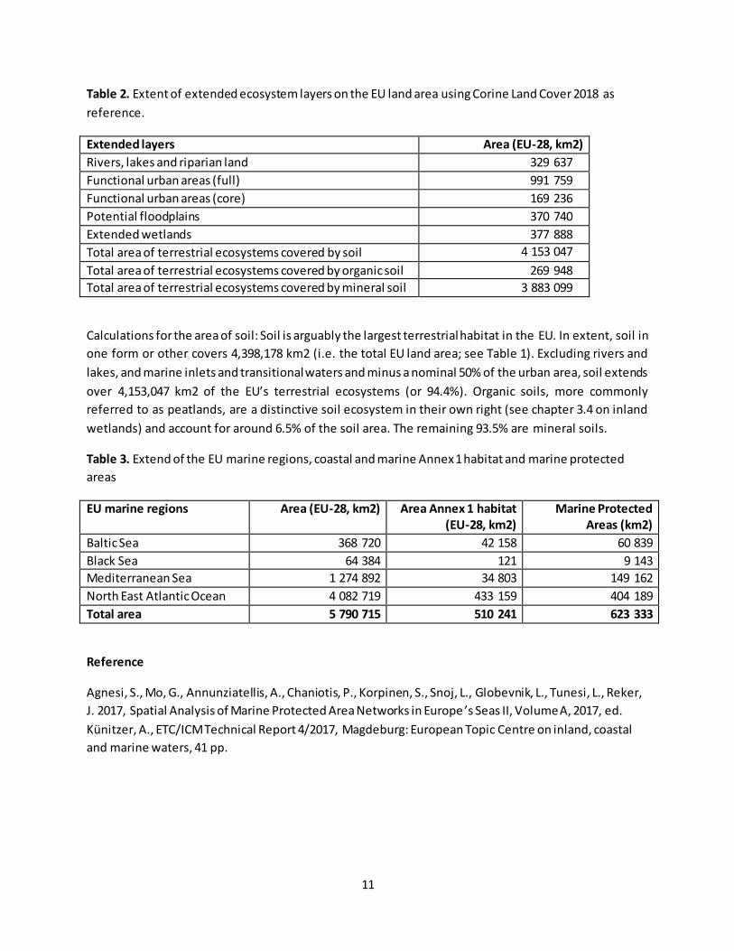
3. Data
Table 1 presents estimates for the year 2018 based on the Corine Land Cover data 2018, the . The table
contains information on the total extent of ecosystem types on the EU land area, the total Area of Annex
1 habitat (protected under the Habitats Directive), the total area of Natura 2000 and the total area of
Annex 1 habitat inside Natura 2000. Romania overestimated for certain habitat types the total area of
Annex 1 habitat. Therefore, table 1 also includes statistics on the different area estimates for Romania
and for the EU-28 without Romania.
Table 2 contains area estimates for extended ecosystem layers. These extended layers overlap with
other ecosystem types and should therefore not be used for accounting purposes.
Table 3 lists the total area of the EU marine regions, the area of coastal and marine Annex 1 habitats and
the area of marine protected areas.

10
Table 1. Ecosystem extent on the EU land area using Corine Land Cover 2018 as reference.
MAES ecosystem types
(EU land area, Corine Land
Cover)
Area (EU-28, km2)
Area (Romania,
km2)
Area (EU-28 excl. Romania,
km2)
Area Annex 1 habitat (EU-
28, km2)
Area Annex 1 habitat (EU-28 excl. Romania,
km2)
Area Natura 2000 (km2)
Area of Annex 1 habitat
within Natura 2000 (km2)
Urban ecosystems 222 189 12 504 209 685 0 0 6 777 0
Cropland 1 596 051 111 476 1 484 575 0 0 135 185 0
Grassland 500 566 30 668 469 898 247 328 218 504 94 056 73 253
Forest 1 597 533 75 473 1 522 060 494 392 429 961 361 505 157 588
Inland wetlands 98 003 3 080 94 922 138 437 109 337 36 623 29 191
Heathland and shrub 181 814 739 181 074 128 894 125 602 73 926 61 642
Sparsely vegetated land 67 986 241 67 744 128 452 36 272 35 764 18 532
Rivers and lakes 109 261 3 346 105 915 127 754 68 050 35 383 27 769
Marine inlets and transitional waters
24 776 785 24 701
Coastal wetlands (Annex 1)
84 487
Total area 4 398 178 238 313 4 160 575 1 349 745 987 727 779 219 367 975
11
Table 2. Extent of extended ecosystem layers on the EU land area using Corine Land Cover 2018 as
reference.
Extended layers Area (EU-28, km2)
Rivers, lakes and riparian land 329 637
Functional urban areas (full) 991 759
Functional urban areas (core) 169 236
Potential floodplains 370 740
Extended wetlands 377 888
Total area of terrestrial ecosystems covered by soil 4 153 047
Total area of terrestrial ecosystems covered by organic soil 269 948
Total area of terrestrial ecosystems covered by mineral soil 3 883 099
Calculations for the area of soil: Soil is arguably the largest terrestrial habitat in the EU. In extent, soil in
one form or other covers 4,398,178 km2 (i.e. the total EU land area; see Table 1). Excluding rivers and
lakes, and marine inlets and transitional waters and minus a nominal 50% of the urban area, soil extends
over 4,153,047 km2 of the EU’s terrestrial ecosystems (or 94.4%). Organic soils, more commonly
referred to as peatlands, are a distinctive soil ecosystem in their own right (see chapter 3.4 on inland
wetlands) and account for around 6.5% of the soil area. The remaining 93.5% are mineral soils.
Table 3. Extend of the EU marine regions, coastal and marine Annex 1 habitat and marine protected
areas
EU marine regions Area (EU-28, km2) Area Annex 1 habitat
(EU-28, km2)
Marine Protected
Areas (km2)
Baltic Sea 368 720 42 158 60 839
Black Sea 64 384 121 9 143
Mediterranean Sea 1 274 892 34 803 149 162
North East Atlantic Ocean 4 082 719 433 159 404 189
Total area 5 790 715 510 241 623 333
Reference
Agnesi, S., Mo, G., Annunziatellis, A., Chaniotis, P., Korpinen, S., Snoj, L., Globevnik, L., Tunesi, L., Reker,
J. 2017, Spatial Analysis of Marine Protected Area Networks in Europe ’s Seas II, Volume A, 2017, ed.
Künitzer, A., ETC/ICM Technical Report 4/2017, Magdeburg: European Topic Centre on inland, coastal
and marine waters, 41 pp.
12
Fact sheet 3.1.100: Reporting units for urban ecosystems
1. General information
Reporting units for the urban ecosystems
2. Data sources
Data holder: EUROSTAT – Urban Audit
Weblink: https://ec.europa.eu/eurostat/web/gisco/geodata/reference-data/administrative-
units-statistical-units/urban-audit#ua11-14
Version: Urban Audit 2018
Access date: January 2019
Reference: (Eurostat 2017)
The study focused on 706 European cities and their surroundings. As basic mapping boundaries and
spatial reporting units the Spatial system for city statistic, version 20181, was used as recommended by
EUROSTAT (Dijkstra and Poelman, 2012; EuroStat, 2016; Eurostat, 2017). The system is structured as
follow:
Functional Urban Areas, defined as the core city (with at least 50,000 inhabitants) and the
commuting zone. It is based on commuters, employed persons living in one city that work in
another city. It represents an ‘operational urban spatial extent’ that allows mapping and
evaluating the city and its surroundings. The commuting area is an area of transition, from
agricultural or semi-natural land uses to urban land use and is very important when considering
ecosystem services. There are cities that never had a commuting zone or that lost its commuting zone.
Core cities are cities with at least 50,000 inhabitants. One FUA includes one or more core cities.
As reporting unit for core cities, we aggregated all core cities within the same FUA.
Commuting zone (or sub city districts), it represents the commuting zone around the core city; occasionally FUAs do not include a commuting zone (15% of the cases).
'Greater city', are urbanized areas that stretch far beyond their administrative boundaries. The
greater city can overlap completely the FUA and includes one or more urban centres (Eurostat,
2017).
For reasons of consistency, Greater cities have been considered as the core city for the respective FUAs
(eg. Naples, Paris, London, Athens, see Eurostat, 2017).
1https://ec.europa.eu/eurostat/web/gisco/geodata/reference-data/administrative-units-statistical-units/urban-
audit

13
Table 1: The spatial system for city statistic, number and share of FUAs per Country. 15% of the cities
lack of a commuting zone (they never had one or lost it).
Country
code
Number of Country
code
Number of
Commuting
zone and
aggregated
core cities
Disaggregated
core cities
Commuting
zone and
aggregated
core cities
Disaggregated core
cities
AT 6 6 IE 5 5
BE 11 11 IT 84 92
BG 17 18 LT 6 6
CY 2 2 LU 1 1
CZ 15 18 LV 4 4
DE 96 127 MT 1 1
DK 4 4 NL 35 47
EE 3 3 PL 58 68
EL 14 14 PT 13 25
ES 81 132 RO 35 35
FI 7 9 SE 12 13
FR 64 68 SI 2 2
HR 7 7 SK 8 8
HU 19 19 UK 96 171
EU 706 916
14
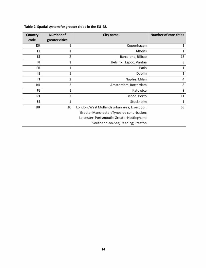
Table 2. Spatial system for greater cities in the EU-28.
Country
code
Number of
greater cities
City name Number of core cities
DK 1 Copenhagen 1
EL 1 Athens 1
ES 2 Barcelona, Bilbao 13
FI 1 Helsinki; Espoo; Vantaa 3
FR 1 Paris 1
IE 1 Dublin 1
IT 2 Naples; Milan 4
NL 2 Amsterdam; Rotterdam 8
PL 1 Katowice 8
PT 2 Lisbon, Porto 11
SE 1 Stockholm 1
UK 10 London; West Midlands urban area; Liverpool;
Greater Manchester; Tyneside conurbation;
Leicester; Portsmouth; Greater Nottingham;
Southend-on-Sea; Reading; Preston
63

15
Figure 1: Distribution of Functional Urban Areas, Core cities and Greater cities in Europe ( EU-28).
Figure 2: Proportion of surface area of FUA and core cities in EU countries territory (%)
16
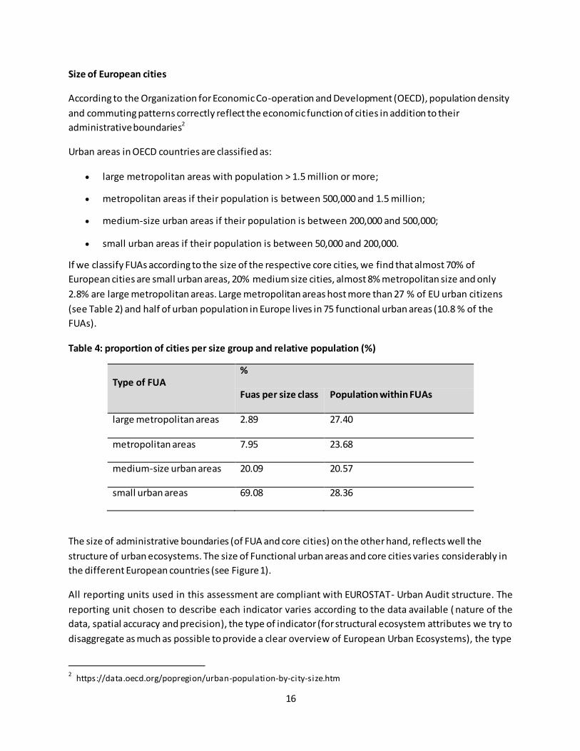
Size of European cities
According to the Organization for Economic Co-operation and Development (OECD), population density
and commuting patterns correctly reflect the economic function of cities in addition to their
administrative boundaries2
Urban areas in OECD countries are classified as:
large metropolitan areas with population > 1.5 million or more;
metropolitan areas if their population is between 500,000 and 1.5 million;
medium-size urban areas if their population is between 200,000 and 500,000;
small urban areas if their population is between 50,000 and 200,000.
If we classify FUAs according to the size of the respective core cities, we find that almost 70% of
European cities are small urban areas, 20% medium size cities, almost 8% metropolitan size and only
2.8% are large metropolitan areas. Large metropolitan areas host more than 27 % of EU urban citizens
(see Table 2) and half of urban population in Europe lives in 75 functional urban areas (10.8 % of the
FUAs).
Table 4: proportion of cities per size group and relative population (%)
Type of FUA
%
Fuas per size class Population within FUAs
large metropolitan areas 2.89 27.40
metropolitan areas 7.95 23.68
medium-size urban areas 20.09 20.57
small urban areas 69.08 28.36
The size of administrative boundaries (of FUA and core cities) on the other hand, reflects well the
structure of urban ecosystems. The size of Functional urban areas and core cities varies considerably in
the different European countries (see Figure 1).
All reporting units used in this assessment are compliant with EUROSTAT- Urban Audit structure. The
reporting unit chosen to describe each indicator varies according to the data available ( nature of the
data, spatial accuracy and precision), the type of indicator (for structural ecosystem attributes we try to
disaggregate as much as possible to provide a clear overview of European Urban Ecosystems), the type
2 https://data.oecd.org/popregion/urban-population-by-city-size.htm
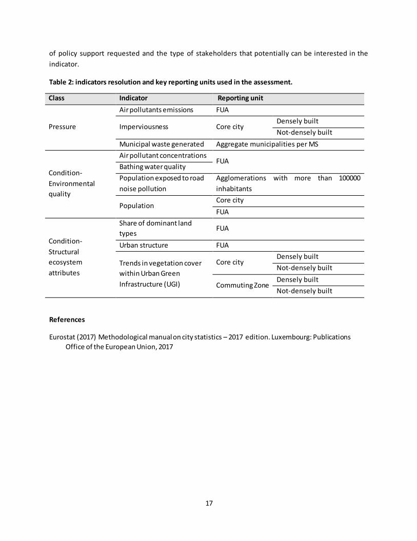
17
of policy support requested and the type of stakeholders that potentially can be interested in the
indicator.
Table 2: indicators resolution and key reporting units used in the assessment.
Class Indicator Reporting unit
Pressure
Air pollutants emissions FUA
Imperviousness Core city Densely built
Not-densely built
Municipal waste generated Aggregate municipalities per MS
Condition-
Environmental
quality
Air pollutant concentrations FUA
Bathing water quality
Population exposed to road
noise pollution
Agglomerations with more than 100000
inhabitants
Population Core city
FUA
Condition-
Structural
ecosystem
attributes
Share of dominant land
types FUA
Urban structure FUA
Trends in vegetation cover
within Urban Green
Infrastructure (UGI)
Core city Densely built
Not-densely built
Commuting Zone Densely built
Not-densely built
References
Eurostat (2017) Methodological manual on city statistics – 2017 edition. Luxembourg: Publications
Office of the European Union, 2017
18
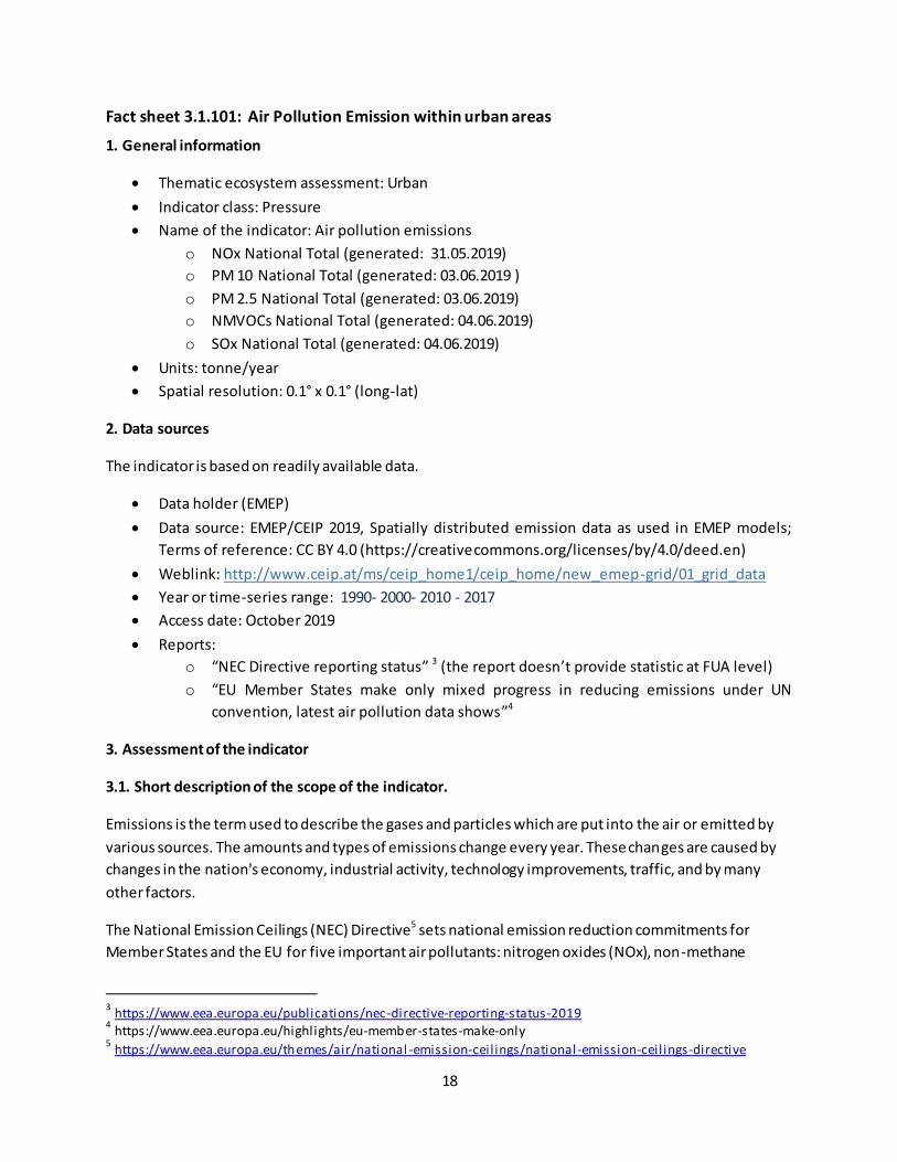
Fact sheet 3.1.101: Air Pollution Emission within urban areas
1. General information
Thematic ecosystem assessment: Urban
Indicator class: Pressure
Name of the indicator: Air pollution emissions
o NOx National Total (generated: 31.05.2019)
o PM 10 National Total (generated: 03.06.2019 )
o PM 2.5 National Total (generated: 03.06.2019)
o NMVOCs National Total (generated: 04.06.2019)
o SOx National Total (generated: 04.06.2019)
Units: tonne/year
Spatial resolution: 0.1° x 0.1° (long-lat)
2. Data sources
The indicator is based on readily available data.
Data holder (EMEP)
Data source: EMEP/CEIP 2019, Spatially distributed emission data as used in EMEP models;
Terms of reference: CC BY 4.0 (https://creativecommons.org/licenses/by/4.0/deed.en)
Weblink: http://www.ceip.at/ms/ceip_home1/ceip_home/new_emep-grid/01_grid_data
Year or time-series range: 1990- 2000- 2010 - 2017
Access date: October 2019
Reports:
o “NEC Directive reporting status” 3 (the report doesn’t provide statistic at FUA level)
o “EU Member States make only mixed progress in reducing emissions under UN
convention, latest air pollution data shows”4
3. Assessment of the indicator
3.1. Short description of the scope of the indicator.
Emissions is the term used to describe the gases and particles which are put into the air or emitted by
various sources. The amounts and types of emissions change every year. These changes are caused by
changes in the nation's economy, industrial activity, technology improvements, traffic, and by many
other factors.
The National Emission Ceilings (NEC) Directive5 sets national emission reduction commitments for
Member States and the EU for five important air pollutants: nitrogen oxides (NOx), non-methane
3 https://www.eea.europa.eu/publications/nec-directive-reporting-status-2019
4 https://www.eea.europa.eu/highlights/eu-member-states-make-only
5 https://www.eea.europa.eu/themes/air/national -emission-ceil ings/national-emission-ceil ings-directive
19
volatile organic compounds (NMVOCs), sulphur dioxide (SO2), ammonia (NH3) and fine particulate
matter (PM2.5). These pollutants contribute to poor air quality, leading to significant negative impacts
on human health and the environment.
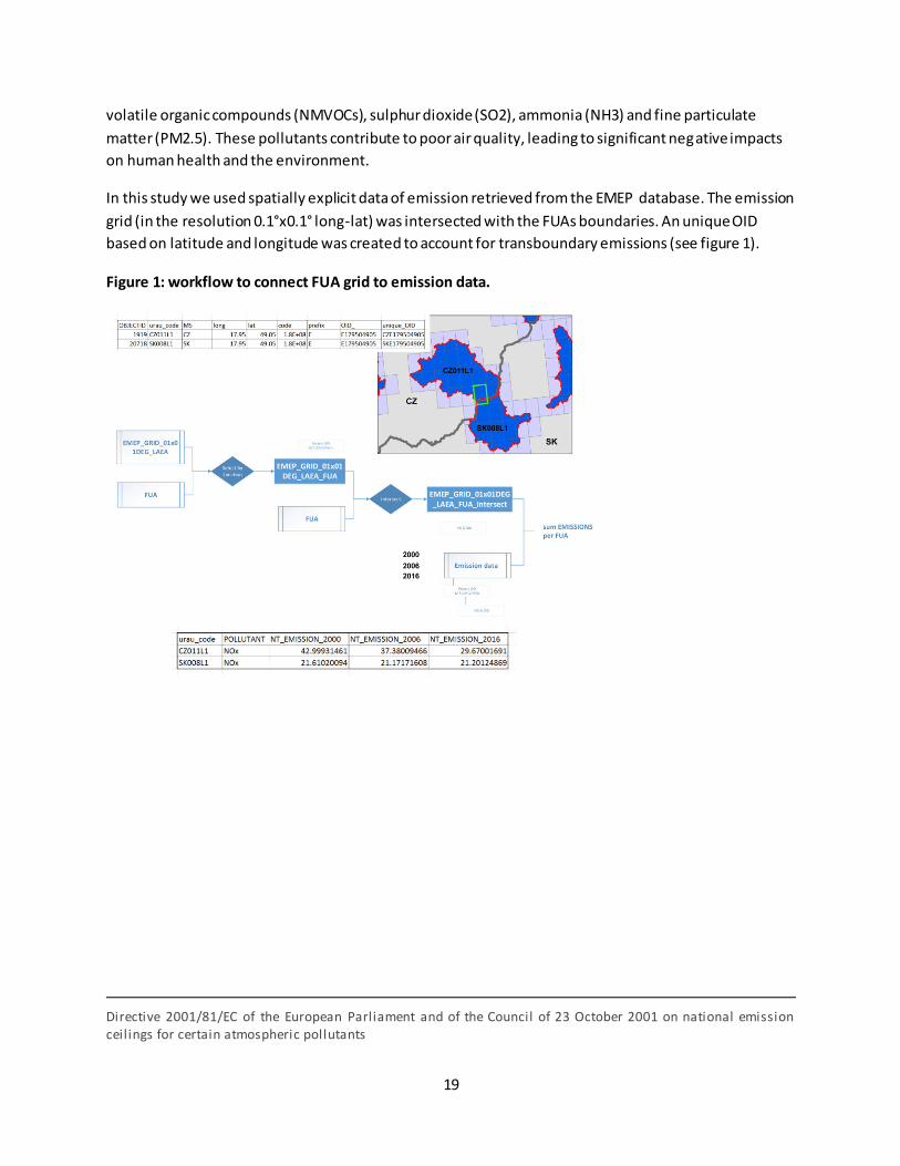
In this study we used spatially explicit data of emission retrieved from the EMEP database. The emission
grid (in the resolution 0.1°x0.1° long-lat) was intersected with the FUAs boundaries. An unique OID
based on latitude and longitude was created to account for transboundary emissions (see figure 1).
Figure 1: workflow to connect FUA grid to emission data.
Directive 2001/81/EC of the European Parliament and of the Council of 23 October 2001 on national emission ceil ings for certain atmospheric pollutants
20
3.2. Maps
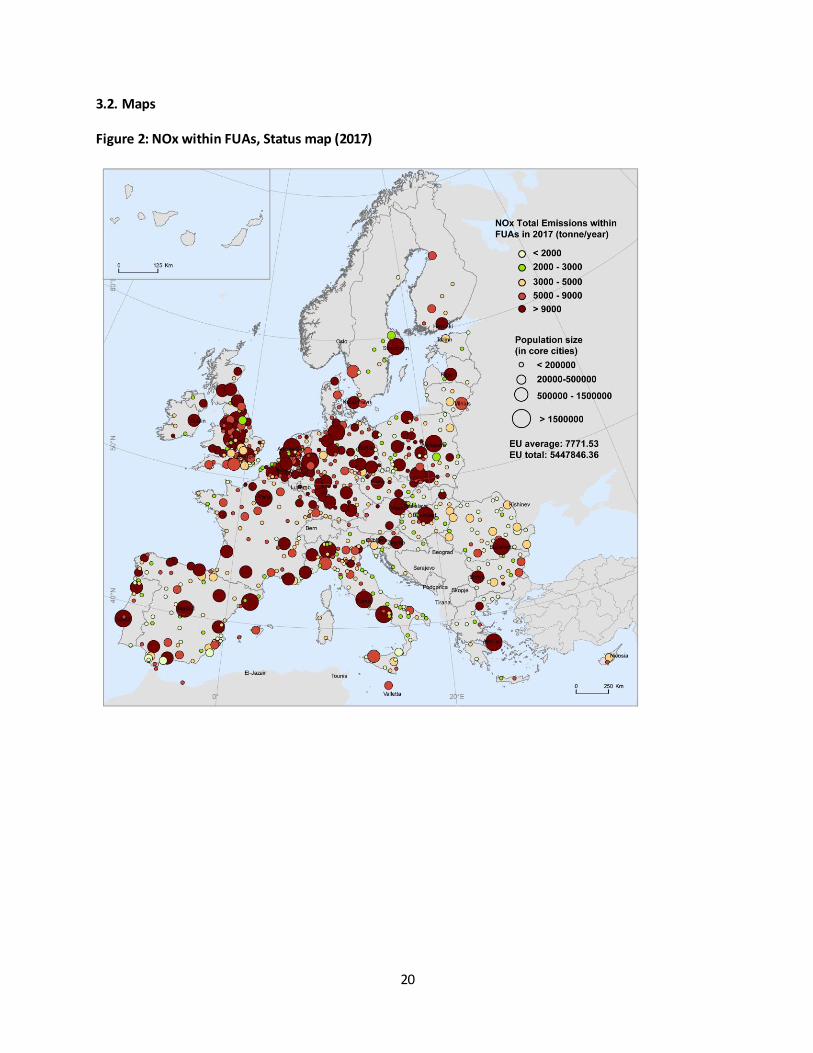
Figure 2: NOx within FUAs, Status map (2017)

21
Figure 3: NOx emissions. NOx within FUAs in the Short and Long Term (source: EMEP model); National
emission by sectors (source EEA)
22
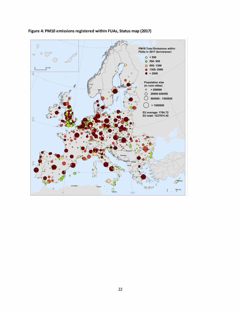
Figure 4: PM10 emissions registered within FUAs, Status map (2017)
23
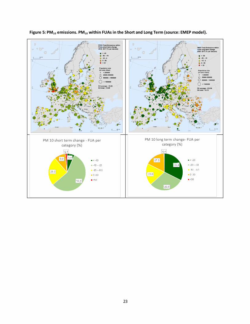
Figure 5: PM10 emissions. PM10 within FUAs in the Short and Long Term (source: EMEP model).

24
Figure 6: PM2.5 emissions registered within FUAs, Status map (2017)

25
Figure 7: PM 2.5 emissions. PM 2.5 within FUAs in the Short and Long Term (source: EMEP model);
National emission by sectors (source EEA)
26
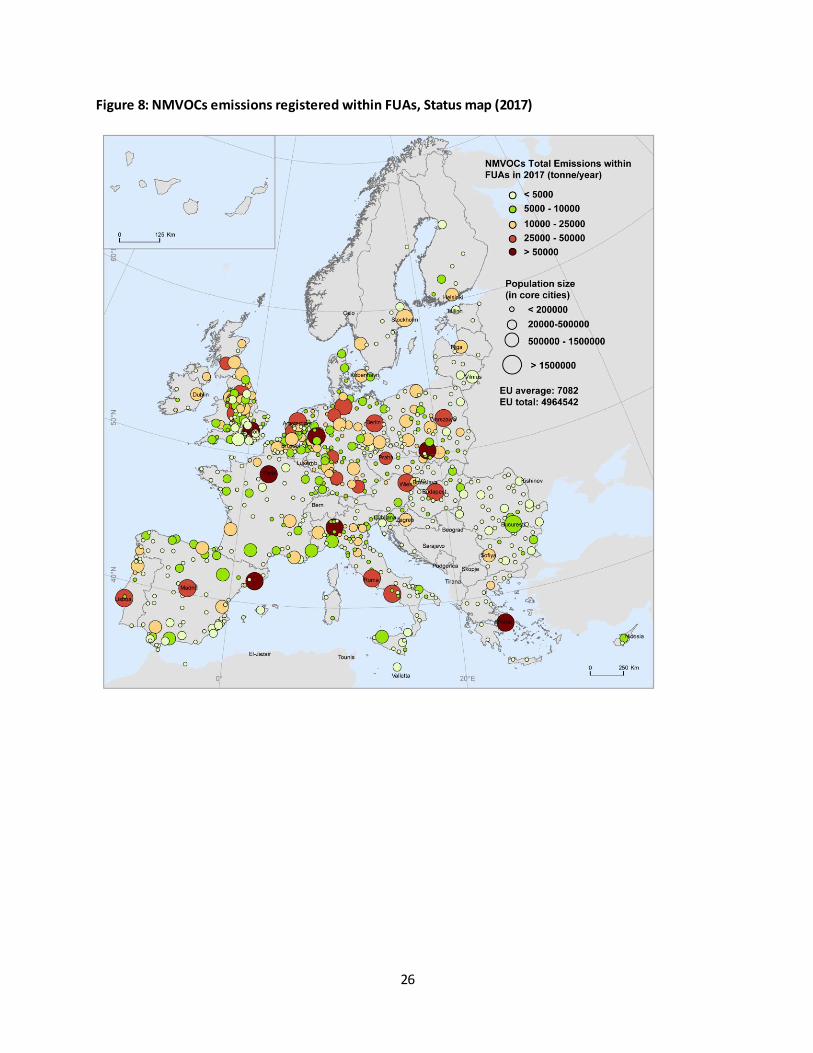
Figure 8: NMVOCs emissions registered within FUAs, Status map (2017)
27
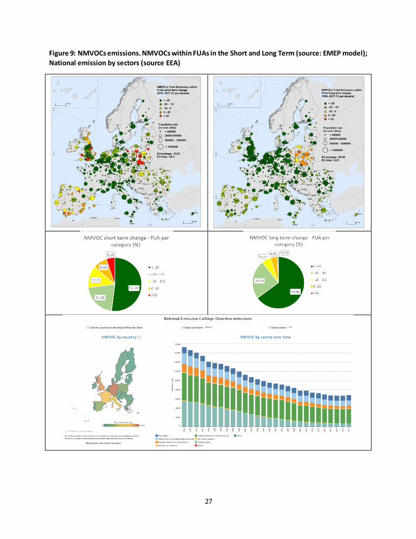
Figure 9: NMVOCs emissions. NMVOCs within FUAs in the Short and Long Term (source: EMEP model);
National emission by sectors (source EEA)

28
Figure 10: SOx emissions registered within FUAs, Status map (2017)

29
Figure 11: SOx emissions. SOx within FUAs in the Short and Long Term (source: EMEP model); National
emission by sectors (source EEA)
30
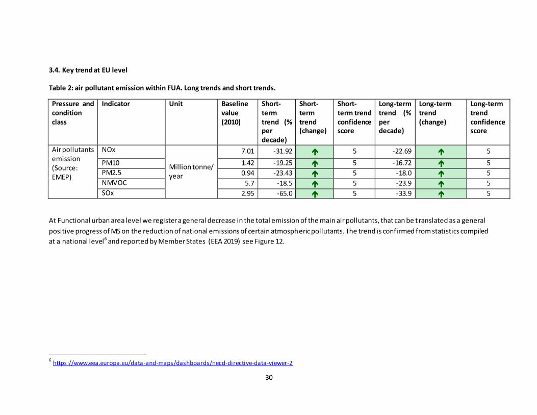
3.4. Key trend at EU level
Table 2: air pollutant emission within FUA. Long trends and short trends.
Pressure and
condition
class
Indicator Unit Baseline
value
(2010)
Short-
term
trend (%
per
decade)
Short-
term
trend
(change)
Short-
term trend
confidence
score
Long-term
trend (%
per
decade)
Long-term
trend
(change)
Long-term
trend
confidence
score
Air pollutants emission (Source: EMEP)
NOx
Million tonne/ year
7.01 -31.92 5 -22.69 5
PM10 1.42 -19.25 5 -16.72 5
PM2.5 0.94 -23.43 5 -18.0 5
NMVOC 5.7 -18.5 5 -23.9 5
SOx 2.95 -65.0 5 -33.9 5
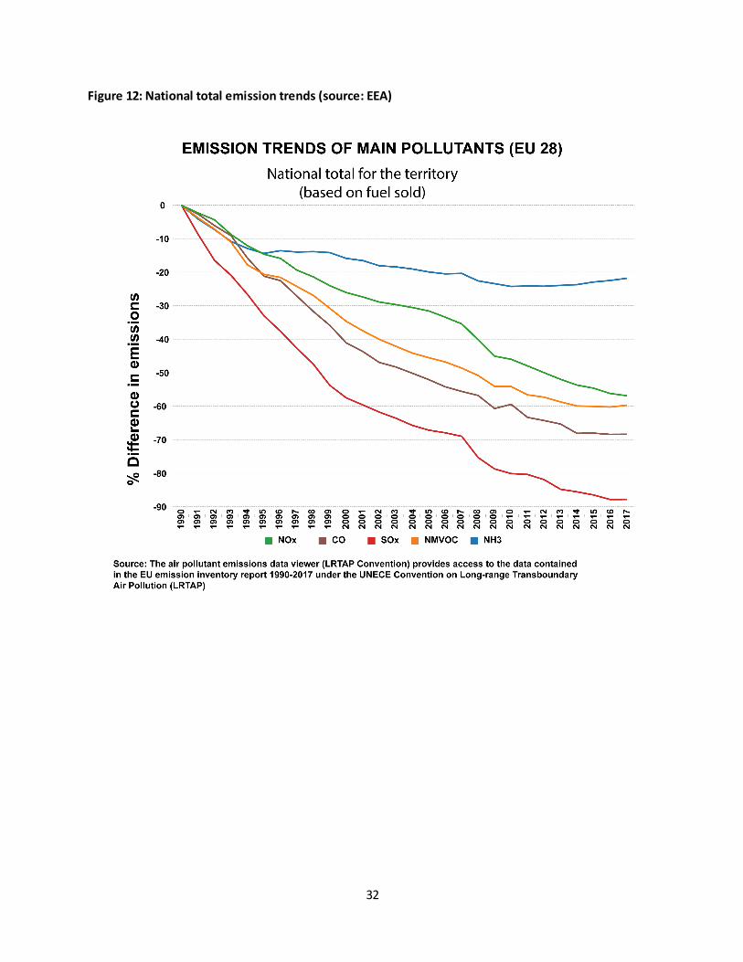
At Functional urban area level we register a general decrease in the total emission of the main air pollutants, that can be translated as a general
positive progress of MS on the reduction of national emissions of certain atmospheric pollutants. The trend is confirmed from statistics compiled
at a national level6 and reported by Member States (EEA 2019) see Figure 12.
6 https://www.eea.europa.eu/data-and-maps/dashboards/necd-directive-data-viewer-2

31
The assessment of the trends using data collected within the FUAs confirm that in 2017, the most recent
year for which data were reported, the total emissions of four main air pollutants - nitrogen oxides
(NOx), non-methane volatile organic compounds (NMVOCs), sulphur dioxide (SO2) and ammonia (NH3)-
were below the respective ceilings set for the EU as a whole (EEA 2019). Specifically within FUAs:
o NOx (Figure 2 and Figure 3)
in the long term the downward trend is stable in 97% of European urbanized
areas. Poland is the only region with slightly increased emissions within FUAs (or
a slower downward trend);
in the short-term the downward trend remains constant in 90% urbanized
areas. Nevertheless in some cities the downward trend is turning into a slightly
upward one (north east Spain, Romania, Poland, UK)
o NMVOCs (Figure 8, Figure 9)
in the long term trend the downward trend is stable in 90% of European
urbanized areas. Poland is the only Member State where emissions increase
within Urban Areas.
in the short-term trend, the downward trend remains constant in 73%
urbanized areas. Nevertheless in Poland, Spain and some cities in UK we register
an upward trend
o PM10 (Figure 4 and Figure 5)
in the long term the downward trend persist in 82% of European urbanized
areas. Nevertheless we register an upward trend in some cities in Romania,
Italy, Spain (north east), Poland, Bulgaria, Latvia and Lithuania.
in the short-term the downward trend remains constant in 88% urbanized
areas. Nevertheless in some cities the downward trend is turning into an
upward one (north east Spain, South UK, few German cities)
o PM 2.5 (Figure 6 and Figure 7)
in the long term trend the downward trend persist in 85.5% of European
urbanized areas. Nevertheless we register an upward trend in some cities in
Romania, Italy, Spain (north east), Poland, Bulgaria, Latvia and Lithuania.
in the short-term the downward trend remains constant in 89% urbanized
areas. Nevertheless: in some cities the downward trend is turning into an
upward one (north east Spain, South UK, few German cities); in other areas
(Romania, Italy, some Spanish and Polish cities) the emission decreased.
o SOx (Figure 10 and Figure 11)
in the long term trend the downward trend persist in all European urbanized
areas.
in the short-term the downward trend remains constant in 82% urbanized
areas. Nevertheless in some urbanized regions we registered an inversed
tendency (Bulgaria, Spain, Germany)
32
Figure 12: National total emission trends (source: EEA)
33
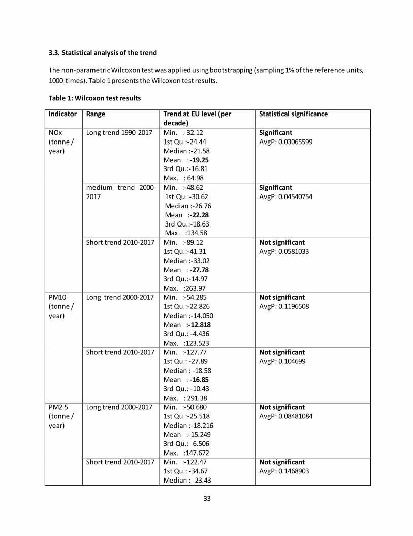
3.3. Statistical analysis of the trend
The non-parametric Wilcoxon test was applied using bootstrapping (sampling 1% of the reference units,
1000 times). Table 1 presents the Wilcoxon test results.
Table 1: Wilcoxon test results
Indicator Range Trend at EU level (per
decade)
Statistical significance
NOx (tonne / year)
Long trend 1990-2017 Min. :-32.12 1st Qu.:-24.44 Median :-21.58 Mean : -19.25 3rd Qu.:-16.81 Max. : 64.98
Significant
AvgP: 0.03065599
medium trend 2000-2017
Min. :-48.62 1st Qu.:-30.62 Median :-26.76 Mean :-22.28 3rd Qu.:-18.63 Max. :134.58
Significant
AvgP: 0.04540754
Short trend 2010-2017 Min. :-89.12 1st Qu.:-41.31 Median :-33.02 Mean : -27.78 3rd Qu.:-14.97 Max. :263.97
Not significant
AvgP: 0.0581033
PM10 (tonne / year)
Long trend 2000-2017 Min. :-54.285 1st Qu.:-22.826 Median :-14.050 Mean :-12.818 3rd Qu.: -4.436 Max. :123.523
Not significant
AvgP: 0.1196508
Short trend 2010-2017 Min. :-127.77 1st Qu.: -27.89 Median : -18.58 Mean : -16.85 3rd Qu.: -10.43 Max. : 291.38
Not significant
AvgP: 0.104699
PM2.5 (tonne / year)
Long trend 2000-2017 Min. :-50.680 1st Qu.:-25.518 Median :-18.216 Mean :-15.249 3rd Qu.: -6.506 Max. :147.672
Not significant
AvgP: 0.08481084
Short trend 2010-2017 Min. :-122.47 1st Qu.: -34.67 Median : -23.43
Not significant
AvgP: 0.1468903
34
Mean : -17.34 3rd Qu.: -13.41 Max. :2846.42
NMVOC (tonne / year)
Long trend 1990-2017 Min. :-34.51 1st Qu.:-26.74 Median :-22.48 Mean : -20.47 3rd Qu.:-18.07 Max. : 37.76
Significant
AvgP: 0.0350674
Short trend 2000-2017 Min. :-42.07 1st Qu.:-29.10 Median :-23.33 Mean :-21.04 3rd Qu.:-16.17 Max. : 47.44
Significant
AvgP: 0.04805504
Short trend 2010-2017 Min. :-94.924 1st Qu.:-27.411 Median :-20.237 Mean : -15.813 3rd Qu.: -8.909 Max. :304.063
Not significant
AvgP: 0.1147921
SOx (tonne / year)
Long trend 1990-2017 Min. :-36.92 1st Qu.:-35.35 Median :-33.52 Mean : -32.46 3rd Qu.:-31.59 Max. : 10.66
Significant
AvgP: 0.02362566
Short trend 2000-2017 Min. :-58.11 1st Qu.:-48.02 Median :-42.46 Mean : -39.76 3rd Qu.:-35.05 Max. :164.18
Significant
AvgP: 0.03389309
Short trend 2010-2017 Min. :-135.55 1st Qu.: -69.02 Median : -44.53 Mean : -39.16 3rd Qu.: -24.52 Max. :1804.89
Not significant
AvgP: 0.1021846
35
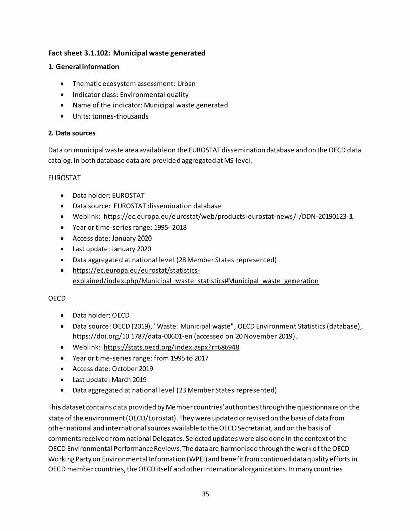
Fact sheet 3.1.102: Municipal waste generated
1. General information
Thematic ecosystem assessment: Urban
Indicator class: Environmental quality
Name of the indicator: Municipal waste generated
Units: tonnes-thousands
2. Data sources
Data on municipal waste area available on the EUROSTAT dissemination database and on the OECD data
catalog. In both database data are provided aggregated at MS level.
EUROSTAT
Data holder: EUROSTAT
Data source: EUROSTAT dissemination database
Weblink: https://ec.europa.eu/eurostat/web/products-eurostat-news/-/DDN-20190123-1
Year or time-series range: 1995- 2018
Access date: January 2020
Last update: January 2020
Data aggregated at national level (28 Member States represented)
https://ec.europa.eu/eurostat/statistics-
explained/index.php/Municipal_waste_statistics#Municipal_waste_generation
OECD
Data holder: OECD
Data source: OECD (2019), "Waste: Municipal waste", OECD Environment Statistics (database),
https://doi.org/10.1787/data-00601-en (accessed on 20 November 2019).
Weblink: https://stats.oecd.org/index.aspx?r=686948
Year or time-series range: from 1995 to 2017
Access date: October 2019
Last update: March 2019
Data aggregated at national level (23 Member States represented)
This dataset contains data provided by Member countries' authorities through the questionnaire on the
state of the environment (OECD/Eurostat). They were updated or revised on the basis of data from
other national and international sources available to the OECD Secretariat, and on the basis of
comments received from national Delegates. Selected updates were also done in the context of the
OECD Environmental Performance Reviews. The data are harmonised through the work of the OECD
Working Party on Environmental Information (WPEI) and benefit from continued data quality efforts in
OECD member countries, the OECD itself and other international organizations. In many countries
36
systematic collection of environmental data has a short history; sources are typically spread across a
range of agencies and levels of government, and information is often collected for other purposes.
When interpreting these data, one should keep in mind that definitions and measurement methods
vary among countries, and that inter-country comparisons require careful interpretation. Data
presented here refer to national level and may conceal major subnational differences
(https://stats.oecd.org/index.aspx?r=686948).
3. Assessment of the indicator
3.1. Short description of the scope of the indicator.
Municipal waste is defined as waste collected and treated by or for municipalities. It covers waste from
households, including bulky waste, similar waste from commerce and trade, office buildings, institutions
and small businesses, as well as yard and garden waste, street sweepings, the contents of litter
containers, and market cleansing waste if managed as household waste. The definition excludes waste
from municipal sewage networks and treatment, as well as waste from construction and demolition
activities. This indicator is measured in thousand-tonnes and in kilograms per capita7.
This dataset presents data in amounts of municipal (including household) waste. The amount of waste
generated in each country is related to the rate of urbanization, the population density, the types and
pattern of consumption, household revenue, size and lifestyles.
In the long term, there has been a slight increase of municipal waste generated at EU scale, nevertheless
the value cannot be considered statistically different from 0, and has been recorded as stable in the EU
level assessment (Figure 1 and Table 1).
7 https://data.oecd.org/waste/municipal -waste.htm
https://ec.europa.eu/eurostat/statistics -
explained/index.php/Municipal_waste_statistics#Municipal_waste_generation
37
Figure 1: Municipal waste generated at EU level.
Table 1: statistic result OLS. Slope is not significantly different from zero, the change is not
significantly different from 0 % per decade.
Regression Statistics
Multiple R 0.287212 R Square 0.082491 Adjusted R Square 0.040786 Standard Error 8419.954 Observations 24
ANOVA df SS MS F
Regression 1 140228942.4 140228942.4 1.977963
Residual 22 1559703754 70895625.19 Total 23 1699932697
Coefficients Standard Error t Stat P-value
Intercept -451494.1 498198.6503 -0.906253099 0.374621
X Variable 1 349.1965 248.2908974 1.40640082 0.173574
% change per decade 1.394605

38
The picture varies a lot at the national level. In ten Member States, we denote a decrease in the amount
of municipal waste produced. In Spain, Germany, United Kingdom and The Netherlands however the
direction of change cannot be considered statistically significant. Eighteen Member states on the
contrary show a clear upward trend, and only in Poland and Belgium the change cannot be considered
statistically significant.
Figure 2: Municipal waste generated per MS (1995-2018), change per decade (%). Black dots represent
the MS for which the change cannot be considered statistically significant.
Table 2 shows the graphs for the Member states where the change is not statistically significant
39
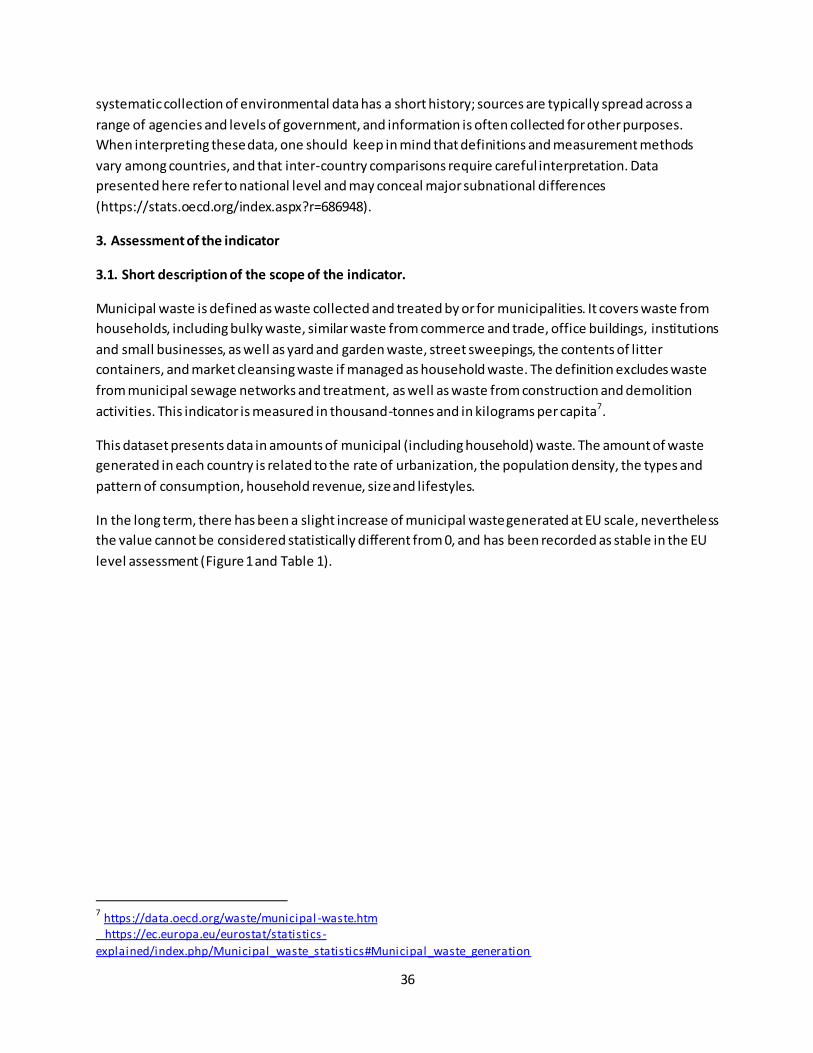
Table 2: Waste generated per MS where a decrease in thousand –tonnes was recorded but not
statistically significant.
As reported by EUROSTAT the variations among member States, which are confirmed by the values
expressed in kg per capita, “…reflect differences in consumption patterns and economic wealth, but also
depend on how municipal waste is collected and managed. There are differences between countries
regarding the degree to which waste from commerce, trade and administration is collected and
managed together with waste from households”8.
8 https://ec.europa.eu/eurostat/statistics -
explained/index.php/Municipal_waste_statistics#Municipal_waste_generation
40
Fact sheet 3.1.103: Soil sealing
1. General information
Urban ecosystem assessment
Indicator class : Structural ecosystem attributes
Name of the indicator: soil sealing
Units:
o Share of sealed soil in artificial land (%)
2. Data sources
Data holder : EEA -Imperviousness
Weblink: https://land.copernicus.eu/pan-european/high-resolution-layers/imperviousness
Year or time-series range: 2006-2009-2012-2015
Resolution: 20 m
Access date: April 2019
3. Assessment of the indicator
3.1. Short description of the scope of the indicator.
“Soil sealing is the covering of the soil surface with materials like concrete and stone, as a result of new
buildings, roads, parking places but also other public and private space. Depending on its degree, soil
sealing reduces or most likely completely prevents natural soil functions and ecosystem services on the
area concerned” (EEA 2011).
This indicator measures the percentage of land covered by surfaces that do not allow water to soak into
the soil. The values are calculated within the core cities, using two reporting units: densely built areas
(areas where there is a dominance of artificial land) and not-densely built areas or interface zones (areas
where artificial land is prevalent but it coexists with other ecosystem types, such as urban forest or
agricultural land).
A high proportion of impervious surfaces exposes urban areas to several risks connected to local climate
regulation, flood protection and water regulation.
41
3.2. Maps
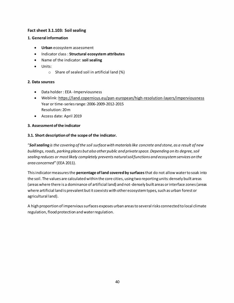
Figure 1: percentage of sealed soil in core cities in 2015 within densely and not densely built areas. Pie
charts show the proportion of core cities per sealed soil class (%)
Figure 1 shows the percentage of sealed soil in core cities. Within densely built areas (Map A, Figure 1)
more than 50% of the land is sealed in 55% of the core cities. This condition exposes urban areas to
several risks connected to local climate regulation, flood protection and water regulation. Concerning
flood protection and water regulation, as an example, an impervious cover greater than 50% implies a
decrease of deep and shallow infiltration and conversely an increase of surface run-off in case of rain
(Chithra S. V., Harindranathan Nair M. V., Amarnath A. 2015). The increase of surface run-off requires
more infrastructure to minimize flooding and exposes people and artefact to risks.
The trend is relatively steady in the short term (Figure 2, Map A and B). Within core cities-densely built
areas, the percentage of sealed soil remained almost stable, showing a very light upward trend. In 85%
A
B

42
of the cities, there was an increase of sealed soil ranging by 0.05 and 2.5%. This pattern is consistent in
almost all European core cities, with few exceptions where a more intense increase is registered.
Figure 2: percentage of sealed soil in core cities, changes in the short term per decade. Pie charts show
the proportion of core cities per class of change (%)
A
B
43
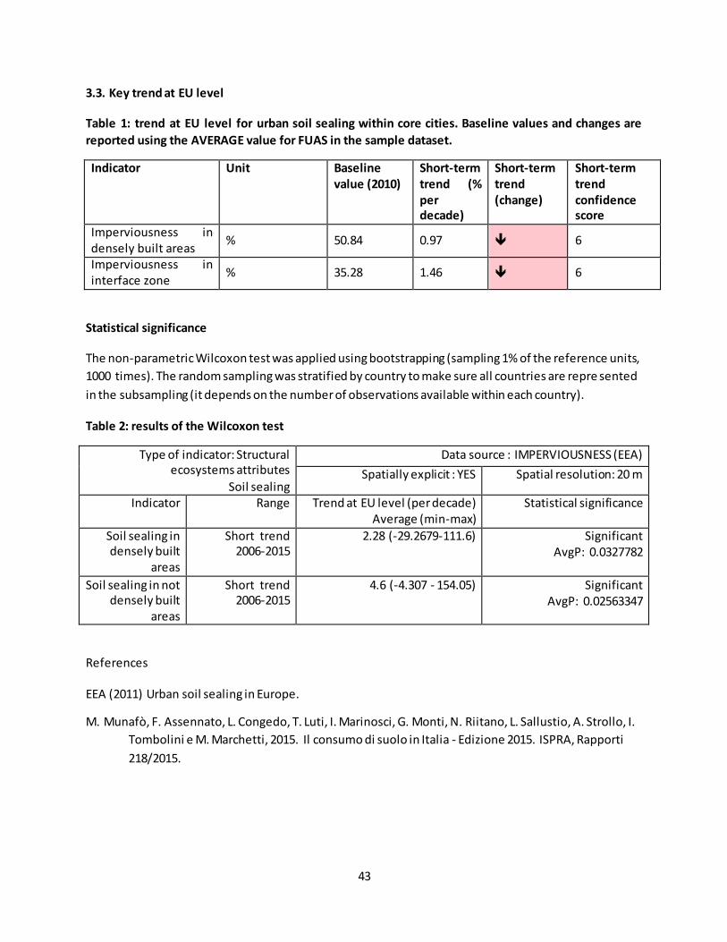
3.3. Key trend at EU level
Table 1: trend at EU level for urban soil sealing within core cities. Baseline values and changes are
reported using the AVERAGE value for FUAS in the sample dataset.
Indicator Unit Baseline
value (2010)
Short-term
trend (%
per
decade)
Short-term
trend
(change)
Short-term
trend
confidence
score
Imperviousness in densely built areas
% 50.84 0.97 6
Imperviousness in interface zone
% 35.28 1.46 6
Statistical significance
The non-parametric Wilcoxon test was applied using bootstrapping (sampling 1% of the reference units,
1000 times). The random sampling was stratified by country to make sure all countries are repre sented
in the subsampling (it depends on the number of observations available within each country).
Table 2: results of the Wilcoxon test
Type of indicator: Structural ecosystems attributes
Soil sealing
Data source : IMPERVIOUSNESS (EEA)
Spatially explicit : YES Spatial resolution: 20 m
Indicator Range Trend at EU level (per decade) Average (min-max)
Statistical significance
Soil sealing in densely built
areas
Short trend 2006-2015
2.28 (-29.2679-111.6)
Significant AvgP: 0.0327782
Soil sealing in not densely built
areas
Short trend 2006-2015
4.6 (-4.307 - 154.05) Significant AvgP: 0.02563347
References
EEA (2011) Urban soil sealing in Europe.
M. Munafò, F. Assennato, L. Congedo, T. Luti, I. Marinosci, G. Monti, N. Riitano, L. Sallustio, A. Strollo, I.
Tombolini e M. Marchetti, 2015. Il consumo di suolo in Italia - Edizione 2015. ISPRA, Rapporti
218/2015.
44
Fact sheet 3.1.104: Noise Pollution
1. General information
Thematic ecosystem assessment: Urban
Indicator class: Environmental quality
Name of the indicator: Noise Pollution from roads
Units:
o Percentage of population exposed to noise pollution from roads (>55dB) (Lden)
2. Data sources
Data holder: EEA
Data source: https://www.eea.europa.eu/data-and-maps/data/data-on-noise-exposure-7
Weblink: https://www.eea.europa.eu/data-and-maps/data/data-on-noise-exposure-7
Year or time-series range: 2012-2017
Access date: 4 December 2019
Last update: 21 November 2019
Data reported at agglomerations level (cities with more than 100000 inhabitants).
Reference: (Fons-esteve, 2018)
o https://www.eea.europa.eu/airs/2018/environment-and-health/environmental-noise
3. Assessment of the indicator
3.1. Short description of the scope of the indicator.
Noise pollution
The Directive related to the assessment and management of environmental noise (the Environmental
Noise Directive – END, 2002/49/EC) is the main EU instrument to identify noise pollution levels and to
trigger the necessary action both at Member State and at EU level. Environmental noise is defined as:
“unwanted or harmful outdoor sound created by human activities, including noise emitted by means of
transport, road traffic, rail traffic, air traffic, and from sites of industrial activity which have negative
effects on human health”. The Directive applies to environmental noise to which humans are exposed in
particular in built-up areas, in public parks or other quiet areas in an agglomeration, in quiet areas in
open country, near schools, hospitals and other noise sensitive buildings and areas (END, 2002/49/EC).
The 7th EAP (EU, 2013) includes an objective to significantly decrease noise pollution by 2020, moving
closer to WHO9 recommended levels. The WHO (2011) has identified noise from transport as the second
most significant environmental cause of ill health in Western Europe, the first being air pollution from
fine particulate matter (AIRS_PO3.1, 201810). Environmental noise exposure can lead to annoyance,
stress reactions, sleep disturbance, poor mental health and wellbeing, impaired cognitive function in
9 http://www.euro.who.int/en/health-topics/environment-and-health/noise/policy
10https://www.eea.europa.eu/airs/2018/environment-and-health/air-pollutant-emissions#tab-based-on-indicators

45
children, and negative effects on the cardiovascular and metabolic system11. Road traffic is the most
widespread source of environmental noise. Railways, air traffic and industry are other major sources of
noise
Methodology and limitations
Noise exposure information are reported under the END Directive (2002/49/EC) per agglomerations
(cities with more than 100000 inhabitants). The database (updated regularly by the EEA) contains
information on the number of people exposed to 55 decibel (dB) bands for two indicators "Lden : 55-59,
60-64, 65-69, 70-74, >75" and "Lnight. : 50-54, 55-59, 60-64, 65-69, > 70". The database covers the noise
sources specified in the END (major roads, major railways, major airports and urban agglomerations)
and the corresponding number of people exposed to each of the noise sources inside urban areas and
outside urban areas.
In this assessment, for comparative purposes, we use the percentage of people exposed to harmful
noise levels derived from roads. Unfortunately the assessment is not completely representative of
European cities but represents the best data available.
Only data for 284 cities were used for this assessment. Cities represented in 2012 were 431 (82.5% of
the agglomerations for which data were requested), in 2017 there were data for 303 cities (57.2% of the
agglomerations for which data were requested).
There are comparability problems between the 2012 and 2017, due to differences in data collection and
mapping. Changes across years may not be strictly related to a real increase/ decrease in noise or
population exposed. In addition to this when comparing countries it should be clear that results also
depend of the mapping methodology of the countries (e.g. in some cities major roads are only mapped
and in other cities all streets are mapped).
Due to the importance of noise pollution the indicator has been included in the assessment having clear
in mind that the results have to be considered as a first estimate for the agglomerations for which data
were available for 2012 and 2017.
11
https://www.eea.europa.eu/airs/2018/environment-and-health/environmental -noise

46
Table 1: summary table of Noise pollution within 242 agglomerations.
Pressure and
condition
class
Indicator Unit Baseline
value
(2012)
Short-
term
trend (%
per
decade)
Short-
term
trend
(change)
Short-
term trend
confidence
score
Noise pollution (Source: EEA)
noise pollution from roads
Percentage of population exposed to noise pollution from roads (>55dB) (Lden)
37.01 3.82 6
Reference
Fons-esteve, J. (2018) ‘Analysis of changes on noise exposure 2007 – 2012 – 2017’, (November).
47
Fact sheet 3.1.205: Bathing Water quality within Functional Urban Areas
1. General information
Thematic ecosystem assessment: Urban
Indicator class: Environmental quality
Name of the indicator: Status of Bathing Water quality within Functional Urban Areas
o Percentage of bathing water in good status
o Percentage of bathing water in poor status
Units: %
2. Data sources
The indicator is based on readily available data.
Data holder (EEA)
Data source: Bathing Water Directive - Status of bathing
Weblink: https://www.eea.europa.eu/data-and-maps/data/bathing-water-directive-status-of-
bathing-water-11
Year or time-series range: from 1990 to 2018 (comparable from 2000 to 2018)
Access date: June 2019
Report: “European Bathing Water Quality in 2018” EEA Report No 3/2019 12 (European
Environment Agency EEA, 2019)
3. Assessment of the indicator
3.1. Short description of the scope of the indicator.
The EU Bathing Waters Directive requires Member States to identify popular bathing places in fresh and
coastal waters and monitor them for indicators of microbiological pollution (and other substances)
throughout the bathing season, which runs from May to September. The EU's efforts to ensure clean
and healthy bathing water began 40 years ago with the first Bathing Water Directive 13. Today, Europe's
bathing waters are much cleaner than in the mid-1970s, when large quantities of untreated or partially
treated municipal and industrial waste water were discharged into clean water. Polluted water can have
impacts on human health, causing stomach upsets and diarrhea if swallowed. Depending on the levels of
bacteria detected, the bathing water quality is classified as 'excellent', 'good', 'sufficient' or 'poor'.
(European Environment Agency EEA, 2019).
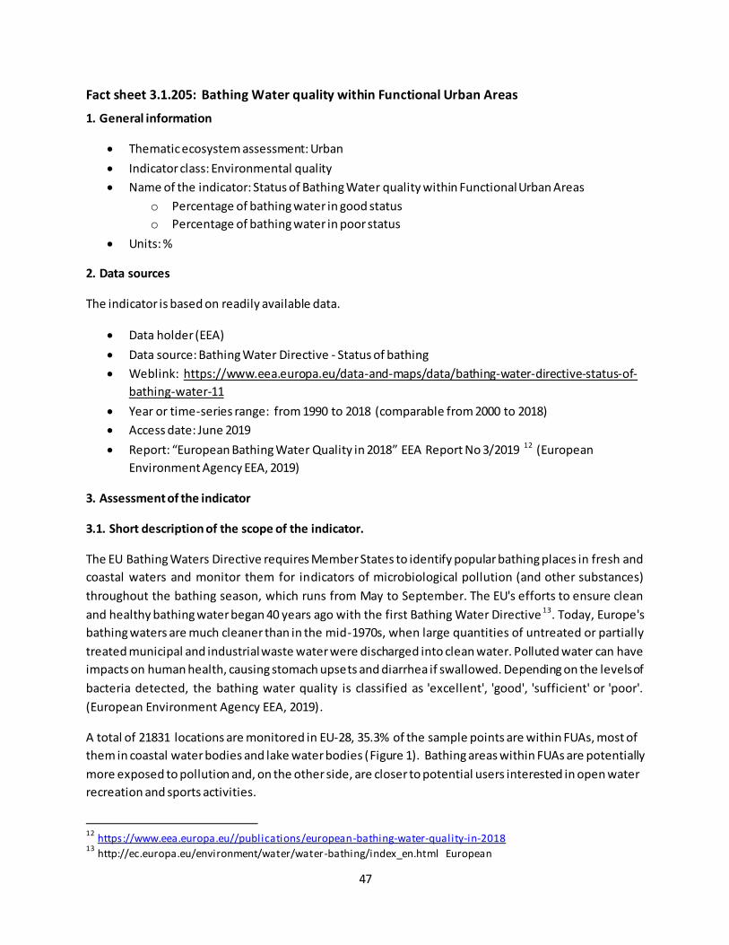
A total of 21831 locations are monitored in EU-28, 35.3% of the sample points are within FUAs, most of
them in coastal water bodies and lake water bodies (Figure 1). Bathing areas within FUAs are potentially
more exposed to pollution and, on the other side, are closer to potential users interested in open water
recreation and sports activities.
12
https://www.eea.europa.eu//publications/european-bathing-water-quality-in-2018 13
http://ec.europa.eu/environment/water/water-bathing/index_en.html European
48
Figure 1: on the left: share of bathing water quality sampling locations within and outside FUA (%);
one the right proportion of sampling locations , within FUA, classified per water categories (%).
Data were considered from 2000 to 2018; Quality classes Good, Good or sufficient and Sufficient were
merged for comparability purposes, see the original classes in Table 1
Table 1: quality status classes.
Quality status (1990-2018)
Quality status classes used in this
assessment
Excellent Excellent
Good Good or sufficient
Good or sufficient*
Sufficient
Poor Poor
Not classified Not classified *Quality classes “Good” and “Sufficient” are merged for comparability with classification of the preceding Bathing Water Directive 76/160/EEC.
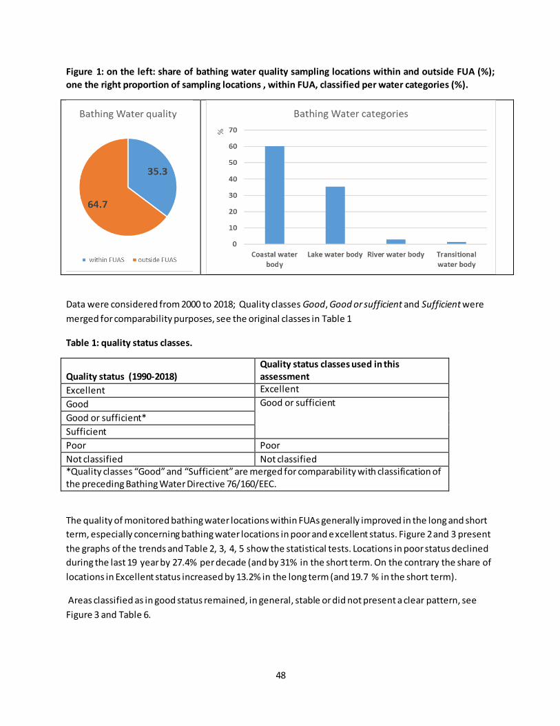
The quality of monitored bathing water locations within FUAs generally improved in the long and short
term, especially concerning bathing water locations in poor and excellent status. Figure 2 and 3 present
the graphs of the trends and Table 2, 3, 4, 5 show the statistical tests. Locations in poor status declined
during the last 19 year by 27.4% per decade (and by 31% in the short term. On the contrary the share of
locations in Excellent status increased by 13.2% in the long term (and 19.7 % in the short term).
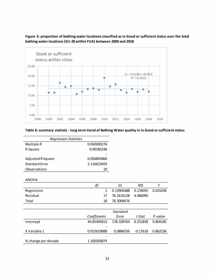
Areas classified as in good status remained, in general, stable or did not present a clear pattern, see
Figure 3 and Table 6.
49
Figure 2: share of bathing water locations classified as in Poor status over the total bathing water
locations (EU-28 within FUA) between 2000 and 2018.
Table 2: summary statistic - long term analysis of Bathing Water quality in poor status
Regression Statistics
Multiple R 0.690133 R Square 0.476284 Adjusted R Square 0.445477 Standard Error 0.324154 Observations 19
ANOVA df SS MS F
Regression 1 1.624505 1.624505 15.46034
Residual 17 1.786285 0.105076 Total 18 3.41079
Coefficients
Standard
Error t Stat P-value
Intercept 109.2541 27.2769 4.005371 0.000916
X Variable 1 -0.05339 0.013577 -3.93196 0.001075
% change per decade -27.3866

50
Table 3: summary statistic - short term analysis of Bathing Water quality in poor status.
Regression Statistics
Multiple R 0.788817 R Square 0.622232 Adjusted R Square 0.568265 Standard Error 0.145417 Observations 9
ANOVA df SS MS F
Regression 1 0.243814 0.243814 11.52988
Residual 7 0.148024 0.021146 Total 8 0.391837
Coefficients
Standard
Error t Stat P-value
Intercept 130.1329 37.80949 3.441804 0.010811
X Variable 1 -0.06375 0.018773 -3.39557 0.011512
% change per decade -31.8214
Figure 3: proportion of bathing water locations classified as in Excellent status over the total bathing
water locations (EU-28 within FUA) between 2000 and 2018

51
Table 4: summary statistic - long term trend of Bathing Water quality in Excellent status
Regression Statistics
Multiple R 0.617551 R Square 0.381369 Adjusted R Square 0.344979 Standard Error 7.383485 Observations 19
ANOVA df SS MS F
Regression 1 571.3273485 571.3273485 10.48002
Residual 17 926.7693427 54.51584369 Total 18 1498.096691
Coefficients Standard Error t Stat P-value
Intercept -1936.79 621.3059201 -3.117289575 0.006268
X Variable 1 1.001164 0.309260135 3.237286513 0.004843
% change per decade 13.25193
Table 5: summary statistic - short term trend of Bathing Water quality in Excellent status
Regression Statistics
Multiple R 0.842476 R Square 0.709765 Adjusted R Square 0.668303 Standard Error 2.68925 Observations 9
ANOVA df SS MS F
Regression 1 123.8014083 123.8014083 17.1184
Residual 7 50.62445429 7.232064899 Total 8 174.4258626
Coefficients Standard Error t Stat P-value
Intercept -2814.29 699.2224363 -4.024889869 0.005028
X Variable 1 1.436439 0.347180666 4.137439298 0.004363
% change per decade 19.69102
52
Figure 3: proportion of bathing water locations classified as in Good or sufficient status over the total
bathing water locations (EU-28 within FUA) between 2000 and 2018
Table 6: summary statistic - long term trend of Bathing Water quality in in Good or sufficient status
Regression Statistics
Multiple R 0.042690274 R Square 0.00182246
Adjusted R Square -
0.056893866 Standard Error 2.116623459 Observations 19
ANOVA df SS MS F
Regression 1 0.13905488 0.139055 0.031038
Residual 17 76.1616128 4.480095 Total 18 76.3006676
Coefficients
Standard
Error t Stat P-value
Intercept 44.85495813 178.109764 0.251839 0.804185
X Variable 1 -
0.015619088 0.0886556 -0.17618 0.862236
% change per decade -
1.160356874

53
Fact sheet 3.1.206: Population
1. General information
Thematic ecosystem assessment: Urban
Indicator class: Environmental quality
Name of the indicator: Population
Units:
o total inhabitants within CORE CITIES
o total inhabitants within FUA
2. Data sources
The indicator is based on readily available data.
Data holder: EUROSTAT
Data source: EUROSTAT-URBAN AUDIT
Weblink: https://ec.europa.eu/eurostat/web/cities/data/database
o Population on 1 January by age groups and sex - cities and greater cities (Code:
urb_cpop1)
o Population on 1 January by age groups and sex - functional urban areas (Code:
urb_lpop1 )
Year or time-series range Core cities:
o 2010-2015 (850 CORE CITIES)
Year or time-series range FUAs:
o 2010-2016 (444 FUA) o 2010-2017 (58 FUA) o 2011-2014 (44 FUA) o 2013-2018 (5 FUA)
Access date:
o Core cities: Access date: 4/11/2019 (Last update of data: 21/10/2019 ; Last table
structure change: 02/09/2019)
3. Assessment of the indicator
3.1. Short description of the scope of the indicator.
Population dynamics (e.g., population size, growth, density, age and sex composition, migration,
distribution) are one of the main drivers of environmental impact of urbanized areas (Newman, 2006).
The intensity of population impact is strongly related to the type of resource management and to
lifestyle ( de Sherbinin et al., 2007).
54
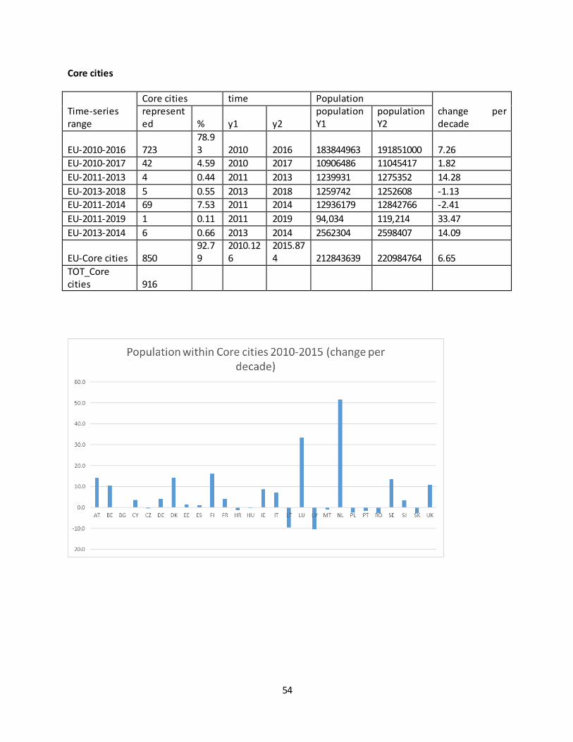
Core cities
Time-series range
Core cities time Population change per decade
represented % y1 y2
population Y1
population Y2
EU-2010-2016 723 78.93 2010 2016 183844963 191851000 7.26
EU-2010-2017 42 4.59 2010 2017 10906486 11045417 1.82
EU-2011-2013 4 0.44 2011 2013 1239931 1275352 14.28
EU-2013-2018 5 0.55 2013 2018 1259742 1252608 -1.13
EU-2011-2014 69 7.53 2011 2014 12936179 12842766 -2.41
EU-2011-2019 1 0.11 2011 2019 94,034 119,214 33.47
EU-2013-2014 6 0.66 2013 2014 2562304 2598407 14.09
EU-Core cities 850 92.79
2010.126
2015.874 212843639 220984764 6.65
TOT_Core cities 916

55
FUA
Time-series range
represented FUA
y1 y2
population
change per decade
number %
Y1 Y2
EU-2010-2016 443 62.75 2010 2016 243164088 253544832 7.12
EU-2010-2017 44 6.23 2010 2017 15893891 16543883 5.84
EU-2011-2014 58 8.22 2011 2014 21276231 21329243 0.83
EU-2013-2018 5 0.71 2013 2018 2072737 2045816 -2.60
EU-2011-2013 4 0.57 2011 2013 5560628 5602628 3.78
EU-2013-2014 6 0.85 2013 2014 5564652 5606655 7.55
EU-2011-2019 1 0.14 2011 2019 3,828,434 3,154,152 -22.02
EU-FUA 561 79.46 2010.17
2015.85 297360661 307827209 6.20
TOT_FUA 706
56
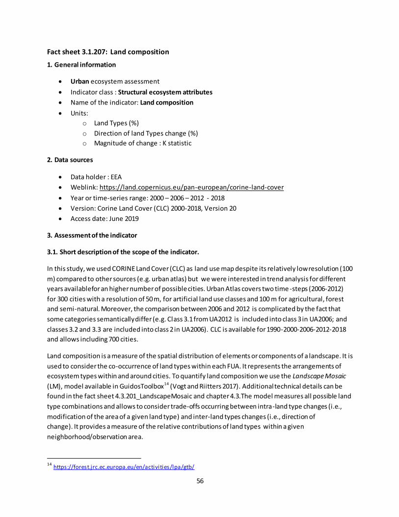
Fact sheet 3.1.207: Land composition
1. General information
Urban ecosystem assessment
Indicator class : Structural ecosystem attributes
Name of the indicator: Land composition
Units:
o Land Types (%)
o Direction of land Types change (%)
o Magnitude of change : K statistic
2. Data sources
Data holder : EEA
Weblink: https://land.copernicus.eu/pan-european/corine-land-cover
Year or time-series range: 2000 – 2006 – 2012 - 2018
Version: Corine Land Cover (CLC) 2000-2018, Version 20
Access date: June 2019
3. Assessment of the indicator
3.1. Short description of the scope of the indicator.
In this study, we used CORINE Land Cover (CLC) as land use map despite its relatively low resolution (100
m) compared to other sources (e.g. urban atlas) but we were interested in trend analysis for different
years availablefor an higher number of possible cities. Urban Atlas covers two time -steps (2006-2012)
for 300 cities with a resolution of 50 m, for artificial land use classes and 100 m for agricultural, forest
and semi-natural. Moreover, the comparison between 2006 and 2012 is complicated by the fact that
some categories semantically differ (e.g. Class 3.1 from UA2012 is included into class 3 in UA2006; and
classes 3.2 and 3.3 are included into class 2 in UA2006). CLC is available for 1990-2000-2006-2012-2018
and allows including 700 cities.
Land composition is a measure of the spatial distribution of elements or components of a landscape. It is
used to consider the co-occurrence of land types within each FUA. It represents the arrangements of
ecosystem types within and around cities. To quantify land composition we use the Landscape Mosaic
(LM), model available in GuidosToolbox14 (Vogt and Riitters 2017). Additional technical details can be
found in the fact sheet 4.3.201_LandscapeMosaic and chapter 4.3.The model measures all possible land
type combinations and allows to consider trade‐offs occurring between intra-land type changes (i.e.,
modification of the area of a given land type) and inter-land types changes (i.e., direction of
change). It provides a measure of the relative contributions of land types within a given
neighborhood/observation area.
14
https://forest.jrc.ec.europa.eu/en/activities/lpa/gtb/
57
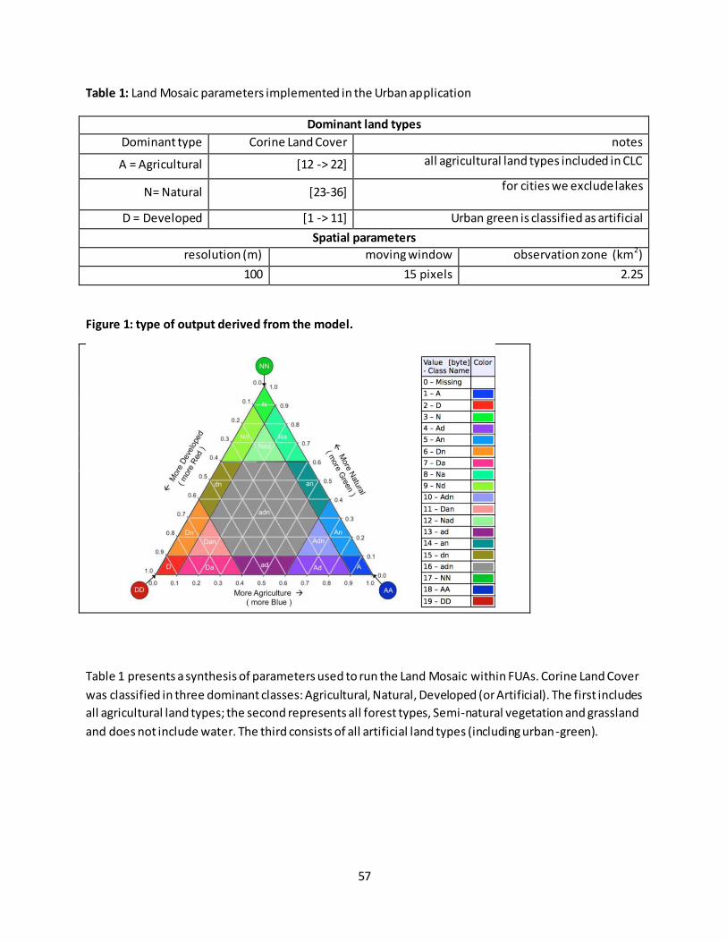
Table 1: Land Mosaic parameters implemented in the Urban application
Dominant land types
Dominant type Corine Land Cover notes
A = Agricultural [12 -> 22] all agricultural land types included in CLC
N= Natural [23-36] for cities we exclude lakes
D = Developed [1 -> 11] Urban green is classified as artificial
Spatial parameters
resolution (m) moving window observation zone (km2)
100 15 pixels 2.25
Figure 1: type of output derived from the model.
Table 1 presents a synthesis of parameters used to run the Land Mosaic within FUAs. Corine Land Cover
was classified in three dominant classes: Agricultural, Natural, Developed (or Artificial). The first includes
all agricultural land types; the second represents all forest types, Semi-natural vegetation and grassland
and does not include water. The third consists of all artificial land types (including urban-green).
58
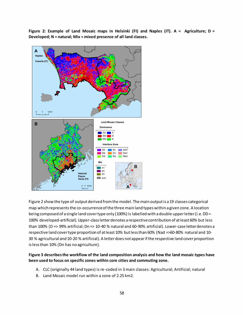
Figure 2: Example of Land Mosaic maps in Helsinki (FI) and Naples (IT). A = Agriculture; D =
Developed; N = natural; Mix = mixed presence of all land classes.
Figure 2 show the type of output derived from the model. The main output is a 19 classes categorical
map which represents the co-occurrence of the three main land types within a given zone. A location
being composed of a single land cover type only (100%) is labelled with a double upper letter (i.e. DD =
100% developed-artificial). Upper-class letter denotes a respective contribution of at least 60% but less
than 100% (D => 99% artificial; Dn => 10-40 % natural and 60-90% artificial). Lower-case letter denotes a
respective land cover type proportion of at least 10% but less than 60% (Nad =>60-80% natural and 10-
30 % agricultural and 10-20 % artificial). A letter does not appear if the respective land cover proportion
is less than 10% (Dn has no agriculture).
Figure 3 describes the workflow of the land composition analysis and how the land mosaic types have
been used to focus on specific zones within core cities and commuting zone.
A. CLC (originally 44 land types) is re-coded in 3 main classes: Agricultural; Artificial; natural
B. Land Mosaic model run within a zone of 2.25 km2.

59
C. The 19 classes are reclassified in 4 main categories representing Dominance and prevalence of
Agricultural, Artificial and Natural plus the situation where there is not a clear prevalence.
D. Land composition analysis
1. Magnitude of land cover change is evaluated using the kappa statistic (Hagen-Zanker
2006; Research Institute for Knowledge Systems 2008; Hagen‐Zanker 2009) . The Kappa
comparison method is based on a straightforward cell -by-cell map comparison, which
considers for each pair of cells on the two maps whether they are equal or not. It is
defined as the goodness of fit between two categorical maps. Values range between 0
and 1, where 0 indicates no agreement at all and 1 indicates a perfect fit.
2. Direction of land cover change, evaluated considering in each FUA the proportion of
cells that from one land type transited to the others.
3. Combination of the two metrics were combined in a hierarchical cluster and EU FUA
E. Land types were used to classify core cities and commuting zone in densely built and interface
zone. This zonation has been used to analyze imperviousness and urban green infrastructure
trends in order to have a more exhaustive overview of what is happening within part of the
cities with different characteristics in terms of land combinations. This method allows to focus
on areas within the city boundaries where the soil in almost completely sealed (> 60% artificial)
and where there is still a proportion of land covered by agriculture or natural vegetation). Table
2 shows examples of aggregated land mosaic types used in the urban assessment.
Table 2: examples of aggregated land mosaic types used in the urban assessment
Land class
Densely built
Not-densely built
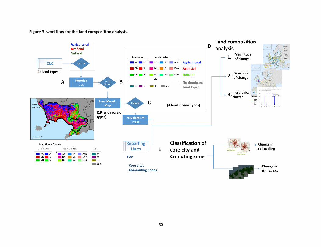
60
Figure 3: workflow for the land composition analysis.
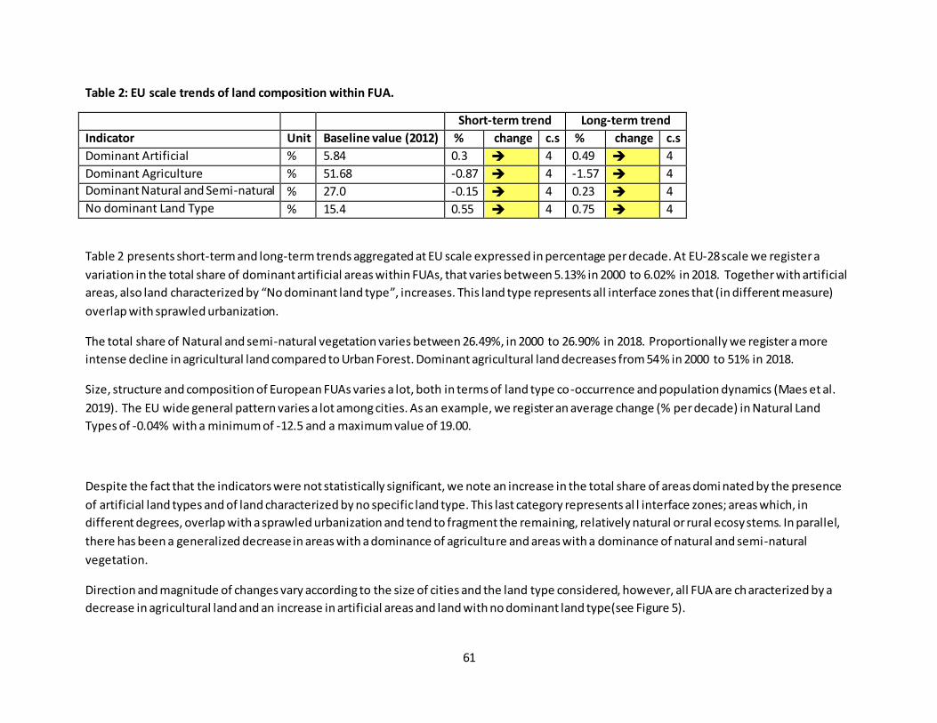
61
Table 2: EU scale trends of land composition within FUA.
Short-term trend Long-term trend
Indicator Unit Baseline value (2012) % change c.s % change c.s
Dominant Artificial % 5.84 0.3 4 0.49 4
Dominant Agriculture % 51.68 -0.87 4 -1.57 4
Dominant Natural and Semi-natural % 27.0 -0.15 4 0.23 4
No dominant Land Type % 15.4 0.55 4 0.75 4
Table 2 presents short-term and long-term trends aggregated at EU scale expressed in percentage per decade. At EU-28 scale we register a
variation in the total share of dominant artificial areas within FUAs, that varies between 5.13% in 2000 to 6.02% in 2018. Together with artificial
areas, also land characterized by “No dominant land type”, increases. This land type represents all interface zones that (in different measure)
overlap with sprawled urbanization.
The total share of Natural and semi-natural vegetation varies between 26.49%, in 2000 to 26.90% in 2018. Proportionally we register a more
intense decline in agricultural land compared to Urban Forest. Dominant agricultural land decreases from 54% in 2000 to 51% in 2018.
Size, structure and composition of European FUAs varies a lot, both in terms of land type co-occurrence and population dynamics (Maes et al.
2019). The EU wide general pattern varies a lot among cities. As an example, we register an average change (% per decade) in Natural Land
Types of -0.04% with a minimum of -12.5 and a maximum value of 19.00.
Despite the fact that the indicators were not statistically significant, we note an increase in the total share of areas domi nated by the presence
of artificial land types and of land characterized by no specific land type. This last category represents al l interface zones; areas which, in
different degrees, overlap with a sprawled urbanization and tend to fragment the remaining, relatively natural or rural ecosystems. In parallel,
there has been a generalized decrease in areas with a dominance of agriculture and areas with a dominance of natural and semi-natural
vegetation.
Direction and magnitude of changes vary according to the size of cities and the land type considered, however, all FUA are characterized by a
decrease in agricultural land and an increase in artificial areas and land with no dominant land type(see Figure 5).

62
Figure 5: short-term and long-term land type change (% per decade) classified per FUA size15
.
15
The methodology applied to classify cities is described in the fact sheet on Reporting Units.
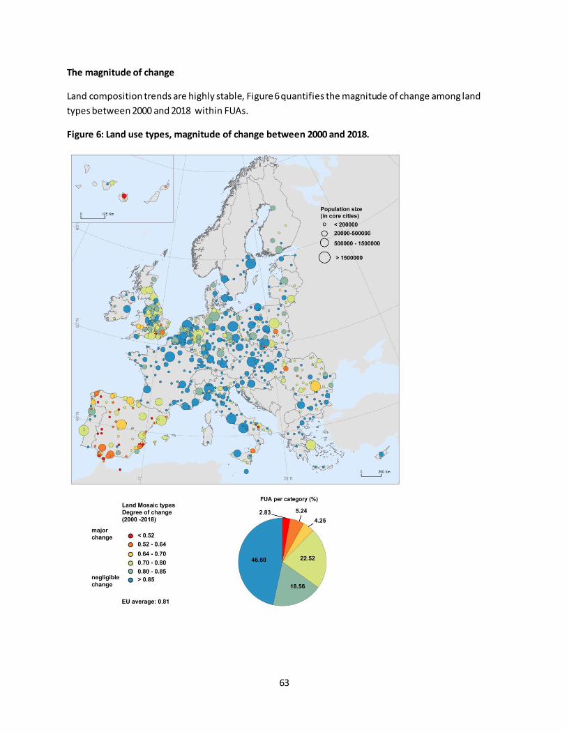
63
The magnitude of change
Land composition trends are highly stable, Figure 6 quantifies the magnitude of change among land
types between 2000 and 2018 within FUAs.
Figure 6: Land use types, magnitude of change between 2000 and 2018.
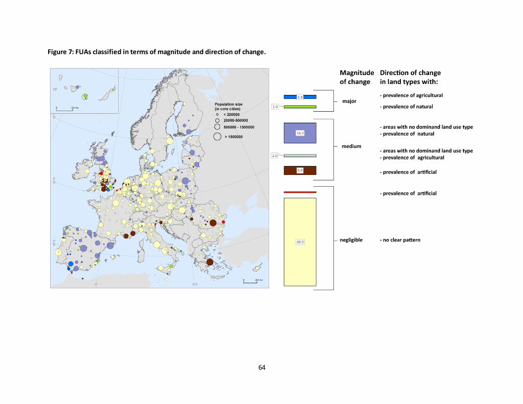
64
Figure 7: FUAs classified in terms of magnitude and direction of change.
65
Changes in share of dominant land types are relatively stable. Figure 14 presents FUA classified
according to magnitude of change and direction of change (the main direction of transition in case of
change of land type). In 70.4 % of FUA land type changes were negligible (meaning that it was not
detectable using CLC). A medium magnitude of change characterized 24.8% of FUA. The main direction
of change in this case has been versus “Land with do dominant land use types”, which represents an
areas with mixed uses. In 4.8% of the FUA there was a major change, with a slightly inverse tendency,
signaling an increase in areas primarily occupied by agricultural or natural land types
References
Acosta-Alba I, Van der Werf MH (2011) The Use of Reference Values in Indicator-Based Methods for the
Environmental Assessment of Agricultural Systems. Sustainability 3:
Hagen-Zanker A (2006) Map comparison methods that simultaneously address overlap and structure. J
Geogr Syst 8(2): 165–185. doi: 10.1007/s10109-006-0024-y
Hagen‐Zanker A (2009) An improved Fuzzy Kappa statistic that accounts for spatial autocorrelation. In t J Geogr Inf Sci 23(1): 61–73. doi: 10.1080/13658810802570317
Maes J, Zulian G, Günther S, Thijssen M, Reynal J (2019) Enhancing Resilience Of Urban Ecosystems
through Green Infrastructure ( EnRoute ) Final Report. Luxembourg.
Research Institute for Knowledge Systems (2008) Assessment and scenarios of land use change in
Europe. Maastricht, The Netherlands
Vogt P, Riitters K (2017) GuidosToolbox: universal digital image object analysis. Eur J Remote Sens 50(1):
352–361. doi: 10.1080/22797254.2017.1330650
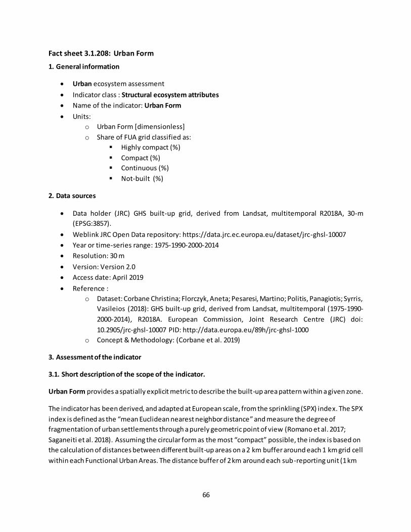
66
Fact sheet 3.1.208: Urban Form
1. General information
Urban ecosystem assessment
Indicator class : Structural ecosystem attributes
Name of the indicator: Urban Form
Units:
o Urban Form [dimensionless]
o Share of FUA grid classified as:
Highly compact (%)
Compact (%)
Continuous (%)
Not-built (%)
2. Data sources
Data holder (JRC) GHS built-up grid, derived from Landsat, multitemporal R2018A, 30-m
(EPSG:3857).
Weblink JRC Open Data repository: https://data.jrc.ec.europa.eu/dataset/jrc-ghsl-10007
Year or time-series range: 1975-1990-2000-2014
Resolution: 30 m
Version: Version 2.0
Access date: April 2019
Reference :
o Dataset: Corbane Christina; Florczyk, Aneta; Pesaresi, Martino; Politis, Panagiotis; Syrris,
Vasileios (2018): GHS built-up grid, derived from Landsat, multitemporal (1975-1990-
2000-2014), R2018A. European Commission, Joint Research Centre (JRC) doi:
10.2905/jrc-ghsl-10007 PID: http://data.europa.eu/89h/jrc-ghsl-1000
o Concept & Methodology: (Corbane et al. 2019)
3. Assessment of the indicator
3.1. Short description of the scope of the indicator.
Urban Form provides a spatially explicit metric to describe the built-up area pattern within a given zone.
The indicator has been derived, and adapted at European scale, from the sprinkling (SPX) index. The SPX
index is defined as the “mean Euclidean nearest neighbor distance” and measure the degree of
fragmentation of urban settlements through a purely geometric point of view (Romano et al. 2017;
Saganeiti et al. 2018). Assuming the circular form as the most “compact” possible, the index is based on
the calculation of distances between different built-up areas on a 2 km buffer around each 1 km grid cell
within each Functional Urban Areas. The distance buffer of 2 km around each sub-reporting unit (1 km

67
cell) was chosen following previous works on urban sprawl developed at European scale (Aurambout et
al. 2018).
The Urban Form index is defined as follow:
𝑈𝑟𝑏𝑎𝑛𝐹𝑜𝑟𝑚 = (𝑀𝑎𝑥− 𝑏𝑙𝑑−𝑑𝑖𝑠𝑡)𝑅
where:
Max(bld-dist) = the maximum distance between all built up areas extracted within a 2 km horizon (2 km
buffer around each 1 km cell); the distance is measured within the target FUA and the adjacent FUAs in
order to take the edge effect into consideration. The analysis is carried on at 30 m resolution and the
final indicator is represented within a 1 km grid.
R= ray of a hypothetical built-up zone with and area equal to the sum of all the built up areas in the
considered horizon
The Urban Form Index is a dimensionless metric. The higher the value the higher the degree of
fragmentation of land due to the presence of built-up infrastructures within the FUA. Values greater
than 100 represents no-built up areas. In terms of changes negative values represent a progressive
densification of built-up areas. To make the interpretation easier the indicator has been classified in six
classes which represent categories of urban form having an impact on city performance in terms of
mobility, urban resilience, ecosystem services and biodiversity (Cortinovis et al. 2019). Figure 1 shows an
example of urban form measured in Padova (north-east of Italy). We note a progressive increase of
compactness within the core city and a progressive densification of settlements in the commuting zone,
at the expenses of agricultural areas and of a Natura 2000 site (the Colli Euganei regional park) (south
east).
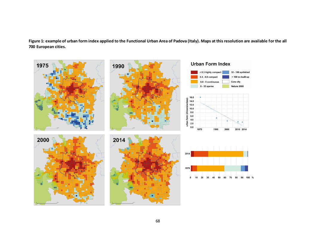
68
Figure 1: example of urban form index applied to the Functional Urban Area of Padova (Italy). Maps at this resolution are available for the all
700 European cities.
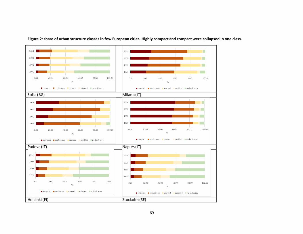
69
Figure 2: share of urban structure classes in few European cities. Highly compact and compact were collapsed in one class.
Sofia (BG) Milano (IT)
Padova (IT) Naples (IT)
Helsinki (FI) Stockolm (SE)
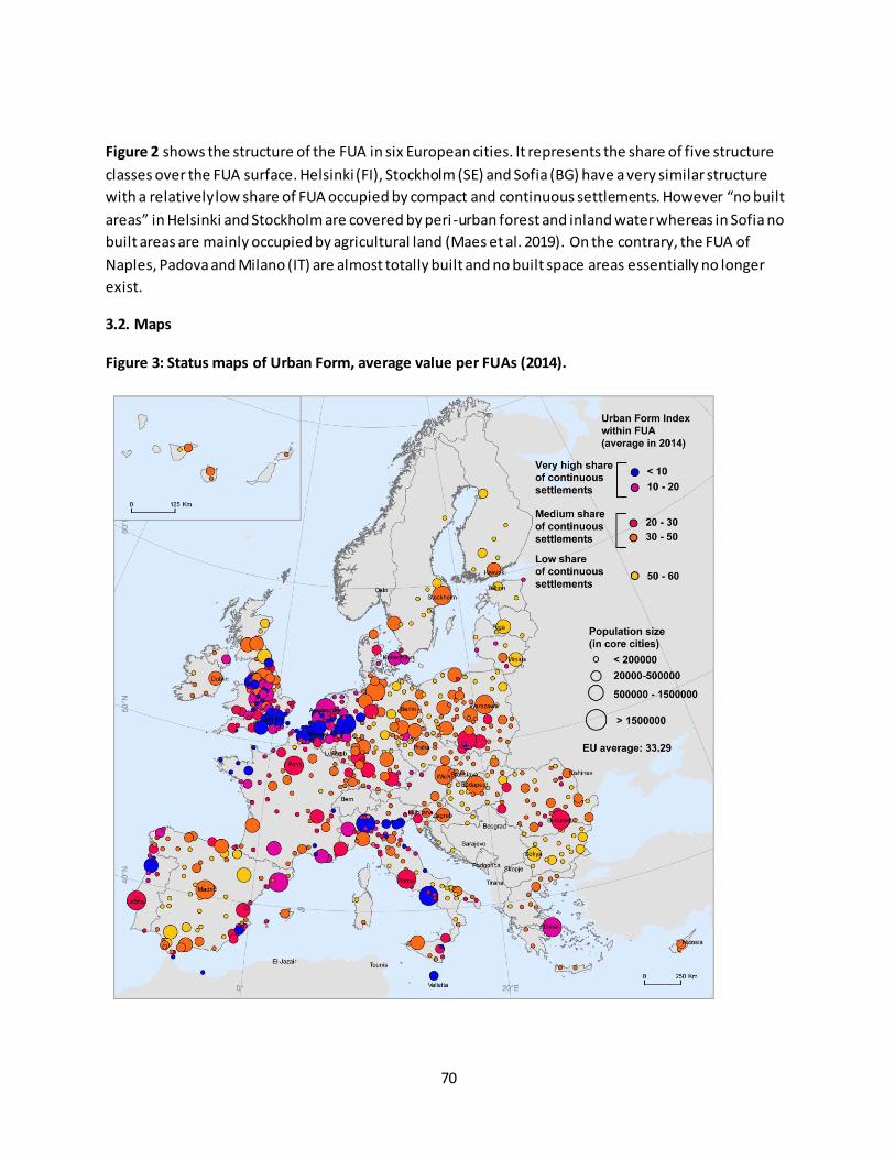
70
Figure 2 shows the structure of the FUA in six European cities. It represents the share of five structure
classes over the FUA surface. Helsinki (FI), Stockholm (SE) and Sofia (BG) have a very similar structure
with a relatively low share of FUA occupied by compact and continuous settlements. However “no built
areas” in Helsinki and Stockholm are covered by peri-urban forest and inland water whereas in Sofia no
built areas are mainly occupied by agricultural land (Maes et al. 2019). On the contrary, the FUA of
Naples, Padova and Milano (IT) are almost totally built and no built space areas essentially no longer
exist.
3.2. Maps
Figure 3: Status maps of Urban Form, average value per FUAs (2014).

71
The map provides a spatially explicit pattern of regions with a dominance of compact and continuous
settlements within the overall FUA surface.
Figure 3 shows the different degree of settlement dispersion in FUA in 2014. A very high share of dense
settlements, i.e. in Naples or Milano, evidence a situation where the commuting zone (or the cluster of
municipalities around the core city) is assuming the characteristics of a conurbation (or of an extended
urban area).
Figure 4: Urban Form short and long term trends
In the long term, a progressive densification process is reported (Figure 4 Map B) at EU level. An intense
transition versus a very dense structure (red and orange dots) characterizes FUAs in England, Belgium
and The Netherlands. In the short term, (Figure 4 Map A) the process demonstrates a relatively rapid
urbanization in eastern, Nordic and Mediterranean cities, probably connected with the stage of
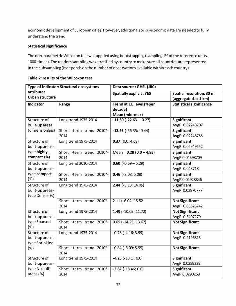
72
economic development of European cities. However, additional socio-economic data are needed to fully
understand the trend.
Statistical significance
The non-parametric Wilcoxon test was applied using bootstrapping (sampling 1% of the reference units,
1000 times). The random sampling was stratified by country to make sure all countries are represented
in the subsampling (it depends on the number of observations available within e ach country).
Table 2: results of the Wilcoxon test
Type of indicator: Structural ecosystems
attributes
Urban structure
Data source : GHSL (JRC)
Spatially explicit : YES Spatial resolution: 30 m
(aggregated at 1 km)
Indicator Range Trend at EU level (%per
decade)
Mean (min-max)
Statistical significance
Structure of built-up areas (dimensionless)
Long trend 1975-2014 -11.30 (-22.63 - -0.27) Significant
AvgP 0.02248707
Short -term trend 2010*-2014
-13.63 (-56.35; -0.44) Significant
AvgP 0.02248755
Structure of built-up areas- type highly
compact (%)
Long trend 1975-2014 0.37 (0.0; 4.68) Significant
AvgP 0.02949552
Short -term trend 2010*-2014
Mean 0.28 (0.0 – 4.95)
Significant
AvgP 0.04598709
Structure of built-up areas- type compact (%)
Long trend 2010-2014 0.60 (-0.69 – 5.29) Significant
AvgP 0.048718
Short -term trend 2010*-2014
0.46 (-2.08; 5.08) Significant
AvgP 0.04928846
Structure of built-up areas- type Dense (%)
Long trend 1975-2014 2.44 (-5.13; 14.05)
Significant
AvgP 0.03870777
Short -term trend 2010*-2014
2.11 (-6.04 ;15.52 Not Significant
AvgP 0.05523742
Structure of built-up areas- type Sparsed (%)
Long trend 1975-2014 1.49 (-10.05 ;11.72) Not Significant
AvgP 0.3407279 Short -term trend 2010*-2014
0.69 (-14.25; 13.67) Not Significant
Structure of built-up areas- type Sprinkled (%)
Long trend 1975-2014 -0.78 (-4.16; 3.99) Not Significant
AvgP 0.2196815
Short -term trend 2010*-2014
-0.84 (-6.09; 5.95) Not Significant
Structure of built-up areas- type No built areas (%)
Long trend 1975-2014 -4.25 (-13.1 ; 0.0) Significant
AvgP 0.0259339
Short -term trend 2010*-2014
-2.82 (-18.46; 0.0) Significant
AvgP 0.0290268
73
References
Aurambout J-P, Barranco R, Lavalle C (2018) Towards a Simpler Characterization of Urban Sprawl across
Urban Areas in Europe. Land 7(1): 33. doi: 10.3390/land7010033
Corbane C, Pesaresi M, Kemper T, Politis P, Florczyk AJ, Syrris V, Melchiorri M, Sabo F, Soille P (2019) Automated global delineation of human settlements from 40 years of Landsat satellite data
archives. Big Earth Data 3(2): 140–169. doi: 10.1080/20964471.2019.1625528
Cortinovis C, Haase D, Zanon B, Geneletti D (2019) Is urban spatial development on the right track? Comparing strategies and trends in the European Union. Landsc Urban Plan 181(August 2018): 22–37. doi: 10.1016/j.landurbplan.2018.09.007
Romano B, Zullo F, Fiorini L, Ciabò S, Marucci A (2017) Sprinkling: An approach to describe urbanization
dynamics in Italy. Sustain. doi: 10.3390/su9010097
Saganeiti L, Favale A, Pilogallo A, Scorza F, Murgante B (2018) Assessing urban fragmentation at regional
scale using sprinkling indexes. Sustain 10(9): 1–23. doi: 10.3390/su10093274

74
Fact sheet 3.1.209: Annual trend of vegetation cover in Urban Green Infrastructure (UGI)
1. General information
Urban ecosystems
Indicator class : Structural ecosystem attributes
Name of the indicator: Annual trend of vegetation cover within Urban Green Infrastructure
(UGI)
Units of measure:
o % change per decade
o Greening-Browning balance (difference between share of UGI where there has been a
major upward and downward trend in vegetation cover)
Spatial Reporting Units:
o Core cities and Commuting zone:
They represent the administrative boundaries (or aggregated administrative
boundaries in the case of Commuting zones)
o Densely built areas and Interface zones:
Densely built areas: where artificial areas cover more than the 60% of a 2.25
km2 neighborhood16
Interface zones: where artificial areas are mixed with urban forest, semi-natural
vegetation or urban fringes
2. Data sources
Data holder : Earth Engine's public data catalog
Weblink:https://developers.google.com/earth-
engine/datasets/catalog/LANDSAT_LE07_C01_T1_ANNUAL_GREENEST_TOA
These composites are created from all the scenes in each annual period beginning from the first
day of the year and continuing to the last day of the year. All the images from each year are
included in the composite, with the greenest pixel as the composite value, where the greenest
pixel means the pixel with the highest value of the Normalized Difference Vegetation Index
(NDVI).
Year or time-series range: 1996 - 2018
Resolution: 30 m
Access date: January 2019
16
See metadata Lan Mosaic model for more information
75
3. Assessment of the indicator
3.1. Short description of the scope of the indicator.
This indicator examines how and in which direction vegetation cover changes within the Urban Green
Infrastructure. Trend detection in Normalized Difference Vegetation Index (NDVI) time series can help to
identify and quantify recent changes in ecosystem properties. The greenness values are derived from
Landsat annual Top-of-Atmosphere (TOA) reflectance composites available in the Google Earth Engine
(GEE) platform for the period 1996–2018. These composites are created by considering the highest
value of the NDVI as the composite value. The analysis is based on the greenest pixel value, i.e. the pixel
with the highest value of NDVI of the year.
Vegetation trends tend to be highly stable and changes are gradual. In anthropized ecosystems instead,
they are not always monotonic (or gradual) but can have what is called an “Abrupt” character (Forkel et
al. 2013; Yu et al. 2017). Gradual and abrupt changes have different meanings and origins (Zhu et al.
2016; Novillo et al. 2019):
Gradual changes:
o generally caused by vegetation growth, climate change, land degradation, extended
drought, pests as well as other factors;
o develop over a relatively long time periods (5+ years);
Abrupt changes:
o generally induced by land cover change (e.g. housing development) or intensive urban
green space management;
o can have an impact on greenness within a short time period (1~2 years);
We examined the greenness trend within UGI in core cities and commuting zone of all European
Functional Urban Areas (FUA)17. Indicators were extracted using two zones, extracted from the Land
Mosaic Model (Guids Toolbox18): the densely built up areas and the interface zones (see Figure 1).
17
See metadata on reporting units for a detailed definition 18
See metadata Land Mosaic model for more information
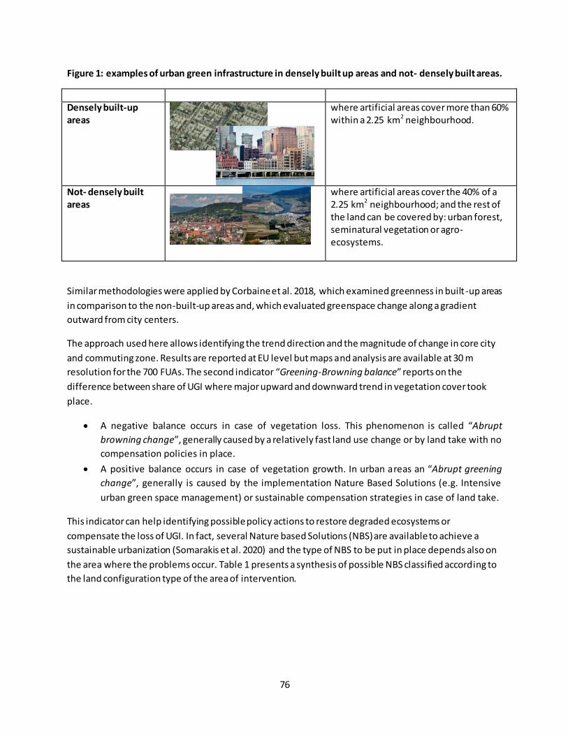
76
Figure 1: examples of urban green infrastructure in densely built up areas and not- densely built areas.
Densely built-up
areas
where artificial areas cover more than 60% within a 2.25 km2 neighbourhood.
Not- densely built
areas
where artificial areas cover the 40% of a 2.25 km2 neighbourhood; and the rest of the land can be covered by: urban forest, seminatural vegetation or agro-ecosystems.
Similar methodologies were applied by Corbaine et al. 2018, which examined greenness in built -up areas
in comparison to the non-built-up areas and, which evaluated greenspace change along a gradient
outward from city centers.
The approach used here allows identifying the trend direction and the magnitude of change in core city
and commuting zone. Results are reported at EU level but maps and analysis are available at 30 m
resolution for the 700 FUAs. The second indicator “Greening-Browning balance” reports on the
difference between share of UGI where major upward and downward trend in vegetation cover took
place.
A negative balance occurs in case of vegetation loss. This phenomenon is called “Abrupt
browning change”, generally caused by a relatively fast land use change or by land take with no
compensation policies in place.
A positive balance occurs in case of vegetation growth. In urban areas an “Abrupt greening
change”, generally is caused by the implementation Nature Based Solutions (e.g. Intensive
urban green space management) or sustainable compensation strategies in case of land take.
This indicator can help identifying possible policy actions to restore degraded ecosystems or
compensate the loss of UGI. In fact, several Nature based Solutions (NBS) are available to achieve a
sustainable urbanization (Somarakis et al. 2020) and the type of NBS to be put in place depends also on
the area where the problems occur. Table 1 presents a synthesis of possible NBS classified according to
the land configuration type of the area of intervention.

77
Table 1: NBS classified according to the land configuration of the Urban Area and the Typology NBS.
The table was compiled following (Somarakis et al. 2020, chapter 2 and Annex 1).
Land configuration type
NBS Type NBS-sub-type Examples
Densely built areas
Type 3 – Design and management of new ecosystems.
Intensive urban green space management
Integrated and ecological management - spatial aspects Choices of plants Structure of urban parks system (Large urban park; Pocket garden/park; Community gardens) Flower field Street trees Green roof Green wall system
Urban water management
Sustainable Urban Drainage Systems
Ecological restoration of degraded terrestrial ecosystems
Soil and slope revegetation Plant trees/ hedges/perennial grass strips to intercept surface run-off
Restoration and creation of semi-natural water bodies and hydrographic networks
Re-vegetation of riverbanks Constructed wetlands and built structures for water management
Interface zones
Type 1 – Better use of protected/natural ecosystems
Protection and conservation strategies in terrestrial and marine Protected Areas (e.g. Natura2000 or MPA
Limit or prevent specific uses and practices Ensure continuity with ecological network Protect forests from clearing and degradation from logging, fire, and unsustainable levels of non-timber resource extraction
Type 2 – NBS for sustainability and multifunctionality of managed ecosystems
Agricultural and Forest landscape management
Agro-ecological practices Agro-ecological network structure Forest patches Hedge and planted fence Flower strips

78
Extensive urban green space management
Ensure continuity with ecological network Planning tools to control urban expansion Historical urban green network structure Choices of plants Heritage park Urban natural protected areas Introduced vs. local plants Vegetation diversification Green corridors and belts Planning tools for biodiversity, green infrastructure, and ecosystem services
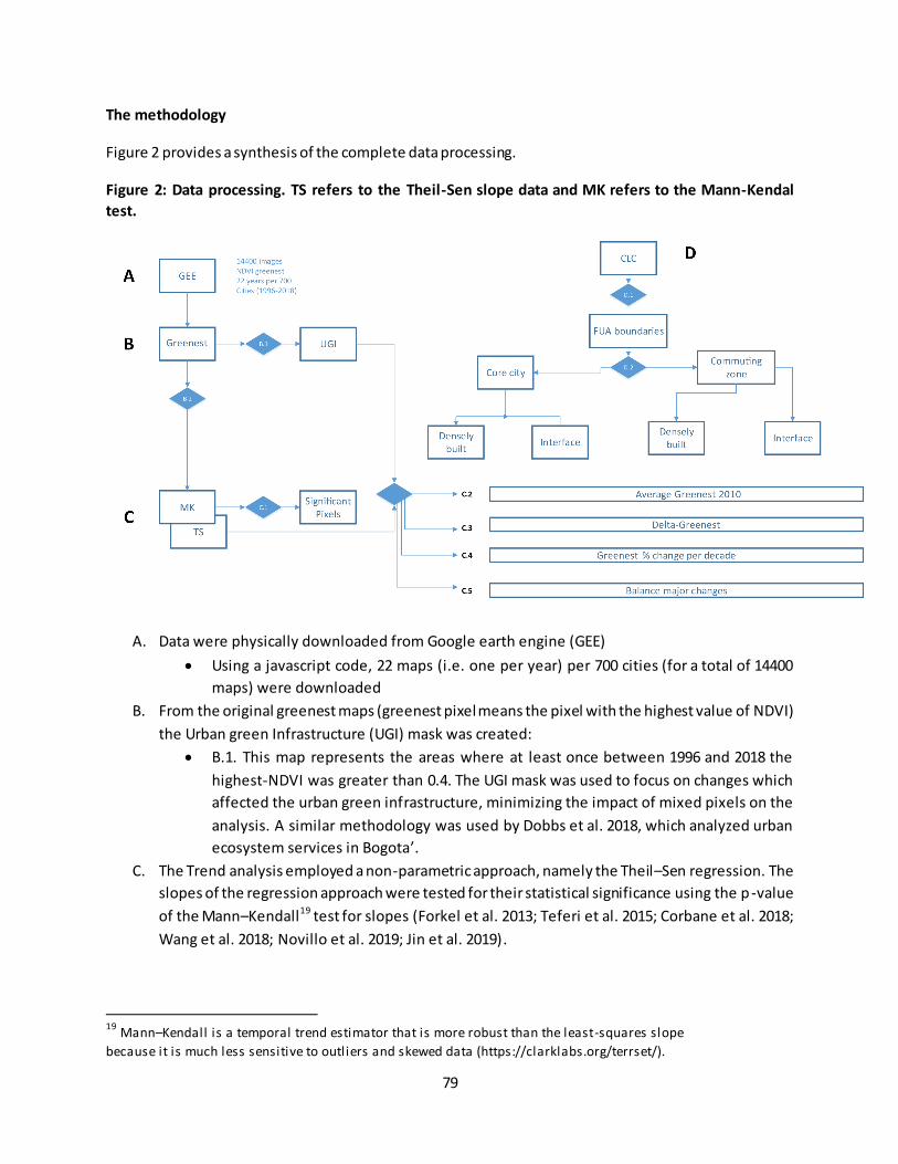
79
The methodology
Figure 2 provides a synthesis of the complete data processing.
Figure 2: Data processing. TS refers to the Theil-Sen slope data and MK refers to the Mann-Kendal
test.
A. Data were physically downloaded from Google earth engine (GEE)
Using a javascript code, 22 maps (i.e. one per year) per 700 cities (for a total of 14400
maps) were downloaded
B. From the original greenest maps (greenest pixel means the pixel with the highest value of NDVI)
the Urban green Infrastructure (UGI) mask was created:
B.1. This map represents the areas where at least once between 1996 and 2018 the
highest-NDVI was greater than 0.4. The UGI mask was used to focus on changes which
affected the urban green infrastructure, minimizing the impact of mixed pixels on the
analysis. A similar methodology was used by Dobbs et al. 2018, which analyzed urban
ecosystem services in Bogota’. C. The Trend analysis employed a non-parametric approach, namely the Theil–Sen regression. The
slopes of the regression approach were tested for their statistical significance using the p-value
of the Mann–Kendall19 test for slopes (Forkel et al. 2013; Teferi et al. 2015; Corbane et al. 2018;
Wang et al. 2018; Novillo et al. 2019; Jin et al. 2019).
19
Mann–Kendall is a temporal trend estimator that is more robust than the least-squares slope
because it is much less sensitive to outliers and skewed data (https://clarklabs.org/terrset/).
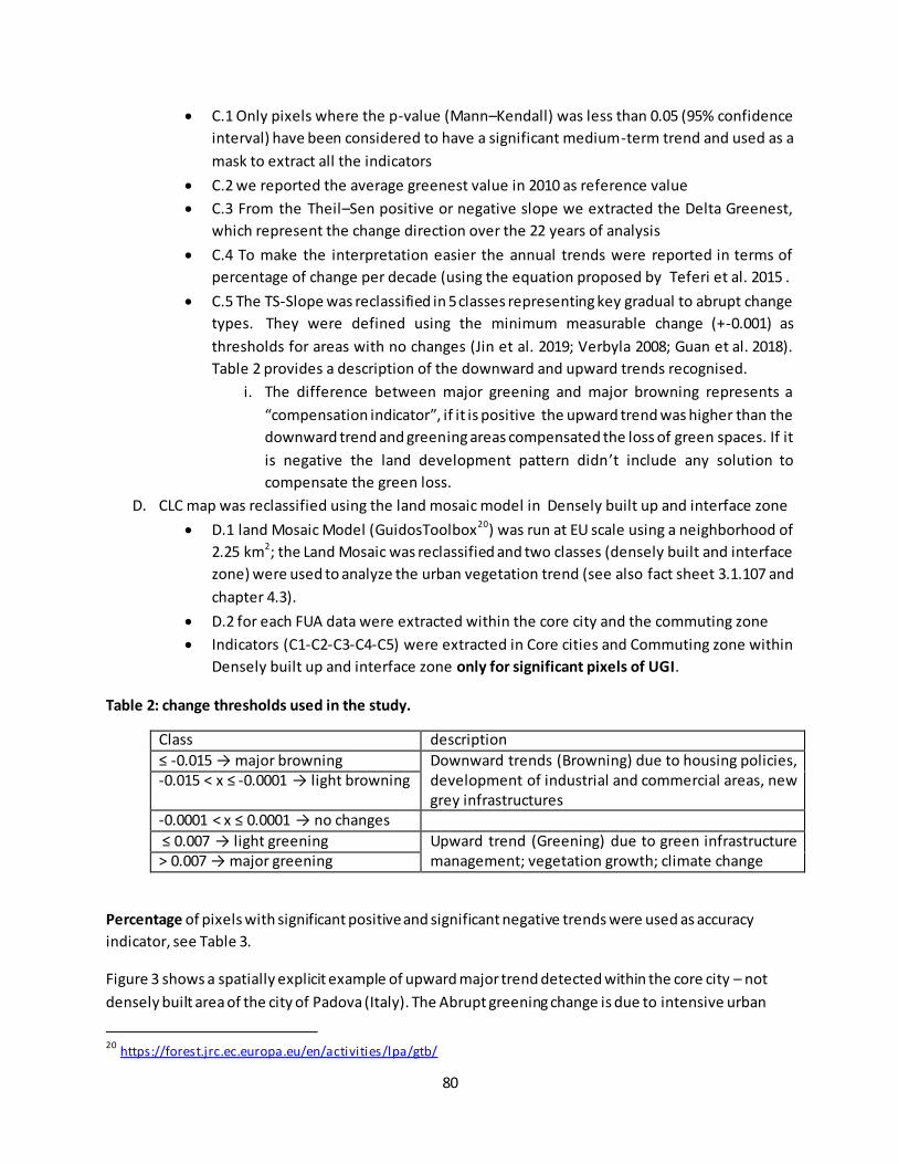
80
C.1 Only pixels where the p-value (Mann–Kendall) was less than 0.05 (95% confidence
interval) have been considered to have a significant medium-term trend and used as a
mask to extract all the indicators
C.2 we reported the average greenest value in 2010 as reference value
C.3 From the Theil–Sen positive or negative slope we extracted the Delta Greenest,
which represent the change direction over the 22 years of analysis
C.4 To make the interpretation easier the annual trends were reported in terms of
percentage of change per decade (using the equation proposed by Teferi et al. 2015 .
C.5 The TS-Slope was reclassified in 5 classes representing key gradual to abrupt change
types. They were defined using the minimum measurable change (+-0.001) as
thresholds for areas with no changes (Jin et al. 2019; Verbyla 2008; Guan et al. 2018).
Table 2 provides a description of the downward and upward trends recognised.
i. The difference between major greening and major browning represents a
“compensation indicator”, if it is positive the upward trend was higher than the
downward trend and greening areas compensated the loss of green spaces. If it
is negative the land development pattern didn’t include any solution to
compensate the green loss.
D. CLC map was reclassified using the land mosaic model in Densely built up and interface zone
D.1 land Mosaic Model (GuidosToolbox20) was run at EU scale using a neighborhood of
2.25 km2; the Land Mosaic was reclassified and two classes (densely built and interface
zone) were used to analyze the urban vegetation trend (see also fact sheet 3.1.107 and
chapter 4.3).
D.2 for each FUA data were extracted within the core city and the commuting zone
Indicators (C1-C2-C3-C4-C5) were extracted in Core cities and Commuting zone within
Densely built up and interface zone only for significant pixels of UGI.
Table 2: change thresholds used in the study.
Class description
≤ -0.015 → major browning Downward trends (Browning) due to housing policies, development of industrial and commercial areas, new grey infrastructures
-0.015 < x ≤ -0.0001 → light browning
-0.0001 < x ≤ 0.0001 → no changes
≤ 0.007 → light greening Upward trend (Greening) due to green infrastructure management; vegetation growth; climate change > 0.007 → major greening
Percentage of pixels with significant positive and significant negative trends were used as accuracy
indicator, see Table 3.
Figure 3 shows a spatially explicit example of upward major trend detected within the core city – not
densely built area of the city of Padova (Italy). The Abrupt greening change is due to intensive urban
20
https://forest.jrc.ec.europa.eu/en/activities/lpa/gtb/
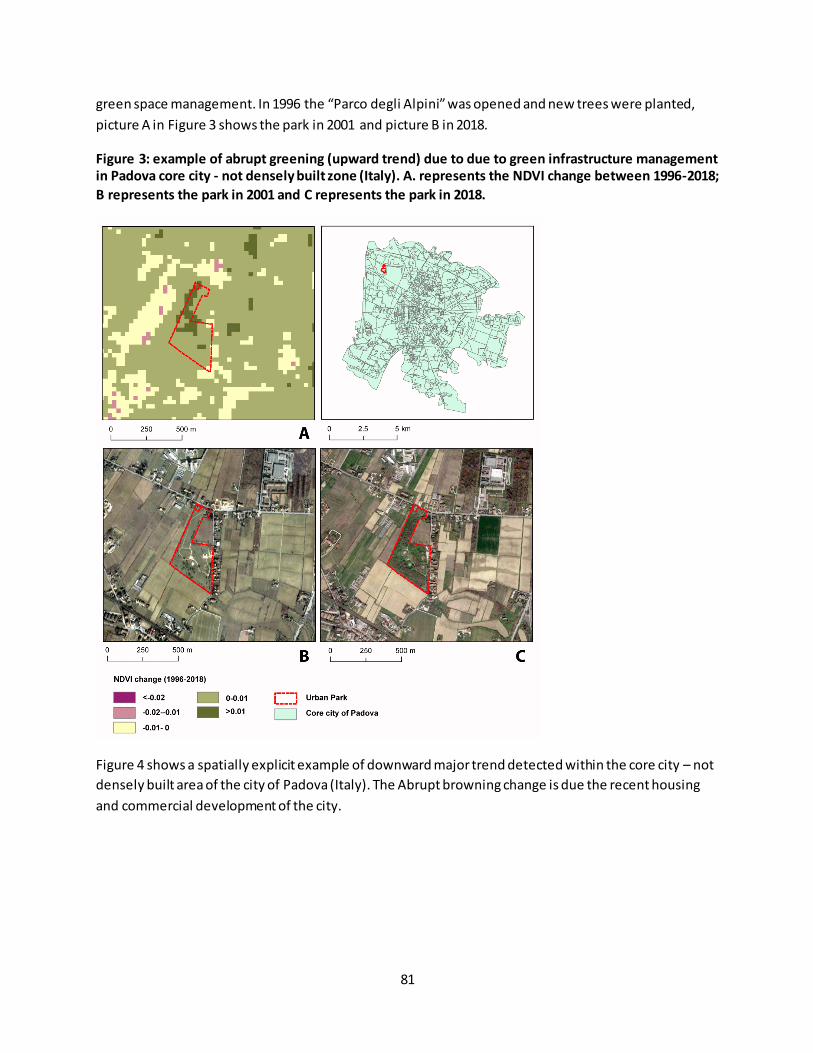
81
green space management. In 1996 the “Parco degli Alpini” was opened and new trees were planted,
picture A in Figure 3 shows the park in 2001 and picture B in 2018.
Figure 3: example of abrupt greening (upward trend) due to due to green infrastructure management
in Padova core city - not densely built zone (Italy). A. represents the NDVI change between 1996-2018;
B represents the park in 2001 and C represents the park in 2018.
Figure 4 shows a spatially explicit example of downward major trend detected within the core city – not
densely built area of the city of Padova (Italy). The Abrupt browning change is due the recent housing
and commercial development of the city.

82
Figure 4: example of abrupt browning (downward trend) due to housing policies in Padova core city -
not densely built zone (Italy). A. represents the NDVI change between 1996-2018; B represents the
area in 2001 and C represents the area with a new residential zone in 2018.
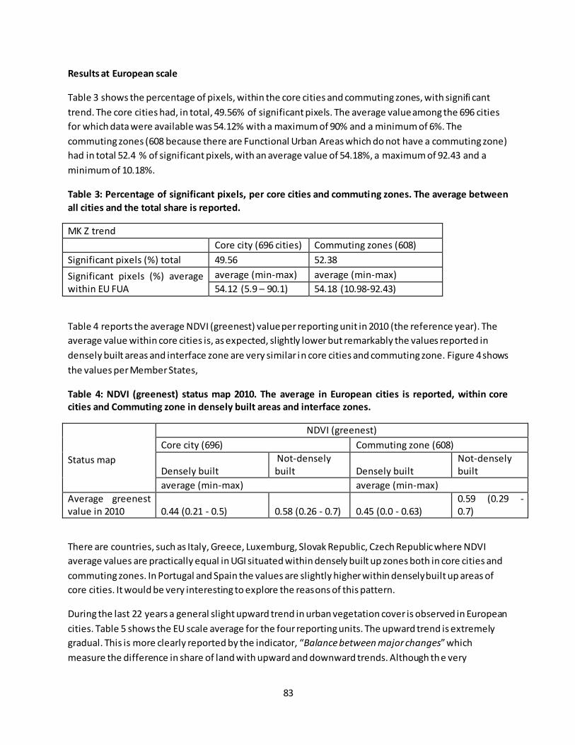
83
Results at European scale
Table 3 shows the percentage of pixels, within the core cities and commuting zones, with signifi cant
trend. The core cities had, in total, 49.56% of significant pixels. The average value among the 696 cities
for which data were available was 54.12% with a maximum of 90% and a minimum of 6%. The
commuting zones (608 because there are Functional Urban Areas which do not have a commuting zone)
had in total 52.4 % of significant pixels, with an average value of 54.18%, a maximum of 92.43 and a
minimum of 10.18%.
Table 3: Percentage of significant pixels, per core cities and commuting zones. The average between
all cities and the total share is reported.
MK Z trend
Core city (696 cities) Commuting zones (608)
Significant pixels (%) total 49.56 52.38
Significant pixels (%) average within EU FUA
average (min-max) average (min-max)
54.12 (5.9 – 90.1) 54.18 (10.98-92.43)
Table 4 reports the average NDVI (greenest) value per reporting unit in 2010 (the reference year). The
average value within core cities is, as expected, slightly lower but remarkably the values reported in
densely built areas and interface zone are very similar in core cities and commuting zone. Figure 4 shows
the values per Member States,
Table 4: NDVI (greenest) status map 2010. The average in European cities is reported, within core
cities and Commuting zone in densely built areas and interface zones.
Status map
NDVI (greenest)
Core city (696) Commuting zone (608)
Densely built Not-densely built Densely built
Not-densely built
average (min-max) average (min-max)
Average greenest value in 2010 0.44 (0.21 - 0.5) 0.58 (0.26 - 0.7) 0.45 (0.0 - 0.63)
0.59 (0.29 - 0.7)
There are countries, such as Italy, Greece, Luxemburg, Slovak Republic, Czech Republic where NDVI
average values are practically equal in UGI situated within densely built up zones both in core cities and
commuting zones. In Portugal and Spain the values are slightly higher within densely built up areas of
core cities. It would be very interesting to explore the reasons of this pattern.
During the last 22 years a general slight upward trend in urban vegetation cover is observed in European
cities. Table 5 shows the EU scale average for the four reporting units. The upward trend is extremely
gradual. This is more clearly reported by the indicator, “Balance between major changes” which
measure the difference in share of land with upward and downward trends. Although the very
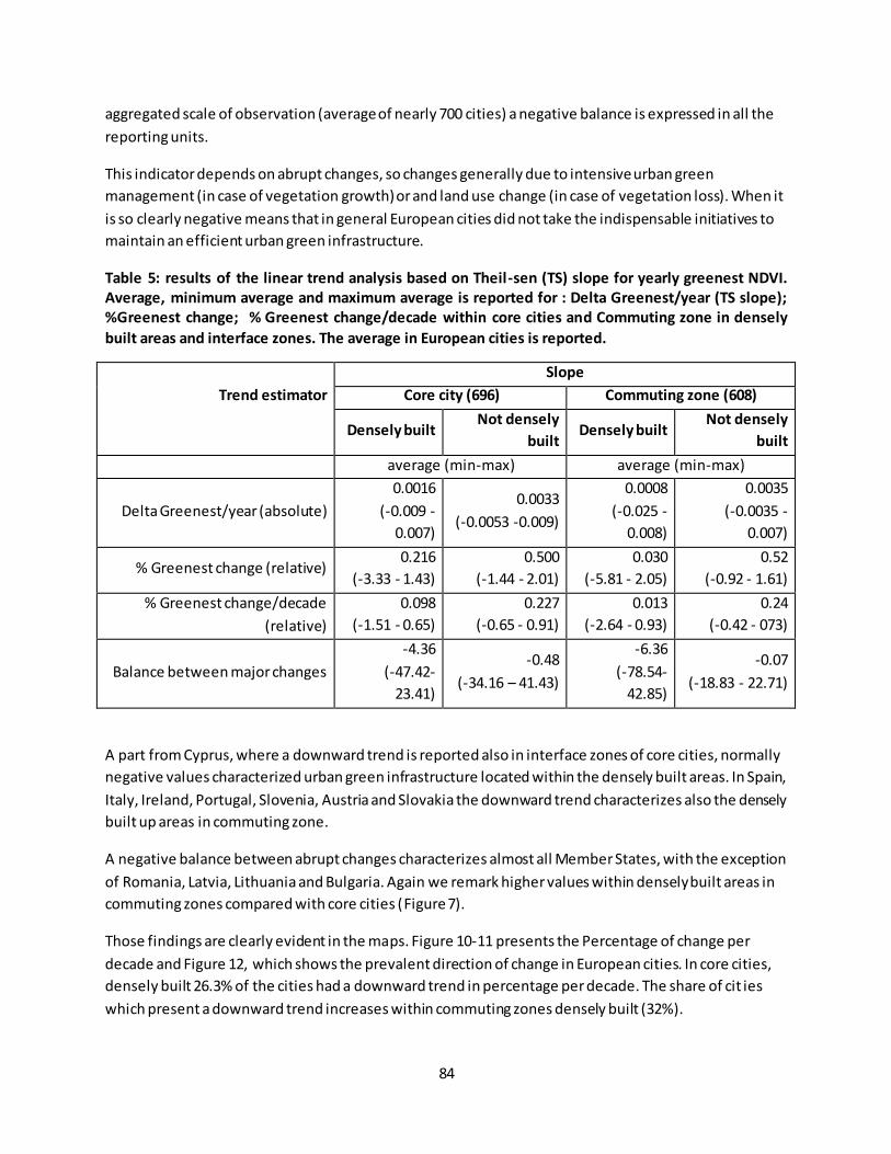
84
aggregated scale of observation (average of nearly 700 cities) a negative balance is expressed in all the
reporting units.
This indicator depends on abrupt changes, so changes generally due to intensive urban green
management (in case of vegetation growth) or and land use change (in case of vegetation loss). When it
is so clearly negative means that in general European cities did not take the indispensable initiatives to
maintain an efficient urban green infrastructure.
Table 5: results of the linear trend analysis based on Theil-sen (TS) slope for yearly greenest NDVI.
Average, minimum average and maximum average is reported for : Delta Greenest/year (TS slope);
%Greenest change; % Greenest change/decade within core cities and Commuting zone in densely
built areas and interface zones. The average in European cities is reported.
Trend estimator
Slope
Core city (696) Commuting zone (608)
Densely built Not densely
built Densely built
Not densely
built
average (min-max) average (min-max)
Delta Greenest/year (absolute)
0.0016
(-0.009 -
0.007)
0.0033
(-0.0053 -0.009)
0.0008
(-0.025 -
0.008)
0.0035
(-0.0035 -
0.007)
% Greenest change (relative) 0.216
(-3.33 - 1.43)
0.500
(-1.44 - 2.01)
0.030
(-5.81 - 2.05)
0.52
(-0.92 - 1.61)
% Greenest change/decade
(relative)
0.098
(-1.51 - 0.65)
0.227
(-0.65 - 0.91)
0.013
(-2.64 - 0.93)
0.24
(-0.42 - 073)
Balance between major changes
-4.36
(-47.42-
23.41)
-0.48
(-34.16 – 41.43)
-6.36
(-78.54-
42.85)
-0.07
(-18.83 - 22.71)
A part from Cyprus, where a downward trend is reported also in interface zones of core cities, normally
negative values characterized urban green infrastructure located within the densely built areas. In Spain,
Italy, Ireland, Portugal, Slovenia, Austria and Slovakia the downward trend characterizes also the densely
built up areas in commuting zone.
A negative balance between abrupt changes characterizes almost all Member States, with the exception
of Romania, Latvia, Lithuania and Bulgaria. Again we remark higher values within densely built areas in
commuting zones compared with core cities (Figure 7).
Those findings are clearly evident in the maps. Figure 10-11 presents the Percentage of change per
decade and Figure 12, which shows the prevalent direction of change in European cities. In core cities,
densely built 26.3% of the cities had a downward trend in percentage per decade. The share of cit ies
which present a downward trend increases within commuting zones densely built (32%).

85
Figure 5: annual trend in vegetation cover in urban GI, per Member states. % Greenest change per
decade is reported within core cities and Commuting zone in densely built areas and interface zones.
Figure 6: Balance between major changes within urban GI, per Member states. The indicator is
reported within core cities and Commuting zone in densely built areas and interface zones.

86
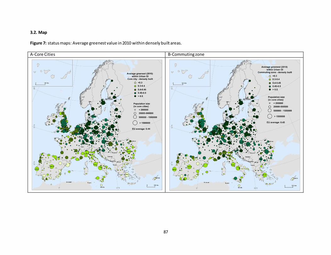
87
3.2. Map
Figure 7: status maps: Average greenest value in 2010 within densely built areas. A-Core Cities B-Commuting zone
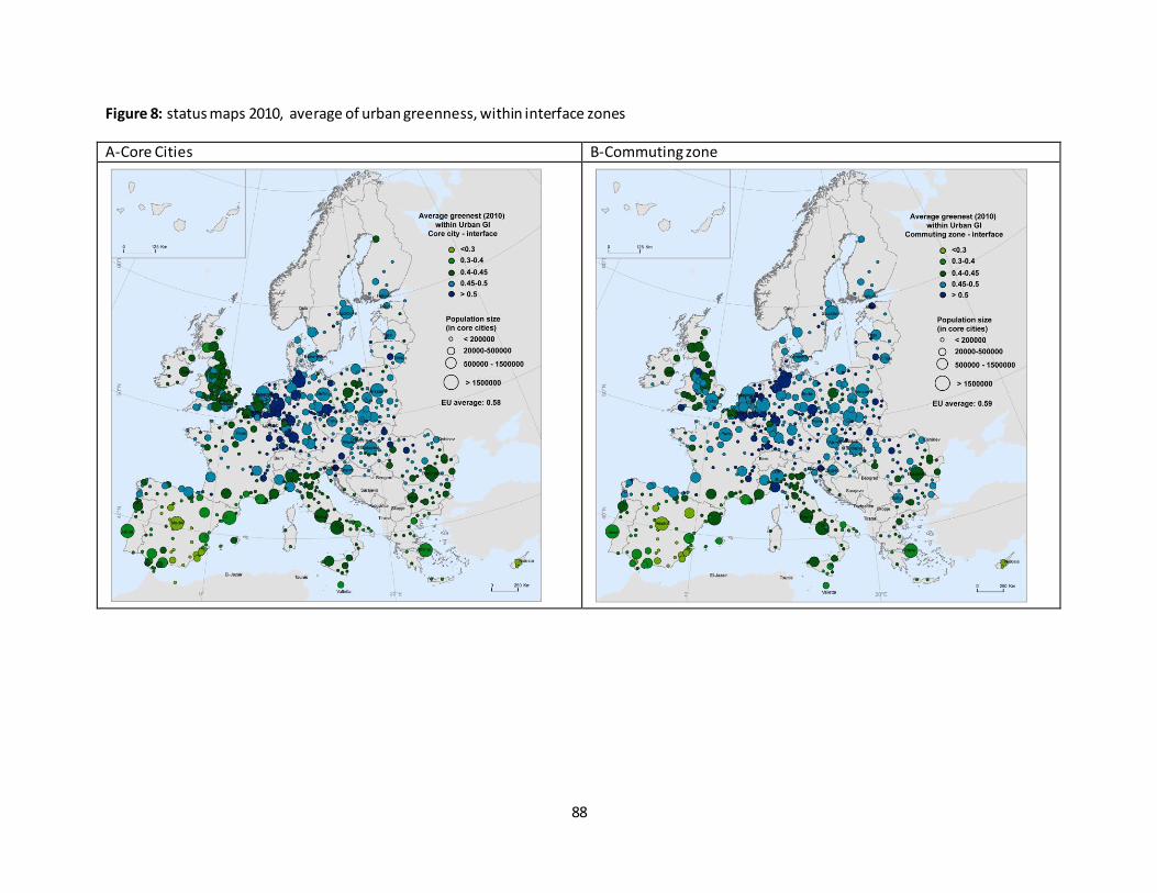
88
Figure 8: status maps 2010, average of urban greenness, within interface zones
A-Core Cities B-Commuting zone
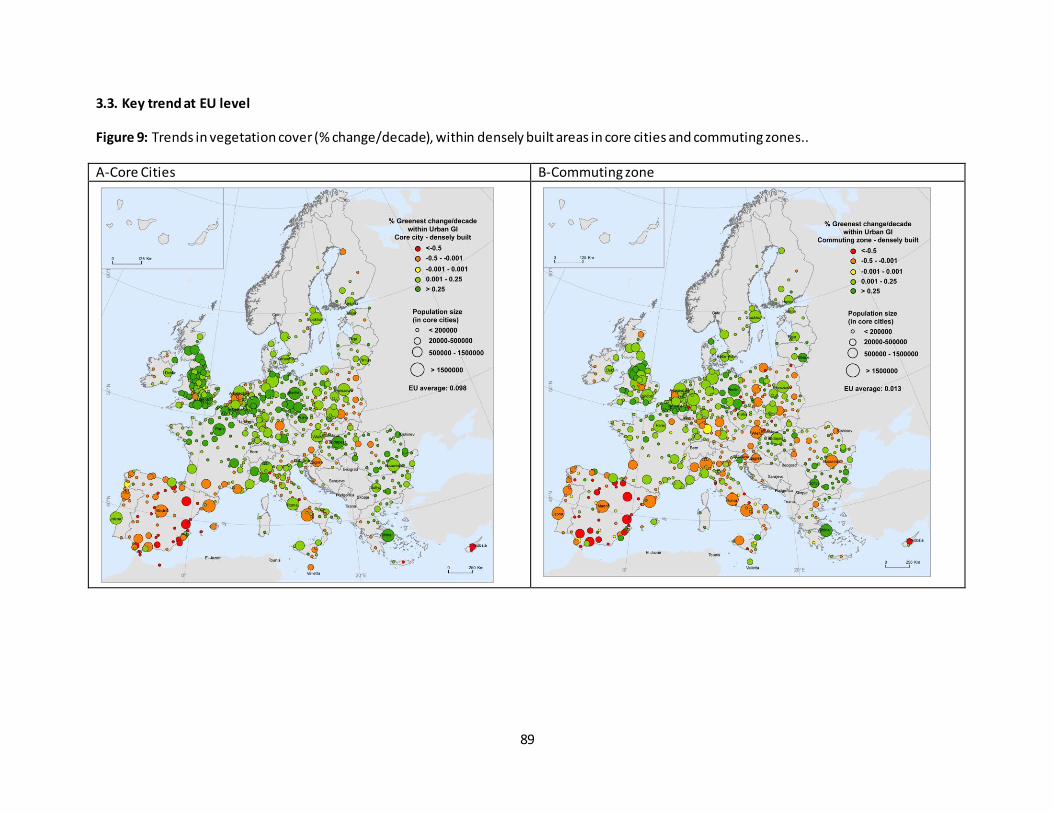
89
3.3. Key trend at EU level
Figure 9: Trends in vegetation cover (% change/decade), within densely built areas in core cities and commuting zones..
A-Core Cities B-Commuting zone
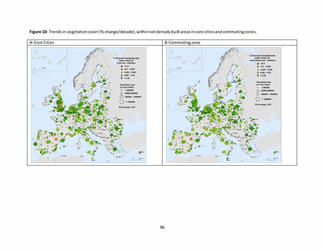
90
Figure 10: Trends in vegetation cover (% change/decade), within not densely built areas in core cities and commuting zones.
A-Core Cities B-Commuting zone
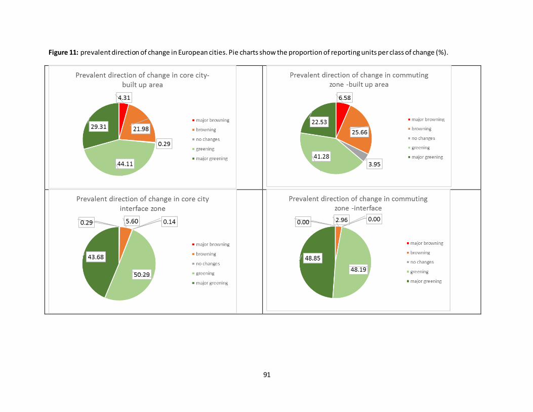
91
Figure 11: prevalent direction of change in European cities. Pie charts show the proportion of reporting units per class of change (%).

92
Figure 12: Balance between abrupt greening and browning changes within densely built areas in core cities and commuting zones.
A-Core Cities B-Commuting zone
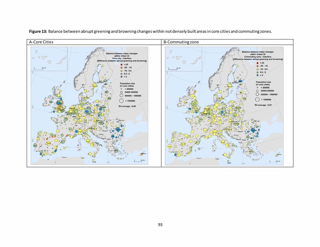
93
Figure 13: Balance between abrupt greening and browning changes within not densely built areas in core cities and commuting zones.
A-Core Cities B-Commuting zone
94
References
Corbane C, Pesaresi M, Politis P, Florczyk J. A, Melchiorri M, Freire S, Schiavina M, Ehrlich D, Naumann G,
Kemper T (2018) The grey-green divide: multi-temporal analysis of greenness across 10,000 urban centres
derived from the Global Human Settlement Layer (GHSL). Int J Digit Earth 0(0): 1–18. doi:
10.1080/17538947.2018.1530311
Forkel M, Carvalhais N, Verbesselt J, Mahecha MD, Neigh CSR, Reichstein M (2013) Trend Change detection
in NDVI time series: Effects of inter-annual variability and methodology. Remote Sens 5(5): 2113–2144. doi:
10.3390/rs5052113
Jin J, Gergel SE, Lu Y, Coops NC, Wang C (2019) Asian Cities are Greening While Some North American Cities
are Browning: Long-Term Greenspace Patterns in 16 Cities of the Pan-Pacific Region. Ecosystems. doi:
10.1007/s10021-019-00409-2
Novillo C, Arrogante-Funes P, Romero-Calcerrada R (2019) Recent NDVI Trends in Mainland Spain: Land-
Cover and Phytoclimatic-Type Implications. ISPRS Int J Geo-Information 8(1): 43. doi: 10.3390/ijgi8010043
Somarakis G, Stagakis S, Chrysoulakis N (2020) NATURE-BASED SOLUTIONS HANDBOOK.
Teferi E, Uhlenbrook S, Bewket W (2015) Inter-annual and seasonal trends of vegetation condition in the
Upper Blue Nile (Abay) Basin: Dual-scale time series analysis. Earth Syst Dyn 6(2): 617–636. doi:
10.5194/esd-6-617-2015
Wang J, Zhou W, Qian Y, Li W, Han L (2018) Quantifying and characterizing the dynamics of urban
greenspace at the patch level: A new approach using object-based image analysis. Remote Sens Environ
204(September 2017): 94–108. doi: 10.1016/j.rse.2017.10.039
Yu Z, Wang Y, Deng J, Shen Z, Wang K, Zhu J, Gan M (2017) Dynamics of Hierarchical Urban Green Space
Patches and Implications for Management Policy.
Zhu Z, Fu Y, Woodcock CE, Olofsson P, Vogelmann JE, Holden C, Wang M, Dai S, Yu Y (2016) Including land
cover change in analysis of greenness trends using all available Landsat 5, 7, and 8 images: A case study
from Guangzhou, China (2000–2014). Remote Sens Environ 185: 243–257. doi: 10.1016/j.rse.2016.03.036
https://link.springer.com/article/10.1007/s10021-019-00409-2
95
Fact sheet 3.2.101: Land take
1. General information
Thematic ecosystem assessment: Cropland and grassland
Indicator class: Pressures - Habitat conversion and degradation (Land conversion)
Name of the indicator: Land take
Units: ha/year
2. Data sources
Data holder, data source: EEA
Weblink:
https://tableau.discomap.eea.europa.eu/t/Landonline/views/Landtakeindicator/Landtakeandnetla
ndtakeindicator
Year or time-series range: 2000 - 2018
Access date: 01/07/2019
Reference: https://www.eea.europa.eu/data-and-maps/indicators/land-take-2/assessment-1
3. Assessment of the indicator
3.1. Short description of the scope of the indicator
The main objective of this indicator is to measure the pressure from the development of urban and other
artificial land use on natural and managed landscapes that are necessary 'to protect and restore the
functioning of natural systems and halt the loss of biodiversity' (Sixth Environment Action Programme (6th
EAP, COM(2001)31)).
Land use in Europe is driven by a number of factors such as the increasing demand for living space per
person, the link between economic activity, increased mobility and the growth of transport infrastructure,
which usually result in urban expansion.
The impact of urbanisation depends on the area of land taken and on the intensity of land use, for example,
the degree of soil sealing and the population density. Land take by urban areas and infrastructure is
generally irreversible and results in soil sealing, i.e. the loss of soil resources due to the covering of land for
housing, roads or other construction work. Converted areas become highly specialised in terms of land us e
and support few functions related to socio-economic activities and housing. Urban land take consumes
mostly agricultural land, but also reduces space for habitats and ecosystems that provide important
services such as the regulation of the water balance and protection against floods, particularly if soil is
highly sealed. Land occupied by man-made surfaces and dense infrastructure connects human settlements
and fragments landscapes. It is also a significant source of water, soil and air pollution.
This indicator looks at the change in the amount (in ha per 6 years) of cropland and grassland taken by
urban and other artificial land development. It includes areas sealed by construction and urban
infrastructure, as well as urban green areas, and sport and leisure facilities. The main drivers of land take
are grouped in processes resulting in the extension of:
housing, services and recreation;
industrial and commercial sites;
transport networks and infrastructures;
mines, quarries and waste dumpsites;

96
construction sites.
3.2. Maps
The long-term change in the amount of croplands taken by artificial land use (Table 1, Figure 1, Figure 3)
has increased at a rate higher than 5% in five countries and lower than 5% in 19 countries. The long-term
change in the amount of grasslands (Table 2, Figure 2, Figure 4) taken by artificial land use has increased at
a rate higher than 5% in nine countries and lower than 5% in 16 countries.
The short-term change in the amount of croplands taken by artificial land use has increased at a rate higher
than 5% in six countries and lower than 5% in 19 countries. The short-term change in the amount of
grasslands taken by artificial land use has increased at a rate higher than 5% in eight countries and lower
than 5% in 16 countries.
Table 1 The amount of cropland taken in different periods, short-term and long-term changes.
2000-2006 2006-2012 2012-2018 2000-2018 % change
per 10 year
(long-term
change)
% change per 10
year
(short-term
change)
Austria 4450 3207 3386 10804 -13.28 4.65
Belgium 2273 2563 2291 6727 0.44 -8.84
Bulgaria 2520 2556 2403 7449 -2.58 -4.99
Croatia 2226 1136 1572 4937 -16.32 31.98
Cyprus 7697 2088 1389 11145 -45.53 -27.9
Czechia 8242 10353 5108 23040 -21.12 -42.22
Denmark 10277 8450 4397 22414 -31.79 -39.97
Estonia 1832 671 558 3022 -38.63 -14.03
Finland 2044 1332 710 4050 -36.26 -38.91
France 62150 60785 32602 152487 -26.41 -38.64
Germany 49489 26837 16402 91157 -37.14 -32.4
Greece 14299 9548 3780 26959 -40.87 -50.34
Hungary 12179 7501 5851 24235 -28.87 -18.33
Ireland 6607 366 634 7557 -50.22 61.02
Italy 45463 31916 10295 86548 -42.98 -56.45
Latvia 381 981 277 1619 -15.16 -59.8
Lithuania 2888 2862 698 6277 -42.13 -63.01
Luxembourg 67 263 400 716 276.12 43.41 Malta - - 87 87 - 0
Netherlands 21606 15022 5059 38368 -42.55 -55.27 Poland 14958 36458 32591 82666 65.49 -8.84
Portugal 11490 3420 1246 15865 -49.53 -52.97
Romania 6997 8773 12131 27838 40.76 31.9
Slovakia 3011 6039 3083 12045 1.33 -40.79
Slovenia 402 157 449 998 6.5 154.99
Spain 94480 71806 5852 168121 -52.11 -76.54
Sweden 5957 4069 1500 10887 -41.57 -52.61
United Kingdom 10115 8026 30847 46968 113.87 236.95
EU-28 404100 327185 185598 894986 -45.06 -72.12
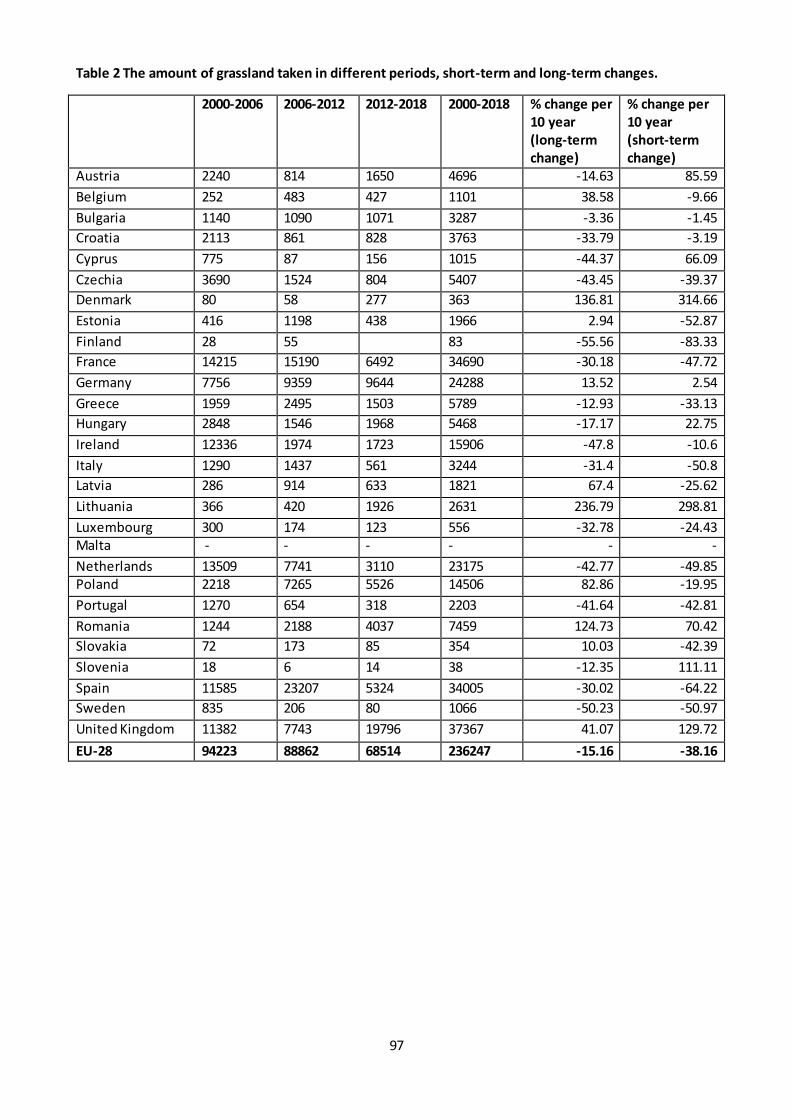
97
Table 2 The amount of grassland taken in different periods, short-term and long-term changes.
2000-2006 2006-2012 2012-2018 2000-2018 % change per
10 year
(long-term
change)
% change per
10 year
(short-term
change)
Austria 2240 814 1650 4696 -14.63 85.59
Belgium 252 483 427 1101 38.58 -9.66
Bulgaria 1140 1090 1071 3287 -3.36 -1.45
Croatia 2113 861 828 3763 -33.79 -3.19
Cyprus 775 87 156 1015 -44.37 66.09
Czechia 3690 1524 804 5407 -43.45 -39.37
Denmark 80 58 277 363 136.81 314.66
Estonia 416 1198 438 1966 2.94 -52.87
Finland 28 55 83 -55.56 -83.33
France 14215 15190 6492 34690 -30.18 -47.72
Germany 7756 9359 9644 24288 13.52 2.54
Greece 1959 2495 1503 5789 -12.93 -33.13
Hungary 2848 1546 1968 5468 -17.17 22.75
Ireland 12336 1974 1723 15906 -47.8 -10.6
Italy 1290 1437 561 3244 -31.4 -50.8
Latvia 286 914 633 1821 67.4 -25.62
Lithuania 366 420 1926 2631 236.79 298.81
Luxembourg 300 174 123 556 -32.78 -24.43 Malta - - - - - -
Netherlands 13509 7741 3110 23175 -42.77 -49.85 Poland 2218 7265 5526 14506 82.86 -19.95
Portugal 1270 654 318 2203 -41.64 -42.81
Romania 1244 2188 4037 7459 124.73 70.42
Slovakia 72 173 85 354 10.03 -42.39
Slovenia 18 6 14 38 -12.35 111.11
Spain 11585 23207 5324 34005 -30.02 -64.22
Sweden 835 206 80 1066 -50.23 -50.97
United Kingdom 11382 7743 19796 37367 41.07 129.72
EU-28 94223 88862 68514 236247 -15.16 -38.16

98
Figure 1 Percentage change in land take per 10 years for cropland, calculated from the change between
2012-2018 and 2000-2006.

99
Figure 2 Percentage change in land take per 10 years for grassland, calculated from the change between
2012-2018 and 2000-2006.

100
Figure 3 The amount of cropland (in hectares) taken in different periods
Figure 4 The amount of grassland (in hectares) taken in different periods
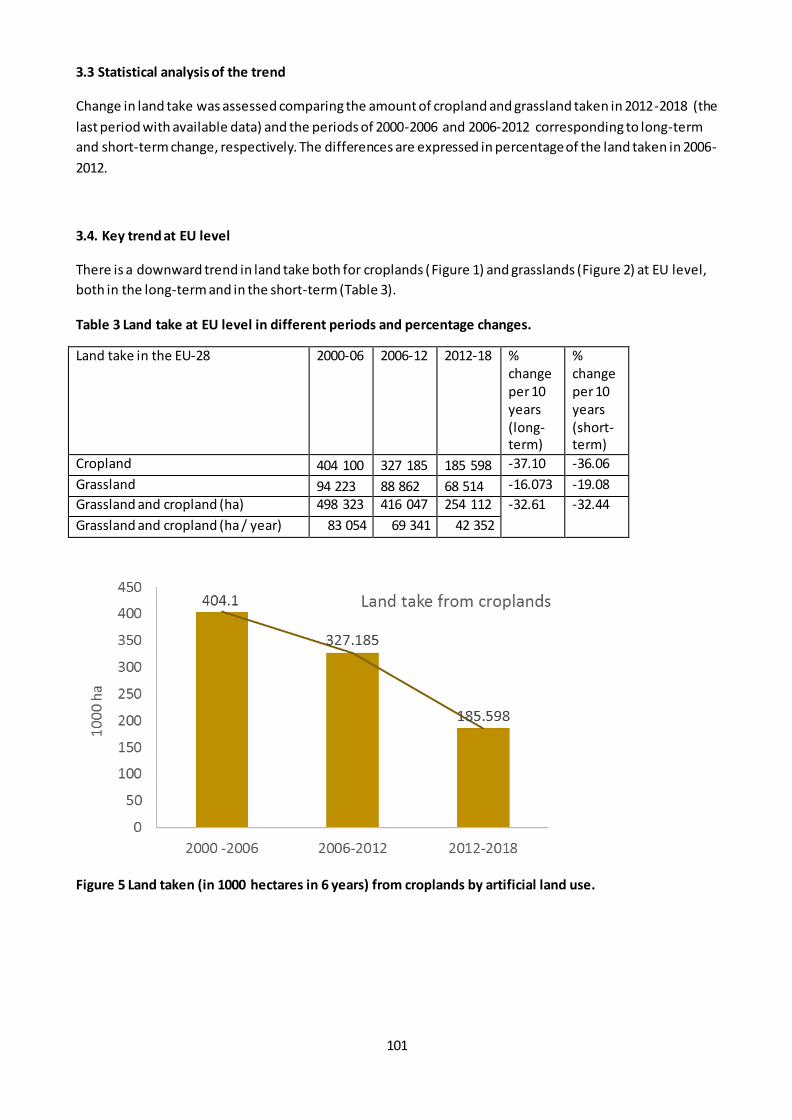
101
3.3 Statistical analysis of the trend
Change in land take was assessed comparing the amount of cropland and grassland taken in 2012-2018 (the
last period with available data) and the periods of 2000-2006 and 2006-2012 corresponding to long-term
and short-term change, respectively. The differences are expressed in percentage of the land taken in 2006-
2012.
3.4. Key trend at EU level
There is a downward trend in land take both for croplands (Figure 1) and grasslands (Figure 2) at EU level,
both in the long-term and in the short-term (Table 3).
Table 3 Land take at EU level in different periods and percentage changes.
Land take in the EU-28 2000-06 2006-12 2012-18 % change per 10 years (long-term)
% change per 10 years (short-term)
Cropland 404 100 327 185 185 598 -37.10 -36.06
Grassland 94 223 88 862 68 514 -16.073 -19.08
Grassland and cropland (ha) 498 323 416 047 254 112 -32.61 -32.44
Grassland and cropland (ha / year) 83 054 69 341 42 352
Figure 5 Land taken (in 1000 hectares in 6 years) from croplands by artificial land use.
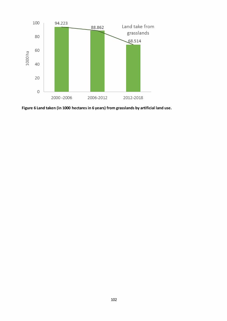
102
Figure 6 Land taken (in 1000 hectares in 6 years) from grasslands by artificial land use.
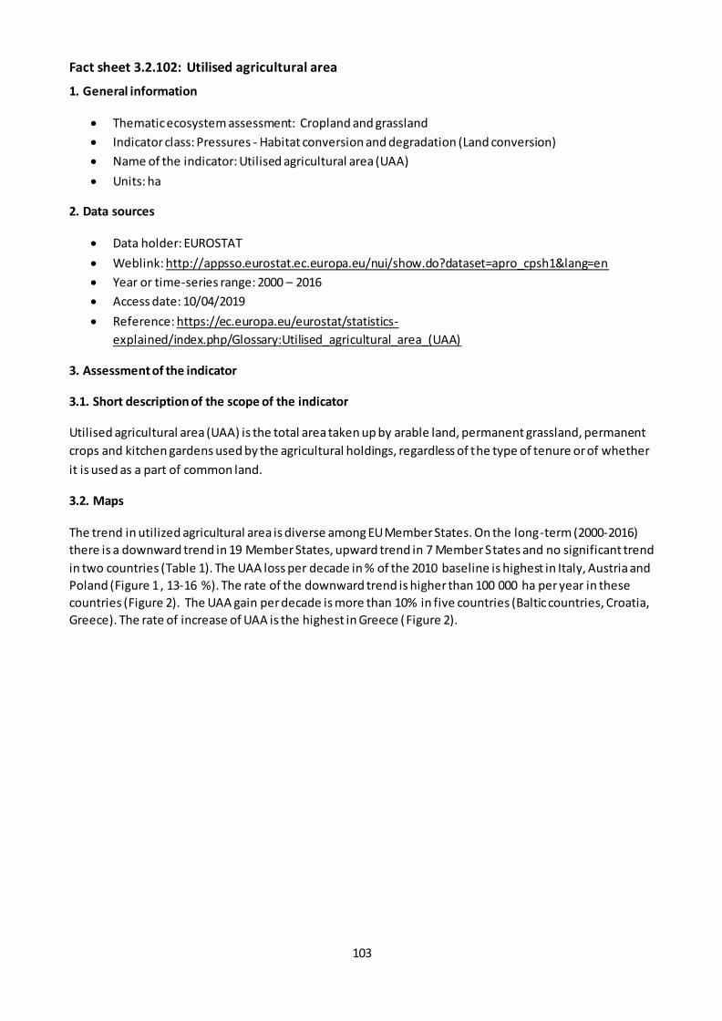
103
Fact sheet 3.2.102: Utilised agricultural area
1. General information
Thematic ecosystem assessment: Cropland and grassland
Indicator class: Pressures - Habitat conversion and degradation (Land conversion)
Name of the indicator: Utilised agricultural area (UAA)
Units: ha
2. Data sources
Data holder: EUROSTAT
Weblink: http://appsso.eurostat.ec.europa.eu/nui/show.do?dataset=apro_cpsh1&lang=en
Year or time-series range: 2000 – 2016
Access date: 10/04/2019
Reference: https://ec.europa.eu/eurostat/statistics-
explained/index.php/Glossary:Utilised_agricultural_area_(UAA)
3. Assessment of the indicator
3.1. Short description of the scope of the indicator
Utilised agricultural area (UAA) is the total area taken up by arable land, permanent grassland, permanent
crops and kitchen gardens used by the agricultural holdings, regardless of the type of tenure or of whether
it is used as a part of common land.
3.2. Maps
The trend in utilized agricultural area is diverse among EU Member States. On the long-term (2000-2016)
there is a downward trend in 19 Member States, upward trend in 7 Member States and no significant trend
in two countries (Table 1). The UAA loss per decade in % of the 2010 baseline is highest in Italy, Austria and
Poland (Figure 1 , 13-16 %). The rate of the downward trend is higher than 100 000 ha per year in these
countries (Figure 2). The UAA gain per decade is more than 10% in five countries (Baltic countries, Croatia,
Greece). The rate of increase of UAA is the highest in Greece (Figure 2).
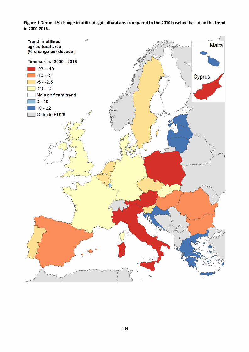
104
Figure 1 Decadal % change in utilized agricultural area compared to the 2010 baseline based on the trend
in 2000-2016..
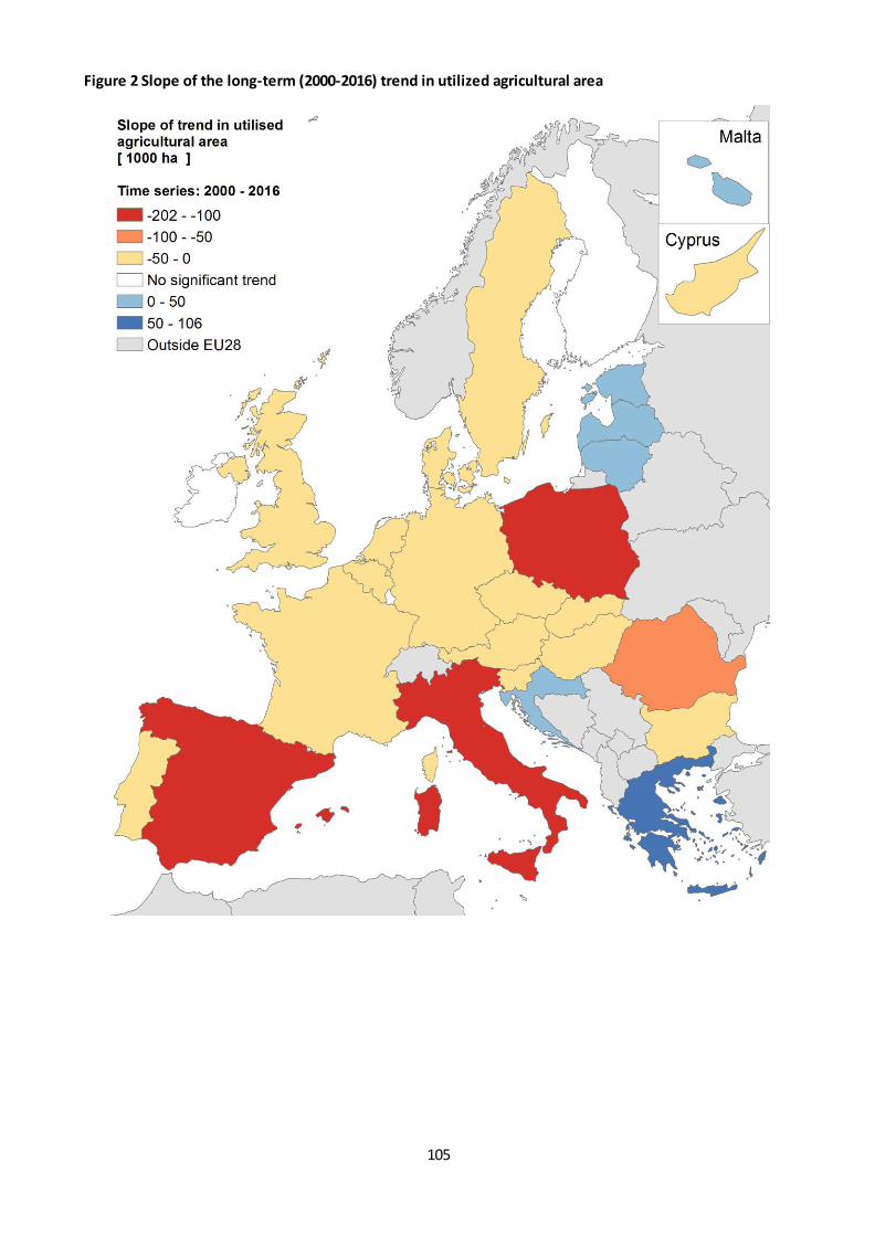
105
Figure 2 Slope of the long-term (2000-2016) trend in utilized agricultural area
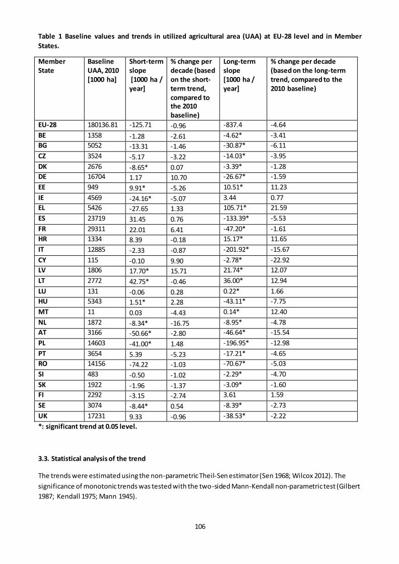
106
Table 1 Baseline values and trends in utilized agricultural area (UAA) at EU-28 level and in Member
States.
Member
State
Baseline
UAA, 2010
[1000 ha]
Short-term
slope
[1000 ha /
year]
% change per
decade (based
on the short-
term trend,
compared to
the 2010
baseline)
Long-term
slope
[1000 ha /
year]
% change per decade
(based on the long-term
trend, compared to the
2010 baseline)
EU-28 180136.81 -125.71 -0.96 -837.4 -4.64
BE 1358 -1.28 -2.61 -4.62* -3.41
BG 5052 -13.31 -1.46 -30.87* -6.11
CZ 3524 -5.17 -3.22 -14.03* -3.95
DK 2676 -8.65* 0.07 -3.39* -1.28
DE 16704 1.17 10.70 -26.67* -1.59
EE 949 9.91* -5.26 10.51* 11.23
IE 4569 -24.16* -5.07 3.44 0.77
EL 5426 -27.65 1.33 105.71* 21.59
ES 23719 31.45 0.76 -133.39* -5.53
FR 29311 22.01 6.41 -47.20* -1.61
HR 1334 8.39 -0.18 15.17* 11.65
IT 12885 -2.33 -0.87 -201.92* -15.67
CY 115 -0.10 9.90 -2.78* -22.92
LV 1806 17.70* 15.71 21.74* 12.07
LT 2772 42.75* -0.46 36.00* 12.94
LU 131 -0.06 0.28 0.22* 1.66
HU 5343 1.51* 2.28 -43.11* -7.75
MT 11 0.03 -4.43 0.14* 12.40
NL 1872 -8.34* -16.75 -8.95* -4.78
AT 3166 -50.66* -2.80 -46.64* -15.54
PL 14603 -41.00* 1.48 -196.95* -12.98
PT 3654 5.39 -5.23 -17.21* -4.65
RO 14156 -74.22 -1.03 -70.67* -5.03
SI 483 -0.50 -1.02 -2.29* -4.70
SK 1922 -1.96 -1.37 -3.09* -1.60
FI 2292 -3.15 -2.74 3.61 1.59
SE 3074 -8.44* 0.54 -8.39* -2.73
UK 17231 9.33 -0.96 -38.53* -2.22
*: significant trend at 0.05 level.
3.3. Statistical analysis of the trend
The trends were estimated using the non-parametric Theil-Sen estimator (Sen 1968; Wilcox 2012). The
significance of monotonic trends was tested with the two-sided Mann-Kendall non-parametric test (Gilbert
1987; Kendall 1975; Mann 1945).
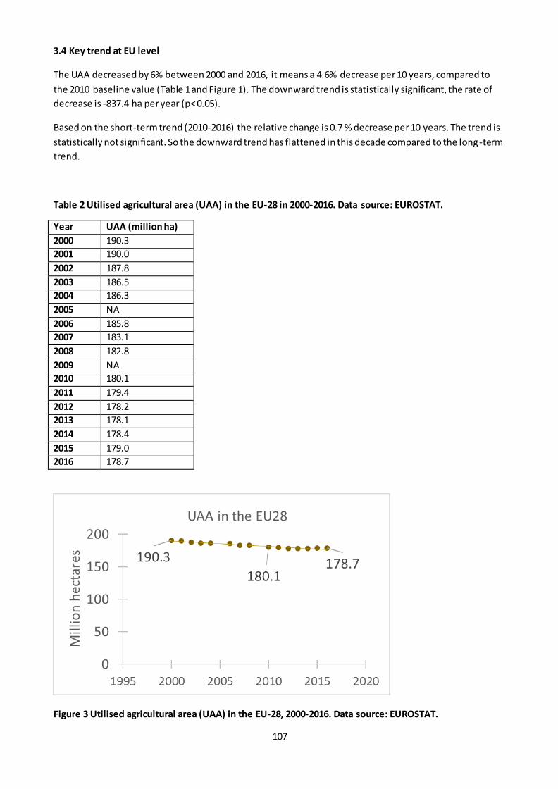
107
3.4 Key trend at EU level
The UAA decreased by 6% between 2000 and 2016, it means a 4.6% decrease per 10 years, compared to
the 2010 baseline value (Table 1 and Figure 1). The downward trend is statistically significant, the rate of
decrease is -837.4 ha per year (p< 0.05).
Based on the short-term trend (2010-2016) the relative change is 0.7 % decrease per 10 years. The trend is
statistically not significant. So the downward trend has flattened in this decade compared to the long-term
trend.
Table 2 Utilised agricultural area (UAA) in the EU-28 in 2000-2016. Data source: EUROSTAT.
Year UAA (million ha)
2000 190.3
2001 190.0
2002 187.8
2003 186.5
2004 186.3
2005 NA
2006 185.8
2007 183.1
2008 182.8
2009 NA
2010 180.1
2011 179.4
2012 178.2
2013 178.1
2014 178.4
2015 179.0
2016 178.7
Figure 3 Utilised agricultural area (UAA) in the EU-28, 2000-2016. Data source: EUROSTAT.
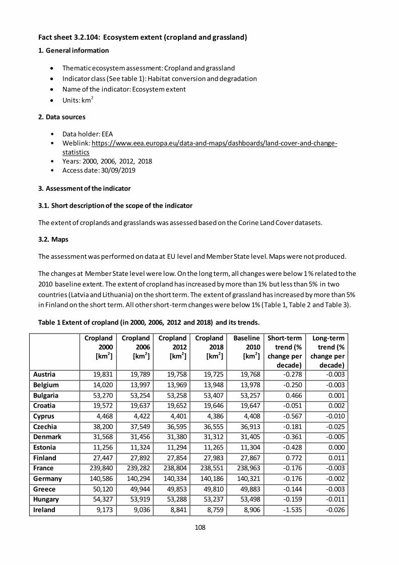
108
Fact sheet 3.2.104: Ecosystem extent (cropland and grassland)
1. General information
Thematic ecosystem assessment: Cropland and grassland
Indicator class (See table 1): Habitat conversion and degradation
Name of the indicator: Ecosystem extent
Units: km2
2. Data sources
• Data holder: EEA • Weblink: https://www.eea.europa.eu/data-and-maps/dashboards/land-cover-and-change-
statistics • Years: 2000, 2006, 2012, 2018 • Access date: 30/09/2019
3. Assessment of the indicator
3.1. Short description of the scope of the indicator
The extent of croplands and grasslands was assessed based on the Corine Land Cover datasets.
3.2. Maps
The assessment was performed on data at EU level and Member State level. Maps were not produced.
The changes at Member State level were low. On the long term, all changes were below 1 % related to the
2010 baseline extent. The extent of cropland has increased by more than 1% but less than 5% in two
countries (Latvia and Lithuania) on the short term. The extent of grassland has increased by more than 5%
in Finland on the short term. All other short-term changes were below 1% (Table 1, Table 2 and Table 3).
Table 1 Extent of cropland (in 2000, 2006, 2012 and 2018) and its trends.
Cropland
2000
[km2]
Cropland
2006
[km2]
Cropland
2012
[km2]
Cropland
2018
[km2]
Baseline
2010
[km2]
Short-term
trend (%
change per
decade)
Long-term
trend (%
change per
decade)
Austria 19,831 19,789 19,758 19,725 19,768 -0.278 -0.003
Belgium 14,020 13,997 13,969 13,948 13,978 -0.250 -0.003
Bulgaria 53,270 53,254 53,258 53,407 53,257 0.466 0.001
Croatia 19,572 19,637 19,652 19,646 19,647 -0.051 0.002
Cyprus 4,468 4,422 4,401 4,386 4,408 -0.567 -0.010
Czechia 38,200 37,549 36,595 36,555 36,913 -0.181 -0.025
Denmark 31,568 31,456 31,380 31,312 31,405 -0.361 -0.005
Estonia 11,256 11,324 11,294 11,265 11,304 -0.428 0.000
Finland 27,447 27,892 27,854 27,983 27,867 0.772 0.011
France 239,840 239,282 238,804 238,551 238,963 -0.176 -0.003
Germany 140,586 140,294 140,334 140,186 140,321 -0.176 -0.002
Greece 50,120 49,944 49,853 49,810 49,883 -0.144 -0.003
Hungary 54,327 53,919 53,288 53,237 53,498 -0.159 -0.011
Ireland 9,173 9,036 8,841 8,759 8,906 -1.535 -0.026
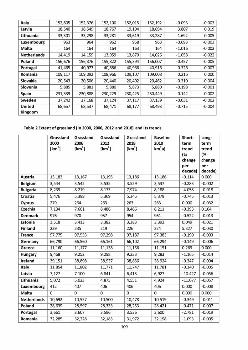
109
Italy 152,805 152,376 152,100 152,015 152,192 -0.093 -0.003
Latvia 18,540 18,549 18,767 19,194 18,694 3.807 0.019
Lithuania 33,301 33,298 33,281 33,619 33,287 1.692 0.005
Luxembourg 963 964 962 958 963 -0.693 -0.003
Malta 164 164 164 163 164 -1.016 -0.003
Netherlands 14,419 14,159 13,959 13,870 14,026 -1.058 -0.022
Poland 156,676 156,376 155,822 155,394 156,007 -0.457 -0.005
Portugal 41,465 40,977 40,886 40,966 40,916 0.326 -0.007
Romania 109,117 109,092 108,966 109,107 109,008 0.216 0.000
Slovakia 20,543 20,506 20,440 20,402 20,462 -0.310 -0.004
Slovenia 5,885 5,881 5,880 5,873 5,880 -0.198 -0.001
Spain 231,339 230,888 230,229 230,425 230,449 0.142 -0.002
Sweden 37,242 37,168 37,124 37,117 37,139 -0.031 -0.002
United
Kingdom
68,657 68,537 68,471 68,177 68,493 -0.715 -0.004
Table 2 Extent of grassland (in 2000, 2006, 2012 and 2018) and its trends.
Grassland
2000
[km2]
Grassland
2006
[km2]
Grassland
2012
[km2]
Grassland
2018
[km2]
Baseline
2010
km2a]
Short-
term
trend
(%
change
per
decade)
Long-
term
trend
(%
change
per
decade)
Austria 13,183 13,167 13,195 13,186 13,186 -0.114 0.000
Belgium 3,544 3,542 3,535 3,529 3,537 -0.283 -0.002
Bulgaria 8,239 8,219 8,173 7,974 8,188 -4.058 -0.018
Croatia 5,476 5,398 5,369 5,345 5,379 -0.745 -0.013
Cyprus 279 264 263 263 263 0.000 -0.032
Czechia 7,134 7,661 8,486 8,466 8,211 -0.393 0.104
Denmark 976 970 957 954 961 -0.522 -0.013
Estonia 3,518 3,413 3,382 3,383 3,392 0.049 -0.021
Finland 239 235 219 226 224 5.327 -0.030
France 97,775 97,553 97,298 97,187 97,383 -0.190 -0.003
Germany 66,790 66,560 66,161 66,102 66,294 -0.149 -0.006
Greece 11,160 11,177 11,138 11,156 11,151 0.269 0.000
Hungary 9,468 9,252 9,298 9,233 9,283 -1.165 -0.014
Ireland 39,151 38,898 38,937 38,856 38,924 -0.347 -0.004
Italy 11,854 11,802 11,771 11,747 11,781 -0.340 -0.005
Latvia 7,127 7,100 6,841 6,413 6,927 -10.427 -0.056
Lithuania 5,072 5,023 4,875 4,551 4,924 -11.077 -0.057
Luxembourg 412 407 406 406 406 0.000 -0.008
Malta 0 0 0 0 0 0.000 0.000
Netherlands 10,692 10,557 10,500 10,478 10,519 -0.349 -0.011
Poland 28,639 28,597 28,333 28,253 28,421 -0.471 -0.007
Portugal 3,661 3,607 3,596 3,536 3,600 -2.781 -0.019
Romania 32,285 32,228 32,183 31,972 32,198 -1.093 -0.005
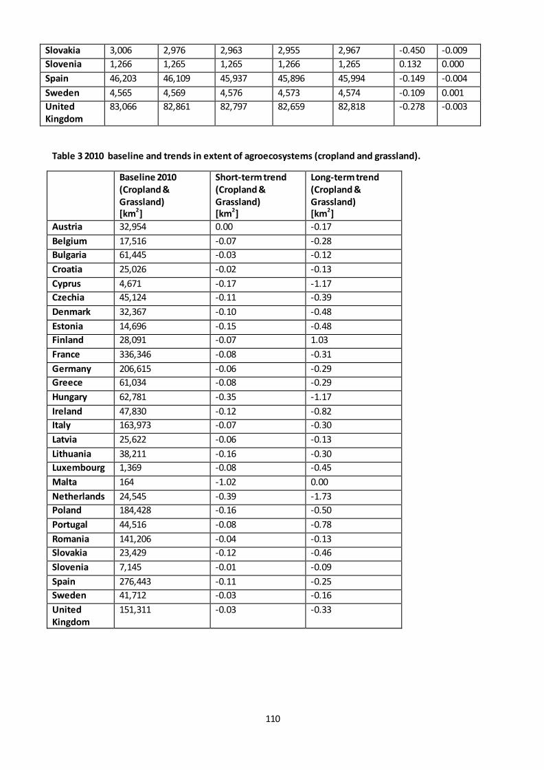
110
Slovakia 3,006 2,976 2,963 2,955 2,967 -0.450 -0.009
Slovenia 1,266 1,265 1,265 1,266 1,265 0.132 0.000
Spain 46,203 46,109 45,937 45,896 45,994 -0.149 -0.004
Sweden 4,565 4,569 4,576 4,573 4,574 -0.109 0.001
United
Kingdom
83,066 82,861 82,797 82,659 82,818 -0.278 -0.003
Table 3 2010 baseline and trends in extent of agroecosystems (cropland and grassland).
Baseline 2010
(Cropland &
Grassland)
[km2]
Short-term trend
(Cropland &
Grassland)
[km2]
Long-term trend
(Cropland &
Grassland)
[km2]
Austria 32,954 0.00 -0.17
Belgium 17,516 -0.07 -0.28
Bulgaria 61,445 -0.03 -0.12
Croatia 25,026 -0.02 -0.13
Cyprus 4,671 -0.17 -1.17
Czechia 45,124 -0.11 -0.39
Denmark 32,367 -0.10 -0.48
Estonia 14,696 -0.15 -0.48
Finland 28,091 -0.07 1.03
France 336,346 -0.08 -0.31
Germany 206,615 -0.06 -0.29
Greece 61,034 -0.08 -0.29
Hungary 62,781 -0.35 -1.17
Ireland 47,830 -0.12 -0.82
Italy 163,973 -0.07 -0.30
Latvia 25,622 -0.06 -0.13
Lithuania 38,211 -0.16 -0.30
Luxembourg 1,369 -0.08 -0.45
Malta 164 -1.02 0.00
Netherlands 24,545 -0.39 -1.73
Poland 184,428 -0.16 -0.50
Portugal 44,516 -0.08 -0.78
Romania 141,206 -0.04 -0.13
Slovakia 23,429 -0.12 -0.46
Slovenia 7,145 -0.01 -0.09
Spain 276,443 -0.11 -0.25
Sweden 41,712 -0.03 -0.16
United
Kingdom
151,311 -0.03 -0.33

111
3.3. Statistical analysis of the trend
Percentage changes were calculated based on the first and last value of the dataset. The short term trend
(expressed as % change per decade) is based on the data 2012 and 2018. The long term trend is based on
the data series between 2000 and 2018.
3.4. Key trend at EU level
The change in the extent of croplands and grasslands, based on the Corine land cover data, was below 1%
so less than 5 % both in the short term and in the long term (Table 4).
Table 4
2000
[km2]
2006
[km2]
2012
[km2]
2018
[km2]
Baseline
2010
[km2]
short-term
trend (%
change per
decade)
long-term
trend (%
change per
decade)
Cropland 1,604,793 1,600,732 1,596,331 1,596,051 1,597,798 -0.029 -0.003
Grassland 504,778 503,411 502,454 500,566 502,773 -0.626 -0.464
Cropland
and
Grassland
2,109,571 2,104,143 2,098,785 2,096,617 2,100,571 -0.094 -0.343
112
Fact sheet 3.2.105: Heat degree days
1. General information
Thematic ecosystem assessment: Cropland and grassland
Indicator class: Climate change
Name of the indicator: heat degree days
Units: degree days (cumulated heat above 30 °C)
2. Data sources
Data source: MARS database
• Data holder: European commission, Joint Research Centre (JRC) • Weblink: https://agri4cast.jrc.ec.europa.eu/DataPortal/ • Time-series range: 1985 – 2018 • Access date: 20/05/2019
The MARS meteorological database contains gridded meteorological data on maximum air temperature
(°C), minimum air temperature (°C), mean air temperature (°C), mean daily wind speed at 10m (m/s),
vapour pressure (hPa), sum of precipitation (mm/day), potential evaporation from a free water surface
(mm/day), potential evapotranspiration from a crop canopy (mm/day), potential evaporation from a
moist bare soil surface (mm/day), total global radiation (KJ/m2/day), snow depth. The parameters are
interpolated from weather station data on a 25 x 25 km grid. The data is available on a daily basis from
1975 up to near real time, covering the EU Member States, neighbouring European countries and the
Mediterranean countries. In the present assessment the MARS data series starting from 1985 is used to
avoid potential inhomogeneities that can lead to uncertainties in the trend analysis.
3. Assessment of the indicator
3.1. Short description of the scope of the indicator.
Heat degree days is the cumulated degrees/heat above 30 °C. It is an indicator of heat stress. The base
temperature of 30°C is widely used in the agricultural domain, it is considered a threshold above which
crops experience heat stress in Europe.
3.2. Statistical analysis of the trend
Temporal trends were calculated at EU level and at grid cell level covering the whole terrestrial domain of
the EU. Trends were estimated using the non-parametric Theil-Sen estimator (Sen 1968; Wilcox 2012). The
significance of monotonic trend was tested with
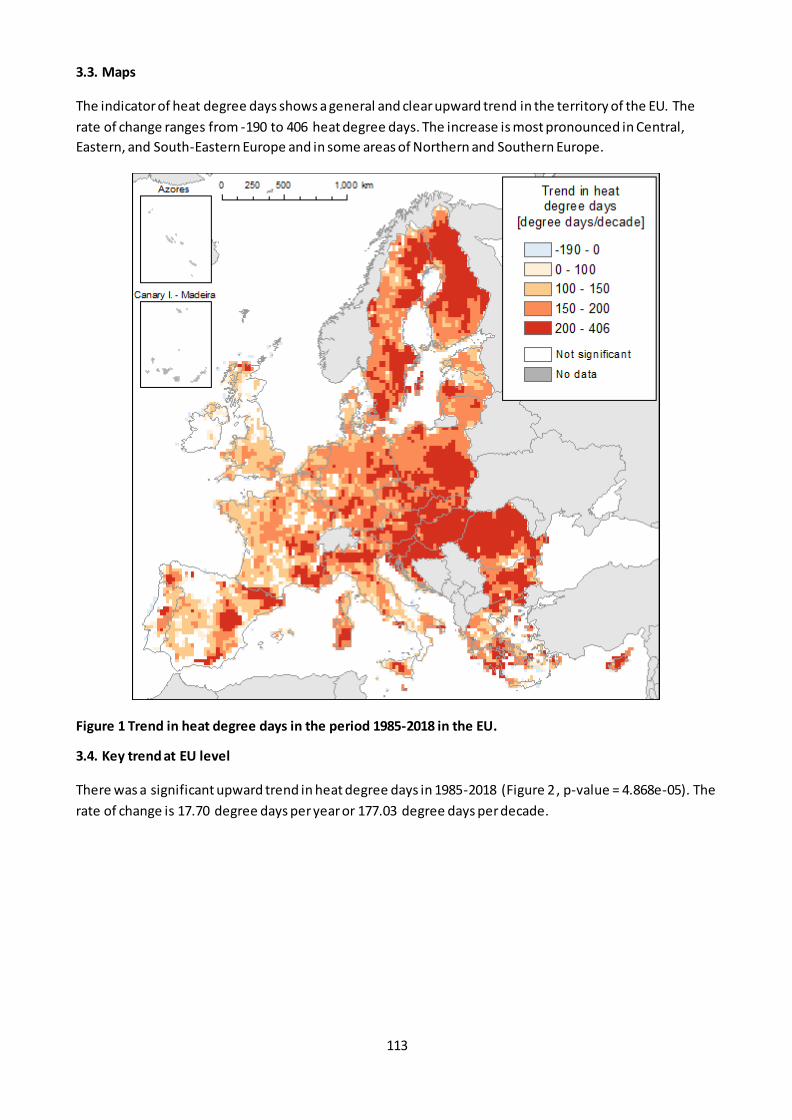
113
3.3. Maps
The indicator of heat degree days shows a general and clear upward trend in the territory of the EU. The
rate of change ranges from -190 to 406 heat degree days. The increase is most pronounced in Central,
Eastern, and South-Eastern Europe and in some areas of Northern and Southern Europe.
Figure 1 Trend in heat degree days in the period 1985-2018 in the EU.
3.4. Key trend at EU level
There was a significant upward trend in heat degree days in 1985-2018 (Figure 2 , p-value = 4.868e-05). The
rate of change is 17.70 degree days per year or 177.03 degree days per decade.
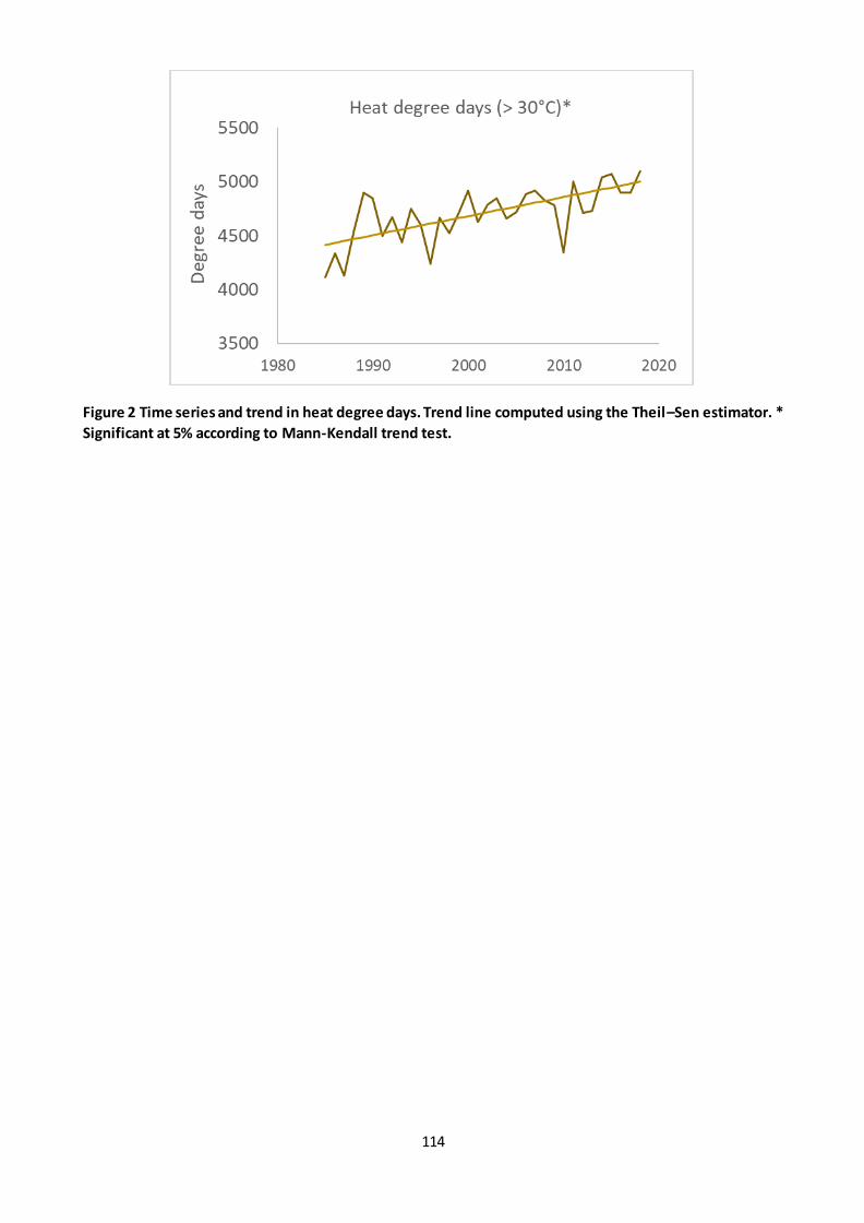
114
Figure 2 Time series and trend in heat degree days. Trend line computed using the Theil–Sen estimator. *
Significant at 5% according to Mann-Kendall trend test.
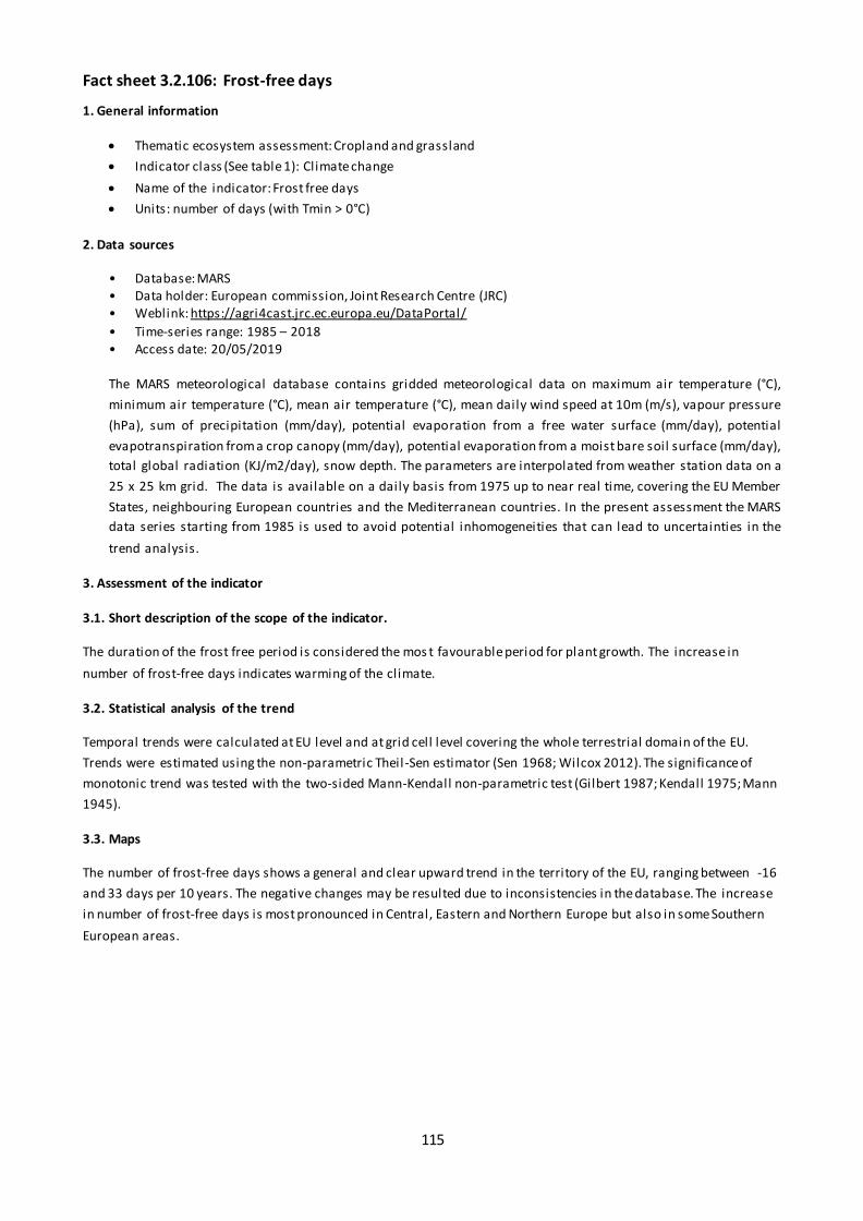
115
Fact sheet 3.2.106: Frost-free days
1. General information
Thematic ecosystem assessment: Cropland and grassland
Indicator class (See table 1): Climate change
Name of the indicator: Frost free days
Units: number of days (with Tmin > 0°C)
2. Data sources
• Database: MARS • Data holder: European commission, Joint Research Centre (JRC) • Weblink: https://agri4cast.jrc.ec.europa.eu/DataPortal/
• Time-series range: 1985 – 2018 • Access date: 20/05/2019 The MARS meteorological database contains gridded meteorological data on maximum air temperature (°C),
minimum air temperature (°C), mean air temperature (°C), mean daily wind speed at 10m (m/s), vapour pressure
(hPa), sum of precipitation (mm/day), potential evaporation from a free water surface (mm/day), potential
evapotranspiration from a crop canopy (mm/day), potential evaporation from a moist bare soil surface (mm/day),
total global radiation (KJ/m2/day), snow depth. The parameters are interpolated from weather station data on a
25 x 25 km grid. The data is available on a daily basis from 1975 up to near real time, covering the EU Member
States, neighbouring European countries and the Mediterranean countries. In the present assessment the MARS
data series starting from 1985 is used to avoid potential inhomogeneities that can lead to uncertainties in the
trend analysis.
3. Assessment of the indicator
3.1. Short description of the scope of the indicator.
The duration of the frost free period is considered the mos t favourable period for plant growth. The increase in
number of frost-free days indicates warming of the climate.
3.2. Statistical analysis of the trend
Temporal trends were calculated at EU level and at grid cell level covering the whole terrestrial domain of the EU.
Trends were estimated using the non-parametric Theil -Sen estimator (Sen 1968; Wilcox 2012). The significance of
monotonic trend was tested with the two-sided Mann-Kendall non-parametric test (Gilbert 1987; Kendall 1975; Mann
1945).
3.3. Maps
The number of frost-free days shows a general and clear upward trend in the territory of the EU, ranging between -16
and 33 days per 10 years. The negative changes may be resulted due to inconsistencies in the database. The increase
in number of frost-free days is most pronounced in Central, Eastern and Northern Europe but also in some Southern
European areas.

116
Figure 1 Trend in number of frost-free days in the period 1985-2018 in the EU.
3.4. Key trend at EU level
There was a statistically significant upward trend in frost-free days in 1985-2018. The rate of change is 0.54 days per
year or 5.4 days per 10 years.
Figure 2 Time series and trend in number of frost-free days. Trend line computed using the Theil–Sen estimator. *
Significant at 5% according to Mann-Kendall trend test.
117
Fact sheet 3.2.106: Spatial assessment of trends of exceedances of critical loads for acidification
1. General information
Thematic ecosystem assessment: Cropland and grassland
Indicator class: pressure
Name of the indicator: Exceedances of critical loads for acidification
Units: equivalents ha-1 year-1
2. Data sources
Data holder: European Monitoring and Evaluation Programme
data source:
Year or time-series range: 2000-2005-2010-2016
Access date--- 17/10/2019
3. Assessment of the indicator
3.1. Short description of the scope of the indicator
Pollutants causing acidification and eutrophication originate mainly from anthropogenic emissions of
Sulphur dioxide (SO2), nitrogen oxides (NOx) and ammonia (NH3). SO2 and NOx are emitted into the
atmosphere primarily as a result of combustion of fossil fuels, whilst agricultural and husbandry activities
are the major source of NH3 emissions, related to manure storage, spreading of fertilizer, and livestock
deposition.
Once emitted, these pollutants may remain in the atmosphere for several days and transported over long
distances by winds. Therefore, they can impact areas far from the emission source. Acidifying pollutants are
removed from the atmosphere by wet deposition (commonly referred to as "acid rain") or dry deposition,
i.e. direct uptake by vegetation and surfaces deposition. Acid deposition can damage terrestrial and water
ecosystem by altering the pH and negatively affect soil and water biodiversity. They can also damage
building by corrosion.
European critical loads for acidifying depositions have been establishe d (Hettelingh et al., 2017) i.e.
quantities of deposited compounds below which these phenomena are negligible. The indicator used here
is the exceedance of the deposition compared to the established critical load on a 25x25 Km grid, on
agroecosystems. Any value >0 is thus a net pressure on ecosystems.
3.2. Statistical analysis of the trend
The trend was analyzed by calculating the ten-year change (%) of exceedances over the long (2000-2016)
and short term (2010-2016) trend per each 25 Km cell. Increases >5% and decreases < -5% were assessed
respectively as “improvement” and “degradation”, whilst any change between -5% and 5% was assessed as
“No change”.
3.3. Key trend at EU level
The trend at EU level is a marked decrease of the exceedances of critical l oads causing acidification over the
period 2000-2016 (Table 1). The average value dropped from 232.6 equivalent ha -1 year-1 in 2000 to 70.6 in
2016.
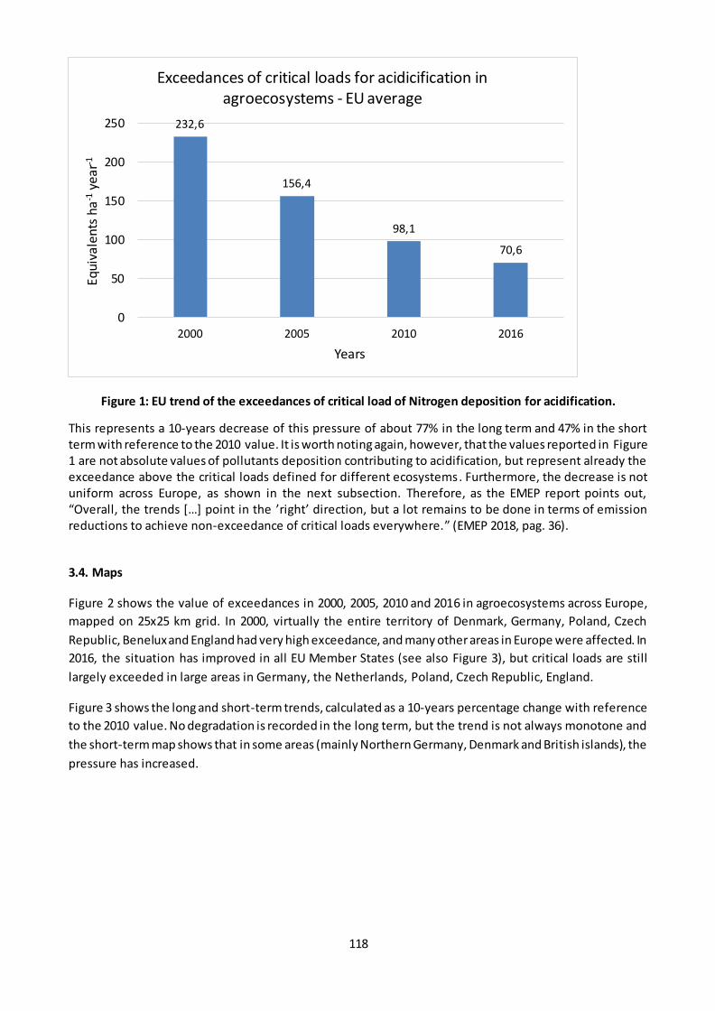
118
Figure 1: EU trend of the exceedances of critical load of Nitrogen deposition for acidification.
This represents a 10-years decrease of this pressure of about 77% in the long term and 47% in the short term with reference to the 2010 value. It is worth noting again, however, that the values reported in Figure 1 are not absolute values of pollutants deposition contributing to acidification, but represent already the exceedance above the critical loads defined for different ecosystems. Furthermore, the decrease is not uniform across Europe, as shown in the next subsection. Therefore, as the EMEP report points out, “Overall, the trends […] point in the ’right’ direction, but a lot remains to be done in terms of emission reductions to achieve non-exceedance of critical loads everywhere.” (EMEP 2018, pag. 36).
3.4. Maps
Figure 2 shows the value of exceedances in 2000, 2005, 2010 and 2016 in agroecosystems across Europe,
mapped on 25x25 km grid. In 2000, virtually the entire territory of Denmark, Germany, Poland, Czech
Republic, Benelux and England had very high exceedance, and many other areas in Europe were affected. In
2016, the situation has improved in all EU Member States (see also Figure 3), but critical loads are still
largely exceeded in large areas in Germany, the Netherlands, Poland, Czech Republic, England.
Figure 3 shows the long and short-term trends, calculated as a 10-years percentage change with reference
to the 2010 value. No degradation is recorded in the long term, but the trend is not always monotone and
the short-term map shows that in some areas (mainly Northern Germany, Denmark and British islands), the
pressure has increased.
232,6
156,4
98,1
70,6
0
50
100
150
200
250
2000 2005 2010 2016
Equi
vale
nts
ha
-1 y
ear-1
Years
Exceedances of critical loads for acidicification in agroecosystems - EU average
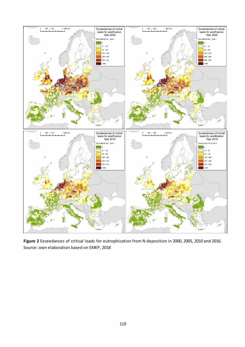
119
Figure 2 Exceedances of critical loads for eutrophication from N deposition in 2000, 2005, 2010 and 2016.
Source: own elaboration based on EMEP, 2018
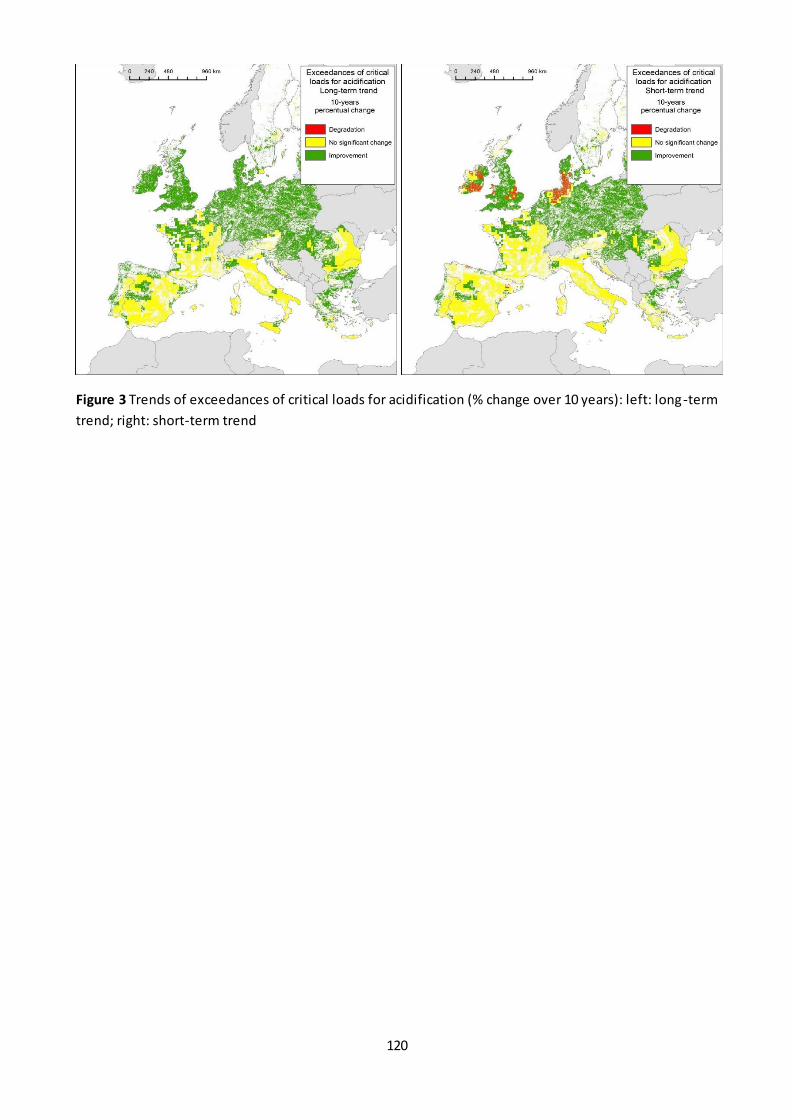
120
Figure 3 Trends of exceedances of critical loads for acidification (% change over 10 years): left: long-term
trend; right: short-term trend
121
Fact sheet 3.2.108: Spatial assessment of trends of exceedances of critical loads for
eutrophication
1. General information
Thematic ecosystem assessment: Cropland and grassland
Indicator class: pressure
Name of the indicator: Exceedances of critical loads of pollutants causing eutrophication
Units: equivalents ha-1 year-1
2. Data sources
Data holder: European Monitoring and Evaluation Programme
data source:
Year or time-series range: 2000-2005-2010-2016
Access date--- 17/10/2019
3. Assessment of the indicator
3.1. Short description of the scope of the indicator
Pollutants causing acidification and eutrophication originate mainly from anthropogenic emissions of
Sulphur dioxide (SO2), nitrogen oxides (NOx) and ammonia (NH3). SO2 and NOx are emitted into the
atmosphere primarily as a result of combustion of fossil fuels, whilst agricultural and husbandry activities
are the major source of NH3 emissions, related to manure storage, spreading of fertilizer, and livestock
deposition.
Once emitted, these pollutants may remain in the atmosphere for several days and transported over long
distances by winds. Therefore, they can impact areas far from the emission source. Acidifying pollutants are
removed from the atmosphere by wet deposition (commonly referred to as "acid rai n") or dry deposition,
i.e. direct uptake by vegetation and surfaces deposition. Deposition of compounds containing Nitrogen
contribute to eutrophication, i.e. excessive nutrient enrichment that can degrade the ecosystems by
favoring Nitrogen-tolerant species. Grasslands diversity and ecological value in particular can be severely
affected by this.
European critical loads for eutrophying depositions have been established (Hettelingh et al., 2017) i.e.
quantities of deposited compounds below which these phenomena are negligible. The indicator used here
is the exceedance of the deposition compared to the established critical load on a 25x25 Km grid, on
agroecosystems. Details on the methods used are provided in EMEP (2018)
3.2. Statistical analysis of the trend
The trend was analyzed at EU level (Figure 1) and subsequently in by calculating the ten-year change (%) of
exceedances over the long and short term at grid level. Increases >5% and decreases < -5% were assessed
respectively as “improvement” and “degradation”, whilst any change between -5% and 5% was assessed as
“No change”.
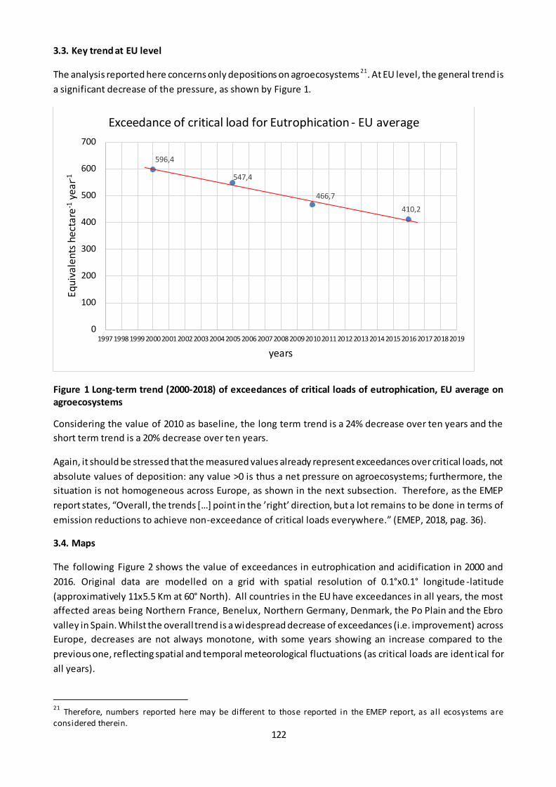
122
3.3. Key trend at EU level
The analysis reported here concerns only depositions on agroecosystems 21. At EU level, the general trend is
a significant decrease of the pressure, as shown by Figure 1.
Figure 1 Long-term trend (2000-2018) of exceedances of critical loads of eutrophication, EU average on
agroecosystems
Considering the value of 2010 as baseline, the long term trend is a 24% decrease over ten years and the
short term trend is a 20% decrease over ten years.
Again, it should be stressed that the measured values already represent exceedances over critical loads, not
absolute values of deposition: any value >0 is thus a net pressure on agroecosystems; furthermore, the
situation is not homogeneous across Europe, as shown in the next subsection. Therefore, as the EMEP
report states, “Overall, the trends […] point in the ’right’ direction, but a lot remains to be done in terms of
emission reductions to achieve non-exceedance of critical loads everywhere.” (EMEP, 2018, pag. 36).
3.4. Maps
The following Figure 2 shows the value of exceedances in eutrophication and acidification in 2000 and
2016. Original data are modelled on a grid with spatial resolution of 0.1°x0.1° longitude -latitude
(approximatively 11x5.5 Km at 60° North). All countries in the EU have exceedances in all years, the most
affected areas being Northern France, Benelux, Northern Germany, Denmark, the Po Plain and the Ebro
valley in Spain. Whilst the overall trend is a widespread decrease of exceedances (i.e. improvement) across
Europe, decreases are not always monotone, with some years showing an increase compared to the
previous one, reflecting spatial and temporal meteorological fluctuations (as critical loads are ident ical for
all years).
21
Therefore, numbers reported here may be different to those reported in the EMEP report, as all ecosystems are considered therein.
596,4
547,4
466,7
410,2
0
100
200
300
400
500
600
700
1997 1998 1999 2000200120022003 2004 2005 20062007 20082009201020112012 20132014 2015 2016 201720182019
Equi
vale
nts
hec
tare
-1 y
ear-1
years
Exceedance of critical load for Eutrophication - EU average

123
Figure 2: Exceedances of critical load for eutrophication in the EU in 2000, 2005, 2010 and 2016.
The following Figure 3 shows the changes in the pressure calculated on the long-term at grid level (25x25
km cells). The ten-year percentage change was computed for each cell through linear regression and
classified as improvement/degradation if based on the slope of the regression line the change was
greater/lass than 5% over 10 years. The spatial pattern is a widespread improvement, with only a few areas
showing stable conditions in central/southern Spain and in the Danubian Plane. Degradation was recorded
on some areas of Croatia, South western Romania and Bulgaria
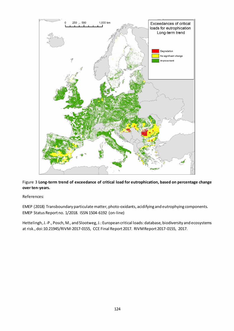
124
Figure 3 Long-term trend of exceedance of critical load for eutrophication, based on percentage change
over ten-years.
References:
EMEP (2018) Transboundary particulate matter, photo-oxidants, acidifying and eutrophying components.
EMEP Status Report no. 1/2018. ISSN 1504-6192 (on-line)
Hettelingh, J.-P., Posch, M., and Slootweg, J.: European critical loads: database, biodiversity and ecosystems
at risk., doi:10.21945/RIVM-2017-0155, CCE Final Report 2017. RIVM Report 2017-0155, 2017.
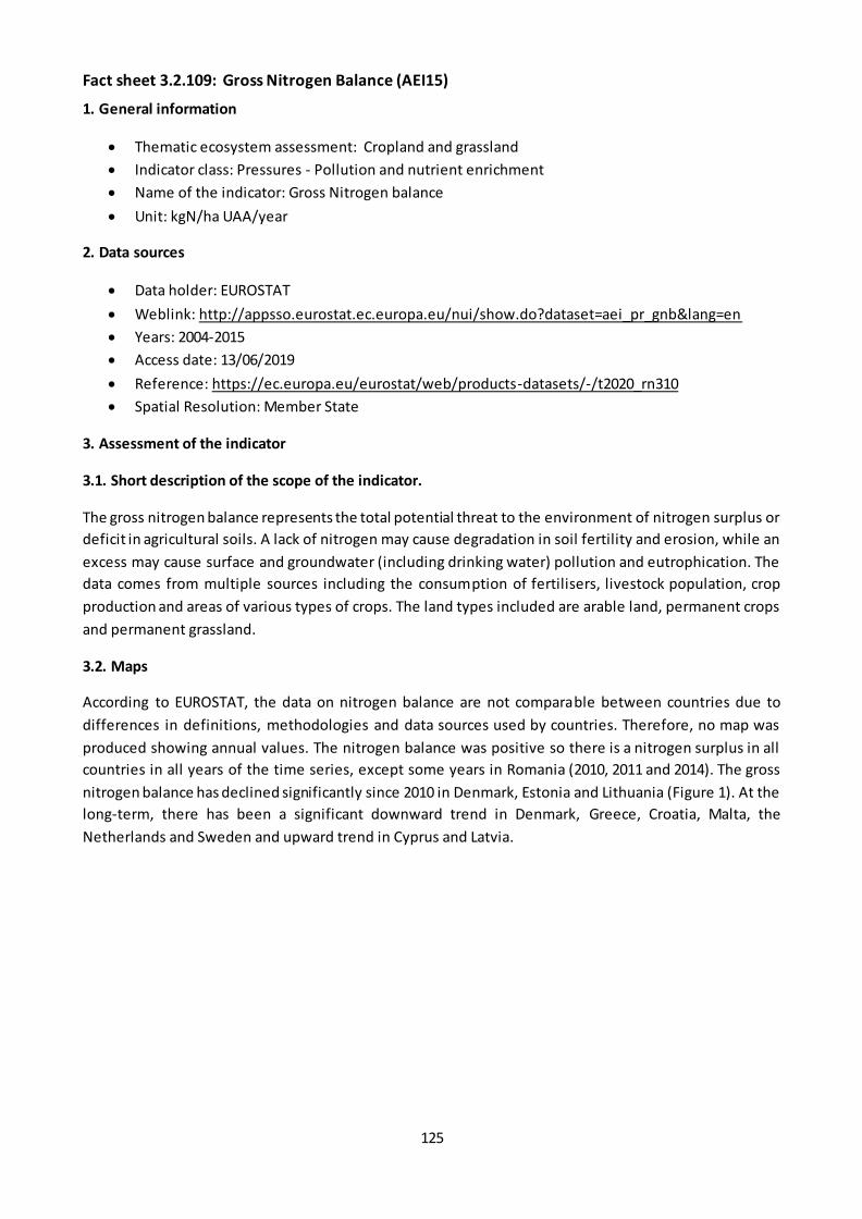
125
Fact sheet 3.2.109: Gross Nitrogen Balance (AEI15)
1. General information
Thematic ecosystem assessment: Cropland and grassland
Indicator class: Pressures - Pollution and nutrient enrichment
Name of the indicator: Gross Nitrogen balance
Unit: kgN/ha UAA/year
2. Data sources
Data holder: EUROSTAT
Weblink: http://appsso.eurostat.ec.europa.eu/nui/show.do?dataset=aei_pr_gnb&lang=en
Years: 2004-2015
Access date: 13/06/2019
Reference: https://ec.europa.eu/eurostat/web/products-datasets/-/t2020_rn310
Spatial Resolution: Member State
3. Assessment of the indicator
3.1. Short description of the scope of the indicator.
The gross nitrogen balance represents the total potential threat to the environment of nitrogen surplus or
deficit in agricultural soils. A lack of nitrogen may cause degradation in soil fertility and erosion, while an
excess may cause surface and groundwater (including drinking water) pollution and eutrophication. The
data comes from multiple sources including the consumption of fertilisers, livestock population, crop
production and areas of various types of crops. The land types included are arable land, permanent crops
and permanent grassland.
3.2. Maps
According to EUROSTAT, the data on nitrogen balance are not comparable between countries due to
differences in definitions, methodologies and data sources used by countries. Therefore, no map was
produced showing annual values. The nitrogen balance was positive so there is a nitrogen surplus in all
countries in all years of the time series, except some years in Romania (2010, 2011 and 2014). The gross
nitrogen balance has declined significantly since 2010 in Denmark, Estonia and Lithuania (Figure 1). At the
long-term, there has been a significant downward trend in Denmark, Greece, Croatia, Malta, the
Netherlands and Sweden and upward trend in Cyprus and Latvia.
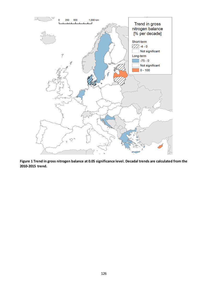
126
Figure 1 Trend in gross nitrogen balance at 0.05 significance level. Decadal trends are calculated from the
2010-2015 trend.
127
Table 1 Trends and decadal percentage changes in gross nitrogen balance at Member State level. *:
significant trend at 0.05 level.
Member
State
Baseline
2010
Long-term
trend
[kgN/ha
UAA/year]
2004-2015
Short-term
trend
[kgN/ha
UAA/year]
2010-2015
Decadal %
change
(calculated
from long-
term
trend)
[%/10
years)
Decadal %
change
(calculated
from
short-term
trend)
[%/10
years)
Decadal
% change
calculated
from
statistical
values
from
2004 and
2015
Decadal
% change
calculated
from
statistical
values
from
2010 and
2015
Belgium 142 -1.08 -2.5 -7.69 0.50 -8.72 -14 Bulgaria 14 0 2.8 0 0.26 43.06 200
Czech
Republic 67 1.17 3.33 15.09 3.07 42.06 93
Denmark 90 -3.47* -2* -37.03 0.19 -30.80 -22 Germany 78 -1 -1.5 -12.66 -1.37 -2.16 10
Estonia 31 -0.75 -2.25* -27.39 1.58 -35.35 -58
Ireland 34 -1.77 3.33 -39.90 0.30 -26.19 47 Greece 71 -2.33* 1.5 -35.94 -0.41 -23.01 -34
Spain 35 0 1 0 -1.05 7.58 23
France 40 -0.76 0 -16.17 0 -17.48 10 Croatia 81 -6.15* -8.25 -74.82 0.50 -41.77 -52
Italy 59 0.17 1 2.67 0.05 2.84 24
Cyprus 191 3.35* 0 18.74 0 11.63 3 Latvia 29 1.2* 0 51.72 0 68.18 -7
Lithuania 44 -1.31 -4* -41.08 0.50 -34.09 -86
Luxembourg 127 0 0.4 0 0.05 -10.03 3 Hungary 38 1.56 0 49.82 0 70.25 5
Malta 169 -11.81* 0 -63.35 0 -39.71 -26
Netherlands 173 -4.25* -1.33 -23.66 0.53 -10.24 18 Austria 26 1.17 2 40.00 0.29 29.33 115
Poland 52 0 -1.25 0 0.19 20.98 -15
Portugal 41 0.25 0 6.23 0 4.66 0 Romania -1 -0.56 2 -55.56 0.49 n.a.*
Slovenia 46 -0.27 -0.2 -5.25 0.05 -13.72 -4
Slovakia 46 0 -1.6 0 0.58 28.21 -35 Finland 57 -0.35 -1 -6.99 -0.80 -6.86 -28
Sweden 42 -1.5* -2.33 -37.97 0.89 -24.79 -48
United
Kingdom 90 -0.65 -1.25 -7.43 -0.56 -12.31 -16
The gross N balance changed from negative to positive value (from -1 to 9) from 2010 to 2015. Therefore
the % change is not applicable.

128
3.3. Statistical analysis of the trend
The trends were analysed using the Theil-Sen estimator non-parametric statistical method. The significance
was tested with Mann-Kendall test.
3.4. Key trend at EU level
EU-28 aggregate is directly provided by ESTAT (Table 1). In 2010 gross nitrogen balance amounted to 49 kg
N/UUA ha/year. The trend is not significant neither on the long term nor short term (at 0.05 level) (Figure
3).
Table 2 EU-28 aggregates of gross Nitrogen balance in the period with available data (2004-2015).
Year 2004
2005
2006
2007
2008
2009
2010
2011
2012
2013
2014
2015
Gross N balance (kg/ha)
52 53 56 56 51 46 49 49 50 49 47 51
Figure 2 Gross Nitrogen balance in the EU-28 from 2004 to 2015.
129
Fact sheet 3.2.110: Gross phosphorus balance
1. General information
Thematic ecosystem assessment: Cropland and grassland
Indicator class: Pressures - Pollution and nutrient enrichment
Name of the indicator: Gross phosphorus balance
Units: kgP/ha UAA/year
2. Data sources
Data holder: EUROSTAT
Weblink: http://appsso.eurostat.ec.europa.eu/nui/show.do?dataset=aei_pr_gnb&lang=en
Years: 2004-2015
Access date: 13/06/2019
Reference: https://ec.europa.eu/eurostat/web/products-datasets/-/t2020_rn310
Spatial Resolution: Member State
3. Assessment of the indicator
3.1. Short description of the scope of the indicator
The gross phosphorus balance provides an insight into the links between agricultural phosphorus (P) use,
losses of P to the environment, and the sustainable use of soil P resources. The gross phosphorus balance
indicates the total potential risk to the environment (water and soil). The actual risk depends on many
factors including climate conditions, soil type and soil characteristics, soil P saturation, management
practices such as drainage, tillage, irrigation etc. Additional information on the vulnerability of the soil to P
leaching and run-off is necessary to assess the risk of P to water.
Data are available or have been estimated for the main inputs and outputs of the balance. These include
consumption of inorganic fertilisers, manure production of total livestock, removal of nutrients by the
harvest of crops, removal of nutrients by the harvest and grazing of fodder. Data are less available for
consumption of organic fertilisers (excluding manure), manure withdrawals, manure stocks, manure
imports, seeds and planting material and atmospheric deposition of phosphorus.
A positive phosphorus balance shows phosphorus surplus that can be leached to water bodies and cause
pollution and euthrophication. A negative balance can mean risk for soil depletion but this has to be
assessed in the context of the long-term trend. If previously decades of excess phosphorus applications
have built up large reserves of phosphorus in the soil, maintaining a negative balance ("phosphorus
mining") can be a sustainable management for years without reducing crop yield potential. According to
EUROSTAT, this can be the case for example in Italy and the Netherlands. The opposite case occurs as well
for example in Ireland. The phosphorus balance is positive, but there is a large deficit in soil phosphorus
levels in certain soil types so there is a national campaign to increase phosphorus application.
3.2. Maps
The gross phosphorus balance cannot be compared across countries because the methodologies and data
used in countries and quality and accuracy of the calculated balance vary. However, the trends can be
compared.
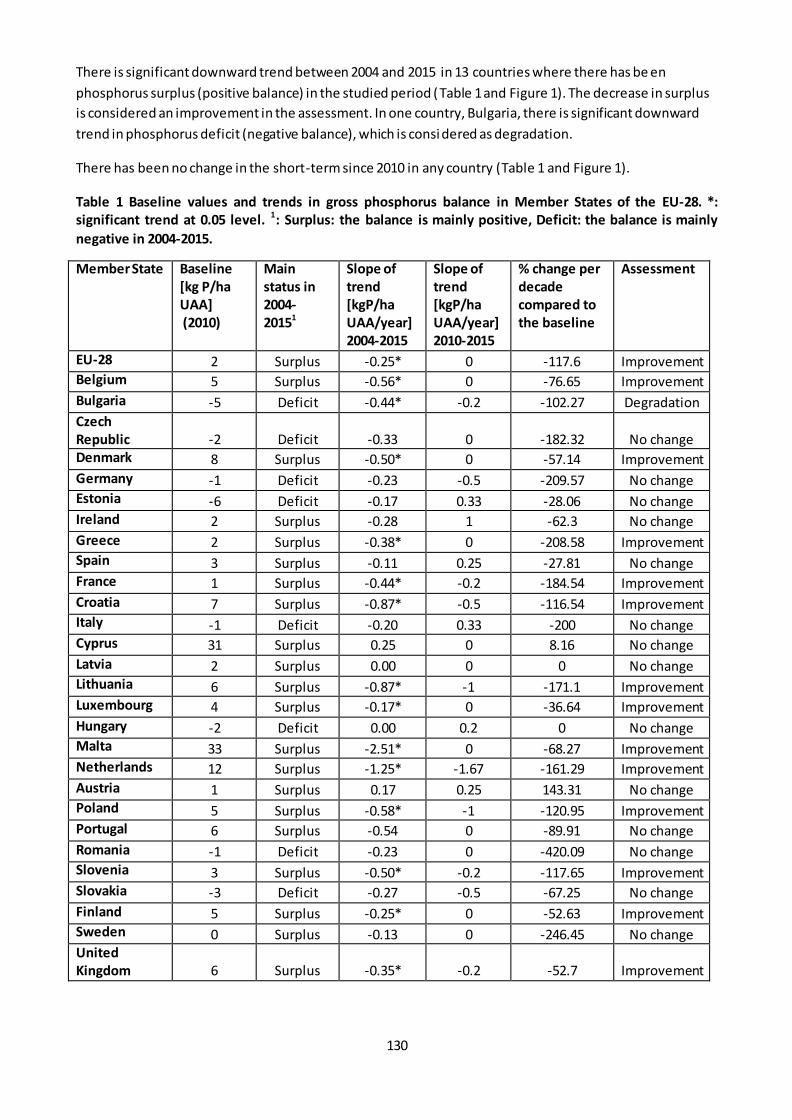
130
There is significant downward trend between 2004 and 2015 in 13 countries where there has be en
phosphorus surplus (positive balance) in the studied period (Table 1 and Figure 1). The decrease in surplus
is considered an improvement in the assessment. In one country, Bulgaria, there is significant downward
trend in phosphorus deficit (negative balance), which is considered as degradation.
There has been no change in the short-term since 2010 in any country (Table 1 and Figure 1).
Table 1 Baseline values and trends in gross phosphorus balance in Member States of the EU-28. *:
significant trend at 0.05 level. 1: Surplus: the balance is mainly positive, Deficit: the balance is mainly
negative in 2004-2015.
Member State Baseline
[kg P/ha
UAA]
(2010)
Main
status in
2004-
20151
Slope of
trend
[kgP/ha
UAA/year]
2004-2015
Slope of
trend
[kgP/ha
UAA/year]
2010-2015
% change per
decade
compared to
the baseline
Assessment
EU-28 2 Surplus -0.25* 0 -117.6 Improvement Belgium 5 Surplus -0.56* 0 -76.65 Improvement
Bulgaria -5 Deficit -0.44* -0.2 -102.27 Degradation
Czech
Republic -2 Deficit -0.33 0 -182.32 No change Denmark 8 Surplus -0.50* 0 -57.14 Improvement
Germany -1 Deficit -0.23 -0.5 -209.57 No change Estonia -6 Deficit -0.17 0.33 -28.06 No change Ireland 2 Surplus -0.28 1 -62.3 No change
Greece 2 Surplus -0.38* 0 -208.58 Improvement Spain 3 Surplus -0.11 0.25 -27.81 No change France 1 Surplus -0.44* -0.2 -184.54 Improvement
Croatia 7 Surplus -0.87* -0.5 -116.54 Improvement Italy -1 Deficit -0.20 0.33 -200 No change Cyprus 31 Surplus 0.25 0 8.16 No change
Latvia 2 Surplus 0.00 0 0 No change Lithuania 6 Surplus -0.87* -1 -171.1 Improvement Luxembourg 4 Surplus -0.17* 0 -36.64 Improvement
Hungary -2 Deficit 0.00 0.2 0 No change Malta 33 Surplus -2.51* 0 -68.27 Improvement Netherlands 12 Surplus -1.25* -1.67 -161.29 Improvement
Austria 1 Surplus 0.17 0.25 143.31 No change Poland 5 Surplus -0.58* -1 -120.95 Improvement Portugal 6 Surplus -0.54 0 -89.91 No change
Romania -1 Deficit -0.23 0 -420.09 No change Slovenia 3 Surplus -0.50* -0.2 -117.65 Improvement Slovakia -3 Deficit -0.27 -0.5 -67.25 No change
Finland 5 Surplus -0.25* 0 -52.63 Improvement Sweden 0 Surplus -0.13 0 -246.45 No change United
Kingdom 6 Surplus -0.35* -0.2 -52.7 Improvement

131
Figure 1 Long-term trend in gross phosphorus balance at country level in the EU-28 (at 0.05 significance
level) from 2004 to 2015. Data source: ESTAT.
3.3. Statistical analysis of the trend
The trends were analysed using the non-parametric Theil-Sen estimator. The significance was tested with
Mann-Kendall test.
3.4. Key trend at EU level
Phosphorous balance showed a significant downward trend of -0.25 kg P/UAA ha/y (p = 0.027) from 2004
to 2015 at EU-28 level, but since 2010 no significant change has occurred (Figure 4). The long-term trend
corresponds 117.6 % decrease per decade compared to the baseline value of year 2010 (2 kg P / ha UAA).
Table 2 EU-28 aggregates of gross phosphorus balance in the period with available data (2004-2015).
Year 2005 2006 2007 2008 2009 2010 2011 2012 2013 2014 2015
Gross P balance (kg P/ha)
4 4 4 2 0 2 1 2 2 1 1
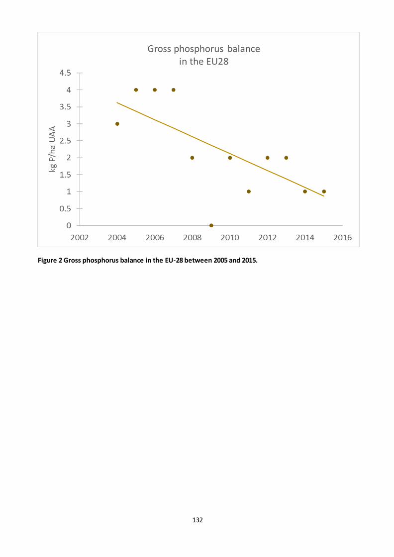
132
Figure 2 Gross phosphorus balance in the EU-28 between 2005 and 2015.
133
Fact sheet 3.2.111: Mineral fertilizer consumption
1. General information
Thematic ecosystem assessment: Cropland and grassland
Indicator class: Pressures - Pollution and nutrient enrichment
Name of the indicator: Consumption of inorganic fertilisers (SEBI 019) (AEI5), nitrogen and
phosphorus
Units: tonnes of nitrogen/phosphorus
2. Data sources
Data holder: EUROSTAT
Data source, weblink:
http://appsso.eurostat.ec.europa.eu/nui/show.do?dataset=aei_fm_usefert&lang=en
Year or time-series range: 2010 - 2017
Access date: 03/07/2019
Reference: https://ec.europa.eu/eurostat/cache/metadata/en/aei_fm_usefert_esms.htm:
Consumption of inorganic fertilisers (aei_fm_usefert), https://ec.europa.eu/eurostat/statistics-
explained/index.php/Agri-environmental_indicator_-_mineral_fertiliser_consumption: Agri-
environmental indicator - mineral fertiliser consumption
3. Assessment of the indicator
3.1. Short description of the scope of the indicator
‘Inorganic fertilizer’ means a fertilizer in which the declared nutrients are in the form of minerals obtained by extraction or by physical and/or chemical industrial processes. Calcium cyanamide, urea and its condensation and association products, and fertilizers containing chelated or complex micro-nutrients may, by convention, be classed as inorganic fertilizers (Regulation (EC) No 2003/2003).
The EUROSTAT data refers to inorganic fertilisers applied to agricultural land.
The indicator is used to assess the pressure from fertilizer use in agriculture. Excessive use of fertilisers can
lead to water, soil and air pollution.
3.2. Maps
A significant upward trend was found in Belgium, Bulgaria, Estonia, Latvia, Lithuania, Hungary, Austria and
Sweden, whereas downward trend was shown in Italy (Figure 1). However, the percentage change per
decade calculated from the 2017 and 2010 values is higher than 5% in most of the countries (Table 1). On
the other hand, the percentage change is lower than 5% in two countries where the linear trend is
significant.
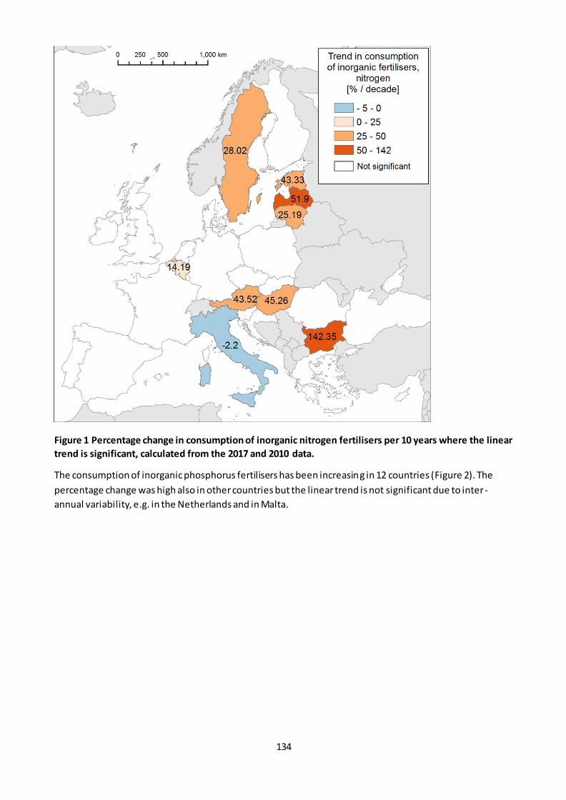
134
Figure 1 Percentage change in consumption of inorganic nitrogen fertilisers per 10 years where the linear
trend is significant, calculated from the 2017 and 2010 data.
The consumption of inorganic phosphorus fertilisers has been increasing in 12 countries (Figure 2). The
percentage change was high also in other countries but the linear trend is not significant due to inter-
annual variability, e.g. in the Netherlands and in Malta.

135
Figure 2 Percentage change in consumption of inorganic phosphorus fertilisers per 10 years where the
linear trend is significant, calculated from the 2017 and 2010 data.
136
Table 1 Baseline and trend in consumption of inorganic fertilisers (nitrogen) by Member State. *:
significant linear trend at 0.05 level
Nitrogen Phosphorus
MS Baseline (2010)
[1000 tonnes N]
Slope
[1000 tonnes
N / year]
%change
/ decade
Baseline (2010)
[1000 tonnes P]
Slope
[1000 tonnes P
/ year]
%change
/ decade
BE 151.34 2.03* 4.43 5.6 0.06 14.09
BG 199.08 27.13* 109.10 17.043 2.78 190.75 CZ 270.26 14.20 67.31 13.654 1.16* 75.55
DK 190.07 2.80 47.22 10 0.86* 87.62
DE 1569.05 15.13 8.18 102.675 0.67 5.54 EE 28.63 1.25* 43.44 2.671 0.19* 72.36
IE 337.57 6.65 13.34 28.235 1.89* 69.76
EL 212.95 -2.29 -13.94 30.073 -0.42 -16.61 ES 940.98 27.37 19.91 147.495 5.35* 35.09
FR 2080.33 23.74 11.53 177.025 -0.74 -3.81
HR 109.35 -4.41 -14.28 15.763 -0.52 -33.97 IT 586.13 -1.29* -2.17 229.716 -0.07 -0.28
CY 9.37 -0.05 -19.76 2.286 0.07 38.57
LV 59.46 3.10* 43.21 6.84 0.65* 89.30 LT 143.20 3.61* 23.89 15 1.21* 83.99
LU 13.77 -0.14 -1.98 0.515 0.00 -1.17
HU 281.43 12.90* 56.53 19.976 3.34* 164.48 MT 0.55 0.01 4.14 0.031 0.00 116.21
NL 205.21 3.42 12.32 12.513 -0.36 -53.76
AT 104.76 4.37* 9.71 12.527 0.35 29.01 PL 1027.43 3.10 17.13 154.183 -4.46 -26.22
PT 100.25 1.21 1.79 18.09 1.41* 115.50
RO 305.76 10.56 35.32 53.849 1.31 26.24 SI 27.49 -0.01 -2.09 4.323 0.00 1.07
SK 106.51 2.32 21.50 7.041 0.42* 55.25
FI 156.52 -1.94 -16.04 12.599 -0.08 -6.60 SE 168.00 4.61* 25.94 9.8 0.60* 61.86
UK 1016.42 4.52 3.31 80.314 0.73* 8.88
3.3. Statistical analysis of the trend
The short-term trends were estimated using the non-parametric Theil-Sen estimator (Sen 1968; Wilcox
2012). The significance of monotonic trends was tested with the two-sided Mann-Kendall non-parametric
test (Gilbert 1987; Kendall 1975; Mann 1945).
3.4. Key trend at EU level
The consumption of inorganic nitrogen fertilisers has been significantly increasing between 2010 and 2017
at a rate of 164 542 tonnes nitrogen per year (Table 2, Figure 3). The trend in the consumption of inorganic
phosphorus fertilisers is not significant, however the percentage change per 10 years is 16 % (Table 2,
Figure 4).

137
Table 2 Statistical data on consumption of inorganic fertilisers in the EU-28. Data source: EUROSTAT. * :
significant trend.
Year 2010 2011 2012 2013 2014 2015 2016 2017 Slope %
change
per 10
years
Nitrogen
[1000
tonnes]
10401.9 10885.7 10384.6 10914.9 11109 11372.7 11203.8 11566 164 542* 15.8
Phosphorus
[1000
tonnes]
1189.8 1273.3 1226.9 1321.3 1312 1285.6 1308.7 1342.5 19 364 16.15
Figure 3 Consumption of inorganic nitrogen fertilisers in the EU-28.
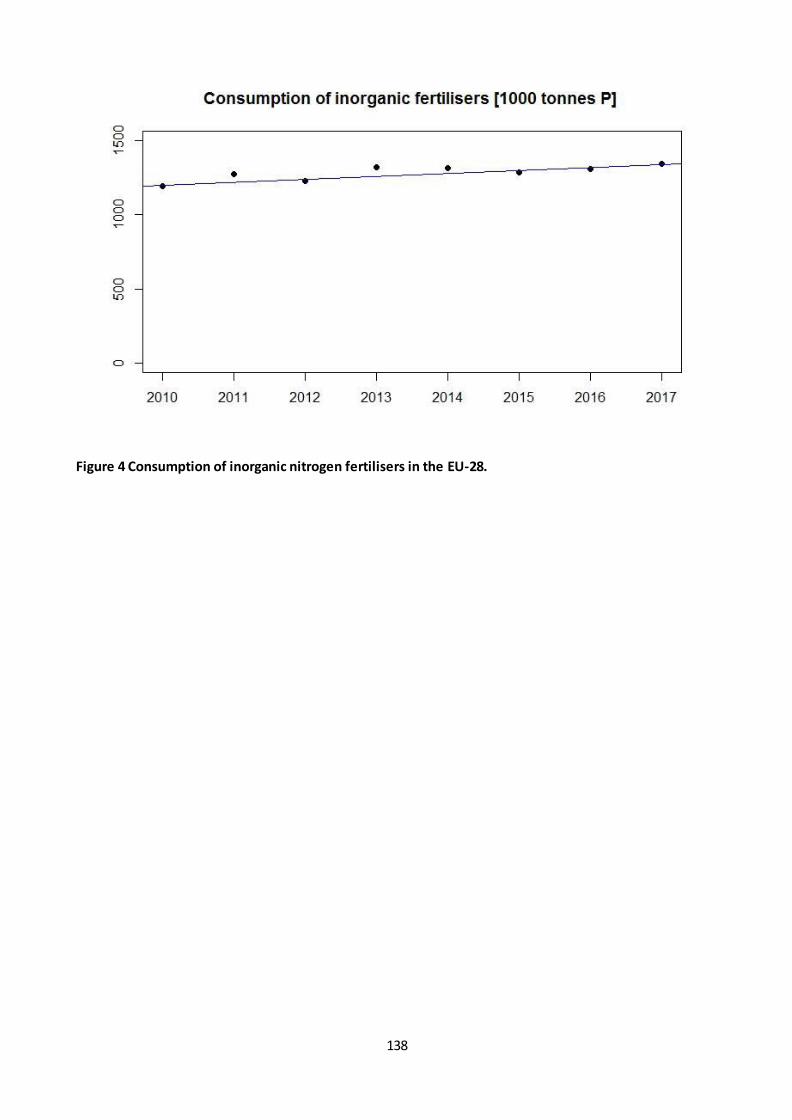
138
Figure 4 Consumption of inorganic nitrogen fertilisers in the EU-28.
139
Fact sheet 3.2.112: Pesticide sales
1. General information
Thematic ecosystem assessment: Cropland and grassland
Indicator class: Pressures - Pollution and nutrient enrichment
Name of the indicator: Pesticide sales
Units: kg active ingredient/year
2. Data sources
Data holder, data source: EUROSTAT
Weblink: http://appsso.eurostat.ec.europa.eu/nui/show.do?dataset=aei_fm_salpest09&lang=en
Year or time-series range: 2011- 2017
Access date--- 09/04/2019
3. Assessment of the indicator
3.1. Short description of the scope of the indicator
There are no EU statistics available on pesticides use in agriculture that could be an indicator of pressure by
pollution. EUROSTAT published a research paper about the data collection on pesticides use between 2010
and 2014 that includes both volume of pesticide used and the area treated (EUROSTAT, 2019). However,
data was collected by crops or crop groups and therefore it is not possible to calculate EU aggregates and
trends. This gap is overcome by using as a proxy data on pesticides sales (in kg of active ingredients) that
have some limitations. Pesticide sales are not always linked to use during the same year and pesticides are
used outside of agriculture in large volumes. So pesticide sales is not a direct indicator of the pressure on
agro-ecosystems. The EUROSTAT database starts from 2011 and contains missing data and confidential
values. There is a break in the time series of the statistics in 2016, because the active substances included in
the major groups were revised between 2011-2015 and 2016. Therefore, the trend in the different groups
of pesticides could not be assessed but the total amount of pesticides is not affected by the changes.
Furthermore, pesticide sales does not fol low a linear trend but can show a high year-to-year variability
depending on the weather, taxes, regulatory changes and other factors.
A complete time series is available only for 12 countries (Belgium, Denmark, Germany, Ireland, Spain,
France, Italy, the Netherlands, Austria, Portugal, Romania and Slovenia). In order to include the remaining
countries as much as possible, different rules were used to impute missing data and not available data due
to confidentiality:
- data is missing in Croatia in 2011 and 2012 (not yet member of the EU) and in Luxembourg in 2017’, the values were imputed taking the values from the closest years (from 2013 for Croatia and 2016
for Luxembourg);
- data gaps due to confidentiality were not filled only if values were 0 in all other years; in this case
the affected quantity is estimated to be less than 3% of the total sold pesticides in the EU, so the
trend analysis is not expected to be affected by these missing values. It led to missing values in one
year in Greece, Hungary and Malta, and made trend analysis impossible for Estonia, Cyprus,
Luxembourg and the UK for which countries’ values are confidential in most or all years;

140
- for countries for which data is missing in more years due to confidentiality and the amounts are
expected to be negligible compared to the totals, based on available data, the total sold pesticides
exclude Molluscicides (for 5 countries) and other plant protection products (for 2 countries);
- other missing data were approximated by 0 assuming that in these cases no pesticide was
authorized in that category.
Additionally, data on pesticide sales do not describe an important characteristic of pesticides: toxicity.
The only available indication describing it is provided by the Harmonised Risk Indicator for pesticid es in
the EU (https://ec.europa.eu/food/plant/pesticides/sustainable_use_pesticides/harmonised-risk-
indicators/trends-hri-eu_en), which shows a 20% reduction in the period 2011-2017.
3.2. Maps
At Member State level, the relative change in the amount of sold pesticides compared to 2011 was higher
than 5 % almost in all countries except Romania (Figure 1, Table 1), increasing in 13 countries and
decreasing in 10 countries.
Figure 1 Decadal % change in EU Member States,calculated from Sen's slope and intercept. In LT, SI, DE,
PL, FR: Other Plant Protection Products or Molluscicides (that are usually used in negligible amounts
compared to the total) excluded in one or more years due to missing data. BG, CZ, EL, HR, HU, MT: there
is one year data gap. Baseline year: 2011, in BG, CZ, EL: 2012, HR: 2013 due to missing data. *: significant
trend according to the Mann-Kendall test. Data source: EUROSTAT.
From the countries with complete time series there is significant downward trend only in Portugal. Based
on the statistical test, there was no significant trend in other Member States, which can mean that there is
no monotonic trend in their data series or the time series were too short ( < 8 points in time).
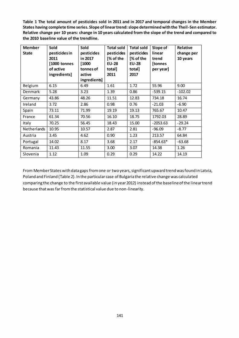
141
Table 1 The total amount of pesticides sold in 2011 and in 2017 and temporal changes in the Member
States having complete time series. Slope of linear trend: slope determined with the Theil -Sen estimator.
Relative change per 10 years: change in 10 years calculated from the slope of the trend and compared to
the 2010 baseline value of the trendline.
Member
State
Sold
pesticides in
2011
[1000 tonnes
of active
ingredients]
Sold
pesticides
in 2017
[1000
tonnes of
active
ingredients]
Total sold
pesticides
[% of the
EU-28
total]
2011
Total sold
pesticides
[% of the
EU-28
total]
2017
Slope of
linear
trend
[tonnes
per year]
Relative
change per
10 years
Belgium 6.15 6.49 1.61 1.72 55.96 9.00
Denmark 5.28 3.23 1.39 0.86 -539.15 -102.02
Germany 43.86 48.26 11.51 12.83 734.18 16.74
Ireland 3.72 2.86 0.98 0.76 -21.03 -6.90
Spain 73.11 71.99 19.19 19.13 765.67 10.47
France 61.34 70.56 16.10 18.75 1792.03 28.89
Italy 70.25 56.45 18.43 15.00 -2053.63 -29.24
Netherlands 10.95 10.57 2.87 2.81 -96.09 -8.77
Austria 3.45 4.62 0.90 1.23 213.57 64.84
Portugal 14.02 8.17 3.68 2.17 -854.63* -63.68
Romania 11.43 11.55 3.00 3.07 14.38 1.26
Slovenia 1.12 1.09 0.29 0.29 14.22 14.19
From Member States with data gaps from one or two years, significant upward trend was found in Latvia,
Poland and Finland (Table 2). In the particular case of Bulgaria the relative change was calculated
comparing the change to the first available value (in year 2012) instead of the baseline of the linear trend
because that was far from the statistical value due to non-linearity.

142
Table 2 The total amount of pesticides sold in 2011 and in 2017 and temporal changes in Member States
for which time series are not complete. 1: the annual totals were estimated in some years in these
countries due to data availability issues. Data on other plant protection products in Lithuania and on
Molluscicides in Lithuania, Slovakia, Finland and Sweden are not available in at least three years out of
the seven but considered to be negligible so excluded. Molluscicides data is excluded from the annual
total in Poland for 2014. *: significant trend, **: change compared to the 2012 statistical value. 2
: Data is
available for 6 years. 3: Data is available in 5 years. n.a.: not available.
Member
State
Sold
pesticides in
2011
[1000 tonnes
of active
ingredients]
Sold
pesticides in
2017
[1000 tonnes
of active
ingredients]
Total sold
pesticides [%
of the EU-28
total]
2011
Total sold
pesticides
[% of the
EU-28
total]
2017
Slope of
linear
trend
[tonnes
per year]
Relative
change
per 10
years
BG2 n.a. 3.38 n.a. 0.90 539.90 405.6**
CZ2 n.a. 5.25 n.a. 1.39 -235.05 -35.06
EE n.a. n.a. n.a. n.a. n.a. n.a.
EL2 n.a. 4.52 n.a. 1.20 -312.15 -49.30
HR3 n.a. 1.58 n.a. 0.42 -118.09 -48.17
CY n.a. 1.11 n.a. 0.30 n.a. n.a.
LV 1.07 1.48 0.28 0.39 92.73* 81.40
LT1 2.56 2.99 0.67 0.80 32.47 12.85
LU n.a. n.a. n.a. n.a. n.a. n.a.
HU2 8.55 9.75 2.24 2.59 251.55 30.51
MT2 0.13 0.11 0.03 0.03 -3.54 -24.00
PL1 21.76 25.07 5.71 6.66 558.26* 25.71
SK1 1.81 2.21 0.47 0.59 56.90 30.22
FI1 3.02 4.36 0.79 1.16 272.77* 94.95
SE1 2.40 2.06 0.63 0.55 -60.06 -24.81
UK 24.43 n.a. 6.41 2017 n.a. n.a.
3.3. Statistical analysis of the trend
The short-term trends were estimated using the non-parametric Theil-Sen estimator (Sen 1968; Wilcox
2012). The significance of monotonic trends was tested with the two-sided Mann-Kendall non-parametric
test (Gilbert 1987; Kendall 1975; Mann 1945). The trend in total sold pesticides was calculated for the
period 2011-2017.
3.3. Key trend at EU level
In order to assess the trend in pesticides sales, the Member State level data were aggregated. According to
the statistical test, the trend is not significant (Figure 2, Table 2), meaning that changes at Member State
level are balanced out.
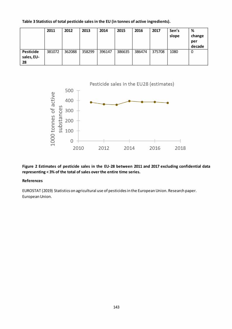
143
Table 3 Statistics of total pesticide sales in the EU (in tonnes of active ingredients).
2011 2012 2013 2014 2015 2016 2017 Sen’s
slope
%
change
per
decade
Pesticide
sales, EU-
28
381072 362088 358299 396147 386635 386474 375708 1080 0
Figure 2 Estimates of pesticide sales in the EU-28 between 2011 and 2017 excluding confidential data
representing < 3% of the total of sales over the entire time series.
References
EUROSTAT (2019) Statistics on agricultural use of pesticides in the European Union. Research paper.
European Union.
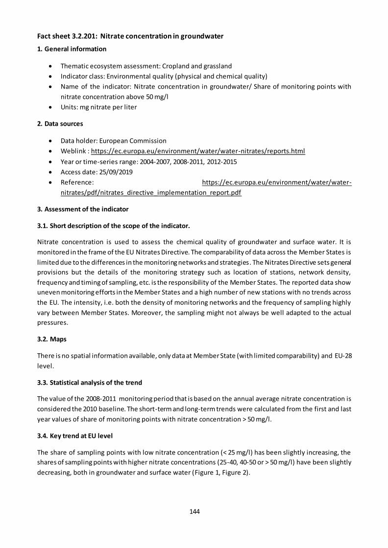
144
Fact sheet 3.2.201: Nitrate concentration in groundwater
1. General information
Thematic ecosystem assessment: Cropland and grassland
Indicator class: Environmental quality (physical and chemical quality)
Name of the indicator: Nitrate concentration in groundwater/ Share of monitoring points with
nitrate concentration above 50 mg/l
Units: mg nitrate per liter
2. Data sources
Data holder: European Commission
Weblink : https://ec.europa.eu/environment/water/water-nitrates/reports.html
Year or time-series range: 2004-2007, 2008-2011, 2012-2015
Access date: 25/09/2019
Reference: https://ec.europa.eu/environment/water/water-
nitrates/pdf/nitrates_directive_implementation_report.pdf
3. Assessment of the indicator
3.1. Short description of the scope of the indicator.
Nitrate concentration is used to assess the chemical quality of groundwater and surface water. It is
monitored in the frame of the EU Nitrates Directive. The comparability of data across the Member States is
limited due to the differences in the monitoring networks and strategies. The Nitrates Directive sets general
provisions but the details of the monitoring strategy such as location of stations, network density,
frequency and timing of sampling, etc. is the responsibility of the Member States. The reported data show
uneven monitoring efforts in the Member States and a high number of new stations with no trends across
the EU. The intensity, i.e. both the density of monitoring networks and the frequency of sampling highly
vary between Member States. Moreover, the sampling might not always be well adapted to the actual
pressures.
3.2. Maps
There is no spatial information available, only data at Member State (with limited comparability) and EU-28
level.
3.3. Statistical analysis of the trend
The value of the 2008-2011 monitoring period that is based on the annual average nitrate concentration is
considered the 2010 baseline. The short-term and long-term trends were calculated from the first and last
year values of share of monitoring points with nitrate concentration > 50 mg/l.
3.4. Key trend at EU level
The share of sampling points with low nitrate concentration (< 25 mg/l) has been slightly increasing, the
shares of sampling points with higher nitrate concentrations (25-40, 40-50 or > 50 mg/l) have been slightly
decreasing, both in groundwater and surface water (Figure 1, Figure 2).
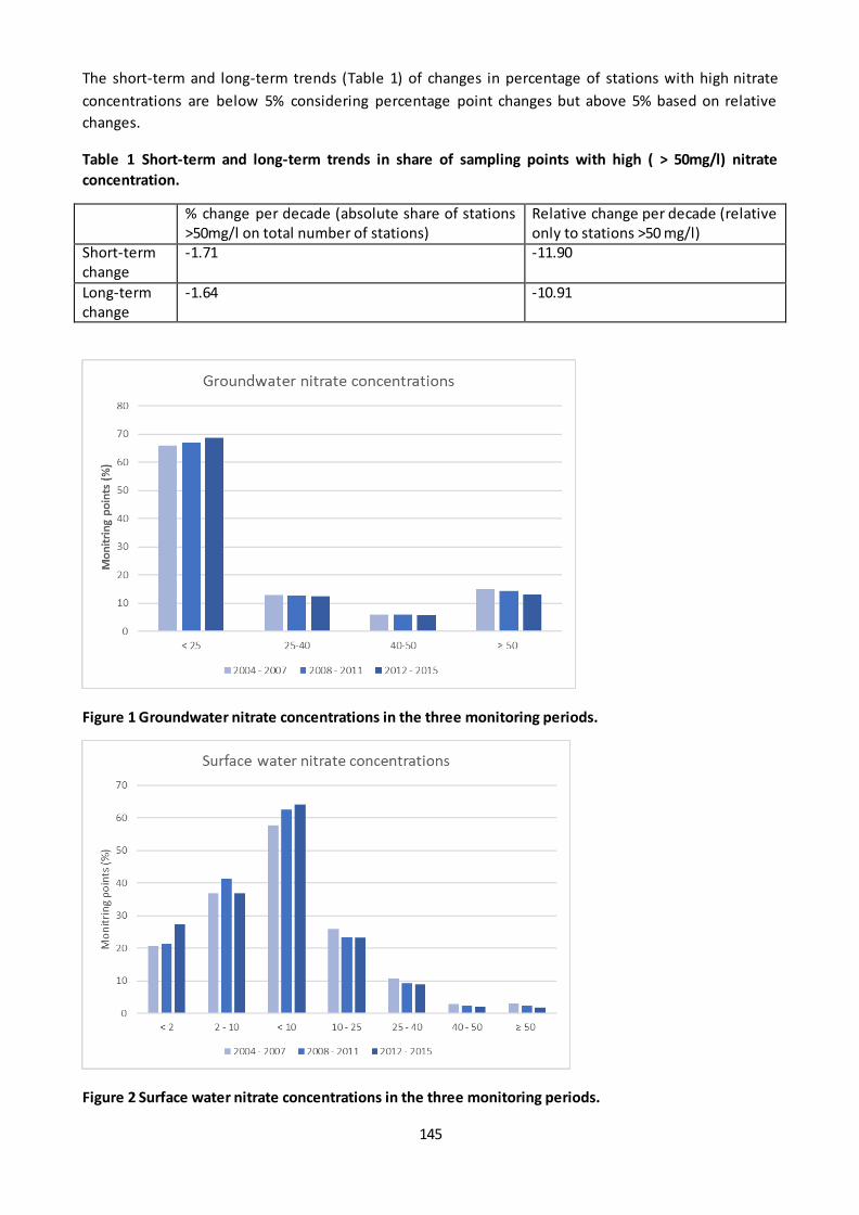
145
The short-term and long-term trends (Table 1) of changes in percentage of stations with high nitrate
concentrations are below 5% considering percentage point changes but above 5% based on relative
changes.
Table 1 Short-term and long-term trends in share of sampling points with high ( > 50mg/l) nitrate
concentration.
% change per decade (absolute share of stations >50mg/l on total number of stations)
Relative change per decade (relative only to stations >50 mg/l)
Short-term change
-1.71 -11.90
Long-term change
-1.64 -10.91
Figure 1 Groundwater nitrate concentrations in the three monitoring periods.
Figure 2 Surface water nitrate concentrations in the three monitoring periods.
146
Fact sheet 3.2.202: Spatial assessment of trend in arable crop diversity
1. General information
Thematic ecosystem assessment: Cropland and grassland
Indicator class: condition
Name of the indicator: Shannon crop diversity index in arable land
Units: dimensionless index
2. Data sources
Data holder: Joint Research Centre Directorate D - Sustainable resources / Unit 05 - Food security,
Agri4Cast resource portal (https://agri4cast.jrc.ec.europa.eu/DataPortal/Index.aspx?o=d)
data source: Elaboration of data from EUROSTAT and from different National Institutes of Statistics
Year or time-series range: 2000-2017
Access date--- 17/10/2019
3. Assessment of the indicator
3.1. Short description of the scope of the indicator
Crop diversity in agroecosystems is a measure of the variety of different crops in a given spatial unit. In
general, higher crop diversity is considered to be beneficial for soil quality, to contrast the emergence of
weeds and pests outbreaks and to support biodiversity, as diverse crops provide a more variegated and
temporally distributed sources of food (e.g. for birds and bats).
JRC Unit D5 collects data on crop acreage in arable land, based on statistics provided by National Institutes
of Statistics and to Eurostat. Based on this, yearly arable crop area is modeled on a 25 Km grid covering the
EU-28. This data has been used to derive, for each grid, the Shannon Diversity Index (SDI) , a common
measure of diversity used in ecology, for arable crops. To this end, data were preprocessed by merging
some categories to avoid double counting. The final dataset contains the following 17 crops: soft wheat,
durum wheat, sunflower, grain maize, fodder maize, spring barley, winter barley, rye, oats, rice, sugar beet ,
potatoes, triticale, field beans, soybean and turnip rapeseed. For each 25km cell, the SDI was calculated
according to the following equation:
𝑆𝐷𝐼𝑗 = − ∑ 𝑐𝑖𝑗 ln 𝑐𝑖𝑗𝑛𝑖=1ln(𝑛)
Where SDIj is the value of the Shannon Diversity Index in cell j; cij is the share (0-1) of the ith crop in cell j, n
is the number of crops considered (=17) and ln is the natural logarithm. The higher the value, the higher the
level of crop diversity. The index is sensitive to both the total number of crops occurring in a cel l and their
relative shares. When there is only one crop in a cell (minimum diversity), the index equals 0. The maximum
possible value would be when all 17 crops are present in a cell with an equal share. In this case, the
numerator of the equation = ln (17) ≈ 2.83. The numerator is divided by ln (17) to normalize the final value
to [0-1].
3.2. Statistical analysis of the trend
The trend was analyzed by calculating the % change both for the long (2000-2017) and short term (2010-
2017) trend per each 25 Km cell. Increases >5% and decreases < -5% were assessed respectively as
“improvement” and “degradation”, whilst any change between -5% and 5% was assessed as “No change”.
147
The 10 years trend calculated on the short term (not shown) does not greatly differ from the long term
trend, and identifiable spatial patterns of change are similar.
3.3. Maps
The following maps (figure 1) shows the value of the SDI in 2010 and in 2017 respectively. It is to be
remarked that the index shows crop diversity in arable land only, not in agricultural areas in general, as
permanent crops and grasslands are not included in the index calculation. The spatial patterns of crop
diversity in 2017 is overall driven by climatic conditions, with higher diversity in the Continental and
Atlantic region, medium to low values in the Mediterranean (lower in islands) and low values in the Boreal
region.
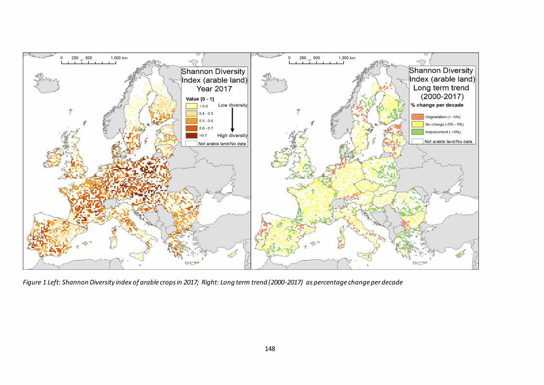
148
Figure 1 Left: Shannon Diversity index of arable crops in 2017; Right: Long term trend (2000-2017) as percentage change per decade
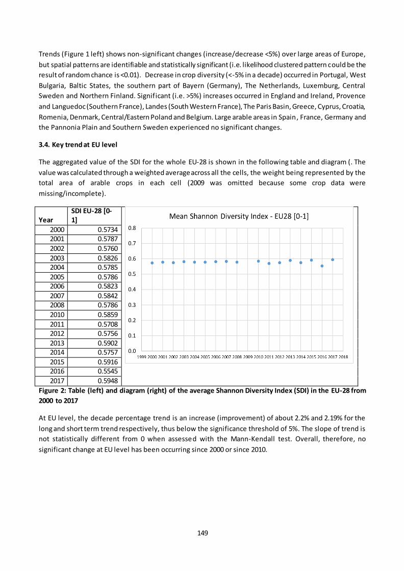
149
Trends (Figure 1 left) shows non-significant changes (increase/decrease <5%) over large areas of Europe,
but spatial patterns are identifiable and statistically significant (i.e. likelihood clustered pattern could be the
result of random chance is <0.01). Decrease in crop diversity (<-5% in a decade) occurred in Portugal, West
Bulgaria, Baltic States, the southern part of Bayern (Germany), The Netherlands, Luxemburg, Central
Sweden and Northern Finland. Significant (i.e. >5%) increases occurred in England and Ireland, Provence
and Languedoc (Southern France), Landes (South Western France), The Paris Basin, Greece, Cyprus, Croatia,
Romenia, Denmark, Central/Eastern Poland and Belgium. Large arable areas in Spain, France, Germany and
the Pannonia Plain and Southern Sweden experienced no significant changes.
3.4. Key trend at EU level
The aggregated value of the SDI for the whole EU-28 is shown in the following table and diagram (. The
value was calculated through a weighted average across all the cells, the weight being represented by the
total area of arable crops in each cell (2009 was omitted because some crop data were
missing/incomplete).
Year
SDI EU-28 [0-
1]
2000 0.5734 2001 0.5787
2002 0.5760
2003 0.5826 2004 0.5785
2005 0.5786 2006 0.5823
2007 0.5842 2008 0.5786
2010 0.5859
2011 0.5708 2012 0.5756
2013 0.5902 2014 0.5757
2015 0.5916 2016 0.5545
2017 0.5948
Figure 2: Table (left) and diagram (right) of the average Shannon Diversity Index (SDI) in the EU-28 from
2000 to 2017
At EU level, the decade percentage trend is an increase (improvement) of about 2.2% and 2.19% for the
long and short term trend respectively, thus below the significance threshold of 5%. The slope of trend is
not statistically different from 0 when assessed with the Mann-Kendall test. Overall, therefore, no
significant change at EU level has been occurring since 2000 or since 2010.
150
Fact sheet 3.2.206: Share of fallow land in utilised agricultural area
1. General information
Thematic ecosystem assessment: Cropland and grassland
Indicator class: Condition - Structural ecosystem attributes (general)
Name of the indicator: Share of fallow land in utilised agricultural area (UAA)
Units: UAA %
2. Data sources
Data holder: EUROSTAT
Weblink: https://appsso.eurostat.ec.europa.eu/nui/show.do?dataset=apro_cpsh1&lang=en
Year or time-series range: 2000 – 2017 by country and NUTS2 regions, 2000 – 2016: EU aggregate is
available
Access date: 21/02/2019
Reference: https://ec.europa.eu/eurostat/statistics-explained/index.php/Glossary:Fallow_land
3. Assessment of the indicator
3.1. Short description of the scope of the indicator
Fallow land is all arable land included in the crop rotation system, whether worked or not, but with no
intention to produce a harvest for the duration of the crop year.
Fallow land can be either:
- bare land bearing no crops at all;
- land with spontaneous natural growth which may be used as feed or ploughed in;
- land sown exclusively for the production of green manure (green fallow).
The common characteristic of all fallow lands that they are left to recover normally for the whole crop year,
therefore they can be beneficiary for biodiversity and ecosystem services. However, their impact depends
on the type of fallow land, on the management and other conditions.
The data is available at EU-28, Member State and NUTS2 region level. Data is missing in several NUTS2
regions in at least 3 years in the period since 2010 so trends were not calculated for those (e.g. in taly,
Finland, Croatia).
3.2. Maps
No significant trend was found in most of the NUTS2 regions in the EU-28 in the short-term (Figure 1).
There was a significant upward trend in a very small number of regions and downward trend is some
regions, mostly in France, Poland, Romania and in Spain.

151
Figure 1 Short-term trend in share of fallow land at regional level (NUTS2) in the EU-28.
3.3. Statistical analysis of the trend
The long-term- and short-term trends were estimated using the non-parametric Theil-Sen estimator (Sen
1968; Wilcox 2012). The significance of monotonic trends was tested with the two-sided Mann-Kendall
non-parametric test (Gilbert 1987; Kendall 1975; Mann 1945). The short-term and long-term relative
changes were calculated from the slope of the trends and the baseline value (2010) of the trendline.
3.4. Key trend at EU level
The extent of fallow land decreased by 2 548 740 ha between 2010 (8 928 530 ha) and 2016 (6 379 790 ha)
in the EU-28 (Figure 1, Table 1). The long-term downward trend (2000-2017) is significant, the
corresponding relative decadal change is -37.8%. The relative change calculated from the short-term trend
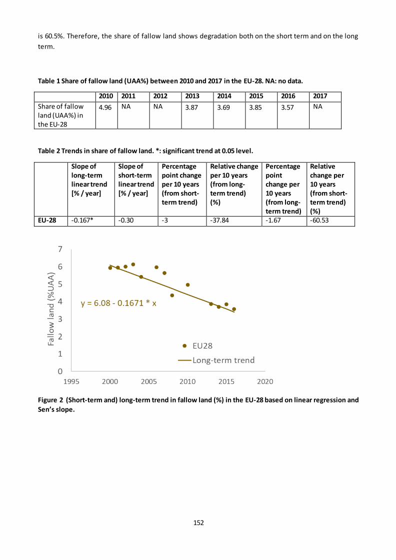
152
is 60.5%. Therefore, the share of fallow land shows degradation both on the short term and on the long
term.
Table 1 Share of fallow land (UAA%) between 2010 and 2017 in the EU-28. NA: no data.
2010 2011 2012 2013 2014 2015 2016 2017
Share of fallow land (UAA%) in the EU-28
4.96 NA NA 3.87 3.69 3.85 3.57 NA
Table 2 Trends in share of fallow land. *: significant trend at 0.05 level.
Slope of
long-term
linear trend
[% / year]
Slope of
short-term
linear trend
[% / year]
Percentage
point change
per 10 years
(from short-
term trend)
Relative change
per 10 years
(from long-
term trend)
(%)
Percentage
point
change per
10 years
(from long-
term trend)
Relative
change per
10 years
(from short-
term trend)
(%)
EU-28 -0.167* -0.30 -3 -37.84 -1.67 -60.53
Figure 2 (Short-term and) long-term trend in fallow land (%) in the EU-28 based on linear regression and
Sen’s slope.
153
Fact sheet 3.2.207: High Nature value (HNV) farmland
1. General information
Thematic ecosystem assessment: Cropland and grassland
Indicator class: Condition - Structural ecosystem attributes (general)
Name of the indicator: Share of HNV farmland in total agricultural area
Units: %
2. Data sources
Data holder: EEA
Weblink: https://www.eea.europa.eu/data-and-maps/data/high-nature-value-farmland
Year or time-series range: 2000, 2006, 2012, 2018
Access date: 18/10/2019
Version: the data is based on the Corine Land Cover accounting layers version v2018_20
(CLC2000ACC_V2018_20.tif, CLC2006ACC_V2018_20.tif, CLC2012ACC_V2018_20.tif and
CLC2018ACC_V2018_20.tif)
Reference: Report 1.7.7.2 – HNV farmland update 2000 – 2018 (2019), Paracchini, M. L.; Petersen,
J.-E.; Hoogeveen, Y.; Bamps, C.; Burfield, I. and van Swaay, C., 2008. High Nature Value Farmland in
Europe. An estimate of the distribution patterns on the basis of land cover and biodiversity data.
JRC Scientific and Technical Reports. European Communities, Luxembourg
3. Assessment of the indicator
3.1. Short description of the scope of the indicator.
The HNV farmland maps aim to provide information on the distribution and extent of farmland that
potentially is of biodiversity value. They are based on Corine land cover and biodiversity related datasets
(Paracchini et al., 2008).
3.2. Maps
The following map (Figure 1) shows the spatial distribution of HNV farmland in 2018
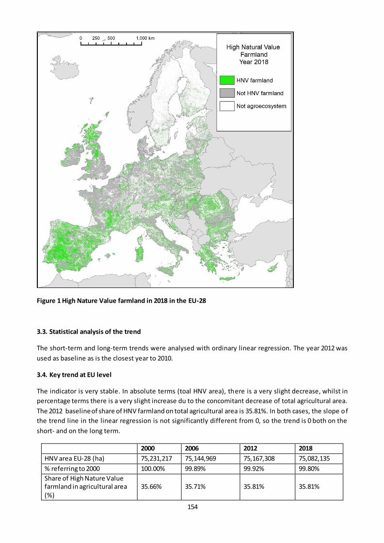
154
Figure 1 High Nature Value farmland in 2018 in the EU-28
3.3. Statistical analysis of the trend
The short-term and long-term trends were analysed with ordinary linear regression. The year 2012 was
used as baseline as is the closest year to 2010.
3.4. Key trend at EU level
The indicator is very stable. In absolute terms (toal HNV area), there is a very slight decrease, whilst in
percentage terms there is a very slight increase du to the concomitant decrease of total agricultural area.
The 2012 baseline of share of HNV farmland on total agricultural area is 35.81%. In both cases, the slope o f
the trend line in the linear regression is not significantly different from 0, so the trend is 0 both on the
short- and on the long term.
2000 2006 2012 2018
HNV area EU-28 (ha) 75,231,217 75,144,969 75,167,308 75,082,135
% referring to 2000 100.00% 99.89% 99.92% 99.80%
Share of High Nature Value farmland in agricultural area (%)
35.66% 35.71% 35.81% 35.81%

155
Locally, some changes are visible in some member states (Figure 2), particularly in Hungary (reflecting
changes in the presence of grasslands), Czech Republic and the western part of the Iberian peninsula,
reflecting shrinkage of traditional agroforestry areas (dehesas and montados)
Figure 2 Long-term trend in share of HNV farmland on total agricultural area.

156
Fact sheet 3.2.208: Share of organic farming in Utilised Agricultural Area
1. General information
Thematic ecosystem assessment: Cropland and grassland
Indicator class: Condition - Structural ecosystem attributes (general)
Name of the indicator: Share of organic farming in UAA
Units: %
2. Data sources
Data holder: EUROSTAT
Weblink:
https://ec.europa.eu/eurostat/tgm/table.do?tab=table&init=1&plugin=1&language=en&pcode=sd
g_02_40
and UAA:
https://ec.europa.eu/eurostat/tgm/table.do?tab=table&init=1&plugin=1&language=en&pcode=tag
00025
Year or time-series range: 2005 - 2017
Access date: 22/01/2019 and 07/02/2019 for organic arable land and grasslands
Reference: https://ec.europa.eu/eurostat/statistics-
explained/index.php/Organic_farming_statistics
3. Assessment of the indicator
3.1. Short description of the scope of the indicator.
The indicator is defined as the share of total utilised agricultural area (UAA) occupied by organic farming,
including existing organically-farmed areas and areas in process of conversion. Organic production of crops
and livestock is defined by the Council Regulation (EC) No 834/2007. The detailed rules for the
implementation of this Regulation are laid down in Commission Regulation (EC) No 889/2008.
The indicator is used to assess the share of agroecosystems under management practices potentially
supporting biodiversity, together with the indicator of share of High Nature Value farmland.
3.2. Statistical analysis of the trend
The long-term- and short-term trends were estimated using the non-parametric Theil-Sen estimator (Sen
1968; Wilcox 2012). The significance of monotonic trends was tested with the two-sided Mann-Kendall
non-parametric test (Gilbert 1987; Kendall 1975; Mann 1945).
The trend in share of organic farming was analysed for the whole EU and for each Member States. The
long-term trend was calculated for the whole period for which data is available (from 2005 for the EU, from
2000, 2003, 2004, 2005 or 2012 depending on the country until 2017). The short-term trend means the
period 2010-2017, starting in 2012 for Croatia due to lack of data from previous years.
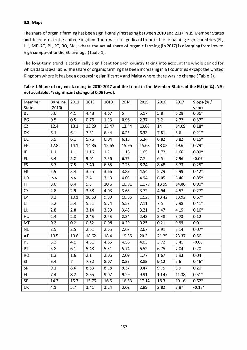
157
3.3. Maps
The share of organic farming has been significantly increasing between 2010 and 2017 in 19 Member States
and decreasing in the United Kingdom. There was no significant trend in the remaining eight countries (EL,
HU, MT, AT, PL, PT, RO, SK), where the actual share of organic farming (in 2017) is diverging from low to
high compared to the EU average (Table 1).
The long-term trend is statistically significant for each country taking into account the whole period for
which data is available. The share of organic farming has been increasing in all countries except the United
Kingdom where it has been decreasing significantly and Malta where there was no change ( Table 2).
Table 1 Share of organic farming in 2010-2017 and the trend in the Member States of the EU (in %). NA:
not available. *: significant change at 0.05 level.
Member State
Baseline (2010)
2011 2012 2013 2014 2015 2016 2017 Slope (% / year)
BE 3.6 4.1 4.48 4.67 5 5.17 5.8 6.28 0.36*
BG 0.5 0.5 0.76 1.13 0.96 2.37 3.2 2.72 0.37*
CZ 12.4 13.1 13.29 13.47 13.44 13.68 14 14.09 0.18*
DK 6.1 6.1 7.31 6.44 6.25 6.33 7.81 8.6 0.21*
DE 5.9 6.1 5.76 6.04 6.18 6.34 6.82 6.82 0.15*
EE 12.8 14.1 14.86 15.65 15.96 15.68 18.02 19.6 0.79*
IE 1.1 1.1 1.16 1.2 1.16 1.65 1.72 1.66 0.09*
EL 8.4 5.2 9.01 7.36 6.72 7.7 6.5 7.96 -0.09
ES 6.7 7.5 7.49 6.85 7.26 8.24 8.48 8.73 0.25*
FR 2.9 3.4 3.55 3.66 3.87 4.54 5.29 5.99 0.42*
HR NA NA 2.4 3.13 4.03 4.94 6.05 6.46 0.85*
IT 8.6 8.4 9.3 10.6 10.91 11.79 13.99 14.86 0.90*
CY 2.8 2.9 3.38 4.03 3.63 3.72 4.94 4.57 0.27*
LV 9.2 10.1 10.63 9.89 10.86 12.29 13.42 13.92 0.67*
LT 5.2 5.4 5.51 5.74 5.57 7.11 7.5 7.98 0.41*
LU 2.8 2.8 3.14 3.39 3.43 3.21 3.47 4.15 0.16*
HU 2.4 2.3 2.45 2.45 2.34 2.43 3.48 3.73 0.12
MT 0.2 0.2 0.32 0.06 0.29 0.25 0.21 0.35 0.01
NL 2.5 2.5 2.61 2.65 2.67 2.67 2.91 3.14 0.07*
AT 19.5 19.6 18.62 18.4 19.35 20.3 21.25 23.37 0.56
PL 3.3 4.1 4.51 4.65 4.56 4.03 3.72 3.41 -0.08
PT 5.8 6.1 5.48 5.31 5.74 6.52 6.75 7.04 0.20
RO 1.3 1.6 2.1 2.06 2.09 1.77 1.67 1.93 0.04
SI 6.4 7 7.32 8.07 8.55 8.85 9.12 9.6 0.46*
SK 9.1 8.6 8.53 8.18 9.37 9.47 9.75 9.9 0.20
FI 7.4 8.2 8.65 9.07 9.29 9.91 10.47 11.38 0.51*
SE 14.3 15.7 15.76 16.5 16.53 17.14 18.3 19.16 0.62*
UK 4.1 3.7 3.41 3.24 3.02 2.89 2.82 2.87 -0.18*
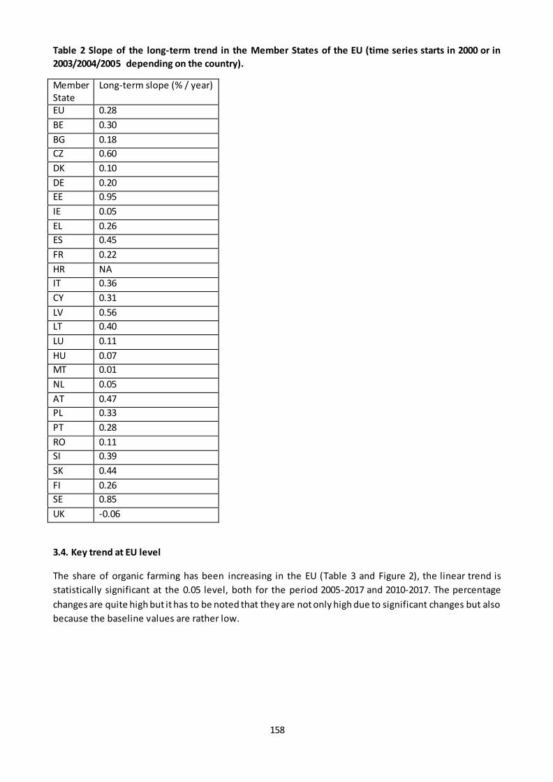
158
Table 2 Slope of the long-term trend in the Member States of the EU (time series starts in 2000 or in
2003/2004/2005 depending on the country).
Member State
Long-term slope (% / year)
EU 0.28
BE 0.30
BG 0.18
CZ 0.60
DK 0.10
DE 0.20
EE 0.95
IE 0.05
EL 0.26
ES 0.45
FR 0.22
HR NA
IT 0.36
CY 0.31
LV 0.56
LT 0.40
LU 0.11
HU 0.07
MT 0.01
NL 0.05
AT 0.47
PL 0.33
PT 0.28
RO 0.11
SI 0.39
SK 0.44
FI 0.26
SE 0.85
UK -0.06
3.4. Key trend at EU level
The share of organic farming has been increasing in the EU (Table 3 and Figure 2), the linear trend is
statistically significant at the 0.05 level, both for the period 2005-2017 and 2010-2017. The percentage
changes are quite high but it has to be noted that they are not only high due to significant changes but also
because the baseline values are rather low.
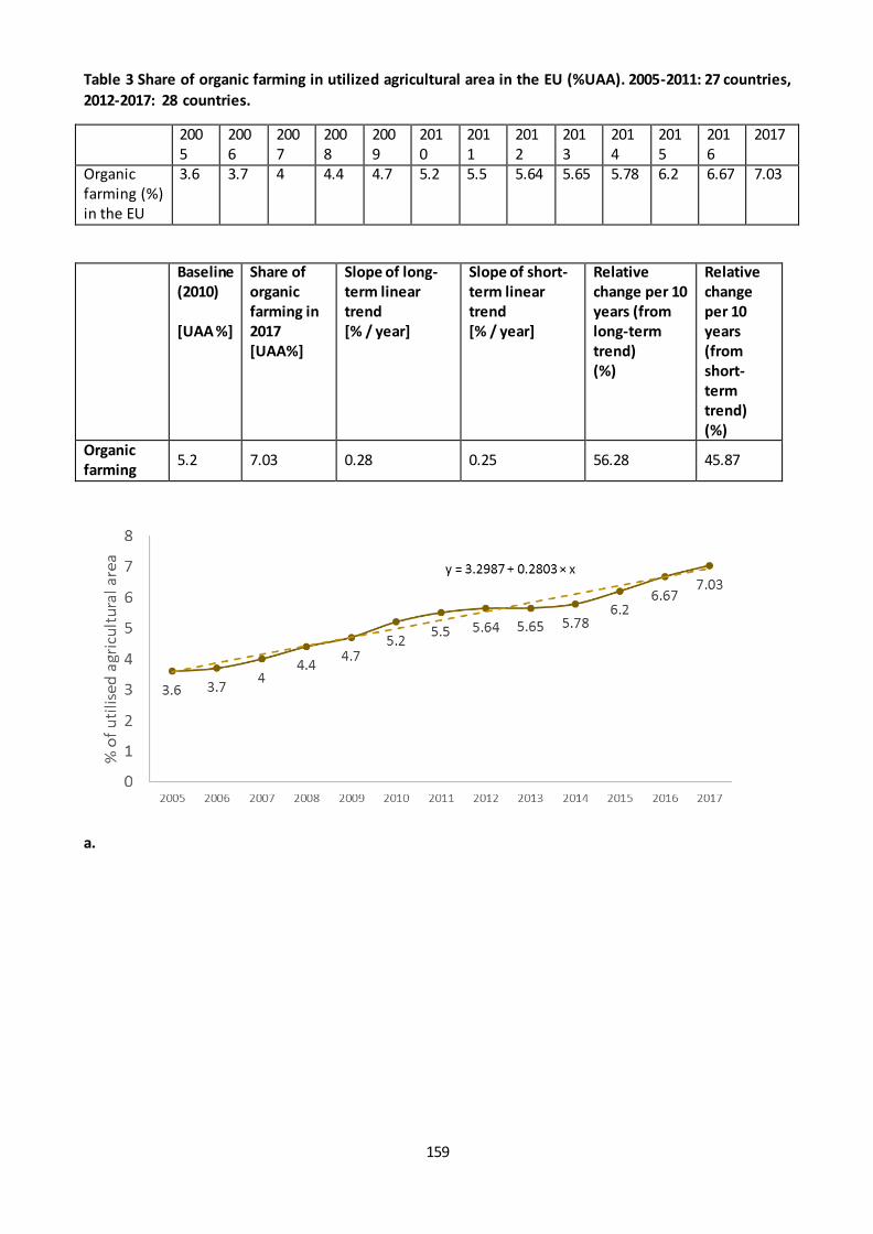
159
Table 3 Share of organic farming in utilized agricultural area in the EU (%UAA). 2005-2011: 27 countries,
2012-2017: 28 countries.
2005
2006
2007
2008
2009
2010
2011
2012
2013
2014
2015
2016
2017
Organic farming (%) in the EU
3.6 3.7 4 4.4 4.7 5.2 5.5 5.64 5.65 5.78 6.2 6.67 7.03
Baseline
(2010)
[UAA %]
Share of
organic
farming in
2017
[UAA%]
Slope of long-
term linear
trend
[% / year]
Slope of short-
term linear
trend
[% / year]
Relative
change per 10
years (from
long-term
trend)
(%)
Relative
change
per 10
years
(from
short-
term
trend)
(%)
Organic
farming 5.2 7.03 0.28 0.25 56.28 45.87
a.
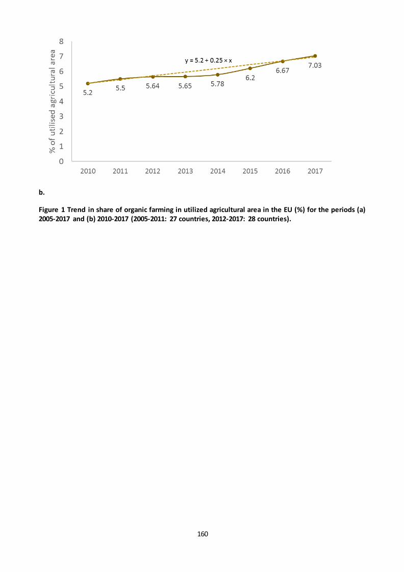
160
b.
Figure 1 Trend in share of organic farming in utilized agricultural area in the EU (%) for the periods (a)
2005-2017 and (b) 2010-2017 (2005-2011: 27 countries, 2012-2017: 28 countries).
161
Fact sheet 3.2.209: Livestock density
1. General information
Thematic ecosystem assessment: Cropland and grassland
Indicator class: Condition - Structural ecosystem attributes (general)
Name of the indicator: Livestock density
Units: Livestock units (LU)/ha
2. Data sources
Data source: EUROSTAT
Data holder: JRC
Weblink:
Livestock density: https://ec.europa.eu/eurostat/databrowser/view/tai09/default/table?lang=en
Utilised agricultural area (UAA) :
http://appsso.eurostat.ec.europa.eu/nui/show.do?dataset=apro_cpsh1&lang=en
Years: 2005, 2007, 2010, 2013, 2016
Access date: 29/11/2019
https://ec.europa.eu/eurostat/web/products-datasets/-/tai09
3. Assessment of the indicator
3.1. Short description of the scope of the indicator
The livestock density index provides the number of livestock units (LSU) per hectare of utilised agricultural
area. The LSU is a reference unit which facilitates the aggregation of livestock from various species and
ages. The Eurofarm LSU coefficients, which are at the basis of this indicator, are established by convention
(originally, they were related to the animals' feed requirements, the reference being a dairy cow with an
annual yield of 3000 kg milk, without additional concentrated feedingstuffs). In the interpretation of the
livestock density index, the limits of this theoretical unit are to be taken into account.
The livestock species aggregated in the LSU total, for the purpose of this indicator, are: equidae, cattle,
sheep, goats, pigs, poultry and rabbits.
The condition of the agroecosystems is assumed to be better where the livestock density is lower.
The indicator is available at country level in 5 years, in every third year between 2005 and 2016. Data is
missing for Croatia in 2005 so it was imputed taking the value from the next year available (2007). 2016
data was provisional for Ireland and Italy. The EU aggregates were calculated as weighted average using
UAA values for weighting.
3.2. Maps
There is an upward short-term trend in 5 countries and downward short-term trend in 10 countries (Table
1). There was an upward long-term trend in 5 countries and downward long-term trend in 15 countries
(Table 1). The upward trend was the highest in Ireland in the short term and in Austria in the short term.
The downward trend was the highest in Croatia in the short term and in Bulgaria in the long te rm.

162
Table 1 Livestock density data between 2003 and 2016
Member State
2005 2007 2010 2013 2016 Short-term trend per 10years
Long-term trend for 10 years
Belgium 2.8 2.76 2.8 2.74 2.79 -0.60 -0.32
Bulgaria 0.49 0.41 0.26 0.22 0.24 -12.82 -87.41 Czechia 0.58 0.58 0.49 0.5 0.51 6.80 -12.99
Denmark 1.69 1.72 1.86 1.58 1.58 -25.09 -5.38 Germany 1.07 1.06 1.07 1.1 1.09 3.12 1.70
Estonia 0.38 0.35 0.33 0.32 0.28 -25.25 -27.55
Ireland 1.47 1.43 1.16 1.2 1.27 15.80 -15.67 Greece 0.62 0.64 0.46 0.44 0.46 0.00 -31.62
Spain 0.58 0.58 0.62 0.62 0.62 0.00 5.87 France 0.82 0.82 0.81 0.79 0.79 -4.12 -3.37
Croatia 0.9 0.9 0.78 0.55 0.48 -64.10 -48.95 Italy 0.75 0.78 0.77 0.77 0.75 -4.33 0.00
Cyprus 1.61 1.69 1.7 1.6 1.54 -15.69 -3.74
Latvia 0.27 0.28 0.26 0.26 0.26 0.00 -3.50 Lithuania 0.46 0.39 0.33 0.29 0.29 -20.20 -46.83
Luxembourg 1.22 1.23 1.28 1.26 1.33 6.51 7.81 Hungary 0.59 0.57 0.53 0.49 0.52 -3.14 -12.01
Malta 4.5 4.8 3.64 3.21 2.92 -32.97 -39.46 Netherlands 3.26 3.35 3.58 3.57 3.8 10.24 13.71
Austria 0.75 0.78 0.87 0.89 0.91 7.66 16.72
Poland 0.72 0.72 0.72 0.64 0.66 -13.89 -7.58 Portugal 0.56 0.58 0.6 0.56 0.61 2.78 7.58
Romania 0.47 0.44 0.41 0.38 0.39 -8.13 -17.74 Slovenia 1.08 1.13 1.07 1 1.05 -3.12 -2.55
Slovakia 0.42 0.39 0.35 0.34 0.33 -9.52 -23.38 Finland 0.51 0.5 0.49 0.51 0.48 -3.40 -5.57
Sweden 0.57 0.57 0.57 0.56 0.57 0.00 0.00
United Kingdom
0.9 0.86 0.79 0.76 0.79 0.00 -12.66
3.3. Statistical analysis of the trend
The relative short-term change was calculated from the last year and 2010 indicator values and the 5% rule
was applied for the assessment of the trend. For the long-term trend, ordinary least squares regression was
fitted on the observed data and the slope was used to calculate the relative change (%/ 10 years).

163
3.4 Key trend at EU level
The EU level weighted average of livestock density shows a slight but significant downward long-term trend
at a rate of -0.0044 unit per decade on the long term (2005-2016), which corresponds to 6.51 % decrease
per decade. The trend on the short term (2010-2016) was 2.96% decrease per decade, which is less than 5%
so livestock density has been stable since 2010.
Figure 1 Livestock density at EU-28 level between 2005 and 2016.
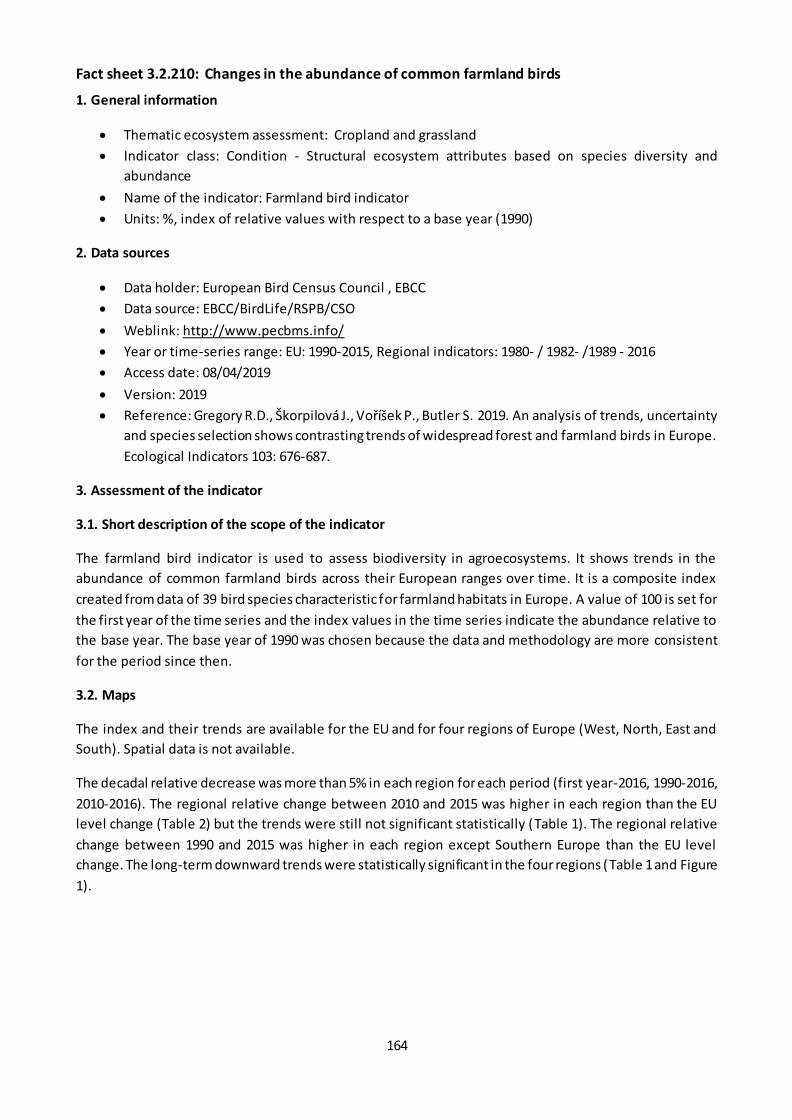
164
Fact sheet 3.2.210: Changes in the abundance of common farmland birds
1. General information
Thematic ecosystem assessment: Cropland and grassland
Indicator class: Condition - Structural ecosystem attributes based on species diversity and
abundance
Name of the indicator: Farmland bird indicator
Units: %, index of relative values with respect to a base year (1990)
2. Data sources
Data holder: European Bird Census Council , EBCC
Data source: EBCC/BirdLife/RSPB/CSO
Weblink: http://www.pecbms.info/
Year or time-series range: EU: 1990-2015, Regional indicators: 1980- / 1982- /1989 - 2016
Access date: 08/04/2019
Version: 2019
Reference: Gregory R.D., Škorpilová J., Voříšek P., Butler S. 2019. An analysis of trends, uncertainty
and species selection shows contrasting trends of widespread forest and farmland birds in Europe.
Ecological Indicators 103: 676-687.
3. Assessment of the indicator
3.1. Short description of the scope of the indicator
The farmland bird indicator is used to assess biodiversity in agroecosystems. It shows trends in the
abundance of common farmland birds across their European ranges over time. It is a composite index
created from data of 39 bird species characteristic for farmland habitats in Europe. A value of 100 is set for
the first year of the time series and the index values in the time series indicate the abundance relative to
the base year. The base year of 1990 was chosen because the data and methodology are more consistent
for the period since then.
3.2. Maps
The index and their trends are available for the EU and for four regions of Europe (West, North, East and
South). Spatial data is not available.
The decadal relative decrease was more than 5% in each region for each period (first year-2016, 1990-2016,
2010-2016). The regional relative change between 2010 and 2015 was higher in each region than the EU
level change (Table 2) but the trends were still not significant statistically (Table 1). The regional relative
change between 1990 and 2015 was higher in each region except Southern Europe than the EU level
change. The long-term downward trends were statistically significant in the four regions (Table 1 and Figure
1).
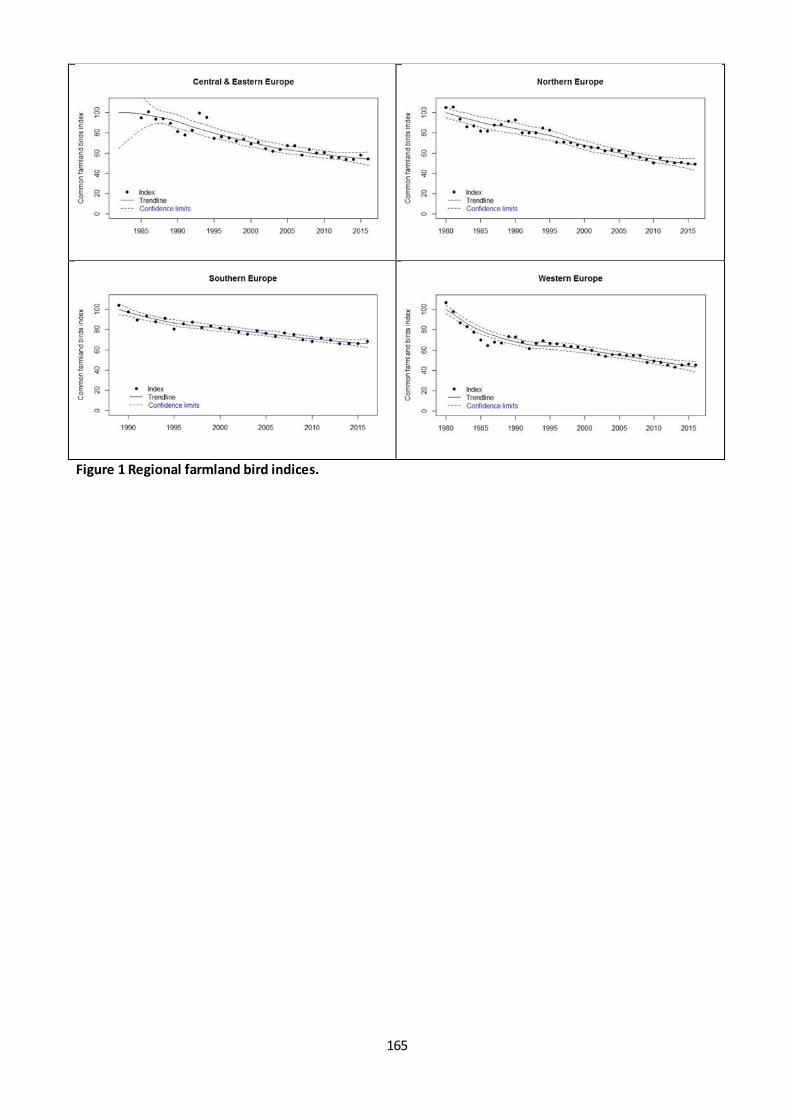
165
Figure 1 Regional farmland bird indices.
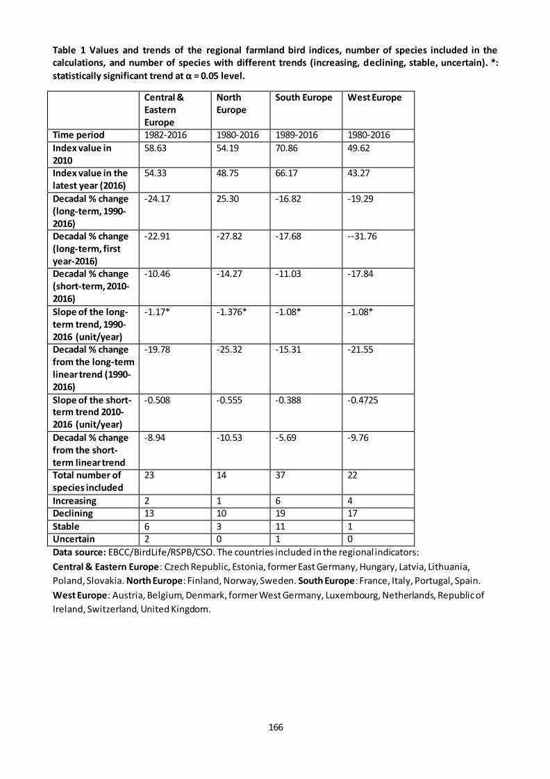
166
Table 1 Values and trends of the regional farmland bird indices, number of species included in the
calculations, and number of species with different trends (increasing, declining, stable, uncertain). *:
statistically significant trend at α = 0.05 level.
Central &
Eastern
Europe
North
Europe
South Europe West Europe
Time period 1982-2016 1980-2016 1989-2016 1980-2016
Index value in
2010
58.63 54.19 70.86 49.62
Index value in the
latest year (2016)
54.33 48.75 66.17 43.27
Decadal % change
(long-term, 1990-
2016)
-24.17 25.30 -16.82 -19.29
Decadal % change
(long-term, first
year-2016)
-22.91 -27.82 -17.68 --31.76
Decadal % change
(short-term, 2010-
2016)
-10.46 -14.27 -11.03 -17.84
Slope of the long-
term trend, 1990-
2016 (unit/year)
-1.17* -1.376* -1.08* -1.08*
Decadal % change
from the long-term
linear trend (1990-
2016)
-19.78 -25.32 -15.31 -21.55
Slope of the short-
term trend 2010-
2016 (unit/year)
-0.508 -0.555 -0.388 -0.4725
Decadal % change
from the short-
term linear trend
-8.94 -10.53 -5.69 -9.76
Total number of
species included
23 14 37 22
Increasing 2 1 6 4 Declining 13 10 19 17
Stable 6 3 11 1 Uncertain 2 0 1 0
Data source: EBCC/BirdLife/RSPB/CSO. The countries included in the regional indicators:
Central & Eastern Europe: Czech Republic, Estonia, former East Germany, Hungary, Latvia, Lithuania,
Poland, Slovakia. North Europe: Finland, Norway, Sweden. South Europe: France, Italy, Portugal, Spain.
West Europe: Austria, Belgium, Denmark, former West Germany, Luxembourg, Netherlands, Republic of
Ireland, Switzerland, United Kingdom.
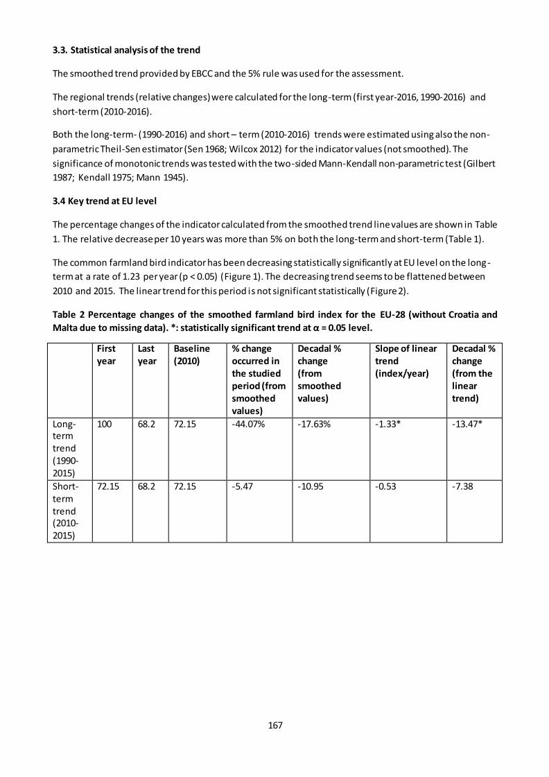
167
3.3. Statistical analysis of the trend
The smoothed trend provided by EBCC and the 5% rule was used for the assessment.
The regional trends (relative changes) were calculated for the long-term (first year-2016, 1990-2016) and
short-term (2010-2016).
Both the long-term- (1990-2016) and short – term (2010-2016) trends were estimated using also the non-
parametric Theil-Sen estimator (Sen 1968; Wilcox 2012) for the indicator values (not smoothed). The
significance of monotonic trends was tested with the two-sided Mann-Kendall non-parametric test (Gilbert
1987; Kendall 1975; Mann 1945).
3.4 Key trend at EU level
The percentage changes of the indicator calculated from the smoothed trend line values are shown in Table
1. The relative decrease per 10 years was more than 5% on both the long-term and short-term (Table 1).
The common farmland bird indicator has been decreasing statistically significantly at EU level on the long-
term at a rate of 1.23 per year (p < 0.05) (Figure 1). The decreasing trend seems to be flattened between
2010 and 2015. The linear trend for this period is not significant statistically (Figure 2).
Table 2 Percentage changes of the smoothed farmland bird index for the EU-28 (without Croatia and
Malta due to missing data). *: statistically significant trend at α = 0.05 level.
First
year
Last
year
Baseline
(2010)
% change
occurred in
the studied
period (from
smoothed
values)
Decadal %
change
(from
smoothed
values)
Slope of linear
trend
(index/year)
Decadal %
change
(from the
linear
trend)
Long-term trend (1990-2015)
100 68.2 72.15 -44.07% -17.63% -1.33* -13.47*
Short-term trend (2010-2015)
72.15 68.2 72.15 -5.47 -10.95 -0.53 -7.38

168
Figure 1 Trend in common farmland bird index in the EU between 1990 and 2015. The dashed lines
represent the confidence limits. Source: EBCC/BirdLife/RSPB/CSO.
Figure 2 Farmland bird indicator of the EU in 2010-2015.
Technical details about the indicator
The index
The index is a is a composite, Multi-Species Indicator (MSI) calculated using Monte Carlo simulations as
described in Soldaat et al. (2017) and an R-script developed by Statistics Netherlands (2017).
The index and their trends for the EU and for regions of Europe (West, North, East and South) were
calculated from different data, from EU and regional individual species indices, respectively. The number of
common farmland bird species included in the EU index is 39.

169
In this assessment, the index calculated based on the single European species habitat classification was
used.
The trendline
The trendlines (smoothed indicators) and their lower and upper confidence limits for the time periods from
1990-onwards were downloaded from the EBCC website. In case of the regional indicators, the baseline
year was different in the different regions. It was 1982 for Central and East Europe, 1989 for Southern
Europe and 1980 for Western Europe and North Europe. More information about the computation of the
indices and the trend can be found on the web link provided.

170
Fact sheet 3.2.211: EU grassland butterfly indicator
1. General information
Thematic ecosystem assessment: Grassland
Indicator class: Condition - Structural ecosystem attributes based on species diversity and
abundance
Name of the indicator: EU grassland butterfly indicator (SEBI 001)
Units: index without unit
2. Data sources
Data holder: EEA, Butterfly Conservation Europe, European Butterfly Monitoring Scheme
partnership, Assessing Butterflies in Europe (ABLE) project
Data source: eBMS: www.butterfly-monitoring.net
Weblink: https://www.eea.europa.eu/data-and-maps/daviz/european-grassland-butterfly-
indicator-3#tab-chart_6
Year or time-series range: 1990-2017
Country coverage: Belgium, Estonia, Finland, France, Germany, Ireland, Lithuania, Luxembourg, the
Netherlands, Portugal, Romania, Slovenia, Spain, Sweden, United Kingdom
Access date: 08/07/2019
Reference: Van Swaay, C.A.M., Dennis, E.B., Schmucki, R., Sevilleja, C.G., Balalaikins, M., Botham,
M., Bourn, N., Brereton, T., Cancela, J.P., Carlisle, B., Chambers, P., Collins, S., Dopagne, C., Escobés,
R., Feldmann, R., Fernández-García, J. M., Fontaine, B., Gracianteparaluceta, A., Harrower, C.,
Harpke, A., Heliölä, J., Komac, B., Kühn, E., Lang, A., Maes, D., Mestdagh, X., Middlebrook, I.,
Monasterio, Y., Munguira, M.L., Murray, T.E., Musche, M., Õunap, E., Paramo, F., Pettersson, L.B,,
Piqueray, J., Settele, J., Stefanescu, C., Švitra, G., Tiitsaar, A., Verovnik, R., Warren, M.S., Wynhoff, I. & Roy, D.B. (2019). The EU Butterfly Indicator for Grassland species: 1990-2017: Technical Report.
Butterfly Conservation Europe & ABLE/eBMS (www.butterfly-monitoring.net). https://butterfly-
monitoring.net/sites/default/files/Publications/Technical%20report%20EU%20Grassland%20indica
tor%201990-2017%20June%202019%20v4%20(3).pdf
3. Assessment of the indicator
3.1. Short description of the scope of the indicator.
The European Grassland Butterfly Indicator is one of the status indicators on biodiversity in Europe. It is based on the population trends of 17 butterfly species in 19 countries. Out of the 17 species, 8 species
showed decline, 2 species stable, 1 species moderate increase and the trend in 6 species is uncertain.
For the interpretation it has to be kept in mind that a large decline of butterflies in north-western Europe
happened before 1990. Large year-to-year fluctuations or a low number of transects can lead to high
uncertainty at EU level. Data is not available from 9 Member States but the coverage can be reasonably
representative. The coverage of the species’ populations may be lower at the beginning of the data series
as countries have been joining in during the years.
3.2. Statistical analysis of the trend
Linear trends were calculated from the unsmoothed indicator. The long-term- and short-term trends were
estimated using the non-parametric Theil-Sen estimator (Sen 1968; Wilcox 2012). The significance of
monotonic trends was tested with the two-sided Mann-Kendall non-parametric test (Gilbert 1987; Kendall

171
1975; Mann 1945). The short-term and long-term relative changes were calculated from the slope of the
trends and the baseline value (2010) of the trendline.
3.3. Key trend at EU level
The grassland butterfly indicator has been significantly decreasing in the long-term (1990-2017). The
relative change per 10 years calculated from the long-term trend (and compared to the 2010 baseline value
of the trend) is 21.6% (Table 1 and Figure 1). The relative change per 10 years calculated from the short-
term trend (and compared to the 2010 baseline value of the trend) is more than 5%. However the trend is
not significant and based on visual inspection of the temporal pattern the values are fluctuating so the
short-term trend is considered unresolved.
Table 1 Changes in grassland butterfly index between 1990 and 2017. *: significant change at 0.05 level.
Baseline (2010) Decadal % change
(calculated from long-
term trend 1990-2017)
[%/10 years)
Decadal % change
(calculated from short-
term trend 2010-2017)
[%/10 years)
Grassland butterfly
indicator
62.15 -21.63 -9.36
Figure 1 Grassland butterfly index. Annual values, long-term and short-term trend. The long-term trend
is significant, short-term trend is not.

172
Fact sheet 3.2.213: Percentage of cropland and grassland covered by Natura 2000 (%)
1. General information
Thematic ecosystem assessment: cropland and grassland
Indicator class: Condition. Structural ecosystem attributes monitored under the EU nature
directives
Name of the indicator: Percentage of cropland and grassland covered by Natura 2000 (%)
Indicator description: The indicator measures the percentage of cropland and grassland protected
by Natura 2000 sites from 2000 to 2018 and the trends.
Units: percentage (%)
2. Data sources
Data holder: EEA
Weblinks:
o Corine Land Cover https://www.eea.europa.eu/data-and-maps/data/corine-land-cover-
accounting-layers#tab-european-data
o Natura 2000 data - the European network of protected sites
https://www.eea.europa.eu/data-and-maps/data/natura-10
Year or time-series range 2000 / 2006 / 2012 / 2018
Versions
o Corine Land Cover 2000 (raster 100m) version 20 accounting layer, Jun. 2019
o Corine Land Cover 2006 (raster 100m) version 20 accounting layer, Jun. 2019
o Corine Land Cover 2012 (raster 100m) version 20 accounting layer, Jun. 2019
o Corine Land Cover 2018 (raster 100m) version 20 accounting layer, Jun. 2019
o Natura 2000 End 2018 – Shapefile
o Natura 2000 End 2013 rev1 - Shapefile
3. Assessment of the indicator
3.1. Short description of the scope of the indicator.
At the EU level, the Nature Directives (Birds and Habitats) are the centerpiece of its nature legislation and
biodiversity policy. The Natura 2000 sites are one of the Nature Directive's main tools that contribute to
ensuring the conservation of many species and habitats of EU interest. Its purpose is primarily to ensure
the conservation of targeted species and habitats of European interest. The Natura 2000 network is largely
complete as far as the terrestrial environment is concerned and connectivity — spatial and functional — of
Natura 2000 sites across national borders is relatively good.
Every country has designated Natura 2000 sites to help conserve the rare habitats and species present in
their territory. Progress in designating sites was slow at first but currently the protected area is over 18 %
of the EU’s land area being the largest network of protected areas in the world (EEA, 2012).
This indicator aims to evaluate how the percentage of cropland and grassland protected by Natura 2000
site has been changed. The changes could be due to changes of ecosystem extent, for example due to
agricultural abandonment, or also be associated with changes in the protection zones, either by the
designation of new areas or by the modification of the limits of those already existing. Both cases are
included in this assessment since the indicator values are obtained by overlapping the spatial information,
by means of spatial analysis tools, of CLC 2000, 2006, 2012 and 2018 with Natura 2000 network informed
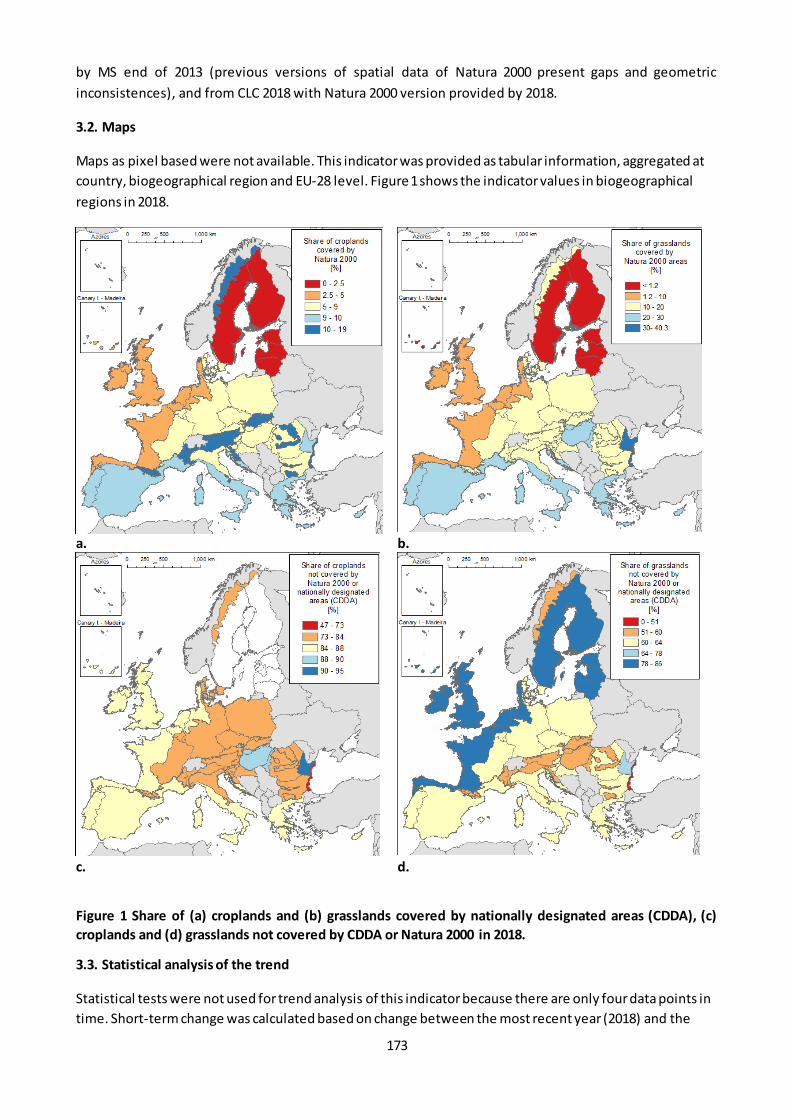
173
by MS end of 2013 (previous versions of spatial data of Natura 2000 present gaps and geometric
inconsistences), and from CLC 2018 with Natura 2000 version provided by 2018.
3.2. Maps
Maps as pixel based were not available. This indicator was provided as tabular information, aggregated at
country, biogeographical region and EU-28 level. Figure 1 shows the indicator values in biogeographical
regions in 2018.
a. b.
c. d.
Figure 1 Share of (a) croplands and (b) grasslands covered by nationally designated areas (CDDA), (c)
croplands and (d) grasslands not covered by CDDA or Natura 2000 in 2018.
3.3. Statistical analysis of the trend
Statistical tests were not used for trend analysis of this indicator because there are only four data points in
time. Short-term change was calculated based on change between the most recent year (2018) and the

174
closest year of Corine mapping to 2010 (2012). Long-term change was calculated based on the difference
between 2018 and 2000. The 2010 baseline value was calculated by linear interpolation.
3.4. Key trend at EU level
The share of cropland and grassland covered by Natura 2000 has not changed in the studied period (Figure
2). The short-term and long-term percentage change per 10 years is 0% both for croplands and grasslands
(Table 1).
Table 1 Percentage of croplands and grasslands covered by Natura 2000 in the period 2000-2018. %
change / 10 years is calculated from the changes between 2012 and 2018 (short-term) and between 2000
and 2018 (long-term).
2000 2006 2012 2018 2010 baseline
% change/10 years (2012-2018)
% change/10 years (2000-2018)
Cropland 5.77 5.78 5.78 5.79 5.78 0.0 0.0
Grassland 10.01 10.03 10.03 10.04 10.03 0.0 0.0
Figure 2 Percentage of croplands and grasslands covered by Natura 2000 in the period 2000-2018.
References
EEA, 2012. Protected areas in Europe - an overview.European Environment Agency. EEA Report / No 5/2012,
s.l.: s.n.
175
Fact sheet 3.2.214: Percentage of cropland and grassland covered by Nationally designated
areas –CDDA
1. General information
Thematic ecosystem assessment: cropland and grassland
Indicator class: Condition. Structural ecosystem attributes monitored under the EU nature
directives
Name of the indicator: Percentage of cropland and grassland covered by CDDA (%)
Indicator description: The indicator measures the percentage of cropland and grassland protected
by nationally designated areas from 2000 to 2018 and the trends.
Units: percentage (%)
2. Data sources
Data holder: EEA
Weblinks:
o Corine Land Cover
https://sdi.eea.europa.eu/catalogue/srv/eng/catalog.search#/metadata/b90803ac-57db-
4653-b393-3e04445a7035
o CDDA data - Nationally designated areashttps://www.eea.europa.eu/data-and-
maps/data/nationally-designated-areas-national-cdda-13
Year or time-series range 2000 / 2006 / 2012 / 2018
Versions
o Corine Land Cover 2000 (raster 100m) version 20 accounting layer, Jun. 2019
o Corine Land Cover 2006 (raster 100m) version 20 accounting layer, Jun. 2019
o Corine Land Cover 2012 (raster 100m) version 20 accounting layer, Jun. 2019
o Corine Land Cover 2018 (raster 100m) version 20 accounting layer, Jun. 2019
o CDDA 2018 – Shapefile
Reference https://www.eea.europa.eu/data-and-maps/indicators/nationally-designated-
protected-areas-10
3. Assessment of the indicator
3.1. Short description of the scope of the indicator
The nationally designated areas -CDDA- is the official source of protected area information from the 39
European countries members of EEA to the World Database of Protected Areas (WDPA). A 'nationally
designated protected area' is an area designated by a national designation instrument, based on national
legislation.
This indicator aims to evaluate how the percentage of cropland and grassland protected by the nationally
designated areas has being changed against time. The changes could be due to changes of e cosystem
extent, for example due to agricultural abandonment, or also be associated with changes in the protection
zones, either by the designation of new areas or by the modification of the limits of those already existing.
This indicator focuses only on the trend in the percentage of protected cropland and grassland due to the
change in the ecosystem extent. The CDDA digital maps are being reported by the countries from 2002,
however this voluntary provision could trigger restrictions on the fully publication of the datasets.
Consequently, the CDDA spatial information is not consistent over time. In fact, the last available dataset,
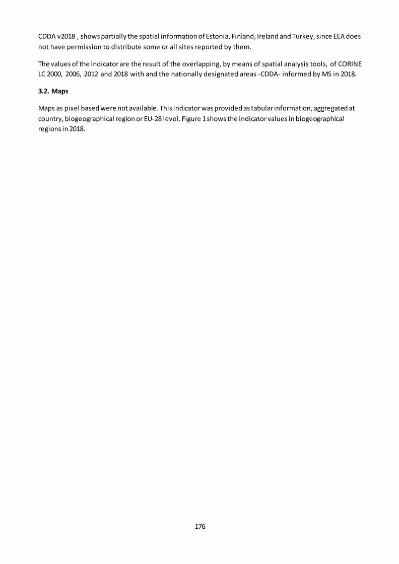
176
CDDA v2018 , shows partially the spatial information of Estonia, Finland, Ireland and Turkey, since EEA does
not have permission to distribute some or all sites reported by them.
The values of the indicator are the result of the overlapping, by means of spatial analysis tools, of CORINE
LC 2000, 2006, 2012 and 2018 with and the nationally designated areas -CDDA- informed by MS in 2018.
3.2. Maps
Maps as pixel based were not available. This indicator was provided as tabular information, aggregated at
country, biogeographical region or EU-28 level. Figure 1 shows the indicator values in biogeographical
regions in 2018.
177
a. b.
c. d.
Figure 1 Share of grasslands covered by nationally designated areas (CDDA) in 2018.
3.3. Statistical analysis of the trend
Statistical tests were not used for trend analysis of this indicator because there are only four data points in
time. The 2010 baseline value was calculated from the 2006 and 2012 values by linear interpolation. Short-
term change was calculated based on change between the most recent year (2018) and the closest year of
Corine mapping to 2010 (2012). Long-term change was calculated based on the difference between 2018
and 2000. The assessment of the indicator was done using the 5% rule.
3.4. Key trend at EU level
The share of cropland and grassland covered by CDDA is around 6 and 13%, respectively (Figure 2). These
shares have not changed in the studied period. The short-term and long-term percentage change per 10
years are both below 5% both for croplands and grasslands (Table 1).
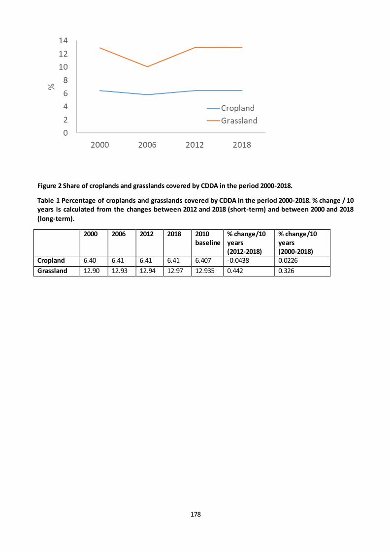
178
Figure 2 Share of croplands and grasslands covered by CDDA in the period 2000-2018.
Table 1 Percentage of croplands and grasslands covered by CDDA in the period 2000-2018. % change / 10
years is calculated from the changes between 2012 and 2018 (short-term) and between 2000 and 2018
(long-term).
2000 2006 2012 2018 2010
baseline
% change/10
years
(2012-2018)
% change/10
years
(2000-2018)
Cropland 6.40 6.41 6.41 6.41 6.407 -0.0438 0.0226
Grassland 12.90 12.93 12.94 12.97 12.935 0.442 0.326
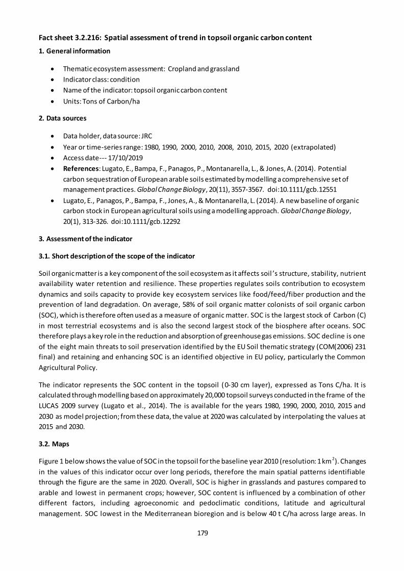
179
Fact sheet 3.2.216: Spatial assessment of trend in topsoil organic carbon content
1. General information
Thematic ecosystem assessment: Cropland and grassland
Indicator class: condition
Name of the indicator: topsoil organic carbon content
Units: Tons of Carbon/ha
2. Data sources
Data holder, data source: JRC
Year or time-series range: 1980, 1990, 2000, 2010, 2008, 2010, 2015, 2020 (extrapolated)
Access date--- 17/10/2019
References: Lugato, E., Bampa, F., Panagos, P., Montanarella, L., & Jones, A. (2014). Potential
carbon sequestration of European arable soils estimated by modelling a comprehensive set of
management practices. Global Change Biology, 20(11), 3557-3567. doi:10.1111/gcb.12551
Lugato, E., Panagos, P., Bampa, F., Jones, A., & Montanarella, L. (2014). A new baseline of organic
carbon stock in European agricultural soils using a modelling approach. Global Change Biology,
20(1), 313-326. doi:10.1111/gcb.12292
3. Assessment of the indicator
3.1. Short description of the scope of the indicator
Soil organic matter is a key component of the soil ecosystem as it affects soil ’s structure, stability, nutrient
availability water retention and resilience. These properties regulates soils contribution to ecosystem
dynamics and soils capacity to provide key ecosystem services like food/feed/fiber production and the
prevention of land degradation. On average, 58% of soil organic matter colonists of soil organic carbon
(SOC), which is therefore often used as a measure of organic matter. SOC is the largest stock of Carbon (C)
in most terrestrial ecosystems and is also the second largest stock of the biosphere after oceans. SOC
therefore plays a key role in the reduction and absorption of greenhouse gas emissions. SOC decline is one
of the eight main threats to soil preservation identified by the EU Soil thematic strategy (COM(2006) 231
final) and retaining and enhancing SOC is an identified objective in EU policy, particularly the Common
Agricultural Policy.
The indicator represents the SOC content in the topsoil (0-30 cm layer), expressed as Tons C/ha. It is
calculated through modelling based on approximately 20,000 topsoil surveys conducted in the frame of the
LUCAS 2009 survey (Lugato et al., 2014). The is available for the years 1980, 1990, 2000, 2010, 2015 and
2030 as model projection; from these data, the value at 2020 was calculated by interpolating the values at
2015 and 2030.
3.2. Maps
Figure 1 below shows the value of SOC in the topsoil for the baseline year 2010 (resolution: 1 km2). Changes
in the values of this indicator occur over long periods, therefore the main spatial patterns identifiable
through the figure are the same in 2020. Overall, SOC is higher in grasslands and pastures compared to
arable and lowest in permanent crops; however, SOC content is influenced by a combination of other
different factors, including agroeconomic and pedoclimatic conditions, latitude and agricultural
management. SOC lowest in the Mediterranean bioregion and is below 40 t C/ha across large areas. In

180
Eastern Europe the interactions between agroeconomic and pedoclimatic conditions produces more
complex SOC distribution patterns, whilst SOC content tends to increase with l atitude, although even at
latitudes >50° N low and medium-low values are modelled over large areas of eastern Germany, Poland
and Denmark, characterized by coarse parent material deposited during the last glacial period. Conversely,
SOC is higher across Hungary and Romania, where the soils are rich in clay. Very high values in the British
island are due to the presence of peatlands.
Figure 1 Soil Organic Carbon content in the topsoil in agroecosystems. Source: own elaboration base on
Lugato et al., 2014
The following Figure 2 shows the absolute (left) and percentage (right) difference in SOC values between
2010 and 2020. Decreases are spread across the Mediterranean region and in eastern and Baltic countries.
Hotspots of decrease are also modelled to occur in the British islands. When calculated as percentage of
2010 values, however, only in very few cases these correspond to decreases greater than 5%. Increases are
projected to occur mainly in the Atlantic bioregion, (Brittany in NW France, Belgium, England) and in
continental region in Germany and some areas in France. Again, very rarely such increase are greater than
5% in relative terms.
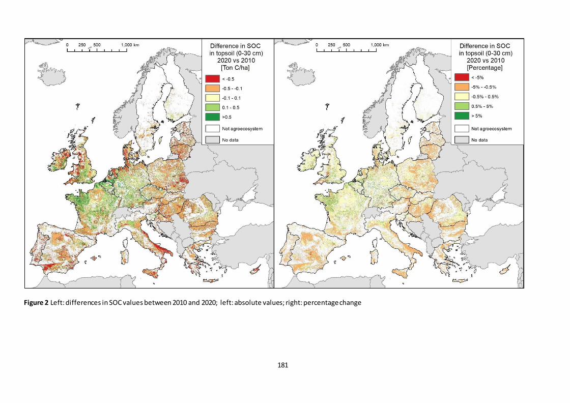
181
Figure 2 Left: differences in SOC values between 2010 and 2020; left: absolute values; right: percentage change
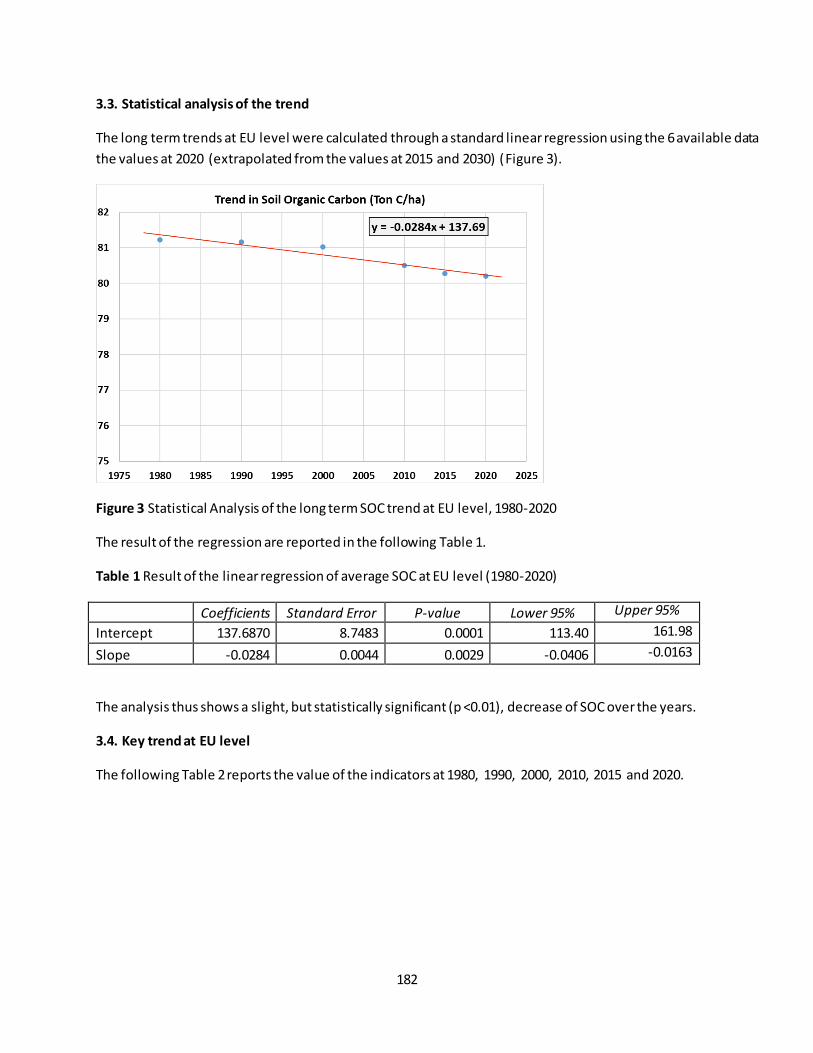
182
3.3. Statistical analysis of the trend
The long term trends at EU level were calculated through a standard linear regression using the 6 available data
the values at 2020 (extrapolated from the values at 2015 and 2030) (Figure 3).
Figure 3 Statistical Analysis of the long term SOC trend at EU level, 1980-2020
The result of the regression are reported in the following Table 1.
Table 1 Result of the linear regression of average SOC at EU level (1980-2020)
Coefficients Standard Error P-value Lower 95% Upper 95%
Intercept 137.6870 8.7483 0.0001 113.40 161.98
Slope -0.0284 0.0044 0.0029 -0.0406 -0.0163
The analysis thus shows a slight, but statistically significant (p <0.01), decrease of SOC over the years.
3.4. Key trend at EU level
The following Table 2 reports the value of the indicators at 1980, 1990, 2000, 2010, 2015 and 2020.

183
Table 2 Average SOC values at EU level from 1980 to 2020 and corresponding fitted values from the linear
regression
Year Average EU SOC (ton/ha)
Fitted value linear regression
1980 81.22 81.37
1990 81.16 81.09
2000 81.03 80.80
2010 80.50 80.52
2015 80.28 80.38
2020 80.20 80.23
The percentage change at 2020 with the baseline year (2010) is -0.373%; the percentage change calculated
using the fitted values of the linear regression for the same year is very similar: -0.353%. The short term trend
is -0.36%. Therefore, at aggregate EU level, in both cases the decrease is very limited. The following bar
diagram (Figure 4) shows the indicators values (second column in Table 2).
Figure 4 Average SOC in topsoil in agroecosystem (EU-28)
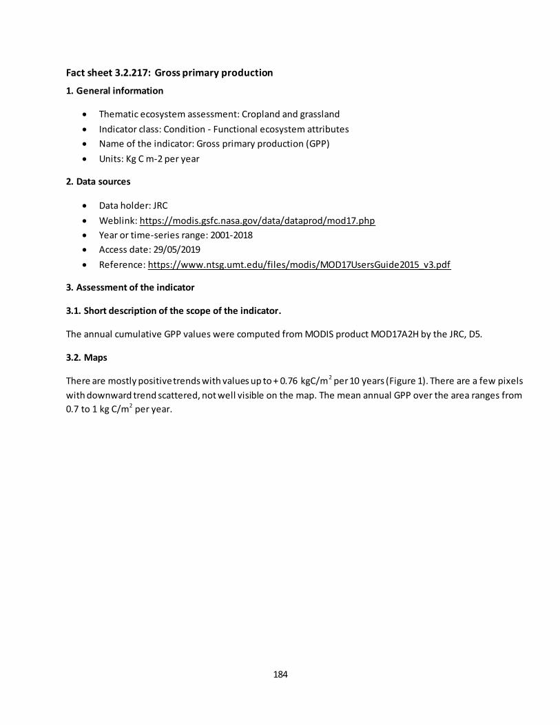
184
Fact sheet 3.2.217: Gross primary production
1. General information
Thematic ecosystem assessment: Cropland and grassland
Indicator class: Condition - Functional ecosystem attributes
Name of the indicator: Gross primary production (GPP)
Units: Kg C m-2 per year
2. Data sources
Data holder: JRC
Weblink: https://modis.gsfc.nasa.gov/data/dataprod/mod17.php
Year or time-series range: 2001-2018
Access date: 29/05/2019
Reference: https://www.ntsg.umt.edu/files/modis/MOD17UsersGuide2015_v3.pdf
3. Assessment of the indicator
3.1. Short description of the scope of the indicator.
The annual cumulative GPP values were computed from MODIS product MOD17A2H by the JRC, D5.
3.2. Maps
There are mostly positive trends with values up to + 0.76 kgC/m2 per 10 years (Figure 1). There are a few pixels
with downward trend scattered, not well visible on the map. The mean annual GPP over the area ranges from
0.7 to 1 kg C/m2 per year.
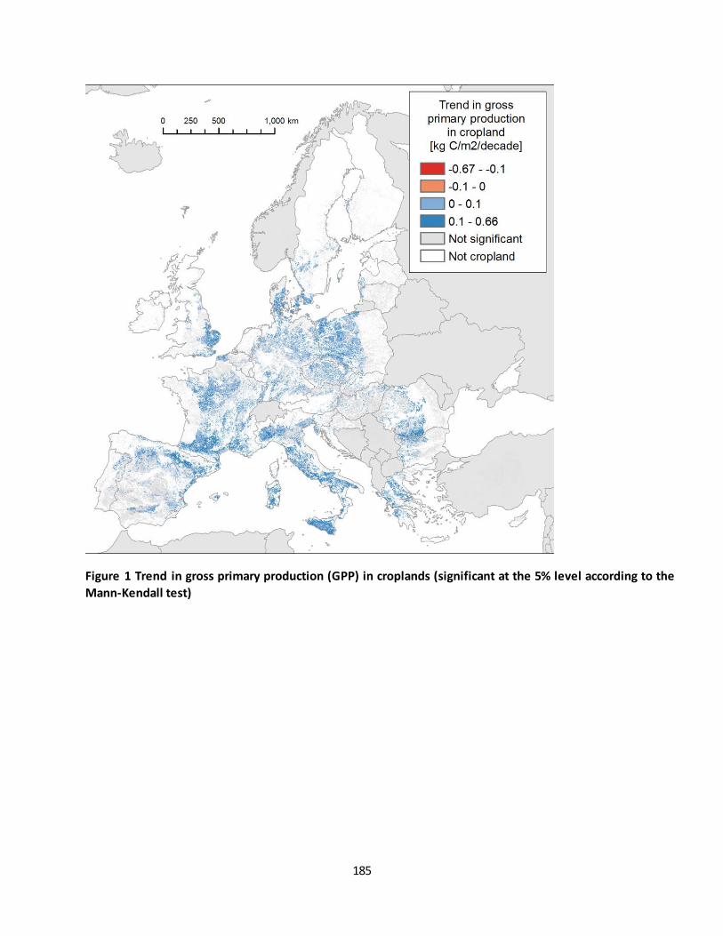
185
Figure 1 Trend in gross primary production (GPP) in croplands (significant at the 5% level according to the
Mann-Kendall test)

186
Figure 2 Trend in gross primary production (GPP) in grasslands (significant at the 5% level according to the
Mann-Kendall test).
Figure 3 Distribution of areas showing significant decrease, increase and no change in gross primary
production.
3.3. Statistical analysis of the trend
The long-term- and short-term trends were estimated using the non-parametric Theil-Sen estimator (Sen 1968;
Wilcox 2012). The significance of monotonic trends was tested with the two-sided Mann-Kendall non-
parametric test (Gilbert 1987; Kendall 1975; Mann 1945). The short-term and long-term relative changes were
calculated from the slope of the trends and the baseline value (2010) of the trendline.
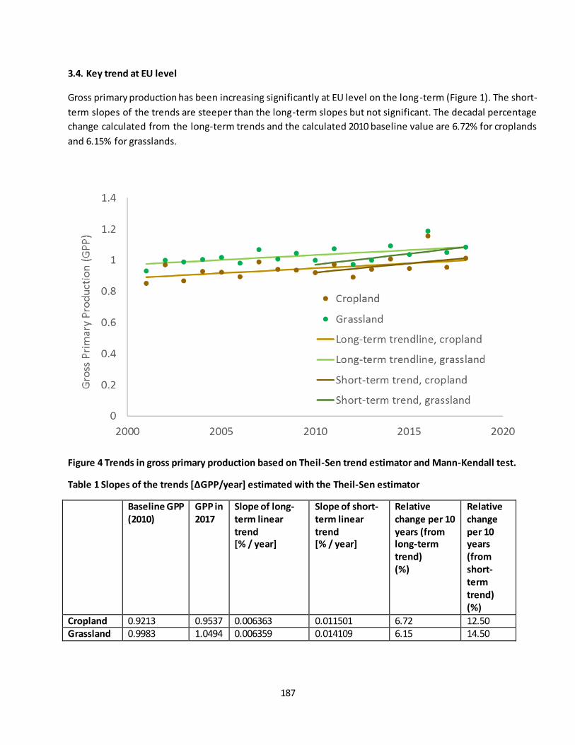
187
3.4. Key trend at EU level
Gross primary production has been increasing significantly at EU level on the long-term (Figure 1). The short-
term slopes of the trends are steeper than the long-term slopes but not significant. The decadal percentage
change calculated from the long-term trends and the calculated 2010 baseline value are 6.72% for croplands
and 6.15% for grasslands.
Figure 4 Trends in gross primary production based on Theil-Sen trend estimator and Mann-Kendall test.
Table 1 Slopes of the trends [ΔGPP/year] estimated with the Theil-Sen estimator
Baseline GPP
(2010)
GPP in
2017
Slope of long-
term linear
trend
[% / year]
Slope of short-
term linear
trend
[% / year]
Relative
change per 10
years (from
long-term
trend)
(%)
Relative
change
per 10
years
(from
short-
term
trend)
(%)
Cropland 0.9213 0.9537 0.006363 0.011501 6.72 12.50 Grassland 0.9983 1.0494 0.006359 0.014109 6.15 14.50
188
Limitations
The MODIS GPP is calculated from the absorbed photosynthetically active radiation (APAR) using a set of biome
specific radiation use efficiency parameters. MODIS uses a global land cover product for the definition of land
cover at 1km pixel level. There can be inconsistencies between the global dataset and the map of MA ES
grasslands and croplands, which can lead to misclassification and inclusion of other land covers in the
calculations.

189
Fact sheet 3.3.101: Forest cover change
1. General information
Thematic ecosystem assessment: Forest
Indicator class: Pressure. Habitat conversion and degradation (Land conversion)
Name of the indicator: Forest cover change
Units: ha/km2 in 6 years
2. Data sources
The indicator is based on existing data:
Maps: Corine Land Cover Change (LCC) accounting layer 2000; 2006; 2012 and 2018
Tabular information: Land ecosystem accounting LEAC. LEAC Cube
Data holder: EEA
Weblinks:
o https://www.eea.europa.eu/data-and-maps/data/corine-land-cover-accounting-layers#tab-
european-data
o https://tableau.discomap.eea.europa.eu/t/Landonline/views/LEACCube2018/LEAC2018
Table
Year or time-series range: 2000, 2006, 2012 and 2018
Versions
o Corine Land Cover 2000 (raster 100m) version 20 accounting layer, Jun. 2019
o Corine Land Cover 2006 (raster 100m) version 20 accounting layer, Jun. 2019
o Corine Land Cover 2012 (raster 100m) version 20 accounting layer, Jun. 2019
o Corine Land Cover 2018 (raster 100m) version 20 accounting layer, Jun. 2019
Reference https://www.eea.europa.eu/data-and-maps/data/corine-land-cover-accounting-layers
3. Assessment of the indicator
3.1. Short description of the scope of the indicator
This indicator aims to evaluate the trends of forest cover change (gain/loss) from 2000 to 2018 based on the
spatial explicit information provided by Corine Land Cover. According to Annex 2 of 1st MAES report (Maes et
al., 2013) the correspondence to woodland and forest ecosystems in Corine land cover are the classes 3.1
(Forest) and 3.2.4 (Transitional woodland shrub).
The change area, by land cover (LC) changes, has been calculated for the following periods: 2000-2006, 2006-
2012, 2012-2018 and 2000-2018. The indicator has two components. (1) Forest loss (the conversion from forest
cover classes to other LC) that includes loss of forest cover resulting from forest operations, natural
disturbances (fires, storms), deforestation and conversion to other non-forest land cover. (2) Forest gain that
includes the conversion from non-forest LC to forest LC, including reforestation after forest operations, natural
expansion and succession and afforestation. The internal changes between different forest types and between

190
forest classes (i.e. 3.1.X CLC classes) and transitional forest (i.e. 3.2.4 CLC class) were not considered as change
(Figure 1).
The indicator focuses on forest dynamics and is complementary to tree cover loss and forest area indicators
(assessed in other fact sheets). The net change is the result of the difference between forest cover loss and
forest cover gain. The final values of the indicator are the average value of net change, expressed in hectares
per square kilometre of forest area.
Figure 1 Methodological sketch about the changes of the ecosystem types accounted for computing the
indicator.
3.2. Maps
The following figures present the forest cover change indicator, by each category and period. Note that the
original resulting maps at 1 km grid size were upscaled to 10 km grid size for better readability in the figures.
Maps for each period at 1 km grid size are not presented in this document. However., the datasets are
available in the MAES server.
Regarding the forest cover loss maps (figures 2-5) Portugal, Western Spain, South of France, Croatia, the Polish-
German border show most of the hotspot areas, whereas the hotspots about forest gain (figures 6-9) are in
Portugal, Ireland, Poland and Hungary.
The overlap of grid cells with forest LC loss and gain is a proxy to identify areas with forest dynamics.
Overall analysis of the maps shows a decline in the rate of change from non-forest LC classes to forest classes
(forest gain) while maintaining the loss of forest. This is observed when comparing the three maps (figure 10-
13) that reveal that the grid cells with negative net change (interpreted as more loss than gain, in purple
colours) remain constant (in relative quantity and intensity) between the maps of the series, while the grid cells
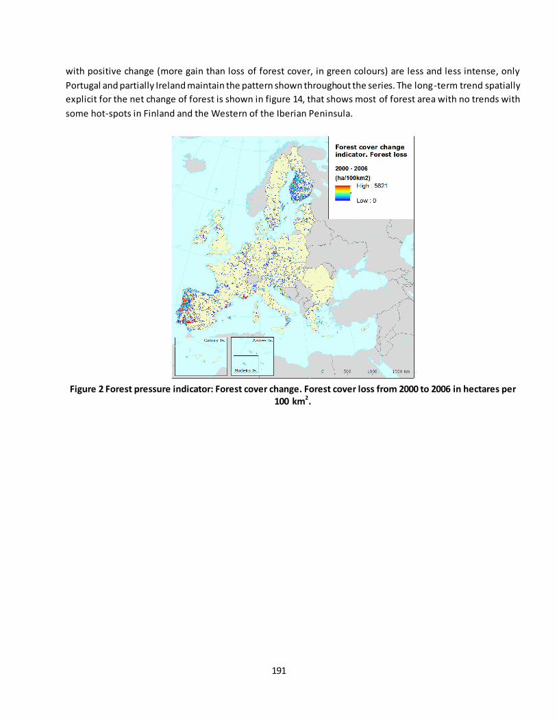
191
with positive change (more gain than loss of forest cover, in green colours) are less and less intense, only
Portugal and partially Ireland maintain the pattern shown throughout the series. The long-term trend spatially
explicit for the net change of forest is shown in figure 14, that shows most of forest area with no trends with
some hot-spots in Finland and the Western of the Iberian Peninsula.
Figure 2 Forest pressure indicator: Forest cover change. Forest cover loss from 2000 to 2006 in hectares per
100 km2.
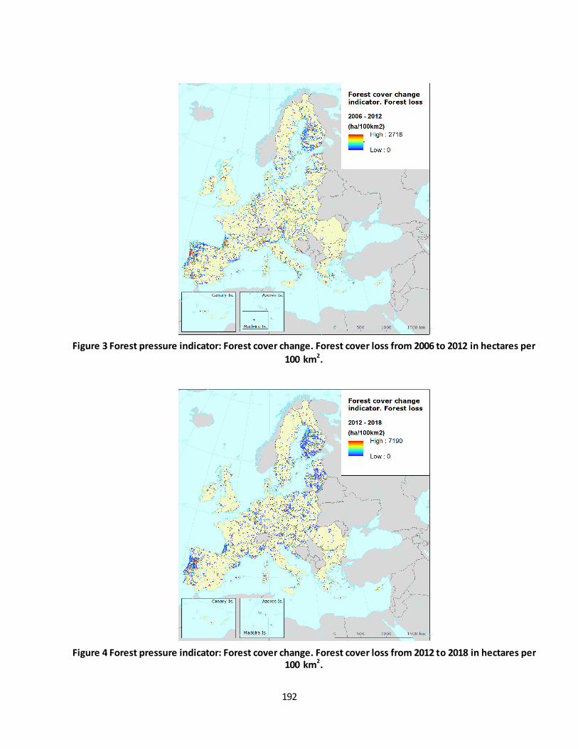
192
Figure 3 Forest pressure indicator: Forest cover change. Forest cover loss from 2006 to 2012 in hectares per
100 km2.
Figure 4 Forest pressure indicator: Forest cover change. Forest cover loss from 2012 to 2018 in hectares per
100 km2.
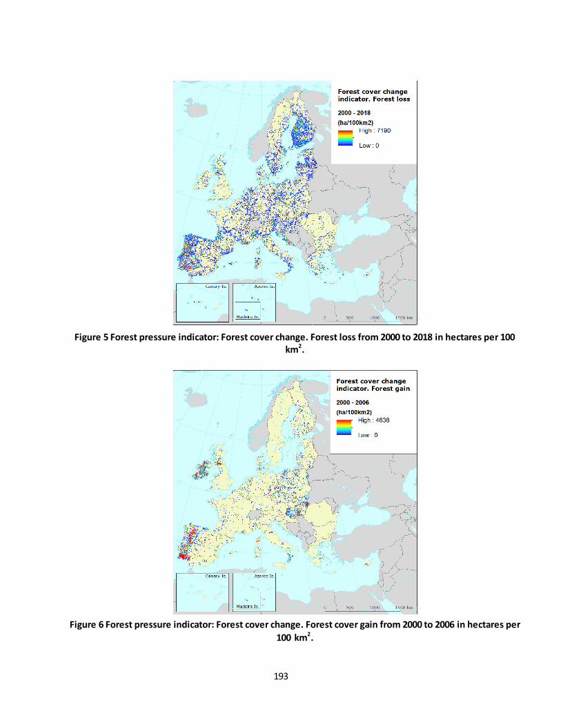
193
Figure 5 Forest pressure indicator: Forest cover change. Forest loss from 2000 to 2018 in hectares per 100
km2.
Figure 6 Forest pressure indicator: Forest cover change. Forest cover gain from 2000 to 2006 in hectares per
100 km2.
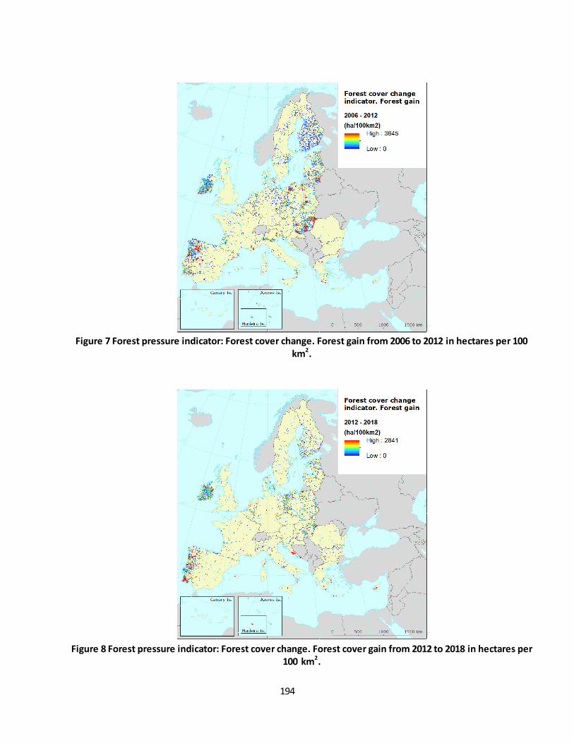
194
Figure 7 Forest pressure indicator: Forest cover change. Forest gain from 2006 to 2012 in hectares per 100
km2.
Figure 8 Forest pressure indicator: Forest cover change. Forest cover gain from 2012 to 2018 in hectares per
100 km2.

195
Figure 9 Forest pressure indicator: Forest cover change. Forest cover gain from 2000 to 2018 in hectares per
100 km2.
Figure 10 Forest pressure indicator: Forest cover change. Net forest change area from 2000 to 2006 in
hectares per 100 km2. Result of subtracting the forest cover loss from the area gain. Negative values mean
that the forest cover loss is higher than the forest cover gain while positive values are the opposite.
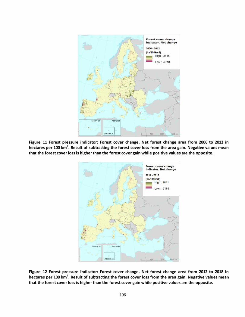
196
Figure 11 Forest pressure indicator: Forest cover change. Net forest change area from 2006 to 2012 in
hectares per 100 km2. Result of subtracting the forest cover loss from the area gain. Negative values mean
that the forest cover loss is higher than the forest cover gain while positive values are the opposite.
Figure 12 Forest pressure indicator: Forest cover change. Net forest change area from 2012 to 2018 in
hectares per 100 km2. Result of subtracting the forest cover loss from the area gain. Negative values mean
that the forest cover loss is higher than the forest cover gain while positive values are the opposite.
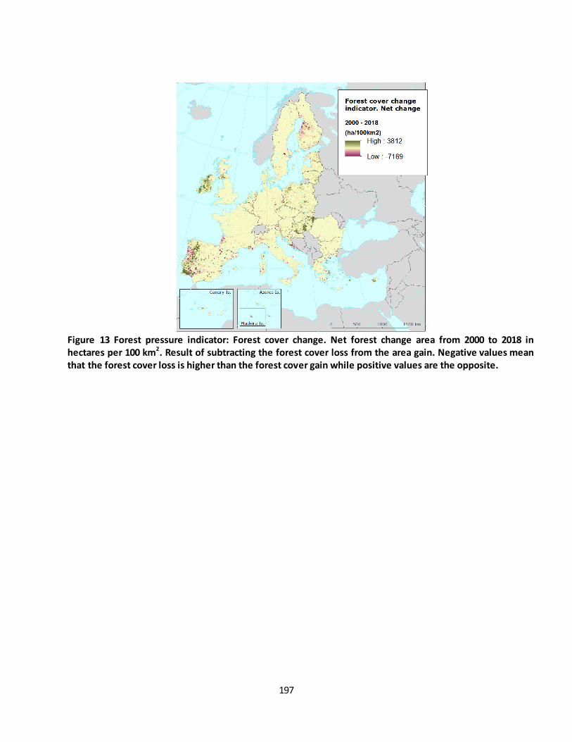
197
Figure 13 Forest pressure indicator: Forest cover change. Net forest change area from 2000 to 2018 in
hectares per 100 km2. Result of subtracting the forest cover loss from the area gain. Negative values mean
that the forest cover loss is higher than the forest cover gain while positive values are the opposite.
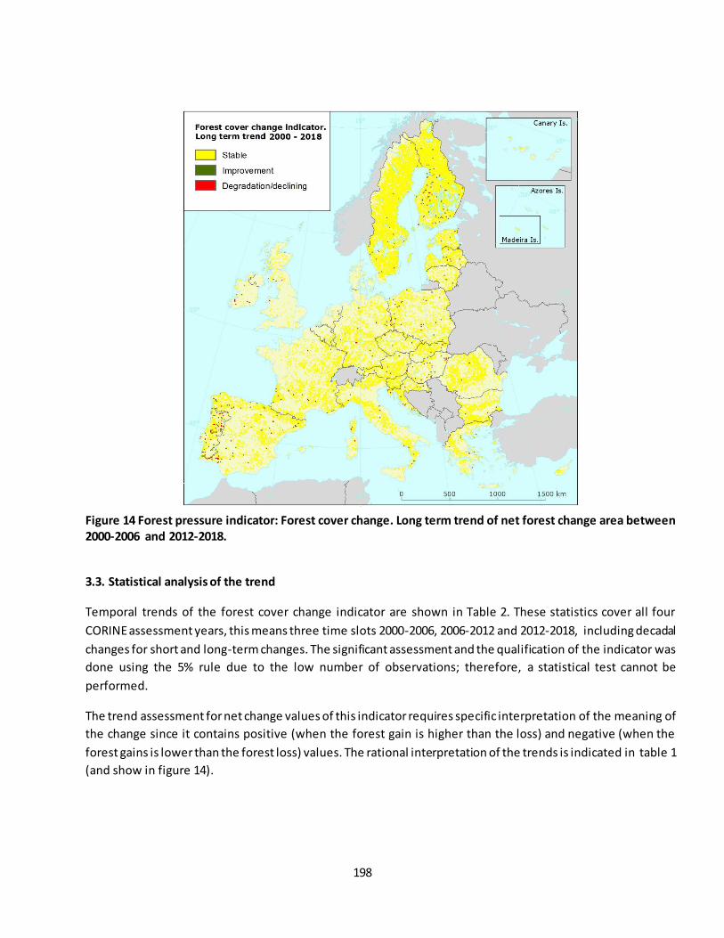
198
Figure 14 Forest pressure indicator: Forest cover change. Long term trend of net forest change area between
2000-2006 and 2012-2018.
3.3. Statistical analysis of the trend
Temporal trends of the forest cover change indicator are shown in Table 2. These statistics cover all four
CORINE assessment years, this means three time slots 2000-2006, 2006-2012 and 2012-2018, including decadal
changes for short and long-term changes. The significant assessment and the qualification of the indicator was
done using the 5% rule due to the low number of observations; therefore, a statistical test cannot be
performed.
The trend assessment for net change values of this indicator requires specific interpretation of the meaning of
the change since it contains positive (when the forest gain is higher than the loss) and negative (when the
forest gains is lower than the forest loss) values. The rational interpretation of the trends is indicated in table 1
(and show in figure 14).

199
Table 1 Short and long-term trend analysis and interpretation for forest cover change indicator.
Net change value
Decadal change rate (%)
5% rule Trend 2000-2006
2012-2018
1 (+) (+) < -5% Significant Degradation / declining if 2012-2018<2000-2006
2 (+) (+) > 5% Significant Improvement --> both positive but 2012-2018 >
2000-2006
2 (+) (-) < -5% Significant Degradation / declining
3 (-) (-) < -5% Significant Improvement --> both negative but 2012-
2018>2000-2006
4 (-) (+) < -5% Significant Improvement
5 0 (+) N/A N/A Improvement
6 - - -5%> <5% Non-
significant Stable
7 0 (+) N/A N/A Improvement
8 0 (-) N/A N/A Degradation / declining
3.4. Key trend at EU level
The indicator was computed as the average of hectares of forests changed per square kilometre across the EU
forest ecosystem extent. The time series is based on the CLC accounting layers available for the years 2000,
2006, 2012 and 2018. This indicator is a proxy of forest dynamics because it describes gain and loss changes in
forest LC classes (see section 3.1).
Table 2 shows the aggregated values at EU-28 level, the average of hectares changed by square kilometre of
forest. The forest cover change indicator shows, for the whole period analysed, average values of less than 1
ha/km2 at EU level indicating non-change. Then, the decadal change rate is considered 0% (no change) because
the average values of Net change in forest ecosystems are less than 1 ha/km2 (<1%) and therefore negligible.
Although the trend at EU level is stable, there are dynamic areas as show the figures 11, 12 and 13, affected in
some cases by unbalanced forest gain and loss. At biogeographical region scale the negative net change forest
area concerns specially the Macaronesian biogeographical region (table 3) where the deforestation pressure,
especially of laurel forests, is important due to agricultural pressures (EC, 2009 a). On the other hand, there is a
positive balance in the Pannonian region (Figure 3) where the area of forest in the hills has, in fact, increased
over the years due to the abandonment of grazing which helped to keep the tall grasses and the commercial
plantation of the invasive false acacia Robinia pseudoacacia (EC, 2009 b).
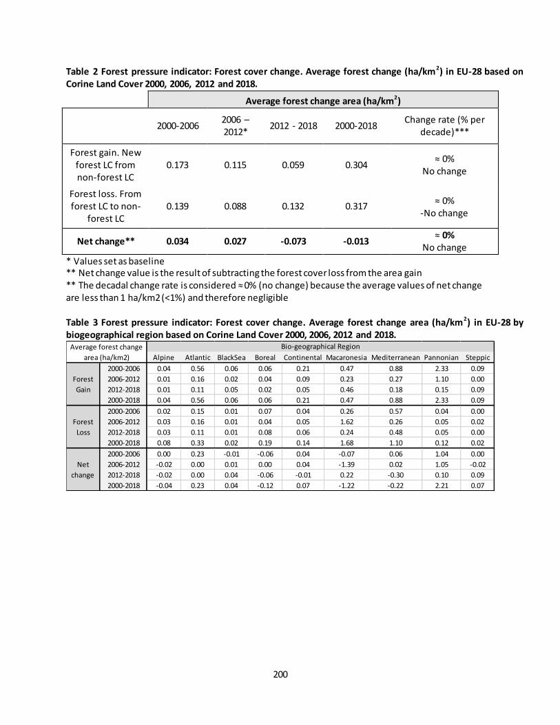
200
Table 2 Forest pressure indicator: Forest cover change. Average forest change (ha/km2) in EU-28 based on
Corine Land Cover 2000, 2006, 2012 and 2018.
Average forest change area (ha/km
2)
2000-2006 2006 – 2012*
2012 - 2018 2000-2018 Change rate (% per
decade)***
Forest gain. New forest LC from non-forest LC
0.173 0.115 0.059 0.304 ≈ 0%
No change
Forest loss. From forest LC to non-
forest LC 0.139 0.088 0.132 0.317
≈ 0% -No change
Net change** 0.034 0.027 -0.073 -0.013 ≈ 0%
No change
* Values set as baseline ** Net change value is the result of subtracting the forest cover loss from the area gain ** The decadal change rate is considered ≈ 0% (no change) because the average values of net change are less than 1 ha/km2 (<1%) and therefore negligible
Table 3 Forest pressure indicator: Forest cover change. Average forest change area (ha/km2) in EU-28 by
biogeographical region based on Corine Land Cover 2000, 2006, 2012 and 2018.
Alpine Atlantic BlackSea Boreal Continental Macaronesia Mediterranean Pannonian Steppic
2000-2006 0.04 0.56 0.06 0.06 0.21 0.47 0.88 2.33 0.09
2006-2012 0.01 0.16 0.02 0.04 0.09 0.23 0.27 1.10 0.00
2012-2018 0.01 0.11 0.05 0.02 0.05 0.46 0.18 0.15 0.09
2000-2018 0.04 0.56 0.06 0.06 0.21 0.47 0.88 2.33 0.09
2000-2006 0.02 0.15 0.01 0.07 0.04 0.26 0.57 0.04 0.00
2006-2012 0.03 0.16 0.01 0.04 0.05 1.62 0.26 0.05 0.02
2012-2018 0.03 0.11 0.01 0.08 0.06 0.24 0.48 0.05 0.00
2000-2018 0.08 0.33 0.02 0.19 0.14 1.68 1.10 0.12 0.02
2000-2006 0.00 0.23 -0.01 -0.06 0.04 -0.07 0.06 1.04 0.00
2006-2012 -0.02 0.00 0.01 0.00 0.04 -1.39 0.02 1.05 -0.02
2012-2018 -0.02 0.00 0.04 -0.06 -0.01 0.22 -0.30 0.10 0.09
2000-2018 -0.04 0.23 0.04 -0.12 0.07 -1.22 -0.22 2.21 0.07
Forest
Gain
Forest
Loss
Net
change
Bio-geographical RegionAverage forest change
area (ha/km2)
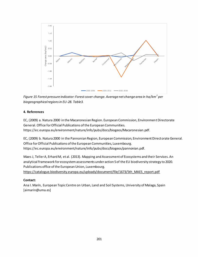
201
Figure 15 Forest pressure indicator: Forest cover change. Average net change area in ha/km
2 per
biogeographical regions in EU-28. Table3.
4. References
EC, (2009) a. Natura 2000 in the Macaronesian Region. European Commission, Environment Directorate
General. Office for Official Publications of the European Communities.
https://ec.europa.eu/environment/nature/info/pubs/docs/biogeos/Macaronesian.pdf.
EC, (2009) b. Natura 2000 in the Pannonian Region, European Commission, Environment Directorate General.
Office for Official Publications of the European Communities, Luxembourg.
https://ec.europa.eu/environment/nature/info/pubs/docs/biogeos/pannonian.pdf.
Maes J, Teller A, Erhard M, et al. (2013). Mapping and Assessment of Ecosystems and their Services. An
analytical framework for ecosystem assessments under action 5 of the EU biodiversity strategy to 2020.
Publications office of the European Union, Luxembourg.
https://catalogue.biodiversity.europa.eu/uploads/document/file/1673/5th_MAES_report.pdf
Contact:
Ana I. Marín, European Topic Centre on Urban, Land and Soil Systems, University of Malaga, Spain

202
Fact sheet 3.3.102: Tree cover loss
1. General information
Thematic ecosystem assessment: Forest condition
Indicator class (See table 1): Pressures - Habitat conversion and degradation
Name of the indicator: Tree cover loss
Units: Ha
2. Data sources:
The indicator is based on processed remote sensing data.
Data holder: University of Maryland, Department of Geographical Sciences
Weblink: https://earthenginepartners.appspot.com/science-2013-global-forest/download_v1.0.html
Year or time-series range: 2001-2012 (v.1) and 2001–2018 (v1.6)
Version: v.1 and v.1.6
Access date: 07/01/2019 and 05/05/2020
Reference: Hansen, M. C., Potapov, P. V., Moore, R., Hancher, M., Turubanova, S. A., Tyukavina, A., et
al. (2013). High-Resolution Global Maps of 21st-Century Forest Cover Change. Science, 342(6160), 850-
853, doi:10.1126/science.1244693.
3. Assessment of the indicator
Changes in tree cover affect the supply of ecosystem services, including habi tat for biodiversity, climate
regulation, erosion protection, carbon storage and water supply (Foley et al. 2005). Fires, windstorms and
forestry are examples of drivers changing tree cover. These drivers affect the condition of forest ecosystems
and therefore its services. The aim of this indicator is to assess the spatial distribution and trends of tree cover
loss in the EU-28 using observational data acquired by remotely sensed imagery sourced from Hansen et al.
(2013).
3.1 Data and methods
Trends in tree cover loss were assessed using the Global Forest Change dataset v.1 for the period 2000-2012
and v1.6 for the period 2011-2018 (Hansen et al. 2013). The reason of using two versions covering different
periods is that, as acknowledged by the data provider22, in v1.6 the data was reprocessed from 2011 onward.
The reprocessing lead to a different and improved detection of tree cover loss from 2011. Therefore, users
might find inconsistencies from 2011 in v1.6. In consequence, the “integrated use of version 1.0 (2001-2012
data) and updated version 1.6 (2011–2018 data) should be performed with caution”. Nevertheless, recent
evidence suggests that these inconsistencies are minor in the data sets covering the European region
(Ceccherini et al., 2020). In addition, we acknowledge that tree cover loss data for the period 2001-2003 might
present some gaps.
This dataset provides data on tree cover loss and tree density (tree canopy cover) available at 30 m grid size.
We used version 1 of this data set for assessing the long-term trend, and version 1.6 for the short term trend.
22
https://earthenginepartners.appspot.com/science-2013-global-forest/download_v1.6.html
203
Tree cover loss is defined as a stand-replacement disturbance, or a change from a forest (tree) to a non-forest
(non-tree) state. This data is encoded as either 1 (loss) or 0 (no loss) for the years 2001 to 2018. The dataset
represents the effects of logging, forest fires, windstorms and other disturbances leading to a change in the
tree cover.
Tree canopy cover is referred to year 2000 and is defined as canopy closure for all vegetation taller than 5m in
height. It is estimated as a percentage per grid cell in the range 0–100.
Trends were assessed by computing tree cover loss per year on each European biogeographical region (EEA
2002, 2019) within the EU-28 countries. Before computing the tree cover loss, we excluded grid cells falling
outside forest areas. For doing so, first, we used the 20% tree canopy cover threshold, similarly to Potapov et
al. (2008) and Heino et al. (2015), to define whether the 30 m grid cells are classified as forest or non-forest.
Second, we used a forest map created using Corine Land Cover (CLC) 2012 (v. 18.5) according to the MAES
(2013) classification of ecosystems for excluding grid cells falling outside forest areas.
3.2 Statistical assessment of the trend
Trends were computed using robust regression. Regression slopes were estimated using the non -parametric
Theil-Sen estimator (Sen 1968; Wilcox 2012) because it accommodates non-normal distributions and is a
robust trend slope estimator resistant to the effects of outliers. Additionally, a two -sided Mann-Kendall
(Gilbert 1987; Kendall 1975; Mann 1945) non-parametric trend test was used to assess the significance of
monotonic trends.
3.3 Key trend at EU level – Results
Results of this assessment indicate upward trends of tree cover loss across biogeographical regions in both
periods in the EU-28, with the exception of the Back Sea and the Macaronesian regions that show downward
trends (Table 1). This might suggests tree cover loss intensification across the EU-28 in both the short and long
term. Nevertheless, statistically significant upward trends were found only in two regions on each period. It
should be noted that the short time range of the series makes challenging assessing trends.
In the EU-28 domain, not statistically significant upward trends were estimated at around 25,000 ha of tree
cover loss per year in the first period, and at 55,000 ha per year in the second period ( Figure 1). The amount of
tree cover loss in 2017, the maximum of the series, is around 1.5 million ha. This is equivalent to half the size of
Belgium and represents around 0.9% of the extent of forest in the EU-28 (161 million ha according to FOREST
EUROPE (2015)). Table 2 shows the decadal trend calculated according to the MAES method.
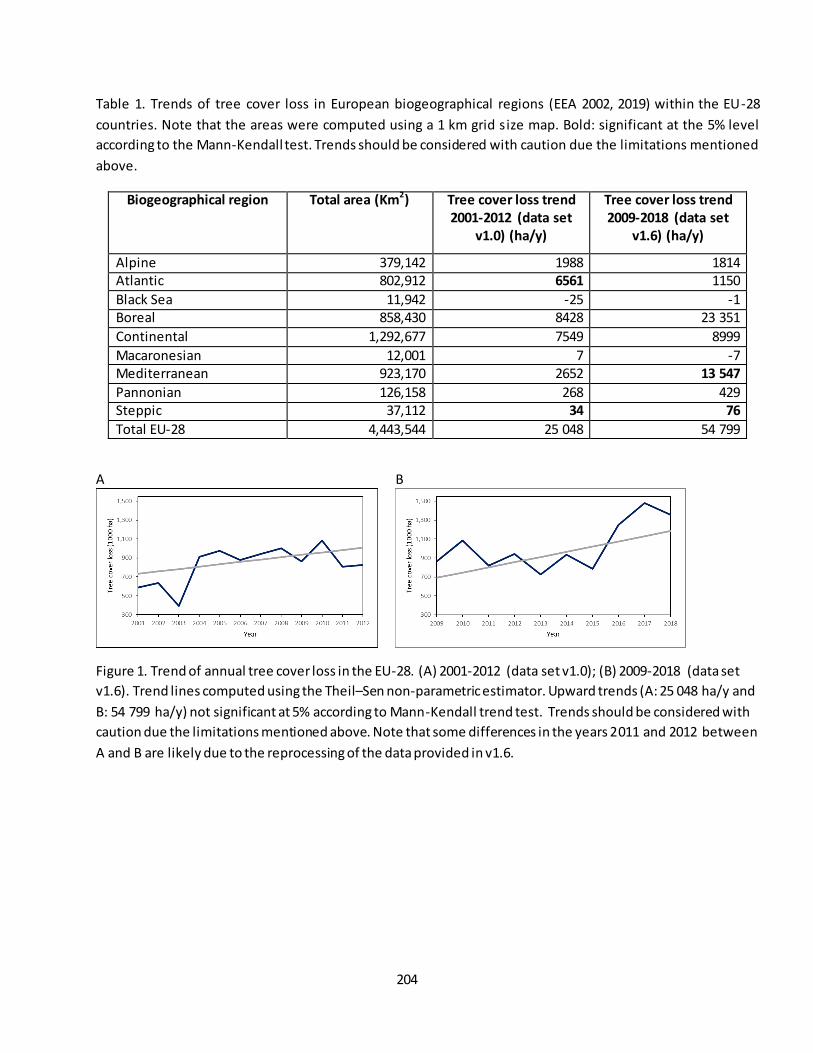
204
Table 1. Trends of tree cover loss in European biogeographical regions (EEA 2002, 2019) within the EU-28
countries. Note that the areas were computed using a 1 km grid size map. Bold: significant at the 5% level
according to the Mann-Kendall test. Trends should be considered with caution due the limitations mentioned
above.
Biogeographical region Total area (Km2) Tree cover loss trend
2001-2012 (data set
v1.0) (ha/y)
Tree cover loss trend
2009-2018 (data set
v1.6) (ha/y)
Alpine 379,142 1988 1814 Atlantic 802,912 6561 1150
Black Sea 11,942 -25 -1 Boreal 858,430 8428 23 351
Continental 1,292,677 7549 8999
Macaronesian 12,001 7 -7 Mediterranean 923,170 2652 13 547
Pannonian 126,158 268 429 Steppic 37,112 34 76
Total EU-28 4,443,544 25 048 54 799
A
B
Figure 1. Trend of annual tree cover loss in the EU-28. (A) 2001-2012 (data set v1.0); (B) 2009-2018 (data set
v1.6). Trend lines computed using the Theil–Sen non-parametric estimator. Upward trends (A: 25 048 ha/y and
B: 54 799 ha/y) not significant at 5% according to Mann-Kendall trend test. Trends should be considered with
caution due the limitations mentioned above. Note that some differences in the years 2011 and 2012 between
A and B are likely due to the reprocessing of the data provided in v1.6.

205
Table 2. Long-term trend and short-term trend of annual tree cover loss in the EU-28. N.S.: not significant at 5%
according to Mann-Kendall trend test. Note: According to the methodology adopted in this assessment a
change is always considered significant in case the percentage change per decade is higher than or equal to +5
% or lower than or equal to -5 %. This is valid for both short and long-term trends and regardless statistical
testing. A change outside this interval is thus always considered as policy-relevant to report. Trends should be
considered with caution due the limitations mentioned above.
Long-term trend Short-term trend
% per decade 26.1 (N.S.) 73.5 (N.S.) Time range 2001-2012 (data set v1.0) 2009-2018 (data set v1.6)
Method Mann-Kendall Mann-Kendall
The assessment of the series 2001-2018 using the data set v1.6 indicates that according to the Mann-Kendall
trend test there is a statistically significant upward trend (p=0.023) of 33,044 ha/y. This is equivalent to a
decadal increase of 35.1%.
3.4 Mapping tree cover loss
A map of average tree cover loss in the 12-year period 2001-2012 (v.1) were computed in grid cells of 10 x 10
km. Using large grid cells provides a more readable map if compared with the maps at the high resolution of
the original data. We summed the annual tree cover loss in the 10 x 10 km grid cells to produce a measure of
tree cover loss from 2001 to 2012 and averaged this over the 12-y (Figure 2). Despite an overall increase of
forest area in the EU-28 (FOREST EUROPE 2015), the map shows regions where the more intense tree cover
loss occurred, for example, Portugal, west France, Sweden, Finland, Slovakia, Czech Republic, som e areas of
Estonia and Latvia, as well as other zones such as the Carpathians, parts of Germany and south Belgium.
Changes in tree cover affect many ecosystem services such as erosion protection or habitat for biodiversity.
Despite that a significant trend was not fond at EU-28 level, Figure 3 shows areas where significant trends of
tree cover loss were found at the grid cell level. The map shows areas whe re intensification of tree cover loss
was occurring, i.e. upward trends. These areas represent around 400,000 km2, which is equivalent to 25% of
the EU-28 forest area. In these zones an increasing amount of tree cover is lost every year.
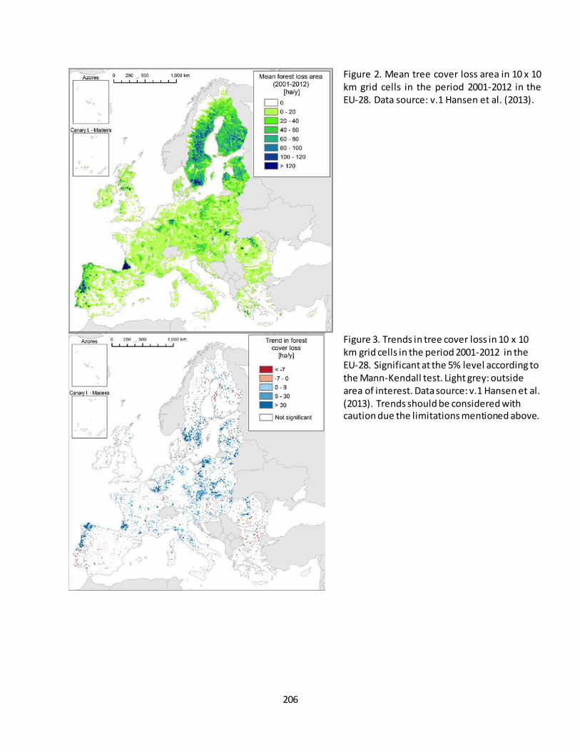
206
Figure 2. Mean tree cover loss area in 10 x 10 km grid cells in the period 2001-2012 in the EU-28. Data source: v.1 Hansen et al. (2013).
Figure 3. Trends in tree cover loss in 10 x 10 km grid cells in the period 2001-2012 in the EU-28. Significant at the 5% level according to the Mann-Kendall test. Light grey: outside area of interest. Data source: v.1 Hansen et al. (2013). Trends should be considered with caution due the limitations mentioned above.
207
References
Ceccherini G., G. Duveiller, G. Grassi, G. Lemoine, V. Avitabile, A. Cescatti. (2020). Abrupt increase in harvested forest area over Europe after 2015, Nature, Vol 583.
EEA (2002). Europe’s biodiversity – biogeographical regions and seas. Luxembourg: European Environment Agency.
EEA (2019). Biogeographical regions. https://www.eea.europa.eu/data-and-maps/data/biogeographical-regions-europe-3#tab-figures-produced2019.
Foley, J. A., DeFries, R., Asner, G. P., Barford, C., Bonan, G., Carpenter, S. R., et al. (2005). Global Consequences of Land Use. Science, 309(5734), 570-574, doi:10.1126/science.1111772.
FOREST EUROPE (2015). State of Europe's Forests 2015. (pp. 312): Ministerial Conference on the Protection of Forests in Europe.
Gilbert, R. O. (1987). Statistical Methods for Environmental Pollution Monitoring. NY, USA: Wiley. Hansen, M. C., Potapov, P. V., Moore, R., Hancher, M., Turubanova, S. A., Tyukavina, A., et al. (2013). High-
Resolution Global Maps of 21st-Century Forest Cover Change. Science, 342(6160), 850-853, doi:10.1126/science.1244693.
Heino, M., Kummu, M., Makkonen, M., Mulligan, M., Verburg, P. H., Jalava, M., et al. (2015). Forest Loss in Protected Areas and Intact Forest Landscapes: A Global Analysis. PLoS ONE, 10(10), e0138918, doi:10.1371/journal.pone.0138918.
Kendall, M. G. (1975). Rank Correlation Methods (4th edition). London: Charles Griffin. MAES (2013). Mapping and Assessment of Ecosystems and their Services - An analytical framework for
ecosystem assessments under Action 5 of the EU Biodiversity Strategy to 2020. (pp. 57). Luxembourg. Mann, H. B. (1945). Nonparametric Tests Against Trend. Econometrica, 13(3), 245-259, doi:10.2307/1907187. Potapov, P., Hansen, M. C., Stehman, S. V., Loveland, T. R., & Pittman, K. (2008). Combining MODIS and Landsat
imagery to estimate and map boreal forest cover loss. Remote Sensing of Environment, 112(9), 3708-3719, doi:10.1016/j.rse.2008.05.006.
Sen, P. K. (1968). Estimates of the Regression Coefficient Based on Kendall's Tau. Journal of the American
Statistical Association, 63(324), 1379-1389, doi:10.2307/2285891. Wilcox, R. R. (2012). Introduction to Robust Estimation and Hypothesis Testing . San Diego, California, USA:
Academic Press.
Contact:
José I. Barredo, European Commission - Joint Research Centre, Ispra, Italy [[email protected]]
Giovanni Caudullo, Arcadia SIT s.r.l., Vigevano, Italy [[email protected]]
208
Fact sheet 3.3.103: Fragmentation by forest cover loss
1. General information
• Thematic ecosystem assessment: Forest
• Indicator class: Pressures, Habitat conversion and degradation
• Name of the indicator: Fragmentation by forest cover loss
• Units: percent; six fragmentation classes: Rare, Patchy, Transitional, Dominant, Interior, Intact
2. Data sources
The indicator is derived from CORINE (v20) land cover data:
• Data holder: JRC; MAES collection. Contact: Peter Vogt
• Weblink: EIONET
• Year or time-series range: 2000, 2006, 2012, 2018
• Reference: summary in Vogt 2019
3. Assessment of the indicator
3.1. Short description of the scope of the indicator.
Forest fragmentation is a key aspect in biodiversity, ecosystem services and the ever-increasing pressure from
anthropogenic land use. Forest fragmentation may lead to the isolation and loss of species and gene pools,
degraded habitat quality, and a reduction in the forest’s ability to sustain the natural processes necessary to
maintain ecosystem health.
The goal of the indicator is to provide intuitive classes of various degree of forest fragmentation. Measuring
the spatial integrity of forest land cover the indicator accounts for key fragmentation aspects, such as isolation
of small fragments and perforations within compact forest patches.
The indicator measures forest area density in a local neighbourhood, which is then classified into six degrees of
fragmentation classes. The result is a map product showing the degree of forest fragmentation at pixel -level
accompanied by a statistical summary table. A conceptually similar approach (Riitters et al. 2002, 2012;
Wickham 2008) is used for official reporting on forest fragmentation by the US-Forest Service (2003, 2010), the
Montréal Process, FAO (indicator 1.5, Vogt et al. 2019a), and Forest Europe (indicator 4.7, Vogt et al. 2019b)
enabling common usage of the same information across disciplines and locations, and permitting rigorous
evaluations of the trade-offs or synergies involved in land-cover pattern management.
Implementation summary:
The CORINE (CLC) land cover maps (https://land.copernicus.eu/pan-european/corine-land-cover) identify 44
land cover classes at a spatial resolution of 1 hectare per pixel (100 m x 100 m) for a series of assessment years
over Europe. The CLC land cover classes 23, 24, 25, 29 are combined into a binary forest/nonforest map. Forest
area density (FAD) is defined as the proportion of all forest pixels within a fixed-area neighbourhood area. FAD
measurements are conducted via a moving window algorithm to create a new map of forest area density: the
given neighbourhood (here, a square window of size 23x23 pixels = 529 hectares) is centred over a given pixel,

209
the forest area density within that neighbourhood is measured and assigned in a new map at the location of
the subject pixel. This process is repeated for all pixels resulting in a new map of the same dimensions but
showing forest area density values for the analysed neighbourhood over each forest pixel; The area density
map may be post-stratified or aggregated in different ways to answer different assessment questions. Within
MAES, the area density values (in [0, 100] %) are converted to an ordered categorical variable (one of six forest
area density classes – Intact (FAD=100%), Interior (FAD=90-99%), Dominant (FAD=60-89%), Transitional
(FAD=4059%), Patchy (FAD=10-39%), and Rare (FAD<10%) indicative for various degrees of forest
fragmentation (see Figure 1). This processing scheme (FAD 6-class) is implemented in the free software
GuidosToolbox (Vogt & Riitters 2017) and further detailed in Vogt 2019.
Statistics of forest fragmentation at EU-28-scale are summarized with the following parameters:
1. Proportion of fragmentation in: Intact, Interior, Dominant, Transitional, Patchy and Rare [%].
2. Total forest area [hectares]
3. Total number of forest patches
4. APS [hectares]: Average forest patch size = total forest area / total number of forest patches
5. FAD_av [%]: Average forest area density for all forest pixels
Aggregation: Aggregated maps with a pixel resolution of 1 km2 and 10 km2 are derived by building the mean
value of all FAD values in the original FAD maps at 100 m resolution for the respective new pixel area. The
purpose of spatially aggregated maps is to provide a comparative reference layer for other MAES indicators,
which are derived at a spatial resolution of 1 km2 or 10 km2.
Change analysis:
Tabular statistics can only provide a simple summary but they cannot capture geographical variability. Instead,
the map product provides crucial information on any spatially explicit question, such as where is the forest,
where are fragmentation hotspots, where did forest cover change and in which way? A quantitative and
spatially explicit index is obligatory to evaluate progress in policy programs, for example landscape dynamics
inside versus outside protected areas, or guidance in landscape planning and monitoring in risk assessment
studies. As a consequence, an informative change analysis should communicate key messages inherent in the
statistical summary table as well as the geospatial variability coming from the map product only. Temporal
trends of forest fragmentation are derived for the time frame 2000-2012, 2012-2018, and 2000-2018 and the
following two categories (see also Section 3.3):
a) Statistical summary: Trends in each of the 6 forest fragmentation classes, total forest area, total number
of patches, APS and FAD_av.
b) Spatial maps: Trend maps showing geographic locations where forest fragmentation has changed.
Changes in forest fragmentation are constrained to areas where forest was present at both times. In
addition, the fragmentation change map also includes information on areas where forest cover is present
but a fragmentation analysis is not meaningful, such as areas of forest loss/gain and smallscale spurious
changes. With the focus on essential change areas we ensure to provide a clear message and facilitate
interpretation.

210
All status and trend maps and related statistics are available on EIONET for each assessment year 2000, 2006,
2012, 2018.
3.2. Maps
Figure 1 shows the processing chain starting from the CORINE land cover data to the final forest fragmentation
map, providing spatial detail in six degrees of forest fragmentation.
Figure 1. Processing steps to derive forest fragmentation exemplified for Luxembourg: CORINE 2012 land cover data (left),
forest map (centre), forest fragmentation (legend see Figure 2).
Figure 2 shows forest fragmentation at 100-meter spatial resolution for the year 2018. Unsurprisingly, the
most intact forest areas can be found in areas with a high forest coverage, for example Scandinavia, the alpine
regions in Europe, the Pyrenees and northern Balkan countries. Areas of high fragmentation coincide with
either a low amount of forest cover (Ireland, United Kingdom) or areas with high population density (the
Netherlands), where agriculture and urban land cover is dominant and the remaining forest area is hi ghly
fragmented into isolated small fragments.
Status maps for other assessment years are not shown here because they do not exhibit significant visual
differences compared to Figure 2 when viewed at European scale.

211
Figure 2. Forest fragmentation for the EU-28 countries at 100 m2 spatial resolution for the year 2018. Fragmentation is
calculated for a local neighbourhood of 500 hectares and categorized into 6 classes with varying degree of forest
fragmentation.
3.3. Statistical analysis of the trend
The statistical method used to evaluate the short-term and long-term trend is the 5% rule according to the
MAES approach. Table 1 summarises decadal trends in average forest area density (AV -FAD). Further details
can be found in Table 2.
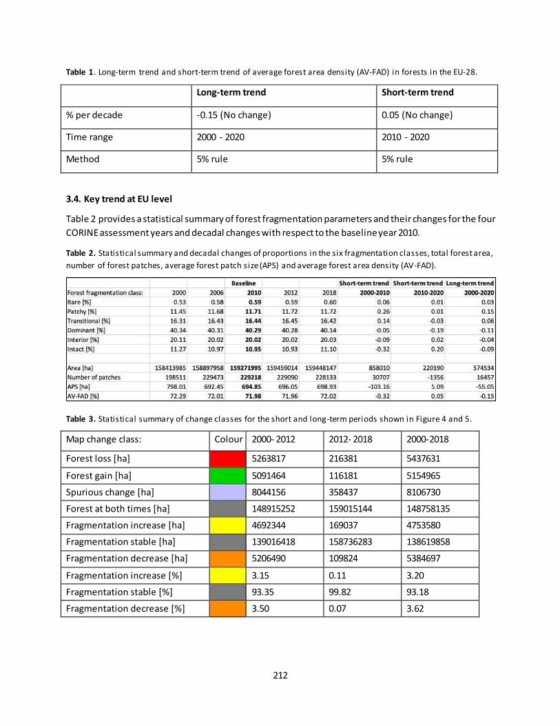
212
Table 1. Long-term trend and short-term trend of average forest area density (AV-FAD) in forests in the EU-28.
Long-term trend Short-term trend
% per decade -0.15 (No change) 0.05 (No change)
Time range 2000 - 2020 2010 - 2020
Method 5% rule 5% rule
3.4. Key trend at EU level
Table 2 provides a statistical summary of forest fragmentation parameters and their changes for the four
CORINE assessment years and decadal changes with respect to the baseline year 2010.
Table 2. Statistical summary and decadal changes of proportions in the six fragmentation classes, total forest area,
number of forest patches, average forest patch size (APS) and average forest area density (AV-FAD).
Table 3. Statistical summary of change classes for the short and long-term periods shown in Figure 4 and 5.
Map change class: Colour 2000- 2012 2012- 2018 2000-2018
Forest loss [ha] 5263817 216381 5437631
Forest gain [ha] 5091464 116181 5154965
Spurious change [ha] 8044156 358437 8106730
Forest at both times [ha] 148915252 159015144 148758135
Fragmentation increase [ha] 4692344 169037 4753580
Fragmentation stable [ha] 139016418 158736283 138619858
Fragmentation decrease [ha] 5206490 109824 5384697
Fragmentation increase [%] 3.15 0.11 3.20
Fragmentation stable [%] 93.35 99.82 93.18
Fragmentation decrease [%] 3.50 0.07 3.62
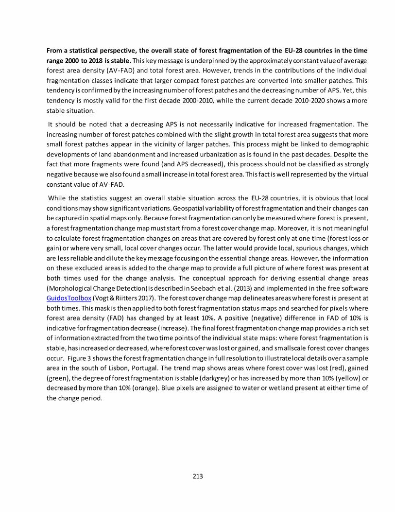
213
From a statistical perspective, the overall state of forest fragmentation of the EU-28 countries in the time
range 2000 to 2018 is stable. This key message is underpinned by the approximately constant value of average
forest area density (AV-FAD) and total forest area. However, trends in the contributions of the individual
fragmentation classes indicate that larger compact forest patches are converted into smaller patches. This
tendency is confirmed by the increasing number of forest patches and the decreasing number of APS. Yet, this
tendency is mostly valid for the first decade 2000-2010, while the current decade 2010-2020 shows a more
stable situation.
It should be noted that a decreasing APS is not necessarily indicative for increased fragmentation. The
increasing number of forest patches combined with the slight growth in total forest area suggests that more
small forest patches appear in the vicinity of larger patches. This process might be linked to demographic
developments of land abandonment and increased urbanization as is found in the past decades. Despite the
fact that more fragments were found (and APS decreased), this process should not be classified as strongly
negative because we also found a small increase in total forest area. This fact is well represented by the virtual
constant value of AV-FAD.
While the statistics suggest an overall stable situation across the EU-28 countries, it is obvious that local
conditions may show significant variations. Geospatial variability of forest fragmentation and their changes can
be captured in spatial maps only. Because forest fragmentation can only be measured where forest is present,
a forest fragmentation change map must start from a forest cover change map. Moreover, it is not meaningful
to calculate forest fragmentation changes on areas that are covered by forest only at one time (forest loss or
gain) or where very small, local cover changes occur. The latter would provide local, spurious changes, which
are less reliable and dilute the key message focusing on the essential change areas. However, the information
on these excluded areas is added to the change map to provide a full picture of where forest was present at
both times used for the change analysis. The conceptual approach for deriving essential change areas
(Morphological Change Detection) is described in Seebach et al. (2013) and implemented in the free software
GuidosToolbox (Vogt & Riitters 2017). The forest cover change map delineates areas where forest is present at
both times. This mask is then applied to both forest fragmentation status maps and searched for pixels where
forest area density (FAD) has changed by at least 10%. A positive (negative) difference in FAD of 10% is
indicative for fragmentation decrease (increase). The final forest fragmentation change map provides a rich set
of information extracted from the two time points of the individual state maps: where forest fragmentation is
stable, has increased or decreased, where forest cover was lost or gained, and smallscale forest cover changes
occur. Figure 3 shows the forest fragmentation change in full resolution to illustrate local details over a sample
area in the south of Lisbon, Portugal. The trend map shows areas where forest cover was lost (red), gained
(green), the degree of forest fragmentation is stable (darkgrey) or has increased by more than 10% (yellow) or
decreased by more than 10% (orange). Blue pixels are assigned to water or wetland present at either time of
the change period.
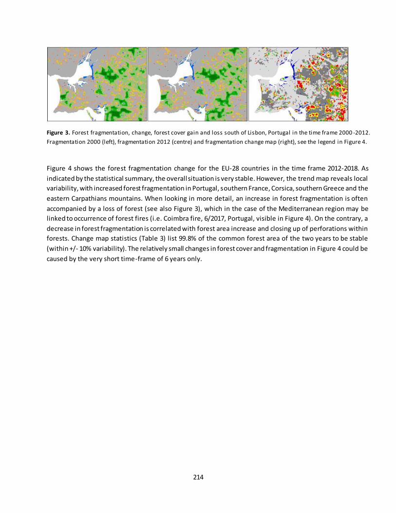
214
Figure 3. Forest fragmentation, change, forest cover gain and loss south of Lisbon, Portugal in the time frame 2000 -2012.
Fragmentation 2000 (left), fragmentation 2012 (centre) and fragmentation change map (right), see the legend in Figure 4.
Figure 4 shows the forest fragmentation change for the EU-28 countries in the time frame 2012-2018. As
indicated by the statistical summary, the overall situation is very stable. However, the trend map reveals local
variability, with increased forest fragmentation in Portugal, southern France, Corsica, southern Greece and the
eastern Carpathians mountains. When looking in more detail, an increase in forest fragmentation is often
accompanied by a loss of forest (see also Figure 3), which in the case of the Mediterranean region may be
linked to occurrence of forest fires (i.e. Coimbra fire, 6/2017, Portugal, visible in Figure 4). On the contrary, a
decrease in forest fragmentation is correlated with forest area increase and closing up of perforations within
forests. Change map statistics (Table 3) list 99.8% of the common forest area of the two years to be stable
(within +/- 10% variability). The relatively small changes in forest cover and fragmentation in Figure 4 could be
caused by the very short time-frame of 6 years only.
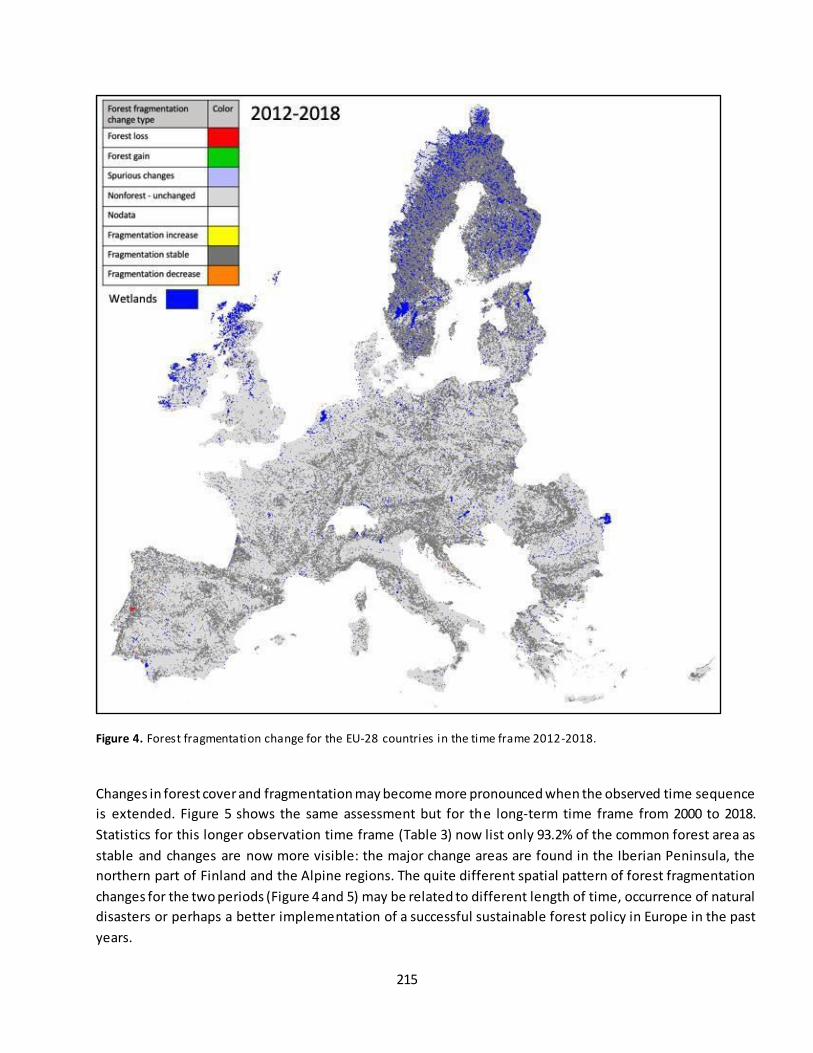
215
Figure 4. Forest fragmentation change for the EU-28 countries in the time frame 2012-2018.
Changes in forest cover and fragmentation may become more pronounced when the observed time sequence
is extended. Figure 5 shows the same assessment but for the long-term time frame from 2000 to 2018.
Statistics for this longer observation time frame (Table 3) now list only 93.2% of the common forest area as
stable and changes are now more visible: the major change areas are found in the Iberian Peninsula, the
northern part of Finland and the Alpine regions. The quite different spatial pattern of forest fragmentation
changes for the two periods (Figure 4 and 5) may be related to different length of time, occurrence of natural
disasters or perhaps a better implementation of a successful sustainable forest policy in Europe in the past
years.
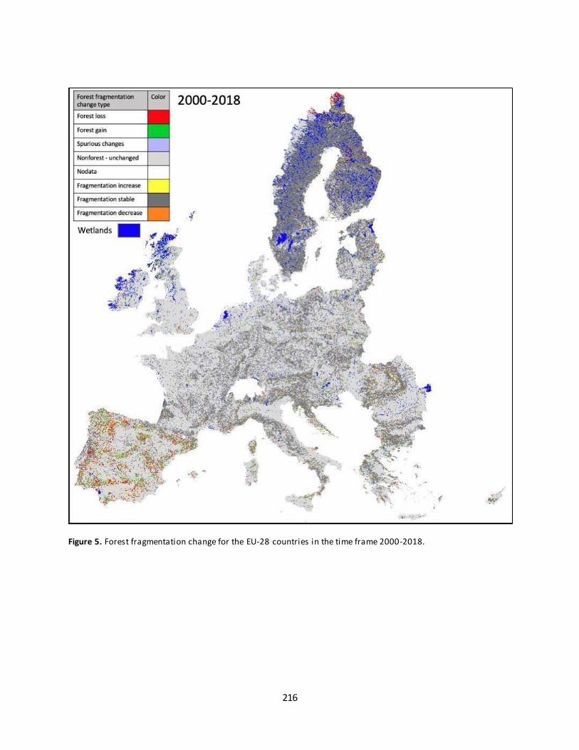
216
Figure 5. Forest fragmentation change for the EU-28 countries in the time frame 2000-2018.
217
References
Montréal Process Working Group:
https://www.montrealprocess.org/documents/publications/techreports/MontrealProcessSeptember20
15.pdf
Riitters, K.H., Wickham, J.D., O’Neill, R.V., Jones, K.B., Smith, E.R., Coulston, J.W., Wade, T.G. & Smith, J.H.
2002. Fragmentation of continental United States forests. Ecosystems 5:815-822.
Riitters, K.H., Wickham, J.D. 2012. Decline of forest interior conditions in the conterminous United States.
Scientific Reports 2, Article number: 653. DOI: 10.1038/srep00653
Seebach, L., Strobl, P., Vogt, P., Mehl, W., San-Miguel-Ayanz, J. 2013. Enhancing post-classification change
detection through morphological post-processing – a sensitivity analysis. International Journal of Remote
Sensing 34:20, 7145-7162, DOI: 10.1080/01431161.2013.815382
Vogt P., Riitters, K. 2017. GuidosToolbox: universal digital image object analysis. European Journal of Remote
Sensing 50:1, 352-361, DOI: 10.1080/22797254.2017.1330650.
Vogt, P. 2019. Measuring Forest Area Density to quantify Forest Fragmentation. https://ies-
ows.jrc.ec.europa.eu/gtb/GTB/psheets/GTB-Fragmentation-FADFOS.pdf
Vogt, P., Riitters, K.H., Caudullo, G., Eckhardt, B., 2019a. FAO – State of the World’s Forests: Forest
Fragmentation, EUR 29972 EN, Publications Office of the European Union, Luxembourg, 2019, ISBN 978-
92-76-13036-9, DOI: 10.2760/145325, JRC118594
Vogt, P., Riitters, K.H., Caudullo, G., Eckhardt, B. and Raši, R., 2019b. An approach for pan-European monitoring
of forest fragmentation, EUR 29944 EN, Publications Office of the European Union, Luxembourg, 2019, ISBN
978-92-76-10374-5, DOI: 10.2760/991401, JRC118541
Wickham, J.D., Riitters, K.H., Wade, T.G., Homer, C. 2008. Temporal change in fragmentation of continental US
forests. Landscape Ecology 23:891-898. DOI: 10.1007/s10980-008-9258-z
Contact:
Peter Vogt, European Commission - Joint Research Centre, Ispra, Italy [[email protected]]
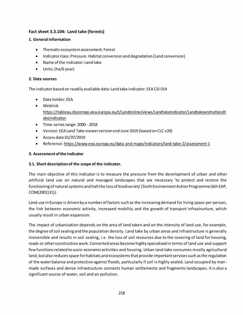
218
Fact sheet 3.3.104: Land take (forests)
1. General information
Thematic ecosystem assessment: Forest
Indicator class: Pressure. Habitat conversion and degradation (Land conversion)
Name of the indicator: Land take
Units: (ha/6 year)
2. Data sources
The indicator based on readily available data: Land take indicator. EEA CSI 014
Data holder: EEA
Weblink
https://tableau.discomap.eea.europa.eu/t/Landonline/views/Landtakeindicator/Landtakeandnetlandt
akeindicator.
Time-series range: 2000 - 2018
Version: EEA Land Take viewer version end June 2019 (based on CLC v20)
Access date 01/07/2019
Reference: https://www.eea.europa.eu/data-and-maps/indicators/land-take-2/assessment-1
3. Assessment of the indicator
3.1. Short description of the scope of the indicator.
The main objective of this indicator is to measure the pressure from the development of urban and other
artificial land use on natural and managed landscapes that are necessary 'to protect and restore the
functioning of natural systems and halt the loss of biodiversity' (Sixth Environment Action Programme (6th EAP,
COM(2001)31)).
Land use in Europe is driven by a number of factors such as the increasing demand for living space per person,
the link between economic activity, increased mobility and the growth of transport infrastructure, which
usually result in urban expansion.
The impact of urbanisation depends on the area of land taken and on the intensity of land use, for example,
the degree of soil sealing and the population density. Land take by urban areas and infrastructure is generally
irreversible and results in soil sealing, i.e. the loss of soil resources due to the covering of land for housing,
roads or other construction work. Converted areas become highly specialised in terms of land use and support
few functions related to socio-economic activities and housing. Urban land take consumes mostly agricultural
land, but also reduces space for habitats and ecosystems that provide important services such as the regulation
of the water balance and protection against floods, particularly if soil is highly sealed. Land occupied by man -
made surfaces and dense infrastructure connects human settlements and fragments landscapes. It is also a
significant source of water, soil and air pollution.

219
This indicator looks at the change in the amount (in ha per 6 years) of forest land taken by urban and other
artificial land development. It includes areas sealed by construction and urban infrastructure, as well as urban
green areas, and sport and leisure facilities. The main drivers of land take are grouped in processes resulting in
the extension of:
housing, services and recreation;
industrial and commercial sites;
transport networks and infrastructures;
mines, quarries and waste dumpsites;
construction sites.
3.2. Maps
Maps as pixel based were not available. This indicator was provided as tabular information, aggregated at EU-
28 level.
3.3. Statistical analysis of the trend
Temporal trends of the Land take indicator are shown in Table 1. These statistics cover all CORINE assessment
years, including decadal changes for short and long-term trends. The assessment of the indicator was done
using the 5% rules due to the low number of observations; therefore, a statistical test of significance was not
done.
3.4. Key trend at EU level
At the European level the land take indicator shows a significant downward trend with a negative decadal
change rate of -37% in the short term and -31% in the long term (Table 1 and figure 2). The land take pressure
decreased, in terms of area taken for, from 80,331 ha in 2000-2006 to 54,070 in 2012-2018. The downward
trend is maintained throughout the time series with a gradual decline of the pressure in the three periods (see
figure 2).
Table 1. Forest area taken by urban and other artificial land development in the EU-28 (hectares) in three
periods.
2000-2006 2010*
2006-
2012
2012-
2018
Short-term trend
(% per decade)**
Long-term trend
(% per decade)**
EU-28 80,331 76,428 74,477 54,070 -37% -31%
* Baseline (interpolated)
** Decadal change estimated using the forest area taken between 2010 vs 2012- 2018 values (short term trend); and 2000-2006 vs 2012-2018 (long term trend using 2010 as baseline).
220
Figure 2 Trend of forest area taken by urban and other artificial land development in the EU-28 in three
periods. Values from EEA Land take indicator based on CLC 2000, 2006, 2012 and 2018. See values in Table 1.
Contact:
Ana I. Marín, European Topic Centre on Urban, Land and Soil Systems, University of Malaga, Spain
221
Fact sheet 3.3.105: Wildfires – Burnt area and number of fires
1. General information
Thematic ecosystem assessment: Forest condition
Indicator class (See table 1): Pressures - Climate change
Name of the indicator: Burnt area and number of fires
Units: Ha and number of fires
2. Data sources:
The indicator is based on 1) country level statistics, and 2) processed remote sensing data, both provided by
the European Forest Fire Information System (EFFIS).
Data holder: EFFIS - JRC
Weblink: http://effis.jrc.ec.europa.eu/
Year or time-series range: 1980-2017
Version: 2018
Access date: 07/01/2019
Reference: San-Miguel-Ayanz, J., Durrant, T., Boca, R., Libertá, G., Branco, A., de Rigo, D., et al. (2017).
Forest Fires in Europe, Middle East and North Africa. (pp. 139): European Commission - Joint Research
Centre.
3. Assessment of the indicator
Fire is a natural component of ecosystems and they have been occurring for long time before the human era.
Changes in fire occurrence can result in ecosystem degradation if plants are not adapted to the new regime.
Currently, wildfires are complex phenomena resulting from the interaction between human and biophysical
systems. Climate and weather conditions are key determinants of fire activity, they may facilitate fire ignition
and spread. However, human actions such as land management and fire prevention reduce rates of fire
occurrence. In contrast, other human causal factors, such as arson or negligence, may also contribute to
increased occurrence.
Analyses of wildfires occurring in Europe in the last 30 years indicate an increase in the length of the fire season
(EFFIS 2018). However, improved management and fire prevention actions contributed to mitigate fire
occurrence, specifically in Sothern European countries that are the most fire -affected in the EU. The aim of this
report is to assess areas of high occurrence and trends in wildfires that may suggest a decreasing conditio n of
ecosystems in Europe.
Data and methods
EFFIS data
We accessed two types of time-series of burnt area and number of fires from EFFIS (2018). First, country level
statistics as provided by countries of the EFFIS network. These data cover the period 1980-2017 for Southern
EU countries, with the exception of Croatia and Cyprus that cover 1992-2017 and 2000-2017, respectively.

222
Second, spatially explicit data covering the period 2000-2017 (18 y) from the Rapid Damage Assessment23
module of EFFIS. This time series is composed of annual layers at a spatial resol ution of 250 m obtained from
MODIS daily images representing fires of about 30 ha or larger. The series shows some limitations for this
study, among which small burnt areas below the spatial resolution of the MODIS imagery are not mapped.
These may include small unburned islands inside the burnt area perimeter. Therefore, the time series maps
only a fraction, of around 75% to 80%, of the total area burnt by fires in the EU. Other limitation regards some
changes in the remote sensing sensors used by EFFIS in the creation of the time series. This could affect the
amount of burnt area and number of fires in the first years of the time series. Finally, the time series represents
fires in natural and semi-natural areas and excludes fires occurring in agricultural land.
3.1 Country level data - Trend assessment
To identify trends in the country level data of burnt areas and number of fires, we used robust regression to
mitigate the effect of anomalous fire years that might bias the ordinary least squares regression (Dennison et
al. 2014; Giglio et al. 2013). Regression slopes were estimated using the non-parametric Theil-Sen estimator
(Sen 1968; Wilcox 2012) because it accommodates non-normal distributions and is a robust trend slope
estimator, meaning that is resistant to the effects of outliers. Additionally, a two-sided Mann-Kendall (Gilbert
1987; Kendall 1975; Mann 1945) non-parametric trend test was used to assess the significance of monotonic
trends in annual burnt area and number of fires (Dennison et al. 2014; Jolly et al. 2015; Rodrigues et al. 2013).
3.2 Maps - Spatially explicit data
Maps of average burnt area and average number of fires in the 18-year period 2000-2017 were computed in
grid cells of 25 km x 25 km. Using large grid cells provides a more comprehensive assessment due to the
stochastic character of fire occurrence. Computing averages of fire parameters in short time series is
problematic (Archibald et al. 2013), however, longer time series than those provided by EFFIS are not available.
For example, the Global Fire Emissions Database (Giglio et al. 2013) provides time series comparable to EFFIS.
We summed the annual EFFIS burnt area data in the 25 km x 25 km grid cells to produce a measure of burnt
area from 2000 to 2017 and averaged this over the 18 years. Additionally, we computed the average number of
fires occurring in the grid cells. This was done by summing the annual number of fires per grid cell to produce a
measure of number of fires from 2000 to 2017 and averaged this over the 18 years. Therefore, one time series
was created per grid cell. The time series are highly skewed and often contains a large number of no fire
occurrence (zero). This, in addition to the short time range of the series makes challenging assessing trends.
Additionally, in short series the effect of outliers is increased, an aspect that may characterise the series in
many grid cells. Therefore, the spatial wildfire indicator for the aggregated condition index was produced by
selecting those grid cells having at least one fire over the 2000-2017 period with 1 km grid cells following
Cherlet et al. (2018).
23
http://effis.jrc.ec.europa.eu/about-effis/technical-background/rapid-damage-assessment/
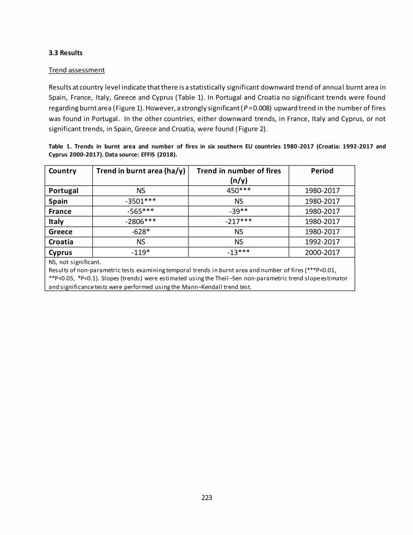
223
3.3 Results
Trend assessment
Results at country level indicate that there is a statistically significant downward trend of annual burnt area in
Spain, France, Italy, Greece and Cyprus (Table 1). In Portugal and Croatia no significant trends were found
regarding burnt area (Figure 1). However, a strongly significant (P = 0.008) upward trend in the number of fires
was found in Portugal. In the other countries, either downward trends, in France, Italy and Cyprus, or not
significant trends, in Spain, Greece and Croatia, were found (Figure 2).
Table 1. Trends in burnt area and number of fires in six southern EU countries 1980-2017 (Croatia: 1992-2017 and
Cyprus 2000-2017). Data source: EFFIS (2018).
Country Trend in burnt area (ha/y) Trend in number of fires
(n/y)
Period
Portugal NS 450*** 1980-2017
Spain -3501*** NS 1980-2017 France -565*** -39** 1980-2017 Italy -2806*** -217*** 1980-2017
Greece -628* NS 1980-2017 Croatia NS NS 1992-2017
Cyprus -119* -13*** 2000-2017 NS, not significant. Results of non-parametric tests examining temporal trends in burnt area and number of fires (***P<0.01, **P<0.05, *P<0.1). Slopes (trends) were estimated using the Theil –Sen non-parametric trend slope estimator
and significance tests were performed using the Mann–Kendall trend test.

224
Figure 1. Trends of annual burnt area in seven southern EU countries 1980-2017 (Croatia: 1992-2017 and Cyprus: 2000-
2017). Trend line computed using the Theil–Sen non-parametric estimator. Data source: EFFIS (2018).
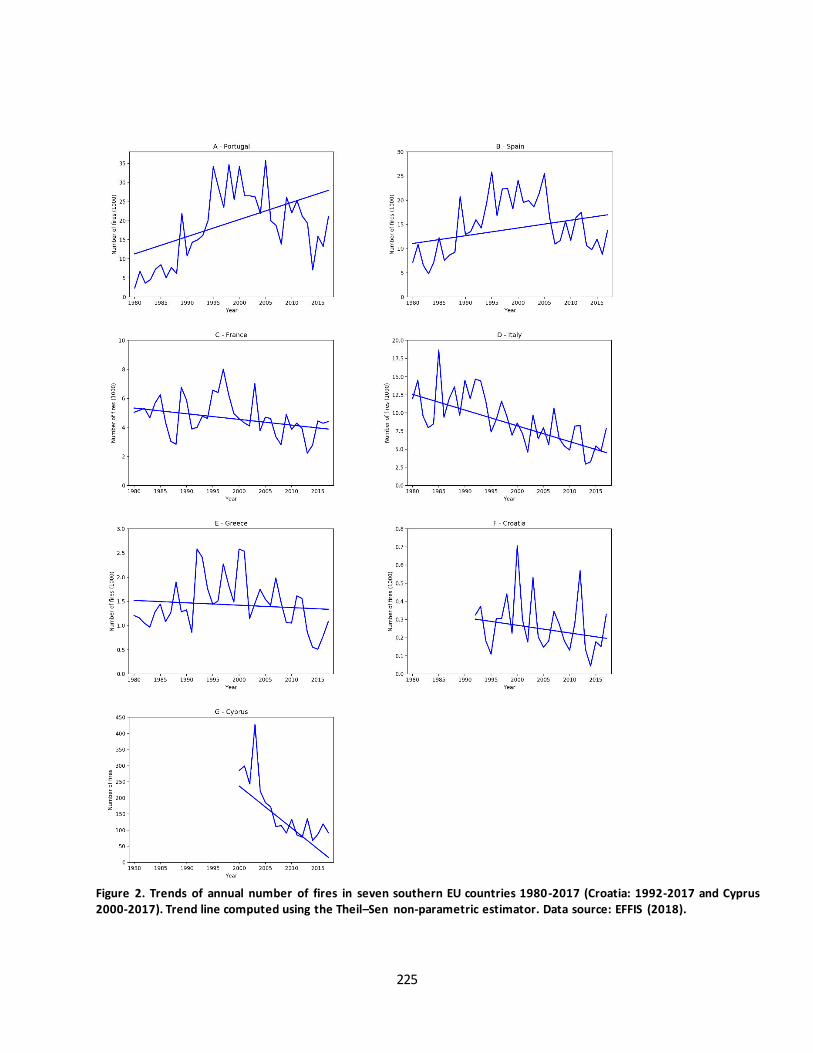
225
Figure 2. Trends of annual number of fires in seven southern EU countries 1980-2017 (Croatia: 1992-2017 and Cyprus
2000-2017). Trend line computed using the Theil–Sen non-parametric estimator. Data source: EFFIS (2018).

226
An assessment of the domain covered by Southern countries having long time series (1980-2017), i.e. Portugal,
Spain, France, Italy and Greece, indicates a statistically significant (P = 0.009) downward trend in burnt area
(Figure 3) and a not significant (P = 0.303) upward trend in number of fires (Figure 4). Table 2 shows the
decadal trend of burnt area and number of fires calculated according to the MAES method.
Figure 3. Trend of annual burnt area in Southern EU countries (Portugal, Spain, France, Italy and Greece) 1980 -2017. Trend
line computed using the Theil–Sen non-parametric estimator. Downward trend (-6478 ha/y) significant at 5% according to
Mann-Kendall trend test. Data source: EFFIS (2018).
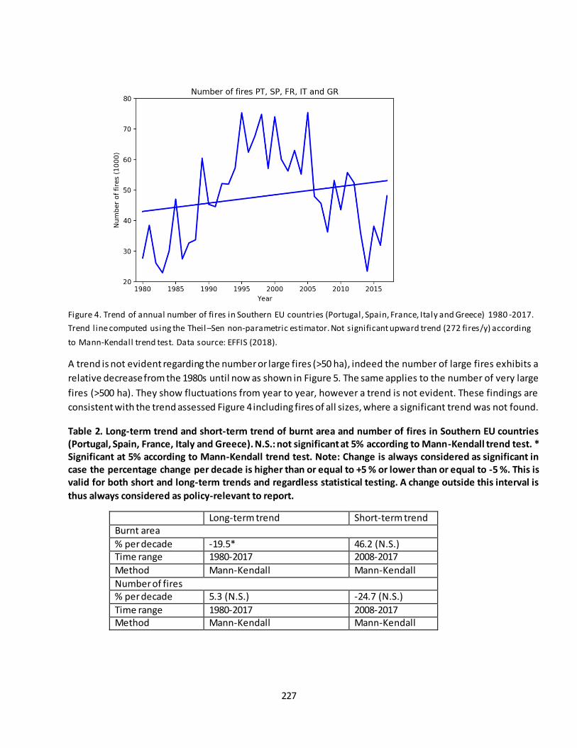
227
Figure 4. Trend of annual number of fires in Southern EU countries (Portugal, Spain, France, Italy and Greece) 1980 -2017.
Trend line computed using the Theil –Sen non-parametric estimator. Not significant upward trend (272 fires/y) according
to Mann-Kendall trend test. Data source: EFFIS (2018).
A trend is not evident regarding the number or large fires (>50 ha), indeed the number of large fires exhibits a
relative decrease from the 1980s until now as shown in Figure 5. The same applies to the number of very large
fires (>500 ha). They show fluctuations from year to year, however a trend is not evident. These findings are
consistent with the trend assessed Figure 4 including fires of all sizes, where a significant trend was not found.
Table 2. Long-term trend and short-term trend of burnt area and number of fires in Southern EU countries
(Portugal, Spain, France, Italy and Greece). N.S.: not significant at 5% according to Mann-Kendall trend test. *
Significant at 5% according to Mann-Kendall trend test. Note: Change is always considered as significant in
case the percentage change per decade is higher than or equal to +5 % or lower than or equal to -5 %. This is
valid for both short and long-term trends and regardless statistical testing. A change outside this interval is
thus always considered as policy-relevant to report.
Long-term trend Short-term trend Burnt area
% per decade -19.5* 46.2 (N.S.) Time range 1980-2017 2008-2017
Method Mann-Kendall Mann-Kendall
Number of fires % per decade 5.3 (N.S.) -24.7 (N.S.)
Time range 1980-2017 2008-2017 Method Mann-Kendall Mann-Kendall

228
Figure 5. Annual number of large fires (>50 ha) in Southern EU countries (Portugal, Spain, France, Italy and Greece) per fire
size, 1985-2017. Data source: EFFIS (2018).
Mapping burn area and number of fires
Maps of mean burnt area (Figure 6) and mean number of fires (Figure 7) show the incidence of these two
indicators in the 2000-2017 period. As expected, the areas most affected by fires are in Southern Europe.
Specifically, higher levels of mean burnt area and mean number of fires are present in zones of the Iberian
Peninsula, South of Italy and Sicily, South of France and Corse, Croatia, Greece and Cyprus
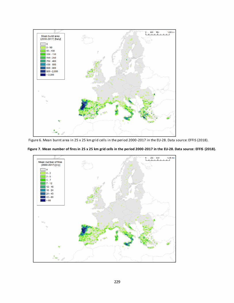
229
Figure 6. Mean burnt area in 25 x 25 km grid cells in the period 2000-2017 in the EU-28. Data source: EFFIS (2018).
Figure 7. Mean number of fires in 25 x 25 km grid cells in the period 2000-2017 in the EU-28. Data source: EFFIS (2018).
230
Discussion
Results of this assessment are in line with Giglio et al. (2013) that found a downward trend in burnt area in
Europe in the period 1996-2013 and with EFFIS that found no upward trends in the five large Mediterranean
countries i.e. Portugal, Spain, France, Italy and Greece, in the period 1980-2017 (San-Miguel-Ayanz et al.
2017). Nevertheless, our results using the spatially-explicit time-series covering 2000-2017 illustrate some
hotspot areas regarding mean burnt area and mean number of fires in southern EU ( Figure 6 and Figure 7).
Evidence indicates that frequently burned areas experience a significant decline in surface soil carbon and
nitrogen over time that, in turn, affect ecosystem productivity, among other effects (Pellegrini et al. 2017).
Therefore, fire mitigation measures and restoration in these areas should be considered.
Despite hotspot areas are concentrated in a few zones in the EU-28 and that in most of the continent critical
areas are not evident, future scenarios projects a worsening situation. Turco et al. (2018) assessed future
trends in bunt area in the Mediterranean region. Their results indicate that a warmer and drier climate can
affect fire activity not only leading to more favourable conditions, but also changing the structure of the fuel
i.e. more available fire-prone biomass in time and space. Therefore, the relation climate fire may change over
time facilitating fire ignition and spread. Results of the study of Turco et al. (2018) projects an increase of burnt
area over the extended summer months (JJAS) under three warming levels, i.e. at 1.5 °C, 2 °C, and 3 °C of mean
global warming. In the 1.5 °C warming burnt area is projected to increase between 40 to 54% with respect to
the reference period 1971–2000. Then, in the 2 °C and 3 °C warming the increase is projected at 62-87% and
96-187%, respectively. There is consensus in the scientific literature projecting a worsening of fire activity in
Europe under scenarios of climate change (Amatulli et al. 2013; Migliavacca et al. 2013; Sousa et al. 2015;
Turco et al. 2014; Wu et al. 2015). Additionally, spatial shifts of the Mediterranean climate domain suggest
increased fire activity in areas not traditionally associated with fires (Barredo et al. 2016; Barredo et al. 2018).
The scenarios pointing towards an increased fire activity call for a coordinate action at EU level. In addition to
the measures in place, there is a need for further preventing fires through an ecosystem-based approach. For
instance, relying more on the natural capacity of forest of limiting fire spread and severity (Bradley et al., 2016;
Odion et al., 2004, de Rigo et al., 2017). This is a characteristic of multi-species and multi-age forest stands.
References
Amatulli, G., Camia, A., & San-Miguel-Ayanz, J. (2013). Estimating future burned areas under changing climate
in the EU-Mediterranean countries. Science of The Total Environment, 450-451, 209-222,
doi:10.1016/j.scitotenv.2013.02.014.
Archibald, S., Lehmann, C. E. R., Gómez-Dans, J. L., & Bradstock, R. A. (2013). Defining pyromes and global
syndromes of fire regimes. Proceedings of the National Academy of Sciences, 110(16), 6442-6447,
doi:10.1073/pnas.1211466110.
231
Barredo, J. I., Caudullo, G., & Dosio, A. (2016). Mediterranean habitat loss under future climate conditions:
Assessing impacts on the Natura 2000 protected area network. Applied Geography, 75, 83-92,
doi:10.1016/j.apgeog.2016.08.003.
Barredo, J. I., Mauri, A., Caudullo, G., & Dosio, A. (2018). Assessing Shifts of Mediterranean and Arid Climates
Under RCP4.5 and RCP8.5 Climate Projections in Europe. Pure and Applied Geophysics, 1-17,
doi:10.1007/s00024-018-1853-6.
Bradley, C. M., Hanson, C. T., DellaSala, D. A., 2016. Does increased forest protection correspond to higher fire
severity in frequent-fire forests of the western United States? Ecosphere 7 (10), e01492+.
https://doi.org/10.1002/ecs2.1492.
Cherlet, M., Hutchinson, C., Reynolds, J., Hill, J., Sommer, S., & von Maltitz, G. (Eds.). (2018). World Atlas of
Desertification. Luxembourg: Publication Office of the European Union.
de Rigo, D., Libertà, G., Houston Durrant, T., Artés Vivancos, T., San-Miguel-Ayanz, J., Forest fire danger
extremes in Europe under climate change: variability and uncertainty, EUR 28926 EN, Publications Office of the
European Union, Luxembourg, 2017, ISBN: 978-92-79-77046-3, doi:10.2760/13180, JRC108974.
Dennison, P. E., Brewer, S. C., Arnold, J. D., & Moritz, M. A. (2014). Large wildfire trends in the western United
States, 1984–2011. Geophysical Research Letters, 41(8), 2928-2933, doi:doi:10.1002/2014GL059576.
EFFIS (2018). European Forest Fire Information System. http://effis.jrc.ec.europa.eu/. Accessed 10th Octob er
2018.
Giglio, L., Randerson, J. T., & Werf, G. R. (2013). Analysis of daily, monthly, and annual burned area using the
fourth-generation global fire emissions database (GFED4). Journal of Geophysical Research: Biogeosciences,
118(1), 317-328, doi:doi:10.1002/jgrg.20042.
Gilbert, R. O. (1987). Statistical Methods for Environmental Pollution Monitoring. NY, USA: Wiley.
Jolly, W. M., Cochrane, M. A., Freeborn, P. H., Holden, Z. A., Brown, T. J., Williamson, G. J., et al. (2015).
Climate-induced variations in global wildfire danger from 1979 to 2013. [Article]. Nature Communications, 6,
7537, doi:10.1038/ncomms8537.
Kendall, M. G. (1975). Rank Correlation Methods (4th edition). London: Charles Griffin.
Mann, H. B. (1945). Nonparametric Tests Against Trend. Econometrica, 13(3), 245-259, doi:10.2307/1907187.
Migliavacca, M., Dosio, A., Camia, A., Hobourg, R., Houston-Durrant, T., Kaiser, J. W., et al. (2013). Modeling
biomass burning and related carbon emissions during the 21st century in Europe. Journal of Ge ophysical
Research: Biogeosciences, 118(4), 1732-1747, doi:doi:10.1002/2013JG002444.
Odion, D. C., Frost, E. J., Strittholt, J. R., Jiang, H., Dellasala, D. A., Moritz, M. A., 2004. Patterns of fire severity
and forest conditions in the western Klamath Mountains, California. Conservation Biology 18 (4), 927-936.
https://doi.org/10.1111/j.1523-1739.2004.00493.x
232
Pellegrini, A. F. A., Ahlström, A., Hobbie, S. E., Reich, P. B., Nieradzik, L. P., Staver, A. C., et al. (2017). Fire
frequency drives decadal changes in soil carbon and nitrogen and ecosystem productivity. Nature, 553, 194,
doi:10.1038/nature24668.
Rodrigues, M., San Miguel, J., Oliveira, S., Moreira, F., & Camia, A. (2013). An insight into spatial-temporal
trends of fire ignitions and burned areas in the European Mediterranean countries. Earth Science and
Engineering, 3, 497–505.
San-Miguel-Ayanz, J., Durrant, T., Boca, R., Libertá, G., Branco, A., de Rigo, D., et al. (2017). Forest Fires in
Europe, Middle East and North Africa. (pp. 139): European Commission - Joint Research Centre.
Sen, P. K. (1968). Estimates of the Regression Coefficient Based on Kendall's Tau. Journal of the American
Statistical Association, 63(324), 1379-1389, doi:10.2307/2285891.
Sousa, P. M., Trigo, R. M., Pereira, M. G., Bedia, J., & Gutiérrez, J. M. (2015). Different approaches to model
future burnt area in the Iberian Peninsula. Agricultural and Forest Meteorology, 202, 11-25,
doi:10.1016/j.agrformet.2014.11.018.
Turco, M., Llasat, M.-C., von Hardenberg, J., & Provenzale, A. (2014). Climate change impacts on wildfires in a
Mediterranean environment. [journal article]. Climatic Change, 125(3), 369-380, doi:10.1007/s10584-014-
1183-3.
Turco, M., Rosa-Cánovas, J. J., Bedia, J., Jerez, S., Montávez, J. P., Llasat, M. C., et al. (2018). Exacerbated fires in
Mediterranean Europe due to anthropogenic warming projected with non-stationary climate-fire models.
Nature Communications, 9(1), 3821, doi:10.1038/s41467-018-06358-z.
Wilcox, R. R. (2012). Introduction to Robust Estimation and Hypothesis Testing. San Diego, California, USA:
Academic Press.
Wu, M., Knorr, W., Thonicke, K., Schurgers, G., Camia, A., & Arneth, A. (2015). Sensitivity of burned area in
Europe to climate change, atmospheric CO2 levels, and demography: A comparison of two fire-vegetation
models. Journal of Geophysical Research: Biogeosciences, 120(11), 2256-2272, doi:doi:10.1002/2015JG003036.
Contact:
José I. Barredo, European Commission - Joint Research Centre, Ispra, Italy [[email protected]]
Giovanni Caudullo, Arcadia SIT s.r.l., Vigevano, Italy [[email protected]]

233
Fact sheet 3.3.106: Heat and drought-induced tree mortality
1. General information
Thematic ecosystem assessment: Forest condition
Indicator class: Pressures, Climate change
Name of the indicator: Tree mortality
Unit: Unit less
2. Data sources
The indicator is based on literature collected by JRC.
• Data holder: JRC D1
• Weblink: not available
• Year or time-series range: 1970-2017
• Access date: November 2018
• References: Caudullo and Barredo (2019).
3. Assessment of the indicator
The indicator shows tree mortality occurrences in Europe reported in the peer-reviewed literature and caused
directly or indirectly by drought or heat. All collected sources reported (1) the impacted tree species, (2) the
detailed localization of the occurrence, and (3) the years (start and end) of the drought and of the tree
mortality.
Methods
The dataset on tree mortality in Europe was created by Caudullo and Barredo (2019). Their study departs from
the work of Allen, et al. (2010) that cover the period since 1970 until 2009. In addition, Caudullo and Barredo
(2019) collected data from Allen, et al. (2015) for extending the period of the original dataset with post-2009
occurrences according to Settele, et al. (2014). Finally, they did a bibliographic survey for complementing and
updating the information on tree mortality within the period 1970-2017 in Europe. For every documented tree
mortality occurrence, a point was included in a GIS layer with the help of coordinates, maps or toponyms
reported in the reference source. The survey provided 69 peer-reviewed references containing useful
information for creating the data set. Thus, the data set contains 293 tree mortality occurrences (Figure 1). The
map in figure 1 shows the resulting data set of documented mortality occurrences.
In the data set, each drought/heat event reported in the attribute table is represented by one or more records
(points) where mortality occurred. Therefore, the user can query and retrieve the locations where mortality
occurred as consequence of specific drought/heat events. Additionally, the source reference of the information
of each record is also provided. Thus, each point is associated with its source reference. The attribute table of
the tree mortality layer provides, for every mortality occurrence, detailed information o f the sources, tree
species affected, localisation and years of the drought and the mortality event (Table 1).
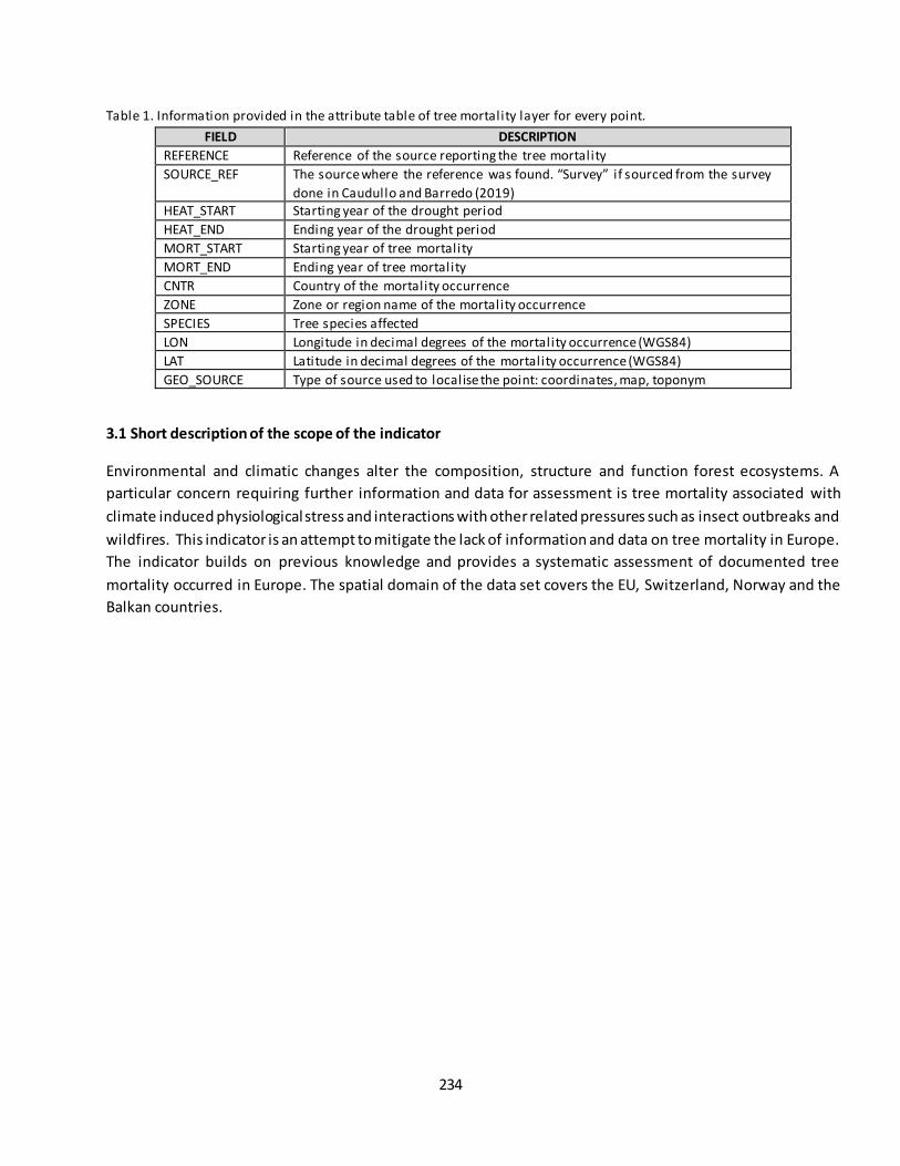
234
Table 1. Information provided in the attribute table of tree mortality layer for every point.
FIELD DESCRIPTION
REFERENCE Reference of the source reporting the tree mortality
SOURCE_REF The source where the reference was found. “Survey” if sourced from the survey
done in Caudullo and Barredo (2019) HEAT_START Starting year of the drought period
HEAT_END Ending year of the drought period
MORT_START Starting year of tree mortality
MORT_END Ending year of tree mortality
CNTR Country of the mortality occurrence
ZONE Zone or region name of the mortality occurrence
SPECIES Tree species affected
LON Longitude in decimal degrees of the mortality occurrence (WGS84)
LAT Latitude in decimal degrees of the mortality occurrence (WGS84)
GEO_SOURCE Type of source used to localise the point: coordinates, map, toponym
3.1 Short description of the scope of the indicator
Environmental and climatic changes alter the composition, structure and function forest ecosystems. A
particular concern requiring further information and data for assessment is tree mortality associated with
climate induced physiological stress and interactions with other related pressures such as insect outbreaks and
wildfires. This indicator is an attempt to mitigate the lack of information and data on tree mortality in Europe.
The indicator builds on previous knowledge and provides a systematic assessment of documented tree
mortality occurred in Europe. The spatial domain of the data set covers the EU, Switzerland, Norway and the
Balkan countries.
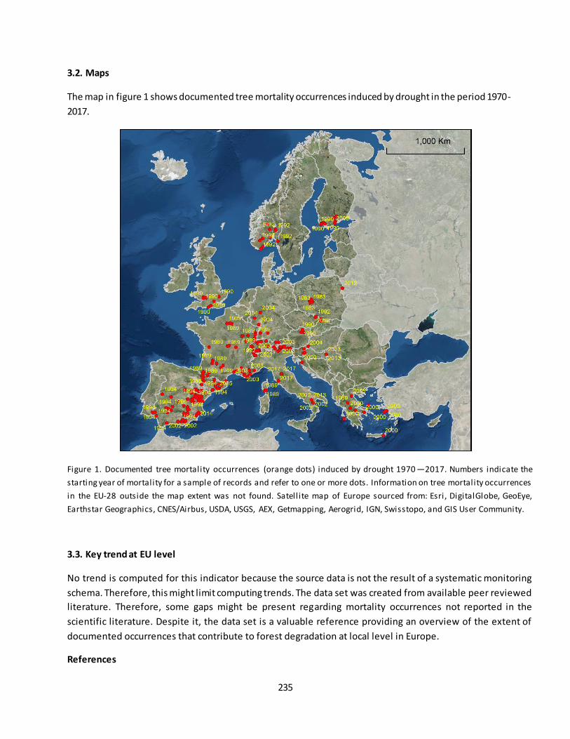
235
3.2. Maps
The map in figure 1 shows documented tree mortality occurrences induced by drought in the period 1970-
2017.
Figure 1. Documented tree mortality occurrences (orange dots) induced by drought 1970 —2017. Numbers indicate the
starting year of mortality for a sample of records and refer to one or more dots. Information on tree mortality occurrences
in the EU-28 outside the map extent was not found. Satell ite map of Europe sourced from: Esri, DigitalGlobe, GeoEye,
Earthstar Geographics, CNES/Airbus, USDA, USGS, AEX, Getmapping, Aerogrid, IGN, Swisstopo, and GIS User Community.
3.3. Key trend at EU level
No trend is computed for this indicator because the source data is not the result of a systematic monitoring
schema. Therefore, this might limit computing trends. The data set was created from available peer reviewed
literature. Therefore, some gaps might be present regarding mortality occurrences not reported in the
scientific literature. Despite it, the data set is a valuable reference providing an overview of the extent of
documented occurrences that contribute to forest degradation at local level in Europe.
References

236
Allen, C. D., Breshears, D. D., & McDowell, N. G. (2015). On underestimation of global vulnerability to tree mortality and forest die-off from hotter drought in the Anthropocene. Ecosphere, 6 (8), art129.
Allen, C. D., Macalady, A. K., Chenchouni, H., Bachelet, D., McDowell, N., Vennetier, M., Kitzberger, T., Rigling, A., Breshears, D. D., Hogg, E. H., Gonzalez, P., Fensham, R., Zhang, Z., Castro, J., Demidova, N., Lim, J. -H., Allard, G., Running, S. W., Semerci, A., & Cobb, N. (2010). A global overview of drought and heat-induced tree mortality reveals emerging climate change risks for forests. Forest Ecology and
Management, 259 (4), 660-684. Caudullo, G., & Barredo, J. I. (2019). A georeferenced data set of drought and heat-induced tree mortality in
Europe. One ecosystem, (submitted). Settele, J., Scholes, R., Betts, R., Bunn, S., Leadley, P., Nepstad, D., Overpeck, J., & Taboada, M. A. (2014).
Terrestrial and inland water systems. In C. B. Field, V. R. Barros, D. J. Dokken, K. J. Mach, M. D. Mastrandrea, T. E. Bilir, M. Chatterjee, K. L. Ebi, Y. O. Estrada, R. C. Genova, B. Girma, E. S. Kissel, A. N. Levy, S. MacCracken, P. R. Mastrandrea & L. L. White (Eds.), Climate Change 2014: Impacts, Adaptation
and Vulnerability (pp. 271– 359). Cambridge University Press, Cambridge, UK.
Contact:
José I. Barredo, European Commission - Joint Research Centre, Ispra, Italy [[email protected]]
Giovanni Caudullo, Arcadia SIT s.r.l., Vigevano, Italy [[email protected]]

237
Fact sheet 3.3.107: Effect of drought on forest productivity.
This fact-sheet is missing.
See: Ivits et al. (2016) Assessing European ecosystem stability to drought in the vegetation growing season.
https://doi.org/10.1111/geb.12472
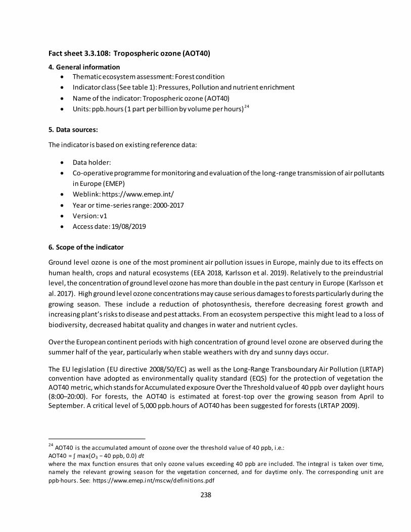
238
Fact sheet 3.3.108: Tropospheric ozone (AOT40)
4. General information
Thematic ecosystem assessment: Forest condition
Indicator class (See table 1): Pressures, Pollution and nutrient enrichment
Name of the indicator: Tropospheric ozone (AOT40)
Units: ppb.hours (1 part per billion by volume per hours)24
5. Data sources:
The indicator is based on existing reference data:
Data holder:
Co-operative programme for monitoring and evaluation of the long-range transmission of air pollutants
in Europe (EMEP)
Weblink: https://www.emep.int/
Year or time-series range: 2000-2017
Version: v1
Access date: 19/08/2019
6. Scope of the indicator
Ground level ozone is one of the most prominent air pollution issues in Europe, mainly due to its effects on
human health, crops and natural ecosystems (EEA 2018, Karlsson et al. 2019). Relatively to the preindustrial
level, the concentration of ground level ozone has more than double in the past century in Europe (Karlsson et
al. 2017). High ground level ozone concentrations may cause serious damages to forests particularly during the
growing season. These include a reduction of photosynthesis, therefore decreasing forest growth and
increasing plant’s risks to disease and pest attacks. From an ecosystem perspective this might lead to a loss of
biodiversity, decreased habitat quality and changes in water and nutrient cycles.
Over the European continent periods with high concentration of ground level ozone are observed during the
summer half of the year, particularly when stable weathers with dry and sunny days occur.
The EU legislation (EU directive 2008/50/EC) as well as the Long-Range Transboundary Air Pollution (LRTAP) convention have adopted as environmentally quality standard (EQS) for the protection of vegetation the AOT40 metric, which stands for Accumulated exposure Over the Threshold value of 40 ppb over daylight hours (8:00–20:00). For forests, the AOT40 is estimated at forest-top over the growing season from April to September. A critical level of 5,000 ppb.hours of AOT40 has been suggested for forests (LRTAP 2009).
24
AOT40 is the accumulated amount of ozone over the threshold value of 40 ppb, i .e.: AOT40 = ∫ max(O3 − 40 ppb, 0.0) dt where the max function ensures that only ozone values exceeding 40 ppb are included. The integral is taken over time, namely the relevant growing season for the vegetation concerned, and for daytime only. The corresponding unit are
ppb·hours. See: https://www.emep.int/mscw/definitions.pdf
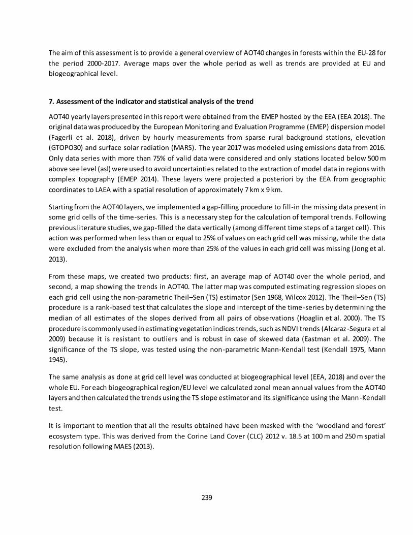
239
The aim of this assessment is to provide a general overview of AOT40 changes in forests within the EU-28 for
the period 2000-2017. Average maps over the whole period as well as trends are provided at EU and
biogeographical level.
7. Assessment of the indicator and statistical analysis of the trend
AOT40 yearly layers presented in this report were obtained from the EMEP hosted by the EEA (EEA 2018). The
original data was produced by the European Monitoring and Evaluation Programme (EMEP) dispersion model
(Fagerli et al. 2018), driven by hourly measurements from sparse rural background stations, elevation
(GTOPO30) and surface solar radiation (MARS). The year 2017 was modeled using emissions data from 2016.
Only data series with more than 75% of valid data were considered and only stations located below 500 m
above see level (asl) were used to avoid uncertainties related to the extraction of model data in regions with
complex topography (EMEP 2014). These layers were projected a posteriori by the EEA from geographic
coordinates to LAEA with a spatial resolution of approximately 7 km x 9 km.
Starting from the AOT40 layers, we implemented a gap-filling procedure to fill-in the missing data present in
some grid cells of the time-series. This is a necessary step for the calculation of temporal trends. Following
previous literature studies, we gap-filled the data vertically (among different time steps of a target cell). This
action was performed when less than or equal to 25% of values on each grid cell was missing, while the data
were excluded from the analysis when more than 25% of the values in each grid cell was missing (Jong et al.
2013).
From these maps, we created two products: first, an average map of AOT40 over the whole period, and
second, a map showing the trends in AOT40. The latter map was computed estimating regression slopes on
each grid cell using the non-parametric Theil–Sen (TS) estimator (Sen 1968, Wilcox 2012). The Theil–Sen (TS)
procedure is a rank-based test that calculates the slope and intercept of the time-series by determining the
median of all estimates of the slopes derived from all pairs of observations (Hoaglin et al. 2000). The TS
procedure is commonly used in estimating vegetation indices trends, such as NDVI trends (Alcaraz -Segura et al
2009) because it is resistant to outliers and is robust in case of skewed data (Eastman et al. 2009). The
significance of the TS slope, was tested using the non-parametric Mann-Kendall test (Kendall 1975, Mann
1945).
The same analysis as done at grid cell level was conducted at biogeographical level (EEA, 2018) and over the
whole EU. For each biogeographical region/EU level we calculated zonal mean annual values from the AOT40
layers and then calculated the trends using the TS slope estimator and its significance using the Mann -Kendall
test.
It is important to mention that all the results obtained have been masked with the ‘woodland and forest’ ecosystem type. This was derived from the Corine Land Cover (CLC) 2012 v. 18.5 at 100 m and 250 m spatial
resolution following MAES (2013).
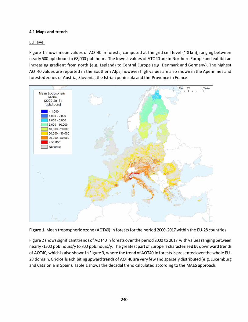
240
4.1 Maps and trends
EU level
Figure 1 shows mean values of AOT40 in forests, computed at the grid cell level (~ 8 km), ranging between
nearly 500 ppb.hours to 68,000 ppb.hours. The lowest values of ATO40 are in Northern Europe and exhibit an
increasing gradient from north (e.g. Lapland) to Central Europe (e.g. Denmark and Germany). The highest
AOT40 values are reported in the Southern Alps, however high values are also shown in the Apennines and
forested zones of Austria, Slovenia, the Istrian peninsula and the Provence in France.
Figure 1. Mean tropospheric ozone (AOT40) in forests for the period 2000-2017 within the EU-28 countries.
Figure 2 shows significant trends of AOT40 in forests over the period 2000 to 2017 with values ranging between
nearly -1500 ppb.hours/y to 700 ppb.hours/y. The greatest part of Europe is characterised by downward trends
of AOT40, which is also shown in Figure 3, where the trend of AOT40 in forests is presented over the whole EU-
28 domain. Grid cells exhibiting upward trends of AOT40 are very few and sparsely distributed (e.g. Luxemburg
and Catalonia in Spain). Table 1 shows the decadal trend calculated according to the MAES approach.
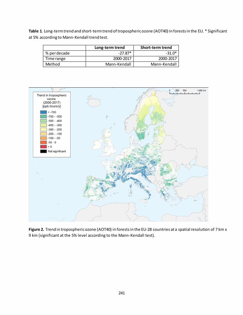
241
Table 1. Long-term trend and short-term trend of tropospheric ozone (AOT40) in forests in the EU. * Significant
at 5% according to Mann-Kendall trend test.
Long-term trend Short-term trend
% per decade -27.87* -31.0* Time range 2000-2017 2000-2017
Method Mann-Kendall Mann-Kendall
Figure 2. Trend in tropospheric ozone (AOT40) in forests in the EU-28 countries at a spatial resolution of 7 km x
9 km (significant at the 5% level according to the Mann-Kendall test).
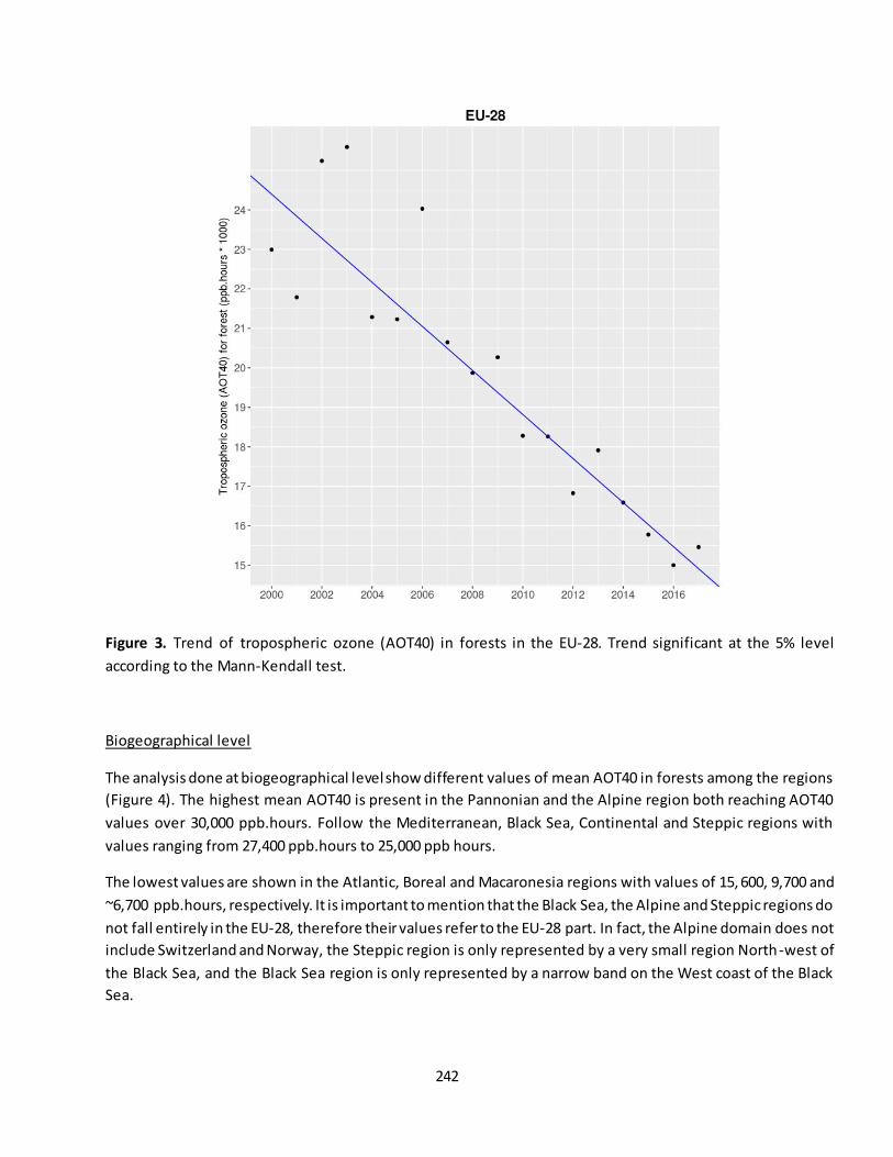
242
Figure 3. Trend of tropospheric ozone (AOT40) in forests in the EU-28. Trend significant at the 5% level
according to the Mann-Kendall test.
Biogeographical level
The analysis done at biogeographical level show different values of mean AOT40 in forests among the regions
(Figure 4). The highest mean AOT40 is present in the Pannonian and the Alpine region both reaching AOT40
values over 30,000 ppb.hours. Follow the Mediterranean, Black Sea, Continental and Steppic regions with
values ranging from 27,400 ppb.hours to 25,000 ppb hours.
The lowest values are shown in the Atlantic, Boreal and Macaronesia regions with values of 15, 600, 9,700 and
~6,700 ppb.hours, respectively. It is important to mention that the Black Sea, the Alpine and Steppic regions do
not fall entirely in the EU-28, therefore their values refer to the EU-28 part. In fact, the Alpine domain does not
include Switzerland and Norway, the Steppic region is only represented by a very small region North-west of
the Black Sea, and the Black Sea region is only represented by a narrow band on the West coast of the Black
Sea.
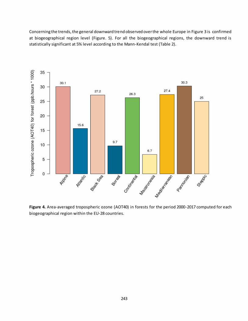
243
Concerning the trends, the general downward trend observed over the whole Europe in Figure 3 is confirmed
at biogeographical region level (Figure. 5). For all the biogeographical regions, the downward trend is
statistically significant at 5% level according to the Mann-Kendal test (Table 2).
Figure 4. Area-averaged tropospheric ozone (AOT40) in forests for the period 2000-2017 computed for each
biogeographical region within the EU-28 countries.
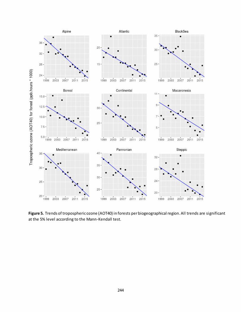
244
Figure 5. Trends of tropospheric ozone (AOT40) in forests per biogeographical region. All trends are significant
at the 5% level according to the Mann-Kendall test.
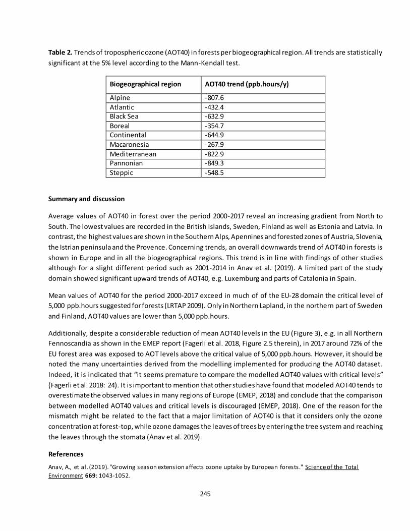
245
Table 2. Trends of tropospheric ozone (AOT40) in forests per biogeographical region. All trends are statistically
significant at the 5% level according to the Mann-Kendall test.
Biogeographical region AOT40 trend (ppb.hours/y)
Alpine -807.6
Atlantic -432.4 Black Sea -632.9
Boreal -354.7 Continental -644.9
Macaronesia -267.9
Mediterranean -822.9 Pannonian -849.3
Steppic -548.5
Summary and discussion
Average values of AOT40 in forest over the period 2000-2017 reveal an increasing gradient from North to
South. The lowest values are recorded in the British Islands, Sweden, Finland as well as Estonia and Latvia. In
contrast, the highest values are shown in the Southern Alps, Apennines and forested zones of Austria, Slovenia,
the Istrian peninsula and the Provence. Concerning trends, an overall downwards trend of AOT40 in forests is
shown in Europe and in all the biogeographical regions. This trend is in li ne with findings of other studies
although for a slight different period such as 2001-2014 in Anav et al. (2019). A limited part of the study
domain showed significant upward trends of AOT40, e.g. Luxemburg and parts of Catalonia in Spain.
Mean values of AOT40 for the period 2000-2017 exceed in much of of the EU-28 domain the critical level of
5,000 ppb.hours suggested for forests (LRTAP 2009). Only in Northern Lapland, in the northern part of Sweden
and Finland, AOT40 values are lower than 5,000 ppb.hours.
Additionally, despite a considerable reduction of mean AOT40 levels in the EU (Figure 3), e.g. in all Northern
Fennoscandia as shown in the EMEP report (Fagerli et al. 2018, Figure 2.5 therein), in 2017 around 72% of the
EU forest area was exposed to AOT levels above the critical value of 5,000 ppb.hours. However, it should be
noted the many uncertainties derived from the modelling implemented for producing the AOT40 dataset.
Indeed, it is indicated that “it seems premature to compare the modelled AOT40 values with critical levels”
(Fagerli et al. 2018: 24). It is important to mention that other studies have found that modeled AOT40 tends to
overestimate the observed values in many regions of Europe (EMEP, 2018) and conclude that the comparison
between modelled AOT40 values and critical levels is discouraged (EMEP, 2018). One of the reason for the
mismatch might be related to the fact that a major limitation of AOT40 is that it considers only the ozone
concentration at forest-top, while ozone damages the leaves of trees by entering the tree system and reaching
the leaves through the stomata (Anav et al. 2019).
References
Anav, A., et al. (2019). "Growing season extension affects ozone uptake by European forests." Science of the Total
Environment 669: 1043-1052.
246
EEA (2018). Exposure of ecosystems to acidification, eutrophication and ozone, European Environment Agency.
Eastman, J. R., et al. (2009). "Seasonal trend analysis of image time series." International Journal of Remote Sensing
30(10): 2721-2726.
Fagerli, H., et al. (2014). Transboundary particulate matter , photo-oxidants, acidifying and eutrophying components. EMEP Report 1/2014, EMEP.
Fagerli, H., et al. (2018). Transboundary particulate matter , photo-oxidants, acidifying and eutrophying components.
EMEP Report 1/2018, EMEP.
de Jong, R., et al. (2013). "Shifts in Global Vegetation Activity Trends." Remote Sensing 5(3): 1117-1133.
Karlsson, P. E., et al. (2017). "Past, present and future concentrations of ground-level ozone and potential impacts on ecosystems and human health in northern Europe." Science of the Total Environment 576: 22-35
LRTAP (2009). Mapping critical levels for vegetation. Manual on Methodologies and Criteria for Mapping Critical Loads and Levels and Air Pollution Effects, Risks and Trends. G. Mills.
MAES (2013). Mapping and Assessment of Ecosystems and their Services - An analytical framework for ecosystem
assessments under Action 5 of the EU Biodiversity Strategy to 2020. (pp. 57). Luxembourg.
Mann, H. B. (1945). "Nonparametric Tests against Trend." Econometrica 13(3): 245-259.
Wilcox, R. (2012). "Introduction to Robust Estimation and Hypothesis Testing, 3rd Edition." Introduction to Robust Estimation and Hypothesis Testing, 3rd Edition: 1
Contact:
Achille Mauri, European Commission - Joint Research Centre, Ispra, Italy [[email protected]]
José I. Barredo, European Commission - Joint Research Centre, Ispra, Italy [[email protected]]
Giovanni Caudullo, Arcadia SIT s.r.l., Vigevano, Italy [[email protected]]
247
Fact sheet 3.3.109: Exceedances of critical loads for acidification and eutrophication in forest
ecosystems
1. General information
- Thematic ecosystem assessment: Forest condition
- Indicator class: Pressures, pollution and nutrient enrichment
- Name of the indicator: Exceedances of critical loads for acidification and eutrophication in forest
ecosystems - Units: (eq/ha yr) and forest ecosystem area exceeded (%)
2. Data sources
- Data holder: Co-operative programme for monitoring and evaluation of the long-range transmission of air
pollutants in Europe (EMEP)
- Web link: https://www.emep.int/
- Year of time-series range: 2000, 2005, 2010 and 2016
- Version: 2018 (EMEP Status Report 1/2018)
- Access date: 01/07/2019
- References:
Hettelingh, J.P. Posch, M. Slootweg, J. (eds.), 2017. European critical loads: database, biodiversity and
ecosystems at risk: CCE Final Report 2017. RIVM Report 2017-0155, Coordination Centre for Effects,
Bilthoven, Netherlands, 204 pp; ISBN 978-90-6960-288-2, DOI: 10.21945/RIVM-2017-0155.
Tsyro, S. Aas, W. Solberg, S. Benedictow, A. Fagerli, H. Posch, M., 2018. Chapter 2: Status of
transboundary air pollution in 2016. In: Fagerli, H., et al. (Eds.): Transboundary particulate matter,
photo-oxidants, acidifying and eutrophying components. EMEP Status Report 1/2018, Norwegian Meteorological Institute, Oslo, Norway, pp. 15-40; ISSN 1504-6109.
3. Assessment of the indicator
3.1 Short description of the scope of the indicator
Nitrogen and sulphur emissions and depositions can lead to eutrophication and acidification of ecosystems.
When this pollution exceeds certain levels, i.e. “critical load”, it affects ecosystems and biodiversity25. The
exceedances of critical loads were computed for the total nitrogen and sulphur depositions modelled on 0.1 x
0.1 degree grid cells across Europe by Hettelingh et al. (2017) and Tsyro et al. (2018). Spatial data (maps) of
exceedances of critical loads for eutrophication and acidification were provided by EMEP for the years 2000,
2005, 2010 and 2016. The exceedance shown in the maps is the so-called “average accumulated exceedance”
(AAE). AAE is computed on each grid cell as the area weighted average of the exceedance of critical loads of all
ecosystems (Tsyro et al. 2018).
25
https://www.eea.europa.eu/data-and-maps/indicators/critical-load-exceedance-for-nitrogen/critical-load-exceedance-for-nitrogen and https://www.eea.europa.eu/data-and-maps/indicators/exposure-of-ecosystems-to-acidification-14/assessment-1

248
In this assessment we created maps of exceedances of critical loads for eutrophication and acidification in EU-
28 forests by masking the EMEP maps with a forest ecosystem map produced from CORINE land cover 2012
data (version 18.5) (EEA 1993, 2000) according to MAES (2013) at the spatial resolution of the EMEP maps.
3.2 Maps
Maps of change in exceedances of critical loads for acidification and eutrophication in EU-28 forests are shown
in Figure 1 and Figure 2, respectively. The maps show the change in the long term, 2000-2016, and short-term,
2010-2016. A decrease of critical loads for acidification and eutrophication across EU-28 forests in both the
long and short term is evidenced in the maps. However, despite these reductions, critical loads for acidification
in 2016 were exceeded in 30% of the EU-28 forest area, and the mean exceedance is about 28 eq/ha yr in this
ecosystem. The situation regarding critical loads for eutrophication is more severe because critical loads in the
same year were exceeded in 74% of the EU-28 forest area, exhibiting a mean exceedance of about 205 eq/ha yr
in forests (Table 1 and Figure 3: C and D). Additionally, in the short term trend maps of Figure 2-B, increasing
levels of exceedances of critical loads for eutrophication are evident in the Carpathians, Pyrenees and some
other forested areas across the EU-28.
A
B
Figure 1. Change in exceedances of critical loads for acidification between A) 2000 and 2016 (long term) and B)
2010 and 2016 (short term) in EU-28 forests. Change maps created from the EMEP 2000, 2010 and 2016 maps
of exceedances of critical loads for acidification simulated with the EMEP MSC-W model (Hettelingh et al. 2017;
Tsyro et al. 2018). Source of data: EMEP.
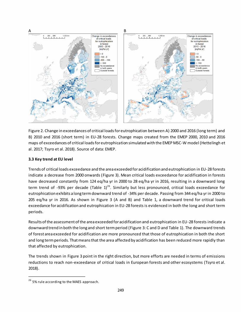
249
A
B
Figure 2. Change in exceedances of critical loads for eutrophication between A) 2000 and 2016 (long term) and
B) 2010 and 2016 (short term) in EU-28 forests. Change maps created from the EMEP 2000, 2010 and 2016
maps of exceedances of critical loads for eutrophication simulated with the EMEP MSC-W model (Hettelingh et
al. 2017; Tsyro et al. 2018). Source of data: EMEP.
3.3 Key trend at EU level
Trends of critical loads exceedance and the area exceeded for acidification and eutrophication in EU-28 forests
indicate a decrease from 2000 onwards (Figure 3). Mean critical loads exceedance for acidification in forests
have decreased constantly from 124 eq/ha yr in 2000 to 28 eq/ha yr in 2016, resulting in a downward long
term trend of -93% per decade (Table 1)26. Similarly but less pronounced, critical loads exceedance for
eutrophication exhibits a long term downward trend of -34% per decade. Passing from 344 eq/ha yr in 2000 to
205 eq/ha yr in 2016. As shown in Figure 3 (A and B) and Table 1, a downward trend for critical loads
exceedance for acidification and eutrophication in EU-28 forests is evidenced in both the long and short term
periods.
Results of the assessment of the area exceeded for acidification and eutrophication in EU-28 forests indicate a
downward trend in both the long and short term period (Figure 3: C and D and Table 1). The downward trends
of forest area exceeded for acidification are more pronounced that those of eutrophication in both the short
and long term periods. That means that the area affected by acidification has been reduced more rapidly than
that affected by eutrophication.
The trends shown in Figure 3 point in the right direction, but more efforts are needed in terms of emissions
reductions to reach non-exceedance of critical loads in European forests and other ecosystems (Tsyro et al.
2018).
26
5% rule according to the MAES approach.
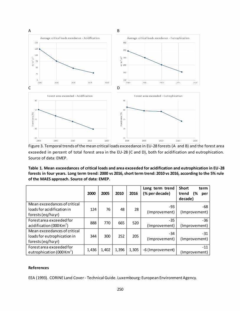
250
A B
C D
Figure 3. Temporal trends of the mean critical loads exceedance in EU-28 forests (A and B) and the forest area
exceeded in percent of total forest area in the EU-28 (C and D), both for acidification and eutrophication.
Source of data: EMEP.
Table 1. Mean exceedances of critical loads and area exceeded for acidification and eutrophication in EU-28
forests in four years. Long term trend: 2000 vs 2016, short term trend: 2010 vs 2016, according to the 5% rule
of the MAES approach. Source of data: EMEP.
2000 2005 2010 2016
Long term trend
(% per decade)
Short term
trend (% per
decade)
Mean exceedances of critical loads for acidification in forests (eq/ha yr)
124 76 48 28 -93
(Improvement) -68
(Improvement)
Forest area exceeded for acidification (000 Km2)
888 770 665 520 -35
(Improvement) -36
(Improvement) Mean exceedances of critical loads for eutrophication in forests (eq/ha yr)
344 300 252 205 -34
(Improvement) -31
(Improvement)
Forest area exceeded for eutrophication (000 Km2)
1,436 1,402 1,396 1,305 -6 (Improvement) -11
(Improvement)
References
EEA (1993). CORINE Land Cover - Technical Guide. Luxembourg: European Environment Agency.
251
EEA (2000). CORINE land cover technical guide – Addendum 2000. (pp. 105). Copenhagen: European Environment Agency.
Hettelingh, J. P., Posch, M., & Slootweg, J. (2017). European critical loads: database, biodiversity and ecosystems at risk: CCE Final Report 2017. (pp. 204). Bilthoven, Netherlands: RIVM, Coordination Centre for Effects.
MAES (2013). Mapping and Assessment of Ecosystems and their Services - An analytical framework for ecosystem assessments under Action 5 of the EU Biodiversity Strategy to 2020. (pp. 57). Luxembourg.
Tsyro, S., Aas, W., Solberg, S., Benedictow, A., Fagerli, H., & Posch, M. (2018). Chapter 2: Status of transboundary air pollution in 2016. In H. Fagerli, et al. (Ed.), Transboundary particulate matter, photo-
oxidants, acidifying and eutrophying components. EMEP Status Report 1/2018 (pp. 15-40). Oslo, Norway: Norwegian Meteorological Institute.
Contact:
José I. Barredo, European Commission - Joint Research Centre, Ispra, Italy [[email protected]]
Giovanni Caudullo, Arcadia SIT s.r.l., Vigevano, Italy [[email protected]]

252
Fact sheet 3.3.110: Ratio of annual fellings to annual increment
1. General information
- Thematic ecosystem assessment: Forest condition
- Indicator class: Pressures, Over-harvesting
- Name of the indicator: Ratio of annual fellings to net annual increment
- Units: %
2. Data sources
- Data holder: Forest Europe, State of Europe ’s forests 2015
- Web link: https://foresteurope.org/state-europes-forests-2015-report/
- Year of time-series range: 1990, 2000, 2005, 2010
- Version: State of Europe’s forests 2015
- Access date: 01/05/2019
- Reference: FOREST EUROPE (2015). State of Europe's Forests 2015. (pp. 113): Ministerial Conference on
the Protection of Forests in Europe.
3. Assessment of the indicator
Increment and fellings data on forests available for wood supply is available for four years: 1990, 2000, 2005
and 2010. Data for 2015 was not available at the moment of drafting this report. The indicator shows the ratio
of annual fellings to net annual increment in forests (felling rates). Therefore, data of both, fellings and
increment, is necessary for computing the ratio per Member State (MS) per year. In some cases data gaps are
present in a few MS. Therefore, we excluded MS for which data is missing in two or more years, resulting in
that data on increment and fellings was available only for 20 MS.
From these data we have calculated the ratio of annual fellings to annual increment, which represent the
proportion of increment that is used by fellings. We computed the indicator using data from 17 MS that have
records of both increment and fellings for the all the four years. However, we also computed the indicator
using data from 20 MS where some data gaps are present in specific years in Germany, Latvia and Portugal
(Table 1). Other countries, such as Sweden or Poland were excluded because two or more years were missing
data in either increment or fellings (Table 2).
Table 1 shows the ratios for two groups of MS. The ratio for EU-17 includes MS for which data is available in
the four dates (i.e. excluding Germany, Latvia and Portugal). In contrast, the ratio for EU-20 includes data of the
20 Members States listed in the table. The group of 20 MS represents 62% of the EU-28 forest area. As shown
in Table 1, felling rates vary significantly among countries. For instance, Austria, Denmark, Finland, Germany
and Hungary have felling rates mostly above 70%, whilst Bulgaria, Italy, Slovenia and the United Kingdom have
felling rates below 50%. Denmark exhibits felling rates above 100% in 1990, 2000, and 2005 but in 2010 felling
rates have decrease to 62.7%. Table 2 shows the indicator for MS with incomplete data.
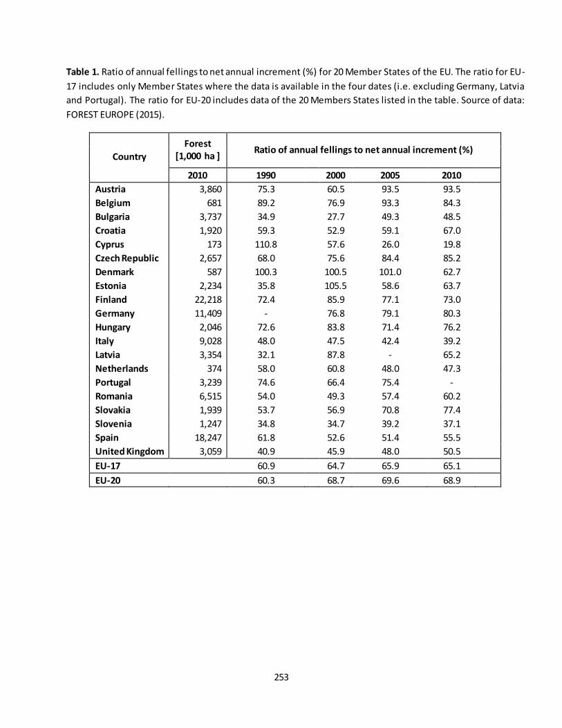
253
Table 1. Ratio of annual fellings to net annual increment (%) for 20 Member States of the EU. The ratio for EU-
17 includes only Member States where the data is available in the four dates (i.e. excluding Germany, Latvia
and Portugal). The ratio for EU-20 includes data of the 20 Members States listed in the table. Source of data:
FOREST EUROPE (2015).
Country
Forest
[1,000 ha ] Ratio of annual fellings to net annual increment (%)
2010 1990
2000 2005 2010
Austria 3,860 75.3
60.5 93.5 93.5
Belgium 681 89.2
76.9 93.3 84.3
Bulgaria 3,737 34.9
27.7 49.3 48.5
Croatia 1,920 59.3
52.9 59.1 67.0
Cyprus 173 110.8
57.6 26.0 19.8
Czech Republic 2,657 68.0
75.6 84.4 85.2
Denmark 587 100.3
100.5 101.0 62.7
Estonia 2,234 35.8
105.5 58.6 63.7
Finland 22,218 72.4
85.9 77.1 73.0
Germany 11,409 -
76.8 79.1 80.3
Hungary 2,046 72.6
83.8 71.4 76.2
Italy 9,028 48.0
47.5 42.4 39.2
Latvia 3,354 32.1
87.8 - 65.2
Netherlands 374 58.0
60.8 48.0 47.3
Portugal 3,239 74.6
66.4 75.4 -
Romania 6,515 54.0
49.3 57.4 60.2
Slovakia 1,939 53.7
56.9 70.8 77.4
Slovenia 1,247 34.8
34.7 39.2 37.1
Spain 18,247 61.8
52.6 51.4 55.5
United Kingdom 3,059 40.9 45.9 48.0 50.5
EU-17 60.9 64.7 65.9 65.1
EU-20 60.3 68.7 69.6 68.9
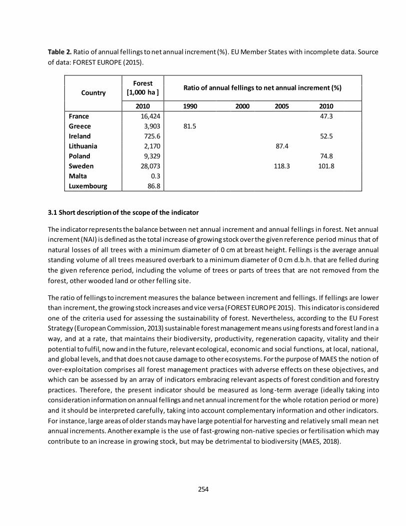
254
Table 2. Ratio of annual fellings to net annual increment (%). EU Member States with incomplete data. Source
of data: FOREST EUROPE (2015).
Country
Forest
[1,000 ha ] Ratio of annual fellings to net annual increment (%)
2010 1990
2000 2005 2010
France 16,424 47.3
Greece 3,903 81.5
Ireland 725.6 52.5
Lithuania 2,170 87.4
Poland 9,329 74.8
Sweden 28,073 118.3 101.8
Malta 0.3
Luxembourg 86.8
3.1 Short description of the scope of the indicator
The indicator represents the balance between net annual increment and annual fellings in forest. Net annual
increment (NAI) is defined as the total increase of growing stock over the given reference period minus that of
natural losses of all trees with a minimum diameter of 0 cm at breast height. Fellings is the average annual
standing volume of all trees measured overbark to a minimum diameter of 0 cm d.b.h. that are felled during
the given reference period, including the volume of trees or parts of trees that are not removed from the
forest, other wooded land or other felling site.
The ratio of fellings to increment measures the balance between increment and fellings. If fellings are lower
than increment, the growing stock increases and vice versa (FOREST EUROPE 2015). This indicator is considered
one of the criteria used for assessing the sustainability of forest. Nevertheless, according to the EU Forest
Strategy (European Commission, 2013) sustainable forest management means using forests and forest land in a
way, and at a rate, that maintains their biodiversity, productivity, regeneration capacity, vitality and their
potential to fulfil, now and in the future, relevant ecological, economic and social functions, at local, national,
and global levels, and that does not cause damage to other ecosystems. For the purpose of MAES the notion of
over-exploitation comprises all forest management practices with adverse effects on these objectives, and
which can be assessed by an array of indicators embracing relevant aspects of forest condition and forestry
practices. Therefore, the present indicator should be measured as long-term average (ideally taking into
consideration information on annual fellings and net annual increment for the whole rotation period or more)
and it should be interpreted carefully, taking into account complementary information and other indicators.
For instance, large areas of older stands may have large potential for harvesting and relatively small mean net
annual increments. Another example is the use of fast-growing non-native species or fertilisation which may
contribute to an increase in growing stock, but may be detrimental to biodiversity (MAES, 2018).
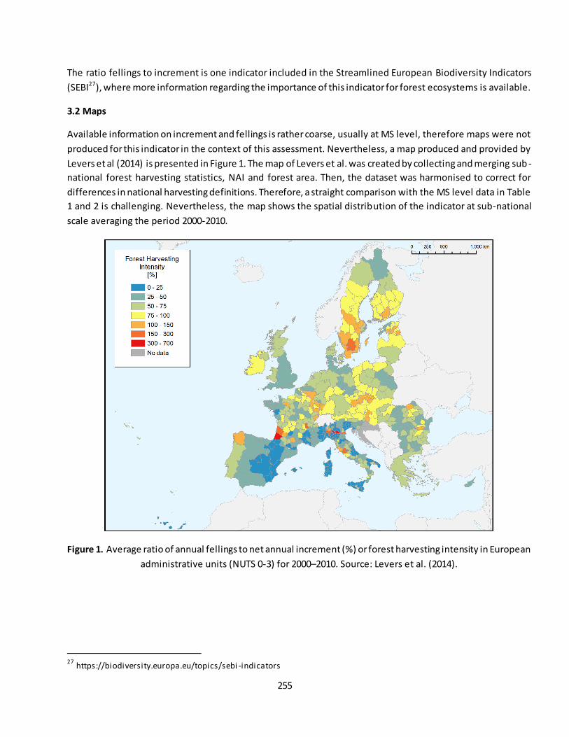
255
The ratio fellings to increment is one indicator included in the Streamlined European Biodiversity Indicators
(SEBI27), where more information regarding the importance of this indicator for forest ecosystems is available.
3.2 Maps
Available information on increment and fellings is rather coarse, usually at MS level, therefore maps were not
produced for this indicator in the context of this assessment. Nevertheless, a map produced and provided by
Levers et al (2014) is presented in Figure 1. The map of Levers et al. was created by collecting and merging sub -
national forest harvesting statistics, NAI and forest area. Then, the dataset was harmonised to correct for
differences in national harvesting definitions. Therefore, a straight comparison with the MS level data in Table
1 and 2 is challenging. Nevertheless, the map shows the spatial distribution of the indicator at sub-national
scale averaging the period 2000-2010.
Figure 1. Average ratio of annual fellings to net annual increment (%) or forest harvesting intensity in European
administrative units (NUTS 0-3) for 2000–2010. Source: Levers et al. (2014).
27
https://biodiversity.europa.eu/topics/sebi -indicators
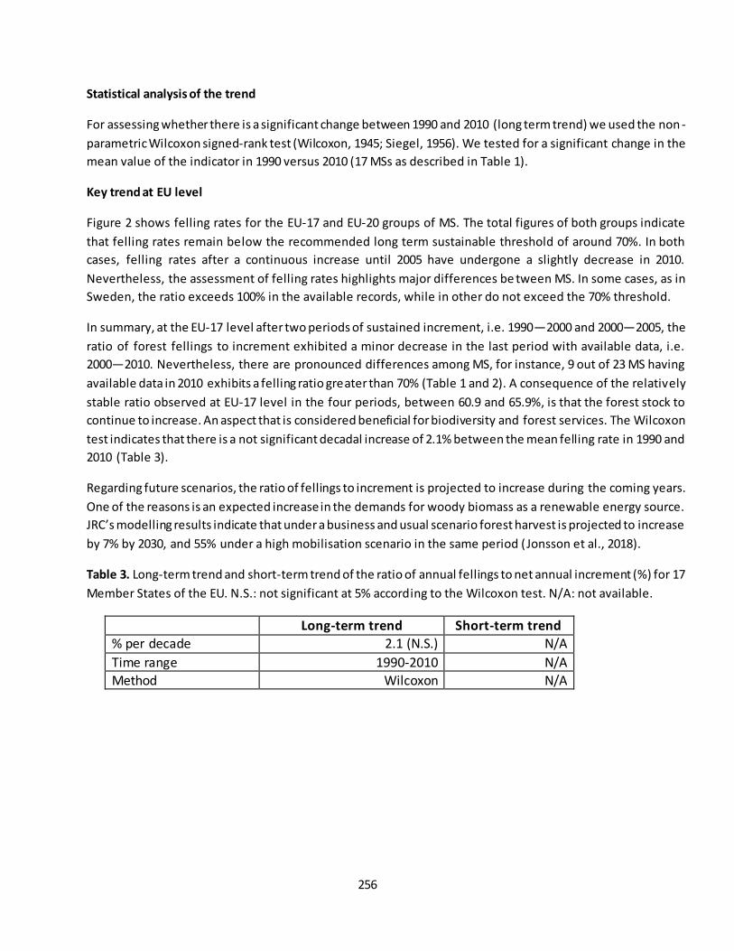
256
Statistical analysis of the trend
For assessing whether there is a significant change between 1990 and 2010 (long term trend) we used the non -
parametric Wilcoxon signed-rank test (Wilcoxon, 1945; Siegel, 1956). We tested for a significant change in the
mean value of the indicator in 1990 versus 2010 (17 MSs as described in Table 1).
Key trend at EU level
Figure 2 shows felling rates for the EU-17 and EU-20 groups of MS. The total figures of both groups indicate
that felling rates remain below the recommended long term sustainable threshold of around 70%. In both
cases, felling rates after a continuous increase until 2005 have undergone a slightly decrease in 2010.
Nevertheless, the assessment of felling rates highlights major differences be tween MS. In some cases, as in
Sweden, the ratio exceeds 100% in the available records, while in other do not exceed the 70% threshold.
In summary, at the EU-17 level after two periods of sustained increment, i.e. 1990—2000 and 2000—2005, the
ratio of forest fellings to increment exhibited a minor decrease in the last period with available data, i.e.
2000—2010. Nevertheless, there are pronounced differences among MS, for instance, 9 out of 23 MS having
available data in 2010 exhibits a felling ratio greater than 70% (Table 1 and 2). A consequence of the relatively
stable ratio observed at EU-17 level in the four periods, between 60.9 and 65.9%, is that the forest stock to
continue to increase. An aspect that is considered beneficial for biodiversity and forest services. The Wilcoxon
test indicates that there is a not significant decadal increase of 2.1% between the mean felling rate in 1990 and
2010 (Table 3).
Regarding future scenarios, the ratio of fellings to increment is projected to increase during the coming years.
One of the reasons is an expected increase in the demands for woody biomass as a renewable energy source.
JRC’s modelling results indicate that under a business and usual scenario forest harvest is projected to increase
by 7% by 2030, and 55% under a high mobilisation scenario in the same period (Jonsson et al., 2018).
Table 3. Long-term trend and short-term trend of the ratio of annual fellings to net annual increment (%) for 17
Member States of the EU. N.S.: not significant at 5% according to the Wilcoxon test. N/A: not available.
Long-term trend Short-term trend
% per decade 2.1 (N.S.) N/A
Time range 1990-2010 N/A Method Wilcoxon N/A
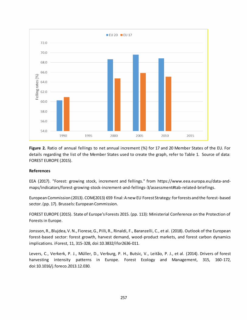
257
Figure 2. Ratio of annual fellings to net annual increment (%) for 17 and 20 Member States of the EU. For
details regarding the list of the Member States used to create the graph, refer to Table 1. Source of data:
FOREST EUROPE (2015).
References
EEA (2017). "Forest: growing stock, increment and fellings." from https://www.eea.europa.eu/data-and-
maps/indicators/forest-growing-stock-increment-and-fellings-3/assessment#tab-related-briefings.
European Commission (2013). COM(2013) 659 final: A new EU Forest Strategy: for forests and the forest-based
sector. (pp. 17). Brussels: European Commission.
FOREST EUROPE (2015). State of Europe's Forests 2015. (pp. 113): Ministerial Conference on the Protection of
Forests in Europe.
Jonsson, R., Blujdea, V. N., Fiorese, G., Pilli, R., Rinaldi, F., Baranzelli, C., et al. (2018). Outlook of the European
forest-based sector: forest growth, harvest demand, wood-product markets, and forest carbon dynamics
implications. iForest, 11, 315-328, doi:10.3832/ifor2636-011.
Levers, C., Verkerk, P. J., Müller, D., Verburg, P. H., Butsic, V., Leitão, P. J., et al. (2014). Drivers of forest
harvesting intensity patterns in Europe. Forest Ecology and Management, 315, 160-172,
doi:10.1016/j.foreco.2013.12.030.
258
MAES (2018). Mapping and Assessment of Ecosystems and their Services - An analytical framework for
mapping and assessment of ecosystem condition in EU. European Commission, DG-Environment, Technical
Report - 2018 – 001, Luxembourg. pp. 75.
Siegel, S. (1956). Non-parametric statistics for the behavioral sciences. New York: McGraw-Hill. pp. 75–83.
Wilcoxon, F. (1945). Individual Comparisons by Ranking Methods. Biometrics Bulletin, Vol. 1, pp. 80-83.
doi:10.2307/3001968.
Contact:
José I. Barredo, European Commission - Joint Research Centre, Ispra, Italy [[email protected]]
259
Fact sheet 3.3.111: Effective rainfall (precipitation – potential evapotranspiration)
1. General information
Thematic ecosystem assessment: Forest condition
Indicator class (See table 1): Pressures, climate change
Name of the indicator: Effective rainfall
Units: mm
2. Data sources:
The indicator is based on existing reference data:
Data holder:
o PET: University of East Anglia Climatic Research Unit (CRU) Time-Series (TS) (1901–2016)
version 4.01 gridded monthly data at 0.5 degree (~43 km at 40° N) spatial resolution (Harris et
al. 2014).
o Precipitation: Full Data Monthly Product Version 2018 provided by the Global Precipitation
Climatology Centre (GPCC) of the Deutscher Wetterdienst (DWD) (Schneider et al. 2018;
Schneider et al. 2017)
Weblink:
o PET: https://crudata.uea.ac.uk/cru/data/hrg/
o Precipitation: https://www.dwd.de/EN/ourservices/gpcc/gpcc.html
Year or time-series range: 1960–2016
Version: See above
Access date: 22/02/2019
Reference:
o Harris, I., Jones, P. D., Osborn, T. J., & Lister, D. H. (2014). Updated high-resolution grids of
monthly climatic observations – the CRU TS3.10 Dataset. International Journal of Climatology,
34(3), 623-642, doi:doi:10.1002/joc.3711.
o Schneider, U., Becker, A., Finger, P., Meyer-Christoffer, A., & Ziese, M. (2018). GPCC Full Data
Monthly Product Version 2018 at 0.5°: Monthly Land-Surface Precipitation from Rain-Gauges
built on GTS-based and Historical Data.
3. Assessment of the indicator
Introduction
The focus of the present assessment is to examine significant changes in effective rainfall (ER) in Europe. ER is
the difference between mean annual precipitation (MAP) and mean annual potential evapotranspiration (PET)
(Archibald et al. 2013; Santhi et al. 2008; Wolock et al. 2004). It is considered an index of plant productivity,
where values below zero indicate that evaporative demands exceeds precipitation and values above zero that
precipitation exceeds evaporative demands. Therefore, ER is a quantitative indicator of the degree of water
260
deficiency at a given location. The productivity of land biological systems is related to available moisture, which
in turn is related to rainfall and the evaporative demand of the system (Archibald et al. 2013). In forest
ecosystems the amount of biomass is largely controlled by the productivity of the system.
PET is an important climatic parameter that describes the amount of water needed for plant growth and
development. PET represents the potential flux of water from a surface having enough soil moisture so that the
amount of water is not limited. Thus, PET is defined as the amount of water that would be evaporated and
transpired by a specific crop, or ecosystem, if there is sufficient water available. The FAO Penman–Monteith
method defines PET as the potential evapotranspiration from a clipped grass-surface having 0.12 m height and
bulk surface resistance equal to 70 s m−1, an assumed surface albedo of 0.23 (Allen et al. 1994; Ekström et al.
2007), and no moisture stress. This definition was used by Harris et al. (2014) for computing the PET dataset
used in this assessment. The Penman–Monteith algorithm includes the effects of surface air temperature,
humidity, solar radiation and wind. An upward trend of PET indicates plant water shortage when PET becomes
greater than precipitation, consequently decreasing ER. Therefore, a sustained downward trend of ER suggests
loss of ecosystem productivity and ultimately degradation. When the water demand as consequence of
increased PET is not met, dry soil moisture conditions prevail resulting in a trend toward drought and aridity
(Feng and Fu 2013). Natural ecosystems have adapted to temporal water shortages, however, regime shifts in
water supply represent a serious threat.
Data and methods
We computed annual effective rainfall (ER) as the difference between annual precipitation and annual PET,
which gives a value ranging from around –1200 mm to 2100 mm. Negative values indicate areas in which
evaporative demands exceeds incoming precipitation and vice versa. Thus, one layer of ER was created for
each year of the time series between 1960 and 2016 using data from two sources. First, we used a PET dataset
from the University of East Anglia Climatic Research Unit (CRU) Time -Series (TS) (1901–2016) version 4.01
gridded monthly data at 0.5 degree (~43 km at 40° N) spatial resolution (Harris et al. 2014). The CRU TS v4.01
data are monthly gridded fields based on monthly observational data calculated from daily or sub-daily data by
National Meteorological Services and other external agents. Second, gridded monthly data of precipitation at
0.5 degree (1891-2016) was sourced from the Full Data Monthly Product Version 2018 provided by the Global
Precipitation Climatology Centre (GPCC) of the Deutscher Wetterdienst (DWD) (Schneider et al. 2018;
Schneider et al. 2017). Version 2018 was created by merging in situ time-series of raingauge data based on
more than 53,000 stations globally. Both datasets have been widely used in many applications and are
accepted as reliable data.
The annual layers of ER were used for detecting spatial trends on each grid cell. We used robust regression to
mitigate the effect of anomalous years. Regression slopes were estimated using the non-parametric Theil-Sen
estimator (Sen 1968; Wilcox 2012) because it accommodates non-normal distributions and is a robust trend
slope estimator resistant to the effects of outliers. Additionally, a two-sided Mann-Kendall (Gilbert 1987;
Kendall 1975; Mann 1945) non-parametric trend test was used to assess the significance of monotonic trends
in ER.
261
3.1 Trends and maps
Results
The map of Figure 1 shows areas where significant changes in ER have occurred in the study period. Changes
below 0 mm/decade indicate a drying climate and changes above 0 mm/decade a wetter climate. Within the
Mediterranean domain large areas of the Iberian Peninsula, France, Italy, major Mediterranean islands and the
Balkans, exhibit a downward trend of ER.
Among the European biogeographical regions, after the Black Sea (63%), the Mediterranean shows the larger
proportion of area (61%) having significant decreases of ER (Table 1). Additionally, other regions beyond the
Mediterranean such as zones of Belgium, Germany, Poland, Czech Republic, Hungary, Bulgaria and Romania
also exhibited downward significant trends. In these zones, an increasing climatic water deficit indicates
evaporative demands not met by precipitation. Therefore, suggesting increasing aridity. Other biogeographical
regions showing a large proportion of area affected by significant decreases of ER are the Continental, Atlantic,
Pannonian and Steppic, all exhibiting decreases in at least 20% of their extent ( Table 1).
In contrast, some zones of northern Europe show a significant increase of ER, for instance, parts of Sweden,
Finland, north Britain, but also some zones of the western part of the Island of Sicily. In these areas, an upward
wetter trend prevails. Specifically, the Alpine and Boreal biogeographical regions exhibit increases in 12% and
13%, of their extent, respectively.
Table 1. Percentage area of significant changes in effective rainfall (ER) in European biogeographical regions
(EEA 2002, 2019) within the EU-28 countries (1960–2016). Note that the areas were computed using a 1 km
grid size map.
Biogeographical
region
Total area (Km2) ER significant
decrease (%)
ER significant
increase (%)
Alpine 379,142 14 12 Atlantic 802,912 21 3
Black Sea 11,942 63 0
Boreal 858,430 0 13 Continental 1,292,677 22 0
Macaronesia 12,001 18 0 Mediterranean 923,170 61 1
Pannonian 126,158 20 0 Steppic 37,112 20 0
Total 4,443,544 25 4
Decreases of ER as result of climate change has a direct consequence on land degradation in arid, semiarid and
subhumid areas (Feng and Fu 2013), being mostly located in Europe within the Mediterranean biogeographical
region. In forest ecosystems, a downward trend in ER suggests higher mortality of trees, increased bark-beetles
outbreaks, more favourable conditions for wildfires and a reduction of forest productivity. Nevertheless, the
effects can vary from site to site depending of local conditions. Despite climate models uncertainty, the re is
262
consensus in that future impacts of climate change indicate a projected increase of aridity in the European
continent (Barredo et al. 2016; Barredo et al. 2018; Cherlet et al. 2018; Feng and Fu 2013; Lin et al. 2018;
Spinoni et al. 2015), specifically in southern Europe and in the Mediterranean biogeographical region.
Figure 1. Trends in annual effective rainfall 1960–2016 in the EU-28 (significant at the 5% level according to the
Mann-Kendall test). Light grey: outside area of interest.
The assessment of annual ER computed in the domain covered by the EU-28 indicates a significant (p = 0.031)
downward trend of -1.2 mm/y (Figure 2). Therefore, the decadal long term trend is -38% (statistically
significant at the 5% level) and the decadal short-term trend -57% (but not statistically significant at the 5%
level). However, note that change is always considered as significant in case the percentage change per decade
is higher than or equal to +5 % or lower than or equal to -5 %. This is valid for both short and long-term trends
and regardless statistical testing. A change outside this interval is thus always considered as policy -relevant to
report.
263
Figure 2. Trend of annual effective rainfall 1960–2016 in the EU-28. Trend line computed using the Theil–Sen
non-parametric estimator. Downward trend (-1.2 mm/y) significant at 5% according to Mann-Kendall trend
test.
References
Allen, R. G., Smith, M., Pereira, L. S., & Perrier, A. (1994). An update for the calculation of reference
evapotranspiration. ICID Bulletin, 43, 35-92.
Archibald, S., Lehmann, C. E. R., Gómez-Dans, J. L., & Bradstock, R. A. (2013). Defining pyromes and global
syndromes of fire regimes. Proceedings of the National Academy of Sciences, 110(16), 6442-6447,
doi:10.1073/pnas.1211466110.
Barredo, J. I., Caudullo, G., & Dosio, A. (2016). Mediterranean habitat loss under future climate conditions:
Assessing impacts on the Natura 2000 protected area network. Applied Geography, 75, 83-92,
doi:10.1016/j.apgeog.2016.08.003.
Barredo, J. I., Mauri, A., Caudullo, G., & Dosio, A. (2018). Assessing Shifts of Mediterranean and Arid Climates
Under RCP4.5 and RCP8.5 Climate Projections in Europe. Pure and Applied Geophysics, 1-17,
doi:10.1007/s00024-018-1853-6.
Cherlet, M., Hutchinson, C., Reynolds, J., Hill, J., Sommer, S., & von Maltitz, G. (Eds.). (2018). World Atlas of
Desertification. Luxembourg: Publication Office of the European Union.
264
EEA (2002). Europe’s biodiversity – biogeographical regions and seas. Luxembourg: European Environment
Agency.
EEA (2019). Biogeographical regions. https://www.eea.europa.eu/data-and-maps/data/biogeographical-
regions-europe-3#tab-figures-produced2019.
Ekström, M., Jones, P. D., Fowler, H. J., Lenderink, G., Buishand, T. A., & Conway, D. (2007). Regional climate
model data used within the SWURVE project – 1: projected changes in seasonal patterns and estimation
of PET. Hydrology and Earth System Sciences, 11(3), 1069-1083, doi:10.5194/hess-11-1069-2007.
Feng, S., & Fu, Q. (2013). Expansion of global drylands under a warming climate. Atmospheric Chemistry and
Physics, 13(19), 10081-10094, doi:10.5194/acp-13-10081-2013.
Gilbert, R. O. (1987). Statistical Methods for Environmental Pollution Monitoring. NY, USA: Wiley.
Harris, I., Jones, P. D., Osborn, T. J., & Lister, D. H. (2014). Updated high-resolution grids of monthly climatic
observations – the CRU TS3.10 Dataset. International Journal of Climatology, 34(3), 623-642,
doi:doi:10.1002/joc.3711.
Kendall, M. G. (1975). Rank Correlation Methods (4th edition). London: Charles Griffin.
Lin, L., Gettelman, A., Fu, Q., & Xu, Y. (2018). Simulated differences in 21st century aridity due to different
scenarios of greenhouse gases and aerosols. [journal article]. Climatic Change , 146(3), 407-422,
doi:10.1007/s10584-016-1615-3.
Mann, H. B. (1945). Nonparametric Tests Against Trend. Econometrica, 13(3), 245-259, doi:10.2307/1907187.
Santhi, C., Allen, P. M., Muttiah, R. S., Arnold, J. G., & Tuppad, P. (2008). Regional estimation of base flow for
the conterminous United States by hydrologic landscape regions. Journal of Hydrology, 351(1), 139-153,
doi:https://doi.org/10.1016/j.jhydrol.2007.12.018.
Schneider, U., Becker, A., Finger, P., Meyer-Christoffer, A., & Ziese, M. (2018). GPCC Full Data Monthly Product
Version 2018 at 0.5°: Monthly Land-Surface Precipitation from Rain-Gauges built on GTS-based and Historical
Data.
Schneider, U., Finger, P., Meyer-Christoffer, A., Rustemeier, E., Ziese, M., & Becker, A. (2017). Evaluating the
Hydrological Cycle over Land Using the Newly-Corrected Precipitation Climatology from the Global
Precipitation Climatology Centre (GPCC). Atmosphere, 8(3), 52.
Sen, P. K. (1968). Estimates of the Regression Coefficient Based on Kendall's Tau. Journal of the American
Statistical Association, 63(324), 1379-1389, doi:10.2307/2285891.
Spinoni, J., Vogt, J., Naumann, G., Carrao, H., & Barbosa, P. (2015). Towards identifying areas at climatological
risk of desertification using the Köppen–Geiger classification and FAO aridity index. International Journal of
Climatology, 35(9), 2210-2222, doi:doi:10.1002/joc.4124.
265
Wilcox, R. R. (2012). Introduction to Robust Estimation and Hypothesis Testing. San Diego, California, USA:
Academic Press.
Wolock, D. M., Winter, T. C., & McMahon, G. (2004). Delineation and Evaluation of Hydrologic-Landscape
Regions in the United States Using Geographic Information System Tools and Multivariate Statistical Analyses.
[journal article]. Environmental Management, 34(1), S71-S88, doi:10.1007/s00267-003-5077-9.
Contact:
José I. Barredo, European Commission - Joint Research Centre, Ispra, Italy [[email protected]]
266
Fact sheet 3.3.201: Dead wood
1. General information
- Thematic ecosystem assessment: Forest condition
- Indicator class: Ecosystem condition, Structural ecosystem attributes (general)
- Name of the indicator: Dead wood - Units: Tonnes/ha
2. Data sources
- Data holder: FAO, Global Forest Resource Assessment (FRA)(FAO 2015)
- Web link: http://www.fao.org/forest-resources-assessment/en/
- Year of time-series range: 1990, 2000, 2005, 2010, 2015
- Version: FRA 2015
- Access date: 01/02/2019
- Reference: FAO (2015). Global Forest Resources Assessment 2015. Rome: Food and Agriculture Organization of the United Nations.
According to FAO (2015) dead wood is defined as “all non-living woody biomass not contained in the li tter,
either standing, lying on the ground, or in the soil. Dead wood includes wood lying on the surface, dead roots,
and stumps larger than or equal to 10 cm in diameter or any other diameter used by the country”.
Available data: Data on dead wood is available for a group of 15 MS of the EU for 1990, 2000, 2005, 2010 and
2015. The MS are: Austria, Belgium, Czech Republic, Denmark, Estonia, Finland, Hungary, Italy, Latvia,
Lithuania, Netherlands, Slovakia, Slovenia, Sweden and United Kingdom.
Additionally, Germany has data only for four dates, i.e.: 2000, 2005, 2010 and 2015.
The amount of dead wood per unit area was computed by dividing the total amount of dead wood by forest
area on each year (i.e. 1990, 2000, 2005, 2010 and 2015) for the group of 15 MS. Data on forest area was
provided from the same source as dead wood, i.e. FAO FRA (FAO 2015). The same computation was done for a
group of 16 MS (15 MS + Germany) but only for 2000, 2005, 2010 and 2015.
3. Assessment of the indicator
3.1 Short description of the scope of the indicator
Dead wood is an important trait of forest ecosystems representing the substrate for a large number of animal
and plant species, including vertebrates, invertebrates, vascular plants, algae, bryophytes, fungi, slime moulds
and lichens (FOREST EUROPE 2015). Additionally, dead wood contributes to several forest features and
functions such as structural stability of soils, microhabitats, carbon sequestration, nutrient supply and water
retention (Lachat et al. 2013). Dead wood is one indicator included in the Streamlined European Biodiversity
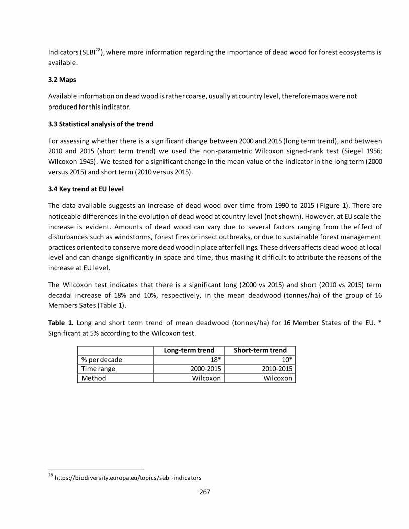
267
Indicators (SEBI28), where more information regarding the importance of dead wood for forest ecosystems is
available.
3.2 Maps
Available information on dead wood is rather coarse, usually at country level, therefore maps were not
produced for this indicator.
3.3 Statistical analysis of the trend
For assessing whether there is a significant change between 2000 and 2015 (long term trend), and between
2010 and 2015 (short term trend) we used the non-parametric Wilcoxon signed-rank test (Siegel 1956;
Wilcoxon 1945). We tested for a significant change in the mean value of the indicator in the long term (2000
versus 2015) and short term (2010 versus 2015).
3.4 Key trend at EU level
The data available suggests an increase of dead wood over time from 1990 to 2015 ( Figure 1). There are
noticeable differences in the evolution of dead wood at country level (not shown). However, at EU scale the
increase is evident. Amounts of dead wood can vary due to several factors ranging from the ef fect of
disturbances such as windstorms, forest fires or insect outbreaks, or due to sustainable forest management
practices oriented to conserve more dead wood in place after fellings. These drivers affects dead wood at local
level and can change significantly in space and time, thus making it difficult to attribute the reasons of the
increase at EU level.
The Wilcoxon test indicates that there is a significant long (2000 vs 2015) and short (2010 vs 2015) term
decadal increase of 18% and 10%, respectively, in the mean deadwood (tonnes/ha) of the group of 16
Members Sates (Table 1).
Table 1. Long and short term trend of mean deadwood (tonnes/ha) for 16 Member States of the EU. *
Significant at 5% according to the Wilcoxon test.
Long-term trend Short-term trend
% per decade 18* 10* Time range 2000-2015 2010-2015
Method Wilcoxon Wilcoxon
28
https://biodiversity.europa.eu/topics/sebi -indicators
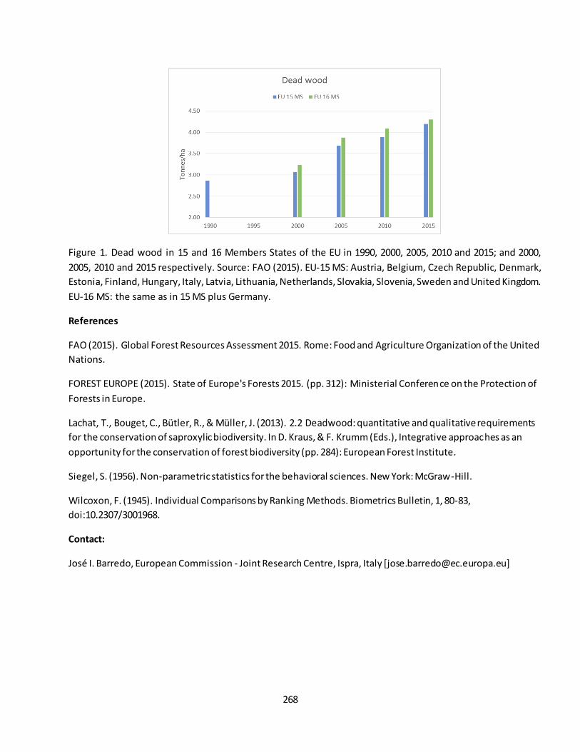
268
Figure 1. Dead wood in 15 and 16 Members States of the EU in 1990, 2000, 2005, 2010 and 2015; and 2000,
2005, 2010 and 2015 respectively. Source: FAO (2015). EU-15 MS: Austria, Belgium, Czech Republic, Denmark,
Estonia, Finland, Hungary, Italy, Latvia, Lithuania, Netherlands, Slovakia, Slovenia, Sweden and United Kingdom.
EU-16 MS: the same as in 15 MS plus Germany.
References
FAO (2015). Global Forest Resources Assessment 2015. Rome: Food and Agriculture Organization of the United
Nations.
FOREST EUROPE (2015). State of Europe's Forests 2015. (pp. 312): Ministerial Conference on the Protection of
Forests in Europe.
Lachat, T., Bouget, C., Bütler, R., & Müller, J. (2013). 2.2 Deadwood: quantitative and qualitative requirements
for the conservation of saproxylic biodiversity. In D. Kraus, & F. Krumm (Eds.), Integrative approaches as an
opportunity for the conservation of forest biodiversity (pp. 284): European Forest Institute.
Siegel, S. (1956). Non-parametric statistics for the behavioral sciences. New York: McGraw-Hill.
Wilcoxon, F. (1945). Individual Comparisons by Ranking Methods. Biometrics Bulletin, 1, 80-83,
doi:10.2307/3001968.
Contact:
José I. Barredo, European Commission - Joint Research Centre, Ispra, Italy [[email protected]]

269
Fact sheet 3.3.202: Biomass (growing stock)
1. General information
- Thematic ecosystem assessment: Forest condition
- Indicator class: Ecosystem condition, Structural ecosystem attributes (general)
- Name of the indicator: Biomass (growing stock) - Units: m3/ha
2. Data sources
- Data holder: Forest Europe, State of Europe ’s forests 2015
- Web link: https://foresteurope.org/state-europes-forests-2015-report/
- Year of time-series range: 1990, 2000, 2005, 2010, 2015
- Version: State of Europe’s forests 2015
- Access date: 01/05/2019
- Reference: FOREST EUROPE/UNECE/FAO enquiry on pan-European quantitative indicators. FOREST
EUROPE (2015). State of Europe's Forests 2015. Ministerial Conference on the Protection of Forests in
Europe. pp. 312.
3. Assessment of the indicator
Growing stock data on forest is available from almost all the EU-28 countries for the years 1990, 2000, 2005,
2010 and 2015. Exception is made for Ireland, where figures of growing stock are missing for the years 1990
and 2000, and in Portugal 2015. The total growing stock of forests in the EU-28 amounts to 26.3 billion m3 in
2015 (not including Portugal). This figure produces an average growing stock density of 210 m3/ha, however
pronounced differences exists among countries. The highest growing stock density is for Slovenia with 346
m3/ha, followed by Germany, Luxembourg , Austria and Czech Republic with values above 297 m3/ha. The
countries with lowest value are Greece with 47 m3/ha followed by Cyprus and Spain with 64 and 66 m3/ha,
respectively (Table 1). Environmental and climatic conditions, and human actions such as forest protectio n and
management practices, explain differences in growing stock density. The figures provided in table 1 are
averages at country level, however, considerable differences may exist at sub-national and local level.
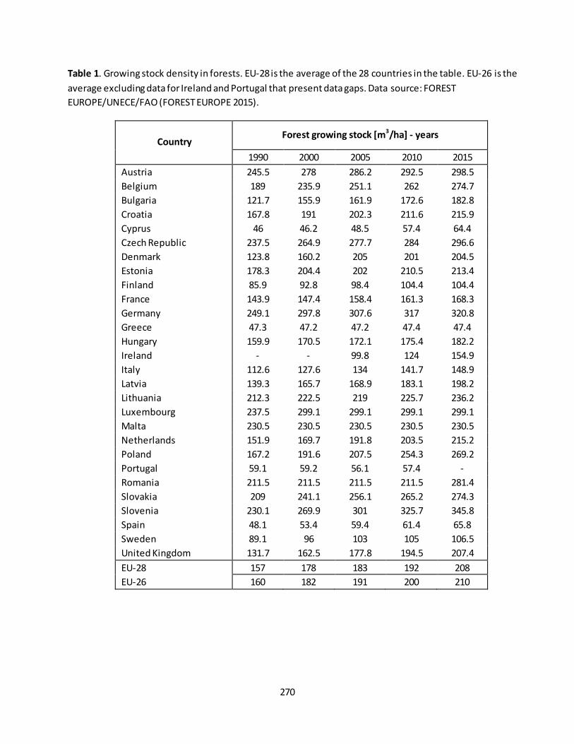
270
Table 1. Growing stock density in forests. EU-28 is the average of the 28 countries in the table. EU-26 is the
average excluding data for Ireland and Portugal that present data gaps. Data source: FOREST
EUROPE/UNECE/FAO (FOREST EUROPE 2015).
Country Forest growing stock [m
3/ha] - years
1990 2000 2005 2010 2015
Austria 245.5 278 286.2 292.5 298.5
Belgium 189 235.9 251.1 262 274.7
Bulgaria 121.7 155.9 161.9 172.6 182.8
Croatia 167.8 191 202.3 211.6 215.9
Cyprus 46 46.2 48.5 57.4 64.4
Czech Republic 237.5 264.9 277.7 284 296.6
Denmark 123.8 160.2 205 201 204.5
Estonia 178.3 204.4 202 210.5 213.4
Finland 85.9 92.8 98.4 104.4 104.4
France 143.9 147.4 158.4 161.3 168.3
Germany 249.1 297.8 307.6 317 320.8
Greece 47.3 47.2 47.2 47.4 47.4
Hungary 159.9 170.5 172.1 175.4 182.2
Ireland - - 99.8 124 154.9
Italy 112.6 127.6 134 141.7 148.9
Latvia 139.3 165.7 168.9 183.1 198.2
Lithuania 212.3 222.5 219 225.7 236.2
Luxembourg 237.5 299.1 299.1 299.1 299.1
Malta 230.5 230.5 230.5 230.5 230.5
Netherlands 151.9 169.7 191.8 203.5 215.2
Poland 167.2 191.6 207.5 254.3 269.2
Portugal 59.1 59.2 56.1 57.4 -
Romania 211.5 211.5 211.5 211.5 281.4
Slovakia 209 241.1 256.1 265.2 274.3
Slovenia 230.1 269.9 301 325.7 345.8
Spain 48.1 53.4 59.4 61.4 65.8
Sweden 89.1 96 103 105 106.5
United Kingdom 131.7 162.5 177.8 194.5 207.4
EU-28 157 178 183 192 208
EU-26 160 182 191 200 210
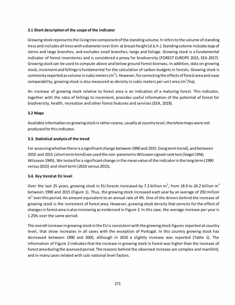
271
3.1 Short description of the scope of the indicator
Growing stock represents the living tree component of the standing volume. It refers to the volume of standing
tress and includes all tress with a diameter over 0 cm at breast height (d.b.h.). Standing volume includes tops of
stems and large branches, and excludes small branches, twigs and foliage. Growing stock is a fundamental
indicator of forest inventories and is considered a proxy for biodiversity (FOREST EUROPE 2015, EEA 2017).
Growing stock can be used to compute above and below ground forest biomass. In addition, data on growing
stock, increment and fellings is fundamental for the calculation of carbon budgets in forests. Growing stock is
commonly reported as volume in cubic meters (m3). However, for correcting the effects of forest area and ease
comparability, growing stock is also measured as density in cubic meters per uni t area (m3/ha).
An increase of growing stock relative to forest area is an indication of a maturing forest. This indicator,
together with the ratio of fellings to increment, provides useful information of the potential of forest for
biodiversity, health, recreation and other forest features and services (EEA, 2019).
3.2 Maps
Available information on growing stock is rather coarse, usually at country level, therefore maps were not
produced for this indicator.
3.3. Statistical analysis of the trend
For assessing whether there is a significant change between 1990 and 2015 (long term trend), and between
2010 and 2015 (short term trend) we used the non-parametric Wilcoxon signed-rank test (Siegel 1956;
Wilcoxon 1945). We tested for a significant change in the mean value of the indicator in the long term (1990
versus 2015) and short term (2010 versus 2015).
3.4. Key trend at EU level
Over the last 25 years, growing stock in EU forests increased by 7.3 billion m 3, from 18.9 to 26.2 billion m3
between 1990 and 2015 (Figure 1). Thus, the growing stock increased each year by an average of 292 million
m3 over this period. An amount equivalent to an annual rate of 4%. One of the drivers behind the increase of
growing stock is the increment of forest area. However, growing stock density that corrects for the effect of
changes in forest area is also increasing as evidenced in Figure 2. In this case, the average increase per year is
1.25% over the same period.
The overall increase in growing stock in the EU is consistent with the growing stock figures reported at country
level, that show increases in all cases with the exception of Portugal. In this country growing stock has
decreased between 1990 and 2005, although in 2010 a slightly increase was reported (Table 1). The
information of Figure 2 indicates that the increase in growing stock in forest was higher than the increase of
forest area during the assessed period. The reasons behind the observed increase are complex and manifold,
and in many cases related with sub-national level factors.
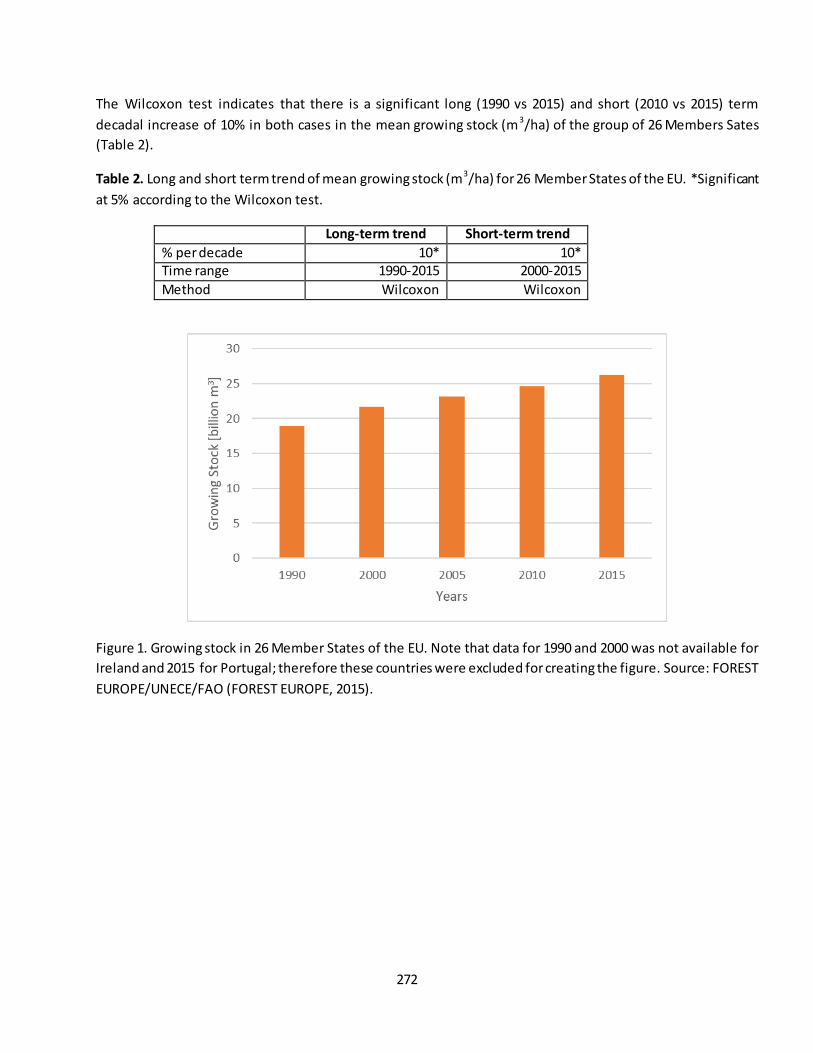
272
The Wilcoxon test indicates that there is a significant long (1990 vs 2015) and short (2010 vs 2015) term
decadal increase of 10% in both cases in the mean growing stock (m3/ha) of the group of 26 Members Sates
(Table 2).
Table 2. Long and short term trend of mean growing stock (m3/ha) for 26 Member States of the EU. *Significant
at 5% according to the Wilcoxon test.
Long-term trend Short-term trend
% per decade 10* 10* Time range 1990-2015 2000-2015
Method Wilcoxon Wilcoxon
Figure 1. Growing stock in 26 Member States of the EU. Note that data for 1990 and 2000 was not available for
Ireland and 2015 for Portugal; therefore these countries were excluded for creating the figure. Source: FOREST
EUROPE/UNECE/FAO (FOREST EUROPE, 2015).
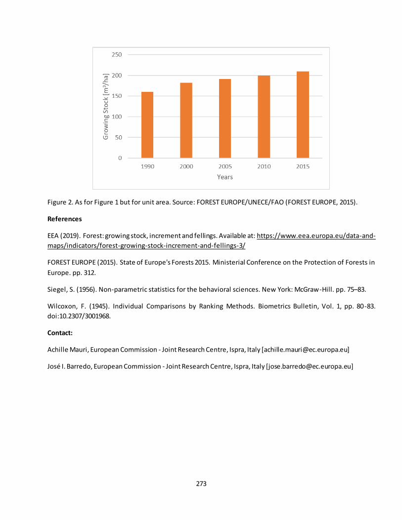
273
Figure 2. As for Figure 1 but for unit area. Source: FOREST EUROPE/UNECE/FAO (FOREST EUROPE, 2015).
References
EEA (2019). Forest: growing stock, increment and fellings. Available at: https://www.eea.europa.eu/data-and-
maps/indicators/forest-growing-stock-increment-and-fellings-3/
FOREST EUROPE (2015). State of Europe's Forests 2015. Ministerial Conference on the Protection of Forests in
Europe. pp. 312.
Siegel, S. (1956). Non-parametric statistics for the behavioral sciences. New York: McGraw-Hill. pp. 75–83.
Wilcoxon, F. (1945). Individual Comparisons by Ranking Methods. Biometrics Bulletin, Vol. 1, pp. 80-83.
doi:10.2307/3001968.
Contact:
Achille Mauri, European Commission - Joint Research Centre, Ispra, Italy [[email protected]]
José I. Barredo, European Commission - Joint Research Centre, Ispra, Italy [[email protected]]

274
Fact sheet 3.3.203: Forest area
1. General information
- Thematic ecosystem assessment: Forest condition
- Indicator class: Ecosystem condition, Structural ecosystem attributes (general)
- Name of the indicator: Forest area - Units: hectares (ha)
2. Data sources
- Data holder: Forest Europe, State of Europe’s forests 2015
- Web link: https://foresteurope.org/state-europes-forests-2015-report/
- Year of time-series range: 1990, 2000, 2005, 2010, 2015
- Version: State of Europe’s forests 2015
- Access date: 01/05/2019
- Reference: FOREST EUROPE/UNECE/FAO enquiry on pan-European quantitative indicators. FOREST
EUROPE (2015). State of Europe's Forests 2015. Ministerial Conference on the Protection of Forests in
Europe. pp. 312.
3. Assessment of the indicator
Estimates of forest area are available for all EU-28 countries for the years 1990, 2000, 2005, 2010 and 2015. In
2015, the countries with the highest forest area were Sweden followed by Finland, Spain and France with
28,000, 22,000, 18,000 and 17,000 million hectares, respectively (Table 1). Six countries (Malta, Lux embourg,
Cyprus, Netherlands, Denmark, Belgium and Ireland, in increasing order) have a forest area below 1,000 million
ha with Malta having only 300 ha of forest area. Large forest areas are found in Northern Europe. In Finland,
almost three quarters of the total land area is covered by forests. At 68%, Sweden is the country with the
second largest forest area. Slovenia is the only country in the South Europe region with more than 60% forest
cover.

275
Table 1. Forest area for the years 1990, 2000, 2005, 2010 and 2015 and proportion of land area (2015). Data
source: FOREST EUROPE/UNECE/FAO (FOREST EUROPE 2015).
Country
Proportion of
land area (%)
(2015)
Area [Million ha]
1990 2000 2005 2010 2015
Austria 46.9 3.8 3.8 3.9 3.9 3.9
Belgium 22.6 0.7 0.7 0.7 0.7 0.7
Bulgaria 35.2 3.3 3.4 3.7 3.7 3.8
Croatia 34.3 1.9 1.9 1.9 1.9 1.9
Cyprus 18.7 0.2 0.2 0.2 0.2 0.2
Czech Republic 34.5 2.6 2.6 2.6 2.7 2.7
Denmark 14.4 0.5 0.6 0.6 0.6 0.6
Estonia 49.4 2.2 2.2 2.3 2.2 2.2
Finland 73.1 21.9 22.5 22.2 22.2 22.2
France 31.0 14.4 15.3 15.9 16.4 17.0
Germany 32.8 11.3 11.4 11.4 11.4 11.4
Greece 30.3 3.3 3.6 3.8 3.9 3.9
Hungary 22.2 1.8 1.9 2.0 2.0 2.1
Ireland 10.9 0.5 0.6 0.7 0.7 0.8
Italy 31.6 7.6 8.4 8.8 9.0 9.3
Latvia 54.0 3.2 3.2 3.3 3.4 3.4
Lithuania 34.8 1.9 2.0 2.1 2.2 2.2
Luxembourg 33.5 0.1 0.1 0.1 0.1 0.1
Malta 0.9 0.0 0.0 0.0 0.0 0.0
Netherlands 11.1 0.3 0.4 0.4 0.4 0.4
Poland 30.8 8.9 9.1 9.2 9.3 9.4
Portugal 35.3 3.4 3.3 3.3 3.2 3.2
Romania 29.8 6.4 6.4 6.4 6.5 6.9
Slovakia 40.3 1.9 1.9 1.9 1.9 1.9
Slovenia 62.0 1.2 1.2 1.2 1.2 1.2
Spain 36.9 13.8 17.0 17.3 18.2 18.4
Sweden 68.4 28.1 28.2 28.2 28.1 28.1
United Kingdom 13.0 2.8 3.0 3.0 3.1 3.1
Short description of the scope of the indicator
Forest area is a key indicator to assess the overall status of afforestation, reforestation and deforestation
actions. It is at the basis of forest-related policies, for instance, changes of forest area over time are
fundamental for assessing the sustainability of land-use management (FOREST EUROPE 2015). In 2015, forest
covered around 38% of the EU-28 extent, totalling 161 million hectares. Of this extent, 84% falls within forest
276
available for wood supply (FAWS), i.e. forest where any legal, economic, or specific environmental restrictions
do not have a significant impact on the supply of wood. FAWS include areas where, although there are no such
restrictions, harvesting is not taking place, for example areas included in long-term utilization plans or
intentions (UNECE, 2019).
3.2 Maps
Available information on forest area is rather coarse, usually at country level, therefore maps were not
produced for this indicator.
3.3 Statistical analysis of the trend
For assessing whether there is a significant change between 1990 and 2015 (long term trend), and between
2010 and 2015 (short term trend) we used the non-parametric Wilcoxon signed-rank test (Siegel 1956;
Wilcoxon 1945). We tested for a significant change in the mean value of the indicator in the long term (1990
versus 2015) and short term (2010 versus 2015).
3.4 Key trend at EU level
The forest area in the EU-28 expanded by nearly 13 million hectares over the last 25 years, an area equivalent
to the size of Greece, from 148 to 161 million hectares (Figure 1). The forest expansion is the net balance of
afforestation, natural forest expansion, regeneration and deforestation (FOREST EUROPE 2015). This is
equivalent to an increase of 520,000 ha (0.35%) per year. The rate of increase in forest area was higher in the
first decade (1990-2000) than in the 2000-2015 period, around 680,000 ha/y versus 410,000 ha/y. This
indicates that forest area continues to increase but at a lower rate than in the first sub-period.
Net forest expansion in the period 1990-2015 was highest in Spain (184,000 ha/y) and France (104,000 ha/y),
whereas in relative terms the highest increase per year was in Ireland with around 2%. Most Member States
reported stable or increasing in forest area, however Portugal reported a net decrease in forest area in the
1990-2015 period of 254,000 ha and Sweden a decrease in the period 2005-2015 of 145,000 ha.
The Wilcoxon test indicates that there is a significant long (1990 vs 2015) and short (2010 vs 2015) term
decadal increase of 3.27% and 2.13%, respectively, in forest area in the EU (Table 2).
Table 2. Long and short term trend of forest area in the EU. *Significant at 5% according to the Wilcoxon test.
Long-term trend Short-term trend
% per decade 3.27* 2.13* Time range 1990-2015 2010-2015
Method Wilcoxon Wilcoxon

277
Figure 1. Forest area in the EU-28. Data source: FOREST EUROPE/UNECE/FAO (FOREST EUROPE 2015).
References
FOREST EUROPE (2015). State of Europe's Forests 2015. Ministerial Conference on the Protection of Forests in
Europe. pp. 312.
UNECE (2019). Terms and definitions applied in the UN-ECE/FAO Temperate and Boreal Forest Resources
Assessment 2000. Available at: http://www.unece.org/forests/fra/definit/
Siegel, S. (1956). Non-parametric statistics for the behavioral sciences. New York: McGraw-Hill. pp. 75–83.
Wilcoxon, F. (1945). Individual Comparisons by Ranking Methods. Biometrics Bulletin, Vol. 1, pp. 80-83.
doi:10.2307/3001968.
Contact:
José I. Barredo, European Commission - Joint Research Centre, Ispra, Italy [[email protected]]
Achille Mauri, European Commission - Joint Research Centre, Ispra, Italy [[email protected]]
278
Fact sheet 3.3.204: Tree defoliation
1. General information
- Thematic ecosystem assessment: Forest condition
- Indicator class: Ecosystem condition, Structural ecosystem attributes (general)
- Name of the indicator: Tree defoliation
- Units: percentage of leaf or needle loss
2. Data sources
- Data holder: ICP Forests (Michel A 2018); FOREST EUROPE (2015)
- Web link: http://icp-forests.net/
- Year of time-series range: 1998—2017 (20-year)
- Version: 2018 (Michel A 2018)
- Access date: 16/10/2019
- Reference:
o Michel A, S. W., Prescher A-K, (Ed.). (2018). Forest Condition in Europe: 2018 Technical Report of
ICP Forests. Report under the UNECE Convention on Long-range Transboundary Air Pollution (Air
Convention). Vienna: BFW-Dokumentation 25/2018. BFW Austrian Research Centre for Forests.
o FOREST EUROPE (2015). State of Europe's Forests 2015. (pp. 312): Ministerial Conference on the
Protection of Forests in Europe.
Crown defoliation of trees is an important indicator of forest health. In fact, defoliation is one of the indicators
collected periodically by the International Co-operative Programme on Assessment and Monitoring of Air
Pollution Effects on Forests (ICP Forests) (Michel A 2018) and reported in Forest Europe under Criterion 2
“forest Ecosystem Health and Vitality” (FOREST EUROPE 2015). Defoliation is a parameter of tree vitality, which
can be affected by a number of human and natural factors (abiotic and biotic). Therefore, defoliation is a
natural bioindicator useful as warning sing in the fate of forest pressures. Defoliation can occurs, for example,
when trees are exposed to insect’s infestations, fungi, deposition, abiotic factors such as heat and drought,
frost, wind, snow/ice, or the action of man. For a more comprehensive description of the indicator see Michel
A (2018) and FOREST EUROPE (2015).
3. Assessment of the indicator
3.1 Short description of the scope of the indicator
Defoliation describes a loss of needles or leaves in tree crown compared to a fully foliated refere nce tree.
Defoliation is measured in percentage from 0% (no defoliation) to 100% (dead tree). Tress with defoliation
above 25% are considered damaged (25%-60% moderate, 60%-<100% severe, and 100% dead).
The defoliation survey from ICP in 2017 assessed 5496 plots in 26 European countries, in total 101,779 trees
(Michel A 2018). Of the 26 countries assessed, 2029 are MS of the EU, the other six countries are: Moldova,
29
The eight MS of the EU not included in the 2017’s defoliation data are Malta, Por tugal, Austria, Cyprus, Finland, Ireland,
Netherlands and UK.

279
Montenegro, Norway, Serbia, Switzerland and Turkey. The reporting from ICP indicates that 25.1% of all
assessed trees had needle of leaf loss exceeding 25%, thus classified as either damaged or dead. Thought, there
were only 595 (0.6%) dead trees in the damage assessment 2017.
The mean defoliation of all tress was 21.7%, indicating a 0.3% increase in relation to 2016. Broadleaved trees
had a higher mean defoliation, 22.7%, than coniferous trees with 20.7%. Around 71% of all the plots assessed
had a mean defoliation up to 25%, therefore some 29% of plots had a mean defoliation above 25% i.e. the
damage threshold.
3.2 Maps
Available information on tree defoliation is provided a plot level, therefore maps were not produced for this
indicator.
3.3 Statistical analysis of the trend
The ICP report (Michel A 2018), main source of this fact sheet, used the non-parametric Theil-Sen estimator
(Sen 1968; Wilcox 2012) for calculating regression slopes, and Mann-Kendall (Gilbert 1987; Kendall 1975; Mann
1945) non-parametric trend test to assess the significance of monotonic trends in annual mean plot defoliation.
3.4 Key trend at EU level
The overall trend of mean plot defoliation from 1998 to 2017 per group of tree species is shown in Table 1. All
the 10 groups of tree species exhibited upward trends of defoliation, of which seven significant. The groups
exhibiting significant upward trends represent around 70% of all the trees of the survey.
For computing the long term trend of defoliation at European level, first, we selected the upper and lower
slope from the seven groups of tree species showing a significant upward trend in Table 1. Second, we
calculated the decadal long-term trend for the two groups (lower and upper bound). Results indicate a decadal
increase between 3.4% (lower bound) and 16.5% (upper bound) in the groups with significant trends in mean
annual plot defoliation (Table 2).
Figures showing the annual data and trends of defoliation of tree species groups can be accessed in pages 44
and 45 of the ICP-forests report (Michel A 2018)30.
30
https://www.icp-forests.org/pdf/TR2018.pdf
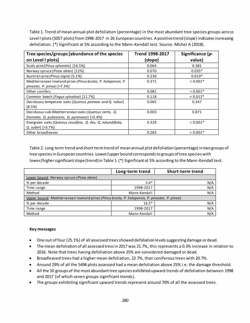
280
Table 1. Trend of mean annual plot defoliation (percentage) in the most abundant tree species groups acro ss
Level I plots (5057 plots) from 1998-2017 in 26 European countries. A positive trend (slope) indicates increasing
defoliation. (*) Significant at 5% according to the Mann-Kendall test. Source: Michel A (2018).
Tree species/groups [abundance of the species
on Level I plots]
Trend 1998-2017
(slope)
Significance (p-
value) Scots pine (Pinus sylvestris) [16.5%] 0.064 0.381
Norway spruce (Picea abies) [12%] 0.070 0.035*
Austrian pine (Pinus nigra) [5.1%] 0.230 0.010*
Mediterranean lowland pines (Pinus brutia, P. halepensis, P.
pinaster, P. pinea) [>7.3%] 0.371 < 0.001*
Other conifers 0.081 < 0.001*
Common beech (Fagus sylvatica) [11.7%] 0.118 < 0.012*
Deciduous temperate oaks (Quercus petraea and Q. robur) [8.5%]
0.065 0.347
Deciduous sub-Mediterranean oaks (Quercus cerris, Q.
frainetto, Q. pubescens, Q. pyrenaica) [>5.4%]
0.003 0.871
Evergreen oaks (Quercus coccifera, Q. ilex, Q. rotundifolia,
Q. suber) [>3.7%] 0.329
< 0.001*
Other broadleaves 0.283 < 0.001*
Table 2. Long term trend and short term trend of mean annual plot defoliation (percentage) in two groups of
tree species in European countries. Lower/upper bound corresponds to groups of tree species with
lower/higher significant slope (trend) in Table 1. (*) Significant at 5% according to the Mann-Kendall test.
Long-term trend Short-term trend
Lower bound: Norway spruce (Picea abies)
% per decade 3.4* N/A Time range 1998-2017 N/A
Method Mann-Kendall N/A
Upper bound: Mediterranean lowland pines (Pinus brutia, P. halepensis, P. pinaster, P. pinea)
% per decade 16.5* N/A
Time range 1998-2017 N/A
Method Mann-Kendall N/A
Key messages
One out of four (25.1%) of all assessed trees showed defoliation levels suggesting damage or dead.
The mean defoliation of all assessed tress in 2017 was 21.7%, this represents a 0.3% increase in relation to
2016. Note that trees having defoliation above 25% are considered damaged or dead.
Broadleaved trees had a higher mean defoliation, 22.7%, than coniferous trees with 20.7%.
Around 29% of all the 5496 plots assessed had a mean defoliation above 25% i.e. the damage threshold.
All the 10 groups of the most abundant tree species exhibited upward trends of defoliation between 1998
and 2017 (of which seven groups significant trends).
The groups exhibiting significant upward trends represent around 70% of all the assessed trees.

281
References
FOREST EUROPE (2015). State of Europe's Forests 2015. (pp. 312): Ministerial Conference on the Protection of
Forests in Europe.
Gilbert, R. O. (1987). Statistical Methods for Environmental Pollution Monitoring. NY, USA: Wiley.
Kendall, M. G. (1975). Rank Correlation Methods (4th edition). London: Charles Griffin.
Mann, H. B. (1945). Nonparametric Tests Against Trend. Econometrica, 13(3), 245-259, doi:10.2307/1907187.
Michel A, S. W., Prescher A-K, (Ed.). (2018). Forest Condition in Europe: 2018 Technical Report of ICP Forests.
Report under the UNECE Convention on Long-range Transboundary Air Pollution (Air Convention). Vienna:
BFW-Dokumentation 25/2018. BFW Austrian Research Centre for Forests.
Sen, P. K. (1968). Estimates of the Regression Coefficient Based on Kendall's Tau. Journal of the American
Statistical Association, 63(324), 1379-1389, doi:10.2307/2285891.
Wilcox, R. R. (2012). Introduction to Robust Estimation and Hypothesis Testing. San Diego, California, USA:
Academic Press.
Contact:
José I. Barredo, European Commission - Joint Research Centre, Ispra, Italy [[email protected]]
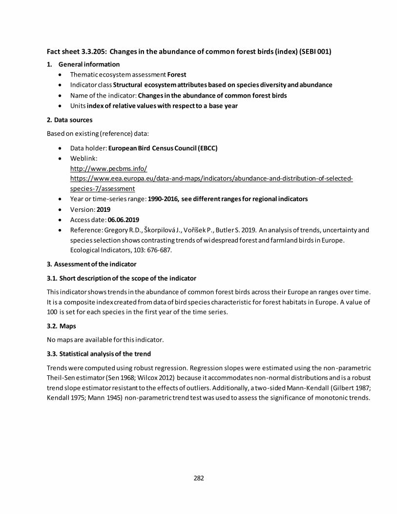
282
Fact sheet 3.3.205: Changes in the abundance of common forest birds (index) (SEBI 001)
1. General information
Thematic ecosystem assessment Forest
Indicator class Structural ecosystem attributes based on species diversity and abundance
Name of the indicator: Changes in the abundance of common forest birds
Units index of relative values with respect to a base year
2. Data sources
Based on existing (reference) data:
Data holder: European Bird Census Council (EBCC)
Weblink:
http://www.pecbms.info/
https://www.eea.europa.eu/data-and-maps/indicators/abundance-and-distribution-of-selected-
species-7/assessment
Year or time-series range: 1990-2016, see different ranges for regional indicators
Version: 2019
Access date: 06.06.2019
Reference: Gregory R.D., Škorpilová J., Voříšek P., Butler S. 2019. An analysis of trends, uncertainty and species selection shows contrasting trends of widespread forest and farmland birds in Europe.
Ecological Indicators, 103: 676-687.
3. Assessment of the indicator
3.1. Short description of the scope of the indicator
This indicator shows trends in the abundance of common forest birds across their Europe an ranges over time.
It is a composite index created from data of bird species characteristic for forest habitats in Europe. A value of
100 is set for each species in the first year of the time series.
3.2. Maps
No maps are available for this indicator.
3.3. Statistical analysis of the trend
Trends were computed using robust regression. Regression slopes were estimated using the non -parametric
Theil-Sen estimator (Sen 1968; Wilcox 2012) because it accommodates non-normal distributions and is a robust
trend slope estimator resistant to the effects of outliers. Additionally, a two-sided Mann-Kendall (Gilbert 1987;
Kendall 1975; Mann 1945) non-parametric trend test was used to assess the significance of monotonic trends.
283
3.3. Key trend at EU level
Between 1990 and 2016, the common forest bird index decreased by 3%31 in the 26 EU Member States that
have bird population monitoring schemes (Figure 1). Meanwhile, around 2005 the index stays in stable
situation and improves in the most recent years. In contrasts, the common farmland bird index continues to
show a steep decline of 16% between 2000 and 2016. While the forest bird indicator uses 1990 as the baseline
of the time series, it should be considered that a decrease of 4% had already occurred since 198032.
Figure 1. EU common forest bird indicator, single European species habitat classification, 34 species, 1990-
2016. Blue line: smoothed index; blue broken line: unsmoothed index; grey area: upper and lower confidence
limits. The indicator was created using data from EU countries with the exception of Croatia and Malta. Data
source: European Bird Census Council (EBCC), BirdLife International, Royal Society for the Protection of Birds
(RSPB) and Czech Society for Ornithology (CSO).
Table 1 shows the decadal trend calculated according to the MAES approach.
31
Change in percentage (trend) in the index value between the first and last year of the time series. Trend according to Pan-European Common Bird Monitoring Scheme (PECBMS): https://pecbms.info/trends-and-indicators/indicators/ 32
See: https://pecbms.info/trends-and-indicators/indicators/indicators/EU1_Fo/confidential/yes/
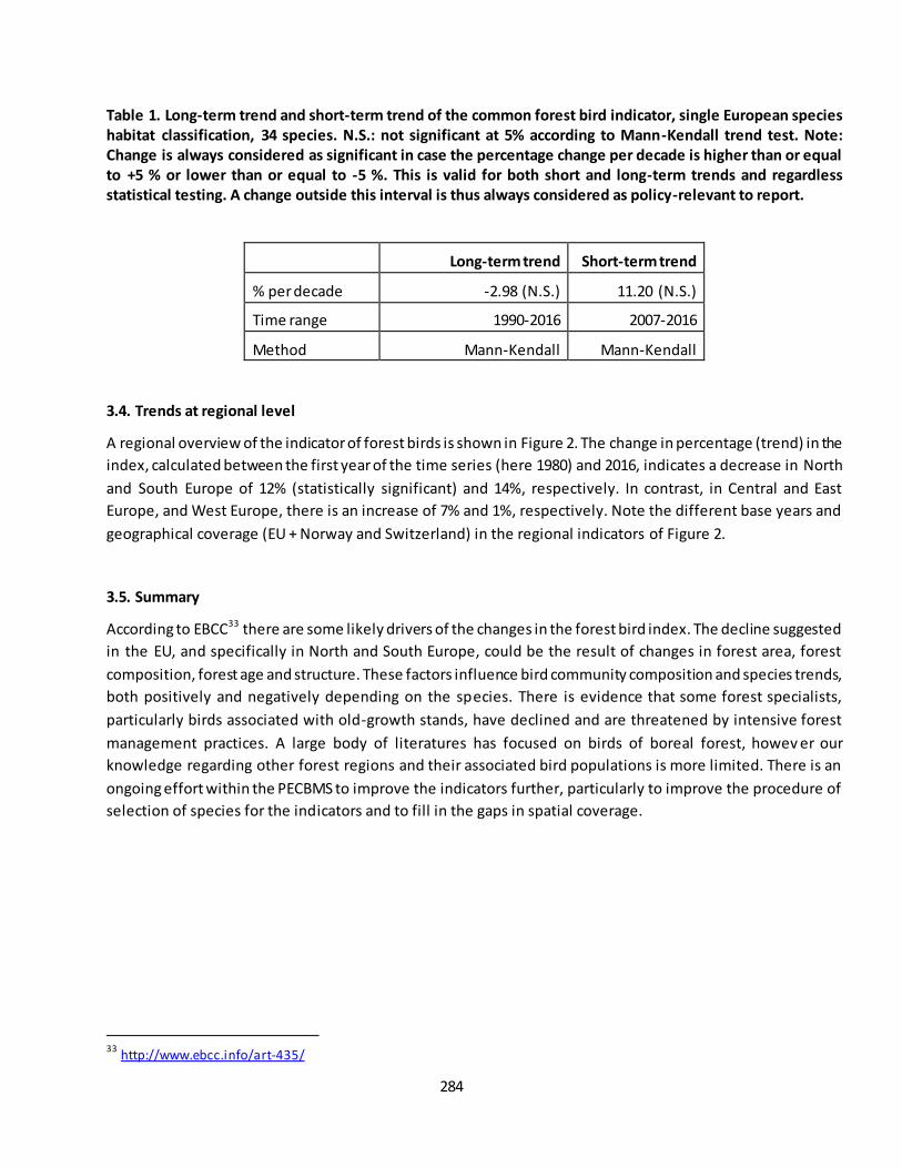
284
Table 1. Long-term trend and short-term trend of the common forest bird indicator, single European species
habitat classification, 34 species. N.S.: not significant at 5% according to Mann-Kendall trend test. Note:
Change is always considered as significant in case the percentage change per decade is higher than or equal
to +5 % or lower than or equal to -5 %. This is valid for both short and long-term trends and regardless
statistical testing. A change outside this interval is thus always considered as policy-relevant to report.
Long-term trend Short-term trend
% per decade -2.98 (N.S.) 11.20 (N.S.)
Time range 1990-2016 2007-2016
Method Mann-Kendall Mann-Kendall
3.4. Trends at regional level
A regional overview of the indicator of forest birds is shown in Figure 2. The change in percentage (trend) in the
index, calculated between the first year of the time series (here 1980) and 2016, indicates a decrease in North
and South Europe of 12% (statistically significant) and 14%, respectively. In contrast, in Central and East
Europe, and West Europe, there is an increase of 7% and 1%, respectively. Note the different base years and
geographical coverage (EU + Norway and Switzerland) in the regional indicators of Figure 2.
3.5. Summary
According to EBCC33 there are some likely drivers of the changes in the forest bird index. The decline suggested
in the EU, and specifically in North and South Europe, could be the result of changes in forest area, forest
composition, forest age and structure. These factors influence bird community composition and species trends,
both positively and negatively depending on the species. There is evidence that some forest specialists,
particularly birds associated with old-growth stands, have declined and are threatened by intensive forest
management practices. A large body of literatures has focused on birds of boreal forest, howev er our
knowledge regarding other forest regions and their associated bird populations is more limited. There is an
ongoing effort within the PECBMS to improve the indicators further, particularly to improve the procedure of
selection of species for the indicators and to fill in the gaps in spatial coverage.
33
http://www.ebcc.info/art-435/

285
A
B
C
D
Figure 2. Common forest bird indicator in four European regions according to the BioGeo regional species
habitat classification of EBCC. A) Central and East Europe (34 species): Czech Republic, Estonia, former East
Germany, Hungary, Latvia, Lithuania, Poland and Slovakia; B) North Europe (18 species): Finland, Norway and
Sweden; C) South Europe (32 species): France, Italy, Portugal and Spain; D) West Europe (32 species): Austria,
Belgium, Denmark, former West Germany, Luxembourg, Netherlands, Ireland, Switzerland and United
Kingdom. Blue line: smoothed index; blue broken line: unsmoothed index; grey area: upper and lower
confidence limits. Data source: European Bird Census Council (EBCC), BirdLife International, Royal Society for
the Protection of Birds (RSPB) and Czech Society for Ornithology (CSO).
References
Gilbert, R. O. (1987). Statistical Methods for Environmental Pollution Monitoring. NY, USA: Wiley.
Kendall, M. G. (1975). Rank Correlation Methods (4th edition). London: Charles Griffin.
Mann, H. B. (1945). Nonparametric Tests Against Trend. Econometrica, 13(3), 245-259, doi:10.2307/1907187.
Sen, P. K. (1968). Estimates of the Regression Coefficient Based on Kendall's Tau. Journal of the American
Statistical Association, 63(324), 1379-1389, doi:10.2307/2285891.
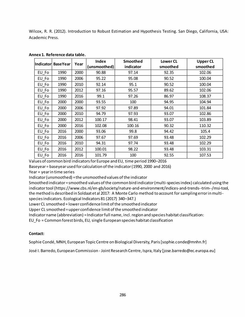
286
Wilcox, R. R. (2012). Introduction to Robust Estimation and Hypothesis Testing. San Diego, California, USA:
Academic Press.
Annex 1. Reference data table.
Indicator BaseYear Year Index
(unsmoothed)
Smoothed
indicator
Lower CL
smoothed
Upper CL
smoothed
EU_Fo 1990 2000 90.88 97.14 92.35 102.06
EU_Fo 1990 2006 95.22 95.08 90.52 100.04
EU_Fo 1990 2010 92.14 95.1 90.52 100.04
EU_Fo 1990 2012 97.16 95.57 89.62 102.06
EU_Fo 1990 2016 99.1 97.26 86.97 108.37
EU_Fo 2000 2000 93.55 100 94.95 104.94
EU_Fo 2000 2006 97.92 97.89 94.01 101.84
EU_Fo 2000 2010 94.79 97.93 93.07 102.86
EU_Fo 2000 2012 100.17 98.41 93.07 103.89
EU_Fo 2000 2016 102.08 100.16 90.32 110.32
EU_Fo 2016 2000 93.06 99.8 94.42 105.4
EU_Fo 2016 2006 97.67 97.69 93.48 102.29
EU_Fo 2016 2010 94.31 97.74 93.48 102.29
EU_Fo 2016 2012 100.01 98.22 93.48 103.31
EU_Fo 2016 2016 101.79 100 92.55 107.53
Values of common bird indicators for Europe and EU, time period 1990–2016 Baseyear = baseyear used for calculation of the indicator (1990, 2000 and 2016) Year = year in time series Indicator (unsmoothed) = the unsmoothed values of the indicator Smoothed indicator = smoothed values of the common bird indicator (multi-species index) calculated using the indicator tool (https://www.cbs.nl/en-gb/society/nature-and-environment/indices-and-trends--trim--/msi-tool, the method is described in Soldaat et al 2017: A Monte Carlo method to account for sampling error in multi-species indicators. Ecological Indicators 81 (2017) 340–347.) Lower CL smoothed = lower confidence limit of the smoothed indicator Upper CL smoothed = upper confidence limit of the smoothed indicator Indicator name (abbreviation) = Indicator full name, incl. region and species habitat classification: EU_Fo = Common forest birds, EU, single European species habitat classification
Contact:
Sophie Condé, MNH, European Topic Centre on Biological Diversity, Paris [[email protected]]
José I. Barredo, European Commission - Joint Research Centre, Ispra, Italy [[email protected]]
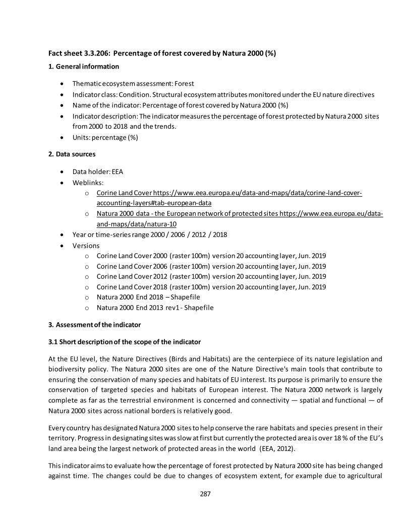
287
Fact sheet 3.3.206: Percentage of forest covered by Natura 2000 (%)
1. General information
Thematic ecosystem assessment: Forest
Indicator class: Condition. Structural ecosystem attributes monitored under the EU nature directives
Name of the indicator: Percentage of forest covered by Natura 2000 (%)
Indicator description: The indicator measures the percentage of forest protected by Natura 2000 sites
from 2000 to 2018 and the trends.
Units: percentage (%)
2. Data sources
Data holder: EEA
Weblinks:
o Corine Land Cover https://www.eea.europa.eu/data-and-maps/data/corine-land-cover-
accounting-layers#tab-european-data
o Natura 2000 data - the European network of protected sites https://www.eea.europa.eu/data-
and-maps/data/natura-10
Year or time-series range 2000 / 2006 / 2012 / 2018
Versions
o Corine Land Cover 2000 (raster 100m) version 20 accounting layer, Jun. 2019
o Corine Land Cover 2006 (raster 100m) version 20 accounting layer, Jun. 2019
o Corine Land Cover 2012 (raster 100m) version 20 accounting layer, Jun. 2019
o Corine Land Cover 2018 (raster 100m) version 20 accounting layer, Jun. 2019
o Natura 2000 End 2018 – Shapefile
o Natura 2000 End 2013 rev1 - Shapefile
3. Assessment of the indicator
3.1 Short description of the scope of the indicator
At the EU level, the Nature Directives (Birds and Habitats) are the centerpiece of its nature legislation and
biodiversity policy. The Natura 2000 sites are one of the Nature Directive's main tools that contribute to
ensuring the conservation of many species and habitats of EU interest. Its purpose is primarily to ensure the
conservation of targeted species and habitats of European interest. The Natura 2000 network is largely
complete as far as the terrestrial environment is concerned and connectivity — spatial and functional — of
Natura 2000 sites across national borders is relatively good.
Every country has designated Natura 2000 sites to help conserve the rare habitats and species present in their
territory. Progress in designating sites was slow at first but currently the protected area is over 18 % of the EU’s
land area being the largest network of protected areas in the world (EEA, 2012).
This indicator aims to evaluate how the percentage of forest protected by Natura 2000 site has being changed
against time. The changes could be due to changes of ecosystem extent, for example due to agricultural
288
abandonment, or also be associated with changes in the protection zones, either by the designation of new
areas or by the modification of the limits of those already existing. Both cases are included in this assessment
since the indicator values are from overlap the spatial information, by means of spatial analysis tools, of CLC
2000, 2006 and 2012 with Natura 2000 network informed by MS end of 2013 (previous versions of spatial data
of Natura 2000 present gaps and geometric inconsistences), and from CLC 2018 with Natura 2000 version
provided by 2018.
3.2 Maps
Maps as pixel based were not available. This indicator was provided as tabular information, aggregated at
biogeographical regions and at EU-28 level.
The next maps show the decadal change rate (in percentage) across the biogeographical regions ( Figure 1).
From the biogeographical (BGR) perspective (Figure 2 and Table 2), in most of BGR there are no significant
changes, the decadal change rates range between -1% and +1%. Only in Boreal BGR the indicator shows a
negative decadal change rate of -11.42%, being the strongest downward trend.
Figure 1 Forest condition indicator: Percentage of forest covered by Natura 2000 sites by Biogeographical
regions. Short-term trend (in %) with respect to baseline. Red colors mean downwards trends in the
percentage of forest area covered by Natura 2000, while blue colors mean an upward trend. The baseline is
2010 which values were interpolated based on the values for 2006 and 2012.

289
3.3 Statistical analysis of the trend
Temporal trends of the percentage of forest covered by Natura 2000 are shown in Table 1. These statistics
cover all four CORINE assessment years, including decadal changes for short and long-term trends. The
assessment of the indicator was done using the 5% rules due to the low number of observations, therefore a
statistical test of significance was not done.
3.4 Key trend at EU level
At the European level (Figure 2, Table 1) the percentage of forest ecosystem within Natura 2000 is almost
stable from 2000 to 2018. The indicator shows a slightly decrease in both the short-term trend (2010-2018) and
the long-term trend (2000-2018) by –0.27% and –0.12%, respectively.
Table 1 Structural condition indicator. Percentage of forest protected by Natura 2000 sites at EU-28. Values got
from overlap the spatial information of CLC 2000, 2006 and 2012 with Natura 2000 network informed by MS
end of 2013, and from CLC 2018 with Natura 2000 version provided by 2017. (*) values for the baseline 2010
(interpolated between 2006 and 2012.
Percentage of forest covered by Natura 2000 sites
2000 2006 2010* 2012 2018 Short-term
trend (% per
decade)
Long-term trend
(% per decade)
EU-28 22.84 22.85 22.84 22.84 22.63 - 0.27% No-change
-0.12% No-change
Time range 2010 vs 2018 2000 vs 2018
Method 5% rule 5% rule
Figure 2 Trend of percentage of forest covered by Natura 2000 site from 2000 to 2018. Values got from
overlap the spatial information of CLC 2000, 2006 and 2012 with Natura 2000 network informed by MS end
of 2013, and from CLC 2018 with Natura 2000 version provided by 2017.
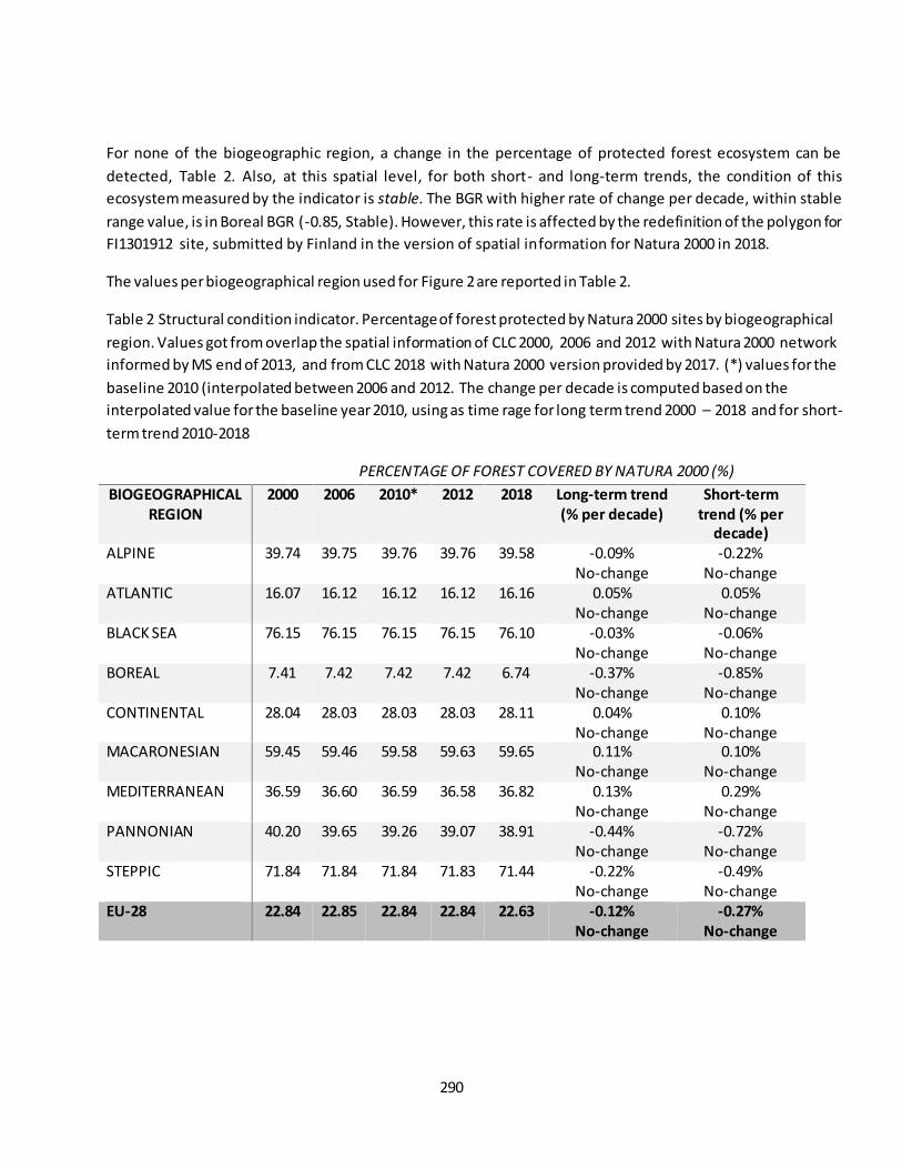
290
For none of the biogeographic region, a change in the percentage of protected forest ecosystem can be
detected, Table 2. Also, at this spatial level, for both short- and long-term trends, the condition of this
ecosystem measured by the indicator is stable. The BGR with higher rate of change per decade, within stable
range value, is in Boreal BGR (-0.85, Stable). However, this rate is affected by the redefinition of the polygon for
FI1301912 site, submitted by Finland in the version of spatial information for Natura 2000 in 2018.
The values per biogeographical region used for Figure 2 are reported in Table 2.
Table 2 Structural condition indicator. Percentage of forest protected by Natura 2000 sites by biogeographical
region. Values got from overlap the spatial information of CLC 2000, 2006 and 2012 with Natura 2000 network
informed by MS end of 2013, and from CLC 2018 with Natura 2000 version provided by 2017. (*) values for the
baseline 2010 (interpolated between 2006 and 2012. The change per decade is computed based on the
interpolated value for the baseline year 2010, using as time rage for long term trend 2000 – 2018 and for short-
term trend 2010-2018
PERCENTAGE OF FOREST COVERED BY NATURA 2000 (%)
BIOGEOGRAPHICAL
REGION
2000 2006 2010* 2012 2018 Long-term trend
(% per decade)
Short-term
trend (% per
decade)
ALPINE 39.74 39.75 39.76 39.76 39.58 -0.09% No-change
-0.22% No-change
ATLANTIC 16.07 16.12 16.12 16.12 16.16 0.05% No-change
0.05% No-change
BLACK SEA 76.15 76.15 76.15 76.15 76.10 -0.03% No-change
-0.06% No-change
BOREAL 7.41 7.42 7.42 7.42 6.74 -0.37% No-change
-0.85% No-change
CONTINENTAL 28.04 28.03 28.03 28.03 28.11 0.04% No-change
0.10% No-change
MACARONESIAN 59.45 59.46 59.58 59.63 59.65 0.11% No-change
0.10% No-change
MEDITERRANEAN 36.59 36.60 36.59 36.58 36.82 0.13% No-change
0.29% No-change
PANNONIAN 40.20 39.65 39.26 39.07 38.91 -0.44% No-change
-0.72% No-change
STEPPIC 71.84 71.84 71.84 71.83 71.44 -0.22% No-change
-0.49% No-change
EU-28 22.84 22.85 22.84 22.84 22.63 -0.12%
No-change
-0.27%
No-change
291
References
EEA, 2012. Protected areas in Europe - an overview.European Environment Agency. EEA Report / No 5/2012,
s.l.: s.n.
Contact:
Ana I. Marín, European Topic Centre on Urban, Land and Soil University of Malaga, Spain [[email protected]]
292
Fact sheet 3.3.207: Percentage of forest covered by Nationally designated areas -CDDA
1. General information
Thematic ecosystem assessment: Forest
Indicator class: Condition. Structural ecosystem attributes monitored under the EU nature directives
Name of the indicator: Percentage of forest covered by CDDA (%)
Indicator description: The indicator measures the percentage of forest protected by nationally
designated areas from 2000 to 2018 and the trends.
Units: percentage (%)
2. Data sources
Data holder: EEA
Weblinks:
o Corine Land Cover https://www.eea.europa.eu/data-and-maps/data/corine-land-cover-
accounting-layers#tab-european-data
o CDDA data - Nationally designated areashttps://www.eea.europa.eu/data-and-
maps/data/nationally-designated-areas-national-cdda-13
Year or time-series range 2000 / 2006 / 2012 / 2018
Versions
o Corine Land Cover 2000 (raster 100m) version 20 accounting layer, Jun. 2019
o Corine Land Cover 2006 (raster 100m) version 20 accounting layer, Jun. 2019
o Corine Land Cover 2012 (raster 100m) version 20 accounting layer, Jun. 2019
o Corine Land Cover 2018 (raster 100m) version 20 accounting layer, Jun. 2019
o Natura 2000 End 2018 – Shapefile
o CDDA 2018 – Shapefile
Reference https://www.eea.europa.eu/data-and-maps/indicators/nationally-designated-protected-
areas-10
3. Assessment of the indicator
3.1. Short description of the scope of the indicator
The nationally designated areas -CDDA- is the official source of protected area information from the 39
European countries members of EEA to the World Database of Protected Areas (WDPA). A 'nationally
designated protected area' is an area designated by a national designation instrument, based on national
legislation.
This indicator aims to evaluate how the percentage of forest protected by the nationally designated areas has
being changed against time. The changes could be due to changes of ecosystem extent, for example due to
agricultural abandonment, or also be associated with changes in the protection zones, either by the
designation of new areas or by the modification of the limits of those already existing. This i ndicator focuses
only on the trend in the percentage of protected forest due to the change in the ecosystem extent. The CDDA
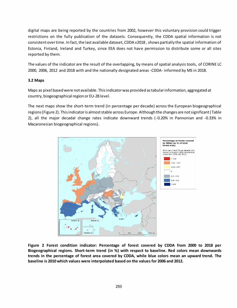
293
digital maps are being reported by the countries from 2002, however this voluntary provision could trigger
restrictions on the fully publication of the datasets. Consequently, the CDDA spatial information is not
consistent over time. In fact, the last available dataset, CDDA v2018 , shows partially the spatial information of
Estonia, Finland, Ireland and Turkey, since EEA does not have permission to distribute some or all sites
reported by them.
The values of the indicator are the result of the overlapping, by means of spatial analysis tools, of CORINE LC
2000, 2006, 2012 and 2018 with and the nationally designated areas -CDDA- informed by MS in 2018.
3.2 Maps
Maps as pixel based were not available. This indicator was provided as tabular information, aggregated at
country, biogeographical region or EU-28 level.
The next maps show the short-term trend (in percentage per decade) across the European biogeographical
regions (Figure 2). This indicator is almost stable across Europe. Although the changes are not significant ( Table
2), all the major decadal change rates indicate downward trends ( -0.20% in Pannonian and -0.33% in
Macaronesian biogeographical regions).
Figure 2 Forest condition indicator: Percentage of forest covered by CDDA from 2000 to 2018 per
Biogeographical regions. Short-term trend (in %) with respect to baseline. Red colors mean downwards
trends in the percentage of forest area covered by CDDA, while blue colors mean an upward trend. The
baseline is 2010 which values were interpolated based on the values for 2006 and 2012.
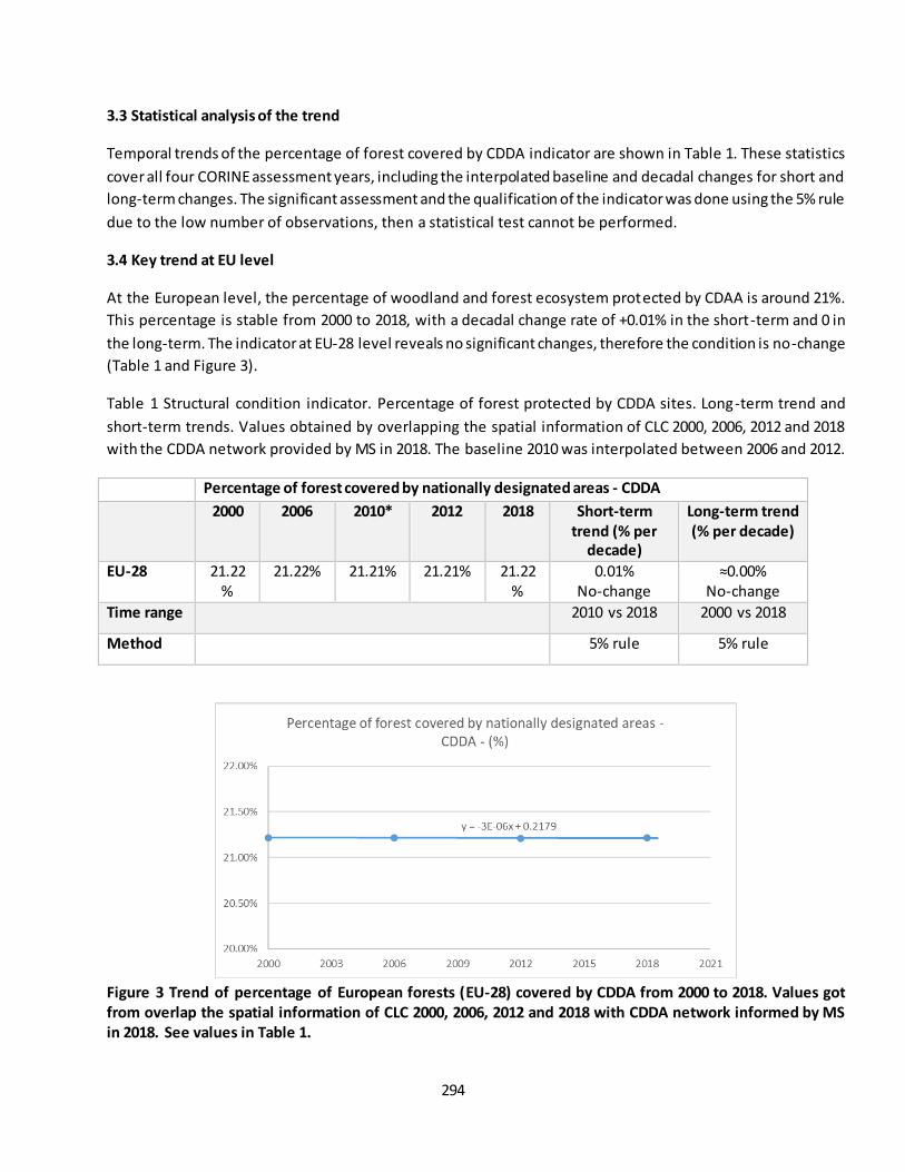
294
3.3 Statistical analysis of the trend
Temporal trends of the percentage of forest covered by CDDA indicator are shown in Table 1. These statistics
cover all four CORINE assessment years, including the interpolated baseline and decadal changes for short and
long-term changes. The significant assessment and the qualification of the indicator was done using the 5% rule
due to the low number of observations, then a statistical test cannot be performed.
3.4 Key trend at EU level
At the European level, the percentage of woodland and forest ecosystem protected by CDAA is around 21%.
This percentage is stable from 2000 to 2018, with a decadal change rate of +0.01% in the short-term and 0 in
the long-term. The indicator at EU-28 level reveals no significant changes, therefore the condition is no-change
(Table 1 and Figure 3).
Table 1 Structural condition indicator. Percentage of forest protected by CDDA sites. Long-term trend and
short-term trends. Values obtained by overlapping the spatial information of CLC 2000, 2006, 2012 and 2018
with the CDDA network provided by MS in 2018. The baseline 2010 was interpolated between 2006 and 2012.
Percentage of forest covered by nationally designated areas - CDDA
2000 2006 2010* 2012 2018 Short-term
trend (% per
decade)
Long-term trend
(% per decade)
EU-28 21.22%
21.22% 21.21% 21.21% 21.22%
0.01% No-change
≈0.00% No-change
Time range 2010 vs 2018 2000 vs 2018
Method 5% rule 5% rule
Figure 3 Trend of percentage of European forests (EU-28) covered by CDDA from 2000 to 2018. Values got
from overlap the spatial information of CLC 2000, 2006, 2012 and 2018 with CDDA network informed by MS
in 2018. See values in Table 1.
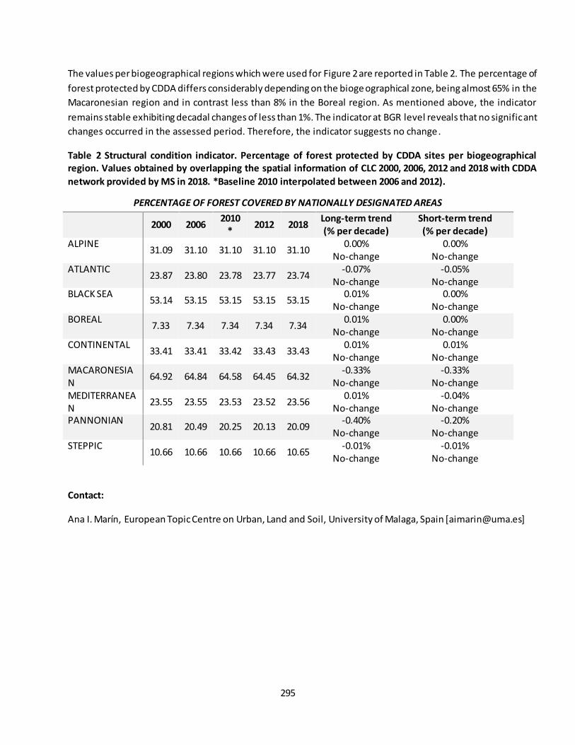
295
The values per biogeographical regions which were used for Figure 2 are reported in Table 2. The percentage of
forest protected by CDDA differs considerably depending on the bioge ographical zone, being almost 65% in the
Macaronesian region and in contrast less than 8% in the Boreal region. As mentioned above, the indicator
remains stable exhibiting decadal changes of less than 1%. The indicator at BGR level reveals that no significant
changes occurred in the assessed period. Therefore, the indicator suggests no change .
Table 2 Structural condition indicator. Percentage of forest protected by CDDA sites per biogeographical
region. Values obtained by overlapping the spatial information of CLC 2000, 2006, 2012 and 2018 with CDDA
network provided by MS in 2018. *Baseline 2010 interpolated between 2006 and 2012).
PERCENTAGE OF FOREST COVERED BY NATIONALLY DESIGNATED AREAS
2000 2006
2010
* 2012 2018
Long-term trend
(% per decade)
Short-term trend
(% per decade)
ALPINE 31.09 31.10 31.10 31.10 31.10
0.00% No-change
0.00% No-change
ATLANTIC 23.87 23.80 23.78 23.77 23.74
-0.07% No-change
-0.05% No-change
BLACK SEA 53.14 53.15 53.15 53.15 53.15
0.01% No-change
0.00% No-change
BOREAL 7.33 7.34 7.34 7.34 7.34
0.01% No-change
0.00% No-change
CONTINENTAL 33.41 33.41 33.42 33.43 33.43
0.01% No-change
0.01% No-change
MACARONESIAN
64.92 64.84 64.58 64.45 64.32 -0.33%
No-change -0.33%
No-change MEDITERRANEAN
23.55 23.55 23.53 23.52 23.56 0.01%
No-change -0.04%
No-change PANNONIAN
20.81 20.49 20.25 20.13 20.09 -0.40%
No-change -0.20%
No-change STEPPIC
10.66 10.66 10.66 10.66 10.65 -0.01%
No-change -0.01%
No-change
Contact:
Ana I. Marín, European Topic Centre on Urban, Land and Soil, University of Malaga, Spain [[email protected]]
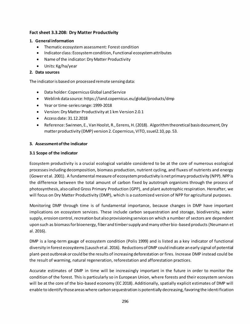
296
Fact sheet 3.3.208: Dry Matter Productivity
1. General information
Thematic ecosystem assessment: Forest condition
Indicator class: Ecosystem condition, Functional ecosystem attributes
Name of the indicator: Dry Matter Productivity
Units: Kg/ha/year
2. Data sources
The indicator is based on processed remote sensing data:
Data holder: Copernicus Global Land Service
Weblink data source: https://land.copernicus.eu/global/products/dmp
Year or time-series range: 1999-2018
Version: Dry Matter Productivity at 1 km Version 2.0.1
Access date: 31.12.2018
Reference: Swinnen, E., Van Hoolst, R., Eerens, H. (2018). Algorithm theoretical basis document, Dry
matter productivity (DMP) version 2. Copernicus, VITO, ssueI2.10, pp. 53.
3. Assessment of the indicator
3.1 Scope of the indicator
Ecosystem productivity is a crucial ecological variable considered to be at the core of numerous ecological
processes including decomposition, biomass production, nutrient cycling, and fluxes of nutrients and energy
(Gower et al. 2001). A fundamental measure of ecosystem productivity is net primary productivity (NPP). NPP is
the difference between the total amount of carbon fixed by autotroph organisms through the process of
photosynthesis, also called Gross Primary Production (GPP), and plant autotrophic respiration. Hereafter, we
will focus on Dry Matter Productivity (DMP), which is a customized version of NPP for agricultural purposes.
Monitoring DMP through time is of fundamental importance, because changes in DMP have important
implications on ecosystem services. These include carbon sequestration and storage, biodiversity, water
supply, erosion control, recreation but also provisioning services on which a number of sectors are dependent
upon such as biomass for bioenergy, fiber and timber supply and many other bio-based products (Neumann et
al. 2016).
DMP is a long-term gauge of ecosystem condition (Polis 1999) and is listed as a key indicator of functional
diversity in forest ecosystems (Lausch et al. 2016). Reductions of DMP could indicate an early signal of potential
plant-pest outbreak or could be the results of increasing deforestation or fires. Increase DMP instead could be
the result of warming, natural regeneration, reforestation and afforestation practices.
Accurate estimates of DMP in time will be increasingly important in the future in order to monitor the
condition of the forest. This is particularly so in European Union, where forests and their ecosystem services
will be at the core of the bio-based economy (EC 2018). Additionally, spatially explicit estimates of DMP will
enable to identify those areas where carbon sequestration is potentially decreasing, favoring the identi fication
297
of areas where sustainable management practices would be required to mitigate climate change (Browers et
al. 2016).
The aim of this assessment is to settle an indicator of DMP over the EU-28 and for a period of 20 years ranging
from 1999 to 2018. This indicator will be updated from time to time providing researchers and public
authorities with a fundamental tool to monitor the condition of forest ecosystems in Europe. Furthermore, we
provide an assessment of DMP changes at the biogeographical region level, being able to monitor forest
condition for regions that are climatically and ecologically diverse such as for instance the Mediterranean
region, the Pannonian region or the Alpine region. DMP will become part of a collection of indicators
specifically designed to monitor ecosystem condition at European level, being able support policy -makers in
decision-making.
Methods
Data download from Copernicus
Data on DMP was downloaded from Copernicus Global Land Service (Copernicus 2018), delivered in
compressed Network Common Data Form (NetCDF) files having a global coverage. DMP layers are derived from
SPOT-VGT (until December 2013) and PROBA-V (from January 2014) satellite imagery and are combined with
(modelled) meteorological data from the European Center Medium Weather Forecast (ECMWF). The spatial
resolution of the layers is of 0.083 arcsec (~1km). Each NetCDF file represents the DMP average for a ca. 10-
days period, where the starting position is always set to the 01st, 11th and 21st day of the month. DMP is
expressed in kgDM/ha/day. The period covered by the images ranges 20 years from 1999 until 2018.
Analysis and trends
From the three monthly decadal averages we derived a single average value for each month and multiplied it
by the number of days in the month to obtain cumulative monthly values of DMP (kgDM/ha/month). The latter
were summed up over the whole year to acquire a total year sum of DMP (kgDM/ha/year).
As one of our objectives is to track changes in DMP over time we created yearly maps of DMP from 1999 to
2018. As a preprocess step we implemented a gap-filling procedure to fill-in the missing data present in some
grid cells of the time-series that could arise from cloud cover, missing meteorological data or other sources.
Following previous literature studies, we gap-filled our data by interpolating values horizontally (between
neighboring cells of the same layer), and vertically (among different time steps of a target cell). The first was
made on a 3 x 3 grid cell basis obtaining the average value over the 9 neighboring grid cells pixels around the
targeted-grid cell as suggested by Ivits et al. (2013). The latter was performed when less than equal to 25% of
values in each grid cell was missing, while the data were excluded from the analysis when more than 25% of
the values in each grid cell was missing (Jong et al. 2013).
As a first product, we obtained 20 yearly sum maps of DMP with a spatial resolution of 0.083 arc sec (~1 km).
From these maps, we created two products: first, an average map of yearly sums of DMP over the whole
period, and second, a map showing the trends in DMP. The latter map was computed estimating regression

298
slopes on each grid cell using the non-parametric Theil–Sen (TS) estimator (Sen 1968, Wilcox 2012). The Theil–Sen (TS) procedure is a rank-based test that calculates the slope and intercept of the time-series by
determining the median of all estimates of the slopes derived from all pairs of observations (Hoaglin et al.
2000). The TS procedure is commonly used in estimating vegetation indices trends, such as NDVI trends
(Alcaraz-Segura et al 2009) because it is resistant to outliers and is robust in case of skewed data (Eastman et
al. 2009). The significance of the TS slope, was tested using the non-parametric Mann-Kendall test (Kendall
1975, Mann 1945).
The same analysis as done at grid cell level was conducted at biogeographical level (EEA, 2018) and over the
whole Europe. For each biogeographical region/EU level we calculated yearly area averaged values from the 1-
km yearly DMP total sums and then we calculated trends using the TS slope estimator and its significance using
the Mann-Kendall test.
It is important to mention that all the results obtained have been masked with the ‘woodland and forest’ ecosystem type. This was derived from the Corine Land Cover (CLC) 2012 v. 18.5 at 100m and 250m spatial
resolution.
Results
3.2 Maps and trends
EU level
Figure 1 shows mean values of DMP, computed at the grid cell level (~ 1 km), ranging between nearly 1000
kg/ha/year to 24,000 kg/ha/year. The lowest values of DMP are recorded in the Alps, Scotland, a substantial
part of the Iberian Peninsula, and in general Fennoscandia although southern Sweden and Finland report
relatively higher DMP rates. The highest DMP values are reported for North and Western Iberia, Italy, France
and the Balkans countries. Our results are in agreement with previous satellite -based NPP estimates for the
European region (Newmann et al. 2016) although for a slightly different period (2000-2012). Results are also in-
line with a global assessment of GPP for a very similar period (2000-2016) (Zhang et al 2017).
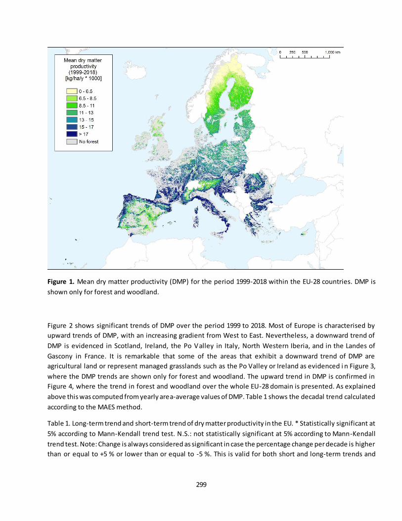
299
Figure 1. Mean dry matter productivity (DMP) for the period 1999-2018 within the EU-28 countries. DMP is
shown only for forest and woodland.
Figure 2 shows significant trends of DMP over the period 1999 to 2018. Most of Europe is characterised by
upward trends of DMP, with an increasing gradient from West to East. Nevertheless, a downward trend of
DMP is evidenced in Scotland, Ireland, the Po Valley in Italy, North Western Iberia, and in the Landes of
Gascony in France. It is remarkable that some of the areas that exhibit a downward trend of DMP are
agricultural land or represent managed grasslands such as the Po Valley or Ireland as evidenced i n Figure 3,
where the DMP trends are shown only for forest and woodland. The upward trend in DMP is confirmed in
Figure 4, where the trend in forest and woodland over the whole EU-28 domain is presented. As explained
above this was computed from yearly area-average values of DMP. Table 1 shows the decadal trend calculated
according to the MAES method.
Table 1. Long-term trend and short-term trend of dry matter productivity in the EU. * Statistically significant at
5% according to Mann-Kendall trend test. N.S.: not statistically significant at 5% according to Mann-Kendall
trend test. Note: Change is always considered as significant in case the percentage change per decade is higher
than or equal to +5 % or lower than or equal to -5 %. This is valid for both short and long-term trends and
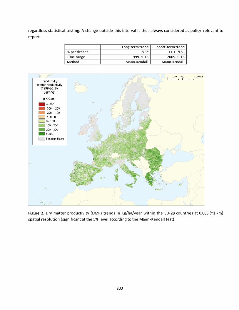
300
regardless statistical testing. A change outside this interval is thus always considered as policy -relevant to
report.
Long-term trend Short-term trend
% per decade 8.3* 11.1 (N.S.)
Time range 1999-2018 2009-2018
Method Mann-Kendall Mann-Kendall
Figure 2. Dry matter productivity (DMP) trends in Kg/ha/year within the EU-28 countries at 0.083 (~1 km)
spatial resolution (significant at the 5% level according to the Mann-Kendall test).
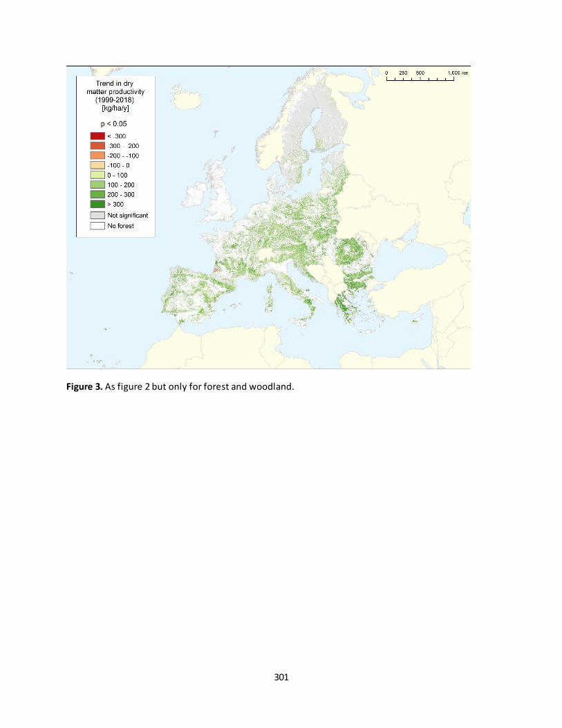
301
Figure 3. As figure 2 but only for forest and woodland.
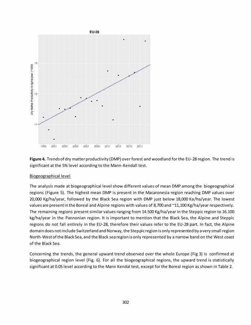
302
Figure 4. Trends of dry matter productivity (DMP) over forest and woodland for the EU-28 region. The trend is
significant at the 5% level according to the Mann-Kendall test.
Biogeographical level
The analysis made at biogeographical level show different values of mean DMP among the biogeographical
regions (Figure 5). The highest mean DMP is present in the Macaronesia region reaching DMP values over
20,000 Kg/ha/year, followed by the Black Sea region with DMP just below 18,000 Ka/ha/year. The lowest
values are present in the Boreal and Alpine regions with values of 8,700 and ~11,100 Kg/ha/year respectively.
The remaining regions present similar values ranging from 14.500 Kg/ha/year in the Steppic region to 16.100
kg/ha/year in the Pannonian region. It is important to mention that the Black Sea, the Alpine and Steppic
regions do not fall entirely in the EU-28, therefore their values refer to the EU-28 part. In fact, the Alpine
domain does not include Switzerland and Norway, the Steppic region is only represented by a very small region
North-West of the Black Sea, and the Black sea region is only represented by a narrow band on the West coast
of the Black Sea.
Concerning the trends, the general upward trend observed over the whole Europe (Fig 3) is confirmed at
biogeographical region level (Fig. 6). For all the biogeographical regions, the upward trend is statistically
significant at 0.05 level according to the Mann Kendal test, except for the Boreal region as shown in Table 2.
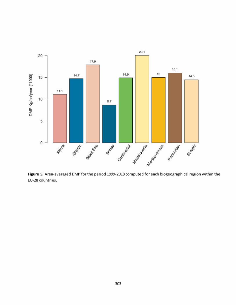
303
Figure 5. Area-averaged DMP for the period 1999-2018 computed for each biogeographical region within the
EU-28 countries.
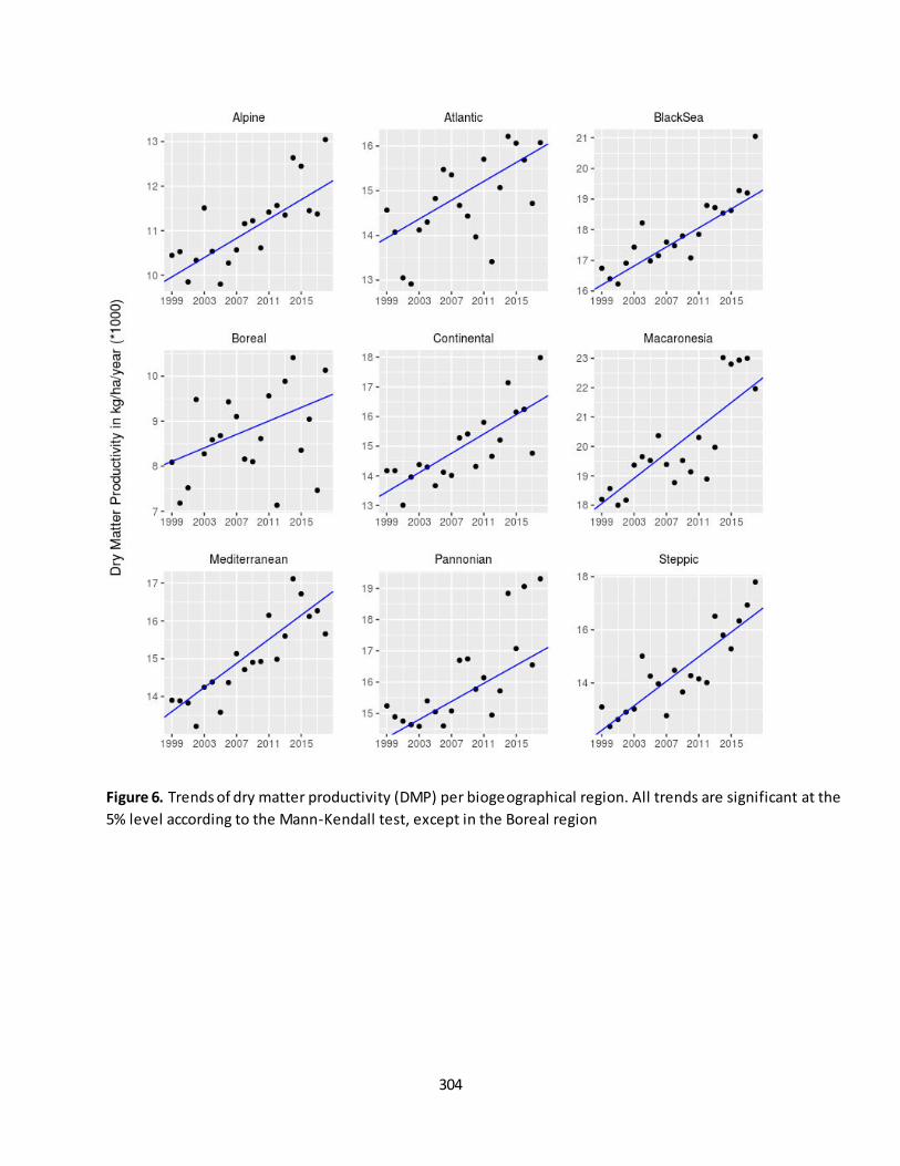
304
Figure 6. Trends of dry matter productivity (DMP) per biogeographical region. All trends are significant at the
5% level according to the Mann-Kendall test, except in the Boreal region

305
Table 2. Trends of dry matter productivity (DMP) in biogeographical regions. In bold significant at the 5% level
according to the Mann-Kendall test.
Biogeographical region DMP trend (kg/ha/year)
Alpine 104.6
Atlantic 99.7
Black Sea 164.8
Boreal 72.1 Continental 147.7
Macaronesia 235.7
Mediterranean 146.3
Pannonian 151.2
Steppic 244.0
Summary
Our analysis reveal an overall upwards trend of DMP in Europe and for all the biogeographical regions. This
confirms the continuation of a greening trend observed over Europe in a precedent period (1982-2012) using
remote sensing imagery (Rafique et al. 2016, Jong et al. 2011) and ecosystem-based models (Liu et al. 2015).
Our findings are in agreement with previous evidence, e.g. with Zhang et al. (2017) that found increasing trends
in GPP in a similar period (2000-2016) in Europe, although using data at a coarser spatial resolution of 0.5
degree.
A limited part of the study domain showed significant downward trends of DMP. The downward trend over the
Po Valley that occurs in agricultural areas might be related to a shortening of the growing season length
observed over this area although for a previous period (1982-2011) (Garonna et al. 2014). However, it is
important to note that in this region very few grid cells show a significant decreasing trend. The decreasing
trend in DMP in the Landes of Gascony might be related to the loss in forest cover observed over the period
from 2000 to 2012 in Hansen et al. (2013).
The significant downward trend over Scotland and Ireland is partly shown in the land productivity maps
available in Cherlet et al. (2018). However our maps show a greater extension of the downward trend for this
area. For the Iberian Peninsula, our results are in line with the indicator of vegetation response to climate
variability shown in the Atlas of desertification (Cherlet et al. 2018: 122). Although, focusing on a slight shorter
period, this indicator does not exhibit a significant downward trend of vegetation photosynthetic activity
(fAPAR), despite a period with prolonged drought condition. The second lowest values in DMP shown for the
Mediterranean region in 2005 (Fig. 6) is concomitant with a drought event occurred in the same year, also
confirmed by Ivits et al. (2016). The droughts occurred in the Mediterranean in 2007, 2008 and 2009 haven ’t resulted in a decreasing DMP because most of the droughts occurred outside of the growing season (Ivits et al.
2016).
The assessment presented in this report provides a first overview of the trends of DMP in the EU. With new
data becoming available in the next coming years by the Copernicus Programme, these trends could be
extended to longer time-series. Integrated assessments using a suite of indicators, such as changes in biomass,
306
NDVI, soil-moisture indexes or wild fires occurrence are deemed relevant for a comprehensive overview of the
condition of ecosystems.
References
Alcaraz-Segura, D.; Chuvieco, E.; Epstein, H.E.; Kasischke, E.S.; Trishchenko, A. Debating the greening vs.
browning of the North American boreal forest: Differences between satellite datasets. Global Change Biol.
2009, 16, 760−770.
Browers et al. 2016. Decreasing Net Primary Production in forest and shrub vegetation across southwest
Australia
Cherlet, M., Hutchinson, C., Reynolds, J., Hill, J., Sommer, S., von Maltitz, G. (Eds.), World Atlas of
Desertification, Publication Office of the European Union, Luxembourg, 2018.
Copernicus (2018) Dry Matter Productivity. https://land.copernicus.eu/global/products/dmp
distribution of biomass. Oikos 1999, 86, 3–15.
Eastman, J. R.; Sangermano, F.; Ghimire, B.; Honglei, Z.; Hao, C.; Neeti, N.; Yongming, C.;
EC 2018, Bioeconomy: The European way to use our natural resources : action plan 2018
EEA (2019). "Biogeographical regions. https://www.eea.europa.eu/data-and-maps/data/biogeographical-
regions-europe-3#tab-figures-produced2019.".
Garonna et al. 2014. Strong contribution of autumn phenology to changes in satellite‐derived growing season length estimates across Europe (1982–2011)
Gower, S. T., et al. 2001. "Net primary production and carbon allocation patterns of boreal forest ecosystems."
Ecological Applications 11(5): 1395-1411.
Hoaglin, D.C.; Mosteller, F.; Tukey, J.W. Understanding Robust and Exploratory Data Analysis; Wiley: New York,
NY, USA, 2000; Volume 3.
Ivits et al. 2013. Addressing the complexity in non-linear evolution of vegetation phenological change with
time-series of remote sensing images
Jong et al. 2011. Trend changes in global greening and browning: contribution of short-term trends to longer-
term change
Jong et al. 2013. Shifts in Global Vegetation Activity Trends
Kendall, M. G. (1975). Rank Correlation Methods (4th edition). London: Charles Griffin.
Lausch, A., Erasmi, S., King, D., Magdon, P., & Heurich, M. (2016). Understanding Forest Health with Remote
Sensing -Part I—A Review of Spectral Traits, Processes and Remote-Sensing Characteristics. Remote Sensing, 8
(12), 1029+
Liu et al. 2015. Spatial and Temporal Patterns of Global NDVI Trends: Correlations with Climate and Human
Factors
307
Machado, E.A.; Crema, S.C. Seasonal trend analysis of image time series. Int. J. Remote Sens. 2009, 115, 692–702.
Mann, H. B. (1945). Nonparametric Tests Against Trend. Econometrica, 13(3), 245-259, doi:10.2307/1907187.
Neumann et al. 2016. Creating a Regional MODIS Satellite-Driven Net Primary Production Dataset for European
Forests
Polis, G.A. Why are parts of the world green? Multiple factors control productivity and the
Pope & Traitz 2013. Leaf Area Index (LAI) Estimation in Boreal Mixedwood Forest of Ontario, Canada Using
Light Detection and Ranging (LiDAR) and WorldView-2 Imagery
Rafique et al. 2016. Global and Regional Variability and Change in Terrestrial Ecosystems Net Primary
Production and NDVI: A Model-Data Comparison
Sen 1968. Sen, P. K. (1968). Estimates of the Regression Coefficient Based on Kendall's Tau. Journal of the
American Statistical Association, 63(324), 1379-1389, doi:10.2307/2285891.
Wilcox, R. R. (2012). Introduction to Robust Estimation and Hypothesis Testing. San Diego, California, USA:
Academic Press.
Zhang et al 2017. A global moderate resolution dataset of gross primary production of vegetation for 2000–2016.
Contact:
Achille Mauri, European Commission - Joint Research Centre, Ispra, Italy [[email protected]]
José I. Barredo, European Commission - Joint Research Centre, Ispra, Italy [[email protected]]
308
Fact sheet 3.3.209: Evapotranspiration
1. General information
Thematic ecosystem assessment: Forest condition
Indicator class (See table 1): Ecosystem condition, Functional ecosystem attributes
Name of the indicator: Evapotranspiration
Units: mm
2. Data sources:
The indicator is based on existing reference data:
Data holder: GLEAM dataset (Global Land Evaporation Amsterdam Model), Vrije Universiteit
Amsterdam, Ghent University, ESA.
Weblink: https://www.gleam.eu/
Year or time-series range: 1980-2017
Version: v3.2a
Access date: 22/01/2019
Reference: Martens, B., Miralles, D. G., Lievens, H., van der Schalie, R., de Jeu, R. A. M., Fernández -
Prieto, D., et al. (2017). GLEAM v3: satellite-based land evaporation and root-zone soil moisture.
Geoscientific Model Development, 10(5), 1903-1925, doi:10.5194/gmd-10-1903-2017.
3. Assessment of the indicator
Definition
The focus of this assessment is to examine significant changes in Evapotranspiration (ET) in Europe. ET is the
process by which liquid water pass to water vapour driven energetically by incoming solar radiation (Zhang et
al. 2016). It is considered to be one of the most significant processes of the hydrological cycle as it returns
about 60% of global land surface precipitation and consumes more than half of absorbed solar radiation
(Trenberth et al. 2009). Therefore, terrestrial ET is a fundamental component of the energy and water cycles
with important implications for ecosystem services such as fresh water availability and micro and regional
climate regulation (Goulden and Bales 2014; Pan et al. 2015; Seneviratne et al. 2006).
Changes in terrestrial ET are expected to impact land surface temperature, having implications on regional and
global warming (Wang and Dickinson 2012). Additionally, ET is a driver of air humidity, cloud formation and
precipitation (Miralles et al. 2012; Seneviratne et al. 2010; Taylor et al. 2012). Plants take up water from
ground and transpire it back to the atmosphere, therefore affecting ground water supply and inf luencing
regional precipitation (Jung et al. 2010). Empirical evidence indicates that around 74% of the terrestrial ET
comes from plant transpiration. Bare soil evaporation contributes with 15% and plant rainfall interception loss
11% (Martens et al. 2017) (not considering ET from inland waters).
309
Climate change is expected to intensify the hydrological water cycle (Huntington 2006), and hence to alter ET
with implications for ecosystem condition and services and complex feedbacks to regional and global climate.
Drivers of ET
Climate, atmospheric CO2 concentration, and functional, structural and compositional traits of vegetation
affect terrestrial ET. Climate factors that drive ET include wind speed, temperature, precipitation and solar
radiation. Elevated atmospheric CO2 is another factor influencing ET (Allen 1991). Evidence in literature
suggests that elevated atmospheric CO2 concentrations stimulates plant growth, thus increasing the area of
transpiring leaves, which enhances ET. Nevertheless, a consensus is yet to be reached concerning this point
(Pan et al. 2015).
Land surface properties, specifically vegetation cover in natural, semi -natural and agricultural ecosystems,
influence the partitioning of radiative energy (Taylor et al. 2012) affecting ET rates. For instance, forest density
or forest species composition are factors affecting ET. Plantation forest and the extensive use of exotic forest
species can affects evapotranspiration regimes, with negative implications on water availability (Trabucco et al.
2008). The effects of changes in land cover, such as grasslands to forest or vice versa, are considerable in ET
rates (Martens et al. 2017; Sterling et al. 2012).
Data and methods
We computed layers of annual ET (mm/y). Thus, one layer was created for each year of the time series
between 1980 and 2017 using daily (mm/day) data from GLEAM v3.2a (Martens et al. 2017; Miralles et al.
2011). The GLEAM model uses a set of algorithms driven by remote-sensing observations for estimating all the
components of ET at 0.25° spatial resolution globally. The Priestley and Taylor equation used in GLEAM
calculates ET based on satellite-observed soil moisture, vegetation optical depth and snow-water equivalent,
reanalysis air temperature and radiation, a multi -source precipitation product, and land cover and soil
properties. The ET dataset is validated against measurements from 91 eddy-covariance towers and 2325 soil
moisture sensors across a broad range of ecosystems (Martens et al. 2017).
3.1 Statistical analysis of the trend
The layers of annual ET were used for detecting spatial trends on each grid cell. We used robust regression to
mitigate the effect of anomalous years. Regression slopes were estimated using the non-parametric Theil-Sen
estimator (Sen 1968; Wilcox 2012) because it accommodates non-normal distributions and is a robust trend
slope estimator resistant to the effects of outliers. Additionally, a two-sided Mann-Kendall (Gilbert 1987;
Kendall 1975; Mann 1945) non-parametric trend test was used to assess the significance of monotonic trends
in ET. The same test was conducted for computing the EU level trend.
3.2 Trends and maps
The assessment of annual ET computed in the domain covered by the EU-28 indicates a significant (P < 0.01)
upward trend of 0.8 mm/y (Figure 1). Table 1 shows the decadal trend calculated according to the MAES
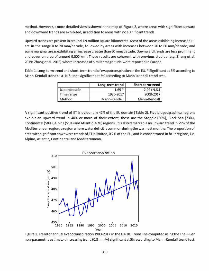
310
method. However, a more detailed view is shown in the map of Figure 2, where areas with significant upward
and downward trends are exhibited, in addition to areas with no significant trends.
Upward trends are present in around 1.9 million square kilometres. Most of the areas exhibiting increased ET
are in the range 0 to 20 mm/decade, followed by areas with increases between 20 to 60 mm/decade, and
some marginal areas exhibiting an increase greater than 60 mm/decade. Downward trends are less prominent
and cover an area of around 9,500 km2. These results are coherent with previous studies (e.g. Zhang et al.
2019; Zhang et al. 2016) where increases of similar magnitude were reported in Europe.
Table 1. Long-term trend and short-term trend of evapotranspiration in the EU. * Significant at 5% according to
Mann-Kendall trend test. N.S.: not significant at 5% according to Mann-Kendall trend test.
Long-term trend Short-term trend
% per decade 1.69 * -2.04 (N.S.) Time range 1980-2017 2008-2017
Method Mann-Kendall Mann-Kendall
A significant positive trend of ET is evident in 42% of the EU domain (Table 2). Five biogeographical regions
exhibit an upward trend in 40% or more of their extent, these are the Steppic (86%), Black Sea (73%),
Continental (58%), Alpine (51%) and Atlantic (40%) regions. It is also remarkable an upward trend in 29% of the
Mediterranean region, a region where water deficit is common during the warmest months. The proportion of
area with significant downward trends of ET is limited, 0.2% of the EU, and is concentrated in four regions, i.e.
Alpine, Atlantic, Continental and Mediterranean.
Figure 1. Trend of annual evapotranspiration 1980-2017 in the EU-28. Trend line computed using the Theil–Sen
non-parametric estimator. Increasing trend (0.8 mm/y) significant at 5% according to Mann-Kendall trend test.
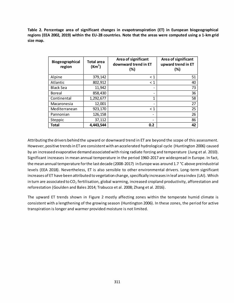
311
Table 2. Percentage area of significant changes in evapotranspiration (ET) in European biogeographical
regions (EEA 2002, 2019) within the EU-28 countries. Note that the areas were computed using a 1-km grid
size map.
Biogeographical
region
Total area
(Km2)
Area of significant
downward trend in ET
(%)
Area of significant
upward trend in ET
(%)
Alpine 379,142 < 1 51
Atlantic 802,912 < 1 40 Black Sea 11,942 - 73
Boreal 858,430 - 36 Continental 1,292,677 1 58
Macaronesia 12,001 - 27 Mediterranean 923,170 < 1 25
Pannonian 126,158 - 26
Steppic 37,112 - 86 Total 4,443,544 0.2 42
Attributing the drivers behind the upward or downward trend in ET are beyond the scope of this assessment.
However, positive trends in ET are consistent with an accelerated hydrological cycle (Huntington 2006) caused
by an increased evaporative demand associated with rising radiate forcing and temperature (Jung et al. 2010).
Significant increases in mean annual temperature in the period 1960-2017 are widespread in Europe. In fact,
the mean annual temperature for the last decade (2008-2017) in Europe was around 1.7 °C above preindustrial
levels (EEA 2018). Nevertheless, ET is also sensible to other environmental drivers. Long-term significant
increases of ET have been attributed to vegetation change, specifically increases in leaf area index (LAI). Which
in turn are associated to CO2 fertilisation, global warming, increased cropland productivity, afforestation and
reforestation (Goulden and Bales 2014; Trabucco et al. 2008; Zhang et al. 2016).
The upward ET trends shown in Figure 2 mostly affecting zones within the temperate humid climate is
consistent with a lengthening of the growing season (Huntington 2006). In these zones, the period for active
transpiration is longer and warmer provided moisture is not limited.

312
Figure 2. Trends in annual evapotranspiration 1980-2017 (significant at the 5% level according to the Mann-
Kendall test). Light grey: outside area of interest.
Discussion – Implications of changes in ET
River flow is a function of precipitation minus ET, therefore an increase of ET as result of e.g. increased
temperature or changes in vegetation traits, is consistent with reduced river flow (Goulden and Bales 2014).
The relation precipitation minus ET is generally positive or close to zero because ET cannot exceed precipitation
over long periods averaged at basin level (Byrne and O’Gorman 2015). Likewise, changes in land cover resulting
from afforestation and/or reforestation can result in an in-site increase of ET and a decreased off-site
(downstream) water availability. However, whether this is positive or negative for water resources, soil and
land conservation and/or biodiversity is highly site specific, and dependent upon local environmental traits
(Trabucco et al. 2008).

313
Downward trends in ET could be associated with several drivers that may act individually or concomitantly. For
instance, deforestation, land cover change, changes in plant phenology or vegetation degradation affects ET
rates (Sterling et al. 2012; Zhang et al. 2016). Similarly, climatic drivers could also reduce ET rates in the long
term, for instance in case of reduced moisture supply.
Although the drivers of the significant changes in ET in Europe have yet to be elucidated, ET is a sensitive
bioindicator of ecosystem function and services due to the consistent relationship between ecosystem change
(temperature, plant traits, land cover), ET and water supply (Goulden and Bales 2014).
In summary, at the level of whole ecosystems ET is limited by moisture input (Jung et al. 2010), when moisture
deficit (more output that input) is continued over long periods, changes in vegetation due to moisture stress
would have subsequent effects in ecosystem functions and services, including water supply.
References
Allen, L. (1991). Effects of increasing carbon dioxide levels and climate change on plant growth,
evapotranspiration, and water resources. In National Research Council (Ed.), Managing Water Resources in the
West Under Conditions of Climate Uncertainty (pp. 101–147). Washington, DC: The National Academies Press.
Byrne, M. P., & O’Gorman, P. A. (2015). The Response of Precipitation Minus Evapotranspiration to Climate
Warming: Why the “Wet-Get-Wetter, Dry-Get-Drier” Scaling Does Not Hold over Land. Journal of Climate,
28(20), 8078-8092, doi:10.1175/jcli-d-15-0369.1.
EEA (2002). Europe’s biodiversity – biogeographical regions and seas. Luxembourg: European Environment
Agency.
EEA (2018). Global and European temperature. Accessed 12 Febrary 2019.
EEA (2019). Biogeographical regions. https://www.eea.europa.eu/data-and-maps/data/biogeographical-
regions-europe-3#tab-figures-produced2019.
Gilbert, R. O. (1987). Statistical Methods for Environmental Pollution Monitoring. NY, USA: Wiley.
Goulden, M. L., & Bales, R. C. (2014). Mountain runoff vulnerability to increased evapotranspiration with
vegetation expansion. Proceedings of the National Academy of Sciences of the United States of America,
111(39), 14071-14075, doi:10.1073/pnas.1319316111.
Huntington, T. G. (2006). Evidence for intensification of the global water cycle: Review and synthesis. Journal of
Hydrology, 319(1), 83-95, doi:doi.org/10.1016/j.jhydrol.2005.07.003.
Jung, M., Reichstein, M., Ciais, P., Seneviratne, S. I., Sheffield, J., Goulden, M. L., et al. (2010). Recent decline in
the global land evapotranspiration trend due to limited moisture supply. Nature, 467, 951,
doi:10.1038/nature09396.
Kendall, M. G. (1975). Rank Correlation Methods (4th edition). London: Charles Griffin.
314
Mann, H. B. (1945). Nonparametric Tests Against Trend. Econometrica, 13(3), 245-259, doi:10.2307/1907187.
Martens, B., Miralles, D. G., Lievens, H., van der Schalie, R., de Jeu, R. A. M., Fernández-Prieto, D., et al. (2017).
GLEAM v3: satellite-based land evaporation and root-zone soil moisture. Geoscientific Model Development,
10(5), 1903-1925, doi:10.5194/gmd-10-1903-2017.
Miralles, D. G., Holmes, T. R. H., De Jeu, R. A. M., Gash, J. H., Meesters, A. G. C. A., & Dolman, A. J. (2011).
Global land-surface evaporation estimated from satellite-based observations. Hydrology and Earth System
Sciences, 15(2), 453-469, doi:10.5194/hess-15-453-2011.
Miralles, D. G., van den Berg, M. J., Teuling, A. J., & de Jeu, R. A. M. (2012). Soil moisture-temperature coupling:
A multiscale observational analysis. Geophysical Research Letters, 39(21), doi:doi:10.1029/2012GL053703.
Pan, S., Tian, H., Dangal, S. R. S., Yang, Q., Yang, J., Lu, C., et al. (2015). Responses of global terrestrial
evapotranspiration to climate change and increasing atmospheric CO2 in the 21st century. Earth's Future, 3(1),
15-35, doi:10.1002/2014EF000263.
Sen, P. K. (1968). Estimates of the Regression Coefficient Based on Kendall's Tau. Journal of the American
Statistical Association, 63(324), 1379-1389, doi:10.2307/2285891.
Seneviratne, S. I., Corti, T., Davin, E. L., Hirschi, M., Jaeger, E. B., Lehner, I., et al. (2010). Investigating soil
moisture–climate interactions in a changing climate: A review. Earth-Science Reviews, 99(3), 125-161,
doi:10.1016/j.earscirev.2010.02.004.
Seneviratne, S. I., Lüthi, D., Litschi, M., & Schär, C. (2006). Land–atmosphere coupling and climate change in
Europe. Nature, 443, 205, doi:10.1038/nature05095.
Sterling, S. M., Ducharne, A., & Polcher, J. (2012). The impact of global land-cover change on the terrestrial
water cycle. Nature Climate Change, 3, 385, doi:10.1038/nclimate1690.
Taylor, C. M., de Jeu, R. A. M., Guichard, F., Harris, P. P., & Dorigo, W. A. (2012). Afternoon rain more likely over
drier soils. Nature, 489, 423, doi:10.1038/nature11377.
Trabucco, A., Zomer, R. J., Bossio, D. A., van Straaten, O., & Verchot, L. V. (2008). Climate change mitigation
through afforestation/reforestation: A global analysis of hydrologic impacts with four case studies. Agriculture,
Ecosystems & Environment, 126(1), 81-97, doi:10.1016/j.agee.2008.01.015.
Trenberth, K. E., Fasullo, J. T., & Kiehl, J. (2009). Earth's Global Energy Budget. Bulletin of the American
Meteorological Society, 90(3), 311-324, doi:10.1175/2008bams2634.1.
Wang, K., & Dickinson, R. E. (2012). A review of global terrestrial evapotranspiration: Observation, modeling,
climatology, and climatic variability. Reviews of Geophysics, 50(2), doi:doi:10.1029/2011RG000373.
Wilcox, R. R. (2012). Introduction to Robust Estimation and Hypothesis Testing. San Diego, California, USA:
Academic Press.

315
Zhang, Y., Kong, D., Gan, R., Chiew, F. H. S., McVicar, T. R., Zhang, Q., et al. (2019). Coupled estimation of 500 m and 8-day resolution global evapotranspiration and gross primary production in 2002–2017. Remote Sensing of
Environment, 222, 165-182, doi:10.1016/j.rse.2018.12.031.
Zhang, Y., Peña-Arancibia, J. L., McVicar, T. R., Chiew, F. H. S., Vaze, J., Liu, C., et al. (2016). Multi -decadal trends
in global terrestrial evapotranspiration and its components. [Article]. Scientific Reports, 6, 19124,
doi:10.1038/srep19124.
Contact:
José I. Barredo, European Commission - Joint Research Centre, Ispra, Italy [[email protected]]
316
Fact sheet 3.3.210: Land Productivity Dynamics – Normalized Difference Vegetation Index (NDVI)
1. General information
Thematic ecosystem assessment: Forest condition
Indicator class: Ecosystem condition, Functional ecosystem attributes
Name of the indicator: Land Productivity Dynamics – Normalized Difference Vegetation Index (NDVI)
Units: unite less (index)
2. Data sources
The indicator is based on existing data:
Data holder: JRC World Atlas Of Desertification, Third edition (WAD-3)
Year or time-series range: 1999-2013
Reference: Cherlet, M. et al. (2018). World Atlas of Desertification. Luxembourg, Publication Office of
the European Union. Ivits, E. and Cherlet, M. (2013). Land-Productivity Dynamics Towards integrated
assessment of land degradation at global scales, EUR 26052, Luxembourg: Publications Office of the
European Union.
Land productivity dynamics (LPD) changes for the period 1999-2013 were computed from phenological metrics,
such as growing season productivity, derived from time series of the Copernicus Global Land SPOT VGT
products of normalised difference vegetation index (Copernicus-NDVI 2018), composited in 10-day intervals at
a spatial resolution of 1 km. An exhaustive description of the methodology is found in Ivits and Cherlet (2013)
and Cherlet et al. (2018).
3. Assessment of the indicator
3.1. Short description of the scope of the indicator.
The LPD indicator aims at providing the status of Earth’s vegetative cover and its development over time. In
general terms it refers to the amount of carbon fixed by plants through the process of photosynthesis.
The global monitoring of land productivity typically relies on the multi-temporal and thematic evaluation of
long-term time series of remotely-sensed vegetation indices such as NDVI of fAPAR, computed from
continuous spectral measurements of photosynthetic activity. These data are highly correlated with
photosynthetic capacity and primary production, which in turn are related to processes of land degradation
and recovery (Sommer et al., 2017).
LPD also reflects the overall capacity of land to support biodiversity and provide ecosystem services. A
persistent decline in land productivity points to the long-term alteration in the health and productive capacity
of the land, the basis for economic growth and sustainable livelihoods (Sommer et al. 2017).
The LPD is one of the key-indicators used to assess land degradation. It has been used in the World Atlas of
Desertification (WAD-3, Cherlet et al., 2018), in the United Nations Convention to Combat Desertification
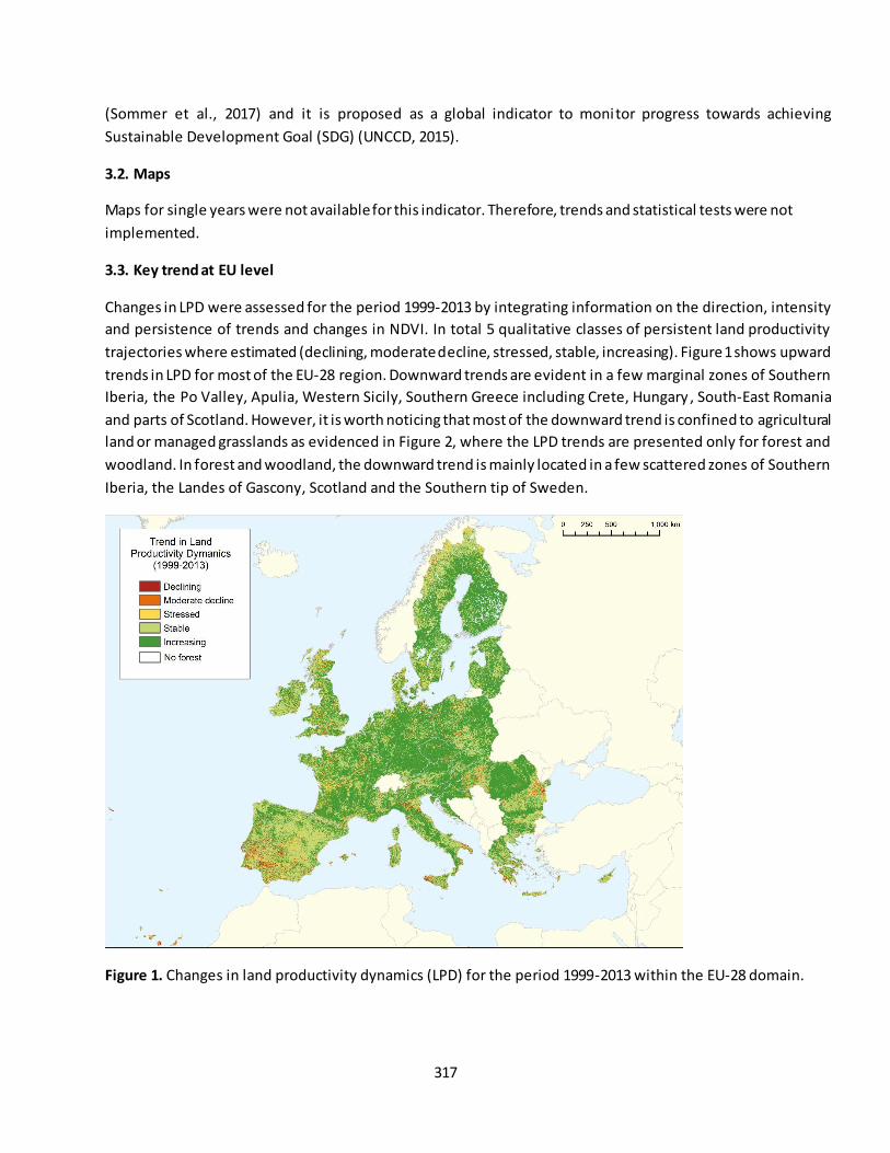
317
(Sommer et al., 2017) and it is proposed as a global indicator to monitor progress towards achieving
Sustainable Development Goal (SDG) (UNCCD, 2015).
3.2. Maps
Maps for single years were not available for this indicator. Therefore, trends and statistical tests were not
implemented.
3.3. Key trend at EU level
Changes in LPD were assessed for the period 1999-2013 by integrating information on the direction, intensity
and persistence of trends and changes in NDVI. In total 5 qualitative classes of persistent land productivity
trajectories where estimated (declining, moderate decline, stressed, stable, increasing). Figure 1 shows upward
trends in LPD for most of the EU-28 region. Downward trends are evident in a few marginal zones of Southern
Iberia, the Po Valley, Apulia, Western Sicily, Southern Greece including Crete, Hungary , South-East Romania
and parts of Scotland. However, it is worth noticing that most of the downward trend is confined to agricultural
land or managed grasslands as evidenced in Figure 2, where the LPD trends are presented only for forest and
woodland. In forest and woodland, the downward trend is mainly located in a few scattered zones of Southern
Iberia, the Landes of Gascony, Scotland and the Southern tip of Sweden.
Figure 1. Changes in land productivity dynamics (LPD) for the period 1999-2013 within the EU-28 domain.
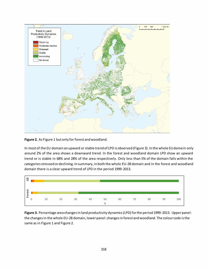
318
Figure 2. As Figure 1 but only for forest and woodland.
In most of the EU domain an upward or stable trend of LPD is observed (Figure 3). In the whole EU domain only
around 2% of the area shows a downward trend. In the forest and woodland domain LPD show an upward
trend or is stable in 68% and 28% of the area respectively. Only less than 5% of the domain falls within the
categories stressed or declining. In summary, in both the whole EU-28 domain and in the forest and woodland
domain there is a clear upward trend of LPD in the period 1999-2013.
Figure 3. Percentage area changes in land productivity dynamics (LPD) for the period 1999-2013. Upper panel:
the changes in the whole EU-28 domain, lower panel: changes in forest and woodland. The colour code is the
same as in Figure 1 and Figure 2.
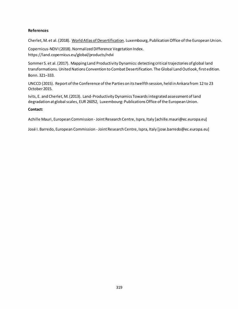
319
References
Cherlet, M. et al. (2018). World Atlas of Desertification. Luxembourg, Publication Office of the European Union.
Copernicus-NDVI (2018). Normalized Difference Vegetation Index.
https://land.copernicus.eu/global/products/ndvi
Sommer S. et al. (2017). Mapping Land Productivity Dynamics: detecting critical trajectories of global land
transformations. United Nations Convention to Combat Desertification. The Global Land Outlook, first edition.
Bonn. 321–333.
UNCCD (2015). Report of the Conference of the Parties on its twelfth session, held in Ankara from 12 to 23 October 2015.
Ivits, E. and Cherlet, M. (2013). Land-Productivity Dynamics Towards integrated assessment of land degradation at global scales, EUR 26052, Luxembourg: Publications Office of the European Union.
Contact:
Achille Mauri, European Commission - Joint Research Centre, Ispra, Italy [[email protected]]
José I. Barredo, European Commission - Joint Research Centre, Ispra, Italy [[email protected]]
320
Fact sheet 3.4.101: Change of area due conversion (wetlands)
1. General information
Thematic ecosystem assessment: Inland marshes and peatbogs
Indicator class: Habitat conversion and degradation (Land conversion)
Name of the indicator: Change of area due to conversion
Units: %/6 years
2. Data sources
The indicator based on readily available data.
Data holder: EEA
Weblink: https://www.eea.europa.eu/data-and-maps/dashboards/land-cover-and-change-statistics
Year or time-series range: 2000-2018
Version: Corine Land Cover version 20 accounting layers
19/09/2019
Reference: https://www.eea.europa.eu/data-and-maps/dashboards/land-cover-and-change-statistics
3. Assessment of the indicator
3.1. Short description of the scope of the indicator.
“Land accounts describe, in a consistent and systematic way, the amount of land stock and its changes over
time”34: This indicator assessed for different years aims to help monitoring the trends of inland marshes and
peatbogs habitat conversion in time.
Wetlands, although constituting only 2% of the EU-28 land area, are considered an ecosystem of key-
importance due to its unique ecological and hydrological features.
Europe has historically suffered the greatest losses in mires having suffered great declines since 1900.
Approximately two thirds of European wetlands were lost before the 1990s 35 and peat formation has stopped
in about 60% of the original mire area and possibly 10-20% is not even peatland anymore (Joosten, 1997).
Transformational changes in their use and cover has transformed these areas from wetlands to wastelands,
reverting in many cases their condition from carbon sink to carbon emitter.
3.2. Maps
No map is available for this indicator.
3.3. Statistical analysis of the trend
Both short-term and long-term trends are computed for this indicator.
34
https://www.eea.europa.eu/data-and-maps/dashboards/land-cover-and-change-statistics 35
https://www.eea.europa.eu/data-and-maps/indicators/ecosystem-coverage-3/assessment
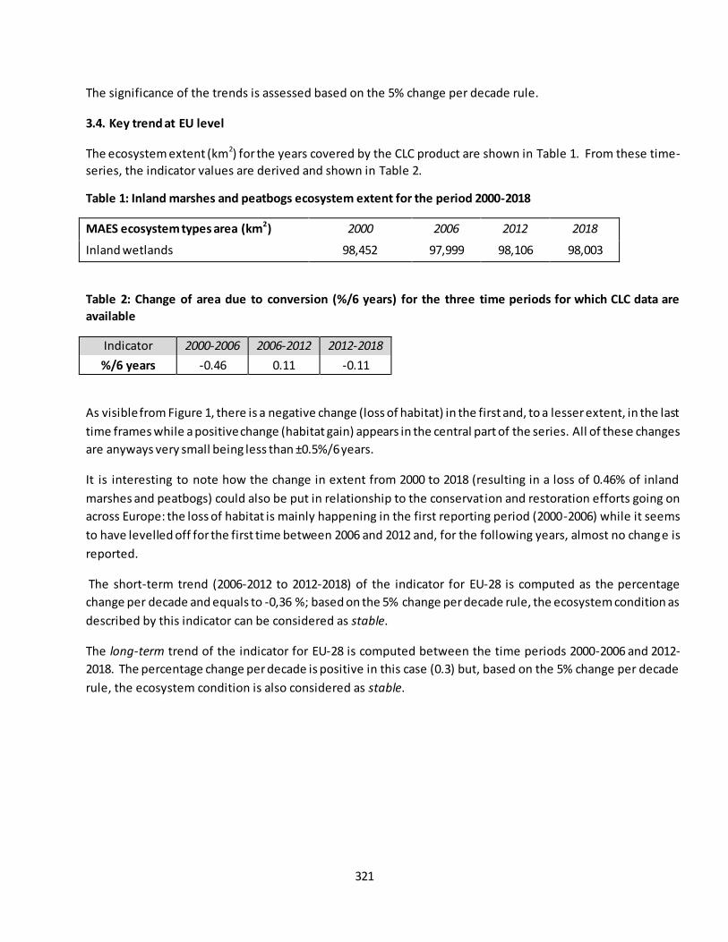
321
The significance of the trends is assessed based on the 5% change per decade rule.
3.4. Key trend at EU level
The ecosystem extent (km2) for the years covered by the CLC product are shown in Table 1. From these time-
series, the indicator values are derived and shown in Table 2.
Table 1: Inland marshes and peatbogs ecosystem extent for the period 2000-2018
MAES ecosystem types area (km2) 2000 2006 2012 2018
Inland wetlands 98,452 97,999 98,106 98,003
Table 2: Change of area due to conversion (%/6 years) for the three time periods for which CLC data are
available
Indicator 2000-2006 2006-2012 2012-2018
%/6 years -0.46 0.11 -0.11
As visible from Figure 1, there is a negative change (loss of habitat) in the first and, to a lesser extent, in the last
time frames while a positive change (habitat gain) appears in the central part of the series. All of these changes
are anyways very small being less than ±0.5%/6 years.
It is interesting to note how the change in extent from 2000 to 2018 (resulting in a loss of 0.46% of inland
marshes and peatbogs) could also be put in relationship to the conservation and restoration efforts going on
across Europe: the loss of habitat is mainly happening in the first reporting period (2000-2006) while it seems
to have levelled off for the first time between 2006 and 2012 and, for the following years, almost no change is
reported.
The short-term trend (2006-2012 to 2012-2018) of the indicator for EU-28 is computed as the percentage
change per decade and equals to -0,36 %; based on the 5% change per decade rule, the ecosystem condition as
described by this indicator can be considered as stable.
The long-term trend of the indicator for EU-28 is computed between the time periods 2000-2006 and 2012-
2018. The percentage change per decade is positive in this case (0.3) but, based on the 5% change per decade
rule, the ecosystem condition is also considered as stable.
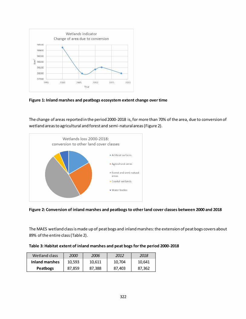
322
Figure 1: Inland marshes and peatbogs ecosystem extent change over time
The change of areas reported in the period 2000-2018 is, for more than 70% of the area, due to conversion of
wetland areas to agricultural and forest and semi-natural areas (Figure 2).
Figure 2: Conversion of inland marshes and peatbogs to other land cover classes between 2000 and 2018
The MAES wetland class is made up of peat bogs and inland marshes: the extension of peat bogs covers about
89% of the entire class (Table 2).
Table 3: Habitat extent of inland marshes and peat bogs for the period 2000-2018
Wetland class 2000 2006 2012 2018
Inland marshes 10,593 10,611 10,704 10,641
Peatbogs 87,859 87,388 87,403 87,362
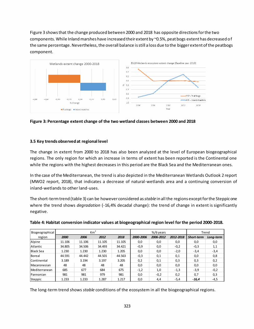
323
Figure 3 shows that the change produced between 2000 and 2018 has opposite directions for the two
components. While Inland marshes have increased their extent by ~0.5%, peat bogs extent has decreased o f
the same percentage. Nevertheless, the overall balance is still a loss due to the bigger extent of the peatbogs
component.
Figure 3: Percentage extent change of the two wetland classes between 2000 and 2018
3.5 Key trends observed at regional level
The change in extent from 2000 to 2018 has also been analyzed at the level of European biogeographical
regions. The only region for which an increase in terms of extent has been reported is the Continental one
while the regions with the highest decreases in this period are the Black Sea and the Mediterranean ones.
In the case of the Mediterranean, the trend is also depicted in the Mediterranean Wetlands Outlook 2 report
(MWO2 report, 2018), that indicates a decrease of natural-wetlands area and a continuing conversion of
inland-wetlands to other land-uses.
The short-term trend (table 3) can be however considered as stable in all the regions except for the Steppic one
where the trend shows degradation (-16,4% decadal change): the trend of change in extent is significantly
negative.
Table 4: Habitat conversion indicator values at biogeographical region level for the period 2000-2018.
The long-term trend shows stable conditions of the ecosystem in all the biogeographical regions.
2000 2006 2012 2018 2000-2006 2006-2012 2012-2018 Short-term Long-term
Alpine 11.106 11.106 11.105 11.105 0,0 0,0 0,0 0,0 0,0
Atlantic 34.805 34.506 34.493 34.421 -0,9 0,0 -0,2 -0,3 1,1
Black Sea 1.230 1.230 1.230 1.205 0,0 0,0 -2,0 -3,4 -3,4
Boreal 44.591 44.442 44.501 44.563 -0,3 0,1 0,1 0,0 0,8
Continental 3.189 3.194 3.197 3.205 0,2 0,1 0,3 0,3 0,2
Macaronesian 48 48 48 48 0,0 0,0 0,0 0,0 0,0
Mediterranean 685 677 684 675 -1,2 1,0 -1,3 -3,9 -0,2
Pannonian 981 981 979 981 0,0 -0,2 0,2 0,7 0,3
Steppic 1.233 1.233 1.287 1.217 0,0 4,4 -5,4 -16,4 -4,5
Km2 %/6 years TrendBiogeographical
region
324
References
Joosten, H 1997. Mires in Europe: a preliminary status report. International Mire Conservation Group Members
Newsletter, 3
Mediterranean Wetlands Outlook 2: Solutions for sustainable Mediterranean Wetlands, 2018, Tour du Valat,
France.
WORK DONE BY MARCO TROMBETTI, DANIA ABDUL MALAK AND ANA MARIN (ETC/ULS – UMA)
Version December 2019
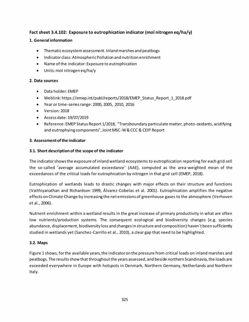
325
Fact sheet 3.4.102: Exposure to eutrophication indicator (mol nitrogen eq/ha/y)
1. General information
Thematic ecosystem assessment. Inland marshes and peatbogs
Indicator class: Atmospheric Pollution and nutrition enrichment
Name of the indicator: Exposure to eutrophication
Units: mol nitrogen eq/ha/y
2. Data sources
Data holder: EMEP
Weblink: https://emep.int/publ/reports/2018/EMEP_Status_Report_1_2018.pdf
Year or time-series range: 2000, 2005, 2010, 2016
Version: 2018
Access date: 19/07/2019
Reference: EMEP Status Report 1/2018, "Transboundary particulate matter, photo-oxidants, acidifying
and eutrophying components", Joint MSC-W & CCC & CEIP Report
3. Assessment of the indicator
3.1. Short description of the scope of the indicator
The indicator shows the exposure of inland wetland ecosystems to eutrophication reporting for each grid cell
the so-called ’average accumulated exceedance’ (AAE), computed as the area-weighted mean of the
exceedances of the critical loads for eutrophication by nitrogen in that grid cell (EMEP, 2018).
Eutrophication of wetlands leads to drastic changes with major effects on their structure and functions
(Vaithiyanathan and Richardson 1999, Álvarez-Cobelas et al. 2001). Eutrophication amplifies the negative
effects on Climate Change by increasing the net emissions of greenhouse gases to the atmosphere (Verhoven
et al., 2006).
Nutrient enrichment within a wetland results in the great increase of primary productivity in what are often
low nutrients/production systems. The consequent ecol ogical and biodiversity changes (e.g. species
abundance, displacement, biodiversity loss and changes in structure and composition) haven´t been sufficiently
studied in wetlands yet (Sanchez-Carrillo et al., 2010), a clear gap that need to be highlighted.
3.2. Maps
Figure 1 shows, for the available years, the indicator on the pressure from critical loads on inland marshes and
peatbogs. The results show that throughout the years assessed, and beside northern Scandinavia, the loads are
exceeded everywhere in Europe with hotspots in Denmark, Northern Germany, Netherlands and Northern
Italy.

326
Figure 1: Exceedances of critical loads for eutrophication in wetlands computed with the 2000, 2005, 2010
and 2016 nitrogen depositions
Figure 2 shows the percentage change per decade of critical loads for eutrophication between the latest
available year (2016) and the baseline one (2010).
For most of the wetlands across Europe, the indicator shows a reduction in load values, although the critical
threshold is still exceeded. Most of critical load reduction is visible in the Baltic sea basin and in Italy, Southern
France and along the Danube in Romania. Negative changes (increase in eutrophication over time) are affecting
Ireland, the United Kingdom and Denmark.
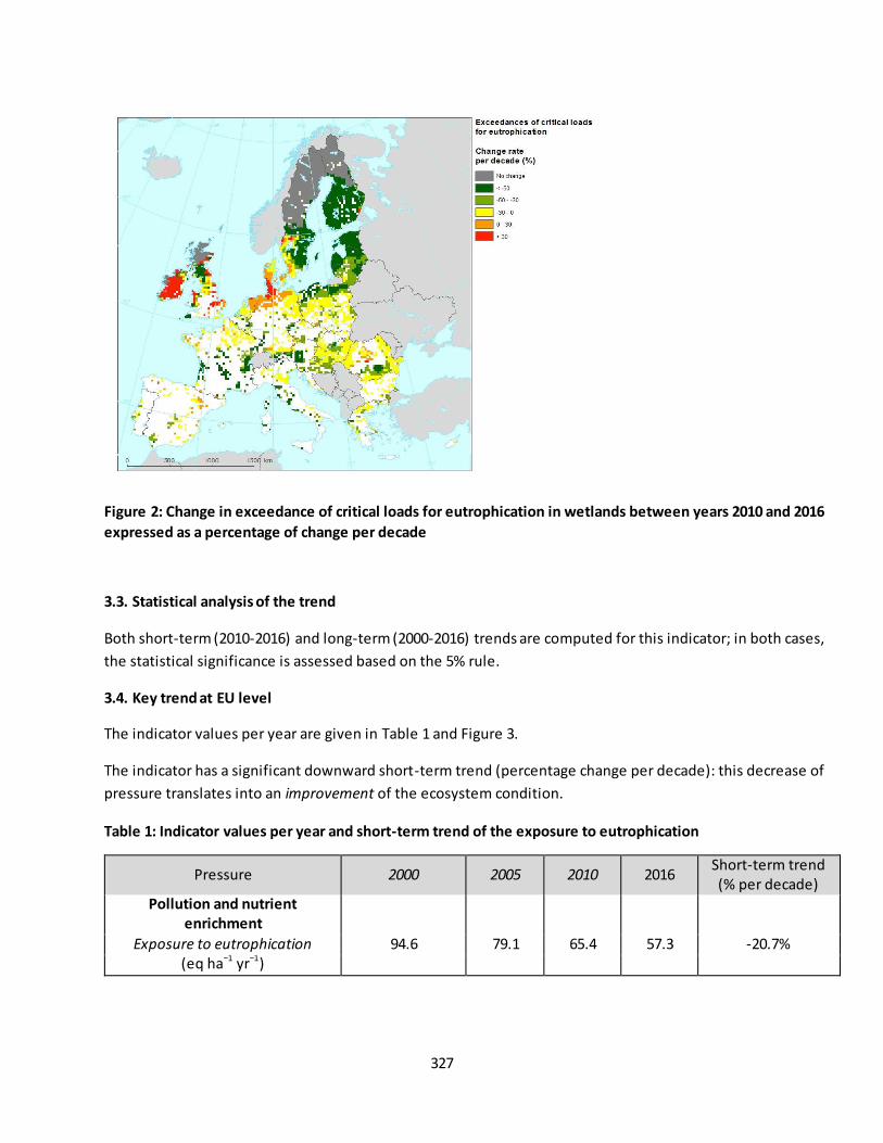
327
Figure 2: Change in exceedance of critical loads for eutrophication in wetlands between years 2010 and 2016
expressed as a percentage of change per decade
3.3. Statistical analysis of the trend
Both short-term (2010-2016) and long-term (2000-2016) trends are computed for this indicator; in both cases,
the statistical significance is assessed based on the 5% rule.
3.4. Key trend at EU level
The indicator values per year are given in Table 1 and Figure 3.
The indicator has a significant downward short-term trend (percentage change per decade): this decrease of
pressure translates into an improvement of the ecosystem condition.
Table 1: Indicator values per year and short-term trend of the exposure to eutrophication
Pressure 2000 2005 2010 2016 Short-term trend (% per decade)
Pollution and nutrient
enrichment
Exposure to eutrophication 94.6 79.1 65.4 57.3 -20.7% (eq ha−1 yr−1)
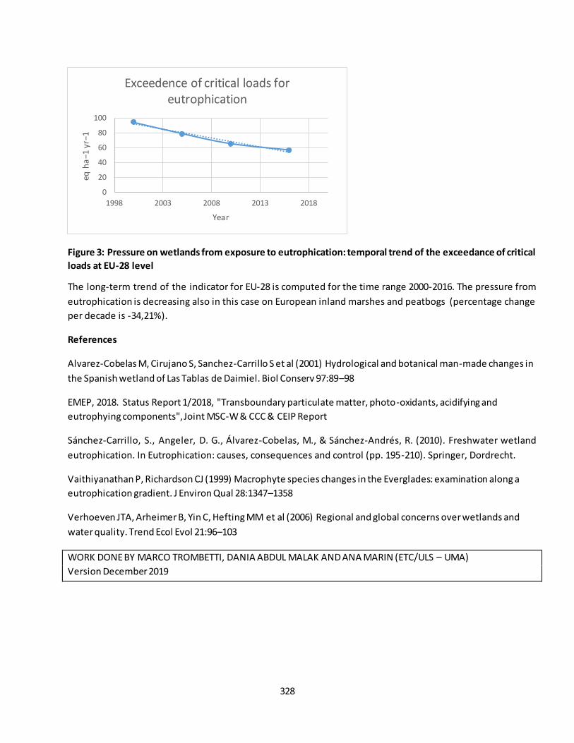
328
Figure 3: Pressure on wetlands from exposure to eutrophication: temporal trend of the exceedance of critical
loads at EU-28 level
The long-term trend of the indicator for EU-28 is computed for the time range 2000-2016. The pressure from
eutrophication is decreasing also in this case on European inland marshes and peatbogs (percentage change
per decade is -34,21%).
References
Alvarez-Cobelas M, Cirujano S, Sanchez-Carrillo S et al (2001) Hydrological and botanical man-made changes in
the Spanish wetland of Las Tablas de Daimiel. Biol Conserv 97:89–98
EMEP, 2018. Status Report 1/2018, "Transboundary particulate matter, photo-oxidants, acidifying and
eutrophying components", Joint MSC-W & CCC & CEIP Report
Sánchez-Carrillo, S., Angeler, D. G., Álvarez-Cobelas, M., & Sánchez-Andrés, R. (2010). Freshwater wetland
eutrophication. In Eutrophication: causes, consequences and control (pp. 195-210). Springer, Dordrecht.
Vaithiyanathan P, Richardson CJ (1999) Macrophyte species changes in the Everglades: examination along a
eutrophication gradient. J Environ Qual 28:1347–1358
Verhoeven JTA, Arheimer B, Yin C, Hefting MM et al (2006) Regional and global concerns over wetlands and
water quality. Trend Ecol Evol 21:96–103
WORK DONE BY MARCO TROMBETTI, DANIA ABDUL MALAK AND ANA MARIN (ETC/ULS – UMA)
Version December 2019
0
20
40
60
80
100
1998 2003 2008 2013 2018
eq h
a−1
yr−1
Year
Exceedence of critical loads for eutrophication

329
Fact sheet 3.4.103: Agriculture intensity pressure on inland marshes and peatbogs
1. General information
Thematic ecosystem assessment: Inland marshes and peatbogs
Indicator class: Over-exploitation
Name of the indicator: Agriculture intensity pressure on inland marshes and peatbogs
o Sub-indicator i: Non-atmospheric nitrogen input from agriculture to soil
o Sub-indicator ii: Extent of agricultural area around inland marshes and peatbogs
Units
o Sub-indicator i Kg/ha/year
o Sub-indicator ii %
2. Data sources
The indicator is made-up of two sub-indicators.
i) Non-atmospheric nitrogen inputs to soils from manure application and mineral fertiliser
Derived through GIS analysis of the input dataset “Nitrogen flows relevant for HSU database” combined with
the MAES Wetland Ecosystem types mask derived from the Corine Land Cover 2012.
Data holder: JRC
Year or time-series range: 2000, 2002, 2004, 2006, 2008, 2010, 2012
Reference:
o Leip A. Koeble R. 2018 The CAPRI disaggregation. Report in preparation
o Leip A. Koeble R. Reuter H.I. Lamboni M. Homogeneous Spatial Units (HSU) - a Pan-European
geographical basis for environmental and socio-economic modelling. PANGAEA.
https://doi.org/10.1594/PANGAEA.860284 Unpublished data archive
o Lamboni M. Koeble R. Leip A. 2016. Multi-scale land-use disaggregation modelling: Concept
and application to EU countries. Environ. Model. Softw. 82 183-217.
https://doi.org/10.1016/j.envsoft.2016.04.028
o Leip A. Marchi G. Koeble R. Kempen M. Britz W. Li C. 2008. Linking an economic model for
European agriculture with a mechanistic model to estimate nitrogen and carbon losses from arable
soils in Europe. Biogeosciences 5 73-94. https://doi.org/10.5194/bg-5-73-2008
ii) Extent of agricultural area around inland marshes and peatbogs
The indicator is derived through GIS analysis of the input Corine Land Cover status layers
o Corine Land Cover 2000 (raster 100m) version 18.5 status layer, Mar. 2017
o Corine Land Cover 2006 (raster 100m) version 18.5 status layer, Mar. 2017
o Corine Land Cover 2012 (raster 100m) version 18.5 status layer, Mar. 2017
o Corine Land Cover 2018 (raster 100m) version 20.b2 status layer, Apr. 2018
330
Data holder: JRC
Year or time-series range: 2000, 2006, 2012, 2018
Reference: This fact sheet
3. Assessment of the indicator
3.1. Short description of the scope of the indicator
This indicator aims to evaluate spatial and temporal trends of pressure on inl and marshes and peatbogs from
agriculture intensification.
The intensification of agricultural activities has a significant negative impact on ecosystems, both in
quantitative (decreases in flow) and qualitative terms (loads of pollutants, including nutrie nts and other
chemicals used to maximize production on cropland) (Davies et al., 2008).
This pressure occurs frequently within and in the surroundings of the wetland bodies. For the indicator
purposes, the area around inland marshes and peatbogs considered to have a potential impact on its
ecosystems has been defined through a buffer area of 10km radius around each wetland body. This area
approximates a statistical measurement (IQR) of the distribution of the European river catchments extent,
which are important geographical units to consider for the management of inland marshes and peatbogs and
water resources.
Pressure is assessed by means of two sub-indicators. The sub-indicator i quantifies the amount of nitrogen
inputs to soil from manure application and mineral fertilizer, while the sub-indicator ii defines the percentage
of area around inland marshes and peatbogs which is used for agricultural purposes.
Nutrient balance (nitrogen in this case) can be considered a proxy for agricultural intensification since, in many
inland marshes and peatbogs, natural fluxes of nutrient availability is altered by agricultural practices,
increasing nutrient loading and altering the physical and chemical conditions (Sánchez-Carrillo et al., 2010) and
the ecosystem structure and functions.
3.2. Maps
Sub-indicator i
The sub-indicator i is computed for EU-27 (no nitrogen input data are available for Croatia) and for each
available year. It represents the average nitrogen input rate (kg/ha) in the proximity area of each wet land body.
In Figure 1, the sub-indicator i is shown as average input rate (kg/ha) at 25*25 km2 resolution. This resolution
has been selected for informative purposes; the indicator is available as a vector file with yearly values for each
wetland body.
Differences between years are barely visible and the general spatial pattern of the indicator is very similar
along the considered timeframe. Pressure on inland marshes and peatbogs is higher in central Europe with a
wide hot-spot in the Netherlands and high values also in Germany, South of Denmark and West of France.
Values also peak in the southern half of Ireland. Inland marshes and peatbogs in southern an d Eastern Europe
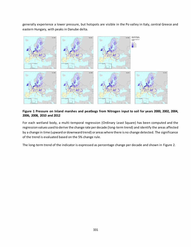
331
generally experience a lower pressure, but hotspots are visible in the Po valley in Italy, central Greece and
eastern Hungary, with peaks in Danube delta.
Figure 1 Pressure on Inland marshes and peatbogs from Nitrogen input to soil for years 2000, 2002, 2004,
2006, 2008, 2010 and 2012
For each wetland body, a multi-temporal regression (Ordinary Least Square) has been computed and the
regression values used to derive the change rate per decade (long-term trend) and identify the areas affected
by a change in time (upward or downward trend) or areas where there is no change detected. The significance
of the trend is evaluated based on the 5% change rule.
The long-term trend of the indicator is expressed as percentage change per decade and shown in Figure 2.
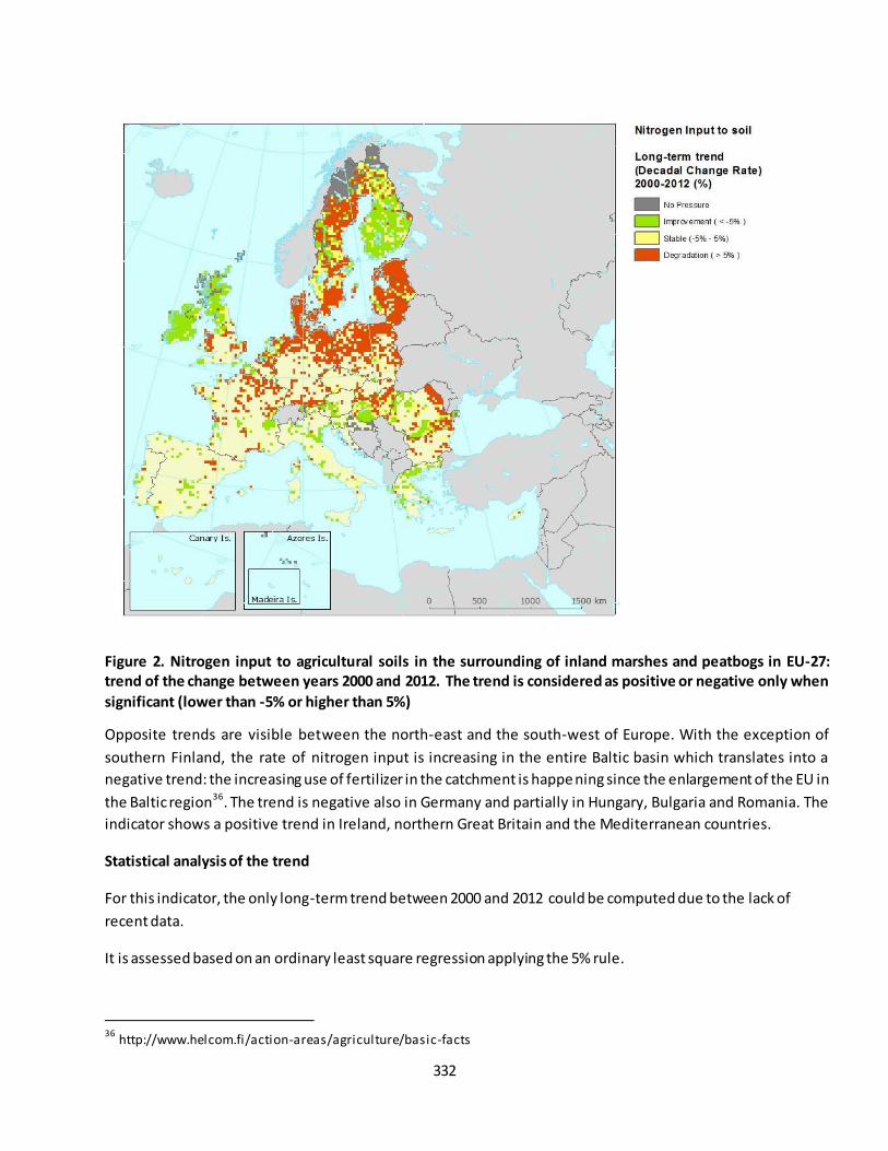
332
Figure 2. Nitrogen input to agricultural soils in the surrounding of inland marshes and peatbogs in EU-27:
trend of the change between years 2000 and 2012. The trend is considered as positive or negative only when
significant (lower than -5% or higher than 5%)
Opposite trends are visible between the north-east and the south-west of Europe. With the exception of
southern Finland, the rate of nitrogen input is increasing in the entire Baltic basin which translates into a
negative trend: the increasing use of fertilizer in the catchment is happe ning since the enlargement of the EU in
the Baltic region36. The trend is negative also in Germany and partially in Hungary, Bulgaria and Romania. The
indicator shows a positive trend in Ireland, northern Great Britain and the Mediterranean countries.
Statistical analysis of the trend
For this indicator, the only long-term trend between 2000 and 2012 could be computed due to the lack of
recent data.
It is assessed based on an ordinary least square regression applying the 5% rule.
36
http://www.helcom.fi/action-areas/agriculture/basic-facts
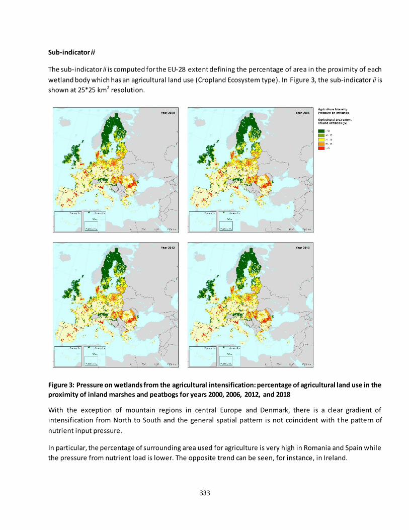
333
Sub-indicator ii
The sub-indicator ii is computed for the EU-28 extent defining the percentage of area in the proximity of each
wetland body which has an agricultural land use (Cropland Ecosystem type). In Figure 3, the sub-indicator ii is
shown at 25*25 km2 resolution.
Figure 3: Pressure on wetlands from the agricultural intensification: percentage of agricultural land use in the
proximity of inland marshes and peatbogs for years 2000, 2006, 2012, and 2018
With the exception of mountain regions in central Europe and Denmark, there is a clear gradient of
intensification from North to South and the general spatial pattern is not coincident with t he pattern of
nutrient input pressure.
In particular, the percentage of surrounding area used for agriculture is very high in Romania and Spain while
the pressure from nutrient load is lower. The opposite trend can be seen, for instance, in Ireland.

334
Figure 4. Agricultural land use in the surrounding of inland marshes and peatbogs in EU-28: trend of the
change between years 2012 and 2018.
The indicator doesn´t show meaningful changes in most of Central and Southern Europe while th is pressure is
decreasing in Germany, Baltic countries, Finland and Ireland. Pressure is increasing in Sweden, UK, central
Austria and at the delta of Danube.
Statistical analysis of the trend
Both short-term (2012-2018) and long-term (2000-2018) trends are computed for this indicator and assessed
based on the 5% rule.
3.3. Key trends at EU level
The aggregated sub-indicators at EU level are computed as the average of the sub-indicators values for each of
the wetland polygons.
Sub-indicator i
For the sub-indicator i, the time series is based on the nutrient input database, hence it covers years 2000,
2002, 2004, 2006, 2008, 2010 and 2012. The value for the baseline year 2010 is in bold.
The trend for EU-27 is shown in Table 1 and Figure 5. Based on the 5% rule, the multi-temporal correlation is
not statistically significant, hence the indicator at EU-27 level reveals that no significant change is occurring in
time: the pressure is stable. Nevertheless, regional fluctuations are obvious.
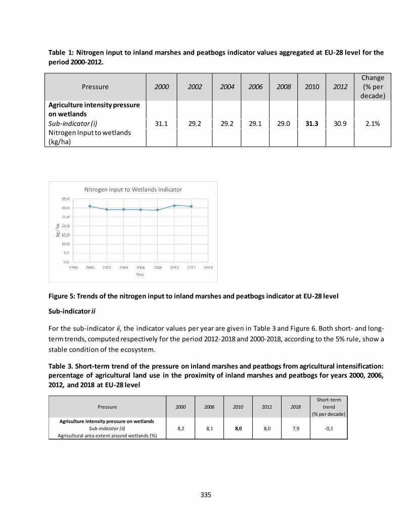
335
Table 1: Nitrogen input to inland marshes and peatbogs indicator values aggregated at EU-28 level for the
period 2000-2012.
Pressure 2000 2002 2004 2006 2008 2010 2012
Change (% per
decade) Agriculture intensity pressure
on wetlands
Sub-indicator (i) 31.1 29.2 29.2 29.1 29.0 31.3 30.9 2.1% Nitrogen Input to wetlands (kg/ha)
Figure 5: Trends of the nitrogen input to inland marshes and peatbogs indicator at EU-28 level
Sub-indicator ii
For the sub-indicator ii, the indicator values per year are given in Table 3 and Figure 6. Both short- and long-
term trends, computed respectively for the period 2012-2018 and 2000-2018, according to the 5% rule, show a
stable condition of the ecosystem.
Table 3. Short-term trend of the pressure on inland marshes and peatbogs from agricultural intensification:
percentage of agricultural land use in the proximity of inland marshes and peatbogs for years 2000, 2006,
2012, and 2018 at EU-28 level
Pressure 2000 2006 2010 2012 2018
Short-term
trend
(% per decade)
Agriculture intensity pressure on wetlands
Sub-indicator (ii) 8,2 8,1 8,0 8,0 7,9 -0,1
Agricultural area extent around wetlands (%)

336
Figure 6. Pressure on inland marshes and peatbogs from agricultural intensification: temporal trend of the
percentage of agricultural land use in the proximity of inland marshes and peatbogs at EU-28 level
References
Davies, B. R., Biggs, J., Williams, P. J., Lee, J. T., & Thompson, S. (2007). A comparison of the catchment sizes of
rivers, streams, ponds, ditches and lakes: implications for protecting aquatic biodiversity in an agricultural
landscape. In Pond Conservation in Europe (pp. 7-17). Springer, Dordrecht.
Sánchez-Carrillo, S., Angeler, D. G., Álvarez-Cobelas, M., & Sánchez-Andrés, R. (2010). Freshwater wetland
eutrophication. In Eutrophication: causes, consequences and control (pp. 195-210). Springer, Dordrecht.
WORK DONE BY MARCO TROMBETTI, DANIA ABDUL MALAK AND ANA MARIN (ETC/ULS – UMA)
Version December 2019
337
Fact sheet 3.4.104: Soil sealing in wetlands
1. General information
Thematic ecosystem assessment: Inland marshes and peatbogs
Indicator class: Other pressures
Name of the indicator: Soil sealing
Units: km2/year
2. Data sources
The indicator is based on existing data.
Data holder: EEA
Weblink: https://www.eea.europa.eu/data-and-maps/dashboards/imperviousness-in-europe
Year or time-series range: 2006, 2009, 2012, 2015
Version: 2018
Access date: 15/09/2019
Reference: https://land.copernicus.eu/pan-european/high-resolution-layers/imperviousness/status-
maps
3. Assessment of the indicator
3.1. Short description of the scope of the indicator.
Soil sealing, expressed as “the substitution of the original (semi-) natural land cover or water surface with an
artificial, often impervious cover”37, can be considered a quantifiable land-use indicator closely correlating with
impacts on water resources (Arnold et al., 1996).
Wetland condition degradation occurs at relatively low levels of impervi ousness: Hicks (1995) could define a
direct relationship between wetlands habitat quality and impervious surface area, with wetlands being
impacted once the imperviousness of the local drainage basin exceeded 10%. It would then be important to
extend the assessment of this indicator to the areas surrounding wetland bodies.
3.2. Maps
No maps are available for this indicator.
3.3. Statistical analysis of the trend
Both short- and long-term trends have been computed for this indicator; the significance of the trend is
assessed based on the 5% rule.
37
https://land.copernicus.eu/pan-european/high-resolution-layers/imperviousness/status-maps/2006?tab=metadata

338
3.4. Key trend at EU level
The aggregated indicator values at EU-28 level are shown in Table 1 and Figure 1.
Table 1: Soil sealing indicator values aggregated at EU-28 level for the period 2006-2015. Baseline value for
year 2010 is shown in bold. The change per decade is computed based on the regression coefficient values
The short-term trend of the indicator for EU-28 is computed for the time range 2010-2015 while the long-term
trend is computed for the time range 2006-2015, based on the regression coefficients for slope and intercept.
Based on the 5% rule, both short- and long-term trends are significant and the condition of inland marshes and
peatbogs as measured by this indicator is degrading. The extent of inland marshes and peatbogs soils being
sealed is increasing with a rate per decade of 6,5% and 6,8% for short- and long-term respectively.
Figure 1: The short-term trend of the indicator for EU-28 is computed for the time range 2006-2015. The
percentage change per decade is 6,8% and it can be considered significantly negative (p<0.05): the indicator
shows degradation of the ecosystem
References
Arnold Jr, C. L., & Gibbons, C. J. (1996). Impervious surface coverage: the emergence of a key environmental
indicator. Journal of the American planning Association, 62(2), 243-258.
Hicks, A, 1995. Impervious surface area and benthic macroinvertebrate response as index of impact from
urbanization on freshwater wetlands. U.S. Environmental Protection Agency, Washington, D.C., EPA/600/R-
95/074.
Pressure 2006 2009 2010 2012 2015
Soil sealing
(km2)27,5 27,9 28,8 29,128,2
339
WORK DONE BY MARCO TROMBETTI, DANIA ABDUL MALAK AND ANA MARIN (ETC/ULS – UMA)
Version December 2019

340
Fact sheet 3.4.201: Wetland connectivity
1. General information
Thematic ecosystem assessment: Inland marshes and peatbogs
Indicator class: Ecosystem condition – Structural ecosystem attributes (general)
Name of the indicator: Wetland connectivity
Units: km
2. Data sources
The indicator is derived through GIS analysis of the input Corine Land Cover accounting layers:
o Corine Land Cover 2000 (raster 100m) version 20 accounting layer, Jun. 2019
o Corine Land Cover 2006 (raster 100m) version 20 accounting layer, Jun. 2019
o Corine Land Cover 2012 (raster 100m) version 20 accounting layer, Jun. 2019
o Corine Land Cover 2018 (raster 100m) version 20 accounting layer, Jun. 2019
Dataholder: ETC/UMA
Year or time-series range: 2000, 2006, 2012, 2018
Reference: Abdul Malak et al., 2018. European Wetland Connectivity Indicator 2012: Synthesis of
ETC/ULS work for supporting to MAES, Deliverable 30, ETC/ULS
3. Assessment of the indicator
3.1. Short description of the scope of the indicator.
Wetland connectivity is broadly used as a proxy to assess the pressure from management activities on this
ecosystem. Indicators on wetland connectivity should be species and habitat specific and involve other
ecosystems connected to inland marshes and peatbogs, namely rivers, estuaries, and mudflats, among others
(Kingsford & Norman, 2002).
A well-connected network of wetland habitats is crucial for the ecological functioning of this ecosystem since
its deterioration can have a significant impact, for instance, on waterbird populations (Merken et al., 2015).
The spatial distribution of wetlands is a key aspect in determining their connectivity (Amezaga et al., 2002) as
well as addressing management and planning efforts to restore and maintain connectivity patterns (UN
Environment, 2017).
Wetland connectivity can then be assessed through the simplest measure of structural connectivity which is
calculated as the distance from one wetland to its nearest neighboring wetland (Calabrese and Fagan 2004).
This index, although simple, reflects different scales and/or probabilities of movement for waterbirds (5 km, 10
km, 50 km and 100 km; Morris, et al., 2012) and Amphibians (0.5-1-10km; Sinsch, 2006), as well as the dispersal
range of plants and invertebrate propagules.
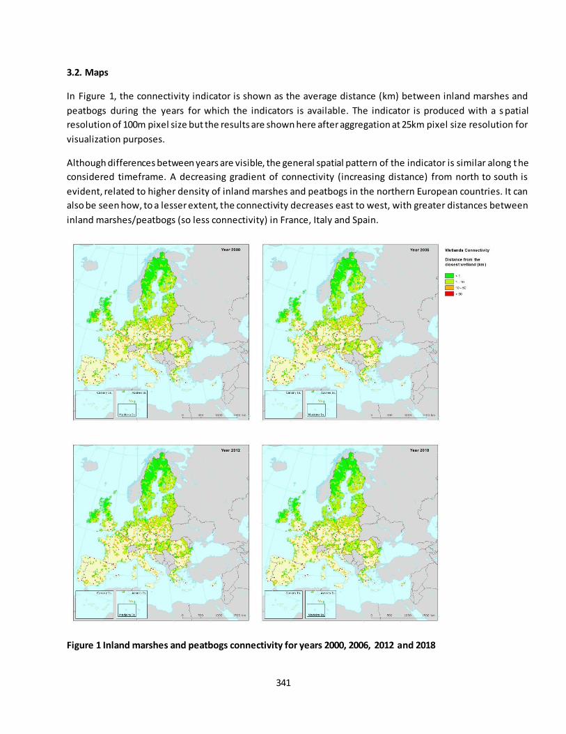
341
3.2. Maps
In Figure 1, the connectivity indicator is shown as the average distance (km) between inland marshes and
peatbogs during the years for which the indicators is available. The indicator is produced with a s patial
resolution of 100m pixel size but the results are shown here after aggregation at 25km pixel size resolution for
visualization purposes.
Although differences between years are visible, the general spatial pattern of the indicator is similar along the
considered timeframe. A decreasing gradient of connectivity (increasing distance) from north to south is
evident, related to higher density of inland marshes and peatbogs in the northern European countries. It can
also be seen how, to a lesser extent, the connectivity decreases east to west, with greater distances between
inland marshes/peatbogs (so less connectivity) in France, Italy and Spain.
Figure 1 Inland marshes and peatbogs connectivity for years 2000, 2006, 2012 and 2018
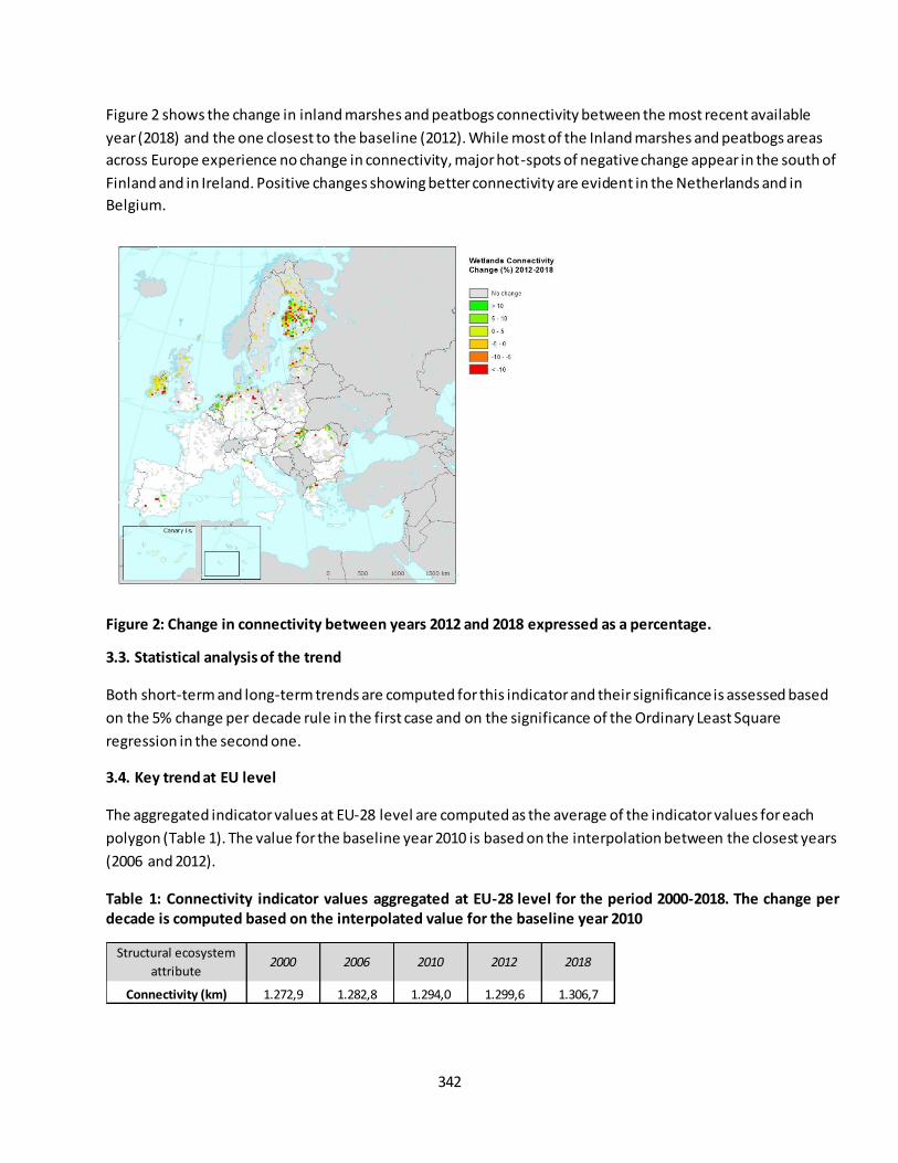
342
Figure 2 shows the change in inland marshes and peatbogs connectivity between the most recent available
year (2018) and the one closest to the baseline (2012). While most of the Inland marshes and peatbogs areas
across Europe experience no change in connectivity, major hot-spots of negative change appear in the south of
Finland and in Ireland. Positive changes showing better connectivity are evident in the Netherlands and in
Belgium.
Figure 2: Change in connectivity between years 2012 and 2018 expressed as a percentage.
3.3. Statistical analysis of the trend
Both short-term and long-term trends are computed for this indicator and their significance is assessed based
on the 5% change per decade rule in the first case and on the significance of the Ordinary Least Square
regression in the second one.
3.4. Key trend at EU level
The aggregated indicator values at EU-28 level are computed as the average of the indicator values for each
polygon (Table 1). The value for the baseline year 2010 is based on the interpolation between the closest years
(2006 and 2012).
Table 1: Connectivity indicator values aggregated at EU-28 level for the period 2000-2018. The change per
decade is computed based on the interpolated value for the baseline year 2010
Structural ecosystem
attribute2000 2006 2010 2012 2018
Connectivity (km) 1.272,9 1.282,8 1.294,0 1.299,6 1.306,7

343
The short-term trend (2012 to 2018) of the indicator for EU-28 is computed as the percentage change per
decade and equals to 0,91%; based on the 5% change per decade rule, it can be considered as stable.
The long-term trend of the indicator for EU-28 is computed in for the time range 2000-2018. The percentage
change per decade is 1,52% and it can be considered significantly negative (p<0.05): the indicator in this case
shows degradation (Figure 3) meaning a significant decrease in connectivity between inland marshes and
peatbogs in Europe.
Figure 3: Long-term trend of the connectivity indicator
3.5 Key trends observed at regional level
The trend of the indicator has also been analyzed at the level of biogeographical regions.
The lowest values of connectivity (highest values of average distance) are observed in the Mediterranean and
the Macaronesia regions. The regions with the best connectivity are the Alpine and the Boreal one, both with
an average value of distance below 1km (table 2).
For all of the regions, the short-term trend can be considered stable, since in none of the cases the observed
percentage change is significant. The only exception is the Steppic region, where the short-term trend shows a
decrease of average distance between inland marshes and peatbogs (increase of connectivity).
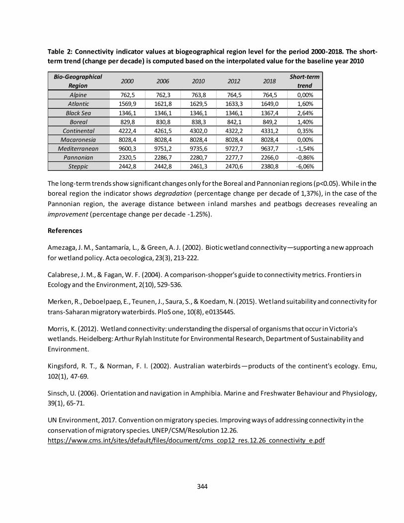
344
Table 2: Connectivity indicator values at biogeographical region level for the period 2000-2018. The short-
term trend (change per decade) is computed based on the interpolated value for the baseline year 2010
The long-term trends show significant changes only for the Boreal and Pannonian regions (p<0.05). While in the
boreal region the indicator shows degradation (percentage change per decade of 1,37%), in the case of the
Pannonian region, the average distance between inland marshes and peatbogs decreases revealing an
improvement (percentage change per decade -1.25%).
References
Amezaga, J. M., Santamaría, L., & Green, A. J. (2002). Biotic wetland connectivity—supporting a new approach
for wetland policy. Acta oecologica, 23(3), 213-222.
Calabrese, J. M., & Fagan, W. F. (2004). A comparison‐shopper's guide to connectivity metrics. Frontiers in Ecology and the Environment, 2(10), 529-536.
Merken, R., Deboelpaep, E., Teunen, J., Saura, S., & Koedam, N. (2015). Wetland suitability and connectivity for
trans-Saharan migratory waterbirds. PloS one, 10(8), e0135445.
Morris, K. (2012). Wetland connectivity: understanding the dispersal of organisms that occur in Victoria's
wetlands. Heidelberg: Arthur Rylah Institute for Environmental Research, Department of Sustainability and
Environment.
Kingsford, R. T., & Norman, F. I. (2002). Australian waterbirds—products of the continent's ecology. Emu,
102(1), 47-69.
Sinsch, U. (2006). Orientation and navigation in Amphibia. Marine and Freshwater Behaviour and Physiology,
39(1), 65-71.
UN Environment, 2017. Convention on migratory species. Improving ways of addressing connectivity in the
conservation of migratory species. UNEP/CSM/Resolution 12.26.
https://www.cms.int/sites/default/files/document/cms_cop12_res.12.26_connectivity_e.pdf
Bio-Geographical
Region2000 2006 2010 2012 2018
Short-term
trend
Alpine 762,5 762,3 763,8 764,5 764,5 0,00%
Atlantic 1569,9 1621,8 1629,5 1633,3 1649,0 1,60%
Black Sea 1346,1 1346,1 1346,1 1346,1 1367,4 2,64%
Boreal 829,8 830,8 838,3 842,1 849,2 1,40%
Continental 4222,4 4261,5 4302,0 4322,2 4331,2 0,35%
Macaronesia 8028,4 8028,4 8028,4 8028,4 8028,4 0,00%
Mediterranean 9600,3 9751,2 9735,6 9727,7 9637,7 -1,54%
Pannonian 2320,5 2286,7 2280,7 2277,7 2266,0 -0,86%
Steppic 2442,8 2442,8 2461,3 2470,6 2380,8 -6,06%

345
WORK DONE BY MARCO TROMBETTI, DANIA ABDUL MALAK AND ANA MARIN (ETC/ULS – UMA)
Version December 2019
346
Fact sheet 3.4.202: Percentage of wetlands covered by Natura 2000
1. General information
Thematic ecosystem assessment: Wetlands (Inland marshes and peatbogs)
Indicator class: Condition. Structural ecosystem attributes monitored under the EU Nature Directive
Name of the indicator: Percentage of inland marshes and peatbogs covered by Natura 2000 (%)
Units: percentage (%)
2. Data sources
Data holder: EEA
Weblinks:
o Corine Land Cover
https://www.eea.europa.eu/data-and-maps/data/corine-land-cover-accounting-layers#tab-
european-data
o Natura 2000 data - the European network of protected sites https://www.eea.europa.eu/data-
and-maps/data/natura-9#tab-gis-data
Year or time-series range 2000 / 2006 / 2012 / 2018
Versions
o Corine Land Cover 2000 (raster 100m) version 20 accounting layer, Jun. 2019
o Corine Land Cover 2006 (raster 100m) version 20 accounting layer, Jun. 2019
o Corine Land Cover 2012 (raster 100m) version 20 accounting layer, Jun. 2019
o Corine Land Cover 2018 (raster 100m) version 20 accounting layer, Jun. 2019
o Natura 2000 End 2018 – Shapefile
o Natura 2000 End 2013 rev1 - Shapefile
3. Assessment of the indicator
3.1. Short description of the scope of the indicator
At the EU level, the Nature Directive (Birds and Habitats) is the centerpiece of nature legislation and
biodiversity policy. The Natura 2000 sites are one of the Nature Directive's main tools that contribute to
ensuring the conservation of many species and habitats of EU interest. Its purpose is primarily to ensure the
conservation of targeted species and habitats of European interest.
Every country has designated Natura 2000 sites to help conserve the rare habitats and species present in their
territory. Progress in designating sites was slow at first but currently the protected area is over 18% of the EU’s
land area, constituting the largest network of protected areas in the world (EEA, 2012).
This indicator aims to evaluate how the percentage of inland marshes and peatbogs protected by Natura 2000
site has changed against time. The changes could be due to changes of ecosystem extent (e.g. related to
agricultural abandonment or urban expansion) or also be associated with changes in the protection zones,
either by the designation of new areas or by the modification of the limits of those already existin g. Both cases
are included in this assessment since the indicator values are derived overlapping the spatial information of
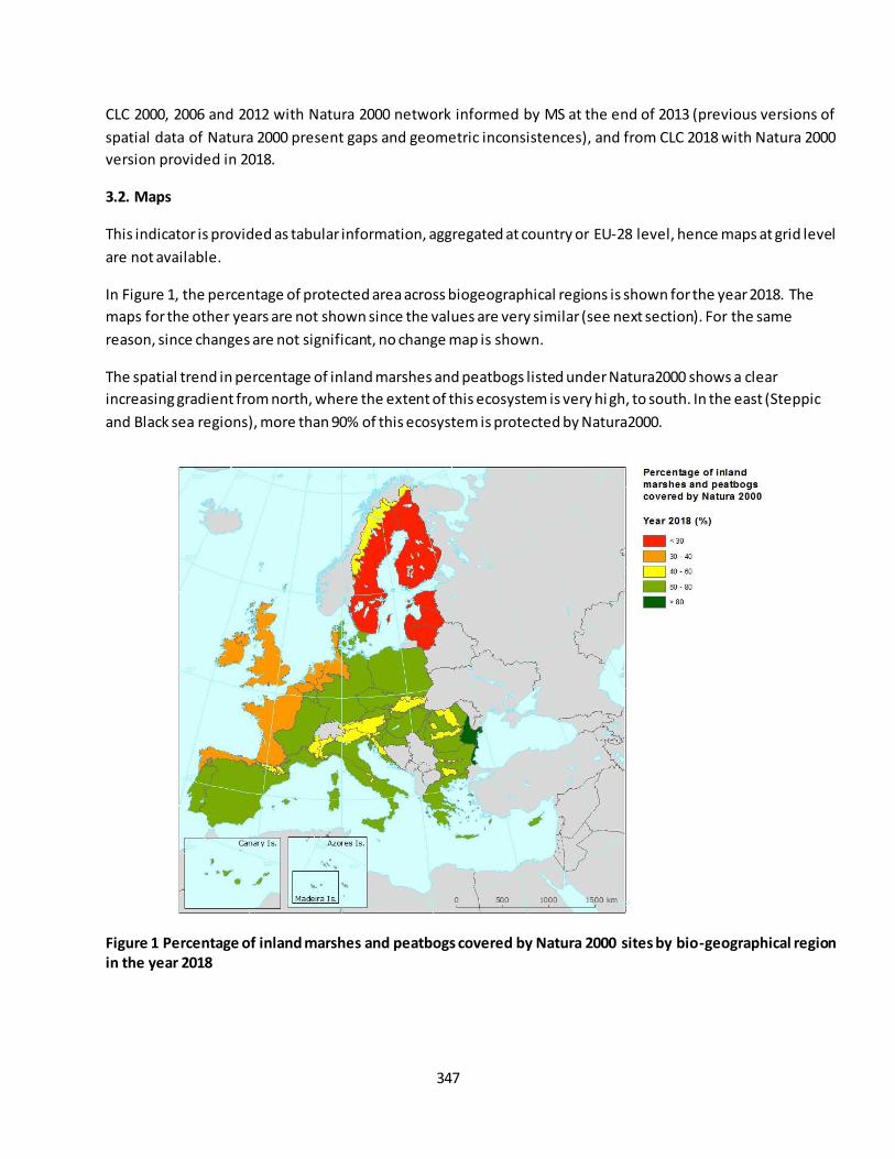
347
CLC 2000, 2006 and 2012 with Natura 2000 network informed by MS at the end of 2013 (previous versions of
spatial data of Natura 2000 present gaps and geometric inconsistences), and from CLC 2018 with Natura 2000
version provided in 2018.
3.2. Maps
This indicator is provided as tabular information, aggregated at country or EU-28 level, hence maps at grid level
are not available.
In Figure 1, the percentage of protected area across biogeographical regions is shown for the year 2018. The
maps for the other years are not shown since the values are very similar (see next section). For the same
reason, since changes are not significant, no change map is shown.
The spatial trend in percentage of inland marshes and peatbogs listed under Natura2000 shows a clear
increasing gradient from north, where the extent of this ecosystem is very hi gh, to south. In the east (Steppic
and Black sea regions), more than 90% of this ecosystem is protected by Natura2000.
Figure 1 Percentage of inland marshes and peatbogs covered by Natura 2000 sites by bio-geographical region
in the year 2018
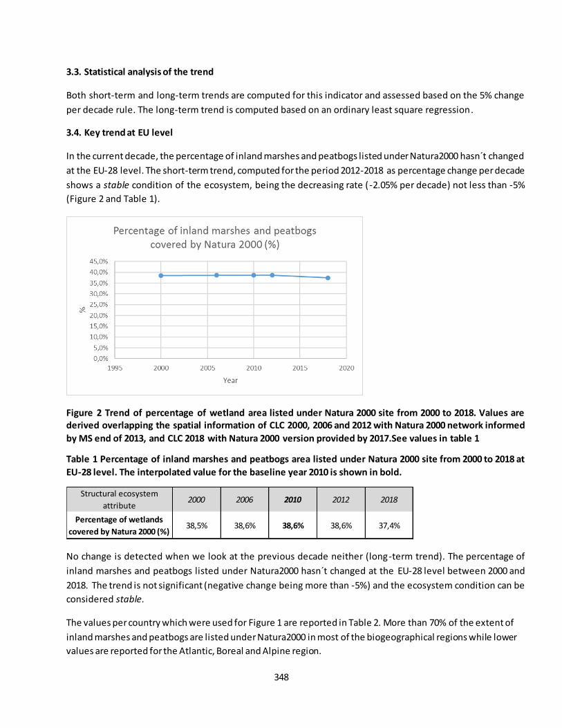
348
3.3. Statistical analysis of the trend
Both short-term and long-term trends are computed for this indicator and assessed based on the 5% change
per decade rule. The long-term trend is computed based on an ordinary least square regression.
3.4. Key trend at EU level
In the current decade, the percentage of inland marshes and peatbogs listed under Natura2000 hasn´t changed
at the EU-28 level. The short-term trend, computed for the period 2012-2018 as percentage change per decade
shows a stable condition of the ecosystem, being the decreasing rate (-2.05% per decade) not less than -5%
(Figure 2 and Table 1).
Figure 2 Trend of percentage of wetland area listed under Natura 2000 site from 2000 to 2018. Values are
derived overlapping the spatial information of CLC 2000, 2006 and 2012 with Natura 2000 network informed
by MS end of 2013, and CLC 2018 with Natura 2000 version provided by 2017.See values in table 1
Table 1 Percentage of inland marshes and peatbogs area listed under Natura 2000 site from 2000 to 2018 at
EU-28 level. The interpolated value for the baseline year 2010 is shown in bold.
No change is detected when we look at the previous decade neither (long-term trend). The percentage of
inland marshes and peatbogs listed under Natura2000 hasn´t changed at the EU-28 level between 2000 and
2018. The trend is not significant (negative change being more than -5%) and the ecosystem condition can be
considered stable.
The values per country which were used for Figure 1 are reported in Table 2. More than 70% of the extent of
inland marshes and peatbogs are listed under Natura2000 in most of the biogeographical regions while lower
values are reported for the Atlantic, Boreal and Alpine region.
Structural ecosystem
attribute2000 2006 2010 2012 2018
Percentage of wetlands
covered by Natura 2000 (%)38,5% 38,6% 38,6% 38,6% 37,4%
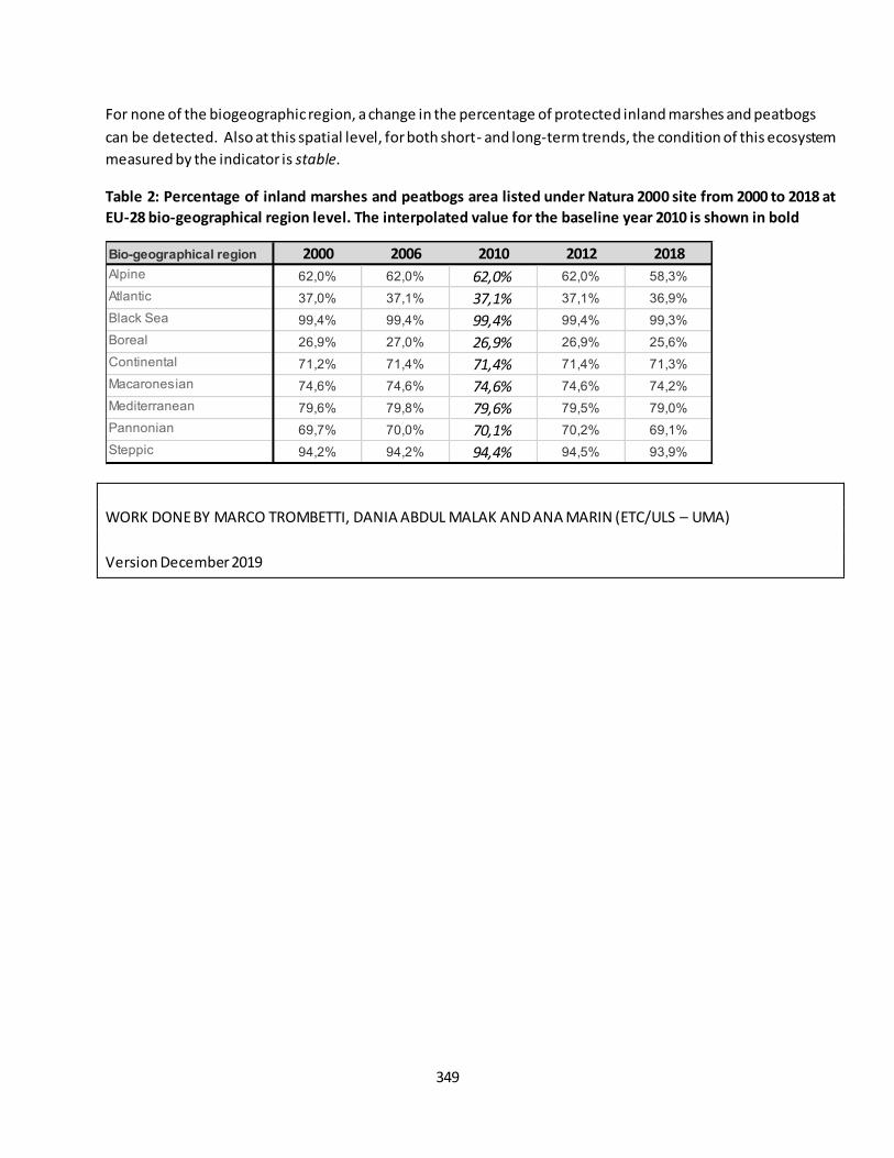
349
For none of the biogeographic region, a change in the percentage of protected inland marshes and peatbogs
can be detected. Also at this spatial level, for both short- and long-term trends, the condition of this ecosystem
measured by the indicator is stable.
Table 2: Percentage of inland marshes and peatbogs area listed under Natura 2000 site from 2000 to 2018 at
EU-28 bio-geographical region level. The interpolated value for the baseline year 2010 is shown in bold
WORK DONE BY MARCO TROMBETTI, DANIA ABDUL MALAK AND ANA MARIN (ETC/ULS – UMA)
Version December 2019
Bio-geographical region 2000 2006 2010 2012 2018
Alpine 62,0% 62,0% 62,0% 62,0% 58,3%
Atlantic 37,0% 37,1% 37,1% 37,1% 36,9%
Black Sea 99,4% 99,4% 99,4% 99,4% 99,3%
Boreal 26,9% 27,0% 26,9% 26,9% 25,6%
Continental 71,2% 71,4% 71,4% 71,4% 71,3%
Macaronesian 74,6% 74,6% 74,6% 74,6% 74,2%
Mediterranean 79,6% 79,8% 79,6% 79,5% 79,0%
Pannonian 69,7% 70,0% 70,1% 70,2% 69,1%
Steppic 94,2% 94,2% 94,4% 94,5% 93,9%
350
Fact sheet 3.4.203: Percentage of inland marshes and peatbogs covered by Natura 2000
1. General information
Thematic ecosystem assessment: Inland marshes and peatbogs
Indicator class: Condition. Structural ecosystem attributes monitored under the EU Nature Directive
Name of the indicator: Percentage of inland marshes and peatbogs covered by Natura 2000 (%)
Units: percentage (%)
2. Data sources
Data holder: EEA
Weblinks:
o Corine Land Cover
https://www.eea.europa.eu/data-and-maps/data/corine-land-cover-accounting-layers#tab-
european-data
o CDDA data - Nationally designated areas
https://www.eea.europa.eu/data-and-maps/data/nationally-designated-areas-national-cdda-
13
Year or time-series range 2000 / 2006 / 2012 / 2018
Versions
o Corine Land Cover 2000 (raster 100m) version 20 accounting layer, Jun. 2019
o Corine Land Cover 2006 (raster 100m) version 20 accounting layer, Jun. 2019
o Corine Land Cover 2012 (raster 100m) version 20 accounting layer, Jun. 2019
o Corine Land Cover 2018 (raster 100m) version 20 accounting layer, Jun. 2019
o CDDA 2018 – Shapefile
3. Assessment of the indicator
3.1. Short description of the scope of the indicator
The CDDA database - nationally designated areas - is the official source of protected area information from the
39 European countries members of EEA to the World Database of Protected Areas (WDPA). A 'nationally
designated protected area' is an area designated by a national designation instrument, based on national
legislation.
This indicator aims to evaluate how the percentage of inland marshes and peatbogs protected by the nationally
designated areas has changed over time. The changes could be due to changes of ecosystem extent, for
example due to agricultural abandonment, or also be associated with changes in the protection zones, either
by the designation of new areas or by the modification of the limits of those already existing. This indicator
focuses only on the trend in the percentage of protected area due to the change in the ecosystem extent. The
CDDA digital maps are being reported by the countries from 2002, however this voluntary provision could
trigger restrictions on the fully publication of the datasets. Consequently, the CDDA spatial information is not
consistent over time.
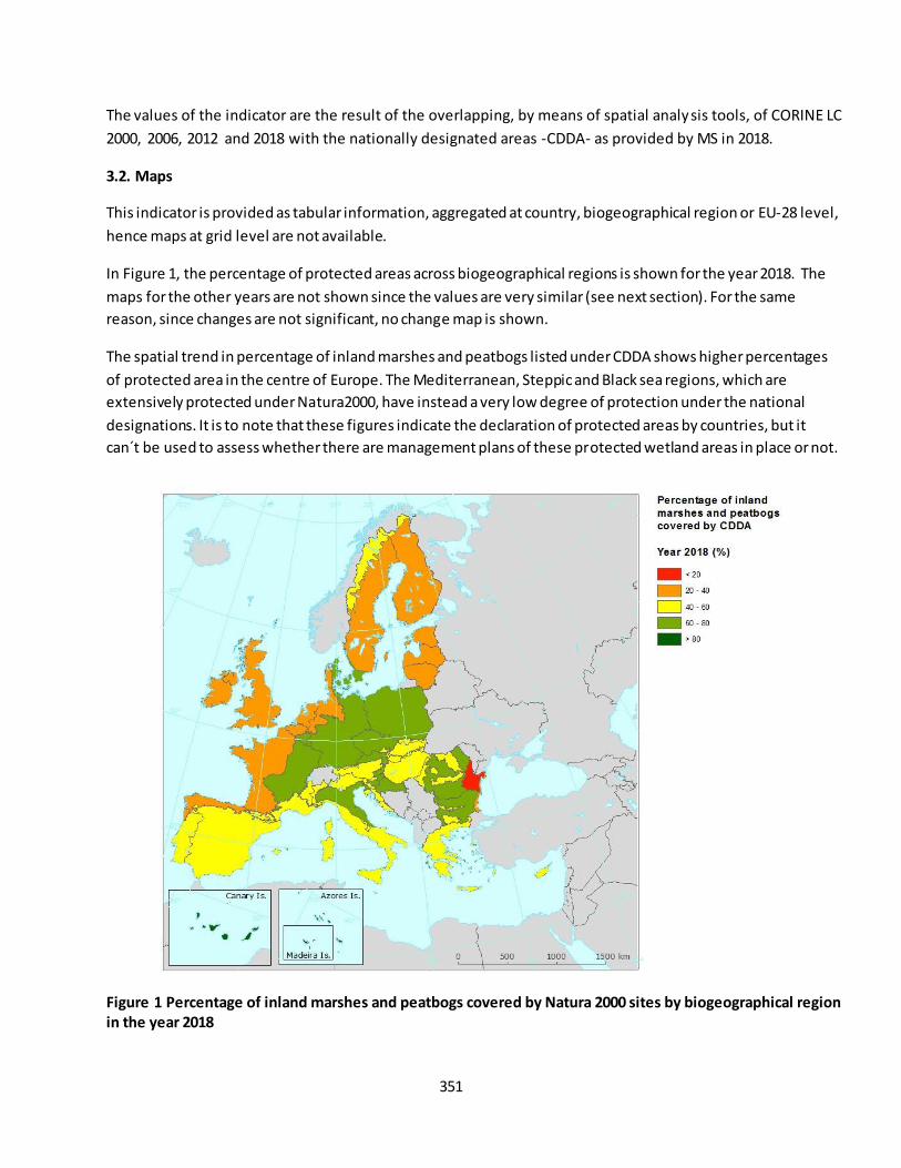
351
The values of the indicator are the result of the overlapping, by means of spatial analysis tools, of CORINE LC
2000, 2006, 2012 and 2018 with the nationally designated areas -CDDA- as provided by MS in 2018.
3.2. Maps
This indicator is provided as tabular information, aggregated at country, biogeographical region or EU-28 level,
hence maps at grid level are not available.
In Figure 1, the percentage of protected areas across biogeographical regions is shown for the year 2018. The
maps for the other years are not shown since the values are very similar (see next section). For the same
reason, since changes are not significant, no change map is shown.
The spatial trend in percentage of inland marshes and peatbogs listed under CDDA shows higher percentages
of protected area in the centre of Europe. The Mediterranean, Steppic and Black sea regions, which are
extensively protected under Natura2000, have instead a very low degree of protection under the national
designations. It is to note that these figures indicate the declaration of protected areas by countries, but it
can´t be used to assess whether there are management plans of these protected wetland areas in place or not.
Figure 1 Percentage of inland marshes and peatbogs covered by Natura 2000 sites by biogeographical region
in the year 2018
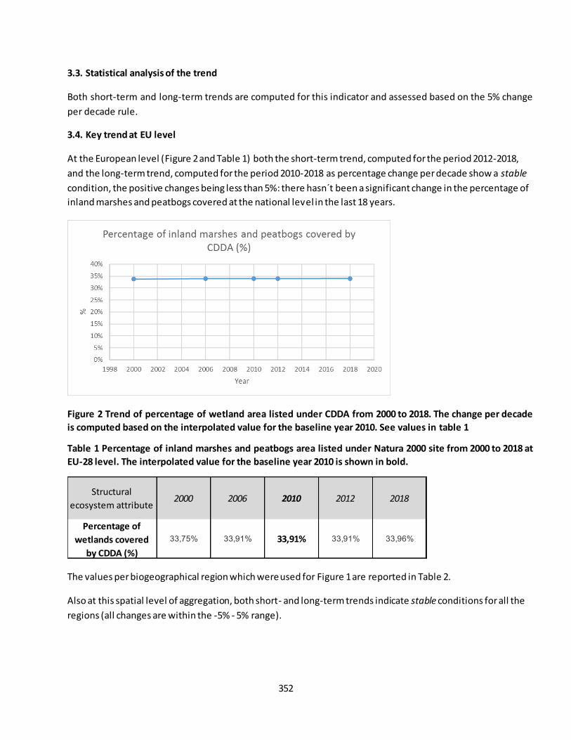
352
3.3. Statistical analysis of the trend
Both short-term and long-term trends are computed for this indicator and assessed based on the 5% change
per decade rule.
3.4. Key trend at EU level
At the European level (Figure 2 and Table 1) both the short-term trend, computed for the period 2012-2018,
and the long-term trend, computed for the period 2010-2018 as percentage change per decade show a stable
condition, the positive changes being less than 5%: there hasn´t been a significant change in the percentage of
inland marshes and peatbogs covered at the national level in the last 18 years.
Figure 2 Trend of percentage of wetland area listed under CDDA from 2000 to 2018. The change per decade
is computed based on the interpolated value for the baseline year 2010. See values in table 1
Table 1 Percentage of inland marshes and peatbogs area listed under Natura 2000 site from 2000 to 2018 at
EU-28 level. The interpolated value for the baseline year 2010 is shown in bold.
The values per biogeographical region which were used for Figure 1 are reported in Table 2.
Also at this spatial level of aggregation, both short- and long-term trends indicate stable conditions for all the
regions (all changes are within the -5% - 5% range).
Structural
ecosystem attribute2000 2006 2010 2012 2018
Percentage of
wetlands covered
by CDDA (%)
33,75% 33,91% 33,91% 33,91% 33,96%
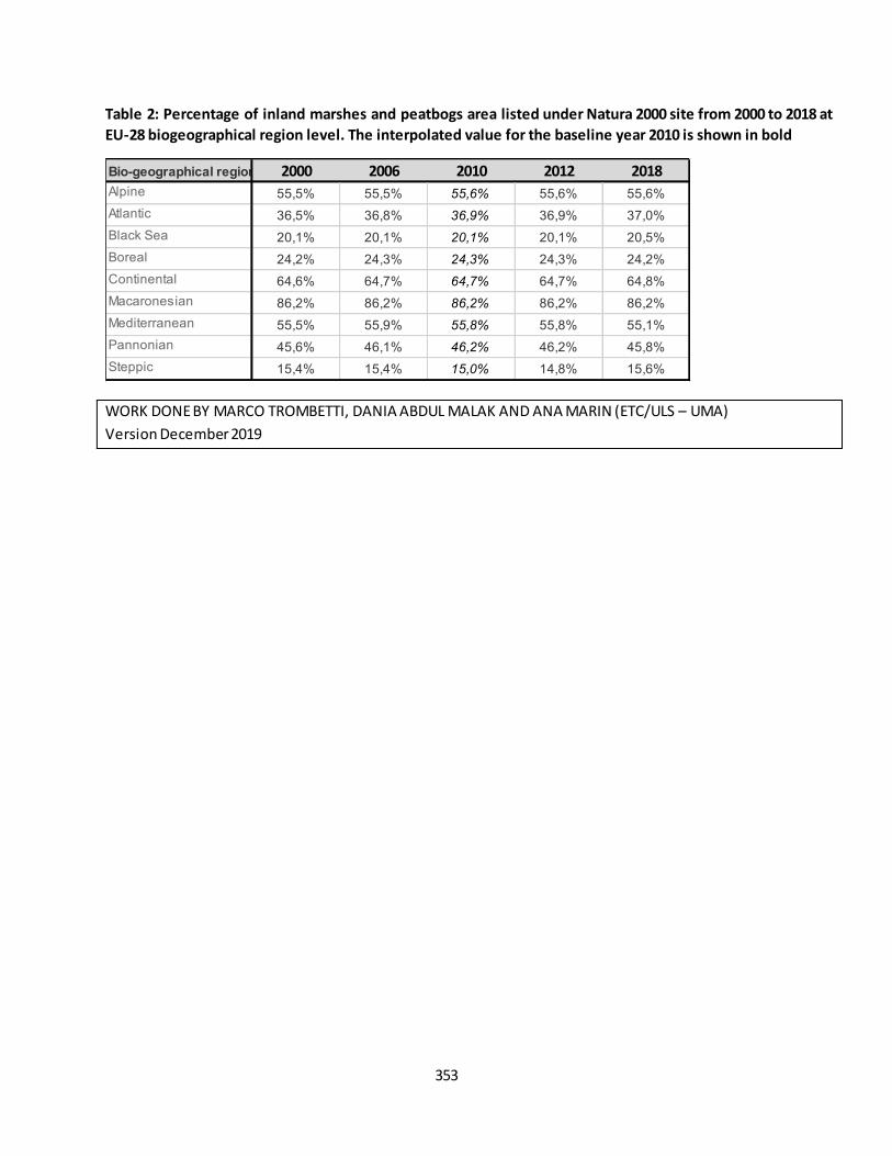
353
Table 2: Percentage of inland marshes and peatbogs area listed under Natura 2000 site from 2000 to 2018 at
EU-28 biogeographical region level. The interpolated value for the baseline year 2010 is shown in bold
WORK DONE BY MARCO TROMBETTI, DANIA ABDUL MALAK AND ANA MARIN (ETC/ULS – UMA)
Version December 2019
Bio-geographical region 2000 2006 2010 2012 2018
Alpine 55,5% 55,5% 55,6% 55,6% 55,6%
Atlantic 36,5% 36,8% 36,9% 36,9% 37,0%
Black Sea 20,1% 20,1% 20,1% 20,1% 20,5%
Boreal 24,2% 24,3% 24,3% 24,3% 24,2%
Continental 64,6% 64,7% 64,7% 64,7% 64,8%
Macaronesian 86,2% 86,2% 86,2% 86,2% 86,2%
Mediterranean 55,5% 55,9% 55,8% 55,8% 55,1%
Pannonian 45,6% 46,1% 46,2% 46,2% 45,8%
Steppic 15,4% 15,4% 15,0% 14,8% 15,6%
354
Fact sheet 3.5.101: Land take (Heathlands and Shrub / Sparsely Vegetated Land)
1. General information
Thematic ecosystem assessment: Heathlands and Shrub / Sparsely Vegetated Land
Indicator class: Pressure. Habitat conversion and degradation (Land conversion)
Name of the indicator: Land take
Units: (km2/6 year)
The extent of heathlands and shrubs as reported in Corine Land Cover as Moors and heathlands (322)
and Sclerophyllous vegetation (323) and sparsely vegetated lands as Beaches, dunes, sands (331), Bare
rocks (332), Sparsely vegetated areas (333), Burnt areas (334), Glaciers and perpetual snow (335)
(MAES, 2013)
2. Data sources
The indicator based on readily available data: Land take indicator. EEA CSI 014
Data holder: EEA
Weblink https://www.eea.europa.eu/data-and-maps/dashboards/land-take-statistics
Time-series range: 2000 - 2018
Version: EEA Land Take viewer version end June 2019 (based on CLC v20)
Access date 04/2020
Reference:
3. Assessment of the indicator
3.1. Short description of the scope of the indicator.
The main objective of this indicator is to measure the pressure from the development of urban and other
artificial land use on natural and managed landscapes that are necessary 'to protect and restore the
functioning of natural systems and halt the loss of biodiversity' (Sixth Environment Action Programme (6th EAP,
COM(2001)31)).
Land use in Europe is driven by several factors such as the increasing demand for living space per person, the
link between economic activity, increased mobility and the growth of transport infrastructure, which usually
result in urban expansion.
The impact of urbanisation depends on the area of land taken and on the intensity of land use, for example,
the degree of soil sealing and the population density. Land take by urban areas and i nfrastructure is generally
irreversible and results in soil sealing, i.e. the loss of soil resources due to the covering of land for housing,
roads or other construction work. Converted areas become highly specialised in terms of land use and support
few functions related to socio-economic activities and housing. Urban land take consumes mostly agricultural
land, but also reduces space for habitats and ecosystems that provide important services such as the regulation
of the water balance and protection against floods, particularly if soil is highly sealed. Land occupied by man-
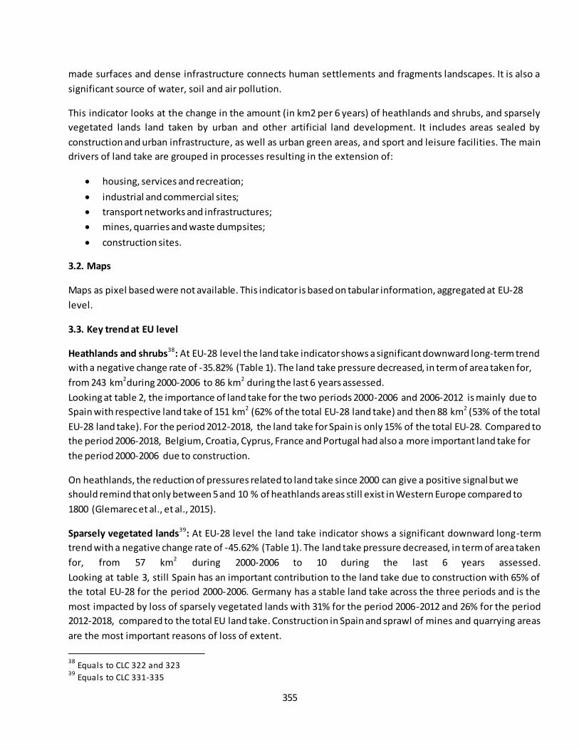
355
made surfaces and dense infrastructure connects human settlements and fragments landscapes. It is also a
significant source of water, soil and air pollution.
This indicator looks at the change in the amount (in km2 per 6 years) of heathlands and shrubs, and sparsely
vegetated lands land taken by urban and other artificial land development. It includes areas sealed by
construction and urban infrastructure, as well as urban green areas, and sport and leisure facilities. The main
drivers of land take are grouped in processes resulting in the extension of:
housing, services and recreation;
industrial and commercial sites;
transport networks and infrastructures;
mines, quarries and waste dumpsites;
construction sites.
3.2. Maps
Maps as pixel based were not available. This indicator is based on tabular information, aggregated at EU-28
level.
3.3. Key trend at EU level
Heathlands and shrubs38
: At EU-28 level the land take indicator shows a significant downward long-term trend
with a negative change rate of -35.82% (Table 1). The land take pressure decreased, in term of area taken for,
from 243 km2during 2000-2006 to 86 km2 during the last 6 years assessed.
Looking at table 2, the importance of land take for the two periods 2000-2006 and 2006-2012 is mainly due to
Spain with respective land take of 151 km2 (62% of the total EU-28 land take) and then 88 km2 (53% of the total
EU-28 land take). For the period 2012-2018, the land take for Spain is only 15% of the total EU-28. Compared to
the period 2006-2018, Belgium, Croatia, Cyprus, France and Portugal had also a more important land take for
the period 2000-2006 due to construction.
On heathlands, the reduction of pressures related to land take since 2000 can give a positive signal but we
should remind that only between 5 and 10 % of heathlands areas still exist in Western Europe compared to
1800 (Glemarec et al., et al., 2015).
Sparsely vegetated lands39
: At EU-28 level the land take indicator shows a significant downward long-term
trend with a negative change rate of -45.62% (Table 1). The land take pressure decreased, in term of area taken
for, from 57 km2 during 2000-2006 to 10 during the last 6 years assessed.
Looking at table 3, still Spain has an important contribution to the land take due to construction with 65% of
the total EU-28 for the period 2000-2006. Germany has a stable land take across the three periods and is the
most impacted by loss of sparsely vegetated lands with 31% for the period 2006-2012 and 26% for the period
2012-2018, compared to the total EU land take. Construction in Spain and sprawl of mines and quarrying areas
are the most important reasons of loss of extent.
38
Equals to CLC 322 and 323 39
Equals to CLC 331-335
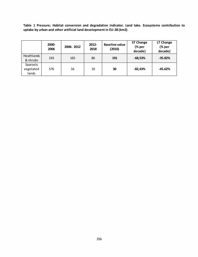
356
Table 1 Pressure; Habitat conversion and degradation indicator. Land take. Ecosystems contribution to
uptake by urban and other artificial land development in EU-28 (km2)
2000-
2006 2006- 2012
2012-
2018
Baseline value
(2010)
ST Change
(% per
decade)
LT Change
(% per
decade)
Heathlands & shrubs
243 165 86 191 -68,53% -35.82%
Sparsely vegetated
lands 576 16 10 30 -82,43% -45.62%
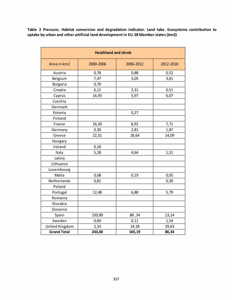
357
Table 2 Pressure; Habitat conversion and degradation indicator. Land take. Ecosystems contribution to
uptake by urban and other artificial land development in EU-28 Member states (km2)
Heathland and shrub
Area in km2 2000-2006 2006-2012 2012-2018
Austria 0,78 0,88 0,52
Belgium 7,47 3,05 3,61
Bulgaria 0,70 Croatia 6,12 2,31 0,51
Cyprus 16,93 5,97 6,07
Czechia Denmark Estonia
0,27 Finland
France 16,30 8,92 7,71
Germany 0,30 2,81 1,87
Greece 22,31 26,64 14,09
Hungary Ireland 0,18
Italy 5,28 4,64 1,51
Latvia Lithuania Luxembourg Malta 0,08 0,19 0,05
Netherlands 0,81
0,30
Poland Portugal 12,48 6,88 5,79
Romania Slovakia Slovenia Spain 150,89 88 ,34 13,14
Sweden 0,04 0,11 1,54
United Kingdom 2,33 14,18 29,63
Grand Total 243,00 165,19 86,34

358
Table 3 Pressure; Habitat conversion and degradation indicator. Land take. Ecosystems contribution to
uptake by urban and other artificial land development in EU-28 Member states (km2)
Sparsely vegetated land
Area in km2 2000-2006 2006-2012 2012-2018
Austria
0,47 0,22
Belgium
Bulgaria 0,24
Croatia 1,38 0,32 0,69
Cyprus 0,44 0,66 0,11
Czechia
Denmark 0,95
0,32
Estonia 0,17 0,30
Finland 0,07 0,30
France 0,65 0,73 1,19
Germany 5,17 5,14 2,73
Greece 1,60 0,54 0,85
Hungary
Ireland
Italy 1,06 0,19 0,57
Latvia
0,34
Lithuania
Luxembourg
Malta
Netherlands
0,01
Poland
Portugal 6,22 1,89 0,43
Romania 0,66 0,25 0,50
Slovakia
Slovenia
Spain 38,34 4,41 2,35
Sweden 0,47 0,31
United Kingdom 0,21 1,09
Grand Total 57,63 16,60 10,31

359
References
Glemarec, E., et al., 2015, Les landes du Massif armoricain ? Approche phytosociologique et conservatoire. Les
cahiers scientifiques et techniques du CBN Brest.
360
Fact sheet 3.5.102: Land cover change due to fire (Heathlands and Shrub)
1. General information
Thematic ecosystem assessment: Heathlands and Shrub
Indicator class: Pressure. Habitat conversion and degradation (Land conversion)
Name of the indicator: Land cover change due to fire
Units: (km2/6 year)
The extent of heathlands and shrubs as reported in Corine Land Cover as Moors and heathlands (322)
and Sclerophyllous vegetation (323) (MAES, 2013)
2. Data sources
The indicator based on readily available data: LEAC - Land and Ecosystem Accounting
Data holder: EEA
Weblink
https://tableau.discomap.eea.europa.eu/t/Landonline/views/LEACCube2018Advanced/LEAC2018
Time-series range: 2000 - 2018
Version: EEA under development
Access date 04/2020
Reference:
3. Assessment of the indicator
3.1. Short description of the scope of the indicator.
Heathlands are a peculiar habitat of Western Europe, and have markedly declined over the last decades. Most
of the remaining fragments are now protected, but are still threatened by the encroachment of pioneer trees
such as birches and poplars. Controlled burning and mechanical cutting are commonly used to control pioneer
trees in northern countries, but there is little understanding of their effects towards the southern edge of the
range of European heathlands. Even if fire can be prescribed for management, there is a need of combination
with mowing and grazing (Borghesio, 2014).
Often shrublands suffer from lack of management, polluting aerial deposition, overgrazing, excessive wildfires,
or size reduction or fragmentation due to different land uses. Climate change may add to these threats and
make these ecosystems even more vulnerable. In the Mediterranean shrubland both warming and drought
led to a shift in the species composition, which might lead to a reduction in biodiversity and an increased threat
of wildfires (Wessel et al, 2004).
3.2. Maps
Maps as pixel based were not available. This indicator is based on tabular information, aggregated at EU-28
level.
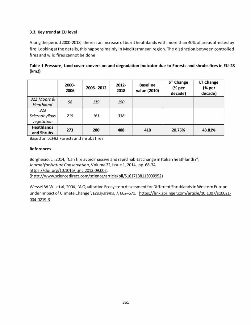
361
3.3. Key trend at EU level
Along the period 2000-2018, there is an increase of burnt heathlands with more than 40% of areas affected by
fire. Looking at the details, this happens mainly in Mediterranean region. The distinction between controlled
fires and wild fires cannot be done.
Table 1 Pressure; Land cover conversion and degradation indicator due to Forests and shrubs fires in EU-28
(km2)
2000-
2006 2006- 2012
2012-
2018
Baseline
value (2010)
ST Change
(% per
decade)
LT Change
(% per
decade)
322 Moors &
Heathland 58 119 150
323
Sclerophyllous
vegetation
215 161 338
Heathlands
and Shrubs 273 280 488 418 20.75% 43.81%
Based on LCF92 Forests and shrubs fires
References
Borghesio, L., 2014, ‘Can fire avoid massive and rapid habitat change in Italian heathlands? ’, Journal for Nature Conservation, Volume 22, Issue 1, 2014, pp. 68-74, https://doi.org/10.1016/j.jnc.2013.09.002. (http://www.sciencedirect.com/science/article/pii/S1617138113000952) Wessel W.W., et al, 2004, ‘A Qualitative Ecosystem Assessment for Different Shrublands in Western Europe
under Impact of Climate Change’, Ecosystems, 7, 662–671. https://link.springer.com/article/10.1007/s10021-
004-0219-3

362
Fact sheet 3.5.103: Exposure to eutrophication indicator
1. General information
Thematic ecosystem assessment: Heathlands and Shrub / Sparsely Vegetated Land
Indicator class: Pollution and nutrition enrichment
Name of the indicator: Exposure to eutrophication
Units: mol nitrogen eq/ha/y
2. Data sources
Data holder: EMEP
Weblink: https://projects.eionet.europa.eu/eea-ecosystem-assessments/library/restricted/air-
pollution/emep-data-deposition-and-air-pollution
Year or time-series range: 2000, 2005, 2010, 2016
Version: 2018
Access date: 19/07/2019
Reference: EMEP Status Report 1/2018, "Transboundary particulate matter, photo-oxidants, acidifying
and eutrophying components", Joint MSC-W & CCC & CEIP Report
3. Assessment of the indicator
3.1.Short description of the scope of the indicator
The indicator reports for each grid cell the so-called ’average accumulated exceedance’ (AAE), computed as the
area-weighted mean of the exceedances of the critical loads for eutrophication in that grid cell (EMEP, 2018).
Elevated atmospheric nitrogen (N) deposition is a major driver of change, altering the structure/functioning of
nutrient-poor heathlands over Europe. These effects may vary across the ecosystem's distribution, especially at
the range limits, as heathlands are highly vulnerable to land-use changes combined with present climate
change (Taboeda, 2018).
3.2. Maps
This indicator is based on tabular information, aggregated at EU-28 level.
3.3. Statistical analysis of the trend
Both short-term (2010-2016) and long-term (2000-2016) trends are computed for this indicator.
The short-term trend is assessed based on the non-parametric Wilcoxon test40 with bootstrapping, used in this
case to compare the EU aggregated value based on two spatial datasets.
40
The Wilcoxon test is a non-parametric statistical hypothesis test used to compare two related samples (paired difference test) to assess whether their population mean ranks differ. It is used in this case to compare EU-28 aggregated
values based on two spatial datasets
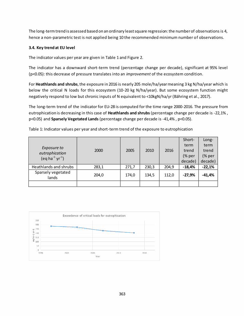
363
The long-term trend is assessed based on an ordinary least square regression: the number of observations is 4,
hence a non-parametric test is not applied being 10 the recommended minimum number of observations.
3.4. Key trend at EU level
The indicator values per year are given in Table 1 and Figure 2.
The indicator has a downward short-term trend (percentage change per decade), significant at 95% level
(p<0.05): this decrease of pressure translates into an improvement of the ecosystem condition.
For Heathlands and shrubs, the exposure in 2016 is nearly 205 mole/ha/year meaning 3 kg N/ha/year which is
below the critical N loads for this ecosystem (10-20 kg N/ha/year). But some ecosystem function might
negatively respond to low but chronic inputs of N equivalent to <10kgN/ha/yr (Bähring et al., 2017).
The long-term trend of the indicator for EU-28 is computed for the time range 2000-2016. The pressure from
eutrophication is decreasing in this case of Heathlands and shrubs (percentage change per decade is -22,1% ,
p<0.05) and Sparsely Vegetated Lands (percentage change per decade is -41,4% , p<0.05).
Table 1: Indicator values per year and short-term trend of the exposure to eutrophication
Exposure to
eutrophication
(eq ha−1 yr−1)
2000 2005 2010 2016
Short-term trend (% per
decade)
Long-term trend (% per
decade)
Heathlands and shrubs 283,1 271,7 230,3 204,9 -18,4% -22,1%
Sparsely vegetated lands
204,0 174,0 134,5 112,0 -27,9% -41,4%
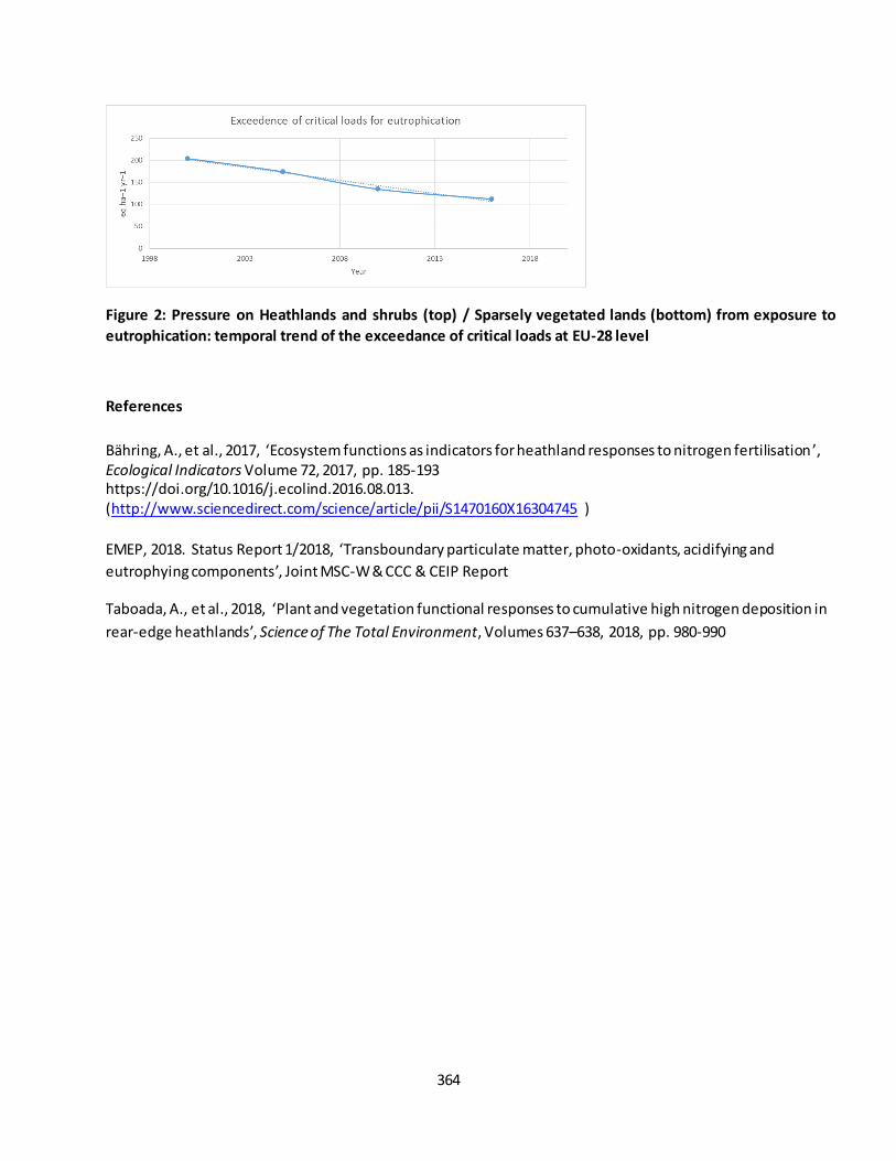
364
Figure 2: Pressure on Heathlands and shrubs (top) / Sparsely vegetated lands (bottom) from exposure to
eutrophication: temporal trend of the exceedance of critical loads at EU-28 level
References
Bähring, A., et al., 2017, ‘Ecosystem functions as indicators for heathland responses to nitrogen fertilisation ’, Ecological Indicators Volume 72, 2017, pp. 185-193 https://doi.org/10.1016/j.ecolind.2016.08.013. (http://www.sciencedirect.com/science/article/pii/S1470160X16304745 )
EMEP, 2018. Status Report 1/2018, ‘Transboundary particulate matter, photo-oxidants, acidifying and
eutrophying components’, Joint MSC-W & CCC & CEIP Report
Taboada, A., et al., 2018, ‘Plant and vegetation functional responses to cumulative high nitrogen deposition in
rear-edge heathlands’, Science of The Total Environment, Volumes 637–638, 2018, pp. 980-990
365
Fact sheet 3.5.201: Percentage of Heathlands and shrubs / Sparsely vegetated lands covered by
Natura 2000 sites and/or Nationally designated areas - CDDA
1. General information
Thematic ecosystem assessment: Heathlands and Shrub / Sparsely Vegetated Land
Indicator class: Condition. Structural ecosystem attributes monitored under the EU nature directives
and national legislations
Name of the indicator: Percentage of heathlands and shrubs / sparsely vegetated lands covered by
Natura 2000 sites and/or Nationally designated areas -CDDA- (%)
Units: percentage (%)
The extent of heathlands and shrubs as reported in Corine Land Cover as Moors and heathlands (322)
and Sclerophyllous vegetation (323) and sparsely vegetated lands as Beaches, dunes, sands (331), Bare
rocks (332), Sparsely vegetated areas (333), Burnt areas (334), Glaciers and perpetual snow (335)
(MAES, 2013)
2. Data sources
Data holder: EEA
Weblinks:
o Corine Land Cover
https://sdi.eea.europa.eu/catalogue/srv/eng/catalog.search#/metadata/b90803ac-57db-4653-
b393-3e04445a7035
o CDDA data - Nationally designated areashttps://www.eea.europa.eu/data-and-
maps/data/nationally-designated-areas-national-cdda-13
Year or time-series range 2000 / 2006 / 2012 / 2018
Versions
o Corine Land Cover 2000 (raster 100m) version 20 accounting layer, Jun. 2019
o Corine Land Cover 2006 (raster 100m) version 20 accounting layer, Jun. 2019
o Corine Land Cover 2012 (raster 100m) version 20 accounting layer, Jun. 2019
o Corine Land Cover 2018 (raster 100m) version 20 accounting layer, Jun. 2019
o CDDA 2018 – Shapefile
o Natura 2000 End 2018 - Shapefile
3. Assessment of the indicator
3.1. Short description of the scope of the indicator
The ‘nationally designated protected area' is an area designated by a national designation instrument, based
on national legislation. If a country has included sites designated under international agreements such as the
EU Birds and Habitats Directives, or the Bern or Ramsar Convention in its legislation, those figures ove rlap
spatially. The degree of overlap between Natura 2000 sites and nationally designated sites illustrates the
extent to which countries have made use of their nationally designated areas to underpin Natura 2000 and to
what extent Natura 2000 sites extend beyond national systems.
366
The overlap of Natura 2000 boundaries with the boundaries of nationally designated sites shows very different
patterns across the EU. But it should be stressed that while the Natura 2000 digital maps fully reflect the actual
extension of the network, the CDDA digital maps only reflects what countries have reported on a voluntary
basis to the European Environment Agency.
This indicator aims to evaluate how the percentage of Heathlands and Shrub / Sparsely Vegetated Land
covered by both networks has being changed against time. As based on the situation of Natura2000 network
and nationally designated areas network in 2018, this indicator focuses only on the trend due to the change in
the ecosystem extent. The values of the indicator are the result of the overlapping, by means of spatial analysis
tools, of CORINE LC 2000, 2006, 2012 and 2018 with Natura 2000 network informed by MS end of 2018 and the
nationally designated areas -CDDA- informed by MS in 2018.
3.2. Maps
Maps as pixel based were not available. This indicator is based on tabular information aggregated at country
and EU-28 level.
3.3. Key trend at EU level
As detailed in table 1, around 40% of heathlands and shrubs are covered by N2000 network and around 32%
are under national designations.
Around 53% of sparsely vegetated lands are covered by N2000 network and around 44% are under national
designations.
Table 1 – Share of Heathlands covered by Natura 2000 and by national designations
2000 2006 2012 2018
% Heathlands in N2K (*) 40.50% 40.55% 40.60% 40.66%
% Heathlands in CDDA (**) 31.95% 32.05% 32.11% 32.20%
2000 2006 2012 2018
% SVL in N2K (*) 52.99% 53.11% 53.17% 52.61%
% SVL in CDDA (**) 43.90% 43.89% 44.04% 43.39%
(*) designated only by N2K and by the overlapping of both (N2K and CDDA)
(**)designated only by nationally designated areas and by the overlapping of both (N2K and CDDA)
3.4. Key status at biogeographic level
The share of ecosystems under EU or national legislations is also stable at biogeographic level since 2000. In
2018, the share of heathlands and shrub under Natura 2000 designation are above 74% in the Pannonian and
Boreal regions. Between 45 and 55% in Alpine, Continental and Macaronesian regions (figure 1). The share
under national designations is about 75% in the Boreal region and between 45 and 56% in the Macaronesian,
Continental, Alpine and Atlantic regions. In the Macaronesian region, bushy sclerophyllous shrubs are
predominant.
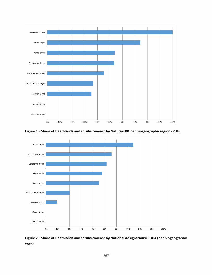
367
Figure 1 – Share of Heathlands and shrubs covered by Natura2000 per biogeographic region - 2018
Figure 2 – Share of Heathlands and shrubs covered by National designations (CDDA) per biogeographic
region
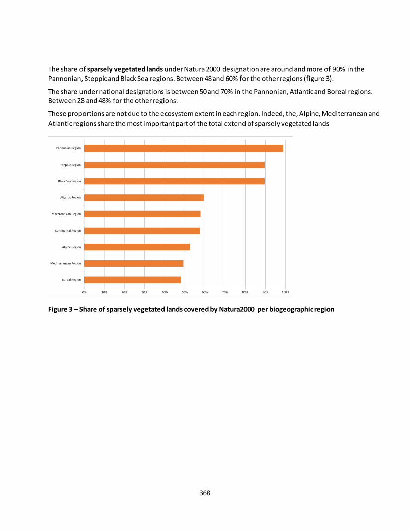
368
The share of sparsely vegetated lands under Natura 2000 designation are around and more of 90% in the Pannonian, Steppic and Black Sea regions. Between 48 and 60% for the other regions (figure 3).
The share under national designations is between 50 and 70% in the Pannonian, Atlantic and Boreal regions. Between 28 and 48% for the other regions.
These proportions are not due to the ecosystem extent in each region. Indeed, the, Alpine, Mediterranean and
Atlantic regions share the most important part of the total extend of sparsely vegetated lands
Figure 3 – Share of sparsely vegetated lands covered by Natura2000 per biogeographic region
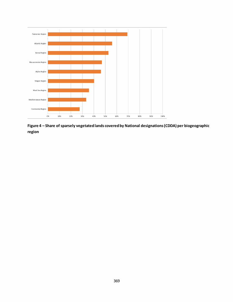
369
Figure 4 – Share of sparsely vegetated lands covered by National designations (CDDA) per biogeographic
region
370
Fact sheet 3.5.203: Article 17 habitat conservation status
1. General information
Thematic ecosystem assessment: all
Indicator class: Conservation status and Structural ecosystem attributes monitored under the EU
nature directives
Name of the indicator: Conservation status and trends per habitat group
Units: %
2. Data sources
Data holder: EEA
Weblink: not online yet
Year or time-series range: 2013-2018
Version 17/04/2020
Access date:
Reference (paper, report, …): State of Nature in the EU. Results from reporting under the Nature Directives 2013-2018 Version: 6.0
3. Assessment of the indicator
3.1. Short description of the scope of the indicator.
The EU Habitats Directive aims to achieve a favourable conservation status for 233 different habitats. Listed in
the Annex I of the directive, these habitats are grouped along 9 groups (Coastal habitats, Dunes habitats,
Freshwater habitats, Heath & scrub, Sclerophyllous scrubs, Grasslands, Bogs, mires & fens, Rocky habitats,
Forests).
As described in the table below, these groups fit not exactly to the MAES ecosystems typology. Therefore to be
consistent with 2020 publications using the results of the Article 17 reporting, it has been decided to use the
same grouping and results as published in the State of Nature report 2020.
The EU Member States report every six years on the conservation status and trends of these habitats under Art.17 of the directive. The conservation status of each habitat is derived by individually assessing four parameters: natural range, area, structure and functions and future prospects. Then the EU regional assessments are based on the conservation status and trends reported by MSs.
Conservation status and trends per habitat group are expressed as percentage of total number of assessments. For the MAES chapter dedicated to Wetlands, three approaches similar to the Ramsar Convention definition, are presented: Inland Wetlands (equivalent to Bogs, mires and fens of Annex I Habitat grouping), Coastal
Wetlands and Extended Wetlands as described below.
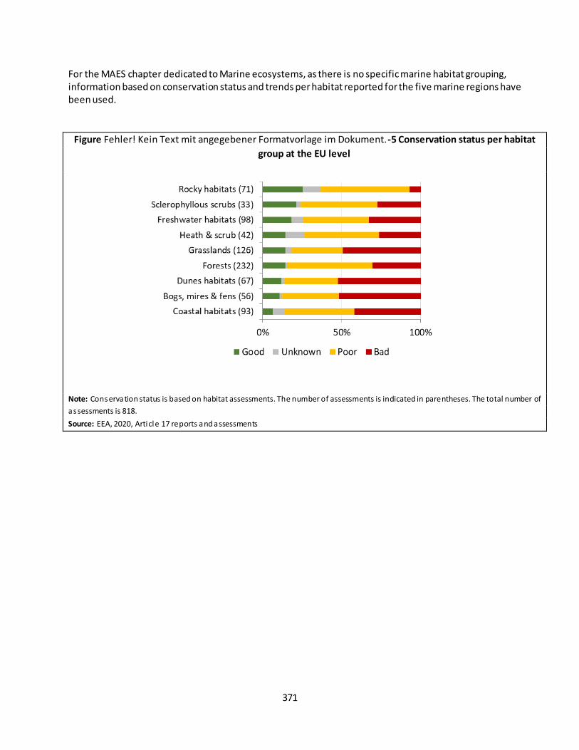
371
For the MAES chapter dedicated to Marine ecosystems, as there is no specific marine habitat grouping, information based on conservation status and trends per habitat reported for the five marine regions have been used.
Figure Fehler! Kein Text mit angegebener Formatvorlage im Dokument.-5 Conservation status per habitat
group at the EU level
Note: Conservation status is based on habitat assessments. The number of assessments is indicated in parentheses. The total number of
assessments is 818.
Source: EEA, 2020, Article 17 reports and assessments
372
Figure Fehler! Kein Text mit angegebener Formatvorlage im Dokument.-15 Conservation status trends per
habitat group at EU level
Note: Conservation status trends are based on habitat assessments. The number of assessments i s indicated in parentheses. The total
number of assessments is 698
Source: EEA, 2020, Article 17 reports and assessments
Figure Fehler! Kein Text mit angegebener Formatvorlage im Dokument.-7 Conservation status of habitat group
for each biogeographic and marine region
at EU level

373
Note: Conservation status trends are based on habitat assessments. The number of assessments i s indicated in parentheses. The total
number of assessments is 698
Source: EEA, 2020, Article 17 reports and assessments
Habitat conservation status (nb assessments) Good Unknown Poor Bad
Coastal habitats (93) 6 7 41 39
Bogs, mires & fens (56) 6 1 20 29
Dunes habitats (67) 8 1 23 35
Forests (232) 33 3 125 71
Grasslands (126) 18 5 41 62
Heath & scrub (42) 6 5 20 11
Freshwater habitats (98) 18 7 41 32
Sclerophyllous scrubs (33) 7 1 16 9
Rocky habitats (71) 18 8 40 5
Total (818) 120 38 367 293
Habitat conservation status (%) Good Unknown Poor Bad
Coastal habitats (93) 6.5% 7.5% 44.1% 41.9%
Bogs, mires & fens (56) 10.7% 1.8% 35.7% 51.8%
Dunes habitats (67) 11.9% 1.5% 34.3% 52.2%
Forests (232) 14.2% 1.3% 53.9% 30.6%
Grasslands (126) 14.3% 4.0% 32.5% 49.2%
Heath & scrub (42) 14.3% 11.9% 47.6% 26.2%
Freshwater habitats (98) 18.4% 7.1% 41.8% 32.7%
Sclerophyllous scrubs (33) 21.2% 3.0% 48.5% 27.3%
Rocky habitats (71) 25.4% 11.3% 56.3% 7.0%
Habitat conservation status trends (nb
assessments) U improving Unknown U stable U deteriorating
Sclerophyllous scrubs (26) 0 6 12 8
Freshwater habitats (80) 3 19 30 28
Bogs, mires & fens (50) 2 5 11 32
Rocky habitats (53) 3 12 30 8
Grasslands (108) 8 27 18 55
Dunes habitats (59) 5 15 8 31
Coastal habitats (87) 8 21 27 31
Heath & scrub (36) 4 12 11 9
Forests (199) 26 38 84 51
Total (698) 59 155 231 253
Habitat conservation status trends (%) U improving Unknown U stable U deteriorating
Sclerophyllous scrubs (26) 0.0% 23.1% 46.2% 30.8%
Freshwater habitats (80) 3.8% 23.8% 37.5% 35.0%
374
Bogs, mires & fens (50) 4.0% 10.0% 22.0% 64.0%
Rocky habitats (53) 5.7% 22.6% 56.6% 15.1%
Grasslands (108) 7.4% 25.0% 16.7% 50.9%
Dunes habitats (59) 8.5% 25.4% 13.6% 52.5%
Coastal habitats (87) 9.2% 24.1% 31.0% 35.6%
Heath & scrub (36) 11.1% 33.3% 30.6% 25.0%
Forests (199) 13.1% 19.1% 42.2% 25.6%
Coastal Wetlands
The Annex I habitats groups don’t make distinction with “Coastal Wetlands” as defined in the MAES chapter
dedicated to Wetlands.
In the MAES framework, Coastal wetland habitats are defined as “Marine” (level 1) and “Marine inlets and
transitional waters” ecosystem types (level 2). The Marine inlets and transitional waters ecosystem types are
defined in the first MAES report, page 24 (Maes et al, 2013), as “ecosystems on the land-water interface under
the influence of tides and with salinity higher than 0.5 ‰” which, beside coastal wetlands, also include
“lagoons, estuaries and other transitional waters, fjords and sea lochs as well as embayments”.
The Annex I habitats defined as characteristic of “Coastal wetlands” are a subset of the Annex I Coastal
Habitats, and the table below lists them with information on Conservation Status and Trends.
Extended Wetlands
Coastal Wetlands Conservation Status Good Poor Bad Unknown
1130 Estuaries 2 2
1140 Mudflats and sandflats not covered by seawater at low tide 2 2 1
1150 Coastal lagoons 1 5
1160 Large shallow inlets and bays 1 3 1
1310 Salicornia and other annuals colonizing mud and sand 1 4 1
1320 Spartina swards (Spartinion maritimae) 1 3
1330 Atlantic salt meadows (Glauco-Puccinellietalia maritimae) 1 3
1650 Boreal Baltic narrow inlets 1
Total number of EU assessments 1 12 20 2
Percentage 2.9% 34.3% 57.1% 5.7%
Coastal Wetlands Conservation Status Trends for Unfavourable Deteriorating Improving Stable Unknown
1130 Estuaries 2 2
1140 Mudflats and sandflats not covered by seawater at low tide 1 2 1
1150 Coastal lagoons 3 3
1160 Large shallow inlets and bays 1 3
1310 Salicornia and other annuals colonizing mud and sand 3 1 1
1320 Spartina swards (Spartinion maritimae) 1 2 1
1330 Atlantic salt meadows (Glauco-Puccinellietalia maritimae) 3 1
1650 Boreal Baltic narrow inlets 1
Total number of EU assessments 8 5 11 8
Percentage 24.2% 15.2% 33.3% 24.2%

375
The Annex I habitats groups don’t make distinction with “Extended wetland ecosystem” as defined in the MAES
chapter dedicated to Wetlands.
The extended wetland ecosystem is defined according to the Ramsar Convention, signed by all EU-28 parties,
which states that wetlands are “areas of marsh, fen, peatland or water, whether natural or artificial,
permanent or temporary, with water that is static or f lowing, fresh, brackish or salty, including areas of marine
water the depth of which at low tide does not exceed six meters”. Furthermore, wetlands “may incorporate
riparian and coastal zones adjacent to the wetlands, and islands or bodies of marine water deeper than six
meters at low tide lying within the wetlands”.
The Annex I habitats defined as characteristic of “Extended wetland ecosystem” are a selection of the Annex I
habitats from different habitat groups. The table below lists them with information on Conservation Status and
Trends.
376
Extended Wetlands Conservation Status Good Poor Bad Unknown
1110 Sandbanks which are slightly covered by sea water all the time 2 2 1 5
1120 Posidonia beds (Posidonion oceanicae) 1 1
1130 Estuaries 2 2 4
1140 Mudflats and sandflats not covered by seawater at low tide 2 2 1 5
1150 Coastal lagoons 1 5 6
1160 Large shallow inlets and bays 1 3 1 5
1170 Reefs 2 1 1 4
1310 Salicornia and other annuals colonizing mud and sand 3 1 4
1320 Spartina swards (Spartinion maritimae) 1 3 4
1330 Atlantic salt meadows (Glauco-Puccinellietalia maritimae) 1 3 4
1340 Inland salt meadows 1 3 4
1410 Mediterranean salt meadows (Juncetalia maritimi) 3 2 5
1510 Mediterranean salt steppes (Limonietalia) 1 1
1530 Pannonic salt steppes and salt marshes 1 3 4
1630 Boreal Baltic coastal meadows 2 2
1650 Boreal Baltic narrow inlets 1 1
2170 Dunes with Salix repens ssp. argentea (Salicion arenariae) 1 1
2190 Humid dune slacks 2 3 5
3110Oligotrophic waters containing very few minerals of sandy plains
(Littorelletalia uniflorae)1 3 1 5
3120Oligotrophic waters containing very few minerals generally on sandy soils
of the West Mediterranean, with Isoetes spp.2 2
3130Oligotrophic to mesotrophic standing waters with vegetation of the
Littorelletea uniflorae and/or of the Isoëto-Nanojuncetea2 3 4 9
3140 Hard oligo-mesotrophic waters with benthic vegetation of Chara spp. 2 3 3 8
3150Natural eutrophic lakes with Magnopotamion or Hydrocharition - type
vegetation1 3 4 1 9
3160 Natural dystrophic lakes and ponds 3 3 2 8
3170 Mediterranean temporary ponds 1 3 1 5
3180 Turloughs 1 3 4
3190 Lakes of gypsum karst 1 1 1 3
31A0 Transylvanian hot-spring lotus beds 1 1
3210 Fennoscandian natural rivers 1 2 3
3220 Alpine rivers and the herbaceous vegetation along their banks 2 2 2 6
3230 Alpine rivers and their ligneous vegetation with Myricaria germanica 1 2 3
3240 Alpine rivers and their ligneous vegetation with Salix elaeagnos 2 2 4
3250 Constantly flowing Mediterranean rivers with Glaucium flavum 2 1 3
3260Water courses of plain to montane levels with the Ranunculion fluitantis
and Callitricho-Batrachion vegetation1 5 2 8
3270Rivers with muddy banks with Chenopodion rubri p.p. and Bidention p.p.
vegetation3 4 1 8
3280Constantly flowing Mediterranean rivers with Paspalo-Agrostidion species
and hanging curtains of Salix and Populus alba2 1 3
3290 Intermittently flowing Mediterranean rivers of the Paspalo-Agrostidion 1 1
4010 Northern Atlantic wet heaths with Erica tetralix 1 3 4
4020 Temperate Atlantic wet heaths with Erica ciliaris and Erica tetralix 2 2 4
6410Molinia meadows on calcareous, peaty or clayey-silt-laden soils (Molinion
caeruleae)2 1 5 8
6420 Mediterranean tall humid grasslands of the Molinio-Holoschoenion 4 2 6
6430Hydrophilous tall herb fringe communities of plains and of the montane to
alpine levels1 5 2 8
6440 Alluvial meadows of river valleys of the Cnidion dubii 3 3 6
6450 Northern boreal alluvial meadows 2 2
6460 Peat grasslands of Troodos 1 1
7110 Active raised bogs 1 6 7
7120 Degraded raised bogs still capable of natural regeneration 1 4 5
7130 Blanket bogs (* if active bog) 1 2 3
7140 Transition mires and quaking bogs 4 3 7
7150 Depressions on peat substrates of the Rhynchosporion 3 2 5
7160 Fennoscandian mineral-rich springs and springfens 1 2 3
7210Calcareous fens with Cladium mariscus and species of the Caricion
davallianae2 2 2 6
7220 Petrifying springs with tufa formation (Cratoneurion) 6 1 7
7230 Alkaline fens 2 4 6
7240 Alpine pioneer formations of Caricion bicoloris-atrofuscae 1 1 2 4
7310 Aapa mires 1 1 2
7320 Palsa mires 2 2
91D0 Bog woodland 1 3 2 6
91E0Alluvial forests with Alnus glutinosa and Fraxinus excelsior (Alno-Padion,
Alnion incanae, Salicion albae)1 6 7
91F0
Riparian mixed forests of Quercus robur, Ulmus laevis and Ulmus minor,
Fraxinus excelsior or Fraxinus angustifolia, along the great rivers (Ulmenion
minoris)
3 5 8
92B0Riparian formations on intermittent Mediterranean water courses with
Rhododendron ponticum, Salix and others1 1
Total number of EU assessments 33 104 127 12 276
Percentage 12.0% 37.7% 46.0% 4.3% 100.0%
377
Extended Wetlands Conservation Status Trends for Unfavourable Deteriorating Improving Stable Unknown
1110 Sandbanks which are slightly covered by sea water all the time 2 1 1 1 5
1120 Posidonia beds (Posidonion oceanicae) 1 1
1130 Estuaries 2 2 4
1140 Mudflats and sandflats not covered by seawater at low tide 1 2 1 4
1150 Coastal lagoons 3 3 6
1160 Large shallow inlets and bays 1 3 4
1170 Reefs 1 3 4
1310 Salicornia and other annuals colonizing mud and sand 3 1 4
1320 Spartina swards (Spartinion maritimae) 1 2 1 4
1330 Atlantic salt meadows (Glauco-Puccinellietalia maritimae) 3 1 4
1340 Inland salt meadows 3 1 4
1410 Mediterranean salt meadows (Juncetalia maritimi) 4 1 5
1510 Mediterranean salt steppes (Limonietalia) 1 1
1530 Pannonic salt steppes and salt marshes 3 3
1630 Boreal Baltic coastal meadows 1 1 2
1650 Boreal Baltic narrow inlets 1 1
2170 Dunes with Salix repens ssp. argentea (Salicion arenariae) 1 1
2190 Humid dune slacks 3 2 5
3110Oligotrophic waters containing very few minerals of sandy plains (Littorelletalia
uniflorae)2 2 4
3120Oligotrophic waters containing very few minerals generally on sandy soils of the
West Mediterranean, with Isoetes spp.1 1 2
3130Oligotrophic to mesotrophic standing waters with vegetation of the Littorelletea
uniflorae and/or of the Isoëto-Nanojuncetea4 3 7
3140 Hard oligo-mesotrophic waters with benthic vegetation of Chara spp. 4 2 6
3150Natural eutrophic lakes with Magnopotamion or Hydrocharition - type vegetation
1 6 1 8
3160 Natural dystrophic lakes and ponds 1 4 5
3170 Mediterranean temporary ponds 2 1 2 5
3180 Turloughs 1 2 3
3190 Lakes of gypsum karst 1 1 2
31A0 Transylvanian hot-spring lotus beds 1 1
3210 Fennoscandian natural rivers 1 1 2
3220 Alpine rivers and the herbaceous vegetation along their banks 2 2 4
3230 Alpine rivers and their ligneous vegetation with Myricaria germanica 1 1 1 3
3240 Alpine rivers and their ligneous vegetation with Salix elaeagnos 3 1 4
3250 Constantly flowing Mediterranean rivers with Glaucium flavum 1 1 1 3
3260Water courses of plain to montane levels with the Ranunculion fluitantis and
Callitricho-Batrachion vegetation2 1 3 1 7
3270Rivers with muddy banks with Chenopodion rubri p.p. and Bidention p.p.
vegetation1 1 3 5
3280Constantly flowing Mediterranean rivers with Paspalo-Agrostidion species and
hanging curtains of Salix and Populus alba3 3
3290 Intermittently flowing Mediterranean rivers of the Paspalo-Agrostidion 1 1
4010 Northern Atlantic wet heaths with Erica tetralix 3 1 4
4020 Temperate Atlantic wet heaths with Erica ciliaris and Erica tetralix 2 2 4
6410Molinia meadows on calcareous, peaty or clayey-silt-laden soils (Molinion
caeruleae)6 6
6420 Mediterranean tall humid grasslands of the Molinio-Holoschoenion 3 1 1 1 6
6430Hydrophilous tall herb fringe communities of plains and of the montane to alpine
levels3 2 2 7
6440 Alluvial meadows of river valleys of the Cnidion dubii 1 2 3
6450 Northern boreal alluvial meadows 1 1 2
7110 Active raised bogs 6 1 7
7120 Degraded raised bogs still capable of natural regeneration 2 2 4
7130 Blanket bogs (* if active bog) 2 2
7140 Transition mires and quaking bogs 5 2 7
7150 Depressions on peat substrates of the Rhynchosporion 3 1 1 5
7160 Fennoscandian mineral-rich springs and springfens 2 2
7210 Calcareous fens with Cladium mariscus and species of the Caricion davallianae 3 1 4
7220 Petrifying springs with tufa formation (Cratoneurion) 2 1 3 1 7
7230 Alkaline fens 6 6
7240 Alpine pioneer formations of Caricion bicoloris-atrofuscae 1 1 1 3
7310 Aapa mires 1 1
7320 Palsa mires 2 2
91D0 Bog woodland 4 1 5
91E0Alluvial forests with Alnus glutinosa and Fraxinus excelsior (Alno-Padion, Alnion
incanae, Salicion albae)5 1 1 7
91F0Riparian mixed forests of Quercus robur, Ulmus laevis and Ulmus minor, Fraxinus
excelsior or Fraxinus angustifolia, along the great rivers (Ulmenion minoris)3 1 3 1 8
92B0Riparian formations on intermittent Mediterranean water courses with
Rhododendron ponticum, Salix and others1 1
Total number of EU assessments 112 17 66 45 240

378
Lists of Annex I Habitats grouping
Coastal habitats
habitatcode HDname
1110 Sandbanks which are slightly covered by sea water all the time
1120 Posidonia beds (Posidonion oceanicae)
1130 Estuaries 1140 Mudflats and sandflats not covered by seawater at low tide
1150 Coastal lagoons
1160 Large shallow inlets and bays 1170 Reefs
1180 Submarine structures made by leaking gases
1210 Annual vegetation of drift lines 1220 Perennial vegetation of stony banks
1230 Vegetated sea cliffs of the Atlantic and Baltic Coasts
1240 Vegetated sea cliffs of the Mediterranean coasts with endemic Limonium spp. 1250 Vegetated sea cliffs with endemic flora of the Macaronesian coasts
1310 Salicornia and other annuals colonizing mud and sand
1320 Spartina swards (Spartinion maritimae)
1330 Atlantic salt meadows (Glauco-Puccinellietalia maritimae) 1340 Inland salt meadows
1410 Mediterranean salt meadows (Juncetalia maritimi)
1420 Mediterranean and thermo-Atlantic halophilous scrubs (Sarcocornetea fruticosi) 1430 Halo-nitrophilous scrubs (Pegano-Salsoletea)
1510 Mediterranean salt steppes (Limonietalia)
1520 Iberian gypsum vegetation (Gypsophiletalia) 1530 Pannonic salt steppes and salt marshes
1610 Baltic esker islands with sandy, rocky and shingle beach vegetation and sublittoral vegetation
1620 Boreal Baltic islets and small islands 1630 Boreal Baltic coastal meadows
1640 Boreal Baltic sandy beaches with perennial vegetation
1650 Boreal Baltic narrow inlets
Dunes habitats
habitatcode HDname
2110 Embryonic shifting dunes 2120 Shifting dunes along the shoreline with Ammophila arenaria (‘white dunes’) 2130 Fixed coastal dunes with herbaceous vegetation (“grey dunes’) 2140 Decalcified fixed dunes with Empetrum nigrum 2150 Atlantic decalcified fixed dunes (Calluno-Ulicetea)
2160 Dunes with Hippophae rhamnoides
2170 Dunes with Salix repens ssp. argentea (Salicion arenariae) 2180 Wooded dunes of the Atlantic, Continental and Boreal region
2190 Humid dune slacks
21A0 Machairs (* in Ireland)
2210 Crucianellion maritimae fixed beach dunes 2220 Dunes with Euphorbia terracina
2230 Malcolmietalia dune grasslands
2240 Brachypodietalia dune grasslands with annuals 2250 Coastal dunes with Juniperus spp.
2260 Cisto-Lavenduletalia dune sclerophyllous scrubs
2270 Wooded dunes with Pinus pinea and/or Pinus pinaster 2310 Dry sand heaths with Calluna and Genista
2320 Dry sand heaths with Calluna and Empetrum nigrum
2330 Inland dunes with open Corynephorus and Agrostis grasslands 2340 Pannonic inland dunes
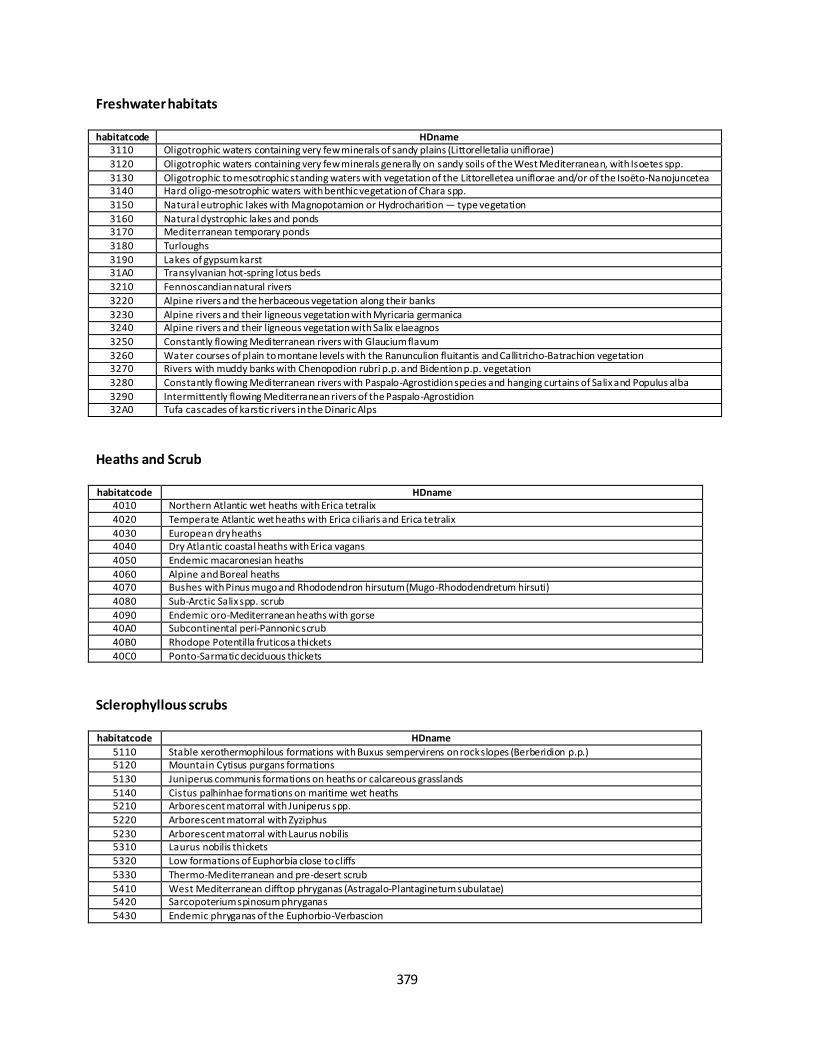
379
Freshwater habitats
habitatcode HDname
3110 Oligotrophic waters containing very few minerals of sandy plains (Littorelletalia uniflorae)
3120 Oligotrophic waters containing very few minerals generally on sandy soils of the West Mediterranean, with Isoetes spp.
3130 Oligotrophic to mesotrophic standing waters with vegetation of the Littorelletea uniflorae and/or of the Isoëto-Nanojuncetea 3140 Hard oligo-mesotrophic waters with benthic vegetation of Chara spp.
3150 Natural eutrophic lakes with Magnopotamion or Hydrocharition — type vegetation
3160 Natural dystrophic lakes and ponds 3170 Mediterranean temporary ponds
3180 Turloughs
3190 Lakes of gypsum karst 31A0 Transylvanian hot-spring lotus beds
3210 Fennoscandian natural rivers
3220 Alpine rivers and the herbaceous vegetation along their banks
3230 Alpine rivers and their ligneous vegetation with Myricaria germanica 3240 Alpine rivers and their ligneous vegetation with Salix elaeagnos
3250 Constantly flowing Mediterranean rivers with Glaucium flavum
3260 Water courses of plain to montane levels with the Ranunculion fluitantis and Callitricho-Batrachion vegetation 3270 Rivers with muddy banks with Chenopodion rubri p.p. and Bidention p.p. vegetation
3280 Constantly flowing Mediterranean rivers with Paspalo-Agrostidion species and hanging curtains of Salix and Populus alba
3290 Intermittently flowing Mediterranean rivers of the Paspalo-Agrostidion 32A0 Tufa cascades of karstic rivers in the Dinaric Alps
Heaths and Scrub
habitatcode HDname
4010 Northern Atlantic wet heaths with Erica tetralix
4020 Temperate Atlantic wet heaths with Erica ciliaris and Erica tetralix
4030 European dry heaths 4040 Dry Atlantic coastal heaths with Erica vagans
4050 Endemic macaronesian heaths
4060 Alpine and Boreal heaths 4070 Bushes with Pinus mugo and Rhododendron hirsutum (Mugo-Rhododendretum hirsuti)
4080 Sub-Arctic Salix spp. scrub
4090 Endemic oro-Mediterranean heaths with gorse 40A0 Subcontinental peri-Pannonic scrub
40B0 Rhodope Potentilla fruticosa thickets
40C0 Ponto-Sarmatic deciduous thickets
Sclerophyllous scrubs
habitatcode HDname
5110 Stable xerothermophilous formations with Buxus sempervirens on rock slopes (Berberidion p.p.) 5120 Mountain Cytisus purgans formations
5130 Juniperus communis formations on heaths or calcareous grasslands
5140 Cistus palhinhae formations on maritime wet heaths 5210 Arborescent matorral with Juniperus spp.
5220 Arborescent matorral with Zyziphus
5230 Arborescent matorral with Laurus nobilis 5310 Laurus nobilis thickets
5320 Low formations of Euphorbia close to cliffs
5330 Thermo-Mediterranean and pre-desert scrub
5410 West Mediterranean clifftop phryganas (Astragalo-Plantaginetum subulatae) 5420 Sarcopoterium spinosum phryganas
5430 Endemic phryganas of the Euphorbio-Verbascion
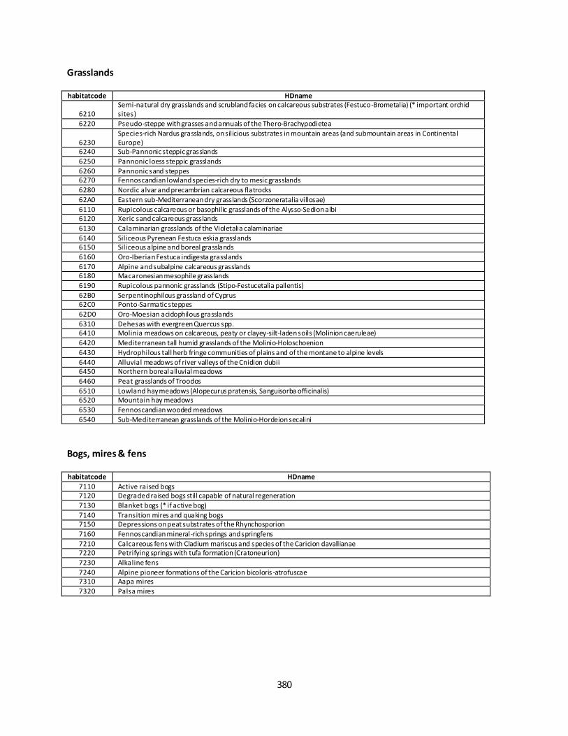
380
Grasslands
habitatcode HDname
6210 Semi-natural dry grasslands and scrubland facies on calcareous substrates (Festuco-Brometalia) (* important orchid sites)
6220 Pseudo-steppe with grasses and annuals of the Thero-Brachypodietea
6230 Species-rich Nardus grasslands, on silicious substrates in mountain areas (and submountain areas in Continental Europe)
6240 Sub-Pannonic steppic grasslands
6250 Pannonic loess steppic grasslands
6260 Pannonic sand steppes 6270 Fennoscandian lowland species-rich dry to mesic grasslands
6280 Nordic alvar and precambrian calcareous flatrocks
62A0 Eastern sub-Mediterranean dry grasslands (Scorzoneratalia villosae)
6110 Rupicolous calcareous or basophilic grasslands of the Alysso-Sedion albi 6120 Xeric sand calcareous grasslands
6130 Calaminarian grasslands of the Violetalia calaminariae
6140 Siliceous Pyrenean Festuca eskia grasslands 6150 Siliceous alpine and boreal grasslands
6160 Oro-Iberian Festuca indigesta grasslands
6170 Alpine and subalpine calcareous grasslands 6180 Macaronesian mesophile grasslands
6190 Rupicolous pannonic grasslands (Stipo-Festucetalia pallentis)
62B0 Serpentinophilous grassland of Cyprus 62C0 Ponto-Sarmatic steppes
62D0 Oro-Moesian acidophilous grasslands
6310 Dehesas with evergreen Quercus spp. 6410 Molinia meadows on calcareous, peaty or clayey-silt-laden soils (Molinion caeruleae)
6420 Mediterranean tall humid grasslands of the Molinio-Holoschoenion
6430 Hydrophilous tall herb fringe communities of plains and of the montane to alpine levels
6440 Alluvial meadows of river valleys of the Cnidion dubii 6450 Northern boreal alluvial meadows
6460 Peat grasslands of Troodos
6510 Lowland hay meadows (Alopecurus pratensis, Sanguisorba officinalis) 6520 Mountain hay meadows
6530 Fennoscandian wooded meadows
6540 Sub-Mediterranean grasslands of the Molinio-Hordeion secalini
Bogs, mires & fens
habitatcode HDname
7110 Active raised bogs 7120 Degraded raised bogs still capable of natural regeneration
7130 Blanket bogs (* if active bog)
7140 Transition mires and quaking bogs 7150 Depressions on peat substrates of the Rhynchosporion
7160 Fennoscandian mineral-rich springs and springfens
7210 Calcareous fens with Cladium mariscus and species of the Caricion davallianae 7220 Petrifying springs with tufa formation (Cratoneurion)
7230 Alkaline fens
7240 Alpine pioneer formations of the Caricion bicoloris -atrofuscae 7310 Aapa mires
7320 Palsa mires
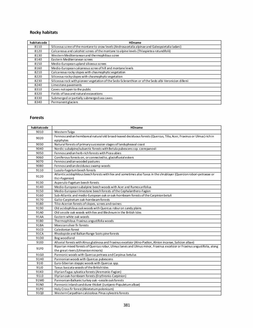
381
Rocky habitats
habitatcode HDname
8110 Siliceous scree of the montane to snow levels (Androsacetalia alpinae and Galeopsietalia ladani)
8120 Calcareous and calcshist screes of the montane to alpine levels (Thlaspietea rotundifolii)
8130 Western Mediterranean and thermophilous scree 8140 Eastern Mediterranean screes
8150 Medio-European upland siliceous screes
8160 Medio-European calcareous scree of hill and montane levels 8210 Calcareous rocky slopes with chasmophytic vegetation
8220 Siliceous rocky slopes with chasmophytic vegetation
8230 Siliceous rock with pioneer vegetation of the Sedo-Scleranthion or of the Sedo albi-Veronicion dillenii 8240 Limestone pavements
8310 Caves not open to the public
8320 Fields of lava and natural excavations
8330 Submerged or partially submerged sea caves 8340 Permanent glaciers
Forests
habitatcode HDname
9010 Western Taïga
9020 Fennoscandian hemiboreal natural old broad-leaved deciduous forests (Quercus, Tilia, Acer, Fraxinus or Ulmus) rich in epiphytes
9030 Natural forests of primary succession stages of landupheaval coast
9040 Nordic subalpine/subarctic forests with Betula pubescens ssp. czerepanovii
9050 Fennoscandian herb-rich forests with Picea abies
9060 Coniferous forests on, or connected to, glaciofluvial eskers 9070 Fennoscandian wooded pastures
9080 Fennoscandian deciduous swamp woods
9110 Luzulo-Fagetum beech forests
9120 Atlantic acidophilous beech forests with Ilex and sometimes also Taxus in the shrublayer (Quercion robori-petraeae or Ilici-Fagenion)
9130 Asperulo-Fagetum beech forests
9140 Medio-European subalpine beech woods with Acer and Rumex arifolius 9150 Medio-European limestone beech forests of the Cephalanthero-Fagion
9160 Sub-Atlantic and medio-European oak or oak-hornbeam forests of the Carpinion betuli
9170 Galio-Carpinetum oak-hornbeam forests 9180 Tilio-Acerion forests of slopes, screes and ravines
9190 Old acidophilous oak woods with Quercus robur on sandy plains
91A0 Old sessile oak woods with Ilex and Blechnum in the British Isles
91AA Eastern white oak woods 91B0 Thermophilous Fraxinus angustifolia woods
91BA Moesian silver fir forests
91C0 Caledonian forest 91CA Rhodopide and Balkan Range Scots pine forests
91D0 Bog woodland
91E0 Alluvial forests with Alnus glutinosa and Fraxinus excelsior (Alno-Padion, Alnion incanae, Salicion albae)
91F0 Riparian mixed forests of Quercus robur, Ulmus laevis and Ulmus minor, Fraxinus excelsior or Fraxinus angustifolia, along the great rivers (Ulmenion minoris)
91G0 Pannonic woods with Quercus petraea and Carpinus betulus
91H0 Pannonian woods with Quercus pubescens 91I0 Euro-Siberian steppic woods with Quercus spp.
91J0 Taxus baccata woods of the British Isles
91K0 Illyrian Fagus sylvatica forests (Aremonio-Fagion) 91L0 Illyrian oak-hornbeam forests (Erythronio-Carpinion)
91M0 Pannonian-Balkanic turkey oak –sessile oak forests
91N0 Pannonic inland sand dune thicket (Junipero-Populetum albae)
91P0 Holy Cross fir forest (Abietetum polonicum) 91Q0 Western Carpathian calcicolous Pinus sylvestris forests
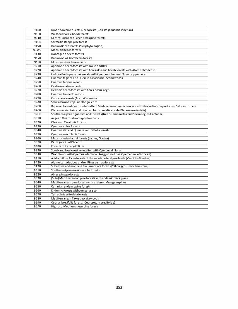
382
91R0 Dinaric dolomite Scots pine forests (Genisto januensis-Pinetum)
91S0 Western Pontic beech forests 91T0 Central European lichen Scots pine forests
91U0 Sarmatic steppe pine forest
91V0 Dacian Beech forests (Symphyto-Fagion) 91W0 Moesian beech forests
91X0 Dobrogean beech forests
91Y0 Dacian oak & hornbeam forests
91Z0 Moesian silver lime woods 9210 Apeninne beech forests with Taxus and Ilex
9220 Apennine beech forests with Abies alba and beech forests with Abies nebrodensis
9230 Galicio-Portuguese oak woods with Quercus robur and Quercus pyrenaica 9240 Quercus faginea and Quercus canariensis Iberian woods
9250 Quercus trojana woods
9260 Castanea sativa woods 9270 Hellenic beech forests with Abies borisii-regis
9280 Quercus frainetto woods
9290 Cupressus forests (Acero-Cupression) 92A0 Salix alba and Populus alba galleries
92B0 Riparian formations on intermittent Mediterranean water courses with Rhododendron ponticum, Salix and others
92C0 Platanus orientalis and Liquidambar orientalis woods (Platanion orientalis) 92D0 Southern riparian galleries and thickets (Nerio-Tamaricetea and Securinegion tinctoriae)
9310 Aegean Quercus brachyphylla woods
9320 Olea and Ceratonia forests
9330 Quercus suber forests 9340 Quercus ilex and Quercus rotundifolia forests
9350 Quercus macrolepis forests
9360 Macaronesian laurel forests (Laurus, Ocotea) 9370 Palm groves of Phoenix
9380 Forests of Ilex aquifolium
9390 Scrub and low forest vegetation with Quercus alnifolia 93A0 Woodlands with Quercus infectoria (Anagyro foetidae-Quercetum infectoriae)
9410 Acidophilous Picea forests of the montane to alpine levels (Vaccinio-Piceetea)
9420 Alpine Larix decidua and/or Pinus cembra forests 9430 Subalpine and montane Pinus uncinata forests (* if on gypsum or limestone)
9510 Southern Apennine Abies alba forests
9520 Abies pinsapo forests 9530 (Sub-) Mediterranean pine forests with endemic black pines
9540 Mediterranean pine forests with endemic Mesogean pines
9550 Canarian endemic pine forests
9560 Endemic forests with Juniperus spp. 9570 Tetraclinis articulata forests
9580 Mediterranean Taxus baccata woods
9590 Cedrus brevifolia forests (Cedrosetum brevifoliae) 95A0 High oro-Mediterranean pine forests

383
Fact sheet 3.6.101: Land take in freshwaters
1. General information
Freshwaters
Pressure: Habitat conversion and degradation (Land conversion)
Land take
km2/18 year
2. Data sources
The indicator based on readily available data: Land take indicator. EEA CSI 014
Data holder: EEA
Weblinks
o Rivers and Lakes
https://tableau.discomap.eea.europa.eu/t/Landonline/views/Landtakeindicator/Landtakeandn
etlandtakeindicator.
o Potentially flooded land
https://tableau.discomap.eea.europa.eu/#/site/Landonline/views/RiparianZonesanalysis2019-
DRAFT/RiparianZoneanalysiswithinpotentialfloodproneareas?:iid=1
Time-series range: 2000 - 2018
Version: EEA Land Take viewer version end June 2019 (based on CLC v20)
Access date 14/10/2019
Reference: https://www.eea.europa.eu/data-and-maps/indicators/land-take-2/assessment-1
3. Assessment of the indicator
3.1. Short description of the scope of the indicator.
The main objective of this indicator is to measure the pressure from the development of urban and o ther
artificial land use on natural and managed landscapes that are necessary 'to protect and restore the
functioning of natural systems and halt the loss of biodiversity' (Sixth Environment Action Programme; 6th EAP,
COM(2001)31).
Land use in Europe is driven by a number of factors such as the increasing demand for living space per person,
the link between economic activity, increased mobility and the growth of transport infrastructure, which
usually result in urban expansion. The impact of urbanisation de pends on the area of land taken and on the
intensity of land use, for example, the degree of soil sealing and the population density. Land take by urban
areas and infrastructure is generally irreversible and results in soil sealing, i.e. the loss of soil resources due to
the covering of land for housing, roads or other construction work. Converted areas become highly specialised
in terms of land use and support few functions related to socio-economic activities and housing. Urban land
take consumes mostly agricultural land, but also reduces space for habitats and ecosystems that provide
important services such as the regulation of the water balance and protection against floods, particularly if soil
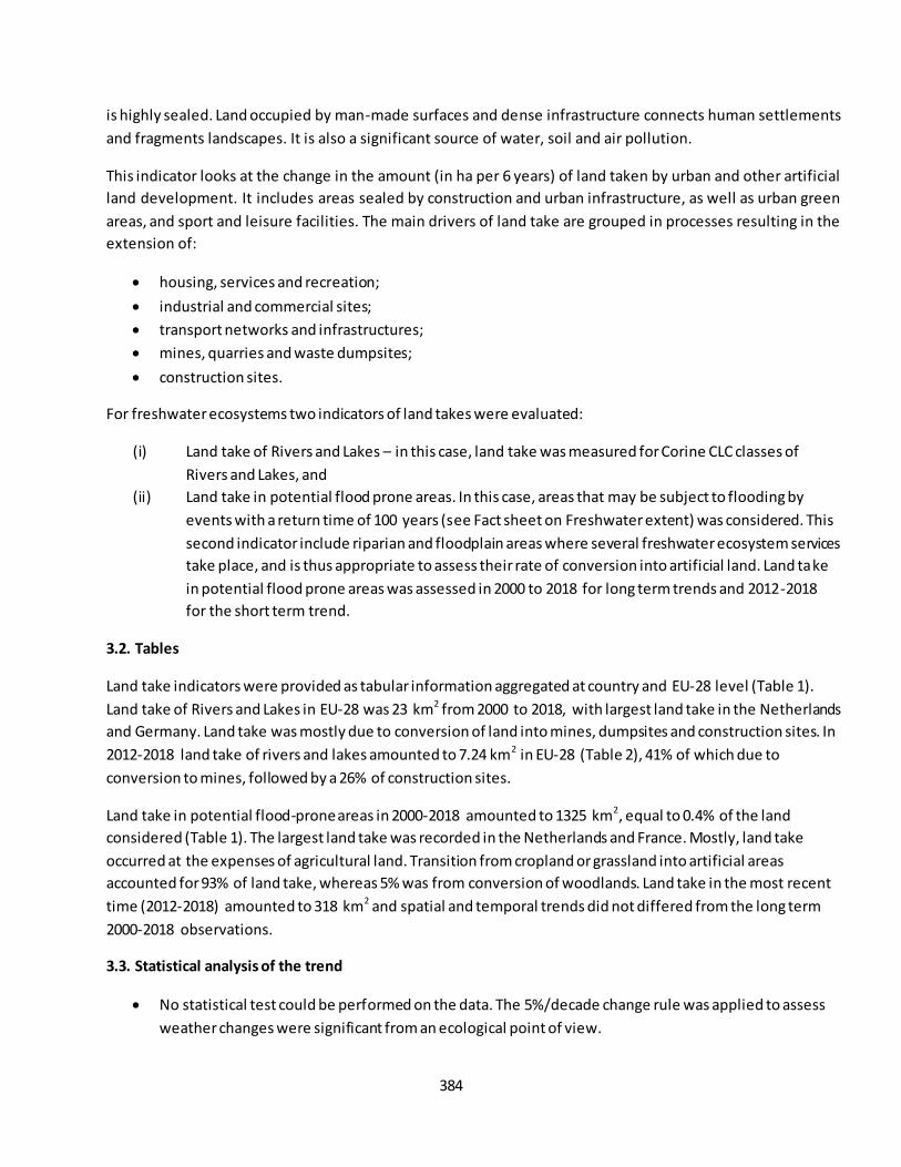
384
is highly sealed. Land occupied by man-made surfaces and dense infrastructure connects human settlements
and fragments landscapes. It is also a significant source of water, soil and air pollution.
This indicator looks at the change in the amount (in ha per 6 years) of land taken by urban and other artificial
land development. It includes areas sealed by construction and urban infrastructure, as well as urban green
areas, and sport and leisure facilities. The main drivers of land take are grouped in processes resulting in the
extension of:
housing, services and recreation;
industrial and commercial sites;
transport networks and infrastructures;
mines, quarries and waste dumpsites;
construction sites.
For freshwater ecosystems two indicators of land takes were evaluated:
(i) Land take of Rivers and Lakes – in this case, land take was measured for Corine CLC classes of
Rivers and Lakes, and
(ii) Land take in potential flood prone areas. In this case, areas that may be subject to flooding by
events with a return time of 100 years (see Fact sheet on Freshwater extent) was considered. This
second indicator include riparian and floodplain areas where several freshwater ecosystem services
take place, and is thus appropriate to assess their rate of conversion into artificial land. Land take
in potential flood prone areas was assessed in 2000 to 2018 for long term trends and 2012-2018
for the short term trend.
3.2. Tables
Land take indicators were provided as tabular information aggregated at country and EU-28 level (Table 1).
Land take of Rivers and Lakes in EU-28 was 23 km2 from 2000 to 2018, with largest land take in the Netherlands
and Germany. Land take was mostly due to conversion of land into mines, dumpsites and construction sites. In
2012-2018 land take of rivers and lakes amounted to 7.24 km2 in EU-28 (Table 2), 41% of which due to
conversion to mines, followed by a 26% of construction sites.
Land take in potential flood-prone areas in 2000-2018 amounted to 1325 km2, equal to 0.4% of the land
considered (Table 1). The largest land take was recorded in the Netherlands and France. Mostly, land take
occurred at the expenses of agricultural land. Transition from cropland or grassland into artificial areas
accounted for 93% of land take, whereas 5% was from conversion of woodlands. Land take in the most recent
time (2012-2018) amounted to 318 km2 and spatial and temporal trends did not differed from the long term
2000-2018 observations.
3.3. Statistical analysis of the trend
No statistical test could be performed on the data. The 5%/decade change rule was applied to assess
weather changes were significant from an ecological point of view.
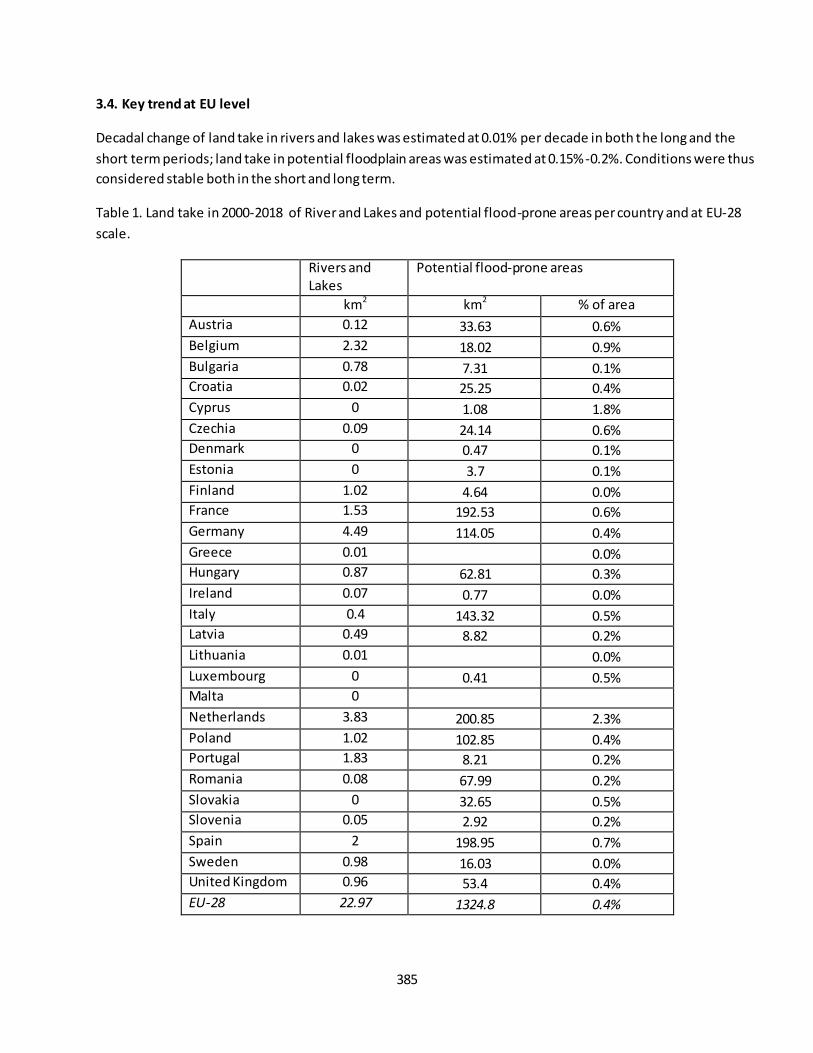
385
3.4. Key trend at EU level
Decadal change of land take in rivers and lakes was estimated at 0.01% per decade in both the long and the
short term periods; land take in potential floodplain areas was estimated at 0.15%-0.2%. Conditions were thus
considered stable both in the short and long term.
Table 1. Land take in 2000-2018 of River and Lakes and potential flood-prone areas per country and at EU-28
scale.
Rivers and Lakes
Potential flood-prone areas
km2 km2 % of area
Austria 0.12 33.63 0.6%
Belgium 2.32 18.02 0.9%
Bulgaria 0.78 7.31 0.1% Croatia 0.02 25.25 0.4%
Cyprus 0 1.08 1.8%
Czechia 0.09 24.14 0.6% Denmark 0 0.47 0.1%
Estonia 0 3.7 0.1%
Finland 1.02 4.64 0.0% France 1.53 192.53 0.6%
Germany 4.49 114.05 0.4%
Greece 0.01 0.0% Hungary 0.87 62.81 0.3%
Ireland 0.07 0.77 0.0%
Italy 0.4 143.32 0.5% Latvia 0.49 8.82 0.2%
Lithuania 0.01 0.0%
Luxembourg 0 0.41 0.5% Malta 0
Netherlands 3.83 200.85 2.3%
Poland 1.02 102.85 0.4% Portugal 1.83 8.21 0.2%
Romania 0.08 67.99 0.2%
Slovakia 0 32.65 0.5% Slovenia 0.05 2.92 0.2%
Spain 2 198.95 0.7%
Sweden 0.98 16.03 0.0% United Kingdom 0.96 53.4 0.4%
EU-28 22.97 1324.8 0.4%
386
Table 2. Land take in 2012-2018 of River and Lakes and potential flood-prone areas per country and at EU-28
scale.
Rivers and Lakes
Potential flood-prone areas
km2 km2 % of area
Austria 0.12 9.25 0.2%
Belgium 0.73 7.38 0.4%
Bulgaria 0.3 2.54 0.0% Croatia 0 9.91 0.1%
Cyprus 0 0.35 0.6%
Czechia 0 4.18 0.1% Denmark 0 0.2 0.0%
Estonia 0 0.98 0.0%
Finland 0.12 1.24 0.0% France 1.31 36.23 0.1%
Germany 1.74 33.37 0.1%
Greece 0.05 0 0.0% Hungary 0.54 19.38 0.1%
Ireland 0 0 0.0%
Italy 0.56 17.71 0.1% Latvia 0.16 1.97 0.1%
Lithuania 0 0 0.0%
Luxembourg 0 0.08 0.1% Malta 0 0
Netherlands 0.48 35.99 0.4%
Poland 0.77 38.33 0.2% Portugal 0 1.01 0.0%
Romania 0.08 41.3 0.2%
Slovakia 0 11.25 0.2% Slovenia 0.05 1.75 0.1%
Spain 0.06 13.4 0.0%
Sweden 0 2.52 0.0% United Kingdom 0.17 28.17 0.2%
EU-28 7.24 318.49 0.1%

387
Fact sheet 3.6.102: Atmospheric Deposition of Nitrogen
1. General information
Freshwater ecosystems
Pressure: Pollution and nutrient enrichment
Atmospheric deposition (Nitrogen)
kg/ha/y
2. Data sources
Data holder: EMEP
Weblink: https://emep.int/mscw/mscw_moddata.html with files from
http://thredds.met.no/thredds/catalog/data/EMEP/2018_Reporting/catalog.html
Years: 2000-2016
Access date: 19/07/2019
References:
o https://emep.int/publ/reports/2018/EMEP_Status_Report_1_2018.pdf
o https://www.atmos-chem-phys.net/12/7825/2012/acp-12-7825-2012.html
Spatial Resolution: Nuts2
3. Assessment of the indicator
3.1. Short description of the scope of the indicator.
Air pollution of nitrogen gases emitted by agricultural and industrial activities is harmful to human and
ecosystem health, contributing to acidification and eutrophication of rivers and lakes. Nitrogen emitted in the
air in form of gases returns on land and surface waters through wet and dry deposition. Part of the nitrogen
deposited on land may reach waters through surface or subsurface pathways, whereas deposit ion on waters
enters the water cycle directly, enriching nutrient content of river and lake waters. In Europe, air pollution
impacts peaked in the 1980s (for acidification) through 1990s (for euthrophication). International legislation,
particularly the EU National Emission Directive (EC, 2001; 2016), prompted pollution reduction investments
that triggered a general improvement of environmental conditions.
Air pollution and nitrogen deposition are significantly affected by both emissions and weather condit ions.
Annual nitrogen deposition at the European continent scale is modelled by European Modelling and Evaluation
Programme (EMEP). Nitrogen deposition (NDEP, kg/ha) is the sum of four annual components, i.e. oxidized
(OX) or reduced (RD) nitrogen components, each with wet (W) or dry (D) deposition:
NDEP = (DDEP_OXN_m2Grid + DDEP_RDN_m2Grid) + (WDEP_OXN + WDEP_RDN)
For this assessment, annual nitrogen deposition for 2000-2016 was averaged at Nuts2 scale, providing
important information of this nutrient source in time. No differentiation was made on where deposition
occurred, i.e. on land or water, thus basin attenuation of nitrogen deposited on land before entering the
stream network was not accounted for. Also, ecosystem response to nitrogen deposition is n on-linear, as
388
harmful effects appears when deposition exceeds ecosystem thresholds (critical load concept). The nitrogen
deposition indicator does not consider critical load exceedance, thus is not a measure of direct impact on the
freshwater ecosystem.
3.2. Maps
Figure 1 shows nitrogen deposition (in kg/ha) in 2005, 2010, 2015, showing that the central part of Europe
from North to South is the most exposed to nitrogen deposition.
The rate of change, assessed through ordinary least square regression from 2010 (reference year) to 2016
(latest available year) for each spatial unit and reported only where it is significant at probability level of 5%,
indicates that conditions since 2010 are generally static except in the Baltic region where nitrogen deposition is
declining. In one NUTS2 region (in Germany) N deposition was reported to be increasing in 2010-2016,
however the longer term time series (2000-2016) indicated a decline.
3.3. Statistical analysis of the trend
Rates of change were assessed by Ordinary Least Square regression for the long (2000-2016) and the
short (2010-2016) period, both at EU-28 and at Nuts2 scale (Figure 1). Change was reported only if
significant at 5% probability level.
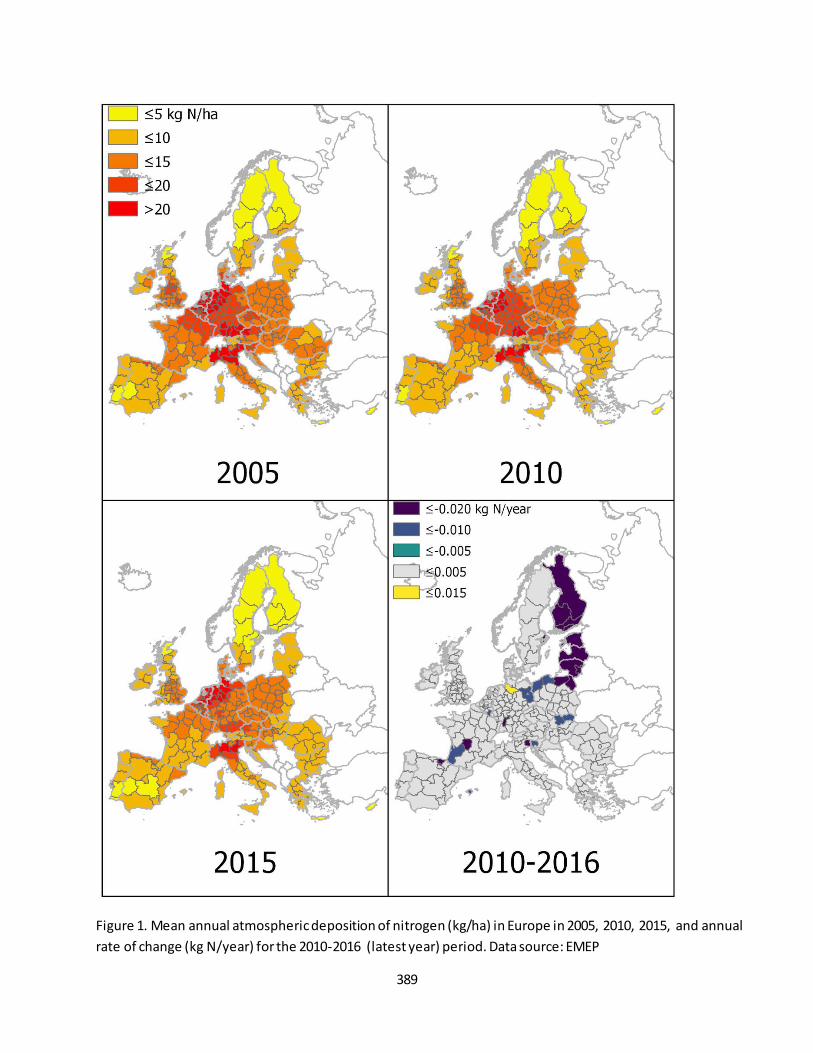
389
Figure 1. Mean annual atmospheric deposition of nitrogen (kg/ha) in Europe in 2005, 2010, 2015, and annual
rate of change (kg N/year) for the 2010-2016 (latest year) period. Data source: EMEP
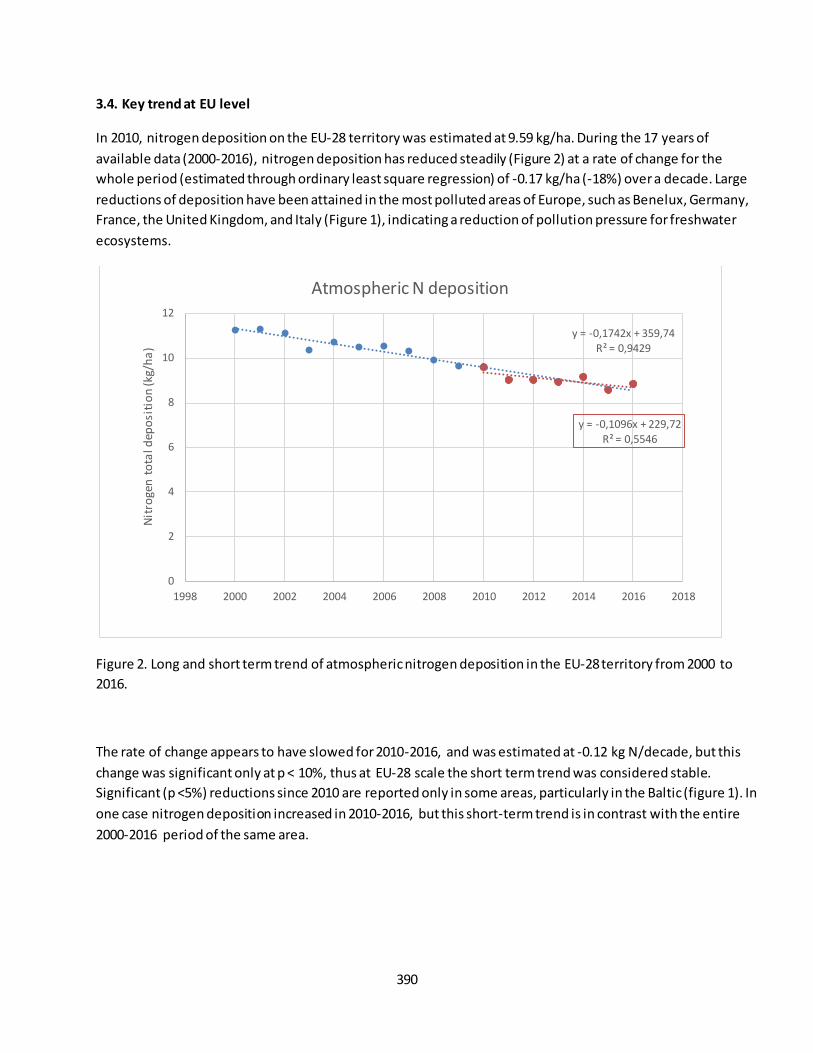
390
3.4. Key trend at EU level
In 2010, nitrogen deposition on the EU-28 territory was estimated at 9.59 kg/ha. During the 17 years of
available data (2000-2016), nitrogen deposition has reduced steadily (Figure 2) at a rate of change for the
whole period (estimated through ordinary least square regression) of -0.17 kg/ha (-18%) over a decade. Large
reductions of deposition have been attained in the most polluted areas of Europe, such as Benelux, Germany,
France, the United Kingdom, and Italy (Figure 1), indicating a reduction of pollution pressure for freshwater
ecosystems.
Figure 2. Long and short term trend of atmospheric nitrogen deposition in the EU-28 territory from 2000 to
2016.
The rate of change appears to have slowed for 2010-2016, and was estimated at -0.12 kg N/decade, but this
change was significant only at p < 10%, thus at EU-28 scale the short term trend was considered stable.
Significant (p <5%) reductions since 2010 are reported only in some areas, particularly in the Baltic (figure 1). In
one case nitrogen deposition increased in 2010-2016, but this short-term trend is in contrast with the entire
2000-2016 period of the same area.
y = -0,1742x + 359,74 R² = 0,9429
y = -0,1096x + 229,72
R² = 0,5546
0
2
4
6
8
10
12
1998 2000 2002 2004 2006 2008 2010 2012 2014 2016 2018
Nit
roge
n t
ota
l dep
osi
tio
n (k
g/h
a)
Atmospheric N deposition
391
Fact sheet 3.6.103a: Domestic waste emissions to the environment trend
1. General information
Freshwater ecosystems
Pressure: Pollution and nutrient enrichment
Domestic emissions trends
% of population whose waste is treated at least at secondary level
2. Data sources
Data holder: EUROSTAT
Weblink: https://ec.europa.eu/eurostat/en/web/products-datasets/-/ENV_WW_CON ;
https://ec.europa.eu/eurostat/en/web/products-datasets/-/MIGR_POP3CTB
Years: 2007-2015
Access date: 20/6/2019
Spatial Resolution: MS and EU-27 (no data for Slovakia)
3. Assessment of the indicator
3.1. Short description of the scope of the indicator.
Pollutant emissions from domestic sources impact freshwaters altering nutrient balance. Domestic waste
comprises emissions from point sources, i.e. direct discharges to river network form wastewater treatment
plans and sewerage systems without treatment, and from diffuse sources, i.e. disconnected dwellings and
independent appropriate systems. Wastewater treatment may reduce emissions to the environment to large
extent when treatment level increases to at least secondary. Higher population rates connected to at least
secondary treatment, therefore, indicate a reduction in domestic waste emissions.
Trends of domestic waste emissions were estimated from EUROSTAT data of population and the share of
population that is connected to at least secondary level to calculate the amount of people whose waste was
treated in at least secondary treatment level. However, no calculation of pollution load change was performed
as this depends on amount of emitted pollution load/PE and treatment efficiency, both of which vary with the
pollutant agent (e.g. see fact sheet 3.6.103b). The period of assessment is 2007-2015, for which shares of
population connected to at least secondary level was available. Some reporting gaps in data series for each
member state were noted; for years where figures were not reported, these were interpolated between the
two closest information, or taking the first or last available year. Slovakia did not report this information so it
was excluded from the analysis. This indicator is supplementary to maps of domestic waste emissions shown in
‘Domestic waster emissions to the environment’ that refer to years 2014-2015 (fact sheet 3.6.103b).
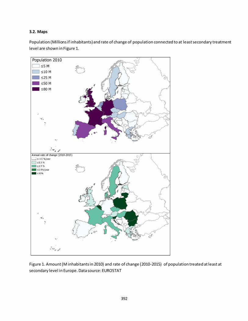
392
3.2. Maps
Population (Millions if inhabitants) and rate of change of population connected to at least secondary treatment
level are shown in Figure 1.
Figure 1. Amount (M inhabitants in 2010) and rate of change (2010-2015) of population treated at least at
secondary level in Europe. Data source: EUROSTAT
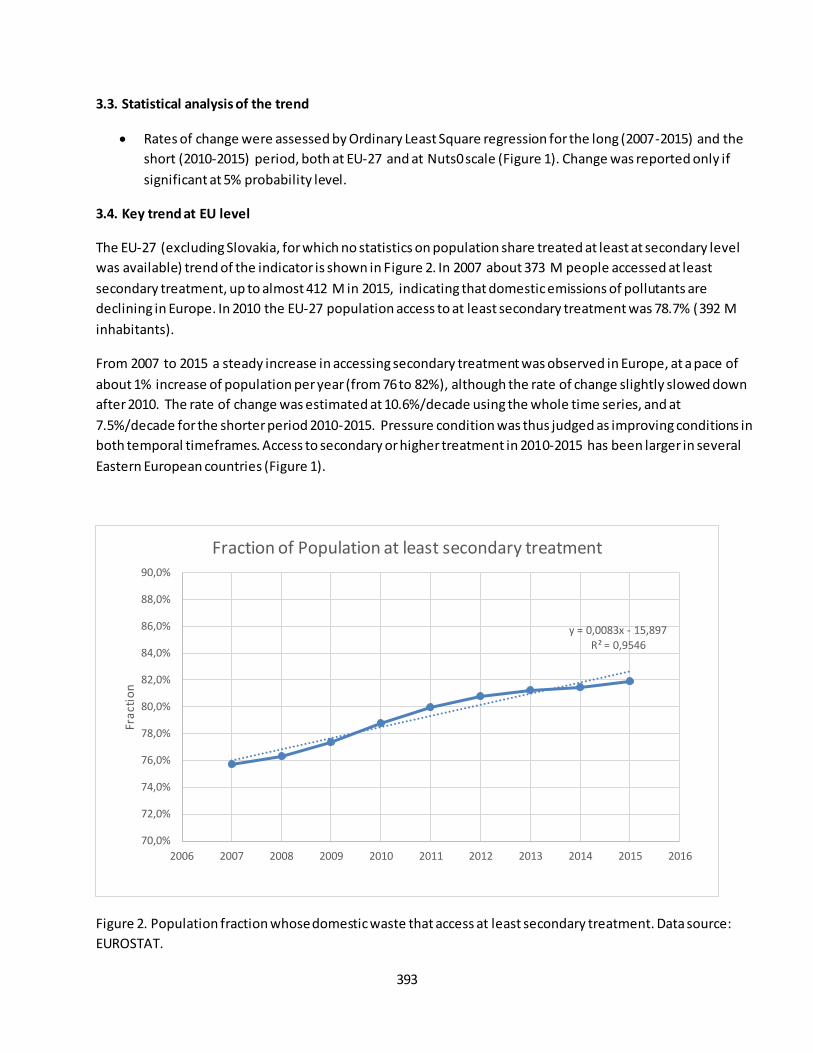
393
3.3. Statistical analysis of the trend
Rates of change were assessed by Ordinary Least Square regression for the long (2007-2015) and the
short (2010-2015) period, both at EU-27 and at Nuts0 scale (Figure 1). Change was reported only if
significant at 5% probability level.
3.4. Key trend at EU level
The EU-27 (excluding Slovakia, for which no statistics on population share treated at least at secondary level
was available) trend of the indicator is shown in Figure 2. In 2007 about 373 M people accessed at least
secondary treatment, up to almost 412 M in 2015, indicating that domestic emissions of pollutants are
declining in Europe. In 2010 the EU-27 population access to at least secondary treatment was 78.7% (392 M
inhabitants).
From 2007 to 2015 a steady increase in accessing secondary treatment was observed in Europe, at a pace of
about 1% increase of population per year (from 76 to 82%), although the rate of change slightly slowed down
after 2010. The rate of change was estimated at 10.6%/decade using the whole time series, and at
7.5%/decade for the shorter period 2010-2015. Pressure condition was thus judged as improving conditions in
both temporal timeframes. Access to secondary or higher treatment in 2010-2015 has been larger in several
Eastern European countries (Figure 1).
Figure 2. Population fraction whose domestic waste that access at least secondary treatment. Data source:
EUROSTAT.
y = 0,0083x - 15,897 R² = 0,9546
70,0%
72,0%
74,0%
76,0%
78,0%
80,0%
82,0%
84,0%
86,0%
88,0%
90,0%
2006 2007 2008 2009 2010 2011 2012 2013 2014 2015 2016
Fra
ctio
n
Fraction of Population at least secondary treatment
394
Fact sheet 3.6.103b: Domestic waste emissions to the environment
1. General information
Freshwater ecosystems
Pressure: Pollution and nutrient enrichment
Domestic emissions (Biochemical Oxygen Demand, Nitrogen and Phosphorous)
t/y
2. Data sources
Data holder: JRC
Weblink: http://data.europa.eu/89h/0ae64ac2-64da-4c5e-8bab-ce928897c1fb
Years: 2014
Access date: 28/08/2019
Reference: http://publications.jrc.ec.europa.eu/repository/handle/JRC113729
Spatial Resolution: Nuts2
3. Assessment of the indicator
3.1. Short description of the scope of the indicator.
Pollutant emissions from domestic sources impact freshwaters altering balance between nutrients. Domestic
waste comprise emissions from point sources, i.e. direct discharges to river network form wastewater
treatment plans and sewerage systems without treatment, and from diffuse sources, i.e. disconnected
dwellings and independent appropriate systems. Emissions of domestic waste are reported in terms of
Population Equivalent (PE) by Member States in the Urban Waste Water Directive database (v5 with reference
year 2014) but the database was revised for data gap filling (e.g. dwellings smaller than 2000 PEs). From PEs, 5-
days biochemical oxygen demand (BOD), nitrogen and phosphorous loads (t/y) were estimated considering
mean national protein consumption. Literature based removal efficiencies for septic tanks, primary, secondary,
or more advanced treatment were applied before releases to the environment. It should be noted that
emissions from disconnected sources would be further attenuated before reaching the river network; however,
this attenuation has not been considered for these reported domestic emission indicators.
3.2. Maps
Figure 1 shows the domestic emissions of nitrogen (N), phosphorous (P), and 5-days biochemical oxygen
demand (BOD) loads per km2 (t/y/km2).
3.3. Key trend at EU level
No trend could be calculated as data refer only to 2014-2015.

395
Figure 1. Domestic emissions of Nitrogen, Phosphorous and Biochemical Oxygen Demand (BOD, all in t/y/km 2)
in 2014. Data source: JRC.
396
Fact sheet 3.6.104: Gross Water Abstraction
1. General information
Freshwater ecosystems
Pressure: over-exploitation
Gross Water Abstraction (total and by sectors)
Million m3/y
2. Data sources
Data holder: EEA
Weblink: https://www.eea.europa.eu/data-and-maps/indicators/use-of-freshwater-resources-
2/assessment-3
Years: Average 2000-2015
Access date: 19/9/2019
Reference: EEA. Use of freshwater resources. 2018. https://www.eea.europa.eu/data-and-
maps/indicators/use-of-freshwater-resources-2/assessment-3
Spatial Resolution: Nuts0
3. Assessment of the indicator
3.1. Short description of the scope of the indicator.
Water abstractions pose heavy pressure on freshwater ecosystems, especially where water availability is
limited. Water abstraction serves demands from the energy (cooling), agriculture, manufacturing and mining,
and public water supply sectors.
Water is abstracted for generating electricity through hydro or thermal power, i.e. for cooling. While
hydropower generation involves storing water behind a dam or reservoir in order to use its hydraulic energy to
move turbines, the generation of thermal power involves the use of water to cool hot steam used to move
turbines. In general, water for hydropower is abstracted in-stream and regarded as non-consumptive.
However, it is not impact free. Hydropower generation leads to changes in natural water cycles in rivers and
lakes, deteriorates erosion and sedimentation patterns in river beds and causes substantial changes in riparian
ecosystems. Cooling installations return water back to the environment at increased temperature (resulting in
heat emissions) that may favor invasive species and act as barrier to native species moving upstream.
Water plays a crucial role in agriculture. The major cause of water consumption in the agricultural sector is crop
irrigation, especially in the southern basins where precipitation and soil moisture are not sufficient to satisfy
crop water needs. In general, vegetables and other crops that generate high gross value added are also very
water demanding. Around 7-8 % of total agricultural areas are irrigated in Europe with this value reaching 15 %
in southern Europe.
397
Various industrial sectors, such as the pulp and paper, iron and steel, textiles, food and beverages, and
chemicals sectors, use water in production processes. Some industries, such as the food industry, also
incorporate water into products. The mining industry undertakes activities to prepare materials for market, e.g.
crushing, grinding, cleaning, drying, sorting, concentrating ores, liquefaction of natural gas and agglomeration
of solid fuels. The mining industry uses water in production processes, e.g. dust depression and rock crushing,
as well as in dewatering processes for removing water from mines. Therefore, the mining industry carries out
off-stream water abstraction but also water discharge at the same time as the dewatering process, resulting in
substantial levels of water-borne emissions and pollutants. Water abstraction for mining usually lowers the
groundwater table and deteriorates water quality because of the high levels of emissions released from the
dust depression and dewatering processes. Available data on water abstraction and water use for mining are
very limited. This means that there is a high degree of uncertainty in relation to water abstraction for the
mining industry.
The public water supply industry uses relatively large amounts of water of a certain quality (i.e. drinking water
quality) from the environment to provide sufficient water to meet societal needs. Water is supplied by utilities
companies to households for domestic needs and to other industries, e.g. business and production services,
food and beverage, and accommodation sectors. Water collection, treatment and supply relate to water
supplies for both households and the services sector. Around 64 % of the total public water supply, on
average, goes to households, while the remainder is allocated to other connected services.
3.2 Data sources
For each sector, primarily data from the Waterbase — Water Quantity database have been used. Eurostat,
OECD and Aquastat (FAO) databases have also been used to fill the gaps in the data sets. Furthermore, the
statistical office websites of all European countries have each been visited several times to get the most up -to-
date data from these national open sources. Despite this, some gaps still needed to be filled by applying certain
statistical or geospatial methodologies. A substantial amount of gap filling has been performed in the data on
water abstraction for irrigation. First, a mean factor between utilised agricultural areas and irrigated areas h as
been used to fill the gaps in the data on irrigated areas. Then, a multiannual mean factor of water density
(m3/ha) in irrigated areas per country has been used to fill the gaps in the data on water abstraction for
irrigation. The gaps in the data on water abstraction for manufacturing and construction have been filled by
using Eurostat data on production in industry and the E-PRTR database with the methodologies to convert the
production level into the volume of water.
3.3. Graph
Figure 1 shows gross water abstractions in EU-28 zone. In 2010 around 204 490 million m3 of water (roughly
equivalent to 46.8 mm) was abstracted in the EU-28 zone as off-stream to meet sectorial demands. In 2015,
about 211 585 million m3 (48.4 mm) of water was abstracted, 39% of which was used and 61% of which was
returned back to the environment with a certain level of physical or chemical deterioration. In 2010 the highest
share of gross abstraction was from cooling sector (42%), followed by Agriculture (26%), Manufacturing and
mining (16%) and Public water supply (16%). Net abstractions however indicate different use shares. Around 40
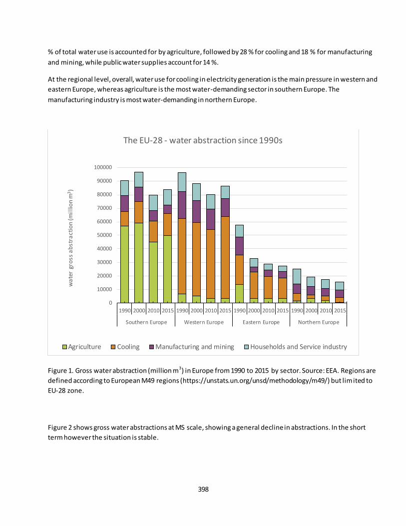
398
% of total water use is accounted for by agriculture, followed by 28 % for cooling and 18 % for manufacturing
and mining, while public water supplies account for 14 %.
At the regional level, overall, water use for cooling in electricity generation is the main pressure in western and
eastern Europe, whereas agriculture is the most water-demanding sector in southern Europe. The
manufacturing industry is most water-demanding in northern Europe.
Figure 1. Gross water abstraction (million m3) in Europe from 1990 to 2015 by sector. Source: EEA. Regions are
defined according to European M49 regions (https://unstats.un.org/unsd/methodology/m49/) but limited to
EU-28 zone.
Figure 2 shows gross water abstractions at MS scale, showing a general decline in abstractions. In the short
term however the situation is stable.
0
10000
20000
30000
40000
50000
60000
70000
80000
90000
100000
1990 2000 2010 2015 1990 2000 2010 2015 1990 2000 2010 2015 1990 2000 2010 2015
Southern Europe Western Europe Eastern Europe Northern Europe
wa
ter
gro
ss a
bst
ract
ion
(mil
lion
m3)
The EU-28 - water abstraction since 1990s
Agriculture Cooling Manufacturing and mining Households and Service industry

399
Figure 2. Gross water abstraction (mm) in EU-28 in 2005, 2010, 2015, and annual rate of change from 2010 to
2015. Source: EEA
400
3.4. Statistical analysis of the trend
Data was available from 1990 to 2015, however data gaps especially in the agricultural sector were
important in the 1990s. Analysis was conducted with Ordinary Least square regression for long term
(2000-2015) and short term (2010-2015) at EU-28 and nuts0 scale.
3.5. Key trend at EU level
The long term trend test indicated a decadal change of -7% for 2000-2015. The short term trend however
indicates no significant change between 2010 and 2015. Some considerations can be added.
The energy-related cooling sector is the only sector in Europe in which the use of water is estimated to have
increased (by 19 %) between 1990 and 2015, but has been stable in 2000-2015. Southern and western Europe
increasingly use water for cooling. In agriculture, political and socio-economic transitions in eastern Europe,
combined with the economic recession in southern Europe (EC, 2013), have resulted in a decline in utilised
irrigated areas (by 14 %). In turn, estimations of trends in water use for irrigation suggest a substantial decline
(9 %) between 2000 and 2015. In the coming years, a slight increase in the water requirement for irrigation
(EEA, 2014a), associated with a decrease in precipitation in southern Europe (EEA, 2015b), together with the
lengthening of the thermal growing season, may be expected.
Because of technological improvements combined with high efficiency gains, it is estimated that there has
been an absolute decoupling of the gross added value generated by the manufacturing and mining industry
and water use, with an estimated decline of 13 % between 2000 and 2015. Changing production processes,
technological improvements, and recycling and reusing water all lead to gains in efficiency and, in turn, reduce
water use. The highest efficiency gains in water use were achieved in southern Europe ( -52 %) followed by
western Europe (-45 %) and northern Europe (-12 %). In eastern Europe, efficiency is low, with a relative
increase in water use (8 %) by the manufacturing industries.
Improvements in water conveyance systems have resulted in an estimated decrease of water use for public
water supply by 15 %, whereas Europe ’s population has increased by around 10 % in the last two decades.
Substantial water savings have been achieved in western Europe, with the water supply to households
declining from 230 litres per capita in 1990 to 134 litres per capita in 2015. However, European metropoles and
dry regions are still the most vulnerable to water stress.
The important reductions in water abstractions from 1990 to 2010 may thus not continue in the foreseeable
horizon. In the light of these considerations, abstractions till 2020 are considered to remain stable and similar
to 2010.
401
Fact sheet 3.6.201: Chemical status of European rivers and lakes
1. General information
Freshwater ecosystems
Condition: Environmental quality
Chemical status of rivers and lakes
Classes: Good, Failing to achieve good, or Unknown
2. Data sources
Data holder: EEA and Commission (DG ENV)
Weblink: WISE Water Framework Directive Database, WISE-Freshwater WFD dashboards on Chemical
status of surface water bodies
Years: 2010-2015 (second River Basin Management Program RBMPs round; note that many RBMPs
only included results up to 2012/13), and before 2009 (first RBMPs)
Access date: July 2019
Reference: EEA 2018, European waters – assessment of status and pressures 2018. EEA Report No
7/2018. Available at https://www.eea.europa.eu/publications/state-of-water
After this publication data are updated with Ireland (and Norway).
Spatial Resolution: River Basin Districts excluding Lithuania, Greece, and Slovenia
3. Assessment of the indicator
3.1. Short description of the scope of the indicator.
The contamination of European waters with hazardous substances is a major environmental concern addressed
by a number of EU legislative measures and policies. The Water Framework Directive (EU, 2000) stipulates that
EU Member States should aim to achieve good status in all bodies of surface water and groundwater. For
surface waters, good chemical status is defined by limits (environmental quality standards, EQS) on the
concentration of certain pollutants found across the EU, known as priority substances.
Good chemical status means that no concentrations of priority substances exceed the relevant EQS established
in the Environmental Quality Standards Directive 2008/105/EC (EU, 2008; as amended by the Priority
Substances Directive 2013/39/EU, EU, 2013). EQS aim to protect the most sensitive species from direct toxicity,
including predators and humans via secondary poisoning.
Chemical status is reported by Member States to monitor progress in implementing the WFD. Chemical status
is reported per water body as “good”, “failing to achieve good”, or “unknown”. The indicator covers the current
status of surface waters as reported in the second River Basin Management Plans (RBMPs).
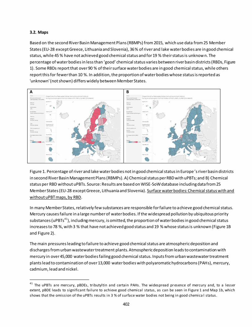
402
3.2. Maps
Based on the second River Basin Management Plans (RBMPs) from 2015, which use data from 25 Member
States (EU-28 except Greece, Lithuania and Slovenia), 36 % of river and lake water bodies are in good chemical
status, while 45 % have not achieved good chemical status and for 19 % their status is unknow n. The
percentage of water bodies in less than ‘good’ chemical status varies between river basin districts (RBDs, Figure
1). Some RBDs report that over 90 % of their surface water bodies are in good chemical status, while others
report this for fewer than 10 %. In addition, the proportion of water bodies whose status is reported as
'unknown' (not shown) differs widely between Member States.
A
B
Figure 1. Percentage of river and lake water bodies not in good chemical status in Europe ’s river basin districts
in second River Basin Management Plans (RBMPs). A) Chemical status per RBD with uPBTs; and B) Chemical
status per RBD without uPBTs. Source: Results are based on WISE-SoW database including data from 25
Member States (EU-28 except Greece, Lithuania and Slovenia). Surface water bodies: Chemical status with and
without uPBT maps, by RBD.
In many Member States, relatively few substances are responsible for failure to achieve good chemical status.
Mercury causes failure in a large number of water bodies. If the widespread pollution by ubiquitous priority
substances (uPBTs41), including mercury, is omitted, the proportion of water bodies in good chemical status
increases to 78 %, with 3 % that have not achieved good status and 19 % whose status is unknown (Figure 1B
and Figure 2).
The main pressures leading to failure to achieve good chemical status are atmospheric deposition and
discharges from urban wastewater treatment plants. Atmospheric deposition leads to contamination with
mercury in over 45,000 water bodies failing good chemical status. Inputs from urban wastewater treatment
plants lead to contamination of over 13,000 water bodies with polyaromatic hydrocarbons (PAHs), mercury,
cadmium, lead and nickel.
41
The uPBTs are mercury, pBDEs, tributyltin and certain PAHs. The widespread pr esence of mercury and, to a lesser extent, pBDE leads to significant failure to achieve good chemical status, as can be seen in Figure 1 and Map 1b, which
shows that the omission of the uPBTs results in 3 % of surface water bodies not being in good chemica l status.
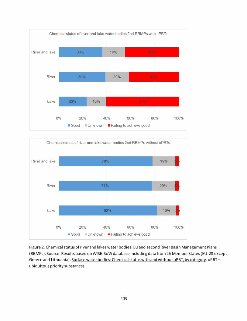
403
Figure 2. Chemical status of river and lakes water bodies, EU and second River Basin Management Plans
(RBMPs). Source: Results based on WISE-SoW database including data from 26 Member States (EU-28 except
Greece and Lithuania). Surface water bodies: Chemical status with and without uPBT, by category. uPBT =
ubiquitous priority substances

404
3.3. Statistical analysis of the trend
Methodological differences between the two RBMP reporting periods precluded analysis of temporal
trends. However at the European scale conditions can be assessed as stable from the first to the
second RBMPs round. Because of the differences in the two reporting periods, there is no trend
assessment of this indicator at unit scale
3.4. Key trend at EU level
In 2015 At EU scale 36% of rivers and lakes have been reported to achieve good chemical status. This figure
increases to 78% when uPBTs are not considered. Comparing chemical status in the two RBMPs is complicated
because there was more pollutant monitoring for the second RBMPs, and some Member States rep orted
mercury as causing all of their surface water bodies failing to achieve good chemical status.
A comparison of the chemical status reported in the first and second RBMP periods shows that the proportion
of water bodies with unknown chemical status has dropped significantly, from 40 % to 19 % (Figure 3).
Chemical status remained similar in rivers and declined slightly in lakes. Consequently, knowledge on chemical
status has improved, but, in return, a larger number of water bodies has been classified as failing to achieve
good chemical status.
However, it seems that Member States are making significant progress in tackling certain individual priority
substances, apart from mercury, pBDEs and PAHs. During the first RBMP cycle, Member States made progress
in tackling several other priority substances, such as metals (cadmium, lead and nickel) and several pesticides,
suggesting that some effective measures were implemented.
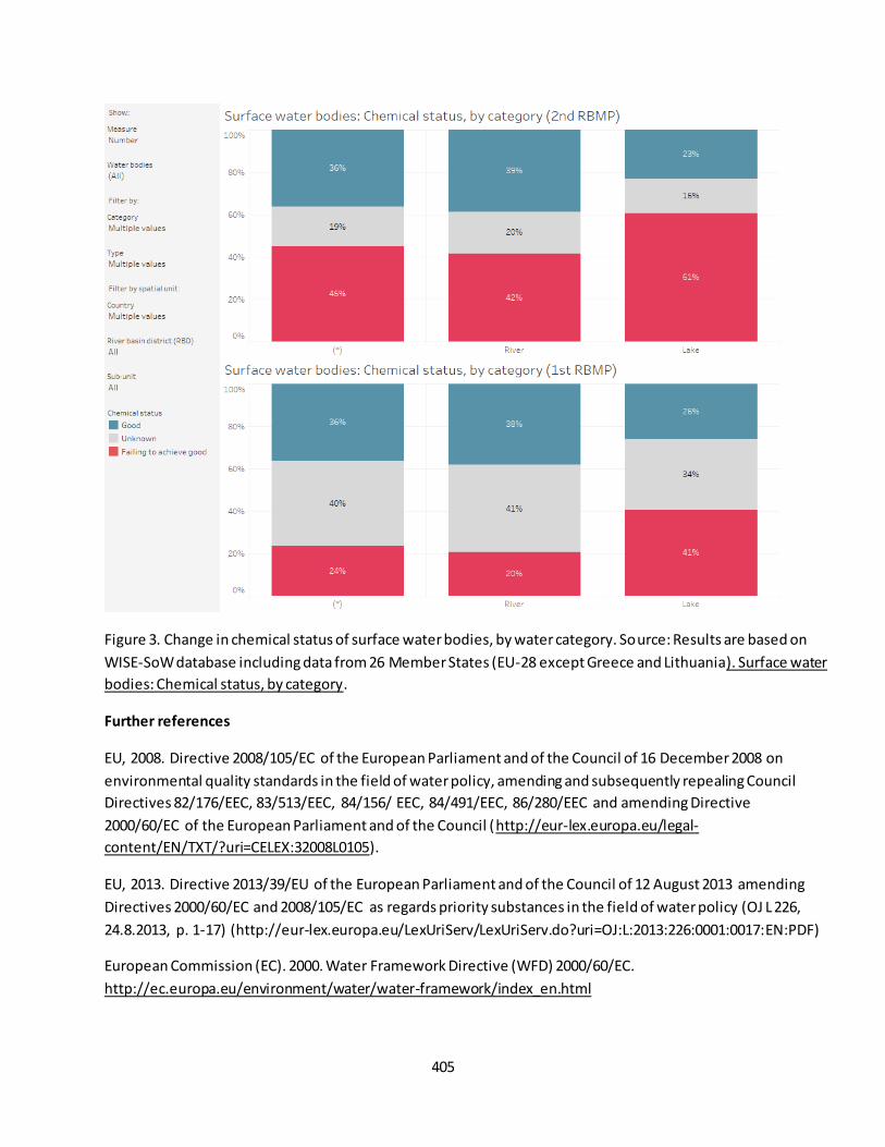
405
Figure 3. Change in chemical status of surface water bodies, by water category. Source: Results are based on
WISE-SoW database including data from 26 Member States (EU-28 except Greece and Lithuania). Surface water
bodies: Chemical status, by category.
Further references
EU, 2008. Directive 2008/105/EC of the European Parliament and of the Council of 16 December 2008 on
environmental quality standards in the field of water policy, amending and subsequently repealing Council
Directives 82/176/EEC, 83/513/EEC, 84/156/ EEC, 84/491/EEC, 86/280/EEC and amending Directive
2000/60/EC of the European Parliament and of the Council (http://eur-lex.europa.eu/legal-
content/EN/TXT/?uri=CELEX:32008L0105).
EU, 2013. Directive 2013/39/EU of the European Parliament and of the Council of 12 August 2013 amending
Directives 2000/60/EC and 2008/105/EC as regards priority substances in the field of water policy (OJ L 226,
24.8.2013, p. 1-17) (http://eur-lex.europa.eu/LexUriServ/LexUriServ.do?uri=OJ:L:2013:226:0001:0017:EN:PDF)
European Commission (EC). 2000. Water Framework Directive (WFD) 2000/60/EC.
http://ec.europa.eu/environment/water/water-framework/index_en.html
406
Fact sheet 3.6.202a: Water quality in rivers
1. General information
Freshwater ecosystems
Environmental quality
Water quality in rivers
River concentration data on BOD5, ammonium, nitrate and phosphate.
2. Data sources
Data holder: EEA
Weblink: EEA Waterbase Water Quality : https://www.eea.europa.eu/data-and-maps/data/waterbase-
water-quality-2
Years: 1992-2017
Access date: Sept 2019
Reference: EEA 2019, CSI019 Oxygen consuming substances in European rivers. Available at
https://www.eea.europa.eu/data-and-maps/indicators/oxygen-consuming-substances-in-
rivers/oxygen-consuming-substances-in-rivers-8 & EEA 2019, CSI020 Nutrients in freshwater in Europe
https://www.eea.europa.eu/data-and-maps/indicators/nutrients-in-freshwater/nutrients-in-
freshwater-assessment-published-8.
Spatial Resolution: River Basin District.
3. Assessment of the indicator
3.1. Short description of the scope of the indicator.
These indicators reflect water quality in rivers. Specifically, five pollutant concentrations in rivers were
considered: Biological Oxygen Demand over five days (BOD5), ammonium, nitrate, orthophosphate and total
phosphorous. The monitoring network use to produce the indicators comprised more than 6000 sites, and data
were averaged at River Basin District (RBD) scale but the number of monitoring sites vary between RBDs. Not
all RBDs are always represented. As some of the year-to-year variation can be explained by variations in
precipitation and runoff, data were averaged over periods to reduce inter-annual variability due to hydrologic
conditions or heterogeneity of monitoring network. Specifically, periods were defined as: 1990-1995, 1996-
2000; 2001-2005, 2006-2010, and After 2010 (2011-2017).
Biochemical oxygen demand (BOD) and ammonium are key indicators of organic pollution in water. BOD
shows how much dissolved oxygen is needed for the decomposition of organic matter present in water.
Concentrations of these parameters normally increase as a result of organic pollution. Severe organic pollution
may lead to rapid de-oxygenation of river water, high concentrations of ammonia and the disappearance of fish
and aquatic invertebrates. The most important sources of organic waste load are: household wastewater;
industries such as the paper or food processing industry; and silage effluents and manure from agriculture.
Increased industrial and agricultural production in most European countries after the 1940s, coupled with a
greater share of population being connected to sewerage systems, initial ly resulted in increases in the
407
discharge of organic waste into surface water. Over the past 20 to 40 years, however, the biological treatment
(secondary treatment) of waste water has increased, and organic discharges have consequently decreased
throughout Europe.
Nitrate and phosphate in rivers are key indicators of nutrient pollution. Large inputs of nitrogen and phosphorus to water bodies from urban areas, industry and agricultural areas can lead to eutrophication. This causes ecological changes that can result in a loss of plant and animal species (reduction in ecological status) and have negative impacts on the use of water for human consumption and other purposes.
3.3. Statistical analysis of the trend
Statistical method used to evaluate the long term only from 2000 to 2017 by Ordinary Least square
regressions. The short term trends from 2010 were not calculated since this is too short a time for
observing changes.
3.4. Key trend at EU level
The bar charts in Figure 2 show the distribution of RBDs into classes of water quality for the five pollutants.
Over the past few decades, clear progress has been made in reducing emissions from point sources. The
implementation of the Urban Waste Water Treatment Directive (UWWTD), together with national legislation,
has led to improvements in waste water treatment across much of the European continent. In Europe ’s rivers,
oxygen consuming substances have been decreasing over the period 1992 to 2017. On average, BOD has been
halved down to 51 % compared to the 1992 level, but after decreasing to less than 2 mg/l in 2010, it remains
more stable without marked further decrease.
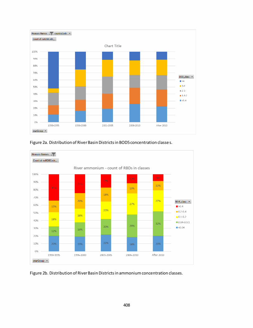
408
Figure 2a. Distribution of River Basin Districts in BOD5 concentration classe s.
Figure 2b. Distribution of River Basin Districts in ammonium concentration classes.
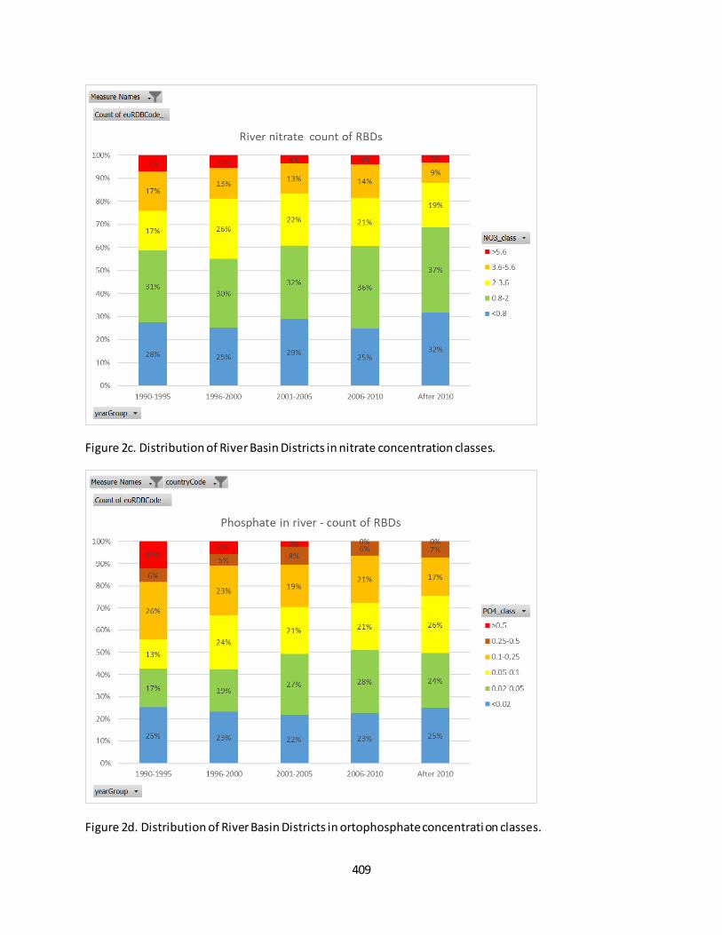
409
Figure 2c. Distribution of River Basin Districts in nitrate concentration classes.
Figure 2d. Distribution of River Basin Districts in ortophosphate concentrati on classes.
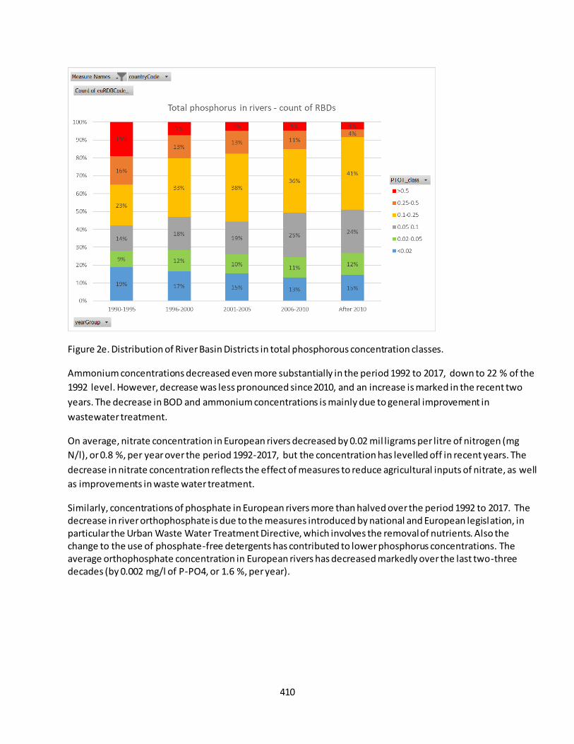
410
Figure 2e. Distribution of River Basin Districts in total phosphorous concentration classes.
Ammonium concentrations decreased even more substantially in the period 1992 to 2017, down to 22 % of the
1992 level. However, decrease was less pronounced since 2010, and an increase is marked in the recent two
years. The decrease in BOD and ammonium concentrations is mainly due to general improvement in
wastewater treatment.
On average, nitrate concentration in European rivers decreased by 0.02 mil ligrams per litre of nitrogen (mg
N/l), or 0.8 %, per year over the period 1992-2017, but the concentration has levelled off in recent years. The
decrease in nitrate concentration reflects the effect of measures to reduce agricultural inputs of nitrate, as well
as improvements in waste water treatment.
Similarly, concentrations of phosphate in European rivers more than halved over the period 1992 to 2017. The decrease in river orthophosphate is due to the measures introduced by national and European legislation, in particular the Urban Waste Water Treatment Directive, which involves the removal of nutrients. Also the change to the use of phosphate-free detergents has contributed to lower phosphorus concentrations. The average orthophosphate concentration in European rivers has decreased markedly over the last two-three decades (by 0.002 mg/l of P-PO4, or 1.6 %, per year).
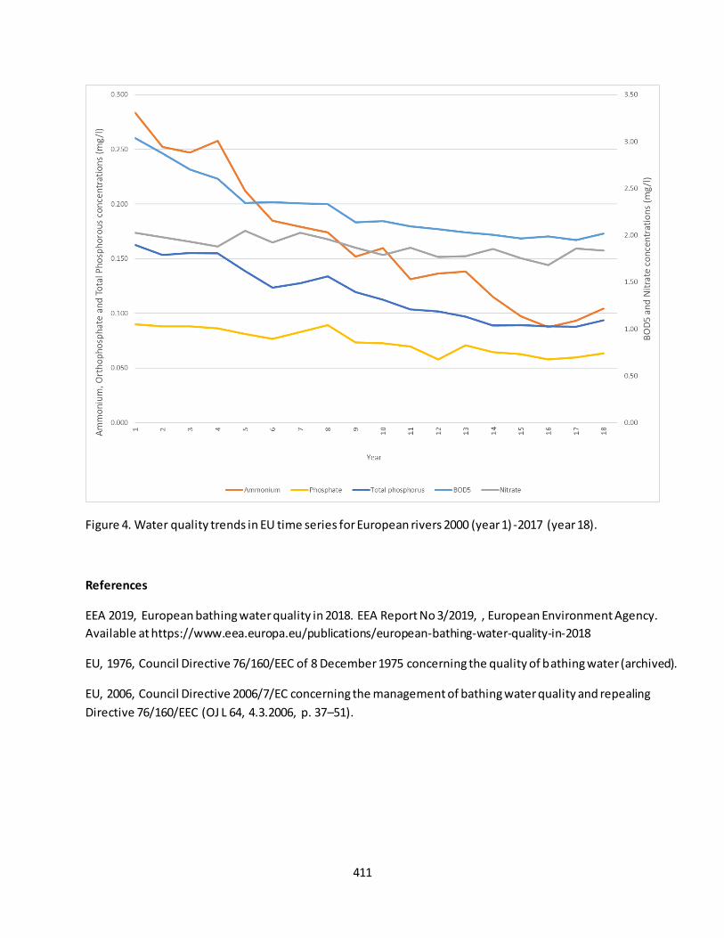
411
Figure 4. Water quality trends in EU time series for European rivers 2000 (year 1) -2017 (year 18).
References
EEA 2019, European bathing water quality in 2018. EEA Report No 3/2019, , European Environment Agency.
Available at https://www.eea.europa.eu/publications/european-bathing-water-quality-in-2018
EU, 1976, Council Directive 76/160/EEC of 8 December 1975 concerning the quality of bathing water (archived).
EU, 2006, Council Directive 2006/7/EC concerning the management of bathing water quality and repealing
Directive 76/160/EEC (OJ L 64, 4.3.2006, p. 37–51).
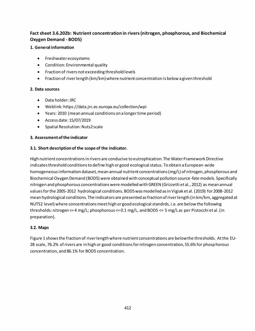
412
Fact sheet 3.6.202b: Nutrient concentration in rivers (nitrogen, phosphorous, and Biochemical
Oxygen Demand - BOD5)
1. General information
Freshwater ecosystems
Condition: Environmental quality
Fraction of rivers not exceeding threshold levels
Fraction of river length (km/km) where nutrient concentration is below a given threshold
2. Data sources
Data holder: JRC
Weblink: https://data.jrc.ec.europa.eu/collection/wpi
Years: 2010 (mean annual conditions on a longer time period)
Access date: 15/07/2019
Spatial Resolution: Nuts2 scale
3. Assessment of the indicator
3.1. Short description of the scope of the indicator.
High nutrient concentrations in rivers are conducive to eutrophication. The Water Framework Directive
indicates threshold conditions to define high or good ecological status. To obtain a European-wide
homogeneous information dataset, mean annual nutrient concentrations (mg/L) of nitrogen, phosphorous and
Biochemical Oxygen Demand (BOD5) were obtained with conceptual pollution source -fate models. Specifically
nitrogen and phosphorous concentrations were modelled with GREEN (Grizzetti et al., 2012) as mean annual
values for the 2005-2012 hydrological conditions. BOD5 was modelled as in Vigiak et al. (2019) for 2008-2012
mean hydrological conditions. The indicators are presented as fraction of river length (in km/km, aggregated at
NUTS2 level) where concentrations meet high or good ecological standrds, i.e. are below the following
thresholds: nitrogen <= 4 mg/L; phosphorous <= 0.1 mg/L, and BOD5 <= 5 mg/L as per Pistocchi et al. (in
preparation).
3.2. Maps
Figure 1 shows the fraction of river length where nutrient concentrations are below the thresholds. At the EU-
28 scale, 76.2% of rivers are in high or good conditions for nitrogen concentration, 55.6% for phosp horous
concentration, and 86.1% for BOD5 concentration.
413
Figure 1. Fraction of river length (km/km) where nutrient concentrations meet high or good ecological status,
i.e. are below given thresholds. Data source: JRC
414
3.3. Key trend at EU level
Hydrological conditions affect streamflow and nutrient concentration, and annual variations in concentrations
may be due to changes in hydrological conditions rather in in pollution loads. The conceptual models that
inform these indicators are relatively static in terms of pollution sources, thus only mean annual average
conditions over simulation periods are reported and no trend was calculated.
References
Grizzetti, B., Bouraoui, F., Aloe, A., 2012. Changes of nitrogen and phosphorus loads to European seas. Global
Change Biology 18, 769-782.
Pistocchi, A., Dorati, C., Grizzetti, B., Udias, A., Vigiak, O., Zanni, M. in preparation. Water quality in Europe:
effects of the Urban Wastewater Treatment Directive. JRC Science for Policy report.
Vigiak O., Grizzetti B., Udias-Moniello A., Zanni M., Dorati C., Bouraoui, F., Aloe A., Pistocchi A. 2019. Predicting
Biochemical Oxygen Demand in European freshwater bodies. Paper in preparation for submission. Science of
the Total Environment 666, 1089-1105
415
Fact sheet 3.6.203: Bathing water quality of European rivers and lakes
1. General information
Freshwater ecosystems
Condition: Environmental quality
Bathing water quality of rivers and lakes
Bathing water quality classes: ‘excellent’, ‘good’, ‘sufficient’, or ‘poor’, as well as those bathing waters
that could not be classified.
2. Data sources
Data holder: EEA and Commission (DG ENV)
Weblink: EEA bathing water site: https://www.eea.europa.eu/themes/water/europes-seas-and-
coasts/assessments/state-of-bathing-water/state-of-bathing-water-3
Years: 2014-2018.
Access date: July 2019
Reference: EEA 2019, European bathing water quality in 2018. EEA Report No 3/2019. Available at
https://www.eea.europa.eu/publications/european-bathing-water-quality-in-2018.
Spatial Resolution: Member States and bathing water sites.
3. Assessment of the indicator
3.1. Short description of the scope of the indicator.
Bathing water quality is a cause for concern for public and ecosystem health, and for economic activities such
as tourism. The major sources of pollution responsible for faecal bacteria are sewage and water draining from
farms and farmland. Such pollution increases during heavy rain and floods, when pollution is washed into rivers
and seas, and as a result of overflowing sewerage networks.
The EU's efforts to ensure clean and healthy bathing water began 40 years ago with the first Bathing Water
Directive42. The Bathing Water Directive (EU, 2006) has the aim of increasing the number of bathing waters
classified as ‘excellent’ or ‘good’. It also stipulates that by 2015 all waters should have been of at least
‘sufficient’ quality.
During the bathing season samples from inland bathing waters are taken and analyzed against two
microbiological parameters that may indicate the presence of faecal pollution, namely intestinal enterococci
and Escherichia coli (also known as E. coli). Bathing waters are classified base d on the 90th and 95th percentile
concentrations in samples collected in four years (minimum of 16 samples) into one of the bathing water
quality classes (excellent, good, sufficient or poor). Bathing water sites classified as ‘poor’ must be closed
throughout the following bathing season and measures to eliminate hazards to the health of bathers must be
put in place. Finally, bathing waters cannot be classified where (i) there were insufficient samples, or (ii) they
are new, or (iii) sites have undergone changes affecting water quality.
42
http://ec.europa.eu/environment/water/water-bathing/index_en.html
416
3.2. Maps
In 2018, EU Member States monitored 6,622 rivers and lakes across Europe. Almost 90 % of all inland bathing
waters are situated on lakes, whereas less than 900 bathing water sites are located on rivers. Inland site where
monitored in 26 EU Member States. No inland bathing waters were identified in Cyprus and Malta. Water
quality was classified as at least 'sufficient' in 91.6 % of all EU inland bathing water sites for the 2018-bathing
season (Figure 1). Only 128 (1.9%) bathing water sites had poor quality.
In 2018, the share of unclassified bathing waters was relatively high, particularly in Poland, mainly due to the opening of new bathing water sites for which an insufficient number of samples had been taken. In fi ve EU countries, 3 % or more of bathing waters were of poor quality: Spain (15.6 %; 41 bathing waters), Ireland (11.1 %; one bathing waters), the Netherlands (3.9 %, 25 bathing waters), Hungary (3.2 %, eight bathing waters) and Slovakia (3.1 %, one bathing water).
Figure 1. Inland bathing water quality in 2018 for the EU Member States. Note: No inland bathing waters in
Cyprus and Malta and Member States with * have less than 10 inland bathing water sites.
417
3.3. Statistical analysis of the trend
The time series analyzed here is limited to 2014-2018 because of the revision of the bathing water directive,
thus data collected before 2014 cannot be compared to current. Rates of change were assessed by Ordinary
Least Square regression for 2014-2018 and resulted in no significant change of poor water quality class (stable
conditions with a significant probability of 5%), indicating that conditions in the most recent period have been
stable. No data was available per country so this indicator remains unresolve d at scale lower than EU-28.
3.4. Key trend at EU level
Europe's bathing water quality has improved markedly over the last 40 years, following the introduction of the
EU Bathing Water Directive. Effective monitoring and management has led to a drastic re duction in pollutants
released through untreated or partially treated urban wastewaters. As a result, more and more bathing sites
are not only meeting the minimum 'sufficient' quality standards but have reached 'excellent ’ quality.
In the five-year period 2014-2018, the share of excellent inland bathing waters increased from 78.2 % to 80.8 %
(Figure 2). The share of poor quality bathing waters decreased from 2.4 % in 2014 to 1.9 % in 2018.
Figure 2. Inland bathing water quality in the EU between 2014 and 2018. Source: WISE bathing water quality
database (data from annual reporting by EU Member States).
418
References
EEA 2019, European bathing water quality in 2018. EEA Report No 3/2019, , European Environment Agency.
Available at https://www.eea.europa.eu/publications/european-bathing-water-quality-in-2018
EU, 1976, Council Directive 76/160/EEC of 8 December 1975 concerning the quality of bathing water (archived).
EU, 2006, Council Directive 2006/7/EC concerning the management of bathing water quality and repealing
Directive 76/160/EEC (OJ L 64, 4.3.2006, p. 37–51).

419
Fact sheet 3.6.204: Frequency of low flow - Q10 alteration
1. General information
Freshwater ecosystems
Environmental quality
Occurrence of streamflow below the natural 10th percentile (Q10)
Frequency (0-1)
2. Data sources
Data holder: JRC
Weblink:
Years: Average 2000-2018
Access date:
Reference: Bisselink, B., Bernhard J, Gelati E., Adamovic M, Guenter S, Mentaschi L, De Roo A. Impact
of a changing climate, land use, and water usage on Europe’s water resources, EUR29130EN,
Publication Office of the European Union, Luxemburg, 2018. ISBN 978-92-79-80288-1, doi: 10.2760/
09027, JRC110927
Spatial Resolution: 5x5 km2
3. Assessment of the indicator
3.1. Short description of the scope of the indicator.
Heavy water abstractions may reduce streamflow in aquatic freshwater systems to levels that threaten
biodiversity survival and ecosystem services delivery, to the point that some countries forbid abstractions
when streamflow is below given thresholds. However, at the European level there is no agreement on what
threshold to define for sustainable environmental flows. For the MAES, we use as reference the 10 th percentile
of streamflow that would occur in natural conditions (i.e the level below which streamflow would occur on
average 36.5 days a year in the absence of any abstraction and flow regulations), and calculated the frequency
with which streamflow is below the reference in current hydrological conditions. A frequency below 0.1 means
that the natural low flow occurrence is respected, whereas values above the 0.10 thresholds indicate
increasing alteration of low flows.
The indicator is calculated with Lisflood 2.0 model (Bisselink et al., 2018) for historical records of 2000-2018 for
current conditions. Natural conditions are simulated by taking out water abstractions and flow regulations
(reservoirs). The indicator Q10 is calculated at pixel size of 5 x 5 km2.
3.2. Map
Figure 1 shows the distribution of low flow occurrence in Europe for the average conditions for 2000-2018.
Currently in 39% of EU-28 territory the occurrence of low flow is unaltered compared to natural flow conditions
(i.e. the frequency of streamflow above the Q10 threshold is met in at least for 90% of time), leaving 61% of
freshwaters affected to some degree of alteration. In 5% of EU-28 territory streamflow is extreme, and below

420
the natural 10th percentile for more than 50% of time. This includes 100% of Malta, 27% of Spain, and 10% of
Bulgaria.
Figure 1. Occurrence of streamflow below the 10th percentile of natural conditions. Mean conditions for 2000-
2018.
421
3.3. Key trend at EU level
Water abstractions in the model are assumed constant in time, thus only hydrologic conditions may alter
annual outputs; for this reason average conditions in the 2010s were used and no trend was derived.

422
Fact sheet 3.6.205: Water Exploitation Index (Consumption) – WEIc
1. General information
Freshwater ecosystems
Environmental quality
Water Exploitation Index (water consumption/availability)
Fraction (of available water resources)
2. Data sources
Data holder: JRC
Weblink: JRC data portal (in progress)
Years: Average 2000-2018
Access date:
Reference: Bisselink, B., Bernhard J, Gelati E., Adamovic M, Guenter S, Mentaschi L, De Roo A. Impact
of a changing climate, land use, and water usage on Europe ’s water resources, EUR29130EN,
Publication Office of the European Union, Luxemburg, 2018. ISBN 978-92-79-80288-1, doi: 10.2760/
09027, JRC110927
Spatial Resolution: River basins
3. Assessment of the indicator
3.1. Short description of the scope of the indicator.
Water abstractions pose heavy pressure on aquatic freshwater ecosystems, especially where water availability
is limited. The Water Exploitation Index on consumption (WEIC) is the ratio of net water consumption divided
by the freshwater resources of a region. Water consumption considers net abstractions, i.e. total abstractions
less the amount of water that returns to the system after usage. WEIC above 0.20 indicates water stress, and
WEIC above 0.4 indicates severe water stress.
The indicator is calculated with the Lisflood 2.0 model (Bisselink et al., 2018). Water abstractions and
consumption rates are defined for five main sectors. Water demand from domestic, industrial, and energy and
cooling are based on national statistics reported in EUROSTAT/AQUASTAT and downscaled according to the
distribution of population and industries. Livestock water demand is based on livestock density maps. Water
demand for irrigation is estimated within LISFLOOD based on crop water requirements.
Freshwater resources taken into account include locally generated runoff, inflowing surface waters, lakes and
reservoirs storage and outflow, and groundwater recharge (Bisselink et al. 2018). WEIC is calculated for sub -
river basin districts within an EU Member State. While the model can predict monthly values, the average for
2000-2018 was used for the purposes of this assessment.
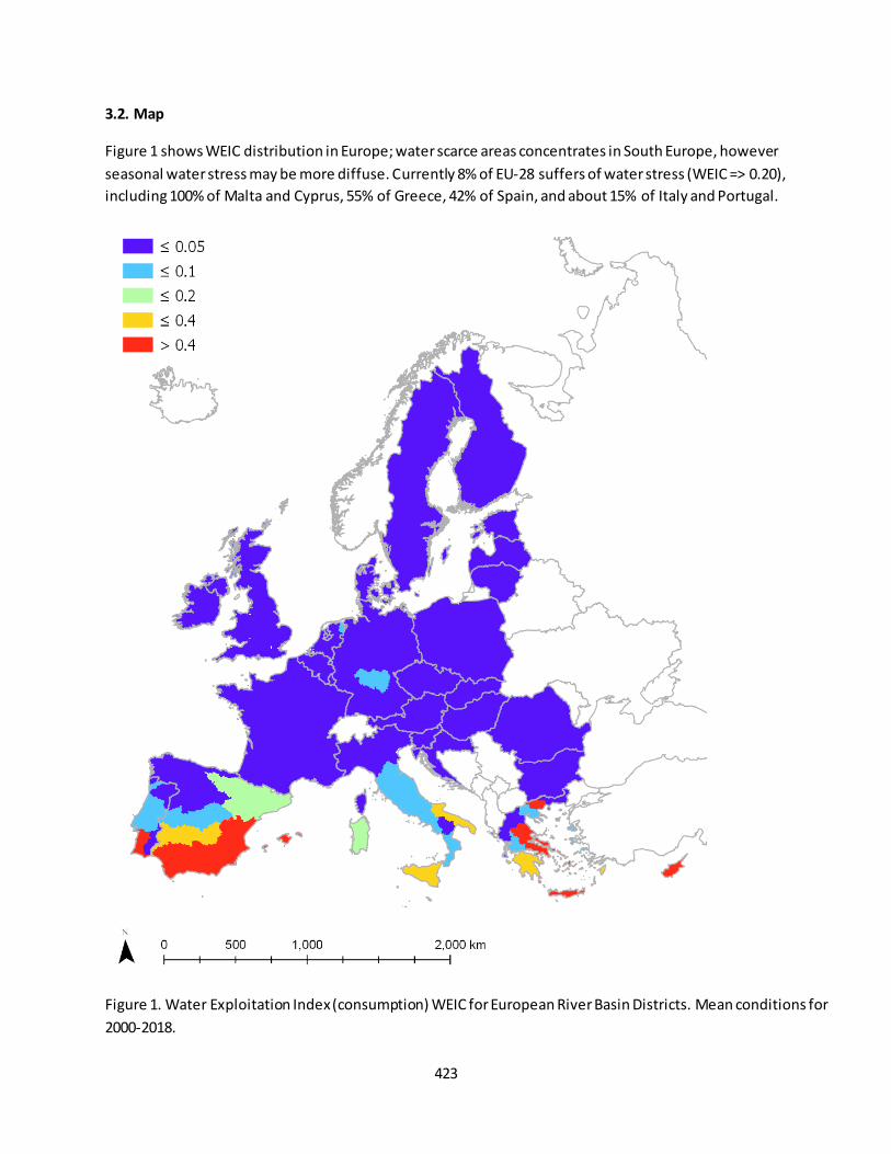
423
3.2. Map
Figure 1 shows WEIC distribution in Europe; water scarce areas concentrates in South Europe, however
seasonal water stress may be more diffuse. Currently 8% of EU-28 suffers of water stress (WEIC => 0.20),
including 100% of Malta and Cyprus, 55% of Greece, 42% of Spain, and about 15% of Italy and Portugal.
Figure 1. Water Exploitation Index (consumption) WEIC for European River Basin Districts. Mean conditions for
2000-2018.
424
3.3. Key trend at EU level
Water demands and consumption rates in this model application were assumed constant in time, and were
estimated for average conditions in the 2010s. No trend was derived.
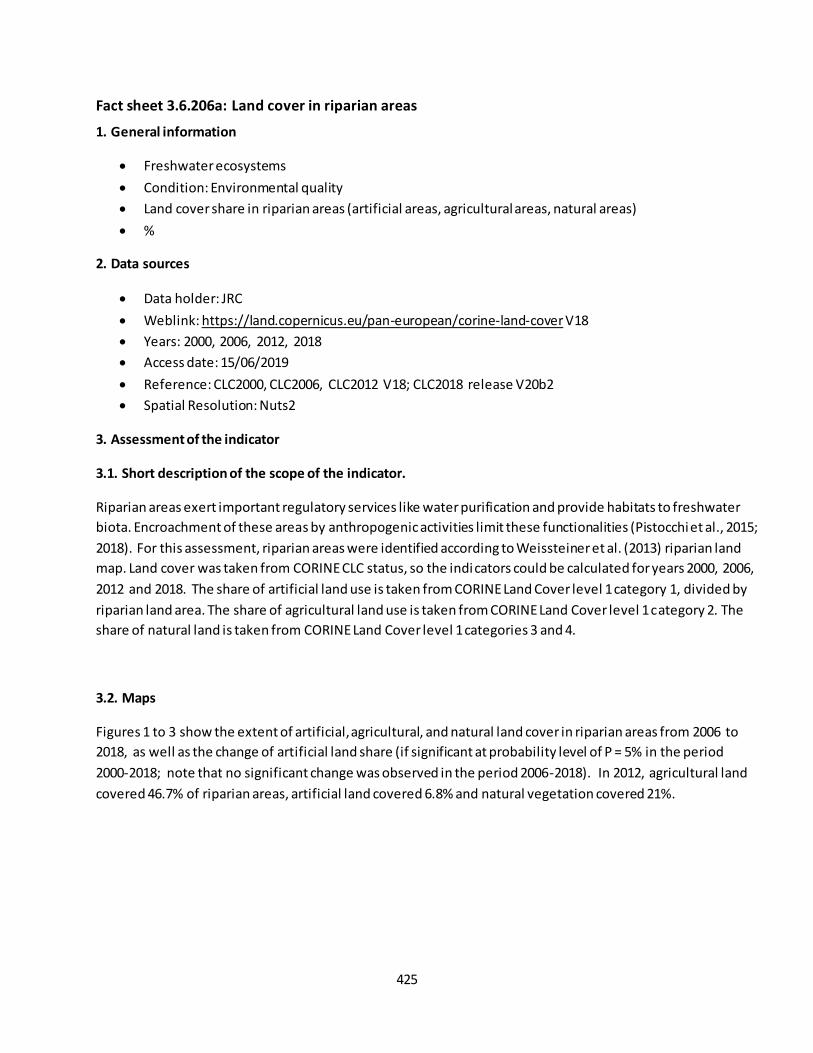
425
Fact sheet 3.6.206a: Land cover in riparian areas
1. General information
Freshwater ecosystems
Condition: Environmental quality
Land cover share in riparian areas (artificial areas, agricultural areas, natural areas)
%
2. Data sources
Data holder: JRC
Weblink: https://land.copernicus.eu/pan-european/corine-land-cover V18
Years: 2000, 2006, 2012, 2018
Access date: 15/06/2019
Reference: CLC2000, CLC2006, CLC2012 V18; CLC2018 release V20b2
Spatial Resolution: Nuts2
3. Assessment of the indicator
3.1. Short description of the scope of the indicator.
Riparian areas exert important regulatory services like water purification and provide habitats to freshwater
biota. Encroachment of these areas by anthropogenic activities limit these functionalities (Pistocchi et al., 2015;
2018). For this assessment, riparian areas were identified according to Weissteiner et al. (2013) riparian land
map. Land cover was taken from CORINE CLC status, so the indicators could be calculated for years 2000, 2006,
2012 and 2018. The share of artificial land use is taken from CORINE Land Cover level 1 category 1, divided by
riparian land area. The share of agricultural land use is taken from CORINE Land Cover level 1 category 2. The
share of natural land is taken from CORINE Land Cover level 1 categories 3 and 4.
3.2. Maps
Figures 1 to 3 show the extent of artificial, agricultural, and natural land cover in riparian areas from 2006 to
2018, as well as the change of artificial land share (if significant at probability level of P = 5% in the period
2000-2018; note that no significant change was observed in the period 2006-2018). In 2012, agricultural land
covered 46.7% of riparian areas, artificial land covered 6.8% and natural vegetation covered 21%.
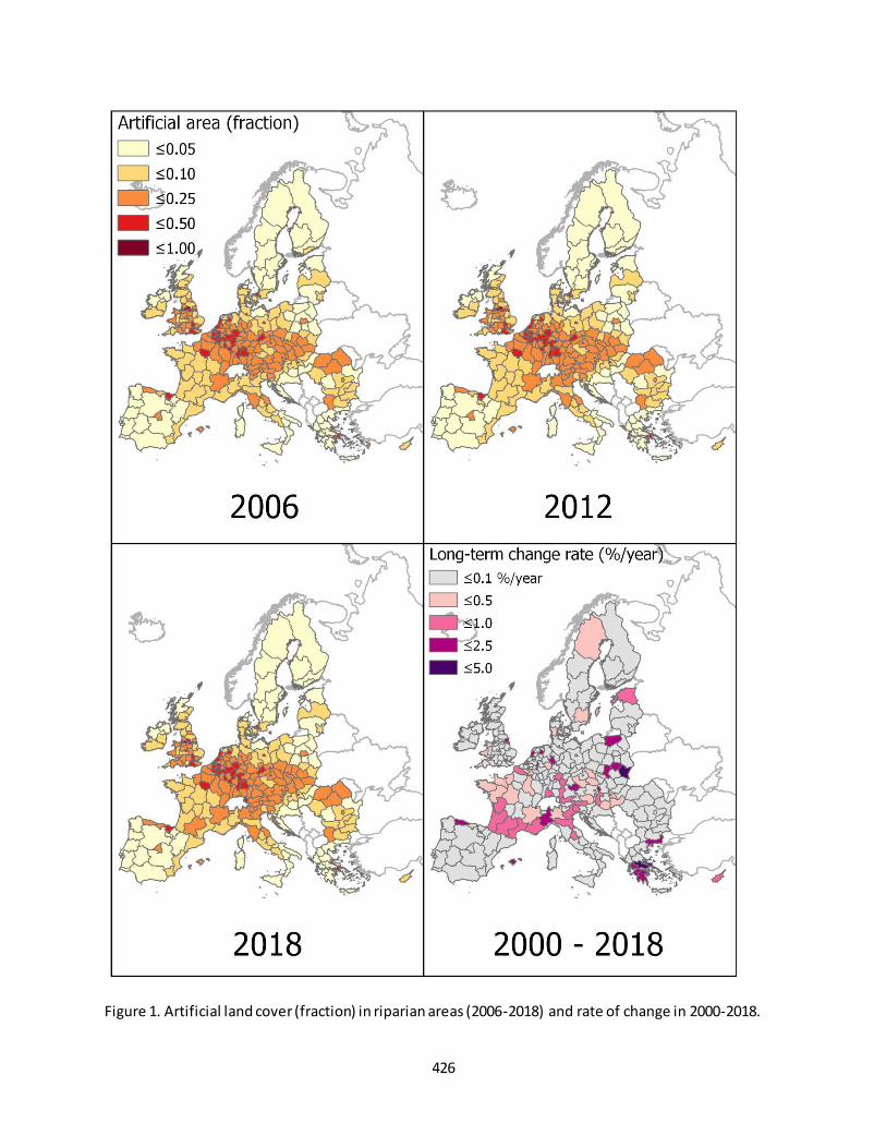
426
Figure 1. Artificial land cover (fraction) in riparian areas (2006-2018) and rate of change in 2000-2018.
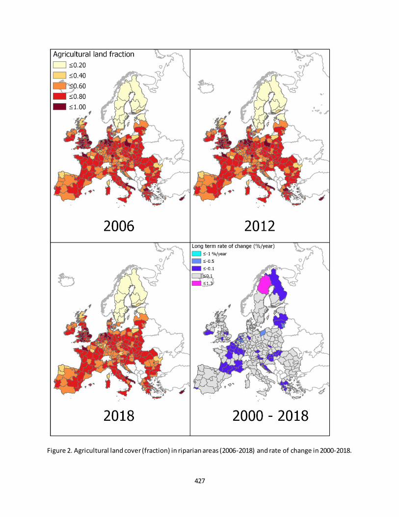
427
Figure 2. Agricultural land cover (fraction) in riparian areas (2006-2018) and rate of change in 2000-2018.
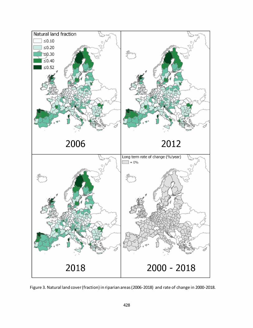
428
Figure 3. Natural land cover (fraction) in riparian areas (2006-2018) and rate of change in 2000-2018.
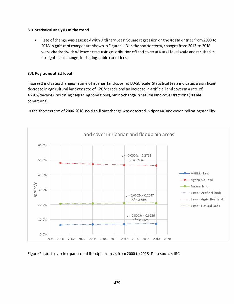
429
3.3. Statistical analysis of the trend
Rate of change was assessed with Ordinary Least Square regression on the 4 data entries from 2000 to
2018; significant changes are shown in Figures 1-3. In the shorter term, changes from 2012 to 2018
were checked with Wilcoxon tests using distribution of land cover at Nuts2 level scale and resulted in
no significant change, indicating stable conditions.
3.4. Key trend at EU level
Figures 2 indicates changes in time of riparian land cover at EU-28 scale. Statistical tests indicated a significant
decrease in agricultural land at a rate of -2%/decade and an increase in artificial land cover at a rate of
+6.8%/decade (indicating degrading conditions), but no change in natural land cover fractions (stable
conditions).
In the shorter term of 2006-2018 no significant change was detected in riparian land cover indicating stability.
Figure 2. Land cover in riparian and floodplain areas from 2000 to 2018. Data source: JRC.
y = 0,0005x - 0,8526 R² = 0,9425
y = -0,0009x + 2,2795 R² = 0,934
y = 0,0002x - 0,2047
R² = 0,8591
0,0%
10,0%
20,0%
30,0%
40,0%
50,0%
60,0%
1998 2000 2002 2004 2006 2008 2010 2012 2014 2016 2018 2020
kg N
/ha
/y
Land cover in riparian and floodplain areas
Artificial land
Agricultual land
Natural land
Linear (Artificial land)
Linear (Agricultual land)
Linear (Natural land)
430
These indicators suggest urbanization of riparian land at the cost of agricultural land (cropland and grassaland).
This is corroborated by conclusions from land take indicator in potential floodplains based on CLC accounting
datasets.
References
Weissteiner, C.J., Martin Ickerott, M., Ott, H., probeck, M., Ramminger, G., Clerici , N., Dufourmont, H., Ribeiro
de Souse, A.M. 2016. Europe’s green arteries – a continental dataset of riparian zones. Remote Sensing 8, 925:
doi: 10.3390/rs8110925
Pistocchi, A., Aloe, A., Bizzi, S., Bouraoui, F., Burek, P., de Roo, A., Grizzetti, B., van de Bund, W., Liquete, C.,
Pastori, M., Sala, F., Stips, A., Weissteiner, C., Bidoglio, G. 2015. Assessment of the effectiveness of reported
Water Framework Directive Programmes of Measures. Part I – Pan-European screening of the pressures
addressed by member states. JRC Technical Reports, report EUR27465EN.
http://publications.jrc.ec.europa.eu/repository/handle/JRC96943
Pistocchi, A., Aloe, A., Grizzetti, B., Udias Moinelo, A., Vigiak, O., Bisselink, B., Bouraoui, F., de Roo, A., Gelati,
E., Pastori, M., Van De Bund, W. 2018. Assessment of the effectiveness of reported Water Framework Directive
Programmes of Measures - Part III – JRC Pressure Indicators v.2.0: nutrients, urban runoff, flow regime and
hydromorphological alteration. JRC Technical Reports, report EUR 29045 EN.

431
Fact sheet 3.6.206b: Hydromorphological alteration (density of infrastructures in riparian areas)
1. General information
Freshwater ecosystems
Environmental quality
Hydromorphological alteration by infrastructures in riparian/floodplain areas
km of infrastructure/km2 of riparian-floodplain areas
2. Data sources
Data holder: JRC
Weblink: https://data.jrc.ec.europa.eu/collection/wpi
Years: 2015
Access date: July 2019
Reference: Pistocchi, A., Aloe, A., Grizzetti, B., Udias Moinelo, A., Vigiak, O., Bisselink, B., Bouraoui, F.,
de Roo, A., Gelati, E., Pastori, M., Van De Bund, W. 2018. Assessment of the effectiveness of reported
Water Framework Directive Programmes of Measures - Part III – JRC Pressure Indicators v.2.0:
nutrients, urban runoff, flow regime and hydromorphological alteration. JRC Technical Reports, report
EUR 29045 EN
Spatial Resolution: Nuts2
3. Assessment of the indicator
3.1. Short description of the scope of the indicator.
The presence of infrastructures in riparian areas can be considered a proxy for human pressures on the aquatic
habitats, disturbing the natural setting. Linear infrastructures (roads and railways) in riparian areas were
mapped on the basis of the OpenStreetMap road and railway segments accessed in 2016. The extent of
riparian areas was mapped by Weissteiner et al. (2013). Density is expressed in km of linear infrastructure per
km2 of riparian areas, and for the purposes of MAES has been aggregated at NUTS2 level.
3.2. Maps
Figure 1 shows the density of infrastructures in riparian land. At EU-28 level, the mean density is 2.03 km/km2.
Besides urbanized areas, high infrastructure densities can be observe d in central Europe and in mountain
ranges (e.g. Alps).
3.3. Key trend at EU level
The indicator is static in time, and representative for 2015 conditions. No trend is available.
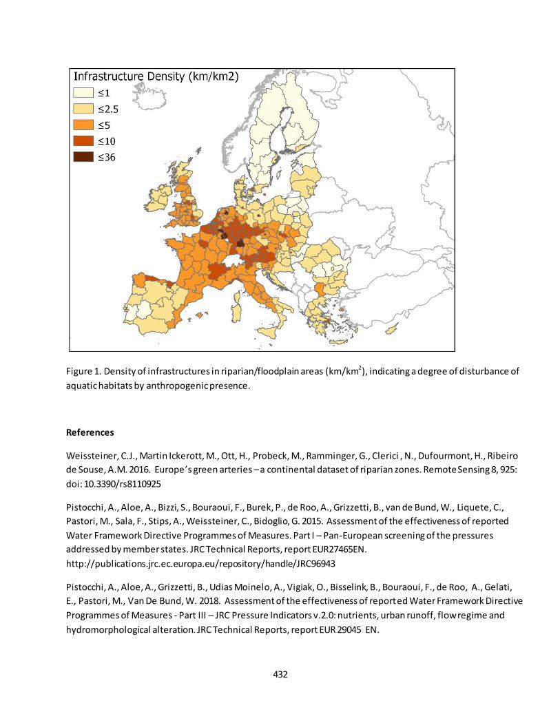
432
Figure 1. Density of infrastructures in riparian/floodplain areas (km/km2), indicating a degree of disturbance of
aquatic habitats by anthropogenic presence.
References
Weissteiner, C.J., Martin Ickerott, M., Ott, H., Probeck, M., Ramminger, G., Clerici , N., Dufourmont, H., Ribeiro
de Souse, A.M. 2016. Europe’s green arteries – a continental dataset of riparian zones. Remote Sensing 8, 925:
doi: 10.3390/rs8110925
Pistocchi, A., Aloe, A., Bizzi, S., Bouraoui, F., Burek, P., de Roo, A., Grizzetti, B., van de Bund, W., Liquete, C.,
Pastori, M., Sala, F., Stips, A., Weissteiner, C., Bidoglio, G. 2015. Assessment of the effectiveness of reported
Water Framework Directive Programmes of Measures. Part I – Pan-European screening of the pressures
addressed by member states. JRC Technical Reports, report EUR27465EN.
http://publications.jrc.ec.europa.eu/repository/handle/JRC96943
Pistocchi, A., Aloe, A., Grizzetti, B., Udias Moinelo, A., Vigiak, O., Bisselink, B., Bouraoui, F., de Roo, A., Gelati,
E., Pastori, M., Van De Bund, W. 2018. Assessment of the effectiveness of reported Water Framework Directive
Programmes of Measures - Part III – JRC Pressure Indicators v.2.0: nutrients, urban runoff, flow regime and
hydromorphological alteration. JRC Technical Reports, report EUR 29045 EN.
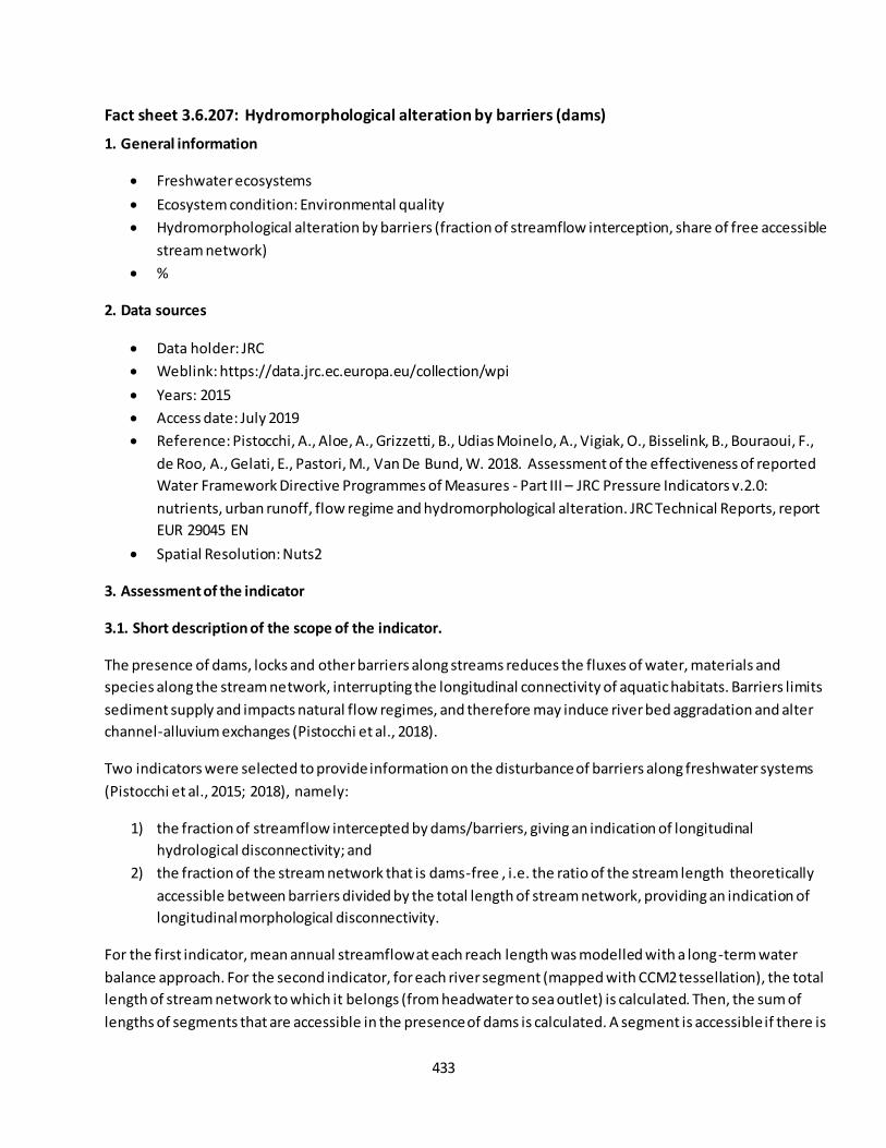
433
Fact sheet 3.6.207: Hydromorphological alteration by barriers (dams)
1. General information
Freshwater ecosystems
Ecosystem condition: Environmental quality
Hydromorphological alteration by barriers (fraction of streamflow interception, share of free accessible
stream network)
%
2. Data sources
Data holder: JRC
Weblink: https://data.jrc.ec.europa.eu/collection/wpi
Years: 2015
Access date: July 2019
Reference: Pistocchi, A., Aloe, A., Grizzetti, B., Udias Moinelo, A., Vigiak, O., Bisselink, B., Bouraoui, F.,
de Roo, A., Gelati, E., Pastori, M., Van De Bund, W. 2018. Assessment of the effectiveness of reported
Water Framework Directive Programmes of Measures - Part III – JRC Pressure Indicators v.2.0:
nutrients, urban runoff, flow regime and hydromorphological alteration. JRC Technical Reports, report
EUR 29045 EN
Spatial Resolution: Nuts2
3. Assessment of the indicator
3.1. Short description of the scope of the indicator.
The presence of dams, locks and other barriers along streams reduces the fluxes of water, materials and
species along the stream network, interrupting the longitudinal connectivity of aquatic habitats. Barriers limits
sediment supply and impacts natural flow regimes, and therefore may induce river bed aggradation and alter
channel-alluvium exchanges (Pistocchi et al., 2018).
Two indicators were selected to provide information on the disturbance of barriers along freshwater systems
(Pistocchi et al., 2015; 2018), namely:
1) the fraction of streamflow intercepted by dams/barriers, giving an indication of longitudinal
hydrological disconnectivity; and
2) the fraction of the stream network that is dams-free , i.e. the ratio of the stream length theoretically
accessible between barriers divided by the total length of stream network, providing an indication of
longitudinal morphological disconnectivity.
For the first indicator, mean annual streamflow at each reach length was modelled with a long-term water
balance approach. For the second indicator, for each river segment (mapped with CCM2 tessellation), the total
length of stream network to which it belongs (from headwater to sea outlet) is calculated. Then, the sum of
lengths of segments that are accessible in the presence of dams is calculated. A segment is accessible if there is
434
no dam in between. The indicator is the ratio of the total accessible length over the total length of the stream
network and represents the share of naturally available habitat. The analysis was conducted at 1 km resolution.
Dams, weirs and locks were delineated enlarging the EuroRegionalMap v6.04, including some 3000 dams with a
reservoir of at least 0.4 km2 surface, with other sources.
The dataset can be considered valid for 2015, however mapped barriers are likely incomplete. Further,
presence of mitigation measures could not be considered.
3.2. Maps
Figure 1 shows the distribution of hydromorphological indicators in EU-28 for the year 2015. At the EU-28
scale, 60.3% of streamflow is intercepted by barriers that alter material fluxes, whereas the accessible network
(both upstream and downstream) is 3.8% of what would be in the absence of barriers. The areas more
impacted by barriers are the Iberian Peninsula, South of France, Central Europe and most of the Danube basin.
Regions that appear to be less impacted by barriers are the Baltic countries, Ireland and the Unite d Kingdom in
the North, and Greece, centre and South of Italy, Malta and Cyprus in the South.
3.3. Key trend at EU level
Information used to calculate these indicators is static, and no trend can be provided.
References
Pistocchi, A., Aloe, A., Bizzi, S., Bouraoui, F., Burek, P., de Roo, A., Grizzetti, B., van de Bund, W., Liquete, C.,
Pastori, M., Sala, F., Stips, A., Weissteiner, C., Bidoglio, G. 2015. Assessment of the effectiveness of reported
Water Framework Directive Programmes of Measures. Part I – Pan-European screening of the pressures
addressed by member states. JRC Technical Reports, report EUR27465EN.
http://publications.jrc.ec.europa.eu/repository/handle/JRC96943
Pistocchi, A., Aloe, A., Grizzetti, B., Udias Moinelo, A., Vigiak, O., Bisselink, B., Bouraoui, F., de Roo, A., Gelati,
E., Pastori, M., Van De Bund, W. 2018. Assessment of the effectiveness of reported Water Framework Directive
Programmes of Measures - Part III – JRC Pressure Indicators v.2.0: nutrients, urban runoff, flow regime and
hydromorphological alteration. JRC Technical Reports, report EUR 29045 EN.
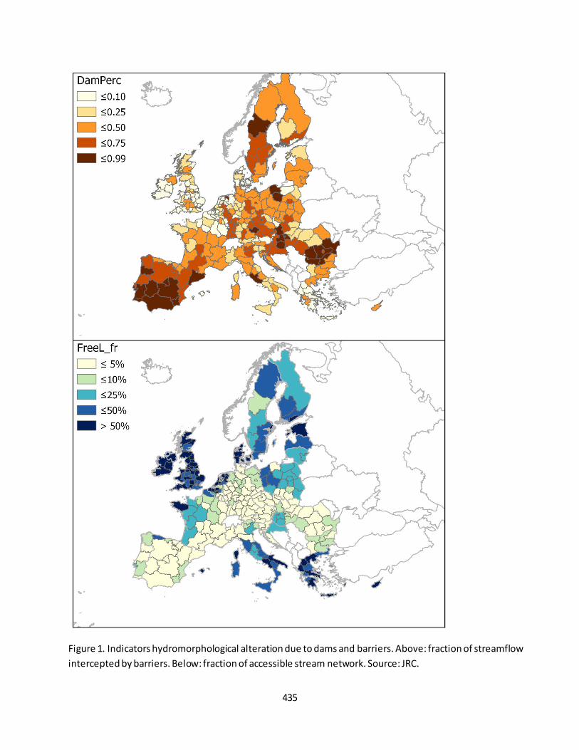
435
Figure 1. Indicators hydromorphological alteration due to dams and barriers. Above: fraction of streamflow
intercepted by barriers. Below: fraction of accessible stream network. Source: JRC.

436
Fact sheet 3.6.208: Ecological status or potential of European rivers and lakes
1. General information
Freshwater ecosystems
Environmental quality
Ecological status or potential of rivers and lakes
Classes: High, Good, Moderate, Bad, Poor, or Unknown
2. Data sources
Data holder: EEA and Commission (DG ENV)
Weblink: WISE Water Framework Directive Database, WISE-Freshwater WFD dashboards on Ecological
status of surface water bodies
Years: 2010-2015 (second River Basin Management Program RBMPs round; note that many RBMPs
only included results up to 2012/13), and before 2009 (first RBMPs)
Access date: July 2019
Reference: EEA 2018, European waters – assessment of status and pressures 2018. EEA Report No
7/2018. Available at https://www.eea.europa.eu/publications/state-of-water
After this publication data are updated with Ireland (and Norway).
Spatial Resolution: River basin districts excluding Lithuania and Greece who have not yet finalized the
data reporting for the 2nd RBMPs
3. Assessment of the indicator
3.1. Short description of the scope of the indicator.
According to the Water Framework Directive (EC, 2000) the ecological status of surface water bodies is
assessed on the basis of several standards for the ecology, chemistry, morphology and quantity of waters.
These criteria for the quality of the structure and functioning of surface water ecosystems. In general terms,
good status means that water shows only a slight change from what would normally be expected under
undisturbed conditions (i.e. with a low human impact). More specifically, a surface water body has achieved
good ecological status when ‘the values of the biological quality elements for the surface water body type show
low levels of distortion resulting from human activity, but deviate only slightly from those normally associated
with the surface water body type under undisturbed conditions ’ (EU, 2000). Ecological status is used here as a
proxy for the overall status of waters. This is because ecological status is influenced by water quality (e.g.
pollution levels of all types), hydromorphological pressures as well as by the amount of available water.
The indicator is defined as the number of surface water bodies not achieving at least ‘good’ ecological status or
‘good’ ecological potential. The indicator covers the current status of surface waters as reported in the second
River Basin Management Plans (RBMPs, with reference period 2010-2015), based on the information reported
by Member States and stored in the WISE-WFD database. It is aggregated at the scale of river basin
management district. A comparison is made with the data reported in the first RBMPs (EEA, 2018).
3.2. Maps
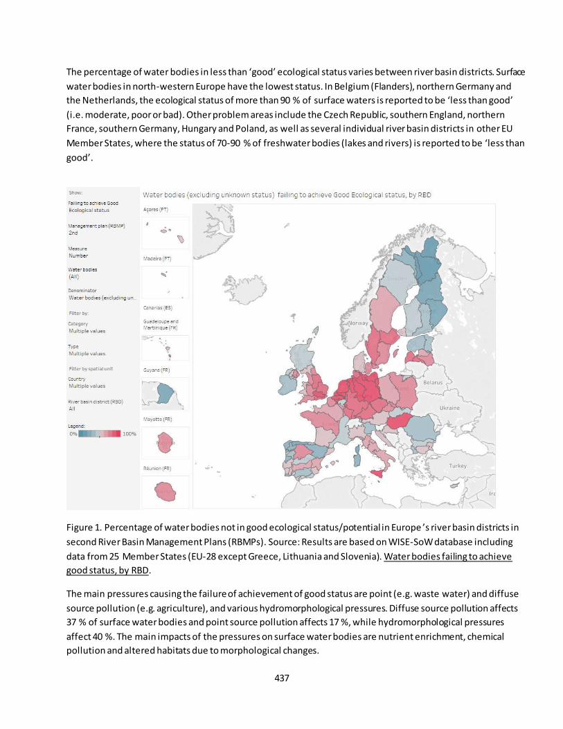
437
The percentage of water bodies in less than ‘good’ ecological status varies between river basin districts. Surface
water bodies in north-western Europe have the lowest status. In Belgium (Flanders), northern Germany and
the Netherlands, the ecological status of more than 90 % of surface waters is reported to be ‘less than good’ (i.e. moderate, poor or bad). Other problem areas include the Czech Republic, southern England, northern
France, southern Germany, Hungary and Poland, as well as several individual river basin districts in other EU
Member States, where the status of 70-90 % of freshwater bodies (lakes and rivers) is reported to be ‘less than
good’.
Figure 1. Percentage of water bodies not in good ecological status/potential in Europe ’s river basin districts in
second River Basin Management Plans (RBMPs). Source: Results are based on WISE-SoW database including
data from 25 Member States (EU-28 except Greece, Lithuania and Slovenia). Water bodies failing to achieve
good status, by RBD.
The main pressures causing the failure of achievement of good status are point (e.g. waste water) and diffuse
source pollution (e.g. agriculture), and various hydromorphological pressures. Diffuse source pollution affects
37 % of surface water bodies and point source pollution affects 17 %, while hydromorphological pressures
affect 40 %. The main impacts of the pressures on surface water bodies are nutrient enrichment, chemical
pollution and altered habitats due to morphological changes.
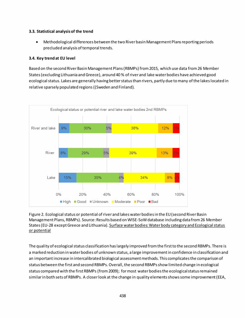
438
3.3. Statistical analysis of the trend
Methodological differences between the two River basin Management Plans reporting periods
precluded analysis of temporal trends.
3.4. Key trend at EU level
Based on the second River Basin Management Plans (RBMPs) from 2015, which use data from 26 Member
States (excluding Lithuania and Greece), around 40 % of river and lake water bodies have achieved good
ecological status. Lakes are generally having better status than rivers, partly due to many of the lakes located in
relative sparsely populated regions ((Sweden and Finland).
Figure 2. Ecological status or potential of river and lakes water bodies in the EU (second River Basin Management Plans, RBMPs). Source: Results based on WISE-SoW database including data from 26 Member States (EU-28 except Greece and Lithuania). Surface water bodies: Water body category and Ecological status or potential
The quality of ecological status classification has largely improved from the first to the second RBMPs. There is
a marked reduction in water bodies of unknown status, a large improvement in confidence in classification and
an important increase in intercalibrated biological assessment methods. This complicates the comparison of
status between the first and second RBMPs. Overall, the second RBMPs show limited change in ecological
status compared with the first RBMPs (from 2009); for most water bodies the ecological status remained
similar in both sets of RBMPs. A closer look at the change in quality elements shows some improvement (EEA,

439
2018). The improvements are seen in all the most commonly used biological quality elements in rivers, bu t they
are less clear in phytoplankton in lakes.
Figure 3. Comparison of ecological status reported in the second RBMPs (2010-2015) and the first RBMPs
(2009). Source: Results are based on WISE-SoW database including data from 26 Member States (EU-28 except
Greece and Lithuania). Surface water bodies ecological status or potential in first and second RBMPs.
Further references
European Commission (EC). 2000. Water Framework Directive (WFD) 2000/60/EC.
http://ec.europa.eu/environment/water/water-framework/index_en.html
440
Fact sheet 3.6.209: Fraction of freshwater habitats protected by Natura 2000 sites and/or
Nationally designated areas - CDDA
1. General information
Freshwater ecosystems
Condition: Structural ecosystem attributes monitored under the EU Nature directives
Fraction of ecosystem covered by protected areas (by Natura 2000 sites; by nationally designated areas
– CDDA; and by the overlapping of both networks) from 2000 to 2018
Percentage (%)
2. Data sources
Data holder: EEA
Weblinks:
Corine Land Cover https://www.eea.europa.eu/data-and-maps/data/corine-land-cover-accounting-
layers#tab-european-data
Natura 2000 data - the European network of protected sites: https://www.eea.europa.eu/data-and-
maps/data/natura-10
CDDA data - Nationally designated areas: https://www.eea.europa.eu/data-and-maps/data/nationally-
designated-areas-national-cdda-13
Year or time-series range 2000 / 2006 / 2012 / 2018
Versions
o Corine Land Cover 2000 (raster 100m) version 20 accounting layer, Jun. 2019
o Corine Land Cover 2006 (raster 100m) version 20 accounting layer, Jun. 2019
o Corine Land Cover 2012 (raster 100m) version 20 accounting layer, Jun. 2019
o Corine Land Cover 2018 (raster 100m) version 20 accounting layer, Jun. 2019
o Natura 2000 End 2018 – Shapefile
o Natura 2000 End 2013 rev1 – Shapefile
o CDDA 2018 – Shapefile
3. Assessment of the indicator
3.1. Short description of the scope of the indicator.
The EU Nature Directives (Birds and Habitats) are the centerpiece of its nature legislation and biodiversity
policy. The Natura 2000 sites are one of the Nature Directive's main tools that contribute to ensuring the
conservation of many species and habitats of EU interest. Its purpose is primarily to ensure the conservation of
targeted species and habitats of European interest. Every country has designated Natura 2000 sites to help
conserve the rare habitats and species present in their territory. Progress in designating sites was slow at first
but currently the protected area is over 18 % of the EU’s land, being the largest network of protected areas in
the world (EEA, 2012). The Natura 2000 network is largely complete as far as the terrestrial environment is
441
concerned and connectivity — spatial and functional — of Natura 2000 sites across national borders is
relatively good.
The ‘nationally designated protected area' (CDDA) is an area designated by a national designation instrument,
based on national legislation. If a country has included sites designated under international agreements such as
the EU Birds and Habitats Directives, or the Bern or Ramsar Convention in its legislation, those figures overlap
spatially. The degree of overlap between Natura 2000 sites and CDDA sites illustrates the extent to which
countries have made use of their nationally designated areas to underpin Natura 2000 and to what e xtent
Natura 2000 sites extend beyond national systems.
The overlap of Natura 2000 boundaries with the boundaries of nationally designated sites shows very different
patterns across the EU. While the Natura 2000 digital maps fully reflect the actual extension of the network,
the CDDA digital maps only reflects what countries have reported on a voluntary basis to the European
Environment Agency. Moreover, in the case of a few countries, there are issues regarding the completeness of
some of the IUCN data they have included in the CDDA database.
In this assessment for each biogeoregion we report the area fraction of river and lakes (as indicated in CLC 1 ha
raster layers) covered by Natura 2000 sites and/or CDDA as well as the fraction of ecosystem that is not
covered by protection regulation. The indicators are calculated from spatial overlap of rivers and lakes
indicated in CLC 2000, 2006, 2012 with Natura 2000 network informed by MS at the end of 2013 (previous
versions of spatial data of Natura 2000 present gaps and geometric inconsistences), and from CLC 2018 with
Natura 2000 version provided by 2018, and the nationally designated areas informed by MS in 2018. Changes
in time of the indicators could be due to changes in the extent of either the ecosystem or of the protection
zones, e.g. by the designation of new areas or by the modification of the limits of those already existing. Both
cases are included in this assessment and no attempt is made to distinguish the two cases. Due to partial
overlap between Natura2000 sites and CDDA, also the fraction of unprotected areas is reported.
3.2. Maps
The indicators are provided as tabular information aggregated at biogeographical region. Figure 1 shows the
fractions of protected or not protected areas for the year 2012.
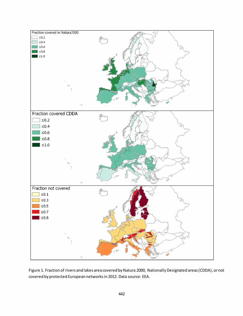
442
Figure 1. Fraction of rivers and lakes area covered by Natura 2000, Nationally Designated areas (CDDA), or not
covered by protected European networks in 2012. Data source: EEA.
443
3.3. Statistical analysis of the trend
Changes in fractions of protected and not protected areas for the long term on the basis of 4
observations (2000, 2006, 2012, and 2018) was assessed with Ordinary Least Square Regression. No
attempt was made to assess changes in the short term (after 2010) due to limited number of
observations.
3.4. Key trend at EU level
In the EU-28 territory the fraction of river and lakes covered by Natura 2000 sites in 2010 was estimated at
32.4% and the fraction of areas protected by Nationally Designated areas was estimated at 19.9%. The
overlapping between the two networks was such that the fraction of rivers and lakes not covered by regulation
was estimated at 63.4%. A large variability between bio-geographical regions (of variable size too) can be
observed in Figure 1. In the Black Sea and Steppic regions, Natura 2000 sites cover more than 80% of river and
lakes, whereas in the boreal region they cover 19.8%. CDDA areas covers more than 90% of Macaronesian
rivers and lakes, but only 7.5% of the boreal region. The fraction of unprotected river and lakes ranged from
less than 4% in Black sea and Macaronesian regions to 80% in the boreal region. Practically, these fractions did
not change through time at EU-28 scale. However, in three bio-geographical regions, a slight reduction of rivers
and lakes protected by Natura2000 and CDDA since 2000 to 2018 is noted (Table 1).
Table 1. Decadal rate of change (%) of fractions of rivers and lakes protected by Natura 2000 sites, National Designated
(CDDA) Areas, or not protected by regulation for the 2000-2018 period. Only changes significant at 5% probability levels
are reported.
Bio-geographical region Change in Natura 2000 sites
(%/10 years)
Change in CDDA areas (%/10 years)
Change in unprotected areas
(%/10years)
Alpine 0 0 0
Atlantic -0.7% -0.5% 1.5% Black Sea 0 0 0
Boreal 0 0 0 Continental -1.0% -0.8% 1.9%
Macaronesian 0 0 0 Mediterranean 0 0 0
Pannonian -0.9% 0 2.4%
Steppic 0 0 0 EU-28 0 0 0
References
EEA, 2012. Protected areas in Europe - an overview.European Environment Agency. EEA Report / No 5/2012,
s.l.: s.n.

444
Fact sheet 3.7.101: Acidification
1. General information
Thematic ecosystem assessment: Marine ecosystems
Indicator class: Pressure/Climate change
Name of the indicator: Acidification
Units: pH
2. Data sources
The indicator is derived from the merge of readily available datasets. The derived dataset and has been
resampled at EU Marine Regions scale.
References for the derived dataset:
Dataholder: JRC; Contact: Anna M. Addamo, Francesca Somma
Time-series range: 1993-2015 (25 years of time-window and 75 depth levels).
Reference:
- Copernicus, CMEMS, GLOBAL_REANALYSIS_BIO_001_029 weblink:
http://marine.copernicus.eu/services-portfolio/access-to-products/
http://marine.copernicus.eu/ocean-monitoring-indicators-acidity/
3. Assessment of the indicator
The seawater pH is used to assess the pressure of the climate change due to human activities.
3.1. Short description of the scope of the indicator
The indicator expresses the ocean acidification. It provides an indirect measure of CO2 production . The
rationale of the indicator is based on the following assumption: ocean acidification is quantified by decreases in
pH, which represents the concentration of hydrogen ions (H+) in the water. A decrease in the pH value means
an increase in acidity, known as acidification. The pH of a solution is usually between 0 and 14, where pH >7
means that the solution is basic. At pH 7, the solution is neutral and if pH < 7, the solution is acidic. Seawater
pH is hence slightly basic as it is around 8.1 and it is becoming more acidic overtime (see Figure 1).
3.2. Maps
Not available.
3.3. Statistical analysis of the trend
The indicator is calculated as follows: dataset are derived from the extraction of the year-mean for each depth
levels, where the average of the seawater parameter for each year is computed from the monthly sub dataset
relative of each year and EU marine region. Statistical test that fit a regression model through the observed
data against time (in years) is performed per each EU marine regions, so that the change per decade is based
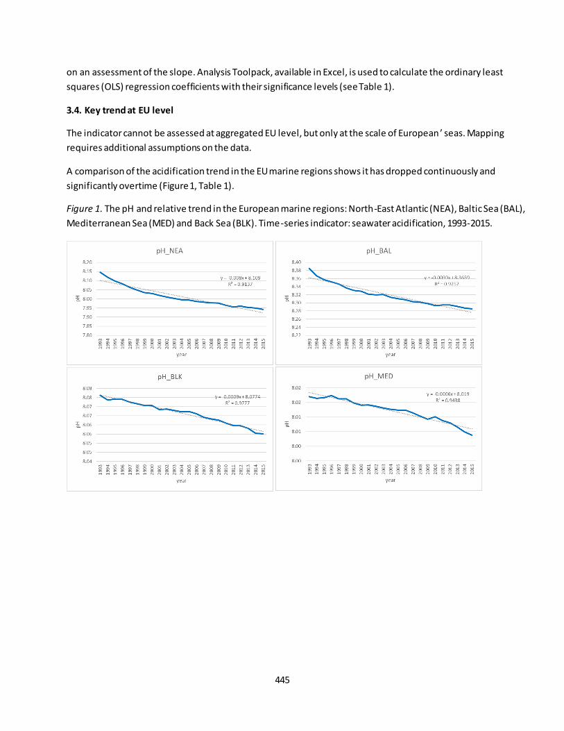
445
on an assessment of the slope. Analysis Toolpack, available in Excel, is used to calculate the ordinary least
squares (OLS) regression coefficients with their significance levels (see Table 1).
3.4. Key trend at EU level
The indicator cannot be assessed at aggregated EU level, but only at the scale of European ’ seas. Mapping
requires additional assumptions on the data.
A comparison of the acidification trend in the EU marine regions shows it has dropped continuously and
significantly overtime (Figure 1, Table 1).
Figure 1. The pH and relative trend in the European marine regions: North-East Atlantic (NEA), Baltic Sea (BAL),
Mediterranean Sea (MED) and Back Sea (BLK). Time-series indicator: seawater acidification, 1993-2015.

446
Table 1.
OLS regression coefficients, percentage change per decade and trend direction of short term (ST: 2010-2015)
and long term (LT: 1993-2015) for NEA, BAL, BLK and MED.
Further references
IPCC Special Report on the Ocean and Cryosphere in a Changing Climate [H.- O. Portner, D.C. Roberts, V. Masson-Delmotte, P. Zhai, M. Tignor, E. Poloczanska, K. Mintenbeck, A. Alegría, M. Nicolai, A. Okem, J. Petzold, B. Rama, N.M. Weyer (eds.)]. In press.
Korpinen, S., Klančnik, K., Peterlin, M., Nurmi, M., Laamanen, L., Zupančič, G., Murray, C., Harvey, T., Andersen, J.H., Zenetos, A., Stein, U., Tunesi, L., Abhold, K., Piet, G., Kallenbach, E., Agnesi, S., Bolman, B., Vaughan, D.,
Reker, J. & Royo Gelabert, E., 2019, Multiple pressures and their combined effects in Europe’s seas. ETC/ICM
Technical Report 4/2019: European Topic Centre on Inland, Coastal and Marine waters, 164 pp.
von Schuckmann, K. ((Editor)) et al. (2019) Copernicus Marine Service Ocean State Report, Issue 3, Journal of
Operational Oceanography, 12:sup1, S1-S123, DOI: 10.1080/1755876X.2019.1633075
EEA (2019) The European environment – state and outlook 2020. Knowledge for transition to a sustainable
Europe. 499 pp. DOI: 10.2800/96.749.
Parameters Acidification_NEA Acidification_BAL Acidification_BLK Acidification_MED
intercept 15.9253 12.0142 10.5910 10.5609
slope -0.0040 -0.0019 -0.0013 -0.0013
p-values 0.0048 0.0218 0.0012 0.0000
R2 0.8892 0.7691 0.9430 0.9904
ST_% change per decade -0.4973 -0.2230 -0.1561 -0.1584
ST_trend direction decrease decrease decrease decrease
MARINE CONDITION_ST DEGRADATION DEGRADATION DEGRADATION DEGRADATION
intercept 24.1028 16.0970 9.8876 9.1392
slope -0.0080 -0.0039 -0.0009 -0.0006
p-values 0.0000 0.0000 0.0000 0.0000
R2 0.9137 0.9257 0.9777 0.9438
LT_% change per decade -1.0081 -0.4678 -0.1127 -0.0702
LT_trend direction decrease decrease decrease decrease
MARINE CONDITION_LT DEGRADATION DEGRADATION DEGRADATION DEGRADATION
447
Fact sheet 3.7.102: Sea surface temperature
1. General information
Thematic ecosystem assessment: Marine ecosystems
Indicator class: Pressure/Climate change
Name of the indicator: Sea surface temperature
Units: Kelvin
2. Data sources
The indicator is derived from the merge of readily available datasets. The derived dataset and has been
resampled at EU Marine Regions scale.
References for the derived dataset:
Dataholder: JRC; Contact: Anna M. Addamo, Francesca Somma
Time-series range: 1993-2015 (25 years of time-window and 75 depth levels)
Reference:
- Copernicus, CMEMS, GLOBAL_REANALYSIS_PHY_001_025 weblink:
http://marine.copernicus.eu/services-portfolio/access-to-products/;
http://marine.copernicus.eu/training/education/ocean-parameters/temperature/
3. Assessment of the indicator
The sea surface temperature is used to assess the impact of human activities to marine ecosystem.
3.1. Short description of the scope of the indicator.
The indicator expresses the impact of human activities to marine ecosystem. It provides a direct measure of
the temperature of the ocean near the surface. The rationale of the indicator is based on the following
assumption: sea surface temperature (SST) is the temperature of the ocean near the surface. Knowing the
temperature of this part of the ocean is absolutely essential for many reasons: e.g. 1) it is the signs/results of
the exchange of energy between the ocean and the atmosphere, 2) it is the parameter that determines the
development of different biological organisms 3), important temperature variati ons as seen on a map (thermal
fronts) indicate prolific fishing zones. Sea surface temperature (SST) is increasing overtime (see Figure 1).
Sea surface temperature (SST) is the temperature of the ocean near the surface. Knowing the temperature of
this part of the ocean is absolutely essential for many reasons. For oceanographers, meteorologists and
climatologists, it is one of the signs/results of the exchange of energy between the ocean and the atmosphere.
For marine biologists, it is the parameter that determines the development of different biological organisms.
For fishermen, important temperature variations as seen on a map (thermal fronts) indicate prolific fishing
zones.
Meteorological phenomena such as El Niño or tropical hurricanes/cyclones are the direct consequences of
specific temperature variations at the sea-surface
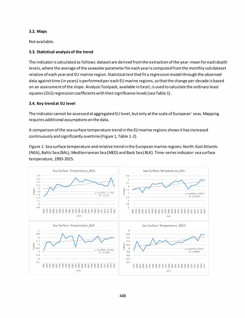
448
3.2. Maps
Not available.
3.3. Statistical analysis of the trend
The indicator is calculated as follows: dataset are derived from the extraction of the year-mean for each depth
levels, where the average of the seawater parameter for each year is computed from the monthly sub dataset
relative of each year and EU marine region. Statistical test that fit a regression model through the observed
data against time (in years) is performed per each EU marine regions, so that the change per decade is based
on an assessment of the slope. Analysis Toolpack, available in Excel, is used to calculate the ordinary least
squares (OLS) regression coefficients with their significance levels (see Table 1) .
3.4. Key trend at EU level
The indicator cannot be assessed at aggregated EU level, but only at the scale of European ’ seas. Mapping
requires additional assumptions on the data.
A comparison of the sea surface temperature trend in the EU marine regions shows it has increased
continuously and significantly overtime (Figure 1, Table 1-2).
Figure 1. Sea surface temperature and relative trend in the European marine regions: North-East Atlantic
(NEA), Baltic Sea (BAL), Mediterranean Sea (MED) and Back Sea (BLK). Time-series indicator: sea surface
temperature, 1993-2015.
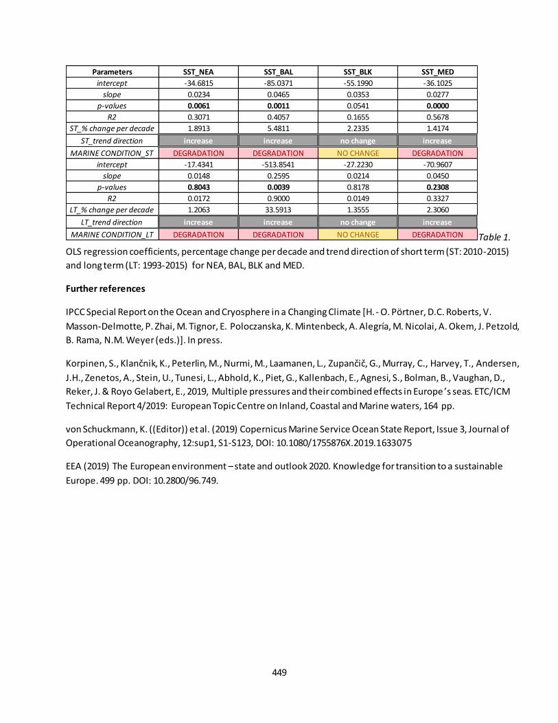
449
Table 1.
OLS regression coefficients, percentage change per decade and trend direction of short term (ST: 2010-2015)
and long term (LT: 1993-2015) for NEA, BAL, BLK and MED.
Further references
IPCC Special Report on the Ocean and Cryosphere in a Changing Climate [H. - O. Portner, D.C. Roberts, V. Masson-Delmotte, P. Zhai, M. Tignor, E. Poloczanska, K. Mintenbeck, A. Alegría, M. Nicolai, A. Okem, J. Petzold, B. Rama, N.M. Weyer (eds.)]. In press.
Korpinen, S., Klančnik, K., Peterlin, M., Nurmi, M., Laamanen, L., Zupančič, G., Murray, C., Harvey, T., Andersen, J.H., Zenetos, A., Stein, U., Tunesi, L., Abhold, K., Piet, G., Kallenbach, E., Agnesi, S., Bolman, B., Vaughan, D.,
Reker, J. & Royo Gelabert, E., 2019, Multiple pressures and their combined effects in Europe ’s seas. ETC/ICM
Technical Report 4/2019: European Topic Centre on Inland, Coastal and Marine waters, 164 pp.
von Schuckmann, K. ((Editor)) et al. (2019) Copernicus Marine Service Ocean State Report, Issue 3, Journal of
Operational Oceanography, 12:sup1, S1-S123, DOI: 10.1080/1755876X.2019.1633075
EEA (2019) The European environment – state and outlook 2020. Knowledge for transition to a sustainable
Europe. 499 pp. DOI: 10.2800/96.749.
Parameters SST_NEA SST_BAL SST_BLK SST_MED
intercept -34.6815 -85.0371 -55.1990 -36.1025
slope 0.0234 0.0465 0.0353 0.0277
p-values 0.0061 0.0011 0.0541 0.0000
R2 0.3071 0.4057 0.1655 0.5678
ST_% change per decade 1.8913 5.4811 2.2335 1.4174
ST_trend direction increase increase no change increase
MARINE CONDITION_ST DEGRADATION DEGRADATION NO CHANGE DEGRADATION
intercept -17.4341 -513.8541 -27.2230 -70.9607
slope 0.0148 0.2595 0.0214 0.0450
p-values 0.8043 0.0039 0.8178 0.2308
R2 0.0172 0.9000 0.0149 0.3327
LT_% change per decade 1.2063 33.5913 1.3555 2.3060
LT_trend direction increase increase no change increase
MARINE CONDITION_LT DEGRADATION DEGRADATION NO CHANGE DEGRADATION
450
Fact sheet 3.7.103: Sea level anomaly
1. General information
Thematic ecosystem assessment: Marine ecosystems
Indicator class: Pressure/Climate change
Name of the indicator: Sea level anomaly
Units: meter
2. Data sources
The indicator is derived from the merge of readily available datasets. The derived dataset and has been
resampled at EU Marine Regions scale.
References for the derived dataset:
Dataholder: JRC; Contact: Anna M. Addamo, Francesca Somma
Time-series range: 1993-2015 (25 years of time-window)
Reference:
- Copernicus, CMEMS, GLOBAL_REANALYSIS_PHY_001_025 weblink:
http://marine.copernicus.eu/services-portfolio/access-to-products/;
http://marine.copernicus.eu/training/education/ocean-parameters/sea-level/
3. Assessment of the indicator
The sea level anomaly is used to assess the sea level rise.
3.1. Short description of the scope of the indicator.
The indicator expresses the sea level anomaly. It provides an indirect measure of sea level rise. Sea level
anomaly is the height of water over the mean sea surface in a given time and region. The rationale of the
indicator is based on the following assumption: the sea surface is anything but flat. There are bumps and
troughs, all due to different physical characteristics such as gravity, currents, temperature and salinity. Since it
is not know much about the ocean’s bottom, it is easier to refer to “sea height” instead of sea depth. Sea level
is measured with reference to a fixed surface height. By analyzing variations from this reference point,
scientists determine ocean circulation (currents and eddies at the edges of holes and bumps), seasonal or inter-
annual variations, or even longer periods (long-term rise in sea level)43. Sea level is quantified by increase in sea
level anomaly (SLA). An increase in the SLA value means an increase in sea level. Sea level anomaly is increasing
overtime (see Figure 1).
3.2. Maps
Not available.
43
http://marine.copernicus.eu/training/education/ocean-parameters/sea-level/

451
3.3. Statistical analysis of the trend
The indicator is calculated as follows: dataset are derived from global dataset of sea surface height (SSH) and
Mean Dynamic Topography (MDT). The SLA is obtain from the formula SLAx=SSHx-MDTx where x indicate the
mean of SSH and MDT for each year and EU marine region. Statistical test that fit a regression model through
the observed data against time (in years) is performed per each EU marine regions, so that the change per
decade is based on an assessment of the slope. Analysis Toolpack, available in Excel, is used to calculate the
ordinary least squares (OLS) regression coefficients with their significance levels (see Table 1).
3.4. Key trend at EU level
The indicator cannot be assessed at aggregated EU level, but only at the scale of European ’ seas. Mapping
requires additional assumptions on the data.
A comparison of the sea level anomaly trend in the EU marine regions shows it has increased continuously and
significantly overtime (Figure 1, Table 1-2).
Figure 1. Sea level anomaly and relative trend in the European marine regions: North-East Atlantic (NEA), Baltic
Sea (BAL), Mediterranean Sea (MED) and Back Sea (BLK). Time-series indicator: sea surface height, 1993-2015.
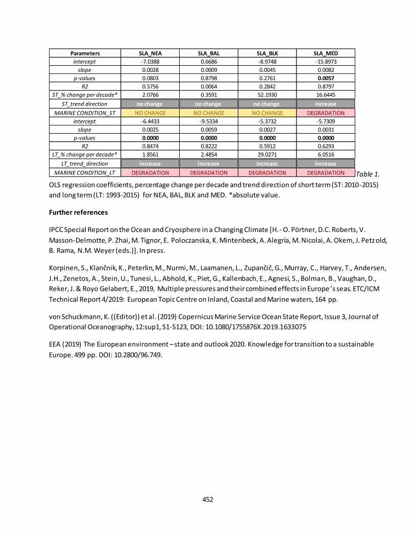
452
Table 1.
OLS regression coefficients, percentage change per decade and trend direction of short term (ST: 2010-2015)
and long term (LT: 1993-2015) for NEA, BAL, BLK and MED. *absolute value.
Further references
IPCC Special Report on the Ocean and Cryosphere in a Changing Climate [H. - O. Portner, D.C. Roberts, V. Masson-Delmotte, P. Zhai, M. Tignor, E. Poloczanska, K. Mintenbeck, A. Alegría, M. Nicolai, A. Okem, J. Petzold,
B. Rama, N.M. Weyer (eds.)]. In press.
Korpinen, S., Klančnik, K., Peterlin, M., Nurmi, M., Laamanen, L., Zupančič, G., Murray, C., Harvey, T., Andersen, J.H., Zenetos, A., Stein, U., Tunesi, L., Abhold, K., Piet, G., Kallenbach, E., Agnesi, S., Bolman, B., Vaughan, D.,
Reker, J. & Royo Gelabert, E., 2019, Multiple pressures and their combined effects in Europe ’s seas. ETC/ICM
Technical Report 4/2019: European Topic Centre on Inland, Coastal and Marine waters, 164 pp.
von Schuckmann, K. ((Editor)) et al. (2019) Copernicus Marine Service Ocean State Report, Issue 3, Journal of
Operational Oceanography, 12:sup1, S1-S123, DOI: 10.1080/1755876X.2019.1633075
EEA (2019) The European environment – state and outlook 2020. Knowledge for transition to a sustainable
Europe. 499 pp. DOI: 10.2800/96.749.
Parameters SLA_NEA SLA_BAL SLA_BLK SLA_MED
intercept -7.0388 0.6686 -8.9748 -15.8973
slope 0.0028 0.0009 0.0045 0.0082
p-values 0.0803 0.8798 0.2761 0.0057
R2 0.5756 0.0064 0.2842 0.8797
ST_% change per decade* 2.0766 0.3591 52.1930 16.6445
ST_trend direction no change no change no change increase
MARINE CONDITION_ST NO CHANGE NO CHANGE NO CHANGE DEGRADATION
intercept -6.4433 -9.5334 -5.3732 -5.7309
slope 0.0025 0.0059 0.0027 0.0031
p-values 0.0000 0.0000 0.0000 0.0000
R2 0.8474 0.8222 0.5912 0.6293
LT_% change per decade* 1.8561 2.4854 29.0271 6.0516
LT_trend_direction increase increase increase increase
MARINE CONDITION_LT DEGRADATION DEGRADATION DEGRADATION DEGRADATION
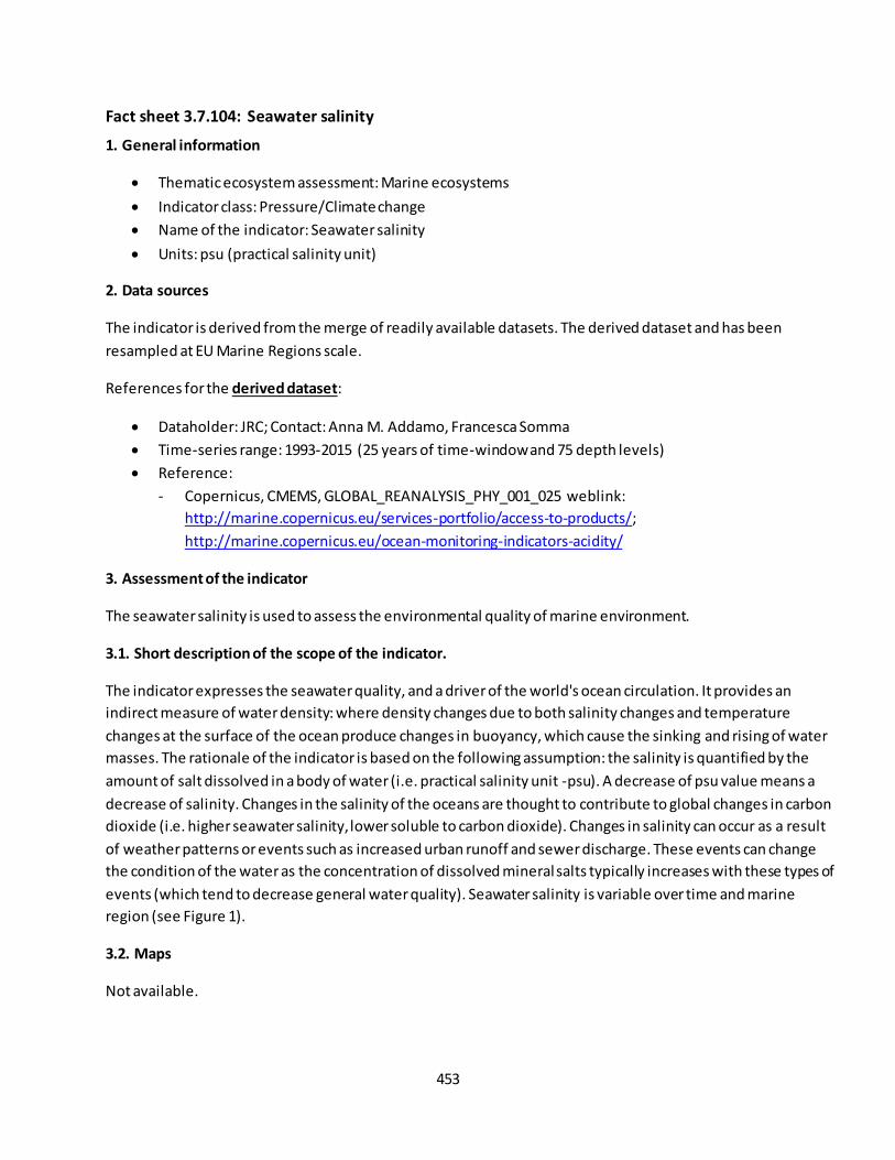
453
Fact sheet 3.7.104: Seawater salinity
1. General information
Thematic ecosystem assessment: Marine ecosystems
Indicator class: Pressure/Climate change
Name of the indicator: Seawater salinity
Units: psu (practical salinity unit)
2. Data sources
The indicator is derived from the merge of readily available datasets. The derived dataset and has been
resampled at EU Marine Regions scale.
References for the derived dataset:
Dataholder: JRC; Contact: Anna M. Addamo, Francesca Somma
Time-series range: 1993-2015 (25 years of time-window and 75 depth levels)
Reference:
- Copernicus, CMEMS, GLOBAL_REANALYSIS_PHY_001_025 weblink:
http://marine.copernicus.eu/services-portfolio/access-to-products/;
http://marine.copernicus.eu/ocean-monitoring-indicators-acidity/
3. Assessment of the indicator
The seawater salinity is used to assess the environmental quality of marine environment.
3.1. Short description of the scope of the indicator.
The indicator expresses the seawater quality, and a driver of the world's ocean circulation. It provides an
indirect measure of water density: where density changes due to both salinity changes and temperature
changes at the surface of the ocean produce changes in buoyancy, which cause the sinking and rising of water
masses. The rationale of the indicator is based on the following assumption: the salinity is quantified by the
amount of salt dissolved in a body of water (i.e. practical salinity unit -psu). A decrease of psu value means a
decrease of salinity. Changes in the salinity of the oceans are thought to contribute to global changes in carbon
dioxide (i.e. higher seawater salinity, lower soluble to carbon dioxide). Changes in salinity can occur as a result
of weather patterns or events such as increased urban runoff and sewer discharge. These events can change
the condition of the water as the concentration of dissolved mineral salts typically increases with these types of
events (which tend to decrease general water quality). Seawater salinity is variable over time and marine
region (see Figure 1).
3.2. Maps
Not available.

454
3.3. Statistical analysis of the trend
The indicator is calculated as follows: dataset are derived from the extraction of the year-mean for each depth
levels, where the average of the mean seawater parameter for each year is computed from the monthly sub
dataset relative of each year and EU marine region. Statistical test that fit a regression model through the
observed data against time (in years) is performed per each EU marine regions, so that the change per decade
is based on an assessment of the slope. Analysis Toolpack, available in Excel, is used to calculate the ordinary
least squares (OLS) regression coefficients with their significance levels (see Table 1).
3.4. Key trend at EU level
The indicator cannot be assessed at aggregated EU level, but only at the scale of European ’ seas. Mapping
requires additional assumptions on the data.
A comparison of the mean seawater salinity trend in the EU marine regions, except Baltic Sea), shows it has
increased continuously overtime (Figure 1, Table 1-2).
Figure 1. Mean seawater salinity and relative trend in the European marine regions: North-East Atlantic (NEA),
Baltic Sea (BAL), Mediterranean Sea (MED) and Back Sea (BLK). Time-series indicator: seawater salinity, 1993-
2015.
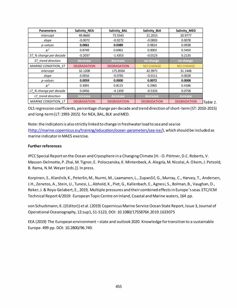
455
Table 1.
OLS regression coefficients, percentage change per decade and trend direction of short-term (ST: 2010-2015)
and long-term (LT: 1993-2015) for NEA, BAL, BLK and MED.
Note: the indicators is also strictly linked to change in freshwater load to sea and sea ice
(http://marine.copernicus.eu/training/education/ocean-parameters/sea-ice/), which should be included as
marine indicator in MAES exercise.
Further references
IPCC Special Report on the Ocean and Cryosphere in a Changing Climate [H. - O. Portner, D.C. Roberts, V. Masson-Delmotte, P. Zhai, M. Tignor, E. Poloczanska, K. Mintenbeck, A. Alegría, M. Nicolai, A. Okem, J. Petzold,
B. Rama, N.M. Weyer (eds.)]. In press.
Korpinen, S., Klančnik, K., Peterlin, M., Nurmi, M., Laamanen, L., Zupančič, G., Murray, C., Harvey, T., Andersen, J.H., Zenetos, A., Stein, U., Tunesi, L., Abhold, K., Piet, G., Kallenbach, E., Agnesi, S., Bolman, B., Vaughan, D.,
Reker, J. & Royo Gelabert, E., 2019, Multiple pressures and their combined effects in Europe ’s seas. ETC/ICM
Technical Report 4/2019: European Topic Centre on Inland, Coastal and Marine waters, 164 pp.
von Schuckmann, K. ((Editor)) et al. (2019) Copernicus Marine Service Ocean State Report, Issue 3, Journal of
Operational Oceanography, 12:sup1, S1-S123, DOI: 10.1080/1755876X.2019.1633075
EEA (2019) The European environment – state and outlook 2020. Knowledge for transition to a sustainable
Europe. 499 pp. DOI: 10.2800/96.749.
Parameters Salinity_NEA Salinity_BAL Salinity_BLK Salinity_MED
intercept 49.8660 73.5543 21.2015 20.9777
slope -0.0072 -0.0272 -0.0003 0.0078
p-values 0.0061 0.0389 0.9814 0.0938
R2 0.8749 0.6961 0.0002 0.5450
ST_% change per decade -0.2037 -1.4353 -0.0123 0.2135
ST_trend direction decrease decrease no change no change
MARINE CONDITION_ST DEGRADATION DEGRADATION NO CHANGE NO CHANGE
intercept 32.1208 175.8504 42.9971 31.1448
slope 0.0016 -0.0781 -0.0111 0.0028
p-values 0.0059 0.0000 0.0072 0.0008
R2 0.3091 0.8115 0.2965 0.4186
LT_% change per decade 0.0456 -4.1359 -0.5333 0.0758
LT_trend direction increase decrease decrease increase
MARINE CONDITION_LT DEGRADATION DEGRADATION DEGRADATION DEGRADATION

456
Fact sheet 3.7.105: Chemicals load to sea
1. General information
Thematic ecosystem assessment: Marine ecosystems
Indicator class: Pressures/Climate Change
Name of the indicator: Chemicals load to sea
Units: tonnes/year
2. Data sources
The indicator is derived from the merge of readily available datasets. The derived dataset and has been
resampled at EU Marine Regions scale.
References for the derived dataset:
Dataholder: JRC; Contact: Anna M. Addamo, Francesca Somma
Time-series range: not available. Point-in-time: 2010
Reference:
- Pistocchi et al, 2019; River pollution by priority chemical substances under the Water Framework
Directive: A provisional pan-European assessment. Science of the Total Environment 662:434-445;
https://doi.org/10.1016/j.scitotenv.2018.12.354
3. Assessment of the indicator
Chemicals load is used to assess the amount of contaminants load to sea from riverine system.
3.1. Short description of the scope of the indicator.
The indicator expresses the quality of the water load to sea. It provides a direct measure of contaminants load
to sea from human activities. The rationale of the indicator is based on the following assumption: the chemicals
load is quantified by the amount of chemicals waste from urban and other human activities. A decrease in
chemicals load to sea means an increase in water quality, contributing to reaching "good environmental
status". Chemicals load to sea needs further analysis with a time-series dataset, which is not available yet (se
Figure 1-2).
3.2. Maps
Not available.
3.3. Statistical analysis of the trend
No trend assessment of this indicator. Chemicals Load to EU seas, survey period: 2009-2014. Modelled
estimation, values have been calibrated with data from 2009-2014 (chemicals) and 2008-2012 (BOD). Data
should be considered as central value for 2010. Chemicals considered: 37 pollutants:
1_2_dichloroethane,Alachlor, Anthracene, Atrazine, Benzene, Bifenox, Cadmium, Chlorfenvinphos,
Chloroalkanes_C10_13, Chloroform, Chlorpyrifos, Cypermethrin, Di_2_ethylhexyl_phthalate, Dichloromethane,
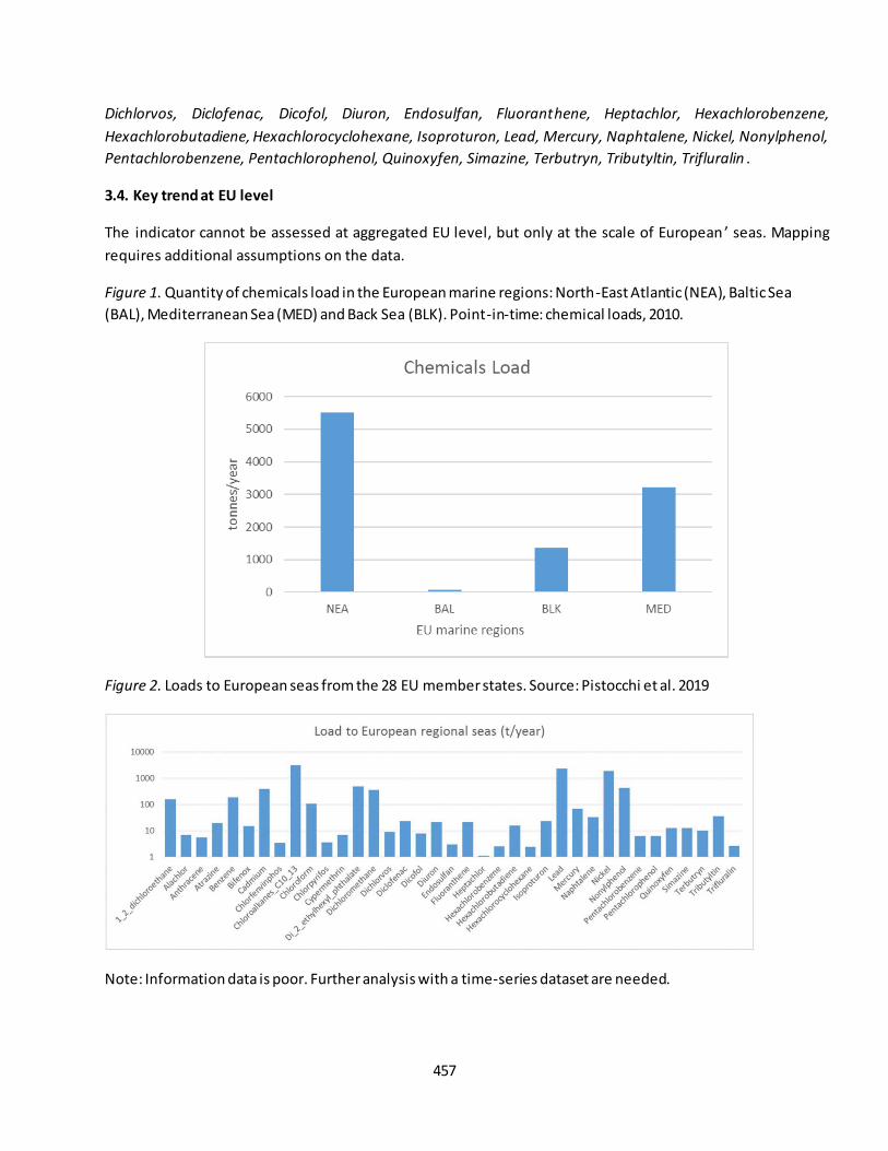
457
Dichlorvos, Diclofenac, Dicofol, Diuron, Endosulfan, Fluoranthene, Heptachlor, Hexachlorobenzene,
Hexachlorobutadiene, Hexachlorocyclohexane, Isoproturon, Lead, Mercury, Naphtalene, Nickel, Nonylphenol,
Pentachlorobenzene, Pentachlorophenol, Quinoxyfen, Simazine, Terbutryn, Tributyltin, Trifluralin .
3.4. Key trend at EU level
The indicator cannot be assessed at aggregated EU level, but only at the scale of European ’ seas. Mapping
requires additional assumptions on the data.
Figure 1. Quantity of chemicals load in the European marine regions: North-East Atlantic (NEA), Baltic Sea
(BAL), Mediterranean Sea (MED) and Back Sea (BLK). Point-in-time: chemical loads, 2010.
Figure 2. Loads to European seas from the 28 EU member states. Source: Pistocchi et al. 2019
Note: Information data is poor. Further analysis with a time-series dataset are needed.
458
Further references
EEA Report No 25/2018 Contaminants in Europe ’s Seas. Moving towards a clean, non-toxic marine
environment (2018) https://www.eea.europa.eu/publications/contaminants-in-europes-seas
EEA Report No 18/2018 Chemicals in European water. Knowledge developments. 80 pp. DOI:10.2000/265000
Korpinen, S., Klančnik, K., Peterlin, M., Nurmi, M., Laamanen, L., Zupančič, G., Murray, C., Harvey, T., Andersen,
J.H., Zenetos, A., Stein, U., Tunesi, L., Abhold, K., Piet, G., Kallenbach, E., Agnesi, S., Bolman, B., Vaughan, D.,
Reker, J. & Royo Gelabert, E., 2019, Multiple pressures and their combined effects in Europe ’s seas. ETC/ICM
Technical Report 4/2019: European Topic Centre on Inland, Coastal and Marine waters, 164 pp.
EEA (2019) The European environment – state and outlook 2020. Knowledge for transition to a sustainable
Europe. 499 pp. DOI: 10.2800/96.749.
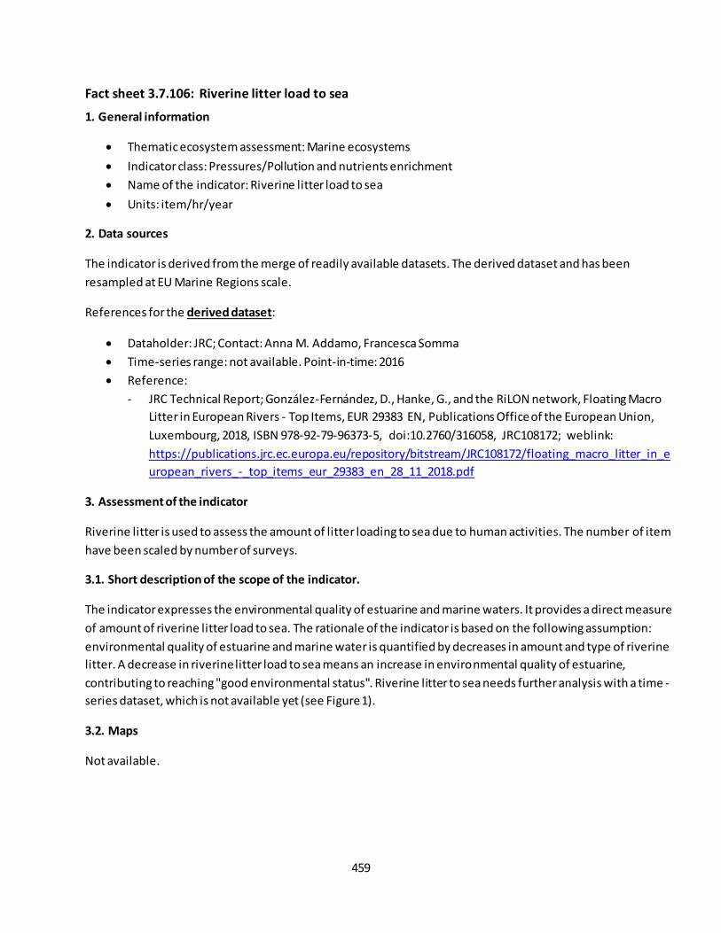
459
Fact sheet 3.7.106: Riverine litter load to sea
1. General information
Thematic ecosystem assessment: Marine ecosystems
Indicator class: Pressures/Pollution and nutrients enrichment
Name of the indicator: Riverine litter load to sea
Units: item/hr/year
2. Data sources
The indicator is derived from the merge of readily available datasets. The derived dataset and has been
resampled at EU Marine Regions scale.
References for the derived dataset:
Dataholder: JRC; Contact: Anna M. Addamo, Francesca Somma
Time-series range: not available. Point-in-time: 2016
Reference:
- JRC Technical Report; González-Fernández, D., Hanke, G., and the RiLON network, Floating Macro
Litter in European Rivers - Top Items, EUR 29383 EN, Publications Office of the European Union,
Luxembourg, 2018, ISBN 978-92-79-96373-5, doi:10.2760/316058, JRC108172; weblink:
https://publications.jrc.ec.europa.eu/repository/bitstream/JRC108172/floating_macro_litter_in_e
uropean_rivers_-_top_items_eur_29383_en_28_11_2018.pdf
3. Assessment of the indicator
Riverine litter is used to assess the amount of litter loading to sea due to human activities. The number of item
have been scaled by number of surveys.
3.1. Short description of the scope of the indicator.
The indicator expresses the environmental quality of estuarine and marine waters. It provides a direct measure
of amount of riverine litter load to sea. The rationale of the indicator is based on the following assumption:
environmental quality of estuarine and marine water is quantified by decreases in amount and type of riverine
litter. A decrease in riverine litter load to sea means an increase in environmental quality of estuarine,
contributing to reaching "good environmental status". Riverine litter to sea needs further analysis with a time -
series dataset, which is not available yet (see Figure 1).
3.2. Maps
Not available.
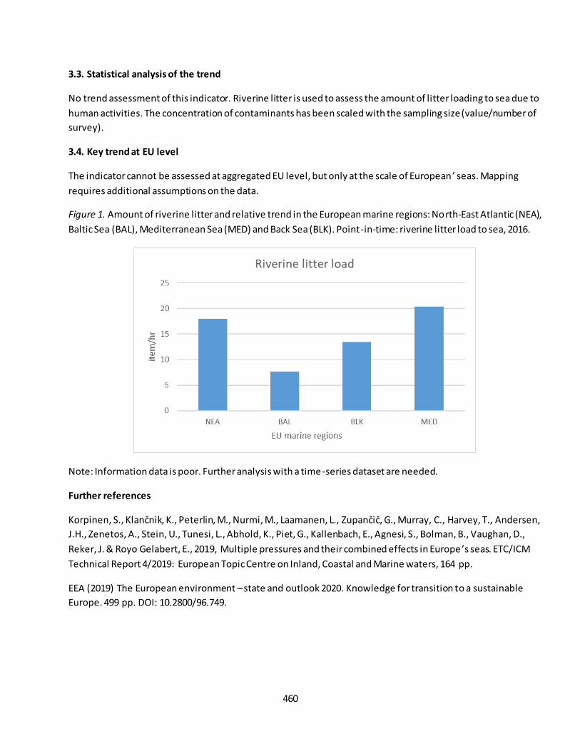
460
3.3. Statistical analysis of the trend
No trend assessment of this indicator. Riverine litter is used to assess the amount of litter loading to sea due to
human activities. The concentration of contaminants has been scaled with the sampling size (value/number of
survey).
3.4. Key trend at EU level
The indicator cannot be assessed at aggregated EU level, but only at the scale of European ’ seas. Mapping
requires additional assumptions on the data.
Figure 1. Amount of riverine litter and relative trend in the European marine regions: North-East Atlantic (NEA),
Baltic Sea (BAL), Mediterranean Sea (MED) and Back Sea (BLK). Point-in-time: riverine litter load to sea, 2016.
Note: Information data is poor. Further analysis with a time-series dataset are needed.
Further references
Korpinen, S., Klančnik, K., Peterlin, M., Nurmi, M., Laamanen, L., Zupančič, G., Murray, C., Harvey, T., Andersen, J.H., Zenetos, A., Stein, U., Tunesi, L., Abhold, K., Piet, G., Kallenbach, E., Agnesi, S., Bolman, B., Vaughan, D.,
Reker, J. & Royo Gelabert, E., 2019, Multiple pressures and their combined effects in Europe ’s seas. ETC/ICM
Technical Report 4/2019: European Topic Centre on Inland, Coastal and Marine waters, 164 pp.
EEA (2019) The European environment – state and outlook 2020. Knowledge for transition to a sustainable
Europe. 499 pp. DOI: 10.2800/96.749.
461
Fact sheet 3.7.107: Nutrient loads
1. General information
Thematic ecosystem assessment: Marine ecosystems
Indicator class: Pressures/Climate Change
Name of the indicator: Nutrients loads
Units: tonnes/year
2. Data sources
The indicator is derived from the merge of readily available datasets. The derived dataset and has been
resampled at EU Marine Regions scale.
References for the derived dataset:
Dataholder: JRC; Contact: Anna M. Addamo, Francesca Somma
Time-series range: 1985-2012 AND 2005-2012. Trend is not possible. Point-in-time: 2010.
Reference:
- Grizzetti, B., Bouraoui, F. and Aloe, A. (2012), Changes of nitrogen and phosphorus loads to
European seas. Glob Change Biol, 18: 769-782. doi:10.1111/j.1365-2486.2011.02576.x
- Grizzetti B., Vigiak O., Udias A., Aloe A., Zanni M., Bouraoui F., Pistocchi A., Dorati C., Friedland R.,
De Roo A., Benitez Sanz C., Leip A., Bielza M. Present and future nutrient pressures in European
fresh and coastal water (submitted). - Time-series 2005-2012. Nutrient loads for
calibration/reference year 2010, analyzed and received from R. Friedland on 26/03/2020.
3. Assessment of the indicator
Nutrients loads is used to assess the amount of total nitrogen and total phosphorus load to sea from riverine
system.
3.1. Short description of the scope of the indicator.
The indicator expresses the quality of the water load to sea. It provides a direct measure of nutrients load to
sea from human activities. The nitrogen and phosphorus load to sea are estimated (by modelling) considering
different sources (such as fertilizers, atmospheric deposition, human and industrial waste), pathways and
retention processes in the river basins. A decrease in nutrients load means an increase in water quality,
contributing to reaching "good environmental status". Nutrients load to sea needs further analysis with a time-
series dataset, whose trend is not available yet (see Figure 1-5).
3.2. Maps
Not available.
462
3.3. Statistical analysis of the trend
Nutrients loads to EU seas, survey periods: 1985-2005 (Figure 1-2) and 2005-2012 (Figure 3-4), which should be
considered as central value for year 2010 (Figure 5). Nutrients considered: N, P, and ratio N:P. For the time
being, no trend assessment of this indicator due to the differences in model set up, simulation, spatial
resolution and aggregation between the two time-series and hydrological variation between the different years
(the presence of a wet or dry year influences the amount of nutrients exported to the sea).
3.4. Key trend at EU level
The indicator cannot be assessed at aggregated EU level, but only at the scale of European’ seas. Mapping
requires additional assumptions on the data.
Figure 1. Total nitrogen (N) and total phosphorus (P) loads (thousand tonnes/year) discharged from land into
the European marine regions: North-East Atlantic (NEA), Baltic Sea (BAL), Mediterranean Sea (MED) and Back
Sea (BLK). Source: Time-series 1985-2005 (data source Grizzetti et al, 2012)

463
Figure 2. Nutrients ratio (N:P) in waters discharged from land into the European marine regions: North-East
Atlantic (NEA), Baltic Sea (BAL), Mediterranean Sea (MED) and Back Sea (BLK). Source: Time -series 1985-2005
(data source Grizzetti et al, 2012)

464
Figure 3. Total nitrogen (N) and total phosphorus (P) loads (thousand tonnes/year) discharged from land into
the European marine regions: North-East Atlantic (NEA), Baltic Sea (BAL), Mediterranean Sea (MED) and Back
Sea (BLK). Source: Time-series 2005-2012 (data source Grizzetti et al, upcoming)

465
Figure 4. Nutrients ratio (N:P) in waters discharged from land into the European marine regions: North-East
Atlantic (NEA), Baltic Sea (BAL), Mediterranean Sea (MED) and Back Sea (BLK). Source: Time -series 2005-2015
(data source Grizzetti et al, upcoming)
Figure 5.
Total nitrogen (N) and total phosphorus (P) loads (thousand tonnes/year) and relative ratio N:P for the
reference year 2010 discharged from land into the European marine regions: North-East Atlantic (NEA), Baltic
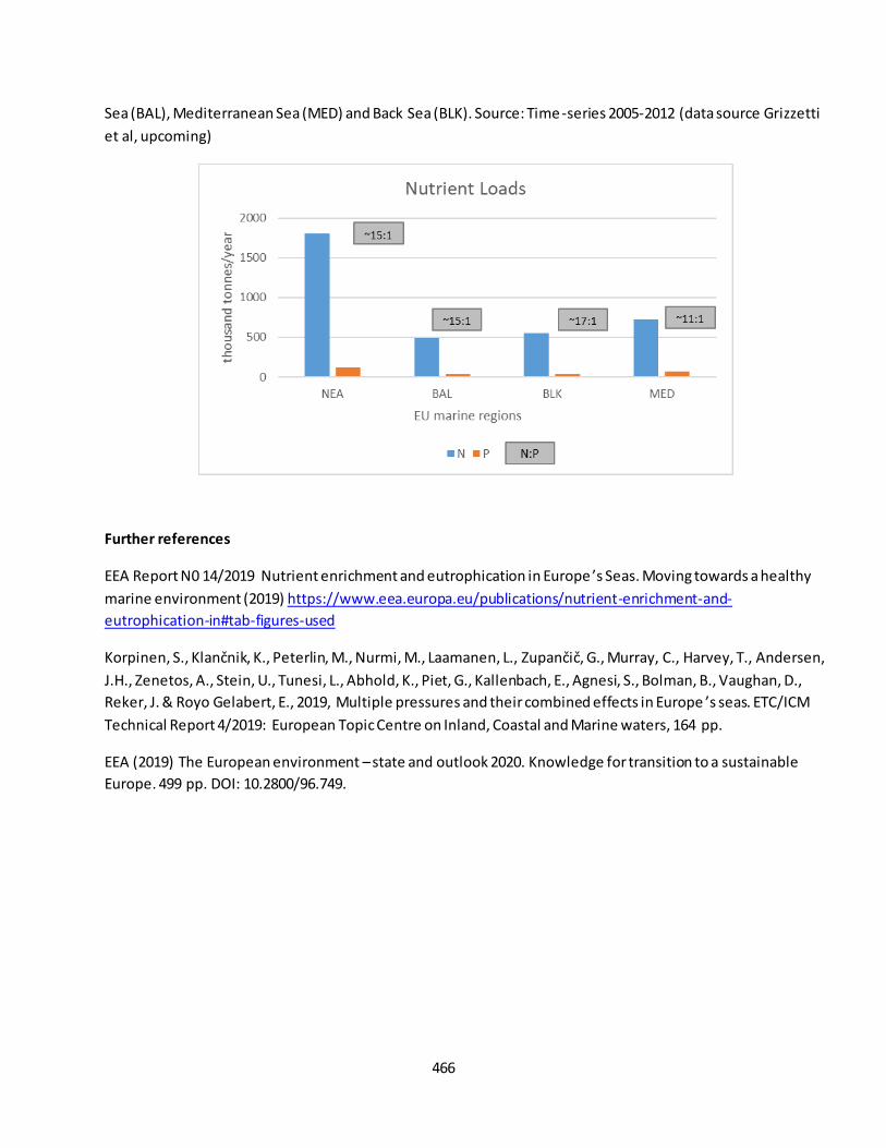
466
Sea (BAL), Mediterranean Sea (MED) and Back Sea (BLK). Source: Time-series 2005-2012 (data source Grizzetti
et al, upcoming)
Further references
EEA Report N0 14/2019 Nutrient enrichment and eutrophication in Europe ’s Seas. Moving towards a healthy
marine environment (2019) https://www.eea.europa.eu/publications/nutrient-enrichment-and-
eutrophication-in#tab-figures-used
Korpinen, S., Klančnik, K., Peterlin, M., Nurmi, M., Laamanen, L., Zupančič, G., Murray, C., Harvey, T., Andersen, J.H., Zenetos, A., Stein, U., Tunesi, L., Abhold, K., Piet, G., Kallenbach, E., Agnesi, S., Bolman, B., Vaughan, D.,
Reker, J. & Royo Gelabert, E., 2019, Multiple pressures and their combined effects in Europe ’s seas. ETC/ICM
Technical Report 4/2019: European Topic Centre on Inland, Coastal and Marine waters, 164 pp.
EEA (2019) The European environment – state and outlook 2020. Knowledge for transition to a sustainable
Europe. 499 pp. DOI: 10.2800/96.749.
467
Fact sheet 3.7.109: Fish mortality (f) of commercially exploited fish and shellfish exceeding fishing
mortality at maximum sustainable yield (fmsy)
1. General information
Thematic ecosystem assessment: Marine ecosystems
Indicator class: Pressure/Over-exploitation
Name of the indicator: Fish mortality (F) of commercially exploited fish and shellfish exceeding fishing
mortality at maximum sustainable yield (FMSY)
Units: F/FMSY (rate/year)
2. Data sources
The indicator is derived from the merge of readily available datasets. The derived dataset and has been
resampled at EU Marine Regions scale.
References for the derived dataset:
Data holder: JRC; Contact: Anna M. Addamo, Francesca Somma
Time-series range: 2003-2017
Reference:
- Report STECF2018-01, weblink: https://stecf.jrc.ec.europa.eu/reports/cfp-monitoring;
- Report STECF2019-01, weblink: https://stecf.jrc.ec.europa.eu/reports/cfp-monitoring;
3. Assessment of the indicator
The rate of mortality of commercially exploited fish and shellfish F exceeding FMSY (fishing mortality at
maximum sustainable yield) is used to assess the status of fish stocks.
3.1. Short description of the scope of the indicator.
The indicator expresses the status of fish and shellfish stocks. It provides a direct measure of rate of mortality
of commercially exploited fish and shellfish F exceeding FMSY (fishing mortality at maximum sustainable yield).
The rationale of the indicator is based on the following assumption: fish and shellfish stocks is quantified by the
rate of F/FMSY, which represent the mortality of commercially exploited fish and shellfish F exceeding F MSY
(fishing mortality at maximum sustainable yield). The rate of F/FMSY of sustainable status of fish and shellfish
stocks is around 1. A decrease in the rate value means a decrease in fishing mortality, contributing to reaching
"good environmental status". Fish catch is slightly decreasing overtime (see Figure 1).
3.2. Maps
Not available.
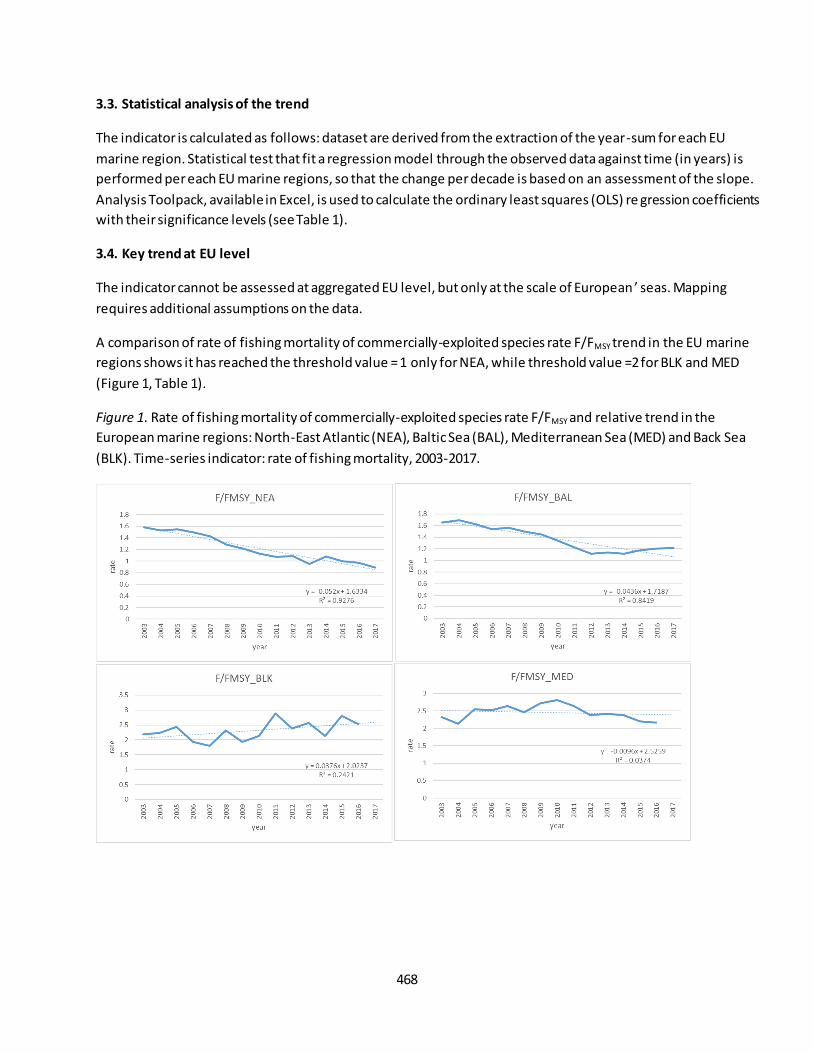
468
3.3. Statistical analysis of the trend
The indicator is calculated as follows: dataset are derived from the extraction of the year-sum for each EU
marine region. Statistical test that fit a regression model through the observed data against time (in years) is
performed per each EU marine regions, so that the change per decade is based on an assessment of the slope.
Analysis Toolpack, available in Excel, is used to calculate the ordinary least squares (OLS) re gression coefficients
with their significance levels (see Table 1).
3.4. Key trend at EU level
The indicator cannot be assessed at aggregated EU level, but only at the scale of European ’ seas. Mapping
requires additional assumptions on the data.
A comparison of rate of fishing mortality of commercially-exploited species rate F/FMSY trend in the EU marine
regions shows it has reached the threshold value = 1 only for NEA, while threshold value =2 for BLK and MED
(Figure 1, Table 1).
Figure 1. Rate of fishing mortality of commercially-exploited species rate F/FMSY and relative trend in the
European marine regions: North-East Atlantic (NEA), Baltic Sea (BAL), Mediterranean Sea (MED) and Back Sea
(BLK). Time-series indicator: rate of fishing mortality, 2003-2017.

469
Table
1. OLS regression coefficients, percentage change per decade and trend direction of short term (ST: 2010-2017)
and long term (LT: 2003-2017) for North-East Atlantic (NEA), Baltic Sea (BAL), Mediterranean Sea (MED) and
Back Sea (BLK).
Note: Baseline set up by STECF: 2003.
Further references
Korpinen, S., Klančnik, K., Peterlin, M., Nurmi, M., Laamanen, L., Zupančič, G., Murray, C., Harvey, T., Andersen, J.H., Zenetos, A., Stein, U., Tunesi, L., Abhold, K., Piet, G., Kallenbach, E., Agnesi, S. , Bolman, B., Vaughan, D.,
Reker, J. & Royo Gelabert, E., 2019, Multiple pressures and their combined effects in Europe ’s seas. ETC/ICM
Technical Report 4/2019: European Topic Centre on Inland, Coastal and Marine waters, 164 pp.
EEA (2019) The European environment – state and outlook 2020. Knowledge for transition to a sustainable
Europe. 499 pp. DOI: 10.2800/96.749.
Parameters F/Fmsy_NEA F/Fmsy_BAL F/Fmsy_BLK F/Fmsy_MED
intercept 56.2603 21.0986 -53.5285 204.8880
slope -0.0274 -0.0099 0.0278 -0.1006
p-values 0.0123 0.4283 0.6651 0.0013
R2 0.6753 0.1073 0.0405 0.8937
ST__% change per decade -24.5314 -8.0636 11.5671 -36.8422
ST_trend direction decrease no change no change decrease
MARINE CONDITION_ST IMPROVEMENT NO CHANGE NO CHANGE IMPROVEMENT
intercept 105.8028 88.9453 -73.3454 21.6965
slope -0.0520 -0.0436 0.0376 -0.0096
p-values 0.0000 0.0000 0.0739 0.5074
R2 0.9276 0.8419 0.2421 0.0374
LT_% change per decade -42.7500 -31.7990 16.1928 -3.9095
LT_trend_direction decrease decrease no change no change
MARINE CONDITION_LT IMPROVEMENT IMPROVEMENT NO CHANGE NO CHANGE
470
Fact sheet 3.7.110: Number of newly introduced non-indigenous species
1. General information
Thematic ecosystem assessment: Marine ecosystems
Indicator class: Pressures/Introduction of invasive alien species
Name of the indicator: Number of newly introduced non-indigenous species (number/year)
Units: number of species
2. Data sources
The indicator is derived from the merge of readily available datasets. The derived dataset and has been
resampled at EU Marine Regions scale.
References for the derived dataset:
Dataholder: JRC; Contact: Anna M. Addamo, Francesca Somma
Time-series range: 2000-2017
Reference:
- EASIN, weblink: http://easin.jrc.ec.europea.eu;
3. Assessment of the indicator
The number of newly introduced non-indigenous species is used to assess the negative impact on habitats and
autochthonous species.
3.1. Short description of the scope of the indicator.
The indicator expresses the negative impact on habitats and autochthonous species. It provides a direct
measure of number of newly introduced non-indigenous species. The rationale of the indicator is based on the
following assumption: NIS is quantified by amount in number of different species newly introduced. A decrease
in introduced value means a decrease in diversity species might have a cumulative negative impact on marine
ecosystem, contributing to reaching "good environmental status". Number of newly introduced non-
indigenous species is increasing overtime (see Figure 1).
3.2. Maps
Not available.
3.3. Statistical analysis of the trend
The indicator is calculated as follows: dataset are derived from the extraction of the year-sum for each EU
marine region. Statistical test that fit a regression model through the observed data against time (in years) is
performed per each EU marine regions, so that the change per decade is based on an assessment of th e slope.
Analysis Toolpack, available in Excel, is used to calculate the ordinary least squares (OLS) regression coefficients
with their significance levels (see Table 1).
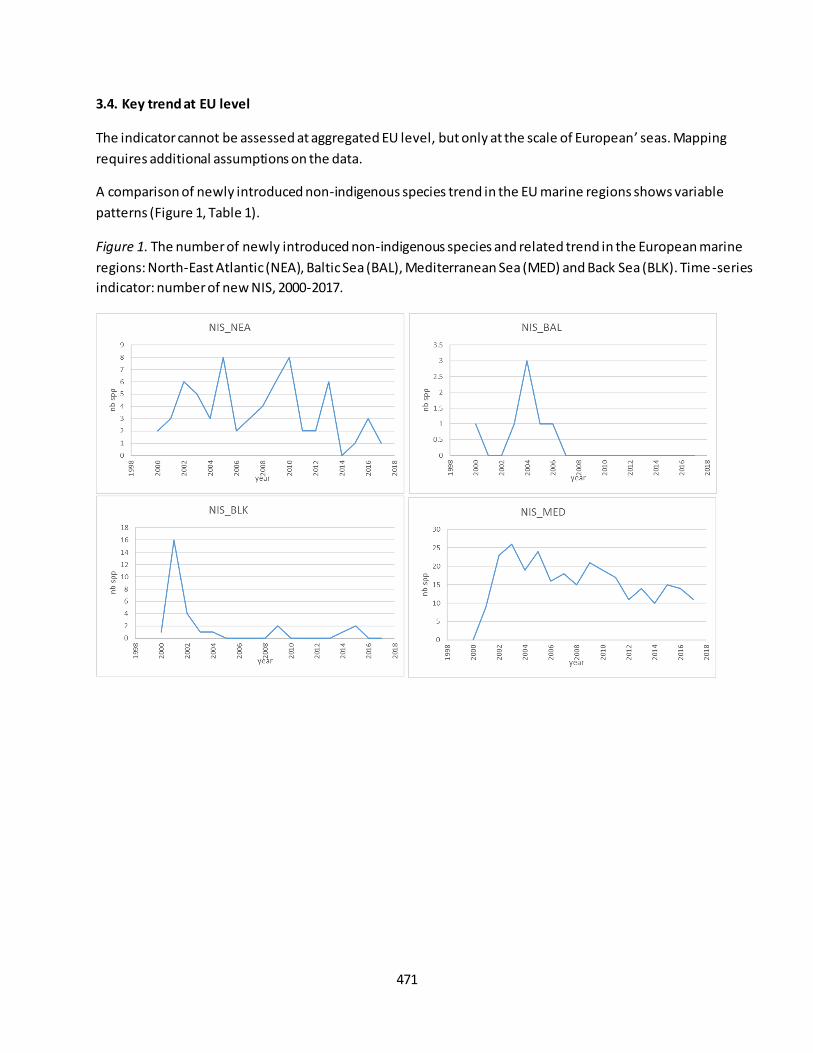
471
3.4. Key trend at EU level
The indicator cannot be assessed at aggregated EU level, but only at the scale of European’ seas. Mapping
requires additional assumptions on the data.
A comparison of newly introduced non-indigenous species trend in the EU marine regions shows variable
patterns (Figure 1, Table 1).
Figure 1. The number of newly introduced non-indigenous species and related trend in the European marine
regions: North-East Atlantic (NEA), Baltic Sea (BAL), Mediterranean Sea (MED) and Back Sea (BLK). Time -series
indicator: number of new NIS, 2000-2017.
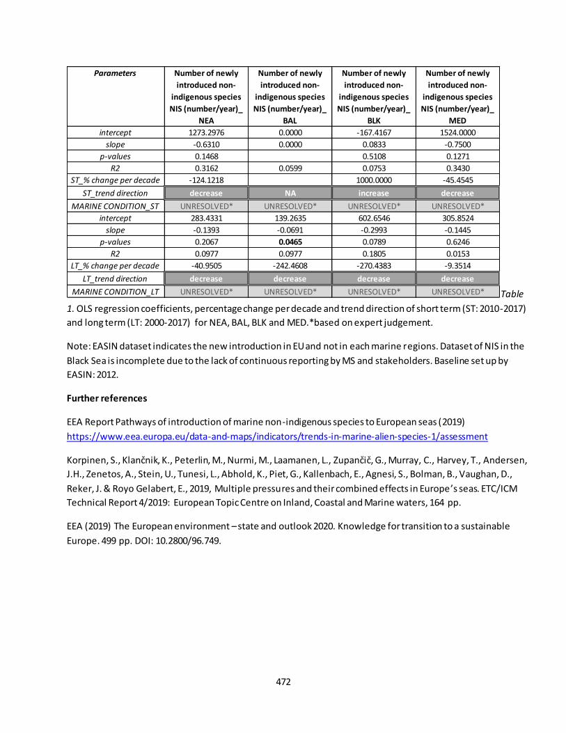
472
Table
1. OLS regression coefficients, percentage change per decade and trend direction of short term (ST: 2010-2017)
and long term (LT: 2000-2017) for NEA, BAL, BLK and MED.*based on expert judgement.
Note: EASIN dataset indicates the new introduction in EU and not in each marine regions. Dataset of NIS in the
Black Sea is incomplete due to the lack of continuous reporting by MS and stakeholders. Baseline set up by
EASIN: 2012.
Further references
EEA Report Pathways of introduction of marine non-indigenous species to European seas (2019)
https://www.eea.europa.eu/data-and-maps/indicators/trends-in-marine-alien-species-1/assessment
Korpinen, S., Klančnik, K., Peterlin, M., Nurmi, M., Laamanen, L., Zupančič, G., Murray, C., Harvey, T., Andersen, J.H., Zenetos, A., Stein, U., Tunesi, L., Abhold, K., Piet, G., Kallenbach, E., Agnesi, S., Bolman, B., Vaughan, D.,
Reker, J. & Royo Gelabert, E., 2019, Multiple pressures and their combined effects in Europe ’s seas. ETC/ICM
Technical Report 4/2019: European Topic Centre on Inland, Coastal and Marine waters, 164 pp.
EEA (2019) The European environment – state and outlook 2020. Knowledge for transition to a sustainable
Europe. 499 pp. DOI: 10.2800/96.749.
Parameters Number of newly
introduced non-
indigenous species
NIS (number/year)_
NEA
Number of newly
introduced non-
indigenous species
NIS (number/year)_
BAL
Number of newly
introduced non-
indigenous species
NIS (number/year)_
BLK
Number of newly
introduced non-
indigenous species
NIS (number/year)_
MED
intercept 1273.2976 0.0000 -167.4167 1524.0000
slope -0.6310 0.0000 0.0833 -0.7500
p-values 0.1468 0.5108 0.1271
R2 0.3162 0.0599 0.0753 0.3430
ST_% change per decade -124.1218 1000.0000 -45.4545
ST_trend direction decrease NA increase decrease
MARINE CONDITION_ST UNRESOLVED* UNRESOLVED* UNRESOLVED* UNRESOLVED*
intercept 283.4331 139.2635 602.6546 305.8524
slope -0.1393 -0.0691 -0.2993 -0.1445
p-values 0.2067 0.0465 0.0789 0.6246
R2 0.0977 0.0977 0.1805 0.0153
LT_% change per decade -40.9505 -242.4608 -270.4383 -9.3514
LT_trend direction decrease decrease decrease decrease
MARINE CONDITION_LT UNRESOLVED* UNRESOLVED* UNRESOLVED* UNRESOLVED*

473
Fact sheet 3.7.111: Number of newly introduced non-indigenous species from human activities-
transport
1. General information
Thematic ecosystem assessment: Marine ecosystems
Indicator class: Pressures/Introduction of invasive alien species
Name of the indicator: Number of newly introduced non-indigenous species from human activities-
transport
Units: number/year
2. Data sources
The indicator is based on readily available and derived from data, which have been downscale d to European
Marine Regions.
References for the derived dataset which required a calculation:
Dataholder: JRC; Contact: Anna M. Addamo, Francesca Somma
Time-series range: 2000-2017
Reference:
- EASIN, weblink: http://easin.jrc.ec.europea.eu;
3. Assessment of the indicator
The number of newly introduced non-indigenous species from human activity - transport is used to assess the
negative impact on habitats and autochthonous species. The category transport include the different
subcategories44.
3.1. Short description of the scope of the indicator.
The indicator expresses the negative impact on habitats and autochthonous species due to a specific human
activity – transport. It provides a direct measure of number of newly introduced non-indigenous species
through the transport activities. The rationale of the indicator is based on the following assumption: NIS is
quantified by amount in number of different species newly introduced by different pathways, whose transp ort
has the major impact (Figure 1). A decrease/controlled in introduced value by transport means a decrease in
diversity species might have a cumulative negative impact on marine ecosystem, contributing to reaching
"good environmental status". Number of newly introduced non-indigenous species is increasing overtime (see
Figure 2).
44
TRANSPORT- STOWAWAY: Ship/boat ballast water; TRANSPORT- STOWAWAY: Other means of transport; TRANSPORT- STOWAWAY: Ship/boat hull fouling; TRANSPORT- STOWAWAY: Angling/fishing equipment; TRANSPORT- CONTAMINANT: Contaminant on animals (except parasites, species tra nsported by host/vector); TRANSPORT- CONTAMINANT: Parasites on animals (including species transported by host and vector)
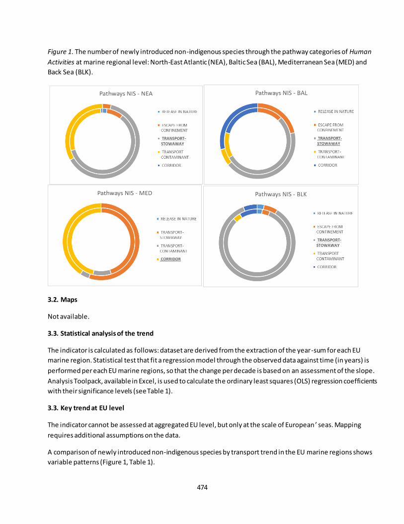
474
Figure 1. The number of newly introduced non-indigenous species through the pathway categories of Human
Activities at marine regional level: North-East Atlantic (NEA), Baltic Sea (BAL), Mediterranean Sea (MED) and
Back Sea (BLK).
3.2. Maps
Not available.
3.3. Statistical analysis of the trend
The indicator is calculated as follows: dataset are derived from the extraction of the year-sum for each EU
marine region. Statistical test that fit a regression model through the observed data against time (in years) is
performed per each EU marine regions, so that the change per decade is based on an assessment of the slope.
Analysis Toolpack, available in Excel, is used to calculate the ordinary least squares (OLS) regression coefficients
with their significance levels (see Table 1).
3.3. Key trend at EU level
The indicator cannot be assessed at aggregated EU level, but only at the scale of European ’ seas. Mapping
requires additional assumptions on the data.
A comparison of newly introduced non-indigenous species by transport trend in the EU marine regions shows
variable patterns (Figure 1, Table 1).
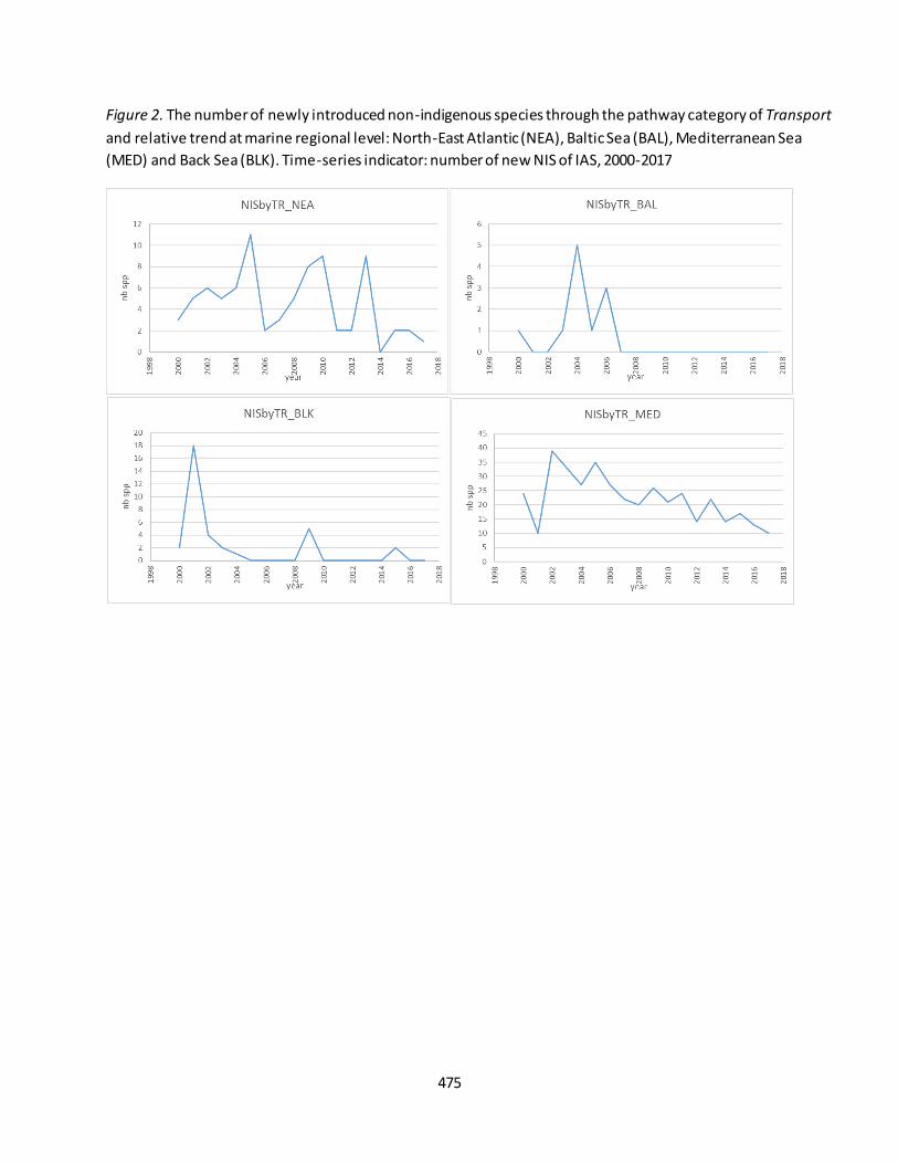
475
Figure 2. The number of newly introduced non-indigenous species through the pathway category of Transport
and relative trend at marine regional level: North-East Atlantic (NEA), Baltic Sea (BAL), Mediterranean Sea
(MED) and Back Sea (BLK). Time-series indicator: number of new NIS of IAS, 2000-2017
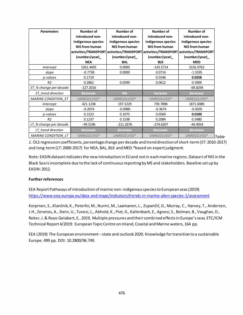
476
Table
1. OLS regression coefficients, percentage change per decade and trend direction of short-term (ST: 2010-2017)
and long-term (LT: 2000-2017) for NEA, BAL, BLK and MED.*based on expert judgment.
Note: EASIN dataset indicates the new introduction in EU and not in each marine regions. Datase t of NIS in the
Black Sea is incomplete due to the lack of continuous reporting by MS and stakeholders. Baseline set up by
EASIN: 2012.
Further references
EEA Report Pathways of introduction of marine non-indigenous species to European seas (2019)
https://www.eea.europa.eu/data-and-maps/indicators/trends-in-marine-alien-species-1/assessment
Korpinen, S., Klančnik, K., Peterlin, M., Nurmi, M., Laamanen, L., Zupančič, G., Murray, C., Harvey, T., Andersen, J.H., Zenetos, A., Stein, U., Tunesi, L., Abhold, K., Piet, G., Kallenbach, E., Agnesi, S., Bolman, B., Vaughan, D.,
Reker, J. & Royo Gelabert, E., 2019, Multiple pressures and their combined effects in Europe’s seas. ETC/ICM
Technical Report 4/2019: European Topic Centre on Inland, Coastal and Marine waters, 164 pp.
EEA (2019) The European environment – state and outlook 2020. Knowledge for transition to a sustainable
Europe. 499 pp. DOI: 10.2800/96.749.
Parameters Number of
introduced non-
indigenous species
NIS from human
activities/TRANSPORT
(number/year)_
NEA
Number of
introduced non-
indigenous species
NIS from human
activities/TRANSPORT
(number/year)_
BAL
Number of
introduced non-
indigenous species
NIS from human
activities/TRANSPORT
(number/year)_
BLK
Number of
introduced non-
indigenous species
NIS from human
activities/TRANSPORT
(number/year)_
MED
intercept 1561.4405 0.0000 -143.5714 3156.9762
slope -0.7738 0.0000 0.0714 -1.5595
p-values 0.1719 0.5546 0.0258
R2 0.2862 0.0599 0.0612 0.5909
ST_% change per decade -127.2016 -69.8294
ST_trend direction decrease NA increase decrease
MARINE CONDITION_ST UNRESOLVED* UNRESOLVED* UNRESOLVED* UNRESOLVED*
intercept 421.1238 197.5229 739.7898 1871.0089
slope -0.2074 -0.0980 -0.3674 -0.9205
p-values 0.1523 0.1075 0.0569 0.0100
R2 0.1237 0.1538 0.2084 0.3480
LT_% change per decade -49.5196 -211.2676 -274.6207 -44.4054
LT_trend direction decrease decrease decrease decrease
MARINE CONDITION_LT UNRESOLVED* UNRESOLVED* UNRESOLVED* UNRESOLVED*
477
Fact sheet 3.7.200: Chemical status (marine ecosystems)
1. General information
Thematic ecosystem assessment: Marine ecosystems
Indicator class: Condition/Environmental quality
Name of the indicator: Chemical Status
Units: class
2. Data sources
The indicator is derived from the merge of readily available datasets. The derived dataset has been resampled
at EU Marine Regions scale.
References for the derived dataset:
Dataholder: JRC; Contact: Anna M. Addamo, Francesca Somma
Point-in-time: 1st RBMP (2010) – 2nd RBMP (2016) reporting exercises45
Reference:
- WISE WFD database version 3, accessed through EEA WISE-Marine Tableau, weblink:
https://tableau.discomap.eea.europa.eu/t/Wateronline/views/WFD_Marine_status/Chemical?ifra
meSizedToWindow=true&%3Aembed=y&%3AshowAppBanner=false&%3Adisplay_count=no&%3A
showVizHome=no&%3Aorigin=viz_share_link;
3. Assessment of the indicator
Chemical Status is used to assess the environmental quality of coastal and transitional waters.
3.1. Short description of the scope of the indicator.
The indicator expresses the quality of coastal and transitional waters. It provides a direct measure of water
quality. The rationale of the indicator is based on the following assumption: the chemical status is quantified by
the concentrations of priority substances and whether they exceed or not the relevant EQS 46 established in the
Environmental Quality Standards Directive 2008/105/EC, and included in the Water Framework Directive
45
Caution is advised when comparing Member States and when comparing the first and second RBMPs, as the results are affected by the methods Member States have used to collect data and often cannot be compared directly. The major contribution to variability seems to arise from the approach taken to monitoring, modelling and extrapolating results and
from the choice of monitoring matrix: water, sediment or biota (e.g. fish). Some countries extrapolated failure to meet the standard at monitoring sites to all water bodies, while others reported failure only where failure was confirmed. Typically, measurements of mercury in biota extrapolated to all similar water bodies lead to widespread failure to meet the EQS. Further info in https://www.eea.europa.eu/themes/water/european-waters/water-quality-and-water-assessment/water-
assessments/chemical -status-of-surface-water-bodies 46
EQS aim to protect the most sensitive species from direct toxicity, including predators and humans via secondary poisoning. A smaller group of priority hazardous substances were identified in the Priority Substances Directive as uPBT (ubiquitous (present, appearing or found everywhere), persistent, bioaccumulative and toxic). The uPBTs are mercury,
brominated diphenyl ethers (pBDE), tributyltin and certain polyaromatic hydrocarbons (PAHs).
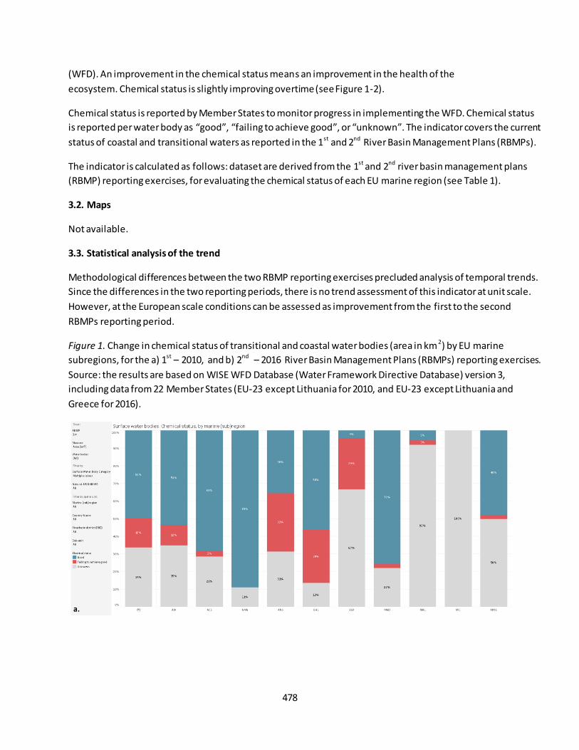
478
(WFD). An improvement in the chemical status means an improvement in the health of the
ecosystem. Chemical status is slightly improving overtime (see Figure 1-2).
Chemical status is reported by Member States to monitor progress in implementing the WFD. Chemical status
is reported per water body as “good”, “failing to achieve good”, or “unknown”. The indicator covers the current
status of coastal and transitional waters as reported in the 1st and 2nd River Basin Management Plans (RBMPs).
The indicator is calculated as follows: dataset are derived from the 1st and 2nd river basin management plans
(RBMP) reporting exercises, for evaluating the chemical status of each EU marine region (see Table 1).
3.2. Maps
Not available.
3.3. Statistical analysis of the trend
Methodological differences between the two RBMP reporting exercises precluded analysis of temporal trends.
Since the differences in the two reporting periods, there is no trend assessment of this indicator at unit scale.
However, at the European scale conditions can be assessed as improvement from the first to the second
RBMPs reporting period.
Figure 1. Change in chemical status of transitional and coastal water bodies (area in km2) by EU marine
subregions, for the a) 1st – 2010, and b) 2nd – 2016 River Basin Management Plans (RBMPs) reporting exercises.
Source: the results are based on WISE WFD Database (Water Framework Directive Database) version 3,
including data from 22 Member States (EU-23 except Lithuania for 2010, and EU-23 except Lithuania and
Greece for 2016).

479
3.4 Key trend at EU level
The indicator cannot be assessed at aggregated EU level, but only at the scale of Europe ’s seas. Mapping
requires additional assumptions on the data.
A comparison of the chemical status reported in the first and second RBMP periods shows that the proportion
of coastal and transitional waters with unknown chemical status has dropped significantly, from 68 % to 39 %
(Figure 2, Table 1).
Figure 2. The chemical status (% of area) in the European marine regions: North-East Atlantic (NEA), Baltic Sea
(BAL), Mediterranean Sea (MED) and Back Sea (BLK). Point-in-time indicator: chemical status, a) 1st RBMP –
2010, and b) 2nd RBMP – 2016 reporting exercises.

480
Table 1. The chemical status (% of area) in the European marine regions: North-East Atlantic (NEA), Baltic Sea
(BAL), Mediterranean Sea (MED) and Back Sea (BLK). Percentage per each class for marine region.
Further references
European Commission (EC). 2000. Water Framework Directive (WFD) 2000/60/EC.
http://ec.europa.eu/environment/water/water-framework/index_en.html
EEA (2019) The European environment – state and outlook 2020. Knowledge for transition to a sustainable
Europe. 499 pp. DOI: 10.2800/96.749.
RBMP ClassChemical
Status_%_NEA
Chemical
Status_%_BAL
Chemical
Status_%_BLK
Chemical
Status_%_MED
GOOD 55.32% 56.23% 4.18% 32.81%
FAILING TO ACHIEVE GOOD 15.44% 30.28% 29.08% 1.94%
UNKNOWN 29.24% 13.48% 66.74% 65.26%
GOOD 67.80% 38.97% 50.36% 71.47%
FAILING TO ACHIEVE GOOD 20.00% 54.71% 11.49% 14.52%
UNKNOWN 12.19% 6.32% 38.15% 14.01%
1st RBMP
2nd RBMP
481
Fact sheet 3.7.201: Nutrients (marine ecosystems)
1. General information
Thematic ecosystem assessment: Marine ecosystems
Indicator class: Condition/Environmental quality
Name of the indicator: Concentration of phosphate and nitrate, and N:P
Units: mmol/m3
2. Data sources
The indicator is derived from the merge of readily available datasets. The derived dataset and has been
resampled at EU Marine Regions scale.
References for the derived dataset:
Dataholder: JRC; Contact: Anna M. Addamo, Francesca Somma
Time-series range: 1993-2015 (25 years of time-window and 75 depth levels)
Reference:
- Copernicus, CMEMS, GLOBAL_REANALYSIS_BIO_001_029 weblink:
http://marine.copernicus.eu/services-portfolio/access-to-products/;
3. Assessment of the indicator
Phosphate and nitrate are used to assess the environmental quality of the marine ecosystem due to ecological
process and human activities.
3.1. Short description of the scope of the indicator.
The indicator expresses the quality of the water load to sea. It provides a direct measure of nutrients in the sea
from human activities and ecological process. The rationale of the indicator is based on the following
assumption: the nutrients in the sea is quantified by the amount of nitrate and phosphate from ecological
process and human activities. A decrease in nutrients load means an increase in water quality, contributing to
reaching "good environmental status". Nutrients analysis is based on time-series dataset and nutrient
anomalies, which are differences relative to the concentrations determined in the 1993 profile (see Figure 1).
3.2. Maps
Not available
3.3. Statistical analysis of the trend
The indicator is calculated as follows: dataset are derived from the extraction of the year-mean for each EU
marine region and up to max depth of photic zone basin-specific [NEA max 150 m, BAL max 20 m, BLK max 50
m, MED max 150], and in the entire sea basin excluding differences between marine areas (i.e. coastal, open
ocean etc.). The average of the seawater parameter for each year is computed from the monthly sub dataset
relative of each year and EU marine region. Statistical test that fit a regression model through the observed
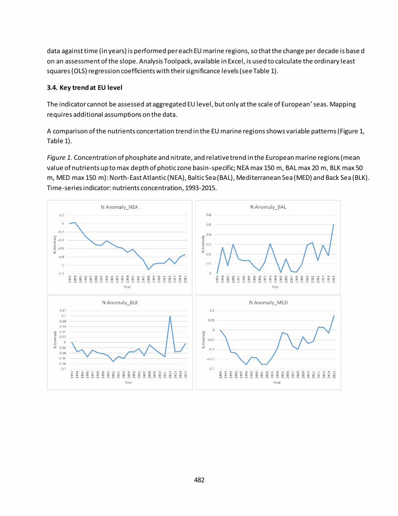
482
data against time (in years) is performed per each EU marine regions, so that the change per decade is base d
on an assessment of the slope. Analysis Toolpack, available in Excel, is used to calculate the ordinary least
squares (OLS) regression coefficients with their significance levels (see Table 1).
3.4. Key trend at EU level
The indicator cannot be assessed at aggregated EU level, but only at the scale of European’ seas. Mapping
requires additional assumptions on the data.
A comparison of the nutrients concertation trend in the EU marine regions shows variable patterns (Figure 1,
Table 1).
Figure 1. Concentration of phosphate and nitrate, and relative trend in the European marine regions (mean
value of nutrients up to max depth of photic zone basin-specific; NEA max 150 m, BAL max 20 m, BLK max 50
m, MED max 150 m): North-East Atlantic (NEA), Baltic Sea (BAL), Mediterranean Sea (MED) and Back Sea (BLK).
Time-series indicator: nutrients concentration, 1993-2015.
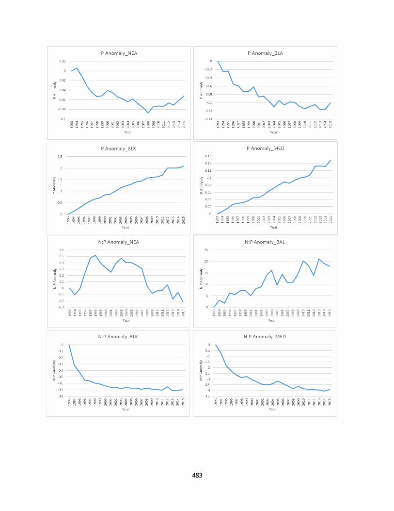
483
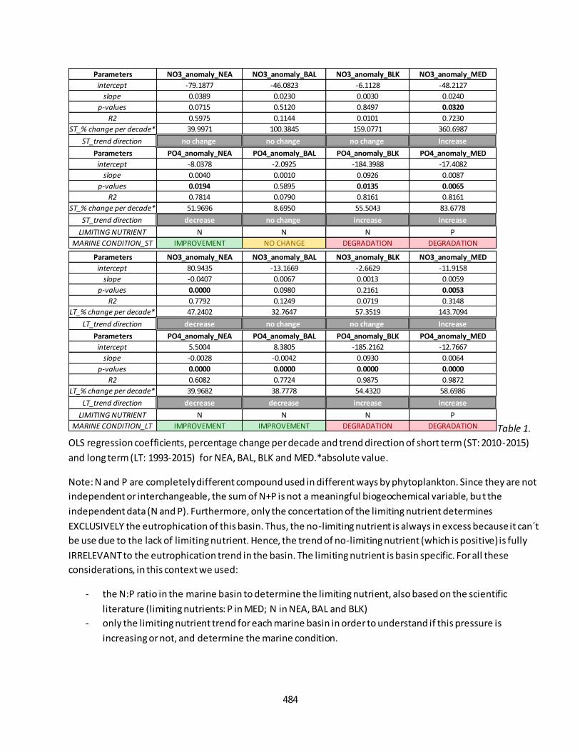
484
Table 1.
OLS regression coefficients, percentage change per decade and trend direction of short term (ST: 2010-2015)
and long term (LT: 1993-2015) for NEA, BAL, BLK and MED.*absolute value.
Note: N and P are completely different compound used in different ways by phytoplankton. Since they are not
independent or interchangeable, the sum of N+P is not a meaningful biogeochemical variable, but the
independent data (N and P). Furthermore, only the concertation of the limiting nutrient determines
EXCLUSIVELY the eutrophication of this basin. Thus, the no-limiting nutrient is always in excess because it can´t
be use due to the lack of limiting nutrient. Hence, the trend of no-limiting nutrient (which is positive) is fully
IRRELEVANT to the eutrophication trend in the basin. The limiting nutrient is basin specific. For all these
considerations, in this context we used:
- the N:P ratio in the marine basin to determine the limiting nutrient, also based on the scientific
literature (limiting nutrients: P in MED; N in NEA, BAL and BLK)
- only the limiting nutrient trend for each marine basin in order to understand if this pressure is
increasing or not, and determine the marine condition.
Parameters NO3_anomaly_NEA NO3_anomaly_BAL NO3_anomaly_BLK NO3_anomaly_MED
intercept -79.1877 -46.0823 -6.1128 -48.2127
slope 0.0389 0.0230 0.0030 0.0240
p-values 0.0715 0.5120 0.8497 0.0320
R2 0.5975 0.1144 0.0101 0.7230
ST_% change per decade* 39.9971 100.3845 159.0771 360.6987
ST_trend direction no change no change no change Increase
Parameters PO4_anomaly_NEA PO4_anomaly_BAL PO4_anomaly_BLK PO4_anomaly_MED
intercept -8.0378 -2.0925 -184.3988 -17.4082
slope 0.0040 0.0010 0.0926 0.0087
p-values 0.0194 0.5895 0.0135 0.0065
R2 0.7814 0.0790 0.8161 0.8161
ST_% change per decade* 51.9696 8.6950 55.5043 83.6778
ST_trend direction decrease no change increase increase
LIMITING NUTRIENT N N N P
MARINE CONDITION_ST IMPROVEMENT NO CHANGE DEGRADATION DEGRADATION
Parameters NO3_anomaly_NEA NO3_anomaly_BAL NO3_anomaly_BLK NO3_anomaly_MED
intercept 80.9435 -13.1669 -2.6629 -11.9158
slope -0.0407 0.0067 0.0013 0.0059
p-values 0.0000 0.0980 0.2161 0.0053
R2 0.7792 0.1249 0.0719 0.3148
LT_% change per decade* 47.2402 32.7647 57.3519 143.7094
LT_trend direction decrease no change no change Increase
Parameters PO4_anomaly_NEA PO4_anomaly_BAL PO4_anomaly_BLK PO4_anomaly_MED
intercept 5.5004 8.3805 -185.2162 -12.7667
slope -0.0028 -0.0042 0.0930 0.0064
p-values 0.0000 0.0000 0.0000 0.0000
R2 0.6082 0.7724 0.9875 0.9872
LT_% change per decade* 39.9682 38.7778 54.4320 58.6986
LT_trend direction decrease decrease increase increase
LIMITING NUTRIENT N N N P
MARINE CONDITION_LT IMPROVEMENT IMPROVEMENT DEGRADATION DEGRADATION

485
Further references
EEA Report N0 14/2019 Nutrient enrichment and eutrophication in Europe ’s Seas. Moving towards a healthy
marine environment (2019) https://www.eea.europa.eu/publications/nutrient-enrichment-and-
eutrophication-in#tab-figures-used
486
Fact sheet 3.7.202: Dissolved oxygen (marine ecosystems)
1. General information
Thematic ecosystem assessment: Marine ecosystems
Indicator class: Condition/Environmental quality
Name of the indicator: Dissolved Oxygen
Units: mg/L
2. Data sources
The indicator is derived from the merge of readily available datasets. The derived datase t and has been
resampled at EU Marine Regions scale.
References for the derived dataset:
Dataholder: JRC; Contact: Anna M. Addamo, Francesca Somma
Time-series range: 1993-2018 (25 years of time-window and 75 depth levels)
Reference:
- Copernicus, CMEMS, GLOBAL_REANALYSIS_BIO_001_029 weblink:
http://marine.copernicus.eu/services-portfolio/access-to-products/;
3. Assessment of the indicator
Dissolved oxygen is used to assess the environmental quality of marine waters.
3.1. Short description of the scope of the indicator.
The indicator expresses the quality of the marine waters. It provides a direct measure of concentration of
oxygen dissolved in the water column. The rationale of the indicator is based on the following assumption: a
decrease in oxygen levels means an increase of the oxidation of organic matter. In case of eutrophication, the
organic matter in the water increase. The oxidation of this excess organic matter will reduce the oxygen
dissolved in the water, affecting physiology, composition and abundance of marine species, impeding to
reaching "good environmental status". Oxygen depletion can occur episodically (less than once per year),
periodically (several times per year for short periods) and seasonally (each summer), and eventually it can
become persistent. Dissolved oxygen is stable overtime (see Figure 1).
3.2. Maps
Not available.
3.3. Statistical analysis of the trend
The indicator is calculated as follows: dataset are derived from the extraction of the year-mean concentration
of oxygen is expressed as mg/l for each EU marine region, only near sea bottom (i.e. 50 -150 m) in the entire
sea basin excluding differences between marine areas (i.e. coastal, open ocean etc.). Statistical test that fit a
regression model through the observed data against time (in years) is performed per each EU marine regions,
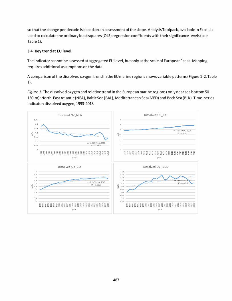
487
so that the change per decade is based on an assessment of the slope. Analysis Toolpack, available in Excel, is
used to calculate the ordinary least squares (OLS) regression coefficients with their significance levels (see
Table 1).
3.4. Key trend at EU level
The indicator cannot be assessed at aggregated EU level, but only at the scale of European ’ seas. Mapping
requires additional assumptions on the data.
A comparison of the dissolved oxygen trend in the EU marine regions shows variable patterns (Figure 1-2, Table
1).
Figure 1. The dissolved oxygen and relative trend in the European marine regions (only near sea bottom 50 -
150 m): North-East Atlantic (NEA), Baltic Sea (BAL), Mediterranean Sea (MED) and Back Sea (BLK). Time -series
indicator: dissolved oxygen, 1993-2018.
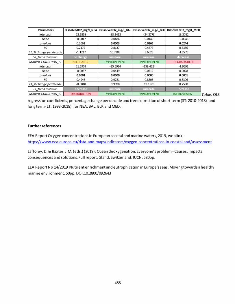
488
Table. OLS
regression coefficients, percentage change per decade and trend direction of short term (ST: 2010-2018) and
long term (LT: 1993-2018) for NEA, BAL, BLK and MED.
Further references
EEA Report Oxygen concentrations in European coastal and marine waters, 2019, weblink:
https://www.eea.europa.eu/data-and-maps/indicators/oxygen-concentrations-in-coastal-and/assessment
Laffoley, D. & Baxter, J.M. (eds.) (2019). Ocean deoxygenation: Everyone’s problem - Causes, impacts,
consequences and solutions. Full report. Gland, Switzerland: IUCN. 580pp.
EEA Report No 14/2019 Nutrient enrichment and eutrophication in Europe's seas. Moving towards a healthy
marine environment. 50pp. DOI:10.2800/092643
Parameters DissolvedO2_mg/l_NEA DissolvedO2_mg/l_BAL DissolvedO2_mg/l_BLK DissolvedO2_mg/l_MED
intercept 13.6358 -93.1418 -24.2778 13.3762
slope -0.0047 0.0486 0.0140 -0.0048
p-values 0.2061 0.0003 0.0365 0.0244
R2 0.2172 0.8637 0.4873 0.5386
ST_% change per decade -1.1217 10.7303 3.6523 -1.2773
ST_trend direction no change increase increase decrease
MARINE CONDITION_LT NO CHANGE IMPROVEMENT IMPROVEMENT DEGRADATION
intercept 11.5909 -85.6924 -139.4624 -1.9592
slope -0.0037 0.0449 0.0712 0.0028
p-values 0.0001 0.0000 0.0000 0.0001
R2 0.4946 0.9781 0.8306 0.8306
LT_%c hange perdecade -0.8848 9.9098 19.1528 0.7590
LT_trend direction decrease increase increase increase
MARINE CONDITION_LT DEGRADATION IMPROVEMENT IMPROVEMENT IMPROVEMENT
489
Fact sheet 3.7.203: Chlorophyll-a (marine ecosystems)
1. General information
Thematic ecosystem assessment: Marine ecosystems
Indicator class: Condition/Environmental quality
Name of the indicator: Chlorophyll-a concentration
Units: mg/m3
2. Data sources
The indicator is derived from the merge of readily available datasets. The derived dataset and has been
resampled at EU Marine Regions scale.
References for the derived dataset:
Dataholder: JRC; Contact: Anna M. Addamo, Francesca Somma
Time-series range: 1993-2015 (25 years of time-window and 75 depth levels)
Reference:
- Copernicus, CMEMS, GLOBAL_REANALYSIS_BIO_001_029 weblink:
http://marine.copernicus.eu/services-portfolio/access-to-products/;
http://marine.copernicus.eu/training/education/ocean-parameters/biogeochemistry/
3. Assessment of the indicator
The concentration of Chlorophyll-a is used to assess the environmental quality and the productivity in the sea.
3.1. Short description of the scope of the indicator
The indicator expresses the chrolophyll-a content in seawater. It provides an indirect measure of
environmental quality, phytoplankton production, and biomass in the seawater. The rationale of the indicator
is based on the following assumption: phytoplankton is the first link in the ocean ’s food chain, and is the main
source of food for most fish. It contains chlorophyll, which instigates photosynthesis in the ocean, absorbs
atmospheric CO2 and releases oxygen in sunlight. More than any land-based plant, phytoplankton is the
biggest producer of oxygen on Earth. Sustainable management of marine resources has become a major
preoccupation for today’s society, and knowing the chlorophyll content of the ocean ’s surface levels is an
important way to measure primary production, as well as of global ocean health. An increase in Chl -a content
indicates an increase in phytoplankton production. Chlorophyll-a is slightly increasing overtime (see Figure 1).
IMPORTANT NOTE: In shelf regions, Chl-a trends switched from negative to positive in more recent years (since
1980), consistent with reported Chl-a increases due to intensifying coastal eutrophication and land runoff47.
47
Gregg, W. W., Casey, N. W. & McClain, C. R. Recent trends in global ocean chlorophyll. Geophys. Res. Lett. 32, 1–5 (2005); Boyce, D., Lewis, M. R. & Worm, B. Global phytoplankton decline over the past century. Nature 466, 591 -596
(2010)
490
3.2. Maps
Not available.
3.3. Statistical analysis of the trend
The indicator is calculated as follows: dataset are derived from the extraction of the year-mean for each EU
marine region and up to max depth of photic zone basin-specific [NEA max 150 m, BAL max 20 m, BLK max 50
m, MED max 150], and in the entire sea basin excluding differences between marine areas (i.e. coastal, open
ocean etc.). The average of the seawater parameter for each year is computed from the monthly sub dataset
relative of each year and EU marine region. Statistical test that fit a regression model through the observed
data against time (in years) is performed per each EU marine regions, so that the change per decade is based
on an assessment of the slope. Analysis Toolpack, available in Excel, is used to calculate the ordinary least
squares (OLS) regression coefficients with their significance levels (see Table 1).
3.4. Key trend at EU level
The indicator cannot be assessed at aggregated EU level, but only at the scale of European’ seas. Mapping
requires additional assumptions on the data.
A comparison of Chlorophyll-a content trend in the EU marine regions shows variable patterns (Figure 1, Table
1).
Figure 1. The concentration of Chlorophyll-a and relative trend in the European marine regions (mean value of
nutrients up to max depth of photic zone basin-specific; NEA max 150 m, BAL max 20 m, BLK max 50 m, MED
max 150 m): North-East Atlantic (NEA), Baltic Sea (BAL), Mediterranean Sea (MED) and Back Sea (BLK). Time -
series indicator: Chlorophyll-a content, 1993-2015.

491
Table 1.
OLS regression coefficients, percentage change per decade and trend direction of short term (ST: 2010-2015)
and long term (LT: 1993-2015) for NEA, BAL, BLK and MED.
Other associated indicators:
1. The net primary production is used to assess the environmental quality of the ocean. The net primary
production and relative trend in the European marine regions: North-East Atlantic (NEA), Baltic Sea
(BAL), Mediterranean Sea (MED) and Back Sea (BLK) (Figure 2).
Figure 2. Time-series indicator: net primary production in NEA, BAL, BLK and MED.
Parameters CHLOROPHYLL-a_NEA CHLOROPHYLL-a_BAL CHLOROPHYLL-a_BLK CHLOROPHYLL-a_MED
intercept -2.4983 -2.2822 -1.6944 -4.3812
slope 0.0014 0.0015 0.0010 0.0023
p-values 0.4772 0.6656 0.9187 0.4649
R2 0.1330 0.0514 0.0029 0.1400
ST_% change per decade 3.5549 2.2615 2.9395 12.1247
ST_trend direction no change no change no change no change
MARINE CONDITION_ST NO CHANGE NO CHANGE NO CHANGE NO CHANGE
intercept -0.1523 -2.6231 -5.7745 -2.0320
slope 0.0003 0.0016 0.0030 0.0011
p-values 0.3272 0.0136 0.0002 0.0012
R2 0.0457 0.2567 0.4948 0.4018
LT_% change per decade 0.6837 2.5077 9.0279 5.8389
LT_trend direction no change increase increase increase
MARINE CONDITION_LT NO CHANGE DEGRADATION DEGRADATION DEGRADATION

492
2. Ocean productivity index for fish (OPFish) is used to assess the quality on marine environment. The
OPFish value relative trend in the European marine regions: North-East Atlantic (NEA), Baltic Sea (BAL),
Mediterranean Sea (MED) and Back Sea (BLK) (Figure 3).
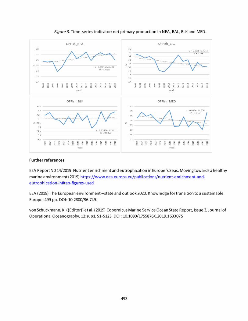
493
Figure 3. Time-series indicator: net primary production in NEA, BAL, BLK and MED.
Further references
EEA Report N0 14/2019 Nutrient enrichment and eutrophication in Europe ’s Seas. Moving towards a healthy
marine environment (2019) https://www.eea.europa.eu/publications/nutrient-enrichment-and-
eutrophication-in#tab-figures-used
EEA (2019) The European environment – state and outlook 2020. Knowledge for transition to a sustainable
Europe. 499 pp. DOI: 10.2800/96.749.
von Schuckmann, K. ((Editor)) et al. (2019) Copernicus Marine Service Ocean State Report, Issue 3, Journal of
Operational Oceanography, 12:sup1, S1-S123, DOI: 10.1080/1755876X.2019.1633075

494
Fact sheet 3.7.204: Bathing water quality (marine ecosystems)
1. General information
Thematic ecosystem assessment: Marine ecosystems
Indicator class: Condition/Environmental quality
Name of the indicator: Bathing water quality
Units: quality level48/year
2. Data sources
The indicator is derived from the merge of readily available datasets. The derived dataset has been resampled
at EU Marine Regions scale.
References for the derived dataset:
Dataholder: JRC; Contact: Anna M. Addamo, Francesca Somma
Time-series range: 1990-2018
Reference:
- EEA, update 23rd May 2019 through O. Vigiak (JRC) and Peter Kristensen (EEA); EEA Report No
3/2019 European Bathing Water Quality in 2018, weblink:
https://www.eea.europa.eu/themes/water/europes-seas-and-coasts/assessments/state-of-
bathing-water; https://www.eea.europa.eu/publications/european-bathing-water-quality-in-2018
3. Assessment of the indicator
Bathing water quality is used to assess the environmental quality of coastal and transitional waters.
3.1. Short description of the scope of the indicator.
The indicator expresses the quality of the coastal waters and beaches. It provides a direct measure of water
quality. The rationale of the indicator is based on the following assumption: the bathing water is quantified by
two parameters of (faecal) bacteria and other parameters. An increase in bathing water quality means an
increase in safeguard public health and clean bathing waters. Bathing water quality is improving overtime (see
Figure 1).
3.2. Maps
Not available.
3.3. Statistical analysis of the trend
The indicator is calculated as follows: dataset are derived from the extraction of the year-mean for each beach
by EU marine region. Statistical test that fit a regression model through the observed data against time (in
years) is performed per each EU marine regions, so that the change per decade is based on an assessment of
48
Quality levels or categories: Not classified/NA (0); Poor (1); Sufficient (2); Good or Sufficient (3); Good (4) Excellent (5).
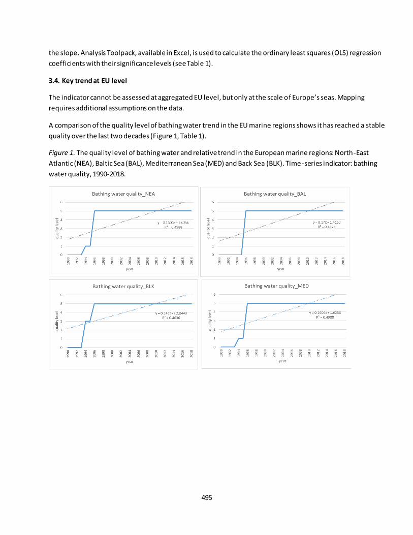
495
the slope. Analysis Toolpack, available in Excel, is used to calculate the ordinary least squares (OLS) regression
coefficients with their significance levels (see Table 1).
3.4. Key trend at EU level
The indicator cannot be assessed at aggregated EU level, but only at the scale of Europe’s seas. Mapping
requires additional assumptions on the data.
A comparison of the quality level of bathing water trend in the EU marine regions shows it has reached a stable
quality over the last two decades (Figure 1, Table 1).
Figure 1. The quality level of bathing water and relative trend in the European marine regions: North-East
Atlantic (NEA), Baltic Sea (BAL), Mediterranean Sea (MED) and Back Sea (BLK). Time -series indicator: bathing
water quality, 1990-2018.
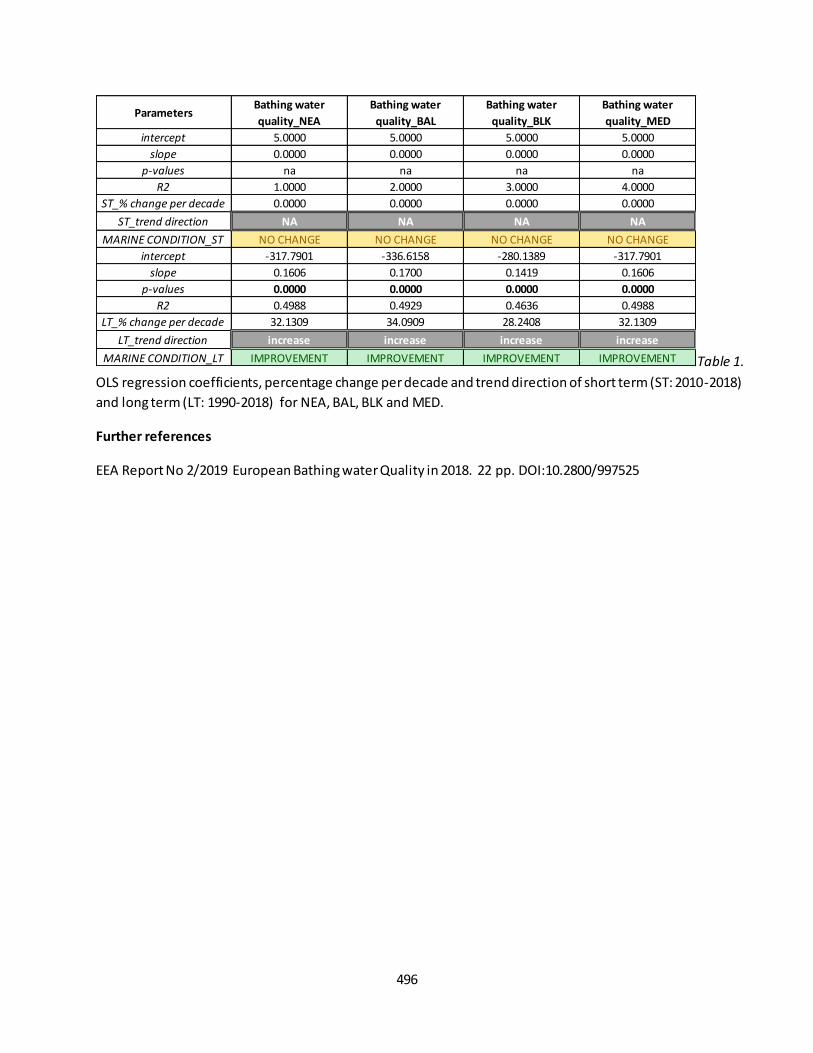
496
Table 1.
OLS regression coefficients, percentage change per decade and trend direction of short term (ST: 2010-2018)
and long term (LT: 1990-2018) for NEA, BAL, BLK and MED.
Further references
EEA Report No 2/2019 European Bathing water Quality in 2018. 22 pp. DOI:10.2800/997525
ParametersBathing water
quality_NEA
Bathing water
quality_BAL
Bathing water
quality_BLK
Bathing water
quality_MED
intercept 5.0000 5.0000 5.0000 5.0000
slope 0.0000 0.0000 0.0000 0.0000
p-values na na na na
R2 1.0000 2.0000 3.0000 4.0000
ST_% change per decade 0.0000 0.0000 0.0000 0.0000
ST_trend direction NA NA NA NA
MARINE CONDITION_ST NO CHANGE NO CHANGE NO CHANGE NO CHANGE
intercept -317.7901 -336.6158 -280.1389 -317.7901
slope 0.1606 0.1700 0.1419 0.1606
p-values 0.0000 0.0000 0.0000 0.0000
R2 0.4988 0.4929 0.4636 0.4988
LT_% change per decade 32.1309 34.0909 28.2408 32.1309
LT_trend direction increase increase increase increase
MARINE CONDITION_LT IMPROVEMENT IMPROVEMENT IMPROVEMENT IMPROVEMENT

497
Fact sheet 3.7.205: Contaminants in biota (marine ecosystems)
1. General information
Thematic ecosystem assessment: Marine ecosystems
Indicator class: Ecosystem condition/ Environmental quality
Name of the indicator: Contaminants concentration in biota
Units: μg/kg
2. Data sources
The indicator is derived from the merge of readily available datasets. The derived dataset and has been
resampled at EU Marine Regions scale.
References for the derived dataset:
Dataholder: JRC; Contact: Anna M. Addamo, Francesca Somma
Time-series range: variable, 2000-2017 or shorter
Reference:
- EMODnet Chemistry, weblink http://ec.oceanbrowser.net/emodnet/;
3. Assessment of the indicator
Contaminants in biota is used to assess the impact of human activities to marine organisms.
3.1. Short description of the scope of the indicator.
The indicator expresses the impact of human activities to marine organism. It provides a direct measure of
contaminants in marine organisms. The rationale of the indicator is based on the following assumption:
contaminants in biota is quantified by decreases in pollutants concentration and type in marine biota. A
decrease in contaminants concentration means an increase in water quality, contributing to reaching "good
environmental status". Contaminants in biota do not represent a clear pattern of trend (see Figure 1).
3.2. Maps
Not available.
3.3. Statistical analysis of the trend
The concentration of contaminants has been scaled with the sampling size (value/nb. entries). The indicator is
calculated as follows: dataset are derived from the extraction of the year-sum for each EU marine region.
Statistical test that fit a regression model through the observed data against time (in years) is performed per
each EU marine regions, so that the change per decade is based on an assessment of the slope. Analysis
Toolpack, available in Excel, is used to calculate the ordinary least squares (OLS) regression coefficients with
their significance levels (see Table 1).

498
3.4. Key trend at EU level
The indicator cannot be assessed at aggregated EU level, but only at the scale of European ’ seas. Mapping
requires additional assumptions on the data.
A comparison of the contaminants in biota trend in the EU marine regions shows no clear pattern (Figure 1,
Table 1).
Figure 1. The concentration of contaminants in biota and relative trend in the European marine regions: North -
East Atlantic (NEA), Baltic Sea (BAL), Mediterranean Sea (MED), Back Sea (BLK). Time-series indicator:
contaminants in biota, 2000-2017.

499
Table 1.
OLS regression coefficients, percentage change per decade and trend direction of short term (ST: 2010-2017)
and long term (LT: 2000-2017) for NEA, BAL, BLK and MED.*based on expert judgment.
Further references
EEA Report No 25/2018 Contaminants in Europe ’s Seas. Moving towards a clean, non-toxic marine
environment (2018) https://www.eea.europa.eu/publications/contaminants-in-europes-seas
EEA Report No 18/2018 Chemicals in European water. Knowledge developments. 80 pp. DOI:10.2000/265000
Korpinen, S., Klančnik, K., Peterlin, M., Nurmi, M., Laamanen, L., Zupančič, G., Murray, C., Harvey, T., Andersen,
J.H., Zenetos, A., Stein, U., Tunesi, L., Abhold, K., Piet, G., Kallenbach, E., Agnesi, S., Bolman, B., Vaughan, D.,
Reker, J. & Royo Gelabert, E., 2019, Multiple pressures and their combined effects in Europe ’s seas. ETC/ICM
Technical Report 4/2019: European Topic Centre on Inland, Coastal and Marine waters, 164 pp.
EEA (2019) The European environment – state and outlook 2020. Knowledge for transition to a sustainable
Europe. 499 pp. DOI: 10.2800/96.749.
ParametersContaminants_biota_
NEA
Contaminants_biota_
BAL
Contaminants_biota_
BLK
Contaminants_biota_
MED
intercept -118633054.7547 97358.0734 2234903.6257
slope 59135.1991 -48.2123 -1104.1911
p-values 0.3416 0.2902 0.2759
R2 0.1509 0.1831 0.1932
ST_% change per decade 258.5762 -106.8187 -71.3328
ST_trend direction no change no change NA no change
MARINE CONDITION_ST UNRESOLVED* UNRESOLVED* NA UNRESOLVED*
intercept -80027758.6846 31861.1119 1372869.7932
slope 39955.3598 -15.7061 -676.3598
p-values 0.0019 0.1067 0.0178
R2 0.4610 0.1544 0.8354
LT_% change per decade 141.4276 -53.8140 -50.5255
LT_trend direction increase no change NA decrease
MARINE CONDITION_LT UNRESOLVED* UNRESOLVED* NA UNRESOLVED*
500
Fact sheet 3.7.206: Contaminants in sediment (marine ecosystems)
1. General information
Thematic ecosystem assessment: Marine ecosystems
Indicator class: Ecosystem condition/ Environmental quality
Name of the indicator: Contaminants concentration in sediment
Units: μg/kg
2. Data sources
The indicator is derived from the merge of readily available datasets. The derived dataset and has been
resampled at EU Marine Regions scale.
References for the derived dataset:
Dataholder: JRC; Contact: Anna M. Addamo, Francesca Somma
Time-series range: variable, 2000-2017 or shorter
Reference:
- EMODnet Chemistry, weblink http://ec.oceanbrowser.net/emodnet/;
3. Assessment of the indicator
Contaminants in sediment is used to assess the environmental quality and integrity of seafloor due to human
activities.
3.1. Short description of the scope of the indicator.
The indicator expresses the impact of human activities to quality and integrity of seafloor. It provides a direct
measure of contaminants in the seafloor. The rationale of the indicator is based on the following assumption:
contaminants in sediment is quantified by decreases in pollutants concentration and type in the seafloor. A
decrease in contaminants concentration means an increase in quality of wate r, seafloor and habitats,
contributing to reaching "good environmental status". Contaminants in sediment do not represent a clear
pattern of trend (see Figure 1).
3.2. Maps
Not available.
3.3. Statistical analysis of the trend
The concentration of contaminants has been scaled with the sampling size (value/nb. entries). The indicator is
calculated as follows: dataset are derived from the extraction of the year-sum for each EU marine region.
Statistical test that fit a regression model through the observed data against time (in years) is performed per
each EU marine regions, so that the change per decade is based on an assessment of the slope. Analysis
Toolpack, available in Excel, is used to calculate the ordinary least squares (OLS) regression coefficients with
their significance levels (see Table 1).
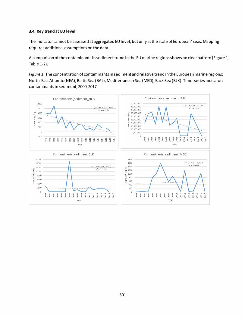
501
3.4. Key trend at EU level
The indicator cannot be assessed at aggregated EU level, but only at the scale of European ’ seas. Mapping
requires additional assumptions on the data.
A comparison of the contaminants in sediment trend in the EU marine regions shows no clear pattern (Figure 1,
Table 1-2).
Figure 1. The concentration of contaminants in sediment and relative trend in the European marine regions:
North-East Atlantic (NEA), Baltic Sea (BAL), Mediterranean Sea (MED), Back Sea (BLK). Time-series indicator:
contaminants in sediment, 2000-2017.
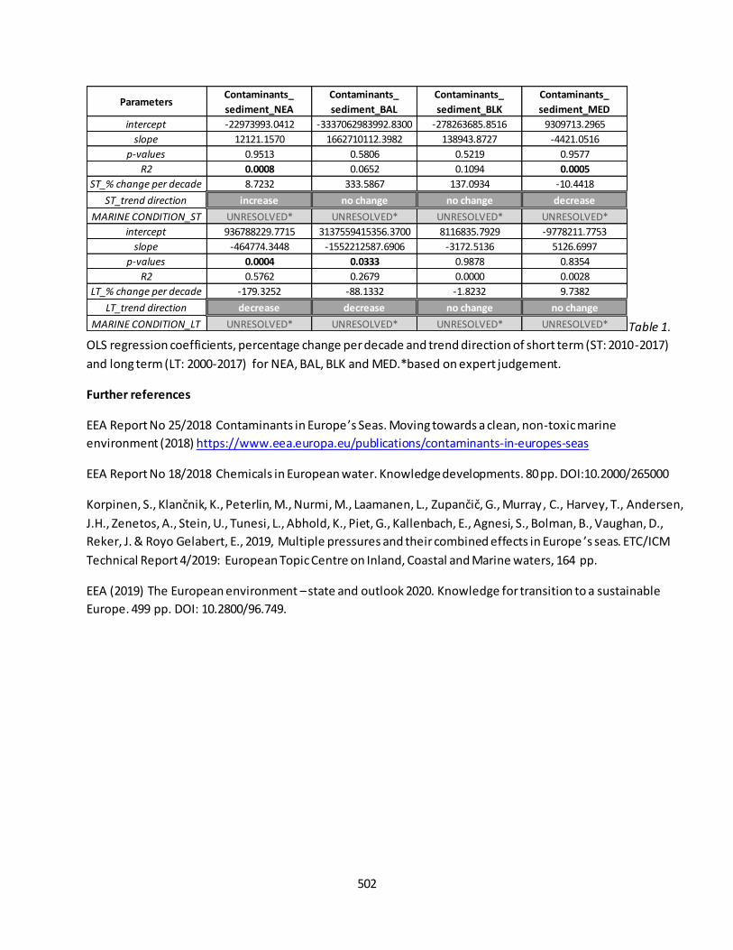
502
Table 1.
OLS regression coefficients, percentage change per decade and trend direction of short term (ST: 2010-2017)
and long term (LT: 2000-2017) for NEA, BAL, BLK and MED.*based on expert judgement.
Further references
EEA Report No 25/2018 Contaminants in Europe ’s Seas. Moving towards a clean, non-toxic marine
environment (2018) https://www.eea.europa.eu/publications/contaminants-in-europes-seas
EEA Report No 18/2018 Chemicals in European water. Knowledge developments. 80 pp. DOI:10.2000/265000
Korpinen, S., Klančnik, K., Peterlin, M., Nurmi, M., Laamanen, L., Zupančič, G., Murray , C., Harvey, T., Andersen,
J.H., Zenetos, A., Stein, U., Tunesi, L., Abhold, K., Piet, G., Kallenbach, E., Agnesi, S., Bolman, B., Vaughan, D.,
Reker, J. & Royo Gelabert, E., 2019, Multiple pressures and their combined effects in Europe ’s seas. ETC/ICM
Technical Report 4/2019: European Topic Centre on Inland, Coastal and Marine waters, 164 pp.
EEA (2019) The European environment – state and outlook 2020. Knowledge for transition to a sustainable
Europe. 499 pp. DOI: 10.2800/96.749.
ParametersContaminants_
sediment_NEA
Contaminants_
sediment_BAL
Contaminants_
sediment_BLK
Contaminants_
sediment_MED
intercept -22973993.0412 -3337062983992.8300 -278263685.8516 9309713.2965
slope 12121.1570 1662710112.3982 138943.8727 -4421.0516
p-values 0.9513 0.5806 0.5219 0.9577
R2 0.0008 0.0652 0.1094 0.0005
ST_% change per decade 8.7232 333.5867 137.0934 -10.4418
ST_trend direction increase no change no change decrease
MARINE CONDITION_ST UNRESOLVED* UNRESOLVED* UNRESOLVED* UNRESOLVED*
intercept 936788229.7715 3137559415356.3700 8116835.7929 -9778211.7753
slope -464774.3448 -1552212587.6906 -3172.5136 5126.6997
p-values 0.0004 0.0333 0.9878 0.8354
R2 0.5762 0.2679 0.0000 0.0028
LT_% change per decade -179.3252 -88.1332 -1.8232 9.7382
LT_trend direction decrease decrease no change no change
MARINE CONDITION_LT UNRESOLVED* UNRESOLVED* UNRESOLVED* UNRESOLVED*

503
Fact sheet 3.7.207: Beach litter
1. General information
Thematic ecosystem assessment: Marine ecosystems
Indicator class: Condition/Environmental quality
Name of the indicator: Beach litter
Units: number of item/100m
2. Data sources
The indicator is derived from the merge of readily available datasets. The derived dataset and has been
resampled at EU Marine Regions scale.
References for the derived dataset:
Dataholder: JRC; Contact Anna M. Addamo
Time-series range: 2001-2018 or earlier
Reference:
- EMODnet Human Activities, weblink: http://www.emodnet-humanactivities.eu/view-data.php;
3. Assessment of the indicator
The quantity of beach litter is used to assess impact of human activities to coastal beaches.
3.1. Short description of the scope of the indicator.
The indicator expresses the environmental quality of the coastal beaches. It provides a direct measure of
amount of litter in EU beaches. The rationale of the indicator is based on the following assump tion:
environmental quality of coastal beaches is quantified by decreases in amount and type of litter. A decrease in
beach litter means an increase in environmental coastal quality, contributing to reaching "good environmental
status". Beach litter do not represent a common pattern of trend across the EU marine regions (see Figure 1).
3.2. Maps
Not available.
3.3. Statistical analysis of the trend
The indicator is calculated as follows: dataset are derived from the extraction of the year-sum for each EU
marine region. Statistical test that fit a regression model through the observed data against time (in years) is
performed per each EU marine regions, so that the change per decade is based on an assessment of the slope.
Analysis Toolpack, available in Excel, is used to calculate the ordinary least squares (OLS) regression coefficients
with their significance levels (see Table 1).
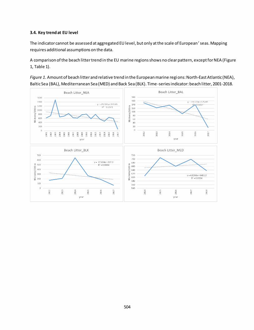
504
3.4. Key trend at EU level
The indicator cannot be assessed at aggregated EU level, but only at the scale of European ’ seas. Mapping
requires additional assumptions on the data.
A comparison of the beach litter trend in the EU marine regions shows no clear pattern, except for NEA (Figure
1, Table 1).
Figure 1. Amount of beach litter and relative trend in the European marine regi ons: North-East Atlantic (NEA),
Baltic Sea (BAL), Mediterranean Sea (MED) and Back Sea (BLK). Time-series indicator: beach litter, 2001-2018.

505
Table 1.
OLS regression coefficients, percentage change per decade and trend direction of short term (ST: 2010-2018)
and long term (LT: 2001-2018) for NEA, BAL, BLK and MED.
Note: No EU baseline and threshold from TG Marine Litter yet. Floating litter should be also considered as
indicators in the MAES.
Further references
Addamo A.M., Laroche P., Hanke G. 2017. Top Marine Beach Litter Items in Europe, EUR 29249 EN, Publications
Office of the European Union, Luxembourg, ISBN 978-92-79-87711-7, doi:10.2760/496717.
Hanke G., Walvoort, D., Van Loon, W., Addamo, A.M., Brosich, A., del Mar Chaves Montero, M., Molina Jack,
M.E., Vinci, M., Giorgetti, A. EU Marine Beach Litter Baselines, EUR 30022 EN, Publications Office of the
European Union, Luxemburg, 2019, ISBN 978-92-76-14243-0, doi:10.2760/16903.
Korpinen, S., Klančnik, K., Peterlin, M., Nurmi, M., Laamanen, L., Zupančič, G., Murray, C., Harvey, T., Andersen, J.H., Zenetos, A., Stein, U., Tunesi, L., Abhold, K., Piet, G., Kallenbach, E., Agnesi, S., Bolman, B., Vaughan, D.,
Reker, J. & Royo Gelabert, E., 2019, Multiple pressures and their combined effects in Europe ’s seas. ETC/ICM
Technical Report 4/2019: European Topic Centre on Inland, Coastal and Marine waters, 164 pp.
EEA (2019) The European environment – state and outlook 2020. Knowledge for transition to a sustainable
Europe. 499 pp. DOI: 10.2800/96.749.
Parameters Beach litter_ATL Beach litter_BAL Beach litter_BLK Beach litter_MED
intercept 133464.5612 38732.4558 56331.6911 -9067.8882
slope -66.0025 -19.1729 -27.8341 4.8266
p-values 0.0495 0.1147 0.6221 0.7686
R2 0.5010 0.5027 0.0664 0.0334
ST_% change per decade -82.5522 -98.3177 -72.2712 7.6173
ST_trend direction decrease no change no change no change
MARINE CONDITION_ST IMPROVEMENT NO CHANGE NO CHANGE NO CHANGE
intercept 59737.8374
slope -29.3940
p-values 0.0236
R2 0.2971
LT_% change per decade -44.8140
LT_trend direction decrease
MARINE CONDITION_LT IMPROVEMENT NA NA NA
506
Fact sheet 3.7.208: Seafloor litter
1. General information
Thematic ecosystem assessment: Marine ecosystems
Indicator class: Condition/Environmental quality
Name of the indicator: Seafloor litter
Units: number of item/haul49
2. Data sources
The indicator is derived from the merge of readily available datasets. The derived dataset and has been
resampled at EU Marine Regions scale.
References for the derived dataset:
Dataholder: JRC; Contact: Anna M. Addamo, Francesca Somma
Time-series range: variable, 2007-2018 or earlier
Reference:
- EMODnet Human Activities, weblink: http://www.emodnet-humanactivities.eu/view-data.php;
3. Assessment of the indicator
The amount of seafloor litter is used to assess the environmental quality due to human activities.
3.1. Short description of the scope of the indicator.
The indicator expresses the environmental quality of the seafloor. It provides a direct measure of amount of
litter in the seafloor. The rationale of the indicator is based on the following assumption: environmental quality
of seafloor is quantified by decreases in amount and type of litter. A decrease in seafloor litter value means an
increase in environmental seafloor quality, contributing to reaching "good environmental status". Seafloor
litter do not represent a common pattern of trend across the EU marine regions. Further analysis with a time -
series dataset, which is not available yet, are needed (see Figure 1).
3.2. Maps
Not available.
3.3. Statistical analysis of the trend
The indicator is calculated as follows: dataset are derived from the extraction of the year-sum for each EU
marine region. Statistical test that fit a regression model through the observed data against time (in years) is
performed per each EU marine regions, so that the change per decade is based on an assessment of the slope.
Analysis Toolpack, available in Excel, is used to calculate the ordinary least squares (OLS) regression coefficients
with their significance levels (see Table 1).
49
or “swept area”

507
3.4. Key trend at EU level
The indicator cannot be assessed at aggregated EU level, but only at the scale of European ’ seas. Mapping
requires additional assumptions on the data.
A comparison of the seafloor litter trend in the EU marine regions shows no clear patterns (Figure 1, Table 1).
Figure 1. Amount of seafloor litter and relative trend in the European marine regions: North-East Atlantic
(NEA), Baltic Sea (BAL), Mediterranean Sea (MED) and Back Sea (BLK). Time-series indicator: seafloor litter,
2007-2018.

508
Table 1.
OLS regression coefficients, percentage change per decade and trend direction of short term (ST: 2010-2018)
and long term (LT: 2007-2018) for NEA, BAL, BLK and MED.*based on expert judgment.
Note: information data is poor. Further analysis with a time-series dataset are needed.
Further references
Vlachogianni T, Somarakis S (2014) Methodology for monitoring marine litter on the seafloor (continental
shelf). Bottom trawl surveys. http://mio-ecsde.org/wp-content/uploads/2014/12/Seafloor-litter_monitoring-
methodology_continental-selves_final.pdf
Korpinen, S., Klančnik, K., Peterlin, M., Nurmi, M., Laamanen, L., Zupančič, G., Murray, C., Harvey, T., Andersen, J.H., Zenetos, A., Stein, U., Tunesi, L., Abhold, K., Piet, G., Kallenbach, E., Agnesi, S., Bolman, B., Vaughan, D.,
Reker, J. & Royo Gelabert, E., 2019, Multiple pressures and their combined effects in Europe’s seas. ETC/ICM
Technical Report 4/2019: European Topic Centre on Inland, Coastal and Marine waters, 164 pp.
EEA (2019) The European environment – state and outlook 2020. Knowledge for transition to a sustainable
Europe. 499 pp. DOI: 10.2800/96.749.
Parameters Seafloor litter_ATL Seafloor litter_BAL Seafloor litter_BLK Seafloor litter_MED
intercept -128.0537 187.1290 -102.3080 -421.2658
slope 0.0641 -0.0921 0.0515 0.2102
p-values 0.3083 0.4053 0.0174 0.0850
R2 0.1471 0.1007 0.8839 0.4143
ST_% change per decade 82.3713 -44.1354 43.0168 174.0749
ST_trend direction no change no change increase no change
MARINE CONDITION_ST UNRESOLVED* UNRESOLVED* UNRESOLVED* UNRESOLVED*
intercept -220.9464
slope 0.1102
p-values 0.0034
R2 0.5576
LT_% change per decade 204.9287
LT_trend direction increase
MARINE CONDITION_LT UNRESOLVED* NA NA NA
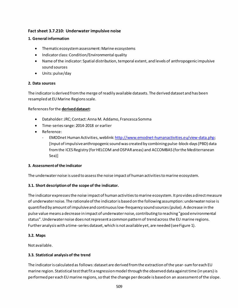
509
Fact sheet 3.7.210: Underwater impulsive noise
1. General information
Thematic ecosystem assessment: Marine ecosystems
Indicator class: Condition/Environmental quality
Name of the indicator: Spatial distribution, temporal extent, and levels of anthropogenic impulsive
sound sources
Units: pulse/day
2. Data sources
The indicator is derived from the merge of readily available datasets. The derived dataset and has been
resampled at EU Marine Regions scale.
References for the derived dataset:
Dataholder: JRC; Contact: Anna M. Addamo, Francesca Somma
Time-series range: 2014-2018 or earlier
Reference:
- EMODnet Human Activities, weblink: http://www.emodnet-humanactivities.eu/view-data.php;
[Input of impulsive anthropogenic sound was created by combining pulse-block-days (PBD) data
from the ICES Registry (for HELCOM and OSPAR areas) and ACCOMBAS (for the Mediterranean
Sea)]
3. Assessment of the indicator
The underwater noise is used to assess the noise impact of human activities to marine ecosystem.
3.1. Short description of the scope of the indicator.
The indicator expresses the noise impact of human activities to marine ecosystem. It provides a direct measure
of underwater noise. The rationale of the indicator is based on the following assumption: underwater noise is
quantified by amount of impulsive and continuous low-frequency sound sources (pulse). A decrease in the
pulse value means a decrease in impact of underwater noise, contributing to reaching "good environmental
status". Underwater noise does not represent a common pattern of trend across the EU marine regions.
Further analysis with a time-series dataset, which is not available yet, are needed (see Figure 1).
3.2. Maps
Not available.
3.3. Statistical analysis of the trend
The indicator is calculated as follows: dataset are derived from the extraction of the year-sum for each EU
marine region. Statistical test that fit a regression model through the observed data against time (in years) is
performed per each EU marine regions, so that the change per decade is based on an assessment of the slope.
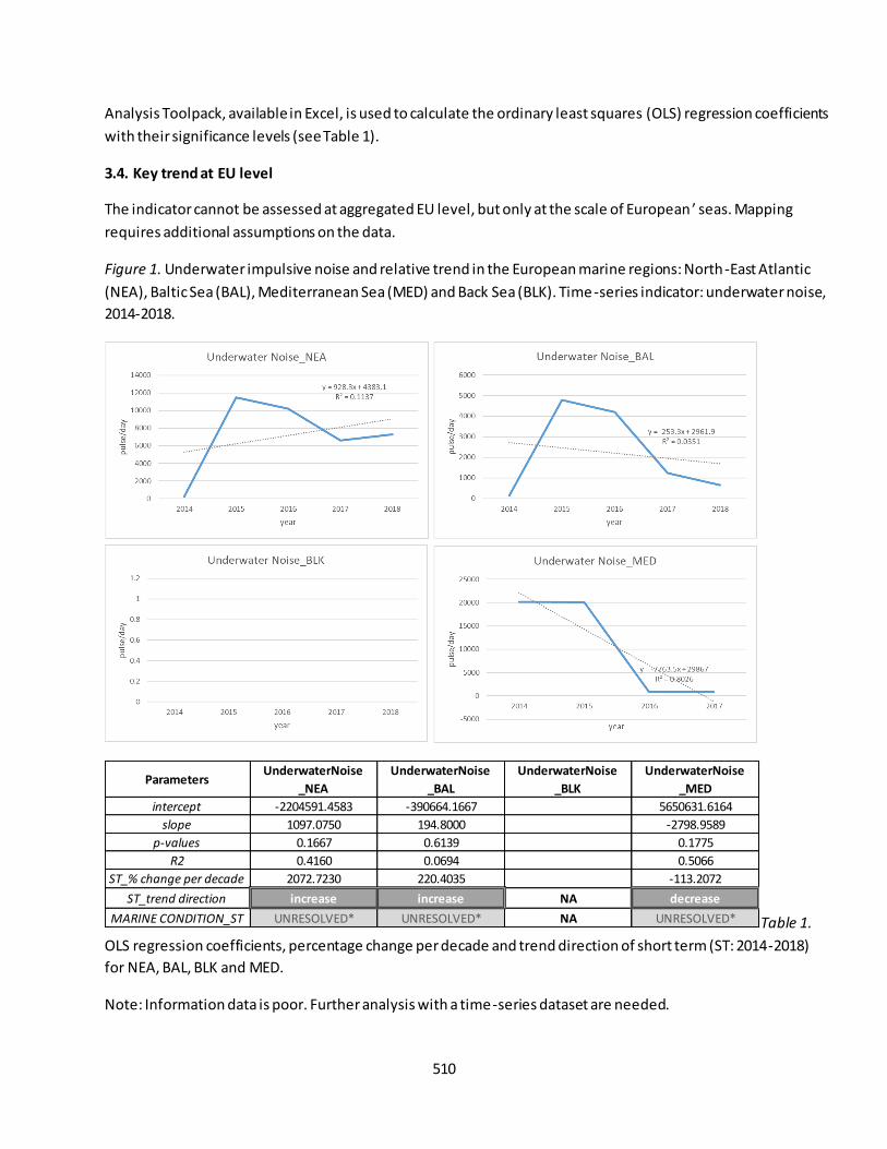
510
Analysis Toolpack, available in Excel, is used to calculate the ordinary least squares (OLS) regression coefficients
with their significance levels (see Table 1).
3.4. Key trend at EU level
The indicator cannot be assessed at aggregated EU level, but only at the scale of European ’ seas. Mapping
requires additional assumptions on the data.
Figure 1. Underwater impulsive noise and relative trend in the European marine regions: North-East Atlantic
(NEA), Baltic Sea (BAL), Mediterranean Sea (MED) and Back Sea (BLK). Time-series indicator: underwater noise,
2014-2018.
Table 1.
OLS regression coefficients, percentage change per decade and trend direction of short term (ST: 2014-2018)
for NEA, BAL, BLK and MED.
Note: Information data is poor. Further analysis with a time-series dataset are needed.
ParametersUnderwaterNoise
_NEA
UnderwaterNoise
_BAL
UnderwaterNoise
_BLK
UnderwaterNoise
_MED
intercept -2204591.4583 -390664.1667 5650631.6164
slope 1097.0750 194.8000 -2798.9589
p-values 0.1667 0.6139 0.1775
R2 0.4160 0.0694 0.5066
ST_% change per decade 2072.7230 220.4035 -113.2072
ST_trend direction increase increase NA decrease
MARINE CONDITION_ST UNRESOLVED* UNRESOLVED* NA UNRESOLVED*

511
Further references
EEA (2020) Estimated distribution of impulsive underwater noise in Europe's seas
https://www.eea.europa.eu/data-and-maps/figures/input-of-impulsive-anthropogenic-sound
Korpinen, S., Klančnik, K., Peterlin, M., Nurmi, M., Laamanen, L., Zupančič, G., Murray, C., Harvey, T., Andersen, J.H., Zenetos, A., Stein, U., Tunesi, L., Abhold, K., Piet, G., Kallenbach, E., Agnesi, S., Bolman, B., Vaughan, D.,
Reker, J. & Royo Gelabert, E., 2019, Multiple pressures and their combined effects in Europe ’s seas. ETC/ICM
Technical Report 4/2019: European Topic Centre on Inland, Coastal and Marine waters, 164 pp.
EEA (2019) The European environment – state and outlook 2020. Knowledge for transition to a sustainable
Europe. 499 pp. DOI: 10.2800/96.749.
512
Fact sheet 3.7.212: Ecological status (marine ecosystems)
1. General information
Thematic ecosystem assessment: Marine ecosystems
Indicator class: Condition/Ecosystem attributes/Structural ecosystem attributes (general)
Name of the indicator: Ecological Status
Units: class
2. Data sources
The indicator is derived from the merge of readily available datasets. The derived dataset has been resampled
at EU Marine Regions scale.
References for the derived dataset:
Dataholder: JRC; Contact: Anna M. Addamo, Francesca Somma
Point-in-time: 1st RBMP (2010) – 2nd RBMP (2016) reporting exercises50
Reference:
- WISE WFD database version 3, accessed through EEA WISE-Marine Tableau, weblink:
https://tableau.discomap.eea.europa.eu/t/Wateronline/views/WFD_Marine_status/Ecological?ifra
meSizedToWindow=true&:embed=y&:showAppBanner=false&:display_count=no&:showVizHome=
no&:origin=viz_share_link;
3. Assessment of the indicator
Ecological Status is used to assess the environmental quality of coastal and transitional water bodies.
3.1. Short description of the scope of the indicator.
The indicator expresses the quality of the structure and functioning of transitional and coastal waters
ecosystems. It provides an indirect measure of water quality. The rationale of the indicator is based on the
following assumption: the ecological status is quantified by the combination of several parameters (biological,
physico-chemical and hydromorphological quality elements51) included in the Water Framework Directive
(WFD). The overall ecological status classification for a water body is determined, according to the ‘one out, all
out’ principle, by the element with the worst status out of all the biological and supporting quality elements.
An improvement in the ecological status means an improvement in the health of the ecosystem. Ecological
Status is slightly improving overtime (see Figure 1-2).
50
Caution is advised when comparing Member States and when comparing the first and second RBMPs, as the results are affected by the methods Member States have used to coll ect data and often cannot be compared directly. Further info in https://www.eea.europa.eu/themes/water/european-waters/water-quality-and-water-assessment/water-
assessments/ecological -status-of-surface-water-bodies 51
BQEs: phytoplankton; macroalgae; angiosperms, macrophytes, phytobenthos; benthic invertebrates; fish; HQEs: hydrological or tidal regime; river continuity conditions; morphological conditions; CPQEs: transparency conditions; thermal conditions; oxygenation conditions; salinity conditions; acidification conditions; nutrients conditions;
phosphorous conditions.

513
Ecological status is reported by Member States to monitor progress in implementing the WFD. Ecological status
is reported per water body as “high”, “good”, “moderate”, “poor”, “bad”, or “unknown”. The indicator covers
the current status of coastal and transitional waters as reported in the 1st and 2nd River Basin Management
Plans (RBMPs).
The indicator is calculated as follows: dataset are derived from the 1st and 2nd river basin management plan
(RBMP) reporting exercises, for evaluating the ecological status or potential of each EU marine region (see
Table 1).
3.2. Maps
Not available.
3.3. Statistical analysis of the trend
Methodological differences between the two RBMP reporting exercises precluded analysis of temporal trends.
Due to the differences in the two reporting periods, there is no trend assessment of this indicator at unit scale.
However at the European scale conditions can be assessed as improvement from the first to the second RBMPs
reporting period.
Figure 1. Change in ecological status of coastal and transitional water bodies (area in km2) by EU submarine
regions, for the a) 1st – 2010, and b) 2nd – 2016 River Basin Management Plans (RBMPs) reporting exercises.
Source: the results are based on WISE WFD Database (Water Framework Directive Database) version 3,
including data from 22 Member States (EU-23 except Lithuania for 2010, and EU-23 except Lithuania and
Greece for 2016).

514
3.4. Key trend at EU level
The indicator cannot be assessed at aggregated EU level, but only at the scale of European ’ seas. Mapping
requires additional assumptions on the data.
A comparison of the ecological status reported in the first and second RBMP periods shows that the proportion
of marine coastal and transitional waters with high ecological status has dropped significantly, from a total of
48 % to 32 % (Figure 2, Table 1).
Figure. The ecological status (% of area) in the European marine regions: North-East Atlantic (NEA), Baltic Sea
(BAL), Mediterranean Sea (MED) and Back Sea (BLK). Point-in-time indicator: ecological status, a) 1st RBMP –
2010, and b) 2nd RBMP – 2016 reporting exercises.
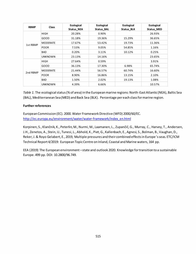
515
Table 1. The ecological status (% of area) in the European marine regions: North-East Atlantic (NEA), Baltic Sea
(BAL), Mediterranean Sea (MED) and Back Sea (BLK). Percentage per each class for marine region.
Further references
European Commission (EC). 2000. Water Framework Directive (WFD) 2000/60/EC.
http://ec.europa.eu/environment/water/water-framework/index_en.html
Korpinen, S., Klančnik, K., Peterlin, M., Nurmi, M., Laamanen, L., Zupančič, G., Murray, C., Harvey, T., Andersen,
J.H., Zenetos, A., Stein, U., Tunesi, L., Abhold, K., Piet, G., Kallenbach, E., Agnesi, S., Bolman, B., Vaughan, D.,
Reker, J. & Royo Gelabert, E., 2019, Multiple pressures and their combined effects in Europe ’s seas. ETC/ICM
Technical Report 4/2019: European Topic Centre on Inland, Coastal and Marine waters, 164 pp.
EEA (2019) The European environment – state and outlook 2020. Knowledge for transition to a sustainable
Europe. 499 pp. DOI: 10.2800/96.749.
RBMP ClassEcological
Status_NEA
Ecological
Status_BAL
Ecological
Status_BLK
Ecological
Status_MED
HIGH 20.28% 0.90% 26.93%
GOOD 31.18% 19.36% 15.29% 36.65%
MODERATE 17.67% 53.42% 19.73% 11.36%
POOR 7.53% 9.05% 54.85% 1.16%
BAD 0.20% 3.11% 10.12% 0.25%
UNKNOWN 23.13% 14.16% 23.65%
HIGH 27.64% 0.59% 3.91%
GOOD 36.13% 17.30% 6.98% 65.74%
MODERATE 21.44% 56.57% 60.74% 16.60%
POOR 8.90% 16.86% 13.15% 2.10%
BAD 1.50% 2.02% 19.13% 1.08%
UNKNOWN 4.39% 6.66% 10.57%
1st RBMP
2nd RBMP
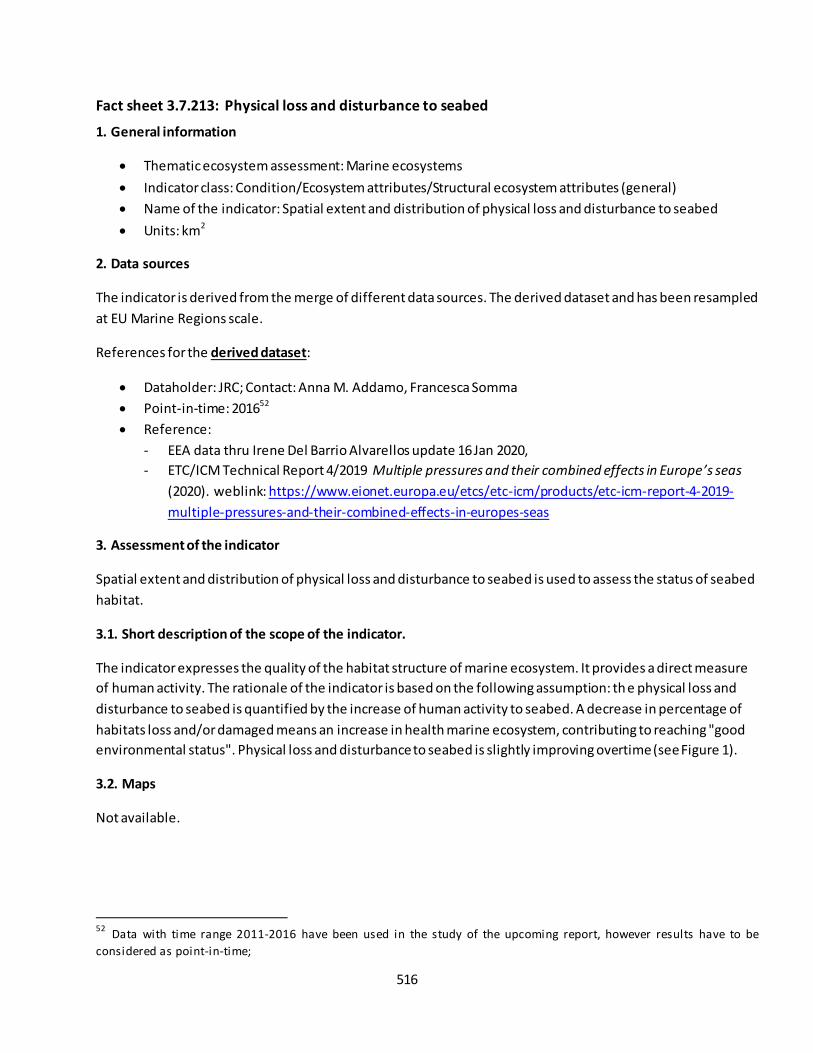
516
Fact sheet 3.7.213: Physical loss and disturbance to seabed
1. General information
Thematic ecosystem assessment: Marine ecosystems
Indicator class: Condition/Ecosystem attributes/Structural ecosystem attributes (general)
Name of the indicator: Spatial extent and distribution of physical loss and disturbance to seabed
Units: km2
2. Data sources
The indicator is derived from the merge of different data sources. The derived dataset and has been resampled
at EU Marine Regions scale.
References for the derived dataset:
Dataholder: JRC; Contact: Anna M. Addamo, Francesca Somma
Point-in-time: 201652
Reference:
- EEA data thru Irene Del Barrio Alvarellos update 16 Jan 2020,
- ETC/ICM Technical Report 4/2019 Multiple pressures and their combined effects in Europe’s seas
(2020). weblink: https://www.eionet.europa.eu/etcs/etc-icm/products/etc-icm-report-4-2019-
multiple-pressures-and-their-combined-effects-in-europes-seas
3. Assessment of the indicator
Spatial extent and distribution of physical loss and disturbance to seabed is used to assess the status of seabed
habitat.
3.1. Short description of the scope of the indicator.
The indicator expresses the quality of the habitat structure of marine ecosystem. It provides a direct measure
of human activity. The rationale of the indicator is based on the following assumption: the physical loss and
disturbance to seabed is quantified by the increase of human activity to seabed. A decrease in percentage of
habitats loss and/or damaged means an increase in health marine ecosystem, contributing to reaching "good
environmental status". Physical loss and disturbance to seabed is slightly improving overtime (see Figure 1).
3.2. Maps
Not available.
52
Data with time range 2011-2016 have been used in the study of the upcoming report, however results have to be
considered as point-in-time;
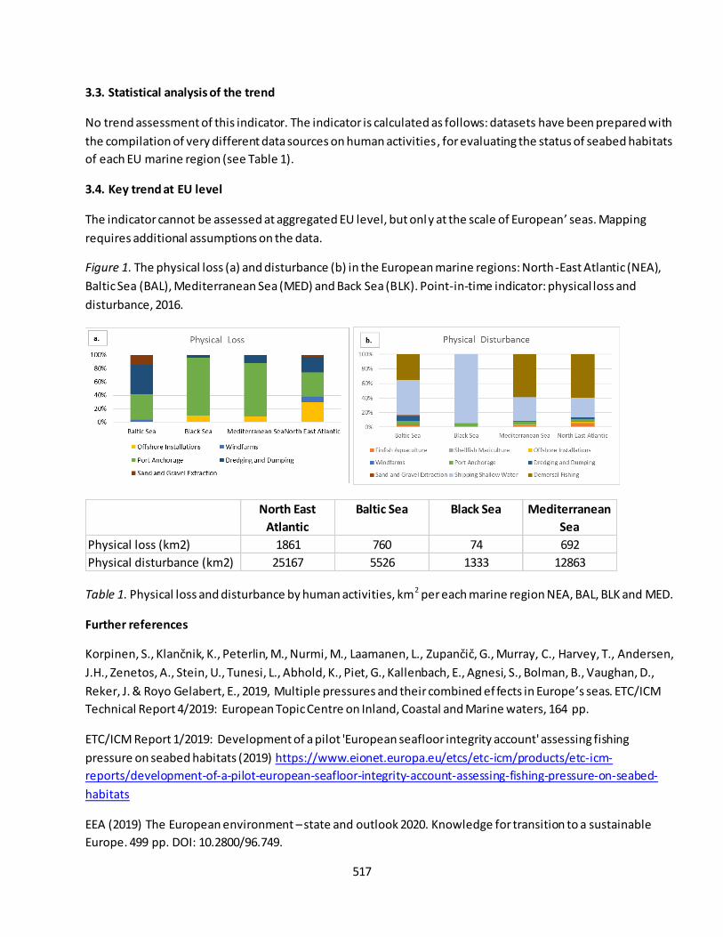
517
3.3. Statistical analysis of the trend
No trend assessment of this indicator. The indicator is calculated as follows: datasets have been prepared with
the compilation of very different data sources on human activities, for evaluating the status of seabed habitats
of each EU marine region (see Table 1).
3.4. Key trend at EU level
The indicator cannot be assessed at aggregated EU level, but only at the scale of European’ seas. Mapping
requires additional assumptions on the data.
Figure 1. The physical loss (a) and disturbance (b) in the European marine regions: North-East Atlantic (NEA),
Baltic Sea (BAL), Mediterranean Sea (MED) and Back Sea (BLK). Point-in-time indicator: physical loss and
disturbance, 2016.
Table 1. Physical loss and disturbance by human activities, km2 per each marine region NEA, BAL, BLK and MED.
Further references
Korpinen, S., Klančnik, K., Peterlin, M., Nurmi, M., Laamanen, L., Zupančič, G., Murray, C., Harvey, T., Andersen, J.H., Zenetos, A., Stein, U., Tunesi, L., Abhold, K., Piet, G., Kallenbach, E., Agnesi, S., Bolman, B., Vaughan, D.,
Reker, J. & Royo Gelabert, E., 2019, Multiple pressures and their combined ef fects in Europe’s seas. ETC/ICM
Technical Report 4/2019: European Topic Centre on Inland, Coastal and Marine waters, 164 pp.
ETC/ICM Report 1/2019: Development of a pilot 'European seafloor integrity account' assessing fishing
pressure on seabed habitats (2019) https://www.eionet.europa.eu/etcs/etc-icm/products/etc-icm-
reports/development-of-a-pilot-european-seafloor-integrity-account-assessing-fishing-pressure-on-seabed-
habitats
EEA (2019) The European environment – state and outlook 2020. Knowledge for transition to a sustainable
Europe. 499 pp. DOI: 10.2800/96.749.
North East
Atlantic
Baltic Sea Black Sea Mediterranean
Sea
Physical loss (km2) 1861 760 74 692
Physical disturbance (km2) 25167 5526 1333 12863

518
Fact sheet 3.7.218: Population abundance (marine ecosystems)
1. General information
Thematic ecosystem assessment: Marine ecosystems
Indicator class: Ecosystem condition/Ecosystem attributes (biological quality)/ Structural ecosystem
attributes/ Structural ecosystem attributes based on species diversity and abundance
Name of the indicator: Population abundance
Units: Number of individual/species
2. Data sources
The indicator is derived from the merge of readily available datasets. The derived dataset and has been
resampled at EU Marine Regions scale.
References for the derived dataset:
Data holder: JRC; Contact: Anna M. Addamo, Francesca Somma
Time-series range: variable, 1911-2018
Reference:
- EMODnet Biology, weblink: http://www.emodnet-biology.eu/portal/index.php5354;
3. Assessment of the indicator
The population abundance of marine species is used to assess the biomass status of marine ecosystem.
3.1. Short description of the scope of the indicator.
The indicator expresses the biomass status of marine ecosystem. It provides a direct measure of biomass of
marine organism. The rationale of the indicator is based on the following assumption: population abundance is
quantified by increases in biomass. An increase in biomass value means an increase in population abundance,
contributing to reaching "good environmental status". Population abundance represent a common pattern of
trend across the EU marine regions. Further analysis with a time-series dataset, which is not available yet, are
needed (see Figure 1-2).
3.2. Maps
Not available.
53
Dataset of benthic macroinvertebrates: the series products display the main functional type of benthic macroinvertebrates derived from a multivariate analysis of 13 l ife history traits. Further info in https://www.emodnet-biology.eu/distribution-benthic-macroinvertebrate-living-modes-european-seas 54
Dataset of fish: the series products display the main functional type of fish derived from a multivariate analysis of 8 l ife
history traits. Further info in https://www.emodnet-biology.eu/distribution-fish-living-modes-european-seas
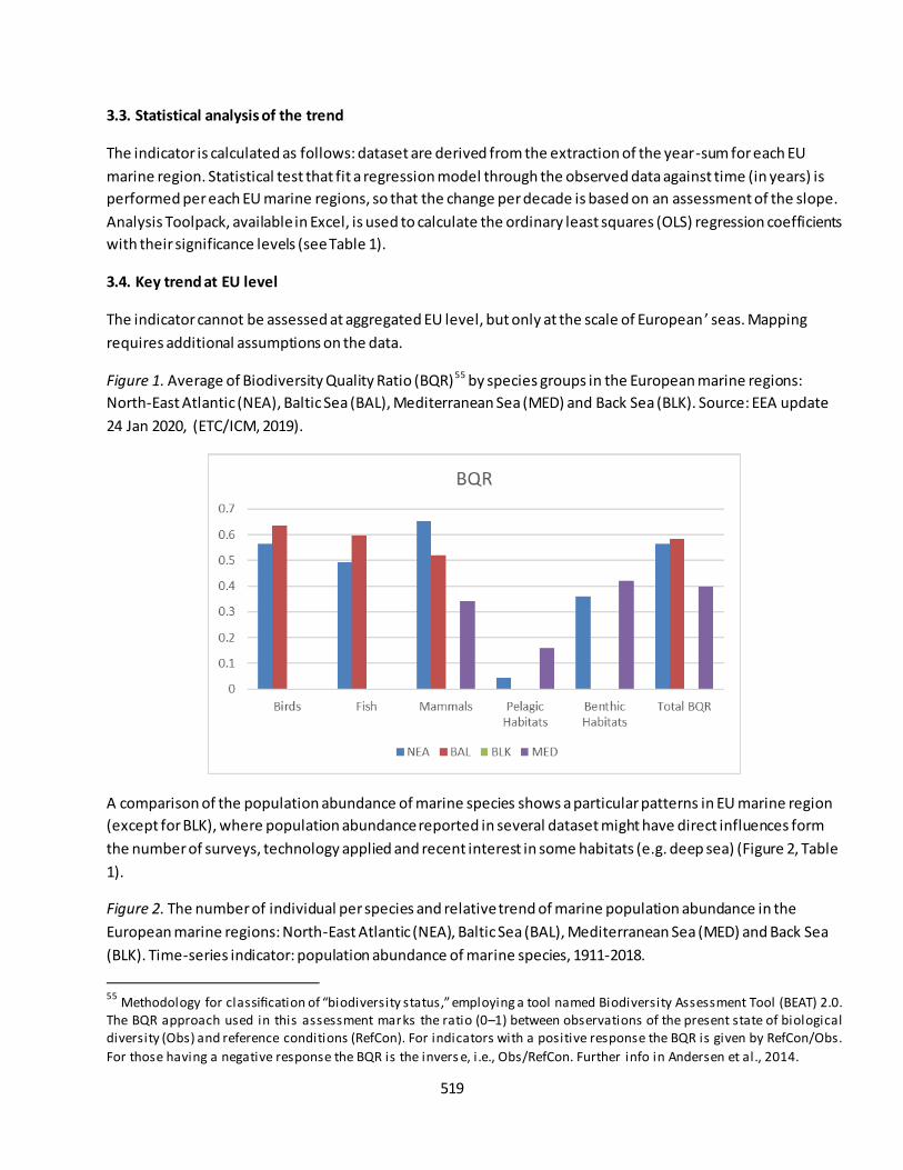
519
3.3. Statistical analysis of the trend
The indicator is calculated as follows: dataset are derived from the extraction of the year-sum for each EU
marine region. Statistical test that fit a regression model through the observed data against time (in years) is
performed per each EU marine regions, so that the change per decade is based on an assessment of the slope.
Analysis Toolpack, available in Excel, is used to calculate the ordinary least squares (OLS) regression coefficients
with their significance levels (see Table 1).
3.4. Key trend at EU level
The indicator cannot be assessed at aggregated EU level, but only at the scale of European ’ seas. Mapping
requires additional assumptions on the data.
Figure 1. Average of Biodiversity Quality Ratio (BQR)55 by species groups in the European marine regions:
North-East Atlantic (NEA), Baltic Sea (BAL), Mediterranean Sea (MED) and Back Sea (BLK). Source: EEA update
24 Jan 2020, (ETC/ICM, 2019).
A comparison of the population abundance of marine species shows a particular patterns in EU marine region
(except for BLK), where population abundance reported in several dataset might have direct influences form
the number of surveys, technology applied and recent interest in some habitats (e.g. deep sea) (Figure 2, Table
1).
Figure 2. The number of individual per species and relative trend of marine population abundance in the
European marine regions: North-East Atlantic (NEA), Baltic Sea (BAL), Mediterranean Sea (MED) and Back Sea
(BLK). Time-series indicator: population abundance of marine species, 1911-2018.
55
Methodology for classification of “biodiversity status,” employing a tool named Biodiversity Assessment Tool (BEAT) 2.0. The BQR approach used in this assessment marks the ratio (0–1) between observations of the present state of biological diversity (Obs) and reference conditions (RefCon). For indicators with a positive response the BQR is given by RefCon/Obs.
For those having a negative response the BQR is the invers e, i .e., Obs/RefCon. Further info in Andersen et al., 2014.
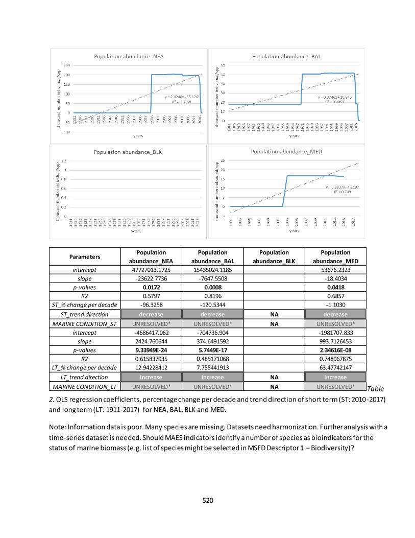
520
Table
2. OLS regression coefficients, percentage change per decade and trend direction of short term (ST: 2010-2017)
and long term (LT: 1911-2017) for NEA, BAL, BLK and MED.
Note: Information data is poor. Many species are missing. Datasets need harmonization. Further analysis with a
time-series dataset is needed. Should MAES indicators identify a number of species as bioindicators for the
status of marine biomass (e.g. list of species might be selected in MSFD Descriptor 1 – Biodiversity)?
ParametersPopulation
abundance_NEA
Population
abundance_BAL
Population
abundance_BLK
Population
abundance_MED
intercept 47727013.1725 15435024.1185 53676.2323
slope -23622.7736 -7647.5508 -18.4034
p-values 0.0172 0.0008 0.0418
R2 0.5797 0.8196 0.6857
ST_% change per decade -96.3258 -120.5344 -1.1030
ST_trend direction decrease decrease NA decrease
MARINE CONDITION_ST UNRESOLVED* UNRESOLVED* NA UNRESOLVED*
intercept -4686417.062 -704736.904 -1981707.833
slope 2424.760644 374.6491592 993.7126453
p-values 9.33949E-24 5.7449E-17 2.34616E-08
R2 0.615837935 0.485171068 0.748967875
LT_% change per decade 12.94228412 7.755441913 63.47742147
LT_trend direction increase increase NA increase
MARINE CONDITION_LT UNRESOLVED* UNRESOLVED* NA UNRESOLVED*

521
Further references
ETC/ICM Report 3/2019. Biodiversity in Europes’s Seas (2019). https://www.eionet.europa.eu/etcs/etc-
icm/products/biodiversity-in-europes-seas
EEA (2019) The European environment – state and outlook 2020. Knowledge for transition to a sustainable
Europe. 499 pp. DOI: 10.2800/96.749.
Andersen JHM, Dahl K, Göke C, Hartvig M, Murray C, Rindorf A, Skov H, Vinther M and Korpinen S (2014) .
Integrated assessment of marine biodiversity status using a prototype indicator-based assessment tool.
Frontiers in Marine Science, 1:55. doi: 10.3389/fmars.2014.00055

522
Fact sheet 3.7.221: Spawning stock biomass relative to reference biomass
1. General information
Thematic ecosystem assessment: Marine ecosystems
Indicator class: Ecosystem condition/Ecosystem attributes (biological quality)/ Structural ecosystem
attributes/ Structural ecosystem attributes based on species diversity and abundance
Name of the indicator: Spawning Stock Biomass relative to reference biomass
Units: Rate B/B2003
2. Data sources
The indicator is derived from the merge of readily available datasets. The derived dataset and has been
resampled at EU Marine Regions scale.
References for the derived dataset:
Data holder: JRC; Contact: Anna M. Addamo, Francesca Somma
Time-series range: 2003-2017
Reference:
Report STECF2018-01, weblink: https://stecf.jrc.ec.europa.eu/reports/cfp-monitoring;
Report STECF2019-01, weblink: https://stecf.jrc.ec.europa.eu/reports/cfp-monitoring;;
3. Assessment of the indicator
The spawning stock biomass of population of commercially-exploited species relative to reference biomass
(B2003) is used to assess the reproductive status of fish stocks.
3.1. Short description of the scope of the indicator.
The indicator expresses the reproductive status of fish and shellfish stocks. It provides an indirect measure of
spawning stock biomass. The rationale of the indicator is based on the following assumption: reproductive
status of fish and shellfish stocks is quantified by increases in rate of spawning stock biomass related to
reference biomass. A decrease in the rate value means an increase in reproductive status of fish and shellfish
stocks, contributing to reaching "good environmental status". Spawning stock biomass has a different trend
over time across marine region (see Figure 1).
The indicator is calculated as follows: dataset are derived from the extraction of the year-sum for each EU
marine region. Statistical test that fit a regression model through the observed data against time (in years) is
performed per each EU marine regions, so that the change per decade is based on an assessment of the slope.
Analysis Toolpack, available in Excel, is used to calculate the ordinary least squares (OLS) regression coefficients
with their significance levels (see Table 1).
3.2. Maps
Not available.
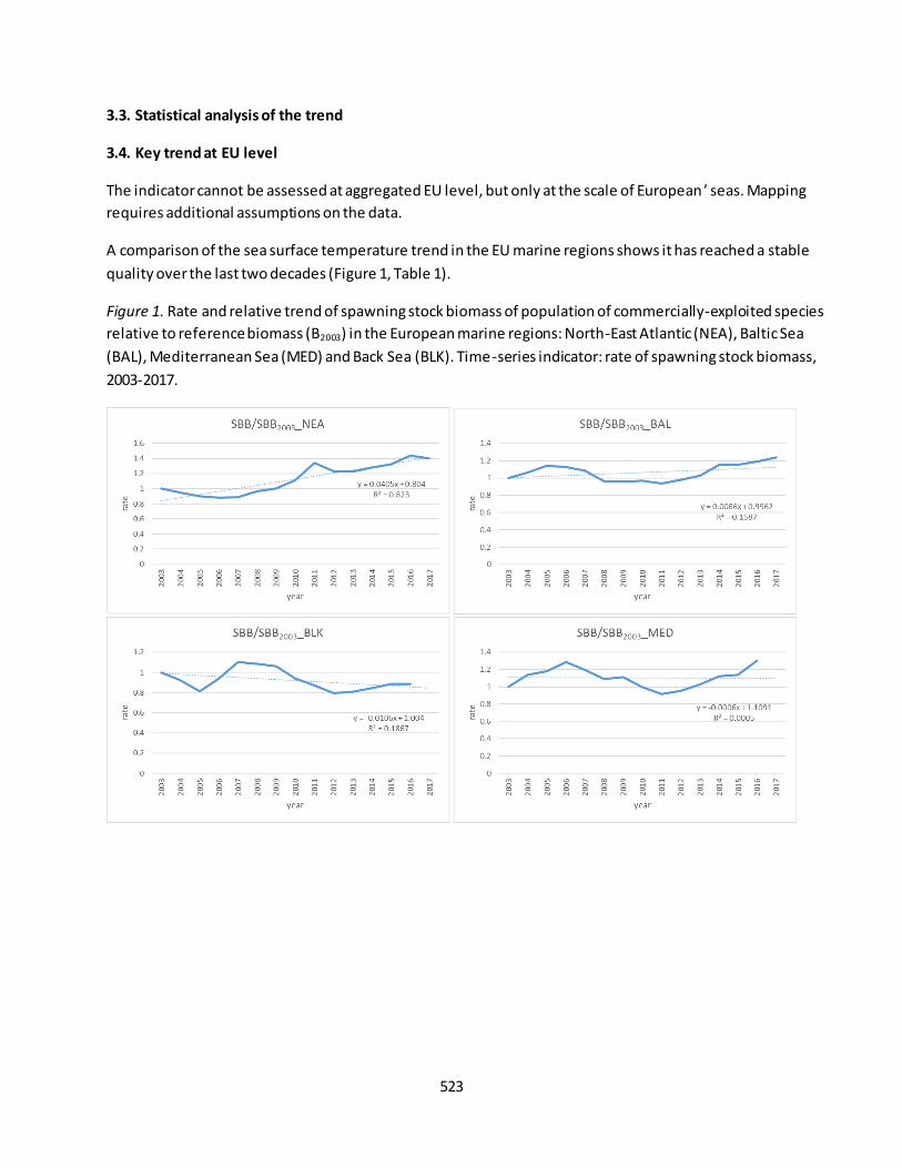
523
3.3. Statistical analysis of the trend
3.4. Key trend at EU level
The indicator cannot be assessed at aggregated EU level, but only at the scale of European ’ seas. Mapping
requires additional assumptions on the data.
A comparison of the sea surface temperature trend in the EU marine regions shows it has reached a stable
quality over the last two decades (Figure 1, Table 1).
Figure 1. Rate and relative trend of spawning stock biomass of population of commercially-exploited species
relative to reference biomass (B2003) in the European marine regions: North-East Atlantic (NEA), Baltic Sea
(BAL), Mediterranean Sea (MED) and Back Sea (BLK). Time-series indicator: rate of spawning stock biomass,
2003-2017.
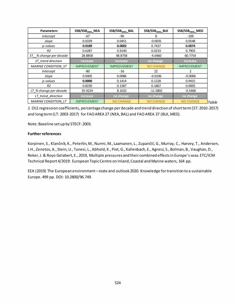
524
Table
1. OLS regression coefficients, percentage change per decade and trend direction of short term (ST: 2010-2017)
and long term (LT: 2003-2017) for FAO AREA 27 (NEA, BAL) and FAO AREA 37 (BLK, MED).
Note: Baseline set up by STECF: 2003.
Further references
Korpinen, S., Klančnik, K., Peterlin, M., Nurmi, M., Laamanen, L., Zupančič, G., Murray, C., Harvey, T., Andersen, J.H., Zenetos, A., Stein, U., Tunesi, L., Abhold, K., Piet, G., Kallenbach, E., Agnesi, S., Bolman, B., Vaughan, D.,
Reker, J. & Royo Gelabert, E., 2019, Multiple pressures and their combined effects in Europe ’s seas. ETC/ICM
Technical Report 4/2019: European Topic Centre on Inland, Coastal and Marine waters, 164 pp.
EEA (2019) The European environment – state and outlook 2020. Knowledge for transition to a sustainable
Europe. 499 pp. DOI: 10.2800/96.749.
Parameters SSB/SSB2003_NEA SSB/SSB2003_BAL SSB/SSB2003_BLK SSB/SSB2003_MED
intercept -67 -90 8 -109
slope 0.0339 0.0451 -0.0035 0.0548
p-values 0.0189 0.0002 0.7437 0.0074
R2 0.6287 0.9140 0.0233 0.7903
ST__% change per decade 28.8858 48.8758 -4.0460 60.7754
ST_trend direction increase increase no change increase
MARINE CONDITION_ST IMPROVEMENT IMPROVEMENT NO CHANGE IMPROVEMENT
intercept -80 -16 22 2
slope 0.0405 0.0086 -0.0106 -0.0006
p-values 0.0000 0.1414 0.1228 0.9415
R2 0.8230 0.1587 0.1867 0.0005
LT_% change per decade 35.9224 8.1032 -11.5802 -0.5468
LT_trend_direction increase no change no change no change
MARINE CONDITION_LT IMPROVEMENT NO CHANGE NO CHANGE NO CHANGE
525
Fact sheet 3.7.223: Biological quality elements (marine ecosystems)
1. General information
Thematic ecosystem assessment: Marine ecosystems
Indicator class: Condition/Ecosystem attributes/Structural ecosystem attributes based on species
diversity and abundance
Name of the indicator: Biological quality elements (BQEs) collected to assess ecological status
Units: class
2. Data sources
The indicator is derived from the merge of readily available datasets. The derived dataset and has been
resampled at EU Marine Regions scale.
References for the derived dataset:
Dataholder: JRC; Contact: Anna M. Addamo, Francesca Somma
Point-in-time: 1st RBMP (2010) – 2nd RBMP (2016) reporting exercises56
Reference:
- WISE WFD database version 3, accessed through EEA WISE Marine Tableau:
https://tableau.discomap.eea.europa.eu/t/Wateronline/views/WFD_Marine_status/QualityEleme
nts?iframeSizedToWindow=true&%3Aembed=y&%3AshowAppBanner=false&%3Adisplay_count=n
o&%3AshowVizHome=no&%3Aorigin=viz_share_link;
3. Assessment of the indicator
Biological quality elements are used to assess the environmental quality of coastal and transitional waters.
3.1. Short description of the scope of the indicator.
The indicator expresses the quality of the biological structure and functioning of transitional and coastal waters
ecosystems. It provides a direct measure of water quality. The rationale of the indicator is based on the
following assumption: the biological quality elements are quantified by the status of seve ral biological
indicators included in the Water Framework Directive (WFD)57. An improvement of the biological quality
elements means an increase in the health of the ecosystem. Biological quality elements are slightly improving
overtime (see Figure below).
Biological quality elements are reported by Member States to monitor progress in implementing the WFD.
Biological quality elements are reported per water body as “high”, “good”, “moderate”, “poor”, or “unknown”.
56
Caution is advised when comparing Member States and when comparing the first and second RBMPs, as the results are affected by the methods Member States have used to collect data and often cannot be compared directly. Further info in https://www.eea.europa.eu/themes/water/european-waters/water-quality-and-water-assessment/water-assessments/quality-elements-of-water-bodies 57
BQEs: phytoplankton; macroalgae; angiosperms, macrophytes, phytobenthos; benthic invertebrates; fish.

526
The indicator covers the current status of coastal and transitional waters as reported in the 1st and 2nd River
Basin Management Plans (RBMPs).
The indicator is calculated as follows: dataset are derived from the 1st and 2nd river basin management plan
(RBMP) reporting exercises, for evaluating the ecological status or potential of each EU marine region (see
Table 1 below).
3.2. Maps
Not available.
3.3. Statistical analysis of the trend
Methodological differences between the two RBMP reporting exercises precluded analysis of temporal trends.
Since the differences in the two reporting periods, there is no trend assessment of this indicator at unit scale.
However at the European scale conditions can be assessed as improvement from the first to the second RBMPs
reporting period.
Figure 1. Change in biological quality elements of coastal and transitional water bodies by EU submarine
regions, for the a) 1st – 2010, and b) 2nd – 2016 River Basin Management Plans (RBMPs) reporting exercise.
Source: the results are based on WISE WFD Database (Water Framework Directive Database) version 3,
including data from 22 Member States (EU-23 except Lithuania for 2010, and EU-23 except Lithuania and
Greece for 2016).

527
3.4. Key trend at EU level
The indicator cannot be assessed at aggregated EU level, but only at the scale of European ’ seas. Mapping
requires additional assumptions on the data.
A comparison of the biological quality elements reported in the first and second RBMP periods shows that the
proportion of coastal and transitional waters with unknown biological quality elements has dropped
significantly, from 79 % to 43 % (Figure 2, Table 1).
Figure 2. The biological quality elements assessment (% of area) in the European marine regions: North-East
Atlantic (NEA), Baltic Sea (BAL), Mediterranean Sea (MED) and Back Sea (BLK). Point-in-time indicator:
biological quality elements in a) 1st RBMP – 2010, and b) 2nd RBMP – 2016 reporting exercises.

528
Table 1. Biological quality elements assessment (% of area) in the European marine regions: North-East Atlantic
(NEA), Baltic Sea (BAL), Mediterranean Sea (MED) and Back Sea (BLK). Percentage per each class.
Further references
European Commission (EC). 2000. Water Framework Directive (WFD) 2000/60/EC.
http://ec.europa.eu/environment/water/water-framework/index_en.html
Korpinen, S., Klančnik, K., Peterlin, M., Nurmi, M., Laamanen, L., Zupančič, G., Murray, C. , Harvey, T., Andersen,
J.H., Zenetos, A., Stein, U., Tunesi, L., Abhold, K., Piet, G., Kallenbach, E., Agnesi, S., Bolman, B., Vaughan, D.,
Reker, J. & Royo Gelabert, E., 2019, Multiple pressures and their combined effects in Europe ’s seas. ETC/ICM
Technical Report 4/2019: European Topic Centre on Inland, Coastal and Marine waters, 164 pp.
EEA (2019) The European environment – state and outlook 2020. Knowledge for transition to a sustainable
Europe. 499 pp. DOI: 10.2800/96.749.
RBMP ClassBiological Quality
Elements_NEA
Biological Quality
Elements_BAL
Biological Quality
Elements_BLK
Biological Quality
Elements_MED
HIGH 1.68% 0.73% 26.75%
GOOD 4.80% 11.10% 29.54%
MODERATE 5.77% 28.64% 4.29%
POOR 6.78% 11.82%
BAD 1.57% 3.59%
UNKNOWN 79.39% 44.13% 39.42%
HIGH
GOOD 50.54% 18.78% 9.80% 42.13%
MODERATE 21.62% 67.57% 90.20% 14.41%
POOR
BAD
UNKNOWN 27.84% 13.65% 43.46%
1st RBMP
2nd RBMP

529
Fact sheet 3.7.224: Presence of invasive alien species (marine ecosystems)
1. General information
Thematic ecosystem assessment: Marine ecosystems
Indicator class: Ecosystem condition/Ecosystem attributes (biological quality)/ Structural ecosystem
attributes/ Structural ecosystem attributes based on species diversity and abundance
Name of the indicator: Occurrence of invasive alien species
Units: number of occurrences
2. Data sources
The indicator is derived from the merge of readily available datasets. The derived dataset and has been
resampled at EU Marine Regions scale.
References for the derived dataset:
Dataholder: JRC; Contact: Anna M. Addamo, Francesca Somma
Time-series range: 2000-2016
Reference:
- EASIN, weblink: http://easin.jrc.ec.europea.eu;
3. Assessment of the indicator
The occurrence of invasive alien species is used to assess the negative impact on habitats and autochthonous
species.
3.1. Short description of the scope of the indicator.
The indicator expresses the negative impact on habitats and autochthonous species. It provides an direct
measure of occurrence of invasive alien species. The rationale of the indicator is based on the following
assumption: negative impact is quantified by increases in occurrence of invasive alien species. A decrease in
occurrence value means a decrease in negative impact due to IAS, contributing to reaching "good
environmental status". Occurrence of IAS is increasing overtime (see Figure 1).
3.2. Maps
Not available.
3.3. Statistical analysis of the trend
The indicator is calculated as follows: dataset are derived from the extraction of the year-sum for each EU
marine region. Statistical test that fit a regression model through the observed data against time (in years) is
performed per each EU marine regions, so that the change per decade is based on an assessment of the slope.
Analysis Toolpack, available in Excel, is used to calculate the ordinary least squares (OLS) regression coefficients
with their significance levels (see Table 1).
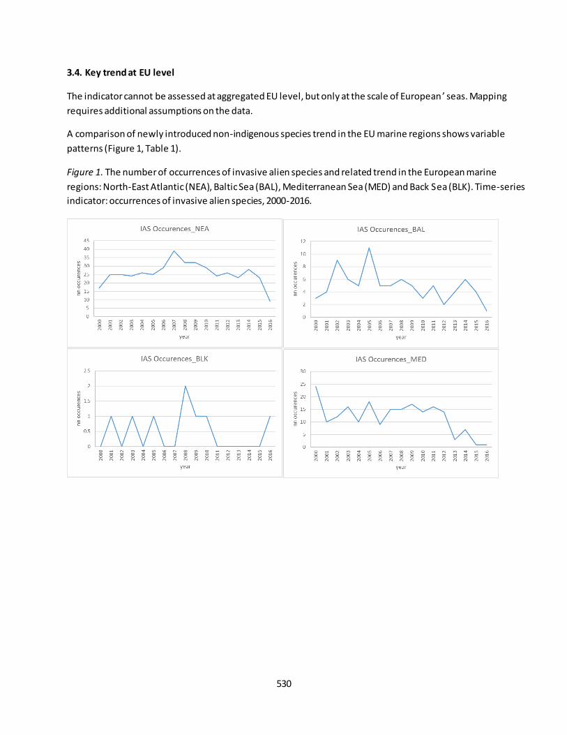
530
3.4. Key trend at EU level
The indicator cannot be assessed at aggregated EU level, but only at the scale of European ’ seas. Mapping
requires additional assumptions on the data.
A comparison of newly introduced non-indigenous species trend in the EU marine regions shows variable
patterns (Figure 1, Table 1).
Figure 1. The number of occurrences of invasive alien species and related trend in the European marine
regions: North-East Atlantic (NEA), Baltic Sea (BAL), Mediterranean Sea (MED) and Back Sea (BLK). Time-series
indicator: occurrences of invasive alien species, 2000-2016.
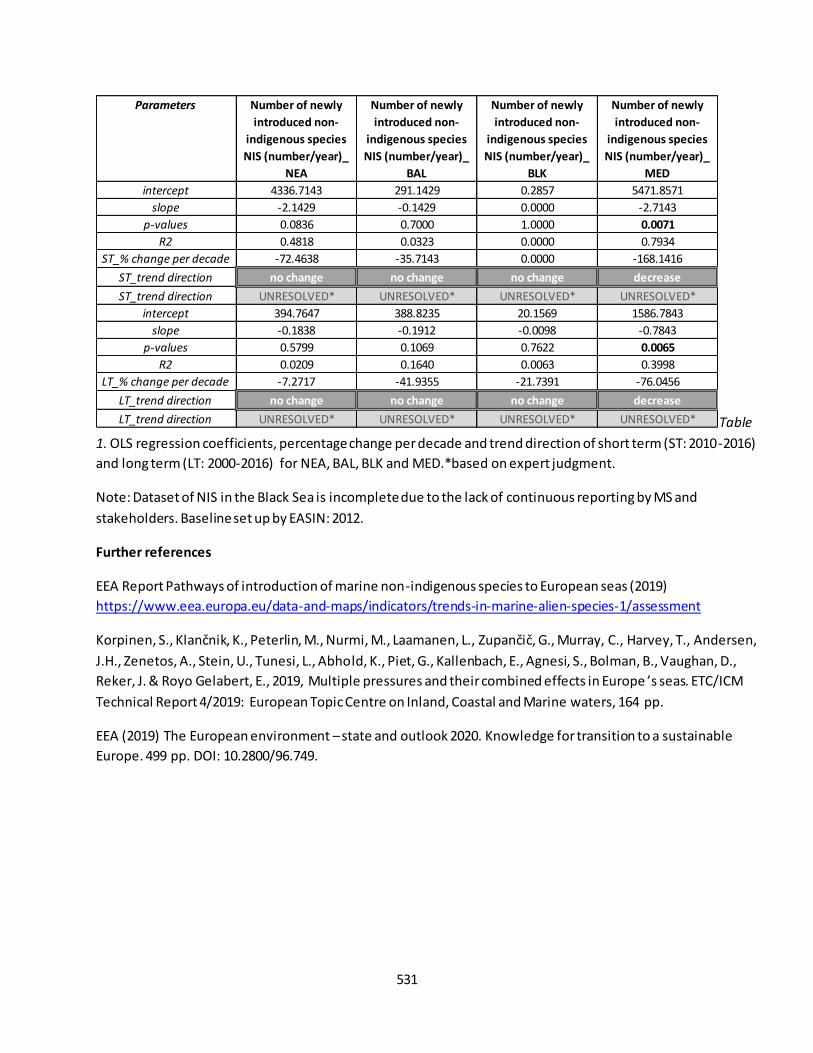
531
Table
1. OLS regression coefficients, percentage change per decade and trend direction of short term (ST: 2010-2016)
and long term (LT: 2000-2016) for NEA, BAL, BLK and MED.*based on expert judgment.
Note: Dataset of NIS in the Black Sea is incomplete due to the lack of continuous reporting by MS and
stakeholders. Baseline set up by EASIN: 2012.
Further references
EEA Report Pathways of introduction of marine non-indigenous species to European seas (2019)
https://www.eea.europa.eu/data-and-maps/indicators/trends-in-marine-alien-species-1/assessment
Korpinen, S., Klančnik, K., Peterlin, M., Nurmi, M., Laamanen, L., Zupančič, G., Murray, C., Harvey, T., Andersen, J.H., Zenetos, A., Stein, U., Tunesi, L., Abhold, K., Piet, G., Kallenbach, E., Agnesi, S., Bolman, B., Vaughan, D.,
Reker, J. & Royo Gelabert, E., 2019, Multiple pressures and their combined effects in Europe ’s seas. ETC/ICM
Technical Report 4/2019: European Topic Centre on Inland, Coastal and Marine waters, 164 pp.
EEA (2019) The European environment – state and outlook 2020. Knowledge for transition to a sustainable
Europe. 499 pp. DOI: 10.2800/96.749.
Parameters Number of newly
introduced non-
indigenous species
NIS (number/year)_
NEA
Number of newly
introduced non-
indigenous species
NIS (number/year)_
BAL
Number of newly
introduced non-
indigenous species
NIS (number/year)_
BLK
Number of newly
introduced non-
indigenous species
NIS (number/year)_
MED
intercept 4336.7143 291.1429 0.2857 5471.8571
slope -2.1429 -0.1429 0.0000 -2.7143
p-values 0.0836 0.7000 1.0000 0.0071
R2 0.4818 0.0323 0.0000 0.7934
ST_% change per decade -72.4638 -35.7143 0.0000 -168.1416
ST_trend direction no change no change no change decrease
ST_trend direction UNRESOLVED* UNRESOLVED* UNRESOLVED* UNRESOLVED*
intercept 394.7647 388.8235 20.1569 1586.7843
slope -0.1838 -0.1912 -0.0098 -0.7843
p-values 0.5799 0.1069 0.7622 0.0065
R2 0.0209 0.1640 0.0063 0.3998
LT_% change per decade -7.2717 -41.9355 -21.7391 -76.0456
LT_trend direction no change no change no change decrease
LT_trend direction UNRESOLVED* UNRESOLVED* UNRESOLVED* UNRESOLVED*
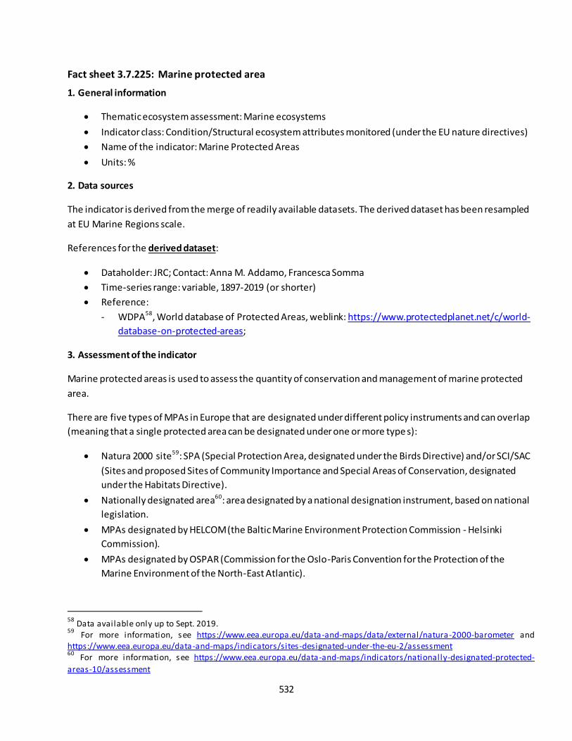
532
Fact sheet 3.7.225: Marine protected area
1. General information
Thematic ecosystem assessment: Marine ecosystems
Indicator class: Condition/Structural ecosystem attributes monitored (under the EU nature directives)
Name of the indicator: Marine Protected Areas
Units: %
2. Data sources
The indicator is derived from the merge of readily available datasets. The derived dataset has been resampled
at EU Marine Regions scale.
References for the derived dataset:
Dataholder: JRC; Contact: Anna M. Addamo, Francesca Somma
Time-series range: variable, 1897-2019 (or shorter)
Reference:
- WDPA58, World database of Protected Areas, weblink: https://www.protectedplanet.net/c/world-
database-on-protected-areas;
3. Assessment of the indicator
Marine protected areas is used to assess the quantity of conservation and management of marine protected
area.
There are five types of MPAs in Europe that are designated under different policy instruments and can overlap
(meaning that a single protected area can be designated under one or more type s):
Natura 2000 site59: SPA (Special Protection Area, designated under the Birds Directive) and/or SCI/SAC
(Sites and proposed Sites of Community Importance and Special Areas of Conservation, designated
under the Habitats Directive).
Nationally designated area60: area designated by a national designation instrument, based on national
legislation.
MPAs designated by HELCOM (the Baltic Marine Environment Protection Commission - Helsinki
Commission).
MPAs designated by OSPAR (Commission for the Oslo-Paris Convention for the Protection of the
Marine Environment of the North-East Atlantic).
58
Data available only up to Sept. 2019. 59
For more information, see https://www.eea.europa.eu/data-and-maps/data/external/natura-2000-barometer and https://www.eea.europa.eu/data-and-maps/indicators/sites-designated-under-the-eu-2/assessment 60
For more information, see https://www.eea.europa.eu/data-and-maps/indicators/nationally-designated-protected-
areas-10/assessment
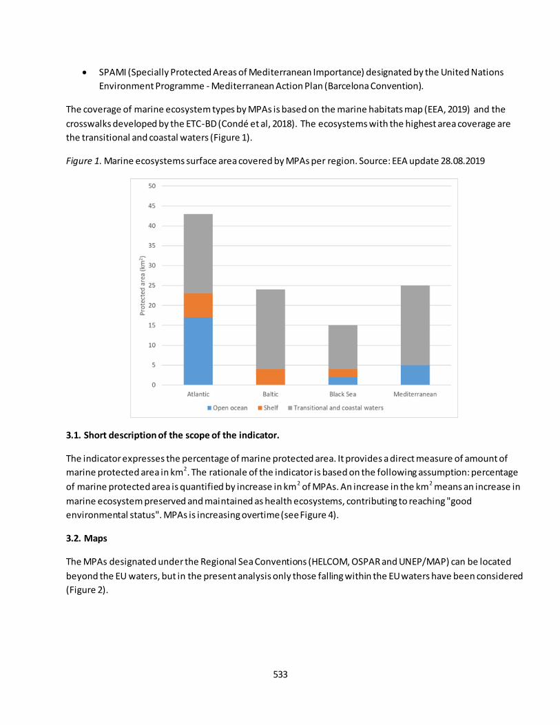
533
SPAMI (Specially Protected Areas of Mediterranean Importance) designated by the United Nations
Environment Programme - Mediterranean Action Plan (Barcelona Convention).
The coverage of marine ecosystem types by MPAs is based on the marine habitats map (EEA, 2019) and the
crosswalks developed by the ETC-BD (Condé et al, 2018). The ecosystems with the highest area coverage are
the transitional and coastal waters (Figure 1).
Figure 1. Marine ecosystems surface area covered by MPAs per region. Source: EEA update 28.08.2019
3.1. Short description of the scope of the indicator.
The indicator expresses the percentage of marine protected area. It provides a direct measure of amount of
marine protected area in km2. The rationale of the indicator is based on the following assumption: percentage
of marine protected area is quantified by increase in km2 of MPAs. An increase in the km2 means an increase in
marine ecosystem preserved and maintained as health ecosystems, contributing to reaching "good
environmental status". MPAs is increasing overtime (see Figure 4).
3.2. Maps
The MPAs designated under the Regional Sea Conventions (HELCOM, OSPAR and UNEP/MAP) can be located
beyond the EU waters, but in the present analysis only those falling within the EU waters have been considered
(Figure 2).

534
Figure 2. MPAs in EU marine waters. Source: EEA update 28.08.2019
3.3. Statistical analysis of the trend
The indicator is calculated as follows: dataset are derived from the extraction of the year-sum for each EU
marine region. Statistical test that fit a regression model through the observed data against time (in years) is
performed per each EU marine regions, so that the change per decade is based on an assessment of the slope.
Analysis Toolpack, available in Excel, is used to calculate the ordinary least squares (OLS) regression coefficients
with their significance levels (see Table 1).
3.4. Key trend at EU level
The indicator cannot be assessed at aggregated EU level, but only at the scale of Europe ’s seas. Mapping
requires additional assumptions on the data.
The area covered by MPAs in EU waters has increased substantially along the years, especially from 2000
onward (Figure 3).
Figure 3. Trends in marine protected area coverage in EU waters. Source: EEA update 28.08.2019

535
A comparison of the marine protected area trend in the EU marine regions shows an increasing amount of
MPAs in the last decades with high variation in percentage per each marine region (Figure 4, Table 1).
Figure 4. The percentage of a) km2 and b) cumulative km2 of marine protected areas and relative trend in the
European marine regions: North-East Atlantic (NEA), Baltic Sea (BAL), Mediterranean Sea (MED) and Back Sea
(BLK). Time-series indicator: marine protected area, 1897-2019.
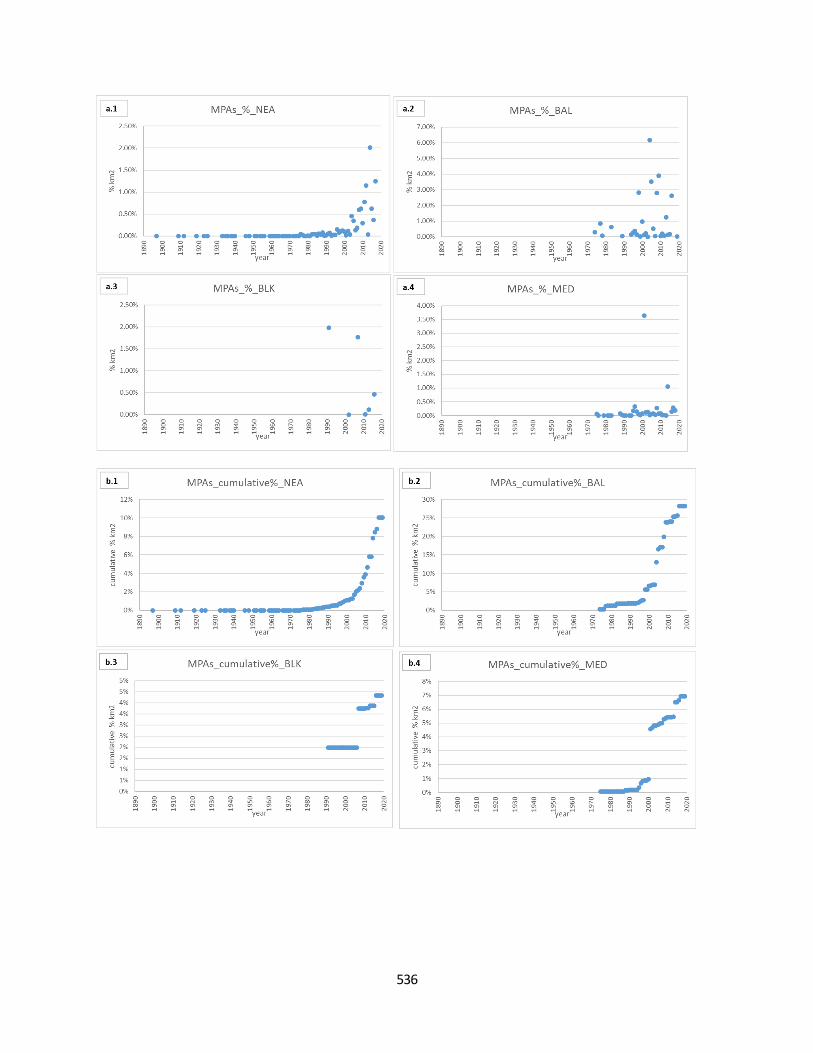
536

537
Table 1.
OLS regression coefficients, percentage change per decade cumulative km2 of marine protected areas and
trend direction of short term (ST: 2010-2019) and long term (LT: 1897-2019) for NEA, BAL, BLK and MED.
Note: CBD and Biodiversity Strategy’s targets (i.e. 10% coverage by 2020) have been reached by NEA and BAL. Increase MPAs as total protection - no fishing zone. Ongoing discussion about effective MPAs size: small vs
large. Controversial management: paper MPAs vs MPAs.
Further references
EEA Briefing No 13/2018 Marine protected areas. Designed to conserve Europe's marine life, marine protected areas are a globally recognised tool for managing and enhancing our marine ecosystems.
https://www.eea.europa.eu/publications/marine-protected-areas
Condé, S., Royo Gelabert, E., Parry, M., Lillis, H., Evans, D., Mo, G., & Agnesi, S., 2018. Updated crosswalks
between European marine habitat typologies - A contribution to the MAES marine assessment. ETC/BD
Technical paper N°7/2018.
https://bd.eionet.europa.eu/Reports/ETCBDTechnicalWorkingpapers/Crosswalks_EU_marine_hab_typologies
EEA, 2019. Mapping Europe's ecosystems. European Environment Agency (EEA), Copenhagen, Denmark.
https://www.eea.europa.eu/themes/biodiversity/mapping-europes-ecosystems/mapping-europes-ecosystems
EEA (2019) The European environment – state and outlook 2020. Knowledge for transition to a sustainable
Europe. 499 pp. DOI: 10.2800/96.749.
ParametersMarine protected
area_NEA
Marine protected
area_BAL
Marine protected
area_BLK
Marine protected
area_MED
intercept -15.1542 -11.8004 -1.6392 -4.2400
slope 0.0076 0.0060 0.0008 0.0021
p-values 0.0000 0.0000 0.0002 0.0001
R2 0.9505 0.8966 0.8331 0.8661
ST_% change per decade 182.5349 25.5524 22.8424 40.6450
ST_trend direction increase increase increase increase
MARINE CONDITION_ST IMPROVEMENT IMPROVEMENT IMPROVEMENT IMPROVEMENT
intercept -1.0767 -4.3234 -0.7663 -1.1154
slope 0.0006 0.0022 0.0004 0.0006
p-values 0.0000 0.0000 0.0000 0.0000
R2 0.3780 0.4892 0.5701 0.4789
LT_% change per decade 17.3619 16.8637 16.4723 16.9838
LT_trend direction increase increase increase increase
MARINE CONDITION_LT IMPROVEMENT IMPROVEMENT IMPROVEMENT IMPROVEMENT

538
Fact sheet 4.1.101: Climate indicators
1. Data sources
The observational climate databases E-OBS and MARS were used to derive the indicators.
E-OBS
• Data holder: EU-FP6 project UERRA (http://www.uerra.eu) and the Copernicus Climate Change Service, and
the data providers in the ECA&D project (https://www.ecad.eu)
• Weblink: http://surfobs.climate.copernicus.eu/dataaccess/access_eobs.php
• Time-series range: 1950-2018
• Version: 19.0e
• Access date: 20/03/2019
• Reference: Cornes, R. C., van der Schrier, G., van den Besselaar, E. J. M., & Jones, P. D. (2018). An Ensemble
Version of the E-OBS Temperature and Precipitation Data Sets. Journal of Geophysical Research: Atmospheres,
123(17), 9391-9409, doi:10.1029/2017jd028200.
E-OBS ensemble version 19.0e (Cornes et al. 2018) at 0.1 degree horizontal resolution was sourced from the
EU-FP6 project UERRA and the Copernicus Climate Change Service, and the data providers in the ECA&D
project. E-OBS is a European high-resolution gridded daily data set of surface mean temperature, minimum
temperature, maximum temperature, precipitation sum and averaged sea level pressure. E-OBS covers the
land areas within 25–75°N latitude and 40W–75°E longitude. A summary of the limitations of E-OBS is
presented in Annex B.
MARS
• Data holder: European commission, Joint Research Centre (JRC)
• Weblink: https://agri4cast.jrc.ec.europa.eu/DataPortal/
• Time-series range: 1985 – 2018
• Access date: 20/05/2019
The MARS meteorological database contains gridded meteorological data on maximum air temperature (°C),
minimum air temperature (°C), mean air temperature (°C), mean daily wind speed at 10m (m/s), vapour
pressure (hPa), sum of precipitation (mm/day), potential evaporation from a free water surface (mm/day),
potential evapotranspiration from a crop canopy (mm/day), potential evaporation from a moist bare soil
surface (mm/day), total global radiation (KJ/m2/day), snow depth. The parameters are interpolated from
weather station data on a 25 x 25 km grid. The data is available on a daily basis from 1975 up to near real time,
covering the EU Member States, neighbouring European countries and the Mediterranean countries. In the
539
present assessment the MARS data series starting from 1985 is used to avoid potential inhomogeneities that
can lead to uncertainties in the trend analysis.
2. Assessment of the indicators
Trends for each indicator were calculated at EU level (Table 1) and at grid cell level (Figures 1-7, 9-13 and 15-
17) covering the whole terrestrial domain of the EU. To avoid bias in the trend analysis, some grid cells with
incomplete data series were excluded from the E-OBS data analysis and the period 1985-2018 was selected
from the MARS database.
For each indicator the annual value was calculated on each grid cell based on the algorithms shown in Table 2
in Annex A. Annual spatial data were used for detecting trends on each grid cell. We used robust regression to
mitigate the effect of anomalous years. Regression slopes were estimated using the non-parametric Theil-Sen
estimator (Sen 1968; Wilcox 2012) because it accommodates non-normal distributions and is a robust trend
slope estimator resistant to the effects of outliers. Additionally, a two-sided Mann-Kendall (Gilbert 1987;
Kendall 1975; Mann 1945) non-parametric trend test was used to assess the significance of monotonic trends.
At EU level, the following indicators show a significant trend, therefore representing a major pressure on
ecosystems: annual mean temperature, mean temperature of warmest and coldest quarter, effective rainfall,
extreme drought event frequency, summer days and growing season length (Table 1). The rest of the indicators
do not exhibit significant trends at EU level, but for all indicators there are regions where they show a
significant trend locally. The maps (Figures 1-7, 9-13 and 15-17) show these regions for each of the studied
indicators.
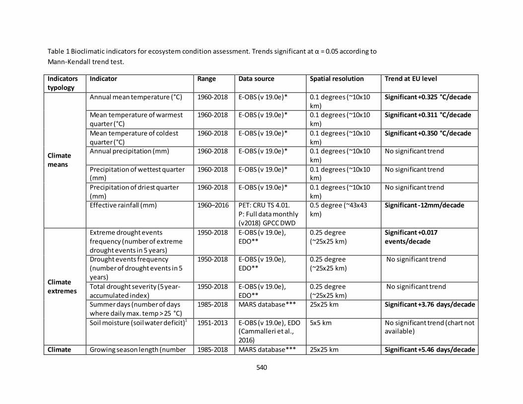
540
Table 1 Bioclimatic indicators for ecosystem condition assessment. Trends significant at α = 0.05 according to Mann-Kendall trend test.
Indicators
typology
Indicator Range Data source Spatial resolution Trend at EU level
Climate
means
Annual mean temperature (°C) 1960-2018 E-OBS (v 19.0e)* 0.1 degrees (~10x10 km)
Significant +0.325 °C/decade
Mean temperature of warmest quarter (°C)
1960-2018 E-OBS (v 19.0e)* 0.1 degrees (~10x10 km)
Significant +0.311 °C/decade
Mean temperature of coldest quarter (°C)
1960-2018 E-OBS (v 19.0e)* 0.1 degrees (~10x10 km)
Significant +0.350 °C/decade
Annual precipitation (mm) 1960-2018 E-OBS (v 19.0e)* 0.1 degrees (~10x10 km)
No significant trend
Precipitation of wettest quarter (mm)
1960-2018 E-OBS (v 19.0e)* 0.1 degrees (~10x10 km)
No significant trend
Precipitation of driest quarter (mm)
1960-2018 E-OBS (v 19.0e)* 0.1 degrees (~10x10 km)
No significant trend
Effective rainfall (mm) 1960–2016 PET: CRU TS 4.01. P: Full data monthly (v2018) GPCC DWD
0.5 degree (~43x43 km)
Significant -12mm/decade
Climate
extremes
Extreme drought events frequency (number of extreme drought events in 5 years)
1950-2018 E-OBS (v 19.0e), EDO**
0.25 degree (~25x25 km)
Significant +0.017
events/decade
Drought events frequency
(number of drought events in 5 years)
1950-2018 E-OBS (v 19.0e), EDO**
0.25 degree (~25x25 km)
No significant trend
Total drought severity (5 year- accumulated index)
1950-2018 E-OBS (v 19.0e), EDO**
0.25 degree (~25x25 km)
No significant trend
Summer days (number of days where daily max. temp > 25 °C)
1985-2018 MARS database*** 25x25 km Significant +3.76 days/decade
Soil moisture (soil water deficit)1 1951-2013 E-OBS (v 19.0e), EDO (Cammalleri et al., 2016)
5x5 km No significant trend (chart not available)
Climate Growing season length (number 1985-2018 MARS database*** 25x25 km Significant +5.46 days/decade
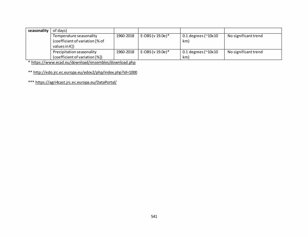
541
seasonality of days) Temperature seasonality (coefficient of variation [% of values in K])
1960-2018 E-OBS (v 19.0e)* 0.1 degrees (~10x10 km)
No significant trend
Precipitation seasonality (coefficient of variation [%])
1960-2018 E-OBS (v 19.0e)* 0.1 degrees (~10x10 km)
No significant trend
* https://www.ecad.eu/download/ensembles/download.php
** http://edo.jrc.ec.europa.eu/edov2/php/index.php?id=1000
*** https://agri4cast.jrc.ec.europa.eu/DataPortal/
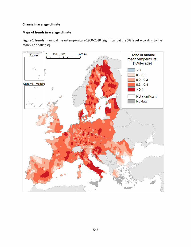
542
Change in average climate
Maps of trends in average climate
Figure 1 Trends in annual mean temperature 1960-2018 (significant at the 5% level according to the
Mann-Kendall test).
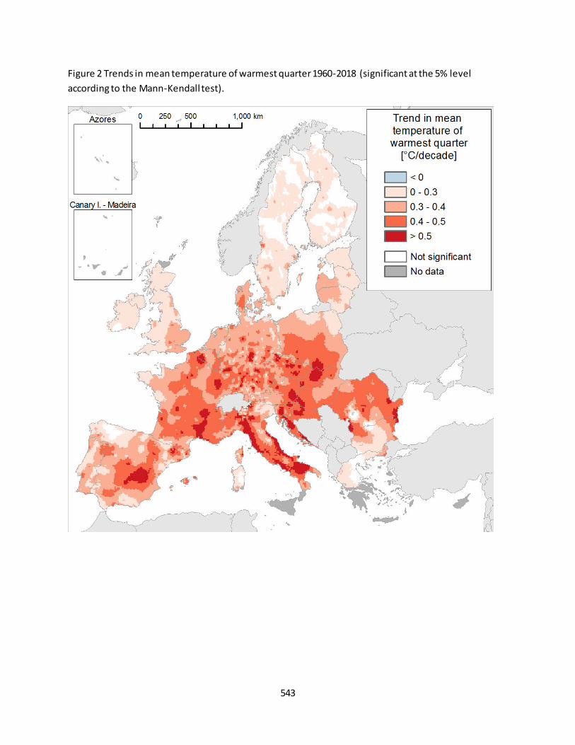
543
Figure 2 Trends in mean temperature of warmest quarter 1960-2018 (significant at the 5% level
according to the Mann-Kendall test).
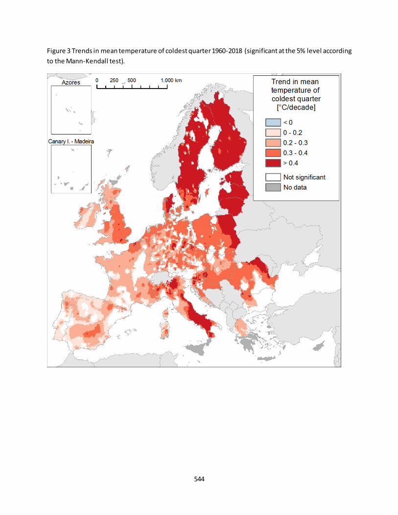
544
Figure 3 Trends in mean temperature of coldest quarter 1960-2018 (significant at the 5% level according
to the Mann-Kendall test).
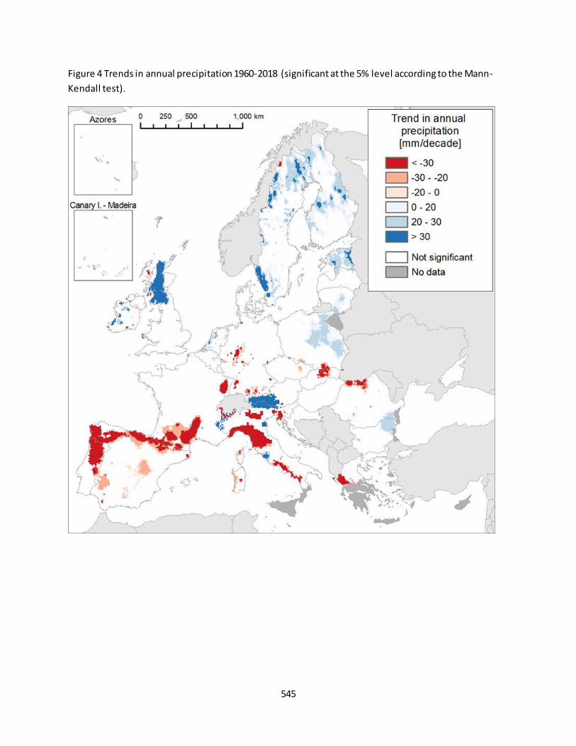
545
Figure 4 Trends in annual precipitation 1960-2018 (significant at the 5% level according to the Mann-
Kendall test).
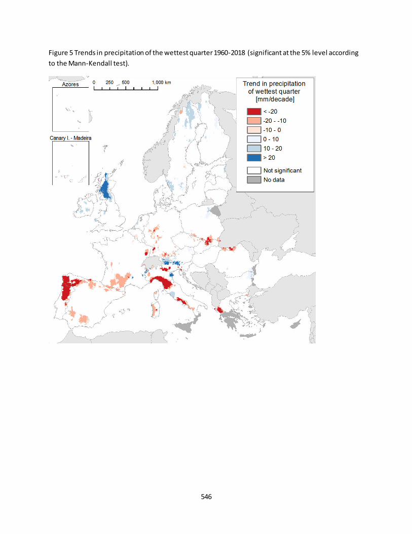
546
Figure 5 Trends in precipitation of the wettest quarter 1960-2018 (significant at the 5% level according
to the Mann-Kendall test).
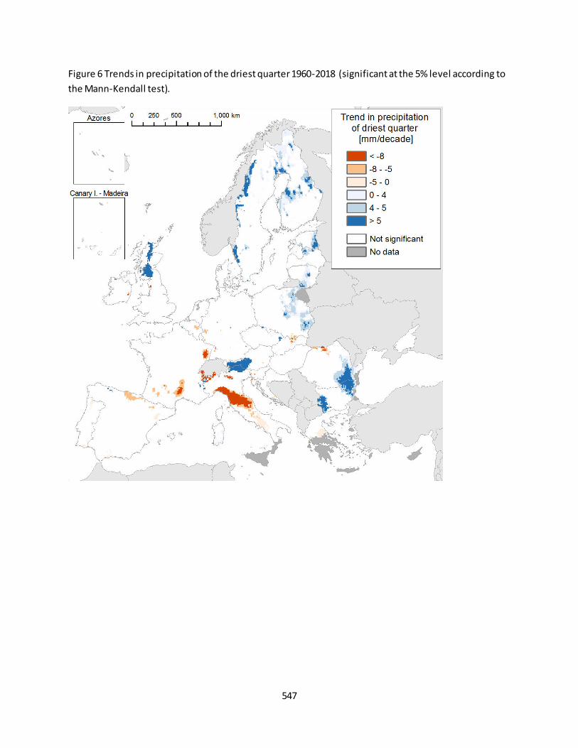
547
Figure 6 Trends in precipitation of the driest quarter 1960-2018 (significant at the 5% level according to
the Mann-Kendall test).
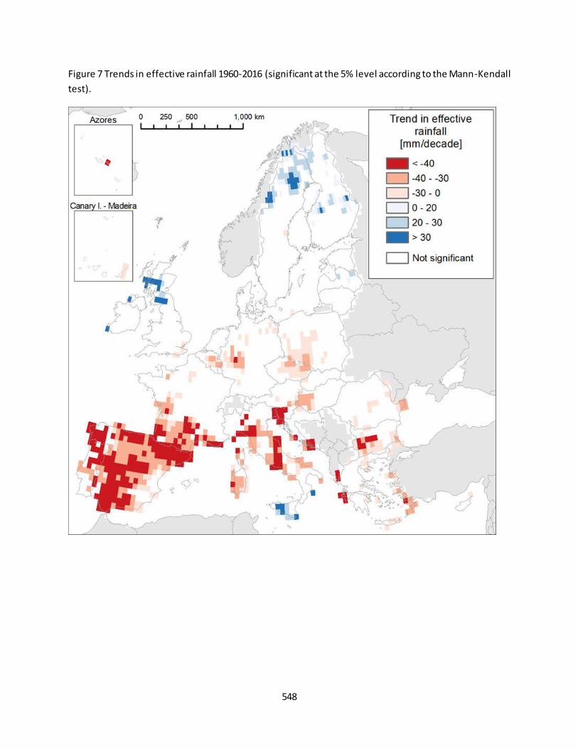
548
Figure 7 Trends in effective rainfall 1960-2016 (significant at the 5% level according to the Mann-Kendall
test).
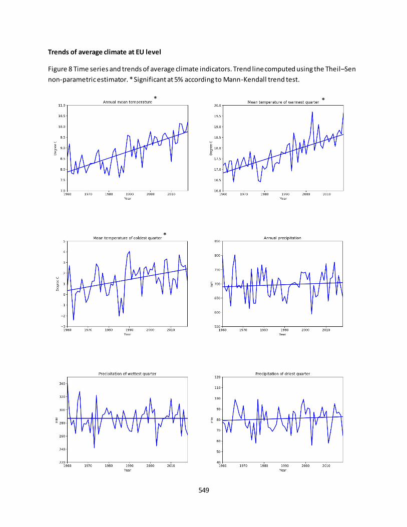
549
Trends of average climate at EU level
Figure 8 Time series and trends of average climate indicators. Trend line computed using the Theil–Sen
non-parametric estimator. * Significant at 5% according to Mann-Kendall trend test.
* *
*
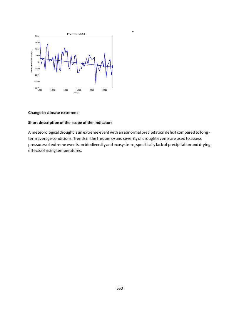
550
Change in climate extremes
Short description of the scope of the indicators
A meteorological drought is an extreme event with an abnormal precipitation deficit compared to long-
term average conditions. Trends in the frequency and severity of drought events are used to assess
pressures of extreme events on biodiversity and ecosystems, specifically lack of precipitation and drying
effects of rising temperatures.
*
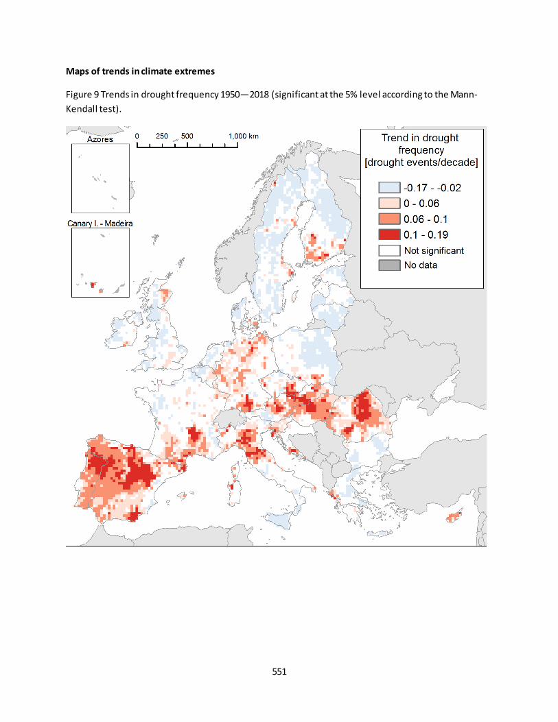
551
Maps of trends in climate extremes
Figure 9 Trends in drought frequency 1950—2018 (significant at the 5% level according to the Mann-
Kendall test).

552
Figure 10 Trends in extreme drought frequency 1950-2018 (significant at the 5% level according to the
Mann-Kendall test).
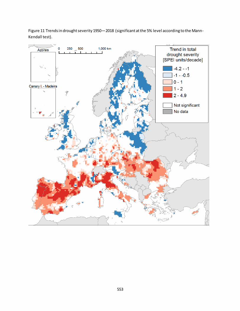
553
Figure 11 Trends in drought severity 1950—2018 (significant at the 5% level according to the Mann-
Kendall test).
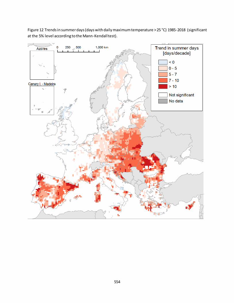
554
Figure 12 Trends in summer days (days with daily maximum temperature > 25 °C) 1985-2018 (significant
at the 5% level according to the Mann-Kendall test).

555
Figure 13 Trends in soil moisture deficit 1985-2018 (significant at the 5% level according to the Mann-
Kendall test).

556
Trends of climate extremes at EU level
Figure 14 Time series and trends of climate extremes indicators. Trend line computed using the Theil–Sen non-parametric estimator. * Significant at 5% according to Mann-Kendall trend test.
*
*

557
Change in seasonality
Maps of trends in seasonality
Figure 15 Trends in growing season length 1985-2018 (significant at the 5% level according to the Mann-
Kendall test).
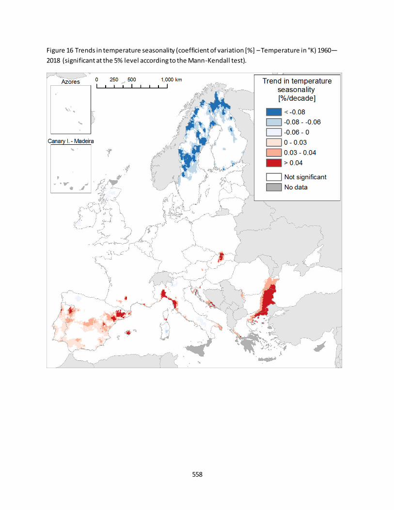
558
Figure 16 Trends in temperature seasonality (coefficient of variation [%] – Temperature in °K) 1960—2018 (significant at the 5% level according to the Mann-Kendall test).

559
Figure 17 Trends in precipitation seasonality (coefficient of variation [%]) 1960—2018 (significant at the
5% level according to the Mann-Kendall test).
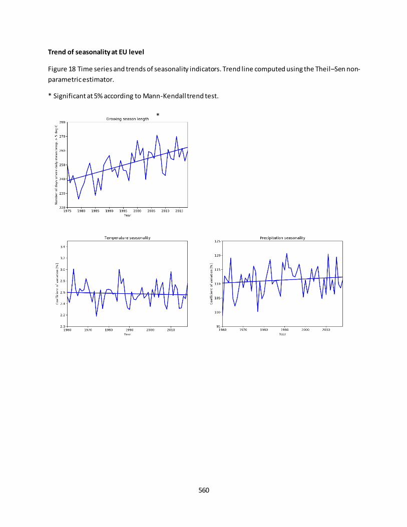
560
Trend of seasonality at EU level
Figure 18 Time series and trends of seasonality indicators. Trend line computed using the Theil–Sen non-
parametric estimator.
* Significant at 5% according to Mann-Kendall trend test.
*
561
References
Booth, T. H., Nix, H. A., Busby, J. R., & Hutchinson, M. F. (2014). bioclim: the first species distribution
modelling package, its early applications and relevance to most current MaxEnt studies. Diversity and
Distributions, 20(1), 1-9, doi:10.1111/ddi.12144.
Cammalleri, C., Micale, F., & Vogt, J. (2016). Recent temporal trend in modelled soil water deficit over
Europe driven by meteorological observations. International Journal of Climatology, 36(15), 4903-4912,
doi:10.1002/joc.4677.
Cornes, R. C., van der Schrier, G., van den Besselaar, E. J. M., & Jones, P. D. (2018). An Ensemble Version
of the E-OBS Temperature and Precipitation Data Sets. Journal of Geophysical Research: Atmospheres,
123(17), 9391-9409, doi:10.1029/2017jd028200.
European Environment Agency (2017) Climate change, impacts and vulnerability in Europe 2016. An
indicator-based report. doi:10.2800/534806.
Garcia, R. A., Cabeza, M., Rahbek, C., & Araújo, M. B. (2014). Multiple Dimensions of Climate Change and
Their Implications for Biodiversity. Science, 344(6183), doi:10.1126/science.1247579.
Gilbert, R. O. (1987). Statistical Methods for Environmental Pollution Monitoring. NY, USA: Wiley.
Kendall, M. G. (1975). Rank Correlation Methods (4th edition). London: Charles Griffin.
Mann, H. B. (1945). Nonparametric Tests Against Trend. Econometrica, 13(3), 245-259,
doi:10.2307/1907187.
Nix, H. A. (1986). A biogeographic analysis of Australian elapid snakes. In R. Longmore (Ed.), Atlas of
elapid snakes of Australia: Australian flora and fauna series 7 (pp. 4-15). Canberra: Bureau of Flora and
Fauna.
O’Donnell, M. S., & Ignizio, D. A. (2012). Bioclimatic predictors for supporting ecological applications in
the conterminous United States. (pp. 10): U.S. Geological Survey.
Sen, P. K. (1968). Estimates of the Regression Coefficient Based on Kendall's Tau. Journal of the
American Statistical Association, 63(324), 1379-1389, doi:10.2307/2285891.
Spinoni, J., Naumann, G., Vogt, J.V., 2017. Pan-European seasonal trends and recent changes of drought
frequency and severity. Global and Planetary Change. 148: 113-130.
Trnka, M., Olesen, J. E., Kersebaum, K. C., Skjelvåg, A. O., Eitzinger, J., Seguin, B., Peltonen-Sainio, P.,
Rötter, R., Iglesias, A., Orlandini, S., Dubrovský, M., Hlavinka, P., Balek, J., Eckersten, H., Cloppet, E.,
Calanca, P., Gobin, A., Vučetić, V., Nejedlik, P. et al., 2011, 'Agroclimatic conditions in Europe under climate change', Global Change Biology 17(7), 2 298–2 318 (doi:10.1111/j.1365-2486.2011.02396.x).
Wilcox, R. R. (2012). Introduction to Robust Estimation and Hypothesis Testing. San Diego, California,
USA: Academic Press.
562
Xu, T., & Hutchinson, M. F. (2011). ANUCLIM Version 6.1 User Guide. Canberra: The Australian National
University, Fenner School of Environment and Society.
Zhang, X., Alexander, L., Hegerl, G. C., Jones, P., Tank, A. K., Peterson, T. C., et al. (2011). Indices for
monitoring changes in extremes based on daily temperature and precipitation data. Wiley
Interdisciplinary Reviews: Climate Change, 2(6), 851-870, doi:10.1002/wcc.147.
Contributors: Hagyo, A., Caudullo, G., Ceglar, A., Spinoni, J.,C., Czucz, B., Paracchini, M.L., Barredo, J.I.
563
ANNEX A - Methodology
The definition and approach for computing the indicators and the rational to use them in the ecosystem
assessment are shown in Table 2.
Metrics Definition and interpretation
Annual mean temperature (°C) For computing annual mean temperature the average temperature for each month is averaged across the year. The annual mean temperature approximates the total energy inputs for an ecosystem.
Mean temperature of warmest quarter (°C)
This quarterly metric approximates mean temperatures occurred during the warmest quarter. To calculate this metric we first identified the warmest quarter of the year, i.e. consecutive 13 weeks. We then calculated the average temperature for the 13 weeks in the warmest quarter. This metric provides mean temperatures during the warmest 13 weeks of the year, which is a useful indicator for examining how such environmental conditions may affect species seasonal distributions.
Mean temperature of coldest quarter (°C)
The same as previous but for the coldest quarter.
Annual precipitation (mm)
This metric is the sum of total precipitation across the year. Annual precipitation describes the total water input and is useful for determining the importance of water availability to a species distribution.
Precipitation of wettest quarter (mm)
This quarterly metric approximates total precipitation occurred during the wettest quarter of the year. To calculate this metric we first identified the quarter with the highest cumulative precipitation of the year, i.e. consecutive 13 weeks. We then calculated the cumulative precipitation for the 13 weeks in the quarter. This metric can be useful for examining how such environmental conditions may affect species seasonal distributions.
Precipitation of driest quarter (mm)
The same as previous but for the driest quarter.
Effective rainfall (mm) Effective rainfall is the difference between mean annual precipitation and mean annual potential evapotranspiration. This metric is an index of plant productivity, where values below zero indicate that evaporative demands exceeds precipitation and values above zero that precipitation exceeds evaporative demands. The productivity of land biological systems is related to available moisture, which in turn is related to rainfall and the evaporative demand of the system. In forest ecosystems the amount of biomass is largely controlled by the productivity of the system.
Drought frequency (DRF) Drought events were defined based on the Standardised Precipitation-Evapotranspiration Index (SPEI). SPEI is one of the most widely used indices to describe climatological droughts. It takes into account not only precipitation but also potential evapotranspiration. SPEI was computed for 12-month accumulation periods. It means that the sum of 12 monthly values of difference (actual months and 11

564
months before) were compared to the long-term values. SPEI is in units of standard deviation from the long-term mean. A drought event happens when the SPEI is below -1 for at least 2 months. The period starts when the SPEI falls below -1. It ends when SPEI returns back above zero, so the recovery period is included. The number of drought events in 5 years was calculated using a 5-year moving window. The initial input data was E-OBS daily grids (Haylock et al., 2015a, 2015b) of temperature and precipitation. PET was calculated with Hargreaves method as the available data is not sufficient to calculate Penman-Monteith PET. So, PET is driven by temperature only. Monthly values were calculated from the daily data for the calculation of SPEI. The spatial resolution of the data is0.25. The results have to be considered the “upper bound case” because potential evapotranspiration is driven by temperature only in the calculation of SPEI. Trend in frequency of drought events are used to assess the pressures of lack of precipitation and the drying effects of rising temperatures on the condition of ecosystems.
Extreme drought frequency (ExDRF)
An extreme drought event happens when the SPEI value is below -2 for at least 2 months. It starts when the SPEI falls below -2 and ends when SPEI returns back above 0. The number of extreme drought events in 5 years was calculated using a 5-year moving window. This metric can be used to assess the impact of drought on the condition of ecosystems. Trend in frequency of extreme drought events are used to assess the pressures of lack of precipitation and the drying effects of rising temperatures on the condition of ecosystems.
Total drought severity (DRS) Total drought severity was defined as the sum of all negative SPEI values (in absolute values) during the drought events in 5 years. The drought severity values were smoothed using a 5-year moving window weighted average. This metric can be used to assess the impact of drought on the condition of ecosystems. Trend in severity of drought events are used to assess the pressures of lack of precipitation and the drying effects of rising temperatures on the condition of ecosystems.
Summer days (number of days where daily max. temp > 25 °C)
Summer days were defined as days with maximum temperature above 25 °C. This metric can be used to assess the impact of heat stress on the condition of ecosystems.
Soil moisture (soil water deficit) (%)
Soil water deficit was obtained from modelled soil moisture in the top-soil root zone by Cammalleri et al. (2016). Water deficit is measured in percentage, therefore it ranges between 0 (no deficit) and 100 (full deficit). This metric is a synthetic descriptor of the actual water available to plants for their primary processes. Thus, it is considered an important parameter for describing the condition of ecosystems in the long term. The central role of soil moisture as feedback into the atmospheric system, as well as a key environmental variable in the

565
terrestrial biosphere, suggests the possibility to obtain relevant synthetic information on the hydrological balance from its analysis.
Growing season length (number of days)
Growing season length is defined as the number of days in a year above a base temperature. The base temperature is 5°C in present study as this can be used as a temperature threshold for active growth of most temperate crops grown in Europe (Trnka, Olesen, et al., 2011). The period starts with the fifth day of the first 5 consecutive days in the year having daily average temperature (Tavg) above 5°C. The end of the period was defined as the fifth day when at least 5 consecutive days have their average daily temperature below 5°C. This metric can be used to assess the pressure of changing temperature- based seasonality on the condition of ecosystems and species distribution.
Temperature seasonality (coefficient of variation [%])
Temperature seasonality describes the amount of temperature variation over a given year based on the coefficient of variation (variation) of weekly temperature means expressed as a percentage. This metric is a measure of temperature change over the course of the year. The larger the coefficient of variation, the greater the variability of temperature. This metric can be useful for examining how intra-annual seasonality may affect species distributions.
Precipitation seasonality (coefficient of variation [%])
Precipitation seasonality described the amount of precipitation variation over a given year based on the coefficient of variation (variation) of weekly precipitation expressed as a percentage. This metric is a measure of precipitation change over the course of the year. The larger the coefficient of variation, the greater the variability of precipitation. This metric can be useful for examining how intra-annual seasonality may affect species distributions. Species distributions can be strongly influenced by variability in precipitation, therefore this metric provides a measure of precipitation variability where larger percentages represent greater variability of precipitation and vice
versa. Table 2. Climatic metrics definition and interpretation according to O’Donnell and Ignizio (2012), Xu and
Hutchinson (2011), and Cammalleri et al. (2016).
566
ANNEX A - Methodology
The definition and approach for computing the indicators and the rational to use them in the ecosystem
assessment are shown in Table 2.
Metrics Definition and interpretation
Annual mean temperature (°C) For computing annual mean temperature the average temperature for each month is averaged across the year. The annual mean temperature approximates the total energy inputs for an ecosystem.
Mean temperature of warmest quarter (°C)
This quarterly metric approximates mean temperatures occurred during the warmest quarter. To calculate this metric we first identified the warmest quarter of the year, i.e. consecutive 13 weeks. We then calculated the average temperature for the 13 weeks in the warmest quarter. This metric provides mean temperatures during the warmest 13 weeks of the year, which is a useful indicator for examining how such environmental conditions may affect species seasonal distributions.
Mean temperature of coldest quarter (°C)
The same as previous but for the coldest quarter.
Annual precipitation (mm)
This metric is the sum of total precipitation across the year. Annual precipitation describes the total water input and is useful for determining the importance of water availability to a species distribution.
Precipitation of wettest quarter (mm)
This quarterly metric approximates total precipitation occurred during the wettest quarter of the year. To calculate this metric we first identified the quarter with the highest cumulative precipitation of the year, i.e. consecutive 13 weeks. We then calculated the cumulative precipitation for the 13 weeks in the quarter. This metric can be useful for examining how such environmental conditions may affect species seasonal distributions.
Precipitation of driest quarter (mm)
The same as previous but for the driest quarter.
Effective rainfall (mm) Effective rainfall is the difference between mean annual precipitation and mean annual potential evapotranspiration. This metric is an index of plant productivity, where values below zero indicate that evaporative demands exceeds precipitation and values above zero that precipitation exceeds evaporative demands. The productivity of land biological systems is related to available moisture, which in turn is related to rainfall and the evaporative demand of the system. In forest ecosystems the amount of biomass is largely controlled by the productivity of the system.
Drought frequency (DRF) Drought events were defined based on the Standardised Precipitation-Evapotranspiration Index (SPEI). SPEI is one of the most widely used indices to describe climatological droughts. It takes into account not only precipitation but also potential evapotranspiration. SPEI was computed for 12-month accumulation periods. It means that the sum of 12 monthly values of difference (actual months and 11
567
months before) were compared to the long-term values. SPEI is in units of standard deviation from the long-term mean. A drought event happens when the SPEI is below -1 for at least 2 months. The period starts when the SPEI falls below -1. It ends when SPEI returns back above zero, so the recovery period is included. The number of drought events in 5 years was calculated using a 5-year moving window. The initial input data was E-OBS daily grids (Haylock et al., 2015a, 2015b) of temperature and precipitation. PET was calculated with Hargreaves method as the available data is not sufficient to calculate Penman-Monteith PET. So, PET is driven by temperature only. Monthly values were calculated from the daily data for the calculation of SPEI. The spatial resolution of the data is0.25. The results have to be considered the “upper bound case” because potential evapotranspiration is driven by temperature only in the calculation of SPEI. Trend in frequency of drought events are used to assess the pressures of lack of precipitation and the drying effects of rising temperatures on the condition of ecosystems.
Extreme drought frequency (ExDRF)
An extreme drought event happens when the SPEI value is below -2 for at least 2 months. It starts when the SPEI falls below -2 and ends when SPEI returns back above 0. The number of extreme drought events in 5 years was calculated using a 5-year moving window. This metric can be used to assess the impact of drought on the condition of ecosystems. Trend in frequency of extreme drought events are used to assess the pressures of lack of precipitation and the drying effects of rising temperatures on the condition of ecosystems.
Total drought severity (DRS) Total drought severity was defined as the sum of all negative SPEI values (in absolute values) during the drought events in 5 years. The drought severity values were smoothed using a 5-year moving window weighted average. This metric can be used to assess the impact of drought on the condition of ecosystems. Trend in severity of drought events are used to assess the pressures of lack of precipitation and the drying effects of rising temperatures on the condition of ecosystems.
Summer days (number of days where daily max. temp > 25 °C)
Summer days were defined as days with maximum temperature above 25 °C. This metric can be used to assess the impact of heat stress on the condition of ecosystems.
Soil moisture (soil water deficit) (%)
Soil water deficit was obtained from modelled soil moisture in the top-soil root zone by Cammalleri et al. (2016). Water deficit is measured in percentage, therefore it ranges between 0 (no deficit) and 100 (full deficit). This metric is a synthetic descriptor of the actual water available to plants for their primary processes. Thus, it is considered an important parameter for describing the condition of ecosystems in the long term. The central role of soil moisture as feedback into the atmospheric system, as well as a key environmental variable in the
568
terrestrial biosphere, suggests the possibility to obtain relevant synthetic information on the hydrological balance from its analysis.
Growing season length (number of days)
Growing season length is defined as the number of days in a year above a base temperature. The base temperature is 5°C in present study as this can be used as a temperature threshold for active growth of most temperate crops grown in Europe (Trnka, Olesen, et al., 2011). The period starts with the fifth day of the first 5 consecutive days in the year having daily average temperature (Tavg) above 5°C. The end of the period was defined as the fifth day when at least 5 consecutive days have their average daily temperature below 5°C. This metric can be used to assess the pressure of changing temperature- based seasonality on the condition of ecosystems and species distribution.
Temperature seasonality (coefficient of variation [%])
Temperature seasonality describes the amount of temperature variation over a given year based on the coefficient of variation (variation) of weekly temperature means expressed as a percentage. This metric is a measure of temperature change over the course of the year. The larger the coefficient of variation, the greater the variability of temperature. This metric can be useful for examining how intra-annual seasonality may affect species distributions.
Precipitation seasonality (coefficient of variation [%])
Precipitation seasonality described the amount of precipitation variation over a given year based on the coefficient of variation (variation) of weekly precipitation expressed as a percentage. This metric is a measure of precipitation change over the course of the year. The larger the coefficient of variation, the greater the variability of precipitation. This metric can be useful for examining how intra-annual seasonality may affect species distributions. Species distributions can be strongly influenced by variability in precipitation, therefore this metric provides a measure of precipitation variability where larger percentages represent greater variability of precipitation and vice
versa. Table 2. Climatic metrics definition and interpretation according to O’Donnell and Ignizio (2012), Xu and
Hutchinson (2011), and Cammalleri et al. (2016).

569
ANNEX B – limitations of E-OBS
E-OBS is a comprehensive database of observational climate in Europe that is widely used by a large
number of research organisations and projects, e.g. the EEA61. However, a number of limitations have
been documented in the literature. We present here a summary of these limitations. Cornes et al.
(2018) indicate that some temporal changes computed with E-OBS are likely attributable to
inhomogeneities in the reference stations rather than particular changes in the gridded data. In light of
this, they suggest that caution should be used when using the E-OBS data set. Similarly, Spinoni et al.
(2017) indicate that some grid cells of E-OBS can be derived from non-homogeneous station data.
Nevertheless, quality checks on the monthly series performed by Spinoni et al. (2017) indicate that only
a minor fraction (0.7%) of monthly data grid cells did not pass all the tests. The “problematic” grid cells
were mainly located in Turkey, Scandinavian Mountains, Russia, and Latvia.
Cornes, R. C., van der Schrier, G., van den Besselaar, E. J. M., & Jones, P. D. (2018). An Ensemble Version
of the E-OBS Temperature and Precipitation Data Sets. Journal of Geophysical Research: Atmospheres,
123(17), 9391-9409, doi:10.1029/2017jd028200.
Spinoni, J., Naumann, G., & Vogt, J. V. (2017). Pan-European seasonal trends and recent changes of
drought frequency and severity. Global and Planetary Change, 148, 113-130,
doi:10.1016/j.gloplacha.2016.11.013.
61
https://www.eea.europa.eu/data-and-maps/indicators/global -and-european-temperature-9/assessment
https://www.eea.europa.eu/data-and-maps/indicators/european-precipitation-2/assessment
570
Fact sheet 4.2.101: Pressure by Invasive Alien Species on terrestrial ecosystems
1. General information
The pressure by Invasive Alien Species (IAS) is a spatially explicit crosscutting indicator that can
contribute to assess the pressures acting on ecosystems.
The indicator quantifies the cumulative and relative pressure by IAS on each terrestrial ecosystem type,
using a unitless figure directly related to the relative extent of each ecosystem type negatively affected,
over a reference grid of 10 km spatial resolution.
(Thematic ecosystem assessment): Common indicators for pressures and ecosystem condition
Indicator class:
o Pressure class: Invasive alien species;
o Condition class: Environmental quality
Name of the indicator: Pressure by Invasive Alien Species on terrestrial ecosystems
Units: unitless [between 0 and the number of IAS recorded in one area].
2. Data sources
The indicator requires processing of the following input data (Table 1):
Distribution of IAS (10 km spatial resolution);
Affected ecosystems, for each IAS;
CORINE land cover 2012 (100 m spatial resolution).
The derived data are:
Reclassification of CORINE land cover classes into MAES Ecosystem Types (Maes et al., 2013);
Relative cover (i.e. the share) of each MAES Ecosystem Type (ET), for each 10 km grid cell
covering the extent of EU-28;
Cumulative pressure for each grid cell and for each ET (total pressure);
Relative pressure for each ET occurring within a given grid cell (percent).

571
Table 1. Input data
Data Source Notes Data
holder
Reference
year
Access
date
CORINE Land
Cover 2012
CORINE land cover 2012
Version 20:
https://land.copernicus.e
u/pan-european/corine-
land-cover/clc-
2012?tab=download
Minimum mapping
unit: 25 ha or 100 m
width
EEA 2012 January
2019
Invasive Alien
Species
EASIN:
https://easin.jrc.ec.europ
a.eu/easin
Distribution records
on the 10 km
reference grid
JRC Compiled
over time
February
2019
Reference
grid covering
EU-28
EEA:
https://www.eea.europa.
eu/data-and-
maps/data/eea-
reference-grids-2
10 km spatial
resolution
EEA Not
applicable
January
2019
3. Assessment of the indicator
3.1. Short description of the scope of the indicator.
The species considered for this indicator are the 49 species listed as IAS of Union Concern up to 2017
(EU, 2017). For 47 of them spatial distribution data exist. The exception are Persicaria perfoliata and
Microstegium vimineum, both plants, which were not present in the EU at the time of establishment of
the baselines (and they are still absent to our knowledge).
For each IAS, pressure was identified for four macro-categories of ecosystems based on the traits of the
IAS. Specifically, the information on the known impacts caused on invaded ecosystems and reported in
Table 4 of Tsiamis et al. (2017; 2019) was linked to the pressure on one or more MAES ecosystem types
(Maes et al., 2013). The link between CORINE LCC, MAES ecosystem types and macro-categories of
ecosystems is shown in Annex 1.
Their negative impact was identified for four macro groups of ecosystem types (Table 2) by the EASIN
team (Tsiamis et al., 2017; Tsiamis et al., 2019), using literature and exert knowledge; each macro group
of ecosystem type was then linked to the one or more MAES ecosystem types (Maes et al., 2013). The
572
link between MAES ecosystem type and impact group is shown in Annex 1, together with the link
between the MAES ecosystem type and the CORINE land cover classes.
For every grid cell (c) where an IAS was recorded, the per-species pressure (ws,e) corresponds to the
relative extent (the proportion from 0 to 1) of each ecosystem type within the cell, that could be
affected by the IAS. Hence, the cumulative pressure ( I) for each grid cell (c) is the sum of the individual
pressures of all IAS present within a cell and affecting negatively one or more ET of that cell:
Where:
Ic = Cumulative pressure for cell c (0 to S);
s = Invasive Alien Species;
e = Ecosystem type;
Os = Occurrence for species s in cell c (0, 1);
He = Proportion, share, of ecosystem type e within cell c (0 to 1);
ws,e = Evidence of pressure of species s on the ecosystem type e (0, 1).

573
Table 2. List of the 49 Invasive Alien Species of Union Concern, and pressure caused to macro-
categories of ecosystems. 1 = evidence of pressure; 0 = absence of evidence. See Annex 1 for the
correspondence between macro-categories of ecosystems, ecosystem types, and CORINE LC classes.
Species Name Artificial Agriculture Forests & Semi-natural Freshwater
Alopochen aegyptiacus 0 1 1 1
Alternanthera philoxeroides 1 1 1 1
Asclepias syriaca 1 1 1 0
Baccharis halimifolia 1 0 1 0
Cabomba caroliniana 0 1 0 1
Callosciurus erythraeus 0 0 1 0
Corvus splendens 1 1 1 0
Eichhornia crassipes 1 0 0 1
Elodea nuttallii 1 0 0 1
Eriocheir sinensis 0 0 0 1
Gunnera tinctoria 0 0 1 0
Heracleum mantegazzianum 1 0 1 0
Heracleum persicum 1 0 1 0
Heracleum sosnowskyi 1 0 1 0
Herpestes javanicus 1 1 1 0
Hydrocotyle ranunculoides 1 0 0 1
Impatiens glandulifera 0 0 1 0
Lagarosiphon major 1 0 0 1
Lithobates catesbeianus 0 0 0 1
Ludwigia grandiflora 1 0 0 1
Ludwigia peploides 1 0 0 1
Lysichiton americanus 0 0 1 0
Microstegium vimineum 1 0 1 0
Muntiacus reevesi 0 1 1 0
Myocastor coypus 1 1 1 1
Myriophyllum aquaticum 1 0 0 1
Myriophyllum heterophyllum 1 0 0 1
Nasua nasua 0 0 1 0
Nyctereutes procyonoides 1 0 1 0
Ondatra zibethicus 1 1 1 1
Orconectes limosus 0 0 0 1
Orconectes virilis 0 0 0 1
Oxyura jamaicensis 0 0 1 1
Pacifastacus leniusculus 0 0 0 1
Parthenium hysterophorus 1 1 1 0
Pennisetum setaceum 0 0 1 0

574
Species Name Artificial Agriculture Forests & Semi-natural Freshwater
Perccottus glenii 0 0 0 1
Persicaria perfoliata 0 1 1 0
Procambarus clarkii 1 1 0 1
Procambarus fallax f. virginalis 0 0 0 1
Procyon lotor 1 1 1 0
Pseudorasbora parva 0 0 0 1
Pueraria montana var. lobata 1 1 1 0
Sciurus carolinensis 0 0 1 0
Sciurus niger 1 0 1 0
Tamias sibiricus 0 1 1 0
Threskiornis aethiopicus 0 0 1 1
Trachemys scripta 0 0 0 1
Vespa velutina nigrithorax 1 1 1 0
3.2. Maps and tables
The analysis and comments of the resulting pressures are found in Chapter 4.2 ‘Invasive Alien Species’.
Summary statistics and maps for each ET are found in:
Table 3: the cumulative pressure, i.e. the total pressure by the IAS occurring across the 10 km
reference grid;
Spatially explicit information (i.e. the cumulative and relative score for each cell and ET) is found within
the file: IASpressure_LAND.xlsx (the same information is found also within the corresponding csv file:
IASpressure_LAND.csv).
3.4. Key trend at EU level
Not applicable because only the baseline information is available.
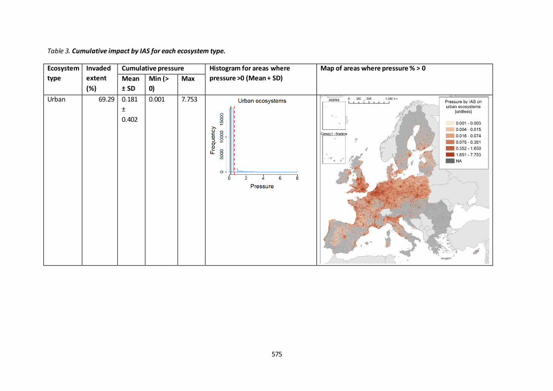
575
Table 3. Cumulative impact by IAS for each ecosystem type.
Ecosystem
type
Invaded
extent
(%)
Cumulative pressure Histogram for areas where
pressure >0 (Mean + SD)
Map of areas where pressure % > 0
Mean
± SD
Min (>
0)
Max
Urban 69.29 0.181
±
0.402
0.001 7.753

576
Ecosystem
type
Invaded
extent
(%)
Cumulative pressure Histogram for areas where
pressure >0 (Mean + SD)
Map of areas where pressure % > 0
Mean
± SD
Min (>
0)
Max
Cropland 46.75 0.630
±
0.495
0.001 4.418
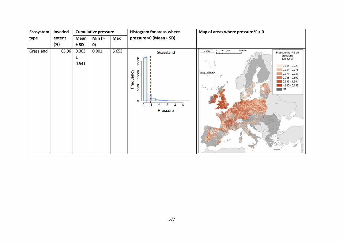
577
Ecosystem
type
Invaded
extent
(%)
Cumulative pressure Histogram for areas where
pressure >0 (Mean + SD)
Map of areas where pressure % > 0
Mean
± SD
Min (>
0)
Max
Grassland 65.96 0.363
±
0.541
0.001 5.653
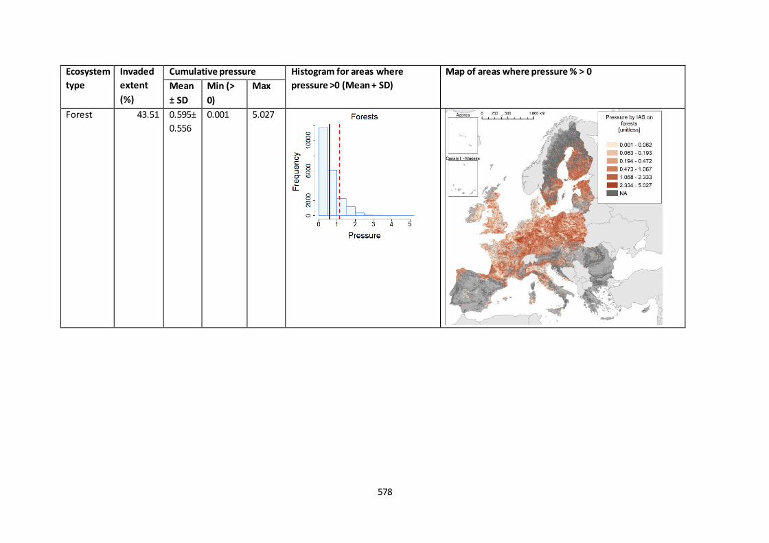
578
Ecosystem
type
Invaded
extent
(%)
Cumulative pressure Histogram for areas where
pressure >0 (Mean + SD)
Map of areas where pressure % > 0
Mean
± SD
Min (>
0)
Max
Forest 43.51 0.595±
0.556
0.001 5.027

579
Ecosystem
type
Invaded
extent
(%)
Cumulative pressure Histogram for areas where
pressure >0 (Mean + SD)
Map of areas where pressure % > 0
Mean
± SD
Min (>
0)
Max
Heathland
and shrub
16.87 0.122
±
0.197
0.001 2.307
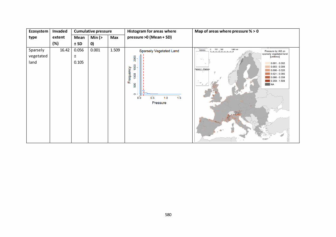
580
Ecosystem
type
Invaded
extent
(%)
Cumulative pressure Histogram for areas where
pressure >0 (Mean + SD)
Map of areas where pressure % > 0
Mean
± SD
Min (>
0)
Max
Sparsely
vegetated
land
16.42 0.056
±
0.105
0.001 1.509
References
EU, 'Commission Implementing Regulation (EU) 2017/1263 of 12 July 2017 Updating the List of Invasive
Alien Species of Union Concern Established by Implementing Regulation (EU) 2016/1141 Pursuant to
Regulation (EU) No 1143/2014 of the European Parliament and of the Council', Official Journal of the
European Union, Vol. L 182, 2017, pp. 37–39.
Maes, J., Teller, A., Erhard, M., Liquete, C., Braat, L., Berry, P., Egoh, B., Puydarrieux, P., Fiorina, C.,
Santos, F., Paracchini, M., Keune, H., Wittmer, H., Hauck, J., Fiala, I., Verburg, P., Condé, S., Schägner, J.,
San Miguel, J., et al., Mapping and Assessment of Ecosystems and Their Services. An Analytical
Framework for Ecosystem Assessments under Action 5 of the EU Biodiversity Strategy to 2020
(1stTechnical Report), 2013.
Tsiamis, K., Gervasini, E., Deriu, I., D’Amico, F., Nunes, A., Addamo, A., De Jesus Cardoso, A., Baseline
Distribution of Invasive Alien Species of Union Concern , 2017, doi:10.2760/345310.
Tsiamis, K., Gervasini, E., Deriu, I., D’amico, F., Katsanevakis, S., De Jesus Cardoso, A., Baseline
Distribution of Species Listed in the 1st Update of Invasive Alien Species of Union Concern , 2019,
doi:10.2760/75328.

Annex 1. Correspondence between CORINE LC classes’ level 3, MAES ecosystem types’ level 2, and
macro-category of ecosystems adopted to identify the presence of pressure.
CORINE LC level 3 MAES level 2 ecosystem type Macro-category
of ecosystems
Continuous urban fabric Urban Artificial Discontinuous urban fabric
Industrial or commercial units Road and rail networks and associated land
Port areas
Airports Mineral extraction sites
Dump sites Construction sites
Green urban areas Sport and leisure facilities
Non-irrigated arable land Cropland Agriculture Permanently irrigated land
Rice fields
Vineyards Fruit trees and berry plantations
Olive groves Pastures Grassland
Annual crops associated with permanent crops Cropland Complex cultivation patterns
Land principally occupied by agriculture with significant areas of natural vegetation
Agro-forestry areas Broad-leaved forest Woodland and forest (‘Forest’) Forest & Semi-
natural Coniferous forest Mixed forest
Natural grasslands Grassland Moors and heathland Heathland and shrub
Sclerophyllous vegetation
Transitional woodland-shrub Woodland and forest (‘Forest’) Beaches dunes sands Sparsely vegetated land
Bare rocks Sparsely vegetated areas
Burnt areas Glaciers and perpetual snow
Inland marshes Wetlands Freshwater
Peat bogs Salt marshes Marine inlets and transitional
waters Excluded
Salines Intertidal flats
Water courses Rivers and lakes Freshwater

CORINE LC level 3 MAES level 2 ecosystem type Macro-category
of ecosystems
Water bodies
Coastal lagoons Excluded Excluded Estuaries
Sea and ocean
Fact sheet 4.2.102: Pressure by Invasive Alien Species on freshwater ecosystems
1. General information
The pressure by Invasive Alien Species (IAS) is a spatially explicit crosscutting indicator that can
contribute to assess the pressures acting on ecosystems.
The indicator quantifies the cumulative pressure by IAS on freshwater ecosystems, using a unitless
figure directly related to the relative extent of freshwater negatively affected, over a reference grid of
10 km spatial resolution.
(Thematic ecosystem assessment): Common indicators for pressures and ecosystem condition
Indicator class:
o Pressure class: Invasive alien species;
o Condition class: Environmental quality
Name of the indicator: Pressure by Invasive Alien Species on freshwater ecosystems
Units: unitless [between 0 and the number of IAS recorded in one area].
2. Data sources
The indicator requires processing of the following input data (Table 1):
Distribution of IAS (10 km spatial resolution);
Affected ecosystems, for each IAS;
Global Surface Water (GSW) (Pekel et al., 2016), using the presence of waters for each month in
2012;
Catchment Characterisation Model (CCM2) database (De Jager and Vogt, 2007), rasterized to 25
m spatial resolution;
CORINE land cover 2012 (100 m spatial resolution).
The derived data are:
Extent of freshwater for each 10 km reference grid cell, derived from the sum of waters from
CCM2 and GSW, from which the extent of brackish waters from CORINE (classes 37, 38, 39, 42,
43 and 44) are removed.
Cumulative pressure by IAS for each grid cell (total pressure).

Table 1. Input data
Data Source Notes Data
holder
Referenc
e year
Access
date
Catchment
Characterisati
on Model
(CCM2)
http://data.europa.eu/89
h/fe1878e8-7541-4c66-
8453-afdae7469221
Rasterized to 25 m JRC Februar
y 2019
Global
Surface Water
https://global-surface-
water.appspot.com/
JRC 2012
CORINE Land
Cover 2012
CORINE land cover 2012
Version 20:
https://land.copernicus.e
u/pan-european/corine-
land-cover/clc-
2012?tab=download
Minimum mapping unit:
25 ha or 100 m width
EEA 2012
Invasive Alien
Species
EASIN
https://easin.jrc.ec.europ
a.eu/easin
Distribution records on
the 10 km reference grid
JRC Compiled
over time
Februar
y 2019
Reference
grid covering
EU-28
EEA:
https://www.eea.europa.
eu/data-and-
maps/data/eea-
reference-grids-2
10 km spatial resolution EEA Not
applicable
January
2019
3. Assessment of the indicator
3.1. Short description of the scope of the indicator.
The species considered for this indicator are the 49 species listed as IAS of Union Concern up to 2017
(EU, 2017). For 47 of them spatial distribution data exist. The exception are Persicaria perfoliata and
Microstegium vimineum, both plants, which were not present in the EU at the time of establishment of
the baselines (and they are still absent to our knowledge).
For each IAS, pressure was identified for four macro-categories of ecosystems based on the traits of the
IAS. Specifically, the information on the known impacts caused on invaded ecosystems and reported in
Table 4 of Tsiamis et al. (2017; 2019) was linked to the pressure on one or more MAES ecosystem types
(Maes et al., 2013). The link between CORINE LCC, MAES ecosystem types and macro-categories of
ecosystems is shown in Annex 1.

For this indicator, only species affecting negatively freshwater ecosystems are considered:
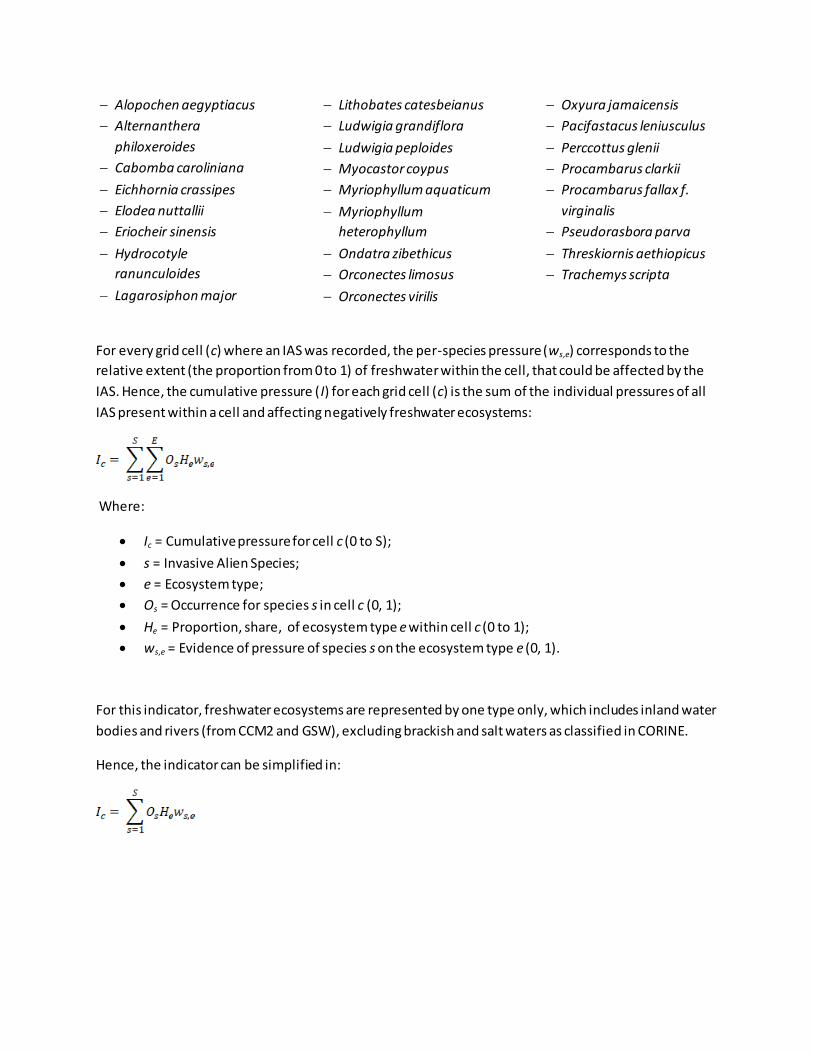
Alopochen aegyptiacus
Alternanthera
philoxeroides
Cabomba caroliniana
Eichhornia crassipes
Elodea nuttallii
Eriocheir sinensis
Hydrocotyle
ranunculoides
Lagarosiphon major
Lithobates catesbeianus
Ludwigia grandiflora
Ludwigia peploides
Myocastor coypus
Myriophyllum aquaticum
Myriophyllum
heterophyllum
Ondatra zibethicus
Orconectes limosus
Orconectes virilis
Oxyura jamaicensis
Pacifastacus leniusculus
Perccottus glenii
Procambarus clarkii
Procambarus fallax f.
virginalis
Pseudorasbora parva
Threskiornis aethiopicus
Trachemys scripta
For every grid cell (c) where an IAS was recorded, the per-species pressure (ws,e) corresponds to the
relative extent (the proportion from 0 to 1) of freshwater within the cell, that could be affected by the
IAS. Hence, the cumulative pressure (I) for each grid cell (c) is the sum of the individual pressures of all
IAS present within a cell and affecting negatively freshwater ecosystems:
Where:
Ic = Cumulative pressure for cell c (0 to S);
s = Invasive Alien Species;
e = Ecosystem type;
Os = Occurrence for species s in cell c (0, 1);
He = Proportion, share, of ecosystem type e within cell c (0 to 1);
ws,e = Evidence of pressure of species s on the ecosystem type e (0, 1).
For this indicator, freshwater ecosystems are represented by one type only, which includes inland water
bodies and rivers (from CCM2 and GSW), excluding brackish and salt waters as classified in CORINE.
Hence, the indicator can be simplified in:
3.2. Maps and tables
The analysis and comments of the resulting pressures are found in Chapter 4.2 ‘Invasive Alien Species’.
Summary statistics and maps for freshwater ecosystem are found in:
Table 2: the cumulative pressure, i.e. the total pressure by the IAS occurring across the 10 km
reference grid for which water data exist.
Spatially explicit information (i.e. the cumulative score for each cell having f reshwater, and the extent of
water for all grid cells for which water data exist) is found within the file: IASpressure_WATER.xlsx (the
cumulative pressure for each cell is found also within the corresponding csv file:
IASpressure_WATER.csv).
3.4. Key trend at EU level
Not applicable because only the baseline information is available.
Table 2. Cumulative pressure by IAS for freshwater ecosystems.
Ecosyste
m type
Invad
ed
extent
(%)
Cumulative pressure Histogram for areas where
pressure >0 (Mean + SD)
Map of areas where pressure > 0
Mea
n ±
SD
Min (>
0)
Max
Freshwat
er
36.68 0.05
0 ±
0.13
2
6.250e-
06
4.50
9
References
De Jager, A., Vogt, J., Rivers and Catchments of Europe - Catchment Characterisation Model (CCM),
[Dataset] PID: http://data.europa.eu/89h/fe1878e8-7541-4c66-8453-afdae7469221, 2007, doi:PID:
http://data.europa.eu/89h/fe1878e8-7541-4c66-8453-afdae7469221.
EU, 'Commission Implementing Regulation (EU) 2017/1263 of 12 July 2017 Updating the List of Invasive
Alien Species of Union Concern Established by Implementing Regulation (EU) 2016/1141 Pursuant to
Regulation (EU) No 1143/2014 of the European Parliament and of the Council', Official Journal of the
European Union, Vol. L 182, 2017, pp. 37–39.
Maes, J., Teller, A., Erhard, M., Liquete, C., Braat, L., Berry, P., Egoh, B., Puydarrieux, P., Fiorina, C.,
Santos, F., Paracchini, M., Keune, H., Wittmer, H., Hauck, J., Fiala, I., Verburg, P., Condé, S., Schägner, J.,
San Miguel, J., et al., Mapping and Assessment of Ecosystems and Their Services. An Analytical
Framework for Ecosystem Assessments under Action 5 of the EU Biodiversity Strategy to 2020
(1stTechnical Report), 2013.
Pekel, J.-F., Cottam, A., Gorelick, N., Belward, A. S., 'High-Resolution Mapping of Global Surface Water
and Its Long-Term Changes', Nature, Vol. 540, Macmillan Publishers Limited, part of Springer Nature. All
rights reserved., 2016, p. 418, http://dx.doi.org/10.1038/nature20584.
Tsiamis, K., Gervasini, E., Deriu, I., D’Amico, F., Nunes, A., Addamo, A., De Jesus Cardoso, A., Baseline
Distribution of Invasive Alien Species of Union Concern , 2017, doi:10.2760/345310.
Tsiamis, K., Gervasini, E., Deriu, I., D’amico, F., Katsanevakis, S., De Jesus Cardoso, A., Baseline
Distribution of Species Listed in the 1st Update of Invasive Alien Species of Union Concern , 2019,
doi:10.2760/75328.
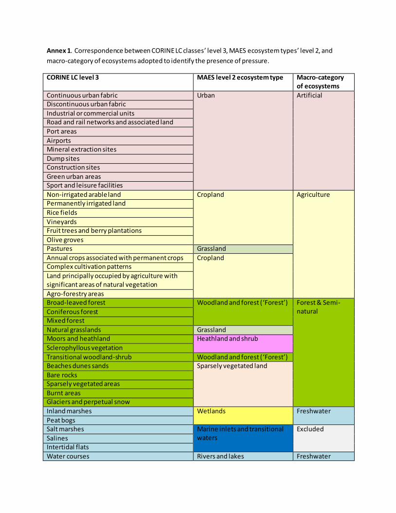
Annex 1. Correspondence between CORINE LC classes’ level 3, MAES ecosystem types’ level 2, and
macro-category of ecosystems adopted to identify the presence of pressure.
CORINE LC level 3 MAES level 2 ecosystem type Macro-category
of ecosystems
Continuous urban fabric Urban Artificial Discontinuous urban fabric
Industrial or commercial units Road and rail networks and associated land
Port areas
Airports Mineral extraction sites
Dump sites Construction sites
Green urban areas Sport and leisure facilities
Non-irrigated arable land Cropland Agriculture Permanently irrigated land
Rice fields
Vineyards Fruit trees and berry plantations
Olive groves Pastures Grassland
Annual crops associated with permanent crops Cropland Complex cultivation patterns
Land principally occupied by agriculture with significant areas of natural vegetation
Agro-forestry areas Broad-leaved forest Woodland and forest (‘Forest’) Forest & Semi-
natural Coniferous forest Mixed forest
Natural grasslands Grassland Moors and heathland Heathland and shrub
Sclerophyllous vegetation
Transitional woodland-shrub Woodland and forest (‘Forest’) Beaches dunes sands Sparsely vegetated land
Bare rocks Sparsely vegetated areas
Burnt areas Glaciers and perpetual snow
Inland marshes Wetlands Freshwater
Peat bogs Salt marshes Marine inlets and transitional
waters Excluded
Salines Intertidal flats
Water courses Rivers and lakes Freshwater

CORINE LC level 3 MAES level 2 ecosystem type Macro-category
of ecosystems
Water bodies
Coastal lagoons Excluded Excluded Estuaries
Sea and ocean
Fact sheet 4.3.201: Landscape Mosaic
1. General information
Thematic ecosystem assessment: Cropland and grassland
Indicator class: Ecosystem condition
Name of the indicator: Landscape mosaic in agricultural land
Units: percent; 7 mosaic summary classes
2. Data sources
The indicator is derived from CORINE (v20) land cover data:
https://land.copernicus.eu/pan-european/corine-land-cover
Data holder, data source: JRC; MAES collection. Contact: Peter Vogt
Year or time-series range: 2000, 2006, 2012, 2018
Access date: 17/10/2019
Reference: Summary in Vogt (2018)
3. Assessment of the indicator
3.1. Short description of the scope of the indicator
The Landscape Mosaic (LM) describes landscape composition or the degree of landscape heterogeneity.
The LM is based on the CORINE (CLC) land cover maps (https://land.copernicus.eu/pan-
european/corine-land-cover) containing 44 land cover classes at a spatial resolution of 1 hectare (100 m
X 100 m) per pixel for a series of assessment years over Europe. Firstly, the 38 terrestrial land cover
classes are aggregated into three main land cover type - Agriculture, Natural and Developed - according
to the following Table 1. For each cell, relative proportions of these three types are then measured via a
moving window algorithm using a fixed neighborhood area, i.e. a square window of size 23x23 pixels (=
529 hectares). Based on this, each pixel belonging to agroecosystem was classified in one of the seven
LM classes shown in Figure 1 Developed pixels in its neighborhood.
Table 1 Aggregation of Corine Land Cover (CLC) terrestrial land use classes into three main Landscape
Mosaic (LM) classes
Main land
cover type CLC Label 1 CLC Label 2 CLC Label 3
Developed Artificial surfaces
Urban fabric Continuous urban fabric Discontinuous urban fabric
Industrial, commercial and transport units
Industrial or commercial units Road and rail networks and Port areas Airports
Mine, dump and construction sites
Mineral extraction sites Dump sites Construction sites
Artificial, non-agricultural vegetated
Green urban areas Sport and leisure facilities
Agriculture Agricultural areas
Arable land Non-irrigated arable land Permanently irrigated land Rice fields
Permanent crops Vineyards Fruit trees and berry plantations Olive groves
Pastures Pastures
Heterogeneous agricultural areas
Annual crops associated with Complex cultivation patterns Land principally occupied by Agro-forestry areas
Natural
Forest and semi natural areas
Forests Broad-leaved forest Coniferous forest Mixed forest
Scrub and/or herbaceous vegetation
associations
Natural grasslands Moors and heathland Sclerophyllous vegetation Transitional woodland-shrub
Open spaces with little or no vegetation
Beaches, dunes, sands Bare rocks Sparsely vegetated areas Burnt areas Glaciers and perpetual snow
Wetlands Inland wetlands Inland marshes Peat bogs
Water bodies Inland waters Water courses Water bodies
Figure 1 Landscape Mosaic for agricultural area, showing 7 mosaic classes and their proportions of the
three main cover types - Agriculture, Natural and Developed
To assess changes in the condition, transitions from one class to another (in total 49 possi ble transitions,
including no changes) were computed on the long term (2000-2018) and on the short term (2012-2018)
trend, according to the rules showed in the following table.
Figure 168 Seven classes landscape mosaic based on relative shares of
agriculture, natural and developed land cover in a 23x23 pixels window
Table 2 Landscape mosaic classes transitions in the period 2000-2018, percentage of agricultural cells
involved in each transition and trend assessment associated to each transition
Transition Percentage of cells
2000-2018
Trend
from Nat to Dev-nat 0.0028% Degradation from Nat to Mix 0.0629% Degradation
from Agri-nat to Mix 0.3697% Degradation from Mix to Dev 0.0201% Degradation from Nat to Agri 0.3941% Degradation from Agri to Mix 0.7780% Degradation
from Dev-nat to Dev 0.0009% Degradation from Mix to Agri-dev 0.0394% Degradation from Agri to Agri-dev 0.3525% Degradation from Agri-dev to Dev 0.0677% Degradation
from Agri-nat to Agri-dev 0.0005% Degradation from Agri to Dev 0.0149% Degradation from Nat to Dev 0.0003% Degradation
from Agri-nat to Dev 0.0003% Degradation from Nat to Agri-dev 0.0004% Degradation
from Agri-nat to Dev-nat 0.0007% Degradation from Agri to Dev-nat 0.0002% Degradation
from Dev-nat to Agri-dev 0.0005% Degradation from Mix to Nat 0.0475% Improvement
from Mix to Agri-nat 0.1392% Improvement from Dev-nat to Nat 0.0013% Improvement from Agri-nat to Nat 0.9569% Improvement
from Dev to Mix 0.0079% Improvement from Agri-dev to Mix 0.0410% Improvement
from Agri to Nat 0.3037% Improvement from Dev to Dev-nat 0.0007% Improvement from Agri-dev to Nat 0.0001% Improvement
from Agri-dev to Agri-nat 0.0007% Improvement from Dev to Nat 0.0007% Improvement from Dev to Agri 0.0041% Improvement
from Dev to Agri-nat 0.0005% Improvement from Dev-nat to Agri-nat 0.0005% Improvement
from Dev-nat to Agri 0.0002% Improvement from Nat to Nat 9.1892% No change from Mix to Mix 2.0830% No change
from Dev-nat to Dev-nat 0.0057% No change from Agri-nat to Agri-nat 7.6738% No change
from Dev to Dev 0.1101% No change from Agri to Agri 73.0848% No change
from Agri-dev to Agri-dev 0.4085% No change from Agri to Agri-nat 1.8878% Unresolved from Dev-nat to Mix 0.0042% Unresolved from Mix to Dev-nat 0.0067% Unresolved from Nat to Agri-nat 0.6402% Unresolved from Agri-nat to Agri 1.0040% Unresolved

from Mix to Agri 0.2269% Unresolved from Agri-dev to Agri 0.0556% Unresolved from Dev to Agri-dev 0.0085% Unresolved
from Agri-dev to Dev-nat 0.0004% Unresolved
The rationale is that any transition entailing an increase of the proportion of developed area in the
neighborhood or a decrease of the share of natural area is assessed as a degradation, whilst any
transition entailing an increase of natural area is considered an improvement, under the assumption
that more natural areas provide potentially more Ecosystem services and exert less pressure on the
agricultural compared to artificial land or other agricultural areas. In some cases, transitions from two
classes were assessed considering the most likely land-use change that can determine it: for example a
transition from Agriculture to Agri-nat could occur even with a decrease of natural area and an increase
of developed area, but these increases would be necessarily very small (see Figure 1) whilst in most
cases the transition would imply a significant increase of the share of natural areas. This transition is
therefore assessed as an improvement. Trends should however be interpreted carefully, considering
that in most cases the increase of natural area in the surrounding occurs at the expense of other
agricultural land, land use changes from artificial areas to natural ones being very rare in Europe.
Therefore, they should be evaluated jointly with trends in ecosystems extents and (agricultural) land
abandonment.

3.2. Maps
Figure 2 shows the Landscape Mosaic classification in agroecosystems for the year 2018.
Expectedly, most of cropland is classified in the LM as “Agriculture”, whilst most of grassland area in the
“Natural” LM class. The occurrence of other classes is comparatively much smaller and no clearly
identifiable at EU level. Developed, and Agri -Dev classes represent peri-urban agricultural areas or
remnants of fields interspersed in a developed matrix, as shown in the following figure, representing the
metropolitan area of Milan, Northern Italy
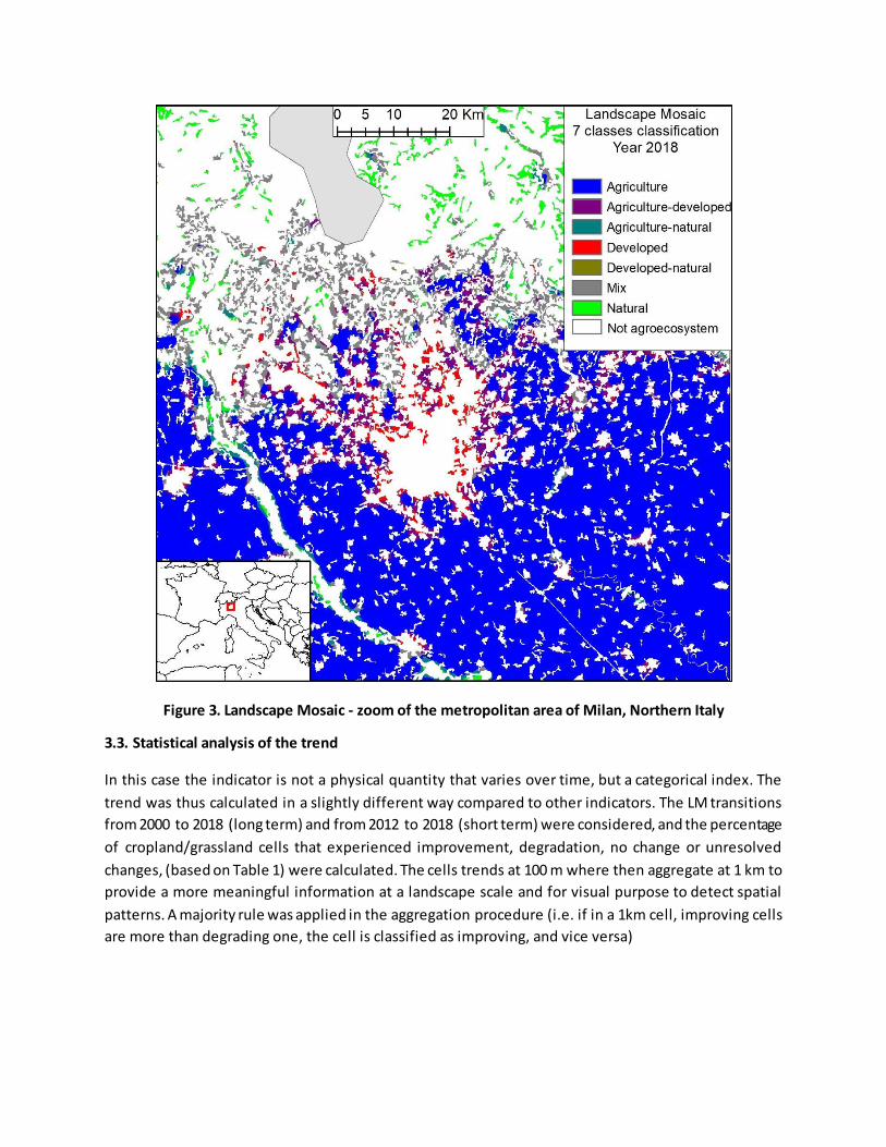
Figure 3. Landscape Mosaic - zoom of the metropolitan area of Milan, Northern Italy
3.3. Statistical analysis of the trend
In this case the indicator is not a physical quantity that varies over time, but a categorical index. The
trend was thus calculated in a slightly different way compared to other indicators. The LM transitions
from 2000 to 2018 (long term) and from 2012 to 2018 (short term) were considered, and the percentage
of cropland/grassland cells that experienced improvement, degradation, no change or unresolved
changes, (based on Table 1) were calculated. The cells trends at 100 m where then aggregate at 1 km to
provide a more meaningful information at a landscape scale and for visual purpose to detect spatial
patterns. A majority rule was applied in the aggregation procedure (i.e. if in a 1km cell, improving cells
are more than degrading one, the cell is classified as improving, and vice versa)

Figure 4. Trends in the landscape mosaic at 1 km resolution. Ten-year trend based on the long period
(changes between 2000 and 2018)
Significant spatial pattern are identifiable in western Spain partly related to transformation processes
and abandonment of traditional agroforestry areas; in Transylvania (Central Romania, improvement),
degradation has also occurred in Wales, where traditional grasslands have been converted to arable
land.
3.4. Key trend at EU level
At EU level, the ten-year trends, measured as share of cropland/grassland cells experiencing changes in
their LM classification, show that overall degradation is occurring at a greater pace than improvement,
although the absolute values are low. Ten-year trends calculated over the long period are more marked
than those calculated over the short period, indicating that the speed of land-cover change is decreasing
in more recent years. However, in both cases degradation is higher than improvement: 1.17% vs 0.84%
in the first case, and 0.25% vs 0.10% in the second one Table 3.
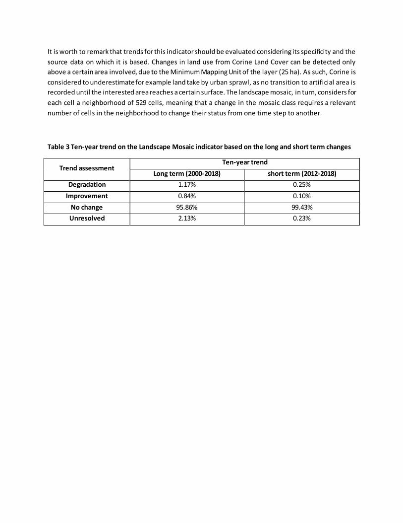
It is worth to remark that trends for this indicator should be evaluated considering its specificity and the
source data on which it is based. Changes in land use from Corine Land Cover can be detected only
above a certain area involved, due to the Minimum Mapping Unit of the layer (25 ha). As such, Corine is
considered to underestimate for example land take by urban sprawl, as no transition to artificial area is
recorded until the interested area reaches a certain surface. The landscape mosaic, in turn, considers for
each cell a neighborhood of 529 cells, meaning that a change in the mosaic class requires a relevant
number of cells in the neighborhood to change their status from one time step to another.
Table 3 Ten-year trend on the Landscape Mosaic indicator based on the long and short term changes
Trend assessment Ten-year trend
Long term (2000-2018) short term (2012-2018)
Degradation 1.17% 0.25%
Improvement 0.84% 0.10%
No change 95.86% 99.43%
Unresolved 2.13% 0.23%
Fact sheet 4.4.101: Spatial assessment of trend in soil erosion by water
1. General information
Thematic ecosystem assessment: Cropland and grassland
Indicator class: pressure
Name of the indicator: soil erosion by water
Units: tonnes of soil/hectare/year (t ha-1 yr-1)
2. Data sources
Data holder, data source: JRC
Year or time-series range: 2000, 2010, 2016
Access date--- 31/01/2020
References: Panagos, P., Ballabio, C., Scarpa, S., Borrelli, P., Lugato, E. & Montanarella, L., 2020.
Soil related indicators to support agri-environmental policies, EUR 30090 EN, Publications Office
of the European Union, Luxembourg, 2020, ISBN 978- 92-76-15644-4, doi:10.2760/011194,
JRC119220
Panagos, P.; Ballabio, C.; Poesen, J.; Lugato, E.; Scarpa, S.; Montanarella, L.; Borrelli, P. 2020. A
Soil erosion indicator for supporting agricultural, environmental and climate policies in the
European Union. Remote Sensing, 12, 1365
3. Assessment of the indicator
3.1. Short description of the scope of the indicator
Soil erosion is the physical removal of soil particles. It is a natural process that can be amplified by
human activities that affect the soil surface (in particular vegetation cover) or by changes in climatic
factors. The land surface of the EU is primarily subject to erosion by water, wind and as a result of
harvesting root crops. Other types of natural processes include coastal erosion and glacial erosion.
Water erosion can be divided into four categories,
splash - where soil particles are displaced by the impact of raindrops
sheet – occurs when the soil is saturated (i.e. all pore spaces are full of water) or when
precipitation is greater than the rate at which water can infiltrate into the soil. In these
conditions, and with sufficient gradient, a sheet of water will runs across the surface
transporting loose soil particles down the slope.
rill - this is a small, shallow channel (only a few cm deep and wide), that usually develops when
sheet flow becomes concentrated. Rills can affect significant areas and when taken collectively
can account for significant soil movement.
gully – this is a well defined channel (usually several metres deep and wide) where large
volumes of water can flow during or after heavy rainfall. Gullys can move considerable amounts
of soil through the landscape.

Eroded soil is eventually redeposited either at the bottom of slopes (if moved by water) but it may also
enter terrestrial water bodies or even transported hundreds or thousands of kilometers through the
atmosphere.
This indicator assess the extent of soil erosion by sheet and rill erosion. The data presented in this
assessment are derived from a modified version of the Revised Universal Loss Equation (RUSLE) model
(Renard et al. 1991) that has been adapted for European condi tions (Panagos et al., 2015). RUSLE2015
improves the quality of calculating soil erosion by sheet and rill erosion by using the most current high -
resolution (100m) input layers.
Annual soil loss rates by water erosion (measure in t ha-1 yr-1) is based on the following equation:
E = R × K × C × LS × P where:
• R: Rainfall Erosivity factor (MJ mm ha-1 h-1 yr-1) – denotes the erosive power of
precipitation events
• K: Soil Erodibility factor (t ha h ha-1 MJ-1 mm-1) – reflects the capacity of the soil to
withstand erosion (based on texture, structure and organic matter content)
• C: Cover-Management factor (dimensionless) – describes the nature of the vegetation
protecting the soil
• LS: Slope Length and Slope Steepness factor (dimensionless) – describes the topographic
setting of the soil
• P: Support practices factor (dimensionless) – land management practices designed to
reduce or prevent erosion
From the above equation, it is clear that the magnitude of erosion by water can be augmented through
land cover change (e.g. deforestation or conversion of grasslands to croplands) or land management
practices such as leaving the soil bare after harvest, ploughing in the direction of the slope (plough lines
act as rills) or removing natural erosion barriers in the landscape e.g. walls, hedges, grass strips, etc.). In
addition, climate change scenarios with more intense precipitation events will lead to an increased
vulnerability to soil erosion by water, especially in regions where vegetation cover is generally low .
Soil erosion is a degradational processes as its impacts include a reduction in soil fertility, a loss of
organic carbon, disruption of soil water and gas fluxes, the silting up of waterbodies and reservoirs, and
potentially a complete loss of the soil body. In fact, soil erosion has been identified as the most
widespread land degradation processes on the planet. In terms of soil -related ecosystems services, soil
erosion should be reduced to sustainable levels.
Soil erosion is one of the eight main threats to soil functions identified by the EU Soil Thematic Strategy
(COM(2006) 231 final). Soil erosion by water is a CAP Context Indicator, part of the EU Core SDG
Indicator Set and a Impact Indicator in the post-2020 Common Agricultural Policy.
The potentially erosive area of the EU is about 3,912 x 103 km2, which is 88.9% of the soil ecosystem.
Data are available for 2000, 2010 and 2016.

3.2. Maps
Figure 1 below shows the soil erosion rates for the baseline year 2010 (resolution: 1 km 2). Areas with
high erosion are depicted red and yellow colours, intermediate levels are shown in yellow while low
erosion rates are show in green. Broadly speaking, soil erosion rates are lower in northern parts of the
EU, increasing southwards as the vegetation cover decreases while terrain conditions become more
evident. Changes in the values of this indicator are generally slow but can occur relatively quickly if there
are marked changes in land management practices or climatic patterns.
Panagos et al. (2015) reported that mean soil erosion by water for EU in 2010 was 2.46 t ha -1 yr-1,
resulting in a total annual soil loss of 970 Mt. This covers a wide range of land use types , with around
70% occurring on land under agricultural systems. Around 24% of the EU exhibits unsustainable soil
water erosion rates (>2 t ha-1).
Figure 2 shows the situation for 2016, aggregated for NUTS2 regions. The estimated soil erosion rates in
2016 was 2.45 t ha-1 yr-1. This reflects a limited decrease of 0.4% in all lands and 0.8% in arable lands
compared to 2010. Regions with high levels of erosion (e.g. the Mediterranean) show limited
improvements, probably reflecting a combination of limited soil cover, limited implementation of
control measures, increasingly erosive rainfall patterns and terrain conditions.
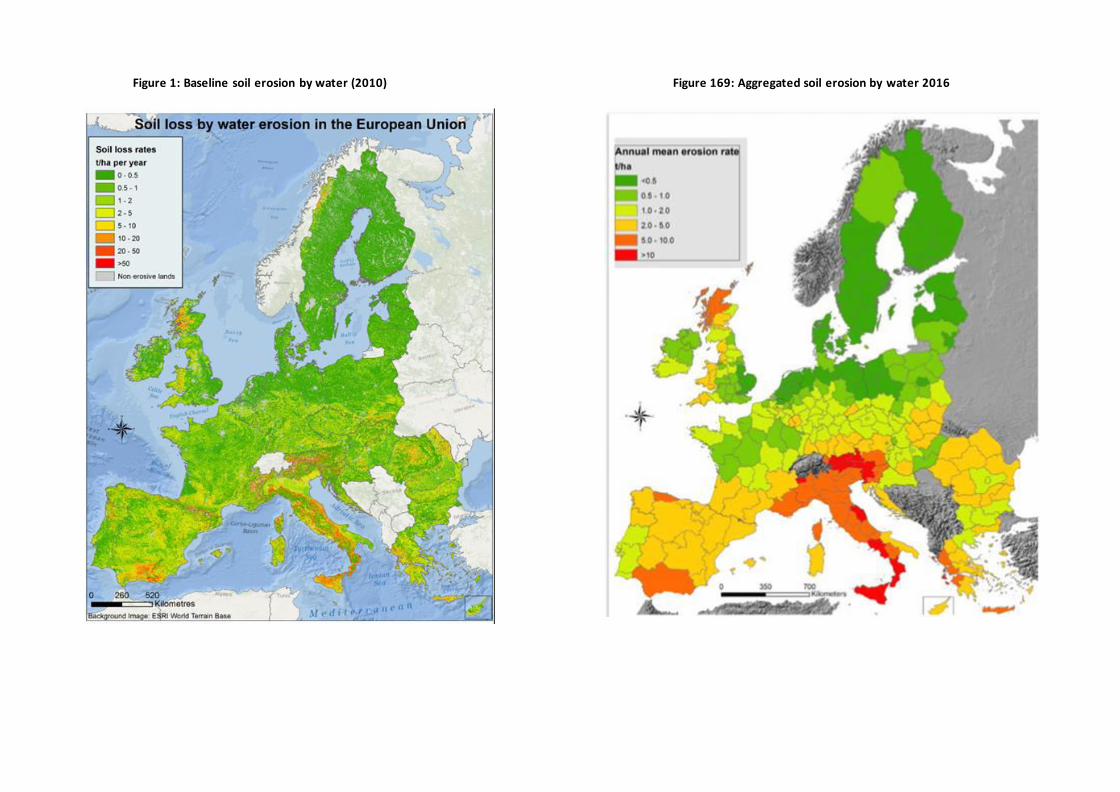
Figure 1: Baseline soil erosion by water (2010) Figure 169: Aggregated soil erosion by water 2016

606
3.3. Statistical analysis of the trend
Figure 3 shows the key trends in soil erosion by water for the EU. The long-term trend (2000-2010) saw a
significant reduction in soil erosion by water in all soi ls and especially in agricultural soil, falling by 9%
and 19% respectively.
The current short-term assessment does not show any statistically significant (p <0.01) change in soil
erosion between 2010 and 2016. While there is an overall reduction in the comparison between arable
soils and all lands, soil erosion by water on agricultural soils remains higher. In 2016 is erosion on
agricultural land is 10% greater than the mean for the EU.
Figure 1: Baseline soil erosion by water (2000-2016)
Figure 3 shows soil erosion rates by land cover type. Arable land shows annual erosion rates of 2.66 t ha -
1 while show the permanent crops show the highest soil erosion rates for managed land (9.45 t ha –1 yr–
1). Erosion rates on grasslands (2.01 t ha–1 yr–1) are close to being sustainable. Despite the fact that
woodlands occupy more around 34% of the EU erosive land, they have by far the lowest rate of soil loss
(0.07 t ha-1 yr-1), contributing less than 1% of the total soil loss in Europe.
In addition, there are notable erosion rates on shrublands and sparse vegetation with mean soil loss rate
of 2.69 t ha–1 yr–1 and 4026 t ha–1 yr–1, respectively, on around 14% of the EU.
Figure 3. Analysis of soil erosion rates by land cover types

607
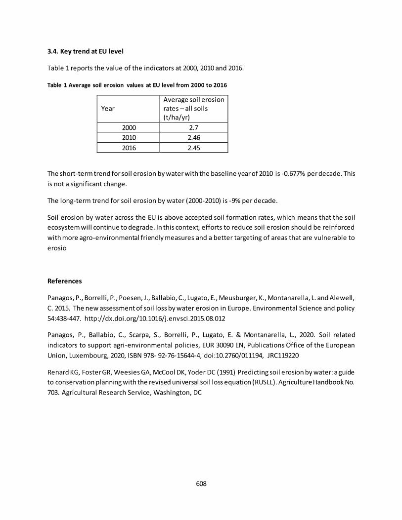
608
3.4. Key trend at EU level
Table 1 reports the value of the indicators at 2000, 2010 and 2016.
Table 1 Average soil erosion values at EU level from 2000 to 2016
Year Average soil erosion rates – all soils (t/ha/yr)
2000 2.7
2010 2.46
2016 2.45
The short-term trend for soil erosion by water with the baseline year of 2010 is -0.677% per decade. This
is not a significant change.
The long-term trend for soil erosion by water (2000-2010) is -9% per decade.
Soil erosion by water across the EU is above accepted soil formation rates, which means that the soil
ecosystem will continue to degrade. In this context, efforts to reduce soil erosion should be reinforced
with more agro-environmental friendly measures and a better targeting of areas that are vulnerable to
erosio
References
Panagos, P., Borrelli, P., Poesen, J., Ballabio, C., Lugato, E., Meusburger, K., Montanarella, L. and Alewell,
C. 2015. The new assessment of soil loss by water erosion in Europe. Environmental Science and policy
54:438-447. http://dx.doi.org/10.1016/j.envsci.2015.08.012
Panagos, P., Ballabio, C., Scarpa, S., Borrelli, P., Lugato, E. & Montanarella, L., 2020. Soil related
indicators to support agri-environmental policies, EUR 30090 EN, Publications Office of the European
Union, Luxembourg, 2020, ISBN 978- 92-76-15644-4, doi:10.2760/011194, JRC119220
Renard KG, Foster GR, Weesies GA, McCool DK, Yoder DC (1991) Predicting soil erosion by water: a guide
to conservation planning with the revised universal soil loss equation (RUSLE). Agriculture Handbook No.
703. Agricultural Research Service, Washington, DC

609
Fact sheet 5.0.100: Ecosystem service: crop provision
1. General information
Provisioning ecosystem service (CICES V.5.1);
Crop provision: ecological contribution to the growth of cultivated crops that can be harvested
and used as raw material (yield provision derived from human inputs is not included);
Components assessed for crop provision:
o Use: share of crop production derived only from the ecosystem contribution
(tonne/year and tonne/ha/year).
2. Data sources
The assessment of crop provision is described in Vallecillo et al. 201962. For consistency with the official
statistics, the mapping of the changes for the EU-wide ecosystem assessment is based on the allocation
of the values obtained from official Eurostat statistics to the locations where changes take place:
agriculture areas except permanent crops (not covered in this assessment). Accounting layers of CORINE
land cover (codes 211, 212, 213, 231, 241, 242, 243, 244) are used for the mapping and we refer to
these areas as ‘arable land’ for simplification.
Data holder: JRC at the JRC data catalogue in MAES collection63
Format and spatial resolution: raster maps with the status for 2012 (1 x 1 km) based on the
distribution of CAPRI data64 and maps of changes between 2000 and 2012 at 100 x 100 m
resolution.
Spatial coverage: EU-25 (excluding Cyprus, Malta and Croatia because of the lack of data to
assess ecosystem contribution)
Years available: data at country level for 2000, 2006 and 2012
3. Assessment of the indicator
3.1. Short description of the scope of the indicator
Crop provision as ecosystem service is assessed by disentangling the yield generated by the ecosystem
(i.e., ecosystem service) from what is generated by human inputs such as planting, irrigation and
chemical inputs. Analyses of changes over time are based on Eurostat statistics [apro_cpnh1] for 13 crop
types: soft wheat, durum, wheat, barley, oats, maize, other cereals, rape, sunflower, fodder maize,
other fodder on arable land, pulses, potatoes and sugar beet. These crop types represent about 82% of
the extent of all arable land in Europe.
62
Vallecil lo, S., La Notte, A., Kakoulaki, G., Kamberaj, J., Robert, N., Dottori, F., Feyen, L., Rega, C. & Maes, J. (2019) Ecosystem services accounting. Part II -Pilot accounts for crop and timber provision, global climate regulation and
flood control, EUR 29731 EN, Publications Office of the European Union, Luxembourg. Retrieved from http://publications.jrc.ec.europa.eu/repository/handle/JRC116334. 63
https://data.jrc.ec.europa.eu/collection/maes 64
Britz, W., & Witzke, H. P., (Eds.),. (2014). CAPRI model documentation 2014. Retrieved from University of Bonn,
Germany: http://www.capri-model.org/docs/CAPRI_documentation.pdf
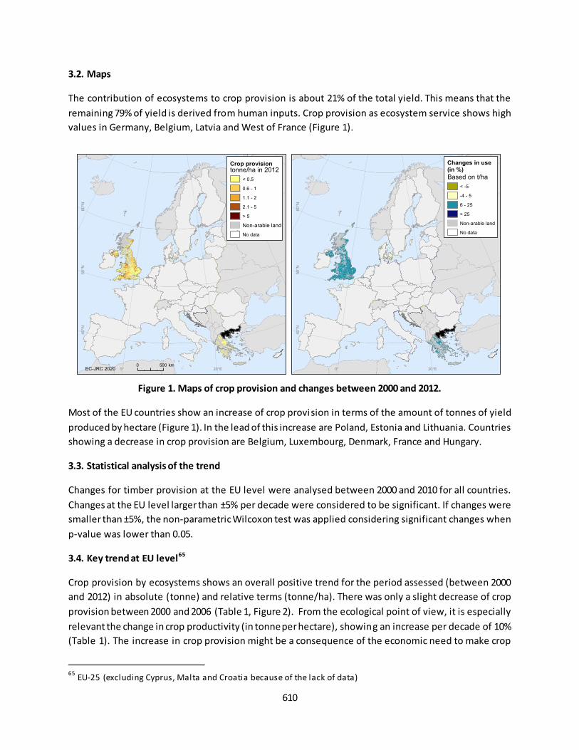
610
3.2. Maps
The contribution of ecosystems to crop provision is about 21% of the total yield. This means that the
remaining 79% of yield is derived from human inputs. Crop provision as ecosystem service shows high
values in Germany, Belgium, Latvia and West of France (Figure 1).
Figure 1. Maps of crop provision and changes between 2000 and 2012.
Most of the EU countries show an increase of crop provision in terms of the amount of tonnes of yield
produced by hectare (Figure 1). In the lead of this increase are Poland, Estonia and Lithuania. Countries
showing a decrease in crop provision are Belgium, Luxembourg, Denmark, France and Hungary.
3.3. Statistical analysis of the trend
Changes for timber provision at the EU level were analysed between 2000 and 2010 for all countries.
Changes at the EU level larger than ±5% per decade were considered to be significant. If changes were
smaller than ±5%, the non-parametric Wilcoxon test was applied considering significant changes when
p-value was lower than 0.05.
3.4. Key trend at EU level65
Crop provision by ecosystems shows an overall positive trend for the period assessed (between 2000
and 2012) in absolute (tonne) and relative terms (tonne/ha). There was only a slight decrease of crop
provision between 2000 and 2006 (Table 1, Figure 2). From the ecological point of view, it is especially
relevant the change in crop productivity (in tonne per hectare), showing an increase per decade of 10%
(Table 1). The increase in crop provision might be a consequence of the economic need to make crop
65
EU-25 (excluding Cyprus, Malta and Croatia because of the lack of data)
20°E0°
60°N
50°N
40°N
tonne/ha in 2012
< 0.5
0.6 - 1
1.1 - 2
2.1 - 5
> 5
Non-arable land
No data
Crop provision
EC-JRC 2020 20°E0°
60°N
50°N
40°N
0 500 km
Based on t/ha
< -5
-4 - 5
6 - 25
> 25
Non-arable land
No data
Changes in use (in %)
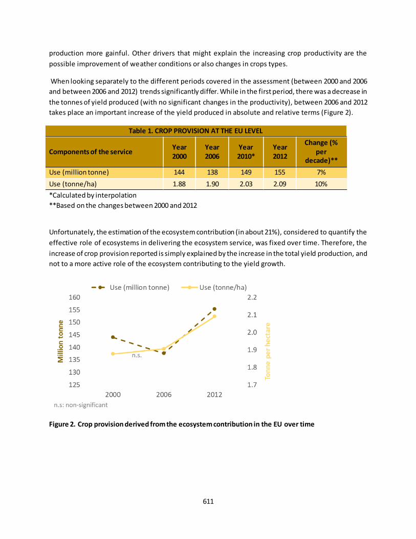
611
production more gainful. Other drivers that might explain the increasing crop productivity are the
possible improvement of weather conditions or also changes in crops types.
When looking separately to the different periods covered in the assessment (between 2000 and 2006
and between 2006 and 2012) trends significantly differ. While in the first period, there was a decrease in
the tonnes of yield produced (with no significant changes in the productivity), between 2006 and 2012
takes place an important increase of the yield produced in absolute and relative terms (Figure 2).
Table 1. CROP PROVISION AT THE EU LEVEL
Components of the service Year
2000
Year
2006
Year
2010*
Year
2012
Change (%
per
decade)**
Use (million tonne) 144 138 149 155 7%
Use (tonne/ha) 1.88 1.90 2.03 2.09 10%
*Calculated by interpolation
**Based on the changes between 2000 and 2012
Unfortunately, the estimation of the ecosystem contribution (in about 21%), considered to quantify the
effective role of ecosystems in delivering the ecosystem service, was fixed over time. Therefore, the
increase of crop provision reported is simply explained by the increase in the total yield production, and
not to a more active role of the ecosystem contributing to the yield growth.
Figure 2. Crop provision derived from the ecosystem contribution in the EU over time
612
Fact sheet 5.0.200: Ecosystem service: timber provision
1. General information
Provisioning ecosystem service (CICES V.5.1);
Timber provision: contribution of ecosystems to the growth of wood harvested as raw material
for different purposes;
Components assessed for timber provision:
o Potential: net annual increments of growing stocks (m3/year and m3/ha/year)
o Use/demand: annual standing volume of all trees, living or dead, that are felled during
the given reference period, including the volume of trees or parts of trees that are not
removed from the forest, other wooded land or other felling site (m3/year and
m3/ha/year)
2. Data sources
The assessment of timber provision is based on EUROSTAT data66. The source of these data is Joint
Forest Sector Questionnaire from FAO, UNECE, ITTO and Eurostat. These data are also used for Forest
Europe.
Data holder: JRC at the JRC data catalogue in MAES collection67
Format and spatial resolution: raster maps for potential and use/demand are based on a simple
allocation of the values provided by official statistics (in m3/ha) to forest areas according to the
accounting layers of CORINE land cover (codes 311, 312 and 313). Transitional woodland-shrub
(code 324) was not included in the mapping since official statistics refer only to forest available
for wood supply.
Spatial coverage: EU-28 except Malta, which does not report any forest available for wood
supply)
Years available: data at country level for 2000, 2005 and 2010 (for the integration with other
ecosystem services we used 2005 matching with 2006, and 2010 with 2012)
3. Assessment of the indicator
3.1. Short description of the scope of the indicator
Timber provision as ecosystem service is assessed using two different indicators: potential and use. The
potential timber provision is measured as the net annual increment (NAI) of timber which represents
the annual amount of timber that forest can offer. Data available for NAI refer only to forest available
for wood supply; therefore the whole assessment refers to this type of forest only. Timber provision use
is quantified as annual fellings, including also the amount of timber that is not removed from the forest.
66
https://appsso.eurostat.ec.europa.eu/nui/show.do?dataset=for_vol&lang=en 67
https://data.jrc.ec.europa.eu/collection/maes
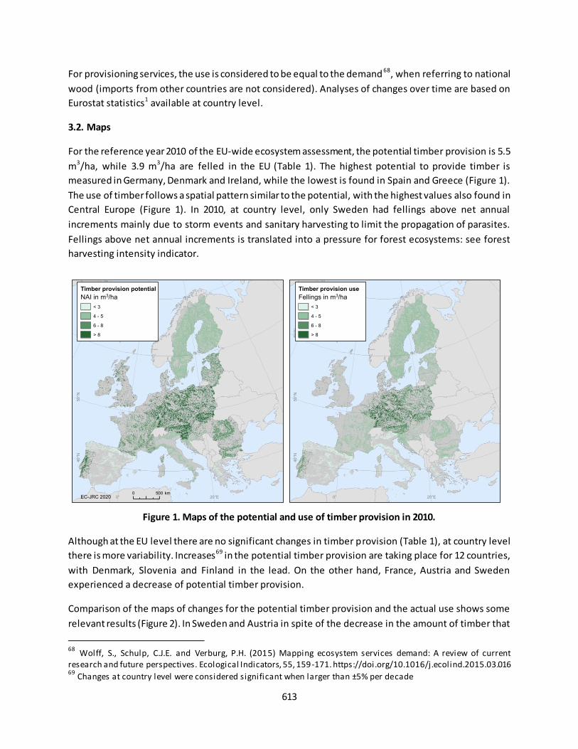
613
For provisioning services, the use is considered to be equal to the demand 68, when referring to national
wood (imports from other countries are not considered). Analyses of changes over time are based on
Eurostat statistics1 available at country level.
3.2. Maps
For the reference year 2010 of the EU-wide ecosystem assessment, the potential timber provision is 5.5
m3/ha, while 3.9 m3/ha are felled in the EU (Table 1). The highest potential to provide timber is
measured in Germany, Denmark and Ireland, while the lowest is found in Spain and Greece (Figure 1).
The use of timber follows a spatial pattern similar to the potential, with the highest values also found in
Central Europe (Figure 1). In 2010, at country level, only Sweden had fellings above net annual
increments mainly due to storm events and sanitary harvesting to limit the propagation of parasites.
Fellings above net annual increments is translated into a pressure for forest ecosystems: see forest
harvesting intensity indicator.
Figure 1. Maps of the potential and use of timber provision in 2010.
Although at the EU level there are no significant changes in timber provision (Table 1), at country level
there is more variability. Increases69 in the potential timber provision are taking place for 12 countries,
with Denmark, Slovenia and Finland in the lead. On the other hand, France, Austria and Sweden
experienced a decrease of potential timber provision.
Comparison of the maps of changes for the potential timber provision and the actual use shows some
relevant results (Figure 2). In Sweden and Austria in spite of the decrease in the amount of timber that
68
Wolff, S., Schulp, C.J.E. and Verburg, P.H. (2015) Mapping ecosystem services demand: A review of current research and future perspectives. Ecological Indicators, 55, 159-171. https://doi.org/10.1016/j.ecolind.2015.03.016 69
Changes at country level were considered significant when larger than ±5% per decade
20°E0°
60
°N50
°N40
°N
NAI in m3/ha
< 3
4 - 5
6 - 8
> 8
Timber provision potential
EC-JRC 2020 20°E0°
60
°N50
°N40
°N
0 500 km
Fellings in m3/ha
< 3
4 - 5
6 - 8
> 8
Timber provision use
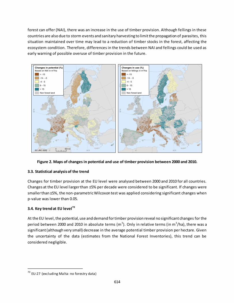
614
forest can offer (NAI), there was an increase in the use of timber provision. Although fellings in these
countries are also due to storm events and sanitary harvesting to limit the propagation of parasites, this
situation maintained over time may lead to a reduction of timber stocks in the forest, affecting the
ecosystem condition. Therefore, differences in the trends between NAI and fellings could be used as
early warning of possible overuse of timber provision in the future.
Figure 2. Maps of changes in potential and use of timber provision between 2000 and 2010.
3.3. Statistical analysis of the trend
Changes for timber provision at the EU level were analysed between 2000 and 2010 for all countries.
Changes at the EU level larger than ±5% per decade were considered to be significant. If changes were
smaller than ±5%, the non-parametric Wilcoxon test was applied considering significant changes when
p-value was lower than 0.05.
3.4. Key trend at EU level70
At the EU level, the potential, use and demand for timber provision reveal no significant changes for the
period between 2000 and 2010 in absolute terms (m3). Only in relative terms (in m3/ha), there was a
significant (although very small) decrease in the average potential timber provision per hectare. Given
the uncertainty of the data (estimates from the National Forest Inventories), this trend can be
considered negligible.
70
EU-27 (excluding Malta: no forestry data)
20°E0°
60°N
50°N
40°N
Based on NAI in m3/ha
< -15
-14 - -5
-4 - 5
6 - 15
> 15
Non forest land
Changes in potential (%)
EC-JRC 2020 20°E0°
60°N
50°N
40°N
0 500 km
Based on fellings in m3/ha
< -15
-14 - -5
-4 - 5
6 - 15
> 15
Non forest land
Changes in use (%)

615
Table 1. TIMBER PROVISION AT THE EU LEVEL
Components of the service Year
2000 Year 2005
Year
2010
Change (% per
decade)
Potential (million m³) 739 722 744 0.7%n.s.
Potential (m³/ha) 5.56 5.39 5.54 -0.3%
Use/demand (million m³) 504 539 523 4%n.s.
Use/demand (m³/ha) 3.78 4.02 3.89 3%n.s. n.s.Changes between 2000 and 2010 non s tatistically s ignificant
The lack of changes between 2000 and 2010 are due to the opposing trends found over time within this
period. The potential timber provision shows a decrease between 2000 and 2005, compensated by an
increase the period after (between 2005 and 2010). Conversely, the use/demand for timber provision
increase for the first period, while decreased between 2005 and 2010 (Figure 3).
Figure 3. Changes of timber provision as ecosystem service

616
Fact sheet 5.0.300: Ecosystem service: carbon sequestration
1. General information
Regulating and maintenance ecosystem service (CICES V.5.1);
Carbon sequestration from the atmosphere by ecosystems;
Components assessed for carbon sequestration:
o Use: net CO2 sequestration by ecosystems (tonne/year)
o Demand: CO2 concentration in the atmosphere (ppm)
2. Data sources
The assessment of carbon sequestration by ecosystems is based on data of the greenhouse gases (GHG)
inventory for the Land Use, Land Use Change and Forestry (LULUCF) sector reported annually 71. LULUCF
data provide net emissions and removal of CO2 per different land use categories that roughly match
different MAES ecosystem types. Land uses reported in LULUCF data are forest land, cropland,
grassland, wetland and settlements (forestry is not included since in the accounting framework, it
corresponds to an economic sector and not to the ecosystem role). Although there might be some slight
differences in the ecosystem definitions provided by LULUCF and MAES (Table 1), we consider them as
negligible. Lack of perfect correspondence of definitions of land cover and ecosystem types is a common
issue when integrating data derived from different data sources. However, in this case, we pose that
there are no major differences that might affect the main outcome of this assessment.
The use of the service was considered as the net CO2 sequestration (net ecosystem removals minus net
ecosystem emissions72,73). LULUCF data were used to make maps of the CO2 sequestration at country
level. The assessment is further described in Vallecillo et al. 201974.
The demand (need) for this ecosystem service is arising from the accumulation of CO 2 in the
atmosphere. Data for the assessment of the demand are provided by the National Oceanic and
Atmospheric Administration (NOAA)75.
71
https://unfccc.int/process-and-meetings/transparency-and-reporting/reporting-and-review-under-the-convention/greenhouse-gas-inventories-annex-i-parties/national-inventory-submissions-2019 72
EEA (2018) National emissions reported to the UNFCCC and to the EU Greenhouse Gas Monitoring Mechanism.
Published by Eurostat (update 05/06/2018). Downloaded on the 06/06/2018. Retrieved from http://appsso.eurostat.ec.europa.eu/nui/show.do?lang=en&dataset=env_air_gge 73
Ecosystem uptake corresponds to the negative net emissions reported in the LULUCF data, while ecosystem
emissions are the positive net values of the inventory. 74
Vallecil lo, S., La Notte, A., Kakoulaki, G., Kamberaj, J., Robert, N., Dottori, F., Feyen, L., Rega, C. & Maes, J. (2019) Ecosystem services accounting. Part II -Pilot accounts for crop and timber provision, global climate regulation and flood control, EUR 29731 EN, Publications Office of the European Union, Luxembourg. Retrieved from
http://publications.jrc.ec.europa.eu/repository/handle/JRC116334. 75
Available at: https://www.eea.europa.eu/data-and-maps/daviz/atmospheric-concentration-of-carbon-dioxide-4#tab-chart_5_filters=%7B%22rowFilters%22%3A%7B%7D%3B%22columnFilters%22%3A%7B%22pre_config_polutant%2
2%3A%5B%22CO2%20(PPM)%22%5D%7D%7D
617
Data holder: JRC at the JRC data catalogue in MAES collection76;
Format and spatial resolution: vector maps at country level (based on EU National Inventory
Report 2018)4;
Spatial coverage: EU-28;
Years available: data at country level for 2000, 2006 and 2012 (changes over time are based on
the comparison between 2000 and 2012)
Table 1. Correspondence between land use categories and ecosystem types.
LULUCF land categories1 MAES ecosystem types
2
Forest land (land with woody vegetation consistent
with thresholds used to define forest land in the
national GHG inventory)
Woodland and forest (forest and transitional
woodland shrub)
Cropland (arable and tillage land, and agro-
forestry systems where vegetation falls below the
thresholds used for the forest land category)
Cropland (arable land, permanent crops and
heterogeneous agricultural areas)
Grassland (rangelands and pasture land that is
not considered as cropland) Grassland (pastures and natural grassland)
Wetlands (land that is covered or saturated by
water for all or part of the year (e.g., peatland)
and that does not fall into the forest land,
cropland, grassland or settlements categories. It
includes reservoirs as a managed sub-division and
natural rivers and lakes as unmanaged sub-divisions)
Wetlands (Inland marshes and peatbogs)
Settlements (all developed land, including
transportation infrastructure and human settlements
of any size)
Urban (artificial surfaces)
Other land (bare soil, rock, ice, and all unmanaged
land areas that do not fall into any of the other five
categories. It allows the total of identified land areas
to match the national area, where data are
available)
Sparsely vegetated land (unvegetated or
sparsely vegetated habitats (naturally
unvegetated areas). Often these ecosystems
have extreme natural conditions that might
support particular species. They include bare
rocks, glaciers and dunes, beaches and sand
plains) 1https://www.ipcc.ch/site/assets/uploads/2018/03/GPG_LULUCF_FULLEN.pdf 2http://ec.europa.eu/environment/nature/knowledge/ecosystem_assessment/pdf/MAESWorkingPaper2013.pdf. Detailed description of CORINE land cover classes can be found in https://land.copernicus.eu/user-corner/technical-library/corine-land-cover-nomenclature-guidelines/html
76
https://data.jrc.ec.europa.eu/collection/maes
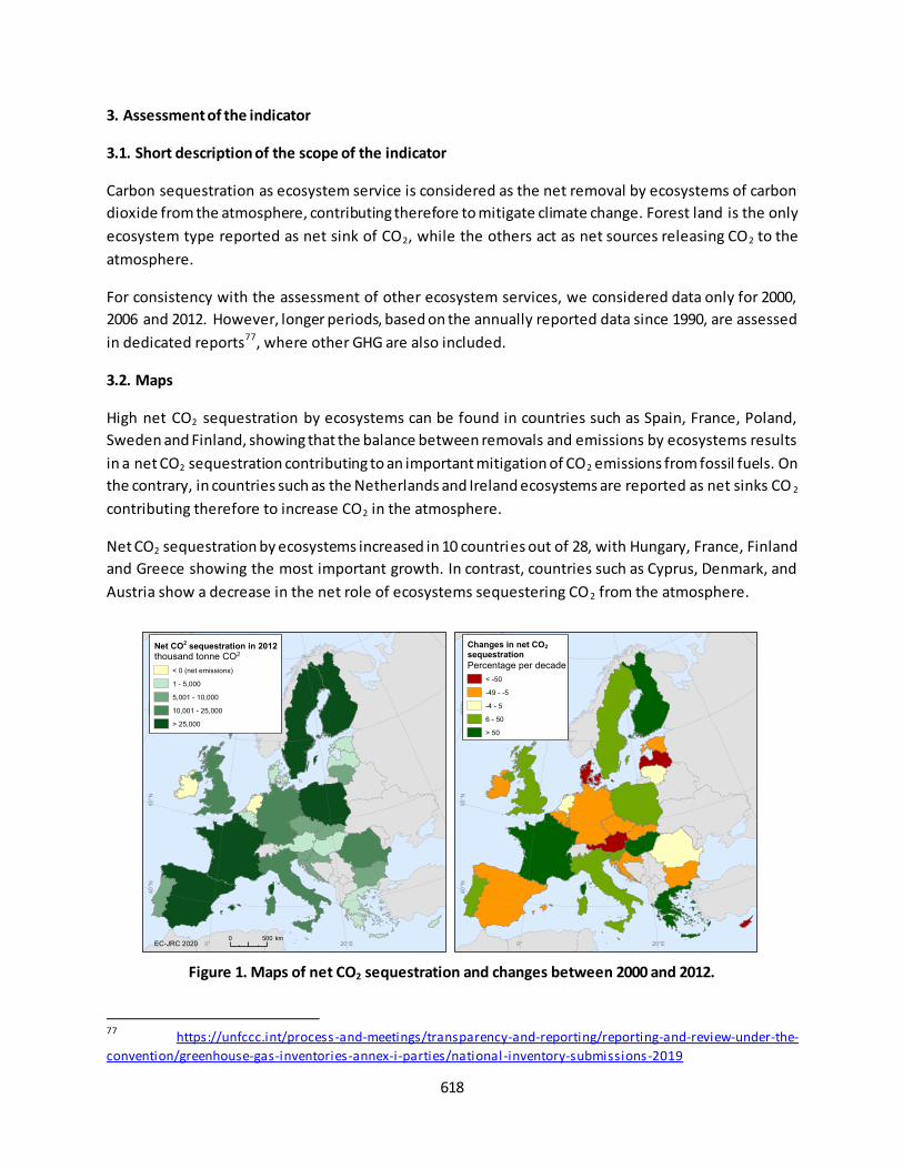
618
3. Assessment of the indicator
3.1. Short description of the scope of the indicator
Carbon sequestration as ecosystem service is considered as the net removal by ecosystems of carbon
dioxide from the atmosphere, contributing therefore to mitigate climate change. Forest land is the only
ecosystem type reported as net sink of CO2, while the others act as net sources releasing CO2 to the
atmosphere.
For consistency with the assessment of other ecosystem services, we considered data only for 2000,
2006 and 2012. However, longer periods, based on the annually reported data since 1990, are assessed
in dedicated reports77, where other GHG are also included.
3.2. Maps
High net CO2 sequestration by ecosystems can be found in countries such as Spain, France, Poland,
Sweden and Finland, showing that the balance between removals and emissions by ecosystems results
in a net CO2 sequestration contributing to an important mitigation of CO2 emissions from fossil fuels. On
the contrary, in countries such as the Netherlands and Ireland ecosystems are reported as net sinks CO 2
contributing therefore to increase CO2 in the atmosphere.
Net CO2 sequestration by ecosystems increased in 10 countries out of 28, with Hungary, France, Finland
and Greece showing the most important growth. In contrast, countries such as Cyprus, Denmark, and
Austria show a decrease in the net role of ecosystems sequestering CO2 from the atmosphere.
Figure 1. Maps of net CO2 sequestration and changes between 2000 and 2012.
77
https://unfccc.int/process-and-meetings/transparency-and-reporting/reporting-and-review-under-the-
convention/greenhouse-gas-inventories-annex-i-parties/national-inventory-submissions-2019
20°E0°
60
°N50
°N40
°N
thousand tonne CO2
< 0 (net emissions)
1 - 5,000
5,001 - 10,000
10,001 - 25,000
> 25,000
Net CO2 sequestration in 2012
EC-JRC 2020 20°E0°
60
°N50
°N40
°N
0 500 km
Percentage per decade
< -50
-49 - -5
-4 - 5
6 - 50
> 50
Changes in net CO2 sequestration
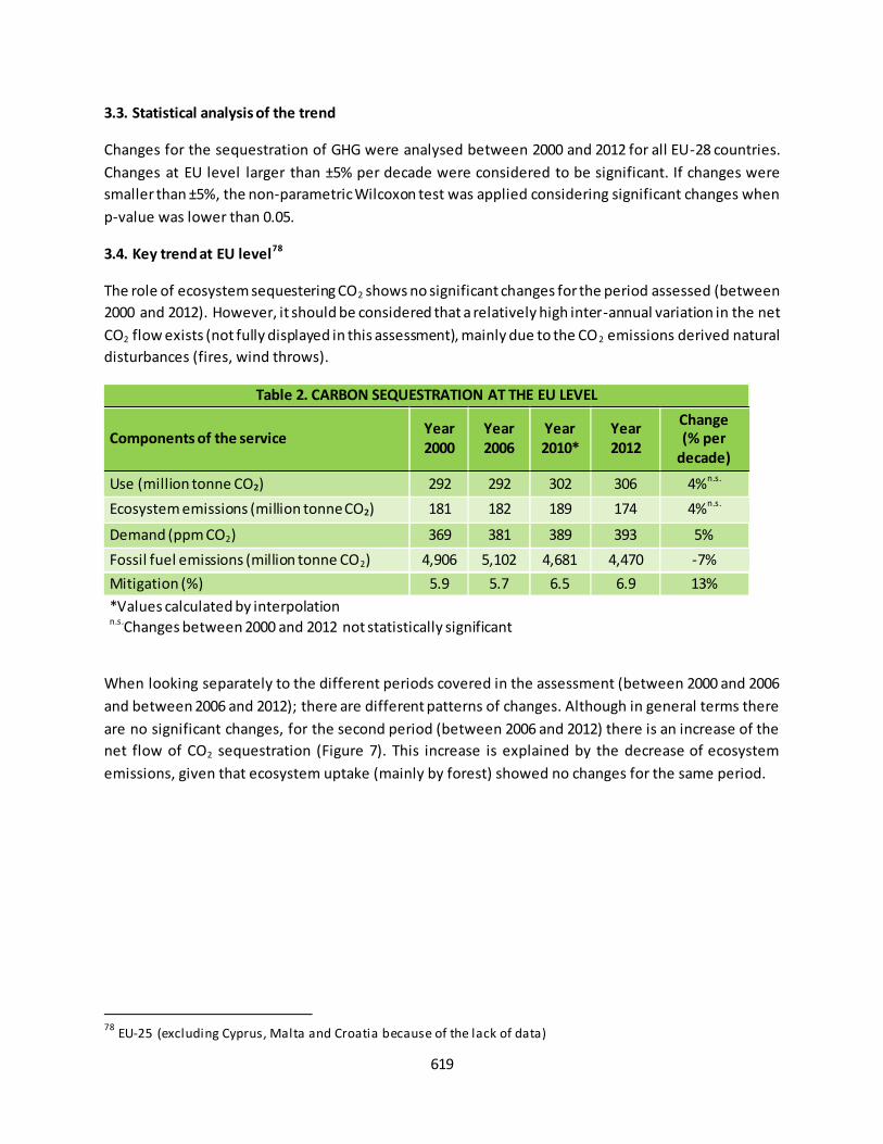
619
3.3. Statistical analysis of the trend
Changes for the sequestration of GHG were analysed between 2000 and 2012 for all EU-28 countries.
Changes at EU level larger than ±5% per decade were considered to be significant. If changes were
smaller than ±5%, the non-parametric Wilcoxon test was applied considering significant changes when
p-value was lower than 0.05.
3.4. Key trend at EU level78
The role of ecosystem sequestering CO2 shows no significant changes for the period assessed (between
2000 and 2012). However, it should be considered that a relatively high inter-annual variation in the net
CO2 flow exists (not fully displayed in this assessment), mainly due to the CO2 emissions derived natural
disturbances (fires, wind throws).
Table 2. CARBON SEQUESTRATION AT THE EU LEVEL
Components of the service Year
2000
Year
2006
Year
2010*
Year
2012
Change
(% per
decade)
Use (million tonne CO₂) 292 292 302 306 4%n.s.
Ecosystem emissions (million tonne CO₂) 181 182 189 174 4%n.s.
Demand (ppm CO2) 369 381 389 393 5%
Fossil fuel emissions (million tonne CO2) 4,906 5,102 4,681 4,470 -7%
Mitigation (%) 5.9 5.7 6.5 6.9 13%
*Values calculated by interpolation n.s.Changes between 2000 and 2012 not statistically significant
When looking separately to the different periods covered in the assessment (between 2000 and 2006
and between 2006 and 2012); there are different patterns of changes. Although in general terms there
are no significant changes, for the second period (between 2006 and 2012) there is an increase of the
net flow of CO2 sequestration (Figure 7). This increase is explained by the decrease of ecosystem
emissions, given that ecosystem uptake (mainly by forest) showed no changes for the same period.
78
EU-25 (excluding Cyprus, Malta and Croatia because of the lack of data)
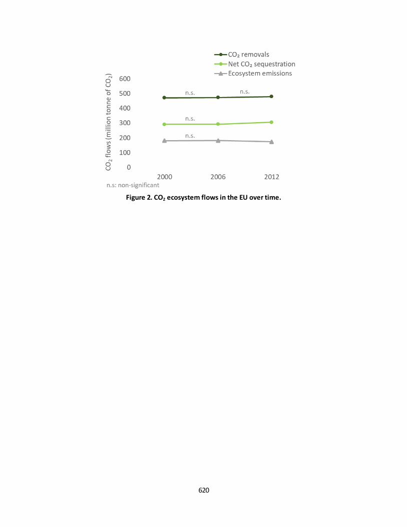
620
Figure 2. CO2 ecosystem flows in the EU over time.
621
Fact sheet 5.0.400: Ecosystem service: crop pollination
1. General information
Regulating and maintenance ecosystem service (CICES V.5.1);
Crop pollination: transfer of crop pollen by wild bees resulting in the fertilization of crops;
maintaining and/or increasing the crop production. This assessment estimates only pollination
by wild bees;
Components assessed for crop pollination:
o Potential: dimensionless indicator of environmental suitability to support wild insect
pollinators (between 0 and 1)
o Demand: extent of pollinator-dependent crops (in km2)
o Use: area where high pollination potential (environmental suitability > 0.2) and demand
overlap (in km2)
o Unmet demand: extent of pollinator-dependent crops not covered by high pollination
potential (in km2)
2. Data sources
The assessment of crop pollination is described in Vallecillo et al. 201879.
Data holder: JRC at the JRC data catalogue in MAES collection80;
Format and spatial resolution:
o Indicator environmental suitability: raster, 1 km x 1 km;
o Other ecosystems services components: vector data at local administrative level;
Spatial coverage: minimum common coverage for all maps is EU-25 (excluding Croatia, Cyprus
and Malta);
Years available: 2000, 2006 and 2012 (because of the lack of data, we assumed the demand
between 2006 and 2012 was the same). Changes over time are based on the comparison
between 2000 and 2012
3. Assessment of the indicators
3.1. Short description of the scope of the indicators
The ecosystem service potential reports the environmental suitability to support wild insect pollinators.
Environmental suitability is calculated based on the integration of two different models (for
bumblebees81 and solitary bees). The main environmental factors included to assess suitability are
climate and variables related to different land covers and landscape structure. The indicator can
potentially vary between 0 (lack of environmental suitability) and 1 (maximum suitability). After
79
Vallecil lo, S., La Notte, A., Polce, C., Zulian, G., Alexandris, N., Ferrini S. & Maes, J. (2018) Ecosystem services accounting: Part I - Outdoor recreation and crop pollination, EUR 29024 EN; Publications Office of the European Union, Luxembourg. Retrieved from http://publications.jrc.ec.europa.eu/repository/handle/JRC110321. 80
https://data.jrc.ec.europa.eu/collection/maes 81
https://oneecosystem.pensoft.net/article/28143/list/9/

622
integrating the two models, the maximum value reached within this assessment was 0.5. This indicator
has been used to delineate areas with high pollination potential (also known as Service Providing Areas,
SPA), where environmental suitability was above 0.2. SPA were used to calculate the use area.
The demand for crop pollination shows in a spatially explicit way where crop pollination is needed by
pollinator-dependent crops for 2004 (matched with 2000) and 2008 (matched with 2006 and also 2012).
The use of pollination by crops is quantified as the overlapping area between SPA (environmental
suitability > 0.2). We assumed that crop production attributable to the role of pollinators was only
generated in the use area.
The unmet demand for crop pollination is quantified as the extent of pollinator-dependent crops (in
km2) not covered by SPA (i.e., environmental suitability lower than 0.2). In areas of unmet demand, the
contribution of pollinators to crop production can potentially be compromised.
3.2. Maps
Ecosystem potential to support pollinators shows higher values in central-eastern Europe (Figure 1).
This pattern is driven especially by the suitability of these areas for bumblebees. Increase of the
pollination potential between 2000 and 2012 took place especially in the south of Europe, while
decreases show a more widespread pattern.
The map of the demand for crop pollination shows large areas in Romania, Hungary, but also in many
other countries of central-eastern Europe, and Mediterranean countries (Figure 1). Scandinavian
countries show the smallest demand. The demand reveals larger increases in Poland, Lithuania, Latvia,
and Estonia.
The use of crop pollination is especially high in Czechia, Hungary, Poland and West Germany as a result
of the overlap between pollinator-dependent crops and high environmental suitability for pollinators
(Figure 1). A careful look at these maps (Figure 1) shows that in some areas there is correspondence
between areas of expansion of pollinator-dependent crops (‘areas of demand’) and areas with
enhancement of pollination potential (mainly in Spain and Greece). The parallel increase of demand and
potential in these areas, translates into an increase of their overlapping areas, in other words in the area
of use. It is important to bear in mind that the use of crop pollination could also have been quantified as
the yield attributable to pollinators; however, this other indicator would be very much influenced by the
human inputs in agriculture increasing yield growth, and may result in a misleading messages for th is
assessment.
The unmet demand for crop pollination is very low in north and central Europe, due to high
environmental suitability to support pollinators (bumblebees and solitary bees) in these areas (Figure 2).
Overall, we can see larger changes in the unmet demand in areas where pollination potential presents
low-intermediate values (north and south of the EU). It is in these areas where the impact of change in
the pollination potential may have larger consequence on the contribution of pollination to human well-
being, requiring therefore especial attention.
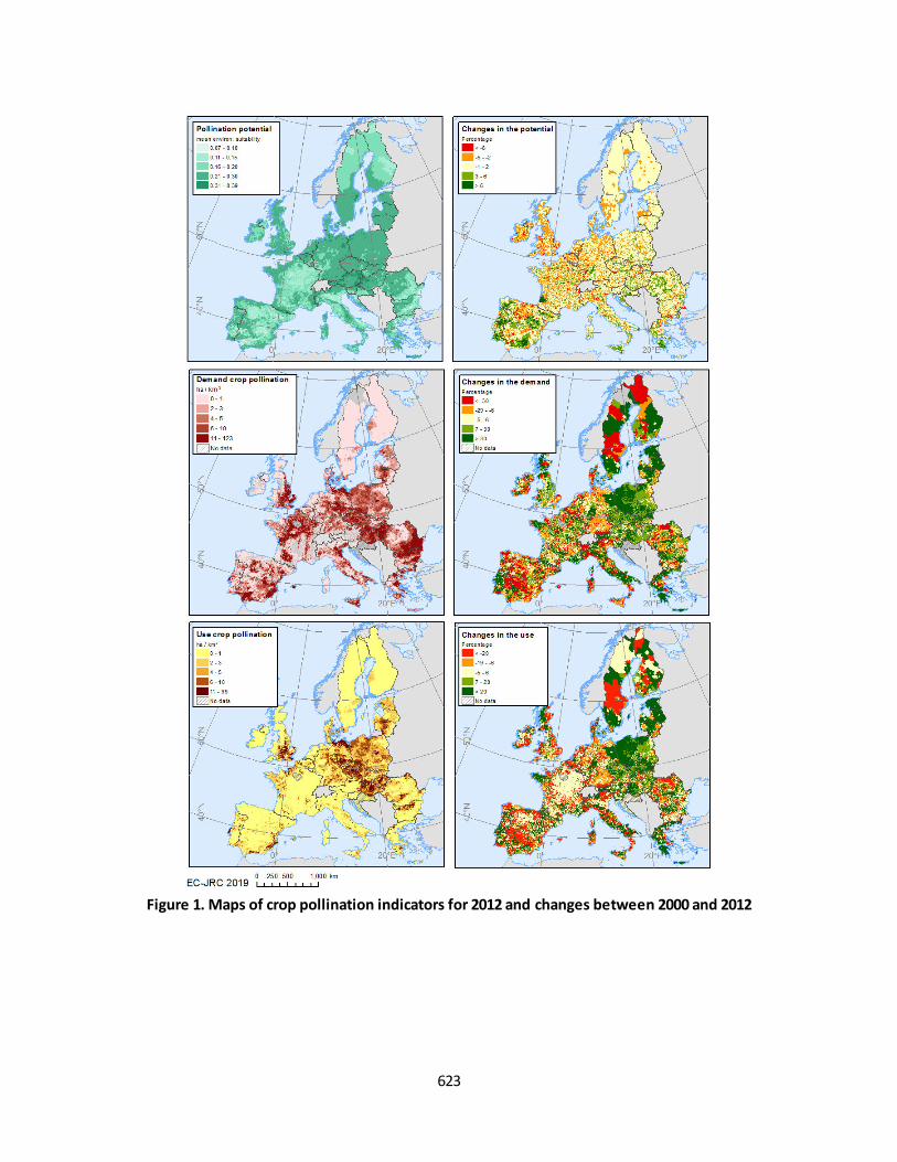
623
Figure 1. Maps of crop pollination indicators for 2012 and changes between 2000 and 2012
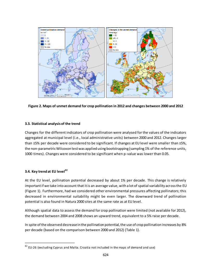
624
Figure 2. Maps of unmet demand for crop pollination in 2012 and changes between 2000 and 2012
3.3. Statistical analysis of the trend
Changes for the different indicators of crop pollination were analysed for the values of the indicators
aggregated at municipal level (i.e., local administrative units) between 2000 and 2012. Changes larger
than ±5% per decade were considered to be significant. If changes at EU level were smaller than ±5%,
the non-parametric Wilcoxon test was applied using bootstrapping (sampling 1% of the reference units,
1000 times). Changes were considered to be significant when p-value was lower than 0.05.
3.4. Key trend at EU level82
At the EU level, pollination potential decreased by about 1% per decade. This change is relatively
important if we take into account that it is an average value, with a lot of spatial variability across the EU
(Figure 1). Furthermore, had we considered other environmental pressures affecting pollinators; this
decreased in environmental suitability might be even larger. The downward trend of pollination
potential is also found in Natura 2000 sites at the same rate as at EU level.
Although spatial data to assess the demand for crop pollination were limited (not available for 2012),
the demand between 2004 and 2008 shows an upward trend, equivalent to a 5% raise per decade.
In spite of the observed decrease in the pollination potential, the use of crop pollination increases by 8%
per decade (based on the comparison between 2000 and 2012) (Table 1).
82
EU-26 (excluding Cyprus and Malta. Croatia not included in the maps of demand and use)
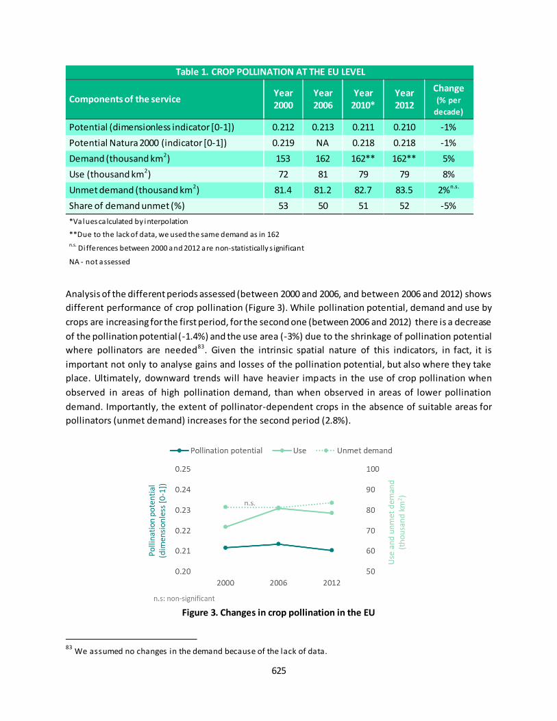
625
Table 1. CROP POLLINATION AT THE EU LEVEL
Components of the service Year
2000
Year
2006
Year
2010*
Year
2012
Change
(% per
decade)
Potential (dimensionless indicator [0-1]) 0.212 0.213 0.211 0.210 -1%
Potential Natura 2000 (indicator [0-1]) 0.219 NA 0.218 0.218 -1%
Demand (thousand km2) 153 162 162** 162** 5%
Use (thousand km2) 72 81 79 79 8%
Unmet demand (thousand km2) 81.4 81.2 82.7 83.5 2%n.s.
Share of demand unmet (%) 53 50 51 52 -5%
*Values ca lculated by interpolation
**Due to the lack of data, we used the same demand as in 162 n.s. Differences between 2000 and 2012 are non-statistically s ignificant
NA - not assessed
Analysis of the different periods assessed (between 2000 and 2006, and between 2006 and 2012) shows
different performance of crop pollination (Figure 3). While pollination potential, demand and use by
crops are increasing for the first period, for the second one (between 2006 and 2012) there is a decrease
of the pollination potential (-1.4%) and the use area (-3%) due to the shrinkage of pollination potential
where pollinators are needed83. Given the intrinsic spatial nature of this indicators, in fact, it is
important not only to analyse gains and losses of the pollination potential, but also where they take
place. Ultimately, downward trends will have heavier impacts in the use of crop pollination when
observed in areas of high pollination demand, than when observed in areas of lower pollination
demand. Importantly, the extent of pollinator-dependent crops in the absence of suitable areas for
pollinators (unmet demand) increases for the second period (2.8%).
Figure 3. Changes in crop pollination in the EU
83
We assumed no changes in the demand because of the lack of data.
626
Fact sheet 5.0.500: Ecosystem service: flood control
1. General information
Regulating and maintenance ecosystem service (CICES V.5.1);
Flood control: regulation of water flow (runoff) by ecosystems that mitigates or prevents
potential damage to land assets (i.e., infrastructure, agriculture) and human lives. The current
assessment covers only riverine floods for artificial surfaces (i.e. urban MAES ecosystems);
Components assessed for flood control:
o Potential: dimensionless indicator of potential runoff retention (between 0 and 100)
o Demand: extent of artificial surfaces (in km2) located in floodplains (for a return period
of 500 years)
o Use: extent of the demand (artificial areas) protected by upstream ecosystems (in km2)
o Unmet demand: extent of the demand not protected by upstream ecosystems (in km2).
2. Data sources
The assessment of flood control is described in Vallecillo et al. 201984 and Vallecillo et al. 202085.
Data holder: JRC at the JRC data catalogue in MAES collection86;
Format and spatial resolution:
o Indicator potential runoff retention: raster, 100 m x 100 m;
o Ecosystems services components: vector data at sub-catchment level;
Spatial coverage: EU-26 (excluding Cyprus and Malta, and some regions in Croatia, Bulgaria and
Finland);
Years available: 2006 and 2012.
3. Assessment of the indicators
3.1. Short description of the scope of the indicators
The ecosystem service potential to reduce runoff is quantified by means of a dimensionless indicator of
potential runoff retention (zero means no runoff retention, while a value of 100 indicates the maximum
runoff retention).
The demand for flood control shows in a spatially explicit way where flood control is needed by artificial
areas.
84
Vallecil lo, S., La Notte, A., Kakoulaki, G., Kamberaj, J., Robert, N., Dottori, F., Feyen, L., Rega, C. & Maes, J. (2019) Ecosystem services accounting. Part II -Pilot accounts for crop and timber provision, global climate regulation and
flood control, EUR 29731 EN, Publications Office of the European Union, Luxembourg. Retrieved from http://publications.jrc.ec.europa.eu/repository/handle/JRC116334. 85
Vallecil lo, S., Kakoulaki, G., La Notte, A., Feyen, L., Dottori, F., & Maes, J. (2020). Accounting for changes in flood control delivered by ecosystems at the EU level. Ecosystem Services, (in press) 86
https://data.jrc.ec.europa.eu/collection/maes

627
Flood control by ecosystems is considered to be used only when areas of high runoff retention 87 are
located upstream to demand areas, and contributing therefore to reduce downstream runoff. Areas of
high runoff retention are considered ‘Service Providing Areas’ (SPA). In this way, the use of flood control
by ecosystems is quantified as the extent of artificial areas in floodplains protected by upstream
ecosystems (in km2). The use of flood control reaches the minimum value when upstream areas from
the demand present 0% of SPA, and maximized when 100% of the upstream area presents SPA . Flood
control accounts developed under KIP INCA also includes the protection of agricultural areas. However,
for the sake of simplicity, only the protection of artificial areas is presented here. Further
methodological details can be found in Vallecillo et al. 201988 and Vallecillo et al, 202089.
3.2. Maps
Visual comparison of maps for flood control potential and flood control demand shows some
complementarity: areas with high potential (mainly mountain and forested areas) spatially match with
areas of none or low demand and vice versa (Figure 1). This is usually translated in large areas of unmet
demand, like for instance the Po Valley in Italy or the east of Hungary. However, the spatial distribution
of the use of flood control as ecosystem service does not only depend on the amount of ES potential and
demand, but also how it is located. For instance, in some areas in the Netherlands, there is high demand
and relatively low ES potential; however, they present a high use of the service due to the role of
upstream ecosystems in south of the Netherlands and Belgium.
Map of changes (Figure 2) shows a more widespread pattern of a downward trend in flood control
potential all over the EU, although some areas in Czechia, Hungary, Portugal and Finland show also an
improvement in the potential of ecosystems to reduce runoff . The demand for flood control by artificial
areas is mainly increasing (with very limited number of municipalities showing a decrease). Changes in
the demand for flood control are related to urban sprawl and land take taking place in floodplains
(return period of 500 years). Both, changes in the potential or in the demand drive fluctuations in the
use of flood control as ecosystem service. In the case of the Netherlands, the increase in the use is
mainly due to an increase in the demand, while in Czechia the use increases due to the enhancement of
natural capital to reduce runoff. Importantly, there is an overall increase of the unmet demand, which
demonstrates that more ecosystems would be needed to contribute to reduce runoff and control
flooding.
Increases in the unmet demand follow a similar patter to the increase in the demand (Figure 2),
demonstrating that there is a lack of flood control by ecosystems for the new built up areas in flood
plains. Only in the case of the Netherlands, the level of protection by artificial defense measures is high
87
Thresholds vary by ecosystem type: 61 for natural and semi -natural ecosystems, 52 for agriculture areas, 27 for artificial areas. For further details see Vallecil lo et al. 2020. 88
Vallecil lo, S., La Notte, A., Kakoulaki, G., Kamberaj, J., Robert, N., Dottori, F., Feyen, L., Rega, C. & Maes, J. (2019)
Ecosystem services accounting. Part II -Pilot accounts for crop and timber provision, global climate regulation and flood control, EUR 29731 EN, Publications Office of the European Union, Luxembourg. Retrieved from http://publications.jrc.ec.europa.eu/repository/handle/JRC116334. 89
Vallecil lo, S., Kakoulaki , G., La Notte, A., Feyen, L., Dottori, F., & Maes, J. (2020). Accounting for changes in flood
control delivered by ecosystems at the EU level. Ecosystem Services, (in press)
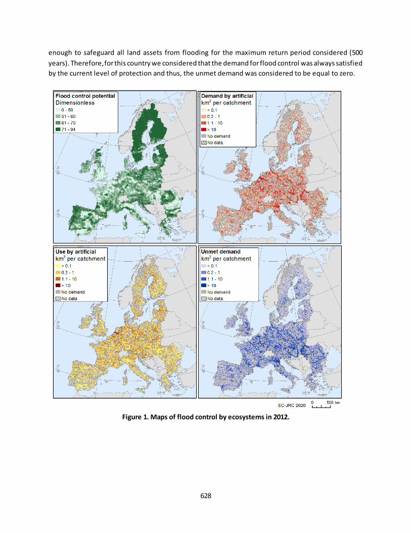
628
enough to safeguard all land assets from flooding for the maximum return period considered (500
years). Therefore, for this country we considered that the demand for flood control was always satisfied
by the current level of protection and thus, the unmet demand was considered to be equal to zero.
Figure 1. Maps of flood control by ecosystems in 2012.
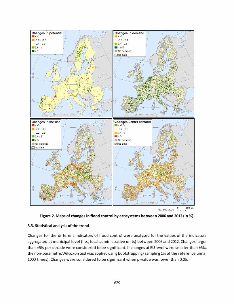
629
Figure 2. Maps of changes in flood control by ecosystems between 2006 and 2012 (in %).
3.3. Statistical analysis of the trend
Changes for the different indicators of flood control were analysed for the values of the indicators
aggregated at municipal level (i.e., local administrative units) between 2006 and 2012. Changes larger
than ±5% per decade were considered to be significant. If changes at EU level were smaller than ±5%,
the non-parametric Wilcoxon test was applied using bootstrapping (sampling 1% of the reference units,
1000 times). Changes were considered to be significant when p-value was lower than 0.05.

630
3.4. Key trend at EU level90
Between 2006 and 2012, there was a very slight, but significant, decrease in the flood control potential
(by 0.1%) (Table 1). Although the magnitude is not large, the Wilcoxon test applied shows that the
number of municipalities undergoing a decrease in flood control potential is significantly larger than the
municipalities with an increase (as also shown in Figure 2). The average value at the EU level is masking
the large spatial variability of the changes in flood control potential across the EU territory. In the EU, 43
000 km2 of land show a significant91 increase in flood control potential, while 55 000 km2 experience a
decrease (Figure 3). It should also be noted that these changes refer only to a period of 6 years, whi ch is
considered a relative short period to track changes in ecosystem services at European scale.
Table 1. FLOOD CONTROL BY ECOSYSTEMS AT THE EU LEVEL (for artificial land)
Components of the service Year
2000*
Year
2006
Year
2010*
Year
2012
Change
(% per decade)
Potential (dimensionless indicator [0-100]) 62.22 62.20 62.18 62.18 -0.1%
Demand (thousand km2) 18.26 18.56 18.76 18.86 3%
Use (thousand km2) 4.95 4.97 4.98 4.98 0.5%n.s.
Unmet demand (thousand km2) 12.31 12.54 12.70 12.78 3%n.s.
Share of demand unmet (%) 67.4 67.6 67.7 67.8 0.5%n.s.
*Values ca lculated by interpolation n.s. Di fferences between 2006 and 2012 are non-statistically significant
Figure 3. Areas where flood control potential changes between 2006 and 2012 in the EU.
At the other side of the supply of flood control, the demand for this ecosystem service by artificial land
increased by 3 % per decade. As a result of the mismatch between the changes in ES potential and
demand, the use of flood control by ecosystems is stable for this period, even in spite of the generalized
increase of the demand.
90
EU-26 (excluding Cyprus and Malta, and some regions in Croatia, Bulgaria and Fi nland) 91
When changes are larger than 5% per decade
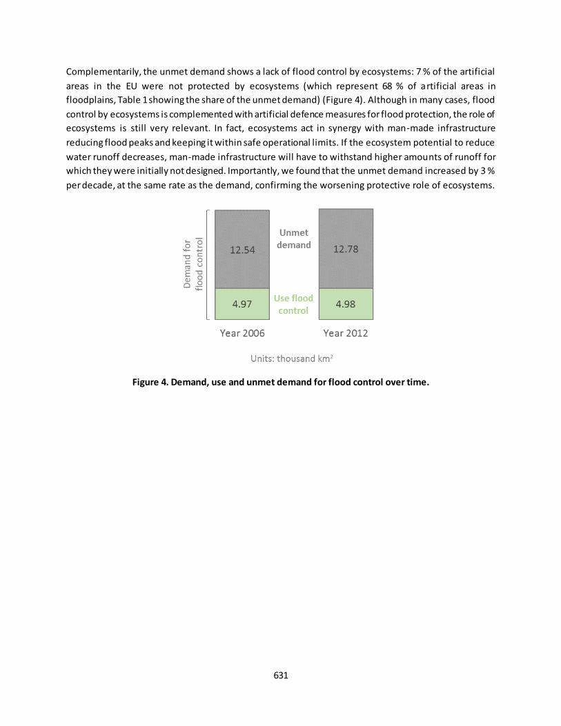
631
Complementarily, the unmet demand shows a lack of flood control by ecosystems: 7 % of the artificial
areas in the EU were not protected by ecosystems (which represent 68 % of artificial areas in
floodplains, Table 1 showing the share of the unmet demand) (Figure 4). Although in many cases, flood
control by ecosystems is complemented with artificial defence measures for flood protection, the role of
ecosystems is still very relevant. In fact, ecosystems act in synergy with man-made infrastructure
reducing flood peaks and keeping it within safe operational limits. If the ecosystem potential to reduce
water runoff decreases, man-made infrastructure will have to withstand higher amounts of runoff for
which they were initially not designed. Importantly, we found that the unmet demand increased by 3 %
per decade, at the same rate as the demand, confirming the worsening protective role of ecosystems.
Figure 4. Demand, use and unmet demand for flood control over time.

632
Fact sheet 5.0.600: Ecosystem service: daily nature-based recreation
1. General information
Cultural ecosystem service (CICES V.5.1);
Daily nature-based recreation: biophysical characteristics or qualities of ecosystems that are
viewed, observed, experienced or enjoyed in a passive, or active, way by people on a daily basis;
Components assessed for nature-based recreation:
o Potential: A) Ecosystem-based potential: a dimensionless indicator of the availability of
opportunities provided by nature (between 0 and 1), and B) Extent of suitable areas for
daily recreation (proximal high-quality areas considered as Service Providing Areas- SPA-
for daily recreation; in km2)
o Demand: population (inhabitants)
o Use: potential visits to suitable areas for daily recreation (number of visits)
o Unmet demand: people living beyond 4 km from suitable areas for daily recreation
2. Data sources
The assessment of daily nature-based recreation is based on the spatial model described in Vallecillo et
al. 201992.
Data holder: JRC at the JRC data catalogue in MAES collection93
Format and spatial resolution: vector data at local administrative units equivalent to
municipalities
Spatial coverage: EU-28 for 2012; while for 2000 comparisons in the ecosystem service potential
and use can only be made for the EU-15 (Austria, Belgium, Germany, Denmark, Spain, Finland,
France, Greece, Ireland, Italy, Luxembourg, Netherlands, Portugal, Sweden and United Kingdom)
Years available: 2000, 2006 and 2012 for the potential and years 2000 and 2012 for demand, use
and unmet demand.
3. Assessment of the indicator
3.1. Short description of the scope of the indicators
The ecosystem-based potential is a dimensionless indicator of the availability of opportunities provided
by nature. It mainly includes a suitability score to support recreation for each land cover type (i.e.
zero/very low for artificial areas, close to one for semi-natural areas), quality and distance to water
bodies and the presence of protected areas. However, proximity of areas with high recreation potential
to infrastructure such as roads and residential areas is of especial relevance for the assessment of
recreation on a daily basis. For this reason, only locations with high recreation opportunities but close to
92
Vallecillo, S., La Notte, A., Zulian, G., Ferrini, S. & Maes, J. (2019) Ecosystem services accounts: Valuing the actual flow of nature-based recreation from ecosystems to people. Ecological Modelling, 392, 196-211. https://doi.org/10.1016/j.ecolmodel.2018.09.023 93
https://data.jrc.ec.europa.eu/collection/maes
633
urban areas and roads were considered suitable to be used on a daily basis. We refer to these locations
as ‘suitable areas for daily recreation’.
The demand for nature-based recreation was assessed as the number of inhabitants, since population
need natural sites for recreation purposes.
The use of nature-based recreation was estimated as the number of potential visits that inhabitants will
do depending on the distance to the ‘suitable areas for daily recreation’. Visits were calculated
considering only the inhabitants that live closer than 4 km from suitable areas for daily recreation. Then,
a mobility function was applied. See further details in Vallecillo et al. 201994.
The unmet demand for nature-based recreation was assessed as the inhabitants living beyond 4 km
from suitable areas for daily recreation. Beyond this distance, population may need to take a car to
reach ‘suitable areas for daily recreation’ or might use recreational areas with lower opportunities for,
or lower quality of, nature-based recreation, therefore generating fewer benefits from nature.
3.2. Maps
Nature-based recreation potential shows high values especially in forest areas and also in Natura 2000
sites. Low values of recreation potential in vast areas of arable land or in built-up-dominated regions
demonstrate that the landscape does not offer high quality recreation opportunities. Map of changes in
the recreation potential between 2000 and 2012 shows the largest increases in Belgium, Germany and
Greece, mainly due to the designation of new Natura 2000 sites (Figure 1). Designation of Natura 2000
sites does not necessarily imply any improvement in the physical suitability or condition of ecosystems
supporting recreation. However, new protected areas usually involve the development of recreation
services and facilities, such as adding walking paths and informative signs about designated areas with
high natural value, increasing the recreation potential.
Complementarily to the nature-based potential, the delineation of ‘suitable areas for daily recreation’ show where areas with high recreation potential are close to roads or urban areas (Figure 2). Changes in
‘suitable areas for daily recreation’ are explained by change in the potential, but also by the sprawl of
artificial areas into natural sites which increase the proximity of users and therefore their suitability to
be used for daily-based recreation activities.
Regions in Central Europe, but also capital cities of each country show large demand for nature-based
recreation. Demand decreases between 2000 and 2012 in Romania, Bulgaria, Portugal, and Latvia
(Figure 1). The use of nature-based recreation potential is high where high potential is located nearby
demand areas (i.e. where population live): Germany, Poland and Belgium among others. The use of the
service decreases in some areas such as Easter Germany and Portugal because of a decline in demand.
While in other countries such as the Netherlands and Belgium, the increase of the use coincide with
increases in the demand (Figure 1).
94
Vallecillo, S., La Notte, A., Zulian, G., Ferrini, S. & Maes, J. (2019) Ecosystem services accounts: Valuing the actual flow of nature-based recreation from ecosystems to people. Ecological Modelling, 392, 196 -211.
https://doi.org/10.1016/j.ecolmodel.2018.09.023
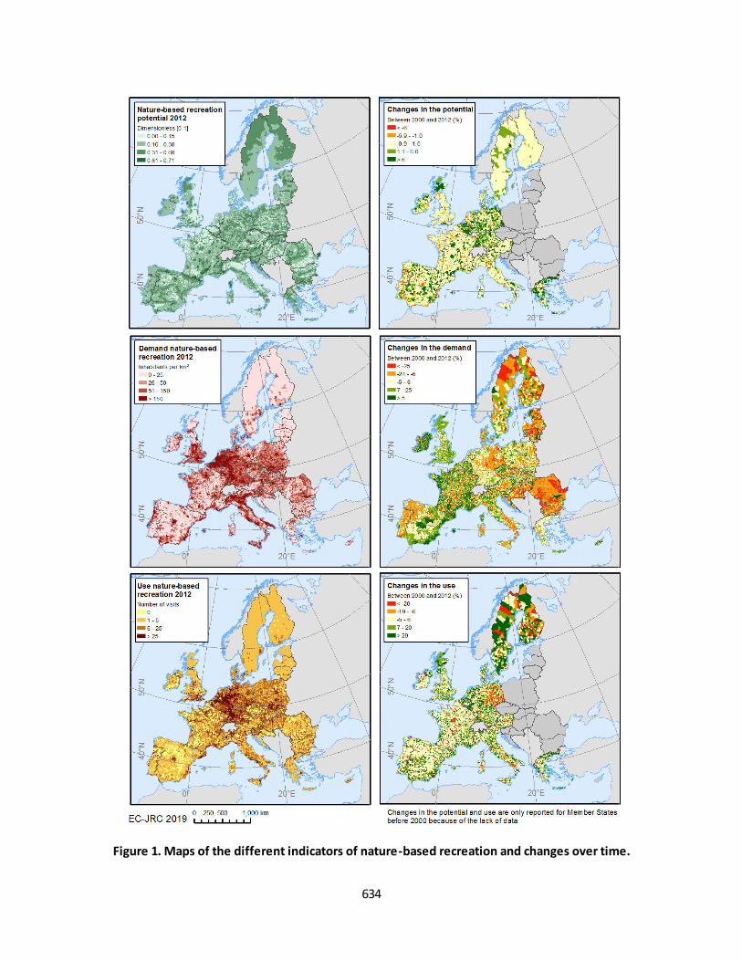
634
Figure 1. Maps of the different indicators of nature-based recreation and changes over time.

635
Figure 2. Maps of suitable areas for daily recreation.
The unmet demand for nature-based recreation shows high values in countries such as Ireland, Spain
and Croatia (Figure 3). High unmet demand is also found in some municipalities of Sweden and Finland.
Although there are not very large urban areas in these municipalities, a high share of the population
lives further away from the few ‘suitable areas for daily recreation’ (Figure 2), since these cities are
mainly surrounded by arable land, which offers low nature-based recreation opportunities. By contrast,
countries such as Germany have low unmet demand because of the proximity of ‘suitable areas for daily
recreation’ to urban centres.
3.3. Statistical analysis of the trend
Changes for the different indicators of nature-based recreation were analysed for the values of the
indicators aggregated at municipal level (i.e., local administrative units) between 2000 and 2012.
Changes larger than ±5% per decade were considered to be significant. If changes at EU level were
smaller than ±5%, the non-parametric Wilcoxon test was applied using bootstrapping (sampling 1% of
the reference units, 1000 times). Changes were considered to be significant when p-value was lower
than 0.05.
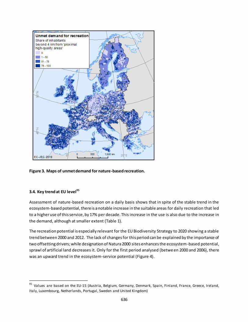
636
Figure 3. Maps of unmet demand for nature-based recreation.
3.4. Key trend at EU level95
Assessment of nature-based recreation on a daily basis shows that in spite of the stable trend in the
ecosystem-based potential, there is a notable increase in the suitable areas for daily recreation that led
to a higher use of this service, by 17% per decade. This increase in the use is also due to the increase in
the demand, although at smaller extent (Table 1).
The recreation potential is especially relevant for the EU Biodiversity Strategy to 2020 showing a stable
trend between 2000 and 2012. The lack of changes for this period can be explained by the importance of
two offsetting drivers; while designation of Natura 2000 sites enhances the ecosystem-based potential,
sprawl of artificial land decreases it. Only for the first period analysed (betwe en 2000 and 2006), there
was an upward trend in the ecosystem-service potential (Figure 4).
95
Values are based on the EU-15 (Austria, Belgium, Germany, Denmark, Spain, Finland, France, Greece, Ireland,
Italy, Luxembourg, Netherlands, Portugal, Sweden and United Kingdom)

637
Table 1. DAILY NATURE-BASED RECREATION AT THE EU LEVEL
Components of the service
Year
2000
Year
2006
Year
2010*
Year
2012
Change (%
per decade)
Potential (dimensionless indicator [0-1]) 0.269 0.276 0.279 0.280 3%n.s.
Suitable areas for daily recreation (thousand km2) 440 516 532 540 19%
Demand (million inhabitants) 342 NA 357 360 4%
Use (million potential visits) 26 NA 31 32 17%
Unmet demand (million inhabitants) 164 NA 150 147 -8%
Share of demand unmet (%) 48 NA 42 41 -12%
*Values calculated by interpolation
n.s. Differences between 2000 and 2012 are non-statistically significant
NA - not available
Figure 4. Nature-based recreation over time in the EU-15.
638
GETTING IN TOUCH WITH THE EU
In person
All over the European Union there are hundreds of Europe Direct information centres. You can find the address of the
centre nearest you at: https://europa.eu/european-union/contact_en
On the phone or by email
Europe Direct is a service that answers your questions about the European Union. You can contact this service:
- by freephone: 00 800 6 7 8 9 10 11 (certain operators may charge for these calls),
- at the following standard number: +32 22999696, or
- by electronic mail via: https://europa.eu/european-union/contact_en
FINDING INFORMATION ABOUT THE EU
Online
Information about the European Union in all the official languages of the EU is available on the Europa website at:
https://europa.eu/european-union/index_en
EU publications
You can download or order free and priced EU publications from EU Bookshop at:
https://publications.europa.eu/en/publications . Multiple copies of free publications may be obtained by contacting Europe Direct or your local information centre (see https://europa.eu/european-union/contact_en).
639
KJ-N
B-3
0161-E
N-N
doi:10.2760/519233
ISBN 978-92-76-22954-4