Advanced Excel & Dashboard Reporting: Power BI Masterclass:
10
Advanced Excel & Dashboard Reporting: Learn to create stunning, world-class Excel dashboards. Melbourne 4-5 June Brisbane 10-11 June Perth 17-18 June Sydney 24-25 June Power BI Masterclass: Develop Power BI, Power Pivot and Power Query skills to communicate better and do things faster. Melbourne 6-7 June Brisbane 12-13 June Perth 19-20 June Sydney 26-27 June MASTERCLASS I MASTERCLASS II
-
Upload
khangminh22 -
Category
Documents
-
view
1 -
download
0
Transcript of Advanced Excel & Dashboard Reporting: Power BI Masterclass:

Advanced Excel & Dashboard Reporting:
Learn to create stunning, world-class Excel dashboards.
Melbourne
4-5 June
Brisbane
10-11 June
Perth
17-18 June
Sydney
24-25 June
Power BI Masterclass:
Develop Power BI, Power Pivot and Power Query skills to communicate better and
do things faster.
Melbourne
6-7 June
Brisbane
12-13 June
Perth
19-20 June
Sydney
26-27 June
MA
STE
RC
LA
SS
IM
AS
TE
RC
LA
SS
II

Learn how to build stunning dashboards & workbooks
Excel Dashboards are used to convey vital business
information to senior management, partners & customers. In
our two day Masterclasses, learn how to create stunning,
world-class Excel dashboards, analyse data and create brilliant
Power Pivot dashboards. Along the way, you will learn
how to use various advanced features in Excel so that you can
save time and look good in front of your bosses & colleagues.
These two-day Masterclass sessions can be undertaken
individually, or attend all four days for the full Chandoo
experience!
Benefits of attending:
1. Exposure to best-in-class dashboard techniques, design ideas & practical tips
2. Tips & ideas on using Excel better3. USB stick with Example workbooks, PDF guides & videos4. Access to selected videos & material on Chandoo.org5. Networking opportunities with fellow professionals & Chandoo6. Email support for your Excel questions for three months by
Chandoo.org
This program is aimed at:
• Managers
• Systems & Reporting Analysts
• Business & Data Analysts
• MIS Reporting Analysts
• Business Intelligence Professionals
• Executives in Sales, Finance, Marketing or Customer Service
If you use Excel for more than 6 hours a week, you will benefit from this Masterclass
Phone02 9818 7250
4
Book Online

8:45 Registration
Session 1
Making modern Excel work for you & your organisation• What is new in Excel 365 / 2016 / 2019?
o Quick tour of Excelo Smart features for Analysts and Managers
• Analysing data with Tableso Tabular data modelo Structural referencing vs. Cell referencingo Advantages of tables
• Formulas for data analysiso SUMIFS and many other IFSo VLOOKUP and other search functionso Business rules & logic in Excelo Date intelligence formulaso Error handling
• Hands-on: Sales & Customer Analysiso Build an interactive sales & customer analysis tool in Excelo Gather insights on customer behaviouro Build quick visualisations
Morning break
Session 2
Insights in a snap – Pivot Tables & Data Modelling in Excel• Data modelling and relationships in Excel
o Multiple tableso Connecting tables with relationships
• Pivot Tables for data analysiso Basics of pivotso Hierarchies and Groupingo Time intelligence in pivotso Slicers and timelines - interactive filtering o Powerful pivoting features in modern Excel
• Visualising thru Pivotso Pivot chartso Regular charts from Pivot Tableso Interactive charting thru Pivots
• Hands-on: One-hour dashboard with Excel
Lunch
Session 3
Visual Analytics with Excel• Right charts for your data
o How to pick right charts for your datao Charting mistakes to avoid
• Advanced Charting for visual analyticso Combination chartso Waterfall chartso Treemapso Box plotso Map charts
• Quick and elegant visualisationso Sparklineso In-cell charting
• Interactive chartingo Slicers + Chartso Form controls + charts
5:00 End of day one
MA
STE
RC
LA
SS
I DA
Y O
NE

8:45 Registration
Session 1
Making effective dashboards for your business
• Process for creating awesome dashboards
o What is a bad dashboard?
o 10-step process for awesome dashboards
o MVC architecture for your dashboards
Morning break
Session 2
Hands-on: Building an awesome Executive dashboard in Excel
• Defining goals for our dashboard
o Requirement gathering
o Mocking up the dashboard
o Defining interactive features
• Collecting and structuring data in Excel
o Gathering data thru connections / Power Query
o Setting up tables
o Creating a calendar table
o Connecting tables with relationships
• Building a calculation engine
o Using pivot tables to process KPIs
o Adding necessary formula layer
o Interactivity thru Slicers & Form Controls
• Visualisations for the dashboard
o Visual layout for the dashboard
o Headlines and key takeaways
o Visualising trends
o Adding alerts
o Interactive graphs / tables
• Sharing & Publishing the dashboard
o Sharing for PC / Tablets
o Sharing for Web
o Sharing for print
Lunch
Session 3
What can we learn from the world’s best dashboards?
• Design philosophies for dashboards
o CRAP rules for design
o MVC architecture for the workbooks
o Layout templates
o One screen vs. scrollable?
• Inspiration from world’s best dashboards
o Case studies on best dashboards
o Resources to learn more
o Q&A
5:00 End of day one
MA
STE
RC
LA
SS
I DA
Y T
WO
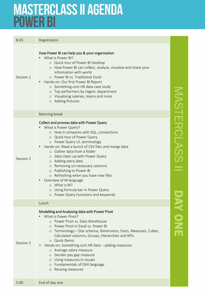
8:45 Registration
Session 1
How Power BI can help you & your organisation• What is Power BI?
o Quick tour of Power BI Desktopo How Power BI can collect, analyse, visualise and share your
information with worldo Power BI vs. Traditional Excel
• Hands-on: Our first Power BI Reporto Something.com HR data case studyo Top performers by region, departmento Visualising salaries, teams and moreo Adding Pictures
Morning break
Session 2
Collect and process data with Power Query• What is Power Query?
o How it compares with SQL, connectionso Quick tour of Power Queryo Power Query UI, terminology
• Hands-on: Read a bunch of CSV files and merge datao Gather data from a foldero Data clean up with Power Queryo Adding extra datao Removing un-necessary columnso Publishing to Power BIo Refreshing when you have new files
• Overview of M languageo What is M?o Using formula bar in Power Queryo Power Query Functions and keywords
Lunch
Session 3
Modelling and Analysing data with Power Pivot• What is Power Pivot?
o Power Pivot vs. Data Warehouseo Power Pivot in Excel vs. Power BIo Terminology – Star schema, Dimensions, Facts, Measures, Cubes,
Calculated columns, Groups, Hierarchies and KPIso Quick Demo
• Hands-on: Something.com HR data – adding measureso Average salary measureo Gender pay gap measureo Using measures in visualso Fundamentals of DAX languageo Reusing measures
5:00 End of day one
MA
STE
RC
LA
SS
II DA
Y O
NE

MA
STE
RC
LA
SS
II DA
Y T
WO
8:45 Registration
Session 1
Connecting the dots – Power Query, Power Pivot and Power BI• How each part of the Power pack plays a role in building world’s easiest
reporting system with Power BI• Thinking about performance, privacy and optimisation• Star Schema and how to use it• Various Business Intelligence terminology – explained
Morning break
Session 2
Hands-on: Making a comprehensive Financial Performance Dashboard • Defining goals for our dashboard
o Requirement gatheringo Mocking up the dashboardo Defining interactive features
• Collecting and structuring data thru Power Queryo Gathering data o Generating a calendar tableo Connecting tables with relationships
• Building a calculation engineo Writing measureso Using quick measureso Introduction to time intelligence in Power Pivot & DAXo What-if analysis thru parameters in Power BI
• Visualisations for the dashboardo Defining pages of the dashboardo Building CEO viewo Creating CFO viewo Adding alertso Interactive graphs / tableso Bookmarks and Scenarios
• Sharing & Publishing the dashboardo Sharing for PC / Tabletso Sharing for Web
Lunch
Session 3
What does it take to create world’s best dashboards?• Advanced Power BI features
o Report tooltipso Bookmarkso Themeso Data categorieso Working with maps, images
• Design philosophies for Power BI dashboardso CRAP rules for designo Inspiration from world’s best dashboardso Case studies on best dashboardso Resources to learn moreo Q&A
5:00 End of day one

ChandooYour Masterclass Leader
Chandoo, known for his most popular Excel &
Dashboard site, Chandoo.org is famous for his clear
explanations, practical approach and Excel mastery.
Chandoo has trained more than 5,000 professionals
from all over the world in Excel, Advanced Excel,
Dashboards, VBA & Project Management.
For his contribution to MS Excel users, Microsoft has
awarded him the prestigious MVP award every year
since 2009.
Chandoo (otherwise known as Purna Duggirala) is an
MBA with more than ten years’ experience in Excel
based dashboards, reporting & consulting, and
regularly travels the world delivering his specialist
workshops.
• This was a great two days with Chandoo! He is very engaging and always answered all our questions
• Chandoo is full of new innovative ways to crunch and communicate data
• The course contained good examples; he is a very open and responsive teacher
• This course has taught me more than I learnt in three years of working on my own!
• It really made me re-evaluate the way I worked Excel to deliver my results
• I’ve always loved working with Excel, but this course gave me the kick to take my existing skills to the next level
• Very good facilitator
• Engaging, knowledgeable and patient with us all. He knows his stuff!

By attending our Advanced Dashboards in Excel Masterclass 2019 you get,
• Exposure to best-in-class dashboard techniques, design ideas & practical tips
• Tips & ideas on using Excel better• USB stick with Example workbooks, PDF
guides & videos• Access to selected videos & material on
Chandoo.org• Networking opportunities with fellow
professionals & Chandoo• Email support for your Excel questions for 3 months
by Chandoo.org
Suggested Skill Level
• To benefit the most from this workshop, you need to have intermediate level working knowledge of MS Excel.
• Understanding of basic business terminology and reporting situations
• Targeted at managers, analysts & reporting professionals with 3-7 years of experience
Software
This Masterclass is run in a specialist training venue with workstations provided. The course is demonstrated using Microsoft Excel 2016, but students can use older versions if they prefer. Attendees may also bring their own laptops.
Phone1302 9818 7250
Got several participants?Run this course in
your company.
4
Book Online

Course fee of includes:• Two full days of tuition by Dashboard expert, Chandoo
• Use of workstations, lunch and refreshments
• USB stick with Example workbooks,
PDF guides & videos
• Access to selected videos & material on Chandoo.org
• Email support for Excel questions for three months
following the course by Chandoo.org
Sydney Melbourne24-25 June 4-5 JuneBrisbane Perth10-11 June 17-18 June
Sydney Melbourne26-27 June 6-7 JuneBrisbane Perth12-13 June 19-20 June
*Use Coupon Code: CHANDOO_2019 at checkout to register for all four days. This code can be shared between colleagues.
Payments can be made by:• Visa, MasterCard, Amex • Paypal• Bank transfer
:
Phone02 9818 7250
Cost
Either Two-day Masterclass $1,500+GST
Attend all four days* $2,600+GST
Got several participants?Run this course in
your company.
4
Book Online
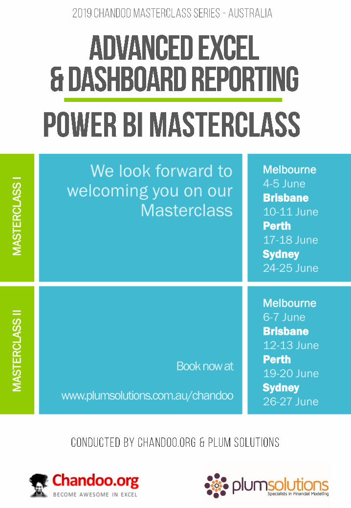
We look forward to welcoming you on our
Masterclass
Melbourne
4-5 June
Brisbane
10-11 June
Perth
17-18 June
Sydney
24-25 June
Book now at
www.plumsolutions.com.au/chandoo
Melbourne
6-7 June
Brisbane
12-13 June
Perth
19-20 June
Sydney
26-27 June
MA
STE
RC
LA
SS
IM
AS
TE
RC
LA
SS
II