Action, Affection & Control: Interface guidelines for complex visual content
40
1 Slavko Milekic, M.D., PhD Professor of Cognitive Science & Digital Design Department of Art Education & Art Therapy University of the Arts Philadelphia Action, affection & control: Interface guidelines for complex visual content Summary This paper examines emerging interface paradigms, to a certain extent exemplified by Apple’s iPhone interface for interacting with complex visual content. It provides an overview of 15 years of research devoted to the creation of intuitive user-friendly interfaces, as well as conceptual analysis of design principles. Implications for the design of interfaces for cultural heritage information are also being discussed. 1. INTRODUCTION We live in an increasingly visual world where new technologies are supporting human- friendly ways of exchanging and supplying information. Although we may have an illusion that we actually listen to each other, humans predominantly rely on the sense of vision for accessing information. Many traditional psychological experiments have shown that the information coming through the visual channel overrides information from all other senses. Thus it is enough to visually tilt the room to make us fall (even though all of our other senses are telling us that we are standing solidly upright), or to make us hear non existing sounds by substituting the original video clip of “talking mouth” with another one (one would “hear” the sound that one sees the mouth voicing and not the sound played with the video clip). In this context, the success of different technologies that promote exchange of visual content, like modern cell phones or Web sites like “Flickr” or “YouTube” is not surprising. These developments are especially significant in the fields of exchange and accessibility of cultural heritage information which tends to be highly visual in nature, with fuzzy boundaries and subject to numerous interpretations. In this paper I will try to examine the development of more “humane” interfaces for visual content especially in their relation to cultural heritage information.
Transcript of Action, Affection & Control: Interface guidelines for complex visual content

1
Slavko Milekic, M.D., PhD
Professor of Cognitive Science & Digital Design
Department of Art Education & Art Therapy
University of the Arts
Philadelphia
Action, affection & control: Interface guidelines for complex
visual content
Summary
This paper examines emerging interface paradigms, to a certain extent exemplified by Apple’s
iPhone interface for interacting with complex visual content. It provides an overview of 15 years of
research devoted to the creation of intuitive user-friendly interfaces, as well as conceptual analysis of
design principles. Implications for the design of interfaces for cultural heritage information are also
being discussed.
1. INTRODUCTION
We live in an increasingly visual world where new technologies are supporting human-
friendly ways of exchanging and supplying information. Although we may have an
illusion that we actually listen to each other, humans predominantly rely on the sense of
vision for accessing information. Many traditional psychological experiments have
shown that the information coming through the visual channel overrides information
from all other senses. Thus it is enough to visually tilt the room to make us fall (even
though all of our other senses are telling us that we are standing solidly upright), or to
make us hear non existing sounds by substituting the original video clip of “talking
mouth” with another one (one would “hear” the sound that one sees the mouth voicing
and not the sound played with the video clip). In this context, the success of different
technologies that promote exchange of visual content, like modern cell phones or Web
sites like “Flickr” or “YouTube” is not surprising. These developments are especially
significant in the fields of exchange and accessibility of cultural heritage information
which tends to be highly visual in nature, with fuzzy boundaries and subject to numerous
interpretations. In this paper I will try to examine the development of more “humane”
interfaces for visual content especially in their relation to cultural heritage information.

2
2. BASIC PREMISES
Although this tends not to be a well known fact for general population, most of the
interface designs (in a broader sense of interface) that are now ubiquitous began as a
direct response to a special need. These include the invention of the typewriter and
modern computer keyboard, the invention of sound recording devices like the
phonograph, long playing records that evolved into CDs and now MP3 files, and the
remote control, (the number of which in the US now exceeds the population number).
Even the telephone, a communication device with an enormous on humankind, was
invented as means of transmitting the human voice at a distance for hearing impaired. In
1872 Alexander Graham Bell founded the school for “deaf-mutes” in Boston, now part of
Boston University. Both the invention of the telephone and of the first phonograph were
initially motivated as a solution to the problems of populations with special needs.
Figure 1. Alexander Graham Bell speaking into the first telephone compared
to the modern mobile phone
One of the underlying premises of this paper is that good interface designs tend to be the
ones that are usable by the broadest segment of the population. This idea is not new
although it tends to be forgotten because of our fascination with new technological
capabilities. The success of Kodak’s “point-and-shoot” camera and now the Flip digital
camcorder was due to its simple interface colloquially referred to as “idiot proof”. The
old advertising slogan “so simple that even a child can use it” reflects another important
insight. In many respects young children, just like the growing population of elderly or
non-native speakers of a specific language, can be viewed as a special needs population.
Young children lack sophisticated cognitive skills, have problems with fine motor
control, are preliterate and have a short attention span. All of these characteristics make
them ideal “testers” of interface solutions. In other words, if a particular interface design
is accessible to young children, then it is also accessible to the rest of the population.

3
Many of the interface solutions that will be discussed in this paper initially started as
design solutions for children.
3. QUESTIONS
In approaching interface design for any population the usual questions one may ask are:
What characteristics of the target population are most relevant for the design
process?
and, assuming that one has come up with a satisfactory answer to the first question, the
next one is:
What is the goal of a particular interface design?
It is possible to answer the first question by listing a number of descriptive characteristics
of potential users, for example, the quality of their attention span, short-term memory
retention, etc. One of the problems with this approach is that the list is potentially
endless. The reason for this is not only because of the possible number of characteristics
one could take into account, but also because of the qualitative and quantitative
differences which emerge as a function of age. Another problem that often occurs while
focusing on a set of specific characteristics is the tendency to forget 'the big picture' and
the context in which the particular application will be used. By saying this I don't mean
that knowing these characteristics is not important. On the contrary, taking into account
the particulars of user’s perceptual, cognitive and motor abilities is essential for good
design. However, the full value of knowing these details comes out only in approaches
where user’s activities are viewed in a broader social context. This means that answering
the second question will dramatically influence design strategy. For example, if the goal
of a particular interface is to transfer certain knowledge or facts, this design will be very
different from one with a goal to enable free exploration and “learning through
discovery”.
Finally, the third question is:
Which guiding principle(s) should one adopt for the creation of a particular
interface design?
In the context of a modern museum and/or gallery experience and especially as it relates
to cultural heritage information I will assume that the goal of museum visitors is to learn
something and that the goal of museum educators is to provide easy access to an
abundance of unbiased information and foster learning through discovery.

4
4. DESIGN PRINCIPLES
In this paper, and in a somewhat unorthodox fashion, I will focus on the users’ basic
needs as a context for providing guidelines for interface design. So far, most of the
suggestions for interface design (as described in “Historical overview” section of this
paper) focused on interface characteristics. Many of these suggestions are completely
valid and compatible with my own approach. However, I would like to put these in the
context of the needs of humans as social organisms. I feel that in this way one is more
likely not to lose the “big picture” and blindly follow certain design guidelines.
Speaking in most general terms, the needs of the target population that should be taken
into consideration when designing interfaces for digital environments are the need for:
� action;
� affection, and
� control
In the following pages I will try to: (a) justify the choice of these guidelines by presenting
the supporting evidence from available literature, and (b) provide illustrative examples of
their application in interface design.
4.1 Action
In interface design, support for user actions is often confused with providing a
mechanism (often convoluted) for achieving a certain goal. In a traditional GUI
(Graphical User Interface) this is most commonly achieved by choosing a ‘menu’ option,
then selecting appropriate ‘action’ from a drop-down menu. The process often includes
three or four steps in order to trigger the ‘action’.
In this paper, the term action is used to denote spontaneous user actions that are related
to an individual’s “knowledge of the world”. For example, pointing (or touching) the
object for selection, being able to move (push) objects around and assuming that the
quality of action (pushing object faster) should affect the outcome of one’s action.
The ideal interface should provide support for context relevant actions. This means that
if a map is displayed on the screen, the user should be able to scroll it, zoom in, zoom out
and find relevant information about landmarks. However, it is not only “what” but also
“how” the environment supports user actions that is important.
The first ‘revolution’ in interface design came with the concept of Graphical User
Interface and ‘direct manipulation’, a somewhat misleading term (Shneiderman, 1998)
5
because it was referring to computer mouse based control. Even though researchers
found out that touch screens were more efficient for basic user interactions (selecting,
moving, etc.) long time ago (Sears, A., Shneiderman, B.,1991) it took almost two decades
for the invention of iPhone.
One of the advantages of touch screens is that they are re-definable surfaces. This means
that the same interaction surface can be used to display a keyboard, a photograph, a map
or one’s email browser. Even though standard computer monitors can display the same
things, the advantage of touch screens is that they allow direct interaction with displayed
objects. Another advantage comes with portable touch screen devices which are
accessible to the user wherever they happen to be – in their car, in the store, camping, etc.
There is a growing consensus among HCI researchers that the description of interaction
between humans and computers in terms of action is more adequate than the description
in terms of information processing. In his monograph, Being There, Andy Clark writes:
"Cognitive development, it is concluded, cannot be usefully treated in isolation from
issues concerning the child's physical embedding in, and interactions with, the
world. A better image of child cognition (indeed of all cognition) depicts
perception, action, and thought as bound together in a variety of complex and
interpenetrating ways" (Clark, 1997, pp 37, italics in original)
Clark uses the example of a puzzle assembly task. A possible approach to putting the
puzzle together would be just to look at each piece and figure out mentally where its
place would be. However, both children and adults often use the strategy of 'trying out'
the fit of various pieces, and rotating the pieces themselves rather than trying to perform
the same operation mentally. These actions labeled as ‘epistemic’ by Kirsh and Maglio
(1994) have the purpose of making the task easier by reducing the cognitive effort
necessary to achieve the goal.
Some authors go as far as to suggest that human cognitive abilities are an extension of
bodily experiences created by our early activities. Mark Johnson calls these kinesthetic
image schemas (Johnson, 1987). An example of such a schema would be the container
schema, which can provide conceptual structural elements (such as interior, exterior or
boundary), basic logic (something can be either inside or outside), and allow for
numerous complex metaphorical projections (for example, one gets in and out of a
relationship, is a member of a certain group or not, etc.).
4.1.1 Action and interaction
Surprisingly enough, the concept of interactivity which plays the central role in modern
digital applications, has received little serious attention in the field of human-computer
interface design. Most often, what is hiding under the label 'interactive' is no more
interactive than an ordinary light switch. The reason for this is that the concept of
interaction has a very broad meaning, ranging from the physical coupling of two objects
to highly complex social interactions of humans. The interactivity level that is easily

6
achievable with current digital technology falls somewhere in the middle, between the
two extremes. It can be described as interplay of human actions with environment
(computer) reactions. In this case, it is the reactive potential of an environment that
defines the interactivity level (Kirsh 1997). However, in order for the digital applications
to be truly useable, they should at least be able to support interactivity levels comparable
to those of humans during structured activities such as tutoring or collaborative work.
According to Kirsh, human interactions involve:
� certain level of co-operation between parties; � certain level of co-ordination of actions; � certain level of control over interacting parties, who can be influenced by
ones' actions; � certain level of (tacit) negotiation between the parties as to who is going to do
what and when;
Human interaction is also characterized by frequent interruptions and, sometimes
dramatic, shifts in direction.
Figure 2. Norman's "decision cycle model"
Currently, the most widely accepted description of human-computer interaction is the
'decision cycle model' proposed by Donald Norman (Norman, 1988). It is based on the
assumption that the users interacting with an application have fairly clear goals of the
desired interaction outcome. The model proposes the following feedback loop: the user
starts with a goal of what s/he wants to achieve, translates this goal into intention to use
certain actions to achieve the desired goal, and finally creates a list of the necessary
operations (a plan) to execute the actions. Once the plan is executed, its effect on the
environment is perceived, interpreted and compared to the initial goal. The cycle is
repeated until the goal is reached at which point the new goal is selected.
Kirsh criticizes Norman's model on the basis that goals need not be fully formed in user's
mind (Kirsh 1997). This is especially true for children's interactions with an
environment. Children tend to 'discover' their goals based on active exploration of the
environment. In the same article, Kirsh also points out another facet of interaction which
goal
intention
detailed plan
comparison
interpretation
perception
EXECUTION

7
is left unaccounted for by the 'decision cycle model' -- the fact that we are actively
contributing to the building of an environment in a manner consistent with our (long-
term) desires and goals. For example, in order to remind myself to mail my bills I always
put them on the kitchen table that I have to pass by on my way out of the house.
Although putting the envelopes on kitchen table is not the same as mailing them this
preparatory activity creates a change in the environment that helps me decide to
undertake the right activity (that is, formulate the 'right' goal) in the future. Thus, Kirsh
(1997) suggests the incorporation of the following new forms of action and new forms of
interactivity into the decision cycle model:
� preparation;
� maintenance, and
� complimentary actions
Preparation is an act of the active modification of environmental characteristics which
facilitates the carrying out of subsequent activities or the reaching of certain goals.
Preparation plays an important role for creative activities including those where the end
result is not known at the beginning of the activity. It is a known strategy of writers,
painters and creative individuals in general to 'prime' themselves for the creative process
by actively creating or seeking a stimulating environment. By providing external clues to
the possible sequence of actions (plan) or to the components of a complex assembly like
preparing all of the ingredients for a recipe before cooking) preparatory activities have
the effect of reducing cognitive complexity and mental effort in interactions with an
environment. Thus, in designing digital environments for children, it is extremely
important to provide support for diverse preparatory activities which, on surface, may
have little to do with the final interaction outcome. Digital environments have the
advantage of having the potential to record and, if need arises, instantaneously reproduce
the preparatory operations for certain activities.
Pushing the notion of preparation a little further, one may make a claim that all activity in
a certain environment can be viewed as preparatory for the actions that are yet to come.
This is nowhere more evident than in children's play: if two four-year olds were given a
set of toy farm animals and other accessories like farm houses, fences, etc. very soon they
will create an elaborate play environment. If, as is common practice, they are made to
'clean up the mess' after playing, chances are that the next time they meet they will not
recreate the previous environment. However, if one preserves the results of their
interactions, at the next meeting they will be able to continue with playing as if there was
no interruption. In this case, all of the previous actions can be viewed as preparatory for
the continuation of playing.
Maintenance activities are often overlooked because they are so common and, for the
most part, executed unconsciously and automatically. Since every system has a tendency
to end up in a state of chaos (the fact that every homemaker knows more than well)
maintenance activities are a necessity rather than a choice. In the digital medium it is
possible, although rarely implemented, to delegate the maintenance activities to the

8
environment itself. Automated and adaptive maintenance can further reduce attentional
and cognitive demands in interactions with digital environments and as such are
important for the design of user-friendly applications.
Complimentary actions (also known as epistemic actions) are defined by Kirsh as
external actions that “reliably increase the speed, accuracy or robustness of performance
by reducing cognitive load and simplifying mental computation” (Kirsh 1997). As such,
they are to be distinguished from actions undertaken to cause some change in the
environment (Kirsh and Maglio 1994). Children naturally use complimentary actions whenever the complexity of the task strains their cognitive abilities, like in using their fingers for counting or while performing mathematical operations. Thus, an abacus can be viewed as a physical environment that vastly simplifies carrying out abstract calculations just by providing support for complimentary actions.
An example of a software package that supports user actions in interacting with complex
visual content is ShowMe Tools™ (FlatWorld Interactives, LLC) designed by the author
of this paper. ShowMe Tools™ can be best described as software that allows real time
manipulation of visual content. Although superficially resembling popular programs for
image manipulation (like PhotoShop™, and many other programs), and presentation
tools (like PowerPoint™ and other kinds of ‘slide shows’). ShowMe Tools™ are
conceptually very different and unique. In simple terms, other programs for image
manipulation and presentation tools are designed to produce a final product while
ShowMe Tools™ software is action and process oriented.
Figure 3. Basic layout of ShowMe Tools™ screen. Both palettes
(the tool and the library palette) are automatically retractable so the
work space expands to the size of the screen.

9
When using traditional image manipulation and presentation tools, all actions happen
before the presentation. For example, one may manipulate a certain image in
PhotoShop™ to create an image that will be displayed on a Web site, or to prepare it for
print. To create a PowerPoint™ presentation, one has to spend time beforehand (often
hours) to create a glitzy slide show. The final result is presented to a viewer and no
additional corrections or manipulations are possible. This creates a passive experience
both for the viewer and the presenter, where both are bound by the final product.
In contrast, ShowMe Tools™ support an active approach to interaction with the visual
content. Even though operations supported by ShowMe Tools™ are found in many
image manipulation programs (flipping of an image, rotation, scaling) using an intuitive
interface, these actions are available during the presentation thus making the process an
integral part of a presentation. This brings incredible flexibility to the presenter who is
now capable of actively manipulating the course of the presentation and responding to
any audience feedback/questions using the material already displayed on the screen (or
by importing new relevant material).
Figure 4. Resizing an object in ShowMe Tools™ environment by
‘pulling’ at (any) corner

10
Figure 5. Example of object rotation in ShowMe Tools™ environment.
Figure 6. Object ‘flipping’ by pulling on (any) edge of the object

11
ShowMe Tools™ design abandoned the sequential and linear notion of “the next slide”.
The whole presentation surface is able t o be dynamically changed to illustrate new ideas
or concepts. When used with an interactive whiteboard (large scale touch sensitive
surface) this environment provides a low-cost solution to intuitive support of user
actions. Current examples of use include the fields of art and museum education, design,
architecture, biology and medical illustration.
To avoid increasing the cognitive load on the user well designed interfaces should
support the use of a natural, built-in, “knowledge of the world”. The most natural
constraint of our environment (and probably the Universe as well) is the force of gravity.
Gravity affects all living organisms and since it is the most reliable feature of our natural
environment, we take it for granted. However, it is helpful to dissect some of the more
obvious consequences of the constant pull of gravity since (surprised?) they have serious
implications on interface design for digital environments as well. The following list
presents some of the 'knowledge' that is already built-in into humans by sheer virtue of
them being organisms exposed to the force of gravity:
• sense of direction - up/down
• sense of weight
• friction
• inertia
• speed
• upright orientation
• stability/balance
• etc.
Adding bilateral symmetry, another biological characteristic that we share with most
vertebrates, adds additional 'knowledge' to the list:
• direction - left/right
• concept of side
Clever use of tiny accelerometers/gyroscopes that can detect the movement and
orientation of the device is what makes iPhone so easy to use, not to mention that it led to
an explosion of add-ons that capitalize on these features.

12
Figure 7. The original “Labyrinth” game and iPhone rendition of it
that uses the same kinesthetic and visual feedback as the original
4.1.2 Using gestures
Research on incorporating gestures in human/computer interaction started almost thirty
years ago (Bolt 1980). However, gesture-based interfaces are still confined to different
research laboratories and, if one disregards several ‘gestures’ used in pen-based
computing or iPhone add-ons, there are practically no commercially available interaction
devices based on the use of gestures. Wexelblat lists several reasons for this state of
affairs: lack of adequate gesture taxonomies and classifications, development of gesture-
commands instead of natural gesture recognition and problems which arise because of the
social and cultural components of gestures (Wexelblat 1998). Suggestions presented here
are in no way solutions to these complex problems. However, based on my experience in
building interfaces I think that there is a layer of gesture-based communication that could
be extremely useful for supporting interactions between users and digital environments.
Several proposed gesture classifications (Kendon 1986, McNeill 1992, Efron 1941)
converge on a handful of gesture types:
� deictic gestures: used for pointing at objects or space; � metaphoric gestures: describe speakers ideas or internal state in a metaphoric
way, like rotating one’s index finger to indicate dizziness; � iconic gestures: depict the content of speech, for example, hitting with fist the
palm of the other hand to indicate a head-on collision; � symbolic gestures: culturally recognisable gestures with specific meaning, like
the victory or OK signs; � speech marking gestures: gestures used to accentuate speech, for example, by
waving the index finger.
One must note that the above classification is largely based on gestures occurring during
human-to-human conversation. Since the interpretation of most of these gestures relies

13
heavily on context, their use in human-computer interaction is limited by current
limitations in the field of computer natural language understanding. The exception is
deictic (pointing) gestures, where the digital environment itself would provide objects
and space that could be pointed to. Besides selection of objects by pointing, gestures
involving objects can be further classified into gestures describing the form of objects
(descriptive gestures), manipulative gestures that transform objects and utilization
gestures that use objects (Krueger 1993, Hummels, Smets and Overbeeke 1998). It is
this subset of gestures that I will suggest for use in enhancing the communication
between humans and digital environments.
There is another important and useful distinction one should make when trying to
incorporate gestures into interactive systems: the difference between two- and three-
dimensional gestures. Kramer defines three-dimensional gestures as movements of the
limbs of the body which are detected by an application and processed as a stream of 3D
co-ordinates with relative limb- and finger-positions. Two-dimensional gestures would be
those produced by a movement of a finger, stylus or a mouse cursor over two-
dimensional display surface (Kramer 1998). Most of the gesture-based interactions
suggested in the following sections are the ones happening in two-dimensional plane and
compatible (to some extent) with the traditional interaction devices, like a mouse as well
as with interactive whiteboards.
4.1.3 Gesture-based navigation
If you happen to be walking to a nearby place and someone asked you where you were
going, besides providing the information verbally, you would most probably also make a
gesture in the general direction of the place you were going to. Your gesture would
augment the verbal information in providing the direction information (which does not
have to be a part of your verbal answer, for example, “I am going to the pharmacy”), and
often an estimate of distance (when something is ‘faaar’ away we tend to make broader
gestures).
Using natural gestures for control of transportation vehicles (including airplanes and
powerboats) is widely spread: to turn left one turns the wheel, the lever or similar device
to the left and in the opposite direction to turn right. One would expect then, that
navigation mechanisms in digital environments would build on users’ expectations from
the real world. However, this is not the case. Trying to make graphical user interfaces
(GUI) more “efficient” led to the grouping of navigation controls in a small space, often
on one side of the menu bar. Although such design practices definitively save on space
and seemingly allow the user to focus more on content, they also introduce an
unnecessary layer of complexity into interaction with the system. Menu choices or
navigational buttons look alike although they may trigger very different functions and
even experienced users have to pay close attention when using less frequently accessed
options. The problem is often remedied by providing a pictorial representation of an
action on the “button” itself. This practice frequently backfires because of space
problems: it is hard (and sometimes impossible) to provide clear pictorial representation
of an action (like “sort these files/objects”) in a space which measures 16 x 16 pixels!

14
Because of the problems the users had in understanding pictorial representations brief
descriptions of button functions made it back and current application controls most often
have both pictorial and written indication of their function. Another solution to the
problem was to provide the written description of control function as a roll-over hint – a
text which appears next to the control if the mouse cursor ‘hovers’ over it for a prescribed
length of time. Although this method can provide the needed information with sufficient
detail, the price that the user pays is the disruption of the primary activity through
mobilization of additional attentional and cognitive resources (one cannot not register an
object which suddenly appears and, if one is literate, it is also hard to ignore the written
text).
Adopting a simple principle that navigation in digital spaces should not claim more
attentional or mental resources than navigation in real life would have significant impact
on digital interface design. In order to uncover these design principles we should ask
ourselves what is it that makes navigation easier in real life?
First, it is the sense of direction. We are always going somewhere and changes of
direction at certain points make it possible for us to internalize the ‘map’ of physical
space. Second, it is the length of time we spend going in one direction that provides us
with the information about relative distance. Transplanting “directional” navigation on a
computer screen does not have to come at any cost to screen space – it can be completely
action based. Creating a small routine that would constantly monitor the direction and
amplitude of mouse (cursor) movements allows mapping of directional gestures onto
navigation functions. For example, “hitting” with a mouse cursor the right or the left
edge of the screen would produce an appropriate navigational action. This suggestion has
been implemented almost a decade ago in “The Theory of Language” an introductory
linguistics text published simultaneously as a book and an interactive CD ROM (Weisler,
Milekic 1999).
4.1.4 Gesture-based exploration
Gesture-based exploration is similar to gesture-based navigation in terms of the system’s
ability to detect and react to user’s movements. However, these movements are directed
towards manipulating objects, rather than space. The fact that digitally represented
objects or data also occupy certain (categorical or organizational) space becomes evident
only through interaction with the objects. Thus, gesture-based exploration of complex
data spaces can be used to convey additional information about the data without an
increase in cognitive complexity. For example, one may structure the data space in such
a way that its organization is directly mapped onto exploratory activities
.
Which modes of object manipulations (that is, manipulations of representations of objects
and data) are traditionally supported in digital applications? One can point to objects,
select them (mouse click), drag (mouse down and move) and ‘drop’ them (mouse release
after dragging). It is also customary that one can ‘launch’ an application by double-
clicking on an object. It seems that these basic interactions are sufficient for any kind of
interaction with digital content. However, if one observes young children’s play with

15
actual objects it soon becomes evident that there is another activity which can be, but is
traditionally not (with the exception of iPhone), supported in digital environments. The
activity in question is throwing. Although “throwing” can be also implemented with a
mouse as an interaction device, it is most naturally supported by a touch screen.
The "throwing" action occurs when a selected object is dragged across the screen and
then released. For throwing to occur a certain speed threshold value needs to be reached.
The threshold is expressed as a linear distance (number of pixels) covered per unit of
time (milliseconds). The threshold value can be fine tuned so that the throwing occurs
only when the user really has the intention to throw away the objects and does not
interfere with the selection and movement of objects at a "normal" pace.
There is no practical reason for not using the "throwing" as one of the legitimate actions
in human-computer interaction repertoire. One must agree that throwing of the objects in
real life is sometimes followed by losing of the same, and that a typical adult would
rarely welcome the opportunity to "lose" an important file. However, in children's play
discarding of an object by throwing it away and its subsequent re-discovery is a common
element. The inclusion of the "throwing" action into interface design is not just a trivial
addition to the interactions repertoire. The advantages of support for this kind of action
are numerous and offer new perspectives on the design of children's software and
intuitive interfaces in general. Some of the more evident reasons for supporting the
throwing action in an interface design for young users are the following:
� minimal effort, maximal effect; � throwing is a natural, symbolic (semantic) gesture which does not need to be
explained. Using a touch screen to support two-dimensional gestures is a low-cost (and, may be, transitional) step towards incorporating gestures into interface design;
� it provides a simple way of exchanging & choosing objects; � allows exposure to and browsing of a large number of objects without cluttering
the screen; � offers the possibility of increasing the complexity of interactions by taking into
account the speed and the direction of the throw, presence or absence of other objects in the trajectory of the thrown object, etc.
� allows mapping of a 'navigational space' to body actions making exploration of 'digital spaces' easier;
� allows alternative ways of navigation by making the 'background' (the desktop) also 'throwable'
The practical application of "throwing" action in a touchscreen-based environment will
be illustrated by the "Veggie Face" and the "Throwing Gallery" modules of the
KiddyFace installation in the Speed Art Museum in Louisville, Kentucky.

16
Figure 8. Illustration of throwing action in the "Veggie Face" module from the
KiddyFace installation at the Speed Art Museum, Louisville, Kentucky (Milekic,
1997). See text for details
It seems that there is no need to explain the action of throwing to young children.
Observations of young children interacting with the KiddyFace environment at the
Hampshire College Children's Center indicate that even children younger than 3 years of
age discover the throwing action while exploring the environment on their own. Very
soon they discover an efficient way of throwing, using a short and quick 'flicking' motion.
Interestingly enough, even after very short exposure to this way of interaction (it was
available in only two out of ten modules) children generalized the expectations of this
kind of behavior to other objects and tried to elicit it even in modules that did not support
it. It is possible that the attractiveness of this kind of interaction comes from the fact that
very small investment yields a substantial result, similar to the delight which very young
children find in repeatedly throwing various objects outside of their cot.
Object "throwing" can be used to achieve a variety of exploratory and navigational goals
without marked increases in cognitive complexity of visual interface design. In the
module described above, different face parts (vegetables) when "thrown away" from the
screen would be replaced by a randomly chosen element of the same kind (that is, an eye
would be replaced by another eye, and a nose with another nose) from a database. In this
case, the “throwing” action is used as an exploratory action allowing a child to
investigate the suitability of a large number of objects for the play goal (i.e. building a
face) without being overwhelmed by simultaneous availability of all possible choices.
Even with a relatively small number of objects in individual databases the number of
distinctly different patterns (faces) which can be created is very large. Using this
approach in another project (build-a-face) the children were free to manipulate face parts
with characteristics belonging to different age, gender, race and culture groups.
An example of an interface design which uses the throwing action both for exploration of
objects and navigation in digital space is the "Throwing Gallery", also a part of

17
KiddyFace installation (see Figure 9.). The goal of this module was to make parts of the
collection of the Speed Art Museum in Louisville, Kentucky accessible even to the
youngest audiences.
Physically, the installation consisted of a (hidden) computer with a large touch-sensitive
monitor. The monitor was encased in such a way so that the children were presented
with an interactive touch-sensitive surface facing upward at a 60 degree angle. The
display was at comfortable height for a standing child or a sitting adult. A support for
leaning on or sitting was provided through a large, movable, "bean-bag" arm which could
be positioned at various distances from the display.
Figure 9. The "Throwing Gallery" module from the KiddyFace installation at the Speed Art Museum, Louisville, Kentucky (Milekic, 1997)
The challenge for the interface design was to provide a way to allow the children to
browse the "virtual gallery" which contained a large number of digitized representations
of the works of art. The goal was not just to expose the children to the reproductions of
artwork, but also to convey educational information, both at the level of individual works
and at the level of art as an inherently human activity. The goal on the level of interface
design was to provide an environment with minimal demands in terms of cognitive
complexity and eye-hand co-ordination requirements necessary for navigation. To allow
a child to focus undistracted on a single work of art, at any given time there was only one
image on the screen, represented in the largest format possible.
The main mode of exploring this digital gallery was by using the throwing action
(although it was also possible to move and reposition an image on the screen without
throwing it away). The child could "throw" an image in any direction -- left, right, up or
down. The "thrown" image would continue moving in the direction of the throw,
eventually leaving the screen. At the moment at which the "thrown" image disappeared
from the screen, a new image would appear moving from the opposite edge of the screen
towards its centre, where it would settle. With the new image in the centre of the display

18
a short voiceover (in a child's voice) would draw the attention to the different aspects of
the represented work of art. This interface was especially advantageous for use with
children because:
� it uses a simple, natural gesture for exploration & navigation; � it allows experiential mapping of the 'digital space' to the child's own activity; � it makes it possible for the educators to convey additional (meta)information about
categorical organization of data space by consistent mapping of different categories of the presented material onto the four 'throwing' directions.
Throwing action which, in the case of touch screen-mediated action may be better
described as 'pushing away', is a symbolic (semantic) gesture. Although they perform it
with less precision and using a whole arm movement even very young children are
capable of performing this action. Moreover, in the touch screen-mediated throwing the
differences in throwing styles between immature and mature "throwers" are ironed out.
A wide, clumsy movement or the elegant wrist "fling" will produce the same effect on the
screen.
The fact that the throwing action has a definite direction (as opposed to clicking on a
button) allows creation of sequences which are meaningfully mapped onto child's
activity. Thus, throwing the images from the virtual gallery in one direction the child
will be able to explore this part of digital space in a sequential fashion, comparable to
exploring the real space by walking in one direction. Consequently, reversing the
direction would allow the child to "go back", that is, explore the objects which he/she
manipulated before.
By making objects (paintings) also ‘throwable’ in up/down directions it is possible to
create a navigational space which will reflect the categories signified by the objects. In
the above illustration (Figure 9), the objects are the paintings in the museum gallery
classified into child-friendly categories, like “faces”, “flowers”, “outdoors”. “Throwing”
an object to the right or left lets the child explore objects belonging to one category while
throwing it up or down brings about a new category. In the example depicted in Figure 2,
throwing an object left or right explores the category of “flowers”; throwing it up
switches the category to “faces” (portraits) and throwing it down brings the category
“animals” (not depicted in the illustration). The possibility of mapping 'categorical'
spaces onto the experiential 'navigational' space of a child allows the educators to expose
the children to different kinds of meta-knowledge, for example, classification of paintings
based on technique (oil, aquarelle, gouache), style (cubist, impressionist, baroque), etc.
Directional mapping can be also used for other purposes, for example, switching between
different levels of complexity. In this case 'horizontal' navigation would correspond to a
certain complexity level which could be increased by going 'up' or decreased by going
'down'.
Another example of incorporating the throwing gesture into interface design is the
mechanism used for “trashing” an object on the screen in software package ShowMe
Tools™. Instead of selecting an object and then going to a pull-down menu option to

19
delete it, one can just “grab” the object and throw it to the left side of the screen where it
will end up in the “trash can”.
Figure 10. Removing an object from the screen using the “throwing” gesture
Interestingly enough, interactions via object throwing can be easily ported over even to
the traditional systems that use the computer mouse as an interaction device. Although
there is a slight increase in complexity because of the necessity to map the mouse
movements onto the cursor movement, it is still an easy, intuitive way of navigating
through digital spaces.
4.1.5 Gestures in 3D space
The use of gestures in three dimensional space was only recently commercially
implemented in iPhone by Apple Corporation. However, it was implemented only to a
modest extent – iPhone will switch screen orientation from ‘portrait’ to ‘landscape’ mode
depending on whether it is held in vertical or horizontal position. However, an
avalanche of add-on applications for iPhone was quickly generated by independent
developers (and generated substantial income for some of them). Examples of gesture-
based interactions include Urbanspoon application, where a user can generate a random
choice of restaurants in his/her area by simply “shaking” the iPhone, or popular light-

20
saber application where ‘swishing’ the phone through the air generates a familiar sound
from StarTrek movies. It is somewhat surprising that the company that produced a
digital device capable of detecting motion (including the speed of movement), orientation
in space, and even proximity (a sensor that turns of the touch screen when iPhone is held
next to one’s ear during phone conversation) did not use these features to a greater extent
in interface design. Most of the ‘gesture-based’ interactions in iPhone interface are still
surface based (2D) like the ones used for browsing of photos or music CDs.
Another example of gesture-based interface is provided by Nintendo Wii game consoles.
Although extremely popular and physically engaging, the interface is used only for
entertainment purposes. However, the Wii hardware has attracted attention of a number
of researchers (most notably Johhny Chung Lee from Carnegie Mellon University) who
are experimenting with various uses of the existing hardware that ranges from head-
tracking to pseudo-3D representation of images on the screen. ?
A gesture-based interface was designed by the author of this paper (Milekic, 2002) and
implemented in a museum setting. The interface was commercialized by MIO, a
Philadelphia based design company, and successfully implemented at a number of events.
Figure 11. “Gesture station” as designed by MIO
21
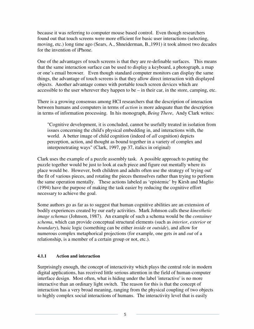
Figure 12. Browsing mechanism for “gesture station”. Moving the hand to the left
or to the right browses images within a category (for example, drawings). Moving
the hand forward switches to another category (for example, photos) or brings up a
menu.
Figure 13. Gesture station setup in a museum setting.
Projected images correspond in size to the originals.

22
4.2 Affection
Emotional ‘dialogue’ plays an important, if not crucial, role in our communication. We
are often unaware of the importance that affective signals (facial expressions and body
language) play in everyday communication. At the most basic level these signals serve
the purpose of indicating that communication has occurred, that the message or intent
“came across”. Taking away these “confirmation signals” can have disastrous effects to
human-to-human communication, but also in human-computer communication. Lack of
acknowledgement that a certain action has been recognized has led many a computer user
to repeat in frustration their actions and often loose valuable data in the process. As
Rosalind Picard states in the introduction to her book Affective Computing, for computers
to be able to adapt to us “they will need the ability to recognize and express emotions, to
have emotions, and to have what has come to be called ‘emotional intelligence’…”.
(Picard, 1997).
Young children are especially prone to react with frustration if their actions have not been
recognized. Thus, it is important to provide them with an immediate feedback in regard
to their interactions with a digital environment. It is important to note here that affective
communication is much richer and goes far beyond simple feedback.
It is becoming increasingly evident that emotions play a major role in, what we consider
to be rational behavior. Antonio Damasio, in his book, Descartes’ Error (Damasio,
1994) provides an example of an individual who, after suffering a lesion in frontal part of
the brain, has lost the ability to access his own emotional responses. According to the
test results, the lesion has left his above-average intelligence and other ‘rational’
capabilities intact. In spite of this, his ability to function rationally an intelligently in real
life was severely impaired. Damasio’s interpretation of this finding is that the emotions
play an important regulatory role in everyday thinking and decision making by
dramatically reducing the number of possible rational decisions. The reduction is
achieved by associating the positive or negative feelings, based on prior experience, with
certain decisions. Choosing to act on decisions connected to a positive past experience,
and avoiding the ones that had negative consequences, serves as a simple guiding
mechanism for our rational and intelligent behavior.
The communication with current computers and computer applications can be described,
as Rosalind Picard puts it, as “affect-impaired”. Computer applications do not provide an
affective context for their functioning, nor are they designed to detect recognize and react
to the changes in the affective states of the users. In other words, the ‘affective channel’
in human-computer communication is closed. Although everyone would agree that
affective exchange plays a major role in human communication, the question still remains
whether it is as important in human-computer interaction? A simple answer to this
question may be provided by the research results of Byron Reeves and Clifford Nass
from Stanford University. In their book, The Media Equation (Reeves and Nass, 1996),

23
they eloquently sum up a decade of research investigating the relationship between
humans and the new media, including computers. Their conclusion is summarized in the
following sentence:
People respond socially and naturally to media even though they believe it is not reasonable to do so, and even though they don’t think that these responses characterise themselves. (Reeves and Nass, 1996 edition, p. 7)
In a series of experiments they demonstrated that humans react to social and biological
stimuli represented in a variety of media (including the television screen and a
multimedia computer) as if they were real. The reaction is unconscious and automatic
and is elicited even by very crudely represented stimuli. In their interaction with
computers humans adhere to the same social rules they use in real life with other humans.
They are more polite in a direct (“face-to-face”) evaluation of a computer program then
when they use a different program for evaluation. Humans react to visually presented
inter-personal space cues, as well as to flattery or personality and gender indicators.
Thus, it seems that for humans, the ‘affective channel’ in communication with computers
is already open.
The questions that naturally follow are: How can one incorporate affect into human-
computer communication? And do the implementation costs of such a decision justify the
investment?
There are different ways of adding an affective component to human-computer
interaction. Some of them cost nothing and depend solely on the way the software is
written. Some of them can be implemented with minimal investment and others depend
on the current, expensive, cutting-edge technologies. The first step in introducing
emotion to human-computer communication can be implemented with minimal
investment. It consists of providing computer applications with affect-expressing
abilities. Just by using the same voice prompts that differ in affective quality, one can
convey different degrees of satisfaction (or dissatisfaction) with user’s actions, convey a
sense of urgency, importance, etc. The specific benefit of building in such affective
components in computer applications is that additional information is conveyed quickly
and easily without an increase in cognitive complexity.
The major drawback of the previously described example is that affective communication
is that it is unidirectional and thus less flexible and adaptable to the changes of context of
user actions. For any dialogue, including the affective exchange, it is necessary to be
aware of the presence of the other. Thus the first step towards opening of the ‘affective
channel’ in human-computer communication for bi-directional exchange may be to allow
computers to detect the presence of a human being that can engage in interaction with
them. Currently there is a large number of cheap, commercially available proximity and
motion sensors which can be easily interfaced with today’s computers. Although
relatively easy to build, and conveying fairly simple affective qualities (like interest),
presence sensing can have a dramatic effect on human-computer interaction. First,
presence sensing on its own can serve as a trigger for starting an application. For
example, just standing in front of a painting or approaching a sculpture may trigger the

24
change in light intensity and audio narrative. A step further would be to use the change
in proximity as an indicator of ‘interest’.
Figure 14. A prototype of an ‘interest sensing’ application (Milekic, 1997)
An example of ‘interest sensing’ application is depicted in Figure 14. A simple head
movement towards the screen allows the user to ‘zoom’ into the painting and see more
detail.
Sensing the presence of a human is just the beginning of opening up the ‘affective
channel’. In order to establish a true affective dialogue, the computers will have to be
able to detect, recognize and interpret human emotions. What emotions are, and their
relationship or equivalence with specific bodily changes is still a subject of debate among
theorists. However, there is a general consensus that bodily changes are reflective of
emotional states. Research conducted by Manfred Clynes in 1970’s indicates that
different emotions may produce specific and identifiable patterns of bodily expressions,
which he named 'essentic forms’ (Clynes, 1977). Clynes’ apparatus for the registering of
‘essentic forms’ consisted of a single, pressure sensitive button (‘sentograph’) capable of
detecting both pressure amount and its direction. Graphical representation of these two
dimensions of pressure produces a ‘sentogram’ which differs in form for different
emotions. Following Clynes’ nomenclature Rosalind Picard coined the term ‘sentic
modulation’ for the effects of emotion on bodily expression (Picard, 1997).
Humans are very capable of detecting even subtle manifestations of ‘sentic modulation’
as conveyed through facial expression, voice inflection, general posture, gestures and
even the dilation of pupils. Thus one of the ways of allowing computers to detect the
emotional state of humans would be to provide them with the means of detecting the
same bodily changes humans use to infer the emotions of others. Although considerable
advances have been made in this area, with prototypes of applications being able to
recognize human facial expression, voice ‘signatures’, gaze direction and pupil dilation,
they are far from being usable in current computer applications. Building on Clynes’
research one may envision collecting data about a user’s emotional state just by analyzing
the characteristics of finger pressure exerted on keyboard while typing, or using a

25
touchpad. Modern touch screens (Surface Acoustic Wave technology) have also the
potential of detecting gradients of pressure.
Paradoxically, it seems that providing computers with access to human emotions through
the detection of physiological changes not readily observable by humans may be more
efficient and easier to implement. These include detection of changes in blood pressure,
heart and respiration rate and skin galvanic response1. Today’s miniaturized medical
technology can be unobtrusively incorporated into the current computer hardware and
provide constant feedback about changes in the user’s physiology. For example, the
electrodes for the detection of galvanic skin response can be embedded into the surface of
the computer mouse button. The usefulness of monitoring a user’s physiological state
has been already recognized in interface design of computer applications where any
disturbance of human-computer communication may have tragic consequences, as in the
area of air traffic control (Rowe, Sibert, Irwin 1998).
4.2.1 Supporting affective aspects of social communication
Affective component is closely tied to (inter)action. We form relationships with objects
(and people) that we touch, for the simple reason that the act of touching and the sensory
experience associated with it becomes literally part of ourselves, our experience that we
can recall and relate to. Digital environments were not initially designed to support
affective components of communication even though the need for such support was
clearly demonstrated by observed human behavior. Early users of the Internet developed
a whole ‘language’ consisting of punctuation marks to express their emotions (these are
known as ‘emoticons’, for example, ;-) indicates “a smile and a wink”). Today, the
language of emoticons has evolved to sophisticated and often even animated graphical
representations (Figure 15).
Figure 15. The “broken heart” emoticon provides
emotional context for text message
1 skin galvanic response is a change in skin resistance to electrical current usually a consequence of emotion-induced
increase in micro perspiration. Skin galvanic response is one of the measurements used for the ‘lie detector’ test.

26
Affection plays a significant role in mediating social interactions where successful
interaction devices support it. Thus there are (digital) cameras that are capable of
recognizing a smile and only then take a picture (or, in absence of it, digitally manipulate
the image to produce one!), cameras that recognize faces and focus on them, and cameras
that make people look thinner. The invention of mobile phones dramatically changed
the paradigm of how we communicate. Instead of calling a number at a certain
geographic location, now we are calling a specific person, regardless of their location.
Affective component in mobile phone interfaces started by being able to choose
individual ring-tones, and now it is common that one can see a photo of a person who is
calling or call a friend just by choosing their photo on the screen.
Figure 16. The new “phone book” consists of faces, not numbers
(Copyright ©2007 Nokia. All rights reserved.)
Figure 17. Mobile phone (or “communicator”) design for group
communication (Copyright ©2007 Nokia. All rights reserved.)

27
Another component of affective interaction is ‘personalization’ of different environments,
and ability of digital environments to recognize particular user and their preferences. A
growing number of Web-based environments now routinely support affective component
of user interactions, sometimes with simple ‘I like it’ or ‘I don’t like it’ choices
(StumbleUpon, Del.icio.us), and sometimes with a more sophisticated mechanism.
Although many museum Web sites are developing alternative visitor-oriented
‘folksonomies’ (Trant, 2006, Chun, S., Cherry, R., Hiwiller, D., Trant, J., & Wyman, B.
,2006) I am not aware of any museums that would explicitly gauge visitor emotional
experience.
An example for affective support in a museum environment is provided by study of
Goren-Bar at all. (D. Goren-Bar, I. Graziola, T. Kuflik, F. Pianesi, C. Rocchi, O. Stock,
M. Zancanaro, 2005) using the fresco collection in Castle of Buonconsiglio in Trento,
Italy. However, the focus of the study was not the emotional experience related to
cultural heritage artifacts. The authors used a simple “like-o-meter” mechanism to
identify parts of the museum presentation (delivered on a mobile device) that were most
attractive to the visitors.
4.2.2 Emotions and learning
Children naturally prefer affect-supportive environments over affect-suppressing ones,
like the traditional school setting. As good educators know, the best way of creating
motivated life-long learners is to make the process of discovery a goal in itself. Personal
accounts of a learning process can often be described only in ‘emotional’ terms:
curiosity, fascination, frustration, confusion, joy, sense of accomplishment, etc. Thus,
one may infer that the building of ‘affectionate’ digital environments would prove to be
more efficient for educational purposes. For children, it is much easier to relate to a
well-defined emotional carrier in the form of an animated agent than to generalized
affection like using supportive voice overlays. A well-defined emotional carrier in this
context does not imply a realistic or visually sophisticated character. As Reeves and
Nass (1996) point out, humans will react socially and naturally to even very crude
representations in the media as if they were real. The abundance of ‘edutainment’
software titles in recent years seems to indicate that the industry is aware of these
findings. However, most edutainment titles completely miss the point that the discovery
process in itself is rewarding and interesting and treat it as a bitter pill which can be
easier swallowed with a helping of engaging, but otherwise empty, computer games.
A step beyond creating ‘affectionate tutors’ is the building of affect-sensitive tutors
(Picard, 1997). These environments should be able to detect user states such as boredom,
interest, frustration, etc., and use this information to modify the way they interact with the
user. Although the future will bring more sophisticated means of registering users’
emotional states, even the traditional systems consisting of a keyboard, mouse and screen

28
can be designed in such a way to collect this information. For example, some of the user
states can be inferred just by analyzing the log of their interactions with an application.
Thus, a navigational path and time spent on different topics is a pretty good indicator of
the user’s interests (as the marketing experts collecting information on the WWW very
well know). A preference for descriptive, diagrammatic or graphic explanations (which,
of course, have to be simultaneously available in the application) will point to the specific
learning style. On a more basic level, the speed, amplitude and pattern of mouse
movements (or key presses) and the number of ‘interruptions’ of the program may
indicate user’s general frustration or excitement level. In the past several years a large body of research accumulated on the use of life-like animated agents (Bates, 1994; Granieri, Beckett, Reich, Grabtree, Badler, 1995; Maes, Darell, Blumberg, Pentland, 1995; Lester and Stone 1997; Elliott, Rickel, Lester, 1999). A recent study indicated that the presence of an animated life-like character in an interactive learning environment may have a strong positive effect (the ‘persona effect’) on students’ perception of their learning experience (Lester, Converse, Kahler, Barlow, Stone, Bhogal, 1997). Within the framework of Affective Reasoner, a program developed at DePaul University, animated agents use facial expressions, speech and music to convey their emotions in real time. Reportedly, adding speech recognition component to the design has allowed children as young as 2 years of age to interact with animated agents (Elliott et al. 1999). In their exploratory synthesis on the development of affective pedagogical agents Elliott and his collaborators suggest the following mechanisms for inferring the user’s emotional state:
1. Inquiry: Ask the user. Observations of interactions with Affective Reasoner indicated that users are motivated to express themselves to an ‘understanding’ computer agent.
2. Stereotypes: User’s tend to exhibit stereotypical individual behaviour characteristics (like being impatient, following the rules, etc.) consistently across tasks.
3. Context: Use context information. For example, a user who consistently fails on certain task is likely to feel frustrated.
4. Affective Stereotypes: Infer how most users would feel based on analysis of previous interactions with different individuals.
5. Self-Inspection: a well-built affective agent should exhibit affective responses resembling the ones of a real user in certain situations. Thus, if no other information about the user is available, the agent can always resort to self-inspection.
It is worth noting that none of the above suggested criteria requires any additions or
changes to the existing computer hardware.
4.3 Control
In general, the human need for control of their environment can be broken down into
three (related) categories. These are the control of:

29
• what (choice)
• how (method), and
• when (time)
Interacting with museum objects (whether in an actual museum or Web page) should
provide an individual with an easy way to choose objects of interest. User choices
should be preserved and available to the user at a later point in time.
The delivery method should also be under user control. Depending on a personal
preference or learning style, the content could be delivered in form of text, images,
podcasts, audio tours, video clips etc. The user should also be able to choose the delivery
device – whether it is an MP3 player for audio files, or a variety of personal digital
devices (PDAs, iPods and many mobile phones) capable of displaying visual content.
SF MOMA is one of the pioneering institutions in experimenting with different delivery
devices (Samis, P., Pau, S. 2006). Another aspect of control of delivery method would
include the choice of the level of complexity of presented material. Ideally, the material
should be structured in such a way to offer a spectrum of complexity ranging from a brief
description (corresponding to a museum label) to the level of scholarly article. In simple
words, a museum visitor should always be able to get “more” of the information on
certain topic. Needless to say a visitor should also be able to choose the language in
which the content is delivered.
As exemplified by success of on-demand TV services like TiVo, as well as the recent
trend of Internet-based video streaming (Netflix, the largest Internet-based distributor of
movies quietly made thousands of movies available for on-demand streaming), humans
are very eager to be in control of time. Many museums are aware of this trend and
provide pre-visit information packages on their Web sites, and some of them are even
doing post-visit follow ups.
Most of these control needs are eloquently summarized in a blog entry by Dan Cohen, the
director of the Center for History and New Media, and one of the attendees of the recent
Smithsonian 2.0 event:
“The young, brilliant David Recordon of Six Apart summarized what the 2.9
project should result in (I’m paraphrasing here from memory):
Before I visit Washington, I want to be able to go to the web and select
items I’m really interested in from the entire Smithsonian collection.
When I wake up the next morning, I want in my inbox a PDF of my
personalized tour to see these objects. When I’m standing in front of an
object in a museum, I want to see or hear more information about it on my
cell phone. When an event happens related to an object I’m interested in, I
want a text message about it. I want to know when it’s feeding time for the
pandas, or when Lincoln’s handball will be on public display. And I want
30
to easily share this information with my classmates, my friends, my
family.”
4.3.1 Control and interface
In order to exercise control over an environment, one has to be aware of what is going on
in the environment and of the consequences of one's actions. In the field of interface
design this criterion has been known as the principle of visibility (Hutchins, Hollan,
Norman 1986), a misnomer to a certain extent because feedback to the user can also be
provided through perceptual channels other than visual. Implementing the following in
interface design satisfies the principle of visibility:
a) the users should be aware of all possible actions available to them at any given
point in time; b) the users should receive immediate feedback that their actions have been
communicated to the system; c) the users should get adequate information as to the consequences of their actions;
Kirsh (1997) notes that the more challenging interpretation of the visibility principle is
that an effective interface should also provide an indication of what a user ought to do
next in order to reach his/her goal. Although this may seem a far-fetched goal,
interpretation of perception as an active process implies that this is what is happening in
our everyday interactions with the environments (Gibson 1966, Gibson 1979). Our
exploratory activities provide us not only with information about the environment but
also with information relevant to our determining of what to do next. In the context of
digital interface design, and especially with some general knowledge of the user's goals,
the same effect can be achieved by biasing the visibility of environment affordances in
favor of those consistent with anticipated user's goal (Kirch 1997).
4.3.2 Control & navigation
The issue of user control of navigation has not received much attention in regard to
software applications for young children. However, it has received considerable attention
in the framework of instructional design and these results can be, to some extent,
generalized to younger audiences.
In their recent article Lawless and Brown (1997) present an overview of the research interpreting the effects that the design and control in multimediated learning environments have on the efficacy of knowledge transfer. They list the hierarchy of five basic navigation and content control levels that can be imposed on a digital learning environment:
� browsing; � searching;

31
� connecting; � collecting, and � generating.
Browsing provides substantial navigational freedom but is less structured in terms of
content presentation. Navigational paths tend to be haphazard and random. Searching
allows somewhat higher level of learner control by providing support for investigation of
a single topic or concept. However, it also implies that the learner has a well defined
goal in mind. Connecting support provides the users with the ability to create permanent
links between concepts and topics they consider to be related. This level is generative in
a sense that it allows the user to redefine navigational paths. Collecting information
involves selection and extraction of related information. The end product is often a topic-
specific ‘folder’ with ‘clippings’ in a variety of media. Generative level of control allows
learners to contribute to the instructional database itself.
Although the above mentioned levels are general enough to be applied to the design of
learning environments for children, the obvious challenge is to make them compatible
with preliterate audience. A suggestion for possible search mechanisms could be visual
inspection of catalogued data (consisting of objects, or previously visited screens).
Another possibility is to use speech recognition software and provide a more natural
input for search terms. And while providing an intuitive and child-friendly mechanism
for connecting the data may prove to be an elusive task at this age, creating collections
seems to be a natural (and often commercially exploited) tendency of pre-schoolers.
5. “HUMANE” DESIGN GUIDELINESS
Due to large variations in cognitive and motor skills that exist across different segments
of population referred to as ‘children’ it is hard to provide very specific guidelines which
would be applicable to every subgroup of this population. The situation is further
complicated by the fact that different software applications are bound to have different
desired outcomes. Nevertheless, there are some general design principles that are
especially appropriate for this population. In the following sections I will propose these
guidelines and examples of their practical implementation. Of course, the provided
examples should serve only as an illustration. The number and nature of possible
implementations of these guidelines is constrained only by creativity and imagination of
application designers.
5.1 General guidelines
The proposed guidelines are based on deceptively simple observation from real life: that
any human activity is undertaken for the sake of some desired outcome. The outcome
need not be very abstract and the person carrying out the activity may not even be
consciously aware of it. For instance, I may unconsciously brush aside a hair that

32
happens to be in my visual field, or adjust my position in an uncomfortable chair. The
desired outcomes in these examples are clear visual field and comfort.
The desired outcomes can also be very complex and cater to different needs. Even a
simple activity, like going out to a movie, may satisfy a number of different needs
(desired outcomes): a wish to see another work by a known director, a desire to spend
time together with friends, a need to break-up monotonous daily routine, etc. It is worth
noting that the existence of different needs (and desired outcomes) is not, in itself, a
guarantee that certain activity will take place. Each activity carries with it a certain ‘cost’
either in terms of physical or mental effort, or its emotional value. It is the relationship
between this ‘cost’ and the strength of different needs that determines whether certain
activity will be initiated or continued. The above, admittedly simplistic, analysis may seem far removed from the principles of
interface design. However, the history of technological innovations can be viewed as a series of
steps which make certain basic human needs easier to achieve: to communicate with others
(telephone); to know what is happening (television); to share experiences (big events, sports).
Within this framework I shall propose a single, general principle of digital interface design:
� The interaction mechanisms in the digital medium should be designed in such a
way to allow the user to achieve the same effect (outcome) with substantially less effort, as compared to an analogous real life activity.
Please note that this principle can be restated in the following way by emphasizing the
outcome of the activity:
� The interaction mechanisms in the digital medium should be designed in such a way to allow the user to achieve more (both objectively and subjectively) for the same amount of effort, as compared to an analogous real life activity.
In the realm of digital applications the effort which the user invests is most likely to be
mental or will be related to emotional aspects of interaction. Therefore, most of the
specific strategies will be aimed at: a) the reduction of cognitive complexity of
interaction, b) maximizing the effects of the user’s actions, and c) providing support for
the affective and social components of the interaction. One must also note here that
traditionally used interaction devices, like the keyboard and the mouse, are not ideally
suited for children and that the suggested design strategies will tend to have substantially
greater effect when used in conjunction with a child-friendly interaction device like a
touch screen.
5.1.1 Design principles & implementation examples
The following design principles are divided into three different groups mostly for ease of
presentation because their effects are due to the factors that span two or more groups. A
strategy of introducing an animated agent capable of affective exchange into design
would be in group three (strategies that enhance communication). Yet, this same
procedure also decreases cognitive load (group one) because affective channel can be
used to convey additional information without an increase in cognitive complexity. With

33
this in mind, the tentative grouping of design principles would be into the following
strategies:
a) strategies that lead to reduction of cognitive load & complexity; b) procedures that reduce the necessary physical effort (repetitive actions) and the
need for highly developed motor or eye-hand co-ordination skills; c) procedures that enhance communication.
Some of the strategies that may lead to the reduction of cognitive complexity (a) of interactions
with an application (and hence to the reduction of the necessary mental effort on user’s side) are
presented in the list below. As noted earlier, this is not an inclusive list, but rather a suggestion of
useful design practices:
� provide support for complementary actions (as defined by Kirsh); � support cognitive mapping – mapping of experiential to representational; � provide clear indication of the system affordances with biased
representation in favour of the ‘likely user goal’; � make use of over learned skills (on/off switches, etc.); � make use of user’s mental model as a design metaphor (story plots,
knowledge of fictional characters, etc); � provide gradual increase in complexity of interactions;
Strategies for the reduction of physical effort and the need for eye-hand co-ordination
skills (b) would include the following:
� provide natural (gesture based) navigation; � support effect magnification & automation (or repetitive tasks); � adapt to lack of skill and provide appropriate compensation;
Procedures that enhance human/computer communication include:
� provide redundant information through different channels (visual, auditory, proprioceptive, tactile);
� include affective channel; � try to infer user’s intent and goals;
In the following sections I will provide a brief overview and practical implementation
suggestions for the above mentioned procedures.
5.1.2 Supporting complimentary actions
As defined earlier, complimentary actions (also known as ‘epistemic’ actions) are the
physical actions humans use to make their own mental operations easier, faster or more
reliable (Kirsh 1995). Examples of complimentary actions from everyday life abound:
from tapping one’s foot to keep the rhythm during music practice, to jotting down
intermediary results of arithmetic computations or following with one’s finger a line of

34
printed text. In spite of general acceptance of the usefulness of complimentary actions,
there has been surprisingly little research on design principles that would support such
actions in human/computer interaction. Studying the strategies developed by the players
of a popular computer game “Tetris” Kirsh and Maglio (1994) documented that they rely
heavily on complimentary actions, such as frequent rotation of game pieces. In their
study they demonstrated that by rotating the game piece ‘physically’ before deciding on
the next action the “Tetris” players reduced the cognitive complexity of the task in at
least three ways:
� by reducing memory requirements necessary for mental rotation, i.e, space
complexity; � by reducing the number of steps involved in mental computation, i.e. time
complexity; � by reducing the probability of error of mental computation, i.e. unreliability
(Kirsh and Maglio, 1994).
Although support for specific complimentary actions will depend on the nature of a
particular software application, the more interesting question is whether there are some
general design principles which would provide such support regardless of application.
Even before we consider this question we should note that there is one characteristic of
the real world which vastly simplifies our interactions in it. This feature did not make it
to the most popular computer operative systems for no other reason than historic
tradition. I am referring to the fact that in the real world the results of our actions tend to
persist over time. If I was reading a book, and left it open on my desk, I will (most
likely) find it there the next morning and will be able to continue where I left off without
having to remember the page number and look for it again. In contrast, this is exactly
what I have to do with my computer and word processor – every morning when I start up
my computer I have to re-create the circumstances of my previous activities manually.
So, before we even suggest which kind of activities may make human-computer
interaction easier let us adopt this as the most general principle:
� digital environments should preserve the ‘state of the world’ when they are not in
use;
The value of being able to continue with activities where one left of has been recognized
in some manufacturers so most of the new portable computers come with a ‘suspend to
disk’ feature, which will preserve the exact state of working environment while the
computer is turned off.
Another characteristic of the real world which, again for historical reasons, was not
replicated in digital environments is the preservation of the results of actions. In other
words, if I spend time writing on a piece of paper, if I leave to have lunch, or turn the
light off in the room, my writing will not disappear. Again, this is exactly what happens
in traditional interactions with personal computers – if you write something and forget to
save on the hard drive by issuing a specific command to that effect, chances are you will
lose your document. Losing the results of one’s effort is the most common experience
among computer users, and happens both to expert and novice users alike. Thus, another
general principle of friendly design would be:

35
� digital environments should automatically and continuously preserve the results of
user’s actions;
It is interesting to note that both of these features have been implemented in operative
systems used for portable electronic Personal Digital Assistants (PDA) like Palm Pilot.
Assuming that the digital environment we are designing will automatically preserve the
state of the world and outcomes of user’s actions, we can turn to the question of support
for activities that make interactions with these environments easier. In real life
complimentary activities include pointing, arranging the position or orientation of objects
or creating reminder marking or annotations (like dog-earing a book page) in the
environment.
Pointing is one of the most common complimentary activities, especially during
continuous operations that involve a number of similar steps, like in reading or counting.
Since pointing is external to objects both in the real and digital world, one would think
that there is no need to provide explicit support for this action. However, digital
environments offer the possibility of enhancing pointing by having the objects that were
pointed to ‘remember’ this action and provide some visible clue to that effect. Objects
pointed to (by using the mouse cursor or a finger on a touch screen) may temporarily get
a bright ‘halo’ or change in color. What would distinguish this activity from
straightforward marking would be that the change induced by pointing will be transient,
that is, the ‘halo’ around the objects that were pointed to would gradually disappear. In
this way, the simple action of pointing would provide not only the information about
which objects were already pointed to (counted, for example) but also the temporal
information about which one was most recently the focus of attention.
Changing the position or orientation of objects is another frequent complimentary activity
during grouping, sorting or other organizing activities. Consider the activity depicted in
Figure 2., which would be almost impossible to solve without this kind of activity.
Figure 18. Example of a task where the use of complimentary actions leads to
dramatic decrease in mental effort necessary for the solution. The goal was to
decide whether all letters differ in size.
So, another way of supporting user’s complimentary actions would be to:
� enable the user to change the position and/or the orientation of objects in a digital
environment;

36
Being able to re-group the objects or change their orientation can be also considered as
one way of allowing the user to mark or annotate their environment.
Figure 19. Why is this not possible? (Annotated screenshot of my desktop)
Marking of the objects can also be supported in a more direct way. This feature has been
supported to some extent in some operating environments. For example, in Macintosh
OS the user may choose the color of an individual folder. However, this involves a)
selecting of the folder, b) clicking on the ‘label’ menu on the menu bar, and c) choosing a
color from the drop-down menu. Ideally, complimentary actions should be
straightforward and have an immediate effect. Relative increase in size has been used
throughout the history of humankind as an indicator of importance (for example, the size
of depicted Egyptian pharaohs and dignitaries corresponded directly to their hierarchical
status, not to mention the more recent ‘larger than life’ representations of famous
individuals in Western traditions). Relative size is also an indicator of the significance of
depicted objects and individuals in children’s drawings. Indicating the relative
importance of a folder on the desktop may be achieved in a more natural way by being
able to directly manipulate its size (for example, by ‘pulling’ on a corner). It is worth
noting that being able to resize a window, both in Windows and Macintosh OS, serves a
different purpose (that of being able to see more of the contents of a folder).
Explicit annotation of the environment is also one of the common complimentary actions
in real life (which explains the popularity of refrigerator magnets and different kinds of
sticky notes). Although this feature is provided in sophisticated word processors, or it
can be purchased as a standalone software application, there is no reason why it should
not be supported by the environment itself. (Thus) another design principle:
37
� digital environments should allow the users to easily mark (through change of size, color, border etc.) objects and support more sophisticated annotation functions (marking, writing and drawing on objects and/or backgrounds);
Since many of the complimentary activities have as the goal some kind of organizing or
sorting of objects, these activities could be automatically enhanced.
6. CONCLUSION
In this paper I made a case that when designing interfaces with the digital medium one
should focus on the needs of target population, rather than on technological
accomplishments. With its visual complexity, personal significance and fuzzy
interpretation boundaries, cultural heritage information is an ideal test bed for new
interface ideas with museum collections (now also available in digital format). Of
course, the main question is still what are the actual needs of individuals who are
interacting with information provided by museums? However, with the increased
availability of the Internet (and other communication devices) it is becoming evident that
the 21st century consumer of information is very different from 20
th century museum
visitor. Although many ideas described in this paper were tried out and tested in different
museum settings what is still lacking is a comprehensive theory of “cultural heritage
(museum) information consumers”.

38
References
Bolt, R. A. (1980) Put-That-There: Voice and Gesture at the Graphics Interface,
Proceedings of SIGGRAPH ’80, ACM Press
Clark, A. (1997) Being There: Putting Brain, Body, and World Together Again, The
MIT Press, Cambridge, Mass.
Clynes, M. (1977). Sentics, the touch of emotion. Doubleday Anchor, New York
Chun, S., Cherry, R., Hiwiller, D., Trant, J., & Wyman, B. (2006). Steve.museum: An
Ongoing Experiment in Social Tagging, Folksonomy, and Museums, in J. Trant & D.
Bearman (Eds.), Museums and the Web 2006: selected papers from an international
conference. Albuquerque, NM: Archives & Museum Informatics
Cohen, D. (2009) blog entry: http://www.dancohen.org/2009/01/27/smithsonian-11-and-
29/#comments
Damasio, A. (1994) Descartes’ Error: Emotion, Reason, and the Human Brain, Avon
Books
Efron, D. (1941) Gesture and Environment, King’s Crown Press, New York
Gibson, J.J. (1966) The Senses Considered as Perceptual Systems, Houghton Mifflin,
Boston
Gibson, J.J. (1979) The Ecological Approach to Visual Perception, Houghton Mifflin,
Boston
Hummels, C., Smets, G., Overbeeke, K. (1998) An Intuitive Two-Handed Gestural
Interface for Computer Supported Product Design, in Wachsmuth, I., Froelich, M. (Eds.)
Gesture and Sign Language in Human-Computer Interaction, Springer
Hutchins, E.L., Hollan, J.D., Norman, D.A., (1986) Direct manipulation interfaces, in
Norman, D.A., Draper, S. (eds.) User Centered System Design: New Perspectives on
Human-Computer Interaction, pp. 87-124, LEA
Johnson, M. (1987) The Body in the Mind: The Bodily Basis of Imagination, Reason and
Meaning, University of Chicago Press
Kirsh, D., Maglio, P.(1994) On Distinguishing Epistemic from Pragmatic Actions,
Cognitive Science, 18: 513-549
Kirsh, D. (1997) Interactivity and multimedia interfaces, Instructional Science 25: 79-96,
Kluwer Academic Publishers

39
Kendon, A. (1986) Current Issues in the Study of Gestures, in Nespoulous, Perron,
Lecours (Eds.) The Biological Foundations of Gestures: Motor and Semiotic Aspects,
LEA
Kramer, A. (1998) Classifying Two Dimensional Gestures in Interactive Systems, in
Wachsmuth, I., Froelich, M. (Eds.) Gesture and Sign Language in Human-Computer
Interaction: International Gesture Workshop, Bielefeld, Germany, September 1997
Proceedings, Springer
Krueger, M.W. (1993) An easy entry artificial reality, in Wexelblat, A. (Ed.) Virtual
reality applications and explorations, Academic Press Professional, Cambridge, MA
McNeill, D. (1992) Hand and Mind: What Gestures Reveal about Thought, University of
Chicago Press
Milekic, S. (2005) US Patent US6,920,619 B1 for an original way of interacting with a
visual display
Milekic, S. (2003) The More You Look the More You Get: Intention-based Interface
using Gaze-tracking, in Bearman, D., Trant, J. (eds.) Museums and the Web 2003:
Selected papers from an international conference, pp 57-72, Archives and Museum
Informatics, Pittsburgh
Milekic, S. (2002) Towards Tangible Virtualities: Tangialities, in Bearman, D., Trant, J.
(eds.) Museums and the Web 2002: Selected papers from an international conference,
Archives and Museum Informatics, Pittsburgh
Norman, D A. & Draper S. (Eds.) (1986). User centered system design: new perspectives
on human-computer interaction, Hillsdale, N.J.: L. Erlbaum Associates.
Norman, D. (1988) The Psychology of Everyday Things. New York: Basic
Books
Picard, R. W. (1997) Affective Computing, MIT Press, Cambridge Massachusetts
Reeves, B., Nass, C. (1996) The Media Equation: How People Treat Computers,
Television, and New Media Like Real People and Places, CSLI Publications &
Cambridge University Press
Samis P. and Pau S. (2006) ‘Artcasting’ at SFMOMA: First-Year Lessons, Future
Challenges for Museum Podcasters broad audience of use, in J. Trant and D. Bearman
(eds.). Museums and the Web 2006: Proceedings, Toronto: Archives & Museum
Informatics

40
Sears, A., Shneiderman, B.(1991) High precision touchscreens: design strategies and
comparisons with a mouse, International Journal of Man-Machine Studies 34, 593-613
Shneiderman, B.(1998) Designing the User Interface: Strategies for Effective Human-
Computer Interaction, Addison-Wesley
Trant, J. (2006) Social Classification and Folksonomy in Art Museums: early data from
the steve.museum tagger prototype, A paper for the ASIST-CR Social Classification
Workshop, from http://www.archimuse.com/papers/asist-CR-steve-0611.pdf
Weisler, S., Milekic, S. (1999) The theory of language, book & interactive CD ROM,
MIT Press, Cambridge, MA
Wexelblat, A. (1998) Research Challenges in Gesture: Open Issues and Unsolved
Problems, in Wachsmuth, I., Froelich, M. (Eds.) Gesture and Sign Language in Human-
Computer Interaction, Springer
Web sites:
Alexander Graham Bell
http://www.ideafinder.com/history/inventors/bell.htm
Del.icio.us sharing browser bookmarks
http://del.icio.us/
Flickr photo sharing and tagging
http://www.flickr.com/
MIO design company
www.mioculture.com
Smithsonian 2.0
http://www.smithsonian20.si.edu/schedule.html
ShowMe Tools™ overview:
www.flatworldinteractives.com/tutorials.html
YouTube video sharing
http://youtube.com/