A Critical Analysis of Internet Infrastructure Mapping - The ...
469
1 Understanding Cyberspace Cartographies: A Critical Analysis of Internet Infrastructure Mapping Martin Dodge UCL A thesis submitted for the degree of Doctor of Philosophy April 2008
-
Upload
khangminh22 -
Category
Documents
-
view
2 -
download
0
Transcript of A Critical Analysis of Internet Infrastructure Mapping - The ...

1
Understanding Cyberspace Cartographies:
A Critical Analysis of Internet Infrastructure
Mapping
Martin Dodge
UCL
A thesis submitted for the degree of Doctor of Philosophy
April 2008

2
Declaration
I, Martin Dodge, confirm that the work presented in this thesis is my own. Where information has been derived from other sources, I confirm that this has been indicated in the thesis. Signed: ________________ Date: __________________

3
Abstract
For thousands of years, people have been creating maps of the world around
them as a means of understanding, navigating and controlling space. Cyberspace is the
pre-eminent terra incognita of the twenty-first century and a wide range of maps and
map-like visualisations have been produced to comprehend it. Many different aspects
of cyberspace have been mapped, from the physical infrastructure, the data flows and
customer statistics, to the emergent patterns of Web hyperlinks and the social
structures of online forums. This thesis provides a discussion of the nature of these
maps and visualisations, recognising them as complex socio-technical visual images
open to multiple connotative interpretation, and imbued with political power and
embedded in a wider socio-cultural milieu. The work is situated theoretically within
contemporary cultural analyses of cartography, employing a hermeneutic epistemology
and a non-progressive categorisation of cyberspace mapmaking practices into distinct,
but overlapping and contested modes. The research questions tackled by the thesis are
threefold, involving auditing how Internet infrastructures have been mapped, how
these maps work semiotically and what is the nature of power they have to do work in
the world.
The thesis is an empirically-focused interpretative approach applied to an
important mode of cyberspace cartographies: those that map Internet infrastructures.
These maps give a fascinating picture of what the Internet looks like, and,
significantly, they also provide rich insights into how different interest groups want the
Internet to look. The goal of the analysis is to understand both the design connotations
of the cartographic signs and the political imaginings of maps of the Internet
infrastructure and this proceeds via two detailed case studies. The first case study
focuses on the connotative meaning and power of statistical mapping to represent the
nature of the globalisation of Internet connectivity. The second case study critiques
marketing maps that sell infrastructure access and are intimately bound up in
promoting the notion of global network reach.

4
Contents
Abstract……………………………………………………………………. 3
Acknowledgements………………………………………………………... 9
1.
Introduction………………………………………………………………. 1.1 Aims…………………………………………………………………… 1.1.2 Research questions……………………………………………….. 1.2 Defining themes………….…..…………………...…………………… 1.2.1 Cyberspace………………………………………………………... 1.2.2 Internet……………………………………………………………. 1.2.3 Infrastructure………………………………...…………………… 1.2.4 Mapping………………………………………………….……….. 1.3 Theoretical approach………………...…………………...……………. 1.3.1 Cyberspace cartographies………………………………………... 1.4 Structure of the thesis………...………………...………………..…….
11 11 14 14 14 18 19 21 22 24 26
2. Delineating the Map……………………………………………………… 2.1 Introduction……………………………………………………………. 2.1.1 Mapping processes……………………………………………...…
2.2 Cartographic history, mapping modes and the digital transition……… 2.2.1 Digital transition and cartography……………………………..… 2.3 Cartographic theories……………………..……………………..…….. 2.3.1 Cartography as communication………….……………………….. 2.3.2 Cartography as representation…………....……………………… 2.3.2.1 Lexical understanding of representation – semiotics………… 2.3.2.2 Cognitive understanding of representation – visualization…... 2.3.3 Cartography as power……………..……………………………... 2.3.3.1 Three levels of map deconstruction………………………….. 2.4 Conclusions…………………………………………………………….
29 29 31 34 38 44 45 48 49 53 56 62 69
3. Cyberspace Cartographies………………………………………………. 3.1 Introduction……………………………………………………………. 3.2 Cyberspace and new modes of cartography…………………………… 3.2.1 The ‘maps in cyberspace’ mode……………………...……………
3.2.2 The ‘maps of cyberspace’ mode………………...………………… 3.2.2.1 Representational forms……….…………………...………….. 3.2.3 The ‘maps for cyberspace’ mode…………………………..……... 3.2.3.1 The potential of information mapping……..………………… 3.2.3.2 Spatialization for information mapping………...……………. 3.2.3.3 Challenges in information mapping……………..…………… 3.3 Literature on the cartographies of cyberspace………………………… 3.3.1 Popular interest in cyberspace cartographies……...……………
71 71 72 75 77 81 89 91 93 94 98 105

5
4. Imagining Internet Infrastructures……………………………………... 4.1 Introduction: explaining what the Internet looks like…………………. 4.2 Internet ‘invisibility’…………………………………………………... 4.2.1 Materially unseen…………………………..…………………….. 4.2.2 Transparent in use………………………………………………… 4.2.3 Disappearance by social naturalisation………………………….. 4.2.4 Occlusion through institutional normalisation…………………… 4.2.5 Implications of infrastructure invisibility…………………………. 4.3 The role of verbal and visual metaphors………………………………. 4.3.1 Linguistic spatial metaphors……………………………………… 4.3.2 Visual metaphors for Internet infrastructure……………………... 4.3.2.1 Wiring visions………………………………………………... 4.3.2.2 Global visions………………………………………………… 4.3.2.3 Machine-like visions…………………………………………. 4.3.2.4 Abstract visions………………………………………………. 4.4 Overcoming Internet invisibility via scientific inscription……………. 4.4.1 Virtual witnessing of Internet infrastructures…………………….. 4.5 Conclusions…………………………………………………………….
106 106 109 109 111 112 114 115 117 117 125 126 130 132 135 138 143 149
5. Statistical Mapping of Internet Globalisation…………………………..
5.1 Introduction……………………………………………………………. 5.2 Connecting the world………………………………………………….. 5.3 The emergence of statistical mapping…………………………………. 5.4 Area-based mapping of Internet globalisation……………..….………. 5.4.1 ‘International Connectivity’ map series……….…………………. 5.4.1.1 Design…………………………………...………….………... 5.4.1.2 Patterns of Internet globalisation……...……….…………….. 5.4.1.3 Authorship…………………...……………………………….. 5.4.1.4 Methodology………………...………..……………………… 5.4.1.5 Distribution………………………...………………………… 5.4.2 ‘Digital Opportunity 2005/2006’ map…………..………………... 5.4.2.1 Design………………………………………..………………. 5.4.2.2 Patterns of Internet globalisation……….……....……...…….. 5.4.2.3 Authorship……………………...…………………………….. 5.4.2.4 Methodology..………...……………………………………… 5.5 Deconstructing area-based mapping of Internet globalisation………… 5.5.1 Zoning scheme design………………………...…………..………. 5.5.2 Hiding small places, silencing temporal variability…………….... 5.5.3 Implications of classification…………………...………………… 5.5.4 Ecological fallacy and grouping bias…………...………….…….. 5.6 Design extensions to area-based mapping of Internet globalisation.….. 5.6.1 Stepped surface mapping of Internet globalisation…………...….. 5.6.2 Hybrid diagram mapping of Internet globalisation……...……….. 5.6.3 Dasymetric-based mapping of Internet globalisation…………….. 5.7 Cartogram-based mapping of Internet globalisation…………………... 5.7.1 ‘Wired World Atlas’ cartogram……………………………...…… 5.7.2 ‘Internet Users World Map’ cartogram…………….…………….. 5.8 Discussion……………………………………………………………... 5.9 Conclusion……………………………………………………………...
151 151 152 161 166 166 167 169 170 172 176 183 185 189 193 195 197 198 202 204 210 214 215 218 223 226 231 240 245 250

6
6. Marketing Maps of Internet Networks…………………………………. 6.1 Introduction……………………………………………………………. 6.2 Maps for marketing……………………………………………………. 6.2.1 Advertising visual rhetoric…………………….…………..……… 6.2.2 Marketing maps for transportation networks……..…….………... 6.2.3 Marketing maps for telecommunications networks……….……… 6.3 Internet marketing maps……………………………………………….. 6.3.1 Survey of the prevalence of Internet marketing maps……..……... 6.3.1.1 Website sample………………………………………………. 6.3.1.2 Website survey results: prevalence and prominence………… 6.4 Design strategies in network marketing maps………………………… 6.4.1 Decoding the design strategies in five network marketing maps…. 6.4.1.1 The long range of network infrastructure…………..………… 6.4.1.2 The wide reach of network infrastructure……………………. 6.4.1.3 Direct network connections are indispensable……..………… 6.4.1.4 The centrality of network infrastructure……………………... 6.4.1.5 An abundance of network infrastructure……………………... 6.4.1.6 Confirming network capacity………………………………… 6.4.1.7 The silencing of alternatives………………...……………….. 6.4.1.8 The exclusive exhibition of the network……………………... 6.4.1.9 Summary……………………………………………………... 6.5 WorldCom case study - backbone boom and the doubling myth……... 6.5.1 Deficient data on the Internet traffic growth……………………... 6.5.2 WorldCom’s rise to the ‘World-Con’ bust………………………... 6.5.3 Decoding the design strategies in WorldCom’s marketing maps… 6.5.3.1 WorldCom’s network marketing rhetoric……………………. 6.5.3.2 WorldCom’s network marketing maps………………………. 6.6 The map and the myth………………………………………………….
254 254 255 257 259 264 266 269 274 275 288 291 298 300 302 303 305 307 308 309 311 312 314 317 320 321 326 339
7. Conclusions: The Cartographic Imagination of Cyberspace..………… 7.1 Introduction……………………………………………………………. 7.1.1 Why do cyberspace cartographies matter?………………………. 7.1.2 Critical theorisation of cyberspace cartographies……………….. 7.1.3 What is revealed about cyberspace?………………………..…….. 7.2 Infrastructure mapping and the importance of the technical…………... 7.3 Case studies in infrastructure mapping………………………………... 7.3.1 Statistical cartographic imaginary……………………………...... 7.3.2 Promotional cartographic imaginary…………………………….. 7.4 The true vision of Internet infrastructure………………………………
344 344 344 348 350 351 353 355 358 361
8. References……….…………………...…………………………………….
362
Appendix One: Building the Atlas of Cyberspaces
Appendix Two: Statistical Maps of the Internet Globalisation
Appendix Three: Network Marketing Maps from Website Survey

7
List of Figures 1. Introduction 1.1 Sketch map of the principal virtual spaces of cyberspace……………… 17 2. Delineating the Map 2.1 Cartographic development as a tree……………………………………. 34 2.2 Cartographic development as a rhizomatic modes……………………... 37 2.3 Map communication model…………………………………………….. 46 2.4 Semiotic triangle………………………………………………………... 49 2.5 Role of cartography in the research process……………………………. 54 2.6 Counter-cartography……………………………………………………. 68 3. Cyberspace Cartographies 3.1 Online atlas of network infrastructure………………………….………. 75 3.2 Statistical map of telephone calling patterns…………...………………. 79 3.3 Telephone traffic between metropolitan centres……………………….. 79 3.4 Hyperbolic visualisation of Internet topology………………………….. 82 3.5 TeleGeography diagram of bandwidth capacity..……………………… 86 3.6 NewsMaps navigable information spatialization………………………. 93 3.7 HotSauce fly-through web interface. ………………………………….. 97 3.8 The New York Times story…………………………………………….. 104 4. Imagining Internet Infrastructures 4.1 Undersea cable map…………………………………………………….. 108 4.2 Utility graffiti signifying the location of underground cables………….. 109 4.3 Internet infrastructure presented using a subway map metaphor………. 127 4.4 Three-dimensional geographic network map metaphors………………. 128 4.5 Internet World poster using a globe metaphor…………………………. 130 4.6 Machine-like diagram illustrating basic Internet concepts……….……. 132 4.7 Warriors of the Net movie using mechanical metaphors………………. 133 4.8 Physical model of the Internet………………………………………….. 134 4.9 Internet denoted using the cloud metaphor…………………………….. 135 4.10 Internet connectivity graph……………………………………………... 136 4.11 IPv4 Internet Topology Map……………………………………...……. 145 5. Statistical Mapping of Internet Globalisation 5.1 Growth chart of Internet connected countries………………………….. 152 5.2 Fourfold grid of connotative meanings…………………..…………….. 159 5.3 Cost of staying connected map…………………………………………. 163 5.4 International Connectivity maps, 1991 and 1997………………………. 165 5.5 Worldwide network growth, 1991 to 1997…………………………….. 173 5.6 International Connectivity data table, December 1992………………… 175 5.7 Academic deployment of International Connectivity map……………... 179 5.8 Policy deployment of International Connectivity maps…………….….. 181 5.9 Digital Opportunity 2005/2006 map…………………………………… 182 5.10 Scattergram of GDP against DOI………………………………………. 189 5.11 Subset image of the Americas DOI regional map…..………………….. 203 5.12 Bit Map stepped surface map…………………………………………... 215 5.13 Network Society diagram map…………………………………………. 219

8
5.14 Subset image of the Network Society diagram map…………………… 220 5.15 Holderness dasymetric map…………………………………………….. 223 5.16 Wired World Atlas cartogram………………………………………….. 231 5.17 Subset image of the Wired World Atlas cartogram…………………….. 233 5.18 Internet Users World Map cartogram…………………………………... 239 5.19 Internet’s Black Holes map……………………………………….……. 247 5.20 Positioning maps in the fourfold grid of connotative meanings……….. 250 6. Marketing Maps of Internet Networks 6.1 Marketing map from the telegraph era…………………………………. 263 6.2 Cable & Wireless’s Great Circle map from 1945……………………… 263 6.3 ARPANET network map from 1975…………………………………… 266 6.4 JANET Backbone map, 2000…………………………………………... 268 6.5 Cogent Communications marketing map………………………………. 276 6.6 GTS Energis homepage………………………………………………… 277 6.7 Qwest marketing map…………………………………………………... 278 6.8 Asia Netcom marketing map…………………………………………… 279 6.9 RTCOMM marketing map……………………………………………... 280 6.10 COLT and AboveNet marketing maps…………………………………. 282 6.11 Internap marketing map………………………………………………… 283 6.12 Subset image of Internap marketing map………………………………. 284 6.13 TeliaSonera marketing map…………………………………………….. 285 6.14 Net Access marketing diagram…………………………………………. 287 6.15 AT&T marketing map………………………………………………….. 293 6.16 British Telecom marketing map………………………………………... 294 6.17 Cable&Wireless marketing map………………...……………………... 295 6.18 France Telecom marketing map………………………………………... 296 6.19 Verizon marketing map…………………….…………………………... 297 6.20 North Atlantic region from AT&T marketing map…………………….. 298 6.21 Europe region region from British Telecom marketing map…………... 300 6.22 Southern Africa region from Verizon marketing map…………………. 301 6.23 South America region from Verizon marketing map…………………... 302 6.24 Central Asia region from Cable&Wireless marketing map……………. 303 6.25 Blank North America from Cable&Wireless marketing map………….. 305 6.26 Empty Africa from British Telecom marketing map…………………... 306 6.27 Cable labels from France Telecom map………………………………... 309 6.28 Differential levels of cartographic generalisation……………………… 310 6.29 Fluctuating share price of WorldCom………………………………….. 318 6.30 Promotional description of network infrastructure……………...……... 321 6.31 The promotional context of marketing maps…………………………... 325 6.32 UUNET marketing map, spring 1997………………………………….. 327 6.33 UUNET marketing maps, May 1998…………………………………... 329 6.34 UUNET marketing maps, June 1999…………………………………... 331 6.35 UUNET marketing map, June 2000……………………………………. 335 6.36 Worldcom marketing maps, January 2001……………………………... 337 6.37 Worldcom marketing maps, March 2005………………………………. 339

9
List of Tables 6. Marketing Maps of Internet Network 6.1 Use of network marketing maps………………………………………... 271 6.2 Details on sample corporations………………………………………… 291 6.3 Bandwidth of U.S. domestic inter-city routes, 1999-2002……………... 312 6.4 Principal WorldCom acquisitions, 1995-2001…………………………. 318

10
Acknowledgements
Sinesio Alves, Sinead Bendall, Elena Besussi, Graham Bowden, Liz B. Burbridge,
Paul Cluskey, Steve Coast, Cora Collins, Jeremy Crampton, Sara Fabrikant, Sean
Gorman, Muki Haklay, Jo Kirke, Paul Longley, Naru Shiode, Paul Torrens, Anthony
Townsend, and Matt Zook. Particular thanks to Darren Williams and John W. Dodge
for taking the time to read through various draft chapters. Thanks also to the reading
room staff in the British Library, for exemplary provision of ‘thinking space’ in which
much of the thesis was initially written. For insightful information on particular maps,
thanks to: Bob Brooks; Alex McKenzie, John Quarterman, and Peter Salus.
I am grateful to Mike Batty, Rob Kitchin and Chris Perkins for guidance and support.

11
Chapter One
Introduction
Now when I was a little chap I had a passion for maps. I would look for hours at South
America, or Africa, or Australia, and lose myself in all the glories of exploration. At that time
there were many blank spaces on the earth and when I found one that looked particularly
inviting on a map (but they all look that) I would put my finger on it and say, ‘When I grow up
I will go there’.
-- Joseph Conrad, Heart of Darkness, 1902.
I want to investigate in what ways this cartographic imaginary proliferates spaces and the
ways in which we can live in them.
-- John Pickles, A History of Spaces, 2004.
1.1 Aims
This thesis is one of the outcomes of an ongoing, ten-year long, cybergeography
research project focused on describing the various socio-spatial forms of
cyberspace, analysing their supporting material infrastructures and understanding
their implications for the geographical organisation of everyday living. The
epistemological and philosophical approach I have taken is centred around the
map as a process of knowledge construction and as social-material site for
critique. The goal of the thesis is to provide an analysis of the semiotic meanings
and political ‘imaginings’ of cyberspace cartographies through a critical reading
of maps of Internet network infrastructures.
To understand the power of maps, particularly in contemporary Western
capitalist contexts, one must grasp how they stir both the imagination and work
instrumentally in the exploration and exploitation of new spaces. As Joseph
Conrad’s narrator Marlow makes clear in the Heart of Darkness, mapped
representations open up space to the imagination. This cartographic imaginary,
according to theorist John Pickles, is more than looking, it inspires action, it

Chapter One: Introduction
12
beckons space into being and needs to be understood in relationship to living
within and through cyberspace1.
Cyberspace is often portrayed as the pre-eminent ‘blank’ space of the twenty-
first century, an alluring virtual terra incognita. The fact that its digitally-
mediated territories are composed of software code rather than vast deserts or
impenetrable jungle does not weaken the desire for exploration or the potency of
the cartographic imaginary in representing it in particular ways for competing
interests. Cyberspace cartographies are opening up unique ways to visually
understand the complex, multivalent and intangible nature of virtual spaces. Yet,
just like in the Heart of Darkness, the opening up of cyberspace through
particular cartographic gazes also closes down some avenues of development and
some of the latent potential of virtual space at the same time. A mapped space
becomes a known place, a controllable territory that can be more effectively used
by certain interests and groups over and above others.
Many different aspects of cyberspace have been mapped, ranging from the
physical infrastructure, the logical layers of data links, the routing details held in
software code, traffic flows, customer statistics, hyperlink structures of the Web,
the emergent patterns of social interaction, along with new interactive
spatialisations2 to navigate in the myriad of online forums and information
resources (see Dodge 2005 for examples). The maps cover a range of different
scales from individual local area networks and single websites up to global scale
visualisation of vast topological grids and the graphical exploration of the online
social networks of millions of people. Some of the maps and spatialisations
adhere to established conventions of cartographic design, but many more use
different visual vocabularies. A few are beautiful and many more are really
1 As pointed out by C. Board (viva, October 2006) Pickles’ notion is in many ways a subset of a more general ‘geographical imaginary’, that is particular historically continent ways of seeing and thinking about places and social groups that, while they are subjective and stereotypical, actually affect how decisions are made. (cf. Gregory 1994). Maps are potent means for creating such imagined and preconceived notions of place and people (cf. Schulten 2001). 2 Spatialisations are a form of visualisation where a spatial structure and map-like interface is applied to data where no inherent or obvious geographical one exists. They are used to provide an interpretable, navigable structure to various types of non-geographic datasets, particularly large text corpuses (cf. Couclelis 1998; Dodge and Kitchin 2000a; Skupin and Fabrikant 2003).

Chapter One: Introduction
13
rather unappealing in terms of quality of design and aesthetics. A few are quite
useful as practical cartographic tools for navigating new virtual space, but many
more are not effective at all for route following or finding particular sites.
However, all the maps provide a fascinatingly diverse picture of what cyberspace
looks like, and they can also be read connotatively and interpreted politically to
provide valuable insights into how people imagine the virtual territory to look in
service to their interests and desires. Understanding the connotative meanings
and political contexts of cartographies of cyberspace is, therefore, important
because they not only reflect the nature of the virtual world according to the
interests of map-makers and mapping institutions, but also because they play a
fundamental role in shaping the ongoing social-material (re)production of those
virtual spaces. They are active in the producing a cartographic imaginary of
cyberspace but also in producing cyberspace itself.
This new and diverse emerging domain of cyberspace mapping activities can be
usefully conceptualised, following Edney (1993), into three distinct cartographic
modes. The first mode, what I term, ‘maps of cyberspace’ is mapping which
describes the material information and communications technology (ICT)
infrastructures and documents the operations of cyberspace itself, as viewed from
an external position. (This thesis is focused on this mode through the analysis of
Internet infrastructure maps.) In some senses they can be thought of as the
thematic maps of cyberspace and are distinct from the other two modes. ‘Maps
for cyberspace’, the second mode, are maps and spatialisations created for
navigating within cyberspace; they are expressly designed to be used to
‘interface’ virtual spaces themselves. The final mode, ‘maps in cyberspace’
involves putting existing forms of terrestrial mapping online to widen access and
add user interactivity. This mode is far and away the most evident in terms of the
many millions of people using online services like MapQuest and Google Earth.
(These three mode conceptualisation is discussed further in chapter three.)

Chapter One: Introduction
14
1.2 Research questions
The major research questions tackled by the thesis are threefold:
1. What are the main ways that Internet infrastructures have been mapped?
2. How do the elements of cartographic design in terms denotative signs on these
maps work in creating particular kinds of connotative meanings about the
Internet infrastructures?
3. Within what kind of culture milieus and political contexts are these maps of
Internet infrastructures embedded and how does this effect the power they exert
in advancing particular interests and agendas?
A range of relevant empirical evidence to answer these questions has been
gathered, primary from texts published online and from corporate reports and
government documents. The primary cartographic evidence is analysed utilising
three methodological approaches: (1) processes of audit and classification, (2)
semiotic interpretation of connotative meanings of representations and (3) a
deconstructive reading of the maps.
1.2 Defining themes
Cyberspace. A consensual hallucination experienced daily by billions of legitimate operators,
in every nation, by children being taught mathematical concepts…A graphical representation
of data abstracted from the banks of every computer in the human system. Unthinkable
complexity. Lines of light ranged in the nonspace of the mind, clusters and constellations of
data. Like city lights, receding... (Gibson 1984, 67.)
1.2.1 Cyberspace
Historically considered, cyberspace emerged from the convergence of two sets of
technologies: those for the transmission of information and those for the
automation of computation. (This convergence is itself premised on the
fundamental digitisation of the operations and products of both of these sets of
technologies.) Since the second world war the technologies of computing and
telecommunication have grown dramatically in capacity and fallen in per unit
cost. As is well noted, they have diffused throughout society and have had a
significant transformative agency in the nature of everyday living (Castells

Chapter One: Introduction
15
1996), including radically altering space-time relations in complex ways through
processes of space-time convergence, time-space compression, and distanciation
of service provision (Janelle 1969; Harvey 1989; Giddens 1990). They also give
rise to cyberspaces, the conceptual spaces of information flows and social
interactions that are continually created within the infrastructural ensemble of
digital computing hardware, software code and high-speed telecommunications
networks.
Cyberspace is not the technology or infrastructure itself (although it cannot exist
independently of these), but the experience of virtual spaces that these engender.
The word literally means ‘navigable space’ and is derived from the Greek word
kyber (to navigate). As a description of virtual space it was conceived by William
Gibson, in his novel Neuromancer (1984, 51), as a three-dimensional ‘data-
scape’ inside the global matrix of computer networks where disembodied users
interact with “clusters and constellations of data”. As an everyday human
phenomena, cyberspace is much more mundane than Gibson’s science-fiction
imaginary, but is fast becoming as powerful in mediating social relationships and
re-shaping the material world. For example, cyberspace “is the ‘place’ where a
telephone conversation appears to occur. Not inside your actual phone, the
plastic device on your desk. Not inside the other person's phone, in some other
city. The place between the phones. The indefinite place out there, where the two
of you, two human beings, actually meet and communicate” (Sterling 1992, 1).
Cyberspace is also the ‘space’ where your money is (to paraphrase John Perry
Barlow3) and is fast becoming the primary archive of many of personal memories
(through online diaries and blogs, emails and text messages, digital photographs,
and so on). The Internet is most obvious element of cyberspace currently in
Western societies, but it is only one particular socio-technical instance amongst
many (albeit a very rapidly growing, complex and heterogeneous one).
Cyberspaces are not ‘real’ in terms of common-sense definitions of material
‘stuff’ you can touch; they are, in Gibson’s phrase, a ‘consensual hallucination’
created by software code and visual interfaces, and made tangible by access
3 Cited in Rheingold 1993, 68.

Chapter One: Introduction
16
devices (screens, keyboards, speakers, mice, joysticks, and so on). However, they
are perceived as real places in that they can have very real, material
consequences (e.g., money being stolen electronically from a bank account). This
is because cyberspace is folded into everyday lived experience more and more,
rather than being some exotic, dissociated paraspace4 (as it was frequently
depicted cinematically in the 1990s). Uses of ICTs are themselves embodied and
the experiences of virtual spaces form a complex continuum from purely material
spaces to wholly cyberspaces, with many social activities now taking place on
the thresholds between the “virtually real and the actually real” (Madge and
O’Connor 2005, 83). An illustration of this experiential continuum is the extent
to which cyberspace explicitly draws on material socio-spatial relations and
geographic metaphors to create new spatialities and a sense of place (see also
chapter four discussions on role of metaphors to explain the nature of the
Internet).
4 Paraspace means ‘other space’ - a sublime space that has forms and practices alien to that in geographic space (see Bingham 1999).

Chapter One: Introduction
17
Figure 1.1: An attempt to sketch the principal online virtual spaces of cyberspace, circa 1994.
While it is now out of date factually, the map is still useful for the way it conceptualises
cyberspace as multiple, irregularly-sized domains with fluid boundaries, and many
interconnections and overlaps. (Source: December 1995, no pagination.)
Given the bleeding together of real and virtual activities, cyberspaces are always
contingent on the time and place of their production. Typically, they are
heterogeneous in structure and fast changing. There are a rapidly expanding
range of online virtual spaces experienced through different forms of interaction
and communication affordances (Figure 1.1). There is also convergence of
technologies that allows new spaces to emerge (such as the rapid growth in text
messaging on mobile phones, or the emergence of voice over Internet protocol
telephony services). Reliable, representative and comparative statistics on the
scope and structure of cyberspace are notoriously hard to gather and quickly
become obsolete. All these characteristics mean it is challenging space to survey
and has served as a driver in the development of new techniques of mapping.

Chapter One: Introduction
18
1.2.2 Internet
The focus of this thesis is on just one element of cyberspace, the Internet, a
global network of networks that uses TCP/IP protocols5 to communicate. It burst
into the popular imagination in the early 1990s after a twenty year gestation in
academic and research communities. At a conceptual level the Internet is not a
material entity, rather it is an agreement between a heterogeneous collection of
networks to exchange data traffic using common protocols. The ease of
connecting individual networks together, that is inter-networking, via IP (internet
protocol) has been paramount to the Internet’s success and phenomenal growth.
Importantly, the core Internet protocol, Searls and Weinberger (2003, no
pagination) note, “doesn’t specify what people can do with the network, what
they can build on its edges, what they can say, who gets to talk”. This openness
gives rise to the Internet’s three key virtues: no one owns its, everyone can use it
and anyone can improve it (Searls and Weinberger 2003).
Anyone with a computer, a modem and a telephone can connect to one of the
networks and, through it, to the rest of the public Internet6. (Note, there are many
private intranets which also use the same TCP/IP protocols but are not
interconnected to the public Internet.) The sum of the Internet’s nodes and their
connections is greater than their parts, forming a network of network that
empowers millions of people to directly communicate and share information with
each other for the first time in human history.
Built around this agreement is a vast socio-material infrastructure to move data
and to provide services. The physical construction of the Internet ranges from
individual PCs connected via modems, to small domestic LANs up to immense
networked assemblages such as undersea cable systems linking continents that
cost billions to construct and require specialised ships to maintain them in
working order. Given its open architecture no one knows for sure quite how
5 TCP/IP - Transmission Control Protocol / Internet Protocol. 6 Various ‘digital divide’ issues exist, notwithstanding, relating to the unequal distribution of the Internet access and production (e.g., Warf 2001); for example, the cost of access, particularly telephone charges, vary markedly between countries (e.g., Petrazzini and Kibati 1999) along with the freedom to communicate without state censorship (e.g., Reporters without Borders 2003 analysis of Internet surveillance). See wider discussion in chapter five.

Chapter One: Introduction
19
much infrastructure is enrolled in the ongoing production of the Internet, but it is
significant. In January 2008, for example, there were some 541,677,000 hosts on
the Internet according to one of the most creditable ‘hardware’ statistics7, an
increase of 20% from January 2007.
The development of the Internet has not been achieved independently and is bound
up in the histories of telecommunication technologies, computing and wider social
and political-economic histories of media (including easily overlooked and banal
infrastructures, such as the ASCII text encoding format). The contemporary Internet
is the outcome of a specific set of political-economic relations, most especially to
do with the Cold War funding for computing research; the Internet has a particular
historical geography that centres it in the U.S., and early Internet development was
guided by the military-industrial-academic complex (cf. Abbate 1999). It was only
later that it became re-appropriated into the public and commercial domain.
The Internet itself is experienced as a variety of different virtual spaces and
media channels that are built seamlessly on top of it, including email, instant-
messaging, peer-to-peer file sharing, and, of course, the Web. As Castells (2001,
269) rightly points out, the Internet is more than just the sum of its infrastructural
parts; “it is the technological tool and organisational form that distributes:
information power, knowledge generation, and networking capacity in all realms
of activity.” It should be viewed as a general purpose technology, much like
steam power and electrical current, in that it sets no preconditions on how it is
used. As such, the Internet forms the vital motive force for ongoing processes of
economic and cultural globalisation. The Internet is the cardinal infrastructure of
the network society (Castells 1996).
1.2.3 Infrastructures
Conceptually, everything that works in the background necessary to effect a
certain action or event is infrastructure. Infrastructures work transparently and
7 The Internet Domain Name Survey, a biannual survey by Network Wizards, <www.isc.org>. A host is an Internet computer assigned a fix domain name, typically they are servers and routers which are permanently networked. The survey does not attempt to count the many hundreds of millions more PCs and computing devices that users connect to the Internet at various times.

Chapter One: Introduction
20
have innate tendencies to disappear from consciousness (except, of course, when
they fail). Multiple infrastructures mesh together into complex assemblages (e.g.,
air transportation); new infrastructures are often built onto of existing ones (e.g.,
fibre-optic cables running through old steam pipes). New infrastructures can
emerge rapidly, but then quickly become naturalised and taken-for-granted in the
everyday landscape of consumption (mobile telephony for example). Many
infrastructures, particularly utility networks, are largely hidden from view being
conveyed underground and in unseen service spaces of buildings; further the
production of the infrastructural services are often far removed from the point of
their consumption (especially so with growth of global supply chains). “[U]sers
tended not to worry where the electrons that power their electricity came from;
how their telephone conversations (or later faxes and Internet messages) were
flitted across the city or the planet; how complex technological systems sustained
their journey to work; or what distant gas and water reserves they were utilizing
in their homes” (Graham 2000, 184). In the context of affluent Western
consumer societies it is easy to assume that some infrastructures, increasingly
including the Internet, are geographically ubiquitous and socially universal;
while the conveniences they bring become viewed as necessary to living.
Given these characteristics, infrastructures, including Internet networks, tend not
to be studied sufficiently within the social sciences (except for policy studies
focused largely on their regulation). Studying infrastructures academically is
made harder because they are often deliberately ‘black-boxed’ to keep outsiders
from observing (and questioning) their operational logics. (It could be argued
such external ignorance of the internal workings of network infrastructures
usually serves the interests of the organisations operating them.) Although they
can easily appear ‘natural’, infrastructures are anything but. They are designed
and operated in particular ways (e.g., universal service versus cherry-picking
through differential pricing), they have politics. Internet network infrastructures,
connecting places together at various scales to facilitate efficient data
transmission, are no different; they are bound up in wider sets of power relations.
One productive route into the study of infrastructures and their politics, I would
argue, is through map representations of them. Maps of Internet network

Chapter One: Introduction
21
infrastructures reveal something of the nature of Internet itself (such as
differential ownership patterns and the unevenness of the places served), but
more than this they also reveal how the Internet is being conceptualised by the
organisation behind the map. Maps then can make the Internet’s politics visible
for scholarly analysis because they ineluctably make the agenda of the map-
makers visible.
1.2.4 Mapping
And this, essentially is what maps give us, reality, a reality that exceeds our vision, our
reach, the span of our days, a reality we achieve no other way. We are always mapping the
invisible or the unattainable or the erasable, the future or the past, the whatever-is-not-here-
present-to-our-senses-now and, through the gift that the map gives us, transmuting it into
everything it is not … into the real. (Wood 1992, 4-5)
In this research I take a broad view of what constitutes ‘mapping’. Following
Harley and Woodward (1987, xvi), I define it as the application of any graphic
representation to facilitate a spatial understanding of things, concepts, conditions,
processes, or events in the human world. The development of cartographic
modes over millennia have provided in the Western cultural context uniquely
powerful means by which to classify, represent and communicate information
about areas that are too large and too complex to be seen directly. Well designed
maps are relatively easy-to-interpret within their own socio-cultural milieu, and
constitute concentrated repositories of information about the location, shape and
size of key features of a landscape and the connections between them. More
recently, it has been recognised that the process of spatialisation can provide an
interpretable structure to other types of non-geographic data. In essence, maps
and spatialisations exploit the mind’s ability to more readily see complex
relationships in images, providing a clear understanding of a phenomena,
reducing search time, and revealing relationships that may otherwise not have
been noticed. As a consequence, they form an integral part of how people
understand and explain the world.
It is now widely recognised that mapping is a process of creating, rather than
revealing, spatial knowledge. This applies to cyberspace cartographies as well.

Chapter One: Introduction
22
Throughout the process of map creation a large number of subjective, often
unconscious, decisions are made about what to include and what to exclude, how
the map will look, and what message the map-maker is seeking to communicate.
In this fashion, maps necessarily become imbued with the social norms and
cultural values of the people who construct them. Commonly these norms and
values reflect dominant power relations in the society, especially because
individuals and institutions with power commission a great deal of cartographic
production.
Maps are used in diverse ways by diverse audiences as the work that maps
perform is contingent on the times and places in which they are consumed. Maps
are situated and selective re-presentations of spatial knowledges. They are not
objective, neutral artefacts, but a view point onto the world from a particular
perspective. This thesis is concerned with understanding the nature of these view
points and perspectives into cyberspace revealed through case studies of how and
why Internet infrastructures have been mapped.
1.3 Theoretical approach
The research undertaken on the cartographies of cyberspace, their design,
authorship, dissemination and circulation, draws theoretically on concepts from
two domains: semiotics of map design and critical cartography. The fusion of
these two conceptual domains provides the means to interpret the nature of maps
from two distinct, but I would argue complementary, ‘viewpoints’ – an ‘interior’
view for reading the signs within the map, and an ‘exterior’ gaze revealing the
power from the around map.
The conceptual basis of a semiotic reading of map representations is to describe
how the cartographic design works in terms of both the denotative signs created
by mapmakers to express meaning explicitly, and their multiple possible
connotative interpretations by users of the map. As MacEachren (1995, 331)
explains “[t]his is the difference between knowing that a line on a map is a
boundary and what boundaries stand for in various political, community, or other
contexts (i.e., what it means to establish and defend a …dividing line).” As an

Chapter One: Introduction
23
analytical strategy, making this distinction between denotative and connotative
signs has been shown to be effective for understanding how maps work at
multiple levels of meanings, some which can be quite subtle but nonetheless
influential (cf. work of Vujakovic (1999a, b) reading the connotation embedded
in geopolitical maps in the media). As MacEachren’s boundary line example
illustrates, interpreting the connotative meanings of signs has potential to
generate insights into how maps emotively effect people’s perceptions and
modifies the understanding of space denotatively represented (although not
always in the way intended by the cartographer or the institution publishing and
endorsing the map). As such this analytical focus on connotative meanings is
complementary with the second methodological approach employed in the thesis
involving the deconstruction of maps to understand how they work as sources of
power, as asserted by the critical cartography paradigm.
Broadly speaking, the goal of critical cartography as a field of enquiry is to
challenge normative and conventional mapping practice (focused on technique)
by employing poststructuralist approaches to deconstruct and denaturalise
cartography’s scientific truth claims and to demonstrate how maps are socially
constructed and historically contingent (focused on political readings). The map
when viewed critically, is recognised as always partial and provisional ordering
of spatial knowledges, and the outcome of processes actively shaped by the
choices, intentions and ideologies of map-makers and cartographic institutions.
Both semiotic interpretation and critical deconstruction see maps as cartographic
texts which are more than functional, they are imbued, both, with subjective
meaning and with power to do work in the world. These approaches are
conceptually aligned to broader cultural re-reading of images following the
‘crisis of representation’ in contemporary scholarship. New visual methodologies
that have emerged for analysing representations are interested in more than just
the site of the image itself, seeking to untangle the full web of relationships of
meaning and power in the design of signs, in the methods of production, the
mode of dissemination, and contingent intertextual interpretations as they
circulate and get read and re-read.

Chapter One: Introduction
24
Many of the key themes emerging in semiotic interpretation and critical
deconstruction of the meanings and power of maps can equally be applied to the
newly emerging cartographies of cyberspace, as to old paper maps of the ‘real
world’. Cyberspace maps, for all their cutting-edge graphical sophistication, can
be conceptualised as texts with signs open to connotative readings and structures
of power-knowledge that have important, and often overlooked, social
implications for how cyberspace is perceived and consumed.
1.3.1 Cyberspace cartographies
It is important not to subscribe to technological determinist notions whereby
cyberspace cartographies are presented as autonomous tools and essentially
benign agents operating outside of society, and which ‘impacts’ in predictable
and universal ways, ignoring the problematic contingencies of readership and the
unstable and partial connotative interpretation picked up.
If one views cyberspace cartography through a deterministic and uncritical lens
then it can be seen as a logical and even ‘natural’ evolution of map
representations, whose aim is to enhance knowledge of new virtual spaces,
making online navigation (and commercial exploitation and governmental
surveillance) more efficient and increasing the ‘return-on-investment’ in existing
geospatial data by facilitating wider distribution on the Web. Making maps of
cyberspace will make cyberspace a better place for business, governments and
other elite institutions. However, I would argue the situation with cyberspace
cartographies is much more contestable. Only certain maps of cyberspace get
made and they show only certain aspects, in certain ways. They are not
inherently ‘good’ and will certainly not be beneficial to all users and non-users of
cyberspace. The mapping of cyberspace is not a benign act, instead particular
maps are designed to serve certain interests.
Cyberspace cartographies do not emerge by themselves in a cultural or political
vacuum. They are a product of particular individual endeavours, usually framed
within institutional agendas. To really understand cyberspace cartographies, it is
necessary to both interpret the semiotics of the signs within the representation
and explain the power circulating ‘around’ the map representation itself. The

Chapter One: Introduction
25
theoretical tools applied here to achieve this are a combination of semiotics and
political economy, what one might consider a reading of both the ‘local’ and
‘global’ contexts in which cyberspace cartographies are design and consumed.
This theoretical approach to cyberspace mapping is applied to two significant
case studies of maps of Internet network infrastructures in chapters five and six.
The analysis has required a broad, contextual knowledge of cyberspace
cartographies, synthesising materials from a wide range of sources, along with
several short email interviews with map-makers to learn about their stated aims,
and their professional and institutional contexts. The analysis also draws upon
the wider cybergeography research I have undertaken, whose goal has been an
empirically-driven auditing of the different types of cyberspace mapping,
through comprehensive cataloguing and classification of artefacts, as well as
providing technical and functionalist descriptions of their communicative
properties (see discussion in appendix one).
The analysis is an academic critique and not a personal criticism of individuals or
groups involved. It does not seek denigrate or disparage the diverse work of
cyberspace cartographers, which I have found stimulating over the past ten years.
It is also important to acknowledge that the ‘failings’ in many maps of
cyberspace results from expedient design decisions by people not trained as
cartographers and often working under pressure and not fully understanding the
consequence of a particular cartographic choice, rather than the result of
conspiracy to mislead or maliciously conceal a particular social reality8.
Furthermore, this thesis does not provide a formal evaluation of cyberspace
cartographies in terms of cognitive perception/usability testing, the customary
methodological approach of researchers in the map communications paradigm,
although this is in itself valuable work in regard to new map forms9. In some
senses, it does not really matter if they look good or look bad in terms of
normative design criteria or if they ‘work’ or do not ‘work’ as efficient
8 This equally applies to geographers who use inappropriate world maps in their textbooks (Vujakovic 2002b). 9 For example, the Spacecast project lead by Sara Fabrikant and Dan Montello behavioural testing perceptions of spatialisations (latest results, see Fabrikant et al. 2004; Fabrikant and Montello 2008).

Chapter One: Introduction
26
communication media, for my purposes they still yield insights into their
connotative meanings and their socio-political workings.
Having said that, I do believe it is important to fully grasp the normative
technical scope of the maps, in terms of how they were produced (e.g., what data
was used, how it was gathered and processed, and so on) and how they are
designed to be used. I think the critic does need to be fully conversant with the
practicalities of the maps they are critiquing. A weakness with much of social
and cultural ‘deconstruction’ of technological phenomena, in particular, is its
failure to appreciate the genuine potentialities of the technology and tendency to
overstate its capacity to change social relations.
It is also important here to acknowledge my own role as an agent in actively
constructing cyberspace cartographies as a coherent research topic over the past
ten years through a range of print publications and a website (see
www.cybergeography.org/atlas). This is discussed in appendix one.
Lastly, while this thesis does not attempt to offer a ‘better’ practice of cyberspace
mapping that in some way ‘answers’ the weaknesses highlighted by semiotic
interpretation or the criticisms arising from critical deconstruction, it does offer
up a positive and productive re-reading of what the Internet is made to look like
by challenging the truth claims of its dominant cartographic imaginary and
revealing something of the partial and unstable possible readings of the maps and
thus the infrastructure itself.
1.4 Structure of the thesis
The thesis comprises five main chapters, with chapters two and three reviewing
relevant literatures and discussing conceptual ideas for undertaking the analysis
of cyberspace cartographies. Chapter four considers how the Internet has been
made knowable and tangible through spatial metaphors and various network
representations. Chapters five and six are in-depth case studies interpreting
specific set of examples from the ‘maps of cyberspace’ mode. The empirics
focus on the geographic representation of the Internet as a material network
Chapter One: Introduction
27
infrastructure, examining examples, at the global scale, from two distinctive
cartographic genres10: statistical maps and marketing maps.
Chapter two provides a substantive overview of the core elements of the research
in terms of defining the nature of the map and discussing contemporary theories
of mapping (particularly, the critical cartography paradigm).
Chapter three describes the three modes of cyberspace cartography, outlining
their distinctive social relations, organisational settings and conceptions of space.
I review the literature in the field, paying attention to the varying definitions,
taxonomies and research questions relating to the cartographies of cyberspace.
Chapter four characterises Internet network infrastructures in relation to the
problem of ‘invisibility’ and considers how they have been imagined using
different spatial metaphors. The discussion then considers how the Internet is
made into a tangible phenomena for scientific research by particular types of
inscriptions of the network infrastructure. Using ideas from science and
technology studies I argue that these network inscriptions work as a form of
‘virtual witnessing’ for ‘matters of fact’ about the Internet.
Chapter five is the first of the two case study chapters and it examines the genre
of statistical cartography as deployed to map the worldwide globalisation of
Internet infrastructure and use. The focus of the analysis is on global scale maps
created to present different viewpoints on the scope and speed of the spread of
the Internet internationally, particularly during the 1990s (a crucial phase in the
maturation of the Internet, when its network infrastructure grew from technical
novelty linking thousands of sites to a powerful communications medium
directly connecting hundreds of millions of people). The principal actors in this
mapping genre are academics, network activists and consultants, and
10 A genre here is a distinctive type of communicative event or text which is characterised in terms of its central purpose, its prototypical content and form, it being conventionally recognised and labelled as such by the discourse community of which it is a part (Thurlow and Jaworski 2003). Genres are conventionalised, yet their boundaries are always indistinct; they are powerful because they “establish particular ways of organizing and looking at the world” (Thurlow and Jaworski 2003, 584).

Chapter One: Introduction
28
international agencies and NGOs, who are working to spread Internet
connectivity worldwide. They have distinctly different perspectives on the
potential role of ICTs and network connectivity for social and economic
development – some pushing to get everyone onto the ‘information
superhighway’ as soon as possible, whereas others are sceptical of the benefits of
such a ‘digitising mission’ to wire up the world. While the map texts analysed
are largely conventional in cartographic design terms, they nonetheless provide a
revealing connotative window into how Internet globalisation is conceived and a
way to think about the political implications of a global Internet that remains
unevenly distributed.
Chapter six case study is an alternative view of the evolution of the Internet
gleaned through the analysis of the commercial marketing map genre of
cartography. The analysis of maps deployed as integral elements of the
promotional strategies of large telecommunications corporations, examines how
they work semiotically and politically to sell global network infrastructure. The
chapter begins with a contextual history of network marketing maps and then
evaluates the importance of cartography to a sample of fifty major
telecommunications companies. The analysis then proceeds with a detailed
consideration of the semiotic mapping strategies for displaying networks in an
advantageous fashion, illustrated with a critical comparison of the promotional
cartographies deployed by five of the most significant Internet network providers
who promote their global spanning infrastructures. This is followed by a tracing
of the role changing marketing maps used by WorldCom in the period of
commercial take-off of the Internet through the second half of the 1990s when
the Web spurred unprecedented levels of hype, culminating in the dot-com
bubble at the end of the decade. The analysis shows how marketing maps have
an active role in the promotional discourses that lead to large speculative, and
selective, overbuilding of expensive new fibre-optic cable infrastructures across
the globe.

29
Chapter Two
Delineating the Map
A map is, in its primary conception, a conventionalized picture of the Earth’s pattern as seen
from above.
-- Erwin Raisz, General Cartography, 1938.
Every map is someone’s way of getting you to look at the world his or her way.
-- Lucy Fellowes, Smithsonian curator (quoted in Henrikson 1994).
2.1 Introduction
Mapping provides a uniquely powerful means to classify, represent and
communicate information about places that are too large and too complex to be
seen directly. Importantly, the places that maps are able to represent need not be
limited to physical, geographical spaces like cities, rivers, mountain ranges and
such like: maps can be used to represent virtual spaces of cyberspace and their
supporting network infrastructures. This chapter seeks to delineate the nature of
maps and outline the major theoretical perspectives that have been used to
understand and critique cartography in Western academia in the last fifty years.
The ability to create and use maps is one of the most basic means of human
communication, at least as old as the invention of language and, arguably, as
significant as the discovery of mathematics. The recorded history of cartography
clearly demonstrates the practical utility of maps in all aspects of Western
society, being most important for organising spatial knowledges, facilitating
navigation and controlling territory. Some have gone further, to argue that
mapping processes are culturally universal, evident across all societies (e.g.,
Blaut et al. 2003), although the visual forms of the resulting map artefacts are
very diverse. At the same time, maps are also rhetorically powerful graphic
images that frame our understanding of the human and physical world, shaping
our mental image of places, constructing our sense of spatial relations. So, in a
very real sense, maps make our world.

Chapter Two: Delineating the Map
30
Conventionally, maps are material artefacts that visually represent a geographical
landscape using the cartographic norms of a planar view - looking straight down
from above - and a consistently applied reduction in scale. However, it is
impossible neatly to define maps according to the type of phenomena mapped or
the particular mode of presentation, or their medium of dissemination (Dorling
and Fairbairn 1997). Maps have traditionally been used as static paper
repositories for spatial data, but now they are much more likely to be interactive
tools displayed on a computer screen. (Some national mapping agencies are
contemplating discontinuing the printed topographic map products as customers
increasingly use digital geospatial data1). Today, we live in a map-saturated
world (Wood 1992), continually exposed to conventional maps, along with many
other map-like spatial images and media (e.g., animated satellite images, three-
dimensional city models, MRI scans of the brain).
Maps have long been used in scholarly research into social and physical
phenomena. They provide, of course, a primary technique in geography2 but they
are also used widely in other disciplines such as anthropology, archaeology,
history, and epidemiology, to store spatial information, to analyse data and
generate ideas, to test hypotheses and to present results in a compelling, visual
form. Mapping as a method of enquiry and knowledge creation also plays a
growing role in the natural sciences, in disciplines such as astronomy and particle
physics, and in the life sciences, as exemplified by the metaphorical and literal
mapping of DNA by the Human Genome Project (cf. Hall 2003). This work is
not limited to cartography; many other spatial visualisation techniques, often
using multi-dimensional displays, have been developed for handling very large,
complex spatial datasets without gross simplification or unfathomable statistical
output (e.g., volumetric visualisation in atmospheric modelling, three-
dimensional body imaging in medical diagnostics). “More mapping of more
domains by more nations will probably occur in the next decade than has
occurred at any time since Alexander von Humboldt ‘rediscovered’ the earth in
1 For example in Canada, see “Ottawa plots making maps without paper”, Globe and Mail, October 4, 2005, <www.theglobeandmail.com/servlet/story/RTGAM.20051004.wxmaps104/>. 2 Although denigrated methodologically in some quarters; see Dodge and Perkins (2008a).

Chapter Two: Delineating the Map
31
the eighteenth century, and more terra incognita will be charted than ever before
in history” (Hall 1992, 22). Cyberspace cartographies form one of the most
significant new domains of this mapping activity.
2.1.1 Mapping processes
The production of cartography and other spatial visualisation involves a whole
series of mapping processes, from the initial selection of what is to be measured
to the choice of the most appropriate scale of representation and projection, and
the best visual symbology to use. The concept of ‘map as process’ is useful
methodologically because it encourages particular ways of organised thinking
about how to generalise reality, how to distil inherent, meaningful spatial
structure from the data, and how to show significant relationships between things
in a legible fashion. Mapping provides a means to organise large amounts of,
often multi-dimensional, information about a place in such a fashion as to
facilitate human exploration and understanding. Yet, mapping practices are not
just a set of techniques for information ‘management’, they also encompass
important social processes of knowledge construction. As scholars have come to
realise, maps and culture are intimately entwined and inseparable.
Mapping not only represents reality, it has an active role in the social
construction of that reality. Map-makers should be seen as creators rather than
copyists of the landscapes represented. However, people are often not conscious
of this constructive role when they use maps. Sparke (1998, 466) calls this the
‘recursive proleptic effect’ of mapping, “the way maps contribute to the
construction of spaces that later they seem only to represent”. The power of maps
comes from the fact that they are both a practical form of information processing
and also a compelling form of rhetorical communication.
Maps work, essentially, by helping people to see the unseen. This is achieved
through the act of visualisation, premised on the simple notion that humans can
reason and learn more effectively in a visual environment than when using
textual or numerical descriptions. Maps provide graphical display which renders
a place, a phenomenon or a process visible, enabling our most powerful
information-processing abilities - those of spatial cognition associated with the
Chapter Two: Delineating the Map
32
human eye-brain vision system - to be brought to bear. Visualisation is thus a
cognitive process of learning through the interaction with visual signs that make
up the map and it differs from passive observation in that its purpose is to
discover unknowns, rather than to see what is already known. Effective
cartographic visualisation can reveal novel insights that are not apparent with
other methods in terms of spatial relations, patterns and trends. In an instrumental
sense, then, map use is a powerful prosthetic enhancement for the human body:
“[l]ike the telescope or microscope, it allows us to see at scales impossible for
the naked eye and without moving the physical body over space” (Cosgrove
2003, 137). The ideal of obtaining a reliable capacity to see the unseen is
particularly applicable to much of cyberspace cartography, because of the
invisibility of the infrastructure and the intangibility of the virtual spaces (see
chapter three).
The power of map use as spatial visualisation to elucidate meaningful patterns in
complex data is well illustrated by some of the ‘classics’ of pre-digital era, such
as Charles Joseph Minard’s ‘Napoleon map’ of 1869 or Harry Beck’s ‘Tube
diagram’ of 1933 (see Garland 1994; Tufte 1983). Even though these were hand-
drawn on paper, they are nonetheless still powerful today and show the potential
of visualisation to provide new understanding and compelling means of
communicating to a wide audience. Through their novel visual forms they also
demonstrate the extent to which mapping can be a creative practice in and of
itself. The best maps also go beyond merely representing to become a kind of
cognitive shorthand for the actual places and processes themselves, as illustrated
in Beck’s celebrated diagrammatic design of the Underground (the Tube map)
which has become such a powerful cartographic imaginary and spatial template
for the ‘real’ layout of London in the minds of many visitors and residents. The
‘problem’ is that while Beck’s map works well for underground movement, it
can be confusing for surface navigation because it famously sacrifices
geographic accuracy for topological clarity.
Map effectiveness is also engendered because they are visually appealing
objects. As Keates (1996, 174) argues art “is fundamental to cartography itself”
and the aesthetic of cartographic representations is central to their success in

Chapter Two: Delineating the Map
33
rhetorical communication and means they are widely deployed as persuasive
devices to present ideas, themes, and concepts that are difficult to express
verbally (cf. Edsall 2007; Keates 1996). The result, according to Francaviglia
(1999, 155) is that “[c]artographers draw maps that have the power to both
inform and beguile their users”. Most of the maps encountered on a daily basis
(often with little conscious thought given to them) are used in the service of
persuasion3, ranging from marketing maps and city-centre tourist maps to the
more subtle displays such as states’ claims to sovereign power over territory,
implicitly displayed in daily weather maps seen on the news. Maps work because
they are able to sell a particular vision of the world and because people are
willing to buy into this vision because they believe in the authority of the image
as a trustworthy representation.
The persuasive power of ‘informative-yet-beguiling’ maps is equally applicable
to cyberspace cartography projects. Indeed, much of this mapping is used
precisely because it has an appealing visual sense of what cyberspace should
look like, matching the metaphorical preconceptions of the designers, journalists
and editors. (See chapter four for discussion of the visual tropes used to spatially
imagine Internet infrastructure.) Yet, the lack of established conventions in
mapping aspects of cyberspace (what should a map website look like?4) have
provided significant scope for design and aesthetic experimentation. And in this
regard, some of the most innovative cartographies of cyberspace are pushing the
definitional boundaries of the map (as opposed to a graph or merely a ‘pretty
picture’). As such, I would argue, cyberspace cartography is one of the few
genuinely ‘cutting edge’ developments in map design practice in the twenty-first
century.
3 Many of these illustrations are what is known as ‘popular’ maps and they use figurative infographics style rather than geometrically accurate representations (see Holmes 1991). 4 A diversity of metaphors and design styles have been developed, see Kahn (2000) for examples and discussion of some of the issues.

Chapter Two: Delineating the Map
34
2.2 Cartographic history, mapping modes and the digital transition
Attempts to historicize the nature of (Western) cartography through
categorisations of map forms and taxonomies based on purpose often implicitly
use the notion of evolutionary advancement driven by technological development
as an explanation. The end result, often conceptualised as a tree (Figure 2.1),
narrates cartography as a beneficent pursuit, characterised by improving accuracy
and comprehensiveness with each new generation of map. Examples of this
conceptualisation are quite common in the literature, such that “[t]he normative
history of cartography is a ceaseless massaging of this theme of noble progress”
(Harley 1992, 234). For example, Crone (1953, xi) notes, “[t]he history of
cartography is largely that of the increase of accuracy with which ... elements of
distance and direction are determined and the comprehensiveness of the maps’
content.”.
Figure 2.1: Cartography explained as a ‘story of progress’. Mapping is shown to evolve over time
with the development of increasingly complex forms. (Source: Robinson et al. 1995, 22.)
Histories of cartography tend to be written as a history of technique, with an
underlying assumption that rational decision-making leads to the adoption of
improved technologies and institutional practices when they become available. In

Chapter Two: Delineating the Map
35
some narrative histories cartographers are portrayed as benign artisans and later
skilled technicians striving to make ever more accurate depictions of space.
Technical development is conceived as a continuous path of improvement,
punctuated with particular bursts of intense innovation and progress (e.g., John
Harrison’s 1761 invention of the chronometer and the reliable production of
longitude at sea; cf. Sobel 1995). Within this ‘onward march’ view of map-
making history, distinct phases are conveniently identified: the Eurocentric
sequence runs typically through primitive medieval cartography based on
religious imagination, followed by revolutions in measurement and projective
geometry, flowing from Ptolemaic geography, leading to Renaissance mapping
and the first atlases, then moving forward with the scientific formulations of the
Enlightenment and geodetic national surveys, ending up with the most
‘advanced’ digital map-making founded on GIS and GPS technology. Above all
else, such ‘progressivist’ narratives stress the changes in (Western) cartography’s
state from essentially a descriptive art to a thoroughly scientific endeavour
embracing the doctrine of objectivism. This ‘cartographic reformation’ in which
map-makers strove for intellectual respectability as ‘men of science’ was
inscribed on the maps themselves in terms of the “decline in florid decoration
and the rise of the factual neutrality of white space” (Edney 1993, 56). This
‘reformation’ marked a shift in authorship from named cartographers (the
individual artisan map-makers) to the anonymised mass-produced maps of print
capitalism, paralleled by an economic reorganisation of map production from
small-scale, uncoordinated and sporadic efforts to systematic and later
industrialised methods of large cartographic institutions working to formalised
standards, typically in the service of the state.
The apparent ‘naturalness’ of this account belies the politics behind the
conceptualisation of the progressive development of cartography from a
primitive past to the sophisticated present (Edney 1993; Pickles 1999). The
underlying goal of this kind of construction of cartographic history - achievable
only through a carefully selective reading of extant map artefacts according to
Edney (1993) - is to ‘prove’ that the objectivity of current scientific methods is
predestined. It grants an important legitimation to the positivist notion of
contemporary professional cartography as the ‘best’ and provides a discursive

Chapter Two: Delineating the Map
36
mechanism to dismiss maps that do not fit ‘acceptable’ scientific standards (e.g.,
dismissal of non-Western mapping practices). Social studies of science have
shown that this type disciplinary ‘storytelling’ is a form of scientism, a
metanarrative underlying modernist science’s claims to exclusive truth based on
the superiority of empirical measurement to describe reality and the privileging
of the resulting representations. Scientific worldviews see technological progress
almost like a force of nature that somehow operates outside society and beyond
the political concerns of money, power, and ego. The way one approaches
cartographic history is therefore worthy of consideration, as it is at the heart of
the recent political theorisation of cartography and directly informs our
understanding of the nature of the map and contemporary positivistic
epistemological foundations of cartography (including much of the work
mapping cyberspace).
There are alternative ways to conceptualise cartographic history that are not so
wedded to modernist narratives. One of the most useful is provided by Edney’s
(1993, 54) theorisation of ‘cartography without progress’, in which mapping is
read as “a complex amalgam of cartographic modes rather than a monolithic
enterprise”. For Edney, a cartographic mode is not simply a time period in a
linear chronological sequence, but is a unique set of cultural, social, economic
and technical relations within which cartographers and the map production
processes are situated. The mode is the milieu in which mapping practices occur.
Each cartographic mode gives rise to its own kind of map artefacts, and these
may well look different from other modes, but critically this conceptualisation
does not assume that one is inherently better than another, or that one mode will
inevitably evolve into a ‘better’ mode. As Edney (1993, 58) says: “[t]he mode is
thus the combination of cartographic form and cartographic function, of the
internal construction of the data, their representation on the one hand and the
external raison d’être of the map on the other”. Modes are unique to their time
and places, and are transitory. There can be multiple distinct cartographic modes
operating at the same time, in the same place. Modes can interact and may well
overlap, merge or split. The boundaries between modes are likely to be fuzzy and
permeable.

Chapter Two: Delineating the Map
37
Cartographic history, according to Edney’s theorisation, is a pluralist and
relational network of activities rather than a single linear process. The end result
is not the unidirectional evolutionary tree but a complex, many-branching,
rhizomatic5 structure (Figure 2.2). In contemporary cartographic epistemologies,
a diverse range of mappings is seen to emerge from a shifting creative milieu
rather than in a systematic fashion.
Figure 2.2: Cartography alternatively characterised as a rhizomatic network of competing and
overlapping modes of mapping. This example shows the post-Renaissance convergence of modes
into mathematical cosmography and then the gradual bifurcation into several more distinctive
modes following the Enlightenment. (Source: Edney 1993, 59.)
As stated in the introduction, the theorisation of this thesis is built on modes
rather than trees. The development of new forms of contemporary mapping
practices and artefacts - what I term cyberspace cartographies - is best
conceptualised as three distinct modes rather than a new branch at the end of the
5 A rhizome is a tangled root system that develops horizontally, and in a non-hierarchical fashion.

Chapter Two: Delineating the Map
38
family-tree of cartography history. The rhizomatic notion of cartographic modes
suits the emergent and variegated nature of cyberspace mapping, which has
drawn on many disparate ideas, approaches and visualisation forms; it is
thoroughly situated in wider socio-technical changes (particularly the diffusion
of the Internet throughout map production and the use of the Web as the primary
media of dissemination). The empirical analysis (presented in chapters five and
six) tries to unpack the some of cultural, social, and technological relations which
determine the cartographic practices of one of these modes, the ‘maps of
cyberspace’ mode, using a range of cartographic genres from Internet network
infrastructure mapping.
2.2.1 Digital transition and cartography
The development and rapid diffusion of information and communication
technologies in the last three decades has affected all modes of mapping,
changing methods of data collection, cartographic production, and the
dissemination and use of maps. This has been termed the ‘digital transition’ in
cartography (Goodchild 1999; Pickles 1999) and it is continuing apace (for
example, developments in satellite navigation displays and mobile mapping
services). As such it is a vital component in understanding the milieu in which
new modes of cartography are emerging.
While the detailed social and technical histories of the digitisation of the
cartographic industry are complex and largely unwritten, it would be fair to say
that in the last decade cartography has been almost wholly subsumed in a rapid
convergence of spatial technologies, such that today, professional cartography is
seen as little more than an ‘end-service’ component of the multi-billion dollar GI
industry. Nowadays, the majority of maps are digital and created only ‘on
demand’ from geospatial databases for temporary display on screens. The days of
the unwieldy folded map sheet and heavy paper atlases are quickly becoming a
thing of the past, replaced by the rapid technological development of GIS, spatial
databases and real-time navigation systems. The Web mapping portal
MapQuest.com, for example, has already generated more digital maps than any
other publisher in the history of cartography (Peterson 2001); the huge popularity

Chapter Two: Delineating the Map
39
of Google map’s API6 in the summer of 2005 has inspired an explosion of new
online mapping tools and hacks (see Gibson and Erle 2006), and there is even the
prospect that GIS itself will begin to adapt and evolve around such a Web
services mapping model.
As the map itself has became a fully digital text, many of its basic properties
have changed. The digital map is infinitely copiable, infinitely transportable, and
a highly mutable representation (switching thematic layers on and off, easy
modification of symbols, the ability to make selections by spatial/attribute
queries, and so on). Cheap, powerful computer graphics on desktop PCs, and
increasingly mobile devices, enable much more expressive and interactive
cartography, potentially available to a growing number of people. The pervasive
paradigm of hypertext as a way to structure and navigate information has also
influenced digital maps. Increasingly, maps are used as core components in
larger multimedia information resources where locations and features on the map
are hotlinked to pictures, text and sounds, to create distinctively new modes of
map use (Cartwright et al. 1999). In design terms, the conventional planar map
form itself is, of course, only one possible representation of spatial data and new
digital technologies have enabled much greater diversity of forms including
pseudo three-dimensional landscape views, interactive panoramic image-maps,
fully three-dimensional flythrough models, and virtual globes (e.g., Fisher and
Unwin 2001; Goodchild 2008; Hudson-Smith 2008).
Developments in computer graphics, computation and user interfaces have begun
to fundamentally transmute the role of the map from the finished product to a
situation where the map is displayed within a visual tool to be used interactively
for exploratory data analysis (typically with the interlinking of multiple
representations such as statistical charts, three-dimensional plots, tables, and so
on). This changing conceptualisation of the map is at the heart of the emerging
field of geovisualization, which in the last five years or so have been one of the
leading areas of applied cartographic research (cf. Dodge et al. 2008; Dykes et
al. 2005; MacEachren and Kraak 2001).
6 An API (Application Programming Interface) allows technically savvy users direct access to the database enabling sophisticated and novel third-party applications to be developed.

Chapter Two: Delineating the Map
40
As well as making maps more interactive, information and communication
technologies (ICTs) are also helping to give many more people access to
cartography as map-makers themselves, be it via the ‘map charting’ options in
spreadsheets to produce simple thematic maps of their own data or through
desktop GISs such as ArcView or MapInfo. As more and more people ‘by-pass’
professional cartographers to make their own maps as and when required, it is
likely that the diversity of map forms and usage will expand. Of course, access to
‘point and click’ mapping software itself is no guarantee that the maps produced
will be as effective as those hand-crafted by professionally-trained cartographers
(C. Board, PhD examiners report, 24th October 2006).
Developments in networking and computer-mediated communications, and the
rise of the World-Wide Web in the mid 1990s, means that digital maps are now
very easy to distribute at marginal cost and can be accessed ‘on demand’ by
many (see Kraak and Brown 2001; Peterson 2003a and 2008; Plewe 1997). One
of the first examples was the Xerox PARC Map Viewer7 online in June 1993 and
the threshold of online mapping continues to rise (e.g., in June 2005, Google
Maps service provided seamless satellite image coverage of the world). These
Web mapping services are free at the point of use and are encouraging the casual
use of cartography8.
The provision of Web mapping and online GIS tools is significantly shifting the
accessibility to mapping and spatial data, as well as altering the user perception
of what a map should be. There are clear signs that cartography will be seen as
simply one of many available ‘on demand’ Web services. As the digital map
display becomes more flexible and much more accessible, it is also, in some
respects, granted a less reified status than analogue map artefacts of the past.
Maps are increasingly treated as transitory information resources, created in the
moment, and discarded immediately after use. In some senses, this devalues the
7 Created by Steve Putz. The map is no longer online, however further background details are available at <www2.parc.com/istl/projects/www94/iisuwwwh.html>. 8 Although, there are many much thornier, political, issues about access rights and intellectual property, especially so in the UK; see for example Dodson 2005.

Chapter Two: Delineating the Map
41
map as it becomes just another form of ephemeral media, one of the multitude of
screen images that barrage people everyday. Cartographic knowledge itself is
just another informational commodity to be bought and sold, repackaged and
endlessly circulated9.
The production of cartographic knowledge has always been dependent, to large
degree, on the available methods of data collection. These are being greatly
augmented in the digital transition. The wide-spread importance of new digital
measurement was noted by U.S. National Science Foundation Director Rita
Colwell (2004, 704): “new tools of vision are opening our eyes to frontiers at
scales large and small, from quarks to the cosmos.” Cartography’s ability to
‘capture’ the world has been transformed by digital photogrammetry, remote
sensing and GPS-based surveying. Cartography can not only ‘see’ the world in
greater depth (Pickles 2004b), but it can also ‘see’ new things (including virtual
spaces), and with new temporalities.
Vast geospatial databases underlie the modern digital topographic maps, such as
the Ordnance Survey’s Digital National Framework comprising over 400 million
features.10 These are growing as part of the ‘exponential world’, being fed in
particular by high-resolution imagery from commercial satellites. Interestingly,
in the future, much of this growth will come from people gathering geospatial
data as they go about their daily activity, automatically captured by location-
aware devices that they will carry and use. From this kind of emergent mobile
spatial data capture it will be possible to ‘hack’ together new types of maps
rather than be dependent on the map products formally published by
governments or commercial firms. Such individually-made, ‘amateur’ mapping
may be imperfect in many respects (not meeting the positional accuracy
standards or adhering to the TOPO-96 surveying specifications for example), but
could well be more fit-for-purpose than professionally produced, general map
9 The emergence of open-source cartography, as exemplified by the OpenStreetMap project, has the potential to challenge the commercial commodification of geospatial data by developing a ‘bottom-up’ capture infrastructure that is premised on a volunteerist philosophy (Perkins and Dodge 2008). 10 Source: <www.ordnancesurvey.co.uk/oswebsite/media/news/2001/sept/masterchallenge.html>.

Chapter Two: Delineating the Map
42
products11. There is also exciting scope for using locative media to annotate our
maps with ephemeral things, personal memories, messages for friends, that are
beyond the remit of governmental cartography or the commercial cartography
industry12.
In some respects, then, the outcome of the digital transition can be read as a
democratisation of cartography, widening access to mapping and breaking the
rigid control of authorship by an anonymised professional elite. However, if one
looks more closely (and sceptically), the freedom for people to make their own
maps with these types of software tools is strongly inscribed in the design and
functionality of the software itself. The maps one can make in Excel or ArcView
are only the maps the program allows one to make. The majority of people still
do not have the time or skills to break free from the functional constraints that
the software imposes13. Google may currently make a vast amount of mapping
freely available online (supported by advertising) but it is subject to their terms
and conditions of use and raises risks of monopolistic provision (cf. Zook and
Graham 2007).
Furthermore, interpreting the digital transition should not merely be about
plotting technical ‘impacts’, but should also involve assessing the political
implications of changing social practices in data capture and map authorship.
Being wary of linear narratives of progress, one should not read the digitisation
of the map as seamless, unproblematic or inevitable (Pickles 1999; 2004a).
Technological change is always contested, driven by competing interests and
received in different ways and at different speeds in particular institutional
settings. Technology is never a neutral actor. It is shaped by social forces and is
bound up in networks of power, money, and control of new institutional practices
11 Of course, many would argue that Ordnance Survey mapping is not perfect or perfectly accurate (source: C. Board, PhD examiners report, 24th October 2006). 12 An example would be Christian Nold’s on-going emotion mapping project, <www.emotionmap.net>. 13 See Fuller’s (2003) analysis of the framing power of Microsoft Word on writing and Tufte’s (2003) trenchant critique of Microsoft PowerPoint on how people give presentations. The effect of the software ‘defaults’ on the look of maps produced by GIS packages such as ArcView and MapInfo is also evident in a good deal of generic presentation cartography produced these days.

Chapter Two: Delineating the Map
43
in the processes of cartographic digitisation - and the benefits and costs are never
felt evenly. “The mappings of the digital transition have their own geographies”
Pickles (2004a, 149) argues, which are intimately bound-up with “new
Americanism, a thorough-going post-Fordism, and a resurgent geopolitics of
global hegemony.” Government agencies and large commercial mapping firms
have invested heavily in digitisation not from enlightened ideals to improve
cartography but because it serves their interests (such as to maximise efficiency,
to reduce costs by de-skilling production), and to boost revenues. The popular
discourses of digitisation in cartography and elsewhere are often uncritical,
driven in large part by the boosterism of the vendors of hardware, software and
IT consultants offering ‘solutions’. The reality of the ‘messy’ social aspects of
digitisation are glossed over in techno-utopian fantasies.
As such, the transition has made it more urgent to understand the wider social
milieu in which maps are produced and disseminated, because as Harley (1992,
231) argued at the start of the 1990s, digital cartography and GIS works “to
strengthen its positivist assumptions and it has bred new arrogance in geography
about its supposed value as a mode of access to reality.” One needs to realise that
the path of digitisation in cartography has been driven in large part by militaristic
interests in various guises (e.g., Cloud 2002). The underlying geospatial
technologies and capture infrastructures (such as earth imaging and GPS) are still
dependent on state funding and imperatives of territorial security. Rather than
becoming more democratic, one could argue that the surveillant power of the
cartographic gaze is deepening, particularly after 9/11 (Monmonier 2002),
accompanied by a fetishization of the capability of geospatial technologies to
‘target terrorism’. The mundane disciplining role of the digital map in systems of
computerised governmentality continues to grow, for example in consumer
marketing and crime mapping (Crampton 2003). Such surveillance requirements
are also a key driver in the development of new mapping techniques for
cyberspace (e.g., Gorman’s (2004) work mapping infrastructure networks in the
U.S. to assess their vulnerability to attack). In conclusion, Pickles (2004a, 146)
notes cautiously: “As the new digital mappings wash across our world, perhaps
we should ask about the worlds that are being produced in the digital transition of

Chapter Two: Delineating the Map
44
the third industrial revolution, the conceptions of history with which they work,
and the forms of socio-political life to which they contribute.”
2.3 Cartographic theories
The theoretical perspectives in academic research that seek to understand the
nature of cartography - both the map as object and wider conceptions of mapping
practices - can be grouped into three broad but distinct paradigms, each based on
a common set of beliefs about what represents a valid area of research14. These
respectively conceptualise cartography as (1) a means of communication, (2) a
form of representation, or (3) an expression of power. These three different
theoretical approaches provide a useful way to begin to understand how scholars
have interpreted, analysed and read the nature and meaning of cartography in
recent history.
These theoretical positions have framed the types of ‘questions’ that are asked of
the map and, therefore, the ways of approaching empirical cartographic research,
and they have also informed the way cartography is taught15. It is clear that
scholarly cartography research remains a contested subject, with significant
alternative epistemologies in play, and offers no definitive answers (there is no
‘true’ nature of the map in some senses). As such, I concur with Perkins (2003,
342) when he says “it makes more sense to understand contrasting approaches as
representing different knowledge communities telling very different stories.” As
outlined in the introductory chapter, I employ a hybrid theoretical ‘story’ which
uses concepts from both the ‘maps as representation’ and the ‘power of maps’
knowledge communities. This theoretical frame is applied to interpret the
14 It should be acknowledged that attempts to impose simple paradigm categories inevitably means the lost of much detail and nuance in such narratives. Describing trends through paradigms can also be problematic as it creates sharp divides, where scholar often come to see those work in supposedly ‘opposing’ paradigms as threats to their ideas and unjustly undermine their work through caricatures and ‘straw-men’. As Keates (1996, 192) put it: “the arguments are sustained by all sorts of unproven assertions, and the well-known ‘rhetorical’ device of misrepresenting the views of the ‘opponent’ in order to demolish them.” 15 Although, they have often had little impact beyond the academy on practising cartographers; as Petchenik (1983, quoted in Keates 1996, 188) says “specialization in cartography has developed to the point where academic studies of map design and map use may be completely divorced from the non-academic, routine map production milieu.”

Chapter Two: Delineating the Map
45
cartographies of cyberspace as both sign systems with important connotative
meanings and as social constructions that do work in the world. I review the
major focus of the three paradigms in turn as these shed light on the types of
analytical work that has been done in analysing different modes of cyberspace
mapping.
2.3.1 Cartography as communication
It is a truism to assert that maps are vehicles for the flow of information. Some are better
vehicles than others, but the functions they perform are nevertheless similar, irrespective of
their quality. It is instructive to look at the role of maps in an adaptation of a general
communications system. (Board 1967, 673)
The dominant theoretical paradigm in academic cartographic research in the last
forty years or so (1960s-90s) has been based the ‘map communication model’.
Developing from initial but significant conceptualisations espoused by Moles
(1964), Board (1967) and Koláèný (1969), the goal of this theoretical approach,
broadly speaking, was to work to improve cartography by determining how map
representations communicate geographic information to the user, primarily
through psychological testing. The appeal of such an experimentalist approach
was its potential to systematically determine the parameters of the map user’s
capabilities in reading, comprehending and remembering information from
different types of cartographic representations. Board and Taylor (1977, 19), in
their review of preliminary work on design and map perception, argued it was
important for advancing cartographic communication research that, “realistic
map-reading tasks should be used in experimental evaluations”. Such work
would generate robust psychophysical data which could, in turn, form the basis
for quantifiable, consistent rules for the most appropriate cartographic design
decisions (such as symbol sizes, colour ranges, classification schemes and so on;
see, for example, MacEachren’s (1982) work on design parameters and
complexity in thematic maps). Such striving for objective rules in map design
was premised on the positivistic belief that it was possible to produce optimal
mapping for a given purpose and the acceptance of cartographic research was
able to produce more ‘accurate’ mapping in terms of effective communication to
the reader.

Chapter Two: Delineating the Map
46
In the communications model there is a clear distinction made between the map-
maker and the map user, with the map representation itself being essentially a
neutral medium of one-way information transmission between the two.
Accordingly, Robinson and Sale (1969, 18) asserted: “Maps today are strongly
functional in that they are designed, like a bridge or a house, for a purpose. Their
primary purpose is to convey information or to ‘get across’ a geographical
concept or relationship; it is not to serve as an adornment for a wall.” The model
was often depicted in a summary flow chart as a linear process with distinct
entities and a directed flow of information from originator to receiver (Figure
2.3). The role of the cartographer in the model was cast as someone who
essentially works in a technical, impartial way, taking a body of geographic data
and applying rules of functional design, which resulted in a map that works as a
‘scientific’ tool for the visual communication of the information in the public
realm. Map users were accordingly afforded a relatively passive role of readers
as receivers of a fixed message from the cartographer.
Figure 2.3: The basic map communication model, conceptualising cartography in terms of stages
in the transmission of spatial data from cartographer to reader via the map. (Source: redrawn
from Keates 1996, 114.)
The ‘map communication’ paradigm marked a significant epistemological shift
in cartographic research and its advocates, led by Arthur H. Robinson, wished to
remould cartographic scholarship as a scientific practice, moving it away from its
existing interpretative, qualitative and artistic nature. This major modification to
map theorisation was itself bound-up with rapid quantification and a rush to more
‘scientific’ methods of research in the late 1950s in other social science
disciplines, including human geography and psychology. The basic premise of
the ‘map communications model’ held sway for decades in Anglo-American
Receiver
Map userCartographer
Transmitter Channel
Map
DecodeEncodeReceiver
Map userCartographer
Transmitter Channel
Map
DecodeEncode

Chapter Two: Delineating the Map
47
academia and was a major influence in cartographic education, as can be clearly
seen in the content of leading English-language textbooks such as Robinson’s
Elements of Cartography (which went through six editions, with various
coauthors, from 1953 to 1995) and Dent’s Cartography: Thematic Map Design
(which went through five editions).
By the 1990s, the dominance of the ‘map communication’ paradigm had waned
considerably, as the focus of scholarly cartography research shifted direction and
methods of behavioural psychological testing were discredited as excessively
reductionist. Although it contains much of practical value, especially in teaching
notions of effective map design, the tide of academic ideas has moved against its
agenda, driven in part by rapidly changing technology (many researchers having
moved into research in GIS and geographic visualisation), and also the ‘cultural
turn’ in theoretical perspectives in the social sciences. Some of the key concepts
of ‘map communication’ theory have been challenged in the last decade or so by
scholars advocating a different cartographic theorisation, in which mapping is
conceptualised cognitively as spatial representations that can have multiple
semiotic meanings and uses, and where the map reader actively constructs
knowledge from the representation in relation to their particular experience,
skills and circumstances. The role of the cartographer as the primary arbiter of a
single message encoded in the map is questioned.
Having said this, the ‘map communication’ paradigm still has influence,
particularly in U.S. cartographic research (Montello 2002) and important work
being done around map perception (such as Brewer’s influential work on
optimising colour selection on thematic maps16). Much of the recent work on
Web cartography, for example, has a distinctly ‘communicative’ epistemology,
with its focus on testing users and determining new map-design guidelines for
optimum graphical presentation for Internet media (e.g., Kraak and Brown 2001;
various chapters in Peterson 2003a and 2008), Fabrikant work on evaluative
testing of the informational meanings users gain from spatializations (Fabrikant
16 One of the novel outputs of this research is the online tool called ColorBrewer that mapmakers can use to select colours for their own cartographic design work; available at <www.personal.psu.edu/cab38/ColorBrewer/ColorBrewer_intro.html>.

Chapter Two: Delineating the Map
48
et al. 2004; Fabrikant and Montello 2008); while Jiang and Ormeling’s (1997,
112) initial analysis of ‘cybermaps’ is premised on the notion of optimising map
design, in which they claim: “in long standing cartographic practice, maps have
been considered as communications tools”.
2.3.2 Cartography as representation
The map is examined here…. not as a communications vehicle but as one of many potential
representations of phenomena in space that a user may draw upon as a source of
information or an aid to decision making and behaviour in space. (MacEachren 1995, 12)
A new paradigm has emerged in academic cartographic research, since the early
1990s, that views the map as a representation which should be analysed and
understood through a combined cognitive-semiotic lens. The paradigm is best
articulated by MacEachren’s (1995, 12) book ‘How Maps Work’ where he
argues, “[e]mphasis is placed on how the map ‘represents’ in both a lexical and a
semiotic sense and how vision and cognition represent that representation in
forms that allow the map viewer access to meaning.”
In some respects the ‘representation’ approach has significant commonalities
with both the other two active cartographic research paradigms identified here. In
terms of the focus on the cognitive understanding of visual processing,
particularly through experiments using visualization software, the
‘representation’ paradigm has strong methodological and ontological overlaps
with the ‘communication’ paradigm. While the semiotic component of the
‘representation’ paradigm, seeking to understand the meaning of representational
signs has significant accordance with the ‘critical cartography’ agenda to expose
the ‘hidden’ power of the map.
Given the dual aspects of the ‘representation’ paradigm, and there potential
relevance to the analysis of various aspects of the cartographies of cyberspace, it
is worthwhile to discuss, firstly, how semiotics might have utility in unlocking
meanings in the map and, then, to consider how an interest in the cognitive basis

Chapter Two: Delineating the Map
49
of cartography is being advanced in applied research on visualization,
particularly building and testing realistic and multi-modal interactive mapping
software.
2.3.2.1 Lexical understanding of representation through semiotics
Semiotics is the study of signs, concept-objects that, it can be argued, are
fundamental units of understanding that humans use to make sense of the world
and to communicate ideas and exchange information. Language and visual
representations (including maps) are lexical, being composed of signs that carry
messages/meaning about things or concepts. As Pierce, one of the founders of
semiotics, put it: “something stands to somebody for something else in some
respect or capacity.” (quoted in MacEachren 1995, 213). A sign on a map
represents things from reality to somebody. The ‘sign’ has been theorised in a
multitude of ways in different areas of scholarship, but in simple terms can be
thought of as concept-object comprising three distinct parts which work in
relation (Figure 2.4).
Figure 2.4: A simplified notion of a sign as a triangular relation.
The three parts of the triangle operate in unison to represent something by
creating a unit of understanding. This is done by assigning a meaning (signifier)
to something (signified) by a mediating sign-vehicle. In the cartographic case, a
sign-vehicle is a graphic element on the map itself (a blue line symbol say) which
Sign-vehicle(mediating graphic entity)
Sign
Signified(a real thing)
Signifier(a concept)
Stands for Codes - symbolises
Meanings which describe
Sign-vehicle(mediating graphic entity)
Sign
Signified(a real thing)
Signifier(a concept)
Stands for Codes - symbolises
Meanings which describe

Chapter Two: Delineating the Map
50
is a signifier (for rivers) which describes, through meaning, a signified instance
(a ‘real’ river, with attributes and located in space and time). (At another scale,
the map as a whole could be viewed as a single sign within a large system of
signs, such as a book.) The relations between the sign-vehicle and signifier are
potentially made up of multiple codes (e.g., symbols to code a river); and for
visual representations have been classified into various kinds typologies of
design codes (which are often complex and hard to apply to real data). Codes of
sign-vehicles for cartographic design can be classified in various ways, including
according to their visual iconicity, running on a continuum from wholly mimetic
symbols which are pictorial equivalents of the real thing (e.g. a bike representing
a cycle path) to completely arbitrary symbols which only represent the real thing
when specified to be so (e.g., a triangle symbol representing a post office).
Of more interest for understanding cartographic representations is the outcome of
the relationship between signifier and the signified (mediated by the sign-
vehicle) as this gives rise to meanings in mind of the reader about mapped
reality. Such meanings can be multiple, unstable and unanticipated by sign maker
(i.e., cartographer). Meanings are dependent, in varying degrees, on the social
context of the sign and the experience of the reader, i.e., meanings often lie
beyond the map and are brought to it. As MacEachren (1995, 311, original
emphasis) notes, therefore, “a lexical approach to cartographic representation
accepts a potentially broad range of legitimate meaning for individual or groups
of signs. The issue of correct or incorrect signs becomes secondary to that of
exploring the various perspectives from which, or levels at which, map signs
might be understood.”
There is no universal set, or guaranteed single, meaning for a given sign,
although social convention and lived experience means that most people, most of
the time, will get broadly similar meanings from the same signs. For
understanding maps then, one of the goals of semiotic analysis is to trace out the
multiple levels of meaning created by a sign and think through the implications
of this for how maps are used in the world.

Chapter Two: Delineating the Map
51
In tracing out meaning in signs, researchers have found it useful to try to
categorise them. One useful categorisation, that has been applied productively for
cartographic interpretation, is a division of meaning into two levels,
Denotative Connotative
Explicit, primary Implicit, secondary
(overt, obvious) (hidden, unspoken)
The difference in levels is significant, as Guiraud (1975, quoted in MacEachren
1995, 229) puts it: “A uniform denotes rank and function; it connotes the prestige
and authority attached to rank and function.” Moreover, in maps, according to
MacEachren (1995, 311), “denotative meanings [are] either specified precisely in
a map legend or assumed to be part of the normal reader’s general map schema”,
(e.g., the blue line has specific meaning of ‘rivers’). Connotative meanings are
latent and contingent, but can be as important, and on occasion more important,
than the denoted meaning of a sign. For example, Vujakovic (2002b, 372,
original emphasis), in his interpretation of world maps in textbooks, says about
the (problematic) different meanings of the Mercator projection: “[w]hile
direction, and to some extent continental shape, are (correctly) denoted, the
choice of this projection for a map would create, through its usual centring on
Europe, its orientation, and its exaggeration of higher latitude landmasses, a false
connotation of the importance of Europe.” Connotative meanings can be picked
up unconsciously and can be obscure (they exist only in the ‘eye of beholder’ but
are nonetheless real meanings; this has methodological issues for decoding
them), and may not have been in the mind of the sign maker (cartographer). The
kinds of intention that lies behind a connotative meaning attached to a sign is an
important philosophical/ethical divide between the ‘critical’ and ‘representation’
paradigms. Critical deconstruction would typically see connotative meanings as
insidiously hidden, manipulative and created with malicious intent on the part of
the cartographer. A representational point of view, as espoused by MacEachren
(1995) for example, would tend to see connotative meanings as largely
‘innocent’ and unintended by the cartographer.

Chapter Two: Delineating the Map
52
Accepting that connotative meanings can be of different kinds also implies the
potential to derive potentially useful and useable typologies of meanings.
MacEachren (1995, 336-338) presents his initial typology of map connotation,
which he acknowledges is tentative. The typology schema has two high levels
and then a five level subdivision, as follows:
1. Connotations about the map
1.1. Connotations of veracity (people believe maps because they think
they are free from error),
1.2. Connotations of integrity (people believe maps, especially official
ones, because they think they are free from bias),
2. Connotations about the topic mapped:
2.1. Valuative connotation (maps proffer a value judgement),
2.2. Incitive connotation (maps are intended to arouse emotions and
prompt particular actions),
2.3. Connotation of power (maps often exert control over places or
people)
MacEachren only provides limited hypothetical examples to support each
category in his typology and they remain largely untested. It is also apparent that
they overlap with map deconstruction espoused by ‘critical cartography’
paradigm, discussed in section 2.3.3 below.
The classification of denotative and connotative meanings of map signs is an
analytic that begins to get at the different affects maps have on people’s
understanding of what is being represented, of how people understand the
mapped reality. Given that connotative meanings are not explicit, a method of
analysis is need to expose them. MacEachren (1995) advances two routes, firstly,
that of intensive and careful individual reading and hermeneutic interpretation by
the researcher and, secondly, a more quantitative semantic differential testing
using multiple human subjects. The second method has been applied to map
signs, for example in classic early work by Petchenik (1974) and more recently
by Harrower et al. (1997) investigating the meanings of online maps. The first
method for decoding connotative meanings has also been profitably applied to

Chapter Two: Delineating the Map
53
understanding cartographic representations, often drawing on an intertextual
reading of map materials from competing sources; examples include Vujakovic’s
(1999a and b) work interpreting the mapping of changing European geopolitics
as presented in newspapers; Edsall’s (2007) work on the meanings of national
and world maps as deployed in U.S. political campaigning; and Kosonen’s
(2008) analysis of the meanings of maps portraying the emerging Finish national
identity in the first half of the twentieth century. As noted previously semiotic
analysis of connotative meanings is one of the methods used in this thesis to
understand the two different genres of maps of Internet infrastructure. Chapter
five analyses statistical maps of Internet globalisation using a four fold typology
of connotative meanings based around axis of ‘difference’ and ‘complexity’.
Chapter six considers marketing maps used by Internet network operators to
promote their infrastructure and deploys a typology of eight connotative
meanings that work to demonstrate that the company has the ‘biggest and best’
network, that the network is a tangible entity and that the network can be trusted.
2.3.2.2 Cognitive understanding of representation through visualization
Besides an interest in semiotics, another central focus of the ‘representation’
paradigm has been on the visualization of geographic data (rather than on its
communication), which according to one of it leading practitioners, is focused on
researching “human-centred methods and technologies that make it possible for
scientists and decision-makers to solve scientific, social and environmental
problems through computer-supported, visually-enabled analysis of the growing
wealth of geospatial data” (Peterson 2003b, 441). To a large degree its research
questions and methods of work have been driven by computer technology, with
the digital transition of the map and rise of GIS being the crucial catalysts for
new research questions. In this sense, visualization research in the
‘representation’ paradigm can be characterised as a tool-driven epistemology.
A core concern for visualization research has been to examine the potential of
interactivity and multi-modal computerised graphic displays of cartographic
information and how this can facilitate so-called ‘knowledge discovery’ by users.
Consequently, the typical separation of reader from cartographer inherent in the
communication paradigm collapses. Map users make their own map; they are

Chapter Two: Delineating the Map
54
actively engaged using their innate cognitive capability, combined with
interactive displays, to analyse geographic patterns and visually explore spatial
relationships in the data. The map is not a fixed communicative artefact for
public presentation, but an element in a process of individual exploration in
private environments (Figure 2.5). The research goal is no longer to produce
optimal map design rules, but to develop better visualisation ‘toolboxes’ that can
most effectively support ‘visual thinking’ - “the generation of ideas through the
creation, inspection, and interpretation of visual representations of the previously
non-visible” (DiBiase 1990, 4). A great deal of this work is influenced by ideas,
techniques and experiences from scientific visualisation and computer science
research in interactive graphics and virtual environments. A good amount of
research being undertaken in terms of visualisation is also relevant to understand
the interactivity and user-controlled representations produced to map cyberspace.
Figure 2.5: DiBiase’s conceptualisation of role of cartography in the research process. The focus
of the ‘map communication’ paradigm is on optimising cartography for use in the right hand side
of the diagram, more recent work under the rubric of cognitive geovisualisation is concerned with
developing cartographic tools for use in the left hand part of the process. (Source: DiBiase 1990.)
Proponents of ‘representation’ as a form of geographic visualisation (so-called
geovisualisation), have argued ebulliently that it represents “the most important
development in cartography since the thematic mapping ‘revolution’ of the early
Chapter Two: Delineating the Map
55
nineteenth century. For map users, [it] represents nothing less than a new way to
think spatially” (MacEachren 1995, 460). The direction of this paradigm through
the last five years or so has been set, in large part, by the work of International
Cartographic Association (ICA) Commission on Visualization and Virtual
Environments17 in developing a comprehensive geovisualization research agenda
(see Dykes et al. 2005). Leading proponents of ‘representation’ paradigm,
MacEachren and Kraak (2001, 4) argued geovisualisation’s agenda should be
focused on supporting researchers dealing with data-rich human-environment
problems, to “provide ‘windows’ into the complexity of phenomena and
processes involved, through innovative scene construction, virtual environments,
and collaboration, thus prompting insight into the structures and relationships
contained within these complex, linked datasets.” Key issues of concern were
providing map-based visualisation tools that could be distributed amongst
diverse research teams and used in group working tasks; research into three-
dimensional representations and immersive modes of interactions (the ‘fly-thru-
map’); along with empirically driven work on evaluation and usability of these
software tools. In evaluating geovisualisation, the concern has been on the
fidelity of representation (often with a concern for mimetic ‘reality’), issues of
scale and level-of-detail on cognitive perception and the potential of 2d-to-3d
transformations and linked representations to expose novel spatial data relations.
There are also growing linkages with other innovations in representing non-
geographic data using spatial metaphors in the field of information visualisation
(see Skupin and Fabrikant 2003). Although the map as a graphic image is central
to the geovisualisation paradigm, there are also wider concerns with facilitating
analytical methods within a visualisation environment (such as interactive
parameter testing in spatial statistics and simulation modelling). This concern
overlaps heavily with the development of GIScience. Whilst distinctly positivist
epistemologies underlie the geovisualisation paradigm, some have tried to open
up the scope of visualisation in more politically progressive directions, for
example Kwan’s (2002; 2007) work in fusing geospatial technologies with
feminist theory to map affect and emotional geographies.
17 Commission’s homepage at <http://kartoweb.itc.nl/icavis/index.html>.

Chapter Two: Delineating the Map
56
Many of the most interesting developments in cyberspace cartographies have
clear linkages and overlaps with developments in geovisualisation, in terms of
using interactive spatial representations – the ‘map’ – as an interface tool for data
exploration and knowledge discovery. Developing new forms of interface and
interaction that let the analyst explore and cognise cyberspace in terms of spatial
patterns and semantic relationships that are not readily apparent in the raw data
(very often large databases of automatically logged records); for example, the
visualisation of Internet infrastructure by three-dimensional geographic
visualisation of network address ownership (Shiode and Dodge 1999).
2.3.3 Cartography as power
Robinson tried to describe how maps are, whereas Harley asks why maps are as they are,
and how else they can be. It is this latter project which is the political one. (Crampton 2002,
15)
No sooner are maps acknowledged as social constructions than their contingent, their
conditional, their ... arbitrary character is unveiled. Suddenly the things represented by these
lines are open to discussion and debate, the interest in them of owner, state, insurance
company is made apparent. (Wood 1992, 19)
Cartographers would agree that all maps are, by necessity, selective and that all
maps are designed to serve particular purposes. This somewhat innocuous
admission, however, can - depending on the philosophical position one holds -
lead to a significant re-interpretation of the nature of mapping. In the last fifteen
years or so, a new strand of critical cartographic theory has emerged, which takes
a fundamentally different viewpoint as to what is the purpose of maps is and the
social significance of human agency in map-making. The thrust of this
perspective is twofold: first, the acknowledgement that the map is a form of
power-knowledge, and second, the rejection of the cartographic orthodoxy of
representational objectivism and communicative efficiency. The concern of this
paradigm, as Crampton alludes to in the quote above, is not to accept normative
cartographic discourses, but to “subvert the apparent naturalness and innocence
of the world shown in maps both past and present” (Harley 1992, 232).

Chapter Two: Delineating the Map
57
Scholars advocating a critical theory concerning the ‘power of maps’ argue that
maps are social constructions that reflect the ideological structure of their
production and work actively in the ongoing reproduction of these structures.
Maps are never neutral ‘scientific’ representations, instead they are powerful
heuristic devices serving particular interests. Furthermore, the consequences of
what Wood (1992) conceptualises as the ‘interested selectivity of cartography’
flow well beyond the semiotics of the map image itself. These consequences of
map power on human lives have been largely overlooked by earlier academic
cartography discourses focused on design and technique. To reverse this, critical
scholars sought to bring concerns for cultural, social and ethical issues into the
centre of the academic cartography discipline. Indeed, strident advocates of
critical cartography view the map with suspicion, seeing it as a hegemonic object
in struggles for social domination, and regard cartographers as guiltily implicated
in the production of social difference (such as governance of populations,
enforcement of property rights, imperial conquest and colonial exploitation, and
military violence and environmental destruction). Mapping for them is a deeply
politicised process.
The socially constructed nature of contemporary cartography itself is not readily
apparent because the reader shares, often at the subconscious level, much the
same values as the map-maker. Most conventional map representations are ‘in-
step’ with norms of the society in which they are made, agreeing on what is and
is not important in that socio-political milieu. Occasionally, however, the map-
maker’s social values will be at odds with the reader’s, so that the map will be
viewed as unconventional or controversial (e.g., Bunge’s (1975) maps from the
Detroit Geographical Exploration or CCTV maps produced by the New York
Surveillance Camera Players18). Similarly, maps from earlier historical periods,
when viewed from the perspective of contemporary cultural norms, often seem
‘wrong’ (people can see them as social constructions). Contemporary politically-
18 See <www.notbored.org/scp-maps.html>.

Chapter Two: Delineating the Map
58
motivated counter-mapping19 projects set out to produce maps that reveal ‘truth’
by deliberately unsettling the pact of shared social values between reader and
map-maker.
To begin to understand the politics of cartography, advocates of the ‘power of
maps’ paradigm argue, one must ‘deconstruct’ and ‘demystify’ the implicit and
explicit power relations imbedded in the representation, questioning why the map
was made, who paid for it to be made, exposing who gains from the map, and,
equally, who loses from the map’s work in the world; it is necessary to expose
what point-of-view the map takes while it assiduously pretends to be a ‘view
from nowhere’. Harley (1992, 232), set out in his methodological agenda to,
“show how cartography also belongs to the terrain of the social world in which it
is produced. My key metaphor is that we should begin to deconstruct the map by
challenging its assumed autonomy as a mode of representation.”
The critical paradigm emerged in academic cartographic research, particularly
from the sub-discipline of the history of cartography, in the late 1980s, propelled
in large part by the influential work of Brian Harley and Denis Wood. It can seen
as following along with a much broader critical ‘project’ across the social
sciences, focused on rethinking the nature of representations within
contemporary visual cultures. Harley, and other cartography theorists, drew on a
range of poststructural ideas to question the Cartesian surety of the map as a
‘natural’ representation of reality, particularly the influential work of the social
theorists, Roland Barthes, Jacques Derrida, and Walter Benjamin in analysing
texts, sign systems and the political economy of images. Besides such textual
deconstruction, other concepts have been drawn from feminism (particularly the
work of Donna Haraway) and governmentality (especially the work of Michel
Foucault). Critical ideas on the politics of mapping have informed a number of
19 Counter-mapping is the conscious deployment of maps to exploit the authority embedded within cartographic representation to challenge established power relations. As Peluso (1995, 387) argues in relation to struggles over natural resources in Indonesia, “[c]ounter-maps … have the potential for challenging the omissions of human settlements from forest maps, for contesting the homogenization of space on political, zoning, or property maps, for altering the categories of land and forest management, and for expressing social relationships in space rather than depicting abstract space in itself.” See also, Aberley (1993) and Harris and Hazen (2005).

Chapter Two: Delineating the Map
59
substantive, theoretically-driven ‘archaeologies’ of cartographic knowledges in
specific geopolitical contexts20.
The ‘crisis of representation’ as it pertains to maps, seeks to undermine the truth
claims of mainstream ‘scientific’ cartography in at least three ways. Firstly, it
questions modern (Western) science’s privileging of representations of real-
world phenomena based on empirical observation, overlooking the social and
cultural conditions within which such observations are grounded. Fundamental to
this privileging is the ontological dualism of observer and subject, which is
replicated in cartography as the separation of the map from the territory it
represents. As Edney (1993, 54) put it: “[t]here is a world of geographic facts
‘out there’ - separate and distant from the observer - which are to be ‘discovered’
by the explorer and surveyor”. If there are errors in the map, these are technical
and do not effect the representational essentialism of cartography, i.e., maps can
capture faithfully the details of the landscape, they are ‘mirrors of nature’ (Rorty
1980).
Secondly, critics dispute the possibility of producing ‘mirrors of nature’, arguing
in many ways that the map precedes the territory. As Pickles (2004a, 145)
asserts: “[f]ar from being a mere representation of private property, cadastral
mapping gave legal and material form to the new territories and landscapes of
private property”.
Thirdly, the fallacy of modern representationalist logics has been highlighted by
alternative measurement methodologies. From a philosophical point of view, the
application of fractal analysis to geographic features, for example, breaks the
faith in being able measure ‘facts’ with certainty. Benoît Mandelbrot’s (1967)
simple question about ‘how long is the coastline of Britain?’ exposed the scale-
dependent nature of capturing cartographic data. While the increasing diversity
20 Examples include: Schulten’s (2001) in-depth study of U.S. mapping institutions, focused on popular world maps and atlases produced by Rand McNally and National Geographic, and their role in the social construction of modern American geographical imagination; Edney’s (1997) detailed study of British colonial mapping in India; Winichakul’s (1997) examination of the role of cartography in the construction of national identity of nineteenth century Thailand; Herb’s (1997) reading of map use in Weimar and Nazi Germany.

Chapter Two: Delineating the Map
60
of data sources, from surveys, sensors, and satellite imaging, means the
appearance of empirical unity and universality in state-produced topographic
representations dissolves. The ease with which aerial photographs can now be
directly compared to topographic maps, using for example Google Maps, is
powerful exemplar (Dodge and Perkins 2008b). Ultimately, the technologies of
cartographic measurement are dialectical. As Turnbull (2004, 209) argues: “Our
devices for measuring the world frame our understanding of nature but cannot by
themselves lead to greater correspondence with reality, rather they require the
proliferation of evermore sophisticated technical devices and social strategies to
keep our conceptions and nature in line.”
The focus of critical cartography deconstruction has been principally historical in
character, rather than focused on contemporary mapping practice (although, see
Pickles 2004a, chapter 8). There has been little published research that has
applied the ‘power of maps’ theoretical perspective to begin to understand the
ideologies of cyberspace cartographies (although, see Crampton 2003, chapter
two; Dodge and Kitchin 2000b; Harpold 1999).
While this body of critical writing on cartography has been forceful (and
sometimes polemical), it is not without its problems, inconsistencies and critics
(e.g., Andrews 2001; Belyea 1992; Godlewska 1989). Keates (1996, 194), for
example, undermines the methodological agenda of Harley and ‘critical
cartography’ paradigm more broadly, commenting: “The question of how the
production and publication of maps is controlled in any society is an interesting
and important issue, but it is not illuminated by uttering clichés about hidden
agendas.”
Ideologically-driven cartographic deconstruction can also be seen as
unproductive in that it offers little in the way of an agenda for map-making
practice to carry forward (Crampton 2001; Kitchin and Dodge 2007). Indeed, the
influence of new critical theoretical approaches within academic discourse is in
marked contrast to the work of the large majority of cartographers in practitioner
communities, in university drawing offices, in government departments and in
commercial design firms. The profession has not followed this new

Chapter Two: Delineating the Map
61
epistemological line as it offers little of value for those tasked with real world
demands of making effective maps21 and they have little reason to contribute to
theoretical debates; as Petchenik (1985, quoted in Keates 1996, 190) wryly notes:
“Practising cartographers tend to be so busy earning their living by making and
selling maps that there isn’t ‘free’ time or energy left to be expended on research
and writing projects: as a consequence, their point of view is not accurately
reflected in the literature.” Equally disappointing in terms of effecting
progressive change in the nature of cartography is the failure of human
geographers to make critical use of maps in their researches. Accordingly,
Perkins (2004, 385) laments: “[d]espite arguments for a social cartography
employing visualizations to destabilize accepted categories most geographers
prefer to write theory rather than employ critical visualization”. The humanistic
cartography of Dorling, discussed below, is a notable exception to this (the
Worldmapper cartograms project he leads has enjoyed considerable success; also
Dodge and Kitchin 2008a).
Other accusations levelled at critical cartography include: a misreading and
superficial misusing of social theories, of simply jumping on the cultural
‘bandwagon’ of deconstruction and the foisting of a false ‘conspiracy’ view of
cartography through biased sampling of empirical evidence (Black 1997). “In
contrast to Harley’s experience of cartographers”, Godlewska (1989, 97) notes,
“I have found that most have a subtle and critical sense of the nature of their
work and do not perceive cartography as an objective form of knowledge”. Of
course, the critical scholars themselves had an agenda in their attacks on
mainstream cartography, being “propelled by an odd mixture of cynicism and
idealism” (Lemann 2001, no pagination).
It is also worthwhile noting, that besides the ideologically-driven
‘deconstructionists’, this paradigm includes other socially-informed and
progressive scholarship. One might term this work ‘map scepticism’ rather ‘map
21 Much the same situation pertains to the case of GIS research and the ‘Ground Truth’ debate (cf. Schuurman 2000).

Chapter Two: Delineating the Map
62
criticism’22. It is significant work, I think, as it has tried to move mapping
practice forward in addition to commenting on the politics of map-making. The
position is highlighted best by Monmonier’s empirically-informed works which
consistently pointed up the social implications of mapping across a range of
pertinent topics. His work is also valuable as it is consciously written to reach
beyond the confines of academia to inform a wider readership. In addition to
Monmonier, the work of quantitative social geographer Dorling (1995; 1998) is
noteworthy in questioning conventional statistical mapping practices and also
offering up a range of alternative, more ‘democratic’ visualisation techniques
(especially the use of cartograms). Dorling (2005), for example, produced
socially-informed mapping applicable to educating the next generation of
geographers and also to influence public policy by more effectively highlighting
the extent of social inequalities across space; “[m]aps are powerful images”,
acknowledges Dorling (1998, 287), but this can be exploited in a progressive
way, “[f]or people who want to change the way we think about the world,
changing our maps is often a necessary first step”.
2.3.3.1 Three levels of map ‘deconstruction’
In terms of undertaking a deconstructive type of interpretation of cartography, it
is useful to think of the process as working on three levels: ‘power on the map’,
‘power in the map’ and ‘power through the map’. We consider each level in turn.
• ‘Power on the map’
“Maps are stories we tell about ourselves, but they are stories with political
payoff” notes Crampton (2004, 41) and “the question for map criticism is then to
expose who is getting the payoff and how it is achieved.” To begin this work,
one needs to focus on the power exerted on the map in its production. Maps are
embedded within a relational network of power/knowledge. The map-maker is
not a lone individual or organisation, but encompasses a whole set of actors -
explorers and surveyors, designers and printers, publishers and politicians - all
with interests and particular agendas working in ongoing processes. The map
22 This kind of realist conceptualisation of cartography as an imperfect enterprise has a longer pedigree of course, for example dating back to J.K. Wright’s 1942 paper, Map makers are human: comments on the subjective in maps.
Chapter Two: Delineating the Map
63
necessarily emerges from this milieu, as a codified and conventionalised text that
stabilises the network into visual form at a particular point in time. Within the
network geometry of the map’s production there are unequal relationships, with
much power resting on the patrons (be they the military, local government,
commercial firms or the patronage of kings and princes of times past)23. The
power exerted in the network of cartographic production leave visible traces, to
varying degrees, in the actual content and graphic form of map text itself. Power
resides within the map’s image. Critical analysis seeks to reveal the traces.
• ‘Power in the map’
The application of epistemological tools from social theory can provide a new
reading of map artefacts as texts. This analysis looks beyond the aesthetic
connoisseurship of the map collector or the Tufte-type rules of good design and
focuses on the ‘second text’ of the map. As such, deconstructing the map means
exposing the reasons underlying the selectivity of what is displayed and
demystifying the origins of the signs used. This focus has clear links to semiotic
concern for connotative meanings examined by the ‘representation’ paradigm.
Everything about the look of a map is subjective and to some extent arbitrary in
semiotic terms, but people usually ignore this because they read modern maps as
‘natural’, having been thoroughly indoctrinated into the conventions of
cartographic sign systems (i.e., a blue line for a river)24.
The power in the map text through the conventionality of sign systems can be
deconstructed in terms of ‘rules of cartography’ (Harley 1992). These rules
enable certain map texts to be conceived and made, whilst at the same time
making other maps unacceptably unconventional and, therefore, unmade. The
rules are generally not openly acknowledged and many operate in unspoken and
unconscious ways (i.e. ‘this the way we always represent churches’). Traditions,
23 When talking critically to individuals at Ordnance Survey (the epitome of professional map-makers in many respects) one often discovers the severe limits on their freedom of action in terms of what gets mapped and what is left unmapped by the ‘government’. 24 Furthermore, as noted by Board, the “very existence of conventions allows the ‘counter-mapper’ to shock by breaking with conventions.” (Source: Chris Board, PhD examiners report, 24th October 2006.)

Chapter Two: Delineating the Map
64
customary working practices, professional standards, institutional cultures, all
help to simultaneously mask the rules and enforce the rules, as well as ensuring
their perpetuation. The ways of ‘policing’ the rules become more overt, with
external threats (the reaction by some in the mapping ‘establishment’ to the
Peters projection and his agenda, for example; cf. Vujakovic 2002 for discussion
and sources). Even though these rules are very powerful, they are never universal
and are also contingent on the time and context of production. Such rules also
provide opportunities for resistance by exposing their conventionality.
Harley (1992) advances two exemplars of these subtle yet powerful cartographic
rules: the ‘rule of ethnocentricity’ and the ‘rule of social ordering’. The first rule
is premised on the tendency for any society to place itself (its territorial base or
metropolitan heartland) at the centre of its maps, thereby, granting more
significance to itself and ‘pushing’ other peoples and places to the periphery. The
subliminal geometry of the map image is used to achieve this. For example, it is
evident in the choice of orientation and projection used on world maps.
Eurocentric dominance in cartography means a map of the world conventionally
centred on the Atlantic, with north at the top. While Mercator ‘biases’ in relative
apparent sizes of nations are long-lasting in the cartographic imaginary and as
Stewart (1943, 589) noted more than sixty years ago: “Children studying
elementary geography should be warned that a Mercator map of the world, .. is
not a picture but a representation in code; specifically, the ‘Mercator code’.”
Breaking the convention on world maps (such as ‘upside down’ projections like
McArthur's Universal Corrective Map) shows just what a powerful hold the
‘rule’ of Eurocentricism has on cartography.
In the second rule, the sign systems employed on maps encode an implicit
hierarchy of space based on social power rather than objective measures of
importance. So, the “distinctions of class and power are engineered, reified and
legitimated by means of cartographic signs” (Harley 1992, 237). The palace,
cathedral, and castle have, historically, been most prominently represented on
maps because they are classified as socially significant (i.e. powerful). The rule
of thumb is that the more powerful you are, the more visible you will be on the
map. A stark example of this is the urban mapping in apartheid South Africa,

Chapter Two: Delineating the Map
65
where small typefaces were used to label large black townships, while much
larger, more prominent labels were used to show white settlements which often
had far fewer inhabitants (Stickler 1990). However, there are many other more
subtle examples, such as the prioritising of mapped landscapes for car drivers in
almost all general cartography, at the expense of other forms of mobility (Perkins
and Thomson 2005).
Another important concept elaborated by Harley (1988b) to deconstruct the
power in the map was the theory of cartographic silences. The idea that what is
not shown on a map can be as revealing to the implicit agenda as what is shown.
The absence of a feature on a map that one would normally expect to see (i.e. it
is technically possible to survey and represent it at the nominal scale of the map)
is read as a positive statement in the mapping process, rather just a passive gap in
representation. There is a range of intentional and deliberate silences, where
geographic information is suppressed and censored from maps - often, due to
strictures of security or exigencies of commercial confidentiality. So, for
example, certain military bases and security installations in the UK have been
absent or masked on successive official maps (cf. Board 1991; Hodson 1999),
even though they are evident on aerial photographs (Dodge 2004). Increasing
fears of terrorism following 9/11 have led to a much wider definition of
‘sensitive sites’, including various infrastructure networks, and the ‘chilling’ of
previously published map information on these (see Zellmer 2004 for the
perspective of map librarians).
Beyond such wilful censorship there is a range of subtle and insidious silences
that operate as a ‘hidden’ rule. Certain aspects of the material landscape of
society are silenced because they are not appropriate – they are ‘not the things we
put on our maps’; “objects outside the surveyor’s classification of ‘reality’ are
excluded” (Harley 1988b, 65). These objects might be inconvenient,
embarrassing or deemed insignificant and are made to disappear figuratively
from the map. The active denial of indigenous place-names on colonial
cartography or the erasure of politically-incorrect toponynms on official maps are
examples the power of silencing (cf. Monmonier 2006) .
Chapter Two: Delineating the Map
66
• ‘Power through the map’
The power relations encoded semiotically within the map text do not exist in
isolation, they (re)project outward from the image onto the space and social lives
they purport to represent. The map can create power itself - just like the power of
a photograph, film or song - by changing opinions, stirring the emotions and
inspiring and enabling action in the world. As such, cartographic knowledge has
often been jealously guarded because it is perceived to be so powerful (Harley
1988b).
“Cartographers manufacture power: they create a spatial panopticon” (Harley
1992, 244) and use of official cartography, according to critical
deconstructionists, demonstrates that the map to be a pre-eminent device of
social domination by manufacturing not just visibility over space but also
legibility throughout the social-material landscape, “rendering the broad swathes
of worldly complexity and enormity in miniature form for a discrete purpose”
(Pickles 2004a, 80). Hegemonic power exercised through the map is evident in
the conduct of wars, the delineation and enforcement of property rights (at all
different scales), for counting and monitoring population, and maintaining law
and order. The instrumental role of government mapping in European imperial
exploitation through the erasure of indigenous peoples from the colonisers’ maps
provides strong evidence of exercise of power through cartography. In the
partition of India, the annexation of Palestinian land or the ‘terra nullius’ of
Australia, cartography has been integral to colonial practices, providing both
spatial justification and a rationalising tool for colonisers, past and present. For
example, Bassett’s (1994, 333) analysis of maps made by European imperial
powers at the end of the nineteenth century demonstrates how effectively they
“promoted the appropriation of African space under the rhetoric of commerce
and civilization.”
An important way that the power of the cartography works in the world is by
dehumanising the landscape, allowing powerful groups to exercise power at a
distance, “removed from the realm of face-to-face contacts” (Harley 1988a, 303).
Maps are foundational to modern systems of governmentality, as evidenced in
the extensive use of statistical mapping by bureaucracies and businesses (see

Chapter Two: Delineating the Map
67
examples related to Internet in chapter five and appendix two). Maps have come
to actually symbolize the governmental processes of regimentation, in which
people and places are rendered as mere dots. This kind of de-socialisation of
space through cartographic abstraction is seen most brutally in the military.
Modern war making is now frighteningly like a game played out on digital map
interfaces that render human landscapes into an impersonal terrain of targets and
threats that can be engaged by so-called precision-guided weapons (cf.
Vujakovic 2002a).
Beyond war fighting, states also actively uses cartography to foster national
identity and legitimate the sovereignty over territory (cf. for European nations,
Vujakovic 1995 and 1999b; for Finland, Kosonen 2008; for the U.S., Edsall
2007). The map provides one of the most potent images of unity between people,
territory and the government (Biggs 1999). Anderson’s (1991, 175) thesis of
nationalism as imagined community, for example, highlights the extensive
symbolic power of ‘map-as-logo’, deployed in an “infinitely reproducible series,
available for transfer to posters, official seals, letterheads, magazine and textbook
covers, tablecloths, and hotel walls. Instantly recognisable, everywhere visible.”
Maps showing the world divided geopolitically have become so ingrained as
‘natural’ template that such borders are present even in maps which are not
explicitly political (e.g., weather maps). (See also discussion in chapter five on
the connotations arising from the use of nation state as the mapping template for
representing the Internet.) The symbolic power of cartography to make borders is
endlessly exploited in the ‘grand games’ of geopolitics between states, including
Halford Mackinder’s cartographic articulation of the ‘Eurasian heartlands’ thesis
at the height of British imperial power (Mackinder 1904).
The myriad ways that the state has come to rely on ‘power through the map’ to
govern means that it is far and away the largest patron of cartography, but
mapping is also integral in the processes of capitalist accumulation by
(re)ordering lived lives into markets, potential markets or obstructions to
markets. For example, geodemographic mapping reductively profiles individuals,
fitting them into idealised consumer types, fixing them into a spatial grid of
quantifiable economic value and ranking them based on ‘worth’ or ‘risk’ (see

Chapter Two: Delineating the Map
68
Curry 1997; Goss 1995). This easily leads to discriminatory practices of
‘redlining’ - the term is derived from the mapping practice - where whole
communities deemed unprofitable or high risk and are denied services (e.g., see
Hillier’s (2005) historical analysis of mortgage loan discrimination in
Philadelphia).
Figure 2.6: Example of the counter-cartography of William Bunge showing the rhetorical power
of thematic maps to challenge the status-quo. (Source: author scan from Bunge 1975, 161.)
The potent role of cartographic power in social domination by states and
corporations is certainly strong, such hegemonic mapping is also dialectical
because it always opens up ways to resist. The practical and rhetorical power of
maps to articulate alternative perspectives is always available. The power of the
map can be used to re-frame the world in the service of progressive interests and
to challenge inequality (such was the overt goal of the Peters projection project),
while the logo-map used to bolster the state can re-imagined as a potent emblem
in anti-colonial struggles (Huggan 1989). Cartographic power has also been
exploited by environmental pressure groups and anti-globalisation activists to

Chapter Two: Delineating the Map
69
counter the dominant corporate discourses, usurping the authority of the map
against hegemonic interest (e.g., ‘scientific’ maps of the global temperatures and
shrinking ice sheets have become potent images for climate change
campaigners). This kind of counter-hegemonic cartographic potential was
evident in the work of radical geographer Bunge (1975, 150) and his
expeditionary geography, mapping socially-polarised urban America, to “depict a
region of super-abundance adjacent to a region of brutal poverty”; an example in
Figure 2.6 uses a conventionally designed statistical map to challenge
convention25. The distinction that marks these mapping projects as ‘subversively’
powerful is that they exploit the authority of cartography to ask difficult
questions by mapping the types of human phenomena (war, poverty, racism
violence against women) and landscape features (toxic waste sites, rat bites) that
are usually deemed insignificant, inappropriate or otherwise ‘difficult’ by
mainstream government and commercial cartography and, therefore, left
unmapped. They confront the norms of society by using the conventional signs
of the society’s elite. Another significant tactic in counter-cartography is
changing scale and opening up authorship, for example in eco-mapping, which
stresses the importance of mapping local areas by local people (Aberley 1993),
and the empowering of marginalised groups, such as having physically disabled
people participate in mapping their experiences of navigating streetscapes
(Vujakovic and Matthews 1994).
2.4 Conclusions
In conclusion, one might ask to what extent can the ideas from the ‘map as
representation’ and the ‘power of maps’ paradigms be productively applied to
cyberspace cartographies? To answer this, I would argue, firstly, that ideas on
semiotic interpretation from the ‘representation’ paradigm can highlight the
conventional notions that underlie much cyberspace mapping and lead to
analytical insights on the partial nature of new maps, and the contested social
25 Vujakovic (notes on thesis draft, October 2006) observes that Bunge also uses deliberate cartographic design “slight of hand” in terms of widely extrapolating the extents of the rat-bite area from a sparse distribution of data points.

Chapter Two: Delineating the Map
70
meanings of the map signs, the wider social milieu in which they are embedded,
and how they work as cartographic imagination shaping the perception of
cyberspace for users.
Secondly, that concepts from the ‘critical cartography’ paradigm can and should
be connected to understanding these new modes of mapping, not least because
the hegemonic work of cartography is being replicated to a large degree in
cyberspace. The luxury of hindsight and the distance of time seem to make the
political agendas and social consequences of old maps more apparent, but there
is a need to critically read contemporary maps because they are the ones directly
affecting people’s lives today. Many of the implicit purposes of today’s maps of
cyberspace are the same as those of maps from earlier times – to control space
and exert sovereignty, to legitimate private property rights, to surveil people, to
defend social difference, to make a profit. The theoretical ideas, such as rules of
ethnocentric geometry and social ordering, the concepts of mapped silences,
spatial governmentality and dehumanisation through cartographic abstraction,
along with the focus on authorship and contested practices, can open up
cyberspace cartographies critically and as shown in the empirical analysis
presented in chapters five and six help reveal the ideology of the maps of Internet
infrastructures.

71
Chapter Three
Cyberspace Cartographies
[N]ow we have the emergence of cyberspace … It is largely invisible to conventional
methods of observation and measurement … We need to begin to map this space, to
visualize its architecture, and to show how it connects to and transforms our traditional
geographies. The task before us is urgent, baffling, and exciting…
-- Michael Batty, The Geography of Cyberspace, 1993.
The mapping of that vast territory known as cyberspace has begun in earnest ... They range
from glorious depictions of globe-spanning communications networks to maps of Web
information. Many have no geographic references, instead turning to nature, the cosmos or
neuroscience for spatial models.
-- Pamela Licalzi O’Connell, Beyond Geography: Mapping Unknowns of
Cyberspace, 1999.
3.1 Introduction
A major part of my interest researching cyberspace cartographies has been to
learn about the authorship of the new map representations produced outside of
the mainstream mapping industry. Who are the new map-makers and what
motivates them to tackle the challenge of mapping aspects of cyberspace? Over
the past thirty years many different map-makers, from a diverse range of
academic, technical and institutional backgrounds, have mapped different aspects
of cyberspace. It is apparent that cyberspace cartographies are one of the
significant areas of creativity in map-making, with a considerable amount of
experimentation with new visual metaphors, new survey methods and data
sources, and above all new forms of users interaction with map artefacts. Indeed,
as cyberspace is lacking established conventions of representations, it is a
domain ripe for real cartographic innovation, along with opportunities for
counter-hegemonic and ‘bottom-up’ mapping activity outside of established
institutional boundaries. As such cyberspace cartographies need to be studied in
greater depth.
Chapter Three: Cyberspace Cartographies
72
This chapter, therefore, begins by offering a substantive review of cyberspace
cartographies using a three-fold classification of mapping modes identified in the
introduction. This is followed by a review of relevant theoretical literature
focusing on how other scholars have defined the domain of cyberspace
cartographies and the issues implications they highlight. The review also
considers the more significant media reporting of the field revealing how these
new mapping modes have been presented to the general public.
3.2 Cyberspace and new modes of cartography
The cartographic imagination in Europe was profoundly changed during the ‘age
of discovery’ in the fifteenth century as the bounds of geographic knowledge
expanded. Now, at the digital ‘fin de siècle’, a new and diverse range of mapping
activities has emerged in concert with the so-called ‘age of information’, giving
rise to new cartographic imaginings encompassing cyberspace. As discussed in
chapter two there are a range of ways to theorise such cartographic change and
innovation and here I follow Edney’s (1993, 54) non-progressive genealogical
approach in which map-making is composed of a number of modes, that are
historically contingent sets of “cultural, social, and technological relations which
define cartographic practices and which determine the character of cartographic
information”. Modes of cartographic practice are coupled to the continual
emergence of new knowledges, problems, methods, and institutions, driving
developments in both the design of map representations and roles that
cartographic artefacts serve in society.
Contemporary mapping practices for the information age - what I term
cyberspace cartographies - can be categorised into three distinct modes:
• maps in cyberspace,
• maps of cyberspace,
• maps for cyberspace.

Chapter Three: Cyberspace Cartographies
73
The first mode, ‘maps in cyberspace’ involves putting existing forms of
terrestrial cartography online to widen access and add user interactivity. Whilst
somewhat more prosaic than the other two modes, work in this area to distribute
existing map information in new ways, and to new audiences, has undoubtedly
had the widest impact on the discipline of cartography (e.g., many millions of
people use Web mapping services daily to create custom maps). Maps in this
mode are characterised by their spatial conception based exclusively on
conventional geographic frameworks. In institutional terms, the established
cartographic industry is at the centre of these developments (although being
challenged by new players, e.g., Google Maps).
The second mode of ‘maps of cyberspace’ is focused on mapping that describes
the structures of networks and documents the operations of cyberspace itself, as
viewed from external positions. In some senses they can be thought of as the
engineering and thematic maps of cyberspace infrastructures and customer
statistics. (As already noted, this thesis is focused on this mode through the
analysis of two different genres of Internet network infrastructure mapping, of
network routes and national connectivity statistics) The scope of this mode is,
therefore, primarily defined by the subject of the maps rather than the spatial
conception of the map representations or the tasks undertaken with them. The
resulting maps encompass a multitude of graphic forms, some of which appear
quite un-cartographic in a normative sense, such as topological network graphs
and abstract flow diagrams (see discussion in chapter four on spatial metaphors
to envision Internet infrastructure).
The last mode produces maps for navigating through cyberspace, their purpose is
to guide users within the virtual spaces themselves. They are mostly created
through the spatialization of non-geographic information structures to produce a
visual map-like interfaces to virtual space that can support interactive browsing
and searching. As such this mode is primarily defined by the task to which the
maps are put rather than their subject or spatial conception. Many of the maps
from this mode are experimental interfaces and produced in different institutional
contexts to the other modes, particularly academic computer science and
Chapter Three: Cyberspace Cartographies
74
commercial software research laboratories, as well as more expressive and
experimental work from new media artists.
The formal nature, and wider cultural meanings and social implications, of these
three modes of cyberspace cartography is a novel area for scholarly research. It
has received relatively little consideration within academic cartography and
geography (although, the ‘maps in cyberspace’ has been subject to a sizeable
amount of analysis, but this tends to be technical rather than conceptual or
political). While this framing of cyberspace cartographies into three modes is an
imposed classification and somewhat artificial, I think it does provide a useful
conceptual aid to analysis. It is useful to try to group social-technical innovations
into a new modes to see the overlaps between them, to identify the distinctive
themes (in terms of ‘what’ to map and ‘how’ to map it) that divide them, and to
mark out their particular relationships to wider ‘information age’ discourses (e.g.,
the pluralism of authorship and open content versus enforced marketisation and
the greater corporate control; enhanced activism and transparency versus
increased securitisation and the rise of the ‘fear economy’; strengthening of
localism and regional diversity versus deepening cultural globalisation and
homogenising consumption patterns).

Chapter Three: Cyberspace Cartographies
75
Figure 3.1: Telecommunications atlas of network infrastructure in Georgia, USA is an example of
‘maps of cyberspace’ mode based on it thematic interest and was disseminated using Web
mapping technology that is more characteristic of the ‘maps in cyberspace’ mode. (Source:
Center for Geographic Information Systems, <http://maps.gis.gatech.edu/>, no longer available
online.)
3.2.1 The ‘maps in cyberspace’ mode
The work in this mode has already produced demonstrable utility and
commercial viability in putting ‘real-world’ cartography online through
developments in Web mapping portals and Internet-based GIS services. Much of
the innovation in this mode has links into the visualisation research in the
representation paradigm, however, the large-scale deployment is very much
commercially driven, often through joint ventures between established mapping
organisations and newer Internet-focused companies with e-commerce

Chapter Three: Cyberspace Cartographies
76
experience (e.g. Google launching its impressive online mapping service in the
summer of 2005 with topographic data primarily from Tele Atlas and imagery
sourced from its purchase of Keyhole). GIS software vendors are also active in
this mode, developing platforms for customers to distribute maps via the Web
(e.g., built using ESRI’s ArcIMS software, such as in Figure 3.1; see also French
and Jia 2001). Many in the mapping industry see the future as one in which they
provide cartographic information as a bespoke Web service rather than
publishing general-purpose map products.
This mode has received much greater attention from cartography practitioners
and academic researchers because it represents an obvious continuation of many
of their ongoing activities. Nearly all the work examining this mode is technical
in scope, concerned with adapting existing mapping practices for the new media
and adopting new technological solutions for user interactivity (e.g., Kraak and
Brown 2001; Peterson 2003 and 2008; Plewe 1997). The edited volume by Kraak
and Brown (2001, 1) for example delineates Web cartography straightforwardly
and instrumentally as maps “presented in a Web browser” and is primarily
concerned with design and presentation issues in relation to the constraints and
opportunities of the new medium of publishing. Two notable exceptions to the
focus on the ‘engineering’ side are Crampton’s (2003) useful genealogical
analysis of distributed mapping and Monmonier’s (2002) consideration of some
of privacy implications of making cartographic information widely available
online.
One of the more sophisticated research efforts to understand this mode of
cartography is led by Taylor and colleagues at Carleton University in Canada,
under the project they call ‘cybercartography’ (Taylor and Caquard 2006). He
argues that the Internet, as a new publishing media, is “revolutionising
cartography” and that the map reconceived as an interface tool will be “key to
navigation in the information era, as both a framework to integrate information
and a process by which that information can be organized, understood and used”
(Taylor 2003, 405). Their research agenda in many respects sets the techno-
cultural imperatives underlying this mode of cartography, focuses on new

Chapter Three: Cyberspace Cartographies
77
multiple representation for maps and the media to deliver them. It comprises
seven core elements aimed at creating new maps which:
- are multisensory (vision, sound, touch and leading to smell and taste),
- are multimedia format, exploiting new media,
- are highly interactive and engage users in new ways,
- are applied to a wide range of topics of interest to society,
- are integrated with analytical capability rather than a ‘stand-alone’
products
- are compiled by teams of individuals from different disciplines,
- involve new research partnerships among academia, government, civil
society and the private sector.
(following Taylor 2003, 407).
The agenda is clearly building upon a communicational view of cartography with
the focus on designing better map artefacts for representing data about
geographic spaces rather than as an immersive navigation tool for information
space (hence it should be seen as distinctive from the third mode of cyberspace
mapping, ‘maps for cyberspace’). If this research agenda is achieved - and much
is being actively pursued by geovisualisation researchers (cf. Dodge et al. 2008;
Dykes et al. 2005) - the nature of mapping as experienced by a general audience
will likely be profoundly changed in the next decade. One might argue that
Google Earth is already delivering much of this.
3.2.2 The ‘maps of cyberspace’ mode
A functional definition of the ‘map of cyberspace’ mode is any visual image that
facilitates the spatial understanding of the physical makeup and operation of
cyberspace itself. Their distinctive subject matter is to show what cyberspace
‘looks like’ by mapping how it is produced, revealing unseen details of its
technical geography: infrastructure, operations and the patterns of customer
activity. (See also chapter four on the role of spatial metaphors in this context.)
There are overlaps between this mode of cyberspace cartography and the ‘maps
in cyberspace’ mode outlined in the preceding section; for example, the
commonality of practice and visual form in online mapping techniques used to
display network routes (e.g., in interactive telecommunications atlases; Figure

Chapter Three: Cyberspace Cartographies
78
3.1 above). One of the key denominators of the ‘maps of cyberspace’ mode from
the other modes is, therefore, its thematic focus. Its ‘external’ descriptive
approach distinguishes it from the ‘maps for cyberspace’ mode that are designed
to be used ‘internally’ for searching and navigating online spaces.
The ‘maps of cyberspace’ mode encompasses a broad range of representational
genres: cartography, abstract diagrams and charts and graph visualisations
(chapter four details examples relating specifically to Internet network
infrastructures; see also Dodge and Kitchin 2001). It is, therefore, difficult to
taxonomise this mode based on graphic form or spatial conception of
representations.
Many of the maps produced in this mode do look familiar in that they use
semiotic conventions of mainstream cartography – for, example mapping the
routes of cables as colour-coded line symbols on a generic geographic base map
in the Georgia Telecommunications Atlas (Figure 3.1 above). A large proportion
draw directly on the practices of thematic mapping to spatially represent
statistical data on cyberspace’s production, such as mapping telephone calling
pattern (see Figures 3.2 and 3.3); chapter five analyses a series of conventional
choropleth maps, produced at the world scale, to track the national diffusion of
Internet connectivity and technological progress towards the ‘information
society’.

Chapter Three: Cyberspace Cartographies
79
Figure 3.2: Statistical map of telephone calling patterns from Washington DC. This is a typical
example of ‘maps of cyberspace’ mode presenting results of cyberspace census-taking in the
context of academic analysis. (Source: author scan from Gottmann 1961, 593.)
Figure 3.3: Statistical flow map of the volume of trunk telephone traffic between metropolitan
centres in South Africa, 1963. (Source: author scan from Board et al. 1970, 381.)

Chapter Three: Cyberspace Cartographies
80
A significant amount of geographical research on various types of networks has
been undertaken by geographers and regional scientists in the last fifty years. A
good deal predates the emergence of cyberspace per se and the tremendous
growth in the Internet, but does offer insights in terms of analytical methods and
patterns of interpretation that could inform contemporary work on the spatial
impacts of ICTs on the economy and society. Much of this work focuses on
understanding the spatial structures of the economy as measured by
geographically differentiated patterns in flows, including ‘invisible’ flows of
information via telecommunications and visible, yet ephemeral, transportation
and communications flows such as road traffic or postal mail (C. Board, PhD
examiners report, 24th October 2006). Noteworthy early work on geographical
analysis of information flows includes the work of Gottmann (1961) who
examined inter-city telephone call patterns as part of his assessment of the
emerging ‘informatisation’ of the U.S. economy (example of the mapping
produced is shown in Figure 3.2 above). Board et al. (1970) analysed telephone
call statistics as one of a number of empirical variables in their integrative spatial
analysis of the economy in South Africa (example of the mapping produced is
shown in Figure 3.3 above) and they found that “the network closely integrates
the northern metropolitan nodes and joins the system to Cape Town, through
Johannesburg, the national focus; [while] Port Elizabeth and East London are
isolated in a secondary and peripheral nodal system.” (p. 380). Lastly, Pred’s
(1973) historically-focused analysis of intra-urban information flows and
industrial growth and innovation in U.S. antebellum cities in the nineteenth
century derived, in part, from empirical analysis of newspaper circulation.
In terms of physical movement of goods, vehicles and people in transitory
patterns and cyclical patterns across space, there is a lot of literature at various
scales. For example, ranging from Goddard’s (1970) factor analysis of the
movement economy of central London based on taxi flows, to Mitchelson and
Wheeler’s (1994) analysis of the aggregate patterns of inter-urban FedEx parcel
deliveries to infer the hierarchy of U.S. cities; and up to global scale
investigation such as Taylor (1999) and colleagues quantitative analysis of airline
networks and passenger flows, as an element in their much larger empirical
understanding of the systems of world cities, showing through network links how

Chapter Three: Cyberspace Cartographies
81
the major cities for chains and clusters of specialisation that underpins the global
economy.
Tracing out more generalisable theories on spatial impacts of networks on
society and the meanings embed in different kinds of flows and movements has
tended to be dominated by other fields of social sciences than geography. The
sociologists in the form of Manuel Castells, Anthony Giddens and John Urry
seem to have been particularly successful in galvanising support for their ideas.
An exception is the work of Ron Abler who has attempted to develop a general
geographical theory relating distance to communication flows (cf. Falk and Abler
1980).
3.2.2.1 Representational forms
Other products of the ‘maps of cyberspace’ mode go beyond what many people
would think of as ‘maps’ in their use of non-geographic forms of representations.
For example, non-Euclidean visualisations of the topological structure of
network infrastructures (e.g., Figure 4.10 in the next chapter). These abstract
graphs focus on showing the connectivity between nodes rather than their
position in geographic space. (In some cases such non-geographic visualisation is
undertaken because of the difficulty in meaningfully and reliably geo-coding data
objects, e.g. problems of locating Internet network addresses; see discussion in
Grubesic and Murray 2005; Shiode and Dodge 1999).

Chapter Three: Cyberspace Cartographies
82
Figure 3.4: A screenshot of a three-dimensional hyperbolic visualisation of Internet topologies
created by Young Hyun in 2000. It was produced using custom-written hyperbolic graph viewer
called Walrus designed to allow researchers to interactively browse huge graphs (greater than
100,000 nodes). (Source: Courtesy of Young Hyun, Cooperative Association for Internet Data
Analysis (CAIDA), <www.caida.org/~youngh/walrus/walrus.html >.)
In terms of map use, a good many ‘maps of cyberspace’ move beyond the static
two-dimensional representational norms of mainstream cartography to provide
interactive multi-dimensional visualisations. There are overlaps in this case with
visualisation research being undertaken in the representation paradigm in
cartography (discussed in chapter two). The lure of sophisticated three-
dimensional graphics and virtual reality interfaces to produce mapping with the
requisite ‘cyber’-look has been a recurrent feature of this mode. The Earth globe
aesthetic has proved to be a particularly popular backdrop onto which
infrastructural data can be mapped (see the discussion in chapter four of the
power visual metaphor for imagining the Internet). For example, Lamm et al.

Chapter Three: Cyberspace Cartographies
83
(1996) visualising Web server traffic as ‘skyscrapers’ on VR Earth. (The striking
images from this research proved to be suitably iconic that one was used as the
major illustration of the 1999 New York Times story on cyberspace cartographies
(see Figure 3.8 below). Eschewing the globe and restrictions of terrestrial
referencing, others have produced immersive three-dimension visualisations of
cyberspace operations in abstract space, such the Walrus system used to
interactively display huge graphs of data routing in a hyperbolic space (Figure
3.4). In some respects these types of interactive three-dimensional visualisations
of topological structures are the most innovative for cartographic practice by
pushing outwards the boundaries of the map users experience. However, most
also suffer with poor semiotic performance in actually conveying information for
general audiences (Dodge and Kitchin 2000a). In terms of DiBiase’s schema of
the role of maps in the research process discussed in chapter two (see Figure 2.5),
these kinds of interactive graph visualisations are designed primarily for use in
private realm for ‘visual thinking’ rather than for public communication.
Many of the map-makers creating ‘maps of cyberspace’ would not class
themselves as ‘cartographers’. They are a diverse collection of individual
explorers/programmers, academic research groups (typically from the computer
science domain), market research companies, the marketing departments of
networking / telecommunications corporations, and government statistical and
regulatory agencies. Unsurprisingly, they tend to come from fields that are most
involved in the daily production of cyberspace, having the need for maps to
accomplish immediate pragmatic goals (e.g., engineers analysing network traffic
and planning new infrastructure deployment, market researchers tracking and
predicting the growth of the network, industry regulators monitoring
competitiveness of provision for multiple services areas). Those directly
responsible for building and operating the data networks underlying cyberspace
are the most prolific single group of map-makers in this mode; however much of
their work is for internal use and is never made public, except for specifically
designed marketing maps (examined in chapter six).
In some senses then, many of these people are compelled to become cyberspace
map-makers because the basic maps they needed to do their jobs do not exist

Chapter Three: Cyberspace Cartographies
84
within the normal cartographic supply-chain. There is no coverage of cyberspace
in major world atlases, for example and the national mapping agencies, like
USGS and Ordnance Survey, do not record telecommunications infrastructure in
small scale topographic mapping; it is very much the poor cousin to other
infrastructures, like railways, that are mapped in much greater depth1. A key
reason for this is the ‘invisibility’ of much of the Internet’s infrastructures,
relative to other networks like rail or roads (see discussion in chapter four).
In terms of authorship, the ‘maps of cyberspace’ mode has offered a renewed
scope for dedicated individual endeavour to make an impact. In much of
conventional commercial and state-sponsored mapping, cartographic authorship
has been firmly professionalised and largely anonymised. This is not the case
with mapping the Internet, for example, because the network infrastructures open
up new technical opportunities to be used to map themselves in really quite
innovative ways and at very low costs (see Dodge and Kitchin 2006). This allows
novel opportunities for what might called ‘super-empowered individuals’ to chart
vast swathes of cyberspace with minimal resources, utilising recursive software
algorithms to automate the surveying process and reduce the burden of charting
huge volumes of data. The work of undergraduate physics student Stephen
Coast2 is a telling example. Individually he mapped the core topology of the
Internet as a summer internship project in the Centre for Advanced Spatial
Analysis in 2001 using software ‘bots’ to scan the network and report results to a
database (in much the same way that search engines monitor the Web). Coast’s
work also highlights how whole territories of cyberspace can be remotely sensed
from a single survey location.
Given the diversity of institutions and individuals producing ‘maps of
cyberspace’ it is not surprising that they serve multiple normative purposes. At a
basic level, most of the maps in the mode provide a visual census of where
cyberspace nodes are located, and in very few cases the traffic that flows
1 The Ordnance Survey’s ‘Digital National Framework’ (marketed as their MasterMap product), for example, does not contain a coherent representation of telecommunications networks suitable for spatial analysis. 2 Results of the project are available at <www.fractalus.com/steve/stuff/ipmap/>.

Chapter Three: Cyberspace Cartographies
85
between them. (The ‘where’ in this case can be plotted in geographic space or
according to some other topologic framework). ‘Maps of cyberspace’ at the level
of infrastructure can detail how computers are physically wired together to create
complex networks that operate over several spatial scales, from individual
buildings up to global scale systems. Depending on scale, these maps can be used
by engineers to install and maintain the physical hardware of the networks, by
system operators to manage networks more effectively, and by marketing and
business development departments to demonstrate the size and penetration of
networked services (see chapter six for analysis of examples of the last instance).
Many of the ‘maps of cyberspace’ serve as significant components in the market-
driven development of cyberspace fostered by global capital. They are produced
as cartographic propaganda by companies and consultants who have vested
financial interests in the expansion of cyberspace. Maps are deployed as
persuasive devices (Tyner 1982) because they provide authoritative support to
the rhetoric of universal expansion, helping to visually assert the global
ambitions of corporations and as a means to exert sovereignty of private capital
over public electronic spaces (Dodge and Kitchin 2000b). A examination of most
ISP Web sites, undertaken in chapter six, reveals the presence of ‘high-gloss’
marketing maps showing a generalised and simplified view of the company’s
network. They usually represent the network on a familiar template of real-world
geography. As such they have many design commonalties with airline route
maps displayed in the back of in-flight magazines and are part of an established
cartographic lineage of marketing maps used to highlight the advantages of the
latest communications technology to prospective investors and potential
customers (see chapter six for full discussion).
Beside selling cyberspace, another motive is census-mapping cyberspace in
support of academic and policy analysis (see the analysis in chapter five for
detailed empirical discussion). The results, with varying degrees of reliability and
impartiality, are fed back into business strategies and government policy
formulation, thereby directly effecting the future production of cyberspace. More
recently, much of policy analysis work using census type mapping focused on
explaining the exponential growth in Internet infrastructures, connectivity and

Chapter Three: Cyberspace Cartographies
86
usage. Visual summary presentation using statistical charts, diagrams and maps
is common (Figure 3.5).
Figure 3.5: Diagrammatic summary of Internet bandwidth capacity between core countries in
1999. (Source: TeleGeography 1999, 34.)
TeleGeography, a market analysis firm based in Washington DC has produced
some of the more innovative examples of cyberspace mapping for policy. They
measure and map telecommunications traffic flows and Internet bandwidth
between countries (Figure 3.5), and provide one of the most important and
credible data sources for the growth of cyberspace. The company grew out of the
pioneering work by telecommunications lawyer Gregory Staple in the late 1980s,
who gathered telecom traffic flow data between countries for the first time (see
Staple and Dixon 1992). Staple’s goal was to map out the structures of
telegeography; his motivation in doing this was simple: “At the time, I was a few
streets away from one of London's best stocked book stores and I had the same
frustrating experience; the information society was everywhere, but you couldn't
find a map of who was connected to whom to save your job.” (quoted in Dodge
2000e). While some of Staple’s output used conventional statistical cartography

Chapter Three: Cyberspace Cartographies
87
templates (for example, see TeleGeography’s wall posters3), he is also interested
in more innovative visual vocabularies for ‘maps of cyberspace’ as evidenced by
his publication of the ‘The Whole Internet’ maps4 (based on the graph projection
by Hal Burch and Bill Cheswick, see chapter four, Figure 4.10).
There are several reasons why ‘maps of cyberspace’ are important beyond their
normative roles in planning network construction, in selling network access or
network census-taking for policy-making. Firstly, taken as a whole the output
from this mode has significant pedagogic utility in challenging the misconception
of cyberspace as a paraspace5 and the naïve notions that the potential for virtual
interaction spells the ‘death of distance’ and somehow renders geographic
location almost insignificant (Cairncross 1997). As noted in the introduction
these notions have been prevalent in cyberspace discourses, particularly in much
of the business-orientated coverage in the 1990s, and stemmed in part from
infrastructure invisibility (discussed in chapter four), combined with techno-
utopianist fantasies of transcendence of the physical constraints of embodied
human lives and corporate dreams of borderless worlds.
The seemingly magical ability to surf effortlessly through online information,
moving from website to website in a single click, belies the scale and
sophistication of the socio-technical assemblage of protocols, hardware, capital
and labour that makes this possible. Despite the virtualised rhetoric, this
infrastructure assemblage remains embedded in real places and ‘maps of
cyberspace’ have utility in revealing the intersections between virtual space and
geographic space. Mapping is, therefore, significant as it can provide insights
into who owns and controls the supporting infrastructure from where cyberspace
is being produced. In addition, maps are especially useful for communicating this
3 See <www.telegeography.com/products/maps/cable/index.html>. The basis of the undersea cable map published in a Guardian news story was TeleGeography, see chapter four, Figure 4.1. 4 Four iterations of this striking poster were sold by Staple’s company Peacock Maps, <www.peacockmaps.com>. Note, I worked for Peacock Maps in 2001 and participated in the publication of the last version. 5 Paraspace means ‘other space’ - a sublime space that has forms and practices alien to that in geographic space (see Bingham 1999).

Chapter Three: Cyberspace Cartographies
88
kind of detail to public audiences because they use a familiar template of
countries and continents.
Understanding the ‘where’ and ‘how’ of the physical embeddedness of data
networks and information flows through mapping is also important because of
the uneven geographical distribution of cyberspace and the consequent socio-
spatial implications in terms of access and inequalities. The location and
structure of infrastructure is a key determinant in access to cyberspace, affecting
cost, speed, reliability, and ability to connect (Holderness 1998; Warf 2001).
Maps in this cartographic mode can illustrate how, on a global scale,
infrastructure is concentrated in certain countries (such as the USA, UK,
Scandinavia), at the national scale how it is concentrated in certain regions (e.g.,
Silicon Valley, the west London-M4 corridor, the Helsinki metropolitan area),
and even at very localised neighbourhood clusters within ‘high-tech’ cities like
San Francisco or New York (see for example Zook’s (2000; 2005) cogent
economic analysis and mapping of Internet domain name ownership). Accessing
cyberspace is fragmented along traditional spatial and social divisions with
infrastructure density and variety being closely related to areas of wealth (see Warf
2001). These issues are discussed in depth in chapter five in relation to maps of
Internet globalisation.
Despite much innovation and effort from the range of map-makers, in terms of
coverage, the available ‘maps of cyberspace’ give only a partial view of the
production of cyberspace. Mappable information is still limited in many areas;
for example, the inability to measure information flows between and within
cities. The early work by Gottmann and Board et al. analysing telephone call
traffic discussed above has not been repeated for the Internet because of limited
availability of representative datasets. And in some important respects, mappable
information of cyberspace is actually diminishing. The growing diversity, size
and privatisation of cyberspace are making it harder to survey and map legibly
compared to say ten years ago. This has been acerbated with recent post-9/11
‘chilling’ (Zellmer 2004) in which details on cyberspace infrastructures and
operating procedures are kept from public purview for ‘security’ reasons; for
example, the Georgia Telecommunications Atlas (Figure 3.1 above) is no longer

Chapter Three: Cyberspace Cartographies
89
online. Visitors to the site looking to produce maps of network infrastructure are
now informed: “Due to security concerns from telecommunications providers,
the Georgia High-Speed Telecommunications Atlas is no longer available.”6
Yet the ‘maps of cyberspace’ that have been created and published remain
politically important, not because they accurately and reliably denote the shape
of cyberspace itself, but because they reveal how certain people, groups and
organisation perceive and (re)present cyberspace to themselves and to the outside
world. All the ‘maps of cyberspace’ necessary have connotative meanings that
expose the interests and agendas of the people who make them: for example, is
cyberspace being presented as a dangerous, threatening place needing to be
controlled? or as a new digital ‘public square’ for invigorating community and
democracy? or a new market ripe for economic exploitation? The agendas in two
particularly important classes of ‘maps of cyberspace’ are made apparent in
chapters five and six through a semiotic reading of their connotative meanings.
3.2.3 The ‘maps for cyberspace’ mode
The extent and usage of cyberspace has grown very rapidly in the last decade.
With so many distinct virtual spaces and users online, cyberspace has become an
enormous and often confusing entity that can be difficult to cognise and navigate.
The ‘maps for cyberspace’ mode focuses on helping people understand the
structures of online spaces of information and social interaction, rendering them
in visual form and enabling people to navigate through them. These are
cyberspace cartographies designed purposefully as a means to explore ‘inside the
wires’, rather than to see how the ‘wires’ themselves are produced.
It may seem surprising, in the first instance, that a worthwhile case can be made
to use cartographic maps to navigate cyberspace. This surprise is based on two
false assumptions: firstly, that cyberspace has no meaningful spatial structure and
is somehow ‘unmappable’; and secondly, that maps can only represent
geographic phenomena in relation to the surface of the earth. Both these
6 See <http://maps.gis.gatech.edu/telecomweb/index.html>.

Chapter Three: Cyberspace Cartographies
90
assumptions are untenable for maps are not just geographic and cyberspace has
meaningful structures to be surveyed (and calculated) and mapped, such as
semantic similarity between content, affinity ties of differing strengths in online
social networks, turn-taking in mediated conversations. The self-evident answer
is that it is possible to make ‘maps for cyberspace’ - as many researchers have
indeed done (cf. Dodge and Kitchin 2001, chapters three and four for myriad
examples) - although as yet map-makers in this mode have largely failed to
produce effective maps suitable for widespread public usage. In cognitive and
semiotic terms there is no equivalent to the Tube map for the navigating the
Web.
In terms of authorship, the range of work in this mode is undertaken by a
surprisingly diverse group of map-makers, including graphic designers,
sociologists, new media artists, information scientists, librarians and software
interface engineers. Contributions by cartographers and geographers have been
minimal (with the exception of the notable work by Skupin (2000) and Fabrikant,
(2000)). The bulk of the work is being done within academic contexts,
particularly in U.S research labs and universities. Also, quite a number of start-
up companies have spun-out from academic research to develop novel interface
concepts into commercial products7, particularly so in the late 1990s dotcom
boom when venture-capital was readily available. (Few survived the subsequent
technology market crash and none has achieved large scale success in the
commercial market.)
A number of computer science specialisms interested in the ‘engineering’ aspects
of new interactive visualisation have also been heavily involved in the ‘maps for
cyberspace’ mode, including researchers in computer graphics, human-computer
interaction, visual analysis of massive datasets, and virtual reality areas. Many of
these fields share common goals of being able to better understand information
navigation and, thereby, create more efficient means of human-computer
interactions. In some respects online spaces, such as the Web, provide a
7 For example, Visual Insights, Perspecta, Inxight Software and Cartia were spins-off from cutting-edge research at Bell Labs-Lucent Technologies, MIT Media Lab, Xerox PARC, and Pacific Northwest National Laboratories respectively.

Chapter Three: Cyberspace Cartographies
91
conveniently accessible, large-scale testbed for this work. In addition to these
fields within computer science, an allied research community has grown up in
the 1990s under the banner of information visualisation8 which provides many of
the most innovative ‘maps for cyberspace’ exemplars because of their specific
emphasis on developing dynamic interfaces to navigate large volumes of textual
data (see Card et al. 1999; Spence 2001).
Outside of computer science and technically-focused visualisation research, the
information design community, with direct responsibly for the architecture of
online content has been most active within the ‘maps for cyberspace’ mode; for
example in terms of site maps on websites (e.g., Kahn 2000). Valuable but
eclectic contributions have also come from new media artists, who are
developing interactive maps as works of art (see reviews in Anders 1998;
Holtzman 1997; Paul 2003) and as virtualised architectural spaces (e.g., Benedikt
1991; Spiller 1998). One especially interesting group here, working at the
intersection between online art installations and software computation, are the
new breed of so-called ‘data-viz’ artist/programmers including Ben Fry at the
MIT Media Lab and Martin Wattenberg at IBM Research (see Dodge 2001c,
2001d).
3.2.3.1 The potential of information mapping
Cartographic concepts have utility for the maps for cyberspace mode since they
can help render the intangible virtual media, composed of immaterial code (in
essence just software algorithms manipulating database records) into visually
tangible spaces9. Even though one cannot ‘touch’ hypertext, for example, it is
possible to visually plot its structures on screen to aid navigation. Depending on
their scale and design, maps of virtual media can give people a unique sense of
spaces difficult to understand from navigation alone (Dodge 2000a). As such
8 It has been defined by three of leading academic computer science researchers as follows: “The use of computer-supported, interactive, visual representations of abstract data to amplify cognition” (Card et al. 1999, 2). 9 Of course, there are many other visual interface approaches beside cartographic mapping - the most common is the temporally ordered list of items, which underlies the experience of email for example.

Chapter Three: Cyberspace Cartographies
92
notions from cartographic mapping applied to virtual media offers three distinct
and interlinked advantages over other interfaces to cyberspace:
• Creating a sense of the whole information space,
• Supporting ad-hoc, interactive user exploration,
• Revealing hidden connections between data objects.
In a metaphorical sense information maps enable users to get ‘above’ the virtual
space. In terms of the Web this kind of ‘birds-eye view’ function has been
described by David D. Clark, Senior Research Scientist at MIT's Laboratory for
Computer Science, as the missing ‘up button’ on the browser (Dodge 2000a).
Such overview visualisation, displayed on a single screen for cognition at a
glance, is particularly important when combined with support for interactive
exploration given the nature of much of online information seeking is via
unstructured and poorly formulated browsing and foraging techniques. “[A] user
may be unable to say exactly what they are looking for in a collection of
documents because they may not know exactly what they are looking for. They
may want to discover roughly what is available in the collection and then, by
exploration, gradually refine their inquiry” (Spence 2001, 179, original
emphasis). Maps for cyberspace need to be able to show, in an intuitive and
meaningful fashion, the structures of the information space in terms of direct
relationships between documents (via citations or hyperlinks, for example), but
also similarity in terms of shared themes, semantic connections and common
patterns of usage. These structures and relationships are usually completely
hidden in the presentation of conventional media interfaces, like the Web
browser. Yet, this is often where users need insights to assist their visual-
cognitive assimilation of the mosaic of available information. As cartographic
theorist Bertin (1981, 64) reminds us: “Items of data do not supply the
information necessary for decision-making. What must be seen are the
relationships which emerge from consideration of the entire set of data. In
decision-making, the useful information is drawn from the overall relationships
of the entire set.” The effective power of ‘maps for cyberspace’ comes from
showing these relationships to users to enable them to make better decisions.
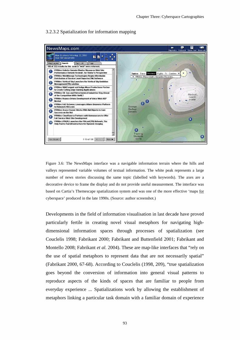
Chapter Three: Cyberspace Cartographies
93
3.2.3.2 Spatialization for information mapping
Figure 3.6: The NewsMaps interface was a navigable information terrain where the hills and
valleys represented variable volumes of textual information. The white peak represents a large
number of news stories discussing the same topic (labelled with keywords). The axes are a
decorative device to frame the display and do not provide useful measurement. The interface was
based on Cartia’s Themescape spatialization system and was one of the more effective ‘maps for
cyberspace’ produced in the late 1990s. (Source: author screenshot.)
Developments in the field of information visualisation in last decade have proved
particularly fertile in creating novel visual metaphors for navigating high-
dimensional information spaces through processes of spatialization (see
Couclelis 1998; Fabrikant 2000; Fabrikant and Buttenfield 2001; Fabrikant and
Montello 2008; Fabrikant et al. 2004). These are map-like interfaces that “rely on
the use of spatial metaphors to represent data that are not necessarily spatial”
(Fabrikant 2000, 67-68). According to Couclelis (1998, 209), “true spatialization
goes beyond the conversion of information into general visual patterns to
reproduce aspects of the kinds of spaces that are familiar to people from
everyday experience ... Spatializations work by allowing the establishment of
metaphors linking a particular task domain with a familiar domain of experience

Chapter Three: Cyberspace Cartographies
94
in such a way that the modes of thought and action appropriate in the familiar
domain area also appropriate in the task domain.”
Spatialization renders large amounts of abstract data (usually textual corpus) into
a more comprehensible, compact visual form by generating meaningful synthetic
spatial structure (such as distance on the map display scaled according a
measurement of lexical similarity between data items; see Fabrikant et al. 2004)
and applying cartographic design concepts from topographic mapping and
thematic cartography (Skupin 2000). Some of the most map-like examples have
used the conventions of hill shading and contouring from terrain mapping to
create browseable virtual ‘information landscapes’ (Wise 1999; Dodge 2000f)
(Figure 3.6 above). Skupin and Fabrikant (2003, 113) have called for much
greater involvement of cartographers in information visualisation to develop
improved spatializations for non-geographic data, arguing that “it may lead to a
renewed interest among non-cartographers in how our community has managed
to not only represent the infinitely complex geographic reality within a limited
display space, but also do it in a manner that enables people to recognize their
world within it.”
3.2.3.3 Challenges in information mapping
Given these potential advantages, actually creating practicable spatializations,
however, faces real challenges. This is particularly the case, firstly, because
cyberspace is new and diverse. It is not a single, homogenous and continuous
phenomenon, but a myriad of rapidly evolving digital databases, channels, and
media, each providing a distinct form of virtual interaction and communication
(as shown in Figure 1.1 in the introductory chapter). Secondly, many virtual
spaces are overlapping and interconnected, but often in ad-hoc and unplanned
ways, giving rise to complex rhizomatic10 structures that can not easily be
surveyed and mapped. Cyberspace, composed of infinitely malleable software
code that can produce numerous media forms - including Web pages and their
hyperlinks, social interactions as text in synchronous chat rooms and
10 A rhizome is a tangled root system that develops horizontally, and in a non-hierarchical fashion. Hypertexts are said to be rhizomatic in form because any node may connect with any other.

Chapter Three: Cyberspace Cartographies
95
asynchronous mailing lists, three-dimensional VR environments, huge
distributed file corpuses on peer-2-peer networks - all with “their own sense of
place and space, their own geography” (Batty 1997, 339).
Some virtual spaces can be highly mutable and in continual informational flux as
content is refined, expanded and deleted in unpredictable ways - the average life
span of a Web page in 2000 was reported to be only 44 days (Lyman 2002).
These are inherently transient landscapes, but where changes are ‘hidden’ until
they are encountered. Change can happen instantaneously, for example deleting a
Web page leaves behind no trace (unless archived elsewhere previously). The
lack of reciprocity in relations means an information node can vanish without
notice or notification to any other party (hence the problem of ‘dead-end’
hyperlinks on the Web). The programmed logic of cyberspace – presence or
absence, zero or one – makes for a hard landscape to map.
Furthermore, these issues of information mutability and transience are likely to
grow, and become obfuscated by increasing use of encryption and ad-hoc
distributed architectures (e.g., P2P and WI-FI mesh networks) making mapping
even harder11. The task of generating even a basic index of parts of cyberspace
for example, continues to tax the largest corporations and government agencies.
The Web search engines, for example, have failed to keep pace with the growth
and mutability of just this one part of cyberspace. Of course, issues of data
currency and change management are well known in cartography (e.g., the
uneven revisions cycles of paper topographic maps by some organisations).
However, the surveyed environment represented on conventional topographic
maps is really quite a stable place (change tends to be gradual in relation to
human perceptions; most things stay the same, and when they do change, they
typically leave evidence behind in the material landscape.) The physical fixity,
friction and inertia of geographic space means the ‘shelf-life’ of most maps is
11 Tim Berners-Lee and others counter that the growth and complexity of online information resources can be more effectively managed with application of XML to encode semantic meanings and the use of collaborative user tagging and rating. Additionally, the wholesale automatic geocoding of information objects, as they are created and transmitted, opens up interesting possibilities for spatial indexing, filtering by distance and searching by geographic location.

Chapter Three: Cyberspace Cartographies
96
quite long (most of the information printed on a Ordnance Survey Landranger
map remains valid for decades). There is no such friction or inertia in cyberspace
and the ‘shelf-life’ for many cyberspace maps is terribly short. What is really
needed are ‘maps for cyberspace’ that are capable of dynamically mapping out
virtual space in real-time, much like a radar map for tracking weather patterns.
A third set of challenges in mapping relate to the nature of the space. Cyberspace
offers media that at first, often seem contiguous with geographic space, yet on
further inspection it becomes clear that the space-time laws of physics have little
meaning online. This is because virtual spaces are purely relational. They are not
‘natural’, but are solely the productions of their designers and, in many cases,
users. They adopt the formal qualities of geographic (Euclidean) space only if
explicitly programmed to do so, and indeed many media such as email have
severely limited spatial qualities. Significantly, many virtual spaces violate two
principal assumptions of modern (Western) cartography making them difficult to
map legibly using conventional techniques12. The first of these are the Cartesian
properties of space as continuous, ordered and reciprocal; there are no sudden
gaps or holes in the landscape, everything is somewhere, and the Euclidean
notion of distance holds true, i.e. the distance from A to B will be the same as
from B to A (Staple 1995). Yet parts of cyberspace are discontinuous, lacking
linear organisation and in some cases elements can have multiple locations.
The second assumption is that the map is not the territory but a representation of
it, (i.e. the territory has a separate, ongoing existence and meaning beyond the
map.) Yet there are examples of virtual space where in a literal and functional
sense the map is the territory. Cartesian logic collapses and there is no reality
independent of the representation (Dodge and Kitchin 2000a). This conflation of
the map and the territory is most obviously seen in hypertext spaces when the
structuring of the data is both the space and its map. This can be experienced in
the experimental three-dimensional ‘fly-through’ spatializations of hypertext,
such MIT Media Lab’s Perspecta system (Holtzman 1997) or Apple’s HotSauce
12 Of course, a number of geographers have undertaken work on non-Euclidean geographies using relational measurements of distance (e.g., Gould 1991).

Chapter Three: Cyberspace Cartographies
97
navigation map-interface (Figure 3.7) (cf. Dodge 2001a). Staple (1995, 71)
comments further that in “a very real sense the session is the map. Or paraphrase
Marshall McLuhan, the medium is the map.” Interestingly, none of the
experiments in ‘fly-thru’ map-spaces that emerged in the 1990s gained
widespread usage despite great hope by some pundits that they would overturn
the page-by-page view of the Web (a visual paradigm based largely on book
metaphors) ingrained in browsing software.
Figure 3.7: A screenshot of the HotSauce fly-through interface to Web space produced in the mid
1990s by Ramanathan V. Guha while working at Apple Research. It was an experimental three-
dimensional abstract representations and illustrates the degree to which ‘maps for cyberspace’
mode stretches beyond cartographic conventions. As an effective navigation map it was a failure.
(Source: author screenshot.)
At present, it is probably fair to say that in relation to the challenges of producing
effective ‘maps for cyberspace’, the current map-makers are at a comparable
stage of development to the cartographers at start of Renaissance period in
creating comprehensive and useful maps. Although armed with a knowledge of
traditional mapping and sophisticated computing, mapmakers are lacking the
vital ‘blueprints’ that Ptolemy provided for European cartographers in terms of a
projective grid for plotting the knowledge of vastly expanded territories that the
New World explorations brought back. At present there is no equivalent world-

Chapter Three: Cyberspace Cartographies
98
making grid of latitude and longitude for cyberspace. As a consequence, many
cyberspace cartographers have generally resorted to extending existing methods.
One productive route forward for this mode is to draw upon the mapping
epistemologies of non-western, aboriginal cartographies, which are markedly
different from the dominant conventions and norms of Western cartography, and
might well provide insights for future cyberspace mapping projects. Much of the
focus in indigenous cartography is on the non-textual visualisation of conceptual
links, pathways and relationships between space rather than the geometric grids
and locational accuracy emphasised in modern (Western) cartography.
3.3 Literature on the cartographies of cyberspace
There is a substantial body of critical analysis on the history of cartography, and
on contemporary digital mapping and the practices of GIS, yet there has been
little scholarly work examining cyberspace cartographies per se. While examples
of cyberspace maps crop up frequently in different literatures, such as network
maps used as illustrations in technical guide books (e.g., Quarterman 1990) and
histories of the Internet (e.g., Abbate 1999; Hafner and Lyon 1996; Salus 1995),
most are without systematic comment on their semiotic properties or their wider
social significance.
To begin the summary of relevant literature on cyberspace cartographies, I want
to consider Gregory Staple’s paper, Notes on Mapping the Net: From Tribal
Space to Corporate Space (1995). (Staple is a telecoms lawyer and the founder
of TeleGeography, as noted above.) Although it is a non-academic treatise in
some respects, and was published in grey literature, the paper provides a valuable
perspective on the emergence of cyberspace cartographies from one of the
pioneers in the field. Staple argues firstly that cyberspace is significant in
extending the centuries old debate about ‘what are maps’ and starts by drawing
direct parallels to the explorative drive from the ‘age of discovery’ to define
contemporary cartographic motivations. He notes that effective maps of
cyberspace are rare because “[f]ew among this frontier fraternity” of hackers and
webmasters, “have both the navigational and drafting skills of a Ferdinand
Chapter Three: Cyberspace Cartographies
99
Magellan or a James Cook” (Staple 1995, 66). He then provides a role call of
‘issues’ that make cyberspace mapping challenging, including the lack of an
established mental conception of what cyberspace should look like: “Ask a
communications engineer to draw a picture of cyberspace and you are likely to
get a sea of clouds each representing a different network” (Staple 1995, 67) (see
also chapter four). The confusion in how to represent cyberspace calls for a clear
separation of the “hardware and software side of the on-line world.” (Staple
1995, 67), matching partially the mode conceptualisation used here in this thesis
(i.e., ‘maps of cyberspace’ and ‘maps for cyberspace’).
Staple’s principal interest is in ‘cybermaps’ to represent information spaces for
user navigation (what I define as the ‘maps for cyberspace’ mode). To achieve
this, he notes, new maps will likely be cartographically unconventional (i.e.
breaking the Euclidean conventions of most Western maps) and he draws on
ideas from tribal mapping as a source for such alternative conceptions.
Importantly, connectivity rather than continuity of virtual spaces of cyberspace
need to be represented to users and he cites American Indian and Australian
Aboriginal mapping as a useful model for this: “Cybermaps like tribal maps may
... dispense with conventional perspective to conserve connectivity. They are true
to the land, not to the theodolite” (Staple 1995, 68). Staple means the focus of
measurement and mapping should be on overall topology rather than topographic
detail. He concludes the paper by discussing the social implications of cybermaps
in relation to the changing forms of cyberspace evident in the mid 1990s with the
start of rampant commercialisation, arguing that initial exploration mapping will
open up cyberspace to the controlling cartography of “a more mercantile genre”
with universalising grids capable of locating all virtual territory. “Tomorrow’s
cybersmaps” he concludes “will record the boundaries of corporate space on the
Net even as earlier ones illustrated its tribal origins” (Staple 1995, 72).
In terms of writing by academic cartographers, there are two descriptive papers
by Jiang and Ormeling (1997 and 2000) which do engage with cyberspace
cartography directly, although they do not attempt any theoretically-informed
critique of their social implications. The lead author is heavily involved in
visualisation research and the papers were both published in the Cartographic

Chapter Three: Cyberspace Cartographies
100
Journal, the house journal of the British Cartographic Society which speaks to
‘mainstream’ practitioners and researchers. Both papers review a range examples
of ‘cybermaps’ with an explicit ‘call to arms’ to cartographers to lend their skills
and experience to make improved maps, asserting that: “cartographers with a
long standing tradition of mapping geographical space, can make an important
contribution to mapping cyberspace” (Jiang and Ormeling 1997, 111).
Jiang and Ormeling’s first paper, Cybermap: The Map for Cyberspace (1997),
defines the nature of the ‘cybermap’ elliptically as a “special map for
cyberspace” (p.112) that encompasses representations of both the physical
network and the information spaces. Drawing on theories of maps as
communication tools, they set out a three-fold ‘functional classification of
cybermaps’: navigation maps, maps for cyberspatial analysis, maps for
persuasion. The short paper includes five colour cybermaps as illustrations, but
these are not politically critiqued. The authors use them in the affirmation of the
need for professional cartography, somewhat snobbishly noting that “[a]s many
cybermaps are produced by non-cartographic professionals, it is unavoidable that
some low quality maps are created.”
Jiang and Ormeling’s second paper, Mapping Cyberspace: Visualizing,
Analysing and Exploring Virtual Worlds (2000), covers similar ground to the
first, with the map again normatively defined as “a visualisation tool for
understanding and perception of space” (p. 118). They set out a somewhat
modified conceptualisation of cyberspace mapping as being concerned, firstly,
with analysing the geography of the “physical anchorages” of Internet following
the “principle of traditional thematic mapping” (Jiang and Ormeling 2000, 118),
secondly, a typology of network forms in which the Internet is visualised as non-
geographic trees and graphs (they cite the Cheswick-Burch visualisation as an
exemplar; see Figure 4.10). Lastly, they argue cybermaps are the means to
produce “general purpose maps for virtual worlds” (Jiang and Ormeling, 2000,
118) as an aid to user navigation through three-dimensional space.
Batty and Miller (2000) bring the concept from quantitative modelling of
accessibility into their analysis of representations of different types information

Chapter Three: Cyberspace Cartographies
101
space. They are concerned with developing a research agenda for understanding
the nexus between material and virtual spaces, the hybrid space that they argue
will be the “focus for a new geography of the information age” (Batty and Miller
2000, 134). Attempts to directly map out virtual spaces using traditional
techniques developed for Euclidean landscapes, they argue, may well not be
applicable because of the ease with which ‘rules’ of geographic space are broken
and the unsuitability of the existing tools: “current GIS software does not treat
non-Euclidean space in an appropriate way” (Batty and Miller 2000, 136) they
point out. An alternative, to map the real-world locations of the physical and
logical components of virtual space, is again viewed with caution by Batty and
Miller because “[t]he spatial/geographical metaphor may not be appropriate,
particularly since information flow in most networks apparently does not
correlate with geographical space” (Batty and Miller 2000, 136). This is an issue
because fluid and uncertain phenomena are hard to represent in cartographic
meaningful ways.
One route forward, they suggest, might be to look beyond mapping the ‘surface’
morphology of cyberspaces towards an analysis of the structural process
underlying cyberspatial production by modelling interactions using measures of
latency instead of Euclidean distance to “see whether or not the frictionless world
that has emerged has any parallel in traditional geographic spaces” (Batty and
Miller 2000, 139) or by applying the notion of power laws and small world
networks to understand the emergent properties of information objects (such as
Web sites and their hyperlink structures). By way of conclusion they set out a
fourfold research program for representing hybrid space (p. 144) focused on (1)
visualisation of connections between material and virtual geographies by
augmenting existing measures of accessibility and developing new ones; (2)
researching information flows and costs in relation to existing market, social and
institutional processes; (3) mapping activity spaces by extending time geography
theories to take account of network flows; (4) developing tools for cyber-
navigation. This agenda has clear overlaps to my conception of cyberspace
cartography, with the first two items aimed at advancing the ‘maps of
cyberspace’ mode and the other two items come within the remit of the ‘maps for
cyberspace’ mode.

Chapter Three: Cyberspace Cartographies
102
Castells’ (1996) sophisticated sociological theorisation of the network society
was founded on the power of informational flows to reconfigure time-spaces of
material places. In his book, The Internet Galaxy13 (2001) he analyses in more
depth the material production of the Internet with a review of the geography of
the infrastructure with descriptive statistics and census-type mapping. He sets out
a three-fold schema for analysis that in many respects correlates to major types
of ‘maps of cyberspace’ mode outline above. The first element in the schema is
the “technical geography” by which Castells’ (2001, 208) refers to “the
telecommunications infrastructure of the Internet, the connections between
computers that organize Internet traffic and the distribution of ... bandwidth”.
The second element is the customer statistics, especially concerning the uneven
geographic distribution of access and usage. The final element in Castells’
schema is the economic geography of Internet production, which has a much
more spatially concentrated pattern that usage. Drawing heavily on the work of
economic geographer Zook, the chapter includes seven illustrative thematic maps
of Internet statistics that show very much the conventional face (and normative
utility) of cyberspace cartographies to make intangible spaces seem tangible to a
non-technical audience.
Outside of academic geography, the most theoretically sophisticated work on
cyberspace cartographies is the paper by Harpold, titled Dark Continents:
Critique of Internet Metageographies (1999). Coming from the cultural studies
domain, Harpold provides a cogent postmodernist critique of maps of global-
scale Internet infrastructure, richly illustrated with relevant empirical evidence.
He views much of the output of the ‘maps of cyberspace’ modes as a pernicious
new ‘metageography’14 sustaining the information society. “[T]he inherent
selectivity and social subjectivity makes a map”, Harpold (1999, 18) argues, “a
13 As an interesting side point, the book’s cover features a version of the Burch-Cheswick Internet graph as its central motif. Clearly this image conjured up, both, the space of networks as well outer (galactic) space in the mind of the designer (see discussion in chapter four). 14 Harpold’s concept of metageography, following Lewis and Wigen (1997), is defined as “sign systems that organize geographical knowledge into visual schemes that seem straightforward, but which depend on historically- and politically-inflected misrepresentation of underlying material conditions.” (p. 5).

Chapter Three: Cyberspace Cartographies
103
problematic construct for describing the heterogeneous conditions and practices
of the emerging global telecommunications networks.” He is particularly
concerned with the politics of silence and the iniquitous under representation of
the peripheries of cyberspace as evidenced in the blank spaces of the African
continent on most infrastructure maps. He draws direct ideological parallels here
to the colonial mappings of the nineteenth century, arguing “[t]he blank region is
‘empty’ only in relation to the comparable fullness of the rest of the map”
(Harpold 1999, 3). He proceeds to trace out the implications of using nation-state
boundaries as the ‘natural’ background to represent Internet diffusion, bandwidth
and access, when the motive forces behind the processes are operating in a multi-
scalar networked political economy. The result, he agues, is that these kinds of
‘maps of cyberspace’ are deeply deceptive, overstating the extent of Internet
diffusion because fundamentally they are unable to “account for the extreme
local obstacles which must be overcome before anything like a viable African
Internet is possible, at least as netizens of digitally-saturated, liberal-democratic
nations understand the Internet.” (Harpold 1999, 12)
In Harpold’s opinion (1999, 17), too many ‘maps of cyberspace’, by opting for
conventional geographic projections, nation state boundaries and signs systems
of thematic cartography, produce mythologies that reduce the Internet into
categories of “on/off, traffic/no traffic, wired/unwired”. Thus the maps work,
Harpold asserts, as a display of “counterfeit ubiquity and technological
reasonableness” that masks the unevenness of the process of Internet diffusion
and the extent to which the network will further acerbate social difference
between places. He ends his analysis with a call to map the Internet using a
different cartographic imagination, with “new schemes for representing the
archipelagic landscapes of the emerging political and technological world order.”
(Harpold 1999, 18). It is not clear whether these have been drawn yet or, indeed,
whether they can be drawn at all by map-makers cultured with conventional
Western metageography.

Chapter Three: Cyberspace Cartographies
104
Figure 3.8: The highly illustrated first page of a major story in the New York Times that
publicized the notion of cyberspace cartographies at the end of the 1990s. (Source: O’Connell
1999, G1.)

Chapter Three: Cyberspace Cartographies
105
3.3.1 Popular interest in cyberspace cartographies
The field of cyberspace mapping has also received coverage from the
mainstream media in many parts of the world. Notable articles where the
journalists provided useful analysis includes: Bodzin (1999), Forde (2000),
Johnson (1999) and O’Connell (1999). The last of these was a substantive review
article in the New York Times entitled Beyond Geography: Mapping Unknowns
of Cyberspace, which provided a coherent frame to the field, noting that
cyberspace cartographies encompass a diverse range of representations and are
being “produced by geographers, cartographers, artists and computer scientists”
(p. G1). The story was illustrated prominently with five colour examples from
both modes with the front page dominated by an Earth globe from the
visualisation research of Lamm et al. (1995) (Figure 3.8). Two other well known
Internet visualisations were used, firstly a fragment of the Burch-Cheswick
topology graph (see also Figure 4.10) and the ‘arc across the world’ map by
Stephen Eick and colleagues (see also Figure 4.4). O’Connell (1999, G1) argued
that cyberspace cartographies stretch the “definition of a map in their effort to
capture, sometimes fancifully, what is sometimes referred to as the ‘common
mental geography’ that lies beyond computer screens.” Defining the field, she
divided cyberspace cartographies into two types, infrastructure and traffic maps
on one side, and “those addressing the content and social spaces of the electronic
world.” (O’Connell 1999, G1) on the other. The quotes she includes from various
domain experts create an impression of a nascent field with few practical maps
available, but an upbeat prognosis about future developments; as she notes: “The
maps hold the potential to change, subtly or perhaps more directly, the
relationship of the average person to cyberspace.” (O’Connell 1999, G1).

106
Chapter Four
Imagining Internet Infrastructures: Spatial Metaphors and Scientific Inscription
4.1 Introduction: explaining what the Internet looks like1
There are several kinds of spatial imaginings that have been exploited to
establish the Internet as something ‘real’ and to prove the ‘matter of fact’
existence of its infrastructure to different audiences by explaining ‘what the
Internet looks like’. These are significant in how they work to overcome the
problems of the invisibility and intangibility of the Internet as an infrastructure.
How do you explain the Internet when you cannot see and touch it?
1 (Source of cartoon: Robert Thompson, The Guardian, Online section, 29 March 2001, page 4.)

Chapter Four: Imagining Internet Infrastructures
107
Imaginings of infrastructures were particularly prevalent in the first half of the
1990s, when the Internet emerged rapidly as a new social-technical phenomenon
in advanced capitalist countries and needed to be ‘explained’ in accessible ways
to the majority of people who had not experienced it for themselves. This was
especially because the Internet as a entity has no singular, manifest
representation. Unlike transportation and telecommunications there is no one
material device that unambiguously signifies the Internet. Further complicating
the matter, the Internet is often typified as a place rather than an object or media
(as illustrated by the cartoon above). Early in the Internets’ entry into the public
consciousness, it had an imaginal malleability as people had no fixed conception
of what it was, how it worked, whether it was valuable to them, or whether they
could trust it. As a result the influence of particular spatial metaphors,
geographical representations and scientific inscriptions in shaping perceptions
was strong.
In this chapter, I consider how different types of spatial imaginary of the Internet
have been deployed to overcome infrastructural invisibility and work to forge the
disparate and fragmented networks into a unitary entity that could be trusted.
This imaginary is examined in two broad categories. Firstly, for general
audiences, the range of verbal and visual metaphors that were deployed is
considered. While such metaphors can be dismissed as mundane, Vujakovic
(1998, 158, added emphasis) points to their social power, noting the “common
acceptance of a particular metaphors (propagated or reinforced by the media)
may lead to a limited view of an issue and the closure of constructive
alternatives.”; and I think this is apposite to particular kinds of spatial metaphor
than have been applied to the Internet. Secondly, for the research-engineering
audiences, I examine the role of scientific inscriptions in constructing facts about
the Internet’s structure and operations. To begin, I unpack the nature of the
Internet’s invisibility.

Chapter Four: Imagining Internet Infrastructures
108
Figure 4.1: Cartography denotation necessary to make invisible Internet infrastructure visible for
readers of a newspaper story about cable cuts and their impact on the Internet. (Source: The
Guardian 2008, 22-23.)

Chapter Four: Imagining Internet Infrastructures
109
4.2 Internet ‘invisibility’
There are several dimensions to the invisibility of the Internet: firstly, the unseen,
ignored and hidden material nature of the wires and computers; secondly, the
transparency of network activities and lack of tangible experience for users;
thirdly, issues of rapid social naturalisation and the ‘taken-for-granted’ banality
of technical systems; and lastly, the conscious occlusion through institutional
normalisation within the wider neo-liberal political economy. I outline each of
these dimensions in turn.
Figure 4.2: A road junction outside the One Wiltshire building, an internet hub in downtown Los
Angeles, that is heavily marked with ‘utility graffiti’ signifying the location of underground cable
routes leading into the building. Such markings are a kind of 1-to-1 map of the complexity of
what lies unseen just beneath the surface. (Source: Varnelis 2002, no pagination.)
4.2.1 Materially unseen
The first dimension of invisibility is that network hardware for data transmission
is largely unseen in the everyday urban landscape, especially in comparison to
the physical presence of other communications systems (roads, railways, airports,
postal mail and the like). The Internet as infrastructure is very briefly visible as
fibre-optic cables are rolled out in the streets, but is quickly subsumed beneath

Chapter Four: Imagining Internet Infrastructures
110
roads and pavements. The ‘wires’ of the Internet through cities and across
countries are almost universally routed subterraneously (Figure 4.2), and
between continents lie along the ocean floors (Figure 4.1). The Internet is also
dematerialising further as the actual wires are rapidly being replaced by wireless
transmission that invisibly carries data unfelt through buildings and bodies.
The infrastructure at the ends of the wires, the network switches and computer
servers, have a small physical footprint, and are usually hidden away in
unmarked service spaces and anonymous secure, windowless buildings. Other
supporting hardware elements vital to ongoing Internet production, such as air-
conditioning and backup power supplies, are separated from people by being
located in basements or on roof tops. For all the hype surrounding the Internet
and the billions in capital investment, it has remarkably little visual impact on the
urban landscape. Other tangible or noxious externalities of the Internet are
minimal because it does not produce noise or other noxious pollution2.
In addition to being out-of-sight and relegated to non-human serving spaces,
other elements of the network hardware that are manifestly visible in the
landscape are effectively made invisible because they are mundane (‘invisibility
by being ignored’) or because they are not associated with the operation of the
Internet (‘invisibility by misconception’). For example, the wiring cabinets3
aggregating customer telephone lines, which are now vital to broadband Internet
distribution, are a common sight on pavements but are an anonymous and
unmarked part of street furniture.
The material invisibility of the Internet is being actively encouraged in some
quarters as part of more recent cybersecurity initiatives in which critical and
2 Moreover, the negative externalities of manufacturing I.T. hardware are concentrated and largely remote from the affluent places of Internet consumption as a consequence of global supply chains. The disposal of computing equipment is also highly polluting, but again is hidden from the view of most people (see BAN 2002). 3 In the UK, British Telecom has some 90,000 such ‘primary cross-connection point’ cabinets. They are usually painted an unassuming green colour, see <www.btplc.com/Thegroup/Networkstory>.

Chapter Four: Imagining Internet Infrastructures
111
vulnerable elements of the infrastructure are thought to be best protected by
being kept anonymous and secret (Gorman 2004). Such ‘security through
obscurity’, leaving important places deliberately undocumented, has a long
tradition, including in the production ‘rules’ of state cartography (Board 1991).
It is not only the ongoing hardware production of the Internet that is unseen; at
the infrastructural level what is carried by data networks is entirely invisible in a
phenomenological sense. Unlike cars on the road, trains on the track, or letters in
the mail, the packets of data flowing through the Internet do not exist at the
analogue scales of human senses. Bits (binary digits) of data are composed of
discrete states of energy propagated at various wavelengths (light, radio,
microwave, and so on) and have “no colour, size, or weight, and can travel at the
speed of light ... [they are] a state of being, on or off, true or false” (Negroponte
1995, 14). While the bits are easily interpreted by software, they must be
rendered through interfaces for people to comprehend. It is, therefore, not
possible to observe the operation of the Internet unmediated. This is problematic,
in particular, for companies selling Internet network services who need to make
their infrastructure into something potential customers can trust. As a
consequence they have to construct a connotation of infrastructure in a way
people expect it to look using a range of visual metaphors, of which world maps
showing the geography of routes is a primary vehicle (see case study analysis in
chapter six).
4.2.2 Transparent in use
At a higher level than traffic flows, the Internet is also ‘invisible-in-use’ because
data networks are intangible in terms of consumer experience. In conventional
transportation infrastructures, passengers and drivers have innate and
phenomenological knowledge of the networks through the journey experience.
They comprehend the physical nature of the infrastructure by kinaesthetic
interaction with cars, trains and planes - the direct ‘seat of the pants’ feel of the
network. Telecommunications, in their inherent virtuality, are completely lacking
such experiential comprehension. The lack of human touch defines tele-
communications.

Chapter Four: Imagining Internet Infrastructures
112
No knowledge of the Internet as infrastructure is gained from browsing the Web
for example, it gives off no physical sensations. The majority of people on the
Internet are never aware of the vast infrastructure they are utilising because it is
consciously hidden from them, behind software interfaces. (Again, as noted
above this is problematic for companies in the actual business of Internet
infrastructure, who commonly use deploy market maps to give potential
customers a visible sense of how extensive and powerful their network is; see
discussion in chapter six.) Such infrastructural concealment is seen as a good
thing by the industry - it is described as the ‘network being transparent to the
user’4. A key part of the power of the Internet has been its ability to provide
seamless, end-to-end, communications services so that users do not have to
worry about the structure of the underlying networks and the complex ways in
which traffic is transmitted. Indeed, one might argue that the Internet could only
become such a successful and widely used media of communication once its
arcane technicalities were rendered sufficiently invisible to users, through
developments such as the Web browser.
Moreover, a large cadre of computer science researchers, network engineers and
industrial designers are striving to greatly increase the degree to which
computers and the Internet fade into the fabric of everyday activities. Working
under the banner of pervasive computing they are striving for systems that are
“so imbedded, so fitting, so natural, that we use it without even thinking it”
(Weiser 1991, 94). Scholars in this area argue that current ICT use, is in fact, not
transparent enough, requiring too much cognitive effort to achieve the desired
results (cf. Norman 1998). The promise of nomadic, always-on access through
wireless networks will, advocates argue, make the Internet as invisible and
ubiquitous as air.
4.2.3 Disappearance by social naturalisation
The conduct of daily life surely demands a tactical lack of curiosity! But that lack of curiosity
carries costs and overhead expenses as well as benefits. (Bijker and Law 1992, 2.)
4 Transparency in this sense means that infrastructure “does not have to be reinvented each time or assembled for each task, but invisibly supports those tasks” (Star and Bowker 2002, 152); the archetypal of this, in developed countries, is domestic electricity supply.

Chapter Four: Imagining Internet Infrastructures
113
As well as being materially unseen and intangible in use, probably the most
effective way that Internet infrastructure is made invisible is through its subtle
disappearance from people’s consciousness. As is well noted by scholars
interested in the social shaping of technology, once an infrastructure becomes
commonplace, people do not much care for how it is produced, for they exhibit
“a tactical lack of curiosity” according to Bijker and Law (1992, 2). It becomes a
‘taken-for-granted’ feature, fading into the background of everyday life.
Infrastructure is something you notice more by its absence than its presence.
From being a novelty in the mid 1990s, the Internet has quickly become
culturally naturalised, with email addresses and websites part of common
vernacular. Concerns about ‘digital divides’ notwithstanding, many businesses
and government agencies now presume that all people have Internet service and
are sufficiently conversant with it to obtain information and perform transactions
online. (Arguably, connotations of ubiquity and universality is, in part,
constructed through the particular kinds of worldwide mapping of Internet
penetration statistics by some organisations; see analysis in chapter five.) Such
everyday social-cultural familiarity is clearly bound-up with transparency in use.
As infrastructures become more transparent (and more reliable, affordable and
universally available), so they morph in character from desired conveniences to a
necessary and seemingly naturally-given part of the lived environment.
This is often conceived of as a process of ‘black-boxing’ in which infrastructures
are “treated by users as unproblematic and ‘closed’ sociotechnical artefacts that
[can] be relied on without much thought” (Graham 2000, 184). One might argue
that the best infrastructures are those that are so ‘black-boxed’ they are not
noticed at all; they are also the most powerful, able to affect deeper or wider
ranging reorganisations of socio-spatial relationships without scrutiny or
resistance (again, electrical power supplies serves as an archetypal case). Indeed,
one way of assessing the extent to which technologies, including the Internet,
have moved ‘backstage’ and been ‘black-boxed’ is by measuring the degree of
dependency people are willing to place on them. Such dependency is exposed in
the disruption caused when infrastructures temporarily fail, for whatever reason

Chapter Four: Imagining Internet Infrastructures
114
(e.g., the large degree of inconvenience to everyday activities caused by power
cuts).
4.2.4 Occlusion through institutional normalisation
Large infrastructures are produced by institutions and their ongoing production
requires huge amounts of mundane, easily-overlooked organisational work
(construction plans and maintenance schedules, operational staffing
arrangements, business processes, financial management, technical standards,
and so on). Internet networks are as much an outcome of the institutional
practices as they are the result of physical wires.
Yet this kind of institutional work tends to become normalised, bureaucratic and
anonymous. Infrastructure invisibility is manufactured institutionally then, by
obscure regulatory structures that make it hard to discern sources of decision-
making power, by complex pricing models that hide real costs and deliberately
opaque ownership structures which make it unclear who controls companies.
Ultimately, the complex institutional power structures underlying the supply of
the Internet into people’s homes contributes to making the infrastructure
invisible. (Many of the companies examined in chapter six who run large parts of
the Internet networks are obscure because they do not sell services to end-
customers.)
Institutional working is itself is bound within the prevailing political-economic
structures. Through much of the second half of the twentieth century utility
infrastructures (electricity, water, telephone, transportation networks) were
operated within monopolistic state ownership structures. Generally, these had
clearly established remits and strong public identities for the infrastructure they
managed (even if they were not well liked, e.g. British Rail). Since the 1980s,
this institutional unity in provision has been deliberately broken apart - so called
‘unbundling’ or ‘deregulation’- through processes of marketisation, privatisation
and regulatory liberalisation. Such fragmentation means there is a lack of a
constituted, agreed institutional identity for utility providers. In the case of the
Internet, whose job is it to keep the infrastructure running? Graham and Marvin
(2001) characterise this shift as a ‘splintering urbanism’, arguing that it is giving

Chapter Four: Imagining Internet Infrastructures
115
rise to “‘premium networked spaces’ that are customised precisely to the needs
of powerful users and spaces, whilst bypassing less powerful users and spaces”
(Graham 2000, 185). Internet provision is a prime example of such premium
networked spaces, with its pricing, quotas and differential bandwidths.
Another significant element in this invisibility of institutions owning and running
the infrastructures of the Internet is the obscurity of the workers who do this
work. The skilled labour force required to build and operate the Internet is
largely invisible, and when acknowledged they are often denigrated as just
‘technicians’ in comparison to other more attractive occupations associated with
the creative industries of new media. This aspect of the ‘hidden’ workforce in
information infrastructures is not new, as Downey (2001) shows in relation to the
telegraph era.
4.2.5 Implications of infrastructure invisibility
Infrastructure can be dullest of all topics. It can also be the most important. Infrastructure
defines the basis of society; it is the underlying foundation of the facilities, services and
standards upon which everything else builds. (Norman 1998, 55.)
The above dimensions of infrastructural invisibility have consequences, both
pragmatic and political, for understanding the nature of the Internet. Firstly, from
a practical point of view it means infrastructures tend to be little studied within
social sciences. They are easily overlooked by scholars and deemed to be
insignificant elements in wider analysis or are seen as ‘mere’ technicalities with
little scope for socially informed research. Hillis (1998, 544), for example,
argues that infrastructure invisibility across several registers has been the key
reason why telecommunications have received scant attention by the human
geography discipline5: “[f]or a discipline firmly rooted in an empirical and
visually dependent understanding of the facts, too often, if it can’t be seen ‘it’s
not geography’.”
5 There have been some noteworthy academic attempts to understand the physical construction and geographical embeddedness of network infrastructures, in spite of the varying dimensions of invisibility, e.g., Board et al. (1970); Gottmann (1961);Graham and Marvin (1996, 2001); Hugill (1999); Mitchell (1995); Townsend (2003).

Chapter Four: Imagining Internet Infrastructures
116
The failure of much of the social sciences to take a serious interest in
infrastructures is compounded by the lack of published and comprehensible
documentation of them. This is particularly the case with the Internet, with
available data being partial, spatially incomplete, fragmented organisationally
and often held to be commercially confidential (cf. Grubesic and Murray 2005;
Jordan 2001). In relation to network maps for commercial promotion, chapter six
discusses the impacts of partial and missing traffic data for misunderstanding the
nature of Internet infrastructure growth. Furthermore, as an infrastructural entity,
the Internet is essentially made intractable because of its undocumented presence
in standard government statistics and on general reference mapping. For
example, the terrestrial fibre-optic cable systems which sustain the Internet are
not present as a layer in published topographic map databases (e.g., in Ordnance
Survey’s MasterMap product in the UK)6. Being unmapped in this way is, in
many respects, tantamount to being invisible for analysis7.
From a political perspective, critical studies of infrastructures are made harder
because of the ways in which institutions deliberately keep them as ‘black-
boxed’ systems, to keep people from easily observing (and questioning) their
design and operational logics. Invisibility of the infrastructure provides an
effective cloak under which dubious or iniquitous practices can be safely carried
out by institutions owning and operating them. The lack of critical studies of
Internet infrastructure mean intensifying bias in the ongoing production of
networks that widen social difference and inequalities across space are
unchallenged. It also precludes informed discussion of ways to build and operate
infrastructure differently.
6 Utility engineering departments do have facilities maps showing pipe and cable routes but these are typically not available to the public and in many cases are incomplete and of varying degrees of accuracy. 7 As noted in chapter six, this limit has meant some academic and policy analysts have been overly reliant on the vagaries of network marketing maps produced for commercial promotion as their source of primary data on the extent of Internet infrastructures.

Chapter Four: Imagining Internet Infrastructures
117
4.3 The role of verbal and visual metaphors
The generation of popular explanations of the Internet involves the classification
and conceptualisation of an unfamiliar phenomenon (i.e., extensive but invisible
infrastructures which support novel forms of interactive media) into a set of well-
known categories. This process can be effectively accomplished using
metaphors, which constitute an important and pervasive form of figurative
speech, fundamental to human language and which structure cognitive
experience (Lakoff and Johnson 1980). Here I consider verbal metaphors first,
followed by a discussion of common visual spatial metaphors, used to represent,
imagine and ‘explain’ Internet infrastructures, thus, at least in part, overcoming
its multidimensional invisibility.
4.3.1 Linguistic spatial metaphors
The expanding lexicon of the Internet ... is not only replete with, but actually constituted by,
the use of geographical metaphors. (Graham 1998, 166.)
Metaphors are linguistic tools that facilitate understanding of a unfamiliar subject
by bringing another, more familiar, concept in conjunction with it. According to
Lakoff and Johnson (1980), metaphorical schemas ground the conceptual
structures of a novel domain (target) to a known, physical one (source). The
metaphor works as a transfer of concepts from source to target, in which the
transferred, familiar concepts interact with the new unfamiliar context,
highlighting its nature and producing effects in terms of potential shifts in
meaning. As Sawhney (1996, 292) argues, metaphors “create a ‘stereoscopic
vision’ which allows for simultaneous viewing of an idea from two or more
points of view.” The unfamiliar motorcar when it first appeared in 1880s, for
example, was explained as a horseless carriage, thereby grounding the unknown
by proposing that it can be seen as being like the common horse and cart. The
insight generated by a well-chosen metaphor comes from the point of interaction
between familiar concepts and unfamiliar contexts. Metaphors create an image
that is usually far from the actuality of the subject; for example, the reality of
Internet access via dial-up modems in the early 1990s was at odds with
‘highway’ metaphors, and yet effective metaphors can pervade the popular
Chapter Four: Imagining Internet Infrastructures
118
imagination through reproduction in the media, being endlessly circulated and
refined, so that they become a natural and invisible part of language and thought.
Furthermore, metaphors become part of defining the cultural contexts of
communication and play a major role in the legitimisation of certain social values
and in the denial of others. The choice of metaphors can reveal as much about the
speaker as what they are actually talking about.
Metaphors can work as self-fulfilling prophecies in which the phenomena so
described gets progressively remade to fit its dominant metaphor. “The
metaphors that are used to study an emerging technology”, Sawhney (1996, 293)
notes, “usually end up influencing the shape it takes.” This can be seen for
example, in the legal frameworks enacted to regulate the Internet, which are
based, in significant part, on metaphors from a transportation context relating to
physical movement of goods (see below). The conceptual framework from which
particular metaphors are drawn is important because they impart certain
properties and favour certain implications. Contrast, for example,
conceptualising Internet infrastructure as media with the associated range of
broadcasting metaphors, instead of the more utilitarian transportation one.
Metaphors must, therefore, be read as political because their linguistic power can
effect social change in terms of the way a new phenomenon is perceived, in the
service of certain interests. Adams (1997, 156) calls this effect a “cognitive jolt”
that makes people stop and think in a new way, and it can be used to destabilise
accepted norms. Metaphors can also be deployed persuasively to contain and
normalise threats to powerful interests from new phenomena, such as a disruptive
technology like the Internet. Metaphors, then, are a contested domain of political
action because they affect how people talk about the world which, in turn, affects
the way they relate to it.
In circumstances where there is “high uncertainty, missing data, unclear goals
and poorly understood parameters” (Klein 1987 quoted in Sawhney 1996, 292),
the most productive means of explanation of a new technology can often be
through metaphors and analogies. This was the case with the Internet in the early
1990s when it was in its social ‘discovery’ phase of development in Western

Chapter Four: Imagining Internet Infrastructures
119
consumer societies. It is important to think about the politics lying behind the
work metaphors were being employed at this time.
Metaphors from many different conceptual frameworks have been actively
deployed to characterise the Internet. For example, the Internet as a living
organism (such as a tree, a body or brain); the Internet as a city (with streets,
towns halls and suburbs); the Internet as a marketplace (with online shops,
virtual money, and e-trading); the Internet as written text (with its letter
metaphors of web pages email, addresses and signature files). The map and
mapping practices related to navigation were themselves also a prime source of
metaphors for explaining the Internet. Metaphors from multiple domains were
employed simultaneously, often in competition to dominate a discourse. The
result was a confusing ecosystem of metaphors (see Palmquist 1996), being
combined together and clashing against each other in confusing, sometimes
creative ways (e.g., the notion of information presented as a ‘Web page’
combines the organic framework with a book-bound analogy).
Each of these metaphorical domains highlights certain aspects of the Internet,
downplays some and hides others. Some clearly owe allegiance to U.S.-centric
domination of the Internet’s infrastructure development and media-driven
popularisation; for example, the large number of ‘frontier’ related metaphors.
This metaphorical domain is seen as foundational to many American cultural
myths, pregnant as it is with complex connotations of social autonomy and
political conquest (cf. Adams 1997; Yen 2002). As example in 1990, Mitch
Kapor and John Perry Barlow, co-founders of the Electronic Frontier Foundation,
a U.S. interest group that works for Internet free speech, wrote: “In its present
condition, cyberspace is a frontier region, populated by the few hardy
technologists who can tolerate the austerity of its savage computer interfaces,
incompatible communications protocols, proprietary barricades, cultural and
legal ambiguities, and general lack of useful maps...”. The nature of social and
spatial relations implied by this kind invocation of the frontier (zone beyond
legal control, self-reliance, boundless opportunities for risk takers and so on) are
seen as ideals, by some, for the kinds of new technological opportunities the
Internet promised in the early 1990s. It also “supports an often-made claim that

Chapter Four: Imagining Internet Infrastructures
120
cyberspace is different from real space, and that government should generally
refrain from regulating the Internet” (Yen 2002, 3). Yet the frontier is as much a
romantised myth of progress that consciously elides the very detrimental
experiences for many living on the frontier, with its profiteering, rough justice,
racial prejudice and casual violence.
The notion of a frontier also has direct and significant connections to
cartography. The act of mapping frontiers begins to render these uncertain spaces
as definite lines (a classic example from history being the Tordesillas line that
divided the New World for Portuguese and Spanish conquest). Inscribing the
frontier begins to formalise its existence and representations necessarily fix its
position. Mapping as an act of enclosure transforms frontiers into known borders,
able to separate inside from outside, to determine who belongs and those who do
not. In some senses all that world maps are semiotically is just frontier signs, but
quite problematic for all their connotations of solidity and reality; as Black
(2000, 218) observes: “[c]learly contrasting primary colours and firmly
delineated frontier lines do not describe adequately or accurately problems of
multiple allegiances, overlapping jurisdictions and complex sovereignty…”.
Also, on the ground, at the frontier line there is often no physical trace to be seen
yet the map has real force in construction of territory.
Besides the ‘frontier’ metaphors, another noteworthy collection of spatial
metaphors applied to the Internet uses familiar architectural places (e.g., library,
shops, farms, etc). Others characterise the Internet in terms of container-like
space (e.g., rooms, sites, malls, communities, cities, spheres, worlds and, of
course, cyberspace itself). The metaphors in the container-spaces framework are
somewhat more abstract than others, but have nevertheless proved to be
particularly potent in defining the Internet as a territorial system, with discrete
locations and a bounded sense of inside / outside.
Metaphors built around architectural places are also very common, subtly
suffusing throughout Internet imaginary. Familiar domestic environments of the
home and work have been metaphorically co-opted to give concrete cognitive
forms to invisible Internet infrastructures and their intangible media (homepages,

Chapter Four: Imagining Internet Infrastructures
121
digital libraries, virtual classrooms, server farms and so on). There are almost
endless combinations of them and they have been nested together by function or
linked thematically. Internet evangelist, Howard Rheingold, who was the lead
propagator of the ‘virtual communities’ movement (itself a potent metaphor),
gave a vivid description in the early 1990s of the social forms of part of the
Internet, by mixing together multiple architectural-place metaphors:
“… a place for conversation or publication, like a giant coffee-house with a
thousand rooms; it is also a world-wide digital version of the Speaker’s
Corner in London’s Hyde Park, an unedited collection of letters to the
editor, a floating flea market, a huge vanity publisher, and a collection of
every odd special-interest group in the world.” (Rheingold 1993, 130.)
The coffee house is particularly interesting as a spatial metaphor with assorted
meanings. It is applied to describe the social nature of cyberspace, imagining the
Internet as an ideal venue for particular kinds of discourse and discussion. The
coffee house has many connotations in European intellectual thought and public
life, being regarded in the eighteenth century as one of the wellsprings of the
Enlightenment, a place from which new ideas in science and politics emerged
and could be openly debated. It was a place to meet like minded thinkers, share
scholarly gossip, read political pamphlets and hear about new scientific
discoveries from the men themselves. The coffee house was a public place where
you could be seen to be in serious conversations, yet it also offering room for
private dialogue (but with the risks of being overheard). Besides discourse, it was
also a space for where business could be conducted, and contributed to the raise
to form new forms of capitalism and entrepreneurship which were distinct from
traditional sources of wealth and power – the church, the king and landed
aristocracy.
Yet for all the progressive idealism bound-up in the notion of coffee house
culture – which obviously made it an apposite metaphor to apply to mould the,
then, formless Internet for ‘cyber-utopianists’ like Rheingold – it implies certain
kinds of acceptable context and social relations. The most obvious being around
class and gender. The coffee house was not welcoming to all, it was only a
convivial space only for certain class of men engaging in serious talk. It was

Chapter Four: Imagining Internet Infrastructures
122
distinct from the ribald alcoholic atmosphere of the (working class) public house
or the trivialities of chatter of the (feminine) tea shop. While the coffee house
metaphor connotes openness, it has distinct social and material boundaries that
create categories of insiders and outsiders. It was also a space of labour relations
with people serving and people being served. It was only democratic for those on
the one side of the counter and with the level of income to be able to afford to
indulge in the new taste for coffee, an expensive luxury, indicative of
sophistication and certain social status. Even today coffee drinking implies a
different set of behaviours and identities to, say, lager drinking, as does the use
of the Internet which for some is about edification but it also offers prurient
recreation for others.
A thorough application of architectural imaginary to metaphorically ‘explain’ the
nature of Internet infrastructures is given in the writings of William Mitchell
(professor of Architecture and Media Arts at MIT). His influential book City of
Bits (1995) published in the midst of the Internet ‘take-off’ was one of the first to
analyse the significance of emerging Internet infrastructures for the built
environment. Mitchell’s (1995, 107) thesis claimed that “[c]omputer networks
[will] become as fundamental to urban life as street systems. Memory and screen
space become valuable, sought-after sorts of real estate.” The highpoint of such
urban-centred metaphors came in the late 1990s with popularity of ‘virtual
cities’, some of which were ‘grounded’ with real-world equivalents while others
were purely imaginary (Aurigi 2005). This has now been large usurped by the
rise of placeless social networking focused around individual ego rather than
communal life, as seen in the popularity of services such as Facebook and
Myspace.
The widespread application of such architectural and city metaphors clearly has
utility in making foreign media-based environments feel familiar, yet they are not
innocent (mere convenient linguistic devices). The over-reliance on such
metaphors, Graham (1998, 167) argues, “actually serves to obfuscate the
complex relations between new communications and information technologies
and space, place and society”. How far is a digital library really like a ‘real’
library, for example, in relation to issues of access, usability and privacy? More

Chapter Four: Imagining Internet Infrastructures
123
subtly, these metaphors bring with them the oppressive potential of manmade
environments, with their established power geometries of ownership and rules of
access and exclusion. As Adams (1997, 167) notes: “We might worry that the
primary function of virtual architecture would be a kind of containment, in which
there was no longer an ‘outside’ and populations were everywhere contained and
subjugated.”
Beside place-based ‘nouns’ to describe the forms of the Internet, the action of
using the network is frequently described in terms of spatial ‘verbs’ of physical
movement and embodied travel. The lexicon of such metaphors includes: surfing,
navigating, exploring, homesteading. (They are quite different from ways of
describing other media use, e.g., book reading and television viewing.) These
metaphors of movement also encompass spatial notions of following paths,
getting lost, hitting dead-ends and the discovery of new places. Online activity
draws from “every imaginable environmental situation, suggesting not simply a
virtual place but an entire virtual geography” (Adams 1997, 155).
Closely allied with the spatial metaphors of movement used to explain
participation in computer networks, are the transportation-oriented metaphors of
pipes, routes, rails and especially roads used to analogise data flows.
Transportation metaphors conceptualise the wider effects of the Internet
infrastructure not as a virtual territory but as a means to traverse real territory,
typically at great speed. (The nature of maps of transportation and travel
contribute to this, with their highlighting of network above topography, see
discussion in chapter six in relation to marketing maps.) The implication of this
metaphorical approach to infrastructure, is that Internet’s role is primarily about
improving efficiency in shipping data, which is treated as a bulk commodity to
be rapidly moved from point-to-point. The most common of these traversal
metaphors is, of course, the ‘information superhighway’, which coupled the
nascent Internet directly with ingrained American notions of automobility8. At
the end of 1993 the highway metaphor was invoked directly as a political ideal of
8 Of course mapping played a part in the rise of car culture, representing the landscape in ways amenable to drivers as the analysis by Akerman (1993, 2002) has shown; see chapter six for discussion.

Chapter Four: Imagining Internet Infrastructures
124
what the Internet should become, as then U.S. Vice President Al Gore asserted:
“Today, commerce rolls not just on asphalt highways but along information
highways” (Gore 1993, 3).
Coming from a strongly techno-utopianist perspective, Gore championed a vision
of universal public access to the Internet, explaining that a helpful way to think
about such an infrastructure was as “a network of highways -- much like the
Interstates begun in the ‘50s. Highways carrying information rather than people
or goods” (Gore 1993, 5). Although these new ‘information highways’ would be
built by private capital, the clear analogy with road infrastructures of the past
implied that the government had a positive social remit to oversee development
of the Internet, to ensure equality of provision and that all places are connected.
Furthermore, the government had a duty to set the framework of the market
(equivalent to the highway code) to ensure “there will be a ‘public right of way’
on the information highway” (Gore 1993, 10), rather than a private network, such
as cable television.
The ‘information superhighway’ metaphor proved to be a potent choice and it
quickly grew to be one of the dominant metaphors applied to ‘explain’ the nature
of Internet infrastructure in the mid 1990s, endlessly promulgated in media
coverage and in government reports9. While the socially progressive goals of
Gore’s vision were clearly articulated, the choice of the highway metaphor itself
imposed distinctly instrumental notions on the future shape of network
infrastructure: it would essentially be a flat hierarchy, accessible only at certain
junctions, with people as passive drivers only able to go in certain directions10.
Highways are, after all, built for efficiency and this has been paralleled in the
Internet’s subsequent development. As such the ‘superhighway’ had a “strong
aura of linearity” (Sawhney 1996, 304) and can be read as an extension of the
individualistic economic model over the communitarian one that dominated
much of the Internet’s nascent development in the late 1980s (emphasised, for
9 The British Library catalogue lists 71 books which contain the phrase ‘information superhighway’ in their titles. Thirty-four of these books were published in 1995. 10 Interestingly, this passivity was itself subverted metaphorically when commentators argued users should be allowed the freedom to ‘go off road’.

Chapter Four: Imagining Internet Infrastructures
125
example, in Rheingold’s deployment of the ‘virtual community’ metaphor).
Sawhney (1996, 307) argues that at its heart, the highway metaphor is
reductionist: “[t]he ritual or the communal aspect of human communication is
almost totally neglected” in favour of maximising the transfer of information.
The subsequent demise of the ‘highway’ as a meaningful explanation of the
Internet shows how metaphors are contingent, partial and contestable11. By the
end of the 1990s the ‘superhighway’ metaphor had become a thoroughly clichéd
moniker and was being used most often in a derisory sense. It was also deployed
counter-factually as commentators pointed up the reality of network ‘dirt tracks’
outside the developed core in discussion of global Internet diffusion and digital
divides (The dichotomy of diffusion versus divides is considered in depth in
chapter five in relation to the role played by global scale mapping of statistics on
Internet globalisation.) As Sawhney (1996, 300) notes: “The initial metaphors
basically function as provisional hypotheses which can be held only as long as
the facts permit”. As more people experienced the Internet first hand, and used it
productively for everyday tasks, the appeal of the ‘highway’ metaphor waned, to
be replaced by more organic metaphors of Web environments and social
networks.
4.3.2 Visual metaphors for Internet infrastructure
Metaphors are not just verbal constructs, they can equally be fabricated through
visual imagery. Given that much of modern experience is constructed ‘second-
hand’ through visual media and marketing imagery in print and on screen, in
many respects visual metaphors enjoy even greater political significance in
defining ‘what the Internet is like’ than their verbal counterparts. This is well
recognised by designers of advertising who strive to invent new metaphors and
them taken up into circuits of cultural communication (see De Cock et al. 2001;
Goldman et al. 2003).
11 Of the 71 books with ‘information superhighway’ in their title catalogued by the British Library, only four have been published since 2000.

Chapter Four: Imagining Internet Infrastructures
126
As noted in the introduction, the Internet lacks a single, obvious, physical
representation that people experience for themselves, which could be moulded
into its defining visual metaphor12. Uncertainty on the ‘natural’ visual shorthand
for the Internet for a general audience is apparent; for example, in newspaper
coverage in the 1990s that juxtaposed quite different image types. A significant
proportion of these visual metaphors called upon explicitly spatial constructs to
make the Internet appear as a tangible entity or to place it within familiar
geographical contexts. Here, I audit and interpret the significant types of visual
spatial metaphor that imagined the Internet infrastructure in four categories: (i) as
a network of wires, (ii) as flows around the globe, (iii) as machines for moving
objects and, lastly, (iv) as abstract clouds and organisms.
4.3.2.1 Wiring visions
The commonest visual analogy to explain the Internet as a spatially extensive
infrastructure is a physical network of wires. Very often this imagery uses arc-
node route lines plotted on top of a geographical base map such as the illustration
of undersea cables shown above (Figure 4.1). As such they are part of a lineage
of sketching the pathways of human movement stretching back throughout
cartographic history to the earliest maps scratched in the sand. Route maps have
been applied to telecommunication systems since they emerged in the mid
nineteenth century, as shown in chapter six. As a visual analogy they
demonstrate the material reality of the infrastructure in relation to a familiar and
trusted geographical backdrop and are most widely deployed in commercial
promotions as the analysis in chapter six demonstrates.
The ‘wires-on-the-world’ visual analogy also underlies a great deal of ‘maps of
cyberspace’ produced (see examples in chapter three). They can be produced at
different scales, from local maps in the form of wiring schematics for a
neighbourhood or an individual corporation, up to global scale maps of
transcontinental cable systems (Figure 4.1 above). National and global scale
12 Here, I am distinguishing the Internet as an infrastructure, from the consumption of particular Internet services. The Internet as a service is typically represented visually by screenshots of particular media interfaces, such as websites ‘in action’ (e.g., e-commerce was often ‘explained’ metaphorically by a visual image of Amazon.com’s homepage).

Chapter Four: Imagining Internet Infrastructures
127
maps of infrastructure are frequently produced as part of network marketing (see
chapter six). The level of realism in plotting the routes of lines can be varied and
in many network maps the routes are logical links between end nodes and bear
no relation to the physical pathway of the cable on the ground. Increasing the
degree of topological generalisation of route lines morphs the Internet from
conventional geographical network mapping into variable scale-distortion
subway maps and non-geographical circuit diagrams (Figure 4.3).
Figure 4.3: Internet infrastructure explained using the subway maps metaphor. This example was
produced by Interoute in 2000 to promote its European network. (Source: www.interoute.com.)

Chapter Four: Imagining Internet Infrastructures
128
Figure 4.4: Top: A dazzling network of wires provides the central metaphor for a visualisation of
NSFNET infrastructure produced by Donna Cox and Robert Patterson, National Center for
Supercomputing Applications, University of Illinois Urbana-Champaign in 1994. The figure
itself is a single frame from a short movie of the growth in traffic on the NSFNET backbone
(source: NCSA 1994). Bottom: The metaphor of ‘arcs across the world’ creates a visually
arresting image of Internet traffic flows between fifty countries as measured by the NSFNET
backbone for a two hour period in February 1993 (source: Cox et al. 1996).

Chapter Four: Imagining Internet Infrastructures
129
Attempts have also been made to increase the visual impact of Internet
infrastructure maps by stringing the wires in three dimensions. One of the best
known examples is the NCSA (1994) visualisation of the NSFNET network
backbone (Figure 4.4 top). The network is imagined glowing white hot with
pulses of data-light in the inky dark sky, a powerful presence radiating
connectivity down to the nation. This striking image has been widely circulated
and reproduced.
The NCSA visualisation is also interesting as it blends together the iconography
of the engineer’s wiring diagram with the thematic display of statistical mapping.
The connecting lines from ground to network in the sky are colour coded to
indicate the volume of traffic flowing from individual sites onto the network.
“Icons such as this rely on the associations the audience makes between familiar
forms- the maps of the United States with connecting lines – and the unfamiliar
and formless realm of electronic networks” (Kallick-Wakker 1994, 313).
Showing flows, rather than just the wire routes of a network, opens up many
possibilities for metaphorical invention. Although, this approach is unusual and
most network marketing maps are much more convention (see discussion in
chapter six).
Another visualisation from the mid 1990s illustrates well the potency of visual
imaginary to capture the essence of the Internet by displaying real flow data in
three-dimensions (Figure 4.4 bottom). The Arc-Trans map of global traffic flows
imagines the Internet as a set of fountain-like arcs of light traversing the world.
The colour, link style and height of the arcs encode statistical information. It is
important to realise that the arcs are not denoting network links per se but
symbols plotted between capital cities to represent aggregate statistics on inter-
country traffic flows. The map was produced by the researcher Stephen Eick and
colleagues at Bell Labs-Lucent Technologies in 1996 as part of a project to
create compelling 2D and 3D visualisations to understand network data flows. It
is a screenshot of an interactive visualisation tool they developed called
SeeNet3D (Cox et al. 1996). Of all the maps and diagrams catalogued in the
Atlas of Cyberspaces, the ‘arcs-across-the-world’ metaphor at the heart of this
image is far and away the most requested one for reproduction. In this manner, a

Chapter Four: Imagining Internet Infrastructures
130
few of most the visually impressive and compelling maps begin to define how
the actual infrastructure of the Internet is perceived. Yet, it is not an innocent
image. As Harpold (1999, 5) points out, the underlying metaphor draws its
energy from “visual discourses of identity and negated identity that echo those of
the European maps of colonized and colonizable space of nearly a century ago.”
Figure 4.5: An effective example of the globe metaphor used to visualise Internet bandwidth
statistics. It was conceived by Gregory Staple and Martin Dodge for a commercial poster in 2001.
(Source: Peacock Maps, <www.peacockmaps.com>.)
4.3.2.2 Global visions
The earth globe is a dominant visual metaphor in Western contexts. The
capability to command global vision is intimately associated with modernist
culture. The globe has symbolic power because “we all assume for ourselves the
position that most peoples have historically reserved for God. No longer confined
by the local worlds of our direct experience, the conception of the globe allows
us to make geography, for us to predict and then to discover new spaces, new
worlds, new peoples” (Cosgrove 1989, 13). The globe has become integral in the
imagery of many elements of corporate capitalism (e.g., aviation,

Chapter Four: Imagining Internet Infrastructures
131
telecommunications), as well as the key icon for the environmental movement
(the ‘Whole Earth’ idea) (Cosgrove 1994). Universally displayed, often to the
point of cliché, it is the iconic symbol of a business or institution with world-
wide operations or aspirations, and potent for representing internationalism in
political campaigning (cf. Edsall 2007) The global perspective, derived directly
from the arms-race technical capacities in satellite monitoring, is also bound up
with the militaristic gaze of command and control.
The globe as a visual metaphor is immediately recognisable13. It has become a
staple visual metaphor for the Internet, with network arcs or data flows being
wrapped around the world (good examples visualising aspects of the Internet
infrastructure on the globe include: Cox et al. 1996; Lamm et al. 1996; Munzner
2000). Globes were used as the central motif on a poster called Internet World,
produced by Peacock Maps in 2001 (Figure 4.5). Three views on the Earth show
curving lines between capital cities to represent the available international
Internet bandwidth. The height of the arcs above the surface of the globe is a
function of distance. This is an imaginary view of the Internet, as if seen from a
God-like position, with a dense mesh of arcs criss-crossing the USA from coast
to coast, along with higher, longer transcontinental tunnels curving around the
globe. The points on the globe without arcs are evident as well.
13 It is also highly functional in graphic design terms because it can be rendered in myriad forms from a naturalistic ‘blue planet’ to a very stylised image conjured forth by a sparse grid of curving lines.

Chapter Four: Imagining Internet Infrastructures
132
Figure 4.6: A step-by-step machine metaphor using photographs of hardware linked buildings to
‘explain’ basic Internet networking concepts (source: author archive).
4.3.2.3 Machine-like visions
In a very different mode to maps and globes, the Internet has also been spatially
envisioned as a machine with working parts which handle and transport items of
data. Representing the Internet through such mechanical metaphors can be
particularly helpful in an educational context (e.g., Gralla 2003). The simplest of
these approaches use photographs of actual network hardware or iconic images
of equipment. These visual elements are sometimes presented as a systems model
showing conceptually how a message is transported - what can be thought of as a
‘tin cans and string’ diagram (Figure 4.6).
More elaborate machinic metaphors imagine the Internet as a ‘world-in-
miniature’ inside the infrastructure. For example, Warriors of the Net, a short
animated film, shows in a jovial, non-technical way, how the Internet works
internally by following the journey of data packets through different parts of the
infrastructure (Elam 1999). Its underlying metaphor shows an industrial
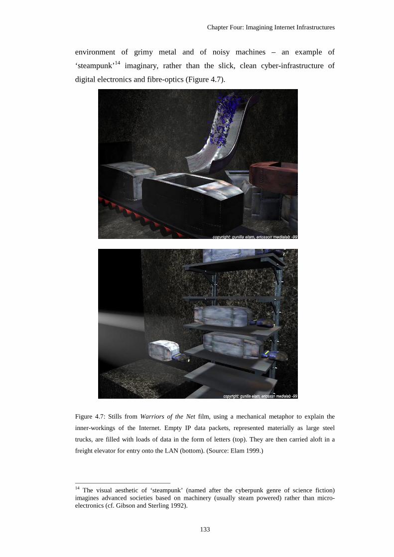
Chapter Four: Imagining Internet Infrastructures
133
environment of grimy metal and of noisy machines – an example of
‘steampunk’14 imaginary, rather than the slick, clean cyber-infrastructure of
digital electronics and fibre-optics (Figure 4.7).
Figure 4.7: Stills from Warriors of the Net film, using a mechanical metaphor to explain the
inner-workings of the Internet. Empty IP data packets, represented materially as large steel
trucks, are filled with loads of data in the form of letters (top). They are then carried aloft in a
freight elevator for entry onto the LAN (bottom). (Source: Elam 1999.)
14 The visual aesthetic of ‘steampunk’ (named after the cyberpunk genre of science fiction) imagines advanced societies based on machinery (usually steam powered) rather than micro-electronics (cf. Gibson and Sterling 1992).

Chapter Four: Imagining Internet Infrastructures
134
Rather than just imagine infrastructure spaces in mechanical terms, others have
actually created physical machines to model the Internet’s concept. For example,
Japanese media artist Kouichirou Eto created ‘a hands-on model of the Internet’
that simulates physically the outward appearance of digital bits and data routing.
As he succinctly notes: “[b]alls roll, and the workings of the Internet are
revealed.”15. Infrastructure is thus made tangible as an analogue model, a real
spatial metaphor of the Internet that people can see, hear and touch (Figure 4.8).
Figure 4.8: Kouichirou Eto’s physical model of the Internet exhibited in National Museum of
Emerging Science and Innovation, Tokyo. The control panel in the foreground is used to
compose short messages by hand using black and white balls to encode letters in binary. Users
then watch their message move through the machine, accompanied by suitably mechanical
sounds of clanking metal and clinking of ceramic balls. (Source:
<http://eto.com/2001/PhysicalInternet>.)
The metaphorical use of the movement of real objects to suggest the invisible
workings of the Internet is also common. The power and speed of flows of data
through network has often been visually connoted through images of blurring
vehicle lights on highways or a soaring flight over a city at night. The feeling of
physical movement experienced by the viewer captures the idea of flow through
networks. For example, Goldman et al. (2003, no pagination) highlight a MCI
15 Source: <http://eto.com/2001/PhysicalInternet/>.

Chapter Four: Imagining Internet Infrastructures
135
WorldCom advert using this kind imagery, noting: “Here is the cyber-scape of
the moment, not simply a symbol of a future that is upon us, but a functional
conduit, the veins of a network that like a river flows through us, connecting us.”
Intertwined with the evocative imagery of movement and the power of incredible
speed is the utopian message of transcendence over the tyranny of place and
time, commonly used in promotional rhetoric of the ‘New Economy’ (De Cock
et al. 2001).
4.3.2.4 Abstract visions
The last category of spatial metaphors deployed to envision Internet
infrastructures connote in a very much more abstract way. These metaphors draw
on naturalistic iconography of organic structures (the fractal branching of trees
and leaves, structured lattices of coral and webs of spiders, the fine filigrees
patterning of brains or veins) and emergent aesthetics redolent of meteorology
and astronomy (cloud patterns, glowing gas nebulas and star clusters).
Figure 4.9: A montage of typical representations of the Internet as a cloud. (Source: various,
images gathered from the Web through Google image search.)
The simplest and most common genre of abstract visual metaphors is the cloud
(Figure 4.9). Curiously, cloud diagrams are ubiquitous in the Internet literature as

Chapter Four: Imagining Internet Infrastructures
136
a visual shorthand for infrastructure, particularly favoured in technical
‘explanations’, as they allow the author to signify the Internet as a definite object
without needing to spell out the detail. As such they are a useful envisioning
metaphor precisely because they obscure the infrastructure’s heterogeneity and
topological complexity: “the cloud’s main usefulness lies in its vagueness”
(Gibson, quoted in Scanlon and Wieners 1999, no pagination). Clouds can be
quickly sketched and are instantly recognised, and “[a]sk the founders of the Net
about the cloud, and it quickly becomes apparent that the Net cloud is as old as
the Net itself” (Scanlon and Wieners 1999, no pagination).
Figure 4.10: Connectivity graph to visualise the core of the Internet ‘cloud’ in topological terms.
The colour coding of nodes is according to the IP address and seeks to highlight zones that share
common network addresses and, likely, corporate ownership. The striking dark blue cluster
represents a key hub owned by Cable and Wireless (formerly MCI); Cheswick describes this as
“the magnetic north of the Internet”. (Source: Bill Cheswick.)

Chapter Four: Imagining Internet Infrastructures
137
Computer scientists and network researchers have produced many other abstract
visual representations of the Internet that try to show the full complexity of the
infrastructure rather than hide it inside cartoon clouds. These images, created by
and for technoscience elites, tend to be amongst the most elaborate and visually
dramatic representations of the Internet (e.g., chapter three, Figure 3.4). They use
graph-like network representations to show the topology of connections and are
distinct from the wiring metaphors using geographical ‘arc-node’ links examined
above. Even though their construction is avowedly technical, some have
resonated with wider public constituencies as ‘artistic’ renderings of the Internet.
The outstanding example of this genre emerged from the research of Bill
Cheswick and Hal Burch16 (Figure 4.10). Their technoscience visualisation is
noteworthy in normative aesthetic terms, but also politically, in terms of the
impact it has had on how the infrastructure has subsequently been imagined.
Automatic surveying of the topology of thousands of interconnected Internet
networks provides raw data that is visualised as huge, complex, multi-coloured
graphs. The layout algorithm uses simple rules, with forces of attraction and
repulsion jostling the nodes into a stable configuration that looks distinctly
organic. It is projected within abstract space because as Cheswick notes: “We
don't try to lay out the Internet according to geography ..... The Internet is its own
space, independent of geography”17.
Indeed, the power of the metaphor underlying the Cheswick-Burch graphs
derives directly from this evolved, organic look - this is what people in some
senses expect the Internet to look like now. Their results have been variously
described as a peacock’s wing or a coral reef. These graphs have been widely
circulated, including being sold as large wall posters proclaiming to show the
‘Whole Internet’, used on book covers and featured in art galleries and as
16 Begun in 1998 as a research project at Bell Labs - Lucent Technologies and subsequently continued as a part of commercial venture Lumeta, <www.lumeta.com>. 17 Source: <www.lumeta.com/research/mapping.asp>.

Chapter Four: Imagining Internet Infrastructures
138
exhibits in science museums18. Typically, these types of abstract graphs are
employed as purely ‘artistic’ images and there are no instructions as to how they
maybe interpreted, or even that careful interpretation is necessary. The image’s
main function is as a connotation for the sublime complexity of the Internet and
as a demonstration of the technical prowess of its creator.
While they have become firmly established, showing the entity with “no
beginning, no centre, no end (or all beginning, all centre, all end)” (McClellan
1994, quoted in Kress and von Leeuwen 1996, 88), the wider implication of these
graph metaphors is the number of people who assume that they denote the
endogenous characteristics of the Internet infrastructure itself. In fact, all the
visual properties of the graphs (geometry of the lines, their spatial arrangement,
colours, etc) are exogenous to the phenomena being mapped; they are in that
sense purely technical artefacts. Changing the parameters of the graph layout
algorithm even slightly can produce a radically different looking Internet. While
it is possible to make the Internet look like something from nature, there is
nothing natural about the graph’s appearance.
4.4 Overcoming Internet invisibility via scientific inscription
Instead of being a figment of one’s imagination ..., it will become a ‘real objective thing’, the
existence of which is beyond doubt. (Latour and Woolgar 1979, 241)
Using ideas from science and technologies studies (STS) concerning the
construction of objective authority within technoscience working practices,
particularly Steven Shapin’s (1984) theory of virtual witnessing, I will now
consider how infrastructure invisibility is overcome by computer scientists and
network engineers who are studying the structures and dynamics of the Internet.
18 See <www.peacockmaps.com>. I worked for Peacock Maps in 2001 and contributed to the publication of the 2001 Whole Internet poster. Book covers include: Castells’ Internet Galaxy (2001); Mitchell’s ME++: The Cyborg Self and the Networked City (2003).

Chapter Four: Imagining Internet Infrastructures
139
According to detailed ethnomethodological studies19 by STS scholars, the natural
and biological sciences do not discover ‘laws of nature’, but socially construct
knowledge by stabilising particular experimental findings as widely agreed
‘facts’. Because the phenomena to be experimented upon are usually
undetectable directly by human senses, they require measurement techniques and
graphical inscriptions to make them visually apparent. There is an almost
obsessive preoccupation by scientists and engineers with such inscription (Lynch
and Woolgar 1990), producing a bewildering array of “traces, spots, points,
histograms, recorded numbers, spectra, peaks and so on” (Latour and Woolgar
1979, 88). Indeed, Latour (1990, 42) has characterised laboratory work as
fundamentally a “cascade of inscriptions”. As visual re-presentations of ‘nature’
such scientific inscriptions are constructed from direct empirical measurement,
then cleaned, redrawn, smoothed, transformed, and finally displayed prominently
in publications to the bolster the of the truth claims made in the text.
The potency of such inscription is due, in large part, to the ocularcentric nature of
Western scientific practices. Since the Enlightenment, vision has been the
dominant mode of understanding of the material world: ‘seeing is believing’.
Reflecting this primacy of vision, most geographical research, for example, was,
until recently, a matter of ‘looking’ at the landscape as the best way of obtaining
truthful knowledge (Sui 2000). It has been argued that the Enlightenment
‘scientific revolution’ itself depended significantly on Renaissance development
of new ways of seeing, such as linear perspective, which allowed the creation of
far more mimetic inscriptions of reality (Edgerton 1975). Many ‘technical’
approaches in engineering-drawing, which are now taken-for-granted modes of
inscription, were invented at this time, such as the orthographic projection
depicting three views of an object, the exploded view to show how complex
mechanisms were assembled, and the cut-away view to show internal workings.
Contemporary scientific endeavour - partly in response to modern media driven
agendas – has also realised the power of inscription for public communication
and promotion; as Heller (2003, 57) wryly notes: “[s]cientific disciplines with
19 These seek to understand scientific epistemology by looking at what scientists and technicians actually do in their everyday working practices, rather than accept the formally published methodology of ‘discoveries’ as sufficient explanation for the production of knowledge.

Chapter Four: Imagining Internet Infrastructures
140
good pictures are rich in resources that keep them ... moving forward.” This
equally applies to those scientists seeking research funding to study the dynamics
of the Internet.
Inscriptions are usually produced by measuring devices, specialised machines or
an assemblage of apparatus designed purposefully to “transform pieces of matter
into written documents” (Latour and Woolgar 1979, 51). Inscription devices
come in all different sizes and work in a myriad of different ways - from a simple
weighing balance up to an sophisticated radio telescope - but their end result is
always the same - inscriptive markings written out on paper. The markings are
invaluable to scientific endeavour because “scientists themselves base their own
writing on the written output of the [inscription devices]” (Latour and Woolgar
1979, 51).
Yet, the real importance of inscriptions, Latour and Woolgar (1979, 245) argue,
is “not so much as a method of transferring information but as a material
operation of creating order.” Inscriptions work to ‘create order’ within the social
practices in technoscientific settings in several ways. Firstly, they define objects
of interest. They are seen as having a direct relationship to reality, providing the
focus of discussion about the properties of the phenomena that are otherwise
invisible. The pattern of peaks on the graph is itself analysed as a legitimate
object of scientific study. Secondly, they are a means for organising collaborative
effort between scientists and reaching common agreement on ‘what is
happening’. As such, Roth and McGinn (1998, 217) characterise inscriptions as
‘conscription devices’, noting how they are of such importance in many
discussions that “scientists and engineers will stop a meeting to fetch a design
drawing, produce a more or less faithful facsimile on the whiteboard, or render a
diagram in a gesture.” Inscriptions are also a most effective means of forging
unity of effort across different communities of practices, which may well be
distributed geographically and in time. In this way inscriptions work publicly in
the production of ‘matters of fact’, that is discrete elements of knowledge that
have been verified by the scientific community and enjoy widespread assent as
being true explanations of reality.

Chapter Four: Imagining Internet Infrastructures
141
However, a significant problem in the production of such ‘matters of fact’ is the
limited access to experimental activities and the inner working of inscription
devices for independent verification. Scientists strive to solve this verification
problem through what Shapin (1984) describes as a process of ‘virtual
witnessing’, a way that an experiment can be validly observed via a particular
kind of publication of results rather than by being physically viewed in the
laboratory. Assent that an inscription constitutes valid ‘matters of fact’ can, thus,
be manufactured remotely and infinitely using ‘literary technology’. This is now
easily recognisable and taken-for-granted as an ‘objective’ style of scientific
writing, but it had to be invented20. It comprises a functional, dispassionate form
of prose, with a puritan form of diagrammatic inscription. The results, Shapin
and Schaffer (1985, 62) argue, “served to announce, as it were, that ‘this was
really done’ and that ‘it was done in the way stipulated’; [it] allayed distrust and
facilitated virtual witnessing.” Objectifying ‘matters of fact’ works by the denial
of human subjectivity. ‘Facts’ have to appear to have been discovered from
nature rather than being man-made artefacts.
For this kind of ‘literary technology’ to be successful in virtual witnessing it
requires that scientists themselves be ‘modest witnesses’ - “the author as a
disinterested observer and his accounts as unclouded and undistorted mirrors of
nature” (Shapin 1984, 497). Modest witnesses describe facts objectively for the
advancement of science, not for personal rewards; and they willingly admit
weaknesses in their methods and present the results of failed experiments. “Such
an author gave the signs of a man whose testimony was reliable” (Shapin 1984,
497). They produce descriptive and systematic work and do not indulge in overly
theoretical and speculative writing.
Literary technology for virtual witnessing also mandates a very particular style of
published inscriptions. The now conventional scientific ‘look’ of inscriptions is
achieved through various semiotic strategies, many of which are also evident in
the generation of objective authority in modernist cartography (see discussion in
20 Shapin and Schaffer (1985) argue it came about in relation to the contested emergence of experimentalist natural philosophy in the mid seventeenth century. They highlight the significance of Robert Boyle’s empirical studies on the nature of vacuum using air-pumps.

Chapter Four: Imagining Internet Infrastructures
142
chapter two). Objective authority is, in large part, constructed by how the image-
marker chooses to position the viewer in relation to the data. Typically, technical
pictures are authored as the ‘view from nowhere’ that situates the viewer as an
outside observer. Kress and van Leeuwen (1996) identify several distinct
viewpoints that convey an ‘objective attitude’ by eliminating the subjective
distortions associated with linear perspectivism. These disinterested positions
include the front-on view, the cross-sectional view and, most significant, the top-
down angle that “contemplates the world from a god-like point of view, puts it at
your feet, rather than within reach of your hands” (Kress and van Leeuwen 1996,
149).
Besides employing such objectifying viewpoints, the scientific inscription’s most
conspicuous semiotic strategy is the strategic use of blank space. Scientific
diagrams are most recognisable by their lack of decoration or aesthetic
embellishment. Graphical austerity connotes objective authority. The data are
always denoted on an bare white canvas to focus attention and to connote that the
data is sufficient and stand alone for inspection; the existence of issues of
uncertainty and province in the data are connotatively covered over by the
blanket of white space. Such emptiness, according to Lynch (1985, 59), “is
infused with moral significance, inasmuch as it involves the tacit claim of
scientific integrity, with motives assumed to be beyond reproach, and is offered
with an unstated presumption that, if anything significant should have been said
about the operational history of the graphic line, it will have been stated.” This
kind of semiotic interpretation is applicable to the connotative meanings of
modernist cartography, with Wright (1942, 527) noting that “[t]he trim, precise,
and clean-cut appearance that a well drawn map presents lends it an air of
scientific authenticity that may or may not be deserved …. We tend to assume
too readily that the depiction of the arrangement of things on the earth’s surface
on a map is equivalent to a photograph – which, of course, is by no means the
case.” We can also draw direct parallels to MacEachren (1995) two internal map
connotations of veracity and integrity discussed in chapter two. He gives the
exemplar of official topographic mapping claiming that “[t]he U.S. Geological
Survey uses highly detailed, unadorned, visually unassuming maps to connote

Chapter Four: Imagining Internet Infrastructures
143
accuracy, impartiality, authority – thereby creating an impression that the U.S.
Geological Survey maps have no point of view” (MacEachren 1995, 335).
A noteworthy manifestation of the active manufacture of cartography with ‘view
from nowhere’ in the empty space, as Turchi (2004, 37) says: “a blank on a map
became a symbol of rigorous standards; the presence of absences lent authority to
all on the map that was unblank.” The origin of this strategy for a ‘scientific’
mode of cartography is often traced to Jean Baptiste Bourguignon d’Anville’s
1749 map of Africa with its famously blank interior replacing earlier imaginings
of map-makers. Yet, this map is not only a laying claim to honesty, for as Hiatt
(2002, 248) points out, “the blank testifies to a lack of possession, since it
signifies land, rather than territory, earth rather than ownership. Consequently,
the blank also can be seen to invite exploration, and in a colonial context this is
the inevitable prelude to acts of demarcation.”
Allied to the strategy of blank space is the normalising power inherent in
scientific inscriptions. They work as ‘sensible pictures’ according to Lynch
(1985), to literally refigure the natural world into geomatisied and mathematised
form. Continuous phenomena are measured into detached units of data, these are
classified and transformed, then plotted into idealised, abstract graphical space
that is correctly determined by its labels, axis, scales and legends. (As discussed
in chapter two this kind of charge is made again official maps by those
advocating critical cartographic deconstruction. Also, see chapter five in relation
to the normalising effects of statistical maps). In effect, all data points on a
scatter graph become exactly similar (except for their position in the grid) and
“all other circumstantial features of their observation ‘drop out’” (Lynch 1985,
43).
4.4.1 Virtual witnessing of Internet infrastructures
Computer network infrastructures have been constructed as objects of ‘scientific’
study since the very beginning. The engineers and computer scientists involved
in designing ARPANET in the 1970s, for example, produced detailed analysis of
its topology and performance from direct measurement of the network (e.g.,
Frank et al. 1972). Their goal was to discern the underlying ‘facts’ of wide-area

Chapter Four: Imagining Internet Infrastructures
144
computer communication by experimental study of the real dynamics of a
working packet-switching network.
Today, a sizeable interdisciplinary ‘Internet science’ community undertakes
experimentally-driven studies using positivist scientific approaches. The self-
stated aims of ‘Internet science’ research are primarily pragmatic, being to aid
future engineering efforts to achieve more optimal design of data routing
software and equipment through more accurate descriptions of the Internet. A
key part of this work involves building complex inscription devices in the form
of large-scale software systems for passively monitoring traffic flows or actively
scanning instruments to measure the connectivity of the network from multiple
sample points (see Murray and Claffy 2001; Spring et al. 2004 for reviews). To
achieve this, most inscriptions devices use the network infrastructure to measure
itself (Dodge 2000d).
Whilst sharing much of the ethos with other scientists and engineers, ‘Internet
science’ research centres suffer because they have little or nothing in the way of
scientific equipment in their labs, so the output of the software-based inscription
devices becomes all the more critical to witnessing their work. Their inscriptions
strive to render the Internet ‘factually’, as opposed to most of the more
‘impressionistic’ envisioning produced through visual metaphors for lay
audiences, discussed early in this chapter. A range of different inscriptions are
produced, including schematic diagrams, statistical charts and tables and, most
especially, complex topological graphs. Another notable feature of their
inscription practices is the desire to present ever greater data volumes as a kind
signifier of machismo in modern scientific endeavour.

Chapter Four: Imagining Internet Infrastructures
145
Figure 4.11: A scientific inscription of Internet connectivity measured in April 2005. It is used as
a key part of the virtual witnessing of ‘Internet science’ researchers at CAIDA, producing a
matter of fact of the otherwise unobservable infrastructure.
(Source: <www.caida.org/analysis/topology/as_core_network/>.)

Chapter Four: Imagining Internet Infrastructures
146
One of the leading ‘Internet science’ centres, combining both academic and
industrial researchers, is CAIDA21 and they create a range of scientific
inscriptions to aid the virtual witnessing of ‘matters of fact’ about the Internet
infrastructure. It was founded in 1997 by KC Claffy22 and Tracie Monk to “foster
development of tools and analysis methodologies for promoting the engineering
and maintenance of a robust, scalable global Internet infrastructure.”23 It has
succeeded in securing multi-million dollar grant funding and employs fifteen
people. It also collaborates extensively with industrial partners and has ties to
Internet network operators. CAIDA exhibits a fetishistic obsession for
measurement, generating huge data volumes on different aspects of Internet
infrastructure performance. This is perhaps unsurprising, given the depth of
empiricism underlying most engineering practice associated with this approach
to understanding networking. Here I focus on one example of an inscription that
is illustrative of the type work that CAIDA produces to make Internet
infrastructure visible and researchable. The ‘IPv4 Internet Topology Map:
Autonomous System (AS)-Level Internet Graph’24 (Figure 4.11 above) was
created by a team of researchers to visualise the macroscopic structure of the
Internet for a snapshot in time by showing relationships between networks
An important element in the inscription is the large-scale, automatic
measurements of the Internet’s topology, using a distributed systems of scanning
beacons, known as ‘skitter’. This generates large data volumes which are
aggregated and filtered prior to visualisation. So the 220,000 odd individual
nodes in the skitter dataset were aggregated by the ISP that they belonged to,
based on the technical grouping by Autonomous System (AS) number. This
yielded some 1516 AS nodes which represent the most highly connected ISPs
21 The Co-operative Association for Internet Data Analysis is based at the San Diego Supercomputing Center, the University of California at San Diego, <www.caida.org>. 22 Her 1994 PhD thesis topic, in some senses sets the tone of CAIDA’s research, entitled: “Internet traffic characterization: a methodology to support more accurate workload characterization in the face of increasing diversity in Internet traffic types and qualities.” 23 Source : <www.caida.org/home/staff/kc/kclaffy.xml>. 24 Source: <www.caida.org/analysis/topology/as_core_network/>. Research team: Brad Huffaker, Andre Broido, KC Claffy, Marina Fomenkov, Sean McCreary, David Moore and Oliver Jakubiec.

Chapter Four: Imagining Internet Infrastructures
147
that form the core of the Internet and carry the bulk of the traffic. These are
plotted as dots in a calibrated space as ‘matters of fact’ on the topology of the
Internet.
Its form is a complex graph displayed using a polar projection, where each AS
node encodes two data characteristics. First, the distance away from the centre
shows the relative strength of peering relationships with other networks. Second,
the angular position around the circumference of the circle shows the
approximate geographical position of its corporate headquarters25. The peering
links between ISPs are shown by the arcs which are colour-coded ‘hot to cold’
based on the relative strength of connection (as indicated in the legend). So
yellow, central nodes are some of the most well connected ISP and the
scientifically witnessed core of the Internet.
In terms of the geographical data encoded in the inscription, one can think of this
as somewhat like a map of the Earth, with a projection centred on the North Pole.
Around the circumference of the graph, longitudes are marked every 10 degrees
and coloured strips denote different continents. Key cities are also labelled. The
graph generally divides the nodes into three distinct segments based on the
continents of North America, Europe and Asia/Oceania related unsurprisingly, to
the major metropolitan nodes in the world economy.
In normative terms, the IPv4 Internet Topology Map has the ability to identify
the most powerful ISPs and where on the globe are they are concentrated. It is
clear that the densest concentration of AS nodes, towards the centre of the graph,
lies along the longitude of about 70 degrees west, which relates to the eastern
seaboard of the USA. The headquarters of some of the leading Internet backbone
operators such as UUnet, PSInet, Qwest, CWUSA are found there. In many ways
this inscription reinforces what is apparent from many of the other infrastructure
maps of the global Internet – that the U.S. is the dominant player in terms of
infrastructure provision. It has been described as the world’s ‘switching centre’
25 Obviously there is considerable generalisation as many large ISPs will have their infrastructure spread across the globe. As such, one might like to think of this as more of a geopolitical location.

Chapter Four: Imagining Internet Infrastructures
148
(Singel 2007) in terms of global traffic flows. In fact the top 15 most connected
AS nodes are in North America (one is in Canada). The IPv4 Internet Topology
Map also reveals that many of the ISPs based in Europe and Asia-Oceania have
relatively much fewer connections between them, relying instead on peering with
U.S. backbones to act as a hub.
Besides the normative reading, this graph clearly is a significant scientific
inscription for CAIDA. It enjoys prominence in many of their presentations26 and
is displayed in pride of place on their Web homepage. Whilst there have been
some attempts to use it metaphorically as an impressionistic visualisation (for
example it is available for purchase on wall posters), it is too technical, and it
lacks the immediate visual punch and instant recognition of a more familiar
metaphor (for an example of a global image, see Figure 4.4; for world maps, see
chapter six). It makes use of all three semiotic strategies to achieve the
dispassionate ‘scientific look’ needed for a successful inscription to use in virtual
witnessing processes. Firstly, it situates the viewer in a top-down position,
inspecting the data from a God’s-eye vantage point, apparently offering totalising
vision ‘over’ the core of the Internet. Secondly, the graph itself is embedded in a
antiseptic, blank canvass, unadorned except for title and technical scale bar.
Lastly, the graph is an archetypal ‘sensible picture’ with the connectivity of the
Internet thoroughly re-figured to fit into calibrated, circular space. The reality of
the Internet is reduced to an orderly (albeit informationally over-crowded and in
some area illegible) layout of dots in a graph.
More generally, the way that IPv4 Internet Topology Map is embedded in the
web page text27 also demonstrates how this inscription functions as part of
CAIDA’s virtual witnessing of the Internet’s topology. Firstly, the witnessing
makes claims to sources of empirical data that are comprehensive and accurate.
The size of dataset is given precisely, along with exact dates when the
experimental measurements were run. The description of the data uses various
26<www.caida.org/publications/presentations/> 27 Source: www.caida.org/analysis/topology/as_core_network/>.

Chapter Four: Imagining Internet Infrastructures
149
specialised terms that create an aura technocratic authenticity. The witnessing
also uses other strategies to bolster its objective attitude, such as:
(1) making older versions of the graph available for consultation,
(2) making the raw data available for independent verification,
(3) setting out a detailed list of caveats demonstrating that the authors are
‘modest witnesses’ willing to admit their weaknesses,
(4) text sets out the ‘insights’ in terms of descriptive, experimentalist
understanding of Internet topology only and makes no grand theoretical
claims - again this is a necessary tactic of the ‘modest witness’.
4.5 Conclusions
Ultimately, the choice of how to visually represent the Internet, to overcome
infrastructure invisibility, is a far from simple question. Over time many
conceptions have dominated. Implicit in any approach are the underlying power
geometries of the metaphors used (verbal, visual, numerical) regarding what the
Internet is, and more importantly, what it could be. None of these conceptions
can really be said to be ‘incorrect’. The various impressionistic visualisation and
technical diagrams can be seen as imaginal explorations of what the Internet is
‘at its essence’. In some respects, this exploration phase has ended, various
metaphors and diagrams having been tried and rejected, while a few dominant
ones have been legitimated28. Certain kinds of cartographic representation remain
one of the mainstays for overcoming Internet invisibility. Two of the most firmly
established genres of mapping that are in common use, and are clearly deemed to
be effective to some degree for this process, are route maps showing network
structure and thematic maps showing aggregate national statistics. How these
two genres of mapping work semiotically and politically to make the Internet
visible and tangible, in particular ways, is the focus of analysis in the next two
chapters.
28 Indeed, as Internet as become commonplace, it has itself become a metaphor in its own right, for example, used to describe new forms of decentralised, corporate organisation or supposedly new modes of war fighting.

Chapter Four: Imagining Internet Infrastructures
150
In conclusion, spatial metaphors and scientific inscriptions not only make visible
the invisible infrastructures of the Internet, they work as narrative devices to
dramatise the dull and banal nature of a network wholly lacking in striking
physical motifs of soaring airliner or impressive architectural displays. Thus they
explain visually what the Internet looks like, but they also delude in equal
measure, as this is never a view of the Internet one could see naturally. This
applies, for example, to the kinds route map discussed in chapter six which are
created by commercial operators to market their network and use various design
strategies to try to demonstrate they have the best available infrastructure.
Although from empirical evidence, investigated in chapter six, they have varying
degrees of success at connoting wholly positive impressions because they often
represent their infrastructure too realistically rather than more metaphorically.

151
Chapter Five
Statistical Mapping of Internet Globalisation
Jobs, knowledge use and economic growth will gravitate to those societies that are the most
connected, with the most networks and the broadest amount of bandwidth.
-- Thomas L. Friedman, The Lexus and the Olive Tree, 1999.
Almost the whole world, it seems from a casual inspection of this map, has turned Internet-
coloured. The sun never sets on the Internet; it appears to reach everywhere except some
war-torn corners of the world.
-- Mike Holderness, Who are the World’s Information Poor?, 1998.
5.1 Introduction
In this chapter I consider maps that provide a synoptic picture of the evolving
geographical structure of the Internet at the global scale using various kinds of
area-based statistical map designs. The analysis focuses, in part, on the recent
history of the Internet in the 1990s as the period of mainstream ‘take-off’ of the
Internet in most developed nations and subsequent widespread diffusion of
network connectivity across the world. I consider the ways these differently
designed maps serve politically to produce particular imaginative geography of
the Internet, either masking or exposing the extent of ‘digital divides’ across the
world. These maps are valuable as they highlight the multiple ways that a
statistical understanding of social phenomena can be represented, particularly
when seen in contrasting cartographic designs deployed (choropleth, cartogram,
dasymetric, stepped surface and diagram mapping techniques).
The chapter begins with an outline discussion of the discourses of development
and digital divides that underpin the use of statistical maps of Internet
globalisation, and then sets out a fourfold conceptual model of connotative
meanings based dimensions of difference and complexity that is used to inform
the empirical analysis. This is followed by a brief contextual history of the

Chapter Five: Statistical Mapping of Internet Globalisation
152
emergence of statistical mapping as a politically powerful representation before
moving onto an interpretation of a range of empirical material.
5.2 Connecting the world: Tales of Internet diffusion and digital divides
The Internet grew tremendously during the 1990s. One of the most impressive
elements in this growth was the speed by which countries across the world
became connected (Figure 5.1). The first half of the 1990s, in particular, can be
conceptualised as the ‘globalisation’ of the Internet, starting from a U.S core,
spreading throughout the reminder of the developed world and then linking to
poorer, peripheral nations, so that by the end of decade most countries had at least
some form of connection to Internet. The rapid globalisation of the Internet was
facilitated by a number of technological developments, as well as wider political
and economic factors which benefited new forms of low-cost international
computer networking.
Figure 5.1: A typical growth chart demonstrating the rapid pace of Internet expansion from the late
1980s through the first half of the 1990s as measured by the number of countries connected. The
de facto meaning of ‘Internet backbone connectivity’ during this period was a direct link to the
U.S. to reach the National Science Foundation network. (Source: Rutkowski 1995.)

Chapter Five: Statistical Mapping of Internet Globalisation
153
The most significant technological factor was developments in long-haul fibre-
optic transmission systems, particularly undersea cables linking continents, made
in the 1980s. This led to an order of magnitude growth in available bandwidth1
and concomitant decline in circuit costs in the 1990s. (See also chapter six for
more discussion of the boom in fibre-optic infrastructures in relation to network
marketing maps.) The majority of investment in new undersea cable systems,
however, was on a select few routes linking together already well-connected
industrialised regions and major cities (Graham 1999), beneficially reinforcing
existing transportation routes (Arnum and Conti 1998)2.
Demand for this new bandwidth was driven by exponential growth in Internet
traffic in the early 1990s resulting from many new users, new interfaces to
navigate online information spaces and wholly new applications (see analysis by
Coffman and Odlyzko 2000). Web traffic growth in the early 1990s exploded,
growing at several thousand percent per year and quickly outstripping all other
Internet applications (Odlyzko 2000). By helping to make it a mass medium, the
Web was also a critical element in the commercialisation of the Internet.
Netscape’s Navigator browser was commercially released in 1994 and the
company’s IPO the following year is now commonly regarded as marking the
starting point for the ‘dotcom’ boom that propelled the Internet into the public
consciousness as one of the defining technologies at the fin de siecle.
The underlying economics and governance structures of the Internet also evolved
significantly in the early 1990s to facilitate the global spread of the network. At
the end of the 1980s the Internet largely retained its ‘research & education’ ethos,
being run in a co-operative, not-for-profit way based on informal consensus
1 This growth was reified by technology commentator George Gilder in his ‘law of telecosm’, which states: “The world's total supply of bandwidth will double roughly every four months - or more than four times faster than the rate of advances in computer horsepower [Moore’s law].” (Rivlin 2002, no pagination). See also ‘Metcalfe’s law’ on connectivity states that the value of a telecommunications network is proportional to the square of the number of users on the network (cf. Odlyzko and Tilly 2005 for discussion of the validity of such ‘laws of networking’). 2 The current geographical pattern of submarine cables is mapped in Figure 4.1, chapter four.

Chapter Five: Statistical Mapping of Internet Globalisation
154
reached by a small cabal of ‘techies’. It was dominated by the quasi-academic3
U.S. National Science Foundation Network (NSFNET), which was the largest and
fastest network and thus formed the effective central ‘backbone’ of the Internet
during the late 1980s and early 1990s. The 1990s saw the transition of the Internet
core in the U.S. from a public to a fully privately managed and financed
infrastructure. In 1991 commercial traffic was allowed and soon the major
proprietary online services - including AOL, CompuServe and Delphi - provided
gateways to the Internet to allow exchange of email. An increasing number of
commercial ISPs emerged, creating an affordable dial-up Internet access market
for domestic users in several developed countries. In 1995 the Internet backbone
itself was ‘privatised’, as NSFNET was decommissioned. One noteworthy
symptom of commercialisation and changing management of the Internet was a
transformation in online culture, to the chagrin of many long-time users4.
Beyond the network, so to speak, the world-wide spread of the Internet was
facilitated by significant broader geopolitical changes at the start of the 1990s,
announced by the fall of the Berlin Wall and the collapse of the Soviet Union.
Many states, particularly in Eastern Europe, became more open to external trade,
economic investment and media flows, often accompanied by marketisation of
industries. The liberalisation of telecommunications monopolies in many
developed countries also opened up ‘market space’ for new businesses to start
providing commercial Internet access services. In complex ways, then, the spread
of the Internet was greatly aided by the wider globalisation ‘project’ that many see
as characterising the 1990s (Dicken 2003). Yet at the same time the Internet was
itself playing a key part enabling this economic and political globalisation - for
example, by easing data flows, flattening hierarchies of communication and,
3 It was government-funded but run by private corporations under an agreement with the National Science Foundation. It had an operational charter forbidding transmission of commercial traffic for the first five years of its operation. 4 Feelings about this time are nicely summarised by Guédon’s (2002, no pagination) reminiscence: “I remember the dismay of old-time users like myself when the AOL crowd showed up, with no manners, no understanding of the community spirit that had developed quietly in the 80s, no comprehension of the sharing and give-and-take quasi-utopia that had grown somewhat confidentially in their midst.”

Chapter Five: Statistical Mapping of Internet Globalisation
155
above all, lowering transaction costs (Cairncross 1997).
Unsurprisingly, interpreting the nature of the Internet’s global growth has been the
subject of intense and competing analysis through the 1990s, focused in particular
on the implications for economic and social development likely to flow from
connectivity (cf. Castells 2001; Drori and Jang 2003; Main 2001; Shade 2003;
Warf 2001). In binary terms, the debate around the meaning of Internet
globalisation can be conflated into two viewpoints: what I label here ‘diffusion’
and ‘division’ perspectives5. The first discourse sees the world as a relatively
orderly matrix of countries, which are broadly converging as ICTs, having a
beneficial impact (bringing about enhanced knowledge and greater opportunity).
In contrast the alternate ‘divistionist’ perspective conceptualises the world as a
more fragmented set of places and social groups, with disorderly processes of
change (not solely growth) resulting increasing divergence as ICTs have impacts
that are often detrimental (bringing about more unequal access and greater scope
for exploitation).
The broad ‘diffusionist’ coalition of scholars, activists, technology commentators
and network builders who view the Internet as essentially a progressive tool for
social empowerment and development. For example, the then U.S. Vice President,
Al Gore (1994) in a utopian call to create a global information infrastructure,
asserted: “I see an new Athenian Age of democracy forged in the fora the GII
[Global Information Infrastructure] will create.” (See chapter four for further
discussion of Gore’s role in promoting the ‘information superhighway’.) Network
connectivity in the 1990s was seen as a potent tool to diminish of economic
difference between regions of the world. The rapid diffusion of access,
particularly of personal email communication, would connect people in the less
developed regions directly into the core, and the mutual flows of information,
ideas and knowledge engendered would be beneficial to all, fundamentally
overturning power differentials. Ultimately development, driven through Internet
5 Obviously, this characterisation is a simplification for purposes of the current discussion, but it resonates with many other debates about the ‘impact’ of ICTs which tend to split along broadly utopian or dystopian lines (cf. Graham 1998).

Chapter Five: Statistical Mapping of Internet Globalisation
156
access and ICTs, brings about social and economic convergence at different
scales.
The alternative, ‘divisionist’ discourses, focused on the hegemonic power of
technologies, are deeply sceptical of the progressive potential of networking and
typically viewed the Internet as simply adding another layer of inequality between
nations (cf. Jordan 1999; Main 2001). Far from being economically empowering,
the Internet and ICTs are active in widening divisions, enabling the developed
regions to exploit the less developed more effectively. In the future, the Internet
promises, so the argument goes, “the distinction between developed and non-
developed countries will be joined by distinctions between fast countries and slow
countries, networked nations and isolated ones” (Baranshamaje et al. 1995, quoted
in Holderness 1998, 37). The winners of world-wide Internet growth - much like
other dimensions of globalisation in the 1990s - would be those select few
switching points able to direct the flows and extract surplus value. Besides
economics, the potential of Internet to level social differentials in power was also
questioned: “Despite the assertions of the people at Wired6 and other end-of-
politics theorists, class stratification and oppression have not been eliminated by
computers or any other technology” (Surman 1995, no pagination). In this way
development that is delivered through infrastructural intervention, such as
building Internet access and giving ICT equipment actually brings about social
and economic divergence at different scales.
Fundamentally then, the ‘diffusionists’ and ‘divisionists’ positions disagree on the
extent to which the Internet as agent of social and economic development can
make the world a ‘better’ place. Assessment of the undoubted unevenness of
Internet penetration is a key element for both sides, with concerns being most
publicly articulated in ‘digital divides’ discourses. The digital divide emerged as a
distinct ‘problem’ for academic analysis and political action in the late-1990s with
major international summits held and the formation of high-profile taskforces to
measure the scale of inequality and develop acceptable policy solution (such as
6 This alluded to the utopian rhetoric espoused by writers in Wired magazine, which was in the 1990s an influential voice in Internet discourses in the U.S. (Jordan 1999).

Chapter Five: Statistical Mapping of Internet Globalisation
157
the G8 Dot.Force7). At the global scale, the African continent is often highlighted
as needing special attention; for example, a New York Times article from this
period stated: “From the White House and the World Bank to international
business and academic circles, analysts warn that unless Africa gets online
quickly, what is already the poorest continent risks greater marginalization”
(French 1995, 5). For the advocates of the ‘diffusionist’ position, the evidence of
digital divides was useful for highlighting where extra effort was needed and,
anyway, these differentials in access were just a temporary ‘blip’ that could be
relatively quickly ironed out (usually through delivery of better infrastructure to
the most disconnected places). The same kind of evidence was used in a more
incriminating fashion in ‘divisionist’ discourses to puncture the utopian hype of
the ‘diffusionists’ and point up the absurdities of the ‘global information society’
rhetoric when large parts of the world still lack basic infrastructure, including
reliable electrical supply to power computers.
Both sides seek to create particular imaginary geographies of the worldwide
spread of the Internet to suit their agendas, deploying potent metaphors and tables
of statistical data, along with specific case studies of successes in ‘wiring’ up
places or personal stories of continued exclusion from the information age. In
terms of spatial metaphors deployed, the most prevalent ones seen in the mid-
1990s drew a direct analogy between computer networks and road networks, with
the ‘diffusionists’ proclaiming the Internet as the coming ‘information super
highway’. This was pointedly countered by the ‘divisionists’ camp who said it
was clear that most of the world would be left to struggle along ‘digital dirt tracks’
(see discussion in chapter four). Certain kinds of representations of the nature of
Internet globalisation are also prevalent and rhetorically significant in the
competing truth claims of these discourses, as actors seek to garner support to
their point of view through the authority incumbent in certain types of images,
particularly the scientific legitimacy connoted by statistical charts and thematic
maps. Many official reports, activist documents and scholarly articles tactically
7 The Digital Opportunities Task force was instigated by the G8 heads of state at a meeting in Okinawa, Japan in July 2000, <www.markle.org/dotforce.html>. It has been criticised for its ‘top-down’ model of development driven by technology which favours the interests of corporate capital above the needs of citizens (Shade 2003).
Chapter Five: Statistical Mapping of Internet Globalisation
158
deploy bar charts and scattergrams demonstrating obvious statistical trends to aid
their case by making complex sets of social phenomena into visible and unified
objects of analysis. As Buck-Morss (1994, 440) says in her work on how graphic
representations helped to make the ‘economy’ into an object of analysis early in
the twentieth century: “the map shifts the point of view so that viewers can see the
whole as if from the outside, in a way that allows them, from a specific position
inside, to find their bearings.” The potency of scientific looking charts is evident,
for example, in latest ITU-published ‘information society’ report (WISR 2007), a
lengthy and well produced policy document, has 40 different statistical charts and
diagrams in its 147 pages to assist in picturing what actually constitutes the
‘information society’ as if viewed from an outside ‘objective’ position but clearly
created from a position inside the discourse.
Given the worldwide scope and inherently geographical nature of the patterns to
Internet globalisation it is not surprising the valuable role world maps play in
these discourses, as different kinds of statistical mapping are deployed to show the
extent to which countries are diverging or converging. The map serves to make
the abstract statistical measurement into a visual pattern that is tangible and
perhaps more real and believable than a large table of numbers or scatter chart of
indistinguishable dots. The map can show the statistics in relation to powerful
geographical template of continents and the mosaic of nations that is thoroughly
engrained into people as the proper mental model of the world.
To make sense of the range of statistical mapping deployed by different
institutions to represent the processes of Internet globalisation, a categorisation
was developed based on two ‘worldviews’, conceptualised as two linear
dimensions of ‘difference’ and ‘complexity’. The ‘difference’ dimension is the
extent of areal uniformity evident (at both the global and continental scale) and
varies by the how the statistical patterns are denoted in the map, which in turn
create connotative meanings for readers along a spectrum from universal
homogeneity to abrupt and widespread inequalities between nations. The
‘complexity’ dimension is the degree of entropy evident (at various scales from
local to global) which depends on how statistical patterns are denoted in the map

Chapter Five: Statistical Mapping of Internet Globalisation
159
by the cartographer and how the explicit representation are interpreted
connotatively by readers along a spectrum from simplicity and harmony to wholly
discordant and unmanageable variance between national performance. Using a
pair of axes, these two dimensions of ‘difference’ and ‘complexity’ create four
separate quadrants or categories of mapping semiotics (Figure 5.2). Each quadrant
represents one kind of map worldview, definable approximately by the strength of
its difference and complexity characteristics. The positioning of a map into a
particular quadrant depends on the connotative meanings, which in turn depend, in
part, on the overt graphic design choices and cartographic symbology employed,
as well as the epistemological element in the data classification and normalisation
and the units of measurement. Also, less obviously connotations vary depending
on the underlying ontological schema of what aspect of Internet globalisation is
deemed to be measurable and worthy of representation.
Figure 5.2: A fourfold grid of connotative meanings to categorise maps of Internet globalisation.
Complexity
+-
+
Difference
-Disorderly
Divergent
Convergent
Orderly
Complexity
+-
+
Difference
-Disorderly
Divergent
Convergent
Orderly

Chapter Five: Statistical Mapping of Internet Globalisation
160
The four quadrants of map worldviews are defined as follows:
• Orderly: Maps which fall into this category are typified by the visual
arrangement of data in a conceptually simple, systematic and logical fashion.
The overall design aims to be a ‘neat and tidy’ display of the data to suggest a
world in harmony. Even though nations are likely to be differentiated from
each other they are presented in strongly regularised array, ranking or
hierarchy that designates a clear order from worse to best. An orderly
denotative form also has particular connotations about the underlying
organisation of the world in terms of obedience to hierarchy (i.e., ‘respectful
to those who are better’), accepting the ‘natural’ order and the inevitability of
continual difference in the world. Thus for many a statistical world mapped in
an orderly manner implies a positive view of the world that is secure and not
likely to change radically.
• Divergent: This group of maps is characterised by denotation of large
differences between nations along with high complexity in the display of
variation often at manifold scales. This is a statistical map without a
harmonious pattern, exhibiting disunity with many places that deviate from
the norm in an unpredictable way. There will be obvious and wide inequalities
between the top and bottom classes, perhaps incomplete coverage, with stark
contrasts geographically between abundance and barrenness. The connotations
that may be drawn from a divergent map are of a fractured, and fracturing,
world without equity and widening injustice. Thus for many a statistical world
mapped in an divergent manner implies a negative view of the world that is
insecure, unstable and getting worse.
• Disorderly: Typified by a highly fragmented pattern, yet accompanied with
low degree of difference between nations. It is denoted by a muddled and
confused display of data which implies a lack of systematic processes at work.
Such visual disorganisation connotes a lack of understanding and perhaps
control over changes, with wild areas that defy conventions on what should be
done. It is a world without a master narrative and with deep disagreement as to
the correct solution, and even whether there is a universal solution for uneven

Chapter Five: Statistical Mapping of Internet Globalisation
161
geographical development. Thus for many a statistical world mapped in an
disorderly manner implies a negative view of the world that is ungovernable
and resistant to process of economic and cultural globalisation.
• Convergent: The attributes of a convergent map are denoted by a simple and
self-evident pattern of low inequities between nations. There are few, if any
sharp divisions between neighbouring countries and the variation across the
world is gradual and within manageable proportions. It is a map that shows
countries are much more alike than they are different, and where relative
uniformity of development is the norm and within reach for all people. The
connotative implications arising from convergent maps are the that countries
of the world are coming together, with a unity of purpose. It is implies
common causes for the patterns and that universal solutions can be rolled out
across a largely ‘flat’ world. Thus for many a statistical world mapped in an
convergent manner implies a positive view of the world that is becoming more
similar as countries assimilate upwards in terms of social and economic
development.
The effectiveness of the maps as authoritative evidence in particular discourses,
one could argue, depends on the extremity of their positioning in the opposite
quadrants. For ‘diffusionists’ the more deeply located in convergent quadrant the
better, with its stress on minimal difference between nations and low complexity
imply a coherent world. For those advancing ‘divisionists’ agenda then an ideal
map will be positioned in the top-right quadrant because it most advantageously
connotes complexity and difference, a world of separate nations moving apart.
5.3 The emergence of statistical mapping
Robinson (1982, 16) defines the thematic map essentially as one that “focuses on
the differences from place to place of one class of feature, that class being the
subject or ‘theme’ of the map”. The communicative goal of thematic maps is to
make apparent to the reader the spatial distribution or structure of the theme itself
and the underlying geographical base map is the backcloth to support this. The

Chapter Five: Statistical Mapping of Internet Globalisation
162
spatial description of data revealed by the thematic map can be a useful aid in
determining underlying causal processes and then demonstrating the plausibility
of an explanation to others (e.g., spatial diffusion patterns in epidemiological
studies). An almost infinite range of possible themes can be mapped, using a wide
range of representational techniques (cf. Dent 1995; Slocum et al. 2005).
Thematic maps displaying statistical data commonly use choropleth techniques
which shade areal units of enumeration to represent classified interval data,
although several other approaches, such as isopleth and proportional symbol
maps, are also widely deployed.
Thematic maps are one of the most widely-seen forms of cartography, being
deployed in all manner of discourses and distributed in all media, the ubiquitous
weather map being the most obvious. Yet, attempts at understanding the nature of
the human world in terms of the nomothetic mapping of environmental, social and
economic phenomena came quite late in the history of cartography. Until the late
seventeenth century, cartography had focused solely on representing idiographic
knowledge, with maps used predominantly as a topographic reference recording
the location of unique features in the landscape, for delineating property
boundaries and as tools for navigation. The development of a distinctive new
mode of cartographic representation - the thematic map - focused on the
generalised description of a single aspect of place or human activity came to the
fore in the beginning of the eighteenth century and became firmly established as
an outcome of dramatic changes of the Enlightenment era and later industrialised
modernity (Robinson 1982).
It is now widely acknowledged that the Enlightenment and the shift into a modern
society gave rise to more systematic means of managing and governing
populations. People became increasingly viewed as components in larger systems:
as labour commodities, as problems to be solved (e.g., ill-health, illiteracy), and as
citizens. The development of ‘population thinking’ by centralised State
institutions depended, crucially, on generating both a depth and a breadth of new
statistical knowledge about society as a whole. This period saw the creation of
systems of universal civil registration, standardised observational methods in

Chapter Five: Statistical Mapping of Internet Globalisation
163
morbidity, the enactment of large-scale social surveys (on education, poverty and
other aspects of ‘moral’ status) and, ultimately, the total enumeration of the
population through censuses. The concern was to gain a uniform understanding of
the human resources available to the State and also to create “unitary national
identities via the production of statistical measures that levelled differences, and
suppressed local and ethnic identities” (Higgs 2004, 20).
Figure 5.3: A literal mapping of Internet statistics onto place. The actual design of the data
presentation means it is hard to make comparisons on how costs of Internet access varies between
cities; this failing is tacitly acknowledged by the need to include the ‘highs and lows’ bullet point
list in addition to the map. (Source: Bures 2006, 53. A larger version is reproduced in appendix
two, Figure A2.1.)
This wholesale ‘quantification’ of society required new kinds of representation to
make sense of wholly new classes of economic and demographic data being

Chapter Five: Statistical Mapping of Internet Globalisation
164
generated. Indeed, Cosgrove (2003, 133) argues that “statistics had their greatest
social impact through graphic expression - graphs, charts and maps”. A range of
thematic maps, along with many other chart types, such as Playfair’s pie charts,
were invented at the start of the nineteenth century in a burst of graphic creativity
(cf. Friendly and Denis 2003). William Smith produced his geological map of
England and Wales in 1815 and two years later the pioneering geographer
Alexander von Humboldt produced the first known isoline map showing
temperature patterns. The origination of the choropleth map itself has been traced
back to 1823 and work of the political economist, Charles Dupin, who was
concerned with mapping the demographic capacity of the French nation
(Robinson 1982, 156-57). In representational terms, choropleth maps were a
significant advance in visually communicating complex socio-spatial patterns, as
they replaced the accepted practice of simply writing numeric values onto the map
(see Figure 5.3 above for a contemporary example) which aided the interpretation
of raw data in order to discover and explain otherwise hidden spatial patterns,
relations and trends.
The emergence of thematic mapping also had political implications (Crampton
2004). Statistical maps, particular of classified data, in their visual form and
application tend to dehumanise the spaces they purport to represent. They are
intimately involved in the production of a particular kind of governmentality, in
which their instrumental rationality aggregates unique places and generalises
individual human experience into easily mappable averages, rates and scores. The
orderly representation of statistical knowledges offered by thematic maps are
powerful, I would argue, not because of what they show, but because they can
mask so well the complex, contingent social reality. The social worlds viewed
through statistical mapping are thus de-socialised and rendered more easily
governed by powerful institutions, as the human effects of policy decisions remain
safely opaque, hidden behind the neat tables of numbers and uniformly shaded
enumeration areas. (This line of argument is a key element in critical cartography
paradigm on the power of maps to do work in the world; see chapter two.)

Chapter Five: Statistical Mapping of Internet Globalisation
165
Figure 5.4: The first and last maps in the ‘International Connectivity’ series charting national-level
Internet access. (Source: <ftp://ftp.cs.wisc.edu/connectivity_table>.)

Chapter Five: Statistical Mapping of Internet Globalisation
166
5.4 Area-based mapping of Internet globalisation
In a way cyberspace’s spread would become iconized through displays such as the country-
by-country Internet world connectivity maps which … adopted the visual language of
geopolitics in framing cyberspace’s spread as national question.
-- Greg Elmer, Critical Perspectives on the Internet, 2002.
In this section I examine in depth two examples of choropleth mapping of
national-level statistics on Internet globalisation. The first is the ‘Internet
Connectivity’ maps from the 1990s and the second is a contemporary example
called the ‘Digital Opportunity 2005/2006’ map published in 2007. The analysis
considers how the maps work semiotically, utilising the connotative dimensions
of ‘difference’ and ‘complexity’, and also the wider cultural milieu in which they
are embedded and the work they do in the world.
5.4.1 ‘International Connectivity’ map series, 1991-97
The world-wide spread of the Internet during the 1990s was tracked by the U.S.
based computer scientist, Lawrence Landweber, and charted in a series of
statistical maps. In total, Landweber produced twelve maps over a period of six
years, providing a visual census of the spread of international connectivity via a
range of different computer networks, including the Internet (for convenience all
the maps are reproduced in full pages in appendix two, figures A2.2). The first
‘International Connectivity’ map produced displayed the diffusion of network
connectivity in September 1991 and the last one in the series was created in June
1997 (Figure 5.4). The first ‘International Connectivity’ map produced (which is
labelled version 2; there is no version 1) is the earliest known published map that
attempted to represent the worldwide geography of the Internet in a nomothetic
fashion8.
8 A quite similar survey and mapping effort known as the ‘FAQ: International E-Mail Accessibility Survey’ was undertaken by Olivier MJ Crepin-Leblond (<www.nsrc.org/codes/bymap/ntlgy/>), but began in November 1993 and ran through eight updates until May 1997. For reference, examples of Crepin-Leblond’s maps are given in appendix two, Figure 2.3, however his project is not examined here because it does not add substantively to the arguments made regarding the ‘International Connectivity’ maps.

Chapter Five: Statistical Mapping of Internet Globalisation
167
By making a simple visual comparison of ‘International Connectivity’ maps
through time, it becomes clear that a large swathe of the world’s nations appeared
to have become connected to the Internet in the first half of the 1990s. As such,
these maps, and the associated data tables (see Figure 5.6 below), became
established one of the most accessible and well-used sources of longitudinal data
on Internet globalisation during a crucial period of growth in the middle of the
1990s.
5.4.1.1 Design of the ‘International Connectivity’ maps
In terms of design semiotics, the ‘International Connectivity’ maps are firmly
embedded in the conventions of statistical cartography. They use a choropleth
approach, based on a fourfold nominal classification, to denote network
connectivity at the national level (Figure 5.4). The first class, ‘No Connectivity’,
is represented by yellow shading; the two intermediate categories of connectivity -
‘EMail Only’ and ‘BITNET but not Internet’ - are symbolised by green and red
shading respectively; and the ‘top’ category of ‘Internet’ connectivity is
represented by a purple colour. The world base map of countries is wholly
conventional, taking a familiar Robinson-type projection centred on the prime
meridian. Countries are rendered as black outlines, easily filled with bright, solid
colour. No countries, oceans or other features are labelled; there is no geographic
context shown beyond the country outline acting as a vessel for the statistic.
Clearly, it is assumed that the readership will know the conventions of world
maps and be able to interpret the statistic appropriately as showing worldwide
convergence to complete Internet connectivity.
The classification scheme is set out in the large legend box that dominates the
centre of the map layout. The legend box also gives the title of the map,
‘International Connectivity’, along with revision details. The title itself is
somewhat ambiguous if the maps are read out of context. Connectivity to what?
The word ‘international’ in the title must also be noted so the reader understands
what is being shown and what is not shown (see discussion below regarding data
collection methodology related to the survey on which the maps are based). The
labels for classes in the legend are also cryptic for readers without prior

Chapter Five: Statistical Mapping of Internet Globalisation
168
knowledge of computer networking. What, for example, are BITNET and UUCP?
(Where these maps are employed intertextually the legend text is often simplified
to aid comprehension.) It is also not explained what the significance is of the
difference between the classes of connectivity. How is BITNET different from
Internet? What does it denote for a country to be shaded red rather than green in
terms of online access for people living there? There is no explanation on the map
artefacts themselves, although some further details are given in associated data
tables (Figure 5.5; see discussion below).
Besides the legend box, there are two other textual elements in the map layout.
These denote background information on the map in terms of authorship and
distribution. They also work in a connotative sense to grant additional authority to
the statistics on the map. On the right hand side is a formal sounding copyright
statement that says of the work: ‘this map is formally published’. De facto
credibility is also bestowed on the map’s validity by citing the Internet Society
(ISOC)9. The left hand text ‘opens up’ the map to the world in a sense, by
proclaiming it to be freely and anonymously available online. This text also subtly
exudes technocratic power by the statement of the ftp access method and the
URL; particularly so as the first of the maps were published in 1991-93, pre-Web
mainstream, when only the cyber-cognoscenti would have been able to
meaningfully decode this text.
Taken as a whole, the textual elements of the map promote the work as a quasi-
official statement on Internet globalisation. A techno-scientific aesthetic can also
been seen in the overall map composition: the unadorned, sparse and perfunctory
style of scientific representation, drawn on ascetic white space. This outward
‘matter-of-fact’ simplicity in design results mainly from expediency in
production. However, the effect - I would argue - is the production of an
authoritative looking map and one that epitomises the authoritarian imposition of
the ‘statistical’ vision onto the world, ordering Internet globalisation by country
9 This is a significant U.S.-based lobby group working to support the ‘progressive’ development agenda for the Internet. In the mid 1990s it enjoyed considerable influence as the ‘voice of the Internet’ in policy debates with the U.S. government and international forums. Today, its influence in shaping the structure of the Internet has diminished considerably.

Chapter Five: Statistical Mapping of Internet Globalisation
169
and by classes. The ‘International Connectivity’ maps display the prevailing de-
socialising modus operandi of most thematic mapping.
5.4.1.2 Patterns of Internet globalisation in the ‘International Connectivity’ maps
How, then, do Landweber maps denote the geography of global Internet diffusion
through the 1990s? A casual inspection of the first map from 1991 presents a
world where pretty much all developed countries were connected to the Internet
(most had been linked to NSFNET during previous three years), but at the same
time a large number of the world’s nations were shaded yellow, indicating that
they had no international network connectivity. In fact, this category included
about half of the world’s countries, though these were clearly concentrated in the
less developed regions of Africa and central Asia. The connotation is of a
complicated and fragmented pattern with significant differences between parts of
the world, including wide divisions in connectivity between neighbouring
countries (e.g., the purple shaded India in the highest category bordering the
yellow coloured Pakistani and Bangladesh in the bottom class of ‘no
connectivity’).
Jumping forward in time to the final ‘International Connectivity’ map produced
for June 1997, the vast majority of the nations of the world were shaded purple.
The Internet, measured according to Landweber's survey methodology and
classification scheme, was so widespread that by 1997 the exceptions really stand
out on the map. The connotations are markedly different to the 1991 with a much
more uniform pattern across the world and much reduced difference evident. The
1997 map is a representation of convergence and implies that the globalisation of
the Internet will be imminently complete. It was at this point that tracking
diffusion at this scale became largely redundant and, hence, this was the last map
in the series produced by Landweber. (An amended map was created later in 1997
by activists Mike Jensen, with slightly adapted classification, to show the updated
networking situation in Africa; map reproduced in appendix two, Figure A2.4.)
By 1997, then, this mapping of Internet globalisation showed a pristine purple-
coloured world, pockmarked with bright yellow spots. These remaining ‘unwired’

Chapter Five: Statistical Mapping of Internet Globalisation
170
spots were nations suffering from extreme poverty, war and civil conflicts (such
as Afghanistan, Bhutan and Somalia) or from geopolitical isolation (e.g., Libya,
North Korea, Burma, Iraq and Syria). More than ten years after this map was
produced, many of these yellow ‘No Connectivity’ countries are still marginal to
the Internet world10. Indeed, in some globalisation discourses they are stigmatised
as ‘failed’ states, with a number being actively demonised as part of an (illusory)
‘axis of evil’. These ‘unwired’ places are being shifted, in certain geopolitical
circles, from a moral problem of underdevelopment to a security threat to
globalised peace11.
A particularly pernicious example of such a construction of new threats of the
‘unwired’ is set out in the ‘Pentagon’s New Maps’, a provocative template of
twenty-first century U.S. geopolitics produced by defence analyst, Thomas
Barnett (map is reproduced in appendix two, Figure A2.5). In his mapping, he
asserts that “disconnectedness defines danger” as the “new security paradigm that
shapes this age” (Barnett 2003, no pagination). Unsurprisingly, Saddam Hussein’s
Iraqi regime was cited as the prime example of a nation that was seen as
“dangerously disconnected from the globalizing world, from its rule sets, its
norms, and all the ties that bind countries together in mutually assured
dependence” (Barnett 2003, no pagination). This new security challenge for U.S.,
therefore, justifies pre-emptive action to re-connect the disconnected nations, by
military means if necessary. As Roberts’ et al. (2003, 895), in their trenchant
critique of Barnett’s neoliberal re-mapping of the world, argue it justifies
“intervention in the cause of forcibly removing obstacles to globalisation.”
5.4.1.3 Authorship of the ‘International Connectivity’ maps
Unlike most statistical maps, the ‘International Connectivity’ series has a clearly
identified human author. The maps were solely the work of Lawrence Landweber,
10 As note above in the discussion of the ‘DOI’ map, Afghanistan,, Iraq, North Korea and Somalia appear to be in a strange category of having no digital opportunity ranking but being denoted cartographically. 11 Although as pointed out by Vujakovic (notes on thesis draft, October 2006) this is a narrow and extreme perspective even in geopolitical circles, yet even with limited support it still has some influence on wider development and diplomatic discourses.

Chapter Five: Statistical Mapping of Internet Globalisation
171
whilst a professor in the computer science department at the University of
Wisconsin-Madison, where he worked for over thirty years. Initially, Landweber’s
research interests lay in theoretical computer science but from the late 1970s he
become one of the pioneers in the development of academic networking in the
U.S., being the prime mover in the building of TheoryNet in 1977 and CSNET at
the start of the 1980s (for details, see Cromer 1983). These networks
complemented developments then taking place with ARPANET (cf. Abbate 1996;
Hafner and Lyon 1996) and were themselves significant milestones along the road
towards the modern Internet. The success of CSNET, in particular, was an
important factor in securing government funding for NSFNET (Randall 1997).
Landweber’s breadth of professional work over two decades clearly demonstrates
his commitment to spreading the benefits of computer networking as widely as
possible: “Starting in 1982”, Landweber notes, “we made contact with CS
[computer science] groups in other countries and held workshops with people
from around the world who were building national networks. The networking idea
was awakening everywhere in the world” (quoted in Randall 1997, 120). He was
involved in founding the Internet Society and he served as the society’s President
for two years. He was instrumental in founding the society’s Developing Country
Workshops, beginning in 1993 – cited as a vital element in Internet
‘bootstrapping’ (Guédon 2002).
Why did Landweber track and map the global diffusion of network? Given his
academic background, the desire to inform and educate the wider community of
interest through the free, timely dissemination of accurate information was
important; and given his commitment to the ‘diffusionist’ cause, the maps were
likely not purely academic productions, they were created as tools of persuasion to
encourage greater efforts to connect up the ‘unwired’ nations. This last motivation
is articulated in a revealing comment Landweber made in a 1995 New York Times
article: “Everyone realizes that Africa is lagging .... you look at the map of Africa
and you see huge gaps all over that will prevent this continent from participating
in so many aspects of life on this planet as it is developing” (quoted in French
1995, 5). His efforts in this regard, should be read as altruistic rather than
commercially-driven promotion for personal gain.

Chapter Five: Statistical Mapping of Internet Globalisation
172
While the Internet has grown tremendously in the last ten years Africa remains the
least connected region in the world, and the digital gap between it and the
developed world is, arguably, widening not narrowing. In illustration of this,
Landweber was again quote as a authority figure in network developing in a New
York Times over twelve year later but echoing similar ‘diffusionist’ sentiments: “
‘Unless you can offer Internet access that is the same as the rest of the world,
Africa can’t be part of the global economy or academic environment,” said
Lawrence H. Landweber, professor emeritus of computer science at the University
of Wisconsin in Madison, who was also part of an early effort to bring the Web to
Africa in the mid-1990s. “The benefits of the Internet age will bypass the
continent.” (Nixon 2007, no pagination). Empirical evidence to support the
widening gap thesis put forward in this news story was provided by two
choropleth maps of Africa showing national-level per capita penetration of
Internet and mobile telephones.
5.4.1.4 Methodology of the ‘International Connectivity’ maps
To understand the ‘International Connectivity’ maps and the perspective on
Internet globalisation they produce, it is important to have a sense of what they are
measuring and how the measurement was undertaken. Essentially, Landweber was
enumerating the availability of computer networks according to two key
characteristics: that connections were international in nature and that they were
publicly accessible. ‘International’ chiefly meant connected to the U.S. and
‘public’ effectively meant that some institutions (most often universities) were
reachable to general users outside the country. (The degree to which connectivity
and public reachability in both directions was verified by Landweber is not clear.)
Landweber was solely concerned with the presence of an international link, with
no recording of the capacity, cost or reliability of the links (which would have
clearly been prohibitively time consuming to attempt to gather at worldwide
scale). Furthermore, measurement did not enumerate the extent of internal
networking provision and intentionally did not register private networks (such as
military links or proprietary business networks like the airline reservation system).

Chapter Five: Statistical Mapping of Internet Globalisation
173
The data was collated and presented in summary form at the country level at
regular intervals (shown Figure 5.5). Like any survey methodology, Landweber’s
was a compromise; as Press (2000, no pagination) points out: “[k]eeping track of
only one easily defined variable allowed [Landweber] to maintain a global
perspective at a reasonable cost, but this system was limited by the fact that
differences among and within nations were hidden.”
Figure 5.5: A longitudinal chart of “worldwide network growth” showing the range of network
types covered by the ‘International Connectivity’ survey and the periodicity of their publication.
Note, not all surveys were accompanied by a map. (Source: Zakon 2004.)
Details on the changing state of network connectivity in different countries were
returned to Landweber’s ‘centre of calculation’ (Latour 1987) at the University of
Wisconsin-Madison, from a human network of knowledgeable ‘locals’ across the
world. The maps were, therefore, in some senses built by many hands from
voluntarily submitted data (explicitly acknowledged in the data tables, see Figure
5.6). Besides collecting data from the field, Landweber was also an ‘insider’, with
intimate knowledge of ongoing networking activities, particularly those related to
NSFNET’s international connection scheme (see Goldstein 1995). He was also
knowledgeable to be able to exploit technical information and statistics published
by the consortium that ran the NSFNET backbone. Once the early ‘International
Connectivity’ surveys began to circulate he also received feedback from readers
(again, this was explicitly encouraged in the header of the data tables, see Figure
Chapter Five: Statistical Mapping of Internet Globalisation
174
5.6 below). Overall, it is evidently a pragmatic way of assembling such global
information at a low cost (remembering this project was very much a ‘one man’
effort), although others tried direct technical measurement methods, using the
Internet as measurement tool to scan computer connected to different networks
(cf. Dodge 1999b, 2000d; Quarterman et al. 1993, 1994).
As noted the actual network data that underlies each ‘International Connectivity’
map was also published in tabular form. Figure 5.6 presents an illustrative portion
of the December 1991 (version 3) table. The table of data is another
representational form that deliberately exudes orderliness, objectivity and an air of
authoritative accuracy. The ‘International Connectivity’ survey tables list all
countries as ‘present and correct’ - the ideological “fiction of the census is that
everyone is in it, and that everyone has one - and only one - ... place. No
fractions.” (Anderson 1991, 166). The tables themselves are of direct relevance to
the discussion here, primarily, because they reveal a more sophisticated
classification system for connectivity than was represented in the maps
themselves, as they contain a basic ‘intensity of use’ measure12. Besides the data
classification, the table headers also contain some useful information for
contextualising Landweber’s project, including acknowledgement of sources and
often succinct remarks on the precision (or otherwise) of the data (e.g.,
‘Information on Slovenia/Croatia/Yugoslavia and former Soviet Republics may be
incomplete’, from the April 1992 survey table). The admission of potential faults
in the data (in the mode of a ‘modest witness’, see chapter four) can contrasted
with the cartographic certainty of denotation by the maps. An orderly visual
presentation on the choropleth maps does not only reveal, it can most effectively
hide a multitude of sins in the underlying data13.
12 Countries were categorised into the ‘minimal’ use class if they had fewer than five known sites publicly connected and this was indicated with a lower case letter. Countries with more than five sites were classed as having ‘widespread’ connectivity and this was denoted by a capital letter. 13 The capacity to show statistical uncertainty in a useful and meaningful way is a largely unresolved area of cartographic research (cf. Dietrick and Edsall 2008; MacEachren et al. 2005).

Chapter Five: Statistical Mapping of Internet Globalisation
175
Figure 5.6: Part of the ‘International Connectivity’ data table produced by Landweber, December
1991. (Source: <ftp.cs.wisc.edu/connectivity_table>.). Full data table is reproduced in appendix
two, Figure A2.6.
INTERNATIONAL CONNECTIVITY Version 3 - December 2, 1991 Please send corrections, information and/or comments to: Larry Landweber Computer Sciences Dept. University of Wisconsin - Madison 1210 W. Dayton St. Madison, WI 53706 [email protected] FAX 1-608-265-2635 Include details, e.g., on connections, sites, contacts, protocols, etc. Thanks to the many people from around the world who have provided information. ----------------------------------- In the following, BITNET is used generically to refer to BITNET plus similar networks around the world (e.g., EARN, NETNORTH, GULFNET, etc.). --------------------------------- SUMMARY NUMBER OF ENTITIES WITH INTERNATIONAL NETWORK CONNECTIVITY = 89 BITNET Col. 2 (Entities with international BITNET links.) b = minimal < 5 domestic sites = 18 B = widespread >= 5 domestic sites = 28 x = uncertain = 2 INTERNET Col. 3 (Entities with international IP links.) I = operational = 33 i = soon available = 3 UUCP Col. 4 (Entities with international UUCP links.) u = minimal < 5 domestic sites = 40 U = widespread >= 5 domestic sites = 38 FIDONET Col. 5 (Entities with international FIDONET links.) f = minimal < 5 domestic sites = 10 F = widespread >= 5 domestic sites = 43 Col 6 = * = New connections expected in near future. ---- AF Afghanistan (Republic of Afghanistan) ---- AL Albania (Republic of Albania) [……records deleted……] ---- CK Cook Islands b-u- CR Costa Rica (Republic of Costa Rica) --u- CU Cuba (Republic of Cuba) b-U- CY Cyprus (Republic of Cyprus) BiUF CS Czechoslovakia (Czech and Slovak Federal Republic) BIUF DK Denmark (Kingdom of Denmark)
Chapter Five: Statistical Mapping of Internet Globalisation
176
5.4.1.5 Distribution of the ‘International Connectivity’ maps
In the 1990s the ‘International Connectivity’ maps are some of the most widely
seen geographic maps of the Internet. They are still cited and used several years
later (see examples below). There are several factors that can be advanced to
explain why they have enjoyed such wide distribution:
• Easy to get: All of the ‘International Connectivity’ materials were and remain
publicly accessible online via anonymous ftp (and now through the web) from
his department at the University of Wisconsin-Madison. The online location is
widely disseminated and cited. Further, the address has remained active since
the project started in 1991.
• Easy to read: The file formats used by Landweber for the maps and data tables
mean that they are still all readable today on common computing platforms
without the need for specialised software. The avoidance of proprietary
formats (e.g., particular spreadsheet formats for the tables or GIS package for
the maps) has been important for long-term accessibility. The file sizes for the
materials are also small, making downloading possible for people with slow
Internet connections (a significant issue for many people when the survey
began back in 1991).
• Easy to understand: The materials are clearly named and quite straightforward
to understand in a normative sense. As stated earlier, the choice of choropleth
mapping provides an ostensibly familiar and comprehensible cartographic
design. The materials are all labelled with dates and it is easy to work out
which is the most up-to-date version.
• Free to use: Explicit permission is granted for unlimited reproduction of the
materials in the copyright statement on the maps and tables. This is a small but
important factor. By removing the burden in obtaining formal copyright
release, Landweber was encouraging the widest possible dissemination of his
maps. Free access and dissemination clearly stems directly from Landweber’s
academic position, founded as it is on the open publishing model with results
distributed non-commercially, in marked contrast to other valuable Internet
statistics and maps, which are available only in expensive reports for the
corporate market (e.g., those produced by IDC and TeleGeography).

Chapter Five: Statistical Mapping of Internet Globalisation
177
• Authoritative source: There are several interlocking factors that work to
promote the trustworthiness of the ‘International Connectivity’ materials, such
that people are confident in using them as factually accurate representations.
Firstly, the authorship of the materials is clearly stated and this lends
considerable weight to their probity. The author, Landweber, is a respected
professor, well known in the field of research and education networking, and
affiliated with a major U.S. university. As noted above, the endorsement of the
Internet Society was also overtly employed.
• ‘Scarcity breeds success’: A last reason for the success of the ‘International
Connectivity’ maps is that there was little in the way of competition,
especially in the early 1990s. There were few other maps produced which
offered as synoptic and simple - and perhaps one might say seductively simple
- view of the Internet on a single map. Most other maps tended to be more
technical in nature, showing specific networks or specific countries using link-
node graphs. Even today, very few ‘high-level’ statistical maps of the ‘whole’
Internet are produced to match the effectiveness of the ‘International
Connectivity’ maps, which are easily accessible and have consistent
presentation over time14.
5.4.1.6 Influence of the ‘International Connectivity’ maps
Considered in combination, the semiotics of the images, their authorship and the
mode of distribution, mean that the ‘International Connectivity’ maps are apposite
examples of what Latour (1987) called ‘immutable mobiles’. Truthful, scientific
knowledge on the extent of networking across the globe was constituted at a
‘centre of calculation’ from various pieces of survey data. This knowledge was
purposefully inscribed into maps and tables to stabilise the knowledge in fixed,
conventional forms. The maps and tables are said to be ‘immutable’, remaining
the same wherever and whenever they are read. The maps and tables as readable
files, distributed on the Internet, were easily ‘mobile’, freely circulating online
and in print and being usable in a wide range of contexts, including translation
14 The maps of the Digital Opportunity Index discussed in section 5.4.2 suffer because of a change of colour ramp from one version to the next making like-for-like comparisons harder.

Chapter Five: Statistical Mapping of Internet Globalisation
178
into other languages (see Figure 5.8 below). Lastly, the maps were combinable in
many ways and many discourses.
Regarding the ‘International Connectivity’ maps as ‘immutable mobiles’ is useful
because it starts to unravel the underlying truth claims they are working to
establish. As Cosgrove (2003, 136) asserts, maps work because they “permit
scientific discourse to sustain its claims of empirical warranty and repeatable truth
in the absence of eye-witness evidence.” Most people have no means of assessing
first hand the globalising of the Internet. They had to rely on the ‘International
Connectivity’ maps to establish the truth of the Internet diffusionists’ viewpoint
by showing that country x was connected. The maps are powerful ‘immutable
mobiles’ because so many people are willing to accept them as truth, as can be
seen in the extent to which they have been cited and re-used intertextually. If
Landweber had failed to secure immutability, then the maps would not be able
claims to be anything “more than an imaginative picture” (Cosgrove 2003, 137).
The ‘International Connectivity’ maps have been cited and reproduced numerous
times in newspapers, popular books, academic papers and policy-related reports in
the last decade, contributing as pictorial evidence to a range of discourses on the
‘state of the net’. Apparently, they were “displayed triumphantly at the various
Inets [ISOC conferences] to mark the fact that the Internet was gallantly going
global; this was exciting!” according to Guédon (2002, no pagination). The data
tables were widely posted to mailing lists and Usenet newsgroups throughout the
1990s. Long after the end of Landweber’s updating of the maps (in June 1997),
they still continue to attract interest15.
15 For example, a search of the Web, as indexed by the Google search engine, in January 2008 returned 315 pages containing hyperlink citations to the ‘International Connectivity’ maps, quite an impressive measure considering the material has not be updated for over ten years now.

Chapter Five: Statistical Mapping of Internet Globalisation
179
Figure 5.7: Intertextual example of the deployment of a simplified ‘International Connectivity’
map in a narrative about development in an academic monograph. (Source: author scan from
Castells 1998, 94.)
In the majority of cases Landweber’s maps and data tables have been
intertextually deployed as unproblematic and objective evidentiary material,
which supports the ‘truthfulness’ of rapid Internet diffusion - simple maps of a
successful Internet, successfully spreading across the world. In terms of more
scholarly works, the ‘International Connectivity’ materials have been deployed by
several academic authors as matter of fact evidence (e.g., Choucri 2000;
Crampton 1999; Grundy 1997; Leiner 1993). A typical example was the use of a
connectivity map by Manuel Castells in the third book in his ‘network society’
trilogy, End of Millennium (1998). The map was the sole illustration for the
section titled ‘Africa’s technological apartheid at the dawn of the Information
Age’ (Figure 5.7). The discourse expounded by Castells’ is a broadly
‘diffusionist’ one about ‘failing Africa’ and the need to quickly counteract
technological underdevelopment. The citation to the map in the text follows this
clear articulation of the infrastructure ‘failure’: “Connection to the Internet is very
limited because of insufficient international bandwidth, and lack of connectivity

Chapter Five: Statistical Mapping of Internet Globalisation
180
between African countries. Half of the African countries had no connection to the
Internet in 1995, and Africa remains, by and large, the switched-off region of the
world” (Castells 1998, 93). The map itself is presented in landscape orientation,
filling a whole page; it is reproduced in black and white and has been edited
(simplified classification into three categorises, removal of copyright notice and
distribution text). There is no commentary about the map or the statistical patterns
it displays in the text. The reader is assumed to accept it as ‘truthful’ and to be
able to decode it sufficiently to support Castells’ line of argument. In this way
Landweber’s map is a ‘factual’ representation, able to demonstrate with the aid of
cartographic authority, how badly-off Africa is in relation to rest of the world.
Diffusion studies are an enduring topic of interest to academics in a range of
disciplines, with many focused on explaining the temporal and/or geographic
waves of innovations in technologies. Unsurprisingly, describing and explaining
the global spread of the Internet through the 1990s sparked a number of studies
(e.g., Arnum and Conti 1998; Batty and Barr 1994; Elie 1998). These studies
commonly used country-level analysis of per capita measures of Internet
availability in some form of regression modelling to find explanatory
‘independent’ variables and to fit a growth curve. A number of these studies have
utilised the ‘International Connectivity’ data as a ‘truthful’ source for the
dependent variable in their analysis. For example, Hollis (1996) used
Landweber’s data tables from 1991 and 1995 to produce a binary indicator of
network connectivity and chart how this improved over time in relation to the UN
Human Development Indicator (HDI) groupings of nations. Drori and Jang’s
(2003) analysis used the ‘International Connectivity’ data to construct an eight-
level ‘Net Sophistication Score’ with change between 1991 and 1995 compared
and then explained in a regression model. The ‘International Connectivity’ data
are used essentially to show that things are getting better, and getting better
quickly - which in a sense they are. For example, Goodman et al. (1994, 31,
emphasis added) note: “Landweber maintains an extensive and verified
‘International Connectivity Table’ ... regularly updated and published in the
Internet Society News”. However, as explained above, these data are a very
limited sampling, only accounting for the presence of connectivity and taking no

Chapter Five: Statistical Mapping of Internet Globalisation
181
account of the capacity of Internet connections, their availability or how widely
they are used.
Figure 5.8: A creative adaptation of two ‘International Connectivity’ maps. The bottom map is
wrongly labelled as ‘version 2 – 9/91’ when it is actually ‘version 16 – 6/15/97’. (Source:
Ministerio de Ciencia y Tecnología 2001, 4.)
‘International Connectivity’ maps and data have also been utilised in national and
international policy documents, particularly in relation to the ‘problem’ of the
digital divide and development. Illustrative examples include the 1995 UNESCO
report titled The Right to Communicate - At what Price? which features an
‘International Connectivity’ map captioned as ‘Research network connectivity as
of February 1995’, in a section discussing the problems of access for scholars in
Africa. No interpretation was deemed necessary, again because of its self-evident
claim to ‘truth’. In another example from a Brazilian ‘information society’ policy
document two maps are translated and employed in sequence to provide a simple
narrative of ‘progress’ (Figure 5.8). The maps are redrawn on a much generalised
country outlines and somewhat modified different colours.

Chapter Five: Statistical Mapping of Internet Globalisation
182
Figure 5.9: The ‘Digital Opportunity 2005/2006’ map created the International Telecommunication Union. (Source: WISR 2007, 150-51.)

Chapter Five: Statistical Mapping of Internet Globalisation
183
5.4.2 ‘Digital Opportunity 2005/2006’ map
As a comparison to the ‘Internet Connectivity’ maps produced in the 1990s, it is
worthwhile to consider a contemporary geopolitical mapping of worldwide
network diffusion. This mapping, based on a self-espoused ‘convergent’ agenda
of the International Telecommunication Union (ITU), uses a multidimensional
statistic called the ‘Digital Opportunity Index’ (DOI), a ranking of the majority of
countries according to their capacity to fully participate in the ‘Information
Society’.
Such composite indicators of technological development and national
infrastructure capability are fashionable in the last few years, being constructed
and promulgated by various organisations hoping to capture policy agendas. For
example, the Network Readiness Index published by the World Economic Forum,
the Index of Knowledge Societies by the World Bank, the E-Readiness Rankings
published by the Economist Intelligence Unit and the Connectivity Scorecard
created by London Business School and Nokia-Siemens (see Mahan 2007 for
review). The DOI is noteworthy amongst this pack of indicators of ‘progress’ for
several reasons, firstly its ambition to more accurately capture ‘reality’ across all
nations through comprehensive statistical aggregation. Secondly, it enjoys the
endorsement of key international institutions as the ‘definitive’ index. Thirdly, the
commitment of resources to distribute it widely and in a credible form, including
authoritative presentation of the index using statistical maps.
Two iterations of the DOI ranking, and accompany world and regional maps, have
been published and widely disseminated online for free and in printed reports16.
The latest version of the world map using 2005/2006 DOI data was published in
May 2007 and displays scores for 181 countries (Figure 5.9; the earlier version
published in 2006 and using a different colour scheme is reproduced in appendix
16 The map is distributed freely online, in high resolution PDF format. The map is afforded a significant visual presence on the main ITU web page promulgating the DOI, serving as a singular sign of technocratic authority (‘look we have measured the whole world’). The map is also distributed in various ITU publications, including the DOI executive summary where it is located in the middle of the document on double page spread; in the large policy reports the map is somewhat hidden away at the end in the statistical annexes (WISR 2007).

Chapter Five: Statistical Mapping of Internet Globalisation
184
two, Figure A2.9). As is evident, the cartographic design choice for the map is
wholly conventional choropleth representation.
The construction of the DOI is one of the most sophisticated and well planned
attempts to rigorously measure the global extent of ICT development, coming
with high-profile endorsement of authoritative UN bodies and distributed in
substantial, well produced reports (e.g., WISR 2007). The self-stated goal for the
DOI, with its clearly implied political stance, is stated as follows: “a valuable tool
for benchmarking … that governments, operators, development agencies,
researchers and others can use to measure the digital divide and compare ICT
performance within and across countries” (ITU 2008, no pagination); “it provides
a powerful policy tool for exploring the global and regional trends in
infrastructure, opportunity and usage that are shaping the Information Society”
(WISR 2007, 35).
In the outline descriptions of the DOI and its potential usefulness as a tool to
inform policy, the nature of the ‘Information Society’ (always capitalised) is taken
as given, it is a singular model (‘Society’ not ‘societies’) and one that by
implication defaults to a Western-centric market model of consumer capitalism
made, ultra competitive with computers and networks. There is no real definition
of what constitutes the ‘Information Society’, although again implicitly one
should take the characteristics of the leading nations in the index as archetypes
(the role model of South Korea in particular, given the influence of its government
institutions in the conceptualisation and design of the DOI17). The ITU
perspective views the realization of the ‘Information Society’ as an epochal
change with past socio-economic organisations18. It is a top-down, technocratic
view of a particular kind of social relations imagined by elite bureaucrats in their
17 Highlighted on the ‘DOI’ map are the logos of Korean Ministry of Information and Communication (MIC) and the Korea Agency for Digital Opportunity Promotion (KADO), see Figure 5.9 above. 18 Some scholars have argued there is actually the emergence of different types of networked informational societies (e.g., Castells 1996). There are also sceptics who maintain that there is no such thing as the information society, and that changes in employment and industrial structures cited as prima-facie evidence simply reflect continuity with the past trends (e.g., Webster 1995).
Chapter Five: Statistical Mapping of Internet Globalisation
185
offices in Geneva and Seoul. Yet, the ‘Information Society’ in the context of the
ITU, and its view of the world, is accepted as a real achievable goal, that progress
to this goal is inevitable and that reaching the goal is universally desirable. It is a
strongly ‘diffusionist’ agenda where all countries are essentially journeying
towards a single endpoint. The DOI is then a sophisticated statistical ‘navigation’
instrument to guide nations along a this linear and one-way path to the
‘Information Society’.
The DOI is viewed as a particularly useful yardstick for lagging nation, because
“developing countries are being left behind in the emerging Information Society –
not just in basic infrastructure, but in their abilities to compete in service
industries, experience and skilled labour” (ITU 2008, no pagination). The DOI’s
‘objective’ statistical criteria do not just monitor but can be seen almost as an
enforcement tool because of the individualised and consumption-orientated
meanings embedded in very definition of ‘digital opportunity’. According to the
DOI overview web page (ITU 2008, no pagination) in an “ideal world” digital
opportunity means:
- the whole population having easy access to ICTs at affordable prices,
- all homes equipped with ICT devices,
- all citizens having mobile ICT devices,
- everyone using broadband.
The agenda implicit in these objectives is clearly focused on neoliberal
development through of market-based solutions and individualized actions. This
kind of ‘digital opportunity’ is also clearly desirable and likely to be profitable for
corporations making equipment and providing services.
5.4.2.1 Design of the ‘Digital Opportunity 2005/2006’ map
The ‘Digital Opportunity 2005/2006’ map is a world scale choropleth mapping of
181 countries classified into one of eight categories (Figure 5.9 above). The
classification of the index values range between 1 and 0 (with 1 being the ‘ideal’
country with complete digital opportunity) and uses an equal sized intervals.
Countries are shaded according to their class with a subdued pink-based colour

Chapter Five: Statistical Mapping of Internet Globalisation
186
ramp, running from beige to dark pink-purple. There is also a special category for
‘no data’ that shades countries grey and this seems to apply, noticeably, only to
Western Sahara (the territories of Northern Cyprus and Puerto Rico are also in this
category but this is only evident through close-up inspection using the zoom in the
PDF document). The classification is denoted in a small legend left floating in the
Pacific. The legend runs horizontally from ‘low’ to ‘high’ rather than the more
typical vertical alignment. One could speculate whether the vertical arrangement
was avoided because it denotes a hierarchy from ‘bad’ at the bottom to the ‘best’
performers at the top that connotes a value judgement from the institution behind
the map.
The map is likely in Plate Carrée projection, with the conventional Atlantic
centred orientation which places Western Europe in the focal point of the
representation and splits the Pacific Ocean. This projection tends to be ‘default’
generated in GIS packages for world maps. (Indeed, Figure 5.9 has, subjectively,
the feel of a GIS-generated map, being somewhat clinical in execution with overly
detailed boundaries and distracting smattering of tiny island; it is lacks the
subtleties and polish of a hand-finished map.) No countries are identified and no
geographical features are labelled, the cartography is a purely functional graphic
to display the DOI statistic. (Note, the regional-level DOI maps do label countries,
see section 5.5.2 below.) The only prominent natural geographical feature evident
are the large lakes which stand out from the background surround because of their
silver-blue colouring. There is no overt cartographic paraphernalia such as a scale
or graticule – it is a simplified image of the world that that seems to merely denote
the statistics, it is striving to be as conventional as possible so it artifice and
constructed nature disappears from view. The bureaucratic origins and supposed
mundane nature of its viewpoint is subtly reinforced by the literal small print
running under the map which denotes explicitly in writing that the map does not
show precisely what it does connote - that of nation state boundaries. The map,
stamped with the UN logo clearly does signify as a powerful visual ‘endorsement’
and ‘acceptance’ of all the boundaries drawn in spite of the disclaimer. As such,
the caveat is legalise and typical on the documents of such global institutions that
connote a great deal of meaning but can not denotatively admit to it.

Chapter Five: Statistical Mapping of Internet Globalisation
187
The map elements themselves are floating on a empty white background and are
surrounded by supporting graphical material that denote its origins and work
connotatively to establish its authority as an reliable representation of the state of
the world. Although this somewhat undermined because the title is rather
ambiguous in itself – what does ‘digital opportunity’ mean and what does the split
date of ‘2005/2006’ indicate? The dual date is explained in the technical notes in
the accompanying report that the part of the input data for the DOI comes from
2005 and the other from 2006. Conceptually, this is a somewhat problematic issue
that makes it hard to place the map at a definite point in time (and different from
the temporal precision indicated on the ‘International Connectivity’ maps, Figure
5.4 above). Most statistical maps seek to denote their point of reference in time
exactly so as not to connote uncertainty in the reader. Beside the title, the top of
the map is stamped with four corporate logos of the institutions involved in the
production of the index statistics and the map. These are stamps of approval from
institutions with global credentials and connote integrity on the representation
below. The logos are also denotative marks the ownership rights over the map
and, by implication, the world, much like heraldic signs surrounding Renaissance
maps denoted the patronage of the map and also connoted forcefully their power
over the territory represented in the map. Given the internationalist agenda of
these organisation, it is not surprising that they all have a logo premised to some
degree on the iconicity of globe. The ITU’s logo is a state-less globe formed of
the graticule alone, the famous UN logo shows the whole continents in unity from
a polar projection, the MIC (Ministry of Information and Communication, Korea)
logo has a small globe forming the dot over the ‘i’ and, lastly, KADO (Korea
Agency for Digital Opportunity Promotion) with the most abstract globe
symbolism hinted at through the oval swirl.
The bottom third of the whole map page is dominated by an elongated bar chart
that runs the full width of the world and shows all 181 countries rank according to
their DOI score. This ranking from high to low creates a very even slope from the
best to the worst performers. The bars are colour coded to match the classification
and shading of the map and the subtle colour ramp combined with the smoothness
of the slope connotes a systematic, almost natural, ordering of the nations of the

Chapter Five: Statistical Mapping of Internet Globalisation
188
world. It would be interesting to speculate how the bar chart would connote if
ordered differently (e.g., alphabetical order or by population) and the degree to
which it would give a discordant impression of the world’s digital opportunity.
The bar chart acts as a visual support, holding the world aloft (a role often taken
by a distorted Antarctic continent in this projection) and has utility for the reader
as a index to aid identification of countries by matching with the colour categories
on the map. Although, the order of classes in the bar chart runs in the opposite
direction to the small legend above it which is somewhat poorly thought through
design. Denotatively the bar chart scale only goes up to 0.9 and not to 1.0. This is
a somewhat sly design practice that makes the countries seem to be better
performing that they are, and in particular it connotes positively for the top
performers making them appear to have achieved near complete digital
opportunity.
The final component to consider in the overall presentation of map is a text box
running along the bottom of the page that seeks to explain, and in some senses
justify and legitimate, the data displayed in the chart and map above. The text
stresses, in the currently in-vogue language, that it results from an ‘open multi-
stakeholder WSIS19 partnership’ with a list of organisational types contributing –
governments, international agencies, corporation and civil society. (Connotatively
one assumes the order of organisations indicates their signification in the
partnership.) Denotatively, the tag line is stating this is not the usual ‘top-down’
developmentalist20 attempt to measure the world into orderly existence but rather
an inclusive and participatory process. However, by feeling the need to state their
19 WSIS acronym is not explained, it is assumed to be important and well known. It stands for ‘World Summit on the Information Society’. 20 Developmentalism is a critical description of the agenda and working practices of international agencies, Western governments, some large NGOs and aid charities that have become a self-sustaining industry with a set of top-down models of modernisation and economic growth that get rolled out regardless of local contexts. It is particularly associated with one-size-fits-all structural adjustment and marketization policies promulgated from the air-conditioned offices of institutions such as the IMF and World Bank that critics argue work to advantage of Western interests above improving the welfare of people in impoverished countries. Easterly (2007, 1) argues that developmentalism operates ideologically because it “promises a comprehensive final answer to all of society’s problems, …. and it tolerates little dissent.”. Statistical indicators, ‘explanatory’ scattergrams and simple shaded maps are instrumental tools of the intelligentsia of developmentalism, helping to manage the delivery of modernisation and inevitable progress out of poverty.

Chapter Five: Statistical Mapping of Internet Globalisation
189
‘openness’ credentials explicitly, arguably, connotes the opposite view and
making one question quite how inclusive the process actually was. The inclusion
of the web address at the end of the text box is a denotative aid to locating further
information, but also work connotatively as a citation for credibility – by
willingness to show your sources of the material represented (see also discussion
of the techniques of virtual witnessing and constructing signs of authority in
chapter four). Overall, many of the established techniques for connoting integrity
and veracity of a map supposedly without a point of view are in play in the
‘Digital Opportunity 2005/2006’ map. It is effective at connoting the impression
of being unbiased and straightforward presentation of the world that can be
trusted.
Figure 5.10: The relationship between national wealth and DOI. Countries above trend line could been seen to be performing better than predicted for their GDP, those below the trend line could be said to be under performers. (Source: author scan from WISR 2007, 39.) 5.4.2.2 Patterns of Internet globalisation in the DOI map
What does the ‘Digital Opportunity 2005/2006’ map denote about the state of the
world? The overall geographic pattern of the DOI score represented is quite
predictable, with no real surprises about the places in world that are classed as the
‘best’ and the clusters of nations that perform poorly at the opposite end of the

Chapter Five: Statistical Mapping of Internet Globalisation
190
classification. The distribution is denoted clearly from dark to light shading of
countries (connotatively from ‘healthy’ and ‘full’ to a ‘pallid and ‘empty’
appearance) and follows, broadly, established North – South global divides, with
the large Australian landmass standing out in (‘healthy’) pink as the usual odd-
one-out in uniform pattern across the southern hemisphere nations. The
predictability of the overall pattern, for anyone who has some sense of global
socio-economic performance, points to the fact that the DOI is essentially a
statistical proxy for national wealth. Despite it being a sophisticated index
measure, combining eleven ICT variables, DOI correlates strongly against GDP
with an unsurprisingly positive linear relationship (Figure 5.10).
As is the way with such summary statistical plots, most of the interest lies in the
places located significant off the trend line. Some of the outliers may have
interesting stories but they corralled into a globally applied composite index, so
impossible to unpick the local contextual effects from the map. Much of the
variance on this chart is not discernibly on the DOI map because the choropleth
classification tends to mask the difference.
Besides the spatial distribution of DOI denoted on the choropleth map, the large
accompanying bar chart allows one to see the statistical distribution of countries
in relation to the eight categories in the classification. It is apparent that the
chosen equal intervals applied to the indicator generates a pleasingly even
distribution of countries. Unpicking details in the distribution pattern is perhaps
somewhat less important than seeing the overall regularity to it – again this has a
sense of a ‘natural order’ about it. This is particularly so with the anodyne
classification intervals that do not relate meaningfully to human experience, so
there is no valuative connotative meanings from that fact that El Salvador, for
example, is in the ‘higher’ class 0.4-0.5, than Peru, which is adjacent with a near
identical DOI score but, in a lower class. As with these kinds of world rankings,
most prurient interest lies in the membership of the top and bottom classes. These
two privileged categories have slightly fewer countries than the middle classes but
their membership is as expected. In common with many other country-based
Internet and technology ranking schemes produced over the last decade or so, the

Chapter Five: Statistical Mapping of Internet Globalisation
191
‘best’ performing nations are always the southeast Asian and Nordic nations, and
the ‘worst’ are, as ever, the impoverished states in central Africa. The actual
relative ranking of countries to each other in the top and bottom classes is
somewhat arbitrary (dependent on the particular vagaries of statistical calculation)
and only really matters in terms of national pride and regional rivalries (e.g., the
competition between Japan and Korea for top spot, or the enmity between Hong
Kong and Singapore as the leading small Asian ‘tiger’ economy). The relatively
poor performance of the USA, ranked only twentieth in terms of DOI, may
surprise some readers unfamiliar with technology rankings but it is not out of the
ordinary and reflects in large part the socio-economic polarisation of the country
which tends to ‘drag’ it down such lists. There are no countries scoring at the very
top of the DOI indicator (South Korea is ranked first with 0.80 out of a possible
1.0 (the top two classes are not denoted on the map legend and the top class is
missing from bar chart scales). Equally, no country scores zero, although Niger
comes close.
In terms of the classification of countries according to their DOI score and
subsequent representation on the map there is an unexplained issue around a
handful of ‘problem’ nations (derogatorily labelled by commentators as ‘rogue
states’) of Afghanistan, Iraq, North Korea and Somalia. These countries do not
have a DOI score and are not in the 181 ranked nations on the bar chart, yet from
inspection of the map it is apparent that they have all been shading according to
membership of the lowest class (light beige). Interestingly, they are not in the
special ‘no data’ category but seem to occupy an unidentified position outside of
the normal parameters of calculation. The lengthy report in which the map is
published runs to 175 pages, including five pages of technical notes on the DOI
calculation and data sources, makes no mention of the fate of these four countries
in calculating DOI rankings. Connotatively, does this mean their scores were so
low as to be too embarrassing to admit to?
An overall reading of the mapped pattern of digital opportunity in connotative
terms is one of considerably order and harmony. Most geographically adjacent
nations are in the same or similar classes. This fact, combined with the well

Chapter Five: Statistical Mapping of Internet Globalisation
192
chosen colour ramp, connotes a smooth transition from place to place across
continents, a continuous, almost ‘natural’, spatial gradations in DOI which is
reminiscent of the subtly changing patterns of vegetation between biomes on
global landcover maps. (The orderliness of the geographic pattern is also
reinforced connotatively by the almost perfectly even slope on the bar chart.) The
‘natural’ harmony amongst nations across the map only breaks down slightly with
the more disorderly patchwork of nations in central/southern Africa and a small
portion of southeast Asia. But even here there are few sharp divides between next-
door neighbours (i.e. differences of two classes or more) that would seriously dent
the convergent impression. Indeed, there are no chasms of difference where
countries in the top class border directly to nations at the bottom of the ranking,
unlike the disruptive clashes between top and bottom denoted in the ‘International
Connectivity’ maps. The one exception to this is the digital opportunity ‘fault
line’ running along the DMZ on the Korean peninsula, however, this is not
visually prominent or intrusive to an overall orderly pattern across the rest of the
mapped world and it can be easily explained away as an aberration from an earlier
era of geopolitics.
The overall connotative meaning emerging from the ‘Digitial Opportunity
2005/2006’ map and bar chart is of a convergent world, with nations having much
more in common than separating them. This notion of the world coming together
is assisted by the faint, almost porous denotation of boundaries between countries.
The result is an impression of large continuous blocks of the equal colour (e.g.,
North America, Western Europe, parts of South America). The connotation is
different to that created by the ‘International Connectivity’ maps with their
definite black line-work imply hard boundaries between nations. The choice of
distinct and boldly differentiated colour to denote the four classes on the
‘International Connectivity’ map (suggesting marked difference between
countries) also contrast with the progressive eight class colour ramp for the DOI
map (suggesting only gradual variation between countries).
Overall, what does the DOI map reveal about the extent of digital opportunity? It
is already extensively diffused across the world and most places are participating.

Chapter Five: Statistical Mapping of Internet Globalisation
193
Even though there is some uneven progress to the ideal of the Information
Society, virtually all nations are safely on route. In terms of the fourfold
classification of meanings, it can be argued that the DOI map connotes a powerful
convergent message about the world.
5.4.2.3 Authorship of the ‘Digital Opportunity 2005/2006’ map
The Digital Opportunity Index (DOI), underlying the map, is primarily a product
of the International Telecommunication Union. The DOI was launched in May
2006 and is intended to track progress towards bridging the digital divide and
implementing the outcomes of the World Summit on the Information Society
(WSIS), a major UN conference held in two phases in Geneva in December 2003
and in Tunis in November 2005. Two iterations of DOI have been published so
far. In authorship terms the DOI was conceived by technocrats and statisticians at
ITU headquarters in Geneva, with collaboration from the Korea Agency for
Digital Opportunity and Promotion (KADO) and the United Nations Conference
on Trade and Development (UNCTAD).
The ITU is a long established although relatively little know specialised UN
agency that facilitates global telecommunications through important but behind
the scenes work in technical standards, setting tariffs and managing the allocation
of radio spectrum. It has an explicit agenda seeking to promote “peaceful
relations, international cooperation among people and economic and social
development by means of efficient telecommunications services.” (source:
<www.itu.int/about>). It is headquartered in Geneva, one of the favoured world
cities for such international organisations, and draws its main funding from
member states and large corporations. As with many such international agencies it
espouses transparency of operations, budgets and decision-making but remains
remote from many of the constituencies and people it notionally serves. The ITU
has also been criticised as being part of the developmentalist industry, in league
with the interests of large telecommunications companies to sell more equipment
and gain preferential access to new markets, and not working in the interests of
consumers (Jordan 1999). In operational ethos it is focused on technical solutions
with a preponderance for opaque and officious working practices (labyrinthine

Chapter Five: Statistical Mapping of Internet Globalisation
194
documents, myriad committees and ‘high-level’ meetings) with little delivered
beyond perpetuating its own existence.
A core element in how ITU the influences industry and government is through
gathering comprehensive range of data on the worldwide status of
telecommunications and publishing select statistical analysis from these. Like
many UN agencies, the ITU’s published statistics enjoy significant legitimacy for
being reliable and unbiased. They are widely utilised in studies by other
organisations and academics as the ‘gold standard’ benchmark to measure against.
They also have a powerful bureaucratic aura of authority because of their
worldwide scale and year-on-year consistency. As such they are seductive in
appearance, offering one of few means to quantitatively compare many countries
across space and through time. Yet, like all large institutions what gets collected
and published reflect as much the agenda of the organisation as they do the
underlying social reality purportedly being represented (cf. Cornford 1999).
The ethos at the core of ITU agenda is based on the fundamental belief in positive
interplay between ICTs and social and economic development. This is clearly
articulated in the following text from November, 2005: “[t]he digital revolution,
fired by the engines of Information and Communication Technologies, has
fundamentally changed the way people think, behave, communicate, work and
earn their livelihood. It has forged new ways to create knowledge, educate people
and disseminate information. It has restructured the way the world conducts
economic and business practices, runs governments and engages politically. It has
provided for the speedy delivery of humanitarian aid and healthcare, and a new
vision for environmental protection. It has even created new avenues for
entertainment and leisure” (source: <www.itu.int/wsis/basic/why.html>). Yet,
through much of the 1980s and 1990s the development of the Internet, at the
vanguard of the ‘digital revolution’, occurred almost completely outside the orbit
of the ITU and its standards, statistics and committees. In danger of becoming
irrelevant in a changing market landscape, over the last few years the ITU has
made conscious efforts to embrace the Internet ‘revolution’ and move away from
narrow focus on telecommunications as an industrial sector to be managed. It

Chapter Five: Statistical Mapping of Internet Globalisation
195
wants to be seen to be representing, and setting agendas, for a much broader
notion of the ‘Information Society’. The creation and promulgation of the DOI,
can therefore, be seen as a component in this institutional refocusing exercise, it is
tool not merely for measuring the information society, but an active instrument
(including colourful world maps) that proves how seriously and proactively the
ITU is working to bring about the ‘Information Society’.
5.4.2.4 Methodology of the ‘Digital Opportunity 2005/2006’ map
The DOI is a complex statistical index created by aggregating eleven separate
indicators related to measurable aspects of ICT consumption, including cost,
household access and market penetration. Six of the eleven indicators relate to
fixed line telecommunications and five are geared to mobile infrastructure. The
DOI documentation stresses that these eleven input indicators can be usefully
categorises into three component parts of ‘digital opportunity’. The average of the
three components are combined with equal weights into an overall score. The
indicators for 2006 DOI are as follows.
• Indicators that provide an opportunity for the country’s citizen to use ICTs:
• Percentage of population covered by mobile cellular telephony,
• Internet access tariffs as a percentage of per capita income,
• Mobile cellular tariffs as a percentage of per capita income.
• Indicators that represent the infrastructure needed by any country to use ICTs:
• Proportion of households with a fixed line telephone,
• Proportion of households with a computer,
• Proportion of households with Internet access at home,
• Mobile cellular subscribers per 100 inhabitants,
• Mobile Internet subscribers per 100 inhabitants.
• Indicators show the extent of ICTs utilization within the country:
• Proportion of individuals that used the Internet,
• Ratio of fixed broadband subscribers to total Internet subscribers,
• Ratio of mobile broadband subscribers to total mobile subscribers.
The documentation around the DOI also continually stresses that this selection of
indicators is ‘internationally agreed upon’, arising from consultation and

Chapter Five: Statistical Mapping of Internet Globalisation
196
deliberation with multiple stakeholders (WISR 2007). However, one might be
tempted to see it more like a hotchpotch of measures that will often overlap and
confound each other. Rather than being driven by theory on what constitutes
‘digital opportunity’ it is arguable that expediency played the major part in what is
included – it can only be an indicator if it can be easily measured across the world.
As with many of these supposedly ‘objective’ and technical rankings of what are
complex social phenomena, the old accounting adage should be born in mind, that
‘they only value what is measurable instead of measuring what is valuable.’
The superficial orderly appearance of the resulting DOI classification with each
country neatly assigned a single score and put into a class, of course, helps to
deflect the many questions related to data validity and statistical robustness that
could be asked of its construction. Furthermore, each of the eleven indicators
going into the DOI is itself a complex statistic that requires careful scrutiny,
particularly in terms of how the multiple base data sources are gathered by
different countries. In the 2007 World Information Society Report a table sets out
some of the underlying intricacy of what goes into each indicator; for example for
the ‘proportion of individuals that used the Internet’ variable: “The base year is
2005. A growing number of countries have carried out surveys. In the absence of
survey data, national estimates are used. If these are lacking, then estimates are
derived from the number of subscribers” (WISR 2007, 55). There are 181
countries ranked in the DOI and one wonders how the validity of these variables
stacks up across that sample size.
Given the potential influence of the DOI to act as universal benchmarking tool, it
is not surprising that it has come in for methodological criticism, including what it
chooses to measures and how it is put together, especially the weighting of
indicators. In terms of the choice of what to measure Peña-López (2007) asks
‘where are the people?’ in the DOI with its focus on infrastructure potential above
digital literacy (the capability to exploit opportunities); 91% of the DOI is
effectively based on infrastructure. James (2008, 790-791) has argued that the
choice of indicator types is ill-considered, meaning that the DOI rankings are
“deeply flawed and potentially misleading because they confuse ends and means

Chapter Five: Statistical Mapping of Internet Globalisation
197
or inputs and outputs”; the result he goes onto argue “blurs rather than sharpens
divergences between means and ends of progress towards the information
society.”
5.5 Deconstructing area-based mapping of Internet globalisation
The ‘International Connectivity’ maps enjoyed an influential position as
‘immutable mobiles’, securing particular connotative impressions of the
geography of Internet globalisation in the 1990s through their superficially simple
and clear visual narrative. It is apparent that the ITU’s ‘Digital Opportunity Index’
maps are quite likely to take on this role over the coming years.
However, in several respects they are both problematic and partial representations
of world-wide network diffusion. The surface ‘truthfulness’ and authority of this
kind statistical mapping as comprehensible representations of social phenomena is
open to question in terms of the efficacy of cartographic design and in terms of
political critiques of the ways they shape perception in the service of particular
interests and agendas (cf. Crampton 2003 & 2004; Monmonier 1996). Both the
technical weaknesses and the ideological concerns in statistical mapping typically
remain unacknowledged by the institutions publishing them, as such an
admission, it is feared, would undermine cartography’s authority in representing
the world. The maps must be presented as ‘matters of fact’ that speak for
themselves.
Many map readers approach statistical maps assuming them to be straightforward
and essentially accurate geographical presentations of social reality. Yet, the
degree of generalisation necessary for successful cartographic design means that
social reality is inevitably simplified, often to a gross extent, in statistical
mapping. This simplification is pronounced in the widely-used choropleth
approach and it is all too easy to draw naive and unsound conclusions as to the
actual spatial distribution of the phenomena being represented from an orderly-
looking world map. Therefore, in critiquing the representational effectiveness of

Chapter Five: Statistical Mapping of Internet Globalisation
198
the ‘International Connectivity’ and DOI maps, I seek to highlight the practical
and political degrees to which they grant partial views of Internet globalisation.
In this section I discuss the key methodological problems, common to all
choropleth mapping, and draw out the resulting political implications relevant to
the ‘International Connectivity’ and DOI maps. These problems concern: the
choice of scale of presentation and the design of the zones for aggregation; the
invisibility of small areas and the denial of temporality; the nature of the
classification scheme applied to the zones, and the resulting issues of ecological
fallacy and grouping bias.
5.5.1 Zoning scheme design
The size of the zones in choropleth maps has a direct impact on the level of
generalisation of the social phenomena being mapped. Larger zones average over
more people to give a much less detailed presentation of the population. The
definition of the boundaries for areal zones can also have significant impacts on
the nature of the representation; perhaps most evident in terms of gerrymandering
possibilities in drawing up electoral constituencies (cf. Johnston 2002;
Monmonier 2001). Often people producing choropleth maps - using secondary
data from the census, for example - are constrained to use a predefined set of
zones in which the data has been published. For many social phenomena this is
problematic as the zone definitions are arbitrary, not having been drawn up to take
account of the ‘real’ distribution of the social phenomena; as Crampton (2004, 47)
puts it: “Where human life is lived continuously, the map (especially the
choropleth) chops up and divides.” The possible ways the ‘chopping’ can be done
are manifold - as Openshaw (1984) and others have demonstrated under the rubric
of modifiable area unit problems (MAUP) - it also ineluctably has political
ramifications because they alter the denotative visual properties of the map in
favour of certain interests. In essence, zoning decisions can work connotatively to
increase the perception of social difference or help to mask the extent of
inequalities.

Chapter Five: Statistical Mapping of Internet Globalisation
199
In the case of the ‘International Connectivity’ and DOI maps, the zoning scheme
is the national state, as defined by the international standard ISO3166. Clearly,
this is the most obvious scheme for world-scale statistical mapping. Indeed, world
maps using countries as graphical containers for statistical data are so common
and conventional that they are easily perceived as the ‘natural’ way of seeing the
world, especially in atlases21. Yet, at the world scale, how efficient, let alone
‘accurate’, is it to aggregate 6.4 billion people into 192 pre-given country units -
units that have been drawn-up arbitrarily in many cases? Many national borders
are maliciously arbitrary in relation to the underlying social reality (the infamous
colonial ‘cartographic’ partitioning of Africa being the archetypal case). The
result is a set of mapping units with a huge range in terms of land surface and
population size. Countries as units of analysis and mapping are a highly political
metageography (Lewis and Wigen 1997). The definition of countries as stable,
unitary objects, as we see them neatly drawn on world maps, masks contentious
processes of territorial formation and ongoing maintenance - including some of
the most bitter, bloody contemporary conflicts (e.g., the Balkans, Israel-Palestine,
Kashmir). Notwithstanding this, countries as units of analysis are undeniably
convenient analogues because, firstly, of their engrained familiarity with map
readers and, secondly, their effectiveness for delineating the distribution of nation-
state power as it currently operates (which remains pivotal for understanding
many global socio-economic processes). And, of course, cartographic knowledge
has played, and continues to play, a significant role in the creation of the nation-
states they supposedly only represent (see Anderson 1991; Biggs 1999; Vujakovic
1995 and 1999b).
The question then, is how effective and appropriate are countries as units of
analysis for describing Internet globalisation? In many respects it seems illogical
to create maps that demarcate the Internet into the arbitrary territorial jigsaw
pieces of nation-states. After all, the network technologies of the Internet are
21 Although, this dominance is being partially usurped by the growing use of ‘earth from space’ satellite imagery which often do not show nation states. This is exemplified by Google Earth which, in its default setting, presents a ‘natural’ looking world free of geopolitical boundaries.

Chapter Five: Statistical Mapping of Internet Globalisation
200
creating new online space and virtual groups that, according to some
commentators, subvert the primacy of nation states and their boundaries. Border
lines are less meaningful in the era of the ‘death of distance’ (Cairncross 1997), so
the argument goes22. The use of countries in mapping the Internet is not only
idiosyncratic; it has the visual effect of granting undue territorial authority over
the ‘space of flows’. Choropleth mapping ‘chops’ up what should be viewed as a
continuous network flows linking people together into rhizomatic structures that
cut across political frontiers. “The tracing of political borders in these maps of
putatively virtual domains”, Harpold (1999, 15, original emphasis) argues,
“naturalizes specific relations between nation-state and network identities -- and,
as a result, obscures the global political forms of the Internet with a mosaic of
individual national forms.” These maps, like much of statistical cartography, work
to constrain the inherent disorderliness of the social worlds and reinforcing
uniformity of the status quo. As such, their connotations of little difference and
low complexity mean they are positioned in the convergent quadrant in the
fourfold conception (Figure 5.2 above)
Despite disputing the ‘end of geography’ thesis, I would nonetheless agree with
Harpold that there is a need to loosen the metageographical shackles of the nation-
state as a unit of analysis in the Internet and try to show some of the more local,
contingent forces that affect the patterning of digital access and use by different
people. Concurring with Harpold (1999, 18), I would argue that progressive
analysis of the Internet “must look beyond the limited (and limiting) visual
vocabularies of national-political identity, and base its investigations on new
schemes for representing the archipelagic landscapes of the emerging political and
technological world orders”. Some interesting points of exploration in terms of
cartographic design include the use of dot mapping showing the distribution of
data at sub-national level, a chorochromatic thematic map which at world scale
would represented data without boundaries (see Figure 5.19 below for partial
22 This rhetoric proclaiming the decline of nation state power, in face of technological change, can be traced back, at least, to the telegraph era and the utopian hopes spurred by wiring continents with undersea cables (cf. Standage 1998).

Chapter Five: Statistical Mapping of Internet Globalisation
201
example of this), and also flow mapping that represents data as point-to-point
transfers (as done by Board et al. (1970) for South African telecommunications
flows, see Figure 3.3 in chapter three). The pragmatics of making such alternative
representations for the whole world are significant, as the necessary data are
simply not available at this scale.
The counter-argument is that the notion of the fading away of nation-state power
has been overplayed in much of the globalisation talk on deterritorialisation. The
transcendence rhetoric surrounding telecommunications and computer
networking, especially redolent in the ‘dotcom’ boom in the late 1990s, has been
exposed as essentially hollow. The nation-state has been, and will likely remain,
crucially important in the determination of people’s actual experience of the
Internet (setting legal parameters, regulatory structures, taxation, censorship, and
so on; see Everard 2000; Jordan 1999, for cogent analysis). Most of the Internet,
in terms of transmission infrastructures as well as content and services, is
produced by large companies, and as Morgan (2004, 14) tellingly notes: “Contrary
to fashionable notions of ‘techno-globalism’ and ‘borderless worlds’ the national
environment remains a highly significant operating milieu for firms, even for so-
called multinational firms.” Moreover, many global firms are beneficiaries (and
thus supporters) of current nation state based metageography of consumer
modernity - for example, exploiting differential regulatory systems in production
and segmenting markets in profitable ways. Consequently, it can be argued that, in
many respects, the most appropriate way to analyse and visualise the global
geography of connectivity is in the form of country-based units, as Landweber did
through the start of the 1990s and that the ITU continues to do for ‘digital
opportunity’ today.
In many respects, Landweber’s and ITU’s choice of units of analysis was down to
map-making expediency; as Vujakovic (1999a) notes, in relation to maps
produced in the news media, one should be alert to the dangers of looking for
‘hidden agendas’ for what are in actuality pragmatic decisions made under
resource and time constraints. Moreover, in terms of the practicability of the
‘International Connectivity’ and DOI maps, country boundaries are undoubtedly

Chapter Five: Statistical Mapping of Internet Globalisation
202
convenient for many readers because they render abstract notions of ‘internet’ and
‘information society’ into easily understandable visual forms (at least for majority
who are acquainted with the cartographic conventions of thematic maps). This
factor above all was particularly important at the beginning of the 1990s when the
prospect of global networking was strange and unfamiliar to most people and,
arguably, remains so for institutions like the ITU that seek to influence
mainstream discourses around appropriate development policies that require
conventional representations.
5.5.2 Hiding small places and silencing temporal variability
The use of a map projection based on geographic area to represent statistical data
at the global scale inevitably creates a distortion that visually favours territorially
large countries and renders small, but populous, nations effectively invisible.
Much of the ‘data-ink’ on statistical maps is, therefore, wasted in showing land
where few people live. This technical weakness has obvious political
repercussions in trying to understand the social processes taking place. This
problem is a taken-for-granted, largely irresolvable artefact of world scale
mapping and usually ignored. However, it has been purposefully highlighted by a
number of socially-conscious cartographers and geographers, leading some to
advocate counter-mappings based on cartograms (e.g., Dorling 1998; Vujakovic
1989; see section 5.7 below for further discussion and analysis of several apposite
examples). On the ‘International Connectivity’ world maps, a number of countries
are simply not drawn at the given scale and pixel resolution of the image. Many
islands are indiscernible, including much of the Caribbean. A number of city-
states, including the Asian technology ‘hotspots’ Hong Kong and Singapore, have
such small geographic footprints that they do a cartographic ‘disappearing trick’.
Yet, these places are not unimportant in understanding Internet globalisation -
several Caribbean nations, for example, have become important nodes in e-
commerce and online gambling because of their offshore status (see Wilson
2003). This is ironic, as many of these nations are consciously trying to exploit the
Internet to project a global image and overcome the inherent limits due to their
small territorial size (see Brunn and Cottle 1997). The result, then, is a capricious
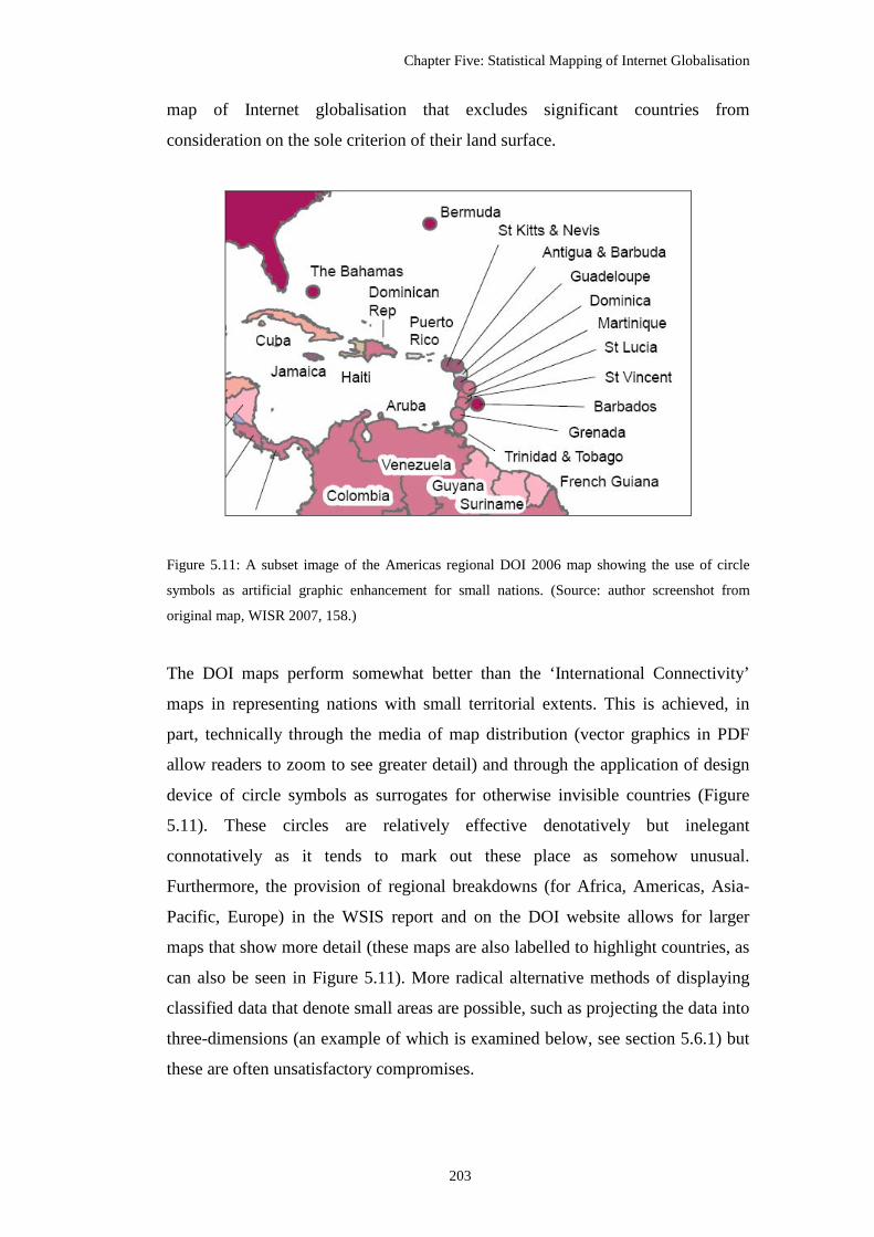
Chapter Five: Statistical Mapping of Internet Globalisation
203
map of Internet globalisation that excludes significant countries from
consideration on the sole criterion of their land surface.
Figure 5.11: A subset image of the Americas regional DOI 2006 map showing the use of circle
symbols as artificial graphic enhancement for small nations. (Source: author screenshot from
original map, WISR 2007, 158.)
The DOI maps perform somewhat better than the ‘International Connectivity’
maps in representing nations with small territorial extents. This is achieved, in
part, technically through the media of map distribution (vector graphics in PDF
allow readers to zoom to see greater detail) and through the application of design
device of circle symbols as surrogates for otherwise invisible countries (Figure
5.11). These circles are relatively effective denotatively but inelegant
connotatively as it tends to mark out these place as somehow unusual.
Furthermore, the provision of regional breakdowns (for Africa, Americas, Asia-
Pacific, Europe) in the WSIS report and on the DOI website allows for larger
maps that show more detail (these maps are also labelled to highlight countries, as
can also be seen in Figure 5.11). More radical alternative methods of displaying
classified data that denote small areas are possible, such as projecting the data into
three-dimensions (an example of which is examined below, see section 5.6.1) but
these are often unsatisfactory compromises.

Chapter Five: Statistical Mapping of Internet Globalisation
204
Statistical maps like the ‘International Connectivity’ and DOI examples also
necessarily distort dynamic processes by arbitrarily freezing them at a single point
in time. The processes of Internet globalisation are shown fixed in time - credited
to the actual day of publication in Landweber’s case - with no way to convey the
underlying temporal dynamics of the diffusion of connectivity, such as the
sequencing or rate of change. The denial of temporality in conventional
cartography is only partially solved by the use of a series of surveys and maps that
build up over time (an example of this approach is deployed by Batty and Barr
1994, in their analysis of Internet diffusion where they present readers with a
Tufte-style ‘small multiples’ set of five choropleth world maps from 1991-1994;
reproduced in appendix two, Figure A2.10). However, the periodicity of
compilation and publishing of statistical maps rarely have any meaningful relation
to the temporality of the social phenomena being represented (it is commonly just
a function of administrative convenience, e.g., the decennial cycle of censuses).
Consequently, the handling of the temporality of events in thematic cartography
remains a largely unresolved problem23. Even animation and interactively offered,
for example, via online mapping toolboxes like GapMinder
(<www.gapminder.org>) can not overcome the episodic nature of the collection
and publication of most global scale socio-economic datasets This failure has
ideological implications, as the inability to represent dynamic phenomena over
space and through time means much of the subtlety of social life is simply
unmappable (Dorling 1998).
5.5.3 Implications of classification
The final - and most significant - methodological problem with statistical maps
concerns the process of data classification. The selection of the number of classes,
and their intervals, for grouping data on choropleth maps is crucially important in
denotative term to the appearance of spatial patterns and, thus, the connotative
23 Developments in map animation and multimedia, and more recently in geovisualisation environments, are opening up interactive avenues for mapping phenomena spatio-temporally (see Cartwright et al. 1999; Harrower and Fabrikant 2008; MacEachren and Kraak 2001), but have not yet delivered any generally applicable solutions.

Chapter Five: Statistical Mapping of Internet Globalisation
205
impressions that readers receive on the phenomena being represented. Producing
practicable and meaningful classifications is a real challenge, as a balance must be
struck each time a choropleth map is made, since, “[r]educing the number of
classes achieves simplification at the expense of loss of useful detail, especially
local contrasts” (Evans 1977, 99). In the days of manual cartography,
cartographers typically used a small number of classes as a matter of convenience
rather than because of any deeper philosophical or perceptual concerns. In recent
decades, there has been considerable investigation by cartographic scholars into
the specification of ‘optimal’ classification schemes from both the statistical point
of view (e.g., Jenks and Caspall 1971; Evans 1977) and from the perspectives of
aesthetics and map usability (e.g., MacEachren 1982; Slocum and Egbert 1993).
Computer mapping and GIS has made it much easier to experiment with different
classification schemes for a given data set, but have given little help to users in
choosing a workable one; and Jenks and Caspall’s (1971, 221) perceptive
comment still holds true: “[w]e are certain, however, that many maps result from
an almost accidental setting of class limits”. This is significant because the use of
an inappropriate classification scheme can, at a stroke, render a choropleth map
unworkable.
However, beyond technical concerns on performance, it is clear that the nature of
the classification scheme in statistical mapping has political ramifications because
of the connotations that readers may draw about the underlying social reality
denotatively being ‘accurately’ represented. The design of the classification, either
deliberately or unintentionally, serves a purpose in highlighting the ‘right’ spatial
pattern for the map-maker’s agenda. Active manipulation of classifications, as
Monmonier (1996) has demonstrated, opens up a rich array of ways to ‘lie with
maps’.
The level of simplification implied in fourfold classification on the ‘International
Connectivity’ maps, for example, as it is applied to the complexity of world-wide
patterns of Internet diffusion, is problematic. The distinction between the four
classes in the map is important, and corresponds roughly to the increasing
sophistication of services possible, the persistence of the connection, the

Chapter Five: Statistical Mapping of Internet Globalisation
206
bandwidth of links, and also the likely cost. Only full internet connectivity
allowed interactive services, including telnet and ftp, that require persistent
synchronous links. In a sense, the middle two classes are intermediary levels of
sophistication in terms of possible services. ‘Bitnet’ and ‘EMail only’
connectivity only supported asynchronous interaction and did not provide
persistent connectivity. ‘Bitnet’ was a formally constituted network, with fulltime
operational managers and users had to pay for access24 (cf. Kellerman 1986). In
contrast, the ‘EMail only’ type networks of Fidonet and UUCP25 were informal
(low cost/no cost) networks relying on volunteers to operate nodes for ‘store and
forward’ email transmission (cf. Bush 1993). (The issue of classificatory collapse
of reality, is even more problematic on the adapted version of the ‘International
Connectivity’ map used in Castells’ book (Figure 5.7 above) conflates the middle
two classes into one.) The bottom class of ‘No Connectivity’ seems quite
straightforward, although this will also have included ‘no data’ countries - the
maxim, ‘absence of evidence is not evidence of absence’, always needs to be
borne in mind when reading statistical maps. (This issue reappears in a similar
vein with the ambiguous classificatory status of the ‘rogue states’ of Afghanistan,
Iraq, North Korea and Somalia in the DOI map.)
The DOI is a much more sophisticated measurement of ‘reality’ and has
categories (and the bar chart under the map allows alert readers to see the
distribution of countries in the classes). Yet there are deeper conceptual problems
with the DOI and similar kinds of indexes. One can argue that they are less
meaningful, in important commonsense terms, than simple measures because their
classification have no direct, intuitive relation to the real-world they purport to
represent. (In this sense the four levels of the ‘International Connectivity’, whilst a
gross simplification, are at least more intuitively meaningful than the DOI.) The
composite nature of the DOI, made up of eleven different indicators, means that
24 Bitnet had ‘gateway’ connections to the Internet to enable exchange of email. However, it was distinct from the Internet as it did not use the TCP/IP protocol for data transmission. 25 For half of the maps - versions 6 to 11 - the ‘EMail Only ’ category was expanded to encompass OSI networks in addition to UUCP and Fidonet. Reproduced in appendix two, Figure A2.2. See Salus 1995 for discussion of significance of the OSI challenge to TCP/IP in the early 1990s.

Chapter Five: Statistical Mapping of Internet Globalisation
207
overall score for each country does not stand for anything specific or tangible, it is
just a number representing ‘digital opportunity’. Yet no one know what this is, as
it does not exist – it is a statistical construct. Furthermore, this DOI construct is
literally ‘made-up’ and varies from place to place, so a similar DOI score in two
countries does not mean they have comparable social and technological
characteristics. This is counter intuitive in many respects. The classification of
DOI into ten equal classes also has no inherent real-world meaning (what is the
real difference between a score in the range of 0.4-0.5 and one in 0.5-0.6?). In this
fashion, the DOI is a statistical ‘black-box’, which readers must take on faith to it
represents some aspect of reality. However, in important ways, I would argue, the
map has no relation to the world it represents, it merely reifies the DOI score as a
reality. Much the same kinds of criticism were levelled at sophisticated factor
analysis in the 1970s that produced statistical values that were not intuitively
meaningfully to social experience; and some argue this applies today with
evermore sophisticated deprivation models and geodemographic profiles (cf.
Burrows and Gane 2006; Curry 1997).
Additionally, the process of data classification in statistical mapping usually
implies, either explicitly or implicitly, a ranking of areas. When people are being
represented on maps, the visual ranking has social meanings, with the map-maker
exercising disciplinary power to produce an ordering of areas (and thus people)
from ‘good’ to ‘bad’ or sorting out the ‘successful’ from the ‘failures’, according
to particular criteria. Depending on the interests served, statistical maps can be
deployed as instrumental tools of discrimination, operating as elements in larger
systems of modern governmentality (Harley 1988a; Crampton 2004); for example
in much ‘top-down’ analysis of poverty, choropleth type maps are used as a visual
instrument for identifying areas suffering ‘problems’ - and implicitly the
‘problem’ people who need help - and enabling the spatial targeting of ‘solutions’
(cf. Yapa 1992). The judicious manipulation of data classification means it is
possible to produce the ‘right’ ranking to identify the desired type of areas (and
people) to target. The issue of power over people created through social order and
instrumental targeting is at the heart of ‘Ground Truth’ critique of GIS and
geodemographics (Curry 1997; Goss 1995; Pickles 1995).

Chapter Five: Statistical Mapping of Internet Globalisation
208
In the cases of the ‘International Connectivity’ and DOI maps, the ranking serves
the purpose of expounding a normative ranking of technological prowess. It has
an explicit political ordering of countries based on their ‘worth’ to the so-called
information society. For the ‘International Connectivity’ maps it runs from Good
(‘Internet’) to Getting there (‘Bitnet but not Internet’) to Unacceptable (‘EMail
only’) and bottom of the list, are the Failures (‘No Connectivity). This last group
of excluded nations are ripe for ‘targeting’ with (Western) networking know-how
to ‘solve’ their problem of underdevelopment. With the DOI map countries
become progressive more ‘healthier’ coloured, connotatively, the higher you
climb up the ‘ladder of progress’ to the ideal state 1.0, complete ‘digital
opportunity’. Most of the rich world is already comfortably (‘naturally’) classed
atop the ‘International Connectivity’ ranking and ‘in the pink’ with a high DOI
score, and with each passing map, it is possible to see how well the other
straggling nations are doing to ‘improve themselves’ and climb their way up the
list. Such quantifying and ranking approaches can be seen as indicative of
developmentalist view of inequality that locates the ‘problem’ solely within the
boundary of the impoverished countries and exhorts them to follow set pathway
out of poverty. For example, Yapa (1992, 507) in his critique of the pernicious use
of maps of GNP as unproblematic ‘facts’ about the worldwide distribution of
poverty notes: “[w]hat do we really communicate when we use this map?: that it
is reasonable to compare whole nations to each other according to the exchange
value of commodities; that developed countries are advanced because they have a
higher GNP per capita; that underdeveloped countries need to expand their GNP
rapidly if they hope to solve the problems of hunger and poverty, and catch up
with the rest of the advanced world. But growth in GNP has no necessary relation
to the eradication of hunger.”
The connotative impact of the ranking of areas is frequently enhanced on
choropleth mapping through the particular choice of colours and shadings and
their sequence. Understanding colour perception related to the visual classification
of areas on choropleth maps combine aspects of psychological comprehension,
physiological processing and subjective interpretation in complex ways. The

Chapter Five: Statistical Mapping of Internet Globalisation
209
meanings taken up by readers are unstable and perhaps inconsistent (Dent 1995,
295). Although Keates (1996, 234) argues that colour in this context works in a
“fundamentally metaphorical” way, where “fully saturated and dark is equivalent
to either more of, or more important than; and less saturated and lighter is
equivalent to either less of, or less important than.” So where the choropleth map
colours sequence run from dark to light colour, it can be argued, that the dark
colours and heavy shadings reinforce notions that these are the ‘darkest’ areas,
with shadowy people and endemic failure - what Cosgrove (2003, 134) calls
“cartographic gloom” - while light colours give off the impression of progress,
success and the ‘light of reason’. Charles Booth’s poverty map of London is a
‘classic’ in this regard. The streets at the bottom of his ranking, ‘lowest class.
vicious, semi-criminal’, are shaded black, while the top category, the ‘upper-
middle and upper classes. wealthy’, are coloured a light golden yellow.
It is interesting, however, that on the ‘International Connectivity’ and DOI maps
the choice of colours are in reverse of this, with the darkest hues, being applied to
the top category and the lightest colour to lowest category. The eight stage colour
ramp on the DOI map, in particular, is open to connotative interpretation running
as it does from light beige up to dark purple. One could argue that the saturated
purple gives the impression of solidity, surety and, perhaps, superiority of
Western Europe / North America in ‘digital opportunity’, in marked contrast to
the pale and anaemic colours used to portray many nations at the bottom end of
the ranking. Purple has historical connotations with royalty and richness (Dent
1995, 295). Many of these low scoring (under performing) countries lie in the
global South, which in the Western imagination are stereotypically seen as
poverty stricken places that are arid and dun-brown. In some senses, then, the DOI
map resonates with Vujakovic’s (2002b, 372) observation that the choice of
colour can often “play on culturally embedded connotations; for instance, maps of
the British empire were traditionally coloured pale red/pink, with connotations of
‘health/vigour’.”

Chapter Five: Statistical Mapping of Internet Globalisation
210
5.5.4 Ecological fallacy and grouping bias
In addition to the issue of ranking, there are two more fundamental problems
associated with the imposition of a constricting classification scheme on data in
choropleth mapping. While classification is useful (often vital) to denote complex
patterns of variability in a clearer fashion, and thus more easily comprehended, it
also induces the problems of grouping bias and ecological fallacy. These are
visual-cognitive effects on the map reader which work to diminish the apparent
difference between areas and overstate the level of homogeneity within areas.
These problems are not tractable from a map efficiency point of view, but must be
embraced to begin to comprehend the ideological implications of statistical
mapping. The later ‘International Connectivity’ maps and DOI map are an
apposite example of both problems and create convergent connotations by
reducing the apparent complexity of the pattern of Internet globalisation and the
extent to which difference between nations is visible.
The ecological fallacy as a general statistical problem occurs when a relationship
observed at one scale of aggregation is assumed to hold true when looking at a
more detailed scale, without proof or testing. More specifically, in the case of
statistical maps of social phenomena, it is the ‘natural’ tendency, in graphical
connotations, to assume that the residents in an area match the average conditions
of the area as indicated through the uniform shading on the map. This notion is
commonly expounded in media reporting on social issues such as crime, health,
and education (cf. Vujakovic 1998). This is problematic when demeaning social
stereotyping based on the area’s characteristics come to taint individual lives.
In the case of the ‘International Connectivity’ and DOI maps, each country is
assigned to one class and wholly shaded accordingly. The result is an easily-
conferred visual impression that every location within the country has equivalent
levels of network connectivity or digital opportunity and all citizens enjoy
comparable access, which is clearly not the case. Uniformity in the shading of
spaces on the map is all too easily connoted into uniformity of places on the

Chapter Five: Statistical Mapping of Internet Globalisation
211
ground26. Therefore, the ideology of ecological fallacy in these maps instinctively
promotes an artificial sense of homogeneity, masking socially-significant
variation and inequality within countries. This denial of differences in terms of
reader connotations, one might argue, serves the interests of diffusionists because
the results is a more orderly and convergent representation of social reality.
The reality of network access is far from uniform, particularly so in the early
1990s as many empirical studies have demonstrated (e.g., Miller and Slater 2000;
Press 2000; Warf 2001). The effect of the ecological fallacy in the ‘International
Connectivity’ and DOI maps are most evident, and significant, in the poorest
places. In many least developed countries (LDCs), international network
connectivity, especially in the early 1990s when Landweber created his maps, was
likely to be very restricted, available only at certain elite institutions in primary
urban centres. As Holderness (1998, 40) pointedly comments: “[t]here may be a
full Internet connection at the university in Ulan Bator, but ten kilometres away
there are no telephones.” Despite very rapid growth in mobile phone use,
significant basic access inequality issues remain in many LDCs today, which
Castells (1998, 82) memorably characterised for Africa as “technological
apartheid”.
The ecological fallacy also has insidious effects for rich nations, imposing
unrealistic visual homogeneity. In well-‘wired’ nations, including the U.S. and
Britain, there were significant variations in take-up at in different regions
throughout the 1990s27 (e.g., see NTIA 1995; Office of e-Envoy 2002), often the
focus for ‘digital divide’ policy initiatives. Although these differences in basic
Internet access have closed markedly since the last ‘International Connectivity’
26 I would argue this is exacerbated because areal units in choropleth maps are drawn for simplicity, using a so-called ‘space-filling’ approach - that is, no part of the territory can be left blank as unclassified. This contrasts with dasymetric approaches, described in section 5.6.3 below, which fades sparsely populated regions and greys out uninhabited area. Although, it acknowledged that the dasymetric is not a panacea for all problems of ecological fallacy; they are still scale dependent, so on world maps do not distinguish at the local level (Vujakovic, notes on thesis draft, October 2006). 27 There are, of course, also inequalities along other important social dimensions such as age, gender, class and race (cf. Shade 2003; Warf 2001).

Chapter Five: Statistical Mapping of Internet Globalisation
212
map was drawn in 1997, socio-spatial differentials in networking capability are
being replicated, in a quite similar fashion to the early 1990s, with the deployment
of newer (faster, and more flexible) technologies like fibre-to-the-home and
municipal public wi-fi coverage (Townsend 2003). So ‘digital opportunities’ are
not evenly distributed, socially or geographically, with in developed nations but
the connotation arising from ecological bias is that everywhere is uniformly ‘in
the pink’.
Due to the nature of the choropleth mapping, with its inherent visual dominance
by geographically extensive areas, the ecological fallacy also contains an in-built
rural-urban bias. As the average rate, determined predominantly by densely
populated urban areas, must be ‘painted’ across the whole country, this can mean
a significant overestimate of networking potential of rural areas. This is certainly
the case with the ‘International Connectivity’ maps (extreme cases, in Figure 5.4,
being Russia, Canada and Australia). Whilst network access has diffused to many
rural areas over the last decade, the economic reality is that Internet production,
despite the ‘spaceless’ rhetoric, is to a large extent an urban phenomenon,
dominated by hubs in a few large cities28. Is it likely that ‘digital opportunity’ is
the same across the whole of Brazil or China as it connotes to be or concentrated
in a few major cities, mostly along the coast.
The second cartographic ‘error’, with political ramifications, caused by
classification in statistical mapping is grouping bias, which is the prejudicial
contraction of the differences between units of enumeration. Because of the
limited number of categories, coupled to the selection of their class limits, it is
often the case that really quite dissimilar countries end up being assigned, and
visually labelled, to the same group. In conventional choropleth maps there is no
scope for ambiguity or fuzziness, each zone must be classified completely - it can
only exist in a single group. In the case of the ‘International Connectivity’ maps,
28 According to Zook’s (2005) empirical analysis of January 2002 data, the top 100 cities across the world, with only six percent of the global population, contained fifty percent of the Internet domain names.

Chapter Five: Statistical Mapping of Internet Globalisation
213
all the diverse countries of the world have to fit into just four groups. The lack of
discrimination in the top Internet class is especially problematic. Only a minority
of countries shaded Internet purple actually had comparable nation-wide
infrastructures to support genuinely comprehensive network access, especially so
in the first ‘International Connectivity’ map from 1991 (Figure 5.4 above). The
amount of international network connectivity could vary from a single (expensive,
low bandwidth) satellite link in the capital city along a spectrum of capacity, up to
countries with dense networks of high-capacity fibre-optic cables linking many
parts of the country to the Internet. For example, on the 1991 map, the three
nations that constitute North America are all shaded purple, denoting they are in
the same group because they all have Internet connectivity, yet it is an
inappropriate connotation if readers believe that Mexico’s Internet capability was
in any way equivalent to that in the USA and Canada at that time.
In the final ‘International Connectivity’ map produced by Landweber in June,
1997, a large proportion of the nations are classified as having full Internet
connectivity. “Almost the whole world, it seems from a casual inspection of this
map, has turned Internet-coloured” Holderness (1998, 39) sardonically
commented29. Yet, this connotation of Internet hegemony through graphic
homogeneity is map fiction. Despite their belonging to the same category,
Petrazzini and Kibati (1999) demonstrate that the USA, Argentina and Kenya, for
example, have fundamentally different Internet statuses, noting that end-user
access costs (adjusted for purchasing power) were nine-times higher in Argentina
than the U.S., and 413 times more expensive in Kenya. It is not just in the
consumption of the Internet that inequalities are masked: arguably even wider and
politically more significant variations are hidden in terms of Internet production
(again, demonstrated by Zook’s (2005) analysis of the geography of the Internet
industry). The result, then, for an unwary reader of the ‘International
Connectivity’ maps, is that countries coloured the same are easily assumed to
29 Interestingly, he went on to construct his own version of the ‘International Connectivity’ map, which tried to remove some of the grossest distortions of the ecological fallacy and grouping bias, effectively by using dasymetric mapping techniques (discussed in section 5.6.3 below).

Chapter Five: Statistical Mapping of Internet Globalisation
214
have equivalent levels of connectivity in reality. Reducing the connotations of
difference between neighbours and across continents is powerfully convergent.
Grouping bias still applies for the DOI map as 181 different countries must be
grouped into eight classes30. Although the extent of grouping bias is lessened
somewhat as there are twice as many categories than in the ‘International
Connectivity’ maps and the ranking of countries by their DOI score on the bar
chart under the maps provides useful information on the class distribution and the
degree of variance in their score. A much more radical representational strategy to
overcome grouping bias would be classless choropleth techniques (cf. Peterson
1979; Tobler 1973), where all countries are uniquely shaded. Such mapping is
now easily produce by mapping software and studies show readers can interpret
them, but not widely seen as too unconventional and the resultant patterns are too
complex.
In combination, then, the ecological fallacy and grouping bias result in the
graphical imposition of homogeneity, diminishing diversity and the erosion of
difference between places. The deeper question, then, is who benefits from the
cartographic concealment of true inequality in the distribution of networking
across the world in the 1990s? Making the situation look much better than the
underlying social reality supports the ‘diffusionist’ viewpoint.
5.6 Design extensions to area-based mapping of Internet globalisation
There are various design options that can be applied to represent area-based
statistical data to overcome some the methodological issues with conventional
choropleth maps. While these can generate different denotative meanings about
statistics of Internet globalisation, it is not always so easy to change the
connotative impressions of the mapped world. In this section consideration is
given to three extensions that have been used to represent Internet globalisation
differently from standard choropleth mapping: pseudo three-dimensional stepped
surface mapping, hybrid diagram mapping, and, lastly, dasymetric mapping.
30 Plus the two special classes for ‘no data’ and for the ‘rogue states’.

Chapter Five: Statistical Mapping of Internet Globalisation
215
5.6.1 Stepped surface mapping of Internet globalisation
Figure 5.12: The ‘Bit Map’, a pseudo three-dimensional stepped surface map representation of the
ITU’s Digital Access Index. (Source: Cherry 2004, 54-55.)
Projecting data into the space above the x-y plane of conventional cartography is
one possible way to display more levels of attribute information in statistical
maps. The use of the z-dimension for representing density values and trend
surfaces is relatively common and now quite easily generated with GIS software
from point sample data. It is also possible to represent area-based data
volumetrically as a stepped surface map where height above the ground of each
enumeration unit denotes a statistical aspect of the data. Such stepped surface
maps have some novelty as ‘alternative’ representations and do offer the potential
to display more of the variance within data than may be possible with shading of
the enumeration units according to a limited classification (i.e., z-dimension is

Chapter Five: Statistical Mapping of Internet Globalisation
216
unclassified). However, they also suffer from problems of visual occlusion when
presented statically on a flat sheet of paper or display screen, rather than as a fully
three-dimension model that can be used interactively and visually interrogated
from different angles.
The ‘Bit Map’ is an example of a pseudo three-dimensional stepped surface map
representing national-level data related to Internet globalisation (Figure 5.12). It
was published on a double-page spread in an article entitled, ‘a world divided by a
common Internet’ in IEEE Spectrum (flagship journal of the U.S. Institute of
Electrical and Electronic Engineers). The accompanying text claims it “show[s]
who’s bit-rich and who’s bit-poor, and why” (Cherry 2004, 56). The data
underlying the map was from an ITU calculated ‘digital access index’ created in
2003, and a statistical forerunner to their DOI national ranking discussed above.
From initial inspection it is a visually intriguing representation of the world,
however in a lot of ways it is premised on a conventional choropleth approach,
with five colour-coded classes with unequal intervals. All that is different is the
countries are extruded vertically according to their index score, in addition to
being shaded. Indeed, one can seriously question the benefits to legibility in
employing the stepped surface mapping technique as the scaling factor for the
extrusion means particularly tall counties mask other parts of the map. The
vertical bulk of Australia blocks out much of Southeast Asia, for example, and the
relatively well-wired South Africa obscures a good portion of central Africa. In
denotative terms it is also difficult to compare reliably the heights of countries
from different regions (is Brazil higher than South Africa?). Given the viewing
angle for map, some countries also have an unfamiliar shape to them making
identification more difficult. The one noticeable benefit of projecting up off the
surface of the map is that territorially small nations that score highly – and
therefore stand tallest – can be much more easily discerned than on a ‘flat’
choropleth map (e.g., Hong Kong, Singapore).
Besides the denotative issues with information legibility, the ‘Bit Map’ does,
however, connote powerfully an overall sense of the patterns of sharp divisions

Chapter Five: Statistical Mapping of Internet Globalisation
217
across the world. The countries in the global North metaphorically and graphically
appears to stand over the world and dominate the map. This is enhanced for some
countries because of the viewing angle at which the map is drawn. The overall
tilting of the map diminishes the apparent size of the nations in the southern
hemisphere. The bottom scoring - denotatively lower - countries are all found
across the middle of the continent of Africa. Statistical ‘cliffs’ seem to rear up to
separate the ‘mountainous’ networked core of Europe from the flat under-wired
periphery. Inequalities between some neighbouring countries appear to be sheer
and physically insurmountable because of how they are drawn, quite a different
connotation in comparison to how disparity between classes in a ‘flat’ choropleth
map is read. In connotative terms the difference between high and low have clear
social significance to readers, creating valuative connotations; Harpold (1999, 17)
observed of such three-dimensional statistical mapping: “[a]cross its peaks and
valleys emerges an archipelagic, virtual landmass that traverses the conventional
boundaries of continents and nations. Viewed from on high, the vast, flat surface
of the network’s digital plains seem far removed, alien and obscure.”
Geographically contiguous nations at the same level of distribution tend to merge
into one another, supporting the impression of large politically unmarked terrains
free of significant activity at lower level, and others, politically-differentiated but
also uniformly towering over the rest of the world. (The towering nations are all
signalled as important connotatively by the selective denotative labelling.) Yet, it
is not just about height alone, the use of the z-dimension creates much greater
visual differences, enhancing the presence of already territorially large countries
that score well, by granting them voluminous amounts of space on the map
display (e.g. Australia, the U.S./Canada are not just taller, they appear to be very
much bigger than other nations). Along with the effect of the bright yellow colour,
for the countries in the top category, the connotative meaning of their bulk is clear
- bigger is better.
The selective labelling strategy highlights that this is not a map of the whole
world as it purports to be, but actually a map of an American viewpoint on parts
of the world that are deemed to be significant. (The top 10 countries are listed

Chapter Five: Statistical Mapping of Internet Globalisation
218
against only the bottom 5, for example) Many nations outside the core economies
are left unmarked; the ‘middle’ ranked countries, of average height, are
undifferentiated and unnamed. Special treatment is reserved for the bottom five
countries in central Africa which are purposefully identified by text even though
they barely register as volumes in space.
The selective labelling, combined with the widely differentiated heights applied
across the world (rather than classifying the z-values) means that the patterns
revealed are too complex and disorderly to connote convergence. And despite the
muted colour ramp that hints at convergence, the connotative effects of such
uneven heights and variations in volumes between adjacent nations and across
continents is to imply an excess of difference in the world. As such the ‘Bit Map’
is firmly located in the divergent quadrant of the fourfold conceptual model of
connotative meanings.
The ‘Bit Map’ read semiotically in its totality is also clearly projecting a
forcefully valuative connotation, it is “intended to aid in preferential selection”
(MacEachren 1995, 227). A more challenging way to re-map the ‘world divided
by a common Internet’ would be to reverse the logic of the extrusion so the lower
the statistical score, the taller the projection of the country. This would, perhaps,
contest stereotypes by highlighting the divergent of the world seen from the
perspective of those nations usually at the bottom of worldwide ranking schemes.
5.6.2 Hybrid diagram mapping of Internet globalisation
Another thematic mapping method to display statistical data is using multiple
small charts or diagrams drawn within country boundaries. The advantage is that
the diagrams can display several different statistical values at the same time rather
than the single value denoted through shading the enumeration unit. The notion is
that the reader can make comparative inferences between areas according to
multiple statistical dimensions, giving a more nuanced understand of the spatial
distribution and the underlying social processes. Although the results are not
necessarily effective because, as Board and Taylor 1977 31) note, attempts “to

Chapter Five: Statistical Mapping of Internet Globalisation
219
show both the total volume and proportional sub-divisions of a phenomenon in an
area by complex symbols such as pie-charts sets up mutual interference or ‘visual
jamming’ that could be severe enough to reduce the information communicated by
both sets of information.”
Figure 5.13: The ‘Network Society Map’, published by World Link, 1997. Map research and
conception by Nico Macdonald; cartography by Chapman Bounford. (Source: Spy Graphics,
<www.spy.co.uk/research/worldlink/>.)
An example of diagram mapping applied to the theme of Internet globalisation is
the ‘Network Society Map’31, published in 1997 by World Link magazine (Figure
5.13; a larger version is also reproduced in appendix two, Figure A2.11.) The
‘Network Society Map’ was originally designed to be distributed as a large poster
(measuring 32" x 54") for “the occasion of the 1997 Annual Meeting of the World
Economic Forum in Davos, Switzerland”, according to subtitle. The overt
business-focus of the map is denoted explicitly in the text in the ‘explanation’
box, the being to “show how well prepared 49 of the largest and most dynamic
31 Another conceptually similar but graphically more complex diagram map entitled ‘Wired Countries of the World’ was produced in 2007 by the World Information Access Project. It is not analysed here as it does not add anything substantive to the arguments but is reproduced for information in appendix two, Figure A2.12. This map suffers severely from what Board and Taylor (1977) term ‘visual jamming’.

Chapter Five: Statistical Mapping of Internet Globalisation
220
economies are to compete in the network society.” The map’s support for global
capital is reinforced through its visible sponsorship by Hewlett Packard and
Novell, two major multinational IT companies with the prominent presence of
their logos in middle of the page. The connotations from these texts and logos
signals the world as represented in the map is ripe for capitalist exploitation, it is a
dehumanised view of national markets with differing opportunities for investment
and profits.
Figure 5.14: A subset image of the ‘Network Society Map’ showing the key showing the
choropleth shading scheme and doughnut symbol. (Source: author scan from original.)
The map is well constructed cartographically with has production values as
befitting its target audience; it is rather more aesthetic than purely scientific. For
example, the design uses a graticule and shaded ocean floor terrain to frame the
countries which creates a more realistic feel to the background, rather than the
unadorned white frame more typical of statistical maps. All countries are
identified and have name labels.
The map visually denotes five different statistical variables (see legend detail in
Figure 5.14), although it is demanding to make meaningful comparative
inferences between them and across multiple countries. At the base level, all

Chapter Five: Statistical Mapping of Internet Globalisation
221
counties are assigned into one of four classes and shaded accordingly. This
classification is actually Landweber’s 1996 ‘International Connectivity’ survey
(acknowledged in the notes at the bottom of the Connectivity text box). Most of
the world is in the top class (full Internet connectivity) and shaded a warm pastel
pink, except for the mosaic of colours across central and southern Africa
indicating much greater difference. Doughnut-type symbols located within a
select number of countries denote another four data variables (Figure 5.14). Three
ICT measures, phone lines, PCs and Internet hosts per capita are denoted by
colour coded rings and the overall network society ranking is denoted by the
number at the centre of the doughnut. Much additional ‘technical’ data and detail
is also presented to readers in four text boxes which work connotatively as
credible evidence to enhance the credibility of the map itself.
The ‘Network Society Map’ is a discriminatory representation, denotative ranking
only 49 nations, thus connotatively signally these are the nations that matter most
in the network society. The prime focus of the map is Europe with its denotative
enhancement through the enlargement of scale and the graphical highlighting in
the drop shadow box. (The box connotes, perhaps, as a protective wall around
‘fortress Europe’.) The Eurocentric connotative meaning is clear - the network
society is principally enjoyed by markets of European nations32. The rest of the
world is relatively sparely covered, except for a slight cluster in Southeast Asia
economies; large swathes of the world and hundreds of millions of people are, by
implication, excluded from the network society. The ‘empty’ African continent
languishes, connotatively, below spatially enhanced and graphically enclosed
Europe, only receiving doughnut symbols at the top and tail and nothing worthy
of network society status in between. Indeed, much of the equatorial zone of the
world seems to be beyond the network society with no doughnut symbols found in
the Caribbean or Central America. The large expanse of Russia (heading east
beyond the safe confines of the European citadel) and central Asia is also a
32 Although even in the European heartland of the network society, there is powerful and judgemental selectivity on what nations matter. Many ‘emerging markets’ in the eastern half of Europe obviously do not quality for network society status. Russia does get targeted but all its former colonial territories are consciously left out.

Chapter Five: Statistical Mapping of Internet Globalisation
222
denotatively empty and connotatively unimportant void.
Yet as noted earlier, many of these ‘excluded’ economies in Africa, the Caribbean
and Central America are actively involved in the production and development of
the information economy, albeit in a different capacity to those in developed
nations (i.e., as manual labour providing raw materials or manufacturing, low-paid
back office function rather than high-order information processing).
The connotative power of Europe, at the centre of the network society, is assisted
denotatively because the territorially compact countries are well filled with the
large doughnut symbols. For other countries, with larger territorial extents, these
symbols look much less impressive and a stuck somewhat awkwardly in the
middle, signify a relatively empty zone of activity, with network society
concentrated only at this one point (e.g., the USA, Canada, China). Europe also
gains in status by the denotative North-South division in the map layout by
placing nearly all text boxes and ancillary material in bottom of the map,
connotatively in regions that do not matter so much to the network society, which
is securely located in the region above.
Besides their geographical distribution, the doughnut symbols themselves are
open to interpretation. At one level they are not effective denotatively for
statistical comparison between countries and their interpretation is made harder as
the three colour-coded rings have widely different scales (e.g., why does the USA
score better than Finland?). Connotatively, they imply complexity and show
excessive difference, with too many rings empty for countries outside the West.
Even the emerging BRIC economies barely register any colours on their doughnut
rings. The extent of bareness is confusing connotatively, how can they be ranked
in the network society if they denotatively don’t have any PCs or Internet hosts?
Also, what is the connotative meaning of the doughnut symbol design itself? It
has a quasi-militaristic appeal of a target on a firing range. Does these signify the
value of countries as different business ‘targets’, their worth denoted directly by
the large number in the bull’s-eye for business in the network society. The number
‘1’ target of USA is worth more than Indonesia at number ‘49’. No target symbol

Chapter Five: Statistical Mapping of Internet Globalisation
223
on a country connotes that it is not worth targeting by corporations.
In conclusions, the ‘Network Society Map’ leaves much of the world unmeasured
and unmapped. The selection of criteria measured and mapped to denote
‘preparedness’ of the countries for competition with each other are wholly
concerned with technological superiority, with no wider social or cultural
dimensions. A great deal of variation and inequality is evident in the ‘Network
Society Map’, which in its desire to show technological progress and prowess,
only targets the best 49 countries with attention. The map is a divergent view of
the world.
5.6.3 Dasymetric-based mapping of Internet globalisation
Figure 5.15: A hand-drawn dasymetric style map of ‘International Connectivity’ produced by
Mike Holderness. It is a consciously political ‘adjustment’ of Landweber’s original map that seeks
to undermine the myth of rapid Internet diffusion. (Source: Holderness’s website,
<www.poptel.org.uk/nuj/mike/cyberdiv.htm>.)

Chapter Five: Statistical Mapping of Internet Globalisation
224
The dasymetric technique for cartographic representation seeks to ameliorate the
gross areal averaging inherent in choropleth maps by explicitly recognising the
internal spatial distribution of the phenomena being represented to create a new
set of zones to display the data. The goal is, therefore, to map the statistics, as far
as possible, to their ‘natural’ zones rather than to arbitrary, prescribed units of
publication (mostly based on administrative convenience). The primary
application of the technique has been in mapping social phenomena, particularly
population distributions. It can be argued that the dasymetric mapping methods
give a more denotatively ‘accurate’ (i.e., spatially realistic) - and hence a more
connotatively persuasive - visual representation. The dasymetric method can “help
us to escape from the spatially bounded conceptions of human life produced by
the choropleth map” (Crampton 2004, 50). Robinson (1982) traces the lineage of
the dasymetric approach back to the 1830s, with the Harness population map of
Ireland cited as the first published example.
Yet dasymetric mapping has been only sporadically deployed, despite its
potentially significant benefits for mapping area-bases social statistics. This lack
of use is because it requires considerable amounts of ancillary geospatial data33
and additional cartographic processing to produce them, compared to the standard
choropleth mapping techniques34. Also, like cartograms (discussed in section 5.7
below), dasymetric maps can suffer from the ‘unfamiliarity’ problem, as new the
boundaries generated to display the data are more complex and less uniform than
the administrative units people are used to seeing.
Despite this lack of general use, dasymetric ideas have been applied to the
mapping of Internet globalisation by journalist and activist, Mike Holderness
33 In terms of social mapping, necessarily detailed, small-scale, data on population distributions have traditionally been unavailable - although technical developments in urban remote sensing and household level geodemographics are changing this, at least in the UK (cf. Longley and Harris 1999). In many ways, Martin’s (1996) extensive work on surface-based population representations from the census provides one of the best routes to generating data needed for dasymetric mapping. 34 The availability of GIS, enabling greater flexibility in the manipulation and aggregation of spatial data, has made it potentially easier to create dasymetric maps (e.g., Mennis’ 2003, work using ArcView). However, as far as I am aware, no major GIS package yet provides a ‘point-and-click’ function to generate dasymetric maps. Indeed, the help system for the market leader, ESRI’s ArcGIS, contains no reference to them.

Chapter Five: Statistical Mapping of Internet Globalisation
225
(1998). He states he was troubled by the level of abstraction in the ‘International
Connectivity’ maps, how they portrayed an unrealistic viewpoint on the extent of
world-wide network diffusion, and decided to produce his own approximate,
hand-drawn reconfiguration as a political counter-map (Figure 5.15; it is also
reproduced as a full page image in appendix two, Figure A2.13). Although he
does not recognise it as such, his map has many elements of dasymetric design.
Holderness’ adjusted map removes some of the most significant elements of
distortion from the ‘International Connectivity’ map (he used the second to last
map from 1996 as his starting point, reproduced in appendix two, Figure A2.2) by
fading non-metropolitan regions outside of the OECD core nations to account for
their likely much lower ‘connection density’ and also greying out the uninhabited
deserts and arctic tundra. Holderness has effectively doubled the complexity of
the classification, so as to make “a first approximation at a realistic map”
(Holderness 1998, 40), by introducing the notion of dense and sparsely networked
regions (in many ways mirroring the more complex division in the original
‘International Connectivity’ data tables; see Figure 5.6 above). Although the
representation of dense and sparse areas was acknowledged as cartographic
guesswork on Holderness’ part, the result is a view of the world with a very much
more constricted degree of Internet globalisation, and with network connectivity
significantly more spatially concentrated, than implied by the homogenising
choropleth display of the last few of the ‘International Connectivity’ maps. (For
example, Russia, China and Australia seem to be much less completely networked
in dasymetric form compared to the choropleth representation in the ‘International
Connectivity’ map.) The rich, dark purple shading of full Internet connectivity is
very much more constrained to the core regions of the developed world in
Holderness’ presentation. It is also interesting to see that Holderness is willing to
create his zoning scheme by curving the boundaries of different connectivity
levels across national borders (e.g., between the U.S. and Mexico) which is
arguably more realistic that the complete cut-off at the frontier implied by the
solid black lines on the ‘International Connectivity’ map. In this fashion
Holderness is by implication breaking down the primacy of the nation state

Chapter Five: Statistical Mapping of Internet Globalisation
226
metageography, where countries as sovereign units must be denoted as completely
separate and self-contained on conventional world maps.
In connotative terms Holderness (1998, 40) says of his map, “it is not dissimilar to
a map of per capita income - or, for that matter, one of where the white folks are”.
The global south is clearly rendered connotatively as markedly unequal periphery
through the use of faded colours, while the distinctive ‘spotty’ appearance
highlights to the map reader the tight concentration of the best connectivity in
very few principal cities (e.g., India goes from full purple in the ‘International
Connectivity’ map to only three dark city spots). And one could argue
denotatively that many of the spots are actually exaggerated and if drawn to scale
would actually be dots of connectivity. In many ways then, Holderness’
dasymetric mapping of the Internet highlights effectively the extent of continuing
unevenness in network access and the complexity of patterns within countries and
across regions, countervailing the more harmonious picture painted in the
‘International Connectivity’ and DOI maps. As such, on the fourfold connotative
schema for maps of Internet globalisation, this dasymetric view of the world
should be placed in the quadrant for map with disorderly meanings.
5.7 Cartogram-based mapping of Internet globalisation
Cartograms are a hybrid of map and diagram in which a scale manipulation of
distance or area is deliberately employed to highlight the structure of the thematic
data at the expense of geographic accuracy. The most common technique is the
‘value-by-area’ cartogram where the units of enumeration are drawn scaled
according the statistical data and not their customary territorial extents.
Even though there is a relatively long history of cartograms production, dating
back to innovations in the 1860s in statistically representing data for European
countries (see Tobler 2004 for review), they have not been commonly deployed,
particularly compared to choropleth maps. This is due, in part, to the fact that they
are perceived as being more demanding to produce, and in an era of automated
cartography, most software packages still do not provide cartogram drawing
Chapter Five: Statistical Mapping of Internet Globalisation
227
functions35. When cartograms are deployed, it tends to be for consciously political
reasons and a case is often made that they offer a more socially progressive way
of mapping people, particularly at the global scale (Vujakovic 1989). For
example, the political case for cartograms for radically re-presenting global social
geography is explicit within the work of the Worldmapper project at Sheffield
University, as they claim their eye-catching cartogram design “enables a more
democratic representation of the population of the world, where people are treated
as equals regardless of where they live” (Barford and Dorling 2008, 68).
Cartograms are said to be rhetorically powerful because they eliminate the
“fundamental distortion of much past thematic cartography in (literally) drawing
our attention to the patterns in places where the fewest people live” (Dorling
1994, 85) and thus offer a connotatively ‘fairer’ scheme of visual representation,
particularly at the world scale (e.g., small, densely populated states can be easily
seen and sparsely populated territory shrinks). The goal in their use is, therefore,
to stimulate new ways of thinking about social patterns represented by denoting
them in a way that goes against convention (e.g., cartograms used in Kidron and
Segal 1995).
The major disadvantage of cartograms is their unfamiliar denotative appearance to
readers. Cartogram algorithms, particularly contiguous ones that attempt to
preserve boundary adjacency, can produce very warped country outlines,
eliminating conventional shapes and shifting well-known landmarks, such that
people, who have been imprinted from a lifetime’s exposure to the ‘normal’ visual
geometry of world maps, find them confusing and difficult to read. (The extent of
distortion to conventional shape is a very evident issue, for example, in the
Worldmapper cartograms; selected examples shown in appendix two, Figures
A2.15–A2.18). Such denotative unfamiliarity can, of course, be viewed as a
connotative benefit as it can spark interest and help to challenge complacent
viewpoints - “[t]he appeal of cartograms no doubt results from their attention-
getting attributes” (Dent 1995, 208). However, it can also reduce the effectiveness
35 Various custom scripts and programs have been developed to create cartograms (e.g., Dykes’ (1997) ‘cdv’ system), but the extra effort required is usually not justifiable, compared to the ease of producing a choropleth map.

Chapter Five: Statistical Mapping of Internet Globalisation
228
of the map because people focus their attention more on the mapping technique
than on the actual data being represented, thereby breaking one of Tufte’s (1983)
maxims for good information design.
Cartograms are potentially interesting semiotically as a representational technique
to change the conventional denotation of statistical views of the world that has
connotative impacts beyond just ‘shocking’ the audience out of complacency –
they can connote a uncluttered and more lucid world picture. Such a smooth,
simpler and more straightforward appearance of nations for example,
unencumbered by the complex twists and turns of borders and coastlines, implies
a greater clarity of understanding of the statistical trends and highlights
differences not noticed before. In the context of representing Internet globalisation
under examination here, the interesting question is whether the connotative
meanings in cartograms suggest a more divergent pattern in comparison to the
tendency of choropleth maps to present a convergent view of the world coming
together.
A number of cartogram techniques have been applied by several different
individuals and groups to represent the extent of networking across the world. It
should be acknowledged that the distribution of most of these cartograms of
Internet globalisation has been limited, especially in comparison to the two main
choropleth-based examples considered above (‘International Connectivity’ and the
DOI maps) and they should perhaps be viewed as rather experimental
interventions into the discourses of network development. As such they have
likely had little impact on reshaping the wider discourses about the worldwide
extent of Internet globalisation, but do offer alternative connotations that are
worth considering, particularly if an organisation with influence, such as the ITU,
were to decide to deploy cartograms rather than choropleth-based world maps in
the future.
Distance-based cartograms using a linear scale distortion according to cost, time
or speed of travel have been employed to show how communications connectivity
is differentially re-scaling relationships between places, for example Arrowsmith
and Wilson’s (1998) ‘telecom tectonic’ world maps (example reproduced in

Chapter Five: Statistical Mapping of Internet Globalisation
229
appendix two, Figure A2.14). Crude aesthetically, their cartograms denote the
distance between countries in terms of the uneven costs of telecommunications,
which they claim connote differences between cyberspace and physical,
highlighting the “location of electronic ghettos … of the electronic world”
(Arrowsmith and Wilson 1998, 8) not apparent on conventional choropleth maps.
Value-by-area cartograms have also been used to show Internet globalisation,
including the work of the Worldmapper project, using their novel equal area
diffusion algorithm that attempts to preserve boundary shape and adjacency of
nations36. The Worldmapper team are publishing online hundreds of world
cartograms on a myriad of social, demographic and economic themes using public
national-level statistics. They have created two cartograms of Internet users per
capita, for 1990 and 2002 survey points – the results denote the northern
hemisphere nations as greatly enlarged, connoting images of being blown up like
balloons and the Global South shrivels almost out of existence (reproduced in
appendix two, Figures A2.15-A2.18). Their goal is to highlight scale of inequality
by exaggerating the connotation of divergence between regions of the world in the
hopes of bringing about changed policies (which would ultimately bring about
changes to the patterns denoted, making the world a more harmonious social
space). Their 2002 cartogram poster, for example, asserts this agenda through a
human voice in the following quote: “we strive to achieve a ‘warm-hearted digital
world’ where everybody … enjoys ubiquitous access to communications
technologies for the greater good” (reproduced in appendix two, Figure A2.17).
The denotative and connotative meanings of their cartograms can, in some senses,
be correlated to Barford and Dorling’s (2008, 108-09) dual scientific objectives
expressed in their work: “These cartograms are scientifically (in the natural
science sense) [and denotatively] interesting as they result from the beauty and
elegance of solving an algorithmic problem. These cartograms are also
scientifically (in the social science sense) [and connotatively] interesting because
they show how we live now – they deliver a clear message about the current state
of the world.”
36 Developed by U.S. academic physicists Michael Gastner and Mark Newman. Further details at <www.worldmapper.org>.

Chapter Five: Statistical Mapping of Internet Globalisation
230
The more easily constructed and thus more commonly drawn cartogram design is
the non-continuous one and there are several exemplars that map data relevant to
the theme of Internet globalisation, including ExploMap Technologies’ cartogram
using a relatively simple design of scaled square blocks representing the number
of Internet users placed directly on top of world map of country boundaries;
Govcom.org’s ‘digital divide cartogram’ has an interesting twist in that country
size is drawn inversely proportional to level of Internet usage, so the nations with
least become the most visible; and Byte Level Research’s cartogram ignores
geopolitical boundaries by focusing on the global politics of Internet domain
names with nations represented solely by their country codes scaled according to
the size of population (these three different cartograms are reproduced in appendix
two, Figures A2.19, A2.20, A2.21)37. Two further non-continuous cartogram
examples will be considered in a little more depth because they have a rather more
sophisticated design perspective and significant political agendas – the first is
from a U.S. technology magazine and connotes the ‘wired world’ as a set of
business opportunities and under-developed markets, the second is a project by an
Italian artist questioning the unequal growth in the Internet in relation to
population geography by exploiting the iconicity of nation-state flags.
37 Original pdf versions of them are currently available from: • <www.bytelevel.com/map/ccTLD.html>, • <http://explomap.free.fr/world_map_internet_users_2005.pdf>, • <www.govcom.org/maps/map_set_wsis/GC0_Maps_set_3.0_digitaldivide_invert.pdf>.

Chapter Five: Statistical Mapping of Internet Globalisation
231
5.7.1 ‘Wired World Atlas’ cartogram
Figure 5.16: The ‘Wired World Atlas’ displays national-level statistics on telephones and
televisions per capita using a non-contiguous cartogram technique. (Source: author scan from
Conners-Petersen 1998, 162 and 167.)
In 1998, at the height of the ‘dotcom’ boom and the hype around the
transformative potential of the Internet and worries about those people and places
trapped on the wrong side of the digital divide, Wired magazine featured a large
non-contiguous value-by-area cartogram, entitled the ‘Wired World Atlas’ in its
November issue. In the cartogram countries are denoted as rectangular blocks,
scaled according to telephone lines per capita and shaded by the penetration of
television (Figure 5.16; a larger version is reproduced in appendix two, Figures
A2.22 and A2.23). Wired magazine is a U.S. technology lifestyle magazine with a
strongly libertarian and utopian outlook on the Internet, and in the mid 1990s was
considered something of a ‘bible’ for the true believer in cyberspaces’ potential to
change the world for the better (Jordan 1999). Their conscious decision to use a
visually novel cartogram representation rather than a more conventional

Chapter Five: Statistical Mapping of Internet Globalisation
232
choropleth world map is in keeping with the design pretensions of the magazine
which often features alternative and colorful info-graphics.
The ‘Wired World Atlas’ cartogram was printed across a double page of the
magazine as part of a six-page special fold out section38. This feature was
promoted on the magazine’s cover with the strap line: ‘Globally wired - your
foldout guide to every nation’s tech wealth’ which overtly construes the agenda of
the cartogram. It is a technologically centred narrative, viewing computer media
and telecommunications as actives agent, existing ‘outside’ of society, that are
capable of directly effecting (positive) changes social behaviour. The text
accompanying the map also clearly advocates a developmentalist point of view
that technology can solve problems of uneven development: “This leapfrog
syndrome, the speed of IT development, the entrenchment of socio-economic
inequality – these factors are shaping and animating the media map” (Conners-
Petersen 1998, 167). The statistics represented on this ‘media map’ are wedded to
commercially-driven, positivist measures of infrastructure penetration and
technological progress, failing to reveal the nuanced role that many developing
nations play in supplying and supporting the information economy of developed
nations.
38 The other four pages feature a large summary chart, entitled ‘The Media Spectrum’, showing countries classified by eight different statistics accompanied by short anecdotal portraits of how technology is improving individual lives in different countries.

Chapter Five: Statistical Mapping of Internet Globalisation
233
Figure 5.17: A subset image of part of the ‘Wired World Atlas’ cartogram. (Source: author scan from Conners-Petersen 1998, 167.)
Design wise the cartogram is actually a quite familiar shaped world view, albeit
with a strongly rectilinear manifestation, with the established cardinal orientation
of north at the top, America to the left and Australia on the right, and the
continental groups all in the right places. In denotative terms a major change from
world scale choropleth maps, such as the ‘International Connectivity’ and DOI
considered above, is that countries can not be recognised by their familiar outline
shape so must all be labelled for identification. Many counties do maintain,
approximately, their correct geographical adjacency to each other. Representing
nations scaled by the statistical values rather than their territorial extent results, in
general terms, in the countries in the Global North being denoted as larger and
lighter coloured, compared to the rather undifferentiated mass of nations in the
southern hemisphere, which tend to be much smaller and more darkly shaded. The
most striking visual feature of this cartogram, in connotative terms, is the
shrunken-looking African continent which seems to be overwhelmed by huge,

Chapter Five: Statistical Mapping of Internet Globalisation
234
overbearing European country blocks. Although slightly less oppressive, this
‘squeezing down’ from above connotation also applies to a stunted looking
Central and South America that seems to capped by the ‘heavy’ golden blocks of
the U.S. and Canada. Mexico, in particular, seems to have been squashed flat by
their bulk.
In specific denotative terms the representation performs poorly as it is impossible
to judge the meaning of the size of countries as no scaling equivalence is given in
the legend (shown in close-up in Figure 5.17). In fact, the legend and
accompanying text are vague about the mechanics of the classification and
denotative meaning of the shading; what is the scale of the saturation meant to
indicate? (Whether this vagueness is deliberate or merely oversight is not
discernable.) How are readers to reliably decode the meaning of two variables in
the cartogram? Perhaps they are not supposed to focus on detail of each country
but just appreciate the ‘big picture’. Besides size and colour, the actual shape of
different countries varies from exact squares and elongated rectangles, to some
with odd blocky protrusions. Again, it is not clear whether this denotes
information or is simply artistic license by the designer (the shape of Italy would
suggest shape is used arbitrary for decorative purposes alone.)
Even though the denotative meaning of the size and shape of countries is
unspecified and therefore uncertain, the potential connotative meanings are
interesting to speculate about, particularly how to read the meaning of narrow-
vertical nations (do they appear to be ‘skinny’ and rather ‘puny’?) in comparison
to the wide-horizontal countries (which seem ‘fatter’). This thin/fat visual
dichotomy, arguably, creates subconscious perceptions of the differing potency
and worth of nations – in this case square-fatter shaped countries appear superior
visually and thus are judged as being superior places. The variations across
Western European nations, between wide ones and tall ones, is an interesting case
in point; connotatively how do France and Belgium compare, or more
dramatically in terms of visual prominence, Monaco and Switzerland?

Chapter Five: Statistical Mapping of Internet Globalisation
235
The case of Monaco’s representation in the ‘Wired World Atlas’ also highlights
another key denotative aspect of the cartogram in that it offers clarity of
representation in some respects in that many small nations can be seen at the
global scale. As noted above, on the ‘International Connectivity’ and DOI maps
many small nations can not be discerned visually, and connotatively they do not
exist in the mapped world. In Figure 5.16, the tiny principality of Monaco is
actually the most visible nation at the centre of Europe, with the largest graphical
extent and a bright yellow shading which makes it stand out from the darker hue
colour of its neighbours. Connotatively, Monaco is clearly an important nation in
the wired world, a point reinforced denotatively by the addition of a textual
citation next to the cartogram informing readers that it may be small in land area
but is ‘arguably the most wired’. The text goes on to point out the obvious
explanation for this ‘superpower’ status in the wired world – “its sheer wealth
remind us that money begets media.” This hints at the fact that per capita wealth is
actually the real factor determining denotative visual presence of countries on the
‘Wired World Atlas’.
As well as highlighting the small and wealthy nations, the cartogram seems to
give undue denotative attention to a select few island economies which are most
‘plugged’ into wired world. Such islands are normally mere specks in expansive
seas and oceans on conventional map projections. The ‘wired’ islands that are
most apparent are in the Atlantic with Bermuda, the Bahamas and the Antilles,
typically invisible on world maps, shown are hefty-sized blocks in their own right.
Indeed, Bermuda seems like some kind of new Atlantis, drawn as large as North
America and connotatively inviting favourable comparisons between the two
nations. While in the southern hemisphere, the whole African continent
(undersized denotatively and connotatively an unwired zone of ‘failure’) is
visually hemmed in by an enlarged Cape Verde island and a combined island
block representing Réunion, Seychelles and Mauritius; this bright red block is
denotatively bigger than the whole of southern Africa (it also receives additional
attention as a ‘noteworthy place’ via a text citation). The way these islands are
mapped is also interesting as it provides clear evidence of selective cherry-picking
as many other island nations – one suspects the poorer and much less wired one –
Chapter Five: Statistical Mapping of Internet Globalisation
236
are consciously not represented on the ‘Wired World Atlas’. For example, much
of the Caribbean seems not to exist.
In terms of visual clarity, the African nations are clearly a denotative design
‘problem’ on this cartogram. Given their low scores in ‘wired’ rankings they are
drawn as small and indistinct squares, whereas on conventional territorial
projection they are easily visible. They are also shaded in dark purple hue that
connotatively seems to resonate with Cosgrove’s (2003) notion of ‘cartographic
gloom’ and recreates the dark heart of Africa, reminiscent of European maps of
the continent from the age of empires. Some of these small and landlocked nation
‘squares’ do not even get labelled – signally connotatively that they do not need to
be named, they are indistinguishable and do not really matter in the wired world.
Another advantageous dimension of cartogram designs in general is that they can
often be seen as an improvement over conventional choropleth maps in their
capacity to make readers to think anew and undertake qualitative comparisons
between places when seen in a different projection. Certainly some of the visual
juxtapositions on the ‘Wired World Atlas’ prompt reconsiderations of relative
importance between neighbours and may overturn perceived hierarchies based on
unequal territorial size alone. For example, which is best in connotative terms
when comparing the UK and Ireland? It is hard to say, and their representation on
the cartogram implies near equanimity between what have traditionally been
viewed as very asymmetrical neighbours (particularly given the colonial legacy39).
One might argue that the representation is now more accurately reflecting the
changing economic balance as the UK economy has declined in comparison to the
boom enjoyed by the ‘Celtic tiger’ in the last two decades.
Other connotatively intriguing regional power re-configurations include eastern
Europe versus Russia. Denotatively, Russia is very small scaled on the cartogram,
connotatively a tiny sliver of a nation unlike its usual connotation of a vast
territory spanning a third of the world from Europe to the edges of Asia. In the
39 Interestingly, the denotative simplification of representation in the cartogram allows the territorial ambiguity of Northern Ireland be overlooked.

Chapter Five: Statistical Mapping of Internet Globalisation
237
‘Wired World Atlas’ its power, accruing from sheer land mass, is lost and it is
rendered at a scale comparable to former socialist republics of Belarus and
Georgia and appears connotatively to be somewhat less important than its former
colonial territories, and now newly vitalised, Baltic states of Estonia, Latvia and
Lithuania.
In Asia, there are several potent reversals of normal power relations evident,
including the two populous superpowers of India and China which are shrunken
significantly. The diminished size of India and China (which can visually
dominate population-based cartograms) shows that the geometric calculation of
power in the ‘Wired World Atlas’ depends not on people per se, but on wealthy
people. It would be interesting to speculate what this cartogram would look like
redrawn with 2008 data, and the degree to which the intervening ten years of
double-digit technology-driven economic growth in China has really changed the
per capita performance that much. In terms of comparative geopolitical visualities
in the cartogram, the contrast between Pakistan being drawn as larger (and above)
India is noteworthy given their bitter national rivalries, along with the
juxtaposition of Hong Kong drawn much larger and brighter than China proper.
One last theme to consider regarding the meanings given out by this cartogram is
the degree to which it does connote the whole world, as it denotatively purports to
be. The legend texts hints at the ambiguity that the cartogram is not actually a
guide to ‘every nation’s tech wealth’ by admitting that no data, means no
representation (Figure 5.17 above). So territories that do not rank statistically,
literally do not count - they are made to disappear from the ‘Wired World Atlas’.
Denotatively the cartogram is made up of a profusion of nation blocks but there is
not enough of them to connotatively represent the world effectively. The count of
blocks shows about 140 countries represented on the cartogram, which is about
forty nations less than mapped by the DOI (which is itself less than 193 sovereign
states recognised by the UN). What is missing? Its hard to identify countries left
unmapped but it likely to be places that do not count strategically to U.S. interests
or do not offer attractive market opportunities (e.g., some small poor Caribbean
nations). So while the headline text under the cartogram may claim that it

Chapter Five: Statistical Mapping of Internet Globalisation
238
‘envision[s] the globe’, it is only on a partial viewpoint, and while it might be a
‘brand-new map’ it exhibits many of the old geopolitical devices of silencing,
ethnocentrism and visual ordering based on social power found in other world
maps.
Given these limitations, how does the ‘Wired World Atlas’ score in terms of the
fourfold categorisation of connotative meanings for representations of Internet
globalisation? Some denotative elements of design – the saturated colour ramp,
the regular shape to the symbols and the spatially contiguous spatial
representation of each nation40 - means it is simplified picture which strongly
implies an orderly world. This connotation of relative orderliness is enhanced
because the transitions in country block size and shading are, broadly speaking,
gradual across the continents, with relatively few sharp divides between adjacent
nations. In many ways then this cartogram suggests an ordered and convergent
world, however, this is at odds with much of the surrounding text annotations and
commentary along the bottom of the page which consciously highlight places of
difference and of concern41 (e.g., a particularly negative comment is associated
with Africa by choosing to highlight the Congo as the worst performer in the
world.) “Rarely will you find clear patterns in the way media penetrate markets
and influence our lives” notes Conners-Petersen (1998, 162), which does not
suggest a convergent pattern. (This could be a case of the visuals and the text
being authored separately and the editor not being fully aware of the clash of
connotations; cf. Vujakovic 1999a.) Furthermore, differences between continents
evident in the relative scaling of the blocks, does highlight in an unavoidable
fashion the degree of inequality in the world; the shrunken African continent in
contrast to Europe is especially powerful connotation of the gulf of difference in
the wired world. The extent of order, combined with evident difference exhibited
in the ‘Wired World Atlas’ mean it should be positioned in the upper left quadrant
on the fourfold grid of connotative meanings.
40 Avoiding the visual complexity and disharmony of nations with split territories, such as the U.S. or geographically fragmented nations such as the Philippines. 41 Note, text is more legible on the larger versions in appendix two, Figures A2.22 and A2.23.

Chapter Five: Statistical Mapping of Internet Globalisation
239
Figure 5.18: Screenshots of two frames from an animated cartogram visualising the growth of
Internet users created by Antonio Scarponi. The top image is from the middle of the animation and
the bottom image is the last frame. (Source: GlobaLab, <www.globalab.org/eng/>.)

Chapter Five: Statistical Mapping of Internet Globalisation
240
5.7.2 ‘Internet Users World Map’ cartogram
Another noteworthy project exploiting the cartogram approach to try to envision
Internet globalisation differently is the ‘Internet Users World Map’ created in
2002 by Italian architect/artist Antonio Scarponi, as part of a larger critical art
project he calls ‘Human World’42 (Figure 5.18). He describes his mapping project
as “an atlas that propose a representation of the cultural and political information
of our world displayed on a demographic basis. This project uses Boetti's mapping
code by flipping the concept of the flag from the territory to its population.”43
The design aesthetic Scarponi deploys for representing the world are country
outlines filled with their national flag. Denotative this conflates two of the primary
visual signifiers of national identity - the territorial outline and the emblem of
state. Flags and maps often have overlapping emotive connotations, particularly as
they are interwoven with patriotism and nationalistic politics (Vujakovic 1999a).
Yet, typically these two icons of the nation are deployed as separate
representations; Whyte (2007) reports only one national flag (that of the Republic
of Cyprus) features a recognisable country outline, although other flags do make
symbolic calls to cartographically related theme and geopolitical narratives.
Scarponi acknowledges his deployment of the cartographic design of the world
doubly ‘politicised’ through national flags is a notion copied directly from the
work of another Italian artist, Alighiero Boetti (1940-1994). Given this aesthetic
relation, the work of Boetti is of relevance to the reading of the conceptual
meanings Scarponi’s cartograms. Boetti was fascinated by the relationship
between chance and order, systems of classification, and many aspects of culture,
particularly non-Western traditions and practices. These interests are reflected in
aspects of his most significant art works, a series of large embroidered maps of the
world, made in collaboration with Afghani and Pakistani artisans, where the shape
of each country is filled with its national flag, described as “vividly illustrating
42 Available online at <www.conceptualdevices.com/ENG/Human%20World/index.html>. The other maps use the same country-flag cartogram design but represent different statistics, such as national rankings for democracy and the use of the death penalty. 43 Source: <http://point-view.blogspot.com/2007/04/space-in-picture-is-like-property.html>.

Chapter Five: Statistical Mapping of Internet Globalisation
241
our world of fiercely demarcated individual nation states.”44 In contrast to signs of
demarcation, others have argued, the interwoven pattern of countries in Boetti’s
work, resulting denotatively from the embroidery technique in the making of the
map, symbolises the interdependence of states (Storr 1994). In some senses,
Boetti’s world maps also connote that national boundaries are not as fixed as they
can appear in conventional cartography, involved as they are in a constant process
of flux and negotiation due to geopolitical events (such as the reunification of
Germany, or the break-up of Yugoslavia)45. The maps, then, have multiple and
potentially incompatible connotative readings (just like Scarponi’s cartogram, see
below). This instability of meaning resonates with Boetti’s own creative practice,
which he self-effacingly described as follows: “[f]or me, an embroidered map
couldn’t be more beautiful. I did nothing for this work, chose nothing myself, in
the sense that the world is shaped as it is, I did not draw it; the flags are what they
are, I did not design them. In short I created absolutely nothing. When a
fundamental idea, the concept, emerges, there is no need to decide on anything
else.”46 This comment, in its overt naivety that the shape of the world is merely
‘given’ to him, I think clearly suggests that one needs to think very carefully about
why the world is shaped way it is on his maps.
Scarponi’s own art work, ‘Internet Users World Map’ is a short animated non-
contiguous value-by-area cartogram (delivered online using Flash) that shows the
countries scaled according to the number of Internet users (Figure 5.18 above). To
achieve the re-scaling, he claims each pixel represents a thousand people, in what
he describes as a ‘demographic’ projection. The animation of maps runs from
1993 through to a future projection in 2015 and denotes how the configuration
and relative scaling of countries changes as differential growth in the Internet user
population plays out. In the beginning, the U.S. dominates the field of view, with
44 Source: <www.tate.org.uk/modern/exhibitions/artepovera/boetti.htm>. A noted example from this series, Mappa del Mondo, 1989 (140 x 220 cm) is on view in the permanent collection of the New York Museum of Modern Art. Photographs of a range of Boetti maps are presented here, <http://www.orbit.zkm.de/?q=node/357>. 45 A point made visually in Scarponi’s animation through the merging of European nation into an imagined single Euro-land under one flag (discussed below). 46 Source: <www.orbit.zkm.de/?q=node/357>.

Chapter Five: Statistical Mapping of Internet Globalisation
242
Latin America and the African continents barely visible (except for Brazil and
South Africa), yet towards the end of the sequence, North America shrinks from
prominence as the maps become visually dominated by the expansion of India,
China and the central African states (based on future projected online population
growth in those countries). Also, some territorially large nations, which tend to
dominate conventional geographically projected world maps, shrink away because
of their relatively small online presence – the most noticeable being Russia,
Canada and Australia. Separate European nations merge overtime to become a
single EU super-state in the middle of the world map, the nature of the bright blue
flag connotes a dominant monolithic expanse (by the end of the animation
sequence only the Swiss flag exists to disrupt European unity).
Overall the cartogram has many denotative problems around the legibly of the
information displayed and the difficulties of interpretation for many people with
limited awareness of the design of national flags and the shape of nation states. As
a mode of identification the rectangular shaped flag designs are often poor
choices, particularly when they have had to be tightly cropped to fit irregularly
shaped countries. This makes recognition a challenge in many parts of the map
and clearly disadvantages those nations without a strongly iconic flag (or with a
flag not known to wider readership). Denotatively, then the primary meaning of
the map is one of cartographic muddle as a jumble of odd sized bits of pattern and
colour grow and jostle around.
Beyond explicit issues with design effectiveness and denotative legibility, there
are several important connotative meanings expressed through this cartogram.
Firstly, many flags are only recognisable when shown on territorially extensive
countries and consequently small countries cannot be identified and are silenced.
The outcome is that the citizens in these nations are given no more connotative
significance than on the conventionally projected choropleth maps of the world.
As a politically motivated cartogram, it does not address the fundamental
equalities with territorial delineation. As a result it is very much the same select
few countries (those that dominant global discourse and are widely represented in
the media as leading the international community) reified in Scarponi’s cartogram.

Chapter Five: Statistical Mapping of Internet Globalisation
243
The effect of using flags as land cover can have other disconcerting connotative
results. The dominance of China for example, with its large land area and
population base is magnified through the simplicity of the Chinese flag design,
with it assertive singular red colour. The result is a monolithic area which gives
off menacing connotations of ‘threat from the east’. In comparison, the design of
India’s flag with its three distinct bands, denotatively splits the nation and this
connotes as a divided country, with diminished capacity (and threat to Western
interests) compared to China.
Scarponi’s invocation of the cartogram as a supposed ‘demographic’ projection
that focuses attention on people, rather than conventional representation
dominated by territory, is interesting politically but is not delivered with his
chosen design approach. Its emotive connotation to change understandings of the
world is undermined precisely because of his choice of the primary semiotic
vehicles of the territorial power - the country outline and the nation flag. The
implied claim that flags can speak for people is problematic at best, they more
likely signify state space.
Flags are culturally complex visual symbols in their own right, each one having
layers of meaning and imbued with various historical belongings (Whyte 2007).
For those outside of a culture, the symbolism embedded in the flags colours and
patterns is obscure at best and many citizens probably do not know what their flag
means; how many people can decode the meanings of the British flag? The
narrative and symbolic meanings of flags are also unstable, varying over time and
with contexts – the ‘problematic’ issue of the meaning imparted by displaying the
Union Jack, for example, with it connotations of a tarnished colonial past and
more recent associations with racist and fascist groups and the violence of football
hooligans in the 1980s. This is in marked contrast to the rejuvenated position, for
some, of the George Cross with positive connotations of English pride. In the
U.S., the national flag has strong patriotic resonance for many, to the point where
the protest of burning the flag is criminalized. The flag and map are often
combined as political icons, particularly in conservative rhetoric. Edsall (2007,
343) notes the prevalence of ‘flag-filled maps’ in America which “emphasizes the

Chapter Five: Statistical Mapping of Internet Globalisation
244
difference between what is ‘‘inside’’ and what is ‘‘outside’’ the borders but, more
importantly, implies a unity of spirit, purpose, and resolve. This monotone fill
suppresses notions of internal variation (e.g., dissent) and connotes uniformity, a
common mission, solidarity, and national pride.”
Crucially, then, the deployment of national flags is not innocent as each of them
brings with them all kinds of political connotations. Vujakovic (1999a 11) notes,
“[f]lags are highly potent symbols of nationhood, and their importance is
demonstrated by the multitude of ways in which they have been revived and
incorporated into the iconography of resurgent nationalism in east-central
Europe.” So the complex profusion of flags in some areas on the cartogram
(central Africa or the Middle East), one could read connotatively as an emergent
maze of cultural diversity, political self-determination and the potential rise of
nationalism as a powerful force reshaping the geography of states. The flag, in this
sense, is an emotive sign producing “incitive connotations”, which MacEachren
(1995, 348) says tries to “stimulate action (or at least a desire that someone take
action).” The profusion of country filled flags are perhaps a call to resist a
globalising, convergent world of uniformity of media access. Yet, at the same
point these forces are signified elsewhere on the cartogram by the strength and
stability of the flags of powerful nations (the EU, the US and China), which are
visually dominant and most legible in denotative terms.
Overall, then Scarponi’s cartogram approach is a conscious attempt to visually
restructure the readers understanding of Internet globalisation through a map that
focuses on population and not territory but is flawed in many respect because it is
fundamentally still premised on nation-state geopolitics and not people as social
actors. It is founded on the nation as the basic units of measure and representation
(reified, of course, by the iconography of national flags). Despite its intentions it
is connotatively analogous to the ‘International Connectivity’ and DOI maps in
many respects, with the emphasis on the power of nation-states to visualise and
explain the impact of the Internet.

Chapter Five: Statistical Mapping of Internet Globalisation
245
In terms of the fourfold grid of connotative meanings, it is apparent that
Scarponi’s cartogram defies clear classification into a single quadrant.
Semiotically it speaks to global consolidation and growth, but also invokes
countervailing notions of nationalism and splintering of world into many separate
spaces. It is a picture of a converging world in the sense that countries seem
visually to be getting closer, stemming in part from the denotative use of a
growing cartogram, and also in the sense that growing Internet use is all about
convergent media practices, but it also connotes diverging world because it
highlights trends that are locally variable and, in part, nationally regulated, hence
the flags.
5.8 Discussion
Given the many issues with how the above maps connote divergent or convergent
patterns, is it possible to conceive of more progressive, although not necessarily
more ‘accurate’, approaches to the analysis of Internet globalisation? Maps that
overcome the culture of ranking, which tends to encourage competition rather
than cooperation, pitting country against country, rather than highlighting
common causes of difference. In a neoliberal socio-economic contexts
benchmarking tools such as the DOI are seen as beneficial as both a measure of,
and also means to encourage, competitive behaviour between economies. Policies
are enacted with an eye to the rankings and to improve the score (e.g., Japan and
Korea vying for top spot; rivalry between Hong Kong and Singapore as most
efficient Asian hub). Focus is on score not necessarily what it means for changing
and improving the lived experience of people (as a very different scale, rankings
of the world’s top universities can be seen to perform in the same way).
Getting beyond the ranking culture may means more than ‘tinkering’ with
alternative representational forms and indicator choices, to think about different
conceptions of measurement and, indeed, very different types of questions about
the nature of the Internet and so-called information society. In addition to
measuring Internet availability and activity, some have argued for an empirical
assessment of the Internet focused on utility in terms of peoples’ capacity to

Chapter Five: Statistical Mapping of Internet Globalisation
246
exploit it47. For example, Gurstein (2003, no pagination), using ideas from
community informatics, has called for the analysis of digital divides to look at
‘effective use’ of the Internet in local settings that focus on the ability to actively
participate in the production as well as consumption of the networks. In relation to
the Asian Tsunami and supposed ‘failure’ of communications in the region,
Gurstein (2005, no pagination) notes:
“From what I can gather most if not all of the communities impacted [by the
tsunami] had Internet ‘access’ in one form or another. What they (and here I
would include those with the knowledge who couldn't use it as well as those
without knowledge) lacked rather, was the social, organizational,
informational, and applications infrastructure which could have turned
Internet access into an ‘effectively usable’ early warning system.”
Conceptualising Internet measurement in terms of the ability for individuals and
communities to take effective action online is also interesting conceptually
because it moves the focus from ‘top-down’ measurement of infrastructure
availability towards a more ‘bottom-up’ rights-based agenda for understanding
Internet globalisation. Some commentators argue that the most socially relevant
way to measure Internet globalisation now is as the ‘freedom to access’. For
example, Guédon (2002, no pagination), noting the ‘completion’ of the access
project charted by the ‘International Connectivity’ maps through the 1990s,
argued in a statement on the future role of the Internet Society that: “I believe a
new kind of map ought to be issued each year by ISOC, and it would graphically
display how the rights of access of cyber-citizens are respected or flouted, as the
case may be”, a consciously political mapping, meaning that “ISOC would raise a
moral voice in the world, a voice that would say: not only do we guarantee the
existence of our cyber-citizens, but we also defend their cyber-rights.” There have
been a number of ‘moral mapping’ projects with this kind of human rights agenda
recently (e.g., mapping of Darfur crisis, cf. Parks 2008).
47 The DOI has one indicator, out of eleven components, that comes part way to capturing some notion of use but it tends to be lost in crowd of other infrastructure capacity indicators (cf. Peña-López 2007).

Chapter Five: Statistical Mapping of Internet Globalisation
247
Figure 5.19: An overtly propagandist mapping of Internet globalisation in terms of online freedom,
produced by campaigning NGO Reporters without Borders. (Source: <www.rsf.org>.)
In terms of Internet globalisation, Wired magazine produced a world map in 1997
entitled ‘Freedom to Connect’ (Conners 1997; reproduced in appendix two,
Figure A2.31) denoting the extent of government censorship in five classes.
Harpold (1999, 14), however, critiques the map’s chosen way to measure
‘freedom’ saying “[t]he crudeness of the map's visual scale - distinguishing free
from unfree connections in only five steps that must represent differences across
all political-legal, economic, and technological contexts - begs the question: how
meaningful is it to compare the ‘freedom to connect’ in Mexico City, Paris,
Brisbane, and Algiers, and come up with the same result?” More recently in-depth
annual studies have been produced by the NGO, Reporters without Borders
comprehensively auditing inequalities in online access caused by governmental
surveillance and censorship. The results are informative in that they show the
highly fragmented nature of Internet globalisation, even in many OCED countries.
As part of a campaign to highlight the extent of surveillance to attendees at the

Chapter Five: Statistical Mapping of Internet Globalisation
248
2005 World Summit on the Information Society in Tunis they published an
striking and simplistic map of a binary world highlighting almost universal
‘freedom’ except for the ‘black holes’ (Figure 5.19; reproduced as a larger image
in appendix two, Figure A2.32). Despite its stress on difference, it is also a
convergence with the definite potential to eliminate the ‘black holes’, if only
enough political pressure could be brought to bear. Of course the map deliberately
hides much of the complexity of online surveillance to make a political point.
Online freedoms are, arguably, in reverse - and not just from more intensive
government wiretapping spurred by the ‘war on terror’. The right to explore
cyberspace anonymously and communicate freely is being undermined by media
corporations in their attempts to channel consumers and combat file sharing, along
with criminals who are polluting virtual commons with offensive spam, phishing
and malicious viruses.
Unsurprisingly, there is tendency in the quantitative analysis of global Internet to
focus on technical and economic statistics - seen as solid, knowable data and
relatively easily gathered, rather than ‘fuzzy’ human experience. (This has been
highlighted by Cornford (1999) as a general problem in the statistical assessment
of impacts of ICTs.) The basic epistemological problem in all the above
approaches seeking generalisable mappings is that they explain little about
people’s real experience. Statistical world maps in this regard have an implicit
tendency to dehumanise the world because they work best as simple stories of
national averages, per capita scores and the rollout of governmental schemes. To
broaden the understanding of the peopling of the global Internet, one must try to
assess the rich, individual experiences of networking practices best gained through
ethnographic case studies.
The work of anthropologists Miller and Slater (2000), examining how the Internet
is variously adopted and adapted into everyday life of people in Trinidad, provides
an authoritative exemplar of the benefits of exploring the local contingency of
networking practice. Accordingly, they claim, “[s]ocial thought has gained little
by attempting to generalize about ‘cyberspace’, ‘the Internet’, and ‘virtuality’. It
can gain hugely by producing material that will allow us to understand the very

Chapter Five: Statistical Mapping of Internet Globalisation
249
different universes of social and technical possibility that have developed around
the Internet in, say, Trinidad versus Indonesia, or Britain versus India” (Miller and
Slater 2000, 1).
In particular, most existing statistical approaches and mappings completely fail in
their representation of the African experience of the Internet. The result, at
present, leaves Africa largely as a blank, the ‘dark continent’ of old. The
blankness on Western-centric ‘top-down’ statistical maps of the network society
masks the fascinating richness and diversity of the Internet’s percolation through
Africa (e.g., see Barlow 1998; Hall 1998 for diverse examinations of the situation
‘on the ground’). The need is for analysis not to demarcate the spaces of diffusion
but to give voice to the places of adoption.
Given this sophistication is pretty much impossible to capture in conventional
cartographic genres, in what ways are the statistical maps of Internet globalisation
useful and how should they be interpreted politically? They seem to provide a
conceptually simple - one might say simplistic - picture of the global geography
of the Internet. Taken together they create a various cartographic stories of the
extent of the diffusion of connectivity and access measured at the national scale.
The maps, through the use of the most ‘obvious’ geoplitical form of nation state,
make it is easy to assume that they provide a clear and straightforward geographic
presentation of the data. This is certainly how they have been used (for example
deployment of DOI map by the ITU). Yet, one must also recognise “that these
depictions of network activity are embedded in unacknowledged and pernicious
metageographies -- sign systems that organize geographical knowledge into visual
schemes that seem straightforward, ... but which depend on historically - and
politically - inflected misrepresentation of underlying material conditions.”
Harpold (1999, 5). A critical reading of them as actually revealing something of
this metageography, that they actually ‘truthful’ maps of contemporary global
power relations. As world maps and thematic maps from Victorian era can now be
read as representations of Britain’s imperial vision, so these maps can show the
nature of contemporary economic neo-imperialism driven in part by the Internet.
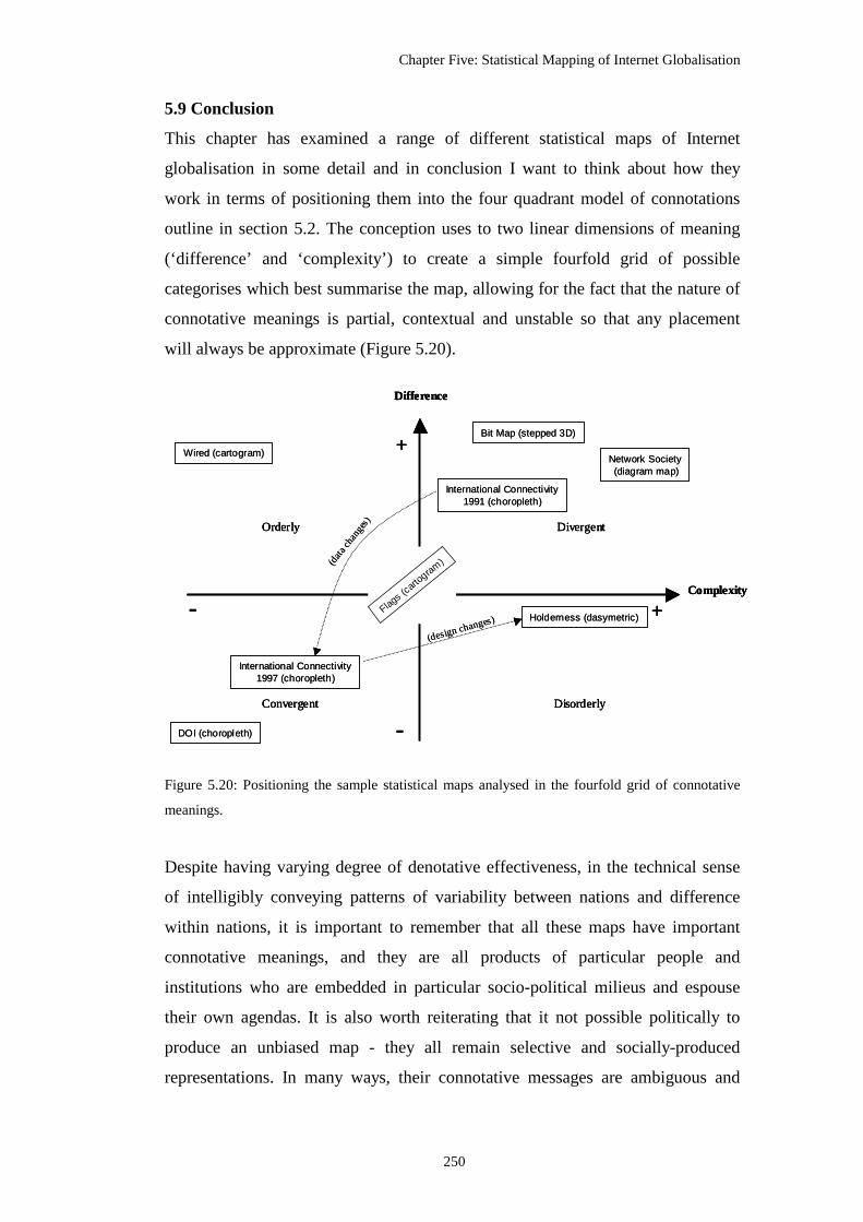
Chapter Five: Statistical Mapping of Internet Globalisation
250
5.9 Conclusion
This chapter has examined a range of different statistical maps of Internet
globalisation in some detail and in conclusion I want to think about how they
work in terms of positioning them into the four quadrant model of connotations
outline in section 5.2. The conception uses to two linear dimensions of meaning
(‘difference’ and ‘complexity’) to create a simple fourfold grid of possible
categorises which best summarise the map, allowing for the fact that the nature of
connotative meanings is partial, contextual and unstable so that any placement
will always be approximate (Figure 5.20).
Figure 5.20: Positioning the sample statistical maps analysed in the fourfold grid of connotative
meanings.
Despite having varying degree of denotative effectiveness, in the technical sense
of intelligibly conveying patterns of variability between nations and difference
within nations, it is important to remember that all these maps have important
connotative meanings, and they are all products of particular people and
institutions who are embedded in particular socio-political milieus and espouse
their own agendas. It is also worth reiterating that it not possible politically to
produce an unbiased map - they all remain selective and socially-produced
representations. In many ways, their connotative messages are ambiguous and
Complexity
+-
+
Difference
-Disorderly
Divergent
Convergent
Orderly
Bit Map (stepped 3D)
DOI (choropleth)
Network Society(diagram map)
Wired (cartogram)
International Connectivity1991 (choropleth)
International Connectivity1997 (choropleth)
Flags (c
artogram
)
Holderness (dasymetric)
(data
chan
ges)
(design changes)
Complexity
+-
+
Difference
-Disorderly
Divergent
Convergent
Orderly
Complexity
+-
+
Difference
-Disorderly
Divergent
Convergent
Orderly
Bit Map (stepped 3D)
DOI (choropleth)
Network Society(diagram map)
Wired (cartogram)
International Connectivity1991 (choropleth)
International Connectivity1997 (choropleth)
Flags (c
artogram
)
Holderness (dasymetric)
(data
chan
ges)
(design changes)

Chapter Five: Statistical Mapping of Internet Globalisation
251
open to multiple readings, in that some highlight more strenuously the divisions in
some respects, but, at the same time, also speak to the potential for convergence as
well.
Given these limits, it is apparent that the eight different statistical maps examined
occupy a range of positions in the fourfold grid, with slight majority tending
towards convergent meanings in how they represented Internet globalisation.
Considering each of the maps in turn, it seems useful to start with Antonio
Scarponi’s ‘Internet Users World Map’, which is represented by the box ‘Flags
(cartogram)’ in Figure 5.20 and has been placed precariously balanced across the
confluence of the two axis as it exhibits in a dichotomous fashion connotative
meanings of both convergence and divergence in roughly equal measure. While
the meanings of the flags are complex to interpret, the evident growth in the
cartogram and the emergence of dominant national and supranational blocks
suggests a consolidation of power, yet other elements are, at the same time,
divergent in meaning with the multitude of different flags connoting a
countervailing force of cultural diversity and potentially nationalist separatism.
The ‘Digital Opportunity 2005/2006’ map produced by the ITU is, arguably the
most convergent in terms of connotations of difference and complexity. Overall, it
projects a view of Internet globalisation that is strongly harmonious with
commonalities between nations rather than wide differences. The degree of
variance across the world is made to appear as gradual, almost natural, phases of
change and there are no sharp breaks or unsettling complexity.
The ‘Wired World Atlas’ is a rectilinear cartogram which has been positioned
high in the orderly quadrant because it presents a compelling vision of Internet
globalisation that is at once simple in appearance but also highlights the
differences between continents. The connotations of simplicity stem from the
block shapes and the even transitions of colours but there is also a very unequal
connotation created by the scale differences in block sizes across the world as a
whole.

Chapter Five: Statistical Mapping of Internet Globalisation
252
The ‘Bit Map’, with its distinctive pseudo three-dimensional stepped
representation of the world, is similar in some respects to the connotative
meanings of the ‘Wired World Atlas’ as it emphasises, using height and volume,
the differences between regions of the world. The extent of divergence across the
world can not be counteracted by the classification and colour scheme that work
to reduce the perception of inequality. The overall feel of the pattern is much more
intricate and disorganized than the Wired presentation, hence the placement of the
‘Bit Map’ in the divergent quadrant, scoring highly on both dimensions of
difference and complexity.
Two versions of the ‘International Connectivity’ maps, one from near the
beginning of Internet globalisation (1991) and then another from the height of the
Internet boom (1997) were examined. The first map from 1991 suggests a fairly
divergent and somewhat disorderly world, with some areas of high difference
evident (adjacent countries in polar opposite categorises and obviously wide
differences between continents). The sharp inequalities are emphasised by the
discordant choice of colours that can not suggest anything but divergence. There
is little symmetry to the patterns of highs and lows across the world and the
extensive inequalities mean this map, in connotative, terms is located inside the
divergent quadrant. At the end of the ‘International Connectivity’ series, the
eleventh map produced by Landweber in 1997, arguably, connotes a quite
different view of Internet globalisation. This map suggests a much more
convergent world due to changes in the underlying data as so many countries
reached the top class (full Internet connections), rather than modifications in the
design and classification (which remain constant). Given these changes in
underlying data mean most of the world is a uniform colour leaving only
constrained pockets of ‘failure’, the map scores much lower on difference and
complexity dimensions and is positioned firmly in the convergent quadrant. The
arrow between the 1991 and 1997 ‘International Connectivity’ maps boxes in
Figure 5.20 illustrate the reasoning behind the significant switch in connotations.
The next map is the dasymetric reconfiguration of the 1996 ‘International
Connectivity’ map undertaken by Holderness to take account of variance in

Chapter Five: Statistical Mapping of Internet Globalisation
253
connection density within countries, particularly in the developing world. The
changed design, in terms of doubling the number of classes displayed on the map
and the willingness to represent subnational variation in the data, means that it is a
much more complex and less certain view of Internet globalisation. The
impression is of a world much more divided, with only spots of high connectivity
in many parts of the Global South. Given these characteristics this map should be
placed connotatively in the opposite quadrant to its originator because it is
fundamentally a disorderly representation of the world. The arrow between the
two maps in Figure 5.20 illustrates that they map essentially the same data but the
impact of classification and design changes has altered the connotative meanings.
The final map to classify into the fourfold grid is the 1997 ‘Network Society Map’
hybrid diagram map, which has a clearly Eurocentric bias and visually emphasises
the very partial distribution of ‘network society’ status across the world. The use
of the diagrammatic targets plotted onto countries added to the complexity of
patterns displayed and suggested multiple processes at work and little coherence
in the narrative of network society diffusion. The design of the target graphics
themselves also emphasises the incompleteness of the network society ‘project’
for most countries outside the core rather than demonstrating positive fullness.
The many empty targets speaks to failure rather than success. Given these
characteristics the dominant connotative meaning for the ‘Network Society Map’
is one of divergent world.

254
Chapter Six
Marketing Maps of Internet Networks
The advertiser generally uses the map both to enlighten and to persuade and only rarely to distort.
The map is often the quickest, clearest, and most neatly organised method of conveying a
geographical idea in advertising.
-- Douglas K. Fleming and Richard Roth, Place in Advertising, 1991.
6.1 Introduction
The focus of analysis in this chapter are marketing maps used in the commercial
promotion of Internet infrastructure, particularly during the phase of rapid growth in
the second half of the 1990s through a case study of WorldCom. A large number of
maps of Internet infrastructures have been produced by commercial network operators
for the purposes of marketing services and as an element in their corporate branding
strategies. As such, they are the latest incarnation of a long lineage of marketing maps
used to promote communications networks, including railways, highways and the
airways. This genre of mapping is interesting theoretically as it drops the ethic of
cartographic independence by serving an overt commercial purpose, namely to attract
prospective customers and investors in what are often highly competitive business
environments. The maps created seek to communicate persuasively to potential
customers and investors the benefits of using the network operators’ services above
another company by highlighting key aspects of their infrastructure, including its
geographic extent, the range of important places connected and its capacity.
The analysis in this chapter is structured in four distinct parts: it begins by discussing
the nature of marketing maps in general terms, considering how cartographic rhetoric
can be employed in commercial promotion strategies for a variety of networks. The
second part of the chapter is an overview analysis of the extent of marketing map
usage to promote Internet infrastructure based on data from a content study of the
websites of the fifty most important network providers. In the third part a framework
of cartographic design strategies is developed to analyse the rhetorical power of the
network marketing maps. This framework is then applied to examine in the detail
global scale network marketing maps deployed by five of the largest

Chapter Six: Marketing Maps
255
telecommunications corporations. The forth and final part of the chapter analyses a
time series of network marketing maps produced by WorldCom, a corporation that
dominated Internet infrastructure provision through much of the late 1990s before
going bankrupt in 2002. The analysis uses the same framework of cartographic design
strategies as in the previous section, along with other contextual business data and
interview material from the manager responsible for map production, to understand
how the marketing maps of one corporation evolved over time, considering the extent
to which design modification improved the rhetorical capacity of the maps to match
WorldCom’s global ambitions. The concluding discussion considers the role of
network marketing maps in the promulgation of unrealistic views of Internet growth,
which in the late 1990s fuelled a disastrous speculative bubble of investment in
infrastructure that lost shareholders billions when many networking companies went
bankrupt in 2002.
6.2 Maps for marketing
Given the ways that maps can be made to ‘lie’, it is perhaps not surprising that they
are a commonly used visual trope in consumer advertising, corporate marketing and
place promotion. As has been well noted, all maps are selective in what they show
because they take a particular viewing position, in that they are essentially selling a
viewpoint on space that serves certain interests. And like advertising, the best maps
work when the viewers do not really feel they are being sold a selective view.
In scholarly discussion of the forms and purposes of Western cartography it is
frequently asserted that a distinct genre of propaganda mapping can be usefully
discerned. Such maps are categorised separately from ‘normal’ cartography on the
basis that their goal is consciously political and their design is deliberately and
maliciously manipulated to present views of space that advance one particular
message above all others. Fundamentally, maps are propagandist in nature when they
wilfully deceive people to change their behaviour. Yet, attempting to draw a sharp and
practicable distinction between propaganda maps and other supposedly ‘objective’
cartography is obviously a problematic task. As Pickles (2004a, 39) points out,
“notions of propaganda are ... centred on an unexamined boundary between ‘truth’
and ‘falsity’, an unstable boundary at best.” In fact all maps have persuasive and

Chapter Six: Marketing Maps
256
deceptive qualities – and a part of the practice of ‘scientific’ cartography is to police
the norms on acceptable deception (through, for example, the recommendations given
in textbooks and best practice guides, along with the criticism and gate-keeping work
of journal editors and reviewers.)
The most evident propaganda cartography is the mapping used by the state in
asserting claims for the territorial naturalness of the nation, for the geographic right of
territorial expansion or to exaggerate foreign threats (cf. Biggs 1999; Burnett 1985;
Herb 1997). Propaganda maps produced for mass consumption in times of war offer
particularly egregious examples of cartographic artifice, often overlaid with crude
racist symbolism, to generate fear of the enemy and engender greater efforts from
citizens (see Monmonier 1996, chapter seven; Tyner 1982). More subtle and insidious
ethnocentric propaganda is said to pervade the world maps of many national atlases
(cf. Fremlin and Sebert 1972; Kent 1986). The devices of cartographic centring and
biased size distortions, fostered through projection choice, are used to create an
advantageous sense of national superiority that seems to be geographically ordained
(Henrikson 1994). Overtly propagandist mappings are not the sole preserve of
government, of course, and in recent decades non-state actors have created
consciously political cartographies in counter-hegemonic discourses opposing, for
example, nuclear weapons (cf. Burnett 1985). While commercial marketing maps, as a
form of propaganda in support of capitalist accumulation, carefully use the
pretensions of objectivity in selling a respectable representation space.
Clearly, decoding the propagandist connotations given off by maps depends to a great
degree on the discourses in which they are used. When the discourse moves away
from informing to influencing the reader, the map is evoked as an intentional means to
change behaviour in one particular direction, resulting in what Tyner (1982) usefully
terms persuasive cartography. It is evident that the growth in persuasive cartography
in the twentieth century has seen a shift in emphasis from politically-motivated
propaganda mapping to profit-driven promotional cartography. The shift is evident in
the use of maps in consumer adverts that seek to channel customers to the benefit of
private capital rather than national interests. “Whereas maps were once used to
expand nation building they now build commercial empires that, in a very real sense,
are eclipsing the nation-state in importance” (Francaviglia 2005, 11). Yet, the

Chapter Six: Marketing Maps
257
effectiveness of maps in the service of commercial promotion has been, surprisingly,
little examined in the cartographic literature, with only sporadic coverage since the
Second World War (e.g., Harrison 1953; McDermott 1969; Monmonier 1996;
Schulten 2001). Growth in the commercial use of maps has been significant,
particularly as new means of cartographic production enabled a much wider range of
more attractive graphic representations (e.g., Richard Edes Harrison’s celebrated
hemispheric map views), some of which were the direct result of new technologies
created in the Second World War and subsequent Cold War arms race (cf. Cloud
2002).
6.2.1 Advertising visual rhetoric
At one level, advertising works semiotically through iconic images that show what the
product or service looks like and indexical images that show how it can be used - car
advertisements being a good exemplar, with close-up views of the form of the vehicle
and then seductive shots of it being driven. Obviously, maps can serve indexically as
a good way to show a complex, space-extensive product such as a transportation
network to potential customers, the archetypal case being the airline route map found
in nearly every in-flight magazine (discussed below).
However, much modern advertising rhetoric is about creating a brand identity rather
than demonstrating specific products and how they are used. Marketing is about
generating a desirable image - the brand - that consumers will aspire to be part of.
People desire goods and services from the brand in the hope that the positive cache
associated with brand is transferred onto them. Consequently, rhetorical messages in
branding tend to be more subtle than ‘straight’ product advertising, (for example
lifestyle imagery used in establishing the brand values of car manufacturers and their
models - young and fast, luxury and business, families and flexibility, and so on).
Even though there is resistance and cynicism from many consumers to these lifestyle
marketing efforts, powerful brands, particularly those with global appeal, are
recognised as hugely valuable assets. For some businesses, the building of the brand is
arguably their primary activity as the products by themselves are largely
indistinguishable (e.g., the drinks industry). Many multinational companies spend
hundreds of millions developing a brand identity and marketing it through numerous
media channels. The most successful have become global icons recognisable virtually

Chapter Six: Marketing Maps
258
everywhere. Indeed, these branding strategies themselves have come to be seen as a
defining element in contemporary globalisation and threatening in terms of cultural
homogenisation (Klein 2000).
The production of brand imagery in a marketing campaign relies much more heavily
on symbolic representations, rather than iconic or indexical semiotic forms.
Commonly the product or service is not shown at all - it does not really need to be.
Instead, the goal is to conjure up the right mood using symbolic visual forms that
resonate with readers through base human instinct, ingrained cultural conventions or
positive associations (e.g., celebrity endorsement or sporting sponsorship). Maps,
when used adeptly, can have powerful symbolic qualities, able to exude a multiplicity
of connoting moods required for effective brand marketing. At one level, a familiar
map can symbolise a sense of pride in territory, taping into national identities and
reassuring feelings of hearth and home, but they can also be used to connote messages
of adventure, exploration and the exoticism of distant lands. Antiquarian-looking
maps, on the other hand, can be used to suggest endurance, authenticity and
traditional wisdom; while sweeping satellite views overlaid with glowing grids radiate
a modernist sense of techno-power and transcendence over nature.
In corporate brand advertising of ‘hi-tech’ firms, maps are a common visual trope
used purposefully to tap into the cartographic fetish of expansionism and the pseudo-
militarist aura of command and control over territory (see Goldman et al. 2003).
Corporate marketing designs mesh with business desires to “wrap the world in
complexes of arrows, networks and cages to represent their own ‘global’ presence”
(De Cock et al. 2001, 217). World maps, map-like overhead satellite views and Earth
globes are now so thoroughly ingrained visually in globalist business discourses that
their use can easily tip into cliché. The image of the Earth, in particular, is an
enormously powerful symbol that can connote myriad different meanings and has
been exploited by a wide range of interests (cf. Cosgrove 1994; Edsall 2007; also
chapter four).
Besides globes, a panoply of other geographic imagery is used for its symbolic power.
These can include expansive landscape views of the countryside displayed on the
threshold between map and picture, dramatic panoramic cityscapes, typically

Chapter Six: Marketing Maps
259
represented at night-time as vistas of lights, and increasingly popular use of high-
resolution aerial photography. Cartograms and map-like pictorial graphics are also
common in marketing, often employing elements of fantasy or whimsical humour to
produce a positive rhetorical effect (see Edsall 2007; Holmes 1991; McDermott 1969
for examples). Spatial rhetoric can even be conveyed simply from territorial outlines,
as they are proven to be “a highly recognizable shape that cannot be confused with
anything else” (Francaviglia 2005, 5).
6.2.2 Marketing maps for transportation networks
The use of marketing maps in the establishment of the brand identity of commercial
transportation networks has a long lineage and one of direct relevance to
understanding the commercial promotion of Internet infrastructure. As Fleming and
Roth (1991, 288-289) note, “[r]elative locations, distances, types of itineraries, transit
times, and costs of transit are factors of significance in the advertising of railroad,
ocean, and airline services.” All these factors can usefully and persuasively be
visualised in cartographic form1. Showing the geographic structure of routes offered is
an especially powerful selling point and one that can best be conveyed semiotically
through network maps and diagrams. This is well demonstrated in nineteenth century
railroad cartography, for example.
The growth in railroads in the United States from the 1850s, especially during the
speculative building boom following generous land grants from the government, led
to fierce competition between companies on routes between major metropolitan
centres. High quality network maps were a significant element in competitive
marketing strategies (cf. Modelski 1984; Musich 2006). Initially derived from
construction surveys and engineering plans, the output became ever more
presentational in design and persuasive in purpose, such that “manipulating scale,
area, and paths of railroads became common practice in advertising maps of the 1870s
and early 1880s and in railroad timetable maps” (Modelski 1984, 4). Besides long-
distance railways, the growth of mass transit subways, trams and buses at the end of
the nineteenth and beginning of the twentieth century in large cites required a new
1 For typical examples, see the collection of transportation and communication maps from the nineteenth century provided by the maps division of the U.S. Library of Congress, <http://lcweb2.loc.gov/ammem/gmdhtml/trnshome.html>.

Chapter Six: Marketing Maps
260
mapping idiom to inform passengers, and also to promote new ridership. The
development of complex metropolitan networks and the need to forge a public
identity for an integrated system gave rise to one of the celebrated maps of the
twentieth century, the London Underground ‘diagram’ (Garland 1994).
Harry Beck’s supremely successful Tube map not only made a chaotic mass of lines
under London into a legible system, it also created a powerful visual-cognitive
template of the spatial layout of London in the minds of many visitors and residents.
The cartographic design, drawing on ideas from electrical wiring diagrams, pioneered
a new genre of schematic subway maps, which sacrificed locational accuracy for
topological clarity and has been widely copied across the world (cf. Avelar and Hurni
2006; Ovenden 2003). The Tube map also established itself as marketing symbol par
excellence for the Underground, and now enjoys symbolic power world-wide as a
marque of London and quirky Englishness.
In promoting the network in the way it did, the Tube map also played an important
part in promoting the actual form of London’s urban growth (Hadlaw 2003).
Extending the simplification and generalisation of cartographic practice to the
extreme, Beck completely denied the twists and turns of topography by straightening
route lines; stations became uniformly spaced, and - most (in)famously - differential
distance scales were applied across the map to expand the crowded centre and greatly
shrink the periphery. The result was to sell a selective spatial layout of London, a
layout that is cartographically marketing a much more compact, orderly and
accessible city than really exists. The remote suburbs, in particular, only look to be a
short distance from the centre of town in Beck’s vision of London, when in fact they
are a rather long ride away.
Another noteworthy example of persuasive network cartography was the role of route
maps in selling the desirability of automobile travel in the U.S. in the 1930s. Detailed
analysis by Ristow (1964) and Akerman (1993, 2002) has ably decoded the marketing
rhetoric in the production of these widely used route maps, directed and subsidised by
oil companies and motoring clubs2. The free ‘gas map,’ Akerman (2002, 187)
2 The Petrol Maps website curated by Ian Byrne provides a comprehensive catalogue of examples for Britain, <www.ianbyrne.free-online.co.uk>.

Chapter Six: Marketing Maps
261
observes, “promoted specific brands by associating them with positive social aspects
of automobile travel and good customer service”. Most state governments also
produced official highway maps as a potent form of tourist promotion, with selected
historic and scenic places of interest prominently marked. The manipulative
techniques in service to marketing included “representing highways in thick, clean
lines emphasizing connected populated places and cross-routes” (Akerman 1993, 16)
along with clear route identification through numbering schemes. Importantly, the
promotional elements did not in themselves diminish the need for clear, reliable route
information to facilitate navigation - although “railroads ... were generally omitted”
(Akerman 1993, 16), which conveniently worked to ‘silence’ the competition to the
automobile. Similar techniques continue to be used to help drivers and sell road travel
in the latest, advertising-supported, interactive route planning services available on
the Web. Today, the extent to which car culture dominates in most developed
countries means that the persuasive road rhetoric underlying general reference
mapping is masked and rendered unquestionable (see Wood 1992, chapter four).
In addition to rail and road, the most obvious application of the marketing maps is the
promotional cartography of the airlines3. Virtually all glossy in-flight magazines
contain a route map that informs and above all persuades passengers of the space-
transcending power of the airline. The map’s “rationale seems to be to create an
impression of the airlines entangling, even appropriating, the world in their own webs
of commercial influence” (Thurlow and Jaworski 2003, 586-588). The route maps
have been around since the start of commercial aviation as an obvious - and from a
marketing perspective, absolutely intrinsic - way to make intangible schedules of
flight times and lists of destinations into a coherent, believable and real network,
capable of carrying people quickly, reliably and safely. An interesting feature of
airline route mapping over the years has been its willingness to experiment design-
wise, particularly with unconventional projections as a means to get the optimal
promotional look for the map. Cartographic manipulation has been put to the service
of corporate centricism, necessary to position the airline’s hub of operations at the
central point of the map view, and to connote a convincing visual appearance of the
3 The Airchive curated by Chris Sloan presents an impressive array of route maps, <www.airchive.org>.

Chapter Six: Marketing Maps
262
desirability of its routes by making them look to be the shortest or most direct
(Fleming 1984). In the last decade, the printed route maps in in-flight magazines have
also been significantly augmented by the airshow moving map provided as one of the
entertainment television channels on many long-haul flights. This map dynamically
updates the position of the plane to inform passengers of the progress of the flight, but
it is also subtly promotes a particular sense of the air travel experience through a
privileging, God’s-eye, view of the world for passengers.

Chapter Six: Marketing Maps
263
Figure 6.1: Network marketing map from the telegraph era. (Source: Bill Burns, <www.atlantic-
cable.com/Maps/index.htm>.)
Figure 6.2: An attractive azimuthal projection map of the world produced to market the globe spanning
Cable & Wireless telecommunications network in 1945. (Source: Cable & Wireless Archives,
Porthcurno, Cornwall, <www.porthcurno.org.uk/>.)

Chapter Six: Marketing Maps
264
6.2.3 Marketing maps for telecommunications networks
Transportation marketing maps in their profit-driven agenda and cartographic
strategies have much in common with examples produced by telecommunications
companies to promote the extent of their networks to prospective customers and
investors. Going back to the telegraph era in the mid nineteenth century, a number of
competing companies used maps in their advertising to demonstrate the extensiveness
of their network infrastructure by plotting the geographic pathways of cables and
emphasising the cities connected4. The beginnings of intercontinental telegraph
services from the 1860s resulted in a range of promotional cartography, both to attract
investors and to celebrate the success of new cable connections5. A typical example is
the map from the Anglo-American Telegraph Company (Figure 6.1 above). In many
cases, these ambitious and expensive engineering schemes were initially intimately
bound to the needs of imperial communications. Servicing the telecommunications
needs of the British Empire, for example, was the responsibility of the Cable &
Wireless company linking the territory on the ‘red routes’ and becoming one of the
largest operators of networks across the world by the middle of the twentieth century
(cf. Barty-King 1979). The company commissioned designer MacDonald Gill to
produce the ‘Great Circle Map’ (Figure 6.2 above), a particularly refined example of
telecommunications marketing genre, with its promotional cartouches showing scenes
of building the network infrastructure and how it operated. The map also provides a
seminal example of projecting the company (and in an imperial sense, the British
nation) at the centre of the map, with cable route lines radiating outwards from Britain
to connect distant lands.
The task of network mapping for telecommunications companies is in some respects
harder than for transportation, but at the same time more important for marketing. As
discussed in chapter four, the invisibility and intangibility of the infrastructures for
telecommunication, as opposed to those for physical movement, mean there is little
for people to see and feel. The telegraph, the telephone and the Internet lack the iconic
4 A range of examples for North America can be found online in the David Rumsey map collection <www.davidrumsey.com> and the U.S. Library of Congress’s collection <http://lcweb2.loc.gov/ammem/gmdhtml/trnshome.html>. 5 Examples maps and memorabilia associated with these engineering feats are available on Bill Burns’ ‘History of the Atlantic Cable & Submarine Telegraphy’ website, <http://atlantic-cable.com>.
Chapter Six: Marketing Maps
265
architectures of railway viaducts, wide highways carving through the landscape and
monumental modernist airport terminals that can be exploited for advertising imagery.
(The prominence of BT Tower in central London is an exception to the rule and only
reinforces the great extent of the invisibility of telecommunications infrastructure).
Furthermore, the most conspicuous visible element in telecommunications networks,
the telephone handset, has none of the dramatic visuality of fast cars, thundering trains
and soaring jetliners.
Besides the invisibility of infrastructure, telecommunications networks are also
intangible from the consumer experience perspective (see also chapter four). In
transportation, the friction of distance can be readily turned into fictions of experience
by the marketers. Passengers and drivers have innate, physical knowledge of
transportation networks through the journey. Positive elements of this physicality - the
smoothness of the ride of the new car, the relaxing comfort of wider seats on planes
and so on - is commonly exploited in promotional narrative that attempt to positively
connect customers to brands6. Telecommunications, in their inherent virtuality, are
completely lacking such experiential customer knowledge. The lack of human
kinaesthetic involvement defines tele-communications. Telephones and the Internet
provide customers with mere interfaces to the network, through physical devices like
the phone handset and computer screens, not experience of the network itself. No
knowledge of the network structure and physical construction is gained from
browsing the Web, for example - it gives off little physical sensation, except perhaps
the sense of delay when waiting to connect or the odd bout of frustration when it fails
temporarily.
Marketing telecommunications, therefore, tend to construct its own symbolic imagery
in the form of route maps, in part to compensate for the lack of other iconography and
direct customer experience that can be more easily exploited (see the discussion in
chapter four of major types of spatial metaphors used to represent Internet
infrastructure). Route maps of telecommunication networks, while of no practical
value for navigation, construct a sense of tangibility, a kind of second-hand
6 Of course, the all too common mismatch between customer experience and the projected images of marketers is the basis for much contemporary cynicism about corporations.

Chapter Six: Marketing Maps
266
experience of the network to compensate for the lack of directly observable activity.
This was particularly so when the technologies were new and customers and investors
needed evidence of what they looked like and how they worked. This has been
repeated with the development of the Internet from 1990s onwards when maps
became a useful tool for making a novel, unusual and unproven technology seem real.
6.3 Internet marketing maps
In many respects promotional Internet network maps as a genre can be traced back to
those produced to document the growing extent of ARPANET from the early 1970s
through to the late 1980s. In terms of their cartographic design there is little to choose
between the maps produced by BBN7 to virtually witness the logical structure of links
and hubs of ARPANET and the contemporary Internet marketing maps detailed in the
following section.
Figure 6.3: ARPANET network map created by Bob Brooks and the BBN graphic design department to
promoted the growth of the infrastructure. (Source: scanned from Heart et al. 1978.)
7 The private company contracted by the U.S. government to design, build and maintain the network.

Chapter Six: Marketing Maps
267
ARPANET pioneered wide-area computer networking in the U.S. and laid much of
the foundations of the Internet in terms of both the technical infrastructure and social
practices of internetworking (cf. Abbate 1999; Hafner and Lyon 1996). A series maps
of ARPANET were created at regular intervals throughout its operation to document
its network structure (e.g., Figure 6.3). (Many maps have survived in published
records, reports and scholarly articles, e.g., CCR (1990) and Heart et al. (1978)). It is
important to note that these maps show the ARPANET at the level of data linkages
(termed ‘level 2’ in terms of the hierarchical layer model of communications
protocols). They do not plot the actual geographic routes of the cables (so called ‘level
1’ facilities). While the nodes are relatively accurately positioned, the paths are
merely relational, designating a link between sites. Hence the acceptability of
generalising transmission paths between nodes to straight lines in the maps. It is also
apparent from the maps that ARPANET was, tentatively at least, international in
scope, with sites overseas connected via satellite links, represented by the two wavy
lines projecting out beyond the continental coastline. Interestingly, the these links
went towards the east and the west, rather than perhaps more obvious north or south
direction to the United States’ immediate continental neighbours. One satellite link
towards the west, crossed the Pacific to connect with the network research group at
the University of Hawaii. The link east crossed the Atlantic, to London and then onto
an ARPA-funded seismic monitoring facility near Oslo, Norway (called NORSAR).
In terms of cartographic design, these maps are quite crude, being simple black and
white line drawings using the functional form of arc-node representations (Figure
6.3). They employed magnifying circles as a graphic device to enhance legibility in
the four core ARPANET regions in northern and southern California, and the Boston
and Washington DC. This scale distortion makes the maps look fuller than they are. In
reality, many sites were clustered geographically (e.g., the sites in the Washington DC
area were all within a few miles of each other).
The presentation of the territorial base itself in these marketing maps of ARPANET as
an empty canvas is also noteworthy. The U.S. is represented by a simple border line
which has the effect of creating an inert container, an archetypal terra nullius, ready
to be filled with infrastructure and remade into a modern networked space. Indeed, for

Chapter Six: Marketing Maps
268
the engineers involved, the ability to draw the network on a blank map parallels the
unencumbered construction of the infrastructure itself: “the ARPANET did not have
to interconnect with other existing and/or decrepit communications systems; it was
possible to establish … standards de novo, in the best ways that could be devised”
(Heart et al. 1978, III-111). Fitting into the U.S. tradition of Manifest Destiny,
ARPANET could literally be mapped out over a blank landscape.
Figure 6.4: An example of a contemporary network map produced to promote a non-commercial
research and education network. Shown is the geographic topology of the core of the SuperJanet3
network in Britain, circa 2000 (source: <www.ja.net>).
The maps were significant in the virtual witnessing of ARPANET, supporting the
‘matter of fact’ of novel packet-switching computer networking technology8.
8 One element of this was to win over traditional telecommunications engineering, which is based on the circuit-switching concept. This debate continued for next two decades. Today packet-switching has won out, as voice telephony is being rapidly being absorbed to become just another service running on IP networks.

Chapter Six: Marketing Maps
269
ARPANET maps worked as a credible form of visual proof of, firstly, the material
existence of a network that was beyond the limits of human vision and, secondly, the
superiority of the engineering by showing a network that was dominant in size and
spanning the nation. This kind of information dissemination and promotional ‘pride’
role for technical network maps, established as a distinct genre of cartographic
discourse by ARPANET, continues today with contemporary research and education
networks across the world producing backbone maps that provide virtual witness to
their engineering prowess. For example, maps of the Joint-Academic Network, known
as JANET, in Britain are frequently deployed in its publications for the technical user
community (Figure 6.4).
The contemporary role of the ARPANET network marketing maps is really an
archaeological one, as they serve as evidence of a past infrastructure that no long
exists and also as emblematic visual symbols of pioneering engineering. The maps are
now perceived as historical artefacts and they have became easily packaged into
narratives of the Internet’s development (e.g., Abbate 1999; Hafner and Lyon 1996;
Salus 1995). This symbolic role is aided graphically because they easily connote as
‘old’ maps with their crude line-drawing design.
6.3.1 Survey of the prevalence of Internet marketing maps
To compete for new customers and investors, and differentiate themselves from
competitors, Internet infrastructure companies use a range of marketing techniques.
This extends well beyond conventional advertising, and includes the overall ‘look and
feel’ of the company’s public image, its pricing strategies, special offers and
discounts, along with the response of sales representatives and customer service staff.
Network maps are deployed as a component of this marketing mix of activities.
To gauge the prevalence and significance of network maps in the marketing of
Internet infrastructure, a website survey of the fifty most important corporations9 was
conducted in August 2007. A subsidiary aim of the survey was to evaluate the
9 Ranking of corporation by importance used to select the sample for the survey was based their capacity to route traffic across the Internet. This was determined by a measure of degrees of connectivity (given in column two in Table 6.1) to other corporations in an adjacency matrix calculated by active surveying of Internet topology undertaken by the Cooperative Association for Internet Data Analysis. Further details and the full ranking data available from <http://as-rank.caida.org/>.

Chapter Six: Marketing Maps
270
appearance of any network marketing maps present in terms of their geographic scale
and user functionality. The survey methodology involved the identification of the
main corporate website used to promote networking services10 and then a thorough
manual search was conducted to determine the presence of any network maps; results
were recorded in a spreadsheet and a digital copy all maps located was taken (where
interactive and dynamic maps were present representative screenshots were taken and
stored).
The tabulated results for the fifty corporate websites surveyed, summarised in Table
6.1, showed that seventy-six percent had some form of network marketing map
present. (A comprehensive set of the different marketing maps discovered from the
survey is provided in appendix three.) In some regards, it seems that having a
infrastructure map available is seen as necessary in itself, irrespective of what the map
shows. For marketing bravado, it is the ability to produce such maps that symbolises
the company as a ‘serious’ player in the Internet infrastructure industry. A useful
parallel can be drawn here to the airline industry, where Thurlow and Jaworski (2003,
586, original emphasis) note in their study of promotional in-flight magazines: “it is
not so much what is in the magazines which is important, as the fact that the airlines
have a magazine clearly identified by its ascription to a range of generic ‘in-flight
magazine’ features. .... it appears that the in-flight magazine is a textual practice
which marks an international airline as an ‘international airline’ - evidenced most
obviously by its ubiquity.”
10 Note, this was not always the primary consumer-facing website. For example, BT has a dedicated website for its network infrastructure (www.btglobalservices.com) that is quite separate from its for domestic customers (www.bt.com).

Table 6.1: Use of network marketing maps on the websites of the top fifty Internet infrastructure operators, August 2007. (Source: Author survey. Ranked list of corporations
provided by Cooperative Association for Internet Data and Analysis, <www.caida.org>.)
Map Scales Map Functionality
Rank Degree Corporation (headquarter location) Website surveyed Map
pre
senc
e an
d pr
omin
ence
Glo
bal
Reg
iona
l
Nat
iona
l
Met
ropo
litan
zoom
/ pa
n
Laye
r se
lect
ion
Que
ry /
sear
ch
Dyn
amic
dat
a
Dat
e in
dica
tor
Top
olog
y di
agra
ms
1 3,008 Verizon Business (USA) www.verizonbusiness.com
2 2,079 AT&T WorldNet (USA) www.att.com
3 1,689 Sprint (USA) www.sprint.net
4 1,660 Cogent Communications (USA) www.cogentco.com
5 1,436 Level 3 Communications (USA) www.level3.com
6 1,260 Qwest (USA) www.qwest.com
7 967 Global Crossing (USA) www.globalcrossing.com
8 934 Time Warner Telecom (USA) www.twtelecom.com
10 680 Hurricane Electric (USA) www.he.net
11 564 Abovenet Communications (USA) www.above.net
12 528 Verio (USA) www.verio.com
13 521 XO Communications (USA) www.xo.com
14 499 Savvis (USA) www.savvis.net
15 482 Telia Sonera (SE) www.teliasoneraic.com
16 466 COLT Telecommunications (NL) www.colt.net

17 464 LambdaNet (DE) www.lambdanet.net
18 432 VSNL International (CA) www.vsnlinternational.com
19 406 Deutsche Telekom (DE) www.deutschetelekom.com
20 394 Swisscom (CH) www.swisscom.com
21 392 Tiscali International Network (DE) www.tiscali.net
23 341 WV Fiber (USA) www.wvfiber.com
24 324 KPN (NL) www.kpn.com
25 323 LG DACOM (KR) www.lgdacom.net *
26 315 Interoute Communications (UK) www.interoute.com
27 306 Korea Telecom (KR) www.kt.co.kr *
28 304 Bell Canada (CA) www.bell.ca
29 298 PCCW (USA) www.pccwglobal.com
30 291 KDDI Corporation (JP) www.kddi.com
31 248 TransTeleCom (RU) www.transtk.ru
32 239 Cable & Wireless (UK) www.cw.com
33 227 Net Access Corporation (USA) www.nac.net
34 216 IIJ Internet Initiative Japan (JP) www.iij.ad.jp
35 216 Asia Netcom (CN) www.asianetcom.com
37 205 Golden Telecom (RU) www.goldentelecom.ru *
38 195 British Telecommunications (UK) www.btglobalservices.com
39 194 REACH (HK) www.reach.com
40 193 Port80 (SE) www.rixport80.se *
41 191 PIPEX (UK) www.pipex.net
42 185 Internap Network Services (USA) www.internap.com
43 183 Yipes Communications (USA) www.yipes.com

44 178 New Edge Networks (USA) www.newedgenetworks.com
45 178 Romania Data Systems (RO) www.rdsnet.ro *
46 175 RTComm (RU) www.rtcomm.ru
47 174 Cablevision (USA) www.cablevision.com
49 167 France Telecom (FR) www.francetelecom.com
50 162 Cox Communications (USA) www.cox.com
51 161 GTS Energis (PL) www.gtsce.com
52 156 Flag Telecom (UK) www.flagtelecom.com
53 153 SingTel (SG) www.singtel.com
54 143 Integra Telecom (USA) www.integratelecom.com
* Indicates non-English language website
Note: The following entries from the CAIDA list were Legend
excluded because the corporation no longer exists: = Network maps featured prominently on homepage
9 SBC Internet Services (USA) = Network maps featured prominently on product pages
22 Broadwing Communications (USA) = Network maps can be found by browsing around
36 WilTel Communications (USA) = Network maps are hidden, found by keyword search
48 Adelphia Business Solutions (USA) = No network maps evident on corporate website
Chapter Six: Marketing Maps
274
6.3.1.1 Website sample
The fifty corporations surveyed provide a cross-section of commercial providers
of Internet infrastructure services. Some of these are well-known
telecommunications companies which offer consumer phone services (such as
AT&T and British Telecom), whereas others specialise in Internet infrastructure
services (e.g., Interoute Communications). Even though this is the top fifty ranked
corporations, it should be noted they do vary in the size and scale of their
operations, ranging from global scale corporation with transcontinental
infrastructures, millions of customers and many billions in revenues (e.g., Verizon
and Deutsche Telekom), down to smaller, niche operators serving particular
regional or national markets (e.g., GTS Energis in central Europe). The degree
column in Figure 6.1 indicates the scale range of connectivity across the sample.
From the original rank list it was found during the survey process that four
corporations no longer existed as distinct businesses11. It was decided to exclude
these four corporations and to substitute the next four highest ranked corporations
to maintain a consistent sample size. As a consequence of this, the numbering in
the rank column in Table 6.1 goes down to fifty-four and has gaps at nine, twenty-
two, thirty-six and forty-eight indicating the excluded records. Another caveat
with five of the corporations in the sample was the unavailability of their
corporate website in English which hindered an in-depth search (these are
indicated in Table 6.1, column 4).
Geographically, the sample is weighted to U.S.-based corporations (twenty-two
out fifty surveyed); of the other twenty-eight corporations, the majority were
headquartered in Europe (nineteen) and southeast Asia (seven). There were no
corporations headquartered in Africa, Oceania or South America in the survey.
This distribution is unsurprising and reflects the uneven geography of global
telecommunications and the political economy of Internet infrastructure which is
dominated by U.S. based corporations.
11 These were: SBC Internet Services (ranked 9th), Broadwing Communications (ranked 22nd), WilTel Communications (ranked 36th), Adelphia Business Solutions (ranked 48th). They were all U.S. based and have either merged with or been taken over by corporations.

Chapter Six: Marketing Maps
275
6.3.1.2 Website survey results: map prevalence and prominence
The survey found network maps present on thirty-eight out of fifty corporate
websites examined (seventy-six percent). This basic count of presence
demonstrates that maps are widely employed and clearly deemed worthwhile to
produce and display for marketing purposes. Looking at the results for presence of
maps in more detail (see Table 6.1, column five), it is apparent that the higher
ranked corporations are more likely to have marketing maps. The top quartile of
most important corporations, in terms of degree of Internet connectivity, all had
some form of network marketing map deployed on their websites. In the bottom
quartile, over a third (thirty-eight percent) of corporations had no network maps
visible on their websites.
Beyond simple presence/absence, the website survey assessed the prominence of
network maps on the websites and by implication the weight attached to them in
marketing terms. Prominence was quantified through how easy they were to find
and how highly positioned they were in the website page hierarchy. Corporation’s
use of maps was then coded into a five-level categorisation (represented by
different hatching styles in Table 6.1, column five):
1. Network maps prominent, featured on or directly linked from the
homepage,
2. Network maps featured prominently on secondary product pages,
3. Network maps can be found by browsing around subsidiary pages,
4. Network maps are hidden away, found by keyword searching,
5. No network maps evident on corporate website.

Chapter Six: Marketing Maps
276
Figure 6.5: Evidence of the high regard of network maps for infrastructure marketing by Cogent
Communications. Left image is the homepage of the corporate website, right image is the network
map page. (Source: <www.cogentco.com>, August 2007.)
The most prominent and visible category - featuring network maps on the
homepage - provides a strong indicator that these corporations see maps as a
highly effective tool to promote their infrastructure to potential customers and
investors. Remembering there can only be one homepage for the corporate
website, screen ‘real-estate’ on this page is, consequently, at a premium and only
the most significant items can command space. The survey results showed that of
the thirty-eight corporations with some kind of marketing map, twenty-nine
percent gave them high prominence by featuring them on the homepage. One of
the best examples of this is on the homepage of Cogent Communications, that is
ranked as the fourth most important corporation in terms of degree of Internet
connectivity, which gives over a significant portion of available display space to a
thumbnail maps of the USA and Europe (Figure 6.5), accompanied by a
somewhat clichéd sales pitch: ‘How our network translates into big savings for
you’. This invites people to see more about the company’s infrastructure and
clicking on the map panel provides a direct hyperlink to a dedicated ‘Network
Map’ web page displaying a large network infrastructure map and descriptive text
highlighting technical capabilities (Figure 6.5, right-hand image).
The eleven corporations with the most prominent use of network marketing maps
on their homepages tended to be the more important ones. Seven of them were

Chapter Six: Marketing Maps
277
located in the top twenty-five corporations surveyed according to their degree of
Internet connectivity. While the bottom quartile had only one corporation, GTS
Energis, featuring network maps directly on its homepage (Figure 6.6). As in the
case of Cogent, clicking on the map on the GTS Energis homepage takes users to
a dedicated network map web page.
Figure 6.6: The homepage of GTS Energis features maps prominently for marketing its
infrastructure. (Source: <www.gtsce.com>, August 2007.)
The second category of prominence - maps readily displayed on subsidiary
product or ‘about us’ web pages - accounted for over forty percent of corporations
with some kind of infrastructure marketing maps (sixteen out of thirty-eight
websites surveyed). In these cases, network maps are deemed to be effective for
infrastructure marketing, but are perhaps not sufficiently important in the overall
corporate strategy to command valuable screen space on the homepage.

Chapter Six: Marketing Maps
278
Figure 6.7: Example of the high quality network marketing maps available on the Qwest website.
(Source: Author screenshot from interactive Flash-delivered map from <www.qwest.com>,
August 2007.)
The third category encompassed corporate websites where infrastructure maps
were present, but were not prominently displayed (i.e. the manual search required
several minutes of browsing around and potentially clicking down through
multiple layers in the website’s information hierarchy). Eighteen percent of
corporations were found in this class (seven from thirty-eight), which included
well known U.S.-based companies, such as AT&T and Qwest. Both these
corporation produce high quality network maps and make them available (e.g.,
Qwest’s map shown in Figure 6.7; AT&T maps are analysed in section 6.4
below), but their lack of visibility in the website indicates they are not at the
centre of marketing strategy at the time of the survey.
The bottom category are the corporate websites that literally hide their maps away
and these could only be located by specific key word searching (for the phrase
‘network map’). This applied to only four out of thirty-eight websites with some
kind of marketing maps present. While a small minority, it rather surprisingly did
include Sprint the third most important corporation in the survey according to its
ranking on degree of Internet connectivity. So in a minority of cases mapping is
not regarded as a particularly effective tools for marketing network infrastructure.

Chapter Six: Marketing Maps
279
6.3.1.2 Website survey results: map scale and functionality
The survey of fifty corporate websites also considered other relevant contextual
information about the nature of the marketing maps deployed. Four aspects were
recorded: scale of maps; availability of interactive functionality to users; the
presence of currency flag for the map; and the presence of topological (i.e. non-
geographic) diagrams. These results are also summarised in Table 6.1 above by a
binary display (filled = presence/ blank = absence).
Figure 6.8: Small scale map presented on the Asia Netcom corporate website to promote its
infrastructure. (Source: <www.asianetcom.com>, August 2007.)
The scale of maps deployed was recorded in four classes: small scale world maps,
regional scale, national scale and large scale metropolitan maps. Twenty-four
from the thirty-eight corporations presented world scale network maps of their
infrastructure. (It should be noted that this partly reflects that these are typically
large corporations with international operations.) A typical example from the
corporate website of Asia Netcom (Figure 6.8) shows a highly generalised
network representation of routes and hubs drawn on a generic world map. (Other
examples can be consulted in appendix three and in section 6.4 below.) The map
is centred on the Pacific to focus attention on the company’s core operating
territory, encompassed by the prominent blue lines of their backbone network.
The design is conspicuously diagrammatic with angular routes reminiscent of the

Chapter Six: Marketing Maps
280
Tube map, and without easily identifiable countries, the visual focus is given to
the few named cities in which Asia Netcom has infrastructure. There are no
details on the capacity of the network links. The currency of the data displayed is
not specifically indicated but the image is copyright 2005, so already dated at the
time of the website survey.
A greater percentage of corporations with some kind of network marketing maps
deployed regional scale maps (twenty-nine out of thirty-eight websites). Fewer
provided maps at the national scale (twenty-one out of thirty-eight) reflecting, in
part, that the survey focused on larger networking corporations rather than more
local oriented corporations, but also the additional time and effort required to
produce individual maps for each country in which a multinational company has
infrastructure. There is similar in design approach used in many regional and
national maps, taking what might be termed the default airline route map style of
smoothing curving network links between prominent city nodes (e.g., Figure 6.9;
see other examples in appendix three).
Figure 6.9: The network marketing map deployed by the RTCOMM corporation showing its
infrastructure spanning the Russian Federation. (Source: <www.rtcomm.ru>, August 2007.)
The map is produced by RTCOMM providing Internet network services in the
Russian Federation, and is prominently featured on its website. The map is
Chapter Six: Marketing Maps
281
dominated visually by the curving network link shown in red. What appear to be
secondary hubs and links are shown in grey and fade into the background. The
size and elongated shape of the country creates a challenge for representing the
whole network infrastructure legibly on a single map; the international link to
London is rather fudged and the weight of information is very unbalanced around
Russian heartland leaving Siberian expanse as virtual blank.
The most detailed mapping showing infrastructure on a large scale in relation to
metropolitan geography is relatively uncommon from the survey. Barely ten
percent of websites with maps displayed metropolitan level mapping and these
were almost all highly ranked corporations. This scale of mapping is not widely
deployed for several reason, including the cost of production,
security/confidentiality concerns, and because they are seen as having limited
effectiveness for marketing. Yet the mapping provided by two companies, Colt
and AboveNet, belies this trend by providing a surprisingly wide range of very
legible and detailed street-level infrastructure mapping. Colt sells its networking
services across western Europe and provides, on its corporate website, street-level
maps of network routes for thirty-four different cities in sixteen countries,
including London, Birmingham and Manchester (e.g., Figure 6.10 top). The way
the red line, representing the network route jinks around, suggests the actual route
of the fibre-optic cable in the ground, including branches and stubs, has been used
as the source for these maps. Equally impressive coverage is provided on the
AboveNet website, with thirty-five detailed maps for fifteen different
metropolitan areas in the U.S., including for example routes through Boston’s
CBD (Figure 6.10 bottom). The AboveNet maps have the ‘look-and-feel’ of
engineering schematics with neat-boxes, scale bar and revision numbers common
on these types of representation rather than a more abstract and anodyne
presentation found in small scale marketing maps.

Chapter Six: Marketing Maps
282
Figure 6.10: Metropolitan scale network marketing maps from the corporate websites of COLT
(top) and AboveNet (bottom). Infrastructure represented as cable routes along streets. (Source:
<www.colt.net> and <www.above.net>, August 2007.)

Chapter Six: Marketing Maps
283
The second contextual aspect of the network marketing maps audited by the
survey was the use of interactive functionality. The focus was on whether the
potential of the web as a media is being exploited by the corporations to extend
the usability of their maps beyond inert representations (delivered as a raster
image).
A fourfold classification of functionality was applied:
1. scaleable zoom and panning,
2. selection control over layers displayed,
3. interactive querying of features and/or keyword search,
4. dynamically generated maps features from ‘live’ data feeds.
In some senses this categorisation represents increasingly sophisticated
functionality that requires more programming effort on the part of the
cartographers / web designers. The final category of dynamic map generation, in
particular, also requires significant behind-the-scenes software engineering to
produce the actual graphics delivered to the users.
Figure 6.11: A screenshot of the interactive network mapping application provided by Internap.
(Source: author screenshot of interactive application, <www.internap.com>, August 2007.)

Chapter Six: Marketing Maps
284
Overall, forty-two percent of websites with some kind of network marketing maps
utilised at least one of the four interactive features in displaying their maps.
Unsurprisingly, the most widely deployed was the pan/zoom facility. Nearly all
interactive maps were in packaged and delivered Flash applet, a popular web
technology for authoring and delivery complex package of graphics. (Flash has
been quite widely utilised for online cartography, cf. Taylor and Caquard 2006).
One of the advantages of Flash over raster images is that it can deliver high-
quality scaleable vector graphics, allowing pan and zoom by default. Given the
greater costs to produce it is not unexpected that they are more prevalent in the
larger, more important corporations in the survey; ten out of sixteen of the
websites with some level of interactivity in their marketing maps were found in
the top half of the ranked corporations. Although, interestingly the only
corporation in the survey to provide a map offering all four interactive features,
including dynamically generated data, was Internap Network Services, ranked at
number forty-two out of fifty (Figure 6.11).
Figure 6.12: Detail of the Internap mapping system showing the result of an interactive user query
on a data point on the map. (Source: author screenshot, <www.internap.com>, August 2007.)
The interactive mapping application is called ‘Eye on the Net’ and ingeniously
seeks to promote Internap’s own infrastructure and services by highlighting poor
network performance being experienced by other commercial network providers.
The underlying cartographic ‘engine’ in the application is Google Maps, currently

Chapter Six: Marketing Maps
285
dominating online mapping with its seamless global map and imagery layers, and
offering smooth zoom down to street level and high-resolution aerial photography
backdrops in many metropolitan areas.
Internap’s ‘Eye on the Net’ mapping application allows users to select which data
layers are displayed and also toggle on/off different classes within each layer.
Points of data traffic congestion (in terms of latency and volatility) are measured
by Internap’s ‘observation points’ (shown as blue triangles) and displayed
dynamically as red and yellow dots. Indicator links from the observation points to
the points of congestion can also be drawn, although its not indicated if the
colouring of lines encodes any meaning. The user can also interactively query the
congestion dots to obtain summary details on the time, location and nature of the
performance problem, displayed in a small pop-up window (Figure 6.12).
Figure 6.13: The interactive mapping application provide by TeliaSonera to market its network
infrastructure. (Source: author screenshot, <www.teliasoneraic.com>, August 2007.)

Chapter Six: Marketing Maps
286
Another noteworthy example of a well designed interactive marketing map is that
provided by TeliaSonera (Figure 6.13). The company serves the Scandinavian and
Baltic regions, and features the map prominently on its homepage. Although, it
does not offer dynamic data generation of the Internap system, its link mapping is
both aesthetically pleasing and more functional as it is classified by bandwidth.
The symbolisation of bandwidth is achieved by colour coding link lines as well as
using multiplier icons for routes with several links of a given capacity. The map is
delivered in a simple-to-use Flash application that offers visitors the capacity to
zoom and pan, to make layer selections and to interactively query nodes. The
panel along the bottom of the display provides intuitive controls for the pan and
zoom functionality. The ‘map selection’ menu allows users to choose one of three
possible data layers (IP backbone, capacity backbone, voice backbone). The hubs
in its network infrastructure (called ‘TSIC PoP locations’) can be interactively
queried to give the street address and details on the particular services available
through this location (in Figure 6.13 details for the Budapest hub are displayed in
the bottom-right hand panel).
A further aspects noted during the survey was the presence of a date of production
on the network marketing maps. Given the high profile role of these maps in the
public communication for many corporation it was surprising that only a fifth
(eight from thirty-eight) had some form of currency indicator to show how up-to-
date the map data was. Why are so few maps given a date? It could simply be
oversight in some cases, but one might also suspect that in many other cases it is
consciously done to mask the fact the maps are not updated regularly and only
partially reflect the dynamic state of the corporation’s infrastructure. (Indeed, a
few include a ‘small print’ caveat to this effect; e.g., Verizon’s map says:
‘Network routes and speeds are subject to change’.) The lack of dates on the map
is a small but significant design feature that perhaps marks out marketing map
from other independent cartographic products for information purposes. It is
perhaps not surprising given that many of the maps are designed to give ‘an
impression’ of the infrastructure rather than ‘be precise’ mirrors of reality,
however this can be problematic when people choose to interpret them as
representing being mirrors and not impressions (see also section 6.5.1 below).

Chapter Six: Marketing Maps
287
This impressionistic aspect is made explicit by the legal sounding disclaimer
made in small print on the Cable&Wireless maps: “This image is representative
only and, to the extent permitted by law, Cable & Wireless plc makes no
representation or warranty of any kind, whether express or implied, that the
information contained in this image is accurate, complete or current. All liability
for any loss or damage that may result from the use of this information as a
consequence of any inaccuracies in, or any omissions from, the information, is
expressly disclaimed.” (see Figure 6.17 below).
Figure 6.14: One of only two examples of topology diagrams employed to represent network
infrastructure in the fifty websites surveyed. (Source: <www.nac.net>, August 2007.)
The final element noted in the website survey was the deployment of topology
diagrams to market the corporation’s network infrastructure. As discussed in
chapter four, the use of topology visualization rather than cartography is a
common trope for representing the structure of Internet infrastructure in different
contexts. However, from the auditing the fifty websites it is clear that non-
geographic representation are hardly ever used for network marketing. Topology

Chapter Six: Marketing Maps
288
diagrams were only found on two corporate websites; in one case, Net Access
Corporation, only had a ‘network topography’ diagram and no geographic maps
(Figure 6.14). The Net Access diagram has a quirky, rather unattractive, design
common of topology diagrams. While it does give valuable detail (including
bandwidth of links) it is apparent that this type of approach to representation is
little used because it is ineffective for marketing. Topological diagrams and
network graphs lack necessary visual rhetoric and do not matching peoples’
expectations in wanting to see where the corporation’s infrastructure is physically
located in relation to a familiar geographical frame. These alternate kinds of
diagram fail for marketing because they cannot ‘ground’ the intangible nature of
the Internet.
6.4 Design strategies in network marketing maps
Advertising says to people, ‘Here's what we've got. Here's what it will do for you. Here's how to get it.’
-- Leo Burnett, advertising guru.
The study of transportation and telecommunication marketing maps reveals a
number of consistent cartographic design strategies used for cartographic
persuasive representation of network infrastructures. These strategies - of
selectivity, simplification and amplification - are really no different from the
practices of ‘objective’ cartographies and their desire to produce representations
that are as clear and unambiguous as possible. Importantly, I would concur with
Fleming and Roth (1991: 290) that “[t]he advertiser generally uses the map both
to enlighten and to persuade and only rarely to distort.”; there is no evidence of
outright cartographic lies in such infrastructure marketing maps - there is no need.
The job of selling the network can be achieved more subtly through visual
emphasis and suppression of map features.
Through a detailed interpretation of many network maps, including those audited
in the website survey discussed above, a range possible representational choices -
exploiting the full range of graphic variables for map features, along with textual
elements (titles, labels, legends, etc.), projection and the overall layout – can be
identified. These choices can be grouped into eight distinct design strategies:

Chapter Six: Marketing Maps
289
range, reach, directness, centrality, abundance, capacity, silencing competition
and exclusivity. (Usually, some combination of these strategies are employed;
some strategies are easily combined, others are incompatible.) To establish how
these strategies work it is useful analytically to distinguish between denotative
signs (i.e. explicit information representation) in the map and the more
connotative messages that are inferred from these by readers of the map.
Cartographers may seek to connote positive messages to promote the
corporation’s infrastructure and services, but these may not necessarily be
interpreted correctly, if at all (cf. Vujakovic 2002b). I briefly describe each
strategy, noting the primary connotative meanings they seek generate:
• Range: ‘our routes are the longest’
Fundamentally, the marketing goal of the map is to demonstrate, in compelling
visual ways, the extensiveness of the network coverage offered by the company.
Extensive range is best denoted cartographically by long route lines shown criss-
crossing the whole map extent (or as much of the extent as is plausible without
fraud). Line length is paramount as it draws the reader along the route, connoting
a network with a powerful capacity to traverse distances and to transcend space. If
the company is positioning itself as the premier national network, the map must
try to show all of the country to be well covered with long route lines. Likewise, if
the company is pursuing a globalist strategy, the map should demonstrate a fully
world-wide range of routes, stretching across continents and effortlessly spanning
oceans.
• Reach: ‘our routes connect to all the right places’
Closely allied to impressions of extensive route coverage, is the need to
demonstrate the reach of the network on the map. The reach of a network is
assessed by how well it connects to important places. Importance, here, is
determined by the target market for the network.
• Directness: ‘our routes run straight and true’
The network should not only connect to all the important places, it should also
denote as clearly as possible that it provides uninterrupted, point-to-point, links
between these places). Networks with lots of interchanges connotes slower
Chapter Six: Marketing Maps
290
transmission - remembering that in Internet terms delays of a few hundred
milliseconds can be significant to customers.
• Centrality: ‘our routes are at the heart of the action’
The combination of a wide ranging network, directly reaching all the right places,
should also connote the impression of a network offering all the advantages of
centrality to customers, a network naturally positioned at the heart of things.
• Abundance: ‘we have many routes’
“[N]umerousness indicates success, and success indicates a superior product”
(Monmonier 1996, 68). Effective promotional network cartography, should not
only show how much of the terrain is spanned or which places are connected, it
must also powerfully demonstrate the sheer abundance of routes offered by the
company. In prosaic terms, the company which is best able to show many routes,
projects in connotative terms an image of strength through abundance, a sense of
security through numerousness.
• Capacity: ‘our routes can cope with demand’
Well proportioned lines denote lots of capacity and connote a strong, healthy
network easily capable of meeting all demands without the risk of clogging or
congestion. Conversely, ‘skinny’-looking links can connote insufficient capacity
to carry bulky loads and imply a risk of an under-strength network. Solidity of
lines, through their graphic weight on the map, can also be useful in connotative
terms as it implies the network is well engineered, it is secure and, above all, it
can be trusted.
• Silence Competitors: ‘show only our routes’
The silencing of competitors is the key characteristic differentiating informational
cartography (serving the interests of consumers by mapping all available options)
and promotional cartography (serving the interests of one company).
Unsurprisingly, commercial network operators resist comparative mapping,
particularly when their infrastructure, in terms of range, reach, abundance and
capacity, does not stand up well against competitors.

Chapter Six: Marketing Maps
291
• Exclusivity: ‘privilege our routes above all else’
The role of a marketing map is to focus squarely on demonstrating the
impressiveness of the network and it should not be cluttered with any extraneous
contextual details that could distract readers. A degree of selectivity is, of course,
inherent in cartography; however, in persuasive mapping, selectivity goes further
to exclusivity - producing privileged views of world to service the needs of
network marketing and the interests of capital.
6.4.1 Decoding the design strategies in five network marketing maps
The eight fold schema of cartographic design tactics proposed in the previous
section is now applied to the network infrastructure deployed by five large
telecommunications corporations that serve international markets and espouse
globalist rhetoric. Summary details on the size five corporations examined is
given in Table 6.2.
Table 6.2: Details on the size of five sample corporations, 2005. (Source: OECD, 2007, table 1.1.)
Corporation Revenues (USD millions) Employees Access lines (millions)
1 AT&T 43,862 190,000 86.9 2 British Telecom (BT) 35,480 104,000 36.5 3 Cable&Wireless 5,873 8,150 4.6 4 France Telecom 50,048 203,000 145.2 5 Verizon 75,112 250,000 105.0
These corporations publish high quality maps, at various scales, for marketing
purposes. Four are delivered on their websites as interactive maps (using Flash
applets), whereas Cable&Wireless also provides then as high-quality JPEG
images for download (analysed here due to access problems). An example of the
world maps offered by each corporation, displaying the maximum available data
on their Internet infrastructure, was obtained for analysis in December 2007; these
are reproduced as Figures 6.15 – 6.19 below. (Appendix three also provides a
number of examples at different scales for these five corporations.) Superficially
there is much in common between all five in terms of cartographic design for
representing network infrastructure. They are all based on conventional layouts
for world maps with North orientation and Atlantic centred projections.

Chapter Six: Marketing Maps
292
All five corporations publish marketing maps at a range of different scales and
offering readers various data layers. None of the five maps in the sample has
specific authorship information displayed they are all, except BT’s, adorned
prominently with corporate names and logos. AT&T and BT’s maps gave explicit
date of issue/revision; AT&T, Cable&Wireless and Verizon provide some form of
disclaimer as to the validity of the information shown on the map (as noted above
the Cable&Wireless disclaimer, written literally in small print, is particularly
fulsome).
The maps also had varying levels of significance in the marketing strategies of the
five corporations analysed. According to the fivefold schema of map prominence
in the website hierarchy set out in section 6.3.1 above, three corporations, BT,
Cable&Wireless and Verizon, deployed their marketing maps at the second level
(‘network maps featured prominently on product pages’), AT&T had their
marketing maps at level three (not especially prominent use of maps but can be
found by browsing around), while France Telecom ‘hide’ their maps away from
readers to some degree and they were only located by keyword search. Given that
none of the five featured marketing maps on their homepages one could conclude
that they were not essential to promotional agenda of the corporations.

Chapter Six: Marketing Maps
293
Figure 6.15: Global scale network marketing map for AT&T. (Source: author screenshot,
<www.corp.att.com/globalnetworking/media/network_map.swf>, December 2007.)

Chapter Six: Marketing Maps
294
Figure 6.16: Global scale network marketing map for British Telecom. (Source: author screenshot,
<www.btglobalservices.com/business/global/en/about_us/global_connectivity>, December 2007.)

Chapter Six: Marketing Maps
295
Figure 6.17: Global scale network marketing map for Cable&Wireless. (Source:
<http://portal.cw.com/wps/wcm/resources/file/eb34020c09dfbe0/All_Cables.zip>, December
2007.)

Chapter Six: Marketing Maps
296
Figure 6.18: Global scale network marketing map for France Telecom. (Source: author screenshot,
<www.francetelecom.com/en/our_solutions/wholesalesolutions/about_us/>, December 2007.)

Chapter Six: Marketing Maps
297
Figure 6.19: Global scale network marketing map for Verizon. (Source: author screenshot,
<www.verizonbusiness.com/us/about/network>, December 2007.)

Chapter Six: Marketing Maps
298
6.4.1.1 The long range of network infrastructure
All five of the corporation’s marketing maps deploy range as a necessary design
strategy in an attempt to demonstrate the extensive, globe-spanning, network
services they provide. The most effective in this regard are the long curving routes
on the AT&T and Verizon maps which sweep across several continents and
oceans (Figures 6.15 and 6.19). Both map designs also chose red lines as a strong
visual statement to represent their routes. The Verizon map is especially
noteworthy for the raft of arrow straight route lines driven across the Pacific and,
in the centre of the map, the extended routes arcing out from the east coast of the
U.S. across the south Atlantic to connect to cities in South Africa. The
effectiveness of range on the Verizon map is somewhat weaker on the crucial
north Atlantic zone where the cartographer has bunched the company’s route lines
together reducing the denotation of range. In this area of the world the AT&T
map, arguably, is better able to tap into range visually with three long smoothly
curving lines from Europe over the Atlantic to the U.S. northeast cities (Figure
6.20). The AT&T map also benefits in terms of demonstrating range by several
very long lines stretching out from western Europe to southeast Asian cities that
run right across the Middle East and Indian subcontinent. However, there are the
Canadian and Russian northern territories as vast blank spaces literally out of
range of the company’s network.
Figure 6.20: Effective demonstration of network range through long route line across the north
Atlantic. A subset image taken from the AT&T map. (Source: author screenshot.)

Chapter Six: Marketing Maps
299
Turning to the other three corporations, it is apparent that the maps deployed by
BT, Cable&Wireless and France Telecom (Figures 6.16 – 6.18) are significantly
weaker at demonstrating the powerful range of their infrastructure. The design of
the Cable&Wireless and France Telecom maps consciously focuses on following
the approximate geographical routes of submarine cables rather than tracing out
notional point-to-point paths in the style of airline marketing maps. Submarine
cables tend to hug the continental coastlines and consequently do no produce long
route lines which are most effective for connoting range. France Telecom’s map,
in particular, is also lacking in visual impact in terms of range because it has no
elongated routes crossing landmasses in many parts of the world, as such it
appears that its infrastructure is not able to get beyond the shoreline.
Cable&Wireless is marginally better in this regard with several long route lines on
land, most notably those snaking across the vast expanse of the Russian
Federation and northern China (also shown in inset Figure 6.24 below).
The somewhat different cartographic design of style of BT’s map for representing
network links results in shorter, straight and much more angular routes rather than
continuous curves that appear to be longer. Such short lines are problematic for
confirming the range of BT’s infrastructure. Furthermore, like Cable&Wireless
and France Telecom, BT utilises submarine cable routes that tend to follow the
shoreline (e.g., through the Mediterranean) and thus cannot conjure up a sense of
long range connections. BT’s map also suffers from the lack of any long routes
travelling across the Pacific, which the vast expanse of central Asia and Siberia
are uncrossed as well - connoting these spaces as out of range. Overall, the BT
map has failing in many areas in making the range of its network infrastructure
manifest to potential customers and investors.

Chapter Six: Marketing Maps
300
Figure 6.21: Europe is lost under a mass of nodes making it impossible to determine whether the
network reaches the right places. A subset image taken from the BT map. (Source: author
screenshot.)
6.4.1.2 The wide reach of network infrastructure
It is important in marketing terms that maps can prove the network has wide reach
to connect to the most important places across the world. Arguably, none of the
five maps examined perform particularly well at denoting reach. While both
AT&T and BT (Figures 6.15 and 6.16) display a great many nodes across the
world, none of the points are identifiable as specific and important cities, and the
majority of these places are not visibly linked by the company’s routes. Indeed,
one could argue this lack of visual connections breaks the intuitive narrative of
these marketing maps that the lines represent real cables carrying data to and from
actual places. The message connoted from these maps is that a node without a link
is disconnected, completely at odds with needs to convey network reach. In a few
areas the sheer number of nodes are over-plotted and merge into an
undifferentiated mass that again is unhelpful in expressing where specifically in
world the network reaches, for example BT’s mapping of its infrastructure in
Europe (Figure 6.21).

Chapter Six: Marketing Maps
301
The Cable&Wireless map (Figure 6.17) is better in some respects in that it tries to
show how the network reaches key cities in Europe and Asia. Hubs are explicitly
named and prominently drawn with red target symbols. However, there is simply
not enough of them for Cable&Wireless to convincingly portrait itself as offering
customers real global reach (the dearth of hubs across North America is
particularly problematic).
France Telecom’s map (Figure 6.18), with its focus on submarine cable routes,
manages to display a good distribution of coastal nodes, drawn prominently as
black points, but it is all too apparent that its network does not reach major cities
within the interior of continents. In some respects then the map produced by
Verizon of the sample in demonstrating reach, with a fairly even distribution of
nodes across the world (except in Russia and China). All Verizon’s hub cities are
clearly displayed and definitely connected by a network link. Unfortunately none
of them are named so as to unambiguously identify them as key cities, however
zooming the map into a regional scale allows users to interactively query nodes to
find out the city name and also its network connectivity (an example is shown in
Figure 6.22)12.
Figure 6.22: Querying a hub city on Verizon’s network. A subset image of a zoomed version of
the Verizon world map. (Source: author screenshot.)
12 This example illustrates well the added value that interactive maps have over static images.

Chapter Six: Marketing Maps
302
6.4.1.3 Direct network connections are indispensable
Besides reaching the right places, the most effective network marketing maps
need to be able demonstrate how directly connections are made. Regarding the
directness of network infrastructure, the Verizon map again scores best out of the
sample analysed (Figure 6.19). There are a plethora of route lines projecting out
from Verizon’s core U.S. hubs to provide uninterrupted connections to multiple
destinations in Europe, Asia and South America. Miami, for example, has seven
direct routes to cities in Central and South America, along with connections
across the Atlantic to Cape Town and Johannesburg (Figure 6.23). Such a quantity
of direct city-to-city links denotes strongly that a network able to deliver data
swiftly and reliably as there are no unnecessary detours or diversions. AT&T’s
map (Figure 6.15) is also fairly effective in this regard, displaying direct routes
from its U.S. core to peripheral markets in Central and South America.
Figure 6.23: Example of direct connections from Verizon’s Miami hub to multiple cities in Central
and South America. A subset image taken from the Verizon world map. (Source: author
screenshot.)

Chapter Six: Marketing Maps
303
The representation of networked infrastructure mapped by BT, Cable&Wireless
and France Telecom (Figures 6.16 – 6.18) appear much weaker at denoting direct
routes to key cities. Indeed, France Telecom’s map offers few unbroken
connections, and the visual impression connoted from how the routes are
represented is that the journey of data from the European core out to Asia
promises to be circuitous and slow one, hopping between numerous cable landing
points. One could argue the cartographer has produced a too realistic a
representation full of wiggles and meanders taken by the actual cables.
Cable&Wireless’ route mapping also connotes of being sinuously languid,
suggesting prolonged journey times as data must navigate all those curves – the
overland route from the UK to China across the Russia Steppes is a particularly
problematic case (Figure 6.24). The route line on the AT&T map, in comparison,
just ‘flies’ from Europe to Hong Kong and looks considerably shorter and more
direct.
Figure 6.24: These routes from Europe to China do not suggest direct connectivity. A subset image
taken from the Cable&Wireless map. (Source: author screenshot.)
6.4.1.4 The centrality of network infrastructure
Another key aspect of promoting the Internet for global scale corporations is to
prove their network infrastructure is able to serve the core regions of the world
economy. It is helpful if these regions are suitably displayed at the centre of the
map as well. In a conventional reading, the core regions needing good
infrastructure coverage would be North America, Western Europe and Southeast
Asia, although this is expanding with the growing economic power of the so-

Chapter Six: Marketing Maps
304
called BRIC nations (Brazil, Russia, India and China) and also the powerful
petrodollar economies in the Middle East. None of the maps in the sample cover
all regions with equal effectiveness, reflecting the partial infrastructure provision
of even the largest global telecommunications corporation and also the political
economy of infrastructure ownership that still favours state monopoly providers
(or privatised monopoly corporations) in many countries.
BT’s map demonstrates good centrality, with it strong coverage of Europe with
dense mass of hubs and a busy array of short angular network links (Figure 6.16).
This impression is enhanced as this region is positioned in the middle of the map
and at the focus of reader’s visual attention. BT also exhibits reasonable coverage
in North America and South Asia, visually important to any claim to centrality. In
terms of the BRIC economies, BT appears from its marketing map to have a
relatively good amount of infrastructure in Brazil and India and some nodes in
Chinese coastal cities. However, BT is much weaker in covering Russia, which is
largely a blank landmass. The petrodollar economies in terms of the mapped
infrastructure appear to partially served, with network routes running down the
Red Sea and out into the Gulf of Aden.
Verizon exhibits very good centrality in terms of North America and Europe is
fairly well covered, but has rather sparse network links to the BRIC nations
(Figure 6.19). For the crucial Middle East region, Verizon is also limited with
only one access hub in Kuwait City with direct network connections to London
and Amsterdam. The infrastructure in the other established core region of
southeast Asia is also surprisingly restricted for Verizon, despite the large number
of direct network links the corporation has heading into this region from the U.S.
west coast.
In contrast, Cable&Wireless has a surfeit of cabling running throughout southeast
Asia and Japan along with the appearance of adequate network coverage in
northern Europe, but fails in asserting the centrality of its infrastructure because
the key North American market appears under-served as there are no internal links
or nodes (Figure 6.25). Surprisingly, the same serious failing applies to AT&T

Chapter Six: Marketing Maps
305
which falls down in demonstrating centrality on its world map because it display
no network links covering its U.S. heartland (Figure 6.15). This contrasts with
Europe which AT&T covers well. The reason for the failure to display network
links is a pragmatic design one, explained in part by the caveat under the date -
‘Not all in-country network circuits are represented’ – but in terms of
connotations of centrality given to readers this is problematic.
Figure 6.25: Blank North America region is a serious weakness in demonstrating centrality of
network provision. A subset image taken from the Cable&Wireless map. (Source: author
screenshot.)
6.4.1.5 An abundance of network infrastructure
In combination with centrality, the ability to demonstrate an abundance of
infrastructure connotes trouble-free service availability as well denoting a sense of
strength and reliability through redundancy. Again, BT does well with significant
parts of its world map literally filled to overflowing with infrastructure nodes and
links (Figure 6.16). Europe is completely covered, which for demonstrating
abundance is very good, but as noted above, it is problematic for the specificity
needed to illustrate the network reaches key places (Figure 6.21 above). However,
the good work done with abundant European infrastructure coverage is
immediately undone by the connectivity hole at the centre of BT’s map – the stark
emptiness of Africa (Figure 6.26). The almost complete lack of coverage stands

Chapter Six: Marketing Maps
306
out visually with the bright beige-coloured continental outline resting below
Europe almost completely unconnected apart from a couple of routes that pass
over the top of most of the population to link to South Africa and a submarine
cable skirting conspicuously around the outside without making landfall.
Greenland is also visually prominent in the middle of the map but devoid of any
BT infrastructure whatsoever, as is the vast Russian landmass.
Figure 6.26: The emptiness of Africa in terms of infrastructure is antithesis of abundance. A subset
image taken from the BT map. (Source: author screenshot.)
Both the U.S. based corporation AT&T and Verizon score relatively well on
abundance, but only in restricted regions (Figure 6.15 and 6.19). Their maps
utilise robust-looking red route lines crossing land masses and have many nodes
shown prominently as black symbols that standout against the white country
outlines. As with BT, however, both corporations suffer when considered in the
whole because of the unconnected northern lands in Canada, Greenland and
Russia seriously undermine the connotation of global infrastructure abundance.
France Telecom’s marketing map is significantly weaker than these three because

Chapter Six: Marketing Maps
307
of its focus on undersea cable routes gives the appearance that it has no coverage
across the continental landmasses of Africa, Asia, Australia or South American.
Apart from some infrastructure sited in Western Europe and a skeletal network
across the U.S., France Telecom’s map fails to convince that the corporation has
an abundant network able to meet demands of customers (Figure 6.18).
Cable&Wireless is arguably the weakest of the sample as its map design has node
symbols that lack visual bulk to make an impact and the line style used to
represent network routes is too slight to suggest abundance in most regions
(Figure 6.17). The only exception, and slight bright spot on the Cable&Wireless
map, is the crowding of submarine cables in a narrow strip in the East and South
China Seas region resulting in an over layering of lines to connotes abundance.
The scale of the un-networked world, presented to prospective customers or
investors trying to interpret Cable&Wireless’s map, is exacerbated by the curious
design decision to include the Antarctic continent which, because of the
projection, looms as a vast empty landmass across the whole bottom portion of the
image. It is apparent that Cable&Wireless designers chose the most
geographically complete and detailed world base map but this is not necessary the
most effective for denoting focused marketing narratives. All the other marketing
maps in the sample exclude Antarctica and three of them (AT&T, France Telecom
and Verizon) cut-off a portion of higher northern latitudes in an attempt to reduce
extraneous territory that is largely unpopulated and, therefore, unconnected (see
Figures 6.15, 6.18 and 6.19 above).
6.4.1.6 Confirming network capacity
Are routes suggestive of capacity to cope with growing global traffic in the
marketing maps of these five telecommunications corporation? In most cases the
answer is no, as the line styles employed lack the visual weight necessary to
connote large carrying capacity. Furthermore, none of the five maps use the
conventional design device of varying line symbology (either width, style or
colour) to explicitly denote differential bandwidth capacity.
As in the case of the abundance strategy, the Cable&Wireless map is notably
weaker than the others with its especially delicate looking network links between

Chapter Six: Marketing Maps
308
continents not connoting high capacity. While the lines are differentiated through
colours this simply indicates the transmission protocol employed and not
bandwidth capacity.
The marketing maps offered by BT and France Telecom are slightly better at
connoting high capacity with somewhat stronger line styles and colours for the
representation of submarine cables (Figures 6.16 and 6.18). While AT&T and
Verizon’s map make a markedly stronger visual claim to capacity with their
routes drawn in a solid and readable red (Figures 6.15 and 6.19). However, neither
take the opportunity to maximise the impact of capacity for marketing their
infrastructure by proportionally increasing the line weight to show greater
bandwidth on important routes. So on the Verizon map, for example, the high
capacity transatlantic routes are denoted in the same way as the links in southern
Africa which are an order of magnitude smaller in bandwidth. (Note, users of the
Verizon map can determine bandwidth on different routes when zoomed into a
region by an interactive query on city nodes; see example in Figure 6.22 above for
Selebi Phikwe, in Botswana which has a connection of 128kbps, less than a
typical domestic broadband connection in the UK.)
6.4.1.7 The silencing of alternatives
AT&T, Cable&Wireless and Verizon enact the silence prerogative completely in
the design of their marketing maps by not admitting, in the slightest degree, the
existence of Internet infrastructure that is not their own (Figures 6.15, 6.17 and
6.19). BT’s map appears initially be silent of competitors and alternative
networks, but on closer inspection the descriptions of infrastructure types in the
legend tacitly admits that submarine landing points and certain undersea cables
are not exclusively owned or operated by the corporation (Figure 6.16). Finally,
France Telecom’s map more seriously undermines the logic of the silencing
through the highly visual labelling of every submarine cable system as different
(Figure 6.27). This conscious naming invites speculation that France Telecom
does not own or control these vital infrastructures and connotes that its network
service merely piggy-backs across other systems. This is overly honest, one could
argue, on the part of France Telecom as other corporations certainly buy
transmission capacity on many of the same cable systems, but do not admit in

Chapter Six: Marketing Maps
309
their marketing maps to this dissolution of primary control over infrastructure.
Such an admission in the map weakens the position of France Telecom to offer
customers the total solution to their needs and to guarantee security of data
delivery.
Figure 6.27: Silence is broken in the labelling of submarine cable systems. A subset image taken
from the France Telecom map. (Source: author screenshot.)
6.4.1.8 The exclusive exhibition of the network
All the marketing maps have a strict focus on representing just the network
infrastructure and avoid extraneous details in their overall designs. None of the
five examples includes the technical paraphernalia common on many other world
maps, such as a graticule or scale. They all use blank, and one might say ‘default’,
Eurocentric outline maps showing just the shape and position of continents and
nothing more. They are in some senses quite bland, lacking embellishment and
having consciously excluded all topographic contexts (e.g., relief or vegetation),
all thematic information (e.g., population distribution or economic activity), and
all other modes of transportation. No natural features are named as these are
irrelevant to marketing the Internet, a network existing apart from nature. This

Chapter Six: Marketing Maps
310
then is a primitive world of landmasses and unnamed oceans, a terra nullius onto
which corporation can parade their wares.
Figure 6.28: Differential levels of cartographic generalisation. Simpler cartography focuses
attention exclusively on the network infrastructure. Subset images from the Cable&Wireless (left)
and BT (right) maps. (Source: author screenshots.)
In evaluating the employment of exclusivity as a cartographic design tactic it is
apparent that all the maps score well. BT and Verizon are the most effective of the
five. BT’s map, for example, even assuages country boundaries, plotting its
network on top of stylised continental outlines, each of which is distinctively
coloured (Figure 6.16). The shape of the continents themselves has also been
significantly generalised which aids clarity of display and connotes them as mere
containers for the corporations infrastructure (Figure 6.28). BT’s map also has
very little text on it, adorned with only five regional labels – nothing else it
deemed important enough to name.
Verizon’s map also exhibits a strongly exclusive focus and does not allow much
else to distract readers from the core marketing narrative of demonstrating
network geography (Figure 6.19). The continents are coloured virginal white, with
only faint country boundaries. No countries, cities or other geographical features

Chapter Six: Marketing Maps
311
are named. The corporation’s infrastructure itself is represented in a simple, yet
visually strong, pallet of colours and symbols that envelopes an otherwise empty
world.
The other corporation’s maps are slightly weaker than the paired down
minimalism of BT and Verizon. Cable&Wireless’s map in particular is quite a bit
busier in design terms one might argue (Figure 6.17). Their designer/cartographer
has employed an unnecessarily detailed backdrop (probably bought as a generic
vector world map outline ‘of-the-shelf’). The continents are drawn with joyously
fractal coastlines and true multitude of tiny islands (Figure 6.28). Such geographic
detail distracts from the exclusive display of the network structure. The
infrastructure itself is also represented in a more complex fashion than on the
other maps in the sample, with multiple coloured links and several different kinds
of nodes symbolised. There are small satellite receiving station icons that appear
to be scattered across the globe, including some on near invisible islands in the
middle of the ocean; arguably this appears as somewhat of a visual oddity and is a
distraction perhaps from reading the network routes themselves.
6.4.1.9 Summary
While it is hard to give a quantified summary of the performance of the five maps
analysed, it is apparent that their utilisation of the eight cartographic design
strategies (range, reach, directness, centrality capacity, abundance, silence,
exclusivity) was variable and, consequently, that they had varying degrees of
success at connotatively generating positive impressions of the corporations’
global network infrastructure coverage and capability to potential customers and
investors. There is no clear winner as to the most potent marketing map in the
sample, although it is noticeable that in a number of denotative areas the maps of
AT&T and Verizon had superior performance over their competitors in the
sample. Equally apparent was the relatively weaker performance of the France
Telecom map at connoting positive messages needed for marketing. The
somewhat curious design decisions made by the Cable&Wireless cartographer
means its maps are also problematic at connoting a powerful and reliable network
infrastructure that potential customers could trust.

Chapter Six: Marketing Maps
312
6.5 WorldCom case study - backbone boom and the doubling myth
There is no way to give us an understanding of any society, including our own, except through
the stock of stories which constitute its initial dramatic resources. Mythology, in its original
sense, is at the heart of things.
-- MacIntyre, 1985, quoted in De Cock et al. (2001, 209).
Companies operating dedicated Internet backbones emerged in the late 1980s in
the U.S., offering connectivity to businesses who were not able to use the
academic networks, such as the NSFNET backbone. Many of these were small
start-up companies, rather than established telecommunications carriers, and some
grew out of regional consortia set up to connect local universities together (e.g.,
PSINET from NYSERNET in New York). One of the earliest commercial Internet
network providers was UUNET, founded in 1987. Initially, UUNET was selling
access to Usenet and grew to become a dominant U.S. Internet backbone operator
by the mid 1990s, eventually being bought by WorldCom in 1996.
Table 6.3: Growth in potential bandwidth on U.S. domestic inter-city routes, 1999-2002.
(Source: TeleGeography 2002, 9.)
Rank Route 1999 (Gbps) 2002 (Gbps) Multiple Increase
1 New York – Washington DC 7.5 137.4 18 2 Los Angeles - San Francisco 5.1 129.9 25 3 Sacramento - San Francisco NA 124.9 NA 4 Atlanta - Washington DC 4.2 111.1 27 5 Chicago - New York 4.0 110.3 28 6 Dallas Fort Worth - Los Angeles 3.8 72.9 19 7 Philadelphia - Washington DC 0.7 68.9 94 8 San Francisco - Seattle 3.9 68.3 17 9 Dallas/Fort Worth - Houston 5.3 67.9 13 10 Portland - Seattle 0.7 64.9 88
(Gbps = gigabits per second)
The provision of fibre-optic network infrastructure in general, and Internet
backbones in particular, experienced enormous growth in the 1990s, with the
second half of the decade seeing an especially frenzied pace of new building in
the United States and also in Europe. In what can now be seen as a classic
example of bubble economics, billions of dollars were speculatively invested in
laying thousands of miles of new cables, creating gigabytes of additional
bandwidth. On many routes, available capacity doubled again and again in the

Chapter Six: Marketing Maps
313
space of a couple of years (Table 6.3), and several companies built wholly new
national networks in the United States (e.g., Qwest, Level3 Communications) with
the hope of capturing the lion’s share of Internet traffic and positioning
themselves as the dominant player in the so called ‘New Economy’13. Technical
advances in fibre-optic systems were important enablers of this infrastructure
growth (see Hecht 1999), but the major driving force, at least to start with, was the
undoubted ‘bandwidth crunch’ in the mid 1990s. Traffic on the Internet grew
extraordinarily quickly in the period 1995-96, when many millions of new users
came online in a very short space of time (Odlyzko 2000), and there were worries
of a shortage of available capacity on key routes. Predicting ongoing traffic
growth of this scale held out the inviting promise of rich financial rewards for
those quick enough to meet burgeoning demand. Subsequently, the rapid growth
in backbone building, paralleling the ‘irrational exuberance’ in the e-commerce
sector, became a self-sustaining rush as companies sought to position themselves
favourably, and investors hastened to avoid missing the opportunity.
Unsurprisingly, there were many new entrants into the backbone market with
ambitious plans, but little experience of running network infrastructure, who
nonetheless attracted sizeable investments (Brody and Dunstan 2003).
Much of the new building was duplicative, covering the same routes and
interconnecting much the same matrix of hub cities (Greenstein 2003). In a time
of boom few seemed worried about problems of oversupply - this was time when
‘New Economy’ talk was rife and almost evangelical belief in never-ending
exponential growth was prevalent. The key question about who exactly would use
(and pay for) all this new capacity was never seriously asked. “[I]t was assumed
that demand for the basic commodity, bandwidth, was unlimited, the recipe
appeared to be ‘can’t miss!” (Brody and Dunstan 2003, 127). The hype-fuelled
myopia from within the bubble, clouded judgement and the simple and convenient
13 Besides new networks in the U.S., major investments were also made in intercontinental bandwidth with many ambitious new submarine cables systems. Billions more were spent on constellations of low-earth orbit satellites to provide data network services (such as Teledesic).

Chapter Six: Marketing Maps
314
rationale of ‘if we build it, they will come’ was sufficient to lure many eager
investors14.
The problem was that the peak in Internet traffic growth in 1995-96 turned out to
be a short-lived aberration. Customer demand thereafter, while still growing
quickly at about 100% per year, was nowhere near rampant enough to absorb all
the available new bandwidth being built (Odlyzko 2003). It is estimated that less
than four percent of the fibre optic cable that was laid during the boom in the late
1990s was activated (Brody and Dunstan 2003, 146). The predictable outcome
was a glut of bandwidth, resulting in falling prices and steep decline in revenues
for network operating corporations. By 2001 many new entrants into the backbone
market were in financial trouble, unable to service their large debts. The high-
profile crashes of many dot-com companies in 2001 announced that the ‘New
Economy’ was not so different from the ‘old’ economy after all, repeating much
the same patterns as earlier cycles of speculative technological boom and bust
(e.g., railways in the 1840s and broadcast radio in the 1920s). Yet, the sheer scale
of the telecoms crash in 2002 was unprecedented, encompassing many of the best-
backed companies (for example, the bankruptcy of Global Crossing cost
shareholders $25.5 billion). The widespread bankruptcies of backbone providers
also impacted on the large telecommunications equipment manufacturers such as
Lucent, Nortel, and Marconi. In all, the bandwidth bust has been estimated to
have cost investors around one trillion dollars (Brody and Dunstan 2003). The
indignation of over eager investors at the poor judgement of company executives
would be inflamed further by subsequent revelations of serious corporate
deception and wholesale fraud in the backbone sector.
6.5.1 Deficient data on the Internet traffic growth
A serious problem for those planning and investing in Internet infrastructure in the
1990s was the lack of network knowledge on which considered calculations could
be made. “It’s not like transportation engineers putting down hard numbers for
14 The ‘luring’ was also aided by some dubious practices and bad advice given by an unscrupulous minority of the bankers, technology analysts and commentators involved (Brody and Dunstan 2003). With hindsight, the ‘independence’ of the advice given is in doubt as some of the advisers stood to benefit directly, through consulting fees and stock holdings, from the companies they were recommending to clients.

Chapter Six: Marketing Maps
315
expanding the interstate highway system.” (Behr 2000, H01). The dearth of useful
and credible Internet traffic statistics, in particular, encouraged an over reliance on
what turned out to be poor data.
The Internet is poorly understood statistically and economically, especially
compared to other utility and transportation systems, because of the lack of
representative published statistics on network size and traffic utilization. There are
a number of reasons for this, including the newness of the system, the pace of its
growth, its distributed scale of operation, and its heterogeneous ownership
structures. Further, network owners have few, if any, incentives to publish
representative traffic statistics - particularly as these may aid competitors. An
alternative approach is instrumental measurement of the Internet by independent
researchers but these attempts are usually flawed by unrepresentative distribution
of sample points (cf. Murray and Claffy 2001). In terms of assessing backbone
networks, as built, a number of statistics such as route miles, fibre miles, number
of hubs have been published, for example in reports from TeleGeography (2002)
and OECD (2002). Malecki’s (2004) analysis of investment in fibre optic network
in the U.S. for example relied, primarily, on unverified bandwidth aggregates
between cities derived from Boardwatch Directory maps and provider marketing
maps. Bandwidth is a useful but ultimately unsatisfactory variable (it is like
developing road policy based on the width of tarmac between cities with no
knowledge of the number of moving cars).
A characteristic of most of the available published statistics is that they show the
Internet is expanding quickly and in the boom of the late 1990s the best of these
statistics, and those that got the most attention, were the ones showing the greatest
degree of expansion. Yet, too often these growth statistics were of dubious quality
based on unscientific methods and unrepresentative samples. While some were
well-meaning guestimates and others merely speculative, a few were fabricated -
numbers literally plucked out of the air to feed to technology journalists and to be
disseminated out to the financial markets receptive for the latest statistics
supporting the boom mentality. Such statistical ‘evidence’ encouraged people to
believe growth was happening everywhere and knew no bounds. It directly fed the

Chapter Six: Marketing Maps
316
dot-com hype and the hype, in turn, fed back to those generating evermore
extravagant numbers (Jordan 2001).
The lack of representative data on data traffic growth opened the way for the
biggest - and some claim the most fraudulent - piece of statistical evidence to
circulate, that traffic Internet was doubling in size every 100 days or so. This
corresponds to annual growth rates in excess of 1,000%. Importantly, the origin of
this evidence is specific to traffic data at one time point and for one network, but
it became accepted as universal truth. As with other technology myths, such as
nuclear-war survivability of the early Internet (cf. Abbate 1999), once the
statement circulates it gains credibility through retelling, particularly when the
retelling is in high profile outlets, including in government reports, and by
credible industry insiders (see Odlyzko 2003 for full discussion). For example, the
doubling myth was stated as fact in a widely circulated 1998 U.S. Department of
Commerce report15, while the former chairman of the U.S. Federal
Communications Commission, Reed Hundt, recited it in his book on
telecommunications reform, You Say You Want A Revolution (2000). The power
of such myths is, of course, that they tell people what they want to hear and in the
late 1990s many people wanted to believe that the Internet was growing so fast
that it was rewriting the laws of economics and would revolutionise society. And
that the growth in traffic and infrastructure demands would continue to justify
extravagant claims in business plans.
The origins of the ‘traffic doubling every 100 days’ myth have been traced,
through forensic bibliographic analysis by Andrew Odlyzko (2003), back to
comments made by UUNET chief scientist Mike O’Dell in 1996. It was
subsequently repeated in a February 1997 WorldCom press release and further
reiterated several times during the late 1990s by senior executives in WorldCom,
including CEO Bernie Ebbers. Even as late as September 2000 it was the mantra
of the company, with Kevin Boyne chief operating officer of WorldCom’s
15 The Emerging Digital Economy report (April, 1998) stated in its introduction: “Traffic on the Internet has been doubling every 100 days” (page 5). On page 11, the report also stated: “UUNET, one of the largest Internet backbone providers, estimates that Internet traffic doubles every 100 days” (see <www.technology.gov/digeconomy/EmergingDig.pdf>).

Chapter Six: Marketing Maps
317
Internet division UUNET quoted in a Washington Post article saying
unequivocally: “[o]ver the past five years, Internet usage has doubled every three
months” (Behr 2000, H01). In promulgating the myth so widely it is clear that it
was useful to WorldCom’s business strategies and as such they must share
responsibility for hype of the bandwidth boom (Economist 2002).
The roots of the myth of ‘traffic doubling every 100 days’ are situated in the
unprecedented growth spurt for the Internet in 1995-96 when it might well have
been true, at least for a time for UUNET’s own network. However, detailed
analysis by Odlyzko (2003) of a range of traffic data from different networks
shows that over the period as a whole growth was only doubling annually. Yet,
the ‘doubling every 100 days’ myth continued to be touted as truth for the rest of
the decade and its simplicity and promise of potential revenues meant that it came
to underlay the backbone boom (Dreazen 2002; Economist 2002). In this way, the
myth was dangerously misleading and damaged the whole industry. “WorldCom’s
phantom growth caused once-mighty telecommunications companies like AT&T
to cut prices and slash costs in the crippling race to keep up, from which they
never fully recovered” (Belson 2005, no pagination).
6.5.2 WorldCom’s rise to the ‘World-Con’ bust
WorldCom’s relatively short corporate history began in 1985 with the arrival of
Bernie Ebbers, then a small-time entrepreneur in Mississippi, as owner of a small
telephone company called LDDS. Through numerous take-overs and aggressive
business manoeuvres, Ebbers quickly grew LDDS into a multibillion dollar
operation providing a full range of telecommunications services. In 1995 LDDS
re-branded itself as WorldCom, a name befitting it globalist business ambitions.
At its height, WorldCom was second only to AT&T in the U.S. long-distance
telephone market and the dominant global player in the Internet backbone
business. Importantly, this achievement was facilitated by neoliberal structural
and regulatory changes that reconfigured the U.S. telecommunications landscape
during this period. A key part of these changes was a lessening of government
oversight of corporations’ financial practices.

Chapter Six: Marketing Maps
318
Figure 6.29: The fluctuating share price of WorldCom in relation to its corporate history. (Source:
graphic accompanying Belson 2005.)
Table 6.4: Principal WorldCom acquisitions, 1995-2001. (Sources: Jeter 2003; Sidak 2003, 241;
corporate press releases.)
Date Target Price (USD billions) Core business focus
Mar. 1995 WilTel Networks $2.5 Facilities-based CLEC Aug. 1996 MFS, UUNET $12.5 IP network provider Jan. 1997 Brooks Fiber $2.4 Facilities-based CLEC Jan. 1998 CompuServe $1.3 ISP Jan. 1998 ANS Communications $0.5 ISP Aug. 1998 Embratel $2.3 Brazilian long-distance provider Sept. 1998 MCI $40.0 Long-distance provider [Oct. 1999 Sprint* $129.0 Long-distance provider ] Oct. 1999 SkyTel $1.7 Paging service July 2001 Digex $5.8 Hosting services
* This merger was effectively blocked by government regulators in the U.S. and EU.
WorldCom was a major contributor to the Internet backbone bubble in the second
half of the 1990s, engineering corporate expansion on a monumental scale with a
string of billion dollar acquisitions and mergers (Table 6.4). Key in these were the
1996 take-over of MFS Communications (which included UUNET, then the

Chapter Six: Marketing Maps
319
biggest Internet backbone operator), swiftly followed by the acquisition of MCI
for $42 billion, at the time the largest corporate merger in history. (This was an
audacious move as MCI was over three times the size of WorldCom’s
capitalization at the time). The stock value of WorldCom peaked in 1999 at
$64.50 a share, representing a return of more than 7,000 times the initial
investment (Figure 6.29). Ebbers was widely feted as a leader in the new breed of
‘bandwidth barons’ and in 1999 was named by Forbes magazine as one of the
richest Americans with net worth of $1.4 billion, based largely on value of his
WorldCom stockholding (Jeter 2003). Hindsight also shows that 1999 turned out
to be nadir of the boom for WorldCom16 and to some extent the wider
telecommunications sector.
WorldCom’s tremendous fifteen year growth spurt really began to unravel in 2001
when revenues fell sharply and the stock price plunged (Figure 6.29), and in the
spring of 2002 the U.S. Security and Exchange Commission began investigating
the corporation’s accounts. Soon after WorldCom’s reputation was brought
crashing to earth with the public exposure of huge accounting irregularities of
$3.8 billion17, confirmed in a June 25 2002 company press release. The stock
price plunged to 20 cents and many thousands of employees were laid off
overnight. On July 21 2002 WorldCom was forced to file the largest bankruptcy
in the world, amidst allegation of criminally fraudulent practices on the part of the
senior executives. The media quickly re-branded the company as ‘World-Con’.
WorldCom’s fraud, along with the collapse of ENRON in December 2001 and the
associated failure of the global accountancy firm, Arthur Anderson, represented a
significant blow to confidence in the financial probity of U.S. business and
prompted calls for new legislation on corporate governance. There were other
repercussions: “[a]s people from all walks of life watched as WorldCom’s
betrayal devastated their investments and retirement nest eggs; they wanted to
know what went wrong – when, why, and how?” (Jeter 2003, xxi). WorldCom’s
16 Note, at the end of 1999 WorldCom planned a massive merger with Sprint a deal that would have been worth a staggering $129 billion. The merger was blocked by threatened monopolies investigation from U.S. and EU regulators. 17 The total fraud was eventually tallied to $11 billion (Belson 2005).

Chapter Six: Marketing Maps
320
fall was also part of an industry-wide collapse in the market for network services
in what has been called the ‘great telecoms swindle’ (Brody and Dunstan 2003).
In the ensuing fallout, some commentators have focused blame on WorldCom for
deliberately exaggerating the extent of Internet growth (e.g., Dreazen 2002;
Economist 2002) and Sidak’s (2003) detailed analysis of failures in regulatory
oversight of the telecommunications market, uses the ‘traffic doubling’ myth as a
key element in his legal arguments on the potential liabilities of WorldCom. He
argues that WorldCom’s market power brought a duty to report honestly: “In
retrospect, it appears that WorldCom used this asymmetry of information to
exaggerate the value of its stock by overstating the growth in Internet traffic
volumes” (Sidak 2003, 230).
The proceeding story of backbone boom, deficient data and traffic growth myths
is significant context in which to examine the representational politics of Internet
infrastructure map. The marketing maps that WorldCom produced to promote
their businesses played an important part in shaping the geographic imaginary of
the Internet as a whole, and furthermore, some of this cartography was also
complicit in highlighting the boom and denying deceit underlying it.
6.5.3 Decoding the design strategies in WorldCom’s marketing maps
The network maps are a critical sales tool for us - throughout the world.
-- Henry Ritson, global marketing manager, UUNET - An MCI WorldCom Company,
2000.
The cartographic design strategies of the marketing maps used to sell network
infrastructures will now be considered in detail in relation to one specific Internet
backbone company, WorldCom. The focus of the analysis is on a sequence of
different global scale marketing maps published online by the corporation 1997 to
2001. The comparison of maps over time reveals the evolution of the design
strategies to best promote the corporation’s growing network infrastructure.
WorldCom’s maps are also noteworthy because they cover a significant period in
the Internet’s development and represent an economically significant sample of
the whole backbone industry in the late 1990s.

Chapter Six: Marketing Maps
321
A sample of seven different maps are analysed here using the framework outlined
in section 6.4.1 above (Figures 6.31 - 6.36 below). In addition to the cartographic
materials gathered periodically from WorldCom’s public corporate websites, an
email interview was conducted in April 2000 with Henry Ritson, then global
marketing manager at UUNET, who had responsibility for the production of the
maps for much of this period (more detail published in Dodge 2000c).
Figure 6.30: Promotional description of MCI’s network infrastructure. The style and content is
emblematic of the form of marketing rhetoric promulgated by WorldCom throughout the 1990s
bandwidth boom. (Source: MCI website, March 2005.)
6.5.3.1 WorldCom’s network marketing rhetoric
Before examining a sample of the marketing maps produced by WorldCom, it is
instructive to first consider the kinder promotional context in which they were
typically embedded. This is best achieved by looking at the structure and content
of the corporate website describing the network and how this frames the maps

Chapter Six: Marketing Maps
322
themselves. The March 2005 MCI18 corporate website presentation is used as a
representative exemplar.
The textual marketing narratives, unsurprisingly, describe the network in an
emphatic fashion, stressing its capacity and extensive geographic reach (Figure
6.30). The tone of language used - dynamic verbs, fact-laden statements, ‘punchy’
phrasing - is textbook marketing speak. However, one can also see that this is
carefully crafted language, for example with the conscious insertion of caveats
and subtle qualifiers where necessary to avoid making factually false statements.
The text is also peppered with engineering jargon, a direct call to scientific
authority, signifying this as a technical sales pitch rather than a consumer one.
The narrative’s primary aim is articulating that MCI’s network as the best
available, tapping into obvious rhetoric on size, scope, speed and so on (Figure
6.30). Archetypal claims include: “[t]he company’s expansive IP footprint,
coupled with its direct interconnections, exceeds all other competitor networks”,
“MCI offers the fastest speeds available over IP today.” Other common marketing
practices deployed by MCI in this narrative, include the claims that the company
was the ‘first’ and is thus at the forefront of Internet development; that the
company owns and controls the whole network; connoting that the company can
meet all customer’s needs – ‘the complete solution’. Additionally, several
statements directly outline the benefits to prospective customers, stressing not
only ‘biggest is best’ but also security, reliability, and safety; for example, the
closing assertion of the text highlights the fact that the network is monitored by
skilled technicians to ensure “optimal efficiency 24 hours a day, 365 day a year.”
This kind of statement chimes particularly well in the current risk-averse climate
of the so-called ‘fear economy’.
Beside what the marketers choose to emphasise in the text, branding messages
also work through what is left out. The most striking omission in this marketing
statement is any mention of pricing. By not referring to low costs, the company is
18 WorldCom re-branded itself as MCI in July 2002 following the bankruptcy.

Chapter Six: Marketing Maps
323
positioning itself as a premium service that does not have to attempt to compete
on cheapness. Also, omitted are customer testimonials.
Another core rhetorical strand underpinning the text is the stress on the global
credentials of the company (thereby revealing clearly it’s globalist business
strategy). The word ‘global’ is used seven times and ‘world’ five times; emphasis
is also given to the company’s presence across the world with network facilities
“in more than 140 countries and over 2,800 cities” (Figure 6.30). The
corporation’s marketing is clearly attempting to project an image of itself as being
‘in the world’ and positioned to dominate global telecommunications. The
‘worldliness’ of the rhetoric also implicitly offers the cachet of globalism to
prospective customers and investors. The global rhetoric as a promotional device
is very common in corporate brand marketing, particularly in IT,
telecommunications and airline sectors (cf. De Cock et al. 2001; Goldman et al.
2003; Thurlow and Jaworski 2003). Indeed, being seen to be ‘global’ is often used
as a key selling point to domestic buyers and investors. Clearly, if a company does
not lay claim to be a global player in the age of globalisation one might question
their corporate virility.
The network maps themselves were embedded on the ‘Global Presence’ Web
page (Figure 6.31). The page directly spells out corporation’s network sale pitch
(what marketers call the ‘unique selling proposition’) to customers and,
especially, investors, starting with the forceful opening tag line: “For reach,
reliability, speed, and security, our global network is unparalleled.” In just one
line, the author tries to encompass pretty much all of the key product advantages.
A hierarchy of maps from global to regional to national is then presented to the
reader. The maps are directly cited in a process of ‘virtual witnessing’ (see chapter
four) and “[f]or the experienced technical customer, they act as ‘hard facts’ to
back up our marketing claims” (Ritson interview 2000). Essentially the invitation
to the reader says: ‘go on, look at the maps and see for yourself just how great our
network really is’. This is the classic appeal to unimpeachable cartographic
authority to justify the ‘unique selling proposition’ for the network. The evidential
authority of the map is, itself, backed up by indexical ‘facts’ listed in the seven
bullet points (Figure 6.31), that detail the ‘strengths’ in terms of some ‘honest’

Chapter Six: Marketing Maps
324
engineering numbers. Overall, then the marketing materials are designed to
convey a sense ‘hard-headed’ seriousness and technological competence, and to
achieve this connotation they draw directly on the authoritative visual and
narrative rhetoric of engineering, cartography and statistics.
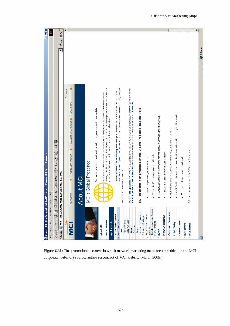
Chapter Six: Marketing Maps
325
Figure 6.31: The promotional context in which network marketing maps are embedded on the MCI
corporate website. (Source: author screenshot of MCI website, March 2005.)

Chapter Six: Marketing Maps
326
6.5.3.2 WorldCom’s network marketing maps
The map artefacts are produced ‘by hand’ in Adobe Illustrator using spreadsheets
of data of network connections provided by the engineering department; “this
takes several days per map” (Ritson interview 2000). A quarterly update cycle is
used as “an appropriate cost/benefit balance between keeping the maps up-to-date
and the resource implications of getting maps drawn to print quality” (Ritson
interview 2000).
A critical point to note is that the maps show inter-city routes and installed
capacity only. They do not show how much of the capacity is active, or how much
data traffic is actually flowing across the network routes. The routes between hubs
are represented as logical links and not geographic cable pathways. Given the
speed of change in ‘Internet time’, the temporal accuracy with static maps is
always problematic, as Mike O’Dell then Chief Scientist at UUNET notes: “the
engineering data change constantly, so there is a challenge to ‘smooth’ some of
detail so the [maps] stay relatively accurate while at the same time don’t violate
external statements of ‘over <mumble> locations’ where people literally count
dots on drawings to check-up on such statements” (pers. communications, March
2000). A balance must also be struck between accuracy and artistic licence. The
maps are published on the corporate website and identified by text and logos as
officially sanctioned public statements of the corporation. Therefore, they have to
tread a fine line between portraying the infrastructure in the most favourable way
and wilful deception. Outright lying on the map could too easily be exposed and
open the corporation to adverse publicity, potential accusation of deliberately
fraudulent statements and criminal deception of investors/customers.
The first map in the sample is the “UUNET Global Network”, dated first quarter
1997 (Figure 6.32). Although clearly identified through the UUNET logo, the
network was a subsidiary of the WorldCom corporation by this point (see Table
6.4 above). In graphic design terms this is the simplest marketing map of the
WorldCom set, being a muted black and white line art composition. It has a
distinct engineering feeling about it and has many stylistic commonalties with
ARPANET network maps (see Figure 6.3 above).

Chapter Six: Marketing Maps
327
Figure 6.32: A WorldCom global scale marketing map showing the newly acquired UUNET
backbone from spring 1997. (Source: Originally published on corporate website. No longer
available.)

Chapter Six: Marketing Maps
328
The title clearly proclaims this to be a global network, but in terms of the range of
infrastructure mapped this is clearly a problematic claim to sustain. While the
U.S. territory is well covered, everywhere else looks sparsely connected. There is
a rather tenuous feel to the links to Europe: just two thin lines terminating in
London. Asia-Pacific looks better in some regards, with several long network
lines carving straight across the Pacific ocean, but there is no actual mesh of
networking within the region. The map is thus somewhat unhelpful because it
shows too well that vast swathes of the world are far outside the range of
WorldCom’s networking. To try to counter this and to increase the perception of
network range, the cartographer has shrunk the extents of the map - cropping off
the top and bottom of the world and removing a large slice through the middle of
the Eurasian continent, including the whole of India.
However, the reach of the network looks rather more positive than the range, with
many of the major hubs (Tokyo, Los Angeles, Chicago, New York and London)
of globalisation interconnected by UUNET / WorldCom. The map focuses
effectively on identifying the cities connected, rather than the countries. Other
well known ‘important’ places for global business activities are also connected
and consciously identified - Singapore, Hong Kong, Paris, Frankfurt and Zurich.
WorldCom’s global network is projected consciously to create an image of
corporate centrality. The hub of operations in the Northeast of America is visually
privileged by its positioning in the middle of the map view. The map is a textbook
example of ethnocentricism, with North orientated at the top, and the U.S. centred
and complete. Centrality for the U.S. and for WorldCom is doubly reinforced
because there are no links out to the periphery of globalisation (South America
and Africa are wholly bypassed) and all links lead back to the North American
heartland19. However, other core regions of the world economy are not connected
by WorldCom’s infrastructure.
19 Except for a somewhat curious link between Monaco and Singapore, that does the uncomfortable cartographic trick of disappearing at one edge and then reappearing on the opposite side of the world.

Chapter Six: Marketing Maps
329
In terms of the next two cartographic design strategies for promotional
cartography, abundance and capacity, the performance of the 1997 map is mixed.
The North American heartland appears at first glance to have an abundance of
network routes criss-crossing it. However, on closer inspection it is apparent that
many U.S. states do not have a hub and the lines cross over them without
connecting. Outside North America, the network fares even worse - just four hubs
in Asia-Pacific and only eight to cover Europe. The impression is not one of an
abundant network throughout the world from this map, but one of a largely
unconnected globe. The capacity of the network again looks relatively healthy for
North America, with some well proportioned black lines representing what were
at the time high-bandwidth DS-3 routes (45 Mbps) and fairly large circular hubs,
but the international routes run at a much lower capacity (1 Mbps) and are
mapped by rather spindly looking lines and dot-sized hub symbols that connotes a
rather frail network overall.
Figure 6.33: Global scale backbone marketing maps produced by WorldCom’s UUNET backbone,
May 1998. (Source: Originally published on corporate websites. No longer available.)

Chapter Six: Marketing Maps
330
The next map in the sequence moves forward about a year, showing UUNET’s
‘Global Backbone Network’ in May 1998 (Figure 6.33). This map is clearly the
product of the same design approach as the 1997, however, the coloured version is
arguably actually less effective than the black and white version it updates. The
legend is somewhat simplified and the technical language is toned-down
compared to the 1997 map.
Little has changed in terms of range of the network in that year. If anything, there
actually seem to be fewer long links, particularly in Asia-Pacific (the dropping of
links between Tokyo-San Francisco and Tokyo-Sydney being obvious). There are
several more links across the North Atlantic but they are tightly clustered
together. The lack of network range in the northern latitudes now also seems
problematic, with the empty extents of Greenland and the Canadian Northern
Territories drawn large (and exaggerated by the map projection). The corporate
centrality of WorldCom in this Mercator view of the world remains potent and if
anything is somewhat enhanced by the imposition of the three-class colour-coding
of nations. The golden-coloured corporate heartland of North America and parts
of Northern Europe comes to the fore on the map, followed by a select few beige
nations deemed privileged enough to have a UUNET hub. The rest of the world
literally shrinks into the background of the map by the application of the light
‘natural’ green wash. This signifies unidentified, unimportant, unprofitable
territory outside the sphere of WorldCom’s corporate concerns. Yet, as a network
marketing map, the presentation remains quite ineffectual in terms of denoting
abundance and especially capacity.
The next map shows a dramatic shift in design, presenting ‘UUNET’s Global
Internet Backbone’ draped over a stylised ‘marshmallow’ world, from the summer
of 1999 (Figure 6.34). The map has lost all its clunky engineering legacies, likely
a function of ‘proper’ marketing people taking over the design of the network
maps, under the direction of Henry Ritson, at UUNET’s office in Cambridge, UK
(interview 2000). The design styling would develop over the next three years, but
remain quite consistent in terms of colours, key symbology and fonts (see Figures
6.35 and 6.36 below).

Chapter Six: Marketing Maps
331
In terms of demonstrating network range, the 1999 map is quite an improvement
over the previous two examples. The somewhat unusual choice of projection
means that many long orange-coloured route lines sweep from the west coast of
the U.S. across the entire width of the map to reach the Asia-Pacific cities. These
routes are represented by smooth curves which draw the eye along their full
length from U.S. origin points to distant destination in the Orient. The lines are
also spread apart, aiding range identification and increasing the perception of an
abundance of routes. However, one must question the validity of this presentation
of routes. Obviously, all route lines are generalised to some degree on marketing
maps but they should probably be shown actually going in the right direction
around the world! Additionally, showing routes in this way also unintentionally
punctures further the globalist claims of the corporation, as the lines can be seen
to pass over all of South America, Africa and India.
Figure 6.34: Global scale backbone marketing maps produced by WorldCom’s UUNET backbone,
June 1999. (Source: Originally published on corporate websites. No longer available.)

Chapter Six: Marketing Maps
332
Unlike the two previous examples, the 1999 map shows the whole extent of the
world (the dissected Indian landmass is restored). The projection is a ‘one-ocean’
viewpoint focused on the Atlantic, with the Pacific Ocean effectively disappearing
at the margins of the map. This, in combination with the unification of the
Eurasian landmass, creates clear problems for the persuasive presentation of a
supposedly global network. The whole left-hand side of the map, stretching east
from Stockholm to the Bering Straits, becomes an eye-catching vast white void,
entirely un-penetrated by WorldCom.
These problems with map extents and the display of route range also impact on
the sense of centrality in the overall presentation. The graphic centre of the map is
now occupied by Western Europe. In a design sense, the overall map looks
unbalanced - the dense left side appears to outweigh the empty void on the right.
This ‘off-centred’ presentation in relation of corporate power was quickly
corrected in the next version of the network map (see Figure 6.35).
The reach of the network is still well-defined with the maps focusing on cities that
are connected. Unlike the previous map, two different sizes of hubs are
distinguished by the size of the symbol and label font. Indeed, the strength of the
clusters of hub symbols tends to dominate the map, rather than the route lines
between them. The primacy of cities is further enhanced by the greater degree of
exclusivity on this map compared to the previous ones. The background is
represented by expansive empty continents. This is a conscious de-politicised
rendering of the globe, a neoliberal terra nullius for globalising capital.
The density of city hubs and interlinks in the two core regions of North America
and Western Europe scores well in terms of the cartographic design strategy for
abundance. Yet, the super-abundance in these parts of the map also makes the rest
of the world look more starkly empty. Pragmatically coping with such a large
contrast is difficult; “You try and show a map of the world’s Internet and you
can’t ever find a scale or legend which will cope with the differences in line
density between Northeast of the USA and more ‘Internet remote’ areas” (Ritson
interview 2000). The capacity of the network is better demonstrated in this map,
with the use of thicker lines and inclusion of colour coding of routes by

Chapter Six: Marketing Maps
333
bandwidth. One can speculate as to whether the ambiguity in the representation of
capacity has positive connotative impacts. Of course, the use of data classification
to group diverse features together into a small number of categories is a common
approach in statistical cartography (as noted in chapter five with regard to
choropleth maps in particular). While classification is useful for simplification it
also works to mask variability in the data. This masking could have useful
benefits in marketing by maximising the impression of capacity because, without
knowledge of the underlying data distribution, the map reader cannot tell how
many of those bright orange-coloured lines are 45Mbps bandwidth and how many
are really at 1.5Mbps - this is a not an insignificant difference in capacity, after
all.
Moving forward in time by another year, we come to the marketing map of
‘UUNET’s Global Internet network’ for June 2000 (Figure 6.35). The corporate
fortunes of WorldCom were beginning to slide by this point, as the growth in
capitalisation through the second half of the 1990s began to slow (see Figure 6.29
above). In overall design style, there is clearly a lot of common heritage with the
previous map. However, some of the more radical elements in the 1999 design
have been toned down. Most obviously, the centring of the map is changed to give
North America back its ‘rightful’ (in terms of corporate power) privileged
position. Also, the unusual bubble shaped rendering of the continental outlines in
the 1999 map has been dropped in favour of more conventional geographic
shapes.
In the same fashion as the 1997 and 1998 maps, the unified world is split and the
‘Indian cut’ is again made to shrink the extents of the Eurasian continent. There
are a whole lot of long route lines, rendered in bright colours, across the pale blue
North Atlantic and Pacific oceans. Most run arrow-straight and have been
consciously spread apart to improve their legibility and also their potency in
connoting range. The parallel track-like routes to Europe in particular seem to
cover the whole ocean. The extra long route line from Seattle across the Pacific
and down through the whole of China to reach Singapore is also demonstrative of
extreme range. Linked to the overall impression of network range, UUNET’s
infrastructure now also appears to offer many more direct routes than in previous

Chapter Six: Marketing Maps
334
maps, especially connecting into European cities. All the improvements in the
presentation of the range of the network in the June 2000 map are, however, more
than offset by the complete failure to demonstrate the reach of UUNET’s network.
The slightly larger scale of mapping employed and the growing density of
network route lines and hubs means that the cartographer chose not to identify the
cities. The simple removal of labels to improve legibility is actually problematic
for persuasive communication, as readers cannot tell which ‘right places’ the
network reaches. If one knows something of the geography of world cities, it is
possible to make plausible guesses, but prospective customers and investors can
not tell for certain which cities are connected. To the untrained eye, the scattering
of red squares of the UUNET hub on the map now appear to be a random
collection of points. Additionally, I would argue that without citing cities by name
(and country borders as well) the visual-cognitive link between infrastructure and
territory is broken on this map; the result seems like a disengaged network
floating above the world, the network is rendered so exclusively that it does not
actually connect with the world. This impacts directly and significantly on the
power of map to conjure up the required sense of tangibility in reader’s minds.
The logical network in this map looks too virtual to be really real.
In terms of demonstrating abundance and capacity, this map also achieves mixed
results. The underlying network has expanded greatly over the 1999 extents and
there is an appearance of a denser meshing of links in the North American
heartland and also in Europe. Indeed, the overwhelming abundance of mapped
infrastructure, at this scale, completely smothers the Northeast U.S. and the San
Francisco Bay area; as such it is counterproductive to cartographic legibility. The
broader based growth of the route links in Japan, across Australia and branching
down to Puerto Rico in the Caribbean are, however, useful additions for evoking
an abundant, successful network. There are now so many links on most routes that
the cartographer has chosen not to try to show them all, instead the overlapping
presence of multiple links is indicated by placing small numbers (‘x2’, ‘x3’)
embedded in the middle of the line. Whilst an acceptable pragmatic technical
solution to convey information factually, it does nothing in terms of design
strategies for marketing maps to evoke in readers the power of network

Chapter Six: Marketing Maps
335
infrastructure being built by UUNET. The result is that while the number of routes
is many times greater than the year before, it does not look like it from the map.
Figure 6.35: Global scale backbone marketing map of WorldCom’s UUNET network, June 2000.
(Source: Originally published on corporate website. No longer available.)
Chapter Six: Marketing Maps
336
The display of route capacity is partially improved by using six different
coloured-coded line categories instead of the three classes in the 1999 map.
However, the choice of colours seems rather random and does not suggest a
building intensity through hue; although line weight is sensibly employed to
suggest increasing capacity and the overly thick style of the 1999 is avoided.
Looking at the key, it is also worth noting how much the topmost network
capacity has increased. In the one year between, the highest bandwidth links
(shown by dark green route lines on Figure 6.35 above) have grown fourfold from
2.45Gbps to 10.0Gbps. However, these routes in the Northeast U.S. (in a ring
linking NYC-DC-Chicago) are, however, hard to spot being heavily over-plotted
with other lines.

Chapter Six: Marketing Maps
337
Figure 6.36: Global scale backbone marketing maps of WorldCom’s UUNET network, January
2001. (Source: Originally published on corporate websites. 2001 map is no longer available.)

Chapter Six: Marketing Maps
338
The last map available from this era of WorldCom’s dominance of Internet
backbone infrastructure comes from January 2001 (Figure 6.36). The company
was experiencing business difficulties at this point with falling revenues, large
debts and a steeply declining stock price (Figure 6.29). The projection and extents
of the underlying base map remain unchanged, along with the problematic lack of
city label needed to identify the network hubs. The demonstration of network
range has been improved on trans-Pacific routes with the links being stretched
into long swooping curves that seem to be pulling Asia towards the North
American heartland. The network infrastructure has also expanded, finally, into
the ‘global south’ with a notable series of route lines dangling down from U.S. to
Brazil. This positive display of range is somewhat undone, however, by the
removal of lines across the Atlantic, with the tremendous track-lines of the 2000
map replaced by two rather understated gold-coloured routes into London. The
demonstration of abundance has intensified in this map, with even more over-
plotting of link lines to create an impossible tangle in the core networked regions.
The capacity encoding remains unchanged, apart from the somewhat strange
addition of one new category at the bottom. This new low bandwidth level of just
64 Kbps looks embarrassingly small compared to the rest and has been seemingly
added to accommodate a single new route in Latin America, likely to be between
Sao Paulo and Buenos Aires (although one cannot be sure of this reach, due to the
lack of city labels).
The discussion of WorldCom’s global marketing maps is concluded by examining
the last version presented on the MCI20 corporate website, as of March 2005
(Figure 6.37). The map was a very different design origin to the Ritson produced
ones. It was delivered as an interactive Flash application and served partially as an
index map to access more detailed regional scale maps. The overall projection
used is a ‘standard’ geographic world map centred interestingly on Europe, rather
than the U.S. Harking back to the map from 1997, country boundaries are added
back in. Indeed, of all the cartographic attempts to justify the claims of offer a
global network, this map presents some of the most plausible evidence, with the
20 This was the name WorldCom’s post-bankruptcy corporate entity. The company disappeared as an independent entity having been purchased by Verizon in January 2006.

Chapter Six: Marketing Maps
339
links into several countries in South America, to India and into Africa (admittedly
only to two cities in South Africa).
Figure 6.37: Global scale backbone marketing maps of the MCI network in March 2005. (Source:
Originally published on corporate websites. 2001 map is no longer available.)
The map has a very much simplified symbology compared to earlier examples and
there is no legend, logo, date, contact information or other corporate
identification. In terms of identifying network reach, no effort is made at all, as no
hub locations are indicated. Only two classes of network links are distinguished
(green ones and orange-coloured ones), but it is not clear what their capacity is.
Only in terms of demonstrating network range does the 2005 map score
reasonably well; the links running down through the South Atlantic to South
Africa are especially effective. The impression of range, however, is diminished
because the Atlantic-centred projection necessarily splits the Pacific, so breaking
the routes here in half. In this case utilising a world map with an equal area
projection to denote their network would serve the company’s marketing better.
6.6 The map and the myth
In conclusion, I want to consider the relationship between cartographic
imagination displayed in the network marketing maps and the hype of Internet

Chapter Six: Marketing Maps
340
growth, particularly the 1990s myth that it was doubling in size every 100 days in
terms of traffic flows. Cartography has long been created and consciously
deployed to serve the exclusive and exclusionary interests of private capital. The
emergence of the marketing map genre over the last century has been one of the
most conspicuous developments in cartography (although surprisingly little
analysed, in comparison to scholarly preoccupations with territorial and thematic
mapping of nation-states). Maps are deployed to differentiate one network from
another. As Henry Ritson, UUNET global marketing manager put it:
“What we have to illustrate is that, since the Internet is ‘many networks
connected’ you get better, faster, more reliable service if the network you
connect into first is able to take you most of the way to your destination ‘on
an uncongested motorway’ rather than hitch-hiking across a variety of
crowded lanes. Our network maps basically show the area of the Internet that
we have the ability to manage directly - and if we are managing it we can
maintain high quality of service ...” (interview, 2000).
Internet infrastructure marketing maps are also as much about impressing
investors as luring customers from competing networks. By analysing network
maps, such as sequence published online by WorldCom, it was demonstrated that
marketing maps attempt to denote the strengths of a infrastructure to investors and
differentiating it from competitors through eight distinct cartographic design
strategies: range, reach, directness, centrality, abundance, capacity, silencing and
exclusivity. However, it was also apparent that they had mixed success in tapping
into these eight strategies in a connotative sense. As such, the analysis present
here demonstrates the real difficulties in effectively mapping Internet
infrastructure even when the interest being served is dedicated exclusively to
commercial persuasion without the need for objectivity. The most significant
failing in the maps overall was the all too obvious mismatch between the claims
of corporations to offer a global network service and the mapped reality of their
infrastructure that barely covers a third of the world in terms of area (although
they do probably connect the majority of the significant population from the
business perspective). The overall connotation is that much of the world remains
out of their reach.

Chapter Six: Marketing Maps
341
Despite the design failings in the maps, they are produced frequently by
corporations and often prominently displayed on the website, and are obviously an
integral part of the company’s marketing message (as shown by the analysis of
fifty corporate websites; see Table 6.1). The maps’ primary goal is to justify bold
marketing claims by providing attractive and authoritative visual proof of the
extent of the company’s network. The maps draw on the reserves of cartographic
gravitas - people tend to believe what they see on the map as real, particularly
when it is shown using familiar framework of a Euro- centric world projection. At
least three distinct truth claims can be discerned from the use of cartography in
service of Internet infrastructure marketing:
(1) ‘Biggest is best’: The maps can prove, better than other rhetoric devices, that
the network is as large as is claimed. One can see it really does connected
continents, link all those important cities, span oceans. The expansive scale of the
network as demonstrated beyond doubt on the map implies a successful company.
(2) The network is made tangible through the map. The rendering of invisible,
unknowable, virtual network links into real lines inscribed onto a familiar
landscape connects customers instinctively to the infrastructure (as discussed in
chapter four). As Ritson commented: “The Internet is such an intangible concept
for people that it is easy for them to assume that whichever Internet provider they
choose, they will still connect to the ‘same Internet’.... The network maps show
what the infrastructure really is” (interview 2000). Of course, the map can show
this with particular emphasis to make it look rather more than it is.
(3) The third and most important truth claim is that of trust. The network, when
mapped must look permanent, safe and trustworthy. The backbone marketing map
connotes: ‘we are here to stay. Look at all the infrastructure we’ve built. You can
trust us with your precious data.’
In relation to WorldCom case study it is now apparent that faith in this
corporation generated by cartographic trust was misplaced. Events happening off
the map fatally damaged the truth claims made on the maps. Despite having the
biggest Internet backbone, WorldCom went bankrupt in July 2002. More widely,
Chapter Six: Marketing Maps
342
the crash of the telecoms sector in 2002 exposed the hollowness of the hype that
underlay all those marketing maps. The maps were born out of the myth of
internet ‘traffic doubling every 100 days’ and they were also an element in
promulgating this mythical narrative. They were visual, irrefutable, cartographic
prove of the growth happening and the need for more and more bandwidth. Ritson
himself repeated this mantra in relation to WorldCom:
“the network has been growing at 1000% per year for several years now. The
map can go significantly out of date in a week. It is a terrifying moving
target. I’m not even sure if anyone has ever had to map anything that grows
this fast before.” (interview 2000).
Of course, the maps in the late 1990s may have been connoting great traffic
growth but they were not actually denoting that. They were showing the
speculative building of infrastructure. They denoted more and more bandwidth,
but investors could not see (and some probably did not want to see) that all those
thick gigabit route lines were only half full, a quarter full, had only a trickle of
data on them or were actually empty. It was easy to believe that maps were
showing growth in demand - after all, why would a commercial company be
building links between cities if they did not have the traffic to fill it? Airlines do
not fly with empty planes, why would backbones networks be running empty
pipes - and then spending billions building yet more pipes?
Basically, WorldCom were claiming to be installing much more infrastructure
than they actually needed to hide losses and artificially boost revenues. They gave
the impression of carrying much more traffic than they actually were.
“[WorldCom] routinely counted fiber-optic capacity as traffic, rendering the
statistic essentially worthless as a barometer of the Internet’s growth” (Dreazen
2002, no pagination). WorldCom’s backbone maps were complicit in this
deception, they were compliant in mis-selling the nature of the demand.
Although, accusing the maps per se of misleading is disingenuous at another level.
The maps were doing what they were supposed to be doing. They were marketing
maps, not independently-produced, informational maps, and made no pretence at
denoting traffic. Indeed, within their own parameters and agenda of marketing

Chapter Six: Marketing Maps
343
they were accurate and in some senses honest. It was just that there was no other
source of information - so people believed the claims of doubling growth every
three months and took the maps that were available (and pushed out by
companies) as credible and cartographically trustworthy evidence21.
What of the Internet infrastructure business now the dust from the 2002 crash has
settled? Well it is still there - the Internet as a whole did not miss a beat and still
continues to grow at a healthy rate. WorldCom, however, has vanished as rapidly
as it appeared. The tainted name itself was erased when the corporation emerged
from bankruptcy in April 2004 as MCI. At the start of 2006, MCI was to be
acquired by Verizon, a major U.S. telephone company, for a mere $5.3 billion.
Meanwhile, Bernie Ebbers, the former chief executive of WorldCom was found
guilty in federal court of orchestrating the fraud and in July 2005 received as 25
year jail sentence.
21 Indeed, the marketing maps from ISPs in this period have been exploited as credible evidence in a good number of academic studies on Internet topology and growth (e.g., Malecki 2002, 2004; Townsend 2001) and for policy analysis (e.g., OECD 2002).

344
Chapter Seven
Conclusions:
The Cartographic Imagination of Cyberspace
[T]he domains that explorers chart, and the maps they produce, open up territories to
interests that view them differently … be they gold deposits or stands of timber or
dispensable human cultures. The maps serve as the groundplan, the blueprint, the graphic
agenda for subsequent exploitation.
-- Stephen S. Hall, Mapping the Next Millennium, 1992.
How many maps, in the descriptive or geographical sense, might be needed to deal
exhaustively with a given space, to code and decode all its meanings and content?
-- Henri Lefebvre, The Production of Space, 1991.
7.1 Introduction
In conclusion, I would argue that this thesis, along with the wider research into
cybergeography I have undertaken, has made three contributions to
understanding the evolving forms and functions of cartography in terms of: (1)
showing how cyberspace cartographies are new, significant politically in the
work they do, and as such are worthy of examination; (2) applying a semiotic
reading of meanings and critical cartographic deconstruction of a range of novel
empirical case studies; and (3) revealing valuable information about how
cyberspace has developed and its varied spatial characteristics as seen through
the cartographic imagination created to make it visible and tangible to different
audiences.
7.1.1 Why do cyberspace cartographies matter?
I have argued that cyberspace cartographies are important because they chart
new virtual spaces of human interaction and economic transaction, and they are
deployed in service to powerful interests that seek to shape what these spaces
will be like in the future. They are active components in many wider-ranging
cyberspace discourses, in large part because they create potent imaginable
geographies for virtual media and hidden infrastructures that are otherwise

Chapter Seven: Conclusions
345
intangible and hard to comprehend. (The two major discourses analysed in
chapter five and six were role of the Internet in development as represented in
statistical maps and the commercial promotion of Internet infrastructure
performed through marketing maps.) As explained in chapter four, the impact of
spatial metaphors and geographic representations on the perception of what
cyberspace looks like, how it works and what it can do, can be quite profound
precisely because it is essentially an invisible infrastructure. Their production
and consumption occurs in various settings, for example, many cyberspace
cartographies are used operationally to document network structure, as
inscriptions to virtually witness online experiments and measurement, or as
means of the legitimising results of policy analysis. Many more maps of
cyberspace are used strategically by business interests, as the ‘blueprints’ and
‘groundplan’ for commercial exploitation, to use Stephen Hall’s phraseology
from the quote above. Most significantly, like all maps, cyberspace
cartographies, regardless of their declared purpose, have an impact in shaping
how people perceive cyberspace, and as such need to be subjected to academic
analysis, considering both how they work semiotically and also what power they
have in the wider world in terms of effecting change.
Furthermore, cyberspace cartographies are increasingly prevalent and should be
seen as a distinctive aspect of contemporary mapping practice and part of wider
visual cultures. Yet, it is also important to recognize that the maps of cyberspace
have multiple and sometimes unstable meanings which makes academic
interpretation and deconstruction challenging. In the main case study chapters,
the analysis focused on the semiotic strategies adopted by the mapmakers in
discourses of development and marketing, drawing a distinction between the
denotative and connotative uses of cartographic symbolisation to effect particular
kinds of meanings. Such an analytical route can be profitable, but as Vujakovic
(1999a, 4, original emphasis) tellingly notes from his work how the news media
exploits cartography: “[c]are has to be taken to not read too much, or too little,
into cartographic images. Any apparent contradictions between a map and the
discourse in which it is embedded may reflect the limitations of cartography as a
representational medium, …… rather than a hidden agenda or internal tensions
within the discourse itself. We may, however, be equally tempted to treat the

Chapter Seven: Conclusions
346
medium as too limited (especially if restricting analysis to linguistic approaches)
and ignore the (visual) subtleties of the form.”
Furthermore, another reason why cyberspace cartographies merit scrutiny by
cartographic scholars is because, by and large, they are produced outside the
mainstream map-making industry. In some senses, then, they are a challenge to
established knowledge and practices but also, I would argue, an opportunity for
cartographers to gain insights and novel ideas on map ontology and mapping
epistemologies. As discussed in chapter three there are many new groups and
individuals becoming active as map-makers to meet their needs to represent and
understand cyberspace. (Although, the authorship of the most significant
elements in the cartographic imaginary of the cyberspace originates from the
United States predominantly.) Cyberspace cartographies, I feel, are a key part of
a larger contemporary reinvigoration of creative mapping practices, as well as
popularising new map uses. They also open up new scope for resistance to
established representations of space as more people are empowered by
fashioning their own maps rather than consuming predetermined cartographic
products (cf. Sui 2008 for discussion of the implication of the new ‘wiki’ ethos
of user-generated content to the GIS industry).
Whilst in some respects the shifting power of authorship is creative and
empowering, there are also serious questions about the effectiveness of many of
results in normative terms of design quality, intelligibility, accuracy and more
general appreciate of aesthetics. Given the unstable meanings, it is also important
to keep in mind when interrogating the maps that the mapmaker, or the mapping
institution, themselves may well not be cognisant of the implications of particular
design decisions made. In some cases denotative choice in design and symbology
produce connotative meanings that are not at all what the mapmaker would have
intended. This is evident in projection selection for many of the world maps used
to display network infrastructure for marketing purposes that diminish the
connotative sense of the corporations coverage of the globe (chapter six).
Acknowledging such unconscious failings in mapmakers and their unintended
impacts is not new of course (cf. Wright 1942), but poor projection selection
persists even with people who, one might think, would know better, geographers

Chapter Seven: Conclusions
347
writing undergraduate textbooks (Vujakovic 2002b). So the mismatch between
denotative intentions and connotative outcomes in cyberspace cartography
should not been seen as necessarily implying a ‘hidden agenda’ to deceive, yet it
can still have serious implications for how readers (mis)interpret the mapped
world.
Besides questions of effectiveness and imperfect understanding of connotative
meanings by authors, it should also be acknowledged that the drawing of maps of
cyberspace - even empowering, counter-hegemonic ones - are also acts of
boundary-making, which inevitably contribute to the commodification of virtual
spaces in the service of some particular interest or set of interlocking interests.
Once cyberspace is mapped, it is changed. The nature of space becomes known,
exposed for others, made available as territory that can be exploited, often in
ways not anticipated or welcomed by user communities. New forms of mapping
can all too easily open up cyberspace to a new kind of surveillance, revealing
interactions that were previously hidden in unused log files and databases. The
act of mapping itself may constitute an invasion of privacy of individuals and
impinge on community rights. If the appeal of some virtual spaces is their
anonymity, then users may object to it being placed under wider scrutiny, even if
individuals are unidentifiable. In some senses, these maps may work to shift the
spaces they map from what their users consider semi-private spaces to public
spaces, and thus the maps may actually change the nature of cyberspace itself. As
Smith (1999, 211-212) points out, reflecting on his own research ethics in
mapping online discussion space: “[t]he bright light of social science research
can create an unpleasant glare for participants drawn to a dimly lit online space.”
Thus, it is important to consider the ways, and the extent to which, cyberspace
cartographies are ‘responsible artefacts’, which do not destroy what they seek to
represent or enhance.
A desire for totalising knowledge of a territory (real or virtual), with mapping as
a logical, necessary process is long standing characteristic of capitalist political-
economy, as Stephen Hall’s quote at the beginning of the chapter nicely
encapsulates. Many of the most effective examples of cyberspace cartographies
can be critiqued for their active role in expansionist rhetoric and technological

Chapter Seven: Conclusions
348
hyperbole, a naïve faith in the inherent beneficial nature of economic growth and
capital accumulation flowing from opening up online space. For example,
driving an unsustainable building bubble in network infrastructure in the 1990s
exploited maps to show where the investment was going, to make the
construction programs tangible, to make the dreams of growing market share and
future profits seem much more likely to come true. The infrastructure marketing
maps in of that time were part of the proof that the Internet ‘doubling every 100
days’, yet such exponential network traffic growth turned out to be a myth and
the predicted fortunes from selling bandwidth were millennial hubris (see chapter
six for further discussion).
While visions that represent an alternative to the development of the ‘virtual
frontier’, based on communitarian values rather than capitalist imperatives, are
manifest in some cyberspace cartographies, these have a much lower profile.
Moreover, these tend towards the utopian, being underwritten by ‘one network -
one world’ idealism that all too often naively denies the importance of place
relations. The reality is much more contested and contestable, with evidence
strongly indicating that cyberspace is yet another technological layer which
replicates and reinforces existing inequalities and power structures within
societies and between different regions and nations. The crucial issue to bear in
mind here, is that the maps do not just represent capital accumulation or social
difference, but are active in their ongoing reproduction, including in cyberspace.
This is one of the core themes that have resonated throughout the discussion in
the case studies, in the analysis of marketing maps of commercial networks
(chapter six) and the statistical mapping of Internet globalisation (chapter five).
7.1.2 Critical theorisation of cyberspace cartographies
I have defined cyberspace cartographies in three distinct modes, following
Edney’s (1993) non-progressive theorisation of map history. The modes are:
maps of cyberspace, which are maps that describe cyberspace as a phenomenon
from an external perspective, maps for cyberspace, which are interactive maps
and spatialization for navigation within virtual spaces, and lastly maps in
cyberspace, which are conventional (terrestrial) cartographic representations that

Chapter Seven: Conclusions
349
have been transmuted through online presentation. The focus of the thesis was
primarily on the first mode, particularly in the case study chapters.
The analysis of maps of cyberspace concentrated on in-depth case studies of
Internet infrastructure mapping. This was situated conceptually within
contemporary cultural analyses of representational practices, employing a
hermeneutic epistemology that sought, both, to understand the semiological
nature of the map designs, and also expose the power of the maps as texts. As
discussed in chapter two, I interpreted these maps of Internet infrastructure as
sets of signs with complex denotative and connotative meanings and as
expressions of power/knowledge of new infrastructure spaces. As such the act of
envisioning Internet infrastructure can never be unbiased and objective, it is
always a social construction that connotes multiple meanings and that serves the
interests of some groups. Maps are thus the products of privileged and formalised
knowledge and they also produce knowledge about the world. Map construction,
dissemination and use, therefore, must also be read within political-economic
milieu. As Harpold (1999, 5, original emphasis) argues: “[t]he lines of force
defining information flow in the networked and unnetworked spheres are not
merely geographical or technological; they are also – irreducibly – political”.
As discussed in chapter two, such critical theoretical approaches to cartographic
texts as expression of power have been well developed over the last ten to fifteen
years, but have most often been applied in historical contexts to untangle the
power that infuses old maps. Virtually all empirical work by Edney, Pickles,
Crampton, Harley, et al. deconstructs by looking backwards, which in some
senses presents easier targets and with less at stake in relation to contemporary
political relationships. The present thesis is innovative in the application of the
theories in a forward looking way, a productive act of map deconstruction to
reveal the ‘power’ of cyberspace mapping, unveiling its purposes, the interests
served and social implications of this new mode of mapping.
Yet, there has been very little socially-informed analysis of cyberspace
cartographies. And as was noted in chapter three, most analysis focuses on
technical aspects and design performance rather than interpreting semiotic

Chapter Seven: Conclusions
350
meanings and political ideologies. This thesis, along with my other publications
on cyberspace cartographies (see appendix one), has played a role in building
understanding of the social effects of these new maps and spatializations. At
another level, this thesis has sought to move beyond thinking epistemologically
(the techniques for mapping the Internet), to focus ontologically on what aspects
of the Internet infrastructure are chosen to be mapped, which are ignored and
which are deemed un-mappable. As the Lefebvre (1991) quote above suggests,
an almost infinite number of possible maps would be needed to fully encode and
decode meanings of a given space, yet only a small percentage of possible maps
are every actualised and an even smaller number enjoy wide circulation and have
the power to effect change in the world. It is important to realise that much else
is unmapped and that this has political implications, not just pragmatic
limitations. The discussion in chapter five on how people have tried to measure
and map Internet globalisation highlighted this. The choice of what to map can
reveal as much about the cartographer as how they actually seek to represent it
(allowing for the instability of connotative meanings and the uncertainty of the
intentions lying behind design decisions discussed above).
7.1.3 What is revealed about cyberspace?
Through critical interpretation, focused on connotative meanings and social
power, I revealed new details on the nature of Internet infrastructure and the
spatial nature of cyberspace more generally. At the same time, the analysis
provided insights into the worldviews and agendas of the map-makers
themselves and the institutions they work for. As chapter four discussed, maps of
infrastructures shape perceptions of the reality of the Internet by making its
invisible routes and flows visible and aiding the analysis of its uneven
geographic structures across different scales and seeing the spatial effects on
interaction and mobilities.
Internet infrastructure maps do important, and sometimes counter-intuitive, work
puncturing the spaceless rhetoric of cyberspace. In their denotative representation
of ‘what is where’, they connotatively counteract the deterministic ‘death of
distance’ notions by demonstrating that place matters in the so-called Network
Society (Castells 1996). Despite the virtualised rhetoric, the socio-technical

Chapter Seven: Conclusions
351
assemblage of the Internet remains embedded in real places and maps are
effective at denoting the intersections between cyberspace and geographic space.
Even maps in the services of Internet promotion, show the discontinuity in
infrastructure provision as much as the coverage, particularly in the ongoing
inequalities between core and periphery at the global scale (chapter six).
Location remains crucial in terms of political and cultural contexts – for example
territorially defined freedom of expression and privacy rights - and the
geopolitical power of the nation-state still holds sway in much cyberspatial
interaction. This is very evident in the ways institutions and individuals have
mapped statistics on the worldwide growth and diffusion of the Internet into a
framework of countries rather than flows of traffic between places and through
borders. Although this is not unusual, because Vujakovic (1999a, 4) notes,
“[c]artography is an excellent medium through which to represent spatially
distinct areas (legally defined territories), and lines (national borders), but less
good when it comes to ‘fuzzy’ boundaries (culture regions), or intersecting and
overlapping ‘classes’ of information (dialect groups, religious affiliations, etc.).”
It is also apparent that the intersections and overlaps of aspects of cyberspace
make it hard to represent cartographically.
7.2 Infrastructure mapping and the importance of the technical
This thesis has taken the object of the infrastructure map as the prime vehicle for
the wider political interpretation of the Internet and, simultaneously, as a notable
signifier of the new era of the Network Society (Castells 1996). Seeing the
possibilities and the partialities of map representations of infrastructures of the
Internet can assist people, I think, in the realisation that the technical is not
natural or pre-given. Breaking through the cultural naturalisation of everyday
technologies to see that the technical is a political project is vital for a more
nuanced understanding of the socio-spatial effects of the Internet. This kind of
approach can be categorised as materialist media studies, which, Thacker (2004,
xii) argues: “shows how the question ‘how does it work?’ is also the question
‘whom does it work for?’. In short, the technical specifications matter,
ontologically and politically.” Within this notion of ‘technical specifications’ one
should include all manner of infrastructure maps. Interrogating the connotative

Chapter Seven: Conclusions
352
meanings created by maps of infrastructure, therefore, does not merely show
‘how the Internet works’ but begins to disclose ‘whom does the Internet work
for’. This is an important and worthwhile project, given the degree to which the
Internet is fast seeping into everyday life and is already slipping into the cultural
background in developed countries.
In addition, while the topic of Internet infrastructure might seem narrowly drawn,
it actually raises many substantive questions in the creation of effective and
legible cartography. Understanding infrastructure is a conceptual and
representational challenge, in large part because of its invisibility and lack of
definite metaphors. I described several dimension to this in chapter four -
materially hidden and unseen activities, taken-for-granted background services
and institutional obscurity. Infrastructure is something you notice more by its
absence than its presence, it is a kind of ‘second nature’ according to Thrift
(2004, 584), “the surface on which life floats.”
The potency of cartographic imagination was examined in terms of how it works
to make the invisible Internet infrastructures visible, but in certain ways, with
certain kinds of connotative meaning. Firstly, for general audiences, the power of
verbal and visual geographic metaphors was considered. Part of the capacity to
influence enjoyed by some of these metaphors (for example, organic form of
abstract network graphs; Figure 4.10) comes from the way they conform to what
people expect the Internet to look like. Visual metaphors are typically chosen
deliberately to reinforce existing preconceptions, thus it is easy to understand
how people willingly accept certain kinds of maps and diagrams as ‘natural’
pictures of the actual Internet, rather than entirely contrived images.
Secondly, for the research-engineering audiences, the significant role of
scientific inscriptions in constructing ‘matters of fact’ about the Internet’s
structure and operations was demonstrated. The theory of virtual witnessing was
used here to understand the mechanism for creating credible connotations using
particular kinds of denotative strategies. Many Internet infrastructure maps are
part of the lineage of ‘scientific illustrations’, which includes architectural plans,
engineering blueprints, anatomical drawings and statistical graphics. The value

Chapter Seven: Conclusions
353
of infrastructure maps produced by scientists is not in what they show, so much
as in how they show it, to make the Internet a plausible, a known, a measured
artefact. They are able to convince others ‘at a distance’ of the matter of the
factual reality of the infrastructure.
As Latour and Woolgar (1979, 243, original emphasis) note from their laboratory
ethnography: “Scientific activity is not ‘about nature’, it is a fierce fight to
construct reality.” The infrastructure maps construct the Internet scientifically,
they construct it literally as a visible reality. (This also applies to the cases of
worldwide Internet globalisation and network marketing which are made real
through the representational acts.) Yet these messy (social) processes of
construction should themselves be invisible to maintain the impression of
scientific objectivity. The result is an authoritative illusion that the Internet is a
natural phenomenon from which scientifically measurable objects are simply
‘discovered’, rather than manufactured: what the science and technology studies
literature calls the ‘ship in the bottle’ conceit, which then presents complete
Internet ‘facts’ as if found fully formed.
7.3 Case studies in infrastructure mapping
The empirical core of this thesis has comprised two case studies in cartographic
imagination of Internet infrastructure. These unpacked distinctive visions of what
the Internet looks like and what various interests want it to become. The case
studies were not designed to give synoptic coverage of cyberspace
cartographies1, but sought to provide in-depth portraits, highlighting the
connotative meanings and the power of maps for imagining particular aspects of
Internet infrastructures.
The case studies analysed maps that purposely work as ‘representations of
spaces’ (Lefebvre 1991, 233). They are formalised works of planners,
statisticians, engineers/technocrats and marketers that attempt to structure
everyday social life through rationalised, organised, and commodified
1 The range of my publications, as part of the larger cybergeography project, does provides comprehensive coverage; discussed in appendix one.

Chapter Seven: Conclusions
354
(re)productions of spaces. In terms of visual form they were recognisably
cartographic - they were static, planar maps based on a geographic framework
generally using established design conventions.
A key part of a hermeneutic approach to cartographic analysis is to break down
the superficial anonymity of viewing map artefacts as a distanced audience, and
to begin to understand the context and power relations involved in their
authorship. In terms of authorship, the cartographic imaginary of Internet
infrastructure examined in the case studies arose from a distinctive set of
institutional contexts. Significantly, none were produced by trained cartographers
working within recognised cartographic institutions, such as a national mapping
agency or a commercial mapping company - reflecting that much of the
authorship of maps of cyberspace is happening in new contexts. Chapter five’s
statistical maps were produced by academics, artists, activists, and also
technocrats working for international agencies and designers employed by U.S.
magazines. Chapter six’s promotional maps were produced in the marketing
departments of major Internet infrastructure corporations, typically by unnamed
graphic designers and illustrators. It is apparent that the cultural-linguistic setting
of these cartographic visions of the Internet is Euro-American because of the
domination by these institutional contexts (academic, corporate and
governmental).
All the maps examined in case studies were disseminated free of charge and were
publicly available. In terms of the mechanism of publication as graphic artefacts,
some of the statistical maps in chapter five were published conventionally in
print (magazines, official reports and academic articles) and others were
designed to be solely delivered online. The marketing maps analysed in chapter
six were all published wholly through the web (although some have no doubt
also been physically printed in various outlets to meet particular needs, e.g.,
promotional brochures). The media of presentation for the statistical maps were
digital files (colour raster graphics and postscript), the marketing maps were all
digital files primarily in PDF format and also Flash animation.

Chapter Seven: Conclusions
355
7.3.1 The statistical cartographic imaginary
The first case study explored how statistical maps of Internet work semiotically
and politically to produce a particularly kinds of imaginary of the worldwide
Internet globalisation. The analysis examined eight different maps in detail.
While they all premised upon the dominant geopolitical framework of nation-
state as their units of measurement and representation, they produced a range of
viewpoints onto the world. In many respects their reliance on this nation-state
metageography is both a conceptual and design shortcoming, however, in other
respects these maps are successful in creating a compelling cartographic
imaginary of the worldwide status of the Internet because they play to these
established conventions. In addition there are still relatively few other kinds of
maps produced which offer a competing synoptic - and one might say
seductively simple – a view of the Internet on a single page. Most other maps and
visualisation tended to be more technical in nature, showing specific company’s
infrastructures denoted as link-node graphs (as in chapter five).
There are few statistical maps of the ‘whole’ Internet, so the ones that exist are
powerful. The empirical examples included maps, such the ‘International
Connectivity’ and DOI maps, which are some of the most widely seen
geographic maps of Internet infrastructure and enjoy an influential position as
‘immutable mobiles’ (Latour 1987), securing a particular imaginative geography
of Internet globalisation through their denotatively conventional and clear visual
narrative design. They employed a range of different area-based thematic map
designs, but they nearly all exuded a recognisable techno-scientific aesthetic, as
they sought objective authority through an unadorned, sparse and perfunctory
style of representation. (Scarponi’s flag-based cartogram was the one noticeably
different case.) The maps are typically presented intertextually as a ‘matter of
fact’ envisioning the Internet using semiotic strategies of scientific inscription.
Of course, this denotative ‘simplicity’ in their design was in part due to
expediency in production but it had political consequences in how people
perceive Internet globalisation.

Chapter Seven: Conclusions
356
To make sense of the sample statistical maps of Internet globalisation, in
semiotic terms, a simple fourfold classificatory model was used to characterise
them according to their overall connotative meaning. The classification was
formed by two dimensions of meaning, ‘difference’ between nations (evident in
denotative signs) and the ‘complexity’ of the patterns (denoted at scales from
local to global). In diagrammatic form these two dimensions were drawn as axis
running from low-to-high, forming a grid of four quadrants. These quadrants are
connotative meanings for four separate classes of map: orderly representations
(lower ‘complexity’ with higher ‘difference’), divergent representations (higher
‘complexity’ and higher ‘difference’), disorderly representations (higher
‘complexity’ with lower ‘difference’) and, lastly, convergent representation
(lower ‘complexity’ and lower ‘difference’).
The case was also made in chapter five that there are two broad, and competing,
discourses that seek to ‘explain’ the relation between the Internet and ICTs and
the prospects for fostering economic and social development across the world.
These were termed ‘diffusionists’ for organisations and individuals who see
basically positive relations, with the Internet being empowering and able to foster
progressive development, and the ‘divisionist’ institutions and activists who are
sceptical and highlight the negative consequences flowing from a developmental
model premised on the Internet and ICTs. In terms of the fourfold model, the
maps classified, according to their overall connotations, as orderly or convergent
are arguably likely to envision the world statistically in ways that are supportive
of the ‘diffusionist’ agenda. In opposition, the divergent and disorderly map
categorises are more likely to have connotations that would be advantageous to
the ‘divisionist’ perspective on Internet globalisation. From the eight maps
analysed connotatively, three were assigned to classes supportive of the
‘diffusionists’ and four were categorised as ‘divisionist’ representations of the
world. One map, Scarponi’s flags cartogram, could not be assigned neatly into
one or other camp because it displays ambivalent connotations that are both
divergent and convergent.
The three ‘diffusionist’ categorised maps were created primarily for the cause of
securing wider network connectivity in poorer parts of the world. They are

Chapter Seven: Conclusions
357
working tools of techno-missionary efforts to connect up the ‘unwired’ nations
by Internet pioneers and development bureaucrats. Enhanced Internet capacity
will also be beneficial for capital in securing access to new markets and
emerging economies.
The final ‘International Connectivity’ map created by Landweber in 1997 and
ITU’s DOI map were both classified as strongly convergent, connoting gradual
and limited degrees of inequality between countries (low on difference
dimension) and overall consistent pattern across the world (low on the
complexity dimension). It was also demonstrated how they are a problematic
representation of Internet globalisation, demonstrating many common problems
with choropleth maps, in terms of zone selection, the occlusion of geographically
small areas, ecological fallacy and grouping bias. The connotative effect is the
production of authoritative looking images, ones that epitomises the imposition
of the normalising ‘statistical’ vision onto the world, ordering rhizomatic
processes of Internet globalisation into country-based units and a rigid hierarchy
of classes. The outcome, I would argue, is that these convergent statistical
mapping of Internet infrastructure work to ‘lockdown’ the complex, multi-vocal
processes of diffusion into a systematic cartographic form favouring hegemonic
narratives about the ‘naturalness’ of technological expansion. They connotatively
reduce the perception of difference in the world and advance the case that ICTs
and the Internet are a beneficent driver of economic development and social
integration. As such they could be seen to be replicating colonial representation
of old, a kind of neo-colonial cartography for the so-called information society,
providing an authoritative view from centre and conscripting the rest of the world
into economically productive digital relations.
Several of the maps analysed presented a different imaginative geography of
Internet globalisation with more confused and complex narratives, in semiotic
terms, about the state of the world. These maps were seen to be likely to work in
favour of the ‘divisionist’ line of argument that sees a generally negative
relationship between the Internet and the prospects of inclusive and progressive
development. Three maps had overall connotative meanings of a divergent world
that emphasises the large inequalities between countries at a local scale and also

Chapter Seven: Conclusions
358
wide differences between regions of the world. The statistical patterns were also
read as disharmonious which suggested undue complexity and the lack of
systematic development process at work. The first ‘International Connectivity’
map from 1991 was classified as divergent in meaning between of the high
degree of difference starkly evident between nations. The other two divergent
maps were the three-dimensional stepped surface ‘Bit Map’ with its cliff-like
digital divides between regions and the ‘Network Society Map’ that selectively
targeted only nations that matter while excluding large parts of the rest of the
world. The other ‘divisionist’ map was the dasymetric reconfiguration of the
‘International Connectivity’ data, produced by activist Mike Holderness, that
connotatively emphasises a much complex and fragmented vision of Internet
globalisation so was classified as an essentially disorderly representation.
I concluded the chapter by looking beyond the critique of cartographic
imagination of Internet globalisation, considering other kinds of statistical vision
that are not based on infrastructure capacity but its capacity to effect social
change. This was about assessing the value of Internet infrastructure and I
discussed work trying to get at a more subtle analysis of the digital divides and
infrastructure diffusion, using local ethnographic studies of individual and
communal use of network technologies to achieve everyday tasks and also
advancing a rights based agenda. Such a ‘view from the ground’, so to speak,
contrasts starkly with the synoptic vision offered by ‘God’s-eye’ global statistical
maps that actually hide much more than they reveal about the real state of the
Internet infrastructure across the world.
7.3.2 The promotional cartographic imaginary
The second case study interrogated marketing maps produced to promote the
networks of the Internet and the work they do in selling a positive geographical
imagination of Internet infrastructure as reliable and trusted to potential
customers and investors.
To begin it was shown how Internet network marketing maps could be situated
within an established lineage of cartography used to promote commercial
networks for transportation and communication. This genre of mapping practice

Chapter Seven: Conclusions
359
is also interesting theoretically because the facade of ‘objectivity’ is negated by
its serving an overt, singular commercial purpose: namely to attract prospective
customers and investors from competing firms and maximise profits. Yet, for this
commercially-biased mapping to work well it still seeks the cloak of objective
cartographic authority in its presentation of deceptively selective data. However,
the maps also silence competitors by not admitting the existence of alternative
routes owned by others. This is a key differentiator of promotional cartography,
that serves solely the interests of one company, from informational cartography,
which serves the broader interests of consumers by mapping all available
network routes.
To understand the prevalence of network maps in the marketing narratives of
Internet infrastructure, a survey of the top fifty networking companies was
undertaken. It revealed that over two-thirds of their corporate websites deployed
network marketing maps and of these nearly thirty percent featured them
prominently on the home page. Nearly all the maps denoted infrastructure using
arc-node symbology on a geographic base map. Such arc-node representations
are the conventional and culturally ‘obvious’ format for representing physical
transportation infrastructures and this clearly translates meaningfully for virtual
networks.
Network marketing maps work as a tangible form of proof of, firstly, the material
existence of a large scale network that is beyond the limits of human vision and,
secondly, the superiority of its design and engineering by showing a network that
is dominant in size and fully able to span the globe. Yet, further interpretation of
many of the maps showed that the network infrastructure was not world-wide at
all, connecting only a small number of cities.
To consider in more depth how network marketing maps work semiotically their
denotative designs were interrogated using an eight point framework of ideal
connotative meanings that effective promotional cartography should produce.
The framework was applied to a sample of maps from five global
telecommunications corporations. Their world scale maps of their infrastructure
were examined in terms of how well they were able to connote positive

Chapter Seven: Conclusions
360
impressions on the range of the network links across the whole globe, the ability
of the network to reach key cities, to provide direct connections to these cities,
and to signal abundance coverage of continents, the network should also ideally
appear to be centrally positioned to serve key markets, to offer ample capacity to
meet customer demands, display their network exclusively and, lastly, to silence
competitors. The analysis showed a mixed performance overall, with none of the
five maps interrogated achieving all eight connotations, of an ideal network,
consistently and strongly. Out of the sample, the maps of two corporations,
AT&T and Verizon, performed markedly above the others. This was due partly
to their simpler design and more abstract symbology that gave superior
impressions of range of the network, direct connections and exclusivity. The
France Telecom marketing map suffered significantly weaker connotations than
its competitors, which was, in part, because it denoted the company’s
infrastructure too realistically and honestly. The result, in connotative terms,
made the network appear to have quite limited geographic coverage of the world,
unable to reach many of the important cities or to offer directness of routes
necessary for rapid flows of data.
The second part of the chapter six analysed the evolving marketing of network
infrastructure of one company, Worldcom through a series of maps produced
over an eight year period from 1997. Again, it is evident that the maps sought to
communicate persuasively and with authority, to potential customers and
investors, the benefits of using Worldcom’s services above those of another
company by highlighting several key aspects of their infrastructure. Analysis
showed the most important of these were: visually demonstrating its geographic
range, the routes to reach important places and its capacity to meet customer
demands. In serving these promotional goals, the semiotic analysis showed,
however, Worldcom’s marketing maps were only partially successful. The most
significant failing in the maps was the all too obvious mismatch between the bold
claims of WorldCom to offer a global network service and the mapped reality of
its infrastructure that barely connected a third of countries in the world. The
analysis demonstrated the real difficulties in effectively mapping Internet
infrastructure of a single organisation, even for commercial persuasion.

Chapter Seven: Conclusions
361
Despite these semiotic failings, current marketing maps are enrolled in the
discourses sustaining demand for new network infrastructure construction. They
do critical work proving cartographically where the investors’ money is going.
They do this by conjuring up a sense of tangibility, a kind of second-hand
experience of the network to compensate for the lack of visibility in the
environment or physicality of experience. People tend to believe what they see
on the map as real, particularly when it is shown using the familiar metaphors of
geographic world maps.
7.4 The true vision of Internet infrastructure
A critical interpretative approach was applied to understand the ways that the
Internet as a material infrastructure has been cartographically portrayed and
proselytised by different interests over the last decade. As the analysis highlights,
it is impossible to imagine a single ‘true’, objective map of the Internet. As such,
there will always be a range of maps produced, for a range of purposes. I have
shown how reading beyond the surface messages as intended, to interrogate the
‘second text’ of infrastructure can be productive for understanding the new
modes of mapping that are coming into existence to chart cyberspace.

362
References
Abbate J, 1999 Inventing the Internet (MIT Press, Cambridge, MA) Aberley D, 1993 Boundaries of Home: Mapping for Local Empowerment (New Society
Publishers, Gabriola Island, BC) Abramson B D , 2000, “Internet globalization indicators” Telecommunications Policy 24 69-
74
Adams P C, 1997, “Cyberspace and virtual places” Geographical Review 87(2) 155-171 Aitken S C 2002, “Public participation, technological discourses and the scale of GIS” in
Craig W J, Harris T M, and Weiner D, (eds) Community Participation and Geographical Information Systems (Taylor & Francis, London) 357-366
Akerman J R, 1993, “Blazing a well worn path: cartographic commercialism, highway
promotion and automobile tourism in the United States, 1880-1930” Cartographica 30(1) 10-19
Akerman J R, 2002, “American promotional road mapping in the twentieth century”
Cartography and Geographic Information Science 29(3) 175-191 Anders P, 1998 Envisioning Cyberspace: Designing 3D Electronic Space (McGraw Hill, New
York) Anderson B, 1991 Imagined Communities: Reflections on the Origins and Spread of
Nationalism, Second Edition (New York, Verso) Andrews J H, 2001, “Meaning, knowledge and power in the map philosophy of J.B. Harley”
in Laxton P, (ed) The New Nature of Maps: Essays in the History of Cartography (The Johns Hopkins University Press, Baltimore) 1-32
Arnum E, Conti S, 1998, “Internet deployment worldwide: the new superhighway follows the
old wires, rails and roads” Proceedings of INET’98 Conference <www.isoc.org/inet98/proceedings/5c/5c_5.html>
Arrowsmith C, Wilson M, 1998, “Telecom tectonics using geographic information systems”
Cartography 27(1) 1-8 Aurigi A, 2005 Making the Digital City: The Early Shaping of Urban Internet Space
(Aldershot, Ashgate) Avelar S, Hurni L, 2006, “On the design of schematic transport maps” Cartographica 41(3)
217-228 BAN 2002, Exporting Harm: The High-Tech Trashing of Asia, The Basel Action Network
(BAN) and Silicon Valley Toxics Coalition <www.ban.org>

363
Barford A, Dorling D, 2008, “Telling an old story with new maps” in Dodge M, McDerby M and Turner M, (eds) Geographic Visualization: Concepts, Tools and Applications (John Wiley and Sons, Chichester, England) 67-107
Barlow J P,1998, “Africa rising” Wired Magazine, January <www.wired.com/wired/archive/6.01/barlow.html>
Barty-King H, 1979 Girdle round the Earth (Heinemann, London) Barnett T P M, 2003, “The Pentagon’s new map” Esquire March,
<www.esquire.com/features/articles/2004/040510_mfe_barnett_1.html > Bassett T J, 1994, “Cartography and empire building in nineteenth-century West Africa”
Geographical Review 84(3) 316-335 Batty M, 1993, “Editorial: The geography of cyberspace” Environment and Planning B:
Planning and Design 20 615-616 Batty M, 1997, “Virtual geography” Futures 29(4/5) 337-352 Batty M, Barr B, 1994, “The electronic frontier: exploring and mapping cyberspace” Futures
26(7) 699-712
Batty M, Miller H J, 2000, “Representing and visualizing physical, virtual and hybrid information space” in Janelle D G, Hodge D C, (eds) Information, Place, and Cyberspace (Springer, Berlin) 133-146
Behr P, 2000, “On or off the bandwidth bandwagon?” Washington Post, 24 September, H01 Belson K, 2005, “Ex-chief of WorldCom is found guilty in $11 billion fraud” The New York
Times 16 March <www.nytimes.com/2005/03/16/business/16ebbers.html> Belyea B, 1992, “Images of power: Derrida/Foucault/Harley” Cartographica 29(2) 1-9 Benedikt M, 1991, “Cyberspace: some proposals” in Benedikt M, (ed) Cyberspace: First
Steps (MIT Press, Cambridge, MA) 119-224
Bertin J, 1981 Graphics and Graphic Information Processing (Walter de Gruyer & Co., Berlin)
Biggs M, 1999, “Putting the state on the map: Cartography, territory, and European state
formation” Comparative Studies in Society and History 41(2) 374-405 Bijker W E, Law J, 1992 Shaping Technology/Building Society: Studies in Sociotechnical
Change (MIT Press, Cambridge, MA.) Bingham N, 1999, “Unthinkable complexity? Cyberspace otherwise” in Crang M, Crang P,
and May J, (eds) Virtual Geographies (Routledge, London) 244-260
Black J, 1997 Maps and Politics (Reaktion Books, London) Black J, 2000 Maps and History (Yale University Press, New Haven)

364
Blaut J M, Stea D, Spencer C and Blades M, 2003, “Mapping as a cultural and cognitive universal” Annals of the Association of American Geographer 93(1) 165-185
Board C, 1967, “Maps as models” in Chorley R J, Haggett P, (eds) Models in Geography
(Methuen, London) 671-725
Board C, 1991, “Things maps won’t show us: Reflections on the impact of security issues on map design”, in Rybaczuk K, Blakemore M, (eds) Mapping the Nations, Proceedings of the International Cartographic Associations 15th Conference 1 136-148
Board C, Davies R J and Fair T J D, 1970, “The structure of the South African space economy: An integrated approach” Regional Studies 4(3) 367-392
Board C, Taylor R M, 1977, “Perception and maps: Human factors in map design and interpretation” Transactions of the Institute of British Geographers NS 2 19-36
Bodzin S, 1999, “The cyberspace cartographers” Wired News 26 August
<www.wired.com/news/culture/0,1284,21419,00.html>
Branigan S, Burch H, Cheswick B, and Wojcik F, 2001, “What can you do with traceroute?” Internet Computing 5(5) 96-97
Brody K, Dunstan S, 2003 The Great Telecoms Swindle (Capstone, Oxford)
Brunn S D, Cottle C D, 1997, “Small states and cyberboosterism” Geographical Review 87(2)
240-258 Buck-Morss S, 1995, “Envisioning capital: Political economy on display” Critical Inquiry
21(2) 434-467 Bunge W, 1971 Fitzgerald: Geography of a Revolution (Schenkman Publishing Company,
Cambridge, MA) Bunge W, 1975, “Detroit humanly viewed: the American urban present” in Abler R, Janelle
D, Philbrick A, and Sommer J, (eds) Human Geography in a Shrinking World (Duxbury Press, North Scituate, MA) 149-181
Burch H, Cheswick B, 1999, “Mapping the Internet” Computer, April, 97-98, 102 Bures F, 2006, “The cost of staying connected” Wired Magazine May, page 53; scanned
version from <www.flickr.com/photos/24657869@N00/156209557>
Burnett A, 1985, “Propaganda cartography” in Pepper D, Jenkins A, (eds) The Geography of Peace and War (Blackwell, Oxford) 60-88
Burrows R, Gane N, 2006, “Geodemographics, software and class” Sociology 40(5) 793-812
Cairncross F, 1997 The Death of Distance: How the Communications Revolution Will Change
Our Lives (Harvard Business School Press, Boston) Card S K, Mackinlay J D, and Shneiderman B, 1999 Readings in Information Visualization:
Using Vision to Think (Morgan Kaufmann Publishers, Inc., San Francisco)

365
Cartwright W, Peterson M P and Gartner G, 1999 Multimedia Cartography (Springer, London)
Castells M, 1996 The Rise of the Network Society (Blackwell, Oxford) Castells M, 1998 End of Millennium (Blackwell, Oxford) Castells M, 2001 The Internet Galaxy: Reflections on the Internet, Business and Society
(Oxford University Press, Oxford) CCR, 1990, “Selected ARPANET maps” Computer Communications Review 20(3) 81-110 Choucri N, 2000, “Cyberpolitics in international relations” International Political Science
Review 21(3) 243-263 Cherry S M, 2004, “A world divided by a common internet” IEEE Spectrum February 54-55
Cloud J, 2002, “American cartographic transformations during the Cold War” Cartography
and Geographic Information Science 29(3) 261-82 Coffman, K.G. & Odlyzko, A.M., 2000, “Internet growth: Is there a "Moore's Law" for data
traffic?” AT&T Labs Working Paper, July 2000 <http://portal.acm.org/citation.cfm?id=779236>
Colwell R, 2004, “The new landscape of science: A geographic portal”, Annals of the
Association of American Geographers 94(4) 703-708 Conners L, 1997, “Freedom to connect” Wired Magazine August, 106-107
<www.wired.com/wired/archive/5.08/map.html> Conners-Petersen L, 1998, “The wired world atlas” Wired Magazine November, 162-167
<www.wired.com/wired/archive/6.11/mediamap.html>
Conrad J, [1902] 1994 Heart of Darkness (Penguin, London) Cornford J, 1999, “Counting computers – or why we are not well informed about the
information society” in Dorling D, Simpson S, (eds) Statistics in Society: The Arithmetic of Politics (Arnold, London) 384-390
Cosgrove D 1989, “Looking in on our world: Images of global geography” in The Globe:
Representing the World (Allanwood Press) 13-18 Cosgrove D, 1994, “Contested global visions: One-world, Whole-Earth and the Apollo space
photographs” Annals of the Association of American Geographers 82(2) 270-294
Cosgrove D, 1999b, “Introduction: mapping meaning” in Cosgrove D (ed), Mappings (Reaktion Books, London) 1-23
Cosgrove D, 2003, “Historical perspectives on representing and transferring spatial
knowledge” in Silver M, Balmori D, (eds) Mapping in the Age of Digital Media (Wiley-Academy, London) 128-137

366
Couclelis H, 1998, “Worlds of information: The geographic metaphor in the visualization of complex information” Cartography and Geographic Information Systems, 25(4) 209-220
Cox K C, Eick SG and He T, 1996, “3D geographic network display” ACM Sigmod Record
25(4) 50-54 Craig W J, Harris T M, and Weiner D, 2002 Community Participation and Geographic
Information Systems (Taylor & Francis, London) Crampton J, 1999, “Virtual geographies: the ethics of the Internet”, in Proctor J D, Smith D
M, (eds) Geography and Ethics: Journeys in a Moral Terrain (Routlege, London), 72-91
Crampton J W, 2001, “Maps as social constructions: power, communication and
visualization” Progress in Human Geography 25(2) 235-252 Crampton J W, 2002, “Thinking philosophically in cartography: A critical politics of
mapping” Cartographic Perspectives 42 12-31 Crampton J W, 2003 The Political Mapping of Cyberspace (Edinburgh University Press,
Edinburgh) Crampton J W, 2004, “GIS and geographic governance: reconstructing the choropleth map”
Cartographica 39(1) 41-53
Crone G R, 1953 Maps and Their Makers: An Introduction to the History of Cartography (Hutchinson’s University Library, London)
Curry M R, 1997, “The digital individual and the private realm” Annals of the Association of American Geographers 87(4) 681-99
Daly J A, 1999, “Measuring impacts of the Internet in the developing world” Information Impacts Magazine, May <www.cisp.org/imp/may_99/daly/05_99daly.htm>
December J, 1995, “A cybermap gazetteer: Maps of the on-line world for browsing and
business” in Staple G (ed), TeleGeography 1995: Global Tele-communications Traffic Statistics & Commentary (TeleGeography, Washington DC) 74-81
De Cock C, Fitchett J A, and Farr M, 2001, “Myths of a near future: Advertising the new economy” Ephemera: Critical Dialogues on Organization 1(3) 201-222
Dent B, 1995 Cartography: Thematic Map Design, Fifth Edition (McGraw-Hill, New York) DiBiase D, 1990, “Visualization in the earth sciences” Earth and Mineral Sciences 59(2) Dicken, P, 2003 The Global Shift, Fourth Edition (Sage, London) Deitrick S, Edsall R, 2008, “Making uncertainty usable: Approaches for visualizing
uncertainty information” in Dodge M, McDerby M and Turner M, (eds) Geographic Visualization: Concepts, Tools and Applications (John Wiley and Sons, Chichester, England) 277-290

367
Dodge M, 1998, “The geographies of cyberspace” Paper presented at the 94th Annual Meeting of the Association of American Geographers 25-29 March, Boston
Dodge M, 1999a, “Mapping MUDs” Mappa.Mundi Magazine October
<http://mappa.mundi.net/maps/maps_005/> Dodge M, 1999b, “MIDS maps the Internet world” Mappa.Mundi Magazine December
<http://mappa.mundi.net/maps/maps_007/> Dodge M, 2000a, “Mapping the World Wide Web” in Rogers R, (ed), Preferred Placement:
Knowledge Politics on the Web (Jan van Eyck Akademie, Netherlands) 81-98 Dodge M, 2000b, “Accessibility to information within the Internet: How can it be measured
and mapped?” in Janelle D G, Hodge D C, (eds) Information, Place, and Cyberspace (Springer, Berlin) 187-204
Dodge M, 2000c, “Maps to market your network” Mappa.Mundi Magazine May
<http://mappa.mundi.net/maps/maps_012/> Dodge M, 2000d, “Mapping where the data flows” OnTheInternet April <www.isoc.org/oti/articles/0200/dodge.html> Dodge M, 2000e, “TeleGeography's traffic flow maps” Mappa.Mundi Magazine August
<http://mappa.mundi.net/maps/maps_014/> Dodge M, 2000f, “NewsMaps: Topographic mapping of information” Mappa.Mundi
Magazine October <http://mappa.mundi.net/maps/maps_015/> Dodge M, 2001a, “Fly through the Web” Mappa.Mundi Magazine, January
<http://mappa.mundi.net/maps/maps_018/> Dodge M, 2001b, “Flowing from site to site - Brian Reid's USENET traffic flow maps (circa
1986-95)” Mappa.Mundi Magazine May <http://mappa.mundi.net/maps/maps_021/> Dodge M, 2001c, “Mapping how people use a website - Ben Fry’s anemone visualization”
Mappa.Mundi Magazine June <http://mappa.mundi.net/maps/maps_022/> Dodge M, 2001d, “Show me the money - SmartMoney's Map of the Market” Mappa.Mundi
Magazine August <http://mappa.mundi.net/maps/maps_023/> Dodge M, 2002 “Explorations in AlphaWorld: the geography of 3D virtual worlds on the
Internet” in Fisher P, Unwin D, (eds) Virtual Reality in Geography (Taylor & Francis, London) 305-331
Dodge M, 2004, “Mapping secret places and sensitive sites: Examining the Cryptome 'Eye-
balling' map series” Society of Cartographers Bulletin 37(1) 5-11 Dodge M, 2005 Atlas of Cyberspaces website (Centre for Advanced Spatial Analysis,
University College London) <www.cybergeography.org/atlas> Dodge M, Kitchin R, 2000a Mapping Cyberspace (Routledge, London)

368
Dodge M, Kitchin R, 2000b, “Exposing the ‘second text’ of maps of the net” Journal of Computer-Mediated Communication 5(4)
<www.ascusc.org/jcmc/vol5/issue4/dodge_kitchin.htm> Dodge M, Kitchin R, 2001 Atlas of Cyberspace (Addison-Wesley, London) Dodge M, Kitchin R, 2004, “Charting movement: Mapping Internet infrastructure” in Hanley
R E (ed), Moving People, Goods, and Information in the Twenty-First Century (Routledge, London) 159-185
Dodge M, McDerby M and Turner M, 2008, Geographic Visualization: Concepts, Tools and
Applications (John Wiley and Sons, Chichester, England)
Dodge M, Perkins C, 2008a, “Reclaiming the map: British geography and ambivalent cartographic practice” Environment and Planning A, in press
Dodge M, Perkins C, 2008b, “Secret sites and satellite imagery: A possible reversal of the Panopticon?” Geoforum, under review
Dodson S, 2005, “Get mapping: As mapmaking becomes big business, citizen cartographers
are creating free personal alternatives” The Guardian 7 April Dorling D, 1994, “Cartograms for visualizing human geography” in Hearnshaw H M, Unwin
D J, (eds) Visualization in Geographical Information Systems (John Wiley and Sons, Chichester, England) 85-102
Dorling D, 1995 A New Social Atlas of Britain (John Wiley and Sons, Chichester, England) Dorling D, 1998, “Human cartography: when it is good to map” Environment and Planning A
30 277-288 Dorling D, 2005 Human Geography of the UK (Sage, London) Dorling D, Fairbairn D, 1997 Mapping: Ways of Representing the World (Longman, Harlow
UK) Downey G, 2001, “Virtual webs, physical technologies, and hidden workers: The spaces of
labour in information internetworks” Technology and Culture 42 209-235 Downs R M, Stea D, 1977 Maps in Minds (Harper & Row Publishers, New York)
Dreazen Y J, 2002, “Wildly optimistic data drove telecoms to build fiber glut” The Wall Street
Journal 26 September Drori G S, Jang Y S, 2003, “The global digital divide: A sociological assessment of trends and
causes” Social Science Computer Review 21(2) 144-161
Dykes J A, 1997, “cdv: A flexible approach to ESDA with free demonstration software” Proceedings British Cartographic Society 34th Annual Symposium 34 100-107
Dykes J, MacEachren A M, Kraak M-J, 2005 Exploring Geovisualization (Elsevier, London)

369
Easterly W, 2007, “The ideology of development” Foreign Policy July/August 1-5 Economist, 2002, “The power of WorldCom’s puff” The Economist 18 July Edgerton S Y, 1975 The Renaissance Rediscovery of Linear Perspective (Basic Books, New
York) Edney M H, 1993, “Cartography without ‘progress’: reinterpreting the nature and historical
development of mapmaking” Cartographica 30(2&3) 54-68 Edney M H, 1996, “Theory and the history of cartography” Imago Mundi 48 185-191 Edney M H, 1997 Mapping an Empire: The Geographical Construction of British India,
1765-1843 (University of Chicago Press, Chicago) Edsall R M, 2007, “Iconic maps in American political discourse” Cartographica 42(4) 335-
347
Edwards P N, 1996 The Closed World: Computers and the Politics of Discourse in Cold War America (MIT Press, Cambridge, MA)
Elam G, 1999 Warriors of the Net. Producer/director: Tomas Stephansson; animation: Gunilla
Elam; music/sound: Niklas Hanberger; narration: Monte Reid (Ericsson Medialab, Sweden) <www.warriorsofthe.net>
Elie M, 1998, “The Internet and global development” INET’98 Conference July, Geneva
<www.isoc.org/inet98/proceedings/5d/5d_3.htm> Elmer G, 2002 Critical Perspectives on the Internet (Rowman & Littlefield, London)
Erle S, Gibson R, Walsh J, 2005 Mapping Hacks: Tips & Tools for Electronic Cartography
(O’Reilly & Associates, Inc., Sebastopol, CA) Evans I S, 1977, “The selection of class intervals” Transactions of the Institute of British
Geographers NS 2(1) 98-124 Everard J, 2000 Virtual States: The Internet and the Boundaries of the Nation-State
(Routledge, London) Fabrikant S I, 2000, “Spatialized browsing in large data archives” Transactions in GIS 4(1)
65-78 Fabrikant S I, Buttenfield B P, 2001, “Formalizing semantic spaces for information access”
Annals of the Association of American Geographers 91(2) 263-280 Fabrikant S I, Montello D R, 2008, “The effect of instructions on distance and similarity
judgements in information spatializations” International Journal of Geographical Information Science 22(4) 463-478
Fabrikant S I, Montello D R, Ruocco M and Middleton RS, 2004, “The distance-similarity
metaphor in network display spatializations” Cartography and Geographic Information Science 31(4) 237-252

370
Falk T, Abler R, 1980, “Intercommunications, distance, and geographical theory” Geografiska Annaler, Series B, Human Geography 62(2) 59-67
Fisher P, Unwin D, 2001 Virtual Reality in Geography (Taylor & Francis, London) Fleming D K, 1984, “Cartographic strategies for airline advertising” Geographical Review 74
76-93 Fleming D K, Roth R, 1991, “Place in advertising” Geographical Review 81 281-291 Forde L, 2000, “Roadmaps for the superhighway” The Guardian, Online, 29 June, 12-13
Francaviglia R, 1999, “Walt Disney’s Frontierland as an allegorical map of the American
West” The Western Historical Quarterly 30(2) 155-182 Francaviglia R, 2005, “‘Cover the Earth’: Maps in advertising and promotion”, mimeo
Frank H, Kahn R E, Kleinrock L, 1972, “Computer communication network design –
experience with theory and practice” AFIPS Conference Proceedings of Spring Joint Computer Conference 40 255-280
Fremlin G, Sebert L M,1972, “Subject matter and contents of maps in national atlases”
Cartographica 9(1) 46-74
French H W, 1995, “On the Internet, most of Africa is getting off to a slow start” The New York Times 17 November, page 5
French S P, Jia X, 2001, “Georgia high-speed telecommunications atlas: An ArcIMS
implementation” Proceedings 2001 ESRI International User Conference 9-13 July San Diego <www.esri.com/library/userconf/proc01/professional/abstracts/a259.html>
Friedman T, 1999 The Lexus and the Olive Tree (HarperCollinsPublishers, London) Friendly M, Denis D J, 2003 Milestones in the History of Thematic Cartography, Statistical
Graphics, and Data Visualization, 25 July <www.math.yorku.ca/SCS/Gallery/milestone/>
Fuller M, 2003, “It looks like you’re writing a letter: Microsoft Word” in Fuller M (ed) Behind
the Blip: Essays on the Culture of Software (Autonomedia, Brooklyn, NY) 137-165 Garland K, 1994 Mr Beck's Underground Map (Capital Transport Publishing, Middlesex,
England) Gibson R, Erle S, 2006 Google Mapping Hacks (O’Reilly & Associates, Inc., Sebastopol, CA) Gibson W, 1984 Neuromancer (HarperCollins, London) Gibson W, Sterling B, 1992 The Difference Engine (Spectra, New York) Giddens A, 1990 The Consequences of Modernity (Polity Press, Cambridge)

371
Goddard J B, 1970, “Functional regions within the city centre: A study by factor analysis of taxi flows in central London” Transactions of the Institute of British Geographers 49 161-182
Godlewska A, 1989, “To surf or to swim? Responses to J.B. Harley’s article ‘Deconstructing
the map’” Cartographica 26(3/4) 96-98 Goldman R, Papson S and Kersey N, 2003 Landscapes of Capital
<http://it.stlawu.edu/~global>
Goldstein S N, 1995, “Future prospects for NSF’s international connections program activities” Proceedings of the 5th annual Conference of the Internet Society, 27-30 June <www.isoc.org/HMP/PAPER/178/html/paper.html>
Goodchild M F, 1999, “Cartographic futures on a digital Earth” Proceedings of the 19th
International Cartographic Association, 14-21 August, Ottawa, Canada Goodchild M F, 2008, “What does Google Earth mean for the social sciences?” in Dodge M,
McDerby M and Turner M, (eds) Geographic Visualization: Concepts, Tools and Applications (John Wiley and Sons, Chichester, England) 11-23
Goodman S E, Press L, Ruth S R, and Rutkowski A M, 1994, “The global diffusion of the Internet: patterns and problems” Communications of the ACM 37(8) 27-31
Gore A, 1993 Remarks by Vice President Al Gore at the National Press Club, December 21
<www.ibiblio.org/nii/goremarks.html> Gore A, 1994 Remarks prepared for delivery by Vice President Al Gore to the International
Telecommunication Union, March 21 <http://clinton1.nara.gov/White_House/EOP/OVP/html/telunion.html>
Gorman S P, 2004 Networks, Complexity, and Security: The Role of Public Policy in Critical
Infrastructure Protection (Unpublished PhD Thesis, George Mason University) Goss J, 1995, “‘We know who you are and we know where you live’: The instrumental
rationality of geodemographics systems” Economic Geography 71 171-198 Gottmann J, 1961 Megalopolis: The Urbanized Northeastern Seaboard of the United States
(Twentieth Century Fund, New York) Gould P, 1991, “Dynamic structures of geographic space” in Brunn S, Leinbach T, (eds)
Collapsing Space and Time: Geographic Aspects of Communication and Information (HarperCollins Academic, London) 3-30
Graham S, 1998, “The end of geography or the explosion of place? Conceptualizing space, place and information technology” Progress in Human Geography 22(2) 165-185
Graham S, 1999, “Global grids of glass: On global cities, telecommunications and planetary
urban networks” Urban Studies 36(5) 929-949

372
Graham S, 2000, “Constructing premium network spaces: Reflections on infrastructure networks and contemporary urban development” International Journal of Urban and Regional Research 24(1) 183-200
Graham S, Marvin S, 1996 Telecommunications and the City: Electronic Spaces, Urban Places (Routledge, London)
Graham S, Marvin S, 2001 Splintering Urbanism: Networked Infrastructures, Technological
Mobilities and the Urban Condition (Routledge, London) Gralla P, 2003 How The Internet Works, Seventh Edition (Que, Indianapolis) Greenstein S, 2003, “Too much Internet backbone?” IEEE Micro March-April, 78-80 Greenstein S M, 2004, “The economic geography of Internet infrastructure in the United
States”, Working paper #0046, Center for the Study of Industrial Organization, Northwestern University
Gregory D, 1994 Geographical Imaginations (Blackwell, Oxford) Grubesic T H, Murray A T, 2005, “Geographies of imperfection in telecommunications
analysis” Telecommunications Policy 29 69-94 Grundy A F, 1997 Women, Work and Computerization (Springer, Berlin) Guardian, 2008, “The internet’s undersea world”, The Guardian, 1 February 22-23 Guédon J-C, 2002, “What I believe - version 2.0 - more yet to come...” ISOC-Members-
Discuss mailing list, 19 May <http://elists.isoc.org/mailman/listinfo/isoc-members-discuss>
Gurstein M, 2003, “Effective use: A community informatics strategy beyond the digital
divide” First Monday 8(12) <www.firstmonday.org/issues/issue8_12/gurstein/index.html>
Gurstein M, 2005, “ Southeast Asia Tsunami and the Effective Use of Community ICTs”
<nettime> mailing list, 1 January <www.nettime.org> Hadlaw J, 2003, “The London Underground map: Imagining modern time and space” Design
Issues 19(1) 25-35 Hafner K, Lyon M, 1996 Where Wizards Stay up Late: The Origins of the Internet (Simon and
Schuster, New York)
Hall E, 2003, “Reading maps of the genes: interpreting the spatiality of genetic knowledge” Health and Place 9(2) 151-161
Hall H, 1998, “Africa connected” First Monday 3(11)
<www.firstmonday.dk/issues/issue3_11/hall/index.html> Hall S S, 1992 Mapping the Next Millennium (Vintage Books, New York)

373
Harley J B, 1988a, “Maps, knowledge and power” in Cosgrove D, Daniels S, (eds) The Iconography of Landscape (Cambridge University Press, Cambridge) 277-312
Harley J B, 1988b, “Secrecy and silences: The hidden agenda of state cartography in early
modern Europe” Imago Mundi 40 57-76 Harley J B, 1992, “Deconstructing the map” in Barnes T J, Duncan J S, (eds) Writing Worlds:
Discourse, Text and Metaphor in the Representation of Landscape (Routledge, London) 231-247
Harley J B, 2001 [1991], “Can there be a cartographic ethics?” in Laxton P (ed), The New
Nature of Maps: Essays in the History of Cartography (Johns Hopkins University Press, Baltimore) 197-207
Harley J B, Woodward D, 1987 The History of Cartography, Volume 1. Cartography in
Prehistoric, Ancient and Medieval Europe and the Mediterranean (University of Chicago Press, Chicago)
Haraway D, 1991 Simians, Cyborgs, and Women: The Reinvention of Nature (Routledge, New
York) Harpold T, 1999, “Dark continents: Critique of Internet metageographies” Postmodern
Culture 9(2) <http://muse.jhu.edu/journals/pmc/v009/9.2harpold.html> Harris L M, Hazen, H D, 2005, “The power of maps: Counter-mapping for conservation”
ACME: International E-Journal for Critical Geographies 4(1) 99-130
Harrison R E, 1953, “Cartography in art and advertising” Professional Geographer 2 12-15 Harrower M and Fabrikant S, 2008, “The role of map animation for geographic visualization”
in Dodge M, McDerby M and Turner M, (eds) Geographic Visualization: Concepts, Tools and Applications (John Wiley and Sons, Chichester, England) 49-65
Harrower M, Keller C P, and Hocking D, 1997, “Cartography on the internet: thoughts and
preliminary user survey” Cartographic Perspectives 26 27-37
Harvey D, 1989 The Condition of Postmodernity (Blackwell, Oxford) Harvey P D A, 1980 The History of Topographical Maps: Symbols, Pictures and Surveys
(Thames and Hudson, London)
Heart F, McKenzie A, McQuillan J, Walden D, 1978 ARPANET Completion Report (Bolt Beranek and Newman Inc, Boston); scanned version available from <www.cs.utexas.edu/users/chris/think/digital_archive.html>
Hecht J, 1999 City of Light: The Story of Fiber Optics (Oxford University Press, New York) Heller E, 2003, “The power of the image to promote science” in Silver M, Balmori D, (eds)
Mapping in the Age of Digital Media (Wiley-Academy, London)

374
Henrikson A K, 1994, “The power and politics of maps” in Demko G J, Wood W B, (eds) Reordering the World: Geopolitical Perspectives on the Twenty-First Century (Westview Press, Boulder, CO) 49-70
Herb G H, 1997 Under the Map of Germany: Nationalism and Propaganda 1918-1945
(Routledge, London) Hiatt A, 2002, “Blank spaces on the Earth” The Yale Journal of Criticism 15(2) 223-250 Higgs E, 2004 The Information State in England (Palgrave Macmillan, Basingstoke, UK) Hillier A E, 2005, “Residential security maps and neighborhood appraisals: The Home
Owners' Loan Corporation and the case of Philadelphia” Social Science History 29(2) 207-233
Hillis K, 1998 “On the margins: The invisibility of communications in geography” Progress
in Human Geography 22(4) 543-566 Hodson, Y, 1999 Popular Maps: The Ordnance Survey Popular Edition One-Inch Map of
England and Wales, 1919-1926 (The Charles Close Society, London)
Holderness M, 1998, “Who are the world’s information-poor?” in Loader B D (ed) The Cyberspace Divide: Equality, Agency and Policy in the Information Society (Routledge, London) 35-56
Hollis D R, 1996, “Measuring worldwide connectivity: expansion of the Internet” Journal of
Government Information 23(4) 499-513 Holmes N, 1991 Pictorial Maps (Watson-Guptill Publications, New York) Holzmann G J, Pehrson B, 1995 The Early History of Data Networks (IEEE Computer Society
Press, Los Alamitos, CA) Holtzman S R, 1997 Digital Mosaics: The Aesthetics of Cyberspace (Simon and Schuster,
New York) Hudson-Smith A, 2008, “The visual city”, in Dodge M, McDerby M and Turner M, (eds)
Geographic Visualization: Concepts, Tools and Applications (John Wiley and Sons, Chichester, England) 183-197
Huggan G, 1989, “Decolonizing the map: Post-colonialism, post-structuralism and the cartographic connection” Ariel: A Review of International English Literature 20(4) 115-131
Hugill B, 1999 Global Communications Since 1844: Geopolitics and Technology (Johns
Hopkins University Press, Baltimore)
Internet Archive, 2004 Arpanet Text Collection (Internet Archive, San Francisco) <www.archive.org/arpanet/index.html>
ITU, 2007 Measuring The Information Society 2007: ICT Opportunity Index and World
Telecommunication/ICT Indicators (International Telecommunication Union, Geneva)

375
ITU, 2008 Digital Opportunity Index (DOI): Overview, International Telecommunication Union website <www.itu.int/ITU-D/ict/doi/>
James J, 2008, “Digital preparedness versus the digital divide: A confusion of means and ends” Journal of the American Society for Information Science and Technology 59(5) 785-791
Jiang B, Ormeling F J, 1997, “Cybermap: the map for cyberspace” The Cartographic Journal 34(2) 111-116
Jiang B, Ormeling F J, 2000, “Mapping cyberspace: Visualising, exploring and analysing
virtual worlds” The Cartographic Journal 37(2) 117-122 Janelle D, 1969, “Spatial reorganization: A model and concept” Annals of the Association of
American Geographers 59 348-364 Jenks G F, Caspall F C, 1971, “Error on choropleth maps: definition, measurement and
reduction” Annals of the Association of American Geographers 61 217-244 Jennings D M, Landweber L H, Fuchs I H, Farber D J, and Adrion W R, 1986, “Computer
networking for scientists” Science 28 February, 943-950 Jeter L W, 2003 Disconnected: Deceit and Betrayal at Worldcom (John Wiley and Sons,
Hoboken, New Jersey) Johnson S, 1999, “Maps & Legends” FEED Magazine, 18 March Johnston R, 2002, “Manipulating maps and winning elections: measuring the impact of
malapportionment and gerrymandering” Political Geography 21 1-31
Jordan T, 1999 Cyberpower: The Culture and Politics of Cyberspace and the Internet (Routledge, London)
Jordan T, 2001, “Measuring the Net: host counts versus business plans” Information,
Communication and Society 4(1) 34-53 Kallick-Wakker I, 1994, “Science icons: The visualization of scientific truths” Leonardo 27(4)
309-315 Kahn P, 2000 Mapping Websites: Designing Digital Media (Rotovision, London)
Kapor M, Barlow J P, 1990, “Across the electronic frontier” Electronic Frontier Foundation
<http://w2.eff.org/Misc/Publications/John_Perry_Barlow/HTML/eff.html>
Keates J S, 1996 Understand Maps, Second Edition (Addison Wesley, Harlow, England)
Kent R, 1986, “National atlases: the influence of wealth and political orientation on mapping” Geography 71 122-130
Kellerman A, 1986, “The diffusion of BITNET: a communications system for universities” Telecommunications Policy 10 88-92
Kidron M, Segal R, 1995 The State of the World Atlas (Penguin, London)

376
Kitchin R, Dodge M, 2007, “Rethinking maps” Progress in Human Geography 31(3) 331-344
Klein N, 2000 No Logo (Flamingo, London) Koláèný A, 1996, “Cartographic information – a fundamental concept and term in modern
cartography” Cartographic Journal 6 47-49 Kosonen, K, 2008, “Making maps and mental images: Finnish press cartography in nation-
building, 1899-1942” National Identities 10(1) 21-47
Kraak M J, Brown A, 2001 Web Cartography (Taylor & Francis, London) Kress G, van Leeuwen T, 1996 Reading Images: The Grammar of Visual Design (Routledge,
London) Kwan M-P, 2002, “Feminist visualization: re-envisioning GIS as a method in feminist
geographic research” Annals of the Association of American Geographers 92(4) 645-661
Kwan M-P, 2007, “Affecting geospatial technologies: Toward a feminist politics of emotion”
The Professional Geographer 59(1) 22-34 Lakoff G, Johnson M, 1980 Metaphors We Live By (University of Chicago Press, Chicago) Lamm S E, Reed DA and Scullin W H, 1996, “Real-time geographic visualization of World
Wide Web traffic” Proceedings of Fifth International World Wide Web Conference, 6-10th May, Paris
LaQuey T, 1990 The User’s Directory of Computer Networks (Digital Press, Cambridge, MA) Latour B, 1987 Science in Action (Open University Press, Milton Keynes) Latour B, 1990, “Drawing things together” in Lynch M, Woolgar S, (eds) Representation in
Scientific Practice (MIT Press, Cambridge, MA) 19-68 Latour B, Woolgar S, 1979 Laboratory Life: The Social Construction of Scientific Facts
(Sage, London)
Lefebvre H, 1991 The Production of Space, Trans. Donaldson-Smith N (Blackwell, Oxford) Leiner B M, 1993, “Globalization of the Internet”, in Lynch D C, Rose M T, (eds) Internet
System Handbook (Addison-Wesley, Reading, MA), 15-40 Lemann N, 2001, “Atlas shrugs: The new geography argues that maps have shaped the world”
The New Yorker 9 April Lessig L, 1999 Code and Other Laws of Cyberspace (Basic Books, New York)
Lewis T, 1999 Divided Highways: Building the Interstate Highways, Transforming American
Life (Penguin, London)

377
Lewis M, Wigen K E, 1997 The Myth of Continents: A Critique of Metageography (University of California Press, Berkeley)
Longley P A, Harris R J, 1999, “Towards a new digital data infrastructure for urban analysis
and modelling” Environment and Planning B: Planning and Design 26(6) 855-878
Lyman P, 2002, “Archiving the World Wide Web” Building a National Strategy for Digital Preservation, April <www.clir.org/pubs/reports/pub106/web.html>
Lynch M, 1985, “Discipline and the material form of images: An analysis of scientific
visibility” Social Studies of Science 15 37-66 Lynch M, Woolgar S, 1990 Representation in Scientific Practice (MIT Press, Cambridge,
MA) MacEachren A M, 1982, “The role of complexity and symbolization in thematic map
effectiveness” Annals of the Association of American Geographers 72(4) 495-513
MacEachren A M, 1995 How Maps Work: Representation, Visualization, and Design (Guilford Press, New York)
MacEachren A M, Kraak M J, 2001, “Research challenges in geovisualization” Cartography
and Geographic Information Systems 28(1) 3-12 MacEachren A M, Robinson A, Hopper S, Gardner S, Murray R, Gahegan M, Hetzler E,
2005, “Visualizing geospatial information uncertainty: What we know and what we need to know” Cartography and Geographic Information Science 32(3) 139-160
Mackinder H J, 1904, “The geographical pivot of history” The Geographical Journal 23 421-
44
Madge C, O’Connor H, 2005, “Mothers in the making? Exploring liminality in cyber/space” Transactions of the Institute of British Geographers 30 83-97
Mahan A K, 2007, “Measuring progress” in Global Information Society Watch 2007 Report
(Association for Progressive Communications and Third World Institute) <www.globaliswatch.org/files/pdf/GISW_Indicators.pdf>
Main L, 2001, “The global information infrastructure: empowerment or imperialism?” Third World Quarterly 22(1) 83-97
Malecki E J, 2002, “The economic geography of the Internet's infrastructure” Economic
Geography 78(4) 399-424
Malecki E J, 2004, “Fibre tracks: explaining investment in fibre optic backbones” Entrepreneurship and Regional Development 16 21-39
Mandelbrot B, 1967, “How long is the coast of Britain? Statistical self-similarity and
fractional dimension” Science 156 636-638 Martin D, 1996, “An assessment of surface and zonal models of population” International
Journal of Geographical Information Systems 10 973-989

378
McDermott P D, 1969, “Cartography in advertising” The Canadian Cartographer 6(2) 149-155
Mennis J, 2003, “Generating surface models of population using dasymetric mapping” Professional Geographer 55(1) 31-42
Miller D, Slater D, 2000 The Internet: An Ethnographic Approach (Berg, Oxford) Ministerio de Ciencia y Tecnología, 2001 Sociedad de la Información en Brasil: Libro Verde
<www.acui.org.co/documentos/Libro%20Verde.%20Brasil.pdf>
Mitchell WJ, 1995 City of Bits: Space, Place and the Infobahn (MIT Press, Cambridge, MA) Mitchelson R L, Wheeler J O, 1994, “The flow of information in a global economy: The role
of the American urban system in 1990” Annals of the Association of American Geographers 84(1) 87-107
Modelski A, 1984 Railroad Maps of North America: The First Hundred Years (Library of Congress, Washington DC)
Moles A A, 1964, “Théorie de l’information et message cartographique” Sciences et
Enseignement des Sciences 5(32) 11-16 Monmonier M, 1995 Drawing the Line: Tales of Maps and Cartocontroversy (Henry Holt and
Co., New York) Monmonier M, 1996 How To Lie With Maps, Second Edition (University of Chicago Press,
Chicago) Monmonier M S, 2001 Bushmanders and Bullwinkles: How Politicians Manipulate Electronic
Maps and Census Data to Win Elections (University of Chicago Press, Chicago)
Monmonier, M S, 2002 Spying with Maps: Surveillance Technologies and the Future of Privacy (University of Chicago Press, Chicago)
Monmonier M, 2005 Rhumb Lines and Map Wars: A Social History of the Mercator
Projection (University of Chicago Press, Chicago) Monmonier M, 2006 From Squaw Tit to Whorehouse Meadow: How Maps Name, Claim, and
Inflame (University of Chicago Press, Chicago)
Montello D R, 2002, “Cognitive map-design research in the twentieth century: Theoretical and empirical approaches” Cartography and Geographic Information Science 29(3) 283-304
Morgan K, 2004, “The exaggerated death of geography: learning, proximity and territorial
innovation systems” Journal of Economic Geography 4 3-21
Munzner T, 2000 Interactive Visualization of Large Graphs and Networks (Unpublished PhD Thesis, Department of Computer Science, Stanford University)

379
Murray M, Claffy K C, 2001, “Measuring the immeasurable: Global Internet measurement infrastructure” Passive and Active Measurements (PAM) Workshop, 23-24 April, Amsterdam <www.caida.org/outreach/papers/2001/MeasInfra/>
Musich J, 2006, “Mapping a transcontinental nation: Nineteenth and early twentieth-century
American rail travel cartography” in Akerman J R, (University of Chicago Press, Chicago) 97-150
National Geographic, 2001, “Connecting the planet” National Geographic Magazine,
December, 78-79
NCSA, 1994 Visualization Study of the NSFNET by Donna Cox and Robert Patterson, Robert National Center for Supercomputing Applications, University of Illinois Urbana-Champaign. Video can be downloaded from <http://virdir.ncsa.uiuc.edu/virdir/raw-material/networking/nsfnet/NSFNET_1.htm>
Negroponte N, 1995 Being Digital (Vintage Books, London) Nixon R, 2007, “Africa, offline: waiting for the web” The New York Times 22 July
<www.nytimes.com/2007/07/22/business/yourmoney/22rwanda.html>
Norman D A, 1998 The Invisible Computer (MIT Press, Cambridge MA) NTIA, 1995 Falling Through the Net: A Survey of the ‘Have Nots’ in Rural and Urban
America U.S. National Telecommunications & Information Administration (NTIA), July, Washington DC <www.ntia.doc.gov/ntiahome/digitaldivide/>
O'Connell P L, 1999, “Beyond geography: mapping unknowns of cyberspace” The New York
Times 30 September <www.nytimes.com/library/tech/99/09/circuits/articles/30maps.html>
Odlyzko A, 2000, “Internet growth: Myth and reality, use and abuse” iMP: Information
Impacts Magazine November <www.dtc.umn.edu/~odlyzko> Odlyzko A M, 2003, “Internet traffic growth: Sources and implications” mimeo
<www.dtc.umn.edu/~odlyzko> Odlyzko A, Tilly B, 2005, “A refutation of Metcalfe's Law and a better estimate for the value
of networks and network interconnections” mimeo <www.dtc.umn.edu/~odlyzko>
OECD, 2002 Internet Traffic Exchange and the Development of End-to-End International Telecommunication Competition March 2002 (Organisation for Economic Co-operation and Development, Paris)
OECD, 2007, Communications Outlook 2007 (Organisation for Economic Co-operation and
Development, Paris) Office of the e-Envoy, 2002 UK Online Annual Report 2002 (Cabinet Office, London) Openshaw S, 1984 The Modifiable Areal Unit Problem, Concepts and Techniques in Modern
Geography 38, (Geo Books, Norwich)

380
Ovenden M, 2003 Metro Maps of the World (Capital Transport Publishing, Middlesex, England)
Palmquist R A, 1996, “The search for an Internet metaphor: A comparison of literatures” ASIS
1996 Annual Conference Proceedings <www.asis.org/annual-96/ElectronicProceedings/palmquist.html>
Parks L, 2008, “Digging into Google Earth: An analysis of ‘crisis in Darfur’” Geoforum, in press
Paul C, 2003 Digital Art (Thames and Hudson, London) Peña-López I, 2007, “ICTs for development: from e-Readiness to e-Awareness”, mimeo,
School of Law and Political Science, Universitat Oberta de Catalunya, Barcelona, 20 November <http:///ictlogy.net>
Peluso N L, 1995, “Whose woods are these? Counter-mapping forest territories in Kalimantan, Indonesia” Antipode 27(4) 383-406
Perkins C, 2003, “Cartography: mapping theory” Progress in Human Geography 27(3) 341-351
Perkins C, 2004, “Cartography - cultures of mapping: power in practice” Progress in Human
Geography 28(3) 381–391 Perkins C, Dodge M, 2008, “The potential of user-generated cartography: a case study of the
OpenStreetMap project and Mapchester mapping party” North West Geographer 8(1) 19-32
Perkins C, Thomson A Z, 2005, “Mapping for health: cycling and walking maps of the city”
North West Geography 5(1) <www.mangeogsoc.org.uk/pdfs/perkins2.pdf> Petchenik BB, 1974, “A verbal approach to characterizing the look of maps” The American
Cartographer 1 63-71 Peterson M P, 1979, “An evaluation of unclassed crossed-line choropleth mapping” The
American Cartographer 6(1) 21-37 Peterson M P, 2001, “The development of map distribution through the Internet” Proceedings
of the 20th International Cartographic Conference 4 2306-12 Peterson M P, 2003a Maps and the Internet (Elsevier, Amsterdam) Peterson M P, 2003b, “Foundations of research in internet cartography” in Peterson M P (ed)
Maps and the Internet (Elsevier Science, Amsterdam) 437-445 Peterson M P, 2008, International Perspectives on Maps and the Internet (Springer, New
York) Petrazzini B, Kibati M, 1999, “The Internet in developing countries” Communications of the
ACM 42(6) 31-36

381
Pickles J, 1992, “Texts, hermeneutics, and propaganda maps”, in Barnes T J, Duncan J S, (eds) Writing Worlds: Discourse, Text, and Metaphor in the Representation of Landscape (Routledge, London) 193-230
Pickles J, 1995 Ground Truth: The Social Implications of Geographic Information Systems
(Guilford Press, New York) Pickles J, 1999, “Cartography, digital transitions, and questions of history” Proceedings of the
19th International Cartographic Association Conference, 14-21 August, Ottawa, Canada
Pickles J, 2004a A History of Spaces: Cartographic Reason, Mapping and the Geo-Coded
World (Routledge, London) Pickles J, 2004b, “Computing geographical futures” in Cloke P, Crang P, Goodwin M, (eds)
Envisioning Human Geographies (Hodder Arnold, London) 172-194
Plewe B, 1997 GIS Online (Onward Press, Sante Fe) Pred A R, 1973 Urban Growth and the Circulation of Information, 1970-1840 (Harvard
University Press, Cambridge, MA)
Press L, 1997, “Tracking the global diffusion of the Internet” Communications of the ACM 40(11) 11-17
Press L, 2000, “The state of the Internet: growth and gaps” INET’2000 Conference 18-21 July,
Yokohama, Japan <www.isoc.org/inet2000/cdproceedings/8e/8e_4.htm> Press L, Burkhart G, Foster W, Goodman S, Wolcott P and Woodard J, 1998, “An Internet
diffusion framework” Communications of the ACM 41(10) 21-26 Quarterman J S, 1990 The Matrix: Computer Networks and Conferencing Systems Worldwide,
(Digital Press, Cambridge, MA) Quarterman J S, Carl-Mitchell S and Phillips G, 1993, “Mapping networks and services”
Proceeding of INET’93 Conference 17-20 August, San Francisco Quarterman J S, Carl-Mitchell S and Phillips G, 1994, “Internet interaction pinged and
mapped” Proceedings of INET'94 Conference, Prague <www.isoc.org/isoc/whatis/conferences/inet/94/papers/522.ps.gz>
Quarterman J S, Hoskins J C, 1986, “Notable computer networks” Communications of the
ACM 29(10) 932-971
Raisz E, 1938 General Cartography (McGraw-Hill, New York) Randall N, 1997 The Soul of the Internet: Net Gods, Netizens and the Wiring of the World
(International Thomson Computer Press, London)
Reporter without Borders, 2003 The Internet Under Surveillance: Obstacles to the Free Flow of Information Online <www.rsf.org>

382
Rheingold H, 1993 The Virtual Community: Finding Connections in a Computerized World (Addison-Wesley, Reading, MA)
Ristow W W, 1964, “A half-century of oil-company road maps” Surveying and Mapping 24(4) 617-637
Rivlin G, 2002, “The madness of king George” Wired Magazine, 10.07, July
<www.wired.com/wired/archive/10.07/gilder_pr.html> Roberts S, Secor A, and Sparke M, 2003, “Neoliberal geopolitics” Antipode 35(5) 886-897 Robinson A H, 1982 Early Thematic Mapping in the History of Cartography (The University
of Chicago Press, Chicago) Robinson A H, Morrison J L, Muehrcke P C, Kimerling A J and Guptill S C, 1995 Elements of
Cartography, Sixth Edition (John Wiley and Sons, New York) Robinson A H, Sale R D, 1969 Elements of Cartography, Third Edition (John Wiley and
Sons, New York) Roth W-M, McGinn M K, 1998, “Knowing, researching and reporting science education:
Lessons from science and technology studies” Journal of Research in Science Teaching 35(2) 213-235
Rorty R, 1980 Philosophy and the Mirror of Nature (Princeton University Press) Rose D B, 1996 Nourishing Terrains: Australian Aboriginal Views of Landscape and
Wilderness (Australian Heritage Commission), <www.ahc.gov.au/publications/generalpubs/nourishing/>
Rundstrom R A, 1991, “Mapping, postmodernism, indigenous people and the changing
direction of North American cartography” Cartographica 28(2) 1-12 Russell B, 2005 TCM (Transcultural Mapping) Locative Reader
<www.locative.net/tcmreader> Rutkowski A M, 1995, “International developments and opportunities”, Internet Society
Summit 11-12 April, San Diego <www.ngi.org/rutkowski/amr/presentations.html> Salus P, 1995 Casting the Net: From ARPANET to Internet and Beyond... (Addison-Wesley,
Reading, MA) Sawhney H, 1996, “Information superhighway: metaphors as midwives” Media, Culture and
Society 18(2) 291-315 Scanlon J H, Wieners B, 1999, “The Internet cloud” The Industry Standard Magazine 9 July
<www.thestandard.com> Schulten S, 2001 The Geographical Imagination in America 1880-1950 (University of
Chicago Press, Chicago)

383
Searls D, Weinberger D, 2003 World of Ends: What the Internet is and How to Stop Mistaking it for Something Else <www.worldofends.com>
Senior M L, 2002, “Deprivation indicators”, in Rees P, Martin D, Williamson P, (eds) The
Census Data System (John Wiley and Sons, Chichester, England) Shade L R, 2003, “Here come the dot force! The new cavalry for equity?” Gazette: The
International Journal for Communication Studies 65(2) 107-120 Shapin S, 1984, “Pump and circumstance: Robert Boyle’s literary technology” Social Studies
of Science 14(4) 481-520 Shapin S, Schaffer S, 1985 Leviathan and the Air Pump: Hobbes, Boyle and the Experimental
Life (Princeton University Press, Princeton) Shiode N, Dodge M, 1999, “Visualising the spatial pattern of Internet address space in the
United Kingdom” in Gittings B (ed), Innovations in GIS 6: Integrating Information Infrastructure with GI Technology (Taylor & Francis, London) 105-118
Sidak J G, 2003, “The failure of good intentions: The WorldCom fraud and the collapse of
American telecommunications after deregulation” Yale Journal on Regulation 20 207-267
Singel R, 2007, “NSA's lucky break: How the U.S. became switchboard to the world” Wired
Magazine 10 October <www.wired.com/print/politics/security/news>
Skupin A, 2000, “From metaphor to method: Cartographic perspectives on information visualization” in Roth S F, Keim D A, (eds) Proceedings IEEE Symposium on Information Visualization (InfoVis 2000), 9-10th October, Salt Lake City, 91-97
Skupin A, Fabrikant S I, 2003, “Spatialization methods: A cartographic research agenda for
non-geographic information visualization” Cartography and Geographic Information Science 30(2) 95-115
Slocum T A, Egbert S L, 1993, “Knowledge acquisition from choropleth maps” Cartography
and Geographic Information Systems 20(2) 83-95 Slocum T A, McMaster R B, Kessler F C, and Howard H H, 2005 Thematic Cartography and
Geographic Visualization, Second Edition (Pearson Education, New Jersey) Smith M A, 1999, “Invisible crowds in cyberspace: mapping the social structure of the
Usenet” in Smith M A, Kollock P, (eds) Communities in Cyberspace (Routledge, London) 195-219
Sobel D, 1995 Longitude (Fourth Estate, London) Sparke M, 1998, “A map that roared and an original atlas: Canada, cartography, and narration
of nation” Annals of the Association of American Cartographer 88(3) 463-495 Spence R, 2001 Information Visualization (Addison-Wesley, London)

384
Spiller N, 1998 Digital Dreams: Architecture and the New Alchemic Technologies (Ellipsis, London)
Spring N, Wetherall D, and Anderson T, 2004, “Reverse engineering the Internet” ACM
SIGCOMM Computer Communication Review 34(1) 3-8
Standage T, 1998 The Victorian Internet: The Remarkable Story of the Telegraph and the Nineteenth Century’s Online Pioneers (Weidenfeld & Nicolson, London)
Staple G C, 1995, “Notes on mapping the net: from tribal space to corporate space”
Telegeography 1995: Global Telecommunications Traffic Statistics and Commentary (TeleGeography, Inc., Washington DC) 66-73
Staple G C, Dixon H, 1992, “Telegeography: Mapping the new world order” Whole Earth
Review Summer, 124-125 Star S L, Bowker G C, 2002, “How to infrastructure” in Lievrouw L A, Livingstone S, (eds)
The Handbook of New Media, Social Shaping and Consequences of ICTs (Sage, London) 151-162
Sterling B, 1992 The Hacker Crackdown: Law and Disorder on the Electronic Frontier (Bantam Books, New York)
Stewart J Q, 1943, “The use and abuse of map projections” Geographical Review 33 588-604 Stickler P J, 1990, “Invisible towns: a case study in the cartography of South Africa”
GeoJournal 22(3) 329-333 Storr R, 1994 Mapping (Museum of Modern Art, New York)
Sui D Z, 2000, “Visuality, aurality, and shifting metaphors of geographical thought in the late
twentieth century” Annals of the Association of American Geographers 90(2) 322-343 Sui D Z, 2008, “The wikification of GIS and its consequences: Or Angelina Jolie’s new tattoo
and the future of GIS” Computers, Environment and Urban Systems 32 1-5
Surman M, 1996, “Wired words: Utopia, revolution, and the history of electronic highways” INET Conference, Montreal 24-28 June <www.isoc.org/inet96/proceedings/e2/e2_1.htm>
Taylor D R F, 2003, “The concept of cybercartography” in Peterson M P, (eds) Maps and the
Internet (Elsevier Science, Amsterdam) 405-420 Taylor D R F, Caquard S, 2006, “Cybercartography: Maps and mapping in the information
era” Cartographica 41(1) 1-5 Taylor P J, 1999, “The so-called world cities: The evidential structure of a literature”
Environment and Planning A 31 1901-04
TeleGeography, 1999 U.S. Internet Geography 2003 (TeleGeography, Inc., Washington DC)
TeleGeography, 2002 U.S. Internet Geography 2003 (TeleGeography, Inc., Washington DC)

385
Thacker E, 2004, “Forward: protocol is as protocol does’ in Galloway A R, Protocol: How Control Exists After Decentralization (MIT Press, Cambridge MA) xi-xxii
Thrift N, 2004, “Movement-space: the changing domain of thinking resulting from the
development of new kinds of spatial awareness” Economy and Society 33(4) 582-604 Thurlow C, Jaworski A, 2003, “Communicating a global reach: Inflight magazines as a
globalizing genre in tourism” Journal of Sociolinguistics 7(4) 579-606 Tobler W R, 1973, “Choropleth maps without class intervals?” Geographical Analysis 5 262-
265 Tobler W, 2004, “Thirty five years of computer cartograms” Annals of the Association of
American Geographers 94(1) 58–73 Townsend A, 2001, “The Internet and the rise of the new network cities, 1969–1999”
Environment and Planning B: Planning and Design 28(1) 39-58 Townsend A, 2003 Wired / Unwired: The Urban Geography of Digital Networks
(Unpublished PhD Thesis, Department of Urban and Regional Planning, MIT)
Tufte E R, 1983 The Visual Display of Quantitative Information (Graphics Press, Cheshire, CT)
Tufte E R, 2003 The Cognitive Style of Powerpoint (Graphics Press, Cheshire, CT) Turchi P, 2004, Maps of the Imagination (Trinity University Press, San Antonio, Texas)
Turnbull D, 2004, “Approaches to the spatial topography of genetics” in Rheinberger H-J,
Gaudilliere J-P, (eds) Classical Genetic Research and Its Legacy: The Mapping Cultures of Twentieth-Century Genetics (Routledge, London) 207-219
Tyner J A, 1982, “Persuasive cartography” Journal of Geography July-August, 140-144 UNESCO, 1995 The Right to Communicate - At What Price? Economic Constraints to the
Effective Use of Telecommunications in Education, Science, Culture and in the Circulation of Information UNESCO/CII-95/WS/2, (UNESCO / ITU, Paris)
Varnelis K 2002, One Wilshire, exhibition at the Center for Land Use Interpretation, Los
Angeles, August <http://varnelis.net/>
Vujakovic P, 1989, “Mapping for world development” Geography 74(2) 97-105 Vujakovic P, 1995, “The sleeping beauty complex: Maps as text in the construction of
national identity”, in Hill T and Hughes W, (eds) Contemporary Writing and National Identity (Sulis, Bath) 231-243
Vujakovic, P, 1998, “Reading between the lines: using news media materials for geography”
Journal of Geography in Higher Education 22(1) 147-155

386
Vujakovic P, 1999a, “From 'red carpet' to 'iron curtain': a case study of UK mass media mapping of the European security architecture in the 1990s” International Workshop on MassMediaMaps, January 16-19th Budapest <http://lazarus.elte.hu/hun/tantort/1999/mmm/pv.htm>
Vujakovic P, 1999b, “A new map is unrolling before us: Cartography in news media representations of post-Cold War Europe” Cartographic Journal 36(1) 43-57
Vujakovic P, 2002a, “Mapping the war zone: cartography, geopolitics and security discourse in the UK press” Journalism Studies 3(2) 187-202
Vujakovic P, 2002b, “Whatever happened to the ‘New Cartography’?: The world map and
development mis-education” Journal of Geography in Higher Education 26(3) 360-380
Vujakovic P, Matthews M H, 1994, “Contorted, folded, torn: Environmental values,
cartographic representation and the politics of disability” Disability & Society 9(3) 359-374
Warf B, 2001, “Segueways into cyberspace: multiple geographies of the digital divide” Environment and Planning B: Planning and Design 28 3-19
Webster F, 1995 Theories of the Information Society (Routledge, London) Weiser M, 1991, “A computer for the 21st century” Scientific American 265 94-104 Whyte B, 2007, “On cartographic vexillology” Cartographica 42(3) 251-262 Wilson M, 2003, “Chips, bits, and the law: an economic geography of Internet gambling”
Environment and Planning A 35(7) 1245-1260 Winichakul T, 1997 Siam Mapped: A History of the Geo-Body of a Nation (University of
Hawaii Press, Honolulu)
Wise J A, 1999, “The ecological approach to text visualization” Journal of the American Society for Information Science 50(13) 1224-1233
Wood D, 1992 The Power of Maps (Guilford Press, New York) Wood D, Fels J, 1986, “Design on signs: Myth and meaning in maps” Cartographica 23(3)
54-103 Wright J K, 1942, “Map makers are human: comments on the subjective in maps”
Geographical Review 32 527-544 WISR, 2007 World Information Society Report 2007: Beyond WSIS (International
Telecommunication Union, Geneva) <www.itu.int/wisr>
Yapa L S, 1992, “Why do they map GNP per capita?”, in Majumdar S K, Forbes G S, Miller E W, and Schmalz R F, (eds) Natural and Technological Disasters: Causes, Effects and Preventive Measures (The Pennsylvania Academy of Science, Easton, PA) 494-510

387
Yen A C, 2002, “Western frontier or feudal society?: Metaphors and perceptions of cyberspace” Boston College Law School Faculty Papers, No. 2
Zakon R H, 2004 Hobbes’ Internet Timeline <www.zakon.org/robert/internet/timeline/> Zellmer L, 2004, “How homeland security affects spatial information” Computers in Libraries
24, 6–8, 37–40 <www.infotoday.com/cilmag/apr04/zellmer.shtml> Zook M A, 2000, “The web of production: the economic geography of commercial Internet
content production in the United States” Environment and Planning A 32 411-426 Zook M A, 2005 The Geography of the Internet Industry (Blackwell, Oxford) Zook M, Graham M, 2007, “The creative reconstruction of the Internet: Google and the
privatization of cyberspace and DigiPlace” Geoforum 38 1322-1343

Appendix One: 1
Appendix one
Building the Atlas of Cyberspaces
at-las n., pl. at-las-es. 1. a bound collection of maps. 2. a bound volume of charts, plates, or
tables illustrating any subject.
This appendix outlines my personal role in the developing notion of cyberspace
cartographies and is focused on the contribution of my research to scholarly
knowledge in relation to building and maintaining the Atlas of Cyberspaces web
catalogue for ten years1.
Figure A1.1: The front page of the Atlas of Cyberspaces web catalogue. The links on the left-
hand side represent the high-level taxonomy of cyberspace cartographies presented on the site.
(Source: <www.cybergeography.org/atlas>.)
1 See <www.cybergeography.org/atlas>.
Appendix One
Appendix One: 2
The significant part of my academic research time between 1995 and 2005 was
focused on the understanding the geographies of cyberspace, what I have termed
cybergeography2. The primary areas of concern in this research has been on
analysing the spatial forms of the Internet and its supporting material
infrastructures. The epistemological and philosophical approach I have taken is
centred around the map as a process of knowledge construction and as social-
material site for critique. The major methodological approach to achieve this has
been the Atlas of Cyberspaces (Figure A1.1), a comprehensive web catalogue of
the most significant published cyberspace maps. Examples in the Atlas are drawn
from both the ‘maps of cyberspace’ and the ‘maps for cyberspace’ modes; the
‘maps in cyberspace’ mode is not covered. The Atlas began largely as a simple
set of visual bookmarks to guide my research, but subsequently grew into a
widely used and well known public resource that has helped to define the scope
of cyberspace cartographies. Over the first six months of 2005, for example, it
was receiving an average of eleven thousand visitors a week and according to the
Google database it has 532 incoming web hyperlinks (equivalent to citations)3.
The Atlas web catalogue remain freely available online and was continuously
maintained and update for over tens years4. It was publicly announced in spring
1997 (via messages to various newsgroups and mailing lists; Figure A1.2) and
expanded in scope as many new sections were added to index the diversity of
maps and spatialization discovered. It comprises seventeen thematic sections,
cataloguing 251 different cyberspace cartography examples5. Each item in the
2 I began investigating this field in 1995 while a research assistant at Cardiff University and the research flourished, subsequently, at the Centre for Advanced Spatial Analysis, University College London with the support and encouragement of Professor Mike Batty. 3 These figures exclude mirror sites and foreign language translations for which usage statistics were not obtainable. 4 The primary URL for the site is <www.cybergeography.org/atlas>, with mirror sites provided by the Department of Geography, UCL <www.geog.ucl.ac.uk/casa/martin/atlas/atlas.html> and for the Australian / Asia-Pacific region at <http://cybergeography.planetmirror.com/>. 5 The thematic categories are as follows: conceptual maps and diagrams, artistic representations, geographic visualisations, cables and satellites maps, traceroutes mapping tools, census maps, topology visualisations, information maps; information landscapes, information spaces, ISP maps, weather maps, wireless visualisations, web site maps, surf maps, muds and virtual worlds, historical maps. This classification mixes form and function, and reveals the evolutionary nature of the Atlas as a research tool.

Appendix One
Appendix One: 3
Atlas contains representative visual image(s) of the map, a short descriptive text
and hyperlinks to further reading/relevant Web pages. The whole resource has
been translated by volunteers into French, Italian, Spanish and Portuguese6. In
2001 a 270-page long ‘coffee-table’ book version of the Atlas was published, co-
authored with Rob Kitchin; whilst it drew heavily from the Web Atlas, it had
many fewer examples and a simplified taxonomy.
Figure A1.2: Original public announcement of the Atlas of Cyberspaces web catalogue, posted to
the comp.infosystems.gis newsgroup in March 1997. (Source: <www.google.com/groups>.)
6 The French language mirror site was maintained by Nicolas Guillard, <www.cybergeography-fr.org/atlas/atlas.html>. Italian language mirror was initially created by Paolo Cavallotti and then maintained by Giuliano Gaia and Stefania Bojano, <www.mappedellarete.net/>. Rodrigo Nóbrega maintained the Portuguese language mirror site, <http://cibergeografia.org/atlas/atlas.html>. Emiliano Rodriguez Nüesch translated the Spanish language version, <www.cybergeography.org/spanish/atlas.html>.

Appendix One
Appendix One: 4
My contribution to the analysis of cyberspace cartographies through the Atlas
web catalogue has been primarily as a curator, surveying the diversity of
examples, classifying and interpreting them and then assembling a selection into
a structured typology for public display. The resulting Atlas presentation was the
most comprehensive one produced by 2002 and has significantly greater value as
a curated whole than the simply the sum of its parts (given as an unedited
bibliography or set of bookmarks). As well as curating the Atlas on the web, I
have described, interpreted and critiqued a wide range of cyberspace
cartographies using various theoretical approaches. The results of these
interpretative analyses have been disseminated to diverse audiences in a range of
publications and presentations.
Collecting the cartographies of cyberspace materials required extensive
fieldwork given the diversity of authorship in these two modes and the fact that
no other catalogues or classifications existed when the project began in the mid
1990s. To a large degree this was ‘virtual fieldwork’ comprising many, many
hours spent in front of the screen exploring cyberspace itself, trawling through
search engines results, monitoring new corporate websites and homepages of
individual researchers, as well as numerous other online resources. In addition,
conventional library research and literature reviews were undertaken, along with
a more limited amount of archival research of primary historical materials at the
British Telecom corporate archives in Holborn and in the British Library map
collection. In total over four hundred different maps (or interactive mapping
projects / software systems) were researched under the criteria of ‘maps of
cyberspace’ or ‘map for cyberspace’ modes7. The majority of these are archived
and not displayed in the Atlas. Besides archiving copies of the cyberspace maps
themselves, relevant supporting papers, descriptive Web pages, and biographic
details on the creators were also kept. As part of the fieldwork process I also built
a significant professional knowledge network, making personal contact with
7 I have been limited to collecting published maps, i.e. those that are available in the public domain. It is certain that there are many more maps of cyberspace created by individuals, corporations and governments never released into the public domain, either because of reasons of confidentially and security, lack of resources or interest, or a belief that the maps are too technical and will, therefore, be of no practical use to the wider public. In addition, my researches have been largely restricted to English-language materials.
Appendix One
Appendix One: 5
many of the map-makers and other interested parties through email, mailing list
discussions and individual interviews. Twenty-two map-makers were
interviewed via email by myself between 1999 - 2003 and the findings written up
and published as ‘map of the month’ articles8. In totality, this collection of
materials arising from the fieldwork represents a valuable contribution to the
history of cartography.
As an information resource, the Atlas has had an impact within human
geography discourses, for example it was highlighted by AAG president Duane
Nellis in the AAG Newsletter (November 2002, 3) as a prime example of
innovative new research which “documents the worldwide infosphere fostered by
the internet that will surely be of growing importance as the millennials further
transform the ways we interact within geography”. While cartography theorist
John Pickles (2004a, 194) in his book ‘A History of Spaces’ cites the Atlas in the
conclusion arguing that it reveals the “conceptual flexibilities and political
possibilities” of new cartographies that have “de-ontologized whatever we ever
meant by modern cartography in ways that we are perhaps only beginning to
recognize.” Further, Pickles (2004b, 184) notes the Atlas “is rich and varied, and
the maps illustrate well the geographically uneven nature of access, connectivity
and interaction in this new ‘world in the wires’”. More importantly, the website
has proven to be a productive medium to disseminate my research beyond the
confines of geography, becoming visible in many other disciplines and outside
academia. The website is also used as a teaching resource for many courses,
across disciplines. The Atlas has also been cited frequently in the press (e.g., The
New York Times, see chapter three, Figure 3.8). Lastly, it has acted as a catalyst
in informing different groups about each others work, cross linking ideas and
maps between information science, media studies, network engineering, artists,
and designer, as well geography/cartography of course.
8 These majority of these articles were published in Mappa.Mundi Magazine and usually involved a detailed examination of a specific example map that best represents a particular genre of cyberspace cartography, and, where possible, an interview with the mapmaker to determine their aims and intentions. All the articles are accessible from <www.cybergeography.org/>.

Appendix One
Appendix One: 6
In addition to the Web catalogue, I have actively disseminated ideas about
cyberspace cartographies to a diverse range of audiences through invitations to
give talks at conferences, in departmental seminar series and to industry. For
example, in 2001 I spoke in the Department of Architecture, Princeton
University; in April 2000 I participated in a symposium at the Department of
Design and Media Arts, UCLA; and more recently at the end of 2004 I gave a
keynote presentation for a workshop on ‘e-social science’ at the School of Social
Sciences at the Australian National University and an invited talk the Ordnance
Survey in Southampton. Key published output also included two books, both co-
authored with Rob Kitchin. These have been well received and cited; the first,
Mapping Cyberspace (Routledge, 2000), currently has 81 citations according to
ISI Web of Science. I have also written a number of other articles and book
chapters considering different aspects of cyberspace cartographies, in which I
have tried to meld together a technical understanding of their formal properties
with some consideration of their wider social implications and cultural meanings
(see Dodge 1998, 2000a, 2000b, 2002; Dodge and Kitchin 2000b). I have also
fostered a network of researchers, scholars and practitioners from across the
world and across multiple disciplines interested in cyberspace cartographies by
publishing a regular email bulletin9 and as the moderator of the mapping-
cyberspace listserv10.
In conclusion, the Atlas of Cyberspaces web catalogue acted as one of the key
international knowledge hubs for cyberspace cartographies and virtual
geographies. My researches as a whole have helped to define cyberspace
cartographies as a coherent and legitimate field of academic enquiry.
9 Located at <www.cybergeography.org/register.html>. It has been running since June 1997 to February 2004 and had 6,100 subscribers by the end. 10 Located at <www.cybergeography.org/discussion.html>. It currently has over 500 subscribers.

Appendix Two: 1
Appendix Two
Statistical Maps of Internet Globalisation Figure A2.1: The cost of staying connected, published in Wired magazine 2006.
(Source: scanned version from <www.flickr.com/photos/24657869@N00/156209557>.)

Appendix Two
Appendix Two: 2
Figure A2.2: Sequence of 11 International Connectivity maps from 1991-1997
produced by Lawrence Landweber. (Source:
<ftp.cs.wisc.edu/connectivity_table/>.)

Appendix Two
Appendix Two: 3

Appendix Two
Appendix Two: 4

Appendix Two
Appendix Two: 5

Appendix Two
Appendix Two: 6

Appendix Two
Appendix Two: 7

Appendix Two
Appendix Two: 8

Appendix Two
Appendix Two: 9

Appendix Two
Appendix Two: 10

Appendix Two
Appendix Two: 11

Appendix Two
Appendix Two: 12

Appendix Two
Appendix Two: 13
Figure A2.3: Two example maps from the ‘FAQ: International E-Mail
Accessibility’ survey produced by Olivier MJ Crepin-Leblond; maps legend also
provided. (Source: <www.nsrc.org/codes/bymap/ntlgy/>.)

Appendix Two
Appendix Two: 14
Figure A2.4: Updated version of the 1997 International Connectivity map
produced by Mike Jensen. (Source: <www3.wn.apc.org/africa/afstat.htm>, no
longer available online.)

Appendix Two
Appendix Two: 15
Figure A2.5: The ‘Pentagon’s New Map’, published by Esquire magazine to
illustrate a story about Thomas Barnett’s work, March 2003 (Source:
<www.thomaspmbarnett.com/images/books/pentagons_new_map_small.jpg>.)

Appendix Two
Appendix Two: 16
Figure A2.6: Data table of the International Connectivity survey, December
1991. (Source: <ftp.cs.wisc.edu/connectivity_table/>.)
NTERNATIONAL CONNECTIVITY Version 3 - December 2, 1991 Please send corrections, information and/or comments to: Larry Landweber Computer Sciences Dept. University of Wisconsin - Madison 1210 W. Dayton St. Madison, WI 53706 [email protected] FAX 1-608-265-2635 Include details, e.g., on connections, sites, contacts, protocols, etc. Thanks to the many people from around the world who have provided information. ----------------------------------- In the following, BITNET is used generically to refer to BITNET plus similar networks around the world (e.g., EARN, NETNORTH, GULFNET, etc.). --------------------------------- SUMMARY NUMBER OF ENTITIES WITH INTERNATIONAL NETWORK CONNECTIVITY = 89 BITNET Col. 2 (Entities with international BITNET links.) b = minimal < 5 domestic sites = 18 B = widespread >= 5 domestic sites = 28 x = uncertain = 2 INTERNET Col. 3 (Entities with international IP links.) I = operational = 33 i = soon available = 3 UUCP Col. 4 (Entities with international UUCP links.) u = minimal < 5 domestic sites = 40 U = widespread >= 5 domestic sites = 38 FIDONET Col. 5 (Entities with international FIDONET links.) f = minimal < 5 domestic sites = 10 F = widespread >= 5 domestic sites = 43 Col 6 = * = New connections expected in near future. ---- AF Afghanistan (Republic of Afghanistan) ---- AL Albania (Republic of Albania) ---- DZ Algeria (People's Democratic Republic of Algeria) ---- AS American Samoa ---- AD Andorra (Principality of Andorra) ---- AO Angola (People's Republic of Angola) ---- AI Anguilla ----* AQ Antarctica ---- AG Antigua and Barbuda BIUF AR Argentina (Argentine Republic) ---- AW Aruba -IUF AU Australia BIUF AT Austria (Republic of Austria)

Appendix Two
Appendix Two: 17
---- BS Bahamas (Commonwealth of the Bahamas) ---- BH Bahrain (State of Bahrain) ---- BD Bangladesh (People's Republic of Bangladesh) ---- BB Barbados BIUF BE Belgium (Kingdom of Belgium) ---- BZ Belize ---- BJ Benin (Republic of Benin) ---- BM Bermuda ---- BT Bhutan (Kingdom of Bhutan) --u- BO Bolivia (Republic of Bolivia) ---f BW Botswana (Republic of Botswana) ---- BV Bouvet Island BIUF BR Brazil (Federative Republic of Brazil) ---- BN Brunei Darussalam --UF BG Bulgaria (Republic of Bulgaria) --u- BF Burkina Faso (formerly Upper Volta) ---- BI Burundi (Republic of Burundi) --uf BY Byelorussian SSR (Byelorussian Soviet Socialist Republic) ----* CM Cameroon (Republic of Cameroon) BIUF CA Canada ---- CV Cape Verde (Republic of Cape Verde) ---- KY Cayman Islands ---- CF Central African Republic ---- TD Chad (Republic of Chad) ---- IO Chagos Islands (Indian Ocean) BIUf CL Chile (Republic of Chile) --u- CN China (People's Republic of China) ---- CX Christmas Island (Indian Ocean) ---- CI Cote d'Ivoire (Republic of Cote d'Ivoire) ---- CC Cocos Keeling Islands) b-u- CO Colombia (Republic of Colombia) ---- KM Comoros (Islamic Federal Republic of the Comoros) ----* CG Congo (People's Republic of the Congo) ---- CK Cook Islands b-u- CR Costa Rica (Republic of Costa Rica) --u- CU Cuba (Republic of Cuba) b-U- CY Cyprus (Republic of Cyprus) BiUF CS Czechoslovakia (Czech and Slovak Federal Republic) BIUF DK Denmark (Kingdom of Denmark) ---- DJ Djibouti (Republic of Djibouti) ---- DM Dominica (Commonwealth of Dominica) --u- DO Dominican Republic ---- TP East Timor b-u- EC Ecuador (Republic of Ecuador) b-u- EG Egypt (Arab Republic of Egypt) ---- SV El Salvador (Republic of El Salvador) ---- GQ Equatorial Guinea (Republic of Equatorial Guinea) --UF EW Estonia ---f ET Ethiopia ---- FK Falkland Islands (Malvinas) ---- FO Faroe Islands --u- FJ Fiji (Republic of Fiji) BIUF FI Finland (Republic of Finland) BIUF FR France (French Republic) --u- GF French Guiana (Department of Guiana) ----* PF French Polynesia ---- TF French Southern Territories ---- GA Gabon (Gabonese Republic) ---- GM Gambia (Republic of the Gambia) BIUF DE Germany (Federal Republic of Germany)

Appendix Two
Appendix Two: 18
---- GH Ghana (Republic of Ghana) ---- GI Gibraltar BIUF GR Greece (Hellenic Republic) ---f GL Greenland ---- GD Grenada --u- GP Guadeloupe (French Department of Guadeloupe) ---- GU Guam --u- GT Guatemala (Republic of Guatemala) ---- GN Guinea (Republic of Guinea) ---- GW Guinea-Bissau (Republic of Guinea-Bissau) ---- GY Guyana (Republic of Guyana) ---- HT Haiti (Republic of Haiti) ---- HM Heard and McDonald Islands ---- HN Honduras (Republic of Honduras) B--F HK Hong Kong (Hisiangkang, Xianggang) biUF HU Hungary (Republic of Hungary) -IUf IS Iceland (Republic of Iceland) bIU- IN India (Republic of India) --u- ID Indonesia (Republic of Indonesia) ---- IR Iran (Islamic Republic of Iran) ---- IQ Iraq (Republic of Iraq) BIUF IE Ireland BIuF IL Israel (State of Israel) BIUF IT Italy (Italian Republic) ---- JM Jamaica BIUF JP Japan ---- JO Jordan (Hashemite Kingdom of Jordan) ---- KH Kampuchea, Democratic (formerly Cambodia) ----* KE Kenya (Republic of Kenya) ---- KI Kiribati (Republic of Kiribati) ---- KP Korea, Democratic People's Republic of BIUf KR Korea, Republic of Korea b--- KW Kuwait (State of Kuwait) ---- LA Lao People's Democratic Republic --UF LV Latvia ---- LB Lebanon (Lebanese Republic) ----* LS Lesotho (Kingdom of Lesotho) ---- LR Liberia (Republic of Liberia) ---- LY Libyan Arab Jamahiriya (Socialist Peoples's Libyan Arab Jamahiriya) ---- LI Liechtenstein (Principality of Liechtenstein) --uF LT Lithuania b-uF LU Luxembourg (Grand Duchy of Luxembourg) ---F MO Macau (Ao-me'n) ---- MG Madagascar (Democratic Republic of Madagascar) ---- MW Malawi (Republic of Malawi) b-uF MY Malaysia ---- MV Maldives (Republic of Maldives) --u- ML Mali (Republic of Mali) ---- MT Malta (Republic of Malta) ---- MH Marshall Islands (Republic of the Marshall Islands) --u- MQ Martinique (French Department of Martinique) ---- MR Mauritania (Islamic Republic of Mauritania) ---- MU Mauritius BIuf MX Mexico (United Mexican States) ---- FM Micronesia (Federated States of Micronesia) ---- MC Monaco (Principality of Monaco) ---- MN Mongolia (Mongolian People's Republic) ---- MS Montserrat ---- MA Morocco (Kingdom of Morocco) ----* MZ Mozambique (Republic of Mozambique)

Appendix Two
Appendix Two: 19
---- MM Myanmar (Union of Myanmar) --u- NA Namibia (Republic of Namibia) ---- NR Nauru (Republic of Nauru) ---- NP Nepal (Kingdom of Nepal) BIUF NL Netherlands (Kingdom of the Netherlands) ---- AN Netherlands Antilles ---- NT Neutral Zone (between Saudi Arabia and Iraq) --u- NC New Caledonia -IuF NZ New Zealand --u- NI Nicaragua (Republic of Nicaragua) --u- NE Niger (Republic of the Niger) ---- NG Nigeria (Federal Republic of Nigeria) ---- NU Niue ---- NF Norfolk Island ---- MP Northern Mariana Islands (Commonwealth of the Northern Mariana Islands) BIUF NO Norway (Kingdom of Norway) ---- OM Oman (Sultanate of Oman) ---- PK Pakistan (Islamic Republic of Pakistan) ---- PW Palau (Republic of Palau) ---- PA Panama (Republic of Panama) --u- PG Papua New Guinea --u- PY Paraguay (Republic of Paraguay) x-u- PE Peru (Republic of Peru) --uF PH Philippines (Republic of the Philippines) ---- PN Pitcairn Island biUF PL Poland (Republic of Poland) bIUF PT Portugal (Portuguese Republic) BIUF PR Puerto Rico ---- QA Qatar (State of Qatar) ----* RE Re'union (French Department of Re'union) ----* RO Romania ---- RW Rwanda (Rwandese Republic) ---- SH Saint Helena ---- KN Saint Kitts and Nevis ---- LC Saint Lucia ---- PM Saint Pierre and Miquelon (French Department of Saint Pierre and Miquelon) ---- VC Saint Vincent and the Grenadines ---- SM San Marino (Republic of San Marino) ---- ST Sao Tome and Principe (Democratic Republic of Sao Tome and Principe) B--- SA Saudi Arabia (Kingdom of Saudi Arabia) --u- SN Senegal (Republic of Senegal) --u- SC Seychelles (Republic of Seychelles) -- - SL Sierra Leone (Republic of Sierra Leone) bIuF SG Singapore (Republic of Singapore) ---- SB Solomon Islands ---- SO Somalia (Somali Democratic Republic) -IUF ZA South Africa (Republic of South Africa) BIUF ES Spain (Kingdom of Spain) --u- LK Sri Lanka (Democratic Socialist Republic of Sri Lanka) ---- SD Sudan (Republic of the Sudan) ---- SR Suriname (Republic of Suriname) ---- SJ Svalbard and Jan Mayen Islands ---- SZ Swaziland (Kingdom of Swaziland) BIUF SE Sweden (Kingdom of Sweden) BIUF CH Switzerland (Swiss Confederation) ---- SY Syria (Syrian Arab Republic) B-uF TW Taiwan

Appendix Two
Appendix Two: 20
---- TZ Tanzania (United Republic of Tanzania) --uF TH Thailand (Kingdom of Thailand) --u- TG Togo (Togolese Republic) ---- TK Tokelau ---- TO Tonga (Kingdom of Tonga) ---- TT Trinidad and Tobago (Republic of Trinidad and Tobago) bI-- TN Tunisia B--- TR Turkey (Republic of Turkey) ---- TC Turks and Caicos Islands ---- TV Tuvalu b-UF SU USSR (Union of Soviet Socialist Republics) ---- UG Uganda (Republic of Uganda) --UF UA Ukrainian SSR (Ukrainian Soviet Socialist Republic) ---- AE United Arab Emirates bIUF GB United Kingdom (United Kingdom of Great Britain and Northern Ireland) BIUF US United States (United States of America) ---- UM United States Minor Outlying Islands x-uf UY Uruguay (Eastern Repuplic of Uruguay) ----* VU Vanuatu (Republic of Vanuatu, formerly New Hebrides) ---- VA Vatican City State --u- VE Venezuela (Republic of Venezuala) ---- VN Vietnam (Socialist Republic of Vietnam) ---- VG Virgin Islands, British ---- VI Virgin Islands, U.S. (Virgin Islands of the United States) ---- WF Wallis and Futuna Islands ---- EH Western Sahara ---- WS Western Samoa (Independent State of Western Samoa) ---- YE Yemen (Republic of Yemen) ---- YD Yemen, Democratic (People's Democratic Republic of Yemen) B-U- YU Yugoslavia (Socialist Federal Republic of Yugoslavia) ---- ZR Zaire (Republic of Zaire) ----* ZM Zambia (Republic of Zambia) ---f ZW Zimbabwe (Republic of Zimbabwe) Copyright 1991 Lawrence H. Landweber and the Internet Society Unlimited permission to copy is hereby granted subject to inclusion of this copyright notice.

Appendix Two
Appendix Two: 21
Figure A2.7: A simplified version of an International Connectivity map used as
an illustration in a research monograph. (Source: author scan from Castells 1998,
94.)

Appendix Two
Appendix Two: 22
Figure A2.8: Modified versions of two International Connectivity maps used as
an illustrations in a policy document by the Brazilian government. (Source:
Ministerio de Ciencia y Tecnología, 2001, 4.)

Appendix Two
Appendix Two: 23
Figure A2.9: Digital Opportunity Index Worldwide, 2005, produced by the
International Telecommunication Union. (Source:
<www.itu.int/osg/spu/publications/worldinformationsociety/2006/World.pdf>.)

Appendix Two
Appendix Two: 24
Figure A2.10: The growth of Internet hosts mapped at regular intervals through
1991-1994. Countries only appear on the map only once they had an Internet
connection. (Source: author scan from Batty and Barr 1994, 707-708.)

Appendix Two
Appendix Two: 25

Appendix Two
Appendix Two: 26
Figure A2.11: The ‘Network Society Map’, 1997. Map research and conception
by Nico Macdonald; cartography by Chapman Bounford; published by World
Link. (Source: <www.spy.co.uk/research/worldlink/>.)

Appendix Two
Appendix Two: 27
Figure A2.12: ‘Wired Countries of the World’ produced by World Information
Access Project, 2007. (Source: <http://wiareport.org>.)
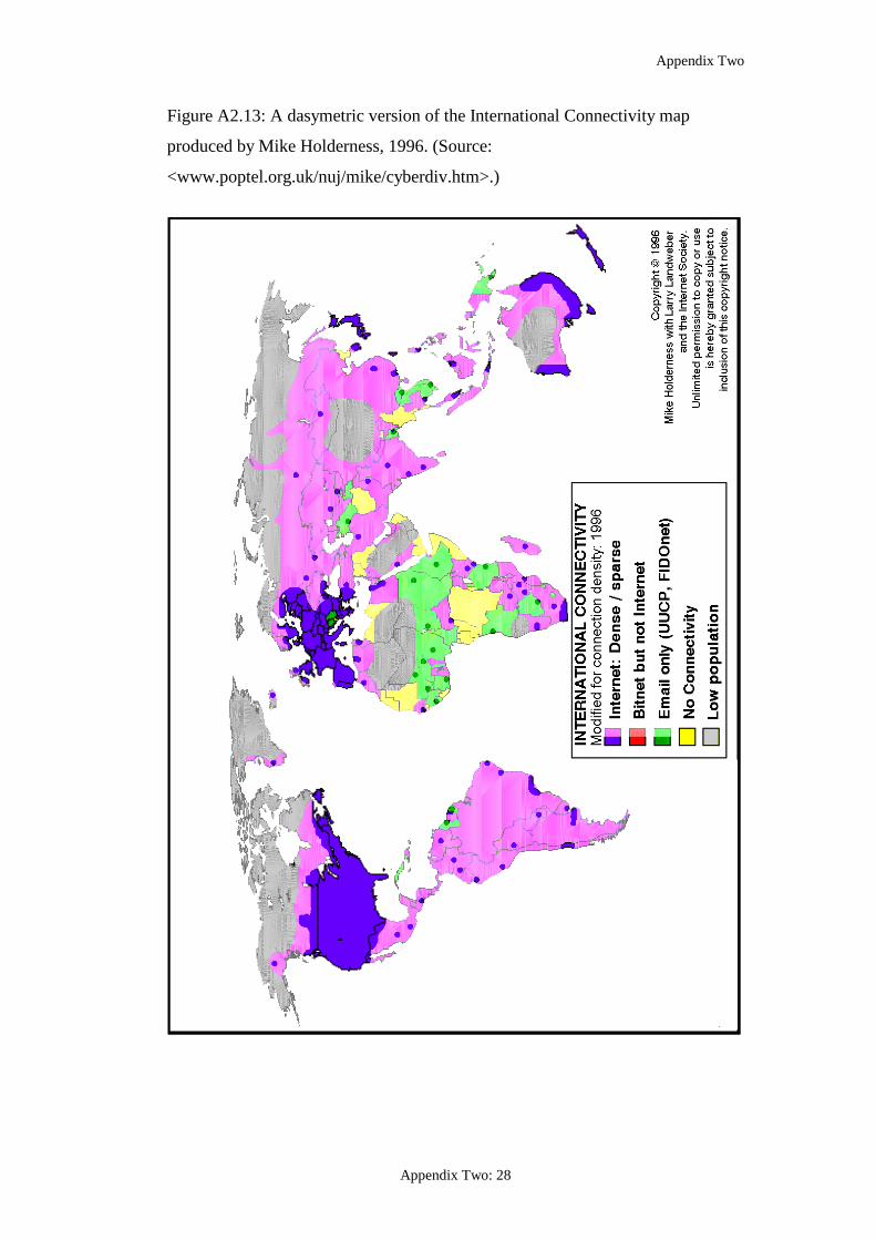
Appendix Two
Appendix Two: 28
Figure A2.13: A dasymetric version of the International Connectivity map
produced by Mike Holderness, 1996. (Source:
<www.poptel.org.uk/nuj/mike/cyberdiv.htm>.)

Appendix Two
Appendix Two: 29
Figure A2.14: Distance-based cartogram produced by Colin Arrowsmith
(Source: author scan from Arrowsmith and Wilson 1998, 7.)

Appendix Two
Appendix Two: 30
Figure A2.15: Internet users per capita 1990 cartogram poster, produced by the
Worldmapper project, 2006. (Source:
<www.worldmapper.org/display.php?selected=335>.)

Appendix Two
Appendix Two: 31
Figure A2.16: Full size view of Internet users per capita 1990 cartogram,
produced by the Worldmapper project, 2006. (Source:
<www.worldmapper.org/display.php?selected=335>.)

Appendix Two
Appendix Two: 32
Figure A2.17: Internet users per capita 2002 cartogram poster, produced by the
Worldmapper project, 2006. (Source:
<www.worldmapper.org/display.php?selected=336>.)

Appendix Two
Appendix Two: 33
Figure A2.18: Full size view of Internet users per capita 2002 cartogram,
produced by the Worldmapper project, 2006. (Source:
<www.worldmapper.org/display.php?selected=336>.)

Appendix Two
Appendix Two: 34
Figure A2.19: Internet users 2005 cartogram produced by ExploMap
Technologies, 2007. (Source:
<http://explomap.free.fr/world_map_internet_users_2005.pdf>

Appendix Two
Appendix Two: 35
Figure A2.20: Digital divide cartogram produced by Govcom.org, April 2005.
Country size is inversely proportional to level of Internet usage. (Source:
<www.govcom.org/maps/map_set_wsis/GC0_Maps_set_3.0_digitaldivide_inver
t.pdf>.)
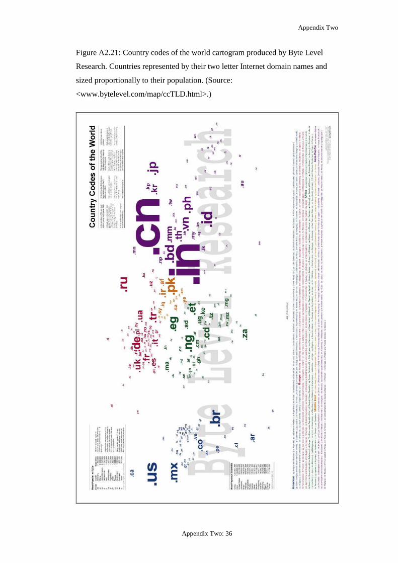
Appendix Two
Appendix Two: 36
Figure A2.21: Country codes of the world cartogram produced by Byte Level
Research. Countries represented by their two letter Internet domain names and
sized proportionally to their population. (Source:
<www.bytelevel.com/map/ccTLD.html>.)

Appendix Two
Appendix Two: 37
Figure A2.22: First page of ‘The Wired World Atlas’ produced by Wired
magazine. (Source: author scan from original, Conners-Petersen 1988, 162.)

Appendix Two
Appendix Two: 38
Figure A2.23: Second page of ‘The Wired World Atlas’ produced by Wired
magazine. (Source: author scan from original, Conners-Petersen 1988, 167.)

Appendix Two
Appendix Two: 39
Figure A2.24: Freedom to Connect, produced by Wired magazine, August 1997.
(Source: scanned version from Harpold 1999, no pagination.)

Appendix Two
Appendix Two: 40
Figure A2.25: Internet’s ‘black holes’ produced by Reporters without Borders as
part of a campaign against online surveillance and censorship. (Source:
<www.rsf.org>.)

Appendix Three: 1
Appendix Three
Network Marketing Maps from Website Survey1,
August 2007
1. Verizon Business (USA), <www.verizonbusiness.com>
Source: <www.verizonbusiness.com/us/about/network/?link=topnav>
1 Note, web addresses were correct at the time of the survey. Where multiple maps were available, for example for different regions or countries, only a representative example is shown here.

Appendix Three
Appendix Three: 2
2. AT&T WorldNet (USA), <www.att.com>
Source: <www.corp.att.com/globalnetworking/media/network_map.swf>

Appendix Three
Appendix Three: 3

Appendix Three
Appendix Three: 4
3. Sprint (USA), <www.sprint.net>
Source: <www.sprintworldwide.com/english/maps/index.html>

Appendix Three
Appendix Three: 5
4. Cogent Communications (USA), <www.cogentco.com>
Source: <www.cogentco.com/htdocs/map.php>

Appendix Three
Appendix Three: 6
5. Level 3 Communications (USA), <www.level3.com>
Source: <www.level3.com/about_us/aboutlevel3network/index.html>

Appendix Three
Appendix Three: 7
6. Qwest (USA), <www.qwest.com>
Source: <www.qwest.com/about/qwest/network/ ; http://stat.qwest.net/>

Appendix Three
Appendix Three: 8
7. Global Crossing (USA), <www.globalcrossing.com>
Source: <www.globalcrossing.com/network/network_interactive_map.aspx>

Appendix Three
Appendix Three: 9
8. Time Warner Telecom (USA), <www.twtelecom.com>
Source: <www.twtelecom.com/about_us/networks.html>
10. Hurricane Electric (USA), <www.he.net>
Source: <www.he.net/about_network.html>

Appendix Three
Appendix Three: 10
11. Abovenet Communications (USA), <www.above.net>
Source: <www.above.net/products/maps.html>

Appendix Three
Appendix Three: 11
12. Verio (USA), <www.verio.com>
Source: <www.verio.com/about/network/gin.cfm>

Appendix Three
Appendix Three: 12
13. XO Communications (USA), <www.xo.com>
Source: <www.xo.com/about/network/maps.html>
14. Savvis (USA), <www.savvis.net>
Source: <www.savvis.net/Products+Services/Network/InfrastructureMaps.htm>

Appendix Three
Appendix Three: 13
15. TeliaSonera (SE), <www.teliasoneraic.com>
Source:
<www.teliasoneraic.com/files/Teliasonera%20International%20Carrier/Articles/
Flash%20map/IP_backbone.html?LinkType=Static%20File>

Appendix Three
Appendix Three: 14
16. COLT Telecommunications (NL), <www.colt.net>
Source: <www.colt.net/uk/en/about_colt>

Appendix Three
Appendix Three: 15
17. LambdaNet (DE), <www.lambdanet.net>
Source: <www.lambdanet.net/userfiles/netzgrafiken/lambdanet-netzwerk-e.pdf>

Appendix Three
Appendix Three: 16
18. VSNL International (CA), <www.vsnlinternational.com>
Source: <www.vsnlinternational.com/map/>

Appendix Three
Appendix Three: 17
19. Deutsche Telekom (DE), <www.deutschetelekom.com>
Source: <www.deutschetelekom.com/dtag/cms/content/ICSS/en/216802>
20. Swisscom (CH), <www.swisscom.com>
No maps found.

Appendix Three
Appendix Three: 18
21. Tiscali International Network (DE), <www.tiscali.net>
Source: <www.tiscali.net/index.php?a=b&id=101&p=network_map>

Appendix Three
Appendix Three: 19
23. WV Fiber (USA), <www.wvfiber.com>
Source: <www.wvfiber.com/netmapus.htm>

Appendix Three
Appendix Three: 20
24. KPN (NL), <www.kpn.com>
Source: <www.kpn.com/kpn/show/id=1228594>

Appendix Three
Appendix Three: 21
25. LG DACOM (KR), <www.lgdacom.net>
No maps found.
26. Interoute Communications (UK), <www.interoute.com>
Source: <www.interoute.com/network_map/index.html>

Appendix Three
Appendix Three: 22
27. Korea Telecom (KR), <www.kt.co.kr>
No maps found.
28. Bell Canada (CA), <www.bell.ca>
No maps found.
29. PCCW (USA), <www.pccwglobal.com>
Source: <www.pccwglobal.com/network-technology/ip-coverage.php>

Appendix Three
Appendix Three: 23
30. KDDI Corporation (JP), <www.kddi.com>
Source: <www.kddi.com/english/business/oversea/index.html>

Appendix Three
Appendix Three: 24
31. TransTeleCom (RU), <www.transtk.ru>
Source: <www.transtk.ru/www/nsf/esite.nsf/docs/dwdm.html>

Appendix Three
Appendix Three: 25
32. Cable & Wireless (UK), <www.cw.com>
Source: <http://portal.cw.com/wps/portal/internet/UK/GlobalView>

Appendix Three
Appendix Three: 26
33. Net Access Corporation (USA), <www.nac.net>
Source: <www.nac.net/enterprise/dedicated.asp?page=NetMap>
34. IIJ Internet Initiative Japan (JP), <www.iij.ad.jp>
Source: <www.iij.ad.jp/en/network/backbone/index.html>

Appendix Three
Appendix Three: 27
35. Asia Netcom (CN), <www.asianetcom.com>
Source: <www.asianetcom.com/inter/index.asp?pg=network_infrastructure>
37. Golden Telecom (RU), <www.goldentelecom.ru>
No maps found.

Appendix Three
Appendix Three: 28
38. British Telecommunications (UK), <www.btglobalservices.com>
Source:
<www.btglobalservices.com/business/global/en/about_us/global_connectivity/>

Appendix Three
Appendix Three: 29
39. REACH (HK), <www.reach.com>
No maps found.
40. Port80 (SE), <www.rixport80.se>
No maps found.
41. PIPEX (UK), <www.pipex.net>
No maps found.
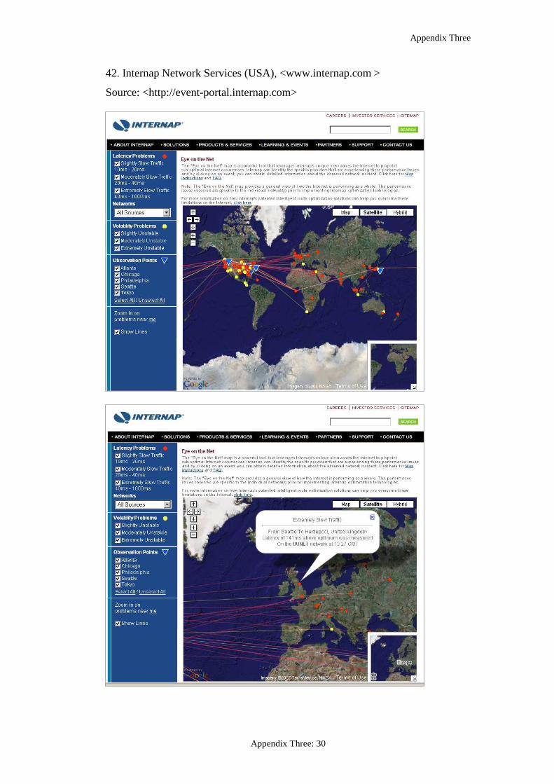
Appendix Three
Appendix Three: 30
42. Internap Network Services (USA), <www.internap.com >
Source: <http://event-portal.internap.com>

Appendix Three
Appendix Three: 31
43. Yipes Communications (USA), <www.yipes.com>
Source: <www.yipes.com/technology/tech_network.shtml>
44. New Edge Networks (USA), <www.newedgenetworks.com>
Source: <www.newedgenetworks.com/about_us/coverage/>

Appendix Three
Appendix Three: 32
45. Romania Data Systems (RO), <www.rdsnet.ro>
No maps found.
46. RTComm (RU), <www.rtcomm.ru>
Source: <www.rtcomm.ru/en/geo/net/>
47. Cablevision (USA), <www.cablevision.com>
No maps found.

Appendix Three
Appendix Three: 33
49. France Telecom (FR), <www.francetelecom.com>
Source:
<www.francetelecom.com/en/our_solutions/wholesalesolutions/about_us/>

Appendix Three
Appendix Three: 34
50. Cox Communications (USA), <www.cox.com>
No maps found.
51. GTS Energis (PL), <www.gtsce.com>
Source: <www.gtsce.com/maps/index.php>

Appendix Three
Appendix Three: 35
52. Flag Telecom (UK), <www.flagtelecom.com>
Source: <www.flagtelecom.com/index.cfm?page=4024>
53. SingTel (SG), <www.singtel.com>
No maps found.

Appendix Three
Appendix Three: 36
54. Integra Telecom (USA), <www.integratelecom.com>
Source: <www.integratelecom.com/about/network_and_facilities.asp>