2010-3.pdf - CSTUG
132
CS G U T Zpravodaj ˇ Ceskoslovenského sdružení uživatel ˚ uT E Xu Zpravodaj sdružení uživatel ˚ uT E Xu Zpravodaj ˇ Ceskoslovenského sdružení uživatel ˚ j ˇ Ceskoslovenského sdružení uživatel ˚ uT E Xu Zpravodaj ˇ Ceskoslovenského sdružení uživat el˚ uT E Xu Zpravodaj ˇ Ceskoslovenského sdružení uživatel ˚ uT E Xu Zpravodaj ého sdružení uživatel ˚ uT E Xu Zpravodaj ˇ Ceskoslovenského sdružení uživatel ˚ vodaj ˇ Ceskoslovenského sdružení uživatel ˚ uT E Xu Zpravodaj ˇ Ceskoslovenského sdružení u živatel ˚ uT E Xu Zpravodaj ˇ Ceskoslovenského sdružení uživatel ˚ uT E Xu Zpravodaj venského sdružení uživatel ˚ uT E Xu Zpravodaj ˇ Ceskoslovenského sdružení uživatel ˚ Zpravodaj ˇ Ceskoslovenského sdružení uživatel ˚ uT E Xu Zpravodaj ˇ Ceskoslovenského sdruž ení uživatel ˚ uT E Xu Zpravodaj ˇ Ceskoslovenského sdružení uživatel ˚ skoslovenského sdružení uživatel ˚ uT E Xu Zpravodaj ˇ Ceskoslovenského sdružení uživatel ˚ T E Xu Zpravodaj ˇ Ceskoslovenského sdružení uživatel ˚ uT E Xu Zpravodaj sdružení uživatel ˚ uT E Xu Zpravodaj ˇ Ceskoslovenského sdružení uživatel ˚ j ˇ Ceskoslovenského sdružení uživatel ˚ uT E Xu Zpravodaj ˇ Ceskoslovenského sdružení uživat el˚ uT E Xu Zpravodaj ˇ Ceskoslovenského sdružení uživatel ˚ uT E Xu Zpravodaj ého sdružení uživatel ˚ uT E Xu Zpravodaj ˇ Ceskoslovenského sdružení uživatel ˚ vodaj ˇ Ceskoslovenského sdružení uživatel ˚ uT E Xu Zpravodaj ˇ Ceskoslovenského sdružení u živatel ˚ uT E Xu Zpravodaj ˇ Ceskoslovenského sdružení uživatel ˚ uT E Xu Zpravodaj venského sdružení uživatel ˚ uT E Xu Zpravodaj ˇ Ceskoslovenského sdružení uživatel ˚ Zpravodaj ˇ Ceskoslovenského sdružení uživatel ˚ uT E Xu Zpravodaj ˇ Ceskoslovenského sdruž ení uživatel ˚ uT E Xu Zpravodaj ˇ Ceskoslovenského sdružení uživatel ˚ skoslovenského sdružení uživatel ˚ uT E Xu Zpravodaj ˇ Ceskoslovenského sdružení uživatel ˚ T E Xu Zpravodaj ˇ Ceskoslovenského sdružení uživatel ˚ uT E Xu Zpravodaj sdružení uživatel ˚ uT E Xu Zpravodaj ˇ Ceskoslovenského sdružení uživatel ˚ j ˇ Ceskoslovenského sdružení uživatel ˚ uT E Xu Zpravodaj ˇ Ceskoslovenského sdružení uživat el˚ uT E Xu Zpravodaj ˇ Ceskoslovenského sdružení uživatel ˚ uT E Xu Zpravodaj ého sdružení uživatel ˚ uT E Xu Zpravodaj ˇ Ceskoslovenského sdružení uživatel ˚ vodaj ˇ Ceskoslovenského sdružení uživatel ˚ uT E Xu Zpravodaj ˇ Ceskoslovenského sdružení u živatel ˚ uT E Xu Zpravodaj ˇ Ceskoslovenského sdružení uživatel ˚ uT E Xu Zpravodaj ˇ Ceskoslo venského sdružení uživatel ˚ uT E Xu Zpravodaj ˇ Ceskoslovenského sdružení uživatel ˚ uT E Xu Zpravodaj ˇ Ceskoslovenského sdružení uživatel ˚ uT E Xu Zpravodaj ˇ Ceskoslovenského sdruž ení uživatel ˚ uT E Xu Zpravodaj ˇ Ceskoslovenského sdružení uživatel ˚ uT E Xu Zpravodaj ˇ Ce skoslovenského sdružení uživatel ˚ uT E Xu Zpravodaj ˇ Ceskoslovenského sdružení uživatel ˚ u T E Xu Zpravodaj ˇ Ceskoslovenského sdružení uživatel ˚ uT E Xu Zpravodaj ˇ Ceskoslovenského sdružení uživatel ˚ uT E Xu Zpravodaj ˇ Ceskoslovenského sdružení uživatel ˚ uT E Xu Zpravoda ení uživatel ˚ uT E Xu Zpravodaj ˇ Ceskoslovenského sdružení uživatel ˚ uT E Xu Zpravodaj ˇ Ce skoslovenského sdružení uživatel ˚ uT E Xu Zpravodaj ˇ Ceskoslovenského sdružení uživatel ˚ u el˚ uT E Xu Zpravodaj ˇ Ceskoslovenského sdružení uživatel ˚ uT E Xu Zpravodaj ˇ Ceskoslovensk ého sdružení uživatel ˚ uT E Xu Zpravodaj ˇ Ceskoslovenského sdružení uživatel ˚ uT E Xu Zpra vodaj ˇ Ceskoslovenského sdružení uživatel ˚ uT E Xu Zpravodaj ˇ Ceskoslovenského sdružení u živatel ˚ uT E Xu Zpravodaj ˇ Ceskoslovenského sdružení uživatel ˚ uT E Xu Zpravodaj ˇ Ceskoslo venského sdružení uživatel ˚ uT E Xu Zpravodaj ˇ Ceskoslovenského sdružení uživatel ˚ uT E Xu Zpravodaj ˇ Ceskoslovenského sdružení uživatel ˚ uT E Xu Zpravodaj ˇ Ceskoslovenského sdruž ení uživatel ˚ uT E Xu Zpravodaj ˇ Ceskoslovenského sdružení uživatel ˚ uT E Xu Zpravodaj ˇ Ce skoslovenského sdružení uživatel ˚ uT E Xu Zpravodaj ˇ Ceskoslovenského sdružení uživatel ˚ u T E Xu Zpravodaj ˇ Ceskoslovenského sdružení uživatel ˚ uT E Xu Zpravodaj ˇ Ceskoslovenského sdružení uživatel ˚ uT E Xu Zpravodaj ˇ Ceskoslovenského sdružení uživatel ˚ uT E Xu Zpravoda j ˇ Ceskoslovenského sdružení uživatel ˚ uT E Xu Zpravodaj ˇ Ceskoslovenského sdružení uživat el˚ uT E Xu Zpravodaj ˇ Ceskoslovenského sdružení uživatel ˚ uT E Xu Zpravodaj ˇ Ceskoslovensk ého sdružení uživatel ˚ uT E Xu Zpravodaj ˇ Ceskoslovenského sdružení uživatel ˚ uT E Xu Zpra ZPRAVODAJ ZPRAVODAJ ˇ Ceskoslovenského sdružení uživatel ˚ uT E Xu 3 2010 ISSN 1211-6661 ISSN 1213-8185 Tištˇ ená verze Elektronická verze Roˇ cník 20
-
Upload
khangminh22 -
Category
Documents
-
view
4 -
download
0
Transcript of 2010-3.pdf - CSTUG

CS
G
UTZpravodaj Ceskoslovenského sdružení uživatelu TEXu Zpravodaj Ceskoslovenského
sdružení uživatelu TEXu Zpravodaj Ceskoslovenského sdružení uživatelu TEXu Zpravodaj Ceskoslovenského sdružení uživatelu TEXu Zpravodaj Ceskoslovenského sdružení uživatelu TEXu Zpravodaj Ceskoslovenského sdružení uživatelu TEXu Zpravodaj Ceskoslovenského sdružení uživatelu TEXu Zpravodaj Ceskoslovenského sdružení uživatelu TEXu Zpravodaj Ceskoslovenského sdružení uživatelu TEXu Zpravodaj Ceskoslovenského sdružení uživatelu TEXu Zpravodaj Ceskoslovenského sdružení uživatelu TEXu Zpravodaj Ceskoslovenského sdružení uživatelu TEXu Zpravodaj Ceskoslovenského sdružení uživatelu TEXuZpravodaj Ceskoslovenského sdružení uživatelu TEXu Zpravodaj Ceskoslovenského sdružení uživatelu TEXu Zpravodaj Ceskoslovenského sdružení uživatelu TEXu Zpravodaj Ceskoslovenského sdružení uživatelu TEXu Zpravodaj Ceskoslovenského sdružení uživateluTEXu Zpravodaj Ceskoslovenského sdružení uživatelu TEXu Zpravodaj Ceskoslovenskéhosdružení uživatelu TEXu Zpravodaj Ceskoslovenského sdružení uživatelu TEXu Zpravodaj Ceskoslovenského sdružení uživatelu TEXu Zpravodaj Ceskoslovenského sdružení uživatelu TEXu Zpravodaj Ceskoslovenského sdružení uživatelu TEXu Zpravodaj Ceskoslovenského sdružení uživatelu TEXu Zpravodaj Ceskoslovenského sdružení uživatelu TEXu Zpravodaj Ceskoslovenského sdružení uživatelu TEXu Zpravodaj Ceskoslovenského sdružení uživatelu TEXu Zpravodaj Ceskoslovenského sdružení uživatelu TEXu Zpravodaj Ceskoslovenského sdružení uživatelu TEXu Zpravodaj Ceskoslovenského sdružení uživatelu TEXuZpravodaj Ceskoslovenského sdružení uživatelu TEXu Zpravodaj Ceskoslovenského sdružení uživatelu TEXu Zpravodaj Ceskoslovenského sdružení uživatelu TEXu Zpravodaj Ceskoslovenského sdružení uživatelu TEXu Zpravodaj Ceskoslovenského sdružení uživateluTEXu Zpravodaj Ceskoslovenského sdružení uživatelu TEXu Zpravodaj Ceskoslovenskéhosdružení uživatelu TEXu Zpravodaj Ceskoslovenského sdružení uživatelu TEXu Zpravodaj Ceskoslovenského sdružení uživatelu TEXu Zpravodaj Ceskoslovenského sdružení uživatelu TEXu Zpravodaj Ceskoslovenského sdružení uživatelu TEXu Zpravodaj Ceskoslovenského sdružení uživatelu TEXu Zpravodaj Ceskoslovenského sdružení uživatelu TEXu Zpravodaj Ceskoslovenského sdružení uživatelu TEXu Zpravodaj Ceskoslovenského sdružení uživatelu TEXu Zpravodaj Ceskoslovenského sdružení uživatelu TEXu Zpravodaj Ceskoslovenského sdružení uživatelu TEXu Zpravodaj Ceskoslovenského sdružení uživatelu TEXuZpravodaj Ceskoslovenského sdružení uživatelu TEXu Zpravodaj Ceskoslovenského sdružení uživatelu TEXu Zpravodaj Ceskoslovenského sdružení uživatelu TEXu Zpravodaj Ceskoslovenského sdružení uživatelu TEXu Zpravodaj Ceskoslovenského sdružení uživateluTEXu Zpravodaj Ceskoslovenského sdružení uživatelu TEXu Zpravodaj Ceskoslovenskéhosdružení uživatelu TEXu Zpravodaj Ceskoslovenského sdružení uživatelu TEXu Zpravodaj Ceskoslovenského sdružení uživatelu TEXu Zpravodaj Ceskoslovenského sdružení uživatelu TEXu Zpravodaj Ceskoslovenského sdružení uživatelu TEXu Zpravodaj Ceskoslovenského sdružení uživatelu TEXu Zpravodaj Ceskoslovenského sdružení uživatelu TEXu Zpravodaj Ceskoslovenského sdružení uživatelu TEXu Zpravodaj Ceskoslovenského sdružení uživatelu TEXu Zpravodaj Ceskoslovenského sdružení uživatelu TEXu Zpravodaj Ceskoslovenského sdružení uživatelu TEXu Zpravodaj Ceskoslovenského sdružení uživatelu TEXuZpravodaj Ceskoslovenského sdružení uživatelu TEXu Zpravodaj Ceskoslovenského sdružení uživatelu TEXu Zpravodaj Ceskoslovenského sdružení uživatelu TEXu Zpravodaj Ceskoslovenského sdružení uživatelu TEXu Zpravodaj Ceskoslovenského sdružení uživateluTEXu Zpravodaj Ceskoslovenského sdružení uživatelu TEXu Zpravodaj Ceskoslovenskéhosdružení uživatelu TEXu Zpravodaj Ceskoslovenského sdružení uživatelu TEXu Zpravodaj Ceskoslovenského sdružení uživatelu TEXu Zpravodaj Ceskoslovenského sdružení uživatelu TEXu Zpravodaj Ceskoslovenského sdružení uživatelu TEXu Zpravodaj Ceskoslovenského sdružení uživatelu TEXu Zpravodaj Ceskoslovenského sdružení uživatelu TEXu Zpravodaj Ceskoslovenského sdružení uživatelu TEXu Zpravodaj Ceskoslovenského sdružení uživatelu TEXu Zpravodaj Ceskoslovenského sdružení uživatelu TEXu Zpravodaj Ceskoslovenského sdružení uživatelu TEXu Zpravodaj Ceskoslovenského sdružení uživatelu TEXuZpravodaj Ceskoslovenského sdružení uživatelu TEXu Zpravodaj Ceskoslovenského sdružení uživatelu TEXu Zpravodaj Ceskoslovenského sdružení uživatelu TEXu Zpravodaj Ceskoslovenského sdružení uživatelu TEXu Zpravodaj Ceskoslovenského sdružení uživateluTEXu Zpravodaj Ceskoslovenského sdružení uživatelu TEXu Zpravodaj Ceskoslovenskéhosdružení uživatelu TEXu Zpravodaj Ceskoslovenského sdružení uživatelu TEXu Zpravodaj Ceskoslovenského sdružení uživatelu TEXu Zpravodaj Ceskoslovenského sdružení uživatelu TEXu Zpravodaj Ceskoslovenského sdružení uživatelu TEXu Zpravodaj Ceskoslovenského sdružení uživatelu TEXu Zpravodaj Ceskoslovenského sdružení uživatelu TEXu Zpra
Adobe Systems Incorporated • 345 Park Avenue, San Jose, CA 95110-2704 USA •
ZPRAVODAJZPRAVODAJCeskoslovenského sdružení uživatelu TEXu
32010
ISSN 1211-6661 ISSN 1213-8185Tištená verze Elektronická verze
Rocník 20

OBSAH
Pavel Stříž: Úvodníček . . . . . . . . . . . . . . . . . . . . . . . . . . . . . 137
Denis Roegel: Jednoduché makro suanpan na kreslení abaku . . . . . . . 138
Timothy Eyre: Sazba japonštiny pomocí pTEXu . . . . . . . . . . . . . . 152
Kazuomi Kuniyoshi: Pravidla sazby japonštiny v X ETEXu . . . . . . . . . 174
Ken Lunde: Kazuraki: tutoriál k japonskému OTF písmu . . . . . . . . . 176
Timothy Eyre: Jak na výrobu písma kandži s pořadím tahů . . . . . . . . 199
Timothy Eyre: PDFdiff: skript srovnávající PDF soubory . . . . . . . . . 208
Jjgod Jiang: Sazba čínštiny v TEXu: historie a současnost . . . . . . . . . 215
Denis Roegel: Sudoku s vepsanými kandži . . . . . . . . . . . . . . . . . . 220
Peter Wilson: Balíček sudokubundle . . . . . . . . . . . . . . . . . . . . . . 227
Pavel Stříž, Michal Mádr: Nové a staronové knihy . . . . . . . . . . . . . 242
Ulrik Vieth: Fonts & Encodings od Yannise Haralambouse . . . . . . . . . 246
Karel Horák: Typografové a programátoři – vzájemné inspirace . . . . . . 250
Pavel Stříž: TypeTalks 2010 . . . . . . . . . . . . . . . . . . . . . . . . . . 253
Miloš Brejcha: Svět knihy Praha 2010 . . . . . . . . . . . . . . . . . . . . 260
Zápis z valné hromady CSTUG, Brno 21. 11. 2009 . . . . . . . . . . . . . . 262
Zpravodaj Československého sdružení uživatelů TEXu je vydáván v tištěné podoběa distribuován zdarma členům sdružení. Po uplynutí dvanácti měsíců od tištěnéhovydání je poskytován v elektronické podobě (PDF) ve veřejně přístupném archívudostupném přes http://www.cstug.cz/ .Zpravodaj je zařazen do Seznamu recenzovaných neimpaktovaných periodik vydávanýchv České republice, viz http://www.vyzkum.cz/ .Své příspěvky do Zpravodaje můžete zasílat v elektronické podobě, nejlépe jako jedenarchivní soubor (.zip, .arj, .tar.gz). Postupujte podle instrukcí, které najdete nastránce http://bulletin.cstug.cz/ . Pokud nemáte přístup na Internet, můžete zaslatpříspěvek na disketě, CD, či DVD na adresu: Zdeněk Wagner, Vinohradská 114, 130 00Praha 3. Redakci lze kontaktovat přes [email protected] .Nezapomeňte přiložit všechny soubory, které dokument načítá (s výjimkou standardníchsoučástí TEX Live), zejména v případě, kdy vás nelze kontaktovat e-mailem.
ISSN 1211-6661 (tištěná verze), ISSN 1213-8185 (elektronická verze)DOI: 10.5300/Zpravodaj

Úvodníček (緒言)Pavel Stříž
Dobrý den, drahé TEXistky, drazí TEXisté,dostáváte do rukou netradiční číslo, jehož příprava vznikala pomalu, ale s velkýmodhodláním. Číslo začíná překladem článku Denise Roegela (ロジエルデニ)o abaku a pokračuje článkem o sazbě japonštiny pomocí pTEXu (na TEX Livebude poprvé až letos; od roku 2010) z dílny Tima Eyreho (ティムエール). Ná-sleduje krátký vstup o balíčku genzi od Kazuomi Kuniyoshiho (國吉一臣) proX ETEX. Práce s třídami znaků je v TEXu relativně nová a stále neznámá.
Po netriviálních, i když oboustranně vstřícných diskuzích získal CSTUG dvou-úrovňový souhlas – autor, poté firma Adobe – s přetištěním technické zprávyo novém písmu Kazuraki (かづらき), včetně náhledů všech glyfů a ligatur,ano, ligatur v japonštině! Ačkoliv písmo není šířeno pod svobodnou licencí,jeho technické aspekty, především přes uvolněný program firmy Adobe afdko,http://www.adobe.com/devnet/opentype/afdko/, by mohly nejednoho čte-náře zaujmout, i když třeba pracujete ve FontForge, FreeType2 či jiných.
Bohužel se nepodařilo získat souhlas japonské grafičky u knihy ukázek, aleto našemu čtenáři nemusí vadit, neb snadno nalezne pdf verzi této brožurky,http://store4.adobe.com/type/browser/pdfs/Kazuraki_SPN.pdf. Poděko-vání patří Kenu Lundemu (小林劍), kterému se nápad s přetištěním technickézprávy ve střední Evropě líbil, i když v Evropě nikdy nebyl.
Další část tohoto čísla tvoří dva články Tima Eyreho. Jeden o písmu KanjiStroke Order Font (漢字の筆順のフォント), stáhnutelné i jako balík pro Linux,a druhý o jeho přístupu ke srovnávání dvou pdf dokumentů. Timu Eyremu patřítaké velké díky, neboť pečlivě své články čistil a pomohl s korekturou dalších.
Následuje shrnutí sazby čínštiny od Jjgod Jianga (江疆). Možná někteříznáte jeho balíček gezhu (割注), japonsky warichu, http://code.google.com/p/gezhu/, či balíček zhspacing, http://code.google.com/p/zhspacing/.
U čínštiny a japonštiny zůstaneme, a to u hry sudoku (数独). O vykreslenína úrovni METAPOSTu za pomoci kandži se zmiňuje překlad článku DeniseRoegela. Následuje článek o balíčku sudokubundle od Petera Wilsona, který patřík pionýrům TEXu. Čtenáři TUGboatu si možná vybavují jeho sloupky nazvanéGlisterings či jeho čtivý článek z roku 2005 o abecedách a písmových systémech,viz http://tug.org/TUGboat/Articles/tb26-3/tb84wilson.pdf.
Závěr tvoří zmínka několika knih především se vztahem k sazbě čínštiny,japonštiny, korejštiny a vietnamštiny (中日韓越) a zprávy účastníků z různýchakcí a konferencí. Přejeme příjemné, nikým a ničím nerušené čtení!
Pavel Stříž (パベル), [email protected]
137

Jednoduché makro suanpan na kresleníčínského a japonského abaku
Denis Roegel
Věnováno 荷花Abstrakt
Článek představuje způsob, jak si lze v METAPOSTu připravit čínský (算盘,suànpan) a japonský (算盤, そろばん, soroban) abakus.
Jedná se o mechanické počítadlo usnadňující elementární matematické ope-race a úkony. Kuličkové počítadlo používané v prvních ročnících základní školyu nás je jednou z podob abaku. Podrobněji o abaku samotném viz např. webovýrozcestník http://www.ee.ryerson.ca/~elf/abacus/.
Článek navíc představí způsob sčítání hodnot a implementaci tohoto al-goritmu v METAPOSTu. Makro představené v článku lze rovněž stáhnout zeserveru ctan.org.Klíčová slova: METAPOST, makro suanpan, abakus, suànpan, soroban.doi: 10.5300/2010-3/138
1. Představení abaku
Abakus je jedním z nejstarších počítadel, které se používá dodnes [6, 7, 9–13].Používají jej především v Asii na základní matematické úkony. Ještě poměrněnedávno byl abakus (anglicky j. č. abacus, mn. č. abaci i abacuses, také v pře-pisu calculating table, board nebo frame) vyučován na čínských školách a bylyz něj skládány zkoušky, pokud měl student zájem se ucházet o některá povolání.V Japonsku byla taková zkouška poprvé skládána v roce 1928 v Tokiu.
Zkušený počtář na abaku může být opravdu rychlý, nezadá si s vámi naběžné kalkulačce, tedy samozřejmě na základní operace s menšími čísly, jakoje sčítání a násobení. Abakus může být využit i na náročnější úkony, jako jenásobení, výpočet zlomků, druhé mocniny či druhé a třetí odmocniny. Na tentodruh úkonů může být potřeba nestandardní abakus, dostatečně velký na to, abydokázal ukládat potřebné mezivýpočty.
Zjednodušeně řečeno abakus je nástroj, který ukládá čísla pozicí svých ko-rálků (kuliček, oblázků či kamínků; angl. beads) na tyčkách (v žlábcích, nadrátech, šňůrkách apod.; angl. on rods). Uložená čísla mohou být jednoduchým
This article is a translation of the article “METAPOST macros for drawing Chinese andJapanese abaci”, which first appeared in TUGboat, Volume 30 (1), pp. 74–79, 2009. Reprintedwith permission. Translation and Czech abstract by Pavel Stříž. The author took the oppor-tunity of this translation in order to make a few minor changes for the sake of clarity, on thesuggestion of the translator.
138

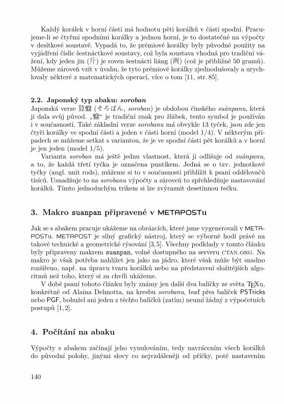
Obrázek 1: Tradiční čínský abakus (算盘, suànpan) se všemikorálky na hodnotě nula. Fotografie je z autorovy kolekce.
způsobem měněna a počtář pracuje s tímto opakujícím se výpočetním vzorempoměrně snadno.
Abakus má dlouhou historii a existovala celá plejáda jeho variant, kterév článku představeny nebudou. Stáří čínského abaku je odhadováno na tisíc let,možná je ještě starší. Jiné civilizace, jako byl Řím a Řecko, používaly podobnénástroje, kdy čísla byla ukládána za pomoci oblázků či speciálních žetonů.
V článku představíme makro naprogramované v METAPOSTu, které jednaknakreslí běžné asijské typy abaku a navíc kroky, jak se s nimi počítá.
2. Typy abaku
Zaměříme se na dva typy abaku – standardní verzi čínského a japonského počí-tadla, které jsou používány i v současnosti.
2.1. Čínský typ abaku: suànpanČínská verze je nazývána 算盘 (suànpan). Slovo 算 (suàn) v čínštině znamená„počítat“ a slovo 盘 (pan) „v rámečku“ nebo na „na destičce“. Abakus suànpanmůže mít celou řadu délek. Běžně má 13 tyček s pěti korálky ve spodní částirámečku (někdy jako pozemské korálky; angl. earth beads) a dvěma korálky(někdy jako nebeské korálky; angl. heaven beads) v horní části (model 2/5 či2:5), viz Obrázek 1. Horní a spodní část je oddělena příčkou či jinou formoupřepážky.
139
Každý korálek v horní části má hodnotu pěti korálků v části spodní. Pracu-jeme-li se čtyřmi spodními korálky a jednou horní, je to dostatečné na výpočtyv desítkové soustavě. Vypadá to, že prémiové korálky byly původně použity navyjádření číslic šestnáctkové soustavy, což byla soustava vhodná pro tradiční vá-žení, kdy jeden jın (斤) je roven šestnácti liang (两) (což je přibližně 50 gramů).Můžeme zároveň vzít v úvahu, že tyto prémiové korálky zjednodušovaly a urych-lovaly některé z matematických operací, více o tom [11, str. 85].
2.2. Japonský typ abaku: sorobanJaponská verze 算盤 (そろばん, soroban) je obdobou čínského suànpanu, kteráji dala svůj původ. „盤“ je tradiční znak pro žlábek, tento symbol je používáni v současnosti. Také základní verze sorobanu má obvykle 13 tyček, jsou zde jenčtyři korálky ve spodní části a jeden v části horní (model 1/4). V některým pří-padech se můžeme setkat s variantou, že je ve spodní části pět korálků a v horníje jen jeden (model 1/5).
Varianta soroban má ještě jednu vlastnost, která ji odlišuje od suànpanu,a to, že každá třetí tyčka je označena puntíkem. Jedná se o tzv. jednotkovétyčky (angl. unit rods), můžeme si to v současnosti přiblížit k psaní oddělovačůtisíců. Usnadňuje to na sorobanu výpočty a zároveň to zpřehledňuje nastavováníkorálků. Tímto jednoduchým trikem si lze zvýraznit desetinnou tečku.
3. Makro suanpan připravené v METAPOSTu
Jak se s abakem pracuje ukážeme na obrázcích, které jsme vygenerovali v META-POSTu. METAPOST je silný grafický nástroj, který se výborně hodí právě natakové technické a geometrické rýsování [3,5]. Všechny podklady v tomto článkubyly připraveny makrem suanpan, volně dostupného na serveru ctan.org. Namakro je však potřeba nahlížet jen jako na jádro, které však může být snadnorozšířeno, např. na úpravu tvaru korálků nebo na představení složitějších algo-ritmů než toho, který si za chvíli ukážeme.
V době psaní tohoto článku byly známy jen další dva balíčky ze světa TEXu,konkrétně od Alaina Delmotta, na kresbu sorobanu, buď přes balíček PSTricksnebo PGF, bohužel ani jeden z těchto balíčků (zatím) neumí žádný z výpočetníchpostupů [1, 2].
4. Počítání na abaku
Výpočty s abakem začínají jeho vynulováním, tedy navrácením všech korálkůdo původní polohy, jinými slovy co nejvzdáleněji od příčky, poté nastavením
140
první hodnoty posuny korálků, a poté následuje matematický úkol dle známéhopostupu. Výsledek se dá následně přečíst.
4.1. Základní pozice abakuObrázek 1 ukazuje základní pozici skutečného suànpanu a Obrázek 2 srovnáváabakus čínský (obrázek vlevo) s japonským (ten napravo). Dvě části abaku jsourozděleny dělicí příčkou, chceme-li přepážkou či trámem (angl. horizontal bar,crosspiece, beam nebo reckoning bar).
V základní poloze jsou všechny korálky co nejdále vzdáleny od příčky, před-stavuje to na všech tyčkách hodnotu nula. Každý korálek představuje jeden řádv desítkové (někdy i šestnáctkové) soustavě. Jednotky jsou nejčastěji vpravo.Tyčky se obvykle číslují, ale tato vlastnost může být v našem makru vypnutanastavením přepínače rod_numbers typu pravda-nepravda (angl. boolean), jakje předvedeno v ukázce.
Obrázek 2: Základní pozice počítadel:算盘(suànpan, vlevo)a 算盤 (soroban, vpravo).
Užijeme-li makro suanpan, lze základní pozici suànpanu získat následujícímzpůsobem:input suanpansetup_abacus(N=13, NBL=5, NBU=2,
bead="suanpan", units=0);beginfig(1);
rod_numbers:=false;reset_abacus;draw_abacus;
endfigend
Makrem setup_abacus můžeme nastavit počet tyček (N), stejně tak početkorálků v obou částech abaku (NBL a NBU), typ korálků (bead) a zdali si pře-jeme značení u každé třetí tyčky (units). Parametry jsou zadávány jako dvojiceproměnná=žádaná hodnota. V současné verzi makra lze nastavit dva typy ko-
141

rálků, odpovídající textovým řetězcům "suanpan" (téměř korálky kruhu, jemnězploštělé po délce) a "soroban" (korálky tvaru dvoukužele).
4.2. Nastavování hodnotNastavení hodnoty na abaku znamená posunutí korálků k příčce. Korálek vespodní části má hodnotu jedné příslušného řádu (jednotky, desítky, stovky atd.)a korálek v horní části představuje hodnotu pěti. Nastavení čtyř korálků vespodní části a jednoho korálku v horní dává dohromady 5+4 = 9. Pokud jsou po-užité všechny korálky na čínském typu 2/5, a v horní části se stále pracuje s ekvi-valentem pěti, dostáváme maximální hodnotu na tyčce rovnu 5 + 5 + 5 = 15.Tímto způsobem můžeme nastavit všechna čísla od nuly (výchozí postavení) pohodnotu patnáct (maximální hodnota).
Co se týká makra suanpan, zde je počet korálků v každé části uložen ve dvoupolích s dimenzí. Libovolná hodnota může být u každého pole nastavena ručnětakto (Obrázek 3):beginfig(3);
reset_abacus;valL[1]:=2; valL[3]:=5;valU[2]:=1; valU[4]:=2;draw_abacus;
endfig;Zpracování tímto způsobem může být užitečné tehdy, když je potřeba na-
stavit nějakou v desítkové soustavě nestandardní situaci (nastavení čísla 10 552na Obrázku 3, vlevo). Tohle je konkrétně výše zmíněný případ, kdy bylo potřebana tyčce nastavit pět korálků ve spodní části. Obvykle nám ve spodní části vy-stačí vždy jen čtyři korálky. Obdobná výjimka platí pro dva korálky v horníčásti, počítáme-li v desítkové soustavě.
Makro suanpan v současné verzi nepodporuje výpočty v šestnáctkové sou-stavě, ale mohou být jednoduše zařízeny nadstavením výpočtů založených nasoustavě desítkové.
Pomocné makro set_abacus_val dokáže operaci nastavení počátečních hod-not zautomatizovat (Obrázek 3, vpravo):beginfig(4);
reset_abacus;set_abacus_val("10552");draw_abacus;
endfig;Máme-li pod N uložen počet tyček, je automaticky brán zprava jen navo-
lený počet znaků z textového řetězce vstupujícího do makra set_abacus_val.Ostatní cifry jsou ignorovány.
142

1
1
2
2
3
3
4
4
5
5
6
6
7
7
8
8
9
9
10
10
11
11
12
12
13
13
1
1
2
2
3
3
4
4
5
5
6
6
7
7
8
8
9
9
10
10
11
11
12
12
13
13
Obrázek 3: Nestandardní pozice hodnoty 10 552 v desítkovésoustavě (vlevo) a její standardní vyobrazení (vpravo).
4.3. Operace sčítáníJakmile máme počáteční hodnotu nastavenu, můžeme ji systematicky měnit.V tomto článku se zaměříme jen na operaci sčítání. Dokonce i pro tak triviálníoperaci můžeme zvolit několik způsobů, my si ukážeme typický způsob sčítáníne zprava doleva, ale zleva doprava.
Abychom ukázali, jak to funguje, připravili jsme v makru suanpan makro,chceme-li funkci, add_val, která sčítání rozloží na nezbytný počet kroků. Jensi dejme pozor, že tohle makro nemůže být běžnou součástí prostředí beginfiga endfig, je to z toho důvodu, že makro tato prostředí generuje za svého běhu.
Ukážeme si příklad na sorobanu s počáteční hodnotou 651 324 tak, jak tozmiňuje následující zdrojový kód (Obrázek 4):setup_abacus(N=13, NBL=4, NBU=1,
bead="soroban", units=1);set_abacus_val("651324");add_val(v="82363456", iv=100, fig=true);
Užíváme-li jako řídicí soubor abacus.mp, pak zmíněná sekvence příkazů v němuložených vygeneruje soubory abacus.100, abacus.101, . . . , abacus.108, kteréjiž mohou být rutinně přiloženy do TEXového dokumentu.
Po vynulování následují kroky dle Obrázku 4. Úvodní stav (a) ukazuje nasta-vení prvního sčítance 651 324, zde náš proces sčítání začíná. V prvním kroku (b)přidáváme 8 na osmou tyčku tím způsobem, že přesuneme k příčce tři spodní ko-rálky a jeden horní. S ostatními korálky není hýbáno. Následuje krok (c), kterýpřidává 2 na sedmou tyčku. Zatím máme život snadný, neboť změny se dějí vždyna jedné tyčce, poněvadž byly nastaveny na hodnotu 0. Je to dáno tím, že prvnísčítanec nemá řád miliónů ani desetimiliónů. V kroku (d) přidáme 3 na šestoutyčku. Z hodnoty 6 se stává hodnota 9.
Krok (e) přidává 6 na pátou tyčku, která obsahuje 5. To nám součtem dává 11.Na páté tyčce nastavíme hodnotu 1 a jedničku si budeme chvíli pamatovat a po-kusíme se tuto jedničku přidat na tyčku šestou (tyčka vlevo). Tato vzniklá situace
143

1
1
2
2
3
3
4
4
5
5
6
6
7
7
8
8
9
9
10
10
11
11
12
12
13
13
(a) Nastavíme 651 324.
1
1
2
2
3
3
4
4
5
5
6
6
7
7
8
8
9
9
10
10
11
11
12
12
13
13
1
1
2
2
3
3
4
4
5
5
6
6
7
7
8
8
9
9
10
10
11
11
12
12
13
13
(b) Po přičtení 80 000 000. (c) Po přičtení 2 000 000.
1
1
2
2
3
3
4
4
5
5
6
6
7
7
8
8
9
9
10
10
11
11
12
12
13
13
1
1
2
2
3
3
4
4
5
5
6
6
7
7
8
8
9
9
10
10
11
11
12
12
13
13
(d) Po přičtení 300 000. (e) Po přičtení 60 000.
1
1
2
2
3
3
4
4
5
5
6
6
7
7
8
8
9
9
10
10
11
11
12
12
13
13
1
1
2
2
3
3
4
4
5
5
6
6
7
7
8
8
9
9
10
10
11
11
12
12
13
13
(f) Po přičtení 3 000. (g) Po přičtení 400.
1
1
2
2
3
3
4
4
5
5
6
6
7
7
8
8
9
9
10
10
11
11
12
12
13
13
1
1
2
2
3
3
4
4
5
5
6
6
7
7
8
8
9
9
10
10
11
11
12
12
13
13
(h) Po přičtení 50. (i) Po přičtení 6.
Obrázek 4: Znázornění rozkladu sčítání do devíti kroků na soro-banu. (a) znázorňuje nastavení prvního sčítance 651 324, a přidá-váme druhého sčítance 82 363 456 v osmi krocích (b)–(i), každýkrok reprezentuje jednu cifru druhého sčítance.
144

nám zatím ukazuje, že jsme tedy změnili počet korálků ve spodní části na tyčcepět, nenastala žádná změna ve smyslu přičtení v její horní části, která se nuluje.Zaměříme naši pozornost na tyčku šest, kde chceme přidat jedničku. Šestá tyčkaobsahuje hodnotu 9. Přidáním jedničky se dostáváme na 10 a je potřeba dalšíhopřesunu jedničky. Vynulujeme šestou tyčku a přidáme jedničku na tyčku sedm.Ta obsahuje hodnotu 2 a tu zvedneme na hodnotu 3. Dalších přesunů už nenítřeba a krok (e) je hotov, přičetli jsme 60 000.
Celý tento proces se opakuje cifra po cifře, dokud není celý rozložený sčíta-nec připsán. Vidíme, že přičtení cifry sčítance se občas rozloží na dílčí kroky.Podrobněji nebudeme detaily v článku rozvádět, v principu se jedná jen o ana-logii práce s jednou tyčkou, jen v několika krocích rozloženou. K procvičení silze vyzkoušet součet 999 999 999 + 1.
Pokud by výklad u zmíněných maker nebyl dostatečný, odkazujeme čtenářepřímo na zdrojový kód suanpan.mp z ctan.org.
Makro add_val může být použito i bez generování obrázků tím, že se nastavífalse u proměnné fig. V takovém případě proběhne jen základní algoritmussčítání a součet je uložen v polích.
Je tu samozřejmě možnost, že by součty mohly být simulovány tím, že vý-počet bude proveden mimo makro suanpan a hodnoty budou vždy nastavenypro každý příchozí požadavek. Takto by bylo možné využít makro suanpan jakonástroj vykreslování pro jiná makra, programy či nástroje.
Přikládáme ukázku součtu, kdy nevznikají obrázky z jednotlivých mezi-součtů.beginfig(200);
reset_abacus;reset_abacus_gray;set_abacus_val("82951324");draw_abacus;
endfig;beginfig(201);
set_abacus_val("82951324");add_val(v="60000", iv=100, fig=false);draw_abacus;
endfig;Operace sčítání může způsobit problém s přeplněním a nastavila by se pro-
měnná overflow typu pravda-nepravda na hodnotu true. Před uskutečněnímsčítání si makro add_val vynuluje tuto proměnnou na false.
4.4. Triky na zrychlení výpočtůPokud chceme zefektivnit práci s abakem, je užitečné si zapamatovat některévzory, které se objevují často a dávají nám prostor k jejich automatizaci. Na
145
jednoduché ukázce si to osvětlíme. Pokud některá z tyček je ve spodní částinastavena na hodnotu 3 a jeden korálek máme přidat, pak nezbývá nic jinéhonež čtvrtý korálek posunout směrem k příčce. Zde nemáme co vylepšovat, početstupňů volnosti je nula.
Pokud je však situace drobně upravena, tedy máme-li přidat tři korálky místojednoho ke stávajícím třem, pak můžeme pravděpodobně u začátečníka očekávatmyšlenkový proces založený na výpočtu 3 + 3 = 6, poté odečtením 5 a nasta-vením jednoho korálku ve spodní i horní části abaku. Věřte či nikoliv, ale tatosituace je neefektivní, poněvadž výpočetní zátěž leží na počtáři.
Uvažujme takto. Víme-li, že tři korálky nemohou být v dané chvíli přemís-těny, pak můžeme rovnou zvážit vztah 3 = 5 − 2 a dostat se ke dvěma úkonům:za prvé, přidání jednoho korálku (hodnoty 5) v horní části, a za druhé, odebránídvou korálků v části spodní. Tohle je příjemná matematická zkratka, která ne-vyžaduje výpočet 3 + 3 = 6, a to jen díky tomu, že si zavčas všimneme, ženemůžeme ve spodní části přidat ke třem stávajícím korálkům tři další.
Podobně nerealizovatelné úkony si lze představit i v horní části. Můžeme sipřipravit podobné schéma. Jakmile není možné přidat korálek o hodnotě pět dohorní části, uvažme užití formule 5 = 10 − 5, technicky přidáme jeden korálek(z pohledu aktuální tyčky je hodnoty 10) ve spodní části další tyčky (opět vlevood aktuální) a ubereme korálek v horní části původní tyčky. A opět se tentopostup opakuje tak dlouho, dokud nesečteme celý sčítanec.
Uvažme situaci, kdy chceme přidat pět nebo více korálků na libovolnou tyčkuve spodní části. Tuto situaci můžeme zapsat buď rozepsáním na 5 + a nebo10 − b, a je-li jedna z nich použitelná, bude aplikována. Konkrétně můžememít tři korálky na tyčce v její spodní části a chceme přidat dalších šest. Buďmůžeme tuto situaci rozepsat jako 6 = 5 + 1 nebo 6 = 10 − 4. Druhý rozkladnelze technicky zrealizovat, protože nemůžeme odebrat čtyři korálky, když mámejen tři. V tomto případě je však možná první situace. Přidáme jeden korálek vespodní části a pokusíme se přidat jeden korálek v horní části. Pokud by to v horníčásti nebylo možné, provedeme další rozklad atd.
Náročnější matematické úkony, jako je násobení, dělení, druhá odmocninaatd., mohou být aplikovány rychle a účinně za použití pomocných tabulek, kterési předtím musel počtář vštěpit do paměti. Ukázky takových tabulek pro sorobanpředkládá např. Knott [7].
5. Účelová makra pro rozšíření abaku
Chceme-li někomu vysvětlit práci s abakem, je poměrně často výhodné vyu-žít nějaké formy značení nebo zvýraznění jednotlivých korálků. Makro suanpannabízí dvě možnosti. Buď je volený korálek vykreslen jinou barvou, konkrétněšedou, nebo je na něj přidán popisek.
146

Je poměrně snadné využít makra set_abacus_gray a vykreslit vybrané ko-rálky v šedé barvě. Makro má tři parametry, zadávané opět ve formě párů pro-měnná=žádaná hodnota. Proměnná deck nám upřesní, jestli pracujeme s horní(upper) nebo spodní (lower) částí abaku. Další dvě proměnné jsou textové ře-tězce udávající korálky brané zprava. Hodnota below odpovídá korálkům vespodnavolené části (horní nebo spodní části abaku), opakem je hodnota above. Na-příklad zapsání hodnoty 2 při below znamená, že budou šedou barvou vykreslenydva korálky zespodu. Tedy ty dva, které jsou brány za první kandidáty na posunk příčce (při volbě lower), resp. ty dva, které se jako první vrací do základníhostavu (při volbě upper).
Při below to je obdobné, jako kdybychom brali vrcholky stalagmitu; přiupper to je, jako bychom odebírali spodní špičky stalaktitu.
V současné verzi makra není tento způsob obarvování zautomatizován, i kdyžje to samozřejmě technicky možné. Můžeme si představit celou řadu možnýchschémat, které jsme do makra nezanesli. Realizace v současné verzi je podpořenajen základními příkazy.
Nechť nám za ukázku poslouží součet z dřívějšího příkladu vyobrazenéhona Obrázku 4, konkrétně přechod z kroku (d) do (e), tentokrát však tak, abybyly zvýrazněny všechny posuny korálků. Jednalo se konkrétně o situaci, kdyjsme k mezihodnotě 82 951 324 přičítali 60 000. Výsledek našich snah si můžeteprohlédnout na Obrázku 5 a zde přikládáme příslušné zdrojové kódy:beginfig(202);
reset_abacus;reset_abacus_gray;set_abacus_val("82951324");set_abacus_gray(deck="lower",
below="1010000", above="0400000");set_abacus_gray(deck="upper",
below="0110000", above="0000000");draw_abacus;
endfig;
beginfig(203);reset_abacus_gray;add_val(v="60000", iv=100, fig=false);set_abacus_gray(deck="lower",
below="0400000", above="1010000");set_abacus_gray(deck="upper",
below="0000000", above="0110000");draw_abacus;mark_abacus(5,5)(btex 1 etex);
endfig;
147

V daných ukázkách makro reset_abacus_gray plní jen ulohu vynulovánídříve šedou barvou vyznačených korálků. Bude to pro čtenáře příjemnější, abyviděl právě jen ten jeden přechod.
Dalším nově představeným makrem na vyznačení korálků je mark_abacus.Tohle makro umí překreslit korálek tak, aby mohl obsahovat (krátký) popisek.Konkrétně mark_abacus(5,5)(btex 1 etex) zapíše cifru jedna na pátý korálekodspodu na pátou tyčku počítanou zprava. Jednou z výhod tohoto přístupu je,že i když se později korálek posune, značka u něj zůstane, aniž bychom příkazjakkoliv upravovali nebo si jej znovu volali.
1
1
2
2
3
3
4
4
5
5
6
6
7
7
8
8
9
9
10
10
11
11
12
12
13
13
1
1
2
2
3
3
4
4
5
5
6
6
7
7
8
8
9
9
10
10
11
11
12
12
13
13
1
Obrázek 5: Zvýraznění všech přesunů v jednom z mezikrokůpři sčítání 829 513 24 s 60 000. Všechny korálky, které byly pře-sunuty, jsou vykresleny šedou barvou, a navíc jsme si vyznačiliaktuální hodnotu na tyčce, se kterou bylo pracováno. V našempřípadě to byla hodnota 60 000, tedy pátá tyčka.
6. Využití abaku v jiných číselných soustaváchJak jsme dříve zmínili, čínský abakus může být použit na výpočty v desítkovéi v šestnáctkové soustavě, záleží jen na tom, jestli použijeme dva bonusové ko-rálky (jeden v horní části a druhý ve spodní). Po chvíli přemýšlení však můžemeabakus upravit tak, aby sloužil i pro jiné číselné soustavy.
Obrázek 6 nám ukazuje sčítání v osmičkové soustavě. Každá tyčka má čtyřikorálky, tři ve spodní části s hodnotou jedna a jeden korálek v horní částis hodnotou čtyři. Tímto způsobem sestavíme hodnoty nula až sedm. Levý ob-rázek představuje nastavení čísla 3 401 2568, přičtením 12348 dostáváme součet3 402 5128, což je vyobrazeno vpravo.
Příprava těchto obrázků je přímočará. Upravíme počet korálků na každétyčce, dále nastavíme proměnnou vbu, která představuje počet korálků v horníčásti abaku. Takový abakus v osmičkové soustavě má hodnotu horního korálkučtyři, což odpovídá počtu korálků ve spodní části plus jeden. Stačí nám nynízapsat tento zdrojový kód, abychom dostali náhled před sčítáním a po něm.
148
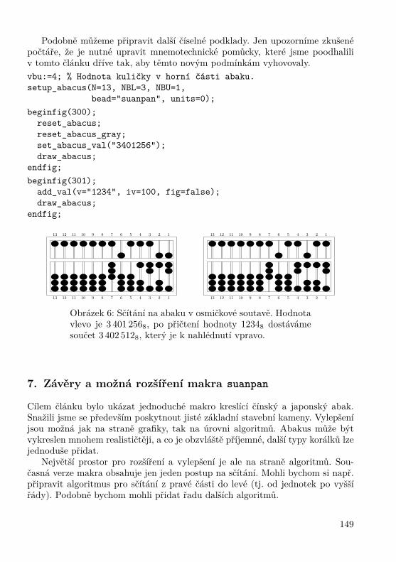
Podobně můžeme připravit další číselné podklady. Jen upozorníme zkušenépočtáře, že je nutné upravit mnemotechnické pomůcky, které jsme poodhaliliv tomto článku dříve tak, aby těmto novým podmínkám vyhovovaly.vbu:=4; % Hodnota kuličky v horní části abaku.setup_abacus(N=13, NBL=3, NBU=1,
bead="suanpan", units=0);beginfig(300);
reset_abacus;reset_abacus_gray;set_abacus_val("3401256");draw_abacus;
endfig;beginfig(301);
add_val(v="1234", iv=100, fig=false);draw_abacus;
endfig;
1
1
2
2
3
3
4
4
5
5
6
6
7
7
8
8
9
9
10
10
11
11
12
12
13
13
1
1
2
2
3
3
4
4
5
5
6
6
7
7
8
8
9
9
10
10
11
11
12
12
13
13
Obrázek 6: Sčítání na abaku v osmičkové soutavě. Hodnotavlevo je 3 401 2568, po přičtení hodnoty 12348 dostávámesoučet 3 402 5128, který je k nahlédnutí vpravo.
7. Závěry a možná rozšíření makra suanpan
Cílem článku bylo ukázat jednoduché makro kreslící čínský a japonský abak.Snažili jsme se především poskytnout jisté základní stavební kameny. Vylepšeníjsou možná jak na straně grafiky, tak na úrovni algoritmů. Abakus může býtvykreslen mnohem realističtěji, a co je obzvláště příjemné, další typy korálků lzejednoduše přidat.
Největší prostor pro rozšíření a vylepšení je ale na straně algoritmů. Sou-časná verze makra obsahuje jen jeden postup na sčítání. Mohli bychom si např.připravit algoritmus pro sčítání z pravé části do levé (tj. od jednotek po vyššířády). Podobně bychom mohli přidat řadu dalších algoritmů.
149

Náročnější matematické úkony, jako je násobení, dělení, výpočet druhé čitřetí odmocniny, ale celá řada dalších [4, 7, 8, 11], by nemělo být náročné dojádra makra suanpan implementovat.
Pro každý z takto zvažovaných algoritmů by bylo vhodné jej naprogramo-vat tak, aby bylo možné na výstupu, graficky a výpisem proměnných, sledovatjednotlivé kroky a mezikroky matematických úkonů.
Makro suanpan vám k tomu všemu dává stavební základnu.
Seznam literatury
[1] Delmotte, Alain. Soroban abacus: package pgf-soroban. [Balíček pgf-sorobanna kresbu abaku japonského typu soroban přes TEXový balíček PGF.][online cit. 12. 11. 2007] Balíček je dostupný na URL: http://ctan.org/tex-archive/graphics/pgf/contrib/pgf-soroban/
[2] Delmotte, Alain. Soroban abacus: package pst-soroban. [Balíček pst-sorobanna kresbu abaku japonského typu soroban přes balíček PSTricks.] [online cit.3. 9. 2009] Balíček je dostupný na URL: http://ctan.org/tex-archive/graphics/pstricks/contrib/pst-soroban/
[3] Goossens, Michel; Mittelbach, Frank; Rahtz, Sebastian; Roegel, Denis;Voß, Herbert. The LATEX Graphics Companion. [Velký průvodce grafikouv LATEXu.] 2. vyd. USA, Boston: Addison-Wesley Professional, 2007.ISBN 978-0-321-50892-8.
[4] Heffelfinger, Totton; Flom, Gary. 算盤 Abacus: Mystery of the Bead.[算盤 Abakus: záhada korálků.] [online cit. 16. 1. 2007] Dostupné na URL:http://webhome.idirect.com/~totton/abacus/
[5] Hobby, John. METAPOST: A User’s Manual. [METAPOST: Uživatelská pří-ručka.] [online cit. 2. 10. 2009] Aktualizovaná verze původního manuálu.Dostupná z URL: http://www.tug.org/docs/metapost/mpman.pdf.
[6] Ifrah, Georges. The Universal History of Computing: From the Abacus to theQuantum Computer. [Historie výpočetního světa: od abaku až po kvantovépočítače.] 1. vyd. USA, New York: John Wiley and Sons, 2001. ISBN 978--0-471-44147-2.
[7] Knott, Cargill Gilston. The Abacus, in Its Historic and Scientific Aspects.[Abakus z pohledu historického a vědeckého.] Transactions of the AsiaticSociety of Japan, Volume 14: 18–71, 1886. ISSN 0913-4271.
[8] Kojima, Takashi. Advanced Abacus: Japanese Theory & Practice. [Abakuspro pokročilé: teorie a praxe v Japonsku.] Japonsko, Tokio: Charles E.Tuttle and Company, 1963. ASIN B0007DNGUQ.
150

[9] Shu-T’ien, Li. Origin and Development of the Chinese Abacus. [Vznik a roz-voj čínského abaku.] Journal of the ACM, Volume 6 (1): 102–110, 1959.ISSN 0004-5411. doi:10.1145/320954.320962
[10] Martzloff, Jean-Claude. A History of Chinese Mathematics. [Historie čínskématematiky.] USA, New York: Springer, 2006. ISBN 978-3-540-33782-9.
[11] Moon, Parry. The Abacus: Its History, Its Design, Its Possibilities in theModern World. [Abakus: historie, umělecké provedení a možnosti využitív současnosti.] USA, New York: Gordon and Breach Science Publishers,1971. ISBN 978-0-677-01960-4.
[12] Needham, Joseph; Wang, Ling. Science and Civilisation in China, Vol. 3:Mathematics and the Sciences of the Heavens and Earth. [Věda a civilizacev Číně, svazek třetí: Matematika a vědy nebes a o Zemi.] Velká Británie,Cambridge: Cambridge University Press, 1959. ISBN 978-0-521-05801-8.
[13] Smith, David Eugene; Mikami, Yoshio. A History of Japanese Mathematics.[Historie japonské matematiky.] Chicago: The Open court publishing com-pany, 1914. Přetištěno jako Smith, David Eugene; Mikami, Yoshio. A His-tory of Japanese Mathematics. 1. vyd. Cosimo Classics, 2007. ISBN 978-1--60206-664-9.
Summary: METAPOST macros fordrawing Chinese and Japanese abaci
This article shows how Chinese (算盘, suànpan) and also a Japanese version ofabaci (算盤, そろばん, soroban) can be drawn with METAPOST, and illustratesit with the details of a simple algorithm.
The source codes are included as small parts in the article commented indetail. You may find the original English version of the article in TUGboat, seehttp://www.tug.org/members/TUGboat/tb30-1/tb94roegel-abacus.pdf.Keywords: METAPOST, Chinese and Japanese abacus, abaci, abacuses, suàn-pan, soroban, suanpan macro.
Denis Roegel, [email protected]://www.loria.fr/ ~roegel
LORIA – Campus Scientifique, BP 239F-54506 Vandœuvre-lès-Nancy Cedex, France
151

Sazba japonštiny pomocí pTEXuTimothy Eyre
ContentsIntroduction ......................................................................... 153
1. Acquiring and installing pTEX ............................................... 1532. Entering Japanese text ......................................................... 154
2.1. Encodings..................................................................... 1542.2. JWPce ......................................................................... 1562.3. Adobe Reader ............................................................... 1562.4. Japanese Fonts 日本語の字体............................................ 156
3. Other Japanese-Capable TEX Systems .................................. 1564. Creating a document (Plain pTEX, pLATEX) .......................... 1585. Viewing documents ............................................................... 158
5.1. dvipdfmx...................................................................... 1595.2. dvipsv.......................................................................... 1595.3. dvipsk.......................................................................... 159
6. PDF bookmark entries .......................................................... 1607. Installing new kanji fonts ...................................................... 160
7.1. Available fonts ............................................................... 1617.2. Installing into pTEX ....................................................... 1617.3. dvipdfmx...................................................................... 1627.4. dvips ........................................................................... 162
8. Vertical typesetting ............................................................... 1639. Ruby ..................................................................................... 164
9.1. Ruby in pLATEX ............................................................. 1649.2. Ruby in Plain pTEX ....................................................... 1659.3. Ruby in Plain non-pTEX ................................................. 165
10. Circled characters ................................................................. 16611. dvipdfmx and PSTricks effects .............................................. 16612. Mixing vertical and horizontal text ....................................... 16713. Kanji font selection in LATEX ................................................. 16914. Missing font shapes ............................................................... 17115. Underlined Japanese text ...................................................... 17216. Warichu ................................................................................ 172
References ............................................................................ 173Summary .............................................................................. 173
152

AbstraktNástroj pTEX je sázecí systém bohatě využívající možnosti TEXu. pTEX je speci-álně navržen pro sazbu japonštiny a je používán především v Japonsku. Článekpopisuje jak získat, nastavit si a používat pTEX v každodenním životě s prak-tickými úlohami, a to s důrazem na správu písem. Článek nás také seznamujese základy sazby japonštiny obecně a s alternativami vůči systému pTEX.Klíčová slova: pTEX, pLATEX, W32TEX, sazba japonštiny, kandži, hiragana,kana, katakana, Unicode, ruby, ČJKV.doi: 10.5300/2010-3/152
IntroductionThe program pTEX from ASCII Media Works is an effective tool for typeset-ting Japanese. Unfortunately I’ve never been able to find much in the way ofEnglish documentation for pTEX. This article gathers together the knowledgeI’ve accumulated on pTEX through web-searching, inspired guesses, hair-pulling,inspecting code and doing my best to make sense of the Japanese documentation.
In this article I assume you are using Microsoft Windows. If you use Linuxthen you will be sufficiently computer-literate to apply what is written here toyour environment. Macintosh users might also find some of the information hereuseful. I have tried the Macintosh distribution of pTEX and it works well. I alsoassume that you are familiar with using the MS-DOS command-line interfaceand basic tools like gzip and tar.
1. Acquiring and installing pTEXPoint your web browser at www.w32tex.org [1]. This is the download site forW32TEX. There is an English version of the page. A good thing about thisinstallation is that the maintainer updates it every few days. Download all thepackages from the Basic and Standard Installation sections. If you fancy any ofthe packages in the Full Installation section then download those too.
One of the things I like about W32TEX is that the packages are just gzippedtar files. The installation includes an installer but you can just gunzip all thefiles and tar -xvf them yourself. My W32TEX installation takes up about250MB of disk space.
Once you’ve done this you’ll need to add c:\usr\local\bin to your pathand modify the texmf.cnf file to reflect your system. Of course, the details ofthis are outside the scope of this article.
If you are reading this article then you are probably already familiar withTEX and therefore probably already have a TEX system installed. If you can
153

get pTEX to work on your existing installation then I’m happy for you. I nevermanaged to do it. For a while I had a TEX Live installation running alongside apTEX installation. This worked fine; I just had to change my path when I wasusing Japanese so that I picked up the W32TEX binaries instead of the TEX Livebinaries. Eventually I migrated to W32TEX. W32TEX is what most Japanesepeople seem to use. The good thing about W32TEX is that it handles Japanesewithout needing any extra configuration.
As an aside, pLATEX seems to be more popular in Japan than LATEX is in theWest. In Japan I see a few books on pLATEX in most larger book shops.
Installation on LinuxYou need to find the extra packages for your distribution that include pTEX.You’ll also need Adobe Reader or xpdf with the Japanese support package;a Japanese font, such as kochi-mincho.ttf; and dvipdfmx. Once all these areinstalled you can compile documents that are in Shift-JIS format by runningptex -kanji=sjis myfile.sjsThis will probably work. However, when you dvipdfmx myfile.dvi you’ll prob-ably get a failure.
I fixed this by copying the contents of the cmap directory in my W32TEXinstallation to my Linux installation. Then I updated texmf.cnf via/etc/texmf.d/<somefile>andupdate-texmf(this seems to be a feature of teTEX) to point at the directory in my installa-tion that contains my TrueType fonts (/usr/share/fonts/truetype/). FinallyI updated x-cid.map to add the linerml H kochi-minchoH refers to something called a CMap resource. You’ll find it in the cmap directoryyou copied over.
2. Entering Japanese text
2.1. EncodingsIn the world of computers all data is stored as numbers. You will already knowthat the characters a–z, A–Z, 1–9 and some punctuation marks are representedby numbers between 0 and 127. The number used to represent each characteris defined by the ASCII standard1. Because we only need the numbers between
1IBM mainframes use a character encoding called EBCDIC, which does not represent con-secutive letters by consecutive numbers. I’ve never seen EBCDIC used with TEX.
154

0 and 127 to represent plain English we can store each character in an Englishtext file as a byte. Languages such as French and Czech that include accentedcharacters can also be represented by text files that use just one byte for eachcharacter. However, to represent the accented characters they also make useof the numbers between 128 and 255. You may already know that there is noone standard for the characters represented by the numbers between 128 and255; the character that is represented by one of these numbers is defined by theencoding that is being used.
This state of affairs is reflected in the development of TEX. When Knuthfirst released TEX each font had 128 character slots. A later version gave eachfont 256 character slots, thus enabling people to use the full width of a byte torepresent character.
Japanese has far more than 256 characters. Therefore we need to use biggernumbers to represent the characters. This is typically achived by using multiplebytes to represent each character. Using two bytes provides us with 65,536 slotsto put characters in. This is enough even for Japanese. However, the details ofrepresenting complex writing systems in computers is rather more complex thanthis. Full details are beyond the scope of this article and can be found in [2].
One might think that using multiple bytes to represent the world’s mostbewildering writing system is complex enough. However, as is usually the casewith software, we have another layer of complexity: there is no one standardencoding for representing Japanese characters. The most common ones are Shift-JIS, ISO-2022-JP (‘JIS’), EUC-JP and the various encodings of the Unicodecharacter set such as UTF-8, UTF-16 and UTF-32.
Unicode and its encodings are the closest we have to an industry-wide stan-dard for encoding the written word. A disadvantage of the UTF-16 and UTF-32encodings of Unicode is that if you send Japanese text encoded in one of theseformats to a destination that can read ASCII but not Unicode then the recipi-ent cannot read any of the text. This would be particularly unfortunate if therewere only a few Japanese characters in the message. This is the advantage ofthe UTF-8 encoding; it keeps all the ASCII characters as single bytes of ASCII.The disadvantage of UTF-8 is that it uses significantly more bytes than UTF-16to encode the same number of non-ASCII characters. UTF-32 is inefficient inits use of space and is rarely used.
The JIS encoding was devised in Japan; it stands for Japanese IndustrialStandard. This system has the same disadvantage as Unicode in that Westerncharacters will not survive if the JIS text is displayed on a JIS-incapable device.Thus Shift-JIS (sometimes written S-JIS or SJIS) was devised. Confusingly, itwas devised by a Japanese company called ASCII Media Works in collaborationwith Microsoft. Microsoft adopted this encoding (in a slightly modified form) soit is widely used. ASCII Media Works also produced pTEX so, not surprisingly,
155

the native encoding of pTEX is Shift-JIS. I always use Shift-JIS unless I have agood reason to do otherwise.
I don’t know anything about the EUC-JP encoding except that it tends tobe used on UNIX systems. For information on the EUC-JP encoding and com-prehensive information on handling Chinese, Japanese, Korean and Vietnameseon computers see [2].
2.2. JWPceWestern versions of Microsoft Windows XP and above include a Japanese textentry system; you just need to fiddle with the settings in the Control Panel toget it working. It works with Notepad and if you’re lucky it might work withyour favourite text editor. Powerful though this input method is, it is moreaimed at native Japanese speakers than students of the language.
Much better for people like me is JWPce [3]. It’s a free download and comeswith plenty of help and documentation. Features that are useful for studentsinclude the built-in dictionary and the built-in kanji information look-up. It alsohas three Japanese fonts built into it.
Download JWPce from [3] and install it. When you save your TEX sourceuse the Shift-JIS encoding (.sjs).
2.3. Adobe ReaderYou will probably want to view your pTEX creations as pdf files. If you don’talready have Adobe Reader installed, install the latest version. Also install theJapanese language pack. The fonts included in this language pack are enoughto get you going with pTEX. You don’t even need the Windows Japanese fonts.
In Japan people seem to use a dvi previewer called DVIout. It is also possibleto run a Japanese-enabled version of dvips (see below) and view the results usingGhostView.
2.4. Japanese Fonts 日本語の字体If you want to view your pTEX output as PostScript then you will need to installthe Windows Japanese fonts. You can do this from the Control Panel. The fontsare called msmincho.ttc and msgothic.ttc. Yes, it is counter-intuitive to needTrueType fonts to view a PostScript document.
3. Other Japanese-Capable TEX SystemsThere is a LATEX package called CJK that provides another way to typesetJapanese text in TEX. It allows you to typeset Korean and Chinese as wellas Japanese. It has documentation in English.
156

The future of polyglot TEX typesetting appears to lie with X ETEX. Thissystem has now been ported from the Macintosh OS X platform to both Linuxand Windows. The Windows installation is done as a bolt-on to W32TEX;the W32TEX download site includes a binary package and English installationinstructions. I have got both these systems up and running. The Windows in-stallation took a matter of minutes. X ETEX is now also available with TEX Live.
There is a Japanese version of a program called Omega, a version of TEX thatcan handle 16-bit encodings. There seems to be little activity or documentationon this project.
jTEX is an early (c.1987) Japanese-enabled TEX variant created by NTT. Itis still available for download but has been largely superseded by pTEX. Anarticle on the development of this package has been published in TUGboat [4].
The UMS package allows you to put Japanese text in a file that is to becompiled by pdfTEX or pdfLATEX. You use it by producing a Shift-JIS sourcefile, running this file through a program called topdftex and the sending theresult to pdfLATEX with the UMS package included. One reason for doing thisrather than using pTEX and dvipdfmx is that you might want to use some featurethat is specific to pdfTEX.
A sample input file is as follows:\documentclass[12pt]{article}\usepackage{ums}\begin{document}私は魚に興味があります。\end{document}
The commands you need to run to obtain a pdf document from a Shift-JISformat file using pdfLATEX are as follows.topdftex source.sjs tmp.sjspdflatex tmp.sjsWhen you run topdftex, the resulting file tmp.sjs should look like this:\documentclass[12pt]{article}\usepackage{ums}\begin{document}\UMS{79C1}\UMS{306F}\UMS{9B5A}\UMS{306B}\UMS{8208}...\end{document}To set up the UMS package you need to run the batch jobs in the following twodirectoriesC:\usr\local\share\texmf\fonts\type1\public\omegaj\msminC:\usr\local\share\texmf\fonts\type1\public\omegaj\msgothto create all the .pfb files. This in turn requires you to install the W32TEXOmega packages.
157

pTEX is the most popular solution in Japan and, as such, has plenty ofJapanese-specific macros available. Judging from the questions on the TEXnewsgroup, comp.text.tex the CJK package is the most popular solution out-side Japan. X ETEX describes itself as experimental software whereas pTEX hashad many years of field hardening. Both the CJK package and the X ETEX sys-tem support writing systems other than Japanese whereas pTEX only supportsJapanese in addition to those supported by ordinary TEX.
4. Creating a document
Plain pTEXA remarkable feature of pTEX is that you can enter Japanese text in-line withWestern text without any extra markup. pTEX handles all the font switchinginternally. Here is a simple document in Plain pTEX. Save the file in Shift-JIS(.sjs) format.The Japanese symbol for fish is 魚.\bye
pLATEXUsing pLATEX is no more complex; again pLATEX handles everything for you. Theonly difference is that if your document is intended to be read as being mainlyJapanese you should use\documentclass{jarticle}instead of\documentclass{article}This makes the output caption figures with図 instead of Figure and so on. Hereis a simple example:\documentclass{jarticle}\begin{document}鯨は魚ではありません。\end{document}
5. Viewing documents
Once you have written your pTEX or pLATEX source file you compile it in theobvious way:c:\work>ptex my_document.sjsor
158

c:\work>platex my_platex_document.sjsThe resulting file is called my_document.dvi. However, the file format is not
standard dvi so the standard versions of dvips and dvipdfm will not be able toconvert it into a viewable format. Because of this pTEX is not strictly speakinga version of TEX at all. pTEX does not pass the trip.tex test either [6]; thisdisqualifies it from being a true TEX. However, you are unlikely to notice anyproblems in practice.
5.1. dvipdfmxTo convert your .dvi file into pdf format, run it through dvipdfmx. This pro-gram comes with the W32TEX installation and does not need any configuration.Run the following two commands and, assuming you have bound .pdf files toAdobe Reader, your document should appear on the screen.c:\work>dvipdfmx my_platex_documentc:\work>start my_platex_document.pdf
5.2. dvipsvThe dvipsv program is a version of dvips enhanced to handle the pTEX .dviformat and embed the TrueType fonts in the document. If you want PostScriptoutput then this is probably the one to use. It produces large output files becauseof the embedding. Obviously, you need GhostScript and GhostView installed toview the output.c:\work>dvipsv my_platex_documentc:\work>start my_platex_document.ps
5.3. dvipskThere is a bit of naming convention confusion here. Radical Eye now call dvips:dvipsk. However W32TEX calls the executable for the standard, non-pTEXversion of dvipsk: dvips.exe. The executable for the version of dvipsk thatcan handle pTEX output is called dvipsk.exe.
The advantage dvipsk.exe has over dvipsv.exe is that it produces smalleroutput files and runs more quickly. The disadvantage is that it does not embedthe fonts in the output so you need to have the fonts installed on the systemwhere you are going to view the PostScript file. Furthermore, if you install anew Japanese font on your system then you need to modify your GhostScriptconfiguration files before you can view your new document. This is covered indetail in a later section.
W32TEX also includes a program called udvips. It appears to produce out-put identical to dvipsk.
159

6. PDF bookmark entries
You have to do a bit of extra work to get pdf bookmarks to work in Japanesescript. The pdf special tounicode is the key. For Plain pTEX the source wouldlook like this:\def\bookmark#1{\special{pdf: out 1 << /Title (#1) /Dest
[ @thispage /FitH @ypos ] >>}}%\special{pdf:tounicode 90ms-RKSJ-UCS2}\bookmark{日本語 1}\byeand in pLATEX\documentclass{jarticle}\def\bookmark#1{\special{pdf: out 1 << /Title (#1) /Dest
[ @thispage /FitH @ypos ] >>}}%\AtBeginDvi{\special{pdf:tounicode 90ms-RKSJ-UCS2}}\begin{document}\bookmark{日本語 1}Hello\end{document}
This technique works for annotations (sticky notes) in dvipdfm too. ForPlain pTEX source it would look like this\special{pdf:tounicode 90ms-RKSJ-UCS2}いろはにほへと\special{pdf: ann width 3.0in height 36pt<< /Type /Annot /Subtype /Text/Contents (日本語) >>}Sphinx of black quartz, judge my vow.\byeDetermining whether tounicode works for other dvipdfmx contructs too is leftas an exercise for the reader. The following standard hyperref package codeplaced in the preamble to a document will produce pdf bookmark entries:\special{pdf:tounicode 90ms-RKSJ-UCS2}\usepackage[dvipdfm,bookmarks=true,%bookmarksnumbered=true,bookmarkstype=toc,%colorlinks,linkcolor=blue,urlcolor=blue]{hyperref}
7. Installing new kanji fonts
The default installation of W32TEX appears to use Microsoft Mincho and Gothicas its only fonts. However, if you use dvipdfmx you actually see the Adobe
160

Reader fonts; dvipdfmx writes the pdf file specifying the Adobe Reader fonts assubstitutes. To get the real Microsoft Mincho and Gothic fonts you need to rundvipdfmx -f msembed.map file.dviThis results in a larger pdf file because the font is now embedded within it.
When I first started using pTEX I was grateful to be able to typeset Japaneseat all; it seemed greedy to want to use other fonts. However, after using pTEXfor a while you might want to use a completely different font. It is possible toinstall new Japanese TrueType fonts into W32TEX. This section explains how.
7.1. Available fontsThere are dozens of free Kanji fonts out there. Do a web search to find them.Epson in particular have a bundle of several Japanese fonts that they give away.Try searching for epkyouka.ttf. One of the most famous free TrueType fontscomes from Netscape and is called Cyberbit. I have created two Kanji fonts: theKanji Stroke Order Font [6] and the (unmaintained) Choumei font [6], which issimply the Kanji Stroke Order Font with the stroke numbers removed.
If you are learning kanji then it’s worth looking at the kyoukasho きょうかしょ
教科書 fonts. These are the Japanese equivalent of the Western ‘Schoolbook’ fonts andare designed explicitly for teaching Japanese. A Japanese calligraphy teacherrecommended the commercial Iwata Gakusen Kyoukasho (Gーイワタ中太教科書体) font to me. This font costs about ¥12,000 (appr. 2700 CZK; 105 EUR).
7.2. Installing into pTEXFirst install the font in Microsoft Windows. Let’s call it epkyouka.ttf. Youshould have a file called c:\windows\fonts\epkyouka.ttf on your system. Inyour local texmf tree (such as c:\work\texmf} copyfonts\tfm\dvips\rml.tfm to fonts\tfm\dvips\epk.tfmcopyfonts\tfm\ptex\min10.tfm to fonts\tfm\ptex\schoolbook.tfmand copyfonts\vf\ptex\min10.vf to fonts\vf\ptex\schoolbook.vf.
Open fonts\vf\ptex\schoolbook.vf in a text editor and change the threeletters rml to epk. What we’ve done here is to create the .tfm files that pTEXuses for a new font and to create a virtual font so we can view it.
Run mktexlsr (or equivalent) so that kpse knows about your new files. Youshould now be able to run a file like the following through pTEX.\font\schlbk=schoolbook at 12pt\tenmin 鮭は魚です。\schlbk 鮭は魚です。\bye
161

7.3. dvipdfmxThese metric files are not much use unless you can view the output. To do thisyou must tell dvipdfmx about the new font. The best way to do this is to modifymsembed.map. Copy it into your local texmf tree and add the following lineepk H :0:epkyouka
Run mktexlsr again and then dodvipdfmx -f msembed.map test.dviYou should get the pdf file. When you open it with Adobe Reader, the documentproperties should tell you that the Microsoft Mincho and Epson Kyoukasho fontsare both present in the document.
There are some advanced options you can put in the msembed.map file. Forexampleepk H :0:epkyouka,Boldgives you a bold version of the font. BoldItalic and Italic are also valid keywordshere. My experiments indicate that this doesn’t work very well; the fonts appearin the modified form in Adobe Reader but do not come out on the printer. Thisis no great loss; ransom-note typography is best left alone. Some TrueTypefonts contain multiple versions of themselves in the same file. You can accessthe different versions by changing the number between the colons:xyz H :1:complexfont
The H refers to whether the font is for horizontal or vertical typesetting.I haven’t tried installing a vertical version of a font.
7.4. dvipsIt is also possible to use TrueType kanji fonts with dvipsv and dvipsk.
For dvipsv, locate psfontsv.map, take a copy into your local texmf treeand add the following line.ekn r-epson-kyoukasho <‘r-epson-kyoukasho
Next locate vfontcap in the main texmf tree, save off a backup and modifyit where it is (kpse doesn’t seem to find it if I put it in my local texmf tree) toadd the following lines.r-epson-kyoukasho:\:ft=freetype:\:ff=c\:/windows/fonts/epkyouka.ttf:
Run mktexlsr and then dvipsv test.dvi and you should get a PostScriptversion of your document.
If you want a PostScript file that does not embed the kanji font then you canalso configure dvipsk to use a new TrueType font. First update psfonts.mapto include the line
162
ekn epson-kyoukasho-HThen update the file cidfmap in your GhostScript installation (try looking forc:\gs\gs8.51\lib\cidfmap) to include the following line (split into two lineshere so it will fit on the page)/epson-kyoukasho << /FileType /TrueType /SubfontID 0 /CSI
[(Japan1) 3] /Path (C:/WINDOWS/fonts/epkyouka.ttf) >> ;I find that documents created this way take a long time to open in GhostView.
Furthermore, one document with dozens of different fonts in it that I triedcrashed GhostScript. Therefore I can’t recommend this method.
8. Vertical typesetting
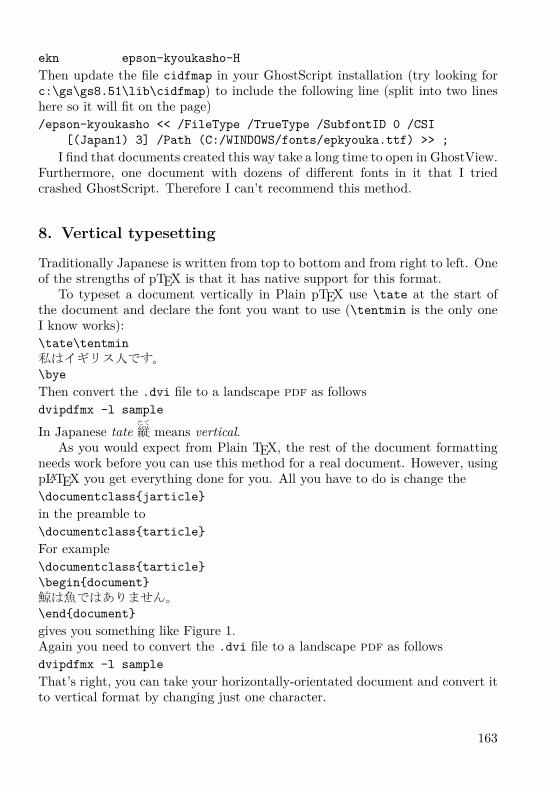
Traditionally Japanese is written from top to bottom and from right to left. Oneof the strengths of pTEX is that it has native support for this format.
To typeset a document vertically in Plain pTEX use \tate at the start ofthe document and declare the font you want to use (\tentmin is the only oneI know works):\tate\tentmin私はイギリス人です。\byeThen convert the .dvi file to a landscape pdf as followsdvipdfmx -l sample
In Japanese tate たて
縦 means vertical.As you would expect from Plain TEX, the rest of the document formatting
needs work before you can use this method for a real document. However, usingpLATEX you get everything done for you. All you have to do is change the\documentclass{jarticle}in the preamble to\documentclass{tarticle}For example\documentclass{tarticle}\begin{document}鯨は魚ではありません。\end{document}gives you something like Figure 1.Again you need to convert the .dvi file to a landscape pdf as followsdvipdfmx -l sampleThat’s right, you can take your horizontally-orientated document and convert itto vertical format by changing just one character.
163
鯨は魚ではあ
りません。
Figure 1: Vertical Japanese.
9. Ruby
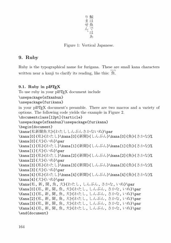
Ruby is the typographical name for furigana. These are small kana characterswritten near a kanji to clarify its reading, like this:
さかな
魚 .
9.1. Ruby in pLATEXTo use ruby in your pLATEX document include\usepackage{sfkanbun}\usepackage{furikana}in your pLATEX document’s preamble. There are two macros and a variety ofoptions. The following code yields the example in Figure 2.\documentclass[12pt]{tarticle}\usepackage{sfkanbun}\usepackage{furikana}\begin{document}\kana{私新聞魚犬}{わたししんぶんさかないぬ}\par\kana[0]{私}{わたし}\kana[0]{新聞}{しんぶん}\kana[0]{魚}{さかな}%\kana[0]{犬}{いぬ}\par\kana[1]{私}{わたし}\kana[1]{新聞}{しんぶん}\kana[1]{魚}{さかな}%\kana[1]{犬}{いぬ}\par\kana[2]{私}{わたし}\kana[2]{新聞}{しんぶん}\kana[2]{魚}{さかな}%\kana[2]{犬}{いぬ}\par\kana[3]{私}{わたし}\kana[3]{新聞}{しんぶん}\kana[3]{魚}{さかな}%\kana[3]{犬}{いぬ}\par\kana[4]{私}{わたし}\kana[4]{新聞}{しんぶん}\kana[4]{魚}{さかな}%\kana[4]{犬}{いぬ}\par\Kana{私,新,聞,魚,犬}{わたし,しんぶん,さかな,いぬ}\par\Kana[0]{私,新,聞,魚,犬}{わたし,しんぶん,さかな,いぬ}\par\Kana[1]{私,新,聞,魚,犬}{わたし,しんぶん,さかな,いぬ}\par\Kana[2]{私,新,聞,魚,犬}{わたし,しんぶん,さかな,いぬ}\par\Kana[3]{私,新,聞,魚,犬}{わたし,しんぶん,さかな,いぬ}\par\Kana[4]{私,新,聞,魚,犬}{わたし,しんぶん,さかな,いぬ}\par\end{document}
164

わたししんぶんさかないぬ
私新聞魚犬
わたし私 しんぶん
新聞 さかな魚 いぬ犬
わたし私 しんぶん
新聞 さかな魚 いぬ犬
わたし私 しんぶん
新聞 さかな魚 いぬ犬
わたし私 しんぶん
新聞 さかな魚 いぬ犬
わたし私 しんぶん
新聞 さかな魚 いぬ犬
わたし私 しんぶん新 さかな聞 いぬ魚
わたし私 しんぶん新 さかな聞 いぬ魚
わたし私 しんぶん新 さかな聞 いぬ魚
わたし私 しんぶん新 さかな聞 いぬ魚
わたし私 しんぶん新 さかな聞 いぬ魚
わたし私 しんぶん新 さかな聞 いぬ魚
Figure 2: Demonstration of ruby macro syntax.
9.2. Ruby in Plain pTEXIt is possible to modify the file furikana.sty to allow you use its ruby macrosin Plain pTEX. Here is a summary of what you need to do (I don’t recommendthis for beginners):– Copy furikana.sty to plain_furikana.tex. Do the edits that follow on thelatter file;– Remove the lines that start \typeout;– Remove the paragraph before the line that reads \let\rubykatuji=\tiny;– Change \@s@sf to \asasf throughout;– Remove the \kana macro;– Change the \k@na@ macro so that it always takes five parameters and renameit to \kana. Parameter #1 is the ruby style, parameters #4 and #5 define thefont and size used for the ruby. Add\font\tiny=#4 at #5pt\def\@rubykatuji{\tiny}\def\rubykatuji{\tiny}to the macro after the line \xkanjiskip=0pt; and– Remove \endinput at the end of the file.You can then use ruby in a Plain pTEX document by adding\input plain_furikana.texnear the start of the document and entering things like\kana{1}{私}{わたし}{epkyo}{6}This works in both horizontal and vertical modes. You may want to define yourown two-parameter macro that sets the other parameters automatically. \Kanaremains a pLATEX-only macro.
9.3. Ruby in Plain non-pTEXThe Plain pTEX version of the furikana.sty macro described in the previoussection requires that you use pTEX. The following macro allows users to useruby in any version of TEX. An obvious application is to typeset ruby whenusing X ETEX. The furikana.sty macro does not work in pLATEX \section{}headings, so this macro could also be useful when typesetting with pLATEX.
165

However, this macro results in corrupted pdf bookmarks when combined withthe hyperref package. This macro could even be used with jTEX or Plain TEX(fonts permitting).\font\tinyjapanese=min10 at 6pt%\def\furigana#1#2{\leavevmode%\setbox0=\hbox{#1}\setbox1=\hbox{\tinyjapanese#2}%\ifdim\wd0>\wd1\dimen0=\wd0\else\dimen0=\wd1\fi%\hbox{\vbox{\hbox to\dimen0{\tinyjapanese\hfil#2\hfil}%\nointerlineskip\hbox to\dimen0{\hfil#1\hfil}}}}The furikana.sty macros produce more elegant output and provide more for-matting flexibility than this macro:
No ruby: 日本で働いたfurikana.sty:
にほん
日本 で はたら
働 いた
\furigana{}{}:にほん
日本ではたら
働いた
You are likely to want to tweak the macro described in this section to suit yourparticular application.
10. Circled characters
Japanese text (especially reference works) sometimes makes use of characterswith circles around them. The macros \psCirclebox and \pscirclebox pro-vided by the PSTricks macro package work well for producing Japanese char-acters with circles around them. The disadvantage is that you then have toproduce your document as a PostScript file rather than a pdf file. The best wayto handle this is to use GhostScript to convert your document to pdf like this:
gswin32c -sDEVICE=pdfwrite -sOutputFile=circle.pdf-dNOPAUSE -dBATCH -q circle.ps
The output looks bad in Adobe Reader but looks fine when you print it.
11. dvipdfmx and PSTricks effects
The fancy text colouring and rotation dvipdfm(x) and PSTricks provide workjust as well with Japanese text as they do with Western text. The followingsample code produces the garish example in Figure 3.
166

Figure 3: Using PSTricks on Kanji.
\documentclass[11pt]{article}\usepackage{pstricks}\usepackage{pst-grad, pst-plot, pst-text, pst-char}\begin{document}\begin{pspicture}(0,-1)(8,2)\pscharpath[linecolor=Yellow,fillstyle=gradient,%gradbegin=Yellow,gradend=Red,gradmidpoint=1,gradangle=5]%{\font\tmp=goth10 at 1.5cm\tmp 建前}\end{pspicture}\end{document}
12. Mixing vertical and horizontal text
This might seem like an exotic requirement and I have to admit I’m unlikely touse it myself. However, Japanese newspapers often mix vertical and horizontaltext. You can do this in pTEX using minipage:
167
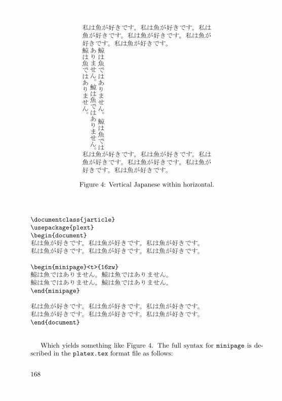
私は魚が好きです。私は魚が好きです。私は魚が好きです。私は魚が好きです。私は魚が好きです。私は魚が好きです。
鯨は魚ではありません。鯨は魚では
ありません。鯨は魚ではありません。
鯨は魚ではありません。
私は魚が好きです。私は魚が好きです。私は魚が好きです。私は魚が好きです。私は魚が好きです。私は魚が好きです。
Figure 4: Vertical Japanese within horizontal.
\documentclass{jarticle}\usepackage{plext}\begin{document}私は魚が好きです。私は魚が好きです。私は魚が好きです。私は魚が好きです。私は魚が好きです。私は魚が好きです。
\begin{minipage}<t>{16zw}鯨は魚ではありません。鯨は魚ではありません。鯨は魚ではありません。鯨は魚ではありません。\end{minipage}
私は魚が好きです。私は魚が好きです。私は魚が好きです。私は魚が好きです。私は魚が好きです。私は魚が好きです。\end{document}
Which yields something like Figure 4. The full syntax for minipage is de-scribed in the platex.tex format file as follows:
168

\begin{minipage}<dir>[pos]{width}...\end{minipage}dir: t ... force tate mode.
y ... force yoko mode.z ... rotate 90 degree (ignored at yoko mode).
Yoko means horizontal mode. This syntax encourages the following test:\documentclass{tarticle}\usepackage{plext}\begin{document}私は魚が好きです。私は魚が好きです。私は魚が好きです。私は魚が好きです。私は魚が好きです。私は魚が好きです。
\begin{minipage}<y>{16zw}鯨は魚ではありません。鯨は魚ではありません。鯨は魚ではありません。鯨は魚ではありません。\end{minipage}
私は魚が好きです。私は魚が好きです。私は魚が好きです。私は魚が好きです。私は魚が好きです。私は魚が好きです。
\begin{minipage}<z>{16zw}鯨は魚ではありません。鯨は魚ではありません。鯨は魚ではありません。鯨は魚ではありません。\end{minipage}
私は魚が好きです。私は魚が好きです。私は魚が好きです。私は魚が好きです。私は魚が好きです。私は魚が好きです。\end{document}Which yields something like Figure 5. Note that a zw is a new unit of widthintroduced by pTEX.
13. Kanji font selection in LATEX
One way to make the default kanji text font in a LATEX document be a newone is brute force: \font\normal=epkyo at 13pt \normal. However, LATEXhas a system for defining font sizes consistently and it is more architectural touse that. I think what follows is pretty much the same as you’d do for a newWestern font except that \rmdefault is replaced by \mcdefault.
What you need to do is copy jy1mc.fd and jt1mc.fd from your installationpTEX tree to your local texmf tree (I put mine in ptex\platex\base) andrename them as jy1ep.fd and jt1ep.fd, where ep represents your new font.
169

私は魚が好きです。私は魚が好きです。私は
魚が好きです。私は魚が好きです。私は魚が
好きです。私は魚が好きです。
鯨は魚ではありません。鯨は魚ではありません。鯨は魚ではありません。鯨は魚ではありません。
私は魚が好きです。私は魚が好きです。私は
魚が好きです。私は魚が好きです。私は魚が
好きです。私は魚が好きです。
鯨は魚ではありません。鯨は魚では
ありません。鯨は魚ではありません。
鯨は魚ではありません。
私は魚が好きです。私は魚が好きです。私は
魚が好きです。私は魚が好きです。私は魚が
好きです。私は魚が好きです。
Figure 5: Horizontal Japanese within vertical.
Change all the instances of mc in the files to ep. Then you need to change thefollowing code\DeclareFontShape{JY1}{mc}{m}{n}{<5> <6> ... <10> sgen*min
<10.95><12><14.4><17.28><20.74><24.88> min10<-> min10}{}
to\DeclareFontShape{JY1}{ep}{m}{n}{<-> s*[1.3] epkyo}{}Obviously you should replace ep here with your own font’s name. The [1.3] isthe magnification over the design size of the font (deliberately set high here at130% because the Epson Kyoukasho font is rather small). The s* means, ‘I don’tcare what size this ends up being so LATEX should not warn me when it sees sizesit does not recognize’. The epkyo is the name of your font, which should existas a .tfm file. All those numbers in pointy brackets and the sgen*min in theoriginal are to do with fized sizes of the font and appear to be unneccesary inmodern installations.
Once you’ve done this, create a file called myfont.sty in your local texmftree and put something like the following code in it.\ProvidesPackage{epkyo}\renewcommand{\mcdefault}{ep}\endinput
170

Then run mktexlsr, put \usepackage{epkyo} in the preamble to your docu-ment and you should get your new font. If you want to change your gothic fontrather than your mincho font then the above should work substituing gt for mcthroughout. I haven’t tried it.
14. Missing font shapes
You may find that pLATEX complains about missing font shapes when compilingdocuments. The messages are benign because the pLATEX font code sensiblysubstitutes other fonts in their place. You can prevent these warnings by addingthe missing shapes to the files jt1ep.fd and jy1ep.fd described in Section 13so that they look like this:\DeclareFontShape{JT1}{ep}{m}{n}{<->s*[1.3] epkyo}{}\DeclareFontShape{JT1}{ep}{m}{sc}{<->ssub*ep/m/n}{}\DeclareFontShape{JT1}{ep}{bx}{n}{<->ssub*gt/m/n}{}and this:\DeclareFontShape{JY1}{ep}{m}{n}{<-> s*[1.3] epkyo}{}\DeclareFontShape{JY1}{ep}{m}{sc}{<-> ssub*ep/m/n}{}\DeclareFontShape{JY1}{ep}{bx}{n}{<-> ssub*gt/m/n}{}It’s the middle line in each of these that is new. pLATEX also complains aboutthe gothic kanji font shapes that one might have thought it would have defineditself (the file that does this seems to be plfonts.dtx). The myfont.sty fileis a convenient (albeit unarchitectural) place to fix this up. You can do so byadding the following two lines so it looks something like this:\ProvidesPackage{epkyo}\renewcommand{\mcdefault}{ep}\DeclareFontShape{JT1}{gt}{m}{it}{<->ssub*gt/m/n}{}\DeclareFontShape{JY1}{gt}{m}{it}{<->ssub*gt/m/n}{}\endinput
If you are not setting up your own fonts and just want to suppress warningsin a document compiled using the default fonts then another approach (the oneused in this document) is to define a new style file that declares the font shapesthat pLATEX is complaining about. Mine is called noswarn.sty:\ProvidesPackage{noswarn}\DeclareFontShape{JT1}{gt}{m}{it}{<->ssub*gt/m/n}{}\DeclareFontShape{JY1}{gt}{m}{it}{<->ssub*gt/m/n}{}\DeclareFontShape{JT1}{mc}{m}{sc}{<->ssub*gt/m/n}{}\DeclareFontShape{JY1}{mc}{m}{sc}{<->ssub*gt/m/n}{}\endinput
171

Put \usepackage{noswarn} in your document’s preamble and run mktexlsr.Next time you compile your documents the warnings should have stopped. If youstill get some warnings then try adding the shapes that pLATEX is complainingabout to the style file.
15. Underlined Japanese text
Though underlining text is considered bad typography, it is easy to do in pTEXif you are in horizontal mode. Just use{$\underline{\hbox{鯨を食べないで下さい}}$}to get 鯨を食べないで下さい.
I have seen pLATEX packages that do underlining but all the documentationwas in Japanese. I think they handle vertical format text.
16. Warichu
Warichu or わりちゅう
割り注 is a form of inserted notes within Japanese text. The char-acters are half the height of the main text. This facility is available in pLATEXusing the warichu.sty package. Figure 6 shows an example of text that includeswarichu. I generated the first block of text in Figure 6 from the code:田中先生は\warichu{本}{教科書だけです。小説がきらいです。}が好きです。In general, the syntax is\warichu{X}{Y}Zwhere X denotes the last ordinary character before the notes, Y denotes the notesthemselves and Z denotes the characters that come after the notes.
This typographical device is more commonly used in vertical format. In tatemode one uses the macro \twarichu rather than \warichu. I generated thesecond block of text in Figure 6 using the above code with \twarichu substitutedfor \warichu.
The warichu.sty macros \warigaki and \twarigaki are similar to themacros \warichu and \twarichu except that they only take one parameter andthey omit parentheses from the result. The third and fourth blocks of text inFigure 6 give examples. I generated the third block of text in Figure 6 from thefollowing code:田中先生は本\warigaki{教科書だけです。小説がきらいです。}が好きです。
There are two limitations to the warichu.sty package. First, it does notsupport line-breaking for warichu; all your notes have to be on a single line.Only painstaking manual tweaking could produce multi-line warichu. Second,by default the font used for the warichu text is simply a scaled-down version of
172

the main text font. Ideally the weight of the strokes in the warichu text wouldmatch that in the main text. A good knowledge of LATEX and pLATEX fontmanagement would probably allow an expert user to get around this problem.This could be done by switching to a weightier version of the main text font forthe warichu text. がんばって。
田中先生は本( 教科書だけです。小説がきらいです。)が好きです。
田中先生は本
(教科書だけです。
小説がきらいです。
)が
好きです。
田中先生は本教科書だけです。小説がきらいです。が好きです。
田中先生は本
教科書だけです。
小説がきらいです。
が好
きです。
Figure 6: Examples of the use of the warichu macros. From left to right:\warichu, \twarichu, \warigaki, \twarigaki.
References[1] W32TEX download page in English: http://www.w32tex.org/[2] Lunde, Ken. CJKV Information Processing. Second Edition, O’Reilly Media,
2009. ISBN 978-0-596-51447-1.[3] http://www.physics.ucla.edu/~grosenth/jwpce.html[4] Saito, Yasuki. Report on jTEX: A Japanese TEX. In TUGboat, Volume 8,
Number 2, pp. 103–116, July 1987. ISSN 0896-3207. Available at http://tug.org/TUGboat/Articles/tb08-2/tb18saito.pdf
[5] http://oku.edu.mie-u.ac.jp/~okumura/texfaq/japanese/ptex.html[6] http://nihilist.org.uk/
Summary: Typesetting Japanese with pTEXpTEX is a TEX-like typesetting system that is specifically designed for typesettingJapanese and is widely used in Japan. This article describes how to acquire, setup and use a pTEX system in practice, with an emphasis on font management.It also provides basic background information on Japanese text processing andalternatives to pTEX.Keywords: pTEX, Japanese, kanji, kana, Unicode, ruby, CJKV.
Timothy Eyre, [email protected] c/o FEL ČVUT, Technická 2
Prague, CZ-166 27, Czech Republic
173

Pravidla sazby japonštiny v X ETEXuKazuomi Kuniyoshi
AbstraktTato krátká zpráva komentuje důvod vzniku balíčku genzi, který nastavujea upravuje pravidla sazby japonštiny v X ETEXu. Komentáře, balíček i něko-lik ukázek si lze stáhnout z webové stránky autora, viz http://kuniyoshi.fastmail.fm/xetex/. Balíček zatím není součástí ctan.org.Klíčová slova: ČJK, X ETEX, japonština, balíček genzi.doi: 10.5300/2010-3/174
In principle, X ETEX lets you mix as many writing systems as you wish in adocument. With an appropriate OpenType font being installed in the operatingsystem, you can freely use all the letters which the font contains. Moreover, youcan put letters from different fonts onto a document at the same time. This is amarvellous feature of X ETEX.
I am a multilingual writer, or to be more precise, multi-script-al writer, wholoves the power of TEX. The writing systems I often mix are Japanese and Latin.It is no big deal to do so in today’s word processors, but fine-tuning the balanceof these letters, let alone producing an overall beautiful layout, is not an easytask in such an environment. So the advent of X ETEX was an exciting news forme. Yet, on trying it for the first time, I immediately faced a problem: X ETEXdoes not know the formatting rules for Japanese writing well.
Some websites give an impression that X ETEX can produce good Japanese doc-uments only by touching \XeTeXlinebreaklocale and \XeTeXlinebreakskip.This is simply false; everyone who knows how to write in Japanese should beable to see quickly that this is like a paradise (mis)represented in a summertravel brochure. Indeed, X ETEX can print Japanese letters; however it ignoresthe formatting rules to the extent that it cannot be used in serious publications.It seems to me that there is some confusion over printing letters and formattingthem among developers and users.
In the world of computing, there is a convenient word ‘CJK’. This word isconvenient as long as letters are concerned, but it turns out to be inconvenientas soon as document formatting becomes the topic of discussion. Perhaps it isright to say that ‘C’, ‘J’ and ‘K’ are similar enough to be treated together forengineering purposes. Chinese and Japanese share a lot of letters despite subtledifferences, and it is unnecessary to come up with different engineering methodsto deal with them. I totally agree with this.
174

X ETEX is, however, not only a tool to print letters onto pdf files (and some-times to sheets of paper), but also a powerful formatting tool. In any event, thatis why people are drawn into TEX most of the time. So it is important to separateprinting letters and formatting them; for printing letters is an engineering issue,but formatting them is a cultural issue. And, ‘C’, ‘J’ and ‘K’ do differ greatlywhen it comes to their formatting rules.
The current state of X ETEX is almost perfect on the printing side. There iswonderful freedom in picking up any of 15,444 letters from an Adobe-Japan1-4font in X ETEX. But whenever I write a document in Japanese or (Classical)Chinese, X ETEX does not automatically format text correctly. This is an areawhere more work should be done, and it is interestingly an interdisciplinary onespanning software engineering, linguistics and literature.
The genzi package I wrote is a preliminary attempt to bridge this gap.
http://kuniyoshi.fastmail.fm/xetex/
Those who use other writing systems in X ETEX, especially very ‘exotic’ ones,may also be feeling that cultural differences should be considered more. As TEX,which was exclusively American in the beginning, has gone out of the Euro-American world and stepped into the dangerous ‘polyscript’ terrain of East andSoutheast Asia, more humanism should melt into its engineering than ever before.
Summary: Japanese formatting rules for X ETEX
This is a two-page report informing about the reasons and the existence of thegenzi package which sets Japanese formatting rules for X ETEX. The package,samples and more comments can be viewed and downloaded from the author’swebsite, see http://kuniyoshi.fastmail.fm/xetex/.Keywords: CJK, X ETEX, Japanese, genzi package.
Kazuomi Kuniyoshi, Brussels, [email protected]
CSTUG c/o FEL ČVUT, Technická 2Prague, CZ-166 27, Czech Republic
175

Kazuraki: tutoriál k japonskému OTF písmuKen Lunde
AbstraktČlánek představuje klíčové technické kroky tvorby proporcionálního japonskéhopísma nazvaného Kazuraki. Toto písmo je oproštěno od konvenčních omezenípřetrvávajících v Japonsku po desetiletí. Design je inspirován kaligrafií z dva-náctého století umělce, spisovatele a jednoho z největších básníků v japonskéhistorii Fujiwara-no-Teika. Písmo bylo poprvé oficiálně představeno 7. prosince2009 v předváděcí místnosti firmy Adobe (North America Type Showroom).
Písmo by se mohlo stát inspirací a vzorem pro další tvůrce a písmolijny,především k vyjádření individuálního a osobitého stylu, silných výrazovýchprostředků a decentnějšího stylizování.
V ukázkách a přílohách tohoto článku je konkrétně použito OpenTypepísmo KazurakiStd-Light. Užité nástroje makeotf, tx, mergeFonts, rotateFont jsousoučástí volně dostupné softwarové kolekce afdko (Adobe® Font DevelopmentKit for OpenType), stáhnutelné z webových stránek http://www.adobe.com/devnet/opentype/afdko/.Klíčová slova: písmo Kazuraki, proporcionální glyfy, japonské písmo, písmoOpenType, afdko, Adobe, makeotf, tx, mergeFonts, rotateFont.doi: 10.5300/2010-3/176
1. IntroductionThis tutorial is designed to guide Japanese font developers in building special-purpose OpenType® Japanese fonts, using KazurakiStd-Light (to be referred toas simply Kazuraki® from this point forward) as an example of how to build agenuinely and completely proportional Japanese font. The techniques, tools, andcontrol files that are described or referenced in, or attached to, this document aretightly coupled to tools that are included in afdko (Adobe® Font DevelopmentKit for OpenType) Version 2.0 or greater, which is available, at no charge, at thefollowing URL: http://www.adobe.com/devnet/opentype/afdko/
Please pay attention to Section 6 on page 186 of this article, which includesinformation—relevant as of this writing—about compatibility with applications.
If you have any questions regarding the content of this article, please do nothesitate to contact its author, Ken Lunde ([email protected]).
© 2010 Adobe Systems Incorporated. All rights reserved. Adobe, the Adobe logo, Betterby Adobe and Kazuraki is/are either [a] registered trademark[s] or a trademark[s] of AdobeSystems Incorporated in the United States and/or other countries.
176
2. Kazuraki Design Motivations
With the exception of the vertical-only hiragana ligatures, all glyphs in Kazurakihave corresponding horizontal and vertical forms. That is, for each character,there are two glyphs in the font. The glyphs themselves are the same, but theiradvances and default positioning along both X- and Y-axes are different. Allglyphs needed to be replicated for vertical use, due to limitations in the abilityto shift glyphs in both X- and Y-axis directions in the OpenType ‘vmtx’ table,coupled with the strong desire to make expected behavior the default—withoutan application depending on, or activating, any GSUB or GPOS features.
The glyph complement includes glyphs for all standard kana characters, butincludes a limited set of kanji, 1,082 to be exact, suitable for creating Japanesegreeting cards, menus, and other specialized uses. Kazuraki also includes abasic set of proportional Latin glyphs to aid in keyboard input. At a minimum,we recommend including glyphs that correspond to ASCII (U+0020 throughU+007E). While Kazuraki is fully-functional in this limited context, it also servesas an example for building comparable fonts.
2.1. Genuine Proportional GlyphsAll horizontal/vertical glyph pairs in Kazuraki are the same, with the exception ofsmall kana, some punctuation, and parenthetical symbols, which require differentglyphs for horizontal and vertical use in conventional Japanese fonts, due totheir position or orientation. Post-processing of the glyph data is used to derivethe vertical versions, which are positioned along the Y-axis differently, and havedifferent metrics.
2.2. Vertical-Only Hiragana LigaturesKazuraki includes a small number of vertical-only hiragana ligatures, fifty to beexact. Three are four-character ligatures, twelve are three-character ligatures,and the remaining thirty-five are two-character ones. These are activated throughthe use of the ‘liga’ GSUB feature. The advantage of using ‘liga’ is that mostapplications that perform an adequate level of typesetting also tend to automati-cally invoke this GSUB feature, or at least allow users to activate it through astandard UI. This allows vertical-only hiragana ligatures to be used by default inmany applications.
2.3. CID- Versus Name-Keyed StructureKazuraki was built as a CID-keyed OpenType font. Its ‘CFF’ table is builtfrom a CIDFont resource. Although Kazuraki could have been built as a name-keyed font, CID-keyed fonts have advantages for Japanese fonts. The primary
177

advantage is that a CID-keyed structure supports multiple hint dictionaries. Eachhint dictionary ideally covers glyphs for specific glyph classes, and each hintdictionary can have its own hinting parameters. Using multiple hint dictionariesthus offers significant rendering advantages.
3. OpenType Table Settings & Overrides
Many of the OpenType tables require special settings for Kazuraki. This sectiondescribes the special settings, one table at a time, along with information thatdemonstrates how the table overrides are specified in the “features” file as usedas input for afdko’s makeotf tool.
3.1. BASEThere is no special treatment necessary for the ‘BASE’ table, other than the usualICF (Ideographic Character Face) and baseline values that should be normallyspecified. It is very important to include a ‘BASE’ table in all OpenType fonts.The following is the ‘BASE’ table override in the “features” file of Kazuraki:
OpenType fonts. The following is the ‘BASE’ table override in the “features”file of Kazuraki:table BASE {
HorizAxis.BaseTagList icfb icft ideo romn;HorizAxis.BaseScriptList DFLT ideo -117 877 -120 0,
hani ideo -117 877 -120 0,kana ideo -117 877 -120 0,latn ideo -117 877 -120 0;
VertAxis.BaseTagList icfb icft ideo romn;VertAxis.BaseScriptList DFLT ideo 3 997 0 120,
hani ideo 3 997 0 120,kana ideo 3 997 0 120,latn ideo 3 997 0 120;
} BASE;Note that only the ‘DFLT’, ‘hani’, ‘kana’, and ‘latn’ scripts are declared in
the ‘BASE’ table override, based on the glyph complement of Kazuraki.
3.2. CFFThe original source data for Kazuraki is a name-keyed OpenType font containingexactly 1,450 glyphs, each with 1000-unit set widths. The same source fontalso contains ‘palt’ and ‘vpal’ GPOS features that specify the desired glyphmetrics (horizontal and vertical set widths, and X- and Y-axis shifting values,
178

respectively), and these GPOS features are used as the source of the defaultmetrics for the horizontal and vertical glyphs in the final font, which is an Adobe-Identity-0 CID-keyed OpenType font containing 2,973 glyphs (CIDs 0 through2972).
Three afdko tools are used to process the original set of 1,450 glyphs: tx,mergeFonts, and rotateFont.
The first tool, tx, simply extracts the ‘CFF’ table from the source OpenTypefont, and converts it into a name-keyed Type 1 font, using the following commandline:% tx -t1 Kazuraki_2.5.otf > font.pfa
The second tool, mergeFonts, is used to convert the glyph names into CIDs,and to simultaneously synthesize the vertical glyphs from the original horizontalversions, using the following command line:% mergeFonts -cid cidfontinfo cidfont.raw
h.map font.pfa v.map font.pfaThe end result is an Adobe-Identity-0 CIDFont resource, named “cidfont.raw,”
containing 2,673 glyphs in a single hint dictionary.The third tool, rotateFont, serves to set the widths for the horizontal glyphs,
and to also shift them along the X-axis. The set width and X-axis shifting valuesare in the ‘palt’ GPOS feature of the source name-keyed OpenType font. Thefollowing command line is used:% rotateFont -t1 -rtf shift.map cidfont.raw cidfont-prop.raw
The end result is an Adobe-Identity-0 CIDFont resource, named “cidfont-prop.raw,” containing 2,673 glyphs, the horizontal versions of which now haveproportional metrics. 300 proportional Latin glyphs are added to bring the glyphcomplement up to 2,973 glyphs.
As an example, let us explore the treatment of the horizontal glyph for thehiragana character “shi” (し). The glyph in the original name-keyed font is named“CID864” (named after CID+864 of the Adobe-Japan1-x character collection). Its‘palt’ GPOS feature settings were as follows in the source name-keyed OpenTypefont:position \CID864 <-223 0 -485 0>;
After processing by the mergeFonts tool, this (horizontal) glyph becomesCID+224. The ‘palt’ data shown above is used to generate the following rotateFontdirective for the “shift.map” mapping file:224 224 515 -223 0
The calculation is simple: the value “−223” is used as-is as the X-axis shiftingvalue, and the default set-width value of 1000 becomes 515 after the value “−485”is added to it (a subtraction operation).
The set widths and Y-axis shifting for the vertical glyphs are specified ina ‘vmtx’ table override definition that is inserted into the “features” file. The
179

handling of vertical glyphs, in terms of specifying their set widths and Y-axispositions, is covered later in this document.
Once these tools have been run, and the glyphs are assigned to CIDs, and thehorizontal glyphs have been set to their default set widths and X-axis positions(that is, made proportional), the CIDFont is then hinted as usual. The processof hinting also involves creating multiple hint dictionaries, ideally only one foreach glyph class.
Note: The process of establishing multiple hint dictionaries in a CIDFont requiresfiles and tools that are not included in afdko, and their description is intentionally(and appropriately) omitted from this article. However, mergeFonts techniquesdescribed in Adobe Tech Note #5900 (“afdko Version 2.0 Tutorial: mergeFonts,rotateFont & autohint”), which is among the documentation bundled with afdko,can be used to establish multiple hint dictionaries. Multiple mergeFonts mappingfiles, in which the first line each each file names a hint dictionary, is the appropriatetechnique. And, multiple mergeFonts mapping files can serve to specify glyphsfor single hint dictionaries. In fact, the proprietary tool that was used to establishmultiple hint dictionaries for Kazuraki uses mergeFonts to perform this task.
The Special-Purpose Adobe-Identity-0 Character CollectionBecause the glyph complement of Kazuraki does not adhere to the Adobe-Japan1-6 character collection, and because it makes little sense to extend Adobe-Japan1-6 to accommodate such special-purpose fonts, the special-purpose Adobe-Identity-0 character collection is advertised in the CFF. Although “Adobe-Identity-0” does not explicitly specify that Kazuraki is a Japanese font, othertable settings, along with proven heuristics, are used to make clear the fact thatit is a Japanese font.
In essence, the advantage of using the Adobe-Identity-0 character collection isthat there are no preconceived notions of language or script, making it possibleto build CIDFonts based on dynamic glyph sets, much like TrueType and name-keyed OpenType fonts. The technique of using the Adobe-Identity-0 charactercollection should not be used to build general-purpose OpenType Japanese fonts.The Adobe-Japan1-x character collection should be used instead.
File Size IssuesBecause the horizontal/vertical glyph pairs are identical, in terms of their outlines,the subroutinization ability of afdko’s makeotf tool makes the resulting CFFtable only slightly larger than that of the original source data, which containedroughly half the number of glyphs. The subroutinized ‘CFF’ table thus becameapproximately fifty percent the size of the unsubroutinized version.
180

Hinting IssuesHinting, in terms of stem widths, is applied as usual for Kazuraki. Alignmentzones, however, are another matter. The hint dictionaries for non-Latin glyphclasses, such as kana and kanji, typically use the following /BlueValues array:/BlueValues [-250 -250 1100 1100] def
However, due to the larger (taller) than usual bounding boxes of the vertical-only hiragana ligatures, the hint dictionary for the kana glyphs require differentvalues, in order to ensure that there are no alignment zones in contact with itsglyphs. The “Kana” hint dictionary of Kazuraki uses the following /BlueValuesarray:/BlueValues [-1250 -1250 2000 2000] def
Furthermore, the “Dingbats” and “Kanji” hint dictionaries of Kazuraki usesthe same /BlueValues array, due to the extent to which the shapes of theirglyphs extend above and below the 1000×1000 em-box.
The following is the /FontBBox for Kazuraki:/FontBBox {-326 -1179 1573 1939} def
It was thus critical to select /BlueValues values less than −1179 (the Y-axislow point) and greater than 1939 (the Y-axis high point), especially for the“Kana” hint dictionary.
3.3. GPOSThe only GPOS features that are included in Kazuraki are ‘kern’ and ‘vkrn’, forhorizontal and vertical kerning, respectively. The ‘palt’ and ‘vpal’ GPOS featuresin the original source data served to drive the production process, to specify thehorizontal/vertical set widths and X- and Y-axis shifting values. These GPOSfeatures are not in the final form of the font, because they are not necessary.Their values were used to define the default glyph metrics.
3.4. GSUBKazuraki contains only four GSUB features: ‘fwid’, ‘vert’, ‘vrt2’, and ‘liga’.Although the conventional ordering of these features is ‘liga’ followed by ‘vert’and ‘vrt2’, this font’s vertical-only hiragana ligatures necessitates a differentordering, specifically ‘vert’ and ‘vrt2’ followed by ‘liga’. As a general rule, theordering of GPOS and GSUB features in the “features” file is important, becausethe same ordering is reflected in the ‘GPOS’ and ‘GSUB’ tables that are generatedby afdko’s makeotf tool.
The ‘vert’ GSUB feature substitutes the horizontal forms with their verticalversions. This feature covers the majority of the font. Once the ‘vert’ GSUBfeature has been applied, the vertical-only hiragana ligatures can then be appliedvia the ‘liga’ GSUB feature.
181

OpenType-savvy applications that support vertical writing automaticallyinvoke the ‘vert’ (or ‘vrt2’, if present) GSUB feature. These same applicationsalso invoke the ‘liga’ GSUB feature by default, which then serves to activate (ormake default) the vertical-only hiragana ligatures.
3.5. OS/2Because the special-purpose Adobe-Identity-0 character collection is used forKazuraki, several ‘OS/2’ table fields must be more carefully specified, such asthe OS/2.unicodeRange and OS/2.codePageRange fields. For Kazuraki, thesesettings are specified in the “features” file as the following ‘OS/2’ table overrides:XHeight 423;CapHeight 645;UnicodeRange 0 1 2 5 31 33 35 36 38 48 49 50 59 62 65 68;CodePageRange 1252 932;
Note that the “XHeight” and “CapHeight” values are set to values thatcorrespond to the proportional Latin glyphs that are in its glyph complement.
The “UnicodeRange” values correspond as follows:
0 Basic Latin1 Latin-1 Supplement2 Latin Extended-A5 Spacing Modifier Letters31 General Punctuation33 Currency Symbols35 Letterlike Symbols36 Number Forms38 Mathematical Operators48 CJK Symbols And Punctuation49 Hiragana50 Katakana59 CJK Unified Ideographs62 Alphabetic Presentation Forms65 Vertical Forms68 Halfwidth And Fullwidth Forms
The “CodePageRange” value of 1252 corresponds to “Latin 1,” and 932corresponds to “JIS/Japan.” These ‘OS/2’ table settings help to explicitly identifyKazuraki as a Japanese font.
182
3.6. VORGThe ‘VORG’ table is automatically generated when using afdko’s makeotf tool,and is derived from the settings and overrides of the ‘vmtx’ table. See the sectionfor the ‘vmtx’ table for more information on ‘vmtx’ table settings and overrides.
3.7. cmapThe ‘cmap’ table for CID-keyed OpenType fonts is built using one or moreCMap resources. For Kazuraki, because it is based on the special-purpose Adobe-Identity-0 character collection, special-purpose CMap resources are necessary.Because the vertical glyphs are accessible through the ‘vert’ and ‘vrt2’ GSUBfeatures, only the horizontal glyphs are mapped from Unicode code points.
3.8. nameThe ‘name’ table is built as usual, setting English and Japanese strings, asappropriate. The only exception is the name.ID=20 string, which is not necessarydue to the special-purpose nature of Kazuraki. The specification of ‘name’ tablestrings is performed in the “FontMenuNameDB” and “features” files. Care mustbe taken to explicitly set Japanese as the script and language, for as many of thestrings as possible, as appropriate.
For more information about specifying ‘name’ table strings for OpenTypeJapanese fonts, please refer to Adobe Tech Note #5149 (“OpenType-CID/CFFCJK Fonts: ‘name’ Table Tutorial”), available at the following URL:
http://www.adobe.com/devnet/font/pdfs/5149.OTFname_Tutorial.pdf
3.9. vmtxThe ‘vmtx’ table plays an absolutely crucial role in building fonts such as Kazuraki,because it is in this table that the vertical set widths are specified, along with anyY-axis shifting. Anything specified in the ‘vmtx’ table becomes default behavior.Thus, OpenType-savvy applications that support vertical writing can use suchfonts without modification.
Kazuraki’s “features” file contains a very large number of “VertAdvanceY”and “VertOriginY” statements in its ‘vmtx’ table overrides. Nearly every verticalglyph required treatment by one or both of these ‘vmtx’ overrides.
As an example, let us explore the treatment of the vertical glyph for thehiragana character “shi” (し). The glyph in the original name-keyed font is named“CID864” (named after CID+864 of the Adobe-Japan1-x character collection).Its ‘vpal’ GPOS feature settings were as follows:
position \CID864 <0 -26 0 331>;
183

After processing by mergeFonts, this (vertical) glyph became CID+1682. The‘vpal’ data shown above was used to generate the following ‘vmtx’ table overridesfor the “features” file:VertOriginY \1682 906;VertAdvanceY \1682 1331;
The calculation is simple: the value “−26” is subtracted from 880 (a fixed valuethat represents the top of the em-box) to become 906, which is the new origin,and the value “331” is added to the default 1000-unit width to become 1331.
4. Special Tools
A single special-purpose tool was written, in Perl, to generate all of the control filesand data in a single execution. The mapping files that controlled the executionof the mergeFonts and rotateFont tools were generated by this tool, as was the“features” files containing ‘vmtx’ table overrides and all GSUB and GPOS featuredefinitions. The raw data to build the Unicode (UTF-32) CMap resources wasalso generated by this tool. Due to the large number of glyphs, and the complexrelationships between them, it was important to create a tool to do this work,because doing so by hand would have been tedious, and also prone to error.
When writing a comparable tool, I found that it was very useful to maintaina mapping from the glyph names in the source font to the final CIDs. This madegenerating the raw data for the CMap resource a much easier task. It also madeother tasks easier.
5. OpenType Control Files & Data
Once the name- to CID-keyed conversion is complete, the usual control files anddata, required by afdko’s makeotf tool, must be generated or supplied. Thesecontrol files and data are detailed in the following sections.
5.1. CIDFont ResourceKazuraki’s CIDFont resource is constructed as usual, with an appropriate numberof hint dictionaries, ideally one for each glyph class, and with Adobe-Identity-0as its advertised ROS (/Registry, /Ordering, and /Supplement, which arethe three entries of the /CIDSystemInfo dictionary). As stated earlier in thisdocument, Kazuraki’s CIDFont resource contains 2,973 glyphs, specifically CIDs0 through 2972. Kazuraki contains exactly six hint dictionaries, named as follows,and with the number of glyphs in each in parentheses:
184

• KazurakiStd-Light-Dingbats (102 glyphs)• KazurakiStd-Light-Generic (one glyph)• KazurakiStd-Light-Kana (406 glyphs)• KazurakiStd-Light-Kanji (2,164 glyphs)• KazurakiStd-Light-Proportional (150 glyphs)• KazurakiStd-Light-ProportionalRot (150 glyphs)
5.2. The “features” FileThe “features” file plays an important role, in that overrides to specific tablescan be made, and GPOS and GSUB features can be defined. Kazuraki containstwo GPOS features, ‘kern’ and ‘vkrn’, to specify horizontal and vertical kerningpairs, respectively. Four GSUB features—‘fwid’, ‘vert’, ‘vrt2’, and ‘liga’—are alsoincluded, whose relative order is important, as described earlier in this document.Lastly, the ‘vmtx’ table overrides, which are also used to build the ‘VORG’ table,serve to specify the default vertical metrics.
5.3. The “FontMenuNameDB” FileThe English and Japanese menu names that are recorded in the ‘name’ tableof an OpenType font are specified in the “FontMenuNameDB” file. Kazuraki’s“FontMenuNameDB” entry is shown below:[KazurakiStd-Light]
f=3,1,0x411,\304b\3065\3089\304d Stds=3,1,0x411,Lc=3,1,0x411,\304b\3065\3089\304d Std Lf=1,1,11,\82\a9\82\c3\82\e7\82\ab Stds=1,1,11,Lc=1,1,11,\82\a9\82\c3\82\e7\82\ab Std Lf=Kazuraki Stds=Lc=Kazuraki Std LIt is important to stress that English menu names must be set—in addition
to the obvious Japanese menu names—in case such fonts are used in applicationswhose heuristics may cause a failure to properly use the Japanese menu names.
5.4. CMap ResourcesFor special-purpose fonts such as Kazuraki, only a Unicode CMap resource isnecessary. Even if there are no mappings outside the BMP, a UTF-32 CMapresource is still recommended as input to afdko’s makeotf tool. For Kazuraki,the Unicode CMap resource was named “UniKazurakiStd-UTF32-H” to make
185

it tightly coupled with the font. This CMap resource is used solely as input toafdko’s makeotf tool, to build the Unicode ‘cmap’ subtables of the resultingOpenType font.
For more information about building CMap resources, please refer to AdobeTech Note #5099 (“Building CMap Files for CID-Keyed Fonts”), available at thefollowing URL:
http://www.adobe.com/devnet/font/pdfs/5099.CMapFiles.pdf
6. Testing & Compatibility Considerations
Kazuraki works as expected in Adobe InDesign® CS2 and greater. The horizontaland vertical metrics are respected, and proper vertical layout is supported,including the vertical-only hiragana ligatures.
Kazuraki functions in Adobe Illustrator® CS2 and Adobe Photoshop® CS2with some limitations, specifically that the vertical-only hiragana ligatures donot function, even if the ‘liga’ GSUB feature is turned on.
In addition, these and other applications may not display Kazuraki’s name inJapanese in their font menus. Kazuraki’s name may instead display in English,using the English-language menu name strings that are specified in the ‘name’table. Kazuraki works very well with CS3 and CS4 applications, specificallyInDesign, Illustrator, and Photoshop. In fact, we recommend that CS3 and laterapplications be used for Kazuraki and comparable fonts.
Due to its unique (and limited) glyph complement, Kazuraki is not recom-mended for use as a component in these applications’ Composite Font function-ality.
When developing special-purpose OpenType Japanese fonts, it is prudent torigorously test the font with a variety of OSes and applications, to include entiredocument authoring workflows.
7. Glyph Synopsis
The following eleven pages provide a complete glyph synopsis for the 2,973 glyphsof Kazuraki, arranged by CID. The following list provides information aboutspecific CID ranges:
0001–0150 Horizontal glyphs—proportional Latin0151–1462 Horizontal glyphs—Japanese1463–1612 Pre-rotated forms of CIDs 1–1501613–2920 Vertical forms of CIDs 151–14622921–2972 Vertical-only hiragana ligatures and pre-composed
double kana iteration marks186

8. The Latest News
Licenses to use Kazuraki became available for sale for $35 on Adobe’s NorthAmerica Type Showroom on December 7, 2009, and on their Japan, France, andGermany Type Showrooms on December 21, 2009.
Summary: OpenType Japanese Font Tutorial: Kazuraki
Adobe System’s Type Engineering & Design team in Japan has developed aground-breaking and innovative new typeface design that breaks the mold thathas constrained Japanese typefaces for decades. The typeface design, created byAdobe’s own Ryoko Nishizuka, was inspired by the calligraphy of the 12th centuryJapanese calligrapher and writer Fujiwara-no-Teika, and its final production toproduce a functional OpenType font leveraged three powerful afdko (AdobeFont Development Kit for OpenType) tools, tx, mergeFonts, and rotateFont, toimplement its complex metrics.
Kazuraki is unique among other mainstream Japanese typefaces in that itis fully proportional, in both writing directions. Some glyphs are wider thanthey are tall, and some are taller than they are wide, and this is reflected intheir metrics. For this reason, and because subtle shifting is required for correctpositioning of each glyph, there are separate glyphs for both writing directions.In other words, for the 1,082 kanji that are supported in the current version,the font contains 1,082 glyphs for horizontal use, and 1,082 glyphs for vertical.In addition, Kazuraki also includes a significant number of two-, three-, andfour-character hiragana ligatures for vertical use.
The tutorial that is reprinted here in its entirety is designed to guide fontdevelopers in building special-purpose OpenType fonts, using Kazuraki as anexample of how to build a fully-proportional Japanese font. The current versioncan always be accessible here:http://www.adobe.com/devnet/font/pdfs/5901.Kazuraki_Tutorial.pdfThe Kazuraki specimen book, which demonstrates how this font can be used,
is available here:http://store4.adobe.com/type/browser/pdfs/Kazuraki_SPN.pdf
Keywords: Kazuraki font, Proportional glyphs, Japanese font, OpenType font,afdko, Adobe, makeotf, tx, mergeFonts, rotateFont.
Dr. Ken Lunde ([email protected])Senior Computer Scientist, CJKV Type Development
Adobe Systems Incorporated, 345 Park AvenueSan Jose, CA 95120-2704 USA
187

9Adobe Technical Note #5901: Special-Purpose OpenType Japanese Font Tutorial: Kazuraki
0 1 1 1 1 1 1 1 1 1 10 11 11 11 11 11 11 11 11 11
0 � � � � � � � � � � � � � � � � � � � �
10 � � � � � � � � � � � � � � � � � � � �
10 � � � � � � � � � � � � � � � � � � � �
10 � � � � � � � � � � � � � � � � � � � �
10 � � � � � � � � � � � � � � � � � � � �
100 � � � � � � � � � � � � � � � � � � � �
110 � � � � � � � � � � � � � � � � � � � �
110 � � � � � � � � � � � � � � � � � � � �
110 � � � � � � � � � � � � � � � � � � � �
110 � � � � � � � � � � � � � � � � � � � �
100 � � � � � � � � � � � � � � � � � � � �
110 � � � � � � � � � � � � � � � � � � � �
110 � � � � � � � � � � � � � � � � � � � �
110 � � � � � � � � � � � � � � � � � � � �
188

10Adobe Technical Note #5901: Special-Purpose OpenType Japanese Font Tutorial: Kazuraki
0 1 1 1 1 1 1 1 1 1 10 11 11 11 11 11 11 11 11 11
110 � � � � � � � � � � � � � � � � � � � �
100 � � � � � � � � � � � � � � � � � � � �
110 � � � � � � � � � � � � � � � � � � � �
110 � � � � � � � � � � � � � � � � � � � �
110 � � � � � � � � � � � � � � � � � � � �
110 � � � � � � � � � � � � � � � � � � � �
100 � � � � � � � � � � � � � � � � � � � �
110 � � � � � � � � � � � � � � � � � � � �
110 � � � � � � � � � � � � � � � � � � � �
110 � � � � � � � � � � � � � � � � � � � �
110 � � � � � � � � � � � � � � � � � � � �
100 � � � � � � � � � � � � � � � � � � � �
110 � � � � � � � � � � � � � � � � � � � �
110 � � � � � � � � � � � � � � � � � � � �
189

11Adobe Technical Note #5901: Special-Purpose OpenType Japanese Font Tutorial: Kazuraki
0 1 1 1 1 1 1 1 1 1 10 11 11 11 11 11 11 11 11 11
110 � � � � � � � � � � � � � � � � � � � �
110 � � � � � � � � � � � � � � � � � � � �
100 � � � � � � � � � � � � � � � � � � � �
110 � � � � � � � � � � � � � � � � � � � �
110 � � � � � � � � � � � � � � � � � � � �
110 � � � � � � � � � � � � � � � � � � � �
110 � � � � � � � � � � � � � � � � � � � �
100 � � � � � � � � � � � � � � � � � � � �
110 � � � � � � � � � � � � � � � � � � � �
110 � � � � � � � � � � � � � � � � � � � �
110 � � � � � � � � � � � � � � � � � � � �
110 � � � � � � � � � � � � � � � � � � � �
100 � � � � � � � � � � � � � � � � � � � �
110 � � � � � � � � � � � � � � � � � � � �
190

12Adobe Technical Note #5901: Special-Purpose OpenType Japanese Font Tutorial: Kazuraki
0 1 1 1 1 1 1 1 1 1 10 11 11 11 11 11 11 11 11 11
110 � � � � � � � � � � � � � � � � � � � �
110 � � � � � � � � � � � � � � � � � � � �
110 � � � � � � � � � � � � � � � � � � � �
100 � � � � � � � � � � � � � � � � � � � �
110 � � � � � � � � � � � � � � � � � � � �
110 � � � � � � � � � � � � � � � � � � � �
110 � � � � � � � � � � � � � � � � � � � �
110 � � � � � � � � � � � � � � � � � � � �
1000 � � � � � � � � � � � � � � � � � � � �
1010 � � � � � � � � � � � � � � � � � � � �
1010 � � � � � � � � � � � � � � � � � � � �
1010 � � � � � � � � � � � � � � � � � � � �
1010 � � � � � � � � � � � � � � � � � � � �
1100 � � � � � � � � � � � � � � � � � � � �
191

13Adobe Technical Note #5901: Special-Purpose OpenType Japanese Font Tutorial: Kazuraki
0 1 1 1 1 1 1 1 1 1 10 11 11 11 11 11 11 11 11 11
1110 � � � � � � � � � � � � � � � � � � � �
1110 � � � � � � � � � � � � � � � � � � � �
1110 � � � � � � � � � � � � � � � � � � � �
1110 � � � � � � � � � � � � � � � � � � � �
1100 � � � � � � � � � � � � � � � � � � � �
1110 � � � � � � � � � � � � � � � � � � � �
1110 � � � � � � � � � � � � � � � � � � � �
1110 � � � � � � � � � � � � � � � � � � � �
1110 � � � � � � � � � � � � � � � � � � � �
1100 � � � � � � � � � � � � � � � � � � � �
1110 � � � � � � � � � � � � � � � � � � � �
1110 � � � � � � � � � � � � � � � � � � � �
1110 � � � � � � � � � � � � � � � � � � � �
1110 � � � � � � � � � � � � � � � � � � � �
192

14Adobe Technical Note #5901: Special-Purpose OpenType Japanese Font Tutorial: Kazuraki
0 1 1 1 1 1 1 1 1 1 10 11 11 11 11 11 11 11 11 11
1100 � � � � � � � � � � � � � � � � � � � �
1110 � � � � � � � � � � � � � � � � � � � �
1110 � � � � � � � � � � � � � � � � � � � �
1110 � � � � � � � � � � � � � � � � � � � �
1110 � � � � � � � � � � � � � � � � � � � �
1100 � � � � � � � � � � � � � � � � � � � �
1110 � � � � � � � � � � � � � � � � � � � �
1110 � � � � � � � � � � � � � � � � � � � �
1110 � � � � � � � � � � � � � � � � � � � �
1110 � � � � � � � � � � � � � � � � � � � �
1100 � � � � � � � � � � � � � � � � � � � �
1110 � � � � � � � � � � � � � � � � � � � �
1110 � � � � � � � � � � � � � � � � � � � �
1110 � � � � � � � � � � � � � � � � � � � �
193

15Adobe Technical Note #5901: Special-Purpose OpenType Japanese Font Tutorial: Kazuraki
0 1 1 1 1 1 1 1 1 1 10 11 11 11 11 11 11 11 11 11
1110 � � � � � � � � � � � � � � � � � � � �
1100 � � � � � � � � � � � � � � � � � � � �
1110 � � � � � � � � � � � � � � � � � � � �
1110 � � � � � � � � � � � � � � � � � � � �
1110 � � � � � � � � � � � � � � � � � � � �
1110 � � � � � � � � � � � � � � � � � � � �
1100 � � � � � � � � � � � � � � � � � � � �
1110 � � � � � � � � � � � � � � � � � � � �
1110 � � � � � � � � � � � � � � � � � � � �
1110 � � � � � � � � � � � � � � � � � � � �
1110 � � � � � � � � � � � � � � � � � � � �
1100 � � � � � � � � � � � � � � � � � � � �
1110 � � � � � � � � � � � � � � � � � � � �
1110 � � � � � � � � � � � � � � � � � � � �
194

16Adobe Technical Note #5901: Special-Purpose OpenType Japanese Font Tutorial: Kazuraki
0 1 1 1 1 1 1 1 1 1 10 11 11 11 11 11 11 11 11 11
1110 � � � � � � � � � � � � � � � � � � � �
1110 � � � � � � � � � � � � � � � � � � � �
1000 � � � � � � � � � � � � � � � � � � � �
1010 � � � � � � � � � � � � � � � � � � � �
1010 � � � � � � � � � � � � � � � � � � � �
1010 � � � � � � � � � � � � � � � � � � � �
1010 � � � � � � � � � � � � � � � � � � � �
1100 � � � � � � � � � � � � � � � � � � � �
1110 � � � � � � � � � � � � � � � � � � � �
1110 � � � � � � � � � � � � � � � � � � � �
1110 � � � � � � � � � � � � � � � � � � � �
1110 � � � � � � � � � � � � � � � � � � � �
1100 � � � � � � � � � � � � � � � � � � � �
1110 � � � � � � � � � � � � � � � � � � � �
195

17Adobe Technical Note #5901: Special-Purpose OpenType Japanese Font Tutorial: Kazuraki
0 1 1 1 1 1 1 1 1 1 10 11 11 11 11 11 11 11 11 11
1110 � � � � � � � � � � � � � � � � � � � �
1110 � � � � � � � � � � � � � � � � � � � �
1110 � � � � � � � � � � � � � � � � � � � �
1100 � � � � � � � � � � � � � � � � � � � �
1110 � � � � � � � � � � � � � � � � � � � �
1110 � � � � � � � � � � � � � � � � � � � �
1110 � � � � � � � � � � � � � � � � � � � �
1110 � � � � � � � � � � � � � � � � � � � �
1100 � � � � � � � � � � � � � � � � � � � �
1110 � � � � � � � � � � � � � � � � � � � �
1110 � � � � � � � � � � � � � � � � � � � �
1110 � � � � � � � � � � � � � � � � � � � �
1110 � � � � � � � � � � � � � � � � � � � �
1100 � � � � � � � � � � � � � � � � � � � �
196

18Adobe Technical Note #5901: Special-Purpose OpenType Japanese Font Tutorial: Kazuraki
0 1 1 1 1 1 1 1 1 1 10 11 11 11 11 11 11 11 11 11
1110 � � � � � � � � � � � � � � � � � � � �
1110 � � � � � � � � � � � � � � � � � � � �
1110 � � � � � � � � � � � � � � � � � � � �
1110 � � � � � � � � � � � � � � � � � � � �
1100 � � � � � � � � � � � � � � � � � � � �
1110 � � � � � � � � � � � � � � � � � � � �
1110 � � � � � � � � � � � � � � � � � � � �
1110 � � � � � � � � � � � � � � � � � � � �
1110 � � � � � � � � � � � � � � � � � � � �
1100 � � � � � � � � � � � � � � � � � � � �
1110 � � � � � � � � � � � � � � � � � � � �
1110 � � � � � � � � � � � � � � � � � � � �
1110 � � � � � � � � � � � � � � � � � � � �
1110 � � � � � � � � � � � � � � � � � � � �
197

19Adobe Technical Note #5901: Special-Purpose OpenType Japanese Font Tutorial: Kazuraki
0 1 1 1 1 1 1 1 1 1 10 11 11 11 11 11 11 11 11 11
1100 � � � � � � � � � � � � � � � � � � � �
1110 � � � � � � � � � � � � � � � � � � � �
1110 � � � � � � � � � � � � � � � � � � � �
1110 � � � � � � � � � � � � � � � � � � � �
1110 � � � � � � � � � � � � � � � � � � � �
1100 � � � � � � � � � � � � � � � � � � � �
1110 � � � � � � � � � � � � � � � � � � � �
1110 � � � � � � � � � � � � � � � � � � � �
1110 � � � � � � � � � � � � �
No part of this publication may be reproduced, stored in a retrieval system, or transmitted, in any form or by any means, electronic, mechanical, photocopying, recording, or otherwise, without the prior written consent of the publisher. Any software referred to herein is furnished under license, and may only be used or copied in accordance with the terms of such license.
This publication and the information herein is furnished AS IS, is subject to change without notice, and should not be construed as a commitment by Adobe Systems Incorporated. Adobe Systems Incorporated assumes no responsibility or liability for any errors or inaccuracies, makes no warranty of any kind—expressed, implied, statutory, or otherwise—with respect to this publication, and expressly disclaims any and all warranties of merchantability, fitness for particular purposes, and non-infringement of third party rights.
Author
Dr. Ken Lunde, Senior Computer Scientist, CJKV Type Development, Adobe Systems Incorporated
Publishing Date
March 6, 2009
Adobe Systems Incorporated • 345 Park Avenue, San Jose, CA 95110-2704 USA • www.adobe.com
Adobe, the Adobe logo, and “Better by Adobe.” are either registered trademarks or trademarks of Adobe Systems Incorporated in the United States and/or other countries. All other trademarks are the property of their respective owners.
Copyright 2007–2009 Adobe Systems Incorporated. All Rights Reserved.
198

Jak na výrobu písma kandži s pořadím tahůTimothy Eyre
AbstraktTahy u každého jednotlivého kandži by měly být psány v přesně daném pořadí.Projekt Aaaa (A亜アあ) Ulricha Apela sestavil sadu svg souborů, které ob-sahují informace o tazích a jejich pořadí. Díky tomu byl autor článku schopensestavit písmo tak, že zobrazuje správné pořadí tahů u 6373 kandži. Vzniklépísmo usnadňuje přípravu studijních pomůcek, které tuto informaci využívají.Klíčová slova: japonština, kandži, pořadí tahů, tvorba písma, formát True-Type, formát svg, program FontForge.doi: 10.5300/2010-3/199
Introduction
The strokes of each Japanese character (kanji) should be written in a certain or-der. This correct stroke order is called hitsujun (筆順) in Japanese and helps withlegibility and memorization. Students of kanji are examined on kanji stroke orderin exams such as the Japanese Kanji Aptitude Test (日本漢字能力検定試験).
Although there are some general rules about the order in which the strokesof a kanji should be written, it is useful to have a reference available. There areindeed numerous printed and electronic kanji stroke order resources available.However, the coverage of these resources is not always as comprehensive asone might like and the presentation is not always as helpful as it might be.Various means of presenting of kanji stroke order diagrams appear. Step-by-stepdiagrams are popular in printed resources, such as [1] and animated diagramsare popular in electronic resources such as [2].
Dr. Ulrich Apel and Dr. Julien Quint have produced a large set of svg files [3],[4] that present the stroke order of several thousand kanji in the static form usedin [4]. This impressive data resource certainly excelled as a means of storing theinformation but retrieval required the use of the A亜アあ(Aaaa)-project’s webinterface and Adobe’s svg browser plugin.
Dr. Apel was kind enough to send me the set of svg files. A few years earlierit had crossed my mind that a simple way to present kanji stroke order diagramswould be to build them into a Unicode font. The svg files from the A亜アあ-project provided me with the data I needed to create such a font. This paperdescribes how I converted the svg data into the Kanji Stroke Order Font andhow I maintain the font now it exists.
199

1. Method of Creation
The following flowchart summarizes the steps involved in creating the KanjiStroke Order Font.
.. SVG files. Modified
SVGs
. PNGimages
.FlattenedPNGs
. Tracedglyphs inFontForge
.TrueTypefont
.Perl.Batik
.IrfanView
.Potrace .FontForge
The subsections below describe each of these steps in detail.
1.1. Modifying the SVG filesThe original svg files contained graphical information that was not necessaryfor the font. Here is an example of a raw svg image:
字1
23
4
56
As you can see, while the pen stroke version of the kanji and numbers are requiredfor the font, the grid and printed version of the kanji are not. By means of aPerl script, I processed the contents of each svg file to remove the superfluouselements and change the colour of the pen strokes from grey to black. Thefact that svg is an xml-based file format and therefore plain text made thisprocessing simple: I eliminated the large print kanji simply by changing its fontsize from 108 to 0, changed the colour of the grid from dark grey to white andthe colour of the pen strokes from mid grey to black. A simplified version of thePerl script looks like this:
200

while ($line = <STDIN>){$line =~ s/#808080/#000000/;$line =~ s/#404040/#FFFFFF/;$line =~ s/font-size:108/font-size:0/;print $line;
}The while loop reads the standard input until the last line of the redirected fileis reached. The three $line =~ s/foo/bar/; lines substitute foo for bar. Thismeans, for example, that $line =~ s/#808080/#000000/; replaces light greywith black. This script would be executed as follows:perl preproc.pl < infile.svg > outfile.svgHowever, in practice we are handling several thousand files so some extra Perlglobbing code is needed. After this simple processing, the svg image is moresuitable for inclusion in a font, looking as it does like this:
1.2. Conversion to PNG using BatikThe Batik SVG Toolkit [6] is a Java library that can be used to render svggraphics. Rendering the several thousand svg files created in the previous stepsimply required multiple executions of commands like the following:java -jar batik-rasterizer.jar -d . -m image/png
-h 2000 -dpi 2000 outfile.svg -bg 255.255.255.255The parameters for this command are explained as follows:
• The parameter -d . simply specifies that the local directory should beused for the output.
• The parameter -m image/png is a mime specification, indicating that theoutput should be png rather than any of the other formats that Batik canproduce.
• The parameter -h 2000 specifies the height of the output in pixels.• As a result of the previous parameter, the parameter -dpi 2000 ensures
that the resulting png image is exactly one inch tall.
201

• The parameter outfile.svg specifies the svg file to be rendered; it iscalled outfile.svg here because it is the output from the step describedin section 1.1.
• The parameter -bg 255.255.255.255 specifies the background fill colour,including the alpha (transparency) parameter.
Batik renders the svg files relatively slowly, so rendering all of them requiresan overnight run. At the end of this process we will have several thousand pngfiles, one for each character that is going to go into the font.
1.3. Flattening the PNGsBatik produces 32-bit png files. This generous image depth has two disad-vantages for our purpose here. Firstly, it makes the png files needlessly large,an important consideration when there are literally several thousand of them.Secondly, Batik uses subpixel rendering (the technique used by CoolType andClearType) to improve the appearence of the output. The grey fuzz around eachkanji looks pleasing to the human eye but gives extra work to Potrace. There-fore, it is desirable to reduce the number of bitplanes in the png files to 1. TheIrfanView [7] image viewing and processing utility has a GUI tool that makesthis bitplane reduction straightforward, albeit difficult to document.
1.4. Tracing the PNGsAt last we are ready to start using FontForge [8], the BSD-licensed outlinefont editor that runs on Linux, Mac and even Microsoft Windows with thehelp of Cygwin [9]. FontForge includes a trace facility, which calls out to thePotrace [10] bitmap-to-vector tracing tool under the covers. FontForge can alsouse Autotrace [11] to perform the same function.
When doing bulk tracing into a Unicode font, FontForge requires the filenameof the source image file to be of the form uniXXXX.png, where XXXX representsthe 4-digit hexadecimal number corresponding to the Unicode number for thecharacter. This fits in well with our workflow so far.
Invoking the trace feature only requires two menu option selections in Font-Forge. The first option is File→Import with the Format option set to ‘ImageTemplate’. This creates a background image for each of the characters. Wethen tell FontForge to trace these background images by selecting the optionElement→Autotrace.
The tracing process takes some hours and uses copious resource on the hostmachine. One of the challenges I encountered in this project was finding a PCthat was powerful enough to handle this task.
Once the tracing is complete the font can be exported from FontForge inwhatever format you choose. I distribute the Kanji Stoke Order Font in theTrueType format.
202

2. Polishing the Font
As with all real-life projects, the font created by the workflow above is imperfect.The following subsections describe the polishing that I did to produce a usablefont. At no stage in the creation of the font did I check each glyph for theaccuracy of the stroke orders; with several thousand characters this was notpractical.
2.1. Character SizesThe most obvious glitch was that some of the kanji were too large in comparisonwith the other characters in the font. Correcting the rogue characters was simplya matter of invoking a scaling transformation for the character in FontForge.Finding the rogue characters was more of a challenge.
I tracked down the oversized characters in two ways, both using X ETEX anda list of the codepoints covered by the font.
The first chunk of X ETEX code prints the height of each character to screen,allowing for redirection to file, sorting and subsequent identification of outliers.\font\cf="KanjiStrokeOrders" at 40pt\def\boxit#1{\hbox{\vbox{\hrule\hbox%{\vrule\vbox{#1}\vrule}\hrule}}}
\def\charfont#1{\setbox0=\hbox{\boxit{\hbox{\cf#1}}}%\immediate\write15{\the\ht0#1}}
\input test_data.tex\byeThe file test_data.tex is simple, containing just several thousand lines of
the following form:...\charfont{\char"9051}{9051}%\charfont{\char"9052}{9052}%\charfont{\char"9053}{9053}%...
The second chunk of X ETEX code prints the characters themselves, whichenabled me to view the characters in bulk and identify ones that looked wrong.\font\cf="KanjiStrokeOrders" at 40pt\nopagenumbers\pdfpagewidth=331mm\pdfpageheight=207mm\hsize=300mm\vsize=200mm\parindent=0pt\hoffset=-0.5in\voffset=-0.9in\baselineskip=0pt\def\boxit#1{\hbox{\vbox{\hrule\hbox%{\vrule\vbox{#1}\vrule}\hrule}}}
\def\charfont#1#2{\setbox0=\hbox{\boxit{\hbox{\cf#1}}}\box0\ }\input test_data.tex\bye
203

單喰営嗄嗅嗇嗔嗚嗜嗟嗣嗤嗷嗹嗽嗾嘆嘉嘔嘖嘗嘘嘛嘩嘯嘱嘲嘴嘶嘸噂噌噎噐噛噤器噪噫噬噴噸噺嚀嚆嚇嚊嚏嚔嚠嚢嚥嚮嚴嚶嚼囀囁囂囃囈囎囑囓囗囘囚四回因団囮困囲図囹固国囿圀圃圄圈圉國圍圏園圓圖團圜土圦圧在圭地圷圸圻址坂均坊坎坏坐坑坡坤坦坩坪坿垂垈垉型垓垠垢垣垤垪垰垳埀埃埆埋城埒埓埔埖埜域埠埣埴執培基埼堀堂堅堆堊堋堕堙堝堡堤堪堯堰報場堵堺堽塀塁塊塋塑塒塔塗塘塙塚塞塢塩填塰塲塵塹塾境墅墓増墜墟墨墫墮墳墸墹墺墻墾壁壅壇壊壌壑壓壕壗壘壙壜壞壟壤壥士壬壮壯声壱売壷壹壺壻壼壽夂変夊夏夐夕外夘夙多夛夜夢夥大天太夫夬夭央失夲夷夸夾奄奇奈奉奎奏奐契奔奕套奘
Figure 1: Kanji Stroke Order Font test page
Figure 1 shows a typical page generated by this X ETEX fragment. There are28 test pages in total, which means that looking through them for mis-formattedcharacters is a tractable task.
2.2. Making the character widths consistentAll Japanese kanji notionally occupy a square of constant width. Therefore itwas necessary to adjust the width of the characters to all be the same. FontForgeprovides a scripting language, which makes tasks like this easy.
SelectWorthOutputting()SelectFewer(0u0000,0u2e8b) # Remove non-Japanese charsSelectFewer(0uFF61,0uFF9F) # Omit half-width katakanaforeach
Print ("Doing next Jp ", GlyphInfo("Unicode"))SetWidth(1024);CenterInWidth();
endloop
Note the line of code that omits resizing the half-width katakana. These are arelic from the early days of Japanese-language computing [12]. I use a similarblock of code with a call to SetWidth(512) to set the width of these characters.
204

2.3. Cleaning up the outlinesAn effect of tracing the characters from image files is a surplus of points in thecharacter outlines. FontForge has a simplification function that cuts down thenumber of points, thereby reducing the file size and improving maintainability.
FontForge also has a validation function, which enabled me to clean up someproblems with the TrueType font. However, so powerful is FontForge’s validationfeature that it was not practical to fix every validation error.
2.4. Add missing charactersThe source svg dataset omitted some characters that are commonly used butnot relevant to stroke order analysis. To make the Kanji Stroke Order Fontmore usable I merged it with another font to fill in the gaps; FontForge has abuilt-in feature for doing exactly this. Originally I used a public domain fontcalled Tuffy [13] but once I had created the Unicode font Choumei [14] I usedthat to fill in the gaps in the Kanji Stroke Order Font. I describe the Choumeifont in a separate section below.
Creation of the Kanji Stroke Order Font was now complete so I was able topublish it on my website [15].
3. Maintenance
Maintaining the font is fiddly but simple. I rely on reports from users to trackdown errors in the stroke order diagrams. When a user reports an error I verifythat the proposed revision to the stroke order is correct and then use FontForgeto change the affected character. The stroke order numbers are stored as shapesin the font, with no references or underlying structure. This means that the onlyway of changing the order of the stroke numbers is to cut and paste them.
At the time of writing, the current version of the Kanji Stroke Order Fontis v2.014. This contains 146 corrections to the initial revision. By the time thispaper is published I shall have produced v2.015 of the Kanji Stroke Order Font,which will contain several more corrections.
User feedback is important for the Kanji Stroke Order Font: it is not practicalfor me to check all the glyphs myself and most of the users of the font areundoubtedly more skilled in kanji than I am. Moreover, accuracy is importantbecause the ease of use and broad coverage of the Kanji Stroke Order Font meansthere is a risk that some users might treat it as being authoritative, which itmost certainly is not.
205

4. Future PossibilitiesDr. Apel has moved on to create the KanjiVG project [16], which uses a definedsvg format to store information about drawing kanji. It would be theoreticallypossible to automatically create the Kanji Stroke Order Font from this datausing a script based on the technologies described in this paper.
A major advantage of this approach would be that the two projects couldbe kept synchronized and corrections to either would be picked up by both. Myexperience with creating the Kanji Stroke Order Font showed that font creationrequires a significant amount of manual tweaking, so it is not clear that such aprocess would work in practice. This is an area for future study.
5. Choumei Unicode fontFree (as in speech or beer) fonts that cover a large number of kanji are rela-tively few in number. This is to be expected because creating a quality kanjifont requires a large amount of effort. However, with the source data for theKanji Stroke Order Font already to hand, it was comparatively easy to create acomprehensive kanji font (albeit one of dubious quality) by omitting the strokeorder numbers from the glyphs in the Kanji Stroke Order Font. I achieved thisby running through the Kanji Stroke Order Font workflow steps described inthis paper with a single change: I set the font size of the kanji stroke numbersto zero in the Perl script at the svg modification stage. Thus, with minimaladditional effort, I was able to publish a free kanji font [14]. Given its simpleappearence, I named it Choumei for Kamo no Choumei (鴨長明, 1155?–1216),author of the essay Life in a Ten Foot Square Hut.
Having created this initial draft of the Choumei font, I used FontForge to addto its glyph compliment. I did this mostly by cutting, pasting and modifyingexisting glyphs rather than drawing glyphs afresh. The characters I added weremostly symbols and accented Latin letters. Having expanded Choumei signifi-cantly, I merged it with the Kanji Stroke Order Font to expand the latter font’sglyph coverage, albeit without stroke numbers.
I now treat the Choumei font as unmaintained.
ConclusionA font can be generated from svg data using a workflow, each step of whichuses free (as in speech or beer or both) tools. Each of these steps is scalable andtherefore it is practical to use the workflow for a set of several thousand svgfiles. This scalability made it possible to convert the A亜アあ-project’s kanjistroke order svg files into a TrueType font.
206

References[1] Halpern, Jack: Kôdansha Kanji Learner’s Dictionary, Kôdansha Interna-
tional, December 2001. ISBN 978-4-770-02855-6.[2] Kanji Café website: http://www.kanjicafe.com/[3] Quint, Julien; Apel, Ulrich: Does Learning How to Read Japanese Have to
Be So Difficult And Can the Web Help?, Proceedings of the WWW 2005conference, Chiba, Japan, May 2005. ISBN 1-59593-052-3. URL:http://www2005.org/cdrom/docs/p1152.pdf
[4] Quint, Julien; Apel, Ulrich: Teaching and Reference Material on JapaneseKanji in SVG Stroke Order, Animated Drawings of Characters, Kanji Com-ponents and their relationships. Proceedings of the SVG Open 2004 confer-ence, Tokyo, Japan, September 2004. URL:http://www.svgopen.org/2004/papers/svgopen/
[5] O’Neill, P. G.: Essential Kanji: 2,000 Basic Japanese Characters System-atically Arranged for Learning and Reference, Weatherhill Inc., 1 Jan 1974.ISBN 978-0-834-80222-3.
[6] Batik SVG Toolkit: http://xmlgraphics.apache.org/batik/[7] IrfanView: http://www.irfanview.com/[8] FontForge: http://fontforge.sourceforge.net/[9] Cygwin: http://www.cygwin.com/
[10] Potrace: http://potrace.sourceforge.net/[11] Autotrace: http://autotrace.sourceforge.net/[12] Hensch, Kurt: Research and Development in IBM, History of Far Eastern
Languages in Computing, 2nd private edition, Roehm TYPOfactory GmbH,Sindelfingen, Germany, 2004. ISBN 3-937267-03-4.
[13] Tuffy font: http://tulrich.com/fonts/[14] Choumei Unicode Font: http://www.nihilist.org.uk/[15] Kanji Stroke Order Font: http://www.nihilist.org.uk/[16] KanjiVG project: http://kanjivg.tagaini.net/
Summary: Creating a Kanji Stroke Order Font
This article describes how a font that displays Kanji Stroke Orders can be createdfrom thousands of svg files containing this information.Keywords: Kanji, Stroke Order, Font, TrueType, svg, FontForge.
Timothy Eyre, [email protected] c/o FEL ČVUT, Technická 2
Prague, CZ-166 27, Czech Republic
207

PDFdiff: skript srovnávající PDF souboryTimothy Eyre
AbstraktČlánek představuje skript naprogramovaný v Pythonu, který na vstupu očekávádva pdf soubory a automaticky je zpracuje nástroji pdftk, Ghostscript, Image-Magick a X ETEX tak, že vznikne nový pdf soubor, který ukazuje rozdíly mezioběma vstupy.Klíčová slova: Srovnání souborů, Python, Ghostscript, pdftk, ImageMagick.doi: 10.5300/2010-3/208
IntroductionTools that show the difference between two files are a mainstay of softwaredevelopment. They are most commonly used to view the difference betweentwo versions of a source code file; you might even use such a tool when you aredeveloping TEX code. Less common, but still potentially useful, are tools thatshow the difference between two binary files.
This article describes the motivation for and implementation of a tool thatshows the differences between two pdf files.
1. MotivationHere are three examples where a PDF file difference-finding tool would be useful:(1) You have two versions of a paper in pdf format. You know that the
differences between them are slight but you need to know exactly what thedifferences are.
(2) You have created a document using the Kanji Stroke Order Font [1] andwant to create an equivalent version but without the stroke order numbers.A colleague tells you that the Choumei font (also available from [1]) issimply the Kanji Stroke Order Font with the stroke numbers removed. Yoususpect that the Choumei font may have different metrics to the KanjiStroke Order Font and will therefore change the layout of your document.You need a way to test this.
(3) You have re-written a TEX macro used by a large publication to make itmore maintainable or to add a new feature. You are fairly sure that thenew version of the macro will not change the publication’s layout in anyway but need a way to verify this.
208
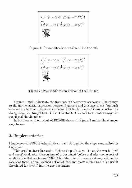
((a1 ⊗ · · · ⊗ an)(b1 ⊗ · · · ⊗ bn)†)=(b1 ⊗ · · · ⊗ bn)†(a1 ⊗ · · · ⊗ an)†
翼
1
Figure 1: Pre-modification version of the pdf file
((a1 ⊗ · · · ⊗ an)(b1 ⊗ · · · ⊗ bn))†=(b1 ⊗ · · · ⊗ bn)†(a1 ⊗ · · · ⊗ an)†
翼
1
Figure 2: Post-modification version of the pdf file
Figures 1 and 2 illustrate the first two of these three scenarios. The changeto the mathematical expression between Figures 1 and 2 is easy to see, but suchchanges are harder to spot in a a larger article. It is not obvious whether thechange from the Kanji Stroke Order Font to the Choumei font would change thespacing of the document.
In both cases, the output of PDFdiff shown in Figure 3 makes the changeseasy to see.
2. Implementation
I implemented PDFdiff using Python to stitch together the steps summarized inFigure 4.
This section describes each of these steps in turn. I use the words ‘pre’and ‘post’ to denote the versions of a document before and after some sort ofmodification that we invoke PDFdiff to determine. In practice it may not be thecase that there is a well-defined notion of ‘pre’ and ‘post’ version but it is a usefulshorthand for identifying the two documents.
209

1Figure 3: Difference between the two pdf files
Pre andpost PDFs
Validatedpre and
post PDFsIndividual
pages
Bitmaps Pagedifferences
PDF ofdifferences
pdfinfopdftk
Ghostscript
ImageMagick X ETEX
Figure 4: PDFdiff workflow
2.1. ValidationTo be able to compare the pre and post versions of the document sensibly, thetwo versions of the document must have the same dimensions. Therefore thefirst thing that PDFdiff does is to call out to the tool pdfinfo [2] to extract thedimensions of the document under scrutiny.
If the dimensions of the pre and post versions of the document differ thenPDFdiff reports this and exits.
2.2. BurstTo simplify the process of generating the bitmaps with Ghostscript, PDFdiff firstbursts the input pdf files into multiple pdf files, each containing a single page ofeither the pre or post version of the document. PDFdiff does this by calling outto the tool pdftk [3] as follows:pdftk pre.pdf burstpdftk post.pdf burst
210
After each call to pdftk, PDFdiff renames the files. This is necessary becausepdftk chooses its own output filenames and so we need to prevent the output ofthe second burst from overwriting the output of the first.
PDFdiff then checks that the pre and post versions of the document have thesame number of pages. If the two documents differ in length then PDFdiff willinform you of the fact. If you are then determined to compare the two versionsof your document regardless of their differing number of pages then it is a simplematter to concatenate a few extra pages to the end of the shorter document toeven up the lengths.
At the end of this burst process, we should have 2n new pdf files, where n isthe number of pages in the document under scrutiny.
2.3. Pages to BitmapsPDFdiff is now ready to convert the pages it has extracted into bitmap files. Itdoes this using Ghostscript [4], as follows:gswin32 -dNOPAUSE -r600 -dBATCH -sDEVICE=bmp256
-sOutputFile=xxx.bmp xxx.pdfHere xxx denotes the name of a single-page pdf file that PDFdiff produced
at the burst stage. -dNOPAUSE tells Ghostscript that it should not wait for userinput. -r600 tells Ghostscript to use a resolution of 600dpi, which I judge tobe a reasonable compromise between quality and resource use. -dBATCH tellsGhostscript to exit after processing the supplied pdf file rather than leaving theGhostscript environment open. -sDEVICE=bmp256 tells PDFdiff to write an 8-bitcolour bitmap file. This allows some degree of colour to be preserved in the finaldifference file.
2.4. Subtract BitmapsHaving called out to Ghostscript 2n times to produce 2n bitmaps, PDFdiff callsout to the ImageMagick software suite [5] to subtract the bitmaps from oneanother, as follows:composite -compose difference pre_i.bmp post_i.bmp diff_i.bmp
In this command, pre_i.bmp denotes the bitmap generated from page i ofpre.pdf, post_i.bmp denotes the bitmap generated from page i of post.pdfand diff_i.bmp represents the file generated by the composite command ofImagemagick that shows the difference between the two input bitmap files. In allthree cases, 1 ≤ i ≤ n.
However, the diff_i.bmp files produced by composite are not ideal. Theyare large and the text (if any) will appear as white on a black background.To solve both these problems, PDFdiff runs the bitmap files through anotherImageMagick command, as follows:
211

convert -negate diff_i.bmp diff_i.pngThis produces a much smaller png version of the bitmap file and the -negate
option reverses the colours so that we have black on a white background again.The ImageMagick processing is the most time-consuming part of the work-
flow, typically requiring around two-thirds of the total time taken to create thedifference file.
2.5. Regenerate DocumentNow we have n .png files, it is a simple matter to create a new pdf file of n pageswith each page containing a single bitmap file as a graphics inclusion. I chose touse X ETEX for this purpose simply because that is the flavour of TEX I use mostof the time rather than because I needed a specific feature of X ETEX.
To achieve this, PDFdiff generates some TEX source of the following form:\pdfpagewidth=155pt\pdfpageheight=93pt\hsize=155pt\vsize=93pt\voffset=-1in\hoffset=-1in\hbox{\XeTeXpicfile "diff_i.png" width 155pt height 93pt}\vfill\eject\bye
Naturally, there is an \XeTeXpicfile inclusion for each i ∈ {1, . . . , n}.PDFdiff then calls out to X ETEX with the auto-generated TEX source file as
the parameter, as follows:xetex diff.tex
Once X ETEX completes its processing, we have the desired final pdf file thatshows the differences between the pre and post versions of the document.
3. DeficienciesThere are four deficiencies that users may notice with this script: speed, size ofoutput, resolution and input parameters.
3.1. SpeedTo run the script to compare the 8 pages of this paper takes 215 seconds on mylaptop. It would be nice if the script ran faster. Testing shows that most of thetime is taken at the ImageMagick stage, so there is not much scope for increasingthe speed.
3.2. Size of OutputThe original version of this document is about 280 kB in size. Running PDFdiffover two versions of this document produced an output file 2MB in size. In general,
212

the output file produced by PDFdiff is much larger than the input files. This issimply because the page is described as a raster graphic rather than using thefont mechanism provided by the pdf standard. Given the size of modern disksthis is only likely to be a problem when sending the output of a large differenceover a communications link.
3.3. ResolutionPDFdiff relies on raster graphics to create the difference output. Therefore, bydefinition, the resolution of the output must be finite, unlike the smooth lines ofthe original vector graphics. Of course, if you are using the old TEX.pk files youwill be using rasters anyway.
It is easy enough to modify PDFdiff to produce output of arbitarily highresolution (subject to the limitations of Ghostscript and Imagemagick) but thisis inevitably at the expense of longer run times and larger output files.
3.4. Input ParametersPurely out of laziness, I have written the script to assume that the ‘pre’ versionof the pdf document is called pre.pdf and the ‘post’ version of the document iscalled post.pdf. It would be simple to change this but I prefer the discipline ofbeing sure which file is which and the simplifying effect on the Python code.
Conclusion
Using readily-available tools, it is possible to create a workflow to compare pdfdocuments. Comparing pdf documents is relatively resource-hungry but can beinvaluable. Not only is PDFdiff useful for developing TEX documents, TEX andrelated tools also make up important parts of the workflow.
213

References
[1] Kanji Stroke Order Font and Choumei Font: http://www.nihilist.org.uk/[2] pdfinfo: http://www.glyphandcog.com/[3] pdftk: The PDF Toolkit: http://www.accesspdf.com/pdftk/[4] Ghostscript: http://pages.cs.wisc.edu/~ghost/[5] ImageMagick: http://www.imagemagick.org/
Summary: PDFdiff: A PDF File Comparison Script
A Python script can be used to take two pdf files and automatically processthem with pdftk, Ghostscript, ImageMagick and X ETEX to produce a pdf filethat shows the differences between the two input files.Keywords: PDF, file difference, Python, Ghostscript, pdftk, ImageMagick.
Timothy Eyre, [email protected] c/o FEL ČVUT, Technická 2
Prague, CZ-166 27, Czech Republic
214

Sazba čínštiny v TEXu: historie a současnostJjgod Jiang
AbstraktČlánek seznamuje čtenáře s přehledem sazby čínštiny v TEXu od prvopočátkůaž do současnosti.Klíčová slova: CCT, TianYuan, CJK, CTEX, X ETEX, xcp.py, zhspacing, xeCJK,ctex, ctex-kit, ctex-doc, sazba čínštiny, Google code.doi: 10.5300/2010-3/215
Introduction
Knuth developed TEX as a 7-bit system at the time it was invented, internation-alization became a tough issue ever since then, yet CJK (Chinese, Japanese andKorean) typesetting is probably the toughest part. The biggest problem is thatEastern language systems like Chinese has a lot of characters compare to westernlanguages like Latin, English and French.
There are more than 100 thousands of ideograph based characters and morethan 10 thousand of which are used on daily basis. It means the typesettingsystem should be able to support such a large range of characters and use fontsaccordingly. Unfortunately under a 7-bit or 8-bit system like Knuth-TEX, thereis no trivial or elegance solution to support that.
CCT and TianYuan
Since the original TEX system does not provide such a capability, workaroundsare invented. Early TEX adopters in China are mostly mathematicians, in 1990s,Zhang Linbo invented the CCT (http://lsec.cc.ac.cn/~zlb/) system whileXiao Gang and Chen Zhijie invented TianYuan system (TY for short; http://wims.math.ecnu.edu.cn/ty/).
Both of them are based preprocessors – using a preprocessing tool to convertfrom the original TEX source file in raw Chinese to a version that TEX canrecognize, most importantly, the DVI generated in such methods can be furtherprocessed to use Chinese fonts. This mechanism was not very easy to use butworked fairly well. However, there are still many limitations:
1. preprocessing based solutions are cumbersome, you need an extra wrapperto the TEX executable otherwise files will be messed up;
215

2. font support is very limited, in both systems mentioned above, you can onlyuse the fonts predefined, it is very difficult for them to support arbitraryfonts.
CJK package
Things changed a lot since Werner Lemberg introduced the CJK macro package(http://cjk.ffii.org/), its a pure TEX macro package so you don’t need topreprocess the TEX source. Werner also defined a font system for CJK fontselection, based on LATEX font selection scheme. To support fonts that containsthousands of glyphs, this system will need users to convert TTF files into multiple“sub-font” files (since TEX can support 256 font files at most, each of themcan have 256 glyphs, so theoretically we can use 65536 different glyphs in onesingle TEX document), each one covers 256 different glyphs, combining thissub-font scheme and a PS/PDF generation driver that supports this scheme,we can correctly generate the resulting PDF (or PostScript). At that moment,DVIPDFMx (http://project.ktug.or.kr/dvipdfmx/) is such an PDF driver.
A typical CJK document looks like this:\documentclass{article}\usepackage{CJK}
\begin{document}\begin{CJK}{GBK}{song}
你好,这里是一段中文内容。\end{CJK}\end{document}
As you can see, the text wrapped between \begin{CJK}. . . and \end{CJK}can be CJK characters, but everything outside cannot be. Obviously that is notvery convenient since you will like to define macros containing CJK characters inthe preamble from time to time.
This method works pretty well and proved to be quite stable, so more andmore Chinese typesetters adopted it. Zhang Linbo also converted CCT to use asimilar method, compare to CJK, CCT have more features focused on Chinesetypesetting, such as white space adjustment, punctuation width adjustment, etc.
CTEX
As one memorable mark of TEX typesetting in China, Wang Lei and Wu Lingyuncreated a community called “CTEX” (http://www.ctex.org/), which later be-
216

came the most popular and most active community for TEX learning and devel-opment in China. CTEX was originally a mailing list, but converted to a Webforum later.
With the help of many others, Wu Lingyun packaged all mature ChineseTEX typesetting solutions with the most popular TEX distribution on Windows –MiKTEX – to an individual distribution called CTEX. CTEX became the mostpopular TEX distribution in China ever since then.
X ETEXHowever, with the above solutions, installing fonts for TEX usage is still verymuch a pain. It requires the users to convert fonts from TTF to TFM and editmapping file very carefully. Thus, new TEX users consider font installation a verydifficult part and try to avoid it as much as possible.
Something revolutionary happened since the introduction of X ETEX createdby Jonathan Kew (http://scripts.sil.org/xetex): processing Unicode doc-uments became so simple and straightforward, especially for CJK documents:you can use any CJK characters in Unicode, not just limited to certain localcharacter sets like GBK or Big5 or Shift-JIS. Best of all, you can use any systemfont directly, without doing any clumsy “subfont” conversion or carefully creatingmapping files for PS/PDF drivers.
However, X ETEX was only available to Mac users when it was first developed,because only a few TEX users use Mac at that time, it was not widely recognized.Soon after Jonathan Kew ported it to Linux and Akira Kakuto provided theWindows port (through w32tex and TEX Live), X ETEX became very popularamong Chinese users.
The low-level facility provided by X ETEX is enough to typeset regular Chinesedocuments, but typesetters always want better results: switch fonts automaticallybetween CJK and Latin text, adjust the width of punctuations to achieve betterline breaking, better support for vertical layout are some of the common requests.
The xcp.py script and zhspacing packageAmong these request, automatic font switching is especially urgent. At that time,most Latin glyphs from Chinese fonts are so badly designed that it is almostimpossible to use. Naturally a typesetter would like to use the high quality Latinfonts for non-Chinese texts.
At first, Jiang Jiang designed a preprocessing script called xcp.py (http://code.google.com/p/xcp/), it simply wrap all the text in CJK with a macroto switch font. This solution is not very convenient but worked amazingly wellfor most Chinese documents, yet does not impose much performance penalty.
217
Since more and more users are requesting this feature, Jonathan Kew andMiyata Shigeru worked together to implement it as a build-in of X ETEX. Ba-sically, you can assign a “character class” to each Unicode code point with\XeTeXcharclass, then define the command to invoke when switching betweentwo specific class with \XeTeXinterchartoks.
With the sample code provided by Miyata Shigeru, Yin Dian implemented apackage called zhspacing (http://code.google.com/p/zhspacing/), which hascomplete support to assign and switch fonts automatically for Chinese documents.zhspacing is a big step forward compare to xcp.py, and it is well documented inboth English and Chinese.
xeCJK
Soon after the release of zhspacing, Sun Wenchang provided another packagecalled xeCJK (http://ctan.org/pkg/xecjk/) with exactly the same purpose.xeCJK is more like a direct descendant of the CJK package by Werner Lemberg,users can port their CJK documents into xeCJK without much efforts, yet featureslike CJKnumber and CJKpunct remains compatible. xeCJK soon became the mostpopular solution for Chinese typesetting.
A typical document in xeCJK looks like this:\documentclass{article}\usepackage{xecjk}\setmainfont{Palatino}\setCJKmainfont{SimSun}
\begin{document}
你好,这里是一段中文内容。\end{document}
While it is totally fine using xeCJK in your documents directly, it is stilla bit inconvenient if you need to include other functions like captions (“Tableof Contents”, “Chapter”, “Bibliography”, and so on) in Chinese, punctuationsin Chinese, hyperref with CJK bookmarks, etc. Different packages may havedifferent options, which should be carefully tuned for each TEX engine and outputdrivers (pdfTEX/X ETEX, dvipdfmx, dvips).
ctex, ctex-kit and ctex-doc
To simplify this process, Wu Lingyun initiated a higher level package called ctex(http://ctan.org/pkg/ctex/), which contains several document classes andmacro packages designed for Chinese typesetting with LATEX.
218

ctex has multiple backends to support traditional CJK and pdfTEX basedengine, or dvipdfmx based PDF output, while it also supports xeCJK and X ELATEXbased engine. Fonts are also pre-defined in several schemes like “winfonts” and“adobefonts”. A typical ctex document looks like this:\documentclass{ctexart}
\begin{document}
你好,这里是一段中文内容。\end{document}
The most recent effort of CTEX community is a project called ctex-kit (http://code.google.com/p/ctex-kit/), we organized all Chinese related TEX packagesinto a code repository on Google code, then we package and submit these packagesto CTAN regularly. With this totally open source approach, these packages arenow maintained in a more active state, and users can retrieve them easily fromCTAN or through the package manager of TEX Live 2009.
Besides ctex-kit, there is another project called ctex-doc (http://code.google.com/p/ctex-doc/), which organized all of the translations (lshort-cnfor instance) or original documents related to TEX, LATEX, ConTEXt and graphicstools like METAPOST.
Conclusion
With the collaboration by the whole Chinese TEX community, we have everyreason to expect an even more bright future for Chinese TEX typesetting.
Summary: Chinese TEX Typesetting: Past and Present
The article introduces and overviews Chinese TEX typesetting from its earlybeginnings to the present day.Keywords: CCT, TianYuan, CJK, CTEX, X ETEX, xcp.py, zhspacing, xeCJK,ctex, ctex-kit, ctex-doc, Chinese typesetting, Google code.
Jjgod Jiang, [email protected] South Kexueyuan Road
Beijing, 100080, China
219

Sudoku s vepsanými kandži: integrace čínskýchglyfů s grafikou na úrovni METAPOSTu
Denis Roegel
AbstraktČlánek představuje metodu, jak lze technicky za pomoci METAPOSTu vykreslitsudoku s čínskými glyfy (kandži). Makra nejsou rozsáhlá a jsou v úplné podoběsoučástí tohoto článku.
Na vykreslení sudoku jen s arabskými číslicemi můžete použít balíček sudoku;na generování, vykreslení a řešení sudoku nahlédněte, prosím, na balíček sudo-kubundle. Oba balíčky jsou dostupné z ctan.org.
Sudoku, česky též magický čtverec, je logická hra, kterou vymyslel HowardGarns v roce 1979. Své obliby se dočkala především v Japonsku, ale praktickyse hraje po celém světě. Cílem hry je doplnit chybějící čísla 1 až 9 v předemdané předvyplněné tabulce. K dříve vyplněným číslům je potřeba dopsat dalšíčísla tak, aby platilo, že v každé řadě, v každém sloupci a v každém z devítičtverců byla použita vždy všechna čísla jedna až devět. Pořadí čísel není důle-žité. Čísla se nesmí opakovat v žádném sloupci, řádku nebo ve vnitřních malýchčtvercích o devíti polích. Kdo by si to rád zkusil, nechť navštíví např. http://profuvsvet.ic.cz/data/sudoku.html nebo http://sudokuonline.cz/.
Přehledně o typech sudoku, jejich algoritmech a matematickém pozadí, viznapř. Wikipedie [1]. Za zajímavost stojí, že první mistrovství světa v sudokuv roce 2006 vyhrála Češka Jana Tylová z Ústí nad Labem. Turnaj v sudokumůžete absolvovat např. na mezinárodním festivalu Czech Open. UstavujícíGuinnessův rekord drží z 23. února 2008 Pavel Jaselský z Vojtovce na Slovensku.Klíčová slova: METAPOST, hra sudoku, balíček CJK, balíček latexmp, kódo-vání UTF-8, čínština, čínské glyfy, kandži.doi: 10.5300/2010-3/220
1. Úvodem
Není tomu zas tak dávno, co jsem potřeboval ke svému povídání o čínskémkalendáři využít výborný balíček Wernera Lemberga CJK. K této příležitostijsem chtěl připravit obrázky v METAPOSTu s čínským značením. Práce to bylatéměř bezproblémová.
This article is a translation of the article “Kanji-Sudokus: Integrating Chinese and Graph-ics”, which first appeared in TUGboat, Volume 29 (2), pp. 317–319, 2008. Reprinted with per-mission. Translation and Czech abstract by Pavel Stříž. The author took the opportunity ofthis translation in order to make a few minor changes for the sake of clarity, on the suggestionof the translator.
220

O té bezproblémovosti to ve skutečnosti není zcela pravda, pravdou však je,že v současnosti je balíček CJK stále lépe a lépe zabudováván do verzí TEX Live.Sazba dokumentů s čínštinou, japonštinou a korejštinou (ČJK) se stává v rychlese měnícím TEXovém světě téměř nadpozemskou záležitostí. Zdaleka tomu taknebylo v polovině roku 2007. Stále je potřeba nainstalovat různé, řekněme, li-nuxové balíčky a i poté hrozí, že nám drobná, ale nenahraditelná záplata chybí.Například se podívejme na mou verzi Ubuntu z poloviny roku 2008. TEX Livenebyl v té době tak kompletní jako dnes, chyběla mu korejská písma a byl jsemnahraný. Počítám však s tím, že to je již zapomenutá bolavá minulost a tatokonkrétní situace již byla dávno vyřešená.
Abych shrnul své postřehy k polovině roku 2008, tak za pomoci TEX Live2007, možná s několika doplňkovými linuxovými balíčky, a zároveň s posledníverzí editoru Emacs jste naprosto soběstační k přípravě prvotřídních dokumentůs ČJK. Sazba ČJK se stala ještě snazší záležitostí, protože téměř vše můžemesepisovat v kódování UTF-8, bez potřeby využívat konverzí vstupního souboru,např. pomocí maker editoru Emacs. Tento postup se používal ke generování sou-boru .cjk, který mohl být následně LATEXem zpracován. Teď je celý proces ještěrychlejší; soubor, který připravíte, je zároveň tím, který se zpracovává.
Pro tvorbu obrázků přes METAPOST bylo toto zpracování ČJK připravenotaktéž příjemněji. Ještě donedávna, když jsme chtěli zahrnout čínštinu do META-POSTu, tak jsme museli vygenerovat soubor .cjk, ten však bohužel nemohl býtpřímo METAPOSTem zpracován. Do souboru .cjk se muselo drobně zasáhnout,protože makra Emacsu formát METAPOSTu nebrala v úvahu.
Situace se mohla řešit na úrovni maker Emacsu, nu, ale ve skutečnosti, když užje tento druh konverzí do .cjk souboru téměř kompletně zapomenutou historií,tak i tento druh problému je bezpředmětný. Tedy má rada je nejen vstoupitdo světa Linuxu, TEX Live v poslední verzi, ale také psát dokumenty s ČJKv kódování UTF-8. Šlape to jak švýcarské hodinky!
2. Motivační ukázkaOsvětlím vám technické pozadí integrace čínštiny a METAPOSTu na následujícídrobné ukázce. Nakreslím si hrací pole s mřížkou, v polích však ne s arabskýmičíslovkami, ale s čínskými glyfy. Číslovky jsou následující 一 (1), 二 (2), 三 (3),四 (4), 五 (5), 六 (6), 七 (7), 八 (8) a 九 (9).
Prázdná mřížka (ve všech proměnných sol nastavit nuly a v makru fillgridpřepnout false na true) a typická ukázka zadání ze hry sudoku vypadá jakonásledující příklad (tento konkrétní problém je převzat z Wikipedie [1]).
2.1. Vykreslení mřížkyZadání sudoku může být nakresleno v METAPOSTu takto:
221

8 7 94 1 9 5
6 2 87 2 64 8 3 18 6 3
9 8 66 1 9 55 3 7
beginfig(1);string sol[];drawgrid(1.5pt,.5pt);% První řádek je ve spodní části mřížky.% Poslední řádek je naopak v její horní části.sol1="000080079"; sol2="000419005";sol3="060000280"; sol4="700020006";sol5="400803001"; sol6="800060003";sol7="098000060"; sol8="600195000";sol9="530070000";fillgrid(sol)(false);
endfig;
Makro drawgrid je přímočaře naprogramované a vykreslí potřebné horizon-tální a vertikální linky (s parametrem u nastaveným například na 1 cm):def drawgrid(expr tha,thb)=
pickup pencircle scaled thb;for i=0 upto 9:
draw (i*u,0)--(i*u,9u);draw (0,i*u)--(9u,i*u);
endfor;pickup pencircle scaled tha;for i=0 upto 3:
draw (3i*u,0)--(3i*u,9u);draw (0,3i*u)--(9u,3i*u);
endfor;enddef;
222

2.2. Vyplnění políPředtím, než se nám podaří vypsat hodnotu do políčka, si musíme zajistit posundo pozice (i,j), kde i je pořadové číslo sloupce a j je hodnota řádku. Počátečníhodnota je v obou směrech nastavena na jedničku a počátek tvoří levá spodníbuňka. Následuje příprava makra, které si načte argumenty i, j a popisek umístído středu příslušné buňky. V našem konkrétním případě je popisek zvětšen na200%, s tím, že aktuální změna závisí na velikosti hracího pole a velikosti písma.def pos(expr i,j,l)=
label(l scaled 2,((i-.5)*u,(j-.5)*u));enddef;
2.3. Vysázení hodnotAbychom zajistili vysázení, řekněme, hodnoty tři na pozici (2,9), můžeme zapsat:pos(2,9,btex 3 etex);
My samozřejmě budeme chtít situaci zevšeobecnit a vysázet jednotlivé hod-noty z textového řetězce sol. Touto úvahou mohou některé nástroje a balíčkynabídnout řešení, stejně tak i potenciální problém. Abychom této situaci s pře-bráním problémů jiných nástrojů předešli, rozšiřme naši úvahu na:pos(2,9,TEX(s));kde s je textový řetětec k načtení makrem TEX. Zmíněné makro je načtenobalíčkem TEX:input TEX;
Vypadá to hezky, ale bohužel tento postup není příliš vhodný, důvod je ten,že TEX je celkově volán jedenaosmdesátkrát. A vedle toho nemáme stále zajiš-těnu podporu čínských glyfů, jakmile dojde na její volání. Hledejme ještě chvílipostup, který by byl více použitelný a lépe nám vyhovoval.
To, co jsme usilovně hledali, je balíček METAPOSTu nazvaný latexmp. Dřívezmíněný popisek na pozici (2,9) zapíšeme takto:pos(2,9,textext(s));
Jednou z výhod balíčku latexmp je, že potřebuje jen dvě spuštění LATEXumísto toho, aby si jej volal pro každý popisek zvlášť. Balíček navíc umožňujesnadné načtení dalších LATEXových balíčků, především těch pro čínštinu. Dostá-váme se k tomu, jak by mohly vypadat první řádky zdrojového kódu v META-POSTu:input latexmp;setupLaTeXMP(class="article",
packages="CJKutf8",preamble=(
"\let\N\newcommand"
223

&"\N\0{}\N\1{一}\N\2{二}\N\3{三}"&"\N\4{四}\N\5{五}\N\6{六}\N\7{七}"&"\N\8{八}\N\9{九}"&"\AtBeginDocument{"& "\begin{CJK}{UTF8}{bsmi}}"&"\AtEndDocument{\end{CJK}}"));
Funguje to tak, že si hlavička načte balíček CJKutf8, který potřebujeme napráci se vstupními soubory formátu UTF-8. Následuje definování příkazů \0(prázdné pole), \1 (čínská číslovka 1), \2 (čínská číslovka 2), postupně až dopříkazu \9.
Pro tyto číslovky zařídíme načtení nezbytného prostředí pro ČJK hned zezačátku těla dokumentu takto:\AtBeginDocument{
\begin{CJK}{UTF8}{bsmi}}
Otevřené prostředí LATEXu uzavřeme obdobně:\AtEndDocument{\end{CJK}}
2.4. Složení dílčích částí do fungujícího celkuV této chvíli máme připravenou definici jednotlivých buněk, můžeme si vykreslithrací pole v podobě mřížky a máme připravená makra na čínské číslovky. Conám zbývá? Ještě bychom potřebovali dvě maličkosti.
Za prvé bychom si přáli, abychom mohli vykreslit zadání versus řešení. Pronaše účely je zadání jen pole hodnot buněk, kdy některé jsou rovny nule. Hodnotynula budou vypadat jako prázdné buňky. Když už jsme u tohoto přepínače, takbychom si přáli, aby se nenulové hodnoty zobrazily buď v podobě arabskýchčíslic nebo právě číslic čínských.
Naše zavedená konvence na hodnoty buněk je vskutku jednoduchá, neboťpoužijeme 4, chceme-li výstup v podobě arabských číslic, nebo \4, chceme-ličíslice čínské. Je to jedna z možností. Pak už si jen dáváme pozor, máme-li předčíslovkou zpětné lomítko, či nikoliv. Zvláštní pozornost věnujme nule, protoženula u arabských číslic bude prázdné pole, ovšem u čínských číslic může a nemusíbýt pole vyplněno glyfem pro nulu. Záleží na stylu.
Přepínač je naprogramován pod makrem zerospace. Makro si bere znak sa nahradí jej mezerou, jen pokud se jedná o nulu a režim není nastaven na čínskéčíslovky.def zerospace(expr chinese,s)=
if not chinese and (s="0"): " " else: s fienddef;
224

Dostáváme se do finále, neboť mřížka je vyplněna makrem fillgrid. Nechťje prvním parametrem název pole s textovým řetězcem a druhý nechť je přepínačmezi číslovkami čínskými a arabskými. Příkaz substring je použit na odděleníjednotlivých znaků.def fillgrid(text grid)(expr chinese)=
for i=1 upto 9: for j=1 upto 9:pos(j,i,textext(if chinese: "\" & fi
zerospace(chinese,substring(j-1,j) of grid[i])));
endfor; endfor;enddef;
Výsledky naší práce následují. První obrázek je zadání sudoku (levý obrázek)a druhý je jeho jednoznačné řešení (pravý obrázek), vše se zapnutým režimempro čínštinu.
八 七 九
四 一 九 五
六 二 八
七 二 六
四 八 三 一
八 六 三
九 八 六
六 一 九 五
五 三 七
三 四 五 二 八 六 一 七 九
二 八 七 四 一 九 六 三 五
九 六 一 五 三 七 二 八 四
七 一 三 九 二 四 八 五 六
四 二 六 八 五 三 七 九 一
八 五 九 七 六 一 四 二 三
一 九 八 三 四 二 五 六 七
六 七 二 一 九 五 三 四 八
五 三 四 六 七 八 九 一 二
3. Závěrem
Příklad nám ukazuje, jak je v současnosti snadné včlenit čínštinu do META-POSTu. Zbývá nám již jediné, a to napojit na představená makra dostatečněobecného řešitele sudoku. To nechť zůstane čtenářům jako otevřený a v článkuneřešený problém.
225

Seznam literatury
[1] Wikipedia, the free encyclopedia. [Wikipedie, otevřená encyklopedie.][online cit. 15. 1. 2010] Typy sudoku, o algoritmech a matematickém pozadí.Dostupné z webových stránek na URL:V angličtině: http://en.wikipedia.org/wiki/SudokuV angličtině: http://en.wikipedia.org/wiki/Algorithmics_of_sudokuV angličtině: http://en.wikipedia.org/wiki/Mathematics_of_SudokuV češtině: http://cs.wikipedia.org/wiki/Sudoku
Summary:Kanji-Sudokus: Integrating Chinese and Graphics
The article illustrates the integration of Chinese and METAPOST on a smallexample. The author draws a Sudoku grid, not with Hindu-Arabic numerals,but with Chinese numerals. This article demonstrates how straightforward theintegration of Chinese and METAPOST has become.
The source codes are included as small parts in the article commented indetail. You may find the original English version of the article in TUGboat, seehttp://tug.org/TUGboat/Articles/tb29-2/tb92roegel.pdf.Keywords: METAPOST, the game of sudoku, CJK package, latexmp package,UTF-8, Chinese glyphs, kanji.
Denis Roegel, [email protected]://www.loria.fr/ ~roegel
LORIA – Campus Scientifique, BP 239F-54506 Vandœuvre-lès-Nancy Cedex, France
226

Balíček sudokubundlePeter Wilson
AbstraktZdrojové kódy v balíku sudoku bundle poskytují sadu maker pro zobrazování,řešení a generování her Sudoku. Tento článek popisuje některé pohledy naalgoritmy a fungování těchto maker.Klíčová slova: Sudoku, balíček sudokubundle.doi: 10.5300/2010-3/227
Introduction
I developed the sudoku bundle in response to a challenge presented in thePracTEX journal. It is available from ctan.org with a complete User Manual [8]and is also described in the LATEX Graphics Companion [3, Chapter 10].
In December 2005 the PracTEX Journal [2] set a competition about Sudokupuzzles. Depending on their experience with TEX, contestants were asked to (a)typeset a particular puzzle, (b) typeset a puzzle described in a ‘Sudoku’ file, (c)create a solver for Sudoku puzzles. I entered the competition with a printer andsolver. Following from this it was no great effort to develop a matching Sudokupuzzle generator. These form the sudoku bundle.
A Sudoku puzzle consists of a 9 by 9 grid of cells with some of the cellscontaining a number between 1 and 9, such as is shown in Figure 1. The problemis to place a number between 1 and 9 in each cell such that no number appearsmore than once in each row and in each column and in each minor 3 by 3 grid.The solution to the example puzzle is shown later in Figure 4 on page 237. Thepuzzle and answer have been typeset using the printsudoku package.
Among many other sources the Sudoku Online [5] website provides muchinformation on Sudoku puzzles and their solutions, as does the Sudoku Solver bylogic website [6].
A Sudoku puzzle may be represented as a simple text file consisting of ninerows of numbers and dots, nine numbers and dots in each row. The numbers arethe clues to the puzzle and the dots represent blanks in the grid. A Sudoku filefor the example puzzle is given in Figure 2.
A harder puzzle is in Figure 3. You may like to try and solve it. Whether youdo or not, the solution as determined and displayed by the sudoku bundle istowards the end of the article in Figure 6 on page 240.
227
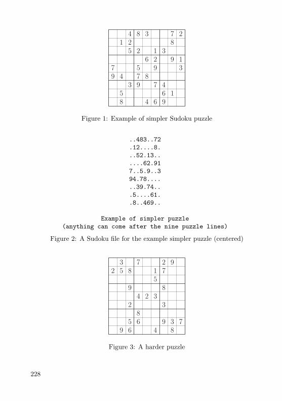
4 8 3 7 21 2 8
5 2 1 36 2 9 1
7 5 9 39 4 7 8
3 9 7 45 6 18 4 6 9
Figure 1: Example of simpler Sudoku puzzle
..483..72
.12....8.
..52.13..
....62.917..5.9..394.78......39.74...5....61..8..469..
Example of simpler puzzle(anything can come after the nine puzzle lines)
Figure 2: A Sudoku file for the example simpler puzzle (centered)
3 7 2 92 5 8 1 7
59 8
4 2 32 3
85 6 9 3 7
9 6 4 8
Figure 3: A harder puzzle
228

The sudoku bundle only handles sudoku puzzles that consist of 9 by 9arrays of the numbers 1 through 9. Other puzzles, such as those consisting of 16by 16 arrays of numbers and letters are outside the scope of this paper.
The sudoku bundle consists of three packages:1. printsudoku which prints a puzzle that is contained in an external file or
writes out a file that is specifed by a macro in the document.2. solvesudoku which solves puzzles up to a certain level of difficulty; it
requires the printsudoku package to read the puzzle from a file and printit and also to print the solution and write it out to an external file.
3. createsudoku which generates puzzles that can be solved by solve-sudoku; it requires the solvesudoku package.
I am not going to describe the packages in detail as you can find that else-where [8]. Rather, I shall discuss some of the algorithms that I used in thepackages and how I implemented them in LATEX.
Typesetting
This is the province of the printsudoku package, which provides two basicfunctions:
1. The \sudoku{〈file〉} macro reads a Sudoku game from 〈file〉 and typesetsthe grid and clues;
2. The \writepuzzle{〈line1 〉}{〈line2 〉}...{〈line9 〉}[〈text〉] macro writes thenine lines of a puzzle to the \puzzlefile external file, where the defaultfile is: \newcommand*{\puzzlefile}{puzz.sud}
The code for \writepuzzle is pretty simple, just opening an output file andwriting the 9 arguments to the file a line at a time:\newwrite\s@dwrite\newcommand*{\writepuzzle}[9]{%
\immediate\closeout\s@dwrite\immediate\openout\s@dwrite=\puzzlefile\immediate\write\s@dwrite{#1}%...\immediate\write\s@dwrite{#9}%\writes@dpuzzend}
\writes@dpuzzend provides an option to write text after the puzzle data iswritten, with \sudpuzznewline as a new line macro (\\ will not work here).\newcommand*{\writes@dpuzzend}[1][\@empty]{%
\ifx\@empty #1\else\immediate\write\s@dwrite{ }% a blank line\immediate\write\s@dwrite{#1}%
\fi
229

\immediate\closeout\s@dwrite}\newcommand*{\sudpuzznewline}{^^J}
The \writepuzzle and \writes@dpuzzend pair of macros is a particularinstance of a general technique for making it appear that a macro takes morethan the 9 argument limit imposed by TEX.
More complicated is the code for the \sudoku{〈file〉} macro, which reads apuzzle from the 〈file〉 and typesets it.\newcommand*{\sudoku}[1]{%
\reads@dgame{#1}% open the file for reading\s@dgame}
The macro \s@dgame uses the picture environment to draw the grid. It theninserts the clues into the grid.\newcommand*{\s@dgame}{%
\setlength\unitlength\halfs@dcell % units of half cell size\begin{picture}(18,18)(0,-18)
%% code to draw the grid\adds@dclues\end{picture}}
The macro \adds@dclues (not shown) reads the puzzle file line by line, each timesetting \firsts@dcluetrue, and then for each line calls \dos@dcols to insertits clues into the grid.\newcommand*{\dos@dcols}{%\bgroup
\loop% over the 9 clues\ifnum\s@dncol<10\relax
%% calculate grid location coordinates (\s@dcolpos,-\s@drowpos)% put the clue into the grid\put(\s@dcolpos,-\s@drowpos){\makebox(0,0){\gets@dclue}}%\advance\s@dncol 1\relax% increment clue/column count
\repeat\egroup}
The macro \gets@dclue retrieves the next clue (character) from the line ofclues and presents it for printing. To do this it uses \splitoff{〈string〉}, whichgets the next character in a string, making it available as \istchar and leavesthe remainder of the string as \restchars. The technique is based on TEX’sdelimited arguments [4, chapter 10]. I have talked about this in more detail intwo of my Glisterings columns [7, 9], the second of which also contains a longexample of using the \loop...\repeat construct.\def\gettwo#1#2\nowt{%
\gdef\istchar{#1}\gdef\restchars{#2}}\def\splitoff#1{\gettwo#1\nowt}
230

Finally, this is the code for \gets@dclue. If the clue is a number, \gets@dclueprovides it for printing or if it is a ‘ . ’ then \gets@dclue skips on. At thebeginning the string is the line as read from the file (\s@dline); after that thestring is \restchars.
\gdef\s@dfstop{.}\newcommand*{\gets@dclue}{%
\iffirsts@dclue% initially set by \adds@dclues\expandafter\splitoff\expandafter{\s@dline}%\global\firsts@dcluefalse
\else\expandafter\splitoff\expandafter{\restchars}%
\fi\ifx\s@dfstop\istchar% a ‘.’ return nothing\else% return clue number
\istchar\fi}
Solving
The \sudokusolve{〈file〉} macro in the solvesudoku package attempts to solvethe puzzle contained in the 〈file〉. It first prints the puzzle as specified in 〈file〉,then solves it as best it can, and lastly typesets the (partial) solution.The following facts are used to generate a solution.
1. Initially the potential solution for any cell is in the set of digits 1. . . 9.2. In a solved puzzle a digit must be unique within its row, its column, and
its 3 by 3 block. So, if a solution, say N , is known for a cell, then N can bedeleted from all the potential solutions in the other cells of the row, columnand block. I have called this a simple reduction.
3. If among all the cells in a row (column, block) there is a digit that occursonly once among all the potential solutions, then that digit is the solutionfor its cell. I have termed this a loner.
4. If among all the cells in a row (column, block) there are two digits whichoccur only twice in the potential solutions, each time as a pair (e.g., 39and 39), then one or other of the two digits must be a solution for a cellin which the pairs occur. This means that the two digits cannot occuranywhere else in the row (column, block) and thus can be eliminated fromall the other potential solutions. I call this pair reduction.
5. There are other facts which are more difficult to apply and I have not con-sidered them because of their complications and the difficulty of embodyingthem in LATEX code.
231

The solution procedure is:1. Populate the puzzle grid by assigning to each cell either the clue (digit)
given in the puzzle 〈file〉 or the set of potential solutions when the puzzleprovides no value.
2. For each clue perform a simple reduction, which may produce loners.3. Continue the simple reductions until there is no change in the solution
state. This is either because the full solution has been obtained or thatmore sophisticated methods are needed.
4. Examine the partial solution for pairs and if one is found perform thepair reduction. After a pair reduction go back and look for loners (andsubsequent simple reductions (and subsequent pair reductions). At the endeither a complete solution is found or the solver gives up.
5. The process stops when either all 81 cells have been solved or there is nochange in any potential solution after going through all the reductions.
The major problem was in deciding on a convenient datastructure for theproblem. In the end I used a 9 digit ‘binary solution set’ for the representationof a cell’s potential solution (e.g., [111111111] ⇔ 123456789 and [101010101] ⇔13579). The solution, say N , for a cell is represented as the ‘set’ [−N ]; that is,for example, a potential solution ‘3’ is represented as [001000000] and the actualsolution ‘3’ is represented as [−3]. I will use the term 9-set to indicate a set witha maximum of 9 members, where a member is a digit d in the range 1 ≤ d ≤ 9.
Following from this was the question of how to implement the datastructure?There are 81 cells in the Sudoku grid and I needed to maintain a potential oractual solution for each cell. It was convenient to use a \count for each cell’ssolution set which was accessible via the cell’s number (1. . . 81).\newcommand*{\newknt}[1]{\expandafter\newcount\csname #1\endcsname}\newcommand*{\useknt}[1]{\csname #1\endcsname}
\newknt{〈id〉} creates a new \count called 〈id〉, where 〈id〉 can include analpha-betic characters (like digits), and \useknt{〈id〉} expands to the 〈id〉 \countcreated previously by \newknt.% make the potential solution sets\newcommand*{\makesudsets}{%
\global\s@lcnta=1\relax\loop
\ifnum\s@lcnta<82\relax\newknt{s@lans\the\s@lcnta}%\global\useknt{s@lans\the\s@lcnta}=111111111\relax\advance\s@lcnta 1\relax
\repeat}
\makesudsets creates 81 \counts named \s@lans1 through \s@lans81 and setsthem all to 111111111.
232
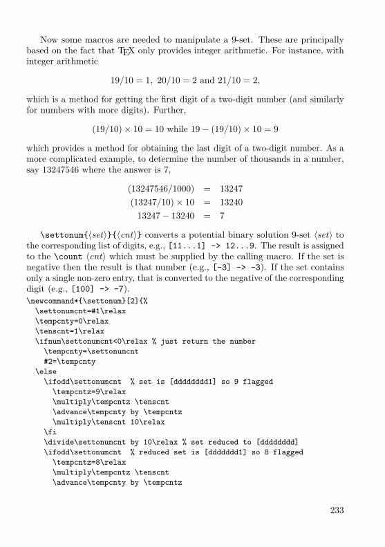
Now some macros are needed to manipulate a 9-set. These are principallybased on the fact that TEX only provides integer arithmetic. For instance, withinteger arithmetic
19/10 = 1, 20/10 = 2 and 21/10 = 2,
which is a method for getting the first digit of a two-digit number (and similarlyfor numbers with more digits). Further,
(19/10)× 10 = 10 while 19− (19/10)× 10 = 9
which provides a method for obtaining the last digit of a two-digit number. As amore complicated example, to determine the number of thousands in a number,say 13247546 where the answer is 7,
(13247546/1000) = 13247(13247/10)× 10 = 13240
13247− 13240 = 7
\settonum{〈set〉}{〈cnt〉} converts a potential binary solution 9-set 〈set〉 tothe corresponding list of digits, e.g., [11...1] -> 12...9. The result is assignedto the \count 〈cnt〉 which must be supplied by the calling macro. If the set isnegative then the result is that number (e.g., [-3] -> -3). If the set containsonly a single non-zero entry, that is converted to the negative of the correspondingdigit (e.g., [100] -> -7).\newcommand*{\settonum}[2]{%
\settonumcnt=#1\relax\tempcnty=0\relax\tenscnt=1\relax\ifnum\settonumcnt<0\relax % just return the number
\tempcnty=\settonumcnt#2=\tempcnty
\else\ifodd\settonumcnt % set is [dddddddd1] so 9 flagged
\tempcntz=9\relax\multiply\tempcntz \tenscnt\advance\tempcnty by \tempcntz\multiply\tenscnt 10\relax
\fi\divide\settonumcnt by 10\relax % set reduced to [dddddddd]\ifodd\settonumcnt % reduced set is [ddddddd1] so 8 flagged
\tempcntz=8\relax\multiply\tempcntz \tenscnt\advance\tempcnty by \tempcntz
233
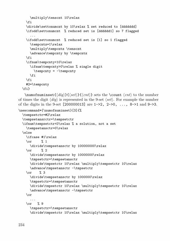
\multiply\tenscnt 10\relax\fi\divide\settonumcnt by 10\relax % set reduced to [ddddddd]\ifodd\settonumcnt % reduced set is [dddddd1] so 7 flagged
...\ifodd\settonumcnt % reduced set is [1] so 1 flagged
\tempcntz=1\relax\multiply\tempcntz \tenscnt\advance\tempcnty by \tempcntz
\fi\ifnum\tempcnty<10\relax
\ifnum\tempcnty>0\relax % single digit\tempcnty = -\tempcnty
\fi\fi#2=\tempcnty
\fi}
\numofnuminset{〈dig〉}{〈set〉}{〈cnt〉} sets the \count 〈cnt〉 to the numberof times the digit 〈dig〉 is represented in the 9-set 〈set〉. For example the numberof the digits in the 9-set [200000013] are 1->2, 2->0, ..., 8->1 and 9->3.\newcommand*{\numofnuminset}[3]{%
\tempsetctr=#2\relax\tempsetansrctr=\tempsetctr\ifnum\tempsetctr<0\relax % a solution, not a set
\tempsetansctr=0\relax\else
\ifcase #1\relax\or % 1
\divide\tempsetansctr by 100000000\relax\or % 2
\divide\tempsetansctr by 10000000\relax\tmpsetctr=\tempsetansctr\divide\tmpsetctr 10\relax \multiply\tempsetctr 10\relax\advance\tmpsetansctr -\tmpsetctr
\or % 3\divide\tempsetansctr by 1000000\relax\tmpsetctr=\tempsetansctr\divide\tmpsetctr 10\relax \multiply\tempsetctr 10\relax\advance\tmpsetansctr -\tmpsetctr
\or...
\or % 9\tmpsetctr=\tempsetansctr\divide\tmpsetctr 10\relax \multiply\tempsetctr 10\relax
234
\advance\tmpsetansctr -\tmpsetctr\else % error
\tmpsetansctr=0\relax\fi
\fi#3=\tmpsetansctr}
The macro \deletenumfromset{〈dig〉}{〈set〉}{〈cnt〉} removes the digit 〈dig〉from the potential binary solution 9-set, putting the modified set in \count 〈cnt〉.If the digit was removed then the boolean \ifsetchanged is set true.\newcommand*{\deletenumfromset}[3]{%
\global\setchangedfalse\tmpsetctr=#2\relax\tmpsetansctr=#2\relax\ifnum\tmpsetctr<0\relax% represents a solved number, do nothing\else
\ifcase #1\relax\or% 1
\divide\tmpsetctr by 100000000\relax\ifodd\tmpsetctr% it’s there
\advance\temsetansrctr -100000000\relax\global\setchangedtrue
\fi\or% 2
\divide\tmpsetctr by 10000000\relax\ifodd\tmpsetctr% it’s there
\advance\temsetansrctr -10000000\relax\global\setchangedtrue
\fi\or
...\or% 8
\divide\tmpsetctr by 10\relax\ifodd\tmpsetctr% it’s there
\advance\temsetansrctr -10\relax\global\setchangedtrue
\fi\or% 9
\ifodd\tmpsetctr% it’s there\advance\temsetansrctr -1\relax\global\setchangedtrue
\fi\fi
\fi#3=\tmpsetansctr}
235
Given these macros it is now just a case of using them in a lot of tedious codeto solve the puzzle using the procedure described earlier.
Going through the puzzle as presented, for any cell for which a clue is given,its potential binary solution set is replaced by the actual solution. After thisinitialisation, \deletenumfromset is used for the simple reductions.
The macro \numofnuminset is used to find loners — the potential binarysolution 9-sets for the cells in a row (column, block) are added together and theresult is then searched for a loner, which is a digit that occurs only once in theresulting 9-set summation.
The macro \numofnuminset is also used to search for pairs in a row (column,block) following a similar summation of the potential binary solution 9-sets.
\settonum is used to determine if a cell’s 9-set has been reduced to a singledigit, which is then a solution. It can alo be used in printing out the currentstatus at any point during the solution process, showing for each cell either thesolution or the list of potential solutions for that cell.
For further details look at the documented code — there’s only about 1400lines of it — for the solvesudoku package.
Towards the end of this article the solution to the puzzle presented in Figure 3found by \sudokusolve is provided as Figure 6 on page 240. The figure isproduced by the following code:\begin{figure}\centering\cluefont{\normalsize}\cellsize{1.5\baselineskip}\sudokusolve{cal4s4.sud}\caption{The puzzle from \fref{fig:puz2} together with its solution
as found and presented by \cs{sudokusolve}}\label{fig:ans2}
\end{figure}where the \cs macro is defined as\DeclareRobustCommand\cs[1]{\texttt{\char‘\\#1}}which is most useful if you ever need to typeset the name of a macro.
Generating
The createsudoku package lets you automatically create Sudoku puzzles ofthe kind that the solvesudoku package, which it uses, can solve. It also usesDonald Arseneau’s random.tex for generating random numbers [1].
The package requires a completely solved puzzle to start with, which can beeither from a file that you provide, or it uses a default solved puzzle.
The starting grid is modified in a random manner. Within one of the threecolumns of blocks exchanging any two of the three cell columns alters the puzzle
236

6 9 4 8 3 5 1 7 23 1 2 6 7 4 5 8 98 7 5 2 9 1 3 6 45 3 8 4 6 2 7 9 17 2 6 5 1 9 8 4 39 4 1 7 8 3 2 5 61 6 3 9 5 7 4 2 84 5 9 3 2 8 6 1 72 8 7 1 4 6 9 3 5
Figure 4: Solution to the simpler example puzzle in Figure 1
but leaves it still as a valid result. For example columns 1 and 3 (in the firstcolumn of blocks) may be exchanged and columns 8 and 9 (in the third columnof blocks) be exchanged and the result is still a solved grid. Similarly, within arow of blocks, exchanging any two of the three rows of cells changes the puzzlebut leaves it as a valid result.
The default starting grid is shown in Figure 5. Check that it is a valid Sudokusolution and then try exchanging pairs of rows and columns, as described above,to check that the result, although different, is still a valid solution.
Row pairs and column pairs are exchanged in a random fashion a randomnumber of times. At this point the grid is a complete solution. There is a macrothat will randomly eliminate 17 numbers from the grid; a puzzle is ambiguous,that is it has more than one solution, if two numbers are completely absentfrom the grid. You can then get the package to delete particular numbers, rows,columns, blocks, or diagonals from this grid.
When given its head the package writes the puzzle to an external file \prevfileand then uses \sudokusolve to try and solve the puzzle. If it can not find asolution then you would have to go back and try again, eliminating fewer and/ordifferent clues. If \sudokusolve can solve the puzzle the package randomlyeliminates a clue, writes the revised puzzle to another external file (\currfile)and uses \sudokusolve to try and solve the new puzzle. If it can then the
237

1 2 3 4 5 6 7 8 94 5 6 7 8 9 1 2 37 8 9 1 2 3 4 5 62 3 4 5 6 7 8 9 15 6 7 8 9 1 2 3 48 9 1 2 3 4 5 6 73 4 5 6 7 8 9 1 26 7 8 9 1 2 3 4 59 1 2 3 4 5 6 7 8Figure 5: Default initial puzzle for generation
\currfile puzzle is written into the \prevfile, another clue is randomly elimi-nated, and the process continues on. At the point where \sudokusolve fails, thelast succesfully solved puzzle is that in the \prevfile. This is the puzzle that ispresented as the newly created puzzle.
An interactive program
For checking how well the \sudokusolver was working I wrote a small interactiveLATEX program that asked for a Sudoku puzzle file to solve, tried to solve it, andkept on asking for more files until I effectively said ‘no more’.
Here is a version of it, which I have called ‘solvem’. To use it simply call:pdflatex solvemand a session will look like this, where, for exposition purposes, the user’s com-mands/responses are typeset in this font and solvem’s are in this font, and theuser wants solutions to the puzzles in the puzzle files cal4s4.sud and st123.sud:
pdflatex solvemNew file? y/n\getans=yEnter the file name
238
\sudfile=cal4s4.sud...progress report on the solution...New file? y/n\getans=yEnter the file name\sudfile=st123.sud...progress report on the solution...New file? y/n\getans=nOutput written on solvem.pdf
Here is the program:% solvem.tex Solve Sudoku% author Peter Wilson\documentclass{article}\usepackage{solvesudoku}\newcommand*{\solvefile}[1]{%\begingroup
\sudokusolve{#1}%\par\vspace{\baselineskip}%Number of clues = \the\numcluesctr\ and difficulty = \the\difficultyctr.
\endgroup}\def\yesans{y}\begin{document}\loop
\typein[\getans]{New file? y/n}\ifx\yesans\getans
\typein[\sudfile]{Enter the file name}r\IfFileExists{\sudfile}{%\clearpage\begin{center}\huge \sudfile\end{center}\solvefile{\sudfile}%}{\typeout{I can’t find file \sudfile}}
\repeat\end{document}
The command \typein[〈csname〉]{〈text〉} is a LATEX macro that outputs〈text〉 to the terminal and .log file and waits for some response text which itassigns to the command 〈csname〉 and you can then do something with \csname.It is an extended version of \typeout{〈text〉} which just outputs 〈text〉 to theterminal and the .log file.
Basically solvem.tex goes round a loop asking for a puzzle file and calls\sudokusolve to try and solve it. There is code to catch if a file specified by the
239

3 7 2 92 5 8 1 7
59 8
4 2 32 3
85 6 9 3 7
9 6 4 8THE ANSWER
6 3 1 7 4 8 2 9 52 5 8 9 6 1 7 4 39 7 4 2 3 5 6 1 83 4 9 5 7 6 8 2 18 1 7 4 2 3 5 6 95 6 2 1 8 9 3 7 41 2 3 8 9 7 4 5 64 8 5 6 1 2 9 3 77 9 6 3 5 4 1 8 2
Figure 6: The puzzle from Figure 3 on page 228together with its solution as found and pre-sented by \sudokusolve (design of the outputis slightly modified for the sake of the article)
240
user does not exist, in which case it asks for another one. After each solution itgives some information about how hard it was to solve (or not as the case maybe) the puzzle. The puzzles and their solutions are written to the output filefrom solvem.tex, either solvem.dvi or solvem.pdf, depending on how solvemis called.
References[1] Donald Arseneau. Generating random numbers in TEX, 1995. Available on
ctan.org in macros/generic/misc/random.tex.[2] The Editors. Distractions: Sudoku. In The PracTEX Journal, Volume 1,
Number 4, 2005. ISSN 1556-6994. Available at http://tug.org/pracjourn/2005-4/distract/.
[3] Michel Goossens, Frank Mittelbach, et al. The LATEX Graphics Companion.Addison-Wesley, 2nd edition, 2008. ISBN 0-321-50892-0.
[4] Donald Knuth. The TEXbook. Addison-Wesley, 1986. ISBN 0-201-13448-0.[5] Sudoku Online: Home of the Sudokulist. http://www.sudoku.org.uk/[6] Sudoku Solver . . . by logic. http://www.sudokusolver.co.uk/[7] Peter Wilson. Glisterings. In TUGboat, Volume 26, Number 3, pp. 253–255,
2005. ISSN 0896-3207. Available at http://tug.org/TUGboat/Articles/tb26-3/tb84glister.pdf.
[8] Peter Wilson. The sudoku bundle for displaying, solving and generatingSudoku puzzles, 2006. Available on ctan.org in macros/latex/contrib/sudokubundle/.
[9] Peter Wilson. Glisterings: stringing along, loops. In TUGboat, Volume 28,Number 1, pp. 12–14, 2007. ISSN 0896-3207. Available at http://tug.org/TUGboat/Articles/tb28-1/tb88glister.pdf.
Summary: The sudoku bundleThe sudoku bundle provides a coordinated set of packages for displaying,solving, and generating Sudoku puzzles. This article describes some of theinternal aspects of the packages.Keywords: Sudoku, sudokubundle package.
Peter Wilson, [email protected] c/o FEL ČVUT, Technická 2Prague, CZ-166 27, Czech Republic
241

Nové a staronové knihyPavel Stříž, Michal Mádr
CJKV Information ProcessingChinese, Japanese, Korean& Vietnamese ComputingKen Lunde
Vydání: druhé.Počet stran: 864 a přílohy A–M.Vazba: brožovaná.Rok vydání: 2008.Nakladatel: O’Reilly Media, Inc.ISBN-10: 0-596-51447-6.ISBN-13: 978-0-596-51447-1.Informace od nakladatele:http://oreilly.com/catalog/9780596514471/
Od svého prvního vydání před deseti lety se tato kniha stala bohatým zdrojeminformací o zpracování textů v čínštině, japonštině, korejštině a vietnamštině(ČJKV). Kniha seznamuje tvůrce webových stránek a aplikací s technikamia nástroji pro šíření informací jihoasijskému publiku. V aktualizovaném druhémvydání si kniha navíc všímá nedávného významného vlivu kódování Unicode,XML a formátu fontů OpenType na zpracování východoasijských textů.
Řada příloh, zdrojových kódů, binárek a ukázek je umístěna na webové stránceprvního vydání http://examples.oreilly.com/9781565922242/. Ken Lundebyl tak laskav a napsal nám, že kvůli vytížení v práci nestihl ukázky k druhémuvydání ještě aktualizovat.
Kniha vám výrazně pomůže:• poznat písma a znaky jazyků ČJKV a metody jejich přepisu,• nahlédnout do trendů a vývoje sad znaků a kódování, zvláště kódování
Unicode,• prozkoumat svět typografie, obzvláště záležitosti spojené s rozložením textu
v jazycích ČJKV na stránce,• poznat techniky zpracování informací (např. algoritmy konverze kódování)
a aplikovat je pomocí různých programovacích jazyků,• zpracovat texty v jazycích ČJVK na rozličných platformách pomocí různých
textových editorů a textových procesorů,• získat informace o ČJKV slovnících, slovníkovém softwaru, softwaru a služ-
bách strojového překladu,
242

• zvládnout zacházení s ČJVK obsahem i formou při publikování na papířenebo na webu.
Pokud někdo ze čtenářů Zpravodaje zná, používá nebo studuje některý z jazykůČJKV, pak tato kniha bude pro něj jako příchod druhých Vánoc. Pokud jstepříznivci konverzí přes iconv, tak vás zahřeje existence nástroje JConv z roku 1993.Teď jen vyřešit otázku, který program byl na světě první, dodáváme s úsměvy.
Za zajímavost uvádíme, že kniha se na několika místech odkazuje na TEX,ovšem komplexní profil možností sazby ČJKV v TEXu zde nečekejte.
Autorem obou vydání knihy je Ken Lunde, seniorský IT pracovník vývojepísem ČJKV ve firmě Adobe Systems.
Obsah [Contents]11. Přehled zpracování informací v jazycích ČJKV
[CJKV Information Processing Overview]12. Písma a texty [Writing Systems and Scripts]13. Standardy znakových sad [Character Set Standards]14. Metody kódování [Encoding Methods]15. Zvládnutí různých metod vstupů [Input Methods]16. Formáty fontů, množiny symbolů, nástroje na zpracování fontů
[Font Formats, Glyph Sets, and Font Tools]17. Typografie [Typography]18. Výstupní metody [Output Methods]19. Techniky zpracování informací [Information Processing Techniques]10. Operační systémy, textové editory, textové procesory
[OSes, Text Editors, and Word Processors]11. Slovníky a software kolem slovníků [Dictionaries and Dictionary Software]12. Předání podkladů na web a pro tisk [Web and Print Publishing]
Přílohy [Appendixes]A. Tabulky pro konverzi kódů [Code Conversion Tables]B. Tabulky pro konverzi notací [Notation Conversion Table]C. Příklady zdrojových kódů v Perlu [Perl Code Examples]D. Glosář [Glossary]E. Standardy znakových sad prodejců [Vendor Character Set Standards]F. Standardy konverzních metod prodejců [Vendor Encoding Methods]G. Čínské znakové sady – Čína [Chinese Character Sets – China]H. Čínské znakové sady – Taiwan [Chinese Character Sets – Taiwan]I. Čínské znakové sady – Hong Kong [Chinese Character Sets – Hong Kong]J. Japonské znakové sady [Japanese Character Sets]K. Korejské znakové sady [Korean Character Sets]L. Vietnamské znakové sady [Vietnamese Character Sets]M. Různé další znakové sady [Miscellaneous Character Sets]
Seznam literatury [Bibliography]; Rejstřík [Index]
243

Unicode ExplainedInternationalize Documents,Programs, and Web SitesJukka K. Korpela
Vydání: první.Počet stran: 688.Vazba: brožovaná.Rok vydání: 2006.Nakladatel: O’Reilly Media, Inc.ISBN-10: 0-596-10121-X.ISBN-13: 978-0-596-10121-3.Informace od nakladatele:http://oreilly.com/catalog/9780596101213/
Jedná se o komplexní náhled na problematiku Unicode od finského autora.Kniha je rozdělena do tří částí. V první části se autor zabývá prací se znaky
[Working with Characters], následuje podrobný náhled na Unicode [A SystematicLook at Unicode] a závěrečná část se zabývá pokročilými oblastmi Unicode[Advanced Unicode Topics].
The Unicode Standard, Version 5.0The Unicode Consortium
Vydání: páté.Počet stran: 1472.Vazba: vázaná.Rok vydání: 2006.Nakladatel: Addison-Wesley Professional.ISBN-10: 0321480910.ISBN-13: 978-0321480910.Informace od nakladatele:http://www.awprofessional.ca/
Jedná se o poslední knižní vydání standardů Unicode ve verzi 5.0. Tato kniha jeoficiální referenční příručkou. Autory knihy jsou lidé ze společenství Unicode, cožje nezisková organizace působící na celém světě.
Zájemce najde dostatek informací k úplně poslední verzi 5.2 na webovýchstránkách http://www.unicode.org/versions/. Nákresy glyfů a symbolů lzenalézt na http://www.unicode.org/charts/.
244
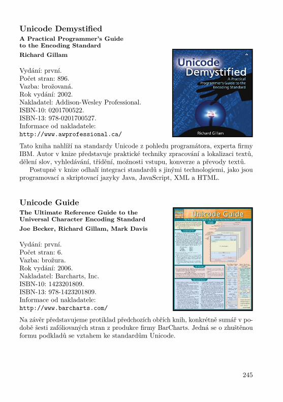
Unicode DemystifiedA Practical Programmer’s Guideto the Encoding StandardRichard Gillam
Vydání: první.Počet stran: 896.Vazba: brožovaná.Rok vydání: 2002.Nakladatel: Addison-Wesley Professional.ISBN-10: 0201700522.ISBN-13: 978-0201700527.Informace od nakladatele:http://www.awprofessional.ca/
Tato kniha nahlíží na standardy Unicode z pohledu programátora, experta firmyIBM. Autor v knize představuje praktické techniky zpracování a lokalizaci textů,dělení slov, vyhledávání, třídění, možnosti vstupu, konverze a převody textů.
Postupně v knize odhalí integraci standardů s jinými technologiemi, jako jsouprogramovací a skriptovací jazyky Java, JavaScript, XML a HTML.
Unicode GuideThe Ultimate Reference Guide to theUniversal Character Encoding StandardJoe Becker, Richard Gillam, Mark Davis
Vydání: první.Počet stran: 6.Vazba: brožura.Rok vydání: 2006.Nakladatel: Barcharts, Inc.ISBN-10: 1423201809.ISBN-13: 978-1423201809.Informace od nakladatele:http://www.barcharts.com/
Na závěr představujeme protiklad předchozích obřích knih, konkrétně sumář v po-době šesti zafóliovaných stran z produkce firmy BarCharts. Jedná se o zhuštěnouformu podkladů se vztahem ke standardům Unicode.
245
Fonts & Encodings od Yannise HaralambouseUlrik Vieth
Základní informace
Překlad knihy: P. Scott Horne.Vydání: první.Počet stran: 1040.Vazba: vázaná.Rok vydání: 2007.Nakladatel: O’Reilly Media Inc.ISBN-10: 0-596-10242-9.ISBN-13: 978-0-596-10242-5.Informace od nakladatele:http://www.oreilly.com/catalog/9780596102425
O autorovi
Yannis Haralambous je v mezinárodní TEXové komunitě velmi dobře znám nejenjako spoluzakladatel projektu Omega, ale i pro svá četná přispění jako vývojářpísem pro rozličné jazyky. Zdálo se tedy zcela příhodné, když se Yannis rozhodlnapsat souhrnnou knihu na téma fontů a jejich kódování.
Původní vydání, nazvané Fontes & Codages, se objevilo v roce 2004, avšakpouze ve francouzském jazyce. Anglický překlad, Fonts & Encodings, From Advan-ced Typography to Unicode and Everything in Between, připravený P. ScottemHornem, je k dispozici teprve krátce, po vydání nakladatelstvím O’Reilly.
Obsah
Rozsahem o trochu více než tisíc stran se kniha vyrovná velikosti The LATEXCompanion ve druhém vydání. Zdá se být velmi působivou, nejen svým pouhýmrozsahem, ale i vzhledem k širokému rozpětí témat, jež pokrývá, jakož i hloubkou,
This review is a translation of the article “Book review: Fonts & Encodings by YannisHaralambous”, which first appeared in TUGboat, Volume 29, Number 2: pp. 331–332, 2008.The book review is available from http://tug.org/TUGboat/Articles/tb29-2/tb92vieth.pdf.Reprinted with permission. Translation by Marcel Svitalský.
246

s jakou je pokrývá, a mírou podrobnosti. V několika případech autor spotřebovávátucty stran, aby dokumentoval některé tajemné detaily písmových formátů, ježposud postrádaly souhrnnou nebo přístupnou dokumentaci z jiných zdrojů.
Kniha sestává z hlavní části o čtrnácti kapitolách v rozsahu kolem šesti setstran, následované přídavkem sedmi kapitol dosahujících dalších čtyři sta stran.
Autor objasňuje již v úvodu, že různé skupiny čtenářů mohou mít užitekz různých částí knihy, aniž by ji všichni museli číst celou: některé kapitoly sevěnují především problematice kódování, zabývajíce se znaky na vstupu, jiné jsoupřevážně o písmech a věnují se glyfům na výstupu, zatímco ještě další kapitolyse nalézají někde uprostřed, kde se musejí zabývat jak písmy, tak kódovánímzároveň. Některé kapitoly jsou přístupné koncovým uživatelům zajímajícím seo instalaci a užívání písem, kdežto jiné budou zajímat pouze návrháře písem nebovývojáře softwaru vztahujícího se k písmům.
První část knihy počíná tématy týkajícími se kódování. Kapitola první posky-tuje přehled historie kódování před příchodem Unicode, počínaje sedmibitovýmASCII a rozličnými osmibitovými kódováními ISO až k šestnáctibitovým kódo-váním východoasijských jazyků. Kapitoly druhá až čtvrtá pokrývají standardUnicode, přičemž nejprve začínají přehledem symbolů a skriptů zahrnutých dostandardu a dále pokračují ke stále komplexnějším implementačním detailům.Kapitola pátá dovršuje tuto část předvedením některých užitečných nástrojůk užití Unicode vstupů na rozličných systémových platformách.
Druhá část se věnuje tématům správy písem na různých systémových platfor-mách a pohybuje se kdesi v šedé zóně mezi písmy a kódováním. Kapitoly šestá ažosmá pokrývají každá podobná témata, jednou pro platformu Macintosh, poté proWindows a konečně pro Unix/X11. Zatímco však popis platformy Macintosh jedosti podrobný v rozboru rozdílů v zacházení s písmy mezi MacOS 9 a Mac OSX,popis platformy Unix/X11 pokrývá pouze některé nejzákladnější a starobylé ná-stroje pro X11. Zde by bylo lze si přát poněkud rozsáhlejší pokrytí správy písemv moderních linuxových desktopových prostředích jako KDE či Gnome.
Následující dvě kapitoly diskutují na platformně nezávislé užití písem v systé-mech TEX/Omega a na webu. Kapitola devátá začíná přehledem vysokoúrovňo-vého výběru písem v LATEXu/NFSS2, následovaným podrobným popisem nízko-úrovňové instalace písem pro dvips. Zbytek kapitoly pak diskutuje řady příkladůvytváření virtuálních písem s užitím nástroje fontinst k implementaci různýchefektů potřebných v rozličných skriptech. Kapitola desátá uzavírá tuto část pře-hledem písem na webu při užití buď (X)HTML/CSS nebo alternativně SVG.
Závěrečná část knihy pokrývá témata vztažená k písmům. Kapitola jedenáctáse věnuje rozličným klasifikacím latinkových písem a zároveň poskytuje pěkněilustrovaný přehled historie nejdůležitějších vzorů typů písem. Kapitoly dvanáctáa třináctá poté probírají tvorbu, úpravy a optimalizaci PostScriptových, TrueTy-peových a OpenTypeových písem s užitím nástrojů jako jsou FontLab a FontForge.Konečně kapitola čtrnáctá uvádí koncept pokročilých typografických vlastností
247
poskytovaných v OpenType či AAT písmech a diskutuje způsoby obohacení písemvyužitím těchto možností.
Přídavek knihy převážně sestává z podrobných popisů písmových formátů.Začíná bitmapovými písmy a písmovými formáty vztaženými k TEXu, pokračujek písmům PostScriptovým, TrueTypeovým, OpenTypeovým a písmům AAT,prakticky všechny významné formáty písem jsou do detailu probrány v dodat-cích A až E. Konečně dodatek F probírá principy návrhu písem v METAFONTua odvozených systémech, jakými jsou METAPOST, MetaFog a MetaType 1.
Komentář
Uvážíme-li rozsah knihy, je pochopitelné, že mezi zapsáním rukopisu a vydá-ním anglického překladu uplynulo několik let. Některé kapitoly jsou vzhledemk tomu bohužel v nebezpečí dosti rychlého zastarání. Pro většinu obsahu je třebapředpokládat, že anglické vydání z roku 2007 reprezentuje stav věcí z roku 2003.
Pro mnoho kapitol sloužících jako příručka takové zpoždění nepředstavujeproblém, jelikož popisy kódování či formátů písmových souborů jsou nezměněnya stále platné. Na druhé straně je politováníhodné, že zejména kapitoly o TEXuzcela pominuly nebo přehlédly některé velmi důležité změny dosažené v posledníchněkolika letech.
Jedním příkladem je, že při popisu podrobností instalace písem autor pokrývápouze TEX/Omega s dvips, zatímco pdfTEX není v této souvislosti vůbec zmíněn,dokonce i přesto, že mnohé z popisu bylo by aplikovatelné na oba systémy v rámcisystémů TEX Live. (Ve skutečnosti pdfTEX není zmíněn v knize vůbec nikde,možná proto, že v době jejího vzniku dosud nepodporoval Omegu.)
Dalším příkladem je hlavní autor pdfTEXu Hàn Thê Thành, jenž je zmíněnpouze jednou v souvislosti s vietnamskými písmy, zatímco jeho významné úspěchytýkající se implementace mikrotypografických vlastností pdfTEXu byly zcelapominuty. Je to ještě překvapivější s ohledem na to, že autor věnuje několikstran diskusi příkladu, kde efekt okrajového kerningu, jenž by byl k dispoziciv pdfTEXu, je simulován dosti nemotorným způsobem s užitím virtuálních fontůvytvořených nástrojem fontinst.
Při probírání příkladů rozšíření písem Computer Modern autor doporučujepísma CM-Super, zatímco (nyní) mnohem populárnější písma Latin Modern jsoupouze mimochodem zmíněna jako příklad užití MetaType 1.
A konečně když přišla řeč na způsoby užití pokročilých typografických rysůpísem OpenType nebo AAT v TEXu, autor nabízí pouze pár narážek na svévlastní výzkumy v rámci projektu Omega 2 (jenž se nedostal za prototypickoufázi), zatímco (nyní) k užití připravený nový projekt X ETEX zmíněn není.
Abychom byli spravedliví, je třeba přiznat, že úspěch a důležitost těchtonejnovějších projektů ve světě TEXu nebylo lze předvídat v době psaní knihy
248

v roce 2003. I přesto však bylo možné přidat některé dodatky a/nebo opravyv době překladu do angličtiny v roce 2007.
Je dosti nepříjemné, že tato příležitost pro úpravy byla promeškána, neboťty by knihu učinily mnohem užitečnější a cennější pro TEXové uživatele, již sezajímají o užití nejposlednějších úspěchů ve vývoji technologie písem.
I přes tyto nedostatky je kniha cenným zdrojem pro TEXové uživatele a soft-warové vývojáře, zajímající se do hloubky o technologii písem a jejich kódování.Žádná jiná kniha nepokrývá ani přibližně tak široký rozsah témat v takové hloubcedetailnosti v jediném svazku. Kdo by se k tomu chtěl byť i jen přiblížit, muselby sesbírat tucty materiálů z nejrůznějších zdrojů a stále by mu zůstalo mnohoprázdných oblastí k doplnění.
Podtrženo a sečteno, kniha je zcela jistě doporučeníhodná. Přece však probudoucí vydání bylo by velmi žádoucí přidat některé dodatky nebo opravy.
Jako závěrečnou poznámku by autor recenze rád zmínil jistou drobnou kurio-situ: jak je obvyklé v moderních učebnicích, i tato kniha obsahuje mimo obvykléhoobecného rejstříku i rejstřík osob. Na rozdíl od jiných knih zde však autor byldosti svobodomyslný, pokud šlo o to, které typy osob do rejstříku zařadit.
V důsledku toho autoři písmového software a nástrojů nejen že mohou samisebe nalézti ve skvělé společnosti některých z nejslavnějších tvůrců písem historie,ale také v sousedství spíše pochybných politických postav (jako Lenin, Hitler,Mao) či fiktivních a literárních hrdinů (kupř. Sherlock Holmes, James Bond,James T. Kirk), v textu pouze mimochodem zmíněných v některých odlehčenýchkomentářích.
Jestliže tedy autor recenze (jenž byl jistou dobu přispěvatelem do projektufontinst) by rád vyjádřil své díky za příležitost být zahrnut do tak unikátníhovýběru osob, pak by zároveň rád vyjádřil i své vážné pochybnosti, zda je pročtenáře vskutku pomocí, jsou-li fiktivní charaktery zařazeny do rejstříku osobstejným způsobem jako lidé „techničtí“.
Recenzent: Ulrik Vieth, [email protected] Straße 69, DE-70567 Stuttgart, Germany
Překlad: Marcel Svitalský[email protected]
249

Typografové a programátoři – vzájemnéinspirace: 18. BachoTEX (30. 4. – 4. 5. 2010)
Karel Horák
Na letošní konferenci polského GUST jsme se sešli z Čech a Moravy hned čtyři:kromě autora této zprávičky ještě jeho spolujezdec Jano Kula, z Ostravy JanŠustek a tradiční konferenční turista Karel Píška.
Do programu z nás lenochů nikdo nepřispěl, jen Honza Šustek na závěrneplánovaně vystoupil s vizualizací řádkového zlomu a blýskl se jednou TEXovouperlou. TEXové perly si mohou zájemci najít na stránkách GUST, http://www.gust.org.pl/. Najdou se tu nejen různé zajímavé a poučné triky, ale i některémálo zdokumentované vlastnosti TEXu.
Foto: Karel Horák (levé) a Jan Šustek (pravé)
Hned první páteční přednáška Adama Kolaného mě zaujala svým tématem:kombinací TEXového výstupu a možností programu Inkscape, volně šířenéhoprogramu pro vektorovou grafiku, s nímž mám sám nejednu velmi příjemnouzkušenost. Vlastně jsem do Bachotku odjížděl s nadějí, že mi tu někdo pomůževyrobit wokenní binárku prográmku pdf2svg, který na rozdíl od filtru samotnéhoInkscape při převodu pdf vkládá do dokumentu i nesystémová písma. Naštěstíjsem předtím ještě znovu zagoogloval, a ejhle, fungující binárka už byla na světě,tedy na webu!
Po mnoha letech jsem tu zas potkal Keese van der Laana, který se po delšíodmlce vrátil do světa TEXových setkání (jistě si naň vzpomenou účastnícihistorického EuroTEXu v Praze roku 1992). Předváděl zejména ukázky ze svéknihovny procedurek napsaných v PostScriptu. Jednu z jeho vtipných ukázek
250

jsem pro vás zrekonstruoval (přitom jsem využil prvních šest řádků z výstupuprográmku pi.tex napsaného Denisem Roegelem, který jsem před časem někdeobjevil a s jehož pomocí jsem si jako kuriozitu a na památku nebohého panaLudolfa nechal TEXem spočítat 5 000 platných číslic čísla π):
3.1
41
592 6 5 3 5 897932
38
46
2643383279502
88
41
97
169 3 9 9 3 751058
20
97
4944592530781
64
06
28
620 8 9 9 8 628034
82
53
4211706798214
80
86
51
328 2 3 0 6 647093
84
46
0955058223172
53
59
40
812 8 4 8 1 117450
28
41
0270193852110
55
59
64
462 2 9 4 8 954930
38
19
6442881097566
59
33
44
612 8 4 7 5 648233
78
67
8316527120190
91
45
64
856 6 9 2 3 460348
61
04
5432664821339
36
07
26
024 9 1 4 1 273724
58
70
0660631558817
48
81
52
092 0 9 6 2 829254
09
17
1536436789259
03
60
01
133 0 5 3 0 548820
46
65
2138414695194
15
11
60
943 3 0 5 7 270365
75
95
9195309218611
73
81
93
261 1 7 9 3 105118
54
80
7446237
π
Nutno ovšem poznamenat, že něco podobného uměl už před mnoha letyBogusław Jackowski v METAFONTu, a na konferenci to pomocí LuaTEXu předvedljeho syn Paweł. Kromě toho jsem nemohl nenamítnout, že není nutné zvládattakové konstrukce v PostScriptu (konec konců dá se v něm i sázet), když tu mámeMETAPOST.
Totéž se dá říci i o proceduře na řešení Apolloniovy úlohy. Je to sice obdivu-hodné využití programovacích možností PostScriptu, ale osobně dávám i nadálepřednost mnohem čitelnějšímu METAPOSTu. Keesovy argumenty o přednostechPostScriptu na kreslení obloučků bych asi snadno vyvrátil (má sice pravdu, žeMETAPOST nemá arc, ale ve výsledku je makro na obloučky úhlů přehlednější).Nicméně na některé náročnější kousky jako třeba fraktály zatím METAPOST
vzhledem ke známým omezením nestačí. Uvidíme však, co další úsilí Taca Hoek-watera ve vývoji METAPOSTu přinese.
Úhelnou přednáškou konference byl rozsáhlý příspěvek Bogusława Jackowskéhoo interpolaci křivek METAFONTem, resp. METAPOSTem.
Ještě několikrát přišla řeč na matematiku, přičemž mě nejvíce překvapilo,že v Polsku se sice při zlomu na konci řádku stejně jako u nás opakují relačníznaménka i na začátku nového řádku, ale neopakuje se takto minus! Údajněproto, že jak známo minus minus dává plus. Když uvážím, s čím zápasí dnešní
251

žactvo, tak nevím, jestli ve školních učebnicích lámání matematických vztahůvůbec nezakázat!
Ze zajímavých přednášek bych ještě vzpomněl „workshop“ Adama Twardochatýkající se tvorby OpenType písem. Téma rozhodně lákavé, oproti jiným Adamo-vým vystoupením, jež byla vždy excelentní, toto působilo poněkud nepřipraveně.
Impozantně naopak zapůsobila informace o systému utilit a maker na sazburozsáhlých katalogů zboží nazvaném autory parcat.
Na polských variantách etiket pomerančových džemů různých renomovanýchvýrobců předvedly dvě lepé TEXistky lesk a bídu typografie podobných produktů.Vybaveny skutečnými produkty a komentáři významného polského typografaAndrzeje Tomaszewského, tradičního to účastníka snad každého BachoTEXu.
Na klíčovou přednášku Andrzeje Tomaszewského o historii vzniku a vývojisymbolu letošní konference (¶) jsme si museli počkat až do samého závěru konfe-rence. Ještě předtím jsme však měli možnost zhlédnout 35minutový film Falkbeerůvprotigambit věnovaný významnému polskému typografu Stefanu Szczypkovi dopl-něný o krátkou animovanou pohádku Jak vzdělání přišlo z lesa. Kdo nezaváhal,mohl si pak oba filmy odnést na dvd.
Závěrem lze jen konstatovat, že téma konference bylo (alespoň pro mne)několikanásobně naplněno!
Karel Horák, [email protected]
Foto: Jan Šustek
252

TypeTalks 2010Pavel Stříž
Tato krátká zpráva informuje o návštěvě denního pásma seminářů TypeTalks 2010o písmech a jejich tvorbě, které se uskutečnilo v pondělí 21. června 2010 v Brněv Domě pánů z Kunštátu. Symposium TypeTalks (http://typetalks.com/Symposium2010/) bylo nekomerčním a nezávislým projektem a neoficiálnímpředvojem slavnostního otevření 24. mezinárodního bienále grafického designuBrno 2010 a velké akce Symposium bienále.
Kvalitních písem není nikdy dostAkci nejlépe vystihují slova organizátorů:„I přes svou zásadní důležitost pro naši kul-turu a rozvoj jsou písmo a textové informaceobecně v grafickém designu a visuální komu-nikaci často zásadně podceňovány. Patrné je
to především ve středoevropském postkomunistickém prostředí. TypeTalks jenezávislá aktivita, jež se snaží o zlepšení povědomí o moci písma, písmařstvía typografie mezi studujícími i praktikujícími grafickými designery.“
Otcem i matkou akce byl David Březina (na fotce; http://davi.cz/) zaspolupráce jeho studentů, kolegů a spolupracovníků. Při příjezdu jsme obdrželiřadu dárečků, jako kdybychom přijeli na velkou mezinárodní konferenci.
Fotky na této straně: Rob Keller a Florian Hardwig.
253

Přednášky a přednášející
V ochozech byla slyšet čeština, slovenština, angličtina, němčina i polština. Vy-stoupilo šest plus jeden přednášející. Přednášky a přednášející si představíme.
Florian Hardwig (D):Lokalizujte! Rukopisná nářečí v typografickém písmuCo dělá písmeno italským nebo německým? Florian Hardwig zkoumá regionálnítvarosloví (latinkových) písmen a to, jak odpovídají příslušným rukopisnýma písmomalířským tradicím. Jak současní tvůrci písem a grafičtí designeři využívajívýrazně lokálních tvarů pro svoje písmové skripty a logotypy?
Florian Hardwig je grafický designer sídlící v Berlíně, kde spolu s MaltemKaunem provozuje studio. Od roku 2007 vyučuje typografii na Hochschulefür Bildende Künste Braunschweig. Floriana můžete často najít na stránkáchTypophile, kde je jedním z moderátorů Type ID Board (identifikace písem).Jeho specializací jsou psací vzory. Ve svém projektu Manuscribe zkoumározličné rukopisné modely, jež se používají k výuce psaní na základníchškolách. http://florian.hardwig.com/
Snímky z přednášky Floriana Hardwiga.Tato přednáška ve mně okamžitě evokovala nedávné zkoumání formátu OTF
a jeho vlastností. Není těžké si představit, že si připravíme alternativy jednotlivýchglyfů a pak si je na úrovni editoru přepínáme. V případě TEXu by to mohlo býtna úrovni příkazu \selectlanguage, používáme-li babel či vlastní přepínač.
Rob Keller (US/D): Písmové technologie blázní!Písmena a typografická sazba prošly během posledních pár tisíc let několikazásadními posuny. Tyto rozličné změny v mnoha ohledech výrazně ovlivnilyvzhled písmen, navrhování tiskového písma i typografie. V nejlepších případechtyto kroky napravily nedostatky předchozích technologií, rozšiřujíce typografickéa lingvistické možnosti. Jindy zadupaly do země tradice, poškodily celé písmovésystémy a snížily typografické standardy. Tak či onak, písmové technologie sestále vyvíjejí. . .
254

Rob Keller (nar. 1981) je písmař pocházející z kukuřičných a sojových polístátu Illinois (US). O typografii se začal vážně zajímat během studií grafickéhodesignu a sochařství na Univerzitě v Illinois. Tato vášeň ho zavedla naUniverzitu v Readingu, kde vystudoval tvorbu písma. Po tomto intenzivnímroce se přesunul do Německa, aby pracoval pro společnost Linotype, kdetaké potkal svoji budoucí ženu, Sonju. V roce 2009 společně založili v Berlíněpísmolijnu Mota Italic. Zde se v současnosti zabývají vývojem rozsáhlýchpísmových rodin se zaměřením na širokou jazykovou podporu a rozličnépísmové systémy. http://motaitalic.com/
Snímky z přednášky Roba Kellera.
Michael Hochleitner (AT):Současný pohled na vztah písmomalířství a typografického písmaJaký je rozdíl mezi písmomalířstvím, logotypy a (typografickým) písmem? Jakéjsou jejich výhody a jaký je jejich vzájemný vztah, co se dnešního použití týče?
Michael Hochleitner se narodil a žije ve Vídni. Ve Vídni také pět let studovalgrafický a komunikační design. Studia zakončil v roce 2003 diplomem. Poroce civilní služby pro svou zemi studoval mediální studia ve Vídni a zároveňřídil taxi, aby si vydělal peníze. Mezi lety 2004 a 2007 pracoval jako nezávislýgrafický designer. V roce 2007 dokončil s vyznamenáním studia tvorby písma(MA Typeface Design) v britském Readingu, kde také začal navrhovat
255
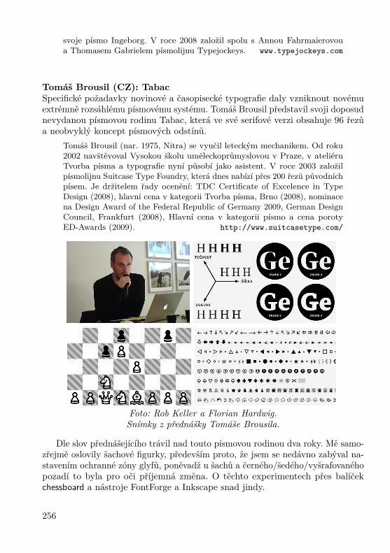
svoje písmo Ingeborg. V roce 2008 založil spolu s Annou Fahrmaierovoua Thomasem Gabrielem písmolijnu Typejockeys. www.typejockeys.com
Tomáš Brousil (CZ): TabacSpecifické požadavky novinové a časopisecké typografie daly vzniknout novémuextrémně rozsáhlému písmovému systému. Tomáš Brousil představil svoji doposudnevydanou písmovou rodinu Tabac, která ve své serifové verzi obsahuje 96 řezůa neobvyklý koncept písmových odstínů.
Tomáš Brousil (nar. 1975, Nitra) se vyučil leteckým mechanikem. Od roku2002 navštěvoval Vysokou školu uměleckoprůmyslovou v Praze, v ateliéruTvorba písma a typografie nyní působí jako asistent. V roce 2003 založilpísmolijnu Suitcase Type Foundry, která dnes nabízí přes 200 řezů původníchpísem. Je držitelem řady ocenění: TDC Certificate of Excelence in TypeDesign (2008), hlavní cena v kategorii Tvorba písma, Brno (2008), nominacena Design Award of the Federal Republic of Germany 2009, German DesignCouncil, Frankfurt (2008), Hlavní cena v kategorii písmo a cena porotyED-Awards (2009). http://www.suitcasetype.com/
Foto: Rob Keller a Florian Hardwig.Snímky z přednášky Tomáše Brousila.
Dle slov přednášejícího trávil nad touto písmovou rodinou dva roky. Mě samo-zřejmě oslovily šachové figurky, především proto, že jsem se nedávno zabýval na-stavením ochranné zóny glyfů, poněvadž u šachů a černého/šedého/vyšrafovanéhopozadí to byla pro oči příjemná změna. O těchto experimentech přes balíčekchessboard a nástroje FontForge a Inkscape snad jindy.
256

Dan Reynolds (US/D): Vášeň mladého multilingvního designeraMnoho mladých písmařů se věnuje designu pro různé písmové systémy. Volí sitento druh práce především pro výzvy, jež skýtá; kreslí písma, protože musí.Po důkladném zkoumání se zdá, že prvky jiných písmových systémů nejsou ažtak odlišné od našich. Učení se jiným sadám pravidel, zvyklostem a jiné historiivšak otvírá nové cesty k lepšímu pochopení podstaty písma. Nezáleží na tom,jestli se výsledků bojíme, pochybujeme o nich nebo je respektujeme, spoustanelatinkových písmových systémů prostě funguje jako zrcadlo designerovy vášněpro písmo. Je nepodstatné, zda se kreslí znaky z latinky, cyrilice nebo dévanágarí.Podstatné je, aby písmo fungovalo.
Dan Reynolds sídlí v Berlíně, je typografickým inženýrem a specialistouv Linotype GmbH a vyučujícím na Hochschule Darmstadt. Během své prvnínávštěvy v německé Mohuči se Dan rozhodl, že se stane písmařem. Poté,co dokončil studia grafického designu na RISD (Rhode Island School ofDesign) s titulem BFA, se nadobro přesunul do Evropy. Se čtyřmi dalšímistudenty z HfG Offenbach založil v roce 2004 Offenbach Typostammtisch(pravidelné písmařské srazy). V roce 2008, rovněž dokončil s vyznamenánímstudia tvorby písma na Univerzitě v Readingu. Jeho poslední písmo Malabarzískalo ocenění TDC Certificate of Excellence in Type Design, stříbrnoumedaili na ED-Awards 2009 a v roce 2010 jednu z pěti zlatých medailíNěmecka v celonárodní designové soutěži. http://www.linotype.com/
Tato přednáška mě zaujala, poněvadž písma, která jsou stylisticky obdobněpojednaná, kde nerozeznáte na první pohled různé abecedy a slabičná písma,obecně písmové systémy – latinka, cyrilice či dévanágarí – mezi sebou, jsou dostivýjimečná a stojí za naši pozornost. Během přednášky byla zmíněna řada reálnýchukázek. Toto téma bádání se opakovalo i u jiných přednášejících.
Dan Rhatigan (US/UK):How I learned to stop worrying and love bad typeIt’s a look at the need for objectivity in type design and typography, emphasizingthe importance of looking not just at reliable sources but also at “bad” or amateurexamples. These can have many useful lessons of their own that can inform thedesigner’s work.
Dan Rhatigan is a type designer/graphic designer living in London, England.He currently works on a joint project between the University of Reading andMonotype Imaging, researching and designing non-Latin typefaces, primarilythose used in India. http://www.ultrasparky.org/
257
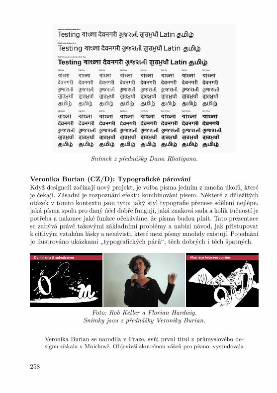
Snímek z přednášky Dana Rhatigana.
Veronika Burian (CZ/D): Typografické párováníKdyž designeři začínají nový projekt, je volba písma jedním z mnoha úkolů, kteréje čekají. Zásadní je rozpoznání efektu kombinování písem. Některé z důležitýchotázek v tomto kontextu jsou tyto: jaký styl typografie přenese sdělení nejlépe,jaká písma spolu pro daný účel dobře fungují, jaká znaková sada a kolik tučností jepotřeba a nakonec jaké funkce očekáváme, že písma budou plnit. Tato prezentacese zabývá právě takovými základními problémy a nabízí návod, jak přistupovatk citlivým vztahům lásky a nenávisti, které mezi písmy mnohdy existují. Pojednáníje ilustrováno ukázkami „typografických párů“, těch dobrých i těch špatných.
Foto: Rob Keller a Florian Hardwig.Snímky jsou z přednášky Veroniky Burian.
Veronika Burian se narodila v Praze, svůj první titul z průmyslového de-signu získala v Mnichově. Objevivši skutečnou vášeň pro písmo, vystudovala
258

v roce 2003 s vyznamenáním tvorbu písma v britském Readingu (MA Type-face Design) a začala pracovat na plný úvazek jako písmařka pro jiholondýnskýDaltonMaag, kde zůstala až do roku 2007. Nyní žije a pracuje v Praze a naplnose věnuje TypeTogether, písmolijně, kterou založila s Josém Scaglionem. Jejípísmo Maiola získalo TDC Certificate of Excellence in Type Design 2004. Kar-mina a Bree, dva společné projekty z TypeTogether, rovněž získala oceněnív soutěži ED-Awards v letech 2007 a 2009. http://type-together.com/
Viva TypeTalks 2011 nebo snad 2012?
Přednášky byly poutavé, diskuze zajímavé, ale pracovní povinnosti volaly. Protojsem se nepřipojil na pozdně noční večeři nezmíněnou v programu sympóziaa neformální diskuze. Snad zas někdy příště!
David Březina přemýšlí, zdali zorganizovat TypeTalks 2011 či až Type-Talks 2012. Tak či onak, máme se na co těšit.
Summary: TypeTalks 2010
This is a short report of a participation at the TypeTalks 2010 symposium inBrno, the Czech Republic. The theme of this conference was type. This is a broadarea embracing the history of type, the design of type, type education, the use oftype (typography) and much more. The key criteria for the acceptance of a talk isthat it have educational value. It is not enough to simply show work, knowledgemust be shared as well.
There were seven invited speakers: Florian Hardwig (D): Localize! The dialectsof handwriting in type design; Rob Keller (US/D): Font technology is crazy!;Michael Hochleitner (AT) A contemporary view on the relationship of letteringand type; Tomáš Brousil (CZ): Tabac; Dan Reynolds (US/D) The passion ofthe young, multi-script type designer; Dan Rhatigan (US/UK): How I learnedto stop worrying and love bad type; and Veronika Burian (CZ/D): Typographicmatchmaking.
Pavel Stříž[email protected]
Snímek: Michael Hochleitner.
259

Svět knihy Praha 2010Miloš Brejcha
Na následujících dvou stranách přinášíme krátkou informaci o proběhlém knižnímveletrhu Svět knihy 2010.
Šestnáctý mezinárodní knižní veletrh a literární festival Svět knihy Praha 2010proběhl na výstavišti Praha-Holešovice ve dnech 13. – 16. 5. 2010, pod záštitouministra kultury ČR, primátora hlavního města Prahy a starosty Městské částiPraha 7. Čestným hostem letoška bylo Polsko, které veřejnosti nabídlo mnohásetkání se spisovateli, výstavy, pořady i dílny pro děti.
Mezi vystavovateli zde byly nakladatelství z Belgie, Číny, Finska, Francie,Itálie, Izraele, Japonska, Jižní Koreje, Maďarska, Německa, Polska, Portugalska,Rakouska, Rumunska, Ruska, Saúdské Arábie, Slovenska, Španělska, Švédska,Švýcarska, Tchajwanu, USA či Velké Británie. Veletrhu ze zúčastnilo 414 vystavo-vatelů ve 194 stáncích na ploše 2 930 m2. Veletrh se dočkal rekordní návštěvnickéúčasti, shlédlo jej čtyřicet tisíc návštěvníků, což je o pět tisíc více než v roce 2009.Návštěvnickému rekordu přispělo i chladnější počasí.
Velkým tématem odborného dne (čtvrtek) byly elektronické knihy a jejichmasivní rozšíření. V několika realistických i nerealistických vizích byl nastíněnjejich další vývoj. Asi nejzajímavější vystoupení k tomuto tématu měli zástupciGooglu, kteří nabídli vydavatelům zajímavé možnosti jak prezentace, tak i dis-tribuce elektronických knih. Méně povedená byla pak představa jednoho z „pro-pagátorů“ elektronických knih, jehož představa byla, že všechny knihy budouzdarma (podle něj odpadnou všechny práce spojené s vydáním knihy, bude třebaji jen napsat a autor si ještě sežene sponzory). Naštěstí většina přítomných jehonázor nesdílela a tak i nadále bude potřeba lidí, kteří dokáží udělat dobrou sazbua tedy i nás TEXistů. :-)
Další dny už byly věnovány běžným návštěvníkům a tedy se plně rozběhlaautorská čtení, křesty knih a autogramiády.
Oproti minulým ročníkům bylo velkou vadou na kráse, že se pořád nepodařilo,i přes prohlášení pražských zastupitelů, dostavět shořelé levé křídlo Průmyslovéhopaláce, snad se dočkáme v blízké budoucnosti.
Návštěva Světa knihy 2010 určitě byla zajímavá jak pro běžného čtenáře, taki pro ty co se podílí na vydávání knih. Doufám, že i v příštím roce se výstavapodaří a i nadále bude největší knižní akcí u nás.
Miloš Brejcha, [email protected]: František Minář
260

261

Zápis z valné hromady CSTUGBrno 21. 11. 2009
Program
Valná hromada začala ve 14:25 hod a řídil ji předseda sdružení J. Kuben.
1. Zahájení.
2. Zpráva o činnosti sdružení za rok 2009 — přednesl předseda.
3. Zpráva o hospodaření sdružení za rok 2009 — přednesl předseda.
4. Zprávy revizorů — přednesli oba revizoři T. Hála a P. Sekanina.
5. Informace o projektech podporovaných finančně CSTUGem — předsedainformoval o skutečnosti, že CSTUG se zavázal v roce 2009 podpořit projektTEX Gyre částkou 1 000 eur (kterou v únoru řešitelům poukázal) a poskyt-nout částku 1 000 eur na společnou podporu projektů MPlib a LuaTEX(kterou v červnu řešitelům poukázal).Na příští rok výbor počítá se dvěma částkami na podporu stejných projektů,vždy v rozmezí 500 až 1 000 eur s tím, že valná hromada pověří výbor, abykonkrétní výše stanovil dle okolností (požadavky řešitelů, výše příspěvkudalších organizací, . . . ).
6. Plán činnosti na rok 2010 — předseda seznámil přítomné s rámcovým ná-vrhem činnosti:• Vydávání Zpravodajů (číslo 4/2009 půjde do tisku ještě v listopadu).• Zorganizování 3. ročníku TEXperience 2010 (akci případně spojit s me-zinárodní konferencí uživatelů systému ConTEXt, která má proběh-nout v okolí Prahy pravděpodobně v září).
• Testování TEX Live a pořízení DVD.• Finanční podpora a případná pomoc s testováním projektů TEX Gyrea MPlib & LuaTEX.
• Vyhlášení grantu pro podporu češtiny a slovenštiny ve fontech TEXGyre (do 10 tisíc Kč).
• Zprovoznění nového webové rozhraní CSTUGu.• Aktualizace členské databáze.
262
• Docílit stavu, aby Zpravodaje byly vždy nejpozději po roce vystavenyv elektronické podobě na webu sdružení.
• Zviditelňování CSTUGu.
7. Příští rok končí funkční období výboru. Je třeba promyslet a připravitsystém voleb (a to včetně vhodných kandidátů) a následně volby zrealizovat.
8. Závěr.(a) Valná hromada jednohlasně (všichni přítomní v počtu 23 byli pro)
schválila:• Zprávu o činnosti sdružení za rok 2009.• Zprávu o hospodaření sdružení za rok 2009.• Finanční podporu projektům TEX Gyre a MPlib & LuaTEX.• Vyhlášení grantu pro podporu češtiny a slovenštiny ve fontechTEX Gyre.
• Neměnnou výši členských příspěvků.(b) Valná hromada pověřila výbor sdružení, aby konkrétní výši finanční
podpory projektu TEX Gyre stanovil v rozmezí 500 až 1 000 eur a stejnětak konkrétní výši společné finanční podpory projektům MPlib &LuaTEX v rozmezí 500 až 1 000 eur.
(c) Valná hromada vzala na vědomí zprávy revizorů.(d) Valná hromada doporučila, aby CSTUG podpořil mezinárodní konfe-
renci uživatelů systému ConTEXt.
Zapsal: Rudolf SchwarzOvěřili: Petr Sojka, Libor Škarvada
263

Permanent Scientific Board /Trvalá vědecká rada a recenzentiJaromír Antoch, Charles University, Prague; Petr Aubrecht, Czech Technical Univer-sity; Radek Benda, Tomas Bata University in Zlín; Ivan Bíbr, Divido systems, s. r. o.;Michaela Beranová, Akademie Sting, o. p. s., Brno; Miloš Brejcha, Vydavatelský servis,občanské sdružení; Karel Brychta, Brno University of Technology; Miroslav Červenka;Miroslava Dolejšová, Tomas Bata University in Zlín; Jiří Dvorský, Technical Univer-sity of Ostrava; Karel Horák, The Academy of Sciences of the Czech Republic; JankaChlebíková; Petr Klímek, Tomas Bata University in Zlín; Miroslava Komínková, TomasBata University in Zlín; Jiří Kosek, University of Economics, Prague; Martin Kovářík,Tomas Bata University in Zlín; Michal Mádr, Czech Republic; Robert Mařík, MendelUniversity, Czech Republic; Michal Mráz; Petr Nevřiva; David Ondřich, Charles Uni-versity; Vlastimil Ott, Editor-in-Chief, www.e-ott.info; Karel Píška, The Academy ofSciences of the Czech Republic; Michal Polášek; Michal Růžička, Masaryk UniversityBrno; Jozef Říha, T-Systems Slovakia, s. r. o., Slovakia; Miroslav Saferna, consultantIDS-Scheer ČR, s. r. o.; Martin Stříž; Marcel Svitalský; Petr Šafařík, Mandrivalinux.cz;Libor Škarvada, Masaryk University Brno; Jan Šustek, University of Ostrava; VojtěchTrefný, Ubuntu ČR; Radek Vicherek, Gedip, s. r. o., Zlín; Petr Vokáč, Nuclear ResearchInstitute Řež plc; Vít Zýka, TYPOkvítek Praha, Czech Republic.
Supporters / SympatizantiTEX Users Group; Česká statistická společnost; Fakulta managementu a ekonomikyUTB ve Zlíně; Zdeněk Wagner, Ice Bear Soft; Liberix, o. p. s.; Stickfish, s. r. o.; Občanskésdružení Ubuntu pro ČR; Vydavatelský servis; Ceed ing. Jena Švarcová, Ph.D.; Dividosystems, s. r. o.; Konvoj, s. r. o.; nakladatelství Martin Stříž; Ing. Jiří Kosek.
Companies, Faculties and Colleges / Kolektivní členiFakulta prírodných vied Žilinskej univerzity; Technická univerzita v Košiciach; Fakultadopravní ČVUT v Praze; Fakulta jaderná a fyzikálně inženýrská ČVUT v Praze;Univerzita Karlova v Praze, Ústav výpočetní techniky; Matematicko-fyzikální fakultaUniverzity Karlovy v Praze; Vysoká škola ekonomická, Fakulta informatiky a statistiky;Ústav makromolekulární chemie AV ČR; Centrum počítačových služeb Fakulty strojníČVUT v Praze; Fakulta elektrotechnická ČVUTv Praze; Ústav informatiky a výpočetnítechniky AV ČR; Ústav teorie informace a automatizace AV ČR; Ústav fyziky plazmatuAV ČR; Fyzikální ústav AV ČR; Astronomický ústav AV ČR; Západočeská univerzitav Plzni; SPŠ a VOŠ Písek; Fakulta stavební ÚMDG ČVUT v Praze; Fakulta informatikyMasarykovy Univerzity v Brně; Aura, s. r. o.; Provozně ekonomická fakulta MZLU v Brně;Fakulta strojního inženýrství VUT v Brně; Univerzita obrany v Brně; Konzervatoř, Brno;VŠB-TU Ostrava; Ústav geoniky AV ČR; VŠB-TU Ostrava, Fakulta elektrotechnikya informatiky; Slezská univerzita v Opavě; Fakulta aplikované informatiky UTB ve Zlíně;Fakulta elektrotechniky a informatiky STU; Ústav svetovej literatúry SAV; Matematickýústav SAV; Fakulta prírodných vied Univerzity Mateja Bela; Matematický ústav AV ČR.
264

Zpravodaj Československého sdružení uživatelů TEXuISSN 1211-6661 (tištěná verze), ISSN 1213-8185 (elektronická verze)
Vydalo: Československé sdružení uživatelů TEXuvlastním nákladem jako interní publikaci
Obálka: Antonín StrejcIlustrace na obálce: Ken Lunde a jeho spolupracovníciPočet výtisků: 480Uzávěrka: 1. 5. 2010Odpovědný redaktor: Zdeněk WagnerRedakční rada: Ján Buša, Jiří Demel, Tomáš Hála, Jaromír Kuben,
Jiří Rybička, Rudolf Schwarz, Petr Sojka,Pavel Stříž, Marcel Takáč, Jiří Veselý
Výroba a distribuce: KONVOJ, spol. s r. o., Berkova 22Brno 612 00, tel. +420 541 245 548
Adresa: CSTUG, c/o FEL ČVUTTechnická 2, 166 27 Praha 6
Tel: +420 224 353 611Fax: +420 233 332 938E-mail: [email protected]
Zřízené poštovní aliasy sdružení CSTUG:[email protected], [email protected]
korespondence ohledně Zpravodaje sdružení[email protected]
korespondence členům vý[email protected], [email protected]
korespondence předsedovi sdružení[email protected]
grantová agentura [email protected], [email protected]
korespondence administrativní síle sdružení, objednávky CD a [email protected]
korespondence členům sdružení[email protected]
řešené otázky s odpověďmi navrhované k zařazení do dokumentu [email protected]
objednávky tištěné TEXové literatury na dobírkuftp server sdružení:
ftp://ftp.cstug.czwww server sdružení:
http://www.cstug.cz
CONTENTSPavel Stříž: From the editors (in Czech) ..................................... 137Denis Roegel: METAPOST macros for drawingChinese and Japanese abaci (in Czech) ...................................... 138Timothy EyreTypesetting Japanese with pTEX (in English) ............................. 152Kazuomi KuniyoshiJapanese formatting rules for X ETEX (in English) ........................ 174Ken LundeOpenType Japanese Font Tutorial: Kazuraki (in English) ............. 176Timothy EyreCreating a Kanji Stroke Order Font (in English) ......................... 199Timothy EyrePDFdiff: A PDF File Comparison Script (in English) ................... 208Jjgod JiangChinese TEX Typesetting: Past and Present (in English) ............... 215Denis RoegelKanji-Sudokus: Integrating Chinese and Graphics (in Czech) ......... 220Peter WilsonThe sudoku bundle (in English) ............................................... 227Pavel Stříž, Michal MádrNew and older books (in Czech) ............................................... 242Ulrik Vieth: Book reviewFonts & Encodings by Yannis Haralambous (in Czech) ................. 246Karel Horák: Typographers and programmers:mutual inspirations – BachoTEX 2010 (in Czech) ......................... 250Pavel StřížTypeTalks 2010 (in Czech) ...................................................... 253Miloš Brejcha: 16th International Book Fair and LiteraryFestival, Prague Exhibition Grounds 2010 (in Czech) ................... 260The Executive Board of CSTUGA Report from an Annual CSTUG Meeting (in Czech) .................. 262