


Bahasa
Halaman
Hukum


Measuring Data Abstraction Quality in MultiresolutionVisualizations
by
Qingguang Cui
A Thesis
Submitted to the Faculty
of the
WORCESTER POLYTECHNIC INSTITUTE
In partial fulfillment of the requirements for the
Degree of Master of Science
in
Computer Science
by
May 2007
APPROVED:
Professor Matthew O. Ward, Thesis Advisor
Professor Elke A. Rundensteiner, Thesis Reader
Professor Michael Gennert, Head of Department

Abstract
Data abstraction techniques are widely used in multiresolution visualization sys-
tems to reduce visual clutter and facilitate analysis from overview to detail. How-
ever, analysts are usually unaware of how well the abstracted data represent the
original dataset, which can impact the reliability of results gleaned from the ab-
stractions. In this thesis, we define three types of data abstraction quality measures
for computing the degree to which the abstraction conveys the original dataset:
the Histogram Difference Measure, the Nearest Neighbor Measure and Statistical
Measure.
They have been integrated within XmdvTool, a public-domain multiresolution
visualization system for multivariate data analysis that supports sampling as well
as clustering to simplify data. Several interactive operations are provided, including
adjusting the data abstraction level, changing selected regions, and setting the ac-
ceptable data abstraction quality level. Conducting these operations, analysts can
select an optimal data abstraction level.
We did an evaluation to check how well the data abstraction measures conform
to the data abstraction quality perceived by users. We adjusted the data abstrac-
tion measures based on the results of the evaluation. We also experimented on the
measures with different distance methods and different computing mechanisms, in
order to find the optimal variation from many variations of each type of measure.
Finally, we developed two case studies to demonstrate how analysts can compare
different abstraction methods using the measures to see how well relative data den-
sity and outliers are maintained, and then select an abstraction method that meets
the requirement of their analytic tasks.
Acknowledgements
I would like to express my gratitude to my advisor, Prof. Matthew Ward, for his
patient guidance and invaluable contributions to this work. I would like to thank
Prof. Elke Rundensteiner for making various suggestions for improving the displays,
and for being the reader of this thesis.
This work was supported under NSF grants IIS-0119276 and IIS-00414380.
i

Contents
1 Introduction 1
2 Related Work 5
3 Background on XmdvTool 8
3.1 Flat Visualization Techniques . . . . . . . . . . . . . . . . . . . . . . 9
3.2 Data Abstraction Technique in XmdvTool: Hierarchical Visualization 10
4 Data Abstraction Quality Measures 14
4.1 Histogram Difference Measure . . . . . . . . . . . . . . . . . . . . . . 15
4.2 Validating Histogram Difference Measures . . . . . . . . . . . . . . . 17
4.3 Nearest Neighbor Measure . . . . . . . . . . . . . . . . . . . . . . . . 19
4.4 Reconsidering Normalization of NNM . . . . . . . . . . . . . . . . . . 21
4.5 Validating Nearest Neighbor Measures . . . . . . . . . . . . . . . . . 24
4.6 Statistical Measures . . . . . . . . . . . . . . . . . . . . . . . . . . . . 26
5 Integrating Quality Measures with Multiresolution Visualization 28
5.1 Displaying Measures . . . . . . . . . . . . . . . . . . . . . . . . . . . 28
5.2 Interactive Operations . . . . . . . . . . . . . . . . . . . . . . . . . . 30
5.3 View Continuity for Sampling . . . . . . . . . . . . . . . . . . . . . . 31
5.4 Widget to Control Cluster-Based Abstraction . . . . . . . . . . . . . 32
ii

6 Evaluation of Abstarction Quality Measures 34
6.1 Description of Evaluation . . . . . . . . . . . . . . . . . . . . . . . . . 34
6.2 Results of Evaluation . . . . . . . . . . . . . . . . . . . . . . . . . . . 35
6.3 Analysis of Evaluation . . . . . . . . . . . . . . . . . . . . . . . . . . 37
7 Experiments on Data Abstraction Measures 38
7.1 Comparing HDM with Different Histograms . . . . . . . . . . . . . . 40
7.2 Comparing NNM with Different Normalization Methods . . . . . . . 42
7.3 Comparing HDM and NNM with Different Distance Methods . . . . . 42
7.4 Conclusion of Experiments . . . . . . . . . . . . . . . . . . . . . . . . 44
8 Case Studies 48
8.1 Case Study 1: Choosing a Data Abstraction Level (DAL) . . . . . . . 48
8.2 Case Study 2: Comparing Data Abstraction Methods . . . . . . . . . 51
9 Conclusions and Future Work 55
9.1 Conclusions . . . . . . . . . . . . . . . . . . . . . . . . . . . . . . . . 55
9.2 Future Work . . . . . . . . . . . . . . . . . . . . . . . . . . . . . . . . 56
A Evaluation Questions 58
A.1 Group 1: 9 Questions . . . . . . . . . . . . . . . . . . . . . . . . . . . 58
A.2 Group 2: 4 Questions . . . . . . . . . . . . . . . . . . . . . . . . . . . 64
iii

List of Figures
3.1 Flat Parallel Coordinates, Iris Dataset . . . . . . . . . . . . . . . . . 11
3.2 Flat Scatterplot Matrices, Iris Dataset . . . . . . . . . . . . . . . . . 11
3.3 Flat Star Glyphs, Iris Dataset . . . . . . . . . . . . . . . . . . . . . . 11
3.4 Flat Dimensional Stacking, Iris Dataset . . . . . . . . . . . . . . . . . 11
3.5 Pixel-oriented Visualization, Remote Sensing Dataset . . . . . . . . . 12
3.6 Hierarchical Parallel Coordinates, Iris Dataset . . . . . . . . . . . . . 13
3.7 Flat Parallel Coordinates, Iris Dataset . . . . . . . . . . . . . . . . . 13
4.1 Radiuses of Clusters and Whole Dataset . . . . . . . . . . . . . . . . 21
5.1 Plot to display measures and sliding bars to adjust the DAL . . . . . 29
5.2 1D plots of quality measures. (a) 1D plot for selected data; (b) 1D
plot for unselected data. . . . . . . . . . . . . . . . . . . . . . . . . . 30
5.3 Structure-based brushing tool. (a) The tree frame; (b) Contour cor-
responding to current level-of-detail; (c) Leaf contour approximates
shape of the tree; (d) Structure-based brush; (e) Interactive brush
handles; (f) Colormap legend for level-of-detail contour. . . . . . . . 33
6.1 Evaluation Results 1 . . . . . . . . . . . . . . . . . . . . . . . . . . . 35
6.2 Evaluation Results 2 . . . . . . . . . . . . . . . . . . . . . . . . . . . 36
6.3 Evaluation results shown by parallel coordinates . . . . . . . . . . . . 36
iv

7.1 Quality Measures with Metrics and Mechanisms of them . . . . . . . 39
7.2 1-HDM-1 and N-HDM-1 . . . . . . . . . . . . . . . . . . . . . . . . . 40
7.3 NNM-a-1 and NNM-b-1 . . . . . . . . . . . . . . . . . . . . . . . . . 43
7.4 NNM-a-2 and NNM-b-2 . . . . . . . . . . . . . . . . . . . . . . . . . 43
7.5 1-HDM-1 and 1-HDM-2 . . . . . . . . . . . . . . . . . . . . . . . . . 44
7.6 N-HDM-1 and N-HDM-2 . . . . . . . . . . . . . . . . . . . . . . . . . 45
7.7 NNM-a-1 and NNM-a-2 . . . . . . . . . . . . . . . . . . . . . . . . . 45
7.8 NNM-b-1 and NNM-b-2 . . . . . . . . . . . . . . . . . . . . . . . . . 46
7.9 SM-1 and SM-2 . . . . . . . . . . . . . . . . . . . . . . . . . . . . . . 46
8.1 Scatterplots of original dataset (DAL=1.00) . . . . . . . . . . . . . . 49
8.2 Scatterplots of abstracted dataset (DAL=0.02) . . . . . . . . . . . . . 49
8.3 Scatterplots of abstracted dataset (DAL=0.08) . . . . . . . . . . . . . 50
8.4 Scatterplots of abstracted dataset (DAL=0.04) . . . . . . . . . . . . . 50
8.5 Data abstraction measures . . . . . . . . . . . . . . . . . . . . . . . . 51
8.6 Parallel Coordinates of AAUP dataset . . . . . . . . . . . . . . . . . 52
8.7 Parallel Coordinates of sampled AAUP dataset (DAL=0.08) . . . . . 53
8.8 Parallel Coordinates of clustered AAUP dataset (DAL=0.08) . . . . . 53
8.9 a. Quality measures for the abstraction of sampling; b. Quality
measures for the abstraction of clustering . . . . . . . . . . . . . . . . 54
A.1 Q1, how well does the abstracted dataset represents the original
dataset? (Range: 0-10) . . . . . . . . . . . . . . . . . . . . . . . . . . 59
A.2 Q2, how well does the abstracted dataset represents the original
dataset? (Range: 0-10) . . . . . . . . . . . . . . . . . . . . . . . . . . 60
A.3 Q3, how well does the abstracted dataset represents the original
dataset? (Range: 0-10) . . . . . . . . . . . . . . . . . . . . . . . . . . 60
v

A.4 Q4, how well does the abstracted dataset represents the original
dataset? (Range: 0-10) . . . . . . . . . . . . . . . . . . . . . . . . . . 61
A.5 Q5, how well does the abstracted dataset represents the original
dataset? (Range: 0-10) . . . . . . . . . . . . . . . . . . . . . . . . . . 61
A.6 Q6, how well does the abstracted dataset represents the original
dataset? (Range: 0-10) . . . . . . . . . . . . . . . . . . . . . . . . . . 62
A.7 Q7, how well does the abstracted dataset represents the original
dataset? (Range: 0-10) . . . . . . . . . . . . . . . . . . . . . . . . . . 62
A.8 Q8, how well does the abstracted dataset represents the original
dataset? (Range: 0-10) . . . . . . . . . . . . . . . . . . . . . . . . . . 63
A.9 Q9, how well does the abstracted dataset represents the original
dataset? (Range: 0-10) . . . . . . . . . . . . . . . . . . . . . . . . . . 63
A.10 Q1, how well does the abstracted dataset represents the original
dataset? (Range: 0-10) . . . . . . . . . . . . . . . . . . . . . . . . . . 64
A.11 Q2, how well does the abstracted dataset represents the original
dataset? (Range: 0-10) . . . . . . . . . . . . . . . . . . . . . . . . . . 64
A.12 Q3, how well does the abstracted dataset represents the original
dataset? (Range: 0-10) . . . . . . . . . . . . . . . . . . . . . . . . . . 65
A.13 Q4, how well does the abstracted dataset represents the original
dataset? (Range: 0-10) . . . . . . . . . . . . . . . . . . . . . . . . . . 65
vi

Chapter 1
Introduction
Very large multivariate datasets are increasingly common in many applications, in-
cluding bioinformatics, social science, and data analysis for homeland security. To
be effective, visualization tools must be increasingly capable of handling such huge
datasets. As the number of data elements increases, two problems arise: displays
become cluttered and response time deteriorates. Clutter saturates visualizations,
obscures the structure of the visual display, and hinders visual data analysis. In-
crease in response time makes effective and efficient interactive exploration difficult.
Many techniques have been proposed to address this scalability problem. They
can be classified into two groups: data abstraction techniques in the data space and
clutter reduction techniques in the visual space. We define data abstraction as the
process of hiding details of data while maintaining the essential characteristics of
data. Techniques for data abstraction found within information visualization include
filtering [2], clustering [13] and sampling [11]. Clutter reduction assigns more screen
space to interesting data elements than to less interesting ones; common techniques
include zooming [5] and distortion [20].
We are faced with a new challenge when working with the abstracted data in
1

place of the original data. Namely, analysts should know how well the selected
abstraction represents the whole dataset and how reliable the patterns discovered
based on this abstraction are. Analysts should be able to compare different abstrac-
tion methods in order to select one abstraction method that best fits their task.
Further analysts should be able to choose an abstraction level for a specific abstrac-
tion method. The measurement of data abstraction quality is one possible solution
to resolve the above problems and should be an essential component of multiresolu-
tion visual analysis. Bertini and Santucci [8] present a quality measure for sampling
and apply it to finding the optimal sampling level. This measure, however, is lim-
ited to sampling. The authors do not consider other types or usages of abstraction
measures. Boutin and Hascoet [9] review and compare various measures for graph
clustering, and propose modified ones. These measures are designed specifically for
clustering and their extensibility into other types of visualization is not clear.
In this thesis, we present three general abstraction quality measures, namely
HDM (Histogram Difference Measure), NNM (Nearest Neighbor Measure) and SM
(Statistical Measure). We also show how they can be utilized in visualization. The
HDM is derived based on the average relative error [4] of aggregation used in approx-
imate query processing of databases as well as image similarity measures [22, 31]
used in image retrieval. The NNM is derived based on the nearest neighbor algo-
rithm [12] used in pattern recognition and image quality measurement [26] used in
image compression. SM utilizes the statistical properties of a dataset, and we use
mean values as an example, though others are equally possible.
We integrated these measures into several multivariate visualizations, including
parallel coordinates, scatterplot matrices and glyphs, employing two dynamic bar
charts to display the measures for the selected and the unselected regions of data.
Several interactive operations were designed for operating in this quality space,
2

including adjusting the data abstraction level, changing the selected regions, regen-
erating the abstraction, and setting a desired quality level. Quality measures are
recomputed whenever the above operations are performed. The measures and inter-
actions together form an environment in which analysts can explore multiresolution
visualizations with abstraction quality information available.
We conducted an evaluation to check how well the data abstraction measures
conform to the data abstraction quality perceived by users. We designed 13 questions
for this evaluation. For each question, users chose the quality according to their
perception. Then we compared the perceived qualities with our quality measures.
We adjusted the data abstraction measures based on the results of the evaluation.
We also experimented on the measures with different distance methods and different
computing mechanisms in order to find the best variation for each type of measure.
Visual analysts can benefit from data abstraction quality measures in several
ways. First, these measures give analysts a confidence level in the given abstraction
they work with and thus also for any observation made based on the abstracted
dataset. This enables them to make more informed decisions. Second, these mea-
sures make analysts aware of the abstraction quality of the dataset. Better yet, in-
teractive mechanisms are available for the analysts to control the abstraction quality.
Thus they can find an appropriate abstraction level by trading off the accuracy of
representing the data subset and the degree of visual clutter. Third, these measures
can be used to compare the effectiveness of different abstraction methods. Analysts
can thus select the abstraction method via a compromise between response time and
the features of the abstraction, such as the relative data density and the degree to
which outliers are preserved. For some applications, it may be acceptable to use the
abstracted datasets with moderate quality as long as the decisions can be rapidly
made, while other applications may require a higher level of confidence in the data
3
being utilized.
The rest of the thesis is organized as follows. We review related work in Chap-
ter 2 and introduce XmdvTool, the implementation foundation of this research, in
Chapter 3. We define three types of abstraction quality measures in Chapter 4.
Chapter 5 describes the integration of these measures with multiresolution visual-
ization using sampling and clustering. Chapter 6 describes the evaluation of these
measures. Chapter 7 details the experiments on these measures. Chapter 8 presents
two case studies of the measures in use. Chapter 9 concludes this thesis and discusses
future work.
4

Chapter 2
Related Work
Several researchers have proposed measures for visual quality, visual clutter and
data abstraction. They have employed the measures to control interactive analysis
on the visualization. Tufte [33] describes general measures for visual quality, such
as the lie factor (the ratio between size of the effect shown in the graphic and size of
the effect in data) and the data density (the ratio between the drawn data entries
and the graph area). Bertini et. al. [7] give a model for measuring visual density
and clutter in 2D scatterplots. They develop a clutter measure represented by the
percentage of colliding pixels in all possible permutations. Peng et al. [23] propose
visual clutter measures for parallel coordinates, scatterplots matrices, star glyphs
and dimensional stacking. They use these measures to compute dimension orders
with reduced visual clutter. Rosenholtz et al. [27] present a feature congestion mea-
sure for displaying clutter based on image retrieval techniques, evaluating similarity
and correlation among different features in the visualization. This measure can be
used in an automated user interface critiquing tool. The work of Bertini et al. [8]
is closest to ours in that they have designed a quality measure for data abstraction.
They partition 2D scatterplots into a grid of blocks, compare data densities of the
5

original dataset and the data densities of samples in each block, and then calculate
the percentage of matching blocks to achieve this measure. They use this quality
measure to find an optimal sampling level. This measure is similar to the Histogram
Difference Measure in our work, but the matching method of blocks is much coarser
than our calculation of the histogram difference.
Sampling refers to the process of selecting and using subsets of observations to es-
timate some parameters about a population [32]; techniques include simple random
sampling, stratified sampling and quota sampling. Sampling techniques have been
well studied in statistics and widely applied in social science. In Computer Science,
sampling is used for many tasks, including optimizing queries in databases with ap-
proximate information from samples [4, 1]. In recent years, faced with increasingly
dense visualizations, researchers have begun to explore combining sampling with
visualization. Dix and Ellis [11] demonstrate that random sampling can make the
visualization of large datasets more perceptually effective. Their Astral Telescope
Visualiser employs a 2D zooming interface to show data with different sampling lev-
els. Bertini and Santucci [7, 8] employ a non-uniform sampling algorithm to select
less data in dense areas to reduce clutter, and more data in sparse areas to maintain
data characteristics. Rafiei and Curial [24] apply simple random sampling into net-
work visualization and show that this sampling preserves the common characteristics
of the network.
Clustering refers to the process of partitioning a dataset into groups of objects
based on similarity between objects or proximity according to some distance mea-
sure [6]. Each group, called a cluster, consists of objects that are similar among
themselves and dissimilar to objects in other groups. Clustering is an aggregation
method, since a cluster is regarded as a higher level object that represents all ob-
jects it contains. It is widely used because of two reasons: 1) By visualizing cluster
6
attributes rather than the original data, the number of visual elements displayed can
be greatly reduced; 2) Clustering itself is a pattern discovering process. Thus visu-
alizing clusters can explicitly reveal hidden patterns to viewers. Many visualization
systems have adopted clustering methods to reduce clutter and analyze datasets.
Fua et al. [13] cluster multivariate datasets, and navigate the hierarchy from clus-
tering with a structure-based tool that supports drill-down, roll-up and brushing
operations. They present a hierarchical version of parallel coordinates and later ex-
tend the work to other multivariate visualizations [37]. The InfoSky visual explorer
[14] supports interactively exploring large, hierarchically structured document col-
lections based on clustering. Kreuseler et al. [18] present a scalable framework for
information visualization that can compute the clustering and hierarchy dynamically
and support different methods to visualize clusters.
7

Chapter 3
Background on XmdvTool
XmdvTool is a public-domain software package for interactive visual exploration
of multivariate data sets [34]. XmdvTool version 7.0 is based on OpenGL and
Tck/Tk and is available for Windows95/98/NT/2000/XP and Linux platforms. It
supports five classes of techniques for displaying both (non-hierarchical) flat form
data and hierarchically clustered data, namely scatterplots, star glyphs, parallel
coordinates, dimensional stacking and pixel-oriented techniques. XmdvTool also
supports a variety of interaction modes and tools, including brushing in screen, data,
and structure spaces, zooming, panning, and distortion techniques, and the masking
and reordering of dimensions. Univariate displays and graphical summarizations, via
tree-maps and modified Tukey box plots, are also supported. Finally, color themes
and user customizable color assignments permit tailoring of the aesthetics to the
users. XmdvTool has been applied to a wide range of application areas, such as
remote sensing, financial, geochemical, census, and simulation data.
In the following sections, we will briefly introduce the five visualization tech-
niques in Xmdvtool. We will also introduce the data abstraction technique used in
XmdvTool, hierarchical visualization based on clustering.
8

3.1 Flat Visualization Techniques
In parallel coordinates [16, 35], each dimension corresponds to an axis, and the N
axes are organized as uniformly spaced vertical lines. A data item in this multidi-
mensional space is mapped to a polyline that traverses across all the axes. Figure
3.1 shows the Iris data set (4 dimensions, 150 data items) using parallel coordinates.
A scatterplot is a visual representation of data that illustrates the relation or
association between two or three variables. The positions of data points represent
the corresponding dimension values. Two or three dimensions are shown directly,
and additional dimensions can be mapped to the color, size or shape of the plotting
symbol. For visualizing multivariate data, the scatterplot matrix is an efficient
and common tool. Given a dataset with N dimensions, the matrix consists of N2
scatterplots arranged in N rows and N columns. The plot in row i and column j uses
dimensions i and j to create a scatterplot. Each scatterplot reveals relationships
between the two dimensions. Figure 3.2 shows the Iris data set using a scatterplot
matrix.
In star glyphs, each glyph [3, 25] is a representation of a data element that
maps data values to various geometric and color attributes of graphical primitives
or symbols. In this technique, each data element occupies one portion of the display
window. Data values control the length of rays emanating from a central point. The
rays are then joined by a polyline drawn around the outside of the rays to form a
closed polygon. Figure 3.3 shows the Iris data set using star glyphs.
The dimensional stacking technique is a recursive projection method developed
by LeBlanc et al. [19]. It displays an N dimensional dataset by recursively em-
bedding pairs of dimensions within each other. Each dimension of the dataset is
first discretized into a user-specified number of bins, which is termed the dimension
9

cardinality. Then two dimensions are defined as the horizontal and vertical axes,
creating a grid on the display. Within each box of this grid this process is applied
again with the next two dimensions. This process continues until all dimensions
are assigned. Each data point maps to a unique bin based on its values in each
dimension, which in turn maps to a unique location in the resulting image (See
Figure 3.4). In XmdvTool, the dimensions are mapped to horizontal and vertical
axes alternatively, from outer-most (slowest) to inner-most (fastest), based on their
order in the input file. Figure 3.4 shows the Iris data set using dimensional stacking.
Pixel oriented techniques map each attribute value of the data to a single colored
pixel, theoretically yielding the display of the maximum possible information at a
time. A large number of pixel layout methods have been proposed, each of which
enables users to perform their visual exploration tasks to varying degrees. Pixel
oriented techniques typically maintain the global view of large amounts of data
while still preserving the perception of small regions of interest. This makes them
particularly interesting for visualizing large multidimensional data sets. Pixel based
methods also provide feedback on the given query by presenting not only the data
items fulfilling the query but also the data that approximately fulfill the query.
Figure 3.5 shows a remote sensing data set using pixel oriented techniques.
3.2 Data Abstraction Technique in XmdvTool: Hi-
erarchical Visualization
The flat visualizations become very crowded when they are applied to large-scale
data sets. To overcome this clutter problem, Yang et al [38] developed an Inter-
active Hierarchical Display framework for XmdvTool. The key strategy is to put
fewer items on the screen. Thus they compress the data sets while preserving their
10

Figure 3.1: Flat Parallel Coordinates,Iris Dataset
Figure 3.2: Flat Scatterplot Matrices,Iris Dataset
Figure 3.3: Flat Star Glyphs, IrisDataset
Figure 3.4: Flat Dimensional Stacking,Iris Dataset
significant features. Moreover, they support multiresolution displays so that users
can interactively select their preferred level of detail. Given the above considera-
tions, they have explored the concept of constructing a hierarchical cluster tree for
a data set and designing hierarchical displays capable of conveying the contents of
this tree.
Each node Ti of a hierarchical cluster tree represents a cluster. A non-leaf cluster
is composed of all its children clusters, while a leaf cluster contains only a single data
11

Figure 3.5: Pixel-oriented Visualization, Remote Sensing Dataset
item from the data set. A hierarchical cluster tree structures and presents a large
data set at different levels of abstraction. On extreme points, the leaf clusters each
present exactly one data item of the data set, while the root is a cluster representing
the data set as a whole.
A hierarchical cluster tree is typically formed by grouping data items based on
some measure of proximity between pairs of objects [17]. A number of clustering
algorithms have been proposed for building hierarchical cluster trees of large data
sets [15, 39]. Those visualization techniques are independent of the particular choice
of the clustering algorithms and in fact could equally be applied to hierarchical data
sets constructed based on any explicit hierarchical clustering. Yang et al [38] use
a bottom-up agglomerative clustering algorithm based on Euclidean distance as an
example.
Hierarchical techniques can be applied to parallel coordinates, scatterplots, star
glyphs, dimensional stacking and Pixel-oriented techniques. Here I only show an
example of parallel coordinates. Hierarchical parallel coordinates are an extension
of traditional (flat) parallel coordinates. In hierarchical parallel coordinates, the
centers of the clusters replace the data items. The mean of a cluster is mapped to a
polyline traversing across all the axes, with a band around it depicting the extents
12

of the cluster in each dimension. The lower edge of the band intersects each axis at
the minimum value of its respective cluster in that dimension. The upper edge of
the band intersects each axis at the maximum value of its respective cluster in that
dimension. To give the user a sense of the location of data points in a cluster and
to convey the overlap among clusters, each band is translucent. There is a linear
drop-off in the density of cluster data from its center to the edge, and the maximum
opacity is proportional to the population. Figure 3.6 show an example of parallel
coordinates with the Iris dataset.
Figure 3.6: Hierarchical Parallel Coor-dinates, Iris Dataset
Figure 3.7: Flat Parallel Coordinates,Iris Dataset
13

Chapter 4
Data Abstraction Quality
Measures
Data abstraction is the process of simplifying a large dataset into one of moderate
size, reducing the detail of data while maintaining the dominant characteristics of
the original dataset. Some data abstraction methods select a subset of the original
dataset as the abstraction, such as sampling [11] and filtering [2], while other data
abstraction methods construct a new, more abstract representation, such as cluster-
ing and summarizing. Measurement generally refers to the process of estimating the
magnitude of a quantitative property [10]. Measurement is essential for scientific
research; with measurement, researchers can compare different objects and evaluate
the effectiveness of programs or processes.
In this section, we will describe three types of abstraction quality measures
that we have proposed. To facilitate explanation of these measures, we define two
terms. Data Abstraction Level (DAL) refers to the ratio between the size of the
abstracted dataset and the original dataset. Data Abstraction Quality (DAQ)
denotes the degree to which the abstracted dataset represents the original dataset.
14

At a given DAL, the DAQ will vary based on the different abstraction methods
used or even on different invocations of a given abstraction operation. A good
abstraction method should maximize the data abstraction quality and minimize the
variance of data abstraction quality in different invocations of data asbtraction with
the same parameters. The DAL can be considered as a very coarse data abstraction
quality measure. Other data abstraction quality measures will, in general, be better
descriptors than the DAL.
4.1 Histogram Difference Measure
A histogram is an aggregation method that conveys data distribution. To construct
a histogram, the data space is partitioned into many small ranges, with each range
corresponding to a histogram bin. The height of a histogram bin is determined by
the percentage of data points that fall in the corresponding range. It reveals the
data density within each subrange.
Because a histogram is a common data descriptor and is fast to compute, we
propose to use the difference between the normalized histograms of the original
dataset and the abstracted dataset as a measure to gauge the DAQ. First we compute
two histograms with the same number of bins from the original dataset and the
abstracted dataset. If the distributions are skewed, we can use non-uniform bin
widths. Bin sizes correspond to the percentage of the total number of data points
that fall in the bins. Bin difference is defined as the absolute difference between two
bins. Then the histogram difference corresponds to the summation of bin differences
between the corresponding bins in the two histograms. HDM (Histogram Difference
Measure) is defined as the normalized histogram difference. Its range is from 0 to
1. 0 s in every pair of corresponding bins, at least one is empty, and 1 indicates a
15

perfect match. We express these with the following equations:
Pbi = |Poi − Pai| (4.1)
where Poi is the percentage of data that fall into the i-th bin of the original his-
togram, Pai is the percentage of data that fall into the i-th bin of the abstracted
histogram, and Pbi corresponds to their bin difference.
Ph =N
∑
i=1
Pbi =N
∑
i=1
|Poi − Pai| (4.2)
where Ph is the histogram difference, and N is the number of bins.
HDM = 1.0 − Ph
MAX(Ph)(4.3)
where HDM is the Histogram Difference Measure, and MAX(Ph) is the maximum
histogram difference. These equations generate the HDM for one data dimension.
The HDM for an N-dimensional dataset is defined as the average of the N HDMs for
the N dimensions. Recall that the histogram represents a data distribution. Thus
the proposed HDM represents the difference between the data distributions in the
two datasets. If this difference is very small, the HDM will be near 1. In this case,
the abstracted dataset represents the original dataset very well, implying the data
abstraction method has a very high quality.
Thus far, we use the absolute difference between bins to calculate the histogram
difference. If we consider a histogram as a vector, then we can treat the histogram
difference as the distance between two vectors. Thus many general methods of
calculating vector distances can be used to calculate the histogram difference. For
16

example, the equation for Minkowski distance is:
Ph =N
∑
i=1
Pbi = (N
∑
i=1
|Poi − Pai|p)1
p (4.4)
where p is the distance type, p > 0. For p=1, it is the Manhattan distance, which
coincides with our definition of histogram difference above. For p=2, it is the Eu-
clidean distance. We first use the Manhattan distance as the histogram difference,
because it represents the absolute density difference between two datasets. Different
distance methods will be evaluated in our future work. The number of bins in a
histogram influences its effectiveness in conveying information. We can compute
the bin size by setting a bin width. The default bin width in our work is calculated
using the equation: W = 3.49S×N−1
3 , where S is the standard deviation in a given
dimension and N is the number of data points. It has been illustrated by Scott [29]
that this generally results in an effective bin size.
4.2 Validating Histogram Difference Measures
Aggregate queries refer to queries involving aggregation, such as summary, average
and maximum. For very large databases, it may be prohibitively expensive to get
exact results for aggregate queries. We note that the result of an aggregate query lists
aggregate values in each sub-category. This in fact parallels a histogram, and each
sub-category corresponds a range in histogram. Error metrics are needed to measure
the accuracy of the estimated query result compared to the actual query result.
Babcock et al. [4] define the average relative error with the following equation:
RelErr =1
n(k +
m∑
j=1
|xj − x′
j|xj
) (4.5)
17

where n is the number of bins, k is the number of empty bins in the estimated
histogram, m is equal to n − k, xj is the actual value of the j-th bin, and x′
j is
the estimated value of the j-th bin. This metric is similar to our histogram-based
measure except that it uses the percentage of each bin, while our measure uses the
percentage of the whole dataset. With this error measure, they demonstrated that
dynamic sampling can provide more accurate approximate results than non-adaptive
uniform or non-uniform sampling.
In the image retrieval field, features are extracted from images in order to fa-
cilitate searching over images. Image features are an abstraction of the image and
often are described as a histogram on image parameters such as color. Similarity
measures are needed to compare histograms of image features. Swain and Ballard
[31] first proposed the color indexing method, which compares the color histograms
of two images, defined in Equation 4.6. Niblack et al. [22] proposed measuring the
image similarity with a quadratic distance metric of a histogram using Equation 4.7.
Similarity(H1, H2) =N
∑
i=1
|H1i − H2i| (4.6)
Similarity(H1, H2) = (H1 − H2)T A(H1 − H2) (4.7)
where H1 and H2 are two histograms, H1i is the i-th bin of the first histogram, H2i is
the i-th bin of the second histogram, (H1 −H2)T is the transpose of (H1 −H2), and
A is matrix, where aij is the element of A in row i and column j, and indicates the
corelationship between H1i and H1j. aii = 1, because the corelationship between one
random variable and itself is 1. If all aij(i 6= j) = 0, then it becomes the Euclidean
distance between the two histograms (Equation 4.8).
Similarity(H1, H2) = (N
∑
i=1
|H1i − H2i|2)1
2 (4.8)
18

Siggelkow [30] provided a comprehensive list of image similarity measures used in
image retrieval systems. Our proposed histogram-based measure is similar to the
first image similarity measure listed by Siggelkow, and is based on the same model
as all similarity measures.
4.3 Nearest Neighbor Measure
As the name implies, nearest neighbor algorithms [12] search for the object nearest to
a given object. They are widely used to classify data into groups in data clustering
and pattern recognition. Every object corresponds to a record. We assume that
each record in the original dataset has a nearest neighbor in the abstracted dataset,
called its representative. The records in the original dataset that are represented by
the same record in the abstracted dataset form a cluster. Currently only numeric
values are considered. We define the NNM (Nearest Neighbor Measure) as the
normalized average of distances between every record in the original dataset to its
representative.
The following steps show the algorithm to calculate the NNM.
1. Choose a distance method to calculate the distance between two records. We
use the normalized Euclidean distance because it is the most commonly used
method. Our future work will compare the NNMs with different parameters,
including different ways to compute the distance. The equation is:
D(x, y) =
√
∑Nk=1
(xk − yk)2
√N
(4.9)
where x and y are two arbitrary records, D(x, y) is the normalized distance
between x and y, xk and yk are the k-th normalized dimension values of records
19

x and y, respectively, ranging from 0 to 1, N is number of dimensions, and√
N is the maximum distance in the N dimensional space. The maximum
value is met when all dimension values in one record are 0 and all dimension
values in the other record are 1. We normalize the distance by dividing by the
maximum distance√
N .
2. Find a representative for each record in the original dataset. For the i-th
record in the original dataset, we calculate the distances to all the records
in the abstracted dataset, select the one with the smallest distance as the
representative, and store this distance. The process is described with the
following equation:
Di =K
minj=1
D(xi, yj) (4.10)
where xi (i=1, 2, ..., N) is the i-th record in the original dataset, yj is the j-th
record in the abstracted dataset, K denotes the number of records in the ab-
stracted dataset, and Di is the distance of the i-th record to its representative.
3. Normalize the average of the minimum distances into the NNM. We use the
following equation to do this:
NNM = 1.0 −∑M
i=1Di
M(4.11)
where Di is the normalized distance of the i-th record to its representative,
NNM is the Nearest Neighbor Measure, and M denotes the number of records
in the original dataset.
20

4.4 Reconsidering Normalization of NNM
As will be described in Chapter 6, the original version of NNM produces values
much higher than the quality perceived by users. In this section, we propose a
new approach to normalize NNM. The idea of this approach is shown in figure 4.1.
A data record in the abstracted dataset and the records represented by it in the
original dataset form a cluster. The whole original dataset also forms a cluster. We
assume each cluster has a radius. We define the centroid of a cluster as the data
record that can represent the whole cluster. We define the radius of a cluster as
the average distance from each record in the cluster to the centroid of cluster. The
cluster formed by the whole dataset also corresponds to a radius, whose value is
fixed.
Figure 4.1: Radiuses of Clusters and Whole Dataset
An abstracted dataset forms a data abstraction. We define the radius of an
21

abstraction as the average radius of clusters, formed by the data records in the
abstracted dataset and the data records represented by them, respectively. The
quality measure is related to the ratio between the radius of abstraction and the
radius of the original dataset. As the DAL increases, the radius of abstraction
will decrease, while the quality will increase. Thus the quality measure should be
negatively related to this ratio.
The detail of this approach is described in the following steps.
1. The radius of a cluster is defined with the following equation:
rk =
∑Jk
i=1Di
Jk
(4.12)
where rk denotes the radius of this kth cluster, Jk denotes the number of data
records in the kth cluster, and Di denotes the normalized distance of the i-th
record to its representative.
The radius of an abstraction is defined with the following equation:
r =
∑Lk=1
rk
L(4.13)
where r denotes the radius of this abstraction, rk denotes the radius of the kth
cluster, and L denotes the number of clusters (the number of records in the
abstracted dataset).
As one variation of the radius, we might consider the importance or weight of
each cluster radius. If we use the percentage of data records of each cluster
as its importance, then the radius of the abstraction can described with the
following equation:
pk =Jk
M(4.14)
22

r =L
∑
k=1
rkpk (4.15)
Where r denotes the radius of this abstraction, rk denotes the radius of the kth
cluster, Jk denotes the number of data records in the kth cluster, pk denotes
the importance of the kth radius, and M denotes the number of records.
When we replace rk and pk, it will become the average distance from each data
record in the original dataset to its representative, as used in Equation 4.11.
r =L
∑
k=1
rkpk =
∑Mi=1
Di
M(4.16)
Where r denotes the radius of this abstraction, rk denote the radius of the kth
cluster, Jk denotes the number of data records in the kth cluster, pk denotes
the importance of the kth radius, Di is the normalized distance of the i-th
record to its representative, and M denotes the number of records.
2. To get the radius of the original dataset, we need to find the data record
that represents the whole dataset. We name this data record the centroid of
this dataset. In our algorithm, we use the data record nearest to all the data
records as the centroid, meaning, it has the smallest average distance to all
other records. The average distance from the centroid to all other records will
become the radius of the whole dataset.
AvgDk =
∑Mi=1
D(k, i)
M(4.17)
R = AvgDc =M
mini=1
AvgDi (4.18)
Where AvgDk denotes the average distance from k to all other records, c
23

denotes the centroid, AvgDc denotes the average distance from c to all other
records, R denotes the radius of original dataset, and M denotes the number
of data records in the original dataset.
3. The data abstraction quality can be described with the following equation.
NNM = 1.0 − r
R= 1.0 −
∑Mi=1
Di
MR(4.19)
where Di is the normalized distance of the i-th record to its representative,
NNM is the Nearest Neighbor Measure, R denotes the radius of the original
dataset, and M denotes the number of records.
Other aproaches are possible for defining data abstraction quality. The one
that we considered employs the average distance bewteen any two data records
to represent the cohesion of a cluster, instead of using the above radius. We will
compare this method to our current method in our future work.
4.5 Validating Nearest Neighbor Measures
The Nearest Neighbor Measure employs an algorithm to find a representative for
each record, averages the normalized distances between data records and their rep-
resentatives, and normalizes this value. To support the use of the Nearest Neighbor
Measure, we first show that the nearest neighbor algorithm has been successfully
used in pattern recognition. We also show that some image quality measures in
image compression are derived from the average distance between pairs of image
pixels in a method similar to our measure.
In pattern recognition, the nearest neighbor algorithm is used to classify phe-
nomena based on observed features [12]. Phenomena and features are described in
24

a vector. In the training stage, feature vectors are extracted from a set of observed
objects. In the testing stage, a vector is extracted from a new phenomena, and the
distances from this vector to all feature vectors are computed. The feature vector
with the smallest distance is the nearest neighbor. This phenomena is assigned to
the class that its nearest neighbor belongs to. We use the same algorithm to find
the representative for each data record.
Image quality measure is essential for image compression. It is not only used to
evaluate compression techniques, but also to control the compression process and
decide how many bits are allocated to each subband [26]. Many image quality mea-
sures can be derived from the total or average distance between pairs of image pixels.
The PSNR (peak signal-to-noise ratio) is the most common image quality measure,
derived from MSE (mean squared error) and used in the JPEG 2000 Standard [28].
It is defined by the following equations:
MSE =
∑Ni=1
∑Mj=1
(F (i, j) − F̂ (i, j))2
NM(4.20)
where MSE is the mean squared error, F (i, j) is the pixel value at (i, j) in the
original image, F̂ (i, j) is the pixel value at (i, j) in the compressed image, and M
and N are the length and height of the image.
PSBR = 10 log10
(MAX2
I
MSE) (4.21)
where PSBR is the peak signal-to-noise ratio and MAXI is the maximum pixel
value. As we can see, NNM employs the same method to compute the average
distance between two datasets. The only difference is that they employ different
methods to process the average distance to get the measures.
25

4.6 Statistical Measures
Statistics is a mathematical science involving the study of data collection, data
analysis, data interpretation and presentation. It is used in nearly all academic
disciplines, from the natural sciences to social sciences. When a statistical algorithm
is applied to a dataset, we get one or more statistic. The most common statistics
are mean value and variance. In this section, we use mean value as an example to
measure data abstraction quality. The SM (Statistical Measure) is defined as the
distance between two sets of statistics.
The following steps show the process to calculate the SM based on mean values.
1. Compute the mean value of each dimension for the original dataset and ab-
stracted dataset, respectively.
Meani =
∑Mj=1
x(i, j)
M(4.22)
Where Meani is the mean value of the i-th dimension, x(i, j) is the normalized
value of the j-th element in the i-th dimension, and M is the number of records
in the dataset.
2. Compute the distance between mean values of the original dataset and the
abstracted dataset.
D =
√
∑Ni=1
(MeanOi − MeanAi)2
N(4.23)
Where MeanOi is the mean value of the i-th dimension in the original dataset,
MeanAi is the mean value of the i-th dimension in the abstracted dataset, N is
the number of dimensions, and D is the distance between two sets of statistics.
26

3. Transform the distance into SM. The range of distance and SM are both from
0.0 t0 1.0. The transformation makes SM positively related to data abstraction
quality.
SM = 1.0 − D (4.24)
27

Chapter 5
Integrating Quality Measures with
Multiresolution Visualization
In this section, we describe our work on integrating quality measures into Xmdv-
Tool to develop effective and quality-aware multiresolution visualization. First we
describe the widget that we use to display quality measures. Then we present the
interactive operations we support for quality measures. Next, we discuss the view
continuity problem of sampling, and finally we give an overview of the Structure-
Based Brush (SBB) that we use to control abstraction parameters in clustering data.
Analysts can adjust the DAL of clustering through both the general widget for all
abstraction methods and the SBB, while they can only brush the structure formed
by clustering through the SBB.
5.1 Displaying Measures
XmdvTool supports interactive selection via brushing [13, 21] using a rich assortment
of tools. The data selected through brushing is called the selected data, while the
28

remaining data are called the unselected data. Analysts can adjust the DAL for
the selected data as well as the unselected data. Each DAL of selected data or
unselected data corresponds to several abstraction qualty measures. We use bar
charts to display them. Figure 5.1 shows two such bar charts, the left one conveys
the quality measures for the selected data, and the right one conveys the quality
measures for the unselected data.
Figure 5.1: Plot to display measures and sliding bars to adjust the DAL
These charts only illustrate the quality measures at a single DAL. We use 1D
plots to illustrate quality measures and their relationship to the DAL. In Figure 5.2,
the left and right plot show the quality measures for the selected and unselected
regions, respectively. In each plot, the x-axis represents the DAL and the y-axis
represents the quality measures. In Figure 5.2, we use HDM and NNM as examples.
The red and blue line represent the changes of abstraction quality measures against
the abstraction level. A vertical line called the DAL handle is drawn to indicate the
current abstraction level. The cross points of this vertical line and the plot lines
29
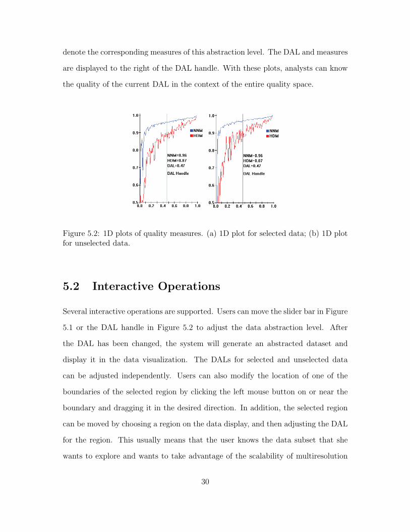
denote the corresponding measures of this abstraction level. The DAL and measures
are displayed to the right of the DAL handle. With these plots, analysts can know
the quality of the current DAL in the context of the entire quality space.
Figure 5.2: 1D plots of quality measures. (a) 1D plot for selected data; (b) 1D plotfor unselected data.
5.2 Interactive Operations
Several interactive operations are supported. Users can move the slider bar in Figure
5.1 or the DAL handle in Figure 5.2 to adjust the data abstraction level. After
the DAL has been changed, the system will generate an abstracted dataset and
display it in the data visualization. The DALs for selected and unselected data
can be adjusted independently. Users can also modify the location of one of the
boundaries of the selected region by clicking the left mouse button on or near the
boundary and dragging it in the desired direction. In addition, the selected region
can be moved by choosing a region on the data display, and then adjusting the DAL
for the region. This usually means that the user knows the data subset that she
wants to explore and wants to take advantage of the scalability of multiresolution
30

visualization. Alternatively a user can first choose a DAL in the current selected
region, and then adjust the selected/brushing boundary to enlarge or diminish the
size of the region. This often indicates that an acceptable data abstraction level had
been found, but the area of interest needs to be increased or decreased.
For some abstraction methods, each abstraction generates the same results, such
as clustering; for other abstraction methods, each abstraction may generate different
results, such as sampling. Analysts can also instruct the system to run the abstrac-
tion algorithm again to generate a new abstraction. For example, resampling can
help analysts verify patterns that had been discovered in the previous samples. If
a pattern still exists after resampling several times, this pattern is most likely a
robust one. Furthermore, analysts can compare the abstraction measures from mul-
tiple resamplings, and select an abstraction with the best quality. Finally, a user
can indicate a desired quality level based on one of the measures and let the system
decide the appropriate DAL.
5.3 View Continuity for Sampling
When analysts change the DAL, the patterns in the previous sample can be more
easily remembered and compared with those in the current sample if view continuity
is maintained. This can be accomplished following the three guidelines below:
1. When changing from a low DAL to a higher DAL, all the records in the
previous sample should be kept.
2. When changing from a high DAL to lower DAL, all the records in the new
sample should come from the previous sample.
3. When broadening or narrowing the brushing boundary, the system should keep
31

the records from the previous view, and then employ the same rules as above.
We follow the above guidelines to maintain view continuity. Analysts still have
the option to resample at any time or whenever they change the DAL or the
selected region.
5.4 Widget to Control Cluster-Based Abstraction
Hierarchical clustering generates a tree of clusters ranging from a single cluster
containing the entire dataset to terminal clusters containing one record each. To
represent a cluster in multiresolution visualization, one member of the cluster can
be selected as a representative or a new record can be constructed to summarize
the records in this cluster. This new record becomes the parent of all the records
or clusters it contains. By recursively clustering data into related groups, a tree of
clusters is formed.
The abstracted dataset in clustering is defined as all the items with a specific
node depth. This node depth represents the DAL. If the tree is visited using an
in-order traversal algorithm, then all the nodes of this tree will be sorted and each
node corresponds to a unique position in this order. Brushing is thus achieved via
selecting a range of nodes in this order. We employ two handles to control this range.
All the nodes in this range form a subtree. Analysts can adjust the abstraction level
and visualize selected nodes in more or less detail.
Figure 5.3 shows the widget to control both the level of abstraction and brushing,
referred to as the Structure-Based Brush (SBB) [13], designed by Ying-Huey Fua.
The triangular frame depicts the tree (see (a)). The leaf contour (see (c)) depicts the
silhouette of the tree. It delineates the approximate shape formed by chaining the
leaf nodes. The colored bold contour (see (b)) across the tree delineates the tree cut
32

that represents the abstracted dataset in a specific data abstraction level. Analysts
can adjust the DAL by moving this contour. The two movable handles (see (e)) on
the base of the triangle are called range handles. The range handles, together with
the apex of the triangle, form the selected region in the structure space (see (d)).
Analysts can adjust the selected region by moving the left handle, the right handle
or both. This interface, while specific to hierarchically clustered data, can support
all of the interactions on the abstraction.
Figure 5.3: Structure-based brushing tool. (a) The tree frame; (b) Contour corre-sponding to current level-of-detail; (c) Leaf contour approximates shape of the tree;(d) Structure-based brush; (e) Interactive brush handles; (f) Colormap legend forlevel-of-detail contour.
33

Chapter 6
Evaluation of Abstarction Quality
Measures
In this chapter, we will present the evaluation we performed on the abstraction qual-
ity measures. Our goal is to validate the accuracy of the proposed data abstraction
measures. Ideally, abstraction quality measures should conform to the data abstrac-
tion quality perceived by analysts. Abstraction quality measures estimates how well
the abstracted dataset represents the original dataset.
6.1 Description of Evaluation
We have designed two groups of questions for this evaluation: one group contains 9
questions based on the Iris dataset and employs parallel coordinates to display data,
while the other group contains 4 questions using the Out5d dataset and employs
Scatterplots to display data. For each question, the left figure displays the original
dataset, and the right figure shows the abstracted dataset. Users are asked to
input the answer by selected one quality level ranging from 0 to 10. All evaluation
34

questions are listed in Appendix A.
15 people evaluated this system, most of them students in the Department of
Computer Science at WPI. Four of them are visualization experts, five of them have
intermediate knowledge of visualization, and four of them had little prior knowledge
of visualization. On average, it took a person 30 seconds to answer each question.
6.2 Results of Evaluation
15 people responded to each question. Each question corresponds to a DAL. We
average the qualities perceived by the subjects to get the perception quality for a
DAL. The perceived quality is named PQ. The standard deviation of the perceived
qualities is also computed to show the variance of the perceived qualities, labelled
Stdev. We first employ a 2D chart to illustrate the relation between DAL and
HDM, NNM, SM, PQ and Stdev. Figure 6.1 shows the result for the first group,
while figure 6.2 shows the results for the second group.
Figure 6.1: Evaluation Results 1
Next, we employ parallel coordinates to show the results. The result dataset
contains five dimensions, vis type (Parallel coordinates or Scatterplots matrices),
35

Figure 6.2: Evaluation Results 2
Stdev (Stanard Deviation), PQ (Perceived Quality), DAL, HDM and NNM. Figure
6.3 shows the 13 data records with parallel coordinates. The results from the first
9 experiments are brushed.
Figure 6.3: Evaluation results shown by parallel coordinates
36

6.3 Analysis of Evaluation
From Figure 6.1, 6.2, and 6.3, we summarize several observations regarding our
measures and evaluation.
1. As the abstraction level increases, the perceived quality increases, and our
quality measures (HDM and NNM) increase as well, although they fluctuate.
This shows that our measures can be used to differentiate data abstraction
qualities, and our measures can indicate data abstraction quality. This also
informs us that we are going in the right direction in our search for quality
measures.
2. Our measures, including HDM, NNM and SM, are higher than the qualities
perceived by users. Thus we need to adjust methods or parameters used in the
process of computing measures to make them closer to the perceived qualities.
We will discuss this problem in the next chapter.
3. As the abstraction level increases, the standard deviation of quality perceived
by users decreases, although it fluctuates. This shows that users agree with
each other on data abstraction quality as the abstraction level increases.
37

Chapter 7
Experiments on Data Abstraction
Measures
In this chapter, we will present experiments we did on data abstraction measures.
For one kind of measure, many variations exist because there are different distance
metrics and/or different mechanisms to choose during the computation of measures.
For HDM, we may use 1-D histograms or N-D histograms. After selecting the
type of histogram, we can use one of many distance measures to compute HDM.
For NNM, we can select one of many possible distance metrics. We may also use
different mechanisms to normalize the NNM. The objective of these experiments
is to find the best measure of each type of measure from variations of each type
through comparing them.
Table 7.1 lists the measures, metrics and mechanisms that they use.
We choose 100 abstraction levels from 0.01 to 1.00. For each abstraction level,
we compute the corresponding quality measures. The result is a measure dataset.
It contain 100 records, and each record contain 11 attributes: DAL, HDM1, HDM2,
NHDM1, NHDM2, NNM1-1, NNM2-1, NNM2-2, SM1 and SM2. Figure 7.1 shows
38

Name Mechanism and Metric1-HDM 1-D HistogramN-HDM N-D Histogram1-HDM-1 1-D Histogram, Manhattan distance1-HDM-2 1-D Histogram, Euclidean distanceN-HDM-1 N-D Histogram, Manhattan distanceN-HDM-2 N-D Histogram, Euclidean distanceNNM-1 Manhattan distanceNNM-2 Euclidean distanceNNM-a Regular NormalizationNNM-b New NormalizationNNM-a-1 Regular Normalization, Manhattan distanceNNM-a-2 Regular Normalization, Euclidean distanceNNM-b-1 New Normalization, Manhattan distanceNNM-b-2 New Normalization, Euclidean distanceSM-1 Manhattan distanceSM-2 Euclidean distance
Table 7.1: List of Quality Measures
Figure 7.1: Quality Measures with Metrics and Mechanisms of them
39

this dataset with parallel coordinates. We will analyze this dataset together with
the quality perceived by users in the following sections.
7.1 Comparing HDM with Different Histograms
HDM may employ different histogram methods, such as 1-D histograms and N-D
histograms, or different distance metrics. For distance metrics, we prefer the Man-
hattan distance metric because it represents the difference between two histograms.
Thus the HDM can represent the difference between data distributions of these two
datasets. In this section, we will compare 1-HDM-1 and N-HDM-1. 1-HDM-1 rep-
resents the HDM based on 1-D histograms, N-HDM-1 represents the HDM based
on an N-D histogram, and both of them use Manhattan distance.
Figure 7.2: 1-HDM-1 and N-HDM-1
Figure 7.2 shows the changes of 1-HDM-1 and N-HDM-1 with the increase of
data abstraction level. As we can see, 1-HDM-1 is higher than N-HDM-1 in nearly
40

all data abstraction levels. In the previous chapter, our evaluation indicates that
the HDM measure is higher than the quality perceived by users. So N-HDM-1 is
closer to the quality perceived by users than 1-HDM-1.
Why is N-HDM-1 closer to the quality perceived by users than 1-HDM-1? We
first review the steps to compute 1-HDM-1 and N-HDM-1.
Steps to compute 1-HDM-1:
1. Compute 1 dimensional histogram for each dimension in the abstracted dataset
and the original dataset;
2. Compute 1 dimensional histogram distances for each dimension;
3. Compute average for distances of all dimensions;
4. Normalize this average value into 1-HDM.
Steps to compute N-HDM-1:
1. Compute N dimensional histogram for the abstracted dataset and the original
dataset;
2. Compute N dimensional histogram distance;
3. Normalize this distance into 1-HDM-1.
1-HDM-1 indicates the average difference of data distribution of each dimension
independently, while N-HDM-1 indicates the difference of data distribution of all
dimensions together. N 1-D histograms may lose some information about data
distribution compared to an N dimensional histogram. Hence N-HDM-1 is closer to
the quality perceived by users than 1-HDM-1 in most of cases.
41

7.2 Comparing NNM with Different Normaliza-
tion Methods
In Chapter 4, we presented two methods to normalize the NNM. One method uses
the average distance from each data record to its representative. The other method
considers the radius (R) of the original dataset, whose value is the average distance
from the centroid to all records in the original dataset. The centroid is the data
record with the minimum distance to all records in a dataset. The average distance
from each data record to its representative is considered as the radius (r) of the data
abstraction.
We use the following formulas to compute NNM, respectively:
NNM-a = 1.0 − AvgD = 1.0 − r
NNM-b = 1.0 − rR
Figure 7.3 shows the changes of NNM-a-1 and NNM-b-1 with the increase of data
abstraction level. Figure 7.4 shows the changes of NNM-a-2 and NNM-b-2 with the
increase of data abstraction level. As we can see, NNM-b is closer to the quality
perceived by users than NNM-a. Since NNM is higher than the quality perceived by
users, we prefer NNM-b to NNM-a to measure data abstraction quality. From the
definition of NNM-a and NNM-b, NNM-b is less than NNM-a because the radius
R, the normalized distance, is less than 1.
7.3 Comparing HDM and NNM with Different
Distance Methods
In this section, we compare 1-HDM, N-HDM, NNM-a, NNM-b and SM (Statistical
Measure) using the Manhattan distance and the Euclidean distance.
42

Figure 7.3: NNM-a-1 and NNM-b-1
Figure 7.4: NNM-a-2 and NNM-b-2
Figures 7.5 and 7.6 show 1-HDM and N-HDM using Manhattan distance and
Euclidean distance respectively. We can see that HDM using Manhattan distance is
closer to the quality perceived by users than HDM using Euclidean distance. Thus
43

HDM (N-HDM as well as 1-HDM) using Manhattan distance is more accurate on
measuring data abstraction quality than HDM using Euclidean distance. We will
analyze this in our future work.
Figure 7.5: 1-HDM-1 and 1-HDM-2
Figures 7.7, 7.8 and 7.9 show NNM-a, NNM-b and SM using Manhattan distance
and Euclidean distance respectively. We can see that NNM and SM using Euclidean
distance are slightly closer to the quality perceived by users than NNM and SM using
Manhattan distance. Thus NNM and SM using Euclidean distance are slightly more
accurate on measuring data abstraction quality than NNM and SM using Manhattan
distance. We will analyze this in our future work.
7.4 Conclusion of Experiments
In this chapter, we compared HDM with different histograms, NNM with differ-
ent normalization methods, and HDM/NNM with different distance methods. We
44

Figure 7.6: N-HDM-1 and N-HDM-2
Figure 7.7: NNM-a-1 and NNM-a-2
noticed that SM-2 is closer to user’s perceived quality than SM-1, thus we recom-
mend SM-2, the SM using Euclidean distance. We found that N-HDM is closer to
the perceived quality than 1-HDM, and HDM-1 is closer to the perceived quality
45

Figure 7.8: NNM-b-1 and NNM-b-2
Figure 7.9: SM-1 and SM-2
than HDM-2, thus we recommend N-HDM-1, the HDM using N-D histogram and
Manhattan distance. We also found that NNM-2 is closer to perceived quality than
NNM-1, NNM-b is closer to perceived quality than NNM-a, thus we recommend
46

NNM-b-2, the NNM using the new normalization method and Euclidean distance.
47
Chapter 8
Case Studies
8.1 Case Study 1: Choosing a Data Abstraction
Level (DAL)
In this section, we show how to choose an appropriate DAL. At this level, the
abstracted dataset should have a high data abstraction quality (equal or more than
0.90) and the visualization should have the best visual quality under the constraints
of the data abstraction quality. The analytic task is to search for clusters in the
OUT5D dataset. This dataset consists of five remote sensing channels: SPOT,
Magnetics, Potassium, Thorium and Uranium, with 16384 records. We employ
scatterplots to visualize this dataset. Figure 8.1 shows the original dataset. Data
points have significant overlaps with each other. We cannot distinguish relative
data density in different regions and have difficulty observing any trends within this
dataset.
First we make an abstraction with the DAL equal to 0.02. The corresponding
HDM is 0.92 and the NNM is 0.93; this abstraction quality meets our requirements.
The abstraction quality is positively related to the data abstraction level in general,
48

Figure 8.1: Scatterplots of original dataset (DAL=1.00)
Figure 8.2: Scatterplots of abstracted dataset (DAL=0.02)
although small fluctuations may exist. The scatterplot matrix with DAL equal to
0.02 is shown in Figure 8.2. We can see that a cluster (named Cluster A) exists in
the marked scatterplot, but data points in other places are too sparse to be able
to observe definitive clustering behavior. Next we will focus on searching for a
visualization with the best visual quality.
We change the DAL to 0.08. As shown in Figure 8.3, the sparse region in the
marked scatterplot illustrates very good visual quality. However, data points in
49

Figure 8.3: Scatterplots of abstracted dataset (DAL=0.08)
Figure 8.4: Scatterplots of abstracted dataset (DAL=0.04)
Cluster A are overplotted, thus the relative data density in Cluster A is higher
than the relative data density we observe. Next we adjust the DAL to 0.04. As
shown in Figure 8.4, the visual quality in the marked scatterplot is very good while
the relative data density is maintained, although a small number of data points in
Cluster A still overlap with each other. The quality measures of this abstraction
are shown in Figure 8.5. This quality meets our requirement and we terminate our
50

Figure 8.5: Data abstraction measures
exploration.
Abstraction quality measures give us confidence in the pattern we discovered. If
we only know that the DAL, the ratio between the number of abstracted records
and the number of original records, is 0.04, we cannot have much confidence in our
discoveries because we know that 96 percent of the data are not shown. However,
with the HDM more than 0.95 and the NNM more than 0.96 for both clustering and
sampling, we are fairly certain that the abstracted dataset represents the original
dataset very well and that the pattern (Cluster A in this case) is very likely valid.
In general, we can assign the abstraction quality measures to the discovered pattern
to indicate the confidence level of the pattern, which enables analysts to make more
accurate decisions.
8.2 Case Study 2: Comparing Data Abstraction
Methods
In this application, two data abstraction methods, clustering and sampling, are
compared using the proposed data abstraction measures embedded within our mul-
tiresolution visualization system. We employ the AAUP dataset, which surveys the
51

number, salary and compensation of professors at 1161 institutions. We use parallel
coordinates to visualize this dataset. Through this case study, we find that sampling
has the advantage of maintaining the relative density of datasets while clustering
has the advantage of maintaining the outliers of the dataset.
First we briefly review some characteristics of the HDM and NNM. The HDM is
based on the histogram and minimizes the difference between the distributions of two
datasets, so it excels in detecting changes in the relative density of data. The NNM
minimizes the distance between the original dataset and the abstracted dataset.
Outliers cannot be eliminated during abstraction without a noticeable increase of
the average distance, because they tend to be far from most of the data records.
Thus the NNM method gives high priority to outliers and is good at monitoring the
change of outliers.
Figure 8.6: Parallel Coordinates of AAUP dataset
The original dataset is shown in Figure 8.6. On the last dimension, the dense
range with low values is marked as A and highlighted in red; the sparse range is
marked as B and drawn in green. We can see that most of the data records are
gathered in range A. We sample the original dataset and tentatively set the DAL
52

Figure 8.7: Parallel Coordinates of sampled AAUP dataset (DAL=0.08)
Figure 8.8: Parallel Coordinates of clustered AAUP dataset (DAL=0.08)
to 0.08. Figure 8.7 shows the visualization of this abstraction. Figure 8.9a shows
the data abstraction quality of the whole dataset: HDM is 0.90 and NNM is 0.95.
We then cluster this dataset, and also set the DAL to 0.08 to facilitate comparison.
As displayed in Figure 8.8, the visual clutter is significantly reduced. Figure 8.9b
shows the data abstraction quality of the whole dataset: HDM is 0.66 and NNM is
0.96.
53

Figure 8.9: a. Quality measures for the abstraction of sampling; b. Quality measuresfor the abstraction of clustering
We can see that the HDM of sampling is much better than the HDM of clustering.
Thus we conclude that sampling maintains the relative density of the dataset much
better than clustering. This can be explained by the fact that clustering finds one
representative for each cluster, no matter how many members the cluster represents.
Thus it loses the relative density. This can be verified by the visualizations. We
can clearly see that sample-based visualization maintains the relative density, while
cluster-based visualization reduces the relative density in range A and enlarges it in
range B. On the other hand, the NNM is slightly better than that for sampling. We
tested sampling and clustering at other abstraction levels and got similar results.
So we verified that clustering maintains the outliers better than sampling. Analysts
can consider the importance of maintaining relative density versus outliers for their
analytic tasks, observe the HDM or NNM measures, and then select an abstraction
method that balances relative density and outliers to meet their goals.
54
Chapter 9
Conclusions and Future Work
9.1 Conclusions
In this thesis, we have identified data abstraction as a common mechanism for deal-
ing with large-scale data visualization. We have designed three data abstraction
quality measures to gauge how well the abstracted dataset represents the original
dataset: the Histogram Difference Measure (HDM) , the Nearest Neighbor Measure
(NNM) and the Statistical Measure (SM). We implemented these measures within
XmdvTool, which supports both sampling and clustering as abstraction methods.
Several interactive operations were developed, including adjusting the data abstrac-
tion level, changing selected regions, regenerating the abstraction, and setting the
desired abstraction quality. The quality measures indicate the quality of the ab-
straction and thus also indirectly the quality of any patterns discovered through the
abstraction.
Data abstraction quality measures should conform to the data abstraction quality
as perceived by analysts. We did an evaluation to check this in Chapter 6. We
found that our measures are larger than the quality perceived by analysts. Thus
55

we designed several experiments to compare each type of measure with different
distance methods and different computing mechanisms, such as different histograms
or normalization approaches. We conclude that HDM using N-D histogram and
Manhattan distance is better than other HDMs, NNM using our new normalization
method and Euclidean distance is better than others NNMs, and SM using Euclidean
distance is better than other SMs.
Aided by these measures, analysts can find the most appropriate data abstrac-
tion level for a given task, that is, one with a reasonable abstraction quality and
acceptable data density. These measures can also be used to compare different data
abstraction methods in terms of how well they maintain relative data density and
outliers. Thus our framework enables analysts to select abstraction methods that
best fit their analytic tasks. We provide two case studies to illustrate the useful-
ness of these measures and the effectiveness of our proposed interactive tools related
to the measures. Different abstraction measures may be sensitive to the changes
in different dataset features, such as the relative data density and characteristics of
outliers. We plan to evaluate the advantages and limitations of abstraction measures
in the presence of different dataset features.
9.2 Future Work
In chapter 4, we introduced the radius based approach to normalizing NNM. Instead
of using the radius of a cluster, we may consider employing the average distance
between any two data records to represent the cohesion of a cluster. We will compare
this approach with the approach based on radius in our future work.
In Chapter 6, we assessed the accuracy of data abstraction measures through user
evaluation. We compared the perceived quality with data abstraction measures, and
56
then adjusted the computing approaches of measures. However, the user evaluation
method used has limitations: users cannot exactly decide how well an abstraction
represents the original dataset. In our future work, we will use synthetic datasets
or datasets on which the quality for each abstraction is already known to assess the
accuracy of data abstraction measures.
In Chapter 7, the experiments show that HDM (N-HDM as well as 1-HDM) using
Manhattan distance is more accurate at measuring data abstraction quality than
HDM using Euclidean distance, and that NNM and SM using Euclidean distance
are slightly more accurate on measuring data abstraction quality than NNM and
SM using Manhattan distance. We will investigate the reasons for this in our future
work.
Peng et al. [23] designed and implemented several quality measures based on
visual clutter into XmdvTool. Xie et al. [36] also integrated data quality attributes
into our visualizations. In our future work, we plan to integrate these three efforts
at quality measurement, representation and optimization and provide a quality-
aware visualization framework to support the visual analysis process. Through
this framework, analysts will be able to interactively explore very large datasets
with quality information and refinement techniques available at each stage of the
visualization process.
57

Appendix A
Evaluation Questions
We have two groups of experiments. The first group has 9 questions and the second
has 4 questions. Please estimate the data abstraction quality regarding to preserving
dominant characteristics of the original dataset. The left figure shows the original
dataset, while the right figure shows the abstracted dataset. Please input your
answer by selected one quality level ranging from 0 to 10.
A.1 Group 1: 9 Questions
58

Figure A.1: Q1, how well does the abstracted dataset represents the original dataset?(Range: 0-10)
59

Figure A.2: Q2, how well does the abstracted dataset represents the original dataset?(Range: 0-10)
Figure A.3: Q3, how well does the abstracted dataset represents the original dataset?(Range: 0-10)
60

Figure A.4: Q4, how well does the abstracted dataset represents the original dataset?(Range: 0-10)
Figure A.5: Q5, how well does the abstracted dataset represents the original dataset?(Range: 0-10)
61

Figure A.6: Q6, how well does the abstracted dataset represents the original dataset?(Range: 0-10)
Figure A.7: Q7, how well does the abstracted dataset represents the original dataset?(Range: 0-10)
62

Figure A.8: Q8, how well does the abstracted dataset represents the original dataset?(Range: 0-10)
Figure A.9: Q9, how well does the abstracted dataset represents the original dataset?(Range: 0-10)
63

A.2 Group 2: 4 Questions
Figure A.10: Q1, how well does the abstracted dataset represents the originaldataset? (Range: 0-10)
Figure A.11: Q2, how well does the abstracted dataset represents the originaldataset? (Range: 0-10)
64

Figure A.12: Q3, how well does the abstracted dataset represents the originaldataset? (Range: 0-10)
Figure A.13: Q4, how well does the abstracted dataset represents the originaldataset? (Range: 0-10)
65

Bibliography
[1] S. Acharya, P. Gibbons, and V. Poosala. Congressional samples for approximateanswering of group-by queries. Proc. ACM SIGMOD International Conferenceon Management of Data, pages 487–498, 2000.
[2] C. Ahlberg and B. Shneiderman. Visual information seeking using thefilmfinder. Proc. ACM SIGCHI Conference on Human Factors in ComputingSystems, 2:433, 1994.
[3] D. F. Andrews. Plots of high-dimensional data. Biometrics, 29:125–136, 1972.
[4] B. Babcock, S. Chaudhuri, and G. Das. Dynamic sample selection for approx-imate query processing. Proc. ACM SIGMOD International Conference onManagement of Data, pages 539–550, 2003.
[5] B. Bederson. Pad++: Advances in multiscale interfaces. Proc. ACM SIGCHIConference on Human Factors in Computing Systems, page 315, 1994.
[6] P. Berkhin. Survey of clustering data mining techniques. Technical report,Accrue Software, San Jose, CA, 2002.
[7] E. Bertini and G. Santucci. By chance is not enough: preserving relative densitythrough nonuniform sampling. Eighth International Conference on InformationVisualisation (IV’04), pages 622–629, 2004.
[8] E. Bertini and G. Santucci. Quality metrics for 2d scatterplot graphics: au-tomatically reducing visual clutter. Proc. of 4th International Symposium onSmartGraphics, pages 77–89, 2004.
[9] F. Boutin and M. Hascoet. Cluster validity indices for graph partitioning.Eighth International Conference on Information Visualisation (IV’04), pages376–381, 2004.
[10] J. Bucher. The Metrology Handbook. ASQ Quality Press, Milwaukee, Wisc.,2004.
[11] A. Dix and G. Ellis. By chance - enhancing interaction with large data setsthrough statistical sampling. Proc. Advanced Visual Interfaces, pages 167–176,2002.
66

[12] R. Duda, P. Hart, and D. Stork. Pattern classification. John Wiley and Sons,Inc., 2th edition, 2001.
[13] Y. Fua, M. Ward, and E. Rundensteiner. Structure-based brushes: A mecha-nism for navigating hierarchically organized data and information spaces. IEEETrans. on Visualization and Computer Graphics, 6(2):150–159, 2000.
[14] M. Granitzer, W. Kienreich, V. Sabol, K. Andrews, and W. Klieber. Evaluatinga system for interactive exploration of large, hierarchically structured documentrepositories. Proc. IEEE Symposium on Information Visualization, pages 127–134, 2004.
[15] S. Guha, R. Rastogiand, and K. Shim. Cure: an efficient clustering algorithmfor large databases. ACM SIGMOD Record, 27(2):73–84, June 1998.
[16] A. Inselberg and B. Dimsdale. Parallel coordinates: A tool for visualizingmultidimensional geometry. In Proc. of Visualization ’90, p. 361-78, 1990.
[17] K. Jain and C. Dubes. Algorithms for Clustering Data. Prentice Hall, 1988.
[18] M. Kreuseler, N. Lopez, and H. Schumann. A scalable framework for informa-tion visualization. Proc. IEEE Symposium on Information Visualization, pages27–36, 2000.
[19] J. LeBlanc, M. Ward, and N. Wittels. Exploring n-dimensional databases. Proc.IEEE Visualization, pages 230–237, 1990.
[20] Y. Leung and M. Apperley. A review and taxonomy of distortion-orientedpresentation techniques. ACM Transactions on Computer-Human Interaction,1(2):126–160, 1994.
[21] A. Martin and M. Ward. High dimensional brushing for interactive explorationof multivariate data. Proc. IEEE Visualization, pages 271–278, 1995.
[22] W. Niblack, R. Barber, W. Equitz, M. Flickner, E. Glasman, D. Petkovic,P. Yanker, C. Faloutsos, and G. Taubin. The QBIC project: querying imagesby content using color, texture and shape. Proc. of SPIE Storage and Retrievalfor Image and Video Databases, pages 173–187, 1993.
[23] W. Peng, M. Ward, and E. Rundensteiner. Clutter reduction in multi-dimensional data visualization using dimension reordering. Proc. IEEE Sym-posium on Information Visualization, pages 89–96, 2004.
[24] D. Rafiei and S. Curial. Effectively visualizing large networks through sampling.Proc. IEEE Visualization, pages 48–55, 2005.
[25] W. Ribarsky, E. Ayers, J. Eble, and S. Mukherjea. Glyphmaker: Creatingcustomized visualization of complex data. IEEE Computer, 27(7):57–64, 1994.
67

[26] E. Riskin. Optimal bit allocation via the generalized BFOS algorithm. IEEETrans. on Information Theory, IT-37:400–402, Mar. 1991.
[27] R. Rosenholtz, Y. L. amd J. Mansfield, and Z. Jin. Feature congestion: ameasure of display clutter. Proc. ACM SIGCHI Conference on Human Factorsin Computing Systems, pages 761–770, 2005.
[28] D. Santa-Cruz, T. Ebrahimi, J. Askelof, M. Larsson, and C. Christopoulos.JPEG 2000 still image coding versus other standards. SPIE’s 45th annualmeeting, Applications of Digital Image Processing XXIII, 4115:446–454, Aug2000.
[29] D. Scott. On optimal and data-based histograms. Biometrika, 66:605–610,1979.
[30] S. Siggelkow. Feature Histograms for Content-Based Image Retrieval. Ph.DThesis, University of Freiburg, Institute for Computer Science, Freiburg, Ger-many, 2002.
[31] M. Swain and D. Ballard. Color indexing. International Journal of ComputerVision, 7:11–32, 1991.
[32] S. Thompson. Sampling. John Wiley and Sons, Inc., New York, 2th edition,1992.
[33] E. Tufte. The Visual Display of Quantitative Information. Graphics Press,Cheshire, CT, 1982.
[34] M. Ward. Xmdvtool: Integrating multiple methods for visualizing multivariatedata. Proc. IEEE Visualization, pages 326–333, 1994.
[35] E. Wegman. Hyperdimensional data analysis using parallel coordinates. Journalof the American Statistical Association, 411(85):664–675, 1990.
[36] Z. Xie, S. Huang, M. O. Ward, and E. A. Rundensteiner. Exploratory visual-ization of multivariate data with variable quality. IEEE Symposium on VisualAnalytics Science and Technology, pages 183–190, 2006.
[37] J. Yang, M. Ward, and E. Rundensteiner. Hierarchical exploration of largemultivariate data sets. Data Visualization: The State of the Art 2003, pages201–212, 2003.
[38] J. Yang, M. O. Ward, and E. A. Rundensteiner. Interactive hierarchical dis-plays: A general framework for visualization and exploration of large multivari-ate data sets. Computer and Graphics Journal, 27:256–283, 2002.
[39] T. Zhang, R. Ramakrishnan, and M. Livny. Birch: an efficient data clusteringmethod for very large databases. SIGMOD Record, 25(2):103–114, June 1996.
68
Top Related
Copyright © 2022 FDOKUMEN

