
Web App Development with ASP.NET
36
Web App Development with ASP.NET
-
Upload
khangminh22 -
Category
Documents
-
view
0 -
download
0
Transcript of Web App Development with ASP.NET

137
Web App Development with ASP.NET

138
23.1 Introduction In this chapter, we introduce web-app development with Microsoft’s ASP.NET
technology. Web-based apps create web content for web-browser clients. We present several examples that demonstrate web-app development using Web
Forms, web controls (also called ASP.NET server controls) and Visual C# programming. Web Form files have the filename extension .aspx and contain the web page’s GUI. You customize Web Forms by adding web controls including labels, textboxes, images, buttons and other GUI components. The Web Form file represents the web page that’s sent to the client browser. We often refer to Web Form files as ASPX
files. An ASPX file created in Visual Studio has a corresponding class written in a .NET
language—we use Visual C# in this book. This class contains event handlers, initialization code, utility methods and other supporting code. The file that contains this class is called the code-behind file and provides the ASPX file’s programmatic implementation.
23.2 Web Basics In this section, we discuss what occurs when a user requests a web page in a browser. In its simplest form, a web page is nothing more than an HTML (HyperText Markup Language) document (with the extension .html or .htm) that describes to a web browser the docu- ment’s content and how to format it.
HTML documents normally contain hyperlinks that link to different pages or to other parts of the same page. When the user clicks a hyperlink, a web server locates the requested web page and sends it to the user’s web browser. Similarly, the user can type the address of a web page into the browser’s address field and press Enter to view the specified page.
URIs and URLs
URIs (Uniform Resource Identifiers) identify resources on the Internet. URIs that start with http:// are called URLs (Uniform Resource Locators). Common URLs refer to files, direc- tories or server-side code that performs tasks such as database lookups, Internet searches and business application processing. If you know the URL of a publicly available resource anywhere on the web, you can enter that URL into a web browser’s address field and the browser can access that resource.
Parts of a URL
A URL contains information that directs a browser to the resource that the user wishes to access. Web servers make such resources available to web clients. Popular web servers include Microsoft’s Internet Information Services (IIS), Apache’s HTTP Server and Nginx.1
Let’s examine the components of the URL
http://www.deitel.com/books/downloads.html
The http:// indicates that the HyperText Transfer Protocol (HTTP) should be used to obtain the resource. HTTP is the web protocol that enables clients and servers to commu- nicate. Next in the URL is the server’s fully qualified hostname
(www.deitel.com)—the name of the web server computer on which the resource resides. This computer is referred to as the host, because it houses and maintains
dell
Highlight
dell
Highlight
dell
Highlight
dell
Highlight
dell
Highlight

139
resources. The hostname www.deitel.com is translated into an IP (Internet
Protocol) address—a numerical value that uniquely identifies the server on the Internet. A Domain Name System (DNS) server maintains a database of hostnames and their corresponding IP addresses, and performs the translations automatically.
remainder of the URL (/books/downloads.html) specifies the resource’s loca- tion (/books) and name (downloads.html) on the web server. The location could repre- sent an actual directory on the web server’s file system. For security reasons, however, the location is typically a virtual directory. The web server translates the virtual directory into a real location on the server, thus hiding the resource’s true location.
23.3 Multitier App Architecture Web-based apps are multitier apps (sometimes referred to as n-tier apps). Multitier apps divide functionality into separate tiers (that is, logical groupings of functionality). Al- though tiers can be located on the same computer, the tiers of web-based apps commonly reside on separate computers for security and scalability. Figure 23.3 presents the basic ar- chitecture of a three-tier web-based app.
Information Tier
The bottom tier (also called the information tier) maintains the app’s data. This tier typ- ically stores data in a relational database management system. For example, a retail store might have a database for storing product information, such as descriptions, prices and quantities in stock. The same database also might contain customer information, such as user names, billing addresses and credit card numbers. This tier can contain multiple da- tabases, which together comprise the data needed for an app.
Top tier (Client tier)
User interface
Middle tier (Business logic tier)
Bottom tier (Information tier)
Business logic implemented in ASP.NET
Database
Fig. 23.3 | Three-tier architecture.
LINQ
dell
Highlight
dell
Highlight
dell
Highlight
dell
Highlight
dell
Highlight
dell
Highlight

140
Business Logic
The middle tier implements business logic, controller logic and presentation
logic to control interactions between the app’s clients and its data. The middle tier acts as an in- termediary between data in the information tier and the app’s clients. The middle-tier controller logic processes client requests (such as requests to view a product catalog) and retrieves data from the database. The middle-tier presentation logic then processes data from the information tier and presents the content to the client. Web apps present data to clients as web pages.
Business logic in the middle tier enforces business rules and ensures that data is reliable before the server app updates the database or presents the data to users. Business rules dic- tate how clients can and cannot access app data, and how apps process data. For example, a business rule in the middle tier of a retail store’s web-based app might ensure that all product quantities remain positive. A client request to set a negative quantity in the bottom tier’s product information database would be rejected by the middle tier’s business logic.
Client Tier
The top tier, or client tier, is the app’s user interface, which gathers input and displays output. Users interact directly with the app through the user interface (typically viewed in a web browser), keyboard and mouse. In response to user actions (for example, clicking a hyperlink), the client tier interacts with the middle tier to make requests and to retrieve data from the information tier. The client tier then displays to the user the data retrieved from the middle tier. The client tier never directly interacts with the information tier.
23.4 Your First Web App Our first example displays the web server’s time of day in a browser window (Fig. 23.4). When this app executes—that is, a web browser requests the app’s web page—the web server executes the app’s code, which gets the current time and displays it in a Label. The web server then returns the result to the web browser that made the request, and the web browser renders the web page containing the time. We executed this app in both the Inter- net Explorer and Firefox web browsers to show you that the web page renders identically in different browsers—the page should look the same in most Web browsers.
dell
Highlight
dell
Highlight

141
Fig. 23.4 | WebTime web app running in both Internet Explorer and Firefox.
Testing the App in Your Default Web Browser To test this app in your default web browser, perform the following steps:
1. Open Visual Studio Express For Web.
2. Select Open Web Site… from the FILE menu.
3. In the Open Web Site dialog (Fig. 23.5), ensure that File System is selected, then navigate to this chapter’s examples, select the WebTime folder and click the Open Button.
4. Select WebTime.aspx in the Solution Explorer, then type Ctrl + F5 to execute the web app.
Fig. 23.5 | Open Web Site dialog.
142
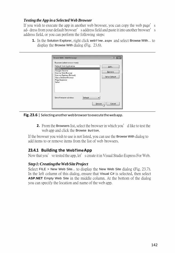
Testing the App in a Selected Web Browser
If you wish to execute the app in another web browser, you can copy the web page’s ad- dress from your default browser’s address field and paste it into another browser’s address field, or you can perform the following steps:
1. In the Solution Explorer, right click WebTime.aspx and select Browse With… to display the Browse With dialog (Fig. 23.6).
Fig. 23.6 | Selecting another web browser to execute the web app.
2. From the Browsers list, select the browser in which you’d like to test the web app and click the Browse Button.
If the browser you wish to use is not listed, you can use the Browse With dialog to add items to or remove items from the list of web browsers.
23.4.1 Building the WebTime App Now that you’ve tested the app, let’s create it in Visual Studio Express For Web.
Step 1: Creating the Web Site Project
Select FILE > New Web Site... to display the New Web Site dialog (Fig. 23.7). In the left column of this dialog, ensure that Visual C# is selected, then select ASP.NET Empty Web Site in the middle column. At the bottom of the dialog you can specify the location and name of the web app.

143
Fig. 23.7 | Creating an ASP.NET Web Site in Visual Studio Express For Web.
The Web location: ComboBox provides the following options:
„ File System: Creates a new website for testing on your local computer. Such web- sites execute on your local machine in IIS Express and can be accessed only by web browsers running on the same computer. IIS Express is a version of Micro- soft’s Internet Information Services (IIS) web server that allows you to test your web apps locally. You can later publish your website to a production IIS web serv- er for access via a local network or the Internet. Each example in this chapter uses the File System option, so select it now.
„ HTTP: Creates a new website on an IIS web server and uses HTTP to allow you to put your website’s files on the server. IIS is Microsoft’s software that’s used to run production websites. If you own a website and have your own web server, you might use this to build a new website directly on that server computer. You must be an Administrator on the computer running IIS to use this option.
„ FTP: Uses File Transfer Protocol (FTP) to allow you to put your website’s files on the server. The server administrator must first create the website on the server for you. FTP is commonly used by so-called “hosting providers” to allow website owners to share a server computer that runs many websites.
Change the name of the web app from WebSite1 to WebTime, then click OK to create the website.
144
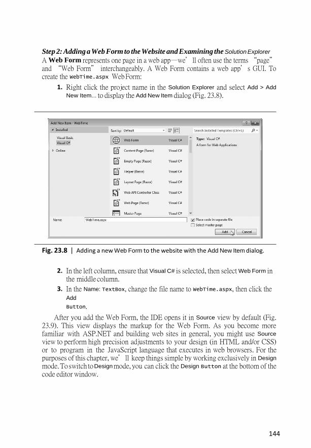
Step 2: Adding a Web Form to the Website and Examining the Solution Explorer
A Web Form represents one page in a web app—we’ll often use the terms “page” and “Web Form” interchangeably. A Web Form contains a web app’s GUI. To create the WebTime.aspx Web Form:
1. Right click the project name in the Solution Explorer and select Add > Add
New Item... to display the Add New Item dialog (Fig. 23.8).
Fig. 23.8 | Adding a new Web Form to the website with the Add New Item dialog.
2. In the left column, ensure that Visual C# is selected, then select Web Form in the middle column.
3. In the Name: TextBox, change the file name to WebTime.aspx, then click the Add
Button.
After you add the Web Form, the IDE opens it in Source view by default (Fig. 23.9). This view displays the markup for the Web Form. As you become more familiar with ASP.NET and building web sites in general, you might use Source
view to perform high precision adjustments to your design (in HTML and/or CSS) or to program in the JavaScript language that executes in web browsers. For the purposes of this chapter, we’ll keep things simple by working exclusively in Design
mode. To switch to Design mode, you can click the Design Button at the bottom of the code editor window.

145
Source mode shows only the Web Form’s
markup
Split mode allows you to view the Web Form’s markup and design at the same time
Design mode allows
you to build a Web Form using similar techniques
to building a Windows Form
Fig. 23.9 | Web Form in Source view.
The Solution Explorer
The Solution Explorer (Fig. 23.10) shows the contents of the website. We expanded the node for WebTime.aspx to show you its code-behind file WebTime.aspx.cs. Visual Studio Express For Web’s Solution Explorer contains a Nest Related Files button that organizes each Web Form and its code-behind file.
View Code
Nest Related Files
Code-behind file that contains the app’s
business logic
ASPX page represents the app’s user interface

146
Fig. 23.10 | Solution Explorer window for an Empty Web Site project after adding the
Web Form WebTime.aspx.
If the ASPX file is not open in the IDE, you can open it in Design mode by double clicking it in the Solution Explorer then selecting the Design tab, or by right clicking it in the Solution Explorer and selecting View Designer. To open the code-behind file in the code editor, you can double click it in the Solution Explorer or
„ select the ASPX file in the Solution Explorer, then click the View Code ( ) Button
„ right click the ASPX file in the Solution Explorer, then select View Code
„ right click the code-behind file in the Solution Explorer and select Open
The Toolbox
Figure 23.11 shows the Toolbox displayed in the IDE when the project loads. Part (a) dis- plays the beginning of the Standard list of web controls, and part (b) displays the remaining web controls and the list of other control groups. We discuss specific controls listed in Fig. 23.11 as they’re used throughout the chapter. Many of the controls have similar or identical names to Windows Forms controls presented earlier in the book.
a) Expanded Standard
list of web controls b) Remaining web controls form the
Standard list and collapsed lists of
other controls
Fig. 23.11 | Toolbox in Visual Studio Express For Web.
The Web Forms Designer
Figure 23.12 shows the initial Web Form in Design mode. You can drag and drop controls from the Toolbox onto the Web Form. You can also type at the current cursor location to add so-called static text to the web page. In response to such actions, the IDE generates the appropriate markup in the ASPX file.

147
Cursor appears here
by default
Cursor’s current location in the Web Form’s HTML Markup

148
Fig. 23.12 | Design mode of the Web Forms Designer.
Step 3: Changing the Title of the Page
Before designing the Web Form’s content, you’ll change its title to Simple Web Form Ex- ample. This title is typically displayed in the web browser’s title bar or on the browser tab that is displaying the page (see Fig. 23.4). It’s also used by search engines like Google and Bing when they index real websites for searching. Every page should have a title. To change the title:
1. Ensure that the ASPX file is open in Design view.
2. In the Properties window’s drop-down list, view the Web Form’s properties by selecting DOCUMENT, which represents the Web Form. A web page is often called a document.
3. Modify the page’s Title property by setting it to Simple Web Form Example.
Designing a Page
Designing a Web Form is similar to designing a Windows Form. To add controls to the page, drag-and-drop them from the Toolbox onto the Web Form in Design view. The Web Form itself and the control’s you add to the Web Form are objects that have properties, methods and events. You can set these properties visually using the Properties window, programmatically in the code-behind file or by editing the markup directly in the .aspx file. You can also type text directly on a Web Form at the cursor location.
Controls and other elements are placed sequentially on a Web Form one after another in the order in which you drag-and-drop them onto the Web Form. The cursor indicates the insertion point in the page. If you want to position a control between existing text or controls, you can drop the control at a specific position between existing page elements. You can also rearrange controls with drag-and-drop actions in Design view. The positions of controls and other elements are relative to the Web Form’s upper-left corner. This type of layout is known as relative positioning and it allows the browser to move elements and resize them based on the size of the browser window. Relative positioning is the default, and we’ll use it throughout this chapter.
For precise control over the location and size of elements, you can use absolute posi- tioning in which controls are located exactly where you drop them on the Web Form. If you wish to use absolute positioning:
1. Select TOOLS > Options…., to display the Options dialog.
2. Expand the HTML Designer node, select the CSS Styling node and ensure that the checkbox labeled Change positioning to absolute for controls added using
Toolbox, paste or drag and drop is selected.
Step 4: Adding Text and a Label
You’ll now add some text and a Label to the Web Form. Perform the following steps to add the text:
1. Ensure that the Web Form is open in Design mode.

149
2. Type the following text at the current cursor location:
Current time on the Web server:
3. Select the text you just typed, then select Heading 1 from the Block Format
Combo- Box (Fig. 23.13) in the IDE’s Formatting toolbar. This formats the text as a first- level heading that typically appears in a larger bold font. In more complex pages, headings help you specify the relative importance of parts of the content—like chapters in a book and sections in a chapter.
Block Format ComboBox on the Formatting toolbar
Fig. 23.13 | Changing the text to Heading 1 heading.
4. Click to the right of the text you just typed and press the Enter key to start a new paragraph in the page. The Web Form should now appear as in Fig. 23.14.
The cursor is positioned here after
inserting a new paragraph by pressing Enter
Fig. 23.14 | WebTime.aspx after inserting text and a new paragraph.

150
5. Next, drag a Label control from the Toolbox into the new paragraph or double click the Label control in the Toolbox to insert the Label at the current cursor position.
6. Using the Properties window, set the Label’s (ID) property to timeLabel. This specifies the variable name that will be used to programmatically change the Label’s Text.
7. Because, the Label’s Text will be set programmatically, delete the current value of the Label’s Text property. When a Label does not contain text, its name is displayed in square brackets in Design view (Fig. 23.15) as a placeholder for de- sign and layout purposes. This text is not displayed at execution time.
Label
control currently selected in
Design view
Fig. 23.15 | WebTime.aspx after adding a Label.
Step 5: Formatting the Label
Formatting in a web page is performed with CSS (Cascading Style Sheets). The details of CSS are beyond the scope of this book. However, it’s easy to use CSS to format text and elements in a Web Form via the tools built into Visual Studio Express For Web. In this example, we’d like to change the Label’s background color to black, its foreground color to yellow and make its text size larger. To format the Label, perform the following steps:
1. Click the Label in Design view to ensure that it’s selected.
2. Select VIEW > CSS Properties to display the CSS Properties window at the left side of the IDE (Fig. 23.16).
151
Fig. 23.16 | CSS Properties window.
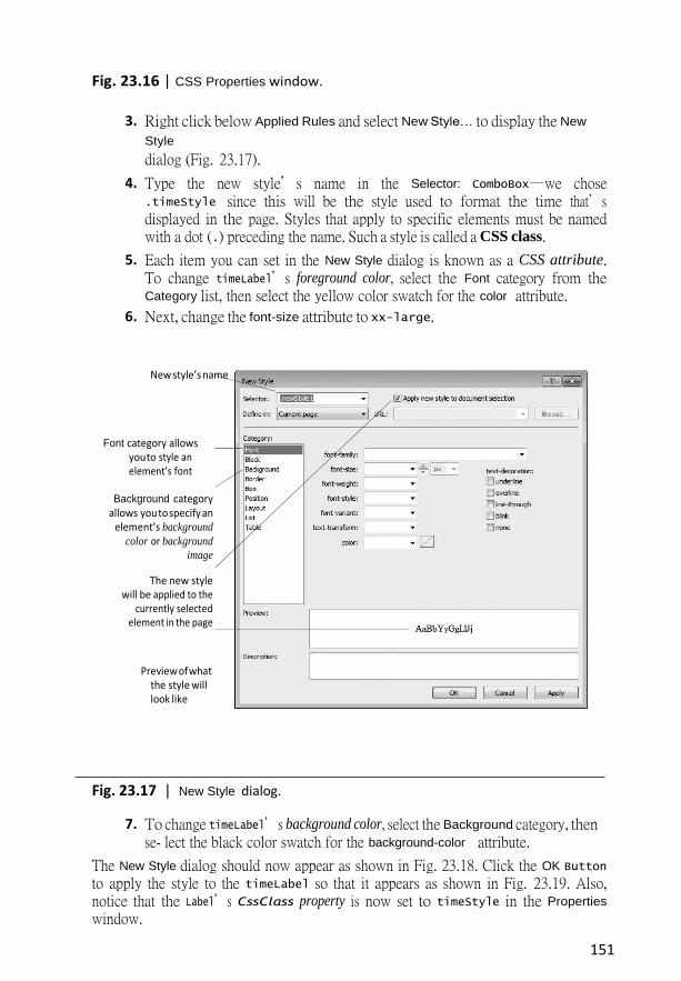
3. Right click below Applied Rules and select New Style… to display the New
Style
dialog (Fig. 23.17).
4. Type the new style’s name in the Selector: ComboBox—we chose .timeStyle since this will be the style used to format the time that’s displayed in the page. Styles that apply to specific elements must be named with a dot (.) preceding the name. Such a style is called a CSS class.
5. Each item you can set in the New Style dialog is known as a CSS attribute. To change timeLabel’s foreground color, select the Font category from the Category list, then select the yellow color swatch for the color attribute.
6. Next, change the font-size attribute to xx-large.
New style’s name
Font category allows you to style an element’s font
Background category allows you to specify an
element’s background
color or background
image
The new style will be applied to the
currently selected element in the page
Preview of what the style will look like
Fig. 23.17 | New Style dialog.
7. To change timeLabel’s background color, select the Background category, then se- lect the black color swatch for the background-color attribute.
The New Style dialog should now appear as shown in Fig. 23.18. Click the OK Button
to apply the style to the timeLabel so that it appears as shown in Fig. 23.19. Also, notice that the Label’s CssClass property is now set to timeStyle in the Properties
window.

152
Step 6: Adding Page Logic
Now that you’ve designed the GUI, you’ll write code in the code-behind file to obtain the server’s time and display it on the Label. Open WebTime.aspx.cs by double clicking it in the Solution Explorer. In this example, you’ll add an event handler to the code-behind file to handle the Web Form’s Init event, which occurs when the page is requested by a web browser. The event handler for this event—named Page_Init—initializes the page. The only initialization required for this example is to set the timeLabel’s Text property to the time on the web server computer. The code-behind file initially contains a Page_Load event handler. To create the Page_Init event handler, simply rename Page_Load as Page_Init. Then complete the event handler by inserting the following code in its body:
Step 7: Setting the Start Page and Running the Program
To ensure that WebTime.aspx loads when you execute this app, right click it in the Solution Explorer and select Set As Start Page. You can now run the program in one of several ways. At the beginning of Fig. 23.4, you learned how to view the Web Form by typing Ctrl + F5.
Bold category names indicate the categories in which
CSS attribute
values have been changed
Fig. 23.18 | New Style dialog after changing the Label’s style.

153
Fig. 23.19 | Design view after changing the Label’s style.
You can also right click an ASPX file in the Solution Explorer and select View in
Browser. Both of these techniques execute IIS Express, open your default web browser and load the page into the browser, thus running the web app. IIS Express stops when you exit Visual Studio Express For Web.
If problems occur when running your app, you can run it in debug mode by selecting DEBUG > Start Debugging, by clicking the Start Debugging Button ( ) or by typing F5 to view the web page in a web browser with debugging enabled. You cannot debug a web app unless debugging is explicitly enabled in the app’s Web.config file—a file that’s generated when you create an ASP.NET web app. This file stores the app’s configuration settings. You’ll rarely need to manually modify Web.config. The first time you select DEBUG > Start Debugging in a project, a dialog appears and asks whether you want the IDE to modify the Web.config file to enable debugging. After you click OK, the IDE executes the app. You can stop debugging by selecting DEBUG > Stop Debugging.
Regardless of how you execute the web app, the IDE will compile the project before it executes. In fact, ASP.NET compiles your web page whenever it changes between HTTP requests. For example, suppose you browse the page, then modify the ASPX file or add code to the code-behind file. When you reload the page, ASP.NET recompiles the page on the server before returning the response to the browser. This important behavior ensures that clients always see the latest version of the page. You can manually compile an entire website by selecting Build Web Site from the DEBUG menu in Visual Studio Express For Web.
23.4.2 Examining WebTime.aspx’s Code-Behind File Figure 23.20 presents the code-behind file WebTime.aspx.cs. Line 5 begins the declara- tion of class WebTime. A class declaration can span multiple source-code files—the separate portions of the class declaration in each file are known as partial classes. The partial modifier indicates that the code-behind file is part of a larger class. Like Windows Forms apps, the rest of the class’s code is generated for you based on your visual interactions to create the app’s GUI in Design mode. That code is stored in other source code files as par- tial classes with the same name. The compiler assembles all the partial classes that have the same into a single class declaration.

154
1 // Fig. 23.20: WebTime.aspx.cs
2 // Code-behind file for a page that displays the web server’s time.
3 using System; 4 5 public partial class WebTime : System.Web.UI.Page 6 {
7 // initializes the contents of the page
8 protected void Page_Init( object sender, EventArgs e ) 9 {
10 // display the server's current time in timeLabel
11 timeLabel.Text = DateTime.Now.ToString( "hh:mm:ss" ); 12 } // end method Page_Init
13 } // end class WebTime
Fig. 23.20 | Code-behind file for a page that displays the web server’s time.
Line 5 indicates that WebTime inherits from class Page in namespace System.Web.UI. This namespace contains classes and controls for building web-based apps. Class Page rep- resents the default capabilities of each page in a web app—all pages inherit directly or indi- rectly from this class.
Lines 8–12 define the Page_Init event handler, which initializes the page in response to the page’s Init event. The only initialization required for this page is to set the time- Label’s Text property to the time on the web server computer. The statement in line 11 retrieves the current time (DateTime.Now) and formats it as hh:mm:ss. For example, 9 AM is formatted as 09:00:00, and 2:30 PM is formatted as 02:30:00. As you’ll see, variable timeLabel represents an ASP.NET Label control. The ASP.NET controls are defined in namespace System.Web.UI.WebControls.
23.5 Standard Web Controls: Designing a Form This section introduces some of the web controls located in the Standard section of the Toolbox (Fig. 23.11). Figure 23.21 summarizes the controls used in the next example.
Fig. 23.21 | Commonly used web controls.
A Form Gathering User Input
TextBox
Button
HyperLink
Gathers user input and displays text.
Triggers an event when clicked.
Displays a hyperlink.
Displays a drop-down list of choices from which a user can select an item.
RadioButtonList A group of radio buttons.
Image Displays images (for example, PNG, GIF and JPG).

155
Figure 23.22 depicts a form for gathering user input. This example does not perform any tasks—that is, no action occurs when the user clicks Register. As an exercise, we ask you to provide the functionality. Here we focus on the steps for adding these controls to a Web Form and for setting their properties. Subsequent examples demonstrate how to handle the events of many of these controls. To execute this app:
1. Select Open Web Site… from the FILE menu.
2. In the Open Web Site dialog, ensure that File System is selected, then navigate to this chapter’s examples, select the WebControls folder and click the Open
Button.
3. Select WebControls.aspx in the Solution Explorer, then type Ctrl + F5 to execute the web app in your default web browser.
Step 1: Creating the Web Site
To begin, follow the steps in Section 23.4.1 to create an Empty Web Site named WebCon- trols, then add a Web Form named WebControls.aspx to the project. Set the docu- ment’s Title property to "Web Controls Demonstration". Right click WebControls.aspx in the Solution Explorer and select Set As Start Page to ensure that this page loads when you execute the app.
Step 2: Adding the Images to the Project
The images used in this example are located in the images folder with this chapter’s exam- ples. Before you can display this app’s images in the Web Form, they must be added to your project. To add the images folder to your project:
1. Open Windows Explorer.
2. Locate and open this chapter’s examples folder (ch23).
3. Drag the images folder from Windows Explorer into Visual Studio Express For Web’s Solution Explorer window and drop the folder on the name of your project.
The IDE will automatically copy the folder and its contents into your project.

156
Heading 3 paragraph
Paragraph of plain text
Image control
A table containing four Images and four TextBoxes
TextBox control
DropDownList control
HyperLink control
RadioButtonList control
Button control
Fig. 23.22 | Web Form that demonstrates web controls.
Step 3: Adding Text and an Image to the Form Next, you’ll begin creating the page. Perform the following steps:
1. First create the page’s heading. At the current cursor position on the page, type the text "Registration Form", then use the Block Format ComboBox in the IDE’s toolbar to change the text to Heading 3 format.
2. Press Enter to start a new paragraph, then type the text "Please fill in all fields and click the Register button.".
3. Press Enter to start a new paragraph, then double click the Image control in the Toolbox. This control inserts an image into a web page, at the current cursor po- sition. Set the Image’s (ID) property to userInformationImage. The ImageUrl property specifies the location of the image to display. In the Properties window, click the ellipsis for the ImageUrl property to display the Select Image dialog. Se- lect the images folder under Project folders: to display the list of images. Then select the image user.png.
4. Click OK to display the image in Design view, then click to the right of the
Image
and press Enter to start a new paragraph.

157
Step 4: Adding a Table to the Form
Form elements are sometimes placed in tables for layout purposes—like the elements that represent the first name, last name, e-mail and phone information in Fig. 23.22. Next, you’ll create a table with two rows and two columns in Design mode.
1. Select Table > Insert Table to display the Insert Table dialog (Fig. 23.23). This di- alog allows you to configure the table’s options.
2. Under Size, ensure that the values of Rows and Columns are both 2—these are the default values.
3. Click OK to close the Insert Table dialog and create the table.
By default, the contents of a table cell are aligned vertically in the middle of the cell.
Fig. 23.23 | Insert Table dialog.
After creating the table, controls and text can be added to particular cells to create a neatly organized layout. Next, add Image and TextBox controls to each the four table cells as follows:
1. Click the table cell in the first row and first column of the table, then double click the Image control in the Toolbox. Set its (ID) property to firstNameImage and set its ImageUrl property to the image fname.png.
2. Next, double click the TextBox control in the Toolbox. Set its (ID) property to firstNameTextBox. As in Windows Forms, a TextBox control allows you to ob- tain text from the user and display text to the user.

158
3. Repeat this process in the first row and second column, but set the Image’s (ID) property to lastNameImage and its ImageUrl property to the image lname.png, and set the TextBox’s (ID) property to lastNameTextBox.
4. Repeat Steps 1 and 2 in the second row and first column, but set the Image’s (ID) property to emailImage and its ImageUrl property to the image email.png, and set the TextBox’s (ID) property to emailTextBox.
5. Repeat Steps 1 and 2 in the second row and second column, but set the Image’s (ID) property to phoneImage and its ImageUrl property to the image phone.png, and set the TextBox’s (ID) property to phoneTextBox.
Step 5: Creating the Publications Section of the Page
This section contains an Image, some text, a DropDownList control and a HyperLink con- trol. Perform the following steps to create this section:
1. Click below the table, then use the techniques you’ve already learned in this sec- tion to add an Image named publicationsImage that displays the publica- tions.png image.
2. Click to the right of the Image, then press Enter and type the text "Which book would you like information about?" in the new paragraph.
3. Hold the Shift key and press Enter to create a new line in the current paragraph, then double click the DropDownList control in the Toolbox. Set its (ID) property to booksDropDownList. This control is similar to the Windows Forms ComboBox control, but doesn’t allow users to type text. When a user clicks the drop-down list, it expands and displays a list from which the user can make a selection.
4. You can add items to the DropDownList using the ListItem Collection Editor
by clicking the ellipsis next to the DropDownList’s Items property in the Properties window, or by using the DropDownList Tasks smart-tag menu. To open this menu, click the small arrowhead that appears in the upper-right corner of the control in Design mode (Fig. 23.24). Visual Studio Express 2012 for Web displays smart-tag menus for many ASP.NET controls to facilitate common tasks. Clicking Edit Items... in the DropDownList Tasks menu opens the ListItem Collection Editor, which allows you to add ListItem elements to the DropDownList. Add items for "Visual Basic 2012 How to Program", "Visual C# 2012 How to Program", "Java
Fig. 23.24 | DropDownList Tasks smart-tag menu.

159
How to Program" and "C++ How to Program" by clicking the Add Button four times. For each item, select it, then set its Text property to one of the four book titles.
5. Click to the right of the DropDownList and press Enter to start a new paragraph, then double click the HyperLink control in the Toolbox to add a hyperlink to the web page. Set its (ID) property to booksHyperLink and its Text property to "Click here to view more information about our books". Set the NavigateUrl property to http://www.deitel.com. This specifies the resource or web page that will be re- quested when the user clicks the HyperLink. Setting the Target property to _blank specifies that the requested web page should open in a new tab or browser window. By default, HyperLink controls cause pages to open in the same browser window.
Step 6: Completing the Page
Next you’ll create the Operating System section of the page and the Register Button. This section contains a RadioButtonList control, which provides a series of radio buttons from which the user can select only one. The RadioButtonList Tasks smart-tag menu provides an Edit Items… link to open the ListItem Collection Editor so that you can create the items in the list. Perform the following steps:
1. Click to the right of the HyperLink control and press Enter to create a new para- graph, then add an Image named osImage that displays the os.png image.
2. Click to the right of the Image and press Enter to create a new paragraph, then add a RadioButtonList. Set its (ID) property to osRadioButtonList. Use the ListItem Collection Editor to add the items shown in Fig. 23.22.
3. Finally, click to the right of the RadioButtonList and press Enter to create a new paragraph, then add a Button. A Button web control represents a button that triggers an action when clicked. Set its (ID) property to registerButton and its Text property to Register. As stated earlier, clicking the Register
button in this example does not do anything.
You can now execute the app (Ctrl + F5) to see the Web Form in your browser.
23.6 Validation Controls This section introduces a different type of web control, called a validation control or valida- tor, which determines whether the data in another web control is in the proper format. For example, validators can determine whether a user has provided information in a required field or whether a zip-code field contains exactly five digits. Validators provide a mechanism for validating user input on the client and the server. When the page is sent to the client, the validator is converted into JavaScript that performs the validation in the client web browser. JavaScript is a scripting language that enhances the functionality of web pages and is typically executed on the client. Unfortunately, some client browsers might not support scripting or the user might disable it. For this reason, you should always perform validation on the server. ASP.NET validation controls can function on the client, on the server or both.
160
Validating Input in a Web Form
The Web Form in Fig. 23.25 prompts the user to enter a name, e-mail address and phone number. A website could use a form like this to collect contact information from visitors.

161
After the user enters any data, but before the data is sent to the web server, validators en- sure that the user entered a value in each field and that the e-mail address and phone-num- ber values are in an acceptable format. In this example, (555) 123-4567, 555-123-4567 and 123-4567 are all considered valid phone numbers. Once the data is submitted, the web server responds by displaying a message that repeats the submitted information. A real business app would typically store the submitted data in a database or in a file on the serv- er. We simply send the data back to the client to demonstrate that the server received the data. To execute this app:
1. Select Open Web Site… from the FILE menu.
2. In the Open Web Site dialog, ensure that File System is selected, then navigate to this chapter’s examples, select the Validation folder and click the Open
Button.
3. Select Validation.aspx in the Solution Explorer, then type Ctrl + F5 to execute the web app in your default web browser.
In the sample output:
„ Fig. 23.25(a) shows the initial Web Form.
„ Fig. 23.25(b) shows the result of submitting the form before typing any data in the TextBoxes.
„ Fig. 23.25(c) shows the results after entering data in each TextBox, but specifying an invalid e-mail address and invalid phone number.
„ Fig. 23.25(d) shows the results after entering valid values for all three TextBoxes and submitting the form.
Step 1: Creating the Web Site
To begin, follow the steps in Section 23.4.1 to create an Empty Web Site named Valida- tion, then add a Web Form named Validation.aspx to the project. Set the document’s Title property to "Demonstrating Validation Controls". To ensure that Valida- tion.aspx loads when you execute this app, right click it in the Solution
Explorer and select Set As Start Page.
a) Initial Web Form
Fig. 23.25 | Validators in a Web Form that retrieves user contact information. (Part 1 of
2.)

162
b) Web Form after the user presses the Submit Button without having entered any data in the TextBoxes; each TextBox is followed by an error
message that was displayed by a validation control
RequiredFieldValidator
controls
c) Web Form after the user enters a
name, an invalid e-mail address and an invalid phone number in the TextBoxes, then presses the
Submit Button; the validation controls display error messages in response to the invalid e-mail and
phone number values
RegularExpressionValidator
controls
d) The Web Form after the user enters valid values for all three
TextBoxes and presses the Submit Button
outputLabel is displayed once the user provides valid form input and
submits the form
Fig. 23.25 | Validators in a Web Form that retrieves user contact information. (Part 2 of 2.)

163
Step 2: Creating the GUI To create the page, perform the following steps:
1. Type "Please fill in all the fields in the following form:", then use the Block Format ComboBox in the IDE’s toolbar to change the text to Heading 3 for- mat and press Enter to create a new paragraph.
2. Insert a three-row and two-column table. You’ll add elements to the table mo- mentarily.
3. Click below the table and add a Button. Set its (ID) property to submitButton and its Text property to Submit. By default, a Button control in a Web Form sends the contents of the form back to the server for processing. Select the Button then use the Block Format ComboBox in the IDE’s toolbar to wrap the Button in a Paragraph format—this places additional space above and below the Button.
4. Click to the right of the Button, then press Enter to create a new paragraph. Add a Label. Set its (ID) property to outputLabel and clear its Text property—you’ll set it programmatically when the user clicks the submitButton. Set the outputLa- bel’s Visible property to false, so the Label does not appear in the client’s browser when the page loads for the first time. You’ll programmatically display this Label after the user submits valid data.
Next you’ll add text and controls to the table you created in Step 2 above. Perform the following steps:
1. In the left column, type the text "Name:" in the first row, "E-mail:" in the sec- ond row and "Phone:" in the third row.
2. In the right column of the first row, add a TextBox and set its (ID) property to nameTextBox.
3. In the right column of the second row, add a TextBox and set its (ID) property to emailTextBox. Set its TextMode property to Email—this produces an HTML5 e-mail input field when the web page is rendered in the client web browser. Click to the right of the TextBox and type the text "[email protected]" to show an ex- ample of what the user should enter in that TextBox.
4. In the right column of the third row, add a TextBox and set its (ID) property to phoneTextBox. Set its TextMode property to Phone—this produces an HTML5 phone input field when the web page is rendered in the client web browser. Click to the right of the TextBox and type the text "(555) 555-1234" to show an ex- ample of what the user should enter in that TextBox.
Step 3: Using RequiredFieldValidator Controls We use three RequiredFieldValidator controls (found in the Validation section of the Toolbox) to ensure that the name, e-mail address and phone number TextBoxes are not empty when the form is submitted. A RequiredFieldValidator makes an input control a required field. If such a field is empty, validation fails. Add a RequiredFieldValidator as follows:
1. Click to the right of the nameTextBox in the table and press Enter to move to the next line.
2. Add a RequiredFieldValidator, set its (ID) to nameRequiredFieldValidator and set the ForeColor property to Red.
164
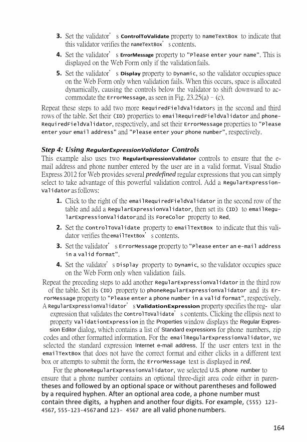
3. Set the validator’s ControlToValidate property to nameTextBox to indicate that this validator verifies the nameTextBox’s contents.
4. Set the validator’s ErrorMessage property to "Please enter your name". This is displayed on the Web Form only if the validation fails.
5. Set the validator’s Display property to Dynamic, so the validator occupies space on the Web Form only when validation fails. When this occurs, space is allocated dynamically, causing the controls below the validator to shift downward to ac- commodate the ErrorMessage, as seen in Fig. 23.25(a)–(c).
Repeat these steps to add two more RequiredFieldValidators in the second and third rows of the table. Set their (ID) properties to emailRequiredFieldValidator and phone- RequiredFieldValidator, respectively, and set their ErrorMessage properties to "Please enter your email address" and "Please enter your phone number", respectively.
Step 4: Using RegularExpressionValidator Controls
This example also uses two RegularExpressionValidator controls to ensure that the e- mail address and phone number entered by the user are in a valid format. Visual Studio Express 2012 for Web provides several predefined regular expressions that you can simply select to take advantage of this powerful validation control. Add a RegularExpression- Validator as follows:
1. Click to the right of the emailRequiredFieldValidator in the second row of the table and add a RegularExpressionValidator, then set its (ID) to emailRegu- larExpressionValidator and its ForeColor property to Red.
2. Set the ControlToValidate property to emailTextBox to indicate that this vali- dator verifies the emailTextBox’s contents.
3. Set the validator’s ErrorMessage property to "Please enter an e-mail address in a valid format".
4. Set the validator’s Display property to Dynamic, so the validator occupies space on the Web Form only when validation fails.
Repeat the preceding steps to add another RegularExpressionValidator in the third row of the table. Set its (ID) property to phoneRegularExpressionValidator and its Er-
rorMessage property to "Please enter a phone number in a valid format", respectively. A RegularExpressionValidator’s ValidationExpression property specifies the reg- ular
expression that validates the ControlToValidate’s contents. Clicking the ellipsis next to property ValidationExpression in the Properties window displays the Regular Expres-
sion Editor dialog, which contains a list of Standard expressions for phone numbers, zip codes and other formatted information. For the emailRegularExpressionValidator, we selected the standard expression Internet e-mail address. If the user enters text in the emailTextBox that does not have the correct format and either clicks in a different text box or attempts to submit the form, the ErrorMessage text is displayed in red.
For the phoneRegularExpressionValidator, we selected U.S. phone number to ensure that a phone number contains an optional three-digit area code either in paren-theses and followed by an optional space or without parentheses and followed by a required hyphen. After an optional area code, a phone number must contain three digits, a hyphen and another four digits. For example, (555) 123-4567, 555-123-4567 and 123- 4567 are all valid phone numbers.

165
Submitting the Web Form’s Contents to the Server
If all five validators are successful (that is, each TextBox is filled in, and the e-mail address and phone number provided are valid), clicking the Submit button sends the form’s data to the server. As shown in Fig. 23.25(d), the server then responds by displaying the sub- mitted data in the outputLabel.
Examining the Code-Behind File for a Web Form That Receives User Input
Figure 23.26 shows the code-behind file for this app. Notice that this code-behind file does not contain any implementation related to the validators. We’ll say more about this soon. In this example, we respond to the page’s Load event to process the data submitted by the user. Like the Init event, the Load event occurs each time the page loads into a web browser—the difference is that on a postback you cannot access the posted data in the con- trols from the Init handler. The event handler for this event is Page_Load (lines 8–33). The event handler for the Load event is created for you when you add a new Web Form. To complete the event handler, insert the code from Fig. 23.26.
1 // Fig. 23.26: Validation.aspx.cs
2 // Code-behind file for the form demonstrating validation controls.
3 using System; 4 5 public partial class Validation : System.Web.UI.Page 6 { 7 // Page_Load event handler executes when the page is loaded
8 protected void Page_Load( object sender, EventArgs e ) 9 {
10 // disable unobtrusive validation
11 12 13 14 // if this is not the first time the page is loading
15 // (i.e., the user has already submitted form data)
16 if ( IsPostBack ) 17 { 18 Validate(); // validate the form
19 20 // if the form is valid
21 if ( IsValid ) 22 { 23 // retrieve the values submitted by the user
24 string name = nameTextBox.Text; 25 string email = emailTextBox.Text; 26 string phone = phoneTextBox.Text;
27
28 // show the the submitted values
29 outputLabel.Text = "Thank you for your submission<br/>" + 30 "We received the following information:<br/>"; 31 outputLabel.Text +=
32 String.Format( "Name: {0}{1}E-mail:{2}{1}Phone:{3}", 33 name, "<br/>", email, phone); 34 outputLabel.Visible = true; // display the output message 35 } // end if
UnobtrusiveValidationMode =

166
36 } // end if
37 } // end method Page_Load
38 } // end class Validation
Fig. 23.26 | Code-behind file for the form demonstrating validation controls.
ASP.NET 4.5 Unobtrusive Validation
Prior to ASP.NET 4.5, when you used the validation controls presented in this section, ASP.NET would embed substantial amounts of JavaScript code in a web page to perform the work of the validation controls in the client web browser. ASP.NET 4.5 now uses unobtrusive validation, which significantly reduces the amount of JavaScript that gets em- bedded into the web page—this, in turn, can improve the performance of your website by making pages load faster. When you create an ASP.NET Web Forms website, everything you need for unobtrusive validation is normally configured for you—unless you create an ASP.NET Empty Web Site, as we’ve done for the examples in this chapter so far. To enable this app to execute correctly in the web browser, lines 11–12 disable unobtrusive valida- tion. In the online Chapter 29, Web App Development with ASP.NET: A Deeper Look, we’ll create a website in which unobtrusive validation is properly enabled.
Differentiating Between the First Request to a Page and a Postback
Web programmers using ASP.NET often design their web pages so that the current page reloads when the user submits the form; this enables the program to receive input, process it as necessary and display the results in the same page when it’s loaded the second time. These pages usually contain a form that, when submitted, sends the values of all the con- trols to the server and causes the current page to be requested again. This event is known as a postback. Line 16 uses the IsPostBack
property of class Page to determine whether the page is being loaded due to a postback. The first time that the web page is requested, IsPostBack is false, and the page displays only the form for user input. When the post- back occurs (from the user clicking Submit), IsPostBack is true.
Server-Side Web Form Validation Server-side Web Form validation must be implemented programmatically. Line 18 calls the current Page’s Validate method to validate the information in the request. This validates the information as specified by the validation controls in the Web Form. Line 21 uses the IsValid property of class Page to check whether the validation succeeded. If this property is set to true (that is, validation succeeded and the Web Form is valid), then we display the Web Form’s information. Otherwise, the web page loads without any changes, except that any validator that failed now displays its ErrorMessage.

167
Processing the Data Entered by the User
Lines 24–26 retrieve the values of nameTextBox, emailTextBox and phoneTextBox. When data is posted to the web server, the data that the user entered is accessible to the web app through the web controls’ properties. Next, lines 29–33 set outputLabel’s Text to display a message that includes the name, e-mail and phone information that was submitted to the server. In lines 29, 30 and 33, notice the use of <br/> rather than \n to start new lines in the outputLabel—<br/> is the markup for a line break in a web page. Line 34 sets the outputLabel’s Visible property to true, so the user can see the thank-you message and submitted data when the page reloads in the client web browser.
23.7.1 Cookies Cookies provide you with a tool for personalizing web pages. A cookie is a piece of data stored by web browsers in a small text file on the user’s computer. A cookie maintains in- formation about the client during and between browser sessions. The first time a user visits the website, the user’s computer might receive a cookie from the server; this cookie is then reactivated each time the user revisits that site. The collected information is intended to be an anonymous record containing data that’s used to personalize the user’s future visits to the site.
23.7.2 Session Tracking with HttpSessionState
The next web app demonstrates session tracking using class HttpSessionState. When you execute this app, the Options.aspx page (Fig. 23.27(a)), which is the app’s Start Page, al- lows the user to select a programming language from a group of radio buttons. [Note: You might need to right click Options.aspx in the Solution Explorer and select Set As
Start Page before running this app.] When the user clicks Submit, the selection is sent to the web server for processing. The web server uses an HttpSessionState object to store the chosen lan- guage and the ISBN number for one of our books on that topic. Each user that visits the site has a unique HttpSessionState object, so the selections made by one user are maintained separately from all other users. After storing the selection, the server returns the page to the browser (Fig. 23.27(b)) and displays the user’s selection and some information about the us- er’s unique session (which we show just for demonstration purposes). The page also includes links that allow the user to choose between selecting another programming language or view- ing the Recommendations.aspx page (Fig. 23.27(e)), which lists recommended books per- taining to the programming language(s) that the user selected previously. If the user clicks the link for book recommendations, the information stored in the user’s unique HttpSes- sionState object is read and used to form the list of recommendations. To test this app:
1. Select Open Web Site… from the FILE menu.
2. In the Open Web Site dialog, ensure that File System is selected, then navigate to this chapter’s examples, select the Sessions folder and click the Open
Button.
3. Select Options.aspx in the Solution Explorer, then type Ctrl + F5 to execute the web app in your default web browser.

168
a) User selects a language from the
Options.aspx page, then presses Submit to
send the selection to the server
b) Options.aspx page is updated to hide the
controls for selecting a language and to display the
user’s selection; the user clicks the hyperlink to
return to the list of languages and make
another selection
Fig. 23.27 | ASPX file that presents a list of programming languages. (Part 1 of 2.)

169
c) User selects another language from
the Options.aspx page, then presses Submit to send the
selection to the server
d) Options.aspx page is updated to hide the
controls for selecting a language and to display the
user’s selection; the user clicks the hyperlink to get a
list of book recommendations
e) Recommendations.as
px
displays the list of recommended
books based on the user’s selections
Fig. 23.27 | ASPX file that presents a list of programming languages. (Part 2 of 2.)
Creating the Web Site
To begin, follow the steps in Section 23.4.1 to create an Empty Web Site named Sessions, then add two Web Forms named Options.aspx and Recommendations.aspx to the proj- ect. Set the Options.aspx document’s Title property to "Sessions" and the Recommen- dations.aspx document’s Title
property to "Book Recommendations". To ensure that Options.aspx is the first page to load for this app, right click it in the Solution Explorer and select Set As Start Page.
23.7.3 Options.aspx: Selecting a Programming Language The Options.aspx page Fig. 23.27(a) contains the following controls arranged
vertically:

170
1. A Label with its (ID) property set to promptLabel and its Text property set to "Select a programming language:". We used the techniques shown in Step 5 of Section 23.4.1 to create a CSS style for this label named .labelStyle, and set the style’s font-size attribute to large and the font-weight attribute to bold.
2. The user selects a programming language by clicking one of the radio buttons in a RadioButtonList. Each radio button has a Text property and a Value property. The Text property is displayed next to the radio button and the Value property rep- resents a value that’s sent to the server when the user selects that radio button and submits the form. In this example, we’ll use the Value property to represent the ISBN for the recommended book. Create a RadioButtonList with its (ID) prop- erty set to languageList. Use the ListItem Collection Editor to add five radio but- tons with their Text properties set to Visual Basic, Visual C#, C, C++ and Java, and their Value properties set to 0-13-340695-4, 0-13-337933-7, 0-13-299044-X, 0-13-337871-3 and 0-13-294094-9, respectively.
3. A Button with its (ID) property set to submitButton and its Text property set to Submit. In this example, we’ll handle this Button’s Click event. You can create its event handler by double clicking the Button in Design view.
4. A Label with its (ID) property set to responseLabel and its Text property set to "Welcome to Sessions!". This Label should be placed immediately to the right of the Button so that the Label appears at the top of the page when we hide the preceding controls on the page. Reuse the CSS style you created in Step 1 by set- ting this Label’s CssClass property to labelStyle.
5. Two more Labels with their (ID) properties set to idLabel and timeoutLabel, respectively. Clear the text in each Label’s Text property—you’ll set these pro- grammatically with information about the current user’s session.
6. A HyperLink with its (ID) property set to languageLink and its Text property set to "Click here to choose another language". Set its NavigateUrl property by clicking the ellipsis next to the property in the Properties window and selecting Options.aspx from the Select URL dialog.
7. A HyperLink with its (ID) property set to recommendationsLink and its Text property set to "Click here to get book recommendations". Set its NavigateUrl property by clicking the ellipsis next to the property in the Properties window and selecting Recommendations.aspx from the Select URL
dialog.
8. Initially, the controls in Steps 4–7 will not be displayed, so set each control’s Vis- ible property to false.
Session Property of a Page
Every ASP.NET Web app includes a user-specific HttpSessionState object, which is acces- sible through property Session of class Page. Throughout this section, we use this property to manipulate the current user’s HttpSessionState object. When the user first requests a page in a Web app, a unique HttpSessionState object is created by

171
ASP.NET and assigned to the Page’s Session property. The same object is also available to the app’s other pages.
Code-Behind File for Options.aspx
Fig. 23.28 presents the code-behind file for the Options.aspx page. When this page is re- quested, the Page_Load event handler (lines 10–40) executes before the response is sent to the client. Since the first request to a page is not a postback, the code in lines 16–38 does not execute the first time the page loads.

172
// display the timeout
meou
// add name–value pair to Session Session.Add( languageList.SelectedItem.Text,
languageList.SelectedItem.Value );
1 // Fig. 23.28: Options.aspx.cs
2 // Processes user's selection of a programming language by displaying 3 // links and writing information in an HttpSessionState object.
4 using System; 5 6 public partial class Options : System.Web.UI.Page 7 {
8 // if postback, hide form and display links to make additional 9 // selections or view recommendations
10 protected void Page_Load( object sender, EventArgs e ) 11 {
12 if ( IsPostBack ) 13 {
14 // user has submitted information, so display message 15 // and appropriate hyperlinks
16 responseLabel.Visible = true; 17 idLabel.Visible = true; 18 timeoutLabel.Visible = true; 19 languageLink.Visible = true; 20 recommendationsLink.Visible = true; 21 22 // hide other controls used to make language selection
23 promptLabel.Visible = false; 24 languageList.Visible = false; 25 submitButton.Visible = false; 26 27 // if the user made a selection, display it in responseLabel
28 if ( languageList.SelectedItem != null ) 29 responseLabel.Text += " You selected " + 30 languageList.SelectedItem.Text;
31 else 32 responseLabel.Text += " You did not select a language."; 33 34 35 36 37 38 39 } // end if 40 } // end method Page_Load
41 42 // record the user's selection in the Session
43 protected void submitButton_Click( object sender, EventArgs e ) 44 {
45 // if the user made a selection
46 if ( languageList.SelectedItem != null ) 47 48 49 50 } // end method submitButton_Click
51 } // end class Options
Fig. 23.28 | Process user's selection of a programming language by displaying links and
writing information in an HttpSessionState object.
// display session ID