Wall and Deco Lifestyle Projektbuch Pdf - Rich Interior
102
.. • 1 • } • . , . - , "
-
Upload
khangminh22 -
Category
Documents
-
view
1 -
download
0
Transcript of Wall and Deco Lifestyle Projektbuch Pdf - Rich Interior

.. ,:;, ..
•
1 •
}
•
., ...
.. , . -,
" .i

l i f e s t y l e b o o k
i i
MARGARETENSTRAßE 93 1 1050 WIEN
+43 1 544 83 39 1 GRUENBECK.CO.AT
-2 55
1977 49
A TRATTI 40
À VIVRE 23
AKOS 74
ALBA SALIX 44
ALTER EGO 15
AMBROSIA 63
ARCADIA 76
AURORA 73
BABILONIA 33
BESTIARIVM 35
CARDO MAXIMUS 45
CHRONOS 36
COLOR FIELD 67
DE PUNTILLAS 78
DITTAMO 79
DORSEL 31
DOWN NEW ROADS 51
ELISIR 27
ENERGY 41
EUREKA 42
EYES IN THE DARK 38
FADE OUT LINES 34
FAENNA 54
FAIRPLAY 12
FLORIANOPOLIS 69
FOSSIL 22
GLAZE 59
HABITAT 68
HISTORIA 84
IN SIGHT 25
KONA 24
LA FAMIGLIA POIS 83
LA VIE EN ROSE 77
LE BILAN D'UN SIÈCLE 70
LESLEY 21
LETTERA 32 61
LIA 88
LIQUIDA 60
LIVE AT EASE 17
LUCIE 48
LUZ 86
MAHAI 72
MANY HOLES 75
MATRIX 50
MECCATRONICO 29
MEMORY OF JM 52
MY WIFE 46
NOMADE 14
NOVECENTO 28
ORNATE 66
PAJLO 64
POMMES À CIDRE 85
PULVIS 30
REVERSO 57
SHOCKING 56
SKIL 71
SLOW MOTION 26
SPELL 58
STONEHENGE 89
SUBMARINO 43
TARAKÉ 18
THE DEEP WILD SPACE 19
TOUJOURS TOI 82
TUJANE 87
TUTTI COLORI + 1 80
UNCLE SY 20
VIRIDE 81
WHO IS WHO 16
WRAPPED AROUND YOU 53
X RAY 39
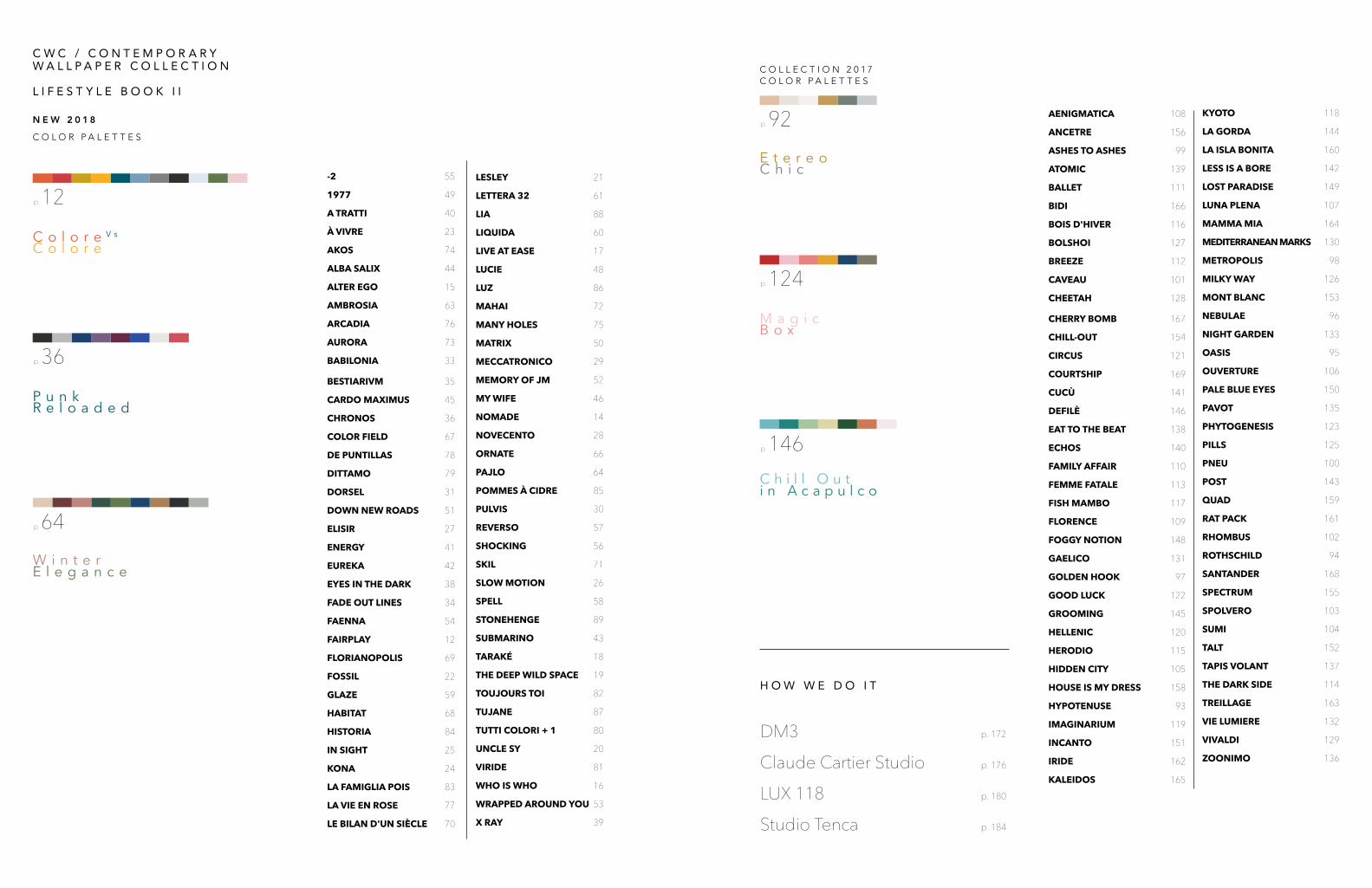
C o l o r e V s
C o l o r e
p. 12
N E W 2 0 1 8
C O L O R P A L E T T E S
P u n kR e l o a d e d
p. 36
W i n t e r E l e g a n c e
p. 64
H O W W E D O I T
DM3 p. 172
Claude Cartier Studio p. 176
LUX 118 p. 180
Studio Tenca p. 184
AENIGMATICA 108
ANCETRE 156
ASHES TO ASHES 99
ATOMIC 139
BALLET 111
BIDI 166
BOIS D'HIVER 116
BOLSHOI 127
BREEZE 112
CAVEAU 101
CHEETAH 128
CHERRY BOMB 167
CHILL-OUT 154
CIRCUS 121
COURTSHIP 169
CUCÙ 141
DEFILÈ 146
EAT TO THE BEAT 138
ECHOS 140
FAMILY AFFAIR 110
FEMME FATALE 113
FISH MAMBO 117
FLORENCE 109
FOGGY NOTION 148
GAELICO 131
GOLDEN HOOK 97
GOOD LUCK 122
GROOMING 145
HELLENIC 120
HERODIO 115
HIDDEN CITY 105
HOUSE IS MY DRESS 158
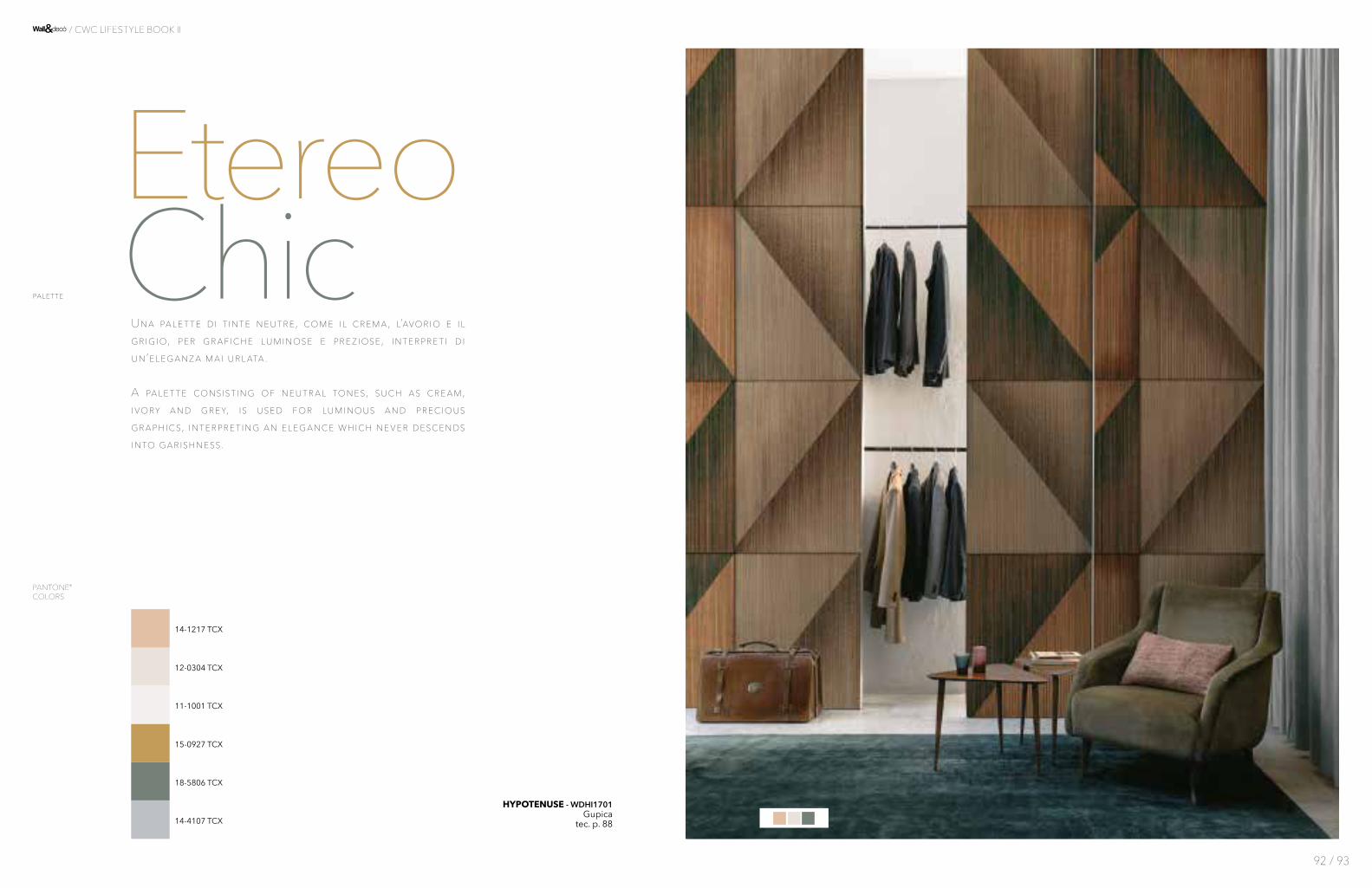
HYPOTENUSE 93
IMAGINARIUM 119
INCANTO 151
IRIDE 162
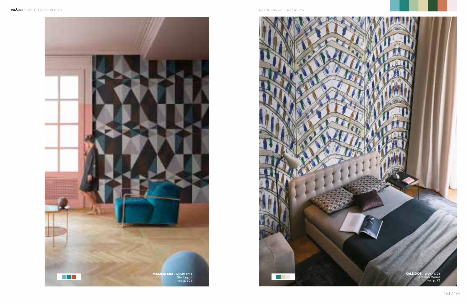
KALEIDOS 165
KYOTO 118
LA GORDA 144
LA ISLA BONITA 160
LESS IS A BORE 142
LOST PARADISE 149
LUNA PLENA 107
MAMMA MIA 164
MEDITERRANEAN MARKS 130
METROPOLIS 98
MILKY WAY 126
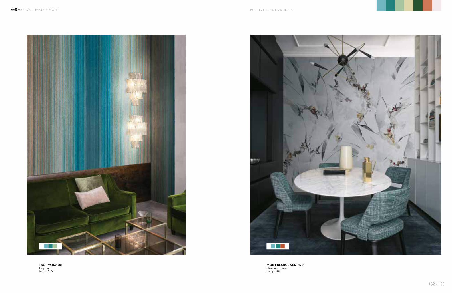
MONT BLANC 153
NEBULAE 96
NIGHT GARDEN 133
OASIS 95
OUVERTURE 106
PALE BLUE EYES 150
PAVOT 135
PHYTOGENESIS 123
PILLS 125
PNEU 100
POST 143
QUAD 159
RAT PACK 161
RHOMBUS 102
ROTHSCHILD 94
SANTANDER 168
SPECTRUM 155
SPOLVERO 103
SUMI 104
TALT 152
TAPIS VOLANT 137
THE DARK SIDE 114
TREILLAGE 163
VIE LUMIERE 132
VIVALDI 129
ZOONIMO 136
E t e r e o C h i c
p. 92
C O L L E C T I O N 2 0 1 7C O L O R P A L E T T E S
M a g i cB o x
p. 124
C h i l l O u ti n A c a p u l c o
p. 146
C W C / C O N T E M P O R A R YW A L L P A P E R C O L L E C T I O N
L I F E S T Y L E B O O K I I
Atlanti del mondo immaginatoL’orizzonte diventa sempre più vasto.
Si disegna davanti ai nostri occhi come una col-lezione-mondo, trovando ispirazione nelle paro-le dell’autore inglese Cyril Connolly: “Un grande scrittore crea il mondo e i suoi lettori sono orgo-gliosi di abitarlo”. Il nostro mondo si espande continuamente, per abbracciare un numero sempre più ampio di vi-sioni, di tratti, di “segni”. Per raccontarlo al meglio, i nostri cataloghi si moltiplicano.
Più volumi che hanno il senso complessivo di un viaggio, un percorso ricco di paesaggi e di archi-tetture, di esplorazioni e di incontri, di ispirazioni e interpretazioni.
A guidare i professionisti, i creativi, i nuovi esplo-ratori in questa scoperta è innanzitutto il colore: la sua potenza emotiva, la sua potenzialità narra-tiva. Come una forza che genera il proprio cen-tro di attrazione, è l’affinità cromatica a creare le palette, tavolozze che raggruppano temi, stili e icone legati dalla declinazione fondamentale del colore.
Attraverso le palette si delineano le infinite pos-sibili rotte, sempre nuove e diverse, mediante le quali navigare fra le isole e i continenti del nostro grande atlante del decoro.
Atlases of the imagined worldAn ever vaster horizon.
It manifests itself before our eyes like a collec-tion-world, drawing inspiration from the words of the English author Cyril Connolly: “A great writer creates a world of his own and his readers are proud to live in it”.
Our world is continuously expanding to embrace an ever greater number of visions, lines, “signs”. To recount it more effectively, our catalogues are in-creasing in number.
More volumes which exude a sense of a journey, a route laden with landscapes, architectures, explora-tions, encounters, inspirations and interpretations.
What guides professionals, creative individuals and new explorers along this journey of discovery is the colour, or rather its emotional power and narrative potential. Like a force generating its own centre of attraction, colour affinity creates palettes which group together themes, styles and icons bound together by fundamental manifestations of tonalities.
Through the palettes infinite possible routes take shape, relentlessly new and different, so that we can navigate between the islands and continents of our great atlas of decoration.
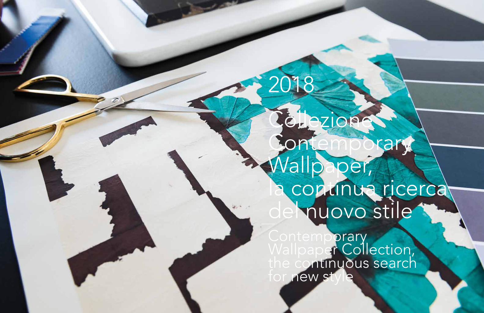
WALL&DECÒ / CWC CATALOGUE 2018
2018 Collezione Contemporary Wallpaper, la continua ricerca del nuovo stileContemporary Wallpaper Collection,the continuous search for new style
WALL&DECÒ / CWC CATALOGUE 2018
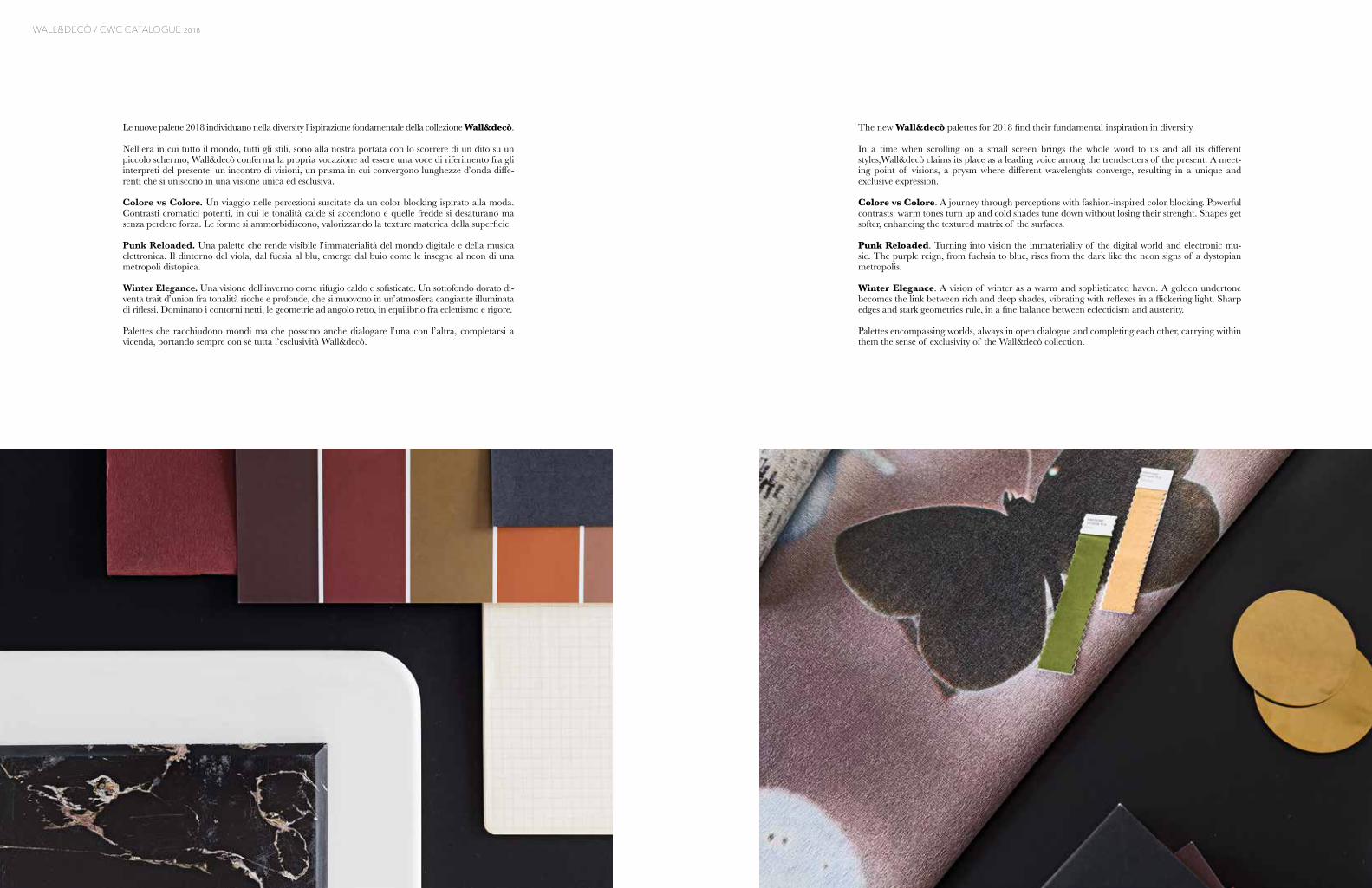
The new Wall&decò palettes for 2018 find their fundamental inspiration in diversity.
In a time when scrolling on a small screen brings the whole word to us and all its different styles,Wall&decò claims its place as a leading voice among the trendsetters of the present. A meet-ing point of visions, a prysm where different wavelenghts converge, resulting in a unique and exclusive expression.
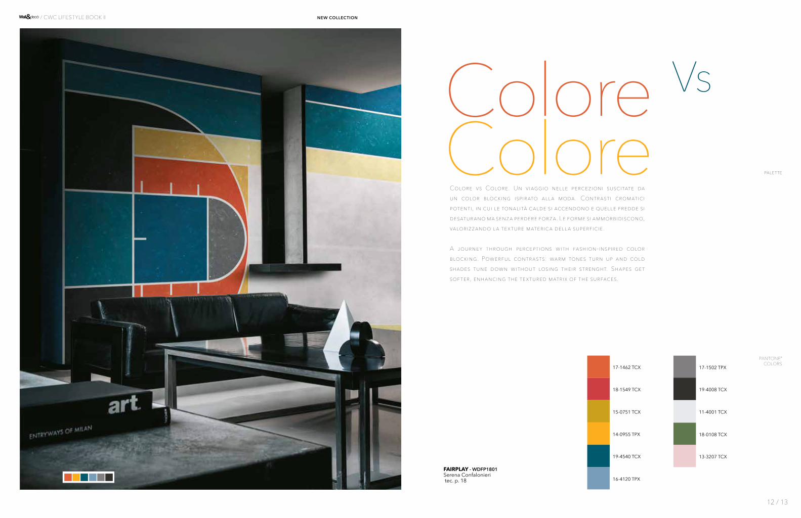
Colore vs Colore. A journey through perceptions with fashion-inspired color blocking. Powerful contrasts: warm tones turn up and cold shades tune down without losing their strenght. Shapes get softer, enhancing the textured matrix of the surfaces.
Punk Reloaded. Turning into vision the immateriality of the digital world and electronic mu-sic. The purple reign, from fuchsia to blue, rises from the dark like the neon signs of a dystopian metropolis.
Winter Elegance. A vision of winter as a warm and sophisticated haven. A golden undertone becomes the link between rich and deep shades, vibrating with reflexes in a flickering light. Sharp edges and stark geometries rule, in a fine balance between eclecticism and austerity.
Palettes encompassing worlds, always in open dialogue and completing each other, carrying within them the sense of exclusivity of the Wall&decò collection.
Le nuove palette 2018 individuano nella diversity l’ispirazione fondamentale della collezione Wall&decò.
Nell’era in cui tutto il mondo, tutti gli stili, sono alla nostra portata con lo scorrere di un dito su un piccolo schermo, Wall&decò conferma la propria vocazione ad essere una voce di riferimento fra gli interpreti del presente: un incontro di visioni, un prisma in cui convergono lunghezze d’onda diffe-renti che si uniscono in una visione unica ed esclusiva.
Colore vs Colore. Un viaggio nelle percezioni suscitate da un color blocking ispirato alla moda. Contrasti cromatici potenti, in cui le tonalità calde si accendono e quelle fredde si desaturano ma senza perdere forza. Le forme si ammorbidiscono, valorizzando la texture materica della superficie.
Punk Reloaded. Una palette che rende visibile l’immaterialità del mondo digitale e della musica elettronica. Il dintorno del viola, dal fucsia al blu, emerge dal buio come le insegne al neon di una metropoli distopica.
Winter Elegance. Una visione dell’inverno come rifugio caldo e sofisticato. Un sottofondo dorato di-venta trait d’union fra tonalità ricche e profonde, che si muovono in un’atmosfera cangiante illuminata di riflessi. Dominano i contorni netti, le geometrie ad angolo retto, in equilibrio fra eclettismo e rigore.
Palettes che racchiudono mondi ma che possono anche dialogare l’una con l’altra, completarsi a vicenda, portando sempre con sé tutta l’esclusività Wall&decò.
N E W C O L L E C T I O N
2018
Colore Vs
Colore
19-4540 TCX
Colore vs Colore. Un viaggio nelle percezioni suscitate da un color blocking ispirato alla moda. Contrasti cromatici potenti, in cui le tonalità calde si accendono e quelle fredde si desaturano ma senza perdere forza. Le forme si ammorbidiscono, valorizzando la texture materica della superficie.
A journey through perceptions with fashion-inspired color blocking. Powerful contrasts: warm tones turn up and cold shades tune down without losing their strenght. Shapes get softer, enhancing the textured matrix of the surfaces.
14-0955 TPX
17-1462 TCX
15-0751 TCX
18-1549 TCX
16-4120 TPX
17-1502 TPX
18-0108 TCX
11-4001 TCX
FAIRPLAY - WDFP1801Serena Confalonieri tec. p. 18
19-4008 TCX
13-3207 TCX
12 / 13
/ CWC LIFESTYLE BOOK II new collection
palette
PANTONE® COLORS

NOMADE - WDNO1801 Federico Pepetec. p. 24
ALTER EGO - WDAE1801Fedrico Pepetec. p. 13
palette / colore vs colore
14 / 15
/ CWC LIFESTYLE BOOK II new collection
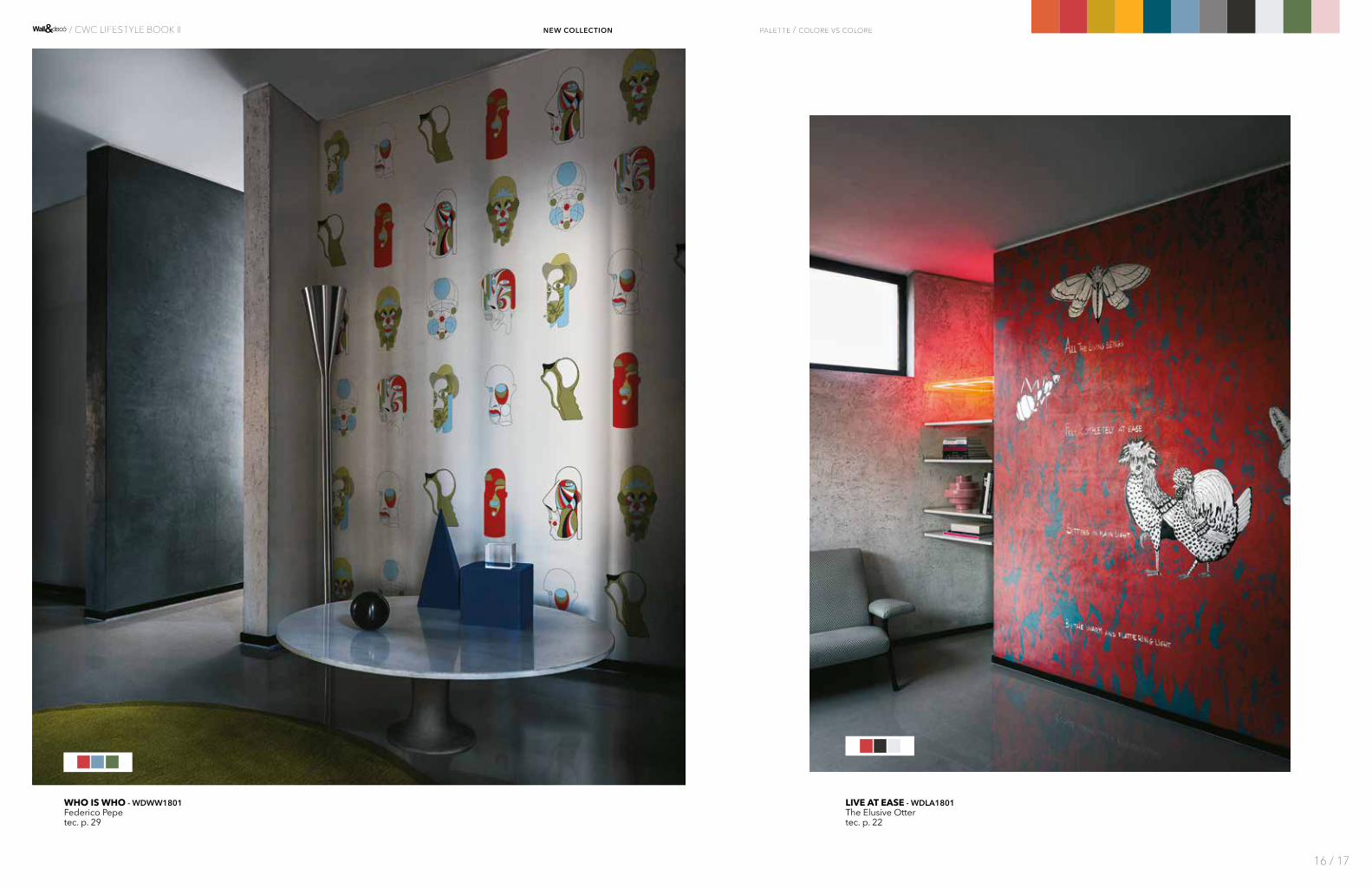
LIVE AT EASE - WDLA1801The Elusive Ottertec. p. 22
WHO IS WHO - WDWW1801Federico Pepetec. p. 29
palette / colore vs colore
16 / 17
/ CWC LIFESTYLE BOOK II new collection
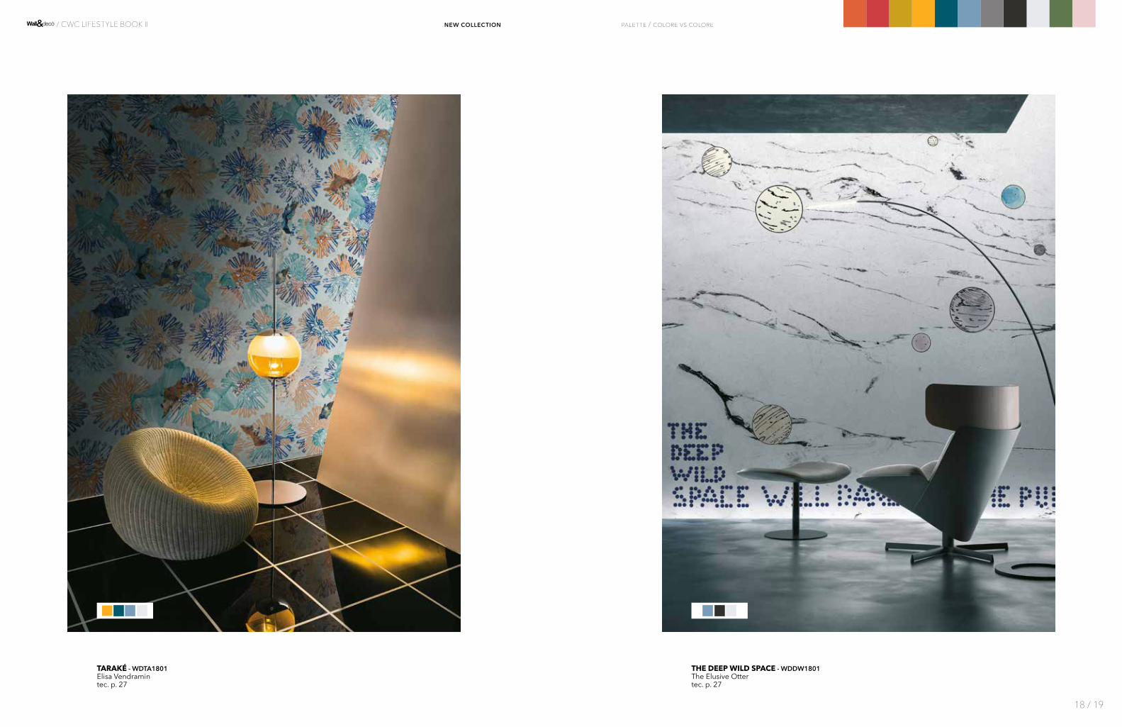
THE DEEP WILD SPACE - WDDW1801The Elusive Ottertec. p. 27
TARAKÉ - WDTA1801Elisa Vendramintec. p. 27
palette / colore vs colore
18 / 19
/ CWC LIFESTYLE BOOK II new collection

UNCLE SY - WDUS1801Shouttec. p. 28
LESLEY - WDLE1801Bertero Projects
tec. p. 21
palette / colore vs colore
20 / 21
/ CWC LIFESTYLE BOOK II new collection

FOSSIL - WDFS1801Talva Design
tec. p. 18
À VIVRE - WDAV1801Antonella Guiditec. p. 12
palette / colore vs colore
22 / 23
/ CWC LIFESTYLE BOOK II new collection

KONA - WDKO1801 Serena Confalonieritec. p. 20
IN SIGHT - WDIS1801Shout
tec. p. 19
palette / colore vs colore
24 / 25
/ CWC LIFESTYLE BOOK II new collection

ELISIR - WDEL1801Lorenzo De Grandistec. p. 16
SLOW MOTION - WDSM1801Giovanni Pescetec. p. 26
palette / colore vs colore
26 / 27
/ CWC LIFESTYLE BOOK II new collection
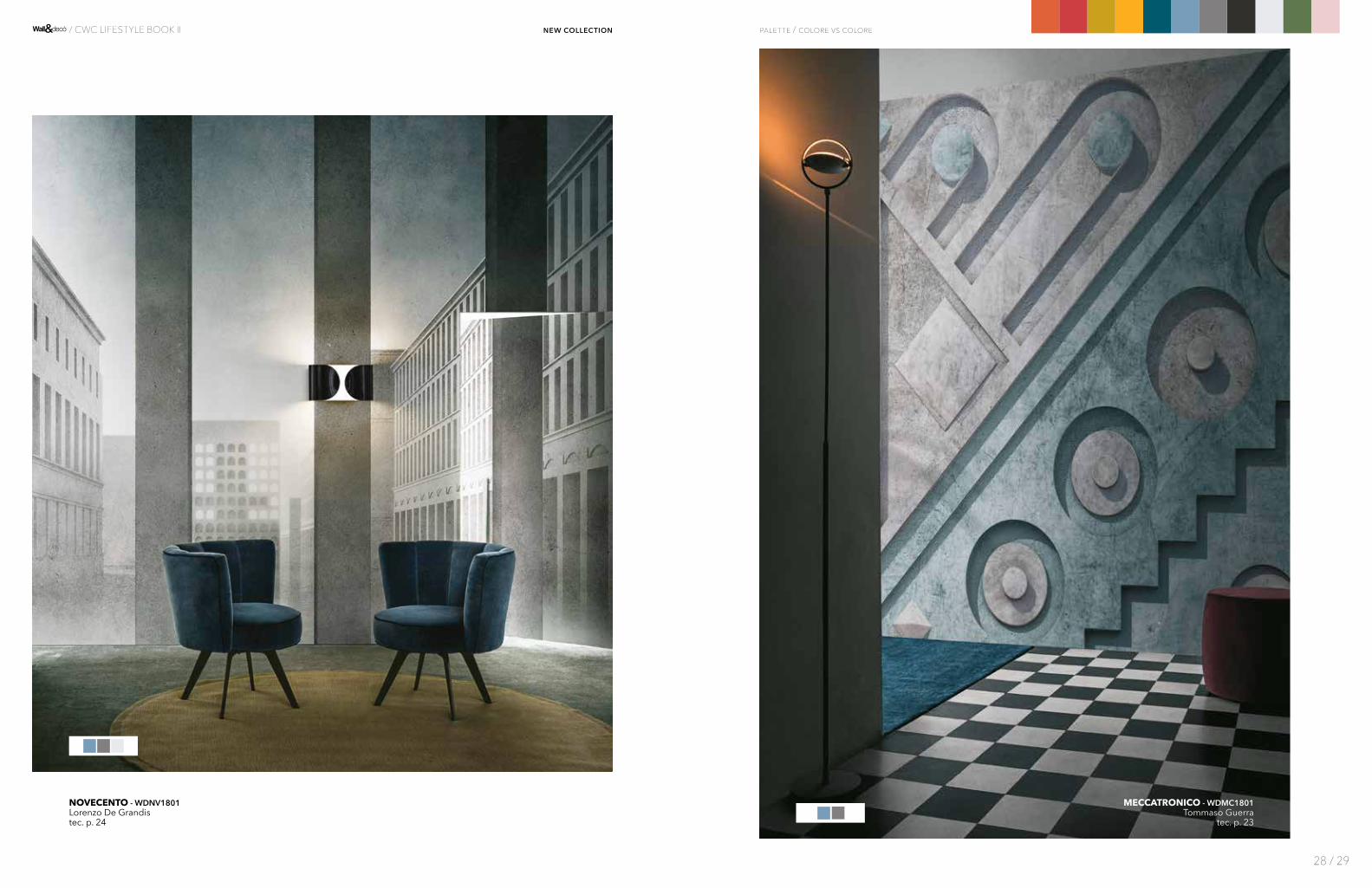
NOVECENTO - WDNV1801Lorenzo De Grandistec. p. 24
MECCATRONICO - WDMC1801Tommaso Guerra
tec. p. 23
palette / colore vs colore
28 / 29
/ CWC LIFESTYLE BOOK II new collection

PULVIS - WDPU1801Ines Porrino
tec. p. 25
DORSEL - WDDO1801Wladimiro Bendandi
tec. p. 16
palette / colore vs colore
30 / 31
/ CWC LIFESTYLE BOOK II new collection
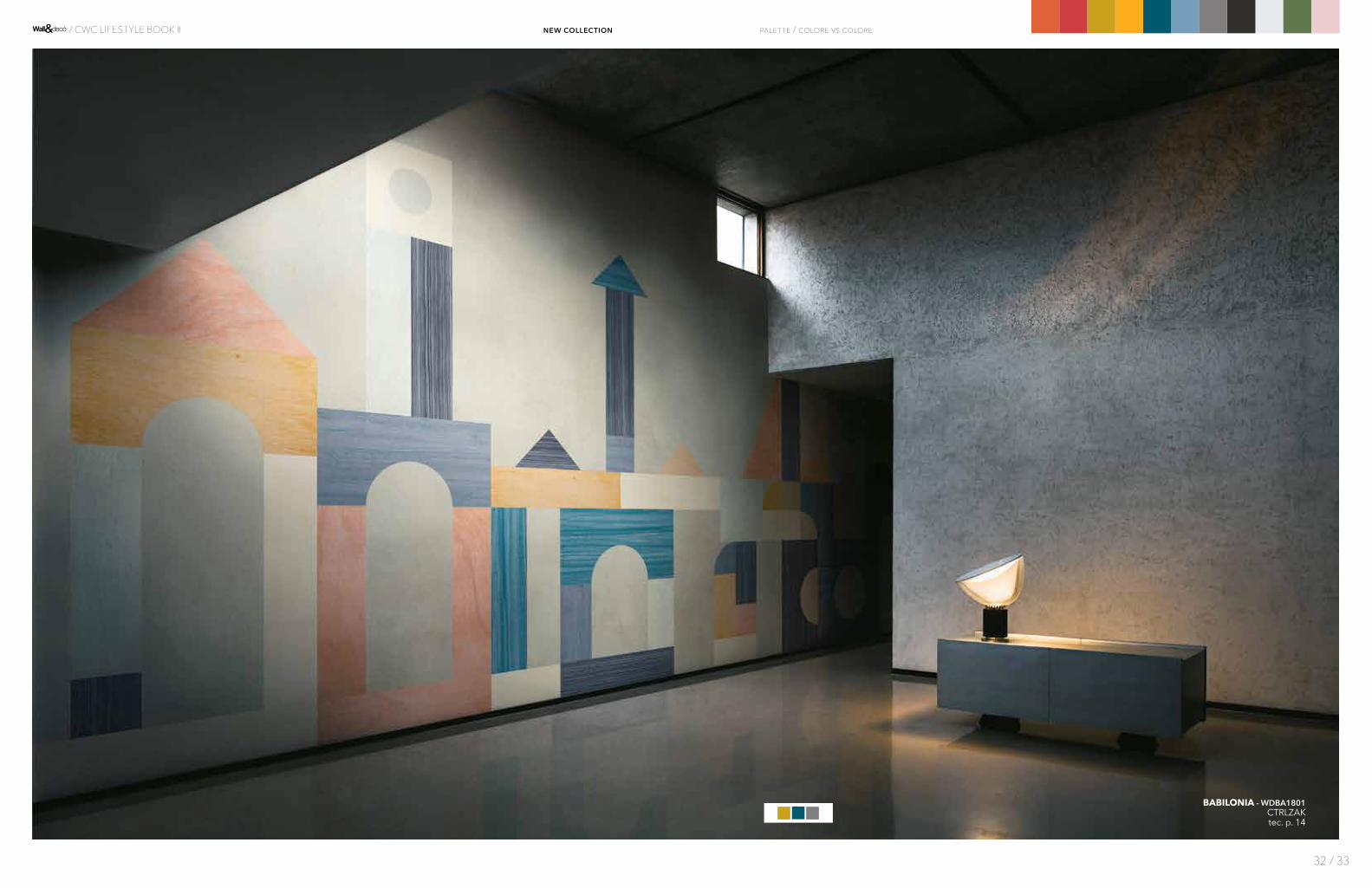
BABILONIA - WDBA1801CTRLZAKtec. p. 14
palette / colore vs colore
32 / 33
/ CWC LIFESTYLE BOOK II new collection
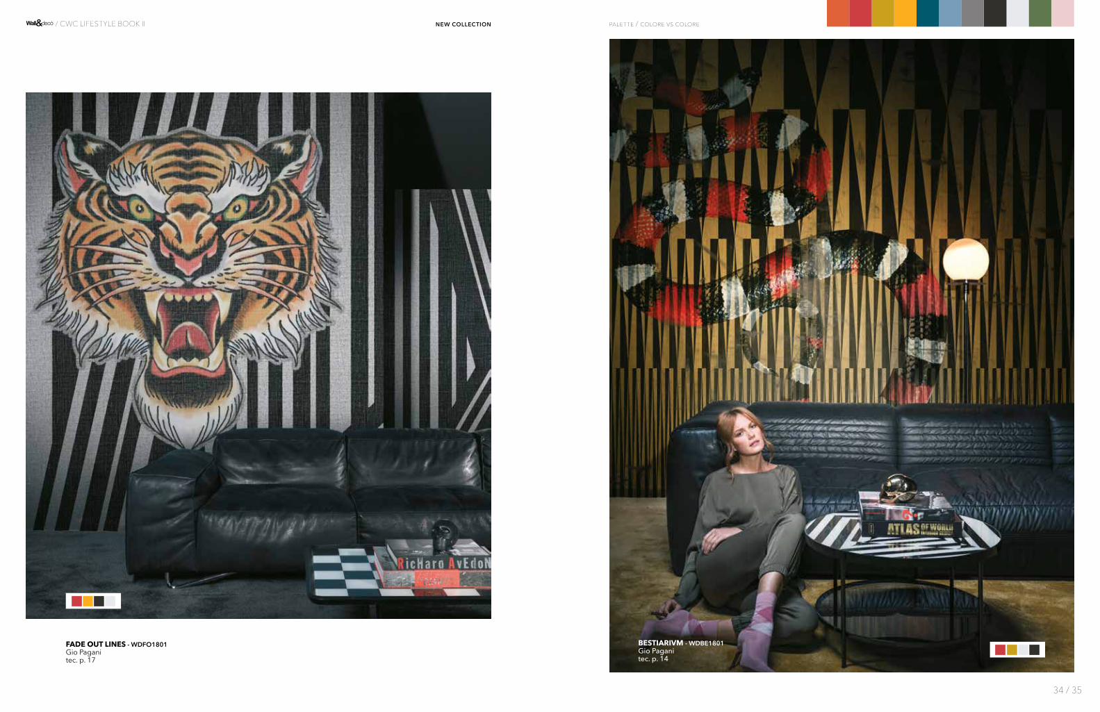
FADE OUT LINES - WDFO1801Gio Paganitec. p. 17
BESTIARIVM - WDBE1801 Gio Paganitec. p. 14
palette / colore vs colore
34 / 35
/ CWC LIFESTYLE BOOK II new collection
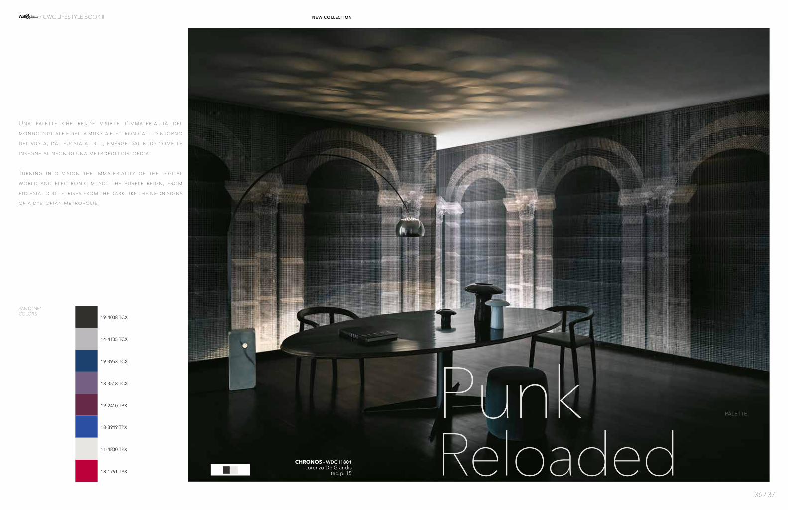
PunkReloadedCHRONOS - WDCH1801
Lorenzo De Grandis tec. p. 15
11-4800 TPX
19-3953 TCX
18-3949 TPX
14-4105 TCX
18-3518 TCX
19-2410 TPX
Una palette che rende visibile l’immaterialità del mondo digitale e della musica elettronica. Il dintorno del viola, dal fucsia al blu, emerge dal buio come le insegne al neon di una metropoli distopica.
Turning into vision the immaterialit y of the digital world and electronic music. The purple reign, from fuchsia to blue, rises from the dark like the neon signs of a dystopian metropolis.
PALETTE
PANTONE® COLORS
18-1761 TPX
19-4008 TCX
36 / 37
/ CWC LIFESTYLE BOOK II new collection
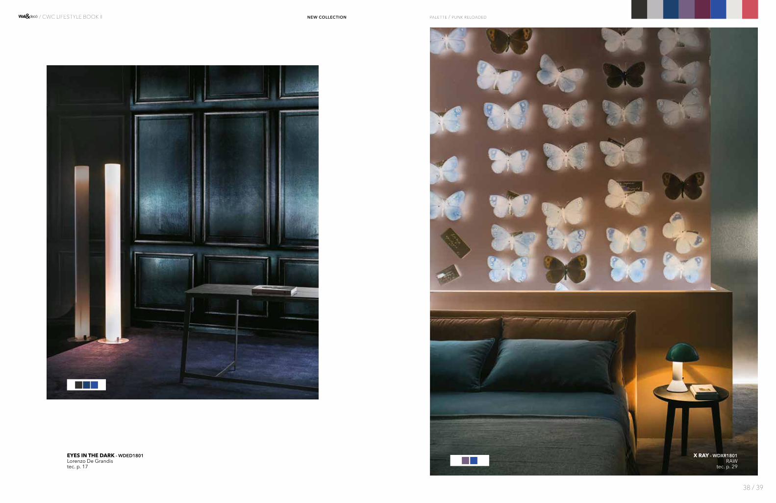
EYES IN THE DARK - WDED1801Lorenzo De Grandistec. p. 17
X RAY - WDXR1801RAW
tec. p. 29
palette / punk reloaded
38 / 39
/ CWC LIFESTYLE BOOK II new collection

A TRATTI - WDAT1801Gupicatec. p. 12
ENERGY - WDEN1801Christian Beninitec. p. 17
palette / punk reloaded
40 / 41
/ CWC LIFESTYLE BOOK II new collection
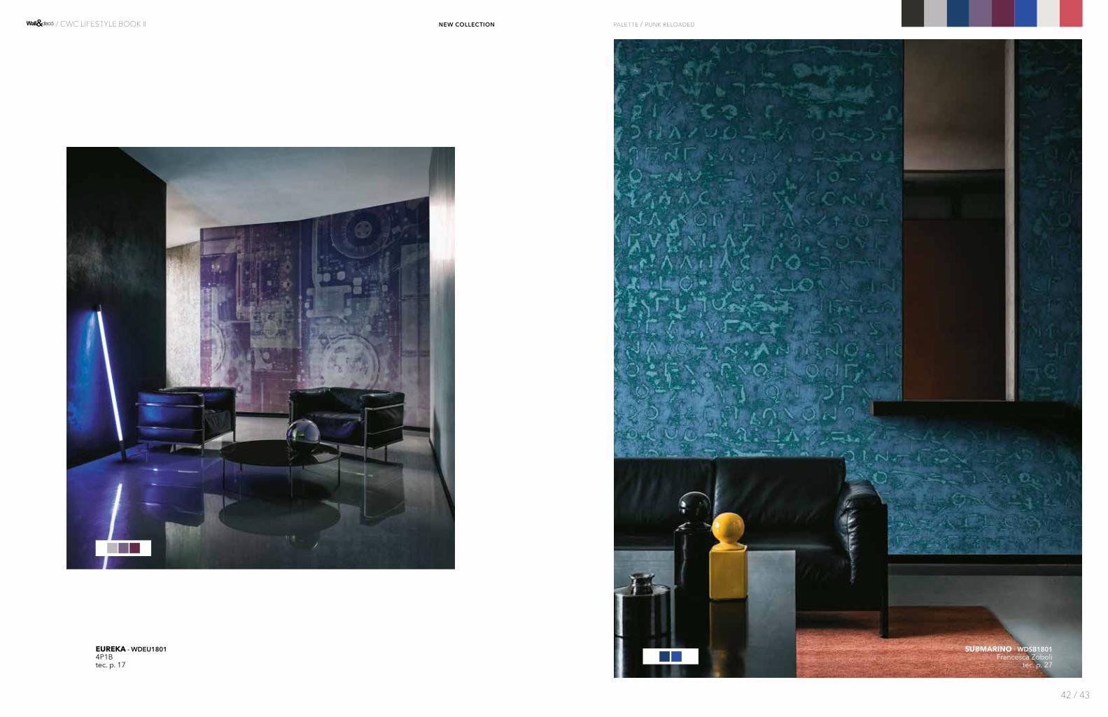
EUREKA - WDEU18014P1Btec. p. 17
SUBMARINO - WDSB1801Francesca Zoboli
tec. p. 27
palette / punk reloaded
42 / 43
/ CWC LIFESTYLE BOOK II new collection

CARDO MAXIMUS - WDCM1801Draga&Aureltec. p. 15
ALBA SALIX - WDAS1801Francesca Zoboli
tec. p. 13
palette / punk reloaded
44 / 45
/ CWC LIFESTYLE BOOK II new collection
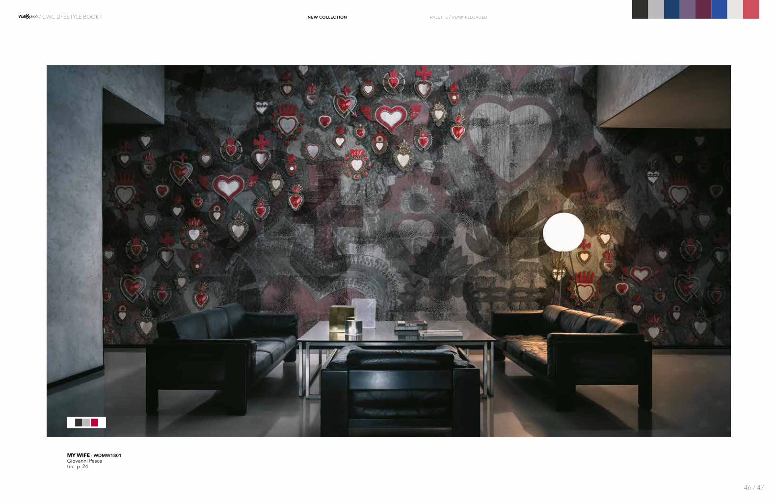
MY WIFE - WDMW1801Giovanni Pescetec. p. 24
palette / punk reloaded
46 / 47
/ CWC LIFESTYLE BOOK II new collection
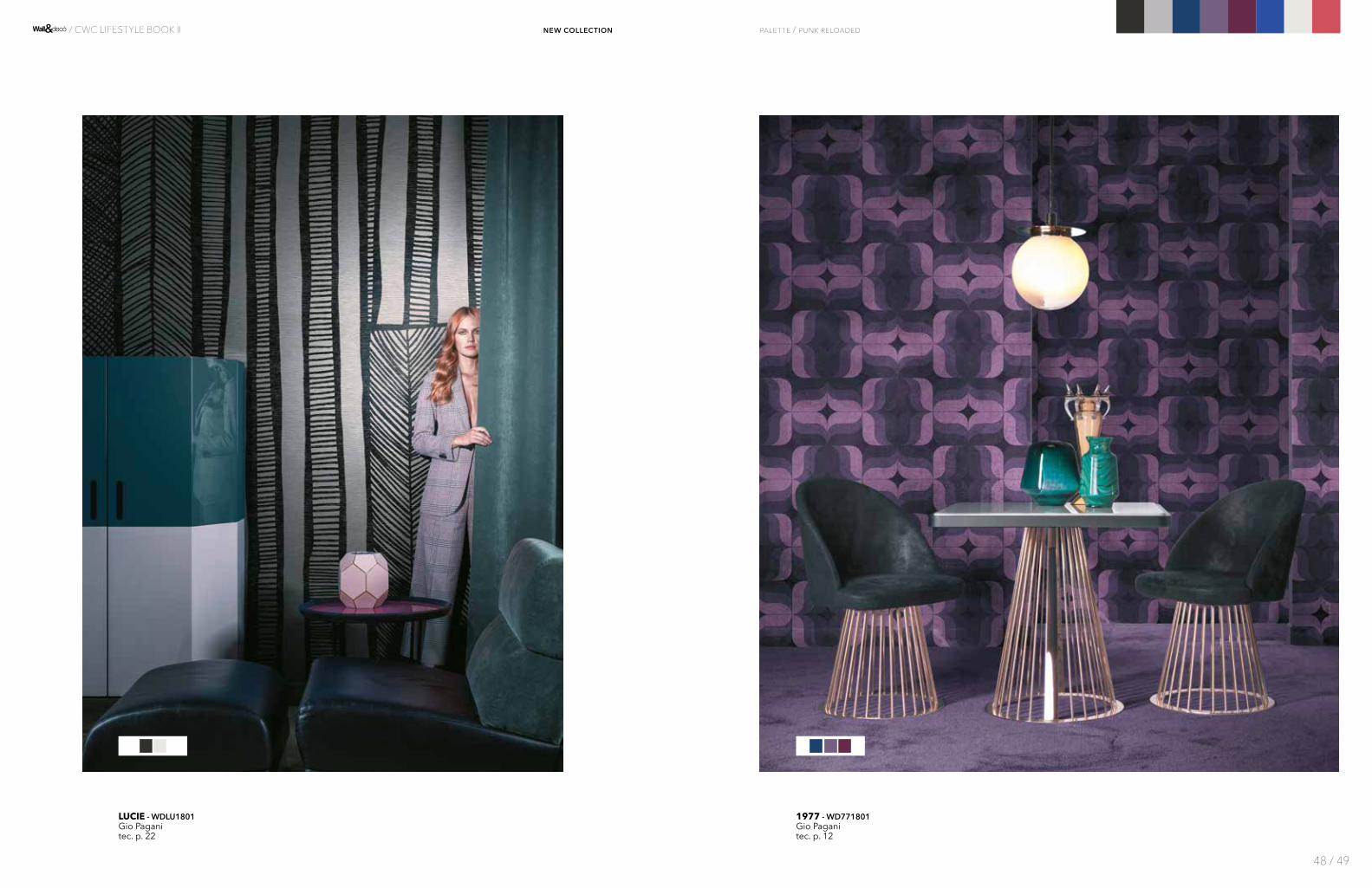
LUCIE - WDLU1801Gio Paganitec. p. 22
1977 - WD771801Gio Paganitec. p. 12
palette / punk reloaded
48 / 49
/ CWC LIFESTYLE BOOK II new collection

DOWN NEW ROADS - WDDN1801Draga&Aureltec. p. 16
MATRIX - WDMX1801Draga&Aurel
tec. p. 23
palette / punk reloaded
50 / 51
/ CWC LIFESTYLE BOOK II new collection

MEMORY OF JM - WDME1801Gio Paganitec. p. 23
WRAPPED AROUND YOU - WDWR1801Gio Pagani
tec. p. 29
palette / punk reloaded
52 / 53
/ CWC LIFESTYLE BOOK II new collection
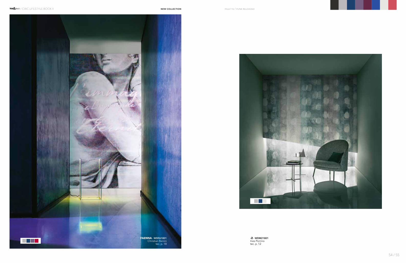
FAENNA - WDFA1801Christian Benini
tec. p. 18
-2 - WDM21801Ines Porrinotec. p. 12
palette / punk reloaded
54 / 55
/ CWC LIFESTYLE BOOK II new collection
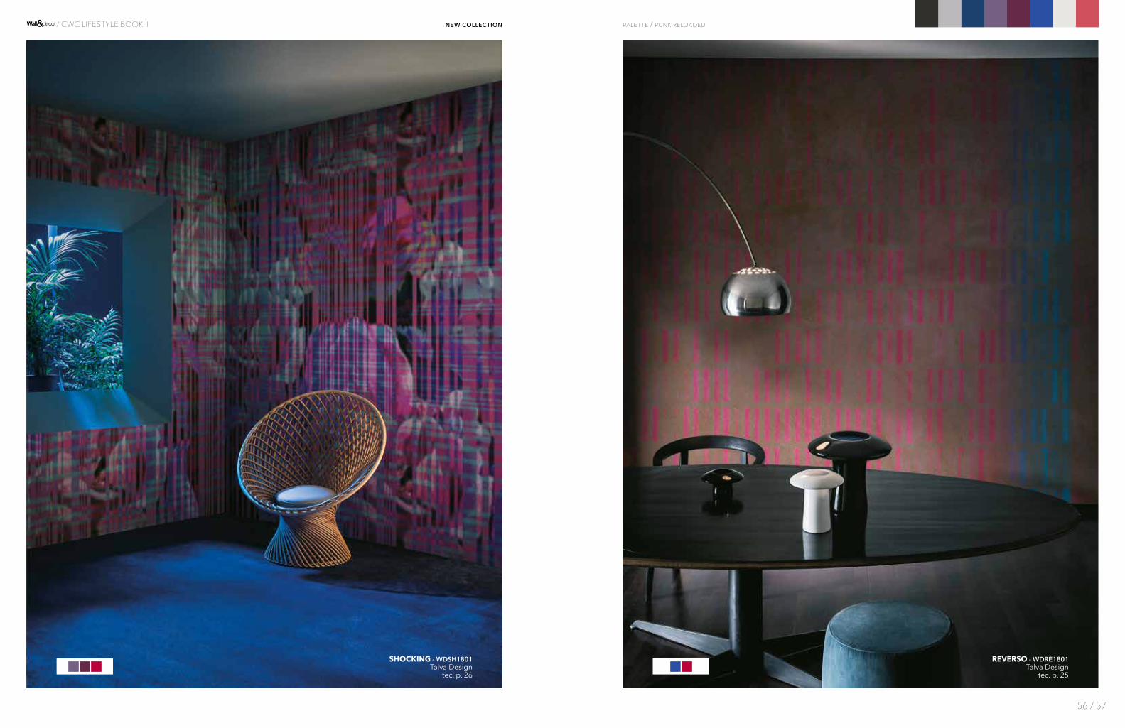
REVERSO - WDRE1801Talva Design
tec. p. 25
SHOCKING - WDSH1801Talva Design
tec. p. 26
palette / punk reloaded
56 / 57
/ CWC LIFESTYLE BOOK II new collection
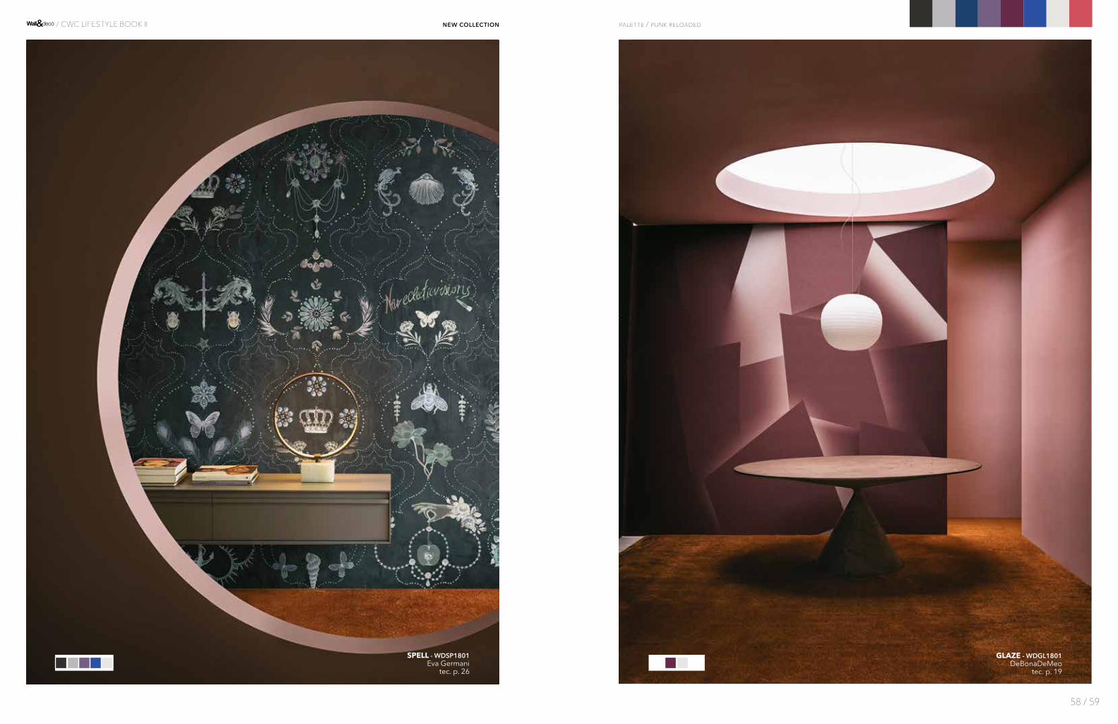
GLAZE - WDGL1801DeBonaDeMeo
tec. p. 19
SPELL - WDSP1801Eva Germani
tec. p. 26
palette / punk reloaded
58 / 59
/ CWC LIFESTYLE BOOK II new collection

LIQUIDA - WDLQ1801Draga&Aurel
tec. p. 21
LETTERA 32 - WDLT1801Bertero Projects + Antonio Andrea Pinnatec. p. 21
palette / punk reloaded
60 / 61
/ CWC LIFESTYLE BOOK II new collection
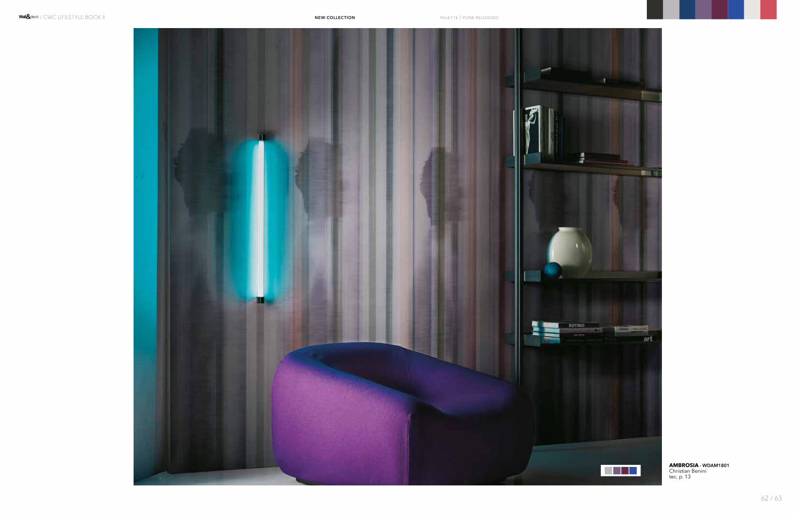
AMBROSIA - WDAM1801Christian Beninitec. p. 13
palette / punk reloaded
62 / 63
/ CWC LIFESTYLE BOOK II new collection
PAJLO - WDPA1801DeBonaDeMeo
tec. p. 25
WinterElegance
16-4703 TCX
18-0108 TCX
19-4205 TPG
19-5513 TCX
19-4044 TCX
15-0927 TPX
Una visione dell’inverno come rifugio caldo e sofisticato. Un sottofondo dorato diventa trait d’union fra tonalità ricche e profonde, che si muovono in un’atmosfera cangiante illuminata di riflessi. Dominano i contorni netti, le geometrie ad angolo retto, in equilibrio fra eclettismo e rigore.
A vision of winter as a warm and sophisticated haven. A golden undertone becomes the link between rich and deep shades, vibrating with reflexes in a flickering light. Sharp edges and stark geometries rule, in a fine balance between eclecticism and austerit y.
palette
PANTONE® COLORS
19-1524 TPX
13-1012 TCX
16-1516 TPX
64 / 65
/ CWC LIFESTYLE BOOK II new collection

ORNATE - WDOR1801DeBonaDeMeo
tec. p. 24
COLOR FIELD - WDCF1801Gio Pagani
tec. p. 15
palette / winter elegance
66 / 67
new collection / CWC LIFESTYLE BOOK II

HABITAT - WDHA1801Silvia Stella Osella
tec. p. 19
FLORIANOPOLIS - WDFL1801MarÍa GÓmez GarcÍa
tec. p. 18
palette / winter elegance
68 / 69
new collection / CWC LIFESTYLE BOOK II

LE BILAN D'UN SIÈCLE - WDBS1801RAW
tec. p. 20
SKIL - WDSK1801Serena Confalonieritec. p. 26
palette / winter elegance
70 / 71
new collection / CWC LIFESTYLE BOOK II

MAHAI - WDMA1801Draga&Aureltec. p. 22
AURORA - WDAU1801Lorenzo De Grandis
tec. p. 14
palette / winter elegance
72 / 73
new collection / CWC LIFESTYLE BOOK II

AKOS - WDAK1801Christian Benini / Andrea Merendi
tec. p. 13
MANY HOLES - WDMH1801Giovanni Pesce
tec. p. 23
palette / winter elegance
74 / 75
new collection / CWC LIFESTYLE BOOK II

ARCADIA - WDAR1801Lorenzo De Grandis
tec. p. 14
LA VIE EN ROSE - WDVR1801Eva Germanitec. p. 20
palette / winter elegance
76 / 77
new collection / CWC LIFESTYLE BOOK II

DITTAMO - WDDI1801Antonella Guiditec. p. 16
DE PUNTILLAS - WDDP1801Eva Germanitec. p. 15
palette / winter elegance
78 / 79
new collection / CWC LIFESTYLE BOOK II
TUTTI COLORI + 1 - WDTC1801Eva Germani
tec. p. 28
VIRIDE - WDVI1801Francesca Zobolitec. p. 29
palette / winter elegance
80 / 81
new collection / CWC LIFESTYLE BOOK II
TOUJOURS TOI - WDTT1801Eva Germanitec. p. 28
LA FAMIGLIA POIS - WDLF1801Antonio Marras
tec. p. 20
palette / winter elegance
82 / 83
new collection / CWC LIFESTYLE BOOK II
POMMES À CIDRE - WDPC1801RAW
tec. p. 25
HISTORIA - WDHI1801Serena Confalonieri
tec. p. 19
palette / winter elegance
84 / 85
new collection / CWC LIFESTYLE BOOK II

LUZ - WDLZ1801Giovanni Pesce
tec. p. 22
TUJANE - WDTU1801Lorenzo De Grandistec. p. 28
palette / winter elegance
86 / 87
new collection / CWC LIFESTYLE BOOK II

LIA - WDLI1801Christophe Delcourt
tec. p. 21
STONEHENGE - WDST1801Lorenzo De Grandis
tec. p. 27
palette / winter elegance
88 / 89
new collection / CWC LIFESTYLE BOOK II

C O L L E C T I O N
2017
EtereoChic
HYPOTENUSE - WDHI1701Gupica
tec. p. 8814-4107 TCX
12-0304 TCX
18-5806 TCX
14-1217 TCX
11-1001 TCX
15-0927 TCX
Una palette di tinte neutre, come il crema, l’avorio e il grigio, per grafiche luminose e preziose, interpreti di un’eleganza mai urlata.
A palette consisting of neutral tones, such as cream, ivory and grey, is used for luminous and precious graphics, interpreting an elegance which never descends into garishness.
92 / 93
/ CWC LIFESTYLE BOOK II
palette
PANTONE® COLORS
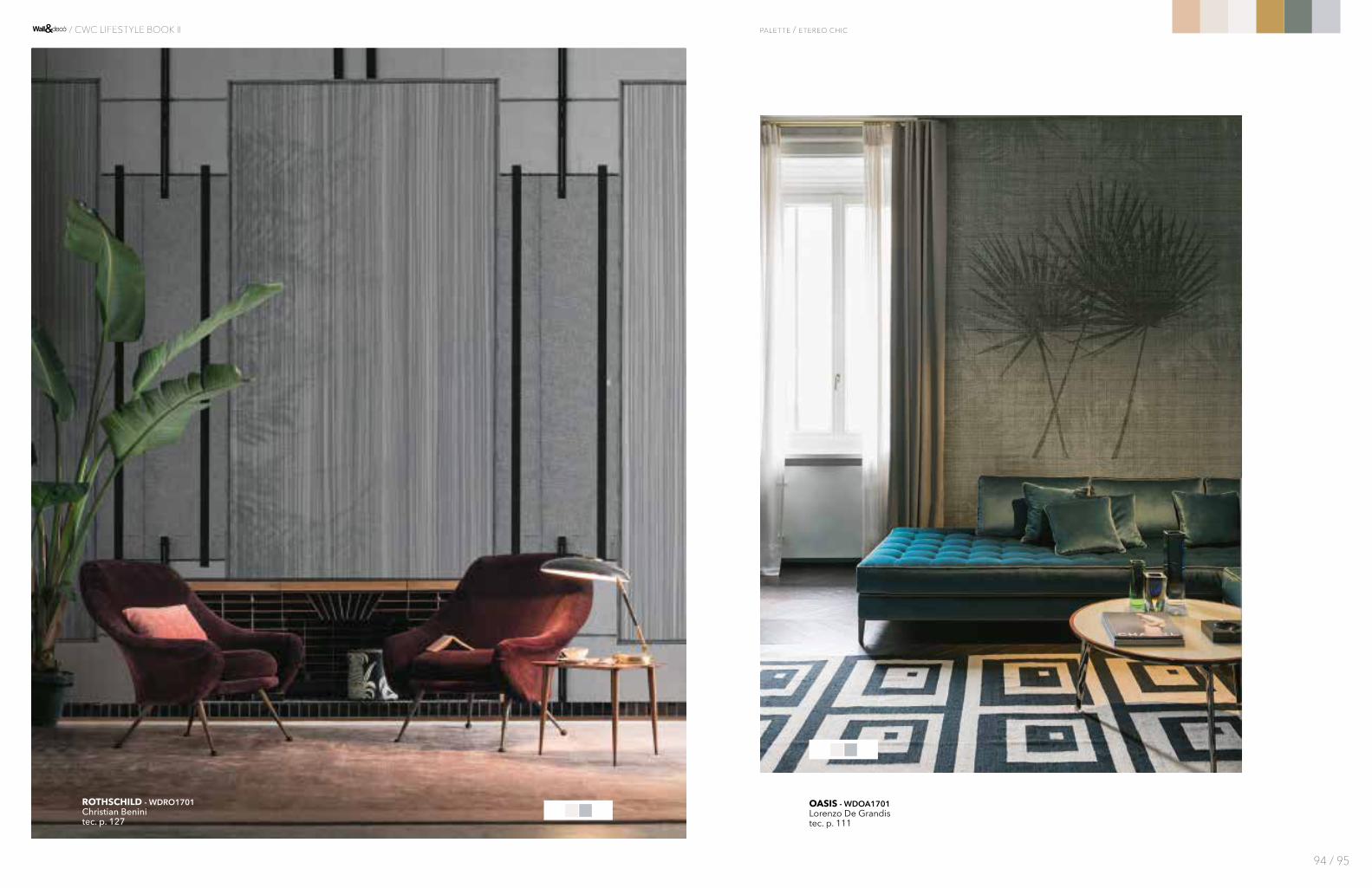
OASIS - WDOA1701Lorenzo De Grandistec. p. 111
ROTHSCHILD - WDRO1701 Christian Beninitec. p. 127
palette / etereo chic
94 / 95
/ CWC LIFESTYLE BOOK II
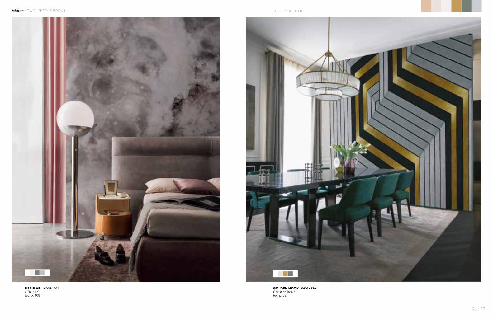
GOLDEN HOOK - WDGH1701Christian Beninitec. p. 82
NEBULAE - WDNB1701CTRLZAKtec. p. 108
palette / etereo chic
96 / 97
/ CWC LIFESTYLE BOOK II

ASHES TO ASHES - WDAA1701Gio Paganitec. p. 37
METROPOLIS - WDME1701Gupica
tec. p. 104
palette / etereo chic
98 / 99
/ CWC LIFESTYLE BOOK II

CAVEAU - WDCV1701Antonella Guidi
tec. p. 53
PNEU - WDPN1701Draga&Aurel
tec. p. 119
palette / etereo chic
100 / 101
/ CWC LIFESTYLE BOOK II
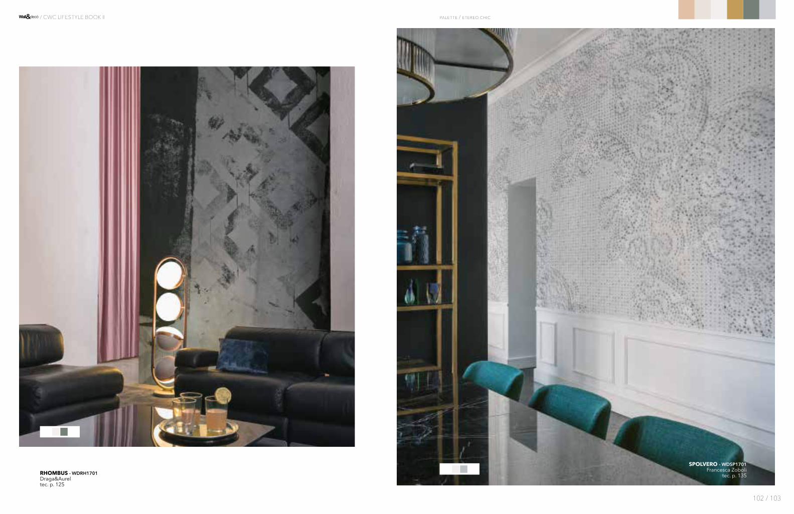
SPOLVERO - WDSP1701Francesca Zoboli
tec. p. 135RHOMBUS - WDRH1701Draga&Aureltec. p. 125
palette / etereo chic
102 / 103
/ CWC LIFESTYLE BOOK II

HIDDEN CITY - WDHC1702Christian Benini
tec. p. 87
SUMI - WDSU1701Francesca Zobolitec. p. 138
palette / etereo chic
104 / 105
/ CWC LIFESTYLE BOOK II
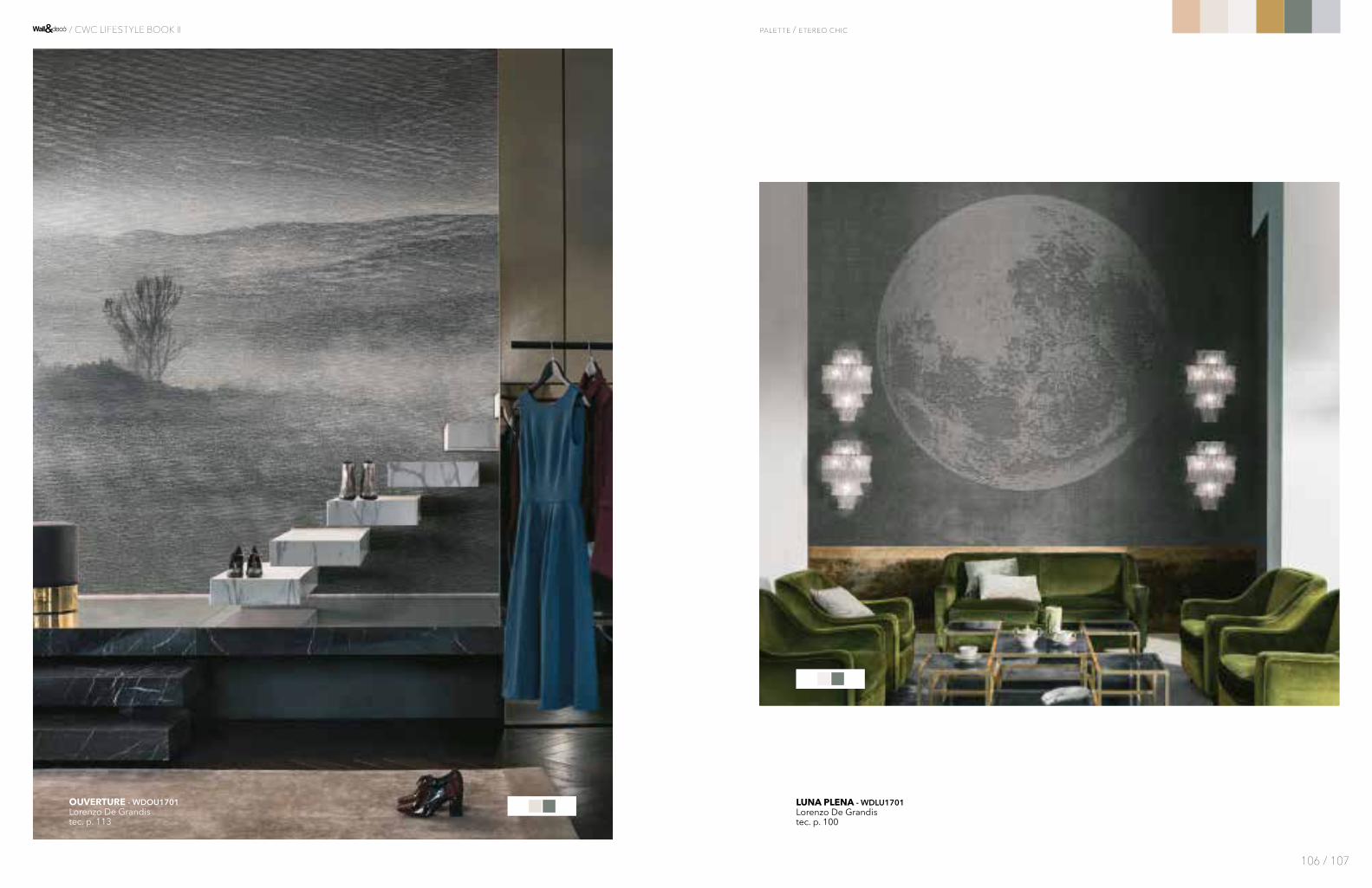
LUNA PLENA - WDLU1701Lorenzo De Grandistec. p. 100
OUVERTURE - WDOU1701Lorenzo De Grandistec. p. 113
palette / etereo chic
106 / 107
/ CWC LIFESTYLE BOOK II

FLORENCE - WDFL1701Lorenzo De Grandis
tec. p. 76AENIGMATICA - WDAE1701
Draga&Aureltec. p. 32
palette / etereo chic
108 / 109
/ CWC LIFESTYLE BOOK II
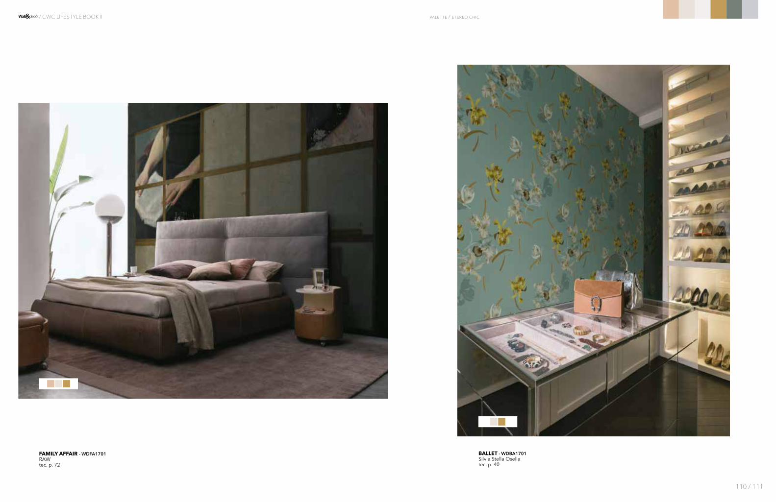
BALLET - WDBA1701Silvia Stella Osellatec. p. 40
FAMILY AFFAIR - WDFA1701RAWtec. p. 72
palette / etereo chic
110 / 111
/ CWC LIFESTYLE BOOK II
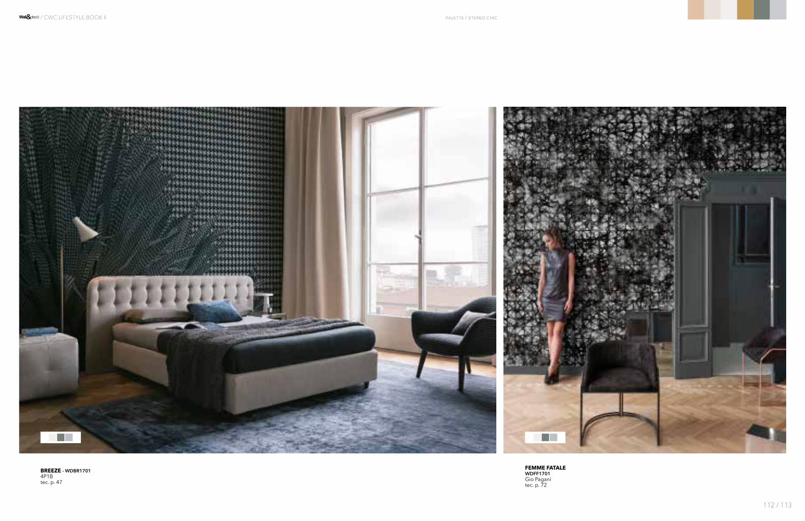
FEMME FATALEWDFF1701Gio Paganitec. p. 72
BREEZE - WDBR17014P1Btec. p. 47
palette / etereo chic
112 / 113
/ CWC LIFESTYLE BOOK II

HERODIO - WDHE1701Tommaso Guerra
tec. p. 86
THE DARK SIDE - WDDS1701Marika Baldoni
tec. p. 141
palette / etereo chic
114 / 115
/ CWC LIFESTYLE BOOK II

FISH MAMBO - WDFM1701Shout
tec. p. 73
BOIS D'HIVER - WDBH1701Lorenzo De Grandis
tec. p. 45
palette / etereo chic
116 / 117
/ CWC LIFESTYLE BOOK II

IMAGINARIUM - WDIM1701Antonio Marrastec. p. 89
KYOTO - WDKY1701Lorenzo De Grandistec. p. 94
palette / etereo chic
118 / 119
/ CWC LIFESTYLE BOOK II

CIRCUS - WDCI1701Eva Germanitec. p. 57
HELLENIC - WDHL1701RAWtec. p. 86
palette / etereo chic
120 / 121
/ CWC LIFESTYLE BOOK II
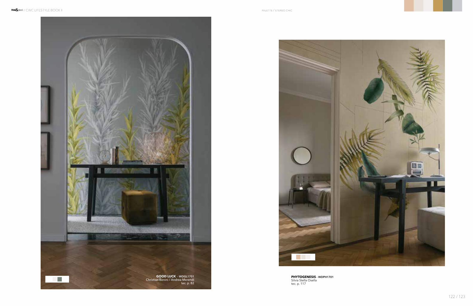
PHYTOGENESIS - WDPH1701Silvia Stella Osellatec. p. 117
GOOD LUCK - WDGL1701Christian Benini / Andrea Merendi
tec. p. 82
palette / etereo chic
122 / 123
/ CWC LIFESTYLE BOOK II

Una palette calda, a predominanza di rosso, dove contenuto e contenitore si fondono in un continuum cromatico che crea un'epserienza estetica avvolgente.
A warm palette, where red prevails, where content and container mingle in a colour continuum wich creates an enveloping aesthetic experience.
PILLS - WDPI17014P1Btec. p. 11719-0403 TCX
14-1909 TCX
19-4029 TCX
18-1659 TCX
17-1647 TCX
16-1054 TCX
MagicBox
124 / 125
/ CWC LIFESTYLE BOOK II
palette
PANTONE® COLORS
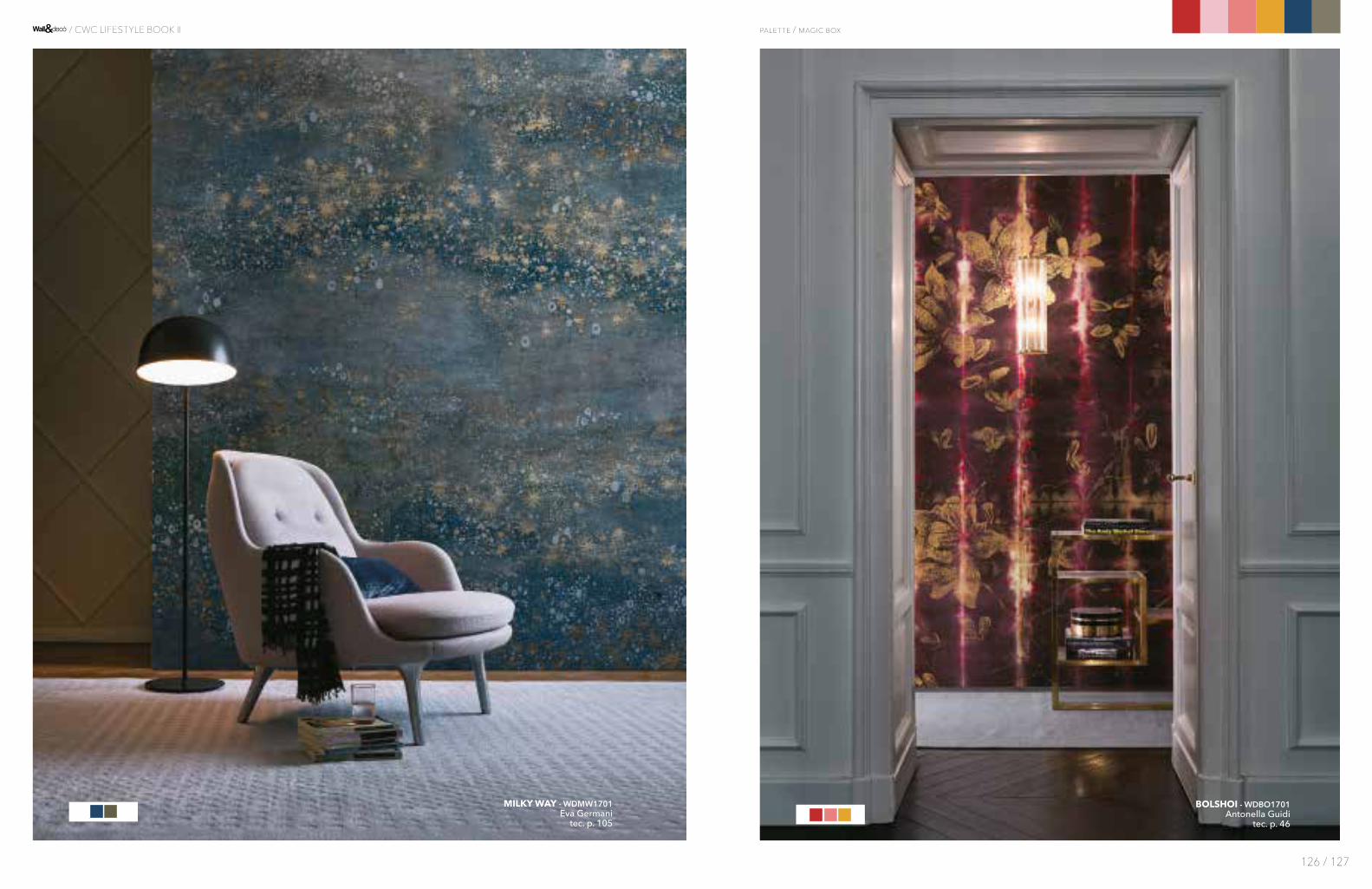
BOLSHOI - WDBO1701Antonella Guidi
tec. p. 46
MILKY WAY - WDMW1701Eva Germani
tec. p. 105
palette / magic box
126 / 127
/ CWC LIFESTYLE BOOK II
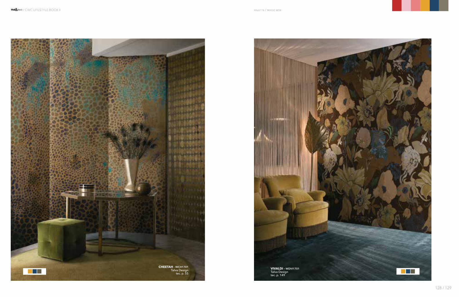
VIVALDI - WDVI1701Talva Designtec. p. 149
CHEETAH - WCH1701Talva Design
tec. p. 55
palette / magic box
128 / 129
/ CWC LIFESTYLE BOOK II
129
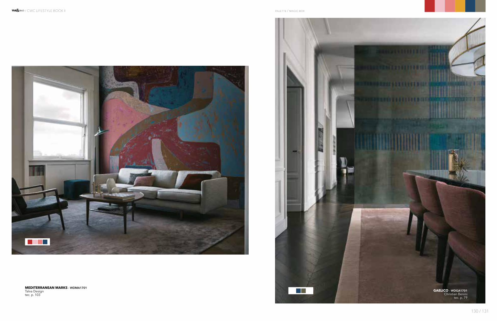
GAELICO - WDGA1701Christian Benini
tec. p. 79
MEDITERRANEAN MARKS - WDMA1701Talva Designtec. p. 103
palette / magic box
130 / 131
/ CWC LIFESTYLE BOOK II
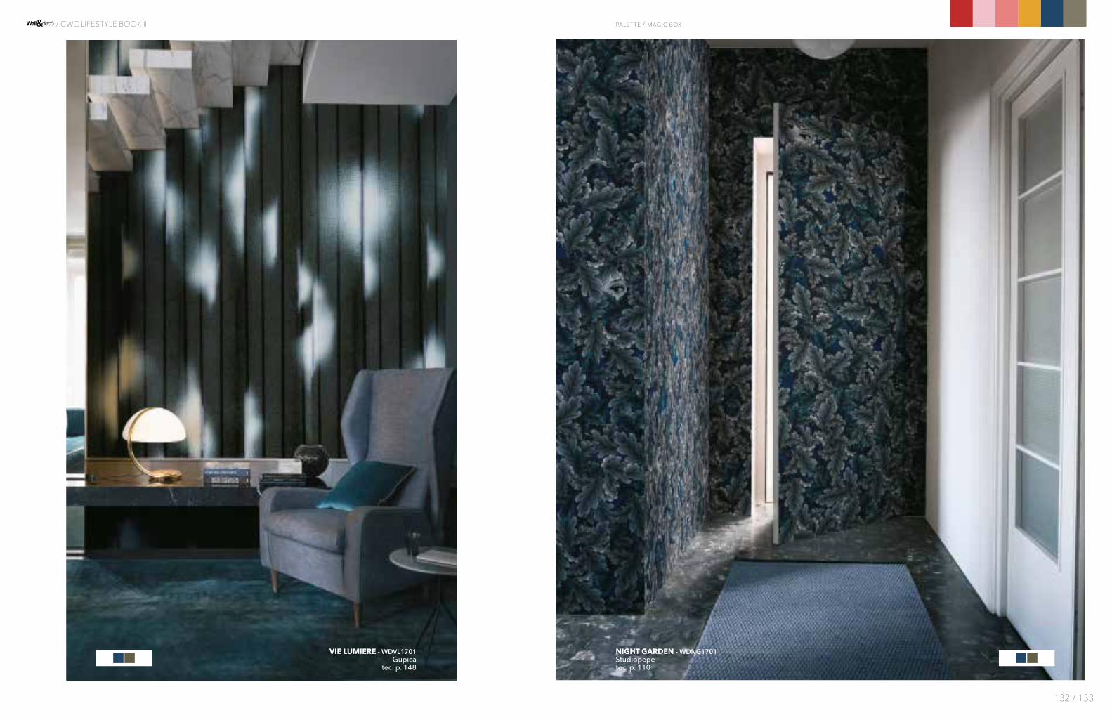
NIGHT GARDEN - WDNG1701Studiopepetec. p. 110
VIE LUMIERE - WDVL1701Gupica
tec. p. 148
palette / magic box
132 / 133
/ CWC LIFESTYLE BOOK II

PAVOT - WDPA1701Eva Germani
tec. p. 116
palette / magic box
134 / 135
/ CWC LIFESTYLE BOOK II

TAPIS VOLANT - WDTV1702RAWtec. p. 140
ZOONIMO - WDZO1703Silvia Stella Osella
tec. p. 155
palette / magic box
136 / 137
/ CWC LIFESTYLE BOOK II

ATOMIC - WDAT1701Gio Paganitec. p. 37
EAT TO THE BEAT - WDEB1701Gio Paganitec. p. 67
palette / magic box
138 / 139
/ CWC LIFESTYLE BOOK II

CUCÙ - WDCU1701Shout
tec. p. 61
ECHOS - WDEC1701The Elusive Otter
tec. p. 68
palette / magic box
140 / 141
/ CWC LIFESTYLE BOOK II
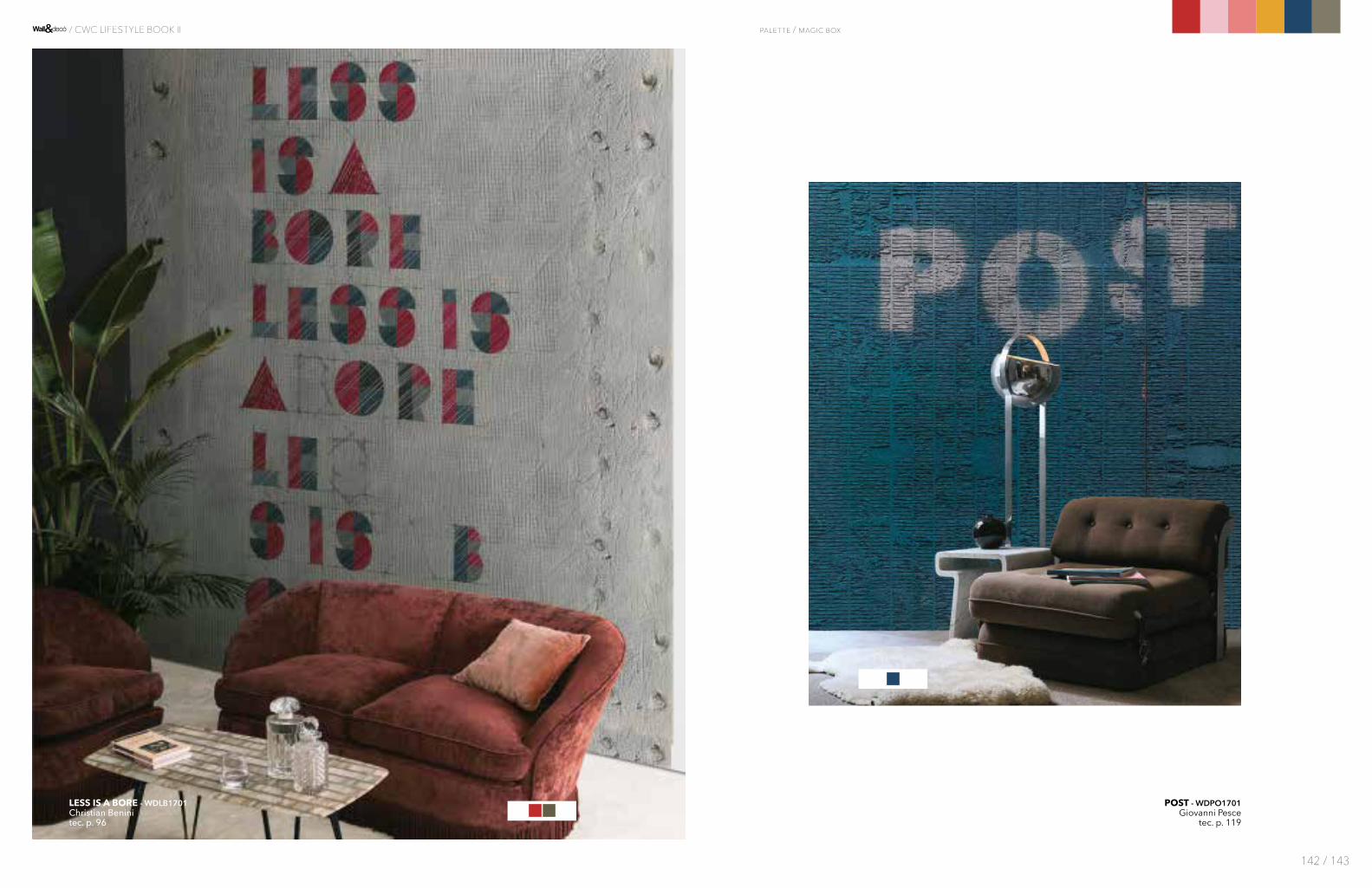
POST - WDPO1701Giovanni Pesce
tec. p. 119
LESS IS A BORE - WDLB1701Christian Beninitec. p. 96
palette / magic box
142 / 143
/ CWC LIFESTYLE BOOK II
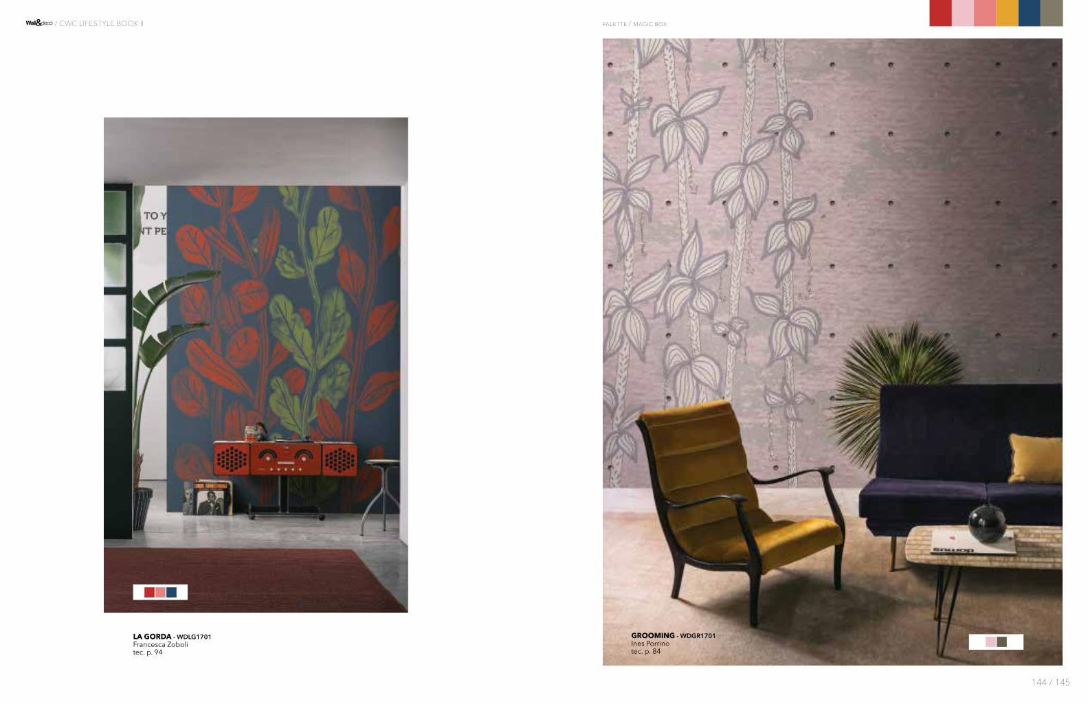
GROOMING - WDGR1701Ines Porrinotec. p. 84
LA GORDA - WDLG1701Francesca Zobolitec. p. 94
palette / magic box
144 / 145
/ CWC LIFESTYLE BOOK II
12-2102 TCX
15-6317 TCX
18-1355 TCX
18-5620 TCX
12-0418 TCX
19-5230 TCX
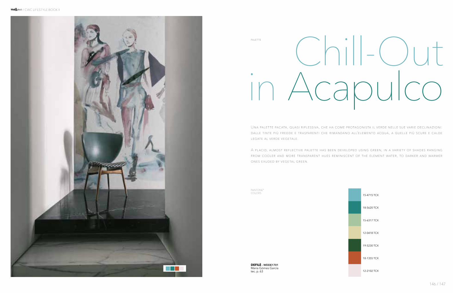
Una palette pacata, quasi riflessiva, che ha come protagonista il verde nelle sue varie declinazioni: dalle tinte più fredde e trasparenti che rimandano all’elemento acqua, a quelle più scure e calde legate al verde vegetale. A placid, almost reflective palette has been developed using green, in a variety of shades ranging from cooler and more transparent hues reminiscent of the element water, to darker and warmer ones exuded by vegetal green.
Chill-Outin Acapulco
15-4715 TCX
DEFILÈ - WDDE1701Maria Gómes Garcíatec. p. 63
146 / 147
/ CWC LIFESTYLE BOOK II
palette
PANTONE® COLORS
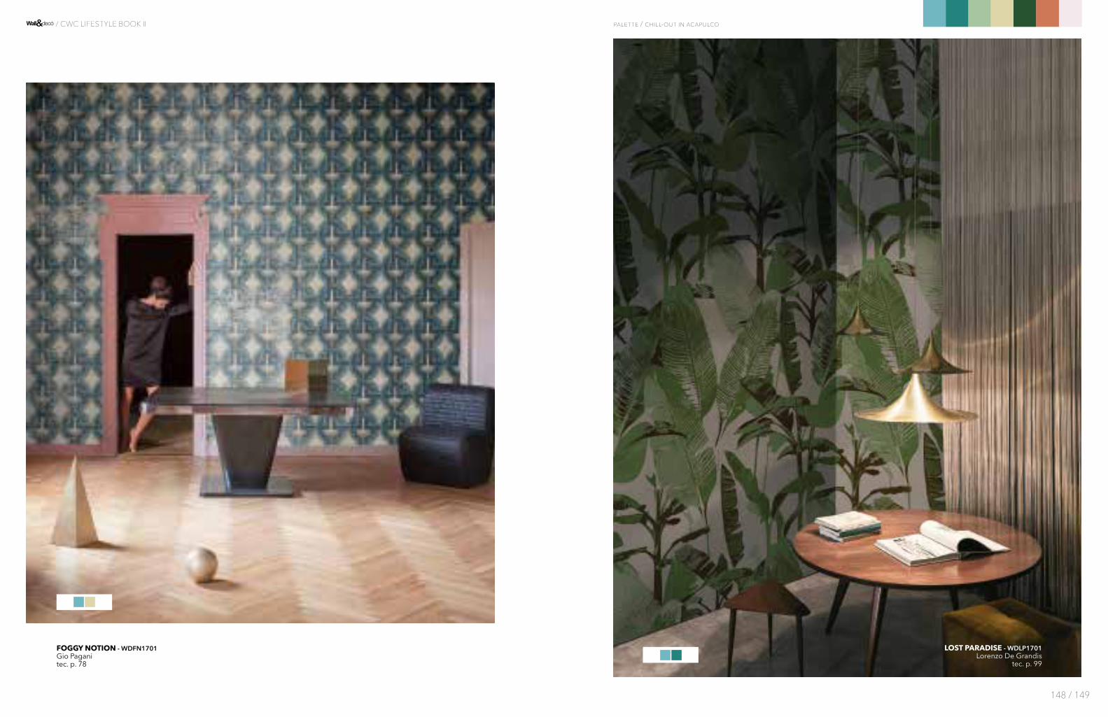
LOST PARADISE - WDLP1701Lorenzo De Grandis
tec. p. 99
FOGGY NOTION - WDFN1701Gio Paganitec. p. 78
palette / chill-out in acapulco
148 / 149
/ CWC LIFESTYLE BOOK II

INCANTO - WDIN1701Maria Gómes Garcíatec. p. 90
PALE BLUE EYES - WDPB1701Gio Paganitec. p. 114
palette / chill-out in acapulco
150 / 151
/ CWC LIFESTYLE BOOK II
151
MONT BLANC - WDMB1701Elisa Vendramintec. p. 106
TALT - WDTA1701Gupicatec. p. 139
palette / chill-out in acapulco
152 / 153
/ CWC LIFESTYLE BOOK II

A x i m o l e n e t a u t e s s i m i , v o l u p t u r s i t
e u m f u g i t l a c u m v o l o r e s t a c c a e
SPECTRUM - WDSE1701Giovanni Pesce
tec. p. 135
CHILL-OUT - WDCO1701Draga&Aureltec. p. 55
palette / chill-out in acapulco
154 / 155
/ CWC LIFESTYLE BOOK II
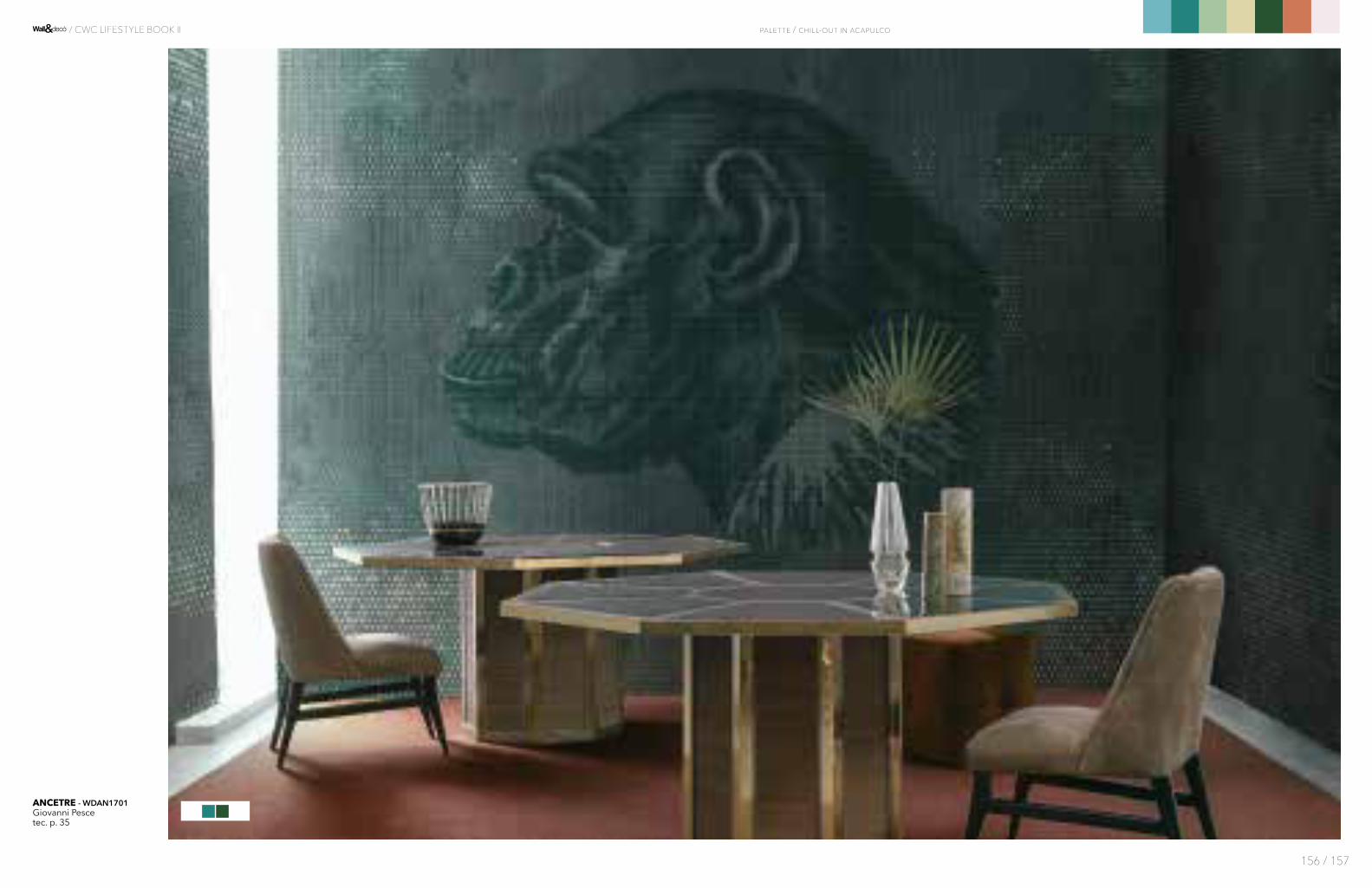
ANCETRE - WDAN1701Giovanni Pescetec. p. 35
palette / chill-out in acapulco
156 / 157
/ CWC LIFESTYLE BOOK II

QUAD - WDQU1701Ines Porrinotec. p. 121
HOUSE IS MY DRESS - WDHD1701Eva Germani
tec. p. 88
palette / chill-out in acapulco
158 / 159
/ CWC LIFESTYLE BOOK II
158

RAT PACK - WDRP1701Wladimiro Bendandi
tec. p. 122LA ISLA BONITA - WDLI1701
Giovanni Pescetec. p. 94
palette / chill-out in acapulco
160 / 161
/ CWC LIFESTYLE BOOK II
160

TREILLAGE - WDTR1701RAW
tec. p. 144
IRIDE - WDIR1701Christian Beninitec. p. 90
palette / chill-out in acapulco
162 / 163
/ CWC LIFESTYLE BOOK II
162
KALEIDOS - WDKA1701Antonio Marras
tec. p. 92
MAMMA MIA - WDMM1701Gio Paganitec. p. 101
palette / chill-out in acapulco
164 / 165
/ CWC LIFESTYLE BOOK II

CHERRY BOMB - WDCB1701Gio Pagani
tec. p. 55
BIDI - WDBI1701Shouttec. p. 42
palette / chill-out in acapulco
166 / 167
/ CWC LIFESTYLE BOOK II
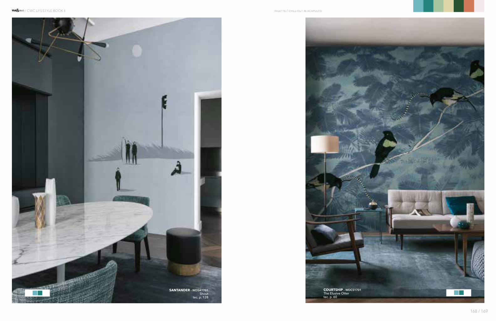
COURTSHIP - WDCS1701The Elusive Ottertec. p. 60
SANTANDER - WDSA1701Shout
tec. p. 128
palette / chill-out in acapulco
168 / 169
/ CWC LIFESTYLE BOOK II

hOW WE dO IT

Come descriverebbe la “scena creativa” in Estonia, in particolare dell’interior design? Interior design e architettura sono entrambi ad un ottimo livello. Le due discipline possiedono ognuna il pro-prio corso universitario e ci sono pro-fessionisti molto preparati, che con-tribuiscono con il proprio lavoro allo sviluppo creativo di entrambi i campi. Un ruolo importante è dato dall’attività edilizia, sia a livello pri-vato che pubblico. A partire dagli anni ‘90 il nostro paese è stato com-pletamente ricostruito e oggi, passa-ta la crisi economica, la costruzione è di nuovo in pieno fervore.Per quanto riguarda la scena creativa, direi che lo stile Esto-ne appartiene al filone del design Nord-Europeo, anche se probabil-mente è più coraggioso e “osa di più” rispetto agli stili più “tranquil-li” di paesi come la Finlandia o la Danimarca.
Nell’appartamento di Tallin che ha realizzato, l’impressione è che abbia voluto dare ad ogni stanza una personalità differente. Ci sono ambienti ricchi di colore come la mansarda, altri più “nar-rativi” come la stanza da letto e un tocco “boho-chic” nel living che ricorda lo studio di Geoffrey Rush in “The King’s Speech”. Come le è venuta questa idea di dare ad ogni ambiente un suo significato particolare? Aveva in mente fin dall’inizio di utilizzare la carta da parati come “strumen-to” in questo senso? Qual è la sua stanza preferita? L’appartamento è nella Città Vecchia, in un edificio storico di grande valore. Il mio obiettivo è sempre stato quello di preservarne lo spirito ma creando un mix unico: conservando e valorizzando detta-gli storici, aggiungendoci elementi di design moderno a livello di ma-teriali, finiture e arredamento.Le carte Wall&decò erano perfette per questo scopo e sapevo fin dall’i-nizio che le avrei usate! Possiedono una texture fantastica, come una tela da artista. Anche il cliente se ne è innamorato subito!Le carte ci hanno permesso di rendere ogni stanza diversa dall’altra, ma sempre all’interno di un unico spazio coerente. No-nostante i diversi motivi, tutti i decori sono graficamente simili e si valorizzano a vicenda.
È come avere una collezione di quadri dello stesso artista distribuita nelle varie stanze della casa. Motivi diversi ma un unico stile.Personalmente mi piacciono tutte le stanze. Sono riuscito ad ottenere un magnifico effetto nell’entrata grazie alla combinazione di materiali. Il delicato motivo sulle pareti ripren-de i pavimenti in marmo e l’arredo.È come se “scorressero” uno nell’altro: amo questo effetto. Un amico architetto ha visto le foto e mi ha detto che sicuramente si trat-tava di un appartamento italiano. È rimasto stupito nello scoprire che in realtà si trova nella nostra città!
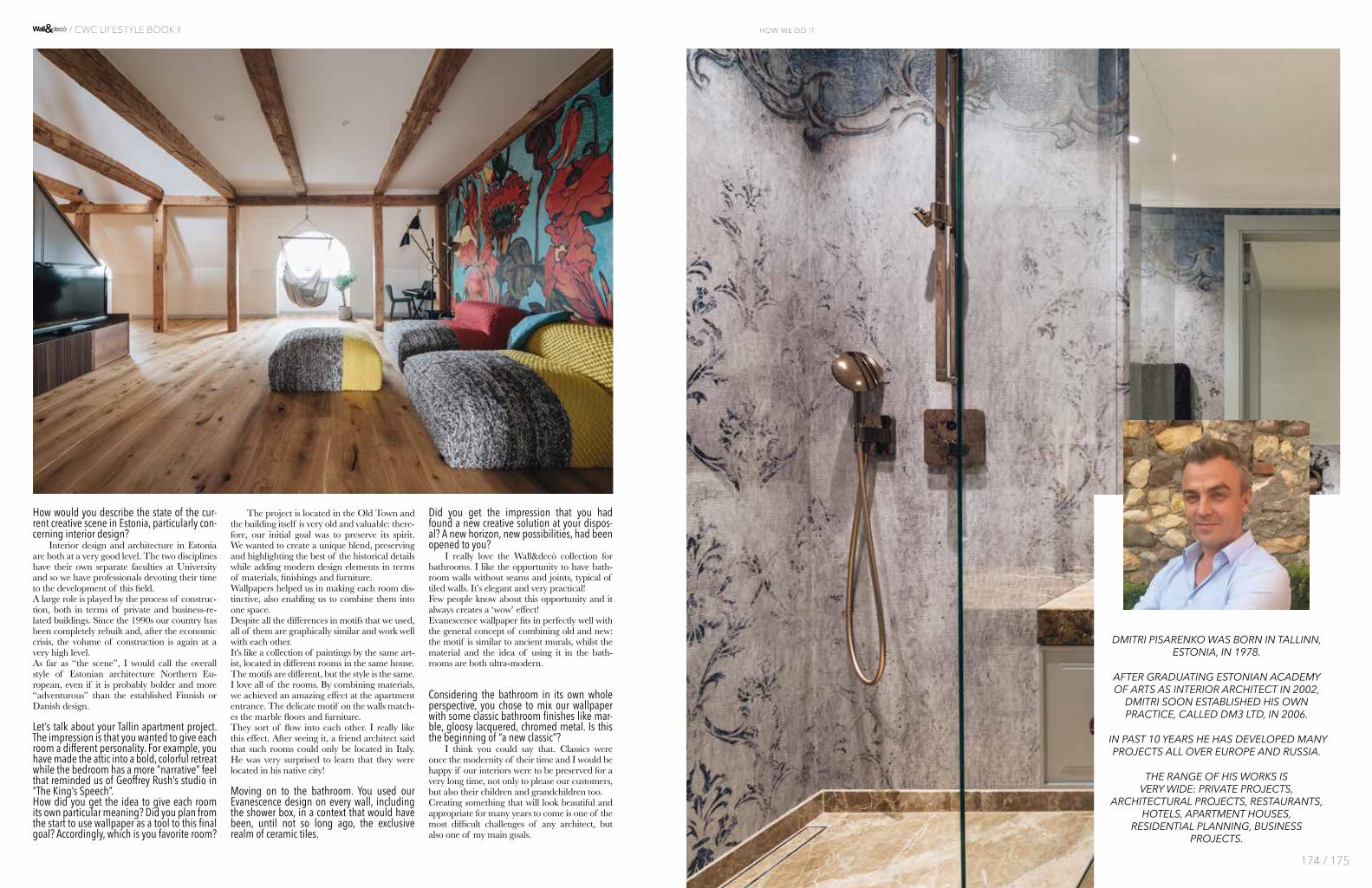
Esaminiamo in particolare il ba-gno. Ha utilizzato il nostro Evane-scence su tutte le pareti, perfino all’interno della cabina doccia, in un contesto che normalmente sarebbe il regno della ceramica. Ha avuto l’impressione di avere trovato una nuova soluzione cre-ativa, di avere aperto un nuovo orizzonte? Adoro le carte Wall&decò per il bagno. Mi piacciono le pareti dei bagni senza le fughe tipiche delle piastrelle. È una soluzione elegante e molto pratica allo stesso tempo: pochi clienti ne sono ancora a co-noscenza e crea sempre un grande stupore!La grafica Evanescence è perfetta per uno stile che vuole combinare antico e nuovo: il disegno ricorda i vecchi affreschi, mentre il mate-riale e la possibilità di collocarlo in bagno sono idee ultra-moderne.A quel punto ho sentito il bisogno di rinforzare l’idea del fogliame e il tappeto di Dimore Studio ha inva-so lo spazio, con tutti i suoi colori.
Ha scelto di affiancare la carta da parati a materiali che sono ormai dei classici del bathroom design come il marmo, il laccato lucido, la finitura cromata. È l’inizio di un “nuovo classico”? Direi proprio di sì. I classici erano la modernità del loro tempo e sarei molto felice se i nostri pro-getti d’interni continuassero a pia-cere non solo ai nostri clienti ma anche ai loro discendenti! Creare qualcosa che continuerà ed essere bello e piacevole per molti anni a venire è una delle più grandi sfide di ogni architetto, ma anche uno dei miei principali obiettivi.
DM3interview with Dmitri Pisarenko
DMITRI PISARENKO NASCE A TALLINN, IN ESTONIA, NEL 1978.
SI LAUREA COME INTERIOR ARCHITECT PRESSO LA ESTONIAN ACADEMY OF ARTS NEL 2002.
FONDA IL PROPRIO STUDIO DM3 LTD NEL 2006, CON IL QUALE INIZIA A SVILUPPARE UNA GRANDE VARIETÀ DI PROGETTI IN EUROPA E IN RUSSIA.
GLI AMBITI DI INTERVENTO RIVELANO LA SUA VERSATILITÀ CREATIVA, CAPACE DI PASSARE DALLE RESIDENZE PRIVATE A PROGETTI DI LOCALI PUBBLICI COME RISTORANTI, HOTEL, COMPLESSI ABITATIVI, RESIDENTIAL PLANNING E COMMITTENTI BUSINESS-ORIENTED.
ph
Tõnu
Tun
nel
172 / 173
how we do it / CWC LIFESTYLE BOOK II
How would you describe the state of the cur-rent creative scene in Estonia, particularly con-cerning interior design? Interior design and architecture in Estonia are both at a very good level. The two disciplines have their own separate faculties at University and so we have professionals devoting their time to the development of this field. A large role is played by the process of construc-tion, both in terms of private and business-re-lated buildings. Since the 1990s our country has been completely rebuilt and, after the economic crisis, the volume of construction is again at a very high level. As far as “the scene”, I would call the overall style of Estonian architecture Northern Eu-ropean, even if it is probably bolder and more “adventurous” than the established Finnish or Danish design.
Let’s talk about your Tallin apartment project. The impression is that you wanted to give each room a different personality. For example, you have made the attic into a bold, colorful retreat while the bedroom has a more “narrative” feel that reminded us of Geoffrey Rush’s studio in “The King’s Speech”.How did you get the idea to give each room its own particular meaning? Did you plan from the start to use wallpaper as a tool to this final goal? Accordingly, which is you favorite room?
The project is located in the Old Town and the building itself is very old and valuable: there-fore, our initial goal was to preserve its spirit. We wanted to create a unique blend, preserving and highlighting the best of the historical details while adding modern design elements in terms of materials, finishings and furniture.Wallpapers helped us in making each room dis-tinctive, also enabling us to combine them into one space. Despite all the differences in motifs that we used, all of them are graphically similar and work well with each other. It's like a collection of paintings by the same art-ist, located in different rooms in the same house. The motifs are different, but the style is the same.I love all of the rooms. By combining materials, we achieved an amazing effect at the apartment entrance. The delicate motif on the walls match-es the marble floors and furniture. They sort of flow into each other. I really like this effect. After seeing it, a friend architect said that such rooms could only be located in Italy. He was very surprised to learn that they were located in his native city!
Moving on to the bathroom. You used our Evanescence design on every wall, including the shower box, in a context that would have been, until not so long ago, the exclusive realm of ceramic tiles.
Did you get the impression that you had found a new creative solution at your dispos-al? A new horizon, new possibilities, had been opened to you? I really love the Wall&decò collection for bathrooms. I like the opportunity to have bath-room walls without seams and joints, typical of tiled walls. It’s elegant and very practical!Few people know about this opportunity and it always creates a ‘wow’ effect!Evanescence wallpaper fits in perfectly well with the general concept of combining old and new: the motif is similar to ancient murals, whilst the material and the idea of using it in the bath-rooms are both ultra-modern.
Considering the bathroom in its own whole perspective, you chose to mix our wallpaper with some classic bathroom finishes like mar-ble, gloosy lacquered, chromed metal. Is this the beginning of “a new classic”? I think you could say that. Classics were once the modernity of their time and I would be happy if our interiors were to be preserved for a very long time, not only to please our customers, but also their children and grandchildren too.Creating something that will look beautiful and appropriate for many years to come is one of the most difficult challenges of any architect, but also one of my main goals.
DMITRI PISARENKO WAS BORN IN TALLINN, ESTONIA, IN 1978.
AFTER GRADUATING ESTONIAN ACADEMY OF ARTS AS INTERIOR ARCHITECT IN 2002,
DMITRI SOON ESTABLISHED HIS OWN PRACTICE, CALLED DM3 LTD, IN 2006.
IN PAST 10 YEARS HE HAS DEVELOPED MANY PROJECTS ALL OVER EUROPE AND RUSSIA.
THE RANGE OF HIS WORKS IS VERY WIDE: PRIVATE PROJECTS,
ARCHITECTURAL PROJECTS, RESTAURANTS, HOTELS, APARTMENT HOUSES,
RESIDENTIAL PLANNING, BUSINESS PROJECTS.
174 / 175
how we do it / CWC LIFESTYLE BOOK II
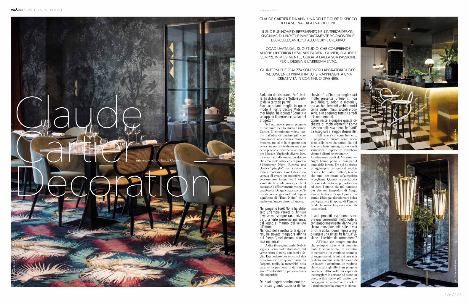
Parlando del ristorante Forêt Noi-re, ha dichiarato che “tutto è parti-to dalla carta da parati”. Può raccontarci meglio in quale modo il nostro decoro Midsum-mer Night l’ha ispirata? Come si è sviluppato il percorso creativo del progetto? Si è trattato del primo progetto di ristorante per lo studio Claude Cartier. Il committente voleva par-tire dall’idea di rendere più con-temporanea una classica brasserie francese, ma al di là di questo non aveva ancora individuato un con-cetto preciso e nemmeno un nome per il locale. Vagliando diverse idee, mi è tornato alla mente un decoro che amo moltissimo, ed era proprio Midsummer Night. Ricorda una classica “grisaglia” ma ha anche un feeling moderno. Così l’idea è di-ventata di creare un’atmosfera che evocasse una foresta, ed è subito sembrata la strada giusta perché il ristorante è effettivamente vicino ad una foresta. Da qui è nata anche l’i-dea del nome, giocando sul doppio significato di “Forêt Noire” che è anche un famoso dessert francese.
Nel progetto Forêt Noire ha utiliz-zato un’ampia varietà di finiture diverse ma sempre caratterizzate da una forte presenza materica: dal legno al marmo, dal velluto all’ottone. Nel caso della nostra carta da pa-rati, ha trovato maggiore affinità nel “segno”, nel decoro, o nella resa materica? A dire il vero, entrambi. Nel di-segno ci sono molte sfumature, dal verde scuro al nero, con rami e fo-glie. Era perfetto per evocare l’idea della foresta. Per quanto riguarda l’aspetto tattile, la matericità della carta ci ha permesso di dare mag-giore “profondità” e presenza fisica alla superficie.
Dai suoi progetti sembra emerge-re la sua grande capacità di “or-
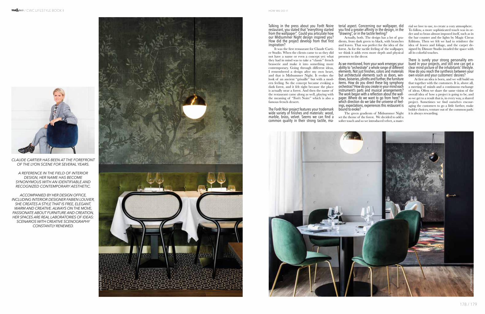
chestrare” all’interno degli spazi molte presenze differenti: non solo finiture, colori e materiali, ma anche elementi architettonici come porte, infissi, zoccoli e boi-serie, e in aggiunta tutti gli arredi e i complementi. Come riesce a dirigere queste or-chestre di molti elementi? Come nascono nella sua mente le “parti” da assegnare ai singoli strumenti? Nello specifico, come ho detto, il progetto è iniziato come rifles-sione sulla carta da parati. Da qui si è ampliato immaginando quali sensazioni e esperienze avrebbero vissuto i clienti del ristorante. Le sfumature verdi di Midsummer Night hanno posto le basi per il tema della foresta. Da qui ho deciso di aggiungere un tocco di morbi-dezza e ho usato il velluto, tessuto che amo, per creare un’atmosfera accogliente. Questo ha portato alla necessità di un tocco più sofisticato ed ecco l’ottone, sia nel bancone bar che nei lampadari di Magic Circus Editions. A quel punto ho sentito il bisogno di rinforzare l’idea del fogliame e il tappeto di Dimore Studio ha invaso lo spazio, con tutti i suoi colori.
I suoi progetti esprimono sem-pre una personalità molto forte e, contemporaneamente, danno una chiara immagine dello stile di vita di chi li abita. Come riesce a rag-giungere una sintesi fra la “sua” vi-sione e i desideri dei committenti? All’inizio c’è sempre un’idea che sviluppo insieme ai commit-tenti. È innanzitutto un incontro di pensieri e un continuo scambio di suggerimenti. A volte si crea una perfetta sintonia sulla direzione di un lavoro e otteniamo un risultato che è a tutti gli effetti un progetto condiviso. Altre volte mi capita di incoraggiare le persone ad osare un poco, a fare scelte più decise, più coraggiose, ad andare oltre il solito: il risultato premia sempre lo sforzo.
ClaudeCartierDecoration
ph
Eri
ck S
aille
t
ph
Gui
llaum
e G
rass
t
ph
Gui
llaum
e G
rass
t
interview with Claude Cartier
CLAUDE CARTIER È DA ANNI UNA DELLE FIGURE DI SPICCO DELLA SCENA CREATIVA DI LIONE.
IL SUO È UN NOME DI RIFERIMENTO NELL’INTERIOR DESIGN, SINONIMO DI UNO STILE IMMEDIATAMENTE RICONOSCIBILE:
LIBERO, ELEGANTE, “CHALEUREUX” E CREATIVO.
COADIUVATA DAL SUO STUDIO, CHE COMPRENDE ANCHE L’INTERIOR DESIGNER FABIEN LOUVIER, CLAUDE È SEMPRE IN MOVIMENTO, GUIDATA DALLA SUA PASSIONE
PER IL DESIGN E L’ARREDAMENTO.
GLI INTERNI CHE REALIZZA SONO VERI LABORATORI DI IDEE: PALCOSCENICI PRIVATI IN CUI SI RAPPRESENTA UNA
CREATIVITÀ IN CONTINUO DIVENIRE.
176 / 177
how we do it / CWC LIFESTYLE BOOK II
Talking in the press about you Forêt Noire restaurant, you stated that “everything started from the wallpaper”. Could you articulate how our Midsummer Night design inspired you? How did the project develop from that first inspiration? It was the first restaurant for Claude Carti-er Studio. When the clients came to us they did not have a name or even a concept yet: what they had in mind was to take a “classic” french brasserie and make it into something more contemporary. Going through different ideas, I remembered a design after my own heart, and that is Midsummer Night. It evokes the look of an ancient “grisaille” but with a mod-ern feeling. So the concept became evoking a dark forest, and it felt right because the place is actually near a forest. And then the name of the restaurant came along as well, playing with the meaning of “Forêt Noire” which is also a famous french dessert.
The Forêt Noir project features your trademark wide variety of finishes and materials: wood, marble, brass, velvet. Seems we can find a common quality in their strong tactile, ma-
terial aspect. Concerning our wallpaper, did you find a greater affinity in the design, in the “drawing”, or in the tactile feeling? Actually, both. The design has a lot of gra-dients, from dark green to black, with branches and leaves. That was perfect for the idea of the forest. As for the tactile feeling of the wallpaper, we think it adds even more depth and physical presence to the decor.
As we mentioned, from your work emerges your ability to “orchestrate” a whole range of different elements. Not just finishes, colors and materials but architectural elements such as doors, win-dows, boiseries, plinths and further, the furniture items. How do you direct these big symphony orchestras? How do you create in your mind each instrument’s parts and musical arrangements? The work began with a reflection about the wall-paper. Where do we want to go from here? In which direction do we take the universe of feel-ings, expectations, experiences this restaurant is bound to evoke? The green gradients of Midsummer Night set the theme of the forest. We decided to add a softer touch and so we introduced velvet, a mate-
rial we love to use, to create a cozy atmosphere.To follow, a more sophisticated touch was in or-der and so brass almost imposed itself, such as in the bar counter and the lights by Magic Circus Editions. Then we felt we had to reinforce the idea of leaves and foliage, and the carpet de-signed by Dimore Studio invaded the space with all its colorful touches.
There is surely your strong personality em-bued in your projects, and still one can get a clear mind picture of the inhabitants’ lifestyle. How do you reach the synthesis between your own vision and your customers’ desires? At first an idea is born, and we will build on that together with the customers. It is, above all, a meeting of minds and a continuous exchange of ideas. Often we share the same vision of the overall idea of how a project is going to be, and so we get to a result that is, in every way, a shared project. Sometimes we find ourselves encour-aging the customers to go a little further, make bolder choices, venture out of the common path: it is always rewarding.
CLAUDE CARTIER HAS BEEN AT THE FOREFRONT OF THE LYON SCENE FOR SEVERAL YEARS.
A REFERENCE IN THE FIELD OF INTERIOR DESIGN, HER NAME HAS BECOME
SYNONYMOUS WITH AN IDENTIFIABLE AND RECOGNIZED CONTEMPORARY AESTHETIC.
ACCOMPANIED BY HER DESIGN OFFICE, INCLUDING INTERIOR DESIGNER FABIEN LOUVIER,
SHE CREATES A STYLE THAT IS FREE, ELEGANT, WARM AND CREATIVE. ALWAYS ON THE MOVE,
PASSIONATE ABOUT FURNITURE AND CREATION, HER SPACES ARE REAL LABORATORIES OF IDEAS:
SCENARIOS WITH CREATIVE SCENOGRAPHY CONSTANTLY RENEWED.
ph
Eri
ck S
aille
t
ph
Gui
llaum
e G
rass
t
178 / 179
how we do it / CWC LIFESTYLE BOOK II

Nella vostra comunicazione social usate spesso parole come “idee straordinarie” (außergewöhnlichen Ideen) per parlare dei vostri progetti di interni. Dove cercate l’ispirazione per lo straordinario e quanto è importan-te per il committente “l’unicità” della propria casa? Tutti i nostri clienti sono alla ricerca di qualcosa di straordinario per le proprie case. A volte hanno un’i-dea più o meno definita, ma spesso questa emerge solo dopo aver dialogato con noi. Capita che un cliente si innamori a prima vista di un oggetto d’arredo esposto e pensi: questo sono io, è unico, è come voglio essere! La mia ispirazione la raccolgo ogni giorno, nella vita quotidiana. Cammino per la città o scappo nella na-tura ma sempre con occhi aperti, pronta a cogliere ogni dettaglio. Naturalmente poi mi avvalgo anche di risorse professionali, come le fiere dedicate al design, visito altri showroom e divoro le riviste di lifestyle. E poi non dimentichiamo il viaggiare, l’incontro con altri paesi e culture. Quando sono in viaggio sono sempre un vulcano di idee!
In un impianto architettonico di matrice moderna, quasi minimalista, avete usato la carta da parati per creare delle “quinte” di grande impatto grafico. La contrapposizione fra pareti pure e superfici disegna-te è volutamente molto forte: che sensazioni voleva-te suscitare in chi abita gli spazi? Il bianco spesso risveglia l’artista in noi. Ci si può lasciare trasportare e creare liberamente, seguendo la fantasia. Le nostre case sono popolate da quadri o da foto: sempre più spesso i nostri clien-ti decidono di usare la carta da parati. I decori più grafici sono i preferiti, perché rilassano e nello stes-so tempo ti portano a “perderti” nel disegno, un po’ come la meditazione! Chi sceglie una soluzione del genere solitamente ama gli opposti: il bianco puro può sembrare sterile, un disegno che cattura l’attenzione lo rende vivo. Questo dà una personalità a tutto l’ambiente, special-mente se l’arredo è di stile minimalista. La parete di-
venta un’opera d’arte: l’ideale per chi vuole distinguer-si! E per tutti coloro che pensano che “Less is more”.
Quello che più ci ha colpito nei progetti è la scelta di decori molto “narrativi”, da Carp di ispirazione giap-ponese a quella che è una nostra icona, il mappa-mondo News Planet. Quanto è importante la “nar-razione”, il senso di un racconto, nell’arredamento contemporaneo? Più che di una storia parlerei di un viaggio del-la mente. Nel caso specifico, l’immagine della carpa in cucina rimanda ad una certa tradizione culinaria (anche se in oriente le carpe sono soprattutto pesci or-namentali). Il colibrì in bagno suggerisce un’idea di uno spazio naturale, all’aperto, legandosi così all’idea dell’acqua e del purificarsi. News Planet nel bagno degli ospiti porta suggestioni di orizzonti lontani, di luoghi visitati in passato o di nuovi viaggi futuri.Alcuni clienti, grazie a queste carte così affascinanti, scoprono nuovi lati di se stessi che non conoscevano! Oppure rimangono colpiti dai disegni o dagli schemi cromatici. Alla fine, ci sono molti motivi per esplorare le pareti come piattaforme di creatività!
La carta da parati nel bagno: un nuovo orizzonte pro-gettuale per i professionisti? Come viene accolta la proposta dai committenti? Il ruolo del bagno è molto cambiato negli ultimi anni. Da stanza puramente funzionale, in cui entrare e uscire il prima possibile, si è evoluto in un vero e pro-prio spazio living: per alcuni è addirittura una fitness area casalinga. Il fatto che la metratura dedicata al ba-gno sia in continuo aumento lo dimostra. Per cui anche in questo ambiente possiamo portare nuove idee. Car-te da parati di grande originalità, che lascino a bocca aperta, sono molto richieste: perché non usarle anche in bagno, dove passiamo sempre più tempo? La proposta incontra sempre più il favore dei nostri clienti e, se posso aggiungerlo, anche il mio!
LUX118interview with Jacqueline von Hobe
JACQUELINE VON HOBE E MICHAEL JÄSCHKE, COPPIA NELLA VITA E NEL LAVORO, SONO LE MENTI CREATIVE DI LUX118 A COLONIA,
UNO DEI PIÙ CONOSCIUTI SHOWROOM DELLA WESTPHALIA. SPECIALIZZATO NELL’ARREDAMENTO DELLA ZONA NOTTE, LUX118 È IL NEGOZIO IDEALE PER CHI
SOGNA DI CREARE LA PERFETTA STANZA DA LETTO O ZONA LIVING.
IL METODO DI JACQUELINE SI BASA SUL DIALOGO CON I CLIENTI: LA COSA PIÙ IMPORTANTE PER LEI È CAPIRE I DESIDERI DI CHI SI TROVA DI FRONTE E TRASFORMARLI
IN SOLUZIONI UNICHE. L’ARREDAMENTO, PER LEI, DEVE PARLARE A TUTTI I SENSI.
ph
Man
uel T
hom
é
180 / 181
how we do it / CWC LIFESTYLE BOOK II

In your social communication, you often use words such as “extraordinary ideas” to describe your interior design projects. Where do you look for the extraordinary in everyday life and how great is the importance of “uniqueness” to your customers, especially concerning their own home? All our customers would like something very special for their home. Sometimes they bring a more or less definite idea, but often this only develops through in-depth discussions with us. Occasionally, a customer will spontaneously fall in love with a piece of furniture at LUX118 and think: this is unique, it suits me, that’s exactly how I want it to be! Incidentally, this applies both to entire bedroom furnishings and to indi-vidual pieces, such as a sideboard. I gain inspi-ration everywhere in daily life. I walk through cities and through nature with open eyes and ears and have a sense for details. Of course, I also have access to other sources for professional trends. Especially significant here are furniture exhibi-tions, other high-quality furniture stores and in-teresting home and lifestyle magazines – not to mention foreign countries and cultures. When travelling, I am always bubbling with new ideas!
In this particular project, you used our wallpa-per to create a “canvas” of great visual impact in a modern, almost minimalist setting. The stark contrast between pure white walls and graphic
designs is purposely strong. What kind of feel-ings did you want to create for the people who live in this house? Pure white often arouses the artist in us. You can let your senses take over and live out a fantasy, so to speak. Many do this with paint-ings, some with photos. Increasingly, our clients are using unusual wallpaper. Graphic designs are particularly appealing, as they both calm and challenge the eyes. You can become com-pletely immersed in a design, almost medita-tively. Those who decide to use such a solution are attracted to opposites. Pure but sterile white can be disrupted with a real eye-catcher. This gives the room a completely new and in-dependent character – especially if the furnish-ings are quite minimalistic overall. Then the wall becomes a work of art that really comes into its own. Ideal for individualists! And for all those for whom less is more.
One thing that stood out for us was your choice of some of our most “narrative”, storytelling de-signs, from the Japanese-inspired Carp to our iconic News Planet. How important is the “sto-ry” aspect – the sense of a narrative – in today’s interior design? I wouldn’t necessarily call it a “story” – more a journey of the mind. Of course, the carp in the kitchen makes a con-nection to culinary traditions – even if they are not always bred to eat, but are considered orna-mental. At the same time, they subtly set a very
different accent to goldfish, for example. The hummingbird wallpaper in the bathroom, in turn, might give some a feeling of the outdoors. This also fits in with water and the aspect of cleansing. The earth theme in the guest bath-room may take you to far-off horizons, make you think of past journeys or discover new places of longing. For some customers, such fascinating wallpaper simply fosters a certain awareness of life. Or you may like the special motif and the interesting colour concept. There are very diverse motivations for imagining the wall as a platform of creativity.
Wallpaper in the bathroom: a new horizon of possibilities for designers? How do customers react to such an original proposal? The role of the bathroom has changed radically over the past few years. It used to be the “wet room” where one was in and out as quickly as possible. Today, the bathroom has become another living space: for many, even something of a wellness area. The increasing size of the room speaks volumes. So the walls can also be seen as a space for new ideas. Orig-inal, breath-taking wallpapers are increasingly in demand. They refine every wall. So why not in the bathroom, where we are spending more and more time? In any case, the idea is being very well received by our customers. Incidental-ly, this group includes myself !
JACQUELINE VON HOBE AND HUSBAND MICHAEL JÄSCHKE RUN ONE OF THE MOST RENOWNED SPECIALIST BEDDING STORES IN
NORTH RHINE-WESTPHALIA. OUTSIDE COLOGNE, THE COUPLE HAS REALISED THE DREAM OF CREATING THE PERFECT LIVING ROOM
AND BEDROOM.
THE AMOUNT OF TIME DEDICATED TO ANY CUSTOMER PLAYS A DECISIVE ROLE. JACQUELINE KNOWS WHAT IS IMPORTANT: TO
REALLY UNDERSTAND THE PERSON, RECOGNISE THEIR WISHES AND TRANSFORM THESE INTO INDIVIDUAL SOLUTIONS.
HER GUIDING PRINCIPLE: THE FURNISHINGS MUST APPEAL TO ALL THE SENSES.
182 / 183
how we do it / CWC LIFESTYLE BOOK II
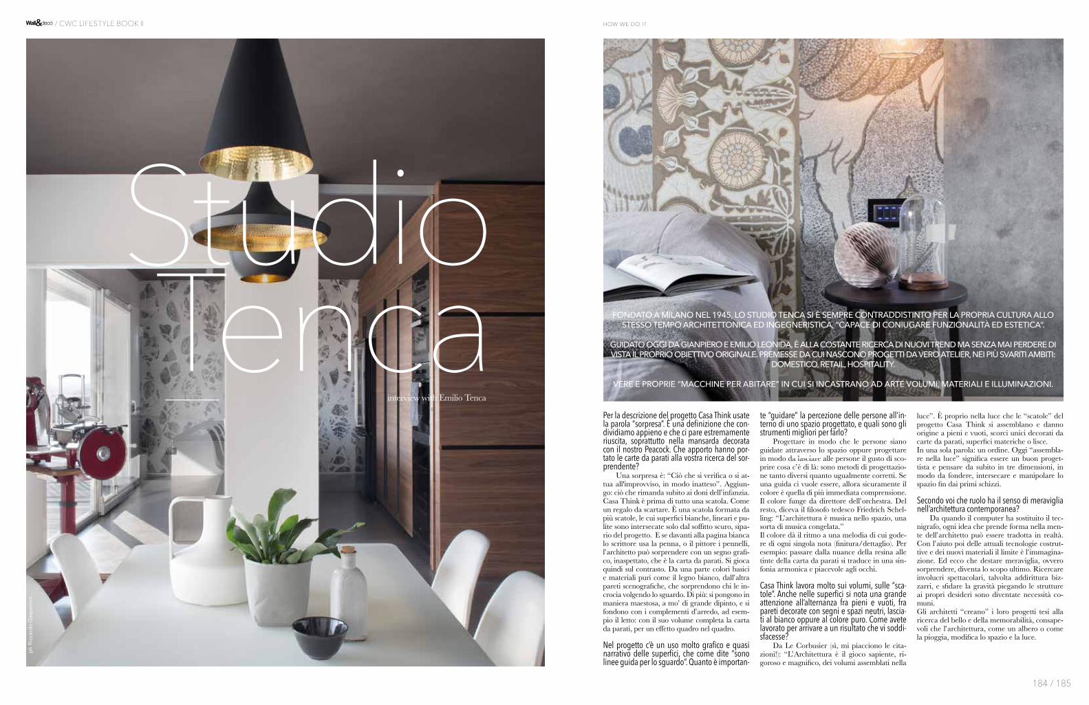
Per la descrizione del progetto Casa Think usate la parola “sorpresa”. È una definizione che con-dividiamo appieno e che ci pare estremamente riuscita, soprattutto nella mansarda decorata con il nostro Peacock. Che apporto hanno por-tato le carte da parati alla vostra ricerca del sor-prendente? Una sorpresa è: “Ciò che si verifica o si at-tua all'improvviso, in modo inatteso”. Aggiun-go: ciò che rimanda subito ai doni dell’infanzia. Casa Think è prima di tutto una scatola. Come un regalo da scartare. È una scatola formata da più scatole, le cui superfici bianche, lineari e pu-lite sono intersecate solo dal soffitto scuro, sipa-rio del progetto. E se davanti alla pagina bianca lo scrittore usa la penna, o il pittore i pennelli, l’architetto può sorprendere con un segno grafi-co, inaspettato, che è la carta da parati. Si gioca quindi sul contrasto. Da una parte colori basici e materiali puri come il legno bianco, dall’altra pareti scenografiche, che sorprendono chi le in-crocia volgendo lo sguardo. Di più: si pongono in maniera maestosa, a mo’ di grande dipinto, e si fondono con i complementi d’arredo, ad esem-pio il letto: con il suo volume completa la carta da parati, per un effetto quadro nel quadro.
Nel progetto c’è un uso molto grafico e quasi narrativo delle superfici, che come dite “sono linee guida per lo sguardo”. Quanto è importan-
te “guidare” la percezione delle persone all’in-terno di uno spazio progettato, e quali sono gli strumenti migliori per farlo? Progettare in modo che le persone siano guidate attraverso lo spazio oppure progettare in modo da lasciare alle persone il gusto di sco-prire cosa c’è di là: sono metodi di progettazio-ne tanto diversi quanto ugualmente corretti. Se una guida ci vuole essere, allora sicuramente il colore è quella di più immediata comprensione. Il colore funge da direttore dell’orchestra. Del resto, diceva il filosofo tedesco Friedrich Schel-ling: “L’architettura è musica nello spazio, una sorta di musica congelata.” Il colore dà il ritmo a una melodia di cui gode-re di ogni singola nota (finitura/dettaglio). Per esempio: passare dalla nuance della resina alle tinte della carta da parati si traduce in una sin-fonia armonica e piacevole agli occhi.
Casa Think lavora molto sui volumi, sulle “sca-tole”. Anche nelle superfici si nota una grande attenzione all’alternanza fra pieni e vuoti, fra pareti decorate con segni e spazi neutri, lascia-ti al bianco oppure al colore puro. Come avete lavorato per arrivare a un risultato che vi soddi-sfacesse? Da Le Corbusier (sì, mi piacciono le cita-zioni!): “L’Architettura è il gioco sapiente, ri-goroso e magnifico, dei volumi assemblati nella
luce”. È proprio nella luce che le “scatole” del progetto Casa Think si assemblano e danno origine a pieni e vuoti, scorci unici decorati da carte da parati, superfici materiche o lisce. In una sola parola: un ordine. Oggi “assembla-re nella luce” significa essere un buon proget-tista e pensare da subito in tre dimensioni, in modo da fondere, intersecare e manipolare lo spazio fin dai primi schizzi.
Secondo voi che ruolo ha il senso di meraviglia nell’architettura contemporanea? Da quando il computer ha sostituito il tec-nigrafo, ogni idea che prende forma nella men-te dell’architetto può essere tradotta in realtà. Con l’aiuto poi delle attuali tecnologie costrut-tive e dei nuovi materiali il limite è l’immagina-zione. Ed ecco che destare meraviglia, ovvero sorprendere, diventa lo scopo ultimo. Ricercare involucri spettacolari, talvolta addirittura biz-zarri, e sfidare la gravità piegando le strutture ai propri desideri sono diventate necessità co-muni. Gli architetti “creano” i loro progetti tesi alla ricerca del bello e della memorabilità, consape-voli che l’architettura, come un albero o come la pioggia, modifica lo spazio e la luce.
StudioTenca
ph
Ric
card
o G
asp
ero
ni
interview with Emilio Tenca
FONDATO A MILANO NEL 1945, LO STUDIO TENCA SI È SEMPRE CONTRADDISTINTO PER LA PROPRIA CULTURA ALLO STESSO TEMPO ARCHITETTONICA ED INGEGNERISTICA, “CAPACE DI CONIUGARE FUNZIONALITÀ ED ESTETICA”.
GUIDATO OGGI DA GIANPIERO E EMILIO LEONIDA, È ALLA COSTANTE RICERCA DI NUOVI TREND MA SENZA MAI PERDERE DI VISTA IL PROPRIO OBIETTIVO ORIGINALE. PREMESSE DA CUI NASCONO PROGETTI DA VERO ATELIER, NEI PIÙ SVARITI AMBITI:
DOMESTICO, RETAIL, HOSPITALITY.
VERE E PROPRIE “MACCHINE PER ABITARE” IN CUI SI INCASTRANO AD ARTE VOLUMI, MATERIALI E ILLUMINAZIONI.
184 / 185
how we do it / CWC LIFESTYLE BOOK II

I n your description of the Casa Think project you use the word “surprise”. It seems a particularly good definition and we love it, especially when looking at the attic decorated with our Peacock design. How did the wallpaper help you in your search for the surprising? Textbook definition of suprise is: something happening out of the blue. I may add, something that brings you back to childhood. Our Casa Think is first of all a box. It’s a box made of other boxes, where white surfaces intersect with the dark ceiling. Now, if a writer uses his pen on the white page, or an artist uses brushes, an architect creates an unexpected graphic sign through wallpaper. It’s a game based on contrast: on one side basic colors, pure materials; on the other suprising, imposing surfaces. Just like a grand painting, the furniture becomes part of the mix: the bed for example, merges with the wallpaper in a kind of Droste effect.
In the project you made an almost “storytelling” use of surfa-ces: in your words, “guidelines for the eyes”. How important is “guiding the perception” inside an architectural space? Which are the best tools for the task? You can either design to guide people inside a space or you can design to let people discover what lies beyond a spa-ce: both choices have a valid point. When looking for a gui-de, surely color is the most immediate, like a conductor. Fri-edrich Schelling used to say “Architecture is frozen music in space”. Color gives rhythm to a melody made of finishings
and details: for example, going from blank resin to colorful wallpaper becomes a pleasing, harmonious symphony.
Casa Think makes the most of volumes, of the “boxes” as you said before. On the surfaces, a lot of attention goes to contra-sts: full/empty, blank/decorated. How did you get to a result that made you say “that’s it, that’s just right”? Le Corbusier said: “Architecture is the wise game of volumes assembled in light. A rigorous, magnificent game”. Yes, I love quotes! Anyway, it’s the light that makes the boxes come to life, cre-ating the contrasts. And there is an order in that. “Assem-bling in light” today means thinking in three dimensions, a good designer begins manipulating space since the very first drafts.
In your opinion, what role does sense of wonder play in mo-dern architecture? Ever since computers took over drawing boards, we can turn into reality each and every shape that comes to our minds. With the new building technologies and state-of-the-art materials, the only limit is in our imagination. In this con-text, awakening the sense of wonder becomes the ultimate goal. Creating spectacular, even bizarre or gravity-defying constructs is almost a necessity. We create designs that reflect our search for beauty and memorability, aware that architecture, just like a tree or like rain, interacts with space and light.
FOUNDED IN MILAN IN 1945, STUDIO TENCA HAS ALWAYS ADOPTED BOTH ARCHITECTURE AND ENGINEERING IN A TWO-SIDED APPROACH “TO
MERGE AESTHETICS AND FUNCTIONALITY”.
LEAD TODAY BY GIANPIERO AND EMILIO LEONIDA, THE STUDIO IS CONSTANTLY
SEARCHING FOR NEW CREATIVE CHALLENGES, ALL THE WHILE REMAINING TRUE TO ITS
HERITAGE. FROM THESE FOUNDATIONS A GREAT VARIETY OF PROJECTS ARE BORN: DOMESTIC,
RETAIL, HOSPITALITY AND MANY MORE.
ALL OF THEM “DWELLING MACHINES” IN WHICH VOLUMES, MATERIALS AND LIGHT COME
TOGETHER AS IN WORKS OF ART.
186 / 187
how we do it / CWC LIFESTYLE BOOK II

Designers
Christian BeniniFotografo, fondatore e art director di Wall&decò Christian Benini inizia la sua carriera come fotogra-fo ritrattista e si specializza poi nella fotografia di moda e pubblicitaria. Le sue collaborazioni lo por-tano ad avvicinarsi alle agenzie di pubblicità e case di moda in Italia, Regno Unito e Stati Uniti.Il suo interesse si indirizza in modo sempre più pre-ciso verso la fotografia d’arredamento. Ha avuto così inizio un percorso di ricerca, tutt’ora in atto, che lo porta a creare Wall&decò, un progetto che unisce fotografia e design in costante evoluzione.
Photographer, founder and art director of Wall&decò Christian Benini began his career as a portrait photographer and then went on to spe-cialise in fashion and publicity photography. He has worked in close conjunction with advertising agencies and fashion houses in Italy, the United Kingdom and the USA. His interest is increasing-ly more precisely focused on the photography of interiors. Thus a path of research began which is still in progress and which resulted in his setting up Wall&decò, a project which combines photography and design in constant evolution.
4P1B4P1B è uno studio di design che opera nel mondo della progettazione con la convinzione che ogni cosa sia progetto, per questo motivo la sua attivi-tà spazia dal mondo del mobile all'illuminazione, dall'allestimento al retail. Al centro del lavoro di 4P1B c'è il metodo progettuale e la ricerca costante di soluzioni formali, funzionali e commerciali, inno-vative.
4P1B is a collective design studio that works in the world of design with the belief that everything is a project, for this reason works range from the world of furniture to lighting, to installations and o retail. At the heart of 4P1B's work is the design method and the constant search formal, functional, com-mercial and innovative solutions.
Alessandro Gottardo (Shout) Alessandro Gottardo, conosciuto anche con lo pseudonimo di Shout, vive e lavora a Milano. Tra le sue collaborazioni più importanti, The New York Times, The Wall Street Journal, TIME, Penguin Books, Volkswagen, Barclays, ENI, Nokia, United Airlines. Ha ricevuto diversi riconoscimenti interna-zionali; tra il 2006 e il 2007 pubblica con la casa edi-trice 27_9 i volumi “Jetlag“ e “Jetlag 2”, nel 2010 “Mono Shout”, una monografia sui primi 10 anni di attività e nel 2011 “DAZED”. Attraverso un’opera-zione di sottrazione, di sintesi dell’immagine, Shout rende le sue illustrazioni piccole opere concettuali in cui più che mostrare, costruisce messaggi imme-diatamente percepibili.
Alessandro Gottardo, also known by the name of Shout, he lives and works in Milan. Highlights of his career include cooperating with The New York Times, The Wall Street Journal, TIME, Penguin Books, Volkswagen, Barclays, ENI, Nokia, United Airlines. He has received numerous international accolades: between 2006 and 2007, his publishing company 27_9 produced the books “Jetlag“ and “Jetlag 2”, in 2010 “Mono Shout”, a monographic work on the first 10 years of business activity and in 2011 “DAZED”. By means of an operation of subtraction and image synthesis, Shout makes his illustrations small conceptual works, in which, rather than showing, he builds up immediately percepti-ble messages.
Andrea MerendiAllestitore, stylist, fiorista, un po’ artista, molto crea-tivo, di sicuro poetico. Da anni si owccupa di vetrine e allestimenti decorativi per diverse aziende. La sua passione sono i fiori. Professionista onnivoro, cresce ripesca le conoscenze floreali e crea dei personali fiori di carta per un lavoro in Rinascente a Milano.Da allora i suoi fiori sono finiti su riviste, in negozi Showroom , come scenografie per eventi e carte da parati. He is a shop window dresser, stylist, florist, with an artistic flair, a lot of creativity and a strong poetic streak. He has years of experience in shop
window dressing and retail premise decoration for several companies. His true passion is flowers. He is an all-round professional who has expanded and re-visited his floral knowledge to create bespoke paper flowers for the Rinascente department store in Milan. Since then his flowers have been shown in maga-zines and displayed in showrooms, event settings and wallpapers.
Antonella GuidiAntonella frequenta l’Istituto Statale d’arte per il Mosaico di Ravenna. Dal 1983 partecipa a mostre sia personali che collettive e nel 1987, utilizzando materiali riciclati a costo zero, inizia a produrre ac-cessori per la moda, fondando una piccola azienda. La filosofia del riciclo sarà la tematica fondamen-tale del lavoro artistico che continuerà in parallelo all’attività nel campo della moda, e che ha prodotto molte opere. Ha inoltre collaborato con aziende tessili e ceramiche come disegnatrice decorativa free lance e con case editrici come illustratrice di libri fantasy.
Antonella attends the Mosaic State Art Institute in Ravenna. Since 1983, she has been taking part in both solo and collective art shows and, in 1987, using recycled no-cost materials, she began mak-ing fashion accessories, setting up a small compa-ny. The recycling philosophy pervades her entire artistic production which continues alongside her fashion industry activities and which has resulted in the creation of numerous works. She has also col-laborated with textile and ceramic manufacturers as free-lance decorative designer and with publishing companies as illustrator of fantasy books.
Antonio MarrasAntonio Marras nasce ad Alghero, Sardegna. Terra che segna profondamente la sua cifra stilistica. Il suo esordio nella moda avviene sotto il segno di una fortunata casualità: nel 1987, infatti, è chiamato da una ditta romana a disegnare collezioni di prêt-à-porter, grazie alla sua competenza sviluppata su un doppio binario. Quello culturale - Marras da sempre si interessa ad ogni forma di espressione artistico-creativa - e quello “tecnico”, sviluppato in base alla conoscenza di materie e forme. Nel marzo 1999, a Milano, la prima volta del suo prêt-à-porter e nel 2003 è invitato dal gruppo francese LVMH a diventare direttore artistico della maison Kenzo sino al 2011. Con il suo headquarter a Milano, Marras farà però una scelta importantissima, sentimentale ma anche artistica: non rinuncerà a vivere dove è cresciuto, ad Alghero sempre tornando a cercare creatività, ispirazione, materiale per il suo universo espressivo.
Antonio Marras was born in Alghero, on Sardinia. The island has always deeply influenced his aes-thetic. His fashion debut was the result of a lucky chance. In 1987 a fashion house in Rome asked him to design a prêt-à-porter collection. Their in-vitation was due to his dual baggage of skills: cul-tural – Marras has always involved himself in every form of artistic/creative expression – and technical based on his know-how of materials and forms. He debuts with his prêt-à-porter in March 1999 in Milan and in 2003 LVMH, the French luxury goods group, invites him to be the artistic director of the Kenzo fashion house till 2011. With his headquarters in Milan, Marras made a fundamental choice, both sentimental and artistic: he will never give up living where he was born, to Alghero always returning in pursuit of creativity, inspiration and material for his expressive universe.
Bertero ProjectsFabrizio Bertero laureato in Architettura nel 1993 presso il Politecnico di Milano, titolare dello Studio Bertero Projects di Milano ed insieme a Simona Marzoli, svolge l’attività di progettista nei settori dell’urbanistica, edilizia, interior design, design del prodotto e grafica, occupandosi principalmente di spazi commerciali, terziario, residenziale, alle-stimenti museali e fieristici. Collabora ed ha col-laborato con diverse società ed enti nazionali ed internazionali come: TDK, Martini, Frankie Morello, FIAT, ILLY, Triennale di Milano, Museo della scien-za e della tecnologia di Milano, Zanotta, Fiera di Milano, Wall & Decò e 100x100 Group. Docente a contratto presso lo IED (Istituto Europeo di
Design) di Milano per i corsi di Progettazione ar-chitettonica dal 1997.
Fabrizio Bertero graduated in architecture at the Polytechnic University of Milan in 1993 and is the owner of Studio Bertero Projects, based in Milan. Together with Simona Marzoli, he works as a de-signer in the urban planning, construction, interior design, product design and graphics sectors and mostly focuses on retail, service, residential interiors as well as museum and exhibitions set-ups.He collaborates and has previously collaborat-ed with a number of companies, national and international bodies including: TDK, Martini, Frankie Morello, FIAT, ILLY, the Milan Triennale, the National Museum of Science and Technology of Milan, Zanotta, Fiera di Milano, Wall & Decò and 100x100 Group.Since 1997 he is contract professor at the IED (European Institute of Design), Milan, for Architectonic Design Courses.
Christophe DelcourtÈ alla fine degli anni' 90 che Christophe Delcourt appare per la prima volta sulla scena francese dell' arredamento. I primi oggetti lo vedono coinvolto non solo come designer, ma anche come editore e produttore. Tavoli, sedie e lampade disegnano rapidamente i contorni di un universo molto giusto e onesto. Il legno e l’acciaio forgiano pezzi la cui apparente semplicità formale maschera sempre una perfetta padronanza della realizzazione a mano. È in questo perfetto equilibrio tra la purezza del dise-gno, la bellezza di un materiale e l'estrema cura nel-la realizzazione che lo stile di Christophe Delcourt trova la sua piena espressione. Designer-editore, il suo viaggio sembra ora seguire un percorso retti-lineo. Ma molto rapidamente nasce il desiderio di confrontarsi con altre attività artigianali e altri tec-nicismi. E Christophe Delcourt inizia lentamente a collaborare con editori di piccole e grandi dimen-sioni, francesi e stranieri: Roche Bobois, Tectona, Baxter, HC 28, Van Rossum e, più recentemente, Collection Particulière, CC-Tapis e Minotti.
It is at the end of the 1990’s that Christophe Delcourt appears for the first time on the French scene of fur-niture. As far as those first objects are concerned, not only is he their designer, but also their manufacturer and editor. Tables, chairs, and lamps then quickly draw the contours of a universe both very just and honest. The wood and the steel forge pieces of which the apparent formal simplicity always masks a perfect mastering of the craftsmanship. It is in this perfect balance between the purity of a drawing, the beau-ty of a material and the extreme care of a making that the Christophe Delcourt style will find its full expression. Designer-editor, his journey now seems to follow a straight path. But very quickly, the desire to confront himself to other craftsmanships and oth-er technicalities is born. And Christophe Delcourt slowly starts collaborating with small and large, French or foreign, editors: Roche Bobois, Tectona, Baxter, HC 28, Van Rossum, or more recently, Collection Particulière, CC-Tapis, and Minotti.
CTRLZAKCTRLZAK Art & Design Studio agisce a livello in-ternazionale nel campo dell’arte e del design. Lo studio fondato da Thanos Zakopoulos (Grecia) e Katia Meneghini (Italia), si avvale di strumenti se-miotici e cognitivi durante tutto il percorso creativo proponendo forme che vanno al di là del comune valore estetico. L’approccio creativo dello studio si relaziona al contesto sociale, ambientale e culturale in cui opera. Negli oggetti e ambienti proposti si enfatizzano aspetti legati alla loro memoria e alla storia stessa del luogo in cui vengono ri-contestua-lizzati, facendo attenzione ai dettagli che sottoline-ano il loro valore simbolico senza però negarne la funzionalità.
CTRLZAK Art & Design Studio is a multidisciplinary team founded by Thanos Zakopoulos (Greece) and Katia Meneghini (Italy). The studio operates interna-tionally in the field of contemporary art and design with a creative vision that is not limited by a specific framework. With the use of semiotic tools within the creative process the studio proposes forms that surpass common aesthetic values working on a cog-nitive level. The concept behind each project is to
inspire a responsible awareness through the ‘added value’ that art has for society with a special atten-tion to issues of environmental impact.
DeBonaDeMeoLuca e Dario, architetto e designer, si incontrano sul percorso tra Milano e il Veneto e iniziano una colla-borazione che proprio dal viaggio attinge ispirazione per produrre segni e disegni di risposta alle esigenze dell’habitat contemporaneo. Collaborano con presti-giose aziende di arredo, illuminazione, decorazione occupandosi di direzione artistica, ideazione di con-cept e sviluppo di prodotti. Una ricerca in micro e macro scala che rilegge e fonde vari ambiti: archi-tettura, design, grafica e arte per creare ambienti e oggetti innovativi, ma capaci di raccontare storie e indurre emozioni.
Luca and Dario, architect and designer, meet on the road between Milan and the Italian Veneto region and begin a collaboration that dRaws inspiration from the trip, to produce marks and dRawings that respond to the needs of the contemporary home interiors. They collaborate with prestigious furnish-ing, lighting and decor companies, looking after art direction, concept and product development. A research in micro and macro scale that reviews and merges different spheres: architecture, design, graphics and art, to create innovative environments and objects, but able to tell stories and stir emotions.
Draga&AurelDi origine serba lei, tedesca lui – trovano nell’Ita-lia il giusto terreno per la loro espressione artistica. Draga affina negli anni una sua tecnica di pittura di-rettamente su tessuto che le permette di creare una collezione dal design unico dove colore, motivo e materia si incontrano in una commistione armonica.Aurel K. sceglie di esaltare le potenzialità della re-sina ricorrendo ad una forte espressività pittorica. L’intesa, oltre che di vita, nel 2007 diventa anche professionale: vivendo e sviluppando insieme la comune passione per l’arte contemporanea, l’af-finità artistica cresce con loro conducendoli ad un comune percorso di ricerca, di approfondimen-to e di confronto che li portano a collaborazioni con prestigiosi marchi internazionali quali Baxter e Anthropologie.
She is of Serbian origin while he is from Germany – they find in Italy the right soil for their artistic expression. Draga refined her painting technique directly on canvas during the years that allowed her creating a collection characterised by a unique design where colour, pattern and matter meet in a harmonic union. Aurel K. chooses to exalt the po-tentials of resin, resorting to a strong pictorial ex-pression. The mutual understanding, in addition to a personal level, became also professional in 2007: living and developing together the common pas-sion for modern art, the artistic affinity grew with them, leading the couple to undertake a common research, study and sharing path that led them to cooperate with the most prestigious international brands, like Baxter and Anthropologie.
Elisa VendraminElisa Vendramin, è un’illustratrice italiana che lavora per lo più a progetti grafici per il settore culturale, elaborando digitalmente pattern illustrati. Dopo aver conseguito la Laurea in Disegno Industriale presso lo IUAV di Venezia si trasferisce a Londra per frequentare un Master in Communication Design presso Central Saint Martins College of Art and Design dove inizia a collaborare con varie istituzio-ni culturali partecipando anche mostre collettive a Londra, Parigi, Reykjavik e Vienna. Nel 2011 Elisa si trasferisce Reykjavik per esplorare progetti di ri-cerca personale e partecipare a diverse residenze d’artista, tra cui SÍM International Residency e NES Artist Residency. Dal 2013 torna in Italia e continua a lavorare come illustratrice con agenzie interna-zionali quali Brandever (Vancouver, BC), Atacama Invest (Santiago del Cile), ed esporre come artista presso le gallerie-artstore Atelier Olschinsky di Vienna e NAU Gallery di Stoccolma.
Elisa Vendramin is an Italian illustrator who special-ises in graphical projects for the cultural sector by creating digitally produced graphic patterns. After graduating in Industrial Design from the IUAC
in Venice, she moved to London to take a Master in Communication Design at the Central Saint Martins College of Art and Design, where she started to work for several cultural institutions and also show-cased her creations in collective art exhibitions in London, Paris, Reykjavik and Vienna. In 2011 Elisa moved to Reykjavik to focus on personal research projects and to join several artist residencies, in-cluding the SÍM International Residency and NES Artist Residency. In 2013 Elisa returned to Italy, where she currently works as an illustrator with in-ternational agencies such as Brandever (Vancouver, BC), Atacama Invest (Santiago de Chile), and exhib-its in the Vienna-based artstore Atelier Olschinsky and in the Stockhom-based NAU Gallery.
Eva GermaniUna lunga formazione maturata nel mondo del re-stauro l’ha portata a contatto diretto con le opere dei grandi maestri, dipinti ed affreschi dal grande impatto e valore artistico ed architettonico. La cono-scenza dei materiali, delle tecniche esecutive, delle atmosfere di sapore antico sono convogliate in uno stile rapido, privo di formalismi accademici a volte aggraziato, ma sempre contraddistinto da un tratto di materica ruvidità. Proiettata verso una decorazio-ne dall’effetto scenografico si dedica, in collabora-zione con architetti e designer, alla creazione di spazi domestici o commerciali caratterizzati da una forte atmosfera retrò e dal gusto vagamente bohémien.
A long training period in the field of architectural conservation allowed her to gain direct contact with the artworks of famous artists, paintings and frescos of great artist and architectural impact and value. Her knowledge of materials and execution tech-niques, which recall traditional settings, are con-veyed through a determined style, without academic formalisms, at times graceful, but always character-ized by a ruvid material trait. Projected towards sce-nographic decoration, her works are carried out with architects and designers and consist in the creation of residential and commercial spaces with strong retrò atmospheres and slight bohemian tastes.
Federico PepeFederico Pepe è nato nel 1976. Vive e lavora a Milano. È una figura unica nel panorama cultura-le e artistico italiano, dove si muove con agilità ed estrema coerenza estetica tra varie forme artistiche. Pubblicità, Artista, Graphic Designer, Video Maker. Direttore creativo dell'agenzia di comunicazio-ne multinazionale DLVBBDO. Nel 2006 fonda Le Dictatuer, progetto editoriale e spazio espositivo indipendente a Milano, per il quale è da oltre 10 anni direttore editoriale e artistico. Ha esposto le sue opere e i suoi progetti alla MOMA Library and Family Business di New York, alla TATE MODERN di Londra, al Palais de Tokyo di Parigi, alla Triennale di Milano e in molte altre gallerie private. Collabora negli anni con artisti famosi come Maurizio Cattelan, Pierpaolo Ferrari, Nico Vascellari, Jacopo Benassi e designer come Patricia Urquiola con cui ha firmato due colle-zioni (CREDENZA 2016, MISCREDENZA 2017).
Federico Pepe was born in 1976. He lives and works in Milan. He is a unique figure in the cultural and ar-tistic Italian landscape, where he moves with agility and extreme aesthetic coherence between various artistic forms. Advertising, Artist, Graphic Designer, Video Maker. Executive creative director of the DLVBBDO Multinational Communication Agency. In 2006 he founded in Le Dictatuer, an editorial pro-ject and an independent exhibition space based in Milan, for which he has been the editor of editorial and artistic plan for over 10 years. He exhibited his works and projects at MOMA Library and Family Business in New York, at TATE MODERN in London, at the Palais de Tokyo in Paris, at the Trienniale of Milan and in many others private galleries. Over the years he collaborated with famous artists such as Maurizio Cattelan, Pierpaolo Ferrari, Nico Vascellari, Jacopo Benassi and designers such as Patricia Urquiola with whom he has signed two col-lections (CREDENZA 2016, MISCREDENZA 2017).
Francesca ZoboliFrancesca, dopo essersi diplomata in pittura all’Ac-cademia di Belle arti di Milano, nel 1990, fonda lo studio di decorazioni d’interni L’O di Giotto, che opera in Italia e all’estero. All’attività di interior de-
corator affianca la ricerca pittorica, condotta in par-ticolare sull’assemblaggio di materiali. Dal connubio fra pittura e decorazione nasce lo stile dei suoi lavori, connotato da un linguaggio originale che si ispira a tessuti, tappezzerie, antiche tecniche di stampa, mo-tivi etnici e tradizionali, pattern grafici, intonaci, tex-ture naturali come legni, foglie, polveri, terre. Attenta e sensibile alle più recenti tendenze della moda, del design, dell’arte e dell’architettura contemporanea, Francesca Zoboli mira ad articolare e integrare orga-nicamente il progetto decorativo all’ambiente e allo spazio. Fra i suoi clienti, Fratelli Rossetti, Hotel De Russie , Kenzo, per cui nel 2006 ha progettato e re-alizzato interventi di decorazione destinati al nuovo concept store di Parigi (Art Director Antonio Marras).
After graduating in Painting at the Academy of Fine Arts in Milan in 1990, Francesca founds l’O di Giotto – ann Interior Decoration Studio operating both in Italy and abroad. Alongside interior deco-rating, she also conducts pictorial research, espe-cially as regards the assembly of materials. Out of the combination of painting and decorating comes the style of her works, distinguished by an original language inspired by fabrics, upholsteries, old printing methods, ethnic and traditional motifs, graphic patterns, plastering, natural textures such as woods, leaves, powders, earths. Careful and sen-sitive to the most recent fashion, design, art and modern architecture trends, Francesca Zoboli aims at organically articulating and integrating decora-tive projects in environments and spaces.Among her customers Fratelli Rossetti and Hotel De Russie; in 2006 she has partially designed and decorated the new concept store in Paris for Kenzo (Art Director Antonio Marras).
Giovanni PaganiGiovanni inizia la sua attività nel 1986 quando viene chiamato a far parte dello staff dell’ufficio tecnico di una importante azienda di credito per la proget-tazione di un gran numero di filiali. Nel 1994 fonda la Signum, un gruppo di lavoro in collaborazione con altri professionisti, insieme ai quali si orienta verso la realizzazione di spazi espositivi. Dal 1997 avvia uno studio/laboratorio di idee che lo vede im-pegnato, inizialmente come interior designer, poi sempre più indirizzato verso il design di prodotto: pezzi chiari, diretti, discreti nelle forme e nei mate-riali, con una bellezza che si lega intimamente alla loro funzionalità.
A graduate in architecture from the Milan Polytechnic, his career began in 1995. Giovanni Pagani’s goal is to capture emotions and transfer them into his objects and interior designs. The guiding theme common to all his works, from shops to hotels, restaurants and private homes, is the emotion aroused by using them: a microcosm of sensations which Wall&decò has grasped and fur-ther promoted.
Giovanni PesceDiplomato al Liceo Artistico di Bari con indirizzo architettonico, Giovanni Pesce inizia la sua attività nel 1986 nell’ufficio tecnico di un’azienda di credi-to, per la progettazione delle sue filiali. Nel 1994 fonda, in collaborazione con altri professionisti, Signum, un gruppo di lavoro attivo nella realizza-zione di spazi espositivi. Dal 1997 avvia un proprio studio che lo vede impegnato sia come interior de-signer che come designer di prodotto.
Giovanni began his career in 1986 when he was asked to join the staff of the technical department of a major credit company for the design of a large number of branches. In 1994 he founded the Signum, a working group in collaboration with other professionals, with whom he developed exhibition spaces. Since 1997 he started a studio / laboratory of ideas in which he is engaged, initially as an inte-rior designer, then more and more directed towards product design: clear and direct works with discrete shapes and materials and with a beauty intimately linked to their functionality.
GupicaDopo una laurea in letteratura Gunilla Zamboni (Gupica) matura una formazione nell’ambito della pittura murale a Firenze e delle arti decorative in Francia a Versailles, dove si diploma in Peintre en Décor. Si specializza in interior design allo IED di Milano. Lavora a contatto con le migliori maestran-
ze italiane e francesi, affinando i segreti e le tecni-che della pittura decorativa in Francia e lo studio del design in Italia. Nel 2010 fonda Gupica, uno studio creativo che realizza progetti servendosi di un metodo multidisciplinare che coinvolge arti de-corative, design di interni e di prodotto, sperimen-tazione contemporanea e artigianalità. Mettendo al servizio di clienti e aziende la propria visione crea-tiva. La cura per il dettaglio e un dialogo costante tra contemporaneo e codici legati alla tradizione contraddistinguono i suoi progetti.
Upon obtaining her degree in Literature, G unilla Zamboni (Gupica) continued to study in Florence fo-cusing on the art of fresco and mural painting, com-pleting her studies with a master degree in Peintre en Décor in Versailles, France. She later specialized in interior design at IED in Milan. Gupica worked with Italian and French masters, honing the secrets and techniques of decorative painting in France and the study of design in Italy. In 2010 she founded Gupica, a creative studio that develops projects through mul-ti-disciplinary methods such as: decorative arts, interi-or design, product design, traditional handcrafts and modern techniques. She evolves projects for private clients and companies with her creative vision. Her attention to detail and the combination of contem-porary and traditional codes characterize her projects.
Ines PorrinoInes svolge l’attività dal 1975, inizialmente in col-laborazione con gli studi Arcoop, Arkite’ Architetti Associati e Studio Piergiorgio Cazzaniga, dal 1997 diventa libero professionista e si occupa di interior, allestimenti fieristici, eventi di design e negozi di ar-redamento. Ines Porrino si occupa del concept della realizzazione del prodotto e del catalogo per collezio-ni di pavimenti in pvc Limonta. Dal 2010 ha iniziato una produzione delle lampade artigianali Filrouge. Ha collaborato con diverse testate d’arredamento,tra le quali Interni, Spazio Casa, Lake Como lifestyle.
Ines has been in business since 1975, initially in collaboration with studios such as Arcoop, Arkite Associated Architects and Studio Piergiorgio Cazzaniga. In 1997 she turn into a free lance con-sultant in the field of interior design, exhibition spaces, design events and furniture stores.Ines Porrino develops the concept up to the prod-uct prototype and the catalogue for a floor collec-tions in PVC for Limonta. Since 2010 he has begun a production of artisanal lamps FILROUGE. She has worked with several interior design magazines such as Interni, SpazioCasa, Lake Como Lifestyle.
Lorenzo De GrandisResponsabile creativo per importanti brand nel de-sign di interni. Una continua ricerca di riferimenti che permette a Lorenzo De Grandis di progettare e sviluppare contenuti visivi ottenendo risultati di grande forza comunicativa. Sensazioni, idee e at-mosfere si traducono nei suoi progetti di graphic design, textile design e allestimenti. Uno studio multidisciplinare con un’ambizione: catturare il rit-mo e l’estetica del tempo.
Responsible of visual communication for important interior design companies. Lorenzo De Grandis’s works inspires ideas and stories. Emotion driving to create atmosphere with shapes and functions, ef-fective solutions and projects. Textiles, graphic de-sign, interiors and further sensation. A multidiscipli-nary study with an ambition: to capture the rhythm and the aesthetics of time. To see what inspires, what elevates, what activates.
María Gómez GarcíaProprietaria e direttrice dello studio creativo Estudio PAM ha sviluppato grafiche destinate a materiali e utilizzi diversi, come sedie, carte da parati, porte, ta-voli, tessuti; lavora, tra gli altri, per clienti con sede in Spagna, Italia, Brasile e Stati Uniti. In precedenza, ha collaborato con aziende e marchi come Le Lis Blanc (marchio brasiliano di moda e oggetti per la casa) e ZARA (Spagna). Ha un’esperienza decennale nella ri-cerca dei nuovi trend della moda e della grafica nelle più significative città del mondo (Londra, New York, Parigi, San Paolo, Seoul e Hong Kong). Tutti i suoi disegni e le illustrazioni sono eseguiti a mano e riflet-tono il suo bagaglio professionale, il cosmopolitismo e la passione per la grafica.
As owner and director of Estudio PAM – a creative studio – has been developing artwork for different usages and materials such as chairs, wallpapers, doors, tables, textiles, among others, for clients based in Spain, Italy, Brazil and US. Previously, has worked for companies and brands such as Le Lis Blanc (Brazilian fashion and housewear brand) or ZARA (Spain). With more than 10 years of experi-ence, has collaborated as visual coolhunter and shopping in cities in different continents (London, New York, Paris, Sao Paulo, Seoul and Hong Kong). All of her drawings and illustrations are handmade created and reflects her professional experience, cosmopolitanism and passion for artwork.
Marika BaldoniMarika Baldoni a 23 anni lascia l’Italia con destina-zione Stati Uniti, dove intraprende un percorso for-mativo che la porta ad avviare la sua attività di visual merchandiser e di vetrinista freelance. Rientra poi in Italia e intensifica un’importante collaborazione con Julian Fashion, nota boutique di Milano Marittima. Grazie alla sua versatilità creativa e alla sua natura poliedrica, Marika si dedica a progetti, allestimenti, vetrine scenografiche ed installazioni di forte comu-nicazione visiva.
Marika Baldoni left Italy for the USA when she was 23. Here she began a training path which resulted in her setting up in business as a visual stylist and free-lance window dresser. Back in Italy, she strength-ened her close cooperation with Julian Fashion, a well-known boutique in Milano Marittima. Thanks to her creative versatility and multifaceted na-ture, Marika dedicates her time to projects, win-dow-dressing, spectacular window set-ups and in-stallations of strong visual impact.
RawUn progetto dell’interior designer Paolo Badesco che dal 2005 presenta al pubblico milanese, attra-verso il suo primo negozio di corso Magenta 96, un repertorio di suggestioni dal sapore nord europeo: arredi e complementi vintage volutamente non restaurati, abbinati a una selezione di oggetti con-temporanei frutto di una ricerca tra Europa e Stati Uniti. Nel 2011 con l’architetto Costantino Affuso, già senior architect dello Studio Paolo Badesco in-terior design, il progetto si amplia acquisendo una nuova location in via Palermo 1, nel cuore del Brera Design District. Le inedite proposte e gli allestimen-ti arditi hanno fatto guadagnare a Raw l’attenzione della stampa internazionale e di un pubblico sem-pre più sensibile alle nuove tendenze.
A project of the interior designer Paolo Badesco, who since 2005 presents to the public in Milan, through its first store in Corso Magenta 96, a rep-ertoire of suggestions with a northern European flavor: vintage furniture and accessories deliberate-ly not restored, combined with a selection of con-temporary works resulting from a selection between Europe and the United States. In 2011, with the architect Constantino Affuso, formerly senior archi-tect at the Paolo Badesco interior design studio, the project expanded by acquiring a new location in Via Palermo 1, in the heart of Brera Design District. The new proposals and daring installations have earned Raw to the attention of the international press and of an increasingly sensitive public to new trends.
Serena ConfalonieriDopo una laurea specialistica in Interior Design conseguita a pieni voti presso il Politecnico di Milano, Serena ha lavorato in diversi studi di ar-chitettura e design, a Milano, Barcellona e Berlino. Ora dirige il suo studio a Milano, lavoran-do su progetti che spaziano dall’interior alla grafica fino al textile design collaborando con importanti aziende di design sia in Italia che all’estero.
After a Master Degree in Interior Design at Politecnico di Milano, Serena worked in many archi-tecture and design practices, moving from Milano to Barcelona and Berlin. Now she runs her own studio in Milano, working on interior, graphic and textile design projects and collaborates with impor-tant companies in Italy and abroad. She has also collaborated with textile and ceramic manufacturers as free-lance decorative designer and with publish-ing companies as illustrator of fantasy books.
Silvia Stella OsellaSilvia lavora nell’ambito della comunicazione visiva dal 2005. Dopo aver studiato Illustrazione all’Istitu-to Europeo di Design si specializza in ambito tessi-le con un Master in Textile Design e postgraduate al Central Saint Martins College di Londra. Dopo aver lavorato in alcune tra le più importanti azien-de tessili europee ha aperto il suo studio di design di superficie e consulenza a Milano. Attualmente collabora con brand internazionali quali il gruppo Inditex - Zara, Zara Kids, Adidas, Mango e Topshop, ed è docente del corso di Pattern Design allo IED di Torino. Grazie al suo background multidisciplinare e al costante aggiornamento ha sviluppato un’e-stetica contemporanea e in continua evoluzione, in grado di coniugare progettualità e artigianalità. Nel 2015 ha co-fondato ILUUT, marchio innovativo di abbigliamento sostenibile.
Silvia has been working in visual communication since 2005. After an illustration and visual communi-cation BA at IED, she focuses on textile design with an MA and post-graduate courses at the Central Saint Martins College of Art, London.After working for some of Europe’s leading textile companies she has opened her surface design and consultancy studio in Milan. She collaborates with international brands such as the Inditex group - Zara, Zara Kids, Adidas, Mango, Topshop, and she is a visiting Professor in Surface and Pattern Design at IED Turin. Thanks to her multidisciplinary back-ground and to a constant research she has devel-oped a contemporary and always evolving aesthet-ic, able to combine design knowledge and sense of craftsmanship. In 2015 she has co-founded ILUUT, a sustainable and innovative fashion start up.
StudiopepeStudiopepe è uno studio di design fondato a Milano nel 2006 da Arianna Lelli Mami e Chiara Di Pinto. Lo studio si occupa di creative consultancy in tutte le sue forme. La filosofia dello studio si basa su un approccio concettuale inedito e trae forza da un vasto background iconografico e visionario, gene-rando risultati di unicità. L’attenzione per i dettagli e l’emozione che possono generare nelle persone, così come l’uso del colore, a volte ardito, e il mix inedito ma armonico tra i materiali scelti sono fon-damentali nei progetti dello studio. Altro elemento di forza è la multidisciplinarità, il saper far dialoga-re all’interno di uno stesso progetto ambiti diversi come il design, la moda e l’arte.
Studiopepe is a design studio founded in Milan in 2006 by Arianna Lelli Mami and Chiara Di Pinto. The studio focuses on creative consultancy (interiors, product design, editorial, set-design, color con-sultancy…). The studio’s philosophy takes a strong visionary approach thanks to an iconographic back-ground that generates unique results. The attention for details and emotions that can be generated in people, as well as the use of color, sometimes dar-ing, and the unusual but harmonius relationship between materials are fundamental in each project of the studio. Studiopepe also takes advantage of multidisciplinarity, knowing how to create a dialogue within different areas such as design, fashion and art.
Talva DesignTal Waldman (Talva Design) è un’artista, designer e architetto con base a Parigi.Completa i suoi studi di arte e architettura lavo-rando per studi internazionali, da Jean Nouvel, Christian de Portzamparc a Jean Paul Viguier. Lo studio Talva Design a Parigi è una sintesi tra design e arte capace di offrire soluzioni d’interni, accessori per la casa e di arredo.
Tal Waldman (Talva Design) is an artist, designer and architect based in Paris. He completed his art and architecture studies working for international firms, from Jean Nouvel to Christian de Portzamparc and Jean Paul Viguier. The Talva Design studio in Paris is a synthesis between design and art capable of providing interior design solutions and home and furnishing accessories.
The Elusive OtterLe raffinate illustrazioni di Raffaella Audiffredi, ideatrice del progetto, puntano una lente d’in-
grandimento sul mondo animale creando tavole su cui s’innesta una dimensione letteraria a firma dello scrittore Matteo Sartori. La collaborazione con Wall&Decò arricchisce di fascino il viaggio della “lontra timida” e sposa l’esperienza artisti-ca di The Elusive Otter a una nuova realtà appli-cativa. Raffaella Audiffredi: Architetto, laureata al Politecnico di Milano, dopo aver lavorato in Italia e all’estero, nel 2010 apre il suo studio a Milano. Nel 2013 crea il progetto The Elusive Otter. Matteo Sartori: Laureato in Scienze politiche all’Università Statale di Milano, dal 2002 al 2012 lavora per il ci-nema e la pubblicità. È autore di tre romanzi.
The refined illustrations of Raffaella Audiffredi, au-thor of the project, zoom in details on the animal world, creating canvases on which a literary dimen-sion signed by writer Matteo Sartori is triggered. The collaboration with Wall&Decò enriches the journey of the ‘’elusive otter’’ with charm and combines the artistic experience of The Elusive Otter to a new ap-plication field. Raffaella Audiffredi: Architect, gradu-ated at the Polytechnic University of Milan, opened her studio in Milan in 2010, after working in Italy and abroad. She conceived The Elusive Otter pro-ject in 2013. Matteo Sartori: Graduated in political sciences at the State University of Milan, he worked in the cinema and advertising field from 2002 to 2012. He is the author of three novels.
Tommaso GuerraDopo 12 anni come pubblicitario in numerose agenzie, Tommaso si dedica pienamente alla sua attività naturale: esprimersi attraverso le arti gra-fiche. Il suo campo di azione lo porta in giro per il mondo e varia di continuo: dalla strada, con in-stallazioni e arredo urbano site specific agli interni, dove spazia dalla decorazione muraria a progetti completi di interior design.Il suo è un percorso in continua evoluzione, fatto di dialogo aperto con i luoghi e con gli oggetti.
After 12 years as advertising agent in numerous agencies, Tommaso fully focused on his natural activ-ity: express himself through graphic arts.His work field takes him around the world and chang-es constantly: from the road, with exhibitions and ur-ban furniture site specific for interiors, where he rang-es from wall decorations to complete interior design projects. His path constantly evolves, and consists of an open dialogue with places and objects.
Wladimiro BendandiWladimiro, dopo la maturità artistica, affina la sua tecnica studiando design e comunicazione visiva. Le sue collaborazioni professionali sono trasversali ed esplora le mille sfaccettature del graphic design. Dal 2007 ha creato D+, il suo studio di progettazio-ne con la convinzione che un buon progetto comu-nicativo è un diritto di tutti. La progettazione grafica è per lui, infatti, una forma di design vasta e virale in grado di interagire con la quotidianità in un’ottica di continua ricerca e contaminazione.
Wladimiro, after graduating from art school, refined his technique by studying visual design and com-munication. He has worked with numerous leading brand names like Diesel and with artists such as Jovanotti and has cooperated in projects such as the Turin World Design Capital.In 2007, he set up D+, his own design firm in the conviction that everyone is entitled to a good com-munication project. For him, communication is in fact a vast and viral form of design able to interact with daily existence in a perspective of ongoing search and contamination.
23 À VIVRE WDAV1801
15 ALTER EGO WDAE1801
33 BABILONIA WDBA1801
35 BESTIARIVM WDBE1801
31 DORSEL WDDO1801
27 ELISIR WDEL1801
34 FADE OUT LINES WDFO1801
12 FAIRPLAY WDFP1801
22 FOSSIL WDFS1801
25 IN SIGHT WDIS1801
24 KONA WDKO1801
21 LESLEY WDLE1801
17 LIVE AT EASE WDLA1801
29 MECCATRONICO WDMC1801
14 NOMADE WDNO1801
28 NOVECENTO WDNV1801
30 PULVIS WDPU1801
26 SLOW MOTION WDSM1801
18 TARAKÉ WDTA1801
19 THE DEEP WILD SPACE WDDW1801
20 UNCLE SY WDUS1801
16 WHO IS WHO WDWW1801
COME UTILIZZARE LE TABELLE COLORE PER ESPLORARE LA COLLEZIONE WALL&DECÒ.
Il colore è la tua guida nella nostra collezione.
Abbiamo creato le palette per favorire la tua ispira-zione, unendo i soggetti grafici per gruppi di colori affini che definiscono mood diversi.
Nelle Tabelle Colore, all’interno di ogni palette troverai i soggetti grafici con indicazione del nu-mero di pagina in cui è possibile consultare la grafica ambientata e il codice prodotto di riferi-mento.
Nelle colonne a destra del nome potrai vedere a quali colori della palette corrisponde il singolo decoro.
Per una ricerca ancora più veloce e sistematica, il nostro sito è la risorsa più importante per naviga-re nella collezione: su www.wallanddeco.com puoi individuare un soggetto grafico filtrando la ricerca per palette, colore, nome e codice.
HOW TO USE COLOR CHARTS TO EXPLORE THE WALL&DECO COLLECTION.
It is the colour that guides you through our col-lection.
We have created palettes to favour your inspi-ration, grouping graphic subjects according to colours which define different moods.
Color chart contain graphic subjects for each pal-ette, complete with the page number to view the graphic settings and product codes of reference.
The columns to the right of the name enable you to view the colours of the palette for each single decoration.
Our website is the most valuable resource for an even faster and systematic search when browsing our collection: go to www.wallanddeco.com to identify a graph-ic subject by filtering according to palette, co-lour, name and code.
TABELLE COLORE
Color charts
PALETTE
Colore Vs Colore
19-4540 TCX
14-0955 TPX
17-1462 TCX
15-0751 TCX
18-1549 TCX
16-4120 TPX
17-1502 TPX
18-018 TCX
11-4001 TCX
19-4008 TCX
13-3207 TCX
PANTONE® COLORS
new collection2018
pagi
na /
page
sogg
etto
/ su
bjec
t
codi
ce /
code
192 / 193
color chart

PALETTE
Punk Reloaded
PANTONE® COLORS
19-3953 TCX
14-4105 TCX
18-3518 TCX
11-4800 TPX
18-3949 TPX
19-2410 TPX
18-1761 TPX
19-4008 TCX
PALETTE
Winter Elegance
16-4703 TCX
19-4205 TPG
19-4044 TCX
15-0927 TPX
18-0108 TCX
19-5513 TCX
19-1524 TPX
13-1012 TCX
16-1516 TPX
PANTONE® COLORS
55 -2 WDM21801
49 1977 WD771801
40 A TRATTI WDAT1801
44 ALBA SALIX WDAS1801
63 AMBROSIA WDAM1801
45 CARDO MAXIMUS WDCM1801
36 CHRONOS WDCH1801
51 DOWN NEW ROADS WDDN1801
41 ENERGY WDEN1801
42 EUREKA WDEU1801
38 EYES IN THE DARK WDED1801
54 FAENNA WDFA1801
59 GLAZE WDGL1801
61 LETTERA 32 WDLT1801
60 LIQUIDA WDLQ1801
48 LUCIE WDLU1801
50 MATRIX WDMX1801
52 MEMORY OF JM WDME1801
46 MY WIFE WDMW1801
57 REVERSO WDRE1801
56 SHOCKING WDSH1801
58 SPELL WDSP1801
43 SUBMARINO WDSB1801
53 WRAPPED AROUND YOU WDWR1801
39 X RAY WDXR1801
pagi
na /
page
sogg
etto
/ su
bjec
t
codi
ce /
code
74 AKOS WDAK1801
76 ARCADIA WDAR1801
73 AURORA WDAU1801
67 COLOR FIELD WDCF1801
78 DE PUNTILLAS WDDP1801
79 DITTAMO WDDI1801
69 FLORIANOPOLIS WDFL1801
68 HABITAT WDHA1801
84 HISTORIA WDHI1801
83 LA FAMIGLIA POIS WDLF1801
77 LA VIE EN ROSE WDVR1801
70 LE BILAN D'UN SIÈCLE WDBS1801
88 LIA WDLI1801
86 LUZ WDLZ1801
72 MAHAI WDMA1801
75 MANY HOLES WDMH1801
66 ORNATE WDOR1801
64 PAJLO WDPA1801
85 POMMES À CIDRE WDPC1801
71 SKIL WDSK1801
89 STONEHENGE WDST1801
82 TOUJOURS TOI WDTT1801
87 TUJANE WDTU1801
80 TUTTI COLORI + 1 WDTC1801
81 VIRIDE WDVI1801
pagi
na /
page
sogg
etto
/ su
bjec
t
codi
ce /
code
new collection2018
new collection2018
194 / 195
color chart / CWC LIFESTYLE BOOK II

MOOD
Etereo Chic
pagi
na /
page
sogg
etto
/ su
bjec
t
codi
ce /
code
PANTONE® COLORS
MOOD
MagicBox
collection2017
collection2017
14-4107 TCX
12-0304 TCX
18-5806 TCX
14-1217 TCX
11-1001 TCX
15-0927 TCX
93 HYPOTENUSE WDHI1702
94 ROTHSCHILD WDRO1701
95 OASIS WDOA1701
96 NEBULAE WDNB1702
97 GOLDEN HOOK WDGH1701
98 METROPOLIS WDME1701
99 ASHES TO ASHES WDAA1701
100 PNEU WDPN1701
101 CAVEAU WDCV1701
102 RHOMBUS WDRH1701
103 SPOLVERO WDSP1701
104 SUMI WDSU1701
105 HIDDEN CITY WDHC1702
106 OUVERTURE WDOU1701
107 LUNA PLENA WDLU1701
108 AENIGMATICA WDAEI1701
109 FLORENCE WDFL1702
110 FAMILY AFFAIR WDFA1701
111 BALLET WDBA1701
112 BREEZE WDBR1701
113 FEMME FATALE WDFF1701
114 THE DARK SIDE WDDS1701
115 HERODIO WDHE1701
116 BOIS D'HIVER WDBH1701
117 FISH MAMBO WDFM1701
118 KYOTO WDKY1701
119 IMAGINARIUM WDIM1701
120 HELLENIC WDHL1701
121 CIRCUS WDCI1701
122 GOOD LUCK WDGL1701
123 PHYTOGENESIS WDPH1701
pagi
na /
page
sogg
etto
/ su
bjec
t
codi
ce /
code
PANTONE® COLORS
125 PILLS WDPI1701
126 MILKY WAY WDMW1701
127 BOLSHOI WDBO1701
128 CHEETAH WDCH1702
129 VIVALDI WDVI1701
130 MEDITERRANEAN MARKS WDMA1701
131 GAELICO WDGA1701
132 VIE LUMIERE WDVL1701
133 NIGHT GARDEN WDNG1701
135 PAVOT WDPA1701
136 ZOONIMO WDZO1703
137 TAPIS VOLANT WDTV1702
138 EAT TO THE BEAT WDEB1701
139 ATOMIC WDAT1701
140 ECHOS WDEC1701
141 CUCÙ WDCU1701
142 LESS IS A BORE WDLB1701
143 POST WDPO1701
144 LA GORDA WDLG1701
145 GROOMING WDGR1701
19-0403 TCX
14-1909 TCX
19-4029 TCX
18-1659 TCX
17-1647 TCX
16-1054 TCX
196 / 197
color chart / CWC LIFESTYLE BOOK II
MOOD
Chill-Outin Acapulco
pagi
na /
page
sogg
etto
/ su
bjec
t
codi
ce /
code
PANTONE® COLORS
collection2017
146 DEFILÈ WDFN1701
148 FOGGY NOTION WDFN1701
149 LOST PARADISE WDLP1701
150 PALE BLUE EYES WDPB1701
151 INCANTO WDIN1701
152 TALT WDTA1701
153 MONT BLANC WDMB1701
154 CHILL-OUT WDCO1701
155 SPECTRUM WDSE1701
157 ANCETRE WDAN1701
158 HOUSE IS MY DRESS WDHD1701
159 QUAD WDQU1701
160 LA ISLA BONITA WDLI1701
161 RAT PACK WDRP1701
162 IRIDE WDIR1701
163 TREILLAGE WDTR1701
164 MAMMA MIA WDMM1701
165 KALEIDOS WDKA1701
166 BIDI WDBI1701
167 CHERRY BOMB WDCB1701
168 SANTANDER WDSA1701
169 COURTSHIP WDCS1701
12-2102 TCX
15-6317 TCX
18-1355 TCX
18-5620 TCX
12-0418 TCX
19-5230 TCX
15-4715 TCX
198 / 199
/ CWC LIFESTYLE BOOK II
wallanddeco.com
via Santerno, 9 - 48015 Cervia (Ravenna) - Italytel [email protected]
showroomvia Solera Mantegazza, 7 - 20121 Milano
Pantone® è un marchio registrato di Pantone LLC.Pantone® is a registered trademark of Pantone LLC.© all rights reserved Wall&decò® 2018
I colori delle immagini mostrate sono indicativi, il reale supporto grafico può presentare differenze cromatiche.
Product images shown are indicative, actual graphic colors may vary.
Catalogue graphic design D+ [www.d-plus.it]
Photo shootingL Pennati with shooting project Lorenzo De Grandis and styling C. Nava
Photo introCristina Bagnara / D+ collective
Catalogue printPazzini Stampatore Editore s.r.l.
Thanks toAgape Casa, Alessi, Arflex, Baxter, Besana Moquette, Betto, Bonacina 1889, Bormioli Rocco, Borzalino, cc-tapis, Desalto, Flexform, Flexform, Flos, FontanaArte, Gallotti&Radice, GLS, Golran, Incipit, Kasthall, Kundalini, Living Divani, Loloey, Manerba, Martinelli Luce,Mepra, Meridiani, Midinette, Molteni&C., Nahoor, Paola Lenti, Penta Light, Poliform, Porada, Republic of Fritz Hansen, Rimadesio, Saba Italia, Salvatori, Society, Twils, Vitra.