Visual Analysis of History of World Cup: A Dynamic Network with Dynamic Hierarchy and Geographic...
17
Visual Analysis of History of World Cup: A Dynamic Network with Dynamic Hierarchy and Geographic Clustering Adel Ahmed 1 , Xiaoyan Fu 2 , Seok-Hee Hong 3 , Quan Hoang Nguyen4, Kai Xu 5 1 King Fahad University of Petroleum and Minerals, Saudi Arabia [email protected] 2 National ICT Australia, Australia [email protected] 3 University of Sydney, Australia [email protected] 4 University of NSW, Australia [email protected] 5 ICT Center, CSIRO, Australia [email protected] Abstract. In this paper, we present new visual analysis methods for history of the FIFA World Cup competition data, a social network from Graph Drawing 2006 Competition. Our methods are based on the use of network analysis method, and new visualization methods for dynamic graphs with dynamic hierarchy and geographic clustering. More specifically, we derive a dynamic network with geographic clustering from the history of the FIFA World Cup competition data, based on who-beats-whom relationship. Combined with the centrality analysis (which defines dynamic hi- erarchy) and the use of the union of graphs (which determines the overall layout topology), we present three new visualization methods for dynamic graphs with dynamic hierarchy and geographic clustering: wheel layout, radial layout and hi- erarchical layout. Our experimental results show that our visual analysis methods can clearly reveal the overall winner of the World Cup competition history as well as the strong and weak countries. Further, one can analyze and compare the performance of each country for each year along the context with their overall performance. This enables to confirm the expected and discover the unexpected. 1 Introduction Recent technological advances have led to the production of a lot of data, and conse- quently have led to many large and complex network models in many domains. Exam- ples include: – Webgraphs, where the nodes are web pages and relationships are hyperlinks, are somewhat similar to social networks and software graphs. They are huge: the whole web consists of billions of nodes.
Transcript of Visual Analysis of History of World Cup: A Dynamic Network with Dynamic Hierarchy and Geographic...
Visual Analysis of History of World Cup: A DynamicNetwork with Dynamic Hierarchy and Geographic
Clustering
Adel Ahmed1, Xiaoyan Fu2, Seok-Hee Hong3,Quan Hoang Nguyen4, Kai Xu5
1 King Fahad University of Petroleum and Minerals, Saudi [email protected]
2 National ICT Australia, [email protected] University of Sydney, [email protected] University of NSW, [email protected] ICT Center, CSIRO, Australia
Abstract. In this paper, we present new visual analysis methods for history ofthe FIFA World Cup competition data, a social network from Graph Drawing2006 Competition. Our methods are based on the use of network analysis method,and new visualization methods for dynamic graphs with dynamic hierarchy andgeographic clustering.More specifically, we derive a dynamic network with geographic clustering fromthe history of the FIFA World Cup competition data, based on who-beats-whomrelationship. Combined with the centrality analysis (which defines dynamic hi-erarchy) and the use of the union of graphs (which determines the overall layouttopology), we present three new visualization methods for dynamic graphs withdynamic hierarchy and geographic clustering: wheel layout, radial layout and hi-erarchical layout.Our experimental results show that our visual analysis methods can clearly revealthe overall winner of the World Cup competition history as well as the strongand weak countries. Further, one can analyze and compare the performance ofeach country for each year along the context with their overall performance. Thisenables to confirm the expected and discover the unexpected.
1 Introduction
Recent technological advances have led to the production of a lot of data, and conse-quently have led to many large and complex network models in many domains. Exam-ples include:
– Webgraphs, where the nodes are web pages and relationships are hyperlinks, aresomewhat similar to social networks and software graphs. They are huge: the wholeweb consists of billions of nodes.
2
– Social networks: These include telephone call graphs (used to trace terrorists),money movement networks (used to detect money laundering), and citation net-works or collaboration networks. These networks can be very large.
– Biological networks: Protein-protein interaction (PPI) networks, metabolic path-ways, gene regulatory networks and phylogenetic networks are used by biologiststo analyze and engineer biochemical materials. In general, they have only a fewthousand nodes; however, the relationships are very complex.
– Software engineering: Large-scale software engineering deals with very large setsof software modules and relationships between them. Analysis of such networks isessential for design, performance tuning, and refactoring legacy code.
Visualization can be an effective analysis tool for such networks. Good visualiza-tion reveals the hidden structure of the networks and amplifies human understanding,thus leading to new insights, findings and predictions. However, constructing good vi-sualizations of such networks can be very challenging.
Recently, many methods for visualization of large graphs have been suggested.For example, see the recent proceedings of Graph Drawing and Information Visual-ization conferences [16]. Methods include fast multi-level force directed methods [12,11], spectral graph drawing [15], geometric or combinatorial clustering methods [21,23], and multidimensional methods [13]. However, current visualization methods tendto exhibit one or more of the following problems: scalability, visual complexity, domaincomplexity and interaction.
Note that some of the network structures exhibit more complex relationships, i.e,multiple relationships, dynamic relationships or temporal relationships. Methods areavailable for visualization of such temporal or dynamic networks including using ananimation or a 2.5D visualization [1, 8, 9, 3, 10, 18].
However, they only considered the dynamics of network topologies, i.e. addition ordeletion of nodes and edges based on different time frames. On the other hand, recentlya method for visualizing affiliation dynamics of the IMDB (Internet Movie Data Base)was introduced [4].
In this paper, we consider a more complex network model of both dynamic topologyand dynamic properties (or attributes). More specifically, we consider a dynamic tempo-ral network with two attributes: dynamic hierarchy and geographic clustering structure.We present three visualization methods for dynamic network with dynamic hierarchyand geographic clustering: wheel layout, radial layout, and hierarchical layout.
Our methods are evaluated with a social network, history of the FIFA World CupCompetition data set. More specifically, we derive a dynamic network with geographicclustering from the history of the FIFA World Cup Competition data, based on who-beats-whom relationship.
Combined with the centrality analysis from the social network analysis [2, 24] whichdefines dynamic hierarchy, and the use of the union of graphs which determines theoverall layout topology, our visualization methods can clearly reveal the overall winnerof the World Cup competition history as well as the strong and weak countries.
Further, one can analyze and compare the performance of each country for eachyear along the context with their overall performance. This enables us to confirm theexpected and discover the unexpected [22].
3
This paper is organized as follows. In Section 2, we explain our network modelwith example data set, the FIFA World Cup competition data. We describe our analysismethod in Section 3. Our visualization techniques and results are presented in Section 4.Section 5 concludes.
2 The FIFA World Cup Competition History Data Set
Our research was originally motivated from the Graph Drawing Competition 2006 tovisualize the evolution of the FIFA World Cup competition history. We first brieflyexplain the details of the data set in order to explain the network model that we derivedfrom the given data set, which eventually motivated the design of our new techniques.
The FIFA (Federation Internationale de Football Association) World Cup is one ofthe most popular and long-lasting sports event in the world. As a record of the WorldCup history, the results of each tournament are widely available and frequently used bythe sports teams as well as the general public. For example, every four years, duringthe the tournament’s final phase, many media outlets analyze such historical record topredict the performance of the teams.
The FIFA World Cup competition history data set has complex relationships be-tween the teams from each country changing over time, thus leading to a set of directedgraphs which consist of nodes representing each country and edges representing theirmatches. Recently, the data set became a popular challenging data set for both socialnetwork community (i.e. Sunbelt 2004 Viszard Session) and graph drawing community(i.e. Graph Drawing Competition 2006) for analysis and visualization purpose.
More specifically, the data set contains the results of all the matches played in thefinal rounds since the Cup’s founding in 1930. The FIFA has organized the World Cupevery four years, but due to the World War II, only 18 tournaments have been held sofar.
There are in total 79 countries that have ever joined the Cup’s final rounds. Further,they can be clustered based on their geographic locations and the Football Federations.There are six different federations: AFC (Asia), CAF (Africa), CONCACAF (NorthAmerica), CONMEBOL (South America), OFC (Oceania) and UEFA (Europe).
Therefore, from the data set, we can derive a series of 18 directed graphs with thefollowing properties:
– Dynamic network: Each year, the graph has been dynamically changing. That is,some nodes are disappeared and some new nodes are added. In addition, the edgesets are dynamically changing based on their matches. There is some overlap ofnodes between each year, as most of the strong countries joined the final gamesmany times.
– Temporal network: Each network has a time stamp. Thus the ordering of each graphis fixed by the time series.
– Geographic clustering structure: Each network can be clustered according to the 6continental confederations.
4
3 Analysis for Dynamic Hierarchy
In this section, we now describe how to define a dynamic hierarchy for the dynamicnetwork of the FIFA World Cup.
The overall result of each match can inherently define a hierarchy between coun-tries. Some countries won many matches, whereas the other countries lost many matches.Furthermore, some countries joined the final game many times, whereas the other coun-tries joined only a few times. Obviously, the most interesting question to ask is to an-alyze the overall winner of the World Cup history, and to identify the top countries ofstrong performance in order to predict the next winner.
Based on the previous centrality analysis from the Sunbelt 2004 Viszard Session, wealso used the centrality analysis from the social network analysis to define a hierarchicalattribute for each node in the network. Centrality index is an important concept in net-work analysis for analyzing the importance of actors embedded in the social network [2,24]. Recently, centrality analysis has been widely used by visualization researchers, see[2, 6, 7, 19, 20]. Note that in our case, the centrality analysis define a dynamic hierarchy,based on the performance of each country in each year.
In particular, we compute both the overall performance and the performance of eachyear, to confirm the expected events and detect the unexpected events. For this purpose,we designed a new approach based on the union of a dynamic graph as follows.
For each year, we construct a directed graph Gi, i = 1, . . . , 18, based on the resultsof matches in each year. Then, we construct the union of graphs G = G1∪G2∪. . .∪G18
in order to analyze the global performance.There are many centrality measures available based on the different definition of
the importance in the specific applications, such as degree, betweenness, stress, and theeigenvalue centralities. For details of each definition, see [2, 24].
We performed several centrality analysis on each Gi as well as the union graph G,as used in the Sunbelt 2004 Viszard Session. Based on the results, we finally chose thedegree centrality to roughly approximate the overall winner.
Degree centrality cD(v) of a node v is the number of edges incident to v in undi-rected graphs. The use of degree centrality makes sense, as in general, strong teamsparticipated and played many times than weak teams. For example, Brazil played inevery world cup so far, and won against many teams.
4 Visualization of Dynamic Networks with Dynamic Hierarchy
In this section, we now describe our new layout methods for visual analysis of dynamicnetworks with dynamic hierarchy: wheel layout, radial layout and hierarchical layout.
4.1 Wheel Layout
In the wheel layout, we place each country in the outermost circle of the wheel, andthen represent the performance (i.e. the centrality value) of each country for each yearusing the size of nodes along each wheel as an inner circle.
5
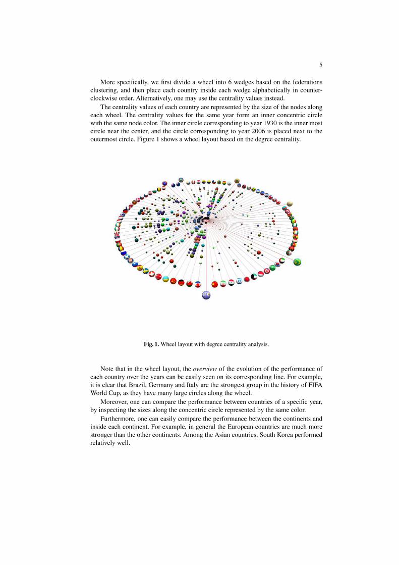
More specifically, we first divide a wheel into 6 wedges based on the federationsclustering, and then place each country inside each wedge alphabetically in counter-clockwise order. Alternatively, one may use the centrality values instead.
The centrality values of each country are represented by the size of the nodes alongeach wheel. The centrality values for the same year form an inner concentric circlewith the same node color. The inner circle corresponding to year 1930 is the inner mostcircle near the center, and the circle corresponding to year 2006 is placed next to theoutermost circle. Figure 1 shows a wheel layout based on the degree centrality.
Fig. 1. Wheel layout with degree centrality analysis.
Note that in the wheel layout, the overview of the evolution of the performance ofeach country over the years can be easily seen on its corresponding line. For example,it is clear that Brazil, Germany and Italy are the strongest group in the history of FIFAWorld Cup, as they have many large circles along the wheel.
Moreover, one can compare the performance between countries of a specific year,by inspecting the sizes along the concentric circle represented by the same color.
Furthermore, one can easily compare the performance between the continents andinside each continent. For example, in general the European countries are much morestronger than the other continents. Among the Asian countries, South Korea performedrelatively well.
6
In order to reveal the evolution of the performance in the history of FIFA WorldCup, we created an animation, which is available at: http://www.cs.usyd.edu.au/ vi-sual/valacon/awards.htm
However, one of the disadvantage in the Wheel layout is that it does not show thenetwork topology structure of each graph. To support this property, we designed a radiallayout and hierarchical layout, which clearly display the network structure of each yearto find out more details.
4.2 Radial Layout
In order to simultaneously display the network topology and the performance, we useda radial drawing convention from the social network analysis for displaying centrality.That is, we place the node with the highest centrality value in the union graph G atthe center of the drawing, and then place the nodes with the next high centrality valuesusing the concentric circles. However, we made the following important modifications.
First, instead of using the exact centrality value for each node to define each con-centric circle, which may end up with too many circles, we used some abstraction. Wedivide all the countries into a winner plus 3 groups (i.e. strong, medium and weak),based on the range of their centrality values. Then we place the strong group in theinnermost circle, and place the weak category in the outermost circle.
Second, in order to enable simultaneous global analysis (i.e. overall performance)and local analysis (i.e. performance of the specific year), we fix the location of eachcountry in each circle of the radial layout, based on the centrality value of the union ofgraphs G. More specifically, we first divide each circle into federation regions, and thenevenly distribute each node in each region, sorted by the centrality values of the nodesin G.
Finally, we use the size of each node based on the centrality values of the graph Gi
of a specific year, in order to enable the local analysis.Note that our approach can achieve preserving the mental map [17] of the dynamic
networks (i.e. no change of the location of a node in each layout).More importantly, we can support important visual analysis: confirm the expected
(i.e. a node with large size in the innermost circle, or a node with small size in theoutermost circle), and detect the unexpected (i.e. a node with large size in the outermostcircle, or a node with small size in the innermost circle).
We now describe more specific details of each step.
Circle assignment We divide all the countries into a winner and 3 groups (i.e. strong,medium and weak), based on the range of their centrality values in the union of graphsG. Then we place the strong group in the innermost circle, and place the weak categoryin the outermost circle.
7
More specifically, the circle L of each node v is determined by the normalizeddegree centrality value cD(v) of the union graph G as follows:
L(v) =
0 if cD(v) = 11 if 0.45 ≤ cD(v) < 12 if 0.15 ≤ cD(v) < 0.453 if cD(v) < 0.15
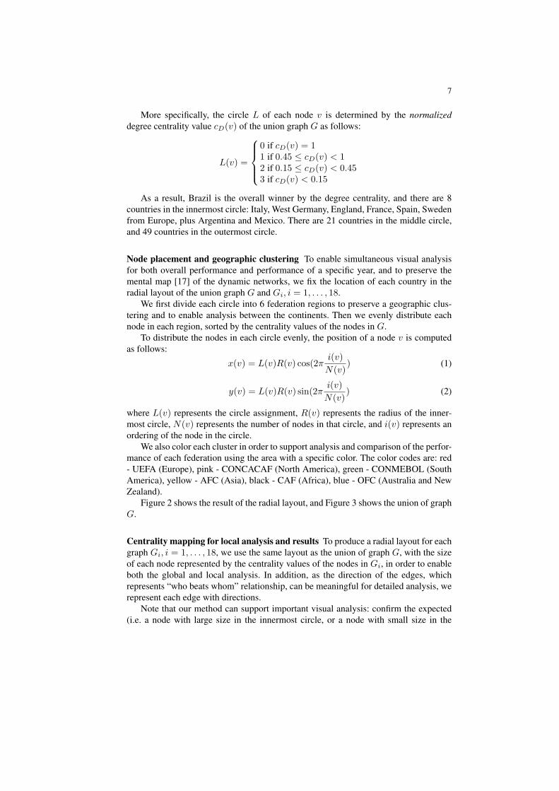
As a result, Brazil is the overall winner by the degree centrality, and there are 8countries in the innermost circle: Italy, West Germany, England, France, Spain, Swedenfrom Europe, plus Argentina and Mexico. There are 21 countries in the middle circle,and 49 countries in the outermost circle.
Node placement and geographic clustering To enable simultaneous visual analysisfor both overall performance and performance of a specific year, and to preserve themental map [17] of the dynamic networks, we fix the location of each country in theradial layout of the union graph G and Gi, i = 1, . . . , 18.
We first divide each circle into 6 federation regions to preserve a geographic clus-tering and to enable analysis between the continents. Then we evenly distribute eachnode in each region, sorted by the centrality values of the nodes in G.
To distribute the nodes in each circle evenly, the position of a node v is computedas follows:
x(v) = L(v)R(v) cos(2πi(v)N(v)
) (1)
y(v) = L(v)R(v) sin(2πi(v)N(v)
) (2)
where L(v) represents the circle assignment, R(v) represents the radius of the inner-most circle, N(v) represents the number of nodes in that circle, and i(v) represents anordering of the node in the circle.
We also color each cluster in order to support analysis and comparison of the perfor-mance of each federation using the area with a specific color. The color codes are: red- UEFA (Europe), pink - CONCACAF (North America), green - CONMEBOL (SouthAmerica), yellow - AFC (Asia), black - CAF (Africa), blue - OFC (Australia and NewZealand).
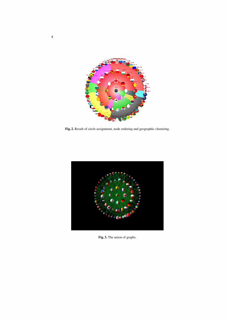
Figure 2 shows the result of the radial layout, and Figure 3 shows the union of graphG.
Centrality mapping for local analysis and results To produce a radial layout for eachgraph Gi, i = 1, . . . , 18, we use the same layout as the union of graph G, with the sizeof each node represented by the centrality values of the nodes in Gi, in order to enableboth the global and local analysis. In addition, as the direction of the edges, whichrepresents “who beats whom” relationship, can be meaningful for detailed analysis, werepresent each edge with directions.
Note that our method can support important visual analysis: confirm the expected(i.e. a node with large size in the innermost circle, or a node with small size in the
8
Fig. 2. Result of circle assignment, node ordering and geographic clustering.
Fig. 3. The union of graphs.
9
outermost circle), and the detection of the unexpected (i.e. a node with large size in theoutermost circle, or a node with small size in the innermost circle).
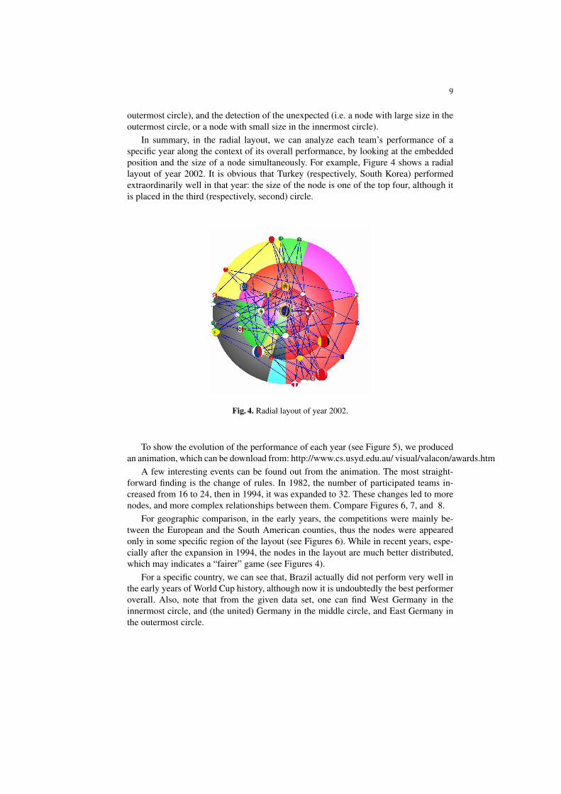
In summary, in the radial layout, we can analyze each team’s performance of aspecific year along the context of its overall performance, by looking at the embeddedposition and the size of a node simultaneously. For example, Figure 4 shows a radiallayout of year 2002. It is obvious that Turkey (respectively, South Korea) performedextraordinarily well in that year: the size of the node is one of the top four, although itis placed in the third (respectively, second) circle.
Fig. 4. Radial layout of year 2002.
To show the evolution of the performance of each year (see Figure 5), we producedan animation, which can be download from: http://www.cs.usyd.edu.au/ visual/valacon/awards.htm
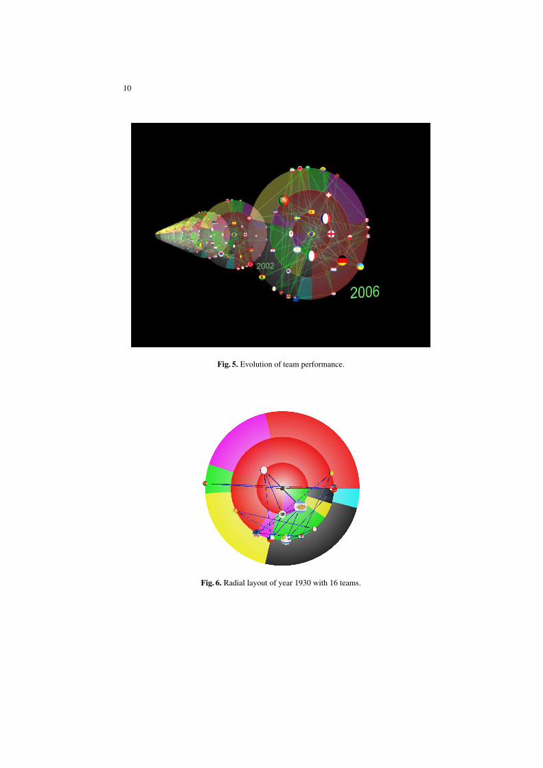
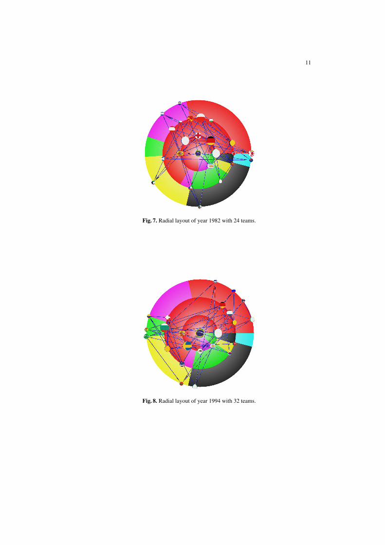
A few interesting events can be found out from the animation. The most straight-forward finding is the change of rules. In 1982, the number of participated teams in-creased from 16 to 24, then in 1994, it was expanded to 32. These changes led to morenodes, and more complex relationships between them. Compare Figures 6, 7, and 8.
For geographic comparison, in the early years, the competitions were mainly be-tween the European and the South American counties, thus the nodes were appearedonly in some specific region of the layout (see Figures 6). While in recent years, espe-cially after the expansion in 1994, the nodes in the layout are much better distributed,which may indicates a “fairer” game (see Figures 4).
For a specific country, we can see that, Brazil actually did not perform very well inthe early years of World Cup history, although now it is undoubtedly the best performeroverall. Also, note that from the given data set, one can find West Germany in theinnermost circle, and (the united) Germany in the middle circle, and East Germany inthe outermost circle.
10
Fig. 5. Evolution of team performance.
Fig. 6. Radial layout of year 1930 with 16 teams.
11
Fig. 7. Radial layout of year 1982 with 24 teams.
Fig. 8. Radial layout of year 1994 with 32 teams.
12
In summary, compared with the wheel layout, the radial layout can display the topol-ogy of the network, i.e. who-beats-whom relationships. It clearly shows the overallwinner, Brazil in the center. Further, visual comparison between regional performanceis clearly visible based on the use of coloring.
However, it shows many edge crossings, as the ordering of nodes inside each ge-ographic clustering is not based on the crossing minimization method. This can beimproved by using one of the crossing minimization method for radial graph layout, orusing a curve representation instead of straight-line edge representation [14].
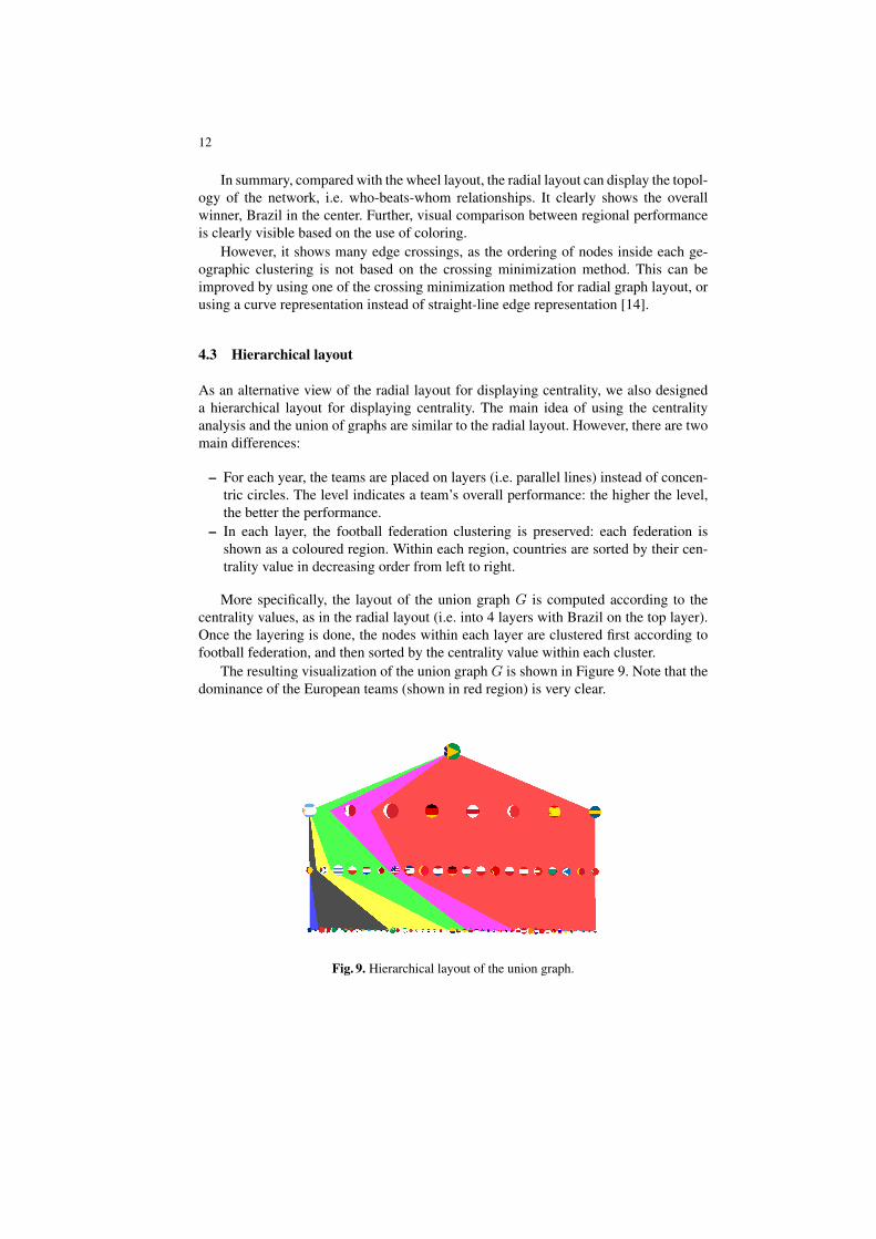
4.3 Hierarchical layout
As an alternative view of the radial layout for displaying centrality, we also designeda hierarchical layout for displaying centrality. The main idea of using the centralityanalysis and the union of graphs are similar to the radial layout. However, there are twomain differences:
– For each year, the teams are placed on layers (i.e. parallel lines) instead of concen-tric circles. The level indicates a team’s overall performance: the higher the level,the better the performance.
– In each layer, the football federation clustering is preserved: each federation isshown as a coloured region. Within each region, countries are sorted by their cen-trality value in decreasing order from left to right.
More specifically, the layout of the union graph G is computed according to thecentrality values, as in the radial layout (i.e. into 4 layers with Brazil on the top layer).Once the layering is done, the nodes within each layer are clustered first according tofootball federation, and then sorted by the centrality value within each cluster.
The resulting visualization of the union graph G is shown in Figure 9. Note that thedominance of the European teams (shown in red region) is very clear.
Fig. 9. Hierarchical layout of the union graph.
13
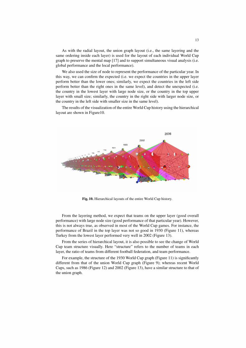
As with the radial layout, the union graph layout (i.e., the same layering and thesame ordering inside each layer) is used for the layout of each individual World Cupgraph to preserve the mental map [17] and to support simultaneous visual analysis (i.e.global performance and the local performance).
We also used the size of node to represent the performance of the particular year. Inthis way, we can confirm the expected (i.e. we expect the countries in the upper layerperform better than the lower ones; similarly, we expect the countries in the left sideperform better than the right ones in the same level), and detect the unexpected (i.e.the country in the lowest layer with large node size, or the country in the top upperlayer with small size; similarly, the country in the right side with larger node size, orthe country in the left side with smaller size in the same level).
The results of the visualization of the entire World Cup history using the hierarchicallayout are shown in Figure10.
Fig. 10. Hierarchical layouts of the entire World Cup history.
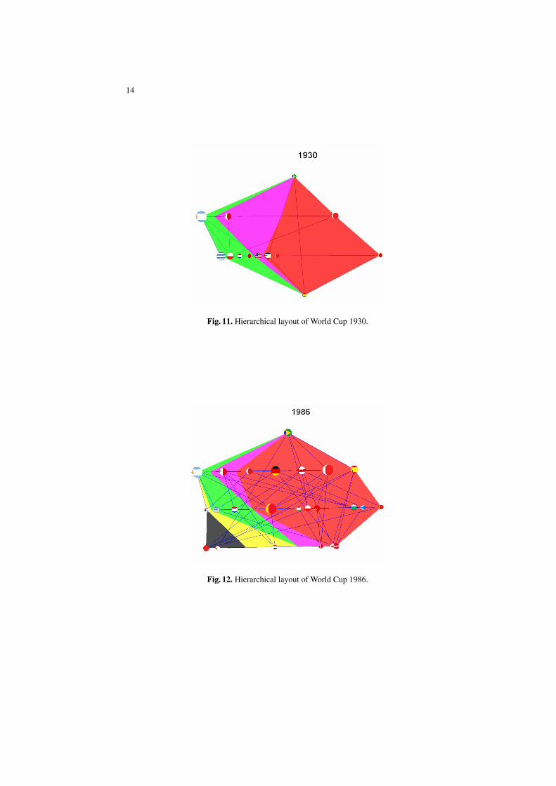
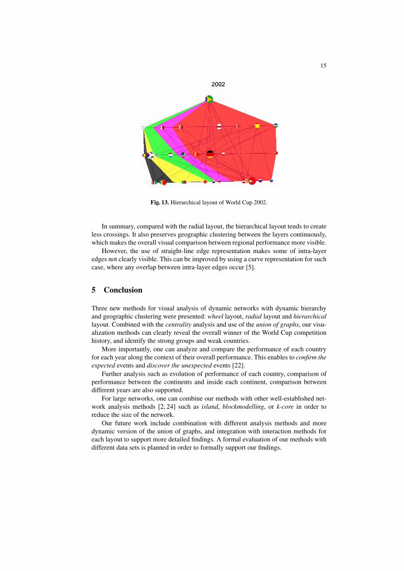
From the layering method, we expect that teams on the upper layer (good overallperformance) with large node size (good performance of that particular year). However,this is not always true, as observed in most of the World Cup games. For instance, theperformance of Brazil in the top layer was not so good in 1930 (Figure 11), whereasTurkey from the lowest layer performed very well in 2002 (Figure 13).
From the series of hierarchical layout, it is also possible to see the change of WorldCup team structure visually. Here “structure” refers to the number of teams in eachlayer, the ratio of teams from different football federation, and team performance.
For example, the structure of the 1930 World Cup graph (Figure 11) is significantlydifferent from that of the union World Cup graph (Figure 9); whereas recent WorldCups, such as 1986 (Figure 12) and 2002 (Figure 13), have a similar structure to that ofthe union graph.
14
Fig. 11. Hierarchical layout of World Cup 1930.
Fig. 12. Hierarchical layout of World Cup 1986.
15
Fig. 13. Hierarchical layout of World Cup 2002.
In summary, compared with the radial layout, the hierarchical layout tends to createless crossings. It also preserves geographic clustering between the layers continuously,which makes the overall visual comparison between regional performance more visible.
However, the use of straight-line edge representation makes some of intra-layeredges not clearly visible. This can be improved by using a curve representation for suchcase, where any overlap between intra-layer edges occur [5].
5 Conclusion
Three new methods for visual analysis of dynamic networks with dynamic hierarchyand geographic clustering were presented: wheel layout, radial layout and hierarchicallayout. Combined with the centrality analysis and use of the union of graphs, our visu-alization methods can clearly reveal the overall winner of the World Cup competitionhistory, and identify the strong groups and weak countries.
More importantly, one can analyze and compare the performance of each countryfor each year along the context of their overall performance. This enables to confirm theexpected events and discover the unexpected events [22].
Further analysis such as evolution of performance of each country, comparison ofperformance between the continents and inside each continent, comparison betweendifferent years are also supported.
For large networks, one can combine our methods with other well-established net-work analysis methods [2, 24] such as island, blockmodelling, or k-core in order toreduce the size of the network.
Our future work include combination with different analysis methods and moredynamic version of the union of graphs, and integration with interaction methods foreach layout to support more detailed findings. A formal evaluation of our methods withdifferent data sets is planned in order to formally support our findings.
16
References
1. Adel Ahmed, Tim Dwyer, Michael Forsterand Xiaoyan Fu, Joshua Wing Kei Ho, Seok-HeeHong, Dirk Koschuetzki, Colin Murray, Nikola S. Nikolov, Ronnie Taib, Alexandre Tarassov,and Kai Xu. Geomi: Geometry for maximum insight. In Graph Drawing, volume 21, pages468–479, 2005.
2. U. Brandes and T. Erlebach. Network Analysis: methodological foundations. Springer, 2005.3. Ulrik Brandes, Tim Dwyer, and Falk Schreiber. Visual understanding of metabolic path-
ways across organisms using layout in two and a half dimensions. Journal of IntegrativeBioinformatics, 1, 2004.
4. Ulrik Brandes, Martin Hoefer, and Christian Pich. Affiliation dynamics with an application tomovie-actor biographies. In Proc. Eurographics/IEEE-VGTC Symp. Visualization (EuroVis’06), pages 179–186, 2006.
5. M. Forster C. Bachmaier, H. Buchner and S. Hong. Crossing minimization in extended leveldrawings of graphs. Discrete Applied Mathematics, page submitted.
6. Chaomei Chen. Visualising semantic spaces and author co-citation networks in digital li-braries. Information Processing and Management, 35(3):401–420, 1999.
7. Chaomei Chen. The centrality of pivotal points in the evolution of scientific networks. In IUI’05: Proceedings of the 10th international conference on Intelligent user interfaces, pages98–105, New York, NY, USA, 2005. ACM Press.
8. Ed H. Chi, James Pitkow, Jock Mackinlay, Peter Pirolli, Rich Gossweiler, and Stuart K. Card.Visualizing the evolution of web ecologies. In CHI ’98: ACM CHI 98 Conference on HumanFactors in Computing Systems, pages 400–407, 644–645, New York, NY, USA, 1998. ACMPress.
9. Tim Dwyer and David R Gallagher. Visualising changes in fund manager holdings in twoand a half-dimensions.
10. Xiaoyan Fu, Seok-Hee Hong, Nikola S. Nikolov, Xiaobin Shen, Yingxin Wu, and Kai Xu.Visualization and analysis of email networks. In Proceedings of Asia-Pacific Symposium onViuslisation 2007, pages 1–8, 2007.
11. Pawel Gajer, Michael T. Goodrich, and Stephen G. Kobourov. A multi-dimensional approachto force-directed layouts of large graphs. In Graph Drawing, pages 211–221, 2000.
12. David Harel and Yehuda Koren. A fast multi-scale method for drawing large graphs. InGraph Drawing, pages 183–196, 2000.
13. David Harel and Yehuda Koren. Graph drawing by high-dimensional embedding. In GraphDrawing, pages 207–219, 2002.
14. Seok-Hee Hong and Hiroshi Nagamochi. Approximating crossing minimization in radiallayouts. In LATIN, pages 461–472, 2008.
15. Yehuda Koren. On spectral graph drawing. In COCOON, pages 496–508, 2003.16. Joe Marks, editor. Graph Drawing, 8th International Symposium, GD 2000, Colonial
Williamsburg, VA, USA, September 20-23, 2000, Proceedings, volume 1984 of Lecture Notesin Computer Science. Springer, 2001.
17. Kazuo Misue, Peter Eades, Wei Lai, and Kozo Sugiyama. Layout adjustment and the mentalmap. J. Vis. Lang. Comput., 6(2):183–210, 1995.
18. James Moody, Daniel McFarland, and Skye Bender-deMoll. Dynamic network visualization.American Journal of Sociology, 110(4):1206–41, Jan 2005.
19. Paul Mutton. Inferring and visualizing social networks on internet relay chat. In IV ’04:Proceedings of the Information Visualisation, Eighth International Conference on (IV’04),pages 35–43, Washington, DC, USA, 2004. IEEE Computer Society.
20. Adam Perer and Ben Shneiderman. Balancing systematic and flexible exploration of so-cial networks. IEEE Transactions on Visualization and Computer Graphics, 12(5):693–700,2006.

17
21. Aaron J. Quigley and Peter Eades. Fade: Graph drawing, clustering, and visual abstraction.In Graph Drawing, pages 197–210, 2000.
22. James J. Thomas and Kristin A. Cook. Illuminating the Path: The Research and DevelopmentAgenda for Visual Analytics. National Visualization and Analytics Ctr, 2005.
23. Chris Walshaw. A multilevel algorithm for force-directed graph drawing. In Graph Drawing,pages 171–182, 2000.
24. Stanley Wasserman and Katherine Faust. Social Network Analysis: Methods and Appli-caitons. Cambridge University Press, 40 West 20th Street, New York, NY 10011-4211,USA, 1st. edition, 1995.