
Understanding and Conceptualizing Interaction - UiO
84
Understanding the problem space What do you want to create? What are your assumptions? What are your claims? Will it achieve what you hope it will? If so, how?
-
Upload
khangminh22 -
Category
Documents
-
view
1 -
download
0
Transcript of Understanding and Conceptualizing Interaction - UiO
Understanding the
problem space
What do you want to create?
What are your assumptions?
What are your claims?
Will it achieve what you hope it will? If so, how?
From problem space to
design space
Having a good understanding of the problem space can help inform the design spacee.g., what kind of interface, behavior,
functionality to provide
But before deciding upon these it is important to develop a conceptual model

Conceptual model
Need to first think about how the system will appear to users (i.e. how they will understand it)
A conceptual model is: “a high-level description of how a system is organized and
operates.” (Johnson and Henderson, 2002, p. 26)

What is and why need a
conceptual model?
Not a description of the user interface but a structure outlining the concepts and the relationships between them
Why not start with the nuts and bolts of design? Architects and interior designers would not think about which
color curtains to have before deciding where the windows will be placed in a new building
Enables “designers to straighten out their thinking before they start laying out their widgets” (p. 28)
Provides a working strategy and a framework of general concepts and their interrelations

Helps the design team
Orient themselves towards asking questions about how the conceptual model will be understood by users
Not to become narrowly focused early on
Establish a set of common terms they all understand and agree upon
Reduce the chance of misunderstandings and confusion arising later on

Example of concept
development in
advertising

Main components
Major metaphors and analogies that are used to convey how to understand what a product is for and how to use it for an activity.
Concepts that users are exposed to through the product
The relationships between the concepts e.g., one object contains another
The mappings between the concepts and the user experience the product is designed to support

Interface metaphors
Designed to be similar to a physical entity but also has own properties
e.g. desktop metaphor, search engine
Exploit user‟s familiar knowledge, helping them to understand „the unfamiliar‟
Conjures up the essence of the unfamiliar activity, enabling users to leverage of this to understand more aspects of the unfamiliar functionality
People find it easier to learn and talk about what they are
doing at the computer interface in terms familiar to them

Benefits of interface
metaphors
Makes learning new systems easier
Helps users understand the underlying conceptual model
Can be innovative and enable the realm of computers and their applications to be made more accessible to a greater diversity of users
Problems with
interface metaphors
(Nelson, 1990)
Break conventional and cultural rules
e.g., recycle bin placed on desktop
Can constrain designers in the way they conceptualize a problem
space
Conflict with design principles
Forces users to only understand the system in terms of the
metaphor
Designers can inadvertently use bad existing designs and transfer
the bad parts over
Limits designers‟ imagination in coming up with new conceptual
models

Two Examples

Two Examples

Interaction types
Instructing
issuing commands using keyboard and function keys and selecting options via menus
Conversing
interacting with the system as if having a conversation
Manipulating
interacting with objects in a virtual or physical space by manipulating them
Exploring
moving through a virtual environment or a physical space
Instructing
Where users instruct a system by telling it what to do e.g., tell the time, print a file, find a photo
Very common interaction type underlying a range of devices and systems
A main benefit of instructing is to support quick and efficient interaction good for repetitive kinds of actions performed on multiple
objects
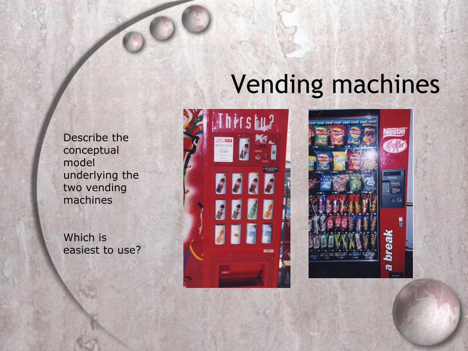
Vending machines
Describe the conceptual model underlying the two vending machines
Which is easiest to use?

Conversing
Like having a conversation with another human
Differs from instructing in that it more like two-way communication, with the system acting like a partner rather than a machine that obeys orders
Ranges from simple voice recognition menu-driven systems to more complex „natural language‟ dialogues
Examples include search engines, advice-giving systems and help systems

Pros and cons of
conversational model
Allows users, especially novices and technophobes, to interact with the system in a way that is familiar
makes them feel comfortable, at ease and less scared
Misunderstandings can arise when the system does not know how to parse what the user says
e.g. child types into a search engine, that uses natural language the question:
“How many legs does a centipede have?” and the system responds:

Manipulating
Exploit‟s users‟ knowledge of how they move and manipulate in the physical world
Virtual objects can be manipulated by moving, selecting, opening, and closing them
Tagged physical objects (e.g., bricks, blocks) that are manipulated in a physical world (e.g., placed on a surface) can result in other physical and digital events

Direct manipulation
Shneiderman (1983) coined the term Direct Manipulation
Came from his fascination with computer games at the time
Proposes that digital objects be designed so they can be interacted with analogous to how physical objects are manipulated
Assumes that direct manipulation interfaces enable users to feel that they are directly controlling the digital objects

Core principles of DM
Continuous representation of objects and actions of interest
Physical actions and button pressing instead of issuing commands with complex syntax
Rapid reversible actions with immediate feedback on object of interest
Why are DM interfaces
so enjoyable?
Novices can learn the basic functionality quickly
Experienced users can work extremely rapidly to carry out a wide range of
tasks, even defining new functions
Intermittent users can retain operational concepts over time
Error messages rarely needed
Users can immediately see if their actions are furthering their goals and if
not do something else
Users experience less anxiety
Users gain confidence and mastery and feel in control
What are the
disadvantages with DM?
Some people take the metaphor of direct manipulation too
literally
Not all tasks can be described by objects and not all actions
can be done directly
Some tasks are better achieved through delegating rather
than manipulating
e.g., spell checking
Moving a mouse around the screen can be slower than
pressing function keys to do same actions

Exploring
Involves users moving through virtual or physical environments
Examples include: 3D desktop virtual worlds where people navigate using
mouse around different parts to socialize (e.g., Second Life)
CAVEs where users navigate by moving whole body, arms, and head
physical context aware worlds, embedded with sensors, that present digital information to users at appropriate places and times

A virtual world

A CAVE
Theories, models and
frameworks
Are used to inform and inspire design
A theory is a well-substantiated explanation of some aspect
of a phenomenon
A model is a simplification of some aspect of human–
computer interaction intended to make it easier for
designers to predict and evaluate alternative designs
A framework is a set of interrelated concepts and/or a set of
specific questions
Main differences
Theories tend to be comprehensive, explaining
human–computer interactions
Models tend to simplify some aspect of human–
computer interaction
Frameworks tend to be prescriptive, providing
designers with concepts, questions, and principles
to consider
Chapter 3:
Understanding users

Overview
What is cognition?
What are users good and bad at?
Describe how cognition has been applied to interaction design
Theories of cognitionMental models, theory of action
Information processing
External cognition, distributed cognition

Why do we need to understand users?
Interacting with technology is cognitive
We need to take into account cognitive processes involved and cognitive limitations of users
We can provide knowledge about what users can and cannot be expected to do
Identify and explain the nature and causes of problems users encounter
Supply theories, modelling tools, guidance and methods that can lead to the design of better interactive products

What goes on in the
mind?
Core cognitive aspects
Attention
Perception and recognition
Memory
Reading, speaking and listening
Problem-solving, planning, reasoning and decision-
making, learning
Most relevant to interaction design are attention,
perception and recognition, and memory

Attention
Selecting things to concentrate on at a point in time from the mass of stimuli around us
Allows us to to focus on information that is relevant to what we are doing
Involves audio and/or visual senses
Focussed and divided attention enables us to be selective in terms of the mass of competing stimuli but limits our ability to keep track of all events
Information at the interface should be structured to capture users‟ attention, e.g. use perceptual boundaries (windows), colour, reverse video, sound and flashing lights
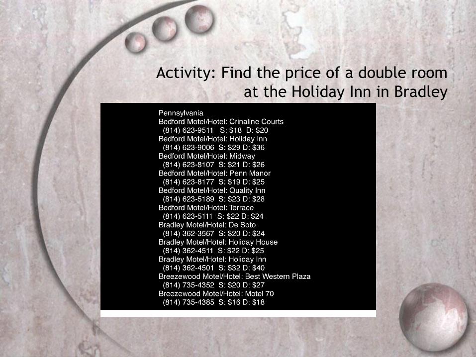
Activity: Find the price of a double room
at the Holiday Inn in Bradley
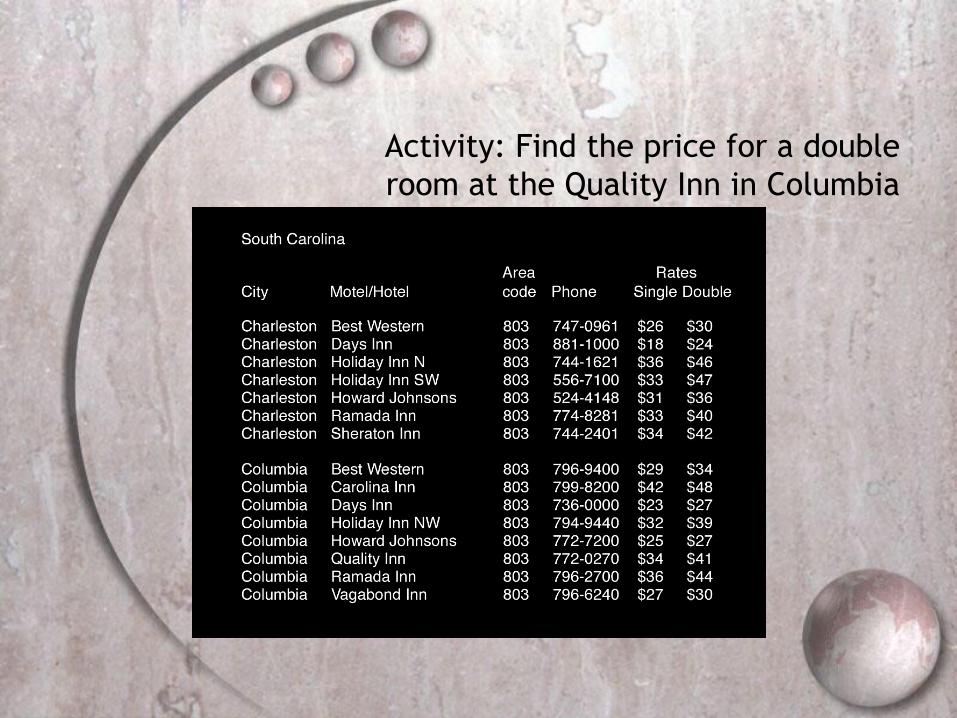
Activity: Find the price for a double
room at the Quality Inn in Columbia
Activity
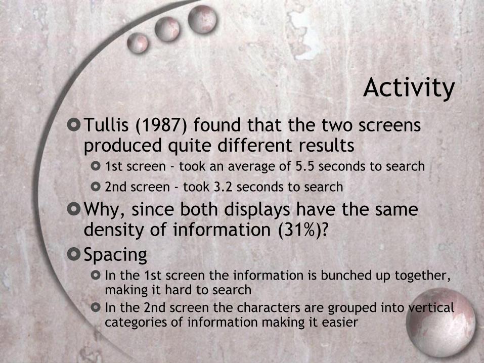
Tullis (1987) found that the two screens produced quite different results 1st screen - took an average of 5.5 seconds to search
2nd screen - took 3.2 seconds to search
Why, since both displays have the same density of information (31%)?
Spacing In the 1st screen the information is bunched up together,
making it hard to search
In the 2nd screen the characters are grouped into vertical categories of information making it easier

Images from yahoo.com
VisualizationSuccess Stories

Visualization Success
Story
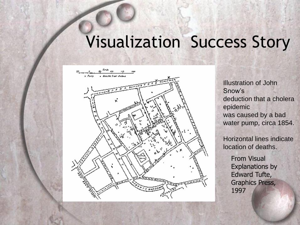
Mystery: what is causing a cholera
epidemic in London in 1854?
Visualization Success Story
From Visual Explanations by Edward Tufte, Graphics Press, 1997
Illustration of John
Snow’s
deduction that a cholera
epidemic
was caused by a bad
water pump, circa 1854.
Horizontal lines indicate
location of deaths.

Visualization Success Story
From Visual Explanations by Edward Tufte,
Graphics Press, 1997
Illustration of
John Snow’s
deduction that a
cholera epidemic
was caused by a
bad water pump,
circa 1854.
Horizontal lines
indicate location
of deaths.

EXAMPLE: VISUAL IMMEDIACY AS FACILITATOR OF VISUAL REASONING
T1
T2
T3
T4
T5
D1
D2
D3
b)a)
(Partial) Production Rules:
Flow in on any corner.
True flow out on any other corner.
False flow out on any remaining corner.
Condition?
a) Operation
Type 3
Operation
Type 2
Operation
Type 1
T1
D1
T3
D2
T2
D3
T4
T5
b)
TERMINATION EXCEPTION NORMAL
(Partial) Production Rules:
Flow in always from the top.
Normal flow out from bottom or right.
Abnormal flow out on left.
General flow direction always
downwards.
Condition?¬N N
either
orN

Visual Impedance
Temporal mismatch: “Stage-coach belongs to another
era. The message does not address me.”
Cultural mismatch (with respect to the Norwegian
culture that emphasizes equality of the two sexes):
“Macho. The only woman is being helped, and the
activities implied are largely male/physical. It is a scene
that reminds a hunt, which is a male occupation/game
also. Gordon’s gin is for the boys?”
Contextual mismatch: “What does being stuck in the
snow have to do with a holiday (appearing in the text
below the picture)?” “Holidays mean children. What
does Gordon’s gin have to do with children?”

How to Exaggerate with
Graphsfrom Tufte ‟83“Lie factor” = 2.8
Visual Perception
behavioural model of visual perception and
recognition
Daniel Chandler's media course visual
perception

Properties of visual perception
Preattentive Processing
Accuracy of Interpretation of Visual
Properties
Illusions and the Relation to Graphical
Integrity
All Preattentive Processing figures from Healey 97
http://www.csc.ncsu.edu/faculty/healey/PP/PP.html

Preattentive Processing (close to
visual immediacy)
A limited set of visual properties are processed
preattentively (without need for focusing
attention).
This is important for design of visualizations
what can be perceived immediately
what properties are good discriminators
what can mislead viewers (visual
impedance)
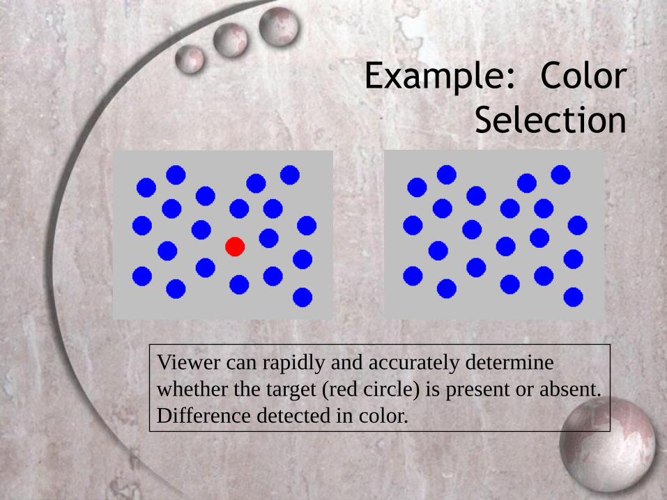
Example: Color
Selection
Viewer can rapidly and accurately determine
whether the target (red circle) is present or absent.
Difference detected in color.

Example: Shape
Selection
Viewer can rapidly and accurately determine
whether the target (red circle) is present or absent.
Difference detected in form (curvature)
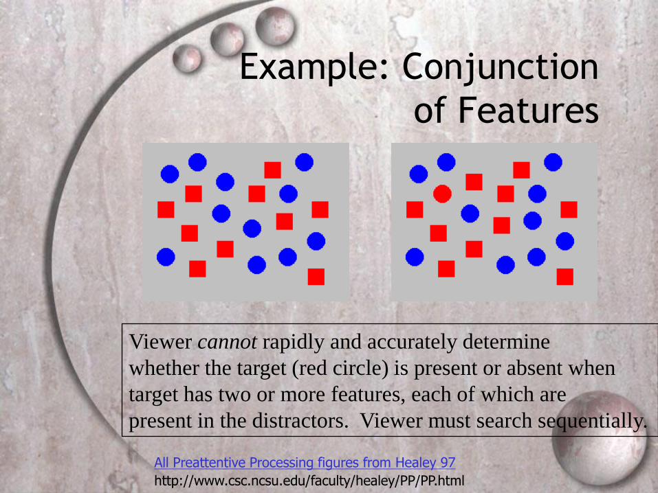
Example: Conjunction
of Features
Viewer cannot rapidly and accurately determine
whether the target (red circle) is present or absent when
target has two or more features, each of which are
present in the distractors. Viewer must search sequentially.
All Preattentive Processing figures from Healey 97
http://www.csc.ncsu.edu/faculty/healey/PP/PP.html

SUBJECT PUNCHED QUICKLY OXIDIZED TCEJBUS DEHCNUP YLKCIUQ DEZIDIXO
CERTAIN QUICKLY PUNCHED METHODS NIATREC YLKCIUQ DEHCNUP SDOHTEM
SCIENCE ENGLISH RECORDS COLUMNS ECNEICS HSILGNE SDROCER SNMULOC
GOVERNS PRECISE EXAMPLE MERCURY SNREVOG ESICERP ELPMAXE YRUCREM
CERTAIN QUICKLY PUNCHED METHODS NIATREC YLKCIUQ DEHCNUP SDOHTEM
GOVERNS PRECISE EXAMPLE MERCURY SNREVOG ESICERP ELPMAXE YRUCREM
SCIENCE ENGLISH RECORDS COLUMNS ECNEICS HSILGNE SDROCER SNMULOC
SUBJECT PUNCHED QUICKLY OXIDIZED TCEJBUS DEHCNUP YLKCIUQ DEZIDIXO
CERTAIN QUICKLY PUNCHED METHODS NIATREC YLKCIUQ DEHCNUP SDOHTEM
SCIENCE ENGLISH RECORDS COLUMNS ECNEICS HSILGNE SDROCER SNMULOC
Text NOT Preattentive

Preattentive Visual Properties(Healey 97)
length Triesman & Gormican [1988]
width Julesz [1985]
size Triesman & Gelade [1980]
curvature Triesman & Gormican [1988]
number Julesz [1985]; Trick & Pylyshyn [1994]
terminators Julesz & Bergen [1983]
intersection Julesz & Bergen [1983]
closure Enns [1986]; Triesman & Souther [1985]
colour (hue) Nagy & Sanchez [1990, 1992]; D'Zmura [1991] Kawai et al. [1995]; Bauer et al. [1996]
intensity Beck et al. [1983]; Triesman & Gormican [1988]
flicker Julesz [1971]
direction of motion Nakayama & Silverman [1986]; Driver & McLeod [1992]
binocular lustre Wolfe & Franzel [1988]
stereoscopic depth Nakayama & Silverman [1986]
3-D depth cues Enns [1990]
lighting direction Enns [1990]

Gestalt Properties
Gestalt: form or configuration
Idea: forms or patterns transcend the
stimuli used to create them.
Why do patterns emerge?
Under what circumstances?
Which Properties are
Appropriate for Which
Information Types?

Visual Perception
behavioural model of visual perception and
recognition
Daniel Chandler's media course visual
perception
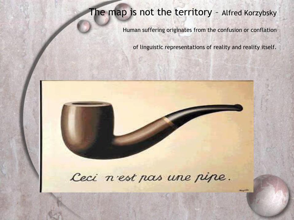
The map is not the territory – Alfred Korzybsky
Human suffering originates from the confusion or conflation
of linguistic representations of reality and reality itself.

We believe what we see – perception is
not reality
Dali/Voltaire

Illusion
If you like illusions, you may go and play at
http://www.sandlotscience.com
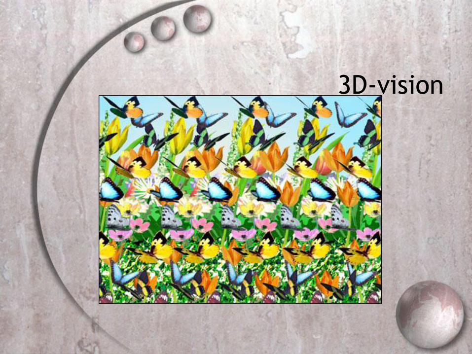
3D-vision
Design implications for attention
Make information salient when it needs attending to
Use techniques that make things stand out like colour,
ordering, spacing, underlining, sequencing and animation
Avoid cluttering the interface - follow the google.com
example of crisp, simple design
Avoid using too much because the software allows it

An example of over-use of
graphics
Perception and
recognition
How information is acquired from the world
and transformed into experiences
Obvious implication is to design
representations that are readily perceivable,
e.g.
Text should be legible
Icons should be easy to distinguish and read

Is color contrast good?
Find italian
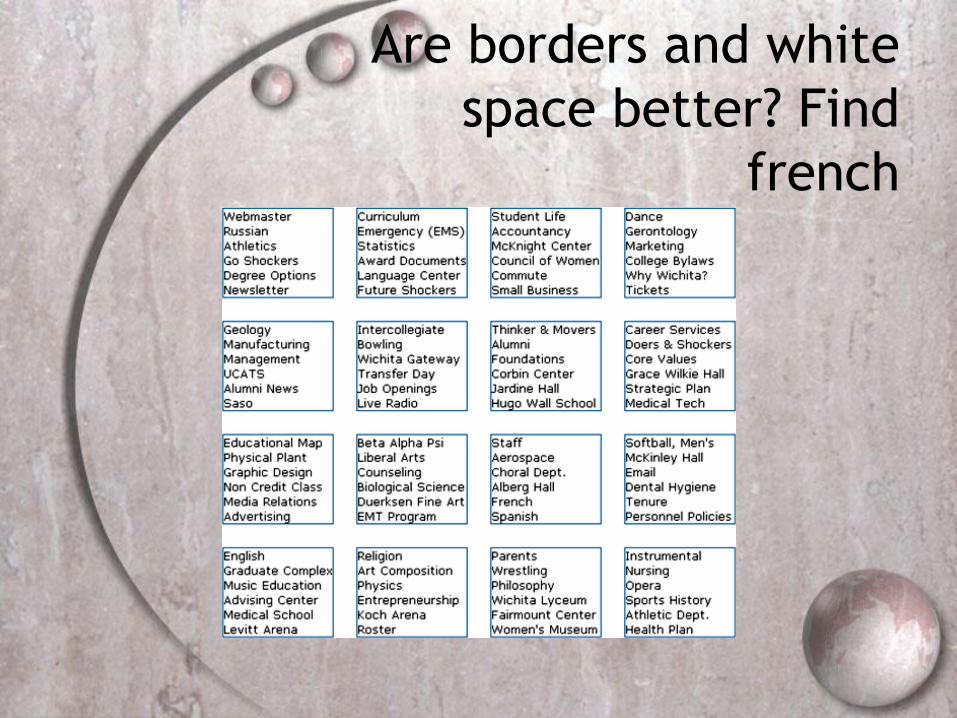
Are borders and white
space better? Find
french

Activity
Weller (2004) found people took less time
to locate items for information that was
grouped
using a border (2nd screen) compared with
using color contrast (1st screen)
Some argue that too much white space on
web pages is detrimental to search
Makes it hard to find information
Do you agree?

Which is easiest to read
and why?
What is the time?
What is the time?
What is the time?
What is the time?
What is the time?

Design implications
Representations of information need to be designed to be perceptible and recognizable
Icons and other graphical representations should enable users to readily distinguish their meaning
Bordering and spacing are effective visual ways of grouping information
Sounds should be audible and distinguishable
Speech output should enable users to distinguish between the set of spoken words
Text should be legible and distinguishable from the background

Memory
Involves first encoding and then retrieving knowledge
We don‟t remember everything - involves
filtering and processing what is attended to
Context is important in affecting our memory (i.e., where, when)
Well known fact that we recognize things much better than being able to recall things
Better at remembering images than words
Why interfaces are largely visual

Processing in memory
Encoding is first stage of memory determines which information is attended to in the
environment and how it is interpreted
The more attention paid to something,
And the more it is processed in terms of thinking about it and comparing it with other knowledge,
The more likely it is to be remembered e.g., when learning about HCI, it is much better to
reflect upon it, carry out exercises, have discussions with others about it, and write notes than just passively read a book, listen to a lecture or watch a video about it
Context is important
Context affects the extent to which information can be subsequently retrieved
Sometimes it can be difficult for people to recall information that was encoded in a different context e.g., You are on a train and someone comes up to you
and says hello. You don‟t recognize him for a few moments but then realize it is one of your neighbors. You are only used to seeing your neighbor in the hallway of your apartment block and seeing him out of context makes him difficult to recognize initially

Activity
Try to remember the dates of your grandparents‟ birthday
Try to remember the cover of the last two DVDs you bought or rented
Which was easiest? Why?
People are very good at remembering visual cues about things e.g., the color of items, the location of objects
and marks on an object
They find it more difficult to learn and remember arbitrary material e.g., birthdays and phone numbers
Recognition versus
recall
Command-based interfaces require users to recall from memory a name from a possible set of 100s
GUIs provide visually-based options that users need only browse through until they recognize one
Web browsers, MP3 players, etc., provide lists of visited URLs, song titles etc., that support recognition memory

The problem with the
classic „7 2‟
George Miller‟s theory of how much
information people can remember
People‟s immediate memory capacity is
very limited
Many designers have been led to believe
that this is useful finding for interaction
design

What some designers get up to…
Present only 7 options on a menu
Display only 7 icons on a tool bar
Have no more than 7 bullets in a list
Place only 7 items on a pull down menu
Place only 7 tabs on the top of a website
pageBut this is wrong? Why?

Why?
Inappropriate application of the theory
People can scan lists of bullets, tabs, menu items till they see the one they want
They don‟t have to recall them from memory having only briefly heard or seen them
Sometimes a small number of items is good design
But it depends on task and available screen estate
Personal information
management
Personal information management (PIM) is a growing problem for most usersWho have vast numbers of documents, images, music
files, video clips, emails, attachments, bookmarks, etc.,
Major problem is deciding where and how to save them all, then remembering what they were called and where to find them again
Naming most common means of encoding them
Trying to remember a name of a file created some time back can be very difficult, especially when have 1000s and 1000s
How might such a process be facilitated taking into
account people‟s memory abilities?

Personal information
management
Memory involves 2 processesrecall-directed and recognition-based scanning
File management systems should be designed to optimize both kinds of memory processes e.g., Search box and history list
Help users encode files in richer ways Provide them with ways of saving files using colour,
flagging, image, flexible text, time stamping, etc
Design implications
Don‟t overload users‟ memories with complicated procedures for carrying out tasks
Design interfaces that promote recognition rather than recall
Provide users with a variety of ways of encoding digital information to help them remember where they have stored theme.g., categories, color, flagging, time stamping

Case Study:
The Journey of the
TreeMap
The TreeMap (Johnson & Shneiderman ‘91)
Idea:
Show a hierarchy as a 2D layout
Fill up the space with rectangles
representing objects
Size on screen indicates relative size of
underlying objects.

Early Treemap Applied to
File System

Treemap Problems Too disorderly
What does adjacency mean?
Aspect ratios uncontrolled leads to lots of skinny boxes
that clutter
Color not used appropriately
In fact, is meaningless here
Wrong application
Don‟t need all this to just see the largest files in the OS

Successful Application of Treemaps
Think more about the use
Break into meaningful groups
Fix these into a useful aspect ratio
Use visual properties properly
Use color to distinguish meaningfully
Use only two colors:
Can then distinguish one thing from another
When exact numbers aren‟t very important
Provide excellent interactivity
Access to the real data
Makes it into a useful tool
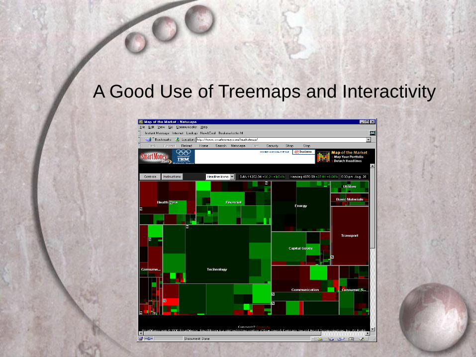
A Good Use of Treemaps and Interactivity

Treemaps in Peets site