The Text-Image Relationship in Goethe's the Sorrows of Young Werther
10
The Text-Image Relationship in Goethe’s “The Sorrows of Young Werther” Hee Sook Lee-Niinioja The German philosopher Friedrich Hegel (1770-1830) begins the classification of arts from the groundwork of the natural towards the spiritual, naming them to his Symbolic, Classical, and Romantic theory series. (i) Architecture whose material is necessarily present is for the Symbolic; (ii) sculpture, which is a step towards ideality, is for the Classical; (iii) painting, an art which represents life in form and colour, is for the Romantic, and is further trained (vi) in music, the most subjective of the arts; and (5) in poetry, the most universal and spiritual of all. For Hegel, Goethe was one of the most successful lyric poets, due to his easy discovery of song materials. Johann Wolfgang von Goethe (1749-1832) is the greatest writer during the German Romantic times between the late 18 th and early 19 th centuries. His acquaintance with Johann Gottfried Herder (1744-1803), a German philosopher and poet, was of a decisive moment for his preparing “Sturm und Drang” movement with Friedrich Schiller (1759-1805). Goethe’s lyric songs have endowed the foremost literary expression to Germany, attuning feeling, sentiment and thought. And his poems shaped a new genre in Germany, set to music by Ludwig van Beethoven (1770-1827) and Franz Schubert (1797-1828). Numerous passionate poems dedicated to his eternal beauty contributed to eminence, delivering universal emotions to his readers through generations. It is no wonder why his superiority was reflected by Napoleon I’s (1769- 1821) “Voilà un homme!” Among Goethe’s literary works, “The Sorrows of Young Werther” (1774) had a larger impact than any others. It is a story of Werther, a sensitive young hero, who falls in love with Lotte at a German village. Werther is unable to subdue his passion for her, and his infatuation torments him to the peak of despair. This book was an immediate success in Europe, and a cult of suicide grew up. I am one of these victims. Why is it so? The book brought an imaginary world to me through its emotional words, lyrical sounds, and impressive colours. But please wait! Whenever I have a glimpse on unsuitable illustrations of the book, I start to lose my longing for Werther, eventually Goethe. Having said, my paper discusses of a text-image relationship in the German version of “The Sorrows of Young Werther” (Die Leidenschaft des jungen Werthers), analysed by lines, a design element. TEXT AND IMAGE The term “material culture” has been applied to art historians who look at an object within its environmental and cultural context. It examines forms, uses, and meanings of objects, images, and surroundings in everyday life, in order to discover untold stories and their linked expressions of creativity. In this regard, books are primary resource to discover the past, due to part of the records of material culture. And book illustrations can be analyzed for their imagery, as they relate to the content of the book. Despite the globalization and timelessness of reading abilities, certain types of books demand their own readers. Therefore, book designs are a crucial element of studying objects, because of (i) expression of the author
-
Upload
independentresearcher -
Category
Documents
-
view
0 -
download
0
Transcript of The Text-Image Relationship in Goethe's the Sorrows of Young Werther
The Text-Image Relationship in Goethe’s “The Sorrows of Young Werther”
Hee Sook Lee-Niinioja The German philosopher Friedrich Hegel (1770-1830) begins the classification of arts from the groundwork of the natural towards the spiritual, naming them to his Symbolic, Classical, and Romantic theory series. (i) Architecture whose material is necessarily present is for the Symbolic; (ii) sculpture, which is a step towards ideality, is for the Classical; (iii) painting, an art which represents life in form and colour, is for the Romantic, and is further trained (vi) in music, the most subjective of the arts; and (5) in poetry, the most universal and spiritual of all. For Hegel, Goethe was one of the most successful lyric poets, due to his easy discovery of song materials.
Johann Wolfgang von Goethe (1749-1832) is the greatest writer during the German Romantic times between the late 18th and early 19th centuries. His acquaintance with Johann Gottfried Herder (1744-1803), a German philosopher and poet, was of a decisive moment for his preparing “Sturm und Drang” movement with Friedrich Schiller (1759-1805). Goethe’s lyric songs have endowed the foremost literary expression to Germany, attuning feeling, sentiment and thought. And his poems shaped a new genre in Germany, set to music by Ludwig van Beethoven (1770-1827) and Franz Schubert (1797-1828). Numerous passionate poems dedicated to his eternal beauty contributed to eminence, delivering universal emotions to his readers through generations. It is no wonder why his superiority was reflected by Napoleon I’s (1769-1821) “Voilà un homme!”
Among Goethe’s literary works, “The Sorrows of Young Werther” (1774) had a larger impact than any others. It is a story of Werther, a sensitive young hero, who falls in love with Lotte at a German village. Werther is unable to subdue his passion for her, and his infatuation torments him to the peak of despair. This book was an immediate success in Europe, and a cult of suicide grew up.
I am one of these victims. Why is it so? The book brought an imaginary world to me through its emotional words, lyrical sounds, and impressive colours. But please wait! Whenever I have a glimpse on unsuitable illustrations of the book, I start to lose my longing for Werther, eventually Goethe.
Having said, my paper discusses of a text-image relationship in the German version of “The Sorrows of Young Werther” (Die Leidenschaft des jungen Werthers), analysed by lines, a design element.
TEXT AND IMAGE The term “material culture” has been applied to art historians who look at an object within its environmental and cultural context. It examines forms, uses, and meanings of objects, images, and surroundings in everyday life, in order to discover untold stories and their linked expressions of creativity.
In this regard, books are primary resource to discover the past, due to part of the records of material culture. And book illustrations can be analyzed for their imagery, as they relate to the content of the book. Despite the globalization and timelessness of reading abilities, certain types of books demand their own readers. Therefore, book designs are a crucial element of studying objects, because of (i) expression of the author
(ii) knowledge (iii) experience for pleasure (vi) recorder of time (v) decoration (vi) symbol of education and civilisation and (vii) consumer item. We all know that some amounts of text and image (if wished) are needed in creating a book. In general, a text is any object which can be readable in a basic form of structural criticism, such as a work of literature, a road signal, or an arrangement of buildings. Within a literary theory, a text means a consistent set of codes which transmits informative messages, while it also refers to the original information content of a particular piece of writing. The text of a work is the primal symbolic arrangement of letters, regardless of changes, additions, subtractions, comments and translations. On the other hand, an image is a reproduction of the form of an object. As one of its expressions, illustration is a displayed visualization of graphical images through drawing, painting, photography, etc, aiming at explaining and stating physical information of text in visual representation. The earliest forms of illustration were prehistoric cave paintings. Historically, before the invention of the printing press, book illustrations were carried out by hand, but during the 15th century, woodcut illustrations became available. In the 16th and 17th centuries, illustrations were largely reproduced through graving and etching. At the end of the 18th century, lithography allowed even better illustrations, and the most famous illustrator was William Blake (1757-1827), an English poet and printmaker, who rendered his illustrations in relief etching. Since then, progress in printing skills freed illustrators to experiment with colour and new rendering techniques in computer graphic at the present time.
Returning to “The Sorrows of Young Werther”, the book is an epistolary and
autobiographical novel by Goethe. It was first published in 1774, and revised in 1787. The majority of its content is a collection of letters written by Werther, a young man of highly sensitive and passionate nature, and sent to his friend Wilhelm. Werther gives an account of his stay in Wahlheim, a village of a simple peasant life. He meets and falls in love with Lotte, a beautiful young girl who takes care of her siblings following the death of their mother, while she is engaged to Albert, 11-years her senior. In the process of his friendship with Lotte, Werther gradually realizes the impossible union with her, taking his own life at last.
In reality, the parallels between Goethe’s experience and the novel are evident. He started to work for the Imperial Chamber Court of the Holy Roman Empire in Wetzlar in 1772 after his law study. On June 9, Goethe attended a ball and was introduced to the 19-years old Charlotte Buff whom he fell in love. Keeping this fact in mind, two favourite scenes illustrated by the Polish-German painter and printmaker Nikolaus Chodowiecki (1726-1801) can display the text-image relationship in visual culture at that time.
June 16, 1771 I walked across the court to a well-built house, and, ascending the flight of steps in front, opened the door, and saw before me the most charming spectacle I had ever witnessed. Six children, from eleven to two years old, were running about the hall, and surrounding a lady of middle height, with a lovely figure, dressed in a robe of simple white, trimmed with pink ribbons. She was holding a rye loaf in her hand, and was cutting slices for the little ones all around, in proportion to their age and appetite. She performed her task in a graceful and affectionate manner; each claimant awaiting his turn with outstretched hands, and boisterously shouting his thanks.1
1 Am 16. Junius

December 20, 1772 Full of despair, he threw himself at Charlotte's feet, seized her hands, and pressed them to his eyes and to his forehead. An apprehension of his fatal project now struck her for the first time. Her senses were bewildered: she held his hands, pressed them to her bosom; and, leaning toward him with emotions of the tenderest pity, her warm cheek touched his. They lost sight of everything. The world disappeared from their eyes. He clasped her in his arms, strained her to his bosom, and covered her trembling lips with passionate kisses. “Werther!” she cried with a faint voice, turning herself away; “Werther!” and, with a feeble hand, she pushed him from her. At length, with the firm voice of virtue, she exclaimed, “Werther!” He resisted not, but, tearing himself from her arms, fell on his knees before her. Charlotte rose, and, with disordered grief, in mingled tones of love and resentment, she exclaimed, “It is the last time, Werther! You shall never see me any more!”2
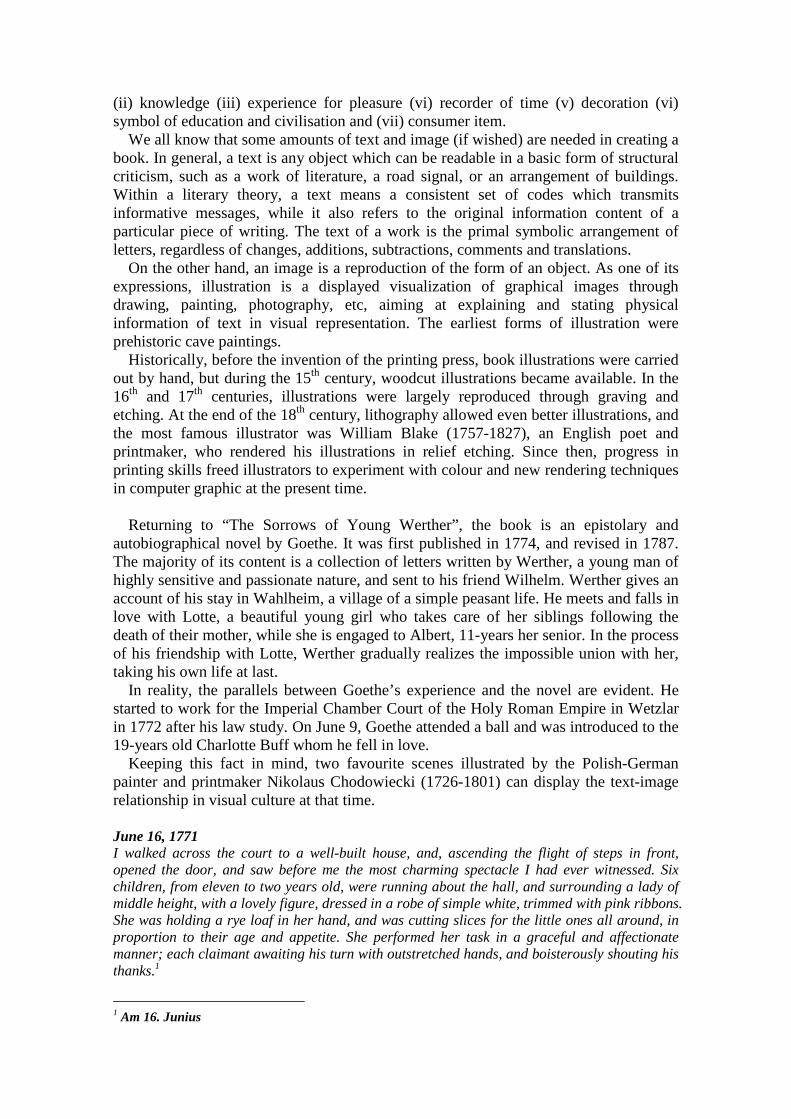
The original book, “die Leidenschaft des jungen Werthers” (1774), and two illustrations by Chodowiecki ASSESSMENT OF 123 ILLUSTRATIONS An attempt of the text-image relationship was done to 123 cover illustrations of the German version, “The Sorrows of Young Werther” from amazon.de (19 January, 2010), a global book supplier through internet. The finding shows that the 123 are made in various formats, such as book, dictionary, CD, cassette, e-book, and others. For example, 50 of the 66 portraits are in a book format: 36 depict Werther (including Goethe); black and drawing are preferred, following original texts of “The Sorrows of Young Werther”.
Of nature, seven of the eight is in a book format: three in a tree motif; and four black; half of them in photography. Of abstract illustrations, 35 of the 49 are in the book
Ich ging durch den Hof nach dem wohlgebauten Hause, und da ich die vorliegenden Treppen hinaufgestiegen war und in die Tűr trat, fiel mir das reizendste Schauspiel in die Augen, das ich je gesehen habe. In dem Vorsaale wimmelten sechs Kinder, von eilf zu zwei Jahren, um ein Mädchen von schöner Gestalt, mittlerer Größe, die ein simples weißes Kleid, mit blaßroten Schleifen an Arm und Brust, anhatte. Sie hilet ein schwarzes Brot und schnitt ihren Kleinen ringsherum jedem sein Stück nach Proportion ihres Alters und Appetits ab, gabs jedem mit solcher Freundlichkeit, und jedes rufte so ungekünstelt sein: Danke! (German texts- Insel taschenbuch 2284, Erste Auflage 1998; English texts - http://www.ibiblio.org/gutenberg/etext03) 2 Am 20.Dezember Die ganze Gewalt dieser Worte fiel über den Unglücklichen. Er warf sich vor Lotten nieder in der vollsten Verzweiflung, faßste ihre Hände, drückte sie in seine Augen, wider seine Stirn, und ihr schien eine Ahnung seines schrecklichen Vorhabens durch die Seele zu fliegen. Ihre Sinnen verwirrten sich, sie drückte seine Hände, drückte sie wider ihre Brust, neigte sich mit einer wehmütigen Bewegung zu ihm, und ihre glühenden Wangen berührten sich. Die Welt verging ihnen. Er schlang seine Arme um sie her, preßte sie an seine Brust und deckte ihre zitternden, stammelnden Lippen mit wütenen Küssen. – Werther! Rief sie mit erstickter Stimme, sich abwendend, Werther! – und drückte mit schwacher Hand seine Brust von der ihrigen; - Werther! Rief sie mit dem gefaßten Tone des edelsten Gefühles. – Er widerstand nicht, ließ sie aus seinen Armen und warf sich unsinnig vor sie hin. Sie riß sich auf, und in ängstlicher Verwirrung, bebend zwischen Liebe und Zorn, sagte sie: Das ist das letzte Mal! Werther! Sie sehn mich nicht wieder.
format; no illustration and blue are in the fist place, associating the colour of Werther. As a whole, the book format, no illustration, and black seem to be a favourite.
PORTRAIT
Scenes from the book
28 book: 24
cd: 3
cassette:1
werther: 25
lotte: 20
others
black/gray: 22
blue: 13, beige: 8, white-red: 7,
yellow-orange- green: 6, others
drawing: 16
painting: 14
follow the book
texts
Goethe himself or other related person in reality
21 book: 16
cd: 3
cassette:
2
Goethe: 19
charlotte: 1
minna: 1
white: 12, yellow: 13
green: 10, red: 7, blue: 6,
black/gray: 5, orange: 3, others
drawing: 12
painting: 9
computer: 6
middle age
goethe
Other portrait images
17 book: 10
cd: 6
cassette:
1
werther: 11
others
black/gray: 11
brown: 8, white-red-blue: 4,
green:3, yellow-orange-violet:
2, others
photo: 13
painting: 3
drawing: 1
follow the book
texts
PORTRAIT Sum
66 book: 50 werther: 36 black/gray: 38, blue: 23,
yellow: 21
drawing: 29 follow the book
texts
NATURE
8 book: 7 tree: 3
flower: 2
others
black/gray-white: 4, blue: 3,
red-green: 2, yellow-orange: 1,
others
photo: 4
drawing: 3
painting: 1
follow the book
texts
ABSTRACT
49 book: 35
cd: 5
cassette: 1
ebook: 8
none: 43
object: 6
others
blue: 24, red: 16, white: 15,
black/gray-yellow: 13 , orange:
8, green: 6, othres
none: 34
drawing: 3
painting:
none: 41
FINAL SUM
123 book: 92 none: 43
werther: 36
black/gray: 55, blue: 50,
yellow: 35
drawing: 35,
none: 34
follow the book
texts
OBJECTIVE AND SUBJECTIVE ATTITUDES OF THE MIND According to Hatton (1925) in his “Principle of Decoration”, the term “objective” is that the state of mind is preoccupied with things around, trying to detect and understand them, while by “subjective”, our thoughts predominate in our mental operations, thus things except ourselves are conceived not as things to get known but as reflections of what we knew. These opposing attitudes of the mind create two different ways of seeing, because our eye is the servant of our mind. Consequently, the objective attitude produces the concentrative way of seeing, whose eye seeks for new details to know them. And the subjective attitude brings the causal glimpse - wandering eye. The subjective eye finds clear marks of identity to enable to recognize what it already knew.
The present-day view of decoration is subjective, and becomes more popular. When our wandering eye comes with the subjective attitude of the mind, and is proper to decorative art, it can be seen in places where the subjective was flourished. In this regard, people in the East are more subjective in thought and decorative in art than those in the West.
A few considerations to decoration in terms of the wandering eye are as follows. (i) The subjective mind is not meticulous about the real colour, so it does not offend to colours, if they are chosen for beauty. In symbolism, they stimulate deception. (ii) As forms require of recognition only, they must be clear and simple, and are appropriate with certain identification, because the eye cannot attend to all details in confusion. (iii) The eye, not necessary to observe things carefully, is liberated to gratify in the

enjoyment of melody. (iv) Exactness is not needed, thus forms can be agreeably made to their decorative situation.
On the contrary, the characteristic of objective representation lies in numerous facts in impartiality, allowing the spectator’s freedom in choice. The work is full of information, an encyclopaedia. And the eye tends to remain longer, and strongly marked attractions can be drawn away.
In design element, the most powerful tool of leading the eye about under such situations is lines. And illustrations as decoration consist of objective renderings, dominated by bold lines.
A German (Klett 2008) and French (Flammarion1968) version
For example, Werther’s suicide scenes show the use of lines in decoration, as well as a suggestion for the nation’s mentality through them. The German book cover (left) poses a gun on Werther’s head with his protest before a suicide action. The scene was put inside a squared frame, surrounded by straight and vertical lines, but the direction of his action indicates with upward diagonal lines. The layout of the cover is rigid, underlined by grotesque typography, and the use of the spiritual violet colour calls attention to our mind in a philosophical manner. On the French book cover (right), Werther puts a gun on his tongue, thus no scream can be made. Occupying half of the cover, his image evokes us a romantic, emotional and temperamental atmosphere. Although a suicide is a lonely liberation from the indifferent world, it transcends to eternity through the infinitive blue colour. If we regard “blue” as Werther and “yellow” as Lotte, “green” can be their re-union, because it is a mixing of the two colours. Among melodically curved lines, downward ones expose Werther’s agony powerfully. Moreover illustrations below from different countries can show objective or subject attitudes in diversity.
German1-4, English 5, French 6, Korean 7 LINE AS A DESIGN ELEMENT Principles of design (unity-variety, balance, emphasis, rhythm, proportion, size) show the way in which the elements are aesthetically combined, in order to arouse a sensory response, while elements (line, value, shape, form, space, texture, colour), the raw

materials of works of design, are arranged to produce order in a composition, supported by principles. I have two specific reasons to use design elements and principles as indicator for analyzing the text-image relationship. First, they are the basic elements in decorative arts, discussed by Greek, Roman, medieval, Renaissance and modern philosophers. Without a study of Greek we could not know the meaning of great design, of harmonious lines and masses, of proportion and composition, of thoughtful correctness in figure-drawing, of the pleasant and proper disposition of the materials or motifs of an ornament (Collingwood 1883: 222-4). In his “Grammar of Ornament”, the English architect Owen Jones ((1856, 2001:185) put forward geometry as general principles for decoration: ‘All ornament should be based upon a geometrical construction’, praising Alhambra built by the Moors. ‘Every ornament contains a grammar in itself. Every principle which we can derive from the study of the ornamental art of any other people is not only ever present here, but was by the Moors more universally and truly obeyed’. Second, I am specialised on visual communication, thus using design elements can provide the best and comprehensive information for my paper, propelling a new method in research. At any rate, some basic information on line needs to be introduced for further analysis on the text-image relationship in “The Sorrows of Young Werther”.
Line consists of an extended point, and its only feature is length. It connects other visual elements, describes edges, forms shapes, and articulates the surfaces of planes. According to Ching (1996), line has only one dimension in theory, but it has visible thickness. The character of line - bold or tentative, graceful or ragged - is decided by human perception of its length-width proportion, its outline, and its degree of continuity. Arnheim (1974) also claims that line is a creation of the human sense of sight, constructed for simplicity, borrowing the French Romantic artist Eugène Delacroix’s (1798-1863) idea of the straight line as ‘never occurs in nature; they exist only in the brain of man’. For Krommenhoek (1975), a line suggests a direction, either one way or in diverse ways, despite possessing no actual movement,
Lines may be divided into straight or curved. A straight line is defined as ‘the shortest distance between two given points’. It can be vertical, horizontal or diagonal, and appears stronger and more direct than a curved line. A vertical line is structural, upward, and the strongest, expressing a state of equilibrium with the force of gravity. Stoops (1983) and Alexander (1965) add that a horizontal line represents stability on the ground plane, creating geometric shapes, whereas contour lines decide space, and repeated lines create texture. A diagonal line indicates action, due to its disturbing effect. In Gothic architecture, vertical lines of columns glorify God’s existence.
This upward surge of lines, characteristic of Gothic art, was an element of beauty which at the same time responded to a profoundly appealing feature of medieval mysticism (Aubert 1959:31). In fact, in classic Greek art, the term “beautiful” was bound up with the idea of
organic undulating lines, and logarithmic spirals enhance the dynamism of the curve. Referring to a curved line in particular, the English painter and social critic William Hogarth (1679-1764) introduced the aesthetic notion of his precise serpentine line as “the line of beauty”. In his “The Analysis of Beauty”, Hogarth (1753) considered beautifying lines as the ideal sign of artistic craftsmanship. The term “the line of

beauty” describes S-shaped curved lines (serpentine lines), which appeared within an object, either the border line of an object or a virtual border line between objects. As a birth of Rococo, it is an important part of Hogarth’s theory of aesthetics, because according to him, S-shaped curved lines represent vigour and action, stimulating the viewer’s attention, while straight lines signify death and stagnation. However, the S-shaped line should be understood in a context that a composition is made by using many types of line in various relations to each other without destroying its simplicity.
Part of “Sign painter from Beer Street” (1751) by William Hogarth: see the S-shaped line of the painter Furthermore, the Austrian art historian Alois Riegl (1893) in his “Stilfragen”
(Problems of Style) maintained that line was the primary tool of the artist, and decorative art was the application of line to solve ornamental problems. As a member of the Vienna school of art history, he practised formalism, joining in establishment of art history as an academic discipline. With an idea that a work’s aesthetic value is decided by its form, formalism underlines design elements rather than context and content.
In symbolism, lines are associated with the ideas of praise, aspiration, and ascension. Vertical lines increase this feeling, but downward bent lines convey despair. Crane (1900) states that a line is a most sensitive and vigorous speech for all purposes as a language. Line is used as a vehicle to record nature and human features, appealing to human emotions and evoking sympathies with the life of nature and humanity.
WERTHER’S “SUICIDE” SCENE For the text-image relationship, four illustrations of Werther’s suicide scene - the climax of the book - are chosen. December 20- After Eleven How warmly have I been attached to you, Charlotte! Since the first hour I saw you, how impossible have I found it to leave you. This ribbon must be buried with me: it was a present from you on my birthday. How confused it all appears! Little did I then think that I should journey this road. But peace! I pray you, peace! “They are loaded – the clock strikes twelve. I say amen. Charlotte, Charlotte! Farewell, farwell!” A neighbour saw the flash, and heard the report of the pistol; but, as everything remained quite, he thought nor more of it. In the morning, at six o’clock, the servant went into Werther’s room with a candle. He found his master stretched upon the floor, weltering in his blood, and the pistol at his side. He called, he took him in his arms, but received no answer. Life was not yet quite extinct.3
3 Am 20. Dezember, nach Eilfe. Die Lieben! Sie wimmeln um mich. Ach wie ich mich an dich schloß! Seit dem ersten Augenblicke dich nicht lassen konnte! - Diese Schleife soll mit mir begraben werden. An meinem Geburtstageschenktest du mir sie! Wie ich das alles verschlang! – -Ach ich dachte nicht, daß mich der Weg hierher führen sollte! - - Sei ruhig! Ich bitte dich, sei ruhig! – Sie sind geladen – Es schlägt zwölfe! So sei des denn! - Lotte! Lotte, lebe wohl! Lebe wohl! – Ein Nachbar sah den Blitz vom Pulver und hörte den Schuß fallen; da aber alles stille blieb, achtete er nicht weiter drauf. Morgens um sechse tritt der Bediente herein mit dem Lichte. Er
straight-
diagonal
lines
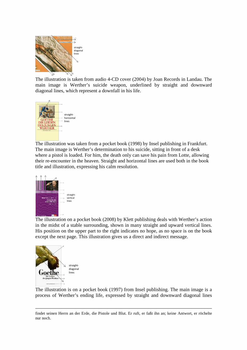
The illustration is taken from audio 4-CD cover (2004) by Joan Records in Landau. The main image is Werther’s suicide weapon, underlined by straight and downward diagonal lines, which represent a downfall in his life.
straight-
horizontal
lines
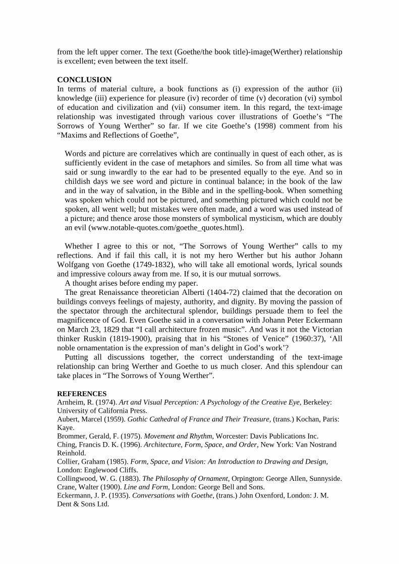
The illustration was taken from a pocket book (1998) by Insel publishing in Frankfurt. The main image is Werther’s determination to his suicide, sitting in front of a desk where a pistol is loaded. For him, the death only can save his pain from Lotte, allowing their re-encounter in the heaven. Straight and horizontal lines are used both in the book title and illustration, expressing his calm resolution.
straight-
vertical
lines
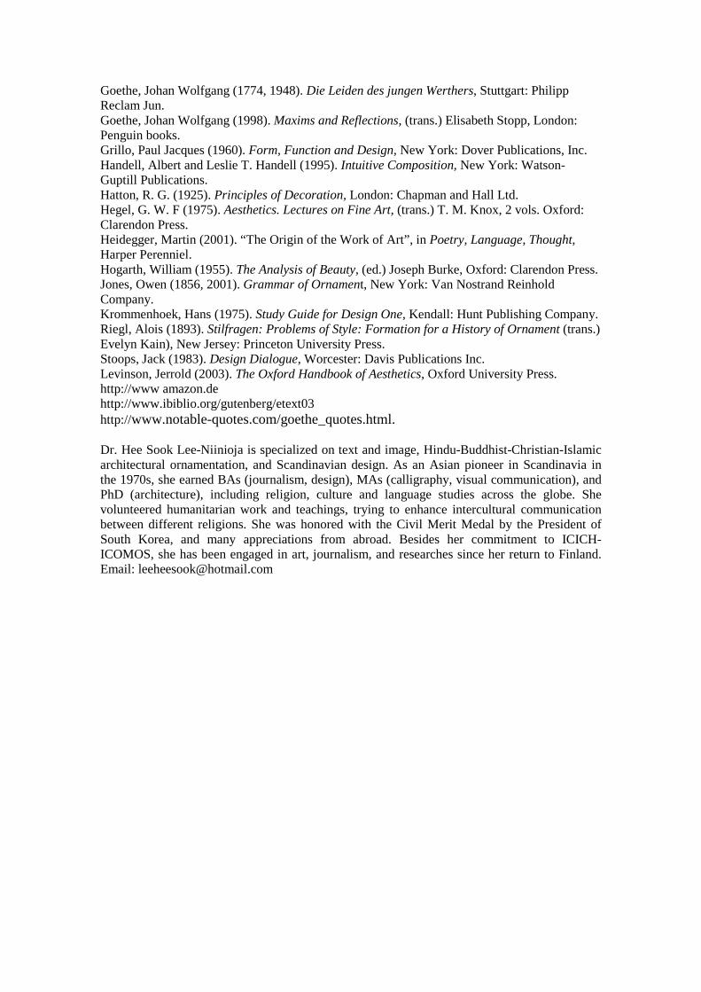
The illustration on a pocket book (2008) by Klett publishing deals with Werther’s action in the midst of a stable surrounding, shown in many straight and upward vertical lines. His position on the upper part to the right indicates no hope, as no space is on the book except the next page. This illustration gives us a direct and indirect message.
straight-
diagonal
lines
The illustration is on a pocket book (1997) from Insel publishing. The main image is a process of Werther’s ending life, expressed by straight and downward diagonal lines
findet seinen Herrn an der Erde, die Pistole und Blut. Er ruft, er faßt ihn an; keine Antwort, er röchelte nur noch.
from the left upper corner. The text (Goethe/the book title)-image(Werther) relationship is excellent; even between the text itself. CONCLUSION In terms of material culture, a book functions as (i) expression of the author (ii) knowledge (iii) experience for pleasure (iv) recorder of time (v) decoration (vi) symbol of education and civilization and (vii) consumer item. In this regard, the text-image relationship was investigated through various cover illustrations of Goethe’s “The Sorrows of Young Werther” so far. If we cite Goethe’s (1998) comment from his “Maxims and Reflections of Goethe”,
Words and picture are correlatives which are continually in quest of each other, as is sufficiently evident in the case of metaphors and similes. So from all time what was said or sung inwardly to the ear had to be presented equally to the eye. And so in childish days we see word and picture in continual balance; in the book of the law and in the way of salvation, in the Bible and in the spelling-book. When something was spoken which could not be pictured, and something pictured which could not be spoken, all went well; but mistakes were often made, and a word was used instead of a picture; and thence arose those monsters of symbolical mysticism, which are doubly an evil (www.notable-quotes.com/goethe_quotes.html). Whether I agree to this or not, “The Sorrows of Young Werther” calls to my
reflections. And if fail this call, it is not my hero Werther but his author Johann Wolfgang von Goethe (1749-1832), who will take all emotional words, lyrical sounds and impressive colours away from me. If so, it is our mutual sorrows.
A thought arises before ending my paper. The great Renaissance theoretician Alberti (1404-72) claimed that the decoration on
buildings conveys feelings of majesty, authority, and dignity. By moving the passion of the spectator through the architectural splendor, buildings persuade them to feel the magnificence of God. Even Goethe said in a conversation with Johann Peter Eckermann on March 23, 1829 that “I call architecture frozen music”. And was it not the Victorian thinker Ruskin (1819-1900), praising that in his “Stones of Venice” (1960:37), ‘All noble ornamentation is the expression of man’s delight in God’s work’?
Putting all discussions together, the correct understanding of the text-image relationship can bring Werther and Goethe to us much closer. And this splendour can take places in “The Sorrows of Young Werther”.
REFERENCES Arnheim, R. (1974). Art and Visual Perception: A Psychology of the Creative Eye, Berkeley: University of California Press. Aubert, Marcel (1959). Gothic Cathedral of France and Their Treasure, (trans.) Kochan, Paris: Kaye. Brommer, Gerald, F. (1975). Movement and Rhythm, Worcester: Davis Publications Inc. Ching, Francis D. K. (1996). Architecture, Form, Space, and Order, New York: Van Nostrand Reinhold. Collier, Graham (1985). Form, Space, and Vision: An Introduction to Drawing and Design, London: Englewood Cliffs. Collingwood, W. G. (1883). The Philosophy of Ornament, Orpington: George Allen, Sunnyside. Crane, Walter (1900). Line and Form, London: George Bell and Sons. Eckermann, J. P. (1935). Conversations with Goethe, (trans.) John Oxenford, London: J. M. Dent & Sons Ltd.
Goethe, Johan Wolfgang (1774, 1948). Die Leiden des jungen Werthers, Stuttgart: Philipp Reclam Jun. Goethe, Johan Wolfgang (1998). Maxims and Reflections, (trans.) Elisabeth Stopp, London: Penguin books. Grillo, Paul Jacques (1960). Form, Function and Design, New York: Dover Publications, Inc. Handell, Albert and Leslie T. Handell (1995). Intuitive Composition, New York: Watson-Guptill Publications. Hatton, R. G. (1925). Principles of Decoration, London: Chapman and Hall Ltd. Hegel, G. W. F (1975). Aesthetics. Lectures on Fine Art, (trans.) T. M. Knox, 2 vols. Oxford: Clarendon Press. Heidegger, Martin (2001). “The Origin of the Work of Art”, in Poetry, Language, Thought, Harper Perenniel. Hogarth, William (1955). The Analysis of Beauty, (ed.) Joseph Burke, Oxford: Clarendon Press. Jones, Owen (1856, 2001). Grammar of Ornament, New York: Van Nostrand Reinhold Company. Krommenhoek, Hans (1975). Study Guide for Design One, Kendall: Hunt Publishing Company. Riegl, Alois (1893). Stilfragen: Problems of Style: Formation for a History of Ornament (trans.) Evelyn Kain), New Jersey: Princeton University Press. Stoops, Jack (1983). Design Dialogue, Worcester: Davis Publications Inc. Levinson, Jerrold (2003). The Oxford Handbook of Aesthetics, Oxford University Press. http://www amazon.de http://www.ibiblio.org/gutenberg/etext03 http://www.notable-quotes.com/goethe_quotes.html.
Dr. Hee Sook Lee-Niinioja is specialized on text and image, Hindu-Buddhist-Christian-Islamic architectural ornamentation, and Scandinavian design. As an Asian pioneer in Scandinavia in the 1970s, she earned BAs (journalism, design), MAs (calligraphy, visual communication), and PhD (architecture), including religion, culture and language studies across the globe. She volunteered humanitarian work and teachings, trying to enhance intercultural communication between different religions. She was honored with the Civil Merit Medal by the President of South Korea, and many appreciations from abroad. Besides her commitment to ICICH-ICOMOS, she has been engaged in art, journalism, and researches since her return to Finland. Email: [email protected]