Electronic cigarette power affects count concentration and ...
Upload
khangminh22Category
view
0download
0
Nature as Reassurance - The Menthol Cigarette
The Safe Cigarette: Visual strategies of reassurance in American advertisements for cigarettes, 1945-1964.
Number: 1 2 3 4 5 6 7 8
Practice-Based Ph.D. Jackie Batey www.thesafecigarette.blogspot.com

The Safe Cigarette
The Safe Cigarette: Visual strategies of reassurance in American advertisements for cigarettes, 1945-1964.
Volume Number: 1 2 3 4 5 6 7 8
Practice-Based Ph.D. Jackie Batey www.thesafecigarette.blogspot.com
The Safe Cigarette
One: The Safe Cigarette
Two: The Cigarette
Three: The Need to Reassure
Four: Personification: Who Should We Trust ?
Five: Nature as Reassurance - The Menthol Cigarette
Six: Technology as Reassurance - The Filter-Tip
Seven: Conclusion
Eight: Glossary, References and Appendices
5

Five: Contents
Taste Tests and the Cigarette . . . . . . . . . . . . . . . . . . . . . . . . . . . . . . . . . . . . . . . . . . . . . . . . . 5:01
The 30-Day Test . . . . . . . . . . . . . . . . . . . . . . . . . . . . . . . . . . . . . . . . . . . . . . . . . . . . . 5:02
The Blindfold Test - Old Gold . . . . . . . . . . . . . . . . . . . . . . . . . . . . . . . . . . . . . . . . . . . . 5:02
Smell and the Cigarette - L&M . . . . . . . . . . . . . . . . . . . . . . . . . . . . . . . . . . . . . . . . . . 5:03
Believe in Yourself ! . . . . . . . . . . . . . . . . . . . . . . . . . . . . . . . . . . . . . . . . . . . . . . . . . . . 5:03
Menthol and Mentholated Brands . . . . . . . . . . . . . . . . . . . . . . . . . . . . . . . . . . . . . . . . . . . . . . 5:04
Refreshing Mint . . . . . . . . . . . . . . . . . . . . . . . . . . . . . . . . . . . . . . . . . . . . . . . . . . . . . . . . . . . . 5:05
Welcome to Salem Country . . . . . . . . . . . . . . . . . . . . . . . . . . . . . . . . . . . . . . . . . . . . . . . . . . . 5:06
Figures in a Salem Country Landscape . . . . . . . . . . . . . . . . . . . . . . . . . . . . . . . . . . . . . 5:06
A Landscape for Figures . . . . . . . . . . . . . . . . . . . . . . . . . . . . . . . . . . . . . . . . . . . . . . . 5:08
The Sierra Club Landscape . . . . . . . . . . . . . . . . . . . . . . . . . . . . . . . . . . . . . . . . . . . . . . 5:10
Newport Coast . . . . . . . . . . . . . . . . . . . . . . . . . . . . . . . . . . . . . . . . . . . . . . . . . . . . . . 5:10
Anxiety Hidden in the Landscape - A Larger Perspective . . . . . . . . . . . . . . . . . . . . . . . . . . . . . . 5:11
For When Nature is Not Enough . . . . . . . . . . . . . . . . . . . . . . . . . . . . . . . . . . . . . . . . . . . . . . . . 5:13
Endnotes to Fascicle Five . . . . . . . . . . . . . . . . . . . . . . . . . . . . . . . . . . . . . . . . . . . . . . . . . . 5:14

Five: Nature as Reassurance - The Menthol Cigarette
“Trust me, nature is health; for health is good, and nature cannot work ill. As little can she work error. Get nature, and you
get well. Now, I repeat, this medicine is nature’s own.” Herman Melville, The Confidence-Man: His Masquerade, Oxford
University Press, Oxford, 1984 [1857], p.106.
For many years before 1950 cigarette manufacturers had added substances other than tobacco leaves to
cigarettes, such as, rum, vanilla and chocolate. Substances were also added to promote the appropriate
level of combustion. Others were added specifically to line the consumer’s throat during smoking. The
drive to mentholated cigarettes started during the health scares of the ’fifties although they had been on
sale well before. Mentholated and filtered brands came to dominate the cigarette market by the end of
the decade each using its own specific strategies. Mentholated brands today account for a quarter of all
cigarettes smoked.
I now want to account for the introduction of the Menthol cigarette. What brought about the
addition of this substance? What was wrong with the flavour of a ‘regular’ cigarette? The menthol
solution cannot be seen in isolation but in an advertising culture that had already recognised the
importance of “Taste” in the smoking of a cigarette.
Taste Tests and the Cigarette
“In 1922 Dr.John B.Watson, at that time employed by the J.Walter Thompson & Co., determined by clinical tests that
smokers have little or no ability to distinguish one cigarette from another by its taste.” Anon, “Philip Morris & Co.”
FORTUNE, March 1936, p.106.
This did not inhibit the manufacturers from establishing and promoting an individual tobacco ‘taste’ for
each brand. With the notion of the ‘taste-test’ being fully exploited in the advertisements. It was
suggested that the discerning consumer should be able to distinguish between the brands in order to
recognise ‘quality’, with visual references to freshness, flavour, mildness and taste.1
The ‘Taste Test’ was a strategy whereby the consumer was encouraged to smoke one brand in
direct comparison with another. This was a popular method in encouraging brand switching. ‘Taste’ is a
difficult concept to visualise resorting to the consumer’s reaction to taste rather than the taste itself;
smiling faces for pleasant tastes and frowns for disagreeable ones.2
If the Taste test was largely
fraudulent, we now look at the viusal devices to perpetrate it.
5:01

n Fig 5:01 Camel Advertisement, SEP, March 1949
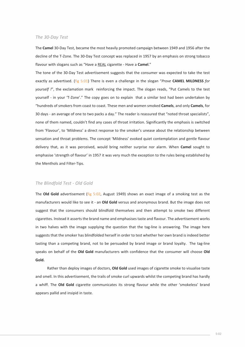
The 30-Day Test
The Camel 30-Day Test, became the most heavily promoted campaign between 1949 and 1956 after the
decline of the T-Zone. The 30-Day Test concept was replaced in 1957 by an emphasis on strong tobacco
flavour with slogans such as “Have a REAL cigarette - Have a Camel.”
The tone of the 30-Day Test advertisement suggests that the consumer was expected to take the test
exactly as advertised. (fig 5:01) There is even a challenge in the slogan “Prove CAMEL MILDNESS for
yourself !”, the exclamation mark reinforcing the impact. The slogan reads, “Put Camels to the test
yourself - in your ‘T-Zone’.” The copy goes on to explain that a similar test had been undertaken by
“hundreds of smokers from coast to coast. These men and women smoked Camels, and only Camels, for
30 days - an average of one to two packs a day.” The reader is reassured that “noted throat specialists”,
none of them named, couldn’t find any cases of throat irritation. Significantly the emphasis is switched
from ‘Flavour’, to ‘Mildness’ a direct response to the smoker’s unease about the relationship between
sensation and throat problems. The concept ‘Mildness’ evoked quiet contemplation and gentle flavour
delivery that, as it was perceived, would bring neither surprise nor alarm. When Camel sought to
emphasise ‘strength of flavour’ in 1957 it was very much the exception to the rules being established by
the Menthols and Filter-Tips.
The Blindfold Test - Old Gold
The Old Gold advertisement (fig 5:02, August 1949) shows an exact image of a smoking test as the
manufacturers would like to see it - an Old Gold versus and anonymous brand. But the image does not
suggest that the consumers should blindfold themselves and then attempt to smoke two different
cigarettes. Instead it asserts the brand name and emphasises taste and flavour. The advertisement works
in two halves with the image supplying the question that the tag-line is answering. The image here
suggests that the smoker has blindfolded herself in order to test whether her own brand is indeed better
tasting than a competing brand, not to be persuaded by brand image or brand loyalty. The tag-line
speaks on behalf of the Old Gold manufacturers with confidence that the consumer will choose Old
Gold.
Rather than deploy images of doctors, Old Gold used images of cigarette smoke to visualise taste
and smell. In this advertisement, the trails of smoke curl upwards whilst the competing brand has hardly
a whiff. The Old Gold cigarette communicates its strong flavour while the other ‘smokeless’ brand
appears pallid and insipid in taste.
5:02

n Fig 5:02 Old Gold Advertisement, SEP, August 1949

Smell and the Cigarette - L&M
The L&M filter cigarette campaign during the ’sixties regularly used smell as a visual metaphor for the
taste of tobacco (fig 5:03) in an attempt to overcome the consumer’s notion that filters made a cigarette
taste awful. The cigarette smoke winds its way to the female bather’s nose prompting her to close her
eyes in satisfaction and wring her sunglasses in delight. The L&M advertisements of this period play on
this theme with the male’s cigarette smell attracting the female. She hardly ever looks at the cigarette
smoker, just dreams inwardly, her eyes shut in ecstasy. The smoke has been air-brushed onto the
photograph in an undulating curve, unlike the fierce whirls of smoke found in Old Gold advertisements.
L&M suggests that their cigarettes are mild since their smoke traces smooth patterns across the image.
L&M stress flavour as opposed to mildness in the strap line “L&M has found the secret that UNLOCKS
FLAVOR in a filter cigarette”.
During 1950, Chesterfield implied that merely smelling the packet was enough to recognise a
quality tobacco blend (fig 5:04), it was however, an experienced tobacco farmer that prompted the
consumer into becoming their own ‘cigarette expert’ and explained the techniques for doing so. Smelling
the packet, unfortunately looked less than glamorous in sequences of stills, and the concept was short-
lived.
Believe in Yourself !
The Philip Morris Taste Test, from May 1951, (fig 5:05) places responsibility and trust back with the
consumer, even asserting that the smoker should “BELIEVE IN YOURSELF !”. The image, in sepia tone, is
of a female smoker who has just inhaled from the cigarette she is holding loosely in her left hand. She
appears to be considering the taste and is just beginning to exhale through her nostrils while still
managing to smile gently. The Taste Test instructions later clarify exactly what she is doing. The copy
suggests “Don’t test one brand alone... compare them all !” This has the effect of implying that one of
the other competing brand’s Taste Tests, tell the smoker to smoke their brand only, e.g. Camel’s 30-Day
Taste Test. Philip Morris again emphasise mildness and less-irritation rather than flavour. The
explanation of how to enact the test appears as two numbered instructions. The instructions tell the
consumer how to smoke and then make comparisons. “NOTICE THAT PHILIP MORRIS IS DEFINITELY LESS
IRRITATING, DEFINITELY MILDER !” The smoke is shown trailing out through the woman’s nose as
described in the test rules. Smoke leaving the female mouth draws the viewers attention to the partially
open mouth, suggesting the act of smoking as a quasi-sexual activity3
in a powerful “erogenous zone”.4
“Throughout vertebrate sexual behaviour there is such a close tie-up between oral eroticism and genital stimulation that
oral activity of any sort must be accepted by the scientist as a biologically normal aspect of sexuality. Its tremendous
suppression in the human animal must be taken to be the outcome of cultural developments.” Kinsey, Pomeroy and Clyde,
5:03

n Fig 5:03 Detail, L&M Advertisement, SEP, August 1960
n Fig 5:04 Detail, Chesterfield Advertisement, SEP, May 1950
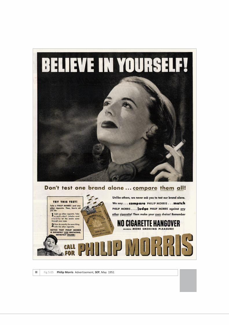
n Fig 5:05 Philip Morris Advertisement, SEP, May 1951

Chapter 14, “Masturbation”, Sexual Behaviour in the Human Male, W.B.Saunders, Philadelphia and London, 1948, p.511.
However, smoke leaving the nostrils draws attention to the nose rather than the mouth, even though the
red lipstick is printed tonally very dark when converted to monotone. The nose, as seen earlier, can be
associated with blocked sinuses and sneezing whereas the mouth is associated with more desirable
images such as kissing.
This memorable advertisement forms one of the elements of James Rosenquist’s print “The Light
That Won’t Fail, I” (1972), (fig 5:06).5
Where the woman’s face is removed from pleasure at consumption
to a sort of idealistic stare at the unknown. Rosenquist combines the face with eccentric domestic
objects, a paradox of consumerism and vision. Rosenquist was a commercial artist during the ’fifties,
painting billboards for the General Outdoor Advertising Company, and in Times Square, New York. The
two main streams of smoke from each nostril are still visible but the body of the smoke instead of fading
away, as in the advertisement, has intensified into a curling mass. Many artists who have used
advertising images as the basis of their work6
have challenged the visual conventions of the raw material,
making their works a useful source of visual heresy, here exploiting a weight and dynamic of smoke
inconceivable in the cigarette advertising of the day.7
Other brands were quickly retreating from ‘flavor’ into ‘mildness’. Mentholated cigarettes
however could make a claim to mildness while, in emphasising the menthol additive, reinstating flavour.
With a wide range of possible flavours available, what made menthol additives so attractive to the
Tobacco Companies?
Menthol and Mentholated Brands
Menthol cigarettes were introduced in the early ‘twenties by Lloyd ‘Spud’ Hughes of the Block Brothers
Tobacco Co. The menthol was mixed into the tobacco by hand, and branded as Spud.8
Axton Fisher Tobacco Co. bought the recipe from ‘Spud’ in 1926. They applied the menthol directly to the
tobacco using jet spray and re-spray of the whirling mixture, saturating it evenly. Menthol is a substance
that is not readily visualised, neither a plant or a mineral although ‘menthol’ is a familiar term widely
used in mouthwash, toothpaste, sweets, cigarettes, and many other products.
Menthol is in fact a colourless crystalline needle that exhibits a typically mint fragrance. The main
suppliers of natural menthol are Chinese peppermint growers who freeze oils that contain up to 90%
Menthol. This main component then crystallises, is separated, dried and then added to the cigarette
tobacco.9
Menthol can almost completely vaporize at room temperature, this volatility creates a major
production problem. Liggett & Myers experimented with a brand called 10 by 10 - the pack contained
5:04

had half menthol and half non-menthol. It was found that the menthol moved or equilibrated making all
the cigarettes in the pack taste the same. In stronger concentrates menthol can act as a natural antiseptic
and pain killer, adding a numbing and cooling effect on the mouth and throat.10
A study done by Philip Morris' overseas laboratory for biological studies,11
(INBIFO) reveals, that
menthol enhances the sensory effect of nicotine. "It was found that menthol increased 'impact' for the
low nicotine delivery cigarette...as a function of the menthol content ... It was concluded that menthol
has a pronounced effect12
on nicotine-derived 'impact.'"
Menthol in cigarettes has never actually been officially sanctioned. Although the U.S. Food & Drug
Administration (FDA) regulates menthol in products other than cigarettes as ‘GRAS’ (Generally
Recognised As Safe) the FDA however does not regulate the ingredients in cigarettes and so nothing is
known of the properties of menthol when it is mixed with tobacco and ignited. The only research
available has been undertaken by the Tobacco Companies. Philip Morris’ own research documents, now
mostly publicly available, suggest that menthol levels directly influence the reaction and absorption of
nicotine.13
October 1998 saw litigation against the Tobacco Companies regarding the risks associated
with smoking mentholated brands.
How was this unfamiliar chemical to be visualised as a desirable addition?
How was mint flavouring to be associated with freshness and coolness?
Refreshing Mint
Spearmint and Peppermint flavouring has long been associated with coolness. Confectionery and
toothpaste manufacturers were quick to identify the cooling, numbing sensation of mint with mouth
freshness and therefore cleanliness of breath. The strategy of showing the ‘offense’ was used heavily.
Fig 5:07 is an advertisement from June 1959 for PEPOMINT Life Savers and typical of the advertiser’s art-
work repertoire of ‘mintyness’. Images of water remind the consumer of thirst and the refreshment of
clear cold water. The water is vigorously painted with emphasis on fragmented surges. The weight of the
bucket can easily be imagined and the sound can almost be heard - this is nature’s own supply. The word
‘refreshment’ had given positive results when tested on potential consumers of drinks, but what did
refreshment look like? Al Whitman from Campbell-Mithun, the agency charged with making Hamm’s
beer look refreshing described what he wanted, “The problem was to get refreshment off the ground
with something colourful, natural and believable.” The visualisation of refreshment as a natural force
became a dominant theme.14
The next section will explore Salem’s strategies for exploiting the concept
of the ‘natural’ to reassure its smokers.
5:05

n Fig 5:06 James Rosenquist, “The Light That Won’t Fail”, 1972
n Fig 5:07 Life Savers Advertisement, SEP, June 1959

Welcome to Salem Country
KOOL (1932) utilised the cooling effect on the throat by creating Mr.Kool, the smoking penguin. Menthol
is mentioned in the copy but not elaborated upon. By 1935 menthol brands accounted for only a tiny
percentage of a market dominated by the regular brands, Camel, Chesterfield and Lucky Strike. KOOL
was in sixth place and Spud (1927) at seventh (holding less than 3 percent of the market). Between 1934
and 1935 KOOL increased its market share by 10 percent while the regulars kept stable or even lost
market shares.15
It was the introduction of Salem in 1956 that first saw the genuinely successful mentholated
brand, capturing the majority of the menthol market within a few years of its introduction. Salem was
the first mentholated brand to also carry a Filter Tip, giving it two strategies to reassure consumers.
So how did Salem show refreshing mint? What constituted Salem Country?
The figs 5:08 and 5:09. show variations on two Salem cigarette advertisements:
Salem advertisements always featured people photographed in a landscape, Salem Country. In the
manufacturers’ terminology, Salem Country had clear visual characteristics.16
In order to understand the
nature of Salem Country and how it could reassure consumers about the act of smoking, I have digitally
removed the figures from the advertisement, to allow a more detailed study of the chosen surroundings.
• Figs 5:08 and 5:09 show the whole advertisement as it appeared on the magazine page.
• The two smaller images A have been manipulated to remove the slogan, body copy and pack.
• The two smaller images B have been manipulated to leave only the landscape,
The isolated landscape then reveals, how reliant the overall visual strategy was on the particular
landscape in which the smokers were to be set and what was to be gained by the presence of people.
Figures in a Salem Country Landscape
Both images (1961) and (1959) feature a male/female couple aged about 20-30, dressed in summer
clothes, smoking. In both images the man is holding his cigarette to his mouth as if about to inhale
whereas the woman is holding her cigarette away from her mouth as if she is in the process of exhaling.
Occasionally Salem advertisements show solitary figures, perhaps resting or even reading a book. So who
are these Salem people?
The generic Salem couple do not carry picnic hampers or rucksacks, so they are not on a camping holiday
or intending to stay for any length of time. The couple are not carrying coats or wearing appropriate
clothes and shoes for a long walk. The couple appear to be on a day out, perhaps even be on their lunch
break from the office. This cigarette break is a short moment in time that will end with the couple
returning to civilisation. It is clear that we see a sophisticated couple only visiting the territory. This
5:06

n Fig 5:08 Salem Advertisement, SEP, March 1959
n Fig 5:08-A Landscape and figures only n Fig 5:08-B Landscape only

n Fig 5:09 Salem Advertisement, SEP, May 1961
n Fig 5:09-A Landscape and figures only n Fig 5:09-B Landscape only

strategy of reassurance proved successful for R.J.Reynolds Tobacco. It still remains firmly in place in their
advertising of today. The Salem Marketing Strategy Division has a current manual, for overseas retailers
that explains the Salem ‘vision’ in terms of refreshment and consumers.17
“Salem offers true refreshment an energizing, revitalizing experience both physically and mentally. Salem refreshment
ensures that you feel good about the world, about yourself. Because, ultimately, refreshment in taste leads to a refreshed
state of mind. Salem people seek exhilaration in whatever they do: the refreshing taste of Salem provides a cool clarity, a
fresh vision, a heightened sense of achievement at home or the office, in the city or on holiday, with colleagues and
friends.” Salem Marketing Strategy, RJR Tobacco website, March 2001, www.rjrtobacco.com
‘Exhilaration’ is an unusual word to find in this statement since it suggests an opposing dynamic action
and strong emotion. The consumer’s ability to easily accept and digest contrasting statements has been
an identifiable feature in cigarette advertisements, e.g. the strongly flavoured cigarette that is ‘mild’.
This juxtaposition of differing but co-existing perspectives is something I explored in my multiple
‘Menthol Daze’ where images of a placid delightful landscapes sit next to texts that, on closer inspection,
reveal threat in the landscape. The idealisation of the landscape is best imagined by people who do not
live there, by editing out all the unappealing characteristics, such as exposure to the elements and lack
of facilities. Interestingly an early FORTUNE Magazine survey18
of smokers dating from December 1935
found, “...it appears that cigarette smoking among both men and women is most widespread in the cities
between 100 000 and 1 000 000 population.” Did Salem intentionally target the city dweller, with images
of springtime in the countryside, having created a space in the mind for wish fulfilment? The Salem
Marketing Strategy Division goes on to profile their target audience. “Salem sets the ultimate standard
in refreshment amongst its core target of young urban adult menthol smokers...First priority should be
given to outlets with a high young urban profile.”
My Gatefold to this Fascicle “Salem Country” is a collage of elements from Salem advertisements
that explores the concept of imagined landscapes. Most idyllic imaginary places are visualised by the
‘dreamer’ as being free of threat and other unknown people. The people appearing in these images are
together and quite alone, even when they appear in what appears to be a public park. The Gatefold
explores a beauty spot in which the couples all arrive at the same time.
The landscape in which the Salem figures consort is not idealised in the same way as Bert Stein’s
photographs of similar landscapes for De Beers Diamond Mines (fig 5:10). This example (December
1954), two years before the introduction of Salem, is similar in setting and composition to the Salem
advertisements. A young male/female couple enjoy a peaceful moment by a river surrounded by
greenery. The figures are set back into the image appearing rather small in scale, the same scale as
suggested in the Salem advertisements. Close-ups might obscure too much of the scenery. It is not
important who these people are, they are not to be recognised and admired, unlike actors or sporting
personalities. This couple, whose faces are hardly visible, are there to represent the consumer under
5:07

n Fig 5:10 De Beers Diamond Mines advertisement, FOR, December 1954
n Fig 5:11 Cartoon by Whitney Darrow Jr., The New Yorker 1950-1955 Album, Harper & Brothers, N.Y., 1955.
“It’s the way I’ve always dreamed of it – just you and me, a million miles fromeveryone. Then I ruin everything by forgetting my cigarettes.”

ideal conditions. The DeBeers landscape has however been manipulated to achieve a more overtly
romantic setting than Salem Country.19
The rich greens and intense yellows have been intensified in the
print process, the lightest areas of the image are saturated with yellows, giving the effect of strong
sunlight and warmth. Shady spots that are normally cool, due to the colour balance, here seem warm.
The man wears a dark suit and tie while the woman is wearing a white voilé dress with a large hat at her
feet. A path can be just seen in the background. This is an environment tamed by Man to be a ‘safe’
landscape where individuals don’t have to compromise their usual attire. The De Beers advertisement
implicitly recognises the most important selling proposition of the product as that moment when their
promises to each other are recognised in the gift of a ring. De Beers’ series of romanticised landscapes
could well have served as visual inspiration for the Salem campaign that followed it. In fact couples
smoking in the landscape became such a familiar image due to the cigarette advertisements of Salem,
Newport, Oasis and others that it almost looks strange that the DeBeers couple are not smoking
(fig 5:11).
Fig 5:12 is an advertisement for Abdullah Number Seven’s a British brand, it shows a greater
practical sense of the open landscape with hiking boots and camping equipment.
A Landscape for Figures
Salem Country consists mainly of fields and greenery. The images have all the ingredients of a quiet and
restful landscape. When water appears in Salem advertisements it has an unruffled surface and is
seemingly shallow. The greenery is well watered, offering a refuge that is healthy and cool, while the
shade from the trees dapples the ground. Salem Country may also offer a hazy generalisation but it can
also be defined by elements it rejects;
1 no visible wildlife;
2 no other people in the image that could pose a threat;
3 no dangerous natural features, cliff ledges, falling rocks;
4 no adverse weather conditions;
5 no soaring temperatures and;
6 above all, no surprises, no sudden revelations and no new circumstances to which to adjust.
The images attempt to evoke the condition of a perfect springtime. The word “springtime” is mentioned
regularly in the copy and the season is evoked relentlessly even in summer, with captions such as;
“Springtime is unmistakable...in the freshness of the air...” LOOK, March 1959.
“...a Salem cigarette suggests all the fresh and fragrant things of springtime.” LOOK, March 1959.
“Take a puff...it’s springtime! Beneath ancient trees, which have known so many springtimes...” SEP, May 1961.
“A Salem breathes ‘Springtime’ with every puff you take.” SEP, July 1960.
“...the cigarette with springtime freshness in the smoke.” SEP, May 1961.
5:08

n Fig 5:12 Number Seven advertisement, Punch, April 1954
n Fig 5:13 Grant Wood, “Young Corn”, 1931

“A shaded stream in Springtime...so apart from the busy world.” SEP, August 1959.
Springtime is visualised as a fertile season of new growth and fresh leaves, when the weather is not too
hot and not too cold. Salem Country is fixed here in an eternal springtime, hovering just outside ‘real’
time.
Salem advertisements use combinations of three main ingredients, trees, lakes and plains20
to
reassure their customers. In John Cheever’s Bullet Park (1967), Nailles (a salesman), attempts to visualise
a green field as a means of escape from the reality and depression he finds himself in.
“...I was most vulnerable when the noise of traffic woke me at dawn. My best defence, my only defence, was to cover my
head with a pillow and summon up those images that represented for me the excellence and beauty I had lost... I also saw
less frequently and less successfully a river with grassy banks. I guessed these were the Elysian Fields although I found
them difficult to arrive at and at one point it seemed to me that a railroad track or a thruway had destroyed the beauty
of the place.” John Cheever, Bullet Park, Vintage, London, 1967, p.175.
The creation of this intermediary zone placed between wilderness and cultivation, has its counterpart in
American perceptions of landscape of the period. This specific landscape, a temperate green gentle
outdoors, was made popular by the Sierra Club during the ’fifties.21
The flattened glades and limited
perspectives can be distinguished from other available options such as Grant Wood’s regionalistic vision
providing a perfectly manicured world with even just a hint of satire (fig 5:13). Regionalism offered
Americans psychological reassurance and nationalism, often depicting fertile agricultural landscapes,
with a rationale in the presence of rural trades and crafts.22
By the 1950’s Regionalism had lost favour as
a contemporary expression of landscape unless alluded to in a spirit of nostalgia. The ideals of American
landscape transferred from exhibited art works to the publications of popular books on supposed
wildernesses and gentle nature, observed often by Elliot Porter, where only occasionally is there a hint
of nature out of balance (fig 5:14).
A tougher more demanding landscape was provided in the period by the Abstract Expressionists23
who created the “American Sublime” with Arshile Gorky’s biometric evocations of personalised nature,
Mark Rothko’s sombre horizons and Jackson Pollock’s energetic search for self through myth and
gesture.
The Sierra Club Landscape
The publications of the Sierra Club were well known at the time of Salem’s launch and could well have
influenced the campaign. In the post ’45 period, landscapes were expressed most acceptably in
photographic form rather than paintings, in the work of Ansel Adams and the F/64 Group, in Elliot Porter
and Edward Weston, in the colour and vegetation of Anton Bruhl, in the popular anthologies such as ‘This
5:09

Is Your Land’ and the Sierra Club books. The pages of such publications unfold in a gentle rhythm of
carefully modulated landscape often associated with patriotic thoughts and homilies.
During the ’fifties The Sierra Club included in its regular publications internationally promoted
photographic luminaries such as Ansel Adams and Willam A. Garnett.24
The Sierra Club provided, in
books, paperbacks, pamphlets and exhibitions a middle ground of landscapes between the wilderness
and the cultivated. The Sierra Club25
did not promote radical solutions preferring to reassure the
American public of the environmental assets of the Nation. Elliot Porter describes the greenness of the
landscape in the Sierra Club’s photographic publication Forever Wild: The Adirondacks.
“The greens have no precise naming. The buttery green of new spruce shoots, the blackened green of old spruce, the
silvered green of the underside of poplar leaves in a breeze are one with the ruddy green of maples, the metallic green of
raspberry leaves, the sunlit green of new cedar. With them is the feathery green of young tamarak....And what are the
precise names for the velvet green of fresh moss beneath the hemlocks, the paper green of young birch leaves...and the
dusted green of Indian paintbrush flourishing in the meadows?” Elliot Porter and the Adirondack Museum, “Looking South
from the road between Tahawus and Blue Ridge”, Forever Wild: the Adirondacks, Harper & Row, New York and London,
1957, (pages are un-numbered).
The success of the Salem advertisements made other advertisers contemplate the apparent
simplicity of the concept - no babble of voices from expensive celebrities or ‘regular Joes/Janes’, no
intrusive strap lines or earnest endorsements, no alarming health claims or scientific diagrams, no
scattergun approach, but a perfectly moulded single barely realistic countryside made for consumption.
Where before there had been conflict, full of assumed consumer anxieties, now, in Salem Country, there
was calmness and consistency. Perhaps its success as a campaign was the result of the consuming public
applying new visual sophistication as it made the journey from print to screen and from magazine to
television.
One test may be to compare its visual strategies with those of its brand rival Newport.
Newport Coast
P.Lorillard Co, introduced Newport in 1958, also as a mentholated Filter Tip. Newport also realised the
importance of the visual qualities of refreshment. With Salem Country firmly established, Newport had
to use a different catchment of landscape in order to appear different. Newport focused upon water,
swimming pools, lakes and, most commonly, the Ocean. With water the main feature of advertisements,
the prominent colour in all the images was turquoise.
Fig 5:15 (February 1960) emphasises turquoise as the major part of the palette. The couple are
similar in age and appearance to the generic Salem couple, although Newport ‘people’ appear more
active. In a wide range of imagery after 1958 the participants laugh and meet in groups permanently on
their holidays, even in the winter issues of the magazines. The two line slogan “Refreshes while you
5:10

n Fig 5:14 Elliot Porter, “Forever Wild: The Adirondacks”, 1958
n Fig 5:15 Detail, Newport advertisement, LOOK, February 1960

smoke ...LIKE NO OTHER CIGARETTE !” Answering Salem’s claims to refresh. Newport’s unique selling
proposition is that a, “hint of mint”, has been added to the “soothing coolness of the menthol.” The
Newport assertion that it had an added mint flavour, underlines a feeling that consumers were not
confident of the properties of ‘menthol’.
Health anxieties over this shadowy substance were difficult to formulate. Menthol was not named
specifically in litigation against cigarette manufacturers until as late as 1998. Newport, as a brand name,
made direct appeal to a real location in the United States associated with sailing, but never managed to
capture the clear sense of visual identity, the “spirit of place” achieved by Salem.
Anxiety Hidden in the Landscape - A Larger Perspective
Salem Country is an environment where the smokers make no impact on their surroundings. They will
leave nothing behind them when they have passed through. They are harmless, inert, passive. The
greenery is totally unaffected by the Salem couple’s smoke. The cigarettes might as well be pencils or
bread sticks. It is, perhaps ironic, that the very images of tranquillity and woody glades promoted by the
Sierra Club in the early ’fifties the very images Salem used to reassure consumers about the effects of
smoking cigarettes, are now no longer untouched.
“Many of us go to our National Parks and wilderness areas for the crisp, clean air and spectacular vistas. Many of these
scenic vistas, however, are becoming so clouded by air pollution that they are barely visible. Congress first set a goal for
protecting air quality in our parks air clean over 20 years ago. Since then the air has only gotten worse, rather than better.”
Sierra Club, “Haze in our National Parks?” www.sierraclub.org, December 1999.
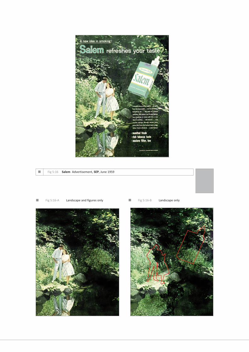
A seemingly idyllic landscape such as this Salem advertisement from June 1959 (fig 5:16), strains
after calmness and contentment in the need to persuade but on a closer scrutiny there is a density that
is claustrophobic and oppressive. Rather than the open plains and harmonious colours of Elliot Porter,
these are the figures of ‘Hansel and Gretal’, Snow White menaced in the woods (1937). When the pack,
such a powerful element in any advertisement, is stripped away, the landscape is revealed as a location
from which the couple cannot escape. When the couple themselves are digitally removed, the tense
qualities of the setting are revealed with an almost gothic fairytale feeling.26
The setting now reveals a more turbulent wooded glade, the undergrowth has not been trimmed here,
there are no signs of picnic benches, this is a secluded setting to really ‘get away from other people’. Do
landscapes reassure when they are totally empty of humans?
At the heart of many visual representations of the American landscape is an unease; that the
Wilderness encountered and cultivated by the Founding Fathers, was a landscape under threat.
Destruction was more likely to come from open cast mining or the ravages of uncontrolled tourism
5:11
n Fig 5:16 Salem Advertisement, SEP, June 1959
n Fig 5:16-A Landscape and figures only n Fig 5:16-B Landscape only

rather than from the Forces of Nature. Man, as his own cause, of anxiety in the landscape.27
The wooded
glade appears sufficiently in Salem to constitute a design decision.
Salem Country is clearly located in a different place to Marlboro Country. Salem emphasises
coolness where as the cowboy’s desert appears hot and dusty. Salem couples enjoy leisure moments
while the Marlboro Man works hard for a living.
In March 1950 Fenno Jacobs’ pioneering photographic portfolio for FORTUNE Magazine, “A
Landscape of Industry’s Leavings” (fig 5:17) was a revelation of the pollution and detritus left by
unlicensed and uncontrolled development. He demonstrated that, once the prospects of the site had
been exhausted, the manufacturers just left the scene to start afresh elsewhere. In the later ’fifties it
became apparent that what had once been uncritically accepted as God’s Own Country could no longer
sustain the paradise.28
Jacob’s feature ran to eight pages and includes’ 10 photographs.
“In its time, however, industry has dealt some harsh strokes to the U.S. landscape...it has preempted and polluted the
waters and waterside areas; it has indifferently permitted agglomerations of joyless jerry-built homes to be thrown up in
its vicinity. Worst of all, when irritated by its own repulsiveness, it has a tendency to not to clean up and reconstruct but
to flee and build anew elsewhere, thus capping the ugliness of the original environment with an air of desolation and
waste.” Fenno Jacobs, “A Landscape of Industry’s Leavings”, FORTUNE, March 1950, p.87.
It is ironic that feature appeared in FORTUNE nestled among advertisements for companies such as Du
Pont, Monsato Chemicals and Union Carbide proudly displaying their newly built factories and research
laboratories. In a country so vast it seemed that powerful industries were able to move on with no
responsibility to the polluted land they left behind? 29
The mountain may conceal hidden and exploitable resources or conceal the control centre for a
post Apocalyptic government. The open plain may only be sustained by increasing levels of nitrate
fertiliser but maybe contain the launch bays of Intercontinental Ballistic Missiles. The quality of the air
began to be suspect, polluted by the internal combustion engine and atomic testing. Invisible forces at
work in the landscape were disconcerting and no one seemingly could give adequate reassurance. Smog
was a major concern for city dwellers, as were anxieties associated with pesticides such as DDT that only
a few years earlier were considered harmless enough for use on the front lawn. A mass move to the
suburbs profoundly changed the appearance of the American landscape and by 1990 45% of Americans
lived in suburban areas.30
The new suburbia quickly became an object of satire for many New Yorker
cartoonists such as Robert Day (fig 5:19) during the ’fifties.
5:12

n Fig 5:17 Fenno Jacobs, “A Landscape of Industry’s Leavings”, FOR, March 1950
“As the motorist emerges from the Holland Tunnel, Jersey City
proudly puts its worst foot forward. It offers ‘Everything for
Industry’, including evidence of what Industry has done to Jersey
City”
“In the township of North bergen, a group of worker’s
cottages stand cozily in the shadow of a gas-storage
tank”

n Fig 5:18 Cartoon by Charles E. Martin, The New Yorker 1955-1965 Album, Hamish Hamilton, New York, 1965.
“It’s not advertising anything, damn it!”

For When Nature is Not Enough
This New Yorker cartoon by Charles E. Martin satirises the advertiser’s cliché of a scenic countyside
landscape behind every product (fig 5:18). It reflects the rising public suspicion that the advertising
community could create the visual conditions for selling that cynically manipulated the last vestiges of
the consumer’s romantic faith in the ‘Natural’. So the advertiser and the imagemaker may feel that the
Reassuring Landscape may not have the power it once had - defining healthiness, vigor and energy for
the undemanding and uncritical citizen. There was still however, another option so intimately laced into
any interpretation of American Culture, the recourse to Scientific Fact and Technological ingenuity.
It has been remarked elsewhere, that opportunity and tensions both emerge from the
relationship between Landscape and Technology.31
We now turn to the visual strategies of reassurance
offered by the capacity of American ‘know-how’ to sustain belief in the Safe Cigarette and the creation
of images of technological devices that prevent poisons and pollution reaching the vulnerable interiors
of the body.
5:13
n Fig 5:19 Cartoon by Robert Day, The New Yorker 1955-1965 Album, Hamish Hamilton, New York, 1965.
“I’m Mrs. Edward M. Barnes. Where do I live?”

Endnotes to Fascicle Five
1
Although the concept of the ‘Taste Test’ was seen as unreliable as early as 1936, this has not stopped advertisers inventing more
and more, one of the best remembered being the ‘Pepsi Challenge’ from the 1980’s. Consumers were expected to choose between
two cola flavoured carbonated drinks, presented in unmarked glasses.
2
For an account of disagreeable tastes and the corresponding facial expression see, Chapter XI “Disgust”, Charles Darwin, The
Expression of the Emotions in Man and Animals, John Murray, London, 1904 [1872], p.264ff.
3
See Jacques-Henri Lartigue, Les Femmes Aux Cigarettes, Viking Press, New York, 1980, photographs of women smoking cigarettes
taken during 1927. In the first episode of the “Century of the Self” broadcast in the U.K. in March 2002, Edward Bernays was
credited with a significant effort in increasing female smokers, the “Torch of Freedom” campaign of 1928 for Lucky Strike.
4
For a detailed account of sexuality during the ’forties in the U.S. see, “Chapter 14 - Masturbation”, Kinsey, Pomeroy and Clyde,
Sexual Behaviour in the Human Male, W.B.Saunders, Philadelphia and London, 1948, p.511ff. See also Kinsey, Pomeroy and Clyde,
Sexual Behaviour in the Human Female, W.B.Saunders, Philadelphia and London, 1948.
5
For more background information on James Rosenquist see, Constance W. Glenn, Time Dust Rosenquist, Complete Graphics:
1962-1992, Rizzoli International Publications, New York, 1993.
6
Many Pop Artists have referenced mass-produced advertising imagery as a source of inspiration for their work, I have found the
following books particularly interesting;
Clive Phillpot and Jon Hendricks, Fluxus; Selections From the Gilbert and Lila Silverman Collection, M.O.M.A, New York, 1988.
Simon Wilson, Pop, Thames and Hudson, London, 1974.
Claes Oldenburg, Claes Oldenburg, Arts Council of Great Britain, Lund Humphries, U.K. 1970.
Claes Oldenburg, The Multiples Store, Catalogue, National Touring Exhibition, Hayward Gallery, London 1996.
Mark Francis, Dieter Koepplin and Andy Warhol, Andy Warhol: Drawings 1942-1987,Bulfinch Press, N.Y., 1999.
Frayda Feldman (Ed.), Andy Warhol Prints: A Catalogue Raisonne 1962-1987, Distributed Art Publishers, New York, 1997.
Richard S. Field, Richard Hamilton, image and process: studies, stage, and final proofs from the graphic works, H. Mayer, in
association with the Tate Gallery, Millbank, London, 1982.
Diane Waldman, Roy Lichtenstein, Solomon R Guggenheim Museum, New York,1994.
Richard Hamilton, Collected Words : 1953-1982, Thames & Hudson, London, 1983.
Also Rosenquist, see Endnote 5.
F5:01

7
Philip Morris document #2055557893 - Available on the Corporate Website, October 2001; www.philipmorris.com
Smoke had been clearly identified as a carcinogen in 1928. As early as 1954 a Liggett & Myers scientist apparently remarked "if we
can eliminate or reduce the carcinogenic agent in smoke we will have made real progress." Secondary smoke from cigarettes
wasn’t seen as a definite health risk until 1972 when the First Report of the Surgeon General identified ‘passive smoking’. The next
major announcement in 1984 from the Surgeon General rather optimistically announced the goal of a smokefree society by the
Year 2000AD.
8
In America ‘Spud’ is slang for a a base coin panned by a fraudster.
9
Menthol can be added directly to the tobacco or via the Filter-Tip (through a ‘Flavour-Thread’). It can even be added to the foil
paper in which cigarettes are wrapped, See ‘Appendix:6.1 Taxonomy of the Filter-Tip.’
10
Menthol also aids breathing by numbing soreness and cooling pain and is widely used in inhalants and is believed to relieve sinus
congestion during bad colds. e.g. A Vicks Inhaler used for clearing “stuffy noses fast” contains B.P 125mg of Menthol as the main
ingredient. Some tobacco companies such as Brown & Williamson on at least two occasions did measure the factory air for levels
of menthol just in case any toxic effects would be reported. Brown and Williamson, document #570313008, available on the
Corporate Website, September 2001; www.brownand williamson.com
11
Philip Morris Document No.2031421331, April 15, 1991 - INBIFO document available on the Corporate Website;
www.philipmorris.com. See also, ASH, Registered Charity No 262067, Action on Smoking and Health is a company limited by
guarantee. Registered in England No. 998971. www.ash.co.uk
12
The term "impact" when used in industry documents is frequently offset in quotes. Philip Morris' official definition of the term is
a "feeling sensation rather than odour or taste." They further compare it to the spicy heat in chilli peppers. It has been suggested
by people who have worked inside the industry that "impact" refers to the drug effect of a substance, particularly nicotine.
“...But it would appear from the present investigation that the influence of menthol on subjective strength ratings over-
rode the influence of nicotine. This suggests that the magnitude of sensory experiences resulting from small variations in
menthol delivery may be greater than there resulting from small variations in nicotine delivery...it may be possible to
increase smoke ‘impact’ in low density menthol cigarettes by utilising somewhat higher menthol delivery levels than usual.
” Philip Morris Document No. 2031421331 , April 15, 1991.
13
www.onyx-group.com The Onyx Group - Black Health Group (U.S.) that monitors Menthol Cigarette litigations on behalf of Black
organisations. The 19th October 1998 lawsuit filed in Philadelphia contends that menthol compounds, when burned, create
additional toxic substances that make such cigarettes more dangerous that regular cigarettes. Government studies of smoking have
suggested, the suit said, that menthol taste makes it easier for people to smoke longer and inhale more deeply. The lawsuit claims
that Tobacco Companies violated the civil rights of blacks by marketing more-dangerous menthol cigarettes in their communities.
Although blacks account for about 10 percent of all U.S. smokers, the lawsuit says, they make up 60 percent to 70 percent of the
F5:02

menthol cigarette consumers and are 30 percent more likely to die of smoking-related illnesses than whites. The Onyx Group
contends that research has shown that “...most African American smokers are addicted to menthols. Approximately 3 out of 4
Black smokers prefer menthols, and among Black youth who smoke, some reports indicate that more than 9 out of 10 choose
menthols. Among whites, approximately 1/4 of smokers prefer menthol - mostly women and young, beginning smokers.”
The Onyx Group also follows and reports mentholated cigarette health risks and research some of their findings are as follows;
"Smokers of menthol cigarettes tend to inhale more deeply because menthol has an anaesthetic and cooling effect." Dr. Karen
Ahijevych, The Ohio State University.
"Research has shown that smokers of low- and medium-nicotine menthol cigarettes have as much as three times the
exposure to toxic and cancer-inducing agents as smokers of non-menthol cigarettes with comparable nicotine content."
Dr. Karam El-Bayoumy, American Health Foundation.
14
For an account of the Hamm’s Beer campaign see, Julian Lewis Watkins, The 100 Greatest Advertisements, Dover Publications,
Inc. New York 1959, p.215.
15
See Anon, “Fortune 500 Survey”, FORTUNE, July 1935, (Section “ III : Cigarettes”, p.68ff).
16
For the creation of the product’s own ‘Country’ see also ‘Schweppshire’ a creation of an ideal British Landscape created by the
makers of Schweppes also Lymeswold an English Blue Cheese launched in 1982 (withdrawn 1992) named to suggest bucolicism -
although the town never exsisted. See John Ayto, Twentieth Century Words, Oxford University Press, Oxford, 1999, Page 548.
17
Salem Marketing Strategy, RJR Tobacco website, March 2001. www.rjrtobacco.com
18
See, Anon, “FORTUNE 500 Survey”, ibid.
19
There are six actual Salems in the U.S the largest being in Oregon near the west coast town of Newport. The town of Salem in
Massachesetts, on the Atlantic is best remembered for the execution of 19 witches after the witch hunts of 1692. The Salem Witch
Trials have remained in the American consciousness as a lesson in the dangers of superstition and hysteria engendered by ‘mass
mentality’. The 1953 play The Crucible by Arthur Miller was intended as a powerful allegory condemning the anti-communist
“witch hunting” then under way lead by Senator Joseph McCarthy. Salem is also the Old Testament name for Jerusalem.
Psalms 76:2
“1 In Judah God is known;
his name is great in Israel.
2His tent is in Salem,
his dwelling-place in Zion.”
20
Plains are mythically the ‘Land of Youth’ or ‘Elysiam’ a paradise on earth.
“...Plains seem to have been the ideal places for mortals to inhabit, mountains, by contrast, being the preserve of the
gods...The Plain of Joy was also the Land of Youth, an Elysium where centuries passed in minutes, where the inhabitants
F5:03

F5:04
never grew old and where the fields were covered in flowers which never died.” Jean Chevalier and Alain Gheerbrant, The
Dictionary of Symbols, Penguin, London, 1994 [France 1969], p.758.
21
For more information on American Regionalist Grant Wood see, Wanda M.Corn, Grant Wood: The Regionalist Vision, Yale
University Press, 1984. For a more general outline of Art during the period and some examples of American Regionalism see, Riva
Castleman, Art of the Forties, Exhibition Catalogue, The Museum of Modern Art, New York, 1991. For photographic versions of
Regionalism see The Sierra Club Publications (see Endnote 22) of which, Elliot Porter and the Adirondack Museum, Forever Wild:
the Adirondacks, Harper & Row, New York and London, 1957, is a fine example.
22
The Sierra Club published numerous photographic portfolios celebrating the American landscape, the following cover a variety of
U.S. terrains and have been particularly useful;
Elliot Porter and the Adirondack Museum, Forever Wild: the Adirondacks, Harper & Row, New York and London, 1957.
Elliot Porter/text by Joseph Wood Krutch, Baja California; and the Geography of Hope, Sierra Club, San Francisco, 1967.
(Photographs date from 1950-62).
David Brower (editor), The Big Sur Coast, Sierra Club Exhibit Format Series, San Francisco, 1964.
David Brower (editor), Grand Canyon, (includes a Sierra Club introduction essay), Sierra Club Exhibit Format Series, San Francisco,
1963-4 .
23
For more information about the WPA Federal Art Project, USIS, United States Information Services in Europe, see R.D.McKinzie,
The New Deal for Artists, Princeton University Press, Princeton, 1973.
24
“The resulting photographs, many resembling expressionist painting, use their material the pattern, texture, and colour of
the land below.” Douglas Davis, “Plate 157 - Willam A. Garnett”, Photography as Fine Art, Thames and Hudson, 1982,
p.214.
See also William Garnett, Aerial Photographs, University of California Press, C.A., 1994.
25
The Sierra Club images have served conservation as much as photography and the modern incarnation of the Club now lists itself
as a ‘Conservation Pressure Group.’ The Sierra Club, via their publicity and internet site, urges people to write to politicians and
companies accused of polluting the landscape. They produce a ‘Top 100’ list that attempts to name and shame companies, that
they have identified as polluters. The Club also has a strong anti-smoking slant in their literature considering it a personal health
risk as well as a polluter of the air. Their work consists of photography but they also publish many features and articles on
environmental concerns.
www.sierraclub.org, Sierra Club, How Cancer Pollution May Hurt Your Health, www.sierraclub.org, December 1999.
Sierra Club, Haze in our National Parks? www.sierraclub.org, December 1999.
26
Using digital image manipulation techniques on the computer has enabled me to strip away elements from the landscape in
order to fully appreciated the locations selected. This technique has allowed the isolation of elements of the image - as used
earlier to examine, in detail, the Camel Advertisement, SEP, July, 1950.

F5:05
27
Fairytale landscape where evil lurks is a tradition also featured in popular feature films such as;
The Wizard of Oz (1939), Forbidden Planet (1956) and Blue Velvet (1986).
Children’s book illustration often visualised landscape where threat lurks, see Susan E. Meyer, “N.C Wyeth”, A Treasury of the
Great Children’s Book Illustrators, Abradale Press, Harry N. Abrams, New York, 1983, pp.233-248.
28
See Fenno Jacobs, “A Landscape of Industry’s leavings”, FORTUNE, March 1950, pp.87ff.
29
“Cancer-causing pollution threatens every American family and every community...State and federal governments allowed
polluters to dump more than 175 million pounds of cancer-causing chemicals into our air and water in 1996, according to
data from polluting companies and the Environmental Protection Agency (EPA). That is almost two-thirds of a pound of
cancer-causing chemicals for every man, woman and child in America. Many scientists believe there is no safe level of
exposure to a cancer-causing chemical.” The Sierra Club “How Cancer Pollution May Hurt Your Health”,
www.sierraclub.org, December 1999.
30
For more information on the mass-move to the surburbs see:
Susan Kirsch Duncan, Levittown: The Way We Were, Maple Hill Press, New York, 1999. See also, Tova Navarra, Margaret
Lundrigan, Margaret Lundrigan Ferrer, Levittown : The First 50 Years, Arcadia Tempus Publishing Group Inc., New York 1997.
31
For a superb account of the tension between technology and the natural see Leo Marx, The Machine in the Garden : Technology
and the Pastoral Ideal in America, Oxford University Press, Oxford, 1967.

The Safe Cigarette
The Safe Cigarette: Visual strategies of reassurance in American advertisements for cigarettes, 1945-1964.
Volume Number: 1 2 3 4 5 6 7 8
Practice-Based Ph.D. Jackie Batey www.thesafecigarette.blogspot.com
Copyright © 2022 FDOKUMEN