p0260-rte-radio-talk -scripts-in-english-descriptive-catalogue.pdf
Upload
khangminh22Category
view
0download
0
Journal of Tolkien Research Journal of Tolkien Research
Volume 10 Issue 2 Article 8
2020
‘Written in a Fair Hand’: The Living Tradition of Medieval Scripts in ‘Written in a Fair Hand’: The Living Tradition of Medieval Scripts in
J.R.R. Tolkien’s Calligraphy J.R.R. Tolkien’s Calligraphy
Eduardo B. Kumamoto Independent scholar, [email protected]
Follow this and additional works at: https://scholar.valpo.edu/journaloftolkienresearch
Part of the Illustration Commons, Literature in English, British Isles Commons, and the Medieval
History Commons
Recommended Citation Recommended Citation Kumamoto, Eduardo B. (2020) "‘Written in a Fair Hand’: The Living Tradition of Medieval Scripts in J.R.R. Tolkien’s Calligraphy," Journal of Tolkien Research: Vol. 10 : Iss. 2 , Article 8. Available at: https://scholar.valpo.edu/journaloftolkienresearch/vol10/iss2/8
This Article is brought to you for free and open access by the Christopher Center Library at ValpoScholar. It has been accepted for inclusion in Journal of Tolkien Research by an authorized administrator of ValpoScholar. For more information, please contact a ValpoScholar staff member at [email protected].

‘Written in a Fair Hand’: The Living Tradition of Medieval Scripts in J.R.R. Tolkien’s ‘Written in a Fair Hand’: The Living Tradition of Medieval Scripts in J.R.R. Tolkien’s Calligraphy Calligraphy
Cover Page Footnote Cover Page Footnote Figures 1–7, 9–17, 19, and 21–29 are reproduced by kind permission of the Tolkien Estate.
This article is available in Journal of Tolkien Research: https://scholar.valpo.edu/journaloftolkienresearch/vol10/iss2/8

INTRODUCTION
In his Liner notes, W.H. Auden (2015: 1) confessed that among Tolkien’s ‘many
gifts, the three which astound me most are his gift for inventing Proper Names, his
gift for describing landscape, and (how I envy him this) his gift for calligraphy.’ It
is not hard to see why Auden envied Tolkien’s calligraphic skills: despite the haste
and illegibility of many drafts, Tolkien could and did produce several impressively
accomplished manuscripts. Some of the most famous calligraphic pieces were
revealed to a wide audience early in his career as a writer, with the publication of
The Hobbit. Many others came to light in posthumously published books dedicated
to his art, such as Pictures by J.R.R. Tolkien (1979), with text by Christopher
Tolkien; Tolkien: Life and Legend (1992), by Judith Priestman; J.R.R. Tolkien:
Artist and Illustrator (1995/2004); The Art of the Hobbit and The Art of the Lord of
the Rings (2011 and 2015) — the three of them by Wayne G. Hammond and
Christina Scull — and, more recently, Tolkien: Maker of Middle-earth (2018), by
Catherine McIlwaine. Their contribution to the study of Tolkien’s art cannot be
overstated, and the work of Hammond and Scull in elucidating crucial points of his
calligraphy will be duly emphasized in this article by the copious references to their
books, which have become essential in Tolkienian scholarship.
But Tolkien’s calligraphy remains a side topic within the study of his art,
perhaps overshadowed by the greatness of his illustrations, and while some scholars
(e.g. Holmes 2006; Lee 2014) have considered the relationship between Tolkien’s
profession and his calligraphy, there is a large unexplored area that awaits
examination. The present work aims to study Tolkien’s calligraphy taking into
consideration the historical scripts and manuscripts that may have served as models
for his ornamental writing in Latin script. The runes and his invented writing
systems will not be the center of attention here.
1
Kumamoto: The Living Tradition of Medieval Scripts in J.R.R. Tolkien’s Calligraphy
Published by ValpoScholar, 2020

The first section focuses on the genesis of Tolkien’s aptitude for calligraphy
according to what has been said in biographical works, which will be briefly
reviewed. This section also addresses the subject of paleography, that is, the study
of ancient scripts, which connects Tolkien’s profession as a philologist and editor
of medieval texts to his calligraphic art.
The second part of the article deals with specific scripts that informed
Tolkien’s calligraphic production, namely the Insular scripts used in manuscripts
he was certainly familiar with and the twentieth-century Foundational Hand,
developed by Edward Johnston having the tenth-century English Carolingian
Minuscule as a model.
The third and last section focuses on the Uncial and Insular Half-uncial
scripts observable in two of the best-known calligraphic pieces made by Tolkien,
namely Thror’s Map and the Wilderland map. The hypothesis that Tolkien was not
only the pseudo-translator, but also the pseudo-scribe of the Red Book of
Westmarch is put forward in that section.
The samples of Tolkien’s handwriting that appear throughout this paper
have been selected because they are representative of many characteristics that
deserve highlighting, but they are not always calligraphic in nature, that is, they do
not always show aesthetic preoccupation. It is also important to clarify that Tolkien
did not actually produce ancient scripts in that he did not use actual Uncial, or
Insular scripts, since these systems are no longer productive in the Primary World,
each of them being restricted to their historical period. He did, however, use the
letterforms that were characteristic of those scripts.
Given that Tolkien’s works, literary or not, cannot be wholly extricated from
their manuscript nature, and that many of his manuscripts were calligraphic, the
underlying purpose of this article is to add to an incipient conversation about an
important subject in Tolkienian studies and to suggest ways through which this
conversation can be continued in future studies.
2
Journal of Tolkien Research, Vol. 10 [2020], Iss. 2, Art. 8
https://scholar.valpo.edu/journaloftolkienresearch/vol10/iss2/8

THE GENESIS OF A CALLIGRAPHIC SKILL
Tolkien’s aptitude for calligraphy has been consistently traced back to his ancestors.
His biographer Humphrey Carpenter, for instance, claims that John Suffield,
Tolkien’s grandfather, would sometimes
take a sheet of paper and a pen with an extra fine nib. Then he
would draw a circle around a six-pence, and in this little space he
would write in fine copperplate the words of the entire Lord’s Prayer. His ancestors had been engravers and plate-makers,
which was perhaps why he had inherited this skill […].
(Carpenter 2002: 33)
A little further, he remarks:
[Tolkien’s] mother’s own handwriting was delightfully uncon-ventional. Having acquired the skill of penmanship from her
father, she chose an upright and elaborate style, ornamenting her
capitals with delicate curls. Ronald soon began to practise a hand
that was, though different from his mother’s, to become equally elegant and idiosyncratic.
(Carpenter 2002: 38)
Mabel Tolkien’s influence was acknowledged by Tolkien himself in one of his
letters: ‘She was also interested in etymology, and aroused my interest in this; and
also in alphabets and handwriting’ (Carpenter and Tolkien 2006: 377).
Accordingly, John and Priscilla Tolkien, in The Tolkien Family Album
(1992: 17 and 22), also attribute their father’s calligraphic skills to Mabel, when
they say that her ‘elegant and decorative handwriting […] almost certainly influ-
enced Ronald’s interest in design and calligraphy later in his life’, and that it was
around 1900 that Tolkien started learning calligraphy.
3
Kumamoto: The Living Tradition of Medieval Scripts in J.R.R. Tolkien’s Calligraphy
Published by ValpoScholar, 2020

Similar claims are made by other authors (Garth 2004: 13; Fimi 2010: 105;
McIlwaine 2018: 186), who have possibly drawn from previous assertions, such as
Hammond and Scull’s in their J.R.R. Tolkien: Artist and Illustrator (2004: 201) and
The J.R.R. Tolkien Companion and Guide: Reader’s Guide (2017b: 204–05). In the
latter book, the authors affirm that ‘Tolkien’s own early handwriting resembled his
mother’s in its eccentricities of form’. That is suggested by Figure 1, for instance:1
The lower inscription, showing Tolkien’s handwriting, comes from a 1904 drawing,
and the letterforms made when he was twelve are indeed very similar to his
mother’s, in the upper inscription, particularly in the curly aspect of the strokes in
most letters, notably E and H. This early piece, with undeniable hints of calligraphic
experimentation, anticipates the accomplishment of his later works.
Apart from his ancestry, scholars also agree in considering Tolkien’s
profession as a catalyst that influenced his calligraphic skills. John R. Holmes, for
instance, claims:
1 The images have been cropped, and their color and size have been altered to highlight faint and
small letters, while preserving their forms.
Figure 1. Detail of Mabel Tolkien’s hand (above), dated 1892, and Ronald Tolkien’s (below), dated 1904. Reproduced from McIlwaine 2018: 115 and 133, respectively.
4
Journal of Tolkien Research, Vol. 10 [2020], Iss. 2, Art. 8
https://scholar.valpo.edu/journaloftolkienresearch/vol10/iss2/8

The philological nature of Tolkien’s professional training as a medievalist, with its emphasis on the word, particularly its sound,
can hide how very visual medieval studies were in Tolkien’s
lifetime. Tolkien certainly availed himself of the best editions, but he also knew Old English classics from their manuscripts
(though he considered himself a dilettante at paleography),
admiring them as artifacts and imitating those artifacts in his own
calligraphy.
(Holmes 2006: 28)
Similarly, Lee (2014: 57–8) affirms that ‘Tolkien was engaged with manuscript
studies throughout his career’, and he names manuscripts with which Tolkien would
have had contact, either directly or through facsimiles and microfilm.
Lee draws from — and adds to — the entry ‘Manuscripts, Medieval’ in the
J.R.R. Tolkien Encyclopedia, where Drout (2006: 404–05) concisely lists
manuscripts that, to a greater or lesser extent, would have influenced Tolkien.
Likewise, McIlwaine (2018: 186) stresses the importance of medieval manuscripts
in Tolkien’s formation, such as the Corpus Christi College, Cambridge, MS. 402,
containing the Middle English Ancrene Wisse, and the Bodleian Library MS. Junius
11, containing the Old English Exodus. Hammond and Scull, in turn, remark that
[as] a philologist and scholar of Old and Middle English […],
Tolkien had many occasions to look at early manuscripts in the
original; and he brought his own substantial visual imagination
to the creation of letters as well as pictures.
(Hammond and Scull 2017b: 205)
Elsewhere, the authors claim that ‘philologists must look at manuscripts, but not all
learn to appreciate the beauty of the scripts and decoration they see, or themselves
take up the pen’ (Hammond and Scull 2004: 201).
In sum, the general message one gets from these accounts is that Tolkien
precociously started his wanderings in the calligraphic realm, owing his skills to an
5
Kumamoto: The Living Tradition of Medieval Scripts in J.R.R. Tolkien’s Calligraphy
Published by ValpoScholar, 2020

early exposition fostered by his mother. Later, his abilities were honed and
informed by the academic dimension, because his profession involved close study
of scripts and manuscripts. As Lee (2014: 57) explains, being ‘a medievalist of
considerable note’, Tolkien was armed with a training in paleography and
codicology.
The reference to paleography, defined by Roberts and Robinson (2020: 51)
as the ‘study and interpretation of writing and writing systems’, invites further
consideration, especially in view of Hammond and Scull’s claim that many
philologists, despite close contact with manuscripts, never actually practice the
scripts they study. Such an imbalance between the science and the art was also
noticed by Albert Derolez:2
[…] Finally, we should consider the unfortunate gap that exists between palaeography and calligraphy. The last century
witnessed an ever-increasing flood of superbly illustrated
publications by modern practitioners of handwriting, starting with Edward Johnston […]. [The] mutual misunderstandings
between palaeographers and calligraphers, between historians
and practitioners, each with their own distinctive goals, are not
likely to be easily removed, despite the growing interest among some palaeographers in the work of calligraphers and vice versa.
(Derolez 2003: 26–7, emphasis added)
Even though Tolkien considered himself a ‘dilettante at paleography’, according to
John R. Holmes’s quotation above, it is safe to assume that his profession,
particularly his editorial projects, demanded more than a superficial acquaintance
with that science.
2 For a discussion of the scientific status of paleography, see Stokes 2014: 1, and Treharne 2011:
264–66.
6
Journal of Tolkien Research, Vol. 10 [2020], Iss. 2, Art. 8
https://scholar.valpo.edu/journaloftolkienresearch/vol10/iss2/8
In his edition of the Old English Exodus, for instance, Tolkien avails himself
of some paleographical description: he dates the script, acknowledges the majus-
cules, ornamental initials, and large capitals, and even finds occasion to assess the
quality of the scribe’s hand: ‘It is written with care — as far as calligraphy goes’
and ‘If [the scribe] frequently preserves (in a fair hand) the unintelligible, he was
quite capable of doctoring’ (Tolkien 1981: 33–4, emphasis added).
Similarly, in the 1929 article ‘Ancrene Wisse and Hali Meiðhad’, Tolkien
claims that the manuscript is ‘well known to be in a fair hand of excellent regularity
and precision’ (1929: 106, emphasis added). ‘Fair hand’ is also the chosen
expression to qualify the scribe’s handwriting in the 1947 article ‘MS. Bodley 34:
A re-collation of a collation’, written in collaboration with Simonne d’Ardenne.
Conforming to the general acerbity of the text, the authors claim that the ‘scribe of
the manuscript had a fair hand, but he (or she) was hasty, often absentminded (or
bored), and sometimes a blunderer’ (d’Ardenne and Tolkien 1947: 66, emphasis
added).3
Joan Turville-Petre, who prepared Tolkien’s Exodus for publication,
remarks that she removed some paleographical description that was by then
‘irrelevant or mistaken’ (Tolkien 1981: 33–4). Still, the description that remained
in the published work hints that Tolkien’s paleographical skills were above the
amateur level, even if not immune to the development of scholarship: allusions to
the scribes’ ‘fair hand’, ‘excellent regularity’, and ‘precision’ may seem
exceedingly subjective in present-day paleography.
3 In Tolkien and Gordon’s edition of Sir Gawain and the Green Knight (Gordon and Tolkien 1967:
xi), the hand in the manuscript is described as ‘small and sharp’, but that would probably be
Gordon’s description, if we accept Shippey’s view that the introductory section was Gordon’s
(Shippey 2014: 45). See also Celia Sisam’s claim: ‘I gathered from my father [Kenneth Sisam] that
that edition [of Sir Gawain] was almost entirely the work of his co-editor E.V. Gordon, as Tolkien
was so dilatory and didn’t produce his share’ (quoted in Bowers 2019: 54–5n).
7
Kumamoto: The Living Tradition of Medieval Scripts in J.R.R. Tolkien’s Calligraphy
Published by ValpoScholar, 2020

Elaine Treharne, in her article ‘The Good, the Bad, the Ugly’, raises the
issue of subjectivity in paleographical description, hardly desirable in scientific
language. Her study focuses on the value judgments made by twentieth-century
paleographers, especially a colleague of Tolkien’s at Oxford: Neil Ripley Ker.4
According to Treharne, Ker’s Catalogue of Manuscripts Containing Old
English has several instances of ambiguous or unclear descriptive expressions,
either condemnatory or complimentary: ‘the less good hand’; ‘a rough ugly hand’;
‘ill-formed’; ‘attractive’; ‘graceful’, etc. Treharne urges scholars, particularly
paleographers, ‘to employ Ker’s Catalogue with a keen sense of the man in his
time’ (2011: 281), and her portrayal of that scholar might be used for Tolkien:
[…] a scholar with a highly developed eye for detail, a sure and
impressive visual perspective, a connoisseurship and erudition
that very few can achieve today, and the time to examine manuscripts at first hand in a manner that the strictures of
present-day academic life do not permit.
(Treharne 2011: 281–82)
Still, she claims, Ker’s deservedly praised qualities come along with ‘an
unwavering aesthetic authority that is subjective’, and that paleography as a science
requires a ‘clear, unambiguous set of definitions’ (Treharne 2011: 282).
As we have seen, Tolkien, who after all was Ker’s contemporary, also
described the handwriting in the Exodus and the Katherine Group manuscripts in a
subjective way, though not condemnatory. If this mode of expression is outdated in
present-day paleography, from a calligraphic point of view it shows that Tolkien
was clearly attentive to the aesthetics of scripts. Moreover, his own calligraphic
skill — and presumably a keen eye to detect it in others — had, as of the publication
of his 1929 essay, already ripened, as evidenced by early pieces among his series
4 On the relationship between Tolkien and Ker, see Hammond and Scull 2017b: 599.
8
Journal of Tolkien Research, Vol. 10 [2020], Iss. 2, Art. 8
https://scholar.valpo.edu/journaloftolkienresearch/vol10/iss2/8

of Father Christmas letters (see Figure 12). In other words, Tolkien’s description of
the medieval scribes’ handwriting reveals the calligrapher behind the philologist.
And he had himself a fair hand.
In agreement with W.H. Auden’s opinion, we consider Tolkien’s
calligraphic work as highly accomplished,5 not least because his knowledge of
paleography enabled him to understand and reproduce the ductus of scripts,6 to
evaluate the suitability of a script for a given purpose, and consider the historical
aspects involved in the choice, among other elements.
Therefore, since Tolkien was both a historian and practitioner, it is possible
to affirm that the ‘unfortunate gap’ between paleography and calligraphy was
negligible in Tolkien’s case. The present study, though not strictly concerned with
paleography, assumes that when Tolkien chose to write using a given script he did
so consciously and informed by his academic expertise.
THE MEDIEVAL MODELS OF TOLKIEN’S LETTERFORMS
THE ANGLO-SAXON SQUARE MINUSCULE
Judith Priestman (1992: 26) remarks that, while at Oxford, Tolkien started learning
scribal handwriting, and a sheet of minutes reproduced in her book (Figure 2),
though hardly calligraphic, may be helpful if we are to look for the scripts that
Tolkien favored in his artistic pieces. The manuscript is dated 1939, two years,
therefore, after The Hobbit was first published, and is closely related to it in content.
5 Mark Atherton, on the other hand, considers that ‘Tolkien was a moderately gifted cartographer,
illustrator, painter and calligrapher’ (2012: 108, emphasis added). 6 The ductus comprises ‘all aspects of the writing of letter forms such as the angle at which the pen
is held against the base line of script, the direction and tilt of the script, the number of strokes that
make up a letter, and the order in which they are made’ (Roberts and Robinson 2020: 52).
9
Kumamoto: The Living Tradition of Medieval Scripts in J.R.R. Tolkien’s Calligraphy
Published by ValpoScholar, 2020

Figure 2. 1939 sheet of minutes written by Tolkien. Reproduced from Priestman 1992: 46.
10
Journal of Tolkien Research, Vol. 10 [2020], Iss. 2, Art. 8
https://scholar.valpo.edu/journaloftolkienresearch/vol10/iss2/8

Tolkien’s humorous remarks will be forgone in this essay, as the focus is on the
following lines: ‘this handwriting though modern in most of its forms shows
considerable influence in style from the Anglo-Saxon “insular” bookhand of the
tenth century’.
The story of the Anglo-Saxon bookhand of the tenth century, or Anglo-
Saxon Square Minuscule, must begin with the Insular system of scripts, as Tolkien
suggests in the 1939 manuscript. Extremely complex in its hierarchy,7 this system
of scripts comprises the majuscule alphabet introduced to Ireland by Christian
missionaries in the fifth century (Bischoff 1990: 83), and which developed into a
very rounded and prestigious script called Insular Half-uncial. In the seventh
century, the Irish downgraded the Half-uncial into the Insular Minuscule, which
was used for more general purposes alongside the Half-uncial for many centuries
(Bischoff 1990: 84–8 and Brown 2012: 148–49).
Both the Insular Half-uncial and the Insular Minuscule were taken by
missionaries from Ireland to the northern Anglo-Saxons in the seventh century, with
the founding of the monastery of Lindisfarne. The Anglo-Saxons, in turn, ‘further
developed the range of scripts, under renewed influence from Rome via centers
such as Canterbury and Wearmouth/Jarrow, adding capitals and uncials, perfecting
half-uncials, and evolving several grades of minuscule’ (Brown 2020: 206). The
Insular system of scripts lasted up to the half of the ninth century, according to
Roberts and Robinson (2020: 54).
This is the background of what Tolkien called ‘the Anglo-Saxon “insular”
bookhand’ — or Square Minuscule — which was developed and used in England
during the tenth century (Ganz 2012: 188). According to Dumville (1987: 148), ‘the
Square minuscule represents but a phase […] in the complex development of the
Insular script system […]. [Its] sources lay within the Insular system and its
7 For a concise and enlightening overview of the whole hierarchy of the Insular system of scripts,
see Brown 2012.
11
Kumamoto: The Living Tradition of Medieval Scripts in J.R.R. Tolkien’s Calligraphy
Published by ValpoScholar, 2020

descendants themselves represent another phase in that continuum of script
development’. On the other hand, Stokes (2014: 8) considers it incorrect to call
Insular any of the post-ninth century scripts, because ‘scribal practices in England
diverged significantly after this date and so there was no consistent scribal practice
across the Insular world’. However, according to him, the letterforms that are
peculiar to the Insular scripts continued to be used even after that system collapsed,
and therefore it is ‘useful and consistent with observed phenomena’ to refer to them
as Insular letterforms (Stokes 2014: 8–9). This expression is adopted here.
It is not hard to see why Tolkien was interested in the Insular letterforms:
they are employed in manuscripts where important texts he studied are preserved.
Even though he might not have handled the artefacts themselves (cf. Lee 2009: 195
and Lee 2014: 58), he may have seen the facsimiles of the Beowulf manuscript8 and
the Exeter Book,9 containing the poems The Wanderer and The Seafarer,10 and the
riddles that inspired the ones in The Hobbit. Tolkien might also have had access to
the actual Exodus manuscript, kept at Oxford, and Lee (2014: 58) puts forward the
possibility that Tolkien would have seen the facsimile of the Lindisfarne Gospels,11
with its majestic Insular Half-uncial and interlinear gloss in Insular Minuscule.
The Insular letterforms were, thus, close to Tolkien’s occupation as a
philologist, and the doodles in the 1939 manuscript show some peculiarly Insular
features and letterforms that Tolkien was trying to imitate, some of which will be
singled out now.
On the bottom left side of the manuscript, it is possible to spot one of these
characteristics, namely the triangular serif in the l of Anglosaxon, and the b and h
of bookhand (Figure 3):
8 London, British Library, Cotton Vitellius A.xv. 9 Exeter Cathedral Library, 3501. 10 See Shippey 2014: 47. 11 London, British Library, Cotton Nero D.iv.
12
Journal of Tolkien Research, Vol. 10 [2020], Iss. 2, Art. 8
https://scholar.valpo.edu/journaloftolkienresearch/vol10/iss2/8
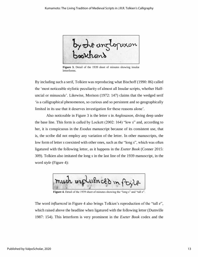
By including such a serif, Tolkien was reproducing what Bischoff (1990: 86) called
the ‘most noticeable stylistic peculiarity of almost all Insular scripts, whether Half-
uncial or minuscule’. Likewise, Morison (1972: 147) claims that the wedged serif
‘is a calligraphical phenomenon, so curious and so persistent and so geographically
limited in its use that it deserves investigation for these reasons alone’.
Also noticeable in Figure 3 is the letter s in Anglosaxon, diving deep under
the base line. This form is called by Lockett (2002: 164) “low s” and, according to
her, it is conspicuous in the Exodus manuscript because of its consistent use, that
is, the scribe did not employ any variation of the letter. In other manuscripts, the
low form of letter s coexisted with other ones, such as the “long s”, which was often
ligatured with the following letter, as it happens in the Exeter Book (Conner 2015:
309). Tolkien also imitated the long s in the last line of the 1939 manuscript, in the
word style (Figure 4):
The word influenced in Figure 4 also brings Tolkien’s reproduction of the “tall e”,
which raised above the headline when ligatured with the following letter (Dumville
1987: 154). This letterform is very prominent in the Exeter Book codex and the
Figure 3. Detail of the 1939 sheet of minutes showing insular
letterforms.
Figure 4. Detail of the 1939 sheet of minutes showing the “long s” and “tall e”.
13
Kumamoto: The Living Tradition of Medieval Scripts in J.R.R. Tolkien’s Calligraphy
Published by ValpoScholar, 2020

Exodus manuscript. The word style, apart from the long s, also shows letter t with
a curved shaft, a feature of Insular scripts since their beginning with the Irish Half-
uncial, and a feature also of the English Caroline Minuscule which will be discussed
later. Tolkien used this form of t very frequently, including in his famous signature.
From the Insular Minuscule inventory Tolkien also picked letter r which,
just like the low s, descends below the baseline. It can be seen in the king’s name
Ælfred, and slightly modernized in alfred (Figure 5):
The most visually interesting letter that Tolkien imitated in the 1939 manuscript is
possibly the flat-topped g (i.e., ᵹ), visible in the word Anglosaxon in Figure 3. As it
happened with t, the Insular Half-uncial ᵹ was a consolidation of the Roman Later
Half-uncial form, a script that ‘rose to be a bookhand of late antiquity and of the
early middle-ages’ (Bischoff 1990: 76). The flat-topped ᵹ, widespread among the
Insular scripts, survived in the Anglo-Saxon Square Minuscule present in the Exeter
Book and the Exodus manuscript.
Apart from the example in Figure 3, Tolkien reproduced this form of g in
the Old English word cyning (Figure 6), and just below his signature, isolated (see
Figure 2).
Figure 5. Detail of the 1939 sheet of minutes, showing the
Insular Minuscule form of r.
14
Journal of Tolkien Research, Vol. 10 [2020], Iss. 2, Art. 8
https://scholar.valpo.edu/journaloftolkienresearch/vol10/iss2/8

Most curious, however, is the experimentation reproduced in Figure 7. Tolkien
seemed interested in the forms that letter g could assume, and four distinct ones are
arguably found in the 1939 manuscript.
On the left, an 8-shaped g, similar in form to a Protogothic one (see Derolez 2003:
61); next to it, the horizontal stroke of the Insular ᵹ, followed by a ᵹ with the lobe
closed to the left and an open bow, like the one in Gandalf. The evolution of Half-
uncial (not directly from the Insular Half-uncial) ᵹ into Carolingian g, which is
itself the source of our modern form of lowercase g, is explained by Derolez:
The only letter in the Carolingian alphabet for which a defini-
tively Precarolingian form was consciously retained is g: in early medieval scripts in general (with the exception of Insular script)
[…] the custom had been introduced of extending the upper
horizontal stroke of Half-uncial g (which itself was a consol-
idation of the Roman Cursive Minuscule one) […] with a bow bending downward towards the left, rejoining the stem and
forming a lobe.
(Derolez 2003: 50)
Figure 6. The flat-topped ᵹ.
Figure 7. Tolkien’s experimentation with letter g.
15
Kumamoto: The Living Tradition of Medieval Scripts in J.R.R. Tolkien’s Calligraphy
Published by ValpoScholar, 2020

This was not the first time Tolkien showed his paleographical awareness by using
the Insular ᵹ in connection with Old English. As is well known, Tolkien worked as
a lexicographer at the Oxford English Dictionary (OED) soon after the First World
War, and because of his knowledge of Germanic languages, he was allocated to
Henry Bradley’s team, who were drafting the dictionary entries for letter W
(Gilliver et al. 2009: 7). One of the words assigned to Tolkien was wain.
Figure 8 shows a representation of the different glyphs Tolkien used in the
dictionary slip.12 Notice the use of the flat-topped ᵹ for Old English (OE) wæᵹen,
and the more common g, with a closed lobe and open bow, for other Germanic
languages. Tolkien also corrected the Old Teutonic asterisk word *waᵹno-z,
striking out the ordinary g and writing the Insular ᵹ above it. The distinction
between ᵹ and g shown in the handwritten dictionary slip was typographically kept
in the first printed edition of the OED (see the reproduction in Gilliver et al. 2009:
17). In the current, updated online version of the dictionary, however, this
distinction is no longer present.
12 The original slip is reproduced in Gilliver et al. 2009: 16.
Figure 8. ᵹ and g glyphs Tolkien used in his dictionary slip for wain. Reconceptualized by the author of this article after the original slip.
16
Journal of Tolkien Research, Vol. 10 [2020], Iss. 2, Art. 8
https://scholar.valpo.edu/journaloftolkienresearch/vol10/iss2/8

Tolkien’s attention to Insular letterforms started even before his university
years at Oxford. A 1910 impressive drawing of the ruins at Whitby Abbey bears a
title whose letterforms are redolent of insularity (Figure 9), visible in the t with its
characteristic curved shaft and, notably, the hints of triangularity in the terminals
of b. Tolkien was using a thin, rather than broad nib.
Another drawing, dated August 1914, when Tolkien was already reading English
at Oxford, shows his view of the Lion Rock, in Cornwall. Caerthilian in the title
(Figure 10) displays unmistakable Insularity in many of its letterforms:13
13 Hammond and Scull (2004: 25) remark that the Caerthilian Cove is not visible in the drawing and,
therefore, the title is ‘only half correct’.
Figure 9. Title piece of a 1910 drawing. Reproduced from Hammond and Scull 2004: 15.
Figure 10. Title piece of a 1914 drawing. Reproduced from Hammond and Scull 2004: 24.
17
Kumamoto: The Living Tradition of Medieval Scripts in J.R.R. Tolkien’s Calligraphy
Published by ValpoScholar, 2020

Worthy of note in this title is letter e, connected to the low r, which was modernized,
showing a prominent leg to the right; the t with a curved shaft, and the ᵹ in Auᵹ.
Tolkien would sometimes taper curved strokes into a “spike”, such as he did in the
uppercase C of Caerthilian. This is even more visible in a drawing Tolkien made
the year before, 1913, on the remarkable cover of the “Exeter College Smoker”
program (Figure 11), which also displays several Insular letterforms.
Figure 11. Exeter College “Smoker” program cover. Reproduced from McIlwaine 2018: 143.
18
Journal of Tolkien Research, Vol. 10 [2020], Iss. 2, Art. 8
https://scholar.valpo.edu/journaloftolkienresearch/vol10/iss2/8

This pointy appearance can be found in very skillful later pieces, namely the 1926
and 1927 envelopes containing Father Christmas’s letters (Tolkien 2012: 27 and
31), and the drawing Tolkien made for Roverandom, titled The White Dragon
Pursues Roverandom & The Moondog, dated September 1927, according to
Hammond and Scull (2017a: 151). The authors also affirm elsewhere (2004: 50)
that Tolkien was ‘extraordinarily productive’ in 1927 and 1928, and that his skill
had also increased.
While the T and the tall e in Tolkiens, in the 1927 envelope (Figure 12), and
the e in England cannot hide their Insular overtones, such insularity is much more
conspicuous in the Roverandom drawing (Figure 13), especially, once again, due to
the exotic form of letter ᵹ, but also the tall e and low r, not to mention d with its
diagonal back.
Figure 12. Detail of the 1927 envelope from Father Christmas. Reproduced from Tolkien 2012: 31.
Figure 13. Title piece of a Roverandom drawing made in September 1927. Reproduced from Hammond and Scull 2004: 81.
19
Kumamoto: The Living Tradition of Medieval Scripts in J.R.R. Tolkien’s Calligraphy
Published by ValpoScholar, 2020

A few other pieces from 1927 and 1928 are also worthy of mention: two of them,
dated September 1927, are Glórund Sets Forth to Seek Túrin and Hringboga heorte
gefysed, the latter title reproduced in Figure 14. It was taken from line 2561 of
Beowulf, as Christopher Tolkien remarks in the preface to the translation made by
his father, who rendered the words as ‘the heart of the coiling beast stirred’ (Tolkien
2014: xiv). John R. Holmes asserts that both images ‘are lettered in a hand worthy
of an eighth-century Mercian scribe’, and that it clearly is ‘a hand in love with the
shape of the letter, as a thing of beauty apart from its role as a vehicle of meaning’
(Holmes 2006: 28). That letterforms could convey to Tolkien both beauty and
meaning seems very likely, as if he somehow thought that Old English could be
expressed more “genuinely” if written with Insular letterforms.
Two other title pieces in Old English (Figure 15) are contemporary and, in light of
the dating ‘Vivas July 1928’, Hammond and Scull (2004: 67) entertain the
possibility that Tolkien might have been drawing during the viva voce exami-
nations. Both drawings represent Grendel’s mere, and Tolkien gave them the title
wudu wyrtum faest, words taken from line 1364 of Beowulf, translated as ‘a wood
clinging by its roots’ (Tolkien 2014: xiv). Neither is calligraphically executed, but
they indicate that, in the examination context in which they were possibly made,
Tolkien might have been pondering again about the extra layer of historical
meaning that Insular letterforms could add to an Old English sentence, and how this
effect contrasted with an inscription using everyday handwriting.
Figure 14. Hringboga heorte gefysed. Reproduced from McIlwaine 2018: 271.
20
Journal of Tolkien Research, Vol. 10 [2020], Iss. 2, Art. 8
https://scholar.valpo.edu/journaloftolkienresearch/vol10/iss2/8

Particularly noticeable in the lower title is the use of the rune wynn (ƿ), a letter
added to the Anglo-Saxon inventory to represent the sound /w/. Other typically
Insular letterforms include d, low f, r and s, the æ ligature, and t.
Figure 16 shows an early piece, but no earlier than 1924, in which we find
Tolkien doodling again, writing out fragments of Beowulf and The Wanderer, a
poem from the Old English Exeter Book which he knew well (see Lee 2009). He
was using a script aptly called Anglo-Saxon book-hand by the editors (Gilson et al.
2004: 118).
Figure 16. Tolkien’s inscription with fragments from Beowulf and The Wanderer. Reproduced from Gilson et al 2004: 116.
Figure 15. Wudu Wyrtum Faest. Reproduced from McIlwaine 2018: 269 (above) and Hammond and Scull
2004: 55 (below).
21
Kumamoto: The Living Tradition of Medieval Scripts in J.R.R. Tolkien’s Calligraphy
Published by ValpoScholar, 2020

In regard to the main script, one can see that Anglo-Saxon Insular letterforms
abound, including the runic letter thorn (þ) which, like wynn (ƿ), was added to the
vernacular alphabet in England (Bischoff 1990: 91). Throughout the inscription
(except for the word an in the last line), the atypical letter A attracts our attention
because of its angle and its wavy crossbar, touching the baseline. Tolkien used
similar forms of A — but with rounded rather than wavy crossbars — as early as
1912 (Figure 17), and again in 1914, in the Caerthilian inscription (see Figure 10),
not to mention a 1916-17 drawing (Figure 17) and the Roverandom one (see Figure
13). This shape of A appears in the very first letter from Father Christmas (1920),
and in the 1925, 1932, 1933 and 1943 letters.
The most remarkable thing about this A with the unusual, rounded crossbar is its
striking similarity to the one that first appeared in a successful typeface created in
Ireland in 1857: the Newman Irish Type (see Figure 18). The typeface, formerly
called ‘Keating Society type’, was renamed by Dermot McGuinne (2010: 120) after
its commissioner, the then rector of the Catholic University of Ireland, John Henry
Newman. The designer of the Newman Type was George Petrie, who was, back
then, already well known for his other Gaelic typefaces, all of which ultimately
derived from the Irish Insular scripts.14
14 Up until the 1960s, texts in the Irish language were printed using distinct Gaelic typefaces
(McGuinne 2010: 2).
Figure 17. Inscriptions showing Insular letterforms from 1912 (left) and 1916-17 (right). Notice especially letter A. Reproduced from McIlwaine 2018: 41 and 213, respectively.
22
Journal of Tolkien Research, Vol. 10 [2020], Iss. 2, Art. 8
https://scholar.valpo.edu/journaloftolkienresearch/vol10/iss2/8

As McGuinne recounts (2010: 120–21), John Edward Pigott, Newman’s
associate, felt the need of a new Gaelic typeface that could be used in a potential
press of the Catholic University of Ireland. The only Gaelic typeface he found
suitable was one that George Petrie had designed years before, but which was the
property of the publisher to Trinity College Dublin, a Protestant university, and
only the printing office of the TCD had the permission to use it. In other words, the
Catholic university commissioned a new typeface from Petrie because it could not
use the typeface of the Protestant university. The Newman Type, however, was
different from the ones previously created by Petrie because it was based on the
Irish Insular Minuscule, and not on the Irish Insular Half-uncial, a majuscule.
It is hard to say whether Tolkien used that form of A because of the Newman
Typeface, but he did own at least one book that employs it throughout: the 1904
Irish-English Dictionary, edited by Patrick Dinneen. A photograph of Tolkien’s
copy of this dictionary can be seen in McIlwaine 2018: 242. Phelpstead (2011: 27,
quoted in Hammond and Scull 2017b: 619) claims that Tolkien attempted to learn
Irish with vigor and determination, and it is possible that he had had contact with
Gaelic typefaces during his undergraduate years, accounting for the employment of
such a letterform in 1912 — many of Tolkien’s books on Celtic languages were
bought only in the 1920s (Hammond and Scull 2017b: 1062). In a draft to a 1967
letter to Mr. Rang (Carpenter and Tolkien 2006: 385), Tolkien famously confesses
he studied Irish at various times with little success and says he had recently become
aware of the Irish word Nasc when looking for something in a Gaelic dictionary.
The meanings he gives for Nasc in that letter (ring, bond, obligation) are all in
Dinneen’s dictionary. Figure 18 shows the title piece of the dictionary in Irish script
and language, and the entry for Nasc which Tolkien possibly consulted. Notice, in
the title piece, the form of A with its wavy crossbar, similar to the one in Figure 16,
and the rounded crossbar of the Newman type a in the entry:
23
Kumamoto: The Living Tradition of Medieval Scripts in J.R.R. Tolkien’s Calligraphy
Published by ValpoScholar, 2020

It is tempting, though evidence is lacking, to think that his encounter with these
distinct typefaces had happened even before, as a child in the community of the
Birmingham Oratory, also established by John Henry Newman, in 1849, and which
Tolkien frequented. John Garth described it as a ‘priestly community with a library
stocked for lifelong learning’ (2020: 147). Fr. Francis Morgan, tutor of the Tolkien
brothers, had been friends with Newman, whose ‘spirit still presided over the high-
ceilinged rooms of the Oratory House’ (Carpenter 2002: 44). Future studies may
elucidate whether there is further evidence to substantiate any of these theories.
Our last example of Insular letterforms is a later calligraphic piece. In the
1950s, Tolkien produced translations of Catholic prayers into Elvish, which were
published and commented in detail by Hostetter, Smith and Wynne (2002). The
final versions of the Átaremma (Pater Noster) and of Aia María (Ave Maria) were
calligraphically rendered by Tolkien on a personalized postcard (Figure 19):
Figure 18. Dinneen’s dictionary. Notice the wavy crossbar in A in the title piece and the distinct Newman type lowercase a in the dictionary entry.
24
Journal of Tolkien Research, Vol. 10 [2020], Iss. 2, Art. 8
https://scholar.valpo.edu/journaloftolkienresearch/vol10/iss2/8

The editors remark that the translations ‘are fair copies, written very carefully […]
with a nib pen in a type of simplified blackletter with archaic letter-forms for lower-
case r and s’ (Hostetter et al. 2002: 5). While the angular, broken aspect of letter M
in Maria (lines 7 and 9) is redolent of blackletter script — broadly understood here
as “gothic” —, it is an isolated letter which seems to disagree with the rest of the
manuscript, whose aspect is more rounded than it would be if it had been entirely
written in angular blackletter. Some letterforms are Insular, including the lowercase
r and s singled out by the editors. Insofar as the low r is concerned, Tolkien was
inconsistent: in the words Átaremma (line 1) and María (line 7), for instance, he
used the “truly” archaic form of it. A modernized form, with a pronounced leg to
the right, is found in most of the manuscript, such as in aire (line 1) and care (line
2). Other letters of arguably Insular lineage are a, d, e, f, l and t.
These are but some of the calligraphic works in which Tolkien paid tribute
to the heritage of Insular scripts. Others can be found in Tolkien’s Letters from
Father Christmas, including the already mentioned 1932 letter, called by Hammond
and Scull (2004: 71) the ‘most beautiful and interesting art’ of the series, with
Figure 19. Tolkien’s translation of the Pater Noster and the Ave Maria into Quenya. Reproduced from Hostetter et al. 2002: 4.
25
Kumamoto: The Living Tradition of Medieval Scripts in J.R.R. Tolkien’s Calligraphy
Published by ValpoScholar, 2020

‘brightly coloured and more elaborate lettering’. Early drawings also display
Insular letterforms, such as the one made at Phoenix Farm in Gedling, perhaps in
1913, reproduced in McIlwaine 2018: 202. An inscription in Parma Eldalamberon
XVI (Gilson et al. 2006: 38) shows Latin fragments of the Aeneid written in a
rounded script of which the tall e is curiously the only Insular letter.
It must be pointed out that, while the Insular letterforms were frequently
used by Tolkien, he also availed himself of other scripts, often in combination. The
most important one is perhaps the formal hand put forward by the scribe Edward
Johnston, which will be considered in the following section.
THE CAROLINGIAN MINUSCULE AND THE FOUNDATIONAL HAND
Hammond and Scull (2004: 201) were, as customary, very enlightening in saying
that Tolkien learned calligraphy
from Edward Johnston’s indispensable manual Writing & Illu-minating, & Lettering, first published in 1906. No doubt it was
Johnston’s “foundational hand”, based on tenth- and eleventh-
century models, that was the basis for the formal script Tolkien
sometimes used in writing out his fiction.
In their Reader’s Guide, the authors complement that piece of information claiming
that Tolkien might also have learned ‘by one of the other writing manuals that
appeared from Johnston or his students and imitators’ (Hammond and Scull 2017b:
205). Similar claims acknowledging Johnston’s influence — possibly or explicitly
derived from Hammond and Scull’s — can be found in Holmes (2006: 28), Fimi
(2010: 105), and Garth (2006: 36). In Tolkien and the Great War, John Garth (2004:
13) says that for ‘formal purposes, Tolkien came to favour a script based on the
medieval “foundational hand”’, a minor inaccuracy in an otherwise irreproachable
26
Journal of Tolkien Research, Vol. 10 [2020], Iss. 2, Art. 8
https://scholar.valpo.edu/journaloftolkienresearch/vol10/iss2/8

book, since the Foundational Hand itself is not medieval, although based on a
medieval script.
Edward Johnston (Uruguay, 1872 – England, 1944), called by Stanley
Morison (1972: 47) ‘the greatest scribe of our time’, was the most important figure
of the calligraphic revival that took place in the twentieth century. According to
Paul Freeman (1989: xiii), Johnston ‘reestablished calligraphy as a viable endeavor,
returning it to its highest form, the manuscript book. Going to the archives of
London’s libraries and museums, he sought the historic manuscripts necessary as
exemplars’, modernizing the scripts he observed and adopting them for practical
use. As is widely known, Edward Johnston was very much informed by the Arts
and Crafts movement, whose leading figure had been William Morris.15 Morris
himself was interested in medieval manuscripts, having studied them at the
Bodleian Library and at the British Museum (Hammond and Scull 2017b: 797). It
was his former secretary, Sidney Cockerell, who introduced Edward Johnston to a
tenth-century manuscript known as the Ramsey Psalter16 (Harris 1995: 43), and the
English Carolingian minuscule script of that psalter was the main one that inspired
Johnston to devise his Foundational Hand.
According to Rebecca Rushforth (2012: 197), the Carolingian (or Caroline,
or Carlovingian) Minuscule script, so called because of its association with the
court of Charlemagne, was ‘developed in Francia in the late eighth and ninth
centuries’, and its ‘clarity and relative simplicity […] led to its rapid adoption across
a wide area of Continental Europe’, but its implementation in England was
relatively slower. Rushforth claims that during Alfred the Great’s reign, despite the
opportunity to introduce the Carolingian Minuscule to the country, they instead
revived the Insular script, which led to the creation of the Square Minuscule, already
15 On William Morris and his influence on Tolkien, see, for instance, Hammond and Scull 2017b:
796–803; Garth 2020: 177–79 and 188, and McNelis 2006. 16 London, British Library, Harley MS. 2904.
27
Kumamoto: The Living Tradition of Medieval Scripts in J.R.R. Tolkien’s Calligraphy
Published by ValpoScholar, 2020

discussed in this work. The adoption of Carolingian minuscule script in England
happened in the middle of the tenth century, connected with the revival of
monasticism in the country (Rushforth 2012: 198).
The script as it was practiced in England was not immune to the influence
of Insular letterforms: Michelle P. Brown (2020: 213) affirms that, in England, the
Carolingian minuscule assumed a rounded style probably due to the Insular Half-
uncial influence.17 Both the Square and Carolingian minuscules were used side by
side in England, the former for vernacular writing, the latter for texts in Latin, but
the Carolingian Minuscule eventually supplanted the autochthonous script by the
end of the tenth century (Rushforth 2012: 203).
The Carolingian script, which eventually evolved into the Gothic systems
after a Protogothic stage, was rediscovered by the Italian Humanists, and is the
ultimate source of our present-day lowercase letters used in print (Derolez 2003:
47). This helps explain why Edward Johnston praised the qualities of that script in
his 1906 book Writing & Illuminating, & Lettering.
Johnston’s objective was to teach the reader how to acquire a “formal hand”
using letters that could achieve such qualities as legibility, beauty, and character.
‘The problem before us’, he writes in the preface, ‘is fairly simple — To make good
letters and to arrange them well’ (1917: xix, emphasis by the author). Johnston
thoroughly explains the methods to achieve that, and among his most important
points is a discussion on the advantage of holding the pen ‘slanted away from the
right shoulder’, hence the name Slanted-pen or Tilted writing (1917: 43), which
produced letters of great strength and legibility. Further on in his book, Johnston
(1917: 305) claims that Carolingian manuscripts are ‘an excellent model for a free
“formal hand”’, and he selects four manuscripts, spanning from the ninth to the
17 See also Bishop 1971: xii–xiii and xxi–xxiv.
28
Journal of Tolkien Research, Vol. 10 [2020], Iss. 2, Art. 8
https://scholar.valpo.edu/journaloftolkienresearch/vol10/iss2/8

twelfth century, which could serve as models for slanted-pen small-letters.18 The
fourth example Johnston provided, a twelfth-century Italian homiliary, is even
described by him as ‘the most perfect and satisfactory penmanship which I have
seen’ (Johnston 1917: 418).19 However, it is the tenth-century manuscript, the
Ramsey Psalter, that the calligrapher singles out as the best example to observe the
effects of the slanted-pen, and he describes that particular script as an ‘almost
perfect model for a modern formal hand’ (Johnston 1917: 416).
The stability of the Carolingian script of the Ramsey Psalter through the
centuries was, for him, compatible with the penman’s intention of making the work
readable by selecting and copying ‘the simple forms which have remained
essentially the same, leaving the complex forms which have passed out of use’
(Johnston 1917: 323). In other words, most letterforms of that script were excellent
in that they were still recognizable, widely used, and, therefore, permanent. The
complex forms that should be replaced included the long s and the t with a curved
shaft, Carolingian letterforms similar in appearance to the Insular ones (see Figure
4).The formal Foundational Hand, then, was a very legible alphabet devised to be
written with a slanted, broad-nib pen. In 1909, in partnership with his student Eric
Gill, who was to become a well-known typographer,20 Edward Johnston launched
Manuscript & Inscription Letters, with sixteen plates intended as a supplement to
Writing & Illuminating, & Lettering. In Plate n.6, he systematized the slanted-pen
small letters of his Foundational Hand, once again explicitly drawing inspiration
from Harley MS. 2904, the Ramsey Psalter, slightly modifying some features of
the original letters, and modernizing the outdated ones (Figure 20):
18 All of them kept in London, at the British Library, respectively under the following shelfmarks: Harley MS. 2790; Harley MS. 2904; Stowe Charter 38, and Harley MS. 7183. 19 Harris (1995: 42) incorrectly attributes this description to the Ramsey Psalter. Furthermore, on
the Detailed record for Harley 7183 (Catalogue of Illuminated Manuscripts) of the British Library
website, the script of that Italian manuscript is given as Protogothic, rather than Carolingian. 20 Incidentally, the dust-jacket of the first edition of The Lord of the Rings was printed in Perpetua
(Hammond and Scull 2015: 217), a typeface designed by Eric Gill.
29
Kumamoto: The Living Tradition of Medieval Scripts in J.R.R. Tolkien’s Calligraphy
Published by ValpoScholar, 2020

According to Hammond and Scull’s quotation in the beginning of this section, this
was the script upon which Tolkien based the formal hand he used in some
manuscripts of his own fiction. It will be seen in the examples that, while Tolkien
did produce the very legible effect of the Foundational Hand, he was not at all
fettered by its principles. Indeed, Johnston encourages students to search for good
models and look at them critically: ‘all Rules must give way to Truth and Freedom’
(Edward Johnston, quoted in Gill and Johnston 1909: 1). The first example (Figure
21) is a manuscript dated 1930–37 titled Of Beren and Lúthien. Tolkien’s script
does not refer back to Johnston’s Foundational Hand in all its forms: the sharp serifs
are observed in very few words (e.g. the tales, line 1 and days, line 2) and some
letters (notably letter o) were written with unconnected strokes, evidencing speed
in writing. Other letterforms are actually at odds with Johnston’s Foundational
Hand, such as the single-story lowercase a, letter k (e.g. darkness, line 2), and the
rounded letter n, with its dash of insularity.
Figure 20. Edward Johnston’s small-letter “Foundational Hand”. Reproduced from Gill and Johnston 1909: Plate 6.
30
Journal of Tolkien Research, Vol. 10 [2020], Iss. 2, Art. 8
https://scholar.valpo.edu/journaloftolkienresearch/vol10/iss2/8

Figure 21. Of Beren and Lúthien. Reproduced from McIlwaine 2018: 235.
31
Kumamoto: The Living Tradition of Medieval Scripts in J.R.R. Tolkien’s Calligraphy
Published by ValpoScholar, 2020
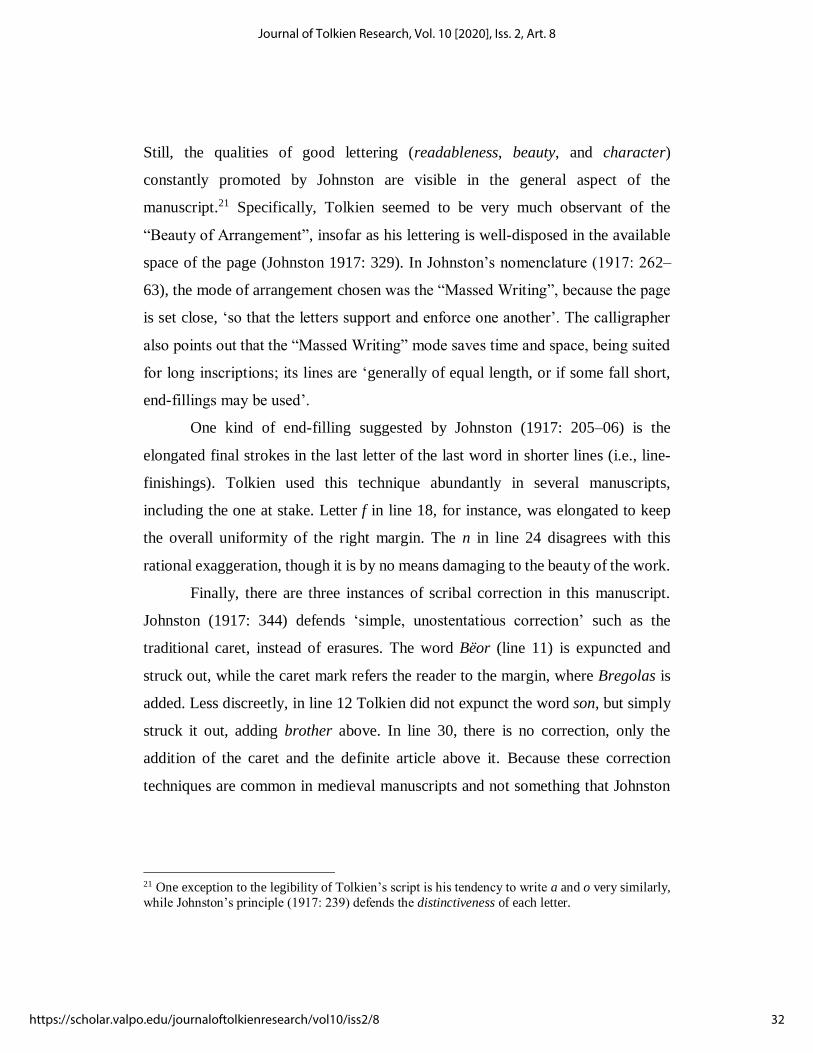
Still, the qualities of good lettering (readableness, beauty, and character)
constantly promoted by Johnston are visible in the general aspect of the
manuscript.21 Specifically, Tolkien seemed to be very much observant of the
“Beauty of Arrangement”, insofar as his lettering is well-disposed in the available
space of the page (Johnston 1917: 329). In Johnston’s nomenclature (1917: 262–
63), the mode of arrangement chosen was the “Massed Writing”, because the page
is set close, ‘so that the letters support and enforce one another’. The calligrapher
also points out that the “Massed Writing” mode saves time and space, being suited
for long inscriptions; its lines are ‘generally of equal length, or if some fall short,
end-fillings may be used’.
One kind of end-filling suggested by Johnston (1917: 205–06) is the
elongated final strokes in the last letter of the last word in shorter lines (i.e., line-
finishings). Tolkien used this technique abundantly in several manuscripts,
including the one at stake. Letter f in line 18, for instance, was elongated to keep
the overall uniformity of the right margin. The n in line 24 disagrees with this
rational exaggeration, though it is by no means damaging to the beauty of the work.
Finally, there are three instances of scribal correction in this manuscript.
Johnston (1917: 344) defends ‘simple, unostentatious correction’ such as the
traditional caret, instead of erasures. The word Bëor (line 11) is expuncted and
struck out, while the caret mark refers the reader to the margin, where Bregolas is
added. Less discreetly, in line 12 Tolkien did not expunct the word son, but simply
struck it out, adding brother above. In line 30, there is no correction, only the
addition of the caret and the definite article above it. Because these correction
techniques are common in medieval manuscripts and not something that Johnston
21 One exception to the legibility of Tolkien’s script is his tendency to write a and o very similarly,
while Johnston’s principle (1917: 239) defends the distinctiveness of each letter.
32
Journal of Tolkien Research, Vol. 10 [2020], Iss. 2, Art. 8
https://scholar.valpo.edu/journaloftolkienresearch/vol10/iss2/8

himself came up with (see Wakelin 2014), it is not possible to affirm that Tolkien,
in these instances, had his handbook in mind.22
The concept of “Massed Writing” in Johnston’s theory was linked to another
one, the “Fine Writing” (1917: 262–63), used for shorter inscriptions, being more
spaced, producing unequal, elegant lines. Tolkien also resorted to that mode, as
seen in Figure 22, dated 1937–38 by McIlwaine (2018: 216):
22 In fact, Tolkien did use the caret mark in wholly un-calligraphic contexts, presumably devoid of
Johnston’s influence. Such is the case of the minutes of an English Faculty Library Committee
meeting held in 1940. Tolkien, who chaired the meeting, added the time, 2:30pm, using a caret mark,
and struck out the word October, replacing it with November 28th. The minute book was exhibited
during the Tolkien Spring School at Oxford, in 2013.
Figure 22. I Eldanyáre. Reproduced from McIlwaine 2018: 217.
33
Kumamoto: The Living Tradition of Medieval Scripts in J.R.R. Tolkien’s Calligraphy
Published by ValpoScholar, 2020

Again, Tolkien makes use of line-finishings to create a uniform, centralized effect
on the page. At times, he would also combine “Fine” and “Massed” writings, the
former for titles and subtitles, and the latter for the main text. This is the case of a
1950s manuscript titled Dangweth Pengoloð (Figure 23) which Hammond and
Scull (2004: 202) singled out because of its great beauty.
Figure 23. Dangweth Pengoloð. Reproduced from Tolkien 2010: frontispiece.
34
Journal of Tolkien Research, Vol. 10 [2020], Iss. 2, Art. 8
https://scholar.valpo.edu/journaloftolkienresearch/vol10/iss2/8

Notice the difference in weight between “Fine” and “Massed” writings, the
unostentatious expunction in line 8 of the main text, and the great care with which
Tolkien treated most serifs in the ascenders of h and l, indicating a higher degree of
calligraphic impulse if compared with Of Beren and Lúthien (Figure 21).
Worthy of mention, once more, are Tolkien’s deviations from Johnston’s
Foundational Hand principles, such as the round-backed d (compare with Figure
21) and, more notably, the consistent use of ligatures, mainly the st ligature (e.g.
question, line 1), still common in typography, and the 2-shaped r used after o (e.g.
memories, line 4). Both ligatures were part of the few that survived in the
Carolingian Minuscule script, even though the Carolingian st ligature was always
made with the long, rather than rounded s (Derolez 2003: 53). Tolkien also uses the
2-shaped r after rounded letters other than o, such as d and p (e.g. kindreds, line 8,
and spring, line 19), a feature that first appeared in English manuscripts in the
middle of the thirteenth century (Parkes 2008: 124).
Since a principle in Johnston’s Writing & Illuminating, & Lettering is the
modernization of elements that may hamper legibility, he does not use ligatures of
these kinds in the book’s many figures, and merely notes the br, or, and pr ligatures
as a common feature of Gothic writing (Johnston 1917: 417). As it has been said,
Tolkien felt free to reinterpret Johnston’s directions.
Figure 24. Early inscription on the Doors of Durin showing the ct ligature in the word characters. Reproduced from McIlwaine 2018: 340.
35
Kumamoto: The Living Tradition of Medieval Scripts in J.R.R. Tolkien’s Calligraphy
Published by ValpoScholar, 2020

Other ligatures to which Tolkien resorted are sk, in the Dangweth Pengoloð
manuscript (Figure 23, asked, in the subtitle); ft (e.g. in The Tale of The Years,
reproduced in the frontispiece of The History of Middle-earth X: Morgoth’s Ring,
and the watercolor Bilbo comes to the Huts of the Raft-elves, in The Hobbit); sp
(Figure 26, line 5, spring), and ct, also a common typographic ligature (e.g. Figure
24; Father Christmas’s 1938 letter, and Quenya: Outline of Phonology, reproduced
on the cover of Parma Eldalamberon XIX).23
Tolkien’s formal hand, exemplified in Figures 21–4, remained relatively
stable in many of his calligraphic works and, according to Hammond and Scull
(2004: 202), he adapted the Foundational Hand ‘for his everyday handwriting and
for what might be called “semiformal” manuscripts such as Mr. Bliss’. While the
hand in Mr. Bliss can be described as semiformal in that it is more legible and
careful than Tolkien’s drafts normally were, it does not fit Johnston’s concept of
‘semiformal writing’ (1917: 322), which combines rapidity, freedom, beauty, and
legibility. However, he warns that there is a danger of semiformal writing becoming
informal and degenerate. In Mr. Bliss, Tolkien’s handwriting at times downgrades
into a muddy cursive, or displays disconnected strokes that attest the speed with
which he was writing, even if it never degenerates into complete illegibility.
As for Father Christmas’s shaky writing, at times it assumed a cursive shape
(e.g. 1923 envelope), but he mostly wrote in a script that can be regarded as a
creative adaptation of Tolkien’s formal hand (e.g. 1933 letter). From 1936, Father
Christmas’s secretary Ilbereth started helping with the letters, showing his ‘thin and
slanting’ writing (Tolkien 2012: 140) which resembles a copperplate cursive and
bears witness to the large inventory of scripts to which Tolkien could resort. In
1937, the North Polar found a ‘thick pen’ — i.e., a broad nib pen — to practice
23 Christopher Tolkien’s manuscripts made after his father’s, in Sauron Defeated (2002b: 322–27),
include ligatures such as st, ct, and a rare nt. Whether these and other stylistic features are
Christopher’s own or a reproduction of his father’s preferences could not be determined.
36
Journal of Tolkien Research, Vol. 10 [2020], Iss. 2, Art. 8
https://scholar.valpo.edu/journaloftolkienresearch/vol10/iss2/8

(Figure 25). With such an implement, Tolkien briefly gave the Polar Bear a round
script reminiscent of the Foundational Hand, but in 1938 the Polar Bear resumed
his former habit of writing angular, rune-like letterforms.
The North Polar Bear’s thick script leads us to the last example, roughly
contemporary with I Eldanyáre in Figure 22. It is a fine 1939 manuscript with one
of the earliest appearances of Treebeard, an evil giant back then (Figure 26).
Catherine McIlwaine (2018: 354) describes the hand in this manuscript as a
‘beautiful copperplate’, but it bears no resemblance to what is normally called
Copperplate script, a cursive letter written with a pointed nib (see, for instance,
Harris 1995: 102–03). It is probably more precise to place the script under the
influence of Johnston’s Foundational Hand as well.
The greatest difference between this manuscript and the ones shown in
Figures 21–4 is the use of a pen with a broader nib, also held at a slant, which
naturally produces thick and thin strokes, more evident here than in the other
examples. Tolkien did not construct the sharp serifs of the Foundational Hand, and
the text contains many ligatures, including the unusually archaic one in spring (line
5), and sh (pushed, line 5). The letterforms, however, follow Johnston’s principles
in their legibility and careful construction, displaying elongated finishing strokes
towards the end of the text. Also notice the insular F in Frodo (line 1). On the left
margin, a beautiful inscription — perhaps even more beautiful than the main text
Figure 25. North Polar Bear uses a thick pen. Reproduced from Tolkien 2012: 143.
37
Kumamoto: The Living Tradition of Medieval Scripts in J.R.R. Tolkien’s Calligraphy
Published by ValpoScholar, 2020

— with two lines from Chaucer’s The Reeve’s Tale. Worthy of mention in it are the
archaic long s; letter p, resembling Tolkien’s Tengwar which also abound in the
manuscript, and the Tironian nota for et (the 7-shaped symbol), which first appeared
with a crossbar in English manuscripts at the end of the twelfth century (Parkes
2008: 117).24
24 For further information on this inscription, see Bowers 2019: 215–16 and Christopher Tolkien’s
comments in Tolkien 2002a: 382.
Figure 26. Treebeard manuscript. Reproduced from McIlwaine 2018: 355.
38
Journal of Tolkien Research, Vol. 10 [2020], Iss. 2, Art. 8
https://scholar.valpo.edu/journaloftolkienresearch/vol10/iss2/8

Other works in which the influence of Johnston’s Foundational Hand can be felt in
Tolkien’s handwriting, but with varying degrees of formality, legibility, and
aesthetic preoccupation, are the frontispieces of Sauron Defeated (1992), The
Legend of Sigurd and Gudrún (2009), The Fall of Arthur (2013), and The Lay of
Aotrou and Itroun (2016). One should not forget the dust-jacket designs Tolkien
made for The Lord of the Rings, particularly the one for The Fellowship of the Ring
(cf. Hammond and Scull 2004: 179–83). The next section, however, will deal with
a more calligraphically interesting book, namely The Hobbit.
THE MAPS OF THE HOBBIT AND THE PSEUDO-SCRIBE OF THE RED BOOK
The Hobbit is an amazing work of visual art not only for its illustrations and
patterns: Tolkien was very careful with the lettering and, given the prominence of
this book among his works, it is safe to assume that through Bilbo’s story many
readers are first introduced to Tolkien’s calligraphic skills.
Especially interesting in this respect are the two maps Tolkien prepared,
Thror’s Map and the Wilderland map. Despite the similarities in their appearance,
they perform different functions within the Primary and Secondary Worlds, as
noted by Hammond and Scull (2004: 95):
[Thror’s Map] is a painstakingly crafted ‘facsimile’ meant to
give verisimilitude to Tolkien’s fiction. It is supposed to be a reproduction of one of the old documents […] that the narrator
consulted before telling his tale […].
Wilderland, in contrast, was meant to be no more than a general map, as Tolkien described it. There is no pretence of it
being an old map drawn by Bilbo. It bears Tolkien’s monogram,
marking it as his own work, and he further distinguished it from
Thror’s Map with […] small differences in the style of lettering. (The statement in chapter 3, that Bilbo ‘liked runes and letters
and cunning handwriting, though when he wrote himself it was a
39
Kumamoto: The Living Tradition of Medieval Scripts in J.R.R. Tolkien’s Calligraphy
Published by ValpoScholar, 2020

bit thin and spidery’, connects the hobbit with the deliberately shakier writing on Thror’s Map.)25
Alice Campbell (2006: 406–08) also talked about Tolkien’s maps, saying that he
‘used an upright “foundational hand”’ and that the ‘writing on [Thror’s Map] is in
English […] some in a style of calligraphy resembling the Irish Half-uncials, and
some in an English rune alphabet’. She also claimed that
Tolkien varied the lettering style on Thror’s map according to the culture represented: rounder uncials for Elvish maps, thinner
Roman letters for hobbits and men, and runes for Dwarves.
Bilbo, we are told, wrote with a thin, spidery hand, which is seen on early versions of Thror’s map.
Campbell’s assertions require some commenting. Tolkien’s use of the Foundational
Hand (not a “foundational hand”) is indeed clear in Thror’s Map, what with its
elongated final strokes; letter g with an open bowl and pronounced ear, and the
general legibility of all letters, even if, once again, he did not employ all the
letterforms proposed by Johnston, such as a, which irregularly appears in both
single- and double-story forms. The claim that ‘Tolkien varied the lettering style on
Thror’s map according to the culture represented’ is slightly puzzling: even though
the map can be seen as a calligraphic melting pot from the Primary World point of
view, the style on the map seems to imitate, as per Hammond and Scull’s quotation,
the handwriting of only one character, Bilbo.
But Campbell’s allusions to Uncial and Half-uncial scripts are enticing
insofar as both were clearly used by Tolkien in Thror’s Map. It does not seem,
however, that the Uncial letterforms in this map are intended to imply Elvishness,
25 See also The Lord of the Rings, Book VI, Chapter 9: ‘At the beginning there were many leaves
covered with Bilbo’s thin wandering hand; but most of it was written in Frodo’s firm flowing script.’
40
Journal of Tolkien Research, Vol. 10 [2020], Iss. 2, Art. 8
https://scholar.valpo.edu/journaloftolkienresearch/vol10/iss2/8

even though Tolkien’s Tengwar in some measure resemble the Uncial script.26
Also, while it is not incorrect to say that some letters resemble the Irish Half-uncials
— since all Insular scripts ultimately refer back to the Irish Half-uncials —, it is
more probable that Tolkien’s models for the Insular Half-uncial would have been
English rather than Irish manuscripts.
The Uncial script, a rounded, majuscule alphabet, was first attested in third-
century North African inscriptions (Roberts and Robinson 2020: 53), and it held a
high position in the hierarchy of scripts. It was brought to England by the Gregorian
mission (Bischoff 1990: 71) and was consistently used in Romanophile English
centers such as Monkwearmouth-Jarrow and Canterbury (Brown 2012: 141).
Edward Johnston, in his Writing & Illuminating, & Lettering, also discusses
Uncial and Half-uncial scripts. He considers them unfit for many practical
purposes, but their great beauty makes them ‘worth practising, and even justifies
their use (in a modernised form) for special [manuscripts], for the more romantic
books — such as poetry and “fairy tales” — and generally where speed in writing
or reading is not essential’ (Johnston 1917: 304, emphasis by the author).
The models Johnston chose for Uncial letters are two continental
manuscripts, but Tolkien may have had English models in mind, since the Uncial
script was employed in exquisite Anglo-Saxon manuscripts, such as the Codex
Amiatinus and the Stockholm Codex Aureus.27 A possible candidate is the Kentish
Vespasian Psalter,28 ‘a particularly impressive volume, written in a fine Uncial
26 On the other hand, in his website Amanye Tenceli (n.d., ‘Tengwar Calligraphy: The Formal Book-
hand Style’ section) Måns Björkman claims that the most common style of Tolkien’s Tengwar is reminiscent of the Half-uncials used in works such as the Book of Kells. Concerning the drawing
The Doors of Durin, in The Lord of the Rings, John R. Holmes (2006: 31) affirms that Tolkien’s
calligraphic translation ‘imitates both the insular characters of Old English manuscript and the very
Feänorian characters it translates’ (emphasis added). 27 Respectively Florence, Biblioteca Medicea-Laurenziana, Amiatino 1 and Stockholm, KB, A.135. 28 London, British Library, Cotton Vespasian A.i.
41
Kumamoto: The Living Tradition of Medieval Scripts in J.R.R. Tolkien’s Calligraphy
Published by ValpoScholar, 2020
script’ (Brown 2012: 124), to which Tolkien referred several times in the first part
of his essay Sigelwara Land (1932: 184 et passim).29
Johnston’s Half-uncial examples came from two codices: the Book of Kells,
housed at Trinity College Dublin,30 and the Northumbrian Lindisfarne Gospels.31
The latter was possibly the model Tolkien had in mind for English Half-uncials,
considering Stuart D. Lee’s supposition that, as a young academic, he saw E.G.
Millar’s 1923 facsimile (Lee 2014: 58).
Just as he had done with the English Carolingian minuscule, Johnston
suggested modernized letterforms for Half-uncial and Uncial scripts to increase
legibility and avoid forms that had passed out of common use. Half-uncial T, for
instance, lost its curved shaft in Johnston’s version (1917: 71), and although he did
not change some characteristically round Uncial letterforms, he admonished that,
even though Uncial D, E, H, M, and U ‘are essentially legible, people generally are
not accustomed to them, and may find them hard to read’ (1917: 304).
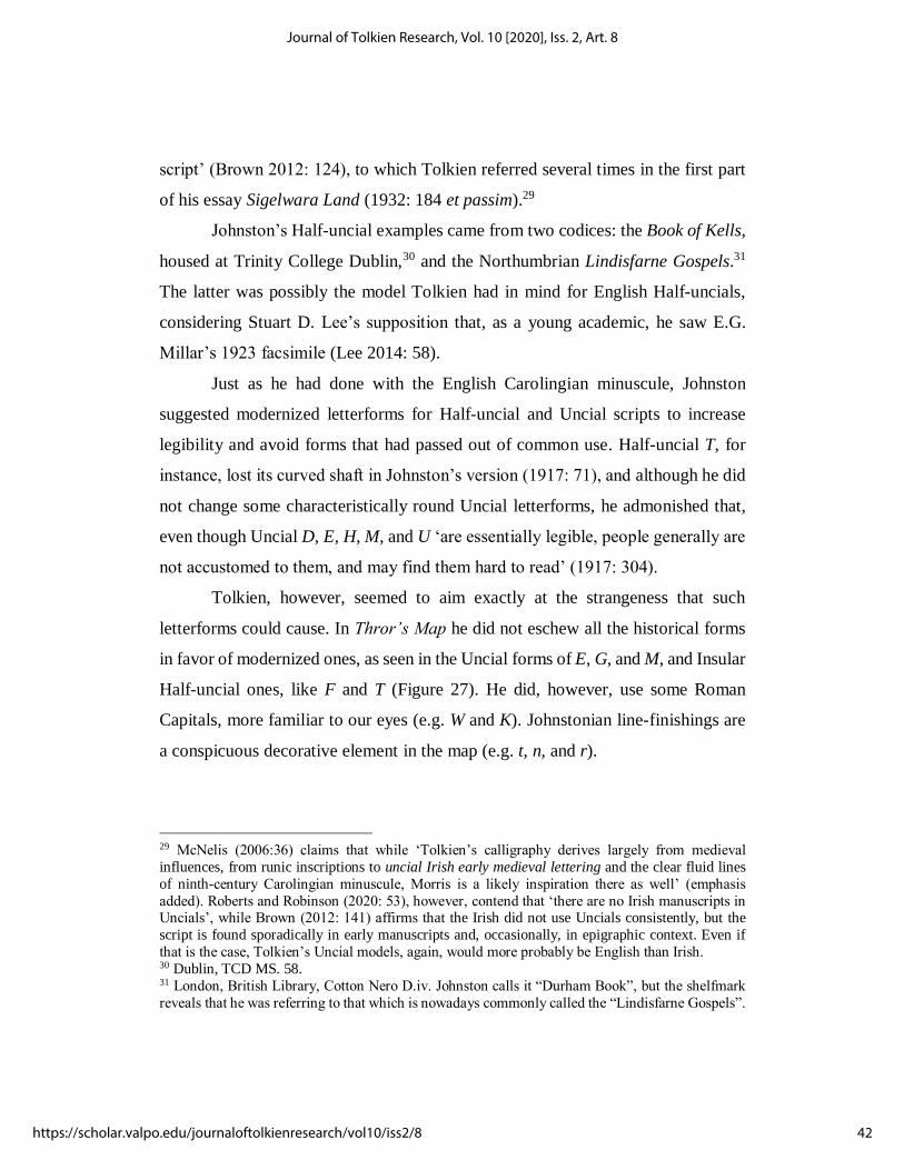
Tolkien, however, seemed to aim exactly at the strangeness that such
letterforms could cause. In Thror’s Map he did not eschew all the historical forms
in favor of modernized ones, as seen in the Uncial forms of E, G, and M, and Insular
Half-uncial ones, like F and T (Figure 27). He did, however, use some Roman
Capitals, more familiar to our eyes (e.g. W and K). Johnstonian line-finishings are
a conspicuous decorative element in the map (e.g. t, n, and r).
29 McNelis (2006:36) claims that while ‘Tolkien’s calligraphy derives largely from medieval
influences, from runic inscriptions to uncial Irish early medieval lettering and the clear fluid lines
of ninth-century Carolingian minuscule, Morris is a likely inspiration there as well’ (emphasis
added). Roberts and Robinson (2020: 53), however, contend that ‘there are no Irish manuscripts in Uncials’, while Brown (2012: 141) affirms that the Irish did not use Uncials consistently, but the
script is found sporadically in early manuscripts and, occasionally, in epigraphic context. Even if
that is the case, Tolkien’s Uncial models, again, would more probably be English than Irish. 30 Dublin, TCD MS. 58. 31 London, British Library, Cotton Nero D.iv. Johnston calls it “Durham Book”, but the shelfmark
reveals that he was referring to that which is nowadays commonly called the “Lindisfarne Gospels”.
42
Journal of Tolkien Research, Vol. 10 [2020], Iss. 2, Art. 8
https://scholar.valpo.edu/journaloftolkienresearch/vol10/iss2/8

Also decorative are the double-strokes in such letters as H and T, an element
paralleled in Tolkien’s later, 1940s ‘Leaves from The Notion Club Papers’ (Figure
28), where the rounded letterforms of seemingly Uncial and Half-uncial lineage are
described by the fictional editor Mr. Howard Green as “Lombardic capitals”
(Tolkien 2002b: 155).
Figure 27. Inscriptions from Thror’s Map. Reproduced from Hammond and Scull 2011: 53.
Figure 28. Lombardic capitals in the title piece of ‘Leaves from The Notion Club Paper’.
Reproduced from Tolkien 2002b: 154.
43
Kumamoto: The Living Tradition of Medieval Scripts in J.R.R. Tolkien’s Calligraphy
Published by ValpoScholar, 2020

This kind of capital letter and its construction are also explained by Edward
Johnston (1917: 210–11), who claims that most examples of Lombardic capitals are
‘often so unlike their originals, and so like one another, as to be scarcely readable’.
Tolkien seems to have followed Johnston’s advice and made the letters more
distinct and legible, even if he did not fill the outlined strokes in any of the cases.
In the Wilderland map, Tolkien employed the double-stroke decoration only
once, in “Iron Hills”, but he used Uncial letterforms more consistently than in
Thror’s Map, including the distinctive Uncial A, E, G and M (Figure 29).
The coexistence of different kinds of script seems to reach a deeper level in Thror’s
Map. By imitating Bilbo’s handwriting, Tolkien was giving verisimilitude to his
work, as indicated by Hammond and Scull (2004: 95). Such verisimilitude comes
about not only because he deliberately wrote with a shakier hand: Tolkien also
chose to render Bilbo’s handwriting using scripts that are part of England’s
manuscript heritage: Roman Capitals, Uncials, Half-uncials, and the Foundational
Hand, based on the English Carolingian minuscule. It is not surprising that he
envisaged such a connection between scripts and nation in the calligraphic project
he had for The Hobbit, since his Shire was itself linked to England:
But, of course, if we drop the ‘fiction’ of long ago, ‘The Shire’ is
based on rural England and not any other country in the world […] The toponymy of The Shire […] is a ‘parody’ of that of rural
England, in much the same sense as are its inhabitants: they go
Figure 29. Fragment of the Wilderland map. Reproduced from Hammond and Scull 2011: 125.
44
Journal of Tolkien Research, Vol. 10 [2020], Iss. 2, Art. 8
https://scholar.valpo.edu/journaloftolkienresearch/vol10/iss2/8

together and are meant to. After all the book is English, and by an Englishman […]
(Carpenter and Tolkien 2006: 250)
Tom Shippey also discussed the connection between the Shire and England:
Thus historically the Shire is like/unlike England, the hobbits
like/unlike English people. Hobbits live in the Shire as the
English live in England, but like the English they come from
somewhere else, indeed from the Angle […]. Both emigrated in three tribes […] all since then largely mingled. The English were
led by two brothers, Hengest and Horsa, i.e. ‘stallion’ and
‘horse’, the hobbits by Marcho and Blanco, cp. Old English *marh, ‘horse’, blanca (only in Beowulf) ‘white horse’.
(Shippey 2005: 116)
By using scripts that thrived in England, therefore, Tolkien was adding another
layer of Englishness to his Secondary World and introducing a mechanism of
coherence in his carefully devised role of pseudo-translator.
It is well known from The Lord of the Rings (especially Appendix F.II) that
Tolkien posed as the translator of the Red Book of Westmarch, which also contains
the story told in The Hobbit. According to his pseudo-translation project, the
Common Speech — or Westron — of the Red Book, was rendered as modern
English, and languages related to the Common Speech were, likewise, translated
into languages related to English.32
It is sensible to think that the “translation” of scripts was also part of this
project. In a prefatory text, for instance, Tolkien says that
[the hobbits’] language was like ours in manner and spirit; but if
the face of the world has changed greatly since those days, so
32 Further explanation can be found in Tolkien’s 1954 letter to Naomi Mitchison (Carpenter and
Tolkien 2006: 175), and in Turner 2011: 14–22.
45
Kumamoto: The Living Tradition of Medieval Scripts in J.R.R. Tolkien’s Calligraphy
Published by ValpoScholar, 2020

also has every detail of speech, and even the letters and scripts then used have long been forgotten, and new ones invented.
(Tolkien 2010: 20, emphasis added)
A little further in the text, Tolkien remarks (2010: 22):
Following the general lines of translation, to which these records have been submitted, as the names of the North have been given
the forms of Northern tongues in our own time, so the Runes [i.e.,
cirth] were represented by the runes of ancient England.
Since the cirth of Tolkien’s Secondary World were transliterated into English runes,
is it possible that non-runic scripts used in the Red Book were rendered by the
pseudo-translator employing typically English scripts? If that is the case, Thror’s
Map33 evidences that Tolkien was not only the pseudo-translator of the Red Book,
but also its pseudo-scribe, conscious that a relationship between the scripts used by
the hobbits and the ones employed in English could be established, visually
reflecting, in some measure, the complex linguistic fabric of his pseudo-translation.
FINAL REMARKS
Stuart Lee (2014: 68) concludes his article ‘Manuscripts: Use, and Using’ by
expressing his confidence to have demonstrated ‘Tolkien’s engagement with
manuscripts, how this experience filtered into his fiction, and how we, using the
skills of manuscript studies, can begin to get further insight into his own creative
processes’. The present article is founded upon a similar belief: that Tolkien’s
33 And other manuscripts in Tolkien’s invented writing systems, such as the leaves of the ‘Book of
Mazarbul’. See Hammond and Scull 2015: 77 and 81.
46
Journal of Tolkien Research, Vol. 10 [2020], Iss. 2, Art. 8
https://scholar.valpo.edu/journaloftolkienresearch/vol10/iss2/8

works can be better understood in the light of his calligraphic pieces and the
historical scripts he used as models. It is, as stated in the introduction, an incipient
conversation about a subject which has much yet to reveal, especially if new
manuscripts by Tolkien become available. Possible paths to be followed include the
study of the relationship between the Primary World scripts and his invented
writing systems; the “calligraphic translation” of maps and title pieces into other
languages, and further developments of the philological dimension of his works.
Another prolific field of inquiry is that of typography, since some typefaces have
been widely used for Tolkien-related works that seem to be visually connected to
the author’s calligraphy. Finally, if and when Tolkien’s Doworst,34 a work of which
we know so little, becomes available, studies on his calligraphy are sure to be given
new lease of life, perhaps reinforcing and making it even clearer the way Tolkien
combined scripts, creating a personal and unique style.
As of their article on the collation of MS. Bodley 34, d’Ardenne and Tolkien
were undertaking a review of the manuscript aiming to publish an edition of it.35
According to them (1947: 72), that edition ‘[would] doubtless contain many
debatable points, and, alas! almost certainly it [would] still contain errors’. The
same applies for this article. Yet, it is something well worth writing about if we are
to continuously increase our understanding of Tolkien’s works.
34 Headed Visio Petri Aratoris de Doworst, this calligraphic work is an interesting case of manuscript
transmission. Tolkien gave it to R.W. Chambers, and after Chamber’s death it passed to his
colleague Winifred Husbands. She, in turn, gave the manuscript to Arthur Brown, who had been
Chambers’s student (Hammond and Scull 2017b: 304). According to Anderson (2006: 144), the ‘location of this manuscript of “Doworst” since Brown’s death in 1979 is unknown’. A revised
typescript version of the work was given by Tolkien in 1953 to Kathleen Lea, according to
Hammond and Scull (2017b: 305). On page 658, however, the authors claim that the revision was a
‘calligraphic manuscript’. 35 This edition, however, was never published in collaboration with Tolkien (see Hammond and
Scull 2017b: 599).
47
Kumamoto: The Living Tradition of Medieval Scripts in J.R.R. Tolkien’s Calligraphy
Published by ValpoScholar, 2020
WORKS CITED
ANDERSON, Douglas A. 2006. ‘R.W. Chambers and The Hobbit’, Tolkien Studies,
3, 137–47
ATHERTON, Mark. 2012. There and Back Again: J.R.R. Tolkien and the Origins of
The Hobbit (London and New York: I.B. Tauris)
AUDEN, W.H. 2015. ‘Liner notes to a recording of Poems and Songs of Middle
Earth’, in Edward Mendelson (ed.). The complete works of W.H. Auden.
Prose. Volume V, 1963-1968 (New Jersey: Princeton University Press)
BISHOP, T.A.M. 1971. English Caroline Minuscule (Oxford: at the Clarendon
Press)
BISCHOFF, Bernhard. 1990. Latin Palaeography: Antiquity and the Middle Ages,
2nd edn, trans. by Dáibhí Ó Cróinín and David Ganz (Cambridge:
Cambridge University Press)
BJÖRKMAN, Måns. [n.d.]. ‘The Formal Book-hand Style’. Amanye Tenceli.
<at.mansbjorkman.net/teng_calligraphy.htm> [accessed 16 August 2020]
BOWERS, John M. 2019. Tolkien’s Lost Chaucer (Oxford: Oxford University Press)
BROWN, Michelle P. 2012. ‘Writing in the Insular World’, in Richard Gameson
(ed.). The Cambridge History of the Book in Britain, Vol. I (Cambridge:
Cambridge University Press) pp. 121–65
—— 2020. ‘The Triumph of the Codex: The Manuscript Book Before 1100’, in
Simon Eliot and Jonathan Rose (eds.). A Companion to the History of the
Book, 2nd edn (Chichester, West Sussex: John Wiley & Sons) pp. 203–18
CAMPBELL, Alice. 2006. ‘Maps’, in Michael D.C. Drout (ed.). J.R.R. Tolkien
Encyclopedia: Scholarship and Critical Assessment (London and New
York: Routledge) pp. 405–08
CARPENTER, Humphrey. 2002. J.R.R. Tolkien: A Biography, 6th edn (London:
HarperCollins)
CARPENTER, Humphrey, and Christopher Tolkien (eds.). 2006. The Letters of J.R.R.
Tolkien (London: HarperCollins)
CONNER, Patrick W. 2015. ‘The Structure of the Exeter Book Codex’, in Mary P.
Richards (ed.). Anglo-Saxon Manuscripts: Basic Readings (New York:
Routledge), pp. 301–16
D’ARDENNE, S.R.T.O., and J.R.R. Tolkien. 1947. ‘MS. Bodley 34: A re-collation
of a collation’, Studia Neophilologica, 20: 1–2, 65–72
DEROLEZ, Albert. 2003. The Palaeography of Gothic Manuscript Books – From the
Twelfth to the Early Sixteenth Century (Cambridge: Cambridge University
Press)
DROUT, Michael D.C. 2006. ‘Manuscripts, Medieval’, in Michael D.C. Drout (ed.).
J.R.R. Tolkien Encyclopedia: Scholarship and Critical Assessment (London
and New York: Routledge) pp. 404–05
48
Journal of Tolkien Research, Vol. 10 [2020], Iss. 2, Art. 8
https://scholar.valpo.edu/journaloftolkienresearch/vol10/iss2/8
DUMVILLE, David N. 1987. ‘English Square minuscule script: the background and
earliest phases’, Anglo-Saxon England, 16, 147–79
FIMI, Dimitra. 2010. Tolkien, Race and Cultural History: From Fairies to Hobbits
(Hampshire and New York: Palgrave Macmillan)
FREEMAN, Paul. 1989. ‘Foreword’, in Marc Drogin, Medieval Calligraphy: Its
History and Technique (New York: Dover)
GANZ, David. 2012. ‘Latin script in England: Square Minuscule’, in Richard
Gameson (ed.). The Cambridge History of the Book in Britain, Vol. I
(Cambridge: Cambridge University Press) pp. 188–96
GARTH, John. 2004. Tolkien and the Great War: The Threshold of Middle-earth
(London: HarperCollins)
—— 2006. ‘Artists and Illustrators’ Influence on Tolkien’, in Michael D.C. Drout
(ed.). J.R.R. Tolkien Encyclopedia: Scholarship and Critical Assessment
(London and New York: Routledge) pp. 36–8
—— 2020. The Worlds of J.R.R. Tolkien: The Places that Inspired Middle-earth
(Princeton and Oxford: Princeton University Press)
GILL, Eric, and Edward Johnston. 1909. Manuscript & Inscription Letters for
schools and classes and for the use of craftsmen (London: John Hogg)
GILLIVER, Peter; Jeremy Marshall, and Edmund Weiner. 2009. The Ring of Words:
Tolkien and the Oxford English Dictionary (Oxford: Oxford University
Press)
GILSON, Christopher; Arden R. Smith; Bill Welden, and Patrick H. Wynne. 2004.
Parma Eldalamberon XV: Sí Qente Feanor and Other Elvish Writings.
—— 2006. Parma Eldalamberon XVI: Early Elvish Poetry and Pre-Fëanorian
Alphabets
GORDON, E.V., and J.R.R. Tolkien (eds.). 1967. Sir Gawain and the Green Knight,
2nd edn, ed. by Norman Davis (Oxford: at the Clarendon Press)
HAMMOND, Wayne G., and Christina Scull. 2004. Tolkien: Artist & Illustrator
(London: HarperCollins)
—— 2011. The Art of The Hobbit (London: HarperCollins)
—— 2015. The Art of The Lord of the Rings (London: HarperCollins)
—— 2017a. The J.R.R. Tolkien Companion and Guide: Chronology, 2nd edn
(London: HarperCollins)
—— 2017b. The J.R.R. Tolkien Companion and Guide: Reader's Guide, 2nd edn
(London: HarperCollins)
HARRIS, David. 1995. The Art of Calligraphy (London: Dorling Kindersley)
HOLMES, John R. 2006. ‘Art and Illustrations by Tolkien’, in Michael D.C. Drout
(ed.). J.R.R. Tolkien Encyclopedia: Scholarship and Critical Assessment
(London and New York: Routledge) pp. 27–32
HOSTETTER, Carl F.; Arden Smith, and Patrick Wynne (eds.). 2002. Vinyar
Tengwar, 43
49
Kumamoto: The Living Tradition of Medieval Scripts in J.R.R. Tolkien’s Calligraphy
Published by ValpoScholar, 2020

JOHNSTON, Edward. 1917. Writing & Illuminating, & Lettering, 8th edn. (London:
John Hogg)
LEE, Stuart D. 2009. ‘J.R.R. Tolkien and The Wanderer: From Edition to
Application’, Tolkien Studies, 6, 189–211
—— 2014. ‘Manuscripts: Use, and Using’, in Stuart D. Lee (ed.). A Companion to
J.R.R. Tolkien (Chichester, West Sussex: John Wiley & Sons) pp. 56–76
LOCKETT, Leslie. 2002. ‘An integrated re-examination of the dating of Oxford,
Bodleian Library, Junius 11’, Anglo-Saxon England, 31, 141–73
MCGUINNE, Dermot. 2010. Irish Type Design: A History of Printing Types in the
Irish Character, 2nd edn (Dublin: National Print Museum)
MCILWAINE, Catherine. 2018. Tolkien: Maker of Middle-earth (Oxford: Bodleian
Library)
MCNELIS III, James I. 2006. ‘Artistic Movements’, in Michael D.C. Drout (ed.).
J.R.R. Tolkien Encyclopedia: Scholarship and Critical Assessment (London
and New York: Routledge) pp. 35–36
MORISON, Stanley. 1972. Politics and Script: Aspects of authority and freedom in
the development of Graeco-Latin script from the sixth century B.C. to the
twentieth century A.D., ed. by Nicolas Barkers (Oxford: at the Clarendon
Press)
PARKES, M.B. 2008. ‘Handwriting in English books’, in Nigel Morgan and Rodney
M. Thomson (eds.). The Cambridge History of the Book in Britain, Vol. II
(Cambridge: Cambridge University Press) pp. 110–35
PHELPSTEAD, Carl. 2011. Tolkien and Wales: Languages, Literature and Identity
(Cardiff: University of Wales Press)
PRIESTMAN, Judith. 1992. Tolkien: Life and Legend (Oxford: Bodleian Library)
ROBERTS, Jane, and Pamela Robinson. 2020. ‘Paleography and Codicology’, in
Simon Eliot and Jonathan Rose (eds.). A Companion to the History of the
Book, 2nd edn (Chichester, West Sussex: John Wiley & Sons) pp. 51–64
RUSHFORTH, Rebecca. 2012. ‘Latin script in England: Caroline Minuscule’, in
Richard Gameson (ed.). The Cambridge History of the Book in Britain, Vol.
I (Cambridge: Cambridge University Press) pp. 197–210
SHIPPEY, Tom. 2005. The Road to Middle-earth, Revised Edition (London:
HarperCollins)
—— 2014. ‘Tolkien as Editor’, in Stuart D. Lee (ed.). A Companion to J.R.R.
Tolkien (Chichester, West Sussex: John Wiley & Sons) pp. 41–55
STOKES, Peter A. 2014. English Vernacular Minuscule from Æthelred to Cnut
c.990-c.1035 (Cambridge: D.S. Brewer)
TOLKIEN, John, and Priscilla Tolkien. 1992. The Tolkien Family Album (London:
HarperCollins)
TOLKIEN, J.R.R. 1929. ‘Ancrene Wisse and Hali Meiðhad’, in Essays and Studies
by Members of the English Association, 14, 104–26
50
Journal of Tolkien Research, Vol. 10 [2020], Iss. 2, Art. 8
https://scholar.valpo.edu/journaloftolkienresearch/vol10/iss2/8

—— 1932. ‘Sigelwara Land’, Medium Ævum, 1, 3, 183–96
—— 1981. The Old English Exodus: Text, Translation and Commentary, ed. by
Joan Turville-Petre (Oxford: at the Clarendon Press)
—— 2002a. The History of Middle-earth VI: The Return of the Shadow, ed. by
Christopher Tolkien (London: HarperCollins)
—— 2002b. The History of Middle-earth IX: Sauron Defeated, ed. by Christopher
Tolkien (London: HarperCollins)
—— 2010. The History of Middle-earth XII: The Peoples of Middle-earth, ed. by
Christopher Tolkien (London: HarperCollins)
—— 2012. Letters from Father Christmas, ed. by Baillie Tolkien (London:
HarperCollins)
—— 2014. Beowulf: A Translation and Commentary, together with Sellic Spell, ed.
by Christopher Tolkien (London: HarperCollins)
TREHARNE, Elaine. 2011. ‘The Good, the Bad, the Ugly: Old English Manuscripts
and their Physical Description’, in Matthew T. Hussey and John D. Niles
(eds.). The Genesis of Books: Studies in the Scribal Culture of Medieval
England in Honour of A.N. Doane (Turnhout: Brepols) pp. 261–83
TURNER, Allan. 2011. ‘A Theoretical Model for Tolkien Translation Criticism’, in
Thomas Honegger (ed.) Tolkien in Translation, 2nd end (Zurich and Jena:
Walking Tree), pp. 1-30
WAKELIN, Daniel. 2014. Scribal Correction and Literary Craft: English
Manuscripts 1375-1510 (Cambridge: Cambridge University Press)
51
Kumamoto: The Living Tradition of Medieval Scripts in J.R.R. Tolkien’s Calligraphy
Published by ValpoScholar, 2020
Copyright © 2022 FDOKUMEN