The GAV Toolkit for Multiple Linked Views
13
The GAV Toolkit for Multiple Linked Views Mikael Jern, Sara Johansson, Jimmy Johansson, Johan Franzén VITA – Visualization Technology and Applications, Linkoping University, Sweden mikael.jern, sara.johansson, jimmy.johansson, [email protected] Abstract Implementing InfoVis multivariate data tools, time- linked coordinated views and visual dynamic queries with conditioning from scratch is not a simple programming task. Our research objective is to develop a generic GeoAnalytics visualization (GAV) component toolkit, based on the principles behind visual analytics (VA), for dynamically exploring time-varying, geographically referenced and multivariate attributes simultaneously. GAV includes components based on a synergy of technologies from information visualization, geovisualization and scientific visualization. Our research concentrates on improving visual user interfaces (VUI) methods and trying to extend existing visual representation techniques. The effectiveness of our proposed component toolkit and framework is demonstrated in two customized applications GeoWizard analysing multivariate energy usage data for Swedish municipalities and MD-Explorer exploring multivariate data using novel interactive ternary diagrams. We use parallel coordinates with embedded visual inquiry methods that serves as a visual control panel for dynamically linked and coordinated views. Finally, discoveries made during the visual exploration process can be captured and organized in a format for later recall and communication to others. 1. Introduction The fast growing quantity of spatial-temporal and multivariate data calls for creative integrated information and geovisualization tools. While researchers have made substantial advances over the past decade, many challenges remain particularly for working with temporal and multivariate attributes simultaneously and have a spatial dimension. We introduce our generic GeoAnalytics visualization (GAV) component toolkit. GAV is based on the principles behind visual analytics (VA) [9] but with more focus on the explorative data analysis (EDA) aspect. GAV provides a broad collection of dynamic visual interaction components familiar from the InfoVis research domain and hopefully pertinent and potentially useful. Our research concentrates on improving visual user interfaces (VUI) methods. Users interact directly with the on-screen graphics without dependence on more traditional and space-consuming GUI controls and therefore valuable screen area is reserved for VA representations. Multivariate data are not best analysed through the use of a single type of graph and view. In order to detect complex patterns within multivariate data it is more necessary to view it through a number of different visual representation methods, each of which is best suited to highlight different patterns and features. GAV provides a framework for building tailor-made multiple-linked and coordinated views applications. GAV tools utilize the advantages of human perception enabling the user to take a more active role in the exploration process; a sense of immediacy inter- action is achieved. For example, in our GeoWizard application this is demonstrated through its ability to coordinate time-link views. Parallel coordinates (PC), time and trend graphs, choropleth maps are time-linked so that all of the views are synchronized to the same point in time. Animating time-linked views simultaneously through time is also a common feature in many VA tasks and enables users to dynamically compare spatio-temporal data [8]. In our second demonstrator MD-Explorer, we introduce the ternary diagram to the InfoVis community. When analysts explore data, they need to capture and synthesize their results in ways that will be easy to return to at later time in a format that is open to collaboration with others. The GAV “snapshot” feature allows the analysts to explain how they arrived at a conclusion. Fifth International Conference on Coordinated and Multiple Views in Exploratory Visualization (CMV 2007) 0-7695-2903-8/07 $25.00 © 2007
-
Upload
northumbria -
Category
Documents
-
view
3 -
download
0
Transcript of The GAV Toolkit for Multiple Linked Views
The GAV Toolkit for Multiple Linked Views
Mikael Jern, Sara Johansson, Jimmy Johansson, Johan Franzén
VITA – Visualization Technology and Applications, Linkoping University, Sweden mikael.jern, sara.johansson, jimmy.johansson, [email protected]
Abstract Implementing InfoVis multivariate data tools, time-
linked coordinated views and visual dynamic queries with conditioning from scratch is not a simple programming task. Our research objective is to develop a generic GeoAnalytics visualization (GAV) component toolkit, based on the principles behind visual analytics (VA), for dynamically exploring time-varying, geographically referenced and multivariate attributes simultaneously. GAV includes components based on a synergy of technologies from information visualization, geovisualization and scientific visualization. Our research concentrates on improving visual user interfaces (VUI) methods and trying to extend existing visual representation techniques. The effectiveness of our proposed component toolkit and framework is demonstrated in two customized applications GeoWizard analysing multivariate energy usage data for Swedish municipalities and MD-Explorer exploring multivariate data using novel interactive ternary diagrams. We use parallel coordinates with embedded visual inquiry methods that serves as a visual control panel for dynamically linked and coordinated views. Finally, discoveries made during the visual exploration process can be captured and organized in a format for later recall and communication to others.
1. Introduction
The fast growing quantity of spatial-temporal and multivariate data calls for creative integrated information and geovisualization tools. While researchers have made substantial advances over the past decade, many challenges remain particularly for working with temporal and multivariate attributes simultaneously and have a spatial dimension.
We introduce our generic GeoAnalytics visualization (GAV) component toolkit. GAV is based on the
principles behind visual analytics (VA) [9] but with more focus on the explorative data analysis (EDA) aspect. GAV provides a broad collection of dynamic visual interaction components familiar from the InfoVis research domain and hopefully pertinent and potentially useful. Our research concentrates on improving visual user interfaces (VUI) methods. Users interact directly with the on-screen graphics without dependence on more traditional and space-consuming GUI controls and therefore valuable screen area is reserved for VA representations.
Multivariate data are not best analysed through the use of a single type of graph and view. In order to detect complex patterns within multivariate data it is more necessary to view it through a number of different visual representation methods, each of which is best suited to highlight different patterns and features. GAV provides a framework for building tailor-made multiple-linked and coordinated views applications.
GAV tools utilize the advantages of human perception enabling the user to take a more active role in the exploration process; a sense of immediacy inter-action is achieved. For example, in our GeoWizard application this is demonstrated through its ability to coordinate time-link views. Parallel coordinates (PC), time and trend graphs, choropleth maps are time-linked so that all of the views are synchronized to the same point in time. Animating time-linked views simultaneously through time is also a common feature in many VA tasks and enables users to dynamically compare spatio-temporal data [8]. In our second demonstrator MD-Explorer, we introduce the ternary diagram to the InfoVis community.
When analysts explore data, they need to capture and synthesize their results in ways that will be easy to return to at later time in a format that is open to collaboration with others. The GAV “snapshot” feature allows the analysts to explain how they arrived at a conclusion.
Fifth International Conference on Coordinated and Multiple Views in Exploratory Visualization (CMV 2007)0-7695-2903-8/07 $25.00 © 2007

Figure 1: GeoWizard – search for space-time-att ribute patterns – 5 highlighted regions. Our ongoing applied research efforts presented in this
paper focus on the following attributes: • Synergy of visual representation and visual interfaces; • Methods for discovering conditioned trends in
temporal behaviours; • Dynamically linked, coordinated and resizable views
from different perspectives; • Methods to provide interactive performance that can
support visual analytic reasoning; • Design based on cognitive and perceptual principles; • Techniques to interact visually with data in a way that
supports clear understanding of the problem, finding reasonable ways to solve it, seeing pros and cons of each possible solution, and understanding the tradeoffs between various options;
• Integrate presentation and dissemination into the GeoAnalytics discovery process through snapshots;
We begin the paper with a brief section about related work that has influenced our research, followed by a con-ceptual and technical description of the overall GAV system. Next we will discuss the visualization and interaction techniques that are implemented in two demonstrators GeoWizard and MD-Explorer. We finish by discussing our findings and present ideas for future work.
2. Related work
Implementing InfoVis multivariate data tools, time-linked coordinated views and visual dynamic queries with conditioning from scratch is not a simple programming task. Toolkits such as InfoVis Toolkit [19] and Visualization ToolKit [12] can ease this burden. These toolkits are freely available. Some commercial InfoVis systems, such as SpotFire [18] provide limited tools for
Fifth International Conference on Coordinated and Multiple Views in Exploratory Visualization (CMV 2007)0-7695-2903-8/07 $25.00 © 2007
customized and scalable applications. We propose a new GAV component toolkit that integrates with Microsoft .NET and Visual Studio development tools.
Visualization of spatio-temporal data has been the subject of several recent research papers [6]. The results include both conceptual models and extensive specialized applications. GeoVISTA Studio [13] is an open source Java-based visual programming environment and is commonly used for developing geovisualization applications. Another general system is CommonGIS [10], tools that support exploratory data analysis. VIS-STAMP [4] tools leverage visual and computational methods to search for space-time and multivariate patterns. Andrienko and Andrienko have described interesting approaches in several papers [5], [6] including the impact of data and task characteristics. Carr et al. [24] describe a multivariate approach based on conditioned choropleth maps. However many systems lack support for analysing simultaneously multiple attributes data and spatio-temporal behaviour. In our research we propose dynamic GeoAnalytics methods to also include support for visual inquiries [7] based on conditioned space-time and multivariate patterns.
3. Conceptual data and component methodology
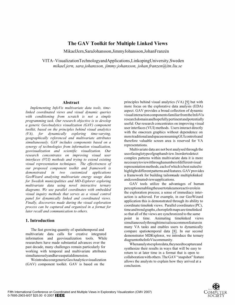
GAV is a development toolkit for tailor-made, multiple-linked views and task-oriented applications based on layered component thinking. We employ our own component-based class libraries and data model. The GAV components are developed in C# based on Microsoft’s low-level DirectX graphics library and fulfil many VA requirements. We have set the following generic requirements for our tool design and implementation of a GeoAnalytics’ framework: 1. Layered component approach for customization,
scalability and reusability; 2. Shorten development time by utilising already
developed and assessed components; 3. Mechanism for integrating external user components; 4. A 3D data model for spatio-temporal and multivariate
attribute data exploration; 5. Hardware rendering techniques for interactive
performance; 6. Visual space-time and multivariate querying tools; 7. Component-embedded colouring interaction and
filtering;
3.1 Layered component architecture
The GAV toolkit enables rapid development of customized applications by combining low-level basic and functional components, each one performing a small
specific task in the overall VA process, into customized and task-centric applications such as GeoWizard and MD-Explorer. The layered component architecture enables broad applicability, customization, scalability, reusability of components and shortens the development time.
Interoperability is an idea that is invaluable to the development of the GAV toolkit since different developers, working almost entirely independently, can contribute VA components to the GAV component repository. Example of available components include scatter plot, PC, shaded graphs, table lens, time and trend series graphs, choropleth map, ternary diagram, 2D, 3D and 4D contour maps, colour legend and several data model, filter and data transformation components.
Figure 2: The GAV toolkit architecture. The data flow pipeline is divided into the following three layers: the data access layer, the data transform/filter layer and the data consumer layer. This separation into layers simplifies and improves the pipeline modularity which facilitates the development process.
3.2 3D Data Representation
An array-based data cube model is used to store multivariate data or time-varying multivariate data sets. Two dimensions of the cube can be used to store a multivariate data set where the axes represent object and their attributes. In the three dimensional case the data model is extended with one more axes which can, for example, represent time. An application specific example of the three dimensional case is seen in figure 6 where an object is a Swedish municipality containing a number of energy consumption measurements over time. A value in the data model is found by a three dimensional index.
Fifth International Conference on Coordinated and Multiple Views in Exploratory Visualization (CMV 2007)0-7695-2903-8/07 $25.00 © 2007

Figure 3: Layered component architecture
3.3 Data Flow
The GAV toolkit data flow architecture is divided into three layers; the data access layer, the data transform/filter layer and the data consumer layer, see figure 2.
1. The data access layer provides GAV with data from underlying data sources. The toolkit supports reading many different data sources;
2. The data transform/filter layer of the toolkit filters and/or transforms the data provided from the data access layer, examples are: down sampling, clustering and projections;
3. The data consumer layer includes the GAV functional components;
3.4 Resizable views
Multivariate data containing both spatial and temporal information are difficult to analyze through the use of a single type of graph. In order to detect complex patterns within the data it is more convenient to view it through a number of different visual representation methods, each of which is best suited to highlight different patterns and features. It is also necessary to achieve balance between non-abstract and abstract visual representation. Some problems are best solved with one or the other, however many require the services of both representations. A common approach is to display each view in a separate window and allow the user to arbitrary arrange the windows. In this context a view is referred to as a clearly defined region on the screen. The notion of arranging views is generic and exists in many visualization systems.
Fifth International Conference on Coordinated and Multiple Views in Exploratory Visualization (CMV 2007)0-7695-2903-8/07 $25.00 © 2007

The GAV toolkit employs Microsoft’s development
tool, Visual Studio’s .NET hierarchical layout management to interactively design a GUI layout with dynamic embedded resizable views in a single coherent window. By using this layout management environment, a visual interface can be divided into a number of views separated by interactive splitters, allowing the user to scale the individual views.
GAV functional components are attached to views through a view organizer class (figure 4). This class handles when and where functional component are rendered. A list of connections between views and GAV functional components is stored internally. Whenever a component is to be rendered, the organizer finds the view assigned to that component and tells the graphics adapter to use that view as rendering target. A re-rendering of a functional component can be triggered in multiple ways.
• The paint event is received from a view. This occurs,
for example, if the view is resized. • The programmer has updated some properties on a
component and requests an update. • The component itself requests an update. This
happens, for example, if the user interacts with a component by means of filtering, rotation or translation.
Figure 4: A functional component is attached to a view using
the VUI organizer.
3.5 Linked views
Linked views enable rapid and dynamic comparison of different visualizations of data. Coordination in GAV is implemented using a data linking method where the visualization components can use the same data model and colouring scheme, and where any dynamic filtering or picking made in one of the linked visualization components easily can be propagated to all other components.
The standard filtering method in the GAV toolkit is
index/row based. The information whether an index/row is visible or not is stored in a separate class and is not a part of the data flow pipeline. This approach enables filtering in different functional components showing different transformed versions of the same data. An example of this approach could be a PC and a scatter plot, visualizing the same data, where the data for the scatter plot has been transformed using a logarithmic function and the PC shows the non-transformed version of the data.
GAV provides the user with high interactive performance when exploring spatial-time multivariate data. If an application does not scale well with these dimensionalities, its performance in terms of execution time can degrade. Many computer games and visualization environments use a render loop, which means that the views are updated all the time. A GAV component is only rendered when an update is explicitly required. The GAV toolkit takes advantage of the GPU on the graphics adapter to enable high rendering performance.
A sense of analytical reasoning and dynamic inter-action is, for example, achieved in GeoWizard through its ability to time-link views. Parallel coordinates, time and trend graphs, choropleth maps are time-linked so that all of the views are synchronized to the same point in time. Animating time-linked views simultaneously through time is also a common feature in many VA tasks and enables users to dynamically compare spatio-temporal data [8].
4. GeoWizard – a GeoAnalytics application
Figure 5: GeoWizard supports visual analytical reasoning
through this sense-making loop
Fifth International Conference on Coordinated and Multiple Views in Exploratory Visualization (CMV 2007)0-7695-2903-8/07 $25.00 © 2007

Complex official statistical data that contain geographic locations, time series and multivariate attributes are made available free of charge by National Statistics Institutes such as Statistics Sweden, SCB [14]. This data can be used for the purpose of making policy decisions, and to facilitate the appreciation of economic, social, demographic, environmental and other matters of interest to the governments, government departments, local authorities, businesses, and to the general public. For our GAV toolkit demonstrator, we select the environmental domain and the supply and use of energy data for controlling the emission of carbon dioxide among 290 Swedish municipality regions during 1990-2004. Interoperability with SCB’s databases is achieved through a request for data in a SCB dynamic HTML form connected to the SCB server. Selected data is returned as an Excel file that is imported into GeoWizard with a GAV component (figure 5).
In our previous publications, we first demonstrated an early prototype [1],[16] built on a commercial toolkit, which limited our preference for programming extensions and restricted distribution of the result. In our 2 nd attempt [2], we designed and implemented a complete application from scratch requiring a massive programming effort. In this 3 rd attempt, we introduce the GAV component toolkit and the data cube model as the programming platform for our application development. We can now implement tailor-made and verified applications, such as GeoWizard in 1-2 weeks instead of months.
We use the data cube model optimized for efficiency and scalability in handling our spatio-temporal, multivariate attribute data sets. This conceptual data model can be seen as a cube filled with discrete values. The cube has tree axes: spatial, time and attributes. In GeoWizard, a region is a Swedish municipality and the attributes are various energy consumption measurements (transport, housing, etc). The time is the data acquisition period (figure 6). The general method for finding a value in the cube is by its position (space; time; attribute;). To obtain the housing energy consumption for Stockholm in 2004, find the value in the cube at that position.
Space-time-attribute awareness means that the GAV data cube can be analysed and visualized across all three dimensions simultaneously. GeoWizard performs this task by integrating five functional components: parallel coordinates (PC), time graph (TG), time trend graph (TTG) and two choropleth maps (figure 1). PC serves as a visual control panel “browser” for multivariate data and TG for time in the integrated system.
Figure 6: GAV data cube model
The PC, TG and TTG use the same PC basic component but with different assigned properties. They all embed dynamic range sliders for defining visual inquiries such as thresholds and conditioning that constrains the dependent attribute data for selected time periods displayed to those meeting specified parameters on all attributes and time (figure 5). These events are processed with minimal cognitive overhead and virtually instantaneous response time. This can be an effective method to isolate patterns that share a range of values of a particular attribute and time step.
The GeoWizard’s VUI (figure1) is divided into five linked views separated by interactive splitters, allowing the user to adopt the layout by changing the size of individual views. Direct manipulation interaction allows maximum screen area to be reserved for the visualization while most of the traditional GUI controls are hidden and can be pulled out when needed in context-sensitive pull-down menus.
User-controlled events of interest can be expressed simultaneously in all three graphs involving multivariate attribute values for time varying data. Events can be defined for single time steps or in the complete temporal domain. This ability to explore easily the data is helpful in identifying specific patterns of interest, as well as in gaining understanding of the data set as a whole.
Fifth International Conference on Coordinated and Multiple Views in Exploratory Visualization (CMV 2007)0-7695-2903-8/07 $25.00 © 2007

In addition to having a global view of patterns in the data cube, the VUI supports several methods to interactively select “regions” of particular interest including pick individual items, rectangle selection and selection based on defined conditions and constraints.
4.1 Parallel coordinates (PC) Parallel coordinates (PC) has been used in many
multiple view geovisualization environments [13]. In GeoWizard, each municipality is represented by a string passing through the parallel axes. Each axis represents a dependent, single attribute data (one time step) in the data cube. A string forms a visual representation of the characteristics of one municipality. Differences between selected municipalities can be found by visually comparing the strings representing them. The number of attributes that can be visualized is restricted only by the horizontal resolution of the PC view. VUI features include
range sliders for defining events such as exceeding of a given threshold, interactive axis labels for controlling visualizations and dynamic movable axis. Polylines outside the given condition are grayed out.
4.2 Time graph (TG) The behaviour of the selected and constraint attribute
data in the PC are represented in a time graph (TG) for a given time period. In figure 8, the attribute “Energy Total kWh/p” is selected in the PC. The corresponding attribute values for the time period 1990-2004 are shown in the TG (right). The TG is time-linked to the PC and updating time in TG will simultaneously change the time step for all attributes in the PC (here 2004). Animating controls (top menu) will dynamically update the PC and linked map and focus users to relevant events. Interesting municipalities can be selected in the map, PC or TG and are highlighted in all displays.
Figure 7: GeoWizard developed with GAV components. Four linked and coordinated views explore the emission of carbon dioxide (CO 2) kg/inhabitants for a selected region and county Stockholm in 2004. Six multivariate CO 2 attributes representing Total, Energy, Household, Industry, Service and Transport are expl ored in the PC [Parallel Coordi nate view]. A string in the PC forms a visual representation of the characteristics of one municipality in the selected county. The user can follow the emissi on of CO 2 for each attribute and select which should be displaye d in the map views. The di fferences between selected municipalities can be found by visually comparing the (here 4) highlighted strings representing them. We compare the total emission of CO 2 (left map) with the emission of household CO 2 (right map). Four specific muni cipalities are highlighted in all views to point out interesting discoveries. Södertälje has the most problems with a high total of CO 2 emissions (from industry), while Danderyd - a high income area - has problems with CO 2 emissions from households, Upplands-Väsby shows the highest concentration of transport and finally the largest populated municipality Stockholm shows average emissions. A coordinated table view allows the user to read CO 2 values.
Fifth International Conference on Coordinated and Multiple Views in Exploratory Visualization (CMV 2007)0-7695-2903-8/07 $25.00 © 2007
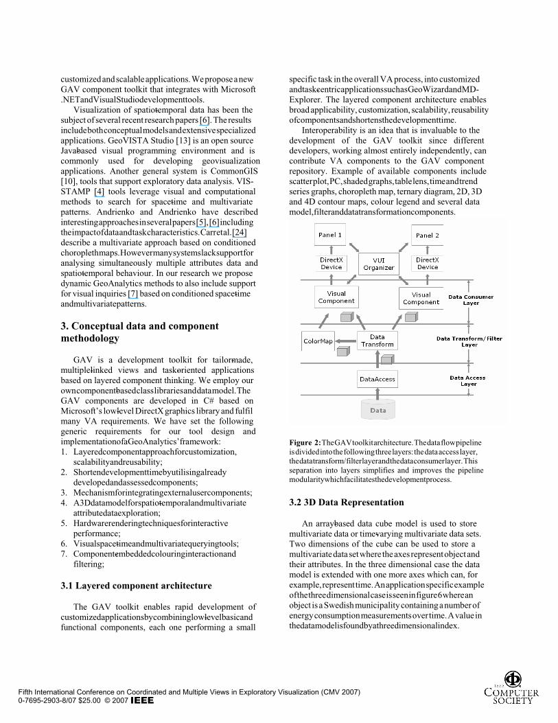
4.3 Time trend graph (TTG) Dynamic animating changes over time is a significant and important feature but there are more profound challenges. Even if a trend or a sharp change is recorded in a data set, traditional visualizations of the data set’s structural and dynamic properties might not feature such trends and changes prominently enough to draw users’ attention. Therefore, it was necessary to provide a visualization component with built-in trend detection mechanisms connected to PC, TG and data modelling components. The time trend graph (TTG) represents Value (t) – Value (t - 1) in percentage, where t is the time period for the observation. The viewer can easily notice changes in particular years (TTG) but also observe municipalities with similar trends (TG) although there values are of different amplitudes.
4.4 Choropleth maps GeoWizard provides two choropleth map views, where the left map is linked to the PC and visualize coloured attribute and for selected time step (TG) and the right map is linked to the TTG and is coloured according to the trend in % from TTG, taking constraints on any attributes into consideration. Any changes in classification of the choropleth map [11] also change the colour of the corresponding municipalities in the PC and TG. Map animation of events over time and geography is provided simultaneously for relevant views as the time slider is moved forward and backwards in time.
4.5 Conditions and constraints GeoWizard provides visual inquiry methods based conditioned space-time and multivariate events (e.g.: “Find municipalities with a total energy usage in 2004 constrained by high Transport, Service and Housing energy – Search for extreme changes during 1990-2004”). Attribute Energy Total is selected (PC -bottom). Time step is 2004 (TG - middle). With range sliders attached to each axis (figure 8), the user can interactively alter constraints on attribute, time and trend values. These dynamic queries will immediately reflect the visual contents in all views. Moving the handles at the top and bottom of the axis controls the range of a selected attribute. AND operations are performed by combining several range slides queries and corresponding subsets of the data is filtered out. In figure 6, attribute Energy Total is selected (PC -bottom). Time step is 2004 (TG - middle). Visual inquiry conditions are defined for three attributes Transport, Service and Housing – We are only interested in exploring regions with high energy usage for these three attributes. The range sliders are used to constrain the data cube to fulfil the given conditions. A particular area with extreme changes in trend is highlighted.
Figure 8: Example of conditioned space-time- attribute inquires defined by range sliders.
Figure 9: The municipalities that fulfil the given conditions in figure 8 are shown in a List View. The selected area Simrishamn is highlighted.
Fifth International Conference on Coordinated and Multiple Views in Exploratory Visualization (CMV 2007)0-7695-2903-8/07 $25.00 © 2007

5. MD-Explorer – interactive Ternary diagram for multivariate data exploration
MD-Explorer is an application developed for the exploration and presentation of aggregate data, which is multivariate data that at every combination sums up to 100 percent. The data visualized in MD-Explorer contains not only the variables that the aggregate is made up by, but also non-aggregate variables that vary due to the proportions of the aggregate variables, as well as to the impact of uncontrollable variables. The non-aggregate variables presented in the application describe the behaviour of different combinations of aggregate variables as a mean value and a variance. The mean value is a measure of the result of that specific proportion of aggregate variables, while the variance is a measure of the variation of the result due to the uncontrollable variables. In figure 10 the data visualized in MD-explorer is presented using parallel coordinates (PC). The data set is made up of six aggregate variables, named Var 1 – Var 6, and the two non-aggregate variables, mean value and variance.
Figure 10: Parallel coordinates visualizing the data set of MD-Explorer. The data set is made up of six aggregate variables, named Var 1 to Var 6, and two non-aggregate variables, named Mean and Variance.
The MD-Explorer application exploits three GAV
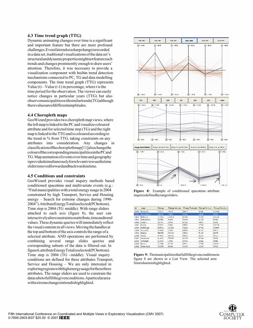
components; ternary diagram, 2D scatter plots and PC. The ternary diagram is a visual representation that is frequently used in disciplines such as chemistry [20] and mineralogy [21] to analyse mixtures of ingredients or mineral compositions, as well as in population studies [22] for visualization of segregation in neighbourhood areas. A ternary diagram is drawn as an equilateral triangle where the corners of the diagram represent 100 percent of the variable positioned at that corner. Any point inside of the triangle represents a composition of the three variables. The interpretation of a ternary diagram is done drawing three lines through the point to be read, each one parallel to one of the triangle sides.
The proportion of that component is given by the distance between the triangle side opposite to that component corner and the line parallel to that side (figure 11) [23].
The main limitation of a ternary diagram is that it is only able to visualize aggregates of three variables at a time. Due to this the ternary diagrams of MD-Explorer visualize a subset of the variables in the aggregate data. Positioned at the top and bottom left corners of the ternary diagrams in MD-Explorer is an aggregate variable, while the sum of all others is positioned at the bottom right corner.
The ternary diagram functional component provides novel interactive features. Through colour legends positioned next to the diagram, connected to the mean and variance variables, the user can filter out data that is of no interest, as well as perform a colour scheme thresholding where the span of a specific colour sequence can be expanded or reduced. Picking and highlighting of specific aggregate units is also implemented. To further simplify the interpretation of the display, the ternary diagram offers brushing in form of guidelines as well as text information. When hovering over the diagram with the mouse the guidelines link out from the position of the mouse pointer to the specific proportions of the aggregate variables at the triangle sides. The text information shows continually updated information on the proportions of the aggregate units that is hovered over.
The ternary diagram is able to visualize data sets with regularly distributed aggregate data as well as with scattered data. When visualizing scattered data two possibilities is available. The first one is a nearest neighbour approach where the diagram is divided into areas based on the nearest aggregate unit in the data set. The second one is based on Shepard's method for interpolation of scattered data [26] and interpolates between the values of the four nearest aggregate units. Using this approach a smooth transition between the aggregate units is offered. In addition to these two possibilities a third one is available when visualizing regularly distributed data. In this third approach the diagram is divided into areas spanned by the aggregate units of the data set and coloured according to the values of those. Figure 12 shows examples of the three visualization possibilities. Using any of these approaches all of the triangular area of the diagram is used, facilitating the discovery of trends in the result. However, since all of the diagram area is coloured, although only some of the proportions of aggregate variables exists in the data set, there is a risk that the exactness of the data is lost. To prevent this and to preserve the understanding and accuracy of the data set a possibility of highlighting all points that represent an aggregate unit in the data set is available.
Fifth International Conference on Coordinated and Multiple Views in Exploratory Visualization (CMV 2007)0-7695-2903-8/07 $25.00 © 2007
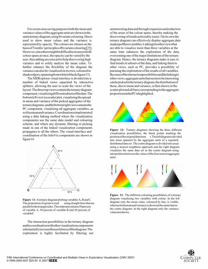
For screen area saving purposes both the mean and variance values of the aggregate units are shown in the same ternary diagram, using bivariate colouring. Hue is used to show mean values and the variance is represented by opacity. The colours are chosen on the basis of Trumbo’s principles of bivariate colouring [25]. However, since there might be difficulties to assess both colour spans at once, the opacity can be varied by the user, thus adding an extra aid to help discovering high variance and to solely analyse the mean value. To further enhance the flexibility of the diagram the variance can also be visualized on its own, coloured in shades of grey, spanning from white to black (figure 13).
The MD-Explorer visual interface is divided into a number of linked views separated by interactive splitters, allowing the user to scale the views of the layout. The three top views contain the ternary diagram component, visualizing different subsets of the data. The bottom left view is a scatter plot, visualizing the spread in mean and variance of the picked aggregates of the ternary diagrams, and the bottom right view contains the PC component, visualizing all aggregate variables, as well as mean and variance. Coordination is implemented using a data linking method where the visualization components use the same data model and colouring scheme, and where any dynamic filtering or picking made in one of the linked visualization components propagates to all the others. The visual interface and coordination of the InfoVis components are shown in figure 14.
Figure 11: A ternary diagram plotting variables A, B and C. The proportion of a point is read using straight lines that are parallel to the triangle sides. The red point contains 50 percent of variable A, 30 percent of variable B and 20 percent of variable C
The interaction possibilities in the ternary diagram and its coordination with other visualization components substantially increase the usefulness of this diagram. The exploration is highly facilitated by filtering out
uninteresting data and through expansion and reduction of the areas of the colour spans, thereby making the discovering of trends noticeably easier. On its own the ternary diagram can effectively display aggregate data made up of three variables. Linking it to other views that are able to visualize more than three variables at the same time enhances the exploration of the data, overcoming one of the major limitations of the ternary diagram. Hence, the ternary diagrams make it easy to find trends in subsets of the data, and linking them to other views, such as PC, provides a possibility of pursuing the exploration of the results of all variables. Because of the interaction possibilities and the linking to other views, aggregate units that seems to be interesting can be picked in the ternary diagram, the distribution of those, due to mean and variance, is then shown in the scatter plot and all lines corresponding to the aggregate proportions in the PC is highlighted.
Figure 12: Ternary diagrams showing the three different visualization possibilities, the black points marking the position of the original data item s. The left diagram is divided into areas spanned by the aggregate units of a regularly distributed data set. The centre diagram is divided into areas using a nearest neighbour approach and the right diagram visualizes the same data set as the centre diagram using interpolation between the values of the four nearest aggregate units.
Figure 13: The different colouring possibilities of a ternary diagram visualizing two variables with colour. In the left diagram only the mean value, coloured by hue, is visible, whereas both mean and variance is shown at the same time in the centre diagram. In the right diagram only the variance values are shown.
Fifth International Conference on Coordinated and Multiple Views in Exploratory Visualization (CMV 2007)0-7695-2903-8/07 $25.00 © 2007

6. Tool for reporting using snapshots
In VA practice [15], [9], tools are generally entirely separate from presentation and reporting tools. Results from using VA can be visual impressions, or mental images, which are hard to verbalize or express in any other form without referring to the discoveries from which they originate. The difficulty of recording and reporting the findings is a serious obstacle to wide recognition and use of VA tools. The visual presentation of analytic results needs to be clear and concise, and it must take place as soon as possible after the analyst reaches a conclusion. VA must therefore equip the analyst with tools that easily reveal what is going on already during the course of the analysis and be able to share with colleagues, visualizations and associated visual analytical reasoning that led to the resulting conclusion.
GAV proposes a method of capturing, recording, commenting and organizing the findings of a visual analytical reasoning in a format that can be unwrapped by other users. We believe that our snapshots can help the analyst to highlight data views of particular interest and guide others to important discoveries. Colleagues can use these descriptive snapshots to quickly locate key information in the system by simply selecting the snapshot view they need. Consider, for example, figure 5 as a discovery and snapshot, where the analyst has selected two energy attributes to be mapped, time step, view properties, a region-of-interest and finally highlighted the discovery representing the behaviour of four municipalities. A Snapshot Manager remembers and records key system information such as space-time-attribute data cube; particular attribute filter constraints; selected views, regions, time step, and attributes; viewing matrix, colour scale, etc. Other users can later open GeoWizard and load the Snapshot Manager and return to any snapshot stage.
7. Conclusions
This paper introduces a generic GAV component toolkit [17] that provides a broad collection of InfoViz and GeoViz components. GAV allows you to program structured GeoAnalytics applications without worrying so much about the low level details. GAV includes efficient interaction methods for event handling, brushing, zooming, drag-and-drop and more. Normally, you would have to write all of this code from scratch. Additionally, the GAV framework provides support for building dynamically linked, coordinated and resizable views where data also can be analysed from different perspectives. The advantages of the GAV component approach can be summarized:
• Generic InfoViz and GeoViz components that can support tailor-made and task-oriented application design;
• Reuse of proven functional components in new applications;
• Component linking is easy; • Large number of properties give developers
flexibility; • Take advantage of the GPU on the graphics adapter
to enable higher rendering performance; • Appropriate for multiple-linked views applications; • Framework for the creation of both user
components and improved versions of existing components so that ideas can be tried out rapidly in a fully functional useful environment;
• Allows different methods for visualizing data to be compared within a common framework;
The customized GeoWizard application [17]
demonstrates time-linked views comprising of coordinated PC, time and trend graphs that can detect and visualize multivariate spatio-temporal geographical clusters during a given time period. Visual inquires with virtually instantaneous response time, allows the analyst to dynamically detect and locate trends with specific features such as continuous decrease or increase for a time period. Our second demonstrator comprises a ternary diagram component that supports novel interactive features and could turn into an innovative multivariate data tool for exploring aggregate data, when linked and coordinated with, for example, a PC and map.
Our next step includes a comprehensive user task analysis [15]. Can our customary GAV applications be sufficiently powerful and flexible for exploration among domain specialists? Can simplicity and visual appeal tools help unskilled users? Can snapshots be used to communicate and report GeoAnalytics discovery?
Finally, we are going to embed GAV components and our snapshot technology into communication tools, such as Microsoft Office or Adobe PDF creating “interactive electronic VA documents”.
Acknowledgements
This work has been funded by Norrkoping Foundation for Research and partly funded by the Swedish Foundation for Strategic Research, grant A3 02:116.
Fifth International Conference on Coordinated and Multiple Views in Exploratory Visualization (CMV 2007)0-7695-2903-8/07 $25.00 © 2007

References
[1] Jern, Johansson, Pettersson, Feldt : “Tailor-made Exploratory Visualization for Statistics Sweden”, CMV 2005, London, July 2005, published by IEEE Computer Society.
[2] Jern, Franzén: “GeoAnalytics – Exploring spatio-temporal and multivariate data”, Reviewed proceedings p25-31, IV 2006, London, July 2006, published by IEEE Computer Society.
[3] D. Brodbeck and L. Girardin. Design study: Using mul-tiple coordinated views to analyze geo-referenced high--dimensional datasets. In Proceedings of IEEE CMV, 2003.
[4] D. Guo, J. Chen, A.M. MacEachren, K. Liao. A visualization system for space-time and multivariate patterns (VIS-STAMP), IEEE Visualization and Computer Graphics, Vol 12, No 6, 2006
[5] Andrienko, N. & Andrienko, G. 2004. Interactive visual tools to explore spatio-temporal variation, In M.F.Coastabile (Ed.) Proceedings of the Working Conference on Advanced Visual Interfaces AVI 2004, Gallipoli, Italy, May 25-28, 2004, ACM Press, 2004, pp.417-420
[6] G. Andrienko and N. Andr ienko. Visual Exploration of Spatial Distribution of Temporal Behaviors, In Proceedings of IEEE IV2005.
[7] Hochheiser, H. & Shneiderman, B. 2004. Dynamic query tools for time series data sets: timebox widgets for interactive exploration, Information Visualization, Vol.3, Issue 1, Spring 2004, 1-18.
[8] Roberts, J. C. 2004. Expl oratory Visualization with Multiple Linked Views, Exploring Geovisualization, J. Dykes, A.M. MacEachren, M.-J. Kraak (Editors)
[9] Thomas, J & Cook, K. 2005. Illuminating the Path: The Research and Development Agenda for Visual Analytics, http://nvac.pnl.gov/
[10] CommonGIS. http://www.commongis.de. [11] G. Dang, C. North, and B. Shneiderman. Dynamic queries
and brushing on choropleth map. Technical report, Human-Computer Interaction Lab & De partment of Computer Sci-ence, 2003.
[12] W. Schroeder, K. Martin and B. Lorensen The Visualization Toolkit: An Obje ct Oriented Approach to 3D Graphics. Kitware, Inc., 2003.
[13] Geovista studio. http://www.geovistastudio.psu.edu. [14] Sweden Statistics. http://www.scb.se [15] G. Andrienko et al, Reacti ons to geovisualization: an
experience from a European project, Int. Journal of Geographical Information Science, 2006.
[16] http://www.openviz.com/ [17] http://vita.itn.liu.se/ [18] C. Ahlberg and E. Wistrand, IVEE: An Information
Visualization & Exploration Environment. Proceedings of the IEEE Symposium on Information Visualization '95, (1995), IEEE Press, 66-73.
[19] Jean-Daniel Fekete, The InfoVis Toolkit, in Proceedings of the 10th IEEE Symposium on Information Visualization (InfoVis'04), IEEE Press, 2004, pp. 167-174.
[20] R. Takahashi, H. Kubota, M. Murakami, Y. Yamamoto, Y. Matsumoto, and H. Koinum a. Design of combinatorial shadow masks for complete ternary-phase diagramming of solid state materials. Journal of Combinatorial Chemistry, Vol. 6, No. 1, pp. 50–53, 2004
[21] P.A. Sabine and R.J. Howarth. The role of ternary projections in colour displays for geochemical maps and in economic mineralogy and petrology. Journal of Geochemical Exploration, Vol. 63, No. 2, pp.123–144, 1998.
[22] B. Plewe and S. Bagchi-Sen. The use of weighted ternary histograms for the visualization of segregation. The Professional Geographer, Vol. 53, No. 3, pp. 347–360, 2001
[23] W.D. Bancroft. A triangular diagram. The Journal of Physical Chemistry, Vol. 1, No. 7, pp. 403–410, 1897.
[24] D. Carr, D.White, and A.M. MacEachren, Conditioned choropleth maps and hypothesis generation. In Annals of the Assoc of Am. Geographers, vol 95, no. 1, pp.32-53,2005. [6] Muller, W. & Schumann, H. 2003
[25]B. Trumbo. A theory for coloring bivariate statistical maps. The American Statistician, Vol. 35, No. 4, pp. 220–226, 1981.
[26]Donald Shepard, A two-dimensional interpolation function for irregularly-spaced data, in Proceedings of the 1968 23rd ACM national conference, AC M Press, 1968, pp. 517 – 524.
Fifth International Conference on Coordinated and Multiple Views in Exploratory Visualization (CMV 2007)0-7695-2903-8/07 $25.00 © 2007

Figure 14: The multiple-linked views user interface of the MD-Expl orer. The top three views all use the same ternary diagram (TD) component and visualize (1) vari able one and variable two, (2) variable one and variable three, (3) variable one and variable four respectively. The bottom two views includes a scatter plot (SP) to the left, with mean and variance on its axes, and to the right parallel coordinate s (PC) visualizing all six variables of the aggregate data as well as the mean and variance. In the left TD three aggregat e units are picked – with proportions 30 pe rcent and 50 percent, 20 percent and 60 percent, and 20 percent and 50 percent of variable one and two respectively. The lines correspond ing to those aggregate units are highlighted in the PC, and their distribution in mean and va riance in a data set containing all aggregate variables is show n in the SP. Aggregate units with a mean value below 6.2 is filtered out in all views.
Fifth International Conference on Coordinated and Multiple Views in Exploratory Visualization (CMV 2007)0-7695-2903-8/07 $25.00 © 2007