Fast 3D molecular superposition and similarity search in databases of flexible molecules
Upload
khangminh22Category
view
4download
0
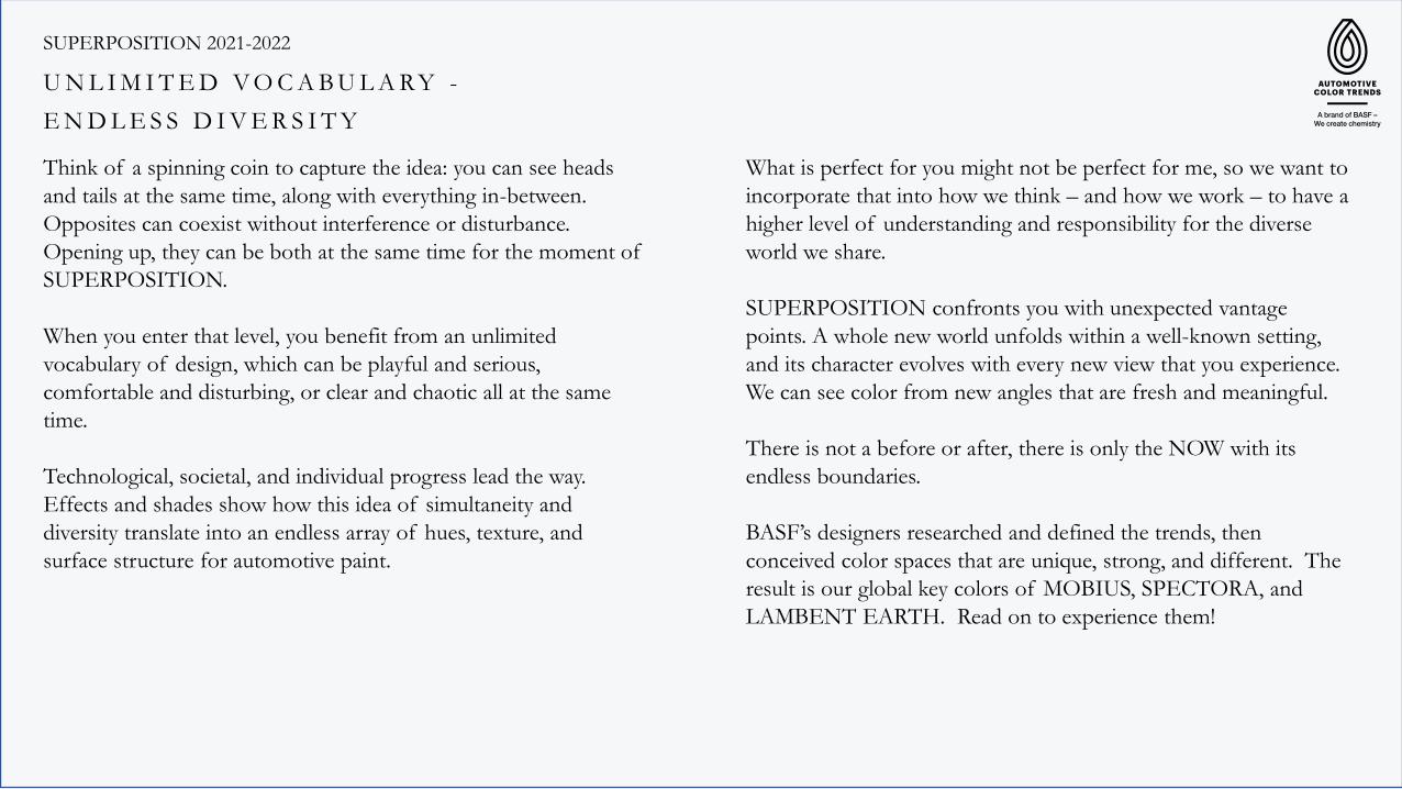
Superposition 2021-2022 P R E S S K I T BASF`s Coatings Division presents Automotive Color Trends 2021-2022 SUPERPOSITION

Become part of an extraordinary phenomenon: a SUPERPOSITION of Automotive Color Trends by BASF for 2021-2022.
Each year, designers for BASF’s Coatings division create a new collection to inspire automotive designers. Delving into new color spaces, they also consider the growing demand for sustainability and functionality.
This year’s collection is called SUPERPOSITION. A phenomenon from quantum mechanics, it defines a state where the limitation of binary systems is overcome.
In other words, things aren’t just black or white, heads or tails, one or zero. The world has an uncountable number of variations in-between. This collection immerses itself in those variations.
Our designers pinpoint trends and the forward-looking signals that influence those trends as they work to create cutting-edge shades and reinforce BASF’s global leadership in color. The latest palette, or some version of it, could be on the road and in your driveway in the next three to five model years.
It’s a SUPERPOSITION of color from BASF.
C O L O R D E S I G N A T B A S F

SUPERPOSITION 2021-2022 – Global Color Collection
SUPERPOSITION 2021-2022
Think of a spinning coin to capture the idea: you can see heads
and tails at the same time, along with everything in-between.
Opposites can coexist without interference or disturbance.
Opening up, they can be both at the same time for the moment of
SUPERPOSITION.
When you enter that level, you benefit from an unlimited
vocabulary of design, which can be playful and serious,
comfortable and disturbing, or clear and chaotic all at the same
time.
Technological, societal, and individual progress lead the way.
Effects and shades show how this idea of simultaneity and
diversity translate into an endless array of hues, texture, and
surface structure for automotive paint.
U N L I M I T E D V O C A B U L A R Y -
E N D L E S S D I V E R S I T Y
What is perfect for you might not be perfect for me, so we want to
incorporate that into how we think – and how we work – to have a
higher level of understanding and responsibility for the diverse
world we share.
SUPERPOSITION confronts you with unexpected vantage
points. A whole new world unfolds within a well-known setting,
and its character evolves with every new view that you experience.
We can see color from new angles that are fresh and meaningful.
There is not a before or after, there is only the NOW with its
endless boundaries.
BASF’s designers researched and defined the trends, then
conceived color spaces that are unique, strong, and different. The
result is our global key colors of MOBIUS, SPECTORA, and
LAMBENT EARTH. Read on to experience them!

In contrast to previous trend collections that explored extremes in
texture or color, this year’s theme looked to the concept of balance
for the inspiration of the region Americas.
We found the equilibrium between the natural and the synthetic
world to create calming, unwavering, and thought-provoking
colors. They draw the viewer into unique sensations that operate
on multiple non-binary levels.
The result is collection of colors generated with pigments and
effects that give the sensation of being anchored to a timeless
color space yet stay fresh and unconventional.
Some have a flashy glint overlaying a subdued pastel. Some emerge
from darker voids. Some have hyperfine flakes evoking softness.
All beckon one to discover something new about oneself.
Region Americas
T H E C O N C E P T O F B A L A N C E

Key Color – Americas
The key color for the region Americas, Lambent Earth, presents
the essence of the bountiful energy and fragility in the world,
combining a fiery glow with a natural brown. The hue comprises
flashy effects and deeply saturated colorants that extend beyond
just being a pretty color; they’re a testament to the myriad of
possibilities attainable from the physics of light dancing on a
coated surface.
The result is a balance that strikes a chord with human
steadfastness. This color space anchors itself in optimism and
resilience and shows the potential for humanity to move forward
despite the challenges.
Lambent Earth superpositions the aesthetic with technology,
elevating color into new dimensions.
Region Americas
L A M B E N T E A R T H

Region Americas
A M I C A B L E G L I M M E R
Key Color – Focus South America
This tri-coat has a pale and soothing yellow position, coupled
with a gentle shower of glass flake that shimmers over the
surface.
The combination is unique and very expressive for the South
American region, with a lot of potential for the 3-D shape of a
vehicle body.
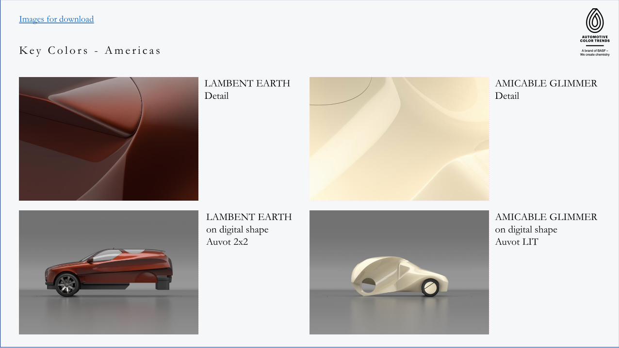
LAMBENT EARTH
Detail
Images for download
K e y C o l o r s - A m e r i c a s
LAMBENT EARTH
on digital shape
Auvot 2x2
AMICABLE GLIMMER
Detail
AMICABLE GLIMMER
on digital shape
Auvot LIT
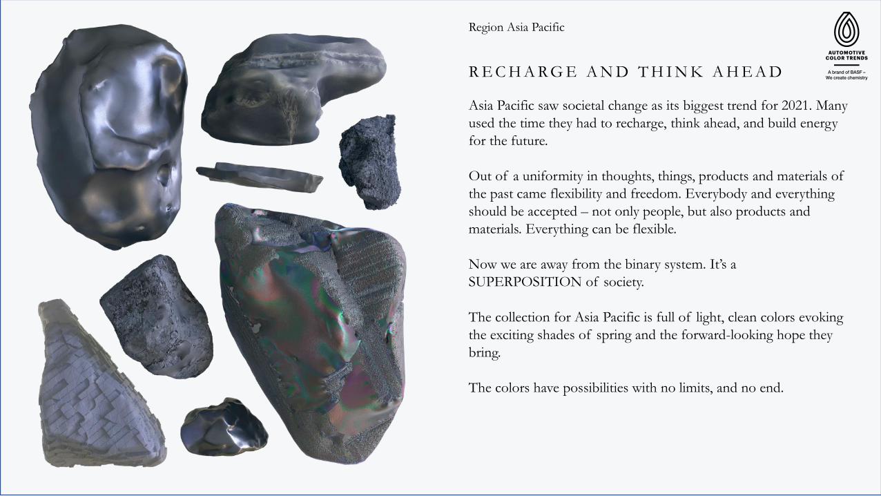
Asia Pacific saw societal change as its biggest trend for 2021. Many
used the time they had to recharge, think ahead, and build energy
for the future.
Out of a uniformity in thoughts, things, products and materials of
the past came flexibility and freedom. Everybody and everything
should be accepted – not only people, but also products and
materials. Everything can be flexible.
Now we are away from the binary system. It’s a
SUPERPOSITION of society.
The collection for Asia Pacific is full of light, clean colors evoking
the exciting shades of spring and the forward-looking hope they
bring.
The colors have possibilities with no limits, and no end.
R E C H A R G E A N D T H I N K A H E A D
Region Asia Pacific

Region Asia Pacific
M O B I U S
Key Color – Asia Pacific
Asia Pacific’s key color, Mobius, is a metaphor for a new way of
thinking. It combines elements of light blue and warm brown.
Mobius shows flexibility in different viewing angles with its
unique color travel, in a society which has infinite possibilities
opening up for everyone.
Besides its rational aspects of color hue and travel, it evokes a
notion of mystery. It has no limits, and no end.
The overall SUPERPOSITION theme – many variations
happening all at once – is summed up by Mobius and its unique
mix of values and aspects.
Region Asia Pacific
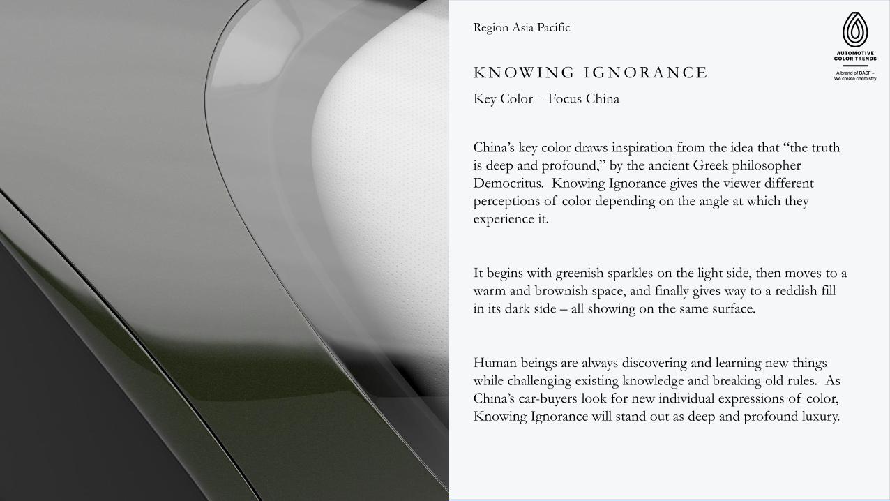
K N OW I N G I G N O R A N C E
Key Color – Focus China
China’s key color draws inspiration from the idea that “the truth
is deep and profound,” by the ancient Greek philosopher
Democritus. Knowing Ignorance gives the viewer different
perceptions of color depending on the angle at which they
experience it.
It begins with greenish sparkles on the light side, then moves to a
warm and brownish space, and finally gives way to a reddish fill
in its dark side – all showing on the same surface.
Human beings are always discovering and learning new things
while challenging existing knowledge and breaking old rules. As
China’s car-buyers look for new individual expressions of color,
Knowing Ignorance will stand out as deep and profound luxury.

MOBIUSDetail
Images for download
K e y C o l o r s - A s i a P a c i f i c
MOBIUS
on digital shape
Auvot MEA
KNOWING
IGNORANCE
Detail
KNOWING
IGNORANCE
on digital shape
Auvot SPORTIF

Region EMEA
There’s something happening in EMEA. Society has a
responsibility to – and an understanding for – the multifaceted
ways we live and how we work.
That idea of simultaneity of different influences carries over into
EMEA’s colors. They dare to be unique positions that are strong,
distinct, and non-automotive.
The colors use partly known positions, but change them with the
help of new effects, subtle color gradients or a specific sparkle
behavior. Shades of gray change their colorfulness according to
the angle of view, shades of blue are light, reflective and structure
the surface. And sustainability is not automatically green.
Each color is approached holistically to take responsibility for the
needs of the future.
These eye-opening and thought-provoking colors are a
SUPERPOSITION of complex tones that are not always easy to
understand.
E Y E - O P E N I N G C O L O R S
Region EMEA
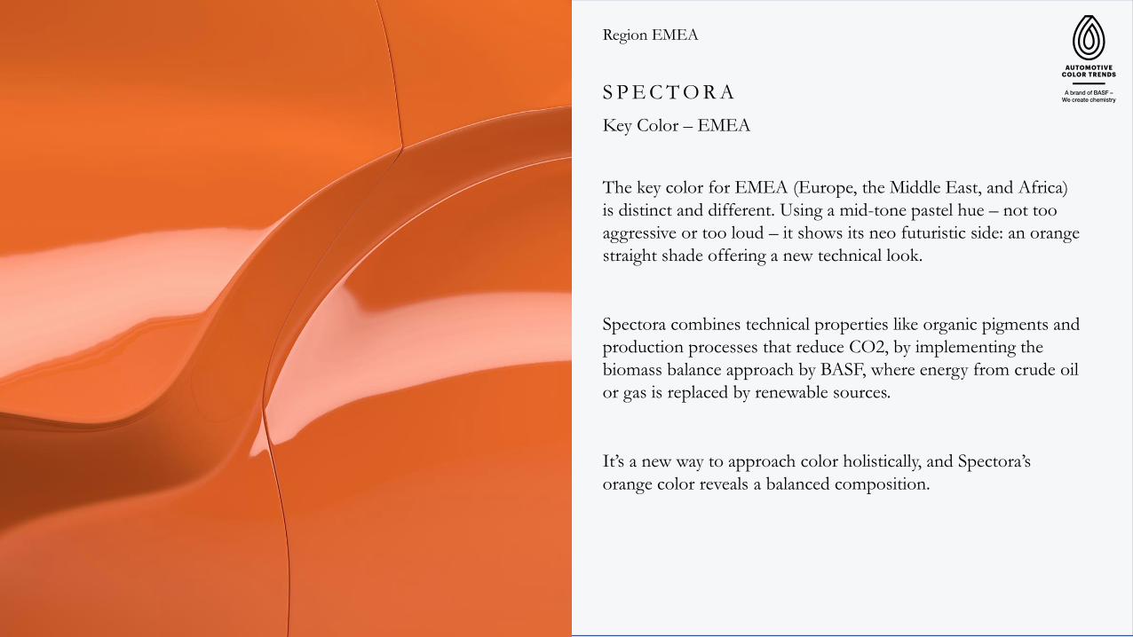
S P E C T O R A
Key Color – EMEA
The key color for EMEA (Europe, the Middle East, and Africa)
is distinct and different. Using a mid-tone pastel hue – not too
aggressive or too loud – it shows its neo futuristic side: an orange
straight shade offering a new technical look.
Spectora combines technical properties like organic pigments and
production processes that reduce CO2, by implementing the
biomass balance approach by BASF, where energy from crude oil
or gas is replaced by renewable sources.
It’s a new way to approach color holistically, and Spectora’s
orange color reveals a balanced composition.

Region EMEA
E L I C I T O R
Key Color – Focus Africa
This key color is a localized look at the huge multiplicity of the
continent of Africa. Elicitor is an earthy tone with a bluish tint
and matte finish.
It’s not a heritage-style, back-looking color space, but rather a
new identity to transport the viewer to the future. It uses regional
resources, combined with local experience and sophistication to
live a modern life.

SPECTORA
Detail
Images for download
K e y C o l o r s E M E A
SPECTORA
on digital shape
Auvot MEA
ELICITOR
Detail
ELICITOR
on digital shape
Auvot 2x2


Industry leader in color design with studios in Asia Pacific (Yokohama/Shanghai),E M E A (Germany) and the Americas (Southfield).
Intense trend research ensures the most cutting-edge color design for the annual trend collection. Get inspired!
B A S F – Design Departments

C O N T A C T I N F O R M A T I O N
BASF Japan Ltd.
296 Shimokurata-cho, Totsuka-ku, Yokohama 244-0815, Japan
BASF Advanced Chemicals Co., Ltd., R&D Center II, No 300,
Jiangxinsha Road, 200137 Shanghai, China
BASF Corporation
26701 Telegraph Road, Southfield, MI, 48033, USA
BASF Coatings GmbH
Glasuritstrasse 1, 48165 Münster, Germany
© Copyright 2021 – all rights reserved.
Asia Pacific
Tanya Tian
North & South America
Alan Baker
EMEA
Jörg Zumkley
Copyright © 2022 FDOKUMEN