Question matrix method according to divided dimensions of ...
17
1 23 Personal and Ubiquitous Computing ISSN 1617-4909 Volume 21 Number 2 Pers Ubiquit Comput (2017) 21:219-233 DOI 10.1007/s00779-016-0988-7 Question matrix method according to divided dimensions of infographics evaluation Waralak V. Siricharoen & Phan Cong Vinh
-
Upload
khangminh22 -
Category
Documents
-
view
1 -
download
0
Transcript of Question matrix method according to divided dimensions of ...
1 23
Personal and Ubiquitous Computing ISSN 1617-4909Volume 21Number 2 Pers Ubiquit Comput (2017) 21:219-233DOI 10.1007/s00779-016-0988-7
Question matrix method accordingto divided dimensions of infographicsevaluation
Waralak V. Siricharoen & Phan CongVinh

1 23
Your article is protected by copyright and
all rights are held exclusively by Springer-
Verlag London. This e-offprint is for personal
use only and shall not be self-archived
in electronic repositories. If you wish to
self-archive your article, please use the
accepted manuscript version for posting on
your own website. You may further deposit
the accepted manuscript version in any
repository, provided it is only made publicly
available 12 months after official publication
or later and provided acknowledgement is
given to the original source of publication
and a link is inserted to the published article
on Springer's website. The link must be
accompanied by the following text: "The final
publication is available at link.springer.com”.
ORIGINAL ARTICLE
Question matrix method according to divided dimensionsof infographics evaluation
Waralak V. Siricharoen1 • Phan Cong Vinh2
Received: 11 July 2016 / Accepted: 30 October 2016 / Published online: 2 December 2016
� Springer-Verlag London 2016
Abstract The visual/image is very good expression in the
cultural heritage domain. Visual archive is one of the
recording techniques for cultural heritage along with the
static image like a picture and the reports documenting
contents in literature. One category of lively image is
infographic which usually created and shared by using ICT.
The infographics are widely used nowadays because the
people need less time to summarize all the needed infor-
mation. There is the massive amount of information
flooding, especially on the internet. However, there is
pretty of not so good designed infographic which has been
published in the social media. So the evaluation approach
is about how user distinct the bad infographics from the
good infographics, also user can evaluate infographics and
improve them before launch them through media. This
research aims to draw the essential summary according to
the important issue of infographic evaluation, for the
audience can find the way to improve and create the better
infographics. The paper introduces the communication
theories and classifies the template types of infographics of
the static and interactive infographic. The questions of
evaluation dimensions bundle into the three core founda-
tion of the infographic which are Visual, Content, and
Knowledge.
Keywords Human–computer interaction � HCI �Communication � Infographic � Evaluation � Staticinfographic � Motion infographic � Interactive infographic �Infographic template � ICT
1 Introduction
The most basic communication is to communicate with
oneself. As a human sometimes, we communicate with
ourselves by thinking. The communication by using lan-
guage is the most important issue of how people interact
with each other. The original communication model of
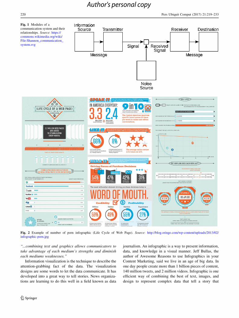
Shannon and Weaver has been known as the information
theory (Fig. 1). This model is specially designed to develop
the communication way between sender and receiver.
Noise can disturb the communication process. The model
combines many concepts like information source, receiver,
channel, noise, transmitter, channel, message, information
destination, encode, and decode [1]. The Shannon infor-
mation theory is divided into five simple parts: (1) the
source, (2) the sender, (3) the message, (4) the receiver, and
(5) the interpretation of the message by the receiver. For
any messaging system from processors related, we can
define and review the following basic components called as
the SMCR model.
Better infographic effectively and quickly assists people
to ingest the information. The pictorial messages by the
images or drawing of the information are the enhanced and
influence means of communication. Matt Byrom said in his
article ‘‘The Power of Visual Communication infographic’’
that visual communication is described as the conveyance
of information and ideas in forms that can be read or
looked upon. The research from Barbara M. Miller and
Brooke Barnett discovered this about infographics:
& Phan Cong Vinh
Waralak V. Siricharoen
1 School of Science and Technology, University of the Thai
Chamber of Commerce, Bangkok, Thailand
2 Faculty of Information Technology, Nguyen Tat Thanh
University, Ho Chi Minh City, Vietnam
123
Pers Ubiquit Comput (2017) 21:219–233
DOI 10.1007/s00779-016-0988-7
Author's personal copy
‘‘...combining text and graphics allows communicators to
take advantage of each medium’s strengths and diminish
each mediums weaknesses.’’
Information visualization is the technique to describe the
attention-grabbing fact of the data. The visualization
designs are some words to let the data communicate. It has
developed into a great way to tell stories. News organiza-
tions are learning to do this well in a field known as data
journalism. An infographic is a way to present information,
data, and knowledge in a visual manner. Jeff Bullas, the
author of Awesome Reasons to use Infographics in your
Content Marketing, said we live in an age of big data. In
one day people create more than 1 billion pieces of content,
140 million tweets, and 2 million videos. Infographic is one
efficient way of combining the best of text, images, and
design to represent complex data that tell a story that
Fig. 1 Modules of a
communication system and their
relationships. Source: https://
commons.wikimedia.org/wiki/
File:Shannon_communication_
system.svg
Fig. 2 Example of number of porn infographic (Life Cycle of Web Page). Source: http://blog.oringe.com/wp-content/uploads/2013/02/
infographic-porn.jpg
220 Pers Ubiquit Comput (2017) 21:219–233
123
Author's personal copy
requests to be shared. The best way to get the audiences
attention is by using infographics. It can represent data
rapidly and visibly [2].
The infographics are very beneficial for telling the story,
especially in cultural heritage matter. For example, they
use infographics to explain how a Mexican holiday is
celebrating the Battle of Puebla, a small city in Mexico.
This traditional holiday called ‘‘Cinco de Mayo’’ has
evolved from the holiday it once was into the holiday it is
now. The UNESCO Iraq office produced the infographic
film1 in 2013 in Arabic aimed at sensitizing Iraqi youth to
the importance of protecting their rich and historical cul-
tural heritage. Infographics have been applied to cultural
heritage: the case of ‘‘Ninfeo de Campetti (Veio).’’
The basis of the infographic is composed of the three
major parts, which are Visual, Content, and Knowledge.
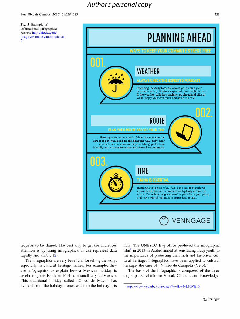
Fig. 3 Example of
informational infographics.
Source: http://klock.work/
images/examples/informational-
2
1 https://www.youtube.com/watch?v=0Lw5yLKWR10.
Pers Ubiquit Comput (2017) 21:219–233 221
123
Author's personal copy
Visual representations of data, information, and/or knowl-
edge are (1) Visual elements, (2) Content elements, and (3)
Knowledge [3]. It mentioned (based on the data from
Google Insights for Search) shows that in the recent years
the clear growth in searching for ‘‘infographic’’ term has
been familiar. The growth of infographic from the
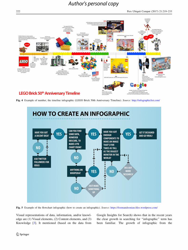
Fig. 4 Example of number, the timeline infographic (LEGO Brick 50th Anniversary Timeline). Source: http://infographiclist.com/
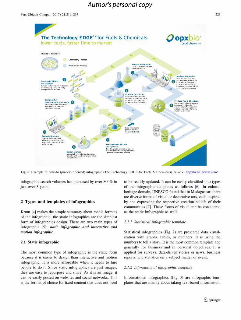
Fig. 5 Example of the flowchart infographic (how to create an infographic). Source: https://foomandoonian.files.wordpress.com/
222 Pers Ubiquit Comput (2017) 21:219–233
123
Author's personal copy
infographic search volumes has increased by over 800% in
just over 3 years.
2 Types and templates of infographics
Krum [4] makes the simple summary about media formats
of the infographic; the static infographics are the simplest
form of infographics design. There are two main types of
infographic [5]: static infographic and interactive and
motion infographic.
2.1 Static infographic
The most common type of infographic is the static form
because it is easier to design than interactive and motion
infographic. It is more affordable when it needs to hire
people to do it. Since static infographics are just images,
they are easy to repurpose and share. As it is an image, it
can be easily posted on websites and social networks. This
is the format of choice for fixed content that does not need
to be readily updated. It can be easily classified into types
of the infographic templates as follows [6]. In cultural
heritage domain, UNESCO found that in Madagascar, there
are diverse forms of visual or decorative arts, each inspired
by and expressing the respective creation beliefs of their
communities [7]. These forms of visual can be considered
as the static infographic as well.
2.1.1 Statistical infographic template
Statistical infographics (Fig. 2) are presented data visual-
ization with graphs, tables, or numbers. It is using the
numbers to tell a story. It is the most common template and
generally for business and in personal objectives. It is
applied for surveys, data-driven stories or news, business
reports, and statistics on a subject matter or event.
2.1.2 Informational infographic template
Informational infographics (Fig. 3) are infographic tem-
plates that are mainly about taking text-based information.
Fig. 6 Example of how–to (process oriented) infographic (The Technology EDGE for Fuels & Chemicals). Source: http://ww1.prweb.com/
Pers Ubiquit Comput (2017) 21:219–233 223
123
Author's personal copy

These include informational posters, ‘‘listographics,’’ pre-
sentations, brochures, and instructional guides. Informa-
tional infographics summarize text information into easy to
understand points using iconography, illustrations, lists or
bullet points, and images. Information design is very
important to combine all these elements together to form a
Fig. 7 Example of data
visualization infographic
(Bangkok Metro Sky train).
Source: https://upload.
wikimedia.org/wikipedia/
commons/0/0b/Bangkok_
Metro_Skytrain
Fig. 8 Example of the world map. Source: http://foa-approved.org/corporate_members/map
224 Pers Ubiquit Comput (2017) 21:219–233
123
Author's personal copy
persuasive infographic. The majority of infographics pro-
duced are usually of this type as informational infographics
can be used for many different uses.
2.1.3 Timeline infographic template
Timeline infographics (Fig. 4) are created with a timeline
as its emphasis. Timelines are useful when telling story or
transfer information over a sequential time period. Time-
lines can also be used to feature information in an order or
to indicate the development of an interested topic over a
time period. Timelines can be used as a reference point for
another set of data by linking it with other visual elements
such as imagery, iconography, and charts. Students use
infographics to understand how a place, population, or
culture changes over time.
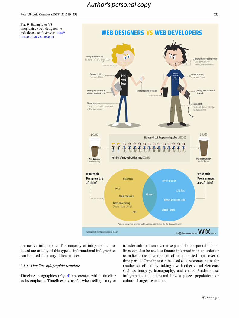
Fig. 9 Example of VS
infographic (web designers vs
web developers). Source: http://
images.sixrevisions.com
Pers Ubiquit Comput (2017) 21:219–233 225
123
Author's personal copy
2.1.4 Process infographic template
Process infographics (Figs. 5, 6) show a stream of infor-
mation by using a linear or separating series. As its name
suggests, this type of infographic can be used to style a
flow of the process.
2.1.5 Geographic infographic template
Geographic infographics (Figs. 7, 8) display location-based
information. The understandable most used of this info-
graphic is a map-based infographic. Geographic informa-
tion can be taken by emphasizing or shading different parts
of a map (called a choropleth map) or by overlaying shapes
on top of the map, such as a bubble map chart or a Sankey
diagram. Now there are many combinations of geographic
location-based with other type of information. The other
data dimensions can be introduced in this type of info-
graphic such as dates, location, distance traveled, and
temperature with the main data set.
2.1.6 Comparison infographic template
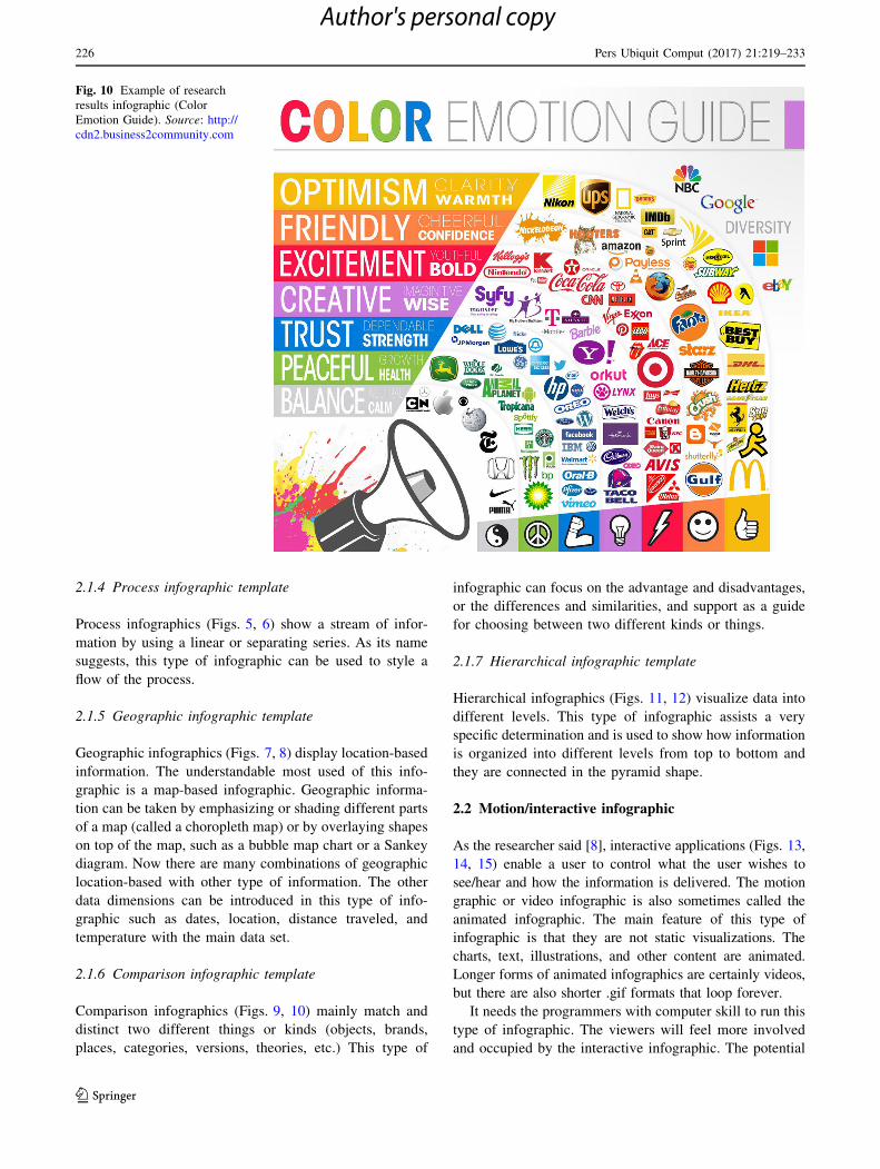
Comparison infographics (Figs. 9, 10) mainly match and
distinct two different things or kinds (objects, brands,
places, categories, versions, theories, etc.) This type of
infographic can focus on the advantage and disadvantages,
or the differences and similarities, and support as a guide
for choosing between two different kinds or things.
2.1.7 Hierarchical infographic template
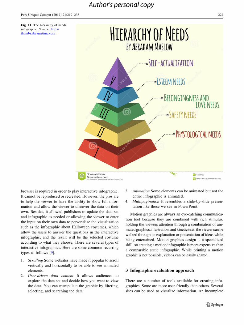
Hierarchical infographics (Figs. 11, 12) visualize data into
different levels. This type of infographic assists a very
specific determination and is used to show how information
is organized into different levels from top to bottom and
they are connected in the pyramid shape.
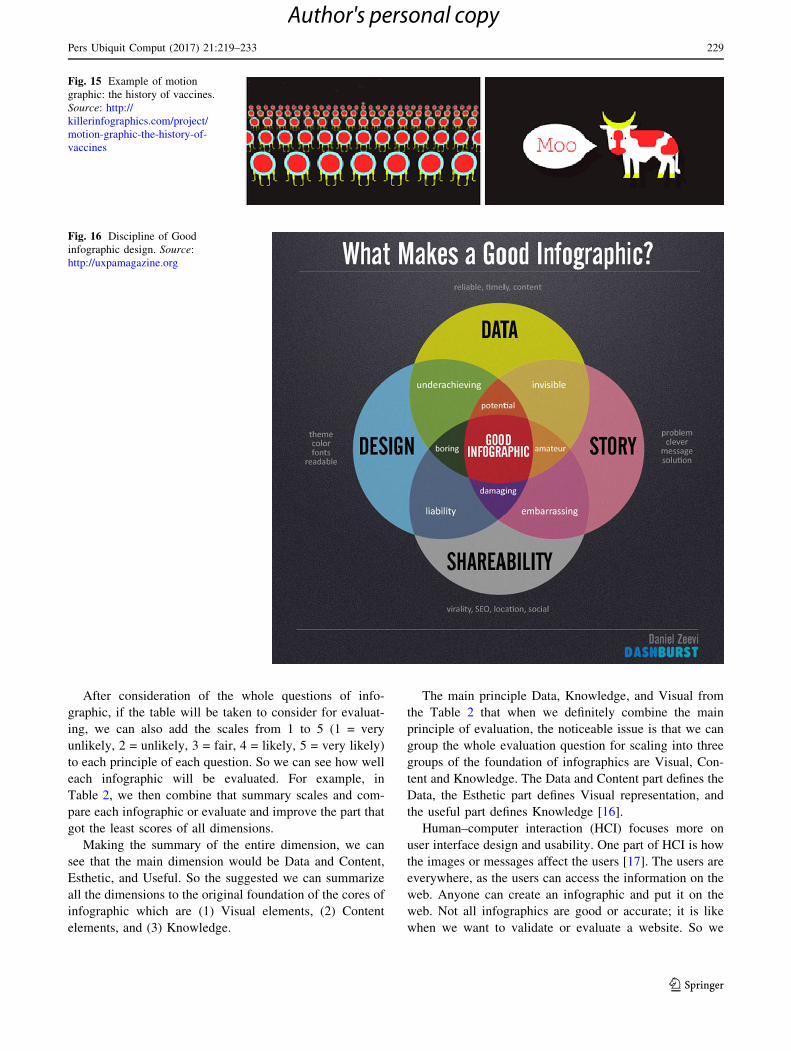
2.2 Motion/interactive infographic
As the researcher said [8], interactive applications (Figs. 13,
14, 15) enable a user to control what the user wishes to
see/hear and how the information is delivered. The motion
graphic or video infographic is also sometimes called the
animated infographic. The main feature of this type of
infographic is that they are not static visualizations. The
charts, text, illustrations, and other content are animated.
Longer forms of animated infographics are certainly videos,
but there are also shorter .gif formats that loop forever.
It needs the programmers with computer skill to run this
type of infographic. The viewers will feel more involved
and occupied by the interactive infographic. The potential
Fig. 10 Example of research
results infographic (Color
Emotion Guide). Source: http://
cdn2.business2community.com
226 Pers Ubiquit Comput (2017) 21:219–233
123
Author's personal copy
browser is required in order to play interactive infographic.
It cannot be reproduced or recreated. However, the pros are
to help the viewer to have the ability to show full infor-
mation and allow the viewer to discover the data on their
own. Besides, it allowed publishers to update the data set
and infographic as needed or allowing the viewer to enter
the input on their own data to personalize the visualization
such as the infographic about Halloween costumes, which
allow the users to answer the questions in the interactive
infographic, and the result will be the selected costume
according to what they choose. There are several types of
interactive infographics. Here are some common recurring
types as follows [9].
1. Scrolling Some websites have made it popular to scroll
vertically and horizontally to be able to see animated
elements.
2. User-driven data content It allows audiences to
explore the data set and decide how you want to view
the data. You can manipulate the graphic by filtering,
selecting, and searching the data.
3. Animation Some elements can be animated but not the
entire infographic is animated.
4. Multipagination It resembles a slide-by-slide presen-
tation like those we see in PowerPoint.
Motion graphics are always an eye-catching communica-
tion tool because they are combined with rich stimulus,
holding the viewers attention through a combination of ani-
mated graphics, illustration, and kinetic text; the viewer can be
walked through an explanation or presentation of ideas while
being entertained. Motion graphics design is a specialized
skill, so creating a motion infographic is more expensive than
a comparable static infographic. While printing a motion
graphic is not possible, videos can be easily shared.
3 Infographic evaluation approach
There are a number of tools available for creating info-
graphics. Some are more user-friendly than others. Several
sites can be used to visualize information. An incomplete
Fig. 11 The hierarchy of needs
infographic. Source: http://
thumbs.dreamstime.com
Pers Ubiquit Comput (2017) 21:219–233 227
123
Author's personal copy

sentence because of the ability to capture attention and
convey information in a straightforward manner, info-
gr.ams, has exploded in use and popularity. Students must
be able to understand and analyze information presented in
this manner. Production of infographics also demonstrates
students expertise of advanced cognitive skills, technical
skills, and familiarity with varied literacies. The wide-
spread use of infographics arises and with emerging tech-
nologies influencing the definition and requirements of
‘‘literacy’’ for current and future students and teachers.
They need to embrace new forms of presenting information
and use it efficiently.
Lynda.com mentioned in the tutorial video about the
five attributes of great infographic; they are contrast,
hierarchy, accuracy, relevance, and truth [10]. The
University of Mary Washington, infographics blog pre-
sented the idea of characteristics of an effective infographic
[8] in [9] show the summaries four main categories were
identified: Usefulness, Legibility, Design, and Esthetics.
The good infographic should have the proper characteristic
as follows: [13] unique, simple, creative, minimal text and
high impact, and easily sharable. Also, the book called ‘‘5
RULES FOR USING INFOGRAPHICS SUCCESS-
FULLY’’ is written by IQ Agency [14] and the rules
described are 1. Tell a story, 2. Pick the right visuals, 3.
Keep it simple, 4. Stay timely, 5. Make it shareable. Also
in the slideshared.net and [15], there are the suggestions of
how can the user create the good infographic. They need to
have four main characters which are Sharable, Data,
Design, and Story. These four elements have to be in
proper portions in order to create the good infographic.
Figure 16 shows the effectively designed infographic
should do the following: to see how to have good info-
graphic to show that we need clear, concise, and structured
design, with useful and relevant content; in order to deliver
interesting, problem, or solution message and sharing them
through social media [15].
However, it is sometimes still difficult to compare many
infographic in the same categories even how well the
infographic be represented. So this research has brought the
whole interesting questions of how to control the info-
graphic show the right messages. This table shows the
dimensions of checklist in order to evaluate the infographic
(Fig. 17; Table 1).
Fig. 12 Balance your media diet. Source: http://www.wired.com
Fig. 13 Care to click infographic. Source: https://www.youtube.com/
watch?V=qvicxgkcbrm
Fig. 14 Retail security threats.
Source: http://www.nuspire.
com/linked/infographic/#/start
228 Pers Ubiquit Comput (2017) 21:219–233
123
Author's personal copy
After consideration of the whole questions of info-
graphic, if the table will be taken to consider for evaluat-
ing, we can also add the scales from 1 to 5 (1 = very
unlikely, 2 = unlikely, 3 = fair, 4 = likely, 5 = very likely)
to each principle of each question. So we can see how well
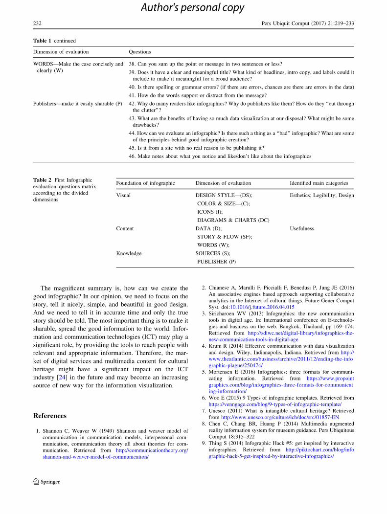
each infographic will be evaluated. For example, in
Table 2, we then combine that summary scales and com-
pare each infographic or evaluate and improve the part that
got the least scores of all dimensions.
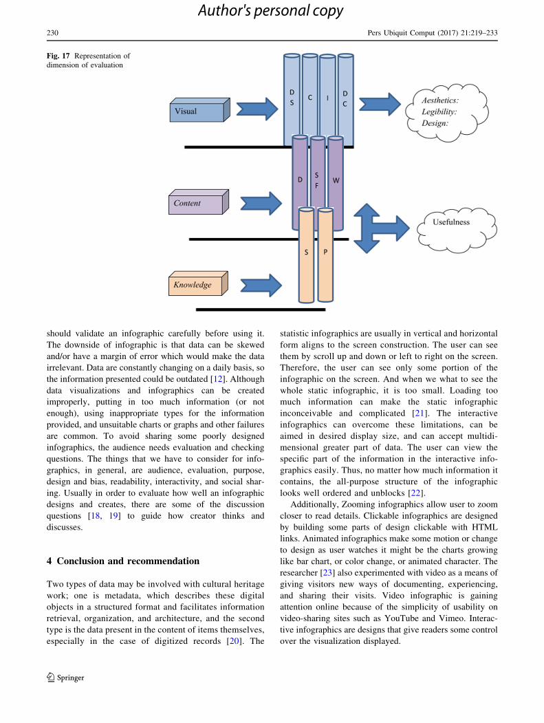
Making the summary of the entire dimension, we can
see that the main dimension would be Data and Content,
Esthetic, and Useful. So the suggested we can summarize
all the dimensions to the original foundation of the cores of
infographic which are (1) Visual elements, (2) Content
elements, and (3) Knowledge.
The main principle Data, Knowledge, and Visual from
the Table 2 that when we definitely combine the main
principle of evaluation, the noticeable issue is that we can
group the whole evaluation question for scaling into three
groups of the foundation of infographics are Visual, Con-
tent and Knowledge. The Data and Content part defines the
Data, the Esthetic part defines Visual representation, and
the useful part defines Knowledge [16].
Human–computer interaction (HCI) focuses more on
user interface design and usability. One part of HCI is how
the images or messages affect the users [17]. The users are
everywhere, as the users can access the information on the
web. Anyone can create an infographic and put it on the
web. Not all infographics are good or accurate; it is like
when we want to validate or evaluate a website. So we
Fig. 15 Example of motion
graphic: the history of vaccines.
Source: http://
killerinfographics.com/project/
motion-graphic-the-history-of-
vaccines
Fig. 16 Discipline of Good
infographic design. Source:
http://uxpamagazine.org
Pers Ubiquit Comput (2017) 21:219–233 229
123
Author's personal copy
should validate an infographic carefully before using it.
The downside of infographic is that data can be skewed
and/or have a margin of error which would make the data
irrelevant. Data are constantly changing on a daily basis, so
the information presented could be outdated [12]. Although
data visualizations and infographics can be created
improperly, putting in too much information (or not
enough), using inappropriate types for the information
provided, and unsuitable charts or graphs and other failures
are common. To avoid sharing some poorly designed
infographics, the audience needs evaluation and checking
questions. The things that we have to consider for info-
graphics, in general, are audience, evaluation, purpose,
design and bias, readability, interactivity, and social shar-
ing. Usually in order to evaluate how well an infographic
designs and creates, there are some of the discussion
questions [18, 19] to guide how creator thinks and
discusses.
4 Conclusion and recommendation
Two types of data may be involved with cultural heritage
work; one is metadata, which describes these digital
objects in a structured format and facilitates information
retrieval, organization, and architecture, and the second
type is the data present in the content of items themselves,
especially in the case of digitized records [20]. The
statistic infographics are usually in vertical and horizontal
form aligns to the screen construction. The user can see
them by scroll up and down or left to right on the screen.
Therefore, the user can see only some portion of the
infographic on the screen. And when we what to see the
whole static infographic, it is too small. Loading too
much information can make the static infographic
inconceivable and complicated [21]. The interactive
infographics can overcome these limitations, can be
aimed in desired display size, and can accept multidi-
mensional greater part of data. The user can view the
specific part of the information in the interactive info-
graphics easily. Thus, no matter how much information it
contains, the all-purpose structure of the infographic
looks well ordered and unblocks [22].
Additionally, Zooming infographics allow user to zoom
closer to read details. Clickable infographics are designed
by building some parts of design clickable with HTML
links. Animated infographics make some motion or change
to design as user watches it might be the charts growing
like bar chart, or color change, or animated character. The
researcher [23] also experimented with video as a means of
giving visitors new ways of documenting, experiencing,
and sharing their visits. Video infographic is gaining
attention online because of the simplicity of usability on
video-sharing sites such as YouTube and Vimeo. Interac-
tive infographics are designs that give readers some control
over the visualization displayed.
Fig. 17 Representation of
dimension of evaluation
230 Pers Ubiquit Comput (2017) 21:219–233
123
Author's personal copy
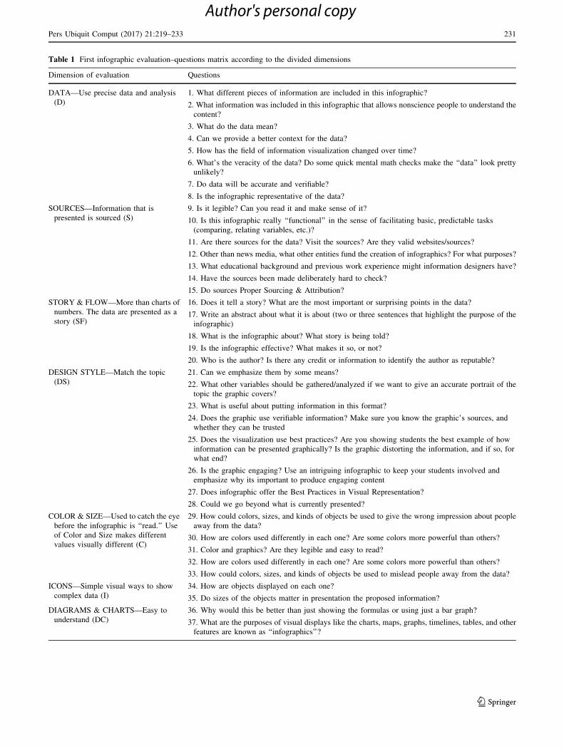
Table 1 First infographic evaluation–questions matrix according to the divided dimensions
Dimension of evaluation Questions
DATA—Use precise data and analysis
(D)
1. What different pieces of information are included in this infographic?
2. What information was included in this infographic that allows nonscience people to understand the
content?
3. What do the data mean?
4. Can we provide a better context for the data?
5. How has the field of information visualization changed over time?
6. What’s the veracity of the data? Do some quick mental math checks make the ‘‘data’’ look pretty
unlikely?
7. Do data will be accurate and verifiable?
8. Is the infographic representative of the data?
SOURCES—Information that is
presented is sourced (S)
9. Is it legible? Can you read it and make sense of it?
10. Is this infographic really ‘‘functional’’ in the sense of facilitating basic, predictable tasks
(comparing, relating variables, etc.)?
11. Are there sources for the data? Visit the sources? Are they valid websites/sources?
12. Other than news media, what other entities fund the creation of infographics? For what purposes?
13. What educational background and previous work experience might information designers have?
14. Have the sources been made deliberately hard to check?
15. Do sources Proper Sourcing & Attribution?
STORY & FLOW—More than charts of
numbers. The data are presented as a
story (SF)
16. Does it tell a story? What are the most important or surprising points in the data?
17. Write an abstract about what it is about (two or three sentences that highlight the purpose of the
infographic)
18. What is the infographic about? What story is being told?
19. Is the infographic effective? What makes it so, or not?
20. Who is the author? Is there any credit or information to identify the author as reputable?
DESIGN STYLE—Match the topic
(DS)
21. Can we emphasize them by some means?
22. What other variables should be gathered/analyzed if we want to give an accurate portrait of the
topic the graphic covers?
23. What is useful about putting information in this format?
24. Does the graphic use verifiable information? Make sure you know the graphic’s sources, and
whether they can be trusted
25. Does the visualization use best practices? Are you showing students the best example of how
information can be presented graphically? Is the graphic distorting the information, and if so, for
what end?
26. Is the graphic engaging? Use an intriguing infographic to keep your students involved and
emphasize why its important to produce engaging content
27. Does infographic offer the Best Practices in Visual Representation?
28. Could we go beyond what is currently presented?
COLOR & SIZE—Used to catch the eye
before the infographic is ‘‘read.’’ Use
of Color and Size makes different
values visually different (C)
29. How could colors, sizes, and kinds of objects be used to give the wrong impression about people
away from the data?
30. How are colors used differently in each one? Are some colors more powerful than others?
31. Color and graphics? Are they legible and easy to read?
32. How are colors used differently in each one? Are some colors more powerful than others?
33. How could colors, sizes, and kinds of objects be used to mislead people away from the data?
ICONS—Simple visual ways to show
complex data (I)
34. How are objects displayed on each one?
35. Do sizes of the objects matter in presentation the proposed information?
DIAGRAMS & CHARTS—Easy to
understand (DC)
36. Why would this be better than just showing the formulas or using just a bar graph?
37. What are the purposes of visual displays like the charts, maps, graphs, timelines, tables, and other
features are known as ‘‘infographics’’?
Pers Ubiquit Comput (2017) 21:219–233 231
123
Author's personal copy
The magnificent summary is, how can we create the
good infographic? In our opinion, we need to focus on the
story, tell it nicely, simple, and beautiful in good design.
And we need to tell it in accurate time and only the true
story should be told. The most important thing is to make it
sharable, spread the good information to the world. Infor-
mation and communication technologies (ICT) may play a
significant role, by providing the tools to reach people with
relevant and appropriate information. Therefore, the mar-
ket of digital services and multimedia content for cultural
heritage might have a significant impact on the ICT
industry [24] in the future and may become an increasing
source of new way for the information visualization.
References
1. Shannon C, Weaver W (1949) Shannon and weaver model of
communication in communication models, interpersonal com-
munication, communication theory all about theories for com-
munication. Retrieved from http://communicationtheory.org/
shannon-and-weaver-model-of-communication/
2. Chianese A, Marulli F, Piccialli F, Benedusi P, Jung JE (2016)
An associative engines based approach supporting collaborative
analytics in the Internet of cultural things. Future Gener Comput
Syst. doi:10.1016/j.future.2016.04.015
3. Siricharoen WV (2013) Infographics: the new communication
tools in digital age. In: International conference on E-technolo-
gies and business on the web. Bangkok, Thailand, pp 169–174.
Retrieved from http://sdiwc.net/digital-library/infographics-the-
new-communication-tools-in-digital-age
4. Krum R (2014) Effective communication with data visualization
and design. Wiley, Indianapolis, Indiana. Retrieved from http://
www.theatlantic.com/business/archive/2011/12/ending-the-info
graphic-plague/250474/
5. Mortensen E (2016) Infographics: three formats for communi-
cating information. Retrieved from https://www.propoint
graphics.com/blog/infographics-three-formats-for-communicat
ing-information/
6. Woo E (2015) 9 Types of infographic templates. Retrieved from
https://venngage.com/blog/9-types-of-infographic-template/
7. Unesco (2011) What is intangible cultural heritage? Retrieved
from http://www.unesco.org/culture/ich/doc/src/01857-EN
8. Chen C, Chang BR, Huang P (2014) Multimedia augmented
reality information system for museum guidance. Pers Ubiquitous
Comput 18:315–322
9. Thing S (2014) Infographic Hack #5: get inspired by interactive
infographics. Retrieved from http://piktochart.com/blog/info
graphic-hack-5-get-inspired-by-interactive-infographics/
Table 1 continued
Dimension of evaluation Questions
WORDS—Make the case concisely and
clearly (W)
38. Can you sum up the point or message in two sentences or less?
39. Does it have a clear and meaningful title? What kind of headlines, intro copy, and labels could it
include to make it meaningful for a broad audience?
40. Is there spelling or grammar errors? (if there are errors, chances are there are errors in the data)
41. How do the words support or distract from the message?
Publishers—make it easily sharable (P) 42. Why do many readers like infographics? Why do publishers like them? How do they ‘‘cut through
the clutter’’?
43. What are the benefits of having so much data visualization at our disposal? What might be some
drawbacks?
44. How can we evaluate an infographic? Is there such a thing as a ‘‘bad’’ infographic? What are some
of the principles behind good infographic creation?
45. Is it from a site with no real reason to be publishing it?
46. Make notes about what you notice and like/don’t like about the infographics
Table 2 First Infographic
evaluation–questions matrix
according to the divided
dimensions
Foundation of infographic Dimension of evaluation Identified main categories
Visual DESIGN STYLE—(DS); Esthetics; Legibility; Design
COLOR & SIZE—(C);
ICONS (I);
DIAGRAMS & CHARTS (DC)
Content DATA (D); Usefulness
STORY & FLOW (SF);
WORDS (W);
Knowledge SOURCES (S);
PUBLISHER (P)
232 Pers Ubiquit Comput (2017) 21:219–233
123
Author's personal copy

10. www.lynda.com (2013) Illustrator tutorial: the five keys to a great
infographic. Retrieved from http://www.youtube.com/watch?V=-
uqweeoqlrk
11. www.infographics2011.umwblogs.org (2011) Rubric for effec-
tive infographics. UMW FSEM infographics. Retrieved from
http://infographics2011.umwblogs.org/2011 /11/16/rubric-for-
effective-infographics/
12. Thatcher B (2012) An overview of infographics, Webinar. Illinois
Central College Teaching and Learning Center. Retrieved from
www.slideshare.net/iccitic2
13. Jonathan Long, Founder and CEO, Market Domination Media.
Why your business should be using infographics. Posted: 11/03/
2013 5:27. Retrieved from http://www.huffingtonpost.com/jona
than-long/why-your-business-should-_b_4192309.html?Utm_hp_
ref=infographics
14. iqagency.com (2012) 5 Rules for infographic success. Retrieved
from http://www.slideshare.net/IQ_Agency/5-rulesinfographic
success
15. Siricharoen WV (2015) Infographic role in helping communica-
tion for promoting health and well-being. In: Conference: pro-
ceedings of the second international conference on computer
science, computer engineering, and education technologies
(CSCEET2015). Kuala Lumpur, Malaysia, 2015, At KL,
Malaysia
16. Doyne S, Ojalvo HE, Schulten K (2011) Data visualized: more on
teaching with infographics. Retrieved from http://learning.blogs.
nytimes.com/2011/04/08/data-visualized-more-on-teaching-with-
infographics/?_r=0
17. Panchanathan S, McDaniel T (2015) Person-centered accessible
technologies and computing solutions through interdisciplinary
and integrated perspectives from disability research. Univ Access
Inf Soc 14:415–426
18. Starr K (2014) Infographics. Retrieved from https://classes.lt.unt.
edu/...2014/.../Starr%20expanded%20storyboard.doc
19. Chianese A, Piccialli F, Valente I (2015) Smart environments and
cultural heritage: a novel approach to create intelligent cultural
spaces. J Locat Based Serv 9(3):209–234
20. Bowen JP, Keene S, Ng K (2013) Quantifying culture: four types
of value in visualization, electronic visualisation in arts and
culture. Springer, pp 25–37. Retrieved from http://www.sersc.
org/journals/IJMUE/vol8_no6_2013/39
21. Siricharoen WV (2013) Infographics: an approach of innovative
communication tool for e-entrepreneurship marketing. IJEEI
4(2):54–71
22. The Big Idea—Te Aria Nui (2014) What are infographics and
how are they used? Retrieved from http://www.thebigidea.co.nz/
the-big-idea-charitable-trust
23. Weilenmann A, Saljo R, Engstro A (2014) Mobile video literacy:
negotiating the use of a new visual technology. Pers Ubiquitous
Comput 18:737–752
24. Roffia L, Bartolini S, Manzaroli D, D’Elia A, Cinotti TS, Raffa
G, Pettinari M Requirements on system design to increase
understanding and visibility of cultural heritage. In: Handbook of
research on technologies and cultural heritage: applications and
environments. Retrieved from http://www.forum-avignon.org/en/
always-further-increasing-understanding-and-visibility-cultural-
heritage-role-ict
Pers Ubiquit Comput (2017) 21:219–233 233
123
Author's personal copy