
Programming The Mobile Web - Firtman - The Swiss Bay
512
-
Upload
khangminh22 -
Category
Documents
-
view
1 -
download
0
Transcript of Programming The Mobile Web - Firtman - The Swiss Bay


Programming the Mobile Web
Maximiliano Firtman
Beijing • Cambridge • Farnham • Köln • Sebastopol • Taipei • Tokyo

Programming the Mobile Webby Maximiliano Firtman
Copyright © 2010 Maximiliano Firtman. All rights reserved.Printed in the United States of America.
Published by O’Reilly Media, Inc., 1005 Gravenstein Highway North, Sebastopol, CA 95472.
O’Reilly books may be purchased for educational, business, or sales promotional use. Online editionsare also available for most titles (http://my.safaribooksonline.com). For more information, contact ourcorporate/institutional sales department: (800) 998-9938 or [email protected].
Editor: Simon St.LaurentProduction Editor: Loranah DimantCopyeditor: Rachel HeadProofreader: Jennifer KnightProduction Services: Newgen, Inc.
Indexer: Jay MarchandCover Designer: Karen MontgomeryInterior Designer: David FutatoIllustrator: Robert Romano
Printing History:July 2010: First Edition.
Nutshell Handbook, the Nutshell Handbook logo, and the O’Reilly logo are registered trademarks ofO’Reilly Media, Inc. Programming the Mobile Web, the image of a jerboa, and related trade dress aretrademarks of O’Reilly Media, Inc.
Many of the designations used by manufacturers and sellers to distinguish their products are claimed astrademarks. Where those designations appear in this book, and O’Reilly Media, Inc., was aware of atrademark claim, the designations have been printed in caps or initial caps.
While every precaution has been taken in the preparation of this book, the publisher and author assumeno responsibility for errors or omissions, or for damages resulting from the use of the information con-tained herein.
TM
This book uses RepKover™, a durable and flexible lay-flat binding.
ISBN: 978-0-596-80778-8
[M]
1279131278

For my parents, Stella Maris and Edgardo, mybrother, Sebastián, and my lovely wife, Ani, who
have supported me during all of my projects

Table of Contents
Preface . . . . . . . . . . . . . . . . . . . . . . . . . . . . . . . . . . . . . . . . . . . . . . . . . . . . . . . . . . . . . . . . . . . . xiii
1. The Mobile Jungle . . . . . . . . . . . . . . . . . . . . . . . . . . . . . . . . . . . . . . . . . . . . . . . . . . . . . . . 1Myths of the Mobile Web 1
It’s Not the Mobile Web; It’s Just the Web! 1You Don’t Need to Do Anything Special About Your Desktop Website 2One Website Should Work for All Devices (Desktop, Mobile, TV, etc.) 2Mobile Web Is Really Easy; Just Create a WML File 2Just Create an HTML File with a Width of 240 Pixels, and You Have aMobile Website 3Native Mobile Applications Will Kill the Mobile Web 3People Are Not Using Their Mobile Browsers 3
The Mobile Ecosystem 4What Is a Mobile Device? 4Mobile Device Categories 6
Mobile Knowledge 11Display 11
Brands, Models, and Platforms 16Apple 16Nokia 18BlackBerry 22Samsung 23Sony Ericsson 24Motorola 24LG Mobile 25HTC 26Android 26Windows Mobile 27Palm 28Symbian Foundation 30Other Platforms 31
Technical Information 31
v

Market Statistics 32
2. Mobile Browsing . . . . . . . . . . . . . . . . . . . . . . . . . . . . . . . . . . . . . . . . . . . . . . . . . . . . . . . 39The Mobile Browsing Experience 39
Browsing Types 40Zoom Experience 41Reflow Engines 42Direct Versus Proxied Browsers 43Multipage Experience 43The WebKit Engine 44Preinstalled Browsers 45User-Installable Browsers 51Browser Overview 53
Mobile Web Eras 54WAP 1 54WAP 2.0 56Mobile Web 2.0 59
3. Architecture and Design . . . . . . . . . . . . . . . . . . . . . . . . . . . . . . . . . . . . . . . . . . . . . . . . . 61Website Architecture 61
Navigation 61Context 62Progressive Enhancement 63Different Version Approach 64
Design and Usability 65Touch Design Patterns 70Official UI Guidelines 73
4. Setting Up Your Environment . . . . . . . . . . . . . . . . . . . . . . . . . . . . . . . . . . . . . . . . . . . . 75Setting Up a Development Environment 75
Working with Code 75Emulators and Simulators 75
Production Environment 92Web Hosting 93Domain 93Error Management 93Statistics 94
5. Markups and Standards . . . . . . . . . . . . . . . . . . . . . . . . . . . . . . . . . . . . . . . . . . . . . . . . . 95First, the Old Ones 95
WML 96Current Standards 102
Politics of the Mobile Web 102
vi | Table of Contents

Delivering Markup 104XHTML Mobile Profile and Basic 109
Available Tags 109Official Noncompatible Features 111Creating Our First Compatible Template 111Markup Additions 112
CSS for Mobile 114WCSS Extensions 114
Confusion 119
6. Coding Markup . . . . . . . . . . . . . . . . . . . . . . . . . . . . . . . . . . . . . . . . . . . . . . . . . . . . . . . 121Heading Structure 121
Icons for the Mobile Web 122Hey! I’m Mobile Friendly 124
The Document Body 128Main Structure 129Images 131Lists 138Links 138Forms 152Tables 166Frames 169
Plug-ins and Extensions 170Adobe Flash 171Microsoft Silverlight 174SVG 174Canvas 178
7. CSS for Mobile Browsers . . . . . . . . . . . . . . . . . . . . . . . . . . . . . . . . . . . . . . . . . . . . . . . . 179Where to Insert the CSS 179
Media Filtering 180Selectors 183CSS Techniques 185
Reset CSS Files 185Box Model 187Text Format 187
Common Patterns 197Display Properties 197
CSS Sprites 205Samples and Compatibility 206CSS Sprites Alternatives 210
WebKit Extensions 211Text Stroke and Fill 211
Table of Contents | vii

Border Image 212Safari-Only Extensions 217
8. JavaScript Mobile . . . . . . . . . . . . . . . . . . . . . . . . . . . . . . . . . . . . . . . . . . . . . . . . . . . . . 219Supported Technologies 220
Document Object Model 220Ajax 221JSON 221HTML 5 APIs 221Platform Extensions 222
Coding JavaScript for Mobile Browsers 222Code Execution 223JavaScript Mobile Compatibility 225DOM 241Scripting Styles 246Event Handling 247Touch Gestures 259
9. Ajax, RIA, and HTML 5 . . . . . . . . . . . . . . . . . . . . . . . . . . . . . . . . . . . . . . . . . . . . . . . . . 267Ajax Support 267
XML Parsing 268JSON Parsing 269JSONP and Lazy Loading 270Comet Techniques 271
JavaScript Libraries 272Mobile Libraries 273
WebKit CSS Extensions 275WebKit Functions 275Gradients 276Reflection Effects 277Masked Images 278Transitions 279Animations 281Transformations 284
Mobile Rich Internet Applications 288JavaScript UI Libraries 289JavaScript Mobile UI Patterns 295
HTML 5 301The Standard 301Editable Content 303New Input Types 303Data Lists 304The canvas Element 304
viii | Table of Contents

Offline Operation 308Client Storage 311
10. Server-Side Browser Detection and Content Delivery . . . . . . . . . . . . . . . . . . . . . . . . 317Mobile Detection 317
HTTP 318Detecting the Context 323Transcoders 326Device Libraries 330
Content Delivery 343Defining MIME Types 343File Delivery 346Application and Games Delivery 351Java ME 353Flash Lite Content 356iPhone Applications 357
Multimedia and Streaming 357Delivering Multimedia Content 358Embedding Audio and Video 358Streaming 359
Content Adaptation 361Adaptation Frameworks 362Microsoft ASP.NET Mobile Controls 364mobileOK Pythia 365Yahoo! Blueprint 365
Mobilizing WordPress and Other CMSs 366WordPress 367
11. Geolocation and Maps . . . . . . . . . . . . . . . . . . . . . . . . . . . . . . . . . . . . . . . . . . . . . . . . . 369Location Techniques 369
Accuracy 369Indoor Location 369Client Techniques 370Server Techniques 371Asking the User 373
Detecting the Location 375W3C Geolocation API 375Google Gears 379BlackBerry Location API 382Widget APIs 383GSMA OneAPI 383Multiplatform Geolocation API 384IP Geolocation 386
Table of Contents | ix
Showing a Map 387Google Maps API v3 388Google Maps Static API 390Following LBS 391
12. Widgets and Offline Webapps . . . . . . . . . . . . . . . . . . . . . . . . . . . . . . . . . . . . . . . . . . . 393Mobile Widget Platforms 394
Pros and Cons 394Architecture 395
Standards 398Packaging and Configuration Standards 398Platform Access 399
Platforms 403Symbian/Nokia 403iPhone, iPod, and iPad 413webOS 418Android 420Windows Mobile 422BlackBerry 424LG Mobile 426Samsung Mobile 427JIL 429Opera Widgets 430Operator-Based Widget Platforms 431
Widget Design Patterns 431Multiple Views 432Layout 432Input Method 432One-View Widget 432Dynamic Application Engine 433Multiplatform Widgets 433
13. Testing, Debugging, and Performance . . . . . . . . . . . . . . . . . . . . . . . . . . . . . . . . . . . 435Testing and Debugging 435
Remote Labs 436Server-Side Debugging 443Markup Debugging 445Client-Side Debugging 448
Performance Optimization 451Measurement 452Best Practices 453
x | Table of Contents
14. Distribution and Social Web 2.0 . . . . . . . . . . . . . . . . . . . . . . . . . . . . . . . . . . . . . . . . . 457Mobile SEO 457
Spiders and Discoverability 458How Users Find You 459User Fidelizing 464
Mobile Web Statistics 466Google Analytics for Mobile 467Yahoo! Web Analytics 467Mobilytics 467Motally Web Analytics 467Pion for Mobile Web 468
Mobile Web Advertising 468Monetizing Your Website 468AdMob 469Other Companies 469
Mobile Web Social Features 469Facebook 469Share Content 470
Appendix: MIME Types for Mobile Content . . . . . . . . . . . . . . . . . . . . . . . . . . . . . . . . . . . . . . 473
Index . . . . . . . . . . . . . . . . . . . . . . . . . . . . . . . . . . . . . . . . . . . . . . . . . . . . . . . . . . . . . . . . . . . . . 477
Table of Contents | xi

Preface
In your pocket is a device that has changed the lives of billions of people all over theworld. The third personal screen (after the TV and the computer) is the most personalone, and bringing our services to it is one of the key business priorities of this decade.
Mobile development, however, is a more challenging activity than desktop develop-ment. Platforms are severely fragmented, and developers have to work with minimalresources. Fortunately, the mobile web makes it easier to deal with this fragmentation,allowing developers to create applications that run on many more platforms than native(or installable) applications. As we will see later, the mobile web and installable appli-cations are not enemies. In fact, they work together very well.
All of that sounds great: billions of devices, web technologies, multiplatform solu-tions…where’s the problem? More than half of your desktop web skills and the tips,hacks, and best practices you already know simply do not apply on the mobile web.The mobile web demands new usability patterns, new programming best practices, andnew knowledge and abilities.
At the time of this writing there are almost no books, websites, or training coursesfocused on concrete mobile web programming. We don’t need vague information like“this may not work on some phones”; we need real, fresh, and working data. On whichdevices does a solution not work? Why? Is there another solution? That is why I’vewritten this book: to help developers in programming mobile websites.
You may feel that you are advanced enough to go directly to the code, but I encourageyou to start from the beginning of the book if you are new to the mobile world. This isanother universe, and every universe has its own rules.
Who This Book Is ForThis book is for experienced web developers who want to learn what’s different aboutdesigning for the mobile web. We will talk about HTML, CSS, JavaScript, Ajax, andserver-side code as if you have experience with all those technologies. If you are a webdesigner with some basic programming skills, you will also find this book useful.
xiii

We will cover HTML 5 features, but don’t worry if you don’t have any experience withthis new upcoming version yet; we will cover it from the ground up, and your HTML4 and XHTML 1.0 knowledge will be enough.
If you are an individual freelancer, if you work for a company in the areas of program-ming or web development, or if you work in a web design studio, this book is for you.Perhaps you need to create a mobile application or client for a current desktop service,you want to add new services to your portfolio, or you need to migrate an old WAPsite to newer devices.
Or perhaps you are a widget developer or a Rich Internet Application programmer,using desktop offline technologies like Google Gears or Adobe AIR. This book willteach you how to use your current skills to create offline mobile applications andbrowser-based solutions.
You may also be a Web 2.0 entrepreneur with—or looking for—a great idea for mobiledevices, and you want to analyze what you can do with current mobile browsers. Thisbook investigates compatibility device by device and discusses advanced features youcan implement.
The book will also be useful if you are wondering how to identify devices and deliverproper and compatible content for ad campaigns, to sell content or to deliver free con-tent to mobile users.
Who This Book Is Not ForWe don’t really want to cut anyone out of the possibility of reading this book, but thereare a lot of people who aren’t likely to enjoy it. If you are a graphic designer, you willnot find detailed tips and practices in this book, and you are likely to only enjoy thefirst three chapters.
If you are a web designer without programming skills, Chapters 1 through 7 are theones you should read line by line; the rest will be useful to review so you know thecapabilities you can request from a developer.
If you are a native mobile developer (iPhone, Android, Symbian, Java ME, WindowsMobile), some web knowledge will be required in order to understand and follow allthe samples in this book.
This is also not a book for learning basic HTML, CSS, or JavaScript. You will not finddetailed samples or step-by-step instructions on how to implement every task. It isassumed that you are experienced enough to create code on your own or, at least knowhow to find out by searching on the Web.
If you are a manager, a CTO, a project leader, or an entrepreneur without any webknowledge, you will find the first four chapters useful: they describe the state of the artin this market and should help you decide how to organize your team.
xiv | Preface

What You’ll LearnThis book is an advanced reference for the mobile web today, and it is the most completereference available at this time. This may seem an ambitious claim, but it is the truth.This book draws upon a mix of experience and very detailed research and testing notavailable in other books, websites, or research papers about the mobile web.
Programming the Mobile Web will teach you how to create effective and rich experiencesfor mobile web browsers, and also how to create offline applications or widgets thatwill be installed in the devices’ applications menu.
We will not talk only about the star devices, like the iPhone and Android devices; wewill also cover mass-market platforms from Nokia, Sony Ericsson, Motorola, Black-Berry, Palm, Windows Mobile, and Symbian.
Chapter 1, The Mobile Jungle, and Chapter 2, Mobile Browsing, introduce the mobileworld: they will help you understand who is who in this market, what platforms youshould care about, how to know your users, and how mobile browsing works (coveringall the mobile browsers currently available in the market). We will also cover the historyof the mobile web, including WAP and Mobile Web 2.0.
Chapter 3, Architecture and Design, focuses on architecture, design, and usability, pre-senting a quick review of the tips, differences, and best practices for defining the nav-igation structure; the design template; and the differences for touch devices.
We will install our development and production environment in Chapter 4, Setting UpYour Environment, which covers all the emulators, tools, and IDEs we will need to usefor our work and what is required on the server side.
Chapter 5, Markups and Standards, and Chapter 6, Coding Markup, focus on markupcoding; we will review every standard (mobile and not) that we can use, with a fullcompatibility table presented for each one. We will cover what happens with standardcode (including links, images, frames, and tables) and how to deal with mobile-specificmarkup, like call-to actions and viewport management for zooming purposes. Everyfeature will be tested for almost every important browser today, so we know what wecan use on every platform. We will also cover how SVG and Adobe Flash work on themobile web.
In Chapter 7, CSS for Mobile Browsers, we will start our journey in CSS Mobile andlook at how to deal with standards and differences in attribute support. We will seehow CSS 2.1 and CSS 3 work on mobile browsers and what advanced extensions wecan use on some devices. Chapter 8, JavaScript Mobile, deals with JavaScript, startingwith how standard dialogs and pop-ups work and passing through DOM compatibilityand touch event support.
We will continue adding best practices for mobile web development in Chapter 9, Ajax,RIA, and HTML 5, covering Rich Internet Application technologies including Ajax
Preface | xv

support, Dynamic HTML, and new features of HTML 5, such as offline support, da-tabase storage, and form enhancements.
We start our work on device detection, discoverability, and content delivery in Chap-ter 10, Server-Side Browser Detection and Content Delivery, working on the server side.We will explore solutions for all server platforms and look at some samples in PHP todetect devices, transform output, and deliver content.
Location-Based Services (LBS) will be covered in Chapter 11, Geolocation and Maps,along with geolocation and maps support for mobile devices. We will talk aboutstandard and nonstandard APIs, server-side solutions, and best practices to locate theuser and to show map information.
Chapter 12, Widgets and Offline Webapps, will be the gem for everyone looking tobypass the browser barrier and create offline applications with icons in the user’s homeor applications menu using strictly web technologies. We will cover web apps foriPhone and Android devices, hybrid application development, and the widget platformsavailable today in other platforms, including JavaScript API extensions. Store distri-bution (free or premium) will be also covered in this chapter.
Chapter 13, Testing, Debugging, and Performance, illustrates how we can test and debugmobile web applications and how to measure and enhance our mobile web perform-ance. Finally, in Chapter 14, Distribution and Social Web 2.0, we will talk about dis-tribution and social networks in a Web 2.0 environment, covering mobile search engineoptimization (SEO), mobile advertisement, distribution techniques including QRcodes, and mobile social network integration, with Facebook and Twitter as samples.
Other OptionsThere aren’t many resources available today for multiplatform mobile web develop-ment. You will find specific information and books for the iPhone and maybe for An-droid, but that’s about it. Other available books (at present, not more than three) areoutdated or do not contain much real information, having plenty of “maybes,” “per-hapses,” and “be carefuls.”
If you need to learn web technologies, there are plenty of books and resources available.Take a look at http://www.oreilly.com/css-html and http://www.oreilly.com/javascriptfor some lists.
If you want to get information on the mobile web for specific platforms, here are someresources you can explore:
• Building iPhone Apps with HTML, CSS, and JavaScript by Jonathan Stark (O’Reilly)
• Palm webOS by Mitch Allen (O’Reilly)
• BlackBerry Development Fundamentals (Addison-Wesley Professional)
• Practical Palm Pre webOS Projects (Apress)
xvi | Preface

• Developing Hybrid Applications for the iPhone (Addison-Wesley Professional)
• Safari and WebKit development for iPhone OS 3.0 (Wrox)
• AdvancED Flash on Devices (Friends of Ed)
If you want a complement to this book in the areas of design, performance, and ad-vanced programming, I recommend the following books:
• Mobile Design and Development by Brian Fling (O’Reilly)
• Programming the iPhone User Experience by Toby Boudreaux (O’Reilly)
• JavaScript: The Good Parts by Douglas Crockford (O’Reilly)
• High Performance JavaScript by Nicholas Zakas (O’Reilly)
• High Performance Websites by Steve Souders (O’Reilly)
• Even Faster Web Sites by Steve Souders (O’Reilly)
• Website Optimization Andrew B. King (O’Reilly)
You may also want to begin in the native mobile development world. For that, youshould explore some of these books:
• Learning iPhone Programming by Alasdair Allan (O’Reilly)
• Head First iPhone Development by Dan Pilone and Tracey Pilone (O’Reilly)
• Android Application Development by Rick Rogers et al. (O’Reilly)
• Beginning iPhone 3 Development (Apress)
• Beginning Java ME Platform (Apress)
• Qt for Symbian (John Wiley & Sons)
• Professional Microsoft Smartphone Programming (Microsoft Press)
If You Like (or Don’t Like) This BookIf you like—or don’t like—this book, by all means, please let people know. Amazonreviews are one popular way to share your happiness (or lack of happiness), and youcan leave reviews on this book’s website:
http://www.oreilly.com/catalog/9780596807788/
There’s also a link to errata there, which readers can use to let us know about typos,errors, and other problems with the book. Reported errors will be visible on the pageimmediately, and we’ll confirm them after checking them out. O’Reilly can also fixerrata in future printings of the book and on Safari, making for a better reader experi-ence pretty quickly.
We hope to keep this book updated for future mobile platforms, and will also incor-porate suggestions and complaints into future editions.
Preface | xvii

Conventions Used in This BookThe following font conventions are used in this book:
ItalicIndicates pathnames, filenames, and program names; Internet addresses, such asdomain names and URLs; and new items where they are defined.
Constant widthIndicates command lines and options that should be typed verbatim; names andkeywords in programs, including method names, variable names, and class names;and HTML/XHTML element tags.
Constant width boldUsed for emphasis in program code lines.
Constant width italicIndicates text that should be replaced with user-supplied values.
This icon signifies a tip, suggestion, or general note.
This icon indicates a warning or caution.
Using Code ExamplesThis book is here to help you get your job done. In general, you may use the code inthis book in your programs and documentation. You do not need to contact us forpermission unless you’re reproducing a significant portion of the code. For example,writing a program that uses several chunks of code from this book does not requirepermission. Selling or distributing a CD-ROM of examples from O’Reilly books doesrequire permission. Answering a question by citing this book and quoting examplecode does not require permission. Incorporating a significant amount of example codefrom this book into your product’s documentation does require permission.
We appreciate, but do not require, attribution. An attribution usually includes the title,author, publisher, and ISBN. For example: “Programming the Mobile Web by Maxi-miliano Firtman. Copyright 2010 Maximiliano Firtman, 978-0-596-80778-8.”
If you feel your use of code examples falls outside fair use or the permission given above,feel free to contact us at [email protected].
xviii | Preface

How to Contact UsWe have tested and verified the information in this book to the best of our ability, butyou may find that features have changed (or even that we have made a few mistakes!).
The author has created a blog to maintain updated information and links for this book;it is available at http://www.mobilexweb.com.
Please let us know about any errors you find, as well as your suggestions for futureeditions, by writing to:
O’Reilly Media, Inc.1005 Gravenstein Highway NorthSebastopol, CA 95472800-998-9938 (in the U.S. or Canada)707-829-0515 (international/local)707-829-0104 (fax)
We have a web page for this book, where we list errata, examples, and any additionalinformation. You can access this page at:
http://www.oreilly.com/catalog/9780596807788/
To comment or ask technical questions about this book, send email to:
For more information about our books, conferences, Resource Centers, and theO’Reilly Network, see our website at:
http://www.oreilly.com
Safari® Books OnlineSafari Books Online is an on-demand digital library that lets you easilysearch over 7,500 technology and creative reference books and videos tofind the answers you need quickly.
With a subscription, you can read any page and watch any video from our library online.Read books on your cell phone and mobile devices. Access new titles before they areavailable for print, and get exclusive access to manuscripts in development and postfeedback for the authors. Copy and paste code samples, organize your favorites, down-load chapters, bookmark key sections, create notes, print out pages, and benefit fromtons of other time-saving features.
O’Reilly Media has uploaded this book to the Safari Books Online service. To have fulldigital access to this book and others on similar topics from O’Reilly and other pub-lishers, sign up for free at http://my.safaribooksonline.com.
Preface | xix

AcknowledgmentsI want to thank first all the members of my family, including my parents, Stella Marisand Edgardo, my brother, Sebastián, and my lovely wife, Ani, who have supported meduring the writing of this book and all of my projects.
Second, thanks to the many anonymous people who have helped with samples, tuto-rials, testing, and documentation during the last 10 years. Without them, I could nothave learned as much as I have and gained experience in this minefield.
I want to thank my technical reviewers, who helped find some bugs and fill in someinformation gaps: Fantayeneh Asres Gizaw, Gabor Torok, Amit Kankani, Chris Abbott,and Kyle Barrow. A special thanks to Luca Passani, CEO of WURFL-Pro, whose tech-nical review was great work and helped me understand the transcoding background.
Some opinions were collected from sources at many important companies, like CathyRohrl from Weather.com. Thanks to all of you for taking time to answer my questions.
Some of the real testing for this book was done thanks to the DeviceAnywhere.comservice. I want to thank Maria Belen del Pino, Ryan Peterson, and Josh Galde fromDeviceAnywhere; your support was definitely helpful in making this book.
A special mention to Rachel Head, copyeditor of this book, who did a really great jobmaking this book a perfect read even with my not-so-perfect English.
Finally, to Simon St.Laurent at O’Reilly Media, thanks for all your help and for trustingme when I presented this risky project.
Creating a book about the mobile web was really a challenge, but it was worth it. Enjoy!
xx | Preface
CHAPTER 1
The Mobile Jungle
Isn’t the mobile web the same web as the desktop one? It does use the same basicarchitecture and many of the same technologies, though mobile device screens aresmaller and bandwidth and processing resources are more constrained. There’s a lotmore to it than that, though, with twists and turns that can trip up even the mostexperienced desktop web developer.
Myths of the Mobile WebAs the Web has moved onto mobile devices, developers have told themselves a lot ofstories about what this means for their work. While some of those stories are true,others are misleading, confusing, or even dangerous.
It’s Not the Mobile Web; It’s Just the Web!I’ve heard this quote many times in the last few years, and it’s true. It’s really the sameWeb. Think about your life. You don’t have another email account just for your mobile.(OK, I know some guys that do, but I believe that’s not typical!)
You read about the last NBA game on your favorite site, like ESPN; you don’t have adesktop news source and a different mobile news source. You really don’t want anothersocial network for your mobile; you want to use the same Facebook or Twitter accountas the one you used on your desktop. It was painful enough creating your friends liston your desktop, you’ve already ignored many people…you don’t want to have to doall that work again on your mobile.
For all of these purposes, the mobile web uses the same network protocols as the wholeInternet: HTTP, HTTPS, POP3, Wireless LAN, and even TCP/IP. OK, you can say thatGSM, CDMA, and UMTS are not protocols used in the desktop web environment, butthey are communication protocols operating at lower layers. From our point of view,from a web application approach, we are using the same protocols.
1

So, yes…it’s the same Web. However, when developing for the mobile web we aretargeting very, very different devices. The most obvious difference is the screen size,and yes, that will be our first problem. But there are many other not-so-obvious dif-ferences. One issue is that the contexts in which we use our mobile devices are oftenextremely different from where and how we use our comfortable desktops or even ourlaptops and netbooks.
Don’t get me wrong—this doesn’t mean that, as developers, we need to create two,three, or dozens of versions duplicating our work. In this book, we are going to analyzeall the techniques available for this new world. Our objective will be to make only oneproduct, and we’ll analyze the best way to do it.
You Don’t Need to Do Anything Special About Your Desktop WebsiteAlmost every smartphone on the market today—for example, the iPhone and Android-based devices—can read and display full desktop websites. Yes, this is true. Users wantthe same experience on the mobile web as they have on their desktops. Yes, this is alsotrue. Some statistics even indicate that users tend to choose web versions over mobileversions when using a smartphone.
However, is this because we really love zooming in and out, scrolling and crawling forthe information we want, or is it because the mobile versions are really awful and don’toffer the right user experience? I’ve seen a lot of mobile sites consisting of nothing buta logo and a couple of text links. My smartphone wants more!
One Website Should Work for All Devices (Desktop, Mobile, TV, etc.)As we will see, there are techniques that allow us to create only one file but still providedifferent experiences on a variety of devices, including desktops, mobiles, TVs, andgame consoles. This vision is called “One Web.” This is to an extent possible today,but the vision won’t fully be realized for years to come. Today, there are a lot of mobiledevices with very low connection speeds and limited resources—non-smartphones—that, in theory, can read and parse any file, but will not provide the best user experienceand will have compatibility and performance problems if we deliver the same documentas for desktop. Therefore, One Web remains a goal for the future. A little additionalwork is still required to provide the right user experience for each mobile device, butthere are techniques that can be applied to reduce the work required and avoid codeand data duplication.
Mobile Web Is Really Easy; Just Create a WML FileI’m really surprised how many mobile websites are still developed using a technologydeprecated many years ago: WML (Wireless Markup Language). Even in emergingmarkets, there are almost no WML-only web-capable devices on the market today. Theworst part of this story is that these developers think that this is the markup language
2 | Chapter 1: The Mobile Jungle

for the mobile web. Wrong! WML development was called mobile web (or WAP) de-velopment a couple of years ago, when the first attempt at building a mobile web wasmade. (We will talk more about history in the “Mobile Web Eras” on page 54 sectionof Chapter 2.) There are still a small proportion of WML-only devices available in somemarkets, but WML is definitely not the mobile web today.
Just Create an HTML File with a Width of 240 Pixels, and You Have a MobileWebsiteThis is the other fast-food way to think about the mobile web. Today, there are morethan 3,000 mobile devices on the market, with almost 30 different browsers (actually,more than 300 different browsers if we separate them by version number). Creatingone HTML file as your mobile website will be a very unsuccessful project. In addition,doing so contributes to the belief that mobile web browsing is not useful.
Native Mobile Applications Will Kill the Mobile WebEvery solution has advantages and disadvantages. The mobile web has much to offernative applications, as Chapter 12 of this book will demonstrate. The mobile web (andthe new concept of mobile widgets) offers us a great multi-device application platform,including local applications that don’t require an always-connected Web with URLsand browsers.
People Are Not Using Their Mobile BrowsersHow many Internet connections are there in the world?
1,802,330,457 (26% of the world’s population) at the beginning of 2010 (http://www.internetworldstats.com)
How many people have mobile devices?
4,600,000,000 (68% of the population) at the beginning of 2010 (U.N. Telecom-munications Agency, http://www.itu.int)
So, one of the reasons why people are not using their mobile browsers may be becauseof us, the web producers. We are not offering them what they need. There are otherfactors, but let’s talk about what we can do from our point of view.
Opera Mini is a mobile browser for low- and mid-range devices. It is free and it has hadmore than 50 million downloads to date. This tells us that 50 million users wanted tohave a better mobile web experience, so they went out and got Opera Mini. Do all the4 billion plus worldwide mobile device users know about Opera Mini? Perhaps not, soit’s difficult to know how many would be interested in trying this different mobile webexperience. However, 50 million downloads for one only browser that the user had toinstall actively is a big number for me. When Opera Mini appeared in Apple Inc.’s App
Myths of the Mobile Web | 3
Store, from which users can download and install applications for the iPhone, iPod,and iPad, 1 million users downloaded the browser on the first day. This is quiteimpressive.
Today, less than 4% of total web browsing is done from mobile devices. This percentageis increasing month by month. Mobile browsing may never become as popular asdesktop browsing, but it will increase a lot in the following years.
In addition, user browsing on mobile devices will likely have a higher conversion rate.How many tabs do you usually have open at once in Internet Explorer or Firefox onyour desktop or laptop? On a mobile device, when you browse you are more specificand more likely to act on what you find.
The Mobile EcosystemIf you are coming from the desktop web world, you are probably not aware of thecomplete mobile ecosystem. Let’s review the current state of affairs, so we can be surewe have all the knowledge we need to create the best solutions.
What Is a Mobile Device?It’s really difficult to categorize every mobile device. Is it a smartphone? Is it a handheld?Is it a netbook? Is it a music player?
First, when is a device considered a mobile one?
For the purposes of this book, a mobile device has the following features:
• It’s portable.
• It’s personal.
• It’s with you almost all the time.
• It’s easy and fast to use.
• It has some kind of network connection.
Portable
A mobile device has to be portable, meaning that we can carry it without any specialconsiderations. We can take it to the gym, to the university, to work; we can carry itwith us everywhere, all the time.
Personal
We’ve all heard it: “Don’t touch my phone!” A mobile device is absolutely personal.My mobile is mine; it’s not property of the family, nor is it managed by the companywho manufactured it. I choose the ringtone, the visual theme, the games and applica-tions installed, and which calls I should accept. My wife has her own mobile device,
4 | Chapter 1: The Mobile Jungle

and so do my kids. This personal feature will be very important in our projects. Youcan browse a desktop website from any computer—your familiar home PC, your com-puter at work, or even a desktop at a hotel or Internet café—and numerous people mayhave access to those machines. However, you will almost always browse a mobile web-site from the same device, and you are likely to be the only person who uses that device.
Do a test: go now and ask some friends or colleagues to allow you toview your email or your Facebook account using their mobile devices.Pay attention to their faces. They don’t want to! You will log them outfrom their accounts, you will use their phone lines, and you will touchtheir devices. It’s like a privacy violation.
Companion
Your mobile device can be with you anytime! Even in the bathroom, you probably haveyour mobile phone with you. You may forget to take lots of things with you from yourhome in the morning, but you won’t forget your wallet, your keys, and your mobiledevice. The opportunity to be with the user all the time, everywhere, is really amazing.
Easy usage
A notebook (or even a netbook) is portable; it can be with you at any time and it has anetwork connection, but if you want to use it, you need to sit down and perhaps finda table. Therefore, it’s not a mobile device for the purposes of this book.
A mobile device needs to be easy and quick to use. I don’t want to wait two minutesfor Windows to start; I don’t want to sit down. If I’m walking downtown, I want to beable to find out when the next train will be departing without having to stop.
Connected device
A mobile device should be able to connect to the Internet when you need it to. Thiscan be a little difficult sometimes, so we will differentiate between fully connected de-vices that can connect any time in a couple of seconds and limited connected devicesthat usually can connect to the network but sometimes cannot.
A classic iPod (non-Touch) doesn’t have a network connection, so it’s out of our listtoo, like the notebooks.
Where do tablets, like the iPad, fit in? They are not so personal (will youhave one tablet per member of the family?), and they may not be soportable. But, as they generally use mobile instead of desktop operatingsystems, they are more mobile than notebooks or netbooks. So, I don’thave the answer. They are in the middle.
The Mobile Ecosystem | 5

Mobile Device CategoriesWhen thinking about mobile devices, we need to take the “phone” concept out of ourminds. We are not talking about simply a phone for making calls. A voice call is justone possible feature of a mobile device.
With this in mind, we can try to categorize mobile devices.
Mobile phones
OK, we still have mobile phones in some markets. These are phones with call and SMSsupport. They don’t have web browsers or connectivity, and they don’t have any in-stallation possibilities. These phones don’t really interest us; we can’t do anything forthem.
In a couple of years, because of device recycling, such phones will probably not be onthe market anymore. The Nokia 1100 (see Figure 1-1) is currently the most widelydistributed device in the world, with over 200 million sold since its launch in 2003. Interms of features, it offers nothing but an inbuilt flashlight. The problem is that wecan’t create web content for it. Some companies may continue to make very low-endentry devices in the future, but hopefully Nokia and most other vendors will stop cre-ating this kind of device. Even newer, cheaper mobile devices now have inbuilt browsersupport. This is because the mobile ecosystem (vendors, carriers, integrators, anddevelopers) wants to offer services to users, and a browser is the entry point.
For example, through its OVI Services Nokia offers OVI Mail, an email service for non-Internet users in emerging markets. Thanks to this service, many, many people whohave never before had access to email can gain that access, with a mobile device costingless than $40. This widespread solution meets a real need for many people in emergingmarkets, like some countries in Africa and Latin America.
Low-end mobile devices
Low-end mobile devices have a great advantage: they have web support. They typicallyhave only a very basic browser, but this is the gross market. People who buy these kindsof devices don’t tend to be heavy Internet users, but this may change quickly with theadvent of social networks and Web 2.0 services. If your friends can post pictures fromtheir mobile devices, you’ll probably want to do the same, so you may upgrade yourphone whenever you can.
Nokia, Motorola, Kyocera, LG, Samsung, and Sony Ericsson have devices for this mar-ket. They do not have touch support, have limited memory, and include only a verybasic camera and a basic music player. We can find phones in this category from $40on sale all over the world.
6 | Chapter 1: The Mobile Jungle

Mid-end mobile devices
This is the mass-market option for a good mobile web experience. Mid-end devicesmaintain the balance between a good user experience and moderate cost. From $150,we can find a lot of devices in this market sector. In this category, devices typically offera medium-sized screen, basic HTML-browser support, sometimes 3G, a decent camera,a music player, games, and application support.
One of the key features of mid-end devices is the operating system (OS). They don’thave a well-known OS; they have a proprietary one without any portability acrossvendors. Native applications generally aren’t available publicly and some runtime, likeJava ME, is the preferred way to develop installed applications.
The same vendors develop these devices as the low-end devices.
High-end mobile devices
Originally the same category as smartphones, high-end devices are generally non-multitouch but have advanced features (like an accelerometer, a good camera, andBluetooth) and good web support (but not the best in the market). They are better thanmid-end devices but not on a par with smartphones. The enhanced user experience onsmartphones is one of the key differences. The other difference is that high-end devices
Figure 1-1. 200 million devices worldwide sounds very attractive but this device (Nokia 1100) is outof our scope because it doesn’t have a web browser.
The Mobile Ecosystem | 7

generally are not sold with flat Internet rates. The user can get a flat-rate plan, but he’llhave to go out and find it himself.
You will find different mobile categories defined in different sources.There isn’t only one de facto categorization. The one used here is basedon mobile web compatibility.
Smartphones
This is the most difficult category to define. Why aren’t some mid-end and high-enddevices considered “smart” enough to be in this category? The definition of smartevolves every year. Even the simplest mobile device on the market today would havebeen considered very smart 10 years ago.
A device in this category can cost upwards of $400. You can probably get one at halfthat price from a carrier; the devices are often subsidized because when you buy themyou sign up for a one- or two-year contract with a flat-rate data plan (hopefully). Thisis great for us as users, because we don’t care too much about the cost of bytes trans-ferred via the Web.
A smartphone, as defined today, has a multitasking operating system, a full desktopbrowser, Wireless LAN (WLAN, also known as WiFi) and 3G connections, a musicplayer, and several of the following features:
• GPS (Global Positioning System) or A-GPS (Assisted Global Positioning System)
• Digital compass
• Video-capable camera
• TV out
• Bluetooth
• Touch support
• 3D video acceleration
• Accelerometer
Currently, this category includes the Apple iPhone, some Symbian devices like theNokia N97 (some consider this device only high-end because of its browser), NokiaMeeGo devices like the N900, every Android device (including the HTC Magic andNexus One), and the Palm Pre.
8 | Chapter 1: The Mobile Jungle
Google bills its own device, the Nexus One (launched in partnershipwith HTC), not as a smartphone but rather a “superphone,” because ofits 1-Ghz processor. The fact is, any “superphone” is super only for acouple of months before it is knocked from the podium by some otherdevice, so this is not really a valid category.
Some other companies, like Nokia, call their phones “mobilecomputers.”
If you are still confused about the models, brands, and operating systems, don’t worry,it will become clearer. Some confusion is normal, and I will help you to understand themobile web ecosystem in the following pages.
Non-phone devices
This may sound a bit strange. Non-phone mobile devices? Indeed, there are some mo-bile devices that have all the features we’ve mentioned, but without voice support usingthe normal carrier services.
For example, Apple’s iPod Touch and iPad are devices in this category. They aren’tphones, but they can be personal, are portable and easy to use, can be kept with youmost of the time, and have WLAN connections, so they fall into the category of limitedconnected devices. They both also have a great mobile browser—the same one as theiPhone—so they will be in our list of devices to be considered for development.
We can also consider some of the new ebook readers. I have a Sony ebook reader, andit’s really great. My reader (a Sony PRS-700) isn’t a mobile device because it isn’t con-nected, but there are other versions (like the Amazon Kindle, shown in Figure 1-2, the Barnes & Noble Nook, and some newer Sony devices) with data connection support.The Kindle can display very basic web pages on its included browser, and a Kindle SDKhas been announced for Java native development on this platform. Ebook readers aren’tphones, but they conform to all our other guidelines for mobile devices (with perhapsone difference: they are more likely to stay at home than to travel everywhere with us).
Small Personal Object Technology (SPOTs)
This may sound like a sci-fi category, but every year sci-fi gets nearer to us. The onlydifference between SPOTs and the other devices we’ve considered is their size: a SPOTmay be a watch, or even a pair of glasses. The LG GD910 in Figure 1-3 is a watch with3G support. It’s on the market now, so it’s not sci-fi.
“OK,” you may be thinking, “but are we really going to create a website for a one-inchscreen?” Maybe not. But we can create small widgets to update information presentedto the users, and this falls under the category of mobile web work.
The Mobile Ecosystem | 9

Tablets, netbooks, and notebooks
I have to be honest: I love the tablet concept. For three years I had a Tablet PC fromHP, and I always loved the idea of it. A small notebook with touch support was a reallygreat device. However, when I bought it (back in 2005), the concept didn’t work. Why?I don’t know. However, the concept is back again, and we now have light netbooks,tablet PCs, the Apple iPad, and a variety of mobile-OS tablets on the market.
These devices have at minimum a nine-inch display, and they are more like desktopsthan mobile devices. Some have desktop operating systems and desktop browsers,while others, such as the iPad, have mobile software.
Figure 1-2. The Amazon Kindle can be considered a mobile device because of its network connectionand (limited) web browser.
10 | Chapter 1: The Mobile Jungle

If a device has a full operating system, you will need to install antivirus protection anda firewall on it, so it won’t meet the easy usage criterion for a mobile device. Alsoremember that you can’t use a netbook while walking.
Still, this concept is growing up. Nokia, a well-know mobile device manufacturer, isnow creating a netbook line: its Booklet 3G has 3G and WLAN support and runsWindows. Apple, with the iPad, has also entered this market with a hybrid half–ebookreader, half-iPhone.
Mobile KnowledgeIf you are not (up to now) a part of the mobile world, we need to discuss some thingsbefore we start analyzing the devices and before we do any coding. I know you wantto start coding right now, but believe me that your project will be more successful ifyou know the environment.
DisplayI know what you’re thinking: “you’re going to talk me about the small screen prob-lems.” Yes, I was going to start with that. A mobile device has a very small screencompared with a desktop. While in desktop development we talk about 17-, 19-, and21-inch screen sizes (diagonally), in mobile development we talk about 1.5, 2.3, or 3inches. It’s really a big difference. Similarly, while in desktop development we talk about
Figure 1-3. The LG GD910 (the “watchphone”) is the first of a new generation of mobile devices thatwill have web support through widgets with updatable information in the near future.
Mobile Knowledge | 11

1024×768 pixel resolution, in mobile development we talk about a quarter or half ofthat.
Resolution
Resolution is the primary concern in mobile design. How many pixels (width andheight) are available on a given device? This was the only portability problem for manyyears in the area of mobile development.
Portability refers to the ability of a mobile application to be used onmultiple devices with different hardware, software, and platforms.
There are no mobile device standards regarding screen resolution. One device may havea resolution of 128×128 pixels, and another 800×600. But if we talk about devices soldfrom 2007, we can separate most of them into four basic groups:
• Low-end devices: 128×160 or 128×128 pixels
• Mid-end devices (group #1): 176×220 or 176×208 pixels
• Mid-end devices (group #2) and high-end devices: 240×320 pixels
• Touch-enabled high-end devices and smartphones: 240×480, 320×480, 360×480,480×800, 480×854, or 640×960 pixels
Touch devices typically have a higher resolution than devices with akeyboard because no space needs to be reserved for the keypad.
Today, the most widely available screen resolution is 240×320 pixels. This is alsoknown as QVGA (Quarter VGA), because the 1990s VGA standard was 640×480 pixels.An iPhone 3GS, for example, has a resolution of 320×480 pixels; this is known as HVGA(Half VGA).
There are also still a lot of devices with custom resolutions. Web technologies willsimplify this problem for us, as we’ll see later in this book.
Physical dimensions
The resolution isn’t the only thing we can talk about with regard to a mobile device’sscreen. One feature as important as the resolution is the physical dimensions of thescreen (in inches or centimeters, diagonally or measured as width/height), or the rela-tion between this measure and the resolution, which is known as the PPI (pixels perinch) or DPI (dots per inch). This is very important, because while our first thought
12 | Chapter 1: The Mobile Jungle

may be that a screen with a resolution of 128×160 is “smaller” than a screen with aresolution of 240×320, that may be a false conclusion.
One of the phones I owned back in 2006, thanks to a gift from Nokia, was an N90. Thedevice was like a brick, but the great (or not so great, as it turned out) feature was itsresolution: 352×416. The problem was that the screen size was very similar to those ofother devices on the market at the time that used resolutions like 176×208. Therefore,I couldn’t use any game or application on the device, or browse the Web; I needed amagnifier to see the normal font size. Every programmer thought that more availablepixels meant a bigger screen, so why bother increasing the font? “Let’s use the extraspace to fit more elements,” everyone thought. Wrong.
In June 2010, Apple presented iPhone 4, the first device with a “retinadisplay,” that is a display with 326 pixels per inch (ppi). The humanretina has a limit of 300 ppi at a certain distance, so this device with960×640 in landscape mode has more pixels per inch that the ones wecan really see. This is perfect for images and zoom-out viewing, butremember that we need to zoom in or have large fonts to perfectly readtext.
The Nokia N90 has a display size of 1.36″ × 1.6″ (3.45 cm × 4.07 cm) = 259 PPI (or0.0979 mm dot pitch), in comparison with other devices with a similar screen size,which have between 130 and 180 PPI.
You can find an online PPI and DPI calculator at http://members.ping.de/~sven/dpi.html.
Aspect ratio
A device’s aspect ratio refers to the ratio between its longer and shorter dimensions.There are vertical (or portrait) devices whose displays are taller than they are wide,there are horizontal (or landscape) devices whose displays are wider than they are tall,and there are also some square screens, as shown in Figure 1-4. To complicate our livesas programmers even more, today there are also many devices with rotation capabilities.Such a device can be either 320×240 or 240×320, depending on the orientation. Ourwebsites need to be aware of this and offer a good experience in both orientations.
Mobile Knowledge | 13
Input methods
Today, there are many different input methods for mobile devices. One device maysupport only one input method or many of them. Possibilities include:
• Numeric keypad
• Alphanumeric keypad (ABC or QWERTY)
• Virtual keypad on screen
• Touch
• Multitouch
• External keypad (wireless or not)
• Handwriting recognition
• Voice recognition
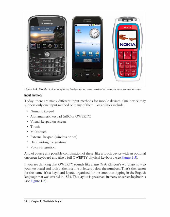
And of course any possible combination of these, like a touch device with an optionalonscreen keyboard and also a full QWERTY physical keyboard (see Figure 1-5).
If you are thinking that QWERTY sounds like a Star Trek Klingon’s word, go now toyour keyboard and look at the first line of letters below the numbers. That’s the reasonfor the name; it’s a keyboard layout organized for the smoothest typing in the Englishlanguage that was created in 1874. This layout is preserved in many onscreen keyboards(see Figure 1-6).
Figure 1-4. Mobile devices may have horizontal screens, vertical screens, or even square screens.
14 | Chapter 1: The Mobile Jungle

Other features
We could talk for hours about mobile device features, but we’ll focus on the ones thatare useful for us as mobile web programmers. Key features include:
GeolocationMany devices can detect the geographical location of the users using one or manytechnologies, like GPS, A-GPS, WPS (WiFi Positioning System), or cell-based lo-cation tracking.
Phone callsYes, mobile devices also make phone calls!
SMS (Short Message Service)Most devices allow you to create text messages to send to other devices or to aserver, with a length of up to 160 7-bit ASCII characters (or 140 8-bit ASCII char-acters, or 70 Unicode chars), or to concatenate many messages for a larger text.
MMS (Multimedia Message Service)Mobile devices often allow users to create messages with text and attachments,such as images, videos, or documents.
Application installationsMany devices allow the user to download and install an application using OTA(Over-The-Air). This means that we can serve applications to a device from ourwebsites.
Figure 1-5. The Nokia N97 mini has a full slider QWERTY keyboard and, when closed, an onscreentouch keyboard.
Mobile Knowledge | 15

Brands, Models, and PlatformsNow that we have established a set of categories in the mobile world, let’s talk aboutthe difficult part: the brands and models on the market. We are not going to talk aboutevery model available, and we don’t need to know about all of them. We only need tobe aware of some information that will be useful for making decisions in the future.
Writing a book about brands and models is very difficult. The market changes a lotevery year. In fact, during the months while I was writing this book, I had to updatethe information several times. That is why I will be general and aim to show you howto understand any new device that could appear on the market.
AppleWe are going to start with Apple, not because its devices are the best or because it hasthe greatest market share, but because Apple has caused a revolution in the market. Itchanged the way mobile devices are seen by users, and it is the reason why many de-velopers (web or not) have turned their attention to the mobile world.
Figure 1-6. The iPhone and iPod Touch use an onscreen virtual keyboard when the user needs to typesomething on a website.
16 | Chapter 1: The Mobile Jungle

Apple, a well-known desktop computer company, entered the mobile world with arevolutionary device: the iPhone. Luckily for us, all of Apple’s devices are quite similar.They have a multitouch screen, a 3.5″ screen size, WLAN connections, and Safari oniOS (formerly Mobile Safari) as the browser.
Apple’s devices have a great feature: an operating system called iOS (formerly iPhoneOS) that is based on Mac OS X (a Unix-based desktop OS). Up to this writing, eventhe first version of the iPhone can be upgraded to the latest operating system version.By default, the iPhone and iPod Touch are charged using USB; when you charge yourdevice, iTunes (the Apple software for managing your device’s content and music) willdetect automatically if an OS update is available for your device, and you can installthe update in minutes without any technical skill needed.
That is why today, for a mobile web developer, it’s more important to know what OSversion an Apple device has installed than which device it is. For those of us whose aimis to create great web experiences for the iPhone, it doesn’t matter if the device is aniPhone (the basic phone), an iPhone 3GS (S for speed, a device with more power andspeed), an iPhone 4 or an iPod Touch (like the iPhone without the phone). Even withineach device type, we have many generations.
The Apple iPad is a 9.7″ multitouch tablet running iOS 3.2 or greater.It includes the same functionality and browser as the iPhone, with minordifferences because of the larger screen, which has a 768×1024resolution.
The important thing is to know which OS version a device that accesses your websiteis running. It may be iOS 1.0, 2.0, 2.2, 3.0, 3.2, 4.0, or newer (although versions 1.0and 2.0 are rarely seen on devices in use today, so we can safely work with versions 2.2and beyond). Up to version 4.0, iOS was called iPhone OS. Every version has upgradesin the browser and is backward compatible. For example, the Gmail version for theiPhone is different if you have an iPhone running OS 1.0, 2.2, or 3.0. You can see samplescreens in Figure 1-7.
Today, we can develop applications for iOS devices on only two platforms: usingmobile web techniques, and using the native Cocoa Touch framework built onObjective-C.
Later in this book, we are going to talk about how to detect the OS anduse all the features available only in Safari on iOS. We will also talkabout the App Store and how to distribute our mobile web applicationsvia this store.
Brands, Models, and Platforms | 17

NokiaNokia has the largest market share in mobile devices and smartphones worldwide (butnot necessarily in specific markets, like the U.S.). Nokia has devices in all the mobilecategories, from very low-end devices to very high-end smartphones.
I’ve been working in the mobile development world since 2000 and I have to admit thatNokia has the best support for developers, compared to all the other companies. Hun-dreds of documents and a huge amount of sample code, ideas, and best practices formany technologies, including technologies used for mobile web development are avail-able on its website for developers, Forum Nokia.
I’ve been one of the Forum Nokia Champions (a worldwide recognition program fortop mobile developers) since 2006, and I know that Nokia really cares about the de-veloper community.
The bad news for developers is that hundreds of different Nokia devices are availabletoday. The good news is that they are very well organized by platform into differentseries, making it easier for us to develop, test, and port our web applications to mostof them.
Figure 1-7. This is the same Gmail account accessed from an iPhone running OS 2.0 and one running3.0. The latter provides a more rich and contextual experience for the user.
18 | Chapter 1: The Mobile Jungle

Series 40
Nokia’s Series 40 consists of low- and mid-end devices using a proprietary Nokia OSfocused on the mass market. The devices in this series first appeared in 2003, and todaythey are separated into different editions and even small update packages (called Fea-ture Packs) that will help us to understand the abilities of each mobile device in thisseries.
The series, the edition, and even the Feature Pack cannot be updated.So, there are no operating system changes in Series 40.
At the time of writing, Series 40 includes the following divisions:
Series 40 1st editionSeries 40 2nd editionSeries 40 3rd editionSeries 40 3rd edition Feature Pack 1Series 40 3rd edition Feature Pack 2Series 40 3rd edition Feature Pack 3Series 40 5th editionSeries 40 5th edition Feature Pack 1Series 40 5th edition Feature Pack 1 LiteSeries 40 6th edition
Every edition has between 5 and 40 devices on the market today. The best part is thatNokia guarantees us that development for each device in one series is the same.
You may have noticed that there isn’t a 4th edition in Nokia’s Series 40.Why is this? Nokia has a lot of market share in Asia, and in China, 4 isconsidered a bad-luck number (like the number 13 in the Westernworld) because it is pronounced “si,” similar to “death” in Chinese.
All the Series 40 devices have a mobile browser and Java ME (Micro Edition)—formerlyknown as J2ME (Java 2 Micro Edition)—support. From the 3rd edition, they also sup-port different versions of Adobe Flash Lite.
Java ME is today the most widespread mobile platform, apart from mo-bile web. It was developed by Sun (now Oracle) in 1998, and the goalwas to create a multiplatform programming language. Sun has said thatJava ME will be retired in 2015.
Brands, Models, and Platforms | 19

Almost all the Series 40 devices have a numeric keypad and a medium-sized screen.Today, all have a camera and an MP3 player, and many of them have an FM receiver.
It’s interesting to see how the mobile world is changing other businessmarkets. Today, the worldwide leading company in the MP3 playermarket is Nokia.
Some Nokia Series 40 devices that are well distributed in the market include:
Nokia 6500Nokia 6120 ClassicNokia 6600 FoldNokia 6600 SlideNokia 6131Nokia 5310Nokia 5200Nokia 3220Nokia 2610
S60
Series 60 began as the smartphone line from Nokia. Today these devices are closer tothe high-end category, but the limit is not clear. All S60 devices use the Symbian op-erating system. The Symbian company was formed by a group of manufacturers in-cluding Nokia, Ericsson, and Motorola. Later, Samsung and Sony Ericsson were addedto the member list. For many years Nokia has been the leading company using theSymbian platform, but there are some Samsung, Sony Ericsson, and Motorola Symbian-based devices on the market. Some of them use the same user interface layer and plat-form, so there are many non-Nokia S60 devices on the market today. Motorola andSony Ericsson developed their own UI layers for Symbian, called UIQ, and DoCoMoin the Japanese market created MOAPS.
This is history, though. In 2008, after the launching of Android as an open sourceoperating system, Nokia made a decision: it bought 100% of Symbian, Ltd. from allthe other manufacturers and created the Symbian Foundation to migrate the Symbianoperating system to open source.
Today, there are some Nokia, Sony Ericsson, and Samsung devices based on the Sym-bian Foundation’s OS and the ex-S60 user interface layer. UIQ has been deprecated.
20 | Chapter 1: The Mobile Jungle

Talking about only Nokia devices, the S60 platform is divided into the followingversions:
S60S60 2nd editionS60 2nd edition Feature Pack 1S60 2nd edition Feature Pack 2S60 3rd edition Feature Pack 1S60 3rd edition Feature Pack 2S60 5th edition
After S60 5th edition, the platform was renamed to Symbian platform.All new devices coming from Nokia and other manufactures will notuse the S60 brand.
All the S60 devices are based on Symbian and include a camera, a mobile browser,multitasking support, and a numeric or QWERTY keyboard. The 5th edition has touchsupport.
Apart from the technical series divisions, Nokia has divided its Symbian-based devicesinto commercial series based on the user groups for whom they were designed sincethe 3rd edition.
The n-series is intended for all type of users, including high-tech users, gamers, andInternet users. This series includes the N97, N95, N85, N78, etc. Some of these deviceshave hardware-accelerated video cards for 3D gaming.
The e-series is aimed at enterprise users wanting access to email, web browsing, andcorporate applications. They include a corporate email application, and many of themhave a QWERTY keyboard for easy typing. This series includes the E52, E65, E71, etc.
The x-series (formerly known as XpressMusic) is designed for the music user. Thesedevices have multimedia keys for easy music player manipulation and provide accessto the Nokia Music Store so users can buy songs legally. The last devices from this seriesare touch-based. This series includes the 5800 XpressMusic (see Figure 1-8) and the X6.
Brands, Models, and Platforms | 21

Figure 1-8. The 5th edition Nokia 5800 XpressMusic was the first touch-enabled S60 device.
Every S60 device has a WebKit-based browser that allows the devices to browse almostany website on the Internet, including Flash-based sites like YouTube. The S60 WebKitbrowser is an open source browser developed by Nokia (now managed by the SymbianFoundation) based on WebKit, an open source browser originally developed by AppleInc. Before this browser was developed, S60 devices included a proprietary Nokiabrowser or preinstalled some other browser, like Opera Mobile.
Maemo/MeeGo
Nokia has recently created a new platform, called Maemo. It’s a Linux-based operatingsystem designed for small netbooks or devices with full web browsing support. Thefirst devices to use Maemo weren’t phones, but today there are devices like the NokiaN900 with 3G support, competing directly with Symbian devices.
Future smartphone devices from Nokia will be Maemo-based. Maemo was the firstmobile platform to support the popular Firefox browser and Google Chrome.
In 2010, Nokia’s Maemo merged with Intel’s Moblin OS, creating the MeeGo OS. Atthe time of this writing, it is not yet clear whether Maemo will continue as a brandingname or if MeeGo will replace it.
BlackBerryResearch in Motion (RIM) is the Canadian manufacturer of the BlackBerry devices,mobile devices focused on being “always connected” with push technologies that areprimarily used by corporate users who need to remain connected to intranets and cor-porate networks. RIM calls all its devices “smartphones.”
22 | Chapter 1: The Mobile Jungle
In following chapters, we will cover all the tools, SDKs, and emulatorsavailable from each manufacturer to make our lives as web developerseasier.
RIM has few devices aimed at the mass market, so most of them have QWERTY key-boards and aren’t designed for gaming. Many of them have proprietary input devices,like a scroll wheel or a touchpad; some touch-enabled devices have also been launchedin the last few years. All BlackBerrys have the RIM OS, a proprietary operating systemcompatible with Java ME with extensions, and, of course, a mobile browser. We cancategorize the devices by operating system version.
BlackBerry has become very popular in the corporate market because of its integrationwith Exchange and other corporate servers. A BlackBerry user can browse the Internetvia the corporate Internet connection though a proxy, and many other manufacturers,such as Nokia, LG, HTC, and Sony Ericsson, support the BlackBerry email client.
SamsungSamsung has many devices on the market, most of which are divided into three differentseries: native devices, Symbian devices, and Windows devices. At the end of 2009,Samsung surprised the market with a new platform for the devices launching from2010: Bada.
Samsung’s native devices are low- and mid-end mobile devices with a proprietary OSincluding a browser and Java ME support, and typically a camera and a music player.
Prior to 2010, the smartphones and high-end devices were divided into two categoriesby operating system—Symbian and Windows Mobile—each having its own set of fea-tures. The latest devices on the market have touch support, with a UI layer installedover the operating system.
For newer devices, there is one feature that is available on all the three platforms: Sam-sung Widgets. These are small applications created using mobile web technologies thatcan operate on all the operating systems Samsung uses.
In Chapter 12, we will cover Mobile Widgets and offline applications.We will talk about the widget platform for Samsung there.
Starting in 2010, Samsung will also be delivering mobile devices with Bada, Android,and Windows Phone.
Brands, Models, and Platforms | 23

Sony EricssonEricsson built many mobile phones in the 1990s, and in 2001 it merged with Sony andcreated the Sony Ericsson company. Today, Sony Ericsson produces a range of low-and mid-end devices and a couple of smartphones.
Sony Ericsson, like Samsung, has decided to offer devices with different operating sys-tems. It offers low- and mid-end devices using a proprietary Sony Ericsson operatingsystem, as well as Windows Mobile devices, Android devices, and Symbian devices.Before 2009, the Symbian devices used UIQ as the UI layer for the operating system.Since 2009, there are Symbian Foundation devices using the same UI layer as Nokia’sand Samsung’s devices. So, in terms of developing web applications for them, they arevery similar.
The proprietary OS devices support Java ME and Flash Lite development (and alsoboth at the same time, thanks to a project called Capuchin), and they are divided inseries according to the Java ME APIs they support. So, today we have Sony Ericssondevices from Java Platform 1 (JP-1) to Java Platform 8 (JP-8), with each category dif-fering in terms of the API support and the screen resolution.
All the devices have a camera, a music player and, of course, a web browser built in.The Symbian Foundation–based devices are touch-enabled.
MotorolaFor many years, Motorola has been a leading manufacturer of low- and mid-end devi-ces. Motorola’s devices were the first mobile devices on the market, and the companypioneered the clamshell design with the classic Motorola StarTac. Motorola’s mobiledevices have traditionally used either a proprietary operating system (like the well-known Motorola v3), Symbian UIQ, Windows Mobile, or a Linux-based operatingsystem the company created for its devices. On the proprietary OS–based devices, JavaME and the browser were the only supported development platforms. The Linux-basedOS supports Java ME, web, and native development.
This situation created a very fragmented market for developers. Today, Motorola haschanged its vision and has focused on a single solution: Android. All new mid-enddevices and smartphones, like the one shown in Figure 1-9, are Android-based, and itappears that Motorola will no longer create new Windows Mobile or Symbian devices.I won’t make any bets about this, because anything could happen in the future of themobile world; however, as of today, Motorola is an Android-based company.
24 | Chapter 1: The Mobile Jungle

Figure 1-9. The Motorola CLIQ was the first Android-based device from this company. It includesMOTOBLUR, a push service connecting your home screen with social networks and news sites.
The Windows-based Motorola devices, like the Motorola Q, which has a QWERTYkeyboard, are intended for the corporate market. The company also has some touchdevices on the market, all with a built-in camera and music player, and some mobiledevices for the two-way radio market, like the Nextel network. These devices have aproprietary OS and the model names usually start with an “i.”
There are no series divisions in Motorola, unlike in the Nokia and Sony Ericsson lines,so we will need to use other information (such as the browser used in each device) totest and make decisions about the devices.
LG MobileLG Mobile has many low- and mid-end devices on the market today. Most are basedon a proprietary OS with Java ME, Flash, and web support. Some of the new onessupport web widgets based on WebKit.
LG is currently working with Android and Windows Mobile/Windows Phone to createsome new smartphones (the company has not previously produced any devices in thiscategory). LG participated in the creation of the Symbian Foundation and has twoSymbian devices based on the S60 platform, but as it has now decided to supportAndroid, we should see a lot of Android-based LG devices in the future.
Brands, Models, and Platforms | 25

HTCHTC has become very popular in the mobile market since it created the first and secondAndroid devices in the world and the first Google phone, the Nexus One. But HTCdoesn’t only create Android devices; it also produces a lot of Windows Mobile ones.Many HTC devices have touch support, and a key feature is that HTC tries to emulatethe same user experience on all its devices. We can think of HTC devices as eitherAndroid devices or Windows devices; that’s the only distinction that’s needed.
This simplicity is reflected in the HTC website for developers: it only contains kernelfiles for Android devices and links to the Android and Windows Mobile genericwebsites.
AndroidThis is the first platform we are covering that isn’t a manufacturer. Therefore, it maynot seem to fit in this list. It does, though—if we are developing a website for an Androiddevice, we don’t need to bother too much about who the manufacturer is. This isbecause the Android platform is powerful enough to leave the brand and model in asecond place when we are talking about developer features.
Android is an open source, Linux-based operating system created and maintained bya group of software and hardware companies and operators called the Open HandsetAlliance. Google mainly maintains it, so it is sometimes known as the “Google MobileOperating System.” As with any open source software, any manufacturer could theo-retically remove all the Google-specific stuff from the operating system before installingit on their devices. However, as of this writing no vendor has done this, which is whyevery Android device is very “Google friendly.”
Android is a software stack including a Linux-core, multitasking operating systembased on the concept of a virtual machine that executes bytecode, similar to .NET orJVM (Java Virtual Machine). Google chose Java as the main language to compile (notcompatible with Java ME) with Web 2.0 users in mind. Android includes a full HTMLbrowser based on WebKit and, in fact, is very similar to the iPhone Safari browser, andall Android devices to date ship with Google Maps, Google Calendar, and an emailclient and provide connections to many free Google web services. It’s not an obligation,but as of today every Android device is touch-based, and many of them have aQWERTY physical keyboard, GPS, a digital compass, and an accelerometer.
Today, HTC, Motorola, Samsung, LG, and Sony Ericsson make Android devices. Manyother vendors have announced the release of Android devices in the future, includingKyocera and Dell. There are also some non-phone devices, such as tablets, that useAndroid.
As of the writing of this book, the Android OS comes in versions 1.0, 1.5, 1.6 withupdate features, and a major 2.0 release with a 2.1 and a 2.2 update. Knowing the OS
26 | Chapter 1: The Mobile Jungle

version will be very useful to determine what browser features are available. Unfortu-nately, the documentation about the Android browser features is not complete.
Windows MobileOne of the older mobile operating systems on the market is Windows Mobile (formerlyWindows CE for PocketPC and Smartphones). For many years, its market included thewell-known PocketPCs as Personal Digital Assistants (PDAs) without phone features.The “mobile revolution” pushed Microsoft to create a smartphone version of its mobileoperating system, now called Windows Mobile, which is available in two flavors: theProfessional (formerly Pocket PC) and Smartphone editions.
Today Windows Mobile doesn’t have too much market share, but it is still well receivedin the corporate world. Microsoft has begun gaining ground in the end-user marketsince the release of the Windows Mobile 6.5 operating system, which supports a veryintuitive touch UI.
Almost every mobile device with Windows Mobile that has launched since 2003has .NET Compact Framework support. This means you can develop native applica-tions using C# or Visual Basic with a reduced .NET Framework. All of them come withthe web browser Internet Explorer Mobile (formerly known as Pocket Internet Ex-plorer) and with Office Mobile (formerly known as Pocket Word, Pocket Excel, and soon).
The browser version will depend on the operating system version, from Windows CE2002 and 2003 to Windows Mobile 5.0, 6.0, 6.5, or newer.
In 2010 Microsoft rebranded the operating system as Windows Phone, starting withversion 7. Windows Phone was presented as a new operating system, with a new UIand services and a new developer platform not compatible with the previous one, usingSilverlight and XNA instead of the .NET Compact Framework.
Microsoft, like Google, has entered the hardware mobile market. WithSharp as a manufacturing partner it has begun creating its own mobilephones, starting with the Kin devices, designed with social networkingand teen users in mind. The Kin One and Kin Two have a custom op-erating system based on Windows CE and cloud services; as of thiswriting they are not Windows Phone devices.
Windows Mobile has its own unique features, like Android, and as developers we canconsider it as a platform without regard to who the device manufacturer is. WindowsMobile devices are produced by HP, Toshiba, Motorola, Sony Ericsson, Samsung(shown in Figure 1-10), and Palm, with the Treo W series.
Brands, Models, and Platforms | 27

Figure 1-10. The Samsung Omnia is a Windows Mobile 6.5 device. The operating system is veryfriendly for desktop Windows users, featuring the Start menu and a very similar user interface.
PalmMy first mobile was a Palm III, back in 1998. At that time, it was a great device for me.It was touch-enabled (used with a stylus), black and white, and very small. It was arevolution for me: I could install applications, read newspapers, and even programdirectly on the device with a Pascal for Palm interpreter. OK, the programming wasn’tthe best experience, but the concept was really powerful.
USRobotics bought Palm Computing Inc. in 1995. At the time, it was the pioneerlaunching PDA devices. USRobotics later merged with 3Com, and as 3Com was dedi-cated to network cards and accessories, Palm Inc was created as a subsidiary. Palm Inc.was very successful, and other manufacturers (including IBM) created other deviceslicensing its Palm OS. In 1998, a couple of Palm’s directors left to create another com-pany, HandSpring, which releases the Treo devices to the market. Half PDA and halfmobile phone, they can be considered the first smartphones on the market.
A few years later, Palm decided to divide the company into a hardware manufacturer,palmOne, and an operating system developer, PalmSource. This idea didn’t work out:customers didn’t accept the palmOne trademark, so the company again acquired the
28 | Chapter 1: The Mobile Jungle

Palm trademark and the operating system became the Garnet OS. In the meantime,Palm acquired HandSpring, so now we have Palm Treo devices.
In 2005, ACCESS (who also had other mobile technologies) acquired PalmSource andthe operating system. Suddenly, the new-old Palm company made a difficult decision:it started to manufacture Treo devices with Windows Mobile, killing all hopes for thefuture of the Garnet OS (formerly Palm OS).
The Treo series was the only type of Palm device that survived in the mobile world, andBlackBerrys, the Nokia E Series, and other devices soon pushed Palm to the bottom ofthe market. In response, Palm created another operating system for mobile devices,aimed at being a web-oriented platform for iPhone-killer devices. webOS came to themarket in 2009 with the first device, the Palm Pre. Other devices, such as the Palm Pixi,followed. Figure 1-11 shows the progression.
The company didn’t go so-well in the market, so in 2010, Palm was acquired by HP,who promised evolution of webOS, so we should expect HP netbooks, tablets and moremobile phones with this operating system in the following years.
Figure 1-11. Palm has a really interesting history. Pictured here are the original USRobotics PalmPilot,the Handspring Treo, and the new webOS-based Palm Pre.
Palm’s new webOS devices are touch and multitouch devices with a very smooth userinterface, excellent web support, and all the functions of a modern mobile device. Theoperating system and all the device applications are web-based. That’s because any“native” application developed for webOS is created using web technologies. We willtalk about this platform in Chapter 12. You can learn more about webOS developmentby reading Mitch Allen’s Palm webOS, also from O’Reilly.
Brands, Models, and Platforms | 29

It’s not widely known today that Apple, creator of the iPod and iPhone,was really one of the pioneers in the mobile device market. The AppleNewton was on the market from 1990 to 1998.
Symbian FoundationWe talked earlier about the history of the Symbian Foundation and Nokia’s relationshipto the new Symbian Foundation operating system. Today there are many SymbianFoundation–based devices on the market (from Nokia, Sony Ericsson, and Samsung),all with similar operating system features. Figure 1-12 shows one such device.
Figure 1-12. The Sony Ericsson Satio is a Symbian-based device (S60 5th edition), so it’s very similarto the Nokia 5800 XpressMusic.
The Symbian Foundation’s OS allows us to develop applications using the nativeC++ framework, Java ME, Adobe Flash, web applications, widgets using web tech-nologies, Python, and Qt, a free C-based framework owned by Nokia (Qt is the currentrecommended platform for creating native applications for Symbian and MeeGo).
The open source OS is versioned as Symbian^1, Symbian^2, Symbian^3, etc. As withAndroid and Windows Mobile devices, if we are talking about a Symbian device weknow that it will be very similar to all other Symbian devices, no matter which manu-facturer created it.
30 | Chapter 1: The Mobile Jungle
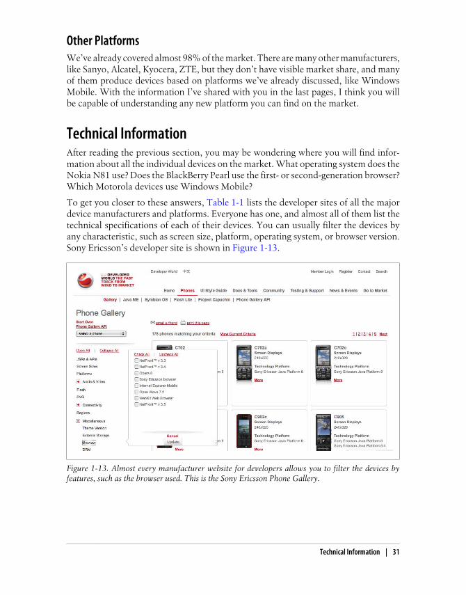
Other PlatformsWe’ve already covered almost 98% of the market. There are many other manufacturers,like Sanyo, Alcatel, Kyocera, ZTE, but they don’t have visible market share, and manyof them produce devices based on platforms we’ve already discussed, like WindowsMobile. With the information I’ve shared with you in the last pages, I think you willbe capable of understanding any new platform you can find on the market.
Technical InformationAfter reading the previous section, you may be wondering where you will find infor-mation about all the individual devices on the market. What operating system does theNokia N81 use? Does the BlackBerry Pearl use the first- or second-generation browser?Which Motorola devices use Windows Mobile?
To get you closer to these answers, Table 1-1 lists the developer sites of all the majordevice manufacturers and platforms. Everyone has one, and almost all of them list thetechnical specifications of each of their devices. You can usually filter the devices byany characteristic, such as screen size, platform, operating system, or browser version.Sony Ericsson’s developer site is shown in Figure 1-13.
Figure 1-13. Almost every manufacturer website for developers allows you to filter the devices byfeatures, such as the browser used. This is the Sony Ericsson Phone Gallery.
Technical Information | 31
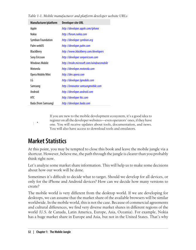
Table 1-1. Mobile manufacturer and platform developer website URLs
Manufacturer/platform Developer site URL
Apple http //developer.apple.com/iphone
Nokia http //forum.nokia.com
Symbian Foundation http //developer symbian.org
Palm webOS http //developer.palm.com
BlackBerry http //www.blackberry.com/developers
Sony Ericsson http //developer sonyericsson.com
Windows Mobile http //msdn.microsoft.com/windowsmobile
Motorola http //developer.motorola.com
Opera Mobile/Mini http //dev.opera.com
LG http //developer.lgmobile.com
Samsung http //innovator samsungmobile.com
Android http //developer.android.com
HTC http //developer htc.com
Bada (from Samsung) http //developer.bada.com
If you are new to the mobile development ecosystem, it’s a good idea toregister on all the developer websites—even operators’ ones, if they haveone. You will receive updates about tools, documentation, and news.You will also have access to download tools and emulators.
Market StatisticsAt this point, you may be tempted to close this book and leave the mobile jungle via ashortcut. However, believe me, the path through the jungle is clearer than you probablythink right now.
Let’s analyze some market share information. This will help us to make some decisionsabout how our work will be done.
Sometimes it’s difficult to decide what to target. Should we develop for all devices, oronly for the iPhone and Android devices? How can we decide how many versions tocreate?
The mobile world is very different from the desktop world. If we are developing fordesktops, we can assume that the market share of the available browsers will be similarworldwide. In the mobile world, this is not the case. Because of commercial agreementsand cultural differences, we find very diverse market shares in different regions of theworld (U.S. & Canada, Latin America, Europe, Asia, Oceania). For example, Nokiahas a huge market share in Europe and Asia, but not in the United States. That’s why
32 | Chapter 1: The Mobile Jungle

we need to define who our targets are. Worldwide users? U.S. users? What about genderand age? Depending on the target demographic, we can define our porting strategy.
Overall mobile device sales statistics aren’t the only ones we need to analyze. The mar-ket shares are very different if we look only at people using their mobile devices tobrowse the Web. A device with a very low total worldwide market share, such as theiPhone, can prove to have a big market share if we only analyze devices with high webconsumption. Figures 1-14 through 1-16 show a few different counts with varyingresults.
Figure 1-14. Gartner offers frequently updated statistics about mobile terminal (all devices) andsmartphone sales. Nokia is the global leader in both segments.
Some statistics services use JavaScript code or some other technique thatis not available for microbrowsers or low-end devices, so they are gen-erally left out of the list of devices visiting your website. You need to bevery careful about interpreting statistics.
GetJar.com is an application store for freeware and shareware applications, mainlydeveloped in Java ME but with other platforms supported, too. The site offers publicstatistics about the market share of its visitors, as shown in Table 1-2. This informationis very useful, because the visitors are active—they are browsing a website looking forapplications to download—so we can consider them active mobile Internet users in theJava ME–compatible market.
Market Statistics | 33

Table 1-2. Global GetJar market share statistics by manufacturer (September 2009)
Manufacturer Market share
Nokia 47.8%
Sony Ericsson 16.6%
Samsung 7.8%
LG 3.2%
BlackBerry 3%
Motorola 2.29%
While GetJar statistics are very useful, we need to understand that themarket share of iPhone, Android, Windows Mobile, and webOS devicesare not represented accurately because their users don’t typically useGetJar.
Figure 1-15. At http://gs.statcounter.com we can find mobile browser statistics (global and by region)collected from websites using the StatCounter tool. The iPod Touch is registered as iTouch, so iPhoneOS devices are leading here.
34 | Chapter 1: The Mobile Jungle
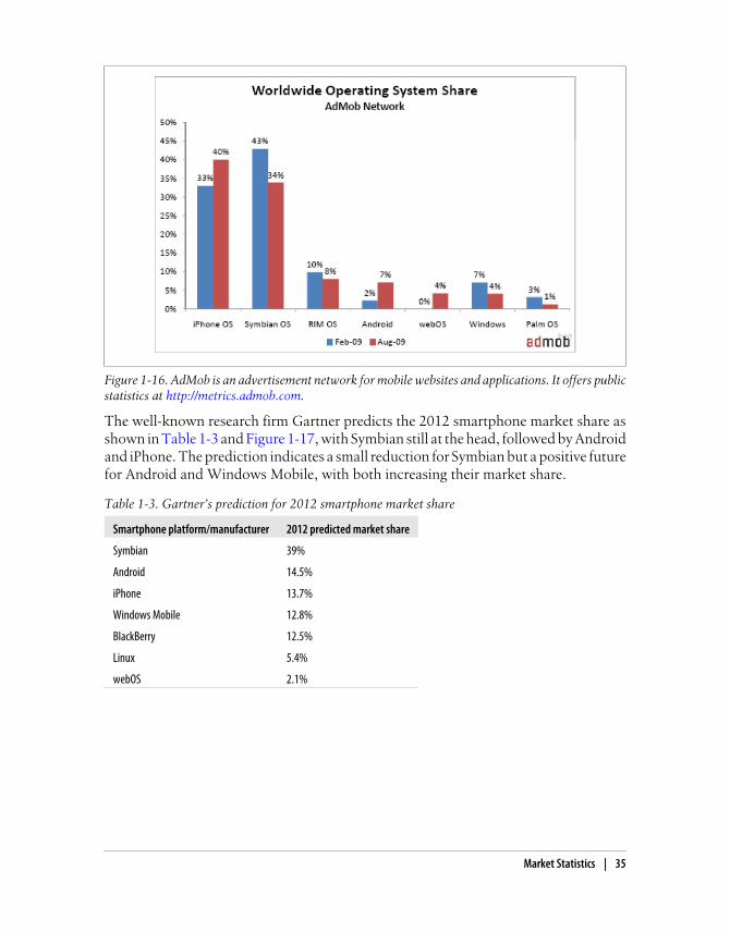
The well-known research firm Gartner predicts the 2012 smartphone market share asshown in Table 1-3 and Figure 1-17, with Symbian still at the head, followed by Androidand iPhone. The prediction indicates a small reduction for Symbian but a positive futurefor Android and Windows Mobile, with both increasing their market share.
Table 1-3. Gartner’s prediction for 2012 smartphone market share
Smartphone platform/manufacturer 2012 predicted market share
Symbian 39%
Android 14.5%
iPhone 13.7%
Windows Mobile 12.8%
BlackBerry 12.5%
Linux 5.4%
webOS 2.1%
Figure 1-16. AdMob is an advertisement network for mobile websites and applications. It offers publicstatistics at http://metrics.admob.com.
Market Statistics | 35

Figure 1-17. Gartner predicts that in 2012 Android will have more market share than iPhone,BlackBerry, and Windows Mobile. Symbian will continue its worldwide leadership.
Smartphones Versus Non-SmartphonesPhone-by-phone statistics are helpful, but a broader categorization can show a biggerpicture. Luke Wroblewski (http://www.lukew.com) created a very extensive blog postabout smartphone versus feature phone statistics found in different sources. The articlecan be found at http://www.mobilexweb.com/go/lukestats.
Here are some of the key points:
• The average smartphone user generates 10 times the amount of traffic generatedby the average non-smartphone user.
• iPhones, in particular, can generate as much traffic as 30 basic feature phones.
• 35% of smartphone owners browse the mobile Internet at least daily, versus only4% of feature phone owners.
• 80% of smartphone users have accessed mobile media on their mobile devices,versus 26% of non-smartphone users.
36 | Chapter 1: The Mobile Jungle
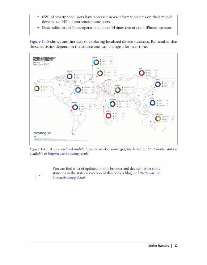
• 65% of smartphone users have accessed news/information sites on their mobiledevices, vs. 14% of non-smartphone users.
• Data traffic for an iPhone operator is almost 14 times that of a non-iPhone operator.
Figure 1-18 shows another way of exploring localized device statistics. Remember thatthese statistics depend on the source and can change a lot over time.
Figure 1-18. A nice updated mobile browser market share graphic based on StatCounter data isavailable at http://www.icrossing.co.uk.
You can find a list of updated mobile browser and device market sharestatistics in the statistics section of this book’s blog, at http://www.mobilexweb.com/go/stats.
Market Statistics | 37

CHAPTER 2
Mobile Browsing
Understanding the big picture about platforms, operating systems, brands, and modelsis important for getting started in the mobile market, but the most important informa-tion for us will be which mobile browser is used. Browsers will guide the rest of thisbook and most of our work as mobile web developers.
Many web developers curse desktop browsers and compatibility issues between them.Maybe you are one of them. But compared with the mobile world, in the desktop worldthe browser war is really simple: we have Internet Explorer (6, 7, 8, or newer), Firefox,Safari, Opera, and Chrome. And that’s about it. In the mobile world, there are morethan 5,000 devices on the market. The good news (compared with this number) is thatthere are fewer than 25 mobile browsers in common usage—every smartphone OS hasits own mobile browser, but the proprietary operating systems for the low- and mid-end devices mostly use similar browsers. Still, the situation is far more complex thanin the desktop world!
All mobile devices come with one preinstalled mobile browser, and very few of themcan be upgraded or uninstalled. There are some exceptions: the browsers included withiOS, webOS, and Android are automatically upgraded when you update the operatingsystem firmware. This can also be done in other operating systems, like Symbian orWindows Mobile, but up to now it’s not an operation that users do frequently.
To complicate the situation, almost every device on the market allows users to add analternative web browser, and some carriers, like Vodafone in Europe, include a copyof an alternative web browser customized for that operator, such as Opera Mini orMobile, along with the factory-installed browser.
The Mobile Browsing ExperienceThe mobile browsing experience varies among different devices, and even among dif-ferent browsers running on the same device. The user interfaces work very differently.
39

Browsing TypesA mobile website can be navigated using different techniques. Every mobile browseruses one or many of these modes of navigation. The modes are:
• Focus navigation
• Cursor navigation
• Touch navigation
• Multitouch navigation
Focus navigation, illustrated in Figure 2-1, is the most frequent mechanism used forbrowsing websites on low- and mid-end devices. (Smartphones that have hardwarecursor keys, a touchpad, or a scroll wheel sometimes use focus navigation as an alter-native.) With this mode, a border or a background color is used to show the user wherethe focus is. In general it is used in non-touch devices, so the user uses the cursor keypadto navigate between links and scroll the website. Pressing the down key makes thebrowser change the focus to the next focusable object (e.g., a link, a text field, or abutton), or scroll a couple of lines in the content if there is no other focusable objectnearby.
Figure 2-1. Focus navigation on a low-end device.
Cursor navigation, illustrated in Figure 2-2, emulates a mouse cursor over the screenthat can be moved using the arrow keys. A mouse click is emulated with the Fire or
40 | Chapter 2: Mobile Browsing
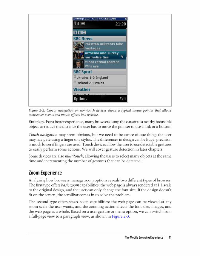
Enter key. For a better experience, many browsers jump the cursor to a nearby focusableobject to reduce the distance the user has to move the pointer to use a link or a button.
Touch navigation may seem obvious, but we need to be aware of one thing: the usermay navigate using a finger or a stylus. The differences in design can be huge; precisionis much lower if fingers are used. Touch devices allow the user to use detectable gesturesto easily perform some actions. We will cover gesture detection in later chapters.
Some devices are also multitouch, allowing the users to select many objects at the sametime and incrementing the number of gestures that can be detected.
Zoom ExperienceAnalyzing how browsers manage zoom options reveals two different types of browser.The first type offers basic zoom capabilities: the web page is always rendered at 1:1 scaleto the original design, and the user can only change the font size. If the design doesn’tfit on the screen, the scrollbar comes in to solve the problem.
The second type offers smart zoom capabilities: the web page can be viewed at anyzoom scale the user wants, and the zooming action affects the font size, images, andthe web page as a whole. Based on a user gesture or menu option, we can switch froma full-page view to a paragraph view, as shown in Figure 2-3.
Figure 2-2. Cursor navigation on non-touch devices shows a typical mouse pointer that allowsmouseover events and mouse effects in a website.
The Mobile Browsing Experience | 41

Some browsers use smart zooming like on a desktop: if a paragraph extends beyondthe page width, when you zoom in you need to scroll horizontally (Safari on iOS is oneexample). Some others reflow the text when zoomed in to fit the page width (the An-droid browser does this), and still others (such as Opera Mini) reflow the page evenwhen zoomed out.
Reflow EnginesSome mobile browsers aim to offer a better experience to mobile users browsing web-sites that were not designed for mobile devices by reflowing the pages to a one-columndesign. The smart zoom option has started to replace this technique, but there are stillsome browsers that use a reflow algorithm. For example, the result of using OperaMini’s “Mobile View” on the page displayed on the left in Figure 2-3 is shown inFigure 2-4.
Figure 2-3. The webOS browser offers smart zooming. The entire website layout is rendered first, andwhen the user double-taps on part of the page the smart zoom focuses in on that area.
42 | Chapter 2: Mobile Browsing
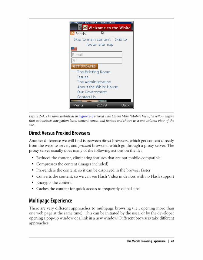
Direct Versus Proxied BrowsersAnother difference we will find is between direct browsers, which get content directlyfrom the website server, and proxied browsers, which go through a proxy server. Theproxy server usually does many of the following actions on the fly:
• Reduces the content, eliminating features that are not mobile-compatible
• Compresses the content (images included)
• Pre-renders the content, so it can be displayed in the browser faster
• Converts the content, so we can see Flash Video in devices with no Flash support
• Encrypts the content
• Caches the content for quick access to frequently visited sites
Multipage ExperienceThere are very different approaches to multipage browsing (i.e., opening more thanone web page at the same time). This can be initiated by the user, or by the developeropening a pop-up window or a link in a new window. Different browsers take differentapproaches:
Figure 2-4. The same website as in Figure 2-3 viewed with Opera Mini “Mobile View,” a reflow enginethat autodetects navigation bars, content zones, and footers and shows us a one-column view of thesite.
The Mobile Browsing Experience | 43

• Only one page support
• Multiple windows (shown in Figure 2-5)
• Windows stacks (shown in Figure 2-6)
• Tab navigation
Figure 2-5. The iPhone browser has multiwindow support that allows the user to maintain up to eightdifferent websites open at the same time. Android and webOS have similar features.
The WebKit EngineWebKit is an open source layout engine for web browsers. It renders HTML and CSSwebsites and can execute JavaScript. It was created by Apple to be used in its Safariweb browser for Mac OS X, and later Windows and iOS. As an open source project,there are many ports of the rendering engine, and today we can find many applicationsusing it—for example, Google Chrome and Adobe AIR.
The great thing about WebKit is that almost everyone in the mobile world is using it(or wants to use it in the future). This means that even on very different mobile deviceswe can expect very similar web rendering with simple markup and styles, which is goodnews for developers. However, it isn’t heaven—as we’ll see in later chapters, manydifferences do exist between WebKit implementations.
44 | Chapter 2: Mobile Browsing
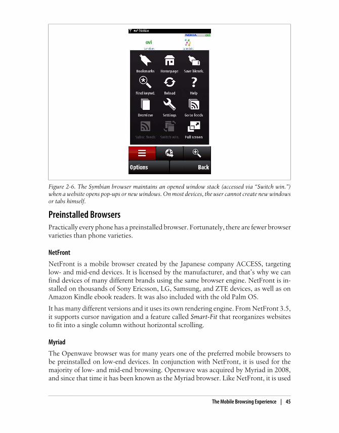
Preinstalled BrowsersPractically every phone has a preinstalled browser. Fortunately, there are fewer browservarieties than phone varieties.
NetFront
NetFront is a mobile browser created by the Japanese company ACCESS, targetinglow- and mid-end devices. It is licensed by the manufacturer, and that’s why we canfind devices of many different brands using the same browser engine. NetFront is in-stalled on thousands of Sony Ericsson, LG, Samsung, and ZTE devices, as well as onAmazon Kindle ebook readers. It was also included with the old Palm OS.
It has many different versions and it uses its own rendering engine. From NetFront 3.5,it supports cursor navigation and a feature called Smart-Fit that reorganizes websitesto fit into a single column without horizontal scrolling.
Myriad
The Openwave browser was for many years one of the preferred mobile browsers tobe preinstalled on low-end devices. In conjunction with NetFront, it is used for themajority of low- and mid-end browsing. Openwave was acquired by Myriad in 2008,and since that time it has been known as the Myriad browser. Like NetFront, it is used
Figure 2-6. The Symbian browser maintains an opened window stack (accessed via “Switch win.”)when a website opens pop-ups or new windows. On most devices, the user cannot create new windowsor tabs himself.
The Mobile Browsing Experience | 45

by many vendors, including Motorola, LG, Sharp, and Kyocera. Up to version 7 it usedits own rendering engine, but the company has announced that the next version willuse WebKit.
Internet Explorer
Microsoft has its own mobile browser, called Internet Explorer Mobile. Formerlyknown as Pocket Internet Explorer (PIE), it can be considered one of the fist mobilebrowsers on the market. The first version was released in 1996, for Windows CE 1.0.Up to version 6.5, it had its own rendering engine (based on IE4). Windows Mobile6.5 was based on Internet Explorer 6 (it even identified itself as IE6). This version (seeFigure 2-7) uses a desktop IE-derived engine and provides a better browsing experiencewith smart zoom capabilities.
Figure 2-7. Starting from version 6.5, IE Mobile has smart zoom features and a desktop-derivedrendering engine.
Before Windows Mobile 6.5, the browser accepted focus navigation forsmartphones and stylus touch navigation for Pocket PCs. Now, it sup-ports both focus and touch for the latest devices on the market.
The new operating system, Windows Phone 7, is based on Silverlight and has an entirelymultitouch UI. It comes with a new version of Internet Explorer Mobile, based on the
46 | Chapter 2: Mobile Browsing

IE7 engine with some IE8 features mixed in (some have called it an IE 7.5 engine). It islikely to offer similar behavior to Internet Explorer 7, and multitouch support.
Safari on iOS
Safari is a WebKit-based browser bundled with iOS (formerly known as iPhone OS)that offers a great browsing experience and smart zoom options. It is updated withevery operating system change to include new features that allow us to create betteruser experiences.
Safari on iOS is currently the only mobile browser to support a range of new features,including those that allow us to create animations, transitions, 3D, and Flash-like ex-periences using HTML, JavaScript, and CSS, but without Flash. We will cover this topicin Chapter 7 and Chapter 12.
This browser is designed only for touch and multitouch navigation. It doesn’t supportfocus or cursor navigation because of the lack of a keyboard in the devices on whichiOS is installed.
The official documentation for mobile Safari can be found at http://www.mobilexweb.com/go/safaridocs.
The only well-known big problem of the mobile Safari browser is itspoor support for caching web content before iOS 4.0.
Nokia Series 40 browser
Every Nokia Series 40 device comes with a built-in web browser created by Nokia. Upto Series 40 5th edition, it was a simple browser without smart zoom capabilities, de-signed with low- and mid-end devices in mind. It was basically a focus navigationbrowser, based on Nokia’s own rendering engine.
Beginning in Series 40 6th edition, the browser is WebKit-based (similar to Nokia’s S60browser), creating a new browsing experience for low- and mid-end devices. The mainproblem with this browser is that the low- and mid-end devices are not created withhigh-quality hardware, which can lead to some performance problems.
In 2010, Nokia acquired a browser company called Novarra that offers proxy-basedweb support. It is possible that new Series 40 devices created after this writing will comewith a proxy-based browser based on Novarra’s solutions to offer a better and fasterbrowsing experience in these kinds of devices.
Sony Ericsson browsers
If we analyze Sony Ericsson’s non-smartphone devices—that is, those not based on anoperating system like Symbian or Windows Mobile—we can find three primary brows-ers in use, depending on the device’s release date:
The Mobile Browsing Experience | 47

• Sony Ericsson WAP browser before 2004
• Sony Ericsson web browser from 2004 to 2006
• NetFront browser (version 3.3, 3.4, or 3.5) from 2006
Other browsers, such as Opera and even Openwave, were also preinstalled in somedevices.
Devices that shipped with NetFront 3.4 or 3.5 support cursor navigation. In this book,we will focus on NetFront for Sony Ericsson devices.
Obigo browser
The Obigo mobile browser from Obigo/Teleca claimed 14% browser market share in2007 (before the smartphone revolution). It can be found in Samsung, LG, Motorola,and Sony Ericsson devices and in many CDMA devices from some operators, like Ver-izon. Obigo also offers a widget solution implemented by LG Mobile.
The Obigo Q7 supports major web standards plus smart zooming, multiple windows,and RSS. It can run in several operating systems, including Symbian, Windows Mobile,Linux, and various native platforms.
Motorola Mobile Internet Browser (MIB)
Motorola devices based on the Motorola proprietary OS (excluding the company’sLinux, Windows Mobile, Android, and Symbian devices) come with a simple propri-etary browser that allows focus navigation and page scrolling. The last version was 2.2.As an indication of its limits, it can only render documents up to 10 KB.
Some other older devices came with the Openwave, Obigo, or Opera browser prein-stalled. The same device model shipped at different dates and in different markets didnot necessarily come with the same browser.
Symbian browser
In 2005, Nokia created an open source WebKit-based mobile browser for the S60 plat-form using Symbian (also known as the S60 OSS Browser). It supports smart zoomfeatures (called Mini Map Browser) and has been installed on every S60 device sincethat year. Depending on the device, it supports focus, cursor, and touch navigation.Many devices support more than one navigation type; for instance, the Nokia N97supports touch (finger and stylus) navigation, and cursor navigation when the keyboardis opened.
The Symbian WebKit browser is the browser with the highest installbase in the market. However, this doesn’t mean it’s the most-usedbrowser.
48 | Chapter 2: Mobile Browsing

Some older devices that use an older Nokia proprietary browser without modern fea-tures are still on the market.
Android browser
The Android OS comes with its own browser, based on WebKit. It is called the Androidbrowser (not Chrome, differentiating it from Google’s desktop WebKit-based browser)and is a very powerful browser with touch support. It is often compared in terms of itsstandards and extension support to Safari on iOS.
The Android browser supports multiple windows, smart zooming, and many otheradvanced features.
webOS browser
The new Palm operating system comes with a WebKit-based browser that supports thelatest web technologies. It supports touch navigation and a card concept that allowsthe user to open many websites at the same time and flip between them using a finger.Starting with OS 1.4, the webOS browser is based on a different version of the WebKitengine, so there may be differences before and after 1.4.
Older Palm devices using Garnet OS (Palm OS) 3.1 and later shippedwith the browser Blazer.
BlackBerry browser
Every RIM device comes with a mobile web browser with focus navigation and, morerecently, touch navigation support. Many versions of the browser are available, de-pending on the device. There are devices with trackball and cursor navigation, olderdevices with focus navigation, and newer smartphones with touch support.
The first generation of the BlackBerry browser was included with Device Software ver-sion 4.5 and earlier. The second generation, available from version 4.6, had a com-pletely redesigned rendering engine. There are still a lot of first-generation browsers indevices on the market today, so we will need to target them if we are targeting Black-Berry users.
BlackBerry devices running OS 6.0 will have a WebKit-based browser more similar toother smartphone browsers. BlackBerry recently acquired Torch Mobile, creators ofthe Iris browser, which in the future will be available only for BlackBerry devices.
A BlackBerry can be connected to the Internet in different ways, depending on thedevice and the operator’s plan:
The Mobile Browsing Experience | 49

BlackBerry browserYou access the Internet using your company’s corporate intranet proxy. The docu-ments are transcoded, compressed, and encrypted by the BlackBerry EnterpriseServer, using your company’s security policies.
Internet browserYou access the Internet directly using the BlackBerry Internet Solution as a com-pressor proxy.
WAP browserYou access the Internet directly using your operator’s WAP gateway (1.0 or 2.0).
WiFi browserYou access the Internet directly using a Wireless LAN connection.
Newer BlackBerry devices support many browsers. The available browsers depend onwhether you are a private customer with or without a BlackBerry server account or acorporate customer; there is no simple rule. The different browsers appear on the deviceas different applications, but they are mainly the same rendering engine connectingthrough different networks.
Samsung WebKit browser
The Samsung WebKit browser is installed with the new Bada OS. At the time of thiswriting there aren’t yet any Bada devices on the market, and no information is availableabout the browser. The demo shows a modern web browser with smart zoom features.
MicroB (Maemo browser)
MicroB, the browser installed in Maemo (now MeeGo) devices (Linux-based Nokiadevices), uses Mozilla’s Gecko rendering engine, the same one used in Firefox. That iswhy MicroB is very similar to Firefox and understands some of the unique features ofthat browser.
MicroB was developed by Nokia and supports plug-ins, similar to Firefox. However,due to the lack of some XUL features, Firefox plug-ins must be rewritten to work onMicroB. Available plug-ins include Adobe Flash Player, Greasemonkey, Adblock,Gears, and Windows Media Player. The website for the MicroB can be found at http://browser.garage.maemo.org.
Japanese Mobile WebIn the mobile web world, the Japanese market is quite an exception. The three maincarriers in Japan (DoCoMo, Softbank, and AU, with approximately 100 million sub-scribers) each have their own mobile web standards regarding markup, Emoji, geolo-cation, etc. that browsers preinstalled on their devices must support. They don’tactually make their own browsers.
50 | Chapter 2: Mobile Browsing

ACCESS’s i-mode browser is the most common on DoCoMo devices, while Openwaveis more common on Softbank and AU devices. Of course, there are also iPhones andother major brands on the market, using their own browsers and operating systems.
User-Installable BrowsersThe market complicates the situation further: we also need to think aboutuser-installable browsers. These are free and commercial web browsers that you caninstall after you buy a device. Sometimes they are included on the device by the vendoror the operator in a particular country or region.
Opera Mobile
I was an addict of Opera for the desktop for many, many years. Opera has lost thedesktop browser war, but it took its experience in browser creation and entered themobile world in 2000. Opera Mobile has been installed on 125 million smartphonessince 2004.
Opera Mobile is a full browser with tab and cursor navigation that comes factory-preinstalled on some devices and is sometimes preinstalled by the carrier using an OEMlicense, replacing the default device browser.
Opera Mobile is also a product available to be downloaded by the end user for WindowsMobile and Symbian devices.
The latest versions support smart zooming, widgets, Opera DragonFly (a toolkit fordevelopers), and Opera Turbo, a service that compresses web pages on Opera’s servers,reducing traffic by up to 80%.
Opera Mini
My Opera addiction continues: Opera Mini is one of the best Java ME applicationsever produced. It is a free browser that works on almost any device, including Androidand iOS devices (iPhone, iPod, iPad). It supports “the full web” as a proxied browser.This means that if you browse using Opera Mini, you won’t be accessing websitesdirectly. Instead, the application will contact an Opera Mini server that will compressand pre-render the websites. This allows very quick full web navigation for every device,whether low-end or smartphone.
From version 4, it supports video playback, Ajax, offline reading, and smart zooming,even in low-end devices (see Figure 2-8). From version 5, it also supports tabbedbrowsing, a password manager, and touch navigation in devices with touch support.
The Mobile Browsing Experience | 51

You can download Opera Mini for free by browsing to http://m.opera.com from your mobile device. The application has over 50 milliondownloads to date, and I know many Opera Mini fanatics in my socialnetwork that never use the preinstalled device browsers. For Androidand iOS devices, you can find Opera Mini in the Android Market andthe App Store.
Firefox for mobile
The Mozilla Foundation arrived a bit late to the mobile browser world. At the time ofthis writing, Mozilla offers a downloadable Firefox version for Maemo devices (theNokia N900, for example), and a version for Android has been announced. Updatedinformation is available at http://www.mozilla.com/mobile.
You can download the mobile version of Firefox from http://m.firefox.com. It uses thesame Gecko engine as the Firefox 3.6 desktop browser.
For alpha releases, you can find information using the code name Fennec, at http://www.mozilla.org/projects/fennec.
UC Browser
The UC Browser (formerly known as UCWEB) is the #1 browser in the Chinese marketand is now available in English for other markets. It is a proxy-based browser supporting
Figure 2-8. Opera Mini is an excellent option for low- and mid-end devices, offering a proxied browserwith smart zooming for almost any mobile phone with Java ME support.
52 | Chapter 2: Mobile Browsing
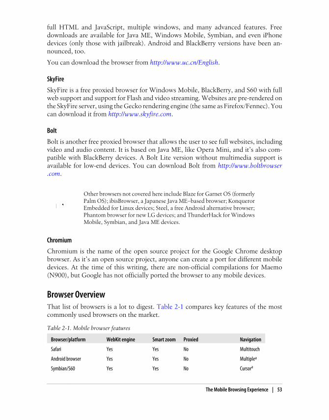
full HTML and JavaScript, multiple windows, and many advanced features. Freedownloads are available for Java ME, Windows Mobile, Symbian, and even iPhonedevices (only those with jailbreak). Android and BlackBerry versions have been an-nounced, too.
You can download the browser from http://www.uc.cn/English.
SkyFire
SkyFire is a free proxied browser for Windows Mobile, BlackBerry, and S60 with fullweb support and support for Flash and video streaming. Websites are pre-rendered onthe SkyFire server, using the Gecko rendering engine (the same as Firefox/Fennec). Youcan download it from http://www.skyfire.com.
Bolt
Bolt is another free proxied browser that allows the user to see full websites, includingvideo and audio content. It is based on Java ME, like Opera Mini, and it’s also com-patible with BlackBerry devices. A Bolt Lite version without multimedia support isavailable for low-end devices. You can download Bolt from http://www.boltbrowser.com.
Other browsers not covered here include Blaze for Garnet OS (formerlyPalm OS); ibisBrowser, a Japanese Java ME–based browser; KonquerorEmbedded for Linux devices; Steel, a free Android alternative browser;Phantom browser for new LG devices; and ThunderHack for WindowsMobile, Symbian, and Java ME devices.
Chromium
Chromium is the name of the open source project for the Google Chrome desktopbrowser. As it’s an open source project, anyone can create a port for different mobiledevices. At the time of this writing, there are non-official compilations for Maemo(N900), but Google has not officially ported the browser to any mobile devices.
Browser OverviewThat list of browsers is a lot to digest. Table 2-1 compares key features of the mostcommonly used browsers on the market.
Table 2-1. Mobile browser features
Browser/platform WebKit engine Smart zoom Proxied Navigation
Safari Yes Yes No Multitouch
Android browser Yes Yes No Multiplea
Symbian/S60 Yes Yes No Cursora
The Mobile Browsing Experience | 53

Browser/platform WebKit engine Smart zoom Proxied NavigationToucha
Nokia Series 40 No <= 5th ed.
Yes >= 6th ed.
No No (expected in the future) Focus
WebOS Yes Yes No Touch
BlackBerry No <= 5.0
Yes >= 6.0
Yesa Yes/Nob Cursor
Toucha
NetFront No No No Focusa
Cursora
Openwave (Myriad) No (yes in the future) No No Focus
Internet Explorer No No < 6.5
Yes >= 6.5
No Focus
Toucha
Obigo/Teleca No Yes >= Q7 No Multiplea
Motorola Internet Browser No No No Focus
Opera Mobile No Yes Yes/Noc Focus
Opera Mini No Yes Yes Cursor
Toucha
Bada browser Yes Yes No Touch
MicroB for Maemo No (Gecko) Yes No Multiple
Firefox No (Gecko) Yes No Multiple
UC browser No Yes Yes Multiplea Depending on the device.b Depending on the connection method.c Depending on the usage of Opera Turbo as a proxy.
Mobile Web ErasDon’t panic; this isn’t a history class. However, it is useful to be aware of the historyof the mobile web. This is recent history: the first mobile web platform was developedless than 15 years ago. Analyzing this history can help us to understand the technologiesbehind the mobile web, and compatibility issues.
WAP 1The mobile Internet appeared at the end of the last millennium. I remember all theadvertising on the streets and in TV commercials. A wide range of operators started tooffer mobile web browsing, with one or two devices with Wireless Application Protocol(WAP) browsers.
54 | Chapter 2: Mobile Browsing

What Is WAP?The Wireless Application Protocol is a standard for application-layer network com-munication in the mobile world. With the exception of the i-mode protocol used inJapan and briefly in other countries, WAP is the primary protocol used by operatorsworldwide.
The WAP standard describes a protocol suite that allows the transportation of infor-mation between a device and the Internet (via a WAP gateway), and list of standardrecommendations for the content to be transmitted. It was created by the WAP Forum(converted in 2002 to the Open Mobile Alliance, or OMA).
For many years the term “WAP” was used incorrectly, to refer to a document type (“aWAP file”) or a website as a whole (“I’ve developed a WAP”).
WAP has two main versions: 1.1, released in 1998, and 2.0, released in 2002 (this isthe actual standard). Many users are not even aware of the existence of the newerversion.
I can remember traveling by train in my home city in 2000, using the first device witha WAP browser (my Nokia 7110, famous because of its similarity to Neo’s phone inthe film The Matrix). My operator had an excellent promotion: free browsing for twomonths. I was browsing a website with an ICQ client, and nobody in my buddy listcould believe that I was chatting from my mobile phone. The free browsing promotionwasn’t very popular, because at the time few people understood what the mobile In-ternet was. When I received a $300 bill for “voice calls” I realized that I was probablythe only one using that promotion (of course, I didn’t pay the bill, because it wassupposed to be free!).
Some WAP 1.X browsers were so simple that they didn’t even have aBack feature—the developer was responsible for providing a link backto the previous page.
At that time, mobile devices connected to the Internet using a voice call as a modemcommunication. So, every minute you were connected was charged as a voice call mi-nute. The devices with browsers had black and white screens without image support(or very basic support) and could display only three or four lines of text on the screen.This early version of the mobile Internet was a failure. It was expensive and did notoffer any useful services. The overall user experience was very poor.
A few years later, 2.5G technologies such as the General Packet Radio Service (GPRS)appeared on the market. These technologies allowed us to browse the Internet (evenWAP 1 sites) and be charged according to the number of kilobytes transferred, nomatter how many minutes we were connected to the Internet.
Mobile Web Eras | 55

This first mobile web was defined by the WAP 1.0 standard (which, in practice, neverexisted on the market, having quickly been replaced by WAP 1.1). That standard sug-gested Wireless Markup Language (WML)—an XML version designed for mobile de-vices that was not compatible with the HTML standards—as the document type forthe web content. The devices communicated with the operators’ WAP gateways usingWAP protocols, and the gateways translated the communications to HTTP and passedthem on to the destination web servers. WAP 1.X is not recommended today, as it hasbeen replaced by new technologies.
The HTML 3.2 subset in the Japanese i-mode service was one of the firstlanguages that shifted the mobile web away from the old HDML (Hand-held Device Markup Language) and WML and pushed it toward HTMLand, eventually, XHTML.
Mobile browsers in this era were called “WAP browsers,” and websites using thisstandard were called “WAP sites”—“WAP” was used instead of “web.” This createda perceived distinction between the two (WAP appeared to be different from the Web).
At this time, the de facto standard for publishing WAP sites on the Internet was the useof the wap subdomain. So, for example, we could access Yahoo!’s WAP site using theURL http://wap.yahoo.com. Even today, it is not uncommon to find this domain patternin use for mobile websites.
Most low- and mid-end devices on the market today still support WAP1.0 content, but the browsers on newer smartphones (like the iPhone,Android, and webOS devices) don’t support WML content anymore.
WAP 2.0The last OMA standard, WAP 2.0, was released in 2002. The first WAP 2.0 devicesappeared in 2002, and almost every device on the market today is WAP 2.0 compatible(with some exceptions in the last few years). This standard is nearer to the webstandards than the previous version and allows HTTP communication between thedevice and the server. The WAP gateway acts only as a proxy in the operator network.
WAP 2.0 deprecated WML and created XHTML MP (Mobile Profile), along with othercompanion standards that we will analyze in detail in Chapter 5. Surprisingly, after thisnew standard was released the word “WAP” dropped out of usage and “mobile web”started to be used. So, if we talk about a “WAP site” today, it will be understood thatwe are referring to a WAP 1.1 website.
Many sites continued to use the wap subdomain for mobile websites, while othersstarted using the other de facto standard for publishing mobile websites, the m sub-domain (“m” for mobile). For example, today we can access the Google Mobile website
56 | Chapter 2: Mobile Browsing

using http://m.google.com, or the popular Facebook social networking site using http://m.facebook.com.
Even now, nearly 10 years after WAP 2.0 was released, it is still normal to find WAP1.1 sites using WML on the Web. The only well-known desktop browser that canrender WML pages without a plug-in is Opera.
WAP PushWAP Push is a standard available since WAP 1.2 that allows content to be pushed toa mobile device at any time. A WAP Push is generally an SMS (Short Message Service)message to a special port with a URL to content or a website. When a device receivesa WAP Push, it asks the user if he wants to go to that URL. This method is used bycontent portals to push games, ringtones, and other premium content when you askfor that content using SMS. There are also some silent pushes from the operator thatthe user doesn’t receive any feedback about.
WAP Link is a similar solution, but it sends an SMS to the user’s inbox. The messagecontains a URL. Modern devices autodetect URLs inside the text messages and convertthem into links that the user can click on.
The dotMobi era
dotMobi (.mobi) is a top-level domain (TLD) approved by the Internet Corporation forAssigned Names and Numbers (ICANN) in 2005 and made available to the public atthe end of 2006. It was approved to be used as the main domain for the mobile Internetand it had the support for many software companies, Internet companies, manufac-turers, and operators. So, if you have the domain yourcompany.com, you should useyourcompany.mobi for your mobile website. The idea was original and some big com-panies have gotten on board (for example, Nokia uses nokia.mobi), but it’s not as wellsupported as everyone wanted. For example, there is no browser with a shortcutto .mobi when you are typing in a URL address (there are shortcuts for .com, .net,and .org).
The TLD is managed by mTLD, an organization with many services and web portalscentered around the mobile web. Any .mobi site should be WAP 2.0 compatible, butthere is no technical obligation for this. You can buy a dotMobi domain from anyregistrar and host it anywhere, without any limitation.
The main criticism of dotMobi is that it created two Internets, a desktop Web(.com, .net, etc.) and a mobile Web (.mobi), rather than promoting a single Web thatcan be browsed from different devices.
Mobile Web Eras | 57

On-Device Portals and rich clients
As WAP 2.0 had limited multimedia features and there were porting problems betweenplatforms, many medium and large websites started to create applications to be instal-led on mobile devices that would allow mobile users to browse their content andservices. Yahoo! was one of the first big portals to create an On-Device Portal (ODP),called Yahoo! Go. It offered a better experience for mobile users to access Yahoo!’s webservices, with options not available for a web browser. The other great advantage isthat an icon for the website appears in the user’s applications menu or even on thehome screen. It was discontinued in 2010 and replaced with a new mobile website.
In Chapter 12 we will analyze mobile widgets and offline web applica-tions that can be compared to the On Device Portal solution, but usethe same multiplatform web technologies described in this book.
The disadvantage, of course, is that a different version of the ODP must be created forevery platform: Java ME (and many portings), BlackBerry, Windows Mobile, Symbian,iPhone, and so on.
There are also many companies offering ODP solutions to distribute web content viaoperators or websites. These solutions are also known as rich clients. For example, Google Maps offers the interface in Figure 2-9, and Facebook has a mobile website anda rich client for some devices, such as Symbian and iOS devices, shown in Figure 2-10.
Figure 2-9. Google Maps offers a mobile web interface and, optionally, a free rich client (some kindof On-Device Portal) with a richer UI.
58 | Chapter 2: Mobile Browsing

Mobile Web 2.0I could write a whole book about Web 2.0, but…what is Mobile Web 2.0? There isn’ta single definition. Mobile Web 2.0 began in 2007, with the new smartphones thatappeared on the market (iPhone, Nokia N95, Android devices, etc.). These devicesintroduced great changes for the mobile web: WiFi support, 3G, full desktop browsers(not only WAP 2.0), Ajax or Flash support, and streaming video. At the same time,thousands of social networks, blogs, and user-generated content portals appeared.
All these ingredients created Mobile Web 2.0, which to date has advanced more thanWeb 2.0 itself. That’s why we can find HTML 5 mobile browsers, but a few HTML 5desktop browsers on the market today. Clearly, the market really wanted to createbetter mobile web experiences than the ones delivered only with WAP 2.0.
Mobile Web 2.0 sites typically have many of the following features:
• Ajax or Rich Internet Application experience
• Geolocation
• Offline working capability
• Social networking activities
Figure 2-10. Facebook is one of the Web 2.0 websites offering both a mobile browser version and arich client version. We can see both versions here on a Nokia X6 with Symbian.
Mobile Web Eras | 59

• Contextual ads
• On-demand/live video streaming
• HTML 4/5, CSS 2/3, JavaScript
• Touch/multitouch support
As we can see from Figure 2-11 (and, no doubt, from personal experience), social net-works are increasingly being accessed from mobile devices, and the predicted trend isfor continued growth.
Figure 2-11. The numbers of mobile Internet users and mobile social network users are expected togrow rapidly over the next few years.
60 | Chapter 2: Mobile Browsing

CHAPTER 3
Architecture and Design
While this is not a book about design, understanding some architectural and usabilityconcepts is critical to creating useful mobile services. Many common desktop web de-sign patterns and usability concepts do not apply in a mobile environment.
Website ArchitectureYes, a mobile website is still a website. The details are very different, however.
NavigationWhen creating your mobile web concept, before you do any coding you should definewhat will be in the navigation tree for the user. To do that, you need to understandwhat services and information will be available for the mobile user. Always rememberthe 80/20 law: 80% of your desktop site will not be useful to mobile users. Therefore,you need to research the 20% you should be focusing on.
You can decide that you won’t have a mobile website and just want toallow access to your desktop site to full HTML smartphones. If you’resure you will have mobile users I don’t recommend you leave the desk-top website as-is, but if you do decide not to create a separate mobilesite, you will see later in this book how to optimize your desktop websitefor better visualization in smartphones.
Here are some tips you will need to follow:
• Define the use cases (for example, find a product price, find a store near you, callus, or perform a search).
• Order the use cases by the most frequent for a mobile user. Use your best guess,statistical information, and usability tests to keep this order updated.
61

• Do your best to make every use case successful in no more than three clicks or ata page depth of no more than three.
• Define approximately three main sections below the home page. If you need more,you should separate your service into more mobile pages.
• Always offer a link to the desktop website.
• Determine whether locating the user is useful for your services.
• Reduce the form pages for user input to the minimum.
• Avoid startup or welcome screens.
• Do your best to predict users’ input based on the context and their browsing historyto reduce the number of selection pages and clicks required.
ContextRemember that a mobile user has a different context than a desktop user. You shouldthink about and define your users’ possible contexts:
• Where is the user?
• Why is the user accessing your mobile website?
• What is the user looking for?
• What can you offer from a mobile perspective to help solve the user’s problem?
• Where will the user be when accessing your website? Walking on the street, usingpublic transportation, at the office, traveling as a tourist?
The context will tell you many things about your navigation, use cases, and the usabilityneeds for your mobile site.
A Bad Example of NavigationI have imprinted in my mind a bad example for navigation in a mobile website. In mycity, years ago (but still online right now), there was a free mobile web service to getpublic bus time slots. It is a great service for mobile web users; you are on the move,you need to take the bus, but you’re not sure when it will arrive. Should you go for acoffee first?
When you first enter the site, you see a welcome page with a Begin link. After that, youhave to choose from a list which bus line you want to query. Then you see a list of finalstops for that line, to select your orientation. The first problem is whether you knowthe name of the final stop in the direction you want to travel. After selecting yourorientation, you have to choose the stop or station where you want to get on the bus.There is a list of around 50 addresses, ordered alphabetically. If you don’t know thestreet name for the stop you want, you will need to make an average of 25 clicks to findthe right one.
Once you’ve found your stop, you need to select whether you want a normal bus or abus with accessibility support. Finally, the service informs you when the next two buses
62 | Chapter 3: Architecture and Design

will be arriving. You have two navigate through six pages and choose from a 50-itemlist to get the result.
In my city, on weekdays during the day buses have a very short delay time (between 5and 8 minutes), so what will be the most common context for the service? Probablynight and weekend services. The first time I really needed the service was at 1 am,coming back from an event. I completed the six-step query only to receive a “There isno information” message. The service did not work at night!
What could be done to improve navigation? Avoid the welcome screen, the accessibilitysupport selection page, and maybe also the direction selection (we can usually guess itfrom the stop, and even if the stop has service in two directions, information for bothcan be shown). The stop selection could be improved with features such as a searchbox, a list filtered by neighborhood, a list of nearby points of interest (museums, cin-emas, etc.), a location query, a history of stops used before (perhaps using cookies),and so on.
Progressive EnhancementProgressive enhancement is a simple but very powerful technique used in web designthat defines layers of compatibility that allow any user to access the basic content,services and functionality of a web and providing an enhanced experience for browserwith better support of standards.
The term was coined by Steven Champeon (http://www.hesketh.com) in 2003, and whilethis approach wasn’t defined for the mobile web specifically, it is really perfect formobile web design. The concept subverts the typical web design strategy, known as“graceful degradation,” where designers develop for the latest technologies and brows-ers and their designs automatically work with the lesser functions available on olderbrowsers. This technique is not useful for mobile browsers because, as we will see, thereare serious compatibility issues in the mobile world. If we develop a website for thelatest device (for example, the iPhone), it may not automatically work on other, lessadvanced devices.
Progressive enhancement has the following core principles:
• Basic content is accessible to all browsers.
• Basic functionality is accessible to all browsers.
• Semantic markup contains all content.
• Enhanced layout is provided by externally linked CSS.
• Enhanced behavior is provided by unobtrusive, externally linked JavaScript.
• End user browser preferences are respected.
We will add some other ingredients to this recipe when talking about mobile devices.The objective is to have one only code that is compatible with all devices. And, as weare going to discuss later, we must provide the right user experience on every device.
Website Architecture | 63
We shouldn’t create lowest common denominator websites just so that they will becompatible with all devices, and we shouldn’t create overly complex mobile websitesthat will only work on high-end smartphones.
In the mobile web, a progressive enhancement approach will also include some server-side detection and adaptation that will be mandatory for some specific mobile markup(sending an SMS, for example).
From my point of view, a mobile web design approach should have the following layersthat will be added using a progressive enhancement strategy:
1. Create valid and semantic markup containing only the content—no CSS, no framesor iframes, no JavaScript, and no Ajax. All the content and services on the website(with the exception of some nonstandard features, like geolocation) should workwith this simple version.
2. Insert in the document any special tags or classes required for device-specific func-tionality, such as call-to links or a file upload form control.
3. Optionally, from the server, decide which MIME type you will be using (this willbe covered in Chapter 5 and Chapter 10) and recognize the device.
4. Optionally, from the server, replace the special tags inserted in step 2 with realmarkup depending on the device capabilities.
5. Add one CSS layer for basic devices, one for high-end devices, and one for somespecific smartphones (Android and iPhone devices, for example). You can insertall the markup at the same time using CSS media queries (to be covered in Chap-ter 7), or use a server-side mechanism to decide which CSS file to apply.
6. Add an unobtrusive basic JavaScript layer for form validation and other basicfeatures.
7. Add an unobtrusive Ajax layer for content updating, capturing the onclick eventof every link.
8. Add an unobtrusive JavaScript layer and a CSS layer for advanced features (ani-mations, effects, geolocation, offline storage, etc.).
9. Optionally add widget support using a new layer.
We will cover most of these technologies over the next few chapters. The most impor-tant part to understand right now is that using this strategy all devices receive similarmarkup (with minor changes if we use a server-side adaptation engine), and using CSSand JavaScript we add layers of behavior and design adapted to each device.
Different Version ApproachA different approach is to create n different versions and redirect the user to the ap-propriate one depending on the device detected. The main problem with this approachis that we need to maintain n different versions of the same document.
64 | Chapter 3: Architecture and Design

If this will be your strategy, expect to need a minimum of four versions for a successfulmobile website, with an optional fifth. If you create fewer versions, some users willprobably have a bad experience with your site.
Using a server-side adaptation mechanism, you can reduce the number of requiredversions to two: one for low- and mid-end devices and one for high-end devices andsmartphones. In the high-end and smartphone world it will be better to use an adap-tation strategy for the many features that are not compatible with all devices. Broadly,here are the features you will need to consider for each device category:
Low-end devicesBasic XHTML markup, maximum screen width of 176 pixels, basic CSS support(text color, background color, font size), no JavaScript
Mid-end devicesBasic XHTML markup, average screen width of 240 pixels, medium CSS support(box model, images), basic JavaScript support (validation, redirection, dialogwindows)
High-end devicesXHTML or HTML 4 markup, average screen width of 240 pixels, advanced CSSsupport (similar to desktops), Ajax and DOM support, optional touch support,optional orientation change support (for an average screen width of 320 pixels)
Advanced smartphonesHTML 5, large screen size and high resolution, touch support, support for CSSextensions (animations, effects) and Ajax, storage, geolocation
Old devices (optional)WML (we will discuss this in Chapter 5)
I’ve seen a lot of browser grouping techniques to decide which versionsor features we can use in each browser group. The reality is that browsersare so different that there is no way to group them that guarantees allmembers will have the exact same features. In the next chapters, we willanalyze compatibility browser by browser and feature by feature. I sug-gest you create your own groups based on your code features and thewebsite versions you will design.
Design and UsabilityDesigning a mobile website can be a challenge at the beginning. Unless you are workingon a website for only one device, forget about creating an exact pixel-by-pixel webdesign. Your mobile website will look different on every device it’s viewed on; you needto accept this and, keeping it in mind, create a strategy to create the best web designyou can.
Design and Usability | 65

The best advice I can give you about mobile web design is: Keep It Sim-ple! However, that doesn’t mean Keep It Ugly.
A mobile website ideally consists of vertically scrollable documents. The typical two-or three-column design is not suitable for mobile web pages. Every mobile web docu-ment has a few identified zones:
• Header
• Main navigation
• Content modules
• Second-level navigation
• Footer
These sections will be created one after the other in a vertical scope. Only for deviceswith a landscape orientation and smartphones it is suitable to create an alternativeorganization where you can move the main navigation section to a right-side column.
On high-end smartphones, your main navigation can become a top orbottom tab bar, and the content modules can shrink with an accordionor master-detail design.
When you are creating a mobile version of an existing desktop website, you need tounderstand that you are mobilizing the website, not minimizing it. Minimizing (orminiaturizing) a desktop website simply involves displaying the same content on asmaller screen. Mobilizing is more than that; it requires understanding the context andoffering your services and content in a manner that is useful and allows for quick accessby the user.
If you are designing a mobile Rich Internet Application or a webappusing Ajax, you should always insert in the UI a background operationicon to alert the user when a background connection is in progress. Anoffline button could be useful if the user is not on WiFi or is in roamingmode and doesn’t want to get updates for a while.
Some best practices include:
• Avoid horizontal scrolling.
• Maintain visual consistency with your desktop site, if you have one.
• Reduce the amount of text.
• Use legible fonts on every screen; don’t rely on the resolution.
66 | Chapter 3: Architecture and Design

• Use background colors to separate sections.
• Keep the main navigation to three or four links.
• Maintain the total link count at no more than 10 per page.
• For low- and mid-end devices, don’t insert more than one link per line.
• Use all the available width (i.e., not columns) for links, list elements, text inputs,and all possible focusable elements.
• Provide a Go to Top link in the footer.
• Provide a Back button in the footer (some browsers don’t have a Back button visibleall the time).
• Provide the most-used features at the top.
• Group large lists by categories, each with no more than 10 items (for example,country selection by selecting the continent first).
• Minimize the amount of user text input required.
• Save the user’s history and settings for future predictive usage.
• Split large text articles into pages (with page size depending on the richness of thebrowser).
• Try your color palette in different environments. Users may be in a place with poorlighting, on public transport, at the beach in bright sunlight, or in an office withfluorescent lighting.
• Provide different styling for touch devices.
• Think about fluid (liquid) designs for best adaptation.
• Use lists rather than tables.
• Don’t use text images.
• For touch and cursor-based devices, use full-width links so that a link will activateif the user clicks on any pixel in the line containing it. Make sure there is only onelink in each line.
• Use high-quality color images and fancier features stuff for smartphones (we willdiscuss optimizing later).
• For cursor navigation, create medium-sized clickable zones for the cursor, movingby 5 or 10 pixels every time. Do not make the user travel a lot using the cursor;design all the clickable buttons near each other.
• If you are providing a shortcut, a widget, or an offline version of your mobile web-site, create an alert at the top of the design (generally with yellow background)alerting the user to download it. Don’t show that alert after many views or afterthe user has entered the download area. We will cover these techniques in Chapters12 and 14.
Design and Usability | 67

Keep the text on your site to a minimum. Read every paragraph fivetimes, and you will always find some word you can remove or a shorterway to say the same thing.
For low- and mid-end devices, it is preferred to use a table design instead of floatingdivs, like in the first years of the desktop web. But keep in mind that using more thanone item, link, or idea per line isn’t a good practice on those devices.
I Didn’t Want to Buy It!Many years ago, I was browsing my operator’s deck portal checking the games andcontent available for my device. I remember accessing the details of one game and seeinga screen that offered to let me buy it and have the charge added to my phone bill. Ididn’t want to buy the game.
The page asked me for permission to make the charge and offered two links, YES andNO. Both links were in the same line, one after the other. The focus was in the YESlink (of course). What did I do? Unconsciously, I pressed the right key to shift focus tothe NO link.
What happened? The right key was a “go-to-link” action for my browser! I could onlychange the link focus using the up and down keys (like a tab), no matter where the linkswere located. So, because of a usability problem, I had to pay for content I didn’t want.
That is why we need to test our websites on a wide range of real devices, and why Iadvise you to use only one link per line when targeting low- and mid-end devices.
If you want to get deeper into mobile web design, you can read Mobile Design andDevelopment, by Brian Fling (http://www.flingmedia.com), also published by O’Reilly.Another excellent resource is Design4Mobile (http://patterns.design4mobile.com),which provides a list of mobile web design patterns with explanations and examples.
Among the Design4Mobile patterns, I recommend that you read the following:
• Screen Design Basics—presents dozens of small tips for markup.
• Screen Design Patterns—provides a list of common solutions for designing but-tons, list-based layouts, fisheye lists, zoom lists, search results, breadcrumbs, car-ousels, and text input fields.
• Application Navigation—describes how to manage list navigation, autocomple-tion, the back button, and other stuff.
If your navigation requires going back frequently, you should checkwhether the browser maintains the scroll position after going back. Ifnot, you should probably create Back links with anchors to scroll todirectly where the user was.
68 | Chapter 3: Architecture and Design
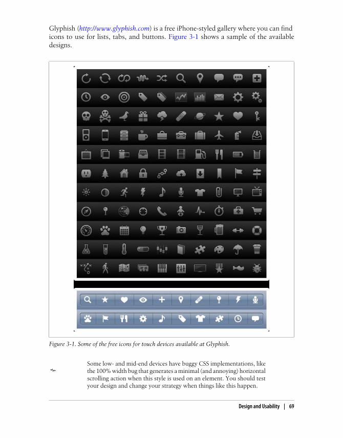
Glyphish (http://www.glyphish.com) is a free iPhone-styled gallery where you can find icons to use for lists, tabs, and buttons. Figure 3-1 shows a sample of the availabledesigns.
Figure 3-1. Some of the free icons for touch devices available at Glyphish.
Some low- and mid-end devices have buggy CSS implementations, likethe 100% width bug that generates a minimal (and annoying) horizontalscrolling action when this style is used on an element. You should testyour design and change your strategy when things like this happen.
Design and Usability | 69

Touch Design PatternsTouch devices have unique features in terms of design and usability. With the sameamount of effort, the user can access every pixel on the screen; this encourages a dif-ferent way of thinking about a design. Another difference is that the user will use herfinger for touch selection (unless it is a stylus-based device). A finger is big comparedto a mouse pointer, and the hit zone should reflect this.
The Touch Gesture Reference Guide is a great resource put together by Luke Wroblewski (http://www.lukew.com) that contains an overview ofcore gestures for most touch commands, how to utilize gestures, visualrepresentations of each one to use in documentation, and an outline ofpopular software platforms supporting them. You can download it fromhttp://www.mobilexweb.com/go/touchguide.
Here are some useful design tips for touch devices:
• When the user touches the screen, parts of it will be obscured. Think about whatwill be hidden, and if it is important. Consider both right- and left-handed users.
• Provide a reasonable amount of space (20 pixels or more) between clickableelements.
• For frequently used buttons and links, provide a big clickable area (minimum 40pixels width and height).
• For less frequently used buttons, you can use a smaller area (minimum 25 pixels).
• Provide quick feedback when a touch is accepted.
• Think about how scrolling will work.
• When using form input fields, try to insert the label above and hints below, not tothe right or left of the input field. Generally, touch devices with virtual keyboardszoom in on the field when the user moves the focus to it, so the user will not seewhat is at the right or left of the input field while typing.
Nokia has recently released Flowella, a free tool for creating designprototypes for mobile applications by using mock-ups and defininglinks between screens. It can export designs to Flash Lite or WRTwidgets for Symbian, and it is ideal for testing the look and feel ofan application. You can download it from http://www.mobilexweb.com/go/flowella.
• Use finger gestures on compatible devices.
• Use infinite lists instead of pagination. An infinite list, like that shown in Fig-ure 3-2, has a “More” final item that the user can click to dynamically add moreelements to the list (via Ajax or other techniques). For performance purposes, youshould reduce the number of pages shown at the same time. When adding new
70 | Chapter 3: Architecture and Design
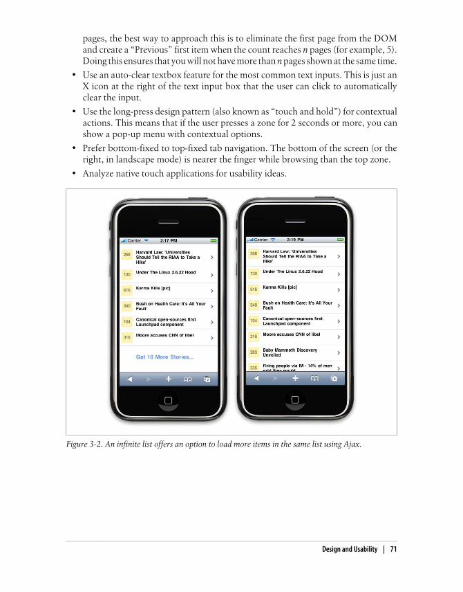
pages, the best way to approach this is to eliminate the first page from the DOMand create a “Previous” first item when the count reaches n pages (for example, 5).Doing this ensures that you will not have more than n pages shown at the same time.
• Use an auto-clear textbox feature for the most common text inputs. This is just anX icon at the right of the text input box that the user can click to automaticallyclear the input.
• Use the long-press design pattern (also known as “touch and hold”) for contextualactions. This means that if the user presses a zone for 2 seconds or more, you canshow a pop-up menu with contextual options.
• Prefer bottom-fixed to top-fixed tab navigation. The bottom of the screen (or theright, in landscape mode) is nearer the finger while browsing than the top zone.
• Analyze native touch applications for usability ideas.
Figure 3-2. An infinite list offers an option to load more items in the same list using Ajax.
Design and Usability | 71
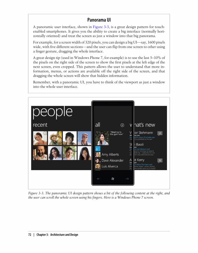
Panorama UIA panoramic user interface, shown in Figure 3-3, is a great design pattern for touch-enabled smartphones. It gives you the ability to create a big interface (normally hori-zontally oriented) and treat the screen as just a window into that big panorama.
For example, for a screen width of 320 pixels, you can design a big UI—say, 1600 pixelswide, with five different sections—and the user can flip from one screen to other usinga finger gesture, dragging the whole interface.
A great design tip (used in Windows Phone 7, for example) is to use the last 5–10% ofthe pixels on the right side of the screen to show the first pixels at the left edge of thenext screen, even cropped. This pattern allows the user to understand that more in-formation, menus, or actions are available off the right side of the screen, and thatdragging the whole screen will show that hidden information.
Remember, with a panoramic UI, you have to think of the viewport as just a windowinto the whole user interface.
Figure 3-3. The panoramic UI design pattern shows a bit of the following content at the right, andthe user can scroll the whole screen using his fingers. Here is a Windows Phone 7 screen.
72 | Chapter 3: Architecture and Design

Official UI GuidelinesOfficial user interface guidelines from the manufacturers, links to which you can findat http://www.mobilexweb.com/go/uiguides, are another source of inspiration for mobileweb design. Here, you will find guidelines, samples, tips, and descriptions of commonmistakes. Many of the guidelines focus on native application development, but we canapply most parts of them to mobile web design, too.
If you apply the long-press (touch and hold) design pattern, you shouldbe aware that browsers have their own long-press actions for clickableelements, like links, images, or text for copying and pasting. In WebKit-based browsers, you can disable text selection on text items using thewebkit-user-select:none style and then create your own menu.
The most important guides are:
• iPhone Human Interface Guidelines
• UI Guidelines for BlackBerry Smartphones
• Motorola’s Best Practices for UI
• Forum Nokia UI Visual Guidelines
• Sony Ericsson’s UI Style Guidelines
• UI Guidelines for Windows Mobile
• UI Guidelines for Android
A fragment of the iPhone Human Interface Guidelines is shown in Figure 3-4.
Design and Usability | 73

Figure 3-4. Official UI guidelines provide information about how your design should follow the user’swell-known interface.
74 | Chapter 3: Architecture and Design
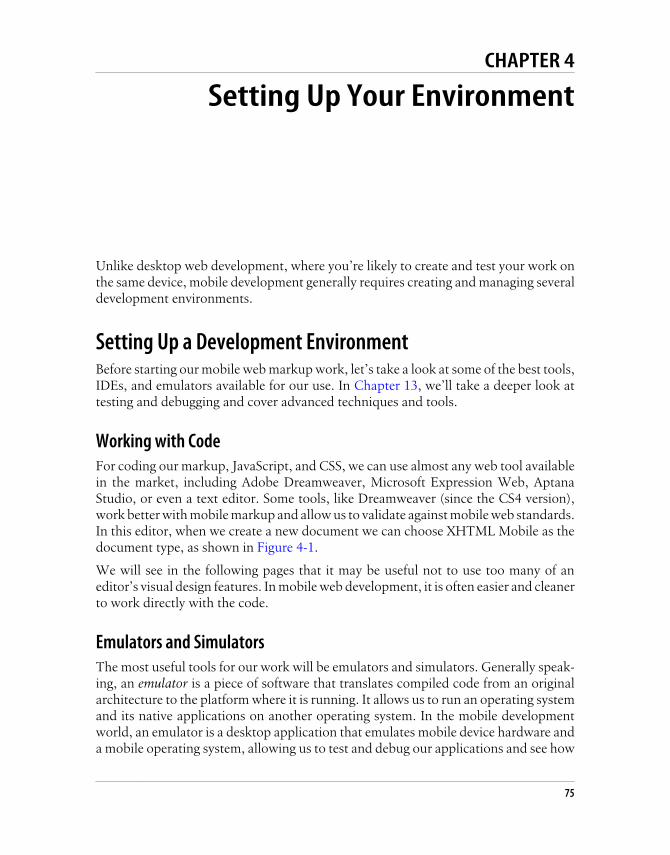
CHAPTER 4
Setting Up Your Environment
Unlike desktop web development, where you’re likely to create and test your work onthe same device, mobile development generally requires creating and managing severaldevelopment environments.
Setting Up a Development EnvironmentBefore starting our mobile web markup work, let’s take a look at some of the best tools,IDEs, and emulators available for our use. In Chapter 13, we’ll take a deeper look attesting and debugging and cover advanced techniques and tools.
Working with CodeFor coding our markup, JavaScript, and CSS, we can use almost any web tool availablein the market, including Adobe Dreamweaver, Microsoft Expression Web, AptanaStudio, or even a text editor. Some tools, like Dreamweaver (since the CS4 version),work better with mobile markup and allow us to validate against mobile web standards.In this editor, when we create a new document we can choose XHTML Mobile as thedocument type, as shown in Figure 4-1.
We will see in the following pages that it may be useful not to use too many of aneditor’s visual design features. In mobile web development, it is often easier and cleanerto work directly with the code.
Emulators and SimulatorsThe most useful tools for our work will be emulators and simulators. Generally speak-ing, an emulator is a piece of software that translates compiled code from an originalarchitecture to the platform where it is running. It allows us to run an operating systemand its native applications on another operating system. In the mobile developmentworld, an emulator is a desktop application that emulates mobile device hardware anda mobile operating system, allowing us to test and debug our applications and see how
75

they are working. The browser, and even the operating system, is not aware that it isrunning on an emulator, so we can execute the same code that will execute on the realdevice.
We should also add to our mobile development environments classictools for project and configuration management, like bug tracking, ver-sion control, and project management tools.
Emulators are created by manufacturers and offered to developers for free, eitherstandalone or bundled with the Software Development Kit (SDK) for nativedevelopment.
There are also operating system emulators that don’t represent any real device hardwarebut rather the operating system as a whole. These exist for Windows Mobile andAndroid.
On the other hand, a simulator is a less complex application that simulates some of thebehavior of a device, but does not emulate hardware and does not work over the realoperating system. These tools are simpler and less useful than emulators. A simulatormay be created by the device manufacturer or by some other company offering a
Figure 4-1. Dreamweaver allows us to define new files as XHTML Mobile documents. It is better notto use the layout templates.
76 | Chapter 4: Setting Up Your Environment
simulation environment for developers. As the simulator does not simulate all the de-vice features, we can also find tools that will not be helpful for mobile web developmentbut rather for other technologies, like Java ME. In mobile browsing, there are simulatorswith pixel-level simulation, and others that neither create a skin over a typical desktopbrowser (e.g., Firefox or Safari) with real typography nor simulate their renderingengines.
For mobile web development, we will find emulators from Nokia, Symbian, BlackBerry,Android, Palm Pre, and Windows Mobile and simulators from Apple for the iPhone(though only for Mac OS X). A multiple mobile browser simulator is available fromAdobe, called Device Central, but we will not find any help from Sony Ericsson, LG,Motorola, or Samsung with their proprietary OSs (used on their low- and mid-enddevices).
Some browser-based emulators, like the Opera Mini emulator, are also available.
An up-to-date list of emulator download URLs can be found at http://www.mobilexweb.com/go/emulators.
As the emulators have the same operating system and applications asthe real devices, we will need to wait for the OS to load before openinga web page.
Android emulator
The Android emulator, shown in Figure 4-2, is available in conjunction with the SDKto create native Java applications for Android. You can download it for free from http://developer.android.com; the base SDK and the different Android OS versions are avail-able separately. The Android emulator is available for Windows, Mac OS X, and Linux.Once you’ve downloaded it, create a folder for the contents on your hard drive andunzip the package.
In the folder where you extracted the package, there is an android terminal commandon Mac OS X/Linux and an SDK Setup.exe application for Windows that opens theAndroid SDK and AVD Manager, where you can download and configure Androidplatforms after installing the base SDK.
If you get errors while trying to retrieve “Available Packs” in the AndroidSDK and AVD Manager, you can go to Settings, click the option “Forcehttps:// sources to be fetched using http://”, and then click Apply.
Opening the Android emulator can be a little tricky the first time. You can open it froman IDE such as Eclipse, but first you need to install the Android plug-in and create anative empty application. Alternatively, you can open the emulator from a console
Setting Up a Development Environment | 77

window (Terminal or the command prompt, depending on the operating system) orfrom the SDK and AVD Manager.
After you’ve had the Android SDK installed for a while, you may wantto update it and install a new package. If you receive an XML error whiledoing this, you may have an outdated version of the AVD manager. Justgo to the website and download the SDK again.
Once you’ve installed a platform, you need to create a new Virtual Device using theSDK and AVD Manager. Creating a new device involves selecting the target (of theinstalled platforms), defining a name, and specifying the size of the SD card, the screensize, and other optional hardware features, as you can see in Figure 4-3. One you’vecreated the device, you can go to Virtual Devices and click Launch to reach a result likethe one shown in Figure 4-4.
You can also install new tools from vendors, like the Droid device for Motorola. In theMotorola case, you need to download the MotoDev Studio for Android, available forfree at http://developer.motorola.com.
Motorola will simplify the SDK install process and emulator launch ifyou download MotoDev Studio for Android IDE first. It will ask you todownload and configure the SDK and platforms automatically.
Figure 4-2. After downloading the Android SDK, open the Manager and download the platforms youwant. The Google APIs are needed for native development using Google’s services.
78 | Chapter 4: Setting Up Your Environment

With the emulator opened, you can open a mobile website by finding the browser usingyour mouse (remember that almost all Android devices are touch capable) and typingthe URL in its location bar. Up to Android 2.0, the emulator doesn’t support openinglocal files, so you’ll need to set up a local web server (e.g., Apache) or upload your filesto a web server on the Internet.
Figure 4-3. After installing the SDK and the platform, you must create virtual devices for each platformand screen combination you need.
Setting Up a Development Environment | 79

If you want to load a local web server in the Android emulator, you can’tuse localhost or 127.0.0.1 because the browser will point the request toAndroid itself. There is a special IP address available to point to the hostcomputer: 10.0.2.2.
Nokia emulators
Nokia has always had the better emulators, since the beginning of mobile web devel-opment. Instead of one emulator per device, you’ll find one emulator for each versionof each platform. You can download emulators for Series 40 (mid- and low-end devices)and for S60 (Symbian smartphones) at http://www.forum.nokia.com. In some casesthere are also specific model emulators with specific features, like for the Nokia N97(an S60 5th edition device with home screen widgets, a feature we will cover in Chap-ter 12).
Nokia also has a tool called the Nokia Mobile Browser Simulator, de-veloped in 2003 to test mobile websites for old WAP 1.0 devices andthe first WAP 2.0 ones. Today, this tool is still available but deprecated;we don’t need it.
Figure 4-4. At this point, you can open the browser as if you were on a touch-enabled Android device.You can use the mouse over the emulator’s screen to emulate the user’s gestures.
80 | Chapter 4: Setting Up Your Environment
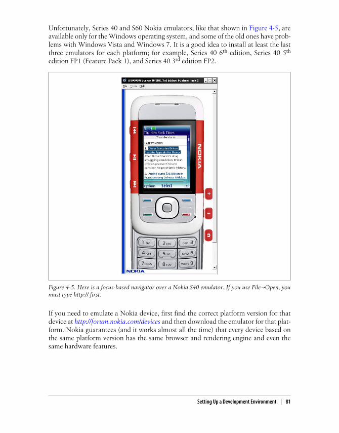
Unfortunately, Series 40 and S60 Nokia emulators, like that shown in Figure 4-5, areavailable only for the Windows operating system, and some of the old ones have prob-lems with Windows Vista and Windows 7. It is a good idea to install at least the lastthree emulators for each platform; for example, Series 40 6th edition, Series 40 5th
edition FP1 (Feature Pack 1), and Series 40 3rd edition FP2.
Figure 4-5. Here is a focus-based navigator over a Nokia S40 emulator. If you use File→Open, youmust type http:// first.
If you need to emulate a Nokia device, first find the correct platform version for thatdevice at http://forum.nokia.com/devices and then download the emulator for that plat-form. Nokia guarantees (and it works almost all the time) that every device based onthe same platform version has the same browser and rendering engine and even thesame hardware features.
Setting Up a Development Environment | 81

There isn’t a Maemo or MeeGo emulator for testing mobile websites,but you can download MeeGo for netbooks from http://www.meego.com and run it on a virtual machine.
The Nokia emulators will add shortcut icons to your Start menu, so it will be easy tofind them. Once you’ve launched the emulator, you can open the browser and type inthe URL or use the shortcut File→Open, which allows you to type or paste a URL orbrowse for a file in your local filesystem. The emulator will open the browserautomatically.
Some of the latest S40 emulators have predictive text input active bydefault, and this will deactivate the usage of your desktop QWERTYkeyboard to type. Before using them, you’ll need to disable predictiveinput.
Nokia S40 emulators support the use of localhost or 127.0.0.1 to connect with yourdesktop host computer.
Running Mac OS X or Linux?If you are taking seriously mobile web programming for multiple devices, it will be veryuseful to have at least one development desktop with Windows XP, even if it is on avirtual PC. Some emulators work only in Windows environments, and some have issueswith Vista and/or 7. Hopefully this will change with time; emulators for Mac OS X and Linux are already available for some platforms.
iPhone simulator
Only available for Mac OS X, the iPhone Simulator, shown in Figure 4-6, offers a freesimulation environment including Safari. It is not an emulator, so it does not reallyprovide a hardware emulation experience and is not a true performance indicator.However, it is perfectly suitable for seeing how your website is rendering and how yourcode is working. It’s especially convenient for loading local or remote files by typing inthe URL field using your desktop keyboard.
The iPhone Simulator is included with the SDK for native development, available forfree at http://developer.apple.com/iphone. The SDK may take a while to download, be-cause it’s more than 2 GB. You can download the latest version of the operating system,in which case you can switch between versions using the Hardware→Version menuoption. With the Simulator, you can also select if you want to simulate an iPhone oran iPad.
82 | Chapter 4: Setting Up Your Environment
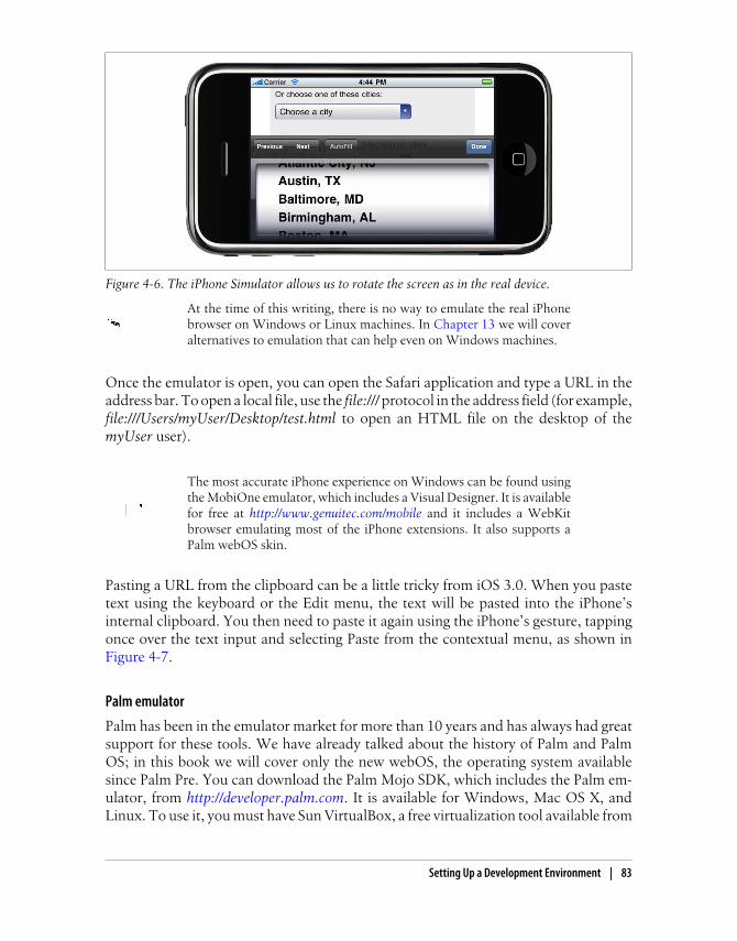
At the time of this writing, there is no way to emulate the real iPhonebrowser on Windows or Linux machines. In Chapter 13 we will coveralternatives to emulation that can help even on Windows machines.
Once the emulator is open, you can open the Safari application and type a URL in theaddress bar. To open a local file, use the file:/// protocol in the address field (for example,file:///Users/myUser/Desktop/test.html to open an HTML file on the desktop of themyUser user).
The most accurate iPhone experience on Windows can be found usingthe MobiOne emulator, which includes a Visual Designer. It is availablefor free at http://www.genuitec.com/mobile and it includes a WebKitbrowser emulating most of the iPhone extensions. It also supports aPalm webOS skin.
Pasting a URL from the clipboard can be a little tricky from iOS 3.0. When you pastetext using the keyboard or the Edit menu, the text will be pasted into the iPhone’sinternal clipboard. You then need to paste it again using the iPhone’s gesture, tappingonce over the text input and selecting Paste from the contextual menu, as shown inFigure 4-7.
Palm emulator
Palm has been in the emulator market for more than 10 years and has always had greatsupport for these tools. We have already talked about the history of Palm and PalmOS; in this book we will cover only the new webOS, the operating system availablesince Palm Pre. You can download the Palm Mojo SDK, which includes the Palm em-ulator, from http://developer.palm.com. It is available for Windows, Mac OS X, andLinux. To use it, you must have Sun VirtualBox, a free virtualization tool available from
Figure 4-6. The iPhone Simulator allows us to rotate the screen as in the real device.
Setting Up a Development Environment | 83
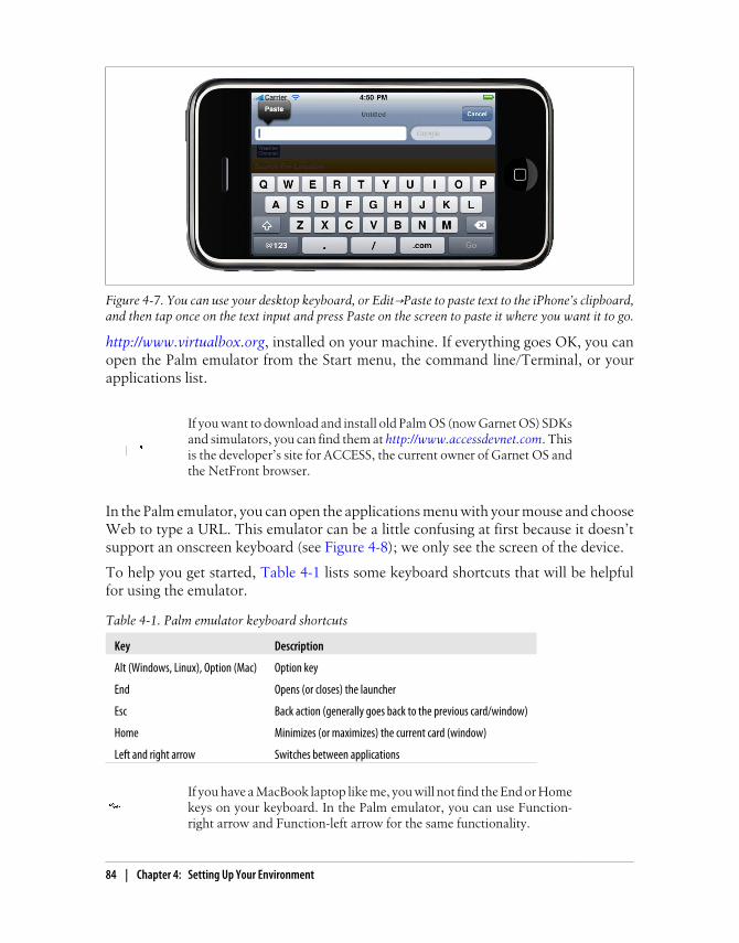
http://www.virtualbox.org, installed on your machine. If everything goes OK, you canopen the Palm emulator from the Start menu, the command line/Terminal, or yourapplications list.
If you want to download and install old Palm OS (now Garnet OS) SDKsand simulators, you can find them at http://www.accessdevnet.com. Thisis the developer’s site for ACCESS, the current owner of Garnet OS andthe NetFront browser.
In the Palm emulator, you can open the applications menu with your mouse and chooseWeb to type a URL. This emulator can be a little confusing at first because it doesn’tsupport an onscreen keyboard (see Figure 4-8); we only see the screen of the device.
To help you get started, Table 4-1 lists some keyboard shortcuts that will be helpfulfor using the emulator.
Table 4-1. Palm emulator keyboard shortcuts
Key Description
Alt (Windows, Linux), Option (Mac) Option key
End Opens (or closes) the launcher
Esc Back action (generally goes back to the previous card/window)
Home Minimizes (or maximizes) the current card (window)
Left and right arrow Switches between applications
If you have a MacBook laptop like me, you will not find the End or Homekeys on your keyboard. In the Palm emulator, you can use Function-right arrow and Function-left arrow for the same functionality.
Figure 4-7. You can use your desktop keyboard, or Edit→Paste to paste text to the iPhone’s clipboard,and then tap once on the text input and press Paste on the screen to paste it where you want it to go.
84 | Chapter 4: Setting Up Your Environment

The Palm emulator, like Android’s, doesn’t support simple local file opening. You’llneed to use a local web server and use the internal VirtualBox IP address to access thehost server.
BlackBerry simulators
Research in Motion (RIM), vendor of the popular BlackBerrys, has done a great jobwith emulators, with one only problem: it is very difficult to decide which one todownload and use. Dozens of different installers are available at http://www.blackberry.com/developers; you can download the proxy server, plug-ins for Eclipse and VisualStudio for web developers, and the simulators. All the tools are compatible only withthe Windows operating system.
The first requirement is to download the BlackBerry Email and MDS Services SimulatorPackage. This proxy allows any simulator to access the network and emulates emailservices and an enterprise server. Before opening a browser, you need to start this serviceon your computer.
The BlackBerry Smartphone Simulators are available at http://na.blackberry.com/eng/developers/resources/simulators.jsp. The first step is to select the smartphone you want
Figure 4-8. The webOS emulator doesn’t have an onscreen keyboard, so you need to learn the shortcutsto emulate keypresses.
Setting Up a Development Environment | 85

to emulate (for example, BlackBerry Tour 9630) and choose either the carrier you want(or Generic), or the OS version.
You can also click the “view all BlackBerry Smartphone Simulator downloads” link andselect the appropriate version of the BlackBerry simulator from the list of more than 20available choices, starting with version 3.6. Every version has a choice of simulatorsavailable for many combinations of BlackBerry device and operator firmware. For ex-ample, if you choose version 4.2, you can download a BlackBerry 8100 simulator withone of the following operator options:
• Operator-less
• Cingular Wireless
• Vodafone
• TIM
• Telefonica
• Rogers Wireless
• T-Mobile USA
• Orange
• O2
In addition, there are different versions of the operating system available for the samedevice and for the same operators. You can either select the operator-agnostic firmware(Generic) or the firmware for a specific operator to download. One example of a Black-Berry simulator is shown in Figure 4-9.
A list of the devices available per version is shown in Table 4-2.
Table 4-2. List of BlackBerry simulators and device models available for each version
Simulator version Some devices available (with many operators for each one)
5.0.0 Tour (9630), Curve (8530), Storm (9500, 9530), Storm 2 (9520, 9550), Bold (9700)
4.7.1 Tour (9630)
4.7.0 Storm (9500, 9530)
4.6.1 Curve (8350i, 8900, 8520, 8230), Bold (9000)
4.6.0 Pearl (8220, 8230), Bold (9000)
4.5.0 Pearl (8100, 8110, 8120, 8130), Curve (8300, 8310, 8330), 8800, 8820, 8830, 8880, 8700
4.3.0 Pearl (8110, 8120, 8130), Curve (8330)
4.2.2 8707, 8820, 8830, Curve (8300, 8310, 8320)
4.2.1 Pearl (8100), 7130, 8707, 8700, 8800
4.2 Pearl (8100)
4.1 8700, 8707, 7130, 8703, 8707, 7290, 7250, 7130, 7100
86 | Chapter 4: Setting Up Your Environment

Once you’ve installed your emulator, remember to open the BlackBerry MDS ServicesSimulator before using it. Launch the emulator, open the browser, and type the URLyou want to access, and you’ll see something like Figure 4-9. These emulators don’tsupport local files or accessing them through localhost; you can use the local IP addressof your desktop if you’re on a network or the public IP address if you are connecteddirectly to the Internet.
Windows Mobile emulators
You can download Windows Mobile emulators along with Visual Studio 2008 or 2010,or without the IDE in standalone mode. The emulator isn’t available with the freeExpress versions of Visual Studio, and they work only on Windows-based computers.
You will need to download:
• The Microsoft Device Emulator
• Windows Mobile emulator images or images from manufacturers
• Virtual PC 2007 for Internet connectivity
• ActiveSync (only for Windows XP or 2003 Server) or Windows Mobile DeviceCenter (only for Windows 7, Vista, or 2008 Server)
All these packages are available for free at http://www.msdn.microsoft.com/windowsmobile.
Figure 4-9. This BlackBerry simulator is pointer-based, so you need to use the onscreen keys or thearrow keys on your desktop keyboard to browse as a mobile user.
Setting Up a Development Environment | 87

If you’re using a version prior to 6.0, shortcut icons will not automatically appear inthe Start menu after installation. You will need to locate the installation folder (e.g.,c:\Program Files\Microsoft Device Emulator\1.0) and execute the Emulator DeviceManager (the file dvcemumanager.exe).
The Emulator Device Manager lists all the installed images; you can right-click on oneand select Connect from the context menu. However, your work is not finished yet.
One of the most common problems with Windows Mobile emulators is that the In-ternet connection doesn’t work out of the box. You need to do some setup beforeconnecting to the network. To connect the emulator with the network, follow thesesteps:
1. With the emulator opened, right-click it in the Device Manager and select Cradle.
2. In the Device Manager, choose File→Configure. On the Network tab, check “En-able NE2000 PCMCIA network adapter and bind to.”
3. Press OK to save your changes and create a bridge between your real network anda virtual network in the emulator.
4. In the emulator, go to the network settings. The location may change betweenWindows Mobile versions, but it should be found near Start menu→Set-tings→Connections. Choose Network Cards and select The Internet from the drop-down list.
5. Repeat this process for each emulator.
6. Open a champagne bottle and enjoy.
If you have installed Visual Studio, you can create an empty Smart De-vice solution (for Windows Mobile or PocketPC) and run it. The emu-lator will open without any other issue.
Windows Phone emulator
Remember that starting in 2010, Microsoft will stop evolving the Windows Mobileoperating system and replace it with Windows Phone 7. The whole platform is new,including the mobile browser. To install the Windows Phone emulator you should useVisual Studio 2010 (you can use the free version, called Visual Studio 2010 Express forWindows Phone). It includes the emulator, and you can also use Internet Explorer. Toinstall it, you will need Windows Vista or Windows 7. A multitouch screen is requiredto emulate multitouch over the emulator.
You can download it for free from http://www.microsoft.com/express.
i-mode HTML simulator
If Japanese people are likely to use your website, you should consider testing it for NTT DoCoMo i-mode devices. Fortunately for people like me, who do not read Japanese,
88 | Chapter 4: Setting Up Your Environment

the company has created an English version of its website containing almost all therelevant development information. A simulator for its devices is also available forWindows.
You can download the i-mode HTML Simulator and the i-mode HTML Simulator IIfrom http://www.nttdocomo.co.jp/english/service/imode/make/content/browser/html.The first one is suitable for simulation of devices released prior to May 2009, and thesecond one is for the second generation of devices, starting in May 2009.
The Fire Mobile Simulator (http://www.firemobilesimulator.org) is aFirefox plug-in simulator for the three main operators in Japan, Do-CoMo, Au, and Softbank. The page and plug-in are in Japanese, but anonline translator such as Google Translate (http://translate.google.com)will give you all the information you need.
Opera Mobile emulator
In 2010, Opera released the first emulator for its Opera Mobile browser, available forMac OS X, Linux, and Windows. The emulator runs the exact same code as the mobileversion, so it is accurate. In addition to the browser, the package includes an OperaWidgets Mobile Emulator, a desktop version of the widget engine available for Symbianand Windows Mobile, discussed in Chapter 12. With this emulator you can also debugyour mobile web applications using Dragonfly, a debugging service for Opera that wewill cover in Chapter 13.
You can download the emulator for free at http://www.opera.com/developer/tools. Youcan also download the Opera Debug Menu, a set of shortcuts to Opera’s developer-focused features, from the same URL.
Openwave simulator
We have already talked about Openwave, a browser installed on many low- and mid-end devices from a variety of vendors before 2008. The company has since beenacquired by Myriad Group, but we can still download different versions of the simulatorat http://developer.openwave.com.
If you are using Visual Studio Development Server you will not be ableto access your ASP.NET pages from a mobile emulator, for security rea-sons. You will have to change your security permissions, or use IIS in-stead.
Adobe Device Central
I really like Adobe and many of its products. I even manage an official Adobe UserGroup. However, while Adobe Device Central (the tool that provides mobile emulation
Setting Up a Development Environment | 89

for Flash and for mobile websites) is great for Flash Lite emulation, it’s not so good forwebsites.
The tool is included with Adobe Dreamweaver, Adobe Flash Professional, and someof the suites and has an updated list of devices, including their screen sizes and FlashLite capabilities. However, for browser emulation it is just a miniature WebKit browseron the desktop. It doesn’t provide real (or almost similar) simulation in terms of ty-pography, browser bars, and markup rendering.
To simulate a website as shown in Figure 4-10, open the HTML source in Dreamweaverand select File→Preview→Device Central or, from version CS5, use File→Open.
Figure 4-10. Don’t rely on Adobe Device Central’s rendering engine for mobile devices. Its best featureis its great library of mobile device capabilities.
Comparison
Table 4-3 shows how the different platform emulators and simulators allow us to accessfiles and the clipboard on our host machines.
90 | Chapter 4: Setting Up Your Environment

Table 4-3. Comparison of available emulators and simulators
Platform Able to open local files Accesses host’s local server via Supports copy/paste from host
Android No 10.0.2.2 No
Nokia S40 and S60 Yes localhost Yes
iPhone Yes localhost Yes (two-phase for 3.0)
BlackBerry No Network IP address No
Palm webOS No Virtual Box IP address No
Windows Mobile No Virtual PC IP address No
For emulators without URL pasting abilities, you can generate a freemobile-optimized short URL for easy typing on a mobile device or in anemulator at http://www.mobiletinyurl.com.
Online simulators
Online simulators are another option for exploring the mobile web.
At http://www.opera.com/mini/demo, you can enjoy a full OperaMini simulation in a Java applet (see Figure 4-11). This URL is for the latest version ofthe software (at the time of this writing, 5.0), but you can also find simulators forprevious versions, like 4.2 at http://www.opera.com/mini/demo/?ver=4.
Remember that Opera Mini and other user-installable browsers areavailable as normal native or Java ME applications, so you can use anyemulator to download them. The Nokia, Windows Mobile, and Black-Berry emulators are great for this purpose.
Opera also offers an emulator for Opera Mobile that works on Windows, Mac OS X,and Linux and can be downloaded for free at http://www.opera.com/developer/tools.
The website http://ready.mobi has a great testing tool that we will cover laterin this book (see Chapter 13). It also has an online simulator for some older devices,such as the following:
• Nokia N70
• Samsung Z105
• Sony Ericsson K850i
• Motorola v3i
• Sharp GX-10
Opera Mini Simulator.
ready.mobi.
Setting Up a Development Environment | 91

When using the Nokia, BlackBerry, Symbian, Windows Mobile, andAndroid emulators, we can install over them browsers that are availablefor free, such as Opera Mini, Bolt, Opera Mobile, and the UC Browser.
Some websites, such as http://www.testiphone.com and http://www.iphonetester.com, try to simulate the iPhone browser, but the experience isn’t the realthing; they are just iframes with the skin of the iPhone.
We will get deeper into the creation of a testing environment in Chap-ter 13, moving beyond emulators and simulators.
Production EnvironmentThe mobile production environment, surprisingly, doesn’t differ too much from a clas-sic web environment. Although many web hosting companies used to offer a “premiumWAP hosting” option (obviously, more expensive than the non-mobile options), thereis no need for any such distinction.
iPhone web simulation.
Figure 4-11. The Opera Mini Simulator is an online free service running the same Java browser asthe one on real devices.
92 | Chapter 4: Setting Up Your Environment
Web HostingTo get started, you will need a web server with your favorite platform installed. It shouldsupport either static or dynamic files on all platforms you plan to work with (PHP,ASP.NET, Java, Ruby, Python, etc.). Cloud hosting (via a service like Amazon EC2,Google App Engine, Aptana Cloud, or Microsoft Azure) will work well, too.
You will need to have permissions to manage MIME types on the server. We will talkabout this in Chapters 5 and 10, but for now, just remember that it will allow you tomake compatible mobile websites more easily.
There is no special need to use HTTPS (secure connections) for mobiledevices. If you want to, just remember that the most widely acceptedcertificates are from Thawte and VeriSign.
DomainWhich domain alternative should you use? I have no answer for this; you will have todecide for yourself. You can create a subdomain of your desktop website (if you haveone), like m.mydomain.com, or you can use the main entry point (mydomain.com orwww.mydomain.com), or you can buy a .mobi domain from any registrar (fees start at$10 per year). My only recommendation is that, whatever decision you make, youshould try to have the other options available and set up a 301 HTTP Redirect to thedomain you’ve chosen. I’ve tried myself many times to guess a mobile URL usingm.<anysite>.com or <anysite>.mobi, and you should support that user behavior.
No matter which mobile domain you will be using, remember to createa 301 HTTP Redirect to the chosen one from all the possibilities(m.yourdomain, wap.yourdomain, mobile.yourdomain, and, if possible,yourdomain.mobi). You don’t want to lose visitors because they couldn’tguess your mobile address.
Error ManagementYou’ll need to ensure that your error pages will be mobile compatible. You should beable to configure the default error pages for most common HTTP error codes, like 404(Page not Found) and 500 (Internal Server Error), on your server. These files must bemobile compatible; we don’t want to waste traffic for the user on a server error or deliverpages that aren’t compatible with low-end devices. If you’re not sure how to configurethe default error pages, ask your server provider.
If you are providing both the desktop and mobile versions of your website from thesame domain, you should create a dynamic code to detect whether the device accessingyour site is a mobile or not. In the case of a 500 error, deliver a very simple HTML page
Production Environment | 93

for both desktop and mobile users; you won’t know whether the problem was in yourdynamic platform.
Facebook uses a main mobile site, http://m.facebook.com, but also de-livers special URLs for some platforms (for example, http://touch.facebook.com for touch devices, http://iphone.facebook.com for iPhones, andhttp://zero.facebook.com for basic phones). You should provide only oneURL and deliver appropriate content from that, as we will see in Chap-ter 10.
StatisticsStatistics about mobile website usage are typically the same as those for desktop usage,but a mobile-friendly tool will be very helpful in understanding mobile-specific features.You can log requests on the server for later processing with a log analysis tool, or youcan use a third-party tool for help in your statistics management. We will cover mobile-friendly statistical tools in Chapter 14.
94 | Chapter 4: Setting Up Your Environment

CHAPTER 5
Markups and Standards
Finally, we have arrived at the best part: coding! If you are reading this chapter but haveskipped the previous ones, I encourage you to read them. Mobile web development isnot just about coding; it is important to understand the full ecosystem, including whattypes of devices and browsers are available, and to be aware of mobile design andusability issues. That said, let’s take a look at the available markup languages and therelevant standards.
First, the Old OnesAlthough you’re unlikely to use them in mobile web projects today, some familiaritywith at least the basic concepts of the old markup languages can be useful. One dayyou may need to migrate an old mobile website or to work with older devices, and Iwouldn’t be satisfied if I didn’t talk a little about them.
One of the first mobile web markup languages to be developed was HDML (HandheldDevice Markup Language). Similar to HTML, it was developed by a company called Unwired Planet (the company that became Openwave and was later taken over by theMyriad Group). This markup language was never released as a standard, but it helpedin the creation of WML.
Why Not HTML from the Beginning?The first specialized language for the mobile web, HDML, appeared in 1996. Why notuse the well-known HTML from the beginning? There were a few main issues. For onething, mobile devices were so limited in terms of network access and CPU and memoryresources that it was necessary to create very small rendering solutions. A mobilebrowser couldn’t process non-strict markup and decide what to do if the developerforgot to close a tag, for example. The other issue was the need to create mobile-specificfunctionality in the markup, like keyboard shortcuts.
95

Over time, mobile devices evolved into what we know today; now some mobile devicesare even more mature than desktop ones, and mobile devices are already using HTML5.0 (before desktops, and before the standard is finished).
WMLWML was incorporated into the WAP 1.1 standard and was the first standard of themobile web. It wasn’t standardized by the World Wide Web Consortium (W3C), butrather by the WAP Forum (known today as the Open Mobile Alliance), an organizationmade up of many players from the mobile industry working on standards in this market.
We have already agreed that WML is absolutely deprecated today. Any non-smart-phone will still understand WML, but I want you to consider it a historic language, likeLatin, instead of a current standard. Depending on your target, you may still want tocreate a basic WML version like that in Figure 5-1, but it is not the place to start.
Figure 5-1. A typical WML document contains just text, links, and maybe some little image. It isalways focus-based and optionally can execute WMLScript code, but that is very rarely used.
96 | Chapter 5: Markups and Standards
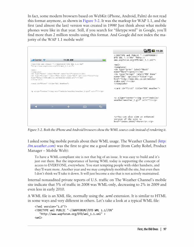
In fact, some modern browsers based on WebKit (iPhone, Android, Palm) do not readthis format anymore, as shown in Figure 5-2. It was the markup for WAP 1.1, and thefirst (and almost the last) version was created in 1998! Just think about what mobilephones were like in that year. Still, if you search for “filetype:wml” in Google, you’llfind more than 2 million results using this format. And Google did not index the ma-jority of the WAP 1.1 mobile web!
Figure 5-2. Both the iPhone and Android browsers show the WML source code instead of rendering it.
I asked some big mobile portals about their WML usage. The Weather Channel (http://m.weather.com) was the first to give me a good answer (from Cathy Rohrl, ProductManager – Mobile Web):
To have a WML-compliant site is not that big of an issue. It was easy to build and it’sjust out there. But the importance of having WML today is supporting the concept ofaccess to EVERYONE, everywhere. You start tempting people with older handsets, andthey’ll want more. Another year and we may completely mothball the site, but even thenI don’t think we’ll take it down. It will just become a site that is not actively maintained.
Internal nonaudited private reports of U.S. traffic on The Weather Channel’s mobilesite indicate that 5% of traffic in 2008 was WML-only, decreasing to 2% in 2009 andeven less in early 2010.
A WML file is an XML file, normally using the .wml extension. It is similar to HTMLin some ways and very different in others. Let’s take a look at a typical WML file:
<?xml version="1.0"?><!DOCTYPE wml PUBLIC "-//WAPFORUM//DTD WML 1.1//EN" "http://www.wapforum.org/DTD/wml_1.1.xml" ><wml>
First, the Old Ones | 97

<card id="home" title="Welcome to Old Mobile"> <p mode="wrap">This is a <b>typical</b> paragraph in WML</p> <p mode="wrap">It can include images, <a href="http://wap.yahoo.com">External Links</a> and <a href="#two">Internal Links</a>. </p> </card> <card id="two" title="Second screen"> <p>This is like a second page in the same document</p> </card></wml>
We can recognize many tags found in HTML here, like p, b, and a, and they have thesame functionality. Other tags the two standards have in common include img, br, andinput.
Today it is common to use the self-closed tag <br /> in XHTML filesinstead of the classic <br> without a closing tag. WML, as one of thefirst XML-based markup languages, was the pioneer in using the self-closed tag.
WML TodayWML was replaced in the WAP standard in 2002, but it continues as the fallbackmarkup for older devices. Today, only sites that are linked in carrier decks are forcedto create WML versions for full compatibility with all devices on the market. Somemajor websites are also available in WML versions, but to take two well-known ex-amples, Twitter and Facebook don’t provide WML versions of their popular services.
In 2009 the percentage of WML-only traffic was below 2%, and it can now be estimatedas accounting for less than 1% of all traffic.
However, you’ll also notice some differences. Firstly, a WML file starts with a rootwml tag after the DOCTYPE declaration. A WML document is also called a deck. Everydeck can contain many cards. A card, identified by a tag with the same name, is onevisible page in a browser; it is like the contents of a body tag in HTML. So yes, a WMLfile can contain many pages in the same document (see Figure 5-3). This was a greatfeature for speeding up the performance of the mobile web in the early 2000s.
The Document Type Declaration (known as the DOCTYPE) is an in-struction in a XML document (or an SGML document, e.g., HTML)that allows the browser to match that document with a Document TypeDefinition (DTD) so it can tell how to understand the document.
WML was conceived for mobile devices. Consequently, we will find tags and attributessupporting mobile device functionality (e.g., voice calls, keyboard support, adding
98 | Chapter 5: Markups and Standards

contacts to the phonebook, and accessing the SIM card) in the standard. The best partis that we can use the well-known anchor tag to create an absolute link, a link to arelative document, or a link to another card in the same document using the#card_name URL.
The multiple cards design pattern in WML is very useful. We will useit in our modern mobile websites using JavaScript, DOM, and even Ajax.You’ll need to wait a few pages for that, though!
There is a lot to say about WML; in fact, I have a book on WML on my bookshelf that’smore than 600 pages long. But to be honest, WAP 1.1 pages today are so simple thatthis quick introduction should be enough for you to understand WML.
WML is not compatible with CSS, and its minimal design support in-cludes the use of the tags big, small, b, and i using a “best effort” mech-anism. Many old WML browsers had only one font and no bold or italicsupport.
If you are still curious about WML, you can use Adobe Dreamweaver to create WMLfiles with code hinting support. When you select File→New, you will find WML in the
Figure 5-3. A WML document can have many cards (one, by default), and we can link to any cardusing the format wml_document#card_name.
First, the Old Ones | 99

“Other” section. Of course, you can also use any text editor and a WML-compatibleemulator. The best WML emulators today are the Nokia Series 40 emulators (only forWindows), as they show real rendering and work well on modern desktops runningWindows Vista or 7.
WML was not alone
WML does not generally support GIF, JPG, or PNG images (although some browsersdid accept GIF and JPG images, starting with color screens). Images in WML files weretypically in WBMP (Wireless Bitmap) format. WML also supports scripting using alanguage called WMLScript, loosely based on ECMAScript. They aren’t worth discus-sing; just know that they existed and talk to your grandchildren about them. A WBMPfile is just a 1 bit per pixel bitmap file, in black and white.
Other common scenarios involved compiled WML and WMLScript files. These fileswere compiled by the developer or by a proxy or WAP gateway between the user andthe web server. A free tool for compiling WMLScript files is the old Nokia MobileInternet Toolkit, still available for download.
Testing Suite from This BookAll the testing documents used in this book are available for free at http://www.mobilexweb.com/tests; you can test yourself with any mobile browser every feature testedhere. For less typing, you can use the Mobile Tiny URL, typing t.ad.ag in yourbrowser’s address bar (you will need to type 8123124 on almost every numeric keypad).This is a valid URL on the Internet, and it uses only the first characters associated witheach numeric key to reduce keypresses. You can create your own URLs for easy mobiletyping by accessing http://www.mobiletinyurl.com from your desktop browser.
Every suite was tested on the latest versions of some of the platforms available at thetime of this writing, on all the major versions available on the market, and on olderversions of the same platforms. As mobile browsers are evolving quickly, new versionscould have different results. You can follow my blog at http://www.mobilexweb.com ormy Twitter account http://www.twitter.com/mobilexweb for updates. Because of spacelimitations, we didn’t test every browser, like Bolt or Firefox for Nokia N900.
Newer versions are supposed to support all the features supported by the older versions.You should also expect currently noncompatible browsers to start supporting newtechnologies in the future (e.g., HTML 5).
Serving WML
To serve WML, you just need to configure your server (or your dynamic code) to deliverthe right MIME type. We will talk more about this in Chapter 10. The list of MIMEtypes for WAP 1.0–compatible markup is shown in Table 5-1, while Table 5-2 reportson those files’ compatibility with current devices.
100 | Chapter 5: Markups and Standards

Table 5-1. WAP 1.0 MIME types and extensions
Format MIME type Common extension
Wireless Markup Language text/vnd.wap.wml .wml
Wireless Markup Language Script text/vnd.wap.wmlscript .wmls
Compiled Wireless Markup Language application/vnd.wap.wmlc .wmlc
Compiled Wireless Markup Language Script application/vnd.wap.wmlc .wmlsc
Wireless Bitmap image/vnd.wap.wbmp .wbmp
Table 5-2. WML support testing compatibility table
Browser/platform WML support What happens WBMP GIF in WML
Safari No Shows source code No No
Android browser No Shows source code No No
Symbian/S60 Yes/No >= 3rd ed.
Yes <= 2nd ed.
Images not rendered in 5th ed. devices
Document not compatible in some 3rd ed.devices
No No
Nokia Series 40 Yes Renders OK Yes Yes
webOS No Nothing happens No No
BlackBerry Yes Renders OK Yes No
NetFront Yes Renders OK Yes Yes
Openwave (Myriad) Yes Renders OK Yes No
Internet Explorer No
Motorola Internet Browser Yes Renders OK Yes No
Opera Mobile Yes Multiple cards don’t work Yes Yes
Opera Mini Yes Multiple cards are rendered on the server Yes Yes
NTT DoCoMo (Japan) No No No
Today, you should not use WML for a normal mobile website. If you are working witha carrier that requires it or providing a very popular service, though, you should con-sider creating a very basic WML site for 100% compatibility.
Remember, there is poor or no support for WML in modern smartphones’ browsers(the most-used mobile Internet devices), and the future is even darker. If you have aWML-only site, you should consider migrating it quickly; you are losing valuablecustomers.
First, the Old Ones | 101

cHTML, the Forgotten StandardAt the same time that WML appeared on the market, in 1998, compact HTML(cHTML) also appeared, mainly in the Japanese market. cHTML is a subset of HTMLwith additions for mobile features, like support for access key shortcuts, pictorial char-acters (emoticons), and Japanese characters. It was submitted as a standard to the W3Cbut its adoption was mainly in Japan, with some implementations in the Netherlands,Italy, France, Australia, and the United States. Early versions of cHTML lacked supportfor JPEG, tables, backgrounds, frames, and stylesheets.
Current StandardsIn terms of the mobile web today, our real work will be directly related to the followingstandards and pseudo-standards:
• XHTML Mobile Profile 1.0, 1.1, and 1.2
• XHTML Basic 1.0 and 1.1
• XHTML 1.0 and 1.1
• HTML 3.2 and 4.0
• HTML 5.0 draft
• De facto standard (X)HTML extensions
• WAP CSS
• CSS Mobile Profile
• CSS 2.1
• CSS 3.0
• CSS custom extensions
This may seem overwhelming, but don’t panic: it isn’t really that complicated. We candistinguish two types of standards: HTML-based and CSS-based.
This discussion will largely ignore the desktop web, but not because Ibelieve in two different webs. Desktop web development relies on tech-niques designed for desktop browsers, like Internet Explorer or Firefox.Many of the techniques used in mobile web development are different.
Politics of the Mobile WebWhy are there so many standards? The first answer is politics. Politics? Yes. Many actorsare involved in the mobile web, and everyone wants to be part of the decision-makingprocess. Are mobile web standards “mobile enough” to be managed by mobilestandards organizations, like the Open Mobile Alliance (OMA)? Are they “web
102 | Chapter 5: Markups and Standards
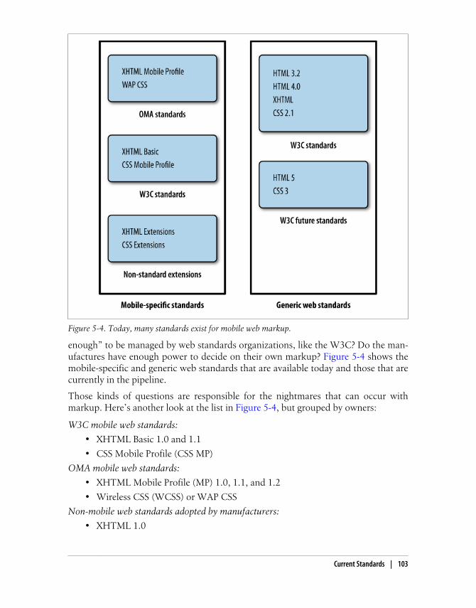
enough” to be managed by web standards organizations, like the W3C? Do the man-ufactures have enough power to decide on their own markup? Figure 5-4 shows themobile-specific and generic web standards that are available today and those that arecurrently in the pipeline.
Those kinds of questions are responsible for the nightmares that can occur withmarkup. Here’s another look at the list in Figure 5-4, but grouped by owners:
W3C mobile web standards:
• XHTML Basic 1.0 and 1.1
• CSS Mobile Profile (CSS MP)
OMA mobile web standards:
• XHTML Mobile Profile (MP) 1.0, 1.1, and 1.2
• Wireless CSS (WCSS) or WAP CSS
Non-mobile web standards adopted by manufacturers:
• XHTML 1.0
Figure 5-4. Today, many standards exist for mobile web markup.
Current Standards | 103

• HTML 3.2 and 4.0
• CSS 2.1
Non-mobile future web standards adopted by manufacturers using the standard drafts:
• HTML 5.0
• CSS 3.0
Manufacturers’ extensions to the standards:
• De facto standard (X)HTML extensions
• CSS Custom Extensions
Managing multiple standards
The first bit of good news is that, with the exception of new features in HTML 5 andCSS 3, all the standards are similar and compatible with each other. The second bit ofgood news is that HTML-based browsers—that is, every mobile browser on the markettoday—have a “good effort” mechanism to manage nonrecognized tags and attributes.This is at the heart of HTML’s evolution.
I remember my first desktop HTML project in 1996, and the projects after that. Thelist of compatible tags was different for each browser on the market (at that time, Mo-saic, Netscape Navigator, the AOL Browser, and a bit later, Internet Explorer). How-ever, it wasn’t a big problem. If the browser did not understand a tag or an attribute,it just ignored it. The same is true of most mobile browsers. This will be very helpfulin enabling us to manage all standards at the same time (with some exceptions: basi-cally, older devices).
As the mobile device manufacturers are nearer to OMA than the W3C, they officiallyimplement the WAP 2.0 standard using XHTML MP and WAP CSS. However, almostall browsers also understand XHTML Basic and CSS MP, and most mid- and high-enddevices understand full desktop web standards (HTML and CSS).
Don’t rely on the standards. Even two devices supporting the samestandard may render different results for many tags, attributes, andstyles. We will analyze every usage, and I’ll recommend the best solu-tion.
Delivering MarkupBefore we talk about the individual standards and the differences between them, wewill analyze how to deliver each standard to a mobile device. Firstly, as in the desktopweb, all static document markups use the .html extension, and the style ones usethe .css extension. Of course, we can deliver XHTML MP or XHTML Basic using adynamic template, a .php or .aspx file, or servlet Java.
104 | Chapter 5: Markups and Standards

So, how does the device know which standard we coded a website in? By reading theMIME type and the DOCTYPE. The MIME type is a string sent by the server tellingthe browser the format of the document, and the DOCTYPE is the first line in theHTML file. If you omit the DOCTYPE it should still work in many browsers, but don’tdo this! The other thing to notice is that in HTML 3.2, 4.0, and 5.0 the opening tagshould be:
<html>
while for all the other XHTML subtypes it should be:
<html xmlns="http://www.w3.org/1999/xhtml">
All CSS standards use the same MIME type as in the desktop web (text/css), and thereis no format indicator inside the CSS. That is why for the style file, we will not need todefine which standard we are using. The selectors and attributes used will determinecompatibility. Figure 5-5 illustrates how MIME types and DOCTYPEs travel throughthe network, one in the header and the other inside the document.
The preferred MIME types and DOCTYPEs are listed in Table 5-3.
Figure 5-5. The MIME type travels with the server’s response headers and the DOCTYPE is definedinside the HTML document.
Current Standards | 105
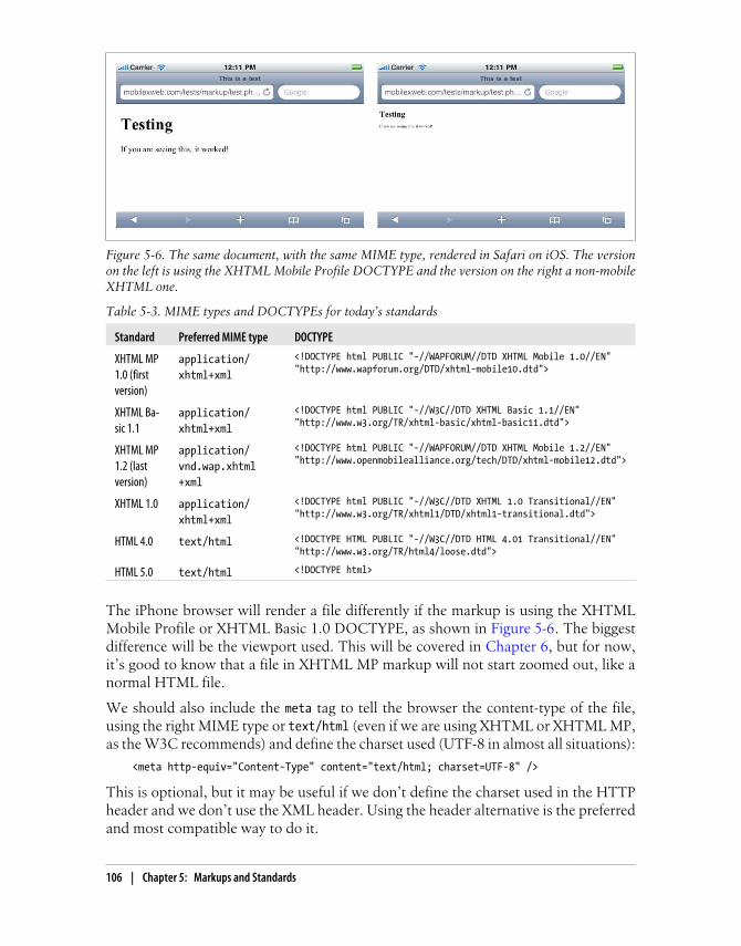
Table 5-3. MIME types and DOCTYPEs for today’s standards
Standard Preferred MIME type DOCTYPE
XHTML MP1.0 (firstversion)
application/xhtml+xml
<!DOCTYPE html PUBLIC "-//WAPFORUM//DTD XHTML Mobile 1.0//EN""http://www.wapforum.org/DTD/xhtml-mobile10.dtd">
XHTML Ba-sic 1.1
application/xhtml+xml
<!DOCTYPE html PUBLIC "-//W3C//DTD XHTML Basic 1.1//EN""http://www.w3.org/TR/xhtml-basic/xhtml-basic11.dtd">
XHTML MP1.2 (lastversion)
application/vnd.wap.xhtml+xml
<!DOCTYPE html PUBLIC "-//WAPFORUM//DTD XHTML Mobile 1.2//EN""http://www.openmobilealliance.org/tech/DTD/xhtml-mobile12.dtd">
XHTML 1.0 application/xhtml+xml
<!DOCTYPE html PUBLIC "-//W3C//DTD XHTML 1.0 Transitional//EN""http://www.w3.org/TR/xhtml1/DTD/xhtml1-transitional.dtd">
HTML 4.0 text/html <!DOCTYPE HTML PUBLIC "-//W3C//DTD HTML 4.01 Transitional//EN""http://www.w3.org/TR/html4/loose.dtd">
HTML 5.0 text/html <!DOCTYPE html>
The iPhone browser will render a file differently if the markup is using the XHTMLMobile Profile or XHTML Basic 1.0 DOCTYPE, as shown in Figure 5-6. The biggestdifference will be the viewport used. This will be covered in Chapter 6, but for now,it’s good to know that a file in XHTML MP markup will not start zoomed out, like anormal HTML file.
We should also include the meta tag to tell the browser the content-type of the file,using the right MIME type or text/html (even if we are using XHTML or XHTML MP,as the W3C recommends) and define the charset used (UTF-8 in almost all situations):
<meta http-equiv="Content-Type" content="text/html; charset=UTF-8" />
This is optional, but it may be useful if we don’t define the charset used in the HTTPheader and we don’t use the XML header. Using the header alternative is the preferredand most compatible way to do it.
Figure 5-6. The same document, with the same MIME type, rendered in Safari on iOS. The versionon the left is using the XHTML Mobile Profile DOCTYPE and the version on the right a non-mobileXHTML one.
106 | Chapter 5: Markups and Standards

If we use a basic markup compatible with all standards, some low- andmid-end devices will not understand the text/html MIME type, andsome smartphones will not understand the XHTML MP MIME type. Ina later chapter, we will learn how to change this attribute dynamically,even when we deliver the same code.
XHTML MP can be delivered using the OMA MIME type (application/vnd.wap.xhtml+xml), the XHTML type (application/xhtml+xml), or even the HTML type (text/html), with the same result. The OMA recommends using the first one, but using theXHTML type will work well in almost all situations. Some older and low-end devicesrender the page differently depending on the MIME type used.
Table 5-4 shows the results of a test of the effects of using different MIME types andDOCTYPEs, testing XHTML MP first with all the browsers listed and seeing if it isdisplayed correctly or not (leading to the result shown in Figure 5-7). You can find thistest at http://www.mobilexweb.com/tests/ch6.
Table 5-4. HTML and XHTML testing compatibility table
Browser/platform
XHTML Mobile Profile
XHTML MP MIME XHTML MIME HTML MIME XHTML Basic XHTML HTML
Safari No Yes Yes Yes Yes Yes
Android browser Yes Yes Yes Yes Yes Yes
Symbian/S60 Yes Yes Yes Yes Yes Yes
Nokia Series 40 Yes Yes Yes Yes Yes Yes
webOS No Yes Yes Yes Yes Yes
BlackBerry Yes Yes Yes Yes Yes Yes
NetFront Yes Yes Yes Yes Yes Yes
Openwave (Myriad) Yes Yes Yes Yes Yes Yes
Internet Explorer Yes Yes Yes Yes Yes Yes
Motorola Internet Browser Yes Yes Yes Yes Yes Yes
Opera Mobile Yes Yes Yes Yes Yes Yes
Opera Mini Yes Yes Yes Yes Yes Yes
NTT DoCoMo (Japan) Yes Yes Yes Yes Yes Yes
Top mobile websites
Table 5-5 shows the top nine mobile websites visited in the UK (statistics by OperaState of the Mobile Web) with a Nokia 5800 XpressMusic user agent and an iPhoneuser agent and reports on how they delivered the documents.
Current Standards | 107
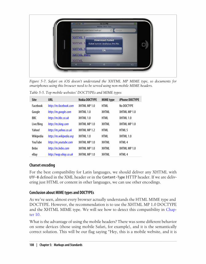
Table 5-5. Top mobile websites’ DOCTYPEs and MIME types
Site URL Nokia DOCTYPE MIME type iPhone DOCTYPE
Facebook http://m.facebook.com XHTML MP 1.0 HTML No DOCTYPE
Google http://m.google.com XHTML 1.0 XHTML XHTML MP 1.0
BBC http://m.bbc.co.uk XHTML 1.0 HTML XHTML 1.0
Live/Bing http://m.bing.com XHTML MP 1.0 XHTML XHTML MP 1.0
Yahoo! http://m.yahoo.co.uk XHTML MP 1.2 HTML HTML 5
Wikipedia http://m.wikipedia.org XHTML 1.0 HTML XHTML 1.0
YouTube http://m.youtube.com XHTML MP 1.0 XHTML HTML 4
Bebo http://m.bebo.com XHTML MP 1.0 XHTML XHTML MP 1.0
eBay http://wap.ebay.co.uk XHTML MP 1.0 XHTML HTML 4
Charset encoding
For the best compatibility for Latin languages, we should deliver any XHTML withUTF-8 defined in the XML header or in the Content-Type HTTP header. If we are deliv-ering just HTML or content in other languages, we can use other encodings.
Conclusion about MIME types and DOCTYPEs
As we’ve seen, almost every browser actually understands the HTML MIME type and DOCTYPE. However, the recommendation is to use the XHTML MP 1.0 DOCTYPEand the XHTML MIME type. We will see how to detect this compatibility in Chap-ter 10.
What is the advantage of using the mobile headers? There was some different behavioron some devices (those using mobile Safari, for example), and it is the semanticallycorrect solution. This will be our flag saying “Hey, this is a mobile website, and it is
Figure 5-7. Safari on iOS doesn’t understand the XHTML MP MIME type, so documents forsmartphones using this browser need to be served using non-mobile MIME headers.
108 | Chapter 5: Markups and Standards

not intended to be used from a desktop.” This metadata will be very helpful for searchengine robots to determine which pages are mobile-ready.
Only if we are going to use some HTML 5 features or non-mobile-compatible tagsshould we consider using the HTML DOCTYPE, so we will still have valid markup.
XHTML Mobile Profile and BasicXHTML MP is based on the W3C’s XHTML Basic, and they are almost the same. The W3C has an online mobile validator at http://validator.w3.org/mobile; it acceptsXHTML Basic and MP as valid markup.
XHTML Mobile Profile is a subset of XHTML. It is XML-based, so we need to followthe strict rules. If you have never worked with XHTML 1.0 or 1.1 for the Web, let’sanalyze the differences compared with working with HTML:
• The file must have a root element (html tag).
• Every tag name and tag attribute must be in lowercase.
• Every attribute value must be enclosed in quotes.
• Every tag must be closed. This may seem obvious, but it is not; tags like <img>,<input>, and <br> don’t need to be closed in HTML, but they do need to be closedin XHTML. The general rule is to use self-closed tags, like <br />.
• The tags need to be closed in reverse order. If you open a paragraph and then alink, you must close the link before closing the paragraph.
• XHTML entities must be well formed. A mandatory space should be andan ampersand character should be &.
• All attributes must have a value. For example, <option selected> is invalid; youmust use <option selected="selected">.
• The DOCTYPE declaration is mandatory, and the XML opening tag is optional.In fact, for mobile browsers we should not insert the XML opening tag.
This is not a book about XHTML, CSS, or even JavaScript. I assumeyou have some basic experience with these markup and programminglanguages; if not, you will find a lot of resources on the Web and excel-lent books from O’Reilly Media to help you get started.
Available TagsWe have finally arrived at the level of code. XHTML MP, as a subset of XHTML derivedfrom HTML, will look familiar to most web developers.
XHTML Mobile Profile and Basic | 109
The Space Before the Final Closing SlashYou may be familiar with the use of <br /> in recent years, whether in XHTML or inHTML. Do you know why the space is included before the closing slash? In an XMLfile, we can use <br/> without a space, and it’s valid. The space is for backward com-patibility with non-XHTML browsers that don’t expect a final slash in the tag. Usingthe space ensures that most older browsers will understand the tag as a line break.
The tags available in both XHTML Mobile Profile 1.2 and XHTML Basic 1.1 (the twostandards are almost at the same level) are listed in Table 5-6. Some features, likescripting support, were added in XHTML MP 1.1 and others, like object support, inthe last standard (1.2).
Table 5-6. HTML tags available in XHTML MP 1.2 and Basic 1.1
Tag types Tags available
Structure body, head, html, title
Text abbr, acronym, address, blockquote, br, cite, code, dfn, div, em, h1, h2, h3, h4, h5, h6, kbd,p, pre, q, samp, span, strong, var
Links a
Presentation b, big, hr, i, small
Stylesheet style
Lists dl, dt, dd, ol, ul, li
Forms form, input, label, select, option, textarea, fieldset, optgroup
Basic tables caption, table, td, th, tr
Other img, object, param, meta, link, base, script, noscript
If we compare previous versions of XHTML MP and Basic, the differences are bigger.The last XHTML Basic standard (1.1) added almost every addition in XHTML MP 1.2,and now the two are almost equal.
XHTML Mobile Profile 1.2 is the last standard from the OMA. The firstdraft was presented in 2004 and the approved version was released in2008. That is why there are still some low- and mid-end devices on themarket that don’t comply with this version. Remember that it takessome time for browser developers to comply with new standards, andmore time for manufacturers to get devices using the new standards tothe market.
We can still use a tag that is not supported in our declared DOCTYPE. It will notvalidate against the DTD, but most mobile browsers will simply ignore the tag withoutany error visible to the user.
110 | Chapter 5: Markups and Standards

Official Noncompatible FeaturesEvery WAP 2.0 browser on the market today should understand and render the tagslisted in Table 5-6. However, in XHTML MP (and Basic), there are also several tags,techniques, and technologies that are officially not supported. We will still test themin every browser, though, because as we’ve seen there are many full HTML browserson the market, and others that will understand some noncompatible features. All ofthe following are officially unsupported:
• Nested tables (table inside other tables)
• Full table tags: thead, tbody, rowspan, and colspan attributes
• Full form tags: input type=“image,” input type=“file”
• Editing: ins, del
• Image maps
• Frames
• Iframes
• Deprecated formatting tags: e.g., font, dir, menu, strike, u, and center
We will check all browsers for compatibility with those features, as well as thefollowing:
• Adobe Flash
• Microsoft Silverlight
• The XMLHttpRequest object (Ajax)
• SVG
• The canvas tag
• Other embedded objects: Windows Media, QuickTime, Java applets
• Multimedia tags: audio and video
• Opening links in new tabs or windows
We will also verify which URL schemas are available for each browser.
Creating Our First Compatible TemplateLet’s create a very simple markup template that will be compatible with all devices. Ireally recommend that you use the source code view if you are using a visual web tool,like Adobe Dreamweaver or Microsoft Expression Web. You should feel comfortablewith nonintrusive, semantic HTML code for mobile web development.
Our template will look like this:
<?xml version="1.0" ?><!DOCTYPE html PUBLIC "-//WAPFORUM//DTD XHTML Mobile 1.2//EN" "http://www.openmobilealliance.org/tech/DTD/xhtml-mobile12.dtd">
XHTML Mobile Profile and Basic | 111

<html xmlns="http://www.w3.org/1999/xhtml"><head> <title>First Template</title></head>
<body> <h1>First Template</h1> <h2>Programming the Mobile Web</h2> <p>Welcome to the first template of this book</p> <p>It <strong>should work</strong> in every mobile browser in the market</p> <ol> <li><a href="http://m.yahoo.com" accesskey="1">Yahoo!</a></li> <li><a href="http://m.google.com" accesskey="2">Google</a></li> <li><a href="http://m.bing.com" accesskey="3">Bing</a></li> </ol> <p><img src="images/copyright.gif" width="150" height="50" alt="(C) mobilexweb.com" /></p></body></html>
Here are some comments on this code, which produces the results shown in Figure 5-8:
• We are using the XHTML MP DOCTYPE.
• We are using standard header tags for titles: h1 ... h6, not p or div tags.
• We are using the paragraph tag (p) to enclose text.
• We are using an ordered list to show a link menu. The option numbers match theaccesskey attributes of the anchor (a) tags.
• We provide a width, height, and alternate text for all images.
As these images prove, this code works on every platform. I know what you’re thinking:“Hey, this is an awful experience for the iPhone.” If you’re tempted to throw away thisbook right now, wait! Give me a chance. Using this exact code, we will create a greatiPhone (or other smartphone) experience in the following pages. Well, OK, there maybe some little changes to the code, but not so many. Our goal will be to keep ourdocument template as simple as this one, even for very complex HTML 5 web apps.
Markup AdditionsWML, as a mobile-specific language, has many mobile-prepared tags and attributes.This is not true of XHTML MP or Basic, and that’s why many developers were againstWAP 2.0 in the early 2000s. Some vendors, such as Nokia, even tried to create theirown markup supersets over XHTML with mobile-specific features.
The only mobile-specific addition is present in XHTML Basic 1.1, but even with theXHTML MP DOCTYPE it will work if the browser understands that markup. Theaddition is the attribute inputmode, available for the input and textarea tags; it allowsus to specify input mode tokens indicating the expected type of the input characters(e.g., latin, thai, arabic) and modifier tokens for the text input (e.g., predictOff to
112 | Chapter 5: Markups and Standards

deactivate predictive input). XHTML MP adds similar support with WAP CSS that wewill cover later.
WML had a format attribute for the input tag that was similar to inputmode. Some browsers, such as Openwave, still understand this attributein an XHTML file.
Figure 5-8. The same template without CSS in the webOS, Android, Safari, BlackBerry, Nokia S60,Windows Mobile, Nokia S40 (low-end device), Motorola, and NetFront (Sony Ericsson device)browsers.
XHTML Mobile Profile and Basic | 113

CSS for MobileWeb (and mobile) browsers have a great feature that makes our lives much easier. Ifwe use any selector or attribute that the browser doesn’t understand, the browser willjust ignore it. This will be very helpful in the following pages. Usage of CSS 2.1, CSS3.0, CSS Mobile Profile, and WAP CSS is the same; we specify CSS selectors and at-tributes for those selectors. The standards only tell us which selectors and attributesare supported, and we will find browsers that do not properly render standard onesand do properly render noncompatible tags.
If you are interested in having W3C-valid markup, remember that XHTML Basic 1.0doesn’t support CSS, and 1.1 added support, but only for a style or link tag withexternal styles. The W3C standard doesn’t support the inner styles defined in thestyle attribute.
WCSS, or WAP CSS (the OMA standard that comes with XHTML MP), is a CSS 2.0subset, like CSS MP (the W3C standard that comes with XHTML Basic). That’s whywe will focus here on CSS 2.0 features (and beyond). We’ll begin by talking generallyabout “mobile CSS,” and later we will see how the different mobile browsers handleeach of those features.
WCSS ExtensionsThe Open Mobile Alliance standard added to CSS 2 some new attributes that we canuse in mobile browsers. As this is how CSS defines extensions, every new attribute hasa dash (-) as a prefix. We will see later that some mobile browsers also understandsome nonstandard extensions, like Mozilla’s. But again, don’t worry; we will look atcompatibility attribute by attribute so you understand how to manage incompatibilitiesthe best you can.
Access key
The first attribute is -wap-accesskey; it is the counterpart of the XHTML accesskeyattribute. It can be used with any interactive element (generally, the a, textarea, label,input, and button tags). The possible values are the digits 0 through 9 and the specialvalues * and #. For some browsers on devices with numerical keypads, this attributecan be used to create shortcuts to access those elements. Some browsers do nothingwith it, some browsers set the focus on that element when the user presses the key, andother browsers directly fire the action associated with it (go to a link, submit a form,etc.).
We should only use the standard keys 0–9, *, and # as access keys. Wecannot assign functions to soft keys or any other special keys in HTML.WML allows us to assign links to soft keys, but this functionality hasno effect in modern browsers.
114 | Chapter 5: Markups and Standards

We can only assign the same key to one element in the same page. That’s why the-wap-accesskey attribute is useful only with ID selectors or with inline styles. Youshouldn’t use this attribute with element or class selectors.
The next three samples all have the same result:
<a href="http://mobilexweb.com" accesskey="0">Our website</a><input type="submit" value="Send" accesskey="9" />
<a href="http://mobilexweb.com" style="-wap-accesskey: 0">Our website</a><input type="submit"" value="Send" style="-wap-accesskey: 9" />
<style type="text/css">#linkWeb { -wap-accesskey: 0;}#btnSubmit { -wap-accesskey: 9;}</style>
<a href="http://mobilexweb.com" id="linkWeb">Our website</a><input type="submit"" value="Send" id="btnSubmit" />
Table 5-7 tests all the possibilities to determine which version it’s better to use, and inwhich browsers we will have results.
Table 5-7. Access key testing compatibility table
Browser/platform
Behavior in links
Behavior in text inputsAs XHTML As inline CSS As CSS by ID
Safari No behavior
Android browser No behavior
Symbian/S60 No behavior
Nokia Series 40 No behavior
webOS No behavior
BlackBerry No behavior
NetFront If accesskey active in preferences, go to link If accesskey active, focus
Openwave (Myriad) Go to link Focus
Internet Explorer Go to link Focus
Motorola Internet Browser Go to link Focus and open edit window
Opera Mobile No behavior
Opera Mini No behavior
CSS for Mobile | 115

As Table 5-7 reveals, access keys only work with a few browsers. Thisis because many of them use the keypad for accelerators (shortcuts forbrowser functions like scrolling, going back, or reloading). That is whywe can only use them if they are not the preferred or only way to accessfunctionality on the website.
Marquee
If you’ve been doing web development for a long time, like me, you probably hate thenonstandard marquee element that many people used to insert in web pages. WAP CSSrevived this technique to create small animations without images that do not requireFlash. A marquee is generally a text that scrolls from one side of the screen to the other,wrapping around continuously. In some mobile browsers it can contain any HTMLcode, including images and even tables. However, don’t scroll too much heavy markup,for the sake of your visitors and the performance of your website.
To create floating, scrolling text, use any paragraph element, like p or div, define thedisplay attribute as -wap-marquee, and assign values to some of the CSS attributes listedin Table 5-8.
Table 5-8. Marquee WAP CSS attributes
Attribute Possible values Description
-wap-marquee-dir ltr or rtl Direction of the scrolling. Can be left to right (ltr) or rightto left (rtl).
-wap-marquee-loop Any number or infinite Animation count. The infinite value creates a never-ending animation.
-wap-marquee-speed slow, normal, or fast Speed of the animation, without fine control.
-wap-marquee-style scroll, slide, oralternate
Possible styles for the animation.
The following sample shows how to use a marquee to present an offer to the user:
<!DOCTYPE html PUBLIC "-//WAPFORUM//DTD XHTML Mobile 1.0//EN" "http://www.wapforum.org/DTD/xhtml-mobile10.dtd"><html xmlns="http://www.w3.org/1999/xhtml"><head><meta http-equiv="Content-Type" content="text/html; charset=UTF-8" /><title>Mobile Web Test</title><style type="text/css">.offer { display: -wap-marquee; -wap-marquee-dir: rtl; -wap-marquee-speed: medium; -wap-marquee-loop: infinite; -wap-marquee-style: scroll;}
.offer strong {
116 | Chapter 5: Markups and Standards

color: red;}</style></head>
<body><div class="offer"><strong>Fly to the Moon</strong> Special offers this monthstarting at US$ 145.000. Apply now and see us from the sky.</div><h1>TravelWithUs.com</h1>(...)</body></html>
The result is shown in Figure 5-9.
Figure 5-9. A Nokia N95 showing a marquee animation in progress using standard WAP CSS.
Now let’s take a look at how browsers react to this tag. We may be tempted to use thisdisplay type to show a large amount of text in a small space, but if the mobile browserdoesn’t understand the marquee display, all that text will appear on the page, pushingdown the important content! That is why we should consider alternative solutions fornoncompatible browsers, like hiding the content. For example:
.offer { display: none; display: -wap-marquee; -wap-marquee-dir: rtl; -wap-marquee-speed: medium; -wap-marquee-loop: infinite; -wap-marquee-style: scroll;}
CSS for Mobile | 117

In the preceding code, we first assign display: none to remove the text from the display.Then we assign display: -wap-marquee. If the browser understands the WAP CSS mar-quee styles, it will replace the none value. If not, it will just ignore the second settingand the none will win. We can also apply this style to a marquee HTML element, so itcan work in all possible marquee-compatible browsers, as listed in Table 5-9. Theproblem is that the code will not validate against standards (if we are interested in that).
Table 5-9. Marquee testing compatibility table
Browser/platform Supports -wap-marquee Supports marquee tag
Safari No Yes
Android browser No Yes
Symbian/S60 Yes Yes
Nokia Series 40 Yes Yes
webOS No Yes
BlackBerry Yes Yes
NetFront Yes Yes
Openwave (Myriad) Yes Yes
Internet Explorer Yes No
Motorola Internet Browser Yes Yes
Opera Mobile Yes Yes
Opera Mini Buggy No
Try to avoid marquees for important information. You may want to use them to reducethe space taken up by information that is not directly relevant, or to have some kind ofanimation free of plug-ins. Avoid the usage of links, images, or any other non-textmarkup inside a marquee, and create an alternative CSS stylesheet for noncompatibledevices.
CSS form extensions
Another great enhancement in WAP CSS is the ability to define useful information forform input. We will talk about this in depth later, but for now let’s see what extensionsare included in the standard. They are listed in Table 5-10.
118 | Chapter 5: Markups and Standards

Table 5-10. WAP CSS form extension attributes
Attribute Possible values Description
-wap-input-format
Complex pattern(see Chapter 6)
Defines the pattern of the text. Can be applied to text fields, password fields,and textareas.
-wap-input-required
true or false If true, requires the user to provide some content before exiting the field. Canbe applied to text fields, password fields, and textareas.
This attribute has precedence over the format attribute in the input tag, ifboth are defined.
ConfusionIt’s OK to be a little confused after reading about all the incompatibilities. This is justan introduction to general and mobile-specific standards—just theoretical information.Actual concrete practice will make it much clearer.
Confusion | 119


CHAPTER 6
Coding Markup
The standards are sometimes utopias, while the real world is something different. Manydevices officially support standards, but in practice some feature is missing; many otherdevices add support for more technologies besides what is covered by the standards.
The W3C maintains a list of Mobile Web Best Practices at http://w3.org/TR/mobile-bp;dotMobi adds more advice in the Developer’s Guide at http://mobiforge.com/node/197; and Luca Passani, an independent developer well known in the mobile web market(you’ll see why in a few chapters), maintains an alternate set of guidelines, called GlobalAuthoring Practices for the Mobile Web, at http://passani.it/gap.
They are decent resources, and they have much good advice for multiplatform mobileweb development. We will take that and go further, testing every feature in thestandards (and some nonstandard ones) to draw real conclusions about their usage.
We will go through a typical document, from the heading to the body structure, lookingat the most common design patterns for document structure, including forms, frames,tables, links, and images. We will test every possible solution for each topic in everymobile platform so we can get some useful information about what we can and cannotuse.
Heading StructureThe <head> part of a mobile web document will be very similar to that in a desktop webdocument, with the addition of some new <meta> tags useful only in mobile browsers.
First we’ll define a title, as for any other web page. The space available for the title ina mobile browser is small compared with a desktop browser (Table 6-1 gives the averagelengths of the titles displayed on the different platforms). The page title is used as theheading at the top of the screen on some devices; other devices also use the title as thedefault text for bookmarks and the history list.
121
Table 6-1. Average characters used in titles compatibility table
Browser/platform Average number of chars used in titles
Safari 40 chars in portrait and 60 in landscape. Hidden after the user scrolls the page and in web apps.
Android browser 15 chars after the domain name in 1.0 and 1.5.
Titles are not displayed after 2.0.
Symbian/S60 5th edition: 35 chars in portrait, 20 in landscape.
Nokia Series 40 13 chars in 2nd edition.
20 chars in 3rd edition.
No usage in 5th and 6th edition.
webOS No usage up to webOS 1.3. In webOS 1.4, the title appears only if the user scrolls down from the top.
BlackBerry 15–30 chars, depending on screen width.
NetFront No usage.
Openwave (Myriad) 15 chars.
Internet Explorer No usage.
Motorola Internet Browser 15 chars.
Opera Mobile Depends on the screen, between 20 and 60 chars.
Opera Mini Depends on the screen, between 20 and 60 chars.
Every mobile title needs to be:
MeaningfulAvoid duplicate titles for every page of your mobile site using only your companyname. However, on your home or entry page, don’t use “Home Page,” use yourcompany or product name and keep it very short. This may be the most book-marked page.
ShortKeep the title between four and eight words long. If mentioning the name of yourcompany, do that last (for example, “Big Mac - Meals in McDonald’s”). Use smallwords first; some old devices truncate the title after 10 or 12 characters.
ConciseDon’t waste words. For example, avoid using “Mobile” in the title; the user knowsthat she is using a mobile device.
Icons for the Mobile WebIn the early 2000s, everyone rushed to insert favicon.ico files in their websites’ root filesto see how the icons would be added to Internet Explorer’s address bar. Today, in thedesktop web those icons are more useful for tab iconography. But what about in mobilebrowsers?
122 | Chapter 6: Coding Markup

For performance purposes, mobile browsers don’t look for a favicon.ico file in the rootfolder if we don’t explicitly specify an icon to be used. In valid XHTML, the way to addan icon file is to use the following link tag:
<link rel="icon" type="image/png" href="favicon.png" />
Originally, the icons were in Windows ICO format (similar to BMP), but these files aredifficult to export from well-known graphic editors and are not optimized in size. To-day, you can use GIF or PNG for mobile compatibility. Originally the icon size had tobe 16×16 pixels, but now they can be any square size and the browser will resize them.
Safari on iOS adds another type of icon (WebClip), which is available if the user addsthe website to the home screen. We will talk about this in Chapter 12, but for now justknow that Safari for iPhone and iPod requires a 57×57-pixel PNG file (with no trans-parency preferred) and the following metatag, which can coexist with the other icon tag:
<link rel="apple-touch-icon" href="iphone_icon.png" />
Up to iOS 3.1 (known as iPhone OS at that time), 57×57 pixels was theonly available size for the WebClip. Starting with iOS 3.2 for iPad, 72×72is the icon size we should use if we detect this device. For iOS 4.0 ornewer, devices with high DPIs (such as iPhone 4) need an icon size of114×114 pixels. Otherwise, the device will resize the icon with qualityloss.
The icon will automatically be given rounded borders and a glossy effect, like thatshown in the middle of Figure 6-1. If you don’t want your icon to have that effect,instead use the following meta tag:
<link rel="apple-touch-icon-precomposed" href="iphone_icon.png" />
Figure 6-1. The original 57×57-pixel iPhone icon file, the final appearance once the website has beenadded to the home screen, and the icon using the precomposed meta tag.
If you don’t define the apple-touch-icon link, mobile Safari will look forthe existence of a file called apple-touch-icon.png in the root folder. If itdoes not find this file, it will look for an apple-touch-icon-precom-posed.png file (from iOS 2.0); no effect will be added to this icon.
Heading Structure | 123

Android (since version 1.5) supports only the apple-touch-icon-precomposed metatagfor high-resolution icons.
Table 6-2 explores compatibility for this type of icon, including usage of both the fa-vicon ICO files and PNG files, and the final display size.
Table 6-2. Icon display compatibility table
Browser/platform Usage PNG ICO Final size on screen (px)
Safari iPhone special icon used on the homescreen
Yes No 57×57, or 72×72 for iPad or114×114 for high-DPI devices
Android browser In the title area and on the home screen Yes Yes 16×16, or 57×57 if iPhone precom-posed icon defined
Symbian/S60 No
Nokia Series 40 No
webOS No
BlackBerry In the title area (some devices) Yes Yes 16×16
NetFront No
Openwave (Myriad) No
Internet Explorer No
Motorola Internet Browser No
Opera Mobile Title and bookmarks Yes Yes 16×16
Opera Mini Title and bookmarks Yes Yes 16×16
Generally speaking, you should create an icon in PNG format and use it as the icon foryour pages. Noncompatible browsers won’t use it, but for the ones that do, it will makea difference. It is better to have a favicon.ico and an Apple touch icon, even if you don’twant to use it: some browsers will make the HTTP request regardless of whether youdefine the reference in the markup, and a 404 response is always worse than deliveryof a small file.
Hey! I’m Mobile FriendlyWe talked about the MIME type and DOCTYPE in the last chapter. As you saw, theseare very helpful in telling browsers that documents are prepared for mobile delivery.However, this is not enough for mobile browsers that can read any desktop website.Those browsers treat the pages differently if they are for desktop users or are optimizedfor mobile devices. The differences are the initial zoom scale and some possible changesin the layout.
If you are creating a mobile-optimized version of your website, you need to tell thebrowsers to be aware of this. They are not part of any standard, but there are somedifferent meta tags to define. You should implement all of them at the same time.
124 | Chapter 6: Coding Markup

BlackBerry and some others use a meta tag for defining mobile-friendly documents:
<meta name="HandheldFriendly" content="True" />
Internet Explorer Mobile (formerly Pocket IE) has also created its own meta tag inWindows Mobile 5:
<meta name="MobileOptimized" content="width" />
Mobile Internet Explorer allows us to activate ClearType technology forsmoothing fonts for easy reading using the tag <meta http-equiv="cleartype" content="on">.
A not-so-standard variation is to use the alternate link metatag. This is intended tobe used in the desktop document, defining the alternative URL for the same contentintended for viewing on different media (handheld, in this case):
<link rel="alternate" media="handheld" href="http://m.mysite.com" />
However, some mobile sites (like the Google mobile home page) use the same link taginserted in the mobile page, too, with an empty href like a flag saying that this is al-ternative content for mobile devices and should not be considered as duplicated con-tent:
<link rel="alternate" media="handheld" href="" />
I don’t have real evidence yet that this works in any mobile browsers or for SEO pur-poses, but it won’t do any harm.
Defining mobile meta tags will be useful for transcoders, in determiningwhether to show the mobile version as we’ve created it rather thantranscoding the content as a full website. We will talk about transcodersin Chapter 10.
Defining the viewport
The viewport is the area in which the page fits. You can specify its width and height,and it can be larger or smaller than the total visible area of the screen (see Figure 6-2).This is where the scale and zoom features of the mobile browser come into play. If youare creating a mobile-friendly website it shouldn’t need to be zoomed in or out, so youcan say to the browser that you want to start with a scale of 1:1 (viewport area:visiblearea) and that you don’t want the user to change that scale (with gestures or buttons).
You define the viewport using the meta name="viewport" tag. The content of the tag canbe a comma-separated list of one or more of the attributes listed in Table 6-3.
Heading Structure | 125

Table 6-3. Viewport metadata attributes
Attribute Possible values Description
width Integer value (in pixels) or constant device-width
Defines the viewport width
height Integer value (in pixels) or constant device-height
Defines the viewport height
initial-scale Floating value (0.1 to n); 1.0 is no scale Defines the initial zoom scale of the viewport
user-scalable no or yes Defines whether we will allow the user to zoom inand out in the viewport
minimum-scale Floating value (0.1 to n). 1.0 is no scale Defines the minimum zoom scale of the viewport
maximum-scale Floating value (0.1 to n). 1.0 is no scale Defines the maximum zoom scale of the viewport
If you open a document without a mobile DOCTYPE on an iPhone, thedefault viewport size will be 980 pixels wide. If you define only some ofthe attributes of the viewport metatag, mobile Safari will infer the otherattributes for the best display.
Figure 6-2. Safari on iOS uses a 980-pixel-wide default viewport. If your desktop website is preparedfor a lower width, you should define it explicitly to avoid the right margin.
126 | Chapter 6: Coding Markup

You can define a viewport with a fixed size (in case you are showing a desktop-friendlywebsite), or with a size relative to the visible area. The most common approach for ourmobile template (introduced in Chapter 5) is to define the width as device-width andboth the maximum-scale and the minimum-scale as 1.0:
<meta name="viewport" content="width=device-width,minimum-scale=1.0,maximum-scale=1.0"/>
or the width as device-width, the initial-scale as 1.0, and the user-scalable attributeas no:
<meta name="viewport" content="width=device-width,initial-scale=1.0,user-scalable=no"/>
Figure 6-3 shows the effect that these settings can have on the user experience.
Figure 6-3. The same 300×300-pixel image viewed in the default Safari viewport, in a 1500-pixelviewport, at a device-width scale of 1.0, and at a device-width scale of 2.0.
Table 6-4 shows what happens if you try the viewport metatag inevery browser to see which ones detect it and do something with it. Remember that wecan still add it in noncompatible browsers because the meta tag accepts any content.
Table 6-4. Viewport usage compatibility table
Browser/platform Usage
Safari Yes
Android browser Yes, but the initial automatic scale is always 1.0 before 2.2
Symbian/S60 No
Nokia Series 40 No
webOS Yes
BlackBerry No before 4.2.1
Yes from 4.2.1
NetFront No
Openwave (Myriad) No
Viewport compatibility.
Heading Structure | 127

Browser/platform Usage
Internet Explorer No before IE 6
Motorola Internet Browser No
Opera Mobile No
Opera Mini No
Changing the navigation method
The Symbian browser (on 3rd edition and later devices) has two possible methods ofbrowsing, the standard and normal way (cursor-based) and a hidden focus-basedmechanism. A meta tag available for these devices allows us to change the default nav-igation method and use a simple focus mechanism:
<meta name="navigation" content="tabbed" />
This should be used only if you have a vertical tabular design (for example, a list oflinks using the whole width of the page). Using this tag will disallow the mouse eventsand hover effects over the page. If your design supports only vertical navigation, focus-based navigation will be faster for the user than the standard cursor navigation. How-ever, when using a finger or a stylus on a touch-enabled 5th-edition device (like the N97or 5800 XpressMusic), the user will not have access to focus-based navigation.
If you are creating a mobile-optimized site, insert the viewport metatagin every document of your site, disallowing user scaling and starting ata scale of 1.0.
If you are just configuring a desktop website to have a better display onsmartphone browsers, use the viewport metatag to tell the browser yourpreferred width and initial scale.
The Document BodyThe body is the most important section of the document, as it will define the contentthat the user will see.
Key best practices include:
• Avoid formatting tags.
• Use semantically correct, clean XHTML; we will define styles later with CSS.
• Don’t create a document larger than 25 KB. Larger documents cause problems onold browsers (and caching problems even on modern ones).
• If you have a lot of text to show, separate the content into many pages.
• Don’t use tables for layout.
128 | Chapter 6: Coding Markup

The classic desktop web meta options, like refresh and cache-control,work well on mobile browsers. Usage of the refresh metatag for au-toupdating documents is not good practice for mobile devices, though:it is difficult to scroll on some mobile browsers, and an unsolicited pagerefresh can be unpleasant for the user. You can do an Ajax autoupdateif it is really necessary to keep the document updated.
Almost every mobile browser supports caching, either in meta tags orusing HTTP headers. It is best practice to use the meta cache tag forenhanced cache purposes. For example:
<meta http-equiv="expires" content="Mon, 5 Mar 2012 01:01:01 GMT">
Main StructureA typical mobile document will be divided into four main sections:
1. Header
2. Main navigation
3. Content
4. Footer
The header should be as simple as possible, using an h1 title and/or a logo or companybanner. The main navigation should be no more than five main links, ordered by like-lihood of use in a mobile context (most to least probable). The content is obvious; thefooter should include very brief copyright information, a home link, a back link, andoptionally other related links (such as “go to top”).
This is a simplification, I know, but most mobile pages should fit this structure. If yourstructure is more complex, give some careful thought to whether that complexity isnecessary.
The Hell of TranscodersSome carriers have decided to install and execute in their networks a transcoder thatproxies every mobile web request, even those made with nonproxied browsers, to createa “better experience” for the user. This is a very bad practice from a developer’s per-spective, for the following reasons:
• It compresses the content, the document, the CSS, the JavaScript, and the imageswithout our consent.
• It changes our layout and design.
• It can even change our markup language.
• It removes all the original HTTP headers from the browser, blinding us fromknowing which devices are accessing our websites.
The Document Body | 129

Luca Passani, a mobile web developer well known in the community, created a mani-festo in 2008 addressing content reformatting problems, available at http://wurfl.sourceforge.net/manifesto. The W3C is also taking part in this issue; it has issued a documenton the Content Transformation Landscape, available at http://www.w3.org/TR/ct-landscape.
Chapter 10 will discuss the transcoder problem in greater depth.
The basic document structure should look like this. Separating every section with a div tag is not necessary for the document definition, but it is useful later for CSS styling.The main navigation can be an unordered list (ul) instead of a div:
<body> <div id="header"> <h1>Mobile Web</h1> </div> <ul id="nav"> <li><a href="Tests">Tests</a></li> <li><a href="Blog">Blog</a></li> <li><a href="Contact">Contact</a></li> </ul> <div id="content"> </div> <div id="footer"> </div></body>
The main content div should have as children only the tags h2–h6, p, ul, and, if neces-sary, another div. I know, this doesn’t seem so exciting. However, using CSS and maybeJavaScript libraries prepared for smartphones, we can take this simple markup andcreate great experiences for high-end devices. Using a simple document structure willbe one of our best practices in the mobile world, to avoid duplication.
Navigation Link MenusXHTML MP 1.2 recommends the usage of linked resources for navigation purposes. Anavigation link menu is a series of link tags, generally defined in the head element, thatrefers to the main index file (the Home) and optionally the next and previous pages ina series of related documents. These links can be useful for indexing and search engineoptimization purposes. Here is an example of a navigation link menu for a photo galleryshowing photo #2:
<link rel="start" href="index.html" /><link rel="next" href="photo3.html" /><link rel="prev" href="photo1.html" />
Go to top
Some mobile browsers, like Safari, allow the user to tap with a finger in the top sectionof the screen to scroll the page to the top. Other browsers have keyboard shortcuts for
130 | Chapter 6: Coding Markup

that. And many others don’t have any such mechanism, or if they do, it’s so obscurethat most users probably don’t know what it is. So, it is a good mobile web practice toinsert an anchor at the top of the page (in the header) and a link to that anchor at thebottom:
<body> <div id="header"> <a name="top"></a> <h1>Mobile Web</h1> </div> ... <div id="footer"> <ol> <li><a href="#top">Go to Top</a></li> <li><a href="/">Go Home</a></li> </ol> </div></body>
ImagesIt’s often said that a picture is worth a thousand words. This is true in the mobile web,too. However, we need to find a balance with regard to the number of images in adocument. Every image adds to the network traffic, number of requests, and load time.(Later chapters will discuss optimizing images.)
For now, we are talking about the img tag. This tag should be used only for:
• A company logo
• An article or product photo
• A map
Don’t use the image tag for:
• Buttons
• Icons for links or menus
• Backgrounds
• Visual separators
• Titles
This doesn’t mean that we won’t use images for any of those purposes—we just won’tuse the image tag. The image tag is semantically correct for images that the user un-derstands as images in their own right, not for visual aids. An arrow icon for a link isn’tconsidered as an image for a normal user. It is just a button, or a link. We will followthe same rule.
The Document Body | 131
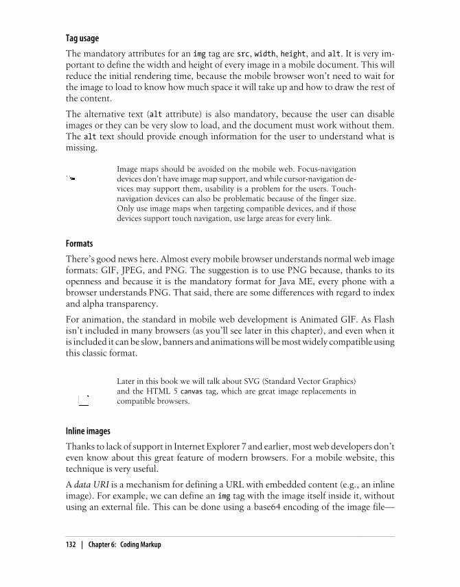
Tag usage
The mandatory attributes for an img tag are src, width, height, and alt. It is very im-portant to define the width and height of every image in a mobile document. This willreduce the initial rendering time, because the mobile browser won’t need to wait forthe image to load to know how much space it will take up and how to draw the rest ofthe content.
The alternative text (alt attribute) is also mandatory, because the user can disableimages or they can be very slow to load, and the document must work without them.The alt text should provide enough information for the user to understand what ismissing.
Image maps should be avoided on the mobile web. Focus-navigationdevices don’t have image map support, and while cursor-navigation de-vices may support them, usability is a problem for the users. Touch-navigation devices can also be problematic because of the finger size.Only use image maps when targeting compatible devices, and if thosedevices support touch navigation, use large areas for every link.
Formats
There’s good news here. Almost every mobile browser understands normal web imageformats: GIF, JPEG, and PNG. The suggestion is to use PNG because, thanks to itsopenness and because it is the mandatory format for Java ME, every phone with abrowser understands PNG. That said, there are some differences with regard to indexand alpha transparency.
For animation, the standard in mobile web development is Animated GIF. As Flashisn’t included in many browsers (as you’ll see later in this chapter), and even when itis included it can be slow, banners and animations will be most widely compatible usingthis classic format.
Later in this book we will talk about SVG (Standard Vector Graphics)and the HTML 5 canvas tag, which are great image replacements incompatible browsers.
Inline images
Thanks to lack of support in Internet Explorer 7 and earlier, most web developers don’teven know about this great feature of modern browsers. For a mobile website, thistechnique is very useful.
A data URI is a mechanism for defining a URL with embedded content (e.g., an inlineimage). For example, we can define an img tag with the image itself inside it, withoutusing an external file. This can be done using a base64 encoding of the image file—
132 | Chapter 6: Coding Markup

basically, storing the binary file as a set of visible ASCII characters in a string. This isgreat for small images, icons, backgrounds, separators, and anything else that doesn’tmerit a new request to the server. Where is the catch? Not every mobile browser iscompatible with this feature.
The size of an image (or any other binary file) will increase by about30% when it’s converted to a base64 string for a data URI, but its sizewill be reduced again if we are serving the document using GZIP fromthe server. Therefore, at the end it will be the same size or even smaller,and it won’t require a new request (with all the overhead that involves).
The best part about data URIs is that they can be used in a CSS file, with caching andmultipage support. We will cover that later in this book.
To convert an image file to a base64 string representation, we can use any online con-verter or command-line utility. There are free and online alternatives at http://www.webutils.pl/index.php?idx=base64 and http://www.motobit.com/util/base64-decoder-encoder.asp.
PHP Base64 ConversionMany web server platforms offer base64 conversion. For example, PHP offers abase64_encode function to this purpose. To generate the code based on a real file onyour server, use something similar to base64_encode(file_get_contents($path)).You’ll need to add error support and insert the result in an img tag.
The compact syntax is data:[MIME-Type][;base64],data. The data can contain spacesand newlines for readability purposes.
For example, the O’Reilly logo (original PNG file 75 pixels wide) attached as a dataURI image looks like this:
<img width="100" height="17" alt="O'Reilly" src="data:image/png;base64,iVBORw0KGgoAAAANSUhEUgAAAEYAAAARBAMAAACSi8f4AAAAA3NCSVQICAjb4U/gAAAAGFBMVEX///////8AAACpqanMzMxmZmaHhoQ/Pz9kt3AEAAAACHRSTlMA/////////9XKVDIAAAAJcEhZcwAACxIAAAsSAdLdfvwAAAAcdEVYdFNvZnR3YXJlAEFkb2JlIEZpcmV3b3JrcyBDUzQGstOgAAAAFnRFWHRDcmVhdGlvbiBUaW1lADEyLzExLzA5uegApgAAAQNJREFUKJGVkUFTwyAQhfMXXiH1LA3hDMTeSVDPidW7WnMvkxn/vo+MsamX6s7wgOy3O29JgetR/I2Rdy8B8HIcAyhj8PLIr0dsuYlDF8i8KWWC/BRKaVCUTaJmkhcDuNOHLVCaJg6VfJY6JivqGJHEjn00q3tpsGcfd0KuuGdx2+fsmSl3m2r2k2gGg30i434xSMlmht0YbR+EflAU71dMW89zzWcy2W61eF6YssK5j3vlII81Lj0vzOKHaXCuSz8334ybgC2bkdlUK6ZeMVvTdMM0M0IL3fmQskbD08LA8YHDzGDw9Nyn7Hziuv1hsH/PltCQi9770MmsXFaGf/z3q/EFatlL/IFsBmgAAAAASUVORK5CYII=" />
I know what you’re thinking: “This is awful, didn’t you tell me to create cleanXHTML?” Maybe you’re right.
The Document Body | 133

You should deliver data URI images only to known compatible brows-ers. Later in this chapter we will talk about CSS Media Queries, and laterin the book we will talk about server device detection.
In CSS this image could be a background-image, like:
#logo { width: 70px; height: 17px; background-image: url('data:image/png;base64,iVBORw0KGgoAAAANSUhEUgAAAEYAAAARBAMAAACSi8f4AAAAA3NCSVQICAjb4U/gAAAAGFBMVEX///////8AAACpqanMzMxmZmaHhoQ/Pz9kt3AEAAAACHRSTlMA/////////9XKVDIAAAAJcEhZcwAACxIAAAsSAdLdfvwAAAAcdEVYdFNvZnR3YXJlAEFkb2JlIEZpcmV3b3JrcyBDUzQGstOgAAAAFnRFWHRDcmVhdGlvbiBUaW1lADEyLzExLzA5uegApgAAAQNJREFUKJGVkUFTwyAQhfMXXiH1LA3hDMTeSVDPidW7WnMvkxn/vo+MsamX6s7wgOy3O29JgetR/I2Rdy8B8HIcAyhj8PLIr0dsuYlDF8i8KWWC/BRKaVCUTaJmkhcDuNOHLVCaJg6VfJY6JivqGJHEjn00q3tpsGcfd0KuuGdx2+fsmSl3m2r2k2gGg30i434xSMlmht0YbR+EflAU71dMW89zzWcy2W61eF6YssK5j3vlII81Lj0vzOKHaXCuSz8334ybgC2bkdlUK6ZeMVvTdMM0M0IL3fmQskbD08LA8YHDzGDw9Nyn7Hziuv1hsH/PltCQi9770MmsXFaGf/z3q/EFatlL/IFsBmgAAAAASUVORK5CYII=') top left no-repeat;}
The best part of using data URI images in CSS is that we can use them in more thanone document without downloading the image content again (i.e., by caching the sameCSS), and we still have clean XHTML.
With HTML 5 features, you can save in a database or in a JSON objecta list of base64 image files that will be cached for the user on the devicefor future usage in URLs. See Chapter 9 for more information.
Table 6-5 explores image features and the browsers that support them.
Table 6-5. Image format compatibility table
Browser/platformPNG 8 bits indextransparency
PNG 8 bits alphatransparency Animated GIF Data URI
Safari Yes Yes Yes Yes
Android browser Yes Yes No Yes
Symbian/S60 Yes Yes Yes (sometimesstopped in 5th
edition)
Yes
Nokia Series 40 Yes Yes Yes No
webOS Yes Yes Yes from 1.4 Yes
BlackBerry Yes Yes Yes from 3.8 Yes, not valid inCSS in olderdevices
NetFront Yes Yes Yes Yes
Openwave (Myriad) Yes Yes Yes No
134 | Chapter 6: Coding Markup

Browser/platformPNG 8 bits indextransparency
PNG 8 bits alphatransparency Animated GIF Data URI
Internet Explorer Yes Yes Yes No
Motorola Internet Browser No on old devices (v3 series)
Yes on newer devices
Yes No
Opera Mobile Yes Yes Yes Yes
Opera Mini Yes Yes No Yes
Local pictograms
The Japanese carriers have created a de facto standard for using small icons in HTMLwithout really using images and requests. The images (called Emoji, a Japanese wordcombining picture and letter) are based on a list of dozens of icons available to use,with the real rendering done by the browser. For example, say you would like to inserta heart icon. Every compatible browser will display a heart icon, but you might notknow the exact image that the browser will use. Today, NTT i-mode services include Basic Pictograms (176) compatible with all devices and Expansion Pictograms (76)added in HTML 4.0. Other Japanese carriers (Au and Softbank) have their own picto-grams (and their own usage mechanisms), so if you need to cover all Japanese carriersthere are a lot of conversion tables between codes.
To display these pictograms, you can just embed the binary code into your HTML(saved as a Shift-JIS file, not UTF-8) or define them as Unicode standard charactersusing 香, where 9999 should be replaced with the pictogram number. The list ofpossible pictograms can be found at http://www.mobilexweb.com/go/pictograms.
This is a very underused feature in the occidental world. Even the iPhone supports theseicons (though not the Android browser, as shown in Figure 6-4), although I have notseen too many websites using them. iOS has supported an Emoji keyboard sinceversion 2.2 (though only for devices sold in Japan), and the browser allows Emoji pic-tograms for users worldwide. The list of iPhone Emoji is available at http://www.mobilexweb.com/go/emoji-iphone. The list is long—there are more than 450 Emoji—and theicons have great designs. Moreover, remember, they are images that don’t use networkresources! For example, for the iPhone we can show a message with a smiley at the endwith the following code:
<p>Thanks for your message! </p>
There is also a Windows program (in Japanese, but understandable) that shows everypictogram we can use. It is called iEmoji, and you can download it from http://www.mobilexweb.com/go/iemoji.
The Document Body | 135
Remember, iPhone Emoji work all over the world, not just in the Japa-nese market. The only requirement is having iOS 2.2.1 or newer.
The OMA standardized pictograms in XHTML MP using an object tag:
<object data="pict:///core/arrow/right" />
The standards support alternative content. That is, if the pictogram is not available,you can add a child to the object with an alternative. The alternative can be anotherpictogram or a classic image:
<object data="pict:///time/season/summer"> <object data="pict://weather/sunny"> <img src="images/sun.png" width="32" height="32" alt="Sunny" /> </object></object>
The pictogram sets are not standardized between browsers, and that’s why today theyare not widely used in mobile websites. Table 6-6 lists pictogram compatibility for the
Figure 6-4. Safari on iOS shows the Emoji icon, but Android shows only a rectangle indicating anoncompatible character.
136 | Chapter 6: Coding Markup

most common mobile browsers. A good resource for Emoji and pictograms is http://sites.google.com/site/unicodesymbols/Home/emoji-symbols.
Table 6-6. Pictograms compatibility table
Browser/platform OMA pictograms Emoji pictograms
Safari No (shows page error alert) Yes
Android browser No (shows a big error message) No (shows nothing)
Symbian/S60 No (shows nothing) No (shows nothing)
Nokia Series 40 No (shows an X) No (shows a square)
webOS No (shows nothing) No (shows a square)
BlackBerry Yes before 4.6
No after 4.6
No (shows nothing or a square)
NetFront Yes No (shows nothing)
Openwave (Myriad) Yes No (shows nothing or a character)
Internet Explorer No (shows nothing) No (shows a square)
Motorola Internet Browser Yes No (shows a square)
Opera Mobile No (shows nothing) No (shows nothing)
Opera Mini No (shows nothing) No (shows nothing)
The Openwave browser (found on millions of low- and mid-end devices) also supportsits own icon mechanism. Icons can be included in the img tag with the localsrcattribute, or with CSS using background-image or list-style-image. There are 562 dif-ferent icons available; visit http://mobilexweb.com/go/openwaveimages to find the wholelist.
For example, to show a back arrow image, we can use the icon name or number:
<img localsrc="back" /><img localsrc="511" />
Openwave also works with WAP standard pictograms using the object tag and a URLlike pict:///<image path>. For example:
<object data="pict:///core/action/stop" height="32" width="32" standby="Stop loading..." name="stop"/>
Using images effectively
Out of all of these complications and possibilities, some guidelines emerge:
• Use images in XHTML only for logos, photos, and maps.
• Compress the images with normal web image methods.
• Define the width, height, and alternative text for every image.
• Use data URIs for small images whenever possible.
The Document Body | 137

• Leave icons, buttons, backgrounds, and visual alert images for CSS.
• Open your mind to the usage of Emoji and pictograms with known compatibledevices.
• Avoid the usage of image maps.
• Analyze the use of canvas or SVG for compatible devices and for some graphictypes. These technologies will be covered later in this book.
Once again, if you are thinking how messed up these things are in themobile web, you are probably right. Later in this book, we will talk aboutframeworks and best practices to reduce the fragmentation problemwhile coding markup.
ListsUsing standard lists will help us a lot in defining our designs later and for semanticsearch engine optimization. For the mobile web, we should use the following list types:
Ordered lists (ol tag)For navigation link menus
Unordered lists (ul tag)To present lists of similar objects
Definition lists (dl tag)To show key/value details
The last one is perhaps the lesser-known list tag in web development. For example, ifwe are showing a product detail page, in many browsers it’s better to use a definitionlist rather than a table for attributes:
<h2>iPhone 3GS</h2><dl> <dt>Price</dt> <dd>300 EUR</dd> <dt>Memory</dt> <dd>32Gb</dd> <dt>Network</dt> <dd>3G, Wifi, Bluetooth</dd></dl>
The dt tag is used for the key (definition term) and the dd tag for the value (definitiondescription). This is very useful, semantically correct, and clearer than using a table.Later, with CSS, we can rearrange the elements.
LinksHyperlinks are the heart of the Web, and this holds for the mobile web, too. You mightthink there isn’t much to say about links, but that’s not the case.
138 | Chapter 6: Coding Markup

Every link in a mobile website should have the well-known href attribute, set to theURL of the desired resource, and the most important links on the page (up to 10) canhave an accesskey attribute assigned for easy access via keyboard shortcuts, on devicesthat support access keys (see Chapter 5). The target attribute should be avoided, unlessyou are developing for smartphones with tab or multipage support.
Some devices support the usage of tabindex for focusable elements(links, form controls, etc.) to change the element order for browsers withfocus-based navigation. However, changing the natural order of tabbingis discouraged, unless you have a difficult design and you want to im-prove the user experience.
If you are making a link to the desktop version of your website (a must-have, as dis-cussed earlier), use rel="alternate" to specify that the link is to the same page in analternative format.
In devices that support focus-based navigation (most low-end devices,and even some touch devices with a touchpad or scroll wheel, like theNexus One and some BlackBerrys), it is important to define wholeclickable zones. For example, if you want to make a title and descriptionboth clickable, use one link tag for both elements instead of two separatelinks to the same page. A single focus border will appear around thewhole area you want to be clickable.
New windows
Some browsers accept the target="_blank" attribute (from the XHTML MP standard),but depending on the browser the behavior is different, as shown in Table 6-7. Somebrowsers simply open the URL in the same window, others create a new tab or window(allowing the user to browse between them), and still others open the new URL as amodal pop-up, in which case the user cannot go back to the first page until he closesthe new one.
Table 6-7. Opening links in new windows compatibility table
Browser/platform New window links
Safari Open in a new window (maximum of 8)
Android browser Open in a new window
Symbian/S60 Open in a new window (not easy for users to move between windows)
Nokia Series 40 Open in the same window before 5th edition
Open in a new window in 6th edition
webOS Open in a new card (OS window)
BlackBerry Open in the same window before OS 6.0
The Document Body | 139
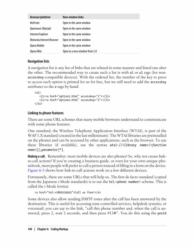
Browser/platform New window links
NetFront Open in the same window
Openwave (Myriad) Open in the same window
Internet Explorer Open in the same window
Motorola Internet Browser Open in the same window
Opera Mobile Open in the same window
Opera Mini Open in a new window from 5.0
Navigation lists
A navigation list is any list of links that are related in some manner and listed one afterthe other. The recommended way to create such a list is with ol or ul tags (for non-accesskey-compatible devices). With the ordered list, the number of the key to pressto access each option is printed for us for free, but we still need to add the accesskeyattributes to the a tags by hand:
<ol> <li><a href="option1.html" accesskey="1"></li> <li><a href="option2.html" accesskey="2"></li></ol>
Linking to phone features
There are some URL schemes that many mobile browsers understand to communicatewith some phone features.
One standard, the Wireless Telephony Application Interface (WTAI), is part of theWAP 1.X standard (created in the last millennium). The WTAI libraries are preinstalledon the phones and can be accessed by other applications, such as the browser. To usethese libraries (if available), use the syntax wtai://<library name>/<functionname>[(;parameter)*].
Remember: most mobile devices are also phones! So, why not create link-to-call actions? If you’re creating a business guide, or even for your own unique pho-nebook, most people will prefer to call a person instead of filling in a form on the device.Figure 6-5 shows how link-to-call actions work on a few different devices.
Fortunately, there are some URLs that will help us. The first de facto standard (copiedfrom the Japanese i-Mode standards) is to use the tel:<phone number> scheme. This iscalled the i-Mode format:
<a href="tel:+1800229933">Call us free!</a>
Some devices also allow sending DMTF tones after the call has been answered by thedestination. This is useful for accessing tone-controlled services, helpdesk systems, orvoicemail; you can say to the link, “call this phone number and, when the call is an-swered, press 2, wait 2 seconds, and then press 913#”. You do this using the postd
Making a call.
140 | Chapter 6: Coding Markup

parameter after the number: the syntax is ;postd=<numbers>. You can use numbers, *,and # (using the URL-encoded %23 value), as well as p for a one-second pause and w fora wait-for-tone pause:
<a href="tel:+1800229933;postd=4">Call us free!</a>
This function doesn’t work on all mobile devices, but on devices that don’t understandit, the primary telephone number should at least be called. The compatibility list forthis feature is complex, and I don’t recommend relying on it.
If the user activates a call link she will receive a confirmation alert asking whether toplace the call, showing the full number so she can decide (see Figure 6-6). This is toavoid frauds tricking the user into calling another country or a premium number.
I recommend inserting the phone number in the international format:the plus sign (+), the country code, the local area code, and the localnumber. We do not really know where our visitors will be located. Ifthey are in the same country, or even in the same local area, the inter-national format will still work.
Figure 6-5. Palm’s webOS and Android show the call window when we activate a tel: link.
The Document Body | 141

Although Table 6-8 shows that it is not as well supported as tel:, the other way tooriginate a call is using the WTAI standard, via the wp public library and the mc (makecall) function:
<a href="wtai://wp/mc;+1800229933">Call us free!</a>
WTAI also accepts a link to be used while the call is in progress, but this is useful onlyif the user is in hands-free mode or using a headset. This link can include tones to besent to the destination as if the user had pressed them on the keypad, specified usingthe wp library’s sd (send DTMF tones) function.
The BlackBerry browser automatically detects phone numbers andemail addresses and converts them to links. If you don’t want this fea-ture, you should use the meta tag <meta http-equiv="x-rim-auto-match"content="none">. Safari also has its own metatag for the same action:<meta name="format-detection" content="telephone=no">.
iDEN networks (like Nextel) use radio packets to make internal calls inside the net-work. If you are working with customers of such a network—for example, for an in-tranet—you can allow users to launch internal calls to other members of the team (orexternal calls) using the Direct Connect URL scheme (dc:<number>). This is compatiblewith BlackBerry iDEN devices:
<a href="dc:5040*0077">Ping John</a>
Some models present users with a submenu when they click a tel: linkso they can choose whether to place a voice-only or a video call (availablein 3G systems). Some Japanese phones also allow you to specify that alink should initiate a video call, using the protocol tel-av:<phone number>.
Figure 6-6. While Nokia and BlackBerry offer a confirmation alert for the call action, Sony Ericsson’sNetFront browser presents the user with a menu proposing different actions to take.
142 | Chapter 6: Coding Markup

Table 6-8 lists which voice call URI schemes work with which platforms.
Table 6-8. Call-to action compatibility table
Browser/platform tel: compatibility WTAI compatibility
Safari Yes No
Android browser Yes Yes
Symbian/S60 Yes Yes
Nokia Series 40 Yes Yes
webOS Yes No
BlackBerry Yes Yes
NetFront Yes, for call and add to
contact manager
Openwave (Myriad) Yes Yes
Internet Explorer Yes, for call, SMS, and add to
contact manager
Motorola Internet Browser Yes, for call, SMS, and add to
contact manager
Opera Mobile Yes Yes
Opera Mini Yes (unless Java MIDP 1.0 device) Yes (unless Java MIDP 1.0 device)
The iPod Touch, a non-phone mobile device, doesn’t allow voice calls.Instead, it shows a prompt to add the phone number used in the tel:link to the phonebook.
Some modern devices with browsers also have mail applications that canreact to the classic web mailto: protocol. The syntax is mailto:<email_destination>[?parameters]. The detected parameters can change from device to device butgenerally include cc, bcc, subject, and body. The parameters are defined in a URL format(key=value&key=value), and the values must be URI-encoded.
Here are some samples:
<a href="mailto:[email protected]">Mail us</a><a href="mailto:[email protected]?subject=Contact%20from%20mobile"> Mail us</a><a href="mailto:[email protected]?subject=Contact&body=This%20is%20the%20body"> Mail us</a>
Be aware that the mailto: mechanism doesn’t guarantee that the mes-sage will be sent. It generally just opens the mail application, and theuser has to confirm the sending after making optional changes. If youneed to actually send the mail, use a server mechanism.
Sending email.
The Document Body | 143
Generally, if we want to insert a newline in the body of the email we can use the CarriageReturn plus Line Feed characters (%0D%0A). This does not currently work with the Mailapplication in iOS, but we can insert HTML tags inside the body, so we can use<br/> for the mobile Safari browser:
<a href="mailto:[email protected]?subject=Contact&body=This%20is%20the%20body%0D%0AThis%20is%20a%20new%20line">Mail us</a>
<a href="mailto:[email protected]?subject=Contact&body=This%20is%20the%20body<br/>This%20is%20a%20new%20line">Mail us from iPhone</a>
We all like the Short Message Service; that’s why mobile browsers gen-erally offer the ability to invoke the new SMS window from a link. To do this, we havetwo possible URI schemes, sms:// and smsto://. Unfortunately, there is no standardway to know for sure which one is compatible with a user’s browser.
We will see in Chapter 10 how to detect sms: and smsto: protocol com-patibility from the server to select the right alternative.
The syntax is sms[to]://[<destination number>][?parameters]. As you can see, thedestination number is optional, so you can open the SMS composer from the devicewithout any parameters defined. The parameters usually define the body, but thisproperty is not compatible with all phones for security reasons (e.g., to avoid a websitesending premium SMS texts). As with sending an email, an SMS is not automaticallysent when the user presses the link. The link only opens the SMS Composer window;the user must finish the process manually.
The destination number should either be an international number or, if it is a shortnumber code, we should guarantee that the user is in the right country and is connectedwith one of the compatible carriers of that short code.
BlackBerry devices offer direct messaging between two BlackBerry de-vices on the same network. For creating a direct message, you can usethe PIN:<number> URL scheme.
Here are some samples:
<a href="sms://">Send an SMS</a>
<a href="sms://?body=Visit%20the%20best%20site%20at%20http://mobilexweb.com">Invite a friend by SMS<a>
<a href="sms://+3490322111">Contact us by SMS</a>
<a href="sms://+3490322111?body=Interested%20in%20Product%20AA2">More info for producto AA2</a>
Sending an SMS.
144 | Chapter 6: Coding Markup
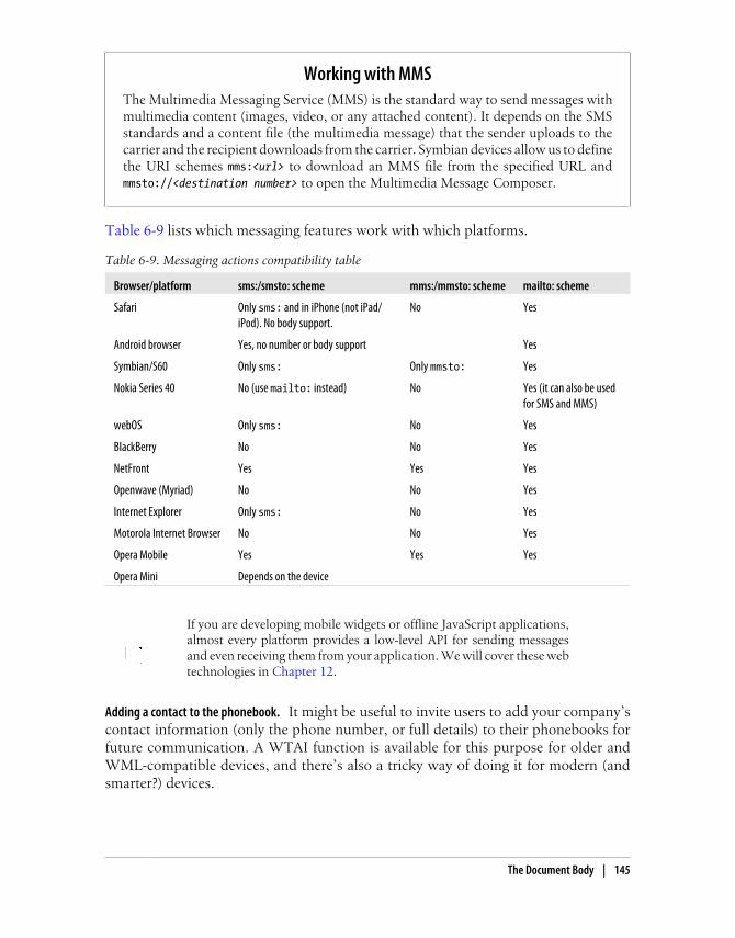
Working with MMSThe Multimedia Messaging Service (MMS) is the standard way to send messages withmultimedia content (images, video, or any attached content). It depends on the SMSstandards and a content file (the multimedia message) that the sender uploads to thecarrier and the recipient downloads from the carrier. Symbian devices allow us to definethe URI schemes mms:<url> to download an MMS file from the specified URL andmmsto://<destination number> to open the Multimedia Message Composer.
Table 6-9 lists which messaging features work with which platforms.
Table 6-9. Messaging actions compatibility table
Browser/platform sms:/smsto: scheme mms:/mmsto: scheme mailto: scheme
Safari Only sms: and in iPhone (not iPad/iPod). No body support.
No Yes
Android browser Yes, no number or body support Yes
Symbian/S60 Only sms: Only mmsto: Yes
Nokia Series 40 No (use mailto: instead) No Yes (it can also be usedfor SMS and MMS)
webOS Only sms: No Yes
BlackBerry No No Yes
NetFront Yes Yes Yes
Openwave (Myriad) No No Yes
Internet Explorer Only sms: No Yes
Motorola Internet Browser No No Yes
Opera Mobile Yes Yes Yes
Opera Mini Depends on the device
If you are developing mobile widgets or offline JavaScript applications,almost every platform provides a low-level API for sending messagesand even receiving them from your application. We will cover these webtechnologies in Chapter 12.
It might be useful to invite users to add your company’scontact information (only the phone number, or full details) to their phonebooks forfuture communication. A WTAI function is available for this purpose for older andWML-compatible devices, and there’s also a tricky way of doing it for modern (andsmarter?) devices.
Adding a contact to the phonebook.
The Document Body | 145

The WTAI library is wp, as for making phone calls, and the function is ap (Add toPhonebook). The parameters are the number and optionally a name to be assigned toit, separated by a semicolon. For example:
<a href="wtai://wp/ap;+12024561111;White%20House"> Add <strong>White House</strong> to contacts</a>
For modern browsers (not supporting WTAI, as shown in Figure 6-7), the trick is tocreate a vCard file (vCard is a standard file format for electronic business cards). If youlink to this file, most browsers will send the file to the device’s Phonebook application,and the user will be invited to add the contact to the database.
Figure 6-7. We need to be careful about using URI schemes not compatible for a device. The user willnot understand the error messages.
A simple vCard 2.1 file (the most compatible version for mobile devices) will look likethis:
BEGIN:VCARDVERSION:2.1N:Maximiliano;FirtmanORG:O'Reilly MediaTITLE:AuthorTEL;CELL;VOICE:+133MFIRTMANTEL;WORK;VOICE:+541150320077END:VCARD
For the device to detect this text file as a valid vCard, we must deliver it with the MIMEtype text/x-vcard. The file, if static, is generally a .vcf file.
Bookmarker is an automatic vCard generator for mobile devices, avail-able at http://bookmarker.mobi.
146 | Chapter 6: Coding Markup

Unfortunately, many modern (again, smarter?) mobile browsers, like Safari, don’t un-derstand vCards if you provide them as links in a document. However, they do under-stand them if the user receives them by email! The solution, therefore, is to retrieve theuser’s email address and, from the server, send the vCard as an attachment.
Another excellent feature to provide to compatible devices is to automatically add tothe user’s calendar details about a meeting or appointment scheduled online, or a re-minder about an event for which the user has bought tickets. If you’re selling tickets toa concert or a theater show, this is a great way to ensure that the user won’t forget it.
There isn’t a WTAI way to do this—in fact, in 1998 mobile devices generally didn’thave calendar programs. For compatible devices we can use the iCalendar format, basedon an older vCalendar standard similar to vCard. iCalendar files should be served withthe MIME type text/calendar. There are a lot of server libraries for creating this format,although as Table 6-10 shows, it really only works with Symbian devices right now.
Table 6-10. Contacts and calendar integration compatibility table
Browser/platform WTAI ap vCard iCalendar
Safari No No (only as an email attachment) No
Android browser No No No
Symbian/S60 Yes Yes Yes
Nokia Series 40 Yes No No
webOS No No No
BlackBerry Yes No No
NetFront Yes, also for calls No No
Openwave (Myriad) No No No
Internet Explorer Yes No No
Motorola Internet Browser No No No
Opera Mobile Yes No No
Opera Mini Depends on
the device
Integrating with other applications
Some devices allow us to integrate our websites with other native installed applications.This is dramatically nonstandard, though, and it depends very much on the device andthe applications.
Safari supports some standard URL schemes that will open other nativeapplications. For example, we can open the YouTube and Google Maps applicationssimply by using the classic URLs for each service (youtube.com/…and maps.google.com/…). Safari will automatically open the native application, showing the information wewant. This method also works for App Store and iTunes links.
iOS URL schemes.
The Document Body | 147

Prior to iOS 4.0, when the user clicks a link that opens another application, the browsercloses. To get back to your website, the user must reopen the browser.
An updated list of URL schemes for iOS is maintained at http://wiki.akosma.com/IPhone_URL_Schemes, and a list of applications, URL schemes, and optional parameters forSafari can be found at http://www.handleopenurl.com.
For example, according to these sites we can open the Facebook iPhone native appli-cation (if installed) showing the user’s list of friends using the URL fb://friends, andif the user has installed Twitterrific (a Twitter client), we can directly post a messageusing twitterrific://post?message=<msg>. Here’s a sample:
<a href="twitterrific://post?message=I%20have%20just%20visit%20a%20site">Tweet this onTwitterrific</a>
When passing parameters by URL, remember to properly encode spacesand other characters (for example, using %20 for spaces).
Detecting Whether an Application Is InstalledWhen the user clicks a link in mobile Safari that is designed to open another application,what happens if that application is not installed on the user’s device? In this case, thebrowser shows an alert to the user and continues displaying the same page. We cantake advantage of this behavior to improve the user experience. Create a timer in Java-Script that starts when the user clicks the link; if the timer is executed quickly, it meansthat the application could not be opened because it is not installed.
We can’t avoid the Safari message, but we can show the user an error message indicatingthat the application seems not to be installed and providing a link to the App Store sothe user can buy or download it.
Symbian devices also allow us to open applications using thenonstandard localapp scheme. For example, for opening the Calendar, Contacts, orMessages, we can use localapp:calendar, localapp:contacts, or localapp:messaging.
Android also has the ability to communicate with other applications, viaintents (abstract descriptions of actions to be performed). A native Android applicationcan register an intent as an explicit call (not available from web applications), from aURL, or from a MIME type.
For example, we can open the default PDF viewer on the user’s device by delivering aPDF file with the MIME type application/pdf. To open an application without sendinga file, we can use the URI schemes defined by the intent. For example, linking to aYouTube video will fire the YouTube internal application (if the user has defined it asthe default player).
Symbian local applications.
Android intents.
148 | Chapter 6: Coding Markup

When the intention call is implicit (using a URL instead of a unique package name),there may be more than one installed application that can respond to that URL. In thiscase, the user will receive a pop-up asking her to select the application to use. The usercan also select a default application for future usages.
In Android, an intent can be registered as part of an HTTP URL or beactivated from a MIME type. For example, if we link to http://www.google.com/m/products/scan in the Android browser, it will try to open aBarcode Scanner application.
Among the internal URLs that Android supports are those for Google Maps placemarksusing geo:<latitude>, <longitude>, Google Maps searches using geo:0,0?q=<search>,and Google street views using google.streetview:cbll=<latitude>, <longitude>&cbp=1. More information is available at http://developer.android.com/guide/appendix/g-app-intents.html.
Similarly, using market://search?q=<search> in Android will open Android Market (thestore for applications and games) with a query search.
In Android, when a URI scheme is not registered as an intent, that meansthe application is not installed. The user will be taken to a new pageshowing an error message, like when you link to a website that doesn’texist.
Unfortunately, at the time of this writing there are no websites that list all the possibleURI schemes to use on Android. Some individual applications do offer developer web-sites to show this information, though. For example, Twidroid (a Twitter client) hashttp://twidroid.com/plugins, where you can see documentation about using a URL toshow a nice Twitter pop-up over the page. The URL syntax is twitter://send?<message>. Therefore, the example we looked at earlier for Twitterrific can be converted to:
<a href="twitter://send?I%20have%20just%20visit%20a%20site">Tweet this on Twidroid</a>
When developing widgets, as discussed in Chapter 12, we will havenonstandard APIs to connect with other native applications from ourwidgets.
Document download
Linking to a document that isn’t an (X)HTML file produces different results dependingon the device. Your first thought about this may be that it depends on the applicationsinstalled on the device. This is true, in part. Some mobile browsers, like the iPhone’s,don’t allow document downloading even if the user has installed a compatible reader
The Document Body | 149

for that document type, as shown in Figure 6-8. Others, like the Symbian browsershown in Figure 6-9, let the user store the file.
Figure 6-8. Safari on iOS opens PDFs directly and doesn’t download noncompatible documents.
Table 6-11 reports the default reactions of the different browsers when we deliver anonstandard file format (e.g., an invented one) and the most common file types, AdobePDF and Microsoft Office (.doc, .xls, etc.).
Table 6-11. Document download compatibility table
Browser/platform Unknown file Adobe PDF Microsoft Office
Safari No Yes. The user can view the PDF but notdownload it.
Yes. 2007 and 2010 (partial). Word,Excel, PowerPoint Viewer.
Android browser Yes Yes, but the user needs to have a
compatible viewer or editor installed.
Symbian/S60 Yes Yes, but the user needs to have a
compatible viewer or editor installed.
Nokia Series 40 Yes Yes, but no reader available.
Only download.
150 | Chapter 6: Coding Markup

Browser/platform Unknown file Adobe PDF Microsoft Office
webOS Yes Yes, but the user needs to have a
compatible viewer or editor installed.
BlackBerry Yes Yes Yes. Word, Excel, PowerPoint 2007.
NetFront Yes Only download.
Openwave (Myriad) No No No
Internet Explorer Yes Yes, but needs a viewer Yes
Motorola InternetBrowser
No No No
Opera Mobile Yes Download. Opening depends on device.
Opera Mini Yes if the de-vice supportsthe File APIfrom Java ME.
Download. Opening depends on device.
Chapter 10 will cover the delivery of multimedia content.
Figure 6-9. The Symbian browser has a download manager capable of downloading any file to theinternal or external memory.
The Document Body | 151
FormsInput forms are common features of web applications. In the mobile world, we shouldkeep forms and the amount of typing they require to the minimum. The input controlsshould be inside the classic form tag, with method="GET" or "POST" and the action URLas any web form.
Form design
Avoid using tables for form layout. The best solution is to use definition lists, labels,and input controls. We will enhance this form design in the next chapter with JavaScriptfor smartphones.
BlackBerry devices allow offline form submission. If the device is offlinewhen the user completes the form, it is placed in a queue and is auto-matically submitted when the device goes back online. You can findmore information about this technique at http://www.mobilexweb.com/go/offlineform.
A typical key/value form should look like this:
<form action="formAction" method="POST"> <dl> <dt><label for="name">Name</label></dt> <dd><input type="text" name="name" /></dd> </dl></form>
The usage of the label tag is very important for mobile input controls, and especiallyfor touch devices. For example, if you insert a checkbox without a label tag, the userwill need to tap (click) over the tiny checkbox to select it. Using a label allows the userto tap anywhere in the text assigned to the checkbox.
As discussed in Chapter 3, mobile forms should have a vertical design,so it is better to put the label above each input field instead of to theright or left. This is because touch devices zoom in on the field whenit’s in focus and do not show what is to the right or left of the control.Tables don’t help in this design.
So, a form with a checkbox should look something like this:
<form action="formAction" method="POST"> <input type="checkbox" name="accept" id="accept" value="yes" /> <label for="accept">I accept terms and conditions</label></form>
152 | Chapter 6: Coding Markup

Some mobile browsers have a lower limit for the URL length than desk-top ones. That is why we should avoid long forms using the GET method.
We can also assign access keys to the form controls (using the accesskey attribute inthe input tags) and show which keys are assigned in the labels, with a CSS class. Thismethod is very useful in devices with QWERTY keyboards, where you can assign aletter to each field instead of numeric values:
<form action="formAction" method="POST"> <input type="checkbox" name="accept" id="accept" value="yes" accesskey="a" /> <label for="accept">I <span class="accesskey">A</span>ccept terms and conditions</label></form>
A typical form should include one or more fieldset tags, each with a legend inside.The fieldset is just a container for form controls, and the legend is a child tag thatdefines the title or legend for its parent:
<fieldset> <legend>Personal Information</legend> <!-- controls here --></fieldset>
Select lists
The select tag should be one of the most-used tags in a mobile form. Selection from alist is the first option for reducing typing. In a mobile browser, when you click on aselect element, typically you will see a pop-up window (modal or not) showing all theoptions. As shown in Figures 6-10 and 6-11, how select lists are rendered varies acrossdevices.
You can use the size property of the select tag to define a list with a predefined height,and you can specify that the list accepts multiple selection using the multiple="multiple" property. The multiple-selection feature is more useful in mobile forms than desk-top forms. In a desktop form, the user generally uses Shift or Control to select multipleoptions. In a mobile form, we generally present a pop-up window with checkboxes forthe user to make his selections and a confirm action to go back to the main page.
The code for the select lists shown in the previous two figures looks like this:
<form action="formAction" method="post"> <dl> <dt><label for="country">Country</label></dt> <dd> <select name="country"> <option>Argelia</option> <option>Argentina</option> <option>Bolivia</option> <option>Brazil</option> </select> </dd>
The Document Body | 153

<dt><label for="filter">Looking for</label></dt> <dd> <select name="filter" multiple="multiple"> <option>Flights</option> <option>Hotels</option> <option>Restaurants</option> <option>Car Rental</option> </select> </dd> </dl></form>
Mobile Safari uses a spinning wheel for selections in HTML, but thenative control also supports a multicolumn spinning wheel to selectmultiple fields at the same time. This functionality is not provided inHTML and can only be used natively in Objective-C. However, there isa JavaScript library that emulates the multicolumn control available athttp://www.mobilexweb.com/go/wheel.
Figure 6-10. Safari on iOS uses a half-screen selection with tabular navigation between form controlsusing Previous and Next buttons.
154 | Chapter 6: Coding Markup

Option groups are an underused feature of select lists, even in desktopweb development. Defining an optgroup allows you to provide a label for a set of chil-dren, so you can group the available options by category. Here’s an example:
<dl> <dt><label for="country">Country</label></dt> <dd> <select name="country"> <optgroup label="America"> <option value="ar">Argentina</option> <option value="bo">Bolivia</option> <option value="br">Brazil</option> </optgroup> <optgroup label="Europe"> <option value="at">Austria</option> <option value="be">Belgium</option> <option value="bg">Bulgaria</option> </optgroup> </select> </dd> </dl>
The result is shown in Figure 6-12. Again, different devices may render option groupsdifferently!
Option groups.
Figure 6-11. Symbian select lists offer a search box for all the options, and Android shows a beautifulmodal pop-up.
The Document Body | 155

Table 6-12 summarizes mobile browser support for select listfeatures.
Table 6-12. Select list compatibility table
Browser/platform select select w/sizeselect w/multiple optgroup
Safari Half-height selection No difference Yes Yes
Android browser Modal pop-up No difference Yes Yes
Symbian/S60 Pop-up with search Yes Yes Yes
Nokia Series 40 Open in separate window No difference be-fore 6th edition
Yes Yes, show options grou-ped in folders
webOS Modal pop-up Yes Yes Yes
BlackBerry In-place drop-down Yes Yes Yes from 3.8
NetFront In-place drop-down Yes Yes Yes
Openwave (Myriad) In-place drop-down Yes Yes Only a separator withoutlabel
Internet Explorer In-place drop-down Yes Yes No
Motorola Internet Browser Shows full list Yes Yes Yes
Opera Mobile In-place drop-down Yes Yes Yes
Opera Mini In-place drop-down Yes Yes No
Select list compatibility.
Figure 6-12. Option groups can be rendered strangely. Here, Android 2.1 shows buttons next to thegroup labels “America” and “Europe,” even though they are not selectable options.
156 | Chapter 6: Coding Markup

Radio buttons and checkboxes
The usage of radio buttons and checkboxes is the same on mobile devices as on desk-tops. The only recommendation I can give you is to avoid the usage of these controlsif there are more than four options, using in that case a select with single or multipleselection, as appropriate. A group of more than four radio buttons is likely to increasethe page height and may require scrolling, which can impact the usability of the form.
Buttons
(x)HTML has five types of buttons:
1. Image map buttons: <input type="image" />
2. Submit buttons: <input type="submit" />
3. Clear buttons: <input type="reset" />
4. Custom buttons: <input type="button" />
5. Submit buttons with HTML support: <button></button>
The image map button allows us to use an image as a button and receive on the serverthe coordinates of the point inside the image where the user clicked. Of course, thisfunctionality is only possible on mobile devices supporting touch- or cursor-basednavigation. This type of button should be avoided if possible (this is the recommen-dation of the W3C) and replaced with a classic submit button. We can later add animage or icon using CSS.
The submit button is the most widely compatible, and for the lowest common denom-inator devices it should work fine. I’ve always hated (yes, hated!) the clear button. Howmany times have you clicked a clear button thinking it was the submit button? Thisbutton should be avoided when developing for mobile devices: why add more scrollingand take up more space for a function that few people use? If do you want to includethis functionality in your form, please be sure to use a different style for the clear button(smaller, darker) than the style you use for the submit button.
The custom buttons should be avoided if you want full mobile compatibility, becausethey only work with JavaScript. For compatible devices, you can still use submit buttonsand capture the submit action with JavaScript.
Finally, be aware that the button tag is not compatible with all devices. In fact, it wasonly added to the latest versions of the standards, and I don’t know many HTMLdesigners and developers who use it.
Hidden fields
Hidden fields are fully compatible with mobile browsers.
The Document Body | 157

File upload
The file upload control is not included in the mobile web standards, but many devicesstill accept it (see Figure 6-13). When the user selects this control a modal pop-upwindow appears, allowing the user to select a file from the public internal memoryfolders or from the additional memory card. A simple upload form might look like this:
<dl> <dt><label for="file">Upload a photo</label></dt> <dl><input type="file" name="photo" /></dl></dl>
The usage is typical: the form tag must be defined with enctype="multipart/formdata". Selecting multiple files using a single selection dialog is not allowed, and dis-playing the upload progress is not supported. In desktop websites this is typically doneusing a Flash invisible movie, and at the time of this writing there are no devices thatare compatible with this feature. Beginning with Flash Player 10.1 in mobile browsers,this is scheduled to change; however, this mechanism will not be compatible with alldevices because Flash Player will not be widely supported.
Figure 6-13. It is ironic that modern smartphone browsers such as Safari and the Android browserdon’t support file uploads, while the low-end Nokia S40 browser does.
The BlackBerry browser (since version 4.2) has a property called accept that you canuse to define a comma-separated list of MIME types that the server will accept. Thiscan reduce sending of noncompatible files. For example:
<dl> <dt><label for="file">Upload a photo</label></dt> <dl>
158 | Chapter 6: Coding Markup

<input type="file" name="photo" accept="image/jpeg,image/gif,image/png" /> </dl></dl>
The iPhone Photo Picker (http://code.google.com/p/iphone-photo-picker) is an open source solution for uploading photos to a server. Youcan create your own version of this native application and make it avail-able in the App Store. Then, when you need the user to upload a photoor file, you call this URL from your website and the app will be opened.After the upload, the app will close, taking the user back to your website.
Table 6-13 shows which browsers support file uploading.
Table 6-13. File upload compatibility table
Browser/platform File upload compatibility accept attribute
Safari No
Android browser No before 2.2. Yes from 2.2 (only images from galleryor sounds)
No
Symbian/S60 Yes Yes; shows a warning if a file of anincorrect type is selected
Nokia Series 40 Yes No
webOS No
BlackBerry Yes from 4.2
No before 4.2
NetFront Yes No
Openwave (Myriad) Yes No
Internet Explorer Yes No
Motorola Internet Browser No
Opera Mobile Yes No
Opera Mini Yes, if the device supports the File API in Java ME No
Text input
The text input is the form feature that requires the most attention. Typing on mobiledevices is not the best experience, and text input mechanisms vary widely betweentouch devices, QWERTY devices, and phones with numeric keypads.
QWERTY devices are the only ones that don’t require a new window to insert the text:when the text input has focus, the user can start typing. In all other device types, whenthe field has focus the user can either click (or tap) in it or start typing to open a modalpop-up window with all of the OS’s typical text typing features (e.g., predictive text,onscreen keyboard, character recognition, dictionary, and symbol list). Some devices
The Document Body | 159

show a full-screen text input window (hiding the entire web interface), and others showa smaller window inside the browser window. In the first case, a descriptive label isrequired so the user knows what to type.
Password or No PasswordThe usage of the password text input (<input type="password" />) on mobile devicesis a subject of much debate. The password text input (with the classic stars displayedinstead of the typed characters) was originally created because of the possibility of apassword or other sensitive data being stolen by someone standing behind the userwith a view of the screen.
In the mobile ecosystem, the situation is different. With the limited screen size and fontsize, it is very difficult for another person to see what the user is typing on his mobilephone. Furthermore, typing on non-QWERTY devices is difficult, and if we show astar instead of the real character typed the user may be unsure that he’s entered the textcorrectly (even if, as some devices do, the character is displayed for a second before it’schanged to a star). If you still want to use the password input, I recommend forcing thetext input to be numeric.
Jakob Nielsen (http://useit.com), guru of web usability, agrees. In a 2009 Alertbox col-umn, Nielsen wrote: “Usability suffers when users type in passwords and the onlyfeedback they get is a row of bullets. Typically, masking passwords doesn’t even in-crease security, but it does cost you business due to login failures.”
Multiline text inputs (using the textarea tag) should be used very carefully. Generallyspeaking, we don’t want the user to type too much text in a form. However, when morespace is required (like in a mail message body), we can use a textarea, and dependingon the device the experience should be the same as with a normal text input. Rich textinput controls are not very common in the mobile world, and it is really difficult toimplement because of the browser internals. The only solution is to capture keypressesusing JavaScript events and emulate your own text input control.
A placeholder is a hint that is shown inside the text box until the user insertstext in that field. When the user starts typing, the placeholder is hidden, as shown inFigure 6-14. This feature is very useful in mobile designs because of the lack of space.Instead of using a label, as discussed earlier, we can use a placeholder, reducing theamount of space required for the field.
The big problem with placeholders is that they are nonstandard. There are two possibleapproaches for implementing them: using an HTML 5 attribute (placeholder), andusing JavaScript. The placeholder attribute is compatible with some modern browsers,and for the others we can create a little script to give this functionality, even using thestandard label as the source. The JavaScript solution will be implemented later in thisbook. For now, we will just use the HTML attribute:
<input type="text" name="zip" placeholder="Your ZIP Code" />
Placeholder.
160 | Chapter 6: Coding Markup

Figure 6-14. The placeholder is the gray descriptive text inside the text box that is automaticallydeleted when the user begins typing a value in the box.
If we need only one text input from the user, a very good approach oncompatible devices is to use the standard JavaScript window.prompt func-tion. It will reduce the work required for the user to type the input.
To reduce the client-side scripts and server-side trips for validationand to improve the usability of our forms, we should provide as many input validationproperties as we can.
The first typical option is to define the maximum size accepted for the text input usingthe maxlength property, expressed as a number of characters. Many platforms auto-matically add a character counter while the user is typing.
Text input validation.
The Document Body | 161

A JavaScript library can add support for placeholder and autofocus (anHTML 5 attribute for input tags that indicates that this control has tobe focused on as soon as the page is loaded) even on devices with nosupport for those attributes. You can download this library from http://gist.github.com/330318.
As mentioned in Chapter 5, WAP CSS added the property -wap-input-format, whichallows us to define the type and number of characters that the user can input (knownas the input mask). Specifying an input mask will reduce the user’s error possibilities;it can yield error messages like the one shown in Figure 6-15. We have also talked aboutthe -wap-input-required attribute, which prevents the user from moving the focus awayfrom a field until she has entered some text in it.
Figure 6-15. Browsers compatible with WAP CSS input constraints show some kind of error messagewhen the user enters text in an invalid format and then tries to move the focus away from that field.
The content of the -wap-input-format attribute is a string mask using the special char-acters in Table 6-14.
Table 6-14. WAP CSS input format patterns
Pattern Usage
a Any character, letter, number, or symbol.
A Any uppercase alphanumeric character.
n Any numeric character or symbol.
N Any numeric character.
162 | Chapter 6: Coding Markup

Pattern Usage
x Any lower case alphanumeric character or symbol.
X Any uppercase alphanumeric character or symbol.
m Any character, lowercase by default, but with uppercase possible.
M Any character, uppercase by default, but with lowercase possible.
{n}{pattern}
A fixed number of repeats (n) of the pattern defined. For example, 4N means four numeric-only characters.
*{pattern} Any number of repeats of the pattern defined. For example, *A means any number of uppercasealphanumeric characters. It can be used only once per pattern.
{pattern}{pattern}
Pattern combination. For example, A*a means one uppercase character and then any number of any othercharacter.
We can also escape other characters to create complex patterns, but this is not recom-mended because the pattern matching engines are not the same on all platforms andstrange behavior can result.
Internet Explorer Mobile also accepts the Boolean attribute emptyok de-fining whether a value is required (false) or not (true).
The next sample shows the standard way to define a required U.S. zip code text input,an optional phone number text input, and a required password numeric field:
<dl> <dt><label for="zip">ZIP Code</label></dt> <dl><input type="text" name="zip" style="-wap-input-format: '5N'; -wap-input-required: true" /></dl> <dt><label for="phone">Phone Number</label></dt> <dl><input type="text" name="phone" maxlength="15" style="-wap-input-format: '*n';" /></dl> <dt><label for="password">Password</label></dt> <dl><input type="password" maxlength="8" name="password" style="-wap-input-format: '8N'; -wap-input-required: true'" /></dl></dl>
Many older XHTML mobile browsers understand the nonstandard inputformat orformat attribute, imported from WML. The syntax is the same as for the WAP CSSattribute. If we want to add the same feature for older Openwave-based devices, forexample, we can use the inputformat attribute. Internet Explorer uses the format at-tribute with the same pattern inside:
<input type="text" name="zip" inputformat="5N" format="5N" maxchars="5" />
Table 6-15 lists which input formats are supported by which mobile browsers.
The Document Body | 163

Table 6-15. Text input format compatibility table
Browser/platform -wap-required -wap-input-formatHTMLattribute placeholder
Safari No No No Yes
Android browser No No No Yes
Symbian/S60 Yes, type required to get outthe input. Error messageshown in 3rd edition
Yes, doesn’t allow invalid charsand show and red style (5th edi-tion) or an error message (3rd ed-ition) if incorrect
No Yes in 5th
edition
No before 5th
edition
Nokia Series 40 Yes, type required Yes, doesn’t allow invalid chars orshows a message error
No Yes in 6th
edition
No before 6th
edition
webOS No No No Yes
BlackBerry Show alert if missing input Filter characters No No
NetFront Show alert at formsubmission
Filter characters and OK only ap-pear when input is correct
No No
Openwave (Myriad) Error message No behavior in 6.x
Filter characters in 7.0
Input No
Internet Explorer Error alert at submit Error alert at submit No No
Motorola InternetBrowser
Error on submit Filter text input No No
Opera Mobile Error message in form sub-mission
Error message in blur and in formsubmission
No No
Opera Mini No No No No
Safari for iPhone and iPod Touch has different onscreen QWERTYkeyboards for different situations, with the keys rearranged or with special onscreenkeys added to improve usability. For example, there is an email-optimized keyboardthat includes the @ character, and a URL-optimized keyboard with a “.com” button.
XHTML MP 1.2 added support for the inputmode HTML attribute fortext inputs, password inputs, and textareas. It can receive dozens ofpossible values, but the most important are digits for numeric inputand latin lowerCase for email addresses or other lowercase values.
If your site includes a search field, you can define it as a type="search" input; thischanges the default keyboard button from “Go” to “Search” (also in Android 2.2).
Safari extensions.
164 | Chapter 6: Coding Markup

Before iOS 3.0, an undocumented feature allows us to force a numeric keyboard usingthe name property of the text input. If the name of the input contains the string “zip”or “phone,” the keyboard will change to numeric. However, using this feature is notgood practice, because it’s inconvenient in non-U.S. countries where the zip code cancontain letters (the United Kingdom and Argentina, for example).
Some of these Safari form extensions don’t work in the iPhone Simula-tor, so you will need to test your form on real devices.
iOS 3.1 and later allow us to define new HTML 5 input types: email, tel, url, andnumber (we’ll talk more about HTML 5 features in Chapter 9). If you specify one ofthese values instead of text for the type attribute, the user will be presented with theright keyboard for that type when the field has focus:
<input type="email" name="user_email" /><input type="tel" name="user_phone" /><input type="text" name="quantity" pattern="[0-9]*" />
The number value is not official, but it works. Officially, we should use a text field andprovide the HTML 5 attribute pattern with a regular expression inside. The regularexpressions accepted are quite small though (and undocumented).
One of the great things about these new controls is that if a browser doesn’t understandthe new input type values, it will render a text input by default.
Other extensions include autocorrect="on/off" and autocapitalize="on/off", to acti-vate/deactivate automatic spelling correction (preferred for non-dictionary input fields)and automatic capitalization for the input.
BlackBerry 4.7.1 and later also add partial support for newHTML 5 form controls. At the time of this writing, the values accepted are number,email, search, url, color, date, datetime, time, week, month, and range. We will coverthese new input types in Chapter 9.
From version 5.0, the browser also accepts the inputmode attribute with a comma-separated list of tokens. The tokens can be script tokens (language charsets) or modifiertokens. The available script tokens are:
• arabic
• bopomofo
• cyrillic
• georgian
• greek
• han
• hangul
BlackBerry extensions.
The Document Body | 165

• hebrew
• hiragana
• kanji
• katakana
• latin
• simplifiedhanzi
• thai
• traditionalhanzi
• user
The possible modifiers are:
• lowerCase
• upperCase
• titleCase
• startUpper
• digits
• symbols
• predictOn
• predictOff
Many mobile browsers maintain a dictionary that is updated with non-included words the user inserts in text inputs and offer the user an autocomplete featurewhile he is typing or when he first clicks in the text input (suggesting the values recentlyinserted in fields of the same type, such as last name or email address fields). We willtalk more about autocompletion in Chapter 9. For now, it is useful to know that if wedon’t want the browser to interfere with suggestions, we can tell it so using the autocomplete="off" HTML attribute (this attribute is nonstandard and does not work in allbrowsers). For BlackBerry 5.0 devices, we should also add inputmode="predictOff".
TablesRepeat after me: “I will not use tables for document layout.” Write it with a red markeron your bedroom ceiling, if it will help you remember. Using tables for document layoutis bad in desktop web development. It is hell for the mobile web. Table support isextremely limited in some mobile browsers and, even when devices have great support,the screen size is not table-friendly.
Mobile browsing is more a one-column experience, even in landscape browsers. If youdo want or need to use a table, you should limit it to at most five columns of tabulardata (preferably with short column headings and data values). Nested table support iseven worse; there are no good examples of mobile web designs using nested tables, so
Autocomplete.
166 | Chapter 6: Coding Markup

don’t even try it. You can do whatever you are thinking of using a nested table for usingCSS and clean markup.
XHTML 1.0 and 1.1 added a lot of tags for tables, not all compatible with mobilebrowsers. We can define the table title (caption), the header (thead), the body (tbody),the footer (tfoot), the columns (colgroup, col) and finally, the rows (tr), the headercells (th), and the data cells (td). Cells can be merged using the rowspan and colspanattributes, and the design should be defined in CSS.
As an exercise, let’s emulate the following table in XHTML and see how the differentmobile browsers render it (see Table 6-16).
Table 6-16. Sales of the Company in 1998
City
Sales
Half 1 Half 2 # Clients
New York 445,000 233,000 589
Paris No operations 0
Barcelona 233,400 344,000 422
Madrid 133,400 239,000
Total 811,800 816,000 1,011
The XHTML 1.1 code is:
<table> <caption> Sales of the Company in 1998 </caption> <colgroup align="left" /> <colgroup span="2" align="right" style="color: blue" /> <thead> <tr> <th rowspan="2">City</th> <th colspan="2">Sales</th> <th rowspan="2"># Clients</th> </tr> <tr> <th>Half 1</th> <th>Half 2</th> </tr> </thead> <tbody> <tr> <td>New York</td> <td>445,000</td> <td>233,000</td> <td>589</td> </tr> <tr> <td>Paris</td>
The Document Body | 167

<td colspan="2">No operations</td> <td>0</td> </tr> <tr> <td>Barcelona</td> <td>233,400</td> <td>344,000</td> <td rowspan="2">422</td> </tr> <tr> <td>Madrid</td> <td>133,400</td> <td>239,000</td> </tr> </tbody> <tfoot> <tr> <td>Total</td> <td>811,800</td> <td>816,000</td> <td>1,011</td> </tr> </tfoot></table>
Browser compatibility for the previous sample is shown in Table 6-17.
Table 6-17. Table display compatibility
Browser/platform Table compatibility
Safari Full
Android browser Full
Symbian/S60 Full
Nokia Series 40 Full
webOS Full
BlackBerry Full from 3.7
No table support before 3.7
NetFront Full
Openwave (Myriad) Full from 6.x
Internet Explorer Full
Motorola Internet Browser Full
Opera Mobile Full
Opera Mini Full
168 | Chapter 6: Coding Markup

FramesFrames are one of the “better if you avoid it” features in the mobile world. I rememberback in 1997 (the Microsoft FrontPage era) being happy with the frames technique,creating fixed menu bars and dealing with links between frames. It was a happy time,until search crawlers came into action and frames became the worst thing you couldever do in a website. OK, background music can be even worse, but it is true that todaythe usage of frames is suitable only for intranet sites and non-crawled applications.Similar functionality can now be provided with the much more versatile Ajax.
The HTML frames mechanism allows the developer to split a document into nsubdocuments, vertically and/or horizontally. Every frame is a different document(that’s the problem for search engine spiders), and every frame manages its own scroll-ing (this is the problem for the mobile world).
We already know that in the mobile world, even though the viewport can be large, thescreen is small. Splitting this small screen into smaller windows as frames can be diffi-cult. The only situation where it can be useful is to define fixed toolbars at the top orbottom of a document. However, this will still cause problems with search engines,and what’s more, there are plenty of mobile browsers that don’t work with frames.
The fixed toolbar can be replaced in some high-end browsers with float-ing toolbars, as we’ll see in Chapter 9. The iOS browser has a two-fingerscrolling gesture to scroll inside a frame or iframe.
So, the final advice is: don’t use frames when developing for the mobile web. The inlineframe (or iframe) is a modern way to do frames (although it was introduced by InternetExplorer in 1997). The iframe tag is not part of the XHTML standards, but in mobilebrowsers it does produce better results than frames. Today, iframes are often used forad servers to serve advertisements from a third-party server. If you can, it’s still best toavoid them; if you can’t, consult the list in Table 6-18 to see which browsers supportiframes.
Table 6-18. Frames compatibility table
Browser/platform Frames Iframes
Safari Yes Yes
Android browser Yes Yes
Symbian/S60 Yes Yes
Nokia Series 40 Yes in 6th edition
No, shows noframe before 6th edition
Yes on 240-width devices
No in Lite editions
webOS Yes Yes
BlackBerry Yes, but show one after the other vertically Yes from 4.0
The Document Body | 169

Browser/platform Frames IframesNo before 4.0
NetFront Yes from 3.4 Yes from 3.4 in some devices only
Openwave (Myriad) Show frames as links No
Internet Explorer Yes Yes
Motorola Internet Browser Shows noframe on v3 series and shows a frame below theother in newer devices
No
Opera Mobile Yes Yes
Opera Mini Yes from 4.0 Yes
i-mode XHTMLJapanese devices from NTT DoCoMo use their own version of XHTML with extensionsfor XHTML and CSS, based on the old cHTML. Serving i-mode XHTML files requiresusing a new DOCTYPE and defining the charset UTF-8 or Shift-JIS for Japanese char-acters. For example, for the latest version, the first two lines of the file might look likethis:
<?xml version="1.0" encoding="Shift_JIS"?><!DOCTYPE html PUBLIC "-//i-mode group (ja)//DTD XHTML i-XHTML(Locale/Ver.=ja/2.3)1.0//EN" "i-xhtml_4ja_10.dtd">
The latest version of i-mode XHTML at the time of this writing is 2.3; there is also anon-XML version, called i-mode HTML, which is currently at version 7.2. i-modeBrowser 2.0 is the browser delivered by devices manufactured after May 2009; it in-cludes the latest versions of both i-mode HTML and XHTML.
There is an excellent portal of information in English for versions 1.0 and 2.0 of thei-mode Browser at http://www.nttdocomo.co.jp/english/service/imode/make/content/browser.
The good news is that the latest versions of i-mode HTML and i-mode XHTML supportalmost every tag used in XHTML MP. The list of supported attributes differs, though,and a lot of new attributes and values are available as i-mode extensions. For example,an li element can have a type attribute with circle as the value, and a numeric textinput can be defined with type="text" and istyle="3".
Plug-ins and ExtensionsBy their very nature, you can’t count on plug-ins to work on every browser, but theyare even less likely to be reliably available on the mobile web.
170 | Chapter 6: Coding Markup

Adobe FlashThe Flash Player is a de facto standard in desktop browsers: Flash Player 8 penetrationwas at more than 99.5% as of September 2009.* However, the mobile world is a verydifferent jungle. Adobe is trying to bring the same experience to the mobile browser,but it has found many stones in the road. That is why Adobe as yet has no official up-to-date penetration percentages for the mobile world.
Adobe currently has two mobile lines: Flash Lite and the major Flash Player 10 formobile devices. The first one is intended for low- and mid-end devices (and high-enddevices shipped before 2010), and the major player will be available for Android, Sym-bian, and Palm Pre (but not iPhone) devices starting in 2010. Table 6-19 shows theActionScript version and Flash Video support in the Flash versions available for mobilebrowsers.
Table 6-19. Flash Mobile version comparison
Version ActionScript version Flash Video (FLV) support Desktop Flash Player similarity
Flash Lite 1.0/1.1 1.0 No Flash Player 4.0
Flash Lite 2.0/2.1 2.0 No Flash Player 7.0
Flash Lite 3.0/3.1 2.0 Yes Flash Player 8.0
Flash Lite 4.0 3.0 Yes Flash Player 9.0
Flash Player 10.1 3.0 Yes Same
Figure 6-16 shows what users with noncompatible devices will see if you embed Flashcontent in your site.
The Flash Lite player can be used in menus, backgrounds, games/apps, and in thebrowser. Having Flash Lite installed on the device doesn’t mean that the Flash playercan be used from the browser, though.
Apple Versus AdobeApple versus Adobe, Adobe versus Apple…this is one of the great fights in the mobileweb world today. When the iPhone SDK arrived in 2008, Adobe wanted to create aFlash Player for it. Apple appeared to agree. A year later, Adobe accused Apple of notproviding any help, and months later Apple announced that the iPhone would not haveFlash support. The justification was the high battery consumption of Flash content inthe browser, and that it was not necessary because iPhone extensions to CSS and Java-Script allow any developer to create Flashy content without Flash.
One of the off-the-record causes, though, is that if Apple enables Flash content in theiPhone, it will lose political control over the content, games, and applications on thedevice.
* http://www.adobe.com/products/player_census/flashplayer/version_penetration.html.
Plug-ins and Extensions | 171

In early 2010, Adobe announced that starting with Adobe Flash CS5, the tool wouldexport SWF to native iPhone applications that could then be distributed in the AppStore. However, Apple counterattacked by changing the terms of the App Store andsaying that those applications will not be allowed. There is a big discussion in the webworld about HTML 5 versus Flash and the Apple–Adobe war, with fans on both sides.
Figure 6-16. As we can see, showing Flash content on noncompatible devices is a big mistake.
Even if Adobe does achieve decent penetration in the mobile world, the differencesbetween Flash Lite 1.0 and 4.0 are really huge. For example, Flash Lite 1.0 has nosupport for arrays or functions as we know them in a programming language. That iswhy the use of Flash in a mobile website should be considered only if you are workingwith a controlled suite of devices and should be tested thoroughly. If you’re using Flash,keep the following guidelines in mind:
1. Optimize the ActionScript as much as you can.
2. Avoid effects that demand complex mathematical processing.
3. Don’t use object-oriented programming.
172 | Chapter 6: Coding Markup
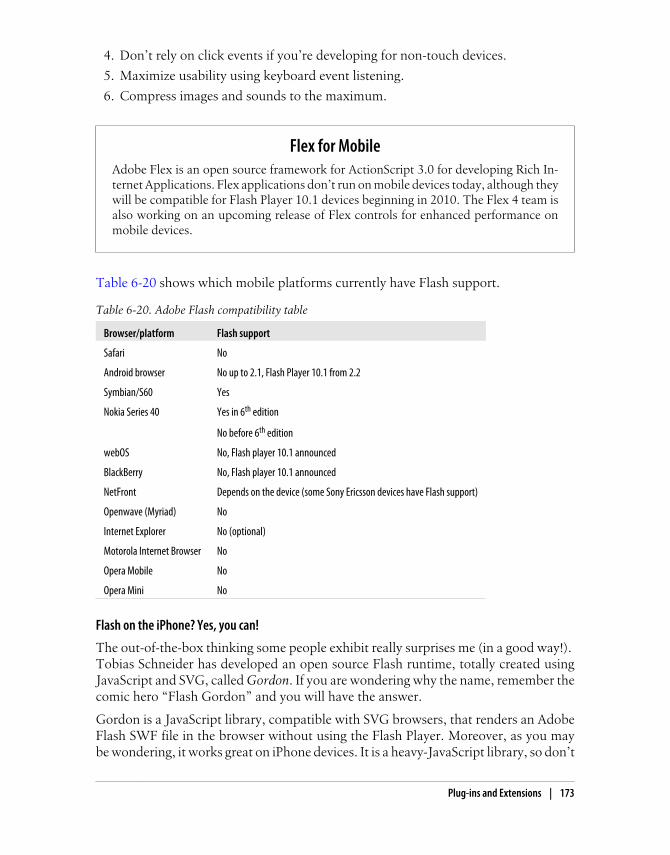
4. Don’t rely on click events if you’re developing for non-touch devices.
5. Maximize usability using keyboard event listening.
6. Compress images and sounds to the maximum.
Flex for MobileAdobe Flex is an open source framework for ActionScript 3.0 for developing Rich In-ternet Applications. Flex applications don’t run on mobile devices today, although theywill be compatible for Flash Player 10.1 devices beginning in 2010. The Flex 4 team isalso working on an upcoming release of Flex controls for enhanced performance onmobile devices.
Table 6-20 shows which mobile platforms currently have Flash support.
Table 6-20. Adobe Flash compatibility table
Browser/platform Flash support
Safari No
Android browser No up to 2.1, Flash Player 10.1 from 2.2
Symbian/S60 Yes
Nokia Series 40 Yes in 6th edition
No before 6th edition
webOS No, Flash player 10.1 announced
BlackBerry No, Flash player 10.1 announced
NetFront Depends on the device (some Sony Ericsson devices have Flash support)
Openwave (Myriad) No
Internet Explorer No (optional)
Motorola Internet Browser No
Opera Mobile No
Opera Mini No
Flash on the iPhone? Yes, you can!
The out-of-the-box thinking some people exhibit really surprises me (in a good way!). Tobias Schneider has developed an open source Flash runtime, totally created usingJavaScript and SVG, called Gordon. If you are wondering why the name, remember thecomic hero “Flash Gordon” and you will have the answer.
Gordon is a JavaScript library, compatible with SVG browsers, that renders an AdobeFlash SWF file in the browser without using the Flash Player. Moreover, as you maybe wondering, it works great on iPhone devices. It is a heavy-JavaScript library, so don’t
Plug-ins and Extensions | 173

abuse it; use it only for important animations. You can test some sample animationsat http://paulirish.com/work/gordon/demos.
At the time of this writing, the library is in its first version, and it supports only a subsetof the SWF format and no ActionScript 2 or 3. It is most suitable for animations andsimple buttons, and it is compatible with the SWF 1 format, with a pre-release versionsupporting the SWF 4 format.
Usage is simple: you just need to download the library from http://github.com/tobeytailor/gordon and insert the gordon.js file and the src folder in your website. Your HTMLshould look like this:
<html xmlns="http://www.w3.org/1999/xhtml"> <head> <title>Gordon: An open source Flash" runtime written in pure JavaScript</title> <script type="text/javascript" src="gordon.js"></script> </head> <body onload="new Gordon.Movie('movie.swf', {id: 'stage', width: 500, height: 400})"> <div id="stage"></div> </body></html>
As you can see from the code, the library replaces a div with the .swf defined in theonload event.
Remember that Gordon isn’t a Flash Player for iPhone devices; it is justa runtime. Users don’t need to install anything for it to work, but it won’tmake any website with Flash content work automatically. You need toinsert the library in your code, export your movie to SWF 1.0, and insertthe JavaScript code required for it to work if you detect that the browseris Safari on iOS.
Microsoft SilverlightSilverlight is a technology for Rich Internet Application development similar to Flash.It is new in the desktop market and incipient in the mobile world. At the time of thiswriting, there are betas available for Windows Mobile, Windows Phone, and Symbian5th edition, so we should expect the Silverlight Player to be preinstalled on futuredevices.
Today, Silverlight is not an option for mobile web development.
SVGStandard Vector Graphics is an open XML specification describing 2D vector graphics.An SVG document can be static (declared in an XML file or tag) or dynamically gen-erated from a JavaScript file. As a vector-rendering engine, a great feature is the adap-tation to different screen sizes without loss of quality.
174 | Chapter 6: Coding Markup
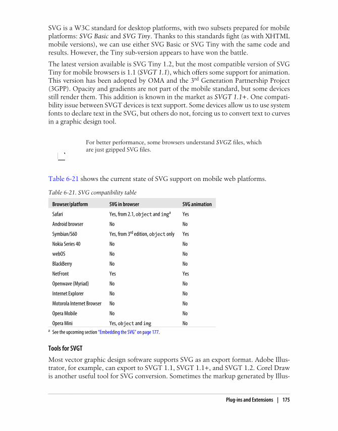
SVG is a W3C standard for desktop platforms, with two subsets prepared for mobileplatforms: SVG Basic and SVG Tiny. Thanks to this standards fight (as with XHTMLmobile versions), we can use either SVG Basic or SVG Tiny with the same code andresults. However, the Tiny sub-version appears to have won the battle.
The latest version available is SVG Tiny 1.2, but the most compatible version of SVGTiny for mobile browsers is 1.1 (SVGT 1.1), which offers some support for animation.This version has been adopted by OMA and the 3rd Generation Partnership Project(3GPP). Opacity and gradients are not part of the mobile standard, but some devicesstill render them. This addition is known in the market as SVGT 1.1+. One compati-bility issue between SVGT devices is text support. Some devices allow us to use systemfonts to declare text in the SVG, but others do not, forcing us to convert text to curvesin a graphic design tool.
For better performance, some browsers understand SVGZ files, whichare just gzipped SVG files.
Table 6-21 shows the current state of SVG support on mobile web platforms.
Table 6-21. SVG compatibility table
Browser/platform SVG in browser SVG animation
Safari Yes, from 2.1, object and imga Yes
Android browser No No
Symbian/S60 Yes, from 3rd edition, object only Yes
Nokia Series 40 No No
webOS No No
BlackBerry No No
NetFront Yes Yes
Openwave (Myriad) No No
Internet Explorer No No
Motorola Internet Browser No No
Opera Mobile No No
Opera Mini Yes, object and img Noa See the upcoming section “Embedding the SVG” on page 177.
Tools for SVGT
Most vector graphic design software supports SVG as an export format. Adobe Illus-trator, for example, can export to SVGT 1.1, SVGT 1.1+, and SVGT 1.2. Corel Drawis another useful tool for SVG conversion. Sometimes the markup generated by Illus-
Plug-ins and Extensions | 175

trator has more tags than you need, so you may want to open it with another tool andexport it again. The most useful tool for mobile SVG currently on the market is IkivoAnimator. It is intended for mobile devices and can create animations using SVGT 1.1.You can download a trial version from http://www.ikivo.com/animator.
In the open source world, Inkscape (http://inkscape.org) offers SVG support, and forWindows only we can use SVGmaker Tiny (http://svgmaker.com), a printer driver thatconverts any printed document into SVGT.
The recommendations for SVG Tiny document generation are:
• Keep the quantity and size of the objects used to the minimum.
• Avoid big gradient areas; they decrease performance.
• Reduce path points to the minimum.
• If the object is too complex, a raster PNG may be better.
• Use GZIP if compatible.
• Combine paths when possible.
• Maintain one copy of each object online.
• Export text as curves.
• For simple shapes, don’t use a graphic design tool.
SVG for beginners
SVG is beyond the scope of this book, but here is a very quick lesson on SVG Tiny.
An SVG document is an XML document with a root svg tag defining an original view-port size (width and height), but remember that it is a vector image, so you can resizeit. Inside the image, we can draw the following kinds of shapes:
• Rectangles (rect)
• Circles (circle)
• Ellipse (ellipse)
• Line (line)
• Polyline (polyline)
• Polygon (polygon)
• Path (path)
The following is an SVG Tiny 1.1+ compatible document (it uses a LinearGradient,which is not included in the SVGT 1.1 standard):
<?xml version="1.0" encoding="utf-8"?><!DOCTYPE svg PUBLIC "-//W3C//DTD SVG 1.1 Tiny//EN" "http://www.w3.org/Graphics/SVG/1.1/DTD/svg11-tiny.dtd">
<svg version="1.1" baseProfile="tiny" xmlns="http://www.w3.org/2000/svg" xmlns:xlink="http://www.w3.org/1999/xlink" x="0px" y="0px" width="200px"
176 | Chapter 6: Coding Markup

height="200px">
<linearGradient id="grad1" gradientUnits="userSpaceOnUse" x1="54" y1="61" x2="147" y2="61"> <stop offset="0" style="stop-color:#FFFFFF"/> <stop offset="1" style="stop-color:#000000"/></linearGradient>
<rect x="0" y="0" fill="url(#grad1)" stroke="#000000" width="193" height="84"/>
<ellipse fill="#FF0000" stroke="#000000" cx="30" cy="100" rx="25" ry="25"/>
</svg>
This document creates a 200×200-pixel SVG image with a rectangle (rect tag) and acircle (ellipse tag with equal radius rx and ry centered at cx, cy). The circle is filledwith a plain red color and the rectangle is filled with a linear gradient defined with anid of grad1. This gradient is not compatible with SVGT 1.1 (without the +).
Google Docs (http://docs.google.com) has an online free vector graphicdesigner for diagrams and graphs. It has the option to export to SVG.
This document has a size of 670 bytes (0.6 KB) as an SVG file. A 24-bit PNG with thesame image has a size of 5.77 KB, and an 8-bit PNG with quality loss has a size of 1.31KB. Clearly, SVG is better from a size (and network traffic) perspective. The bad thingis that the browser has to render the image on the mobile device (although this is notthe case for proxied browsers, such as Opera Mini, or BlackBerry devices where theSVG is pre-rendered on a server).
Embedding the SVG
To insert an SVG document inside an XHTML document we can use the object tag,defining the data attribute with the URL of the SVG, the type as image/svg+xml, andthe width and height. As an SVG is a vector-based image, we can use percentages forthe size attributes to adapt the content to the viewport size. If SVG is not available, wecan use the fallback feature to create an alternative image in another format as a childof the object tag:
<object data="logo.svg" type="image/svg+xml" width="100" height="30"> <img src="logo.jpg" width="100" height="30" alt="Logo not SVG" /></object>
Some browsers (such as Safari on iOS) also use the classic img tag for SVG files:
<img src="logo.svg" width="100" height="30" />
Plug-ins and Extensions | 177

CanvasHTML 5 incorporates a new tag, canvas, that allows the developer to create a dynamicpicture using graphic primitives in JavaScript. Compatibility and syntax will be coveredin Chapter 9. For now, just remember that there is a way to draw small images andpatterns without having to make any new requests to the server.
178 | Chapter 6: Coding Markup

CHAPTER 7
CSS for Mobile Browsers
CSS is very forgiving. If the browser encounters a selector or attribute that it cannotunderstand, it will just ignore that rule. This will be very helpful in the following pages.
The previous chapter discussed the many standards in the mobile CSS world and notedthe CSS extensions available in WAP CSS. Whether we decide to use CSS 2.1, CSS 3.0,CSS Mobile Profile, WAP CSS, or WebKit extensions, it will be just the same; we’ll useCSS selectors, and attributes for those selectors. The standards only tell us which onesare supported. What’s more, we will find some browsers that do not render standardstyles but do render nonstandard ones.
If you’re interested in having W3C-valid markup, remember that XHTML Basic 1.0doesn’t support CSS, and that version 1.1 added support, but only for a style or linktag with external styles. The W3C standards don’t support the inner styles defined inthe style attribute. And to be perfectly honest, in the real world, we won’t worry toomuch about standards in CSS; we will simply do whatever we need to do to create themost compatible stylesheet, and this will by default include official standards andextensions.
Remember, there is no special MIME type, file extension, or XHTMLtag for defining mobile CSS.
Where to Insert the CSSThe first question to answer is: where should we tell the browser what styles to apply?We have many options:
• <style> tags inside the XHTML or HTML markup
• External stylesheets as .css files
• style attributes inside the tags
179

The third option might seem like the most efficient approach, but it is not the best one.That said, there are times when it is useful. For the CSS WAP extensions for formcontrols described in Chapter 6, for instance, it is easiest to insert inline styles to avoiddefining IDs and ID selectors for each control:
<input type="text" name="name" style="-wap-input-format: A*a" />
On BlackBerry devices running Device Software 4.5 or earlier, style-sheets can be disabled from the browser or from a corporate policy.
A fourth option (a new way of including an external stylesheet) is specified in the WAPCSS standard, but it is not implemented and not recommended as it offers no advan-tages. It looks like this:
<?xml-stylesheet href="style.css" media="handheld" type="text/css" ?>
If the website you are creating is a one-page document (a widget, an Ajax mobile ap-plication, or just a simple mobile document), it will be faster to include the CSS in the<style> XHTML tag to avoid a request and a rendering delay. The other ideal situationfor this technique is if your home page is very different from the other pages in yoursite. Otherwise, odds are good that external stylesheets will help you manage your sitemore efficiently.
Media FilteringIs one CSS stylesheet adequate for all devices? Maybe. The first factor to consider iswhether we are working on a desktop XHTML site or a mobile-specific one.
Desktop websites
If we decide to use only one XHTML site for both desktop and mobile devices, our onlyoption for changing the design and layout is the CSS file. This situation is a good fit forthe media attribute.
The CSS standard allows us to define more than one stylesheet for the same document,taking into account the possibility of a site being rendered on different types of media.The most used values for the media attribute are screen (for desktops), print (to beapplied when the user prints the document), and handheld (for… yes, mobile devices).There are also other values, like tv and braille, but no browsers currently supportthese.
Great! We’ve found the solution. We can just define two stylesheets, one for screenand one for handheld, and all our problems will be solved. The two stylesheets candefine different properties for the same elements, and we can even use display: noneto prevent some elements from being shown on mobile devices:
180 | Chapter 7: CSS for Mobile Browsers

<link rel="stylesheet" type="text/css" media="screen" href="desktop.css" /><link rel="stylesheet" type="text/css" media="handheld" href="mobile.css" />
However, this “ideal” situation becomes hell when we test it. Many modern mobilebrowsers rely on screen stylesheets because they can render any desktop website. Andother browsers use screen when they think it is a desktop website and use handheldwhen they think it is a mobile website, depending on the DOCTYPE, a meta tag, or theuser’s view preferences.
To further complicate the situation, some mobile browsers (such asMobile Internet Explorer) use media="handheld" if it is the only valuedefined, but use media="screen" by default if both are defined. The hackis to define media="Screen", with an uppercase S; this causes Mobile IEto use the handheld option when both are defined.
Table 7-1 shows the media values selected by the different mobile browsers when bothscreen and handheld options are defined in the document. Clearly, we can’t rely on themedia="handheld" attribute!
Table 7-1. CSS media compatibility table
Browser/platform Media used
Safari screen
Android browser screen
Symbian/S60 screen
Nokia Series 40 screen in 6th edition
Both (no media understanding) before 6th edition
webOS screen
BlackBerry screen (handheld if meta available)
NetFront handheld
Openwave (Myriad) handheld
Internet Explorer screen
Motorola Internet Browser handheld
Opera Mobile screen
Opera Mini screen
Media queries
CSS3 comes to our help with media queries. These complex media definitions includeconditions about the screen size and media values allowed.
For example, we can say: “Apply this stylesheet for devices supporting only screen andwith a maximum device width of 480.” This will apply to an iPhone, because in
Where to Insert the CSS | 181

landscape mode it has a screen width of 480px and it doesn’t support print, handheld, or any other media type. Here’s how to write this as a conditional media query:
<link type="text/css" rel="stylesheet" media="only screen and (max-device-width: 480px)" href="iphone.css" />
We can then target non-iPhone desktop devices with a filter saying: “Apply this style-sheet for browsers supporting at least screen and with a minimum device width of 481.”This query is written as follows:
<link media="screen and (min-device-width: 481px)" href="notiphone.css" type="text/css" rel="stylesheet" />
Internet Explorer (through version 8) does not understand CSS mediaqueries, so it will apply the iPhone stylesheet by default. That is why weneed to add IE conditional comments:
<!--[if !IE]>--><link type="text/css" rel="stylesheet" media="only screen and (max-device-width: 480px)" href="iphone.css" /><!--<![endif]-->
Some browsers also understand CSS media queries inside the same stylesheet file. Forexample, the following code will change the background color displayed on an iPhone(and other similar devices):
@media only screen and (max-device-width: 480px) { body { background-color: red; }}
An extension for conditional media queries is the orientation media query, whichallows us to define different styles for different orientations. There are two possibilities:orientation:portrait and orientation:landscape. For a device running iOS 3.2 orlater, you can use the orientation media query as follows:
<link rel="stylesheet" media="all and (orientation:landscape)" href="land.css" /><link rel="stylesheet" media="all and (orientation:portrait)" href="port.css" />
iPhone 4 and Pixel-RatioiPhone 4 comes with a 326-DPI screen, twice the original iPhone screen. This meansthat this new device has double width, double height in the same physical screen size.That is why Apple decided to give its browser the same CSS, viewport, and JavaScriptdimensions as the low-DPI device, 320×480, and created a pixel-ratio of 2. This meansthat for every pixel, four real pixels will be drawn (a 2× zoom). Therefore, your websitewill render equally in iPhone 3GS or iPhone 4 beyond the clearer text. If you still wantto show something different for iPhone 4 (as a high-DPI image) you can use the newmedia query condition -webkit-min-device-pixel-ratio:
182 | Chapter 7: CSS for Mobile Browsers

<link media="all and (-webkit-min-device-pixel-ratio:2)"href="iphone4.css" type="text/css" rel="stylesheet" />
The orientation query also works in Android from 2.0, in MicroB for MeeGo deviceslike the Nokia N900, and in Firefox Mobile. Table 7-2 provides a more complete listof browser compatibility for CSS media queries and the orientation extension.
Table 7-2. CSS3 conditional media queries compatibility table
Browser/platform Conditional media queries compatibility Orientation support
Safari Yes Yes, from OS 3.2
Android browser Yes Yes from 2.0
Symbian/S60 Yes from 5th edition
No before 5th edition
No
Nokia Series 40 Yes from 6th edition
No before 6th edition
No
webOS Yes No
BlackBerry No No
NetFront No No
Openwave (Myriad) No No
Internet Explorer No No
Motorola Internet Browser No No
Opera Mobile Yes No
Opera Mini Yes No
SelectorsThe classic CSS 2.1 selectors are compatible with almost every device, and for the fewthat don’t recognize them entirely, it may not be worth the effort to create alternatives.The mobile CSS–compatible selectors we can trust for every device are:
1. Universal: * (compatible but not recommended)
2. Element: tagName
3. Class: .className
4. Unique ID: #elementId
5. Descendant: selectorselector
6. Child: selector > selector
7. Multiple: selector, selector
8. Pseudoclasses (link, visited, active, focus): selector:pseudoclass
Selectors | 183

As we discussed previously, some mobile browsers also understand some additionalstyles to CSS 2.1. A compressed list of other selectors to use for these mobile browsersis:
1. Selector with attribute: selector[attribute]
2. Selector with attribute condition: selector[attribute<operator>value]
operator can be one of the following: equals (=), contains as one value(~=), begins with (^=), ends with ($=), contains as a string (*=), or beginswith and followed by hyphen (|=).
3. Negation: selector:not(selector)
4. Immediately preceded by: selector + selector
5. Preceded by: selector ~ selector
6. Pseudoclasses (after, before, root, nth-child(n), first-child, last-child, empty,and others): selector:pseudoclass
Some CSS3 selectors don’t work for mobile devices. How complexshould a mobile website be, though? If it has that much complexity,perhaps we should consider simplifying.
CSS3 selectors should be used only for noncritical features for the basic behavior. Forexample, we can use one style for input tags and, only if the device supports it, anotherstyle for different input types. For very important features, we should consider usingclass selectors instead.
Table 7-3 lists the browsers’ compatibility with CSS3 selectors, as well as their ACID3 results (on a scale of 0 to 100, with 100 being a perfect score). The ACID test is awell-known test from the Web Standards Project that evaluates how similar to thestandard the implementation is on each browser.
Table 7-3. CSS3 selectors compatibility table
Browser/platform CSS3 selectors compatibility ACID 3 results
Safari Yes 100
Android browser Yes 93
Symbian/S60 Partial on 5th edition: problems with attribute and child selectors
Poor support before 5th edition
47 (5th edition)
Nokia Series 40 None 40 (6th edition)
Complete fail before
webOS Partial 92 in webOS 1.4
184 | Chapter 7: CSS for Mobile Browsers

Browser/platform CSS3 selectors compatibility ACID 3 resultsIncompatible test until 1.2
BlackBerry None
NetFront None
Openwave (Myriad) None
Internet Explorer None
Motorola Internet Browser None
Opera Mobile Yes 99
Opera Mini Partial in 5.0 98
Firefox on Maemo Yes 94
If a browser has only partial support for some attribute or selector, that means thebehavior is not complete. For example, the browser may not accept all the possiblevalues, or it may render a selector properly in the original document but not apply thestyle if we change the DOM dynamically. This stylesheet fragment illustrates a non-critical use of CSS3 selectors:
input { background-color: yellow; border: 1px solid gray;}/* The next style will only work in CSS3-compatible browsers */input[type=button] { background-color: silver;}
CSS TechniquesIn this section we are going to talk about some well-known CSS techniques (reset CSSfiles, text formatting, and the box model) and see how the different browsers react tothese features.
Reset CSS FilesIt is very common in desktop web design to create a CSS hack to reset all the defaultmargins and padding for common HTML elements. We can use this technique whendeveloping for the mobile web, with some considerations: we should only reset theelements we are going to use, we should avoid the usage of the global selector (*) forperformance purposes, and if we are using an external reset CSS file we should considermerging it with our local CSS file.
Some browsers always create a margin around the whole document that cannot bedeleted. And in the browsers that do allow you to delete the margin, remember that azero margin may not be a good design decision.
CSS Techniques | 185

Nokia offers three markup and CSS templates for mobile web design for free throughits developer site at http://www.mobilexweb.com/go/nokiatemplates. Every template hasa reset CSS file. The following code is extracted from the mid-range device template,and we can adapt it to our needs:
html, body, div, span, object, blockquote, pre,abbr, acronym, address, big, cite, code,del, dfn, em, font, img, ins, kbd, q, s, samp,small, strike, strong, sub, sup, tt, var,b, u, i, center, dl, dt, dd, fieldset, form, label, legend,caption, tr, th, td { margin: 0; padding: 0; border: 0; font-size: 100%; font-weight: normal; vertical-align: baseline; background: transparent;}
p { border: 0; font-size: 100%; font-weight: normal; vertical-align: baseline; background: transparent;}a { margin: 0; padding: 0; font-weight: normal;}
h1, h2, h3, h4, h5, h6 { margin: 0; padding: 0; border: 0; vertical-align: baseline; background: transparent;}
body { line-height: inherit;}
body table { margin: 0; padding: 0; font-size: 100%; font-weight: normal; vertical-align: baseline; background: transparent;}
/* remember to highlight insertions somehow! */
186 | Chapter 7: CSS for Mobile Browsers

ins { text-decoration: none;}del { text-decoration: line-through;}
/* tables still need 'cellspacing="0"' in the markup */body table { border-collapse: collapse; border-spacing: 0;}
The Nokia Mobile Web Templates are a set of templates (includingXHTML and CSS files) for low-, mid-, and high-end devices that gen-erate similar experiences across different devices, including hacks thatsolve some bugs, like the 100% width bug. They have been optimizedfor the Series 40 browser, S60 browser, Maemo browser, and OperaMini. You can download them for free at http://www.mobilexweb.com/go/nokiatemplates.
Box ModelThe box model, shown in Figure 7-1, is how the browser represents every context box.Every block element (paragraph, image, title) has a content size, padding, borders, andouter margins. The sum of all of these defines the final size of the whole box. Fortu-nately, most mobile browsers have good compatibility with all of these features.
BlackBerry devices (up to Device Software 4.5) support only bordersand padding from the box model; any other properties are ignored.
I don’t recommend using common desktop techniques such as negative margins forfully compatible mobile websites. These hacks can be used only in modern browsers,and after testing.
CSS 2.1 adds the outline property, which provides a border with thesame color and size for each side that doesn’t take up space in the flowof the document. It is not supported in low- and mid-end devices.
Text FormatShowing text is the most common situation in a mobile website, and styling it in a waythat maximizes compatibility can be a little tricky. Bold (font-weight: bold) and italics
CSS Techniques | 187

(font-style: italic) are reliably compatible, but support for other text-formattingfeatures varies.
Font family
This will be our first problem in styling text for mobile browsers. There are no standardsin terms of fonts for mobile operating systems, and most platforms have only one systemfont (generally a sans-serif one).
NTT DoCoMo markup (for the Japanese market) still uses the oldfont tag for defining font properties like face, color, and size. Newerdevices also support CSS. Other WebKit-based mobile browsers alsosupport the font tag, but its use is not recommended. Use CSS instead.
We can provide specific font names (like Arial, Verdana, or Times New Roman) or genericfont types (like serif, sans-serif, monospace, cursive, or fantasy).
Opera Mini has two modes: desktop and mobile. The default modesince version 4 is desktop, although the user (or carrier) can change thisdefault. In mobile mode, some CSS from your website will be ignoredand styling will be handled by the browser’s own styling engine.
For the best compatibility, you should use the default font and apply other attributes(color, size, etc.). If you want to define a font name, you should consider providing a
Figure 7-1. The CSS box model is the same for mobile and classic web. Understanding this model willsave us some headaches.
188 | Chapter 7: CSS for Mobile Browsers

list of alternatives. If the first font isn’t available, the browser will try the second, thenthe third, and so on; if none of the listed fonts is available, it will use the default one.
Table 7-4 shows only the browsers with font support and lists the available choices foreach.
Table 7-4. Font support list for compatible browsers
Browser/platform Specific fonts available
Safari American Typewriter
American Typewriter Condensed
Arial
Arial Rounded MT Bold
Courier New
Georgia
Helvetica
Marker Felt
Times New Roman
Trebuchet MS
Verdana
Zapfino
Android browser Droid
Symbian/S60 S60 Sans
webOS Arial
Coconut
Verdana
If you thought defining a system font was a headache, using custom fontsis even worse. No browsers support the CSS @font-face rule (with the exception ofSafari for iOS, which has very limited support for SVG fonts).
If you want to use your own font for text, you should think again. If it’s a matter of lifeor death, you can consider using an image (again, not recommended) or a differentapproach on compatible browsers: sIFR on Flash-enabled devices, or Cufón for HTML5 devices. Compatibility is limited, though, and even if these solutions work, they canbe slow.
sIFR (Scalable Inman Flash Replacement) is a nonintrusive JavaScript and Flash tech-nique that replaces normal HTML text with a Flash movie with the same text and anembedded vector font. It can be downloaded from http://wiki.novemberborn.net/sifr.
Custom fonts.
CSS Techniques | 189

Unobtrusive code does not change the way we create the document. Wejust add a JavaScript line and, if the browser is compatible, it will acti-vate. If not, the normal HTML document will be used.
Cufón intends to be the more standard replacement for sIFR: it is a free service thatallows us to upload a font to the website (http://cufon.shoqolate.com) and download a“FontForge” script containing the embedded font in two formats: VML for InternetExplorer and HTML 5 canvas for the other browsers.
If delivering a custom font, you need authorization to distribute it. Thefont may be copyrighted, and you should make sure you have the rightto distribute it as a custom font for your website.
Table 7-5 lists browser compatibility for sIFR and Cufón.
Table 7-5. Custom font techniques compatibility table
Browser/platform sIFR Cufón
Safari No Yes
Android browser No Yes
Symbian/S60 Yes No
Nokia Series 40 No No
webOS No No
BlackBerry No No
NetFront Depends on the browser version No
Openwave (Myriad) No No
Internet Explorer No No
Motorola Internet Browser No No
Opera Mobile No No
Opera Mini No No
Font size
Which elements need a defined font size? For most cases, we should only define fontsizes for headers and for element selectors (h1, h2, p, div). If you are defining a font sizefor a specific paragraph, it may be more appropriate to use a header tag.
We can use any measure for the font size, and almost every browser will understandit. However, it may be not rendered any differently. Only smartphone browsers withsmart zoom support allow any font size to be rendered (like 13.5px in Safari on iOS).
190 | Chapter 7: CSS for Mobile Browsers

For most of the mobile browsers, the best font size technique is to use relative constants(xx-small, x-small, smaller, small, medium, large, larger, x-large, xx-large).
Operating systems have different font support. Some of them have only three possiblesizes for text, and if we use the typical pixel definitions, two different sizes (for example,12px and 14px) may be rendered identically. If we use relative constants (e.g., large),we have more probability of that text being rendered in a larger font. Another com-patible way of specifying font sizes is to use em values. Using em values is perfect forsupporting different screen sizes and DPIs because this unit is relative and scalable tothe standard font in the device.
The default (medium) font size is generally the perfect size in the operating system fornormal paragraph text, and for normal text we should leave it that way.
Text alignment
We can align the text using text-align over a block element (like a p or h1) with a valueof right, left, center, or justify. As shown in Table 7-6, the justify value is the leastwidely compatible for mobile devices; if not supported, it will render as left.
Table 7-6. Text alignment compatibility table
Browser/platform Center Justify
Safari Yes Yes
Android browser Yes Yes
Symbian/S60 Yes Yes
Nokia Series 40 Yes No
webOS Yes Yes
BlackBerry Yes No before 4.5
Yes from 4.5
NetFront Yes No
Openwave (Myriad) Yes No
Internet Explorer Yes No
Motorola Internet Browser Yes No
Opera Mobile Yes Yes
Opera Mini Yes Yes
Other standard text styles
Styles like text-decoration, text-transform, font-variant, letter-spacing, and word-spacing should be used with care. It is best to assume that they will not work and tocreate the standard functionality without them. If some browsers do render them, great;however, don’t rely on them.
CSS Techniques | 191

There are also some CSS3 and WebKit extensions for text styles that will be coveredlater.
A good source to find more detail about mobile CSS compatibility is thewebsite http://www.quirksmode.org/m/css.html. It has many tests andresults for CSS selectors and properties on a range of devices.
Text shadows
Another non-mobile CSS 2.1 feature is text-shadow. It allows us to define the color,x-offset, y-offset, and blur radius of a shadow to be applied to a text selector. Forexample, we can produce a shadowed headline like that shown in Figure 7-2 with codelike this:
h1 { text-shadow: 0.1em 0.1em #AAA}
Figure 7-2. Text Shadow should be used with care and only for titles or short texts
192 | Chapter 7: CSS for Mobile Browsers

If you’re thinking about using this feature, remember that in the mobile world, theclearer the text is the better for usability. Use text shadows with extreme care. Only afew browsers support this feature anyway, as listed in Table 7-7.
Table 7-7. Text shadow compatibility table
Browser/platform Text shadow compatibility
Safari Yes
Android browser No
Symbian/S60 No
Nokia Series 40 No
webOS No
BlackBerry No
NetFront No
Openwave (Myriad) No
Internet Explorer No
Motorola Internet Browser No
Opera Mobile Yes
Opera Mini Yes from 5.0
Text overflow
CSS3 adds a very useful feature for mobile web designs: text overflow. This property,available in some mobile browsers, allows us to specify that an ellipsis should appearat the end of a piece of text if it doesn’t fit in its container in a single line, dependingon the font and space available. This is great for reducing the amount of space takenup by links, and for previews or summaries that will be shown completely in a detailspage after the user clicks on them.
For example, we can show a title, and a description with text-overflow set to ellipsis. When the user clicks on the title, via JavaScript, we remove the text-overflowproperty and the whole text is shown. This maximizes the amount of content we candisplay on a page. This feature also works well on devices that support both landscapeand portrait orientations: with text overflow we can assure the usage of only one linein both modes.
To use this feature, the paragraph (or other element containing the text) must haveoverflow: hidden to avoid the continuing of the overflow text on the next line, white-space: nowrap to avoid wrapping, and some value for text-overflow.
In mobile browsers, the possible values for text-overflow are clip and ellipsis. Theellipsis value causes an ellipsis to appear after the last character that fits in the box(as shown in Figures 7-3 and 7-4). clip is the default value, which truncates the textwithout showing the ellipsis.
CSS Techniques | 193

Here is a sample that produces the result shown in Figure 7-3:
<!DOCTYPE html PUBLIC "-//WAPFORUM//DTD XHTML Mobile 1.0//EN" "http://www.wapforum.org/DTD/xhtml-mobile10.dtd"><html xmlns="http://www.w3.org/1999/xhtml"><head><meta http-equiv="Content-Type" content="text/html; charset=utf-8" /><title>Documento sin título</title><style type="text/css">
Figure 7-3. text-overflow: ellipsis is a great feature for displaying summaries in mobile designs.
Figure 7-4. Gmail for smartphones is an excellent example of text overflow usage. Here is the sameview in portrait and landscape modes. Note that the amount of text displayed is larger in the landscapeorientation.
194 | Chapter 7: CSS for Mobile Browsers

ul p { text-overflow: ellipsis; overflow: hidden; white-space: nowrap;}
</style></head><body>
<h1>Latest news</h1>
<ul id="news"> <li> <a href="#">Teletransporter discovered</a> <p>Beam me up, Scotty! Finally scientists from London have discovered teletransportation</p> </li> <li> <a href="#">Teletransporter discovered</a> <p>Beam me up, Scotty! Finally scientists from London have discovered teletransportation</p> </li></ul>
</body></html>
Table 7-8 lists browser compatibility for the text-overflow property.
Table 7-8. Text overflow compatibility table
Browser/platform Text overflow with ellipsis support
Safari Yes
Android browser Yes
Symbian/S60 No
Nokia Series 40 No
webOS Yes
BlackBerry No
NetFront No
Openwave (Myriad) No
Internet Explorer Yes
Motorola Internet Browser No
Opera Mobile No
Opera Mini No
There are more advanced styles under discussion for the next version of the standard,but they are not yet compatible with mobile devices.
CSS Techniques | 195
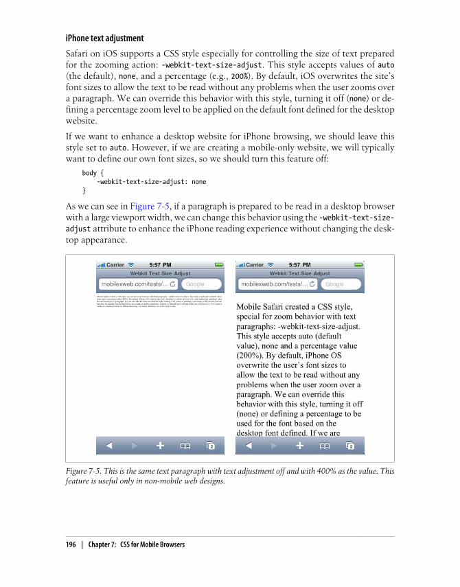
iPhone text adjustment
Safari on iOS supports a CSS style especially for controlling the size of text preparedfor the zooming action: -webkit-text-size-adjust. This style accepts values of auto(the default), none, and a percentage (e.g., 200%). By default, iOS overwrites the site’sfont sizes to allow the text to be read without any problems when the user zooms overa paragraph. We can override this behavior with this style, turning it off (none) or de-fining a percentage zoom level to be applied on the default font defined for the desktopwebsite.
If we want to enhance a desktop website for iPhone browsing, we should leave thisstyle set to auto. However, if we are creating a mobile-only website, we will typicallywant to define our own font sizes, so we should turn this feature off:
body { -webkit-text-size-adjust: none}
As we can see in Figure 7-5, if a paragraph is prepared to be read in a desktop browserwith a large viewport width, we can change this behavior using the -webkit-text-size-adjust attribute to enhance the iPhone reading experience without changing the desk-top appearance.
Figure 7-5. This is the same text paragraph with text adjustment off and with 400% as the value. Thisfeature is useful only in non-mobile web designs.
196 | Chapter 7: CSS for Mobile Browsers

Common PatternsEven the most unique mobile web designs typically rely on a core set of common stylepatterns.
Display PropertiesThe most standard display values (none, block, inline) are supported, but in a limitedway. If you change the value dynamically via JavaScript, many browsers will not renderthe change.
There are also other table and column values that I do not recommend using in mobilewebsites: inline-table, table-column, table-cell, and others. They are not commonin desktop websites either, because of Internet Explorer’s lack of compatibility.
And, to be perfectly honest, why should we need column or table layouts on the mobileweb? If we do want to show tabular data, we should create the tables in HTML, notuse the table layout CSS features.
Even when we’re designing for some new smartphones, like the NokiaN900, which has a screen width of 800 pixels, we should avoid usingtables and column layouts with more than two columns. Even at 800pixels, the screen is still small, and we need to remember that it is amobile device and think about the contexts in which it will be used.
The style display: none will be used a lot in JavaScript and Ajax development. In thenext chapter, we will test browser compatibility for this property dynamically.
Absolute and floating positions
The standard position (position: static) is the most widely compatible and is rec-ommended for mobile websites. This means that each element will be rendered in itsnormal position in the document.
Floating elements do work very well on most mobile devices, as you’ll see in Ta-ble 7-9. However, even on devices with average-sized screens it’s best not to have morethan two floating elements in the same row. This can be approached using float:left and float: right.
Relative positioning (position: relative) is trickier in mobile browsers. It definesmovement (using top, bottom, right, left) from the original position as a static element.
A clear element (clear: both, for example) can be used after floating elements to ensurethat no floating elements are allowed on the right, the left, or both sides of the element.
Common Patterns | 197

There is a JavaScript solution for creating a floating footer called iScroll. You can find it at http://www.mobilexweb.com/iscroll. The mainproblem with using this kind of JavaScript solution is that it impacts theperformance of our websites.
Fixed positioning is not compatible with all mobile browsers (see Table 7-9) and is notrecommended. The problem is that in mobile browsers we are scrolling a window, notthe contents. Depending on the zoom and the viewport size, a fixed position can havedifferent meanings.
There is a campaign on the Web that aims to reduce this problem in thefuture. You can read more about it at http://www.abettermobileweb.com; this site explains the problem of fixed positioning and how to solveit in the future.
Richard Herrera (http://www.doctyper.com) has also created some Java-Script and CSS-based solutions for the iPhone and other WebKit-basedbrowsers to emulate some kind of fixed positioning.
Table 7-9. CSS position compatibility table
Browser/platform Float Float with clear Absolute
Safari Yes Yes Yes
Android browser Yes Yes Yes
Symbian/S60 Yes Yes Yes
Nokia Series 40 Yes No Yes in 6th edition
Buggy before 6th edition
webOS Yes Yes Yes
BlackBerry Yes No before 4.0 No before 4.0
NetFront No No No
Openwave (Myriad) No No No
Internet Explorer Yes Yes No
Motorola Internet Browser No No No
Opera Mobile Yes
Opera Mini Yes, if
mobile mode
off
Scrolling and focus navigation can give us problems with absolute positions. The z-index can also give us problems on low- and mid-end devices.
198 | Chapter 7: CSS for Mobile Browsers

According to the WAP CSS standard, the position and z-index properties are optional,so whether they are supported or not is up to each browser.
Rounded corners
Designers seem to love rounded corners (shown in Figure 7-6), and for years this wasthe nightmare of every web developer who needed to lay out a box with this feature.Table-based layouts for rounded corners are inappropriate for the mobile web, so wecan only rely on CSS solutions. If a device doesn’t render the style (see Table 7-10 fora compatibility list), forget about rounded corners for that device.
Figure 7-6. The rounded corners feature allows us to round any defined border or background coloron compatible devices.
Table 7-10. Rounded corners compatibility table
Browser/platform Rounded corners compatibility
Safari Yes
Android browser Yes
Symbian/S60 Partial
Nokia Series 40 No
webOS Partial
BlackBerry No
NetFront No
Openwave (Myriad) No
Internet Explorer No
Motorola Internet Browser No
Opera Mobile No
Opera Mini No
Common Patterns | 199

WebKit has an extension for rounded corners (-webkit-border-radius); Mozilla alsohas one (-moz-border-radius), but with very low compatibility in mobile devices.
Another solution is the use of canvas for drawing a rounded rectangle;more on this HTML 5 element in Chapter 9.
The -webkit-border-radius attribute can be defined as one value (like 5px or 10%), twovalues (top-bottom and left-right), or four values giving the radius of each corner sep-arately. These are samples of different styles:
.rounded { -webkit-border-radius: 10px;}.rounded2 { -webkit-border-radius: 10px 20px;}.rounded3 { -webkit-border-radius: 3em 2em 3em 2em;}
Titles
A common approach for low- and mid-end devices is to rely on header tags and CSSto provide a simple solution for title design. The best approach is to define a 100%width, a background color (or image pattern), a top and bottom border, and thepadding:
h1 { width: 90%; text-align: center; background-color: red; color: white; border-top: 6px solid #500; border-bottom: 6px solid #500; padding: 8px 20px; clear: both; font-size: larger;}
In Figure 7-7, we can see a very simple stylesheet applying some styles to titles withoutimage usage.
Pseudoclasses
The pseudoclasses link, active, focus, and visited are compatible with all XHTMLbrowsers and standards. The question is: when do the pseudoclasses work? Some sit-uations are well known: for example, link is used for not-visited hyperlinks andvisited is used if the links are in the previous browsing history.
200 | Chapter 7: CSS for Mobile Browsers
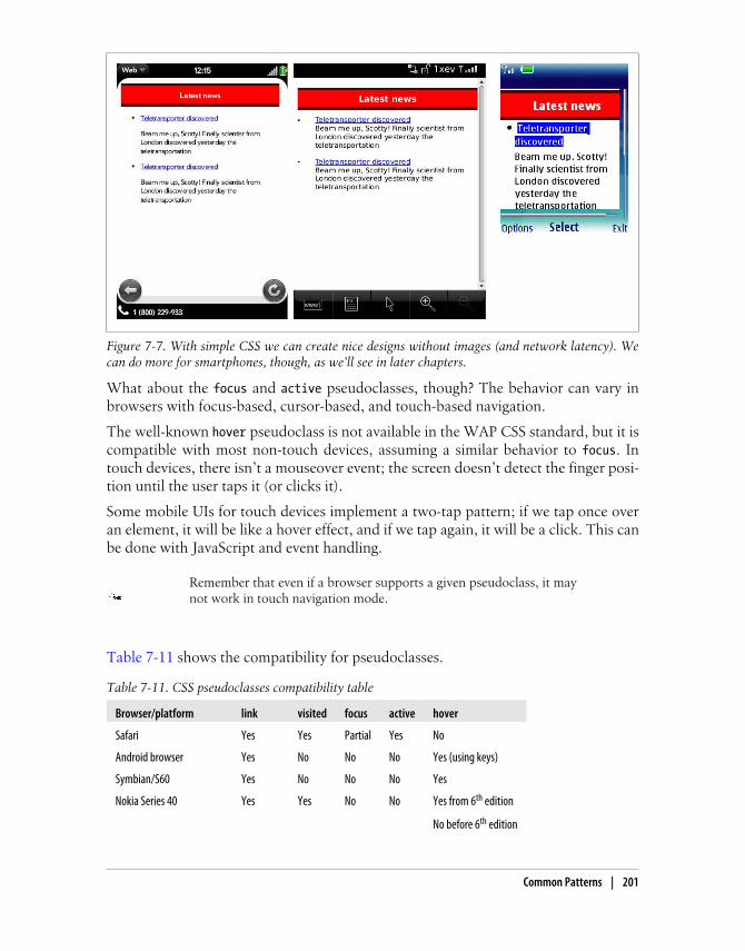
What about the focus and active pseudoclasses, though? The behavior can vary inbrowsers with focus-based, cursor-based, and touch-based navigation.
The well-known hover pseudoclass is not available in the WAP CSS standard, but it iscompatible with most non-touch devices, assuming a similar behavior to focus. Intouch devices, there isn’t a mouseover event; the screen doesn’t detect the finger posi-tion until the user taps it (or clicks it).
Some mobile UIs for touch devices implement a two-tap pattern; if we tap once overan element, it will be like a hover effect, and if we tap again, it will be a click. This canbe done with JavaScript and event handling.
Remember that even if a browser supports a given pseudoclass, it maynot work in touch navigation mode.
Table 7-11 shows the compatibility for pseudoclasses.
Table 7-11. CSS pseudoclasses compatibility table
Browser/platform link visited focus active hover
Safari Yes Yes Partial Yes No
Android browser Yes No No No Yes (using keys)
Symbian/S60 Yes No No No Yes
Nokia Series 40 Yes Yes No No Yes from 6th edition
No before 6th edition
Figure 7-7. With simple CSS we can create nice designs without images (and network latency). Wecan do more for smartphones, though, as we’ll see in later chapters.
Common Patterns | 201
Browser/platform link visited focus active hover
webOS Yes No No No No
BlackBerry Yes No No No No
NetFront No No No Yes No
Openwave (Myriad) As visited No No No No
Internet Explorer Yes Yes Yes Yes No
Motorola Internet Browser Yes Yes No Yes No
Opera Mobile Yes Yes No No Yes
Opera Mini Yes Yes No No Yes
Backgrounds
Changing the background color was the first new feature in XHTML MP that everyWML developer used. It was heaven after the old black and white WML. Every mobilebrowser understands the background property and its specific definitions, like background-image and background-repeat. However, we need to remember that on mobiledevices, the context of the user can be very different from a desktop. It is not recom-mended to use a complex background, and it’s best to use strongly contrasting fore-ground and background colors.
In compatible browsers, it will be very helpful to use data URI patterns for backgroundsto reduce network requests. One feature that can be buggy on mobile devices is the useof background-attachment: fixed. This allows the background image to be fixed evenafter scrolling.
Specifying multiple background images (separated by commas) is not good practice formobile browsers. Symbian S60 browsers appear to be among the few that support it.Some WebKit-based browsers, like mobile Safari, also accept some CSS3 attributes asextensions, like -webkit-background-origin and -webkit-background-size. The up-coming Table 7-12 lists background compatibility.
Overflow
A common design pattern in desktop websites is to use a div (or other element) with afixed size, and content larger than that size. Using the overflow property, we can definea value of scroll, auto, visible (the default), or hidden to indicate what to do with thecontent that is outside the bounds of the element. If we use a value of scroll, the divwill have its own scrollbar on supporting devices.
The use of overflow is discouraged, like the iframe technique. Even with compatibledevices, there are usability problems; for one thing, it’s not easy for the user to tell ifshe’s moving the main scrollbar or the inner scrollbar. And if it works, there are a lotof bugs in mobile browsers, from touch devices with the scroll not working to devices
202 | Chapter 7: CSS for Mobile Browsers
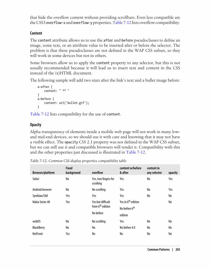
that hide the overflow content without providing scrollbars. Even less compatible arethe CSS3 overflow-x and overflow-y properties. Table 7-12 lists overflow compatibility.
Content
The content attribute allows us to use the after and before pseudoclasses to define animage, some text, or an attribute value to be inserted after or before the selector. Theproblem is that these pseudoclasses are not defined in the WAP CSS subset, so theywill work in some devices but not in others.
Some browsers allow us to apply the content property to any selector, but this is notusually recommended because it will lead us to insert text and content in the CSSinstead of the (x)HTML document.
The following sample will add two stars after the link’s text and a bullet image before:
a:after { content: " ** "}a:before { content: url('bullet.gif');}
Table 7-12 lists compatibility for the use of content.
Opacity
Alpha transparency of elements inside a mobile web page will not work in many low-and mid-end devices, so we should use it with care and knowing that it may not havea visible effect. The opacity CSS 2.1 property was not defined in the WAP CSS subset,but we can still use it and compatible browsers will render it. Compatibility with thisand the other properties just discussed is illustrated in Table 7-12.
Table 7-12. Common CSS display properties compatibility table
Browser/platformFixedbackground overflow
content w/before& after
content inany selector opacity
Safari No Yes, two fingers forscrolling
Yes No Yes
Android browser No No scrolling Yes No Yes
Symbian/S60 Yes Yes Yes No No
Nokia Series 40 Yes Yes but difficultfrom 6th edition
No before
Yes in 6th edition
No before 6th
edition
No
webOS No No scrolling Yes No No
BlackBerry No No No before 4.0 No No
NetFront Yes No No No No
Common Patterns | 203
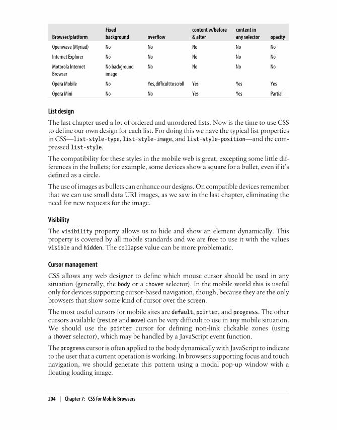
Browser/platformFixedbackground overflow
content w/before& after
content inany selector opacity
Openwave (Myriad) No No No No No
Internet Explorer No No No No No
Motorola InternetBrowser
No backgroundimage
No No No No
Opera Mobile No Yes, difficult to scroll Yes Yes Yes
Opera Mini No No Yes Yes Partial
List design
The last chapter used a lot of ordered and unordered lists. Now is the time to use CSSto define our own design for each list. For doing this we have the typical list propertiesin CSS—list-style-type, list-style-image, and list-style-position—and the com-pressed list-style.
The compatibility for these styles in the mobile web is great, excepting some little dif-ferences in the bullets; for example, some devices show a square for a bullet, even if it’sdefined as a circle.
The use of images as bullets can enhance our designs. On compatible devices rememberthat we can use small data URI images, as we saw in the last chapter, eliminating theneed for new requests for the image.
Visibility
The visibility property allows us to hide and show an element dynamically. Thisproperty is covered by all mobile standards and we are free to use it with the valuesvisible and hidden. The collapse value can be more problematic.
Cursor management
CSS allows any web designer to define which mouse cursor should be used in anysituation (generally, the body or a :hover selector). In the mobile world this is usefulonly for devices supporting cursor-based navigation, though, because they are the onlybrowsers that show some kind of cursor over the screen.
The most useful cursors for mobile sites are default, pointer, and progress. The othercursors available (resize and move) can be very difficult to use in any mobile situation.We should use the pointer cursor for defining non-link clickable zones (usinga :hover selector), which may be handled by a JavaScript event function.
The progress cursor is often applied to the body dynamically with JavaScript to indicateto the user that a current operation is working. In browsers supporting focus and touchnavigation, we should generate this pattern using a modal pop-up window with afloating loading image.
204 | Chapter 7: CSS for Mobile Browsers

Modal Pop-up WindowsA modal pop-up is a floating div that displays important information to the user, whiledisabling and/or fading out the background content.
In the mobile world these are recommended only for smartphones and should be usedwith extreme care. If we are displaying only simple text, it is better to use the standardwindow.alert JavaScript function, as it will render properly on all devices.
Table 7-13 lists compatibility with the progress and pointer cursors for the variousbrowsers.
Table 7-13. Cursor compatibility table
Browser/platform pointer cursor progress cursor
Safari No cursor available, touch navigation
Android browser No cursor available, touch or focus navigation
Symbian/S60 Yes (using keys) No
Nokia Series 40 Yes in 6th edition No
Before 6th edition no cursor available, focus navigation
webOS No cursor available, touch navigation
BlackBerry No No
NetFront No No
Openwave (Myriad) No cursor available in focus navigation mode
Internet Explorer No No
Motorola Internet Browser No Yes
Opera Mobile No No
Opera Mini No No
CSS SpritesCSS Sprites is a great modern web design technique for reducing the number of imageserver requests on a web page. There are a lot of online resources and books availableon this technique. For now, suffice it to say that if you have many images in your site(preferred logos, icons, background images, flags, etc.), you can reduce all of those toone big image with all the originals inside and use a CSS mask to determine whichportion of it to show in each container.
This technique has a great impact on web performance, but for mobile applications,we should think twice before using it and analyze the possible problems. First, we needfull background-position CSS property compatibility (the mobile standards includethis, so it’s not really an issue). The second consideration is that we will not be using
CSS Sprites | 205

img tags. In their place, we will use any block element (div) or any block-convertedelement using display: block, such as a span or a tag. This means that we cannotprovide alternative text for the images, and the browser won’t know how much spaceto allocate for each image until it renders the CSS file.
Finally, in some browsers this technique can have an impact on rendering performance,because the big image will be duplicated in memory for each usage. We need to balancethe performance gained through the reduction of requests with the performance lostin the rendering engine in some browsers.
Samples and CompatibilityLet’s create a sample using two techniques: using an original block element (div) andusing an original inline element (a) converted to a block element.
The original document without CSS Sprites is the following country list:
<!DOCTYPE html PUBLIC "-//WAPFORUM//DTD XHTML Mobile 1.0//EN" "http://www.wapforum.org/DTD/xhtml-mobile10.dtd"><html xmlns="http://www.w3.org/1999/xhtml"><head><meta http-equiv="Content-Type" content="text/html; charset=utf-8" /><title>Documento sin título</title><style type="text/css">
ul { list-style: circle; }
ul li { padding: 0px; margin-bottom: 5px; }
ul li img { margin: 0px 10px 0px 0px; vertical-align: middle; border: 1px solid gray; }
</style></head>
<body><h1>The Best Seller</h1><h2>Select your nearest country</h2><ul> <li><img src='ar.png' width='30' height='19' alt='AR' /> <a href='ar'>Argentina</a></li> <li><img src='br.png' width='30' height='19' alt='BR' /> <a href='br'>Brazil</a></li> <li><img src='fi.png' width='30' height='19' alt='FI' /> <a href='fi'>Finland</a></li>
206 | Chapter 7: CSS for Mobile Browsers

<li><img src='jp.png' width='30' height='19' alt='JP' /> <a href='jp'>Japan</a></li> <li><img src='es.png' width='30' height='19' alt='ES' /> <a href='es'>Spain</a></li> <li><img src='us.png' width='30' height='19' alt='US' /> <a href='us'>United States</a></li></ul></body></html>
The previous sample uses six images that can be converted into a single one (savingfive requests and the HTTP and PNG headers) with the following code:
<!DOCTYPE html PUBLIC "-//WAPFORUM//DTD XHTML Mobile 1.0//EN" "http://www.wapforum.org/DTD/xhtml-mobile10.dtd"><html xmlns="http://www.w3.org/1999/xhtml"><head><meta http-equiv="Content-Type" content="text/html; charset=utf-8" /><title>Documento sin título</title><style type="text/css">
ul { list-style: circle; }
ul li { padding: 0px; margin-bottom: 5px; }
ul li div { /* We define the large image to all divs that represent an image*/ background:url(sprite.png); width: 30px; height: 19px; float: left; border: 1px solid gray; margin-right: 10px; }
</style></head>
<body><h1>The Best Seller</h1><h2>Select your nearest country</h2><ul> <li><div style="background-position: 0px 0px;"></div> <a href='ar'>Argentina</a></li> <li><div style="background-position: 0px −29px;"></div> <a href='br'>Brazil</a></li> <li><div style="background-position: 0px −58px;"></div> <a href='fi'>Finland</a></li> <li><div style="background-position: 0px −87px;"></div> <a href='jp'>Japan</a></li> <li><div style="background-position: 0px −116px;"></div>
CSS Sprites | 207

<a href='es'>Spain</a></li> <li><div style="background-position: 0px −145px;"></div> <a href='us'>United States</a></li></ul></body></html>
This produces the result shown in Figure 7-8.
Figure 7-8. In compatible browsers, using CSS Sprites produces the same result using a single imageas using six separate images for the flags.
There are plenty of online CSS Sprites generators where you can uploadall your images and receive in seconds one big image and the CSS codeto replace each of the original img tags. Examples include http://spritegen.website-performance.org and http://csssprites.com.
Now let’s look at applying the same technique to a non-original block element, suchas the a tag. The only problem will be the flag border: as we use the same a tag for theimage and the text, we cannot define a border. The code looks like this:
<!DOCTYPE html PUBLIC "-//WAPFORUM//DTD XHTML Mobile 1.0//EN" "http://www.wapforum.org/DTD/xhtml-mobile10.dtd"><html xmlns="http://www.w3.org/1999/xhtml"><head><meta http-equiv="Content-Type" content="text/html; charset=utf-8" /><title>Documento sin título</title>
208 | Chapter 7: CSS for Mobile Browsers
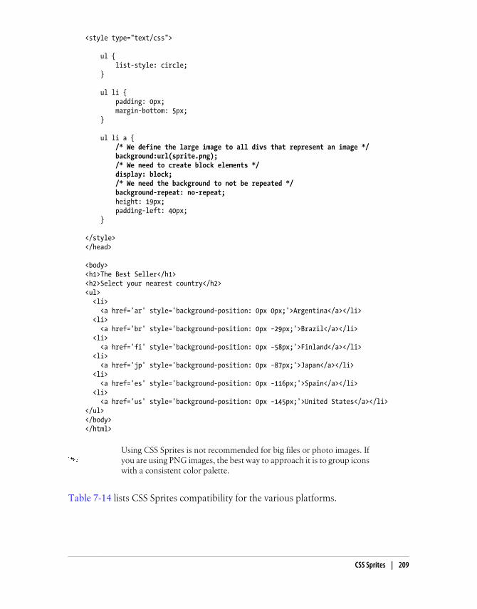
<style type="text/css">
ul { list-style: circle; }
ul li { padding: 0px; margin-bottom: 5px; }
ul li a { /* We define the large image to all divs that represent an image */ background:url(sprite.png); /* We need to create block elements */ display: block; /* We need the background to not be repeated */ background-repeat: no-repeat; height: 19px; padding-left: 40px; }
</style></head>
<body><h1>The Best Seller</h1><h2>Select your nearest country</h2><ul> <li> <a href='ar' style='background-position: 0px 0px;'>Argentina</a></li> <li> <a href='br' style='background-position: 0px −29px;'>Brazil</a></li> <li> <a href='fi' style='background-position: 0px −58px;'>Finland</a></li> <li> <a href='jp' style='background-position: 0px −87px;'>Japan</a></li> <li> <a href='es' style='background-position: 0px −116px;'>Spain</a></li> <li> <a href='us' style='background-position: 0px −145px;'>United States</a></li></ul></body></html>
Using CSS Sprites is not recommended for big files or photo images. Ifyou are using PNG images, the best way to approach it is to group iconswith a consistent color palette.
Table 7-14 lists CSS Sprites compatibility for the various platforms.
CSS Sprites | 209

Table 7-14. CSS Sprites compatibility table
Browser/platform Sprites over div Sprites over anchors
Safari Yes Yes
Android browser Yes Yes
Symbian/S60 Yes Yes
Nokia Series 40 Yes in 6th edition
No before 6th edition
Yes, buggy on low-end devices
webOS Yes Yes
BlackBerry Yes from 4.0 Yes from 4.0
NetFront No Yes
Openwave (Myriad) No No
Internet Explorer No Yes
Motorola Internet Browser No No
Opera Mobile Yes Yes
Opera Mini Yes Yes
CSS Sprites AlternativesThe idea behind optimizing the number of requests to the server is very interesting,even if you reject the usage of CSS Sprites. That is why we need to think about alter-natives to this technique for some specific situations.
Image maps are the first technique that comes to mind as a CSS Spritesalternative. However, they are not recommended for non-touch navi-gation, because image maps in non-touch devices can have a negativeimpact on usability.
Inline images
As we discussed in the last chapter, inline images are a great technique for compatiblebrowsers. When designing for browsers that understand them, we can copy the firstsample (the original document without CSS Sprites) and replace the URL of each imagewith the data: representation.
Join images
If the images are near one another horizontally or vertically, as in our sample, we canconsider joining all the images into one. The concept is similar to CSS Sprites, but weset up the image as a single-use background, adjusting the margins and padding so thatthe elements are properly aligned with the different parts of the image. This techniquecan have poor results on old devices with limited support for margins and padding.
210 | Chapter 7: CSS for Mobile Browsers

If we use the original code but define a good cache policy on the server,subsequent pages of the site will load faster than if we used CSS Sprites,because no rendering work will be required. We will cover caching inChapter 10.
Box borders
If you were thinking of using CSS Sprites to define the borders of a rectangular area,there is a WebKit extension that can help you. In the following section, we will getdeeper into this.
WebKit ExtensionsThe open source project WebKit added many extensions to CSS, and several of theseare under discussion for addition to CSS3. In the mobile world we have many WebKitflavors (Safari, Android, webOS, Symbian, etc.), and the extensions compatibility isn’tperfect across all of them.
Many of the WebKit extensions had counterparts for other desktopbrowsers, like Mozilla Firefox (using the -moz- prefix) or Opera (usingthe -o- prefix). In CSS3, many of these extensions are implementedwithout any prefix.
The following is a list of the most common WebKit extensions, in compressed form:
• -webkit-border-radius defines a rounded-corner box. Modern mobile browsersalso understand it as border-radius.
• -webkit-box-shadow defines a shadow for a block element (similar to text-shadow).
• -webkit-columns specifies the width and count of columns.
• -webkit-border-image specifies an image to use as the border for a box
• -webkit-text-stroke defines a color to use for the stroke (outline) of the text.
• -webkit-text-fill-color defines a color to use for filling the text (inside thestroke).
We’ll look at a few of them here in more detail.
Text Stroke and FillThe stroke and fill properties are a handy way of creating fancy effects in titles (withbig fonts) without the use of images. For example:
<h1 style="-webkit-text-stroke: blue; -webkit-text-fill-color: yellow">Great Title!</h1>
WebKit Extensions | 211
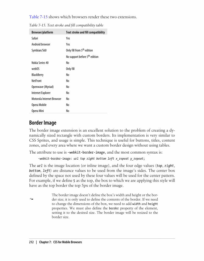
Table 7-15 shows which browsers render these two extensions.
Table 7-15. Text stroke and fill compatibility table
Browser/platform Text stroke and fill compatibility
Safari Yes
Android browser Yes
Symbian/S60 Only fill from 5th edition
No support before 5th edition
Nokia Series 40 No
webOS Only fill
BlackBerry No
NetFront No
Openwave (Myriad) No
Internet Explorer No
Motorola Internet Browser No
Opera Mobile No
Opera Mini No
Border ImageThe border image extension is an excellent solution to the problem of creating a dy-namically sized rectangle with custom borders. Its implementation is very similar toCSS Sprites, and usage is simple. This technique is useful for buttons, titles, contentzones, and every area where we want a custom border design without using tables.
The attribute to use is -webkit-border-image, and the most common syntax is:
-webkit-border-image: url top right bottom left x_repeat y_repeat;
The url is the image location (or inline image), and the four edge values (top, right,bottom, left) are distance values to be used from the image’s sides. The center boxdefined by the space not used by these four values will be used for the center pattern.For example, if we define 5 as the top, the box to which we are applying this style willhave as the top border the top 5px of the border image.
The border image doesn’t define the box’s width and height or the bor-der size; it is only used to define the contents of the border. If we needto change the dimensions of the box, we need to add width and heightproperties. We must also define the border property of the element,setting it to the desired size. The border image will be resized to theborder size.
212 | Chapter 7: CSS for Mobile Browsers

The x_repeat and y_repeat values are optional and can be defined as one of the fol-lowing constants:
repeatThe portion of the image extracted using the top and bottom for y_repeat and usingthe left and right for x_repeat is repeated until it fills the available width/heightof the box.
roundThe image is repeated until it fills the available width/height of the box, but withoutany partial tile at the end; it is stretched so that it fits in the available space a wholenumber of times. This value has no effect in many mobile browsers.
stretchThe image is stretched to fill the entire width or height of the box withoutrepetition.
The border image is cut in nine pieces, as we can see in the Figure 7-9. Four are usedas corners and the others are used as background images for sides and center.
If you are applying a border image to a button, it will not have any“pressed” effect. To create such an effect, you must change the activeand/or focus pseudoclass, specifying another border image. Problemscan occur when you try to change the way buttons are rendered dy-namically, though, so for custom designs it is better to use links or re-move the default button rendering with -webkit-appearance: none.
The simplest way to define the border image is with the four values equal, using:
-webkit-border-image: url distance;
This sample will produce the result shown in Figure 7-10:
<!DOCTYPE html PUBLIC "-//WAPFORUM//DTD XHTML Mobile 1.0//EN" "http://www.wapforum.org/DTD/xhtml-mobile10.dtd"><html xmlns="http://www.w3.org/1999/xhtml"><head><meta http-equiv="Content-Type" content="text/html; charset=UTF-8" /><title>Image Border</title><style type="text/css">/* We should use input[type=button] too, but for testing purposes we willnot use CSS3 */input.bordered { -webkit-border-radius: 10px; -webkit-border-image: url(border1.png) 6;}
a.bordered { -webkit-border-image: url(border1.png) 6; color: white; text-decoration: none; padding: 3px;
WebKit Extensions | 213

}
h1 { -webkit-border-image: url(border2.png) 50 50 50 50 repeat stretch; border: 20px;}
/* The h2 will use the same image border but half size */h2 { -webkit-border-image: url(border2.png) 50 50 50 50 round round; border: 10px;}</style></head>
<body> <h1>This is a title</h1> <h2>This is a subtitle</h2> <input type="button" class="bordered" value="Press Me" /> <!-- Safari applies border image to inline elements too --> <a href="http://mobilexweb.com" class="bordered">This is a link</a></body></html>
Another sample is the implementation of the classic back button in iPhone user inter-faces, using only left, right, and center zones (splitting the image into three parts). Thiscode produces the result shown in Figure 7-11:
<!DOCTYPE html PUBLIC "-//WAPFORUM//DTD XHTML Mobile 1.0//EN" "http://www.wapforum.org/DTD/xhtml-mobile10.dtd"><html xmlns="http://www.w3.org/1999/xhtml"><head><meta http-equiv="Content-Type" content="text/html; charset=UTF-8" /><title>Image Border</title><style type="text/css">#back { -webkit-border-image: url(border1.png) 0 5 0 15;}
</style></head>
<body> <a href="/" id="back">Home Page</a></body></html>
214 | Chapter 7: CSS for Mobile Browsers

Figure 7-9. The image is cut into nine pieces and each one is used as either a corner or a part of thebackground.
As Table 7-16 shows, this extension works on about half of the major mobile webplatforms.
Table 7-16. Border image compatibility table
Browser/platform Block elements Inline elements
Safari Yes Yes
Android browser Yes (differences with content background) Yes
Symbian/S60 Partial in 5th edition
No before 5th edition
Yes
Nokia Series 40 Bad in 6th edition
No before 6th edition
Buggy in 6th edition
webOS Yes Yes
WebKit Extensions | 215

Browser/platform Block elements Inline elements
BlackBerry No No
NetFront No No
Openwave (Myriad) No No
Internet Explorer No No
Motorola Internet Browser No No
Opera Mobile No No
Opera Mini No No
Figure 7-10. Using only two images, we can create these kinds of borders and backgrounds.
Some of the WebKit extensions will also work in Firefox Mobile and inthe MeeGo/Maemo browser, because both use Mozilla’s Gecko engine.For these browsers, we should replace the prefix -webkit with -moz.
216 | Chapter 7: CSS for Mobile Browsers
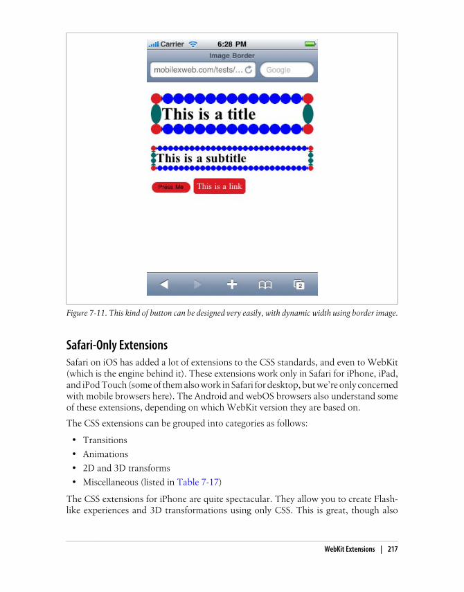
Figure 7-11. This kind of button can be designed very easily, with dynamic width using border image.
Safari-Only ExtensionsSafari on iOS has added a lot of extensions to the CSS standards, and even to WebKit(which is the engine behind it). These extensions work only in Safari for iPhone, iPad,and iPod Touch (some of them also work in Safari for desktop, but we’re only concernedwith mobile browsers here). The Android and webOS browsers also understand someof these extensions, depending on which WebKit version they are based on.
The CSS extensions can be grouped into categories as follows:
• Transitions
• Animations
• 2D and 3D transforms
• Miscellaneous (listed in Table 7-17)
The CSS extensions for iPhone are quite spectacular. They allow you to create Flash-like experiences and 3D transformations using only CSS. This is great, though also
WebKit Extensions | 217

sometimes painful because it all needs to be coded in CSS, a language not built for thiskind of interaction. We will cover most of these advanced iPhone extensions in Chap-ters 9 and 12, as well as some open source JavaScript libraries that will help in our work.
Table 7-17. Common CSS extensions for Safari on iOS
Property Values Description
-webkit-text-security circle, disc, none, square Defines the character to display in password fieldsfor each character the user enters.
-webkit-text-size-adjust auto, none, percentage value Defines the font size adjustment for easy reading.
-webkit-appearance Partial list:
none, button, button-bevel, checkbox,default-button, listbox, listitem, media-fullscreen-button,media-mute-button,media-play-button,radio, searchfield,searchfield-cancel-button, slider-horizontal, slider-vertical,square-button, textarea, textfield
Changes the appearance of elements to render asnative controls of the OS. Available since iOS 2.0. Avalue of none will allow us to define a custom de-sign using CSS.
-webkit-user-select auto / none / text From iOS 3.0, defines whether or not the user canselect the text for copy/paste purposes.
-webkit-touch-callout none, inherit Removes the callout (hint window) that appearswhen the user keeps his finger over a link for a fewseconds.
-webkit-tap-highlight-color
Color value Defines a color to be used as the background whenthe user taps a link or a clickable element.
218 | Chapter 7: CSS for Mobile Browsers
CHAPTER 8
JavaScript Mobile
Designing for the Web is about more than content and presentation—users expectwebsites to be interactive, responding to their choices. Fortunately, although it hassome limitations, the JavaScript you use in developing for the mobile web is similar tothat used in desktop web development.
We have already talked a bit about the WAP 1.1 standard scripting language, WMLScript. We won’t go any deeper into this obsolete language, but it will not bedifficult to learn if you need to do a little scripting with it. The WAP 2.0 standard thatbrought us XHTML MP and WAP CSS didn’t define any scripting support. This wasbad for the first few years, because we could create scripts in WAP 1.0 documents butnot in WAP 2.0 ones.
Thankfully, a couple of years after this standard was released, mobile browsers startedto add some support for JavaScript (or ECMAScript, to be totally correct). Thestandards for mobile scripting are more difficult to define than the standards for CSS.The great benefit is that, excepting some bugs, JavaScript can check at runtime whethersome feature, object, or API is available, so we can code for different “standards.”
The standard name for JavaScript is ECMAScript, because it is definedby the ECMA (an international, private nonprofit standards organiza-tion). There are three well-known dialects on the market: JavaScript(trademark of Sun, licensed now to the Mozilla Foundation), Action-Script (trademark of Adobe), and JScript (trademark of Microsoft). Atthe base, they are the same language, and everyone adds new behavior.
The only mobile-specific standard is called ECMAScript Mobile Profile (ESMP). It wasdefined by the Open Mobile Alliance (OMA), like XHTML MP and WAP CSS. In my10 years in the mobile web world, I have never heard a developer or a company talkingabout ESMP. It is a subset of the ECMAScript language and is really just JavaScriptwith some features left out and some other features added in (imported fromWMLScript).
219
The XHTML MP 1.2 OMA standard recommends using ESMP, but we will just usestandard JavaScript code, as clean as possible.
VBScript is a similar language (created by Microsoft, based on VisualBasic), but it is compatible only with Internet Explorer for desktop.VBScript is not compatible with Pocket IE (now known as Mobile In-ternet Explorer).
There are many versions of JavaScript available (at the time of this writing, from 1.0 to1.8). The most stable version for all browsers (from low-end devices to smartphones)is 1.3, and this is the version we should care most about. For mid-end devices andsmartphones, 1.5 is the most stable. Newer versions only work in the latest editions ofFirefox and Safari (including Safari on iOS), and the additions aren’t worth the incom-patibility. JavaScript developers often aren’t aware of different languages’ versions, sowe will talk about feature compatibility instead of comparing version numbers.
Java and JavaScript only have in common the first four letters of theirnames.
OK, they both also have C syntax, both are object-oriented, and thereare some other similarities. However, they are really different languages.Still, it’s incredible how many developers I hear talking about them asif they were the same language.
Supported TechnologiesWe are going to test JavaScript compatibility in the following pages, but making Java-Script work requires more than just support for the language. There are many tech-nologies (or APIs) that are bundled with JavaScript, but they are optional and will notwork on all devices.
Document Object ModelDOM is a set of conventions for manipulating, browsing, and editing XML and HTMLdocuments using a set of API conventions that may be implemented in many languages.In fact, although many developers think that DOM is a JavaScript thing, this is wrong.There are DOM APIs for PHP, .NET, Java, and many other languages.
Even if you’ve never heard about DOM, odds are good that you’ve used it. If you’veused the well-known document.getElementById function, for example, you were usingDOM.
Today, DOM is a W3C specification. The most compatible versions for web use arethe DOM Level 2 Core specification (DOM2CORE) and the subspecification DOMLevel 2 HTML (DOM2HTML) for HTML and XHTML documents.
220 | Chapter 8: JavaScript Mobile

With DOM, we can browse the XHTML document structure and make changes andadditions dynamically from JavaScript without refreshing the page.
A mobile browser can be JavaScript-compatible but without DOM functionality. Thereare also some browsers that allow us to browse the document tree but not to modify iton the fly.
AjaxAjax, originally an acronym of Asynchronous JavaScript and XML, is a technique thatinvolves making asynchronous server requests without refreshing the page, interrupt-ing the user’s activity, changing the browser’s history, or losing global state variables.
Why did I say “originally an acronym”? Today the term Ajax is used ina more general way to define interactive Web 2.0 applications that useasynchronous requests to the server, but may or may not be written inXML. I even hear a lot about Ajax in dynamic websites using the jQueryUI, ExtJS, or other rich control libraries that don’t actually make back-ground requests to the server.
The magic behind Ajax is called XMLHttpRequest; it is a native JavaScript object availablein compatible devices that was based on an ActiveX object created by Microsoft inInternet Explorer 5.0.
JSONJavaScript Object Notation (best known as JSON) is a lightweight data interchangeformat known to be compatible with almost every language in common use. It is some-times used in JavaScript as a replacement for other transport formats, like XML.
JSON can be used in Ajax requests. We will talk about differences in the mobile brows-ers’ implementations in a while.
HTML 5 APIsWith the upcoming HTML 5 standard, JavaScript will support some new APIs for clientscripting and document work. Mobile browsers are already adopting some of these newAPIs, even though the standard is still in discussion.
Some of the APIs we are going to discuss in this chapter are those for:
• Offline applications
• Client storage
• Canvas drawing
• Workers
Supported Technologies | 221

• Geolocation (available as another W3C standard)
Platform ExtensionsThere are other extensions available for web applications on some devices, and manyother JavaScript APIs are supported in installed applications (also called mobile widg-ets, to be covered in Chapter 12). These JavaScript APIs can include support for:
• Messaging
• Address book management
• Geolocation
• Gallery
• Camera
• Calendar
• Device status information
• Native menus
Coding JavaScript for Mobile BrowsersFirst of all, let’s see what is happening with basic JavaScript compatibility (variables,functions and basic alert functionality) with mobile browsers. Table 8-1 illustrates thecurrent levels of support on the different platforms.
Table 8-1. JavaScript support compatibility table
Browser/platform JavaScript support
Safari Yes
Android browser Yes
Symbian/S60 Yes
Nokia Series 40 Yes
webOS Yes
BlackBerry Yes from 3.8
Can be disabled by the user or the company; in that case, noscript is executed
NetFront Yes
Openwave (Myriad) Not available in Openwave; yes in Myriad Browser V7
Internet Explorer Yes
Motorola Internet Browser Yes
Opera Mobile Yes
Opera Mini Yes, but everything after the onload script will be executed on the server, generating a postback
222 | Chapter 8: JavaScript Mobile

As Openwave does not support JavaScript and Myriad 7 is not com-monly found on mobile devices today (making testing difficult), Open-wave/Myriad will be left out of the following JavaScript-related tables.
We need to pay special attention to proxied browsers, like Opera Mini. Remember thatthese browsers render our websites on their servers and send compressed and compiledcontent to the clients. The clients aren’t really browsers capable of rendering anXHTML file or JavaScript code.
For old non-JavaScript mobile browsers or for browsers with JavaScriptdisabled, we can use the noscript tag. Only those browsers will displayits content.
When we talk about mobile JavaScript, we are talking about the same code you alreadyknow: a script tag including some code or a script tag with an external source. Manybrowsers accept the old way of defining the script language (language="javascript"),and many of them also accept not defining the language at all (using script alone):
<script type="text/javascript">// Code goes here</script>
<script src="mysource.js" type="text/javascript">
ECMAScript Mobile Profile defines two new types for the script tag,application/ecmascript and text/ecmascript, as the preferred types touse for ESMP-compatible code. Beyond that, text/javascript is therecommendation for XHTML MP documents and is the most compat-ible type to use for non-MP browsers. My recommendation is to carryon using the well-known text/javascript.
Code ExecutionYou can execute JavaScript code in four different ways:
• From a script tag
• From an event handler
• From a link using the javascript: URL protocol
• From a bookmarklet using the javascript: URL protocol
Coding JavaScript for Mobile Browsers | 223

BookmarkletsA bookmarklet is a bookmark in the browser containing some JavaScript code using ajavascript: protocol URL. When the user activates the bookmark, the JavaScript codeis executed over the current document. This allows us to execute a wide range of testing,debugging, and other features over any web page.
There are bookmarklets on the Web that are large applications, encoded in a single lineof JavaScript. One of my favorites for desktop usage is Readability (http://lab.arc90.com/experiments/readability).
The main problem with bookmarklets in mobile devices is how to add them. In thedesktop web, the main way is to drag a link with the JavaScript code to the bookmarksarea. This cannot be done in a mobile device, though, so bookmarklets are only usefulif you can manage or synchronize them from a desktop (e.g., via iTunes for iPhone).
There are a lot of bookmarklets for iPhone on the Web, including some that will showthe source code of the page inside the mobile browser. These are only really useful fortesting or debugging purposes, though, or for “only geek” features.
Table 8-2 shows which of these work with which browsers.
Table 8-2. Script execution compatibility table
Browser/platform Script Event handler URL
Safari Yes Yes Yes
Android browser Yes Yes Yes
Symbian/S60 Yes Yes Yes
Nokia Series 40 Yes No before 6th edition Yes
webOS Yes Yes Yes
BlackBerry Yes No before 4.6 Yes
NetFront Yes Yes Yes
Internet Explorer Yes Partial Yes
Motorola Internet Browser Yes No Yes
Opera Mobile Yes Yes Yes
Opera Mini Yes No No
If a device is not compatible with JavaScript (different from a device thatis compatible but has JavaScript disabled), it will show the JavaScriptcode to the user as text. We can avoid this problem by inserting anHTML comment just after the script tag:
<script type="text/javascript"><!--// JavaScript code here
224 | Chapter 8: JavaScript Mobile

--></script>
JavaScript Mobile CompatibilityAs you move into JavaScript on the mobile web, you’ll want to test compatibility anduse some old-fashioned features.
Feature detection
The simplest way to detect if a feature, API, function, or object is available to use is toask if it exists using a simple if statement:
if (object) { // Object available}
For example:
if (document.getElementById) { // DOM function available}
Even on JavaScript-compatible devices, a script might not work becauseof the user’s (or company’s) profile. For example, BlackBerry deviceshave the option to disallow JavaScript from the browser or from thecompany policies. You should always present a non-JavaScript versionof your site’s functionality.
Standard dialogs
JavaScript supports a list of standard dialogs that are undervalued in modern desktopwebsites, often being replaced by Dynamic HTML or UI libraries. They make greatstandard dialogs for use in mobile websites, though, as shown in Figure 8-1.
The list of available dialogs is:
• alert, for showing a message
• confirm, for receiving a Boolean response from the user
• prompt, for receiving a string from the user
• print, for sending the web page to the printer
• find, for invoking the find feature of the browser
The find dialog isn’t really part of the standard, but it works in almost every non-IEdesktop web browser on the market. This dialog receives three optional parameters:the text to find, a case-sensitive Boolean, and a backwards Boolean. In general, it shouldbe avoided in mobile browsers. Most of them don’t have a search feature.
The print dialog isn’t mobile compatible, for obvious reasons, but the alert, confirm, and prompt dialogs are compatible with almost every JavaScript-enabled mobile
Coding JavaScript for Mobile Browsers | 225

phone (as Table 8-3 shows). I encourage you to use them when needed. Using astandard dialog will always be quicker, simpler, nicer, and more compatible than usingany other solution for the same task.
Table 8-3. Standard dialog support compatibility table
Browser/platform alert, confirm, prompt
Safari Yes
Android browser Yes
Symbian/S60 Yes
Nokia Series 40 Yes
webOS Yes
BlackBerry Yes
NetFront Yes
Internet Explorer Yes
Motorola Internet Browser Yes
Opera Mobile Yes
Opera Mini Yes, rendered on the server
Figure 8-1. Using standard JavaScript dialogs you will get free rich and multiplatform interfaces, usingUI controls from the operating system.
226 | Chapter 8: JavaScript Mobile

Common problems with the alert dialog (and the others) are the usage of the carriagereturn for multiline text, and how to display text that’s too big to fit in the availablespace. For the first problem, it is common in desktop JavaScript to use the \n (newline)escape special character. (There are other special escape characters, too, like \t fortabulation.) Let’s see what happens with both problems in mobile browsers. Ta-ble 8-4 reports on their support for newlines and large amounts of text in dialogs, andFigure 8-2 shows the use of a scrolling area that supports long text.
Figure 8-2. On some browsers, big alerts have scrollbars (or can be scrolled with a finger, on touchdevices).
Table 8-4. Multiple lines and scrolling text in alerts compatibility table
Browser/platform \n in alerts Scrolling support for long text
Safari Yes Yes, change alert appearance with scroll support
Android browser Yes Scroll
Symbian/S60 Yes Scroll
Nokia Series 40 Yes Scroll
webOS No, shows one line No, text overflow screen without scroll
BlackBerry Yes Scroll
NetFront Yes Autoscroll
Internet Explorer Yes Scroll
Motorola Internet Browser Yes Scroll
Opera Mobile Yes Scroll
Opera Mini Yes Scroll
Coding JavaScript for Mobile Browsers | 227
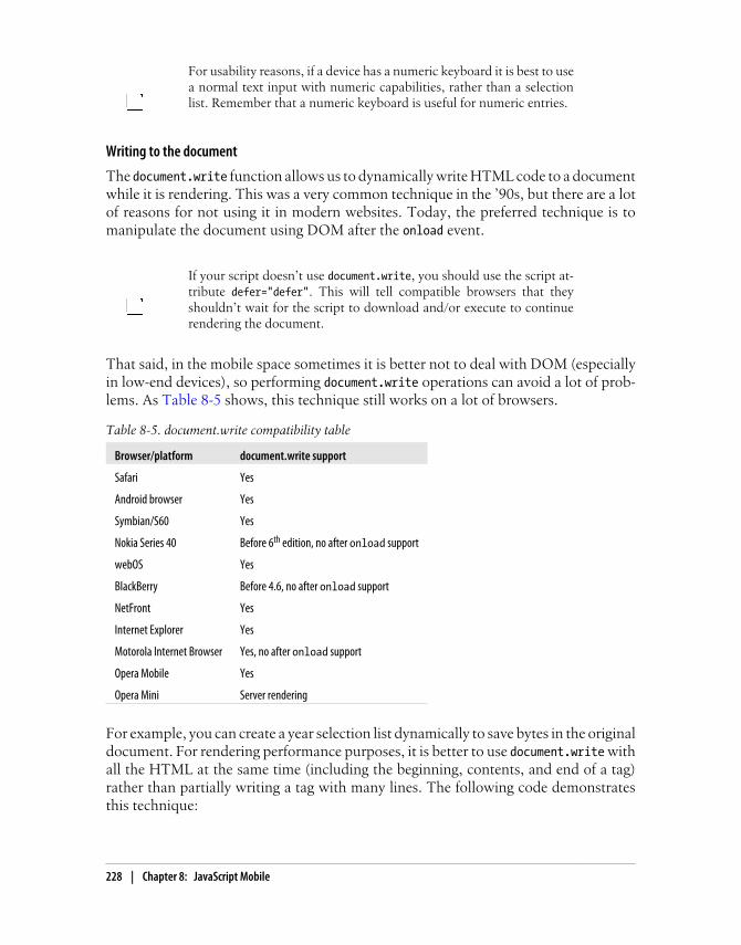
For usability reasons, if a device has a numeric keyboard it is best to usea normal text input with numeric capabilities, rather than a selectionlist. Remember that a numeric keyboard is useful for numeric entries.
Writing to the document
The document.write function allows us to dynamically write HTML code to a documentwhile it is rendering. This was a very common technique in the ’90s, but there are a lotof reasons for not using it in modern websites. Today, the preferred technique is tomanipulate the document using DOM after the onload event.
If your script doesn’t use document.write, you should use the script at-tribute defer="defer". This will tell compatible browsers that theyshouldn’t wait for the script to download and/or execute to continuerendering the document.
That said, in the mobile space sometimes it is better not to deal with DOM (especiallyin low-end devices), so performing document.write operations can avoid a lot of prob-lems. As Table 8-5 shows, this technique still works on a lot of browsers.
Table 8-5. document.write compatibility table
Browser/platform document.write support
Safari Yes
Android browser Yes
Symbian/S60 Yes
Nokia Series 40 Before 6th edition, no after onload support
webOS Yes
BlackBerry Before 4.6, no after onload support
NetFront Yes
Internet Explorer Yes
Motorola Internet Browser Yes, no after onload support
Opera Mobile Yes
Opera Mini Server rendering
For example, you can create a year selection list dynamically to save bytes in the originaldocument. For rendering performance purposes, it is better to use document.write withall the HTML at the same time (including the beginning, contents, and end of a tag)rather than partially writing a tag with many lines. The following code demonstratesthis technique:
228 | Chapter 8: JavaScript Mobile

<!DOCTYPE html PUBLIC "-//WAPFORUM//DTD XHTML Mobile 1.0//EN" "http://www.wapforum.org/DTD/xhtml-mobile10.dtd"><html xmlns="http://www.w3.org/1999/xhtml"><head>
<meta http-equiv="Content-Type" content="text/html; charset=UTF-8" /><title>Document Write</title><script type="text/javascript">function createNumericSelect(name, from, to) { var html = "<select name='" + name + "'>"; for (var i=from; i<to; i++) { html += "<option>" + i + "</option>"; } html += "</select>"; document.write(html);}</script>
</head>
<body><form action="send"> <script type="text/javascript"> createNumericSelect('year', 1990, 2020); </script></form></body></html>
Remember that document.write should not be used in an event handler, like onload oronclick, because it will have unpleasant results. If you need to dynamically generatecontent on the page, it is better to use DOM than document.write.
Platform detection
JavaScript has a native navigator object representing the client browser on which thecode is running. We are going to take a look at server-side detection in the followingchapter, but for now, we can use this technique to detect what device our code isrunning on and make a decision based upon that.
When using a for, remember to define the index variable as a local filewith var i=initial_value. If not, you’ll be using a global variable, whichcan have some performance and bug issues.
The navigator object has many properties, but the most useful are appName (thebrowser’s name), appVersion (the browser’s version), mimeTypes (an array of supportedMIME types), plugin (an array of supported plug-ins for object tag), platform (theoperating system), and userLanguage.
Coding JavaScript for Mobile Browsers | 229

Generally, we will use the string’s indexOf function to verify whether some of theseattributes have the values we are looking for. For example:
// Detects if it is an Android devicevar android = (navigator.platform.indexOf("android")>=0);if (android) { // Do something}
Table 8-6 shows what is returned from these properties for each browser. In this table,assume that <User Agent> will be replaced with each device’s user agent ID.
Table 8-6. JavaScript navigator object properties compatibility table
Browser/ Platform appName appVersion mimeTypes platform
Safari Netscape 5.0 (<User Agent>) Array iPhone, iPod, oriPad
Android browser Netscape 5.0 (<User Agent>) Array null
Symbian/S60 Netscape 5.0 (<User Agent>) Array S60
Nokia Series 40 before 6th ed-ition
Nokia Empty string Undefined Undefined
Nokia Series 40 6th edition Netscape 2.0 Undefined Nokia_Series_40
webOS Netscape 5.0 (<User Agent>) Array webOS
BlackBerry Netscape <Platform version> Array BlackBerry
NetFront ACCESS NetFront
<Browser version> Array Unknown
Internet Explorer Microsoft IEMobile
Empty string Undefined WinCE
Motorola Internet Browser Netscape 5.0 Array WiderWeb
Opera Mobile Opera <opera engineversion> (Symbian orWindows)
Array Symbian orWindows
Opera Mini Opera <opera engineversion>
Array Pike
Window size
JavaScript has two objects related to sizes: document.documentElement and screen. Thefirst is related to the size of the current document’s viewport, and the second to thewhole screen of the device. At the time of writing, there is no browser that allowswindows smaller than the whole screen. We can create web widgets for the home screenon many devices, but this is another situation and it will be covered in Chapter 12.
230 | Chapter 8: JavaScript Mobile

BlackBerry devices have a global variable, blackberry, that has two ob-jects: location and network. location will be reviewed in Chapter 11;the network property allows us to know whether the user is using WiFi,GPRS, EDGE, CDMA, or some other network. Android Browser, from2.2, also has a similar property: navigator.connection.type.
The screen object has four properties: width, height, availWidth, and availHeight. Thelast two refer to the size available taking into account the space used by the operatingsystem toolbars. In the mobile space, they are generally the same as the width andheight values.
The most commonly used way to get the window size is via document.documentElement.clientWidth and document.documentElement.clientHeight.
The only way for these values to change while the page is loaded is in response to anorientation change, on compatible devices (landscape to portrait and vice versa). Ta-ble 8-7 shows which browsers can access information about the screen and windowsize and which support orientation changes.
Table 8-7. Screen properties and events compatibility table
Browser/platform Screen size Window size Orientation change
Safari Yes Yes onorientationchange andonresize
Android browser Yes Yes onresize
Symbian/S60 Yes, different in full-screenmode
Yes onresize
Nokia Series 40 No before 6th edition No before 6th edition No
webOS Yes Viewport size onresize
BlackBerry No before 4.6 No document.onresize in somedevices
NetFront Yes No No
Internet Explorer Yes No No
Motorola Internet Browser Yes Yes No
Opera Mobile Yes Yes No
Opera Mini Yes Yes No
History and URL management
JavaScript has a few standard mechanisms for browser history management: the location and history objects. The location object has several properties regarding the ad-dress, like href for the whole URL and hash for the anchor part of the URL, if present(the # and everything to the right of it). Changing the location.href property will re-direct the browser to another page, on compatible devices. It has two useful methods:
Coding JavaScript for Mobile Browsers | 231

reload(), which refreshes the same page, and replace(url), which sends the user toanother page without creating a new history entry.
Remember to use JavaScript as little as possible to reduce battery con-sumption (one of the main problems today in the mobile environment).
The history object has a few not-very-useful properties and three methods: back(),go(number), and forward(). The back method is the most commonly used, for emulatinga back button:
<!-- As a button --><input type="button" onclick="history.back()" value="Back" /><!-- As a link --><a href="javascript:history.back()">Back</a>
Remember that we are designing for mobile browsers, and sometimes the users will bebrowsing in full-screen mode without any browser buttons in sight. A link or buttonfor going back will be more useful here than in desktop websites.
Table 8-8 shows what happens when we try to manage the history and location usingJavaScript in mobile devices.
Table 8-8. Redirection compatibility table
Browser/platform href, replace, reload, and history.back support
Safari Yes
Android browser Yes
Symbian/S60 Yes
Nokia Series 40 Yes
webOS Yes
BlackBerry Yes
NetFront Yes
Internet Explorer Yes
Motorola Internet Browser Yes
Opera Mobile Yes
Opera Mini Yes, reload causes a new history entry
Manipulating windows
One of the most popular (and annoying) features of JavaScript is the usage ofwindow.open for opening the classic pop-up windows. For mobile browsers, the usageof this technique is not ideal, for many reasons. Many browsers can’t open multiplewindows (although Figure 8-3 shows one that can in action), and we cannot define anyattributes for the pop-ups; they will just be full-sized, like the main window.
232 | Chapter 8: JavaScript Mobile

Communication between the opener and the pop-up also often does not work well.Finally, closing pop-ups can be problematic on browsers that treat the new window asa normal page and not a pop-up, because window.close only works on pop-ups.
So, if you can, avoid using pop-ups. If you really need one for some reason, open thewindow after an onclick event (avoid opening windows in the onload event or inside atimer callback) and remember that some mid- and low-end devices will not show yourwindow.
A better alternative is to use a link with target="_blank". This will havethe same result in mobile devices as a window.open call, and it will workon every browser. If the browser doesn’t support multiple windows, itwill just replace the current one.
Table 8-9 reports on how the different browsers handle window.open.
Figure 8-3. The Android browser is one of the few capable of opening pop-ups with a subwindowdesign.
Coding JavaScript for Mobile Browsers | 233

Table 8-9. window.open compatibility table
Browser/platform window.open behavior
Safari Same as _blank. window.close works, but the user will be redirected to the windows listafter, not back to the original window.
Android browser Yes, pop-up behavior and design. Your defined size will not be used.
Symbian/S60 Open in new window.
Nokia Series 40 Open in same window.
webOS Open a new card. window.close does not work.
BlackBerry Open in same window. Before 4.6, the user is asked if he wants to open it.
NetFront Open in same window. window.close does not work.
Internet Explorer Open in same window. window.close does not work.
Motorola Internet Browser Open in same window.
Opera Mobile Open in same window.
Opera Mini Open in same window.
Focus and scroll management
You can set the focus to a clickable element (e.g., a form input, link, or button) usingthe focus function of every DOM element. The most helpful usage is for form inputcontrols. The behavior varies on different mobile browsers. On some touch devices,focusing in a text box should automatically open the onscreen keyboard, and in somecursor-based browsers it will position the cursor over the element.
If the document the user is browsing is form-based, like a search pageor a contact us page, it will be better for usability to automatically focuson the first text input. This reduces the amount of navigation the userhas to do on the page.
On some devices, the global window object has a scrollTo function that takes two pa-rameters, xPosition and yPosition, specifying the position at the top-left corner of thescreen to scroll to. On some devices (like the iPhone), using scrollTo emulates theuser’s scrolling and hides the browser’s toolbars, as if the user were scrolling with herfingers. So, for iPhone browsers, it is common to use the following code, which auto-matically hides the toolbars after the onload event:
window.scrollTo(0, 1);
This function can also be used to generate links to the top of the page, on compatibledevices:
<a href="javascript:window.scrollTo(0, 1);">Go to Top</a>
This same behavior can also be applied without JavaScript, using anchors.
234 | Chapter 8: JavaScript Mobile

Table 8-10 lists the different browsers’ compatibility with the focus and scrollTofunctions.
Table 8-10. Focus and scrolling compatibility table
Browser/platform focus scrollTo
Safari Yes Yes
Android browser Yes Yes
Symbian/S60 Yes Yes
Nokia Series 40 No No
webOS No No
BlackBerry No No
NetFront No Yes
Internet Explorer No Yes
Motorola Internet Browser No No
Opera Mobile Yes No
Opera Mini No No
Timers
JavaScript offers two kinds of timers: setTimeout and setInterval. The first one is exe-cuted once and the second one is executed every n milliseconds until it is cancelledusing clearInterval.
You can use timers for updating information from the server using Ajax every n seconds,for creating an animation, or for controlling the timeout of an operation.
In mobile browsers, you need to be especially careful about using timersbecause of the battery consumption. If you need to use many high-fre-quency timers at the same time, try to manage them using only one timerthat will launch different behaviors from the same process.
The first question we need to ask ourselves is, what happens when our web page goesto the background because the user switches focus to another application (in multi-tasking operating systems) or opens or browses to another tab or window? Anotherproblem is what happens when the phone goes to sleep (because of the user’s inactivitywhile the script is executing). The behavior of timers can be a little tricky in thesesituations.
Yet another problem is that timers execute on the same thread as the main script. Ifour script is taking too much processor time (a normal situation with large scripts onlow- and mid-end devices), our timers will be delayed until some spare execution timeis found.
Coding JavaScript for Mobile Browsers | 235

If we use a low frequency for the timer (for example, 10 milliseconds), the timer willgenerally have problems meeting the timetable.
Remember that the JavaScript execution time depends a lot on the device hardwareand the browser’s engine. Even if they’re running the same operating system, like An-droid, execution times can differ: for example, an HTC G1 will be much slower thana Nexus One with a 1-Ghz processor.
Let’s look at a simple example and see what happens normally and when we send theweb page to the background:
<!DOCTYPE html PUBLIC "-//WAPFORUM//DTD XHTML Mobile 1.0//EN" "http://www.wapforum.org/DTD/xhtml-mobile10.dtd"><html xmlns="http://www.w3.org/1999/xhtml"><head><meta http-equiv="Content-Type" content="text/html; charset=UTF-8" /><title>Using Timers</title></head>
<body>
<script type="text/javascript">var timer = setInterval(timerHit, 200);var q = 0;var lastTime = new Date().getTime();
function timerHit() { q++; var deltaTime = new Date().getTime() - lastTime; document.getElementById("content").innerHTML += q + ": " + deltaTime + "<br />"; lastTime = new Date().getTime();
// Generate some random delay var randomNumber = Math.floor(Math.random()*1000)+5000; for (var i=0; i<randomNumber; i++) { var a = new Array(); }
// We will run only 15 experiments if (q==15) { clearInterval(timer); }}</script>
<div id="content"></div>
</body></html>
236 | Chapter 8: JavaScript Mobile

As shown in Figure 8-4, the real times are very different on different devices. On low-and mid-end devices, if they work at all, the result is far from our 200 ms intention—some low-end devices don’t even accept timers with a frequency of less than 1 second.
Figure 8-4. Timers will not always have the frequency we want.
Table 8-11 shows which browsers support timers, and how they handle the timers whenthe page is in the background.
Table 8-11. Timers support compatibility table
Browser/platform Timers available Timers in background
Safari Yes Stopped. From iOS 4.0: continue working while in other browser's window.
Android browser Yes Stopped.
Symbian/S60 Yes Stopped. From 2.2: continue working while in other browser's window.
Nokia Series 40 No
webOS Yes Continue working.
BlackBerry No
NetFront Yes No multitasking.
Coding JavaScript for Mobile Browsers | 237

Browser/platform Timers available Timers in background
Internet Explorer Yes Stopped.
Motorola Internet Browser No
Opera Mobile Yes Continue working.
Opera Mini No
The Gmail for Mobile team discovered some issues with timer behavioron mobile Safari and Android devices, and made the results public inthe team blog at http://www.mobilexweb.com/go/timers. The conclu-sions are: for low-frequency timers (1 second or more), there are noperformance issues, and you can add as many as you want; for high-frequency timers (for example, 100 ms), though, every new timer cre-ated makes the UI more sluggish. The preferred solution is to use onlyone high-frequency timer.
Waking up
As we discussed in the previous section, on most devices timers (and all JavaScriptexecution) are paused when the web page is sent to the background. I have an iPodTouch, and in Safari I always have my email open in one of the eight possible tabs (orwindows). When I want to browse to another website, I change to another tab but leavethat one open. That means my email can be frozen for several hours or even days, untilI go back to that tab. As developers, this raises an important issue: when our web pagesare put into the background, how can we detect when they should “wake up” again?
Neil Thomas, a software engineer from Google working in the Gmail for Mobile team,has published a very simple and clever solution using a high-frequency timer and aglobal variable for calculating the time elapsed between calls to that timer. Because thetime will not fire when the application is in the background, if we detect that the deltatime from the last execution is greater than a certain threshold value we can assumethat the timer firing again indicates that the application has just woken up fromhibernation.
Remember to use a large value for the threshold after deciding that thepage has gone to sleep. Otherwise, depending on the tasks being done,the engine behind the browser, and the device hardware, it may takelonger for the JavaScript code that’s executing to complete than the timedefined for the timer.
This is Thomas’s public code (with a little variation from me). An explanation can befound at http://www.mobilexweb.com/go/timers:
// The time, in ms, that must be "missed" before we// assume the app has been put to sleep.
238 | Chapter 8: JavaScript Mobile

var THRESHOLD = 10000;
var lastTick_;var detectWakeFromSleep_ = function() { var now = new Date().getTime(); var delta = now - this.lastTick_; if (delta > THRESHOLD) { // The app probably just woke up after being asleep. notifyWakeFromSleep(delta/1000); } lastTick_ = now;};
In the notifyWakeFromSleep method, you can decide what to do based on the receivedparameter telling you how many seconds have passed since the last active state. Youmay want to do different things if the delta time is 10 seconds or 1 day (86,400 seconds).For example, after a big delta you might want to show a warning or a loading animationwhile new results are fetched using Ajax.
There is one situation where we won’t have the opportunity to wake up.If the device is running out of memory and our page is in the back-ground, it is possible that the browser will delete the page state to releasememory, and when the user comes back to it our page will be loaded byURL as a new session.
Remember that after waking from sleep, the document and the script are in the samestate (including their HTML content and JavaScript variables) as they were before goingto sleep. iOS before 4.0 doesn’t support multitasking, but Safari stores the state of everywindow even when it is closed.
Changing the title
In desktop web applications, it is common to change the title dynamically to alert theusers of a change in the page, when updates are made in an Ajax application, or simplyas an animation (please, don’t do this!).
In mobile browsers, this isn’t such a good idea, for the following reasons:
• Many browsers don’t even display the title.
• If the user is working with many tabs at the same time, dynamically changing thetitle won’t be useful because your web page will be frozen when it is in the back-ground.
• Animations in the title can be annoying in a mobile browser.
Regular expressions
Regular expressions are a great way to validate input and perform other tasks. They areincluded in the JavaScript 1.5 standard, but some low- and mid-end devices may not
Coding JavaScript for Mobile Browsers | 239

include regular expression algorithms. Still, Table 8-12 shows that this is a very com-patible feature across browsers.
Table 8-12. Regular expression compatibility table
Browser/platform Regexps available
Safari Yes
Android browser Yes
Symbian/S60 Yes
Nokia Series 40 Yes
webOS Yes
BlackBerry Yes
NetFront Yes
Internet Explorer Yes
Motorola Internet Browser Yes
Opera Mobile Yes
Opera Mini Yes
Cookie management
Cookies are a great solution for the problem of statelessness in HTTP. As you’ll see in Table 8-13, they work on practically all modern devices. This is good. The bad thingis that the lifetime of a cookie can be shorter in the mobile ecosystem than in the desktopworld, especially in low- and mid-end devices, because of the lack of memory storage.
It is recommended to maintain cookies’ values at below 2 KB for thebest compatibility in mobile devices.
Cookies are normally stored and read by the server, but JavaScript also allows us toread and write them as a client-side storage mechanism. As Table 8-13 shows, all themajor platforms support cookie management from script code.
Table 8-13. Client-side cookies compatibility table
Browser/platform Cookie management
Safari Yes
Android browser Yes
Symbian/S60 Yes
Nokia Series 40 Yes
webOS Yes
BlackBerry Yes
240 | Chapter 8: JavaScript Mobile
Browser/platform Cookie management
NetFront Yes
Internet Explorer Yes
Motorola Internet Browser Yes
Opera Mobile Yes
Opera Mini Yes
DOMThe Document Object Model is an increasingly common part of mobile development.
Versions
Two main DOM versions are available for mobile browsers:
• DOM Level 1 HTML
• DOM Level 2 HTML & Core
DOM Level 1 has been deprecated as a standard, but it still works in desktop and somemobile browsers. I remember using it in the ’90s, before it was replaced by DOMLevel 2.
DOM Level 1 allows a series of array collections as objects in the document for accessingall the elements in the document. The collections are:
• images
• applets
• links
• forms
• anchors
It also defines the document.getElementById and document.getElementsByName methods.In DOM Level 1, it is common to access a form’s input values using the syntax document.forms[0].input_name.value, supposing a unique form.
DOM Level 2 added some new methods, and it is the most commonly used versiontoday for mobile browsers. DOM Level 3 added events, validation, and XPath support,but it’s not compatible with most mobile browsers.
Browsing
Table 8-14 shows compatibility for DOM browsing methods in the different mobilebrowsers.
Coding JavaScript for Mobile Browsers | 241

Table 8-14. DOM support compatibility table
Browser/ platform DOM HTML collecs. getElementById getElementsByTagName childNodes
Safari Yes Yes Yes Yes
Android browser Yes Yes Yes Yes
Symbian/ S60 Yes Yes Yes Yes
Nokia Series 40 before 6th edition No Yes No No
Nokia Series 40 after 6th edition No Yes Yes Yes
webOS Yes Yes Yes Yes
BlackBerry No Yes No before 4.6 Yes
NetFront No Yes Yes Yes
Internet Explorer Partial Yes Yes Yes
Motorola Internet Browser No Yes No Yes
Opera Mobile Yes Yes Yes Yes
Opera Mini Yes Yes Yes Yes
Query selectors
Query selectors are a way to use CSS selectors to retrieve an element result list from theDOM. This mechanism is very popular when using the jQuery JavaScript library, andit is included natively as an extension in some WebKit-based browsers and Firefox 3.5for desktop. At the time of this writing query selectors are covered in a W3C draftknown as Selectors API Level 1.
A query is made using document.querySelector(selector) for unique results, or document.querySelectorAll(selector) for many possible return values. For example:
var items = document.querySelectorAll("ul.menu > li");var option = document.querySelector('#form1 input[type="radio"]:checked');
Many browsers have moved ahead to support query selectors, as shown in Table 8-15.
Table 8-15. CSS-style query selector compatibility table
Browser/platform Query selector support
Safari Yes
Android browser Yes
Symbian/S60 No
Nokia Series 40 No
webOS Yes
BlackBerry No
NetFront No
Internet Explorer No
242 | Chapter 8: JavaScript Mobile

Browser/platform Query selector support
Motorola Internet Browser No
Opera Mobile Yes
Opera Mini Yes
Changing properties
DOM for HTML defines an object representing each HTML tag with properties foreach HTML attribute. Many browsers support this, as you’ll see in Table 8-16. Forexample, we can create an image gallery album by changing the src property of animg tag every 2 seconds. When you change a property that defines a change in a resource,the browser needs to get the new resource at that time. The following code demon-strates:
<body>
<script type="text/javascript">var timer = setInterval(changeImage, 2000);var currentImage = 0;
function changeImage() { // We have 5 images, from 0 to 4 currentImage = (currentImage + 1) % 5; document.getElementById("album").src = currentImage + ".png";}</script>
<img src="1.png" id="album" width="100" height="100" />
</body>
If the mobile browser supports CSS Sprites, we can make the same al-bum by changing the style.backgroundPosition property to move thewindow to a different part of the image.
Table 8-16 shows which browsers support changing properties dynamically.
Table 8-16. Changing properties dynamically compatibility table
Browser/platform Support for changing properties
Safari Yes
Android browser Yes
Symbian/S60 Yes
Nokia Series 40 No before 6th edition
webOS Yes
BlackBerry No before 4.6
Coding JavaScript for Mobile Browsers | 243

Browser/platform Support for changing properties
NetFront Yes
Internet Explorer Partial
Motorola Internet Browser Yes
Opera Mobile Yes
Opera Mini Yes (on the server)
Changing content
The most common usage of Dynamic HTML is to change the content of an elementusing the innerHTML property (or the simpler innerText). For example, you may wantto use it to replace content in or add content to an element. Table 8-17 shows whichbrowsers currently support this property.
Table 8-17. innerHTML property compatibility table
Browser/platform Support for innerHTML
Safari Yes
Android browser Yes
Symbian/S60 Yes
Nokia Series 40 No before 6th edition
webOS Yes
BlackBerry No before 4.6
NetFront Yes
Internet Explorer Yes
Motorola Internet Browser Yes
Opera Mobile Yes
Opera Mini Yes (on the server)
Preloading images
It is common in Dynamic HTML documents to preload images in memory if we aregoing to use them later in the same document (e.g., in the previous image gallery). Thisis typically done using code like the following:
var image = new Image(100,25);image.src = "image_url";
Then, when we use the same src in another image, the resource should already bepresent in the cache. Table 8-18 shows which devices support preloading.
244 | Chapter 8: JavaScript Mobile

Table 8-18. Preloading images compatibility table
Browser/platform Support for preloading images
Safari Yes
Android browser Yes
Symbian/S60 Yes
Nokia Series 40 No before 6th edition
webOS Yes
BlackBerry No before 4.6
NetFront Yes
Internet Explorer Yes
Motorola Internet Browser No
Opera Mobile Yes
Opera Mini Yes
Adding and removing elements
The alternative to using innerHTML to insert elements inside another element is to useDOM methods to add objects as children. The next script will remove all of a list item’schildren and replace them with a link:
var items = document.getElementsById("li");for (int i=0; i<items.length; i++) { for (int j=0; j<items[i].childNodes; j++) { items[i].removeChild(items[i].childNodes[j]); } var a = document.createElement("a"); a.href = "go.html"; a.innerHTML = "Item " + i; items[i].appendChild(a);}
Table 8-19 shows how this works in mobile browsers.
Table 8-19. Adding and removing elements in DOM compatibility table
Browser/platform Support for appendChild and removeChild
Safari Yes
Android browser Yes
Symbian/S60 Yes
Nokia Series 40 No before 6th edition
webOS Yes
BlackBerry No before 4.6
NetFront Yes
Internet Explorer Yes
Coding JavaScript for Mobile Browsers | 245

Browser/platform Support for appendChild and removeChild
Motorola Internet Browser No
Opera Mobile Yes
Opera Mini Yes
For the best mobile performance, use innerHTML instead of using DOMmethods for adding, moving, and removing elements.
Scripting StylesChanging content with JavaScript is useful, but sometimes it’s easier to use styles fromJavaScript to make things appear and disappear and change their appearance.
Changing styles
With DOM support, we can read and dynamically change every inner CSS style usingstyle and its subproperties, like backgroundColor, textAlign, and margin. We can alsochange CSS styles using the className property of every element. Table 8-20 exploreswhich browsers support changing the class, removing the class, and applying multipleclasses using a space (e.g., class1 class2).
Table 8-20. Changing CSS dynamically compatibility table
Browser/platform Support for changing styles and classes dynamically
Safari Yes
Android browser Yes
Symbian/S60 Yes
Nokia Series 40 No before 6th edition
webOS Yes
BlackBerry No before 4.6
NetFront Yes
Internet Explorer Yes
Motorola Internet Browser Partial
Opera Mobile Yes
Opera Mini Yes
Showing and hiding styles
Table 8-21 shows which browsers support showing and hiding block content usingelement.style.display='none' or element.style.display='block'. We can also use
246 | Chapter 8: JavaScript Mobile

style.visibility, but in this case the block will still occupy the box without showingits contents.
Table 8-21. Showing and hiding elements compatibility table
Browser/platform Support for showing/hiding content
Safari Yes
Android browser Yes
Symbian/S60 Yes
Nokia Series 40 No before 6th edition
webOS Yes
BlackBerry No before 4.6
NetFront Yes
Internet Explorer Yes
Motorola Internet Browser No
Opera Mobile Yes
Opera Mini Yes
Event HandlingOne of the most frequently used features of JavaScript is event handling, whether wedefine it inside the HTML document or by using code. Let’s see how mobile browserswork with this way to execute script code.
Managing events
We can define event handling in scripts using the following methods, browser supportfor which is listed in Table 8-22:
• Using HTML attributes, like onclick="alert('sample')"
• Using the JavaScript object property, element.onclick = function() {}
• Using the DOM addEventListener method
Microsoft uses the attachEvent property of the element instead of theDOM addEventListener method in Internet Explorer.
Coding JavaScript for Mobile Browsers | 247

Table 8-22. Event registration compatibility table
Browser/platform HTML attribute Object property addEventListener
Safari Yes Yes Yes
Android browser Yes Yes Yes
Symbian/S60 Yes Yes Yes
Nokia Series 40 Yes No before 4.6 No before 4.6
webOS Yes Yes Yes
BlackBerry Yes No before 4.6 No
NetFront Yes Yes No
Internet Explorer Yes No No
Motorola Internet Browser Yes No No
Opera Mobile Yes Yes Yes
Opera Mini Yes, with server
postback
Load and unload events
The famous onload event is available for any HTML element, but it is best used in thebody element. We’ll test compatibility over different types of elements.
The onunload event is less famous. In theory it should work for every element, but againthe most useful usage is applied to the body element (document object) to detect whenthe user is navigating away from our document.
In modern browsers, the onunload event does not work as we might want (I remembermany battles against the onunload event when a new pop-up was opened every time Iclosed one), and it has been replaced by the nonstandard onbeforeunload. Theonbeforeunload event is useful for alerting the user about unfinished work so she doesn’tlose any changes she’s made on the page before going back or browsing to anotherURL. To do this, it is generally used with a confirm dialog.
Table 8-23 reports on the compatibility of all of these events across browsers.
Table 8-23. Load events compatibility table
Browser/platform body (load) body (unload) body (beforeunload) img (load)
Safari Yes Yes No Yes
Android browser Yes Yes Yes Yes
Symbian/S60 Yes Yes No Yes
Nokia Series 40 Yes No No No before 6th edition
webOS Yes Yes Yes Yes
BlackBerry Yes No No Yes
248 | Chapter 8: JavaScript Mobile

Browser/platform body (load) body (unload) body (beforeunload) img (load)
NetFront Yes Yes No Yes
Internet Explorer Yes Yes No Yes
Motorola Internet Browser No No No No
Opera Mobile Yes No No Yes
Opera Mini Yes No No No
Click events
The onclick event is the most-used event on the Web. In mobile sites, we have to testit to see where it can best be used. We know that there are focus-based, touch-based,and cursor-based browsers. The last ones are the simplest for click events: every timethe user moves the cursor arrow and then presses FIRE or any other similar key, anonclick event is generated. In focus-based browsers, it is recommended to use theonclick event only in clickable elements, such as links or buttons, because the focuswill not be active on other elements (such as div, p, or li elements).
The input type button should be used with care when developing forlow-end devices. Some Series 40 devices require a form tag for everyinput to be rendered, and some Motorola devices use these buttons assubmit buttons, so pressing them causes the form to be submitted.
For touch devices, the behavior is simple, too: every touch (finger- or stylus-based) istransferred as a click over the screen. Table 8-24 reports on how different devices sup-port these events.
Table 8-24. Click event compatibility table
Browser/platform a img div li
Safari Yes Yes Yes Yes
Android browser Yes Yes Yes Yes
Symbian/S60 Yes on touch and cursor browsing
Nokia Series 40 No before 6th edition
webOS Yes Yes Yes Yes
BlackBerry Yes No No before 4.6 No
NetFront Yes Yes Yes Yes
Internet Explorer No No No Yes
Motorola Internet Browser Yes, they are all converted to buttons
Opera Mobile Yes Yes Yes Yes
Opera Mini Yes Yes Yes Yes
Coding JavaScript for Mobile Browsers | 249

If the user is using a finger to touch the screen, you need to be awarethat the click coordinates can change during the touch (depending onhow the user presses the screen), and the precision will not be good. Usebig areas as clickable ones.
On touch devices, if you want to detect a double-tap gesture, you shouldn’tuse the nonstandard ondblclick event; in most cases it will not work and it will alsofire an onclick. The best solution (also compatible with non-touch devices) is to im-plement a tap–double tap detection pattern using the following code sample:
var doubletapDeltaTime_ = 700;var doubletap1Function_ = null;var doubletap2Function_ = null;var doubletapTimer = null;
function tap(singleTapFunc, doubleTapFunc) { if (doubletapTimer==null) { // First tap, we wait X ms to the second tap doubletapTimer_ = setTimeout(doubletapTimeout_, doubletapDeltaTime_); doubletap1Function_ = singleTapFunc; doubletap2Function_ = doubleTapFunc; } else { // Second tap clearTimeout(doubletapTimer); doubletapTimer_ = null; doubletap2Function_(); }}
function doubletapTimeout() { // Wait for second tap timeout doubletap1Function_(); doubleTapTimer_ = null;}
We can use the previous library like this:
<img src="bigbutton.png" onclick="tap(tapOnce, tapTwice)" />
supposing tapOnce and tapTwice are two previously declared global functions.
In general, in a nonclickable element no events will be generated, whilein clickable elements events are fired in the order onmouseover, onmousedown, onmouseup, onclick.
Alternatively, we can use it from JavaScript as follows:
element.onclick = function() { tap( function() { // This is the code for the first tap },
Double tap.
250 | Chapter 8: JavaScript Mobile

function() { // This is the code for the second tap } );}
Remember that implementing touch and hold (or long press) handlingcan cause problems in some touch browsers because the browser is al-ready capturing this event for contextual menus. You can only apply itin text blocks with user-selectable disabled.
Safari as of iOS 2.0 has multitouch support. The user cantouch the screen with up to five fingers at the same time (11 fingers on the iPad) andthe JavaScript code will receive the event for this. For multitouch detection, we shouldnot use the standard onclick event. Instead, we should replace it with the followingnonstandard events:
• ontouchstart
• ontouchmove
• ontouchend
• ontouchcancel
The Android browser also supports these touch events, but the multi-touch support depends on the hardware and software implementation.
When we capture these events, we will receive them both for single touches and mul-titouches. Every time the user presses a finger on the screen, ontouchstart will be exe-cuted; if she moves one or more fingers, ontouchmove will be the event to capture; andwhen the user removes her fingers, ontouchend will be fired. What about ontouchcancel? A touch cancel event is executed if any external event with more priority than ourwebsite (e.g., an alert window, an incoming call, or a push notification) cancels theoperation.
If you are creating a game, a drawing application, or some other solutioncapturing touches, it is very important to remember the ontouchcancelevent and to pause or stop the touch behavior when this event fires.
The four multitouch events receive the same event object (TouchEvent) as a parameter.It contains a touches array representing the coordinates of each touch on the page; eacharray element is an object with pageX and pageY properties. If the device is not multi-touch-enabled, you will receive an array of only one element.
Touch and multitouch events.
Coding JavaScript for Mobile Browsers | 251

A typical scenario, then, will be:
<div ontouchstart="touchStart(event);" ontouchmove="touchMove(event);" ontouchend="touchEnd(event);" ontouchcancel="touchCancel(event);"></div>
A touch sequence begins with the first finger and ends with the lastfinger. The touch events will be delivered to the same object that re-ceived the ontouchstart, no matter where the current touches arelocated.
The first thing we may want to do in all events is to cancel the default behavior of Safarifor the gesture the user is doing. This can be done with the TouchEvent parameter:
event.preventDefault();
The TouchEvent object supports the array collections shown in Table 8-25.
Table 8-25. TouchEvent collections
TouchEvent attribute Description
touches All the touches actually on the screen
targetTouches Only the touches inside the target element of the event
changedTouches Only the touches that changed since the last event call (useful in ontouchmove and ontouchend or to filter only new or removed touches)
When the user lifts a finger from the screen, that touch will be available inchangedTouches but not in the other collections. In Android, the removed touch is alsoavailable in the touches collection.
Every Touch object has the properties outlined in Table 8-26.
Table 8-26. Properties of the Touch object
Touch attribute Description
clientX, clientY Touch coordinates relative to the viewport
screenX, screenY Touch coordinates relative to the screen
pageX, pageY Touch coordinates relative to the whole page, including the scroll position
identifier A number for identifying the touch between event calls
target The original HTML element where the event was originated
The following sample will show a blue 20px circle below each finger touching thescreen:
252 | Chapter 8: JavaScript Mobile

<!DOCTYPE html PUBLIC "-//WAPFORUM//DTD XHTML Mobile 1.0//EN" "http://www.wapforum.org/DTD/xhtml-mobile10.dtd"><html xmlns="http://www.w3.org/1999/xhtml"><head><meta http-equiv="Content-Type" content="text/html; charset=UTF-8" /><title>iPhone Multitouch</title><meta name="viewport" content="width=device-width; initial-scale=1.0; maximum-scale=1.0; user-scalable=0;"><style type="text/css"> .point { width: 20px; height: 20px; position: absolute; -webkit-border-radius: 10px; background-color: blue; }
</style><script type="text/javascript">function touch(event) { event.preventDefault(); for (var i=0; i<event.touches.length; i++) { var top = event.touches[i].pageY-10; var left = event.touches[i].pageX-10; var html = "<div class='point' style='left: " + left + "px ; top: " + top + "px'></div>";
document.getElementById("container").innerHTML += html; }}
function clean() { document.getElementById("container").innerHTML = "";}
</script>
</head>
<body>
<div ontouchstart="touch(event)" ontouchend="clean()" id="container" style="background-color:red; width: 300px; height: 300px">
</div>
</body></html>
Focusable and form events
Table 8-27 shows support for the onfocus, onblur, onchange, and onsubmit (only forforms) events on different mobile browsers.
Coding JavaScript for Mobile Browsers | 253
Table 8-27. Form events compatibility table
Browser/platform onfocus onblur onchange onsubmit
Safari Yes Yes Yes Yes
Android browser Yes Yes Yes Yes
Symbian/S60 Yes Yes Yes Yes
Nokia Series 40 Yes No No Yes
webOS Yes Yes Yes Yes
BlackBerry Yes Yes Yes Yes
NetFront Yes Yes Yes Yes
Internet Explorer Yes No Yes Yes
Motorola Internet Browser No No No No
Opera Mobile Yes Yes Yes Yes
Opera Mini No Yes No Yes
Over events
The over events include mouseover and mouseout and are typically used for creating a hover effect when the cursor is over an element. Usage of these events in mobile websitesis discouraged for must-have features, because they will only work on cursor-basedbrowsers. Touch and focus devices don’t have an “over” state; it should be replaced byan active state or a focus one for focus-based browsers.
Safari on iOS also supports the onmousewheel event when the user isscrolling the element using two fingers at the same time.
Resizing, scrolling, and orientation change events
When the user activates scrolling over the document, some browsers fire theonscroll event from the document as a whole. Others also support the onresize event,which fires when the window size is changed. Users cannot resize mobile browser win-dows in the way they can resize desktop application windows, but a resize can begenerated if the orientation of the device changes from portrait to landscape or viceversa.
Using percentage values for widths is a good mobile design practice. Itautomatically works on all devices and allows your application to re-adapt automatically to any orientation. Unfortunately, some devices(like the Nokia N70) have some bugs with percentage values so the blockstill wraps around content, creating an awful horizontal scroll.
254 | Chapter 8: JavaScript Mobile

As of iOS 2.0, Safari also offers the onorientationchange window event and an orientation property. This property has a value of 0 in portrait mode, 90 in landscape mode,and −90 in inverse landscape mode. We can use this to make changes in the DOM oruse the body class pattern mentioned in Chapter 12 to change the whole layout:
if (window.onorientationchange) { window.onorientationchange = function() { var orientation = window.orientation; switch(orientation) { case 0: // Portrait break; case 90: // Landscape to the left break; case −90: // Landscape to the right break; } }}
Nokia N97 home screen widgets are just web documents that fire theonresize event when going from full screen to home screen mode andvice versa.
If the device isn’t an iPhone and supports onresize, we can detect the change using thefollowing code:
if (window.onresize) { if (screen.width>screen.height) { // Landscape } else { // Portrait }}
Table 8-28 lists the browsers’ compatibility with the onscroll and onresize events.
Table 8-28. Scroll and resize events compatibility table
Browser/platform onscroll onresize
Safari Yes Yes
Android browser Yes Yes
Symbian/S60 Yes Yes, also when the toolbar hides
Nokia Series 40 No No
webOS Yes Yes
BlackBerry No In some devices
NetFront No No
Internet Explorer No No
Coding JavaScript for Mobile Browsers | 255

Browser/platform onscroll onresize
Motorola Internet Browser No No
Opera Mobile No Yes
Opera Mini No No
Key events
Key events—onkeypress, onkeyup, and onkeydown—allow us to detect keypresses overthe whole page (body) or in one element (generally, a text input). On compatible mobiledevices, this can be useful for many situations:
• To provide keyboard shortcuts
• To provide navigation or movement in a game or application
• To enable form submission on Enter or another keypress
• To disallow some characters in a text input
If we are going to prevent a key from being used, we should be very careful. Rememberthat devices can have very different keyboards. Some devices have only virtual key-boards, some numeric, and some QWERTY, and key code management across plat-forms can be a little tricky.
Table 8-29 shows the compatibility of key events over the body and in a text input.
Table 8-29. Key events compatibility table
Browser/platform Support for onkeypress, onkeyup, and onkeydownSupport for onkeypress in a textinput
Safari No Yes
Android browser Yes, but it also opens address bar Yes
Symbian/S60 Yes Yes
Nokia Series 40 Yes No
webOS Yes, but it also opens address bar Yes
BlackBerry Yes No
NetFront No No
Internet Explorer Yes No
Motorola Internet Browser No No
Opera Mobile No Yes
Opera Mini No No
If the device has a QWERTY keyboard we can also detect some modifierkeys (if they exist), like Ctrl, Alt, or Shift, using the event properties.
256 | Chapter 8: JavaScript Mobile

A simple test for getting key codes can be created using the following code:
<script type="text/javascript">window.onkeyup = function(event) { // charCode depends on modifiers (as shift), keyCode not var code = event.keyCode ? event.keyCode : event.charCode; alert( "code: " + code + " - ASCII value: " + String.fromCharCode(code));};</script>
In Safari on iOS, while the focus is inside a text input with thekeyboard visible onscreen, we can capture every key pressed using only keyCode. Ta-ble 8-30 shows some important codes.
Table 8-30. Useful keyCodes in Safari
Key keyCode
Backspace/Del 127
Enter 10
Space 32
There are Android and webOS (Palm) devices with physical keyboards, and otherswithout them. The possible special key values for all these devices are shown in Ta-ble 8-31.
Table 8-31. Android and webOS useful keyCodes
Key keyCode
Backspace/Del 8
Enter 13
Space 32
The Nokia N97 has a full QWERTY keyboard, but the letters don’t provide the correctASCII values unless the user presses the Shift key at the same time. For example, theH and I keys provide the same keyCode (56) but different charCodes. The default Unicodevalues for the charCodes are the numeric or symbol values of the keys (typically usedwith the Sym key). If the user is using the onscreen keyboard (only available as a pop-up window when a form has focus), every character typed is delivered (regardless ofwhether it was entered on the numeric keyboard, by touch recognition, or by predictivetext). Table 8-32 shows the common codes.
Useful keys for some devices.
Coding JavaScript for Mobile Browsers | 257

Table 8-32. Symbian 5th edition useful keyCodes
Key keyCode charCode
Backspace 8 8
Enter 13 13
Space 32 32
Up 38 63497
Down 40 63498
Left 37 63495
Right 39 63496
Fire N/A 63557
Even if we can capture keypresses, remember that special keys (Menu,Call, End, Volume) are generally out of our scope as web developers.We cannot detect those keys.
Symbian 3rd edition devices (including the Nokia N95, E61, and so on) are non-touchdevices with numeric keypads. The few keys we can capture on such devices are shownin Table 8-33.
Table 8-33. Symbian 3rd edition useful keyCodes
Key keyCode charCode
Clear 8 8
Send N/A 63586
Cursor and Fire N/A N/A
Preventing default behavior
For almost every event, we can prevent the default behavior by using the event.preventDefault method or capturing the event and returning false. This is commonly donewith the onsubmit event, to cancel the submission when something doesn’t validate, orto cancel a link. For example:
<a href="news.html" onclick="news();return false">Go to news</a>
The preceding code is a standard link to news.html, but if JavaScript is supported wecan capture the onclick event, call a local function (that can get the news by Ajax), andcancel the normal behavior of the link by returning false. This avoids a page load andreduces network traffic.
We can also prevent a key from being used by cancelling the onkeyup event. This featuremust be used very, very carefully, and only on tested devices.
258 | Chapter 8: JavaScript Mobile

Table 8-34 shows which browsers support these three common scenarios.
Table 8-34. Preventing default event behavior compatibility table
Browser/platform onsubmit onclick on links onkeyup
Safari Yes Yes Partial
Android browser Yes Yes No
Symbian/S60 Yes Yes Partial
Nokia Series 40 Yes Yes No
webOS Yes Yes Partial
BlackBerry Yes Yes No
NetFront Yes Yes Yes
Internet Explorer Yes Yes No
Motorola Internet Browser Yes Yes No
Opera Mobile Yes Yes No
Opera Mini Yes Yes No
Touch GesturesA gesture is a way of combining finger movements over the screen to fire an action,instead of using a simple touch or click. A complete touch (or mouse) move-capturingfeature is required in order for gestures to be registered, and to be perfectly honest,today only mobile Safari and the Android browser offer good support.
If the users need to use a gesture in your web application, it is important to train themin what to do by showing a help message, a sample animation, or some other kind ofhint, as shown in Figure 8-5.
Swipe gesture
The swipe (also known as flip) gesture is a touch-based browser technique typicallyused for going forward and backward. For example, it is used in many photo galleriesto change the currently displayed image, and in presentations to move from slide toslide. The gesture is simply a finger moving across the x-axis from left to right or rightto left (a horizontal swipe) or along the y-axis from top to bottom or bottom to top (avertical swipe). It is a one-finger gesture, so it is compatible with almost any touchdevice.
There is no standard event that captures the swipe action, so we need to emulate itusing standard events.
Coding JavaScript for Mobile Browsers | 259
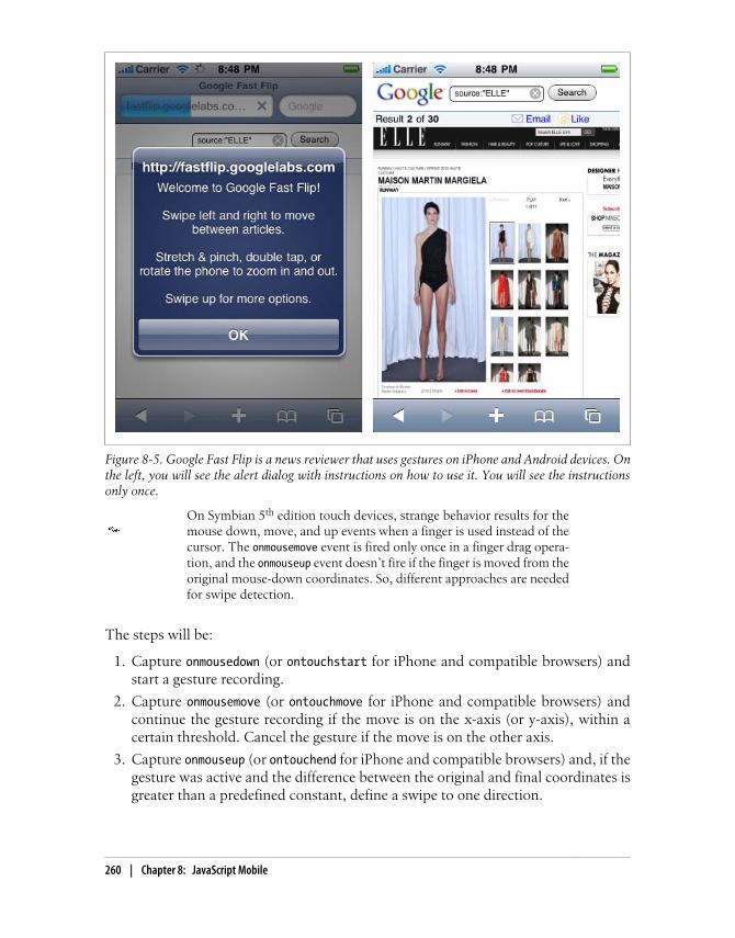
On Symbian 5th edition touch devices, strange behavior results for themouse down, move, and up events when a finger is used instead of thecursor. The onmousemove event is fired only once in a finger drag opera-tion, and the onmouseup event doesn’t fire if the finger is moved from theoriginal mouse-down coordinates. So, different approaches are neededfor swipe detection.
The steps will be:
1. Capture onmousedown (or ontouchstart for iPhone and compatible browsers) andstart a gesture recording.
2. Capture onmousemove (or ontouchmove for iPhone and compatible browsers) andcontinue the gesture recording if the move is on the x-axis (or y-axis), within acertain threshold. Cancel the gesture if the move is on the other axis.
3. Capture onmouseup (or ontouchend for iPhone and compatible browsers) and, if thegesture was active and the difference between the original and final coordinates isgreater than a predefined constant, define a swipe to one direction.
Figure 8-5. Google Fast Flip is a news reviewer that uses gestures on iPhone and Android devices. Onthe left, you will see the alert dialog with instructions on how to use it. You will see the instructionsonly once.
260 | Chapter 8: JavaScript Mobile

The last item can be replaced with an on-the-fly verification of the gesture inside theonmousemove event.
If you use jQuery, there is a free plug-in available at http://plugins.jquery.com/project/swipe to detect horizontal swiping on iPhone devices.
We can create an unobtrusive, object-oriented library for swipe detection compatiblewith iPhone, Android, and other devices with the following code:
/** Creates a swipe gesture event handler*/function MobiSwipe(id) { // Constants this.HORIZONTAL = 1; this.VERTICAL = 2; this.AXIS_THRESHOLD = 30; // The user will not define a perfect line this.GESTURE_DELTA = 60; // The min delta in the axis to fire the gesture
// Public members this.direction = this.HORIZONTAL; this.element = document.getElementById(id); this.onswiperight = null; this.onswipeleft = null; this.onswipeup = null; this.onswipedown = null; this.inGesture = false;
// Private members this._originalX = 0 this._originalY = 0 var _this = this; // Makes the element clickable on iPhone this.element.onclick = function() {void(0)};
var mousedown = function(event) { // Finger press event.preventDefault(); _this.inGesture = true; _this._originalX = (event.touches) ? event.touches[0].pageX : event.pageX; _this._originalY = (event.touches) ? event.touches[0].pageY : event.pageY; // Only for iPhone if (event.touches && event.touches.length!=1) { _this.inGesture = false; // Cancel gesture on multiple touch } };
var mousemove = function(event) { // Finger moving event.preventDefault(); var delta = 0;
Coding JavaScript for Mobile Browsers | 261

// Get coordinates using iPhone or standard technique var currentX = (event.touches) ? event.touches[0].pageX : event.pageX; var currentY = (event.touches) ? event.touches[0].pageY : event.pageY;
// Check if the user is still in line with the axis if (_this.inGesture) { if ((_this.direction==_this.HORIZONTAL)) { delta = Math.abs(currentY-_this._originalY); } else { delta = Math.abs(currentX-_this._originalX); } if (delta >_this.AXIS_THRESHOLD) { // Cancel the gesture, the user is moving in the other axis _this.inGesture = false; } }
// Check if we can consider it a swipe if (_this.inGesture) { if (_this.direction==_this.HORIZONTAL) { delta = Math.abs(currentX-_this._originalX); if (currentX>_this._originalX) { direction = 0; } else { direction = 1; } } else { delta = Math.abs(currentY-_this._originalY); if (currentY>_this._originalY) { direction = 2; } else { direction = 3; } }
if (delta >= _this.GESTURE_DELTA) { // Gesture detected! var handler = null; switch(direction) { case 0: handler = _this.onswiperight; break; case 1: handler = _this.onswipeleft; break; case 2: handler = _this.onswipedown; break; case 3: handler = _this.onswipeup; break; } if (handler!=null) { // Call to the callback with the optional delta handler(delta); } _this.inGesture = false; }
} };
262 | Chapter 8: JavaScript Mobile

// iPhone and Android's events this.element.addEventListener('touchstart', mousedown, false); this.element.addEventListener('touchmove', mousemove, false); this.element.addEventListener('touchcancel', function() { _this.inGesture = false; }, false);
// We should also assign our mousedown and mousemove functions to // standard events on compatible devices}
This is a simple example of usage of our last library, swipe.js, with a div with horizontalswipe detection and another div with vertical swipe detection:
<!DOCTYPE html PUBLIC "-//WAPFORUM//DTD XHTML Mobile 1.0//EN" "http://www.wapforum.org/DTD/xhtml-mobile10.dtd"><html xmlns="http://www.w3.org/1999/xhtml"><head><meta http-equiv="Content-Type" content="text/html; charset=UTF-8" /><title>Swipe Gesture Detection</title><meta name="viewport" content="width=device-width; initial-scale=1.0; maximum-scale=1.0; user-scalable=0;"><script type="text/javascript" src="swipe.js"></script><script type="text/javascript">
window.onload = function() { var swipev = new MobiSwipe("vertical"); swipev.direction = swipev.VERTICAL; swipev.onswipedown = function() { alert('down'); }; swipev.onswipeup = function() { alert('up'); };
var swipeh = new MobiSwipe("horizontal"); swipeh.direction = swipeh.HORIZONTAL; swipeh.onswiperight = function() { alert('right'); }; swipeh.onswipeleft = function() { alert('left'); };}
</script>
</head>
<body>
<div style="width: 100%; height: 150px; background-color: blue" id="vertical">Vertical Swipe</div><div style="width: 100%; height: 150px; background-color: red" id="horizontal">Horizontal Swipe</div>
</body></html>
Coding JavaScript for Mobile Browsers | 263

Many touch devices use the drag gesture to scroll inside the page con-tents and don’t support the preventDefault feature (see “Preventing de-fault behavior” on page 258 earlier in this chapter). That is why weshould consider other ways to navigate instead of swipe gestures.
Zoom and rotate gestures
One of the coolest features of the iPhone when it was presented as a new phone wasthe zoom and rotate gesture. Using a pinching gesture with two fingers, the user canzoom in and zoom out on content (generally a picture), and using two fingers movingin a circle, he can rotate that picture.
For non-multitouch devices, we should provide zoom features usingnormal floating buttons or with a slider.
Fortunately, from iOS 2.0, Safari allows us to detect these gestures without using low-level math in the touch events. There are three WebKit extensions available as events,listed in Table 8-35. The Android browser has also added support for these events.
Table 8-35. Events available for touch handling
Event Description
ongesturestart Fired when the user starts a gesture using two fingers
ongesturechange Fired when the user is moving her fingers, rotating or pinching
ongestureend Fired when the user lifts one or both fingers
The same events are used for rotate and zoom gestures. All three events receive aGestureEvent parameter. This parameter has typical event properties, and the addi-tional properties scale and rotation.
The scale property defines the distance between the two fingers as a floating-pointmultiplier of the initial distance when the gesture started. If this value is greater than1.0 it is a pinch open (zoom in), and if it is lower than 1.0 it is a pinch close (zoom out).
The rotation value gives the delta rotation from the initial point, in degrees. If the useris rotating clockwise we will get a positive degree value, and we’ll get a negative valuefor a counter-clockwise rotation.
I know what you’re thinking right now: “Great! Rotation and zoom. But we’re workingin HTML, so what we can do with that?” CSS extensions for Safari on iOS (and othercompatible browsers) come to our help with one attribute, -webkit-transform, and twofunctions available for manipulating its value: rotate and scale.
264 | Chapter 8: JavaScript Mobile

The rotate function receives a parameter in degrees, and we need to define the deg unitafter the number (e.g., rotate(90deg)). We can define it from a script using element.style.webkitTransform.
Let’s look at a simple sample:
<!DOCTYPE html PUBLIC "-//WAPFORUM//DTD XHTML Mobile 1.0//EN" "http://www.wapforum.org/DTD/xhtml-mobile10.dtd"><html xmlns="http://www.w3.org/1999/xhtml"><head><meta http-equiv="Content-Type" content="text/html; charset=UTF-8" /><title>Gesture Management</title><meta name="viewport" content="width=device-width; initial-scale=1.0; maximum-scale=1.0; user-scalable=0;">
<script type="text/javascript">function gesture(event) { // We round values with two decimals event.target.innerHTML = "Rotation: " + Math.round(event.rotation*100)/100 + " Scale: " + Math.round(event.scale*100)/100; // We apply the transform functions to the element event.target.style.webkitTransform = "rotate(" + event.rotation%360 + "deg)" + " scale(" + event.scale + ")";}
</script>
</head>
<body>
<div ongesturechange="gesture(event)" style="background-color:silver; width: 300px; height: 300px">
</div>
</body></html>
The sample works as shown in Figure 8-6. You can rotate and scale the div (with all itscontents) using two fingers on compatible devices. What’s the only problem? Thetransform style is always applied to the original element. So, if we apply a scale of 2.0to the element and later apply a second scale of 0.5, the new scale value will be 0.5 andnot 1.0, as we might expect.
For typical zoom-rotate relative behavior, we should change our function to thefollowing:
<script type="text/javascript">var rotation = 0;var scale = 1;
function gesture(event) { event.target.innerHTML = "Rotation: " + Math.round((event.rotation+rotation)*100)/100
Coding JavaScript for Mobile Browsers | 265

+ " Scale: " + Math.round((event.scale*scale)*100)/100; event.target.style.webkitTransform = "rotate(" + (event.rotation+rotation)%360 + "deg)" + " scale(" + event.scale*scale + ")";}
function gestureend(event) { rotation = event.rotation+rotation; scale = event.scale*scale;}
</script>
</head>
<body>
<div ongesturechange="gesture(event)" ongestureend="gestureend(event)" style="background-color:silver; width: 100%; height: 300px">
</div>
Figure 8-6. Combining touch events with CSS transformations, you can have rotation and scalefeatures in your website.
266 | Chapter 8: JavaScript Mobile

CHAPTER 9
Ajax, RIA, and HTML 5
Wow! Ajax, HTML 5, and RIA? How do these things fit together on a mobile device?We all know that Ajax is just a JavaScript technique, so that part is obvious. For mobilebrowsers, HTML 5 is also more or less a JavaScript thing, with some bonus markupfeatures (the new technologies borrowed by the mobile browsers from the HTML 5draft are almost all new JavaScript APIs that will work with HTML). Rich InternetApplication development also involves the implementation of some JavaScript UI pat-tern designs.
Ajax SupportAjax is especially important for mobile devices. The ability to download only the datato be updated and avoid unnecessary page loads is key for mobile browsers. However,Ajax is not part of the official standards, and support can vary from device to device.
If your mobile website gets content using Ajax, you should implementGoogle’s proposal for search engine optimization (SEO). You can findmore information about this at http://code.google.com/web/ajaxcrawling.
Let’s first verify the browsers’ support for the XMLHttpRequest native object (seeTable 9-1). Cross-domain requests are not compatible with mobile browsers todaybecause of supposed security problems, but you can bypass this problem with a simpleproxy on your server.
267

Table 9-1. XMLHttpRequest support compatibility table
Browser/platform XMLHttpRequest support
Safari Yes
Android browser Yes
Symbian/S60 Yes since 3rd edition
Nokia Series 40 No before 6th edition
webOS Yes
BlackBerry No before 4.6
NetFront No before 3.5
Internet Explorer Yes since Windows Mobile 5
Motorola Internet Browser No
Opera Mobile Yes since 8.0
Opera Mini Yes since 3.0
When we say that the object is available, we are talking about full support for thefollowing properties and methods:
• open
• abort
• send
• onreadystatechange
• readyState
• status
• responseText
XML ParsingThe property (standard in desktop Ajax) we left out from the previous list isresponseXML. That is because XML parsing is a more complex mechanism inside thebrowser and can have some problems. The first difference we need to verify is how thebrowsers treat whitespace inside tags. Let’s look at a simple example:
<node> <subnode /></node>
Some browsers understand that the previous code is a node with only one child, thesubnode. Other XML parsers believe that there are three children: a text node withspaces (and a newline character), the subnode, and another text node. This differencecan be a little difficult to debug if we are not aware of it. Table 9-2 shows which browserssupport XML parsing, and the nature of that support.
268 | Chapter 9: Ajax, RIA, and HTML 5

Table 9-2. XML parsing compatibility table
Browser/platform XML parsing support Spaces as children
Safari Yes Yes
Android browser Yes Yes
Symbian/S60 Yes Yes
Nokia Series 40 No before 6th edition Yes
webOS Yes Yes
BlackBerry No before 4.6 Yes
NetFront Yes from 3.6 Yes
Internet Explorer Yes No
Motorola Internet Browser No Yes
Opera Mobile Yes Yes
Opera Mini Yes, on the server Yes
JSON ParsingJavaScript Object Notation (JSON) is the most lightweight solution for Ajax becauseit allows us to use dot notation for object access, rather than the DOM parsing requiredfor other techniques, such as XML. We receive the JSON as text with responseText andconvert it to an object using eval. So, the first question is: how well does eval work onmobile devices?
We need to test eval support for JSON objects using the strict standard and the defacto standard used on and compatible with most browsers. The differences betweenthe two are shown in this code, and Table 9-3 reports on whether they worked:
// Strict standardvar obj = { 'name': 'John', 'surname': 'Doe'}// De facto standardvar obj = { name: 'John', surname: 'Doe'}
Table 9-3. JSON parsing compatibility table
Browser/platform eval with JSON (strict and de facto standards)
Safari Yes
Android browser Yes
Symbian/S60 Yes
Nokia Series 40 No before 6th edition
Ajax Support | 269

Browser/platform eval with JSON (strict and de facto standards)
webOS Yes
BlackBerry No before 4.6
NetFront Yes
Internet Explorer Yes
Motorola Internet Browser Yes
Opera Mobile Yes
Opera Mini Yes
For low- and mid-end devices with Ajax support it is not recommendedto create more than two connections to the server at the same time. Ifpossible, try to keep the number of simultaneous connections to theminimum.
JSONP and Lazy LoadingJSON with Padding (JSONP) is a very modern technique for accessing a third-partydomain’s content without the cross-domain problems of Ajax requests. Many publicweb services are offering this new way of communicating with third-party servers.
JSONP uses a script tag generated by JavaScript to a URL with a parameter we define,generally for a local callback function to be called when the script (and the data itfetches) is downloaded and executed.
A very similar technique is used for scripting code: you download only a subset of thescripts in the initial download, and then you download the other scripts that you willneed later.
JSONP needs one feature to be working on the browser: the ability to insert a scriptdynamically from JavaScript. If this feature works, the browser should detect the newDOM script element and automatically download and execute this new resource. Asthis script will call your function with the data, you will be able to receive data from athird-party server.
Modern JavaScript libraries such as jQuery support JSONP requestswithout dealing with DOM. You can use $.getJSON with a parameter toreplace an Ajax query with a JSONP query.
Generally, the third-party server offers some URL to use JSONP as format. For example:
http://api.thirdpartyserver.domain/<jsonp_script>?<callback>=<our_function>
The server will respond with something like this:
270 | Chapter 9: Ajax, RIA, and HTML 5

<our_function>( {<json_data>} );
We can test if a mobile browser detects the dynamic creation of script elements usingthe following code:
function doJSONP() { var head = document.getElementsByTagName('head')[0]; var script = document.createElement('script'); script.type = 'text/javascript'; script.src = 'http://mobilexweb.com/tests/jsonp?cb=finished'; head.appendChild(script);}
Table 9-4 shows how well this works on the different browsers. Some browsers supportan onload event that can be applied to the script and will be executed when the scriptis ready. JSONP doesn’t need this event because of the callback definition in the sameURL, but for lazy loading it can be useful on compatible browsers.
Table 9-4. Dynamic script loading compatibility table
Browser/platform Dynamic script loading support onload support
Safari Yes Yes
Android browser Yes Yes
Symbian/S60 Yes Yes
Nokia Series 40 No before 6th edition
webOS Yes Yes
BlackBerry Yes from 4.6 No
NetFront Yes No
Internet Explorer No
Motorola Internet Browser No No
Opera Mobile Yes Yes, and onreadystatechange
Opera Mini No
Comet TechniquesComet is a new web application model that provides an alternative to the polling designpattern used for making periodical checks for news on a server and similar tasks. Withthis model, we can send long-lived HTTP requests that remain open until the serverhas a response to give to the client.
For example, if we are showing a mailbox, we might want to check whether there arenew messages every x seconds. A Comet technique allows us to emulate a kind of pushtechnology where instead of us making a request every x seconds, we make only onerequest and the server holds that request open until it has new data for us. This canresult in HTTP connections being held open for a very long time. This is only one kindof Comet technique; there are others available, but they are not very reliable.
Ajax Support | 271
Palm, BlackBerry, and Apple offer push services for developers: that is,we can push messages or content from our servers to their servers, andthey will push the information to the devices. Unfortunately, these fea-tures are not available for web applications in Palm and Apple’s solu-tions.
These techniques are not recommended for mobile browsers yet. The main problemwill be 3G and 2.5G network connections: even if the server accepts them, Internetgateways are not prepared for long-lived HTTP connections, and the proxies will ter-minate the connections after a period of time.
If you are using a hung connection at the server as a Comet solution, beaware that only Symbian 5th edition, mobile Safari, Windows Mobile6.5, and Android give predictable results. On Series 40 6th edition andother devices, the browser hangs with the request, so the user cannoteven click on a link.
There are also some Adobe Flash solutions that work by opening sockets to receivenews from the server. This will only work when Flash Player 10.1 has become wide-spread, though, and using WiFi. 3G networks will not be reliable for these situations.We will also need to be careful about battery consumption.
JavaScript LibrariesThe life of a JavaScript programmer has changed radically since 2006, with the ap-pearance of Ajax and hundreds of libraries that help us work better with this language.Many of these libraries modify or add complete new behaviors to the language, creatingnew languages inside (or over) JavaScript.
If the libraries are based on JavaScript, and mobile browsers support JavaScript, whydo we care? The answer is that many of these libraries rely on some not-so-clear thingsin the standard, and while they have been prepared and tested on well-known desktopbrowsers (Internet Explorer, Firefox, Safari, Chrome, Opera), they have not been testedon all the mobile browsers. And as we’ve already seen, some DOM features (for ex-ample) are missing in many mobile browsers.
That is the first reason why we need to be careful about using big JavaScript libraries.The second (no less important) reason is the impact on download and execution times.As mentioned earlier, these libraries modify the language and the behavior of objects,and even if we don’t use any (or very little) of a library’s code, the library will need toload itself completely, which takes time. This can lead to performance problems insome browsers, so we are going to test the time that typical libraries take to initializethemselves on mobile browsers.
272 | Chapter 9: Ajax, RIA, and HTML 5

Some libraries, in their complete form, are larger than 600 KB. We needto be very careful about performance when using that code, as it willincrease network traffic, memory consumption, and execution time. Ifyou can, avoid those big libraries, or use only the code you need.
Table 9-5 shows the results for the jQuery, Prototype, Yahoo! UI, and Dojo libraries.Remember that execution time will depend a lot on the hardware and CPU. These testsare just intended to make you aware of the average time that including a library can take.
Table 9-5. JavaScript libraries average execution/load times in seconds
Browser/platform jQuery Prototype Yahoo! UI Dojo
Safari 1.8 0.2 0 0.1
Android browser 4 2.5 0.4 4.6
Symbian/S60 1.7 0.9 0.2 0.7
Nokia Series 40 Cannot be calculated
webOS 0.2 0.5 0.1 0.4
BlackBerry 6.2 5 0.8 7
NetFront 8 13.6 3.7 11.1
Internet Explorer 2 3 0.4 2
Motorola Internet Browser Not compatible
Opera Mobile 1.4 0.3 0.1 0.4
Opera Mini It can not be calculated, executed on the server
The conclusion is that you should avoid these libraries if you can. If you cannot avoidthem, use them only for smartphones, and be aware that some features and plug-insmay not work properly.
Mobile LibrariesThe good news is that many developers have released alternative libraries that aregeared for mobile devices and are lighter than the previous ones. There are also fullframeworks for mobile application development (mostly prepared for iPhone) that wewill cover later, like jQTouch, iUI, iWebKit, and Webapp.Net. These frameworks willtake care of the visualization, events, and interaction of our websites.
There are also other libraries that can replace jQuery and the others on mobile devices.They are very light libraries that provide basic DOM, event, and Ajax support.
JavaScript Libraries | 273

baseJS
baseJS is a lightweight library (8 KB) compatible with mobile Safari and other WebKit-based browsers, available at http://paularmstrongdesigns.com/projects/basejs. It has onlybeen fully tested on Safari, from iOS 1.0 to 3.0.
baseJS provides a selector similar to jQuery’s, $(selector), and some similar methods,like each, addClass, hasClass, removeClass, toggleClass, getXY, fire, and some Ajaxmethods.
XUI
XUI is a simple JavaScript framework for building mobile websites that takes up only6.7 KB compressed. It is available for free from http://xuijs.com and has been fully testedon WebKit-based browsers and Opera Mobile. The developers are working on addingsupport for IE Mobile and BlackBerry.
XUI is also similar to jQuery, but it is more powerful than baseJS. XUI uses x$ as themain selector object and includes the methods listed in Table 9-6.
Table 9-6. XUI common methods for a selector query
Method Description
html(code) or html(location, code)
Defines the inner HTML (or other location, using the second option) of the elements. Thelocation is a string and can be one of the following: inner, outer, top, bottom,before, after, or remove.
on(event, function) Registers an event listener. The event name can also be used directly as the method name(e.g., click rather than on('click')). The events compatible are: click, load,touchstart, touchmove, touchend, touchcancel, gesturestart,gesturechange, gestureend, and orientationchange.
setStyle(property,value)
Defines a CSS style.
getStyle(property,optional_callback)
Reads the value of a property. If the selector has multiple elements, the callback will befired.
addClass(class_name) Adds a class to the elements.
removeClass(class_name) Removes a class from the elements.
css(object) Defines CSS styles using a JSON-style object having properties with values.
tween(object) Animates one or more CSS properties from one value to another defined in the object.
So, for example, we can capture an onclick for buttons with a class with the followingcode:
x$('input.button').on('click', function(e){ alert('Ouch!') });
or with code like this, chaining the methods à la jQuery:
x$('input.button').click(function(e){ alert('Ouch!') }) .html('Press Me! ').css({color: 'blue'});
274 | Chapter 9: Ajax, RIA, and HTML 5

For Ajax, XUI provides global xhr and xhrjson functions to create requests with options.
WebKit CSS ExtensionsSafari on iOS is the most complex mobile browser at the time of this writing. As men-tioned in Chapter 7, from version 2.0 of iOS it supports a great (and strange) group ofCSS extensions that allow us to use hardware-accelerated animations, transitions, andeven 3D effects in our websites. Some of these extensions also work with the Androidand webOS browsers, depending on the operating system version.
WebKit FunctionsMany CSS attributes accept a function as a parameter. These functions are WebKitextensions and are all hardware-accelerated.
The gradient-related functions listed here are not officially supported iniOS, according to the Safari Reference Library. However, they workproperly from OS 3.0, and on older devices they will just use a plainbackground.
The functions available for iPhone devices are listed in Table 9-7 (there are others, butthey work only in Safari for desktop). Some of these functions, such as scale androtate, are also available for the Android and webOS browsers.
Table 9-7. CSS functions available in Safari on iOS
Function Description
cubic-beizer(p1x, p1y, p2x,p2y)
Specifies a cubic bezier timing function.
matrix(m11, m12, m21, m22, tX,tY)
Specifies a matrix transformation of six values with two translation elements.
matrix3d(m00, m01, m02, m03,m10, m11, m12, m13, m20, m21,m22, m23, m30, m31, m31, m33)
Specifies a 3D matrix transformation of 4×4.
perspective(depth) Maps a viewing cube onto a pyramid whose base is far away from the viewer.
rotate(angle) Defines a 2D rotation around the origin of the element.
rotate3d(x, y, z, angle) Defines a 3D rotation with [x,y,z] as the direction vector of the rotation.
rotateX(angle) Specifies a clockwise rotation around the x-axis.
rotateY(angle) Specifies a clockwise rotation around the y-axis.
rotateZ(angle) Specifies a clockwise rotation around the z-axis.
scale(scaleX, [scaleY]) Performs a 2D scale operation.
WebKit CSS Extensions | 275

Function Description
scale3d(scaleX, scaleY,scaleZ)
Performs a 3D scale operation.
scaleX(value) Scales along the x-axis.
scaleY(value) Scales along the y-axis.
scaleZ(value) Scales along the z-axis.
skewX(angle) Performs a skew transformation around the x-axis.
skewY(angle) Performs a skew transformation around the y-axis.
translate(deltaX, [deltaY]) Specifies a 2D translation vector.
translate3d(deltaX, deltaY,deltaZ)
Specifies a 3D translation vector.
translateX(value) Performs a translation around the x-axis.
translateY(value) Performs a translation around the y-axis.
translateZ(value) Performs a translation around the z-axis.
from(color) Specifies the initial color in a sequence.
to(color) Specifies the final color in a sequence.
color-stop(stop_percentage,color)
Specifies an intermediate color to be used at the stop_percentage value in asequence.
-webkit-gradient(linear,start_function, end_function, [stop_function, ...])
Defines a linear gradient using a start point, a final point, and optional intermediatepoints. This can be used in place of any image in CSS. Available from iOS 3.0.
-webkit-gradient(radial,inner_center, inner_radius,outer_center, outer_radius,[stop_function, ...])
Defines a radial gradient with a center point (inner) and another point (outer) withcolors determined by a series of color-stop functions. Available from iOS 3.0.
CSS functions are not a new feature of CSS; they are available for everybrowser. In fact, you are probably already familiar with some of thestandard functions, such as url(url_string) or rgba(red, green, blue,alpha) for defining colors.
GradientsFrom iOS 3.0, Safari supports CSS gradient extensions as functions anywhere we canuse an image (for a background, for example). Instead of using the url function toprovide the URL of the image, we can use the -webkit-gradient function to define alinear or radial gradient to use as the background. This technique enables us to createreally nice backgrounds for titles, containers, and cells with minimal code. The samecode also works on the Android browser.
Some samples of gradient definitions include:
276 | Chapter 9: Ajax, RIA, and HTML 5

/* Sun effect from top-right corner */body { background: -webkit-gradient(radial, 50% −50, 0, 50% 0, 300, from(#676767), to(black)) black;}
body { background: -webkit-gradient(radial, 100% −10, 50, 70% 0, 200, from(yellow), to(white)) #FFC;}
/* Simple linear gradient */li { background: -webkit-gradient(linear, 0% 0%, 0% 100%, from(#369), to(#3FF)) #369;}
/* Simple 3D effect */h1 { background: -webkit-gradient(linear, 0% 0%, 0% 100%, from(#369), to(#369), color-stop(0.5, #58B));}
For position values, we can use percentages, absolute values (without px), or the con-stant values top, bottom, right, and left. For example, we can use top right as thesecond parameter of the CSS function instead of 0% 0%. Figure 9-1 shows what theseexamples might look like in the browser.
As of version 6.0, Mobile Internet Explorer supports filters and transi-tions, using CSS extensions with the filter style. You can create alpha,chroma, shadow, glow, mask, and other effects. For more information,see http://www.mobilexweb.com/go/iefilter.
Reflection EffectsReflection or mirror effects are among the most-used effects in Web 2.0 designs. Theycan be used on any content, including images. Remember, though, that we are design-ing for mobile screens and we don’t want to waste too much space.
The reflection image doesn’t change the layout or the size of the ele-ment’s original content box. It is only part of the container’s overflow.
To create a reflection effect in Safari on iOS, use the -webkit-box-reflect attribute withthe following syntax:
-webkit-box-reflect: direction offset <mask-box-image>;
WebKit CSS Extensions | 277

The direction can be above, below, left, or right; the offset is the distance (in px or%) from the original element at which the reflection should appear; and the optionalmask-box-image is generally a gradient function that will work as a mask for the reflec-tion image. If no mask image is defined, a normal mirror will be used.
The type of reflection effect typically seen on Web 2.0 websites has the following at-tribute values:
-webkit-box-reflect: below 3px -webkit-gradient(linear, left top, left bottom,from(transparent), color-stop(0.5, transparent), to(white));
Masked ImagesAs of iOS 3.0, we have access to a typical graphic design feature that has been missingfor years in web development: masked images. We can use a masked image to applyany regular or irregular crop to the original image or, if using an alpha mask (or evena gradient function), to create a really nice visual effect over any image, like a fuzzyborder. The mask properties are analogous to the background properties. For applying
Figure 9-1. With just CSS you can create different gradient effects for iPhone, iPod Touch, iPad, andAndroid devices.
278 | Chapter 9: Ajax, RIA, and HTML 5
a mask, we have a shortcut property, -webkit-mask, and specific properties for theposition.
The syntax of the shortcut version with all the optional parameters is:
-webkit-mask: attachment, clip, origin, image, repeat, composite, box-image;
Of course, we also have access to all the properties separately, like -webkit-mask-attachment, -webkit-mask-clip, and so on. There are a lot of possibilities, but typicallyan image (alpha or not, PNG or SVG) or a gradient function is used as the image value.For example:
<img src="london.png" style="-webkit-mask-image: -webkit-gradient(linear, left top, left bottom, from(rgba(0,0,0,1)), to(rgba(0,0,0,0))); " />
<img src="london.png" style="-webkit-mask-image: url(old_picture_mask.png)" />
TransitionsA transition is just an automatic animation that takes place when a CSS property’s valuechanges. The property must be defined by the browser as able to animate (typically thisapplies to position and size properties). There isn’t an official list of properties thatanimations will work on, but the general policy is that any attribute with numerical orcolor values should be animated using transitions. There are also a few exceptions, likethe visibility discrete property.
Remember, these transitions are defined entirely using CSS: we are notusing JavaScript or any other technique to create the animations. Thismay sound a bit strange, but it is a simple and powerful technique.
The transitions framework is available for Safari (from iOS 2.0) and the Androidbrowser, and transitions have enhanced performance on these devices.
To create a transition, we should:
1. Define the transition properties (duration, delay, where to apply, timing function)in the element(s) we want to animate.
2. Change the values of the attributes of the element(s) to animate using JavaScript,or apply classes to or remove them from the element.
3. Verify that the animation is working.
Sounds simple, right? Let’s do it.
Animation properties
An animation can be defined using the shortcut property -webkit-transition, with thefollowing syntax:
WebKit CSS Extensions | 279

-webkit-transition: property duration timing_function delay [, ...];
We can also use the specific properties listed in Table 9-8.
Table 9-8. WebKit transition properties
Property Description
-webkit-transition-property Defines which property or properties to animate. We can use a comma-separated list, or the constant value all.
-webkit-transition-duration Defines the duration of the transition. The value can be 0 (no animation)or a positive value in seconds (using s as the unit) or milliseconds (usingms as the unit). If we want to define different timings for each property,we can use a list of comma-separated values in the same order as the-webkit-transition-property value.
-webkit-transition-delay Defines the offset delay of the animation beginning from the time whenthe property was changed. This can be defined in seconds or milliseconds,and the default value is 0. If a negative value is used, the animation startsimmediately but with some of the animation already done.
-webkit-transition-timing-function Defines the function used to calculate intermediate values from the initialto the finish value of the property. You can use the CSS cubic-bezier function, or any of the following constants: ease, linear, ease-in, ease-out, and ease-in-out (the most commonly used.)
For example, the following code produces a fade-in, fade-out animation:
<!DOCTYPE html PUBLIC "-//WAPFORUM//DTD XHTML Mobile 1.0//EN" "http://www.wapforum.org/DTD/xhtml-mobile10.dtd"><html xmlns="http://www.w3.org/1999/xhtml"><head><meta http-equiv="Content-Type" content="text/html; charset=utf-8" /><title>Fade Sample</title><style>
#box { width: 200px; height: 200px; background-color: red; -webkit-transition: opacity 2s;}
.hide { opacity: 0;}
</style><script type="text/javascript">function fade() { var box = document.getElementById("box"); box.className = (box.className=="hide") ? "" : "hide"; box.innerHTML = box.className;}
280 | Chapter 9: Ajax, RIA, and HTML 5

</script>
</head><body>
<h1>Fading</h1><input type="button" onclick="fade()" value="Hide-Show" /><div id="box"></div></body></html>
We can do similar transitions for resizing, relocation, color changes, or even 3D tran-sitions using the transform properties that we will see in a minute.
Transition ending
The transition ending can be listened for from JavaScript just like any other DOM event,using addEventListener. You can then initiate another transition or do something elsewhen you are sure that the animation has finished. The event to listen for is calledwebkitTransitionEnd.
We can listen for it using the following code:
box.addEventListener('webkitTransitionEnd', function(event) { alert("Finished transition");});
AnimationsTransitions are great and are the simplest way to create animations for iPhone- andAndroid-based devices. If you need finer animation control at the keyframe level, youcan do this using the CSS animation framework. To be completely honest, I thoughtthis was too much to be handled only by CSS, a nonprocedural and non-markup lan-guage, but it works great.
WebKit animations are done with the shortcut property -webkit-animation, which hasthe following syntax:
-webkit-animation: name duration timing_function delay iteration_countdirection
As you’ve probably guessed, there are also specific properties for each possible value,listed in Table 9-9.
WebKit CSS Extensions | 281

Table 9-9. WebKit animation CSS properties
Property Description
-webkit-animation-name Provides the name of the animation to be used by the keyframes.
-webkit-animation-duration Specifies the duration of the animation, in seconds or milliseconds.
-webkit-animation-timing-function: Defines the function used to calculate intermediate values between theinitial and final values of the property. You can use the CSS cubic-bezier function or any of the following constants: ease, linear,ease-in, ease-out, and ease-in-out (the most commonly used.)
-webkit-animation-delay Defines the offset delay of the animation beginning from the time whenthe property was changed. This can be defined in seconds or milliseconds,and the default value is 0. If a negative value is used, the animation startsimmediately but with some of the animation already done.
-webkit-animation-iteration-count Defines how many times the animation will be repeated. This can be 1(the default value), any integer value, the special constant infinite,or a float value.
-webkit-animation-direction Defines whether the animation will play in forward direction (normal)or in alternate mode, playing forward on even iterations and in reverseon odd iterations.
After reading this list of properties you are probably asking yourself, where is the ani-mation defined? What will be animating? For these, the WebKit keyframe extensionscome into play.
If you are moving or scaling an object and you want it to be animated,it is better to use the performance-accelerated -webkit-transform prop-erty rather than the properties specified in the CSS standards.
Keyframe at-rule
To define how the animation will work and what it will do, we need to define a specialCSS at-rule called @-webkit-keyframes. This rule is followed by the animation name(the one specified in -webkit-animation-name).
Inside the keyframe at-rule, we need to specify as many selectors or animation groupsas keyframes we want. The selector is defined by a percentage value or the constantsfrom (equivalent to 0%) and to (equivalent to 100%). Inside each selector, we defineall the properties and values that we want at that point in the animation. We can alsodefine the timing to use in every animation group using -webkit-transition-timing-function.
When the animation finishes, the original values are restored. The ele-ments will not maintain the last keyframe values after the animationstops.
282 | Chapter 9: Ajax, RIA, and HTML 5

For example, the following sample moves a div in a square path:
<!DOCTYPE html PUBLIC "-//WAPFORUM//DTD XHTML Mobile 1.0//EN" "http://www.wapforum.org/DTD/xhtml-mobile10.dtd"><html xmlns="http://www.w3.org/1999/xhtml"><head><meta http-equiv="Content-Type" content="text/html; charset=utf-8" /><title>Fade Sample</title><style>
#box { width: 200px; height: 200px; background-color: red; position: absolute; top: 0px; left: 0px;}
.squareAnimation { -webkit-animation-name: squarePath; -webkit-animation-duration: 4s; -webkit-animation-timing-function: linear; -webkit-animation-iteration-count: infinite;}
@-webkit-keyframes squarePath {
/* We can use 0% or "from" as selector */ from { top: 0px; left: 0px; }
25% { top: 0px; left: 100px; }
50% { top: 100px; left: 100px; }
75% { top: 100px; left: 0px; }
/* We can use 100% or "to" as selector */ 100% { top: 0px; left: 0px; }
}
WebKit CSS Extensions | 283
</style><script type="text/javascript"> function start() { // When we apply the -webkit-animation attributes, the animation starts document.getElementById("box").className = "squareAnimation"; }</script>
</head><body onload="start()">
<h1>Moving over a square path</h1><div id="box"></div></body></html>
If we define the -webkit-animation attributes in the element from thebeginning, the animation will begin when the page loads. The bestsolution is to define animations as classes and, when we want to startan animation, apply that class to the element.
So, to start the animation we apply the class, and if we want to stop it before it reachesthe ending value we should assign an empty value to the -webkit-transform-name prop-erty.
We can define one animation that changes several properties, or use different anima-tions with different names at the same time, each changing a single property.
Animation events
As with transitions, we can listen for the events webkitAnimationStart,webkitAnimationIteration, and webkitAnimationEnd. When fired, they will send aWebKitAnimationEvent object as a parameter. There is no event to capture each keyframechange.
The event object has the special properties animationName and elapsedTime, whose valueis given in seconds.
TransformationsThe last group of WebKit CSS extensions we’ll look at are the transformation functions.We can apply these functions to any element to generate visual effects without usingimages, canvas, or SVG. The transformation functions work in the Safari, Android, andwebOS browsers as of this writing.
The usage is very simple: we use the CSS property -webkit-transform, applying as avalue any of the CSS functions that we saw earlier in this section—for example, rotate,scale, or translate3d (only for Safari).
284 | Chapter 9: Ajax, RIA, and HTML 5

We can change the origin point of the transformation with the -webkit-transform-origin property. The default value is the middle of the element (a value of 50% 50%).
Perspective
Setting a 3D perspective can be done using the perspective transformation function orthe special CSS property -webkit-perspective, which takes a value in pixels definingthe distance from the viewer’s perspective. If we use the latter option the perspectivewill be applied to the children of the element, and if we use the transformation functionit will be applied to the element itself.
Transform style
The transformation can act differently with regard to its nested elements. We can con-trol this behavior with the -webkit-transform-style attribute, which has two possiblevalues: float and preserve-3d. If float is used, the nested elements are flattened as ifthey were an image and the perspective is applied to that image. With preserve-3d everynested element will have its own 3D perspective, as seen in Figure 9-2.
Backface visibility
Backface? What? An element in HTML has a backface? It can in mobile Safari, for 3Dtransformations defining the -webkit-backface-visibility CSS property. It is not whatyou might think (two faces in the same element), but the effect can easily beimplemented.
3D transformations do not work on Android- and webOS-based devi-ces; we should use them only when designing for the iPhone, iPodTouch, or iPad.
The backface visibility property can be defined as hidden or visible. If hidden, whenwe define a rotation of the y-axis of more than 180 degrees the element will disappear,and we can make another element showing a backface appear in its place.
All transformations can also be applied using JavaScript, by changingCSS styles or by using the WebKitCSSMatrix JavaScript class and defininga couple of objects. The most simple and quick way is to define thetransformation as a string and apply it to element.style.webkitTransform.
The CardFlip pattern
This is one of the most “wow” visual features of Safari on iOS. The CardFlip patternallows us to show an element in a rectangular area and, when some event occurs,
WebKit CSS Extensions | 285

perform a transformation that flips the element as if it were a poker card and showsanother element of the same size and in the same position as the backface.
Apple provides a full sample that can be used as the base template for designing thiskind of animation. You can download it from http://www.mobilexweb.com/go/cardflip.
A simplified version of the CardFlip sample looks like this:
<!DOCTYPE html PUBLIC "-//WAPFORUM//DTD XHTML Mobile 1.0//EN" "http://www.wapforum.org/DTD/xhtml-mobile10.dtd"><html xmlns="http://www.w3.org/1999/xhtml"><head><meta http-equiv="Content-Type" content="text/html; charset=utf-8" /><title>Card Flip</title><style>body { margin: 0px; -webkit-user-select: none;}
Figure 9-2. Sample of transformations provided by Apple in the Safari Visual Effects Guide at http://developer.apple.com/safari.
286 | Chapter 9: Ajax, RIA, and HTML 5

#container { height: 356px; width: 320px; background-color: rgba(56,108,179, 0.5);
/* Disable tap highlighting */ -webkit-tap-highlight-color: rgba(0,0,0,0);
/* Give some depth to the card */ -webkit-perspective: 600;}
.card { position: absolute; height: 300px; width: 200px; left: 60px; top: 28px;
-webkit-transform-style: preserve-3d; -webkit-transition-property: -webkit-transform; -webkit-transition-duration: 1.5s;}
.card.flipped{ -webkit-transform: rotateY(180deg);}
/* Styles the card and hides its "back side" when the card is flipped */.face { position: absolute; height: 300px; width: 200px; -webkit-border-radius: 10px; -webkit-box-shadow: 0px 2px 6px rgba(0, 0, 0, 0.5); -webkit-backface-visibility: hidden;}
.face > p { margin-top: 36px; margin-bottom: 0; text-align: center; font-size: 92px;}
.front { color: rgb(78,150,249); background-color: rgb(34,65,108);}
.back { color: rgb(34,65,108); background-color: rgba(78,150,249,0.5); /* Ensure the "back side" is flipped already */
WebKit CSS Extensions | 287

-webkit-transform: rotateY(180deg);}</style><script type="text/javascript">function flip(event) { var element = event.currentTarget; /* Toggle the setting of the classname attribute */ element.className = (element.className == 'card') ? 'card flipped' : 'card';}</script>
</head><body> <div id="container"> <div id="card" class="card" onclick="flip(event)"> <div id="front" class="front face"> <p>♠ ♦<br> ♣ ♥</p> </div> <div id="back" class="back face"> <p>♦ ♠<br> ♥ ♣</p> </div> </div> </div></body></html>
Analyzing the code, we see two div elements inside a container called card. One div isthe “front” face and the other the “back” face. Both faces are positioned in the exactsame position (as absolute elements), and the back side starts with a y-axis rotation of180 degrees. Both faces also define themselves as hidden when backfaced.
When the user clicks the card container (with either the front or back face displayedon the screen), via JavaScript we apply (or not) the flipped CSS class, which rotatesboth elements 180 degrees around the y-axis. And voilà! Only one face will be at thefront at any given time; the other will be automatically hidden. This process is donewith a beautiful, smooth animation, which you can’t quite see in Figure 9-3.
Mobile Rich Internet ApplicationsWe are all comfortable with the RIA (Rich Internet Application) concept in the desktopweb and Web 2.0, but we can also create mobile RIAs. Some of the techniques usedare the same, and others are not: while all the Ajax pieces (strictly about network re-quests) are the same, some UI and richness controls need to be redesigned for the mobileworld.
A mobile RIA is also called webapp, a term often used to define iPhoneweb applications that emulate the native UI behavior and can includeoffline work and home screen icon support.
288 | Chapter 9: Ajax, RIA, and HTML 5

Problems with the devices, including lack of a big screen and lack of mouse support(and the various kinds of mouse events), have made mobile RIA development moretricky than we might have hoped. However, the richness in services (e.g., autosavemechanisms for large text inputs) can be developed in the same way regardless ofwhether the application is targeting desktop or mobile users.
Some UI design pattern concepts that work great in mobile RIAs include:
• Accordion
• Tab navigation
• Menu bars
• In-place editors
For other concepts we need to think twice and ponder alternative solutions. Imple-menting the following can be more complex:
• Drop-down calendars for non-touch devices
• CSS modal pop-ups
• Flash-based interactions and menus
• WYSIWYG editors
• Rich datagrids
JavaScript UI LibrariesThere are dozens of JavaScript UI libraries for implementing rich controls. The greatquestion is: do they work on mobile browsers? Table 9-10 show the results for sixlibraries:
Figure 9-3. With 3D flipping you can use a beautiful 3D effect to display the backface of an element.
Mobile Rich Internet Applications | 289

• Yahoo! UI (http://developer.yahoo.com/yui)
• jQuery UI (http://www.jqueryui.com)
• Sencha (formerly Ext JS) (http://www.sencha.com)
• Microsoft Ajax Control Toolkit (http://ajax.asp.net)
• Google Web Toolkit (http://code.google.com/webtoolkit)
• Adobe Spry (included in Adobe Dreamweaver; http://labs.adobe.com/technologies/spry)
Table 9-10. UI libraries compatibility table
Browser/platform Yahoo! UI jQuery UI Sencha Control Toolkit GWT Adobe Spry
Safari Yes Yes Yes Yes Yes Yes
Android browser Yes Yes Partial Yes Yes Yes
Symbian/S60 Yes Yes Yes Yes Partial Yes
Nokia Series 40 No before 6th edition Yes Yes Yes Yes
webOS Yes Yes No Yes Yes Yes
BlackBerry No before 5.0 Yes Yes Yes Yes
NetFront No Yes Yes Yes Yes Yes
Internet Explorer No Yes Yes Yes Yes Yes
Motorola Internet Browser No Yes Yes Yes Yes Yes
Opera Mobile Partial Yes Yes Yes Yes Yes
Opera Mini Yes Yes Partial Partial Yes Yes
Mobile-specific UI libraries
Many UI libraries have appeared on the market in the past few years to facilitate mobileRIA development. Unfortunately, most of them were designed for specific platforms,but with minor changes or incompatibilities many of them should work on any device.
The browser with the most specific platform is mobile Safari, and lots of libraries allowus to create rich applications emulating native control behaviors for iOS. Common UIlibraries for iPhone include:
• iUI (http://code.google.com/p/iui)
• jQTouch (http://jqtouch.com) and Sencha Touch (http://www.sencha.com/products/touch)
• iWebKit (http://iwebkit.net)
• WebApp.Net (also officially compatible with Android; http://webapp-net.com)
• ciUI (a C-NET alternative to iUI; http://code.google.com/p/ciui-dev)
• Universal iPhone UI Kit: (http://code.google.com/p/iphone-universal)
• Magic Framework (http://www.jeffmcfadden.com)
290 | Chapter 9: Ajax, RIA, and HTML 5

• Safire (http://code.google.com/p/safire)
The only official Android libraries are WebApp.Net and Sencha Touch. The othersshould work with Android, too, but there may be some bugs in animations and effects(because of the Apple extensions in Safari).
Symbian devices have a new library that is optimized for widgets (discussed in Chap-ter 12) but also works on browser-based documents for some of the controls available.It is called the Guarana UI and is a jQuery UI–based library for the Symbian WRTbrowser. The library is available at http://wiki.forum.nokia.com and a control UI tester(for desktop browsers) can be found at http://www.jappit.com/m/guaranabrowser.
An updated list of UI libraries for mobile browsers can be found at http://www.mobilexweb.com/go/ui.
Let’s take a closer look at the two most often used libraries for iPhone: iUI and jQTouch,shown in Figure 9-4.
Figure 9-4. With simple code we can create iPhone-like experiences like the ones shown here, usingiUI (left) or jQTouch (right).
Mobile Rich Internet Applications | 291

iUI was one of the first libraries developed for iPhone-style application develop-ment. It was developed by Joe Hewitt (http://www.joehewitt.com), member of the Face-book developer’s team and author of the popular Firefox plug-in FireBug.
iUI is a very simple to use, nonintrusive JavaScript library, including CSS and assets(generally backgrounds) that emulate the native iPhone application controls, anima-tions, and application workflow.
The main features are:
• No JavaScript coding required
• Extends the behavior of standard HTML markup
• Overrides links and forms with Ajax requests
• Updates the page with smooth iPhone transitions with no code
The library uses the master-detail navigation method, copied from the UITableViewcontrol from Cocoa Touch. UITableView is a native control in iPhone.
The main structure of an iUI website is just a simple HTML file that includes CSS andJavaScript files and contains a div for the top toolbar and one ul for each “list page”we want to show:
<!-- Leave this toolbar div with no changes --><div class="toolbar"> <h1 id="pageTitle"></h1> <a id="backButton" class="button" href="#"></a></div><!-- This is the home screen --><ul id="home" title="Home Page" selected="true"> <li><a href="#first">First</a></li> <li><a href="#second">Second</a></li> <li><a href="#third">Third</a></li> <li><a href="ajax.html">Loaded by AJAX</a></li> <li><a href="more.html" target="_replace">More...</a></li></ul><ul id="first" title="Other Screen"> ... other options ...</ul>... other pages
iUI uses the child element with selected="true" as the home screen when the pageloads the first time, and every link with a hash (#) is a link to another screen that loadson the same page and is identified by the ID after the hash, à la WML card.
The toolbar is always present and the Back button works automatically, restoring theprevious screen’s title and using a smooth swipe animation to go back.
To reference an external file, we can use a normal link: it will load via Ajax and beinserted below the toolbar. The external file should only have a ul or div element with-out any other root tag.
iUI.
292 | Chapter 9: Ajax, RIA, and HTML 5

We can also implement an in-site pagination design pattern using target="_replace".This will load the href document using Ajax and insert its contents where the li withthe replace link is defined. This document should only have lis without any other rootelement, and it should end with another replace link if there are more elements topaginate.
Other advanced features that iUI supports include:
• Modal dialog pop-ups
• Form designs
• Emulation of native form controls
• Stripped tables
• Right toolbar button
You can find more samples of iUI usage at http://www.mobilexweb.com/go/iui.
jQTouch is a jQuery plug-in for iPhone web development that produces similarresults to iUI, but with more powerful graphics and animations. It is also unobtrusive,but it does require some JavaScript code to initialize the page.
With some visual differences, it also works on the Android and webOS browsers.
The supported features include:
• Native WebKit animations using jQuery methods
• Callback events
• Flexible themes
• Swipe detection
• Extensions: floaty bar, geolocation, offline capability
• Visual controls
• Animations
To use jQTouch we need to first load jQuery 1.3.2 and then the jQTouch script withtwo CSS files: the base file (jqtouch.min.css) and the visual theme we want to load. Forexample:
<script type="text/javascript" src="http://www.google.com/jsapi"></script><!-- We load jQuery using the Google AJAX API --><script type="text/javascript"> google.load("jquery", "1.3.2"); </script><script type="text/javascript" src="jqtouch/jqtouch.min.js"></script><style type="text/css" media="screen">@import "jqtouch/jqtouch.min.css";</style><style type="text/css" media="screen">@import "themes/jqt/theme.min.css";</style>
To initialize the page, we can use:
<script type="text/javascript">$.jQTouch({ icon: 'iphone-icon.png', preloadImages: [
jQTouch.
Mobile Rich Internet Applications | 293
'themes/jqt/img/chevron_white.png', 'themes/jqt/img/bg_row_select.gif', 'themes/jqt/img/back_button_clicked.png', 'themes/jqt/img/button_clicked.png' ]});</script>
There are dozens of properties we can define at the initialization. You can find a list athttp://code.google.com/p/jqtouch/w.
Chapter 12 will talk about how we can work in full-screen mode on aniPhone, eliminating the mobile Safari UI and allowing our web appli-cations to be first-class citizens of the iPhone’s home screen menu.
As in iUI, the main markup is done using top-level elements (in this case, div) withids and links with hashes for linking in the same document. For example:
<div id="home" class="current"> <div class="toolbar"> <h1>jQTouch</h1> <a class="button slideup" id="infoButton" href="#about">About</a> </div> <ul class="rounded"> <li class="arrow"><a href="#ui">User Interface</a> <small class="counter">4</small></li> <li class="arrow"><a href="#animations">Animations</a> <small class="counter">8</small></li> <li class="arrow"><a href="#ajax">AJAX</a> <small class="counter">3</small></li> <li class="arrow"><a href="#callbacks">Callback Events</a> <small class="counter">3</small></li> <li class="arrow"><a href="#extensions">Extensions</a> <small class="counter">4</small></li> <li class="arrow"><a href="#demos">Demos</a> <small class="counter">2</small></li> </ul> <h2>External Links</h2> <ul class="rounded"> <li class="forward"><a href="http://www.jqtouch.com/" target="_blank">Homepage</a></li> <li class="forward"><a href="http://www.twitter.com/jqtouch" target="_blank">Twitter</a></li> <li class="forward"><a href="http://code.google.com/p/jqtouch/w/list" target="_blank">Google Code</a></li> </ul>
</div>
294 | Chapter 9: Ajax, RIA, and HTML 5

JavaScript Mobile UI PatternsMobile devices have had to develop alternate paths for handling common tasks.
Clear text box button
In their native UIs, touch devices have added a very nice feature to text boxes: thepossibility of clearing all the text by touching a small X at the righthand side of the box(as shown in Figure 9-5). This is especially useful because of the lack of a keyboard.We can emulate this UI pattern easily by combining an image (or, as we’ll see later, acanvas tag) and a little JavaScript code.
Figure 9-5. You can see this pattern implemented in the Yahoo! website for touch devices like theiPhone.
To implement the clear button, we can use a 20×20-pixel image (great for inline imagesin compatible devices) with the following CSS style. The image can be shown as adiv with a background image from the beginning, or only when the user starts typing.It is important to add a right padding to the input box so the X is not overlapped by text:
Mobile Rich Internet Applications | 295

<style type="text/css">div.clearx { background: transparent url('clearx.png') no-repeat right; height: 20px; width: 20px; margin-top: −26px; position: absolute; left: 235px;}input.clearx { padding: 2px 40px 2px 10px; width: 200px; height: 24px;}
</style>
The HTML should look like this:
<input type="text" id="search" placeholder="Enter your search" class="clearx" /><div class="clearx" onclick="document.getElementById('search').value=''"></div>
Autogrowing textarea
This UI pattern was created by the Google Mobile team and is currently used in Gmail.The problem is that if we have a large amount of text in a textarea, scrolling inside it isvery painful in some browsers (Safari on iOS is one of them). The solution is to growthe textarea to fit the contents, so the user can use the normal page scrolling instead ofthe textarea’s.
All of these JavaScript UI patterns can be created using a nonintrusive,object-oriented approach with a little JavaScript work.
We can capture the onkeyup event and grow the textarea if necessary. We also need tocapture onchange, because pasting in iOS doesn’t generate an onkeyup event.
The complete solution is available at http://www.mobilexcode.com/go/autogrowing. Thecode, borrowed from the Google Code Blog with a few changes, is:
<script>// Value of the line-height CSS property for the textarea.var TEXTAREA_LINE_HEIGHT = 13;
function grow(event) { var textarea = event.target; var newHeight = textarea.scrollHeight; var currentHeight = textarea.clientHeight;
296 | Chapter 9: Ajax, RIA, and HTML 5

if (newHeight > currentHeight) { textarea.style.height = newHeight + 5 * TEXTAREA_LINE_HEIGHT + 'px'; }}</script><textarea onkeyup="grow(event);" onchange="grow(event);" ></textarea>
The Google Mobile team are doing a great job with mobile web UI pat-terns and optimizations, and they release all the tips to the public intheir blog: http://googlecode.blogspot.com.
Floating bar
Scrolling a large mobile page just to access a button or a link at the top of the documentcan be very painful. A floating bar is a great solution for avoiding this problem. Afloating bar is just a full toolbar, a drop-down menu, or a mixture of both that alwaysremains at the top (or bottom) of the page when the user scrolls the content.
It is not suitable for focus-based browsers, because there will be usability issues whenthe user is tabbing between links.
We need to create a custom floating bar solution because of the lack ofposition: fixed support in almost every mobile browser.
For floating bars to work, the browser needs to support the onscroll event. If thebrowser supports this event the toolbar moving can be done automatically, using asmooth animation on some browsers. You can decide whether to have the floating barappear at the beginning of the navigation or only after scrolling.
The steps to create a floating bar (also known as floaty bar) are:
1. Create a div with the content of the floaty bar.
2. Define it as hidden off the screen with negative top values.
3. Define a WebKit transition animation (this will work only on compatible devices).
4. Capture onscroll.
5. If the value of window.scrollY (the top position of the scroll) is near zero, hide ormove the div off the screen; if not, move the div (changing the top value) to thescrollY position.
Mobile Rich Internet Applications | 297

For mobile Safari, there is a solution that will have better performance:instead of using a transition animation and changing the top value, wecan use the translateY function and do a transformation animation.Transformations use hardware implementations for improvedperformance.
The following code produces a floaty bar with animation for compatible devices, similarto the one shown in Figure 9-6:
<!DOCTYPE html PUBLIC "-//WAPFORUM//DTD XHTML Mobile 1.0//EN" "http://www.wapforum.org/DTD/xhtml-mobile10.dtd"><html xmlns="http://www.w3.org/1999/xhtml"><html xmlns="http://www.w3.org/1999/xhtml"><head><meta http-equiv="Content-Type" content="text/html; charset=utf-8" /><title>Mobile Web Test Suite</title><style>
p { font-size: xx-large; }
#floaty { width: 200px; text-align: center; border: 2px solid red; -webkit-border-radius: 5px; background-color: silver; right: 0px; position: absolute; top: −50px; -webkit-transition: top 0.2s ease-out; }
</style><script type="text/javascript">window.onscroll = function() { var floaty = document.getElementById("floaty"); if (window.scrollY<10) { // It is near the top, so we can hide the floaty bar floaty.style.top = "-50px"; // out of the screen } else { floaty.style.top = window.scrollY + "px"; }}</script>
</head><body>
<h1>Floaty Bar</h1><div id="floaty"> This is a floaty bar
298 | Chapter 9: Ajax, RIA, and HTML 5

</div>
<!-- Document goes here --></body></html>
Figure 9-6. Here you can see my Gmail spam folder with a nice floaty toolbar at the top-right corner.
Cascading menu
A cascading menu should be used for large toolbars and only for touch devices. It canalso be used in cursor-based browsers, but remember that in these browsers it may takethe user a while to get the desired zone of the screen using the navigation keys.
As these menus will typically be used on touch devices, we should not use mouseoverevents to open and close the menu bar, and it is best to use onclick for both the openingand closing actions. We can also hide the menu when the user selects an option, scrollsthe page, and moves the focus to another object.
A simple div show/hidden interaction with JavaScript will work, or (with care) you canuse a JavaScript library for this purpose.
Mobile Rich Internet Applications | 299

Autocomplete
An autocomplete (or autosuggest) feature to reduce the user’s typing, like the one inFigure 9-7, is a great feature, but it is not as simple to implement in a mobile site as itis in a desktop site. There are two kinds of autocompletes: preloaded and Ajax-based.The preloaded ones involve downloading all the possible values to suggest (not rec-ommended for more than 2,000 values) and storing them in JavaScript variables andthen, if offline storage is available, storing them in the device for future usage.
Figure 9-7. Google.com autocomplete on an Android device.
The first problem is the issue of network latency and consumption. If the user is using2G technologies (GPRS, EDGE), the latency for going to the server or for preloadingall the possible values can be long and costly. The second problem is the UI design, fora few reasons: generating a floating div over other elements can be problematic in manymobile browsers, and browsing between suggestions in non-touch devices can bedifficult.
If you are going to use a JavaScript-based autocomplete solution, re-member to deactivate the browser’s standard autocomplete feature us-ing autocomplete="off" in the text input.
All that aside, if we can save the users a lot of typing, we will be their heroes.
300 | Chapter 9: Ajax, RIA, and HTML 5

So, the first conclusion is that this solution is recommended only for touch-enabledsmartphones, which we suppose are connected using WiFi or a 3G network. Next, weneed to think about the design. The recommendation is not to use a floating div overother content, and instead to use a hidden div that replaces or pushes down the previouscontent. This div will appear just below the text box, and there must be a close buttonat the top-right corner.
Another thing to keep in mind for touch devices without QWERTY keyboards is thatwhen the user has the focus in the text box (and our autocomplete feature is working),the virtual keyboard will be on the screen and there will not be much space available.One solution that will ensure that as much space as possible is available for the sug-gestion list is to scroll the document to the text box position when the user focuses inthe text box. This will leave the text input just at the top of the screen, and with thekeyboard at the bottom the middle will be open for our suggestion list (as we can seein Figure 9-7).
For BlackBerry 5.0, we can create local autocomplete solutions usingthe new HTML 5 datalist element, which we’ll cover later in this chap-ter.
HTML 5HTML 5 may not be finished yet, but it’s already transforming a wide variety of mobileweb development tasks.
The StandardAt the time of this writing, HTML 5 is a draft for the future standard for website markup.It will replace both XHTML 1.1 and HTML 4.0, adding new markup, deprecating someexisting tags (like font and center), and adding some new JavaScript APIs. You canfind the latest documentation at http://dev.w3.org/html5.
Mobile browsers are very hungry for new features in web applications, and this hungerhas driven these browsers to have partial support of HTML 5 before it’s available indesktop browsers. Many of the new elements that have been proposed (remember,HTML 5 is still a draft and in discussion) are semantic tags intended to reduce divitis(the abuse of the div tag). To this end, the draft standard includes new tags such assection, article, footer, nav, video, audio, canvas, and command.
It also adds support for new types of form controls, including tel, search, url, email,datetime, date, month, week, time, number, range, and color. For input tags, it also definesthe attributes placeholder, autofocus, required, autocomplete, and pattern. (We’ve al-ready discussed many of these new attributes, in Chapter 6.)
HTML 5 | 301
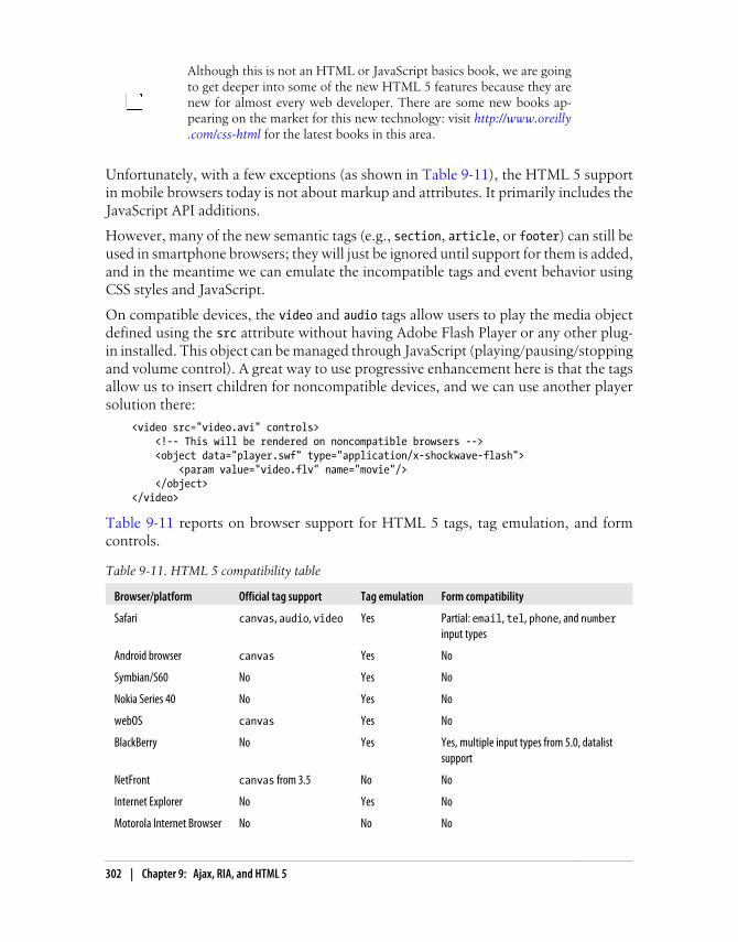
Although this is not an HTML or JavaScript basics book, we are goingto get deeper into some of the new HTML 5 features because they arenew for almost every web developer. There are some new books ap-pearing on the market for this new technology: visit http://www.oreilly.com/css-html for the latest books in this area.
Unfortunately, with a few exceptions (as shown in Table 9-11), the HTML 5 supportin mobile browsers today is not about markup and attributes. It primarily includes theJavaScript API additions.
However, many of the new semantic tags (e.g., section, article, or footer) can still beused in smartphone browsers; they will just be ignored until support for them is added,and in the meantime we can emulate the incompatible tags and event behavior usingCSS styles and JavaScript.
On compatible devices, the video and audio tags allow users to play the media objectdefined using the src attribute without having Adobe Flash Player or any other plug-in installed. This object can be managed through JavaScript (playing/pausing/stoppingand volume control). A great way to use progressive enhancement here is that the tagsallow us to insert children for noncompatible devices, and we can use another playersolution there:
<video src="video.avi" controls> <!-- This will be rendered on noncompatible browsers --> <object data="player.swf" type="application/x-shockwave-flash"> <param value="video.flv" name="movie"/> </object></video>
Table 9-11 reports on browser support for HTML 5 tags, tag emulation, and formcontrols.
Table 9-11. HTML 5 compatibility table
Browser/platform Official tag support Tag emulation Form compatibility
Safari canvas, audio, video Yes Partial: email, tel, phone, and numberinput types
Android browser canvas Yes No
Symbian/S60 No Yes No
Nokia Series 40 No Yes No
webOS canvas Yes No
BlackBerry No Yes Yes, multiple input types from 5.0, datalistsupport
NetFront canvas from 3.5 No No
Internet Explorer No Yes No
Motorola Internet Browser No No No
302 | Chapter 9: Ajax, RIA, and HTML 5

Browser/platform Official tag support Tag emulation Form compatibility
Opera Mobile canvas Yes No
Opera Mini canvas Yes No
Editable ContentHTML 5 introduces an attribute called contenteditable that allows almost any textHTML element to be edited by the user. For example:
<p contenteditable="true"> </p><div contenteditable></div>
The element will respond to text input events, like blur or focus. Almost all desktopbrowsers support this attribute, including Internet Explorer 6, because it was originallyan extension of that browser. It has been used in many online tools for documents,spreadsheets, and presentation management.
No mobile web browsers currently support the contenteditable attribute, but WebKit-based browsers like Android and Safari can emulate this behavior using a textarea witha -webkit-appearance of none:
<textarea style="-webkit-appearance: none"></textarea>
The CSS style will remove the default visual design of the textarea, including borders.
New Input TypesAs Chapter 6 mentioned, HTML 5 adds new form input types that can be used oncompatible devices. Incompatible browsers will generally show a typical text inputinstead.
The new input types include number, email, search, url, color, date, datetime, time,week, month, and range.
Even when the new fields invite the user to insert dates and numbers, we will alwaysread the value as a string. The only difference from type="text" is some kind of visualhint to help the user with filling in the field: for example, when the input is defined asemail the virtual onscreen keyboard changes to include an @, with range the user getsa slider, and select lists are provided for date inputs.
At the time of this writing, only BlackBerry 5.0 has full support for these new inputtypes. Safari on iOS partially supports some of them, and it is very possible that otherplatforms will add this support soon.
The types that have specific attributes are date and range (and other date-related types,like month), which add two new attributes for limits: min and max. For example:
<input type="date" min="2010-01-01" max="2020-01-01" id="date" /><input type="range" min="21" max="110" id="age" />
HTML 5 | 303

These new controls also accept the step attribute—for example, showing every 10minutes in a time input control—but it seems that at the time of this writing no mobilebrowsers support it.
Data ListsHTML 5 also adds a new datalist tag that is useful for autocomplete features. As ofthis writing, only the BlackBerry browser included with version 5.0 or newer of theoperating system supports it.
We can define a data list with an ID and a set of child option elements:
<datalist id="dataCountries"> <option>France</option> <option>Portugal</option> <option>Spain</option></datalist>
Then, we can use that list for suggestions in a text input, matching the list attributewith the data list’s id:
<input type="text" id="txtCountry" list="dataCountries" />
The data list will not have any UI if it is not associated with one or more form elements.When the user focuses on an associated text input, the browser will suggest optionsregarding the data list.
On noncompatible browsers, the user may see the option’s values. We can replace<option>value</option> with <option label="value" /> to avoid this problem.
The canvas ElementThe possibility of a drawing API was the dream of every web designer in the ’90s, butit has only recently become available in browsers. canvas is an HTML element thatdefines a rectangular area where we can draw using a JavaScript API. The drawings arenot vector-based, and we cannot browse through them using DOM or any other mech-anism. canvas is not a competitor for SVG; it’s just another way to generate dynamicgraphics in a browser window.
canvas was originally defined by Apple in WebKit, and it is the oldestHTML 5 feature in the web developers’ world. You will find a lot ofresources on the Web on the usage of this element.
The only mandatory attributes are an id and the dimensions width and height:
<canvas width="300" height="300" id="canvas">Here goes text, images, or other tags for noncompatible browsers</canvas>
304 | Chapter 9: Ajax, RIA, and HTML 5

The context
Once we have defined a canvas we get what is called a 2D context: a JavaScript objectthat we can use for drawing bitmaps over that canvas.
Some desktop browsers add support for a very experimental 3D context,where we can draw in 3D coordinates and the browser renders thegraphics. This is not available yet in mobile browsers.
We can get the context pointer using the following code, with the code checking forAPI support first:
var canvas = document.getElementById('canvas');if (canvas.getContext) { // canvas is supported var context = canvas.getContext('2d');}
Lines and strokes
Once we have the context, we can define the line type using the color properties fillStyle and strokeStyle and the integer property lineWidth. Then we can start drawing.
Drawing methods
The available drawing methods of the 2D context are listed in Table 9-12.
Table 9-12. Drawing methods in the HTML 5 canvas context
Method Description
fillRect(x, y, width, height) Draws a filled rectangle with the current styles.
strokeRect(x, y, width, height) Draws a stroked rectangle with a transparent fill.
clearRect(x, y, width, height) Clears the area and makes it transparent.
beginPath() Begins a path drawing.
closePath() Closes the shape by creating a line from the first path line to the ending path line.
moveTo(x, y) Moves the pen to the coordinates for the next line in the path.
lineTo(x, y) Draws a line from the current pen coordinates to the ones provided.
arc(x, y, radius, startAngle,endAngle, anticlockwise)
Draws an arc with its center at x, y and with the defined radius. The anticlockwise parameter is a Boolean value. Angles are defined in radians.
quadraticCurveTo(controlx,controly, x, y)
Draws a quadratic bezier curve.
bezierCurveTo( control1x,control1y, control2x,control2y, x, y)
Draws a cubic bezier curve.
stroke() Draws the path defined since the last beginPath().
HTML 5 | 305

Method Description
fill() Closes the path defined since the last beginPath() and fills it.
drawImage(x, y) Draws an image (Image JavaScript object) on the canvas. Other optional pa-rameters also exist.
createImageData(width, height) Creates an ImageData object with a data attribute that is an array of pixels tobe manipulated as integers.
getImageData(x, y, w, h) Gets an ImageData object from the current drawing to be manipulated.
putImageData(image_data, x, y) Puts an ImageData object into the drawing.
strokeText(string, x, y) Draws a stroked string.
fillText(string, x, y) Fills a string.
An excellent example of drawing curves on a canvas is provided by Mozilla’s docu-mentation, which shows how to draw a dialog box with the following code:
context.beginPath();context.moveTo(75,25);context.quadraticCurveTo(25,25,25,62.5);context.quadraticCurveTo(25,100,50,100);context.quadraticCurveTo(50,120,30,125);context.quadraticCurveTo(60,120,65,100);context.quadraticCurveTo(125,100,125,62.5);context.quadraticCurveTo(125,25,75,25);context.stroke();
Remember that angles in the Canvas API are defined in radians, notdegrees. To make the conversion we can use the formula (Math.PI/180)*degrees.
Advanced features
Some other advanced features for canvases include text shadowing, gradients, imagescaling, transparency, fonts, line styles, patterns, and other drawing methods. Not allpresently work with all canvas-compatible browsers, so running tests like the oneshown in Figure 9-8 is important.
Canvas compatibility
Table 9-13 lists browser support for basic canvas functionality. For more information,samples, and code for canvas, visit http://www.mobilexweb.com/go/canvas.
306 | Chapter 9: Ajax, RIA, and HTML 5

Table 9-13. HTML 5 canvas compatibility table
Browser/platform Canvas support
Safari Yes
Android browser Yes
Symbian/S60 No
Nokia Series 40 No
webOS Yes, with partial text support
BlackBerry No
NetFront No
Internet Explorer No
Motorola Internet Browser No
Opera Mobile Yes
Opera Mini Yes, rendered on the server
Figure 9-8. A nice canvas drawing sample created using only a few lines of code.
HTML 5 | 307

Offline OperationHTML 5 allows us to create offline-capable websites using a mechanism known asAppCache. The concept is very simple. The user first opens the website in normal onlinemode, and it provides the browser with a predefined text file called the manifest file,which lists all the resources (images, stylesheets, JavaScript, etc.) we want to be cachedfor offline navigation in the future.
The next time the user visits the page, the browser will try to download the manifestfile again to see if it has changed. If it has not changed or there is no Internet connection,the HTML document is loaded from the cache as well as all the resources in themanifest.
Google Gears (available in Android) supports a LocalServer API thatemulates the offline manifest file with a JavaScript API. It will be re-placed over time by HTML 5 in newer Android devices.
The architecture of our website will be exactly the same as if all the resources had beendownloaded from the server. Images, stylesheets, and JavaScript scripts will be loaded,but they will be sourced from the cache instead of the server.
The manifest file
The manifest is a text file, served as text/cache-manifest and defined as the manifestattribute of the html element:
<html manifest="oursite.manifest">
The file has to start with the line CACHE MANIFEST. This line can be followed by a seriesof relative or absolute URLs that we want to be cached for offline availability. We cancomment lines by using a hash at the beginning of the line:
CACHE MANIFEST# This is a commentourscript.jsimages/logo.gifimages/other_image.jpgourstyles.css
After the initial page load the only request the browser will send is for the manifest file,to see if it has changed. If even a single character has changed, all the resources will bedownloaded again so the current versions are available for the next load or for a reloadaction.
To ensure that the browser gets the most recent versions when any internal changesare made to the listed resources as well as when files are added to or removed from thelist, the best and simplest way to update the manifest file is to use a comment with the
308 | Chapter 9: Ajax, RIA, and HTML 5
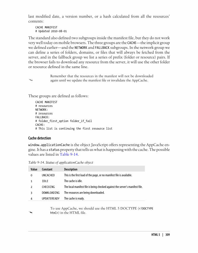
last modified date, a version number, or a hash calculated from all the resources’contents:
CACHE MANIFEST# Updated 2010-08-01
The standard also defined two subgroups inside the manifest file, but they do not workvery well today on mobile browsers. The three groups are the CACHE—the implicit groupwe defined earlier—and the NETWORK and FALLBACK subgroups. In the network group wecan define a series of folders, domains, or files that will always be fetched from theserver, and in the fallback group we list a series of prefix (folder or resource) pairs. Ifthe browser fails to download any resource from the server, it will use the other folderor resource defined in the same line.
Remember that the resources in the manifest will not be downloadedagain until we update the manifest file or invalidate the AppCache.
These groups are defined as follows:
CACHE MANIFEST# resourcesNETWORK:# resourcesFALLBACK:# folder_first_option folder_if_failCACHE:# This list is continuing the first resource list
Cache detection
window.applicationCache is the object JavaScript offers representing the AppCache en-gine. It has a status property that tells us what is happening with the cache. The possiblevalues are listed in Table 9-14.
Table 9-14. Status of applicationCache object
Value Constant Description
0 UNCACHED This is the first load of the page, or no manifest file is available.
1 IDLE The cache is idle.
2 CHECKING The local manifest file is being checked against the server’s manifest file.
3 DOWNLOADING The resources are being downloaded.
4 UPDATEREADY The cache is ready.
To use AppCache, we should use the HTML 5 DOCTYPE (<!DOCTYPEhtml>) in the HTML file.
HTML 5 | 309

If the application cache status is 0 our document is loaded from the network; otherwise,it is loaded from the application cache.
We can manually invoke the cache update process using theapplicationCache.update() method. However, the new resources will not be servedfrom the cache until the page is reloaded or we use the applicationCache.swapCache() method.
If your offline application needs to store custom images that are onlyfor one user (for example, pictures of the user’s contacts), you can createa manifest file dynamically for each user or, even better, store the imagesin base64 in offline storage for usage as inline images later.
Cache events
The applicationCache object supports many events, listed in Table 9-15.
Table 9-15. Events available for applicationCache
Event property Description
oncached Executed after the first update process finishes
onchecking Fired when the update process begins
ondownloading Executed when the resources begin downloading
onerror Fired when an error occurs in the cache
onnoupdate Executed when the update process has finished but the manifest file hasn’t changed from the previous load
onprogress Fired when each resource starts downloading
onupdateready Executed when the cache is ready after a new update process was started on an existing application cache
Debugging AppCache on iPhoneDebugging AppCache issues can be problematic at the beginning. To clear the cachein iPhone, go to Settings→Safari→Clear Cache.
If you want to see what AppCache has inside, you can find a SQLite database in theiPhone Simulator at /Library/Application Support/iPhone Simulator/User/Library/Caches/com.apple.WebAppCache/ApplicationCache.db.
More information on AppCache debugging can be found at http://www.mobilexweb.com/go/appcache.
Table 9-16 reports on browser compatibility with AppCache.
310 | Chapter 9: Ajax, RIA, and HTML 5

Table 9-16. AppCache compatibility table
Browser/platform AppCache support
Safari Yes
Android browser Yes, from 2.0 (Gears before 2.0)
Symbian/S60 No
Nokia Series 40 No
webOS Yes
BlackBerry No
NetFront No
Internet Explorer No
Motorola Internet Browser No
Opera Mobile No
Opera Mini No
Web Workers is a possible HTML 5 feature that allows JavaScript toexecute different threads at the same time. At the time of this writing,no mobile browser implements it.
Client StorageWorking offline is great, but there’s a problem: where should a web application storevital statistics and other information when the device is not connected to the Internet?And if the device is not connected to the Internet, how can our applications accesshelpful databases or information? Client storage solutions come to our assistance, intwo flavors: key/value storage and SQL databases (yes, from JavaScript, without serverinteraction).
Of course, we also have cookies, but they are simpler (only string storage), and we knowthey are not guaranteed to survive in the browser.
Key/value storage
HTML 5 defines a key/value store through two objects: localStorage and sessionStorage. They are pretty much the same, but the scopes are different: while the local storeis used for long-term storage, the session store doesn’t persist after the user closes thetab or window.
We should use try/catch blocks when saving items, in case problemsoccur with the storage or the maximum available space is exceeded.
HTML 5 | 311

Both stores are used in the same way:
// Save an object or variable in the storelocalStorage.setItem("name_in_the_storage", object_to_store);
// Read an object from the storevar object = localStorage.getItem("name_in_the_storage");
We can also delete all the objects using clear or delete one key using removeItem. Thereis also a storage event that we can listen for with window.addEventListener that will befired when the contents of the local or session stores have changed.
SQL database
Having a relational database available in JavaScript sounds powerful. The main methodthat defines the availability of the JavaScript SQL database is the window.openDatabase method. This method has the following signature:
var db = window.openDatabase(shortName, version, displayName, sizeExpectable);
If we use a try/catch, we can capture errors during the operation. This method opensthe database if it exists and creates it if it is the first time we’ve used it. To execute non-recordset sentences (CREATE TABLE, INSERT, etc.) we can use a transaction using thetransact method, which receives a function as parameter. As a transaction, if one sen-tence fails, the others will not execute:
db.transact(function(t)) { t.executeSql('CREATE TABLE countries (id INTEGER NOT NULL PRIMARY KEY AUTOINCREMENT, name TEXT NOT NULL)', [], function() {}, errorHandler);});
The array parameter after the query string is an array of parameters to be replaced inthe query (using ? inside), the next parameter is the data handler function (not used ina non-recordset query), and the last parameter is a function handler for errors in thequery.
HTML 5 doesn’t define which database engine should be used. Mobilebrowsers use SQLite, the open source database engine, so check theSQLite documentation for data type and SQL syntax support.
To create a typical SELECT statement with recordset looping, we can use the followingtemplate:
db.transact(function(t)) { t.executeSql('SELECT * FROM countries', [], countriesHandler, errorHandler);});
function countriesHandler(transaction, data) { var record; var id; var name;
312 | Chapter 9: Ajax, RIA, and HTML 5

for (var i=0; i<data.rows.length; i++) { // We get the current record record = data.rows[i]; id = record['id']; name = record['name']; // Do something with record information }}
function errorHandler(transaction, error) { alert('Error getting results');}
JavaScript databases support versioning, allowing us to change schemaon newer versions of our applications and detect what the current ver-sion installed on the client is, to create a migration procedure.
If you were working offline you should implement a synchronization method, usingAjax to download changes from and upload them to the server.
Safari on iOS accepts up to 5 MB in offline storage without user inter-vention. If you try to save more than 5 MB, the user will need to approveit (an automatic alert will appear).
Google Gears (http://code.google.com/apis/gears) is an open source projectthat enhances web browsers and JavaScript with more functionality, much of which ispart of the HTML 5 draft. Android 1.X supports only Gears, and we can also use SQLdatabases with Gears. The normal usage is simple and synchronous, as the followingsample demonstrates:
<script type="text/javascript" src="gears_init.js"></script><script type="text/javascript">var db = google.gears.factory.create('beta.database');db.open('countries');db.execute(CREATE TABLE countries (id INTEGER NOT NULL PRIMARY KEY AUTOINCREMENT, name TEXT NOT NULL)');
var rs = db.execute('SELECT * FROM countries');
while (rs.isValidRow()) { var id = rs.field(0); var name = rs.field(1)); // Do something rs.next();}rs.close();</script>
Gears storage.
HTML 5 | 313

Fortunately, Google is working on an open source project that gives us an abstractionlayer for both HTML 5 databases and Gears databases using the same code. The projectis called the Web Storage Portability Layer and it is available at http://code.google.com/p/webstorageportabilitylayer.
Safari on iOS allows you to view stored databases and delete them fromthe device using Settings→Safari→Databases.
With this new layer, we can use the following code for select queries in both frame-works:
var database = google.wspl.DatabaseFactory.createDatabase('countries', 'http://yourdomain/dbworker.js');var statement = google.wspl.Statement('SELECT * FROM countries;');
database.createTransaction(function(tx) { tx.executeAll([statement], {onSuccess: function(tx, resultSet) { // Statement succeeded
for(; resultSet.isValidRow(); resultSet.next()) { var id = resultSet.getRow()['id']; var name = resultSet.getRow()['name']; } }, onFailure: function(error) { // Statement failed }});}, {onSuccess: function() { // After transaction commits, before any other starts}, onFailure: function(error) { // After transaction fails, before any other starts}});
Client JSON store
Prepared for mobile devices, Lawnchair is a local client JSON store that uses HTML 5features behind a very simple API. You can download the library from http://brianleroux.github.com/lawnchair.
To create a store, we just use code like this:
var countries = new Lawnhair('countries');
Then, we can save an object synchronously:
countries.save({id: 5, name: 'Spain'});// Object saved
or asynchronously:
314 | Chapter 9: Ajax, RIA, and HTML 5

countries.save({id: 5, name: 'Spain'}, function() { // Object saved});
We can also save it using a key/value mechanism for easy retrieval:
countries.save({key: 5, value: 'Spain'});
var spain = countries.get(5);
And we can easily get all the documents using:
countries.all(function(country) { // We receive every country in this function});
We can also remove documents, clear all the storage, and create iterators for easyfiltering.
Web Compatibility TestIn 2010, the W3C created a test to score mobile browsers in terms of their RIA, Ajax,and HTML 5 support. The Web Compatibility Test for Mobile Browsers, available athttp://www.w3.org/2010/01/wctmb2, verifies compatibility with Ajax, the canvasHTML tag, the contenteditable attribute, geolocation, HTML 5 input forms, the off-line AppCache, the video and audio HTML 5 tags, Web Workers, local storage, sessionstorage, and @font-face. There are currently no mobile browsers that score 100%.
Some results are:
• iPhone 3.0: 83%
• Firefox 3.5 for Maemo: 83%
• Bada Browser: 75%
• Android 1.6–2.1: 67%
• Opera: 33%
• Symbian 5th edition: 17%
• webOS: 17%
• NetFront 3.5: 8.33%
HTML 5 | 315


CHAPTER 10
Server-Side Browser Detectionand Content Delivery
Until now, this book has only discussed the client side of mobile web development.Server-side development has an especially important part to play here, though, not onlybecause of all we know about dynamic content generation, but because the server isthe only place where we can easily make decisions about what content to send to whichdevices.
In this chapter we will look at device detection and content delivery, and introduce thecreation of a content store. The server also manages the MIME types of content, a veryimportant feature we need to define for good compatibility in the mobile world.
We can use any server-side platform, server, and/or programming lan-guage. For the purposes of clarity our samples will use PHP, althoughthis chapter will provide short tips for ASP.NET and Java as well. Youcan easily export these techniques to any other server platform.
Mobile DetectionBefore talking about detection of mobile devices and services on the server, we need togo back a bit and consider an old friend: the HyperText Transfer Protocol, also knownas HTTP. Knowing a bit about its internals will help us determine what we can do interms of mobile web development.
There are no special server requirements for mobile websites; you canjust use the same Apache, Internet Information Server (IIS), or otherserver you are currently using for desktop websites.
317

HTTPHTTP is a protocol originally defined in 1991 for document transportation over TCP/IP networks. It has two main versions: 1.0 and 1.1 (the last and current version of theprotocol, defined in 1996). This same protocol is the one that we need to use from theserver side in mobile web development.
Actually, the last sentence isn’t strictly true if we consider WAP 1.1, where the devicecommunicates with the WAP gateway and the WAP gateway is the one connecting toour server via HTTP. A similar approach is used in proxied browsers, like Opera Miniand Bolt (see Figure 10-1). However, from the server’s point of view the requests comingin will always be HTTP requests.
Figure 10-1. When the user is accessing our website via a proxied browser or a transcoder, we willnot receive the request directly from the user’s mobile device.
The request
An HTTP request involves a client (the browser) sending a request to a server using itsIP address (previously converted from a domain name). That request has a header andan optional body. The body is generally sent when we are doing a POST request. Themost common request type is a GET, requesting a document or a file from the server.
Verizon uses an Optimized View enhancement (a transcoder) for mobilewebsites that are not on one of the mobile addressing standards(.mobi, wap., m., etc.). If you want to avoid transcoding of your site youcan make an opt-out request at http://vzwdevelopers.com/aims/public/OptimizedViewOptout.jsp.
The server responds with a response status code (hopefully not the famous 404), aheader, and an optional (but generally sent) body. The body is the requested file.
Why are we taking this two-minute networking class? Because it illustrates many of thetechniques we will use in server-side detection.
318 | Chapter 10: Server-Side Browser Detection and Content Delivery
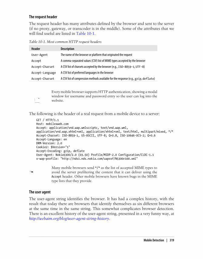
The request header
The request header has many attributes defined by the browser and sent to the server(if no proxy, gateway, or transcoder is in the middle). Some of the attributes that wewill find useful are listed in Table 10-1.
Table 10-1. Most common HTTP request headers
Header Description
User-Agent The name of the browser or platform that originated the request
Accept A comma-separated values (CSV) list of MIME types accepted by the browser
Accept-Charset A CSV list of charsets accepted by the browser (e.g., ISO-8859-1, UTF-8)
Accept-Language A CSV list of preferred languages in the browser
Accept-Charset A CSV list of compression methods available for the response (e.g., gzip, deflate)
Every mobile browser supports HTTP authentication, showing a modalwindow for username and password entry so the user can log into thewebsite.
The following is the header of a real request from a mobile device to a server:
GET / HTTP/1.1Host: mobilexweb.comAccept: application/vnd.wap.wmlscriptc, text/vnd.wap.wml,application/vnd.wap.xhtml+xml, application/xhtml+xml, text/html, multipart/mixed, */*Accept-Charset: ISO-8859-1, US-ASCII, UTF-8; Q=0.8, ISO-10646-UCS-2; Q=0.6Accept-Language: enDRM-Version: 2.0Cookie2: $Version="1"Accept-Encoding: gzip, deflateUser-Agent: Nokia5300/2.0 (03.50) Profile/MIDP-2.0 Configuration/CLDC-1.1x-wap-profile: "http://nds1.nds.nokia.com/uaprof/N5300r100.xml"
Many mobile browsers send */* as the list of accepted MIME types toavoid the server prefiltering the content that it can deliver using theAccept header. Other mobile browsers have known bugs in the MIMEtype lists that they provide.
The user agent
The user-agent string identifies the browser. It has had a complex history, with theresult that today there are browsers that identify themselves as six different browsersat the same time in the same string. This somewhat complicates browser detection.There is an excellent history of the user-agent string, presented in a very funny way, athttp://webaim.org/blog/user-agent-string-history.
Mobile Detection | 319

In brief, as in the beginning of the web era developers often looked for a particularstring in the User-Agent header to determine what content to deliver, many browsers,starting with Microsoft Internet Explorer, started using a hack that today has resultedin user agent hell. The hack was for Internet Explorer to identify itself as Mozilla (theway that the Netscape browser, IE’s main competitor, was identified). After this initialidentification, it clarified that it was not actually Mozilla, but rather a compatiblebrowser (IE). Microsoft also added other information to the user-agent string, like theoperating system and details on the plug-ins and languages supported. The end resultwas a very complex user agent syntax with no standards.
In the mobile world, the situation is even worse. Some browsers use the IE hack andidentify themselves as Mozilla (with some clarification), others identify themselves withthe correct browser name, and still others send the device brand and model number inthe User-Agent header. Even the same device may provide a different user-agent stringdepending on the OS version or the firmware used. This makes device detection usingthis string a bit complex.
If you don’t want your site to be transcoded, you can use Cache-Control:no-transform both in the HTML document and in the HTTP headers.Some transcoders use this information to decide whether or not totranscode a document, but there is no guarantee that this will work.
The following is a list of some mobile user-agent strings provided by a Nokia N95, aNokia 3510, a Motorola v3, a BlackBerry, an iPhone 3.0, a Windows Mobile device,and a Japanese phone from the carrier Au:
• Mozilla/5.0 (SymbianOS/9.2; U; Series60/3.1 NokiaN95/20.0.015 Profile/MIDP-2.0 Configuration/CLDC-1.1 ) AppleWebKit/413 (KHTML, like Gecko)Safari/413
• Nokia3510i/1.0 (05.30) Profile/MIDP-1.0 Configuration/CLDC-1.0
• MOT-V3i/08.B4.34R MIB/2.2.1 Profile/MIDP-2.0 Configuration/CLDC-1.1
• BlackBerry8100/4.2.0 Profile/MIDP-2.0 Configuration/CLDC-1.1 VendorID/125
• Mozilla/5.0 (iPhone; U; CPU like Mac OS X; en) AppleWebKit/420+ (KHTML, likeGecko) Version/3.0 Mobile/1A538a Safari/419.3
• Mozilla/4.0 (compatible; MSIE 4.01; Windows CE; PPC; 240×320)
• UP.Browser/3.04-TS14 UP.Link/3.4.4
As you can see, there is no standard for this string. So, the initial approach is to searchfor some term—for example, “iPhone” or “Symbian”—to try to determine which de-vice or platform a request has originated from. Don’t worry if this sounds nightmarish,though; in a few pages we will talk about a better solution.
320 | Chapter 10: Server-Side Browser Detection and Content Delivery

iPad or iPhone?When the iPad (the Apple tablet) came to the market, many thought that servers wouldautomatically redirect iPad users to the iPhone versions of websites, if they existed.That is because the iPad uses iOS, just like the iPhone itself and the iPod Touch.
However, the iPad User-Agent header looks something like this:
Mozilla/5.0 (iPad; U; CPU OS 3_2 like Mac OS X; en-us) AppleWebKit/531.21.10(KHTML, like Gecko) version/4.0.4 Mobile/7B367 Safari/531.21.10
As you can see, it doesn’t contain the word “iPhone,” and that is one of the ways thatdevelopers detect usage of iPhone-based devices. It does include the word “Mobile,”though, so if you are looking for that word you will be able to tell that the user is on amobile device.
That said, because the iPad has a larger screen and can show more content than a mobiledevice, mobile websites are not ideal. Some big sites have created special iPad versionsusing mobile Safari extensions; these are neither the mobile nor the desktop web ver-sions, but somewhere in between.
The iPod Touch does include “iPhone” in the user-agent string, because it is so similar(in terms of the operating system and screen size) to the iPhone itself.
What we can identify
Identification is useful for context definition. We need to remember that the user is amobile user, and for these users the context is very important. We want to get all theinformation we can about that context, so we can provide the most useful experiencepossible.
The mobile browser doesn’t send information about:
• The International Mobile Equipment Identity (IMEI) or serial number to identifythe device uniquely
• The type of network used (WiFi, 3G, GPRS, EDGE, CDMA)
• The carrier (operator) providing service to the device
• The country of the user
• If the user is roaming
• The phone number of the user
• The device’s brand and model number (not directly)
Some of this information (carrier, brand, and model number) can be inferred, but theother identification data will not be available. That is why we cannot identify usersautomatically without a login, as in desktop web applications.
Mobile Detection | 321

If you are working closely with the carrier for your mobile website, youmay be able to have yourself added to the WAP gateway’s URL whitelist.You will then be able to receive a customer ID or phone number in anew nonstandard header.
Here’s what we can glean from the device headers:
• The carrier and country, from the IP address of the request (if it is using a 2G or3G network).
• The country (and maybe city or even location), from the IP address of the request(if it is using a WiFi network).
• The brand and model number, inferred from the User-Agent header.
• The language in which the operating system is defined.
• What markups and document types are accepted, if the header is not defined as*/*.
I can guess what you’re thinking right now…. What about everythingyou told me in the last few chapters? How can we tell if the device sup-ports CSS3 or Ajax? Wait a few pages, and you will have the answer.
The User Agent Profile
The UAProf (User Agent Profile) is a voluntary standard defined by the Open MobileAlliance (formerly WAP Forum). It takes the form of an XML file defining the abilitiesof the device, including its screen size, download features, and markup support.
The XML is defined by the manufacturer or the carrier, and a link to the XML is definedin a header (typically x-wap-profile). If you look back at the sample headers we sawearlier in this chapter, you’ll see it:
x-wap-profile: "http://nds1.nds.nokia.com/uaprof/N5300r100.xml"
This URL will have been defined when the browser was created, which may have beenseveral years before. If the URL is still working, we should get XML like the followingextract:
<prf:ImageCapable>Yes</prf:ImageCapable><prf:Keyboard>Qwerty</prf:Keyboard><prf:Model>BlackBerry 8100</prf:Model><prf:NumberOfSoftKeys>0</prf:NumberOfSoftKeys><prf:PointingResolution>Character</prf:PointingResolution><prf:PixelAspectRatio>1x1</prf:PixelAspectRatio><prf:ScreenSize>240x260</prf:ScreenSize><prf:ScreenSizeChar>26x18</prf:ScreenSizeChar>
UAProf files have many problems. First, we need to download the XML for each re-quest, process it, and either extract the properties we want or make a local copy on our
322 | Chapter 10: Server-Side Browser Detection and Content Delivery

server. Second, the community has found lots of bugs and problems in this officialinformation. Some devices (the iPhone, for example) don’t define a UAProf file, andthey don’t define the same properties. Also, UAProf does not have the right granularityof information; for example, you can read that Flash is supported, but no informationis there about which version.
So, another problem added to our list.
Detecting the ContextWe’ve already seen how the network protocol works, and what information is providedand not provided in a mobile browser request. Now let’s get some data and informationfrom the context.
How to read a header
The specifics depend on the language, but all server-side platforms offer a way to readthe request’s header. Some languages use the same header as the parameter (for exam-ple, Accept-Charset), and others use a larger version with the syntax HTTP_X, where X isthe header name in all uppercase and with the - replaced by _ (for example,HTTP_ACCEPT_CHARSET).
Some Nokia devices expose a custom HTTP header that defines theconnection type. The header is x-nokia-musicshop-bearer and the pos-sible values are WLAN or GPRS/3G. We can try to read this header and, if itexists, get more information about the context.
In Java Servlets or JSP, we read a header using:
request.getHeader("header_key")
In ASP 3, we use this:
Request.ServerVariables("header_key_large")
And in PHP:
$_SERVER["header_key_large"]
In ASP.NET with C# or Visual Basic, we have a Headers collection and public membersfor most of the common headers:
// This is the C# versionRequest.Headers["header_key"]
' This is the VB versionRequest.Headers("header_key")
Mobile Detection | 323

Remember that BlackBerry devices have many browsers, as we saw inChapter 2. These devices also expose a custom HTTP via header thatcan be used to see which browser is being used. For example, if the valuecontains an MDS string, the user may be connected via the BlackBerryBrowser through the corporate server; if it contains BISB the user is usingthe Internet Browser connecting through the carrier; and if the value isnot defined, the user may be using the WiFi Hotspot Browser.
How to read the IP address
The IP address from which the request originated can be read with the following code:
// In JavaString address = req.getRemoteAddr();
// In PHP$address = $_SERVER["REMOTE_ADDR"];
// In C#String address = Request.UserHostAddress;
What we can do with the IP address? The next chapter will talk about geolocation.However, if we want to define the user’s carrier and country right now, we need to getan updated list of the IP ranges assigned to each carrier. The carriers distribute thisinformation to their partners, and it can also be found in forums and communities orthrough commercial services.
Massive’s Operator Identification Platform is a community-based da-tabase service that allows us to determine visitors’ countries and net-work operators, if detected, using a simple HTTP service request. Youcan request an account at http://www.werwar.com. It is free for non-commercial sites, and commercial licenses start at $10 per month.
Opera Mini
As mentioned earlier, there are some proxied browsers on the market (Opera Mini isthe most widely installed), and we need to take care of differences in the headers insuch browsers. Even on a well-known device, such as a BlackBerry or a Nokia N97, ifOpera Mini is in use the requests we receive on our servers will come from the OperaMini proxy and not from the device itself. So, the client IP address will be Opera’s serveraddress, and the user-agent string will be the proxy’s one. On any device, the OperaMini 5 user-agent string looks like this:
Opera/9.80 (J2ME/MIDP; Opera Mini/5.0.16823/1126; U; en) Presto/2.2.0
Fortunately, Opera Mini offers the original IP address and the original user-agent string,along with other information, in new headers (listed in Table 10-2) that we can readusing the techniques we have already seen.
324 | Chapter 10: Server-Side Browser Detection and Content Delivery

Opera Mini has a developer site at http://www.opera.com/mini/developer that offers tips and technical information about Opera Mini web-site development. Other intermediates are not as developer-friendly asOpera Mini and remove all the original headers, so we are blind in de-tecting the device and its origin.
Table 10-2. Opera Mini additional HTTP headers
Header Description
X-OperaMini-Phone-UA Provides the user-agent string identifying the device that downloaded the Opera Mini client(or the current device’s user-agent string if not available).
X-OperaMini-Phone Provides the device’s brand and model, separated by a hash (<brand>#<model>).
X-Forwarded-For Provides a CSV list of all the proxy servers in the chain that have forwarded the request fromthe device to Opera Mini’s proxy. Opera recommends using the last IP address listed for geo-location purposes.
X-OperaMini-Features Provides a CSV list of phone features, from the following list:
• basic (Java MIDP 1.0 device, low resources)
• advanced (Java MIDP 2.0 device, high resources)
• camera (camera detected, so we can provide a file upload input for pictures)
• file_system (Java filesystem support detected, so the user can download and uploadfiles)
• folding (content folding option is enabled)
• secure (connection between phone and proxy is encrypted)
Content folding in Opera Mini refers to the ability of the browser togroup a series of links into a menu that can be closed and opened to gainspace on the screen.
Mobile detection
If you only want to know whether the user is browsing from a desktop or a mobiledevice (perhaps for doing a redirection), the quickest way to find out is to check forsome different well-known strings (iPhone, iPod, Nokia, etc.) inside the User-Agentheader. Based on their presence or absence, you can make an educated guess aboutwhether or not the user is on a mobile device.
There is an excellent collection of mobile-specific User-Agent headers athttp://mobiforge.com/developing/blog/useful-x-headers.
Mobile Detection | 325

Andy Moore has developed a very simple but powerful PHP script for detecting mobileuser agents and browsers. The latest version (free for non-profit purposes) can bedownloaded from http://detectmobilebrowsers.mobi.
You can find similar scripts in different languages at http://www.mobilexweb.com/go/detection.
Some devices support multipart document delivery. A multipart docu-ment includes XHTML and resources (images, CSS) in the same HTTPresponse, enhancing the download performance. To determine whethera device supports multipart documents, check for the multipart/mixedor application/vnd.wap.multipart MIME type in the Accept header.Visit http://www.mobilexweb.com/go/multipart for more information.
TranscodersWith WAP 1.1, operator gateways were required to precompile WML and make itlighter and more easily parsable by devices with limited memory/CPU resources. Gate-ways were also relied upon to manage cookies on behalf of the devices (which did nothave enough memory) and for integration with the operator’s backend (for example,the gateway was able to inject the users’ phone numbers into HTTP headers, so thatauthorized content providers could recognize them and bill them for services).
With WAP 2 precompilation was no longer needed, but other aspects of gateways wereand still are today, to some extent. In a lot of different contexts, the presence of a WAPgateway is beneficial to developers and content providers.
Around 2002, some companies started selling tools to “mobilize” web content. Thatis, users could type a URL into a field, and the transcoder/content reformatter wouldchop it up into pages that could be viewed by mobile devices.
Around 2006, some kind of genetic mutation happened: transcoder vendors realizedthat transcoders could be deployed in proxy mode and the whole Web could be trans-coded behind the backs of the users and content providers, regardless of the presenceof a mobile-optimized experience for any given site. This dangerous move posed aserious threat to the mobile ecosystem
To help us to understand this problem, I contacted Luca Passani, CEO of WURFL-Proand creator of the WURFL libraries we will analyze later in this chapter. He kindlyanswered my questions to keep us updated about this topic. The rest of this sectionwas entirely written by Luca. For more information on this topic, see http://wurfl.sourceforge.net/manifesto.
What is a transcoder?
Defining transcoders requires a bit of care. Not only has the term “transcoders” beenused in other industries, but there are also other terms in the mobile world that identify
326 | Chapter 10: Server-Side Browser Detection and Content Delivery

mobile-web transcoders and what they do: notably, content transformation and contentadaptation. Content transformation is basically a synonym for “transcoding,” but con-tent adaptation can also refer to development techniques that, while they bear somesimilarities to transcoding, are more traditional (and legitimate) approaches to the cre-ation of mobile websites.
When you say “transcoders” to mobile web developers, they’ll most likely think of theproxies (from companies such as Novarra, InfoGin, Openwave, and ByteMobile) thatnetwork operators (Vodafone, Verizon, Sprint, etc.) install in their networks to inter-cept desktop web pages on their way to mobile devices and “reformat” them. By “re-formatting,” I mean one or more of the following:
• Splitting a full page into several smaller pages (which are supposedly more man-ageable for mobile devices)
• Replacing the original graphics with images of lower size (and lower quality)
• Adding an operator navigation bar on every page
• Injecting advertising from unknown sources
• Disabling mechanisms to detect successful download of applications, Java MEMIDlets, and other downloadable content
A less obvious effect of transcoders is that they often intercept and modify HTTP re-quests, removing the UAProf and/or the original user-agent string (which is key torecognizing devices and their capabilities).
I sometimes refer to transcoding as content transformation, but I never use “contentadaptation” in this context because it would be very likely to generate confusion.
It is important to observe that WAP gateways are also proxies, but typ-ically they do not interfere with the content that goes through them.
Why are transcoders a problem?
If you are a content provider or you build mobile websites, transcoders will make youfurious. As soon as an operator deploys a transcoder, you will notice that you are unableto recognize devices using that operator’s network and its transcoder. If you have in-vested time and money in installing a framework to recognize mobile devices, all ofyour work will be lost: all you will see are web browser requests hitting your server.But that’s not all. Your branding is very likely to be disrupted, and so is your businessmodel if, for example, you are no longer able to bill your customers directly, or if thead banners you were injecting into your pages get discarded. These are things that havehappened in practice and driven people mad. The icing on the cake was when operatorsstarted injecting their own advertising into other people’s content, trying to monetize
Mobile Detection | 327

other people’s efforts. It is no surprise that this has caused huge uproar amongst trans-coder “victims.”
Parties involved in the transcoding problem
There are two main culprits behind the mess caused by transcoders: operators andtranscoder vendors. Transcoder vendors have been guilty of telling operators, “Look,we have this fantastic technology that will bring the entire Web to all of your users.Loads of fantastic content you don’t need to pay for. Isn’t this great? And who cares ifpeople who have invested millions in creating mobile sites complain…We are the future,after all!” This was deeply irresponsible, but of course part of the blame goes to theoperators who actually believed this story, decided to deploy transcoders, and wereflooded by a wave of complaints and thrown into disrepute. Of course, I had a role inmaking mobile developers focus on the problem in detail, but there were thousands ofirritated developers who backed me instantly when I blogged about the issue.
What was the response from carriers after receiving complaints?
Officially, the carriers were silent. After all, these are huge organizations, and gettinganyone to stand up and talk on behalf of their employees is simply not realistic. Behindthe scenes, I got loads of support from people working for operators (particularly Vo-dafone Global, Germany, and UK). They recognized that I was right and that the de-cisions taken at the top floors were wrong.
Practical tips
There are some practical tips to be given, such as using XHTML MP as the markup oradding the Cache-Control: no-transform header to all your HTTP responses. They areall contained in the “Manifesto for Responsible Reformatting” at http://wurfl.sourceforge.net/manifesto. Yet, I don’t think that these alone are enough.
I firmly believe (and so do virtually all developers I have talked to) that developers havea right to a “clean” HTTP. They have the right to see HTTP headers as sent by thedevices, and they have the right to insist that transcoders keep their dirty hands offother people’s content. Therefore, the main practical tip I want to give is not actuallya very technical one: make noise. Complain. Blog and tell the world that operator X orY is doing something wrong. Get a lawyer to send a letter to the operator and complainabout copyright infringement. Using a metaphor, mugging someone to steal his walletis a more serious offence than simple pickpocketing, yet pickpocketing is still a crimethat should be prosecuted, and advice such as “stay home,” “hire a bodyguard,” or“don’t carry your wallet in your pocket” just doesn’t cut it! We have the right to liveand work in a better ecosystem; transcoders are the law of the jungle.
328 | Chapter 10: Server-Side Browser Detection and Content Delivery

Operator whitelists
Some operators offer whitelists where you can explicitly opt your site out of transcod-ing. Whitelists are not the way to go, though. Accepting whitelists means accepting thelaw of the jungle. If we were to agree to whitelisting our sites with each and everyoperator around the planet, we would effectively be giving operators a right they donot have (and must not have). The network and HTTP must be the same for everyone,or this would represent a giant step back for the whole mobile industry. Just think ofwhat the Web would be today if website creators had to “register” their websites withdifferent ISPs around the globe….
Making content transformation a standard
Transcoding is stealing. How do you standardize stealing? There is only one answer:you don’t. Stealing is illegal and must remain that way. Of course, transcoding vendors(mainly Novarra Inc., now part of Nokia) are trying to convince the W3C to create“quasi-standards” that allow transcoding in some instances, which in real deploymentswill naturally translate into “whenever the heck we want.” The problem here is thatthe corporations who sit at the W3C table call the shots in their own interests.
Nokia acquired Novarra Inc. in 2010, and at the time of this writingthere is no information about how the Novarra transcoding politics willevolve.
For those who are curious, Novarra’s attempt at getting the W3C to ratify its way ofdoing transcoding (its Guidelines for Web Content Transformation) is available onlineat http://www.w3.org/TR/ct-guidelines.
Transcoder detection
There is an ongoing battle between transcoder vendors and the rest of the mobile eco-system. There are ways to recognize a transcoder, by checking certain headers (eithertheir values, or simply checking for their presence). Again, the Manifesto has moreinformation. The problem is that the business model of transcoder vendors (transcodeas much as you can) is in direct conflict with the business model of content owners(protect your content as well as you can). For this reason, transcoders are progressivelymaking it harder for others to detect them, by removing those hints from HTTP re-quests. A day may come when developers will need to maintain a list of IP ranges toidentify transcoders and treat requests coming from them specially (again, don’t forgetto complain loudly if you spot one).
Mobile Detection | 329

What to do after detection
Assuming you have detected a transcoder, adopting the Cache-Control: no-transform header and using mobile-specific MIME types and DTDs (XHTML Mobile Profile,for example) is your best bet to prevent your content from being touched. Serving yourcontent from a hostname with a pattern such as m.*, wap.*, or *.mobi will usually alsohelp.
I say “help” because this is not a guarantee. Your content is still at the mercy of theoperators’ transcoder policies, and nobody will go after them on your behalf if theydecide not to respect your directives.
Novarra and InfoGin are the two largest companies in the transcodingfield. Other names include Openwave, ByteMobile, and Volantis.
Device LibrariesAs we’ve discussed, just looking at the HTTP headers and the UAProf will not give usenough useful information about the mobile devices that are accessing our websites.This is where device libraries come to our help. Device libraries are offline databases(or online web services) that take a user-agent string (or all of the request headers) andreturn to us dozens of properties about the detected device, from screen size, to JavaME compatibility, to Ajax support and video codec compatibility.
WURFL
Wireless Universal Resource File (known as WURFL) is a community-based, opensource device capabilities repository created and maintained by the developer LucaPassani (http://passani.it), a fellow member of the Forum Nokia Champion programand author of the preceding section on transcoders.
The library is available in the form of an XML file. While updates to WURFL datahappen every day on the WURFL DB, a publicly available “snapshot” of the DB isproduced and published about once per month on the WURFL website.
WURFL can be downloaded for free from http://wurfl.com, and any suggestions, ques-tions, or bugs can be discussed in the mailing list, http://tech.groups.yahoo.com/group/wmlprogramming.
If you are having doubts about how to pronounce WURFL, you can finda WURFL pronunciation link on the library’s home page, where youcan listen to the word in English and Italian.
330 | Chapter 10: Server-Side Browser Detection and Content Delivery

The sources of information include official technical information published by manu-facturers, UAProf files, and data collected by the community after testing on real de-vices. Today, the WURFL database contains thousands of devices (11,000 profiles,7,000 of which have a unique brand and model), with information on subversions,operating systems, firmware and hardware variations, and hundreds of attributes thatwe can query for each one.
WURFL groups the devices into a hierarchy of devices and attributes. Somedevices are equivalent to other devices from the same series, possibly with some newfeatures, so there is a fallback mechanism in WURFL allowing a device to extend thefeatures of another one. The same applies for different models in the same brand oreven different brands with the same operating system.
Also, there is a feature called “actual device root” that manages multiple subversions(different firmware) of the same device, so the information is not duplicated in tworecords; the subversion will be based on the main record with any added or differentabilities noted.
The WURFL database has a root fallback device called “generic device” that is matchedwhen the device, the brand, and the series can’t be determined.
What should you do if you need to make changes to the WURFL XML,whether to identify new devices or bugs that you’ve found or to add new private orpublic capabilities to be queried? Changing the original WURFL XML would be im-practical, because you would have problems in the future when you wanted to down-load updates from the site.
That is why a patch file is included in the WURFL architecture. A patch is like a mini-WURFL (similar syntax, but typically a lot smaller in size). The WURFL API will mergethe patch information with the information in the WURFL database when the servicestarts.
If you find a bug, new devices, or capabilities that aren’t private to yourdevelopment, report them to the WURFL team or apply to become aWURFL contributor.
You can register to become a contributor by following the instructionsat http://db.wurflpro.com/static/become_a_contributor.htm. You will berequired to study religiously the WURFL conventions, available at http://db.wurflpro.com/static/top.htm.
Remember, this is a community project, and we are all part of the com-munity.
WURFL is intended for use on mobile websites; that is why this library does not detectdesktop browsers, or if they are detected misidentifies them as some fallback mobile.If users may access your mobile website from their desktops and you want to be ableto detect that using WURFL, you can download a web patch that will detect desktop
Architecture.
Patch file.
Mobile Detection | 331

web browsers like Firefox and Internet Explorer. You’ll need to merge this patch withthe main XML.
If you find a generic_device, this is a device that is not included in theWURFL database. It’s good practice to log and report this informationand the user agent received so it can be investigated and recognized inthe future.
Every ability, property, or attribute is called a capability in the WURFLworld. Capabilities are organized into groups. Each capability for each device has anoptional string value (taken from the device itself, or from the fallback mechanism).That value can be converted to a Boolean, a number, a string, or an empty string.
The most useful groups at the time of this writing are shown in Table 10-3.
Table 10-3. Most useful WURFL capability groups
Group name Capabilities related to
product_info Device information, such as the brand, model, operating system, and browser
wml_ui WML rendering, including soft key support, WTAI support, and table support
chtml_ui cHTML rendering
xhtml_ui XHTML rendering, including tel URI scheme support, accesskey support, iframe support, and fileupload support
ajax Ajax and DOM support, including support for getElementById, innerHTML, and CSS manipulation
markup Markup compatibility
cache Cache support
display The screen and display (physical dimensions, resolution, line rows, etc.)
image_format Image formats, including support for Animated GIF and SVG
wta WTAI, including voice call support
security Encryption, including HTTPS support
bearer Networks, including WiFi and VPN support
storage Limits (e.g., max URL length)
object_download Formats and object downloading support for each typical format
streaming Audio and video streaming per format and codec
wap_push WAP Push attribute support
j2me Java ME configuration and profile versions and API compatibility
mms MMS support
sms SMS support
sound_format Support for audio codecs and formats
flash_lite Flash support on the browser, for standalone applications, and for wallpaper or screensavers
Capabilities.
332 | Chapter 10: Server-Side Browser Detection and Content Delivery
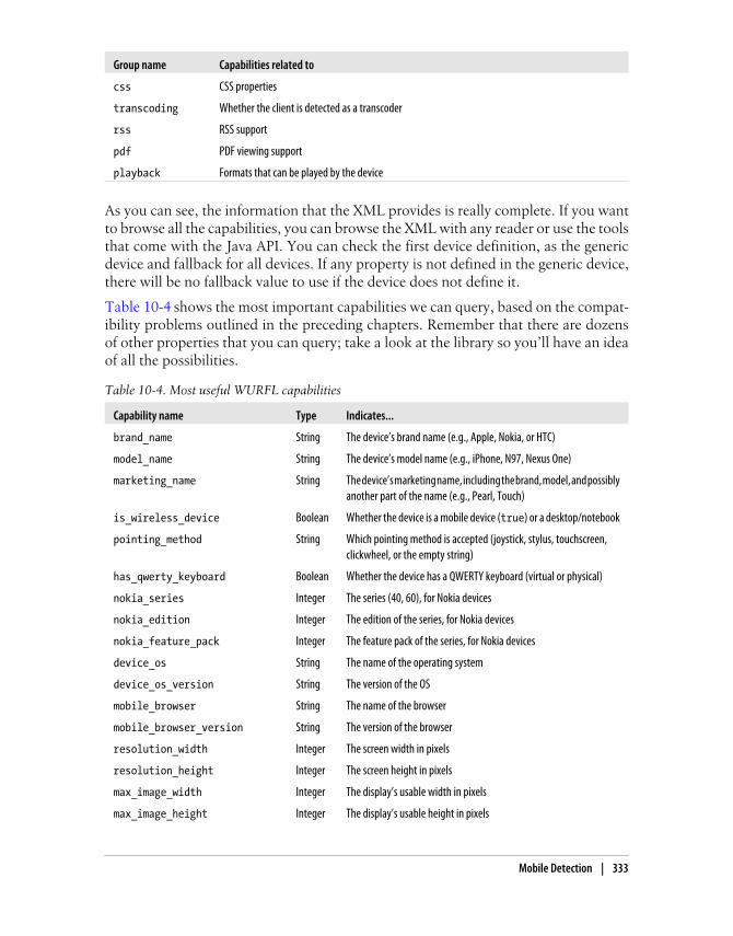
Group name Capabilities related to
css CSS properties
transcoding Whether the client is detected as a transcoder
rss RSS support
pdf PDF viewing support
playback Formats that can be played by the device
As you can see, the information that the XML provides is really complete. If you wantto browse all the capabilities, you can browse the XML with any reader or use the toolsthat come with the Java API. You can check the first device definition, as the genericdevice and fallback for all devices. If any property is not defined in the generic device,there will be no fallback value to use if the device does not define it.
Table 10-4 shows the most important capabilities we can query, based on the compat-ibility problems outlined in the preceding chapters. Remember that there are dozensof other properties that you can query; take a look at the library so you’ll have an ideaof all the possibilities.
Table 10-4. Most useful WURFL capabilities
Capability name Type Indicates...
brand_name String The device’s brand name (e.g., Apple, Nokia, or HTC)
model_name String The device’s model name (e.g., iPhone, N97, Nexus One)
marketing_name String The device’s marketing name, including the brand, model, and possiblyanother part of the name (e.g., Pearl, Touch)
is_wireless_device Boolean Whether the device is a mobile device (true) or a desktop/notebook
pointing_method String Which pointing method is accepted (joystick, stylus, touchscreen,clickwheel, or the empty string)
has_qwerty_keyboard Boolean Whether the device has a QWERTY keyboard (virtual or physical)
nokia_series Integer The series (40, 60), for Nokia devices
nokia_edition Integer The edition of the series, for Nokia devices
nokia_feature_pack Integer The feature pack of the series, for Nokia devices
device_os String The name of the operating system
device_os_version String The version of the OS
mobile_browser String The name of the browser
mobile_browser_version String The version of the browser
resolution_width Integer The screen width in pixels
resolution_height Integer The screen height in pixels
max_image_width Integer The display’s usable width in pixels
max_image_height Integer The display’s usable height in pixels
Mobile Detection | 333

Capability name Type Indicates...
xhtml_support_level Integer The level of XHTML compatibility, from −1 to 4:
• −1: No support
• 0: Basic support (poor or no CSS support, basic form support,basic or no table support)
• 1 and 2: Advanced basic support (basic CSS and table support)
• 3: Medium support, including excellent CSS support)
• 4: Advanced support, including Ajax support
preferred_markup String The markup best supported by the device (even if it supports a newerone)
xhtml_format_as_css_property Boolean Whether -wap-input-format is available
xhtml_make_phone_call_string String The prefix preferred for making phone calls in a URL
xhtml_send_sms_string String Whether and how the device supports triggering the SMS client froma link (can be sms:, smsto:, or the empty string, meaning notsupported)
xhtml_file_upload String Whether the device allows file uploading (returns not_supported, supported, or supported_user_intervention)
xhtml_supports_iframe String Whether the device supports iframes (returns none, partial, orfull)
ajax_supports_javascript Boolean Whether the device supports JavaScript with basic operations (dialogs,form values, timers, and document.location)
ajax_supports_getelementbyid Boolean Whether document.getElementById works on the device
ajax_xhr_type String Which syntax to use when creating an XMLHTTPRequest object(none, standard for the native XHR object, msxml2 for the normalMicrosoft ActiveX object, and legacy_microsoft for the olderone)
ajax_support_inner_html Boolean Whether we can change the innerHTML property dynamically
ajax_manipulate_dom Boolean Whether typical DOM methods are available
ajax_support_event_listener Boolean Whether the browser allows event registration through event listeners
html_wi_oma_xhtmlmp_1_0 Boolean Whether the browser supports XHTML MP 1.0
html_web_3_0 Boolean Whether the browser supports HTML 3
html_web_4_0 Boolean Whether the browser supports HTML 4
gif_animated Boolean Whether Animated GIF is supported
svgt_1_1 Boolean Whether SVG 1.1 is supported
svgt_1_1_plus Boolean Whether SVG 1.1+ is supported
flash_lite_version String Which version of Flash is supported
fl_browser Boolean Whether the browser supports Flash content
is_transcoder Boolean Whether a transcoder was detected as a proxy from the real device
334 | Chapter 10: Server-Side Browser Detection and Content Delivery

Capability name Type Indicates...
transcoder_ua_header String Which header we can find the original device’s user-agent string in, ifa transcoder was detected
multipart_support Boolean Whether the browser supports multipart documents
WURFL usage
You can use WURFL by browsing the file as you would any other XML file and match-ing user-agent strings, but the wheel has already been invented, and on the same websitewhere you can download the XML you will find APIs for the most common serverplatforms: Java, PHP, and .NET (in beta at the time of this writing). Generally speakingyou should use the new APIs available on the website, but for compatibility purposesyou can still find old APIs to download.
These APIs allow us to use WURFL in a couple of lines, with many advantages:
• Automatic device detection using the header information
• Two-step user agent analysis (optimized and clever user-agent searching inside theXML)
• Detection of transcoders and proxies, and matching of the correct user agent anddevice information
• Merging of the static XML provided by WURFL with patches (the web patch oryour own), providing a simple and unique way to query capabilities
• Caching of the XML parsing for the best performance on every request
To use WURFL in PHP, you should download the PHP API fromhttp://wurfl.sourceforge.net/nphp and extract the contents of the GZIP file. The packagecontains documentation, examples, resources, unit tests, and a WURFL folder wherethe API resides.
The PHP WURFL API allows us to save persistence and cache infor-mation using memcache instead of using the filesystem.
To make it work, follow these steps:
1. Copy the WURFL folder into your web server root folder.
2. Copy the resources or examples/resources folder into your web server root folder(you can change the name).
3. Download the latest wurfl-<version>.zip file from the website and copy it to thenew resources folder (along with the web_browsers_patch.xml file, if you need it).
4. Create a cache folder inside the resources folder (or in another place, with a differentname if you like) and verify that it PHP scripts have write permissions for this folder.
PHP API installation.
Mobile Detection | 335

5. Edit the resources/wurfl-config.xml file and check that the <main-file> tag matchesthe name of the ZIP file containing the main XML repository. It can also be adecompressed XML file.
6. Edit the resources/wurfl-config.xml file, go to the persistence node, and check thatthe <params> tag matches the name of the cache folder, as in <params>dir=cache</params>. The path needs to be relative to the config XML folder.
Once WURFL is installed, we can create our first PHP script that uses the repository.Using version 1.0 of the API, the code will be:
<?php
require_once('WURFL/WURFLManagerProvider.php');$configFile='resources/wurfl-config.xml';
$wurflManager=WURFL_WURFLManagerProvider::getWURFLManager($configFile);
$device=$wurflManager->getDeviceForHttpRequest($_SERVER);
?>
In API 1.1, the objects were changed and WURFLManagerProvider was deprecated. So,the preceding code should be:
<?phpdefine("WURFL_DIR", dirname(__FILE__) . 'WURFL/');require_once(WURFL_DIR . 'Application.php');$configFile='resources/wurfl-config.xml';
$wurflConfig=new WURFL_Configuration_XmlConfig($configFile);$wurflManagerFactory=new WURFL_WURFLManagerFactory($wurflConfig);
$wurflManager=$wurflManagerFactory->create();
$device=$wurflManager->getDeviceForHttpRequest($_SERVER);
?>
If you run this file on your web server (local or remote), you will need to wait 1 or 2minutes the first time while it creates the cache folder to enable quick detection in futurerequests. If you receive a blank page, great! If you get an error, you need to check allthe steps again.
If you’re working on a local server and are going to upload your websiteto another server using FTP or some other protocol, it will be better tonot upload the cache folder because it will contain thousands of files. Itis better to leave the server to recreate them locally.
The PHP API is an object-oriented API. Once you have theWURFLManager object, regardless of whether you are using version 1.0 or 1.1 of the API,you can use it.
Using the PHP API.
336 | Chapter 10: Server-Side Browser Detection and Content Delivery

If your server is too loaded, you may get a timeout error when processingWURFL the first time. If this happens, ask your server provider how toincrease the maximum script time limit or change the PHP.ini file.
A typical usage is getting a device object using the manager’s methods:
• getDeviceForHttpRequest($_SERVER)
• getDeviceForUserAgent($user_agent)
• getDevice($deviceId)
If you want to access the capabilities of the current device accessing your website, thefirst option is the best one. If you want to get properties for other devices, you can usethe user_agent method or the deviceId method. Every device in WURFL has an ID thatwe can store in our databases for statistics or logs. We can then look for its capabilitieslater, after the mobile request.
You can browse the WURFL devices database using the free online toolTera-WURFL Explorer, available at http://www.tera-wurfl.com/explore.
You can also get all the possible groups and capabilities using getListOfGroups() andgetCapabilitiesNameForGroup(groupId), both methods of the manager.
Once you have the device object, you can get all properties with the getAllCapabilities() method or query for one particular feature with getCapability($capabilityName).
If you are using the desktop web patch, you can determine whether the client is adesktop or a mobile device:
if ($device->getCapability('is_wireless_device')==false) { // It is not a mobile device header('Location: http://yourdomain.com');}
To detect if it is an iPhone or iPod Touch, use:
if ($device->getCapability('brand_name')=='Apple') { // It is an iPhone, redirect to a prepared version header('Location: http://yourdomain.com/iphone');}
With the capability, you can then decide whether or not to provide some feature. Forexample:
if ($device->getCapability('xhtml_file_upload')=='supported') { echo '<input type="file" />';}
Mobile Detection | 337

A great option if you are offering content is to explicitly display to the user his phonemodel in the marketing information:
echo 'Download compatible content for your ' . $device->getCapability('marketing_name');
If you want to test whether your WURFL code is working on your desk-top browser, you can use Firefox and the free plug-in User AgentSwitcher that allows Firefox to change its user-agent string to that ofany other device of your liking. We will cover this plug-in in Chapter 13.
A lot of related tools, utilities, and frameworks are available athttp://wurfl.sourceforge.net. These include:
• Device Thumbnails (a repository of device images for thumbnails on websites)
• Image Server (a Java servlet for dynamic conversion, scaling, and delivery of imagesto mobile devices)
• Tera-WURFL (a PHP and MySQL implementation of the WURFL repository)
• GAIA Image Transcoder
• PHP Image Rendering Library (works with an old version of the PHP API)
• Apache Mobile Filter
The Apache Mobile Filter is an open source solution for redirecting usersto different versions using filters in an Apache module that looks intothe WURFL database. It also supports image resizing. The project isavailable at http://sourceforge.net/projects/mobilefilter.
DeviceAtlas
In February 2008 (many years later than WURFL), the dotMobi company, which ownsthe .mobi top-level domain, launched its own device database that is similar in manyways to WURFL.
DeviceAtlas is a commercial product (with a free testing version for developers) avail-able at http://deviceatlas.com that has partnerships with many data providers. Accord-ing to dotMobi, this is not only the largest but also the most accurate device databaseon the market.
The main features are:
• Monthly, weekly, daily, or constant updates to the database, depending on yourlicense
• A data explorer to browse the database from the Web
• JSON data format support
WURFL-related products.
338 | Chapter 10: Server-Side Browser Detection and Content Delivery

• APIs for PHP, Java, .NET, Python, and Ruby
• Apache server module (with the enterprise license)
At the time of this writing, the basic license costs $99 per server per year and includesmonthly updates but excludes the possibility to merge private data and other optionsavailable in higher license options.
You can apply for a free developer evaluation version at the website or buya commercial version and then download the data and API from http://deviceatlas.com/downloads. You will receive by email the license key, which is valid for one year. Youwill also receive the direct links to download the data file (in JSON format) in ZIPformat.
The W3C is trying to standardize the device database repositories in theDevice Descriptions Working Group, currently in draft at http://www.w3.org/TR/DDR-Simple-API. DeviceAtlas is offering its database in thisnew format as a preview.
You can get an automatic update of the JSON file using the URL https://deviceatlas.com/getJSON.php?licencekey=<license>&format=zip (inserting your license key in theURL).
The data available in DeviceAtlas is segmented into categories. The mostimportant properties per category are:
• Device name: vendor, model
• Hardware: displayHeight, displayWidth, mobileDevice, touchScreen
• Environment: developerPlatform, developerPlatformVersion, osAndroid, osLinux,osOsx, osProprietary, osRim, osSymbian, osWindows, osVersion
• Web browser: markup.xhtmlMp10, memoryLimitMarkup, uriSchemeSms, uriSchemeSmsTo, uriSchemeSmsTel, vCardDownload, usableDisplayWidth, usableDisplayHeight
• Network protocols: EDGE, GPRS, HDSPA
• JavaVM: cldc, jsr118, jsr139, jsr30, jsr37, midp
• AudioPlayer: aac, amr, mp3
• Streaming: stream.3gp.aac.lc, stream.3gp.h263, stream.3gp.h264.level1,stream.mp4.aac.lc
• VideoPlayer: 3gp.h263, 3gp.h264.level1, mp4.aac.lc, wmv
• DRM: drmOmaCombinedDelivery, drmOmaForwardLock, drmOmaSeparateDelivery
You can browse all the data available with your license at http://deviceatlas.com/explorer.
Installation.
Properties.
Mobile Detection | 339

Remember that if you have a developer account your database file willnot be updated if you download it again, and if you have a basic licensewith monthly downloads a new file will not be available until 30 daysfrom when you downloaded the previous version.
Inside the PHP API package you will find a doc folder containing PHPDocdocumentation, a sample folder containing examples of usage, and a Mobi folder con-taining the API. The PHP API requires PHP version 5.2.3 with JSON support.
You need to copy the Mobi folder with all of its content into your website root, but youcan put the JSON data file in any place you want. In your PHP file, you must includethe file Mobi/Mtld/DA/Api.php.
A typical project will look like the following:
<?phpinclude('Mobi/Mtld/DA/Api.php');// We get a tree object loading the JSON$tree = Mobi_Mtld_DA_Api::getTreeFromFile("deviceatlas.json");// We get all the properties for the User Agent$properties = Mobi_Mtld_DA_Api::getProperties($tree, $_SERVER['HTTP_USER_AGENT']);// Or we can get one property at a time using$value = Mobi_Mtld_DA_Api::getProperty($tree, $ua, 'some-property');?>
If you want a cache implementation, you’ll need to do it yourself or have memcacheinstalled on the server and save the entire tree as the sample provided by the API. TheJava and .NET APIs have better support for caching techniques.
The ASP.NET Mobile Device Browser File
If you work with the ASP.NET platform, you can find an open source mobile browserdatabase at http://mdbf.codeplex.com, released by the Mobile Browse Platform Team atMicrosoft. This file is attached to the current ASP.NET browser detection mechanismand is updated frequently. The sources of the information include WURFL, UAProffiles, contributions from the community, and others.
To use it, all you need to do is download the mobile.browser file from the website, createa folder called App_Browsers (if you don’t already have one) with a mobile subfolder,and copy the downloaded file into that folder. That’s it!
The ASP.NET Mobile Device Browser File is only compatible with .NETFramework 2.0 and newer versions.
You can use the existing Request.Browser object in ASP to get informationabout the requesting device. IsMobileDevice will tell you whether or not it is a mobilebrowser, Platform will tell you the operating system, ScreenPixelsWidth and
PHP API.
340 | Chapter 10: Server-Side Browser Detection and Content Delivery

ScreenPixelsHeight will tell you the screen dimensions, and you can query any otherproperty using Request.Browser as a Collection.
Here is an example in C#:
if (Request.Browser.IsMobileDevice) { Response.Write("This is a " + Request.Browser.Platform + " device"); if (Request.Browser["SupportsTouchScreen"]) { // It is a touch-based device }}
A full list of capabilities can be found at http://mdbf.codeplex.com/wikipage?title=capabilities, but the most important are included in Table 10-5. There are capa-bilities for each video, audio, and image property.
Table 10-5. Common capabilities of the ASP.NET Mobile Device Browser File
Capability Return class Indicates…
AcceptsImageSVG Boolean Whether the device supports SVG 1.1
AjaxCanManipulateCss Boolean Whether we can change CSS properties from JavaScript
AjaxSupportsFullDom Boolean Whether we can use full DOM methods
AjaxSupportsGetElementByID Boolean Whether we can use getElementById from JavaScript
AjaxSupportsInnerHtml Boolean Whether we can use innerHTML without problems
AjaxXmlHttpRequestConstructorSyntax
String Which syntax to use when creating an XMLHTTPRequest object(none for no Ajax support, standard for the native XHR object,or msxml2 for IE syntax)
InputType String Which input type is supported (keyboard, telephoneKeypad, or virtualKeyboard)
IsMobileDevice Boolean Whether or not the current device is a mobile device
JavaScript Boolean Whether the device supports JavaScript
MobileDeviceManufacturer String The device’s brand name
MobileDeviceModel String The device’s model name
PreferredRenderingMime String The preferred MIME type for XHTML content
SupportedFlashVersion String Which Flash version is supported (none or the version number)
SupportsAccesskeyAttribute Boolean Whether the device supports the accesskey value
SupportsCssBackgroundImage Boolean Whether the device supports defining background images
SupportsEmbeddedFlashInWebPages
Boolean Whether the device supports embedding a SWF file
SupportsTouchScreen Boolean Whether the device is touch-based
SupportsWapPush Boolean Whether the device supports WAP Push
SupportsXhtmlRendering Boolean Whether the device supports XHTML
Capabilities.
Mobile Detection | 341

Service-based solutions
You may not want to write all this yourself. Services are available to help; we’ll look ata few of them here.
Movila Detection (http://www.moviladetection.com) is a server-sideJava solution to detect in 500 microseconds which device is using an embeddedrepository. It also works as a tool for URL rewrites. However, Movila’s most-usedfeature is the free service called DetectFree.
DetectFree is a free light version of the service available for PHP and JavaScript (andfor any other platform that sends HTTP requests) that allows you to detect whetherthe connecting device is a mobile device. You can find samples and documentation athttp://www.moviladetection.com/detectfree. Just to illustrate how easy it is to use, thefollowing sample is a JavaScript detection mechanism:
<script src="http://detectfree.moviladetection.com/detectfree.js" type="text/javascript"></script>
<script type="text/javascript">if (is_mobile) { alert("This is a mobile device");}</script>
DetectRight is a detection engine, device database, analytics engine, andAPI/SDK with both service-based and dedicated server options. Free noncommercial/developer licenses are available, and a shared-service license begins at 399 euros permonth. It features SOAP and REST access, unique custom identification, country-levelgeolocation, and profiles in WURFL, DeviceAtlas, UAProf, DetectRight, and Java MEPolish–compatible formats. It features over 20,000 devices at the time of this writing.
If you want easy and quick mobile detection, at http://www.detectmobilebrowsers.mobi you will find a little PHP code that allows you to de-termine whether the user is using a mobile browser without anyrepository, database, or service call.
If you register at http://www.detectright.com, you will receive via email a key that enablesyou to access a variety of PHP, .NET, and SOAP samples and APIs.
Remember that this is a service-based solution, so you don’t need to download orupdate any database on your server. Every request will be sent over the Internet to theDetectRight servers.
Remember that when using service-based solutions, your mobile web-site’s performance will depend on the reliability of the third-party serverto which you are connecting.
Movila DetectFree.
DetectRight.
342 | Chapter 10: Server-Side Browser Detection and Content Delivery

You can download the PHP or .NET API for easy usage for those platforms.
In PHP, once you’ve downloaded the API you can use the service as shown in thefollowing sample:
include_once("detectRight.php");
DetectRight::$druser = '<detectright.com username>';DetectRight::$drpassword = '<detectright.com password>';// possible values: DR, WURFL, W3C, UAProfile, J2MEPolishDetectRight::$defaultSchema = 'DR';
$profile=DR_Customer::deduceCustomer($_SERVER);$value = $profile['<property>'];
The API can also be used to download lists of manufacturers and handsets, and torequest individual ones by manufacturer/model name.
Content DeliveryA common situation in the mobile web world is content delivery. Java applications,widgets, music, video, wallpapers, and any other content can be delivered to compatibledevices, but this requires a bit of explanation and expertise.
Defining MIME TypesMIME types, many of which are listed in the Appendix, are a key element for contentdelivery. Many mobile browsers don’t care about the file extension; they decidewhether or not to accept the content based on the MIME type delivered by the server.Remember that the MIME type travels with the HTTP header response.
Static definition
The simplest way to define the right MIME types is to statically define them on yourweb server. If you are working with a shared hosting service, the control panels oftenallow you to define document MIME types. If you manage your own server, you canset them up with the following instructions.
In Apache, the simplest way is to open the mime.types file located in the conffolder of the Apache root. In your favorite text editor, you can add one row per MIMEtype to be configured.
You will find hundreds of MIME type declarations. The first thing to do is to look forthe following line and change the MIME type to the correct one for mobile XHTMLdocuments:
text/html html htm
As you can see, each line contains a MIME type followed by a series of spaces or tabsand a space-separated list of file extensions.
Apache.
Content Delivery | 343

This technique applies these changes to all the websites on the server.If you want to make changes to only one website or one folder of awebsite, you should create or edit the .htaccess file in the appropriatefolder and use the AddType procedure:
AddType text/x-vcard vcf
You can find an Apache configuration file to download and use with all the importantmobile web MIME types at http://www.mobilexweb.com/go/mime.
Configuring MIME types in Microsoft IIS can be done via theUI (as opposed to in Apache, where you need to edit a text file). To configure the MIMEtypes in IIS 6.0 on Windows XP or Windows Server 2003:
1. Go to IIS Manager.
2. Right-click the whole server, a website, or a folder and select Properties.
3. On the HTTP Headers tab, click MIME Types.
4. Click New, type the file extension and MIME type, and press OK to finish.
In IIS 7.0 for Windows Vista/7 and Windows 2008 Server:
1. Go to IIS Manager.
2. Navigate to the level you want to manage.
3. In Features View, double-click on MIME Types.
4. In the Actions pane, click Add.
5. Type the file extension and MIME type and press OK to finish.
In IIS, you can also manage MIME types from the command line. Checkthe documentation for more information.
In IIS 7.0, it is also possible to define static MIME type declarations in the web.configfile in your ASP.NET folder. The syntax is:
<configuration> <system.webServer> <staticContent> <mimeMap fileExtension=".mp4" mimeType="video/mp4" /> <mimeMap fileExtension=".vcf" mimeType="text/x-vcard" /> </staticContent> </system.webServer></configuration
Internet Information Server.
344 | Chapter 10: Server-Side Browser Detection and Content Delivery

Dynamic definition
The other possible way to declare MIME types is to use dynamic header declarationsin your server script code.
In PHP, you should define the MIME type before any other output using the headerfunction:
header('Content-Type: application/xhtml+xml');
If you are delivering downloadable content (not markup), like a video, you should alsodefine a filename. If not, when the file is saved it will have a .php extension and it willnot work.
Remember that it is better to serve XHTML MIME types to mobilewebsites. You can define them either statically or, if you are using aserver-side language, dynamically. You can also query WURFL or an-other library to check what the preferred MIME type to deliver is anduse it to define the header.
To define the name of the file we use the Content-disposition header, as shown in thefollowing sample:
$path = '/videos/video.mp4';header('Content-Type: video/mp4');header('Content-disposition: attachment; filename=video.mp4');// We serve the file from our local filesystemheader("Content-Length: " . filesize($path) );readfile($path);
ASP.NET has a Response.ContentType property that we can define:
// This is C# codeResponse.ContentType = "application/xhtml+xml";
The filename should also be defined if it is downloadable content, usingResponse.AddHeader.
In a Java servlet or JSP, you should define the headers using the setContentType methodof the response object:
response.setContentType("application/xhtml+xml");
When you are serving non-markup content using a dynamic script, ifan error occurs you will not see the error details and the content will bebroken (imagine a JPEG with a PHP error as the contents). You shouldcapture any error, send yourself an email or log the error details, andreplace the output with generic content.
Content Delivery | 345

File DeliveryTo deliver a file, there are three models:
• Direct linking
• Delayed linking
• OMA Download
You can use any of these three methods to deliver the files, either using the physical file(video, audio, game, etc.) directly or via a script (PHP, ASPX, etc.). If you use a scriptto deliver a file, you can log, secure, and even charge for every download. If the file isavailable directly through the web server, anyone with the URL can download the file.
The installation of files using HTTP is also called OTA (Over-the-Air)provisioning. Some low-end devices don’t have a web browser but dohave the ability to download files (e.g., ringtones, applications, or im-ages) using HTTP. We can offer files to those devices, but we must sendthe download URLs by WAP Push using SMS.
Direct linking
Direct linking is the simplest way to deliver content. A direct link is just a link to thefile (with the right MIME type defined), a link to a script that will deliver the file, or alink to a script that will redirect the user to the file. For example:
<a href="game.jad">Download This Game</a><a href="download.php?id=22222">Download This Game</a>
The download.php script can save the download to the database, check permissions,and then deliver the content using the appropriate MIME type, writing the file to theresponse output or redirecting the browser to the file:
<?phpif ($everything_ok) { header('Location: game.jad');} else { header('Location: download_error.php');}
Delayed linking
Delayed linking is a technique often used in download sites for desktop browsers. Itallows us to show a landing page before the download starts. This landing page willalso be the document the user will see after the download has finished or, if the browsersupports background downloading, while it is downloading.
346 | Chapter 10: Server-Side Browser Detection and Content Delivery

Some devices also look for the type attribute in a link to decide how tomanage the link before downloading the response from the server. Forexample, we can define a link as a Java ME JAD file using:
<a href="game.jad" type="application/vnd.sun.j2me.app-descriptor"> Download This Game</a>
The technique involves linking to an XHTML document that will show the user someinformation and will use a refresh metatag to redirect the user to the direct link in Xseconds (more than 5 for mobile devices).
So, the download page will redirect to:
<a href="download.html">Download This Game</a>
And download.html will contain code like the following:
<!DOCTYPE html PUBLIC "-//WAPFORUM//DTD XHTML Mobile 1.0//EN" "http://www.wapforum.org/DTD/xhtml-mobile10.dtd"><html xmlns="http://www.w3.org/1999/xhtml"><head><meta http-equiv="Content-Type" content="text/html; charset=UTF-8" /><meta http-equiv="refresh" content="5;game.jad" /><title>Download File</title></head>
<body><h1>Your game is being downloaded</h1><p>If the file is not downloaded in 5 seconds, <a href="game.jad">click here</a>
<h2>Brought to you by "Your favourite ad here"</h2>
<p>Trouble downloading this game? <a href="sms:611">Send us an SMS</a><a href="tel:611">Call Us</a></p>
<a href="/">More Downloads</a></body></html>
OMA Download
OMA Download is a standard defined in 2004 by the Open Mobile Alliance to allowus more control over the delivery of media objects. It also has support for Digital RightsManagement (DRM) in two versions, OMA DRM 1.0 and OMA DRM 2.0. The spec-ification was used as the basis for the Java ME MIDlet OTA installation method thatwe will see later in this chapter, so the two are very similar.
Content Delivery | 347

Many browsers support the download of Multimedia MessagingServices (MMS) templates using a format called the Synchronized Mul-timedia Integration Language (SMIL). This is useful if you are offeringtemplates like postcards. You can create messages using Nokia toolsavailable at http://www.mobilexweb.com/go/mms.
OMA Download adds two phases to the download process: before download and afterdownload.
The before download process involves a description file downloaded using HTTP be-fore the real file is downloaded. This description file is an XML file containing meta-information for the operating system and instructions for doing the download. Thisprocess gives the user an opportunity to see information about the content (name,compatibility, size) before accepting it, as shown in Figure 10-2.
Using OMA DRM you can protect a file from being sent by MMS, Blue-tooth, or any other method after it has been installed on the device. Thisis to avoid piracy of video, music, Flash Lite, and other multimediacontent. Nokia, Sony Ericsson, and Motorola devices are known to havesupport for this standard.
The after download process involves an HTTP request posted to your web server fromthe operating system, confirming the final status of the download. This allows you toconfirm that the file has been correctly downloaded and installed.
Figure 10-2. With OMA Download we can give the user more information about the content beforeshe downloads it.
348 | Chapter 10: Server-Side Browser Detection and Content Delivery

OMA DRM supports the ability to define the right to play, display, or execute a mediaobject or a file a limited number of times. DRM should be managed with care, and youneed to test compatibility with the devices you’re targeting before using it.
Sprint, a U.S. carrier, uses a similar format called General Content De-scriptor (GCD). A GCD file is a text file with a .gcd extension that is verysimilar to the JAD file in Java ME.
The descriptor is an XML-based file that should be served using theMIME type application/vnd.oma.dd+xml.
Here’s a simple example of this file:
<?xml version="1.0"?><media xmlns="http://www.openmobilealliance.org/xmlns/dd"> <name>The first man on the moon</type> <type>video/mp4</type> <objectURI>http://mobilexweb.com/video.mp4</objectURI> <size>230</size> <installNotifyURI>http://mobilexweb.com/download/notify.php?id=3333 </installNotifyURI></media>
These are the typical attributes: name, the user-readable name of the content file; type,the MIME type of the file; objectURI, the absolute URL of the file; size, the file sizeexpressed in KB; and installNotifyURI, the URL that will receive the after-downloadstatus (this can have GET parameters defined dynamically to log whether or not thedownload was saved).
Additional properties are also available, like nextURL (the URL of a website to visit afterthe download has finished), description (a short description of the media file),vendor (the organization providing the file), and iconURI (an optional icon to be shownwith the file information).
There are good resources and tools on the Forum Nokia, Sony Ericsson,and Adobe websites about OMA Digital Rights Management. You canfind more information at http://www.mobilexweb.com/go/drm.
If you define the installNotifyURI in the download descrip-tor, you will receive a POST request to that URL when the download finishes. This URLwill receive as the POST body an integer code with a status message. The important thingis that this request does not come in the normal URL-encoded way, so you can’t usethe typical $_FORM or Request.Form. To read the status code, you’ll need to read therequest body in a low-level format. Table 10-6 lists the most common OMA Downloadstatus codes to read in our scripts.
Download descriptor.
Post-download status report.
Content Delivery | 349

Table 10-6. OMA Download status codes
Code Message Description
900 Success The object was downloaded and installed.
901 Insufficient Memory The device has no space to download or install the file.
902 User Cancelled The user cancelled the download.
903 Loss of Service The device lost the network connection while downloading the file.
905 Attribute Mismatch The file doesn’t match the download descriptor (e.g., the MIME type). The file will berejected.
906 Invalid Descriptor The download descriptor is invalid.
951 Invalid DDVersion The download descriptor version is invalid.
952 Device Aborted The device aborted the installation process. This can occur for different reasons.
953 Non-Acceptable Content The device cannot use the file.
954 Loader Error The URL of the file is not working.
To read the OMA Download response from a PHP script, you can use the followingsample code:
<?php// We get the post body from the input$post = file_get_contents('php://input');// We get the first three characters without spaces$status = substr(trim($post), 0, 3);
if ($status==900) { // Download OK, save information to the database} else { // Some error happens, save information to the database // to allow the same user to download it again}
?>
If you are delivering premium content that the user has paid for, if the download failsyou should deliver the same content without forcing the user to pay again. Even if thedownload has succeeded, many carriers insist that the content be made available freeof charge for 24 hours (or even up to a week). Some new application stores also allowthe users to download the premium content again even if they change their mobiledevices.
Remember that you can check for OMA Download compatibility usingWURFL, DeviceAtlas, or another library before using this downloadmechanism.
Table 10-7 reports on browser compatibility with OMA Download.
350 | Chapter 10: Server-Side Browser Detection and Content Delivery

Table 10-7. OMA Download compatibility table
Browser/platform OMA Download compatibility
Safari No
Android browser No
Symbian/S60 Yes
Nokia Series 40 Yes
webOS No
BlackBerry Depends on the device
NetFront Yes
Openwave (Myriad) Yes
Internet Explorer Depends on the device
Motorola Internet Browser Depends on the device
Opera Mobile No
Opera Mini No
Application and Games DeliveryIn the beginning, the mobile content delivery world centered around ringtones andwallpapers. To deliver this kind of content, we should rely on what we have seen before:if we deliver the proper MIME type, the file will be saved by the mobile phone. Forcurrent devices, ringtones are generally MIDI or MP3 files, while there are other audioformats suitable for low-end and older devices. A wallpaper can be a JPG, an animatedGIF, or even a Flash Lite file for compatible devices.
You can use any dynamic image resizing library to generate a wallpaperwith the right dimensions for the device. The best solution is to havethree templates of the same image to avoid deformation: a vertical, ahorizontal, and a square version of the same image, in a large size. Then,using the WURFL properties, you can use the correct version and resizeit as needed.
The next content that appeared on the market was games, followed by applications(the difference is not technical).
Applications delivery can be useful:
• If you are creating a game or application store
• If you are developing a mobile website for a current application
• If you have a richer version of your mobile website available as a widget orapplication
• If you are providing a shortcut for your website embedded as an application
Content Delivery | 351

The formats that you can deliver from a website are:
• Java ME (formerly J2ME)
• Flash Lite
• Symbian native applications
• Widgets
• Android applications
• Windows Mobile applications
• BlackBerry applications
We cannot deliver iOS native applications for iPhone, iPad, or iPod directly to users,as the App Store is the unique public way to install and deliver applications for this OS.However, we can link to the App Store native application with the app we want theuser to buy or download onscreen.
There are similar restrictions on delivering webOS applications.
For widgets and Android, Symbian, and Windows Mobile applications, we just needto use the right MIME type when delivering the file. No special mechanism is used.
Charging for ContentYou may be wondering how you can charge for content using the user’s bill or availablecredit. There is no simple or standard solution for this; to do it universally you wouldhave to have a contract with every carrier in every country in which you wish to sellyour content, and every carrier has its own charging method.
The classic method is to send an HTTP request to the carrier’s server with an XML orany other standard file defining the user’s ID or phone number, the content type, andthe amount to charge for the content. The server responds with a status code indicatingwhether the payment has gone through or if there has been a problem. This methodimplies that we receive the user’s ID or phone number in a header.
More modern methods involve sending a redirect with parameters from your websiteto the carrier’s site, where the user will be prompted to pay for the content. If thepayment goes through, the user will then be redirected again back to your server, whereyou provide the content.
The GSM Association’s OneAPI is trying to standardize this process across carriers.More information about this API can be found at http://gsma.securespsite.com/access.
You can, of course, use other classic payment methods, like PayPal or credit card pro-cessing. PayPal offers Mobile Checkout, an API for mobile commerce. If you have aPayPal account, go to API Permissions and enable mobile checkout. More informationis available at http://www.mobilexweb.com/go/paypal.
Google Checkout is also available for mobile devices, and it requires no additional setupif you already have an account: it will work with mobile devices automatically.
352 | Chapter 10: Server-Side Browser Detection and Content Delivery

Bango (http://www.bango.com) also offers mobile billing through operators, even forusers connecting via WiFi, in over 150 countries.
In Chapters 12 and 14, we will explore how you can monetize your website with otheroptions, such as store distribution or advertising for mobile websites.
Java MEJava ME was the preferred language for games and applications for years. Its usage isdeclining, but it is still the most widespread platform in the world. It is compatible withNokia, non-Android Motorola, LG, Samsung, Sony Ericsson, BlackBerry, and manyother devices.
A Java ME project is shipped as a JAR (Java ARchive) file, which is just a ZIP filecontaining the application (compiled classes and resources). It must be delivered usingthe MIME type application/java-archive. Many phones accept this file type directly,although the best (and 100% compatible) way of delivering Java ME games or apps isto first deliver a JAD (Java Application Descriptor) file. The JAD file is just a text fileserved with the MIME type text/vnd.sun.j2me.app-descriptor that contains metadataabout the application, similar to OMA Download’s download descriptor files (in fact,OMA download took this approach from Java).
So, the device first downloads the JAD file and shows the information to the user (nameof the application, size, format, etc.). If the user accepts, the JAR file is then downloadedand installed. The Java ME developer usually generates the JAD file, and we receive itin its final state. However, as it is a text file, we can generate it ourselves or change itusing a server-side script.
If you are delivering games or advanced applications, it is common tocreate different versions for different device sets, to deal with portabilityproblems and differences between platforms. In this situation, you willneed to be sure to deliver the right JAD and JAR file versions for thecurrent device, if they exist.
At the time of this writing, there are two major versions of the Java ME platform formobile devices: MIDP 1.0 and MIDP 2.0. There are more subversions and differencesin APIs and configurations, but this is beyond the scope of this book. If we’re providingthe same application or game in both versions (e.g., basic and advanced versions), weshould first check the device’s compatibility with Java ME and then deliver the correctJAD and JAR files. WURFL has properties to check if MIDP 1 or MIDP 2 is available.
Serving JAD files
Let’s analyze a part of the MIDP 1.0 version of the JAD file sent to the device when auser tries to download Opera Mini 3:
Content Delivery | 353

MIDlet-Version: 3.1MIDlet-1: Opera Mini 3, /i.png, BrowserMIDlet-Data-Size: 10240MIDlet-Description: Opera MiniMIDlet-Icon: /i.pngMIDlet-Info-URL: http://mini.opera.com/MIDlet-Install-Notify: http://mini.opera.com/n/13045Bviprdome_enMIDlet-Jar-Size: 58800MIDlet-Jar-URL: opera-mini-3.1.13045-basic-en.jarMIDlet-Name: Opera Mini 3MIDlet-Vendor: Opera Software ASAContent-Folder: ApplicationsMicroEdition-Configuration: CLDC-1.0MicroEdition-Profile: MIDP-1.0
The emphasized parts of the code are the ones that we need to care about when deliv-ering Java ME applications.
There are a lot of other standard and vendor-specific JAD attributes thatcan be defined, from virtual keyboard support on touch-screen devicesto digital signatures.
MIDlet-Jar-URL defines the relative or absolute URL of the JAR file. We can insert theJAR file directly here, or, if we want to secure and log the download, we can use a URLto a dynamic script including a URL parameter included in the JAD generation.
MIDlet-Install-Notify is the same as the installNotifyURI parameter in OMA Down-load. It is an optional parameter that defines a URL that will receive by POST the samecodes as in OMA Download (from 900 to 906), as seen in Table 10-6.
There is another optional JAD attribute, MIDlet-Delete-Notify, that de-fines a URL that will receive by POST a notification when the user deletesthe application from the device. Using this attribute is not recommen-ded; it is not reliable, and the user may not want to connect to the Webwhen deleting an application.
Starting with MIDP 2.0 (the version compatible with almost all Java ME devices on themarket today), the standard added new codes that we can receive in the MIDlet-Install-Notify URL. The added status codes are shown in Table 10-8.
Table 10-8. Additional MIDP 2 status codes
Code Message Description
907 Invalid JAR The JAR (executable package) is invalid and could not be installed.
908 Invalid Configuration or Profile The device is not compatible with the versions of the libraries used in thepackage.
909 Application Authentication Failure A security problem has occurred.
354 | Chapter 10: Server-Side Browser Detection and Content Delivery

Code Message Description
910 Application Authorization Failure A security problem has occurred.
911 Push Registration Failure A push notification registered in the JAD file is invalid.
912 Deletion Notification The user has deleted the application from the device (used when MIDlet-Delete-Notify was defined).
913 Required Package Not Supported bythe Device
A package or API marked as required by the application is not available onthe device.
In the MIDlet-Icon and MIDlet-1 parameters, you can find an icon URL (the same pathappears twice). This deserves an explanation.
A Java ME application (called a MIDlet, because it is a MIDP application)can define an icon to be placed in the applications menu of the mobile device once ithas been installed. This icon is placed inside the JAR archive, and we define it in theJAD file. What’s the problem? Every platform has its own preferred icon size. Even ondifferent devices based on the same OS, the icon size can change. In addition, thedeveloper wants the user to have the best possible experience (as do we), and a broken,small, or pixelated icon creates a bad user experience.
There are two solutions:
• The Java developer creates n packages for each device or group of devices.
• The Java developer creates one or more packages with all the possible icon sizesinside the JAR and then we, as the web developers, use a device library to dynam-ically define in the JAD which icon is the best for the current device.
Custom properties
Java ME allows us to define custom properties in the JAD file as string values. Eachproperty can then be read by the Java ME application when it’s executed. A customproperty is just a key: value line in the JAD file. This technique must be coordinatedwith the Java ME developer. These values cannot be changed by the user and are fixedwith the application until it is deleted or updated.
This can be useful for providing any of the following:
• A download ID for future identification
• User agent or device information that the server knows but Java ME does not
• A username or user ID for transactions
• Key codes for nonstandard keys that the server knows but Java ME does not
• IP or server addresses
• Other useful or dynamic parameters
Icon definition.
Content Delivery | 355
Java ME for BlackBerry
Newer BlackBerry devices accept the same JAD and JAR files that we’ve been exam-ining. However, the most compatible way to serve Java ME files on these devices is touse BlackBerry’s own format for JAR files: COD files.
BlackBerry uses the same JAD files, with two new mandatory attributes: RIM-COD-URLand RIM-COD-Size. The COD file must be served as application/vnd.rim.cod, and it isgenerated using a free tool from RIM that converts a JAR into a COD file.
Flash Lite ContentFlash Lite movies, games, or applications are just SWF files. The problem with thisformat is that a SWF file is not “an installed application”; it is managed like any otherdocument on the device, as a file in the filesystem. For Flash Lite content to be installedas an application, it should be contained in another format, such as:
Nokia Flash Lite (NFL)Nokia provides a packager for Flash Lite for Series 40 devices.
Symbian SISThere are many Flash packagers for Symbian that can embed Flash content in aSymbian native format.
Widget for SymbianFor compatible devices, you can embed a Flash application in a widget. We willcover this technology in Chapter 12.
CapuchinThe Capuchin Project is an API compatible with Sony Ericsson devices that allowsthe usage of a SWF file inside a Java ME application.
The NFL format is just a ZIP file with a .nfl extension, served as application/vnd.nokia.flashlite-archive, with a minimum of three files inside: a SWF, an iconfile, and a descriptor.inf text file. The contents of the text file look something like this:
FL-Version: 1.0FL-Icon: image.pngFL-Name: Super GameFL-Root: supergame.swf
An XML-based file that represents a bookmark is available on someNokia, LG, and Sony Ericsson devices. Check for support in theAccept header by looking for the MIME type application/x-wap-prov.browser-bookmarks.
356 | Chapter 10: Server-Side Browser Detection and Content Delivery

iPhone ApplicationsIf you have your own application that has already been accepted for distribution viathe App Store, or if you want to provide users with a link to buy or download anapplication, game, ebook, music file, movie, or TV show, you can use a special iTuneslink that will open iTunes or the App Store automatically, displaying the desiredcontent.
You can create one of these links using the web service iTunes Link Maker, available athttp://www.apple.com/itunes/linkmaker. You can select which country’s App Store tolook for the content in, and then search for the content you want to link.
Android Market, one of the application stores for the Android OS, hasits own URL scheme for linking to an application or searching the storefrom a website. The format is market://search?q=<search>, using theapplication name in the <search> field.
For example, to provide a link that the user can visit to buy the movie TerminatorSalvation, we can use the code provided by the iTunes Link Maker:
<a href="http://itunes.apple.com/WebObjects/MZStore.woa/wa/viewMovie?id=338372479&s=143441&uo=6" target="itunes_store"><img height="15" width="61" alt="Terminator Salvation (Director's Cut)" src="http://ax.phobos.apple.com.edgesuite.net/images/badgeitunes61x15dark.gif" /></a>
Multimedia and StreamingServing audio and video content to mobile devices is very important for many portalsand content providers. Unfortunately, there are so many formats and distributionmethods and the landscape is changing so fast that it’s difficult to provide up-to-dateinformation in this book.
We can provide multimedia content in three formats:
• Downloadable content
• On-demand streaming content
• Live streaming content
For downloadable content, there are many formats and codecs that we can use. Notall devices support all of them, so we should check the documentation for our targetdevices or use WURFL properties to check for support on the fly.
Video and audio files come with two technologies: a container format and one or morecodecs inside. The most compatible container formats for mobile devices are 3GP and3GP2, created by the 3GPP organization (formed with 3G companies). They are verysimilar to the MPEG-4 (MP4) format, so many devices support both.
Multimedia and Streaming | 357
There are also devices with support for MPEG, Flash Video, AVI, Real Audio, RealVideo, MOV, and Windows Media Audio/Video containers. Most devices support theH.263 and H.264 codecs.
In the audio world, the most standard formats today are MP3 and MIDI, but somedevices also support MP4, Real Audio, WAV, AAC, and other audio formats.
Delivering Multimedia ContentIf we want to deliver multimedia content, we need to first look at the Accept header orWURFL properties to determine whether the device supports the format we’re using.If so, we can use the delivery methods defined earlier. Depending on the device’s ca-pabilities, it may download the entire file before playing it or it may try to play it whiledownloading using HTTP streaming techniques.
Multimedia files are generally large. If we deliver noncompatible files,the user will be paying for non-useful traffic and will not be happy withus.
For the best HTTP streaming technique, we need the server to support partial down-loads. If your server doesn’t support it, there is a great PHP script available at http://www.mobilexweb.com/go/phppartial.
The direct download technique works in almost every compatible phone: Symbian,iPhone, Android, Nokia Series 40, etc.
Embedding Audio and VideoNot all devices support embedded multimedia in web pages. On some devices, thedisplay and CPU constraints make this feature impossible.
Flash Video
Flash Lite (from version) 3.0 and Flash Player for mobile devices support Flash Videoformat (FLV). For the compatible devices (see Table 6-20 in Chapter 6), like Symbiandevices from 3rd edition FP1, you can embed any Flash content, although it is better ifyou compile your SWFs for Flash Player 8. In fact, the YouTube desktop version workswell on Flash Lite 3–enabled devices (it’s a bit slow on some devices, but it works).
Object embedding
You can use an object tag to include a video in a web page:
<object data="video.mp4" type="video/mp4" width="300" height="300" />
358 | Chapter 10: Server-Side Browser Detection and Content Delivery

Safari will show an image with a play button. When the user presses play, the videowill open in a full-screen QuickTime Player window instead of being embedded in thebrowser.
An alternative is the embed tag, preferred for iOS 1 and 2.X:
<embed src="poster.jpg" href="video.m4v" type="video/x-m4v" />
The object tag also works on Symbian devices.
HTML 5
Although at the time of this writing they are only compatible with some mobile brows-ers, such as Safari on iOS 3.0 and later, the audio and video tags defined in HTML 5can also be used to embed multimedia content. The behavior is similar to using theobject tag. The video element supports the usage of a source child tag that allows usto define different media files in different codecs and bit rates for best compatibility.The normal syntax is:
<video src="url" poster="some_optional_picture.png" controls="true" width="320" height="240" />
Safari supports the formats 3GP, MOV, and MPEG-4, and the H.264 and AAC-LCcodecs.
Reference movies for iPhone
Safari on iOS also supports “reference movies,” created with QuickTime Pro or a similartool. A reference movie provides a list of movie URLs with different bit rates (for ex-ample, for WiFi, 3G, or EDGE), so QuickTime can select the correct one for the device.In our embed or video tag, we point to this new file.
At http://www.mobilexweb.com/go/refmovie you can find an Objective-C Mac tool provided by Apple to generate iPhone reference movie filesfrom the command line.
StreamingStreaming audio or video is a difficult solution if we want to be compatible with alldevices. Different platforms support different streaming technologies.
Some devices, including Symbian, Windows Mobile, and BlackBerry devices, supportthe Real Time Streaming Protocol (RTSP). When a link with this protocol is used (e.g.,rtsp://server/content), the default media player—Real Player, Windows Media, etc.
Multimedia and Streaming | 359

—is opened. The content can be a file to be streamed (a prerecorded audio or videofile) or a live event (radio or TV show, sports event, etc.).
RTSP is an open standard for establishing and controlling sessions be-tween two points. Most platforms use the Real-time Transport Protocol(RTP) for media streaming (audio and video) and can deliver either liveevents or on-demand multimedia content.
We should expect more Flash streaming services for mobile devices when the full FlashPlayer is available for mobile devices. Today, Flash Lite 3.0 devices should work withAdobe Flash Media Server or the Red5 open source alternative (http://www.osflash.org/red5).
For general audio and video streaming there are also other streaming solutions, like thecommercial Helix Media Delivery Platform (http://www.realnetworks.com) and Quick-Time Streaming Server (http://www.apple.com/quicktime/streamingserver).
Apple also maintains an open source alternative called Darwin Streaming Server. (http://developer.apple.com/opensource/server/streaming).
A streaming server uses TCP or UDP but generally does not use HTTP. Some proxiesmay have problems redirecting the server’s TCP or UDP packages, so HTTP has someadvantages. However, it also has more overhead than TCP or UDP and it is not preparedfor live streaming events. Some mobile devices that use HTTP have to download theentire file before playing it. Other devices will start playing the file while downloadingit.
HTTP Live Streaming
Apple has created a new way to deliver live streaming using HTTP, called HTTP LiveStreaming, which it has presented to the IETF as a proposed Internet standard. It issupported by iOS 3.0 and allows the transmission of live events using the same HTTPprotocol we know. In fact, this is the only streaming solution that works on the iPhone.
Implementing HTTP Live Streaming requires some changes on the web server end. Thesimplified explanation of the protocol is that on the server, the live stream is bufferedin little packages sent to the client. It’s like transmitting a live radio show by sending aseries of 10-second MP3s.
The well-known Akamai application acceleration service provider offerslive streaming services for the iPhone from http://iphone.akamai.com.Influxis (http://www.influxis.com) also offers mobile streaming servicesas a shared hosting solution, for the iPhone/iPad and BlackBerry andAndroid devices.
360 | Chapter 10: Server-Side Browser Detection and Content Delivery

HTTP Live Streaming supports the H.264 codec for video and AAC or MP3 for liveaudio streaming, as well as a bandwidth switcher for different qualities. However, thebest feature is that it passes any firewall or proxy because it is HTTP-based.
Carson McDonald has developed an open source Ruby and C solutionfor doing HTTP Live Streaming from a server, and even using AmazonS3 services. You can check out his blog at http://www.ioncannon.net orread more about the project at http://www.mobilexweb.com/go/httplive.
Apple offers a prerelease toolkit for this solution called HTTP Live Streaming Tools.You need to be part of the Apple Developer Connection to download it. The opensource IceCast Server also supports iPhone streaming, from version 2.3.2. You can findmore information at http://www.icecast.org.
For Android, iPhone, and Flash Lite 3 or Flash Player 10 devices, we cansafely upload video content to YouTube and embed it in our websites.The devices will render this content properly using the internal FlashPlayer or a native YouTube application.
Content AdaptationContent adaptation is a technique for changing the markup delivered by the serverdepending on the device’s capabilities. The alternative solution is content splitting,where you redirect the user to different folders or domains depending on the deviceused.
Once we know how to detect capabilities and how to deliver content to the client, weneed to decide how we are going to do the content adaptation. Content adaptation hasthe great advantage that the same source code can be used for all devices; the frameworktakes care of the adaptation. Therefore, making updates is a one-place modification.
Custom solutions are the most adaptable. My suggestions if you want to develop yourown framework are:
• Create or use a master page or template framework. You will need to define severalmaster pages (e.g., for low-end devices, mid-end devices, smartphones, and per-haps the iPhone).
• Create standard markup templates for the content of each page. Use headers,paragraphs, unordered lists, and whatever other standard markup you need.
• Create a different CSS file for each master page.
• Create a different JavaScript controller file for each master page. Some templatesmay not have any JavaScript.
Content Adaptation | 361

• Create a different JavaScript controller file for the iPhone, using a specific UIlibrary.
• For the iPhone and other smartphones, change and add behavior using JavaScriptin the onload event. If you will create a very different experience for iPhone (andperhaps Android) devices, you will need to create separate content files.
• For Ajax-compatible devices, use a JavaScript onclick handler to override normallinks with Ajax compatibility.
• Make special methods or classes to deliver the best markup for some noncompat-ible features, like call-to links and file upload.
• Make your best effort to maintain your content in one source code file.
• Make one different WML version for WML-only devices. If you use only ul, p, andheader tags, you even can use the same content files and only change the masterpage.
Adaptation FrameworksThere are some different solutions for content adaptation on the market. These solu-tions generally involve not using full markup, but rather using some special markupthat will be translated to XML, HTML, XHTML, or some version thereof.
WALL Next Generation
The existence of a Next Generation (a very Trekkie phrase) implies that there was anolder version. That is the case with WALL (the Wireless Abstraction Library by Luca).The WALL framework, a JSP library created in 2003 by Luca Passani (whom you mayremember from earlier in this chapter; he is also the developer behind WURFL), allowsdevelopers to write mobile applications using a generalized markup. Then, by queryingWURFL capabilities, WALL transparently determines the best markup to send to therequesting device—WML, XHTML MP, or cHTML (for i-mode devices)—and gener-ates the appropriate markup.
It is still available, but has now been deprecated. You can find it at http://sourceforge.net/projects/wurfl/files/WALL.
There is a PHP implementation of WALL (the older version) that workspretty similarly, but because it’s a bit older it doesn’t provide goodmarkup for modern smartphones. Wall4PHP can be found at http://wall.laacz.lv.
WALL Next Generation (WNG) is an update to the platform that adds support formore recent devices (iPhone, Android, etc.) and heavy-CSS sites, while maintainingfallback support for legacy platforms. In WNG, every tag is also a component (an ob-
362 | Chapter 10: Server-Side Browser Detection and Content Delivery

ject) that you can use in any situation—even to create pages programmatically withouttags.
WNG markup can be used to generate WML, simple XHTML MP, and advancedXHTML MP. The controls render differently depending on which markup is selectedfor delivery to the requesting device. A typical WNG document looks like this:
<%@ taglib uri="http://wurfl.sourceforge.net/wng" prefix="wng"%><%@ tag lib uri="http://java.sun.com/jsp/jstl/core" prefix="c"%><wng:document> <wng:head>
</wng:head> <wng:body>
</wng:body></wng:document>
CSS styles are also defined in WNG tags or components. For example:
<wng:css_style> <wng:css selector="body"> <wng:css_property name="margin" value="0" /> <wng:css_property name="border" value="0" /> <wng:css_property name="font-family" value=" serif" /> <wng:css_property name="color" value="#8AE" /> </wng:css>
This declaration may be rendered differently on different devices. Furthermore, becauseof some bugs and known problems in some browsers, the rendered CSS may includesome hacks and additional styles that will reduce the impact of those bugs and producea result similar to the one desired. Of course, the WML version will have no CSSdeclarations.
The WNG package can be downloaded from http://wurfl.sourceforge.net/wng and installed on every Java server platform. A Tutorial and aReference Guide are also available on the same website.
The component library in WNG has support for many tags. The most common of theseare listed in Table 10-9.
Table 10-9. Most common WNG component tags
Tag (with wng: prefix) Description
br Like in HTML
banner_row Page header with images and optional links
billboard Banner advertisement
css Advanced CSS style management
document Main tag of the document (equivalent to HTML or WML)
Content Adaptation | 363

Tag (with wng: prefix) Description
form Like in HTML
grid_menu Menu or icons organized in a matrix (depending on the width of the device)
head Like in HTML
hr Like in HTML
illustrated_item An image with a caption and text below
input Like in HTML
link Hyperlink
listItem Link with styles and with optional text below
navigation_bar Textual navigation bar to use at top or bottom of the website
select/option Like in HTML
rack_menu Two-dimensional list of links
text Text container without styling or markup rendering
textarea Like in HTML
textblock Text block for large contents
title Similar to billboard
Microsoft ASP.NET Mobile ControlsWith ASP.NET 1.1, Microsoft created a really comfortable solution for mobile websitecreation. Similarly to WALL, this framework allows us to create WML, XHTML, andcHTML content from a single source, called a Mobile Form.
The best thing about Mobile Controls is that it has design support in Visual Studio.The main problem is that this framework was deprecated in 2005, in favor of using themain ASP.NET framework and control adapters. That is why you will not find it inVisual Studio 2008 or 2010 amongst the New Website templates. Mobile Controls alsodoes not work with ADO.NET 2.0 and the great additions of .NET Framework 2.0.
ComponentOne has a suite of commercial ASP components to createvisual iPhone applications using ASP.NET, available at http://www.componentone.com/SuperProducts/StudioiPhone.
If you want, you can still use it, and you can find more information at http://www.asp.net/mobile. Microsoft has not offered an alternative adaptation solution, and if you areusing ASP.NET you should probably look at creating an MVC application for bettermarkup management.
364 | Chapter 10: Server-Side Browser Detection and Content Delivery

mobileOK PythiamobileOK Pythia (http://www.w3.org/2009/11/mobileOKPythia) is a W3C tool for PHPto create mobileOK-compatible content. mobileOK is a W3C test that we will cover inChapter 13.
mobileOK Pythia includes open source plug-ins for Joomla!, WordPress, and Moodlefor e-learning, as well as AskPythia, a WURFL implementation using the Device De-scription Repository Simple API W3C Recommendation.
It also includes TransPythia, a transcoding tool that adapts content to fit the propertiesof the requesting device. It uses actions as components that we can reuse. These actionsinclude image resizing, content pagination, script suppression for noncompatible de-vices, table support adaptation, and CSS adaptation. You create an HTML string andthe actions will transcode it to be compatible with the current device.
Here is some sample code for using this library:
// Prerequisites: Prepare AskPythia$service = ServiceFactory::newService( 'WURFL', 'http://www.w3.org/2008/01/ddr-core-vocabulary', array('wurfl_path'=>'[path to WURFL]'));$evidence = $service->newHTTPEvidenceM($_SERVER);
// Step 1: Create the transcoder$transcoder = new Transcoder($service);
// Step 2: Add required transcoding actions$trans = $transcoder->newTranscodingAction('ResizeIMG');$transcoder->addTranscodingAction($trans);
$trans = $transcoder->newTranscodingAction('DeletePopup');$transcoder->addTranscodingAction($trans);
$trans = $transcoder->newTranscodingAction('LinearTables');$trans->setOption('layout', true);$transcoder->addTranscodingAction($trans);
// Step 3: Apply transcoder to HTML content// $content should have all the HTML we want to use$adaptedContent = $transcoder->apply($content, $evidence);
Yahoo! BlueprintYahoo! offers an open self-adapted mobile development platform that includes not onlya new markup language, but hosting and advertisement services, too. Blueprint (http://mobile.yahoo.com/developers) is an XML-based solution that converts your code tothe proper markup for thousands of devices.
Content Adaptation | 365

To start, you can download the SDK from http://mobile.yahoo.com/devcenter/downloads and extract the contents of the ZIP package. The package includes samples, tem-plates, XML schemas to validate your website, and a PHP class to generate valid markupfor Blueprint.
If you want to use your own domain name for your Blueprint website,you can add a CNAME DNS entry in your domain for m.domain.compointing to <widget-id>.bpapps.com, where <widget-id> is the ID re-ceived by Yahoo! when publishing your package.
Visitors will be able to access your site from the browser, as a mobile widget for Yahoo!Go 3.0 (the richer experience for mobile browsers), and also as a standalone mobileapplication using the Blueprint Runtime for Mobile Apps (in preview at the time of thiswriting).
Creating and publishing a Blueprint site is free, and log reports analyzing the usage ofyour website are available.
A Blueprint application is a ZIP package consisting of a config.xml file containingmetadata information about your site (including your server URL for sending requests),a gallery.xml file containing metadata information to help users find your site viaYahoo! Go and the search engine, and all the image files.
The content file will be hosted on your own server, so it will not be insidethe package to be published. Yahoo! offers a PHP builder for easy web-site generation.
The user connects to the Yahoo! servers, which connect to your server using normalHTTP requests. Your script should receive different actions and parameters and re-spond with a Blueprint page served with the MIME type application/x-blueprint+xml.
There is not enough space in this book to talk about all the features of Blueprint, butyou should know that it supports components of different kinds—containers, visualcontrols, helper elements, and inline elements—all in an XML file served by your serverstatically or using the PHP Writer class. Using Blueprint, you can localize the user,define actions, capture events, define form elements, map visualizations, and more.
Mobilizing WordPress and Other CMSsIf you are using a commercial or open source Content Management System (CMS), youprobably don’t have easy support for integrating mobile detection and adaptationtechniques. Here are some plug-ins that will automatically add mobile support to yourwebsite.
366 | Chapter 10: Server-Side Browser Detection and Content Delivery

WordPressFor the popular WordPress blog engine, there are several mobile plug-ins available.
One of the most useful ones is the WordPress Mobility Pack, available at http://wordpress.org/extend/plugins/wordpress-mobile-pack. This is a free plug-in that automati-cally switches mobile users to a mobile version of your blog, like the one shown inFigure 10-3. There are clear installation instructions and steps on the website.
If you want to provide an installable widget for your blog that will workon many devices, you can create a free widget using only your blog URLat http://www.widgen.com.
Figure 10-3. A blog in Spanish about web development using WordPress and the plug-in for mobiledevice adaptation.
Mobilizing WordPress and Other CMSs | 367

The main features of the WordPress Mobility Pack are:
• Mobile switcher, to change versions from desktop to mobile and vice versa
• Image rescaling
• Mobile ads and analytics support
• QR code (called the Barcode widget) in the desktop site for easy access
• XHTML MP 1.0–compatible markup
• Page splitting for large articles
Another good solution is to use the free Mobile Press (http://mobilepress.co.za), whichallows you to customize the stylesheet for every platform.
There are some automatic mobilizing solutions available, even as Word-Press plug-ins, that can redirect the user to another server that analyzesyour desktop website in real time and creates a mobile version, like atranscoder. I don’t recommend this solution, though, as you don’t havemuch control over the rendering engine or the server.
Joomla!
Joomla! is a more complex CMS that also implements many mobile solutions. You canfind a full list at http://extensions.joomla.org/extensions/core-enhancements/mobile.
One of the most complete is OSMOBI (http://www.osmobi.com), which also works withthe Drupal CMS. Free and premium commercial versions are available.
Other Joomla! mobile plug-ins can be found at http://sourceforge.net/projects/joomlamobileplu.
phpBB
There is a mobile compatibility plug-in for the forum phpBB available at http://sourceforge.net/projects/phpbbmobileaddo.
If you are working with another CMS, check in the plug-ins directoryfor a mobile solution. If you don’t find one, it’s an opportunity to createone!
368 | Chapter 10: Server-Side Browser Detection and Content Delivery

CHAPTER 11
Geolocation and Maps
One of the great features of mobile devices is that they can go everywhere with us. Thatis why the where is a very important context to be considered by our websites. Knowingthe user’s location can help us to show useful contextual information. If I live in Lon-don, why should I receive a banner promotion from a shop in New York? Likewise, ifI am on holiday in Singapore and I search for “pizza,” I would like to receive relevantinformation about where I can get it.
Location-based services (LBS) are one of the key features of modern mobile web ap-plications. From our mobile websites, we can get the user’s location using many tech-niques. Mapping and LBS services are very popular right now, so it is easy to find webservices and APIs from different providers and integrate them into our mobile websites.
Location TechniquesThere are different techniques that we can use to determine the geographical locationof a device, based on the platform, the browser, the operator, and so on. Most tech-nologies involve server detection, but others depend on client detection, and we mayeven rely on the user’s input.
AccuracyEvery location technology has some accuracy error. This is usually specified in a dis-tance metric, like meters or kilometers, but in some techniques accuracy is definedaccording to levels such as city accuracy or country accuracy.
Indoor LocationWhen we think about geolocation, we tend to think about the outside location—thatis, where on the planet the user is located. Recently, there has been some interest inservices that will locate a user inside a building (for example, a shopping mall or anoffice building). The idea is that we can offer better services for the users inside the
369

building if we can pinpoint what floor they are on or what department they are in.These services may be local services on the Internet, or even services provided on anintranet with the user using a Wireless LAN connection.
Augmented Reality, the PromiseAugmented Reality (AR) is a very popular technology today. It involves the usage ofthe camera preview with additional information on the screen about the objects andplaces we are seeing. One of the AR solutions is geographical-based, allowing us to see,for example, the camera preview and a tag over every building and Point of Interest(POI), with more information displayed about those places.
This solution involves accelerometer, high-accuracy geolocation (e.g., GPS), digitalcompass, and camera support. Unfortunately, a web application cannot access all ofthese features from the mobile device, so we cannot create AR web applications rightnow. Such applications must be created as native apps, like an Objective-C applicationfor iPhone or a Java application for Android.
Client TechniquesDevices support a wide variety of approaches to figuring out where they are. Differentapproaches may yield different results.
GPS
The Global Positioning System (GPS) is the first technique most people think of whenlocation detection is mentioned. GPS was created by the United States government asa system for locating devices, using between 24 and 32 satellites orbiting the Earth.Many mobile devices come with a built-in GPS receiver that can read satellite data todetermine location information (data must be received from a minimum of four satel-lites). In mobile devices, the accuracy error is between 2m and 100m. The user needsto have a sky view (outside), and it can take between 5 seconds and 5 minutes to cal-culate the location.
A-GPS
Assisted GPS is a software-based system available for mobile phones connected to car-rier networks that can help the devices to determine their locations. The assistance canbe in the form of helping the device to find a better satellite signal, or providing less-accurate information about the location of the user until the GPS has connected suc-cessfully.
In 2006, I started to use a Nokia N95 with GPS support. In my city, it took 5 minutesto get my location using GPS (with an accuracy error of 10 meters). A firmware updatelater added A-GPS support to the same hardware, allowing the same device in the samecity to connect in 10 seconds, with an initial accuracy error of 100 meters.
370 | Chapter 11: Geolocation and Maps

Cell information
Using the operator network’s cellular towers, the carrier can triangulate the positionof a mobile device. The accuracy will depend on how many cells are in range (the moredensely populated your location is, the more towers will be in range and the moreaccurate the reading will be). The carrier knows every cell tower’s position, so it canmake the calculations to detect the device’s location.
Even knowing which cell tower a device is connected to can provide an idea of itslocation (near the location of the tower). This might be accurate to within a block, orup to some kilometers in rural areas.
Getting the Cell Location Without the Carrier’s AssistanceIt is possible to detect a mobile device’s position using cell information without thecooperation of the carrier. OpenCellID (http://www.opencellid.org) is an open sourceproject aiming to create a complete database of cell IDs worldwide. If we can get theIDs of every cell in range and calculate the distances to those cells, we can triangulatethe device’s position.
For example, Google Maps can locate even non-GPS-equipped devices anywhere in theworld, and with some carrier agreements for cell detection.
WiFi Positioning System
If you have a notebook with WiFi and Google Chrome 2.0 or Firefox 3.5 or newer, goto http://maps.google.com and click on the blue circle. If you are in a large city, you willprobably be located very accurately. You were just geolocated, and unless you have a3G netbook chances are your notebook doesn’t have GPS. This technique also workson a WiFi-connected iPod Touch. But how?
The WiFi Positioning System (WPS) is a very clever technique that detects your locationusing the list of wireless routers that are available in your area (even if you are notconnected to them). This method relies on a pre-existing database of routers and theirgeographical locations. Skyhook Wireless (http://skyhookwireless.com) is the leadingprovider, offering developer programs for most mobile and desktop platforms. Googlehas its own database and is the provider used by Firefox.
The main problem for us is that as yet there are no mobile browsers that give us thehotspot list.
Server TechniquesOn the server, we can get the HTTP request headers. This is our opportunity to locatethe user without using any client technology such as GPS, and in a way that works evenfor low-end devices.
Location Techniques | 371

IP address
The main server technique for locating a user is reading the client’s IP address. However,this is not as straightforward as it may sound. Depending on the user’s connection type(2G, 3G, WiFi), the IP address we receive may be the operator’s WAP gateway address,a dynamic IP address in the operator’s range, or the IP address of the WiFi connection.
To further complicate our work, we need to bear in mind proxied browsers (discussedin Chapter 2). These browsers use a proxy server to connect to the Internet and to ourservers. For example, if the user is browsing using Opera Mini, we will receive therequests from the Opera server instead of from the user’s device. Likewise, if the userhas a BlackBerry device and is using a corporate Internet connection, we will receivethe requests from that connection, which could be based thousands of miles from theactual user’s location.
What should we do with the IP address? There are public lists of operators’ IP addresses,and there are public and commercial solutions for determining the location of an IPaddress. The accuracy of this method can be country-level to city-level, although insome special situations, like when the user is using a public WiFi network, we canpinpoint the exact location.
Carrier connection
Some worldwide operators offer developer programs (both open and private) for webportals that allow any request made from a user to your web server to carry additionalheaders containing information about the user (e.g., identity, location, and billingservices). The GSM Association, which encompasses almost all the operators aroundthe world, has launched an initiative called OneAPI that aims to provide web applica-tions with access to all this carrier information through its APIs.
Language
A less-accurate mechanism is to use the accepted language of the browser. If the userhas set up his device correctly, it should send a header indicating the preferred language,from which we can infer the country of the user (for example, the browser may sendus en-CA as the accepted language, meaning English from Canada). This results in atbest country-level accuracy.
Indoor location
When users are connecting via WiFi hotspots in a single building, we can configureour routers to be queried about those users. Every WLAN user has a unique IP addressin the network, so we can tell which hotspot a given user is connected to. With thatinformation, we can identify the floor and zone where the user is located.
Nokia set up the first indoor location implementation trial in the Kamppi shoppingcenter in Finland, shown in Figure 11-1. Anyone inside the shopping center can access
372 | Chapter 11: Geolocation and Maps

indoor maps, information, vouchers, and even their friends’ locations by going to awebsite using any mobile browser from an S60 device.
Asking the UserIf you need to offer web-based location-based services, the last location mechanismavailable if all the others fail is to ask the user. Even if you have identified the locationusing another algorithm, you may be able to increase the accuracy by asking the user,as shown in Figure 11-2.
The user may know her location, or not. For example, if the user isvisiting a foreign city, she may not know her current location.
So, what should we be asking users? We should allow them to select from a closed list,or to type the location in an open text box. We can query our databases for city names,addresses, POIs (like parks, hotels, or restaurants), or zip codes. We can also querypublic databases using web APIs like Yahoo! PlaceMaker and Yahoo! GeoPlanet. Topinpoint the location, we can then use a geocoding query to convert the string into alatitude/longitude pair.
Figure 11-1. Nokia was one of the first providers offering indoor position detection from a webbrowser, in a shopping center in Finland.
Location Techniques | 373

We should allow the users to select their current location from amongst the following:
HomeIf the users need to log into the website, we can ask them where they live whenthey install the application and store this information in our database for future use.
Favorite placesWe can make a user’s favorite places database.
HistoryWe can allow the users to select places where they have been recently, ordering thelist by frequency.
Records of all of these locations may be stored in a database on our server attached tothe user’s credentials (for login-based solutions), in a cookie on the client, or even inclient storage in supported devices.
Figure 11-2. Google Local Search uses automatic geolocation if available; if not, it tries to determineyour location by IP, your location history, and a search feature to define it manually.
374 | Chapter 11: Geolocation and Maps

Detecting the LocationLet’s take a look at some samples of the different techniques, and a multiplatformsolution that will work for almost all devices. Table 11-1 analyzes browser compatibilitywith the different client techniques.
Table 11-1. Client geolocation API support list
Browser/platform Client geolocation support
Safari W3C Geolocation API from iOS 3.0
Android browser Gears from Android 1.5
W3C Geolocation API from Android 2.0
Symbian/S60 No support (available in widgets)
Nokia Series 40 No support
webOS No support (available in offline applications)
BlackBerry BlackBerry Location since 4.1
Gears since 5.0
W3C Geolocation API announced from 6.0
NetFront No support
Openwave (Myriad) No support
Internet Explorer No support (Gears optionally, if it’s installed)
Motorola Internet Browser No support
Opera Mobile No support (Gears optionally, if it’s installed)
Opera Mini No support
W3C Geolocation APIThe World Wide Web Consortium is working on a standard way to query the user’sposition from JavaScript, called the Geolocation API. The API is still in draft at the timeof this writing, but the draft status has not stopped some providers from using it: it hasbeen implemented in Firefox since version 3.5, in mobile Safari since iOS version 3.0,and in the Android browser since 2.0. We should expect it to be implemented in morebrowsers in the future.
The Geolocation API doesn’t rely on one location technology. Instead, it allows thebrowser to decide which method it will use.
With this API implemented in a mobile browser, the navigator object in JavaScript willhave a read-only property called geolocation that will allow us to interact with the API.
Detecting the Location | 375

The Iris Browser (recently acquired by BlackBerry), the Bondi Widgets1.0 API, the Nokia JavaScript Platform 2.0, the webOS DoJo framework,and Safari on iOS 3.0 are the mobile platforms currently supporting theW3C Geolocation API.
Location querying is an asynchronous process. It can take some time to get the user’slocation (like in GPS); that’s why the API relies on callback functions to give us thelatitude and longitude.
The user will need to give the site permission to obtain the geolocation data using theAPI, as shown in Figure 11-3.
Figure 11-3. We cannot get the user’s location unless permission was granted the first time we triedto get it.
Getting the position
The first way to use the Geolocation API is to get the user’s location, using the getCurrentPosition function of the geolocation object. It receives two callbacks: the functionthat will receive the position, and an error-handling function. The latter is optional.
Optionally, it may also receive an object that configures some additional properties;this third parameter will be discussed shortly.
376 | Chapter 11: Geolocation and Maps

Let’s look at an example:
navigator.geolocation.getCurrentPosition(userLocated, locationError);
The first callback will receive one parameter as the position object with a coordinateproperty. The error callback will receive an error code:
function userLocated(position) { var latitude = position.coords.latitude; var longitude = position.coords.longitude; var timeOfLocation = position.timestamp;}
function locationError(error) { alert(error.code);}
The coords property has the following attributes, defined in the W3C standard:
• latitude
• longitude
• altitude (optional)
• accuracy
• altitudeAccuracy (optional)
• heading (optional) in degrees clockwise
• speed (optional) in meters per second
Handling error messages
The parameter received in the error handler is an object of class PositionError havinga code and a message (useful for logging). The class also has some constant values to becompared with the code property. The constants are shown in Table 11-2.
Table 11-2. PositionError constants in the W3C Geolocation API
Error constant Description
UNKNOWN ERROR The location couldn’t be retrieved.
PERMISION_DENIED The user has denied permission to the API to get the position.
POSITION_UNAVAILABLE The user’s position couldn’t be determined due to a failure in the location provider.
TIMEOUT The user’s position couldn’t be determined before the timeout defined in the options.
To use these constants, we should make a switch for each value:
function locationError(error) { switch(error.code) { case error.PERMISSION_DENIED: // error handling break; case error.POSITION_UNAVAILABLE:
Detecting the Location | 377

// error handling break; case error.TIMEOUT: // error handling break; }}
Tracking the location
The second way to use the W3C Geolocation API is to track the user’s location. Withtracking support, we can receive notifications about location changes. For instance, wecan make a sports website that tracks the user’s steps, make speed and distance calcu-lations, and store this information either locally or on our server using Ajax.
For this to work, the user needs to keep the website open in the browser.Many browsers also stop JavaScript execution when the browser is inthe background.
The tracking process involves the watchPosition method of the navigator.geolocation object, which receives two handlers (for location detection and error management)and returns a watchId. The handler function will receive the same parameter as thegetCurrentPosition function that we saw earlier. To stop the location tracking we cancall clearWatch, passing the previously received watchId:
// Global variable to store the watch IDvar watchId = false;
// This function may be called by an HTML elementfunction trackingButtonClick() { if (watchId==false) { // Tracking is off, turn it on var watchId = navigator.geolocation.watchPosition(userLocated, locationError); } else { // Tracking is on, turn it off navigator.geolocation.clearWatch(watchId); watchId = false; }}
Detecting API availability
Detecting whether the W3C Geolocation API is available is as simple as queryingwhether the navigator.geolocation object exists. For example:
if (navigator.geolocation==undefined) { alert("Geolocation API is not present");}
378 | Chapter 11: Geolocation and Maps

Defining optional attributes
The third parameter of the getCurrentPosition and watchPosition functions can receivean object with the optional properties outlined in Table 11-3.
Table 11-3. Optional properties for getCurrentPosition and watchPosition
Property Type Default value
enableHighAccuracy Boolean false
timeout Long (in milliseconds) Infinity
maximumAge Long (in milliseconds) 0
If the enableHighAccuracy property is defined as true, the provider should force the bestaccuracy in determining the user’s location.
The maximumAge attribute is useful for using location data cached on the device. If thedevice has recently acquired a location, we can get that location using this property,defined as the maximum milliseconds we want. If the property is defined as 0 (thedefault value), the device must acquire a new location. A typical usage might look likethis:
navigator.geolocation.getCurrentPosition(userLocated, locationError, {timeout:10000, maximumAge: 30000, enableHighAccuracy:false});
Google GearsGoogle Gears is a browser plug-in preinstalled on some devices and optionally availableon others. It is just a stopgap and will become obsolete as soon as HTML 5 becomes astandard. In the mobile world, we can find Google Gears in the Android browser fromversion 1.5 of the OS, in Opera Mobile from version 9.5, in Windows Mobile as anoptional download for Internet Explorer, and in BlackBerry devices since version 5.0of the OS.
Getting the position
Gears includes a Geolocation API that is similar to the W3C’s. To use the Gears API,first we need to load it into JavaScript using the script tag:
<script type="text/javascript" src="gears_init.js"></script>
We can then query the location using the getCurrentPosition method of a previouslycreated geolocation object. This method receives a handler for success, a handler forfailure, and a third optional parameter (discussed in the upcoming section “Custom-izing location preferences” on page 380):
var geolocation = google.gears.factory.create('beta.geolocation');geolocation.getCurrentPosition(userLocated, locationError);
Detecting the Location | 379

The first callback receives one parameter as the position object with latitude andlongitude properties. The error callback receives an error code:
function userLocated(position) { var latitude = position.coords.latitude; var longitude = position.coords.longitude; var altitude = position.coords.altitude; var timeOfLocation = position.timestamp;}
function locationError(error) { alert(error.message);}
Once the location has been obtained, we can access it again using the lastPositionobject (it will be null if the location has not previously been queried):
var lastPosition = geolocation.lastPosition;
Obtaining permission
As with the W3C Geolocation API, the user has to give permission to a website to usethis feature. However, Gears offers us a way to query the user at any time, as shown inFigure 11-4, using the geolocation object created using the google.gears.factorymethod. This object has a hasPermission property that we can query to see whether theuser has already granted us permission.
To get permission we can use the getPermission method, which receives three optionalparameters: the siteName, an imageURL, and an extraMessage used to give the user in-formation in the pop-up window. This method returns true if the user has grantedaccess and false if not:
hasPermission = Geolocation.getPermission("Geolocation.com", "images/logo.gif","Give us permission to filter your results based on your location");
Customizing location preferences
As with the W3C API, we can define an optional third parameter that can receive anobject with the attributes shown in Table 11-4.
Table 11-4. Google Gears optional attributes for geolocation
Property Type Default value
enableHighAccuracy Boolean false
timeout Int (in milliseconds) Infinity
maximumAge Int (in milliseconds) 0
gearsRequestAddress Boolean false
gearsAddressLanguage String Default language
gearsLocationProviderUrls String[] null
380 | Chapter 11: Geolocation and Maps

As you can see, Gears supports the same properties as the W3C API, and three otherattributes prepared for reverse geocoding. If gearsRequestAddress is defined as true,Gears will try to add address information to the position by performing a reverse geo-coding, converting the latitude and longitude into address information (street, city,country). The gearsAddressLanguage property defines an RFC 3066 string languagecode, like "en-GB" for British English or "es-MX" for Mexican Spanish, to use for theaddress information. By default Gears uses Google as the provider for the reverse geo-coding service, but we can provide our own provider URLs using the gearsLocationProviderUrls array.
The BlackBerry browser has supported the Gears Geolocation API forhigh-accuracy requests since OS 5.0. Alternatively, we can use the pro-prietary blackberry.location object, which is faster and less battery-intensive but provides less accuracy and information than Gears. We’lllook at the BlackBerry Location API shortly.
Figure 11-4. The Android browser showing the permission dialog for geolocation using Gears. TheGears Geolocation API allows for more customization of the permission dialog than the W3C oneused in iPhone devices.
Detecting the Location | 381

Reading the address
If we turn on reverse geocoding, the position object received in the handler will have agearsAddress attribute with the following string properties:
• street
• streetNumber
• premises
• city
• region
• country
• countryCode
• postalCode
This sample gives the street information to the user:
function userLocated(position) { if (position.gearsAddress!=null) { var address = position.gearsAddress; alert("You are located at " + address.streetNumber + " " + address.street + " " + address.city); } else { alert("Your address couldn't be determined"); }}
Handling errors
Gears only supports the following W3C error codes in the error handler parameter:
• PositionError.POSITION_UNAVAILABLE
• PositionError.TIMEOUT
Remember that we can find out whether the user has granted permission by queryingthe hasPermission property of the geolocation object.
Tracking the location
We can also track the user’s location over time using the same technique as the W3CAPI. The only difference is that the watchPosition method has an optional third pa-rameter allowing us to select optional preferences, just like the third parameter for thegetCurrentLocation method.
BlackBerry Location APISince Device Software version 4.1, the BlackBerry browser has included a proprietaryblackberry.location object. To determine whether a BlackBerry device has GPS sup-port, we should check the Boolean property blackberry.location.GPSSupported.
382 | Chapter 11: Geolocation and Maps

The best way to get the user’s location is to use the onLocationUpdate(callback, stringCallback) method, which receives a callback function as the first parameter and a stringfor callback information as the second.
In BlackBerry software before 4.6 the callback method in onLocationUpdate must be passed as a string.
The removeLocationUpdate(callback) method will remove the callback, andrefreshLocation requests an update of the location by calling the previously definedonLocationUpdate callback method.
Once we receive a callback call, we can read the position using blackberry.location.latitude and blackberry.location.longitude.
We can define the method to obtain the GPS location using blackberry.location.setAidMode(mode), using one of the following modes:
• Cellsite (mode 0), the fastest and least accurate mode
• Assisted (mode 1), using some kind of A-GPS
• Autonomous (mode 2), using only GPS
Therefore, for tracking the user’s location, the following sample will be useful:
if (blackberry.location!= undefined) { // It's a Blackberry with Location support blackberry.location.onLocationUpdate(userLocated);}
function userLocated() { var latitude = blackberry.location.latitude; var longitude = blackberry.location.longitude; var timeOfLocation = blackberry.location.timestamp;}
Widget APIsAlmost all widget APIs (covered in Chapter 12) have geolocation support from Java-Script. Remember that in these cases the user will not be using the browser explicitly.
GSMA OneAPIOneAPI is a cross-operator API organized by the GSM Association. At the time of thewriting of this book, the API is still under development, and fewer than 10 operatorsworldwide are connected. With this API we can access the user’s location from ourservers, using his phone number. The website to register as a developer and obtain atoken to access the OpenAPI web services is http://oneapi.aepona.com. The API sup-ports SOAP Web Services and REST using HTTP.
Detecting the Location | 383

One of the services supported by OpenAPI is geolocation. With the Location API, wecan get a user’s longitude and latitude using the mobile operator’s cells’ positions. Touse the API we need to get a key from the website. Then, if we want to use REST, wecan create an HTTP request to a URL like the following:
https://developer.aepona.com/TerminalLocationService/Proxy/REST/<key>?address=tel:<tel>&accuracy=coarse
where <key> is the key assigned to our developer account and <tel> is the internationalnumber of the phone we want to geolocate. If the request is successful, we will receivea response like the following:
<response timestamp="2010-06-06T12:31:07.014Z" longitude="10.22244" latitude="54.601505" altitude="10.0" accuracy="200"/>
The list of supported operators is on the website, and the goal is to have all the operatorsworldwide using the same API.
Loki.com offers an API for developers based on a geolocation plug-infor desktop browsers and an IP Geolocation service that can be usedfrom a mobile device.
Multiplatform Geolocation APIgeo-location-javascript is a multiplatform framework designed for mobile browsers. Itis available as an open source project hosted in Google Code (http://code.google.com/p/geo-location-javascript/).
The framework is compatible with the iPhone and other devices that use the W3CGeolocation API, devices that use the Google Gears Geolocation API (including An-droid and Windows Mobile devices), and BlackBerry devices. It also works with theNokia Web Runtime widget engine, Palm Pre for webOS, and other browsers with lessmarket share.
This framework allows us to use the same code for all platforms. To use the framework,we just need to download the JavaScript file, host it on our servers, and include it inour websites:
<script src="http://code.google.com/apis/gears/gears_init.js" type="text/javascript"></script><script src="geo.js" type="text/javascript"></script>
To support Gears on compatible devices, we must insert the gears_initscript in the HTML document. We can create a function that inserts thisscript only on compatible devices using DOM.
The API creates a global variable called geo_position_js with an init method thatreturns a Boolean indicating whether the device is compatible with geolocation.
384 | Chapter 11: Geolocation and Maps
Once we are sure that geolocation is available we should call getCurrentPosition, pass-ing two callbacks (the position handler and the error handler):
if (geo_position_js.init()){ geo_position_js.getCurrentPosition(userLocated, locationError);} else{ alert("GeoLocation not available");}
The callback parameters are aligned with the W3C API, so we can use the samehandlers:
function userLocated(position) { var latitude = position.coords.latitude; var longitude = position.coords.longitude; var timeOfLocation = position.timestamp;}
function locationError(error) { alert(error.code);}
If the real implementation supports other options (like altitude), we can read them inthe callback parameter.
Simulating movement
To assist us in development phase, the framework also allows us to simulate usersmoving without a real device actually moving. To simulate movement we should inserta second script:
<script src="js/geo_position_js_simulator.js" type="text/javascript" charset="utf-8"></script>
Then, we can create an array of locations and initiate the simulation:
var simulation=new Array();
// These are Barcelona's positions from the simulator samplesimulation.push({ coords:{latitude:41.399856290690956, longitude:2.1961069107055664}, duration:5000 });simulation.push({ coords:{latitude:41.400634242252046, longitude:2.1971797943115234}, duration:5000 });simulation.push({ coords:{latitude:41.40124586762545, longitude:2.197995185852051}, duration:5000 });
// Initiate the simulationgeo_position_js_simulator.init(simulation);
The framework does not support a tracking system, so if we want to useit to track users’ movements we should implement a setTimeout orsetInterval timer to call getCurrentPosition frequently.
Detecting the Location | 385

IP GeolocationThere are a lot of free and commercial IP address geolocation services available for useon our servers. When using such a solution, we need to remember that a BlackBerrycan browse through a corporate network, so the IP address will be the network IPaddress and not the user’s. The same applies to proxied browsers like Opera Mini.
Reading the IP address
We can read the IP address from the host using the appropriate mechanism for theserver platform. For example, in PHP we read the address using:
$IP = $_SERVER['REMOTE_ADDR'];
However, we must remember that this IP address may belong to a renderer proxy. Forexample, when an Opera Mini user accesses our website the IP address will be alwaysthe same, because the client contacting our server is actually the Opera Mini server.Fortunately, Opera Mini servers offer us another HTTP header that provides the actualIP address of the requesting mobile device: the X-Forwarded-For header contains a CSVlist of the IP addresses of all the proxy servers the request has passed through on itsway from the device to the Mini proxy. The last IP address will be the address of theoriginal requestor (the mobile device).
Once we have the IP address to query, we can use a web service to get the country/citydetails, or download the Geo-IP open source database from http://software77.net/geo-ip.
We need to keep in mind that IP geocoding is useful only to get the user’scountry for devices connected to the Internet via 2.5G or 3G, becausewhat we’ll receive is the operator’s gateway IP address. If the user isusing WiFi, depending on the zone, we can usually get more accuratedetails.
Google’s ClientLocation object
Google provides a set of Ajax APIs (Maps, Search, etc.) that can be used to createfeature-rich dynamic websites. Whenever one of these APIs is loaded on a client, theAjax API loader attempts to geolocate the user using the device’s IP address.
To use the Ajax APIs, we need to get an API key, freely available from the website http://code.google.com/apis/ajaxsearch/signup.html. Once we have an API key, we need toinsert this script:
<script type="text/javascript" src="http://www.google.com/jsapi?key={key}"></script>
To use the client location feature, we must then load an API. For example:
386 | Chapter 11: Geolocation and Maps

<script type="text/javascript"> google.load("search", "1");</script>
Once we’ve loaded the API, the google.loader.ClientLocation object will be populatedwith properties like the following:
• latitude
• longitude
• address.city
• address.country
• address.country_code
• address.region
This technique works only on compatible devices and should be usedonly if we are going to make use of one of the Ajax APIs (Ajax Search,Maps, Ajax Feeds, Earth, Data, Visualization, Friend Connect, or AjaxLanguage).
Showing a MapOnce we have located the user (via a client or server solution), we may want to displaya map showing the user’s position, and/or a list of points of interest or other informationsuperposed on the map.
To do this, we should use one of the available public maps APIs: Google Maps, BingMaps from Microsoft, Yahoo! Maps, or OVI Maps from Nokia. However, if we analyzemobile compatibility, there is really only one choice: Google Maps. Compatibility forthe others may increase in the future, but at present Google’s API is by far the bestsupported.
There are actually two Google APIs that are useful for mobile browsers: the GoogleMaps API v3 and the Google Maps Static API. The first one is the same service that wecan find in any website using Google Maps. However, it is currently compatible onlywith iPhone and Android devices; on other devices, this API will not work properly.The Static API will allow us to show a static map compatible with any mobile browser.
Yahoo! APIs will be compatible if we use the Point of Interest (POI)search or even the geocoding services. Microsoft also offers Bing MapsWeb Services with similar solutions.
Showing a Map | 387

Google Maps API v3If we are sure that the device is an iPhone or Android device, we should use the GoogleMaps API version 3, as shown in Figure 11-5.
Figure 11-5. Here we can see the Google Maps API on an iPhone showing the user’s current locationusing the multiplatform framework.
To use the API, we first need to include the script loader:
<script type="text/javascript" src="http://maps.google.com/maps/api/js?sensor=true">
The sensor value must be true if the device has geolocation support via the operatingsystem (this is the case on both iPhone and Android devices). We should check whetherthe device is compatible either on the server, as discussed in Chapter 10, or usingJavaScript.
Then, we need to create a div tag in our HTML and define its dimensions as 100%:
function showMap() { var useragent = navigator.userAgent; var divMap = document.getElementById("map");
if (useragent.indexOf('iPhone') != −1 || useragent.indexOf('Android') != −1 || useragent.indexOf(iPod) != −1 ) {
388 | Chapter 11: Geolocation and Maps

divMap.style.width = '100%'; divMap.style.height = '100%'; // ... } else { // Google Maps not compatible with this mobile device }}
We should use the Google Maps API only for iPhone or Android devices.On other devices, this will not work and we will need to use the GoogleMaps Static API instead.
The other requirement for iPhone and Android from version 1.5 is to define the metatag to work without user zooming and with an initial scale of 1.0. This is necessary toavoid usability problems with the map zooming. So, in the head we should add:
<meta name="viewport" content="initial-scale=1.0, user-scalable=no" />
A full sample looks like this:
<html><head><meta name="viewport" content="initial-scale=1.0, user-scalable=no" /><script type="text/javascript" src="http://maps.google.com/maps/api/js?sensor=true"></script><script type="text/javascript"> function init() { var useragent = navigator.userAgent; var divMap = document.getElementById("map");
if (useragent.indexOf('iPhone') != −1 || useragent.indexOf('Android') != −1 || useragent.indexOf('iPod') != −1 ) { divMap.style.width = '100%'; divMap.style.height = '100%'; position = getPosition(); // This needs to be implemented var latlng = new google.maps.LatLng(position.latitude, position.longitude); var options = { zoom: 7, center: latlng, mapTypeId: google.maps.MapTypeId.ROADMAP }; var map = new google.maps.Map(document.getElementById("divMap"), options); } else { // Google Maps not compatible with this mobile device }}
</script></head><body onload="init()"> <div id="divMap"></div>
Showing a Map | 389

</body></html>
To see the full Google Maps API documentation, go to http://code.google.com/apis/maps/documentation/v3.
Google Maps Static APIIf we need compatibility with all mobile devices, even the ones without JavaScript sup-port, we can use the free Google Maps Static API, which allows us to show a map as astatic image without any automatic interaction.
To use this API you will need to sign up for a free API key at http://code.google.com/apis/maps/signup.html.
This API is very simple and doesn’t require any JavaScript or server code. We will useit inside an HTML image tag, in the source URL. The URL will look like this:
http://maps.google.com/maps/api/staticmap?parameters
To use this API we need to get the location from the server or the client and generatethe image URL dynamically using JavaScript on compatible devices. We need to re-member that we may not want to show the user’s location, but rather a map of someother place.
With the Google Maps Static API we can show a map on any mobilephone on the market, even those without JavaScript or Ajax support.
The common parameters include:
sensorMust be true for a mobile device.
centerMay be a position using latitude,longitude, or a city name.
zoomThe level of zoom required, from 0 (world view) to 21 (building view).
sizeThe size in pixels of the image required (e.g., 220×300). We should get the device’sscreen size from the server or from JavaScript.
formatAccepts GIF, JPEG, or PNG. The default is PNG, which is suitable for mobile devices.
390 | Chapter 11: Geolocation and Maps

mobileMarking this parameter as true creates different rendering images optimized forviewing on mobile devices. Google suggests using false in the case of iPhone orAndroid devices.
The API is more complex, and it can even show marks and routes overthe map. To see the full documentation, go to http://code.google.com/apis/maps/documentation/staticmaps/.
For example, if we are using PHP and we just have the latitude and longitude (acquiredby any method), we should use:
<?php// $latitude and $longitude already acquired$url = "http://maps.google.com/maps/api/staticmap?center=$latitude,$longitude&zoom=14&size=220x300&sensor=true&key=API_KEY";?><img src="<?php echo $url ?>" width="220" height="300" />
Following LBSLocation-based services are great. We can create very useful applications combiningmaps, places (Points of Interest), the user’s location, and even other users’ locations.Some good books about LBS and geographical services are available for marketers anddevelopers. I encourage you to look more deeply into this topic, so you can create bettermobile web experiences.
Showing a Map | 391


CHAPTER 12
Widgets and Offline Webapps
Mobile websites can run like native installed applications on any platform. This tech-nique is present today in every vendor’s roadmap, and many devices are already com-patible with some kind of solution for this.
The mobile community hasn’t settled on a single name for this kind of application yet;some platforms call them “widgets” and others “offline applications,” “JavaScript ap-plications,” “mobile web applications,” “HTML 5 apps,” or simply “webapps.” I per-sonally like the term “mobile widget,” but there is no common agreement on this yet.The only disadvantage I see of using the term “widget” is that it is always related to asmall application, and as this platform evolves we may prove to be underestimating it.
All that said, to simplify our discussion of this kind of application in this chapter, fromhere on out I will refer to them as widgets (call it the power of the author).
The W3C is working on some recommendations for mobile web appli-cation development, available at http://www.w3.org/TR/mwabp.
Alex Nicolaou, Engineering Manager at Google Mobile, said this in the Google Mobileblog about mobile web application design:
A growing number of mobile devices ship with an all-important feature: a modern webbrowser. And this is significant for two reasons:
1. As an engineering team, we can build a single app with HTML and JavaScript, andhave it “just work” across many mobile operating systems. The cost savings aresubstantial, not to mention the time you can re-invest in user-requested features.
2. Having a web application also means we can launch products and features as soonas they’re ready. And for users, the latest version of the app is always just a URL anda refresh away.*
* http://googlemobile.blogspot.com/2009/12/iterative-web-app-feature-rich-and-fast.html.
393

Of course, this also introduces some practical problems, but Nicolaou recognized thatthey could work on those issues to create a better version of Gmail for modern browsers.
Mobile Widget PlatformsWe’ll define a mobile widget as an application entirely developed using web technol-ogies (HTML, CSS, JavaScript, Ajax) that is installed on the device’s home screen or inthe applications menu and that the user can use when offline as well as online. Theusage of web technologies is invisible to the user, and the application can work just likeany other software installed on the device.
If you are working with Android native applications and webOS appli-cations, the term “widget” is used for another purpose: to define visualcontrols we can use on the screen.
Pros and ConsWidgets are the future for most mobile applications, for a number of reasons:
1. The mobile world is fragmented and will be more fragmented in the future. Chap-ter 1 covered all the platforms available today and likely to be available in the future.Java ME is no longer the king of portability; today, if you want wide coverage youneed to create an iPhone, an Android, a Palm Pre, a Windows Mobile, a Symbian,a Bada, and also a Java ME application, and you still won’t be covering all theplatforms.
2. The Web 2.0 environment demands speed to market: we cannot wait months be-fore releasing our mobile application clients. Widgets can be developed quickly.
3. Every vendor roadmap has a widget or similar technology implemented or slatedto be implemented in the near future.
4. The majority of a widget’s code can be shared between all operating systems.
5. A widget can be a great addition to a mobile website, sharing the same code as the“mobile client” version but offering different possibilities, such as integration withthe device.
6. Widgets can be on the users’ screens all the time, without requiring them to openthe browser and type a URL.
7. Carriers are also entering the widget development world with their own platforms.
8. Widgets are built using well-known technologies (HTML, JavaScript, CSS, andAjax) for which a lot of human and technical resources are available.
9. We can use any Web 2.0 API for widget development, without waiting for mobileAPIs to appear.
10. Porting is less painful with widgets than with native applications.
394 | Chapter 12: Widgets and Offline Webapps

11. It is easy to port mobile widgets from and to desktop widgets (Adobe AIR, Win-dows Vista Gadgets and others).
12. We can distribute widgets freely or sell them in vendors’ stores.
13. They can be self-updated.
14. We can access platform services through new JavaScript APIs not available in mo-bile web browsers.
However, not everything is golden, and we will face some problems when using thistechnology:
1. Porting is required between platforms.
2. Debugging is painful.
3. Widgets are not native applications, so the performance will not be the best com-pared to other solutions.
4. Widgets are not suitable for all kinds of applications and games.
5. Widgets are not simple websites, but complete applications using JavaScript; bestpractices and good programming techniques are mandatory.
6. On most platforms, we cannot create background applications.
7. 3D effects are not possible (or at least, not recommended).
8. It is difficult or impossible today to implement CPU-intensive processes, like imagerecognition, augmented reality, or voice recognition, in mobile widgets.
9. Have I said yet that there are too many platforms? Certainly more than we want!
ArchitectureWe can define the architecture of a mobile widget application as described in Fig-ure 12-1.
Meta configuration
Every platform has some kind of meta configuration file where we generally define thename of the application, the icon to be used for the applications menu, the main HTMLor JavaScript file to load when the widget is launched, and other metainformation.
There are widget/webapp platforms using all of the following for meta configuration:
• meta tags
• XML files
• JSON files
• Property list (.plist) files
Mobile Widget Platforms | 395

Platform access
Platform access refers to the ability to connect to platform services using JavaScriptAPIs. Depending on the device platform, our code may be able to access any of thefollowing:
• Messaging
• Calendar and events
• Filesystem
• Camera
• Geolocation
• Home screen
• Battery and signal level
• Accelerometer
• Installed applications
Data storage
Widgets are not simple mobile websites; they are applications. And like all applications,they need to store information—databases, configurations, login data, statistics, orwhatever else—in some sort of persistent store.
We have several data-storage options, including:
Figure 12-1. Architecture of mobile widget development.
396 | Chapter 12: Widgets and Offline Webapps

• HTML 5 storage
• Google Gears
• JavaScript API extensions
Network access
To access the Internet we can use standard Ajax requests, just like any JavaScript code,or any other similar solution, like JSONP requests. Most widget platforms accept cross-platform Ajax requests (to any web server, regardless of the origin of the widget code).For some platforms, we may need a proxy for third-party servers; we’ll discuss proxiesfurther in the next chapter.
Logic
The entire model, the controller, and the UI logic will be JavaScript code, and usingbest practices and high-performance object-oriented code will be mandatory. If youwant to learn about JavaScript internals, hacks, and how you can write better code, Istrongly suggest that you read the excellent book JavaScript: The Good Parts (O’Reilly),written by Douglas Crockford (http://crockford.com), a JavaScript architect at Yahoo!.
The first fear about this is, if the source code is plain JavaScript, can’t other people lookat and even steal our code? The answer is yes, but it shouldn’t be a problem. Every Ajaxwebsite today (Gmail, Facebook, Hotmail) is JavaScript code that anyone can look at.Nothing stops us from using typical obfuscating techniques for our JavaScript codebefore we package it up, so it will be the same as unpacking a Java ME JAR file or aniPhone native application and trying to decompile the classes. Widgets are no less se-cure than native applications.
User interface
The user interface will be defined using all the technologies we’ve already talked aboutin this book: XHTML, CSS, images, canvas, SVG, and even Flash on supported devices.Some mobile widget platforms will offer us some kind of UI library to create native-likecontrols from JavaScript.
Some platforms also allow us to define native menus to be used, just like in any otherinstalled application.
Package
Every platform offers some kind of package system where we will include all the staticassets for our widgets: HTML, JavaScript, CSS, images, text files, configuration files,and any other required resources. Most packages are just ZIP files with a differentextension and MIME type. Some platforms can embed a mobile web application insidea native application, and some others will use the HTML 5 offline behavior (the man-ifest file) to define a virtual package.
Mobile Widget Platforms | 397

Distribution
Finally, when we have our package ready to distribute, we can deliver it to users. Op-tions include Over-the-Air (OTA) delivery (with the appropriate MIME type applied),providing a URL from which the user can access the application for downloading, ordistributing it in stores. (As we’ll see later in this chapter, many stores are now acceptingmobile widgets for free delivery or for sale.)
StandardsThe standards in this area are still emerging, but we can identify some official and defacto standards in the mobile widget world.
Packaging and Configuration StandardsFirst, for packaging and for the configuration file, the W3C has the Widget Packagingand Configuration standard, defined at http://www.w3.org/TR/widgets (not only formobile widgets). The W3C standard defines a ZIP file as the package format, with aconfiguration file and an optional icon included in the root folder of the package.
The configuration file must be named config.xml. Here’s a sample file:
<?xml version="1.0" encoding="UTF-8"?><widget xmlns="http://www.w3.org/ns/widgets" id="http://mobilexweb.com/widget"> <name short="Example 2.0"> The example Widget! </name> <description> A sample widget to demonstrate some of the possibilities. </description> <icon src="icons/example.png"/> <content src="myWidget.html"/></widget>
The other de facto standard is the Apple Dashboard Widget, used for Mac OS X widgetdevelopment. It also uses a ZIP file, and a property list file (info.plist) is used for con-figuration.
The property list format stores serialized objects in a file with a .plist extension. Thecontents are in XML format, but without the typical XML tag usage.
In a property file, objects are stored along with their properties. Each property can bea string, a number, a Boolean, an array, a key/value dictionary, or some other type,depending on the system. For each property, we define the name as one key tag andthe value as another tag, depending on the type. For example:
<?xml version="1.0" encoding="UTF-8"?><plist version="1.0"> <dict> <key>Numeric Property</key>
398 | Chapter 12: Widgets and Offline Webapps
<integer>2010</integer>
<key>String Property</key> <string>Value</string>
<key>Boolean Property</key> <true/> </dict></plist>
Platform AccessFor mobile platform access standards, we have already talked about HTML 5, GoogleGears, and the W3C Geolocation API. To that list, we can add the BONDI standard,the de facto PhoneGap standard, and a proposed standard by Nokia called Nokia Plat-form Services.
BONDI
BONDI (http://bondi.omtp.org) is a standard for mobile platform access from JavaScriptincluding security policies defined and published by the Open Mobile Terminal Plat-form (OMTP) organization, now taken into the Wholesale Applications Community(WAC) and integrated with JIL and GSMA OneAPI. BONDI is supported by manycompanies, including ACCESS (NetFront), Myriad (Openwave), Sony Ericsson, LG,Opera, T-Mobile, Orange, and Vodafone. It supports access from a widget or even thebrowser.
Devices supporting the BONDI platform for widget development began entering themarket in 2010. At the time of this writing there are two versions of the standard, 1.0and 1.1, and the full API can be found on the website.
An open source independent SDK provided by the LiMo foundation is available at http://bondisdk.limofoundation.org, and every vendor should provide its own SDK (like LG,as we will see in the following pages). The LiMo SDK is Eclipse-based and includes aPhone View with some kind of BONDI emulator, as well as an incorporated debugger.This SDK also includes a debugger for testing WRT-based widgets (the Symbian for-mat).
Remember that mobile widgets are just like any other HTML, CSS, andJavaScript code. We can even create something like a product catalogor a small data application that synchronizes with the server using Ajaxwithout using any special API.
A BONDI widget is a ZIP package following the W3C widget standard, so it includesa config.xml file, a startup HTML file, and all the required resources. In order to berecognized as a BONDI widget, the ZIP file extension must be changed to .wgt and thefile must be served as application/widget.
Standards | 399

The API defined in the 1.0 and 1.1 standards manages all functionality with a bondiglobal object that is available in compatible devices. It includes the modules describedin Table 12-1. You can access a module if you define it in the feature tag of the con-fig.xml file. This is to allow the user to know what features you will use when installingthe widget.
Table 12-1. BONDI widget modules
Module name Module object Allows us to...
Application Launcher bondi.applauncher Launch any application installed, including standard ones (browser,email, phone, SMS, or media player)
Messaging bondi.messaging Send SMS, MMS, and email messages
User Interaction bondi.ui Define navigation mechanisms, configure soft keys and native me-nus, access effects (vibration, sounds, and lights), change the ori-entation, and fire some application events
File System bondi.filesystem Browse and manage files in known folders (documents, images,videos) or in any path in local or external memory
Gallery bondi.gallery Access media files on the device
Device Status bondi.devicestatus Access properties of the device
Application Configuration bondi.appconfig Change and read application settings defined by the developer
Geolocation location Implement the W3C Geolocation API
Camera bondi.camera Access video recording and photo snapshot capabilities
Communication Log bondi.commlog Access the list of recent messages and calls
Contact bondi.contact Access the SIM card and stored phone contacts
Calendar bondi.pim.calendar Access the device’s calendars
Task bondi.pim.task Access the device’s tasks list
Many methods support event listeners and JSON-style object parameters.
For example, the JavaScript code for sending an email with attachments taken from thefilesystem from a BONDI widget would look like this:
<script type="text/javascript">function send() {
var file=bondi.filesystem.resolve("/Photo.jpg"); var email = bondi.messaging.createEmail({ from: "[email protected]", to: document.getElementById("email"), subject: "Sent from a widget", body: "Hi! This is our message from a widget with an attachment", attachments: file }); bondi.messaging.sendEmail(function() { // Sent handler alert('Your message was sent');
400 | Chapter 12: Widgets and Offline Webapps

}, function() { // Error handler }, email);}
For testing purposes, you can download a widget from the BONDI Ref-erence Implementation, a Windows Mobile 6.x official implementation.You can also download testing SDKs and emulators for other vendors,such as LG.
The BONDI JavaScript API should also work in the future on normal browser-basedwebsites, but we may first ask for permission using bondi.requestFeature(success_callback, error_callback, module_name). The browser usage is not yet implemented on anyplatform.
At the time of this writing LG, Samsung, and Sony Ericsson are starting to supportBONDI widgets. There are also some wrappers and open source projects to make themwork on Symbian, Android, and other devices.
PhoneGap
If you know about PhoneGap, you may wonder why I am talking about it here, in theAPI standards section. PhoneGap (http://www.phonegap.com) is an open source frame-work for creating mobile web applications in HTML and JavaScript while still takingadvantage of the core features of native applications in some platforms. It is becominga de facto standard for iPhone, Android, and BlackBerry devices and is entering intothe webOS, Symbian, Maemo, and Windows Mobile world.
Other similar projects are RhoMobile (http://rhomobile.com) and Tita-nium Mobile (http://appcelerator.com).
PhoneGap has two main features:
1. A JavaScript API for usage in our code
2. The ability to embed our web applications in native projects
PhoneGap applications are native applications that open a full-screen embeddedbrowser with our mobile web code running inside. This framework provides a bridgebetween JavaScript and the native runtime, providing support for additional featuresnot available in JavaScript.
Standards | 401
You can create PhoneGap-like projects easily for every platform by usingthe web browser control that each platform offers in its native environ-ment, and opening your HTML code inside. The disadvantage of notusing PhoneGap is that you will not have access to any mobile-specificJavaScript APIs.
PhoneGap supports several new JavaScript native objects when you are running insidea PhoneGap project. The objects are listed in Table 12-2.
Table 12-2. PhoneGap native objects
Object Description
Geolocation Provides similar functionality to the W3C Geolocation API
Accelerometer Provides listeners for the accelerometer
Camera Provides access to the camera
Notification Provides access to sound, vibrate, and other notification options
Contacts Allows you to manage contacts from the user’s agenda
File Enables you to read, write, and manage files on the filesystem
SMS Lets you send SMS messages
Phone Lets you make a call
Maps Allows you to open a map
Audio Allows you to record and play audio files
Settings Gets information about the device
HTTP Makes a GET request to an URL
For example, to take a picture we will use a code similar to this:
function takePicture() { navigator.camera.getPicture(function(image) { // This function is called with the picture data in base64 format document.getElementById("img").src="data:image/base64;" + image; }, null, {quality: 8});}
Nokia Platform Services 2.0
Nokia has developed its own standard based on the Symbian WRT widget engine,which we will look at in the next section. This standard is an easy-to-use JavaScript APIfor accessing device services and is intended to be a future standard for many othervendors.
402 | Chapter 12: Widgets and Offline Webapps

Apple Dashboard
Apple Dashboard, as one of the first widget engines for desktops, is the de factostandard for a global widget object in JavaScript. The most widely compatible methodsare openURL, for opening the browser, and the persistent storage methods preferenceForKey and setPreferenceForKey, which we will cover later.
PlatformsWidgets come in a lot of different varieties, as the technology has emerged from dif-ferent vendors and organizations at different times.
Symbian/NokiaWe will start with Nokia and Symbian Foundation devices, because they are the oneswith the oldest mobile widget platform and the most experience in this field. SinceSeries 60 3rd edition Feature Pack 2 (and for some FP1 devices with a firmware update),every Nokia device supports a version of the Web Runtime (WRT) engine. These de-vices hit the market starting in 2007.
WRT is a first-class citizen mobile widget engine. When a WRT widget is installed itappears like any other Symbian or Java ME installed application, and might look likeFigure 12-2. From the user’s perspective, there is no difference between widgets andnative installed applications. And, of course, the widgets are created entirely using webtechnologies.
As a Symbian technology, WRT is also available in non-Nokia devices, such as Samsungand Sony Ericsson devices.
At the time of this writing, the platform is divided into the following versions:
• WRT 1.0 for Series 60 3rd
• WRT 1.1 for Series 60 5th
• WRT 7.1 with optional home screen support (Nokia N97, N97 Mini)
• WRT 7.2 with optional multipage home screen support (Nokia N8)
Home screen support (also known as MiniView) refers to the ability of a widget to stayon the device’s home screen all the time, with visual updates possible. This is an ex-cellent solution for applications related to social media, news, or any other informationthat can benefit from being regularly updated on the user’s home screen.
The 7.1 and 7.2 numbers come from the version of the browser that is installed on thosedevices.
The platform access JavaScript API does not follow any of the standards we have seenso far, but it has many similarities to Apple’s Dashboard Widget API.
Platforms | 403

WRT Using Another JavaScript APIAs JavaScript is a dynamic language, it is easy (almost magical) to create JavaScriptwrappers to translate some other API into a WRT one. That is why we can find manywrappers for WRT for compatibility with other technologies. To use them, you haveto include a script that will create all the global wrapper objects:
• For BONDI on WRT, you can use the BONDI JavaScript standard API (not thepackage standard) inside a Symbian widget.
• For PhoneGap on Symbian, there is a PhoneGap API for WRT 1.1.
• For Nokia Platform Services 2.0 for WRT 1.X, there is an optional library for WRTthat simplifies the usage of the platform’s JavaScript API.
You can find all these libraries for WRT at http://www.mobilexweb.com/go/wrt.
Figure 12-2. A WRT widget looks like any other application. It even has native menu support createdusing JavaScript.
404 | Chapter 12: Widgets and Offline Webapps

Package
A WRT widget is a ZIP file with a .wgz extension, served as application/x-nokia-widget. The configuration file follows the Apple Dashboard standard, so it is a propertylist (info.plist) with some mandatory information:
<?xml version="1.0" encoding="UTF-8"?><!DOCTYPE plist PUBLIC "-//Nokia//DTD PLIST 1.0//EN" "http://www.nokia.com/NOKIA_COM_1/DTDs/plist-1.0.dtd"><plist version="1.0"><dict> <key>DisplayName</key> <string>Widget Name</string> <key>Identifier</key> <string>com.mobilexweb.widget_unique_id</string <key>MainHTML</key> <string>Main.html</string> <key>Version</key> <string>1.0</string> <key>AllowNetworkAccess</key> <false/> <key>MiniViewEnabled</key> <true/></dict></plist>
The DisplayName is the name that the user will see on the screen; the Identifier is aninverse-URL mechanism to identify an application inside the device; the MainHTML is thefirst HTML file that will be opened with the application; the Version is used by theApplication Manager when the user is downloading the application again; and if wedefine AllowNetworkAccess as false, we will not have any access to the Web (Ajax orresource loading). MiniViewEnabled is for compatible devices only.
The icon must be in PNG format (the recommended size for the best compatibility is88×88 pixels), must be named icon.png, and must be located in the root folder of thepackage.
Nokia also offers a map widgets platform called App on Maps. App onMaps widgets are small web applications that can be installed in OVIMaps (the map solution from Nokia) and can interact with a map. Moreinformation can be found at http://forum.nokia.com/ovi.
Features
The Forum Nokia Library (http://library.forum.nokia.com) has great documentation onWRT, in the section Web Developer’s Library→Web Runtime widgets. WRT createsthree new global objects: widget, device, and menu.
Platforms | 405

WRT allows you to define multilanguage applications; the version cor-responding to the user’s defined language will automatically be selected.
In WRT 1.0 we also have a sysinfo object to access the System Information API, whichallows us to access properties from battery, network information, lights, vibration, beeptone, memory, and filesystem information and system language information services.WRT 1.0 doesn’t have access to other APIs.
Platform Services 2.0 supports was added as a firmware update for No-kia N97 and Nokia N97 Mini and is included in newer devices. For otherdevices, we can add support by including the library.
The device object allows us to use the Platform Services API library in WRT 1.1. Thestandard version of Platform Services is 1.0; if we are using Platform Services 2.0, wecan use some new APIs. Table 12-3 lists the available APIs.
Table 12-3. Nokia Platform Services APIs
API Allows us to…
AppManager List applications and launch a specific application or the default handler for a document type.
Calendar Create, access, and manage Calendar entries.
Contact Create, access, and manage Contact entries. In Platform Services 2.0, you can also access Contact Groups.
Landmarks Create, access, and manage Landmark entries that are used by many map applications inside the device.
Location Retrieve information about the user’s location.
Logging Retrieve information about call, messaging, and data logs.
Media Management Retrieve information about media files stored on the device.
Messaging Send and receive messages.
Sensors Access physical sensors on the device (like the accelerometer)
System Information Retrieve system information (similar to WRT 1.0’s System Information API).
Camera (2.0) Launch the camera application and retrieve information on pictures taken (Platform Services 2.0 only).
Landmarks (2.0) Access to the Landmarks local database.
In Platform Services 1.0, you have access to an API using the device.getServiceObject method. It receives the API name and an interface that every API defines in thedocumentation. For example:
var so = device.getServiceObject("Service.Messaging", "IMessaging");
// Get all messages from the Inboxvar criteria = new Object();
406 | Chapter 12: Widgets and Offline Webapps
criteria.Type = 'Inbox';criteria.Filter = new Object();criteria.Filter.MessageTypeList = new Array();criteria.Filter.MessageTypeList[0] = 'MMS';criteria.Filter.MessageTypeList[1] = 'SMS';
var result = so.IMessaging.GetList(criteria);
var iterator = result.returnValue;iterator.reset();var item;while ((item = iterator.getNext()) != undefined){ // Access every message's properties using item}
As you can see, it is a bit hard to implement simple actions. That is why PlatformServices 2.0 was developed.
Every Platform Services 1.0 API call should be enclosed in a try/catchexpression to handle error situations.
If you are targeting devices with WRT 1.X, you can add support for PlatformServices 2.0. To do that, download the API and include a platformservices.js file in yourpackage and code. You will then be able to access any API using the shortcutnokia.device.load(interface_name).
You can create hybrid applications for Symbian and Maemo devicesusing the QtWebKit project. You can find information about portingWRT widgets to QtWebKit at http://wiki.forum.nokia.com.
For example:
var calendar = nokia.device.load("calendar");
The same SMS list sample is much simpler in 2.0:
var so = nokia.device.load("messaging");transactionid = so.getList(listHandler, {type: "sms"}, so.SORT_BY_DATE, so.SORT_ASCENDING, errorHandler);
function listHandler(iterator) { while (var sms = iterator.getNext() ) { var message = sms.message; var sender = sms.sender; }}
Platforms | 407

JavaScript API
The widget object has the following methods and properties:
Table 12-4. Methods and properties of the native widget object
Method/property Description
openURL(url) Opens the specified URL in a browser window, leaving our widget in the background.
setPreferenceForKey(value, key)
Stores a persistent object (the value) for a specific key that can be read by the samewidget anytime. Note that the parameter order is value, key.
preferenceForKey(key) Retrieves a stored preference for a key, or returns undefined if the key doesn’t exist.
prepareForTransition("fade")
Blocks any update on the UI until performTransition is invoked. This is useful if weare going to change the UI for some controls and we don’t want a flick effect.
performTransition() Updates the UI with the changes made since the prepareForTransition call.
setNavigationEnabled(Boolean)
Toggles the navigation mode between the default (cursor-based with a pointer on thescreen) and focus (tabbed) navigation.
setNavigationType(mode) Changes the navigation mode (you can select cursor, tabbed, or none). If none isselected, all the key events can be handled by our code. Available since WRT 7.1.
openApplication(uid,param)
Launches an S60 application, identified by its hexadecimal number. There is a list ofcommon UIDs in the documentation.
setDisplayLandscape() Changes the UI to the landscape orientation.
setDisplayPortrait() Changes the UI to the portrait orientation.
onshow Fired when the application comes to the foreground.
onhide Fired when the application goes to the background.
onexit Fired when the user presses Exit.
isrotationsupported Boolean indicating whether we can change the orientation on this device.
With the menu object and the MenuItem class we can create native menus, and we candefine the label and handler for the left soft key with menu.setLeftSoftkeyLabel(label, handler). The right soft key is by default handled by the platform with an“Exit” label, but after WRT 7.1 you can override it using menu.setRightSoftkeyLabel(label, handler). You can also hide and show the soft key labels using showSoftkeys() and hideSoftkeys().
It is expected that WRT will support HTML 5 in the future, and thatMeeGo/Maemo devices will support WRT widgets.
The onShow event of the menu object will fire when the user opens the menu.
408 | Chapter 12: Widgets and Offline Webapps

If you don’t define a left soft key, by default it will be an “Options” submenu displayingthe native menu you created. A MenuItem can have a label, an id for finding the element,an onSelect event, and optionally child MenuItem objects for submenus. For example:
// We define a label and a menu IDvar option1 = new MenuItem("Refresh", 2);var option2 = new MenuItem("New item", 3);
// We can use the same handler and use the ID to know// which one was pressedoption1.onSelect = menuSelected;option2.onSelect = menuSelected;
// We append the first optionmenu.append(option1);
// We create a third option with a submenumenu.append(new MenuItem("Submenu", 4));// We can search for a MenuItem using the IDmenu.getMenuItemById(4).append(option2);
function menuSelected(id) { switch (id) { // We can query the id to decide what to do }}
After WRT 1.1, the widget object has a wrt property that we can queryfor getting information about the current device and platform, includingwidget.wrt.version, widget.wrt.platform.model and widget.wrt.platform.romVersion.
MiniView
The MiniView, or home screen widget, allows us to display a widget’s content (con-tinuously updated) on the user’s device home screen, as shown in Figure 12-3. Oncompatible devices (Nokia N97, N97 Mini and N8 at the time of this writing), thewidget is installed as normal, but if the MiniViewEnabled property is defined as true inthe info.plist file the user can opt to add it to the home screen.
Platforms | 409

Figure 12-3. With the MiniView, users can add our mobile web content to their home screens. UsingJavaScript, the information displayed in the widget can be updated on a regular basis.
When a widget is displayed on the home screen, it shows the same HTML file it wouldif it were being viewed as a full-screen application. It is up to us to detect the windowsize change and maybe show and hide a div depending on the situation. At the time ofthis writing, the MiniView size is 312×82 pixels, so we can use a div with those pro-portions when we detect that our widget is being displayed on the home screen. Whenthe user clicks on the widget in the home screen it will change to a full-screen display,and when the user exits the widget it will again become small (without actually exiting).The script will be running all the time, so to save the device’s battery we should keepour background code to the minimum.
When the user adds a widget to the home screen, he will receive a con-firmation dialog that will allow the widget to make any API call at anytime in the future without new confirmation dialogs. So, we can safelyuse any API (with care, please) in the background.
To update the home screen UI, we can have a timer defined in JavaScript that updatesthe UI by querying a server via Ajax, or we can use any other API available on the device(like Location).
You can use the onshow, onhide, and onresize events to detect whether the widget is infull or MiniView mode.
410 | Chapter 12: Widgets and Offline Webapps

Some devices, like the Nokia N8, allow multipage home screen support,so the user has more space to add widgets to the home screen.
Tools and libraries
We can use any tools to create WRT widgets, starting with any text editor and a ZIPpackager. However, Nokia offers free plug-ins for the most used IDEs in the web worldthat will help us with JavaScript API code hinting, emulation, and widget packaging.
Keep in mind that the emulation environments provided for widgets arereally just Safari or Firefox modified to work with the APIs. The ren-dering engine and the JavaScript runtime are not exactly the same, andyou should expect differences on real devices. You can use any S60 em-ulator in Windows environments for widget testing, too.
Plug-ins are available for:
• Aptana Studio
• Adobe Dreamweaver
• Visual Studio
Symbian Foundation also released an Eclipse-based IDE called WRT Tools availablefor free for Windows, Linux and Mac.
All of these can be found at http://www.mobilexweb.com/go/widgets.
From Aptana Studio you can use the Install Additional Features dialog, selecting theNokia WRT plug-in.
We’ve already discussed the usage of Ajax UI libraries, and their shortcomings. Forexample, jQuery effects don’t have smooth results on the WRT engine. For that pur-pose, Nokia has developed two libraries: WRTKit and Guarana UI.
WRT supports widget localization to provide content in different lan-guages, switching automatically to the right language. To take advant-age of this you should provide image and string alternatives in axx.lproj folder, with xx being the language code (for example, pt.lprojfor Portuguese). You can find more information at http://wiki.forum.nokia.com.
WRTKit is the most suitable for WRT 1.0 devices (non-touch), and it allows us to avoidusing HTML and CSS for the application design. We can instead use a library of controlsthat we create and define in JavaScript, like a Java SE application.
Platforms | 411

The wiki from Forum Nokia (http://wiki.forum.nokia.com) has severalarticles about porting different widget technologies to WRT, withsamples.
For newer devices, Guarana UI is a better solution. It is a jQuery UI–based solutionthat works perfectly with WRT widgets and also has support for creating nice homescreen widgets.
Both libraries are available for free at http://wiki.forum.nokia.com (you can find directlinks at http://www.mobilexweb.com/go/widgets).
The APIBridge runtime
Nokia guys don’t rest when it comes to widget runtime evolution. They have recentlydeveloped APIBridge (http://wiki.forum.nokia.com/index.php/APIBridge_Web_Runtime_API), a Symbian native application that opens an HTTP server locally that we cancontact using Ajax from our widget code. They also provide a JavaScript API file thatdoes that work for us and have added the following widget capabilities (valid in allversions of WRT):
• File upload support
• Enhanced file service
• File reading
• Image resizing
• Image thumbnail creation
• Logging service
• Location service
• Media management
The only disadvantage is that a widget created with APIBridge needs to be packed as anative SIS file that will include the server required for this API to work. A SIS file mustbe signed before it can be installed on the device, and this requires a bit of Symbianknowledge.
Widget distribution
A WRT widget can be distributed in many ways, including OTA installation from yourown server, offline installation from a desktop, and distribution for free or as a premiumapplication in the Ovi Store.
The Ovi Store is the official Nokia distribution channel, where any registered developercan sell and promote applications in different formats: Symbian, Java ME, Flash Lite,Maemo, and WRT widgets. Once you’ve published a widget to the store you can selectwhich markets you want to distribute it in, the price (can be free), and the compatible
412 | Chapter 12: Widgets and Offline Webapps

devices, and after a short QA revision period your widget will be available to anyonewho visits http://store.ovi.com or uses the Ovi Store application that comes with all newNokia devices.
Nokia Series 40 devices do not currently support any widget technolo-gies, unless you consider the Nokia Flash Lite (NFL) packages, whichalso use web technologies (Flash), as a kind of widget. You will need touse Java ME to develop shortcuts or little widget applications for thesedevices. You can also use my free service, Widgen (http://www.widgen.com), for creating small applications.
If you want to publish your widgets to the Ovi Store, you should get a Publisher accountat http://publish.ovi.com. The initial fee at the time of this writing is 50 euros. Users canpay for premium content by credit card or, in some countries, via their operators’ billingsystems. You will receive 70% of the revenue if the user pays with a credit card andabout 40-50% of the revenue if the user pays with operator billing.
Widgets available through the Ovi Store have the potential to reach a large audience.As an example, without any promotion or marketing budget I’ve received more than60,000 downloads in a couple of months for Widgen, a dynamic widget generationengine that I developed and have made available for free through the store.
iPhone, iPod, and iPadTo create widgets or JavaScript applications for the iOS, we have two possible solutions:
• Create a webapp.
• Create a hybrid solution (e.g., a PhoneGap or similar native project).
A hybrid is a mix between a web and a native application, having thebest of both worlds available at the same time.
Webapp creation
The advantages of a webapp are:
• We don’t need a Mac-based computer.
• We can host, manage, and change the webapp whenever we want.
• We can create any kind of application, including those that Apple doesn’t acceptas native applications (for example, adult content or private corporate applicationsfor small- and medium-size companies).
• The application will have an icon in the Home menu.
Platforms | 413

• The application will be full-screen, and the user will never know it is a webapplication.
• We can use all the HTML 5, geolocation, and CSS extensions we’ve already seen.
However, there are also some cons:
• We cannot distribute or sell a webapp through the App Store (the official Applestore).
• We will not have access to the accelerometer, camera, or filesystem.
• It is not easy to determine whether a webapp is already installed on the system.
• Many users still don’t know how to install webapps.
With iOS 4.0, Apple created iAd, an advertising program for iOS nativeapplications. The ads are created using HTML 5 and some JavaScriptextensions. If we want to create these kinds of ads we can use iAd JS, aJavaScript library available at http://developer.apple.com/iad.
A webapp is just a typical iPhone website that can be used offline (using AppCache,discussed in Chapter 9) and is included in the Home menu. Some new meta tags forfull-screen mode are available for webapps. The new meta tags are available in iPhoneOS 2.1 and later; for lower versions the webapp will just work as a website with theSafari toolbar.
If you create a webapp, you can submit it to the Apple Webapp Galleryat http://www.apple.com/webapps for free promotion.
First, we must use the viewport and webclip tags to provide a 1-scaleinterface and an icon for the home screen:
<meta name="viewport" content="width=device-width; initial-scale=1.0; maximum-scale=1.0; user-scalable=0;" /><link rel="apple-touch-icon" href="/Icon.png" />
To hide the entire Safari interface when the application is opened from the home screen,we can use the apple-mobile-web-app-capable metatag:
<meta name="apple-mobile-web-app-capable" content="yes" />
This tag will make no difference if the site is opened in the browser. We can query thewindow.navigator.standalone JavaScript object to see if we are working in standalonemode (true) or in browser mode (false). Another possibility is to check the windowsize, as in standalone mode the height will be either 460 or 480 pixels (depending onwhether the status bar is transparent or not) in iPhone or iPod Touch. The standaloneand browser versions of the VoiceCentral webapp are shown in Figure 12-4.
Full-screen metatags.
414 | Chapter 12: Widgets and Offline Webapps

We cannot hide the 20-pixel-high top status bar (40-pixel-high in iPhone 4 and otherhigh-DPI devices), but we can change the appearance to be compatible with our design.We do this with the new apple-mobile-web-app-status-bar-style metatag. This tagallows values of black, default, or black-translucent, and it only works if we havealready defined a standalone mode with the previous metatag.
When black or white, our website will have a height of 460 pixels in low DPI devices,like iPhone 3GS. If we use the black-translucent value we will have the entire 480pixels available, and the toolbar will be at the top of the website with an alpha value inthe first 20 pixels of the page. Dimensions are different if we are targeting other iOSdevices, like iPad.
Apple offers a free IDE for webapp creation, including a JavaScript li-brary, along with the iPhone SDK. The tool is DashCode, and you canuse it for free if you have Mac OS X.
Figure 12-4. VoiceCentral is a webapp that detects if the user has accessed it using the browser or thehome screen icon. This is the same HTML file, but the version on the right (the version opened fromthe home screen) looks like any other native app.
Platforms | 415

From iOS 3.0, Safari also supports a startup image, which is a 320×460-pixel (foriPhone/iPod), or a 1004×768-pixel (for iPad) PNG to be used as the initial image beforethe HTML and JavaScript loads. We should detect on the server which device is todeliver the right image. The application launcher also uses it for the zoom-in animationwhen you click on the icon. If you don’t supply a startup image, it will use a screenshotfrom the last time the app was used:
<link rel="apple-touch-startup-image" href="/startup.png" />
As a webapp is a normal web application with AppCache support, the userwill not “install” it as such; the “installation” just involves adding the website to thehome screen. However, it is still useful to provide a Setup assistant.
Remember that there are people who don’t use English as the mainlanguage. If you are going to give instructions to the user for widgetinstallation, try to provide different language versions, as is done for thedevice menus.
First, we need to decide if we are going to accept usage of the webapp from the browseror only as a standalone application. If the last option is our objective, we should providea single HTML file that detects where the user is accessing it from and either presentsthe installation link or the app itself, depending on whether it’s accessed from thebrowser or the home screen.
In the webapp HTML file, we first check whether the user is accessing it from thebrowser or not. If so, we provide instructions for installing the application. Forexample:
• Press the + button.
• Use the “Add to Home Screen” option.
• The application will be installed on your home screen for future usage.
The webapp HTML will include:
• All the metatags provided before
• An offline manifest file
• A short title, for use as the application name on the home screen
We can use any iPhone UI library (like iUI or jQTouch) to provide a native-like interfaceinside the webapp.
Remember that when in standalone mode, the user will not have accessto the Back, Forward, or Reload buttons, or to the address bar. There-fore, you should provide all of these navigation items in your design.
Distribution.
416 | Chapter 12: Widgets and Offline Webapps

PastryKit: The Hidden GemWe’ve already covered many iPhone UI libraries, including iUI and jQTouch. Theyprovide native-like Cocoa Touch controls and enable easy navigation between viewsusing a top toolbar. There is only one problem—the top toolbar scrolls with the con-tents and doesn’t stay fixed at the top (like a frame), as it would in a native application.
Then someone spotted that the URL http://help.apple.com/iphone/3/mobile (seen froman iPhone) uses very smooth scroll visualization, and the top toolbar stays anchored atthe top. Developers discovered that it was using a (up to this writing) hidden officialApple library called PastryKit. The JavaScript API is obfuscated, but many developershave started analyzing it, figuring out how it works, and even incorporating ideas fromit into their own projects.
PastryKit implements its own object-oriented framework, has JavaScript objects formany CSS extensions, includes inline images in a JSON file for icons and other data,and implements a very complex set of modules and classes emulating the Objective-CCocoa Touch framework, changing the original UI prefix to a PK prefix (i.e., UITableViewCell is here PKTableViewCell).
PastryKit is the best library for creating an iPhone webapp experience. There is noofficial documentation or license information available at this time, but unofficial doc-umentation and samples created by various developers can be found at http://www.mobilexweb.com/go/pastrykit.
Apple also appears to have developed an iPad-only JavaScript library, internally calledAdLib, for creating native-like interfaces for websites.
PhoneGap projects
A PhoneGap iPhone project has the ability to work like a standalone webapp, but it isreally a native application with a full-screen Safari inside. The benefit of using Phone-Gap is that you can use the PhoneGap JavaScript API to access features that a normalwebapp can’t, like the accelerometer, the camera, or the filesystem.
To create a PhoneGap project, you need an Intel-based Mac OS computer. Downloadthe SDK at http://github.com/phonegap/phonegap and use the iphone folder inside thepackage.
You will need to download the iPhone SDK for Mac OS X (you’ll already have it ifyou’ve installed the iPhone Simulator) and use the IDE XCode to open the Phone-Gap.xcodeproj file.
You can replace the two files inside the www subfolder with all your HTML, CSS,JavaScript, and image resources. You don’t need to use HTML 5’s manifest file insidea PhoneGap project, as any files are already in offline mode.
In your main HTML file you should include the PhoneGap library with the followingscript tag (you don’t need to have the .js file):
Platforms | 417
<script type="text/javascript" src="phonegap.js"></script>
You can change all of the project’s properties as needed in the PhoneGap.plist file andthen build your project. Building an iPhone native application for delivery is a morecomplicated topic and is outside the scope of this book.
Jo is a lightweight JavaScript framework designed for HTML 5 webappsand works well with PhoneGap for iPhone. You can use it for free bydownloading the library from http://grrok.com/jo.
To distribute your PhoneGap application, you need to join the iPhone De-veloper Program (http://developer.apple.com/iphone/program). A standard accountcosts $99 per year, and a corporate account (open to companies with 500+ iPhones)costs $299 per year. Without an account, your application will only work on theSimulator.
Once your membership has been approved you will have the ability to test your appli-cation on real devices, or you can define up to 100 beta testers.
If you apply for a standard account, you will also have the ability to digitally sign yourapplication to be published to the App Store, as a free or premium application. Forpremium applications, you will receive 70% of the revenue received.
webOSThe new webOS created by Palm (acquired by HP) is the first operating system whereall possible native applications are developed using web technologies. Every applicationon a webOS device is created using HTML, CSS, and JavaScript, possibly with C andC++ plug-ins using the Plug-in Development Kit (PDK).
You can download the SDK, the PDK, and all the documentation from http://developer.palm.com. You’ll also find an Eclipse-based plug-in for code hinting and help in thedesign of these applications here.
webOS has the only web-based IDE solution for creating mobile appli-cations. Ares (http://ares.palm.com/Ares/about.html) is a free mobile de-velopment environment with code support where you can visually de-sign webOS applications.
A native web application for webOS is also called a Mojo application. Mojo is a Java-Script UI library based on the popular Dojo library that is generally used for creatingwebOS applications.
Every webOS application has a main HTML base file, an icon file, a configuration file(appinfo.json), a list of source files (sources.json), and an app folder with all the contents
Distribution.
418 | Chapter 12: Widgets and Offline Webapps

of each scene. A scene is a screen that shows information to the user, divided into anassistant (a JavaScript file for the behavior) and the view (an HTML file).
The appinfo.json file looks like this:
{ "id": "com.mystuff.hello", "version": "1.0.0", "vendor": "My Company", "type": "web", "main": "index.html", "title": "Hello World", "icon": "icon.png"}
Every application is packaged in an .ipk file, created either with the Eclipse plug-in orusing the palm-package command-line tool provided by the SDK.
Dojo application development is a big topic, and we don’t have the spaceto cover it in detail in this book. If you want to get deeper into this webtechnology, look at Mitch Allen’s Palm webOS (O’Reilly).
Mojo allows JavaScript applications to have access to all the features of the phone usingthe Service APIs: Accelerometer, Accounts, Alarms, Application Manager, Audio,Browser, Calendar, Camera, Contacts, Document Viewers, Download Manager,Email, GPS, Maps, Messaging, People Picker, Photos, System Properties, Video, andmore.
If you don’t like the Mojo framework, you can use other frameworksfor the UI. There is even a PhoneGap implementation for Palm webOSwith instructions available at http://wiki.phonegap.com.
The Mojo framework also includes many UI controls designed for optimal visualizationin the operating system. You can use it using an empty div with the x-mojo-elementattribute. For example:
<div x-mojo-element="ToggleButton" id="button"></div>
Distribution
You cannot serve an IPK package from your own website. The end-user devices canonly install applications from a trusted source, such as the official store. To publish anapplication in the store, you will first need to apply for a Palm Developer Programaccount (free for open source projects and with a $99 fee for a full account).
Once you have an account, you can publish your applications to the App Catalog, theofficial webOS store. The applications can be distributed as free or premium content.
Platforms | 419

If you want to distribute an application from your own website instead, you can usethe Web Distribution mechanism, which allows you to publish your IPK file withoutPalm review approval. You will receive a unique URL to give to users on your websiteto install the application. Again, the application can be distributed as either free orpremium content, but there is no fee associated with this publishing method.
For premium content, you will receive 70% of the revenue generated by your applica-tion. You will be paid through PayPal. All the application links are offered as publicRSS files to anyone that wants to integrate them in their websites.
HTML 5 applications
For the webOS browser, you can also create HTML 5 applications that the user canadd as favorite websites without any Palm Developer Program subscription needed.These applications will not have access to the Mojo toolkit or the other advantages offull native applications. However, they will be able to use AppCache, offline storage,and possibly geolocation features.
Remember to use a short title for the webapp. You should encourage the user to addthe webapp to the Launcher using Web→Page→Add to Launcher. Unfortunately,webOS does allow us to define an icon; it will use the title and a little top-left cornerscreenshot of the website to identify it. You can insert an icon there to emulate icondefinition. When the user has added your webapp, it will be available as an icon in theapplications menu.
There is no way to know if the user has already added the webapp tothe Launcher, or if it was opened using that icon or the URL.
The user can also use the Bookmark feature, which displays a screenshot of the pageas the icon.
AndroidAndroid devices don’t yet have an iPhone-similar way to create full-screen webappsusing only markup. So, for mobile widget development, we have two options:
• Create an HTML 5 webapp that will finally open inside the browser.
• Use a hybrid solution like PhoneGap.
HTML 5 webapp
Creating a webapp for Android devices is similar to creating one for Palm devices: youcan develop an HTML 5 application that uses AppCache, offline storage, and maybesome Google Gears APIs, and the user can add it to the bookmarks. Once it’s beenbookmarked, we can provide instructions to the user to add the application’s icon to
420 | Chapter 12: Widgets and Offline Webapps

the home screen. The instructions vary depending on the Android version. For Android1.x devices:
1. Add this page to bookmarks using Menu→Bookmarks→Add to Bookmark.
2. Long press the new bookmark entry and select “Add shortcut to Home.”
For Android 2.X devices, like the Motorola Droid or Nexus One:
1. Add this page to bookmarks using the bookmark icon (you can even provide avisual icon to the user) and select Add Bookmark.
2. Long press the new bookmark entry and select “Add shortcut to Home.”
The home screen shortcut will use the icon specified in the apple-touch-icon-precomposed link tag as the first option for the high-quality icon or the favicon, as describedin Chapter 6.
In Chapter 14 we will talk about a shortcut technique that creates asimple-to-install solution for opening webapps that will work on An-droid, Java ME, and other devices.
PhoneGap solution
If you want to use PhoneGap, you should download the package and download theAndroid SDK, as discussed in Chapter 4. In Eclipse (with the Android plug-in alreadyinstalled), go to File→New Project→Android and point it to the android folder in thePhoneGap package.
Copy all your HTML, CSS, JavaScript, and image files to the android_asset folder (youcan leave the demo files already in that folder or replace them).
Then, edit the /res/value/strings.xml file and change the value of the url field to file:///android_asset/index.html.
Build and test your application.
Android also supports home widgets as applications that run in thebackground and show their contents on the home screen, similar to thehome screen widgets in Symbian. These are not web applications, butrather Android Java applications, available since version 1.5.
You can distribute your PhoneGap Android application via your own web-site, serving the .apk file with the right MIME type: application/vnd.android.package-archive.
You can also distribute your application in the Android Market, the official store fromGoogle. Other stores will be available soon, from other companies like Motorola.
Distribution.
Platforms | 421

You can apply for an Android Market account at http://market.android.com/publish;the initial fee is $25. You will be able to publish free applications from anywhere andpremium applications if you are located in one of the available premium applicationcountries (the U.S. and the UK, at the time of this writing). You will receive 70% of therevenue from your premium web applications.
You can also distribute your Android applications via Motorola’s official store,Shop4Apps. You can create a free publisher account at http://developer.motorola.com/shop4apps.
Windows MobileMicrosoft added official support for widgets in Windows Mobile 6.5. For WindowsMobile 5.X and 6.0, we can create hybrids using PhoneGap or a simple web view .NETproject.
Sony Ericsson offers the XPERIA Panels as a widget platform forXPERIA devices with Windows Mobile. You can download the SDK athttp://www.mobilexweb.com/go/xperia.
Widgets
When creating widgets, you can download a Windows Mobile 6.5 emulator to testthem. Windows Mobile widgets support the W3C widget standard for packaging andconfiguration file support. So, we will use the config.xml file and an icon file, and wewill zip all the content into a package with a .widget extension. The standard supportslocalization for multiple language support and a JavaScript API for platform access.The MSDN documentation is available at http://msdn.microsoft.com/en-us/library/dd721906.aspx. ActiveX plug-ins such as Adobe Flash and Windows Media Player arealso supported.
The widget can be used with touch navigation or using the D-pad avail-able on some devices. There is a bug in the D-pad navigation, though,that forces us to add a tabindex attribute to every element that we wantto be focusable by the keys. Without this attribute, the navigation willnot work.
The global widget JavaScript object allows us to read information from the config.xmlfile and access other useful information, like the width, height, and menu of the device.A systemState object is also available, exposing properties like DisplayRotation (por-trait or landscape), PhoneRoaming, PhoneSignalStrength, and PhoneBatteryStrength.
We can use the widget.menu object to create a menu and to assign it to one of the softkeys:
422 | Chapter 12: Widgets and Offline Webapps

// We create a menu with an ID for future identificationvar option = widget.menu.createMenuItem(1001);option.text = "Refresh";option.onSelect = menuHandler;
// This assigns the menu to the soft keywidget.menu.setSoftKey(option, menu.leftSoftKeyIndex);
// This assigns the menu option to the Menu submenuWidget.menu.append(option);
function menuHandler(id) { // Do something}
Windows Mobile 6.5 supports native XMLHttpRequest, so in widgets youdon’t need to create ActiveX objects.
The persistent storage mechanism is the same as in Symbian WRT widgets: we usewidget.setPreferenceForKey and widget.preferenceForKey. There is a limit of 4,000bytes per key. The widget object also supports the onshow and onhide events to behandled.
This platform doesn’t have any other API to access Platform Services, but we can createan ActiveX plug-in if we want to use it. In fact, the BONDI team has developed anActiveX alpha plug-in that enables the use of BONDI features on Mobile InternetExplorer.
Widget files allows cross-domain Ajax requests to any server. Thewidget ID will be included in the User-Agent header, if you want to checkon your server that the connection was from your widget.
Distribution of Windows Mobile widgets can be done through WindowsMarketplace for Mobile, the official online store for Microsoft. You can apply for aMarketplace publisher account at http://developer.windowsphone.com; there is a fee of$99 per year cost, and a cost per application submission ($99 at the time of this writing).
The operating system doesn’t support Over-the-Air installation and doesn’t detectthe .widget file as an installation package. However, Microsoft does provide detailedinformation in the documentation about how to install widgets, by copyingthe .widget file and changing a Registry entry for automatic widget installation usingthe wmwidgetinstaller.exe application provided by the OS. I hope future updates of theoperating system will support a better way to install widgets without the store.
Distribution.
Platforms | 423

Hybrid solutions
The other solution for creating a mobile web application for Windows Mobile 5 or 6is to use a hybrid approach. You can create a full web view project or downloadPhoneGap.
To compile a .cab .NET application for Windows Mobile, you need Visual Studio Pro-fessional. Using PhoneGap is experimental at the time of this writing. You shoulddownload the PhoneGap project and use the winmo folder to store your C# classes andWebForm design. In the www folder, you will put all the HTML, JavaScript, and re-source classes.
These solutions can be distributed as .cab files in any store or from your own website.
BlackBerryBlackBerry launched a new widget engine in 2009 as a first-class citizen of the operatingsystem, starting in Device Software 5.0. For older devices (and newer ones), you canalso use a hybrid PhoneGap solution.
The BlackBerry widget engine is similar to all the others mentioned in this chapter, witha Widget API for extending normal JavaScript capabilities. You can download theBlackBerry Widget SDK, including a packager, an emulator, and sample code, fromhttp://blackberry.com/developers/widget free of charge.
The BlackBerry Packager (included in the SDK) creates the final .cod file (the package)and an .alx distribution file. You can also download and use a free IDE for web devel-opment that will help in the whole process (the BlackBerry Web Plug-in for Eclipse).The COD file must be signed to be installed on a device.
With BlackBerry Web Signals, a push technology that we will cover inChapter 14, you can insert an icon and an associated text on the device’shome screen.
A BlackBerry widget is a .zip file containing a configuration file, an icon, an HTML file,and any other resources that the widget uses. We can use Google Gears APIs inside thewidget, with the exception of LocalServer, which is not fully supported. The BlackBerryWidget API can also be used to access some resources and to install a widget on theuser’s home screen. Some APIs require signatures from a BlackBerry Signing AuthorityTool.
Widget API
The Widget API supports the features listed in Table 12-5, if they have previously beendefined in the permissions area of the configuration file (in the feature tag). To this
424 | Chapter 12: Widgets and Offline Webapps

API we should add Gears and the normal BlackBerry API browser extensions discussedearlier.
Table 12-5. BlackBerry Widget API objects
Feature Object Allows us to...
Application blackberry.app Access functions and properties for the application, like the background andforeground and home screen support
File I/O blackberry.io Access to files and directories
Identity blackberry.identity Access user identification information (IMEI, PIN, phone number)
Invoke blackberry.invoke Interact with other installed applications
Messaging blackberry.messaging Send email
PIM blackberry.pim Manage the Calendar, Contacts, Tasks, and Memos
Push blackberry.push Manage the listener for information pushed from the server
System blackberry.system Get and set system information and event listeners
User Interface blackberry.ui Manage new JavaScript dialogs and native menus
Utility blackberry.utils Access useful utility functions like blob converters or URL parsers
For example, to add an item to the native menu, we should use:
var item = new blackberry.ui.menu.MenuItem(false, 1, "Refresh", menuHandler);blackberry.ui.menu.addMenuItem(item);
Configuration file
The configuration file is a config.xml file that follows the W3C widget standard, withsome additions. This file must have an access tag for each Internet domain that we aregoing to contact using AJAX or some other resource request and a feature tag for eachAPI that we are going to use:
<?xml version="1.0" encoding="utf-8" ?><widget xmlns="http://www.w3.org/ns/widgets" xmlns:rim="http://www.blackberry.com/ns/widgets" version="1.0.0"> <name>This is a widget</name> <description>BlackBerry Widget</description> <author href="http://www.mobilexweb.com" email = "[email protected]"> Maximiliano Firtman </author> <content src="index.html" /> <feature id="blackberry.system" /> <access url="http://mobilexweb.com" subdomains="true" /></widget>
Distribution
You can distribute a widget just as you would any other Java application (in fact, theyare both .cod files). You can push it from the BlackBerry Enterprise Server, you can
Platforms | 425
make an offline installation, you can serve the file from your server, or you can distributeit via the official BlackBerry store, App World.
BlackBerry offers an Application Web Loader, which is an Internet Ex-plorer ActiveX plug-in that allows a website to deploy an application orwidget to a BlackBerry device from a desktop computer.
To publish applications in App World, you’ll need to create an account at http://na.blackberry.com/eng/developers/appworld. Paying a $200 administrative fee will allowyou to make 10 application submissions (a new version counts as a new submission).When you reach this limit, you can pay another $200 for 10 more submissions.
PhoneGap
The other solution for BlackBerry is to use a hybrid approach, such as PhoneGap. Thisalso works with some BlackBerry devices running Device Software versions prior to5.0. You’ll need to have the BlackBerry JDE IDE installed and the PhoneGap packagedownloaded, and then you can follow similar steps to those used with the other plat-forms. You can find more information on the Community tab of the PhoneGap site.
Motorola WebUI was a widget platform created by Motorola before itsAndroid movement. It was a great platform, but it is now unofficiallydeprecated, with only two devices on the market. If you want moreinformation on this platform, see http://developer.motorola.com/platforms/webui.
LG MobileStarting in 2010, LG Mobile is offering on its devices a widget platform supporting theW3C widget standard, a subset of the BONDI APIs, and some LG proprietary APIs.
You can download an SDK at http://developer.lgmobile.com. The SDK includes a projectcreator, a widget validator, a packager, and a widget emulator. The emulator allows usto configure emulation data for the device API, like the gallery or contact list. It alsosupports a DOM Inspector, JavaScript debugger, and Memory Viewer, as any Firebugdeveloper will want.
An LG widget includes the typical files (HTML, icon, and config.xml files), and a man-datory wgt.dat file for persistent storage. The best way to create them is using the SDK.The LG extensions support the widget object with the preferenceForKey andsetPreferenceForKey methods we’ve seen in other platforms. It also supports the openURL method to open the browser, and a localized string framework for multiplelanguages.
426 | Chapter 12: Widgets and Offline Webapps
The additions to the BONDI APIs include:
• Call support
• Camera support
• Access to the media player
• Speed dial manager
• Contact groups
Distribution
A wgt package can be distributed for free via the LG Widget Gallery, available on thedeveloper website, or you can upload it to the Business Proposals section to see if LGknows how to make money from your widget.
Samsung MobileSamsung is a pioneer in widget development, providing widget support from all of itsTouchWiz UI devices. TouchWiz is a toolbar on the left side of the home screen whereall widgets are installed, as shown in Figure 12-5. When the user drags your widget toan empty space in the home screen it will appear as a non-full-screen application, shar-ing the screen with other widgets. If you need more space to show details, you can resizethe widget or open a mobile website in the browser. You can see how widgets will bedisplayed at http://www.yourwidgetworld.com.
The widget platform is cross-compatible between Symbian, Windows Mobile, andproprietary OS Samsung devices. It may also be compatible with the new Bada plat-form.
The widget platform is based on the W3C package specification and has differentproperty support in Windows Mobile and in the other platforms. Check the docu-mentation for details.
Every widget has an icon that can be one of the following:
• Long vertical
• Long horizontal
• Square
This icon will be available in the lefthand scrolling list of widgets. Every widget alsohas a first depth size (the normal size when the user activates the widget) and an optionalsecond depth size (for more detailed information). You can update the informationdisplayed using a timer and maybe an AJAX request to a server.
Samsung’s widget platform supports the widget object with some known features, suchas the key/value storage we’ve already discussed, the openURL mechanism, and a
Platforms | 427

widget.window.resizeWindow(w, h) method to resize the widget so there is more spaceon the screen.
Starting with Samsung Mobile Widget SDK 1.2 the platform supports full BONDI APIs,so it will be easier to port between platforms.
If the Samsung widget is running on the Symbian OS, it also has fullsupport for WRT APIs for calling all the Platform Services. These arenot compatible with the Windows Mobile and Samsung OS devices onwhich the same widget can run.
Distribution
The .wgt file can be served from your code as application/vnd.samsung.widget or canbe installed by any other offline method. You can also distribute Samsung widgets inthe U.S. and Europe via the Samsung Apps official store, by registering as a seller athttp://seller.samsungapps.com for a fee of $1 (yes, one dollar). You will receive a 70%revenue share.
If your widget is free, you can offer it globally using the “More Widgets” feature avail-able on every compatible device. You can also submit a proposal to the Market.Devsection of the website to receive business feedback from Samsung.
Figure 12-5. Samsung widgets can be dragged to the home screen and they share the available spacewith other widgets.
428 | Chapter 12: Widgets and Offline Webapps

JILJoint Innovation Lab (JIL) is a joint-venture company created by China Mobile, Soft-Bank (Japanese carrier), Vodafone, and Verizon Wireless, covering more than 1 billioncustomers worldwide. The company has created a widget engine that works on a varietyof devices.
JIL offers a widget porting engine to automatically port Symbian, Opera,and Dashboard widgets to the JIL widget standard, uploading youroriginal package to the website.
You can download the SDK for Windows or Linux from the official website, http://jil.org. Each operator should use its own trademark for widget development; for example,Vodafone 360 uses http://360.com as the end-user website and http://jil.vodafone-developer.com for the developer SDK and documentation.
JIL uses a modified W3C widget API package standard with a .wdgt or a .wgt extensionserved as application/widget. It supports the Dashboard Widget object with thecross-platform methods and some widget event handlers. JIL also supports the OperaCSS conditional query extensions and a new conditional for touch devices, -o-touch.
A typical config.xml file will look like this:
<?xml version="1.0" encoding="utf-8" ?><widget xmlns="http://www.jil.org/ns/widgets" id="http://jil.org/myWidget" version="01.00.Beta" height="150" width="100"> <name>Widget Example</name> <icon src="icon.png"/> <access network="true" localfs="true" remote_scripts="false"/> <content src="main.html"/> <feature name="http://jil.org/apis/api.DeviceInfo" required="true"/> <feature name="http://jil.org/apis/api.CalendarItem" required="false"/> <billing required="true"/></widget>
The widget engine supports a JIL JavaScript API with the following modules:
• Telephony
• PIM
• Multimedia
• Device (including File and Application)
• Messaging
The framework includes a Charging API for payment processing and usage authoriza-tion. You can distribute your widget for free or as premium content. You can also usethe JIL Advertising Program for monetizing.
Platforms | 429

At the end of 2009 many vendors announced that they would support JIL, includingRIM, LG, Samsung, and Sharp.
At the time of this writing, JIL widgets can be distributed in the Vodafone Store for freeor as premium content. The widgets will soon be available in the other operators’ stores,and possibly other independent application stores. You can sign the application fromthe JIL website before posting it to the stores.
Opera WidgetsThe Opera browser also has a widget engine that works in desktop and mobile envi-ronments using the same widget package. An Opera widget in the mobile environmentworks with Opera Mobile (Windows Mobile and Symbian) and with the optional run-time (Widget Manager). In 2010, Opera announced that the widgets will also workunder the Opera Mini engine, so widgets should soon work on almost every device onthe market, from low-end devices to smartphones.
Some operators use this platform to offer widgets to their users along with the runtimeor browser that comes preinstalled on devices purchased from those operators. That isthe case with T-Mobile, for which Opera has developed a widget engine with additionalAPIs, including integration with the idle (home) screen and access to the devices’ fea-tures.
You can download the Opera Widgets SDK and the T-Mobile Developer SDK fromhttp://dev.opera.com/sdk, and you will find the documentation at http://dev.opera.com/articles/widgets.
Opera uses a ZIP package file with .wgt extension, served as application/x-opera-widgets. Its config.xml configuration file is very similar to the W3C standard:
<widget> <widgetname> First Opera Widget </widgetname> <width> 300 </width> <height> 300 </height></widget>
In JavaScript, the widget object exists with the now well-known openURL and the preferenceForKey/setPreferenceForKey storage mechanism. It also supports a user notifi-cation mechanism and the onshow and onhide events.
430 | Chapter 12: Widgets and Offline Webapps

The Opera Widgets SDK supports a CSS extension for conditional me-dia queries to define different styles depending on the running mode ofthe widget—application, docked, or fullscreen—using the -o-widget-mode condition.
Distribution
You can distribute the widget via your own server, in the Opera widget gallery, orthrough some operators’ stores (like T-Mobile’s). There is also an autodiscover mech-anism that works when the user is browsing your website using Opera and you wantto share a widget. If you define a link in the head, the browser should detect the widgetand suggest the download to the user:
<link type="application/x-opera-widgets" rel="alternate" href="http://mobilexweb.com/widget.wgt" title="Mobile Web Client" />
Operator-Based Widget PlatformsMany providers offer widget engines to operators to serve content to their end users.Two classic browser companies, ACCESS (NetFront) and Myriad (Openwave), offerwidget engines for operators and manufacturers, like Opera Mobile.
NetFront Widgets (http://widgets.access-company.com) is a widget platform whoseplayer is currently available for Windows Mobile 5.X/6.X and Symbian S60 3rd editiondevices and will support new platforms in the future. Download the NetFront WidgetsContent Development Tools, including a packager and a viewer, from the website.
Myriad also offers a widget engine for low-end devices (available at http://www.myriadgroup.com/Mobile-Operators/Mobile-Widgets.aspx), but no information is availablefor developers at the time of this writing.
Qualcomm Plaza (http://plaza.qualcomm.com) is a multiplatform widget engine foroperators (actually already available through some carriers) that uses the W3C widgetstandard and a free distribution channel for end users.
Obigo (http://obigo.com) created the widget framework that is the base for the LGwidget platform.
Finally, Orange created Djinngo (http://publisher.djinngo.com), a Java ME client to in-stall widgets created using JavaScript and a VRML language.
Widget Design PatternsWidget development requires new design patterns to solve the challenges presented.We need to think of a widget as an application, not a website, so some of the techniqueswe’ve used for websites will not be useful in these applications.
Widget Design Patterns | 431

Multiple ViewsThe first problem stems from the lack of a browser’s toolbar for navigation. We willnot talk about pages; we will talk about screens or views. Typical web links are badpractice because the user will see a flicker effect, and the back feature needs to beimplemented by us.
Widgets are JavaScript-based applications, so you should create simplecode and avoid highly complex algorithms and high-frequency timers.
That is why in a widget, we will generally have only one HTML file and then, usingJavaScript, will change the view, using static hidden divs, dynamic content generatedby code, AJAX replacements, or other similar solutions.
We will generally use one of the following multiview mechanisms:
• Tab navigation (top or bottom)
• Top toolbar for going back
• Key and touch paginating for sequential views (like a slideshow)
LayoutEven if we are working with only one widget platform, we need to support differentscreen sizes, orientation modes, and physical screen dimensions. We’ll need to decidewhether to use a fixed or a liquid design.
Input MethodThe same problem as in the mobile web appears here: the devices on which our widgetsare used can have a variety of input methods (touch, keyboards, pads, etc.), and wewill need to handle all of this by code, supporting all the possible input methods andperhaps changing the layout if it is a touch device (for larger components).
One-View WidgetA one-view widget is the simplest (and sometimes the most powerful) kind of widgetthat we can create. It generally has an information view and, optionally, a second viewfor configuring the details for the main view. This is suitable for weather, financial,social networking, news, and corporate indicators.
432 | Chapter 12: Widgets and Offline Webapps
Dynamic Application EngineAs JavaScript is a dynamic language, we can easily execute code received by a server(using eval or a JSONP request). With this in mind, we can easily create a widget thatis only a little engine (like a web browser) that will receive instructions from our server.
All the code (including access to private APIs) can be delivered from the server andoptionally cached locally in persistent storage. Thus, we can create a self-updatingwidget mechanism so that no intervention is required from the user to receive the latestversion of the application.
There are some security risks and problems, but for most platforms we can easily createa self-update mechanism.
Multiplatform WidgetsIn theory, the widget is a multiplatform application, but we have already seen that thereare a lot of engines, each one following different (but similar) approaches for the samepurposes. The lack of a standard affects the portability of the widgets.
Widgen is a free service-based solution for dynamic mobile widget gen-eration, available at http://www.widgen.com.
However, as we are talking about dynamic languages, it is possible to reuse almost allthe code for all the platforms, creating a multiplatform widget engine. We need to usea JavaScript wrapper API to access the core features for all the platforms, create all thepossible configuration files, and create every package dynamically, changing the ex-tension and serving it using the right MIME type (or the right meta tags and JavaScriptcode for iPhone, Android, and Palm webapps).
The body class pattern allows us to define (using JavaScript) a class forthe body tag that will be used by the CSS file to define different styles forplatform and orientation variants. Another solution is to have one baseCSS file and other different CSS files for each platform, to avoid havinga big CSS file to be rendered all at once with all the platforms’ styles.
It is possible, in theory, to create a multiplatform widget generator engine using bothserver-side and client-side detection mechanisms. Follow the blog at http://www.mobilexweb.com for news about this kind of multiplatform solution.
Widget Design Patterns | 433


CHAPTER 13
Testing, Debugging, and Performance
Testing, debugging, and performance optimization are the three scariest activities inthe mobile web development world, but don’t worry. There are lots of ways to tamethem.
Testing and DebuggingIn Chapter 4, we talked about emulators and simulators and how can they help us tosee how our websites will be rendered on real devices. These tools are very useful andprovide a simple, fast, and fairly accurate testing solution. If it doesn’t work in theemulator, it probably will not work on the real device, and if it works in the emulator,it probably will work on the real device (probably, again probably!).
There are some problems with this testing approach, though. For one thing, there arehundreds of differences between real devices, and hundreds of bugs. Furthermore, thereare several platforms without emulation. That is why real device testing is mandatory.
But how can we get access to multiple real devices? Here are a few suggestions:
• Acquire as many friends as you can (with different devices, if possible).
• Buy or rent devices. Some vendors offer promotions for buying or renting devicesfor developers and their partners.
• Use a testing house company. This is an expensive solution and not recommendedfor mobile web developers; we need to be as close as possible to the devices.
Mob4Hire (http://www.mob4hire.com) is a mobile social network aimedat joining testers with mobile devices around the world and developerswho want to test applications or websites using a payment service. Youcan search for testers by country, operator, and device to access thedevices you want.
435

• Create a beta tester program, for receiving feedback.
• Use a remote lab.
The last item of the previous list sounds good: a remote lab. What is this?
Remote Labs“Any sufficiently advanced technology is indistinguishable from magic,” said sci-fiwriter Arthur C. Clarke in 1961. When I demonstrate some of these remote labs in myclasses, I see a lot of astonished faces.
A remote lab is a web service that allows us to use a real device remotely without beingphysically in the same place. It is a simple but very powerful solution that gives us accessto thousands of real devices, connected to real networks all over the world, with a singleclick. You can think of it as a remote desktop for mobile phones.
There are three kinds of remote lab solutions for mobile devices:
• Software-based solutions, using a resident application on the device that capturesthe screen, sends it to the server, and emulates keyboard input or touches on thescreen.
• Hardware-based solutions, using some technology (magic, I believe) to connectthe server to the hardware components of the device (screen, touchscreen, keypad,lights, audio, etc.).
• Mixed solutions, having some hardware connection, some software additions, andmaybe a video camera for screen recording.
As these are real devices, only one user can make use of them at anygiven time. As such, the devices are a limited resource.
Let’s take a look at some of the remote lab solutions currently on the market.
Remote Device Access
Forum Nokia offers a free (yes, free!) remote lab solution for Symbian and Maemodevices called Remote Device Access (RDA), shown in Figures 13-1 and 13-2. To usethe service, you can access http://www.mobilexweb.com/go/rda (you’ll need to have al-ready created a Forum Nokia account). You will need Java Runtime 5.0 or newer,because RDA is a WebStart Java application.
At present, usage is limited to eight hours per day. The main features are:
• Complete usage of the device
• 3G and WiFi connection support
436 | Chapter 13: Testing, Debugging, and Performance

• Application installation
• Device rebooting
• Changing screen orientation
• Browser and widget WRT support
• Reservation of devices for future usage
• Usage of devices with SIM cards connected in Europe
• Saving screenshot images
• Incoming calls and SMS available
At the time of this writing, there are more than 50 devices available. There is no audioor accelerometer support, and depending on your network bandwidth you can selectthe video quality you want.
Figure 13-1. Remote Device Access is a free and simple way to test on real Symbian and Maemodevices.
Testing and Debugging | 437

There is a bug in the display recording mechanism in RDA that doesn’tshow the cursor arrow over non-touch devices. This makes web brows-ing difficult. You can include the meta tag to apply focus navigation (asseen in Chapter 6) to solve this problem.
Samsung Lab.Dev
Samsung also offers a free remote lab web service, using the same solution provider asNokia’s RDA, called Lab.Dev. It includes some Windows Mobile devices. Dependingon your membership with Samsung (free or partner) you will have access to more du-plicated devices for testing purposes.
Using some commercial products (http://www.projectaphone.com) andeven using a simple webcam and following some instructions (http://www.gotomobile.com/archives/diy-gotomobiles-mobile-cam), you cancreate a small testing lab with real devices that can take screenshots andsave videos of a real mobile screen. There are also some software-basedsolutions.
Lab.Dev has the same features as RDA, so you can test web applications and widgetsusing this solution. The devices don’t have SIM cards, though, so you can only testWiFi connections (not 3G).
You can access this remote lab from http://www.mobilexweb.com/go/labdev.
Figure 13-2. The devices are connected to real 3G networks (you can even call them), so you canaccurately test speeds and transfers.
438 | Chapter 13: Testing, Debugging, and Performance

DeviceAnywhere
DeviceAnywhere is the leader and pioneer in remote lab solutions for mobile testing.It offers a hardware solution that allows any device (low-end, mid-end, or smartphone,from any vendor) to plug into the architecture.
DeviceAnywhere is the selected provider for this book’s testing suites,and for some of the screenshots taken.
This is a commercial solution, with different price models depending on the package.DeviceAnywhere Test Center offers more than 2000 devices (iPhone, Android, Nokia,Motorola, Sony Ericsson, Samsung, BlackBerry, LG, Sanyo, Sharp, HTC, and more)connected to 50 live networks all over the world.
You can apply for a free trial at http://www.deviceanywhere.com. The IDE (Device Any-where Studio) is a Java application, so it should work on any OS. Easy-to-install pack-ages are available for Windows and Mac OS X, as shown in Figure 13-3. The companyoffers a special plan prepared for mobile web testing.
Figure 13-3. With DeviceAnywhere you can use thousands of devices with pixel-perfect resolution,and optionally with a DOM Inspector and an HTTP headers sniffer.
Testing and Debugging | 439

The solution includes:
• Access to the registered packages and devices from DA Studio
• Access to all hardware features (lock/unlock, close and open, change orientation,power off and on)
• Ability to place calls, send and receive SMS messages, access the carrier’s portal,and buy premium content (as the devices are on live networks)
• Pixel-based perfect image rendering, so you can save screenshots and videos ofyour testing for offline review (audio is also supported as an optional feature)
• Ability to manage multiple devices at the same time
• Virtual onscreen keyboard, and shortcuts to use your own desktop keyboard fortesting
• Team management for testing a device and sharing the screen with other users
• DOM Inspector and HTTP headers viewer using an included proxy
Many manufacturers and carriers have selected DeviceAnywhere as the official testingsolution for their Virtual Developer Labs (VDLs). Some of the Virtual Lab solutionsinclude:
• Forum Nokia VDL (Series 40 and S60)
• Sony Ericsson VDL
• Palm VDL (Palm OS, Windows Mobile, and webOS)
• Motorola VDL (Motorola OS, Windows Mobile, and Android)
• BlackBerry VDL
• Symbian VDL (Nokia, Motorola, Samsung, Sanyo, Sony Ericsson)
If you want to access VDL websites, you can see a list at http://www.mobilexweb.com/go/vdl.
To use DeviceAnywhere, you’ll need to subscribe to one or more packages. On top ofthe monthly subscription fee (averaging $100), you will pay on a per-hour-basis orsubscribe to a prepaid plan. On a per-hour-basis, the maximum price is $16/hr. Thereare also other promotions available on the website, and different manufacturers’ VDLscan have different pricing models.
If you apply for a free trial, you will get 3 or 5 hours of free usage andyou will have to enter valid credit card details. It is safe to add this in-formation, and it is a requirement because this is a live network whereyou can buy premium content.
The time spent on the system is calculated beginning from when you open a device andfinishing when you release it, in 6-minute-minimum time slots.
440 | Chapter 13: Testing, Debugging, and Performance

Package options include:
Carrier packageYou select a carrier and a country (for example, Verizon in the U.S. or Orange inFrance), and you will have access to all the devices available.
Manufacturer packageYou select a vendor, and you will have access to several devices from thatmanufacturer.
Official VDLYou select a vendor or a carrier’s official package.
Web Developer packageThis is a special package for web developer testing. You can select U.S. or Europe-based devices (from a range of manufacturers).
For independent developers, there is a special package called the Inde-pendent Developer Plan that provides access to iPhone and Androiddevices. The fee is $30 per month, and $20 per hour.
As DeviceAnywhere uses real devices from different manu-facturers, you will need to learn to use every operating system interface to access theweb browsers. You will generally find an icon in the home or applications menu labeled“Browser,” “Internet,” or even the name of the carrier’s online service (for example,“MediaNET,” the AT&T Wireless service).
When in the mobile browser you will need to type your URL using the phone’s features:a numeric keyboard, a QWERTY keyboard, or an onscreen touch keyboard.DeviceAnywhere also offers a feature where you can type or paste any URL and thenpress a button to automatically generate all the keypresses required on the hardwareto type the URL.
In numeric keypad devices the URL typing process can be slow, so it’s better if you firstminimize the URL using a shortener service, like http://www.mobiletinyurl.com.
For mobile web debugging purposes, DeviceAnywhere includes an excellent proxy-based browsing solution that brings into the IDE an HTTP sniffer and a DOM Inspectorso you can see what markup is actually rendered on the device.
Remember that these are real devices on real networks. If you want totest an application or installable widget you will need first to upload itto a web server (DA offers a solution) and then access the URL from thebrowser, typing it or sending it by SMS to the device.
Usage for mobile web testing.
Testing and Debugging | 441

DeviceAnywhere offers many advanced features. One of them is test-ing automation, a premium service that allows you to create testing scripts and schedulethem to be tested on several devices automatically. You can then access the results viaa web report.
Perfecto Mobile
Perfecto Mobile (http://www.perfectomobile.com) is a new company offering a software/hardware hybrid solution for mobile testing, shown in Figure 13-4. Perfecto Mobileuses a video camera for screen recording. A good point for Perfecto Mobile is that thewhole environment is built on top of the Adobe Flash Player, so you don’t need toinstall anything, and it works from any desktop browser. You can try the system byregistering for a free trial; it will be activated in minutes.
Figure 13-4. With Perfecto Mobile you can manage real phones (here, a Nexus One and a MotorolaDroid) with a Flash-compatible browser. The images are from cameras pointing at the devices.
With this service, you have access to the whole list of devices and carriers from thesame pricing policy. The devices are on real networks in Canada, Israel, the U.S., theUK, and France. The company also has an agreement with the French company PACAMobile Center (http://www.pacamobilecenter.com), where you can access 1100 devicesconnected to French operators with a 10-hour trial promotion.
If you are using non-touch devices, for website scrolling it is better tohave a key pressed down for a long time. You can emulate this using theControl key on your desktop keyboard.
Testing automation.
442 | Chapter 13: Testing, Debugging, and Performance

Perfecto Mobile has a simple pricing model. There is no monthly fee orother package costs, and you can access the full cloud of devices from $16/hr, or witha prepaid plan starting at $12/hr. There is also an Android-only option (the DroidCloud) that you can access at a rate of $9/hr, or $99 for 20 hours (without the hoursexpiring). The charging is done in 1-minute time slots.
In both DeviceAnywhere and Perfecto Mobile you can use two or moredevices at the same time. Your per-minute charges will be counted sep-arately, so you will be spending two or more minutes at a time.
The main features of Perfecto Mobile for mobile web testing are:
• When you take screenshots it uses the real screen image, not the camera one.
• You can record videos and share or embed them easily.
• You can send an SMS or invoke a call to the device from the UI.
• You can transfer files to the device (if file transfer is supported).
• There is an OTA mechanism where you can upload your app or widget and thedevice will receive an SMS link to download it within a 15-minute timeslot.
• You can easily share a URL, so customers and coworkers can see what you aredoing with the device via live streaming. The only requirement for the other partiesis that they use a browser with Adobe Flash Player support.
• You can request Automation, a macro-like recording feature that supports ad-vanced actions and wait conditions using screen recognition and OCR (for exam-ple, “go to this URL, wait for the word “Hello” to appear on the screen, then takea snapshot”).
• In Automation, there is a ScriptOnce technology that includes multiplatform tem-plates for common actions.
• You can test how your mobile website is rendering on multiple devices at the sametime without your intervention. This feature, called Website Validation, is shownin Figure 13-5.
Server-Side DebuggingTo debug server-side detection, adaptation, or content delivery scripts, we can use someHTTP tools before turning to real devices. The most useful tool is the User AgentSwitcher, a free plug-in for Firefox that you can install from http://www.mobilexweb.com/go/uaswichter (see Figure 13-6).
Pricing structure.
Main features.
Testing and Debugging | 443

The User Agent Switcher doesn’t emulate all the headers of a mobiledevice, including the accepted MIME types, so you should not rely onthis plug-in for testing this kind of detection. You can use other plug-ins, such as Tamper Data or Modify Headers, to change HTTP headers.
Figure 13-5. This is what the Website Validation report looks like in the Perfecto Mobile service.
Figure 13-6. With the User Agent Switcher you can test websites using any mobile user agent.
444 | Chapter 13: Testing, Debugging, and Performance

When you’ve installed this plug-in, you will find a new submenu in the Tools menu ofFirefox using the name of the current user agent (it starts with “Default User Agent”).The plug-in changes the user-agent string that Firefox uses for making HTTP requeststo the server. It comes with some user agents preinstalled, such as iPhone 3.0, and youcan add as many others as you want using the Edit User Agent option.
I’ve created a list of mobile user-agent IDs that you can import whenediting the list. You can also download this list from http://www.mobilexweb.com/go/uaswichter.
You can then browse to any website and see how the server manages the user agentand which content it serves. Remember to go back to the default user agent after fin-ishing the debug session, or you may encounter problems in your browser.
Opera and Safari for desktop also offer native features to change the useragent without any plug-ins required.
When using real devices, it will be useful while debugging to store in some log all therequest and response headers from the server-side code, so you can see the data thedevice is sending and receiving. DeviceAnywhere includes a solution for this purposefor all devices, or you can use any emulator that supports HTTP sniffing, like the Nokiaand BlackBerry emulators (see Figure 13-7).
If you work with the ASP.NET platform on the server, you can activate the remotetracing mechanism and you will see every header and response from your mobiledevices.
Markup DebuggingThere is no automatic way to debug XHTML. This is a manual operation on everyemulator, device, or remote device you can access. Safari on iOS has a console windowthat we can check for markup errors (we’ll cover it in a minute), but before doing thisit is a good practice to validate the code using one of the online tools available for mobilemarkup.
W3C mobileOK Checker
The W3C offers a mobile markup checker that you can use for free at http://validator.w3.org/mobile. You can upload a file, copy and paste the code, or use a URL if youalready have your mobile site on your server.
Testing and Debugging | 445
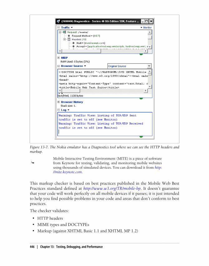
Mobile Interactive Testing Environment (MITE) is a piece of softwarefrom Keynote for testing, validating, and monitoring mobile websitesusing thousands of simulated devices. You can download it from http://mite.keynote.com.
This markup checker is based on best practices published in the Mobile Web BestPractices standard defined at http://www.w3.org/TR/mobile-bp. It doesn’t guaranteethat your code will work perfectly on all mobile devices if it passes; it is just intendedto help you find possible problems in your code and areas that don’t conform to bestpractices.
The checker validates:
• HTTP headers
• MIME types and DOCTYPEs
• Markup (against XHTML Basic 1.1 and XHTML MP 1.2)
Figure 13-7. The Nokia emulator has a Diagnostics tool where we can see the HTTP headers andmarkup.
446 | Chapter 13: Testing, Debugging, and Performance

• Cache usage
• Tag usage
• Image, table, and frame usage
ready.mobi
The dotMobi team has created a free validator that includes the W3C mobileOKChecker tests and some others, plus some emulators and detailed error reports withsuggestions. The validator is available at http://www.ready.mobi. You can use it for asingle document by providing a URL or copying and pasting the code, or to report onan entire site, including site-wide testing (registration is required for this last function).You can see a sample in Figure 13-8.
Figure 13-8. ready.mobi is a good service for markup validation, although it may not have the bestscore for an HTML 5 or iPhone webapp.
Testing and Debugging | 447

As an advanced feature, you can specify the user agent that we want the checker to use,and a list of accepted MIME types.
dotMobi offers, through the Prometric testing service, a mobile webdeveloper certification that will certify your mobile web knowledge. Youcan take the exam from anywhere in the world. More information canbe found at http://prometric.com/dotMobi.
After analyzing your document, ready.mobi will assign you a score on a scale of 1 (verybad) to 5 (excellent). It will also report on the size of your document and resources andthe estimated time and download costs for the user.
Firefox plug-ins
There is a plug-in for Firefox that will allow this browser to support the XHTML MPMIME type (not supported by default). You can download the plug-in from http://xhtmlmp.mozdev.org.
Client-Side DebuggingJavaScript debugging is one of the most painful activities in mobile web development.Every browser has a different JavaScript engine, and sometimes code that works on onedevice doesn’t work on another.
Typical desktop JavaScript techniques should be used first to debug logic problems inour code. This includes using the developer tools from Chrome, Safari, or InternetExplorer, or the classic Firebug for Firefox (http://getfirebug.com). But just becauseeverything works in a desktop browser doesn’t mean that it will work in a mobilebrowser. Rich Internet Application techniques are the worst problem areas.
One problem we will have is that if a JavaScript error is encountered,many devices don’t show any notice and the code simply ends its exe-cution.
Browser-based solutions
Some mobile browsers offer developer tools for JavaScript debugging or console loggingfeatures.
There is a free and simple web application that allows us to evaluateJavaScript on a mobile browser for testing purposes. To try it, just pointyour browser to http://www.jsconsole.com.
448 | Chapter 13: Testing, Debugging, and Performance

Safari includes a debugging console that we can activate (bothin simulators and on real devices) by going to Settings→Safari→Developer→DebugConsole. With the debug console activated, you will find a new 60-pixel-high toolbarbelow the top toolbar of the browser.
The Symbian browser has script error logging disabled by default. Youcan activate it from the Settings menu inside the browser.
Clicking this toolbar opens a full-screen Console window, as shown in Figure 13-9,where you can see advice, warnings, errors, and console output, which you can filterinto HTML, JavaScript, and CSS categories. For better detail reading, use landscapeorientation.
Figure 13-9. When you activate the debug console you will see the console toolbar (left), which youcan click on to access a details list (right).
From JavaScript, you can send messages to the console using the log, warn, error, andinfo methods of the console global object available in the iPhone browser. All of thesemethods receive a string. The difference between them is the icon used to show thetext. For example:
Safari on iOS Debug Console.
Testing and Debugging | 449

console.log("This text will appear on the Console");
From Opera Mobile 9.5, we can debug mobile web applications usingthe remote debugging tool Dragonfly. To use this tool you will need Opera 9.5 or lateron your desktop. You can open Dragonfly by going to Tools→Advanced→DeveloperTools and checking the Remote Debug option.
When you’re done, enter opera:debug in your Opera Mobile browser and specify yourdesktop IP address (public or private, if you are connected using WiFi to the sameLAN). You will then have access to the same debugging features (DOM, CSS, andJavaScript) that you would if you were debugging a local desktop file.
You can also debug Opera widgets with this tool. Complete instructions and tips canbe found at http://www.mobilexweb.com/go/dragonfly.
Android doesn’t have as nice a console output as Safari on iOS, butwe can still read the console errors and even use the same console object using theAndroid Debug Bridge (adb). adb is a command-line application available in the toolsfolder of your SDK.
You can find more information on how to use this console at http://www.mobilexweb.com/go/adb.
BlackBerry offers two plug-ins that can be used to de-velop and also to debug, profile, and package web applications. Both provide JavaScriptdebugging with breakpoints, Ajax requests visibility, and time-to-load reporting forweb content. You can download the BlackBerry Web Plug-in for Eclipse and BlackBerryWeb Plug-in for Visual Studio from http://www.mobilexweb.com/go/bbdebug.
The BONDI SDK for widgets offers a remote debugging feature thatcan be used from the Google Chrome Developer Tools. WRT plug-ins for Aptana Stu-dio and Visual Studio also support debugging over the emulator (remember that it isnot the real engine). The LG SDK and the BlackBerry web development tools have greatdebugging tools for widgets, too.
JavaScript solutions
There are some scripts that work as a kind of debugger, including DOM and CSS in-spectors and some that work for JavaScript debugging, too. The mobile compatibilityfor these tools is complicated, though, because of the lack of space on the screen toshow all the information. There are also some Ajax-based solutions that will workbetter, allowing you to view the debug results and panes from a desktop.
Creating a simple log console is easy, using a floating div or another visual element toshow messages sent by a console.log call.
Using alert windows for logging and debugging is annoying and a bitintrusive. Try to use another solution.
Opera Dragonfly.
Android Debug Bridge.
BlackBerry web development tools.
Widget debuggers.
450 | Chapter 13: Testing, Debugging, and Performance

For example:
if (console==undefined) { var console = new Object(); console.log = function(text) { if (document.getElementById("console")==undefined) { document.getElementsByTagName("body")[0].innerHTML = "<div id='console'></div>"; } document.getElementById("console").innerHTML += "<p>" + text + "</p>"; }}
With some CSS to the console and console p selectors, you can see a console. Withsome scripts, you can also create an object browser and a console JavaScript executionengine using eval.
You can check whether window.onerror is available and catch every errorbefore blocking all the rest of the script.
The JavaScript Debug Toolkit (JSDT) is an Ajax-based JavaScript debugging tool thatworks with mobile devices as a desktop standalone application or an Eclipse plug-in.It is available at http://code.google.com/p/jsdt.
Another option is Firebug Lite (http://getfirebug.com/lite.html), a plug-in that makessome Firebug tools available on non-Firefox browsers if you add a JavaScript file anda CSS file on your website. It works in many mobile browsers and widget engines(including Symbian, Safari, Android, and Palm), but the navigation is very complicatedwhen the Firebug Lite view is open.
Performance OptimizationPerformance is the key to mobile web success. People want high-performance websites.We hate to wait on our desktops, and the situation is far worse on mobile devices, withtheir constrained resources. I could write a whole book about mobile web performance,but for now I will just try to distill some best practices and share some hacks that youcan easily apply to enhance your website’s performance.
Performance has recently become a hot topic in the desktop web world. In generalmobile web developers should follow the same practices, but there are some new onesto keep in mind as well, and some desktop web best practices that will not work onthese devices.
Performance Optimization | 451
If you’re just getting started with performance optimization, the firstthing you should do is read two excellent books from Steve Souders(http://stevesouders.com), High Performance Websites and Even FasterWebsites, both from O’Reilly. Then, you should follow the Yahoo! andGoogle performance team blogs at http://developer.yahoo.com/performance and http://code.google.com/speed.
Mobile browsers aren’t the same as desktop web browsers, and not all mobile browsersare created equal. Specifically, the quantity of resources that can be downloaded inparallel and the cache functionality differ. Nevertheless, it is better to approach mobileperformance optimization from here than from the ground.
If you want to know more about high-performance mobile websites andmobile browser behavior, check out http://www.mobilexweb.com/go/performance.
MeasurementThe first thing we need to do is to measure. If we cannot measure, we cannot optimize.However, measuring mobile websites is not easy. Typical desktop measurement andprofiling tools don’t work for mobile devices, and HTTP sniffers are difficult to imple-ment for mobile browsers.
Nokia provides a free tool for profiling the battery energy used by anapplication. You can download the Nokia Energy Profiler for free fromhttp://forum.nokia.com.
Advanced memory and process profiling for JavaScript is still more of a dream than areality. However, Yahoo! has created a simple JavaScript profiler called the Yahoo! UIProfiler, available at http://developer.yahoo.com/yui/profiler, that will work on anyA-grade browser (Symbian, iPhone, Android), and you can always use new Date().getMilliseconds() to get the time differences between two moments in your JavaScriptcode.
If you are using an emulator or a real device with WiFi capabilities, you can use anyHTTP sniffer proxy, configuring the emulator and your device with your desktop IPaddress and port as the proxy for navigation. There are dozens of tools for doing this,but the one I like best is called the Charles Web Debugging Proxy. A full-featured freetrial for Windows, Mac, and Linux is available at http://www.charlesproxy.com.
Once you’ve installed it, you can use the proxy (by default on port 8888) in your mobileemulator or device, and you will see every request, including the headers and the order
452 | Chapter 13: Testing, Debugging, and Performance

and simultaneity of requests made on each browser to optimize the final download timefor resources. You can also see Ajax requests with JSON and XML browser support.
If you have a dedicated server (or even your own development computer with full in-bound access to port 80), you can install one of these proxies and a web server andbrowse your website from any phone on any network to analyze how is it renderingand requesting resources.
Nokia emulators (Series 40 and Symbian) also have a great network sniffer that enablesyou to see all the requests that the browser is making, including the headers.
Best PracticesHere are some global best practices you should always have in mind:
• Keep it simple.
• Reduce the HTTP requests to the minimum possible.
• Implement Ajax requests if you can, and if the device supports them.
• Make the cache your friend.
HTTP request headers are generally larger in mobile websites becauseof the large User-Agent, Accept, and other headers. Remember that theseheaders are sent with each and every request your page makes. That iswhy it is important to keep the number of requests to the minimum.
Reducing requests
There are plenty of tips for reducing network requests:
• Use only one CSS and JavaScript external link per page.
• If the script and/or CSS is only for one document, don’t use external code; instead,embed it in the page.
• Use inline images whenever you can.
• Use CSS Sprites.
• Reduce the use of images for effects, titles, and text. Try to meet all of these needsusing only CSS.
• Use multipart documents when compatible.
• Download only the initially required code and resources and then, after theonload event, download all the rest on Ajax devices (lazy loading).
Every mobile browser supports a cache for resources and you shoulddefinitely use it, with a long-lived expiry for each static resource. Analyzehow the cache works (this is outside the scope of this book) and makeit your friend, not your enemy!
Performance Optimization | 453

Compressing
Compression is a necessity, and there are different techniques you can use for it:
• Minimize your XHTML files, removing spaces, comments, and non-useful tags.
• Minimize your CSS files, removing spaces and comments.
• Minimize your JavaScript files, removing spaces and comments and obfuscatingthe code.
• Use HTTP 1.1 compression for delivering static and dynamic text-based files(XHTML, JavaScript, CSS, XML, JSON).
• Use a cookie-free domain (or alias domain) for static content files.
For minimizing files, there are plenty of online and offline tools, like JSMin (http://crockford.com/javascript/jsmin) and YUI! Compressor (http://developer.yahoo.com/yui/compressor).
Going Beyond JavaScript CompressionThere are plenty of good JavaScript obfuscators and minimizing tools out there, butGoogle has taken an extra step and created Closure Compiler, a new concept in Java-Script programming. It is not just a minimizing and obfuscating tool, but it is also acompiler: it compiles JavaScript code into better JavaScript code and it is very helpfulfor mobile websites.
You can download the compiler at http://code.google.com/closure/compiler or use theweb application compiler at http://closure-compiler.appspot.com.
The code will be rewritten to be lighter and quicker to execute. The resulting code willnot be suitable for human reading because it will not use good programming practices,but that is not the goal. We are not going to edit the resulting code; we will always workwith the original code (with comments and all the best practices) and recompile it beforesending it to the server.
HTTP compression
HTTP 1.1 added compression (using GZIP and deflate) as an optional possibility whendelivering a file to the client. Using this option is strongly recommended for text-basedfiles on most mobile devices, because it will reduce the traffic between the server andthe client by up to 80%. It will add some overhead on the client (to uncompress thecontent), but it’s well worth it. Network traffic will be one of our worst problems if theuser is not connected to a WiFi network. Even with 3G connections, the network canhave latency problems.
454 | Chapter 13: Testing, Debugging, and Performance

If you work with ASP.NET Web Forms, you should be careful aboutthe usage of the ViewState, which generates big hidden input tags in theHTML. Deactivate the ViewState on the controls where you won’t use it.
You will find plenty of resources on the Web about how to configure HTTP compres-sion for Apache, Internet Information Server, and other products. The most importantthing you need to remember is to also compress dynamic scripts delivering markup,like PHP scripts, which by default do not use HTTP compression in Apache.
Other tips
Here are some other tips to keep in mind:
• Compress images and choose the best format and color palette. You can use thefree online tool Smush.it from Yahoo!, available at http://www.smushit.com.
• Deliver small images for small screens. You can use a dynamic resizing tool, or thefree online service at http://www.tinysrc.net.
• Keep files under 25k because, if not, they will have problems to be cached on somedevices.
• Reduce the initial load time as much as possible. You want the web application tobe ready as soon as possible.
• Minimize DOM access and simplify your document structure.
• Use HTML 5 storage for caching data and resources in base64.
• Flush the buffer early, using flush() in PHP or Response.Flush() in ASP.NET, after</header> and after big blocks of visual components.
• Avoid redirects between pages, especially in the home page.
• Create a quick and simple home page.
• Put script tags at the bottom to avoid resource download delays.
• Use a content delivery network or a static server for static content if you have a lotof images or other static content.
• Remove any non-useful headers from the server responses (like server identificationor “powered by”).
Performance Optimization | 455
Deferred JavaScript EvaluationThe Gmail team, in conjunction with Charles Jolley (http://blog.sproutcore.com), hascreated a very clever and simple way of reducing the initial payload time of JavaScriptexecution. The solution is to deliver the JavaScript code inside a comment block (/**/). This means the JavaScript isn’t executing while loading, and it doesn’t freeze theUI or block other resources.
When you need to execute that library or code, you just get the script by ID, get itscontent, remove the comment characters, and make an eval of that code. Pretty smart,isn’t it? On iPhone OS 2.2, 200 KB of JavaScript code adds 2.6 seconds to the initialpage load time, while if it is comment it adds just 240 ms. After all the initial loadingis done (or later, whenever you need it) you can parse it.
JavaScript performance
Again, keep your code simple. Here are some other specific tips for mobile JavaScriptcoding:
• Don’t use try/catch expressions for expensive code.
• Avoid using eval, even in situations where you might not think about it being used,like when using a string in setTimeout instead of a function.
• Avoid using with.
• Minimize the usage of global variables.
• Minimize the number of changes in the DOM, and make the changes in the sameoperation. Many browsers repaint the whole screen on each change.
• Implement a timeout for Ajax calls.
• Compress (and if you want, compile with Closure Compiler) your code.
You can find an excellent article about JavaScript performance tips for mobile browsersat http://wiki.forum.nokia.com/index.php/JavaScript_Performance_Best_Practices. Youshould also check out Nicholas Zakas’s High Performance JavaScript (O’Reilly).
456 | Chapter 13: Testing, Debugging, and Performance

CHAPTER 14
Distribution and Social Web 2.0
So, you’ve finished your mobile web application and you are ready to go to market (orso you think). However, your work isn’t over yet. In this chapter, we are going to analyzesome search engine optimization tips, and talk about how to get users to actually visitour mobile websites and encourage them to come back again and again.
We will also explore how to monetize mobile websites using advertising and how tomerge our applications with some social features, such as SMS, RSS, and socialnetworks.
Mobile SEOSearch engine optimization (SEO) refers to a set of best practices that you can followto allow your website to be in the best possible place in a search engine.
In general, typical desktop SEO techniques apply to mobile websites, too, but someextra care must be taken. As we’ve already discussed, generating too much code(metadata) and too much text for keyword crawling is not the best solution for themobile web.
The first thing we need to understand is that mobile search users are not the same asdesktop search users. Mobile users are typically searching for something very specific,and we should do our best to facilitate access to those resources.
Mobile search engines (Google, Yahoo!, Bing) localize the search results, so if yourservice is location-based, you should make sure that your location is properly definedin your text and code. In mobile search engines, the user only types a few charactersand the engine tries to suggest the best possible results based on location and previousresults, with mobile-specific content given priority.
457
If your mobile website gets content using Ajax, you should implementGoogle’s proposal for making the content being indexed crawlable. Youcan find more information about this at http://code.google.com/web/ajaxcrawling.
Search engines like Google will try to serve mobile-specific content first, but if someoneis looking for the exact name of your application and Google doesn’t know that youhave a mobile website, the user will be redirected to your desktop site or to a transcodedmobile version of it produced by a Google server.
If you appear in the search engine’s databases, you will also be found using the nativeapplications that many search engines are developing, including voice-powered searchapplications.
Spiders and DiscoverabilityThe first problem is how to make your mobile website known to the search engines.This can be different depending upon whether you already have a desktop website thathas been crawled or not.
If you already have a desktop website, you can give search engines the URL of yourmobile site using the alternate link method:
<link rel="alternate" media="handheld" href="http://m.yoursite.com" />
You can also add your mobile site manually, using these URLs:
• Yahoo! (http://siteexplorer.search.yahoo.com/mobilesubmit)
• Bing (http://bing.com/webmaster)
• Google (http://google.com/addurl)
Mobile Sitemaps
Google has created an extension to the Sitemap protocol (http://sitemaps.org) for mobileweb content discoverability, called Mobile Sitemaps. After creating an account in Goo-gle Webmaster Central (http://www.google.com/webmasters), you can add your mobilesite to Google’s database. You will need to verify that you are the owner of the site, byinserting a temporal metatag or HTML file in your site.
Googlebot-Mobile uses the Accept HTTP header to determine whethera site delivers mobile content types. If you want to be sure that the botcan access your site, you can also check that the User-Agent header con-tains Googlebot-Mobile. Some sites will only allow access to mobile de-vices, and while Googlebot-Mobile tries to emulate such a device it isnot always successful in gaining access unless it is specifically allowed.
458 | Chapter 14: Distribution and Social Web 2.0

Once your site has been validated, you can submit a Sitemap for it. If your mobile siteis targeted to only one country using a non-country top-level domain (like .comor .mobi), you can also define the geographic target for which your mobile site isprepared.
Check the Sitemaps documentation at http://sitemaps.org for full tag andoption support.
A Mobile Sitemap is an XML file, based on the Sitemap standard, that lists the mobileURLs for your site (XHTML, XHTML MP, WML, cHTML). You can provide URLsfor both mobile and non-mobile versions depending on the headers, but you shouldnot list non-mobile-only URLs. A sample Sitemap file looks like this:
<?xml version="1.0" encoding="UTF-8" ?><urlset xmlns="http://www.sitemaps.org/schemas/sitemap/0.9" xmlns:mobile="http://www.google.com/schemas/sitemap-mobile/1.0"> <url> <loc>http://m.yourdomain.com/</loc> <mobile:mobile/> </url></urlset>
You should provide one url element for each mobile URL and page, including themobile:mobile empty tag. If you have many versions using different URLs (for iPhone,WML, etc.), you should provide them all in the same file.
To check whether your website is listed in Google Mobile, visit http://m.google.com with a mobile device and use the search operatorsite:your_domain.
The Google Webmaster Team also suggests detecting Googlebot-Mobile in your desk-top site and redirecting it to the mobile-specific version of the same page. For example,for information about a product X in your desktop site, you should redirect the bot tothe mobile URL displaying information about that product. Otherwise, Google will usea transcoder on the desktop page, as shown in Figure 14-1.
How Users Find YouSearch engines are not the only way for users to discover your mobile website. Obvi-ously, offline marketing is always welcome, but there are also other online features weshould implement to facilitate discoverability. These include advertising the new mo-bile website to your current desktop visitors and implementing newsletters and feedreaders.
Mobile SEO | 459

The first problem to tackle is simplifying the user’s first access to the mobile website.Many mobile users still don’t know how to go to a URL if it is not on the carrier’s homepage, and many others will not want to type a long URL on a numeric keypad device.
SMS invitation
A good solution is to include in your desktop website a form to collect the user’s phonenumber and then send him a WAP Push or an SMS link. A WAP Push is a specialmessage with a URL inside. This is generally a premium SMS, and some carriers don’tallow sending them from a website.
An SMS link is just a normal SMS with a link inside. Almost every modern device witha browser will autodetect a URL inside a text message if it begins with www or http://and will convert the URL into a link that the user can click after receiving the SMS (seeFigure 14-2).
The big question, is how do we send an SMS from a website? The answer is not whatyou might expect—there isn’t a simple or free way to do it. We have to use an SMSprovider or gateway that, with a simple web service call, will send the message to usersin one country or worldwide. We will have to pay for that SMS, but depending on thebusiness, a new mobile web user will probably be worth the small expense.
Some SMS gateway providers also allow inbound SMS messages thatwill be routed to your scripts or will be accessible via an API. This couldbe an excellent solution to receive queries by SMS to your service.
Figure 14-1. If you don’t provide a mobile version of your website, Google will use its transcoder forusers with low- or mid-end devices. Here is the O’Reilly home page transcoded.
460 | Chapter 14: Distribution and Social Web 2.0
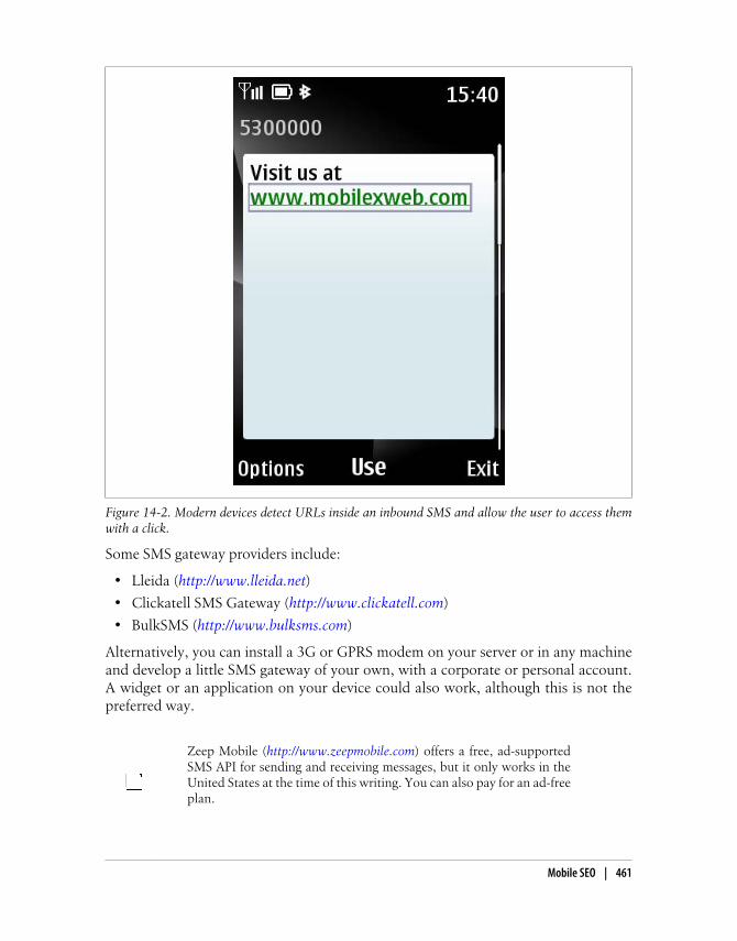
Some SMS gateway providers include:
• Lleida (http://www.lleida.net)
• Clickatell SMS Gateway (http://www.clickatell.com)
• BulkSMS (http://www.bulksms.com)
Alternatively, you can install a 3G or GPRS modem on your server or in any machineand develop a little SMS gateway of your own, with a corporate or personal account.A widget or an application on your device could also work, although this is not thepreferred way.
Zeep Mobile (http://www.zeepmobile.com) offers a free, ad-supportedSMS API for sending and receiving messages, but it only works in theUnited States at the time of this writing. You can also pay for an ad-freeplan.
Figure 14-2. Modern devices detect URLs inside an inbound SMS and allow the user to access themwith a click.
Mobile SEO | 461

You can also use carrier developer networks and the up-and-coming OneAPI to sendmessages to known networks.
Email invitation
For newer smartphones with email support, an alternative to SMS is to send the usera free email message containing the mobile URL.
Mobile Tiny URL
To enable the user to type your URL easily, you can use the free service Mobile TinyURL (http://www.mobiletinyurl.com), shown in Figure 14-3. It converts any URL intoa short form that can be typed with only 13 keypresses on a numeric keypad. By defaultthe generated short URL doesn’t work in desktop browsers or on iPhone devices, butyou can add desktop and iPhone support. These short URLs are useful for publicationon desktop websites and in printed advertising.
Figure 14-3. With the Mobile Tiny URL service, developed in 2009, you can generate valid web addressthat can be entered using only the first characters of a numeric keypad.
For example, instead of typing m.safaribooksonline.com, a mobile user can type ad.ag/admtgp (saving 57 keypresses). As you can see, the generated URL uses only the firstletters associated with every key on the keypad, to speed up entry. Even apparentlysimple URLs like google.com will require 37 keypresses on a mobile phone, and youcan save 24 by using the compressed URL (ad.ag/tgtmjg).
462 | Chapter 14: Distribution and Social Web 2.0

The Mobile Tiny URLs aren’t intended to be URLs that you will re-member; they are intended for you to have in front of you while you aretyping them in.
QR codes
A QR code is a two-dimensional barcode (also called a matrix code) that allows thestorage of several bytes in a graphic. These codes have many uses, one of which is toprovide a URL that can be read by devices with bar code readers. Many Nokia andAndroid devices come with these readers preinstalled, but on other devices, users willneed to download one. A sample QR code is shown in Figure 14-4.
Figure 14-4. Google Maps created the Favorite Places campaign, sending stickers like this one tobusinesses (like restaurants) that the users can scan with their mobile devices to access information,reviews, etc. Today, the service is known as Google Places.
A QR code can contain 4296 alphanumeric characters, or 2953 bytesfor binary data. Some devices also support other data inside, like contactinformation (for example, a vCard file).
They are well known in mobile advertising; many campaigns use these codes in news-papers, on street signs, and even on t-shirts.
Mobile SEO | 463

To create a QR code, you can use any of these free services:
• http://qrcode.kaywa.com
• http://createqrcode.appspot.com
• http://mobilecodes.nokia.com
• http://www.mobiletinyurl.com
If you need to generate a QR code dynamically, there are libraries for almost all server-side platforms that will generate the right image for you.
The free Google Chart API (http://code.google.com/apis/chart) allows you to generatefree QR codes using an XHTML img tag with parameters.
There is also WordPress plug-in (http://wordpress.org/extend/plugins/qr-code-tag) thatcreates a QRCode widget for inserting in your blog).
User FidelizingOnce you’ve gotten a user to your mobile website, how do you encourage her to comeback and maintain an interest in your service? If you are not providing a must-use service(such as online banking or email), you may want to implement some of the followingtechniques to “fidelize” your users:
• Encourage the user to add your site to her bookmarks, or to the home screen onselected browsers (like iPhone or Android).
• Offer the user a widget or mobile client with richer features.
• Offer the user a shortcut to download for the applications or home menu.
• Offer the user a home widget on supported devices, with automatic updates.
• Create a mobile RSS news feed.
• Provide an SMS alert subscription.
Creating a widget for your mobile website (as discussed in Chapter 12) could be thekey to getting the user back, via the icon in her applications menu. This can be usefuleven if the widget is just a void container for the same website.
A great feature to incorporate into a widget or mobile client is friendrecommendation using the Contacts and SMS APIs available on someplatforms.
Web shortcuts
A web shortcut is a native application or widget that has an icon in the menu thatlaunches the browser when it is activated, like the one shown in Figure 14-5. Adding
464 | Chapter 14: Distribution and Social Web 2.0

a shortcut is better than adding a bookmark, because it will be installed just like anyother application.
You can create Java ME, Windows Mobile, BlackBerry, and widget versions to coverall the possible shortcut platforms.
You can create a free shortcut for your website using the free http://www.widgen.com service.
RSS
Some browsers (Opera, Bolt, NetFront, Symbian) detect feed metatags and offer theuser the option to subscribe to the feeds to get updates on the sites that provide them.To offer this service, you should provide an RSS file with a mobile web link inside:
<link rel="alternate" type="application/rss+xml" title="Mobile RSS" href="http://mobilexweb.com/rss.xml" />
If you have an RSS file for your mobile content, you can create a free mobile clientreader at http://www.widgen.com and offer it as a download from your site.
Open Search
If your website provides a search engine, you should supply an Open Search descriptionprotocol file that will allow users of compatible devices to add your engine to the listof possible search engines. Not too many mobile browsers support this format at the
Figure 14-5. In Gmail, you can access the mobile website or download a richer client (“Get fasterGmail”). The same technique is used for downloading a shortcut.
Mobile SEO | 465

time of this writing, but a mobile extension is in draft by the Open Search organization(http://opensearch.org).
To define an Open Search declaration for discoverability, use the following link tag:
<link rel="search" type="application/opensearchdescription+xml" href="http://mobilexweb.com/opensearch.xml" />
The Open Search descriptor file will look like this:
<?xml version="1.0" encoding="UTF-8"?><OpenSearchDescription xmlns="http://a9.com/-/spec/opensearch/1.1/"> <ShortName>Mobile Web Search</ShortName> <Description>Search in our mobile web</Description> <Url type="text/html" template="http://mysite.com/?q={searchTerms}"/> <Image height="64" width="64" type="image/png"> http://example.com/icon.png </Image> <Language>en-us</Language></OpenSearchDescription>
BlackBerry Web Signals
RIM offers a push service called Web Signals that can push real-time information toBlackBerry devices. The customer has to follow an opt-in process to subscribe to yourcontent. When you want to push information you send an icon and a URL to the RIMservers, and they deliver the information to the subscribed users. The mechanism canbe used for public information for end users (news, weather, traffic) or for privateinformation (corporate alerts).
To see more information and start providing Web Signals to users, go to http://www.mobilexweb.com/go/websignals.
Apple, Android from 2.2, and Palm offer push service notifications forapplications distributed in their stores. We can also use these if we pro-vide hybrid web applications.
Mobile Web StatisticsWith your website online, you will want to gather some statistics about usage, visitors,and even mobile browsers accessing your site. Typical desktop web statistics systemsdon’t work well with mobile sites, because they don’t have mobile user agents in mindwhen analyzing logs and don’t work on non-JavaScript devices or other kinds ofservices.
However, there are some free and commercial solutions available for mobile webstatistics.
466 | Chapter 14: Distribution and Social Web 2.0
Google Analytics for MobileGoogle Analytics is one of the most used (and most powerful) free web statistics toolfor mobile websites, but it is based on JavaScript code that, in the mobile world, onlyworks on high-end devices.
Google Analytics for Mobile Websites (http://code.google.com/mobile/analytics/docs/web/) works on all web-enabled browsers, with or without JavaScript support. Thetechnology supports script code for PHP, ASP.NET, Perl, and JSP.
Google Analytics is also available for Android and iPhone native appli-cations, supporting tracking of pages and events.
To use the mobile service, you should apply for a normal Google Analytics account athttp://www.google.com/analytics. Create a new Website Profile and, in the Advancedsection, select “A site built for a mobile phone,” select your server language, and followthe instructions.
Yahoo! Web AnalyticsYahoo! Web Analytics (http://web.analytics.yahoo.com) supports mobile devices, giv-ing the following statistics about your mobile users:
• Mobile device manufacturer
• Mobile device model
• Model device screen size
• Carrier name
You will find these statistics in the Mobile Reports section.
MobilyticsMobilytics (http://www.mobilytics.net) provides free and premium metric and visualindicators about your mobile web visitors. Mobilytics offers scripts for PHP, ASP.NET,JSP, and other server-side platforms. Transcoder detection, mobile device detection,and other capabilities are available in premium plans.
Motally Web AnalyticsMotally (http://www.motally.com) offers mobile web analytic services with a patent-pending algorithm to track mobile user visits. It provides statistics about the devices,operators, and location of your users, and detects the use of proxies and transcoders.
Mobile Web Statistics | 467

Motally is available in a free community version and a commercial version with moreadvanced features. There are server-side code snippets for PHP, JSP, ASP.NET, Perl,and Ruby on Rails.
Pion for Mobile WebAtomic Labs offers a commercial service for mobile web logging and statistics includingmobile session replay, where you can see exactly what your users are doing on yourmobile website. More information can be found at http://www.atomiclabs.com/pion-web-analytics/mobile-web-analytics.php.
Mobile Web AdvertisingYou’ve put a lot of work into build your site. How can you make a return on thatinvestment? One solution could be advertising.
Monetizing Your WebsiteIf you have a free mobile website and you want to monetize it with advertisements,there are a few solutions that you can use.
For more information about mobile advertising, visit the Mobile Mar-keting Association at http://www.mmaglobal.com.
Google AdSense for mobile content
With Google AdSense, you can easily insert mobile-optimized ads for mobile devices.To use it, log in or sign up at http://www.google.com/adsense and select “AdSense forMobile Content” on the Account Setup tab.
When you define a mobile campaign for Google AdWords, you can usethe Keyword tool to access information about mobile searches in theGoogle ecosystem.
It is possible to select only advertisements for iPhone and high-end devices, or for alldevices (including ads in XHTML, cHTML, and WML format), using server-side code.When you add the server code (for example, PHP) you should start seeing mobileadvertisements on your site within 48 hours.
468 | Chapter 14: Distribution and Social Web 2.0

The standard Google AdSense account also works on smartphones withHTML and JavaScript support.
AdMobAdMob is the pioneer in mobile web advertisement, and as Google acquired it in 2009it will probably be joining the AdSense service soon. AdMob offers multiple ad formatsto use in mobile websites, inserted using simple codes. To sign up, register for an ac-count at http://www.admob.com/publish.
Other CompaniesOther companies offering mobile advertising solutions include DeckTrade (http://www.decktrade.com), AdModa (http://www.admoda.com), and Quattro Wireless (http://www.quattrowireless.com).
If you want to promote your mobile web application to mobile usersand you have a marketing budget to spend, you can create a mobilecampaign through Google AdWords (http://www.google.com/adwords),AdMob (http://www.admob.com), GetJAR (http://developer.getjar.com),or GameJump (http://www.gamejump.com) You will begin receivingvisits from mobile applications, games, and search engines withinminutes.
Mobile Web Social FeaturesYour mobile website will not be complete if you don’t add some social features to it.In the current Web 2.0 and social networking era, social integration is a must-havefeature to implement.
FacebookFacebook offers Facebook Connect for Mobile Web, a PHP library that lets our appli-cations log users in using their Facebook accounts. With this API you can:
• Create a login mechanism easily.
• Get user session data.
• Call methods from the Facebook Platform API and prompt for extended permis-sions (access friends list, send private messages).
• Post on the Facebook stream.
Mobile Web Social Features | 469

To use it, you will need to get an API key at http://developer.facebook.com and configureyour mobile web settings and URLs for callbacks. Once you’ve done this, you candownload the API for PHP (including sample code), create the MySQL table, and usethe API.
Your application can also be integrated into the mobile Facebook website (http://m.facebook.com) like a desktop Facebook application. The mobile version is a subset ofthe desktop one, and you can use Facebook Markup Language (FBML) to create it.This is a whole new topic and is outside the scope of this book, but you can get moreinformation at http://wiki.developer.facebook.com.
Share ContentFor any content you are serving in your mobile website, you can offer a Share serviceto publish the URL via Twitter, Facebook, and other social networks.
For most social networks, you should use the same URL you would use for the desktopwebsite. On the server, the social network scripts will redirect users to the mobilewebsite.
For Twitter, you can use a link like this:
http://twitter.com/home?status=<your message here>
Remember that Twitter has a limit of 140 characters, including an optional URL usinghttp://, which should be URL-encoded in the status variable. For long URLs, you shoulduse a shortener service API.
In Chapter 6 we discussed how to open any installed native Facebookor Twitter applications on iPhone and Android devices.
For Facebook, you can share a link using:
http://m.facebook.com/sharer.php?u=<url to share>&t=<title of content>
You can also use the AddThis service, shown in Figure 14-6, which is compatible withmobile browsers when you use the standard button and not the JavaScript button.AddThis offers sharing links and icons for dozens of sharing services. It includes aspecial design for most mobile devices and for iPhone devices. To create your own codefor sharing services, go to http://www.addthis.com.
470 | Chapter 14: Distribution and Social Web 2.0

Figure 14-6. The free service AddThis detects mobile phones and offers an optimized interface forsharing links.
Mobile Web Social Features | 471


APPENDIX
MIME Types for Mobile Content
Markup and Script MIME TypesTable A-1. Markup and script MIME types
Format Typical extension MIME type
WML .wml text/vnd.wap.xml
WMLScript .wmls text/vnd.wap.wmlscript
HTML 3/4/5 .html text/html
cHTML .html text/html
XHTML .html, xhtml application/xhtml+xml, text/xml, text/html
XHTML MP .html, xhtml application/vnd.wap.xhtml+xml, application/xhtml+xml, text/xml, text/html
JavaScript .js text/javascript, application/ecmascript, application/javascript
CSS2, CSS3, WAP CSS, and CSSMP
.css text/css
Multipart document multipart/mixed, application/vnd.wap.multipart.mixed
Image MIME TypesTable A-2. Image MIME types
Format Typical extension MIME type
GIF .gif image/gif
JPEG .jpeg, .jpg image/jpeg, image/jpg
PNG .png image/png
SVG .svg image/svg+xml
473

Format Typical extension MIME type
Compressed SVG .svgz image/svg+xml
WBMP .wbmp image/vnd.wap.wbmp
Nokia Wallpaper image/vnd.nok-wallpaper
Mobile Content MIME TypesTable A-3. Mobile content MIME types
Format Typical extension MIME type
Java ME ApplicationDescriptor
.jad text/vnd.sun.j2me.app-descriptor
Java ME Archive .jar application/java-archive
BlackBerry Archive .cod application/vnd.rim.cod
Android Application .apk application/vnd.android.package-archive
Windows Mobile Application .cab application/cab
Garnet OS Application (oldPalm devices)
.prc application/vnd.palm
Symbian Application .sis application/vnd.symbian.install
Symbian Application .sisx x-epoc/x-sisx-app
vCalendar .vcalendar
iCalendar .icalendar
Nokia Flash Format .nfl
Adobe Flash Movie .swf application/x-shockwave-flash
XML .xml text/xml
JSON .json application/json, text/json, text/javascript
RSS .rss, .xml application/rss+xml
Open Search Description .xml application/opensearchdescription+xml
Mobile Sitemap .xml text/xml
Multimedia Message .mms, .smil application/vnd.wap.mms-message
Bookmark application/x-wap-prov.browser-bookmarks
Sony Ericsson MMS Template .tpl application/vnd.sonyericsson.mms-template
OMA Download application/vnd.oma.dd+xml
474 | Appendix: MIME Types for Mobile Content
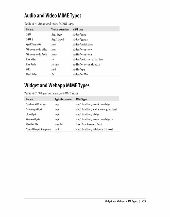
Audio and Video MIME TypesTable A-4. Audio and video MIME types
Format Typical extension MIME type
3GPP .3gp, .3gpp video/3gpp
3GPP 2 .3gp2, .3gpp2 video/3gpp2
QuickTime MOV .mov video/quicktime
Windows Media Video .wmv video/x-ms-wmv
Windows Media Audio .wma audio/x-ms-wma
Real Video .rv video/vnd.rn-realvideo
Real Audio .ra, .ram audio/x-pn-realaudio
MP3 .mp3 audio/mp3
Flash Video .flv video/x-flv
Widget and Webapp MIME TypesTable A-5. Widget and webapp MIME types
Format Typical extension MIME type
Symbian WRT widget .wgz application/x-nokia-widget
Samsung widget .wgt application/vnd.samsung.widget
JIL widget .wgt application/widget
Opera widgets .wgt application/x-opera-widgets
Manifest file .manifest text/cache-manifest
Yahoo! Blueprint response .xml application/x-blueprint+xml
Widget and Webapp MIME Types | 475


Index
AA-GPS (Assisted GPS), 370absolute/floating positions, 197ACCESS, 29, 51access keys, 114, 139, 153ActionScript, 219active pseudoclass, 200adaptation frameworks, 362AddThis, 470AdMob, 469Adobe
vs. Apple, 171Device Central, 89Flash, 171Flash Lite, 19, 90, 356Flex for Mobile, 173
AdSense (Google), 468advertising, 468Ajax, 66, 221, 267–272alignment, text, 191alternative text, 132Amazon Kindle, 9Android, 26
browser, 49, 251Debug Bridge, 450emulator, 77intents, 148platform, 420
animation, 132, 279–288Apache, 343AppCache, 308–311Apple
vs. Adobe, 171Dashboard, 398, 403
iPad, 9, 17, 321, 413–418iPhone
content application delivery, 357CSS extensions, 217mobile widgets webapps, 413–418OS, 17Photo Picker, 159simulators, 82, 92text adjustment, 196version 4, 13
iPod, 5, 9, 143iTunes, 17Newton, 30
Apple, iPhoneform extensions, 165version, 182
Apple, iPhone WebClip con, 123application installations, over the air, 15applications, detecting, 148AR (Augmented Reality), 370AskPythia, 365ASP.NET
components, 364Mobile Controls, 364Mobile Device Brower File, 340Visual Studio on mobile emulator, 89
aspect ratio, 13Assisted GPS (A-GPS), 370AU, 50Augmented Reality (AR), 370autocomplete/autosuggest, 166, 300autofocus, 162autogrowing textarea, 296autoupdate (Ajax), 129
We’d like to hear your suggestions for improving our indexes. Send email to [email protected].
477

Bbackface visibility, 285background operation alerts, 66backgrounds, 202Bada, 23Bango, 353Barnes & Noble Nook, 9base64 encoding, 132, 310baseJS, 274Basic Pictograms, 135basic zoom, 41best practices, 453
coding of document body, 128design, 66JavaScript and battery life, 232, 235titles, 122
BlackBerry, 22borders/padding issues, 187browser, 49CSS stylesheets on, 180direct messaging, 144extensions, 165iDEN devices, 142Java ME for, 356location API, 382meta tags, 125MIME lists, 158offline form submission, 152phone number/email autodetection, 142simulators, 85web development tools, 450Web Signals, 466widget platform, 424–426
Blueprint (Yahoo!), 365Bolt, 53BONDI, 399–402, 450Booklet 3G (Nokia), 11Bookmarker, 146bookmarklets, 224border image, 212–216box borders, 211brands
Apple, 16BlackBerry, 22HTC, 26LG Mobile, 25Motorola, 24Nokia, 18–22other, 31
Palm, 28Samsung, 23Sony Ericsson, 24Symbian Foundation, 30Windows Mobile, 27
break code <br />, 98, 109browsers, 53
browsing types, 40direct vs. proxied, 43preinstalled, 45–51user-installable, 51–53
BulkSMS, 461bullets, 204buttons, 157, 295
Ccaching
application cache, 310base64 image files, 134, 310control metatag, 129resource, 453
calendar, updating, 147canvas tag, 178, 304–306card, wml, 98CardFlip pattern, 285–288cascading menus, 299cell information, 371Champeon, Steven, 63charset encoding, 108checkboxes, 152, 157Chromium, 53cHTML (compact HTML), 102city accuracy location, 369clear tag, 197clear text box button, 295click events, 249Clickatell SMS Gateway, 461client storage, 311–315ClientLocation object (Google), 386Closure Compiler, 454Cocoa Touch framework, 17Comet techniques, 271compact HTML (cHTML), 102compatibility tables
access key testing, 115Adobe Flash, 173AppCache, 310border image, 215call-to action, 143
478 | Index

changing properties dynamically, 243client-side cookies, 240contacts and calendar integration, 147CSS, 181, 183, 198, 201, 203, 209, 242,
246cursor, 205custom font techniques, 190document download, 150document.write, 228DOM, 241, 245dynamic script loading, 271events, 247, 248, 249, 253, 255, 256, 259file upload, 159focus and scrolling, 235frames, 169HTML, 107, 302, 306icon display, 124image format, 134innerHTML property, 244JavaScript, 222, 230JSON parsing, 269marquee testing, 118messaging actions, 145multiple lines/scrolling text in alerts, 227OMA Download, 350opening links in new windows, 139pictograms, 136preloading images, 244redirection, 232regular expressions, 240rounded corners, 199screen properties/events, 231script execution, 224select list, 156showing/hiding elements, 247standard dialog support, 226SVG, 175table display, 168text alignment, 191text effects, 193, 195, 212text input format, 163timers support, 237title lengths, 121UI libraries, 289viewport usage, 127window.open, 233WML support testing, 100XHTML testing, 107XML parsing, 267, 268
ComponentOne commercial ASP components,364
compression, 454condensed URL, 462content adaptation, 361–366content application delivery
iPhone, 357content attribute, 203content delivery
applications and games, 351–356charging for, 352defining MIME types, 343–345files, 346–350Flash Lite, 356multimedia and streaming, 357–361streaming, 359
content folding, 325content transformation/content adaptation,
327contenteditable attribute, 303cookie management, 240country accuracy location, 369, 372Crockford, Douglas, 397CSS
animations, 281backgrounds, 202box model, 187bugs in, 69content attribute, 203display properties, 197–205forms extensions, 118gradients, 276media filtering, 180–183for mobile, 114mobile standards, 114pseudoclasses, 200reset files, 185reset styles, 185Sprites, 205–211, 243Sprites alternatives, 210text format in, 187–196text overflow, 193text shadows, 192titles, 200transformations, 284transitions, 279WebKit extensions for, 211–218, 275–288where to insert, 179
.css extension, 104
Index | 479

Cufón, 190cursor management, 40, 204custom fonts, 189
DDarwin Streaming Server, 360Dashboard (Apple), 398, 403data URI, 132datalist tag, 304Debug Bridge (Android), 450debugging (see testing and debugging)deck, wml, 98default events, 258deferred JavaScript evaluation, 456definition list (dl, dt, dd tags), 138delayed linking, 346design and usability, 65–73Design4Mobile, 68detecting
context, 323–326features, 225, 331installed applications, 148mobile devices, 317platforms, 229, 325
DetectRight, 342device libraries, 330–341DeviceAnywhere, 439–442DeviceAtlas, 338different version approach, 64direct browsers, 43direct linking, 346distribution (see marketing)div tag, 130DMTF tones, 140DoCoMo, 20, 50, 88, 170, 188DOCTYPE (Document Type Declaration), 98,
105, 107, 108document downloads, 149Document Type Definition (DTD), 98DOM (document object model), 220, 241–
246domains, 93dotMobi, 57double tap events, 250Dragonfly (Opera), 450Dreamweaver (Adobe), 75, 99DTD (Document Type Definition), 98dynamic header declarations, 345
Eebook readers, 980/20 law, 61email, sending, 143embedded multimedia, 358Emoji pictograms, 135emulators/simulators, 75–92error management, 93ESMP (ECMAScript Mobile Profile), 219Even Faster Websites (Souders), 452event handling, 247–259Expansion Pictograms, 135extensions, 170–177
FFacebook, 57, 94, 469favicon.ico files, 122, 124feature detection, JavaScript, 225“fidelizing” users, 464–466fieldset tags, 153file upload, 158fill, text, 211Fire Mobile Simulator, 89Firebug Lite, 451Firefox, 50, 52, 443, 448firewalls, 11, 361Flash (Adobe), 171Flash Lite (Adobe), 19, 90, 356Flash Video, 358Flex for Mobile (Adobe), 173Fling, Brian, 68flip (swipe gesture), 259–264floating bar, 297floating/absolute positions, 197Flowella, Nokia, 70focus, 40, 200, 234fonts, 188–191forms
design of, 152file upload, 158HTML 5 input types, 303option groups, 155radio buttons and checkboxes, 157select lists, 153–155text input, 159–166
frames, 169fully connected devices, 5
480 | Index

GGarnet OS, 29, 49Gartner 2012 market predictions, 35General Packet Radio Service (GPRS), 55geolocation and maps
asking the user, 373BlackBerry location API, 382client techniques, 370defined, 15Google Gears, 379–382Google Maps Static API, 390–391GSMA OneAPI, 383IP geolocation, 372, 386–387open source geolocation API, 384overview, 369server techniques, 371–373showing a map, 387–391table of API support, 375W3C Geolocation API, 375–379
gestures, 259–265GetJar.com, 33Global Positioning System (GPS), 370Glyphish, 69go to top navigation, 130Google
AdSense, 468Analytics, 467and Android, 26Checkout, 352ClientLocation object, 386Closure Compiler, 454Earth/Maps, 149Gears, 308, 313, 379Maps, 58Maps API v3, 388Maps Static API, 390–391meta tags, 125Mobile Sitemaps, 458Web Storage Portability Layer, 314
Gordon, 173GPRS (General Packet Radio Service), 55GPS (Global Positioning System), 370gradients, 276graphics (see images)Guarana UI (Symbian), 291
HHandSpring, 28
HDML (Handheld Device Markup Language),95
headers, how to read, 323Hewitt, Joe, 292hibernation, 238hidden fields, 157High Performance Websites (Souders), 452high-end mobile devices, 7, 12, 65history management, 231hotspots, locating users via, 372hover, 201, 254HP, 29href attribute, 139, 231HTC, 26HTML
features, 359HTML DOCTYPE, 104HTML MIME type, 104
history, 95tags available in XHTML MP/Basic, 109version 5 API, 221version 5 features, 301–315
.html extension, 104HTTP (HyperText Transfer Protocol)
compression, 454Live Streaming, 360overview, 317–323Redirect, 93request headers for geolocation, 371
HTTPS connections, 93HVGA (Half VGA), 12
Ii-Mode format, 140i-mode HTML simulator, 88i-mode XHTML, 170iCalendar, 147icons
background operation, 66for iOS, 123for the mobile web, 122free, 69Java ME, 355
iDen networks, 142iEmoji, 135iframes, 169IIS (Internet Information Server), Microsoft,
344images, 131–138
Index | 481

border, 212–216formats, 123, 132inline, 132, 210maps, 210masked, 278preloading, 244with canvas, 304with SVG, 174
img tag, 131, 137indoor geolocation, 369, 372innerHTML property, 244input masks, 162input methods, 14intents, 148Internet Explorer Mobile, 46, 125, 182Internet Information Server, Microsoft (IIS),
344iOS (see Apple)IP address, 324, 372, 386–387iPad/iPod/iPhone (see Apple)iScroll, 198
JJapanese mobile web, 50Java ME, 19, 353–356JavaScript
battery consumption using, 232, 235code execution, 223code visible to user, 224compatibility, 222, 225–228compression, 454cookie management, 240debugging scripts, 450deferred evaluation, 456document.write function, 228DOM and, 241–246event handling, 247–259focus and scroll management, 234history and URL management, 231key events, 256–259libraries, 272–275, 289–294manipulating windows, 232platform detection, 229regular expressions, 239scripting styles, 246supported technologies, 220timers, 235–239touch gestures, 259–265UI patterns, 295–301
waking up, 238JavaScript Object Notation (JSON), 221, 269,
270, 314JavaScript: The Good Parts (Crockford), 397JIL (Joint Innovation Lab), 429Jo, 418join images, 210Joomla!, 368jQTouch, 293JScript, 219JSON (JavaScript Object Notation), 221, 269,
270, 314
KKamppi shopping center, 372key events, 256–259key/value storage, 311keypads, types of, 14Kindle (Amazon), 9
LLab.Dev (Samsung), 438label tag, 152language, user, 108, 372, 381, 416Lawnchair, 314lazy loading, 270LBS (location-based services), 369, 391legend tags, 153LG Mobile, 9, 25, 426limited connected devices, 5LiMo SDK, 399line breaks <br />, 98, 109links
document downloads, 149Integrating with other applications, 147navigation lists, 140opening new window, 139sending email, 143to phone features, 140updating phonebook, 145
Linux, 82lists, 138, 204Lleida, 461loading/unloading events, 248local pictograms, 135location-based services (LBS), 369, 391long-press actions, 73low-end mobile devices, 6
482 | Index
design, 68features, 65screen resolution, 12
MMac OS X, 82Maemo/MeeGo (Nokia), 22, 50, 82mailto: protocol, 143manifest file, 308manufacturer extensions to standards, 104Maps API v3 (Google), 388marketing
advertising, 468facilitating discoverability, 459–466gathering statistics, 466SEO (search engine optimization), 457–
459social features, 469
markupcompatible templates, 111delivering, 104–109heading structure, 121–128mobile-specific additions, 112
marquees, 116–118masked images, 278Massive Operator Identification Platform, 324matrix codes, 463media filtering, CSS, 180–183media queries, 181MeeGo for netbooks, 82meta tags, 124–128MIB (Motorola Mobile Internet Browser), 48MicroB (Maemo browser), 50mid-end mobile devices, 7
design, 68features, 65screen resolution, 12
MIME types, 100, 105–109, 343–345, 473–475
Mini Map Browser, 48mirror effects, 277MMS (Multimedia Messaging Service), 15,
145MOAPS, 20Mob4Hire, 435.mobi domains, 93mobile browsing
current coding standards, 102mobile web eras, 54–60
on different devices, 39–43Mobile Controls, 364Mobile Design and Development (Fling), 68Mobile Device Browser File, 340mobile device categories, 6mobile ecosystem, 4mobile libraries, 273mobile phones, 6Mobile Safari (see Safari on iOS)Mobile Sitemaps (Google), 458Mobile Tiny URL, 100, 462Mobile Web 2.0, 56Mobile WordPress plug-in, 368mobileOK Checker, 445mobileOK Pythia, 365MobiOne emulator, 83Moore, Andy, 326Motally web analytics, 467Motorola, 24, 48, 78Movila DetectFree, 342Mozilla Foundation, 52MP3 players, 20Multimedia Messaging Service (MMS), 15,
145multipage experience, 43multiple cards design pattern, 99multiple standards, managing, 104multitouch, 41Myriad browser, 45, 431myths of the mobile web, 1–4
Nnavigation
architecture, 61changing the method, 128link menus, 130
.NET Compact Framework, 27netbooks, 10NetFront browser, 45, 431network requests, reducing, 453Newton (Apple), 30Nicolaou, Alex, 393Nielsen, Jakob, 160Nokia, 18
Booklet 3G, 11emulators, 80Flowella, 70indoor location implementation trial, 372Maemo/MeeGo, 22, 50, 82
Index | 483

markup/CSS templates, 186Platform Services 2.0, 402Series 40, 19, 47Series 60, 20, 48Symbian mobile widgets platform, 403–
413non-mobile future web standards, 104non-mobile web standards, 103non-phone mobile devices, 9Nook (Barnes & Noble), 9notebooks, 10Novarra Inc., 329
OObigo browser, 48, 431object tag, 137, 358ODP (On-Device Portals), 58official noncompatible features, 111official UI guidelines, 73offline operation, 308–311offline webapps (see widgets, mobile)ol tag, 140OMA (Open Mobile Alliance), 102, 107, 110,
347–350On-Device Portals (ODP), 58OneAPI (GSM Association), 352, 372online simulators, 91opacity, 203Open Handset Alliance, 26Open Mobile Alliance (OMA), 102, 107, 110,
347–350OpenCellID, 371Openwave, 45, 51, 89, 137Opera
Dragonfly, 450Mini, 51, 188, 324Mobile, 51, 89widgets, 430
Operator Identification Platform, Massive,324
opt-out requests, 318optimization, 451–456option groups, 155ordered list (ol tag), 138orientation change events, 254orientation media query, 182outline property, CSS, 187overflow, 202
PPalm, 28, 49, 83, 418Palm webOS (Allen), 29Panorama UI, 72parameters, passing, 148Passani, Luca, 121, 130, 326, 330, 362password text input, 160PastryKit, 417PayPal Mobile Checkout, 352Perfecto Mobile, 442performance optimization, 451–456perspective, 3D, 285phone features, links to, 140phone number international format, 141phonebook, 145PhoneGap, 401, 417, 421PHP base64 conversion, 133.php extension, 104phpBB, 368pictograms, 135PIE (Pocket Internet Explorer), 46Pion analytics, 468placeholders, 160platform extensions, JavaScript, 222platforms, 16–31plug-ins and extensions, 170–177POI (Point of Interest), 370politics of mobile web, 102portability, 12preinstalled browsers, 45–51production environment, 92progressive enhancement, 63properties, changing, 243proxied browsers, 43, 372pseudoclasses, 200
QQR codes, 463Qualcomm Plaza, 431QVGA (Quarter VGA), 12QWERTY keyboard, 14, 153, 159, 164, 256
Rradio buttons, 157RDA (Remote Device Access), 436ready.mobi, 447Real Time Streaming Protocol (RTSP), 359reference movies, 359
484 | Index

reflection effects, 277reflow engines, 42refresh metatag, 129regular expressions, 239Remote Device Access (RDA), 436remote labs, 436request header, HTTP, 319resolution, screen, 12retina display, 13RIA (Rich Internet Applications), 288–301rich clients, 58RIM (Research in Motion), 22Rohrl, Cathy, 97rotate gesture, 264–265rotation capabilities, 13rounded corners, 199RTSP (Real Time Streaming Protocol), 359
SSafari on iOS, 47
CSS functions available, 275debugging console, 449extensions, 164, 217form extensions, 164icons, 123iOS URL schemes, 147multitouch support, 251phone number/email detect, 142zooming action, 196
Samsung, 23Lab.Dev, 438WebKit browser, 50widgets platform, 427
Scalable Inman Flash Replacement (sIFR), 189Schneider, Tobias, 173screen design patterns, 68screen size vs. resolution, 12scripting styles, 246scroll management, 234, 254SDK (software development kit), 76select tag, 153selectors, CSS, 183, 242, 274self-closed tags, 98sending email, 143SEO (search engine optimization), 457–459shadows, text, 192Share services, 470Short Message Service (SMS), 144sIFR (Scalable Inman Flash Replacement), 189
Silverlight, Microsoft, 174simulators, 76, 85–92size
font, 190screen, 12window, 230, 254
SkyFire, 53Skyhook Wireless, 371Small Personal Object Technology (SPOTs), 9smart zoom, 41Smartphone Simulators, BlackBerry, 85smartphones, 8, 12, 36, 65SMS (Short Message Service), 144, 460Softbank, 50Sony ebook readers, 9Sony Ericsson, 24, 47Souders, Steve, 452spiders, 458SPOTs (Small Personal Object Technology), 9Sprint, 349SQL database, 312Standard Vector Graphics (SVG), 174–177statistics, 94
market, 32–37top mobile websites, 107
streaming audio/video, 359stroke and fill, 211subdomains, 93Sun VirtualBox, 83SVG (Standard Vector Graphics), 174–177swipe gesture (flip), 259–264Symbian
browser, 48Foundation, 20, 30, 148Guarana UI, 291
Ttables, 166tablets, 10testing and debugging
client-side, 448–451markup checkers, 445–448remote labs, 435–443server-side, 443–445
Thomas, Neil, 238301 HTTP Redirect, 93timers/hibernation, 235–239titles, 122, 200, 239touch design patterns, 70
Index | 485

touch devices, 9, 12Touch Gesture Reference Guide (Wroblewski),
70touch navigation, 41touch/multitouch events, 251transcoders, 129, 320, 326–330transformations, 284–288transition animations, 279–281TransPythia, 365Treo devices, 29Twidroid pop-ups, 149Twitter, 148, 470
UUAProf (User Agent Profile), 322UC Browser, 52UI, 289–301, 417UIQ, 20Unicode, 135unordered list (ul tag), 138Unwired Planet, 95URL management, 231URLs to online resources/documentation
Andy Moore mobile browser detectors,326
author blog, 100base64 converters, 133BlackBerry offline form submission, 152BlackBerry simulators, 85Carson McDonald open source project,
361coding guidelines/best practices, 121design resources, 68emulator downloads, 77fixed positioning issue, 198Google map API documentation, 391history of user-agent string, 319HTML 5 standard, 301iOS URL schemes, 148Jakob Nielsen blog, 160Luca Passani on transcoder reformatting,
130Luke Wroblewski blog, 36major developer sites, 31Manifesto for Responsible Reformatting,
328market statistics, 37mobile CSS compatibility, 192Mobile Firefox (Fennec) alpha releases, 52
mobile-specific User-Agent headers, 325multipart document delivery, 326Novarra’s Guidelines for Web Content
Transformation, 329official UI guidelines, 73partial downloads, 358performance blogs, 452pictograms, 135placeholder/autofocus library, 162PPI/DPI calculator, 13Readability bookmarklet, 224sIFR, 189SMS gateway providers, 461testing suite for this book, 100tools for MMS templates, 348W3C on Content Transformation
Landscape, 130W3C on mobile webapps, 393, 398W3C online mobile validator, 109W3C Web Compatibility Test, 315
use cases, defining, 61User Agent Profile (UAProf), 322User Agent Switcher, 443user agent, HTTP, 319user-installable browsers, 51–53USRobotics, 28
Vvalidation, text input, 161–163VBScript, 220vCard files, 146video calls, 142viewports, 125–128visibility property, 204Visual Studio, 87
WW3C
on Content Transformation Landscape,130
Geolocation API, 375–379on mobile web apps, 393, 398mobile web standards, 103mobileOK Checker, 445online mobile validator, 109Web Compatibility Test, 315
waking up, 238
486 | Index

WALL (Wireless Abstraction Library by Luca),362
WAP (Wireless Application Protocol), 54–58,100, 219, 322
WAP Push, 460watchphones, 9WBMP (Wireless Bitmap) format, 100WCSS extensions, 114–119Weather Channel, WML usage of, 97Web Compatibility Test, 315web hosting, 93Web Storage Portability Layer, 314Web Workers, 311webapp, 288–301WebClip icons, 123WebKit, 22, 44, 48, 211–218, 275–288webOS browser, 49website architecture, 61–65whitelists, 322, 329widgets, mobile
Android platform, 420architecture, 395–398BlackBerry platform, 424–426debugging, 450definitions of, 394design patterns, 431–433geolocation support APIs, 383iPhone/iPod/iPad platform, 413–418JIL platform, 429LG Mobile platform, 426packaging and configuration standards,
398platform access, 399–403pros and cons of, 394Samsung platform, 427Symbian/Nokia platform, 403–413webOS platform, 418Windows Mobile 6.5 platform, 422–424
WiFi Positioning System (WPS), 371Windows Mobile, 27, 87, 422–424Windows Phone, 27, 88Wireless Abstraction Library by Luca (WALL),
362Wireless Telephony Application Interface
(WTAI), 140, 142, 145Wireless Universal Resource File (WURFL),
326, 330–338WML, 96–101, 219WNG (WALL Next Generation), 362
WordPress, 367WPS (WiFi Positioning System), 371Wroblewski, Luke, 36, 70WRT widget engine, 403WTAI (Wireless Telephony Application
Interface), 140, 142, 145WURFL Wireless Universal Resource File, 326,
330–338
XXHTML
and HTML 5, 301basic coding, 130i-mode, 170markup debugging, 445Mobile Profile and Basic, 106, 109–111,
130XML parsing, 268XMLHttpRequest, 221XUI, 274
YYahoo!
Blueprint, 365GeoPlanet, 373Go, 58PlaceMaker, 373Web Analytics, 467
Zz-index, 198Zeep Mobile, 461zoom and rotate gesture, 264–265zoom experience, 41
Index | 487


About the AuthorMaximiliano Firtman is a developer focused on mobile and Web 2.0 development.He is a professor of web and mobile technologies, and founder of ITMaster ProfessionalTraining. He is the author of many books in Spanish, including books on Java ME,ASP.NET, Ajax, and iPhone development.
He has been a Forum Nokia Champion since 2006, and has developed many mobileprojects, including MobileTinyURL.com and widgen, a mobile widget generator. Hehas also created http://www.mobilexweb.com/, a blog for mobile web developers.
Maximiliano has spoken at conferences in Spanish and English (includingInsideMobile, Mobile Monday, Nokia Developers Day, and Velocity) and has pub-lished dozens of articles in magazines and blogs.
He is an expert in Ajax, Java for Mobile, Widgets for Mobile, and Android and iPhonedevelopment. He is also founder and manager of ARFUG, an official Adobe User Groupcovering many web 2.0 technologies.
His personal homepage is http://www.firt.mobi/ and his personal Twitter account is@firt.
ColophonThe animal on the cover of Programming the Mobile Web is a jerboa, a small jumpingrodent of the family Dipodidae. The 33 species of jerboa are found in deserts of Asiaand North Africa. They feed on the leaves and roots of desert plants; many species alsoeat insects. They extract water from their food so efficiently that they do not need todrink.
Jerboas’ powerful hind legs may be four times longer than their front legs and enablethem to hop up to three meters. Their tails, which are often tufted, are longer than theirbodies and are used for balance. Their ears vary from species to species—they may besmall and mouselike or broad and rabbitlike.
Jerboas are well adapted to their harsh desert environments. They are nocturnal andhide in burrows, which they may plug for protection against the elements, during theday. Some jerboas living in hot regions enter a state of torpor (estivation) during thehottest months; jerboas living in cold regions hibernate during the winters.
The cover image is from Riverside. The cover font is Adobe ITC Garamond. The textfont is Linotype Birka; the heading font is Adobe Myriad Condensed; and the code fontis LucasFont’s TheSansMonoCondensed.