
Pro Android Flash - X-Files
463
-
Upload
khangminh22 -
Category
Documents
-
view
0 -
download
0
Transcript of Pro Android Flash - X-Files


CHAPTER 9: Super Jumper: A 2D OpenGL ES Game 488
For your convenience Apress has placed some of the front matter material after the index. Please use the Bookmarks
and Contents at a Glance links to access them.

iv
Contents at a Glance
Contents .............................................................................................................. v About the Authors ............................................................................................... x About the Technical Reviewer ........................................................................... xi Acknowledgments ............................................................................................ xii Foreword ......................................................................................................... xiii Introduction ...................................................................................................... xiv ■Chapter 1: Introducing Mobile Flash ............................................................... 1■Chapter 2: Targeting Applications for the Mobile Profile .............................. 29■Chapter 3: Building Flash and Flex Applications for Android ........................ 71■Chapter 4: Graphics and Animation ............................................................. 121■Chapter 5: Application Deployment and Publication ................................... 165■Chapter 6: Adobe AIR and Native Android Apps .......................................... 199■Chapter 7: Taking Advantage of Hardware Inputs ....................................... 243■Chapter 8: Rich Media Integration ............................................................... 279■Chapter 9: The Designer-Developer Workflow ............................................. 339■Chapter 10: Performance Tuning ..................................................................359■Chapter 11: Beyond Mobile: Tablets and TV .................................................399Index ............................................................................................................... 427

xiv
Introduction
Our goal in writing this book was to open up the amazing world of mobile and device development to every single developer. You no longer need to learn a custom mobile programming language or be an expert in mobile application design to write good-looking, professional business applications. We believe that in the future, handsets and tablets will just be another deployment target for application developers—and with mobile Flash and Fle× technology, that future is now.
For Those New to Flash This book starts out with a gentle introduction to the Flash tool chain and underlying technologies, and teaches the programming concepts by example. If you have experience in another C-based language, such as Java, JavaScript, or Objective-C, the pacing of this book will allow you to learn ActionScript and MXML while you are being introduced to Flash and Fle× mobile concepts and APIs.
For Those New to Android The Flash and Fle× platform takes advantage of all the great features of Android, while insulating the programmer from having to deal with the complexities of the Android APIs and programming model. This means that with simple end-user knowledge of Android, you can be up and running as an application developer, publishing your very own Flash-based applications to Android Market.
For the Rock Star Developers in All of Us Let’s face it—you didn’t pick up this book to be just another mobile developer. You want to stretch the limits of the platform, tap into features and capabilities that go beyond the average, and build apps that are impossibly cool.
We are there with you, which is why we pushed the technology to its limits in developing this book. In the later chapters of this book, you will learn how to tap into native Android features, profile and tune your application for optimal performance, and deploy to a variety of different devices beyond simple handsets.

■ INTRODUCTION
xv
Written by Your Team We are not your average, faceless authors who write books for a living. We are application developers and technology geeks just like you. We are invested in the technologies we discuss, the future of mobile development, and, most importantly, your success as a future Flash platform developer.
All of the authors have a visible online presence with heavy community involvement, including leading Adobe user groups and technology evangelism. We are excited about the technology and accessible to questions, inquiries, and conversations. Rather than being just another author team, we are your own personal Flash development team.
You will learn a lot from reading this book and coding the exercises, but don’t stop there. Start dialogs with other readers and Flash developers. Join a technology user group that specializes in Flash and Fle× technology. Reach out to us, the authors, with questions, ideas, concepts, and conjectures.
Most importantly, make the technology your own.

1
Chapter
Introducing Mobile Flash This book, Pro Android Flash, is the definitive guide to building rich, pervasive user
experiences on mobile devices using the ubiquitous Flash Platform. We will show you
how to leverage the powerful and mature technologies, frameworks, and tooling that
make up the Flash Platform to build highly customized applications that take full
advantage of all the mobile features that users demand from their devices. In reading
this book, you will gain essential knowledge specific to targeting mobile Android
devices, including device density, hardware inputs, native integration, and performance
optimization.
Why Android? There are many different mobile platforms to choose from and a plethora of mobile and
tablet devices that are offered as options to consumers. Unlike the desktop, where there
has been a considerable amount of consolidation and entrenchment, the mobile market
is constantly evolving, with continual introduction of new devices and features.
The obvious question is, which platform do you target? Our answer is to start with
Android; then, by leveraging Flash technology, you avoid being locked into any
particular platform.
This book focuses on creating applications on devices running the Android operating
system. The reason for this is that Android is quickly becoming the most popular mobile
operating system in the world, with the best support for different hardware platforms
and multiple form factors.
According to the Nielsen Company, Android was the top choice among people who
bought a smartphone in the second half of 2010. BlackBerry RIM and Apple iOS were in
a statistical dead heat for second place, as shown in Figure 1–1.
1

CHAPTER 1: Introducing Mobile Flash 2
Figure 1–1. Mobile OS traffic share in the United States1
This could be due to many different factors, including the fact that the platform is open
source, which attracts device manufacturers, the relative freedom provided by Android
Market, Google’s in-device application storefront, or the Google experience, which
provides a seamless integration of Gmail, Google Maps, Gtalk, YouTube, and Google
Search for end users. Regardless of the reason for Android’s popularity, chances are
that a large percentage of your customers already have Android devices, or are
considering purchasing one in the near future.
At the same time, you are building on a platform with tremendous horizontal growth
potential. Android is only the beginning for the Flash Platform, which benefits from an
abstract virtual machine and APIs designed to work across multiple different operating
systems and devices. You can take advantage of the same cross-platform transparency
that Flash has brought to the desktop for all your mobile applications.
Flash on Other Platforms Adobe started the Open Screen Project™,2 which is an industry-wide initiative to bring
the benefits of Flash-powered applications to all the screens of your life. Adobe has
already announced plans to support iOS, BlackBerry, Windows 7, and webOS, freeing
you from platform lock-in.
BlackBerry support is initially targeted at its Tablet OS, with the first available device
being the BlackBerry PlayBook. Expect this support to be broadened in the future to
include its other mobile devices.
1 Source: The Nielsen Company, http://nielsen.com/, 2010
2 Adobe, “Open Screen Project”, http://www.openscreenproject.org/
Jan ‘10
34%
31%26%
25%
37%
37%
18%
35%
27%
21%
32%
14%
Feb March April May June July Aug ‘10
Top 3 ���������Operating System� - Recent AcquirersAcquired Smartphone within 6 months, Jan 2010 to Aug 2010, USA
32% Android OS
25% Apple �Phone OS
26% RIM Black�erry OS
Source: The Niels�n Company

CHAPTER 1: Introducing Mobile Flash 3
Apple still has a restriction on running Flash in the browser, but it has opened up the
App Store to allow third-party frameworks. This means that for iOS devices, you can
deploy Flash as AIR applications on any iOS device, including the iPod touch, iPhone,
and iPad.
You also have the ability to deploy Flash web applications on any devices that support
Flash in the browser. This includes Google TV, webOS, and Windows 7. In the future,
expect to see even more platforms supporting Flash technology.
Exploring Android Android is a full mobile stack that includes an operating system, services and
infrastructure, and a core set of applications. While you do not need to be an expert in
Android to effectively write and deploy Flash applications to Android devices, it does
help to be familiar with how Android works.
At its core, Android is based on the Linux operating system. It uses a modified version of
the Linux kernel that has additional drivers and support for mobile hardware devices.
On top of this, there is a set of libraries and core services that make up the base Android
functionality. You will rarely interact directly with these libraries, but whenever you play a
media file, browse to a web page, or even draw on the screen, you are going through
one of the core Android libraries.
Native Android applications are written using the Java programming language compiled
down to Dalvik bytecodes. Dalvik is the name of Android’s special virtual machine that
abstracts the hardware and supports advanced features like garbage collection. All the
Android applications that you run (including Adobe AIR applications) execute within the
Dalvik virtual machine.
The full Android system architecture, broken down by the Linux Kernel, Libraries and
Runtime, Application Framework, and Applications, is shown in Figure 1–2.

CHAPTER 1: Introducing Mobile Flash 4
Figure 1–2. Android system architecture3
Besides having a very solid technology foundation, Android is continually evolving to
embrace new hardware advances as they become available. Some of the current
features of the Android platform include the following:
Mobile browser: WebKit, a modern framework that supports all of the
HTML5 proposed extensions and powers Android’s built-in browser
Flash player: Starting with Android 2.2, you can run Flash content from
within a web browser as a standard feature.
Multitouch: All Android phones support touchscreens, and most have
at least two touch points, which you can use for gesture recognition.
Camera: Android phones are required to have a rear-facing camera,
and many now include a front-facing camera as well.
GPS, compass: All Android phones are required to have a three-way
GPS and compass, which can be used for navigation applications.
Multitasking: Android was the first mobile OS to expose application
switching and background operations to installed applications.
GSM telephony: Android devices that operate as phones give you the
full capabilities of GSM telephony.
3 Reproduced from work created and shared by the Android Open Source Project and
used according to terms described in the Creative Commons 2.5 Attribution License:
Google, “What is Android?”, http://developer.android.com/guide/basics/what-is-android.html, 2011
CHAPTER 1: Introducing Mobile Flash 5
Bluetooth, Wi-Fi, and USB: All Android devices come with Bluetooth
and Wi-Fi for connectivity and a standard USB port for data transfer
and debugging.
Audio and video support: Android supports playback of most common
audio and video formats that are in use on the Web, including MP3,
Ogg, and H.264.
These capabilities make the Android platform an exceptionally strong foundation for
building mobile applications. Furthermore, Adobe Flash and AIR build on these base
capabilities, making Flash a great platform to develop Android applications.
The Flash Platform The Adobe Flash Platform is a complete system of integrated tools, frameworks,
servers, services, and clients that run across operating systems, browsers, and devices.
Companies across many industries use the Flash Platform to eliminate device and
platform fragmentation, and develop consistent and expressive interactive user
experiences regardless of device. Let’s take a look at the Flash Platform runtimes and
tools.
The Flash Runtime When creating a Flash application, you have the choice of two different deployment
targets. The first is the Adobe Flash Player, which is an embedded browser plug-in, and
the second is Adobe AIR, which is a stand-alone client runtime. Both of these options
are available on desktop and mobile, and give you a lot of flexibility in tailoring your
application deployment to the needs of your end users.
Adobe Flash Player According to Adobe, Flash Player is installed on 98% of Internet-connected PCs and
more than 450 million devices,4 offering the widest possible reach for applications that
run on the client. For 2011, Adobe projects that Flash Player will be supported on more
than 132 million smartphones, and it already comes pre-installed on over 20 million
smartphones. An additional 50 new tablet devices are expected to support Flash Player
in 2011 as well.
Adobe Flash Player runs inside the browser in a secure container. This allows you to
intermingle your Flash content with other web content written in HTML and JavaScript.
You also get the benefit of installer-less operation.
4 Source: Adobe, “Benefits of rich internet applications”,
www.adobe.com/resources/business/rich_internet_apps/benefits/#, 2009

CHAPTER 1: Introducing Mobile Flash 6
Adobe AIR Designers and developers that currently publish content for Flash Player can also
repurpose that same content to make apps for the Adobe AIR runtime. At the time of
writing, there are 84 million smartphones and tablets that can run Adobe AIR
applications, and Adobe expects more than 200 million smartphones and tablets to
support Adobe AIR applications by the end of 2011.
Adobe AIR extends Flash beyond the browser, allowing your content to be downloaded
from Android Market and installed as a first-class application. In addition, Adobe AIR
applications can request permission from the user to get access to restricted hardware
such as the camera, microphone, and filesystem.
Table 1–1 summarizes the benefits of deploying within Flash Player or as an Adobe AIR
mobile application. Since AIR is a proper superset of the Flash APIs, it is also possible to
create a single application that is deployed under both.
Table 1–1. Flash Player vs. AIR Deployment
Flash Player Adobe AIR
Delivery Web browser Android Market
Installation No installation required Applications installed from
Android Market
Updates Updated via containing web
site
AIR application update service
Background operation Only executing when the
browser window is visible
Can run in the background and
provide notifications
Multitouch and gestures
supported
Fully supported Fully supported
Accessible hardware Limited to browser sandbox Display, keyboard, camera,
microphone, GPS,
accelerometer
Media playback Yes Yes
Data storage Temporary browser storage
only
Persistent/encrypted local
storage plus full filesystem
access

CHAPTER 9: Super Jumper: A 2D OpenGL ES Game 488
For your convenience Apress has placed some of the front matter material after the index. Please use the Bookmarks
and Contents at a Glance links to access them.

CHAPTER 1: Introducing Mobile Flash 8
Adobe Flash Professional Adobe Flash Professional provides designers and developers with a set of drawing
tools, a timeline, and the ability to add interactivity to create rich, interactive experiences
for multiple platforms. It actually has its origins as an animation tool. This, of course,
means that at its core it’s great for working with animation and graphics. But, from its
humble beginnings, it has grown up to be a full-fledged program, able to create rich,
immersive experiences, complete with advanced interactivity written in ActionScript that
can be published to multiple platforms.
If you are new to Flash development, Flash Professional is a great starting place. It offers
a graphical movie and timeline editor that can be used to build content, and a very
functional ActionScript editor with code templates, API help, and advanced features like
code completion.
Adobe Flash Builder Adobe Flash Builder software is designed to help developers rapidly develop cross-
platform rich Internet applications and games for the Flash Platform. Users can create a
game by writing ActionScript code just like you would with Flash Professional. With
Flash Builder, you can also write applications using the Flex framework, which is a free,
highly productive, open source framework for developing and deploying Rich Internet
Applications (RIAs).
If you are developing a large application with a complex UI and complex algorithms or
business logic, you will definitely want to add in Flash Builder 4.5. This is based on the
full-featured Eclipse IDE and offers everything you would expect from a professional
development environment, including code navigation, keyboard accelerators, and a
complete GUI builder.
Device Central Device Central is a complementary application that comes with Flash Professional and
allows you to emulate different mobile devices on your desktop, including support for
tilt, multitouch, and accelerometers. It also gives you access to a huge information
repository that lists all the available mobile and embedded devices supported by the
Flash Platform, including full specifications and custom emulators.
NOTE: As of the time of writing, Device Central had not been updated to AIR 2.6 for Android
device support.

CHAPTER 1: Introducing Mobile Flash 9
Adobe Flash Catalyst Flash Catalyst is Adobe’s rapid application development platform. It allows you to take
art assets made in Photoshop, Illustrator, or Flash, and turn them into first-class UI
controls. The mobile workflow for Catalyst is to create or modify an FXP file that
contains your components and assets, and then open it in Flash Builder to add business
logic and run it on a mobile platform.
All of these applications are available with free trials; however, if you want to develop
with a pure open source stack, you can do Flex and ActionScript development right
from the command line using the Flex SDK. All the components that are the basis for
Flash Builder and Catalyst are part of the Flex SDK and can be programmatically
accessed. This is also what you would want to use if you were configuring an automated
build to compile and test your Flex applications.
Workflow Aside from the tooling already listed, Adobe has a powerful workflow, allowing designers
to use programs like Adobe InDesign, Adobe Photoshop, Adobe Illustrator, and Adobe
Fireworks to move graphics into Flash Professional or Flash Builder for further
development, as shown in Figure 1–3. This means there are rarely conversion issues
when dealing with graphics, nor is there a lengthy process to move graphics from design
to development.
Figure 1–3. The Flash workflow from design to development to publishing to multiple platforms/devices
We talk about the designer/developer workflow in more detail in Chapter 9, giving real-
world examples of how you can streamline your workflow between different tools.

CHAPTER 1: Introducing Mobile Flash 10
Running Applications from Flash Professional The easiest way to get started with writing Flash applications is to use Adobe Flash
Professional. It provides a visual environment for building simple movies and also has
good ActionScript editing capabilities for building more complex logic.
Creating a New Android Project To create a new AIR for Android project, open the new project dialog from File New... and click the Templates tab. Here you can select an AIR for Android project and choose
your device template, as shown in Figure 1–4.
Figure 1–4. Flash Professional new template dialog
This will create a new project with the canvas perfectly sized for a mobile project in
portrait mode, and it will allow you to test your application in Flash Professional or on a
device via USB. For more information about device deployment, see Chapter 5,
“Application Deployment and Publication”.
Writing the Flash Capability Reporter To demonstrate the device capabilities, we will create a simple application called the
Flash Capability Reporter. It will have a simple scrolling list that enumerates all the
capabilities of the emulator or device you are running on.

CHAPTER 1: Introducing Mobile Flash 11
For the ActionScript code, we will use static constants from the Capabilities and
Multitouch classes. Most of these return true or false, but some will return string or
integer values. By using the string concatenation operator, we can easily format them
for display, as shown in Listing 1–1.
Listing 1–1. Flash Capability Checking Code
import flash.system.Capabilities; import flash.ui.Multitouch; capabilityScroller.capabilities.text = "AV Hardware Disable: " + Capabilities.avHardwareDisable + "\n" + "Has Accessibility: " + Capabilities.hasAccessibility + "\n" + "Has Audio: " + Capabilities.hasAudio + "\n" + "Has Audio Encoder: " + Capabilities.hasAudioEncoder + "\n" + "Has Embedded Video: " + Capabilities.hasEmbeddedVideo + "\n" + "Has MP3: " + Capabilities.hasMP3 + "\n" + "Has Printing: " + Capabilities.hasPrinting + "\n" + "Has Screen Broadcast: " + Capabilities.hasScreenBroadcast + "\n" + "Has Screen Playback: " + Capabilities.hasScreenPlayback + "\n" + "Has Streaming Audio: " + Capabilities.hasStreamingAudio + "\n" + "Has Video Encoder: " + Capabilities.hasVideoEncoder + "\n" + "Is Debugger: " + Capabilities.isDebugger + "\n" + "Language: " + Capabilities.language + "\n" + "Local File Read Disable: " + Capabilities.localFileReadDisable + "\n" + "Manufacturer: " + Capabilities.manufacturer + "\n" + "OS: " + Capabilities.os + "\n" + "Pixel Aspect Ratio: " + Capabilities.pixelAspectRatio + "\n" + "Player Type: " + Capabilities.playerType + "\n" + "Screen Color: " + Capabilities.screenColor + "\n" + "Screen DPI: " + Capabilities.screenDPI + "\n" + "Screen Resolution: " + Capabilities.screenResolutionX + "x" + Capabilities.screenResolutionY + "\n" + "Touch Screen Type: " + Capabilities.touchscreenType + "\n" + "Version: " + Capabilities.version + "\n" + "Supports Gesture Events: " + Multitouch.supportsGestureEvents + "\n" + "Supports Touch Events: " + Multitouch.supportsTouchEvents + "\n" + "Input Mode: " + Multitouch.inputMode + "\n" + "Max Touch Points: " + Multitouch.maxTouchPoints + "\n" + "Supported Gestures: " + Multitouch.supportedGestures;
The "\n" character at the end of each line adds line breaks for readability. The resultant
string is then assigned to the Flash text field with ID capabilities defined in the
capabilityScroller movie. The use of an embedded movie in Flash cleans up the main
timeline by hiding the scrolling animation of the text.
While this would have been functionally complete, we added some extra graphic
niceties to the completed book sample, including the following:
1. A graphic clip layer: In order to make the text appear from behind the
graphics as it scrolls in and disappear as it scrolls out, we added an
additional layer with a solid background and a section cut out where the
text should be visible. This is in lieu of using a clip mask, so we could
get the performance advantages of using device fonts.
CHAPTER 1: Introducing Mobile Flash 12
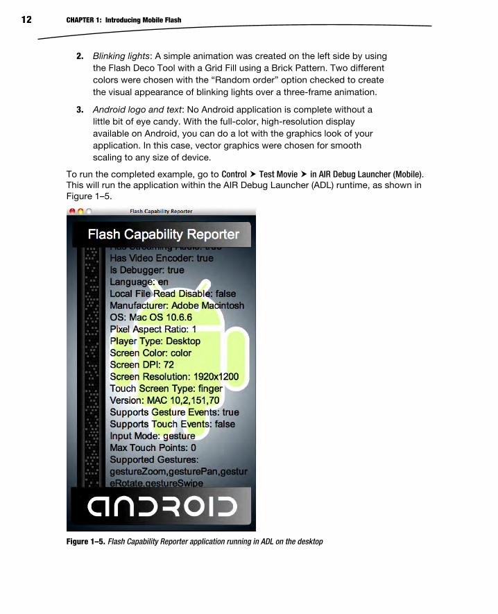
2. Blinking lights: A simple animation was created on the left side by using
the Flash Deco Tool with a Grid Fill using a Brick Pattern. Two different
colors were chosen with the “Random order” option checked to create
the visual appearance of blinking lights over a three-frame animation.
3. Android logo and text: No Android application is complete without a
little bit of eye candy. With the full-color, high-resolution display
available on Android, you can do a lot with the graphics look of your
application. In this case, vector graphics were chosen for smooth
scaling to any size of device.
To run the completed example, go to Control Test Movie in AIR Debug Launcher (Mobile). This will run the application within the AIR Debug Launcher (ADL) runtime, as shown in
Figure 1–5.
Figure 1–5. Flash Capability Reporter application running in ADL on the desktop
CHAPTER 1: Introducing Mobile Flash 13
You can make use of this sample during your own development to compare device
features across desktop and mobile. Feel free to add to the list of capabilities and
experiment with running on different devices.
You will notice that even though we are running in ADL’s mobile mode, the values
returned are not consistent with what you would get when running on a device. We will
show you how to run your application in the Android emulator or on a device via USB
later in this chapter.
Running Applications from Flash Builder The new version of Flash Builder has great support for building Flash and Flex
applications for mobile devices and running and debugging them right from the IDE. In
this section, we will show you how to create a new mobile project from scratch that
demonstrates the basics of Flex mobile development, including views, controls, and
multitouch gesture recognition.
The application we will be creating is called Gesture Check. It allows you to analyze your
device to visually discover what gestures are supported as well as test that they are
recognized successfully. In creating this example, you will get a full tour of the mobile
capabilities of Flash Builder, including how to create a new Flex mobile project,
debugging your application with the Flash Builder debugger, and running on a device via
USB deployment.
Creating a New Flex Mobile Project To create a new Flex mobile project, open the new project dialog from File New Flex Mobile Project. You will get a project creation wizard dialog that allows you to enter the
project name, as shown in Figure 1–6.

CHAPTER 1: Introducing Mobile Flash 14
Figure 1–6. Flex mobile project creation wizard
Name your project GestureCheck, and choose a folder to store the project in.
TIP: If you create a project name without spaces in it, Flex will create project files that match your chosen name. If your name has spaces, dashes, or other characters that are not valid in
ActionScript identifiers, it will use a generic name of “Main” instead.
Once you are done with this, click Next to get to the Mobile Settings page of the wizard,
as shown in Figure 1–7.

CHAPTER 1: Introducing Mobile Flash 15
Figure 1–7. Mobile Settings tab for selecting the application template and settings
Flash Builder comes with several built-in templates for developing mobile projects that
can be used to quickly bootstrap a new project. These include a simple Blank
Application, a View-Based Application that starts on a home page, and a Tabbed
Application that lets you switch between different named views. You can find more
information about view and tab navigation in Chapter 3.
For this exercise, choose the basic View-Based Application template, which is the default.
You are also presented with options for reorientation, full-screen mode, and density
scaling. Make sure to disable automatic reorientation so that the application stays in
portrait mode. We cover portrait/landscape switching in more depth in Chapter 2.
When you are finished on the Mobile Settings page, click Finish to create your mobile
application.

CHAPTER 1: Introducing Mobile Flash 16
To start with, the Flex template gives you the following project structure (files marked
internal you should never modify directly):
.actionScriptProperties: [internal] Flash Builder settings file
containing libraries, platforms, and application settings
.flexProperties: [internal] Flex server settings
.project: [internal] Flex Builder project settings
.settings: [internal] Eclipse settings folder
bin-debug: This is the output folder where the XML and SWF files are
stored during execution.
libs: Library folder where you can add your own custom extensions
later
src: Source folder containing all your application code
views: Package created to store your application views
[AppName]HomeView.mxmlApplication
[App-Name]-app.xml: Application descriptor containing mobile
settings
[AppName].mxml: Main Application class of your project and
entry-point for execution
The files that we will be focusing on for the rest of the tutorial are all in the src directory.
This includes your application descriptor and main Application class, both of which are
in the root package, and your HomeView, which is created in a package called views.
Writing the Flex Mobile Configurator The first thing we will do to create the application is to build a declarative XML layout for
the UI. For this we are going to use some of the basic layout and UI classes of Flex,
including the following:
H/VGroup: The HGroup and VGroup classes let you arrange a set of
components in a simple vertical or horizontal stacked layout. The
components are laid out in order, with the distance between set by the
gap property.
Label: A simple component that displays an uneditable text string; this
is commonly used as the label for another control in a form.
Image: The Image class lets you display a graphic that can be loaded
from a GIF, JPEG, PNG, SVG, or SWF file. In this example, we will be using
transparent PNGs.

CHAPTER 1: Introducing Mobile Flash 17
CheckBox: A form control that has a value of either selected or
unselected with a visual indicator; it also includes a text description as
part of the display.
Using these layouts and controls, we can put together a simple user interface that
displays the status of whether a particular multitouch gesture is enabled on the device
and whether the user has successfully tested the gesture. The code for the first gesture
of “Swipe” is displayed in Listing 1–2. This code should be updated in the view file,
which can be found in src/views/GestureCheckHomeView.mxml.
Listing 1–2. UI Elements for the First Gesture Display
<?xml version="1.0" encoding="utf-8"?> <s:View xmlns:fx="http://ns.adobe.com/mxml/2009" xmlns:s="library://ns.adobe.com/flex/spark" title="Supported Gestures" initialize="init()"> <s:VGroup paddingTop="15" paddingBottom="15" paddingLeft="20" paddingRight="20" gap="10"> <s:HGroup verticalAlign="middle" gap="20"> <s:Label text="Swipe" fontSize="36" width="110"/> <s:Image source="@Embed('/gestures/swipe.png')" width="137"/> <s:VGroup gap="10"> <s:CheckBox content="Enabled" mouseEnabled="false"/> <s:CheckBox content="Tested" mouseEnabled="false"/> </s:VGroup> </s:HGroup> </s:VGroup></s:View>
To run this application, go to Run Run As Mobile Application. This will bring up the Run
Configurations dialog, as shown in Figure 1–8.
Figure 1–8. Flash Mobile run configuration dialog

CHAPTER 1: Introducing Mobile Flash 18
To start with, we will run the application using the AIR Debug Launcher (ADL) on the
desktop. To do this, select the desktop launch method, and choose an appropriate
device to emulate (for this example, you will want to choose a device with a high-density
display, such as the Droid X).
Clicking the Run button will execute the application within ADL, showing you the UI
elements you added earlier, as depicted in Figure 1–9.
Figure 1–9. Gesture Check user interface
This builds out the basic UI pattern, but doesn’t have any application logic hooked up to
set the state of the CheckBoxes. In order to accomplish this, we are going to make use of
an initialize function that iterates through all of the supportedGestures as reported by
the Multitouch class. This is shown in Listing 1–3.
Listing 1–3. Additional Code to Detect Gesture Support and Usage Highlighted in Bold
<?xml version="1.0" encoding="utf-8"?> <s:View xmlns:fx="http://ns.adobe.com/mxml/2009" xmlns:s="library://ns.adobe.com/flex/spark" title="Supported Gestures" initialize="init()"> <fx:Script> <![CDATA[ import flash.ui.Multitouch; private function init():void { for each(var gesture:String in Multitouch.supportedGestures) { this[gesture+"Enabled"].selected = true; addEventListener(gesture, function(e:GestureEvent):void { e.currentTarget[e.type+"Tested"].selected = true; }); } } ]]> </fx:Script> <s:VGroup paddingTop="15" paddingBottom="15" paddingLeft="20" paddingRight="20" gap="10"> <s:HGroup verticalAlign="middle" gap="20"> <s:Label text="Swipe" fontSize="36" width="110"/> <s:Image source="@Embed('/gestures/swipe.png')" width="137"/> <s:VGroup gap="10">

CHAPTER 1: Introducing Mobile Flash 19
<s:CheckBox id="gestureSwipeEnabled" content="Enabled" mouseEnabled="false"/> <s:CheckBox id="gestureSwipeTested" content="Tested" mouseEnabled="false"/> </s:VGroup> </s:HGroup> </s:VGroup> </s:View>
Notice that we have added a few IDs to the CheckBoxes in order to reference them from
the initialize function. The naming convention is the gesture name appended with the
words “Enabled” or “Tested”. The same naming convention is used in the code that sets
the selected state.
The init function gets called once when the view is created, and iterates through all the
supportedGestures. It sets the state of the enabled CheckBox to true and adds an event
listener that will set the state of the tested CheckBox to true when that gesture is used in
the application. We cover gestures and the event listeners in more detail in Chapter 2, if
you want to learn more about this functionality.
If you run the updated example, you will get the same UI, but also trigger an error. The
ActionScript error dialog is shown in Figure 1–10, and while it may be obvious to you
what the issue in the program is, we will use this opportunity to demonstrate how the
Flash Builder debugger works.
Figure 1–10. ActionScript error on execution of the updated application
NOTE: You will get the foregoing error only if you are running on a computer with gesture support enabled, such as a Macintosh with a touchpad. You can instead run against a mobile
device with a touchscreen to reproduce the same error.
Using the Flash Builder Debugger In the last section, we got an error in running the application, but the error window
wasn’t particularly helpful in identifying what happened or letting us inspect the current
state. In fact, if we had run the application on a mobile device, it would have continued
execution without even letting us know that an error had occurred. While this behavior is
CHAPTER 1: Introducing Mobile Flash 20
ideal for production applications where you don’t want minor bugs plaguing your end
user if execution can safely continue, it makes debugging the application challenging.
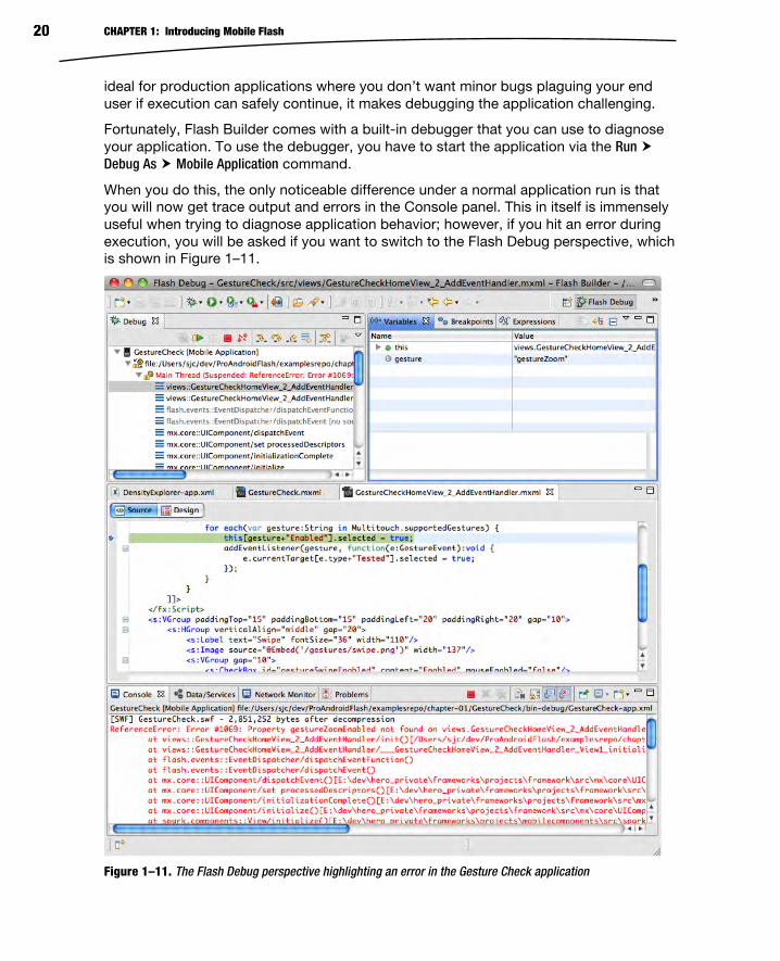
Fortunately, Flash Builder comes with a built-in debugger that you can use to diagnose
your application. To use the debugger, you have to start the application via the Run
Debug As Mobile Application command.
When you do this, the only noticeable difference under a normal application run is that
you will now get trace output and errors in the Console panel. This in itself is immensely
useful when trying to diagnose application behavior; however, if you hit an error during
execution, you will be asked if you want to switch to the Flash Debug perspective, which
is shown in Figure 1–11.
Figure 1–11. The Flash Debug perspective highlighting an error in the Gesture Check application

CHAPTER 1: Introducing Mobile Flash 21
The Flash Debug perspective gives you the ability to look inside your application as it is
executing, which is extremely powerful. In the top left Debug pane, you have the ability
to start and stop your application, as well as navigation stack frames, such as the error
condition that we hit.
When you select a frame in the Debug panel, it shows the state of the execution context
in the top-right Variable pane, as well as the associated source code in the center panel.
This makes it very easy to identify that we failed on the call to set the enabled CheckBox
to true, because there is no CheckBox with the id “gestureZoom”. This is a result of
having additional gestures that we did not yet add UI elements to handle.
Since we have identified the problem already, you can stop the application and switch
back to the code perspective by using the perspective picker in the top-right corner of
the Flash Builder window.
As you will learn in Chapter 2, there are five different gesture events that are supported
in Flash on Android. These are as follows:
Pan: Drag two fingers across the display.
Rotate: Place two fingers on the display and rotate them clockwise or
counterclockwise.
Zoom: Use two fingers, and move them apart or together at the same
time.
Swipe: Press and flick a single finger across the display horizontally or
vertically.
Two-Finger Tap: Touch the display with two fingers simultaneously.
Listing 1–4 shows the completed application, which will let you try each of these
gestures.
Listing 1–4. Complete Code Listing for the Gesture Check Sample Application
<?xml version="1.0" encoding="utf-8"?> <s:View xmlns:fx="http://ns.adobe.com/mxml/2009" xmlns:s="library://ns.adobe.com/flex/spark" title="Supported Gestures" initialize="init()"> <fx:Script> <![CDATA[ import flash.ui.Multitouch; private function init():void { for each(var gesture:String in Multitouch.supportedGestures) { this[gesture+"Enabled"].selected = true; addEventListener(gesture, function(e:GestureEvent):void { e.currentTarget[e.type+"Tested"].selected = true; }); } } ]]> </fx:Script> <s:VGroup paddingTop="15" paddingBottom="15" paddingLeft="20" paddingRight="20" gap="10">

CHAPTER 1: Introducing Mobile Flash 22
<s:HGroup verticalAlign="middle" gap="20"> <s:Label text="Pan" fontSize="36" width="110"/> <s:Image source="@Embed('/gestures/pan.png')" width="137"/> <s:VGroup gap="10"> <s:CheckBox id="gesturePanEnabled" content="Enabled" mouseEnabled="false"/> <s:CheckBox id="gesturePanTested" content="Tested" mouseEnabled="false"/> </s:VGroup> </s:HGroup> <s:HGroup verticalAlign="middle" gap="20"> <s:Label text="Rotate" fontSize="36" width="110"/> <s:Image source="@Embed('/gestures/rotate.png')" width="137"/> <s:VGroup gap="10"> <s:CheckBox id="gestureRotateEnabled" content="Enabled" mouseEnabled="false"/> <s:CheckBox id="gestureRotateTested" content="Tested" mouseEnabled="false"/> </s:VGroup> </s:HGroup> <s:HGroup verticalAlign="middle" gap="20"> <s:Label text="Zoom" fontSize="36" width="110"/> <s:Image source="@Embed('/gestures/zoom.png')" width="137"/> <s:VGroup gap="10"> <s:CheckBox id="gestureZoomEnabled" content="Enabled" mouseEnabled="false"/> <s:CheckBox id="gestureZoomTested" content="Tested" mouseEnabled="false"/> </s:VGroup> </s:HGroup> <s:HGroup verticalAlign="middle" gap="20"> <s:Label text="Swipe" fontSize="36" width="110"/> <s:Image source="@Embed('/gestures/swipe.png')" width="137"/> <s:VGroup gap="10"> <s:CheckBox id="gestureSwipeEnabled" content="Enabled" mouseEnabled="false"/> <s:CheckBox id="gestureSwipeTested" content="Tested" mouseEnabled="false"/> </s:VGroup> </s:HGroup> <s:HGroup verticalAlign="middle" gap="20"> <s:Label text="Two-Finger Tap" fontSize="36" width="110"/> <s:Image source="@Embed('/gestures/twoFingerTap.png')" width="137"/> <s:VGroup gap="10"> <s:CheckBox id="gestureTwoFingerTapEnabled" content="Enabled" mouseEnabled="false"/> <s:CheckBox id="gestureTwoFingerTapTested" content="Tested" mouseEnabled="false"/> </s:VGroup> </s:HGroup> <s:Label text="Graphics courtesy of GestureWorks.com" fontSize="12"/> </s:VGroup> </s:View>
If you test this application from the ADL desktop emulator, you will get different results
based on your desktop gesture support. For machines that have no multitouch support,
none of the gestures will be enabled; however, if you are fortunate enough to have a
desktop or laptop with a touchpad that supports multitouch, you may be able to do
some limited testing of the application, as shown in Figure 1–12.

CHAPTER 1: Introducing Mobile Flash 23
Figure 1–12. Limited gesture support available running on a MacBook Pro with a trackpad
While it reports four out of five of the gestures as enabled, it is physically possible to
execute only Pan, Rotation, and Zoom on the computer we used to execute this
example. As we will see in the next section, it is much more interesting to run it on a
device that has full support for all the multitouch gestures.
Running Flash on Device Flash Builder makes it very easy to execute your application on a mobile device. With a
single click, it will deploy the application, launch it on the device, and even hook up a
remote debugger.

CHAPTER 1: Introducing Mobile Flash 24
To run your application on a physical device, you will need to make sure that it is set up
properly for USB debugging. On most devices, you can enable USB debugging by going
into Settings Applications Development, where you will find the options shown in Figure
1–13.
Figure 1–13. Android development settings screen
Make sure USB debugging is enabled on this page. You may also want to enable
support for staying awake at the same time, so you don’t have to continually log back
into the phone each time it goes to sleep.
Once USB debugging is enabled and you have hooked your phone up to your computer
via a USB cable, your device should be visible to Flash Builder. To switch to running on
the device, go to Run Run Configurations…, and referring back to Figure 1–8, you can
choose the option for launching on the device. Once selected, each time you run your
application, it will launch on your attached Android device, as shown in Figure 1–14.
As you can see, on a real device, it is possible to exercise all the gesture events. This
application should come in handy when testing different devices to see what gestures
they support and how they respond to them.

CHAPTER 1: Introducing Mobile Flash 25
Figure 1–14. Finished Gesture Check application running on an Android mobile device
In case you are having trouble getting your Android phone to connect with your
computer, here are some troubleshooting steps you can follow:
Make sure that your device has a USB connection to the computer.
The notification area on your Android device will say that it is
connected via USB when this is successful.
You also need to ensure that device debugging is enabled via the
foregoing steps. Again, this will be listed in the notification area when it
is working correctly.

CHAPTER 1: Introducing Mobile Flash 26
If you are not getting a USB connection, it could be an issue with
drivers. Macintosh computers do not require drivers; however, on
Windows you may need to install a special USB driver for your phone.
It could also be an issue with the connection to your computer. Try
using a different cable or a different USB port.
If you have a USB connection, but device debugging is not working,
you may need to change your USB connection mode on the Android
device. Look for an option that says “Charge Mode” or “Disable Mass
Storage.”
If you are still having problems, you should verify that your phone is in the list of
supported devices for the release of Flash Builder you are using, and check with your
manufacturer to make sure you have the correct drivers and settings.
Running Applications from the Command Line In addition to running from within Flash Professional and Flash Builder, you can also
launch your application from the command line using the AIR Debug Launcher (ADL).
This is also how you would test your application if you were using Flex directly without
tooling support.
To use ADL, you will have to download the Flex 4.5 SDK, which is a free download, or
navigate to the sdks/4.5.0 folder of your Flash Builder installation. Make sure that the
bin folder of the Flex SDK is in your path so you can invoke the ADL command line tool.
The syntax for the ADL tool is as follows:
adl ( -runtime <runtime-dir> )? ( -pubid <pubid> )? -nodebug? ( -profile PROFILE )? ( -extdir <extensions-dir> )? ( -screensize SCREEN_SIZE )? <app-desc> <root-dir>? ( -- ... )?
ADL supports a number of optional arguments, most of which are optional. Here is a
brief description of all the arguments, with the ones that are important for mobile
development highlighted in bold:
runtime: Optional parameter to specify an alternate AIR runtime; by
default the runtime that is contained within the SDK will be used.
pubid: Deprecated parameter for specifying the application ID; you
should use the ID tag in the application descriptor instead.
nodebug: Disables debugging support, yielding a slight performance
gain and application behavior that is closer to production
profile: The type of application you are debugging; for mobile
development, we will be using the mobileDevice profile. Here is the full
list of values:
mobileDevice, extendedMobileDevice, desktop, extendedDesktop,
tv, extendedTV

CHAPTER 1: Introducing Mobile Flash 27
extdir: Optional directory for ActionScript extensions
screensize: The size of the application window, which can be one of
the keywords listed in Table 1–3 or a string of this format:
<width>x<height>:<fullscreen width>x<fullscreen height>
app-desc: This is the only required parameter for the ADL runtime, and
should refer to the application descriptor of the AIR program you want
to execute.
root-dir: By default ADL will make the root application directory the
folder the application descriptor is stored in, but you can override it by
setting this to another path.
(-- …): Finally, you can pass in parameters to your application by
adding them after two dashes.
Table 1–3. Valid Screen Size Settings for ADL
Screen Size Keyword Normal Size Full-Screen Size
iPhone 320x460 320x480
iPhoneRetina 640x920 640x960
iPod 320x460 320x480
iPodRetina 640x920 640x960
iPad 768x1004 768x1024
Droid 480x816 480x854
NexusOne 480x762 480x800
SamsungGalaxyS 480x762 480x800
SamsungGalaxyTab 600x986 600x1024
QVGA 240x320 240x320
WQVGA 240x400 240x400
FWQVGA 240x432 240x432
HVGA 320x480 320x480
WVGA 480x800 480x800

CHAPTER 1: Introducing Mobile Flash 28
Screen Size Keyword Normal Size Full-Screen Size
FWVGA 480x854 480x854
1080 1080x1920 1080x1920
720 720x1080 720x1080
480 480x720 480x720
To run the Gesture Check application you developed earlier, navigate to the root project
folder and execute the following command:
adl -profile mobileDevice -screensize Droid bin-debug/GestureCheck-app.xml
This will execute the Gesture Check application in the AIR Debug Launcher using a
mobile profile and a screen size of the Motorola Droid. Since the Gesture Check
application does not have full-screen set to true in its application descriptor, the window
size used by ADL will be 480x816.
Upon execution, you should get results identical to those shown in Figure 1–12,
matching the earlier run you executed in Flash Builder.
Summary It is an exciting time to get started with mobile development. The adoption of
smartphones, and in particular Android-based devices, is exponentially rising, and you
can finally use modern development frameworks with full authoring tool support, such as
Flash and Flex.
In the short span of this first chapter, you have already learned how to do the following:
Create mobile applications using both Flash Professional and Flex Builder
Run applications in the AIR Debug Launcher
Deploy and test on Android devices via a USB connection
Use the Flash Builder debugger to diagnose your application
Test your application with different screen sizes from the command line
This is just the tip of the iceberg for Flash Android mobile development. In the upcoming
chapters, we show you how to build engaging, immersive Flash applications that take
full advantage of all the mobile features. Then we demonstrate how to deploy and
publish your application to Android Market. Finally, we cover advanced topics such as
native Android integration, performance tuning, and extending your application to
tablets, TV, and beyond.

29
Chapter
Targeting Applications for the Mobile Profile Mobile devices are significantly resource-constrained when compared to their desktop
brethren. Mobile processors are quickly catching up to the speed of yesterday’s
desktops, but RAM and storage are still at a premium. At the same time, users expect
mobile applications to start up instantaneously and be entirely fault-tolerant to hard or
soft crashes at any time.
For example, to conserve memory resources, the Android OS can choose to kill a
background application at any time. When the user accesses the application, it depends
upon the last known Activity state to start it up. If the application takes longer than one
second to relaunch, the delay will be noticeable to the user, who believes the application
is still running in the background.
While a lot of the same concepts apply as in desktop application development, such as
the tools and programming languages used, server communication protocols available,
and controls and skins available for UI development, there are unique characteristics of
mobile devices that affect the UI and application design, such as screen size, input
methods, and deployment.
Many of the same constraints on space, footprint, and startup time have existed on the
Web for quite a while. Flash browser applications are often expected to fit within a
confined web page, download quickly, share limited computing resources, and start
instantaneously. As a result, your existing Flash and Flex applications may be good
candidates for porting to mobile. In this chapter, we will show you how to build
applications that take full advantage of the Android mobile platform.
Screen Size Android is an operating system and software stack, not a hardware platform. Google
provides an open source platform that includes a modified Linux kernel and Java-based
applications that can run on a variety of hardware platforms. However, they don’t control
2

CHAPTER 2: Targeting Applications for the Mobile Profile 30
the exact characteristics of the final devices on which Android runs. This means that the
exact configuration of the devices varies greatly, and screen size is one area where there
are a lot of variations in terms of resolution, physical size, and pixel density. Table 2–1
shows the screen characteristics of a variety of common Android devices that end users
may run your applications on.
Table 2–1. Android Devices and Screen Characteristics
Device Name Manufacturer Resolution Size Density Type
HTC Dream/T-Mobile G1 HTC 320x480 3.2" 180ppi HVGA
HTC Hero HTC 320x480 3.2" 180ppi HVGA
Motorola Droid Motorola 480x854 3.7" 265ppi FWVGA
Google Nexus One HTC 480x800 3.7" 252ppi WVGA
Xperia X10 mini Sony Ericsson 240x320 2.55" 157ppi QVGA
Xperia X10 Sony Ericsson 480x854 4" 245ppi FWVGA
HTC Evo 4G HTC 480x800 4.3" 217ppi WVGA
Droid X Motorola 480x854 4.3" 228ppi FWVGA
Motorola ATRIX Motorola 540x960 4” 275ppi qHD
In Table 2–1, resolution is the number of physical pixels in the horizontal and vertical
directions, size is the diagonal dimension of the screen, and density is the number of
pixels per inch (ppi). Type gives you the common name for the screen resolution, which
is one of the following:
QVGA (Quarter Video Graphics Array): 240x320 pixels or one quarter
of the resolution of a VGA display (480x640)
HVGA (Half Video Graphics Array): 320x480 or half the resolution of a
VGA display
WVGA (Wide Video Graphics Array): 480x800 with the same height as
VGA, but 800 width (when viewed in landscape)
FWVGA (Full Wide Video Graphics Array): 480x854 with the same
height as VGA, but a 16:9 ratio for displaying uncropped HD video
qHD (Quarter High Definition): 540x960 or one quarter of a 1080p
display with a 16:9 ratio for displaying uncropped HD video
3

CHAPTER 2: Targeting Applications for the Mobile Profile 31
The usable area of your application will also be reduced by the height of the Android
status bar. The height of the bar is 25 pixels on a medium-density display (such as the
HTC Hero), 38 pixels on a high-density display (such as the Nexus One), or 50 pixels on
an ultra-high-density display. This also changes when the display is switched from
portrait to landscape mode. For example, the usable area of a Nexus One in portrait
mode is 480x762, while in landscape mode it changes to 442x800.
You will likely have only one or two of these devices to test against, but this doesn't
mean that your application can't support them all. Flash can automatically scale your
application to fit the screen size, and it is very easy to get the screen resolution to
modify your interface programmatically. Listing 2–1 shows how you can retrieve the
screen resolution and density from ActionScript code.
Listing 2–1. Programmatic Screen Resolution and Density Capture
var resY = Capabilities.screenResolutionX; var resX = Capabilities.screenResolutionY; var dpi = Capabilities.screenDPI; trace("Screen Resolution is " + resX + "x" + resY + " at " + dpi + "ppi");
Note: The terms dots per inch (dpi) and pixels per inch (ppi) are equivalent measures. These are
used interchangeably throughout the ActionScript APIs.
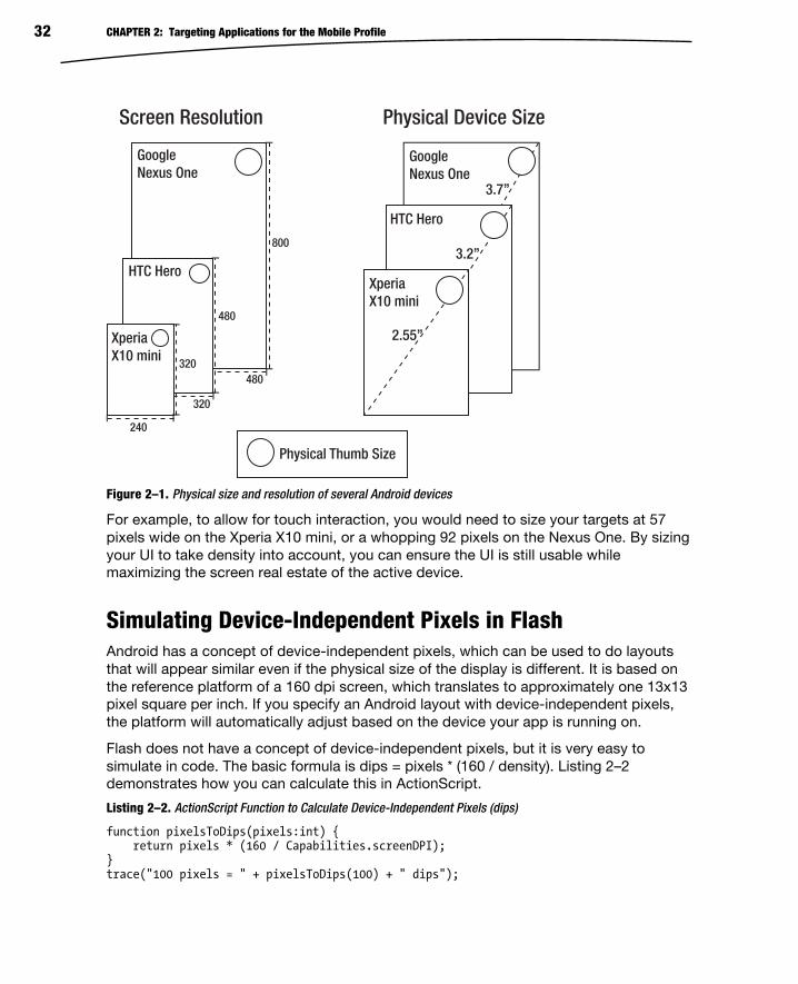
Screen Resolution vs. Density While application developers are more likely to focus on differences in screen resolution,
screen density is equally important. Your application needs to be able to scale to larger
or smaller devices so that text is still readable and targets are large enough to be
manipulated. Figure 2–1 compares the physical size as well as the screen resolution of
several handsets with different characteristics.
While the screen resolution of the Xperia X10 mini is minuscule compared to the Nexus
One, the physical size of the screen is only 30% smaller. This means that all the
graphics in your user interface need to be scaled down significantly to fit on the screen.
On the other hand, when building for the Xperia X10 mini, even small targets can easily
be manipulated by the user since the pixels are so large. For a Nexus One, you need to
make the targets much larger.
In a study done in 2006, researchers at the University of Oulu and in Maryland found that
the minimum target size for manipulating a touchscreen using your thumb ranged from
9.2mm to 9.6mm.1 This is very helpful in determining how large to make hit targets in an
Android user interface.
1Pekka Parhi, Amy K. Karlson, and Benjamin B. Bederson, “Target size study for one-
handed thumb use on small touchscreen devices”,
http://portal.acm.org/citation.cfm?id=1152260, 2006
CHAPTER 2: Targeting Applications for the Mobile Profile 32
Figure 2–1. Physical size and resolution of several Android devices
For example, to allow for touch interaction, you would need to size your targets at 57
pixels wide on the Xperia X10 mini, or a whopping 92 pixels on the Nexus One. By sizing
your UI to take density into account, you can ensure the UI is still usable while
maximizing the screen real estate of the active device.
Simulating Device-Independent Pixels in Flash Android has a concept of device-independent pixels, which can be used to do layouts
that will appear similar even if the physical size of the display is different. It is based on
the reference platform of a 160 dpi screen, which translates to approximately one 13x13
pixel square per inch. If you specify an Android layout with device-independent pixels,
the platform will automatically adjust based on the device your app is running on.
Flash does not have a concept of device-independent pixels, but it is very easy to
simulate in code. The basic formula is dips = pixels * (160 / density). Listing 2–2
demonstrates how you can calculate this in ActionScript.
Listing 2–2. ActionScript Function to Calculate Device-Independent Pixels (dips)
function pixelsToDips(pixels:int) { return pixels * (160 / Capabilities.screenDPI); } trace("100 pixels = " + pixelsToDips(100) + " dips");
GoogleNexus One
480
800
GoogleNexus One
HTC Hero
HTC Hero
XperiaX10 mini
3.7”
3.2”
2.55”480
320
XperiaX10 mini
320
240
Screen Resolution Physical Device Size
Physical Thumb Size

CHAPTER 2: Targeting Applications for the Mobile Profile 33
Using simulated device-independent pixels, you can reproduce similar layout behavior in
your Flash application to that of a native Android application.
If you plan on scaling your application graphics based on the current device density,
make sure that your application is not set to auto-resize to fill the screen or center
content on rotation. More information about how to do this can be found in the section
entitled “Automatic Orientation Flipping in Flash” found later in this chapter.
Density in Flex Applications Flex has built-in support to scale the user interface of your application, including
graphics, fonts, and controls. Rather than doing arbitrary scaling, it supports three
discrete scale factors for common display densities. Table 2–2 lists all of the different
display densities along with the mapped DPI range that is used to select a density for
the current device.
Table 2–2. Flex Display Densities
Density DPI Mapped DPI Range Example Devices
Medium Density (mdpi) 160 Below 200 T-Mobile G1,
Xperia X10 mini,
HTC Hero
High Density (hdpi) 240 200 to 280 Motorola Droid,
Google Nexus
One, HTC Evo 4G
Extra High Density (xhdpi) 320 Above 280 N/A
To take advantage of the Flex density support, set the applicationDPI property on your
Application object to the scale the application was originally designed for. At runtime
your application will be automatically scaled based on the density of the device screen.
An example of what your application descriptor should look like for a 240 dpi is included
in Listing 2–3.
Listing 2–3. Application Descriptor to Set the applicationDPI
<s:ViewNavigatorApplication xmlns:fx="http://ns.adobe.com/mxml/2009" xmlns:s="library://ns.adobe.com/flex/spark" firstView="views.MainHomeView" applicationDPI="240"> </s:ViewNavigatorApplication>
The only valid values for applicationDPI are the text strings of “160”, “240”, and “320”,
corresponding to the three supported densities. The applicationDPI property can be set
only via MXML.
Based on the ratio of the author density to the device density, the portions of your
application built using vector graphics and text are smoothly scaled up or down as
needed. In the case of fonts, the font size is adjusted, ensuring that text is easily
readable on any display.
CHAPTER 2: Targeting Applications for the Mobile Profile 34
Bitmap graphics will also be scaled, but may look blurry when scaled up or lose detail
when scaled down. To ensure that your bitmaps are sized optimally for different
densities, you can provide alternative images that will automatically be swapped in
based on the display density by using the MultiDPIBitmapSource class.
Density Explorer Application To better understand how density affects your Flex applications, we will guide you
through the creation of the Density Explorer application. This application lets you input
the application dpi and device dpi as parameters, and calculate the Flex-adjusted
device density and scale factor that will be used on different devices.
To start, create a new Flex mobile project with the name “Density Explorer”, using the
Mobile Application template. This will automatically generate a standard project
template that includes an Adobe AIR application descriptor (DensityExplorer-app.xml),
a ViewNavigatorApplication (DensityExplorer.mxml), and an initial View
(DensityExplorerHomeView.mxml).
The first step is to open DensityExplorerHomeView.mxml and add in some controls that
let you set the Author Density and the Device DPI. We will cover Flex controls in more
detail in Chapter 5, but for this application a few labels, radio buttons, and a horizontal
slider should be good enough.
Listing 2–4 shows the basic code to allow input of author density and device dpi using
the RadioButton and HSlider classes.
Listing 2–4. Density Explorer Controls for applicationDPI and deviceDPI Entry
<fx:Script> <![CDATA[ [Bindable] protected var applicationDPI:Number; [Bindable] public var deviceDPI:Number; ]]> </fx:Script> <s:VGroup paddingTop="20" paddingLeft="15" paddingRight="15" paddingBottom="15" gap="20" width="100%" height="100%"> <s:Label text="Application DPI:"/> <s:HGroup gap="30"> <s:RadioButton id="ad160" content="160" click="applicationDPI = 160"/> <s:RadioButton id="ad240" content="240" click="applicationDPI = 240"/> <s:RadioButton id="ad320" content="320" click="applicationDPI = 320"/> </s:HGroup> <s:Label text="Device DPI: {deviceDPI}"/> <s:HSlider id="dpiSlider" minimum="130" maximum="320" value="@{deviceDPI}" width="100%"/> </s:VGroup>
First, a few bindable script variables are introduced to hold the applicationDPI and
deviceDPI. These are not required to display the basic UI, but they will make hooking up
the output portion much easier later on. The main controls are organized vertically in a
VGroup, while the RadioButtons are organized horizontally using an HGroup.

CHAPTER 2: Targeting Applications for the Mobile Profile 35
The RadioButtons are wired up to applicationDPI using a simple click handler. A bi-
directional data binding expression (prefixed by the @ operator) is used to update the
value of dpi when the slider changes. To complete this portion of the UI, the Device DPI
text contains a bound reference to dpi so you can see the value of the slider as it
changes.
Running this will give you a simple Flex application, as shown in Figure 2–2. You can
validate the functionality by moving the slider, which will update the deviceDPI setting.
Figure 2–2. Density Explorer part 1: basic controls
The goal of this application is to calculate the adjusted device density and scale factor
that Flex will use. Fortunately, there is a new Flex 4.5 API that exposes this information
via ActionScript. The class that we need to invoke is called DensityUtil and can be
found in the mx.utils package. DensityUtil has two static methods with the following
signatures:
getRuntimeDPI():Number: This function returns the applicationDPI if
set, otherwise the current runtime DPI classification of the application;
it will always return one of the following values: 160, 240, or 320.
getDPIScale(sourceDPI:Number, targetDPI:Number):Number: This
function calculates the scale that will be used by Flex given an
application DPI (source) and a device DPI (target).
In addition to these functions, we also need to know the current applicationDPI and
device dpi values so we can populate the initial values of the UI controls. These can be
queried via the following APIs:
Application.applicationDPI: Member variable on the Application
object that can be queried to get the initial applicationDPI value
Capabilities.screenDPI: Static method on the Capabilities object
that returns the numeric dpi value of the screen

CHAPTER 2: Targeting Applications for the Mobile Profile 36
Making use of these APIs, we can augment the previous code to add in initialization
logic and a readout of density and scale. Listing 2–5 shows the updated code with new
additions in bold.
Listing 2–5. Updated Density Explorer Code with Initialization and Output
<?xml version="1.0" encoding="utf-8"?> <s:View xmlns:fx="http://ns.adobe.com/mxml/2009" xmlns:mx="library://ns.adobe.com/flex/mx" xmlns:s="library://ns.adobe.com/flex/spark" title="Density Explorer" initialize="init()"> <fx:Script> <![CDATA[ import mx.binding.utils.BindingUtils; import mx.utils.DensityUtil; [Bindable] protected var applicationDPI:Number; [Bindable] public var deviceDPI:Number; [Bindable] protected var dpiClassification:Number; protected function updateDensity(dpi:Number):void { dpiClassification = dpi < 200 ? 160 : dpi >= 280 ? 320 : 240; } protected function init():void { applicationDPI = parentApplication.applicationDPI; if (applicationDPI != null) { this["ad" + applicationDPI].selected = true; } BindingUtils.bindSetter(updateDensity, this, "deviceDPI"); deviceDPI = Capabilities.screenDPI; } ]]> </fx:Script> <s:VGroup paddingTop="20" paddingLeft="15" paddingRight="15" paddingBottom="15" gap="20" width="100%" height="100%"> <s:Label text="Application DPI:"/> <s:HGroup gap="30"> <s:RadioButton id="ad160" content="160" click="applicationDPI = 160"/> <s:RadioButton id="ad240" content="240" click="applicationDPI = 240"/> <s:RadioButton id="ad320" content="320" click="applicationDPI = 320"/> </s:HGroup> <s:Label text="Device DPI: {dpi}"/> <s:HSlider id="dpiSlider" minimum="130" maximum="320" value="@{deviceDPI}" width="100%"/> <s:Group width="100%" height="100%"> <s:BorderContainer bottom="0" minHeight="0" width="100%" borderStyle="inset" backgroundColor="#d0d0d0" borderColor="#888888" backgroundAlpha=".6"> <s:layout> <s:VerticalLayout gap="10" paddingLeft="10" paddingRight="10" paddingTop="10" paddingBottom="10"/> </s:layout> <s:Label text="Adjusted Device Density: {dpiClassification}"/> <s:Label text="Scale Factor: {DensityUtil.getDPIScale(applicationDPI, dpiClassification)}"/> </s:BorderContainer>

CHAPTER 2: Targeting Applications for the Mobile Profile 37
</s:Group> </s:VGroup></s:View>
Initialization is performed inside a method called by View.initialize to ensure that all
values are available. The applicationDPI is updated first from the parentApplicationobject, and the correct RadioButton is selected by performing an ID lookup on the
returned string. Next the dpi is set from the Capabilities object. To ensure that all
updates to dpi from both the initial value assignment and subsequent updates to the
slider will recalculate the deviceDensity, a bind setter is configured to fire on all updates
to dpi.
In order to display the current values of deviceDensity and the calculated scale, a
BorderContainer with a few Labels is added to the end of the View. By using a
BorderContainer as the surrounding group, it is easy to change the style to make the
outputs visually distinct from the inputs.
The final touch is to add an extra group that will fade in device pictures as the dpisetting is updated. To ensure that the images are optimally scaled for different density
displays, we make use of a MultiDPIBimapSource that refers to different pre-scaled
artifacts. This code is shown in Listing 2–6.
Listing 2–6. MXML Code for Displaying Representative Device Images Using a MultiDPIBitmapSource
<s:Group id="phones" width="100%" height="100%"> <s:Image alpha="{1-Math.abs(deviceDPI-157)/20}" horizontalCenter="0"> <s:source> <s:MultiDPIBitmapSource source160dpi="@Embed('assets/xperia-x10-mini160.jpg')" source240dpi="@Embed('assets/xperia-x10-mini240.jpg')" source320dpi="@Embed('assets/xperia-x10-mini320.jpg')" /> </s:source> </s:Image> <s:Image alpha="{1-Math.abs(deviceDPI-180)/20}" horizontalCenter="0"> <s:source> <s:MultiDPIBitmapSource source160dpi="@Embed('assets/htc-hero160.jpg')" source240dpi="@Embed('assets/htc-hero240.jpg')" source320dpi="@Embed('assets/htc-hero320.jpg')" /> </s:source> </s:Image> <s:Image alpha="{1-Math.abs(deviceDPI-217)/20}" horizontalCenter="0"> <s:source> <s:MultiDPIBitmapSource source160dpi="@Embed('assets/htc-evo-4g160.jpg')" source240dpi="@Embed('assets/htc-evo-4g240.jpg')" source320dpi="@Embed('assets/htc-evo-4g320.jpg')" /> </s:source> </s:Image> <s:Image alpha="{1-Math.abs(deviceDPI-252)/20}" horizontalCenter="0"> <s:source> <s:MultiDPIBitmapSource source160dpi="@Embed('assets/nexus-one160.jpg')" source240dpi="@Embed('assets/nexus-one240.jpg')" source320dpi="@Embed('assets/nexus-one320.jpg')" /> </s:source>

CHAPTER 2: Targeting Applications for the Mobile Profile 38
</s:Image> <s:Image alpha="{1-Math.abs(deviceDPI-275)/20}" horizontalCenter="0"> <s:source> <s:MultiDPIBitmapSource source160dpi="@Embed('assets/atrix160.jpg')" source240dpi="@Embed('assets/atrix240.jpg')" source320dpi="@Embed('assets/atrix320.jpg')" /> </s:source> </s:Image> </s:Group>
All of the pictures chosen are scaled versions of standard press images for the phones.
In order to fade the devices in slowly as the dpi value is approached, a simple
mathematical formula is applied to alpha:
1-Math.abs(deviceDPI-{physicalDPI})/{threshold}
For each of the phones, the actual dpi is substituted for the physicalDPI for that device,
and the threshold is set to a value low enough that there will not be two phones
overlapping for the target dpi value. For the devices selected, a threshold of 20 is lower
than the difference between any of the phone dpi values.
The finished Density Explorer application is shown in Figure 2–3. This is a good
opportunity to experiment with different values for application dpi and device dpi to see
the effect they will have on your deployed application.

CHAPTER 2: Targeting Applications for the Mobile Profile 39
Figure 2–3. Completed Density Explorer application
For a side-by-side comparison, Figure 2–4 demonstrates screenshots of the Density
Explorer running at 160, 240, and 320 dpi on a physical device. Notice that even though
the physical dimensions of the screens are vastly different, the layout of the application
and quality of the graphs are preserved. By setting the author density to 240, you are
guaranteed that your application will have the same look and feel on a device of any
density with no code modifications.

CHAPTER 2: Targeting Applications for the Mobile Profile 40
Figure 2–4. Side-by-side comparison of the Density Explorer when run on a device classified as 160 dpi (left), 240 dpi (center), and 320 dpi (right)
Density Support in CSS While the applicationDPI setting in Flex gives you a simple mechanism to write your
application for one density and let Flex take care of the resizing, it doesn’t give you fine-
grained control over the precise layout and style of your application when viewed on
different devices. Setting applicationDPI to a constant works fine for simple
applications, but as the complexity of the UI increases this is often not good enough.
This is where CSS media queries come in.
Flex media queries let you exercise fine-grained control over the styles on different
devices from within your CSS. They are based on the W3C CSS Media Query Candidate
Recommendation,2 but contain only a subset of the functionality that is most relevant to
Flex and mobile applications.
There are two types of selectors supported in Flex. The first type lets you choose the
style based on the device type. The code in Listing 2–7 demonstrates how you can
change the font color based on the type of device you are running on.
2 www.w3.org/TR/css3-mediaqueries/

CHAPTER 2: Targeting Applications for the Mobile Profile 41
Listing 2–7. Code Sample Demonstrating a Media Selector for Devices
@namespace s "library://ns.adobe.com/flex/spark"; @media (os-platform: "IOS") { s|Label { color: red; } } @media (os-platform: "Android") { s|Label { color: blue; } }
Adding this style sheet to your application will turn the color of all Labels to blue or red,
depending on the mobile platform you are running on. However, when running as a
desktop application, this will have no effect.
The second type of selector lets you change the style based on the application dpi. The
valid values to match against are the standard Flex densities of 160, 240, and 320.
Using a dpi selector lets you fine-tune the layout and fonts, or even substitute images
for different density displays.
IMPORTANT: In order to use CSS media selectors, you need to ensure that you have not set the
applicationDPI property on your mobile application class.
To demonstrate the use of a dpi selector, we will update the Density Explorer example
to make use of a style sheet to substitute the images rather than embedding it in the
code with the MultiDPIBitmapSource. The simplified application code for the application
images is shown in Listing 2–8.
Listing 2–8. Updated DensityExplorer Code for Integration CSS Media Queries
<s:Group id="phones" width="100%" height="100%"> <s:Image alpha="{1-Math.abs(deviceDPI-157)/20}" horizontalCenter="0" source="{phones.getStyle('xperiaX10Mini')}"/> <s:Image alpha="{1-Math.abs(deviceDPI-180)/20}" horizontalCenter="0" source="{phones.getStyle('htcHero')}"/> <s:Image alpha="{1-Math.abs(deviceDPI-217)/20}" horizontalCenter="0" source="{phones.getStyle('htcEvo4g')}"/> <s:Image alpha="{1-Math.abs(deviceDPI-252)/20}" horizontalCenter="0" source="{phones.getStyle('nexusOne')}"/> <s:Image alpha="{1-Math.abs(deviceDPI-275)/20}" horizontalCenter="0" source="{phones.getStyle('atrix')}"/> </s:Group>
Notice that we are making use of the getStyle method on the parent object to assign
the image sources. This would normally not be required if you were working with a style
such as icons or button states, but the source on the image class is a plain property.

CHAPTER 2: Targeting Applications for the Mobile Profile 42
Using this technique to bind to a named style makes the Image source accessible via
CSS.
To complete the example, we also need to create a style sheet that makes use of the
dpi media selector to substitute an appropriately scaled image. This is similar to the
device selector and is shown in Listing 2–9.
Listing 2–9. CSS for Switching Images Based on the Application dpi
@media (application-dpi: 160) { #phones { xperiaX10Mini: Embed("/assets/xperia-x10-mini160.jpg"); htcHero: Embed("/assets/htc-hero160.jpg"); htcEvo4g: Embed("/assets/htc-evo-4g160.jpg"); nexusOne: Embed("/assets/nexus-one160.jpg"); atrix: Embed("/assets/atrix160.jpg"); } } @media (application-dpi: 240) { #phones { xperiaX10Mini: Embed("/assets/xperia-x10-mini240.jpg"); htcHero: Embed("/assets/htc-hero240.jpg"); htcEvo4g: Embed("/assets/htc-evo-4g240.jpg"); nexusOne: Embed("/assets/nexus-one240.jpg"); atrix: Embed("/assets/atrix240.jpg"); } } @media (application-dpi: 320) { #phones { xperiaX10Mini: Embed("/assets/xperia-x10-mini320.jpg"); htcHero: Embed("/assets/htc-hero320.jpg"); htcEvo4g: Embed("/assets/htc-evo-4g320.jpg"); nexusOne: Embed("/assets/nexus-one320.jpg"); atrix: Embed("/assets/atrix320.jpg"); } }
The final step is to make sure we have referenced the style sheet in our
ViewNavigatorApplication. You will also need to remove the applicationDPI setting,
otherwise the style sheet selector will always report the dpi as a constant value, as
shown in Listing 2–10.
Listing 2–10. Completed DensityExplorer Application Class for Integrating Media Query Support
<?xml version="1.0" encoding="utf-8"?> <s:ViewNavigatorApplication xmlns:fx="http://ns.adobe.com/mxml/2009" xmlns:s="library://ns.adobe.com/flex/spark" splashScreenImage="@Embed('ProAndroidFlash400.png')" firstView="views.DensityExplorerHomeView"> <fx:Style source="DensityExplorer.css"/> </s:ViewNavigatorApplication>
The output of running this program on different devices is nearly identical to the earlier
results in Figure 2–4, with some slight differences in spacing. The reason for this is that
the Flex control team has also put dpi hints in their controls so that they automatically

CHAPTER 2: Targeting Applications for the Mobile Profile 43
resize based on the target device, even without having applicationDPI fixed to a
constant value.
Now that you have learned about CSS media selectors, you have a powerful tool to
extract the styles out of your code, even for density-aware applications.
Screen Orientation One of the unique aspects of mobile devices is the ability to rotate them in your hand.
The equivalent to this in the desktop world would be to flip your monitor on its side.
While there are some creative uses for rotating desktop monitors, as demonstrated in
Figure 2–5, this is certainly not a common use case.
Figure 2–5. Unique use of monitor rotation to create a light arc3
In mobile devices, rotation is an important UI paradigm that lets you take full advantage
of the limited screen real estate. A well-behaved mobile application should resize the UI
on rotation simply to let the user stay in his or her preferred orientation, often displaying
an entirely different view that is custom-built for that orientation.
3 Creative Commons licensed photograph taken by Tim Pritlove:
www.flickr.com/photos/timpritlove/123865627/.

CHAPTER 2: Targeting Applications for the Mobile Profile 44
Portrait/Landscape Switching in Flex To turn on automatic orientation in a Flex project, there are two methods. The most
convenient one is to simply check the “Automatically reorient” check box when creating
a new Flex mobile application from the standard template. Figure 2–6 has a screenshot
of the project creation wizard with the “Automatically reorient” option checked.
Figure 2–6. Flex builder project wizard with the “Automatically reorient” option checked
If you have an existing project or want to change auto-orientation manually, you need to
set the autoOrients property in your application descriptor. The application descriptor is
located in a file called *-app.xml in your root project directory, within which the
autoOrients property should be created as a child of the initialWindow element and set
to true, as shown in Listing 2–11.

CHAPTER 2: Targeting Applications for the Mobile Profile 45
Listing 2–11. Application Descriptor Changes to Allow Automatic Orientation of the Stage
<initialWindow> <content>[This value will be overwritten by Flash Builder in the output app.xml]</content> <autoOrients>true</autoOrients> </initialWindow>
This both rotates and resizes the stage, and also causes events to be fired that you can
listen to in order to change your application layout.
However, simply turning on automatic orientation will often produce less than desirable
results. For example, if you enable automatic orientation on the Density Explorer
application, the bottom of the UI gets cropped off, as shown in Figure 2–7.
Figure 2–7. Density Explorer application in landscape mode with noticeable cropping
For a landscape orientation of the Density Explorer application, the ideal layout would be
to have the phone picture to the left of the controls. There are two ways you can
accomplish this in a Flex application. The first is to add an event handler for rotation
events that changes the layout dynamically. Since this is a pure ActionScript approach,
it also works equally well from Flash Professional. The second is to take advantage of
the new portrait and landscape states, which are accessible only from MXML. In the
following sections, we will demonstrate both of these approaches.

CHAPTER 2: Targeting Applications for the Mobile Profile 46
Portrait/Landscape Switching with Events Each time a Flash mobile device is rotated, orientation events are fired to notify any
listeners. Orientation event handlers are added via the standard addEventListener
method on the Stage object. The event class for orientation events is
StageOrientationEvent, with an event type of
StageOrientationEvent.ORIENTATION_CHANGE.
CAUTION: There is also an ORIENTATION_CHANGING event type on the
StageOrientationEvent class, but this is not applicable for Android devices.
The StageOrientationEvent has two variables on it that are particularly useful for
handling orientation changes:
beforeOrientation: The handset orientation prior to the current
rotation event being fired
afterOrientation: The current handset orientation
Putting all of this together, you can modify the Density Explorer to change the layout
based on the orientation of the phone.
The first step is to update the declarative MXML UI to include an additional HBox that will
be used for the landscape orientation, to name the outer HBox and inner VBox with unique
IDs, and to hook up an addedToStage event listener. The code to accomplish this is
shown in Listing 2–12.
Listing 2–12. MXML Additions to Supported Stage Layout Changes
<s:HGroup id="outer" width="100%" height="100%" addedToStage="stageInit()"> <s:VGroup paddingTop="20" paddingLeft="15" paddingRight="15" paddingBottom="15" gap="20" width="100%" height="100%"> … <s:Group id="inner" width="100%" height="100%"> <s:Group id="phones" width="100%" height="100%"> … </s:VGroup> </s:HGroup>
The next step is to implement the stageInit function to hook up an orientation change
event listener. In addition to hooking up the listener, it is often helpful to fire an initial
event with the current orientation. This will ensure that even if your application starts in
landscape mode, it will follow the same code path as if it opened in portrait and then
was rotated by the user. The ActionScript for this is shown in Listing 2–13.
Listing 2–13. Implementation of the stageInit and orientationChange Functions
protected function orientationChange(e:StageOrientationEvent):void { switch (e.afterOrientation) { case StageOrientation.DEFAULT: case StageOrientation.UPSIDE_DOWN:

CHAPTER 2: Targeting Applications for the Mobile Profile 47
inner.addElementAt(phones, 0); break; case StageOrientation.ROTATED_RIGHT: case StageOrientation.ROTATED_LEFT: outer.addElementAt(phones, 0); break; } } protected function stageInit():void { stage.addEventListener(StageOrientationEvent.ORIENTATION_CHANGE, orientationChange); orientationChange(new StageOrientationEvent( StageOrientationEvent.ORIENTATION_CHANGE, false, false, null, stage.orientation));}
In this case, the behavior for right and left rotation is identical, although if you wanted to
get creative you could put the device display on a different side of the screen based on
which way the phone is rotated.
The result of running the modified Density Explorer application is shown in Figure 2–8.
As you can see, the device display is shown at a usable size and the rest of the controls
are no longer stretched across a very wide display. The most impressive part is that the
layout will dynamically update to optimize for portrait and landscape as you rotate the
phone.
Figure 2–8. Density Explorer application with an improved landscape layout

CHAPTER 2: Targeting Applications for the Mobile Profile 48
Portrait/Landscape Switching with States A second technique you can use in Flex for portrait/landscape switching is to make use
of two built-in states that are triggered on device rotation called portrait and
landscape. While this is accessible only from MXML and does not provide as much
information as the event API about the orientation of the device, the code to implement
this is much simpler and more declarative in nature, making it easier to read and
maintain.
To expose the new portrait and landscape states, you need to add a states declaration
to your view code that defines a portrait and landscape state, as shown in Listing 2–14.
Listing 2–14. State Declaration for portrait and landscape Modes
<s:states> <s:State name="portrait"/> <s:State name="landscape"/> </s:states>
These states will automatically get triggered whenever the device changes orientation.
To modify the layout, you can then take advantage of the includedIn property and
Reparent tag in order to move the phone image position. The code changes you will
need to make to accomplish this are shown in Listing 2–15.
Listing 2–15. UI Changes to Reparent the Phone Image When the State Changes
<s:HGroup width="100%" height="100%"> <fx:Reparent target="phones" includeIn="landscape"/> … <s:Group width="100%" height="100%"> <s:Group id="phones" width="100%" height="100%" includeIn="portrait"> … </s:VGroup> </s:HGroup>
The end result is that with 8 lines of MXML code you can do what took 21 lines using the
event approach. The results of running this application are identical to those obtained in
Figure 2–8.
Automatic Orientation Flipping in Flash Flash applications can also be configured to automatically flip the orientation of the
stage when the device is rotated. To enable automatic orientation switching in a Flash
project, you need to check the box for automatic orientation in the AIR for the Android
publish settings dialog, as shown in Figure 2–9.

CHAPTER 2: Targeting Applications for the Mobile Profile 49
Figure 2–9. Auto-orientation setting for Flash CS5.5 circled
Setting this option will cause the aspect ratio of the application to automatically flip from
landscape to portrait as the user rotates the device. Upon orientation change, the stage
will be rotated so it is oriented vertically, resized to fill the new dimensions after rotation,
and then centered within the display.
If you want to change the layout of your content to fill the screen and have full control
over resizing the stage, you will need to disable the automatic scale and positioning.
This can be accomplished in ActionScript by changing the scaleMode and align
properties of the Stage object, as shown in Listing 2–16.
Listing 2–16. Disabling Stage Scaling and Alignment from ActionScript
stage.scaleMode = StageScaleMode.NO_SCALE; // turn off scaling stage.align = StageAlign.TOP_LEFT; // align content to the top-left of the stage
CHAPTER 2: Targeting Applications for the Mobile Profile 50
This can be added to any key frame in your application that executes on startup, and will
keep the stage top-left aligned with no resizing of the content. You can then add event
listeners on orientation changes in order to modify your application to fit the screen size.
Rotating Smiley Flash Orientation Example To demonstrate how you can quickly create content in Flash CS5.5 that adjusts for
orientation, you will create a small sample application that morphs a happy smiley
picture to a devilish one upon an orientation change.
To start with, you will need to create a new AIR for Android project with a size of
480x480 pixels. The reason for choosing a square canvas that is equal in size to the
smaller device dimension is to ensure no additional scaling will take place upon rotation.
Figure 2–10 shows the starting state for the happy smiley picture, with boxes drawn
denoting the extents of the landscape and portrait modes. The intersection of the two
boxes is the 480x480 canvas, with additional graphics overflowing horizontally and
vertically. These will get cropped out of frame upon orientation change, leaving the
smiley face nicely centered.
Figure 2–10. Happy smiley picture starting state, with boxes showing the landscape and portrait extents

CHAPTER 2: Targeting Applications for the Mobile Profile 51
Feel free to get creative with your own graphics, but keep elements in separate layers to
make it easier to animate and morph them later.
The next step is to create the devilish smiley keyframe at around one second. This
should include motion or shape tweens for a smooth transition from the happy smiley
face. Figure 2–11 shows a few time-lapsed frames that animate the smiley face as well
as some of the background scene elements.
Figure 2–11. Animation of the smiley face from happy to devilish
At the same time, also create the reverse animation to get back to the happy smiley face
at around two seconds. While there are some ActionScript techniques to reverse an
animation in Flash, they are non-intuitive and generally carry a performance penalty.
Now that you have completed the graphics, you need to add in ActionScript code to
animate the smiley face upon device rotation. This should be added to the first keyframe in
the timeline, and should include both stopping the animation from automatically playing
and attaching an orientation event listener to the scene, as shown in Listing 2–17.
Listing 2–17. ActionScript Code to Respond to Orientation Change Events
import flash.events.StageOrientationEvent; stop(); stage.addEventListener(StageOrientationEvent.ORIENTATION_CHANGE, onChanged); function onChanged(event:StageOrientationEvent):void { play(); }
Notice that the onChanged event handler simply has to play the movie on each orientation
change event. All the heavy lifting for the animation is already taken care of by the
timeline.
The final bit of required code is to add a stop() call on the devilish smiley frame so that
it will stop there after a rotation event.
As a bonus, you can add in a warning to the user if orientation events are not supported
on his or her device, such as if the user is running on desktop or TV. The simplest way to

CHAPTER 2: Targeting Applications for the Mobile Profile 52
give feedback is to create a hidden layer that you make visible based upon checking the
orientation support, as shown in Listing 2–18.
Listing 2–18. Orientation Check Code to Hide/Show Error Page
if (Stage.supportsOrientationChange) { orientationNotSupported.visible = false; }
The completed rotating smiley face application running on the device is shown in Figure
2–12. While this example is fairly simple, it demonstrates how easy it is to add
orientation support to your applications.
Figure 2–12. Completed rotating smiley face example in portrait (left) and landscape (right) orientations
Multitouch and Gestures User interfaces have long been limited by the constraints of the desktop mouse. The first
mouse was invented by Douglas Engelbart in 1963. It had two perpendicular wheels for
tracking motion and a long cord that resembled the tail of a rodent or mouse. After this,
mice with internal balls, optical tracking, and multiple buttons appeared, such as the
Dépraz mouse produced in the early 80s. Both of these early devices are shown in
Figure 2–13.

CHAPTER 2: Targeting Applications for the Mobile Profile 53
Figure 2–13. Photo of the Engelbart mouse (bottom-right) and Dépraz mouse (top-left)
Modern mice include features such as scroll wheels, laser tracking, and cordless
operation. However, all mice share a common limitation, which is that they can support
only a single cursor on the screen at a time.
Mobile interfaces originally started with the same limitation of pointer-driven, single
touch interaction. However, they have evolved to take advantage of the human
physique. We have two hands with ten fingers total, each capable of individually
interacting with and manipulating a touch point on the device.
Most Android devices support at least two simultaneous touch points, which is the
minimum required to handle all the mobile gestures. This is also the most common
usage scenario where the mobile device is supported by the fingers and operated with
both thumbs. However, new devices are being introduced that support a virtually
unlimited number of touch points.
You can retrieve the number of touch points your device supports by querying the
Multitouch object, as shown in Listing 2–19.
Listing 2–19. Retrieving the Number of Touch Points via ActionScript
trace("Max Touch Points: " + Multitouch.maxTouchPoints);

CHAPTER 2: Targeting Applications for the Mobile Profile 54
In this section, you will learn how to take advantage of multitouch and user gestures,
improving the user experience and usability of your Flash applications.
Mobile Gestures The easiest way to work with multitouch is to take advantage of the predefined gestures
that Flash supports. For any Android device with at least two touch points, you will be
able to use the gestures in Table 2–3.
Table 2–3. Mobile Gestures Supported by Flash Android4
Gesture Name Event Description
Pan gesturePan Place two fingers on the screen,
and drag left or right; commonly
used for scrolling the contents of
the whole screen
Rotate gestureRotate Touch the screen with two fingers,
and move them in an arc. This is an
interactive gesture that will often be
used to perform arbitrary rotation of
objects.
Zoom gestureZoom Place two fingers on the screen,
and move them apart or together
along a single line. Moving the
fingers apart indicates zooming in,
and moving the fingers together
indicates zooming out.
4 Creative Commons licensed illustrations provided by Gestureworks
(www.gestureworks.com)

CHAPTER 2: Targeting Applications for the Mobile Profile 55
Swipe gestureSwipe Place one finger on the screen, and
quickly swipe it in a single line of
travel. Swipes are commonly used
to change the screen contents or
take an alternate action, such as
deleting an item from a list.
Two-Finger
Tap
gestureTwoFinger
Tap
Lightly tap the screen with two
fingers, making only brief contact.
This can be used as an alternative
or secondary click where more than
one action is required.
It is usually a good idea to provide some other mechanism to accomplish the same
behavior in your application in case gestures are not supported; however, mobile users
have come to expect the convenience and speed that gestures offer, so mapping them
appropriately in your application design is important.
To discover if the device your application is running on supports gestures and to query
the gesture capabilities dynamically, you can call the following static methods on the
Multitouch class:
Multitouch.supportsGestureEvents: Whether the device you are
running on supports emitting gesture events
Multitouch.supportedGestures: A list of strings, one for each of the
supported multitouch events
Before using gesture events, you need to set the touchMode to gesture input mode, as
shown in Listing 2–20.
Listing 2–20. ActionScript Code to Enable Gesture Recognition Support
Multitouch.inputMode = MultitouchInputMode.GESTURE;
This should be called within your program before you expect to receive gesture events.

CHAPTER 2: Targeting Applications for the Mobile Profile 56
Flash Scrapbook Example To demonstrate how to handle gesture events, we will go through a sample program to
build a picture scrapbook that responds to multitouch events. For simplicity, we will load
the images as resources (see Chapter 7 for more information about retrieving images
from the camera roll).
Here are some of the multitouch events that we will support:
Zoom: Increase or decrease the size of the pictures
Rotate: Rotate the images to arbitrary angles
Pan: Move the entire page of images as a unit
Swipe: Swipe the header to switch between pages of images
Two-Finger Tap: Tap an image with two fingers to open it in its own
view
Also, while it is not a multitouch gesture, we will hook in drag listeners so you can
position the images by dragging them with a single finger.
There are two different ways to hook up multitouch listeners in a Flash application. The
first is via pure ActionScript and will work equally well from a Flash- or Flex-based
application. The second is by using the event hooks on the InteractiveObject class,
which is the most convenient option if you are working with Flex components. We will
show examples of both in this section.
Zoom and Rotate Gesture Handling The core of the Flash Scrapbook example will be a MultitouchImage component that
extends the spark Image class to add in resizing and rotation. For this class, we will use
the addEventListener mechanism of hooking up multitouch listeners for the zoom and
rotate gestures. The code for this is shown in Listing 2–21.
Listing 2–21. MultitouchImage Class to Add Rotation and Resizing Support
package com.proandroidflash { import flash.events.TransformGestureEvent; import flash.geom.Point; import flash.ui.Multitouch; import flash.ui.MultitouchInputMode; import mx.events.ResizeEvent; import spark.components.Image; public class MultitouchImage extends Image { public function MultitouchImage() { addEventListener(ResizeEvent.RESIZE, resizeListener); addEventListener(TransformGestureEvent.GESTURE_ROTATE, rotateListener); addEventListener(TransformGestureEvent.GESTURE_ZOOM, zoomListener); Multitouch.inputMode = MultitouchInputMode.GESTURE; }

CHAPTER 2: Targeting Applications for the Mobile Profile 57
protected function resizeListener(e:ResizeEvent):void { transformX = width/2; transformY = height/2; } protected function rotateListener(e:TransformGestureEvent):void { rotation += e.rotation; } protected function zoomListener(e:TransformGestureEvent):void { scaleX *= e.scaleX; scaleY *= e.scaleY; } }}
In the constructor, we add listeners for both rotation and zooming by calling the
addEventListener method and passing in the GESTURE_ROTATE and GESTURE_ZOOMconstants. The rotation callback simply takes the rotation parameter of the
TransformGestureEvent and adds it to the current rotation of the node, saving the value
back. In both cases, the rotation is expressed in degrees as a numeric value. The zoom
listener similarly takes the scaleX and scaleY parameters of the TransformGestureEventand multiplies them by the scaleX and scaleY of the node to get the new values. In both
cases, the gesture event gives you the delta since the last time the listener was called,
so you can simply incrementally adjust the node values.
To ensure that the rotation and zoom occur at the center of the Image node, we set
transformX and transformY to be at the midpoint of the node in the resizeListener.
This is also hooked up via the addEventListener in the constructor so it will fire each
time the node size changes.
The last thing we do is to set the inputMode to MultitouchInputMode.GESTURE so that the
event listeners will fire. It is safe to set this value as frequently as we want, so we take
the liberty of doing this on each constructor call.
For the rest of the gesture events, we will take advantage of the InteractiveObjectevent hooks for easy wiring via MXML; however, you can also hook up all the other
gestures using the addEventListener mechanism by following the class and constant
information in Table 2–4.
Table 2–4. Gesture Names, Classes, and Constants for Use in the addEventListener Method
Gesture Name Class Constant
Pan TransformGestureEvent GESTURE_PAN
Rotate TransformGestureEvent GESTURE_ROTATE
Zoom TransformGestureEvent GESTURE_ZOOM
Swipe TransformGestureEvent GESTURE_SWIPE
Two-Finger Tap PressAndTapGestureEvent GESTURE_PRESS_AND_TAP

CHAPTER 2: Targeting Applications for the Mobile Profile 58
Press and Drag Mouse Events Another helper class we will be using is the DraggableGroup class. This implements a
standard point and drag metaphor as an extension of a spark Group, as shown in Listing
2–22. Besides being good for encapsulation, extracting the mouse events from the
gesture events allows you to handle multiple events simultaneously.
Listing 2–22. DraggableGroup Class That Implements Point and Drag Mechanics
package com.proandroidflash { import flash.events.MouseEvent; import mx.core.UIComponent; import spark.components.Form; import spark.components.Group; public class DraggableGroup extends Group { public function DraggableGroup() { mouseEnabledWhereTransparent = false; addEventListener(MouseEvent.MOUSE_DOWN, mouseDownListener); addEventListener(MouseEvent.MOUSE_UP, mouseUpListener); } protected function mouseDownListener(e:MouseEvent):void { (parent as Group).setElementIndex(this, parent.numChildren-1); startDrag(); } protected function mouseUpListener(e:MouseEvent):void { stopDrag(); // fix for bug in Flex where child elements don't get invalidated for (var i:int=0; i<numElements; i++) { (getElementAt(i) as UIComponent).invalidateProperties(); } } } }
The code for the DraggableGroup is a fairly straightforward Flex component
implementation, and uses the same addEventListener/callback paradigm as the gesture
code did. While you could implement the same code using touch events, the advantage
of sticking to mouse-up and mouse-down events is that this portion of the UI will work
even where there is no touch support.
A few subtleties in the code are worth pointing out.
By default the Group class fires events for any clicks in their bounding
area. By setting mouseEnabledWhereTransparent to false, you avoid
misfires outside the bounds of the children.
To raise this object when clicked, you need to change the order in the
parent container. This implementation assumes the parent is a Group
and uses the setElementIndex function to push this node to the front.

CHAPTER 2: Targeting Applications for the Mobile Profile 59
There is a bug in Flex where child elements won’t have their layout
properties invalidated after the drag. Manually calling
invalidateProperties on all of the children works around this
problem. For example, without this fix you would notice that the center
of rotation/zoom does not translate with the drag.
Swipe Gesture Handling To display the images, we will be using a simple view that delegates rendering of
individual image pages to an ItemRenderer. First we will take a look at the View class
that makes up the main screen of the Scrapbook example. The full code is shown in
Listing 2–23.
Listing 2–23. Flash Scrapbook Main View Code with the Swipe Event Handler Highlighted in Bold
<?xml version="1.0" encoding="utf-8"?> <s:View xmlns:fx="http://ns.adobe.com/mxml/2009" xmlns:s="library://ns.adobe.com/flex/spark" xmlns:mx="library://ns.adobe.com/flex/mx" xmlns:proandroidflash="com.proandroidflash.*" title="Home" backgroundColor="#333333" destructionPolicy="never"> <fx:Script> <![CDATA[ import mx.core.IVisualElement; [Bindable] protected var page:int = 0; protected function swipe(e:TransformGestureEvent):void { page = (page + e.offsetX + pages.numElements) % pages.numElements; updateVisibility(); } protected function updateVisibility():void { for (var i:int=0; i<pages.numElements; i++) { var element:IVisualElement = pages.getElementAt(i); if (element != null) { element.visible = i == page; } } } ]]> </fx:Script> <s:layout> <s:VerticalLayout horizontalAlign="center" paddingTop="10" paddingLeft="10" paddingRight="10" paddingBottom="10"/> </s:layout> <fx:Declarations> <s:ArrayList id="images"> <fx:Object image1="@Embed(source='images/cassandra1.jpg')" image2="@Embed(source='images/cassandra2.jpg')" image3="@Embed(source='images/cassandra3.jpg')"/> <fx:Object image1="@Embed(source='images/cassandra4.jpg')" image2="@Embed(source='images/cassandra5.jpg')" image3="@Embed(source='images/cassandra6.jpg')"/> <fx:Object image1="@Embed(source='images/cassandra7.jpg')" image2="@Embed(source='images/cassandra8.jpg')" image3="@Embed(source='images/cassandra9.jpg')"/>

CHAPTER 2: Targeting Applications for the Mobile Profile 60
<fx:Object image1="@Embed(source='images/cassandra10.jpg')"/> </s:ArrayList> </fx:Declarations> <s:VGroup gestureSwipe="swipe(event)"> <s:Label text="Flash Scrapbook" fontSize="32" color="white"/> <s:Label text="Drag, Rotate, and Zoom with your fingers." fontSize="14" color="#aaaaaa"/> </s:VGroup> <s:DataGroup id="pages" itemRenderer="com.proandroidflash.ScrapbookPage" dataProvider="{images}" width="100%" height="100%" added="updateVisibility()"/> </s:View>
While there is a fair amount of code to create the view, the actual view definition itself
consists of only five lines to create a VGroup for the title and a DataGroup to display the
images. The remainder is primarily a large chunk of code to simply load the embedded
images into an ArrayList, and a few helper functions embedded in a Script tag.
The code needed to hook up the swipe event handler is highlighted in bold. By taking
advantage of the gesture* event properties on InteractiveObject, you can rapidly hook
up event listeners like this to your application. Each time the user swipes the title VGroup,
the protected swipe method will get called with information about the direction of the
swipe. Unlike rotate and zoom events that get continual calls for the duration of the
gesture, swipe gets called exactly once at the end of the gesture. You can decipher the
direction of the swipe by inspecting the offsetX and offsetY properties.
offsetX=0, offsetY=-1: Swipe Up
offsetX=0, offsetY=1: Swipe Down
offsetX=-1, offsetY=0: Swipe Left
offsetX=1, offsetY=0: Swipe Right
It is worth noting that the swipes will always be in the horizontal or vertical direction.
Diagonal swipes are not supported and will not be recognized as a gesture. Also, you
need to ensure that the component you hook the swipe listener up to is wide or tall
enough to provide enough travel for the gesture to be recognized. Once the user’s finger
leaves the component, the gesture recognition will end.
Adding Pan and Two-Finger-Tap Event Listeners Now that we have a main page with a DataGroup, we need to implement the referenced
ItemRenderer that will build the scrapbook page. This will also be the link between the
MultitouchImage, DraggableGroup, and main view that we defined earlier.
Start by creating a new MXML file that has an outer ItemRenderer element with the page
content declared inside. In this class, we will hook up two new gesture event listeners.
On the outer BorderContainer, we will hook up a pan event listener so that the user can
drag the entire page and all the images on it in one gesture. Also, on each of the
MultitouchImages, we will add a two-finger-tap event listener for switching to a full-
screen view.

CHAPTER 2: Targeting Applications for the Mobile Profile 61
The complete code for the ScrapbookPage implementation is shown in Listing 2–24.
Listing 2–24. Flash ScrapbookPage Item Renderer Code with the Pan and Two-Finger-Tap Event Handlers Highlighted in Bold
<?xml version="1.0" encoding="utf-8"?> <s:ItemRenderer xmlns:fx="http://ns.adobe.com/mxml/2009" xmlns:s="library://ns.adobe.com/flex/spark" xmlns:proandroidflash="com.proandroidflash.*" autoDrawBackground="false" width="100%" height="100%"> <s:BorderContainer backgroundColor="#cccccc" borderColor="#555555" gesturePan="pan(event)" rotation="5" x="50" width="100%" height="100%"> <fx:Script> <![CDATA[ import spark.components.View; import views.ImageView; protected function pan(e:TransformGestureEvent):void { e.target.x += e.offsetX; e.target.y += e.offsetY; } protected function expand(source:Object):void { (parentDocument as View).navigator.pushView(ImageView, source); } ]]> </fx:Script> <proandroidflash:DraggableGroup> <proandroidflash:MultitouchImage source="{data.image1}" y="-70" x="10" width="350" rotation="-3" gestureTwoFingerTap="expand(data.image1)"/> </proandroidflash:DraggableGroup> <proandroidflash:DraggableGroup> <proandroidflash:MultitouchImage source="{data.image2}" y="100" x="40" width="350" rotation="13" gestureTwoFingerTap="expand(data.image2)"/> </proandroidflash:DraggableGroup> <proandroidflash:DraggableGroup> <proandroidflash:MultitouchImage source="{data.image3}" y="300" x="5" width="350" rotation="-8" gestureTwoFingerTap="expand(data.image3)"/> </proandroidflash:DraggableGroup> </s:BorderContainer> </s:ItemRenderer>
Both the pan and two-finger-tap event listeners are hooked up similarly to how we
hooked up the swipe event listener earlier. The pan gesture happens to use the same
offsetX and offsetY variables as the swipe gesture, but with a very different meaning.
The pan event gets called continually for the duration of the user gesture with the delta
in pixels passed in for offsetX and offsetY.
For the two-finger-tap gesture, we chose to not pass in the event, and instead to
substitute a context-dependent variable that contains the image to display. This is then
passed in as the data parameter of the ViewNavigator’s pushView method.

CHAPTER 2: Targeting Applications for the Mobile Profile 62
Flash Scrapbook Image View The final step is to implement the ImageView class referenced in the pushView method
call. Since Flex takes care of all the view navigation logic for us, the implementation is
extremely straightforward. The only extra feature we add in is another two-finger-tap
gesture so you can navigate back to the main view without clicking the Android back
button.
The code for the ImageView class is shown in Listing 2–25.
Listing 2–25. ImageView Code with the Two-Finger-Tap Event Handler Highlighted in Bold
<?xml version="1.0" encoding="utf-8"?> <s:View xmlns:fx="http://ns.adobe.com/mxml/2009" xmlns:s="library://ns.adobe.com/flex/spark" title="Image Viewer" backgroundColor="#333333"> <s:Image source="{data}" width="100%" height="100%" gestureTwoFingerTap="navigator.popView()"/> </s:View>
Simple expressions can be inlined in the event handler as we have done here. This
avoids the need to create a Script tag, making the code listing extremely concise.
This also completes the last file of the Flash Scrapbook application, so you can now give
it a test drive. Upon launching the application, you should see a screen similar to that
shown in Figure 2–14.
On this page of the application, try doing the following:
Drag an image around the canvas by using one finger to press and
drag—this exercises the DraggableGroup.
Zoom in on an image by using two fingers to press and drag in
opposite directions—this exercises the zoom listener on the
MultitouchImage.
Rotate an image by using two fingers to press and drag in a circle—
this exercises the rotate listener on the MultitouchImage.
Swipe one finger horizontally across the words “Flash Scrapbook” to
change the page—this exercises the swipe listener on the main view.
Drag the images out of the way so you can see the background and
use two fingers to drag across the background, panning the scene—
this exercises the pan listener on the ScrapbookPage.
Use two fingers to tap one of the images and switch to the
ImageView—this exercises the two-finger-tap listener wired up to each
MultitouchImage.

CHAPTER 2: Targeting Applications for the Mobile Profile 63
Figure 2–14. Completed Flash Scrapbook application on the home view page
Once you finish the last step, you will be on the ImageView page of the application, as
shown in Figure 2–15. To get back to the main view, you can either two-finger-tap on
the image again, or use the Android back button.

CHAPTER 2: Targeting Applications for the Mobile Profile 64
Figure 2–15. Completed Flash Scrapbook example on the Image Viewer page
By completing this simple example, you have successfully explored all of the available
gesture events that are available on Flash Android. Try using these gestures in your own
application in new and innovative ways!
Touch Point API The other way to process multitouch input is to use the touch point API to get direct
access to the events being generated on the device. This allows you to do custom
multitouch processing that is tailored to your application needs. To determine if your
device supports touch event processing, you can query the Multitouch object as shown
in Listing 2–26.
Listing 2–26. Code Snippet That Prints Out Whether Touch Events Are Supported
trace("Supports touch events: " + Multitouch.supportsTouchEvents);
Since processing touch events directly conflicts with gesture recognition, you need to
change the input mode of your application to start receiving touch point events. This can

CHAPTER 2: Targeting Applications for the Mobile Profile 65
be accomplished by setting the Multitouch.inputMode variable to TOUCH_POINT, as
shown in Listing 2–27.
Listing 2–27. Code Snippet to Enable Touch Point Events
Multitouch.inputMode = MultitouchInputMode.TOUCH_POINT;
NOTE: Setting the inputMode to TOUCH_POINT will disable recognition of any gestures, such
as zoom, rotate, and pan.
The touch point API is fairly low-level in the number and type of events that get
dispatched. You can register and listen for any of the events listed in Table 2–5, as long
as the target object extends InteractiveObject.
Table 2–5. Touch Point API Events Dispatched to InteractiveObjects
Touch Constant Event Name Description
TOUCH_BEGIN touchBegin Event dispatched when the user initially touches the
object (finger down)
TOUCH_END touchEnd Event dispatched when the user removes contact with
the object (finger up)
TOUCH_MOVE touchMove Event dispatched when the user drags across the
object (finger slide)
TOUCH_OVER touchOver Event dispatched when the user drags into the object
or any of its children; this event may get fired multiple
times and is equivalent to a MOUSE_OVER event.
TOUCH_OUT touchOut Event dispatched when the user drags out of the object
or any of its children; this event may get fired multiple
times and is equivalent to a MOUSE_OUT event.
TOUCH_ROLL_OVER touchRollOver Event dispatched when the user drags into the
combined bounds of the object and all its children; this
event does not propagate upward and is equivalent to
a mouse ROLL_OVER event.
TOUCH_ROLL_OUT touchRollOut Event dispatched when the user drags out of the
combined bounds of the object and all its children; this
event does not propagate upward and is equivalent to
a mouse ROLL_OUT event.
TOUCH_TAP touchTap Event dispatched after the user finishes a gesture that
involves touching and removing contact with the
object; a high tolerance of movement in the middle is
allowed as long as it is within the bounds of the object.

CHAPTER 2: Targeting Applications for the Mobile Profile 66
Most of the touch events are fairly self-explanatory, but the touchOver, touchOut,
touchRollOver, and touchRollOut can be a little confusing. As an example, take three
nested rectangles labeled A (outer), B (middle), and C (inner). As the finger rolls from A to
C, you would receive the following roll events:
touchRollOver(A) -> touchRollOver(B) -> touchRollOver(C)
At the same time, you would also receive the following over/out events:
touchOver(A) -> touchOut(A) / touchOver(B) -> touchOut(B) / touchOver(C)
The events that rectangle A would directly receive are highlighted in bold. The roll events
don’t propagate, so you receive only one touchRollOver event. However, the
touchOver/Out events do propagate to parents, so you receive three touchOver events
besides the two additional touchOut events.
The easiest way to remember how these work is to relate the roll events to the
implementation of a rollover effect. For a rollover effect, you typically want to display the
effect if the node or any of its children are being touched, which is the semantic for
touchRollOver.
Caterpillar Generator Example As a simple example of the touch point API, we will guide you through how to create a
multitouch-enabled Flash application that generates caterpillars as you drag your fingers
around the screen.
To start with, we will create a few art assets that can be used to construct the example:
Background: Create a layer called Background that will be the
backdrop for the application. We chose to use the pattern paint brush
to draw a virtual garden for the caterpillars to crawl in, but be as
creative as you can.
Green Ball: Create a simple movie clip called GreenBall that will make
up the body of the caterpillars. For this we did a simple radial gradient
on an oval primitive.
Blue Ball: Create a simple movie clip called BlueBall that will make up
the alternate body of the caterpillars. For this we did another radial
gradient on an oval.
Red Ball: Create a movie clip called RedBall with a sequence of faces
that will be displayed on the caterpillars. Make sure to code a stop()
on each frame so we can step through them one at a time.
The mechanics of the application logic are extremely simple. As the user drags his or her
finger around the screen, we will continually create new ball objects for the body of the
caterpillar at the current touch location or locations. Once the user’s finger leaves the
screen, we will draw the head of the caterpillar. In addition, if the user taps one of the
caterpillar heads, we will play the movie to change the face that is shown.
CHAPTER 2: Targeting Applications for the Mobile Profile 67
In order to accomplish this, we need to introduce the TouchEvent class, which is
returned by each of the touch event callbacks. The variables on TouchEvent that are
relevant to this example include the following:
stageX/stageY: The location that the touch event occurred at specified
in global coordinates; to get the location relative to the current Sprite,
use localX/localY instead.
pressure: The amount of pressure used on the display screen (typically
related to the size); this is device-dependent, so you can’t rely on it
being available on all devices.
target: The object that is being interacted with
isPrimaryTouchPoint: Whether this is the first touch point registered or
an additional touch point that was added later; we will use this to color
the caterpillars differently.
The full code listing for the Caterpillar Generator application is shown in Listing 2–28.
You will probably want to put this on the first frame of a separate layer called Actions to
distinguish it from the graphical elements in the program.
Listing 2–28. Code Listing for the Caterpillar Generator Application
import flash.ui.Multitouch; import flash.ui.MultitouchInputMode;import flash.events.TouchEvent;import flash.events.KeyboardEvent;import flash.ui.Keyboard;
Multitouch.inputMode = MultitouchInputMode.TOUCH_POINT;stage.addEventListener(TouchEvent.TOUCH_BEGIN, beginListener);stage.addEventListener(TouchEvent.TOUCH_MOVE, moveListener);stage.addEventListener(TouchEvent.TOUCH_END, endListener);stage.addEventListener(KeyboardEvent.KEY_DOWN, keyListener);
var lastScale:Number;var startX:Number;var startY:Number;
function beginListener(event:TouchEvent):void { lastScale = 0;}
function moveListener(event:TouchEvent):void { var ball; if (event.isPrimaryTouchPoint) { ball = new GreenBall(); } else { ball = new BlueBall(); } ball.x = event.stageX; ball.y = event.stageY; lastScale = Math.max(lastScale, event.pressure*7); ball.scaleX = lastScale; ball.scaleY = lastScale;

CHAPTER 2: Targeting Applications for the Mobile Profile 68
addChild(ball); } function endListener(event:TouchEvent):void { var ball = new RedBall(); ball.x = event.stageX; ball.y = event.stageY; ball.scaleX = lastScale; ball.scaleY = lastScale; ball.addEventListener(TouchEvent.TOUCH_MOVE, ballMoveListener); ball.addEventListener(TouchEvent.TOUCH_TAP, changeFace); addChild(ball); } function ballMoveListener(event:TouchEvent):void { event.stopImmediatePropagation(); } function changeFace(event:TouchEvent):void { event.target.play(); } function keyListener(event:KeyboardEvent):void { if (event.keyCode = Keyboard.MENU) { clearAll(); } } function clearAll():void { for (var i:int=numChildren-1; i>=0; i--) { if (getChildAt(i).name != "background") { removeChildAt(i); } } }
Notice that we add the event listeners to the Stage rather than the background. The
reason for this is that as additional nodes are added under the finger to make up the
caterpillar body, they will block the background, preventing additional move events from
getting fired. However, the stage receives all events regardless of what object they
occurred within.
Adding event listeners to the Stage is a dual-edged sword, because it also means that it
is extremely hard to receive any tap events. To prevent the move events on a
caterpillar’s face from trickling up to the stage, we call
event.stopImmediatePropogation(). This allows the tap gesture to be processed
without interference from the stage event listeners.
One other technique we use is to ensure that each subsequent ball added is larger than
the previous by using the Math.max function. This ensures that the caterpillar perspective
is maintained even as the pressure decreases while the user removes his or her finger
from the screen.
The final application should look similar to Figure 2–16 when run on a device.
x
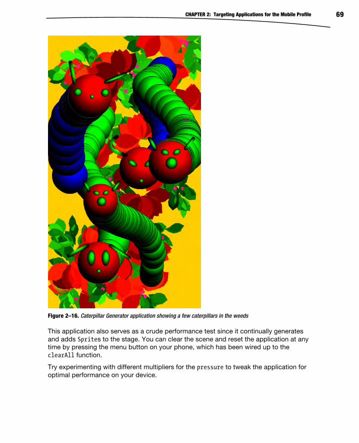
CHAPTER 2: Targeting Applications for the Mobile Profile 69
Figure 2–16. Caterpillar Generator application showing a few caterpillars in the weeds
This application also serves as a crude performance test since it continually generates
and adds Sprites to the stage. You can clear the scene and reset the application at any
time by pressing the menu button on your phone, which has been wired up to the
clearAll function.
Try experimenting with different multipliers for the pressure to tweak the application for
optimal performance on your device.

CHAPTER 2: Targeting Applications for the Mobile Profile 70
Summary In this chapter, you learned how to design and build applications that take full advantage
of the mobile platform. Some of the takeaways that you will be able to apply to your
future mobile projects include the following:
The importance of not just designing for screen resolution, but also
taking density into account
How to calculate device-independent pixels and take advantage of applicationDPI
Tailoring your application layout for portrait and landscape modes
Improving the usability of your application with multitouch gestures
How to consume and process raw touch events within your
application
We will continue to use these concepts throughout the book to build more intricate and
powerful applications, but you should already have a good start to designing your own
mobile user interfaces.

71
Chapter
Building Flash and Flex Applications for Android Chapters 1 and 2 have served as an introduction to using Flash and Flex as a platform
for creating mobile applications. By now you know the reasons for choosing the Flash
platform and some of the considerations involved in writing applications for devices with
a wide variety of screens that use touch gestures as their main form of user input. The
next step is to get down to the business of writing your own applications. By the end of
this chapter, you will know how to decide between the various types of Flex
applications, how to write your own Views, and how to provide rich content to those
Views using the mobile-ready controls in the Flex SDK.
In short, it’s time to show you everything you need to know to start turning your
application ideas into reality!
Constructing Mobile UIs with Flex Because of its convenience and developer productivity features, MXML is the preferred
way to define the main user interfaces of a Flex mobile application. The convenience of
MXML does come with a performance cost, however. For that reason, there are some
tasks, such as List item renderers, that are best done in pure ActionScript. We will
cover that particular topic in more depth in Chapter 10.
Due to the small size of the screen, most mobile applications are broken down into
multiple Views. It is unsurprising, then, that most AIR for Android applications are built
with either a ViewNavigatorApplication or TabbedViewNavigatorApplication. These
application containers take care of initializing and wiring together all of the application’s
View-related goodness. This includes one or more the following components:
3

CHAPTER 3: Building Flash and Flex Applications for Android 72
ViewNavigator: This class handles linking a set of Views together,
passing data back and forth, and transitioning between the Views. The
ViewNavigator also owns the application’s ActionBar, which displays
the title of the current View, optional action controls—usually
buttons—and optional navigation controls—typically a Home or Back
button.
View: These Flex components provide most of the actual interface of
the application. Each View has a reference to its ViewNavigator and
the ActionBar. Each View can populate the ActionBar with its own
content or even hide it completely. Views use the ViewNavigator to
trigger the display of other Views based on user interaction.
Figure 3–1 shows the basic anatomy of a mobile ViewNavigatorApplication in both
portrait and landscape orientations. The source code can be found in the
ViewAppAnatomy sample project located in the chapter-03 directory of this book’s
sample code.
Figure 3–1. The basic anatomy of a Flex mobile ViewNavigatorApplication
The application’s ActionBar stretches itself across the top of the screen in Figure 3–1.
ActionBars are made up of three areas: the navigation area, the title area, and the
actions area. The ActionBar in Figure 3–1 contains one button, labeled Nav, in the
ActionBar’s navigation area, while the title area is displaying the "ActionBar" string. The
ActionBar’s action area contains two buttons labeled A1 and A2. The View’s content
area is comprised of the rest of the screen below the ActionBar. Remember that,
although the View uses the ActionBar to display its title and controls, the two are siblings
in the component hierarchy. The View’s width and height do not include the area
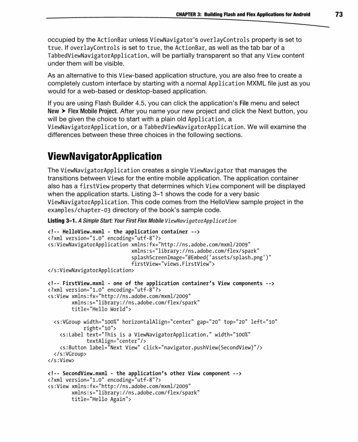
CHAPTER 3: Building Flash and Flex Applications for Android 73
occupied by the ActionBar unless ViewNavigator’s overlayControls property is set to
true. If overlayControls is set to true, the ActionBar, as well as the tab bar of a
TabbedViewNavigatorApplication, will be partially transparent so that any View content
under them will be visible.
As an alternative to this View-based application structure, you are also free to create a
completely custom interface by starting with a normal Application MXML file just as you
would for a web-based or desktop-based application.
If you are using Flash Builder 4.5, you can click the application’s File menu and select
New Flex Mobile Project. After you name your new project and click the Next button, you
will be given the choice to start with a plain old Application, a
ViewNavigatorApplication, or a TabbedViewNavigatorApplication. We will examine the
differences between these three choices in the following sections.
ViewNavigatorApplication The ViewNavigatorApplication creates a single ViewNavigator that manages the
transitions between Views for the entire mobile application. The application container
also has a firstView property that determines which View component will be displayed
when the application starts. Listing 3–1 shows the code for a very basic
ViewNavigatorApplication. This code comes from the HelloView sample project in the
examples/chapter-03 directory of the book’s sample code.
Listing 3–1. A Simple Start: Your First Flex Mobile ViewNavigatorApplication
<!-- HelloView.mxml - the application container --> <?xml version="1.0" encoding="utf-8"?> <s:ViewNavigatorApplication xmlns:fx="http://ns.adobe.com/mxml/2009" xmlns:s="library://ns.adobe.com/flex/spark" splashScreenImage="@Embed('assets/splash.png')" firstView="views.FirstView"> </s:ViewNavigatorApplication> <!-- FirstView.mxml - one of the application container’s View components --> <?xml version="1.0" encoding="utf-8"?> <s:View xmlns:fx="http://ns.adobe.com/mxml/2009" xmlns:s="library://ns.adobe.com/flex/spark" title="Hello World"> <s:VGroup width="100%" horizontalAlign="center" gap="20" top="20" left="10" right="10"> <s:Label text="This is a ViewNavigatorApplication." width="100%" textAlign="center"/> <s:Button label="Next View" click="navigator.pushView(SecondView)"/> </s:VGroup> </s:View> <!-- SecondView.mxml - the application’s other View component --> <?xml version="1.0" encoding="utf-8"?> <s:View xmlns:fx="http://ns.adobe.com/mxml/2009" xmlns:s="library://ns.adobe.com/flex/spark" title="Hello Again">
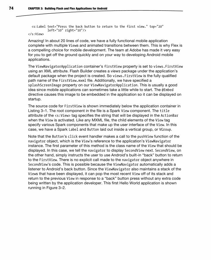
CHAPTER 3: Building Flash and Flex Applications for Android 74
<s:Label text="Press the back button to return to the first view." top="20" left="10" right="10"/> </s:View>
Amazing! In about 20 lines of code, we have a fully functional mobile application
complete with multiple Views and animated transitions between them. This is why Flex is
a compelling choice for mobile development. The team at Adobe has made it very easy
for you to get off the ground quickly and on your way to developing Android mobile
applications.
The ViewNavigatorApplication container’s firstView property is set to views.FirstView
using an XML attribute. Flash Builder creates a views package under the application’s
default package when the project is created. So views.FirstView is the fully qualified
path name of the FirstView.mxml file. Additionally, we have specified a
splashScreenImage property on our ViewNavigatorApplication. This is usually a good
idea since mobile applications can sometimes take a little while to start. The @Embed
directive causes this image to be embedded in the application so it can be displayed on
startup.
The source code for FirstView is shown immediately below the application container in
Listing 3–1. The root component in the file is a Spark View component. The title
attribute of the <s:View> tag specifies the string that will be displayed in the ActionBar
when the View is activated. Like any MXML file, the child elements of the View tag
specify various Spark components that make up the user interface of the View. In this
case, we have a Spark Label and Button laid out inside a vertical group, or VGroup.
Note that the Button’s click event handler makes a call to the pushView function of the
navigator object, which is the View’s reference to the application’s ViewNavigator
instance. The first parameter of this method is the class name of the View that should be
displayed. In this case, we tell the navigator to display SecondView next. SecondView, on
the other hand, simply instructs the user to use Android’s built-in “back” button to return
to the FirstView. There is no explicit call made to the navigator object anywhere in
SecondView’s code. This is possible because the ViewNavigator automatically adds a
listener to Android’s back button. Since the ViewNavigator also maintains a stack of the
Views that have been displayed, it can pop the most recent View off of its stack and
return to the previous View in response to a “back” button press without any extra code
being written by the application developer. This first Hello World application is shown
running in Figure 3–2.

CHAPTER 3: Building Flash and Flex Applications for Android 75
Figure 3–2. A simple ViewNavigatorApplication Hello World program
Important Events in the Life of a View Events are the lifeblood of any Flex and Flash application. Not only do they allow you to
react to what is going on in your application, but also it is important to know the order in
which events arrive so that you can select the appropriate handlers in which to place
your program logic. Figure 3–3 shows the order in which some of the more important
events are received during three application stages: startup, shutdown, and transitioning
from one View to another. The boxes in the figure that represent events received by the
application container are dark, while the events received by Views are light-colored.

CHAPTER 3: Building Flash and Flex Applications for Android 76
Figure 3–3. The order in which the application and its Views receive important events
The application receives the initialize event before the first View is created. Therefore,
we know that the initialize handler is a good place to set the
ViewNavigatorApplication’s firstView and firstViewData properties if you need to do
so programmatically rather than as a simple string in an XML attribute. One example
where this comes in handy is when you persist data during shutdown and you want to
read it back in and restore the application’s View state the next time it starts up.
After the application receives the initialize event, the first View will receive its
initialize, creationComplete, and viewActivate events. It’s important to keep this
sequence in mind when setting up your Views. If you need to programmatically set some
initial state on your controls, it is better to do it in the initialize handler if possible. If
you wait until the creationComplete handler is called, then the control is effectively
initialized twice. It probably won’t create a noticeable lag, but it always pays to be
conscious of performance considerations when developing for a mobile platform.
Likewise, the viewActivate event will be your last chance to have your say during the
View startup sequence.
Once the first View completes its initial startup sequence, the application will receive its
creationComplete and activate events. Then the first View will receive one last activate
event as well. Only the application’s first View will receive the activate event. That event
handler is the right place for code that you want to run only when the View is the first to
be created when the application is run.

CHAPTER 3: Building Flash and Flex Applications for Android 77
During a View transition sequence, the new View will receive its initialize and
creationComplete event before the old View receives its viewDeactivate event. Although
the old View will still be valid, you should avoid interdependencies between the Views.
Any data that needs to be passed from one View to the next can be passed using the
new View’s data parameter. We will show you how that is done later in this chapter. The
final step in the View transition sequence is when the new View receives its viewActivateevent. The important thing to keep in mind about this sequence is that the initializeand creationComplete events will be received by the new View before the ViewNavigatorplays the animated transition to the new View. The viewActivate event will be received
after the transition plays. If you want the new View’s controls to be in a certain state as
the transition plays—and they become visible to the user—you need to use either the
initialize or creationComplete events. And again, initialize is preferred so that
controls are not initialized twice. On the other hand, doing a lot of processing before the
transition plays will cause a noticeable lag between the user’s input and the time at
which the View transitions start, which will cause your interface to feel sluggish. So it is a
good idea to delay processing to the viewActivate event where possible.
When the application shuts down, the application container will receive the deactivateevent, followed by each View in the View stack. If a View was instantiated more than
once, it will receive multiple deactivate events, one in each instance. In a mobile
environment, shutting down doesn’t always mean that the application is removed from
memory. In Android, for example, pushing the “home” button while an application is
running will cause the application to receive its deactivate events. But the application
hasn’t exited; it is just running in the background. If you really want your application to
exit when deactivated, you can call the exit function in the NativeApplication class
from the application container’s deactivate handler, as shown in Listing 3–2.
Listing 3–2. Causing a Mobile Application to Exit Fully When Deactivated
<?xml version="1.0" encoding="utf-8"?><s:ViewNavigatorApplication xmlns:fx="http://ns.adobe.com/mxml/2009" xmlns:s="library://ns.adobe.com/flex/spark" deactivate="onDeactivate()" firstView="views.FirstView"> <fx:Script> <![CDATA[ private function onDeactivate():void { NativeApplication.nativeApplication.exit(); } ]]> </fx:Script></s:ViewNavigatorApplication>
TabbedViewNavigatorApplication A TabbedViewNavigatorApplication allows you to partition your application such that
each group of Views relating to a particular application function gets its own tab. For
example, a stock portfolio application may have one tab that allows you to view your
portfolio, with one View that shows lists all of the stocks you own and another detailed

CHAPTER 3: Building Flash and Flex Applications for Android 78
View that lets you examine one particular stock in detail. Another tab might show market
news with a View that lists stories and another that lets you view an individual story. And
finally you might have an account tab that lets you manage your account settings.
In this scenario, each tab has its own ViewNavigator that is responsible for managing
the Views associated with that tab. You define these ViewNavigators in the application
container’s MXML file, as shown in Listing 3–3.
Listing 3–3. Declaring a TabbedViewNavigatorApplication
<?xml version="1.0" encoding="utf-8"?> <s:TabbedViewNavigatorApplication xmlns:fx="http://ns.adobe.com/mxml/2009" xmlns:s="library://ns.adobe.com/flex/spark"> <s:ViewNavigator label="Hello" width="100%" height="100%" icon="@Embed('assets/smiley.png')" firstView="views.HelloView"/> <s:ViewNavigator label="World" width="100%" height="100%" icon="@Embed('assets/globe.png')" firstView="views.WorldView"/> </s:TabbedViewNavigatorApplication>
You can enclose your ViewNavigator declarations inside a <s:navigators> tag, but it is
unnecessary since the navigators property is the TabbedViewNavigatorApplication’s
default property. This allows us to declare our ViewNavigators as direct child elements
of the TabbedViewNavigatorApplication. The width and height of the ViewNavigators
are set to 100%. This is needed if you want the Views to be sized correctly. Otherwise
they will be only as large as it takes to hold their content. And an ActionBar that extends
only part way across the top of the screen looks a little weird! The size of the icon is also
critical. The tab components do not attempt to resize the image. If it is too large, your
tab could take up the whole screen. Although we haven’t done so in this simple
example, in a real application you would want to make use of a MultiDPIBitmapSource to
define your tab icons so they look good across a whole range of device screens.
Another difference from a regular ViewNavigatorApplication is that the firstView
property is defined on the ViewNavigators rather than in the
TabbedViewNavigatorApplication. This makes sense since each ViewNavigator
manages its own set of Views. The first ViewNavigator declared in the MXML file is the
one that will be active by default when the application starts. Listing 3–4 shows the
MXML for the two Views that make up the Hello tab of this application, the HelloView
and the LanguageView.
Listing 3–4. The two Views of the Hello tab in our TabbedViewNavigatorApplication
<!-- HelloView.mxml --> <?xml version="1.0" encoding="utf-8"?> <s:View xmlns:fx="http://ns.adobe.com/mxml/2009" xmlns:s="library://ns.adobe.com/flex/spark" initialize="onInitialize()" title="Hello" > <fx:Script>

CHAPTER 3: Building Flash and Flex Applications for Android 79
<![CDATA[ import spark.events.IndexChangeEvent; private function onChange(event:IndexChangeEvent):void { data.selectedIndex = event.newIndex; navigator.pushView(LanguageView, listData.getItemAt(event.newIndex)); } /** * Initializes the data object if it does not exist. If it does, * then restore the selected list index that was persisted. */ private function onInitialize():void { if (data == null) { data = {selectedIndex: -1}; } helloList.selectedIndex = data.selectedIndex; } ]]> </fx:Script> <s:List id="helloList" width="100%" height="100%" labelField="hello" change="onChange(event)"> <s:ArrayCollection id="listData"> <fx:Object hello="Hello" lang="English"/> <fx:Object hello="Hola" lang="Spanish"/> <fx:Object hello="nuqneH" lang="Klingon"/> <!-- and a bunch of others… --> </s:ArrayCollection> </s:List> </s:View> <!-- LanguageView.mxml --> <?xml version="1.0" encoding="utf-8"?> <s:View xmlns:fx="http://ns.adobe.com/mxml/2009" xmlns:s="library://ns.adobe.com/flex/spark" initialize="onInitialize()" title="Language"> <fx:Script> <![CDATA[ private function onInitialize():void { hello.text = data.hello; lang.text = "("+data.lang+")"; } ]]> </fx:Script> <s:VGroup horizontalAlign="center" width="100%" paddingTop="20"> <s:Label id="hello" fontSize="36"/> <s:Label id="lang" fontSize="36"/> </s:VGroup> </s:View>

CHAPTER 3: Building Flash and Flex Applications for Android 80
The HelloView defines a static ArrayCollection of objects with two properties: a hello
property that contains the word “Hello” written in some particular language, and the
lang property that specifies what that language is. This ArrayCollection is then used as
the dataProvider for a Spark List that is displayed in the View. The first thing to note
about this View is that it uses its data property to persist data for itself while other Views
are displayed. This is done in the onInitialize function. If the View’s data object is null,
in other words, if this is the first time the View has been initialized, then a new data
object is created using ActionScript’s object literal notation. Otherwise the existing data
object—which is persisted while other Views are displayed—is used to retrieve the index
of the item that was previously selected in the List and re-select it when the View is
reactivated.
The HelloView source code also demonstrates how to pass data to another View as is
done in the List’s onChange handler. When the user selects an item in HelloView’s List,
the onChange handler will first save the newIndex property of the IndexChangeEvent in its
own data object so the List selection can be restored the next time the View is
activated. The handler function then uses that same newIndex property to get a
reference to the selected object from the ArrayCollection. It passes the object to the
LanguageView’s data property by passing it as the second parameter of the
ViewNavigator’s pushView function. At the bottom of Listing 3–4, you can see that the
code for the LanguageView displays the data object’s hello and lang properties to the
user with two Label components, whose text properties are bound to the properties of
the data object.
Figure 3–4 shows these two Views of the Hello tab running in the HelloTabbedView
sample application. The source code for this project can be found in the
examples/chapter-03 directory of this book’s sample code.
Figure 3–4. The Views under the Hello tab of the Hello World TabbedViewNavigatorApplication

CHAPTER 3: Building Flash and Flex Applications for Android 81
What about the World tab? The World tab contains one View, named, creatively enough,
the WorldView. Unintuitively, it does not contain a picture of the earth. Instead it
demonstrates another staple of GUI-based Hello World programs: the greeting
message. Figure 3–5 shows this View in action.
Figure 3–5. The View under the World tab of the Hello World TabbedViewNavigatorApplication
The unique thing about this particular implementation is that it demonstrates that
ActionBars can contain just about any kind of Spark control, not just buttons. Listing 3–5
demonstrates how this is accomplished.
Listing 3–5. A Simple Implementation of a Greeting Message
<?xml version="1.0" encoding="utf-8"?> <s:View xmlns:fx="http://ns.adobe.com/mxml/2009" xmlns:s="library://ns.adobe.com/flex/spark"> <fx:Script> <![CDATA[ import spark.events.TextOperationEvent; private function onChange(event:TextOperationEvent):void { viewLabel.text = "Hello, "+textInput.text; } ]]> </fx:Script> <s:titleContent> <s:TextInput id="textInput" prompt="Enter your name..." width="100%" change="onChange(event)"/> </s:titleContent> <s:VGroup horizontalAlign="center" width="100%" paddingTop="20"> <s:Label id="viewLabel" text="Hello, World" fontSize="44"/>

CHAPTER 3: Building Flash and Flex Applications for Android 82
</s:VGroup> </s:View>
The View’s titleContent, which usually displays the View’s title string, has been
replaced by a Spark TextInput control. The TextInput’s change handler simply copies
the characters that have been entered to the Label’s text property. This is a good
example of the kind of flexibility you have to customize the ActionBar of your Views.
Just an Application The third option when creating a new Flex mobile project is to start with a blank
application. You might select this option if you are working on a unique mobile
application that does not use the typical pattern of multiple “views” for its interface. You
also might take advantage of this option if you are working on an application that has
only one View and you therefore don’t need the ViewNavigator and all that it brings
along with it. When you opt to start with a blank application, you will get just that, as
shown in Listing 3–6.
Listing 3–6. A Blank Mobile Application
<?xml version="1.0" encoding="utf-8"?> <s:Application xmlns:fx="http://ns.adobe.com/mxml/2009" xmlns:s="library://ns.adobe.com/flex/spark"> <fx:Declarations> <!-- Place non-visual elements (e.g., services, value objects) here --> </fx:Declarations> </s:Application>
However, the fact that you start with a blank application doesn’t mean that you can’t
make use of the mobile-specific controls included with Flex 4.5. Take the example
where you are working on an application with just one screen. Setting up an entire View-
based system for a single screen is not worth it. But that doesn’t mean that you cannot
still use an ActionBar to make your application look more like a traditional mobile
application! Listing 3–7 shows an application that started life as a blank application and
now looks like any other Flex mobile app.
Listing 3–7. A Flex Mobile Application Without the ViewNavigator
<?xml version="1.0" encoding="utf-8"?> <s:Application xmlns:fx="http://ns.adobe.com/mxml/2009" xmlns:s="library://ns.adobe.com/flex/spark"> <fx:Declarations> <s:SkinnablePopUpContainer id="myAlert" x="{(width-myAlert.width)/2}" y="{(height-myAlert.height)/2}"> <s:Panel title="Nice Button Click!"> <s:VGroup horizontalAlign="center" paddingTop="20" paddingBottom="20" paddingLeft="20" paddingRight="20" gap="20" width="100%"> <s:Label text="You clicked on an ActionBar button."/> <s:Button label="OK" click="myAlert.close()"/> </s:VGroup> </s:Panel> </s:SkinnablePopUpContainer> </fx:Declarations>
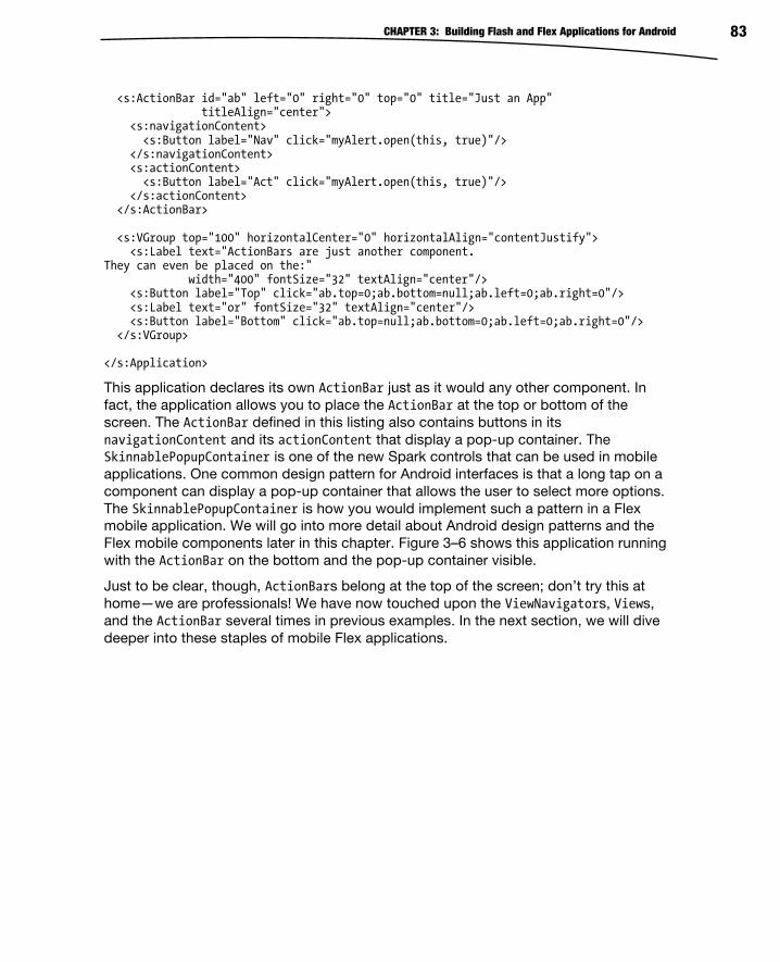
CHAPTER 3: Building Flash and Flex Applications for Android 83
<s:ActionBar id="ab" left="0" right="0" top="0" title="Just an App" titleAlign="center"> <s:navigationContent> <s:Button label="Nav" click="myAlert.open(this, true)"/> </s:navigationContent> <s:actionContent> <s:Button label="Act" click="myAlert.open(this, true)"/> </s:actionContent> </s:ActionBar> <s:VGroup top="100" horizontalCenter="0" horizontalAlign="contentJustify"> <s:Label text="ActionBars are just another component. They can even be placed on the:" width="400" fontSize="32" textAlign="center"/> <s:Button label="Top" click="ab.top=0;ab.bottom=null;ab.left=0;ab.right=0"/> <s:Label text="or" fontSize="32" textAlign="center"/> <s:Button label="Bottom" click="ab.top=null;ab.bottom=0;ab.left=0;ab.right=0"/> </s:VGroup> </s:Application>
This application declares its own ActionBar just as it would any other component. In
fact, the application allows you to place the ActionBar at the top or bottom of the
screen. The ActionBar defined in this listing also contains buttons in its
navigationContent and its actionContent that display a pop-up container. The
SkinnablePopupContainer is one of the new Spark controls that can be used in mobile
applications. One common design pattern for Android interfaces is that a long tap on a
component can display a pop-up container that allows the user to select more options.
The SkinnablePopupContainer is how you would implement such a pattern in a Flex
mobile application. We will go into more detail about Android design patterns and the
Flex mobile components later in this chapter. Figure 3–6 shows this application running
with the ActionBar on the bottom and the pop-up container visible.
Just to be clear, though, ActionBars belong at the top of the screen; don’t try this at
home—we are professionals! We have now touched upon the ViewNavigators, Views,
and the ActionBar several times in previous examples. In the next section, we will dive
deeper into these staples of mobile Flex applications.

CHAPTER 3: Building Flash and Flex Applications for Android 84
Figure 3–6. An application with an ActionBar component and a pop-up container visible
ViewNavigator and Views The ViewNavigator is a skinnable container that holds a stack of View objects where only
the topmost View in the stack is visible and active at any given time. Pushing a new View
onto the stack automatically causes an animated transition to be played and the new
View to be displayed. To return to the previous View, the application simply pops the top
View off the stack.
The ViewNavigator also displays an ActionBar that shows contextual information
defined by the active View. The ViewNavigator automatically updates the ActionBar
whenever a new View is shown. The methods of main interest in the ViewNavigator class
are as follows:
pushView: Pushes a new View onto the stack, automatically making it
visible on the screen; the first parameter to this function is the class of
the View to display. The method has three more optional parameters: a
data object that will be passed to the new View, a context object that
is stored by the ViewNavigator and is also readable by the new View,
and a transition to play between the Views. We will go into more
detail about these three optional parameters later in the chapter.

CHAPTER 3: Building Flash and Flex Applications for Android 85
popView: Removes the current View from the stack and displays the
previous View; the function has one optional parameter: the
transition to play between the Views.
popToFirstView: Removes all Views from the stack except for the very
first one, which then becomes the visible View; this function also
accepts a transition parameter.
popAll: Removes all Views from the stack and displays a blank screen;
the transition parameter is once again optional.
hideActionBar/showActionBar: Hides or shows the ActionBar; some
mobile applications have the option to go full screen by tapping on a
control in the ActionBar. In full-screen mode, tapping on the screen
will cause the ActionBar to be shown again. These methods can be
used to implement such a system in your Flex application. The hiding
and showing of the ActionBar will be animated by default, but you can
pass a Boolean parameter to these functions to turn that off.
The ViewNavigator will automatically handle presses of Android’s back button and call
popView on behalf of the application. The ActionBar, View, and ViewNavigator classes all
collaborate to provide many such features to the mobile developer. The rest of this
section will explore several facets of how these classes work together to provide you
with a productive, flexible, and robust framework for developing your mobile
applications.
The ActionBar In mobile applications, the ActionBar is the conventional place for View titles and
controls. The ActionBar has three distinct areas: a navigation area, a title area, and an
actions area. Refer back to Figure 3–1 for an example that shows these areas. All three
areas can contain arbitrary controls, but the title area will display a title string by default.
And although the title area can also display arbitrary controls, it will not display the title
string if it has been given alternative content to display.
Each ViewNavigator has one ActionBar control that is shared among the Views
instantiated by the navigator. Therefore, a ViewNavigatorApplication will have only one
ActionBar for the entire application, while a TabbedViewNavigatorApplication will have
one separate ActionBar for each ViewNavigator in the application. The ActionBar has
seven properties that determine its content and layout.
actionContent: An array of controls that determine what is displayed in
the ActionBar’s action area (to the right of the title)
actionLayout: A Spark layout that allows a custom layout of the
controls specified by the actionContent array
navigationContent: An array of controls that determine what is
displayed in the ActionBar’s navigation area (to the left of the title)

CHAPTER 3: Building Flash and Flex Applications for Android 86
navigationLayout: A Spark layout that allows a custom layout of the
controls specified by the navigationContent array
title: A string that will be displayed in the title area if titleContent is
null
titleContent: An array of controls that determine what is displayed in
the ActionBar’s title area (the center of the ActionBar)
titleLayout: A Spark layout that allows a custom layout of the
controls specified by the actionContent array
These seven properties are replicated in the ViewNavigatorApplication, ViewNavigator,
and View classes. If you assign values to these properties in ViewNavigatorApplication,
you are, in essence, defining the default appearance of the ActionBar for the whole
application. Defining these properties in the ViewNavigator works as a default for all
Views that will be displayed by that ViewNavigator. In
TabbedViewNavigatorApplications, this is the only way to specify default ActionBar
settings—once for each ViewNavigator. When a new View is displayed, its
ViewNavigator will update the ActionBar with that View’s ActionBar-related properties,
thus overriding any default values specified by the application or the navigator. In
addition, Views have one extra property, actionBarVisible, which determines whether
the ActionBar should be shown at all when the View is shown.
We have already shown sample applications that display controls in the navigation and
action area, as well as one that replaced the title content with a TextField, so we won’t
rehash those examples in this section. One additional piece of information you might
find useful is the use of two special styles that affect the appearance of the ActionBar.
The titleAlign style allows you to set the alignment of the title string to left, right, or
center. The defaultButtonAppearance style can be set to either normal or beveled. On
Android these default to a left-aligned title and normal button appearances. You can
change them as needed for your application, or you may also need to change them if
you plan to port your application to the iOS platform. In that case, ActionBars on iOS
normally have beveled buttons and centered titles. Figure 3–7 shows how this would
look.
Figure 3–7. An Android ActionBar dressed for a date with an iPhone

CHAPTER 3: Building Flash and Flex Applications for Android 87
Applying the beveled style to defaultButtonAppearance even adds the traditional iOS arrow
shape to buttons placed in the navigation content. It’s the little touches that make all the
difference. Listing 3–8 shows the code that created the ActionBar appearance of Figure 3–7.
Listing 3–8. An iOS-Style ActionBar, with Style!
<?xml version="1.0" encoding="utf-8"?><s:ViewNavigatorApplication xmlns:fx="http://ns.adobe.com/mxml/2009" xmlns:s="library://ns.adobe.com/flex/spark" firstView="views.MainHomeView"> <fx:Style> @namespace s "library://ns.adobe.com/flex/spark"; s|ActionBar { titleAlign: "center"; defaultButtonAppearance: "beveled"; chromeColor: "0x7893AB" } </fx:Style> <s:navigationContent> <s:Button label="Back"/> </s:navigationContent></s:ViewNavigatorApplication>
We have taken advantage of the ability to define navigationContent directly in the
MXML file for a ViewNavigatorApplication. Due to this placement, the Back button
would appear on every View in the entire application. In addition to the titleAlign and
defaultButtonAppearance styles, we also defined a custom color for the ActionBar. The
ActionBar will use the chromeColor style as the basis for the gradient that it generates to
fill the ActionBar’s background. Defining a custom chromeColor for the ActionBar is a
common way to customize a mobile application for branding or uniqueness.
Animated View Transitions View transitions control the animation that is played when one View replaces another.
The default transition when pushing a new View is a SlideViewTransition to the left,
while popping a View causes a SlideViewTransition to the right. Both of these default
transitions use their push mode. You can customize the View transition animations in a
myriad of different ways, however. Table 3–1 shows the transitions, their modes, and
their directions.
Table 3–1. The View Transition Classes, Their Modes, and Their Directions
Transition Modes Directions
SlideViewTransition push, cover, uncover up, down, left, right
FlipViewTransition card, cube up, down, left, right
ZoomViewTransition in, out N/A
CrossFadeViewTransition N/A N/A

CHAPTER 3: Building Flash and Flex Applications for Android 88
When you add different easers to the mix, you really have a large number of
combinations to play with. For example, a SlideViewTransition in uncover mode and
the down direction will look like the current View is sliding downward off the screen to
reveal the new View that was sitting underneath it. Throw in a Bounce easer, and the top
View will slide down and bounce when it hits the bottom of the screen. You can even
write your own custom transitions by extending the ViewTransitionBase class and your
own easers by implementing the IEaser interface. You really are limited only by your
imagination!
You can specify the transition that the ViewNavigator will use by passing your transition
as the fourth parameter to the pushView or replaceView functions. ViewNavigator’s
popView, popAll, and popToFirstView also take a single optional parameter that specifies
which transition to play while changing Views. Ah, but what if the user pushes Android’s
back button? We don’t get to call a pop function explicitly in this case, so instead you
must set the ViewNavigator’s defaultPopTransition property to the transition you would
like it to play by default. If you do not specify a transition parameter to a pop function or
set the defaultPopTransition property, the ViewNavigator will play its default slide
transition when it pops the View. Even if you used a custom transition to push a View,
the ViewNavigator will make no attempt to play the push transition in reverse when the
View is popped. It should also be noted that ViewNavigator has a corresponding
defaultPushTransition. You can use these two properties to set the default values for
all of the transitions played by a particular ViewNavigator.
The only logical, and fun, thing to do now is to write an application to try out some of
these transition combinations, right? Right! Listing 3–9 shows the code for the
TransitionListView of the ViewTransitions sample program. This View displays a List of
all the built-in View transitions, each showing a few different combinations of modes,
directions, and easers. The ViewTransitions project can be found with the rest of the
example projects for Chapter 3 in the sample code for this book.
Listing 3–9. Demonstrating Several Different Varieties of Each View Transition
<?xml version="1.0" encoding="utf-8"?> <s:View xmlns:fx="http://ns.adobe.com/mxml/2009" xmlns:s="library://ns.adobe.com/flex/spark" title="Home"> <fx:Declarations> <s:Bounce id="bounce"/> <s:SlideViewTransition id="slide"/> <s:SlideViewTransition id="slideBounce" easer="{bounce}" duration="1000"/> <s:SlideViewTransition id="slideCover" mode="cover"/> <s:SlideViewTransition id="slideUncover" mode="uncover"/> <s:SlideViewTransition id="uncoverBounce" mode="uncover" easer="{bounce}" direction="down" duration="1000"/> <s:FlipViewTransition id="flip"/> <s:FlipViewTransition id="flipBounce" easer="{bounce}" duration="1000"/> <s:FlipViewTransition id="flipCube" mode="cube"/> <s:CrossFadeViewTransition id="fade"/> <s:ZoomViewTransition id="zoom"/> <s:ZoomViewTransition id="zoomBounce" easer="{bounce}" duration="1000"/> <s:ZoomViewTransition id="zoomIn" mode="in"/>

CHAPTER 3: Building Flash and Flex Applications for Android 89
<s:ZoomViewTransition id="zoomInBounce" mode="in" easer="{bounce}" duration="1000"/> </fx:Declarations> <fx:Script> <![CDATA[ import spark.events.IndexChangeEvent; import spark.transitions.ViewTransitionBase; private function onChange(event:IndexChangeEvent):void { var selectedItem:Object = transitionList.selectedItem; var transition:ViewTransitionBase = selectedItem.transition; var data:Object = {name: selectedItem.name}; navigator.defaultPopTransition = transition; navigator.pushView(TransitionedView, data, null, transition); } ]]> </fx:Script> <s:navigationContent/> <s:List id="transitionList" width="100%" height="100%" labelField="name" change="onChange(event)"> <s:ArrayCollection> <fx:Object name="Default - Push Slide" transition="{slide}"/> <fx:Object name="Push Slide with Bounce" transition="{slideBounce}"/> <fx:Object name="Cover Slide" transition="{slideCover}"/> <fx:Object name="Uncover Slide" transition="{slideUncover}"/> <fx:Object name="Uncover Slide with Bounce" transition="{uncoverBounce}"/> <fx:Object name="Flip" transition="{flip}"/> <fx:Object name="Flip with Bounce" transition="{flipBounce}"/> <fx:Object name="Cube Flip" transition="{flipCube}"/> <fx:Object name="Fade" transition="{fade}"/> <fx:Object name="Zoom Out" transition="{zoom}"/> <fx:Object name="Zoom Out with Bounce" transition="{zoomBounce}"/> <fx:Object name="Zoom In" transition="{zoomIn}"/> <fx:Object name="Zoom In with Bounce" transition="{zoomInBounce}"/> </s:ArrayCollection> </s:List> </s:View>
The <fx:Declarations> section is used to declare a Bounce easer and variety of different
transitions. Some transitions use their default settings, while others specify special
modes or directions. Several of the transitions also use the duration property to specify
the total number of milliseconds the transition should take. The default durations for the
built-in transitions range from 300 to 400 milliseconds. This is a little too fast for an
effective bounce animation, so those transitions that use the Bounce easer have longer
durations.
When a transition is selected from the List, the onChange handler function retrieves the
selected object and passes the transition’s name to the next View in its data.name
property. The objects contained in the List also keep a reference to the desired
transition. So this transition property is passed as the fourth parameter to the navigator’s

CHAPTER 3: Building Flash and Flex Applications for Android 90
pushView method. But note that the transition is also used to set the navigator’s
defaultPopTransition property just before the call to pushView. This will ensure that if a
FlipViewTransition was played during the push, that same transition will be played
when returning to the TransitionListView. This is cheating a little bit, because while you
would normally want to play the same type of transition on the push and pop of a
particular pair of Views, you would normally reverse the direction of the pop transition.
This is easily accomplished in a regular application, but in this case it was not worth the
extra clutter in the example code to define an opposite-direction transition for each of
the current transition objects. Figure 3–8 shows the ViewTransitions sample program
caught during a FlipViewTransition in cube mode.
Figure 3–8. Using a cube flip transition to go from one View to the next
If you look closely at the ActionBar while the ViewTransitions sample program runs, or if
you examine the center image in Figure 3–8, you will notice that the ActionBar does not
transition with the View. This is because the ActionBar is considered to belong to the
entire application—or the entire tab—rather than just one View. But there are times when
the transition would look better if the ActionBar took part. You can set the
transitionControlsWithContent property of the View transition class to true in those
cases. So if we change the cube flip declaration in the sample application as follows, we
can then achieve the effect shown in Figure 3–9.
<s:FlipViewTransition id="flipCube" mode="cube" transitionControlsWithContent="true"/>

CHAPTER 3: Building Flash and Flex Applications for Android 91
Figure 3–9. Transitioning the ActionBar with the View on a cube flip transition
View Menus All Android devices have a built-in menu button that displays an onscreen menu. AIR
supports this functionality with the ViewMenu and ViewMenuItem classes. ViewMenu acts as
a container for a single level of ViewMenuItems; sub-menus are not supported. Each View
in your application can define its own ViewMenu. Listing 3–10 shows how a ViewMenu is
declared for a View.
Listing 3–10. Declaring a ViewMenu
<?xml version="1.0" encoding="utf-8"?> <s:View xmlns:fx="http://ns.adobe.com/mxml/2009" xmlns:s="library://ns.adobe.com/flex/spark" title="MenuItem Example">

CHAPTER 3: Building Flash and Flex Applications for Android 92
<fx:Script> <![CDATA[ private function onClick(event:MouseEvent):void { message.text = "You selected " + (event.target as ViewMenuItem).label } ]]> </fx:Script> <s:viewMenuItems> <s:ViewMenuItem label="Pro" click="onClick(event)" icon="@Embed('assets/ProAndroidFlashIcon36.png')"/> <s:ViewMenuItem label="Android" click="onClick(event)" icon="@Embed('assets/android.png')" /> <s:ViewMenuItem label="Flash" click="onClick(event)" icon="@Embed('assets/flash.png')" /> <s:ViewMenuItem label="Book" click="onClick(event)" icon="@Embed('assets/book.png')" /> </s:viewMenuItems> <s:Label id="message" width="100%" top="20" textAlign="center"/> </s:View>
A ViewMenuItem is really just another kind of button. It even extends the Spark
ButtonBase class. Therefore, just like any other button, you can define label and icon
properties as well as a click event handler. In this example, each ViewMenuItem is given
the same onClick handler, which uses the ViewMenuItem’s label to display the selection
to the user. What makes the ViewMenu container and ViewMenuItem buttons different from
their normal Spark counterparts is that their layouts are designed to mimic the native
Android menus.
TIP: Remember that Ctrl+N on Windows and Cmd+N on a Mac will show the View menu in the
desktop emulator.
Figure 3–10 shows what the resulting ViewMenu looks like when run on an Android
device.

CHAPTER 3: Building Flash and Flex Applications for Android 93
Figure 3–10. A ViewMenu with icons
Passing Data Between Views The ViewNavigator will ensure that only one View is in memory at any given time in order
to conserve resources. When a View is pushed on top of the stack, the old
View’s data object is automatically persisted, and a new data object is passed to the
new View if one was provided as the second parameter of the pushView function. If no
data object is provided, then the new View’s data property will be null. Since a View’s
data object is persisted when a new View is pushed onto the stack, that data object will
be restored when the View is reactivated as a result of other Views being popped off the
stack.
It would seem, then, that communication via data object is one-way: a View can pass a
data object to the View that it is pushing onto the stack, but that View has no way to
return data back to the original View when it is popped off the stack. So how would the
new View return data to the original View if it needed to? The answer is that the new View
would simply override View’s createReturnObject function. This function returns an
object that is saved into ViewNavigator’s poppedViewReturnedObject property, which is
of type ViewReturnObject. So in order to access the object returned by the new View,
the original View would access navigator.poppedViewReturnedObject.object.

CHAPTER 3: Building Flash and Flex Applications for Android 94
You can also pass data to a new View by using the context object. You can pass a
context object as the third parameter of the ViewNavigator’s pushView function. The
context behaves much like the data object; it is accessible to the new View at any time
by accessing the navigator.context property. The previous View’s context is also
restored when the top View is popped from the ViewNavigator View stack. The popped
View’s context object is also present in the poppedViewReturnedObject.context property
of the navigator.
The use of the data and context objects are somewhat interchangeable, and in those
cases where either would do the job, you should prefer to use the data object. The
context object is useful for those cases where you have a View that should display itself
slightly differently depending on how the user has navigated to the View. For example,
you may have a details View that displays a person’s contact information. Sometimes,
depending on how the user navigates to the View—whether it’s by tapping a “view”
button versus an “edit” button—the View should adjust its display accordingly. This is a
good place to use the context object to differentiate whether the contact information
contained in the data object should be simply presented to the user or should be made
editable.
Persisting View and Session Data We have already seen in Listing 3–4, and briefly discussed in the previous section, that
a View’s data object is restored to it when the View is reactivated by one of the
ViewNavigator pop functions. Therefore, one persistence strategy for View data is to
store values in its data object either before calling pushView or in the handler for the
viewDeactivate event. If that new View calls one of the pop functions, then the data
previously stored by the original View will be accessible via its data object again. This
strategy will work only for persisting data between Views in a running application. If the
application is shut down by the user triggering an action that calls the
NativeApplication’s exit function or by the Android OS, then all View data objects
are lost.
The PersistenceManager class is used to persist data between runs of your application.
The ViewNavigatorApplication and the TabbedViewNavigatorApplication containers
have a reference to a persistenceManager instance that can be used to save and load
persisted data when the application starts or shuts down. Listing 3–11 shows a simple
example of using the persistenceManager to save the number of times an application
has been launched. This code is part of the Chapter 3 sample project named
SimplePersistence.
Listing 3–11. Persisting Data Between Application Runs
<?xml version="1.0" encoding="utf-8"?> <s:ViewNavigatorApplication xmlns:fx="http://ns.adobe.com/mxml/2009" xmlns:s="library://ns.adobe.com/flex/spark" splashScreenImage="@Embed('assets/splash.png')" initialize="onInitialize()" deactivate="onDeactivate()" applicationDPI="160">

CHAPTER 3: Building Flash and Flex Applications for Android 95
<fx:Script> <![CDATA[ import views.PersistenceCountView; private static const RUN_COUNT:String = "runCount"; private function onInitialize():void { var rc:Number = Number(persistenceManager.getProperty(RUN_COUNT)); navigator.pushView(views.PersistenceCountView, rc); } private function onDeactivate():void { var rc:Number = Number(persistenceManager.getProperty(RUN_COUNT)); persistenceManager.setProperty(RUN_COUNT, ++rc); NativeApplication.nativeApplication.exit(0); } ]]> </fx:Script> </s:ViewNavigatorApplication>
The application’s onDeactivate handler is called when the application is being put in the
background or closed by the Android OS. So in this handler we increment the run count
and call the persistenceManager’s setProperty function to persist it. Then we make a
call to the NativeApplication’s exit function just to make sure the application is being
closed between runs. This ensures that our data really is being persisted and restored.
The application’s run count is then retrieved from the persistenceManager using the
getProperty function when the application’s onInitialize handler is triggered. The
getProperty function takes one parameter that is the key String of the property to
retrieve. This run count is cast to a Number and passed to the application’s first View,
where it is displayed as shown in Figure 3–11.

CHAPTER 3: Building Flash and Flex Applications for Android 96
Figure 3–11. Displaying the application’s persisted run count
The View navigator-based applications also have a property called
persistNavigatorState that, when set to true, will automatically persist the
ViewNavigator’s state and View stack. The persisted data is automatically loaded back
in the next time the program is run. In addition to the ViewNavigator data, the
application’s version and the time that the data is persisted is also saved. These two
pieces of data are accessible using the PersistenceManager’s getProperty function with
the “applicationVersion” and “timestamp” keys.
Now that we have explored the mobile application containers, it is time to focus on the
controls (pun intended) that are available to mobile Flex applications.
Visual Controls At the core of any Flex application is a rich set of UI controls that let you express
common elements within your UI. We have already been using many of these in the
code and applications found earlier in this book; however, in this section, we will focus
specifically on the different types of controls available for mobile Flex applications.
For mobile applications, both performance and skinning are extremely important to
ensure that the user interface is usable. For this reason, it is highly recommended to stay

CHAPTER 3: Building Flash and Flex Applications for Android 97
away from the older MX packages in Flex, and to focus on Spark controls that have
mobile skins.
A full list of the Spark controls is shown in Table 3–2, along with their suitability for
mobile applications.
Table 3–2. Flex 4.5 Controls
Control Mobile Skin Recommended Usage
BorderContainer No This component lacks a mobile skin and
is not recommended for mobile use.
BusyIndicator Yes Recommended for mobile use
Button Yes Recommended for mobile use
ButtonBar Yes Recommended for mobile use
CheckBox Yes Recommended for mobile use
ComboBox No This component lacks a mobile skin and
is not recommended for mobile use.
DataGrid No This component lacks a mobile skin and
is not recommended for mobile use. For
most mobile applications, a List is more
suitable.
DropDownList No This component lacks a mobile skin and
is not recommended for mobile use.
Form No This component lacks a mobile skin and
is not recommended for mobile use.
HSlider Yes Recommended for mobile use
Image Yes For performance reasons, use a Bitmapunless you need specific features of the
Image class, such as skinning.
Label Yes Recommended for mobile use
List Yes Recommended for mobile use
NumericStepper No This component lacks a mobile skin and
is not recommended for mobile use.
Panel No This component lacks a mobile skin and
is not recommended for mobile use.

CHAPTER 3: Building Flash and Flex Applications for Android 98
Control Mobile Skin Recommended Usage
RadioButton Yes Recommended for mobile use
RichEditableText Yes Not recommended for mobile use due to
performance reasons
RichText Yes Not recommended for mobile use due to
performance reasons
Scroller N/A Recommended for mobile use
Spinner No This component lacks a mobile skin and
is not recommended for mobile use.
TabBar Yes Recommended for mobile use
TextArea Yes Recommended for mobile use
TextInput Yes Recommended for mobile use
ToggleButton No This component lacks a mobile skin and
is not recommended for mobile use.
VSlider No This component lacks a mobile skin and
is not recommended for mobile use.
A number of the controls do not currently have mobile optimized skins, and therefore
should not be used on mobile devices at this time. For example, the ComboBox,
NumericStepper, and DropDownList won’t have a consistent look and interaction if used
on mobile with their desktop skins. If you need a control with the functionality of one of
these, you can create your own custom skin that matches the style of your mobile
application.
Some of the available components are also not optimized for performance on mobile
devices. We cover this topic in more detail in Chapter 10, but if you follow the foregoing
guidelines and use TextArea and TextInput instead of RichText and RichEditableText,
you should be fine. The same is true for the Image class, which can be heavyweight
when used repeatedly, such as in ListItemRenderers.
This list is current as of Flex 4.5, but Adobe is working on adding additional mobile skins
for the remaining controls, so please refer to the API documentation for the very latest
information about mobile control compatibility.
In the rest of this chapter, we go into detail on how to use the full capabilities of each
mobile-enabled control.

CHAPTER 3: Building Flash and Flex Applications for Android 99
Text Controls The three controls that are optimized for mobile and will give you the best performing
application are Label, TextArea, and TextInput. Each of these controls is highly
customizable via CSS styles.
Label gives you the ability to display single or multiline text with uniform formatting. It
uses the Flash Text Engine (FTE) behind the scenes, which makes it fast and lightweight,
but not as flexible as the RichText control that uses the full Text Layout Framework
(TLF). Labels should be used anywhere where you have short snippets of unmodifiable
text that you want to display onscreen, such as labels for controls or section headings.
TextInput and TextArea provide text input for single-line and multiline use, respectively.
When used on a mobile device, they use the StyleableTextField class behind the
scenes, making them extremely performant, but with a limited set of functionality. On
desktop these controls are backed by the TLF, giving you international language
support, improved typography, and embedded CFF fonts. If you need these features on
mobile, you will have to use the RichEditableText control, which comes with a
significant performance penalty.
The mobile styles of the three recommended text components are shown in Table 3–3.
While there are additional style attributes available when running on the desktop profile,
such as kerning, lineBreak, and renderingMode, these are not supported on mobile due
to the lighterweight text engine used in the mobile themes.
Table 3–3. Text Styles Recommended for Mobile Use
Style Label TextInput TextArea Description
backgroundAlpha Y Y Y The alpha value (opacity) of
the background color used
backgroundColor Y Y Y The color that the
component’s background will
be painted with
borderVisible N Y Y Whether the border is visible
(true by default)
color Y Y Y Color that will be used for
displaying text
contentBackgroundAlpha N Y Y The alpha value (opacity) of
the content area within the
text field
contentBackgroundColor N Y Y The color that the
component’s content area
will be painted with

CHAPTER 3: Building Flash and Flex Applications for Android 100
Style Label TextInput TextArea Description
focusAlpha N Y Y The alpha value (opacity) for
the focus ring
focusColor N Y Y The color used to paint the
component’s focus ring
fontFamily Y Y Y The name of the font to be
used for text rendering (can
be a comma-separated list of
fonts in order of preference)
fontSize Y Y Y The size of the font used for
rendering in pixel units
fontStyle Y Y Y The font style, which can be
italic or normal (default is
normal)
fontWeight Y Y Y The font weight, which can
be bold or normal (default is
normal)
leading Y Y Y Vertical space between lines
of text
letterSpacing Y Y Y Space between letters in
pixel units
locale Y Y Y Text locale used for
internationalization
textAlign
Y Y Y Alignment of text within the
container, which can be left,
right, or center (default is
left)
textDecoration Y Y Y The text decoration, which
can be underline or none
textIndent N Y Y The indentation of the first
line of text (must be greater
than or equal to 0)
As you can see, the set of styles supported by these text components is almost
identical, with the addition of some styles for the content area, border, and focus for
TextInput and TextArea.

CHAPTER 3: Building Flash and Flex Applications for Android 101
The biggest difference in the use of the different text components comes in the use of
different properties for text editing. Many of these properties are available on TextInput
and TextArea, but not needed for Label since it is intended for text rendering only. Table
3–4 lists all the available properties of the three text components.
Table 3–4. Public Properties Available on Label, TextInput, and TextArea
Property Label
TextInput TextArea Description
displayAsPassword N Y Y Renders the text as a series of
dots, hiding the text as it is typed
editable N Y Y Whether the text component is
editable (default is true)
isTruncated Y N N Read-only property that tells you
if the text was too long and got
truncated
maxChars N Y Y The alpha value (opacity) of the
content area within the text field
maxDisplayedLines Y N N Maximum number of lines to
display before truncation occurs
with an ellipse (default is 0 – no
truncation)
prompt N Y Y Text that will be displayed prior
to the user typing in a value of
his or her own
restrict N Y Y The set of permitted characters
allowed, specified with regexp-
like ranges
selectable N Y Y Whether the text can be
selected (true by default)
selectionActivePosition N Y Y Read-only position of the
selection end
selectionAnchorPosition N Y Y Read-only position of the
selection start
showTruncationTip Y N N Boolean property for whether a
tool-tip will be shown when the
text is truncated (default is false)
text Y Y Y The text that will be displayed
by the component
typicalText N Y Y Text that will be used to set the
initial size of the control

CHAPTER 3: Building Flash and Flex Applications for Android 102
To demonstrate the different styles and capabilities of the text components, we put
together a small sample application that renders the first few paragraphs of the US
Declaration of Independence along with an editable list of the signatories. The code for
this application is shown in Listing 3–12.
Listing 3–12. Text Component Sample Code to Display the Declaration of Independence
<?xml version="1.0" encoding="utf-8"?> <s:View xmlns:fx="http://ns.adobe.com/mxml/2009" xmlns:s="library://ns.adobe.com/flex/spark" title="Text"> <fx:Style> @namespace s "library://ns.adobe.com/flex/spark"; .title { fontFamily: Times; fontSize: 30; fontWeight: bold; } .body { color: #222222; fontFamily: Times; fontSize: 12; fontStyle: italic; textAlign: justify; } .main-signature { fontFamily: Helvetica; fontSize: 18; } .state-signatures { fontFamily: Helvetica; fontSize: 12; } </fx:Style> <s:VGroup left="15" top="15" right="15" width="100%" gap="12"> <s:Label styleName="title" text="Declaration of Independence"/> <s:Label styleName="body" width="100%" text="When in the Course of human events, it becomes necessary for one people to …" /> <s:Label styleName="body" width="100%" maxDisplayedLines="12" text="We hold these truths to be self-evident, that all men are created equal, that they are …" /> <s:HGroup verticalAlign="baseline" width="100%"> <s:Label styleName="main-signature" text="President of Congress:"/> <s:TextInput styleName="main-signature" text="John Hancock" editable="false" width="100%"/> </s:HGroup> <s:Label styleName="main-signature" text="State Representatives:"/> <s:TextArea styleName="state-signatures" width="100%" text="Josiah Bartlett, William Whipple, Matthew Thornton, Samuel Adams, John Adams, …" /> </s:VGroup> </s:View>

CHAPTER 3: Building Flash and Flex Applications for Android 103
Note the use of inline CSS to abstract the styles out from the code. It is also possible to
directly declare the styles on the text components as XML attributes, although for
modularity you would probably prefer to go the opposite direction and extract the CSS
to a separate file altogether.
Running this example would give you the output shown in Figure 3–12.
Figure 3–12. Declaration of Independence test sample
As an exercise to test out the text components, try making the following changes to the
application:
Use password protection on the TextArea component.
Change the sizing of the TextInput to exactly match the initial text size.
Change the TextInput default text to be a prompt that disappears when the
user starts typing.
Change the styling and interactivity of the TextInput to match that of a Label.

CHAPTER 3: Building Flash and Flex Applications for Android 104
TIP: Using a TextInput with editability disabled and similar styling to a Label is higher performance than using a Label component directly, due to the use of the
StyleableTextField implementation behind the scenes.
Soft Keyboard Support When using the text components, the Android soft keyboard will automatically trigger
upon focus as you would expect. However, sometimes you need finer-grained control
over when the soft keyboard gets triggered and what happens when it gets activated.
The soft keyboard in Flex is controlled by the application focus. When a component that
has the needsSoftKeyboard property set to true is given the focus, the soft keyboard will
come to the front and the stage will scroll so that the selected component is visible.
When that component loses focus, the soft keyboard will disappear and the stage will
return to its normal position.
With the understanding of the focus, you can control the soft keyboard by doing the
following:
To show the soft keyboard declaratively: Set needsSoftKeyboard to
true for your component.
To show the soft keyboard programmatically: Call
requestSoftKeyboard() on a component that already has
needsSoftKeyboard set.
To hide the soft keyboard: Call setFocus() on a component that does
not have needsSoftKeyboard set.
This works fine for components that do not normally trigger the soft keyboard; however,
for components that automatically raise the keyboard, setting needsSoftKeyboard to
false has no effect. A workaround to prevent the keyboard from popping up on these
components is to listen for the activating event and suppress it with code like the
following:
<fx:Script> <![CDATA[ private function preventActivate(event:SoftKeyboardEvent):void { event.preventDefault(); } ]]> </fx:Script> <s:TextArea text="I am a text component, but have no keyboard?" softKeyboardActivating="preventActivate(event)"/>
This code catches the softKeyboardActivating event on the TextArea component and
suppresses the default action of raising the soft keyboard.

CHAPTER 3: Building Flash and Flex Applications for Android 105
In addition to getting events on activation, you can also catch softKeyboardActivate
and softKeyboardDeactivate events in order to perform actions based on the soft
keyboard status.
Listing 3–13 shows a soft keyboard sample application that demonstrates all these
techniques used together to take complete control over the soft keyboard.
Listing 3–13. Soft Keyboard Interaction Example Code
<?xml version="1.0" encoding="utf-8"?> <s:Application xmlns:fx="http://ns.adobe.com/mxml/2009" xmlns:s="library://ns.adobe.com/flex/spark" splashScreenImage="@Embed('ProAndroidFlash400.png')"> <fx:Script> <![CDATA[ [Bindable] private var state:String; [Bindable] private var type:String; private function handleActivating(event:SoftKeyboardEvent):void { state = "Activating..."; type = event.triggerType; } private function handleActivate(event:SoftKeyboardEvent):void { state = "Active"; type = event.triggerType; } private function handleDeactivate(event:SoftKeyboardEvent):void { state = "Deactive"; type = event.triggerType; } private function preventActivate(event:SoftKeyboardEvent):void { event.preventDefault(); } ]]> </fx:Script> <s:VGroup left="20" top="20" right="20" gap="15" softKeyboardActivating="handleActivating(event)" softKeyboardActivate="handleActivate(event)" softKeyboardDeactivate="handleDeactivate(event)"> <s:HGroup> <s:Label text="Keyboard State: " fontWeight="bold"/> <s:Label text="{state}"/> </s:HGroup> <s:HGroup> <s:Label text="Trigger Type: " fontWeight="bold"/> <s:Label text="{type}"/> </s:HGroup> <s:Button id="needy" label="I Need the Keyboard" needsSoftKeyboard="true" emphasized="true"/> <s:TextArea text="I am a text component, but have no keyboard?" softKeyboardActivating="preventActivate(event)"/>

CHAPTER 3: Building Flash and Flex Applications for Android 106
<s:HGroup width="100%" gap="15"> <s:Button label="Hide Keyboard" click="{setFocus()}" width="50%"/> <s:Button label="Show Keyboard" click="{needy.requestSoftKeyboard()}" width="50%"/> </s:HGroup> </s:VGroup> </s:Application>
This code creates several controls and attaches actions to them so that you can hide
and show the soft keyboard at will, as well as see the current soft keyboard state as
reported by the events that trickle up. Upon running the application, you will see a UI like
that shown in Figure 3–13.
Figure 3–13. Sample application that demonstrates how to control the soft keyboard
Notice that the TextArea control, which normally triggers the soft keyboard, no longer
brings it up, while the highlighted button immediately raises the soft keyboard whenever
it gets focus. The two buttons at the bottom to show and hide the keyboard merely play
focus tricks to get Flash to show and hide the keyboard at will.

CHAPTER 3: Building Flash and Flex Applications for Android 107
You can use the same techniques in your application to take full control over the soft
keyboard.
Button Controls Perhaps one of the most basic elements of any UI is the button. It has existed since the
very first graphical user interface on the Xerox Alto in 1973. Figure 3–14 shows a picture
of the desk-sized Alto along with the button style used in its file manager. We have
come a long way since then, but the basic concepts have not changed much.
Figure 3–14. Image of a Xerox Alto (left) and a reproduction of the button style used in its GUI (right)
Flex has several built-in button controls with mobile-optimized styles for rendering them
on device at a usable size. These include the following button types:
Button
CheckBox
RadioButton
ButtonBar
The standard Button control is highly customizable, including the ability to include an
embedded image icon. The CheckBox control provides a custom button with a label and
a visual toggle that can be enabled or disabled by clicking. The RadioButton is similar to
a CheckBox, but uses a circular indicator and works together with a group of related
RadioButtons, only one of which can be selected at once. Finally, the ButtonBar merges
together a set of toggle buttons in a row, only one of which can be selected at a given
time, similar to a RadioButton group.
All of these controls have similar styles that can be used to customize them. Due to the
difference in mobile skins, not all of the desktop styles are available, such as
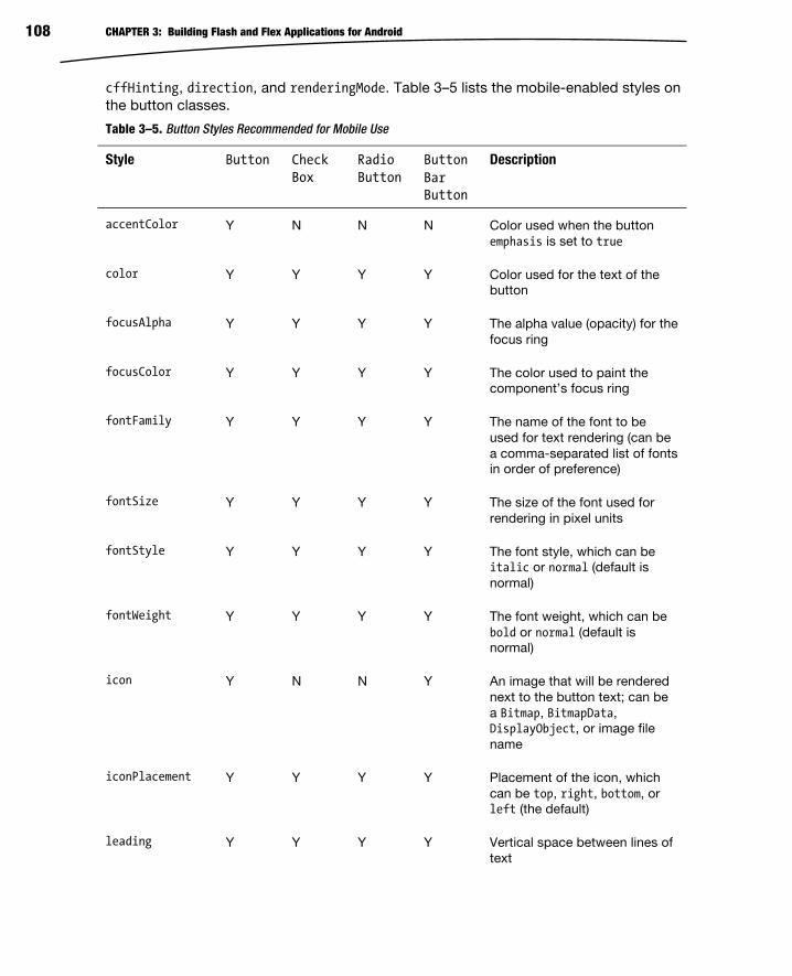
CHAPTER 3: Building Flash and Flex Applications for Android 108
cffHinting, direction, and renderingMode. Table 3–5 lists the mobile-enabled styles on
the button classes.
Table 3–5. Button Styles Recommended for Mobile Use
Style Button Check Box
Radio Button
Button Bar Button
Description
accentColor Y N N N Color used when the button
emphasis is set to true
color Y Y Y Y Color used for the text of the
button
focusAlpha Y Y Y Y The alpha value (opacity) for the
focus ring
focusColor Y Y Y Y The color used to paint the
component’s focus ring
fontFamily Y Y Y Y The name of the font to be
used for text rendering (can be
a comma-separated list of fonts
in order of preference)
fontSize Y Y Y Y The size of the font used for
rendering in pixel units
fontStyle Y Y Y Y The font style, which can be
italic or normal (default is
normal)
fontWeight Y Y Y Y The font weight, which can be
bold or normal (default is
normal)
icon Y N N Y An image that will be rendered
next to the button text; can be
a Bitmap, BitmapData,
DisplayObject, or image file
name
iconPlacement Y Y Y Y Placement of the icon, which
can be top, right, bottom, or
left (the default)
leading Y Y Y Y Vertical space between lines of
text

CHAPTER 3: Building Flash and Flex Applications for Android 109
Style Button Check Box
Radio Button
Button Bar Button
Description
letterSpacing Y Y Y Y Space between letters in pixel
units
locale Y Y Y Y Text locale used for
internationalization
repeatDelay Y Y Y Y Delay before starting to repeat
buttonDown events (default is
500 milliseconds)
repeatInterval Y Y Y Y Delay between the buttonDown
event repeats (default is 35
milliseconds)
symbolColor N Y Y N Color of the check mark or
radial button symbol
textAlign Y N N Y Alignment of text within the
container, which can be left,
right, or center (default is
left)
textAlpha Y Y Y Y The alpha value (opacity) for the
text displayed in the button
textDecoration Y Y Y Y The text decoration, which can
be underline or none
textShadowAlpha Y N N Y The alpha value (opacity) for the
text shadow
textShadowColor Y N N Y The color of the text shadow
touchDelay Y Y Y Y The delay before a touch action
is registered; this is set to
100ms when in a Scroller
component to prevent flicker.
Most of these styles are supported across all the button types, including buttons
embedded in a ButtonBar of type ButtonBarButton. There are a few exceptions where
styles have been explicitly excluded from subclasses, such as textAlign and icon,
which are not supported in either CheckBoxes or Radiobuttons. For setting the style on
ButtonBarButtons, it is usually sufficient to set the style on the ButtonBar and let CSS
inheritance take care of applying it to the child buttons that get created.

CHAPTER 3: Building Flash and Flex Applications for Android 110
Due to the difference in functionality, the available properties for manipulating the
buttons differ slightly as well. Table 3–6 lists the available public properties, including
which button class they apply to.
Table 3–6. Public Button Properties Recommended for Mobile Use
Property
Button Check Box
Radio Button
Button Bar Button
Description
autoRepeat Y Y Y Y Whether the button dispatches
repeated buttonDown events
when the mouse is held down
content Y Y Y Y Arbitrary object to be displayed
by a custom button skin
emphasized Y N N N Whether this button is the
default and should be
displayed with the accentColor
label Y Y Y Y The text that will be displayed
on the button
selected N Y Y Y Whether this button is in a
selected state (true) or
deselected state (false)
stickyHighlighting Y Y Y Y By default buttons display their
down skin only when the mouse
is hovering; set this to true to
keep the down skin until the
user releases the mouse.
In addition to these properties, there are a few events and methods on the button
classes that help with interactivity. The most important of these is the clickHandler
function that gets called whenever the user presses and releases the mouse over a
button. In addition you can listen for a buttonDown event and override the
buttonReleased and mouseEventHandler functions to do more advanced interactions. An
additional event available on the toggleable button subclasses (CheckBox, RadioButton,
and ButtonBarButton) is the change event, which gets triggered whenever the selected
property changes.
To demonstrate the use of different button controls, we put together a small button
sample that parodies the complicated set of controls on a modern microwave. The code
for this example is shown in Listing 3–14.
Listing 3–14. Code for the Modern Microwave Example
<?xml version="1.0" encoding="utf-8"?> <s:View xmlns:fx="http://ns.adobe.com/mxml/2009"

CHAPTER 3: Building Flash and Flex Applications for Android 111
xmlns:s="library://ns.adobe.com/flex/spark" title="Buttons"> <fx:Style> @namespace s "library://ns.adobe.com/flex/spark"; .number { touchDelay: 500; } .header { color: #660000; } </fx:Style> <s:VGroup left="60" right="60" top="20" width="100%"> <s:ButtonBar styleName="header" requireSelection="true" width="100%"> <s:dataProvider> <s:ArrayCollection source="['Defrost', 'Cook', 'Irradiate']" /> </s:dataProvider> </s:ButtonBar> <s:RadioButton label="Meat" color="#404040" symbolColor="green"/> <s:RadioButton label="Poultry" color="#404040" symbolColor="yellow"/> <s:RadioButton label="Alien Fish" color="#d02525" symbolColor="#d02525"/> <s:CheckBox label="Trigger Meltdown" symbolColor="red"/> <s:HGroup width="100%"> <s:Button styleName="number" label="9" width="100%"/> <s:Button styleName="number" label="8" width="100%"/> <s:Button styleName="number" label="7" width="100%"/> </s:HGroup> <s:HGroup width="100%"> <s:Button styleName="number" label="6" width="100%"/> <s:Button styleName="number" label="5" width="100%"/> <s:Button styleName="number" label="4" width="100%"/> </s:HGroup> <s:HGroup width="100%"> <s:Button styleName="number" label="3" width="100%"/> <s:Button styleName="number" label="2" width="100%"/> <s:Button styleName="number" label="1" width="100%"/> </s:HGroup> <s:HGroup width="100%"> <s:Button styleName="number" label="π" width="100%"/> <s:Button styleName="number" label="0" width="100%"/> <s:Button styleName="number" icon="@Embed('alien.gif')" width="100%"/> </s:HGroup> <s:HGroup width="100%"> <s:Button label="End" width="100%"/> <s:Button label="Start" width="100%" emphasized="true"/> </s:HGroup> </s:VGroup> </s:View>
When run on a mobile device, the application will look similar to that shown in Figure 3–15.

CHAPTER 3: Building Flash and Flex Applications for Android 112
Figure 3–15. Output of running the modern microwave example
To practice with some of the new styles and properties you have learned, try the
following:
Change the size and color of the label font in the number buttons.
Add a clickHandler that will play a sound when the microwave is started.
Add a Label that repeatedly appends the number on the button to the text.
Flex Lists Lists are probably one of the most important controls for mobile applications. Due to
the limited screen real estate, they take the place of data grids, and are often used for
drill-down navigation through menus or hierarchical structures.
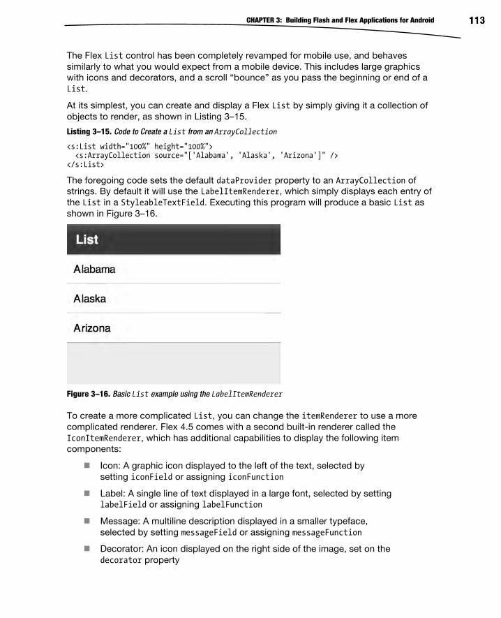
CHAPTER 3: Building Flash and Flex Applications for Android 113
The Flex List control has been completely revamped for mobile use, and behaves
similarly to what you would expect from a mobile device. This includes large graphics
with icons and decorators, and a scroll “bounce” as you pass the beginning or end of a
List.
At its simplest, you can create and display a Flex List by simply giving it a collection of
objects to render, as shown in Listing 3–15.
Listing 3–15. Code to Create a List from an ArrayCollection
<s:List width="100%" height="100%"> <s:ArrayCollection source="['Alabama', 'Alaska', 'Arizona']" /> </s:List>
The foregoing code sets the default dataProvider property to an ArrayCollection of
strings. By default it will use the LabelItemRenderer, which simply displays each entry of
the List in a StyleableTextField. Executing this program will produce a basic List as
shown in Figure 3–16.
Figure 3–16. Basic List example using the LabelItemRenderer
To create a more complicated List, you can change the itemRenderer to use a more
complicated renderer. Flex 4.5 comes with a second built-in renderer called the
IconItemRenderer, which has additional capabilities to display the following item
components:
Icon: A graphic icon displayed to the left of the text, selected by
setting iconField or assigning iconFunction
Label: A single line of text displayed in a large font, selected by setting
labelField or assigning labelFunction
Message: A multiline description displayed in a smaller typeface,
selected by setting messageField or assigning messageFunction
Decorator: An icon displayed on the right side of the image, set on the
decorator property
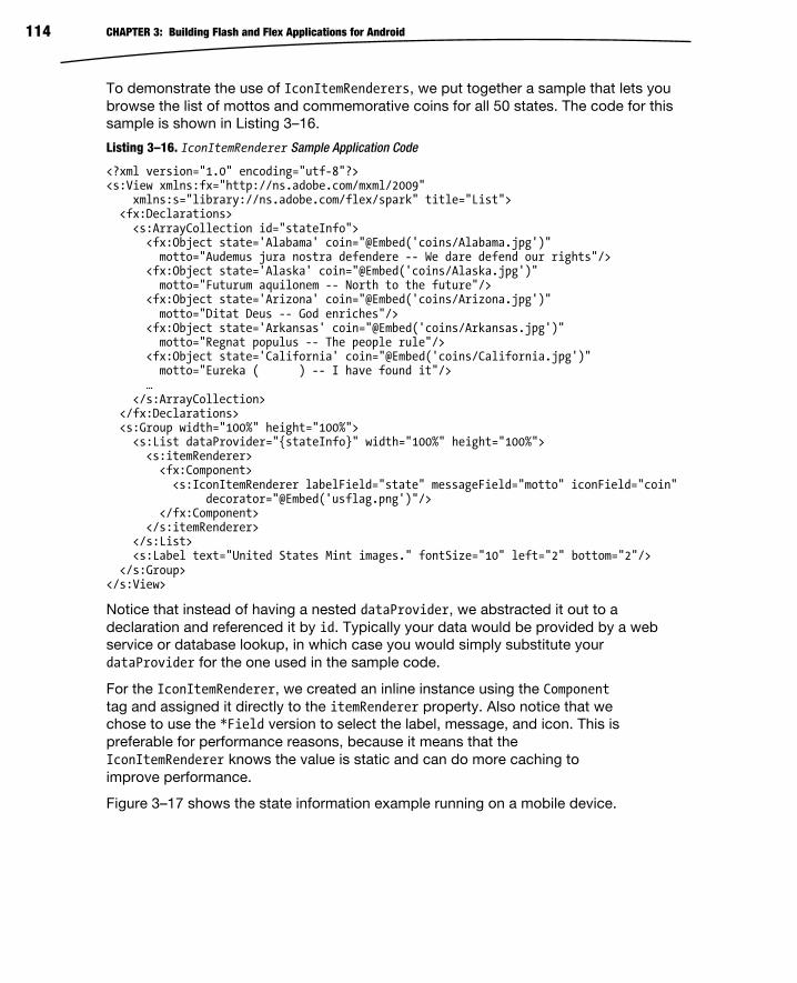
CHAPTER 3: Building Flash and Flex Applications for Android 114
To demonstrate the use of IconItemRenderers, we put together a sample that lets you
browse the list of mottos and commemorative coins for all 50 states. The code for this
sample is shown in Listing 3–16.
Listing 3–16. IconItemRenderer Sample Application Code
<?xml version="1.0" encoding="utf-8"?> <s:View xmlns:fx="http://ns.adobe.com/mxml/2009" xmlns:s="library://ns.adobe.com/flex/spark" title="List"> <fx:Declarations> <s:ArrayCollection id="stateInfo"> <fx:Object state='Alabama' coin="@Embed('coins/Alabama.jpg')" motto="Audemus jura nostra defendere -- We dare defend our rights"/> <fx:Object state='Alaska' coin="@Embed('coins/Alaska.jpg')" motto="Futurum aquilonem -- North to the future"/> <fx:Object state='Arizona' coin="@Embed('coins/Arizona.jpg')" motto="Ditat Deus -- God enriches"/> <fx:Object state='Arkansas' coin="@Embed('coins/Arkansas.jpg')" motto="Regnat populus -- The people rule"/> <fx:Object state='California' coin="@Embed('coins/California.jpg')" motto="Eureka ( ) -- I have found it"/> … </s:ArrayCollection> </fx:Declarations> <s:Group width="100%" height="100%"> <s:List dataProvider="{stateInfo}" width="100%" height="100%"> <s:itemRenderer> <fx:Component> <s:IconItemRenderer labelField="state" messageField="motto" iconField="coin" decorator="@Embed('usflag.png')"/> </fx:Component> </s:itemRenderer> </s:List> <s:Label text="United States Mint images." fontSize="10" left="2" bottom="2"/> </s:Group> </s:View>
Notice that instead of having a nested dataProvider, we abstracted it out to a
declaration and referenced it by id. Typically your data would be provided by a web
service or database lookup, in which case you would simply substitute your
dataProvider for the one used in the sample code.
For the IconItemRenderer, we created an inline instance using the Component
tag and assigned it directly to the itemRenderer property. Also notice that we
chose to use the *Field version to select the label, message, and icon. This is
preferable for performance reasons, because it means that the
IconItemRenderer knows the value is static and can do more caching to
improve performance.
Figure 3–17 shows the state information example running on a mobile device.
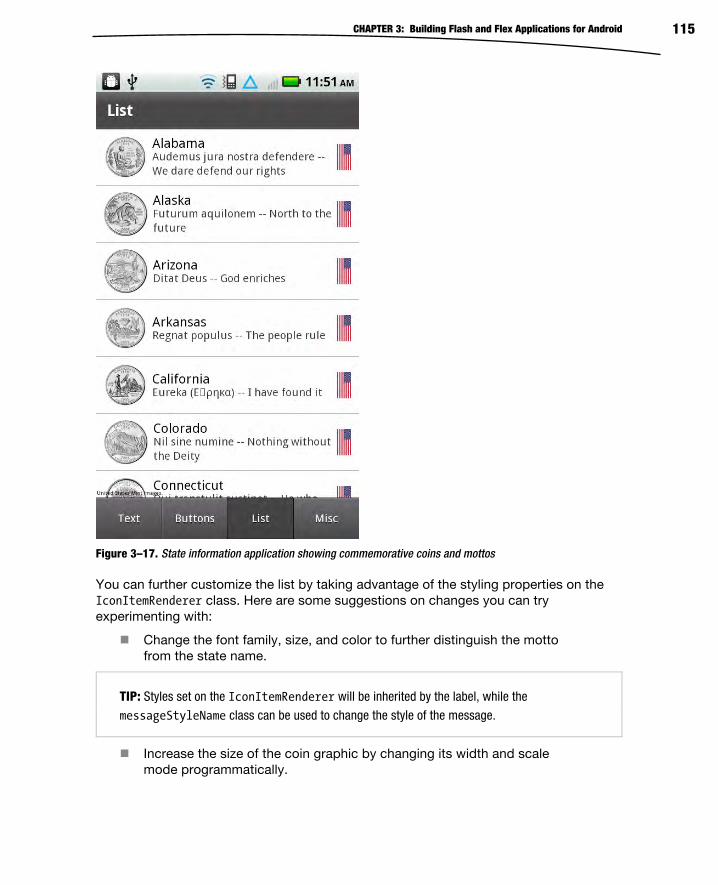
CHAPTER 3: Building Flash and Flex Applications for Android 115
Figure 3–17. State information application showing commemorative coins and mottos
You can further customize the list by taking advantage of the styling properties on the
IconItemRenderer class. Here are some suggestions on changes you can try
experimenting with:
Change the font family, size, and color to further distinguish the motto
from the state name.
TIP: Styles set on the IconItemRenderer will be inherited by the label, while the
messageStyleName class can be used to change the style of the message.
Increase the size of the coin graphic by changing its width and scale
mode programmatically.

CHAPTER 3: Building Flash and Flex Applications for Android 116
Enable multi-select on the List component using the
allowMultipleSelection property.
Slider, Scroller, and BusyIndicator Controls There are several other controls that you will find useful in the creation of mobile
applications. These include the HSlider, Scroller, and BusyIndicator controls.
HSlider The HSlider is a standard horizontal slider control that lets you specify a range of values
over which the user can select. Some of the features of the HSlider include the
following:
A mobile-sized slider bar
A data tip that shows the precise value
Support for configurable value ranges and stepping
The style of the scroller itself is limited to a few simple properties, including focusAlpha,
focusColor, liveDragging, and slideDuration. The first two styles are the same as their
counterparts on other controls. In addition you can disable liveDragging by setting it to
false, which will force the value to get updated only when the user lets go of the mouse
button. The slideDuration style controls how long it takes for the thumb to move when
the background of the slider is pressed, which defaults to 300 milliseconds.
In addition to this, you can control the display of the data tip with several properties,
including a dataTipFormatFunction that turns the Numeric value into a string,
dataTipPrecision to choose the number of decimal places, and showDataTip, which lets
you disable data tips altogether. The data tip text uses the same text style properties as
the button components mentioned in the previous section. For mobile use, the following
text styles are supported: fontFamily, fontStyle, leading, letterSpacing, locale, and
textDecoration.
To control the range of the slider, you have several properties available, including
minimum, maximum, stepSize, and snapInterval. These are all Numeric values and let you
control the extents of the slider as well as the stepping and snapping behavior. You can
set the initial value of the slider by using the value property. This property is also
updated dynamically as the user interacts with the slider.
Finally, there are several events you can track to do interactive behavior when the slider
is in use. This includes events on change, changing, thumbDrag, thumbPress, and
thumbRelease.

CHAPTER 3: Building Flash and Flex Applications for Android 117
Scroller The Scroller is a mobile-enabled control that lets the user page around a body of
content that is larger than the viewable area. The mobile skin is a complete redesign that
uses touch events to pan around the viewport rather than static scrollbars. This makes it
much easier to manipulate on a touchscreen display, while providing equivalent
functionality.
The child of the Scroller must implement the IViewport interface, which includes the
Group, DataGroup, and RicheditableText components in the Spark library. The following
example code shows how you can create a new Scroller instance to navigate around a
static image:
<s:Scroller width="100%" height="100%"> <s:VGroup> <s:BitmapImage source="@Embed('/ProAndroidFlash.png')"/> </s:VGroup></s:Scroller>
In this example, the default property of viewport is set to a VGroup, which contains a
large BitmapImage. The Group is simply there to wrap the BitmapImage, ensuring the outer
component is of type IViewport, but otherwise is invisible to the user. Upon running this
example, the user would be able to drag across the screen to navigate around the
image.
Beyond this there is really nothing to customize due to the simplified mobile user
interface. None of the text or scrollbar styles apply, including fonts, colors, and hiding or
showing the scrollbars.
BusyIndicator This final component displays a simple busy indicator widget with a circular set of
rotating blades. It will continually animate the graphics while displayed on screen,
indicating that activity, such as loading, is going on in the background.
The diameter of the BusyIndicator is calculated as the minimum of the height and width,
rounded down to a multiple of two. The only other two dials specific to the
BusyIndicator component are a rotationInterval to control the speed of the
animation, specified in milliseconds, and a symbolColor that lets you change the color
used in the waiting graphic.
Combined Sample To demonstrate the use of these three controls, we put together a quick demonstration
that uses all the controls together to provide zooming and panning around an image.
The HSlider control is used to change the zoom level of the image, the Scrollercomponent provides panning while the image is zoomed in, and the BusyIndicatorshows activity when either of these actions is taking place.
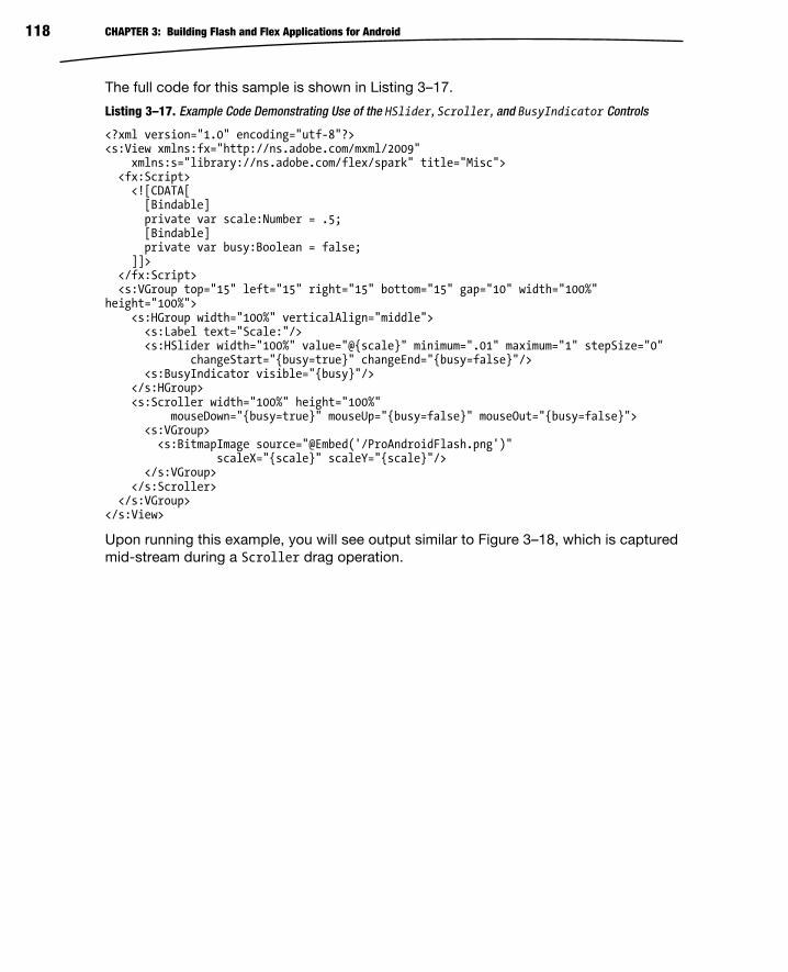
CHAPTER 3: Building Flash and Flex Applications for Android 118
The full code for this sample is shown in Listing 3–17.
Listing 3–17. Example Code Demonstrating Use of the HSlider, Scroller, and BusyIndicator Controls
<?xml version="1.0" encoding="utf-8"?> <s:View xmlns:fx="http://ns.adobe.com/mxml/2009" xmlns:s="library://ns.adobe.com/flex/spark" title="Misc"> <fx:Script> <![CDATA[ [Bindable] private var scale:Number = .5; [Bindable] private var busy:Boolean = false; ]]> </fx:Script> <s:VGroup top="15" left="15" right="15" bottom="15" gap="10" width="100%" height="100%"> <s:HGroup width="100%" verticalAlign="middle"> <s:Label text="Scale:"/> <s:HSlider width="100%" value="@{scale}" minimum=".01" maximum="1" stepSize="0" changeStart="{busy=true}" changeEnd="{busy=false}"/> <s:BusyIndicator visible="{busy}"/> </s:HGroup> <s:Scroller width="100%" height="100%" mouseDown="{busy=true}" mouseUp="{busy=false}" mouseOut="{busy=false}"> <s:VGroup> <s:BitmapImage source="@Embed('/ProAndroidFlash.png')" scaleX="{scale}" scaleY="{scale}"/> </s:VGroup> </s:Scroller> </s:VGroup> </s:View>
Upon running this example, you will see output similar to Figure 3–18, which is captured
mid-stream during a Scroller drag operation.

CHAPTER 3: Building Flash and Flex Applications for Android 119
Figure 3–18. Scroller example captured during a pan operation
Try manipulating the controls to zoom and pan the image, and feel free to replace the
image in this example with one of your choosing.
After reading the past few sections on all the available controls and experimenting with
the samples, you now have a very good understanding of the UI capabilities of the Flex
toolkit.
Summary This chapter was a detailed examination of the anatomy of mobile Flex applications.
Armed with this knowledge, you should now be able to begin writing your own mobile
applications. The following topics are now part of your development arsenal:
CHAPTER 3: Building Flash and Flex Applications for Android 120
The TabbedViewNavigatorApplication and ViewNavigatorApplication
application containers and when to use one or the other
The relationship between the ViewNavigator and Views
How to specify the animated transitions between Views
How to pass data back and forth between Views
The proper methods to use when persisting application state between
runs
Which controls are optimized for mobile applications
How to use text controls to display output and collection input from
the user
How to control Android’s soft keyboard
Some tricks and tips for using and styling mobile Button controls
How to use IconItemRenderers to display rich content in your List
controls
How to use sliders to enter values within a range
The use of Scrollers to pan around in content that is larger than the
constrained screen of mobile devices
How to use a BusyIndicator to inform the user of an operation in
progress
You now know how to create mobile applications. In the next chapter, we’ll show you
how to add some pizzazz with graphics, animation, and charts!
121
Chapter
Graphics and Animation Graphics are a fun "crowd pleaser” for people of all ages. If you enjoy graphics as much
as we do, you’ll be glad to discover that the Flex-based graphics code samples that
work on a desktop browser will also work on a mobile device. In addition, you can take
advantage of touch-related events and gestures (which were discussed in Chapter 2)
when you create graphics-based applications for mobile devices.
The first part of this chapter shows you how to render various two-dimensional shapes,
such as rectangles, ellipses, Bezier curves, and paths. The second part of this chapter
contains a code sample of rendering geometric objects with linear gradients and radial
gradients. The third part of this chapter provides a code sample that illustrates how to
use filter effects, including Blur, DropShadow, and Glow.
You will also see mobile code samples that illustrate how to perform transformations
(translating, scaling, rotating, and shearing) on graphics shapes that are discussed in the
first part of this chapter. Next you’ll learn how to render charts and graphs (which use
MX components), followed by the final example in this chapter, which shows you how to
create a sketching program that ties together various graphics-related notions
introduced earlier in the chapter. This sketching program also includes touch events, the
ability to sketch on top of a JPG file, and a save option that enables you to save your
sketches as a JPG on a mobile device.
After you have read this chapter, you’ll have a good sense of the graphics-related
capabilities for mobile devices, and perhaps some of the code samples in this chapter
will inspire you to write your own esthetically pleasing graphics code!
Using Spark Primitives for 2D Shapes The mobile code samples in this section illustrate how to render various 2D shapes,
such as rectangles, ellipses, Bezier curves, polygons, and paths. In addition, some of
the code samples contain multiple graphics images with various shading techniques,
which will enable you to make a side-by-side comparison of the code for the graphics
images.
4
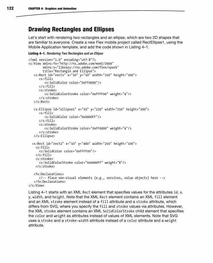
CHAPTER 4: Graphics and Animation 122
Drawing Rectangles and Ellipses Let’s start with rendering two rectangles and an ellipse, which are two 2D shapes that
are familiar to everyone. Create a new Flex mobile project called RectEllipse1, using the
Mobile Application template, and add the code shown in Listing 4–1.
Listing 4–1. Rendering Two Rectangles and an Ellipse
<?xml version="1.0" encoding="utf-8"?> <s:View xmlns:fx="http://ns.adobe.com/mxml/2009" xmlns:s="library://ns.adobe.com/flex/spark" title="Rectangle and Ellipse"> <s:Rect id="rect1" x="10" y="10" width="250" height="200"> <s:fill> <s:SolidColor color="0xFF0000"/> </s:fill> <s:stroke> <s:SolidColorStroke color="0xFFFF00" weight="4"/> </s:stroke> </s:Rect> <s:Ellipse id="ellipse1" x="10" y="220" width="250" height="200"> <s:fill> <s:SolidColor color="0x0000FF"/> </s:fill> <s:stroke> <s:SolidColorStroke color="0xFF0000" weight="4"/> </s:stroke> </s:Ellipse> <s:Rect id="rect2" x="10" y="460" width="250" height="100"> <s:fill> <s:SolidColor color="0xFFFF00"/> </s:fill> <s:stroke> <s:SolidColorStroke color="0x0000FF" weight="8"/> </s:stroke> <fx:Declarations> <!-- Place non-visual elements (e.g., services, value objects) here --> </fx:Declarations> </s:View>
Listing 4–1 starts with an XML Rect element that specifies values for the attributes id, x,
y, width, and height. Note that the XML Rect element contains an XML fill element
and an XML stroke element instead of a fill attribute and a stroke attribute, which
differs from SVG, where you specify the fill and stroke values via attributes. However,
the XML stroke element contains an XML SolidColorStroke child element that specifies
the color and weight as attributes instead of values of XML elements. Note that SVG
uses a stroke and a stroke-width attribute instead of a color attribute and a weight
attribute.

CHAPTER 4: Graphics and Animation 123
Listing 4–1 also contains an XML Ellipse element that defines an ellipse, with almost
identical attributes and values for attributes as the XML Rect element, but the generated
output is an ellipse instead of a rectangle.
The second XML Rect element is similar to the first Rect element, but with different
colors and a different position on the screen.
Figure 4–1 displays the two rectangles and the ellipse.
Figure 4–1. Two rectangles and an ellipse
Using Linear and Radial Gradients Flex mobile applications support linear gradients as well as radial gradients. As the
name implies, a linear gradient calculates intermediate colors in a linear fashion between
the start color and the end color. For instance, if a linear gradient varies from black to

CHAPTER 4: Graphics and Animation 124
red, then the initial color is black and the final color is red, with a linear “transition” of the
shades of the colors “between” black and red.
A radial gradient differs from a linear gradient in that the transition occurs in a radial
fashion. Think of a pebble dropped in a pond, and watch the ripple-like effect of the
circles of increasing radius, and that gives you a sense of how radial gradients are
rendered.
As an illustration, the following mobile code renders a rectangle with a linear gradient
and an ellipse with a radial gradient. Create a new Flex mobile project called
LinearRadial1, using the Mobile Application template, and add the code shown in
Listing 4–2.
Listing 4–2. Using Linear Gradients and Radial Gradients
<?xml version="1.0" encoding="utf-8"?> <s:View xmlns:fx="http://ns.adobe.com/mxml/2009" xmlns:s="library://ns.adobe.com/flex/spark" xmlns:mx="library://ns.adobe.com/flex/mx" title="Linear and Radial Gradients"> <s:Panel title="Linear and Radial Gradients"> <s:Group> <s:Rect id="rect1" x="10" y="10" height="250" width="300"> <s:fill> <s:LinearGradient> <s:GradientEntry color="0xFF0000" ratio="0" alpha=".5"/> <s:GradientEntry color="0xFFFF00" ratio=".33" alpha=".5"/> <s:GradientEntry color="0x0000FF" ratio=".66" alpha=".5"/> </s:LinearGradient> </s:fill> <s:stroke> <s:SolidColorStroke color="0x000000" weight="2"/> </s:stroke> </s:Rect> <s:Ellipse id="ellipse1" x="10" y="270" height="300" width="250"> <s:fill> <s:RadialGradient> <s:GradientEntry color="0xFF0000" ratio="0" alpha="1"/> <s:GradientEntry color="0xFFFF00" ratio=".9" alpha="1"/> </s:RadialGradient> </s:fill> <s:stroke> <s:SolidColorStroke color="0x000000" weight="2"/> </s:stroke> </s:Ellipse> </s:Group>

CHAPTER 4: Graphics and Animation 125
</s:Panel> <fx:Declarations> <!-- Place non-visual elements (e.g., services, value objects) here --> </fx:Declarations> </s:View>
Listing 4–2 contains one XML Panel element that contains one XML Group element
whose attributes specify the layout of the panel. The XML Group element contains two
XML child elements: an XML Rect element and an XML Ellipse element. The XML Rect
element defines a rectangle with a linear gradient, as shown here:
<s:Rect id="rect1" x="10" y="10" height="100" width="200"> <s:fill> <s:LinearGradient> <s:GradientEntry color="0xFF0000" ratio="0" alpha=".5"/> <s:GradientEntry color="0xFFFF00" ratio=".33" alpha=".5"/> <s:GradientEntry color="0x0000FF" ratio=".66" alpha=".5"/> </s:LinearGradient> </s:fill> <s:stroke> <s:SolidColorStroke color="0x000000" weight="2"/> </s:stroke> </s:Rect>
The preceding XML Rect element specifies values for the attributes id, x, y, width, and
height. Next, the XML Rect element contains an XML fill element (as you saw in the
previous example) that in turn contains an XML LinearGradient element that specifies
three XML GradientEntry elements, each of which specifies a decimal value (between 0
and 1) for the ratio and alpha attributes. The last section of the XML Rect element
contains an XML stroke element, which contains an XML SolidColorStroke element
that specifies values for the attributes color and weight.
Listing 4–2 also contains an XML Ellipse element that defines an ellipse with a radial
gradient. This code contains almost the same attributes and values as the XML Rect
element, except that it represents an ellipse instead of a rectangle.
Figure 4–2 displays a rectangle with a linear gradient and an ellipse with a radial
gradient.

CHAPTER 4: Graphics and Animation 126
Figure 4–2. A rectangle with a linear gradient and an ellipse with a radial gradient
Rendering Cubic Bezier Curves Flex supports cubic Bezier curves (which have two endpoints and two control points)
and quadratic Bezier curves (which have two endpoints and only one control point). You
can easily identify a cubic Bezier curve because it starts with the letter “C” (or “c”), and a
quadratic Bezier curve starts with the letter “Q” (or “q”). The uppercase letters “C” and
“Q” specify an “absolute” location, whereas the lowercase letters “c” and “q” specify a
position that is relative to the preceding point in the XML Path element.
The first point listed in the points for a cubic or quadratic Bezier curve is the first control
point, followed by another control point in the case of cubic Bezier curves, and then the
second endpoint. The first endpoint in quadratic and cubic Bezier curves is the

CHAPTER 4: Graphics and Animation 127
preceding point that is specified in the XML Path element; if no point is specified, then
the origin (0,0) is used as the first endpoint.
You can also specify a sequence of Bezier curves using the letter “S” (for a cubic Bezier
curve) or the letter “T” (for a quadratic Bezier curve).
Create a new Flex mobile project called BezierCurves1, using the Mobile Application
template, and add the code shown in Listing 4–3, which displays the code for four
Bezier curves: one cubic Bezier curve, one quadratic Bezier curve, two combined cubic
Bezier curves, and a combined cubic and quadratic Bezier curve.
Listing 4–3. Rendering Cubic and Quadratic Bezier Curves
<?xml version="1.0" encoding="utf-8"?> <s:View xmlns:fx="http://ns.adobe.com/mxml/2009" xmlns:s="library://ns.adobe.com/flex/spark" title="Cubic and Quadratic Bezier Curves"> <s:Panel width="500" height="500" title="Cubic and Quadratic Bezier Curves"> <!-- cubic Bezier curve --> <s:Path data="C 100 150 200 20 300 100"> <s:fill> <s:LinearGradient rotation="90"> <s:GradientEntry color="#FFFFFF" alpha="0.5"/> <s:GradientEntry color="#FF0000" alpha="0.5"/> </s:LinearGradient> </s:fill> <s:stroke> <s:SolidColorStroke color="0x0000FF" weight="4"/> </s:stroke> </s:Path> <!-- quadratic Bezier curve --> <s:Path data="Q 250 200 100 300"> <s:fill> <s:RadialGradient rotation="90"> <s:GradientEntry color="#000000" alpha="0.8"/> <s:GradientEntry color="#0000FF" alpha="0.8"/> </s:RadialGradient> </s:fill>
<s:stroke> <s:SolidColorStroke color="0xFF0000" weight="8"/> </s:stroke> </s:Path> <!-- two combined cubic Bezier curves --> <s:Path data="C 100 300 200 20 300 100 S 250 200 300 250"> <s:fill> <s:LinearGradient rotation="90"> <s:GradientEntry color="#FF0000" alpha="0.5"/> <s:GradientEntry color="#FFFF00" alpha="0.5"/> </s:LinearGradient> </s:fill>
<s:stroke>

CHAPTER 4: Graphics and Animation 128
<s:SolidColorStroke color="0x00FF00" weight="2"/> </s:stroke> </s:Path> <!-- two combined cubic and quadratic Bezier curves --> <s:Path data="C 250 400 200 150 350 100 T 250 250 400 280"> <s:fill> <s:LinearGradient rotation="90"> <s:GradientEntry color="#FFFF00" alpha="0.5"/> <s:GradientEntry color="#FF0000" alpha="0.5"/> </s:LinearGradient> </s:fill> <s:stroke> <s:SolidColorStroke color="0x000000" weight="4"/> </s:stroke> </s:Path> </s:Panel> </s:View>
Listing 4–3 contains an XML Panel element, which in turn contains four XML Path
elements that specify Bezier curves with various types of shading. The first XML Path
element specifies a cubic Bezier curve, as shown here:
<s:Path data="C 100 300 200 20 300 100 S 250 200 300 250"> [other elements omitted] </s:Path>
The first endpoint for this cubic Bezier curve is (0,0) because no point is specified; the
control points are (100,300) and (200,20); and the destination endpoint is (300,100).
This XML Path element contains an XML LinearGradient element that varies from white
to red, with an opacity of 0.5, followed by a blue stroke of width 4, as shown here:
<s:LinearGradient rotation="90"> <s:GradientEntry color="#FFFFFF" alpha="0.5"/> <s:GradientEntry color="#FF0000" alpha="0.5"/> </s:LinearGradient> </s:fill> <s:stroke> <s:SolidColorStroke color="0x0000FF" weight="4"/> </s:stroke>
The second XML Path element specifies a quadratic Bezier curve, whose first endpoint
for this cubic Bezier curve is (0,0) because no point is specified; the single control point
for this quadratic Bezier curve is (250,200); and the destination endpoint is (100,300).
This XML Path element contains an XML LinearGradient element that varies from black
to blue, with an opacity of 0.8.
The third XML Path element specifies a cubic Bezier curve that is “concatenated” with a
second cubic Bezier curve, as shown here:
<s:Path data="C 100 300 200 20 300 100 S 250 200 300 250"> [other elements omitted] </s:Path>

CHAPTER 4: Graphics and Animation 129
The two control points for this cubic Bezier curve are (100,300) and (20,300), and the
destination endpoint is (300,100). The second part of this XML Path element specifies a
quadratic Bezier curve whose control point is (250,200) and whose target endpoint is
(300,250).
This XML Path element contains an XML LinearGradient element that specifies a linear
gradient that varies from yellow to red, followed by an XML stroke element that
specifies the color black and a line width of 4 units.
The final XML Path element specifies a cubic Bezier curve, followed by a second cubic
Bezier curve, as shown here:
<s:Path data="C 250 300 200 150 350 100 T 250 250 400 280"> [other elements omitted] </s:Path>
The control points for this cubic Bezier curve are (250,300) and (200,150), and the
destination endpoint is (350,100). The second part of this XML Path element specifies a
quadratic Bezier curve whose control point is (250,250) and whose target endpoint is
(400,280).
This XML Path element contains an XML LinearGradient element that specifies a linear
gradient that varies from yellow to red, with an opacity of 0.5, followed by an XML
stroke element that specifies the color black and a line width of 4 units.
Figure 4–3 displays the cubic, quadratic, and combined Bezier curves.
Figure 4–3. Cubic, quadratic, and combined Bezier curves

CHAPTER 4: Graphics and Animation 130
Another Path Element Example In the previous example, you saw how to use the Path element in order to render a set of
Bezier curves. The Path element enables you to combine other 2D shapes as well, such
as line segments and Bezier curves with linear gradients and radial gradients. Create a
new Flex mobile project called Path1, using the Mobile Application template, and add
the code shown in Listing 4–4.
Listing 4–4. Combining Line Segments and Bezier Curves
<?xml version="1.0" encoding="utf-8"?> <s:View xmlns:fx="http://ns.adobe.com/mxml/2009" xmlns:s="library://ns.adobe.com/flex/spark" title="Path-based Lines and Bezier Curves"> <s:Panel width="500" height="500" title=”Path-based Lines and Bezier Curves”> <s:Path data="M 50 50 L150 50 350 150 50 150z C 250 300 200 150 350 100 T 250 250 400 500"> <s:fill> <s:LinearGradient rotation="90"> <s:GradientEntry color="#FF0000" alpha="1"/> <s:GradientEntry color="#0000FF" alpha="1"/> </s:LinearGradient> </s:fill> <s:stroke> <s:SolidColorStroke color="0x000000" weight="8"/> </s:stroke> </s:Path> </s:Panel> </s:View>
The XML Panel element in Listing 4–4 contains one XML Path element that uses line
segments to render a trapezoid, followed by a pair of cubic Bezier curves. The data
attribute of the XML Path element is shown here:
<s:Path data="M 50 50 L150 50 350 150 50 150z C 250 300 200 150 350 100 T 250 250 400 280">
The first portion of the data attribute (which starts with the letter M) specifies a trapezoid;
the second portion of the data attribute (which starts with the letter C) renders a cubic
Bezier curve; the third portion of the data attribute (which starts with the letter T)
specifies another cubic Bezier curve.
Figure 4–4 displays a trapezoid and two cubic Bezier curves.

CHAPTER 4: Graphics and Animation 131
Figure 4–4. A path-based trapezoid and Bezier curves
Using Spark Filters Flex filter effects are useful for creating rich visual effects in Flex-based applications,
and these effects can really enhance the appeal of your applications. Spark primitives
support a variety of filters, including Blur filter, a DropShadow filter, and a Glow filter, all of
which belong to the spark.filters package.
Create a new Flex mobile project called RectLGradFilters3, using the Mobile Application
template, and add the code shown in Listing 4–5.

CHAPTER 4: Graphics and Animation 132
Listing 4–5. Drawing Rectangles with Spark Filters
<?xml version="1.0" encoding="utf-8"?> <s:View xmlns:fx="http://ns.adobe.com/mxml/2009" xmlns:s="library://ns.adobe.com/flex/spark" title="Rectangle: Gradient and Filters"> <s:Rect id="rect1" x="50" y="50" height="300" width="250"> <s:fill> <s:LinearGradient> <s:GradientEntry color="0xFF0000" ratio="0" alpha=".5"/> <s:GradientEntry color="0xFFFF00" ratio=".33" alpha=".5"/> <s:GradientEntry color="0x0000FF" ratio=".66" alpha=".5"/> </s:LinearGradient> </s:fill> <s:stroke> <s:SolidColorStroke color="0xFF0000" weight="2"/> </s:stroke> <s:filters> <s:DropShadowFilter distance="80" color="#0000FF"/> <s:BlurFilter/> <s:GlowFilter/> </s:filters> </s:Rect> </s:View>
Listing 4–5 contains an XML Rect element that defines a rectangle that is rendered with
a linear gradient. The ratio attribute is a decimal number between 0 and 1 that specifies
the fraction of the distance from the start point to the destination point for the color
transition. In Listing 4–5, the first GradientEntry element has a ratio attribute whose
value is 0, which means that the rectangle is rendered with the color 0xFF0000
(hexadecimal value for red). The second GradientEntry element has a ratio attribute
whose value is 0.33, which means that the rectangle is rendered with the color 0xFFFF00
(hexadecimal value for yellow) from the location that is 33% of the way from the initial
location to the destination. The third GradientEntry element has a ratio attribute whose
value is 0.66, and therefore the rectangle is rendered with the color 0x0000FF
(hexadecimal value for blue) from the location that is 66% of the way from the initial
location to the destination.
The alpha attribute is the opacity, which is a decimal number between 0 (invisible) and 1
(fully visible). The three GradientEntry elements in Listing 4–5 have an alpha attribute of
0.5, so the rectangle is partially visible. Experiment with different values for the ratio
attribute and the alpha attribute so that you can find the combinations that create
pleasing visual effects.
The last portion of the XML Rect element contains an XML stroke element that specifies
the color red and a stroke width of 2, followed by three Spark filters, as shown here:
<s:filters> <s:DropShadowFilter distance="80" color="#0000FF"/> <s:BlurFilter/> <s:GlowFilter/>

CHAPTER 4: Graphics and Animation 133
</s:filters>
The three Spark filters in this example have intuitive names that suggest the effects that
you can create when you include them in your code. The first Spark filter is a
DropShadowFilter that adds a “drop shadow” to the XML Rect element. The second
Spark filter is a BlurFilter, which adds a blurring effect. The third and final Spark filter is
a GlowFilter, which creates a glow filter effect.
Figure 4–5 displays a rectangle with a linear gradient and three Spark filters.
Figure 4–5. A rectangle with a linear gradient and three Spark filters
Applying Transformations to Geometric Shapes This section of the chapter shows how to apply transformations to geometric objects,
including those that were discussed in the previous part of this chapter. The Spark
primitives support the following effects and transformations:
Animate
AnimateColor
AnimateFilter
AnimateShaderTransition
AnimateTransform

CHAPTER 4: Graphics and Animation 134
Fade
Move
Resize
Rotate
Scale
Wipe
CrossFade
These Spark primitives are in the spark.effects package, and they can be applied to
Spark components as well as MX components; the mx.effects package (which is
included in the Flex 4 SDK) contains the corresponding functionality that can be applied
to MX components.
The following sub-section contains a Flex code sample that illustrates how to create a
scaling effect in Flex.
Creating Scaled Effects Scaled effects (i.e., expanding or contracting a shape) can be useful for game-oriented
applications, and they are very easy to create in Flex-based applications. Create a new
Flex mobile project called ScaleEffect1, using the Mobile Application template, and add
the code shown in Listing 4–6.
Listing 4–6. Creating Scaled Effects with Linear Gradients
<?xml version="1.0" encoding="utf-8"?> <s:View xmlns:fx="http://ns.adobe.com/mxml/2009" xmlns:s="library://ns.adobe.com/flex/spark" title="Scale Effect"> <fx:Library> <fx:Definition name="MyRect1"> <s:Rect x="50" y="50" height="40" width="20"> <s:fill> <s:LinearGradient> <s:GradientEntry color="0xFF0000" ratio="0" alpha=".5"/> <s:GradientEntry color="0xFFFF00" ratio=".33" alpha=".5"/> <s:GradientEntry color="0x0000FF" ratio=".66" alpha=".5"/> </s:LinearGradient> </s:fill> <s:stroke> <s:SolidColorStroke color="0xFF0000" weight="1"/> </s:stroke> <s:filters> <s:BlurFilter/> <s:GlowFilter/> </s:filters>

CHAPTER 4: Graphics and Animation 135
</s:Rect> </fx:Definition> <fx:Definition name="MyEllipse1"> <s:Ellipse x="200" y="200" height="40" width="80"> <s:fill> <s:LinearGradient> <s:GradientEntry color="0xFF0000" ratio="0" alpha=".5"/> <s:GradientEntry color="0xFFFF00" ratio=".33" alpha=".5"/> <s:GradientEntry color="0x0000FF" ratio=".66" alpha=".5"/> </s:LinearGradient> </s:fill> <s:stroke> <s:SolidColorStroke color="0xFF0000" weight="1"/> </s:stroke> <s:filters> <s:DropShadowFilter distance="20" color="#FF0000"/> </s:filters> </s:Ellipse> </fx:Definition> </fx:Library> <s:Group> <fx:MyRect1 scaleX="6" scaleY="4"/> <fx:MyEllipse1 scaleX="3" scaleY="8"/> <fx:MyRect1 scaleX="2" scaleY="2"/> <fx:MyEllipse1 scaleX="2" scaleY="2"/> </s:Group> </s:View>
Listing 4–6 contains an XML Definition element that specifies an XML Rect element
with the definition for a rectangle, and another XML Definition element that specifies an
XML Ellipse element with the definition of an ellipse. The XML Group element contains
two references to the rectangle and two references to the ellipse, as shown here:
<s:Group> <fx:MyRect1 scaleX="6" scaleY="4"/> <fx:MyEllipse1 scaleX="3" scaleY="8"/> <fx:MyRect1 scaleX="2" scaleY="2"/> <fx:MyEllipse1 scaleX="2" scaleY="2"/> </s:Group>
The first XML element scales the previously defined rectangle by specifying values of 6
and 3 for the attributes scaleX and scaleY. The second XML element scales the
previously defined rectangle by specifying values of 3 and 8 for the attributes scaleX and
scaleY.
Figure 4–6 displays two scaled rectangles and two scaled ellipses.

CHAPTER 4: Graphics and Animation 136
Figure 4–6. Two scaled rectangles and ellipses
Creating Animation Effects in Spark This section contains mobile code that shows how to apply animation effects on
geometric objects, including those that were discussed in the previous part of this
chapter. The Spark primitives for animation effects are here:
Animate
AnimateColor
AnimateFilter
AnimateShaderTransition
AnimateTransform
CrossFade
Fade

CHAPTER 4: Graphics and Animation 137
Move
Resize
Rotate
Scale
Wipe
The following sections provide mobile code samples that illustrate how to use the XML
Animate element and how to define animation effects in parallel and in sequence.
Using the Animate Element Animation effects are obviously very popular for game-oriented applications, and they
can also be used effectively in other types of applications. At the same time, keep in
mind that it’s probably a good idea to use animation effects sparingly in business-
focused applications.
Create a new Flex mobile project called AnimPropertyWidth, using the Mobile
Application template, and add the code shown in Listing 4–7.
Listing 4–7. Animating the Width of a Rectangle
<?xml version="1.0" encoding="utf-8"?> <s:View xmlns:fx="http://ns.adobe.com/mxml/2009" xmlns:s="library://ns.adobe.com/flex/spark" title="Animate Rectangle Width">
<fx:Declarations> <s:Animate id="MyAnimate1"> <s:motionPaths> <s:MotionPath property="width"> <s:keyframes> <s:Keyframe time="0" value="200"/> <s:Keyframe time="2000" value="400"/> </s:keyframes> </s:MotionPath> </s:motionPaths> </s:Animate> </fx:Declarations> <s:VGroup> <s:Rect id="rect1" x="10" y="50" height="300" width="200"> <s:fill> <s:LinearGradient> <s:GradientEntry color="0xFF0000" ratio="0" alpha=".5"/> <s:GradientEntry color="0xFFFF00" ratio=".33" alpha=".5"/> <s:GradientEntry color="0x0000FF" ratio=".66" alpha=".5"/> </s:LinearGradient> </s:fill> <s:stroke>
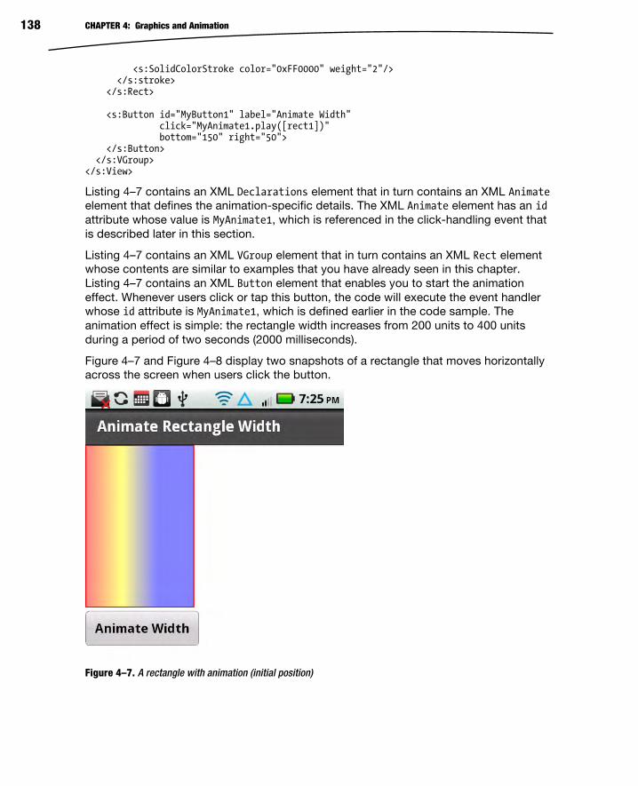
CHAPTER 4: Graphics and Animation 138
<s:SolidColorStroke color="0xFF0000" weight="2"/> </s:stroke> </s:Rect> <s:Button id="MyButton1" label="Animate Width" click="MyAnimate1.play([rect1])" bottom="150" right="50"> </s:Button> </s:VGroup> </s:View>
Listing 4–7 contains an XML Declarations element that in turn contains an XML Animate
element that defines the animation-specific details. The XML Animate element has an id
attribute whose value is MyAnimate1, which is referenced in the click-handling event that
is described later in this section.
Listing 4–7 contains an XML VGroup element that in turn contains an XML Rect element
whose contents are similar to examples that you have already seen in this chapter.
Listing 4–7 contains an XML Button element that enables you to start the animation
effect. Whenever users click or tap this button, the code will execute the event handler
whose id attribute is MyAnimate1, which is defined earlier in the code sample. The
animation effect is simple: the rectangle width increases from 200 units to 400 units
during a period of two seconds (2000 milliseconds).
Figure 4–7 and Figure 4–8 display two snapshots of a rectangle that moves horizontally
across the screen when users click the button.
Figure 4–7. A rectangle with animation (initial position)

CHAPTER 4: Graphics and Animation 139
Figure 4–8. A rectangle with animation (final position)
Animation: Parallel and Sequence Flex supports two categories of animation effects. Parallel animation effects involve two
or more animation effects that occur at the same time. On the other hand, sequential
animation effects involve two or more animation effects that occur in sequence, which
means that only one animation effect takes place at any given time. With this in mind,
create a new Flex mobile project called SequentialAnimation1, using the Mobile
Application template, and add the code shown in Listing 4–8.
Listing 4–8. Creating Sequential Animation Effects
<?xml version="1.0" encoding="utf-8"?> <s:View xmlns:fx="http://ns.adobe.com/mxml/2009" xmlns:s="library://ns.adobe.com/flex/spark" title="Sequential Animation"> <fx:Declarations> <s:Sequence id="transformer1" target="{button1}"> <s:Move xFrom="50" xTo="150" autoCenterTransform="true"/> <s:Rotate angleFrom="0" angleTo="360" autoCenterTransform="true"/> <s:Scale scaleXFrom="1" scaleXTo="2" autoCenterTransform="true"/> </s:Sequence> <s:Sequence id="transformer2" target="{button2}"> <s:Move xFrom="50" xTo="150"

CHAPTER 4: Graphics and Animation 140
autoCenterTransform="true"/> <s:Scale scaleXFrom="1" scaleXTo="2" autoCenterTransform="true"/> <s:Rotate angleFrom="0" angleTo="720" autoCenterTransform="true"/> </s:Sequence> </fx:Declarations> <s:Rect id="rect1" x="10" y="10" width="400" height="400"> <s:fill> <s:SolidColor color="0xFF0000"/> </s:fill> <s:stroke> <s:SolidColorStroke color="0x0000FF" weight="4"/> </s:stroke> </s:Rect> <s:Button id="button1" x="50" y="100" label="Transform Me" click="transformer1.play()"/> <s:Button id="button2" x="50" y="200" label="Transform Me Too" click="transformer2.play()"/> </s:View>
Listing 4–8 contains an XML Declarations element, which in turn contains two XML
Sequence elements that specify three transformation effects. The animation effect starts
with the XML Move element (which provides a translation effect), followed by the XML
Rotate element (which provides a rotation effect), and finally the XML Scale element
(which provides a scaling effect). When users tap the first XML Button element, this will
invoke the animation effects that are defined in the XML Sequence element whose id
attribute has the value transformer1.
Similar comments apply to the second XML Sequence element and the second button,
except that the animation effect involves two full rotations instead of one rotation.
Note that you can easily change the animation effect from sequential to parallel by
replacing the XML Sequence element with an XML Parallel element, as shown here:
<s:Parallel id="transformer" target="{button}"> <s:Move xFrom="50" xTo="150" autoCenterTransform="true"/> <s:Rotate angleFrom="0" angleTo="360" autoCenterTransform="true"/> <s:Scale scaleXFrom="1" scaleXTo="2" autoCenterTransform="true"/> </s:Parallel>
Figure 4–9 and Figure 4–10 display two buttons that undergo animation effects in a
sequential fashion. Since the screenshots capture only the initial and final animation
effects, launch this mobile application on a mobile device so that you can also see the
sliding effect and the rotation effect.

CHAPTER 4: Graphics and Animation 141
Figure 4–9. A button with sequential animation (initial)
Figure 4–10. A button with sequential animation (later)

CHAPTER 4: Graphics and Animation 142
Creating 3D Effects Flex supports several 3D effects, including moving, rotating, and scaling a JPG file. The
3D “move” effect involves moving a JPG image as well as decreasing the size of the
image, whereas a 3D scaling effect involves increasing (or decreasing) the width and
height of a JPG image from a start value (typically 1) to a final value (which can be bigger
or smaller than 1). A 3D “rotate” effect involves rotating a JPG image so that it appears
to be rotating in three dimensions.
The following code sample in Listing 4.9 shows you how to create 3D effects for moving,
rotating, and scaling a JPG file in a mobile-based application.
Figure 4–11 displays the JPG image Cassandra4.jpg of Cassandra Chin (Stephen Chin’s
daughter), which is used in the code samples that illustrate these three 3D animation
effects.
Figure 4–11. A JPG for 3D effects
Listing 4–9. Creating 3D Animation Effects
<?xml version="1.0" encoding="utf-8"?> <s:View xmlns:fx="http://ns.adobe.com/mxml/2009" xmlns:s="library://ns.adobe.com/flex/spark" title="Creating 3D Effects"> <fx:Declarations> <s:Move3D id="moveEffect" target="{targetImg}" xBy="100" zBy="100"
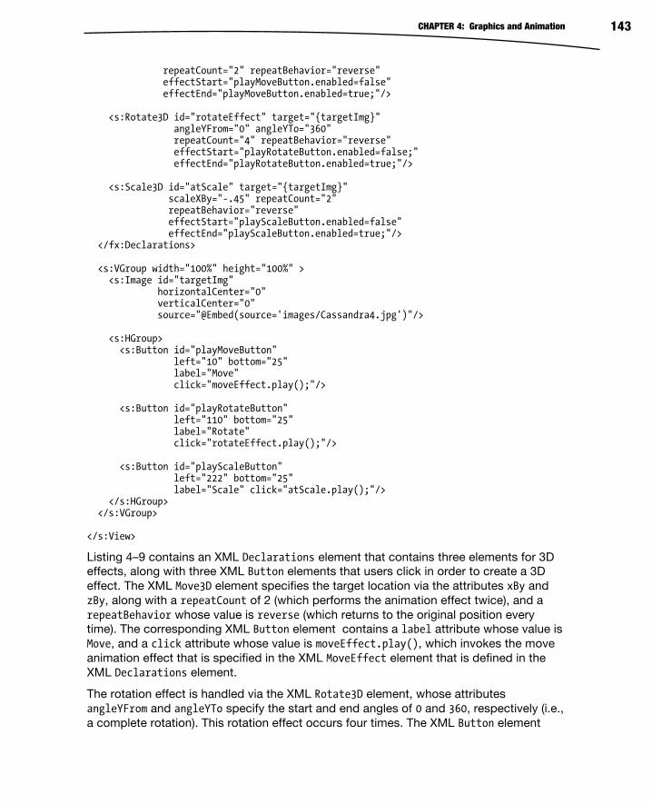
CHAPTER 4: Graphics and Animation 143
repeatCount="2" repeatBehavior="reverse" effectStart="playMoveButton.enabled=false" effectEnd="playMoveButton.enabled=true;"/> <s:Rotate3D id="rotateEffect" target="{targetImg}" angleYFrom="0" angleYTo="360" repeatCount="4" repeatBehavior="reverse" effectStart="playRotateButton.enabled=false;" effectEnd="playRotateButton.enabled=true;"/> <s:Scale3D id="atScale" target="{targetImg}" scaleXBy="-.45" repeatCount="2" repeatBehavior="reverse" effectStart="playScaleButton.enabled=false" effectEnd="playScaleButton.enabled=true;"/> </fx:Declarations> <s:VGroup width="100%" height="100%" > <s:Image id="targetImg" horizontalCenter="0" verticalCenter="0" source="@Embed(source='images/Cassandra4.jpg')"/> <s:HGroup> <s:Button id="playMoveButton" left="10" bottom="25" label="Move" click="moveEffect.play();"/> <s:Button id="playRotateButton" left="110" bottom="25" label="Rotate" click="rotateEffect.play();"/> <s:Button id="playScaleButton" left="222" bottom="25" label="Scale" click="atScale.play();"/> </s:HGroup> </s:VGroup> </s:View>
Listing 4–9 contains an XML Declarations element that contains three elements for 3D
effects, along with three XML Button elements that users click in order to create a 3D
effect. The XML Move3D element specifies the target location via the attributes xBy and
zBy, along with a repeatCount of 2 (which performs the animation effect twice), and a
repeatBehavior whose value is reverse (which returns to the original position every
time). The corresponding XML Button element contains a label attribute whose value is
Move, and a click attribute whose value is moveEffect.play(), which invokes the move
animation effect that is specified in the XML MoveEffect element that is defined in the
XML Declarations element.
The rotation effect is handled via the XML Rotate3D element, whose attributes
angleYFrom and angleYTo specify the start and end angles of 0 and 360, respectively (i.e.,
a complete rotation). This rotation effect occurs four times. The XML Button element

CHAPTER 4: Graphics and Animation 144
contains a label attribute whose value is Rotate, and a click attribute whose value is
rotateEffect.play(), which invokes the scaling animation effect that is specified in the
XML Rotate3D element that is defined in the XML Declarations element.
The scale effect (which is the third and final effect) is handled via the XML Scale3D
element, which contains several attributes whose values specify the details of the
animation behavior of the same JPG image. The id attribute has a value of atScale,
which serves to reference this element elsewhere in the code. The target attribute
references the XML element whose id has the value targetImg, which references the
JPG image. The scaleXBy attribute has the value -0.25, which shrinks the JPG image by
a factor of 25%. The repeatCount attribute has the value 4, and the repeatBehavior
attribute has the value reverse, which means that the animation effect occurs four
times, alternating back and forth from left to right. The other two attributes are
effectStart and effectEnd, which specify the behavior at the beginning and the end of
the animation, which in this case is to disable and then enable the playButton.
Note that the XML Image element specifies the location of Cassandra4.jpg, which is in
the images subfolder of the top-level directory for this mobile project. For layout
purposes, the XML Image element is specified inside an XML VGroup element, which also
contains an XML HGroup element that contains the three XML Button elements.
Figure 4–12 displays a JPG after having undergone a 3D “move” effect.
Figure 4–12. A JPG after a 3D move effect

CHAPTER 4: Graphics and Animation 145
Figure 4–13 displays a JPG after having undergone a 3D “rotate” effect.
Figure 4–13. A JPG after a 3D rotate effect
Figure 4–14 displays a JPG after having undergone a 3D “scale” effect.
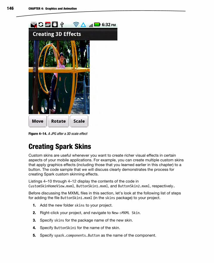
CHAPTER 4: Graphics and Animation 146
Figure 4–14. A JPG after a 3D scale effect
Creating Spark Skins Custom skins are useful whenever you want to create richer visual effects in certain
aspects of your mobile applications. For example, you can create multiple custom skins
that apply graphics effects (including those that you learned earlier in this chapter) to a
button. The code sample that we will discuss clearly demonstrates the process for
creating Spark custom skinning effects.
Listings 4–10 through 4–12 display the contents of the code in
CustomSkinHomeView.mxml, ButtonSkin1.mxml, and ButtonSkin2.mxml, respectively.
Before discussing the MXML files in this section, let’s look at the following list of steps
for adding the file ButtonSkin1.mxml (in the skins package) to your project.
1. Add the new folder skins to your project.
2. Right-click your project, and navigate to New->MXML Skin.
3. Specify skins for the package name of the new skin.
4. Specify ButtonSkin1 for the name of the skin.
5. Specify spark.components.Button as the name of the component.

CHAPTER 4: Graphics and Animation 147
6. Deselect the check box to the left of the label “Create as a copy of:”.
Repeat the preceding set of steps for the custom skin ButtonSkin2.mxml, and also for
any additional custom skins that you want to add to this project. Now let’s look at the
contents of CustomSkin.mxml, which are displayed in Listing 4–10
Listing 4–10. Creating Custom Spark Skins
<?xml version="1.0" encoding="utf-8"?> <s:View xmlns:fx="http://ns.adobe.com/mxml/2009" xmlns:s="library://ns.adobe.com/flex/spark" title="Custom Skins"><s:VGroup> <s:Label text="This is a Normal Button:" x="10" y="0"/> <s:Button label="Button1" x="10" y="25"/> <s:Label text="First Skinned Button:" x="10" y="60"/> <s:Button skinClass="skins.ButtonSkin1" x="10" y="85"/> <s:Label text="Second Skinned Button:" x="10" y="100"/> <s:Button skinClass="skins.ButtonSkin2" x="10" y="125"/>
<s:Label text="Third Skinned Button:" x="10" y="140"/> <s:Button skinClass="skins.ButtonSkin1" x="10" y="165"/>
<s:Label text="Fourth Skinned Button:" x="10" y="180"/> <s:Button skinClass="skins.ButtonSkin2" x="10" y="205"/> </s:VGroup> </s:View>
Listing 4–10 contains an XML VGroup element containing ten “paired” XML elements for
rendering a standard XML Label element and a standard XML Button element, the first
of which is a normal button, as shown here:
<s:Label text="This is a Normal Button:" x="10" y="0"/> <s:Button label="Button1" x="10" y="25"/>
The preceding XML elements are straightforward: the first is a label (“This is a NormalButton”), and the second renders a button.
The first pair of XML elements involving skinned buttons displays the label “FirstSkinned Button:”, and the second element in this pair renders an XML Button element
based on the contents of the Flex skin ButtonSkin1 in the package skins. Similarly, the
next pair of XML elements involving skinned buttons displays the label “Second SkinnedButton:”, and the second element in this pair renders an XML Button element based on
the contents of the Flex skin ButtonSkin2 in the package skins. Similar comments apply
to the other two custom buttons.
Now let’s look at the contents of ButtonSkin1.mxml, which contains the data for
rendering the second button (which is the first skinned button), in Listing 4–11.

CHAPTER 4: Graphics and Animation 148
Listing 4–11. Creating a Button Skin with Graphics
<s:Skin xmlns:fx="http://ns.adobe.com/mxml/2009" xmlns:s="library://ns.adobe.com/flex/spark" > <fx:Metadata> [HostComponent("spark.components.Button")] </fx:Metadata> <s:states> <s:State name="disabled" /> <s:State name="down" /> <s:State name="over" /> <s:State name="up" /> </s:states> <s:Rect id="rect1" x="0" y="0" height="40" width="100"> <s:fill> <s:LinearGradient> <s:GradientEntry color="0xFF0000" ratio="0" alpha=".5"/> <s:GradientEntry color="0xFFFF00" ratio=".33" alpha=".5"/> <s:GradientEntry color="0x0000FF" ratio=".66" alpha=".5"/> </s:LinearGradient> </s:fill> <s:stroke> <s:SolidColorStroke color="0x000000" weight="2"/> </s:stroke> </s:Rect> </s:Skin>
Listing 4–11 contains an XML Skin root node with three XML child elements that define
the behavior of the custom skin. The first child element is the XML Metadata element, as
shown here:
<fx:Metadata> [HostComponent("spark.components.Button")] </fx:Metadata>
The preceding XML element specifies the package name for the Button class, which is
also what you specified when you added the custom skin ButtonSkin1.mxml to your
project.
The second child element is the XML states element, as shown here:
<s:states> <s:State name="disabled" /> <s:State name="down" /> <s:State name="over" /> <s:State name="up" /> </s:states>
The preceding XML states element contains four child elements that correspond to a
button state and three mouse-related events, and you can include additional code if you

CHAPTER 4: Graphics and Animation 149
want to handle these states. The third child element is the XML Rect element that
specifies a linear gradient for the shading effect and a black border.
Listing 4–12. Creating a Second Button Skin
<s:Skin xmlns:fx="http://ns.adobe.com/mxml/2009" xmlns:s="library://ns.adobe.com/flex/spark" > <fx:Metadata> [HostComponent("spark.components.Button")] </fx:Metadata> <s:states> <s:State name="disabled" /> <s:State name="down" /> <s:State name="over" /> <s:State name="up" /> </s:states> <s:Path data="M 0 0 L 100 0 L 100 40 L 0 40 Z "> <s:fill> <s:SolidColor color="#FF0000" alpha="1"/> </s:fill> <s:stroke> <s:SolidColorStroke color="#0000FF" weight="4"/> </s:stroke> </s:Path> </s:Skin>
Note that the only difference between Listing 4–12 and Listing 4–11 is the XML Path
element instead of an XML Rect element.
The XML Path element is straightforward: it contains a data attribute whose value is a
set of line segments that specify a rectangle, whose color is #FF0000 (red) and whose
border is #0000FF (blue) with a width of 4.
As you can see, Flex makes it very easy to define custom skins. However, the more
complex (and more interesting) custom skins often specify the behavior of mouse events
(such as mouse-down, mouse-up, and so forth) and the corresponding touch events in
terms of state changes. You can “bind” ActionScript functions (written by you) that are
executed during those events in order to change the visual display of various aspects of
your application.
Figure 4–15 displays a standard Flex button and four buttons that use custom skins.
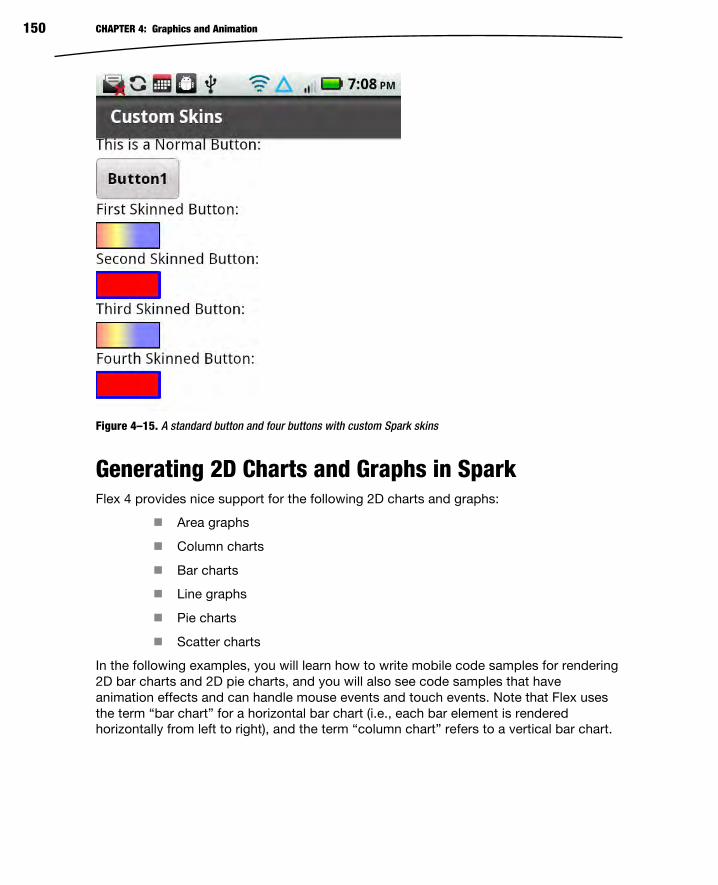
CHAPTER 4: Graphics and Animation 150
Figure 4–15. A standard button and four buttons with custom Spark skins
Generating 2D Charts and Graphs in Spark Flex 4 provides nice support for the following 2D charts and graphs:
Area graphs
Column charts
Bar charts
Line graphs
Pie charts
Scatter charts
In the following examples, you will learn how to write mobile code samples for rendering
2D bar charts and 2D pie charts, and you will also see code samples that have
animation effects and can handle mouse events and touch events. Note that Flex uses
the term “bar chart” for a horizontal bar chart (i.e., each bar element is rendered
horizontally from left to right), and the term “column chart” refers to a vertical bar chart.

CHAPTER 4: Graphics and Animation 151
Creating 2D Bar Charts Bar charts are very popular, especially in business-oriented applications, because they
enable you to easily see trends in data that might otherwise be difficult to discern from a
tabular display of data. In the upcoming example, you will learn how to create a mobile
application that reads XML-based data from an XML document and then renders that
data in a 2D bar chart. This data is for the purposes of illustration, and obviously you
would use your own real data rather than the “fictitious” data that is contained in Listing
4–12. Also keep in mind that the full source for the examples in this book is available
online from the book’s web page.
Now create a new Flex mobile project called BarChart1, using the Mobile Application
template, add a new top-level folder called chartdata, and then add a new XML
document in this folder called ChartData.xml that contains the data shown in Listing 4–
13.
Listing 4–13. Defining XML-Based Chart Data
<?xml version="1.0"?> <chartdata> <data> <month>January</month> <revenue>1500</revenue> </data> <data> <month>February</month> <revenue>1400</revenue> </data> [data omitted for brevity] <data> <month>November</month> <revenue>1900</revenue> </data> <data> <month>December</month> <revenue>1800</revenue> </data> </chartdata>
Listing 4–13 contains an XML chartdata element that contains twelve XML data
elements, each of which holds chart-related data for a single month of the year. Each
XML data element in Listing 4–13 contains an XML month element and an XML revenue
element. For example, the first XML data element specifies a revenue element with the
value 1500 and a month element whose value is January (no currency units are specified).
Now let’s look at Listing 4–14, which contains the code for rendering the bar chart using
the XML-based data in Listing 4–13.
Listing 4–14. Creating a Bar Chart
<?xml version="1.0" encoding="utf-8"?> <s:View xmlns:fx="http://ns.adobe.com/mxml/2009" xmlns:mx="library://ns.adobe.com/flex/mx" xmlns:s="library://ns.adobe.com/flex/spark"

CHAPTER 4: Graphics and Animation 152
title="Bar Chart"> <!-- XML-based chart data --> <fx:Declarations> <fx:Model id="chartModel" source="chartdata/ChartData.xml"/> <s:ArrayCollection id="chartData" source="{chartModel.data}"/> <mx:NumberFormatter id="nf" precision="1" rounding="nearest"/> </fx:Declarations> <fx:Style> @namespace s "library://ns.adobe.com/flex/spark"; @namespace mx "library://ns.adobe.com/flex/mx"; mx|ColumnChart { font-size:12; font-weight:bold; } </fx:Style> <!-- specify a column chart with appropriate attributes --> <mx:ColumnChart dataProvider="{chartData}" height="70%" width="100%"> <mx:horizontalAxis> <mx:CategoryAxis dataProvider="{chartData}" categoryField="month"/> </mx:horizontalAxis> <mx:series> <mx:ColumnSeries xField="month" yField="revenue"/> </mx:series> </mx:ColumnChart> </s:View>
Listing 4–14 defines the location of the XML document ChartData.xml in the XML Model
element, along with an ArrayCollection consisting of the XML-based data, and a simple
data formatter. Listing 4–14 contains an XML Style element that specifies values for two
CSS attributes—font-size and font-weight—with values of 12 and bold, respectively,
which are used for rendering the text in the pie chart.
The XML ColumnChart element specifies a column chart, along with appropriate values
for the attributes dataProvider, height, and weight, whose values are chartData, 75%,
and 80%, respectively. Notice that chartData is an ArrayCollection variable that is
defined in the XML Declarations element, and that chartData is populated with the data
values that are specified in the XML document ChartData.xml.
The values of the height and weight attributes are specified as a percentage of the
dimensions of the screen on which the pie chart is rendered; adjust the values of these
attributes according to the percentage of the screen that you want to occupy with the
bar chart (50% for half width or height, 25% for one-quarter width or height, and so
forth).
The XML ColumnChart element contains two important elements. First there is an XML
horizontalAxis element that specifies the month values (which are specified in
ChartData.xml) for the horizontal axis. Second, there is an XML series element that
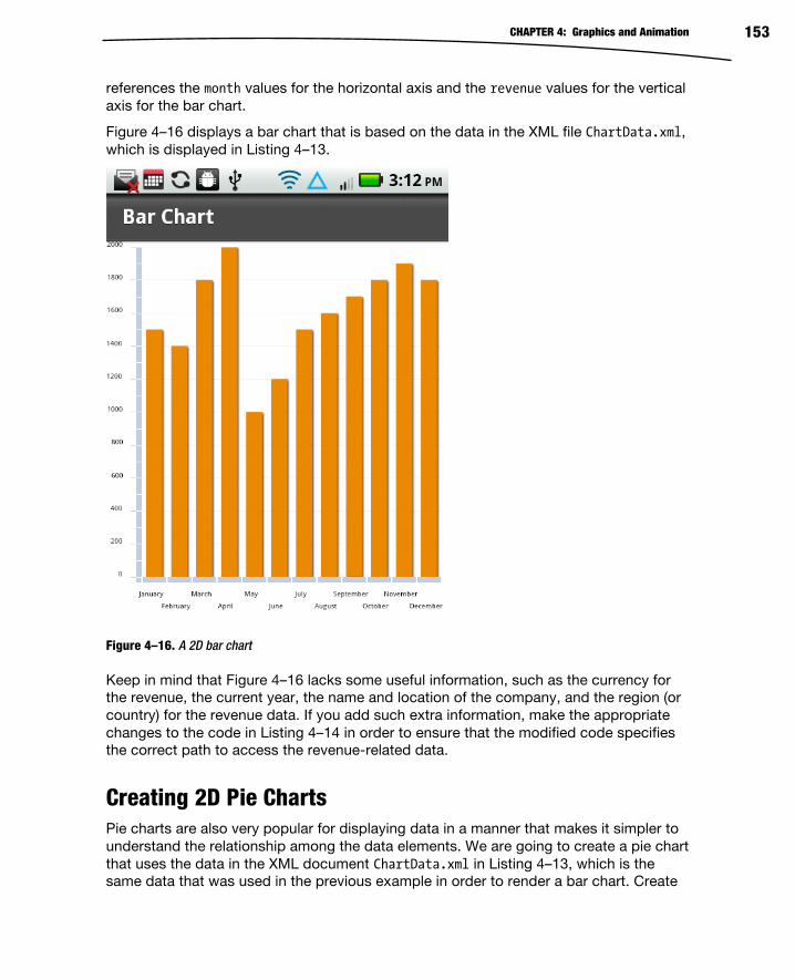
CHAPTER 4: Graphics and Animation 153
references the month values for the horizontal axis and the revenue values for the vertical
axis for the bar chart.
Figure 4–16 displays a bar chart that is based on the data in the XML file ChartData.xml,
which is displayed in Listing 4–13.
Figure 4–16. A 2D bar chart
Keep in mind that Figure 4–16 lacks some useful information, such as the currency for
the revenue, the current year, the name and location of the company, and the region (or
country) for the revenue data. If you add such extra information, make the appropriate
changes to the code in Listing 4–14 in order to ensure that the modified code specifies
the correct path to access the revenue-related data.
Creating 2D Pie Charts Pie charts are also very popular for displaying data in a manner that makes it simpler to
understand the relationship among the data elements. We are going to create a pie chart
that uses the data in the XML document ChartData.xml in Listing 4–13, which is the
same data that was used in the previous example in order to render a bar chart. Create

CHAPTER 4: Graphics and Animation 154
a new Flex mobile project called PieChart1, using the Mobile Application template, and
add the code shown in Listing 4–15.
Listing 4–15. Creating a Pie Chart
<?xml version="1.0" encoding="utf-8"?> <s:View xmlns:fx="http://ns.adobe.com/mxml/2009" xmlns:mx="library://ns.adobe.com/flex/mx" xmlns:s="library://ns.adobe.com/flex/spark" title="Pie Chart"> <!-- XML-based chart data --> <fx:Declarations> <fx:Model id="chartModel" source="chartdata/ChartData.xml"/> <s:ArrayCollection id="chartData" source="{chartModel.data}"/> <mx:NumberFormatter id="nf" precision="1" rounding="nearest"/> </fx:Declarations> <fx:Style> @namespace s "library://ns.adobe.com/flex/spark"; @namespace mx "library://ns.adobe.com/flex/mx"; mx|PieChart { font-size:12; font-weight:bold; } </fx:Style> <!-- wedge information is a name:value pair --> <fx:Script> <![CDATA[ private function getWedgeLabel (item:Object, field:String, index:Number, percentValue:Number):String { return item.month+": "+item.revenue; } ]]> </fx:Script> <!-- specify a pie chart with appropriate attributes --> <mx:PieChart dataProvider="{chartData}" height="50%" width="80%" horizontalCenter="0" verticalCenter="0"> <mx:series> <mx:PieSeries field="revenue" labelFunction="getWedgeLabel" labelPosition="callout" explodeRadius="0.05"/> </mx:series> </mx:PieChart> </s:View>
Listing 4–15 contains an XML Declarations element and an XML Style element that are
the same as Listing 4–14. The XML Script element that defines a private function

CHAPTER 4: Graphics and Animation 155
getWedgeLabel returns a string consisting of a name:value pair for each pie wedge, as
shown here:
<fx:Script> <![CDATA[ private function getWedgeLabel (item:Object, field:String, index:Number, percentValue:Number):String { return item.month+": "+item.revenue; } ]]> </fx:Script>
The XML PieChart element specifies a pie chart, along with attributes whose values
specify how the pie chart will be rendered. For example, the height and the width
attributes both have the value 80%, which means that the chart is rendered with a height
and width that is 80% of the screen dimensions. Adjust the values of these attributes
according to the percentage of the screen that you want to occupy with the pie chart
(just as you did with the bar chart).
The XML PieChart element also contains an XML PieSeries element that in turn
contains four attributes that enable you to specify how to render the pie chart data and
the pie chart wedges. The field attribute has the value revenue, which means that the
data values of the XML revenue element are rendered in the pie chart.
The labelFunction attribute has the value getWedgeLabel, which is an ActionScript
function (defined earlier in the fx:Script element) that specifies the label for each pie
“wedge” in the pie chart.
The labelPosition attribute has the value callout, which means that the label for each
pie wedge is rendered outside the pie wedge, with a “broken” line segment from the pie
wedge to its label. Note that the labelPosition attribute can have three other values:
inside, outside, or insideWithCallout. Experiment with these values to see how they
change the rendering of the pie chart.
Finally, the explodeRadius attribute has the value 0.05, which renders the pie chart with
space between adjacent pie wedges, creating an “exploded” effect.
Figure 4–17 displays a 2D pie chart.

CHAPTER 4: Graphics and Animation 156
Figure 4–17. A 2D pie chart
Using FXG with Spark Chapter 3 contains a very brief introduction to FXG, and this section contains a code
sample that demonstrates how to convert Listing 4–1 (which contains code for rendering
a rectangle and an ellipse) into a Flex project that uses FXG.
Create a new Flex mobile project called FXG1, using the Mobile Application template,
create a top-level folder called components, and then create a file inside this folder called
RectEllipse1.fxg with the contents that are shown in Listing 4–16.
Listing 4–16. Using FXG to Define Graphics Elements
<?xml version="1.0" encoding="utf-8"?> <Graphic xmlns="http://ns.adobe.com/fxg/2008" version="2"> <Rect id="rect1" x="10" y="10" width="250" height="200"> <fill> <SolidColor color="#FF0000"/> </fill> <stroke> <SolidColorStroke color="#FFFF00" weight="4"/> </stroke> </Rect> <Ellipse id="ellipse1" x="10" y="220" width="250" height="200"> <fill> <SolidColor color="#0000FF"/> </fill>

CHAPTER 4: Graphics and Animation 157
<stroke> <SolidColorStroke color="#FF0000" weight="4"/> </stroke> </Ellipse>
<Rect id="rect2" x="10" y="460" width="250" height="100"> <fill> <SolidColor color="#FFFF00"/> </fill> <stroke> <SolidColorStroke color="#0000FF" weight="8"/> </stroke> </Rect>
</Graphic>
The XML Graphic element contains two XML elements whose data values are the same
as the XML Rect element and the XML Ellipse element in Listing 4–1, along with the
following differences:
The elements do not contain a namespace prefix.
The elements belong to the default namespace.
The color attribute uses a “#” symbol instead of a “0x” prefix.
Listing 4–17 shows you how to reference an element that is defined in Listing
4–16.
Listing 4–17. Referencing FXG Components
<?xml version="1.0" encoding="utf-8"?> <s:View xmlns:fx="http://ns.adobe.com/mxml/2009" xmlns:mx="library://ns.adobe.com/flex/mx" xmlns:s="library://ns.adobe.com/flex/spark" xmlns:comps="components.*"> <s:VGroup>
<comps:RectEllipse1 id="rect1"/></s:VGroup> </s:View>
Listing 4–17 contains a namespace that references the FXG file RectEllipse1.fxg,
which is in the components subdirectory. The XML VGroup element contains an XML
RectEllipse1 element in the comps namespace that references an XML element whose
id attribute has the value rect1, which is defined in the FXG file RectEllipse1.fxgshown in Listing 4–16.
Figure 4–18 displays an ellipse and two rectangles, which are the same as those in
Figure 4–1.

CHAPTER 4: Graphics and Animation 158
Figure 4–18. A rectangle and an ellipse
As you can surmise from this example, FXG enables you to modularize the code in your
Flex projects. Moreover, the following Adobe products enable you to export projects as
FXG files that you can then import into Flex projects:
Adobe Photoshop
Adobe Illustrator
Adobe Fireworks
You can see more sophisticated examples of FXG files in Chapter 9.
A Sketching Program The mobile code that you will see in this section shows you how to create a sketching
program that ties together various graphics-related notions introduced earlier in the
chapter, along with touch events, sketching on top of a JPG file, and the ability to save

CHAPTER 4: Graphics and Animation 159
the sketch as a JPG on a mobile device.
Create a new Flex mobile project called Sketch1, using the Mobile Flex Application
template, and add the code that is displayed in Listing 4–18. For the purposes of
discussion, the code is presented in smaller blocks of code, and remember that the
complete code is available for download from the web site for the book.
Listing 4–18. Rendering and Saving Sketches
<?xml version="1.0" encoding="utf-8"?> <s:View xmlns:fx="http://ns.adobe.com/mxml/2009" xmlns:s="library://ns.adobe.com/flex/spark" title="HomeView"> <fx:Script> <![CDATA[ import flash.ui.Multitouch; import flash.ui.MultitouchInputMode; import flash.events.TouchEvent; import mx.graphics.ImageSnapshot; import mx.graphics.SolidColor; import mx.graphics.codec.JPEGEncoder; private var colors:Array = [0xFF0000, 0x00FF00, 0xFFfF00, 0x0000FF]; private var singleTapCount:int = 0; private var touchMoveCount:int = 0; private var widthFactor:int = 0; private var heightFactor:int = 0; private var currentColor:int = 0; private var rectWidth:int = 20; private var rectHeight:int = 20; Multitouch.inputMode = MultitouchInputMode.TOUCH_POINT; function touchMove(event:TouchEvent):void { //event.stopImmediatePropagation(); ++touchMoveCount; if (event.isPrimaryTouchPoint) { currentColor = colors[touchMoveCount%colors.length]; } else { currentColor = colors[(touchMoveCount+2)%colors.length]; } var myRect:Rect = new Rect(); myRect.x = event.localX; myRect.y = event.localY; myRect.width = rectWidth; myRect.height = rectHeight; myRect.fill = new SolidColor(currentColor); var myGroup1:Group = event.target as Group; myGroup1.addElement(myRect); }
Listing 4–18 starts with an XML Script element that contains various import statements
and definitions of aptly named variables (e.g., for tracking touch events) that are used in
some of the ActionScript 3 methods.

CHAPTER 4: Graphics and Animation 160
MultiTouch.inputMode is set for multitouch mode, and so more than one rectangle is
rendered when you drag multiple fingers across the screen. In case you need to refresh
your memory regarding multitouch, you can read the appropriate section in Chapter 2.
The function touchMove contains code for handling move events. This function first
increments the variable touchMoveCount and then uses this variable as an index into the
array colors, thereby rendering a set of rectangles whose colors iterate through this
array. The rest of the code in this function creates a small rectangle at the location of the
touch event. This is actually the “heart” of the graphics rendering code, but the other
functions handle other events.
The next block of code contains the code for the function touchEnd(), which is actually
optional, but it shows you an example of what you can do in this event handler.
function touchEnd(event:TouchEvent):void { ++touchMoveCount; if (event.isPrimaryTouchPoint) { currentColor = colors[touchMoveCount%colors.length]; } else { currentColor = colors[0]; } widthFactor = (touchMoveCount%3)+1; heightFactor = (touchMoveCount%3)+2; var myRect:Rect = new Rect(); myRect.x = event.localX; myRect.y = event.localY; myRect.width = rectWidth*widthFactor; myRect.height = rectHeight*heightFactor; myRect.fill = new SolidColor(currentColor); var myGroup1:Group = event.target as Group; myGroup1.addElement(myRect); }
The code for handling “touch up” events in the function touchEnd increments the
variable touchMoveCount and then uses this variable as an index into the array colors,
but in this case some simple arithmetic is performed to render a rectangle with different
dimensions.
function touchSingleTap(event:TouchEvent):void { var myRect:Rect = new Rect(); myRect.x = event.localX; myRect.y = event.localY; ++singleTapCount; if (event.isPrimaryTouchPoint) { currentColor = colors[singleTapCount%colors.length]; myRect.width = rectWidth*3; myRect.height = rectHeight*2; } else { currentColor = colors[(singleTapCount+1)%colors.length]; myRect.width = rectWidth*2; myRect.height = rectHeight*3;

CHAPTER 4: Graphics and Animation 161
} myRect.fill = new SolidColor(currentColor); var myGroup1:Group = event.target as Group; myGroup1.addElement(myRect); }
The logic for handling single-tap events is in the function touchSingleTap. This function
increments the variable touchSingleTapCount and then applies some simple logic to
determine the dimensions of the rectangle that is rendered at the location of the single-
tap event.
function touchMoveHandlerImage(event:TouchEvent):void { touchMove(event); } function touchTapHandlerImage(event:TouchEvent):void { touchSingleTap(event); } private function saveImageToFileSystem():void { var jPEGEncoder:JPEGEncoder = new JPEGEncoder(500); var imageSnapshot:ImageSnapshot = ImageSnapshot.captureImage(imgPanel, 0, jPEGEncoder); var fileReference:FileReference = new FileReference(); fileReference.save(imageSnapshot.data, "fingersketch.jpg"); } ]]> </fx:Script>
The two functions touchMoveHandlerImage and touchTapHandlerImage (as suggested by
their names) handle move events and single-tap events for the JPG file
fingersketch.jpg, which is stored in the images subdirectory of this Flex application.
These two functions contain one line of code that invokes the corresponding functions
touchMove and touchTapHandler, which were discussed earlier in this section.
The function saveImageToFileSystem is invoked whenever you click the Save Sketch
button, and it contains the code for saving the current sketch to the filesystem of the
mobile device. A pop-up dialog box will appear that contains the default location and
name of the JPG file, both of which you can change before saving the current sketch.
<s:Panel id="imgPanel" title="Finger Sketching For Fun!" width="100%" height="100%" > <s:Button id="saveImage" left="150" bottom="5" label="Save Sketch" click="saveImageToFileSystem();"/> <s:Group name="myGroup1" width="500" height="500" touchMove="touchMove(event)" touchEnd="touchEnd(event)" touchTap="touchSingleTap(event)"> <s:Ellipse id="ellipse1" x="10" y="10" width="100" height="50"> <s:fill> <s:SolidColor color="0xFFFF00"/> </s:fill> <s:stroke> <s:SolidColorStroke color="red" weight="5"/> </s:stroke>

CHAPTER 4: Graphics and Animation 162
</s:Ellipse> <s:Rect id="rect1" x="110" y="10" width="100" height="50"> <s:fill> <s:SolidColor color="0xFF0000"/> </s:fill> <s:stroke> <s:SolidColorStroke color="blue" weight="5"/> </s:stroke> </s:Rect> <s:Ellipse id="ellipse2" x="210" y="10" width="100" height="50"> <s:fill> <s:SolidColor color="0xFFFF00"/> </s:fill> <s:stroke> <s:SolidColorStroke color="red" weight="5"/> </s:stroke> </s:Ellipse> <s:Rect id="rect2" x="310" y="10" width="100" height="50"> <s:fill> <s:SolidColor color="0xFF0000"/> </s:fill> <s:stroke> <s:SolidColorStroke color="blue" weight="5"/> </s:stroke> </s:Rect> <s:Path data="C100 300 200 20 300 100 S 250 200 300 250"> <s:fill> <s:LinearGradient rotation="90"> <s:GradientEntry color="#FF0000" alpha="0.8"/> <s:GradientEntry color="#0000FF" alpha="0.8"/> </s:LinearGradient> </s:fill> <s:stroke> <s:SolidColorStroke color="0x00FF00" weight="2"/> </s:stroke> </s:Path> <s:Path data="C 350 300 200 150 350 100 T 250 250 400 280"> <s:fill> <s:LinearGradient rotation="90"> <s:GradientEntry color="#FFFF00" alpha="0.5"/> <s:GradientEntry color="#FF0000" alpha="0.5"/> </s:LinearGradient> </s:fill> <s:stroke> <s:SolidColorStroke color="0x000000" weight="4"/> </s:stroke> </s:Path> </s:Group> <s:Image id="img" width="480" height="320" source="images/fingersketch.jpg" touchMove="touchMoveHandlerImage(event)" touchTap="touchTapHandlerImage(event)" horizontalCenter="-10" verticalCenter="60"/> </s:Panel> </s:View>
The next major section of code consists of an XML Panel element that contains an XML
Button element for saving the current sketch, followed by an XML Group element that
specifies the touch-related event handlers touchMove, touchEnd, and touchTap, which
were discussed earlier in this example.
The XML Group element also contains definitions for various graphics objects, including
ellipses, rectangles, and Bezier curves, which you learned about earlier in this chapter.

CHAPTER 4: Graphics and Animation 163
These graphics objects are clearly optional, and they are simply meant to give you an
idea of how to make a sketch program that is attractive and visually appealing to users.
The XML Image element specifies the JPG file fingersketch.jpg, which is in the images
subdirectory of this Flex application. The XML Image element specifies the function
touchMoveHandlerImage for touch motion events and the function touchTapHandlerImage
for tap-related events. Experiment with different values for the attributes
horizontalCenter and verticalCenter, which alter the horizontal and vertical layout
positions for this JPG image.
Figure 4–19 displays a sample sketch after launching the sketch program in a mobile
device.
Figure 4–19. A sample sketch

CHAPTER 4: Graphics and Animation 164
Summary In this chapter, you learned how to use Spark components to render a variety of 2D
graphics shapes in graphics-oriented applications for mobile devices. If you are already
familiar with rendering Flex-based graphics, then you can leverage your existing
knowledge quickly and easily in order to create mobile applications that use graphics.
The graphics images and graphics effects that you use depend on your application-
specific requirements, and some of the effects that you can use in your own mobile
projects include the following:
Rendering basic shapes such as rectangles, ellipses, and line
segments
Rendering quadratic and cubic Bezier curves for mobile applications
that require more “artistic” non-linear visual effects
Applying linear gradients, radial gradients, and filter effects to produce
richer and more compelling visual effects
Applying transformations (translating, scaling, rotating, and shearing)
Creating custom skins to replace “standard” buttons
Using parallel or sequential animation effects in conjunction with touch
events
Performing effective data visualization with bar charts and pie charts

165
Chapter
Application Deployment and Publication Up to this point, we have shown you how to build engaging applications on the Flash
platform that take advantage of mobile features in both Flash Professional and Flash
Builder. However, in order to showcase your newly developed applications, you need to
know how to prepare your applications for deployment, install them on development
devices, and deploy your applications to Android Market, where end users can
download them.
In this chapter, we will start off by showing you how to install and configure the Android
SDK and run in the Android Emulator. This is a great way to experiment with your
application on an array of different device types and OS combinations that would
normally require a dedicated device testing lab.
Next we show you how to deploy your applications from both Flash Professional and
Flash Builder, using some of the applications that you developed in earlier chapters as
examples. This is in addition to demonstrating advanced topics such as certificate
creation, command line deployment, and packaging for the Android Emulator.
Finally, we show you how to publish your application to both Android Market and the
Amazon Appstore. Once you have successfully published an application, it will appear
like any other native application in the store, the fact that it was built on the Flash
platform being completely transparent to your end users.
Setting Up an Android Emulator If you do not have ready access to an Android device, or are looking for a way to deploy
and test your code on new or different hardware, the Android Emulator is an excellent
option. The Android Emulator that ships with the SDK is as close as you can get to
running the real thing, including running a full Android OS stack and supporting similar
developer interaction with a USB attached device.
5

CHAPTER 5: Application Deployment and Publication 166
Table 5–1 compares the experience of running on device, in the emulator, and in the AIR
Debug Launcher (ADL).
Table 5–1. Comparison of Running on Device, in the Emulator, and in ADL
On Device In Emulator In ADL
Operating
system
Android Linux Android Linux
(emulated)
Host OS (no
emulation)
Multitouch Device supported
(usually 2-touch points
+ all gestures)
None Limited (only on
Mac OS X)
Rotation Supported via physical
rotation
Rotation via keyboard
(Ctrl+F11, Ctrl+F12)
Rotation via menu
options
Deployment APK files via Android
Debug Bridge (ADB)
APK files via ADB None
File storage Built-in or SD card Built-in or SD card
(emulated)
Host filesystem (no
emulation)
Android
Market
Built-in app, supports
installation
Built-in app, supports
installation
None
As you can see, ADL is a convenient way to test Flash applications during development,
but it is not a full Android environment. In contrast, the Android Emulator runs a full
version of the Android OS on a virtual device, so you can test how your application
would behave on different OS version and screen combinations.
There are some constraints when running in an emulator on the desktop. The most
notable one is that you have no multitouch support. Also, some of the Android buttons
and features are available only via command line options or key bindings, as detailed in
the upcoming section entitled “Emulator Key Bindings.”
Despite these limitations, the Android Emulator is a very cost-effective way to test your
application on multiple different devices and versions of the Android OS, and it is a tool
you won’t want to be without.
Installing the Android SDK A prerequisite to installing and running Flash on devices is to have the Android SDK
installed. You need to download and install both the Java SDK and Android SDK in
order to run the emulator. You can download the latest version of Java for your platform
here:
http://java.sun.com/javase/downloads
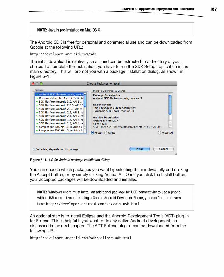
CHAPTER 5: Application Deployment and Publication 167
NOTE: Java is pre-installed on Mac OS X.
The Android SDK is free for personal and commercial use and can be downloaded from
Google at the following URL:
http://developer.android.com/sdk
The initial download is relatively small, and can be extracted to a directory of your
choice. To complete the installation, you have to run the SDK Setup application in the
main directory. This will prompt you with a package installation dialog, as shown in
Figure 5–1.
Figure 5–1. AIR for Android package installation dialog
You can choose which packages you want by selecting them individually and clicking
the Accept button, or by simply clicking Accept All. Once you click the Install button,
your accepted packages will be downloaded and installed.
NOTE: Windows users must install an additional package for USB connectivity to use a phonewith a USB cable. If you are using a Google Android Developer Phone, you can find the drivers
here: http://developer.android.com/sdk/win-usb.html.
An optional step is to install Eclipse and the Android Development Tools (ADT) plug-in
for Eclipse. This is helpful if you want to do any native Android development, as
discussed in the next chapter. The ADT Eclipse plug-in can be downloaded from the
following URL:
http://developer.android.com/sdk/eclipse-adt.html

CHAPTER 5: Application Deployment and Publication 168
It is also possible to use your IDE of choice to develop native Android applications. You
will simply have to use the command line tools that come with the Android SDK to do
compilation and packaging of your project.
Creating an Android Virtual Device The core of the Android Emulator is Android Virtual Devices (AVDs). Each AVD specifies
settings unique to that device, including API version, screen size, and hardware
properties. Using AVDs you can have your own private, virtual device lab with a different
configuration for each of the target devices that you want to test your application on.
To start with, you need to create your first AVD for running Flash platform applications.
This is done in the Android SDK and AVD Manager, which you ran upon first installing
the SDK.
You can relaunch the Android SDK and AVD Manager from the command line by
navigating to the sdk/tools directory and launching the android executable.
After a few moments, Android will launch the SDK Manager. Here you can create a new
AVD by performing the following steps.
1. Navigate to the Virtual Devices pane.
2. Click the New… button to open the AVD creation dialog shown in Figure
5–2.
3. Specify “MyAndroidDevice” in the Name input field.
4. Enter “50” in the Size input field.
5. Select “Android 2.3.3 - API Level 10” (or later) from the Target drop-
down list.
6. Select the built-in skin called “WVGA854”.
7. Click the Create AVD button.

CHAPTER 5: Application Deployment and Publication 169
Figure 5–2. Dialog to create new Android Virtual Devices (AVDs)
The name of the AVD in step 3 is simply a suggestion, so you can replace this string with
another name.
To launch your newly created AVD, select it in the list and click the Start… button. It will
show you the standard Android boot screen followed by a lock screen. Upon unlocking
the emulator by dragging the lock symbol across, you will be greeted by the familiar
home screen shown in Figure 5–3.

CHAPTER 5: Application Deployment and Publication 170
Figure 5–3. Android 2.3.3 running in the emulator on desktop
The Android standard skin for the emulator shows your device screen on the left and the
full complement of Android buttons and keys on the right. Some of the keys, such as the
dial and hang-up buttons, may not be found on every Android device, but the emulator
still lets you test how your application behaves when these keys are pressed.
Almost everything you can do on a normal Android device is enabled in the emulator, so
before continuing on to installing your own applications, familiarize yourself with the user
interface. You can launch pre-installed applications, such as the Browser, Contacts, or
E-mail, or new applications from Android Market. By default the emulator image comes
with all the development options enabled, such as USB debugging, “stay awake,” and
mock locations, but it is also worthwhile to familiarize yourself with the Settings
application.

CHAPTER 5: Application Deployment and Publication 171
Installing AIR Within the Emulator When you run on a physical device via USB Debugging, Flash Builder will automatically
prompt you to upgrade your installed version of AIR if your AIR SDK contains a newer
version. You also have the option of downloading and installing released versions of AIR
directly from Android Market, which is exactly what happens when you run a Flash
Android application without AIR installed.
However, in the case of the emulator, you can’t use the versions of AIR directly out of
Android Market, because they are not compatible. Also, since Flash Builder does not
directly integrate with the Android Emulator, you can’t use the auto-update mechanism
to install AIR either.
The solution to this is to manually install the AIR runtime from the SDK. The AIR SDK
can be found in the sdks/<version> folder of the Flash Builder installation (as of the time
of writing, the latest version was 4.5.0). Within the AIR SDK folder, you can find the
emulator runtime at the following location:
runtimes/air/android/emulator/Runtime.apk
NOTE: There are separate AIR runtimes for devices and emulators, so make sure to choose the
emulator runtime for this purpose.
This file can be installed by using the Android Debug Bridge (ADB) program from the
command line. ADB is one of the tools that comes with the Android SDK and can be
found in the platform-tools folder. Listing 5–1 shows an example of what the command
to install the emulator APK should look like for the default install location on Mac OS X.
Listing 5–1. Installation Command for the AIR Emulator Runtime
adb install "/Applications/Adobe Flash Builder 4.5/sdks/4.5.0/runtimes/air/android/emulator/Runtime.apk"
On Windows the command is very similar, except for the path location of the Flash
Builder installation.
TIP: You can also use the AIR Debug Tool (ADT) to install the AIR runtime. Configuring ADT is described later in this chapter in the section entitled “Setting Up ADT”. The command to install the AIR runtime using ADT is as follows:
adt -installRuntime -platform android

CHAPTER 5: Application Deployment and Publication 172
Emulator Key Bindings When running in the Android Emulator, you have the option of using your normal
desktop keyboard as input. This works fairly well, except that there are several special
keys on Android devices that do not have normal mappings to a desktop keyboard.
Examples of this are the power button, audio volume, and camera button.
To make it easy to press these buttons on an Android device, the default device skins
include these buttons on the physical emulator panel so you can click them with the
mouse. However, there is no guarantee that future Android skins or custom skins that
you install yourself will have the full complement of buttons. One such skin, shown in
Figure 5–4, gives you a near photograph-quality Nexus S device appearance,1 but lacks
some buttons.
Figure 5–4. Nexus S Android Emulator skin
1 Nexus S Skin by Heiko Behrens: http://heikobehrens.net/2011/03/15/android-skins/
6

CHAPTER 5: Application Deployment and Publication 173
To overcome this limitation, the Android Emulator has a full complement of keybindings.
Table 5–2 lists the mapping from common Android keys to the desktop keyboard
modifier equivalent that you can type when using any emulator skin.
Table 5–2. Mapping of Android Device Keys to Desktop Modifiers
Android Key Emulator Keybinding
Back ESC
Menu F2 or
Page-up
Search F5
Home HOME
Call/Dial Dial: F3
Hang-up: F4
Power F7
Camera Ctrl-F3 or
Ctrl-Numpad-5
Raise Audio Volume Ctrl-F5 or
Numpad-Plus
Lower Audio Volume Ctrl-F6 or
Numpad-Minus
DPad Up: Numpad-8
Down: Numpad-2
Left: Numpad-4
Right: Numpad-6
Center: Numpad-5
In addition to remapping the Android buttons, there are also some hidden features of the
emulator that are accessible only via keybindings. Table 5–3 shows some of the special
key bindings that you will find useful when testing applications in the emulator.

CHAPTER 5: Application Deployment and Publication 174
Table 5–3. Special Key Bindings for Android Emulator Features
Feature Keybinding Description
Previous Layout Ctrl-F11 or
Numpad 7
Simulates physical rotation of the
device, switching from Portrait to
Landscape mode (or vice versa)
Next Layout Ctrl-F12 or
Numpad-9
Simulates physical rotation of the
device, switching from Portrait to
Landscape mode (or vice versa)
Full Screen Mode Alt-Enter Toggles full-screen mode on or off
for the emulator; in full-screen
mode, the display is proportionally
scaled to fill the screen with a black
matte.
Trackball Mode F6 or
hold Delete
Trackball mode allows you to
simulate a physical trackball with
your mouse. F6 allows you to toggle
this mode on or off, and Delete
temporarily enables it.
Cell Networking F8 Toggles the virtual cellular network
on or off, which can be useful for
testing applications in the absence
of a network
Code Profiling F9 Toggles code profiling on or off; to
use this feature, you have to launch
the emulator with the -trace startup
option.
Onion Alpha Increase: Numpad-Multiply
Decrease: Numpad-Divide
Allows you to change the
transparency of the onion overlay;
to use this feature, you have to
specify an onion overlay graphic
with the -onion startup option.
To take full advantage of the foregoing key bindings, you will need to know how to
launch the emulator from the command line and pass in arguments. Launching an
Android Emulator from the command line is a straightforward call to the emulator
executable, which can be found in the sdk/tools directory:
emulator -avd <Virtual Device Name>
The virtual device names you substitute are exactly the same as those defined in the
Android tool, as shown in the previous section. You can then append any additional
options you want to use, such as -trace or -onion.

CHAPTER 5: Application Deployment and Publication 175
Deploying AIR Applications If you have been using a device to test your applications via USB, you have already
been doing a limited form of deployment during your development process. However,
you were likely using a debug version and did not have to worry about a lot of things
that are important for your end users when they get a fully packaged application, such
as permissions, proper certificates, and icons.
In this section, we will delve into the application descriptor in much more detail,
demonstrating how to fine-tune your application deployment to improve the user
experience and brand it for your company image.
Setting Up ADT While it is possible to do the entire publication workflow through Flash Professional and
Flash Builder, for automation and scripting purposes it is very useful to be able to do the
same activities from the command line. The Adobe AIR SDK provides a command line
called the AIR Developer Tool (ADT) that let you do everything from a script or build file.
To use ADT from the command line, you must set up the following in advance:
Install the AIR SDK for your platform (this is automatically installed with
Flash Builder).
Install a valid Java Runtime Environment (JRE).
Add the Java runtime to your PATH environment variable.
For Windows this would be %JRE_HOME%\bin.
For Mac OS X this would be $JRE_HOME/bin.
Where JRE_HOME is the fully qualified path to the JRE install
location
Add the AIR SDK to your PATH environment variable.
For Windows this would be %AIR_SDK%\bin.
For Mac OS X this would be $AIR_SDK/bin.
Where AIR_SDK is the fully qualified path to the AIR SDK install
location
Once set up, you can use ADT to accomplish many different packaging and deployment
activities from the command line. These include the following:
Creating signing certificates: ADT lets you create code signing
certificates from the command line that can be used when packaging
your application.
CHAPTER 5: Application Deployment and Publication 176
Packaging applications: By passing in a list of project files and a valid
certificate, you can package up an APK file for deployment to an
Android device. This supports creating an APK file with or without
debugging symbols and also allows you to target the Android
Emulator.
Installing applications: The APK file created by the packaging step can
be installed on device. This requires a path to the Android SDK.
Launching applications: ADT can also be used to launch your
application on device. This also requires a path to the Android SDK.
Throughout this chapter, we will make use of ADT to demonstrate the automation
potential of the Flash workflow.
Application Permissions The first impression that the user will have of your application will be a list of different
permissions that it is requesting upon installation. Therefore, it behooves you to make
sure that the permissions you are requesting make sense for your application, and are
the minimal set that you can deliver the functionality with.
Requesting permissions that are too broad may give users pause in installing your
application. For instance, there is no reason a Twitter client needs to write to external
storage, so asking for that permission might prevent savvy users from installing your
application over security concerns.
TIP: One of the permissions that you probably have enabled by default is the INTERNET permission. This permission is required for USB debugging of your application, so it is an
important permission to have enabled during development. Most applications will also need to access the Internet runtime, so it is likely that you will also need this permission for your
published application version; but if not, remember to disable this.
Changing Permissions in Flash Professional Flash Professional has a dedicated user interface to manage all the deployment options,
including permissions. To open the settings panel, choose Air for Android Settings… from
the File menu. Then click the Permissions tab, and you will get a dialog with check boxes
for each of the permissions, as shown in Figure 5–5.

CHAPTER 5: Application Deployment and Publication 177
Figure 5–5. Flash Professional Permissions tab in the AIR for Android Settings dialog
You also have the option of manually setting the permissions in your application
descriptor file by selecting the top check box. If you would like to do this, see the
section “Manually Changing Permissions in the Application Descriptor”.
Setting Initial Permissions in Flash Builder Flash Builder lets you set permissions when you first create a project. To do this, click
the Permissions tab in the second page of the new mobile project wizard, as shown in
Figure 5–6.

CHAPTER 5: Application Deployment and Publication 178
Figure 5–6. Flash Builder Permissions tab in the new project wizard
Notice that the INTERNET permission is preselected when you enter the dialog. This is
required for USB device debugging to work. If you require any additional permissions,
you can set them now before starting on your project.
Once the project has been created, it is no longer possible to change permissions via
the project settings dialog. Instead, you can directly edit the application descriptor file
that was created for you per the instructions in the next section.
Manually Changing Permissions in the Application Descriptor If you have chosen to manage permissions manually (in the case of Flash Professional)
or are modifying your permissions after project creation (in the case of Flash Builder),
then you need to know how to modify the application descriptor file to change
permissions.

CHAPTER 5: Application Deployment and Publication 179
The application descriptor file is typically in the source root of the project and is named
with the convention <project-name>-app.xml. It is formatted as XML tagged markup
with sections for all the different application settings that you can declaratively control.
The permissions settings can be found toward the bottom of the file under the android
tag, as shown in Listing 5–2.
Listing 5–2. Example Permissions Section of an AIR Application Descriptor
<android> <manifestAdditions> <manifest android:installLocation="auto"> <![CDATA[ <uses-permission android:name="android.permission.PERMISSION_NAME" /> ]]> </manifest> </manifestAdditions> </android>
For each permission you want to enable, you would copy the uses-permission tag and
replace the PERMISSION_NAME placeholder with the appropriate permission name. Listing
5–3 shows an example of all the available Android permissions in the appropriate format
for directly including in an application descriptor.
Listing 5–3. Full Set of Available Android Permissions
<uses-permission android:name="android.permission.INTERNET" /> <uses-permission android:name="android.permission.WRITE_EXTERNAL_STORAGE" /> <uses-permission android:name="android.permission.READ_PHONE_STATE" /> <uses-permission android:name="android.permission.ACCESS_FINE_LOCATION" /> <uses-permission android:name="android.permission.DISABLE_KEYGUARD" /> <uses-permission android:name="android.permission.WAKE_LOCK" /> <uses-permission android:name="android.permission.CAMERA" /> <uses-permission android:name="android.permission.RECORD_AUDIO" /> <uses-permission android:name="android.permission.ACCESS_NETWORK_STATE"/> <uses-permission android:name="android.permission.ACCESS_WIFI_STATE"/>
Of these permissions, there are a few that make sense to enable and disable as a
group—for example:
AIR’s SystemIdleMode APIs require both DISABLE_KEYGUARD and
WAKE_LOCK permissions.
AIR’s NetworkInfo APIs require both ACCESS_NETWORK_STATE and ACCESS_WIFI_STATE
So if you are planning to use either of these APIs, make sure to enable both permissions
at the same time.
Icons and Resources Each time users open your application, they will see the Android launcher icon that you
have selected, so it is important that this is professional and representative of your
application.

CHAPTER 5: Application Deployment and Publication 180
Starting with Android 2.0, they standardized on a forward-facing icon design with the
recommendation to select one aspect of your application and emphasize that with a full-
size depiction. Figure 5–7 highlights some launcher icons that are model examples of
the recommended Android look and feel.
Figure 5–7. Sample Android launcher icons for applications2
To make it easier to build application icons that meet these standards, the Android team
provides a bundle that contains sample materials and templates for different size icons.
You can download the Android Icon Templates pack at the following URL:
http://developer.android.com/guide/practices/ui_guidelines/icon_design.html#templatespack
This package includes Photoshop templates that you can use to precisely line up your
graphics within the bounding rectangle and filters configured to apply the appropriate
effects, such as the icon drop shadow.
Figure 5–8 shows the Photoshop file for the Pro Android Flash icon used in the
examples throughout this book. It takes the “cyber fruit” graphic that is the center of the
cover art and uses that single element as a representative icon for the book.
2 Reproduced from work created and shared by the Android Open Source Project and
used according to terms described in the Creative Commons 2.5 Attribution License: http://developer.android.com/guide/practices/ui_guidelines/icon_design_launcher.html

CHAPTER 5: Application Deployment and Publication 181
Figure 5–8. Android icon template in Adobe Photoshop
Since the shape we are using is circular, it is allowed to touch the outer blue boundary
border (1/6th standoff). Square-shaped icons should not extend beyond the orange
boundary line (2/9ths standoff). We are also using the recommended high-density drop
shadow settings of 2 pixel distance, 5 pixel size, and a 90-degree angle. Table 5–4 lists
the icon dimensions, border sizes, and drop shadow settings for different density icons.
Table 5–4. Dimension, Border, and Drop Shadow Settings for Different Density Icons
Density Dimensions Border
(circular/square)
Drop Shadow
(distance/size/angle)
Low density (ldpi) 36x36 pixels 6px/8px 1px/2px/90deg
Medium density (mdpi) 48x48 pixels 8px/10px 1px/3px/90deg
High density (hdpi) 72x72 pixels 12px/16px 2px/5px/90deg
To complete preparation of your icons, hide any guide layers you may have used for
creating your icon and save it as a transparent portable network graphics (PNG) file. If
you are using Photoshop, the best way to accomplish this is by using the Save for Web and Devices… command in the File menu. This ensures that your image files are the
smallest possible size, removing any unnecessary header information.

CHAPTER 5: Application Deployment and Publication 182
Once you have created your graphics, you can include them in your application
descriptor so they will be bundled with your application and displayed in the launcher
and menu for your deployed application. Flash Professional has a configuration page
that lets you select icons and link them against your application, as shown in Figure 5–9.
Figure 5–9. Icon selection tab of the Flash Professional settings dialog
Each graphic file that you select will be moved to a folder called AppIconsForPublish,
which is rooted in your project file location. Upon deployment these icons will be copied
to the generated .apk file, and linked as the corresponding density asset.
If you are using Flash Builder or manually managing your application descriptor, you will
have to edit the XML manually. After opening up the application descriptor in a text
editor, add in an icon section that lists an absolute or relative path to the different
density icons your application supports. Listing 5–4 shows a sample of what the icon
portion of your application descriptor should look like.

CHAPTER 5: Application Deployment and Publication 183
Listing 5–4. Example icon Section of an AIR Application Descriptor
<icon> <image36x36>ProAndroidFlashIcon36.png</image36x36> <image48x48>ProAndroidFlashIcon48.png</image48x48> <image72x72>ProAndroidFlashIcon72.png</image72x72> </icon>
The icon tag should be directly underneath the outer application tag of the file. In this
example, all the icon resources are in the same folder as the application descriptor file,
so the path is a simple file name. You can name your files anything you want as long as
they match what is written in the descriptor file.
Code Signing Certificates Android requires that all deployed applications are signed. For deploying applications to
Android Market, you do not have to purchase an expensive code signing certificate from
a certificate authority. A simple self-signed certificate is all that is required, because
Google takes care of checking the identity of parties that sell applications in their
market.
Both Flash Professional and Flash Builder provide user interfaces to quickly and easily
create certificates. You can also use the AIR Developer Tool (ADT) to create certificates
from the command line. The certificates created by all of these mechanisms are identical
and can be used interchangeably between tools.
To create a certificate in Flash Professional, open Air for Android Settings… from the File
menu. On the Deployment tab of this dialog, you can click the Create… button to
generate a new certificate via the pop-up shown in Figure 5–10.

CHAPTER 5: Application Deployment and Publication 184
Figure 5–10. Flash Professional certificate creation dialog
We talk about the fields for creating a certificate in more detail ahead, but if you are
creating a certificate for development purposes you can put in anything you want. Flash
Professional requires that you fill in all the fields before continuing.
Flash Builder has an identical form that can be accessed from the Project Properties
dialog in the Google Android Digital Signature section. Again, click the Create… button to
open a certificate creation dialog, as shown in Figure 5–11.

CHAPTER 5: Application Deployment and Publication 185
Figure 5–11. Flash Builder certificate creation dialog
The Flash Builder dialog is almost identical to the Flash Professional one, with the
omission of the validity period. This will be defaulted to 25 years automatically for you.
Creating Certificates Using ADT To create certificates from the command line, you can use the AIR Developer Tool (ADT).
For more information about setting up ADT, please refer to the section entitled “Setting
Up ADT” earlier in this chapter.
To create a code signing certificate via the command line, the command you would type
is the following:
adt -certificate -cn <name> ( -ou <org-unit> )? ( -o <org-name> )? ( -c <country> )? ( -validityPeriod <years> )? <key-type> <pfx-file> <password>
The arguments surrounded in parentheses are optional, and may be omitted. Values that
you can choose yourself are surrounded in angle brackets. The description and valid
values for all the arguments are listed in Table 5–5.
CHAPTER 5: Application Deployment and Publication 186
Table 5–5. ADT Code Signing Arguments
Argument Name Required Description
-cn Common Name Yes Name associated with the certificate
-ou Organizational Unit No Subgroup within a company or
organization; can be a department,
division, geographical region, etc.
-o Organization Name No Organization or company name of the
signing entity
-c Country No Country that the signing entity exists
within
-validityPeriod
Validity Period No Number of years that the generated
certificate will be valid for
key-type Key Type Yes Type and strength of cryptographic
algorithm used by this key; valid
values are 1024-RSA and 2048-RSA.
pfx-file Signature File Yes File path where the signature file will
be written to; it can be a file name,
relative path, or absolute path.
password Password Yes Password for the signature file
required each time it is used for
signing
NOTE: Android Market requires that certificates must be valid past October 22, 2033. Therefore, a
validity period of at least 25 years is recommended.
For example, the following command would create a valid Android code signing
certificate:
adt -certificate -cn ProAndroidFlash -validityPeriod 25 1024-RSA proandroidflash.p12 superSecretPassword
You can then validate that the certificate works by running the checkstore command:
adt -checkstore -storetype pkcs12 -keystore proandroidflash.p12 -storepass superSecretPassword
If the certificate has been created successfully, this command will return “valid password”.

CHAPTER 5: Application Deployment and Publication 187
Publishing from Flash Professional Once you have set up the appropriate permissions, icons, and certificates, publishing
applications from Flash Professional is as easy as pressing a button. In fact, you have
your choice of several buttons or menu items:
The Publish button found in the AIR for Android Settings dialog
The Publish button found on the Publish Settings dialog
The Publish menu item found in the File menu
These three locations are depicted in Figure 5–12. They all work identically, except that
in the case of misentered or incomplete information (such as a missing password for the
certificate), you will be redirected to the AIR for Android Settings dialog.
Figure 5–12. AIR for Android deployment settings dialog
There are a few deployment options found on the Deployment tab of the AIR for Android
Settings dialog that we have not talked about yet, but they are important when
publishing. The first is the choice of a Device, Emulator, or Debug release. If you are
creating an Android package for end-user use, make sure to select a Device release.
The Emulator release is required if you are planning to test your application within the
Android Emulator, so if this is how you plan to test your application, make sure to select
this option. However, remember to switch back to a Device release for distribution to
end users.
A Debug release is the type of project that normally gets built when you test your
application via USB debugging. This has slower performance and slightly different
behavior in error conditions than a Device release, so it is not recommended for
distribution purposes.
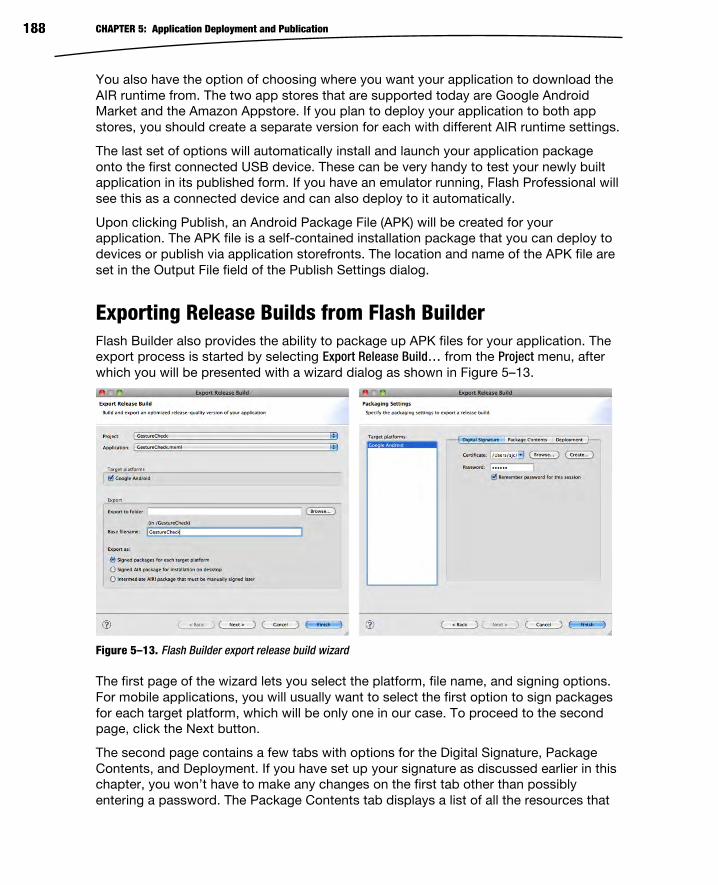
CHAPTER 5: Application Deployment and Publication 188
You also have the option of choosing where you want your application to download the
AIR runtime from. The two app stores that are supported today are Google Android
Market and the Amazon Appstore. If you plan to deploy your application to both app
stores, you should create a separate version for each with different AIR runtime settings.
The last set of options will automatically install and launch your application package
onto the first connected USB device. These can be very handy to test your newly built
application in its published form. If you have an emulator running, Flash Professional will
see this as a connected device and can also deploy to it automatically.
Upon clicking Publish, an Android Package File (APK) will be created for your
application. The APK file is a self-contained installation package that you can deploy to
devices or publish via application storefronts. The location and name of the APK file are
set in the Output File field of the Publish Settings dialog.
Exporting Release Builds from Flash Builder Flash Builder also provides the ability to package up APK files for your application. The
export process is started by selecting Export Release Build… from the Project menu, after
which you will be presented with a wizard dialog as shown in Figure 5–13.
Figure 5–13. Flash Builder export release build wizard
The first page of the wizard lets you select the platform, file name, and signing options.
For mobile applications, you will usually want to select the first option to sign packages
for each target platform, which will be only one in our case. To proceed to the second
page, click the Next button.
The second page contains a few tabs with options for the Digital Signature, Package
Contents, and Deployment. If you have set up your signature as discussed earlier in this
chapter, you won’t have to make any changes on the first tab other than possibly
entering a password. The Package Contents tab displays a list of all the resources that

CHAPTER 5: Application Deployment and Publication 189
will be included in the APK file. Unless you want to specifically exclude any files, such as
unused graphics, you don’t need to make any changes here. Finally, the last tab has an
option to automatically deploy and run on an attached mobile device if available, which
is selected by default.
Once you click the Finish button, Flash Builder will package up an APK file for
publication purposes, and possibly deploy and launch it on an installed device.
Running Flex Applications in the Android Emulator Compared to the Flash Professional publication process, you may notice that there is no
mention of the Android Emulator in the Flash Builder dialogs. Also, if you try to install the
APK file created by Flash Builder on an Android Emulator, it will fail with an error upon
installation.
However, you can manually create an emulator-friendly version of the same application
by using the AIR Developer Tool (ADT) from the command line. For more information
about setting up ADT, please refer to the section entitled “Setting Up ADT” earlier in this
chapter.
As an example, Listing 5–5 shows you how to build an emulator-friendly APK for the
GestureCheck project that was built in the first chapter. Make sure to execute this
command from the bin-debug folder after Flash Builder has already built the SWF file.
Listing 5–5. Command to Build an APK File for the GestureCheck Project
adt -package -target apk-emulator -storetype pkcs12 -keystore <certificate file> GestureCheck.apk GestureCheck-app.xml GestureCheck.swf ProAndroidFlashIcon*.png
This builds an APK file that is compatible with the Android Emulator. While the emulator
is running, you can use the ADT tool to install it by executing the following command:
adt -installApp -platform android -package GestureCheck.apk
TIP: You can also install APK files using the Android Debug Bridge (ADB) as follows:
adb install GestureCheck.apk
Your application will now show up in the application menu on the emulator. You can
manually launch your application via the menu, or programmatically launch it by using
the following command:
adt -launchApp -platform android -appid com.proandroidflash.GestureCheck.debug
Notice that the appid is the same as the id used in your application descriptor, with the
addition of “.debug” appended to the end.
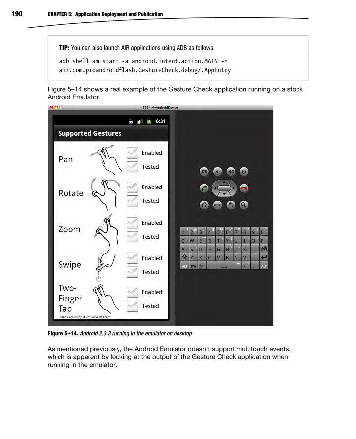
CHAPTER 5: Application Deployment and Publication 190
TIP: You can also launch AIR applications using ADB as follows:
adb shell am start -a android.intent.action.MAIN -n
air.com.proandroidflash.GestureCheck.debug/.AppEntry
Figure 5–14 shows a real example of the Gesture Check application running on a stock
Android Emulator.
Figure 5–14. Android 2.3.3 running in the emulator on desktop
As mentioned previously, the Android Emulator doesn’t support multitouch events,
which is apparent by looking at the output of the Gesture Check application when
running in the emulator.

CHAPTER 5: Application Deployment and Publication 191
Deploying from the Command Line While Flash Professional and Flash Builder make deploying your application from within
the tooling very convenient, it is often useful to be able to do the same deployments
from the command line. This allows you to create a repeatable, automatable process
that is tailored to the exact needs of your development workflow.
The command line tool we will be using is called the AIR Developer Tool (ADT) and
automates several different tasks, from certificate creation to application packaging to
device deployment. For more information about setting up ADT, see the foregoing
section “Setting Up ADT”.
The primary flag used in ADT for packaging AIR applications is -package. This indicates
that you are going to package up an AIR application for desktop, mobile, or other
deployment. Here is the full set of arguments for packaging Android applications with
ADT:
adt -package -target ( apk | apk-debug | apk-emulator ) ( -connect <host> | -listen <port>? )? ( -airDownloadURL <url> )? SIGNING_OPTIONS <output-package> ( <app-desc> PLATFORM-SDK-OPTION? FILE-OPTIONS | <input-package> PLATFORM-SDK-OPTION? )
Table 5–6 talks about each of these arguments and what the valid values are.
Table 5–6. Available Arguments for ADT Packaging
Argument Required Description
-target Yes Type of package to build; it must be one of apk,
apk-debug, or apk-emulator.
-connect/listen No Enables remote debugging via two possible
methods:
-connect <host>: Enables remote TCP/IP
debugging by connecting to the specified host
upon startup
-listen <port>?: Enables remote USB debugging
by waiting for a connection on the given port
(default is 7936 if unspecified)
-airDownloadURL No Lets you choose which app store the AIR SDK is
downloaded from; the default is Android Market.
Use the following URL to switch to the Amazon
Appstore:
http://www.amazon.com/gp/mas/dl/android?p=com.adobe.air
SIGNING_OPTIONS Yes Code signing certificate store options; the most
important ones are as follows:
-storetype: The type of the keystore (usually

CHAPTER 5: Application Deployment and Publication 192
Argument Required Description
pkcs12)
-keystore: The location of the keystore
<output-package> Yes The name of the package file to be created; for
Android this should have an extension of .apk.
<input-package> No Input AIR Intermediate (AIRI) file to sign; either this
or app-desc must be specified.
<app-desc> No Application descriptor file in XML format; either this
or input-package must be specified.
PLATFORM-SDK-OPTION No Optional path to a different AIR SDK than the
default one for ADT; it should have the following
syntax:
-platformsdk <platform-sdk-home-dir>
FILE-OPTIONS No A sequence of file paths separated by spaces; it
may refer to a whole directory and use the *
wildcard character.
While the array of packaging options may seem daunting, you can do most tasks with
only the required parameters. For example, the following would package a simple
application using the information in its app descriptor:
adt -package -target apk -storetype pkcs12 -keystore cert.p12 Sample-app.xml Sample.swf
This has the minimal set of arguments for packaging an application from a descriptor
and SWF file. To build a debugging version instead, you would do the following:
adt -package -target apk-debug -listen -storetype pkcs12 -keystore cert.p12 Sample-app.xml Sample.swf
This would listen on port 7936 for a USB debugging interface on startup.
AIR Intermediate (AIRI) files are very handy if you know you will be creating multiple
deployments for the same project. You can either export an AIRI file from Flash Builder
or create one on the command line using the prepare command with the following
syntax:
adt -prepare Sample.airi Sample-app.xml Sample.swf
Then you can deploy to multiple different targets using the input-package variant of the
package command:
adt -package -target apk -storetype pkcs12 -keystore cert.p12 Sample-android.apk Sample.airi adt -package -target apk -airDownloadURL http://www.amazon.com/gp/mas/dl/android?p=com.adobe.air -storetype pkcs12 -keystore cert.p12 Sample-amazon.apk Sample.airi

CHAPTER 5: Application Deployment and Publication 193
This would create two different APK files, one ready for deployment to Android Market,
and the other with a different AIR download URL that will fetch the runtime from the
Amazon Appstore.
COMMAND LINE DEPLOYMENT EXERCISE
The exercise will walk you step-by-step through the procedure to package, sign, install, and launch the Flash Capability Reporter example.
Here are the exercise prerequisites:
1. AIR SDK installed and in the PATH
2. Java Runtime Environment (JRE) installed and in the PATH
3. Android SDK installed
Start by opening a command prompt or terminal. You should be able to type in the command adt with no options and get back help with the command arguments. If it cannot find the adt command or complains about java not being in the path, verify that you have updated your PATH environment variable correctly.
Creating a Code Signing Certificate
To create a code signing certificate, you can issue the following command, where the values in angle brackets should be replaced with your name and password:
adt -certificate -cn <YourName> -validityPeriod 25 1024-RSA exercise.p12 <YourPassword>
If the command completes successfully, it will return with an exit code of 0.
Packaging the Application
To package up the application, make sure that you have run the application once in Flash Professional so the movie (*.swf) and application descriptor (*-app.xml) files can be created. Then package it into an APK file using the following command:
adt -package -target apk -storetype pkcs12 -keystore exercise.p12 FlashCapabilityReporter.apk FlashCapabilityReporter-app.xml FlashCapabilityReporter.swf AppIconsForPublish/
This will create an APK file containing a deployable version of your application.
Installing and Launching the Application
As an additional bonus, you can install and launch your application to a device connected via USB using the following commands:
adt -installApp -platform android -package FlashCapabilityReporter.apk adt -launchApp -platform android -appid com.proandroidflash.FlashCapabilityReporter
If this is successful, the Flash Capability Reporter application will be both installed and running on your Android phone.

CHAPTER 5: Application Deployment and Publication 194
Publishing AIR Apps to Android Market Android Market is an application store for Android devices created and run by Google.
Compared to other application stores, such as the Apple App Store or Amazon
Appstore, Android Market is very open. It does not have a restrictive screening process,
and it lets end users try an app for one day with the option for a full refund if they don’t
like it.
Google charges a 25 USD fee to developers in order to create an account that can be
used to submit an unlimited number of applications. According to Google, this fee is
designed to raise the quality of the market by preventing application spam.
This section provides an outline of the three-step process for publishing Adobe AIR
applications to the Android marketplace.
Step 1: Create an Android Market Developer Account To create an Android Market developer account, navigate to the following web site:
http://market.android.com/publish/Home
You will be asked to log in to the Google Account that you would like to link to your
Android Market developer account. If you already have a Google Account you can use
that, otherwise it is free to create a new account. However, keep in mind that once you
have linked your Google Account, there is no way to change it in the future without
creating a new Android Market developer account.
Next, provide the information that is required, such as your full name, a web site URL,
and a phone number, and follow the prompts until you arrive at the Google Checkout
site in order to submit your registration fee. To complete the process, follow the link
back to the registration pages after checkout and agree to the Android Market license.
Step 2: Package Your Application For upload to the Android store, you will need a signed application that is packaged as
an APK file. You can do this either from Flash Professional, Flash Builder, or the
command line, as detailed in the previous chapters.
Here are some points that you will want to keep in mind when submitting your
application:
Make sure that you are submitting a release version of your application
(and not a debug or emulator version).
If you do not need the INTERNET permission, which is required for
debugging, remember to disable it.
Make sure to include custom icons for your application in all the
standard Android sizes (36x36, 48x48, and 72x72).

CHAPTER 5: Application Deployment and Publication 195
Make sure that you have the AIR runtime URL set to Android Market
(which is the default).
Once you have built the APK file, you are ready to proceed to publishing your
application to Android Market.
Step 3: Upload Your Adobe AIR Application The Android Market application submission process is fully automated and includes
detailed instructions of each step. Figure 5–15 shows an example of what the
submission process would look like if you used the Gesture Check example application
from Chapter 1.
Figure 5–15. Android Market submission process
The majority of the application submission process is taken care of simply by uploading
your APK file. This includes choosing an icon, setting permissions, and choosing
supported platforms.

CHAPTER 5: Application Deployment and Publication 196
In addition to the APK file, you are also required to submit at least two screenshots of
your application as well as a large format icon (512 pixels square). To take screenshots
of your application, you can either run it in an emulator on the desktop and crop the
pictures to size, or use a screen capture utility to take photos right off your Android
device.
After filling in the required fields, you can submit your application and it will be made
available in Android Market immediately. Figure 5–16 shows the success result of a
successful application deployment to Android Market.
Figure 5–16. Successfully deployed Android Market application
Publishing AIR Apps to the Amazon Appstore The Amazon Appstore is the second market for purchasing applications to be released
for Android devices. It has very tight integration with Amazon’s storefront, allowing you
to purchase Android applications as well as books, CDs, and other products all from a
single interface. Also, it uses Amazon’s patented one-click purchase system to
streamline the process of buying applications on mobile devices.
The fee for publishing applications via the Amazon Appstore is significantly higher, with a
yearly subscription costing 99 USD. Fortunately, Amazon has waived the fee for the first
year for developers who sign up for the Amazon developer program at the same time.
The requirements and process for publishing to the Amazon Appstore are very similar to
Android Market. The same three steps for setting up your account, packaging your
application, and uploading it to the store still apply.

CHAPTER 5: Application Deployment and Publication 197
When submitting to the Amazon Appstore, be sure to set the AIR runtime URL to point
to the Amazon Appstore for download. This can be done via the deployment setting in
the Flash Professional UI, or via the command line by setting the -airDownloadURLproperty of ADT to the following:
http://www.amazon.com/gp/mas/dl/android?p=com.adobe.air
Figure 5–17 shows an example of what the Amazon Appstore application submission
looks like.
Figure 5–17. Amazon Appstore submission proces
Some of the main differences you will notice as a developer when submitting
applications to the Amazon Appstore include the following:
You are required to submit three screenshots of your application, and
they must be exactly sized to 854x480 or 480x854.

CHAPTER 5: Application Deployment and Publication 198
In addition to the 512x512 icon, the Amazon Appstore also requires a
114x114 icon.
Rather than immediately seeing your application appear in the Amazon
Appstore, you will have to wait for it to go through the review process.
Despite these differences, the majority of the application submission process is very
similar, which makes it very easy to deploy your AIR Android applications to both app
stores.
Summary This chapter closes the loop on the end-to-end mobile application development story for
the Flash platform. You now know how to take applications from inception through to
fully published Android applications that end users can download from the market.
In this chapter, you learned how to do the following:
Set up an Android Emulator and configure Android Virtual Devices
Configure permissions that your application requests on installation
Specify launcher icons and other resources as a part of your
application
Release AIR packages from Flash Professional, Flash Builder, and the
command line
Test your application package on devices or in the Android Emulator
Publish your application to Android Market and the Amazon Appstore
We will take this even further in the next few chapters, as we delve into more detail on
native integration with Android, performance tuning for mobile devices, and working
together with designers.

199
Chapter
Adobe AIR and Native Android Apps You have already learned how to create interesting Flex-based mobile applications, and in this chapter you will learn about other useful features that are available in Adobe AIR, and also how to merge Android-specific functionality into an Adobe AIR mobile application.
First you will learn how to do two things that are available in Adobe AIR: how to launch a native browser in an AIR application, and how to store application-specific data in a SQLite database. The next part of the chapter delves into Android fundamentals that you need to understand for the code samples that are discussed later in the chapter. This section shows you how to create a simple native Android application, along with a discussion of the main files in Android applications. You will also learn about important Android-specific concepts, such as Activities, Intents, and Services.
The third part of this chapter contains an example of an Adobe AIR mobile application that invokes an external API to provide status information about web sites that users have registered with an external service. Our Adobe AIR application stores the status of each web site in a SQLite database and then displays the status details in a datagrid. This mobile application also enables users to click a button that sends an update to native Android code, which in turn displays the update in the Android notification bar. The final part of this chapter contains the steps that are required to integrate an Adobe AIR mobile application with native Android code.
There are a few points to keep in mind regarding the material in this chapter. First, the Android content is intended to help you understand how to integrate native Android functionality into Adobe AIR applications. Consequently, only a subset of Android topics is covered, which is not enough to become a proficient Android application developer. Second, Adobe AIR is an evolving product, so it’s possible that some of the Android features that are currently unavailable from Adobe AIR might become available in a future release. Third, the integration of Adobe AIR applications with native Android functionality is not officially supported by Adobe; as a result, if you experience
6

CHAPTER 6: Adobe AIR and Native Android Apps 200
difficulties with the integration process, there is no formal support mechanism available for you to resolve those difficulties.
Another point to consider pertains to the Android versions that are supported in the target devices for your Adobe AIR mobile application. For example, the number of mobile devices that support Android 2.2 is currently much greater than those that support Android 2.3.x or Android 3.0, both of which are currently limited to only a few tablets (such as the Samsung Galaxy Tab 10.1 and Motorola Xoom) and one smart phone (Samsung Galaxy S II).
On the other hand, if Adobe AIR supports all the functionality and features that you require for creating mobile applications, then you do not need any of the code samples in this chapter that illustrate how to merge an Adobe AIR application with an Android application. If this is the case, you can skip that material without loss of continuity.
Invoking URI Handlers in Adobe AIR Currently there are five URI-related handlers available in Adobe AIR that enable you to perform the following actions in an Adobe AIR mobile application:
tel (make telephone calls)
sms (send text messages)
mailto (send email)
market (perform a market search)
http and https (launch a web browser)
The code is very straightforward for each of these handlers, which makes it very simple to embed these handlers in your Adobe AIR mobile applications. One thing to keep in mind is that Adobe AIR does not provide support for the “geo” URI, but you can still navigate to maps.google.com, and users will be prompted about opening the URL in the browser session versions of the Maps application. This “workaround” gives you the ability to support maps-related functionality in Adobe AIR mobile applications.
Create a new Flex mobile project called URIHandlers, using the Mobile Application template, and add the code shown in Listing 6–1.
Listing 6–1. Invoking URI Handlers
<?xml version="1.0" encoding="utf-8"?> <s:View xmlns:fx="http://ns.adobe.com/mxml/2009" xmlns:s="library://ns.adobe.com/flex/spark" title="Home"> <fx:Script> <![CDATA[ import flash.sensors.Geolocation; [Bindable] public var tel:String; [Bindable] public var sms:String;

CHAPTER 6: Adobe AIR and Native Android Apps 201
[Bindable] public var mailto:String; [Bindable] public var search:String; [Bindable] public var http:String; [Bindable] public var geo1:String; private var geo:Geolocation; private function onTel():void { navigateToURL(new URLRequest("tel:"+tel)); } private function onSMS():void { navigateToURL(new URLRequest("sms:"+sms)); } private function onMailto():void { navigateToURL(new URLRequest("mailto:"+mailto+"?subject=Hello%20AIR")); } private function onSearch():void { navigateToURL(new URLRequest("market://search?q=iReverse")); } private function onHTTP():void { navigateToURL(new URLRequest(http)); } private function onGeo():void { this.geo = new Geolocation(); this.geo.addEventListener(GeolocationEvent.UPDATE, onLocationUpdate); } private function onLocationUpdate(e:GeolocationEvent):void { this.geo.removeEventListener(GeolocationEvent.UPDATE,onLocationUpdate); var long:Number = e.longitude; var lat:Number = e.latitude; navigateToURL(new URLRequest("http://maps.google.com/")); } ]]> </fx:Script> <s:VGroup> <s:Form backgroundColor="0xFFFFFF" width="300"> <s:FormItem> <s:HGroup left="0"> <s:TextInput width="180" height="50" text="{tel}"/> <s:Button id="telID" width="250" height="50" label="(Call)" click="onTel();"/> </s:HGroup> </s:FormItem> <s:FormItem> <s:HGroup left="0"> <s:TextInput width="180" height="50" text="{sms}"/> <s:Button id="smsID" width="250" height="50" label="(Text)" click="onSMS();"/>

CHAPTER 6: Adobe AIR and Native Android Apps 202
</s:HGroup> </s:FormItem> <s:FormItem> <s:HGroup left="0"> <s:TextInput width="180" height="50" text="{mailto}"/> <s:Button id="mailtoID" width="250" height="50" label="(EMail)" click="onMailto();"/> </s:HGroup> </s:FormItem> <s:FormItem> <s:HGroup left="0"> <s:TextInput width="180" height="50" text="{search}"/> <s:Button id="searchID" width="250" height="50" label="(Search Market)" click="onTel();"/> </s:HGroup> </s:FormItem> <s:FormItem> <s:HGroup left="0"> <s:TextInput width="180" height="50" text="{http}"/> <s:Button id="httpID" width="250" height="50" label="(Go)" click="onHTTP();"/> </s:HGroup> </s:FormItem> <s:FormItem> <s:HGroup left="0"> <s:TextInput width="180" height="50" text="{geo1}"/> <s:Button id="geoID" width="250" height="50" label="(Geo)" click="onGeo();"/> </s:HGroup> </s:FormItem> </s:Form> </s:VGroup> </s:View>
Listing 6–1 contains a form with various input fields, each of which has an associated event handler that invokes the built-in method navigateToURL() with a different argument. For example, when users enter a URL and then click the associated button, the method onHTTP() launches a URL with the following line of code:
navigateToURL(new URLRequest(http));
Figure 6–1 displays a form with various input fields that illustrate how to use the URI-related functionality in AIR mobile applications.

CHAPTER 6: Adobe AIR and Native Android Apps 203
Figure 6–1. Using URI-related functionality
Launching Custom HTML Pages in Adobe AIR Adobe AIR enables you to launch custom HTML pages (shown ahead) and also to navigate to arbitrary HTML pages (shown in Listing 6–2).
Create a new Flex mobile project called StageWebViewHTML1, using the ActionScript Mobile Application template, and add the code shown in Listing 6–2.
Listing 6–2. Launching a Hard-Coded HTML Page
package { import flash.display.Sprite; import flash.display.StageAlign; import flash.display.StageScaleMode; import flash.geom.Rectangle; import flash.media.StageWebView; public class StageWebViewHTML1 extends Sprite { public function StageWebViewHTML1() { super(); // support autoOrients stage.align = StageAlign.TOP_LEFT; stage.scaleMode = StageScaleMode.NO_SCALE;

CHAPTER 6: Adobe AIR and Native Android Apps 204
var webView:StageWebView = new StageWebView(); webView.stage = this.stage; webView.viewPort = new Rectangle( 0, 0, stage.stageWidth, stage.stageHeight ); // create an HTML page var htmlStr:String = "<!DOCTYPE HTML>" + "<html>" + "<body>" + "<h3>An HTML Page in Adobe AIR</h3>" + "<p><strong>Hello from the Author Team:</strong></p>" + "<hr/>"+ "<p>Stephen Chin</p>" + "<p>Dean Iverson</p>" + "<p>Oswald Campesato</p>" + "<p>Paul Trani</p>" + "<hr/>"+ "<br/>"+ "<p><i>This is the key line of code:</i></p>"+ "<p>webView.loadString( htmlStr, 'text/html'; );</p>"+ "<p>'htmlStr' contains the HTML contents</p>"; "</body>" + "</html>"; // launch the HTML page webView.loadString( htmlStr, "text/html" ); } } }
Listing 6–2 contains several import statements and auto-generated code, and the variable htmlStr is a string with the contents of an HTML page that is launched with one line of code:
webView.loadString( htmlStr, "text/html" );
If you plan to invoke hard-coded HTML pages in mobile applications, experiment with different HTML5 tags to create the stylistic effects that you need for your HTML page.
Figure 6–2 displays the output from Listing 6–2, which renders an HTML page with the hard-coded contents.
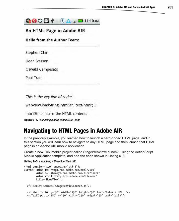
CHAPTER 6: Adobe AIR and Native Android Apps 205
Figure 6–2. Launching a hard-coded HTML page
Navigating to HTML Pages in Adobe AIR In the previous example, you learned how to launch a hard-coded HTML page, and in this section you will learn how to navigate to any HTML page and then launch that HTML page in an Adobe AIR mobile application.
Create a new Flex mobile project called StageWebViewLaunch2, using the ActionScript Mobile Application template, and add the code shown in Listing 6–3.
Listing 6–3. Launching a User-Specified URL
<?xml version="1.0" encoding="utf-8"?> <s:View xmlns:fx="http://ns.adobe.com/mxml/2009" xmlns:s="library://ns.adobe.com/flex/spark" xmlns:mx="library://ns.adobe.com/flex/mx" title="HomeView" > <fx:Script source="StageWebViewLaunch.as"/> <s:Label x="10" y="50" width="150" height="50" text="Enter a URL: "/> <s:TextInput x="180" y="50" width="290" height="50" text="{url}"/>

CHAPTER 6: Adobe AIR and Native Android Apps 206
<s:Button x="10" y="120" width="300" height="50" label="Launch the URL" click="StageWebViewExample()" /> </s:View>
Listing 6–3 contains an input field that enables users to enter a URL, and also a button for launching the specified URL via the method StageWebViewExample() that is defined in the ActionScript3 file StageWebViewLaunch.as.
Now create the file StageWebViewLaunch.as and insert the code shown in Listing 6–4.
Listing 6–4. The ActionScript3 Code for Launching a URL
import flash.media.StageWebView; import flash.geom.Rectangle; import flash.events.ErrorEvent; import flash.events.Event; import flash.events.LocationChangeEvent; [Bindable] public var url:String = "http://www.google.com"; private var webView:StageWebView = new StageWebView(); public function StageWebViewExample() { webView.stage = this.stage; webView.viewPort = new Rectangle( 0, 0, stage.stageWidth, stage.stageHeight ); webView.addEventListener(Event.COMPLETE, completeHandler); webView.addEventListener(ErrorEvent.ERROR, errorHandler); webView.addEventListener(LocationChangeEvent.LOCATION_CHANGING, locationChangingHandler); webView.addEventListener(LocationChangeEvent.LOCATION_CHANGE, locationChangeHandler); // launch the user-specified URL webView.loadURL( url ); } // Dispatched after the page or web content has been fully loaded protected function completeHandler(event:Event):void { dispatchEvent(event); } // Dispatched when the location is about to change protected function locationChangingHandler(event:Event):void { dispatchEvent(event); } // Dispatched after the location has changed protected function locationChangeHandler(event:Event):void { dispatchEvent(event); } // Dispatched when an error occurs protected function errorHandler(event:ErrorEvent):void {

CHAPTER 6: Adobe AIR and Native Android Apps 207
dispatchEvent(event);}
Listing 6–4 defines the Bindable variable url that references the user-specified URL,followed by the variable webView that contains URL-specific functionality. The methodStageWebViewExample() defines various event handlers, all of which invoke the built-inmethod dispatchEvent(), and then the user-specified URL is launched with this line ofcode:
webView.loadURL( url );
Figure 6–3 displays the Google home page, which is the default URL in Listing 6–4.
Figure 6–3. Launching a user-specified URL

CHAPTER 6: Adobe AIR and Native Android Apps 208
Accessing SQLite in Adobe AIR Adobe AIR provides support for accessing data in a SQLite database that is stored on a mobile device. You can also access a SQLite database directly from native Android code, but Adobe AIR provides a higher level of abstraction (and the code is simpler).
Create a new Flex mobile project called SQLite1, using the Mobile Application template, and add the code shown in Listing 6–5.
Listing 6–5. Viewing Data in a SQLite Database
<?xml version="1.0" encoding="utf-8"?> <s:View xmlns:fx="http://ns.adobe.com/mxml/2009" xmlns:s="library://ns.adobe.com/flex/spark" title="HomeView" creationComplete="start()"> <fx:Script source="SQLiteAccess.as"/> <s:Label x="10" y="10" width="400" height="50" text="Create New Person and Click 'Add'"/> <s:Label x="10" y="50" width="150" height="50" text="First name:"/> <s:TextInput x="250" y="50" width="200" height="50" id="first_name"/> <s:Label x="10" y="100" width="150" height="50" text="Last name:"/> <s:TextInput x="250" y="100" width="200" height="50" id="last_name"/> <s:Button x="10" y="160" width="200" height="50" label="Add" click="addItem()"/> <s:Button label="Remove Selected Person" height="50" x="10" y="230" click="remove()" enabled="{dg.selectedIndex != -1}"/> <s:DataGrid id="dg" left="10" right="10" top="300" bottom="80" dataProvider="{dp}"> <s:columns> <s:ArrayList> <s:GridColumn headerText="Index" dataField="id" width="100" /> <s:GridColumn headerText="First name" dataField="first_name" width="150" /> <s:GridColumn headerText="Last name" dataField="last_name" width="150" /> </s:ArrayList> </s:columns> </s:DataGrid> </s:View>
Listing 6–5 contains a XML Script element that references an ActionScript3 file containing methods that access a SQLite database, and its contents will be shown in Listing 6–6. The labels and text input fields enable users to enter a first name and a last name for each new person that will be added to our database.

CHAPTER 6: Adobe AIR and Native Android Apps 209
There is one XML Button element for adding a new person via the addPerson() method, and also one XML Button for deleting an existing person from our database via the removePerson() method. Both methods are defined in SQLiteAccess.as. The variable dp is a Bindable variable that contains the data that is displayed in the datagrid, and since users can add as well as delete rows of data, dp is a Bindable variable.
Since we are accessing data that is stored in a SQLite database, we need to define several methods in ActionScript3 for managing the creating, accessing, and updating of the contents of the database. Create a new ActionScript3 file called SQLiteAccess.as in the same directory as the file SQLite1HomeView.mxml, and add the code shown in Listing 6–6.
Listing 6–6. Defining Database Access Methods in ActionScript3
import flash.data.SQLStatement; import flash.errors.SQLError; import flash.events.Event; import flash.events.SQLErrorEvent; import flash.events.SQLEvent; import flash.events.TimerEvent; import flash.filesystem.File; import flash.utils.Timer; import mx.collections.ArrayCollection; import mx.utils.ObjectUtil; import org.osmf.events.TimeEvent;
Listing 6–6 contains various SQL-related import statements and also a Timer class, which we will use when we attempt to read the contents of the updated database. Since only one SQL statement can be executing at any given point in time, the Timer class gives us the ability to “try again later” (measured in milliseconds).
// sqlconn holds the database connection public var sqlconn:SQLConnection = new SQLConnection(); // sqlstmt holds SQL commands public var sqlstmt:SQLStatement = new SQLStatement(); // a bindable ArrayCollection and the data provider for the datagrid [Bindable] public var dp:ArrayCollection = new ArrayCollection(); // invoked after the application has loaded private function start():void { // set 'people.db' as the file for our database (created after it's opened) var db:File = File.applicationStorageDirectory.resolvePath("people.db"); // open the database in asynchronous mode sqlconn.openAsync(db); // event listeners for handling sql errors and 'result' are // invoked whenever data is retrieved from the database sqlconn.addEventListener(SQLEvent.OPEN, db_opened); sqlconn.addEventListener(SQLErrorEvent.ERROR, error); sqlstmt.addEventListener(SQLErrorEvent.ERROR, error);
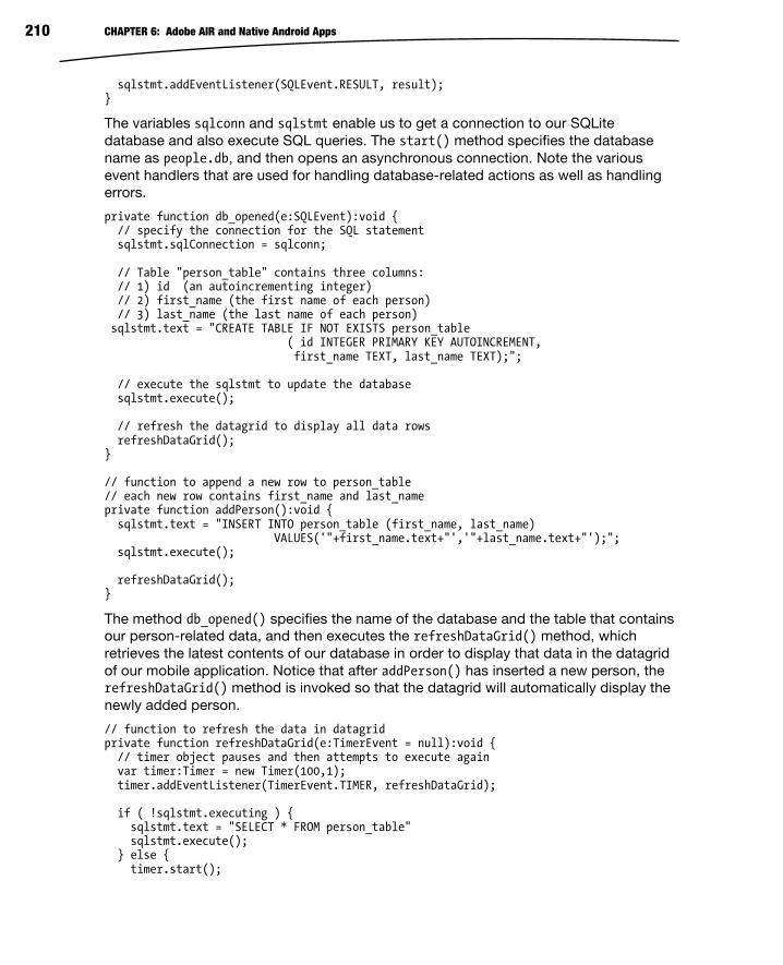
CHAPTER 6: Adobe AIR and Native Android Apps 210
sqlstmt.addEventListener(SQLEvent.RESULT, result); }
The variables sqlconn and sqlstmt enable us to get a connection to our SQLite database and also execute SQL queries. The start() method specifies the database name as people.db, and then opens an asynchronous connection. Note the various event handlers that are used for handling database-related actions as well as handling errors.
private function db_opened(e:SQLEvent):void { // specify the connection for the SQL statement sqlstmt.sqlConnection = sqlconn; // Table "person_table" contains three columns: // 1) id (an autoincrementing integer) // 2) first_name (the first name of each person) // 3) last_name (the last name of each person) sqlstmt.text = "CREATE TABLE IF NOT EXISTS person_table ( id INTEGER PRIMARY KEY AUTOINCREMENT, first_name TEXT, last_name TEXT);"; // execute the sqlstmt to update the database sqlstmt.execute(); // refresh the datagrid to display all data rows refreshDataGrid(); } // function to append a new row to person_table // each new row contains first_name and last_name private function addPerson():void { sqlstmt.text = "INSERT INTO person_table (first_name, last_name) VALUES('"+first_name.text+"','"+last_name.text+"');"; sqlstmt.execute(); refreshDataGrid(); }
The method db_opened() specifies the name of the database and the table that contains our person-related data, and then executes the refreshDataGrid() method, which retrieves the latest contents of our database in order to display that data in the datagrid of our mobile application. Notice that after addPerson() has inserted a new person, the refreshDataGrid() method is invoked so that the datagrid will automatically display the newly added person.
// function to refresh the data in datagrid private function refreshDataGrid(e:TimerEvent = null):void { // timer object pauses and then attempts to execute again var timer:Timer = new Timer(100,1); timer.addEventListener(TimerEvent.TIMER, refreshDataGrid); if ( !sqlstmt.executing ) { sqlstmt.text = "SELECT * FROM person_table" sqlstmt.execute(); } else { timer.start();
CHAPTER 6: Adobe AIR and Native Android Apps 211
} } // invoked when we receive data from a sql command private function result(e:SQLEvent):void { var data:Array = sqlstmt.getResult().data; // fill the datagrid dp = new ArrayCollection(data); } // remove a row from the table private function removePerson():void { sqlstmt.text = "DELETE FROM person_table WHERE id="+dp[dg.selectedIndex].id; sqlstmt.execute(); refreshDataGrid(); } // error handling method private function error(e:SQLErrorEvent):void { // Alert.show(e.toString()); }
The method refreshDataGrid() first checks whether a SQL statement is currently being executed; if so, then it pauses the specified number of milliseconds (which is 100 in this example) and then retrieves all the rows from the person_table (which will include newly added persons). The method result() populates the variable dp with the refreshed set of data. The removePerson() method deletes the row that users selected by tapping on that row in the datagrid.
Figure 6–4 displays a set of rows that are stored in a SQLite database on a mobile device.

CHAPTER 6: Adobe AIR and Native Android Apps 212
Figure 6–4. A set of records in a SQLite database
Learning Basic Concepts in Android Android is an open source toolkit for developing Android mobile applications, and at the time of writing Android 3.0 (“Honeycomb”) is the latest major release; the most current version of Android is 3.1. Note that Adobe AIR 2.5.1 for mobile applications requires at least Android 2.2, and you can install Adobe AIR applications on mobile devices that support Android 2.2 or higher.
The following sections provide some information about the major features of Android 3.0, where to download Android, and key concepts in Android. When you finish this section, you’ll have an understanding of how to create native Android applications.

CHAPTER 6: Adobe AIR and Native Android Apps 213
Major Features of Android 3.0 Earlier versions of Android provided support for UI components and event handlers, audio and video, managing files on the file system, graphics and animation effects, database support, web services, and telephony and messaging (SMS).
Google Android 3.0 (released in early 2011) provides backward-compatible support for the functionality in Android 2.3 (which was released in December 2010). Android 3.0 provides feature improvements over version 2.3 as well as the following new features:
A new UI for tablets
System bar for status and notifications
Action bar for application control
Customizable home screen
Copy/paste support
More connectivity options
SVG support
Universal remote function
Google Docs integration
Built-in remote desktop
Improved media player
Better GPS support
Improved multitasking
Tracking facility
Battery life/power management improvements
The nice feature improvements in Android 3.0 involve longer battery life, faster graphics rendering, and richer media functionality (e.g., time-lapse video, HTTP live streaming, and DRM). Moreover, Android 3.1 supports another set of new features, including APIs for USB accessories and new input events from mice, trackballs, and joysticks. However, in this chapter we are focusing on a small subset of Android functionality that we need to understand in order to merge Adobe AIR applications with native Android applications, so we will not delve into the features of Android 3.x. Navigate to the Android home page to obtain more information about the new and improved suite of features that are supported in |Android 3.x.

CHAPTER 6: Adobe AIR and Native Android Apps 214
Download/Installation of Android You need to download and install Java, Eclipse, and Android in order to develop Android-based mobile applications in Eclipse. Note that Java is pre-installed on Mac OSX, and Java is also available for download via Linux-based package managers. You can download Java for your platform here: http://java.sun.com/javase/downloads.
If you have a Windows machine, you need to set the environment variable JAVA_HOME to the directory where you uncompressed the Java distribution.
The Android SDK is available for download here: http://developer.android.com/sdk/index.html.
For the Windows platform, the Android distribution is a file with the following type of name (this may be slightly different by the time this book is published): android-sdk_r06–windows.zip.
After you have completed the Java and Eclipse installation, follow the Android installation steps in order to install Android on your machine.
You also need to create an AVD (Android Virtual Device), and the step-by-step instructions for doing so are in Chapter 5.
Key Concepts in Android Although Android applications are written in Java, the Java code is compiled into a Dalvik executable, which (along with other assets) is part of the .apk application file that is deployed to Android devices.
In addition to support for standard Java language features, Android applications usually involve some combination of the following Android-specific concepts:
Activities
Intents
Services
Broadcast receivers
After you have mastered the concepts in the preceding list, you can learn about Intent Filters and Content Providers (a full discussion of these two topics is beyond the scope of this chapter) and how to use them in order to provide more fine-grained Intent-based functionality as well as the ability to share data across Android applications.
The properties of every Android application are specified in the XML document AndroidManifest.xml, which is automatically generated during the creation of every Android application. This manifest file contains information about the Activities, Intents, Services, Broadcast receivers, and permissions that are part of the associated Android application.
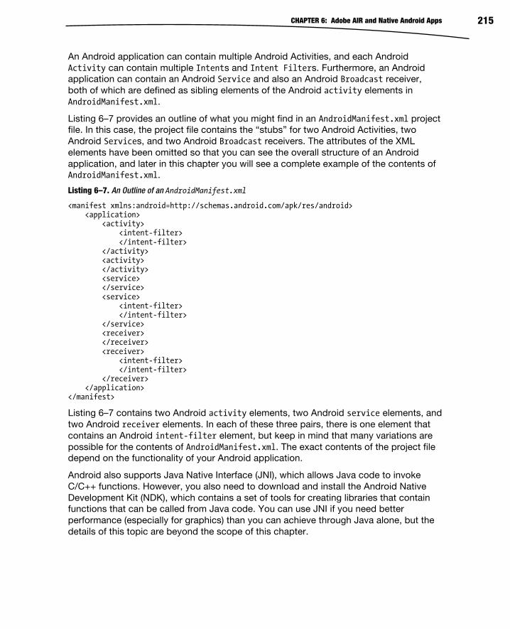
CHAPTER 6: Adobe AIR and Native Android Apps 215
An Android application can contain multiple Android Activities, and each Android Activity can contain multiple Intents and Intent Filters. Furthermore, an Android application can contain an Android Service and also an Android Broadcast receiver, both of which are defined as sibling elements of the Android activity elements in AndroidManifest.xml.
Listing 6–7 provides an outline of what you might find in an AndroidManifest.xml project file. In this case, the project file contains the “stubs” for two Android Activities, two Android Services, and two Android Broadcast receivers. The attributes of the XML elements have been omitted so that you can see the overall structure of an Android application, and later in this chapter you will see a complete example of the contents of AndroidManifest.xml.
Listing 6–7. An Outline of an AndroidManifest.xml
<manifest xmlns:android=http://schemas.android.com/apk/res/android> <application> <activity> <intent-filter> </intent-filter> </activity> <activity> </activity> <service> </service> <service> <intent-filter> </intent-filter> </service> <receiver> </receiver> <receiver> <intent-filter> </intent-filter> </receiver> </application> </manifest>
Listing 6–7 contains two Android activity elements, two Android service elements, and two Android receiver elements. In each of these three pairs, there is one element that contains an Android intent-filter element, but keep in mind that many variations are possible for the contents of AndroidManifest.xml. The exact contents of the project file depend on the functionality of your Android application.
Android also supports Java Native Interface (JNI), which allows Java code to invoke C/C++ functions. However, you also need to download and install the Android Native Development Kit (NDK), which contains a set of tools for creating libraries that contain functions that can be called from Java code. You can use JNI if you need better performance (especially for graphics) than you can achieve through Java alone, but the details of this topic are beyond the scope of this chapter.

CHAPTER 6: Adobe AIR and Native Android Apps 216
Android Activities An Android Activity corresponds to a screen or a view of an application, and the main entry point of an Android application is an Android Activity that contains an onCreate() method (which overrides the same method in its superclass) that is invoked whenever you launch an Android application. When you launch your Android application, its Android Activity will be started automatically. As an example, Listing 6–8 displays the contents of HelloWorld.java, which is automatically generated when you create an Eclipse-based “Hello World” Android application later in this chapter.
Listing 6–8. Contents of HelloWorld.java
package com.apress.hello; import android.app.Activity; import android.os.Bundle; public class HelloWorld extends Activity { /** Called when the activity is first created. */ @Override public void onCreate(Bundle savedInstanceState) { super.onCreate(savedInstanceState); setContentView(R.layout.main); } }
During the project creation step for Android applications, you specify the package name and the class name; the rest of the generated code is the same for every Android project.
Notice that HelloWorld extends android.app.Activity, and it also overrides the onCreate() method. As you can probably surmise, an Android Activity is an Android class containing a set of methods (such as onCreate()) that you can override in your Android applications. An Activity contains one or more Views that belong to an Android application.
An Android View is what users see on the screen, which includes the UI widgets of the Android application. The HelloWorld Android application contains an Android class that extends the Android Activity class and overrides the onCreate() method with your custom code. Note that Android applications can also extend other Android classes (such as the Service class), and they can also create threads.
An Android application can contain more than one Android Activity, and as you already know, every Activity must be defined in the XML document AndroidManifest.xml, which is part of every Android application.
The HelloWorld Android project contains the XML document AndroidManifest.xml, in which the Android class HelloWorld is registered in the XML activity element, as shown in Listing 6–9.

CHAPTER 6: Adobe AIR and Native Android Apps 217
Listing 6–9. Contents of AndroidManifest.xml
<?xml version="1.0" encoding="utf-8"?> <manifest xmlns:android="http://schemas.android.com/apk/res/android" package="com.apress.hello" android:versionCode="1" android:versionName="1.0"> <application android:icon="@drawable/icon" android:label="@string/app_name"> <activity android:name=".HelloWorld" android:label="@string/app_name"> <intent-filter> <action android:name="android.intent.action.MAIN" /> <category android:name="android.intent.category.LAUNCHER" /> </intent-filter> </activity>
</application> <uses-sdk android:minSdkVersion="9" /></manifest>
Notice the period (“.”) that precedes the Android Activity HelloWorld in Listing 6–9.This period is mandatory because the string .HelloWorld is appended to the packagename com.apress.hello (also specified in Listing 6–9), so the fully qualified name ofHelloWorld.java in this Android project is com.apress.hello.HelloWorld.
Android Intents The Android UI (user interface) consists of Intents and Views. In abstract terms, anAndroid Intent represents the details regarding an action (often described by a verb) toperform in an Android application.
An Intent is essentially a notification between Android Activities (or Services). AnIntent enables an Android Activity to send data to other Android Activities and also toreceive data from other Android Activities.
An Android Intent is similar to an event handler, but Android provides additionalfunctionality for handling multiple Intents and options for using existing Intents vs.starting a new Intent. Android Intents can start a new Android Activity, and they canalso broadcast messages (which are processed by Android Broadcast receivers). Thefollowing snippet illustrates how to start a new Activity via an Intent:
Intent intent = new Intent(action, data);startActivity(intent);
Android Activities and Intents provide a loosely coupled set of resources that isreminiscent of SOA (service-oriented architecture). The counterpart of an AndroidActivity would be a web service, and the Intents that the Android Activity canprocess are comparable to the “operations” or methods that the web service makesavailable to the world. Other Android applications can explicitly invoke one of thosemethods, or they can make a “general” request, in which case the “framework”determines which web services will handle that general request.

CHAPTER 6: Adobe AIR and Native Android Apps 218
You can also broadcast Intents in order to send messages between components. The following snippet illustrates how to broadcast an Intent:
Intent intent = new Intent(a-broadcast-receiver-class); sendBroadcast(intent);
This type of functionality provides a greater flexibility and “openness” for Android applications.
Types of Android Intents There are several types of Android Intents, each of which provides slightly different functionality. A directed Intent is an Intent with one recipient, whereas a broadcast Intent can be received by any process. An explicit Intent specifies the Java class that needs to be invoked. An implicit Intent is an Intent that does not specify a Java class, which means that the Android system will determine which application will process the implicit Intent. If there are several applications available that can respond to an implicit Intent, the Android system gives users the ability to select one of those applications.
Android also has the notion of Intent Filters, which are used for Intent resolution. An Intent Filter indicates the Intents that an Android Activity (or Android Service) can “consume,” and the details are specified in the XML intent-filter element. Note that if an application does not provide an Intent Filter, then it can be invoked only by an explicit Intent (and not by an implicit Intent).
An Intent Filter is specified in an Android Activity in the file AndroidManifest.xml, as shown in Listing 6–10.
Listing 6–10. An Example of an Intent Filter in Android
<intent-filter> <action android:name="android.intent.action.MAIN" /> <category android:name="android.intent.category.LAUNCHER" /> </intent-filter>
Listing 6–10 displays a fragment from the contents of AndroidManifest.xml, which is shown in Listing 6–9. The XML action element in Listing 6–10 specifies the default value android.intent.action.MAIN, and the XML category element specifies android.intent.category.LAUNCHER (also a default value), which means that the parent Activity will be displayed in the application launcher.
An Intent Filter must contain an XML action element, and optionally contain an XML category element or an XML data element. As you can see, Listing 6–10 contains the mandatory XML action element that specifies the default action, and an optional XML category element, but not the optional XML data element.
An Intent Filter is a set of information that defines a specific action; the XML data element specifies the data to be acted upon, and the XML category element specifies the component that will perform the action.
There are various combinations of these three XML elements that can be specified in an Intent Filter because two of these elements are optional, and Android uses a priority-

CHAPTER 6: Adobe AIR and Native Android Apps 219
based algorithm to determine what will be executed for each Intent Filter that you define in AndroidManifest.xml. If you need to learn about Intent Filters in greater detail, consult the Android documentation for additional information.
In case you are interested in finding out about Android Intents that are freely available, you can visit OpenIntents, which is an open source project consisting of various Android Intents that have been donated by other people, and its home page is here: www.openintents.org/en/.
OpenIntents provides Android applications in various categories, such as utilities, business applications, education, and entertainment. The applications are available as .apk files, and sometimes the source code for those applications is also available for free. Moreover, OpenIntents provides links to Android libraries such as game engines, charting packages, and services such as accessing a CouchDB server, Drupal, Facebook, and many others. The OpenIntents libraries are available here: www.openintents.org/en/libraries.
OpenIntents also provides a registry of publicly available Android Intents that can be invoked by Android Activities, along with their class files, and a description of their services. Visit the OpenIntents home page for more information.
Android Services Android Services are available for handling background tasks and other tasks that do not involve a visual interface. Since Android Services run in the main thread of the main process, Android Services typically start a new thread when they need to perform work without blocking the UI (which is handled in the main thread) of the Android application. Thus, an Android application can “bind” to a Service through a set of APIs that are exposed by that service.
An Android Service is defined via an XML service element in AndroidManifest.xml, as shown here:
<service android:name=".subpackagename.SimpleService"/>
Listing 6–11 displays the contents of ServiceName.java, which provides “skeleton” code for the definition of a custom Android Service class.
Listing 6–11. Contents of SimpleService.java
public class SimpleService extends Service { @Override public IBinder onBind(Intent intent) { return null; } @Override protected void onCreate() { super.onCreate(); startservice(); // defined elsewhere } @Override

CHAPTER 6: Adobe AIR and Native Android Apps 220
protected void onCreate() { // insert your code here } @Override protected void onStart() { // insert your code here } }
For example, if you need to execute something on a regular basis, you can include an instance of a Timer class that schedules and executes a TimerTask as often as required for your application needs.
Android Broadcast Receivers The purpose of an Android Broadcast receiver is to “listen” to Android Intents. Listing 6–12 displays the definition of an Android Broadcast receiver in the AndroidManifest.xml file for the widget-based Android application that is discussed later in this chapter.
Listing 6–12. Sample Entry for a Receiver in AndroidManifest.xml
<!-- Broadcast Receiver that will process AppWidget updates --> <receiver android:name=".MyHelloWidget" android:label="@string/app_name"> <intent-filter> <action android:name="android.appwidget.action.APPWIDGET_UPDATE" /> </intent-filter> <meta-data android:name="android.appwidget.provider" android:resource="@xml/hello_widget_provider" /> </receiver>
Listing 6–12 contains an XML receiver element that specifies MyHelloWidget as the Java class for this widget. This Android receiver contains an XML intent-filter element with an XML action element that causes an action to occur when it is time to update the AppWidget MyHelloWidget, as shown here:
<action android:name="android.appwidget.action.APPWIDGET_UPDATE" />
Android Life Cycle Earlier in this chapter, you saw the contents of HelloWorld.java, which contains the onCreate() method that overrides the same method in the superclass. In fact, onCreate() is one of the seven Android methods that make up the Android application life cycle.

CHAPTER 6: Adobe AIR and Native Android Apps 221
A Google Android application contains the following methods, and this is the order in which methods are invoked during the life cycle of an Android application1:
onCreate()
onRestart()
onStart()
onResume()
onPause()
onStop()
onDestroy()
The onCreate() method is invoked when an Activity is created, and its role is similar to init() methods in other languages. The onDestroy() method is invoked when an Activity is removed from memory, and its role is essentially that of a destructor method in C++. The onPause() method is invoked when an Activity must be paused (such as reclaiming resources). The onRestart() method is invoked when an Activity is being restarted. The onResume() method is invoked when an Activity interacts with a user. The onStart() method is invoked when an Activity becomes visible on the screen. Finally, the onStop() method is invoked in order to stop an Activity.
The methods onRestart(), onStart(), and onStop() are in the visible phase; the methods onResume() and onPause() are in the foreground phase. An Android application can pause and resume many times during the execution of that application; the details are specific to the functionality of the application (and possibly the type of user interaction as well).
Creating Android Applications This section describes how to create an Android application in Eclipse, and a subsequent section shows you the directory structure of an Android application, followed by a discussion of the main files that are created in every Android application.
Launch Eclipse and perform the following sequence of steps in order to create a new Android application called HelloWorld:
1. Navigate to File New Android Project.
2. Enter “HelloWorld” for the project name.
3. Select the check box on the left of “Android 2.3” for the Build Target.
4. Enter “HelloWorld” for the Application name.
1 http://developer.android.com/reference/android/app/Activity.html#Activity Lifecycle

CHAPTER 6: Adobe AIR and Native Android Apps 222
5. Enter “com.apress.hello” for the Package name.
6. Enter “HelloWorld” in the Create Activity input field.
7. Enter the digit “9” for the Min SDK Version.
8. Click the Finish button.
Eclipse will generate a new Android project (whose structure is described in the next section). Next, launch this application by right-clicking the project name HelloWorld, and then selecting Run As Android Application. You must wait until the Android emulator completes its initialization steps, which can require a minute or so (but each subsequent launching of your application will be noticeably faster).
Figure 6–5 displays the output of the HelloWorld application in an Android simulator that is launched from Eclipse.
Figure 6–5. The HelloWorld Android application
The Structure of an Android Application Navigate to the HelloWorld project that you created in the previous section, and right-click the project name in order to display the expanded directory structure. The next several sub-sections discuss the directory structure and the contents of the main files of every Android application.
Listing 6–13 displays the directory structure of the Android project HelloWorld.

CHAPTER 6: Adobe AIR and Native Android Apps 223
Listing 6–13. Structure of an Android Project
+HelloWorld src/ com/ apress/ hello/ HelloWorld.java gen/ com/ apress/ hello/ R.java Android 2.3/ android.jar assets/ res/ drawable-hdpi/ icon.png drawable-ldpi/ icon.png drawable-mdpi/ icon.png layout/ main.xml values/ strings.xml AndroidManifest.xml default.properties proguard.cfg
This Android application contains two Java files (HelloWorld.java and R.java), a JAR file (android.jar), an image file (icon.png), three XML files (main.xml, strings.xml, and AndroidManifest.xml), and a text file, default.properties.
The Main Files in an Android Application The files in the HelloWorld Android application that we will discuss in this section are listed here (all files are listed relative to the project root directory):
src/com/apress/hello/HelloWorld.java
gen/com/apress/hello/R.java
AndroidManifest.xml
res/layout/main.xml
res/values/strings.xml
Listing 6–14 displays the contents of HelloWorld.java, which is where you include all the custom Java code that is required for this Android application.

CHAPTER 6: Adobe AIR and Native Android Apps 224
Listing 6–14. Contents of HelloWorld.java
package com.apress.hello; import android.app.Activity; import android.os.Bundle; public class HelloWorld extends Activity { /** Called when the activity is first created. */ @Override public void onCreate(Bundle savedInstanceState) { super.onCreate(savedInstanceState); setContentView(R.layout.main); } }
Earlier in this chapter, you saw the contents of HelloWorld.java. You can think of this code as “boilerplate” code that is automatically generated during project creation, based on the user-supplied values for the package name and the class name.
Your custom code is included immediately after this statement:
setContentView(R.layout.main);
Instead of setting the View from the file main.xml, it is also common to set the View from another XML file or from a custom class that is defined elsewhere in your Android project.
Now let’s look at Listing 6–15, which displays the contents of the resources file R.java, which is automatically generated for you when you create an Android application.
Listing 6–15. Contents of R.java
/* AUTO-GENERATED FILE. DO NOT MODIFY. * * This class was automatically generated by the * aapt tool from the resource data it found. It * should not be modified by hand. */ package com.apress.hello; public final class R { public static final class attr { } public static final class drawable { public static final int icon=0x7f020000; } public static final class layout { public static final int main=0x7f030000; } public static final class string { public static final int app_name=0x7f040001; public static final int hello=0x7f040000; } }

CHAPTER 6: Adobe AIR and Native Android Apps 225
The integer values in Listing 6–15 are essentially references that correspond to assets of an Android application. For example, the variable icon is a reference to the icon.png file that is located in a subdirectory of the res directory. The variable main is a reference to the XML file main.xml (shown later in this section) that is in the res/layout subdirectory. The variables app_name and hello are references to the XML app_name element and XML hello element that are in the XML file strings.xml (shown earlier in this section) that is in the res/values subdirectory.
Now that we have explored the contents of the Java-based project files, let’s turn our attention to the XML-based files in our Android project. Listing 6–16 displays the entire contents of AndroidManifest.xml.
Listing 6–16. Contents of AndroidManifest.xml
<?xml version="1.0" encoding="utf-8"?> <manifest xmlns:android="http://schemas.android.com/apk/res/android" package="com.apress.hello" android:versionCode="1" android:versionName="1.0"> <application android:icon="@drawable/icon" android:label="@string/app_name"> <activity android:name=".HelloWorld" android:label="@string/app_name"> <intent-filter> <action android:name="android.intent.action.MAIN" /> <category android:name="android.intent.category.LAUNCHER" /> </intent-filter> </activity> </application> <uses-sdk android:minSdkVersion="9" /> </manifest>
Listing 6–16 starts with an XML declaration, followed by an XML manifest element that contains child XML elements, which provide information about your Android application. Notice that the XML manifest element contains an attribute with the package name of your Android application.
The XML application element in Listing 6–16 contains an android:icon attribute whose value is @drawable/icon, which refers to an image file icon.png that is located in the res subdirectory. Android supports three types of image files: high-density, medium-density, and low-density. The corresponding directories are drawable-hdpi, drawable-mdpi, and drawable-ldpi, all of which are subdirectories of the res directory under the root directory of every Android application.
The XML application element in Listing 6–16 also contains an android:label attribute whose value is @string/app_name, which refers to an XML element in the file strings.xml that is in the res/values subdirectory.
Listing 6–16 contains an XML intent-filter element, which was briefly discussed earlier in this chapter. The final part of Listing 6–10 specifies the minimum Android version number that is required for this application, as shown here:
<uses-sdk android:minSdkVersion="9" />

CHAPTER 6: Adobe AIR and Native Android Apps 226
In our current example, the minimum version is 9, which is also the number that we specified during the creation step of this Android application.
Now let’s take a look at Listing 6–17, which displays the contents of the XML file strings.xml.
Listing 6–17. Contents of strings.xml
<?xml version="1.0" encoding="utf-8"?> <resources> <string name="hello">Hello World, HelloWorld!</string> <string name="app_name">HelloWorld</string> </resources>
Listing 6–17 is straightforward: it contains an XML resources element with two XML child elements that are used to display the string “Hello World, HelloWorld!” when you launch this Android application. Note that the XML application element in the XML document AndroidManifest.xml references also the second XML string element, whose name attribute has the value app_name, as shown here:
<application android:icon="@drawable/icon" android:label="@string/app_name">
Now let’s look at Listing 6–18, which displays the contents of the XML document main.xml, which contains View-related information about this Android application.
Listing 6–18. Contents of main.xml
<?xml version="1.0" encoding="utf-8"?> <LinearLayout xmlns:android="http://schemas.android.com/apk/res/android" android:orientation="vertical" android:layout_width="fill_parent" android:layout_height="fill_parent" > <TextView android:layout_width="fill_parent" android:layout_height="wrap_content" android:text="@string/hello" /> </LinearLayout>
Listing 6–18 contains an XML LinearLayout element that is the default layout for an Android application. Android supports other layout types, including AbsoluteLayout, FrameLayout, RelativeLayout, and TableLayout (none of which are discussed in this chapter).
The XML LinearLayout element contains a fill_parent attribute that indicates that the current element will be as large as the parent element (minus padding). The attributes layout_width and layout_height specify the basic values for the width and height of the View.
The XML TextView element contains the attributes layout_width and layout_height, whose values are fill_parent and wrap_content, respectively. The wrap_content attribute specifies that the size of the View will be just big enough to enclose its content (plus padding). The attribute text refers to the XML hello element that is specified in the

CHAPTER 6: Adobe AIR and Native Android Apps 227
strings.xml file (located in the res/values subdirectory), whose definition is shownhere:
<string name="hello">Hello World, HelloWorld!</string>
The string “Hello World, HelloWorld!” is the text that is displayed when you launch the“Hello World” Android application in the Android simulator or in an Android device afterhaving deployed this Android application.
Sending Notifications in Android Applications As you already know, Adobe does not provide built-in support for notifications, whichare available in native Android mobile applications. However, the example in this sectionwill show you how to create an Adobe AIR mobile application and a native Androidapplication that can be merged into a single .apk file, which will support theNotification-related functionality.
James Ward (who wrote the foreword for this book) contributed the socket-based codein this section, and Elad Elrom provided the step-by-step instructions for merging anAdobe AIR mobile application with a native Android application.
This section is lengthy because there is an initial setup sequence (involving six steps),two Adobe AIR source files, and also Android source files for this mobile application.The first part describes the setup sequence; the second part of this section discussesthe two source files with Adobe AIR code; and the third part discusses the two sourcefiles with native Android code.
1. Download a package with the required dependencies for extending AIR
for Android:
www.jamesward.com/downloads/extending_air_for_android-flex_4_5-air_2_6–v_1.zip
2. Create a regular Android project in Eclipse (do not create an Activityyet): specify a “Project name:” of FooAndroid, select Android 2.2 for the
“Target name:”, type “FooAndroid” for the “Application name:”, enter
“com.proandroidflash” for the “Package name:”, type “8” for the “Min
SDK Version:”, and then click the Finish button.
3. Copy all of the files from the zip file you downloaded in step 1 into the
root directory of the newly created Android project. You will need to
overwrite the existing files, and Eclipse will prompt you about updating
the launch configuration.
4. Delete the res/layout directory.
5. Add the airbootstrap.jar file to the project’s build path by right-
clicking the file, and then select Build Path and Add to Build Path.

CHAPTER 6: Adobe AIR and Native Android Apps 228
6. Launch the project and confirm that you see “Hello, world” on your
Android device. If so, then the AIR application is properly being
bootstrapped and the Flex application in assets/app.swf is correctly
being run.
Now that we have completed the initial setup steps, let’s create a new Flex mobile project called Foo, using the Mobile Application template, and add the code shown in Listing 6–19.
Listing 6–19. Receiving Data and Sending the Data to a Notification on Android
<?xml version="1.0" encoding="utf-8"?> <s:View xmlns:fx="http://ns.adobe.com/mxml/2009" xmlns:s="library://ns.adobe.com/flex/spark" title="HomeView" creationComplete="start()"> <fx:Script source="SQLiteAccess.as"/> <!-- get status updates from Montastic --> <s:Button x="10" y="10" width="200" height="50" label="Get Statuses" click="invokeMontastic()"> </s:Button> <s:Button x="250" y="10" width="200" height="50" label="Clear History" click="removeAll()"> </s:Button> <s:DataGrid id="dg" left="10" right="10" top="70" bottom="100" dataProvider="{dp}"> <s:columns> <s:ArrayList> <s:GridColumn headerText="ID" dataField="id" width="60" /> <s:GridColumn headerText="Status" dataField="status" width="100" /> <s:GridColumn headerText="URL" dataField="url" width="300" /> </s:ArrayList> </s:columns> </s:DataGrid> <s:Button label="Create Notification" x="10" y="650" width="300" height="50"> <s:click> <
CHAPTER 6: Adobe AIR and Native Android Apps 229
s.addEventListener(IOErrorEvent.IO_ERROR, function(event:IOErrorEvent):void { trace('error sending allStatuses from client: ' + event.errorID); }); s.addEventListener(ProgressEvent.SOCKET_DATA, function(event:ProgressEvent):void { trace('allStatuses sent successfully'); }); ]]> </s:click> </s:Button> </s:View>
Listing 6–19 contains an XML Button that invokes the Montastic APIs in order to retrieve the status of the web sites that are registered in Montastic. When users click this button, the statuses of the web sites are stored in a SQLite database and the datagrid is refreshed with the new set of rows.
The second XML Button enables users to delete all the rows in the SQLite table, which is convenient because this table can quickly increase in size. If you want to maintain all the rows of this table, you probably ought to include scrolling capability for the datagrid.
When users click the third XML Button element, this initiates a client-side socket-based connection on port 12345 in order to send the latest statuses of the web sites to a server-side socket that is running in a native Android application. The Android application reads the information sent from the client and then displays the statuses in the Android notification bar.
The ActionScript3 code in Listing 6–20 is similar to Listing 6–8, so you will be able to read its contents quickly, despite the various application-specific changes to the code.
Listing 6–20. Receiving Data and Sending the Data to a Notification on Android
Import flash.data.SQLConnection; import flash.data.SQLStatement; import flash.events.Event; import flash.events.IOErrorEvent; import flash.errors.SQLErrorEvent; import flash.events.SQLEvent; import flash.events.TimerEvent; import flash.filesystem.File; import flash.net.URLLoader; import flash.net.URLRequest; import flash.net.URLRequestHeader; import flash.net.URLRequestMethod; import flash.utils.Timer; import mx.collections.ArrayCollection; import mx.utils.Base64Encoder; //Montastic URL private static const montasticURL:String = "https://www.montastic.com/checkpoints/show"; // sqlconn holds the database connection public var sqlconn:SQLConnection = new SQLConnection();

CHAPTER 6: Adobe AIR and Native Android Apps 230
// sqlstmt is a SQLStatement that holds SQL commands public var sqlstmt:SQLStatement = new SQLStatement(); // a bindable ArrayCollection and the data provider for the datagrid [Bindable] public var dp:ArrayCollection = new ArrayCollection(); [Bindable] public var allStatuses:String = "1:UP#2:UP#3:UP"; private var urlList:Array = new Array(); private var statusList:Array = new Array();
Listing 6–20 contains various import statements, followed by variables for opening a database connection and executing SQL statements. The Bindable variables provide access to the contents of the database table, as well as the URL and status of web sites that are registered with Montastic.
The variable checkpointsXMLList contains “live” data for the web sites that you have registered with Montastic.
// invoked after the application has loaded private function start():void { // set 'montastic.db' as the file for our database (created after it's opened) var db:File = File.applicationStorageDirectory.resolvePath("montastic.db"); // open the database in asynchronous mode sqlconn.openAsync(db); // event listeners for handling sql errors and 'result' are // invoked whenever data is retrieved from the database sqlconn.addEventListener(SQLEvent.OPEN, db_opened); sqlconn.addEventListener(SQLErrorEvent.ERROR, error); sqlstmt.addEventListener(SQLErrorEvent.ERROR, error); sqlstmt.addEventListener(SQLEvent.RESULT, result); } private function db_opened(e:SQLEvent):void { // specify the connection for the SQL statement sqlstmt.sqlConnection = sqlconn; // Table "montastic_table" contains three columns: // 1) id (an autoincrementing integer) // 2) url (the url of each web site) // 3) status (the status of each web site) sqlstmt.text = "CREATE TABLE IF NOT EXISTS montastic_table ( id INTEGER PRIMARY KEY AUTOINCREMENT, url TEXT, status TEXT);"; // execute the sqlstmt to update the database sqlstmt.execute(); // refresh the datagrid to display all data rows refreshDataGrid(); }
The methods start() and db_opened() are similar to the example earlier in this chapter, except that the database name is now montastic.db and the database table montastic_table is updated when users tap the associated Button in the mobile

CHAPTER 6: Adobe AIR and Native Android Apps 231
application. Note that the montastic_table contains the columns id, url, and status instead of the columns id, first_name, and last_name.
// function to append new rows to montastic table // use a begin/commit block to insert multiple rows private function addWebsiteInfo():void { allStatuses = ""; sqlconn.begin(); for (var i:uint = 0; i < urlList.length; i++) { var stmt:SQLStatement = new SQLStatement(); stmt.sqlConnection = sqlconn; stmt.text = "INSERT INTO montastic_table (url, status) VALUES(:url, :status);"; stmt.parameters[":url"] = urlList[i]; stmt.parameters[":status"] = statusList[i]; stmt.execute(); } // insert the rows into the database table sqlconn.commit(); refreshDataGrid(); } // refresh the Montastic data in the datagrid private function refreshDataGrid(e:TimerEvent = null):void { // timer object pauses and then attempts to execute again var timer:Timer = new Timer(100,1); timer.addEventListener(TimerEvent.TIMER, refreshDataGrid); if (!sqlstmt.executing) { sqlstmt.text = "SELECT * FROM montastic_table" sqlstmt.execute(); } else { timer.start(); } } // invoked when we receive data from a sql command //this method is also called for sql statements to insert items // and to create our table but in this case sqlstmt.getResult().data // is null private function result(e:SQLEvent):void { var data:Array = sqlstmt.getResult().data; // fill the datagrid with the latest data dp = new ArrayCollection(data); } // remove all rows from the table private function removeAll():void { sqlstmt.text = "DELETE FROM montastic_table"; sqlstmt.execute(); refreshDataGrid();

CHAPTER 6: Adobe AIR and Native Android Apps 232
}
The method addWebsiteInfo() is the “counterpart” to the addPerson() method, and the database insertion is performed inside a begin/end block in order to perform multiple row insertions in one SQL statement. This technique enables us to use the same logic that is used by the two methods refreshDataGrid() and result() for retrieving the latest data from the database without contention errors.
Note that instead of the method remove(), which removes a selected row from the datagrid, we now have a method, removeAll(), that removes all the rows from the database table.
// functions for Montastic public function invokeMontastic():void { var loader:URLLoader = new URLLoader(); loader.addEventListener(Event.COMPLETE, completeHandler); loader.addEventListener(IOErrorEvent.IO_ERROR, ioErrorHandler); var request:URLRequest = new URLRequest( montasticURL ); request.method = URLRequestMethod.GET; var encoder:Base64Encoder = new Base64Encoder(); encoder.encode("[email protected]:insert-your-password-here"); request.requestHeaders.push(new URLRequestHeader("Authorization", "Basic " + encoder.toString())); request.requestHeaders.push(new URLRequestHeader("pragma", "no-cache")); request.requestHeaders.push(new URLRequestHeader("Accept", "application/xml")); request.requestHeaders.push(new URLRequestHeader("Content-Type", "application/xml")); loader.load(request); } private function completeHandler(event:Event):void { var loader:URLLoader = URLLoader(event.target); checkpointsXMLList = new XML(loader.data); urlList = new Array(); statusList = new Array(); for each (var checkpoint:XML in checkpointsXMLList.checkpoint) { statusList.push(checkpoint.status.toString()); urlList.push(checkpoint.url.toString()); } allStatuses = "1="+statusList[0]+"#2="+statusList[1]; addWebsiteInfo(); }
When users tap on the associated Button (whose label is “Get Statuses”), the method invokeMontastic() is executed, which in turn invokes the Montastic APIs that return XML containing status-related information regarding the web sites that the users have registered with Montastic.

CHAPTER 6: Adobe AIR and Native Android Apps 233
Notice that the method completeHandler() is invoked after the asynchronous request to the Montastic web site has returned the XML-based data.
The allStatuses variable is updated appropriately (we need to send this string to the server socket), and then the method addWebsiteInfo() is executed, which updates the database table montastic_table with the data that we received from Montastic.
private function ioErrorHandler(event:IOErrorEvent):void { trace("IO Error" + event); } private function sqlError(event:SQLErrorEvent):void { trace("SQL Error" + event); }
The functions ioErrorHandler() and sqlError() are invoked when a related error occurs, and in a production environment, you can add additional error messages that provide helpful debugging information.
As you saw earlier, we are using a hard-coded XML string that contains a sample of the information for web sites that you have registered with Montastic. Currently you can retrieve the XML-based status information about your web sites by invoking the “curl” program from the command line, as shown here (invoked as a single line):
curl -H 'Accept: application/xml' -H 'Content-type: application/xml' -u [email protected]:yourpassword https://www.montastic.com/checkpoints/index
Now that we have discussed the AIR-specific code, let’s focus on the socket-based native Android code that processes the information from the client. The socket code is part of an Android application that we will name FooAndroid.
Before we discuss the Java code for this application, let’s look at Listing 6–21, which contains the file AndroidManifest.xml for our Android application. Note that Listing 6–21 displays the final version of this configuration file, and not the contents that are generated during the creation step of the Android project FooAndroid.
Listing 6–21. AndroidManifest.xml for the Native Android Application
<?xml version="1.0" encoding="utf-8"?> <manifest xmlns:android="http://schemas.android.com/apk/res/android" package="com.proandroidflash" android:versionCode="1" android:versionName="1.0"> <uses-permission android:name="android.permission.INTERNET" /> <application android:icon="@drawable/icon" android:label="@string/app_name"> <activity android:name=".MainApp" android:label="@string/app_name" android:theme="@android:style/Theme.NoTitleBar" android:launchMode="singleTask" android:screenOrientation="nosensor" android:configChanges="keyboardHidden|orientation" android:windowSoftInputMode="stateHidden|adjustResize"> <uses-permission android:name="android.permission.INTERNET" />

CHAPTER 6: Adobe AIR and Native Android Apps 234
<intent-filter> <action android:name="android.intent.action.MAIN" /> <category android:name="android.intent.category.LAUNCHER" /> </intent-filter> </activity> <service android:enabled="true" android:name="TestService" /> </application> </manifest>
Listing 6–21 specifies MainApp.java as the Android Activity for our Android application. As you will see, the Java class MainApp.java (which contains some custom Java code) extends the Android Activity AppEntry.java that is a subclass of the Android Activity class. Notice that Listing 6–21 specifies an Android Service class called TestService.java, which contains socket-based custom code that processes information that is received from the Adobe AIR client.
Now create a native Android application in Eclipse called FooAndroid with a Java class MainApp that extends the class AppEntry. The Java class AppEntry.java is a simple, pre-built Java Activity that is an intermediate class between the Android Activity class and our custom Java class, MainApp. Listing 6–22 displays the contents of the Java class MainApp.
Listing 6–22. Main Android Activity Class
package com.proandroidflash; import android.app.Activity; import android.content.Intent; import android.os.Bundle; public class MainApp extends AppEntry { /** Called when the activity is first created. */ @Override public void onCreate(Bundle savedInstanceState) { super.onCreate(savedInstanceState); try { Intent srv = new Intent(this, TestService.class); startService(srv); } catch (Exception e) { // service could not be started } } }
The Java class MainApp (which is an indirect subclass of the Android Activity class) is executed when our Android application is launched; the onCreate() method in MainApp launches our custom Java class TestService.java (discussed later) that launches a server-side socket in order to handle data requests from the Adobe AIR client.

CHAPTER 6: Adobe AIR and Native Android Apps 235
As you can see, the onCreate() method invokes the startService() method that is a method in the Android Activity class, in order to launch the TestService Service. This functionality is possible because MainApp is a subclass of the Android Activity class.
Now create the second Java class, TestServiceApp.java, in the com.proandroidflash package, and insert the code in Listing 6–23.
Listing 6–23. An Android Service Class That Processes Data from an AIR Client
package com.proandroidflash; import java.io.BufferedInputStream; import java.io.DataInputStream; import java.io.IOException; import java.net.ServerSocket; import java.net.Socket; import android.app.Notification; import android.app.NotificationManager; import android.app.PendingIntent; import android.app.Service; import android.content.Context; import android.content.Intent; import android.os.IBinder; import android.os.Looper; import android.util.Log; public class TestService extends Service { private boolean stopped=false; private Thread serverThread; private ServerSocket ss; @Override public IBinder onBind(Intent intent) { return null; }
The initial portion of FooAndroid contains various import statements, private socket-related variables, and the onBind() method. This method can be used for other functionality that is supported by Android Service classes (which is beyond the scope of this example), and for our purposes this method simply returns null.
The next portion of Listing 6–23 contains a lengthy onCreate() method, which starts a server-side socket for handling Adobe AIR client requests.
Listing 6–23. (Cont.) An Android Service Class That Processes Data from an AIR Client
@Override public void onCreate() { super.onCreate(); Log.d(getClass().getSimpleName(), "onCreate"); serverThread = new Thread(new Runnable() { public void run() { try { Looper.prepare();

CHAPTER 6: Adobe AIR and Native Android Apps 236
ss = new ServerSocket(12345); ss.setReuseAddress(true); ss.setPerformancePreferences(100, 100, 1); while (!stopped) { Socket accept = ss.accept(); accept.setPerformancePreferences(10, 100, 1); accept.setKeepAlive(true); DataInputStream _in = null; try { _in = new DataInputStream(new BufferedInputStream( accept.getInputStream(),1024)); } catch (IOException e2) { e2.printStackTrace(); } int method = _in.readInt(); switch (method) { // send a notification? case 1: doNotification(_in); break; } } } catch (Throwable e) { e.printStackTrace(); Log.e(getClass().getSimpleName(), "** Error in Listener **",e); } try { ss.close(); } catch (IOException e) { Log.e(getClass().getSimpleName(), "Could not close serversocket"); } } },"Server thread"); serverThread.start(); }
The onCreate() method starts a Java Thread whose run() method launches a server-side socket on port 12345 (which is the same port as the client-side socket). The onCreate() method contains a while loop that waits for client-side requests and then processes them in the try/catch block.
If the first character in a client-side request is the digit “1”, then we know that the client request is from our AIR application, and the code in the try/catch block invokes the method doNotification(). If necessary, you could enhance onCreate() (i.e., handle the occurrence of other numbers, text strings, and so forth) so that the server-side code can process other client-side requests.

CHAPTER 6: Adobe AIR and Native Android Apps 237
private void doNotification(DataInputStream in) throws IOException { String id = in.readUTF(); displayNotification(id); } public void displayNotification(String notificationString) { int icon = R.drawable.mp_warning_32x32_n; CharSequence tickerText = notificationString; long when = System.currentTimeMillis(); Context context = getApplicationContext(); CharSequence contentTitle = notificationString; CharSequence contentText = "Hello World!";
Intent notificationIntent = new Intent(this, MainApp.class); PendingIntent contentIntent = PendingIntent.getActivity(this, 0, notificationIntent, 0);
Notification notification = new Notification(icon, tickerText, when); notification.vibrate = new long[] {0,100,200,300};
notification.setLatestEventInfo(context, contentTitle, contentText, contentIntent); String ns = Context.NOTIFICATION_SERVICE; NotificationManager mNotificationManager = (NotificationManager) getSystemService(ns);
mNotificationManager.notify(1, notification); }
@Override public void onDestroy() { stopped = true;
try { ss.close(); } catch (IOException e) {}
serverThread.interrupt();
try { serverThread.join(); } catch (InterruptedException e) {} }
}
The doNotification() method simply reads the next character string in the input stream(which was sent from by the client) and then invokes the methoddisplayNotification(). In our case, this character string will be a concatenated stringthat contains the status (“UP” or “DOWN”) for each registered web site.

CHAPTER 6: Adobe AIR and Native Android Apps 238
As you have probably surmised, the displayNotification() method contains the Android code for displaying a notification in the Android notification bar. The key point to notice is that this method creates an Android Intent with the Java class MainApp.java. The new Intent enables us to create an Android PendingIntent, which in turn allows us to create an Android Notification instance. The final line of code in displayNotification() launches our notification, which displays the status of the registered web sites in the Android notification bar.
The last part of the code is the onDestroy() method, which stops the server-side socket that was launched on the onCreate() method.
Now that we have completed the Java code for this application, we need to take care of the XML-related files for this application. First, make sure that the contents of AndroidManifest.xml in your application are the same as Listing 6–21. Second, include the following strings in the XML file strings.xml:
<string name="button_yes">Yes</string> <string name="button_no">No</string> <string name="dialog_title"><b>Adobe AIR</b></string> <string name="dialog_text">This application requires that you first install Adobe AIR®.\n\nDownload it free from Android Market now?</string>
Now that we have completed all the Adobe AIR code and the native Android code, we’re ready to merge the files into one mobile application, and the steps for doing so are shown in the next section in this chapter.
You can see an example of invoking the sample application in this section displayed in Figure 6–6, which shows a set of records consisting of URLs and their statuses that are stored in a SQLite database on a mobile device.
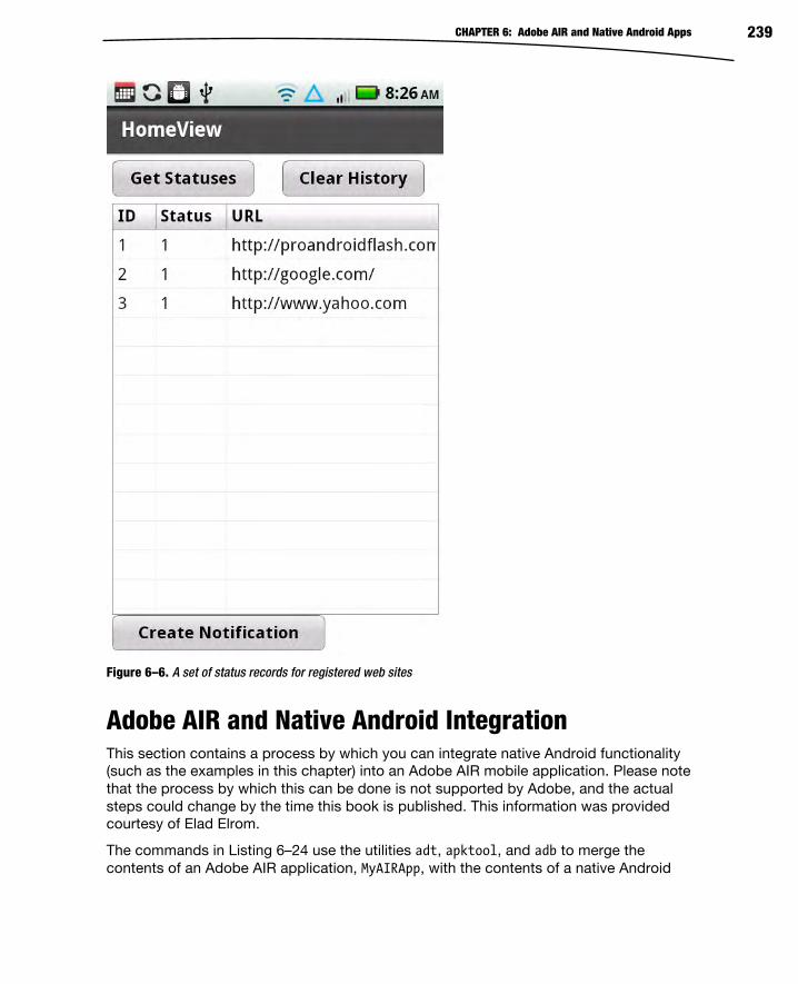
CHAPTER 6: Adobe AIR and Native Android Apps 239
Figure 6–6. A set of status records for registered web sites
Adobe AIR and Native Android Integration This section contains a process by which you can integrate native Android functionality (such as the examples in this chapter) into an Adobe AIR mobile application. Please note that the process by which this can be done is not supported by Adobe, and the actual steps could change by the time this book is published. This information was provided courtesy of Elad Elrom.
The commands in Listing 6–24 use the utilities adt, apktool, and adb to merge the contents of an Adobe AIR application, MyAIRApp, with the contents of a native Android

CHAPTER 6: Adobe AIR and Native Android Apps 240
application, AndroidNative.apk, in order to create the Adobe AIR mobile application MergedAIRApp.apk.
Listing 6–24 displays the actual commands that you need to invoke in order to create a new .apk file that comprises the code from an Adobe AIR mobile application and a native Android mobile application. Make sure that you update the value of the variable APP_HOME so that it reflects the correct value for your environment.
Listing 6–24. Creating a Merged Application with Adobe AIR and Native Android Code
APP_HOME=”/users/ocampesato/AdobeFlashBuilder/MyAIRApp” cd $APP_HOME/bin-debug adt -package -target apk -storetype pkcs12 -keystore certificate.p12 -storepass Nyc1982 out.apk MyAIRApp-app.xml MyAIRApp.swf apktool d -r out.apk air_apk apktool d -r AndroidNative.apk native_apk mkdir native_apk/assets cp -r air_apk/assets/* native_apk/assets cp air_apk/smali/app/AIRApp/AppEntry*.smali native_apk/smali/app/AIRApp apktool b native_apk cd native_apk/dist jarsigner -verbose -keystore ~/.android/debug.keystore -storepass android out.apk androiddebugkey zipalign -v 4 out.apk out-new.apk cd ../../ cp native_apk/dist/out-new.apk MergedAIRApp.apk rm -r native_apk rm -r air_apk rm out.apk adb uninstall app.AIRApp adb install -r MergedAIRApp.apk
The commands in Listing 6–24 are straightforward if you are familiar with Linux or Unix. If you prefer to work in a Windows environment, you can convert the commands in Listing 6–24 to a corresponding set of DOS commands by making the following changes:
Use “set” when defining the APP_HOME variable.
Use DOS-style variables (example: %abc% instead of $abc).
Replace cp with copy and replace rm with erase.
Replace forward slashes (“/”) with backward slashes (“\”).
One important detail to keep in mind: you must obtain the correct self-signed certificate (which is called certificate.p12 in Listing 6–24) for the preceding merging process to work correctly. You can generate a certificate for your Flex-based application as follows:
Select your project in FlashBuilder.
Click Export Release Build.
Specify a location for “Export to folder:” (or click Next).
Click the “Create:” button.

CHAPTER 6: Adobe AIR and Native Android Apps 241
Provide values for the required fields.
Specify a value in the “Save as:” input field.
Click the OK button.
Click “Remember password for this session” (optional).
Click the Finish button.
After generating the self-signed certificate, copy this certificate into the directory where you execute the shell script commands that are shown in Listing 6–24, and if you have done everything correctly, you will generate a merged application that can be deployed to an Android-based mobile device.
This section concludes the multi-step process for creating and then merging Adobe AIR applications with native Android applications. As you can see, this integration process is non-trivial, and arguably non-intuitive as well, so you are bound to stumble during this process (and don’t be discouraged when you do). The thing to remember is that the addition of native Android support to an Adobe AIR application could be the sort of thing that can differentiate your application from similar applications that are available in the marketplace.
Summary In this chapter, you learned how to launch native browsers, access databases, and combine AIR mobile applications with native Android code. More specifically, you learned about the following:
Launching a native web browser from a string containing the actual HTML code for a web site
Enabling users to specify a URL and then launching that URL in an AIR application
Using a SQLite database to create, update, and delete user-specific data, and also how to automatically refresh the display of the updated data
Creating native Android applications in Eclipse
Integrating the functionality of an external API, a SQLite database, and a native Android notification into one mobile application
The specific sequence of steps for merging an Adobe AIR application with a native Android application.

243
Chapter
Taking Advantage of Hardware Inputs You saw in the previous chapter how to integrate your Android Flash application with
the native software services provided by the Android OS. In this chapter, you will learn
how to make use of the hardware sensors included in Android-powered devices. By the
end of this chapter, you will be able to capture sound, images, and video; tap into
geolocation services to read the device’s location; and read accelerometer data to
determine the orientation of the device—all from within your Flash application.
Modern mobile devices have an amazing array of hardware sensors—from
accelerometers to cameras to GPS receivers. Effective mobile applications should be
able to take advantage of these features when the need arises. The AIR runtime
provides classes that allow you to access these native hardware resources. Some of
these classes, such as Microphone and Camera, may be familiar to experienced Flash
developers. Others, such as CameraUI and CameraRoll, are new additions that allow AIR
applications to take advantage of features commonly found on Android devices.
Microphone A phone wouldn’t be very useful without a microphone, so we will start with this most
basic of inputs. Flash has supported capturing sound with the Microphone class for a
long time, and this class is fully supported on AIR for Android as well. As with all of the
hardware support classes you will see in this chapter, the first step is to check the static
isSupported property of the class to ensure that it is supported on the user’s device. All
phones will, of course, have a microphone, but this is not necessarily true of tablets and
TVs. Since you will want to support a wide range of current and future devices, it is a
best practice to always check the isSupported property of Microphone and the other
classes we will cover in this chapter.
7

CHAPTER 7: Taking Advantage of Hardware Inputs 244
If Microphone is supported, you can then proceed to retrieve a Microphone instance, set
your capture parameters, and attach an event listener to enable you to receive the
sound data coming from the device’s microphone.
Listing 7–1 shows these steps in an excerpt from the MicrophoneBasic example project
located in the examples/chapter-07 directory of this book’s sample code.
Listing 7–1. Initializing and Reading Samples from the Microphone
private var activityLevel: uint; private function onCreationComplete():void { if (Microphone.isSupported) { microphone = Microphone.getMicrophone(); microphone.setSilenceLevel(0) microphone.gain = 100; microphone.rate = 22; microphone.addEventListener(SampleDataEvent.SAMPLE_DATA, onSample); initGraphics(); showMessage("Speak, I can hear you..."); } else { showMessage("flash.media.Microphone is unsupported on this device."); } } private function onSample(event:SampleDataEvent):void { if (microphone.activityLevel > activityLevel) { activityLevel = Math.min(50, microphone.activityLevel); } } private function showMessage(msg:String):void { messageLabel.text = msg; }
The microphone initialization code is located inside the View’s creationComplete
handler. If Microphone is unsupported, the onCreationComplete() function calls the
showMessage() function to display a message to the user. The showMessage() function
simply sets the text property of a Spark Label that is positioned at the top of the view. If
Microphone is supported, however, then a call is made to the static function
Microphone.getMicrophone(), which returns an instance of a Microphone object. You
then set the gain and rate properties of the object. A setting of 100 is the maximum gain
setting for the microphone, and a rate of 22 specifies the maximum sample frequency of
22 kHz. This will ensure that even soft sounds are captured at a reasonable sampling
rate. You should note that Microphone supports capturing at rates up to 44.1 kHz, which
is the same sample rate used on compact discs. However, the quality of the recording is
limited to what the underlying hardware can support. A cell phone microphone will likely
capture audio at much lower rates. Although Flash will convert the captured audio to the
sampling rate you requested, this does not mean that you will end up with CD-quality
audio.

CHAPTER 7: Taking Advantage of Hardware Inputs 245
Finally, we add a listener for the SampleDataEvent.SAMPLE_DATA event. The application
will begin receiving sound data once this listener is attached. The event has two
properties of particular interest:
position: A Number indicating the position of the data in the audio
stream
data: A ByteArray containing the audio data captured since the last
SAMPLE_DATA event
An application will typically just copy the data bytes into a ByteArray created by the
application to hold the entire audio clip until it can be played back, stored, or sent on to
a server. See Chapter 8 for more details about capturing and playing back audio data.
The MicrophoneBasic example application simply displays visual feedback about the
audio data coming from the microphone by checking the activityLevel property, as
shown in Listing 7–1.
One important thing to remember is to set the android.permission.RECORD_AUDIO setting
in your application descriptor XML file. You will not be able to read microphone data on
an Android device without this permission. The manifest section from the example
project is shown in the following code snippet.
<android> <manifestAdditions> <![CDATA[ <manifest> <!-- For debugging only --> <uses-permission android:name="android.permission.INTERNET"/> <uses-permission android:name="android.permission.RECORD_AUDIO"/> </manifest> ]]> </manifestAdditions> </android>
Flash’s support for capturing audio samples is actually quite sophisticated. You are even
able to set a “zero” level using setSilenceLevel() or enable echo suppression using
setUseEchoSuppression(). We encourage you to check out Adobe’s excellent online
documentation1.
Figure 7–1 shows what the MicrophoneBasic application looks like when it is running on
an actual phone.
1 http://help.adobe.com/en_US/FlashPlatform/reference/actionscript/3/flash/ media/Microphone.html

CHAPTER 7: Taking Advantage of Hardware Inputs 246
Figure 7–1. The MicrophoneBasic example application running on an Android phone
Camera and CameraUI You will find a camera (or sometimes two) on most mobile devices. An Android Flash
application can use the camera to capture still images as well as full motion video. Some
devices are even capable of capturing high-definition video.
There are two different ways to access a device’s camera. The flash.media.Camera
class will give you access to the raw video stream coming from the camera. This allows
you to do real-time processing on the images as they are captured from the main
camera on the device.

CHAPTER 7: Taking Advantage of Hardware Inputs 247
NOTE: As of AIR 2.5.1, the flash.media.Camera class did not support the ability to capture from more than one camera on an Android device. The ability to select which camera to use
during video capture is expected in a future release of AIR for Android.
The alternative is to use flash.media.CameraUI to capture high-quality images and
video. CameraUI is ideal for applications that just need to capture an image or a video
with minimal hassle. It uses the native Android camera interface to handle the heavy
lifting. This means the user of your application will have access to every feature that
Android supports natively on a given device, including multiple cameras and the ability
to adjust the white balance, geo-tagging features, focus, exposure, and flash settings.
Android also provides a standard interface for browsing the images and video that have
been captured on the device. AIR provides access to this service through the
flash.media.CameraRoll class. CameraRoll provides a simple way to save images to the
device. It also allows the user to browse previously captured images and will inform your
application if the user selects an image or video file. Like CameraUI, CameraRoll is a
wrapper around the native Android media browser interface. Users like applications that
feel familiar and look like the other native applications they use. It is a good thing, then,
that AIR provides easy access to the native interfaces for camera functionality. They
should be your first choice if they meet the needs of your application.
In the next sections, we will explore these three classes in more depth. We’ll first
introduce you to the basic Camera class and then show an example that applies some of
the powerful Flash filter effects to the live video stream. Real-time video processing on a
phone! How cool is that? After that, we’ll take you on a guided tour of the CameraRoll
and CameraUI classes and show you how to use them to capture, save, and browse
media using Android’s native interfaces. Let the fun begin!
Camera The APIs that make up the Flash and Flex SDKs are generally well designed. The video
capture feature is no exception. The responsibilities for this complex process are divided
between two easy-to-use classes. The flash.media.Camera class is responsible for low-
level video capture, and the flash.media.Video class is a DisplayObject that is used to
show the stream to the user. So gaining access to a camera’s video feed is a simple
three-step process.
1. Call Camera.getCamera() to get a reference to a Camera instance.
2. Create a flash.media.Video object, and attach the camera to it.
3. Add the Video object to a DisplayObjectContainer, such as
UIComponent, so that it is visible on the stage.
The code in Listing 7–2 illustrates these basic steps. You can create a new Flex mobile
project in Flash Builder 4.5, and copy the code in Listing 7–2 into the View class that is
created as part of the project. Or you can follow along by looking at the CameraBasic
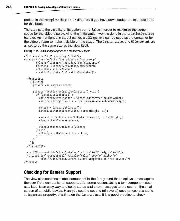
CHAPTER 7: Taking Advantage of Hardware Inputs 248
project in the examples/chapter-07 directory if you have downloaded the example code
for this book.
The View sets the visibility of its action bar to false in order to maximize the screen
space for the video display. All of the initialization work is done in the creationCompletehandler. As mentioned in step 3 earlier, a UIComponent can be used as the container for
the video stream to make it visible on the stage. The Camera, Video, and UIComponent are
all set to be the same size as the view itself.
Listing 7–2. Basic Image Capture in a Mobile View Class
<?xml version="1.0" encoding="utf-8"?> <s:View xmlns:fx="http://ns.adobe.com/mxml/2009" xmlns:s="library://ns.adobe.com/flex/spark" xmlns:mx="library://ns.adobe.com/flex/mx" actionBarVisible="false" creationComplete="onCreationComplete()"> <fx:Script> <![CDATA[ private var camera:Camera; private function onCreationComplete():void { if (Camera.isSupported) { var screenWidth:Number = Screen.mainScreen.bounds.width; var screenHeight:Number = Screen.mainScreen.bounds.height; camera = Camera.getCamera(); camera.setMode(screenWidth, screenHeight, 15); var video: Video = new Video(screenWidth, screenHeight); video.attachCamera(camera); videoContainer.addChild(video); } else { notSupportedLabel.visible = true; } } ]]> </fx:Script> <mx:UIComponent id="videoContainer" width="100%" height="100%"/> <s:Label id="messageLabel" visible="false" top="0" right="0" text="flash.media.Camera is not supported on this device."/></s:View>
Checking for Camera Support The view also contains a label component in the foreground that displays a message to
the user if the camera is not supported for some reason. Using a text component such
as a label is an easy way to display status and error messages to the user on the small
screen of a mobile device. Here you see the second (of several) occurrences of a static
isSupported property, this time on the Camera class. It is a good practice to check

CHAPTER 7: Taking Advantage of Hardware Inputs 249
Camera’s isSupported property to ensure that the feature is supported on the user’s
device. For example, Camera is not currently supported on mobile browsers.
CAUTION: Camera is also not currently supported on AIR for TV devices. However, Adobe’s
documentation points out that isSupported still returns true in that environment even though getCamera always returns null. To deal with this situation, you can change the isSupported check in the previous example to
if (Camera.isSupported && (camera = Camera.getCamera()) != null) { … }.
Initializing the Camera Taking a closer look at the camera initialization code, you can see that after the Camera
instance is obtained by calling the static getCamera method, there is a call to the setMode
method. Without this call, the camera would default to capturing video at 160 x 120
pixels, which would look very pixilated when displayed on a modern phone where
resolutions are typically 800 x 480 or more. The first and second parameters of the
setMode method specify the width and height at which you would like to capture video.
The third parameter of setMode stipulates the frame rate at which video should be
captured in frames per second, also known as FPS.
What you request is not necessarily what you get, though. The camera will be put into
whichever of its native modes matches your request parameters most closely. There is a
fourth optional parameter of the setMode call that controls whether preference is given to
your resolution (width and height) or to your FPS request when picking a native camera
mode. By default, the camera will try to match your resolution request even if it means
that your FPS request cannot be met.
Therefore we call setMode and request a video capture resolution that matches the
resolution of the View—essentially using this.width and this.height. This is the same
as the resolution of the device’s screen since the application is running in full-screen
mode, as we will describe in the next section. We also request that the video be
captured at 15 frames per second. This is a reasonable rate for video while not being too
much of a drain on performance and therefore battery life. You may want to decrease
your FPS request on slower devices.
On a Nexus S phone with 800 x 480 screen resolution, this request results in the camera
being set to capture frames at 720 x 432. On the Motorola Droid with 854 x 480
resolution, the camera captures at 848 x 477. In both cases, the camera selects a mode
that is as close as possible to the requested resolution while preserving the requested aspect ratio.
For more details on configuration and usage, consult the documentation of
flash.media.Camera and flash.media.Video on Adobe’s web site at
http://help.adobe.com/en_US/FlashPlatform/reference/actionscript/3/.

CHAPTER 7: Taking Advantage of Hardware Inputs 250
Application Settings and Android Permissions The video stream coming from Flash’s Camera class assumes a landscape orientation.
You will get the best result by locking your application to landscape mode. Otherwise all
of the video will look like it has been rotated by 90 degrees. The options that control this
behavior can be found in the initialWindow section of the application descriptor XML
file associated with your project. In the CameraBasic project, the file is called
CameraBasic-app.xml and is located in the project’s src folder. You will need to set
aspectRatio to landscape and autoOrients to false. Note that unchecking the
Automatically Reorient check box when you create a mobile project in Flash Builder 4.5
will set autoOrients to false when the application descriptor file is created.
Listing 7–3 shows the final application descriptor for the CameraBasic project.
Comments and unused settings have been removed from the generated file for clarity.
As previously mentioned, the application was also specified to be a full-screen
application when the project was created. This causes the initialWindow setting of
fullScreen to be set to true and results in the application taking up the entire screen
when running, hiding the Android indicator bar at the top of the screen.
Listing 7–3. The CameraBasic-app.xml Application Descriptor File from the CameraBasic Project
<?xml version="1.0" encoding="utf-8" standalone="no"?> <application xmlns="http://ns.adobe.com/air/application/2.5"> <id>CameraBasic</id> <filename>CameraBasic</filename> <name>CameraBasic</name> <versionNumber>0.0.1</versionNumber> <initialWindow> <content>[This value will be overwritten by Flash Builder…]</content> <autoOrients>false</autoOrients> <aspectRatio>landscape</aspectRatio> <fullScreen>true</fullScreen> <visible>false</visible> </initialWindow> <android> <manifestAdditions><![CDATA[ <manifest> <uses-permission android:name="android.permission.CAMERA" /> </manifest> ]]></manifestAdditions> </android> </application>
You will need to specify the Android camera permission in the APK file’s manifest in
order to gain access to the device’s camera. As you can see in Listing 7–3, the
application descriptor’s Android manifest section includes the
android.permission.CAMERA permission. Specifying this permission implies that the
android.hardware.camera and android.hardware.camera.autofocus features are used.
Therefore, they aren’t specifically listed in the manifest additions.

CHAPTER 7: Taking Advantage of Hardware Inputs 251
Manipulating the Camera’s Video Stream The advantage of using Camera instead of CameraUI is that you get access to the video
stream as it is captured. You can apply several types of image filter effects to the video
stream: blurs, glows, bevels, color transforms, displacement maps, and convolutions.
Some of these are relatively inexpensive while others, like a ConvolutionFilter, can be
processor-intensive and will therefore decrease the frame rate of the captured video
stream. The simple blur, glow, and bevel filters are pretty straightforward to use, so this
example will use some of the more complex filters: the ColorMatrixFilter, the
DisplacementMapFilter, and the ConvolutionFilter.
Listing 7–4 shows the code for the default view of the CameraFilter example project. It
can be found in the examples/chapter-07 directory if you have downloaded the book’s
accompanying source code.
Listing 7–4. The VideoFilterView.mxml File from the CameraFilter Example Project
<?xml version="1.0" encoding="utf-8"?> <s:View xmlns:fx="http://ns.adobe.com/mxml/2009" xmlns:s="library://ns.adobe.com/flex/spark" xmlns:mx="library://ns.adobe.com/flex/mx" actionBarVisible="false" creationComplete="onCreationComplete()"> <fx:Script source="VideoFilterViewScript.as"/> <fx:Declarations> <s:NumberFormatter id="fpsFormatter" fractionalDigits="1"/> </fx:Declarations> <s:viewMenuItems> <s:ViewMenuItem label="No Filter" click="onFilterChange(event)"/> <s:ViewMenuItem label="Night Vision" click="onFilterChange(event)"/> <s:ViewMenuItem label="Pencil" click="onFilterChange(event)"/> <s:ViewMenuItem label="Ripples" click="onFilterChange(event)"/> <s:ViewMenuItem label="Funny Face" click="onFilterChange(event)"/> </s:viewMenuItems> <mx:UIComponent id="videoContainer" width="100%" height="100%"/> <s:Label id="messageLabel" top="0" right="0"/> </s:View>
You can see in Listing 7–4 that we’ve separated the ActionScript code into its own file
since the code associated with this example grew much larger compared to the
previous example. We’ve included the script file using the source attribute of the
<fx:Script> tag. It is a little inconvenient to write code that spans two files like this, but
doing it this way keeps both files to a more manageable size. You will also note the
addition of a <fx:Declarations> element that declares a NumberFormatter that is used to
format the frames per second value.
You can imagine that if there will be multiple filters that can be applied to the video
stream, then there will need to be a way for the user to select which filter should be
active. The ViewMenuItems shown in Listing 7–4 give the user an easy way to accomplish

CHAPTER 7: Taking Advantage of Hardware Inputs 252
this. Clicking a ViewMenuItem results in a call to the onFilterChange handler, which will
handle setting up the newly selected filter effect. The resulting application is shown in
Figure 7–2 with the menu visible.
Figure 7–2. The menu that allows users to select which filter effect to apply
So now that the menu is working, it is time to take a look at creating and attaching
image filter effects to the video stream.
TIP: An AIR for Android application is not notified when the user presses the “home” button since that is used by Android itself. However, you can listen for Android’s “back” and “search” buttons by checking for Keyboard.BACK and Keyboard.SEARCH in your KeyboardEvent listener. In those two cases, it is probably a good idea to call event.preventDefault() to prevent any
potential default action the system would take in response to those button presses.
Creating Image Filter Effects As would be expected, Flash provides sophisticated image processing effects that are
easy to use. Applying filter effects to a video stream is not the main point of this chapter,
so we will only briefly describe the filters and present the relevant code with little
comment. Adobe’s excellent online documentation can be consulted for the details
about the filters included in the flash.filters package. If you are already familiar with
the filter effects in Flash, you can browse the code and move on quickly to the next
section.
The first step is to create the filters. Listing 7–5 shows the initialization code. The
onCreationComplete() method, just as in the previous example, is the view’s
creationComplete handler. The first thing that onCreationComplete() does is call the
initFilters() method, which encapsulates all of the filter initialization code. The three

CHAPTER 7: Taking Advantage of Hardware Inputs 253
filter effects used by this example are ColorMatrixFilter, ConvolutionFilter, and
DisplacementMapFilter.
Listing 7–5. Creating the Image Filter Instances
private function onCreationComplete():void { var screenWidth:Number = Screen.mainScreen.bounds.width; var screenHeight:Number = Screen.mainScreen.bounds.height; initFilters(screenWidth, screenHeight); if (Camera.isSupported) { // The same Camera and Video initialization as before… } else { showNotSupportedMsg(); } } private function initFilters(screenWidth:Number, screenHeight:Number):void { var colorMat: Array = [ .5, 0, 0, 0, 0, 0, 10, 0, 0, 0, 0, 0, .5, 0, 0, 0, 0, 0, 1, 0 ]; nightVisionFilter = new ColorMatrixFilter(colorMat); var sharpMat: Array = [ 0, -5, 0, -5, 20, -5, 0, -5, 0 ]; ultraSharpFilter = new ConvolutionFilter(3, 3, sharpMat); var bmpData: BitmapData = new BitmapData(screenWidth, screenHeight, false); var pt: Point = new Point(0, 0); displacementFilter = new DisplacementMapFilter(bmpData, pt, BitmapDataChannel.RED, BitmapDataChannel.RED, 40, 40); }
A ColorMatrixFilter uses a 4 x 5 matrix whose values are multiplied by the color
channels of each pixel. For example, the entries in the first row of the matrix are
multiplied by the red, green, blue, and alpha components of the unfiltered pixel, and the
results are summed, along with the fifth value in the row, and assigned to be the red
component of the final filtered pixel. The green, blue, and alpha components of the
filtered pixel are computed similarly using the second, third, and fourth rows of the
matrix respectively. This is done for each pixel in the source image to produce the final
filtered image. A ColorMatrixFilter is capable of many complex color manipulation
effects, including saturation changes, hue rotation, luminance to alpha transposition (the
brighter the pixel in the source image, the more translucent it will be in the filtered
image), and others. As you can see, this example program uses the ColorMatrixFilter

CHAPTER 7: Taking Advantage of Hardware Inputs 254
to produce a pseudo night vision effect by boosting the green channel and dampening
the red and blue channels. The alpha channel is left unchanged.
The ConvolutionFilter is the workhorse of image processing filters. It works by defining
a matrix whose elements are multiplied by a block of pixels. The results of this
multiplication are then summed to get the final value of the pixel. We are using a 3x3
matrix in this example, and from its values you can see that the red, green, blue, and
alpha components of each pixel in the source image are multiplied by a factor of 20,
while at the same time the pixels directly to the north, south, east, and west of the
source pixel are all multiplied by a factor of -5. These results are then summed to get the
final value of the filtered pixel. The zeros in the corners of the matrix mean that the pixels
to the northwest, northeast, southwest, and southeast of the source pixel are completely
removed from the equation. Since the negative factors balance out the positive factor,
the overall luminance of the image remains unchanged. The matrix we’ve defined here
implements a basic edge detection algorithm. And the multiplication factors are large
enough that the resulting image will be mostly black with the edges in white. The filtered
image looks a bit like it was drawn with a white pencil on a black page, hence the name
we used for the filter: Pencil.
A DisplacementFilter uses the pixel values in one bitmap to offset the pixels in the
source image. The resulting image will therefore be warped in some way as compared to
the original image. This results in all sorts of fun and interesting effects. The code in the
initFilters() method simply initializes the displacement filter with an empty bitmap.
The choice of displacement map is actually set when the user selects either the Funny
Face filter or the Ripples filter. The displacement maps used by this example are shown
in Figure 7–3. For your own sanity, don’t stare at these images for too long!
The displacement filter is configured to use the displacement map’s red color channel
when calculating both the x and y displacement values. Therefore the Funny Face map
on the left in Figure 7–3 is simply a red dot centered on a gray background. This will
leave the surrounding pixels unchanged but expand the pixels in the center of the image
to produce a bulbous effect. The Ripples map is just alternating circles of red and black
that result in positive and negative pixel offsets (expanding and contracting), giving the
impression that the source image is being viewed through rippling water, although this
ripple appears frozen in time and space (hmm, sounds like a bad Star Trek episode).

CHAPTER 7: Taking Advantage of Hardware Inputs 255
Figure 7–3. The displacement maps used in the example program
Listing 7–6 shows the code that sets these displacement maps on the displacement
filter in response to the corresponding menu button clicks. When the ripple or funny face
effect is selected, the appropriate bitmap (which was loaded at startup from an
embedded resource) is drawn into the displacement filter’s mapBitmap.
Listing 7–6. Selecting Filters and Setting the Displacement Maps
[Embed(source="funny_face.png")] private var FunnyFaceImage:Class; [Embed(source="ripples.png")] private var RippleImage:Class; private var rippleBmp:Bitmap = new RippleImage() as Bitmap; private var funnyFaceBmp:Bitmap = new FunnyFaceImage() as Bitmap; // This function is the click handler for all buttons in the menu. videoContainer // is a UIComponent that is displaying the video stream from the camera. private function onFilterChange(event:Event):void { var btn: Button = event.target as Button; switch (btn.id) { case "noFilterBtn": videoContainer.filters = []; break; case "nightVisionBtn": videoContainer.filters = [nightVisionFilter]; break; case "sharpBtn": videoContainer.filters = [ultraSharpFilter]; break; case "rippleBtn":

CHAPTER 7: Taking Advantage of Hardware Inputs 256
showDisplacementFilter(true); break; case "funnyFaceBtn": showDisplacementFilter(false); break; } toggleMenu(); } private function showDisplacementFilter(ripples:Boolean):void { var bmp: Bitmap = ripples ? rippleBmp : funnyFaceBmp; var mat: Matrix = new Matrix(); mat.scale(width / bmp.width, height / bmp.height); displacementFilter.mapBitmap.draw(bmp, mat); videoContainer.filters = [displacementFilter]; }
Figure 7–4 shows some images captured using these filters. From the top left and going
counterclockwise, you can see an image with no filtering, the funny face filter, the pencil
filter, and the night vision filter.
Figure 7–4. The output of some of the filters used in this example captured on a Nexus S mobile phone
It should be noted that while the displacement map and the color matrix filter are
relatively inexpensive in performance terms, the convolution filter is a real performance
killer on the Android devices on which we tested it. This serves as an important reminder
that processor cycles are not plentiful like they are on desktop systems. Always test
your performance assumptions on your target hardware!

CHAPTER 7: Taking Advantage of Hardware Inputs 257
Displaying an FPS Counter One easy way to monitor performance on the target hardware is to display an ongoing
count of the frames per second. Listing 7–7 shows code that displays the camera’s FPS
count in a Label control. The FPS value is formatted and updated every two seconds by
a timer that is running in the background. The FPS count comes directly from the
camera but does take into account the time taken by the filters. As you apply filters, you
will see the frame rate drop since that will slow down the entire program, including the
video capture process. The performance counter can be hidden and redisplayed by
tapping anywhere on the screen. This is accomplished by adding a click handler to the
UIComponent that is displaying the video stream.
Listing 7–7. Showing a Performance Counter on the Screen
private var timer: Timer; private var fpsString: String; private function onCreationComplete(): void { var screenWidth:Number = Screen.mainScreen.bounds.width; var screenHeight:Number = Screen.mainScreen.bounds.height; initFilters(screenWidth, screenHeight); if (Camera.isSupported) { // The same Camera and Video initialization as before… videoContainer.addEventListener(MouseEvent.CLICK, onTouch); fpsString = " FPS ("+camera.width+"x"+camera.height+")"; timer = new Timer(2000); timer.addEventListener(TimerEvent.TIMER, updateFPS); timer.start(); } else { showNotSupportedMsg(); } } private function updateFPS(event:TimerEvent):void { messageLabel.text = fpsFormatter.format(camera.currentFPS) + fpsString; } private function onTouch(event:MouseEvent):void { if (messageLabel.visible) { timer.stop(); messageLabel.visible = false; } else { timer.start(); messageLabel.visible = true; } }
Now that the application has the ability to create interesting images from the video
stream, the next logical step is to capture a frame of video and save it on the device.
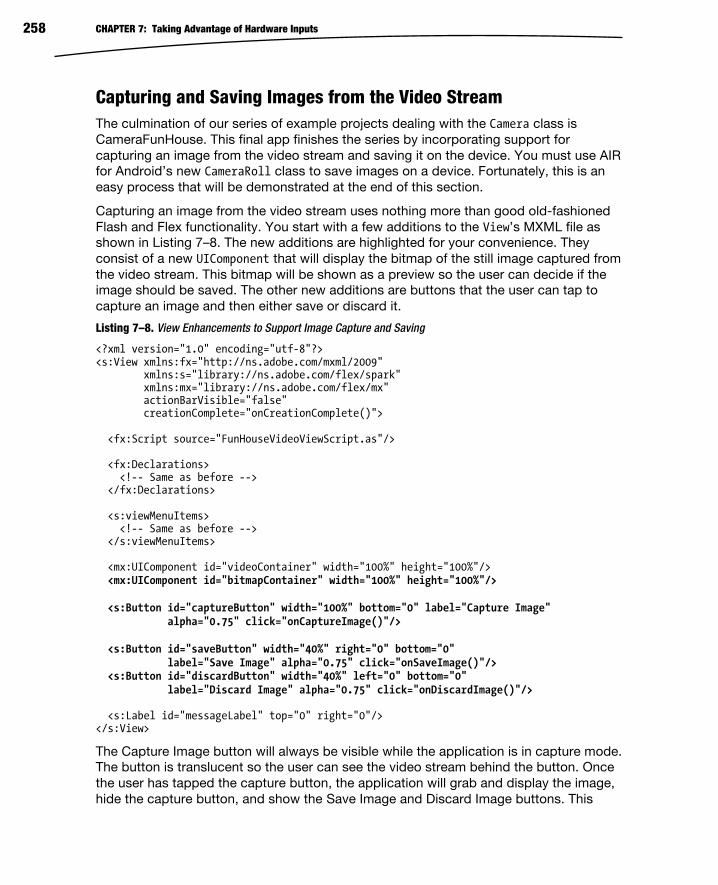
CHAPTER 7: Taking Advantage of Hardware Inputs 258
Capturing and Saving Images from the Video Stream The culmination of our series of example projects dealing with the Camera class is
CameraFunHouse. This final app finishes the series by incorporating support for
capturing an image from the video stream and saving it on the device. You must use AIR
for Android’s new CameraRoll class to save images on a device. Fortunately, this is an
easy process that will be demonstrated at the end of this section.
Capturing an image from the video stream uses nothing more than good old-fashioned
Flash and Flex functionality. You start with a few additions to the View’s MXML file as
shown in Listing 7–8. The new additions are highlighted for your convenience. They
consist of a new UIComponent that will display the bitmap of the still image captured from
the video stream. This bitmap will be shown as a preview so the user can decide if the
image should be saved. The other new additions are buttons that the user can tap to
capture an image and then either save or discard it.
Listing 7–8. View Enhancements to Support Image Capture and Saving
<?xml version="1.0" encoding="utf-8"?> <s:View xmlns:fx="http://ns.adobe.com/mxml/2009" xmlns:s="library://ns.adobe.com/flex/spark" xmlns:mx="library://ns.adobe.com/flex/mx" actionBarVisible="false" creationComplete="onCreationComplete()"> <fx:Script source="FunHouseVideoViewScript.as"/>
<fx:Declarations> <!-- Same as before --> </fx:Declarations> <s:viewMenuItems> <!-- Same as before --> </s:viewMenuItems>
<mx:UIComponent id="videoContainer" width="100%" height="100%"/> <mx:UIComponent id="bitmapContainer" width="100%" height="100%"/> <s:Button id="captureButton" width="100%" bottom="0" label="Capture Image" alpha="0.75" click="onCaptureImage()"/> <s:Button id="saveButton" width="40%" right="0" bottom="0" label="Save Image" alpha="0.75" click="onSaveImage()"/> <s:Button id="discardButton" width="40%" left="0" bottom="0" label="Discard Image" alpha="0.75" click="onDiscardImage()"/> <s:Label id="messageLabel" top="0" right="0"/></s:View>
The Capture Image button will always be visible while the application is in capture mode.
The button is translucent so the user can see the video stream behind the button. Once
the user has tapped the capture button, the application will grab and display the image,
hide the capture button, and show the Save Image and Discard Image buttons. This

CHAPTER 7: Taking Advantage of Hardware Inputs 259
logic is controlled by code that has been added to the ActionScript file along with the
three new click handlers: onCaptureImage(), onSaveImage(), and onDiscardImage().
These additions are shown in Listing 7–9.
Listing 7–9. Additions and Changes to the ActionScript Code to Support Image Capture and Save
private function onCreationComplete():void { var screenWidth:Number = Screen.mainScreen.bounds.width; var screenHeight:Number = Screen.mainScreen.bounds.height; initFilters(screenWidth, screenHeight); setCaptureMode(true); // The rest of the method is the same as before… } // Determines which controls are visible private function setCaptureMode(capture: Boolean): void { videoContainer.visible = capture; bitmapContainer.visible = !capture; captureButton.visible = capture; saveButton.visible = !capture; discardButton.visible = !capture; } private function onCaptureImage():void { var bmp: BitmapData = new BitmapData(width, height, false, 0xffffff); bmp.draw(videoContainer); bitmapContainer.addChild(new Bitmap(bmp)); setCaptureMode(false); } private function onDiscardImage():void { bitmapContainer.removeChildAt(0); setCaptureMode(true); } private function onSaveImage():void { if (CameraRoll.supportsAddBitmapData) { var bmp: Bitmap = bitmapContainer.removeChildAt(0) as Bitmap; new CameraRoll().addBitmapData(bmp.bitmapData); setCaptureMode(true); } else { showNotSupportedMsg(ROLL_NOT_SUPPORTED); saveButton.visible = false; } }
The onCaptureImage() function just draws the contents of the videoContainer into a new
bitmap and displays it in the bitmapContainer as a preview. The call to
setCaptureMode(false) at the end of the method takes care of setting the visibility of all
the appropriate controls. Likewise, the onDiscardImage() handler removes the preview
bitmap and puts the application back into capture mode.

CHAPTER 7: Taking Advantage of Hardware Inputs 260
The CameraRoll class comes into play when the user wants to save the image. As you
can see, it follows the familiar pattern of checking for support before using the class.
You should first ensure that the device supports saving images by using the
CameraRoll.supportsAddBitmapData property. Assuming that adding an image is
supported, the onSaveImage() function creates a new CameraRoll instance and calls its
addBitmapData method, passing a reference to the BitmapData object that holds the
preview image. CameraRoll will issue events when the image has been successfully
saved or if an error occurs that prevents the save operation. The PhotoCollage example
that is covered in the next section will show an example of using these events. Figure 7–
5 shows the completed CameraFunHouse application capturing an image of a
cooperative canine.
Figure 7–5. Our model gladly gave permission for her likeness to be used in exchange for a treat.
The CameraRoll class also lets the user browse and select images that have been saved
on the device as well as those that have been stored by the user in photo albums on the
Internet! This feature will be explained in the next section.
CameraRoll Browsing photos on an Android device with CameraRoll is almost as easy as saving
them. We will illustrate this feature in the context of a new example program named
PhotoCollage. This program lets you select images that have been stored on the device
and arrange them in a collage. You are able to drag, zoom, and rotate the images using
multitouch gestures. When the images are arranged to your liking, you can then save the
new image back to the camera roll. This example can be found in the examples/chapter-

CHAPTER 7: Taking Advantage of Hardware Inputs 261
07 directory of the book’s source code. Listing 7–10 shows the MXML file of the
application’s home view.
Listing 7–10. The Home View of the PhotoCollage Application—PhotoCollageHome.mxml
<?xml version="1.0" encoding="utf-8"?> <s:View xmlns:fx="http://ns.adobe.com/mxml/2009" xmlns:s="library://ns.adobe.com/flex/spark" xmlns:mx="library://ns.adobe.com/flex/mx" actionBarVisible="false" creationComplete="onCreationComplete()" > <fx:Script source="PhotoCollageHomeScript.as"/> <s:viewMenuItems> <s:ViewMenuItem label="Browse" click="onBrowse()"/> <s:ViewMenuItem label="Clear" click="onClear()"/> <s:ViewMenuItem label="Save" click="onSave()"/> </s:viewMenuItems> <mx:UIComponent id="photoContainer" width="100%" height="100%"/> <s:Label id="messageLabel" top="0" left="0" mouseEnabled="false"/> </s:View>
You can see that just as in the previous examples, a menu has been declared for this
view. And we have once again separated the view’s associated script code into its own
file. The view has two child components: a UIComponent to act as a container for the
images that are being arranged and a Label to provide a way to show messages from
the application. Note that the label’s mouseEnabled property is set to false. This will
prevent the label from interfering with the user’s touch gestures. See the section titled “A
Debugging Aside” for more details about how the messageLabel is used to provide
feedback on the running program.
The code to add a KeyboardEvent listener to the stage is the same as in the previous
examples, so we will not repeat it here.
Image Browsing As you saw in Listing 7–10, the onBrowse handler is called when the user taps the
Browse button. This sets off a series of actions that allows the user to browse for an
image using the native Android image browser and, if an image is selected, culminates
with the image appearing in the application’s view. Listing 7–11 shows the relevant
source code.
Listing 7–11. The Code That Initiates a Browse Action and Displays the Selected Image
private static const BROWSE_UNSUPPORTED: String = "Browsing with " + "flash.media.CameraRoll is unsupported on this device."; private var cameraRoll: CameraRoll = new CameraRoll(); private function onCreationComplete():void { cameraRoll.addEventListener(MediaEvent.SELECT, onSelect); cameraRoll.addEventListener(Event.CANCEL, onSelectCanceled); cameraRoll.addEventListener(ErrorEvent.ERROR, onCameraRollError);
CHAPTER 7: Taking Advantage of Hardware Inputs 262
cameraRoll.addEventListener(Event.COMPLETE, onSaveComplete); // … } private function onBrowse():void { if (CameraRoll.supportsBrowseForImage) { cameraRoll.browseForImage(); } else { showMessage(BROWSE_UNSUPPORTED); } toggleMenu(); } private function onSelect(event:MediaEvent):void { var loader: Loader = new Loader(); loader.contentLoaderInfo.addEventListener(Event.COMPLETE, onLoaded); loader.load(new URLRequest(event.data.file.url)); } private function onLoaded(event:Event):void { var info: LoaderInfo = event.target as LoaderInfo; var bmp: Bitmap = info.content as Bitmap; scaleContainer(bmp.width, bmp.height); var sprite: Sprite = new Sprite(); sprite.addEventListener(TransformGestureEvent.GESTURE_ZOOM, onZoom); sprite.addEventListener(TransformGestureEvent.GESTURE_ROTATE, onRotate); sprite.addEventListener(MouseEvent.MOUSE_DOWN, onMouseDown); sprite.addEventListener(MouseEvent.MOUSE_UP, onMouseUp); sprite.addChild(bmp); photoContainer.addChild(sprite); } private function onSelectCanceled(event:Event):void { showMessage("Select canceled"); } private function onCameraRollError(event:ErrorEvent):void { showMessage("Error: "+event.text); } private function onSaveComplete(event:Event):void { showMessage("CameraRoll operation complete"); }
The onCreationComplete() function attaches handlers for all of the CameraRoll events
that matter to this application. MediaEvent.SELECT and Event.CANCEL are the two
possible successful results of the browse operation. The ErrorEvent.ERROR is sent if an
error occurs either during browsing or during saving. And finally, the Event.COMPLETE
event is triggered when a save is completed successfully. The onSelectCanceled(),
onCameraRollError(), and onSaveComplete() handler functions simply call the
showMessage function to display a message on the screen.

CHAPTER 7: Taking Advantage of Hardware Inputs 263
Now that the application is listening to all of the necessary events, it is ready to handle
the onBrowse callback. As always, the first thing you should do is to check if browsing is
supported using the CameraRoll.supportsBrowseForImage property. If this property is
true, you can call the browseForImage() instance method on the cameraRoll object. This
triggers the native Android image browser to be shown to the user. If a user selects an
image, the application’s onSelect() handler will be called. The MediaEvent object that is
passed as a parameter to this function contains a property called data that is an
instance of a MediaPromise object. The key piece of information in the MediaPromise
object is the file property. You can use the URL of the file to load the selected image.
So, as shown earlier, what you are really after is the event.data.file.url property. This
property is passed to a Loader object that handles loading the image data. When the
load is complete, it triggers the onLoaded callback that is responsible for taking the
resulting bitmap and placing it inside a Sprite so it can be manipulated by the user. This
Sprite is then added to the photoContainer so it can be displayed on the screen.
Using a Loader is not the only way to read the data, of course. If you are simply
interested in displaying the photo rather than manipulating it with touch gestures, it is
easier to use a Spark BitmapImage or a halo Image. In those two cases, you only need to
set the source property of the Image or BitmapImage to the event.data.file.url and
then add it to your stage. Everything else will be handled automatically. Figure 7–6
shows the PhotoCollage application running on an Android device.
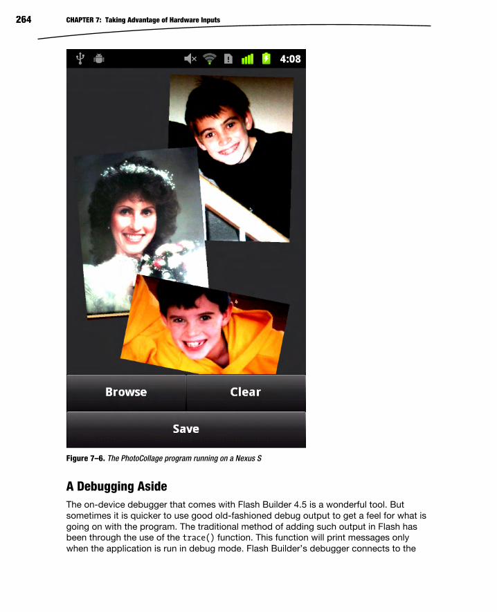
CHAPTER 7: Taking Advantage of Hardware Inputs 264
Figure 7–6. The PhotoCollage program running on a Nexus S
A Debugging Aside The on-device debugger that comes with Flash Builder 4.5 is a wonderful tool. But
sometimes it is quicker to use good old-fashioned debug output to get a feel for what is
going on with the program. The traditional method of adding such output in Flash has
been through the use of the trace() function. This function will print messages only
when the application is run in debug mode. Flash Builder’s debugger connects to the

CHAPTER 7: Taking Advantage of Hardware Inputs 265
Flash player and will display the trace messages in the debugger’s console window.
This method works when debugging on a mobile device as well.
There are times when you may want to write output directly to the screen, either as part
of the debugging process or just to present extra information to the user. Fortunately
this is very easy to set up in an AIR for Android program. Listing 7–12 shows the small
amount of code that is required to provide your application with a workable output log
right on the device’s screen. The listing includes the declaration of messageLabel from
the MXML file previously shown just as a reminder. The messageLabel is a simple Spark
Label that sits in the top left-hand corner of the view. It sits on top of all of the other
display objects, so its mouse interaction has to be disabled so it won’t interfere with
user input.
Listing 7–12. Adding Debug Output to an AIR for Android Application
// From PhotoCollageHome.mxml <s:Label id="messageLabel" top="0" left="0" mouseEnabled="false"/> // From PhotoCollageHomeScript.as private function onCreationComplete():void { // CameraRoll event listener initialization… // Make sure the text messages stay within the confines // of our view's width. messageLabel.maxWidth = Screen.mainScreen.bounds.width; messageLabel.maxHeight = Screen.mainScreen.bounds.height; // Multitouch initialization… } private function showMessage(msg:String):void { if (messageLabel.text && messageLabel.height < height) { messageLabel.text += "\n" + msg; } else { messageLabel.text = msg; } }
In the onCreationComplete() function, the messageLabel’s maxWidth and maxHeight
properties are set to the width and height of the screen. This will prevent the label’s text
from being drawn outside the bounds of the screen. The final piece is a small
showMessage function that takes a message string as a parameter. If the
messageLabel.text property is currently empty or if the messageLabel is growing too
large, then the text property is set to the message string, effectively clearing the label.
Otherwise the new message is just appended to the existing text along with a newline
character. The result is a message buffer that expands down the screen until it gets to
the bottom, at which time the existing messages will be erased and the new messages
will start again at the top. It’s not a full-featured application log and it has to be
reimplemented for each View in your application, but it’s hard to beat as a simple way to
display debugging messages on the screen.
You should now be familiar with using the CameraRoll class to browse and save images
on an Android device. You can find the complete source code in the

CHAPTER 7: Taking Advantage of Hardware Inputs 266
PhotoCollageHomeScript.as file in the PhotoCollage example project. The ActionScript
file includes portions that were not shown previously, such as the handling of the
multitouch zoom and rotate gestures as well as touch dragging. This code should give
you a good idea of how to handle this sort of user input. You can also refer back to the
“Multitouch and Gestures” section of Chapter 2 if you need more details on these
topics.
The final aspect of Flash’s camera support that will be covered in this chapter is using
the native Android media capture interface via the CameraUI class. That will be the
subject of the next section.
CameraUI The CameraUI class gives you the ability to harness the power of the native Android
media capture interface to capture high-quality, high-resolution images and video.
Usage of this class involves the now familiar three steps: ensure the functionality is
supported, call a method to invoke the native interface, and register a callback to be
notified when the image or video has been captured so that you can display it in your
application. Listing 7–13 shows the CaptureView of the CameraUIBasic example project.
This short program illustrates the three steps just listed.
Listing 7–13. Basic Image Capture Using CameraUI
<?xml version="1.0" encoding="utf-8"?> <s:View xmlns:fx="http://ns.adobe.com/mxml/2009" xmlns:s="library://ns.adobe.com/flex/spark" actionBarVisible="false" creationComplete="onCreationComplete()"> <fx:Script> <![CDATA[ private var cameraUI:CameraUI; private function onCreationComplete():void { if (CameraUI.isSupported) { cameraUI = new CameraUI(); cameraUI.addEventListener(MediaEvent.COMPLETE, onCaptureComplete); } captureButton.visible = CameraUI.isSupported; notSupportedLabel.visible = !CameraUI.isSupported; } private function onCaptureImage():void { cameraUI.launch(MediaType.IMAGE); } private function onCaptureComplete(event:MediaEvent):void { image.source = event.data.file.url; } ]]> </fx:Script> <s:Label id="notSupportedLabel" width="100%" height="100%"
CHAPTER 7: Taking Advantage of Hardware Inputs 267
verticalAlign="middle" textAlign="center" text="CameraUI is not supported on this device."/> <s:Image id="image" width="100%" height="100%"/> <s:Button id="captureButton" width="100%" bottom="0" label="Capture Image" alpha="0.75" click="onCaptureImage()"/> </s:View>
The onCreationComplete() method checks for CameraUI support and creates a new
cameraUI instance if it exists. An event listener is then added to the instance object so
the application gets notified when the capture is complete via its onCaptureComplete
callback function. When the user taps on the Capture Image button, the onCaptureImage
callback calls CameraUI’s launch method to show the Android capture interface. The
callback function we attached to CameraUI is called when the capture is complete. It
receives a MediaEvent parameter, the same event class that is used by CameraRoll as
was discussed in the previous section. As before, the event contains a MediaPromise
instance in its data property. Therefore you can load the captured image by using the
event.data.file.url just as was done when an image is selected using the
CameraRoll’s browse function.
The CameraUIBasic example program displays a view with a single translucent button
that has a “Capture Image” label. Android’s native camera interface is launched via the
CameraUI class when the user taps the button. After an image is captured, the image
data is returned to the original view for display, as shown in Listing 7–13. Figure 7–7 is a
sequence of images that show the native Android camera interface capturing an image
of a robot and returning it to the application for display. A team of middle school
students competing in the FIRST Tech Challenge robotics competition built the robot
pictured in Figure 7–7.
NOTE: Any photo captured with CameraUI is also automatically saved to the device’s photo
gallery and therefore can be retrieved later using the CameraRoll class.
That concludes our coverage of the camera functionality in AIR for Android. In the rest of
this chapter, you will learn about the inhabitants of the flash.sensors package:
Accelerometer and Geolocation. We hope you will find it quick and to the point.

CHAPTER 7: Taking Advantage of Hardware Inputs 268
Figure 7–7. An image of a robot captured with the native Android camera interface and CameraUI
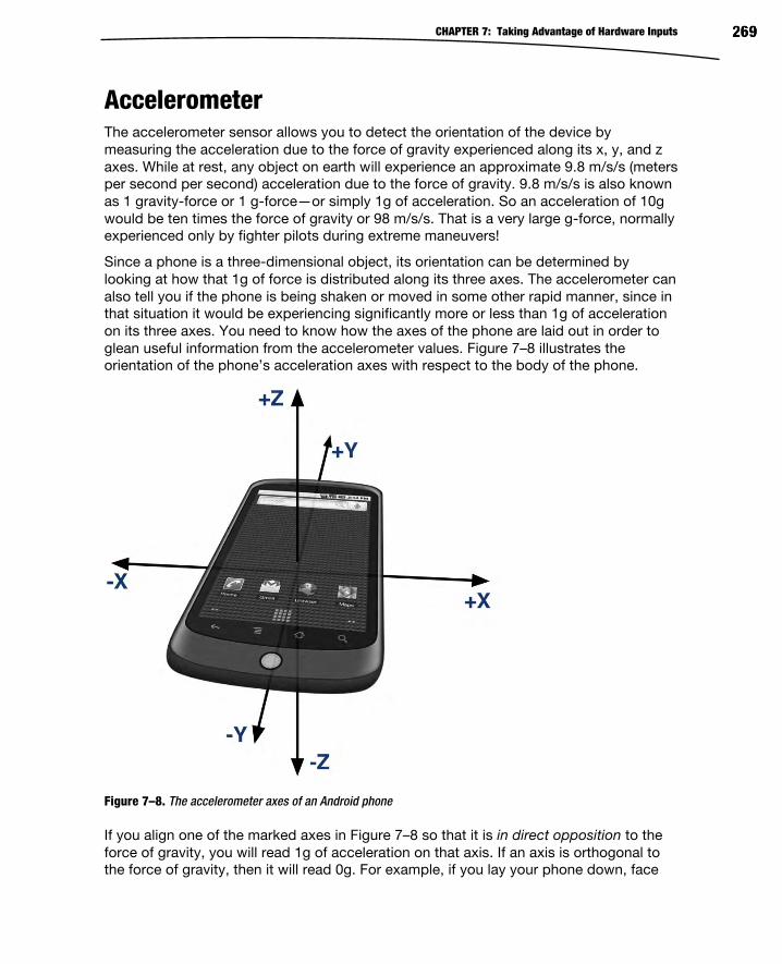
CHAPTER 7: Taking Advantage of Hardware Inputs 269
Accelerometer The accelerometer sensor allows you to detect the orientation of the device by
measuring the acceleration due to the force of gravity experienced along its x, y, and z
axes. While at rest, any object on earth will experience an approximate 9.8 m/s/s (meters
per second per second) acceleration due to the force of gravity. 9.8 m/s/s is also known
as 1 gravity-force or 1 g-force—or simply 1g of acceleration. So an acceleration of 10g
would be ten times the force of gravity or 98 m/s/s. That is a very large g-force, normally
experienced only by fighter pilots during extreme maneuvers!
Since a phone is a three-dimensional object, its orientation can be determined by
looking at how that 1g of force is distributed along its three axes. The accelerometer can
also tell you if the phone is being shaken or moved in some other rapid manner, since in
that situation it would be experiencing significantly more or less than 1g of acceleration
on its three axes. You need to know how the axes of the phone are laid out in order to
glean useful information from the accelerometer values. Figure 7–8 illustrates the
orientation of the phone’s acceleration axes with respect to the body of the phone.
Figure 7–8. The accelerometer axes of an Android phone
If you align one of the marked axes in Figure 7–8 so that it is in direct opposition to the
force of gravity, you will read 1g of acceleration on that axis. If an axis is orthogonal to
the force of gravity, then it will read 0g. For example, if you lay your phone down, face

CHAPTER 7: Taking Advantage of Hardware Inputs 270
up, on a flat surface, then the accelerometer will read approximately +1g on the z axis
and about 0g on the x and y axes. If you then flip the phone over so that it lies face
down, the accelerometer will register -1g on the z axis.
The Accelerometer and AccelerometerEvent Classes The fine folks on the AIR team at Adobe continue their trend of making our lives easier
by providing a simple class with which you can interact with the accelerometer sensor. It
is unsurprisingly named Accelerometer and comes equipped with the usual static
isSupported property. The class declares only one new instance method,
setRequestedUpdateInterval(). This method takes a single parameter that specifies the
number of milliseconds to wait between updates. A value of zero means to use the
minimum supported update interval. The accelerometer will send its updates to your
application using an AccelerometerEvent (of course!) of type
AccelerometerEvent.UPDATE. An AccelerometerEvent instance contains four properties
that tell you the current acceleration detected along each of the three axes plus the
timestamp at which the values were measured. The four properties are named
accelerationX, accelerationY, accelerationZ, and timestamp. The three accelerations
are specified in g-forces, and the timestamp is in milliseconds as measured from when
the sensor started sending events to the application. The timestamp can allow you to
detect shakes and other movements by telling you if large negative and positive g-forces
have been experienced within a short amount of time.
The Accelerometer class also contains a property named muted. This property is true if
the user has denied the application access to the accelerometer sensor. The application
can register a callback that listens for events of type StatusEvent.STATUS if it wishes to
be notified when the value of the muted property changes. Listing 7–14 shows the code
from the AccelerometerBasic example application that is relevant to initializing and
receiving updates from the accelerometer.
Listing 7–14. Reading the Accelerometer Sensor
private var accelerometer: Accelerometer; private function onCreationComplete():void { if (Accelerometer.isSupported) { showMessage("Accelerometer supported"); accelerometer = new Accelerometer(); accelerometer.addEventListener(AccelerometerEvent.UPDATE, onUpdate); accelerometer.addEventListener(StatusEvent.STATUS, onStatus); accelerometer.setRequestedUpdateInterval(100); if (accelerometer.muted) { showMessage("Accelerometer muted, access denied!"); } } else { showMessage(UNSUPPORTED); } }

CHAPTER 7: Taking Advantage of Hardware Inputs 271
private function onStatus(event:StatusEvent):void { showMessage("Muted status has changed, is now: "+accelerometer.muted); } private function onUpdate(event:AccelerometerEvent):void { updateAccel(xAxis, event.accelerationX, 0); updateAccel(yAxis, event.accelerationY, 1); updateAccel(zAxis, event.accelerationZ, 2); time.text = "Ellapsed Time: " + event.timestamp + "ms"; } private function updateAccel(l: Label, val: Number, idx: int):void { var item: Object = accelData[idx]; item.max = formatter.format(Math.max(item.max, val)); item.min = formatter.format(Math.min(item.min, val)); l.text = item.title + "\n Current Value: " + formatter.format(val) + "g" + "\n Minimum Value: " + item.min + "g" + "\n Maximum Value: " + item.max + "g"; }
After checking to ensure the accelerometer is supported on the current device, the
onCreationComplete() method creates a new instance of the Accelerometer class and
attaches listeners for the update and status events. The setRequestedUpdateInterval
method is called to request updates every 100ms. You should always be mindful of
battery consumption when programming for mobile devices. Always set the longest
update interval that still meets the requirements of your application. Once the update
listener is attached, the program will start receiving events from the sensor. The data
contained within these events is displayed on the screen in a series of labels: one for
each axis and one for the timestamp. The program also keeps track of and displays the
minimum and maximum values that have been reported by the sensor. Figure 7–9
shows the output of the AccelerometerBasic program on an Android device.

CHAPTER 7: Taking Advantage of Hardware Inputs 272
Figure 7–9. The AccelerometerBasic program running on an Android device
This program includes a button in its action bar that allows the user to clear the
minimum and maximum values that have been recorded so far. This makes it useful for
experimenting with accelerometer readings when planning your own applications. The
minimum and maximum values are initialized to plus or minus 10g since it is unlikely that
a phone will ever experience more acceleration than that, unless you happen to be a
fighter pilot. As a final note, your application does not need to specify any special
Android permission in the application descriptor in order to use the accelerometer.
You can see from the material in this section that reading the accelerometer in an AIR
application is easy and allows you to accept a user’s input in new and creative ways. We
will next take a look at how to read another form of data that is widely used in mobile
applications: geolocation data.

CHAPTER 7: Taking Advantage of Hardware Inputs 273
Geolocation The prevalence of geolocation services in mobile devices has led to a rapid increase in
the number of location-aware applications in recent years. Location data can come from
cell tower triangulation, a database of known Wi-Fi access points, and of course, GPS
satellites. Location data based on Wi-Fi and cell towers is not as accurate as GPS data,
but it can be quicker to obtain and consumes less battery power than using the device’s
GPS receiver. Due to this complexity, getting an accurate location can be more
complicated than you might assume.
AIR provides a way for developers to easily access location data without having to worry
about most of the details involved in obtaining accurate readings. Geolocation and
GeolocationEvent are the two primary classes involved in this process. The use of these
classes will be familiar to you by now if you have just finished reading the previous
section covering the accelerometer. As usual, you start by checking the static
isSupported property of the Geolocation class. If support is available, you can optionally
use the setRequestedUpdateInterval method to request updates at a certain rate. The
method takes a single parameter that is the requested time interval between updates
expressed in milliseconds. It is important to bear in mind that this is only a request—a
hint to the device about how often you would like to receive updates. It is not a
guarantee. The actual update rate could be greater or less than the requested rate. In
fact, although you can request intervals of less than one second, on the devices we’ve
tested, we have yet to see an AIR application that can receive updates quicker than one
second apart.
Battery usage is an even greater concern with geolocation data since the GPS receiver
can be a real drain on battery life. This is especially true if the device is in a place where
the signal is weak. Therefore you should give careful thought to how often your
application really needs location updates. Update intervals of one minute (60,000
milliseconds) or more are not uncommon in location-aware applications. And since
heading and speed are also provided with the location data, there is a certain amount of
extrapolation that can be done based on previous data. This can significantly smooth
out the location updates you provide to the users of your application.
You will receive location data from a GeolocationEvent object of type
GeolocationEvent.UPDATE that is passed to the event handler you will register with your
Geolocation instance. The GeolocationEvent class contains several properties of
interest:
latitude: The latitude of the device in degrees; the range will be
between -90 and +90 inclusive.
longitude: The longitude of the device in degrees; the range will be
between -180 and +180 inclusive, where negative numbers indicate a
position to the west of the Prime Meridian (also known as the
Greenwich Meridian or International Meridian) and positive longitude is
to the east.

CHAPTER 7: Taking Advantage of Hardware Inputs 274
horizontalAccuracy: An estimate of how accurate the location data is
on the horizontal plane expressed in meters
verticalAccuracy: An estimate of how accurate the location data is
vertically expressed in meters
speed: The speed as measured using the distance between recent
location readings with respect to time; the value is in meters per
second.
altitude: The current altitude of the device above sea level expressed
in meters
timestamp: The number of milliseconds, at the time the event was sent,
since the application started receiving location updates
CAUTION: Although AIR 2.5.1 supports a heading property in the GeolocationEvent, this
property is not currently supported on Android devices and will always return NaN.
The Geolocation class also contains a property named muted that will be set to true if
the user has disabled geolocation (or if you forgot to specify the
android.permission.ACCESS_FINE_LOCATION permission in the manifest section of the
application descriptor XML file!). When the value of the muted property changes, the
Geolocation class will send a StatusChange event with the type StatusChange.STATUS to
your listener if you have added one. Listing 7–15 shows the source code for the
GeolocationBasic example project. This code illustrates the steps to receive and display
geolocation data in your application.
Listing 7–15. The Source Code for the GeolocationBasicHome View
<?xml version="1.0" encoding="utf-8"?> <s:View xmlns:fx="http://ns.adobe.com/mxml/2009" xmlns:s="library://ns.adobe.com/flex/spark" creationComplete="onCreationComplete()" title="Geolocation Data"> <fx:Declarations> <s:NumberFormatter id="f" fractionalDigits="4"/> </fx:Declarations> <fx:Script> <
CHAPTER 7: Taking Advantage of Hardware Inputs 275
if (!loc.muted) { loc.addEventListener(GeolocationEvent.UPDATE, onUpdate); loc.addEventListener(StatusEvent.STATUS, onStatus); loc.setRequestedUpdateInterval(1000); } else { showMessage("Geolocation muted"); } } else { showMessage(UNSUPPORTED); } } private function onStatus(event:StatusEvent):void { showMessage("Geolocation status changed, muted is now " + loc.muted); } private function onUpdate(event:GeolocationEvent):void { geoDataLabel.text = "Geolocation" + "\n Latitude: " + f.format(event.latitude) + "\u00B0" + "\n Longitude: " + f.format(event.longitude) + "\u00B0" + "\n Horz Accuracy: " + f.format(event.horizontalAccuracy) + " m" + "\n Vert Accuracy: " + f.format(event.verticalAccuracy) + " m" + "\n Speed: " + f.format(event.speed) + " m/s" + "\n Altitude: " + f.format(event.altitude) + " m" + "\n Timestamp: " + f.format(event.timestamp) + " ms"; } private function showMessage(msg:String):void { if (messageLabel.text && messageLabel.height < height) { messageLabel.text += "\n" + msg; } else { messageLabel.text = msg; } } ]]> </fx:Script> <s:Label id="geoDataLabel" width="100%"/> <s:Label id="messageLabel" top="0" left="0" mouseEnabled="false" alpha="0.5"/> </s:View>
And as we referred to in passing, this code will not work unless you specify the proper
Android permission in the manifest section of your application descriptor. The
application descriptor for this application is shown in Listing 7–16.
Listing 7–16. The Application Descriptor for GeolocationBasic Showing the Proper Usage of the Fine Location Permission
<?xml version="1.0" encoding="utf-8" standalone="no"?> <application xmlns="http://ns.adobe.com/air/application/2.5"> <id>GeolocationBasic</id> <filename>GeolocationBasic</filename> <name>GeolocationBasic</name> <versionNumber>0.0.1</versionNumber> <initialWindow> <content>[This value will be overwritten by Flash Builder in the output app.xml]</content>

CHAPTER 7: Taking Advantage of Hardware Inputs 276
<autoOrients>false</autoOrients> <fullScreen>false</fullScreen> <visible>false</visible> </initialWindow> <android> <manifestAdditions> <![CDATA[ <manifest> <!-- Only used for debugging --> <uses-permission android:name="android.permission.INTERNET"/> <uses-permission android:name="android.permission.ACCESS_FINE_LOCATION"/> </manifest> ]]> </manifestAdditions> </android> </application>
Android uses ACCESS_COARSE_LOCATION to limit the geolocation data to using only Wi-Fi
and cell towers for location information. The ACCESS_FINE_LOCATION permission that was
used earlier encompasses the coarse location permission and also adds the ability to
access the GPS receiver to obtain more accurate readings. Figure 7–10 shows a screen
capture of the GeolocationBasic program in action.
Figure 7–10. The GeolocationBasic program running on an Android device
Summary This chapter has covered a variety of sensors and hardware capabilities. From
microphones and cameras to media storage, accelerometers, and geolocation data, you
now have all the knowledge you need to integrate your applications with the full variety
of hardware services available to AIR applications. Over the course of this chapter, you
have learned the following:

CHAPTER 7: Taking Advantage of Hardware Inputs 277
How to use the microphone to receive audio input
How to access and view real-time video streams
How to apply various filter effects to those video streams
How to store and browse for media on the mobile device
How to use Android’s native image and video capture interface in your
own application
How to read and interpret acceleration data from the accelerometer
How to retrieve location data including latitude, longitude, speed, and
altitude from the geolocation sensors on a device
You will continue on the path of AIR and Android discovery by exploring Flash’s media
playback capabilities in the next chapter.

279
Chapter
Rich Media Integration If your users aren’t using their Android device to make phone calls, then they are most
likely either playing games, listening to music, or watching videos. When it comes right
down to it, the consumption of audio and video may be even more important to modern
consumers than the communication capabilities of their mobile devices. Fortunately,
outstanding support for audio and video is one of the real strengths of the Flash
platform. In fact, this is one of the primary reasons that the Flash Player has become so
ubiquitous on our computers and mobile devices.
The previous chapter showed you how to capture audio and video on your Android
device. This chapter builds upon those concepts and will teach you how to use the
power of the Flash platform to unlock the rich media potential of an Android mobile
device.
Playing Sound Effects Sound effects are typically short sounds that you play in response to various application
events such as alert pop-ups or button presses. The audio data for the sound effect
should be in an MP3 file and can be embedded in your application’s SWF file or
downloaded from the Internet. You embed an MP3 asset in your application by using the
Embed metadata tag to identify the asset, as shown in Listing 8–1.
Listing 8–1. Embedding a Sound File with the Embed Metadata Tag
<?xml version="1.0" encoding="utf-8"?> <s:View xmlns:fx="http://ns.adobe.com/mxml/2009" xmlns:s="library://ns.adobe.com/flex/spark" xmlns:mx="library://ns.adobe.com/flex/mx" title="SoundAssets"> <fx:Script> <![CDATA[ import mx.core.SoundAsset;
[Embed(source="mySound.mp3")] private var MySound:Class; private var sound:SoundAsset = new MySound();
8

CHAPTER 8: Rich Media Integration 280
]]> </fx:Script> <s:Button label="Play SoundAsset" click="sound.play()"/> </s:View>
The Embed metadata tag will cause the compiler to transcode the MP3 file and embed it
in your application’s SWF file. The source attribute specifies the path and file name of
the MP3 file. In this case, we have placed the file in the same package as our source file.
You access the embedded sound by creating an instance of the class associated with
the Embed tag, which in Listing 8–1 is a class named MySound. The MySound class is
generated by the compiler and will be a subclass of mx.core.SoundAsset. Therefore it
has all the necessary support for basic playback of an audio asset. In Listing 8–1, we
take advantage of this support by creating an instance variable named sound and calling
its play method in response to a button click.
The SoundEffect Class Although it’s nice to know what’s going on behind the scenes, you typically don’t need
to bother with creating and instancing a SoundAsset in your Flex programs. Your tool of
choice will usually be the SoundEffect class, due to its ability to easily create interesting
effects during the playback of the sample. It offers simple control of looping, panning,
and volume effects during playback. Since it extends the base mx.effect.Effect class,
it can be used anywhere a regular effect could be used. For example, you can set a
SoundEffect instance as a Button’s mouseDownEffect or as the creationCompleteEffect
of an Alert dialog. Listing 8–2 shows how you can do this, as well as how to play a
SoundEffect manually.
Listing 8–2. Creating and Playing a Looping SoundEffect
<?xml version="1.0" encoding="utf-8"?> <s:View xmlns:fx="http://ns.adobe.com/mxml/2009" xmlns:s="library://ns.adobe.com/flex/spark" xmlns:mx="library://ns.adobe.com/flex/mx" title="SoundEffects"> <fx:Declarations> <mx:SoundEffect id="mySound" source="{MySound}" useDuration="false" loops="2"/> </fx:Declarations> <fx:Script> <![CDATA[ [Bindable] [Embed(source="mySound.mp3")] private var MySound:Class; private function playEffect(event:MouseEvent):void { mySound.end(); mySound.play([event.target]); } ]]> </fx:Script>

CHAPTER 8: Rich Media Integration 281
<s:VGroup horizontalCenter="0" horizontalAlign="contentJustify"> <s:Button label="Play mouseDownEffect" mouseDownEffect="{mySound}"/> <s:Button label="End & Play SoundEffect" click="playEffect(event)"/> </s:VGroup> </s:View>
The SoundEffect declaration that is highlighted in Listing 8–2 creates a sound effect that
loops twice every time it is played. Note the useDuration attribute that is set to false.
The duration of a SoundEffect is set to 500 milliseconds by default, and if useDuration
is left at its default value of true, then only the first half-second of your sound will be
played. Therefore you will almost always want to set this attribute to false unless you
also set the duration attribute in order to play only a portion of your sound effect. The
source attribute of the SoundEffect is given the class name of the embedded sound
asset.
We then create two buttons to illustrate the two different ways you can play a
SoundEffect. The first button simply sets the instance id of the SoundEffect as its
mouseDownEffect. This plays our audio sample every time the mouse button is pressed
over the button. Each time the mouse button is pressed, a new effect is created and
played. If you click quickly enough, and your sound sample is long enough, it is possible
to hear them playing simultaneously.
Clicking the second button will call the playEffect method, which does two things. First
it will stop any instances of the effect that are currently playing by calling the end
method. This ensures that the sound cannot overlap with any other instances of itself.
Second, a new sound effect is played using the button as its target object. The
MouseEvent’s target property provides a convenient way to refer to the button that we
will be using as the target of our effect. Note that the parameter to the play method is
actually an array of targets. This is why we need the extra set of square brackets around
the event.target parameter.
You can see that each sound you embed in this manner requires three lines of code: two
metadata tags and the line that declares a class name for the sound asset. There is a
way to avoid this and embed the sound into the sound effect directly.
Embedded SoundEffect Example You can use an @Embed directive in the source attribute of a SoundEffect declaration.
This technique is used in the SoundEffectBasic sample application, which can be found
in the examples/chapter-08 directory of the sample code for this book. This example
application also demonstrates how to adjust the volume and panning of the sound effect
as it plays. Listing 8–3 shows the main View of the application.
Listing 8–3. The Home View of the SoundEffectBasic Example Program
<?xml version="1.0" encoding="utf-8"?> <s:View xmlns:fx="http://ns.adobe.com/mxml/2009" xmlns:s="library://ns.adobe.com/flex/spark" xmlns:mx="library://ns.adobe.com/flex/mx" title="Code Monkey To-Do List">

CHAPTER 8: Rich Media Integration 282
<fx:Declarations> <mx:SoundEffect id="coffee" source="@Embed('coffee.mp3')" useDuration="false" volumeFrom="1.0" volumeTo="0.0"/> <mx:SoundEffect id="job" source="@Embed('job.mp3')" useDuration="false" panFrom="-1.0" panTo="1.0"/> <mx:SoundEffect id="meeting" source="@Embed('meeting.mp3')" useDuration="false" volumeFrom="1.0" volumeTo="0.0" volumeEasingFunction="Back.easeOut"/> </fx:Declarations> <fx:Script> <![CDATA[ import flash.net.navigateToURL; import mx.effects.easing.Back; private static const CM_URL_STR:String = "http://www.jonathancoulton.com"+ "/2006/04/14/thing-a-week-29-code-monkey/"; private static const CM_URL:URLRequest = new URLRequest(CM_URL_STR); private function play(event:MouseEvent, effect:SoundEffect):void { effect.end(); effect.play([event.target]); } ]]> </fx:Script> <s:VGroup horizontalCenter="0" horizontalAlign="contentJustify" top="15" > <s:Button label="1. Get Coffee" click="play(event, coffee)"/> <s:Button label="2. Go to Job" click="play(event, job)"/> <s:Button label="3. Have Meeting" mouseDownEffect="{meeting}"/> </s:VGroup> <s:Button horizontalCenter="0" bottom="5" width="90%" label="About Code Monkey..." click="navigateToURL(CM_URL)"/> </s:View>
The first thing to note in Listing 8–3 is the use of the @Embed statement in the source
attribute of each SoundEffect declaration. This allows you to embed a sound asset and
associate it with a SoundEffect in one step. Just as before, if your sound file is in a
different package from your source file, then you must include the path to the sound file
in the @Embed statement in order for the compiler to find it.
Each sound effect will play a short excerpt from the song “Code Monkey,” by Jonathan
Coulton. We have used the volumeFrom and volumeTo attributes of the SoundEffect class
to fade the volume from 1.0 (maximum volume) to 0.0 (minimum volume) as the audio
sample plays. Since we did not specify a volumeEasingFunction, it will be a linear fade.
Similarly, the second sound effect will linearly pan the audio sample from -1.0 (left
speaker) to 1.0 (right speaker) as the sample plays. If you want to use a different easing
function for your pan effect, you would specify it using the panEasingFunction property
of the SoundEffect class. The final SoundEffect declaration shows how to use one of
Flex’s built-in easers to change the volume of the sample as it plays. By using the Back
easer’s fadeOut method, we will fade the volume down to the target value of 0.0,

CHAPTER 8: Rich Media Integration 283
overshoot it a little, and rebound back up past 0.0 again before finally settling on the end
value. This creates an interesting little surge in volume at the end of the audio sample.
This example demonstrates once again the two different methods of playing sound
effects. There is also a fourth button at the bottom of the screen that, when clicked, will
launch Android’s native web browser and take you to the “Code Monkey” web page by
using the navigateToURL method that was covered in Chapter 6. The resulting
application is shown in Figure 8–1.
Figure 8–1. The Code Monkey sound effects example running on an Android device
The SoundEffect class is perfect for playing small sound effects in response to
application events. If you need more advanced control over sound in your application,
then it is time to dig deeper into the functionality that the Flash platform has to offer.
Sophisticated Sound Solutions The SoundEffect class is a convenient abstraction for that (mostly silent) majority of
applications whose needs do not extend beyond the ability to occasionally prompt or
notify the user. There are some applications in which sound is one of the main
ingredients. If you want to record voice memos or play music, then you need to go a
little deeper into the Flash sound APIs. We will start by taking a look at the Sound class
and its partners: SoundChannel and SoundTransform. All three of these classes can be
found in the flash.media package.
The Sound class serves as the data container for your audio file. Its main responsibilities
are to provide mechanisms for loading data into its buffer and to begin playback of that

CHAPTER 8: Rich Media Integration 284
data. The audio data loaded into a Sound class will typically come from either an MP3 file
or from the application itself generating data dynamically. Unsurprisingly, the key
methods to be aware of in this class are the load and play methods. You use the load
method to provide the URL of the MP3 file that should be loaded into the Sound. Once
data is loaded into a Sound, it cannot be changed. If you later want to load another MP3
file, you must create a new Sound object. Passing a URL to the constructor of the Sound
object is equivalent to calling the load method. The Sound class dispatches several
events during the process of loading audio data, as shown in Table 8–1.
Table 8–1. Loading Events Dispatched by the Sound Object
Event Type Dispatched when…
Open flash.events.Event.OPEN Loading begins.
Progress flash.events.ProgressEvent.PROGRESS Data is loading. Check the
event’s bytesLoaded and
bytesTotal properties.
id3 flash.events.Event.ID3 ID3 metadata is available to be
read. Check the Sound’s id3
property.
ioError flash.events.IOErrorEvent The load operation fails. Check
the event’s errorID and text
properties.
Complete flash.events.Event.COMPLETE Data has loaded successfully.
After the data has been loaded, calling the play method of the Sound class will cause the
sound to begin playing. The play method returns a SoundChannel object that can be
used to track the progress of the sound’s playback and to stop it early. The
SoundChannel also has a SoundTransform object associated with it that you can use to
change the volume and panning of the sound as it plays. There are three optional
parameters that can be passed to the play method. First there is the startTime
parameter, which will cause the sound to begin playing at the specified number of
milliseconds into the sample. You can also pass a loop count if you want the sound to
play a certain number of times. And finally, it is also possible to provide a
SoundTransform object as a parameter to the play method if you would like to set the
initial transform of the sound when it begins playing. The transform you pass will be set
as the SoundChannel’s SoundTransform.
A new SoundChannel object is created and returned every time the Sound.play method is
called. SoundChannel serves as your main point of interaction with the sound while it is
playing. It allows you to track the current position and volume of the sound. It contains a
stop method, which interrupts and terminates playback of the sound. When a sound has
reached the end of its data, the SoundChannel class will notify you by dispatching a
soundComplete event of type flash.events.Event.SOUND_COMPLETE. And finally, you can
also use its soundTransform property to manipulate the volume of the sound and to pan

CHAPTER 8: Rich Media Integration 285
the sound to the left and right speakers. Figure 8–2 illustrates the relationship between
these three collaborating classes.
Figure 8–2. The relationship between Sound, SoundChannel, and SoundTransform
Now admittedly the path from the SoundChannel to the speaker is not as direct as
Figure 8–2 implies. There are several layers (including OS drivers and digital-to-analog
conversion circuitry) that exist before the audio signal reaches the speaker. There is
even another class that Flash provides in the flash.media package called SoundMixer,
which includes several static methods for manipulating and gathering data about the
sounds being played by the application at a global level.
That wraps up our overview of the classes you need to be familiar with in order to play
sound on your Android device using Flash. In the next sections, we will take a look at
some examples that use these classes to play sound from in-memory buffers and from
files stored on the device.

CHAPTER 8: Rich Media Integration 286
Playing Recorded Sound We showed you in the MicrophoneBasic example application from Chapter 7 how to
record audio data from the device’s microphone. Expanding on that example will
provide a convenient starting point for a more in-depth exploration of Flash’s audio
support. You may recall that we attached an event handler to the Microphone object to
handle its sampleData event. The handler was called each time the microphone had data
for our application. We didn’t actually do anything with the microphone data in that
example, but it would have been a simple thing to just copy the data into a ByteArray for
later playback. The question is: how do we play sound data from a ByteArray?
Generating Sound Data on the Fly If you call the play() method on a Sound object that has nothing loaded into it, the
object is forced to go looking for sound data to play. It does so by
dispatching sampleData events to request sound samples. The event’s type is
SampleDataEvent.SAMPLE_DATA, and it is found in the flash.events package. This
happens to be the same type of event the Microphone class uses to notify us that
samples are available. The answer to our previous question is simple, then: you just
attach a handler for the Sound’s sampleData event and start copying bytes into the
event’s data property.
Therefore our enhanced application will have two separate handlers for the sampleData
event. The first will copy data to a ByteArray when the microphone is active, and the
second will copy the data from that same ByteArray to the Sound object when we are
playing it back. The source code for the new application can be found in the
SoundRecorder application located in the examples/chapter-08 directory. Listing 8–4
shows the sampleData event handler for the microphone data.
Listing 8–4. The Setup Code and Event Handler for the Microphone’s Data Notifications
private static const SOUND_RATE:uint = 44; private static const MICROPHONE_RATE:uint = 22; // Handles the View’s creationComplete event private function onCreationComplete():void { if (Microphone.isSupported) { microphone = Microphone.getMicrophone(); microphone.setSilenceLevel(0) microphone.gain = 75; microphone.rate = MICROPHONE_RATE; sound = new Sound(); recordedBytes = new ByteArray(); } else { showMessage("microphone unsupported"); } } // This handler is called when the microphone has data to give us

CHAPTER 8: Rich Media Integration 287
private function onMicSample(event:SampleDataEvent):void { if (microphone.activityLevel > activityLevel) { activityLevel = Math.min(50, microphone.activityLevel); } if (event.data.bytesAvailable) { recordedBytes.writeBytes(event.data); } }
The onCreationComplete handler is responsible for detecting the microphone, initializing
it, and creating the ByteArray and Sound objects the application uses to store and play
sound. Note that the microphone’s rate is set to 22 kHz. This is adequate quality for
capturing a voice recording and takes up less space than does recording at the full 44
kHz.
This handler is simple. Just as before, the Microphone object’s activityLevel property is
used to compute a number that is later used to determine the amplitude of the animated
curves drawn on the display to indicate the sound level. Then the event’s data property,
which is a ByteArray, is used to determine if any microphone data is available. If the
bytesAvailable property is greater than zero, then the bytes are copied from the data
array to the recordedBytes array. This will work fine for normal recordings. If you need to
record hours of audio data, then you should either stream the data to a server or write it
to a file on the device.
Since we are working with raw audio data, it is up to the program to keep track of what
format the sound is in. In this case, we have a microphone that is giving us 22 kHz mono
(1-channel) sound samples. The Sound object expects 44 kHz stereo (left and right
channel) sound. This means that each microphone sample will have to be written to the
Sound data twice to convert it from mono to stereo and then twice more to convert from
22 kHz to 44 kHz. So each microphone sample will nominally be copied to the Sound
object’s data array four times in order to play the recording back using the same rate at
which it was captured. Listing 8–5 shows the Sound’s sampleData handler that performs
the copy.
Listing 8–5. The Event Handler for the Sound Object’s Data Requests
// This handler is called when the Sound needs more data private function onSoundSample(event:SampleDataEvent):void { if (soundChannel) { var avgPeak:Number = (soundChannel.leftPeak + soundChannel.rightPeak) / 2; activityLevel = avgPeak * 50; } // Calculate the number of stereo samples to write for each microphone sample var sample:Number = 0; var sampleCount:int = 0; var overSample:Number = SOUND_RATE / MICROPHONE_RATE * freqMultiplier; while (recordedBytes.bytesAvailable && sampleCount < 2048/overSample) { sample = recordedBytes.readFloat(); for (var i:int=0; i<overSample; ++i) { // Write the data twice to convert from mono to stereo event.data.writeFloat(sample);

CHAPTER 8: Rich Media Integration 288
event.data.writeFloat(sample); } ++sampleCount; } }
Since the curves on the display should be animated during playback as well as
recording, the first thing that is done in the handler is to compute the activityLevel that
is used in drawing the curves. From our overview of the sound-related classes in the last
section, we know that the SoundChannel class is where we need to look for information
about a sound that is playing. This class has a leftPeak and a rightPeak property that
indicate the amplitude of the sound. Both of these values range from 0.0 to 1.0, where
0.0 is silence and 1.0 is maximum volume. The two values are averaged and multiplied
by 50 to compute an activityLevel that can be used to animate the waveform display.
Now we arrive at the interesting bits: transferring the recorded data to the sound’s data
array. The overSample value is calculated first. It accounts for the difference in capture
frequency vs. playback frequency. It is used in the inner for loop to control how many
stereo samples are written (remember that writeFloat is called twice because each
sample from the microphone is used for both the right and left channels during
playback). Normally the value of the overSample variable will be two (44 / 22), which
when multiplied by the two calls to writeFloat will give us the four playback samples for
each microphone sample that we calculated earlier. You no doubt have noticed an extra
frequency multiplier factor has also been included. This multiplier will give us the ability
to speed up (think chipmunks) or slow down the frequency of the playback. The value of
the freqMultiplier variable will be limited to 0.5, 1.0, or 2.0, which means that the value
of overSample will be 1, 2, or 4. A value of 1 will result in only half as many samples
being written as compared to the normal value of 2. That means the frequency would be
doubled and we’ll hear chipmunks. An overSample value of 4 will result in a slow-motion
audio playback.
The next question to be answered is: how much of our recordedBytes array should be
copied to the Sound each time it asks for data? The rough answer is “between 2048 and
8192 samples.” The exact answer is “it depends.” Don’t you hate that? But in this one
case the universe has shown us mercy in that the dependency is very easy to
understand. Write more samples for better performance, and write fewer samples for
better latency. So if your application simply plays back a sound exactly as it was
recorded, use 8192. If you have to generate the sound or change it dynamically, say, to
change the playback frequency, then use something closer to 2048 to reduce the lag
between what users see on the screen and what they hear from the speaker. If you write
fewer than 2048 samples to the buffer, then the Sound treats that as a sign that there is
no more data, and playback will end after those remaining samples have been
consumed. In Listing 8–5, the while loop ensures that 2048 samples are always written
as long as there is enough data available in the recordedBytes array.
We now have the ability to both record and play back voice samples. All the application
lacks is a way to transition between the two modes.

CHAPTER 8: Rich Media Integration 289
Handling the State Transitions The application has four states: stopped, recording, readyToPlay, and playing. Tapping
somewhere on the screen will cause the application to transition from one state to the
next. Figure 8–3 illustrates this process.
Figure 8–3. The four states of the SoundRecorder application
The application starts in the stopped state. When the user taps the screen, the
application transitions to the recording state and begins recording his or her voice.
Another tap stops the recording and transitions to the readyToPlay state. Another tap
begins playback in the playing state when the user is ready to hear the recording. The
user can then tap a fourth time to stop the playback and return to the stopped state,
ready to record again. The application should also automatically transition to the stoppedstate if the playback ends on its own. Listing 8–6 shows the MXML for the one and only
View of this application.
Listing 8–6. The Home View of the SoundRecorder Application
<?xml version="1.0" encoding="utf-8"?> <s:View xmlns:fx="http://ns.adobe.com/mxml/2009" xmlns:s="library://ns.adobe.com/flex/spark" actionBarVisible="false" creationComplete="onCreationComplete()"> <fx:Script source="SoundRecorderHomeScript.as"/> <s:states> <s:State name="stopped"/> <s:State name="recording"/> <s:State name="readyToPlay"/> <s:State name="playing"/> </s:states>

CHAPTER 8: Rich Media Integration 290
<s:transitions> <s:Transition toState="stopped"> <s:Parallel> <s:Scale target="{stopLabel}" scaleXBy="4" scaleYBy="4"/> <s:Fade target="{stopLabel}" alphaFrom="1" alphaTo="0"/> <s:Scale target="{tapLabel}" scaleXFrom="0" scaleXTo="1" scaleYFrom="0" scaleYTo="1"/> <s:Fade target="{tapLabel}" alphaFrom="0" alphaTo="1"/> </s:Parallel> </s:Transition> <s:Transition toState="readyToPlay"> <s:Parallel> <s:Scale target="{stopLabel}" scaleXBy="4" scaleYBy="4"/> <s:Fade target="{stopLabel}" alphaFrom="1" alphaTo="0"/> <s:Scale target="{tapLabel}" scaleXFrom="0" scaleXTo="1" scaleYFrom="0" scaleYTo="1"/> <s:Fade target="{tapLabel}" alphaFrom="0" alphaTo="1"/> </s:Parallel> </s:Transition> <s:Transition toState="*"> <s:Parallel> <s:Scale target="{tapLabel}" scaleXBy="4" scaleYBy="4"/> <s:Fade target="{tapLabel}" alphaFrom="1" alphaTo="0"/> <s:Scale target="{stopLabel}" scaleXFrom="0" scaleXTo="1" scaleYFrom="0" scaleYTo="1"/> <s:Fade target="{stopLabel}" alphaFrom="0" alphaTo="1"/> </s:Parallel> </s:Transition> </s:transitions> <s:Group id="canvas" width="100%" height="100%" touchTap="onTouchTap(event)"/> <s:Label id="messageLabel" top="0" left="0" mouseEnabled="false" alpha="0.5" styleName="label"/> <s:Label id="tapLabel" bottom="100" horizontalCenter="0" mouseEnabled="false" text="Tap to Record" includeIn="readyToPlay, stopped" styleName="label"/> <s:Label id="stopLabel" bottom="100" horizontalCenter="0" mouseEnabled="false" text="Tap to Stop" includeIn="playing, recording" styleName="label"/> <s:Label id="speedLabel" top="100" horizontalCenter="0" mouseEnabled="false" text="{1/freqMultiplier}x" fontSize="48" includeIn="playing" styleName="label"/> </s:View>
This code includes the source file that contains the ActionScript code for this View,
declares the four states of the View and the transitions between them, and lastly
declares the UI components displayed in the View. The UI components include a Group
that serves as both the drawing canvas for the animated waveform and the handler for
the tap events that trigger the state transitions. There is also a Label for displaying error
messages to the user, two Labels that display state messages to the user, and a Label
that indicates the frequency of the playback.

CHAPTER 8: Rich Media Integration 291
Now the table is set; our user interface and application states are defined. The next step
will be to look at the code that controls the state changes and UI components. Listing 8–
7 shows the ActionScript code that controls the transitions from one state to the next.
Listing 8–7. Controlling the State Transition Order of the SoundRecorder Application
private function onTouchTap(event:TouchEvent):void { if (currentState == "playing" && isDrag) { return; } incrementProgramState(); } private function onSoundComplete(event:Event):void { incrementProgramState(); } private function incrementProgramState():void { switch (currentState) { case "stopped": transitionToRecordingState(); break; case "recording": transitionToReadyToPlayState(); break; case "readyToPlay": transitionToPlayingState(); break; case "playing": transitionToStoppedState(); break; } }
You can see that the application state will be changed when the user taps the screen or
when the recorded sound has finished playing. The onTouchTap function also performs
checks to make sure that the tap event was not generated as part of a drag (which is
used to control playback frequency). The incrementProgramState function simply uses
the value of the currentState variable to determine which state should be entered next
and calls the appropriate function to perform the housekeeping associated with entering
that state. These functions are shown in Listing 8–8.
Listing 8–8. The State Transition Functions of the SoundRecorder Application
private function transitionToRecordingState():void { recordedBytes.clear(); microphone.addEventListener(SampleDataEvent.SAMPLE_DATA, onMicSample); currentState = "recording"; } private function transitionToReadyToPlayState():void { microphone.removeEventListener(SampleDataEvent.SAMPLE_DATA, onMicSample); tapLabel.text = "Tap to Play"; currentState = "readyToPlay"; }

CHAPTER 8: Rich Media Integration 292
private function transitionToPlayingState():void { freqMultiplier = 1; recordedBytes.position = 0; canvas.addEventListener(TouchEvent.TOUCH_BEGIN, onTouchBegin); canvas.addEventListener(TouchEvent.TOUCH_MOVE, onTouchMove); sound.addEventListener(SampleDataEvent.SAMPLE_DATA, onSoundSample); soundChannel = sound.play(); soundChannel.addEventListener(Event.SOUND_COMPLETE, onSoundComplete); currentState = "playing"; } private function transitionToStoppedState():void { canvas.removeEventListener(TouchEvent.TOUCH_BEGIN, onTouchBegin); canvas.removeEventListener(TouchEvent.TOUCH_MOVE, onTouchMove); soundChannel.stop() soundChannel.removeEventListener(Event.SOUND_COMPLETE, onSoundComplete); sound.removeEventListener(SampleDataEvent.SAMPLE_DATA, onSoundSample); tapLabel.text = "Tap to Record"; currentState = "stopped"; }
The transitionToRecordingState function clears any existing data from the
recordedBytes array, adds the sampleData listener to the microphone so that it will start
sending data samples, and finally sets the currentState variable to trigger the animated
state transition. Similarly, the transitionToReadyToPlayState is called when recording is
finished. It is responsible for removing the sampleData listener from the microphone,
changing the Label in the UI to read “Tap to Play”, and once again setting the
currentState variable to trigger the animated transition.
The transitionToPlayingState function is called when the user taps the screen to start
the playback of the recorded sample. It first resets the playback frequency to 1 and
resets the read position of the recordedBytes array to the beginning of the array. Next, it
adds touch event listeners to the canvas Group in order to listen for the gestures that
control the frequency multiplier during playback. It also installs a handler for the Sound’s
sampleData event so the application can provide data for the Sound during playback. The
play method is then called to start the playback of the sound. Once we have a reference
to the soundChannel that controls playback, we can add a handler for the soundComplete
event so we know if the sound finishes playing, so we can transition automatically back
to the stopped state. And finally, the value of the View’s currentState variable is
changed to trigger the animated state transition.
The last transition is the one that takes the application back to the stopped state. The
transitionToStoppedState function is responsible for stopping the playback (this has no
effect if the sound has finished playing) and removing all of the listeners that were added
by the transitionToPlayingState function. It finally resets the text property of the Label
and changes the value of the currentState variable to trigger the state transition
animation.

CHAPTER 8: Rich Media Integration 293
The remaining piece of functionality to be covered is the frequency multiplier. Listing 8–9
shows the code that handles the touch events that control this variable.
Listing 8–9. Controlling the Frequency of the Playback with Touch Gestures
private function onTouchBegin(event:TouchEvent):void { touchAnchor = event.localY; isDrag = false; } private function onTouchMove(event:TouchEvent):void { var delta:Number = event.localY - touchAnchor; if (Math.abs(delta) > 75) { isDrag = true; touchAnchor = event.localY; freqMultiplier *= (delta > 0 ? 2 : 0.5); freqMultiplier = Math.min(2, Math.max(0.5, freqMultiplier)); } }
The onTouchBegin handler is called when the user first initiates a touch event. The code
makes note of the initial y-location of the touch point and resets the isDrag flag to false.
If a touch drag event is received, the onTouchMove handler checks to see if the
movement is large enough to trigger a drag event. If so, the isDrag flag is set to true so
the rest of the application knows that a frequency multipler adjustment is in progress.
The direction of the drag is used to determine whether the frequency multipler should be
halved or doubled. The value is then clamped to be between 0.5 and 2.0. The
touchAnchor variable is also reset so the computation can be run again in the event of
further movement. The result is that during playback the user can drag a finger either up
or down on the screen to dynamically change the frequency of the playback.
Figure 8–4 shows the SoundRecorder sample application running on an Android device.
The image on the left shows the application in recording state, while the image on the
right shows the animated transition from the readyToPlay state to the playing state.

CHAPTER 8: Rich Media Integration 294
Figure 8–4. The SoundRecorder application running on an Android device
We have now shown you how to play and manipulate data that was stored in a
ByteArray. It should be noted that this technique would also work if you needed to
manipulate data stored in a Sound object rather than a ByteArray. You can use the
extract method of the Sound class to access the raw sound data, manipulate it in some
way, and then write it back to another Sound object in its sampleData handler.
Another common use for sound capabilities is in playing music, either streamed over the
Internet or stored on the device in MP3 files. If you think the Flash platform would be a
good fit for this type of application, you are right! The next section will show you how to
write a mobile music player in Flash.
A Flash Music Player Playing sound from MP3 files on a device is rather uncomplicated. There is more to a
music player than simply playing a sound, however. This section will start by showing
you how to play an MP3 file with Flash’s sound API. Once that is out of the way, we will

CHAPTER 8: Rich Media Integration 295
look at the additional considerations that you will have to take into account when
creating a mobile application.
Playing MP3 Files Loading an MP3 file into a Sound object is as simple as using a URL that begins with the
file protocol. Listing 8–10 shows how it can be accomplished.
Listing 8–10. Loading and Playing an MP3 File from the Filesystem
<?xml version="1.0" encoding="utf-8"?> <s:View xmlns:fx="http://ns.adobe.com/mxml/2009" xmlns:s="library://ns.adobe.com/flex/spark" creationComplete="onCreationComplete()" title="Sound Loading"> <fx:Script> <![CDATA[ private var sound:Sound; private function onCreationComplete():void { var path:String = "file:///absolute/path/to/the/file.mp3"; sound = new Sound(new URLRequest(path)); sound.play(); } ]]> </fx:Script> </s:View>
The three lines shown in bold are all that’s needed to play the MP3 file. Note the third
forward slash after file:// that is used to indicate that this is an absolute path to the
MP3 file. You would obviously not want to use a constant path like this in a real
application. We will look at strategies for handling filesystem paths in a more elegant
manner later in the chapter, when we discuss the considerations that go into making
real-world applications.
Reading ID3 Metadata Playing the music file is a good start; it’s the essence of a music player, after all. Another
thing that all music players do is to read the metadata embedded in the ID3 tags of the
file.1 This metadata includes things like the name of the artist and the album, the year it
was recorded, and even the genre and track number of the song. The Sound class
provides built-in support for reading these tags. Listing 8–11 shows how to add this
functionality to our fledgling music player. The lines in bold indicate the new additions to
the source code from Listing 8–10.
1 www.id3.org/

CHAPTER 8: Rich Media Integration 296
Listing 8–11. Reading ID3 Metadata from an MP3 file
<?xml version="1.0" encoding="utf-8"?> <s:View xmlns:fx="http://ns.adobe.com/mxml/2009" xmlns:s="library://ns.adobe.com/flex/spark" creationComplete="onCreationComplete()" title="Sound Loading"> <fx:Script> <
CHAPTER 8: Rich Media Integration 297
Listing 8–12. Implementing a Play/Pause Toggle
<?xml version="1.0" encoding="utf-8"?> <s:View … > <fx:Script> <![CDATA[ private var sound:Sound; private var channel:SoundChannel; private var pausePosition:Number = 0; [Bindable] private var isPlaying:Boolean = false; private function onCreationComplete():void { var path:String = "file:///absolute/path/to/the/file.mp3"; sound = new Sound(new URLRequest(path)); sound.addEventListener(Event.ID3, onID3); } private function onID3(event:Event):void { /* same as before */ } private function onClick():void { if (isPlaying) { pausePosition = channel.position; channel.stop(); channel.removeEventListener(Event.SOUND_COMPLETE, onSoundComplete); isPlaying = false; } else { channel = sound.play(pausePosition); channel.addEventListener(Event.SOUND_COMPLETE, onSoundComplete); isPlaying = true; } } private function onSoundComplete(event:Event):void { isPlaying = false; pausePosition = 0; } ]]> </fx:Script> <s:VGroup top="5" width="100%" horizontalAlign="center" gap="20"> <s:Label id="metaData" width="100%" textAlign="center"/> <s:Button label="{isPlaying ? 'Pause' : 'Play'}" click="onClick()"/> </s:VGroup> </s:View>
The Sound’s play method is no longer called in the onCreationComplete handler. Instead,
a button has been added to the interface whose Label is either “Play” or “Pause”
depending on the value of the isPlaying flag. A tap on the button triggers a call to the
onClick handler. If the sound is currently playing, the channel’s position is saved in the
pausePosition instance variable, the sound is stopped, and the soundComplete event
listener is removed from the channel. When the sound is next played, a new
SoundChannel object will be created. Therefore, failure to remove our listener from the
old SoundChannel would result in a memory leak.

CHAPTER 8: Rich Media Integration 298
If the sound is not currently playing, it is started by a call to the Sound’s play method.
The pausePosition is passed as an argument to the play method so that the sound will
play from the same location at which it was last stopped. A listener for the
soundComplete event is attached to the new SoundChannel object returned by the play
method. The handler for this event is called when the sound has finished playing all the
way through to the end. When this happens, the handler will reset the values of the
isPlaying flag to false and the pausePosition to zero. That way the song will be
played from the beginning the next time the play button is tapped.
Adjusting the Volume The ability to adjust the volume of the song while it is playing must surely be added to
our music player as well. This is a job for the SoundTransform object that is associated
with the SoundChannel of the song when it is played. Listing 8–13 illustrates how to use
the SoundTransform to change both the volume and the pan of the sound while it is
playing.
Listing 8–13. Implementing Volume and Panning Adjustments
<?xml version="1.0" encoding="utf-8"?> <s:View …> <fx:Script> <![CDATA[ /* All other code is unchanged… */ private function onClick():void { if (isPlaying) { /* Same as before */ } else { channel = sound.play(pausePosition); channel.addEventListener(Event.SOUND_COMPLETE, onSoundComplete); onVolumeChange(); onPanChange(); isPlaying = true; } } private function onVolumeChange():void { if (channel) { var xform:SoundTransform = channel.soundTransform; xform.volume = volume.value / 100; channel.soundTransform = xform; } } private function onPanChange():void { if (channel) { var xform:SoundTransform = channel.soundTransform; xform.pan = pan.value / 100; channel.soundTransform = xform; } ]]> </fx:Script>

CHAPTER 8: Rich Media Integration 299
<s:VGroup top="5" width="100%" horizontalAlign="center" gap="20"> <s:Label id="metaData" width="100%" textAlign="center"/> <s:Button label="{isPlaying ? 'Pause' : 'Play'}" click="onClick()"/> <s:HSlider id="volume" minimum="0" maximum="100" value="100" change="onVolumeChange()"/> <s:HSlider id="pan" minimum="-100" maximum="100" value="0" change="onPanChange()"/> </s:VGroup></s:View>
We have added two horizontal sliders that can be used to adjust volume and panning of
the sound as it plays. There may not be a good reason for a music player on a mobile
device to worry about panning, but it is shown here for completeness. Perhaps this
music player will someday grow into a mini mobile mixing studio. If that happens, you
will have a head start on this piece of functionality!
The change event handlers are called when the sliders are moved. Note the pattern
required for adjusting the SoundTransform settings. You first get a reference to the
existing transform so that you start with all of the current settings. You then change the
setting you’re interested in and set the transform object on the channel again. Setting
the soundTransform property triggers the channel to update its settings. This way you
can batch several transform changes together and pay the cost of resetting the
channel’s transform only once.
The volume property of the SoundTransform expects a value between 0.0 (silence) and
1.0 (maximum volume). Similarly the pan property expects a value between -1.0 (left) and
1.0 (right). The change handlers are responsible for adjusting the slider’s values to the
appropriate range. The last thing to note is that onVolumeChange and onPanChange are
also called when the sound begins playing. Once again, this is necessary since a new
channel is created by every call to the Sound’s play method. This new channel object will
not have the new settings until those calls to onVolumeChange and onPanChange.
That wraps up our quick overview of basic music player functionality. There is no need
to read any further if that is all the information you needed to know, so feel free to skip
ahead to the “Playing Video” section instead. However, if you are interested in seeing all
of the considerations that go into taking this minimalistic music player and turning it into
a real Android application, then the next section is for you.
From Prototype to Application We have covered the basic techniques required to play music in Flash, but it will take a
lot more effort to create a real music player application. This section will talk about some
of the things that will need to be done, including the following:
Creating code that is testable, maintainable, and reusable
Dealing with different screen densities
Incorporating third-party libraries to provide functionality missing from
Flash

CHAPTER 8: Rich Media Integration 300
Creating a custom control to add a little more visual flair
Handling activate and deactivate events for the application and Views
Persisting data when the application is deactivated
We will start by looking at an architectural pattern that helps you separate a View’s logic
from its presentation in order to create code that is more reusable and testable. You can
follow along with this discussion by consulting the MusicPlayer sample application
found in the examples/chapter-08 directory of the book’s source code.
A Better Pattern: The Presentation Model When we have previously wanted to separate a View’s logic from its presentation, we
have relied on simply moving the ActionScript code to a separate file. This file is then
included in the MXML View using the source attribute of the <fx:Script> tag. This
works, but you end up with script logic that is strongly coupled to the View it was written
for and therefore not very reusable. There are much better options for achieving a
separation of responsibilities in your user interface.
In 2004, Martin Fowler published an article that detailed a design pattern called the
Presentation Model.3 This pattern is a slight modification of the popular MVC pattern,4
and is particularly well suited to modern frameworks, like Flash, Silverlight, WPF, and
JavaFX, that include features such as data binding. Implementing this pattern typically
requires three classes that work together: the data model, the presentation model, and
the View. It is worth noting that the data model is usually just called the “model” or
sometimes the “domain model.” Each presentation model has access to one or more
data models whose contents it presents to the View for display. Although not part of the
original pattern description, it is extremely common to see service classes included as a
fourth component in rich Internet applications. A service class encapsulates the logic
needed to access web services (or any other kind of service). A service class and a
presentation model will typically pass data model objects back and forth.
This common application structure is illustrated in Figure 8–5 with a design we will
implement later in our music player application. The SongListView is our MXML file that
declares a View to display a list of objects. The SongListView knows only about its
presentation model, the SongListViewModel. The presentation model has no knowledge
about the View or Views that are using it. Its job is to collaborate with the MusicService
to present a list of MusicEntry objects for display. There is a clear separation of
responsibilities, and each class has limited knowledge of the rest of the system. In
software engineering terms, the design has low coupling and high cohesion. This should
be the goal in any application you design.
3 Martin Fowler, “Presentation Model,” http://martinfowler.com/eaaDev/PresentationModel.html, July 19, 2004
4 Martin Fowler, “Model View Controller,” http://martinfowler.com/eaaCatalog/modelViewController.html

CHAPTER 8: Rich Media Integration 301
Figure 8–5. A common implementation of the Presentation Model pattern
In summary, use of the Presentation Model pattern has two main benefits:
1. The View knows about the presentation model, but the presentation
model knows nothing of the View. This makes it easy for multiple Views
to share the same presentation model. This is one way in which the
Presentation Model pattern makes it easier to reuse code.
2. Most logic is moved out of the View and into the presentation model.
The View can bind to properties of the presentation model in order to
present data to the user. Actions such as button presses are ideally
passed directly to the presentation model rather than handled in the
View. This means that most of the code worth testing is in the
presentation model and you don’t have to worry as much about testing
UI code.
Creating the ViewNavigatorApplication Now that the basic building blocks of the application design are understood, it is time to
create a new Flex mobile project. This application will be a ViewNavigatorApplication
since we will need to navigate between two different Views: a View containing a list of
songs, artists, or albums, and a View containing the controls for playing a song. Once
the project is created, we can set up the application’s package structure. There will be
one package each for the assets, views, viewmodels, models, and services. This makes
it easy to organize the various classes in the application by their responsibility. The
assets package is where all of the application’s graphical assets, such as icons and
splash screens, will be placed.
The main job of the ViewNavigatorApplication is to create and display the first View.
This is normally done by setting the firstView attribute of the
<s:ViewNavigatorApplication> tag. It will be done a little differently in this application
since each View’s presentation model will be passed to it in its data property. To
accomplish this, a handler is assigned to the initialize event of the
ViewNavigatorApplication. In this onInitialize handler, the MusicService and the initial

CHAPTER 8: Rich Media Integration 302
presentation model will be created and passed to the first View. Listing 8–14 shows the
MXML for the application.
Listing 8–14. The MXML for the Main ViewNavigatorApplication
<?xml version="1.0" encoding="utf-8"?> <s:ViewNavigatorApplication xmlns:fx="http://ns.adobe.com/mxml/2009" xmlns:s="library://ns.adobe.com/flex/spark" splashScreenImage="@Embed('assets/splash.png')" initialize="onInitialize()" applicationDPI="160"> <fx:Script> <![CDATA[ import services.LocalMusicService; import services.MusicService; import views.SongListView; import viewmodels.SongListViewModel; private function onInitialize():void { var service:MusicService = new LocalMusicService(); navigator.pushView(SongListView, new SongListViewModel(service)); } ]]> </fx:Script> </s:ViewNavigatorApplication>
The concrete implementation of the MusicService interface being used in this
application is a class named LocalMusicService that reads files from the device’s local
filesystem. This service instance is then used to construct the presentation model, which
in this case is an instance of SongListViewModel. Passing the service to the presentation
model like this is preferred over letting the presentation model construct the service
internally. This makes it easy to give the presentation models different versions of the
service during testing or if the program’s feature set is expanded to include other types
of music services. But we are getting ahead of ourselves. We will look at these classes
in more detail in the next section.
NOTE: Some people prefer to let the View class create its own presentation model rather than passing it in as we did here by using the data property. We prefer to pass the presentation models to the Views since, everything else being equal, you should always prefer less coupling
between your classes. However, either way works well in practice.
One final thing to be noted in Listing 8–14 is the declaration of the applicationDPI
attribute of the ViewNavigatorApplication. We have set it to 160 to indicate that the
application’s UI will be designed for a screen with 160 dpi. If the application is run on a
higher-dpi screen, the UI will be scaled accordingly. Refer back to the “Density in Flex
Applications” section of Chapter 2 for more details.
CHAPTER 8: Rich Media Integration 303
Implementing the MusicService It is a good idea to define your service classes as an interface. Then your presentation
model has a dependency only on the interface class instead of on any one concrete
service implementation. This makes it possible to use different service implementations
in your presentation model. For instance, you could create one implementation of the
music service that reads music files from the device’s local storage, while another
implementation could be used for streaming music over the Internet.
There is an even better reason for using a service interface, however; it makes it easy to
unit test your presentation models. Say that you normally run your application with a
MusicService implementation that reads music files from an Internet web service. If your
presentation model is hardwired to use this version, then you cannot test the
presentation model in isolation. You need to make sure you have a live Internet
connection and that the web service is up and running, or your tests will fail. Making the
presentation model depend only on the interface makes it trivial to swap in a mock
service that returns a predefined list of MusicEntry objects to your presentation model.
This makes your unit tests reliable and repeatable. It also makes them run a lot faster
since you don’t have to download data from the web service in every test!
The job of the MusicService is simply to provide a list of MusicEntry objects given a URL
path. The interface class will therefore contain a single method, as shown in Listing 8–15.
Listing 8–15. The MusicService Interface
package services { import mx.collections.ArrayCollection; public interface MusicService { /** * A MusicService implementation knows how to use the rootPath to find * the list of MusicEntry objects that reside at that path. * * @return An ArrayCollection of MusicEntry objects. * @see models.MusicEntry */ function getMusicEntries(rootPath:String = null):ArrayCollection; } }
A MusicEntry object can represent either a song or a container that holds one or more
other songs. In this way, we can navigate through a hierarchical list of artists, albums,
and songs using multiple lists of MusicEntry objects. As with most data models, this
class is a collection of properties with very little, if any, logic. The MusicEntry object is
shown in Listing 8–16.
Listing 8–16. The MusicEntry Data Model
package models { import flash.utils.IDataInput;

CHAPTER 8: Rich Media Integration 304
/** * This class represents an object that can be either a song or a container * of other songs. */ public class MusicEntry { private var _name:String; private var _url:String; private var _streamFunc:Function; public function MusicEntry(name:String, url:String, streamFunc:Function) { _name = name; _url = url; _streamFunc = streamFunc; } public function get name():String { return _name; } public function get url():String { return _url; } /** * @return A stream object if this is a valid song. Null otherwise. */ public function get stream():IDataInput { return _streamFunc == null ? null : _streamFunc(); } public function get isSong():Boolean { return _streamFunc != null; } } }
The MusicEntry contains properties for the name of the entry, a url that identifies the
location of the entry, a stream that can be used to read the entry if it is a song, and an
isSong property that can be used to tell the difference between an entry that represents
a song versus one that represents a container of songs. Since we don’t know in
advance what kind of stream we will need to read the song, we rely on ActionScript’s
functional programming capabilities. This allows the creator of a MusicEntry object to
pass a function object to the class’s constructor that, when called, takes care of
creating the appropriate type of stream.
This application will play music files from the device’s local storage, so our service will
provide MusicEntry objects read from the filesystem of the device. Listing 8–17 shows
the LocalMusicService implementation.
Listing 8–17. An Implementation of a MusicService That Reads Songs from the Local Filesystem
package services { import flash.filesystem.File; import flash.filesystem.FileMode; import flash.filesystem.FileStream;
x
CHAPTER 8: Rich Media Integration 305
import flash.utils.IDataInput; import mx.collections.ArrayCollection; import models.MusicEntry; public class LocalMusicService implements MusicService { private static const DEFAULT_DIR:File = File.userDirectory.resolvePath("Music"); /** * Finds all of the files in the directory indicated by the path variable * and adds them to the collection if they are a directory or an MP3 file. * * @return A collection of MusicEntry objects. */ public function getMusicEntries(rootPath:String=null):ArrayCollection { var rootDir:File = rootPath ? new File(rootPath) : DEFAULT_DIR; var songList:ArrayCollection = new ArrayCollection(); if (rootDir.isDirectory) { var dirListing:Array = rootDir.getDirectoryListing(); for (var i:int = 0; i < dirListing.length; i++) { var file:File = dirListing[i]; if (!shouldBeListed(file)) continue; songList.addItem(createMusicEntryForFile(file)); } } return songList; } /** * @return The appropriate type of MusicEntry for the given file. */ private function createMusicEntryForFile(file:File):MusicEntry { var name:String = stripFileExtension(file.name); var url:String = "file://" + file.nativePath; var stream:Function = null; if (!file.isDirectory) { stream = function():IDataInput { var stream:FileStream = new FileStream(); stream.openAsync(file, FileMode.READ); return stream; } } return new MusicEntry(name, url, stream); } // Other utility functions removed for brevity… } }
CHAPTER 8: Rich Media Integration 306
It is unsurprising that this type of service relies heavily on the classes found in the
flash.filesystem package. You should always try to use the path properties defined in
the File class when working with filesystem paths. The DEFAULT_DIR constant uses the
File.userDirectory as the basis of its default path, which on Android points to the
/mnt/sdcard directory. Therefore this service will default to looking in the
/mnt/sdcard/Music directory for its files. This is a fairly standard location for music files
on Android devices.
NOTE: File.userDirectory, File.desktopDirectory, and File.documentsDirectory all point to /mnt/sdcard on an Android device.
File.applicationStorageDirectory points to a “Local Store” directory that is specific to
your application. File.applicationDirectory is empty.
The getMusicEntries implementation in LocalMusicPlayer converts the provided
rootPath string to a File, or uses the default directory if rootPath is not provided, and
then proceeds to iterate through the files located at that path. It creates a MusicEntry
object for any File that is either a directory (a container of other songs) or an MP3 file (a
song). If the File is a song rather than a directory, the createMusicEntryForFile
function creates a function closure that, when called, opens an asynchronous
FileStream for reading. This function closure is then passed to the constructor of the
MusicEntry object to be used if the song is played. You may recall from Listing 8–16 that
the value of this closure object—regardless of whether it is null—is used to determine
the type of MusicEntry the object represents.
The SongListView Listing 8–14 showed that the first View created by the application is the SongListView.
The application’s onInitialize handler instantiates the appropriate type of
MusicService and uses it to construct the SongListViewModel for the View. The
SongListViewModel is then passed to the View by using it as the second parameter to the
navigator.pushView function. This will put a reference to the model instance in the
View’s data property.
The job of the SongListViewModel is pretty straightforward. It uses the MusicService it is
given to retrieve a list of MusicEntry objects for the SongListView to display. Listing 8–18
shows the source code of this presentation model.
Listing 8–18. The Presentation Model for the SongListView
package viewmodels { import models.MusicEntry; import mx.collections.ArrayCollection; import services.LocalMusicService; import services.MusicService; [Bindable] public class SongListViewModel {
CHAPTER 8: Rich Media Integration 307
private var _entries:ArrayCollection = new ArrayCollection(); private var _musicEntry:MusicEntry; private var _musicService:MusicService; public function SongListViewModel(service:MusicService = null, entry:MusicEntry = null ) { _musicEntry = entry; _musicService = service; if (_musicService) { var url:String = _musicEntry ? _musicEntry.url : null; entries = _musicService.getMusicEntries(url); } } public function get entries():ArrayCollection { return _entries; } public function set entries(value:ArrayCollection):void { _entries = value; } public function cloneModelForEntry(entry:MusicEntry):SongListViewModel { return new SongListViewModel(_musicService, entry); } public function createSongViewModel(selectedIndex:int):SongViewModel { return new SongViewModel(entries, selectedIndex); } } }
The class is annotated with Bindable so the entries property can be bound to the UI
component in the View class.
The constructor will store the references to the MusicService and MusicEntry instances
that are passed in. If the service reference is not null, then the collection of entries is
retrieved from the MusicService. If the service is null, then the entries collection will
remain empty.
There are two additional public functions in the class. The cloneModelForEntry function
will create a new SongListViewModel by passing along the MusicService reference it was
given. The createSongViewModel will create a new presentation model for the SongView
using this model’s entries collection and the index of the selected entry. This is the
logical place for these functions since this presentation model has references to the data
required to create new presentation models. For this reason, it is common for one
presentation model to create another.
With this in mind, it is time to see how the View uses its presentation model. The source
code for SongListView is shown in Listing 8–19.
CHAPTER 8: Rich Media Integration 308
Listing 8–19. The SongListView
<?xml version="1.0" encoding="utf-8"?> <s:View xmlns:fx="http://ns.adobe.com/mxml/2009" xmlns:s="library://ns.adobe.com/flex/spark" initialize="onInitialize()" title="Music Player"> <fx:Script> <![CDATA[ import spark.events.IndexChangeEvent; import models.MusicEntry; import viewmodels.SongListViewModel; [Bindable] private var model:SongListViewModel; private function onInitialize():void { model = data as SongListViewModel; } private function onChange(event:IndexChangeEvent):void { var list:List = List(event.target); var selObj:MusicEntry = list.selectedItem as MusicEntry; if (selObj.isSong) { var index:int = list.selectedIndex; navigator.pushView(SongView, model.createSongViewModel(index)); } else { navigator.pushView(SongListView, model.cloneModelForEntry(selObj)); } } ]]> </fx:Script> <s:List width="100%" height="100%" change="onChange(event)" dataProvider="{model.entries}"> <s:itemRenderer> <fx:Component> <s:IconItemRenderer labelField="name" decorator="{chevron}"> <fx:Declarations> <s:MultiDPIBitmapSource id="chevron" source160dpi="@Embed('assets/chevron160.png')" source240dpi="@Embed('assets/chevron240.png')" source320dpi="@Embed('assets/chevron320.png')"/> </fx:Declarations> </s:IconItemRenderer> </fx:Component> </s:itemRenderer> </s:List> </s:View>
The onInitialize handler initializes the View’s model reference from the data property.
The model is then used to access the entries that serve as the List’s dataProvider. It is
also used in the List’s onChange handler. If the selected MusicEntry is a song, the model
is used to create a new SongViewModel and the navigator.pushView function is used to
display a SongView. Otherwise, a new SongListViewModel is created and a new

CHAPTER 8: Rich Media Integration 309
SongListView is displayed using the selected MusicEntry as the path for the new
collection of MusicEntry objects.
A custom IconItemRenderer is also declared for the List component. This was done in
order to add a chevron to the item renderer to indicate that selecting an item leads to a
new View. A MultiDPIBitmapSource was used to reference the three pre-scaled versions
of the chevron image. Note that the chevron bitmap source must be contained inside
the <fx:Declaration> tag that is a child element of the <s:IconItemRenderer> tag. The
bitmap source will not be visible to the IconItemRenderer if it is declared as a child of
the View’s <fx:Declaration> tag.
The chevron160.png file is the base size, while chevron240.png is 50% larger, and
chevron320.png is twice as large. The optimal size of the chevron bitmap will be selected
based on the screen properties of the device on which the program is run. Figure 8–6
shows the SongListView running on a low- and medium-dpi device. Note that the
chevron has no pixilated artifacts from being scaled, as would be the case if we used
the same bitmap on both screens.
Figure 8–6. The SongListView running on devices with different dpi classifications

CHAPTER 8: Rich Media Integration 310
CAUTION: You can also use an FXG graphic as the icon or decorator of an IconItemRenderer by declaring it in the same way as the MultiDPIBitmapSource previously. Unfortunately, since the icon and decorator will be converted into a bitmap and then scaled, you will lose the
benefits of using a vector graphic in the first place. For this reason, it is our recommendation that
you use MultiDPIBitmapSource objects with your custom IconItemRenderers.
The SongView That brings us to the real heart of the application: the view that lets users play music! We
want this interface to have the same functionality as most other music players. We will
display the song title and the album cover. It should have controls that allow the user to
skip to the next or previous song, play and pause the current song, adjust the position of
the current song as well as the volume and the panning (just for fun). The resulting
interface is shown in Figure 8–7.
Figure 8–7. The SongView interface running at two different dpi settings
You can see from Figure 8–7 that this interface is a little more complicated than the list
view. It even includes a custom control that serves not only as a play/pause button but
also as a progress indicator for the play position of the current song. In addition, you can

CHAPTER 8: Rich Media Integration 311
swipe your finger back and forth across the button to control the position of the song.
Writing this custom control is just one of the topics that will be covered in this section.
Listing 8–20 shows part of the MXML file that defines this View. Since this is a larger
interface declaration, we will break it down into smaller, more digestible pieces.
Listing 8–20. The States and the Script Sections of the SongView MXML File
<?xml version="1.0" encoding="utf-8"?> <s:View xmlns:fx="http://ns.adobe.com/mxml/2009" xmlns:s="library://ns.adobe.com/flex/spark" xmlns:assets="assets.*" xmlns:views="views.*" initialize="onInitialize()" viewDeactivate="onViewDeactivate()" title="{model.songTitle}" > <s:states> <s:State name="portrait"/> <s:State name="landscape"/> </s:states> <fx:Script> <![CDATA[ import viewmodels.SongViewModel; [Bindable] private var model:SongViewModel; private function onInitialize():void { model = data as SongViewModel; model.addEventListener(SongViewModel.SONG_ENDED, onSongEnded); } private function onViewDeactivate():void { model.removeEventListener(SongViewModel.SONG_ENDED, onSongEnded); if (model.isPlaying) model.onPlayPause(); } private function onSongEnded(event:Event):void { progressButton.stop(); } ]]> </fx:Script> <!-- UI components removed for now… --> </s:View>
The <s:states> section of the file declares states for the portrait and landscape
orientation of the interface. Remember from Chapter 2 that by explicitly declaring the
names for these states in the View, Flex will set the state of our View appropriately when
the orientation of the device changes. Having done this, you can take advantage of
these state names to adjust the layout of your interface when the orientation changes.
As in the SongListView, the onInitialize handler initializes the presentation model
reference from the data property. It also attaches a handler for the model’s SONG_ENDED
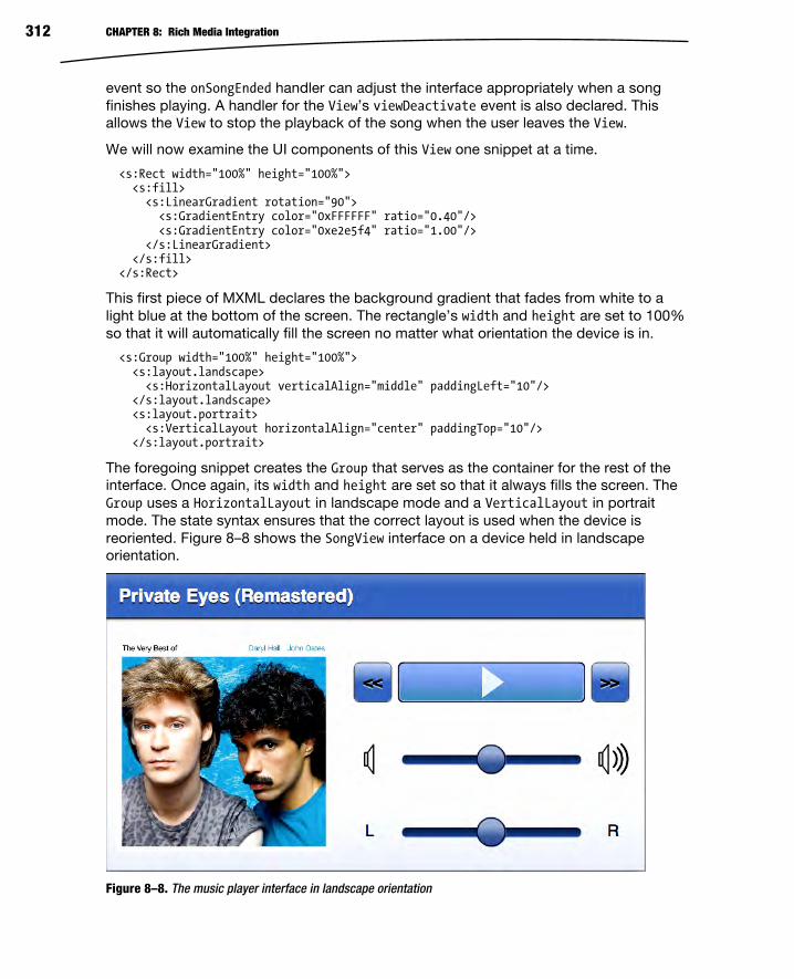
CHAPTER 8: Rich Media Integration 312
event so the onSongEnded handler can adjust the interface appropriately when a song
finishes playing. A handler for the View’s viewDeactivate event is also declared. This
allows the View to stop the playback of the song when the user leaves the View.
We will now examine the UI components of this View one snippet at a time.
<s:Rect width="100%" height="100%"> <s:fill> <s:LinearGradient rotation="90"> <s:GradientEntry color="0xFFFFFF" ratio="0.40"/> <s:GradientEntry color="0xe2e5f4" ratio="1.00"/> </s:LinearGradient> </s:fill> </s:Rect>
This first piece of MXML declares the background gradient that fades from white to a
light blue at the bottom of the screen. The rectangle’s width and height are set to 100%
so that it will automatically fill the screen no matter what orientation the device is in.
<s:Group width="100%" height="100%"> <s:layout.landscape> <s:HorizontalLayout verticalAlign="middle" paddingLeft="10"/> </s:layout.landscape> <s:layout.portrait> <s:VerticalLayout horizontalAlign="center" paddingTop="10"/> </s:layout.portrait>
The foregoing snippet creates the Group that serves as the container for the rest of the
interface. Once again, its width and height are set so that it always fills the screen. The
Group uses a HorizontalLayout in landscape mode and a VerticalLayout in portrait
mode. The state syntax ensures that the correct layout is used when the device is
reoriented. Figure 8–8 shows the SongView interface on a device held in landscape
orientation.
Figure 8–8. The music player interface in landscape orientation

CHAPTER 8: Rich Media Integration 313
The Group in the next bit of code is the container for the image of the album cover. The
size of the Group is adjusted dynamically based on the orientation, but the width and
height are always kept equal—it always forms a square.
<s:Group width.portrait="{height*0.4}" height.portrait="{height*0.4}" width.landscape="{width*0.4}" height.landscape="{width*0.4}"> <s:BitmapImage id="albumCover" width="100%" height="100%" source="{model.albumCover}" visible="{model.albumCover != null}"/> <assets:DefaultAlbum id="placeHolder" width="100%" height="100%" visible="{!model.albumCover}" /> </s:Group>
The source of the albumCover bitmap is bound to the model’s albumCover property. This
bitmap is visible only if there actually is an albumCover image in the model. If there is not,
a placeholder graphic is shown instead. The placeholder is an FXG image that is located
in the application’s assets package. You can see that it is trivial to use FXG graphics in
your MXML declarations. They also scale well for different screen densities since they
are vector graphics.
After the album cover, we arrive at the VGroup that contains the controls for this View.
This VGroup is actually made up of three separate HGroup containers. The first contains
the previous song button, the custom ProgressButton control, and a next song button.
The next HGroup container holds the horizontal volume slider, along with its FXG icons to
indicate low and high volume levels on each side of the slider. The final HGroup contains
the horizontal pan slider, along with Labels that show which direction is left and which is
right. Note that the model’s volume, pan, and percentComplete properties are bound to
the interface components with a two-way binding. This means that either side of the
binding can set the value of the property and the other will be updated.
<s:VGroup id="controls" horizontalAlign="center" width="100%" paddingTop="20" gap="40"> <s:HGroup width="90%"> <s:Button label="<<" height="40" click="model.previousSong()"/> <views:ProgressButton id="progressButton" width="100%" height="40" click="model.onPlayPause()" percentComplete="@{model.percentComplete}" skinClass="views.ProgressButtonSkin"/> <s:Button label=">>" height="40" click="model.nextSong()"/> </s:HGroup> <s:HGroup verticalAlign="middle" width="90%"> <assets:VolLow id="volLow" width="32" height="32"/> <s:HSlider width="100%" maximum="1.0" minimum="0.0" stepSize="0.01" snapInterval="0.01" value="@{model.volume}" showDataTip="false"/> <assets:VolHigh id="volHigh" width="32" height="32"/> </s:HGroup> <s:HGroup verticalAlign="middle" width="90%" > <s:Label text="L" width="32" height="32" verticalAlign="middle" textAlign="center"/> <s:HSlider width="100%" maximum="1.0" minimum="-1.0" stepSize="0.01" snapInterval="0.01" value="@{model.pan}" showDataTip="false"/> <s:Label text="R" width="32" height="32" verticalAlign="middle"

CHAPTER 8: Rich Media Integration 314
textAlign="center"/> </s:HGroup> </s:VGroup> </s:Group> </s:View>
Notice that there is virtually no logic in the View. It is all declarative presentation code,
just as it should be. All of the hard work is delegated to the presentation model.
Unfortunately, the SongViewModel class is too large to list in its entirety, so we will limit
ourselves to looking at only a few choice sections of the class. Remember that the basic
functionality required to play a music file was already covered earlier in the chapter, and
if you want to examine the complete source code of the class, you can refer to the
MusicPlayer project included with the book’s example code. Listing 8–21 shows the
declaration and the constructor for the SongViewModel class.
Listing 8–21. The Declaration of the SongViewModel Class
package viewmodels { // import statements… [Event(name="songEnded", type="flash.events.Event")] [Bindable] public class SongViewModel extends EventDispatcher { public static const SONG_ENDED:String = "songEnded"; public var albumCover:BitmapData; public var albumTitle:String = ""; public var songTitle:String = ""; public var artistName:String = ""; public var isPlaying:Boolean = false; private var timer:Timer; public function SongViewModel(songList:ArrayCollection, index:Number) { this.songList = songList; this.currentIndex = index; timer = new Timer(500, 0); timer.addEventListener(TimerEvent.TIMER, onTimer); loadCurrentSong(); } } }
The class extends EventDispatcher so that it can notify any Views that might be listening
when a song ends. The model dispatches the SONG_ENDED event when this happens. This
model is also annotated with Bindable to ensure that Views can easily bind to properties
such as the albumCover bitmap, the albumTitle, songTitle, artistName, and the
isPlaying flag. The constructor takes a collection of MusicEntries and the index of the
song from that collection that should be played. These parameters are saved into
instance variables for later reference, as they are used when the user wants to skip to

CHAPTER 8: Rich Media Integration 315
the previous or next song in the collection. The constructor also initializes a timer that
goes off every 500 milliseconds. This timer reads the current position of the song and
updates the class’s percentComplete variable. And lastly, the constructor causes the
current song to be loaded. The next two sections present more details regarding the
handling of percentComplete updates and the loadCurrentSong method.
Special Considerations for Two-Way Binding When looking at the MXML declaration of SongView, we noted that two-way bindings
were used with the model’s volume, pan, and percentComplete variables. This means that
their values can be set from outside the model class. This extra bit of complexity
requires some special handling in the model class. Listing 8–22 shows the code related
to these properties in SongViewModel.
Listing 8–22. Handling Two-Way Binding in the Presentation Model
private var _volume:Number = 0.5; private var _pan:Number = 0.0; private var _percentComplete:int = 0; public function get volume():Number { return _volume; } public function set volume(val:Number):void { _volume = val; updateChannelVolume(); } public function get pan():Number { return _pan; } public function set pan(val:Number):void { _pan = val; updateChannelPan(); } public function get percentComplete():int { return _percentComplete; } /** * Setting this value causes the song's play position to be updated. */ public function set percentComplete(value:int):void { _percentComplete = clipToPercentageBounds(value) updateSongPosition(); } /** * Clips the value to ensure it remains between 0 and 100 inclusive. */ private function clipToPercentageBounds(value:int):int { return Math.max(0, Math.min(100, value)); } /** * Set the position of the song based on the percentComplete value. */ private function updateSongPosition():void { var newPos:Number = _percentComplete / 100.0 * song.length; if (isPlaying) {

CHAPTER 8: Rich Media Integration 316
pauseSong() playSong(newPos); } else { pausePosition = newPos; } }
The public get and set functions of the volume, pan, and percentComplete properties
ensure that they can be bound in the View. Simply declaring the variables as public will
not work here since we need to do some extra work when they are set from outside the
class. When the volume and pan properties are set, we only need to call functions that
update the values in the SoundTransform, as was shown earlier in the chapter. Handling
percentageComplete updates is a little more involved: we need to stop the song if it is
playing and then restart it at its new position. We use the private pauseSong and
playSong utility methods to handle the details. If the song is not currently playing, we
only have to update the private pausePosition variable so that it begins at the updated
location the next time the song begins playing.
That covers the handling of percentComplete updates from outside the class, but what
about updates that come from within the class? Recall that there is a timer that reads
the song’s position every half-second and then updates the value of percentComplete. In
this case, we still need to notify the other side of the binding that the value of
percentComplete has been changed, but we cannot use the set method to do so
because we do not want to stop and restart the song every half-second. We need an
alternative update path, as shown in Listing 8–23.
Listing 8–23. Updating percentComplete During Timer Ticks
/* * Update the song's percentComplete value on each timer tick. */ private function onTimer(event:TimerEvent):void { var oldValue:int = _percentComplete; var percent:Number = channel.position / song.length * 100; updatePercentComplete(Math.round(percent)); } /** * Updates the value of _percentComplete without affecting the playback * of the current song (i.e. updateSongPosition is NOT called). This * function will dispatch a property change event to inform any clients * that are bound to the percentComplete property of the update. */ private function updatePercentComplete(value:int):void { var oldValue:int = _percentComplete; _percentComplete = clipToPercentageBounds(value); var pce:Event = PropertyChangeEvent.createUpdateEvent(this, "percentComplete", oldValue, _percentComplete); dispatchEvent(pce); }

CHAPTER 8: Rich Media Integration 317
The solution presented here is to update the value of _percentComplete directly and then
manually dispatch the PropertyChangeEvent to inform the other side of the binding that
the value has changed.
Integrating the Metaphile Library It would be really nice to display the image of the album cover if one is embedded in the
metadata of the MP3 file. However, the Flash’s ID3Info class does not support reading
image metadata from sound files. Luckily, there is a vibrant development community
that has grown around the Flex and Flash platforms over the years. This community has
given birth to many third-party libraries that help fill in functionality missing from the
platform. One such library is the open source Metaphile library.5 This small but powerful
ActionScript library provides the ability to read metadata—including images—from many
popular file formats.
Using the library is as simple as downloading the latest code from the project’s web site,
compiling it into an .swc file, and placing that file in your project’s libs directory. The
library provides an ID3Reader class that can be used to read MP3 metadata entries, as
shown in Listing 8–24. While the Sound class uses the URL provided by the current
song’s MusicEntry instance, Metaphile’s ID3Reader class is set up to read its metadata.
An onMetaData event handler is notified when the metadata has been parsed. The
class’s autoLimit property is set to -1 so that there is no limit on the size of the
metadata that can be parsed, and the autoClose property is set to true to ensure that
the input stream will be closed once ID3Reader is finished reading the metadata. The
final step is to call the read function of ID3Reader with the input stream created by
accessing the MusicEntry’s stream property passed in as the parameter.
Listing 8–24. Loading an MP3 File and Reading Its Metadata
/** * Loads the song data for the entry in the songList indicated by * the value of currentSongIndex. */ private function loadCurrentSong():void { try { var songFile:MusicEntry = songList[currentIndex]; song = new Sound(new URLRequest(songFile.url)); var id3Reader:ID3Reader = new ID3Reader(); id3Reader.onMetaData = onMetaData; id3Reader.autoLimit = -1; id3Reader.autoClose = true; id3Reader.read(songFile.stream); } catch (err:Error) { trace("Error while reading song or metadata: "+err.message); }
5 http://code.google.com/p/metaphile/

CHAPTER 8: Rich Media Integration 318
} /** * Called when the song's metadata has been loaded by the Metaphile * library. */ private function onMetaData(metaData:IMetaData):void { var songFile:MusicEntry = songList[currentIndex]; var id3:ID3Data = ID3Data(metaData); artistName = id3.performer ? id3.performer.text : "Unknown"; albumTitle = id3.albumTitle ? id3.albumTitle.text : "Unknown"; songTitle = id3.songTitle ? id3.songTitle.text : songFile.name; if (id3.image) { var loader:Loader = new Loader(); loader.contentLoaderInfo.addEventListener(Event.COMPLETE, onLoadComplete) loader.loadBytes(id3.image); } else { albumCover = null; } } /** * Called when the album image is finished loading from the metadata. */ private function onLoadComplete(e:Event):void { albumCover = Bitmap(e.target.content).bitmapData }
The onMetaData handler is passed a parameter that conforms to the Metaphile library’s
IMetaData interface. Since this handler is attached to an ID3Reader object, we know it is
safe to cast the passed-in metaData object to an instance of an ID3Data object. Doing so
gives us easy access to properties of the ID3Data class such as performer, albumTitle,
and songTitle. If there is image data present in the image property of the ID3Data class,
a new instance of flash.display.Loader is created to load the bytes into a
DisplayObject. When the image bytes are loaded, the onLoadComplete handler uses the
DisplayObject stored in the Loader’s content property to initialize the albumCover
BitmapData object. Since the View is bound to the albumCover property, it will display the
album cover image as soon as it is updated.
Creating a Custom Component Creating custom mobile components is much like creating any other custom Spark
component in Flex 4. You create a component class that extends SkinnableComponent
and a Skin to go along with it. As long as your graphics are not too complex, you can
use a regular MXML Skin. If you encounter performance problems, you may need to
write your Skin in ActionScript instead. See Chapter 11 for more information about
performance tuning your mobile application.
The custom component we will write is the ProgressButton. To save space in our user
interface, we want to combine the functionality of the play/pause button with that of a

CHAPTER 8: Rich Media Integration 319
progress monitor that indicates the current play position of the song. The control will
also let the user adjust that playback position if desired. So if the user taps the control,
we will treat it as a toggle of the button. If the user touches the control and then drags
horizontally, it will be treated as a position adjustment.
The control will therefore have two graphical elements: an icon that indicates the state of
the play/pause functionality and a progress bar that shows the playback position of the
song. Figure 8–9 shows the control in its various states.
Figure 8–9. The custom ProgressButton control
When creating custom Spark controls, you can think of the Skin as your View and the
SkinnableComponent as your model. Listing 8–25 shows the ProgressButton class, which
extends SkinnableComponent and therefore acts as the control’s model.
Listing 8–25. The Declaration of the Component Portion of the ProgressButton
package views{ // imports removed…
[SkinState("pause")] public class ProgressButton extends SkinnableComponent { [SkinPart(required="true")] public var playIcon:DisplayObject; [SkinPart(required="true")] public var pauseIcon:DisplayObject; [SkinPart(required="true")] public var background:Group;
[Bindable] public var percentComplete:Number = 0; private var mouseDownTime:Number; private var isMouseDown:Boolean; public function ProgressButton() {

CHAPTER 8: Rich Media Integration 320
// Make sure the mouse doesn't interact with any of the skin parts mouseChildren = false; addEventListener(MouseEvent.MOUSE_DOWN, onMouseDown); addEventListener(MouseEvent.MOUSE_MOVE, onMouseMove); addEventListener(MouseEvent.MOUSE_UP, onMouseUp); addEventListener(MouseEvent.CLICK, onMouseClick); } override protected function getCurrentSkinState():String { if (isPlaying()) { return "play"; } else { return "pause"; } } override protected function partAdded(partName:String, instance:Object):void { super.partAdded(partName, instance); if (instance == pauseIcon) { pauseIcon.visible = false; } } override protected function partRemoved(partName:String, instance:Object):void { super.partRemoved(partName, instance); } // Consult Listing 8–26 for the rest of this class } }
The component has two states that every Skin must support: play and pause. The
component class is annotated with SkinState(“pause”) to set the default state of its Skin
to the pause state. Although a Skin may declare as many parts as needed, the
component requires every Skin to define at least the playIcon, the pauseIcon, and a
background. The final component of the interface contract between the component and
the Skin is the bindable percentComplete property that the Skin uses to draw the
progress bar. The component’s constructor disables mouse interaction with any child
components contained in the Skin and attaches listeners for the mouse events that it
needs to handle.
There are three methods that most components will need to implement to ensure
correct behavior of the custom control: getCurrentSkinState, partAdded, and
partRemoved. The Skin calls the getCurrentSkinState function when it needs to update
its display. The ProgressButton component overrides this function to return the state
name based on the current value of the isPlaying flag. The partAdded and partRemoved
functions give the component the chance to perform initialization and cleanup tasks
when Skin parts are added and removed. In this case, both of these functions make
sure to call their corresponding functions in the super class, and the only specialization
done for ProgressButton is to make sure the pauseIcon is invisible when it is added.
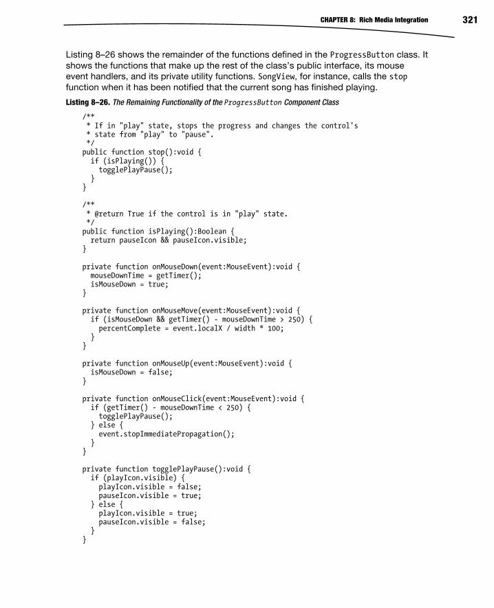
CHAPTER 8: Rich Media Integration 321
Listing 8–26 shows the remainder of the functions defined in the ProgressButton class. It
shows the functions that make up the rest of the class’s public interface, its mouse
event handlers, and its private utility functions. SongView, for instance, calls the stop
function when it has been notified that the current song has finished playing.
Listing 8–26. The Remaining Functionality of the ProgressButton Component Class
/** * If in "play" state, stops the progress and changes the control's * state from "play" to "pause". */ public function stop():void { if (isPlaying()) { togglePlayPause(); } } /** * @return True if the control is in "play" state. */ public function isPlaying():Boolean { return pauseIcon && pauseIcon.visible; } private function onMouseDown(event:MouseEvent):void { mouseDownTime = getTimer(); isMouseDown = true; } private function onMouseMove(event:MouseEvent):void { if (isMouseDown && getTimer() - mouseDownTime > 250) { percentComplete = event.localX / width * 100; } } private function onMouseUp(event:MouseEvent):void { isMouseDown = false; } private function onMouseClick(event:MouseEvent):void { if (getTimer() - mouseDownTime < 250) { togglePlayPause(); } else { event.stopImmediatePropagation(); } } private function togglePlayPause():void { if (playIcon.visible) { playIcon.visible = false; pauseIcon.visible = true; } else { playIcon.visible = true; pauseIcon.visible = false; } }

CHAPTER 8: Rich Media Integration 322
The MouseEvent handlers take care of distinguishing a tap from a drag gesture. If the
control is pressed for less than 250 milliseconds, the gesture will be interpreted as a
button press and no dragging will occur. Any touch that lasts longer than 250
milliseconds will be interpreted as a drag rather than a touch and the value of the
percentComplete value will be adjusted according to the location of the mouse relative to
the origin of the control. The togglePlayPause function is used by some of the other
functions in the class to toggle the visibility of the icons, which then determines the state
of the control.
The last step in creating a custom control is to define a Skin class. This is simply a
matter of creating a new MXML Skin component. The Skin used for the ProgressButton
in the MusicPlayer application is shown in Listing 8–27. Every Skin must include a
metadata tag that specifies the HostComponent for which the Skin was designed. A
reference to the HostComponent specified in the metadata tag is available to the Skin via
its hostComponent property. Another requirement is that the Skin must declare all of the
states in which it is interested. Further, the names of the states must correspond to
those defined by the host component for the Skin to function correctly.
Listing 8–27. The ProgressButtonSkin Declaration
<?xml version="1.0" encoding="utf-8"?> <s:Skin xmlns:fx="http://ns.adobe.com/mxml/2009" xmlns:s="library://ns.adobe.com/flex/spark" xmlns:assets="assets.*" minWidth="20" minHeight="20"> <fx:Metadata> [HostComponent("views.ProgressButton")] </fx:Metadata> <s:states> <s:State name="play"/> <s:State name="pause"/> </s:states> <s:Group id="background" width="{hostComponent.width}" height="{hostComponent.height}"> <s:Rect top="0" right="0" bottom="0" left="0" radiusX="5" radiusY="5"> <s:fill> <s:SolidColor color="0x1A253C" /> </s:fill> </s:Rect> <s:Rect top="1" right="1" bottom="1" left="1" radiusX="5" radiusY="5"> <s:fill> <s:LinearGradient rotation="90"> <s:GradientEntry color="0xa0b8f0" ratio="0.00"/> <s:GradientEntry color="0x81A1E0" ratio="0.48"/> <s:GradientEntry color="0x6098c0" ratio="0.85"/> </s:LinearGradient> </s:fill> </s:Rect> <s:Rect top="1" bottom="1" left="1" right="1" radiusX="5" radiusY="5">

CHAPTER 8: Rich Media Integration 323
<s:stroke> <s:SolidColorStroke color="0xa0b8f0" weight="1"/> </s:stroke> </s:Rect> <s:Rect radiusX="5" radiusY="5" top="1" bottom="1" x="1" width="{(hostComponent.width-2)*hostComponent.percentComplete/100.0}"> <s:fill> <s:LinearGradient rotation="90"> <s:GradientEntry color="0xFFE080" ratio="0.00"/> <s:GradientEntry color="0xFFc860" ratio="0.48"/> <s:GradientEntry color="0xE0a020" ratio="0.85"/> </s:LinearGradient> </s:fill> </s:Rect> <assets:Play id="playIcon" verticalCenter="0" horizontalCenter="0" width="{hostComponent.height-4}" height="{hostComponent.height-4}"/> <assets:Pause id="pauseIcon" verticalCenter="0" horizontalCenter="0" width="{hostComponent.height-4}" height="{hostComponent.height-4}"/> </s:Group> </s:Skin>
The background Group serves as a container for the rest of the graphics of the Skin. It is
bound to the width and height of the hostComponent. The next three rectangles declared
by the Skin serve as the borders and background fill of the component. The fourth
rectangle draws the progress bar. Its width is based on a calculation involving the width
of the hostComponent and its percentComplete property. It is declared after the three
background and border rectangles so that it will be drawn on top of them. The final parts
to be added to the Skin are the FXG graphics for the playIcon and the pauseIcon. FXG
files are just as easy to use in Skin classes as they are in any other MXML file. FXG files
are compiled to an optimized format and drawn as vector graphics. For this reason, they
not only are fast to render but also scale nicely. You don’t have to worry about them
looking bad at different resolutions and screen densities (except when used in
IconItemRenderers, as noted previously!).
That concludes our look at playing sound in Flash and at creating a MusicPlayer that
goes somewhat beyond a trivial example application by exploring the issues that you will
have to deal with when writing real Android applications. For the rest of this chapter, we
will be exploring video playback, a feature that made Flash into a household word.

CHAPTER 8: Rich Media Integration 324
Playing Video Some recent estimates have Flash responsible for as much as 75% of the Web’s video.6
Whether video is in the On2 VP6 format or in the widely used H.264 format, rest assured
that it can be played in your mobile Flash and Flex applications. There are, however, some
things that must be taken into account when dealing with mobile devices. Although mobile
devices are growing in CPU and graphical power at an incredible rate, they are still much
slower than an average desktop or notebook computer. Recent high-end mobile devices
have support for hardware-accelerated decoding and rendering of H.264 video, but many
do not. And new features in Flash, like Stage Video, which gives your Flash applications
access to hardware-accelerated video rendering on the desktop and TV, are not yet
available on Android devices—although it is only a matter of time. Until then, you must
make some compromises when playing video on mobile devices. This starts with
encoding, which is where our examination of mobile Flash video will begin.
Optimizing Video for Mobile Devices Video encoding is half science and half black art. There are some great resources
available that explore the topic in all of its glorious detail.7 Therefore we will only
summarize some of the recent recommended best practices, while advising that you
examine the sources cited in the footnotes of this page for an in-depth treatment of the
subject. The main things to keep in mind when you are encoding video for mobile
devices are that you are dealing with more limited hardware and you will have to cope
with bandwidth that fluctuates between 3G, 4G, and Wi-Fi networks.
Adobe recommends that when encoding new video, you prefer the H.264 format at a
maximum frame rate of 24 fps (frames per second) and with 44.1 kHz AAC-encoded
stereo audio. If you must use the On2 VP6 format, then the same recommendation
applies to frame rate and audio sampling, only with audio in MP3 format rather than
AAC. If you are encoding with H.264, you will want to stick with the baseline profile if
you want good performance across the greatest number of devices. If your source
footage is at a frame rate that is higher than 24, you may want to consider halving it until
you are below that target. For example, if your footage is at 30 fps, then you will get the
best results by encoding it at 15 fps since the encoder won’t have to interpolate any of
the video data.
6Adobe, Inc., “Delivering video for Flash Player 10.1 on mobile devices,” www.adobe.com/devnet/devices/articles/delivering_video_fp10-1.html, February 15, 2010
7Adobe, Inc., “Video encoding guidelines for Android mobile devices,” www.adobe.com/devnet/devices/articles/encoding-guidelines-android.html, December 22, 2010

CHAPTER 8: Rich Media Integration 325
Table 8–2 shows encoding recommendations gathered from recent publications from
Adobe and conference sessions at Adobe Max and 360 Flex. All of these numbers
assume H.264 encoding in the baseline profile. Keep in mind that these are only
recommendations—they change rapidly as faster hardware becomes available, and they
may not apply to your specific situation. Also, these recommendations are targeting the
largest number of devices possible. If your application is specifically targeted at high-
end devices running the latest versions of Android, then these numbers may be a little
too conservative for your needs.
Table 8–2. Encoding Recommendations for Mobile Devices
Wi-Fi 4G 3G
Resolution 640x480 (4:3)
640x360 (16:9)
512x384 (4:3)
512x288 (16:9)
480x360 (4:3)
480x272 (16:9)
Video Bit Rate 500–700 kbps 350–500 kbps Up to 350 kbps
Audio Bit Rate Up to 160 kbps Up to 128 kbps Up to 64 kbps
There are also several steps you can take in your application to ensure that you are
getting the best performance. You should avoid the use of transforms: rotation,
perspective projections, and color transforms. Avoid drop shadows, filter effects, and
Pixel Bender effects. And you should avoid transparency and blending the video object
with other graphics as much as possible.
It is also best to try to avoid excessive ActionScript processing. For example, if you have
a timer that is updating your playhead, do not have it updating multiple times per
second if it’s really not necessary that it do so. The goal is to always dedicate as much
processing time as possible to rendering and minimize the amount needed for program
logic while playing video. For this same reason, you should also try to avoid stretching or
compressing the video if at all possible. It is a better idea to use the Capabilities class,
or the size of your View, to determine the size of your display area and then select the
closest match. That assumes you have multiple formats of the video to choose from. If
you do not, then it is best to include options in your application that will let the user
determine whether to play the video at its natural resolution or to stretch it to fill the
screen (and remember that with video, you nearly always want to maintain aspect ratio
when stretching).
Spark VideoPlayer The topic of playing video is too large to fit in one section, or even one chapter, of a
book. We will not go into installing or connecting to a streaming server such as the Red5
Media Server or Adobe’s Flash Media Server. We will not cover topics such as DRM

CHAPTER 8: Rich Media Integration 326
(digital rights management)8 or CDNs (content delivery networks). Instead, we will cover
the basic options for playing video in your applications. All of these options will work
with either progressive downloads or with streaming servers. It is our intention to get
you started in the right direction so that you know where to begin. If you then need more
advanced features such as those mentioned previously, Adobe’s documentation is more
than adequate.
The first option we will look at is the Spark VideoPlayer component that was introduced
with Flex 4. This component is built on top of the Open Source Media Framework
(OSMF), a library designed to handle all of the “behind the scenes” tasks required by a
full-featured video player. The idea is that you write your cool video player GUI, wire it to
the functionality provided by OSMF, and you are ready to go. We’ll look at OSMF in
more depth later in the chapter.
So the Spark VideoPlayer, then, is a pre-packaged video player UI built on top of the
pre-packaged OSMF library. It is the ultimate in convenience (and laziness) since you
can add video playback functionality to your app with just a few lines of code. Listing 8–
28 shows how to instantiate a VideoPlayer in a View MXML file.
Listing 8–28. Using the Spark VideoPlayer in a Mobile Application
<?xml version="1.0" encoding="utf-8"?> <s:View xmlns:fx="http://ns.adobe.com/mxml/2009" xmlns:s="library://ns.adobe.com/flex/spark" viewDeactivate="onViewDeactivate()" actionBarVisible="false"> <fx:Script> <![CDATA[ private static const sourceURL:String = "http://ia600408.us.archive.org"+ "/26/items/BigBuckBunny_328/BigBuckBunny_512kb.mp4"; private function onViewDeactivate():void { player.stop(); } ]]> </fx:Script> <s:VideoPlayer id="player" width="100%" height="100%" source="{sourceURL}" skinClass="views.MobileVideoPlayerSkin"/> </s:View>
This application is set to full screen, and the View’s ActionBar has been disabled to
allow the VideoPlayer to take up the entire screen of the device. All the component
needs is a source URL, and it will automatically begin playback as soon as sufficient
data has been buffered. It truly does not get any easier. We did take care to stop the
playback when the View is deactivated. It’s a small thing, but there is no reason to
continue buffering and playing any longer than is strictly necessary.
8 http://help.adobe.com/en_US/as3/dev/WS5b3ccc516d4fbf351e63e3d118676a5be7-8000.html
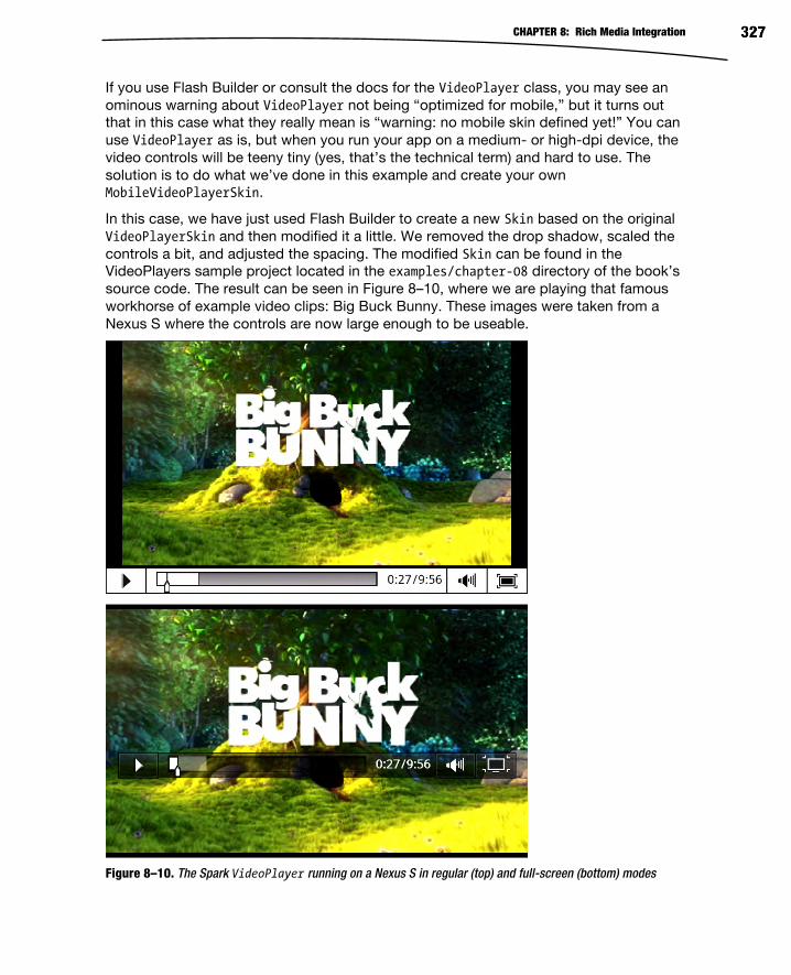
CHAPTER 8: Rich Media Integration 327
If you use Flash Builder or consult the docs for the VideoPlayer class, you may see an
ominous warning about VideoPlayer not being “optimized for mobile,” but it turns out
that in this case what they really mean is “warning: no mobile skin defined yet!” You can
use VideoPlayer as is, but when you run your app on a medium- or high-dpi device, the
video controls will be teeny tiny (yes, that’s the technical term) and hard to use. The
solution is to do what we’ve done in this example and create your own
MobileVideoPlayerSkin.
In this case, we have just used Flash Builder to create a new Skin based on the original
VideoPlayerSkin and then modified it a little. We removed the drop shadow, scaled the
controls a bit, and adjusted the spacing. The modified Skin can be found in the
VideoPlayers sample project located in the examples/chapter-08 directory of the book’s
source code. The result can be seen in Figure 8–10, where we are playing that famous
workhorse of example video clips: Big Buck Bunny. These images were taken from a
Nexus S where the controls are now large enough to be useable.
Figure 8–10. The Spark VideoPlayer running on a Nexus S in regular (top) and full-screen (bottom) modes

CHAPTER 8: Rich Media Integration 328
This was just a quick modification of the current VideoPlayerSkin, but of course you can
get as fancy with your new mobile Skin as you want thanks to the skinning architecture
of the Spark components introduced in Flex 4. Just remember some of the performance
constraints you will face in a mobile environment.
Video with NetStream Having a convenient, pre-packaged solution such as VideoPlayer is nice, but there are
times when you really need something that is customized. Or perhaps you don’t want all
of the baggage that comes with an “everything’s included” library like OSMF. That’s
where the NetConnection, NetStream, and Video classes come in. These classes allow
you to build a lightweight or full-featured and fully customized video player.
In short, NetConnection handles the networking; NetStream provides the programmatic
interface that controls the streaming, buffering, and playback of the video; and Video
provides the display object where the decoded video ultimately appears. In this
scenario, you are the one responsible for supplying the user interface for the video
player. Listing 8–29 shows a very minimalistic MXML declaration for a NetStream-based
video player.
Listing 8–29. The MXML File for the NetStreamVideoView
<?xml version="1.0" encoding="utf-8"?> <s:View xmlns:fx="http://ns.adobe.com/mxml/2009" xmlns:s="library://ns.adobe.com/flex/spark" xmlns:mx="library://ns.adobe.com/flex/mx" initialize="onInitialize()" viewDeactivate="onViewDeactivate()" actionBarVisible="false" backgroundColor="black"> <fx:Script source="NetStreamVideoViewScript.as"/> <mx:UIComponent id="videoContainer" width="100%" height="100%"/> <s:Label id="logger" width="100%" color="gray"/> <s:HGroup bottom="2" left="30" right="30" height="36" verticalAlign="middle"> <s:ToggleButton id="playBtn" click="onPlayPause()" selected="true" skinClass="spark.skins.spark.mediaClasses.normal.PlayPauseButtonSkin"/> <s:Label id="timeDisplay" color="gray" width="100%" textAlign="right"/> </s:HGroup> </s:View>
We have declared a UIComponent that serves as the eventual container for the Video
display object. Other than that, there are just two other visible controls. The first is a
ToggleButton that “borrows” the PlayPauseButtonSkin from the Spark VideoPlayer
component (OK, we admit it, we flat-out stole the Skin and we’re not even a little bit
sorry). This gives us an easy way to display a button with the traditional triangle play
icon and the double-bar pause icon. The other control is simply a Label that will display
the duration of the video clip and the current play position.

CHAPTER 8: Rich Media Integration 329
There are various ActionScript functions mentioned in the MXML declaration as event
handlers for the View’s initialize and viewDeactivate events as well as for the
Button’s click event. The ActionScript code has been moved to a separate file and
included with a <fx:Script> tag. Listing 8–30 shows the code for the View’s
onInitialize and onViewDeactivate handlers.
Listing 8–30. The View Event Handlers for the NetStreamVideoView
private static const SOURCE:String = "http://ia600408.us.archive.org/"+ "26/items/BigBuckBunny_328/BigBuckBunny_512kb.mp4";
private var video:Video; private var ns:NetStream;private var isPlaying:Boolean;private var timer:Timer; private var duration:String = "";
private function onInitialize():void { video = new Video(); videoContainer.addChild(video); var nc:NetConnection = new NetConnection(); nc.connect(null); ns = new NetStream(nc); ns.addEventListener(NetStatusEvent.NET_STATUS, onNetStatus); ns.client = { onMetaData: onMetaData, onCuePoint: onCuePoint, onPlayStatus: onPlayStatus }; ns.play(SOURCE); video.attachNetStream(ns);
timer = new Timer(1000); timer.addEventListener(TimerEvent.TIMER, onTimer); timer.start();}
private function onViewDeactivate():void { if (ns) { ns.close(); }}
The onInitialize handler takes care of all of the setup code. The Video display object is
created and added to its UIComponent container. Next, a NetConnection is created, and
its connect method is called with a null value. This tells the NetConnection that it will be
playing an MP3 or video file from the local filesystem or from a web server.
NetConnection can also be used for Flash Remoting or to connect to Flash Media
Servers if different parameters are passed to its connect method.
The next step is to create the NetStream object by passing it a reference to the
NetConnection in its constructor. There are several events that you may be interested in
receiving from the NetStream object depending on the sophistication of your player. The

CHAPTER 8: Rich Media Integration 330
NET_STATUS event will give you notifications about buffer status, playback status, and
error conditions. There are also metaData, cuePoint, and playStatus events that are
attached to the NetStream’s client property. The client is just an Object that defines
certain properties; it doesn’t have to be of any particular type. In the foregoing listing, we
just used an object literal to declare an anonymous object with the desired properties.
The metaData event will give you important information such as the width, height, and
duration of the video. The cuePoint event will notify you whenever a cue point that was
embedded in the video has been reached. Handling the playStatus will even let you know
when the video has reached its end. These event handlers are shown in Listing 8–31.
The final steps are to begin playing the NetStream, attach it to the Video display object,
and to create and start the timer that will update the time display once per second.
Listing 8–31. The NetStream Event Handlers
private function onMetaData(item:Object):void { video.width = item.width; video.height = item.height; video.x = (width - video.width) / 2; video.y = (height - video.height) / 2; if (item.duration) duration = formatSeconds(item.duration); } private function onCuePoint(item:Object):void { // Item has four properties: name, time, parameters, type log("cue point "+item.name+" reached"); } private function onPlayStatus(item:Object):void { if (item.code == "NetStream.Play.Complete") { timer.stop(); updateTimeDisplay(duration); } } private function onNetStatus(event:NetStatusEvent):void { var msg:String = ""; if (event.info.code) msg += event.info.code; if (event.info.level) msg += ", level: "+event.info.level; log(msg); } private function log(msg:String, showUser:Boolean=true):void { trace(msg); if (showUser) logger.text += msg + "\n"; }

CHAPTER 8: Rich Media Integration 331
The onMetaData handler uses the width and height of the video to center it in the View. It
also saves the duration of the video to be used in the time display Label. In the
onPlayStatus handler, we check to see if this is a NetStream.Play.Complete notification
and, if so, stop the timer that has been updating the time display. The onCuePoint and
onNetStatus handlers are there only for demonstration purposes, and their output is
simply logged to the debug console and optionally to the screen.
Listing 8–32 shows the remaining code associated with the NetStreamVideoView. The
onPlayPause function serves as the ToggleButton’s click handler. Depending on the
selected state of the ToggleButton, it will either pause or resume the NetStream and
start or stop the timer that updates the timeDisplay Label. The onTimer function is the
handler for that Timer. It will use the NetStream’s time property, formatted as a
minutes:seconds string, to update the Label.
Listing 8–32. Playing, Pausing, and Reading Properties from the NetStream
private function onPlayPause():void { if (playBtn.selected) { ns.resume(); timer.start(); } else { ns.pause(); timer.stop(); } } private function onTimer(event:TimerEvent):void { updateTimeDisplay(formatSeconds(ns.time)); } private function updateTimeDisplay(time:String):void { if (duration) time += " / "+duration; timeDisplay.text = time; } private function formatSeconds(time:Number):String { var minutes:int = time / 60; var seconds:int = int(time) % 60; return String(minutes+":"+(seconds<10 ? "0" : "")+seconds); }
Figure 8–11 shows the result of all of this code running on a low-dpi Android device. A
minimal player such as this one is more appropriate for this type of screen.

CHAPTER 8: Rich Media Integration 332
Figure 8–11. A minimal NetStream-based video player running on a low-dpi device
As you can see, there was a lot more code involved in creating our minimalistic
NetStream-based video player. But if you need ultimate flexibility in a lightweight video
player implementation, the combination of the NetStream and Video classes will provide
all of the power you need.
We mentioned Stage Video briefly at the beginning of this section on playing video.
Once supported on Android, it will allow your NetStream-based video players to take
advantage of hardware-accelerated decoding and rendering of H.264 video. Adobe
provides a very helpful “getting started” guide to help you convert your NetStream code
to use Stage Video rather than the Video display object.9 If you prefer to future-proof
yourself with very little effort, you can take advantage of the third option for writing a
video player on Android: the OSMF library. It is the subject of our next section, and it will
automatically take advantage of Stage Video when it becomes available on Android.
Playing Video with OSMF The Open Source Media Framework is a project started by Adobe to create a library that
captures best practices when it comes to writing Flash-based media players. It is a full-
featured media player abstracted into a handful of easy-to-use classes. The library
allows you to quickly create high-quality video players for use in your Flex and Flash
applications. OSMF is included with the Flex 4 SDK, but you can also download the
latest version from the project’s web site.10 Listing 8–33 shows the MXML code for the
OSMFVideoView. The user interface code shown here is almost exactly the same as the
9Adobe, Inc., “Getting started with stage video,” www.adobe.com/devnet/flashplayer/articles/stage_video.html, February 8, 2011
10http://sourceforge.net/projects/osmf.adobe/files/
CHAPTER 8: Rich Media Integration 333
code in Listing 8–29 for the NetStreamVideoView. In essence we’re just replacing the
NetStream-based back end with an OSMF-based MediaPlayer implementation.
Listing 8–33. The MXML Declaration for the OSMFVideoView
<?xml version="1.0" encoding="utf-8"?> <s:View xmlns:fx="http://ns.adobe.com/mxml/2009" xmlns:s="library://ns.adobe.com/flex/spark" xmlns:mx="library://ns.adobe.com/flex/mx" initialize="onInitialize()" viewDeactivate="onViewDeactivate()" actionBarVisible="false" backgroundColor="black"> <fx:Script source="OSMFVideoViewScript.as"/> <mx:UIComponent id="videoContainer" width="100%" height="100%"/> <s:HGroup bottom="2" left="30" right="30" height="36" verticalAlign="middle"> <s:ToggleButton id="playBtn" click="onPlayPause()" selected="true" skinClass="spark.skins.spark.mediaClasses.normal.PlayPauseButtonSkin"/> <s:Label id="timeDisplay" color="gray" width="100%" textAlign="right"/> </s:HGroup> </s:View>
Listing 8–34 shows the initialization code for the OSMF classes that will be used to
implement the video player. We pass an instance of URLResource that contains the URL
of our movie to the LightweightVideoElement constructor. An OSMF MediaElement is an
interface to the type of media being played. LightweightVideoElement is a specialization
that represents a video and supports both progressive download and simple RTMP
streaming. There is also a class named VideoElement that supports more streaming
protocols, but for our purposes the LightweightVideoElement has all of the functionality
that is required.
Once the LightweightVideoElement is created, it is passed to the constructor of the
OSMF MediaPlayer class. MediaPlayer is the class through which you will control the
playback of the video. It is capable of dispatching many different events that can be
used to get information about the state and status of the MediaPlayer. In the example
code shown next, we handle the mediaSizeChange event to center the video display on
the View, the timeChange and durationChange events to update the timeDisplay Label,
and the complete event to inform us when the video has finished playing.
The MediaPlayer is not a display object itself. Instead it provides a displayObject
property that can be added to the display list. In this case, it is being added as a child of
the videoContainer UIComponent. The final bit of initialization we do is to use the
currentTimeUpdateInterval property to request that we be given updates on the
currentTime of the video player only once per second instead of the default value of
every 250 milliseconds. The video will begin playing automatically since the default value
of the MediaPlayer’s autoPlay property is true.

CHAPTER 8: Rich Media Integration 334
Listing 8–34. Initialization Code for the OSMF-Based MediaPlayer
import org.osmf.elements.VideoElement; import org.osmf.events.DisplayObjectEvent; import org.osmf.events.MediaElementEvent; import org.osmf.events.TimeEvent; import org.osmf.media.MediaPlayer; import org.osmf.media.URLResource; import org.osmf.net.NetLoader; private static const sourceURL:String = "http://ia600408.us.archive.org"+ "/26/items/BigBuckBunny_328/BigBuckBunny_512kb.mp4"; private var player:MediaPlayer; private var duration:String; private function onInitialize():void { var element:LightweightVideoElement; element = new LightweightVideoElement(new URLResource(sourceURL)); player = new MediaPlayer(element); videoContainer.addChild(player.displayObject); player.addEventListener(DisplayObjectEvent.MEDIA_SIZE_CHANGE, onSize); player.addEventListener(TimeEvent.CURRENT_TIME_CHANGE, onTimeChange); player.addEventListener(TimeEvent.DURATION_CHANGE, onDurationChange); player.addEventListener(TimeEvent.COMPLETE, onVideoComplete); player.currentTimeUpdateInterval = 1000; } private function onViewDeactivate():void { if (player) player.stop(); } private function onPlayPause():void { if (player.playing) { player.play(); } else { player.pause(); } }
In the onViewDeactivate handler just shown, we make sure to stop the player when the
View is deactivated. You can also see the click handler for the play/pause
ToggleButton. It simply calls the MediaPlayer’s play and pause methods, depending on
whether the player is currently playing.
Listing 8–35 continues the listing of the script code for the OSMFVideoView by showing
the MediaPlayer event handlers. The onSize handler is called whenever the media
changes size. We use this handler to center the MediaPlayer’s displayObject on the
View. The onDurationChange handler is called when the player learns the total duration of
the video being played. We use this handler to store the duration as a formatted string
that is later used by the timeDisplay Label. The onTimeChange handler is called once per
second—as we requested during initialization—so we can update the timeDisplay

CHAPTER 8: Rich Media Integration 335
Label. And finally, onVideoComplete is included for demonstration purposes. Our
implementation just prints a message to the debug console.
Listing 8–35. The OSMF Event Handlers
private function onSize(event:DisplayObjectEvent):void { player.displayObject.x = (width - event.newWidth) / 2; player.displayObject.y = (height - event.newHeight) / 2; } private function onDurationChange(event:TimeEvent):void { duration = formatSeconds(player.duration); } private function onTimeChange(event:TimeEvent):void { updateTimeDisplay(formatSeconds(player.currentTime)); } private function onVideoComplete(event:TimeEvent):void{ trace("The video played all the way through!"); } private function updateTimeDisplay(time:String):void { if (duration) time += " / "+ duration; timeDisplay.text = time; } private function formatSeconds(time:Number):String { var minutes:int = time / 60; var seconds:int = int(time) % 60; return String(minutes+":"+(seconds<10 ? "0" : "")+seconds); }
With OSMF, you get all the functionality with less code when compared with rolling your
own NetStream-based video player. You also get the benefit of leveraging code written
by video experts. If you need all of the functionality it provides, you can’t go wrong by
building your video player on top of OSMF. When run, this OSMF-based video player
looks and behaves exactly like the one shown in Figure 8–11.
VideoRecorder Example The final example of this chapter will be the video analog of the SoundRecorder that was
presented earlier. The VideoRecorder application will use the Android camera interface
to capture a video file and then allow the user to immediately play it back in the Flex
application. The source code for this example can be found in the VideoRecorder
sample application located in the examples/chapter-08 directory of the book’s source
code.
You may recall from Chapter 7 that the CameraUI class can be used for capturing video
and images using the native Android camera interface.

CHAPTER 8: Rich Media Integration 336
This example will use an OSMF MediaPlayer to play the captured video. Listing 8–36
shows the initialization code for the CameraUI class and the MediaPlayer classes.
Listing 8–36. Initializing the CameraUI and MediaPlayer Classes
import flash.media.CameraUI; import org.osmf.elements.VideoElement; import org.osmf.events.DisplayObjectEvent; import org.osmf.events.MediaElementEvent; import org.osmf.events.TimeEvent; import org.osmf.media.MediaPlayer; import org.osmf.media.URLResource; import org.osmf.net.NetLoader; private var cameraUI:CameraUI; private var player:MediaPlayer; private var duration:String; private function onInitialize():void { if (CameraUI.isSupported) { cameraUI = new CameraUI(); cameraUI.addEventListener(MediaEvent.COMPLETE, onCaptureComplete); player = new MediaPlayer(); player.addEventListener(DisplayObjectEvent.MEDIA_SIZE_CHANGE, onSize); player.addEventListener(TimeEvent.CURRENT_TIME_CHANGE, onTimeChange); player.addEventListener(TimeEvent.DURATION_CHANGE, onDurationChange); player.addEventListener(TimeEvent.COMPLETE, onVideoComplete); player.currentTimeUpdateInterval = 1000; player.autoPlay = false; } captureButton.visible = CameraUI.isSupported; }
As always, we check to ensure that the CameraUI class is supported on the device. If so,
a new CameraUI instance is created and a handler for its complete event is added. You
learned in Chapter 7 that the CameraUI triggers this event when the image or video
capture is successfully completed. Next we create our MediaPlayer and attach the usual
event listeners. Note that the autoPlay property is set to false since we will want to start
playback manually in this application.
Listing 8–37 shows the code that initiates the video capture with the native Android
interface, as well as the handler that gets notified when the capture is completed
successfully.
Listing 8–37. Starting and Completing the Video Capture
private function onCaptureImage():void { cameraUI.launch(MediaType.VIDEO); } private function onCaptureComplete(event:MediaEvent):void { player.media = new VideoElement(new URLResource(event.data.file.url)); player.play();

CHAPTER 8: Rich Media Integration 337
playBtn.selected = true; playBtn.visible = true; if (videoContainer.numChildren > 0) videoContainer.removeChildAt(0); videoContainer.addChild(player.displayObject); }
When the user taps the button to start the capture, the onCaptureImage handler launches
the native camera UI to capture a video file. If successful, the onCaptureComplete
handler receives an event containing the MediaPromise as its data property. The
MediaPromise contains a reference to the file in which the captured video was stored.
We can use the file’s URL to initialize a new VideoElement and assign it to the
MediaPlayer’s media property. Then we can start the video playing and adjust the
properties of the playBtn to be consistent with the state of the application. If the
videoContainer already has a displayObject added to it, we remove it and then add the
player’s new displayObject.
Most of the event handling code is the same as the OSMFVideoView code that was
presented in the last section. There are two differences that are shown in Listing 8–38.
Listing 8–38. A Slightly Different Take on the MediaPlayer Event Handling
private function onSize(event:DisplayObjectEvent):void { if (player.displayObject == null) return; var scaleX:int = Math.floor(width / event.newWidth); var scaleY:int = Math.floor(height / event.newHeight); var scale:Number = Math.min(scaleX, scaleY); player.displayObject.width = event.newWidth * scale; player.displayObject.height = event.newHeight * scale; player.displayObject.x = (width - player.displayObject.width) / 2; player.displayObject.y = (height - player.displayObject.height) / 2; } private function onVideoComplete(event:TimeEvent):void{ player.seek(0); playBtn.selected = false; }
In this case, the onSize handler will try to scale the video size to be a closer match to the
size of the display. Note the check to see if the player.displayObject is null. This can
happen when switching from one captured video to the next. So we have to take care
not to attempt to scale the displayObject when it doesn’t exist. The other difference is
in the onVideoComplete handler. Since users may want to watch their captured video
clips multiple times, we reset the video stream by repositioning the playhead back to the
beginning and resetting the state of the play/pause button. Figure 8–12 shows the
application running on an Android device.

CHAPTER 8: Rich Media Integration 338
Figure 8–12. The VideoRecorder example application after capturing a short video
Summary The ability to enjoy media on mobile devices will become more common as the devices
continue to get more powerful. You now have the knowledge you need to utilize the
power of the Flash media APIs in your own mobile applications. This chapter has
covered a wide variety of topics having to do with playing various types of media on the
Flash platform. In particular, you now know the following:
How to embed and play sound effects using the SoundEffect class
How to load MP3 files using the Sound class
How to control the playback, volume, and panning of the sound using
the SoundChannel and SoundTransform classes
How to play dynamically generated or recorded sound
How to write Flex mobile applications that are maintainable and
testable
How to write custom controls for Flex 4 Mobile applications
How to play video using the Spark VideoPlayer component, the
NetStream class, and the OSMF library
How to interface with the CameraUI class to capture video and then
play the captured video in an AIR for Android application
We will continue the theme of writing real-world Flex mobile applications in the next
chapter by taking a look at some of the aspects of working in a team and utilizing a
designer-developer workflow.

339
Chapter
The Designer-DeveloperWorkflow Whether you’re a designer or developer, it’s an exciting time to get into mobile
development, a young industry that is full of potential and opportunity. But the mobile
development industry does face the same challenges that other software development
projects face, those of communication and workflow. Figure 9–1 pokes fun at
communication and interpretation issues in a software project. The cartoon isn’t a far cry
from how many companies work. A project could have many actual requirements, yet
most of the people involved will articulate only those requirements that concern or
interest them.
Figure 9–1. “How projects really work” from www.projectcartoon.com1 licensed under Creative CommonsAttribution 3.0 Unported License: http://creativecommons.org/licenses/by/3.0/
1 “How projects really work”, http://www.projectcartoon.com, July 24, 2006
9

CHAPTER 9: The Designer-Developer Workflow 340
There are many places where the project can break down. A smart workflow can really
help alleviate these pain points, so that what the client asked for is what the designer
designs and what the developer executes. But first it is essential to understand the roles
of the designer and developer, as well as the tools they use.
The Visual Designer’s Role The role of the designer is to understand the needs of the client, translate those to the
application, and create visual designs for it. The designer discusses with the client how
the application should work, how the GUI works to accomplish user stories, and why it
works that way. This is a two-way street, as the client’s input is taken into account as
well. The designer also adjusts the visual design for the developer’s needs. Sometimes
the developer can foresee technical challenges that the designer isn’t aware of, in which
case they can and should collaborate on ways to solve the problem. Sometimes the
collaboration is just clarification of how things work. Other times it can lead to a
compromise between design and technical limitations.
“Design is the conscious and intuitive effort to impose meaningful order.”
—Victor Papanek, designer and educator
Starting in Adobe Device Central Adobe Device Central simplifies the creation of content for mobile phones, tablets, and
consumer electronic devices. It allows both designers and developers to plan, preview,
and test mobile experiences. You can access the latest device profiles through the
dynamically updated online device library and simulate display conditions like backlight
timeout and sunlight reflections in the context of device skins to tune designs for real-
world conditions.
Tip For more information, see www.adobe.com/products/devicecentral.html
Using Device Central Adobe Device Central CS5.5 is integrated with most design programs, including
Photoshop, Illustrator, Fireworks, and Flash, enabling you to leverage handset data and
work more productively from inception to final launch of your mobile project.

CHAPTER 9: The Designer-Developer Workflow 341
Creating a New Document from Device Central Device Central CS5.5 is a good place to start when embarking on a new mobile project.
When you launch Device Central, a welcome screen appears (see Figure 9–2).
Figure 9–2. Launching a new Fireworks document from Device Central CS5; the Captivate and Fireworks file formats have been added since Device Central CS4.
1. Click the file type you want to create from the column on the right (see
Figure 9–3) to start a new project. The message in the center states, “To
start, please select device(s) in the ‘Text Devices’ panel.”
2. Click the Browse button, located in the upper right corner. This will
display a list of devices to create and test against (see Figure 9–3).

CHAPTER 9: The Designer-Developer Workflow 342
Figure 9–3. Browse devices in the device library and sort by name, display creator rating or search for a specific device.
3. Select the device to test against, and drag it to the Test Device panel.
4. Double-click the device name to view the device details (see Figure 9–4).
Figure 9–4. Click and drag the device to the Test Devices panel to add it to the devices to test against

CHAPTER 9: The Designer-Developer Workflow 343
5. Once you’re ready to create a new file based on the selected profile,
double-click the profile from the Test Devices listed on the left side.
Then, click Create in the upper right-hand corner (see Figure 9–5).
Figure 9–5. Double-click the device profile from the Test Devices panel. Click Create in the upper right to create a new document based on that profile.
The new document is automatically set to the correct display size and screen orientation
for your target device. Now you’re ready to create your mobile design. It cannot be
overstated how helpful Device Central is when it comes to profiling devices and
simulating how content will look. This helps speed the design workflow and sure does
beat buying many different devices.
In terms of organization and productivity, one popular Fireworks feature is the ability to
create multiple pages with varying dimensions, screen orientations, and even document
resolutions, all in a single file. This means that you can easily work on portrait and
landscape layouts at the same time, which is really handy when targeting multitouch
devices and using the accelerometer. You can even save application icons alongside
your main content in the same file. No Adobe product except Fireworks does this.
Previewing Content in Device Central When designing for mobile devices, there are points in the process where you may want
to preview your work in the context of an actual handset. The quickest and easiest way
to do this is to launch a preview from within Photoshop, Illustrator, Flash, or Fireworks.

CHAPTER 9: The Designer-Developer Workflow 344
1. In Photoshop, select File Save for Web & Devices…
2. In the lower left corner, select “Device Central…”
3. You will now be able to see how your design might look on various
devices.
4. As you view your work in Device Central, you can change device skins
by double-clicking different device profiles from the Test Devices panel.
5. You can also adjust the lighting or reflections using the Display panel in
Device Central to test your content under different lighting conditions
(see Figure 9–6).
Figure 9–6. Previewing a design on a Samsung Galaxy S in Device Central, with Indoor Reflections selected
Creating Custom Profiles There are several reasons you may want to create custom device profiles:
You notice discrepancies between what is displayed in the Emulation
workspace on the desktop and what you see on an actual device.
You want to modify the device skin for presentation purposes (for
example, to remove or add an operator logo).

CHAPTER 9: The Designer-Developer Workflow 345
You manufacture devices and need to create a new profile (once the
device ships, the custom profile can be distributed to the community).
The first step in creating custom profiles is making a copy of an existing device profile to
use as a template. I recommend picking something as similar as possible to the custom
profile you want to make. The more similarities between the original profile and your
custom one, the less work you’ll have to do in editing individual data points later.
1. In Device Central, click Browse (in the upper right-hand corner) so that
you are in the Browse workspace.
2. If you’ve moved your panels, you can always restore the default by
choosing Window Workspace Reset Browse.
3. Right-click the Flash Player 10.1 32 320 480 Multitouch profile, and
select Create Editable Copy (see Figure 9–7).
4. Type a new name for the profile—for example, type
“My_Multitouch_320x480”—and click OK.
Figure 9–7. Creating an editable copy of a profile
Note that if you plan to share your custom profiles with others, you should give them
names that are both unique and descriptive. Also, fill out all of the fields as completely
as possible. This is an obvious best practice to help grow an accurate and complete
dataset for the mutual benefit of the entire community.
On the right, you should now see a circle with a pencil just above the device skin,
indicating the profile is now editable. Similarly, when you hover the pointer over any of

CHAPTER 9: The Designer-Developer Workflow 346
the attributes, such as Input Controls or Languages, the same pencil icon appears. If an
attribute does not display a pencil icon on hover, it is not editable.
Next, you can edit the device profiles directly from Device Central CS5:
1. Hover the pointer over Languages; the pencil icon appears, indicating
this attribute is editable.
2. Click Languages and select the languages you want to display.
3. Click the check mark to confirm your selection.
The languages you selected should now be displayed in your custom profile.
Repeat these steps to edit all of your custom device profile information right from within
Device Central. This easy and direct method of editing profile data from the interface is a
real time-saver and a vast improvement over earlier versions.
Adobe Photoshop Adobe Photoshop CS5 has a strong focus on photography but is also used to create
application designs, due to its extreme flexibility for design creation and image editing.
Adobe Photoshop CS5 has breakthrough capabilities for superior image selections,
image retouching, and realistic painting, and a wide range of workflow and performance
enhancements.
TIP: For more information, see www.adobe.com/products/photoshop.html
Once the design is created in Photoshop (Figure 9–8), the next step in the workflow
would be to bring these graphics into Flash Professional or Flash Builder for further
development. This can be done by exporting each image separately, or importing the
Photoshop file (.psd) directly into Flash Professional.

CHAPTER 9: The Designer-Developer Workflow 347
Figure 9–8. An app design created in Adobe Photoshop CS5, complete with a shape layer, text, and smart objects, just to name a few
Photoshop to Flash Professional Workflow One exciting feature introduced in Flash Professional CS3 is the ability to import PSD
files (Figure 9–9). On import, Flash Professional gives you the ability to determine how
you want to import each layer. For instance, you can import a text layer as editable text
in Flash Professional. Shape layers can be converted to editable shapes in Flash
Professional as well. Even movie clips can be created from raster graphics, complete
with instance names. Layers in Photoshop can appear as layers in Flash Professional,
complete with layer effects that are still editable. Even the position of items can be
maintained. The final result is a complete design in Flash Professional, ready to be
animated and further developed for mobile.
CHAPTER 9: The Designer-Developer Workflow 348
Figure 9–9. The original Photoshop file, imported into Flash Professional; each layer can be imported differently, maintaining text, shape layers, and even layer effects.
Although importing a Photoshop file is extremely easy and helpful, you do have to watch
out for a couple of things. Be aware of the larger file size when importing many layers,
and consider consolidating them. For instance, if you have multiple graphics on different
layers that make up the background, consider merging those layers in Photoshop before
it is imported. Also, consider drawing vector elements in Flash rather than importing
them. This will give you more control when editing. If it helps, you can even import one
graphic from Photoshop to serve as a guide while creating all parts as vector elements
in Flash Professional.
If a Photoshop file is fairly complex, with multiple layers that make up the background,
consider consolidating those layers into one background layer. The general rule is that if
the graphic doesn’t move, see if you can merge it with other graphics.

CHAPTER 9: The Designer-Developer Workflow 349
Photoshop to Flash Builder Workflow Flash Builder doesn’t import a Photoshop file the way Flash Professional does. Instead,
separate images need to be exported from Photoshop. This is most effectively done by
separating each element into its own Photoshop file and exporting the appropriate file
type (Figure 9–10).
Figure 9–10. Individual graphics in separate PSD files ready to be exported as a PNG, JPG, or GIF. Be sure to keepthe original PSD file in case changes need to be made later.
In Photoshop, the best way to export graphics is using the Save for Web and Devices option
under the File menu. This gives you the ability to select the format you want to export as
well as see its quality (Figure 9–11). In Flash Builder, you can then import the appropriate
file type, regardless of whether it’s a JPG, GID, PNG, SWF, or FXG.

CHAPTER 9: The Designer-Developer Workflow 350
Figure 9–11. Exporting a graphic from Photoshop using File Save for Web and Devices
Graphic File Formats There are basically four different file types you can use in Flash apps. The one you
choose depends on the content of the graphic.
PNG-24 (Portable Network Graphics, 24-Bit Depth) PNG-24 is probably one of the most popular graphic file types for rich graphics because
it allows for varying levels of transparency and 24-bit color. There is also a PNG-8,
which doesn’t allow for transparency, but the file size is even smaller since the color
depth is 8-bit (256 colors).
GIF (Graphics Interchange Format) GIF is an 8-bit file format allowing for as many as 256 colors, which keeps the file size
small. Because of the limited number of colors, GIFs are suitable for sharp-edged line art
and flat colors, such as logos. Conversely, the format is not used for photography or
images with gradients. GIFs can be used to store low-color sprite data for games. GIFs
can be used for small animations as well, since they can contain multiple frames. GIF

CHAPTER 9: The Designer-Developer Workflow 351
files can also have transparency, but not varying levels of transparency like a PNG-24
file. Every pixel in a GIF is either opaque or transparent.
JPEG (Joint Photographic Experts Group) JPG files are commonly used for photographic images. This format has lossy
compression, which means images can be compressed, leading to smaller file size, but
this may cause some loss of image quality. Compressing images to JPG is a fine
balance of maintaining image quality while keeping the file size small.
FXG (Flash XML Graphics) The XML-based graphics interchange format for the Adobe Flash Platform enables
designers to deliver more editable, workable content to developers for web, interactive,
and RIA projects. FXG is used as a graphics interchange format for cross-application file
support. It is XML-based and can contain images, text, and vector data. Flash
Professional, Fireworks, and Illustrator can all create FXG files. These files can then be
used in Flash Professional or Flash Builder (see Figure 9–12).
Figure 9–12. An FXG file open in Flash Builder that contains vector, text, and bitmap data
All these file formats can be created from most image editing programs. The program
used depends largely on what the designer is most comfortable with, but if we take a

CHAPTER 9: The Designer-Developer Workflow 352
more objective look, you’ll notice that each program has its own particular strengths
when it comes to mobile Flash development. The FXG format, for instance, is flexible,
exposing the various text and vector graphic elements to the developer in Flash Builder.
The PNG-24 file format is great when the designer needs pixel-perfect graphics with
varying levels of transparency. The JPG format is great if it’s a photo with a variety of
colors and shades and when transparency isn’t needed. Lastly, GIF is great for really flat
graphics, like logos.
Adobe Illustrator Adobe Illustrator helps designers create vector artwork for virtually any project.
Illustrator has sophisticated drawing tools, natural brushes, and a host of time-savers
built in when it comes to vector image editing. Illustrator CS5 allows users to create and
align vector objects precisely on the file’s pixel grid for clean, sharp raster graphics.
Users can also take advantage of raster effects, such as drop shadows, blurs, and
textures, and maintain their appearance across media, since the imagery is resolution-
independent. This makes Illustrator a great place to start creating graphics regardless of
the output.
TIP: For more information, see www.adobe.com/products/illustrator.html
Illustrator to Flash Professional Workflow With Illustrator you can create mobile designs and convert the individual graphics to
movie clip symbols. Each instance of a symbol can have an instance name, just like in
Flash. The movie clip symbol instances can be copied and pasted into Flash
Professional. Flash maintains the movie clips and even the instance names (see Figure
9–13).

CHAPTER 9: The Designer-Developer Workflow 353
Figure 9–13. In Illustrator (left), you can create movie clip symbols that can be copied and pasted directly into Flash Professional (right). Symbols and instance names are maintained.
Adobe Fireworks Adobe Fireworks CS5 software provides the tools you need to create highly optimized
graphics for the Web or virtually any device. Fireworks allows you to create, import, and
edit both vector and bitmap images.
Fireworks to Flash Builder Workflow Once graphics are created in Fireworks (see Figure 9–14), they can be exported in most
popular graphic formats, including FXG and MXML, specifically for Flash Builder.
Exporting in the XML-based FXG format helps ensure rich application designs are
converted precisely for Adobe Flash Builder. Both FXG and MXML are XML-based
formats that can contain vector graphics and text that can be opened and edited in
Flash Builder (see Figure 9–15). Bitmap-based images are referenced externally.

CHAPTER 9: The Designer-Developer Workflow 354
Figure 9–14. Screen design in Fireworks
Figure 9–15. FXG- and MXML-created files open in Flash Builder; note the reference to text on line 12 as well as the text label properties on lines 5–7. Bitmap images are external from the file.
TIP: For more information, see www.adobe.com/products/fireworks.html

CHAPTER 9: The Designer-Developer Workflow 355
The Developer’s Role From a technical perspective, the developer is expected to be able to translate designs
and technical specifications at the most basic level into an actual functioning
application. Good developers differ from their more average colleagues in many ways.
Some of the important ones are as follows:
Developing understanding: Nearly anyone can blindly follow the
instructions laid out for them, but good developers make it a point to
understand what they’re doing so that they can identify potential
issues and opportunities for improvement at every turn.
Mastery of structures and application architecture: In software
development, there isn’t any one “right” way to do things since the
same problem can often be solved dozens of ways. However, there
are usually some ways that are “more right” than others. Mastering
well-known data structures and application architectures means that
the problem is solved in the most straightforward manner and the
application is architected in the most flexible and efficient way
possible.
Specialization: Specialization demonstrates the will to keep learning
and to grow, which helps to differentiate a developer from the pack. A
special mastery of mobile development techniques makes the
developer a valuable employee and resource to any company.
The Developer’s Toolbox Developers have a limited toolbox. They are expected to know the development
environment (including compiler and debugger) for the language or languages they’ve
chosen, as well as a handful of common tools that every member of a development
team needs to use. These tools are typically integrated into one platform that functions
as both a compiler and debugger. This is typically the same tool that was used to learn
the language, so learning a development environment isn’t typically a big challenge. The
following development environments are commonly used for mobile Flash development.
Adobe Flash Professional Adobe Flash Professional CS5.5 is the leading authoring environment for producing
expressive interactive content and is the one tool that both designers and developers
share. ActionScript is the coding language that is used and can be written inside the
binary FLA file format, which can contain graphics, sounds, fonts, animations, and
sometimes video that the designer has added. Code snippets were introduced in Flash
Professional CS5 and can be used to speed development. ActionScript can also be
written in external ActionScript files (.as), which is routinely done for the Document class
and other object classes. Often it depends on the project type to determine where

CHAPTER 9: The Designer-Developer Workflow 356
ActionScript will be written. For smaller projects, writing ActionScript in the FLA is fine.
For larger projects, many developers prefer external ActionScript files to help organize
their code.
Flash Professional CS5.5 includes on-stage symbol rasterization to improve rendering
performance of complex vector objects on mobile devices. Also, more than 20 new code
snippets have been added, including ones for creating mobile and AIR applications.
Source-level debugging is possible on Adobe AIR–enabled devices that are connected
with a USB cable, running content directly on the device.
TIP: For more information, see www.adobe.com/products/flash.html
Flash Professional Workflow
The designer would often either create graphics in Flash Professional or import them
from other sources. The FLA could be used as a prototype in meetings to show the
client how the final application will work, and/or it can be used as the final source. The
net result is as follows (see Figure 9–16).
The client requests an application.
The designer creates an initial design.
The designer gives the developer an FLA or graphic files.
The developer programs the design and incorporates graphics from
the designer’s FLA, or imports the designer’s graphic files.
The client requests changes.
If the design changes, the designer sends new graphic files.
The developer updates the application with new graphics/animations.

CHAPTER 9: The Designer-Developer Workflow 357
Figure 9–16. A typical client, designer, developer workflow
Flash Builder 4.5 Adobe Flash Builder 4.5 (formerly Adobe Flex Builder) is an Eclipse-based development
tool for rapidly building expressive mobile, web, and desktop applications using
ActionScript and the open source Flex framework. Flash Builder 4.5 allows developers
to build stand-alone Flex/ActionScript applications for one or more mobile platforms
(Android, BlackBerry, or iOS). Design and code views support mobile development using
mobile-ready components. Test mobile applications on the desktop using a mobile
Adobe AIR runtime emulator, or test on locally connected mobile devices using a one-
click process to package, deploy, and launch. Developers can deploy, package, and
sign required resources as platform-specific installer files for upload to a mobile
application distribution site or store.
Flash Builder Workflow Flash Builder can import many popular graphic file formats (see Figure 9–17). The
content should determine what type of file will be used. For photography, JPG can be
used. If there is animation, an SWF file would be needed. The file format that probably

CHAPTER 9: The Designer-Developer Workflow 358
has the most flexibility is FXG. It is an XML-based format that exposes a lot of the
content, enabling the developer to edit further or enable dynamic changes if needed.
Figure 9–17. Importing a graphic file into Flash Builder
When using Flash Builder with the Flex framework, things are slightly different from the
FLA workflow. First off, there is no FLA. Flex is just like traditional web development. All of
your files are in a folder, and it’s up to the developer to organize them and check all of
them into source control (if one is being used). The code is also exposed and organized in
appropriate folders, either as MXML (Flex framework) files or AS (ActionScript) files. As
such, designers currently have no way to easily play in their own design “sandbox,” like
they could using their own FLA with Flash Professional. This has both pros and cons. The
pros are that no designer can edit what a developer has done. The con is the designer
cannot check out his or her design. It is up to the developer’s skillset and preference to
determine whether a Flash Builder or a Flash Professional workflow will be used.
Summary A great workflow can really make the difference between a project succeeding and a
project failing. You can have the best designers and developers on a project, but if they
can’t effectively work together and exchange ideas and assets, all could easily be lost.
What the designer envisioned might not be what the developer executed, and what the
project manager explained might not have been what was originally asked for in the first
place. You can easily see where a project can break down in many places. A good
workflow can alleviate many pain points in a process and can easily determine whether
a project is a failure.

359
Chapter
Performance Tuning There is an industry perception that Flash technology is slow. This has been reinforced
by negative statements in the media, such as Apple CEO Steve Jobs’s “Thoughts on
Flash,”1 where he stated that “Flash has not performed well on mobile devices.”
While it is possible to write slow-performing applications in Flash or any other mobile
technology, with the right tools and techniques you can also create fast, responsive
applications. Just like native applications, Flash technology lets you take advantage of
hardware-accelerated video playback and GPU-accelerated rendering. Proper use of
these techniques can significantly speed up your application’s performance and reduce
the drain on the battery.
It is also very easy to fall into the trap of taking existing content optimized for desktop
use and misusing it for mobile applications. Mobile devices have smaller screens, slower
processors, less memory, and often slower or unreliable network connectivity. If you
build your application with these constraints in mind and test often on your target mobile
device, you will have much better results.
In this chapter, you will learn how the Flash runtime works in enough detail to
understand the critical factors that constrain your application performance. We will then
dig into several different performance-sensitive areas, including images, media, and text.
In this process, we will go over new APIs in ActionScript and Flex that were specifically
introduced to optimize mobile content that you should take advantage of.
There will always be poorly written Flash applications for the detractors to point out as
examples of why Flash is not fit for mobile. However, by following the advice and
guidelines in this chapter, you will ensure that your application is not one of them.
1 Apple, “Thoughts on Flash,” www.apple.com/hotnews/thoughts-on-flash/, April 2011
10

CHAPTER 10: Performance Tuning 360
Mobile Performance Tuning Basics Performance tuning mobile applications is not that much different than desktop
applications, and breaks down into the same three fundamental considerations:
Execution time
Memory usage
Application size
Execution time is CPU cycles spent by your application on processing prior to each
frame being displayed. This could be application logic that you wrote to prepare or
update the content, network I/O where your application is waiting on a response from an
external server, or time spent in the underlying Flash runtime for validation or rendering
of graphics.
Memory is the amount of device RAM that you are using while your application is
running. This will typically grow over the duration of your application’s execution until it
hits a steady state where no additional objects are being created or the number of new
objects roughly equals the number of freed objects. Continual growth of memory might
indicate a memory leak where resources are not being freed or invisible/offscreen
objects are not dereferenced.
Mobile devices add an additional level of complexity, with memory limitations both on
the main system and on the GPU. Garbage collection also factors into this, because the
memory in use will often be double what is actually needed as the collector copies over
live objects to free unused memory.
Application size is an important consideration as well, because it affects both the initial
download of your application from Android Market and its startup performance.
Compiled ActionScript is actually quite compact, so static assets, such as images and
video that you embed in your project, usually dominate the size of the application.
All of these factors are important in determining the overall performance of your
application. However, what matters more than the absolute measures of execution time,
memory, and application size is performance as perceived by your end users.
Perceived vs. Actual Performance If you have written an application that is in widespread use, you have probably
experienced user dissatisfaction with performance. For every user that complains about
slow performance, there are tens or hundreds who give up or stop using the application
instead of reporting an issue.
This correlation between slow application performance and low usage and user
satisfaction has been substantiated by research done by John Hoxmeier and Chris

CHAPTER 10: Performance Tuning 361
DiCesare at Colorado State University.2 Through testing with a control group of 100
students, they proved the following hypotheses:
Satisfaction decreases as response time increases
Dissatisfaction leads to discontinued use
Ease of use decreases as satisfaction decreases
Though they were testing with a web-based application, these findings are highly
analogous to what you will experience with a rich client application built on the Flash
platform. In this study, responses that took six seconds or less were perceived as being
powerful and fast enough, while responses that took nine seconds or more were rated
highly unfavorably.
NOTE: In this study, they also disproved the hypothesis that expert users were more likely to tolerate slower response times, so don’t assume that this research does not apply to your
application.
So how fast does your application need to be in order to satisfy users? According to
Ben Shneiderman,3 you should stay within the following bounds:
Typing, cursor motion, mouse selection: 50–150 milliseconds
Simple frequent tasks: 1 second
Common tasks: 2–4 seconds
Complex tasks: 8–12 seconds
In addition, giving users feedback about long-running tasks with a progress bar or a
spinning wait icon makes a huge difference to their willingness to wait. Beyond the 15-
second mark, this is absolutely crucial to ensure the user will wait or come back after
context switching.
So what does this mean for your Flash application?
Flash applications typically make use of animations and transitions to improve the user
experience. If you plan to make use of these, they need to have relatively high frame
rates in order to give the user the impression that the application is responding quickly.
The goal for these should be around 24 frames per second or roughly 42 milliseconds,
which is the minimum frame rate for users to perceive animation as being smooth. We
talk more about how you can tune rendering performance to hit this in the next section.
2John A. Hoxmeier and Chris DiCesare, “System Response Time and User Satisfaction:
An Experimental Study of Browser-Based Applications.” AMCIS 2000 Proceedings
(2000). Paper 347.
3 Ben Shneiderman, “Response time and display rate in human performance with
computers.” Computing Surveys 16 (1984), p. 265–285.

CHAPTER 10: Performance Tuning 362
For frequent tasks, such as showing details, submitting forms, or drag-and-drop, you
should target under one second of response time. Flash applications have a distinct
advantage over web applications in performing these operations since they can give the
user immediate feedback while executing tasks in the background to retrieve or send
data.
Common tasks, such as loading a new page or navigating via a tab or link can take
longer, but should be accompanied by an indeterminate progress indicator to let the
user know that activity is happening. In addition, judicious use of transition animations
can make the loading seem to occur faster than it actually does.
Complex tasks, such as searching or populating a large list of data, can take longer, but
should either be bounded to complete in less than twelve seconds or provide a progress
bar that indicates how long the task will take to complete. Often it is possible to display
intermediate results, such as partial search results or the first few pages of data. This will
allow the user to continue using the application while additional data is loaded in the
background, dramatically changing the perceived wait time.
Tuning Graphics Performance At its core, the Flash runtime is a frame-based animation engine that processes retained
mode graphics. Even if you are building applications using higher-level frameworks such
as Flex, it is helpful to understand the rendering fundamentals of the Flash Player so that
you can optimize your processing and content for optimal performance.
The heartbeat of the Flash engine is the frames-per-second setting, which controls how
many frames get drawn onscreen each second. While performance bottlenecks may
cause the number of frames per second to get reduced, there will never be more than
this number of frames processed.
Many graphics toolkits use what is called immediate mode rendering to draw to screen.
In immediate mode rendering, the application implements a callback where it has to
redraw the contents of the screen each clock cycle. While this is conceptually simple
and close to what the hardware implements, it leaves the job of saving state and
providing continuity for animations up to the application developer.
Flash uses retained mode graphics where you instead build up a display list of all the
objects that will be rendered on the screen, and let the framework take care of rendering
and blitting the final graphics each clock cycle. This is better suited to animation and
graphics applications, but can be more costly in resources based on the size and
complexity of the display list.

CHAPTER 10: Performance Tuning 363
The Elastic Racetrack Ted Patrick came up with a very useful conceptual model for how the Flash Player
handles rendering, which he called the Elastic Racetrack.4 Shown in Figure 10–1, this
model splits the work in each frame between code execution and rendering.
Figure 10–1. The Flash Player Elastic Racetrack
Code execution is the time spent running any ActionScript associated with that frame,
including event handlers that get fired for user input, the Timer, and ENTER_FRAME events.
Rendering includes processing done by the Flash Player to prepare the display list,
composite images, and blit the graphics to the screen. To keep a steady frame rate, the
total duration of these two activities cannot exceed the time slice allocated for that
frame.
So how much time do you have to execute all your logic? Table 10–1 lists some
common frame rates and how many milliseconds you have to process both code
execution and rendering.
Table 10–1. Processing Time for Different Frame Rates
Target Frame Rate Milliseconds per Frame
16fps 62.5ms
24fps 41.67ms
30fps 33.33ms
60fps 16.67ms
4 Ted Patrick, “Flash Player Mental Model - The Elastic Racetrack,” http://ted.onflash.org/2005/07/flash-player-mental-model-elastic.php, July 2005
Flash Player Elastic Racetrack
Code Execution Heavy Code Execution Heavy RenderingRendering
1 Frame 1 Frame 1 Frame

CHAPTER 10: Performance Tuning 364
The default frame rate for the Flash Player is 24fps; anything lower than this is noticeably
choppy or laggy to the user. However, users can easily perceive frame rate differences
up to 60fps, especially in tasks where there is a large amount of motion or scrolling.
Shooting for frame rates above 60fps is usually not worthwhile, especially considering
that most LCDs are capped at a refresh rate of 60hz and some devices have their max
frame rate capped at 60.
When trying to diagnose a slow frame rate, the first step is to determine whether you are
constrained by long code execution or slow rendering. Code execution is the easier of
the two to profile since it is under your control, and if it approaches or exceeds the total
frame length for your target frame rate, this is where you will want to start your
optimization.
Reducing Code Execution Time If your code execution time takes slightly longer than a single frame cycle, you may be
able to get enough performance by optimizing your code. This will vary based on
whether you are doing pure ActionScript or building on Flex. Also, if you are doing a
complex or long-running operation, a different approach may be needed.
Some common ActionScript code performance best practices that are worth
investigating include the following:
Prefer Vectors over Arrays: The Vector datatype is highly optimized
and much faster than doing basic list operations using Arrays. In some
cases, such as large, sparse lists, Arrays will perform better, but this a
rare exception.
Specify strong types wherever possible: ActionScript is dynamically
typed, allowing you to leave off explicit type information. However,
when provided, type information can allow the compiler to generate
more efficient code.
Keep constructors light: The just-in-time (JIT) compiler does not
optimize code in variable initializers or constructors, forcing the code
to run in interpreted mode. In general, object construction is expensive
and should be deferred until the elements become visible onscreen.
Use binding judiciously: Binding introduces an extra level of overhead
that makes sense for updating the UI, but should be avoided
elsewhere.
Regex expressions are costly: Use regex expressions sparingly and for
validating data. If you need to search, String.indexOf is an order of
magnitude faster.
If you are writing a Flex application, you will want to look into the following in addition:

CHAPTER 10: Performance Tuning 365
Minimize nesting of groups and containers: Measurement and layout of
large object graphs can be very expensive. By keeping your
containment as flat as possible, you will speed up your application.
This is particularly important when building grid or list renderers that
will be reused repeatedly.
Prefer groups over containers: The new Spark graphics library was
redesigned with performance in mind. As a result, groups are very
lightweight in comparison with containers and should be used for
layout instead.
If code execution is still the bottleneck after tuning your code, you may want to look into
splitting up the workload over multiple frames. For example, if you are doing a hit
detection algorithm, it may not be possible to check all the objects within a single frame.
However, if you can group objects by region and process them incrementally, the work
can be spread over multiple frames, increasing your application’s rendering speed.
Speeding Up Rendering When running on the CPU, Flash uses a highly optimized retained mode software
renderer for drawing graphics to the screen. To render each frame, it goes through the
list of all the objects in your DisplayList to figure out what is visible and needs to be
drawn.
The software renderer scans line by line through the update region, calculating the value
of each pixel by looking at the ordering, position, and opacity of each element in the
DisplayList. Figure 10–2 contains a sample graphic created in Flash with several layers
of text and graphics composited to create an image.

CHAPTER 10: Performance Tuning 366
Figure 10–2. Sample Flash graphic of internal organs5
When placed in a Stage, this scene would have a DisplayList similar to that shown in
Figure 10–3.
Figure 10–3. DisplayList for the sample Flash organ graphic
5 Graphics based on public domain organ library: Mikael Häggström, “Internal Organs,” http://commons.wikimedia.org/wiki/File:Internal_organs.png
Stage
Text“Flash Human X-Ray”
DisplayObject
PathBody
PathArteries
BitmapBones
BitmapMuscles
hhhies ss
CHAPTER 10: Performance Tuning 367
During the rendering phase, Flash would use this DisplayList to determine how to draw
each pixel on the screen. Since the graphics are opaque and the nesting is only three
levels deep, this would render very quickly onscreen. As the complexity of your
DisplayList goes up, you need to pay careful attention to the type of objects used in your
application, and the effects applied to them.
Some of the ways that you can improve your application rendering performance include
the following:
Keep your DisplayList small: A well-pruned DisplayList will help the
Flash renderer to save memory and execution time scanning the
hierarchy. If objects are no longer in use, make sure to remove them
for their parent. Otherwise you can hide and show individual elements
by changing their visibility on the fly.
Use appropriate object types: A Shape or Bitmap is the smallest object
in the DisplayList, consuming only 236 bytes. Sprites are more
heavyweight with features for interaction and event handling that takes
414 bytes. MovieClips are the most expensive objects in the scene at
440 bytes and additional overhead to support animation. To speed up
rendering, you should choose the least complex object type that
meets your needs.
Avoid alpha, masking, filters, and blends: The Flash rendering engine
cannot make certain optimizations if you use these features, which
slows down the rendering performance. Rather than using alpha to
hide and show objects, use the visibility flag instead. Masking is very
expensive, and can often be substituted with simple cutouts or
layering of the scene. Blend modes are particularly expensive and
should be avoided whenever possible.
If you are developing a Flex-based application, you will want to pay careful attention to
your use of UIComponents, GraphicElements, and FXG. Table 10–2 lists the trade-offs of
using these different object types.
Table 10–2. Usage and limitations for different Flex object types
Object Type Examples Impact Limitations
UIComponent Button, Label, … Heavyweight No limitations—allows full input, events,
and platform features
GraphicsElement Rect, Ellipse, … Lightweight Cannot receive input and events, does
not receive focus, no styles and
properties
FXG Rect, Ellipse, Path, … Ultralight Graphics only, and must be defined in a
separate file, and cannot be manipulated
at runtime

CHAPTER 10: Performance Tuning 368
UIComponents are the most complex object types in Flex and can significantly impact
your rendering performance, especially if used extensively within a table or list renderer.
GraphicsElements and FXG are both very lightweight components that the renderer can
do significant optimization of. FXG has a slight performance edge since it is compiled
down to graphics when the application is built, as opposed to GraphicsElements, which
need to be processed at runtime.
A common mistake in mobile development is to develop exclusively in the desktop
emulator and wait until the application is almost complete to start testing on device. If
you wait until you have an extremely complex DisplayList, it will be very difficult to figure
out which elements are contributing to the slowdown. On the other hand, if you are
testing regularly as you build out the application, it will be very easy to diagnose which
changes affect the performance the most.
Scene Bitmap Caching Another technique that you can use to speed up rendering performance at the expense
of memory is scene bitmap caching. Flash has built-in support via the cacheAsBitmap
and cacheAsBitmapMatrix properties to easily capture and substitute static images in
place of a completed scene hierarchy. This is particularly important on mobile devices
where vector graphics operations are much slower and can significantly impact your
performance.
cacheAsBitmap cacheAsBitmap is a boolean property of DisplayObject, and by extension all the visual
elements you use in Flash and Flex including Sprites and UIComponents have access to
this variable. When set to true, each time the DisplayObject or one of its children
changes, it will take a snapshot of the current state and save it to an offscreen buffer.
Then for future rendering operations it will redraw off the saved offscreen buffer, which
can be orders of magnitude faster for a complicated portion of the scene.
To enable cacheAsBitmap on a DisplayObject, you would do the following:
cacheAsBitmap true
Flex UIComponents have a cache policy that will automatically enable cacheAsBitmap
based on a heuristic. You can override this behavior and force cacheAsBitmap to be
enabled by doing the following:
cachePolicy = UIComponentCachePolicy.ON;
Turning on cacheAsBitmap is an important technique when you have complex graphics
that change infrequently, such as a vector-rendered background. Even though the
background is static, other elements that move around it can trigger an update when
they overlap and obscure portions of it. Also, simple translations, such as scrolling the
background, will cause an expensive redraw operation.

CHAPTER 10: Performance Tuning 369
To figure out what portions of the screen are being repainted on each frame redraw by
your application, you can enable showRedrawRegions with the following code:
flash.profiler.showRedrawRegions(true);
This will draw red rectangles around the screen areas that are being actively updated,
and can be turned on and off programmatically. Figure 10–4 shows an example of a
CheckBox control that lets you toggle redraw regions on and off. The control has recently
been clicked, so it has a red rectangle drawn around it.
Figure 10–4. Example of the redraw region debugging feature
This option is available only in the debug player, so it will work in the AIR Debug
Launcher while testing your application, but will not work when deployed in a runtime
player, such as on a mobile device. Figure 10–4 also demonstrates a very simple
frames-per-second monitor that can be used to benchmark your Flex application
performance while under development. The full code for both of these is shown in the
upcoming section on building the Flash Mobile Bench application.
While cacheAsBitmap is a very powerful tool for optimizing the redraw of your application,
it is a double-edged sword if not used properly. A full-size screen buffer is kept and
refreshed for each DisplayObject with cacheAsBitmap set to true, which can consume a
lot of device memory or exhaust the limited GPU memory if you are running in graphics
accelerated mode.
Also, if you have an object that updates frequently or has a transform applied, then
cacheAsBitmap will simply slow down your application with unnecessary buffering
operations. Fortunately, for the transformation case there is an improved version of
cacheAsBitmap, called cacheAsBitmapMatrix, that you can take advantage of.
cacheAsBitmapMatrix cacheAsBitmapMatrix is also a property on DisplayObject, and works together with
cacheAsBitmap. For cacheAsBitmapMatrix to have any effect, cacheAsBitmap must also
be turned on.
As mentioned previously, cacheAsBitmap does not work when a transformation, such as
a rotation or a skew, is applied to the object. The reason for this is that applying such a
transformation to a saved Bitmap produces scaling artifacts that would degrade the
appearance of the final image. Therefore, if you would like to have caching applied to
objects with a transform applied, Flash requires that you also specify a transformation
matrix for the Bitmap that is stored in the cacheAsBitmapMatrix property.

CHAPTER 10: Performance Tuning 370
For most purposes, setting cacheAsBitmapMatrix to the identify matrix will do what you
expect. The offscreen Bitmap will be saved in the untransformed position, and any
subsequent transforms on the DisplayObject will be applied to that Bitmap. The
following code shows how to set cacheAsBitmapMatrix to the identify transform:
cacheAsBitmap truecacheAsBitmapMatrix = new Matrix();
If you were doing the same on a Flex UIComponent utilizing a cachePolicy, you would do
the following:
cachePolicy = UIComponentCachePolicy.ON; cacheAsBitmapMatrix = new Matrix();
NOTE: If you plan on setting cacheAsBitmapMatrix on multiple objects, you can reuse the
same matrix to get rid of the cost of the matrix creation.
The downside to this is that the final image may show some slight aliasing, especially if
the image is enlarged or straight lines are rotated. To account for this, you can specify a
transform matrix that scales the image up prior to buffering it. Similarly, if you know that
the final graphic will always be rendered at a reduced size, you can specify a transform
matrix that scales down the buffered image to save on memory usage.
If you are using cacheAsBitmapMatrix to scale the image size down, you need to be
careful that you never show the DisplayObject at the original size. Figure 10–5 shows an
example of what happens if you set a cache matrix that reduces and rotates the image
first, and then try to render the object at its original size.
Figure 10–5. Demonstration of the effect of cacheAsBitmapMatrix on image quality when misapplied
Notice that the final image has quite a bit of aliasing from being scaled up. Even though
you are displaying it with a one-to-one transform from the original, Flash will upscale the
cached version, resulting in a low-fidelity image.
CHAPTER 10: Performance Tuning 371
The optimal use of cacheAsBitmapMatrix is to set it slightly larger than the expected
transform so you have enough pixel information to produce high-quality transformed
images.
Flash Mobile Bench Flash Mobile Bench is a simple application that lets you test the effect of different
settings on the performance of your deployed mobile application.
The functionality that it lets you test includes the following:
Addition of a large number of shapes to the display list
Animation speed of a simple x/y translation
Animation speed of a simple clockwise rotation
Impact of cacheAsBitmap on performance
Impact of cacheAsBitmapMatrix on performance
Impact of the automatic Flex cache heuristic on performance
It also includes a simple FPS monitoring widget that you can reuse in your own
applications.
In order to stress the capabilities of the device this application is running on, the first
thing we had to do was increase the frame rate from the default of 24fps to something
much more aggressive. Based on testing on a few devices, we found 240fps to be a
ceiling limit that lots of platforms hit, and chose this as the target frame rate setting.
Remember that this is a benchmark application testing theoretical performance, but in
most cases you will not want to have the frame rate set this high, because you may be
processing more frames than the hardware is able to display.
To change the frame rate, there is a property called frameRate on the Application class.
Listing 10–1 demonstrates how you can set this in your Flex mobile application.
Listing 10–1. Flash Mobile Bench ViewNavigatorApplication (MobileBench.mxml)
<?xml version="1.0" encoding="utf-8"?> <s:ViewNavigatorApplication xmlns:fx="http://ns.adobe.com/mxml/2009" xmlns:s="library://ns.adobe.com/flex/spark" firstView="views.MobileBenchHomeView" frameRate="240"> </s:ViewNavigatorApplication>
This follows the ViewNavigatorApplication pattern for building Flex mobile applications
with a single View called MobileBenchHomeView. The layout for this View is done in MXML
and shown in Listing 10–2.
Listing 10–2. Flash Mobile Bench View Code for Layout (MobileBenchHomeView.mxml)
<?xml version="1.0" encoding="utf-8"?> <s:View xmlns:fx="http://ns.adobe.com/mxml/2009" xmlns:s="library://ns.adobe.com/flex/spark" title="Flash Mobile Bench" initialize="init()">

CHAPTER 10: Performance Tuning 372
<fx:Script> <![CDATA[ … ]]> </fx:Script> <s:VGroup top="10" left="10" right="10"> <s:Label id="fps"/> <s:CheckBox id="redraw" label="show redraw" click="{flash.profiler.showRedrawRegions(redraw.selected)}"/> <s:HGroup verticalAlign="middle" gap="20"> <s:Label text="Cache:"/> <s:VGroup> <s:RadioButton label="Off" click="cacheOff()"/> <s:RadioButton label="Auto" click="cacheAuto()"/> </s:VGroup> <s:VGroup> <s:RadioButton label="Bitmap" click="cacheAsBitmapX()"/> <s:RadioButton label="Matrix" click="cacheAsBitmapMatrixX()"/> </s:VGroup> </s:HGroup> <s:TileGroup id="tiles" width="100%"> <s:Button label="Generate Rects" click="generateSquares()"/> <s:Button label="Generate Circles" click="generateCircles()"/> <s:Button label="Start Moving" click="moving = true"/> <s:Button label="Stop Moving" click="moving = false"/> <s:Button label="Start Rotating" click="rotating = true"/> <s:Button id="stop" label="Stop Rotating" click="rotating=false"/> </s:TileGroup> </s:VGroup> <s:Group id="bounds" left="20" top="{stop.y + tiles.y + stop.height + 20}"> <s:Group id="shapeGroup" transformX="{tiles.width/2 - 10}" transformY="{(height - bounds.y)/2 - 10}"/> </s:Group> </s:View>
This creates the basic UI for the application, including a place to populate the FPS
setting, radio buttons for selecting the cache policy, and buttons for adding
GraphicsElements and starting and stopping the animations.
There is also an extra check box to show redraw regions. This control can be dropped
into your own applications as-is, and can help you to minimize the size of the redraw
region in order to optimize render performance. Remember that this feature works only
in the AIR Debug Launcher, so you can’t use it in the device runtime.
Other than the UI label, the code for the FPS monitor is fairly stand-alone. It consists of
an event listener that is tied to the ENTER_FRAME event, and some bookkeeping variables
to keep track of the average frame rate. The code for this is shown in Listing 10–3.
Listing 10–3. ActionScript Imports, Initialization, and Code for the FPS Handler
import flash.profiler.showRedrawRegions; import flash.utils.getTimer; import mx.core.UIComponentCachePolicy; import mx.graphics.SolidColor; import mx.graphics.SolidColorStroke; import spark.components.Group; import spark.primitives.Ellipse;

CHAPTER 10: Performance Tuning 373
import spark.primitives.Rect; import spark.primitives.supportClasses.FilledElement; private function init():void { addEventListener(Event.ENTER_FRAME, calculateFPS); addEventListener(Event.ENTER_FRAME, animateShapes); } // FPS handler private var lastTime:int = getTimer(); private var frameAvg:Number = 0; private var lastFPSUpdate:int = getTimer(); private function calculateFPS(e:Event):void { var currentTime:int = getTimer(); var duration:int = currentTime - lastTime; var weight:Number = (duration + 10) / 1000; frameAvg = frameAvg * (1 - weight) + duration * weight; lastTime = currentTime; if (currentTime - lastFPSUpdate > 200) { fps.text = "FPS: " + Math.round(1000.0 / frameAvg).toString(); lastFPSUpdate = currentTime; } }
The algorithm used for calculating the frame rate is tuned for the following
characteristics:
Refresh no more than five times per second: Refreshing the counter
too frequently makes it difficult to read and can impact your
performance negatively. This condition is enforced by the
lastFPSUpdate comparison against a 200ms threshold.
Weight slow frames higher: As the frame rate decreases, the number
of events goes down. This requires each frame to be weighted higher
to avoid lag in the reading. The weight variable accomplishes this up
to the threshold of 1000ms (1 second).
Give a minimum weight to fast frames: As the frame rate goes up, the
weighting approaches zero. Therefore, a minimum weight of 1% is
allocated to prevent the reading from lagging at the other extreme.
Something else to note in this algorithm is the use of integer and floating point
arithmetic. The former is faster and preferred where possible (such as calculating the
duration), while the latter is more accurate, and required for keeping a precise average
(frameAvg).
The next critical section of code is the population of GraphicsElements into the scene.
The code in Listing 10–4 accomplishes this.

CHAPTER 10: Performance Tuning 374
Listing 10–4. ActionScript Code for Creation of GraphicsElements
[Bindable] private var shapes:Vector.<FilledElement> = new Vector.<FilledElement>(); private function populateRandomShape(shape:FilledElement):void { shape.width = shape.height = Math.random() * 20 + 20; shape.x = Math.random() * (tiles.width - 20) - shape.width/2; shape.y = Math.random() * (height - bounds.y - 20) - shape.width/2; shape.fill = new SolidColor(0xFFFFFF * Math.random()); shape.stroke = new SolidColorStroke(0xFFFFFF * Math.random()); shapes.push(shape); shapeGroup.addElement(shape); } private function generateCircles():void { for (var i:int=0; i<100; i++) { populateRandomShape(new Ellipse()); } } private function generateSquares():void { for (var i:int=0; i<100; i++) { populateRandomShape(new Rect()); } }
All the attributes of the shapes are randomized, from the color of the fill and stroke to
the size and location. The overlapping logic between the Rect and Ellipse creation is
also abstracted out into a common function to maximize code reuse.
To animate the shapes, we use the code found in Listing 10–5.
Listing 10–5. ActionScript Code for Animation of the Rect and Ellipse Shapes
private var moving:Boolean; private var rotating:Boolean; private var directionCounter:int; private function animateShapes(e:Event):void { if (moving) { shapeGroup.x += 1 - ((directionCounter + 200) / 400) % 2; shapeGroup.y += 1 - (directionCounter / 200) % 2; directionCounter++; } if (rotating) { shapeGroup.rotation += 1; } }
Rather than using the Flex animation classes, we have chosen to do it via a simple
ENTER_FRAME event listener. This gives you the flexibility to extend the harness to modify
the variables on the shape classes that are not first-class properties.
Finally, the code to modify the cacheAsBitmap settings is shown in Listing 10–6.

CHAPTER 10: Performance Tuning 375
Listing 10–6. Application Descriptor Tag for Setting the renderMode (addition in bold)
private var identityMatrix:Matrix = new Matrix(); private function cacheOff():void { shapeGroup.cachePolicy = UIComponentCachePolicy.OFF; } private function cacheAuto():void { shapeGroup.cachePolicy = UIComponentCachePolicy.AUTO; } private function cacheAsBitmapX():void { shapeGroup.cachePolicy = UIComponentCachePolicy.ON; shapeGroup.cacheAsBitmapMatrix = null; } private function cacheAsBitmapMatrixX():void { shapeGroup.cachePolicy = UIComponentCachePolicy.ON; shapeGroup.cacheAsBitmapMatrix = identityMatrix; }
This code should look very familiar after reading the previous section. Even though we
have only one instance of an object to apply the cacheAsBitmapMatrix on, we follow the
best practice of reusing a common identity matrix to avoid extra memory and garbage
collection overhead.
Upon running Flash Mobile Bench, you will immediately see the FPS counter max out on
your given device. Click the buttons to add some shapes to the scene, set the cache to
your desired setting, and see how your device performs. Figure 10–6 shows the Flash
Mobile Bench application running on a Motorola Droid 2 with 300 circles rendered using
cacheAsBitmapMatrix.

CHAPTER 10: Performance Tuning 376
Figure 10–6. Flash Mobile Bench running on a Motorola Droid 2
How does the performance of your device compare?
GPU Rendering One of the other techniques that is currently available only for mobile devices is
offloading rendering to the graphics processing unit (GPU). While the GPU is a highly
constrained chip, which cannot do everything a normal CPU is capable of, it excels at
doing graphics and rendering calculations that take several orders of magnitude longer
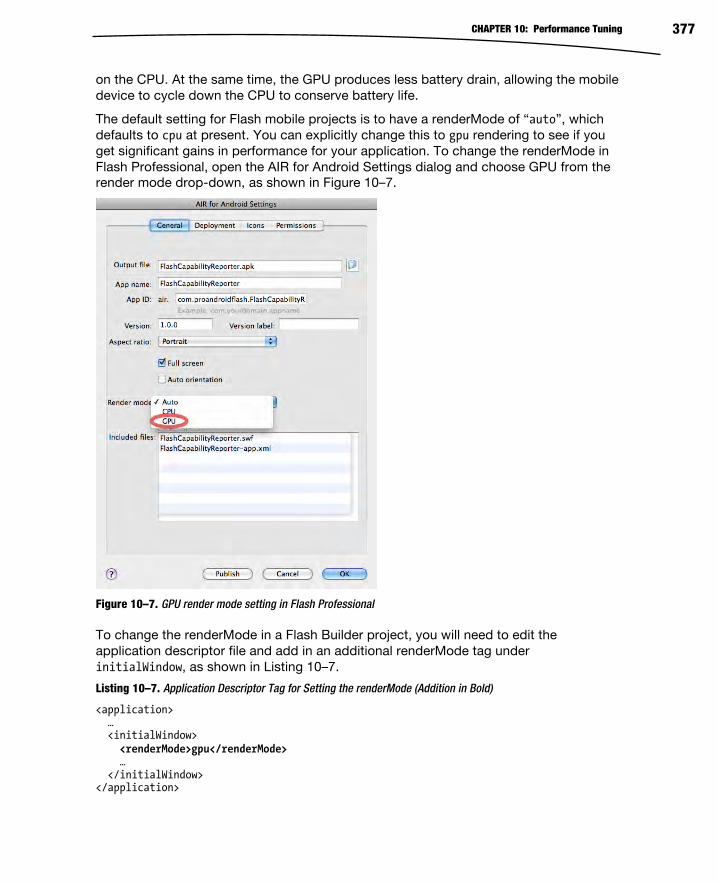
CHAPTER 10: Performance Tuning 377
on the CPU. At the same time, the GPU produces less battery drain, allowing the mobile
device to cycle down the CPU to conserve battery life.
The default setting for Flash mobile projects is to have a renderMode of “auto”, which
defaults to cpu at present. You can explicitly change this to gpu rendering to see if you
get significant gains in performance for your application. To change the renderMode in
Flash Professional, open the AIR for Android Settings dialog and choose GPU from the
render mode drop-down, as shown in Figure 10–7.
Figure 10–7. GPU render mode setting in Flash Professional
To change the renderMode in a Flash Builder project, you will need to edit the
application descriptor file and add in an additional renderMode tag under
initialWindow, as shown in Listing 10–7.
Listing 10–7. Application Descriptor Tag for Setting the renderMode (Addition in Bold)
<application> … <initialWindow> <renderMode>gpu</renderMode> … </initialWindow> </application>

CHAPTER 10: Performance Tuning 378
The results you get from gpu mode will vary greatly based on the application features
you are using and the hardware you are running on. In some cases, you will find that
your application actually runs slower in gpu mode than it does in cpu mode. Table 10–3
lists some empirical results from running Flash Mobile Bench on a Motorola Droid 2 with
100 circles and 100 squares on different cache and gpu modes.
Table 10–3. Performance of CPU and GPU Compared on a Motorola Droid 2
CPU GPU
Cache disabled 9fps 8fps
Cache as bitmap (auto) 9fps 4fps
Cache as bitmap matrix 18fps 17fps
Idle 220fps 150fps
As you can see from the results with this scenario on this particular device, the GPU
provided no advantage, and was significantly slower in the case where cacheAsBitmap
was enabled without a matrix set.
This underscores the importance of testing with different devices before you commit to
design decisions in your application. In this particular example, the reduced
performance was most likely due to write-back overhead of the GPU sending data back
to the CPU. Most GPU devices are optimized for receiving data from the CPU in order to
write it to the screen quickly. Sending data back in the other direction for processing is
prohibitively expensive on some devices.
This is changing quickly, however, with new chipsets such as the Intel Integra features
on the Motorola ATRIX and XOOM, which have optimized pipelines for bidirectional
communication. Also, the Flash team is working on an optimized render pipeline that will
reduce the need for write-backs to the CPU by doing more work on the processor. For
more information about the performance improvements being done by the Flash team,
see the “Future of Flash Performance” section later in this chapter.
Performant Item Renderers Performance is best tuned in the context of a critical application area, which will be
noticeable by users. For Flex mobile applications, organizing content by lists is
extremely common, yet presents a significant performance challenge.
Since scrolling lists involve animation, it is very noticeable if the frame rate drops during
interactions. At the same time, any performance issues in the item renderer code are
magnified by the fact that the renderer is reused for each individual list cell.
To demonstrate these concepts, we will build out a simple example that shows a list of
all the Adobe User Groups and navigates to the group web site when an item is clicked.

CHAPTER 10: Performance Tuning 379
Listing 10–8 shows the basic View code for creating a Flex list and wiring up a click
event handler that will open a browser page. We are also making use of the
FPSComponent developed earlier to keep track of the speed of our application while
developing.
Listing 10–8. Adobe User Group Application View Class
<?xml version="1.0" encoding="utf-8"?> <s:View xmlns:fx="http://ns.adobe.com/mxml/2009" xmlns:s="library://ns.adobe.com/flex/spark" xmlns:renderers="renderers.*" xmlns:profile="profile.*" title="Adobe User Groups (Original)"> <fx:Script> <![CDATA[ import flash.net.navigateToURL; private function clickHandler(event:MouseEvent):void { navigateToURL(new URLRequest(event.currentTarget.selectedItem.url)); } ]]> </fx:Script> <s:VGroup width="100%" height="100%"> <profile:FPSDisplay/> <s:List width="100%" height="100%" dataProvider="{data}" click="clickHandler(event)"> <s:itemRenderer> <fx:Component> <renderers:UserGroupRendererOriginal/> </fx:Component> </s:itemRenderer> </s:List> </s:VGroup></s:View>
TIP: For mobile applications, always use the itemRenderer property rather than theitemRendererFunction property. The latter results in the creation of multiple instances of the
item renderer and will negatively impact performance.
This class references a UserGroupRenderer that will display the list items. The creation of
this renderer involves combining the following components:
An image component for the user group logo
Two text fields for displaying the user group name and description
A horizontal line to separate different visual elements
Listing 10–9 shows a straightforward implementation of an ItemRenderer that meets
these requirements.

CHAPTER 10: Performance Tuning 380
Listing 10–9. Unoptimized ItemRenderer Code
<?xml version="1.0" encoding="utf-8"?> <s:View xmlns:fx="http://ns.adobe.com/mxml/2009" xmlns:s="library://ns.adobe.com/flex/spark" xmlns:renderers="renderers.*" xmlns:profile="profile.*" title="Adobe User Groups (Original)"> <fx:Script> <![CDATA[ import flash.net.navigateToURL; private function clickHandler(event:MouseEvent):void { navigateToURL(new URLRequest(event.currentTarget.selectedItem.url)); } ]]> </fx:Script> <s:VGroup width="100%" height="100%"> <profile:FPSDisplay/> <s:List width="100%" height="100%" dataProvider="{data}" click="clickHandler(event)"> <s:itemRenderer> <fx:Component> <renderers:UserGroupRendererOriginal/> </fx:Component> </s:itemRenderer> </s:List> </s:VGroup> </s:View>
Upon running this example, we have a very functional scrolling list, as shown in Figure
10–8.

CHAPTER 10: Performance Tuning 381
Figure 10–8. Adobe User Group list using a custom ItemRenderer
While the functionality and appearance are both fine, the performance of this
implementation is less than ideal. For normal scrolling, the frame rate drops to around
18fps, and when doing long throws of the list by swiping across the screen you get only
7fps. At these speeds, the scrolling is visually distracting and gives the impression that
the entire application is slow.
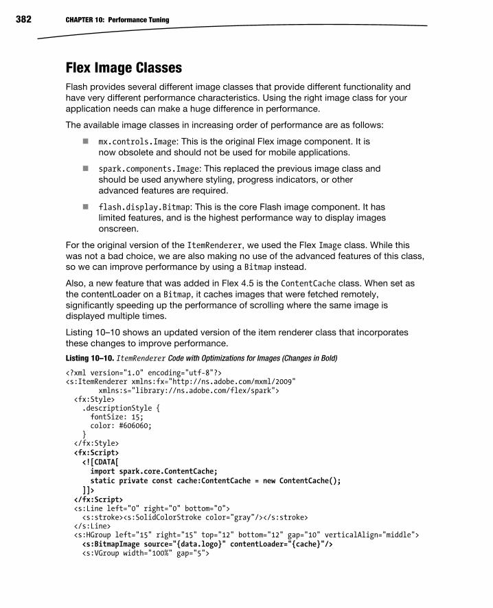
CHAPTER 10: Performance Tuning 382
Flex Image Classes Flash provides several different image classes that provide different functionality and
have very different performance characteristics. Using the right image class for your
application needs can make a huge difference in performance.
The available image classes in increasing order of performance are as follows:
mx.controls.Image: This is the original Flex image component. It is
now obsolete and should not be used for mobile applications.
spark.components.Image: This replaced the previous image class and
should be used anywhere styling, progress indicators, or other
advanced features are required.
flash.display.Bitmap: This is the core Flash image component. It has
limited features, and is the highest performance way to display images
onscreen.
For the original version of the ItemRenderer, we used the Flex Image class. While this
was not a bad choice, we are also making no use of the advanced features of this class,
so we can improve performance by using a Bitmap instead.
Also, a new feature that was added in Flex 4.5 is the ContentCache class. When set as
the contentLoader on a Bitmap, it caches images that were fetched remotely,
significantly speeding up the performance of scrolling where the same image is
displayed multiple times.
Listing 10–10 shows an updated version of the item renderer class that incorporates
these changes to improve performance.
Listing 10–10. ItemRenderer Code with Optimizations for Images (Changes in Bold)
<?xml version="1.0" encoding="utf-8"?> <s:ItemRenderer xmlns:fx="http://ns.adobe.com/mxml/2009" xmlns:s="library://ns.adobe.com/flex/spark"> <fx:Style> .descriptionStyle { fontSize: 15; color: #606060; } </fx:Style> <fx:Script> <![CDATA[ import spark.core.ContentCache; static private const cache:ContentCache = new ContentCache(); ]]> </fx:Script> <s:Line left="0" right="0" bottom="0"> <s:stroke><s:SolidColorStroke color="gray"/></s:stroke> </s:Line> <s:HGroup left="15" right="15" top="12" bottom="12" gap="10" verticalAlign="middle"> <s:BitmapImage source="{data.logo}" contentLoader="{cache}"/> <s:VGroup width="100%" gap="5">

CHAPTER 10: Performance Tuning 383
<s:RichText width="100%" text="{data.groupName}"/> <s:RichText width="100%" text="{data.description}" styleName="descriptionStyle"/> </s:VGroup> </s:HGroup> </s:ItemRenderer>
With these additional improvements, we have increased the frame rate to 19fps for
scrolling and 12fps for throws. The latter is over a 70% improvement for only a few lines
of code and no loss of functionality.
Text Component Performance One of the most notable performance differences that you will notice between desktop
and mobile is the performance of text. When you are able to use text components and
styles that map to device fonts, you will get optimal performance. However, using
custom fonts or components that give you precise text control and anti-aliasing has a
significant performance penalty.
With the release of Flash Player 10, Adobe introduced a new low-level text engine called
the Flash Text Engine (FTE) and a framework built on top of it called the Text Layout
Framework (TLF). TLF has significant advantages over the previous text engine
(commonly referred to as Classic Text), such as the ability to support bidirectional text
and print-quality typography. However, this comes with a significant performance
penalty for mobile applications.
The optimal settings for Flash Player to get high-performance text display is to set the
text engine to “Classic Text” and turn off anti-aliasing by choosing “Use device fonts” in
the Text Properties pane, as shown in Figure 10–9.
Figure 10–9. Flash Professional optimal mobile text settings
For Flex applications, you have a wide array of different Text components that make use
of everything from Classic Text to TLF, and have varying performance characteristics as
a result.

CHAPTER 10: Performance Tuning 384
The available Text components are shown in Table 10–4, along with the text framework
they are built on and mobile performance characteristics.
Table 10–4. Text component comparison by framework, performance, and usage
Text Framework Performance Usage
MX Text Classic Text Poor Not recommended for mobile
use, replaced by Spark equivalent
(see ahead)
MX Label Classic Text Poor Not recommended for mobile
use, replaced by Spark equivalent
(see ahead)
RichEditableText TLF Poor Use only where bidirectional text
or other TLF features are required
for an editable field
RichText TLF Poor Use only where bidirectional text
or other TLF features are required
Label FTE Good Improved text performance since
it avoids TLF; should be used
wherever a single line of
uneditable text is needed
TextInput FTE Best Mobile optimized component that
should be used wherever single-
line text input is required
TextArea FTE Best Mobile optimized component that
should be used wherever multiline
text input is required
StyleableTextField FTE Best The underlying text component
used in the TextInput and
TextArea controls (accessible only
from ActionScript); should be
used anywhere performance is
critical (such as item renderers)
For mobile applications, you will get the best performance by using the Label,
TextInput, and TextArea components, and you should use them whenever possible.
Since they don’t support bidirectional text and other advanced features and styling, you
may still have certain instances where you will need to use RichEditableText or
RichText.

CHAPTER 10: Performance Tuning 385
Since we do not require any advanced text features for the User Group List application,
we can replace the use of RichText with Label. The updated code for this is shown in
Listing 10–11.
Listing 10–11. ItemRenderer Code with Optimizations for Text (Changes in Bold)
<?xml version="1.0" encoding="utf-8"?> <s:ItemRenderer xmlns:fx="http://ns.adobe.com/mxml/2009" xmlns:s="library://ns.adobe.com/flex/spark"> <fx:Style> .descriptionStyle { fontSize: 15; color: #606060; } </fx:Style> <fx:Script> <![CDATA[ import spark.core.ContentCache; static private const cache:ContentCache = new ContentCache(); ]]> </fx:Script> <s:Line left="0" right="0" bottom="0"> <s:stroke><s:SolidColorStroke color="gray"/></s:stroke> </s:Line> <s:HGroup left="15" right="15" top="12" bottom="12" gap="10" verticalAlign="middle"> <s:BitmapImage source="{data.logo}" contentLoader="{cache}"/> <s:VGroup width="100%" gap="5"> <s:Label width="100%" text="{data.groupName}"/> <s:Label width="100%" text="{data.description}" styleName="descriptionStyle"/> </s:VGroup> </s:HGroup> </s:ItemRenderer>
After this change, the scrolling speed is 20fps and the throw speed is 18fps, which is a
significant improvement. We could have achieved even higher speeds by using a
StyleableTextField, which is exactly what the Flash team has done for their built-in
components.
Built-In Item Renderers In the past few sections, we have taken the performance of our custom item renderer
from completely unacceptable speeds below 10fps, up to around 20fps on our test
device. We could continue to optimize the renderer by doing some of the following
additional changes:
Use cacheAsBitmap to save recent cell images.
Rewrite in ActionScript to take advantage of the StyleableTextField.
Remove groups and use absolute layout.
However, there is already a component available that has these optimizations included
and can be used right out of the box.

CHAPTER 10: Performance Tuning 386
The Flex team provides a default implementation of a LabelItemRenderer and
IconItemRenderer that you can use and extend. These classes already have quite a lot
of functionality included in them that you can take advantage of, including support for
styles, icons, and decorators. They are also highly tuned, taking advantage of all the
best practices discussed throughout this chapter.
Listing 10–12 shows the code changes you would make to substitute the built-in
IconItemRenderer for our custom item renderer.
Listing 10–12. View Code Making Use of the Built-In IconItemRenderer
<?xml version="1.0" encoding="utf-8"?> <s:View xmlns:fx="http://ns.adobe.com/mxml/2009" xmlns:s="library://ns.adobe.com/flex/spark" xmlns:views="views.*" title="Adobe User Groups (Built-in)" xmlns:profile="profile.*"> <fx:Script> <![CDATA[ import flash.net.navigateToURL; private function clickHandler(event:MouseEvent):void { navigateToURL(new URLRequest(event.currentTarget.selectedItem.url)); } ]]> </fx:Script> <fx:Style> .descriptionStyle { fontSize: 15; color: #606060; } </fx:Style> <s:VGroup width="100%" height="100%"> <profile:FPSDisplay/> <s:List width="100%" height="100%" dataProvider="{data}" click="clickHandler(event)"> <s:itemRenderer> <fx:Component> <s:IconItemRenderer labelField="groupName" fontSize="25" messageField="description" messageStyleName="descriptionStyle" iconField="logo"/> </fx:Component> </s:itemRenderer> </s:List> </s:VGroup> </s:View>
The results of running this code are extremely close to our original item renderer, as
shown in Figure 10–10. If you compare the images side by side, you will notice subtle
differences in the text due to the use of the StyleableTextComponent, but there are no
significant differences that would affect the usability of the application.

CHAPTER 10: Performance Tuning 387
Figure 10–10. Adobe User Group list using the built-in IconItemRenderer
The resulting performance of using the built-in component is 24fps for scrolling and
27fps for throws on a Motorola Droid 2. This exceeds the default frame rate of Flex
applications, and demonstrates that you can build featureful and performant
applications in Flash with very little code.

CHAPTER 10: Performance Tuning 388
Performance Monitoring APIs and Tools The best-kept secret to building performant mobile applications is to test performance
early and often. By identifying performance issues as you build out your application, you
will be able to quickly identify performance-critical sections of code and tune them as
you go along.
Having the right tools to get feedback on performance makes this job much easier. This
section highlights several tools that are freely available, or you may already have on your
system, that you can start taking advantage of today.
Hi-ReS! Stats Getting real-time feedback on the frame rate, memory usage, and overall performance of
your application is critical to ensure that you do not introduce regressions in
performance during development. While you can roll your own performance
measurements, if you are not careful, you could be skewing your results by slowing
down your application with your own instrumentation.
Fortunately, an infamous web hacker, who goes by the name Mr. Doob, created an open
source statistics widget that you can easily incorporate in your project. You can
download the source from the following URL: https://github.com/mrdoob/Hi-ReS-Stats.
Mr. Doob’s Hi-ReS! Stats gives you the following instrumentation:
Frames per second: This shows the current FPS plus the target FPS
set by in the player (higher is better).
Frame duration: The inverse of frames per second, this lets you know
how many milliseconds it is taking to render a frame (lower is better).
Memory usage: The current amount of memory in use by the
application (in megabytes)
Peak memory usage: The highest memory usage threshold that this
application has hit (also in megabytes)
To add Hi-ReS! Stats to an ActionScript project, you can use the following code:
import net.hires.debug.Stats; addChild(newStats());
Since it is a pure ActionScript component, you need to do a little more work to add it to
a Flex project, which can be done as follows:
import mx.core.IVisualElementContainer; import mx.core.UIComponent; import net.hires.debug.Stats; private function addStats(parent:IVisualElementContainer):void { var comp:UIComponent = new UIComponent(); parent.addElement(comp);

CHAPTER 10: Performance Tuning 389
comp.addChild(new Stats());}
Then, to attach this to a View, simply invoke it from the initialize method with a self
reference:
<s:View … initialize="addStats(this)"> … </View>
Below the statistics, a graph of these values is plotted, giving you an idea of how your
application is trending. You can also increase or decrease the application frame rate by
clicking the top or bottom of the readout. Figure 10–11 shows an enlarged version of the
Hi-ReS! Stats UI.
Figure 10–11. Enlarged screen capture of Hi-ReS! Stats
PerformanceTest v2 Beta Once you have identified that you have a performance issue, it can be very tricky to
track down the root cause and make sure that once you have fixed it, the behavior does
not regress with future changes.
Grant Skinner has taken a scientific approach to the problem with PerformanceTest,
giving you pure ActionScript APIs to time methods, profile memory usage, and create
reproducible performance test scenarios. Sample output from running the
PerformanceTest tool is shown in Figure 10–12.
Figure 10–12. Output from running the PerformanceTest tool

CHAPTER 10: Performance Tuning 390
Since the output is in XML, you can easily integrate this with other tools or reporting,
including TDD frameworks for doing performance testing as you write code. For more
information on PerformanceTest v2, see the following URL:
http://gskinner.com/blog/archives/2010/02/performancetest.html.
Flash Builder Profiler For heap and memory analysis, one of the best available tools is the profiler built into
Flash Professional. The Flash Builder profiler gives you a real-time graph of your
memory usage, allows you to take heap snapshots and compare them against a
baseline, and can capture method-level performance timings for your application.
While this does not currently work when running directly on a mobile device, it can be
used to profile your mobile application when running in the AIR Debug Launcher. To
launch your application in the profiler, select Profile from the Run menu. Upon execution,
you will see a real-time view of your application, as shown in Figure 10–13.
Figure 10–13. Flash Builder profiler running against a Flash mobile project in debug mode

CHAPTER 10: Performance Tuning 391
The Future of Flash Performance The Flash runtime team at Adobe is continually looking for new ways to improve the
performance of Flash applications on the desktop and mobile. This includes
performance enhancements in the Flash and AIR runtimes that are transparent to your
application as well as new APIs and features that will let you do things more efficiently
from within your application.
CAUTION: All of the improvements and changes in this section have been proposed for the Flash roadmap, but are not committed features. The final implementation may vary significantly from
what is discussed.
Faster Garbage Collection As the size of your application grows, garbage collection pauses take an increasingly
large toll on the responsiveness of your application. While the amortized cost of garbage
collection is very low given all the benefits it provides, the occasional hit caused by a full
memory sweep can be devastating to the perceived performance of your application.
Since Flash Player 8, the Flash runtime has made use of a mark and sweep garbage
collector. The way that mark and sweep garbage collectors work is that they pause the
application before traversing from the root objects through all the active references,
marking live objects as shown in Figure 10–14. Objects that are not marked in this phase
are marked for deletion in the sweep phase of the algorithm. The final step is to de-
allocate the freed memory, which is not guaranteed to happen immediately.
Figure 10–14. Visual representation of the mark and sweep garbage collection algorithm
Root
Object Object Object
Object
Object
Object Object
Object
Object
Reachable
Key:
Unreachable

CHAPTER 10: Performance Tuning 392
The benefit of the mark and sweep algorithm is that there is very little bookkeeping
involved, and it is reasonably fast to execute. However, as the size of the heap grows,
so does the duration of the garbage collection pause. This can wreak havoc on
animations or other timing-critical operations that will seemingly hang while the
collection takes place.
The Flash runtime team is looking at several improvements to the garbage collection
algorithms that would benefit performance:
Incremental GC
GC hint API
Generational garbage collection
Incremental garbage collection would allow the garbage collector to split the mark and
sweep work over several frames. In this scenario, the total cost of garbage collection will
be slightly higher; however, the impact on any particular frame duration is minimized,
allowing the application to sustain a high frame rate during collection.
The garbage collector is fairly naïve about when to trigger collections to take place, and
invariably will choose the worst possible times to mark and sweep. A GC hint API would
let the developer give hints to the garbage collector about performance-critical moments
when a garbage collection would be undesirable. If memory is low enough, a garbage
collection may still get triggered, but this will help prevent spurious garbage collections
from slowing down the application at the wrong moment.
While it is not very well known, the converse is already possible. Flash already has a
mechanism to manually trigger a garbage collection to occur. To trigger a garbage
collection cycle to happen immediately, you need to call the System.gc() method twice,
once to force a mark and a second time to force a sweep, as shown in Listing 10–13.
Listing 10–13. Code to Force a Garbage Collection (Duplicate Call Intentional)
flash.system.System.gc(); flash.system.System.gc();
TIP: Previously this API was available only from AIR and worked only while running in debug
mode, but it is now fully supported in all modes.
While mark and sweep collectors are fairly efficient and easy to implement, they are
poorly suited for interactive applications and have a tendency to thrash on newly
created objects. In practice, long-lived objects need collection fairly infrequently, while
newly created objects are frequently discarded. Generational garbage collectors
recognize this trend and group objects into different generations based on their age.
This makes it possible to trigger a collection on younger generations more frequently,
allowing for the reclamation of larger amounts of memory for less work.
Having an efficient generational garbage collector would make a huge difference in the
usage pattern of ActionScript, getting rid of the need for excessive object pooling and
caching strategies that are commonly used today to increase performance.

CHAPTER 10: Performance Tuning 393
Faster ActionScript Performance The Flash applications that you write and even the libraries in the platform itself are
written using ActionScript, so incremental improvements in ActionScript performance
can have a huge effect on real-world performance.
Some of the improvements that the Flash team is looking into that will benefit all
applications include the following:
Just-in-time (JIT) compiler optimizations
Float numeric type
Flash makes use of what is known as a just-in-time (JIT) compiler to optimize Flash
bytecodes on the fly. The JIT compiler translates performance-critical code sections into
machine code that can be run directly on the device for higher performance. At the
same time, it has information about the code execution path that it can take advantage
of to perform optimizations that speed up the application.
Some of the new JIT optimizations that are planned include the following:
Type-based optimizations: ActionScript is a dynamic language, and as
such type information is optional. In places where the type is either
explicitly specified or can be implicitly discovered by inspecting the
call chain, more efficient machine code can be generated.
Numeric optimizations: Currently in the Flash runtime all numeric
operations, including overloaded operators like addition and
multiplication, work on numeric objects rather than primitive numbers
and integers. As a result, the code that gets generated includes extra
instructions to check the type of number and fetch the value out of the
object, which can be very expensive in tight loops. By inspecting the
code to determine where primitive values can be substituted, the
performance of these operations can be dramatically improved.
Nullability: ActionScript is a null-safe language, which is very
convenient for UI programming, but means that a lot of extra checks
are generated to short-circuit calls that would otherwise dereference
null pointers. This is even the case for variables that are initialized on
creation and are never set to null. In these cases, the JIT has enough
information to safely skip the null checks, reducing the amount of
branching in the generated code.
The net result of these JIT optimizations is that with no changes to your application
code, you will benefit from faster performance. In general, the more CPU-bound your
application is, the greater the benefit you will receive.
In addition, the Flash team has proposed the addition of an explicit float numeric type
and matching Vector.<float>. By definition, the Number type in Flash is a 64-bit
precision value, and changing the semantics of this would break backward compatibility

CHAPTER 10: Performance Tuning 394
with existing applications. However, many mobile devices have optimized hardware for
doing floating point arithmetic on 32-bit values. By giving programmers the choice of
specifying the precision of numeric values, they can decide to trade off accuracy for
performance where it makes sense.
Concurrency Modern computers have multiple processors and cores that can be used to do
operations in parallel for higher efficiency. This trend has also extended to mobile
applications, where modern devices such as the Motorola ATRIX are able to pack dual-
core processors in a very small package. This means that to make full use of the
hardware your application needs to be able to execute code in parallel on multiple
threads.
Even where multiple processors are not available, it is still a useful abstraction to think
about code executing in parallel on multiple threads. This allows you to incrementally
work on long-running tasks without affecting operations that need frequent updates, like
the rendering pipeline.
Many built-in Flash operations are already multithreaded behind the scenes and can
make effective use of multiple cores. This includes the networking code, which executes
the I/O operations in the background, and Stage Video, which makes use of native code
running in a different thread. By using these APIs, you are implicitly taking advantage of
parallelism.
To allow you to take advantage of explicit threading, the Flash team is considering two
different mechanisms for exposing this to the developer:
SWF delegation: Code is compiled to two different SWF files that are
independent. To spawn off a new thread, you would use the worker
API from your main SWF file to create a new instance of the child
SWF.
Entrypoint class: Multithreaded code is separated into a different class
using a code annotation to specify that it is a unique application entry
point.
In both of these scenarios, a shared-nothing concurrency model is used. This means
that you cannot access variables or change state between the code executing in
different threads, except by using explicit message passing. The advantage of a shared-
nothing model is that it prevents race conditions, deadlocks, and other threading issues
that are very difficult to diagnose.
By having an explicit concurrency mechanism built into the platform, your application
will benefit from more efficient use of multi-core processors and can avoid pauses in
animation and rendering while CPU-intensive operations are being executed.

CHAPTER 10: Performance Tuning 395
Threaded Render Pipeline The Flash rendering pipeline is single-threaded today, which means that it cannot take
advantage of multiple cores on newer mobile devices, such as the Motorola ATRIX. This
is particularly problematic when rendering graphics and video, which end up being
processed sequentially, as shown in Figure 10–15.
Figure 10–15. Single-threaded render pipeline
When the ActionScript code execution takes longer than expected, this can cause video
frames to get dropped. Flash will compensate by skipping stage rendering and
prioritizing video processing on the subsequent frame. The result is that your video and
animation performance both suffer significant degradation while one of your processors
remains idle.
The threaded render pipeline offloads video processing to a second CPU, allowing
video to run smoothly regardless of delays in ActionScript execution or stage
rendering. This makes optimal use of the available resources on a multi-core system,
as shown in Figure 10–16.
Figure 10–16. Multithreaded render pipeline
1 frame
ExecuteActionScript
RenderStage
NetI/O
DecodeStream
YUVto RGB
Composite
BlitGPU
CPU
Video Processing
1 frame
ExecuteActionScript
RenderStage
Composite
BlitGPU
CPU
Video Processing
NetI/O
DecodeStream
YUVto RGBCPU
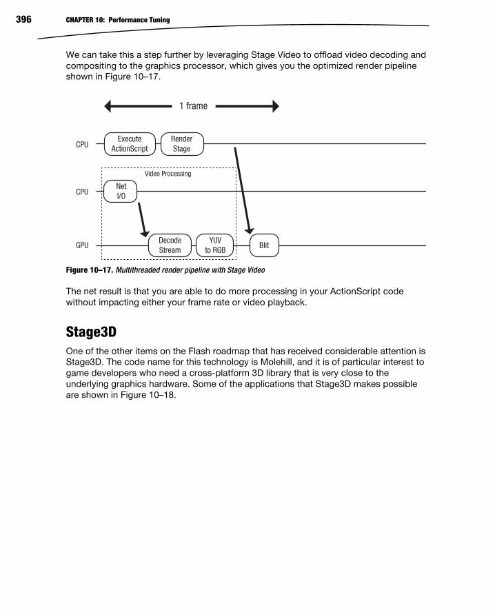
CHAPTER 10: Performance Tuning 396
We can take this a step further by leveraging Stage Video to offload video decoding and
compositing to the graphics processor, which gives you the optimized render pipeline
shown in Figure 10–17.
Figure 10–17. Multithreaded render pipeline with Stage Video
The net result is that you are able to do more processing in your ActionScript code
without impacting either your frame rate or video playback.
Stage3D One of the other items on the Flash roadmap that has received considerable attention is
Stage3D. The code name for this technology is Molehill, and it is of particular interest to
game developers who need a cross-platform 3D library that is very close to the
underlying graphics hardware. Some of the applications that Stage3D makes possible
are shown in Figure 10–18.
1 frame
ExecuteActionScript
RenderStage
BlitGPU
CPU
Video Processing
NetI/O
DecodeStream
YUVto RGB
CPU

CHAPTER 10: Performance Tuning 397
Figure 10–18. Molehill demos from Away3D (top and bottom-right) and Adobe Max (bottom-left)
These examples were built using a third-party 3D toolkit called Away3D on top of a pre-
release version of Stage3D. Some other toolkits that you can expect to take advantage
of Stage3D include Alternative3D, Flare3D, Sophie3D, Unity, Yogurt3D, and M2D.
Besides being useful to game developers, Stage3D also opens up the possibility of
having a highly optimized 2D UI toolkit. As discussed earlier with the GPU acceleration
support, graphics processors can do many operations much faster than the CPU can,
while consuming less power and saving battery life. By completely offloading the UI
toolkit to the graphics processor, the CPU can be dedicated to application and business
logic, leaving the display list management, compositing, and rendering to the GPU via
the existing 3D scenegraph.

CHAPTER 10: Performance Tuning 398
Summary As you have learned in this chapter, building high-performance Flex applications with
advanced graphics, high frame rate, and smooth animation is attainable by following
some mobile tuning best practices. Some of the specific areas in which you have gained
performance tuning knowledge include the following:
Speeding up graphics rendering
Caching portions of the scenegraph as Bitmaps
Building high-performance item renderers
Optimal use of Text and Item components
In addition, you also learned about future improvements in the Flash runtime and
graphics processing capabilities that you will be able to take advantage of in the future
with no code changes.
All of these performance tuning techniques also apply to our final topic, which is
extending the reach of your Flash and Flex applications to tablet, TV, and beyond.

399
Chapter
Beyond Mobile: Tabletsand TV Google and Adobe are working hard to extend the reach of the Android platform and theAIR runtime, respectively. Android has expanded onto tablets like the Motorola XOOMand the Samsung Galaxy Tab, and even into your living room with Google TV. Thisopens still more potential platforms for your AIR for Android applications! In addition,Research In Motion, known for its BlackBerry phones, has released its own tablet, calledthe PlayBook. The PlayBook is fully Flash-compatible and therefore provides yet anotheropportunity for your Flex and Flash applications to reach a new audience.
This chapter will look at some of the special considerations that are required to takeyour mobile application and move it to the larger screens of tablets and TVs.
Scaling the Screen With a larger screen comes more freedom in the design of your interfaces. With morefreedom comes more responsibility. Tablet users expect your application to make gooduse of the extra space that the larger screen provides. Figure 11–1 shows theMusicPlayer application from Chapter 8 running on a Motorola XOOM with a 10.1-inchscreen. While the application is usable, the combination of the low pixel density and thelarge screen leads to small, stretched-out controls and a lot of wasted space. We can,and will, do better.
The motivation to do so comes from the fact that the Android tablet space is explodingsince the introduction of Android 3.0, a version of Android specifically made for thelarger screens of tablets and TVs. In addition to the existing Android 2.2 tablets—theDell Streak and Samsung Galaxy Tab—there are now the Motorola XOOM and theSamsung Galaxy Tab 10.1, both of which run the latest versions of Honeycomb (thecode name for Android 3.x). In addition, Toshiba, Sony, ASUS, and Amazon are allexpected to release Honeycomb tablets in 2011.
11

CHAPTER 11: Beyond Mobile: Tablets and TV 400
Clearly this is a market segment that any application developer will want to take seriously. Applications that have been modified specifically to support these larger tablet screens will have a considerable advantage over those that haven’t.
Figure 11–1. The MusicPlayer application running on a Motorola XOOM tablet
The first step is to familiarize you with the hardware. Most tablets have more powerful processors and more memory than the average smartphone. Table 11–1 shows a comparison of the displays of the popular Android tablets currently on the market. The table shows that most tablets are around 160 dpi, with larger, higher-resolution screens. With the combination of more powerful processors and large screens, you might be tempted to assume that your application will run faster than it does on a phone. This is not a good assumption to make, especially if your application is graphics-bound rather than CPU-bound. Unless they take advantage of hardware acceleration, graphically intense applications will often run slower on tablets due to the larger number of pixel

CHAPTER 11: Beyond Mobile: Tablets and TV 401
calculations that must be done for the larger screens. As always, run performance tests and optimize as required.
Table 11–1. Display Specifications of Some Popular Android Tablets
Device Screen Size Resolution Pixel Density
Motorola XOOM 10.1 inches 1280x800 160 dpi
Samsung Galaxy Tab 10.1 10.1 inches 1280x800 160 dpi
LG G-Slate 8.9 inches 1280x768 168 dpi
HTC Flyer1 7 inches 1024x600 170 dpi
Samsung Galaxy Tab 7 7 inches 1024x600 170 dpi
Whenever you are considering moving your application to a new platform, you should always take the time to study existing applications to determine what design patterns and conventions are in use. Figure 11–2 shows some existing Android tablet applications. From the upper left and proceeding clockwise, we see: Flixster, Newsr and TweetComb by Locomo Labs,2 and Google’s Movie Studio. What common patterns and conventions do you see?
Notice how, especially in landscape orientation (as shown), the applications all make use of the extra screen space to show multiple views? Unlike similar phone applications, Flixster and Newsr show their master and details view together on one screen rather than having to transition to a separate details view. TweetComb takes advantage of the extra space to show multiple columns of tweets, while Movie Studio gives you larger, easier-to-use controls. Also note the inclusion of more actions in the title bar (the ActionBar in a Flex application). We can make similar modifications to our MusicPlayer application and thereby transform it to a full-blown tablet interface, similar to those pictured in Figure 11–2.
When thinking about modifications that can be made to the tablet version of the MusicPlayer, one thing that comes immediately to mind is to use the extra space in the SongView to display the additional metadata that there simply wasn’t room for on the phone version of the application. This sort of simple modification is an ideal candidate for the first technique that we will examine for extending your application to a new screen: state-based customization.
1 Technically, the HTC Flyer runs Android 2.3 (code name Gingerbread) instead of Android 3.x, but your AIR for Android programs will run on Gingerbread as well.
2 http://locomolabs.com/

CHAPTER 11: Beyond Mobile: Tablets and TV 402
Figure 11–2. Popular applications running on an Android tablet
State-Based Customization We have already shown how to customize your application’s UI layout using the landscape and portrait View states. This technique takes that idea and expands upon it. Instead of just portrait and landscape, you would define the four combinations of state that you need to support each orientation for phones and tablets. Therefore your hypothetical MXML code would look something like Listing 11–1.
Listing 11–1. A First Cut at Adding Separate States for Phone and Tablet
<s:states> <s:State name="portraitPhone"/> <s:State name="landscapePhone"/> <s:State name="portraitTablet"/> <s:State name="landscapeTablet"/> </s:states> <s:Group width="100%" height="100%"> <s:layout.landscapePhone> <s:HorizontalLayout verticalAlign="middle" paddingLeft="10"/> </s:layout.landscapePhone> <s:layout.landscapeTablet> <s:HorizontalLayout verticalAlign="middle" paddingLeft="10"/> </s:layout.landscapeTablet> <s:layout.portraitPhone>

CHAPTER 11: Beyond Mobile: Tablets and TV 403
<s:VerticalLayout horizontalAlign="center" paddingTop="10"/> </s:layout.portraitPhone> <s:layout.portraitTablet> <s:VerticalLayout horizontalAlign="center" paddingTop="10"/> </s:layout.portraitTablet> <s:Group width.portraitPhone="{height*0.4}" height.portraitPhone="{height*0.4}" width.landscapePhone="{width*0.4}" height.landscapePhone="{width*0.4}" width.portraitTablet="{height*0.3}" height.portraitTablet="{height*0.3}" width.landscapeTablet="{width*0.3}" height.landscapeTablet="{width*0.3}"> <!-- And so on… --> </s:Group>
We now have four states in our View: a landscape and a portrait version for a phone and a tablet. These are each enumerated in the <s:states> section using the <s:State> element. Once the states are defined, you can use Flex’s state-specific attribute declarations, such as width.portraitPhone, to customize the layouts, spacing, and even the visibility of any component in your View’s user interface. As an example, the Group defined in our hypothetical code listing includes a customized width and height for each of our possible states.
As you can see, the major drawback of this technique is the proliferation of state-specific attribute declarations. You now need four of everything! Luckily there is a way to mitigate this problem.
Using State Groups State groups are a way to assign multiple states—a group of states—to just one state declaration. Take the following state declaration:
<s:State name="portraitPhone" stateGroups="portrait,phone"/>
This says that when we set the currentState of our View to be portraitPhone, we will activate any attribute declarations we have that are modified by the portraitPhone, portrait, or phone states. This allows us to define MXML attributes using combinations of these states:
attributeName.portraitPhone: This will apply only to phones in portrait orientation.
attributeName.portrait: This will apply to phones or tablets in portrait orientation.
attributeName.phone: This will apply to phones in landscape or portrait orientation.
This gives you much more flexibility in declaring your attributes and eliminates a lot of code duplication. Now that we no longer have the standard landscape and portrait states defined, Flex will no longer automatically set our View state. This is something we

CHAPTER 11: Beyond Mobile: Tablets and TV 404
will take care of manually by overriding the getCurrentViewState method to return one of our new states based on the size and current orientation of the screen, as shown in Listing 11–2.
Listing 11–2. Returning Customized View States
override public function getCurrentViewState():String { var isPortrait:Boolean = height > width; var isTablet:Boolean = … // A calculation based on screen size or resolution. var newState:String = (isPortrait ? "portrait" : "landscape") + (isTablet ? "Tablet" : "Phone"); return hasState(newState) ? newState : currentState; }
The new state is determined by two Boolean variables. The isPortrait variable is determined easily by comparing the View’s width and height. The isTablet variable is a little more complex. You can use the resolution of the screen by testing to see if the x or y dimension is larger than 960, which is the largest resolution currently in use on a phone. A more reliable method is to use the screen resolution and pixel density to determine the physical size of the screen. Then you can assume that anything over 5.5 inches is a tablet device. An example of this calculation is shown in the onViewActivate function in Listing 11–4.
Now we can get back to the idea of adding more information from the song’s metadata to the UI. There are four things that would be nice to add to the tablet interface: the album’s title, the artist’s name, the year the album was published, and the genres to which the album belongs. We already have albumTitle and artistName defined as properties in the SongViewModel class. This means we just need to add the year and genres properties. Listing 11–3 shows the code to accomplish this.
Listing 11–3. Adding year and genre Properties to the SongViewModel
package viewmodels { [Bindable] public class SongViewModel extends EventDispatcher { public var albumCover:BitmapData; public var albumTitle:String = ""; public var songTitle:String = ""; public var artistName:String = ""; public var year:String = ""; public var genres:String = ""; // … /** * Called when the song's metadata has been loaded by the Metaphile * library. */ private function onMetaData(metaData:IMetaData):void { var songFile:MusicEntry = songList[currentIndex]; var id3:ID3Data = ID3Data(metaData);

CHAPTER 11: Beyond Mobile: Tablets and TV 405
artistName = id3.performer ? id3.performer.text : "Unknown"; albumTitle = id3.albumTitle ? id3.albumTitle.text : "Album by " + artistName; songTitle = id3.songTitle ? id3.songTitle.text : songFile.name; year = id3.year ? id3.year.text : "Unknown"; genres = id3.genres ? id3.genres.text : "Unknown"; if (id3.image) { var loader:Loader = new Loader(); loader.contentLoaderInfo.addEventListener(Event.COMPLETE, onLoadComplete) loader.loadBytes(id3.image); } else { albumCover = null; } } // … } }
The code highlighted in bold shows the changes that need to be made: declare new bindable variables to hold the year and genres strings and then load them from the ID3Data returned by the Metaphile library.
Our attention now turns to the question of how to add this information to our interface. Figure 11–3 shows two mockups for the new interface, one in landscape orientation and one in portrait orientation. The phone interface will stay exactly the same, but when we detect that we’re running on a tablet, we will make the following changes:
The song title in the ActionBar will be replaced with the album title.
In portrait orientation, the four new pieces of metadata will be placed between the album cover and the playback controls.
In landscape orientation, the new metadata will be placed on the left side of the screen with the album cover in the middle and the playback controls on the right side.
The new song information appears in different places depending on the orientation of the device, but that can be easily implemented using our custom state names and the includeIn property of the components.

CHAPTER 11: Beyond Mobile: Tablets and TV 406
Figure 11–3. A design mockup showing the additional information to display in the tablet interface
The code in Listing 11–4 shows the first modifications that will need to be made to the original View code to achieve the new design shown in Figure 11–3.
Listing 11–4. The Beginning of the Modified SongView MXML
<?xml version="1.0" encoding="utf-8"?> <s:View xmlns:fx="http://ns.adobe.com/mxml/2009" xmlns:s="library://ns.adobe.com/flex/spark" xmlns:assets="assets.*" xmlns:views="views.*" initialize="onInitialize()" viewActivate="onViewActivate()" viewDeactivate="onViewDeactivate()" resize="onResize()" title="{isTablet ? model.albumTitle : model.songTitle}"> <s:states> <s:State name="portraitPhone" stateGroups="portrait,phone"/> <s:State name="landscapePhone" stateGroups="landscape,phone"/> <s:State name="portraitTablet" stateGroups="portrait,tablet"/> <s:State name="landscapeTablet" stateGroups="landscape,tablet"/> </s:states> <fx:Script> <![CDATA[ import viewmodels.SongViewModel; [Bindable] private var isTablet:Boolean; [Bindable] private var model:SongViewModel; override public function getCurrentViewState():String {

CHAPTER 11: Beyond Mobile: Tablets and TV 407
var isPortrait:Boolean = height > width; var newState:String = (isPortrait ? "portrait" : "landscape") + (isTablet ? "Tablet" : "Phone"); return hasState(newState) ? newState : currentState; } private function onViewActivate():void { var w:Number = Capabilities.screenResolutionX/Capabilities.screenDPI; var h:Number = Capabilities.screenResolutionY/Capabilities.screenDPI; isTablet = Math.max(w, h) > 5.5; setCurrentState(getCurrentViewState()); } private function onResize():void { setCurrentState(getCurrentViewState()); } private function onInitialize():void { /* same as before */ } private function onViewDeactivate():void { /* same as before */ } private function onSongEnded(event:Event):void { /* same as before */ } ]]> </fx:Script>
The View’s title attribute uses a binding to the isTablet variable to determine whether to display the song title or the album title in the ActionBar. Remember that on the smaller phone screens we display the song title in the ActionBar’s title area to avoid overcrowding the SongView interface. If a larger tablet screen is being used, it makes more sense to put the album title in the ActionBar and change the song information when moving from one song to the next.
Each of our states has been defined with its associated state groups as described previously in this section. The overridden getCurrentViewState function that appears at the top of the <fx:Script> section is responsible for determining which state the View should be in based upon screen size and orientation. If the View’s height is greater than its width, then the device is marked as being in portrait orientation. Otherwise we know we are in landscape mode. Using this information along with the isTablet flag, the function builds and returns a string that describes the current state of the View.
The isTablet flag is set in the handler for the View’s viewActivate event. When the View becomes active, the onViewActivate handler calculates the width and height of the device’s screen in inches. If either of these dimensions is over 5.5 inches, then we can assume that the application is running on a tablet device. The function then calls our overridden getCurrentViewState method to get the initial state for the View and passes the result to the setCurrentState function.
We also attach a handler to the View’s resize event to detect orientation changes. The onResize handler will set the current state of the View by calling our getCurrentViewState function and using the returned value to set the current View state.

CHAPTER 11: Beyond Mobile: Tablets and TV 408
NOTE: Overriding the getCurrentViewState function to provide custom states does have the
drawback that it makes Flash Builder’s design view virtually useless.
It is time to put this state management code to use in our MXML declarations. Listing 11–5 shows the root Group container along with the group of labels that make up the song information section in the landscape orientation.
Listing 11–5. The View’s Root Container Group and the Landscape Metadata Display
<s:Group width="100%" height="100%"> <s:layout.portrait> <s:VerticalLayout paddingTop="10" horizontalAlign="center"/> </s:layout.portrait> <s:layout.landscape> <s:HorizontalLayout verticalAlign="middle" paddingLeft="10"/> </s:layout.landscape> <s:VGroup width="30%" horizontalCenter="0" gap="20" paddingTop="40" paddingBottom="40" includeIn="landscapeTablet"> <s:VGroup width="100%"> <s:Label styleName="albumInfoLabel" text="Song"/> <s:Label styleName="albumInfo" text="{model.songTitle}" maxWidth="{width*.3}" maxDisplayedLines="1"/> </s:VGroup> <!-- repeated for artist, year, and genres --> </s:VGroup> <s:Group width.portrait="{height*0.4}" height.portrait="{height*0.4}" width.landscape="{width*0.4}" height.landscape="{width*0.4}"> <s:BitmapImage width="100%" height="100%" source="{model.albumCover}" visible="{model.albumCover != null}"/> <assets:DefaultAlbum id="placeHolder" width="100%" height="100%" visible="{!model.albumCover}" /> </s:Group>
As in Chapter 8, we use a VerticalLayout for the root Group when in portrait mode and a HorizontalLayout in landscape mode. Thanks to the state groups that were declared previously, these layouts will be used for both the phone and tablet versions of the interface. The first child of the root Group container is the VGroup that contains the song information—recall from the mockup that it is on the far left of the screen—for the landscape version of the interface. Furthermore, this group should appear only on tablet displays. That is the reason for using the fully specified landscapeTablet state in its includeIn attribute. The next Group is the container for the album cover image. Since the previous VGroup is included only in the landscapeTablet state, the album cover Group will appear first in the layout on phones in any orientation and on tablets in portrait mode.
Listing 11–6 shows the portrait mode version of the song information display along with the rest of the controls.
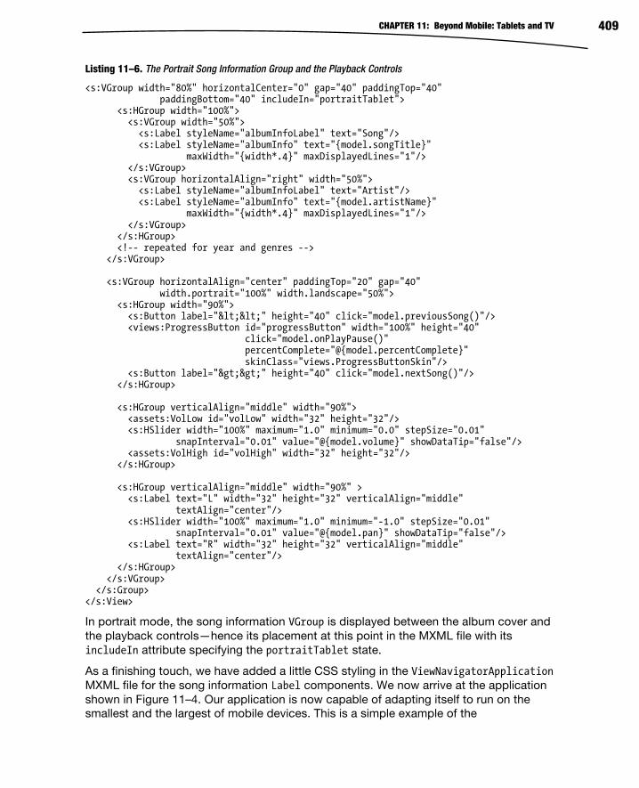
CHAPTER 11: Beyond Mobile: Tablets and TV 409
Listing 11–6. The Portrait Song Information Group and the Playback Controls
<s:VGroup width="80%" horizontalCenter="0" gap="40" paddingTop="40" paddingBottom="40" includeIn="portraitTablet"> <s:HGroup width="100%"> <s:VGroup width="50%"> <s:Label styleName="albumInfoLabel" text="Song"/> <s:Label styleName="albumInfo" text="{model.songTitle}" maxWidth="{width*.4}" maxDisplayedLines="1"/> </s:VGroup> <s:VGroup horizontalAlign="right" width="50%"> <s:Label styleName="albumInfoLabel" text="Artist"/> <s:Label styleName="albumInfo" text="{model.artistName}" maxWidth="{width*.4}" maxDisplayedLines="1"/> </s:VGroup> </s:HGroup> <!-- repeated for year and genres --> </s:VGroup> <s:VGroup horizontalAlign="center" paddingTop="20" gap="40" width.portrait="100%" width.landscape="50%"> <s:HGroup width="90%"> <s:Button label="<<" height="40" click="model.previousSong()"/> <views:ProgressButton id="progressButton" width="100%" height="40" click="model.onPlayPause()" percentComplete="@{model.percentComplete}" skinClass="views.ProgressButtonSkin"/> <s:Button label=">>" height="40" click="model.nextSong()"/> </s:HGroup> <s:HGroup verticalAlign="middle" width="90%"> <assets:VolLow id="volLow" width="32" height="32"/> <s:HSlider width="100%" maximum="1.0" minimum="0.0" stepSize="0.01" snapInterval="0.01" value="@{model.volume}" showDataTip="false"/> <assets:VolHigh id="volHigh" width="32" height="32"/> </s:HGroup> <s:HGroup verticalAlign="middle" width="90%" > <s:Label text="L" width="32" height="32" verticalAlign="middle" textAlign="center"/> <s:HSlider width="100%" maximum="1.0" minimum="-1.0" stepSize="0.01" snapInterval="0.01" value="@{model.pan}" showDataTip="false"/> <s:Label text="R" width="32" height="32" verticalAlign="middle" textAlign="center"/> </s:HGroup> </s:VGroup> </s:Group></s:View>
In portrait mode, the song information VGroup is displayed between the album cover andthe playback controls—hence its placement at this point in the MXML file with itsincludeIn attribute specifying the portraitTablet state.
As a finishing touch, we have added a little CSS styling in the ViewNavigatorApplicationMXML file for the song information Label components. We now arrive at the applicationshown in Figure 11–4. Our application is now capable of adapting itself to run on thesmallest and the largest of mobile devices. This is a simple example of the

CHAPTER 11: Beyond Mobile: Tablets and TV 410
customization that is possible through the judicious use of states. The code for this application can be found in the MusicPlayerWithStates project located in the examples/chapter-11 directory of the book’s sample code.
Figure 11–4. The MusicPlayerWithStates application running on both small and large screens
The main advantage of this state-based customization technique is that it allows you to keep all of your application code in one project. That makes it easier to maintain the code and simplifies the build process. The disadvantages become evident, however, when you consider what needs to be done when you want to start supporting other platforms. If you want to expand your market to include the iPhone, iPad, and PlayBook, then you will need to start performing UI tweaks to accommodate all of the different conventions in use for these platforms. You will suddenly be facing a combinatorial explosion of states. You will also run into problems if your interfaces for the different device classes or platforms start to diverge from each other too much. States will take you only so far before you have a long, difficult-to-read, and difficult-to-maintain MXML file.
If you find yourself in this position, you can turn to the second option for interface customization: project-based customization.
Project-Based Customization The idea behind project-based customization is to put all of your application’s shared code into a library project and then create separate projects that implement the customized user interface of each different platform or device class (phone vs. tablet, for

CHAPTER 11: Beyond Mobile: Tablets and TV 411
example) that you target. Creating a separate project for each version of your application that is meant for a different class of device or a different platform affords you the ultimate flexibility in configuring your interface. This kind of setup is very common for projects that span two or more of web, desktop, phones, tablets, and TV. To avoid unnecessary code duplication, a library project is created to contain all shared source files and graphical assets.
Let’s pretend that our designers have taken a look at some of the applications shown in Figure 11–2 and have decided to try a new look for our music player. They have come up with a new approach to the tablet interface in landscape mode that looks something like Figure 11–5. They want to move the song information to the right side of the screen, place the playback controls under the album cover, and add a list of songs to the left side of the screen. Selecting a song from the list should skip to that song. The list’s selection highlight should always reflect the song that is currently playing. We’ll also pretend that we’ve started hearing whispers from marketing about expanding to support other mobile platforms. Put all that together, and we will decide that it is time we opt for full customization ability by splitting our code base into separate projects with one common library project that the rest will share.
Figure 11–5. A new interface prototype for MusicPlayer running on a tablet in landscape mode
Creating the Library Project The first thing to do is to create the shared library project. In Flash Builder 4.5 (or above), use the application menu and click File New Flex Library Project. Flash Builder will display the dialog box shown in Figure 11–6.

CHAPTER 11: Beyond Mobile: Tablets and TV 412
Figure 11–6. Creating a new library project in Flash Builder 4.5
You must specify a name for the library project (such as MusicPlayerLib) as we did in Figure 11–6. Since we are not concerned with supporting web and desktop in this project (yet!), we also selected the “Mobile library” option in the Configuration section.
We know our presentation models will be placed into this project. We also know that one of them depends on the Metaphile library. Therefore we will have to add the Metaphile.swc file to this project in order for it to compile. We created a libs directory and placed Metaphile.swc inside. We then added the libs directory to the build path by right-clicking the project and selecting Properties. The project’s Properties dialog will be displayed, and it will look something like the one shown in Figure 11–7. Click Flex Library Build Path, and click the “Add SWC Folder…” button. Type the directory name “libs” into the text field of the dialog that comes up, and click OK. Your dialog should now look like the one in Figure 11–7, which shows that the Metaphile.swc file has been added to your build path.

CHAPTER 11: Beyond Mobile: Tablets and TV 413
Figure 11–7. Adding the Metaphile.swc file to our library project
The final step in creating our library project is to replicate the necessary package structure from the original MusicPlayer application and copy the source code and graphical assets into the correct locations. Table 11–2 shows the packages that have been added and the files that go inside each package.
Table 11–2. The Packages and Files That Go into the Shared Library Project
Package Files
assets Play.fxg
Pause.fxg
components ProgressButton.as
ProgressButtonSkin.mxml
models MusicEntry.as
services LocalMusicService.as
MusicService.as
viewmodels SongListViewModel.as
SongViewModel.as

CHAPTER 11: Beyond Mobile: Tablets and TV 414
Notice that we have taken the custom ProgressButton control from the views package in the original MusicPlayer project and placed it into a new components package in the shared library project. The library project should now compile, and we are ready to create the new projects that we will use to build the versions of the application that will run on phones and tablets.
Creating the Phone and Tablet Projects We will create a new Flex mobile project by using the application menu and clicking File
New Flex Mobile Project. When the New Flex Mobile Project dialog appears, name the project MusicPlayerPhone, click the Next button, select a View-Based Application, and click Finish. The following steps must be performed to populate the new project:
1. Copy the graphical assets from the assets package in the original
MusicPlayer project to an assets package in the new project. This
includes the splash screen, volume icons, and the default album cover.
2. Copy the source code from the views package of the original
MusicPlayer project, and place them into the views package of the new
project. This will include the SongListView.mxml and SongView.mxml files.
3. Modify the code in SongView.mxml to take into account the new package
for the ProgressButton control.
4. Copy the code from the main ViewNavigatorApplication MXML file in
the original project’s default package to the new project’s main MXML
file.
5. Add the MusicPlayerLib project to this project’s build path by right-
clicking the project and selecting Properties, clicking Flex Build Path,
clicking the Add Project… button, and selecting the MusicPlayerLib
project.
The new project should now compile and run, with the result looking exactly like the original MusicPlayer from Chapter 8. If you have any questions, you can review the source code in the MusicPlayerPhone project found in the examples/chapter-11 directory of the sample code for this book. By repeating these steps to create a MusicPlayerTablet project, you will be ready to start on the new custom tablet interface for the MusicPlayer application.
But before we get started, this is a good time to introduce you to Eclipse’s Working Sets feature, if you don’t already know it. Defining a working set will allow you to limit the number of projects listed in the Package Explorer to just the ones you are working on at any given time. And once you have working sets defined, you can easily switch between them. You access the Working Sets feature by using the View Menu to the right of the Package Explorer tab. The icon for the View Menu is the upside-down triangle. Figure 11–8 shows its location.

CHAPTER 11: Beyond Mobile: Tablets and TV 415
Figure 11–8. The Package Explorer’s View Menu icon
You define a new working set by clicking the View Menu icon and choosing the “Select Working Set…” option. The Select Working Set dialog box will be displayed. Clicking the New button will display the New Working Set dialog box. Select Resource as your working set type, and click Next. In the final dialog box, type a name for your working set and select the projects that you want to be a part of the working set. Then click Finish. Figure 11–9 shows this sequence of dialog boxes.
Figure 11–9. Creating a new working set
CHAPTER 11: Beyond Mobile: Tablets and TV 416
To select a working set, click the View Menu and Select Working Set again. The working sets you have defined will appear in the list. Select the check box next to the working set you want to activate, and click OK. Once you have selected a working set, its name will appear directly on the View Menu, allowing you to switch between working sets with only two clicks. When your Package Explorer view starts to get crowded with all of the different projects you are working on, being able to quickly define and switch between working sets is a huge benefit.
Implementing the Custom Tablet Interface In the new SongView interface, the list of songs will appear on the left side of the screen. The current selection in the list should reflect the song that is currently playing. Tapping a new entry in the list should switch to that song. What we are describing here is two bindings: one between the song list in the model and the items in the list, and another between the list’s current selection and the current song index in the model.
We shall start with the modifications that need to be made to the model. A new songList ArrayCollection will be created to serve as the source of the binding for the List in the UI. We will also need to make the model’s currentIndex variable bindable to serve as the source of the List’s selectedIndex property, as well as settable so that a new list selection will cause the model to take action to play a new song. Listing 11–7 shows the first of these changes to the model.
Listing 11–7. Changes to the SongViewModel Because Six Pages with No Code Is Just Too Long!
[Bindable] public class SongViewModel extends EventDispatcher { // Some variables removed for brevity… public var year:String = ""; public var genres:String = ""; public var songList:ArrayCollection; private var _currentIndex:Number = 0; /** A collection of MusicEntry objects. */ private var musicEntries:ArrayCollection; public function SongViewModel(entries:ArrayCollection, index:Number) { this.musicEntries = entries; this.currentIndex = index; timer = new Timer(500, 0); timer.addEventListener(TimerEvent.TIMER, onTimer); loadCurrentSong(); filterEntriesBySongs(); } /** * Takes all songs in musicEntries and puts them in songList. */

CHAPTER 11: Beyond Mobile: Tablets and TV 417
private function filterEntriesBySongs():void { songList = new ArrayCollection(); for (var i:int = 0; i<musicEntries.length; ++i) { var entry:MusicEntry = MusicEntry(musicEntries.getItemAt(i)); if (entry.isSong) songList.addItem(entry); } }
In Listing 11–7, we have added the new ArrayCollection named songList and renamed the currentIndex variable to _currentIndex to indicate that it will now have public get and set functions associated with it. The songList collection is initialized in the filterEntriesBySong function that is called at the end of the class’s constructor. This function loops through the musicEntries collection and copies each song entry to the songList collection.
Listing 11–8 shows the code in the model class that provides access to the currentIndex property and handles playing the song that corresponds to the currentIndex. The currentIndex’s get function provides the View with access to the property’s value. The set function stores the new value and calls the playSongAtCurrentIndex function.
Listing 11–8. The SongViewModel Code Relating to Playing the Song at the Current Index
public function get currentIndex():Number { return _currentIndex; } public function set currentIndex(value:Number):void { _currentIndex = value; playSongAtCurrentIndex(); } /** * Jump to the beginning of the next song in the list. Will wrap to * the beginning of the song list if needed. */ public function nextSong():void { incrementCurrentSongIndex(); playSongAtCurrentIndex(); } /** * Moves the play position back to the beginning of the current song * unless we are within 3 seconds of the beginning already. In that * case, we jump back to the beginning of the previous song. Will * wrap to the end of the song list if needed. */ public function previousSong():void { if (channel && channel.position < 3000) { decrementCurrentSongIndex(); playSongAtCurrentIndex(); } else { percentComplete = 0;

CHAPTER 11: Beyond Mobile: Tablets and TV 418
} } /** * Will load and play the song indicated by the currentIndex variable. */ public function playSongAtCurrentIndex():void { loadCurrentSong(); if (isPlaying) { pauseSong(); playSong(); } else { percentComplete = 0; } }
The playSongAtCurrentIndex function loads the song into memory and, if the model is in “play” mode, stops the current song and causes this new song to play. If the model is paused, then the percentComplete variable is just reset, so that playback will resume from the start of the song the next time the model’s onPlayPause function is called. We have also gone back to the model’s previousSong and nextSong functions and changed them to use the new playSongAtCurrentIndex function in order to eliminate unnecessary code duplication. Clean as you go!
Switching to the view, we know that the portrait mode UI should stay the same while we add the song list to the left side of the screen in landscape mode. At the same time, the song information migrates from the left side of the screen in the last incarnation of the interface to the right side of the screen in the latest design. Since we no longer need the extra states, this being a tablet-specific UI now, the beginning of the MXML file is now back to its original form with the exception that the ActionBar displays the album title rather than the song title as it does on the phone interface. All of the extra state declarations and the functions to set and get the View states are gone.
We need to add the declaration for the List as the first child of our View’s root Group container and make sure it is included only in the landscape state. We will also enclose the album cover, portrait mode song information, and playback controls into one VGroup now, since those sections always appear as a vertical group in both the portrait and landscape states. Finally, a VGroup of labels will be added to the landscape state to show the song information on the right side of the screen in that orientation. Listing 11–9 shows these changes to the SongView MXML file.
Listing 11–9. Changes to the SongView MXML to Support the New Landscape Interface Design
<s:Group width="100%" height="100%"> <s:layout.portrait> <s:VerticalLayout paddingTop="10" horizontalAlign="center"/> </s:layout.portrait> <s:layout.landscape> <s:HorizontalLayout verticalAlign="top"/> </s:layout.landscape>

CHAPTER 11: Beyond Mobile: Tablets and TV 419
<s:List id="songList" styleName="songList" includeIn="landscape" width="30%" height="100%" dataProvider="{model.songList}" labelField="name" selectedIndex="{model.currentIndex}" change="model.currentIndex = songList.selectedIndex"/> <s:VGroup horizontalAlign="center" width.portrait="100%" width.landscape="40%" paddingTop="20 "> <s:Group width.portrait="{height*0.4}" height.portrait="{height*0.4}" width.landscape="{width*0.35}" height.landscape="{width*0.35}"> <s:BitmapImage width="100%" height="100%" source="{model.albumCover}" visible="{model.albumCover != null}"/> <assets:DefaultAlbum id="placeHolder" width="100%" height="100%" visible="{!model.albumCover}" /> </s:Group>
<!-- The groups defining the portrait mode song info and controls are unchanged --> </s:VGroup>
<s:VGroup width="30%" gap="60" includeIn="landscape" paddingRight="10" paddingTop="20"> <s:VGroup width="100%" horizontalAlign="right"> <s:Label styleName="albumInfoLabel" text="Song"/> <s:Label styleName="albumInfo" text="{model.songTitle}" maxWidth="{width*.3}" maxDisplayedLines="2"/> </s:VGroup> <!-- Repeated for the other song information items --> </s:VGroup>
The List uses the model’s new songList as its dataProvider and uses it to display thesong names. Its selectedIndex property is bound to the model’s currentIndex propertyto ensure that whichever song is currently playing is also the one highlighted in the list.Whenever the List’s selection changes, the new selectedIndex is used to set themodel’s currentIndex property. This allows the user to tap an item in the list to changethe song that is currently playing.
After implementing these changes, the application now appears as in Figure 11–10. Thefigure shows the application running in landscape orientation on the Motorola XOOMand showing off the new song list on the left side of the screen. The image on the rightside of the figure shows the application running in portrait mode on a Samsung GalaxyTab. Rotating the tablet from portrait to landscape will cause the song list to appearseamlessly. And, of course, we have our original phone version of the interface tuckedsafely away in the MusicPlayerPhone project, which remains unaffected by these newfeatures in the tablet version. The updates to the SongViewModel in the shared library willbe present in the phone version, of course, but they remain unused in that applicationand therefore have no effect.
In some ways, having separate projects for each platform simplifies the build process,especially once you start dealing with multiple platforms, because you can have oneapplication XML descriptor file per project instead of swapping them in and out at buildtime.

CHAPTER 11: Beyond Mobile: Tablets and TV 420
Figure 11–10. The new tablet interface running on a Motorola XOOM in landscape mode and a Samsung Galaxy Tab in portrait mode
Transitioning to TV This is an exciting time to be a part of the Adobe Flash ecosystem. In addition to the web, desktop, and Android platforms, AIR is also becoming a viable programming environment for iOS devices, BlackBerry tablets, and even television sets, Blu-ray players, and set-top boxes! It is the one environment that truly lets you leverage your existing programming and design skills across all the screens of your life—even the big screens.
At Google I/O in May of 2011, Google announced that it was bringing Android 3.1, the so-called Honeycomb release, to its Google TV platform. With this update, the Android market will become available to Google TV users. With a few restrictions, your existing AIR for Android applications should port fairly easily to the Google TV platform. In addition, all new Google TV devices sold at retail will include the Android debugger, which means that you should be able to run and test your applications right on the Google TV in your living room.
Another path to the living room lies in the AIR for TV platform from Adobe. This is a runtime for TVs, set-top boxes, and Blu-ray players. It is currently in pre-release and runs on AIR 2.5. One thing to be aware of when developing for TV platforms is that they typically lie on the low end of the CPU horsepower spectrum. The CPUs found in TVs are often significantly slower than even those found in your average smartphone. This does not necessarily mean that your AIR for TV applications will be slow, but it does mean that you should pay attention to performance. Many of the tips given in Chapter 10 will also apply to TV platforms. Given the slower CPUs commonly found in TVs, you

CHAPTER 11: Beyond Mobile: Tablets and TV 421
should pay particular attention to the advice given in the “Reducing Code Execution Time” section of that chapter.
Adobe AIR for TV is expected to make its debut in Samsung’s Smart TV platform that, at the time of this writing, was expected to ship in 2011.
There are some things that you need to keep in mind should you decide to develop for one of these TV platforms. First, the input method is different for a TV. Even if TVs had touchscreens, nobody wants to constantly get up and walk to the TV to touch the screen in order to interact with their applications. Therefore TVs will likely use small touchpads or directional button pads for navigation and interaction. Secondly, as Google reminds us, TVs are really a “10 foot experience.” The screens are larger, so the controls and fonts should be larger too. Tackling TV will almost certainly require a fresh design pass for your application.
Porting to PlayBook Although Research In Motion is a newcomer to the tablet market, the BlackBerry PlayBook is an interesting entry. The PlayBook comes in a small form factor, measuring just 7.6 inches wide and 5.4 inches tall, which makes it an extremely portable device. It features a 7-inch touchscreen, a 1-GHz dual-core processor, and 1 GB of RAM. It is paired with the QNX Neutrino real-time operating system. This microkernel architecture-based OS is known for its use in mission-critical systems.
One thing to like about the PlayBook is that it is very developer-friendly. It offers developers a choice of no less than four environments in which to develop their applications: native C/C++, Java, HTML5 and related technologies, and (of course) Adobe AIR. Furthermore, AIR is not a second-class citizen on this platform. AIR apps can take advantage of hardware acceleration for video and graphics. Although the usual Flash platform components are present, there are special packages available to AIR programmers that give ActionScript programs the ability to use native, high-performance QNX components in their user interfaces. AIR applications can even access the platform’s native notification features. In short, AIR programs are very well supported and integrate nicely into the platform. The only real drawback to the tablet is that since it is a brand-new platform, its market penetration is fairly low.
So as a Flash/Flex/AIR developer, how can you jump into this new market? A good place to start is the BlackBerry Tablet OS SDK for Adobe Air Development Resources web site.3 From there you will find links to the “Getting Started Guide”4 and steps for installing the development environment. You will first need to download and unzip the SDK installer program. The installer will create a new PlayBook directory in the sdks directory of your current Flash Builder 4.5 installation. This directory will contain everything you need to develop PlayBook applications. The PlayBook simulator is a
3 http://us.blackberry.com/developers/tablet/adobe.jsp
4 http://docs.blackberry.com/en/developers/deliverables/25068/
CHAPTER 11: Beyond Mobile: Tablets and TV 422
VMware-compatible virtual machine image that runs a PlayBook runtime environment right on your Windows, Mac, or Linux desktop. This image is included with the PlayBook SDK files that get placed in your Flash Builder installation directory. Just open this VM image in VMware, and the PlayBook environment will boot up. When it starts, it will ask for a password. Type in “playbook” and you should see the PlayBook UI appear.
You create a new project for your PlayBook application in Flash Builder 4.5 by selecting File New ActionScript Mobile Project from the application’s menu. You use the default SDK, and select BlackBerry Tablet OS as the target platform.
NOTE: At the time of this writing, official BlackBerry Tablet OS support is expected to ship in a Flash Builder update in the summer of 2011. That may change the way you create a mobile
application project for this platform.
You can run and test your AIR applications right in the simulator on your desktop. You will just need to create a run configuration for your project in Flash Builder using the IP address of the PlayBook environment running in the virtual machine. You can get the PlayBook’s IP address by clicking the icon of the person with a gear on his chest, located at the top right of the PlayBook screen. The “Getting Started Guide” just mentioned provides simple and easy-to-follow instructions for all of these steps, which will allow you to get started developing on the simulator in under an hour.
That is enough of a preamble; Listing 11–10 shows what a simple Hello World program looks like for the BlackBerry PlayBook.
Listing 11–10. A Hello World ActionScript Program for the BlackBerry PlayBook
import flash.display.Bitmap; import flash.display.GradientType; import flash.display.Graphics; import flash.display.SpreadMethod; import flash.display.Sprite; import flash.events.MouseEvent; import flash.geom.Matrix; import flash.text.TextFormat; import qnx.ui.buttons.LabelButton; import qnx.ui.text.Label; [SWF(width="1024", height="600", frameRate="30")] public class PlayBookHelloWorld extends Sprite { [Embed(source="splash.png")] private var imageClass:Class; public function PlayBookHelloWorld() { var bitmap:Bitmap = new imageClass(); bitmap.x = 10; bitmap.y = 10; var goodByeButton:LabelButton = new LabelButton(); goodByeButton.label = "Good Bye";

CHAPTER 11: Beyond Mobile: Tablets and TV 423
goodByeButton.x = stage.stageWidth - goodByeButton.width; goodByeButton.y = stage.stageHeight - goodByeButton.height; goodByeButton.addEventListener(MouseEvent.CLICK, onClick); var myFormat:TextFormat = new TextFormat(); myFormat.color = 0xf0f0f0; myFormat.size = 48; myFormat.italic = true; var label:Label = new Label(); label.text = "Hello Pro Android Flash!"; label.x = bitmap.width + 20; label.y = 10; label.width = stage.stageWidth - bitmap.width - 10; label.height = 100; label.format = myFormat; addChild(createBackground()); addChild(bitmap); addChild(goodByeButton); addChild(label); stage.nativeWindow.visible = true; } private function onClick(event:MouseEvent):void{ stage.nativeWindow.close(); } private function createBackground():Sprite { var type:String = GradientType.LINEAR; var colors:Array = [ 0x808080, 0x404040 ]; var alphas:Array = [ 1, 1 ]; var ratios:Array = [ 0, 255 ]; var spread:String = SpreadMethod.PAD; var matrix:Matrix = new Matrix(); matrix.createGradientBox( 100, 100, (90 * Math.PI/180), 0, 0 ); var sprite:Sprite = new Sprite(); var g:Graphics = sprite.graphics; g.beginGradientFill( type, colors, alphas, ratios, matrix, spread ); g.drawRect( 0, 0, 1024, 600 ); return sprite; } }
As you can see, it looks pretty much like any other Flash program. We have used a couple of the basic QNX controls just to show what it looks like to include them in your program. They have a very familiar API to anyone that is used to Flash programming. Figure 11–11 shows what the PlayBook environment and the Hello World program look like when running in the simulator.

CHAPTER 11: Beyond Mobile: Tablets and TV 424
Figure 11–11. A simple Hello World ActionScript program running on the BlackBerry PlayBook simulator
You will need a “debug token” if you want to run your applications on actual PlayBook hardware. Getting such a token is free, but you will need to register with the PlayBook development program. You will also need to apply for a key to sign your applications if you wish to eventually deploy them into the BlackBerry app store.
If you do decide to port your Android applications to the PlayBook, you should follow the same advice we used previously when porting from phone to tablet: get to know your target platform. For example, the PlayBook does not have a hardware Back button; so, much like the iPhone or iPad, there is usually a Back button at the top left corner of

CHAPTER 11: Beyond Mobile: Tablets and TV 425
most application screens. As always, a good way to get to know your target platform is to study the platform’s popular applications. There is a Facebook app and plenty of pre-installed applications for you to look at on the PlayBook.
Investigating iOS Android and iPhone devices are currently dominating the smartphone market in terms of worldwide popularity. This makes Apple’s iOS attractive as a potential target when porting your applications to other platforms. But when you add the fact that Apple’s iPad is the undisputed king of the tablet market, the decision suddenly becomes a very obvious one.
Getting Apple’s development environment set up is somewhat similar to the process required for the PlayBook, although with Apple there is no free option for testing your software on an actual device. You will have to join its developer program5 (currently $99USD per year) to have the ability to run and test your application on real hardware.
Once you have your membership and development key in hand, however, writing ActionScript-based applications for iOS is pretty much the same as it is for Android and PlayBook.
NOTE: Like the PlayBook, at the time of this writing, updated support for iOS development with
Flash Builder is expected in the summer of 2011.
Once again you will need to spend some time familiarizing yourself with the common design patterns employed on this platform. For example, just like the PlayBook, iOS devices do not have hardware Back buttons. Fortunately, the good folks on Adobe’s platform teams have made life somewhat easier for developers in this respect. The defaultButtonAppearance-style property of the ActionBar can be set to “beveled” to approximate the look of the native iOS ActionBar buttons. In addition, titles in the ActionBar tend to be centered rather than right-aligned as they are on Android. The ActionBar’s titleAlign property can be set to “center” to achieve this effect in your AIR application. See Listing 3-8 in Chapter 3 for an example of using these styles in your application.
You can even apply these styles dynamically at runtime by using the @media (os-platform:”ios”) CSS selector or by making sure that Capabilities.cpuArchitecture returns the string “ARM” and that Capabilities.os returns a string containing the term “iPhone”.
5 http://developer.apple.com/programs/ios/

CHAPTER 11: Beyond Mobile: Tablets and TV 426
Summary This chapter has shown you how to take your mobile AIR applications and adapt them to Android tablets, TVs, and even Apple and BlackBerry devices. You have learned the following:
How to use states and state groups to customize your interface for different devices while maintaining a single code base
How to split your application into multiple projects that include shared library code as well as fully customized UIs for each of the different platforms that you want to target
What options you have for expanding your reach onto TV screens and some of the things you will need to consider when doing so
How to get up and running with the BlackBerry PlayBook development environment for Adobe AIR
Some tricks for porting your Android applications to Apple’s iOS platform
You made it! Welcome to the end of the book! We hope you have enjoyed reading it as much as we enjoyed writing it. And if you’ve learned a thing or two to make your life easier as an AIR for Android developer, then that makes the journey worthwhile. These are exciting times in the technology world. This modern world of smartphones, tablet computers, smart TVs, and incredibly fast wireless bandwidth is opening up new opportunities and new challenges for software developers all over the world. Good luck and good programming!

427
Index
■ Numbers 2D charts and graphs, generating with
Spark primitives, 150–164
bar charts, 151–153
pie charts, 153–155
sketching program example, 158
using FXG, 158
2D shapes, rendering with Spark
primitives, 130
3D effects, 142–145
■ A Accelerometer class, 270–272
AccelerometerEvent class, 270–272
accelerometers, 269–272
accentColor style, 108
ACCESS_COARSE_LOCATION, 276
ACCESS_FINE_LOCATION, 276
ACCESS_NETWORK_STATE
permission, 179
ACCESS_WIFI_STATE permission, 179
ActionBar buttons, 425
ActionBar class, 401, 405, 407, 418,
425
ActionBar object, 85–87
ActionBars, 72, 74, 81–83, 85–86, 90
actionBarVisible, 86
actionContent, 85
actionLayout, 85
ActionScript, 364
ActionScript (AS) files, 355, 358
ActionScript language, performance of,
393–394
ActionScript Mobile Project, 422
ActionScript3 Code, 206
actionScriptProperties: [internal], 16
activate event, 76
Activities, 216–217
Activity AppEntry.java, 234
Activity class, 215–217, 235
activity elements, 215–216
Activity HelloWorld, 217
activityLevel property, 245, 287–288
ADB, Android Debug Bridge, 171
adb install command, 189
addedToStage event, 46
addEventListener method, 56–57
addEventListener/callback paradigm,
58
addPerson( ) method, 209–210, 232
addWebsiteInfo( ) method, 233
ADL, AIR Debug Launcher, 166
Adobe AIR runtime emulator, 357
Adobe Device Central, 340–346
creating new document from,
341–343
custom profiles, 344–346
previewing content in, 343–344
Adobe Fireworks, 353–354
Adobe Flash Builder
4.5, workflow, 357–358
exporting release builds from,
188–189
setting initial application permissions
in, 177–178
workflow from Adobe Fireworks to,
353–354
workflow from Adobe Photoshop to,
349–350
Adobe Flash Capability Reporter
application, 10–13

Index 428
Adobe Flash Catalyst 1.5, 7
Adobe Flash music player, 294–323
adjusting volume, 298–299
implementing pause functionality,
296–298
reading ID3 tag metadata, 295–296
Adobe Flash Platform system, 5–28
running applications
from Adobe Flash Builder, 13–26
from Adobe Flash Professional,
10–13
from command line, 26–28
runtime, 5–7
Adobe Flash Player, 5
Adobe Flex SDK, 7
AIR, 6
tooling, 7–9
Adobe Flash Builder software, 8
Adobe Flash Catalyst platform, 9
Adobe Flash Professional
software, 8
Device Central application, 8
workflow, 9
Adobe Flash Player, 5
Adobe Flash Professional, 355–356
changing application permissions in,
176–177
publishing from, 187–188
workflow, 356
from Adobe Illustrator to Adobe
Flash Professional, 352–353
from Adobe Photoshop to,
347–348
Adobe Flex SDK, 7
Adobe Illustrator, workflow to Adobe
Flash Professional from,
352–353
Adobe Integrated Runtime. See AIR
Adobe Photoshop, workflow, 346–350
to Flash Builder, 349–350
to Flash Professional, 347–348
ADT (AIR Developer Tool), 175–176
AIR Developer Tool, 175
Android Development Tools, 167
creating code signing certificates
using, 185–186
adt command, 193
adt -installApp -platform android -
package command, 189
adt -installRuntime -platform android
command, 171
afterOrientation, 46
AIR (Adobe Integrated Runtime), 6,
175–193, 199–241
accessing SQLite database in,
208–211
ADT, 175–176
applications, 221–227
main files in, 223–227
permissions, 176–179
sending notifications in, 227–238
structure of, 222–223
uploading, 195–196
basic Android concepts, 212–221
Activities, 216–217
Broadcast receivers, 220
downloading and installing, 214
Intents, 217–219
life cycle, 220–221
major features, 213–214
Services, 219–220
code signing certificates, 183–186
deploying from command line,
191–193
emulator runtime, 171
exporting release builds from Adobe
Flash Builder, 188–189
HTML pages
launching custom, 203–204
navigating to, 205–207
icons and resources, 179–183
installing released versions, 171
installing within Android Emulator,
171
invoking URI handlers in, 200–202
and native Android integration,
239–241
publishing
from Adobe Flash Professional,
187–188
to Amazon Appstore, 196–198
to Android Market, 194–196

Index 429
running Flex applications in Android
Emulator, 189–190
runtime, 171
AIR Application Descriptor
application section, 183
icon section, 182
AIR Debug Launcher, 166
AIR Developer Tool. See ADT
AIR for Android Settings option, 176,
182–183, 187
AIR Intermediate files, 192
AIR_SDK path, 175
airbootstrap.jar file, 227
-airDownloadURL option, 197
AIRI files, AIR Intermediate, 192
albumCover bitmap, 313
albumCover property, 313, 318
albumTitle, 404
Alert dialog, 280
allowMultipleSelection property, 116
alpha attribute, 132
Amazon Appstore, 188, 194, 196–198
Android
basic concepts, 212–221
Activities, 216–217
Broadcast receivers, 220
downloading and installing, 214
Intents, 217–219
life cycle, 220–221
major features, 213–214
Services, 219–220
native functionality, AIR and,
239–241
permissions, 250
Android Debug Bridge, 171, 189
Android Development Tools plugin, 167
Android Emulator, 165–174
Android devices keys to desktop
keys mapping, 173
AVD, 168–170
development options, 170
dial button, 170
hang-up button, 170
hidden features, 173
installing AIR within, 171
installing Android SDK, 166–168
key bindings, 172–174
keyboard special keys, 172
launching from command line, 174
limitations, 166
multitouch support, 166
running Flex applications in,
189–190
special key binding, 173–174
android executable, 168
Android Icon Templates, 180
Android Market, publishing to, 194–196
developer account, 194
packaging application, 194–195
uploading Adobe AIR application,
195–196
Android OS, 165
Android SDK, installing, 166–168
Android Service, 215
Android Virtual Device (AVD), 168–170
android.hardware.camera, 250
android:icon attribute, 225
android.intent.action.MAIN, 218
android.intent.category.LAUNCHER,
218
android:label attribute, 225
AndroidManifest.xml file, 214–216,
218–219, 225–226, 233, 238
AndroidNative.apk, 240
android.permission.ACCESS_FINE_LO
CATION permission, 274
android.permission.CAMERA, 250
android.permission.RECORD_AUDIO
setting, 245
Animate element, 137–138
animation. See also graphics
effects, 136–140
Animate element, 137–138
parallel and sequence, 139–140
of View transitions, 87–90
APIs (application programming
interfaces)
for monitoring, 388–390
Flash Builder profiler, 390
Hi-ReS! Stats widget, 388–389
PerformanceTest v2 Beta tool,
389–390

Index 430
touch point, 64–70
APK file, 176, 182, 188–189, 193
.apk file, 214, 227
APP_HOME variable, 240
app_name variable, 225–226
app-desc, 27
AppEntry class, 225
AppIconsForPublish directory, 182
Apple App Store, 194
Apple Operating System (iOS), 425–426
application architecture, 355
Application class, 16
application descriptor file, 179
application element, 225–226
Application MXML file, 73
Application object, 33
application programming interfaces.
See APIs
Application.applicationDPI, 35
applicationDPI property, 33–34, 37, 40,
43, 302
applicationDPI setting, 42
applications, 71, 120–165, 198–227.
See also mobile applications
Adobe Flash music player, 299–323
MusicService implementation,
303–306
Presentation Model pattern,
300–301
SongListView view, 306–309
SongView view, 310–318
ViewNavigatorApplication,
301–302
AIR, 175–193
ADT, 175–176
application permissions, 176–179
code signing certificates,
183–185
deploying from command line,
191–193
exporting release builds from
Adobe Flash Builder, 188–189
icons and resources, 179–183
publishing, 187–188, 194–198
running Flex applications in
Android Emulator, 189–190
uploading, 195–196
Android Emulator, 165–174
AVD, 168–170
installing AIR within, 171
installing Android SDK, 166–168
key bindings, 172–174
constructing mobile UIs with Flex
Mobile, 71–96
blank application option, 82–83
events, 75–77
passing data between View
objects, 93–94
persisting View and session data
objects, 94–96
TabbedViewNavigatorApplication
option, 77–82
ViewNavigator container and
View objects, 84–92
ViewNavigatorApplication option,
73–74
descriptor file, manually changing
application permissions in,
178–179
main files in, 223–227
packaging, 194–195
permissions, 176–179
changing in Adobe Flash
Professional, 176–177
manually changing in application
descriptor file, 178–179
setting initial in Adobe Flash
Builder, 177–178
running
with Adobe Flash Builder, 23–26
from command line, 26–28
sending notifications in, 227–238
settings, 250
structure of, 222–223
visual controls, 96–120
BusyIndicator, 117
button, 107–112
Flex List, 112–115
HSlider, 116
sample with combined HSlider,
Scroller, and BusyIndicator
controls, 117–120

Index 431
Scroller, 117
soft keyboard support, 104–107
text, 99–103
[App-Name]-app.xml, 16
[AppName]HomeView.mxml, 16
[AppName].mxml, 16
Appstore, Amazon. See Amazon
Appstore
AppWidget MyHelloWidget, 220
*-app.xml file, 44
ArrayCollection variable, 80, 113, 152,
416
AS (ActionScript) files, 355, 358
assets package, 313, 414
assets/app.swf, 228
attributeName.phone, 403
attributeName.portrait, 403
attributeName.portraitPhone, 403
audio and video support, 5
autoClose property, 317
automatic flipping, 48–50
autoOrients property, 44, 250
autoPlay property, 336
autoRepeat property, 110
AVD (Android Virtual Device), 168–170
■ B backgroundAlpha style, 99
backgroundColor style, 99
bar charts, 151–153
beforeOrientation, 46
Bezier curves, cubic, 126–129
bin folder, 26
Bindable variable, 207, 209, 230, 307,
314
bin-debug folder, 16, 189
bindings, with SongView view, 315–317
bitmap caching, scene, 368–376
cacheAsBitmap property, 368–369
cacheAsBitmapMatrix property,
369–371
Mobile Bench application, 371–376
bitmap-based images, 353
bitmapContainer, 259
BitmapData object, 260, 318
BitmapImage, 117, 263
blank application option, 82–83
blinking lights, 12
Bluetooth, 4
BlurFilter, 133
BorderContainer control, 37, 60, 97
borderVisible style, 99
Bounce easer, 88
Broadcast receivers, 215, 217, 220
Browse button, 341
Browse workspace, 345
browseForImage( ) method, 263
browsing images, 261–263
BusyIndicator control, 97, 117–120
Button class, 148
Button controls, 97, 107–112
Button elements, 138, 140, 143–144,
147, 162
ButtonBar control, 97, 109
ButtonBarButtons, 109
ButtonBase class, 92
buttonReleased, 110
Button's click event, 74, 329
Button's mouseDownEffect, 280
ButtonSkin1.mxml file, 146–148
ButtonSkin2.mxml, 147
ByteArray, 245, 286–287, 294
bytesAvailable property, 287
■ C cacheAsBitmap property, 368–369,
371, 378, 385
cacheAsBitmapMatrix property,
368–371, 375
caching, bitmap scene, 368–376
cacheAsBitmap property, 368–369
cacheAsBitmapMatrix property,
369–371
Mobile Bench application, 371–376
Camera class, 247–250
application settings and Android
permissions, 250
checking for camera support,
248–249
initializing camera, 249

Index 432
manipulating video stream, 251–260
capturing and saving images
from, 258–260
displaying FPS counters, 257
image filter effects, 252–256
CameraBasic-app.xml, 250
CameraRoll class, 258, 260–266
debugging, 264–266
image browsing, 261–263
CameraRoll.supportsAddBitmapData
property, 260
CameraRoll.supportsBrowseForImage
property, 263
cameras
checking for support for, 248–249
initializing, 249
CameraUI class, 266–267, 335–336
Capabilities class, 11, 35, 37
Capabilities.cpuArchitecture, 425
Capabilities.os, 425
Capabilities.screenDPI, 35
capabilityScroller movie, 11
Captivate file, 341
Cascading Style Sheets (CSS), density
support in, 40–43
Cassandra4.jpg, 142, 144
category element, 218
caterpillar generator example, 66–70
certificate.p12, 240
certificates, code signing, 183–186
change event, 110, 299
change handlers, 299
chartData, 152
chartdata element, 151
ChartData.xml folder, 151–153
charts
2D, generating with Spark primitives,
150–164
bar, 151–153
pie, 153–155
CheckBox control, 97, 107, 369
CheckBoxes, 17–19, 21
checkpointsXMLList variable, 230
checkstore command, 186
chevron160.png file, 309
chromeColor, 87
clearAll function, 69
click handler, 334
clickHandler function, 110, 112
cloneModelForEntry function, 307
code, reducing execution time of,
364–365
Code Monkey sound effects, 283
code signing certificates, 183–186
color style, 99, 108
ColorMatrixFilter, 251, 253–254
ColumnChart element, 152
com.apress.hello package, 217
com.apress.hello.HelloWorld, 217
ComboBox control, 97
command line
deploying from, 191–193
running applications from, 26–28
command line launch, Android SDK and
AVD Manager, 168
complete event, 333
completeHandler( ) method, 233
component class, 320
components, custom, 318–323
components folder, 156–157
components package, 414
com.proandroidflash package, 235
concurrency, 394
configurator, Flex Mobile, 16–19
connect method, 329
content property, 110
Content Providers, 214
contentBackgroundAlpha style, 99
contentBackgroundColor style, 99
ContentCache class, 382
context object, 94
controls, visual, 96–120
BusyIndicator, 117
button, 107–112
combined HSlider, Scroller, and
BusyIndicator controls,
117–120
Flex List, 112–115
HSlider, 116
Scroller, 117
soft keyboard support, 104–107
text, 99–103

Index 433
ConvolutionFilter, 251, 253–254
Create Editable Copy, 345
createMusicEntryForFile, 306
creationComplete events, 76–77
creationComplete handler, 76, 248, 252
creationCompleteEffect, 280
CrossFadeViewTransition, 87
CSS (Cascading Style Sheets), density
support in, 40–43
cubic Bezier curves, 126–129
cuePoint event, 330
currentIndex property, 417, 419
currentIndex variable, 416
currentState variable, 291–292
currentTimeUpdateInterval property,
333
customization, state-based, 402–419
project-based customization,
410–416
tablet interface, 416–419
using state groups, 403–410
CustomSkin.mxml, 147
■ D data attribute, 130
data element, 151, 218
data objects, session, persisting, 94–96
data property, 286, 301, 308, 337
DataGrid control, 97
DataGroup, 60
dataProvider property, 113–114, 419
dataTipFormatFunction, 116
db_opened( ) method, 210, 230
ddWebsiteInfo( ) method, 232
deactivate event, 77
debug token, 424
debugging, 19–23, 264–266
Declarations element, 138, 140,
143–144, 152, 154
decorator property, 113
DEFAULT_DIR constant, 306
defaultButtonAppearance, 86–87, 425
defaultPopTransition property, 90
default.properties, 223
Definition element, 135
density
Density Explorer application, 34–39
overview, 33–34
screen resolution vs., 31–32
support in CSS, 40–43
Density Explorer application, 34–39
DensityExplorer-app.xml file, 34
DensityExplorerHomeView.mxml, 34
DensityUtil, 35
deploying, from command line, 191–193
descriptor file, applications, manually
changing application
permissions in, 178–179
designer-developer workflow, 339–358
developer's role, 355–358
visual designer's role, 340–354
Adobe Device Central, 340–346
Adobe Fireworks, 353–354
Adobe Illustrator, 352–353
Adobe Photoshop, 346–350
graphic file formats, 350–352
developer accounts, Android Market,
194
developers, toolbox, 355–358
Adobe Flash Builder 4.5, 357
Adobe Flash Professional, 355–356
Developing understanding, 355
Device Central application, 7–8, 341,
343–344, 346. See also Adobe
Device Central
deviceDensity, 37
deviceDPI setting, 34–35
device-independent pixels, simulating,
32–33
dial button, Android Emulator, 170
digital interactive media. See rich media
integration
DISABLE_KEYGUARD permission, 179
dispatchEvent( ) method, 207
DisplacementFilter, 254
DisplacementMapFilter, 251, 253
Display panel, 344
displayAsPassword property, 101
DisplayList, 367
displayNotification( ) method, 237–238
Index 434
displayObject property, 247, 318, 333,
337, 368–370
Document class, 355
doNotification( ) method, 236–237
downloading Android, 214
dpi media, 42
dpi selector, 41
DraggableGroup class, 58, 60, 62
drawable-hdpi directory, 225
drawable-ldpi directory, 225
drawable-mdpi directory, 225
DropDownList control, 97–98
DropShadowFilter, 131, 133
■ E Eclipse IDE, 167
Eclipse-based development tool, 357
editable property, 101
effects
3D, 142–145
animation, 136–140
Animate element, 137–138
parallel and sequence, 139–140
scaled, 134–135
Elastic Racetrack model, 363–364
Ellipse element, 123, 125, 157
ellipses, 122–123
Embed metadata tag, 279–280
embedding, SoundEffect class
example, 281–283
emphasized property, 110
Emulation workspace, 344
Emulator, Android. See Android
Emulator
emulator -avd command, 174
emulator executable, 175
emulator version application, using AIR
Developer Tool, 189
ENTER_FRAME event, 363, 372, 374
entries collection, 307
entries property, 307
Entrypoint class, 394
ErrorEvent.ERROR, 262
Event.CANCEL, 262
Event.COMPLETE event, 262
event.data.file.url property, 263, 267
EventDispatcher, 314
Event.ID3 event, 296
event.preventDefault( ) method, 252
events, 75–77
listeners
pan, 60–61
two-finger-tap, 60–61
portrait/landscape switching in Flex
with, 46–47
event.stopImmediatePropogation( )
method, 68
event.target parameter, 281
execution time, of code, reducing,
364–365
explodeRadius attribute, 155
extdir directory, 27
extract method, 294
■ F field attribute, 155
file formats, graphic, 350–352
File menu, 349
file protocol, 295
File.applicationStorageDirectory, 306
File.documentsDirectory, 306
files, in applications, 223–227
FileStream, 306
File.userDirectory, 306
fill element, 125
fill_parent attribute, 226
filter effects, images, 252–256
filterEntriesBySong function, 417
fingersketch.jpg file, 161, 163
Fireworks. See Adobe Fireworks
firstView attribute, 301
firstView property, 73–74
firstViewData properties, 76
FirstView.mxml file, 74
FLA workflow, 358
Flash apps, 350
Flash Builder, 15, 358, 390. See also
Adobe Flash Builder
Flash Capability Reporter application,
Adobe, 10–13

Index 435
Flash Platform system, Adobe. See
Adobe Flash Platform system
Flash player, 4, 6. See also Adobe Flash
music player
Flash Professional. See Adobe Flash
Professional
Flash XML Graphics (FXG) format,
156–158, 351–352, 367
flash.display.Bitmap, 382
flash.display.Loader, 318
flash.events package, 286
flash.events.Event.COMPLETE, 284
flash.events.Event.ID3, 284
flash.events.Event.OPEN, 284
flash.events.Event.SOUND_COMPLETE
, 284
flash.events.IOErrorEvent, 284
flash.events.ProgressEvent.PROGRESS
, 284
flash.filesystem package, 306
flash.media package, 283, 285
flash.media.Camera class, 246, 249
flash.media.CameraRoll class, 247
flash.media.CameraUI, 247
flash.media.Video class, 247, 249
flash.sensors package, 267
Flex 4.5 SDK, 7
Flex applications, running in Android
Emulator, 189–190
Flex Display Densities, 33
Flex framework (MXML), 301, 358
Flex image classes, 382–383
Flex Library Project, 411
Flex List control, 112–115
Flex Mobile
configurator, 16–19
constructing mobile UIs with, 71–96
creating new projects, 13–16
Flex Mobile project creation wizard, 14
Flex UIComponent, 370
.flexProperties: [internal], 16
flipping, automatic, 48–50
FlipViewTransition, 87, 90
float numeric type, 393
focusAlpha style, 100, 108
focusColor style, 100, 108
fontFamily style, 100, 108
fontSize style, 100, 108
fontStyle style, 100, 108
fontWeight style, 100, 108
for loop, 288
Form control, 97
FPS (frames per second), 257, 388
FPSComponent, 379
frameRate property, 371
frames per second (FPS), 257, 388
freqMultiplier variable, 288
<fx:Declaration> tag, 89, 309
FXG (Flash XML Graphics) format,
156–158, 351–352, 367
<fx:Script> tag, 251, 300, 329, 407
■ G garbage collection, 391–392
geolocation, 273–277
Geolocation class, 273–274
GeolocationEvent class, 273–274
GeolocationEvent.UPDATE, 273
geometric shapes, applying
transformations to, 133–135
Gesture Check, 13
gesture* event, 60
GESTURE_ROTATE, 57
GESTURE_ZOOM, 57
gestures
handling
swipe, 59–60
zoom and rotate, 56–57
multitouch and, 52–70
Flash scrapbook example, 56–64
mobile gestures, 54–55
touch point API, 64–70
get function, 417
getCamera method, 249
getCurrentSkinState function, 320
getCurrentViewState method, 404, 407
getDPIScale(sourceDPI:Number,
targetDPI:Number):Number
function, 35
getMusicEntries, 306
getProperty function, 95

Index 436
getRuntimeDPI( ):Number function, 35
getStyle method, 41
getWedgeLabel function, 155
GIF (Graphics Interchange Format),
350–351
GlowFilter, 133
Google Account, 194
Google Android Developer Phone, 167
Google Android Market, 188, 194
GPS compass, 4
GPU (graphics processing unit),
rendering, 376–378
gpu mode, 378
GradientEntry elements, 125, 132
gradients, linear and radial, 123–125
graphic clip layer, 11
Graphic element, 157
graphics, 121–164, 362–378
3D effects, 142–145
applying transformations to
geometric shapes, 133–135
Elastic Racetrack model, 363–364
file formats, 350–352
FXG, 351–352
GIF, 350–351
JPEG, 351
PNG-24, 350
GPU rendering, 376–378
reducing code execution time,
364–365
scene bitmap caching, 368–376
cacheAsBitmap property, 368–
369
cacheAsBitmapMatrix property,
369–371
Mobile Bench application,
371–376
Spark primitives
animation effects, 136–140
creating skins with, 146–149
generating 2D charts and graphs
with, 150–164
rendering 2D shapes with,
121–133
speeding up rendering, 365–368
Graphics Interchange Format (GIF),
350–351
graphics processing unit (GPU),
rendering, 376–378
GraphicsElements, 367–368, 372–373
graphs, 150–164
Group class, 58
Group container, 408
Group element, 125, 135, 162
GSM telephony, 4
■ H handlers, URI, invoking in AIR, 200–202
hang-up button, Android Emulator, 170
Hard-Coded HTML Page, 203
hardware inputs. See inputs
hello variable, 225
HelloView, 78, 80
HelloWorld class, 216
HelloWorld.java file, 216–217, 220,
223–224
HGroup containers, 313
HGroup element, 144
hideActionBar/showActionBar, 85
Hi-ReS! Stats widget, 388–389
HomeView, 16
horizontalAxis element, 152
horizontalCenter attributes, 163
HorizontalLayout, 408
hostComponent, 322–323
HSlider class, 34
HSlider control, 97, 116–120
HTML pages
launching custom in AIR, 203–204
navigating to, 205–207
htmlStr variable, 204
http://developer.android.com/sdk, 167
http://java.sun.com/javase/downloads,
166
http://market.android.com/publish/
Home, 194
http://www.amazon.com/gp/mas/dl/
android?p=com.adobe.air, 197
H/VGroup classes, 16

Index 437
Hypertext Markup Language pages.
See HTML pages
■ I icon style, 108
icon variable, 225
iconField, 113
iconFunction, 113
IconItemRenderer class, 113–115,
386–387
IconItemRenderers class, 309, 323
iconPlacement style, 108
icon.png file, 225
icons, 179–183
ID3 tags, reading metadata in, 295–296
ID3Data object, 318
ID3Info class, 296, 317
ID3Reader class, 317
Illustrator, Adobe. See Adobe Illustrator
Image class, 56, 382–383
Image control, 97
Image element, 144
Image source, 42
images
browsing, 261–263
capturing and saving from video
stream, 258–260
filter effects, 252–256
ImageView class, 62–64
IMetaData interface, 318
import statements, 204, 209
includedIn property, 48
includeIn property, 405
incrementProgramState function, 291
IndexChangeEvent, 80
init function, 19
initFilters( ) method, 252, 254
initialize event, 76, 301, 329
initialize function, 18–19, 389
initialWindow, 44, 250, 377
input-package option, 192
inputs, 243–277
accelerometer, 269–272
Camera class, 247–250
application settings and Android
permissions, 250
checking for camera support,
248–249
initializing camera, 249
manipulating video stream,
251–260
CameraRoll class, 260–266
debugging, 264–266
image browsing, 261–263
CameraUI class, 266–267
geolocation, 273–277
microphone, 243–245
installing Android, 214
Intent Filters, 214–215, 218
intent-filter element, 215, 225
Intents, types of, 217–219
InteractiveObject event, 57, 65
interface class, 303
interfaces, tablet, 416–419
INTERNET permission, 178, 194
invalidateProperties, 59
invokeMontastic( ) method, 232
ioErrorHandler( ) method, 233
iOS (Apple Operating System), 425–426
isDrag flag, 293
isPlaying flag, 297–298, 314, 320
isplayObjectContainer, 247
isPortrait variable, 404
isPrimaryTouchPoint, 67
isSong property, 304
isSupported property, 243, 249, 270
isTablet flag, 407
isTablet variable, 404, 407
isTruncated property, 101
item renderers, 378–387
built-in, 385–387
Flex image classes, 382–383
text component performance,
383–385
ItemRenderer Code, 385
ItemRenderer element, 59–60
itemRenderer property, 113–114, 379,
381–382
itemRendererFunction property, 379
IViewport interface, 117

Index 438
■ J Java SDK, 166
JAVA_HOME, 214
JPEG (Joint Photographic Experts
Group) format, 351
JRE_HOME path, 175
■ K key bindings, 172–174
Keyboard.BACK, 252
keyboards, soft, support for, 104–107
Keyboard.SEARCH, 252
■ L Label components, 80, 99, 104, 112
Label control, 97, 257, 261
Label element, 147
label property, 110
labelField, 113
LabelItemRenderer, 113, 386
labelPosition attribute, 155
Label's text property, 82
landscape orientation, 44–48
landscape state, 402
landscapeTablet state, 408
LanguageView class, 78, 80
lastFPSUpdate, 373
leading style, 100, 108
leftPeak property, 288
letterSpacing style, 100, 109
library project, 411–414
libs folder, 16, 412
life cycle, of Android, 220–221
LightweightVideoElement constructor,
333
linear gradients, 123–125
LinearGradient element, 125, 128–129
LinearLayout element, 226
List component, 309
List control, 113
ListItemRenderers, 98
List's dataProvider, 308
load method, 284
loadCurrentSong method, 315
Loader object, 263
locale style, 100, 109
LocalMusicService, 302, 304
■ M MainApp class, 234
MainApp.java, 234
main.xml file, 224–226
manually permission settings, 177
mapBitmap, 255
Market, Android. See Android Market,
publishing to
Math.max function, 68
maxChars property, 101
maxDisplayedLines property, 101
media, rich. See rich media integration
MediaEvent object, 263
MediaEvent parameter, 267
MediaEvent.SELECT, 262
MediaPlayer class, 333–334, 336–337
MediaPromise object, 263, 267
mediaSizeChange event, 333
memory usage, 388
MergedAIRApp.apk, 240
messageField, 113
messageLabel, 261, 265
messageStyleName class, 115
metadata, in ID3 tags, reading, 295–296
Metadata element, 148
metaData event, 330
Metaphile library, 317–318
Metaphile.swc file, 412
Microphone class, 243, 286
Microphone.getMicrophone( ) method,
244
microphones, 243–245
minutes:seconds string, 331
mnt/sdcard directory, 306
mnt/sdcard/Music directory, 306
mobile applications, 29–70
multitouch and gestures, 52–70
Flash scrapbook example, 56–64
mobile gestures, 54–55
touch point API, 64–70

Index 439
performance tuning, 360
screens
orientation of, 43–52
size of, 29–43
Mobile Bench application, 371–376
Mobile browser, 4
mobile devices, optimizing video for,
324–325
Mobile Flash
development, 352, 355
on platforms other than Android, 2–3
mobile gestures, 54–55
mobile project, 341
MobileBenchHomeView, 371
mobileDevice profile, 26
MobileVideoPlayerSkin, 327
monitoring, APIs and tools for, 388–390
Flash Builder profiler, 390
Hi-ReS! Stats widget, 388–389
PerformanceTest v2 Beta tool,
389–390
montastic_table, 231, 233
montastic.db, 230
month element, 151
mouse events, press and drag, 58–59
mouseDownEffect, 281
mouseEnabled property, 261
mouseEnabledWhereTransparent, 58
MouseEvent handlers, 322
Move element, 140
Move3D element, 143
MoveEffect element, 143
moveEffect.play( ) method, 143
MovieClips, 367
MP3 (MPEG-1 Audio Layer 3) files,
playing, 295–299
adjusting volume, 298–299
implementing pause functionality,
296–298
reading ID3 tag metadata, 295–296
MultiDPIBitmapSource class, 34, 37,
41, 78, 310
multitasking, 4
multitouch, and gestures, 52–70
Flash scrapbook example, 56–64
mobile gestures, 54–55
touch point API, 64–70
Multitouch class, 4, 11, 18, 53, 55, 64
multitouch support, Android Emulator,
166
MultitouchImage class, 56, 60, 62
MultiTouch.inputMode variable, 65, 160
MultitouchInputMode.GESTURE, 57
Multitouch.supportedGestures, 55
Multitouch.supportsGestureEvents, 55
music players, Adobe Flash. See Adobe
Flash music player
musicEntries collection, 417
MusicEntry class, 300, 303–304,
306–307, 309, 317
MusicService implementation, 303–306
muted property, 270, 274
MX Label, 384
MX Text, 384
mx.controls.Image, 382
mx.core.SoundAsset, 280
mx.effect.Effect class, 280
mx.effects package, 134
MXML (Flex framework), 301, 358
mx.utils package, 35
My_Multitouch_320x480, 345
MyAIRApp, 239
MyAnimate1, 138
MyHelloWidget, 220
MySound class, 280
■ N name:value pair, 155
native Android integration, AIR and,
239–241
NativeApplication class, 77, 94–95
navigateToURL( ) method, 202, 283
navigationContent, 83, 85
navigationLayout, 86
navigator.poppedViewReturnedObject.o
bject, 93
navigator.pushView function, 306, 308
needsSoftKeyboard, 104
NET_STATUS event, 330
NetConnection, 328–329
NetStream class, 328–332

Index 440
NetStream code, 332
NetStream-based video players, 332
NetStream.Play.Complete, 331
NetStreamVideoView, 331, 333
NetworkInfo API, 179
New->MXML Skin, 146
nodebug, 26
Notification instance, 238
notifications, sending in applications,
227–238
nteractiveObject, 60
nullability, 393
NumberFormatter, 251
numeric optimizations, 393
NumericStepper control, 97–98
■ O onBind( ) method, 235
onBrowse handler, 261, 263
onCameraRollError( ) method, 262
onCaptureComplete, 267, 337
onCaptureImage( ) function, 259, 267
onCaptureImage handler, 337
onChange handler function, 80, 89
onChanged event, 51
onClick handler, 297
onCreate( ) method, 216, 220–221,
234–236, 238
onCreationComplete( ) method, 244,
252, 262, 265, 267, 271
onCreationComplete handler, 287, 297
onCuePoint, 331
onDestroy( ) method, 221, 238
onDiscardImage( ) method, 259
onDurationChange handler, 334
onFilterChange handler, 252
onHTTP( ) method, 202
onID3 handler, 296
onInitialize function, 80
onInitialize handler, 301, 306, 308, 329
onLoaded callback, 263
onMetaData handler, 317–318, 331
onNetStatus handlers, 331
onPanChange, 299
onPause( ) method, 221
onPlayPause function, 331, 418
onPlayStatus handler, 331
onRestart( ) method, 221
onResume( ) method, 221
onSaveComplete( ) method, 262
onSaveImage( ) function, 259–260
onSelect( ) handler, 263
onSelectCanceled( ) method, 262
onSize handler, 334, 337
onSongEnded, 312
onStop( ) method, 221
onTimeChange handler, 335
onTouchBegin handler, 293
onTouchMove, 293
onTouchTap function, 291
onVideoComplete handler, 335, 337
onViewActivate function, 404, 407
onViewDeactivate handler, 329, 334
onVolumeChange, 299
Open Source Media Framework
(OSMF), 332–335
optimizing, video for mobile devices,
324–325
orientation, of screens, 43–52
automatic flipping, 48–50
portrait/landscape switching in Flex,
44–48
rotating smiley flash example, 50–52
OSMF (Open Source Media
Framework), 332–335
OSMF MediaElement, 333
OSMF MediaPlayer class, 333, 336
OSMFVideoView code, 332, 334, 337
overSample value, 288
overSample variable, 288
■ P, Q package command, 192
Package Explorer tab, 414
-package option, 191
packaging applications, 194–195
pan event listener, 60–61
pan property, 299
panEasingFunction property, 283
Panel control, 97
Index 441
Panel element, 125, 127, 162
parallel animation effects, 139–140
Parallel element, 140
parentApplication, 37
partAdded function, 320
partRemoved function, 320
Path element, 127–130, 149
PATH environment variable, 175
pause functionality, 296–298
pausePosition variable, 297–298, 316
peak memory usage, 388
people.db, 210
percentageComplete, 316
percentComplete property, 313,
315–316, 320, 323
performance tuning, 359–398
future of, 391–398
concurrency, 394
faster ActionScript language
performance, 393–394
faster garbage collection,
391–392
Stage3D technology, 396–398
threaded render pipeline,
395–396
graphics, 362–378
Elastic Racetrack model,
363–364
GPU rendering, 376–378
reducing code execution time,
364–365
scene bitmap caching, 368–376
speeding up rendering, 365–368
item renderers, 378–387
built-in, 385–387
Flex image classes, 382–383
text component performance,
383–385
mobile, 360
monitoring APIs and tools, 388–390
Flash Builder profiler, 390
Hi-ReS! Stats widget, 388–389
PerformanceTest v2 Beta tool,
389–390
perceived vs. actual performance,
360–362
PerformanceTest v2 Beta tool, 389–390
permissions
Android, 250
application, 176–179
changing permissions, 176–179
setting initial permissions in
Adobe Flash Builder, 177–178
PersistenceManager class, 94–96
persisting, View and session data
objects, 94–96
persistNavigatorState, 96
person_table, 211
phone project, 414–416
PhotoCollageHomeScript.as file, 266
photoContainer, 263
Photoshop, Adobe. See Adobe
Photoshop
physicalDPI, 38
pie charts, 153–155
PieChart element, 155
pipelines, threaded render, 395–396
pixels, simulating device-independent,
32–33
platforms, Adobe Flash system. See
Adobe Flash Platform system
platform-tools directory, 171
play( ) method, 284, 286, 292, 298
PlayBook directory, 421
PlayBook tablet, porting to, 421–425
playEffect method, 281
player.displayObject, 337
playing state, 289, 293
PlayPauseButtonSkin, 328
playSong utility methods, 316
playSongAtCurrentIndex function,
417–418
playStatus, 330
PNG-24 (Portable Network Graphics),
350–352
popAll, 85
poppedViewReturnedObject.context
property, 94
popToFirstView, 85
Popular Android Tablets, 401
popView, 85

Index 442
Portable Network Graphics (PNG-24),
350–352
porting to PlayBook tablet, 421–425
portrait rotation, 48
portrait View state, 402
portrait/landscape orientation switching,
in Flex, 44–48
with events, 46–47
with states, 48
portraitTablet state, 409
position property, 296–297
prepare command, 192
Presentation Model pattern, 300–301
press and drag mouse events, 58–59
profilers, Flash Builder, 390
profiles, 26, 344–346
ProgressButton class, 318–322
ProgressButton control, 313, 319, 414
.project: [internal], 16
project-based customization, 410–416
library, 411–414
phone and tablet, 414–416
<project-name>-app.xml file
convention, 179
projects, creating new, 10, 13–16
prompt property, 101
PropertyChangeEvent, 317
PSD files, 347, 349
publishing
from Adobe Flash Professional,
187–188
to Amazon Appstore, 196–198
to Android Market, 194–196
developer account, 194
packaging application, 194–195
uploading Adobe AIR application,
195–196
push mode, 87
pushView function, 62, 74, 84, 93
■ R radial gradients, 123–125
RadioButton class, 34, 37
RadioButton control, 98, 107
RadioButtons, 107
readyToPlay state, 289, 293
receiver elements, 215
receivers, Broadcast, 220
recorded sound, playing. See sound,
playing recorded
recordedBytes array, 287–288, 292
recording state, 289, 293
Rect element, 122–123, 125, 149, 157
rectangles, 122–123
RectEllipse1 element, 157
RectEllipse1.fxg file, 156–157
refreshDataGrid( ) method, 210–211,
232
release builds, 188–189
remove( ) method, 232
removeAll( ) method, 232
removePerson( ) method, 209, 211
render pipelines, threaded, 395–396
renderers, item, 378–387
built-in, 385–387
Flex image classes, 382–383
text component performance,
383–385
rendering
2D shapes, with Spark primitives,
121–133
cubic Bezier curves, 126–129
linear and radial gradients,
123–125
path element example, 130
rectangles and ellipses, 122–123
Spark filters, 131–133
GPU, 376–378
speeding up, 365–368
Reparent tag, 48
repeatBehavior, 143
repeatCount attribute, 143–144
repeatDelay style, 109
repeatInterval style, 109
requestSoftKeyboard( ) method, 104
Reset Browse option, 345
resize event, 407
res/layout directory, 225, 227
resolution, of screens, vs. density,
31–32
resources, 179–183

Index 443
resources element, 226
restrict property, 101
result( ) method, 211, 232
res/values subdirectory, 225
revenue element, 151, 155
rich media integration, 279–338
Adobe Flash music player, 294–323
application, 299–323
custom component, 318–323
playing MP3 files, 295–299
playing video, 324–338
with NetStream class, 328–332
optimizing for mobile devices,
324–325
with OSMF, 332–335
Spark VideoPlayer component,
325–328
VideoRecorder example
application, 335–338
sound
effects, 279–283
playing recorded, 286–294
solutions, 283–285
RichEditableText control, 98–99, 384
RichText control, 98–99, 384
rightPeak property, 288
R.java, 223
root-dir, 27
rootPath string, 306
Rotate element, 140
rotate gestures, handling, 56–57
Rotate3D element, 143
rotateEffect.play( ) method, 144
rotating smiley flash example, 50–52
rotationInterval, 117
run( ) method, 236
runtime, 5–7, 26
Adobe Flash Player, 5
Adobe Flex SDK, 7
AIR, 6
runtimes/air/android/emulator/Runtime.
apk file, 171
■ S SAMPLE_DATA event, 245
sampleData events, 286, 292
sampleData handler, 294
SampleDataEvent.SAMPLE_DATA
event, 245
Save for Web and Devices option, 349
saveImageToFileSystem, 161
saving images from video stream,
258–260
scaled effects, 134–135
scaleXBy attribute, 144
scaling, screens of tablets, 399–401
scene bitmap caching, 368–376
cacheAsBitmap property, 368–369
cacheAsBitmapMatrix property,
369–371
Flash Mobile Bench application,
371–376
ScrapbookPage, 61–62
screens
orientation of, 43–52
automatic flipping, 48–50
portrait/landscape switching in
Flex, 44–48
rotating smiley flash example,
50–52
resolution vs. density, 31–32
size of, 29–43
density, 31–34
simulating device-independent
pixels, 32–33
of tablets, scaling, 399–401
screenshots, of app, 196
screensize, 27
Script element, 62, 154, 159
Scroller control, 98, 117–120
Scroller drag operation, 118
sdks/<version> directory, 171
sdk/tools directory, 168, 174
selectable property, 101
selected property, 110
selected state, 19
selectedIndex property, 416, 419
selectionActivePosition property, 101
selectionAnchorPosition property, 101
sequence animation effects, 139–140
Sequence elements, 140

Index 444
Service class, 216
service elements, 215
services, 219–220
session data objects, persisting, 94–96
setCurrentState function, 407
setElementIndex function, 58
setFocus( ) method, 104
setMode method, 249
setRequestedUpdateInterval( ) method,
270–271, 273
setSilenceLevel( ) method, 245
settings, applications, 250
.settings: [internal], 16
setUseEchoSuppression( ) method, 245
Shape layers, 347
shapes, geometric, applying
transformations to, 133–135
Shared Library Project, 413
showDataTip, 116
showMessage( ) function, 244, 265
showRedrawRegions, 369
showTruncationTip property, 101
<s:IconItemRenderer> tag, 309
signing certificate
using AIR Developer Tool, 185–186
using Flash Builder, 184–185
using Flash Professional, 183–184
sketching program example, 158
Skin classes, 322–323, 327
SkinnableComponent, 318–319
SkinnablePopupContainer, 83
skins, creating with Spark primitives,
146–149
slideDuration style, 116
SlideViewTransition, 87–88
<s:navigators> tag, 78
soft keyboards, support for, 104–107
softKeyboardActivating event, 104
softKeyboardDeactivate events, 105
SolidColorStroke element, 122, 125
SONG_ENDED event, 314
SongListView view, 300, 306–309
SongListViewModel, 300, 302
SongListView.mxml file, 414
SongView interface, 310, 312, 315, 321,
407, 416
SongView MXML file, 418
SongView view, 310–318
integrating Metaphile library,
317–318
two-way bindings with, 315–317
SongViewModel class, 314–315, 404,
419
SongView.mxml file, 414
sound
effects, 279–283
playing recorded, 286–294
generating sound data, 286–288
handling state transitions,
289–294
solutions, 283–285
Sound class, 283–284, 294–295, 317
SoundChannel class, 283–284, 288,
296, 298
soundComplete event, 292, 297–298
SoundEffect class, 280–283
Sound.play method, 284, 297–299
SoundTransform object, 283–284,
298–299, 316
soundTransform property, 284, 299
source attribute, 251, 281–282, 300
Source-level debugging, 356
Spark filters, 131–133
Spark graphics library, 365
Spark primitives
animation effects, 136–140
Animate element, 137–138
parallel and sequence, 139–140
creating skins with, 146–149
generating 2D charts and graphs
with, 150–164
bar charts, 151–153
pie charts, 153–155
sketching program example, 158
using FXG with Spark primitives,
156–158
rendering 2D shapes with, 121–133
cubic Bezier curves, 126–129
linear and radial gradients,
123–125
path element example, 130
rectangles and ellipses, 122–123

Index 445
Spark filters, 131–133
using FXG with, 156–158
Spark VideoPlayer component, 325–328
spark.components.Button, 146
spark.components.Image, 382
spark.effects package, 134
spark.filters package, 131
Spinner control, 98
sqlconn variable, 210
sqlError( ) method, 233
SQLite database, accessing in AIR,
208–211
SQLite1HomeView.mxml, 209
SQLiteAccess.as, 209
sqlstmt variable, 210
src folder, 16
<s:states> section, 311, 403
Stage object, 46, 49
Stage3D technology, 396–398
stageInit function, 46
StageOrientationEvent, 46
StageWebViewExample( ) method,
206–207
StageWebViewLaunch.as, 206
stand-alone Flex/ActionScript
applications, 357
start( ) method, 210, 230
startService( ) method, 235
state groups, state-based
customization using, 403–410
state transitions, handling, 289–294
state-based customization, 402–419
project-based customization,
410–416
library, 411–414
phone and tablet, 414–416
tablet interface, 416–419
using state groups, 403–410
states, portrait/landscape switching in
Flex with, 48
states element, 148
StatusChange event, 274
StatusChange.STATUS, 274
StatusEvent.STATUS, 270
stickyHighlighting property, 110
stop( ) method, 51, 296
stopped state, 289, 292
string element, 226
String.indexOf, 364
strings.xml file, 225, 227
stroke element, 122, 125, 129, 132
stroke-width attribute, 122
StyleableTextComponent, 386
StyleableTextField class, 99, 104, 113,
384–385
supportedGestures, 18–19
<s:ViewNavigatorApplication> tag, 301
SWF delegation, 394
SWF file, 192, 357
swipe gestures, handling, 59–60
symbolColor style, 109
System.gc( ) method, 392
SystemIdleMode API, 179
■ T TabBar control, 98
TabbedViewNavigatorApplication
option, 77–82
tablet project, 414–416
tablets, 399–426
porting to PlayBook tablet, 421–425
scaling screen, 399–401
state-based customization, 402–419
project-based customization,
410–416
tablet interface, 416–419
using state groups, 403–410
target attribute, 144
targetImg, 144
television (TV), transitioning to, 420–421
Templates tab, 10
Test Devices panel, 342–344
TestServiceApp.java class, 235
TestService.java class, 234
text attribute, 226
text components, performance,
383–385
text controls, 99–103
Text Devices panel, 341
text label properties, 354
text property, 101

Index 446
textAlign style, 100, 109
textAlpha style, 109
TextArea component, 103
TextArea control, 98, 105, 384
textDecoration style, 100, 109
textIndent style, 100
TextInput control, 82, 98, 103, 384
textShadowAlpha style, 109
textShadowColor style, 109
TextView element, 227
this.height, 249
this.width, 249
threaded render pipelines, 395–396
timeDisplay Label, 331, 335
Timer class, 209, 220
Timer event, 363
title attribute, 407
titleAlign property, 86–87, 425
titleContent, 86
titleLayout, 86
ToggleButton control, 98, 328, 331, 334
togglePlayPause function, 322
toolboxes for developers, 355–358
Adobe Flash Builder 4.5, 357
Adobe Flash Professional, 355–356
tooling, 7–9
Adobe Flash Builder software, 8
Adobe Flash Catalyst platform, 9
Adobe Flash Professional software,
8
Device Central application, 8
workflow, 9
tools for monitoring, 388–390
Flash Builder profiler, 390
Hi-ReS! Stats widget, 388–389
PerformanceTest v2 Beta tool,
389–390
touch point API, 64–70
TOUCH_BEGIN constant, 65
TOUCH_END constant, 65
TOUCH_MOVE constant, 65
TOUCH_OUT constant, 65
TOUCH_OVER constant, 65
TOUCH_POINT constant, 65
TOUCH_ROLL_OUT constant, 65
TOUCH_ROLL_OVER constant, 65
TOUCH_TAP constant, 65
touchAnchor variable, 293
touchDelay style, 109
touchEnd( ) function, 160
touchMode, 55
touchMove function, 161
touchMoveCount, 160
touchMoveHandlerImage function, 161,
163
touchOver/Out events, 66
touchRollOver event, 66
touchSingleTap, 161
touchSingleTapCount, 161
touchTapHandler function, 161
touchTapHandlerImage function, 161,
163
trace( ) function, 264
trace messages, 265
transformations, applying to geometric
shapes, 133–135
transformer1, 140
TransformGestureEvent, 57
transitionControlsWithContent property,
90
transitions
state, handling, 289–294
View, animated, 87–90
transitionToPlayingState function, 292
transitionToReadyToPlayState, 292
transitionToRecordingState function,
292
transitionToStoppedState function, 292
try/catch block, 236
tuning, performance. See performance
tuning
TV (television), transitioning to, 420–421
two-finger-tap event listener, 60–61
two-way bindings, with SongView view,
315–317
type-based optimizations, 393
typicalText property, 101
■ U UIComponents, 247–248, 258, 261,
328–329, 367–368
Index 447
UIs (User Interfaces), mobile, 71–96
URI (Uniform Resource Identifier)
handlers, invoking in AIR,
200–202
URLResource, 333
USB connectivity, Windows users, 167
USB Debugging, 171, 187, 192
useDuration attribute, 281
User Interfaces (UIs), mobile, 71–96
UserGroupRenderer, 379
User-Specified URL, 205
■ V value property, 116
Vector datatype, 364
Vector.<float>, 393
verticalCenter attributes, 163
VerticalLayout, 408
VGroup element, 34, 60, 147, 157, 409,
418
video, playing, 324–338
with NetStream class, 328–332
optimizing video for mobile devices,
324–325
with OSMF, 332–335
Spark VideoPlayer component,
325–328
VideoRecorder example application,
335–338
Video class, 247, 332
Video display object, 328, 330, 332
video stream, manipulating, 251–260
capturing and saving images from,
258–260
displaying FPS counters, 257
image filter effects, 252–256
videoContainer, 259, 333
VideoElement, 333, 337
VideoPlayer class, 326–328
VideoPlayerSkin, 327–328
VideoRecorder example application,
335–338
View class, 59, 247, 290, 300–301,
306–307, 314
View code, 371, 379, 386, 406
View menu class, 91–92
View objects
passing data between, 93–94
persisting, 94–96
ViewNavigator container and, 84–92
ActionBar object, 85–87
animated View transitions, 87–90
View menu class, 91–92
View states, 418
View transitions, animated, 87–90
viewActivate event, 407
View-Based Application template, 15
viewDeactivate event, 77, 94, 329
View.initialize method, 37
ViewMenuItems, 251–252
ViewNavigator container, and View
objects, 84–92
ActionBar object, 85–87
animated View transitions, 87–90
View menu class, 91–92
ViewNavigator pop functions, 94
ViewNavigatorApplication, 73–74,
85–87, 301–302, 371, 409, 414
ViewNavigators class, 72–73, 80,
82–83, 85, 88, 93–94, 96
views package, 414
views.FirstView, 74
ViewTransitionBase class, 88
visual controls, 96–120
BusyIndicator, 117
button, 107–112
Flex List, 112–115
HSlider, 116
sample with combined HSlider,
Scroller, and BusyIndicator
controls, 117–120
Scroller, 117
soft keyboard support, 104–107
text, 99–103
visual designers, 340–354
Adobe Device Central, 340–346
creating new document from,
341–343
custom profiles, 344–346
previewing content in, 343–344
Adobe Fireworks, 353–354

Index 448
Adobe Illustrator, 352–353
Adobe Photoshop, 346–350
graphic file formats, 350–352
FXG, 351–352
GIF, 350–351
JPEG, 351
PNG-24, 350
volume, adjusting for MP3 files,
298–299
volume property, 299
volumeEasingFunction, 282
volumeFrom attribute, 282
volumeTo attribute, 282
VSlider control, 98
■ W WAKE_LOCK permission, 179
webView variable, 207
width.portraitPhone, 403
Wi-Fi, 5
workflow, 9
WorldView, 81
wrap_content attribute, 226
writeFloat, 288
■ X XML action element, 218
XML Button element, 209
XML Group element, 162
XML-based format, 351, 353, 358
■ Z zoom gestures, handling, 56–57
ZoomViewTransition, 87

i
Pro Android Flash
■ ■ ■
Stephen Chin Dean IversonOswald CampesatoPaul Trani

Pro Android Flash
Copyright © 2011 by Stephen Chin, Dean Iverson, Oswald Campesato, and Paul Trani
All rights reserved. No part of this work may be reproduced or transmitted in any form or by any means, electronic or mechanical, including photocopying, recording, or by any information storage or retrieval system, without the prior written permission of the copyright owner and the publisher.
ISBN-13 (pbk): 978-1-4302-3231-5
ISBN-13 (electronic): 978-1-4302-3232-2
Trademarked names, logos, and images may appear in this book. Rather than use a trademark symbol with every occurrence of a trademarked name, logo, or image we use the names, logos, and images only in an editorial fashion and to the benefit of the trademark owner, with no intention of infringement of the trademark.
The use in this publication of trade names, trademarks, service marks, and similar terms, even if they are not identified as such, is not to be taken as an expression of opinion as to whether or not they are subject to proprietary rights.
President and Publisher: Paul Manning Lead Editor: Steve Anglin Development Editor: Tom Welsh Technical Reviewer: James Bucanek Editorial Board: Steve Anglin, Mark Beckner, Ewan Buckingham, Gary Cornell, Jonathan
Gennick, Jonathan Hassell, Michelle Lowman, James Markham, Matthew Moodie, Jeff Olson, Jeffrey Pepper, Frank Pohlmann, Douglas Pundick, Ben Renow-Clarke, Dominic Shakeshaft, Matt Wade, Tom Welsh
Coordinating Editor: Jennifer L. Blackwell Copy Editor: Mary Ann Fugate Compositor: MacPS, LLC Indexers: BIM Inde×ing & Proofreading Services Artist: April Milne Cover Designer: Anna Ishchenko
Distributed to the book trade worldwide by Springer Science+Business Media, LLC., 233 Spring Street, 6th Floor, New York, NY 10013. Phone 1-800-SPRINGER, fax (201) 348-4505, e-mail [email protected], or visit www.springeronline.com.
For information on translations, please e-mail [email protected], or visit www.apress.com.
Apress and friends of ED books may be purchased in bulk for academic, corporate, or promotional use. eBook versions and licenses are also available for most titles. For more information, reference our Special Bulk Sales–eBook Licensing web page at www.apress.com/bulk-sales.
The information in this book is distributed on an “as is” basis, without warranty. Although every precaution has been taken in the preparation of this work, neither the author(s) nor Apress shall have any liability to any person or entity with respect to any loss or damage caused or alleged to be caused directly or indirectly by the information contained in this work.
The source code for this book is available to readers at www.apress.com.

v
Contents
Contents at a Glance .......................................................................................... ivAbout the Authors ............................................................................................... xAbout the Technical Reviewer ........................................................................... xiAcknowledgments ............................................................................................ xii Foreword ......................................................................................................... xiii Introduction ...................................................................................................... xiv ■Chapter 1: Introducing Mobile Flash ............................................................... 1
Why Android? .......................................................................................................................................................... 1Flash on Other Platforms ........................................................................................................................................ 2Exploring Android .................................................................................................................................................... 3The Flash Platform .................................................................................................................................................. 5
The Flash Runtime ............................................................................................................................................. 5Flash Tooling ...................................................................................................................................................... 7Running Applications from Flash Professional ................................................................................................ 10Running Applications from Flash Builder ......................................................................................................... 13Running Applications from the Command Line ................................................................................................ 26
Summary .............................................................................................................................................................. 28
■Chapter 2: Targeting Applications for the Mobile Profile .............................. 29Screen Size ........................................................................................................................................................... 29
Screen Resolution vs. Density ......................................................................................................................... 31Simulating Device-Independent Pixels in Flash ............................................................................................... 32Density in Flex Applications ............................................................................................................................. 33Density Explorer Application ............................................................................................................................ 34Density Support in CSS .................................................................................................................................... 40
Screen Orientation ................................................................................................................................................ 43Portrait/Landscape Switching in Flex .............................................................................................................. 44Automatic Orientation Flipping in Flash ........................................................................................................... 48Rotating Smiley Flash Orientation Example ..................................................................................................... 50
Multitouch and Gestures ....................................................................................................................................... 52Mobile Gestures ............................................................................................................................................... 54Flash Scrapbook Example ................................................................................................................................ 56

■ CONTENTS
vi
Touch Point API ................................................................................................................................................ 64Summary .............................................................................................................................................................. 70
■Chapter 3: Building Flash and Flex Applications for Android ........................ 71Constructing Mobile UIs with Flex ........................................................................................................................ 71
ViewNavigatorApplication ................................................................................................................................ 73Important Events in the Life of a View ............................................................................................................. 75TabbedViewNavigatorApplication .................................................................................................................... 77Just an Application .......................................................................................................................................... 82ViewNavigator and Views ................................................................................................................................ 84Passing Data Between Views .......................................................................................................................... 93Persisting View and Session Data ................................................................................................................... 94
Visual Controls ...................................................................................................................................................... 96Text Controls .................................................................................................................................................... 99Soft Keyboard Support ................................................................................................................................... 104Button Controls .............................................................................................................................................. 107Flex Lists ........................................................................................................................................................ 112Slider, Scroller, and BusyIndicator Controls .................................................................................................. 116
Summary ............................................................................................................................................................ 119
■Chapter 4: Graphics and Animation ............................................................. 121Using Spark Primitives for 2D Shapes ................................................................................................................ 121
Drawing Rectangles and Ellipses ................................................................................................................... 122Using Linear and Radial Gradients ................................................................................................................. 123Rendering Cubic Bezier Curves ...................................................................................................................... 126Another Path Element Example ..................................................................................................................... 130Using Spark Filters ......................................................................................................................................... 131
Applying Transformations to Geometric Shapes ................................................................................................. 133Creating Scaled Effects .................................................................................................................................. 134
Creating Animation Effects in Spark ................................................................................................................... 136Using the Animate Element ............................................................................................................................ 137Animation: Parallel and Sequence ................................................................................................................. 139
Creating 3D Effects ............................................................................................................................................. 142Creating Spark Skins .......................................................................................................................................... 146Generating 2D Charts and Graphs in Spark ........................................................................................................ 150
Creating 2D Bar Charts .................................................................................................................................. 151Creating 2D Pie Charts ................................................................................................................................... 153Using FXG with Spark .................................................................................................................................... 156A Sketching Program ..................................................................................................................................... 158
Summary ............................................................................................................................................................ 164
■Chapter 5: Application Deployment and Publication ................................... 165Setting Up an Android Emulator .......................................................................................................................... 165
Installing the Android SDK ............................................................................................................................. 166Creating an Android Virtual Device ................................................................................................................ 168Installing AIR Within the Emulator ................................................................................................................. 171Emulator Key Bindings ................................................................................................................................... 172
Deploying AIR Applications ................................................................................................................................. 175Setting Up ADT ............................................................................................................................................... 175Application Permissions ................................................................................................................................ 176

■ CONTENTS
vii
Icons and Resources ...................................................................................................................................... 179Code Signing Certificates ............................................................................................................................... 183Creating Certificates Using ADT ..................................................................................................................... 185Publishing from Flash Professional ............................................................................................................... 187Exporting Release Builds from Flash Builder ................................................................................................. 188Running Flex Applications in the Android Emulator ....................................................................................... 189Deploying from the Command Line ................................................................................................................ 191
Publishing AIR Apps to Android Market .............................................................................................................. 194Step 1: Create an Android Market Developer Account ................................................................................... 194Step 2: Package Your Application .................................................................................................................. 194Step 3: Upload Your Adobe AIR Application ................................................................................................... 195
Publishing AIR Apps to the Amazon Appstore ..................................................................................................... 196Summary ............................................................................................................................................................ 198
■Chapter 6: Adobe AIR and Native Android Apps .......................................... 199Invoking URI Handlers in Adobe AIR ................................................................................................................... 200Launching Custom HTML Pages in Adobe AIR .................................................................................................... 203Navigating to HTML Pages in Adobe AIR ............................................................................................................. 205Accessing SQLite in Adobe AIR ........................................................................................................................... 208Learning Basic Concepts in Android ................................................................................................................... 212
Major Features of Android 3.0 ....................................................................................................................... 213Download/Installation of Android ................................................................................................................... 214Key Concepts in Android ................................................................................................................................ 214
Creating Android Applications ............................................................................................................................ 221The Structure of an Android Application ........................................................................................................ 222The Main Files in an Android Application ....................................................................................................... 223
Sending Notifications in Android Applications .................................................................................................... 227Adobe AIR and Native Android Integration .......................................................................................................... 239Summary ............................................................................................................................................................ 241
■Chapter 7: Taking Advantage of Hardware Inputs ....................................... 243Microphone ......................................................................................................................................................... 243Camera and CameraUI ........................................................................................................................................ 246
Camera .......................................................................................................................................................... 247Manipulating the Camera’s Video Stream ..................................................................................................... 251CameraRoll .................................................................................................................................................... 260CameraUI ....................................................................................................................................................... 266
Accelerometer ..................................................................................................................................................... 269The Accelerometer and AccelerometerEvent Classes ................................................................................... 270
Geolocation ......................................................................................................................................................... 273Summary ............................................................................................................................................................ 276
■Chapter 8: Rich Media Integration ............................................................... 279Playing Sound Effects ......................................................................................................................................... 279
The SoundEffect Class ................................................................................................................................... 280Embedded SoundEffect Example ................................................................................................................... 281
Sophisticated Sound Solutions ........................................................................................................................... 283Playing Recorded Sound ..................................................................................................................................... 286
Generating Sound Data on the Fly ................................................................................................................. 286Handling the State Transitions ....................................................................................................................... 289

■ CONTENTS
viii
A Flash Music Player ........................................................................................................................................... 294Playing MP3 Files ........................................................................................................................................... 295From Prototype to Application ....................................................................................................................... 299
Playing Video ...................................................................................................................................................... 324Optimizing Video for Mobile Devices ............................................................................................................. 324Spark VideoPlayer .......................................................................................................................................... 325Video with NetStream .................................................................................................................................... 328Playing Video with OSMF ............................................................................................................................... 332VideoRecorder Example ................................................................................................................................. 335
Summary ............................................................................................................................................................ 338
■Chapter 9: The Designer-Developer Workflow ............................................. 339The Visual Designer’s Role ................................................................................................................................. 340
Starting in Adobe Device Central ................................................................................................................... 340Using Device Central ...................................................................................................................................... 340Adobe Photoshop ........................................................................................................................................... 346Graphic File Formats ...................................................................................................................................... 350Adobe Illustrator ............................................................................................................................................ 352Adobe Fireworks ............................................................................................................................................ 353
The Developer’s Role .......................................................................................................................................... 355The Developer’s Toolbox ................................................................................................................................ 355
Summary ............................................................................................................................................................ 358
■Chapter 10: Performance Tuning ................................................................. 359Mobile Performance Tuning Basics .................................................................................................................... 360Perceived vs. Actual Performance ...................................................................................................................... 360Tuning Graphics Performance ............................................................................................................................ 362
The Elastic Racetrack .................................................................................................................................... 363Reducing Code Execution Time ..................................................................................................................... 364Speeding Up Rendering ................................................................................................................................. 365Scene Bitmap Caching ................................................................................................................................... 368GPU Rendering ............................................................................................................................................... 376
Performant Item Renderers ................................................................................................................................ 378Flex Image Classes ........................................................................................................................................ 382Text Component Performance ....................................................................................................................... 383Built-In Item Renderers .................................................................................................................................. 385
Performance Monitoring APIs and Tools ............................................................................................................. 388Hi-ReS! Stats ................................................................................................................................................. 388PerformanceTest v2 Beta .............................................................................................................................. 389Flash Builder Profiler ..................................................................................................................................... 390
The Future of Flash Performance ....................................................................................................................... 391Faster Garbage Collection .............................................................................................................................. 391Faster ActionScript Performance ................................................................................................................... 393Concurrency ................................................................................................................................................... 394Threaded Render Pipeline .............................................................................................................................. 395Stage3D ......................................................................................................................................................... 396
Summary ............................................................................................................................................................ 398
■Chapter 11: Beyond Mobile: Tablets and TV ................................................ 399Scaling the Screen .............................................................................................................................................. 399

■ CONTENTS
ix
State-Based Customization ................................................................................................................................ 402Using State Groups ........................................................................................................................................ 403Project-Based Customization ......................................................................................................................... 410Implementing the Custom Tablet Interface .................................................................................................... 416
Transitioning to TV .............................................................................................................................................. 420Porting to PlayBook ............................................................................................................................................. 421Investigating iOS ................................................................................................................................................. 425Summary ............................................................................................................................................................ 426
Index ............................................................................................................... 427

x
About the Authors
Stephen Chin is a technical expert in RIA technologies, and chief agile methodologist at GXS, where he led a large-scale lean/agile rollout and pioneered the practice of Agile Portfolio Kanban Planning. He coauthored the Apress Pro JavaFX Platform title, which is the current leading technical reference for JavaFX. In addition, Stephen supports the local developer community by running the Flash on Devices and Silicon Valley JavaFX user groups. Finally, he is a Java Champion and an internationally recognized speaker, featured at Devoxx, Jazoon, and JavaOne, where he received a Rock Star Award. Stephen can be followed on Twitter (@steveonjava) and reached via his blog: http://steveonjava.com/. Dean Iverson has been developing software professionally for more than 15 years. He is currently employed by the Virginia Tech Transportation Institute, where he works with various rich client technologies that organize and visualize the large amount of data collected from the research projects at the Institute. He also has a small software consultancy, Pleasing Software Solutions, which he cofounded with his wife.
Oswald Campesato is a cofounder and CEO of a stealth-mode Web 2.0 company in the social media space. He has worked for various companies, including JustSystems of Japan, Oracle, AAA, and several startups. He is the author/coauthor of four other books.
Paul Trani is really just a six-year-old in a man’s body. He has kept his sense of wonder and passion for creating and has inspired countless others around the world as an Evangelist for Adobe Systems, Inc. Prior to joining Adobe, Paul spent ten years as an Adobe Certified Instructor, and he has worked for a handful of award-winning creative agencies in the Denver area, focusing on interactive technologies. He is also a best-selling author on Lynda.com. But don’t let him fool you. He’s still a kid that thinks Play-Doh is the best mobile interactive technology out there.

xi
About the Technical Reviewer
Kunal Mittal serves as an executive director of technology at Sony Pictures Entertainment, where he is responsible for the SOA, Identity Management, and Content Management programs. He provides a centralized engineering service to different lines of business and leads efforts to introduce new platforms and technologies into the Sony Pictures Enterprise IT environment.
Kunal is an entrepreneur who helps startups define their technology strategy, product roadmap, and development plans. With strong relations with several development partners worldwide, he is able to help startups and even large companies build appropriate development partnerships. He generally
works in an advisor or consulting CTO capacity, and serves actively in the project management and technical architect functions.
He has authored and edited several books and articles on J2EE, cloud computing, and mobile technologies. He holds a master’s degree in software engineering and is an instrument-rated private pilot. You can reach him here: [email protected] or www.kunalmittal.com/.

xii
Acknowledgments
We would like to thank Aaron Houston, Adobe Community Manager and long-time friend, for his unbridled support of the author team. He provided essential, up-to-date information on the evolving technology, enabled us to participate in the Adobe pre-release programs, and ensured we had the latest software and licenses to continually make progress.
We are also heavily indebted to James Ward and Duane Nickull for advice and feedback on the technology. They volunteered time from their busy schedules as Adobe Technology Evangelists to answer floods of questions from a very inquisitive set of authors.
It is also impossible for us not to acknowledge the dedication and work that went into building an amazing mobile platform by the entire Adobe Flash and Flex development staff. Arno Gourdol, director of engineering for the Adobe Flash Platform, deserves special mention for driving the engineering teams to hit a very aggressive schedule and providing insight into the future direction of technology with respect to platforms and performance.
Finally, this book would not have been possible without the hard-working folks at Apress—in particular, the foresight and guidance of Steve Anglin in conceiving this title, the insightful comments and commentary from Tom Welsh, and the tactful pressure and organization of Jennifer Blackwell.

xiii
Foreword
As developers, most of us have had things pretty easy for the past ten years. Building webapplications is a pretty straightforward matter. One of the hardest things used to be decidingwhat web framework/technology to use. But no matter which one we chose, we were stilldeploying apps to desktops and laptops through the browser. There was little variety with whereand how our applications ran. Those days are over. As mobile devices and tablets have rapidlybecome more prevalent, we are now faced with having to build applications for a gigantic varietyof platforms, devices, screen resolutions, input capabilities, and integration APIs. We mustsimplify our development tool chain in this ocean of change.
By combining two great platforms, Flash and Android, developers can anchor themselves toa simple and proven technology stack. With its ties to the designer community, Flash is certainlythe leader in interactive experiences. Flex provides the bridge between the world of interactivityand the world of testable, maintainable, and object-oriented code. Android continues toproliferate as the platform of choice across mobile devices, tablets, TVs, and more. With Flash,Flex, and Android, developers can easily build beautiful apps that over 100 million Android userscan run on their devices.
The fact that it’s easy doesn’t mean there isn’t anything new to learn. Developers must get upto speed on the tool chain and development process. Building mobile and tablet apps provides awhole new set of things to think about. For instance, how do you make a button the samephysical size across devices so that a statically sized finger can always press it? With widelyvarying screen resolutions, how can you keep images looking crisp no matter the output size?What are the typical navigational paradigms used in mobile apps? How do those paradigmschange with tablet apps? How is state managed? What happens when the user rotates the device?
There is plenty to learn! But I’m confident that in this book Stephen Chin, Dean Iverson,Oswald Campesato, and Paul Trani will guide you smoothly through the unfamiliar terrain! Withtheir first-hand experience and knowledge, they are the perfect guides to lead you to this newland. And when you arrive, it will be just as easy (if not easier) to build amazing mobile apps withFlash, Flex, and Android as it was to build web apps!
James Wardwww.jamesward.com

To my loving wife and daughter, who supported me in completing this book, with full knowledge that they would be without a father for several months.
Stephen Chin
To my mother, who always made sure our house was full of books.
Dean Iverson
To my parents.
Oswald Campesato
To my father, who loves me regardless of how much I try to impress him.
Paul Trani


![0 [Type the document subtitle] [Pick the date] Dasar-Dasar Membuat Media Pembelajaran Dengan Dengan Dengan Dengan Flash Flash Flash Flash](https://static.fdokumen.com/doc/165x107/632259f164690856e109202b/0-type-the-document-subtitle-pick-the-date-dasar-dasar-membuat-media-pembelajaran.jpg)