Playing around with Dingbats and The Gimp What are Dingbats ...
11
LinuxFocus article number 238 http://linuxfocus.org by Katja Socher <katja/at/linuxfocus.org> About the author: Katja is the German editor of LinuxFocus. She likes Tux, film & photography and the sea. Her homepage can be found here. Playing around with Dingbats and The Gimp Abstract: In this article I give some examples how you can easily create nice pictures using dingbats and The Gimp. The version of Gimp that was used for this article is Gimp-1.2.2. _________________ _________________ _________________ What are Dingbats? Probably you have already come across dingbats when you used the text tool of Gimp. Dingbats are fonts. When you were trying out several fonts you probably came across some fonts called e.g. dingbats, davysdingbats or davysotherdingbats that weren’t normal letters but small sketches of flowers, a piano, animals etc. Perhaps you have wondered then what you could do with them. But usually when you are using the text tool you want to include some text and later when you are looking for cool motives you have already forgotten about them. But think again. They can really help you create very nice looking pictures in a short time and you also don’t need to be very talented in drawing for this. Where do I get them? In this article I will mainly use dingbats that are included in the sharefonts package (davysdingbats, davysotherdingbats..) as I think that many of you will already have them installed on their computer but I will also show you a few icons of other dingbats that I found exciting. There are really tons of cool and exciting dingbats out there that you might want to install. You can download the sharefonts from http://ibiblio.org/pub/Linux/X11/fonts/ and you find a collection
-
Upload
khangminh22 -
Category
Documents
-
view
0 -
download
0
Transcript of Playing around with Dingbats and The Gimp What are Dingbats ...

LinuxFocus article number 238http://linuxfocus.org
by Katja Socher <katja/at/linuxfocus.org>
About the author:
Katja is the German editorof LinuxFocus. She likesTux, film & photographyand the sea. Her homepagecan be found here.
Playing around with Dingbats and The Gimp
Abstract:
In this article I give some examples how you can easily create nicepictures using dingbats and The Gimp. The version of Gimp that wasused for this article is Gimp-1.2.2.
_________________ _________________ _________________
What are Dingbats?
Probably you have already come across dingbats when you used the text tool of Gimp. Dingbats arefonts. When you were trying out several fonts you probably came across some fonts called e.g. dingbats,davysdingbats or davysotherdingbats that weren’t normal letters but small sketches of flowers, a piano,animals etc. Perhaps you have wondered then what you could do with them. But usually when you areusing the text tool you want to include some text and later when you are looking for cool motives youhave already forgotten about them. But think again. They can really help you create very nice lookingpictures in a short time and you also don’t need to be very talented in drawing for this.
Where do I get them?
In this article I will mainly use dingbats that are included in the sharefonts package (davysdingbats,davysotherdingbats..) as I think that many of you will already have them installed on their computer butI will also show you a few icons of other dingbats that I found exciting. There are really tons of cool andexciting dingbats out there that you might want to install.You can download the sharefonts from http://ibiblio.org/pub/Linux/X11/fonts/ and you find a collection

of other dingbats at http://www.fontguy.com.Read André Pascual’s article on Freefont, TrueType and patterns with The Gimp to find out how toinstall them.
How can I use them?
Of course you can use the normal text tool but there is a specialtool called GDyntext which is preferrable here. You will findGDyntext when you right click in an imageFilter --> Render --> DynamicTextBy using it you can preview the icons and then select the one(s)you want with the mouse (in the same way as you copy & pastesomething) or if you know the key you can also type it in directly.In the default setting the tool already shows you the letters of thealphabet with small as well as with capital letters. But sometimesthere are a few more icons available that you e.g. get if you presssome special characters.Another way to insert your icons (and the one I prefer when I am looking for new icons) is to use theCharMap window which you get by pressing on the button that is the most right in the top row in theGDyntext window. In the charmap you can see all available characters of a font and can insert them inyour image. Left at the bottom there is also a small field where you can see which key it is.With GDyntext you can also scale the size of the icon which can be much bigger here than the availablesize in the text tool. So you may also want to use GDyntext if you need some text in a very big size.You can also set the color you want your dingbats to have as well as rotate it or determine where in theimage it shall be positioned. At first the color is the same as the foreground color in the main menu ofThe Gimp but when you change it afterwards it doesn’t have any effect and you can also choose a colorin the tool itself.The only disadvantage that you have with this tool is - at least at my computer (I am using Gimp1.2.2 ona Mandrake8.0) - that it sometimes manages to crash Gimp when I have loaded all the tons of specialfonts.
What can I do with them?
Perhaps you have taken a look at the dingbats by now. Of course there are a few icons like e.g. the grandpiano you may want to use just as they are without any changes:
grandpiano = davysotherdingbats: D, dolphin = critters by darrian: v, penguin = critters by darrian: u
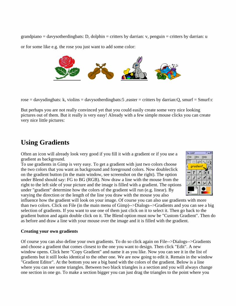
or for some like e.g. the rose you just want to add some color:
rose = davysdingbats: k, violins = davysotherdingbats:5 ,easter = critters by darrian:Q, smurf = Smurf:c
But perhaps you are not really convinced yet that you could easily create some very nice lookingpictures out of them. But it really is very easy! Already with a few simple mouse clicks you can createvery nice little pictures:
Using Gradients
Often an icon will already look very good if you fill it with a gradient or if you use agradient as background.To use gradients in Gimp is very easy. To get a gradient with just two colors choosethe two colors that you want as background and foreground colors. Now doubleclickon the gradient button (in the main window, see screenshot on the right). The optionunder Blend should say: FG to BG (RGB). Now draw a line with the mouse from theright to the left side of your picture and the image is filled with a gradient. The optionsunder "gradient" determine how the colors of the gradient will run (e.g. linear). Byvarying the direction or the length of the line you draw with the mouse you alsoinfluence how the gradient will look on your image. Of course you can also use gradients with morethan two colors. Click on File (in the main menu of Gimp)-->Dialogs-->Gradients and you can see a bigselection of gradients. If you want to use one of them just click on it to select it. Then go back to thegradient button and again double click on it. The Blend option must now be "Custom Gradient". Then doas before and draw a line with your mouse over the image and it is filled with the gradient.
Creating your own gradients
Of course you can also define your own gradients. To do so click again on File-->Dialogs-->Gradientsand choose a gradient that comes closest to the one you want to design. Then click "Edit". A newwindow opens. Click here "Copy Gradient" and name it as you like. Now you can see it in the list ofgradients but it still looks identical to the other one. We are now going to edit it. Remain in the window"Gradient Editor". At the bottom you see a big band with the colors of the gradient. Below is a linewhere you can see some triangles. Between two black triangles is a section and you will always changeone section in one go. To make a section bigger you can just drag the triangles to the point where you

want them to be. The colors of the area that has a darker gray can be changed. Click in the band with aright mouse click and hold it. There are several options you can choose now: You can see "Leftendpoint’s color" and "Right endpoints’ color". If you go to them with the mouse you will get a colorcircle and can choose a new color. The endpoint of one section should have the same color as thestarting point of the adjacent section if you want a smooth picture. Of course this is not true if you wantto have clear borders of color changes. By clicking on "Blending function for section" you can saywhether the color should run linear, in a circle etc. By clicking "Split segments at midpoint" you cansplit the section into smaller parts.
Let’s have a look at some nice pictures now:
The trompet is from davysotherdingbats, character r. I gave it a gradient of a yellow and orange tone.(Make sure that the trompet is selected because otherwise the whole image is filled with the gradient.)
The rabbit on a hat is from the font critters by darrian, character b, and I gave it a gray color. On a newlayer I chose a violet and a gray tone as my gradient (gray=foreground color and violet=backgroundcolor. In the middle of the picture I drew a diagonal line from a higher to a lower point (vertical to theline that you can see) of the length of the darker violet tone.

The sunflower consists of two icons, both from davysdingbats, characters j and e. I gave the stalk agreen colour. For the blossom I used a gradient of a yellow and an orange tone.
Let’s now look at a picture with a gradient I made myself:
First I created the text in a circle. For it I went to the main menu and clicked Xtns (right to File)-->Script Fu --> Logo --> Text in a circle. Here I typed the text "Come and join the fun" but let a space as afirst sign. Otherwise the first and last word are very close to each other. I chose a radius of 80, startAngle 0 and Fill Angle 360. For the Font Size I chose 25 and as Font Jayne Print. The text color is theforeground color from the menu. You get a separate picture now. I deleted the background, opened anew layer and pasted the penguins inside. The penguins are from critters by darrian,I. Then I openedagain a new layer, moved it to the bottom and filled it with my created gradient.
How about a button ?

I chose a light and a dark blue as my foreground and background colors. Then I opened a new imagewith a white background. In a new layer I selected a big circle with the selection tool and filled it withthis blue gradient by drawing a line with the mouse from left to right. I copied this layer and scaled thesize of the circle in the new layer down a bit. Then I filled it again with the gradient but this time I drewa line from right to left. I did the same for a third layer on top of the two. I pasted the circle inside andscaled it down and then filled it with the gradient, this time again drawing a line from left to right. Nowin another layer on top of them I pasted the icon with the mouse and the flowers (from critters bydarrian,A). Then right click in the layer Script Fu-->Shadow-->Drop-Shadow.
Script-Fu
Script Fus are scripts so that you can get an effect in one click for which you usually would need severalsteps. You can get the Script Fus either by right clicking in an image or a click on Xtns (next to File ontop in the main window of the Gimp). It is said that you should use the right click in the image to workwith already created images while by clicking on Script-fu over Xtns you can create a new image anddetermine which text font and color to use and which text to write.
Let’s look at some pictures:
Choose the rose from davysdingbats, character k, and then right click Script fu --> Alpha to Logo-->Chrome.

Choose the grandpiano from davysotherdingbats, character D. I used a size of 140 here. Then right clickin the image Script-Fu-->AlphatoLogo--> gradient bevel.
Choose the cat from davysotherdingbats, character 0 (zero), and then right clickScript-Fu-->AlphatoLogo-->Glossy.
I took the grand piano from davysotherdingbats, D, the second (right) hand from davysotherdingbats, 2,( You take both hands and then just erase the first (the left one) and take the right hand twice) and thehead from davysotherdingbats, 3 as well and then placed them as you can see in the image. I flipped(mirrored) the hands horizontally and erased the upper fingers. Then right click

Script-Fu-->AlphatoLogo--> Textured. Here I used the following settings:Border Size (pixels):20Pattern: here I used a wood pattern Mosaic Tile Type: SquaresBackground Color: white (Hue: -1, Saturation:0, Value, Red, Green and Blue = 1)Starting Blend: orange: here the color that is set as foregound color in Gimp is used, here it is: H=29,S=73, V=91, R=234, G=147, B=61, HexTriplet:#ea933d Ending Blend: yellow: Hue: 43.76, Saturation: 0.77, Value: 0.92, Red: 0.92, Green: 0.73, Blue: 0.21)
Adding some other effects...
I placed everything as you can see in the picture. The dancers and the piano player are fromdavysdingbats, L. I erased the flag from the head and gave them their color, making their hands white.For their eyes I took a big brush and drew two points. The stars are both the same (dingbats, U) justhaving different sizes. I pasted the star on a layer and gave it its color. Then I opened a new layer,copied & pasted it, flipped it horizontally and filled it with the second color. The grand piano is fromdavysotherdingbats,D. The text font is amaze. The piano keyboard is from davysotherdingbats, e. On alayer below the keyboard I filled the space in between the keyboard with a white color. I then mergedthis two layers. You can do this by making the eyes in the layers box of the other non-piano layersinvisible (by clicking on them). Now only the piano keyboard is visible. Right click in the imageLayers-->Merge visible layers and the piano is merged. Then right mouse clickFilters-->Distorts-->IWarp. Here I deformed it with the options move and grow. I just went over thekeyboard and deformed it until I was satisfied. Now make the other layers visible again and right clickLayer-->Merge visible layers. Then right click Script Fu-->Alpha to Logo-->Blended (with the defaultvalues).

I took an empty image and then right click ScriptFu-->Decor-->Add Border (default values). Then againright click in the image ScriptFu-->Alpha to Logo-->Glossy. Then I just added the group of penguinsfrom critters by darrian, z.
I pasted the piano keyboard (davysotherdingbats, e) and filled the space with white in a new layer andmerged the two as described above. Then right click in the layer with the piano keyboardFilters-->Distorts-->CurveBend. Here you can "design" a curve along which the piano keyboard shouldbend. Then I took a new layer and plasted two cats (davysotherdingbats, 0) in it, rotated them so thatthey look as in the picture, choose a green tone and added the eyes. I took a new layer and filled it withmany of the already above described sunflowers in the way you can see in the image. As background Ichose a gradient of blue and green.

I filled a layer with sunflowers as in the previous picture. Then I added another layer below and filled itwith sunflowers where the blossoms were filled with a red gradient. Again a new layer below and filledwith sunflowers of a violet gradient and once again this time with sunflowers of a blue gradient. For theyellow/orange and violet sunflowers I filled the middle of the blossom with yellow. The sunflowers havethis form so just add a new layer below and fill the space below the blossom with yellow and you willget that effect. For the blue and red sunflowers I just filled the whole middle of the blossom with yellow(I painted over the other color). As background I took a green gradient fill.
This picture is similar to the previous one. So take the previous picture and just replace the backgroundgradient fill with a pattern background choosing the pattern with the leaves. Then click on the layer with

the blue sunflowers. Right click on the layer Filter-->Map-->Fractal Trace (Warp and default settings).Finally I erased some of the stalks that I found disturbing. That’s all.
I guess you already have lots of ideas now to create far greater pictures than mine.Have fun and enjoy! :-)
References
The website of Gimp:http://www.gimp.org A site with a lot of cool ideas for 2D graphics: http://www.webreference.com/graphics
Webpages maintained by the LinuxFocus Editorteam
© Katja Socher"some rights reserved" see linuxfocus.org/license/
http://www.LinuxFocus.org
Translation information: en --> -- : Katja Socher <katja/at/linuxfocus.org>
2005-01-14, generated by lfparser_pdf version 2.51