Modelling interface aesthetics
22
Modelling interface aesthetics David Chek Ling Ngo a, * , Lian Seng Teo a , John G. Byrne b a Faculty of Information Technology, Multimedia University, Cyberjaya 63100, Malaysia b Department of Computer Science, Trinity College Dublin 2, Ireland Received 30 December 1999; received in revised form 20 June 2002; accepted 1 September 2002 Abstract An important aspect of screen design is aesthetic evaluation of screen layouts. While it is conceivable to define a set of variables that characterize the key attributes of many alphanumeric display formats, such a task seems difficult for graphic displays because of their much greater complexity. This paper proposes a theoretical approach to capture the essence of artistsÕ insights with 14 aesthetic measures for graphic displays. Our empirical study has suggested that these measures are important to prospective viewers and may help gain attention and build confidence in using computer system. Ó 2002 Elsevier Science Inc. All rights reserved. Keywords: Screen design; Interface aesthetics; Aesthetic measures; Aesthetic character- istics; Multi-screen interfaces 1. Introduction The role of aesthetics in human affairs has been widely documented [1]. Certainly, it is related to our appreciation of computer systems as well. However, some [2,3] warn against a tendency among designers to emphasize Information Sciences 152 (2003) 25–46 www.elsevier.com/locate/ins * Address for correspondence: 32 Jalan Tempua 5, Bander Puchong Jaya, Puchong, Selangor 47100, Malaysia. Tel.: +60-6-252-3485; fax: +60-6-231-8840. E-mail addresses: [email protected], [email protected] (D.C.L. Ngo), [email protected]. my (L.S. Teo), [email protected] (J.G. Byrne). 0020-0255/02/$ - see front matter Ó 2002 Elsevier Science Inc. All rights reserved. doi:10.1016/S0020-0255(02)00404-8
Transcript of Modelling interface aesthetics

Modelling interface aesthetics
David Chek Ling Ngo a,*, Lian Seng Teo a, John G. Byrne b
a Faculty of Information Technology, Multimedia University, Cyberjaya 63100, Malaysiab Department of Computer Science, Trinity College Dublin 2, Ireland
Received 30 December 1999; received in revised form 20 June 2002; accepted 1 September 2002
Abstract
An important aspect of screen design is aesthetic evaluation of screen layouts. While
it is conceivable to define a set of variables that characterize the key attributes of many
alphanumeric display formats, such a task seems difficult for graphic displays because of
their much greater complexity. This paper proposes a theoretical approach to capture
the essence of artists� insights with 14 aesthetic measures for graphic displays. Ourempirical study has suggested that these measures are important to prospective viewers
and may help gain attention and build confidence in using computer system.
� 2002 Elsevier Science Inc. All rights reserved.
Keywords: Screen design; Interface aesthetics; Aesthetic measures; Aesthetic character-
istics; Multi-screen interfaces
1. Introduction
The role of aesthetics in human affairs has been widely documented [1].
Certainly, it is related to our appreciation of computer systems as well.
However, some [2,3] warn against a tendency among designers to emphasize
Information Sciences 152 (2003) 25–46
www.elsevier.com/locate/ins
*Address for correspondence: 32 Jalan Tempua 5, Bander Puchong Jaya, Puchong, Selangor
47100, Malaysia. Tel.: +60-6-252-3485; fax: +60-6-231-8840.
E-mail addresses: [email protected], [email protected] (D.C.L. Ngo), [email protected].
my (L.S. Teo), [email protected] (J.G. Byrne).
0020-0255/02/$ - see front matter � 2002 Elsevier Science Inc. All rights reserved.
doi:10.1016/S0020-0255(02)00404-8

the aesthetic elements of the user interface, because these might degrade us-
ability. In fact, interface aesthetics play a greater role in affecting system
usability and acceptability than we might be willing to admit. Careful appli-
cation of aesthetic concepts can aid:• Acceptability. Two recent studies [4,5] show that very high correlations were
found between users� perceptions of interface aesthetics and usability.• Learnability. Toh [6] found that aesthetically pleasing layouts have a definite
effect on the student�s motivation to learn. Aspillage [7] found that good gra-phic design and attractive displays help contribute to the transfer of infor-
mation. Szabo and Kanuka [8] found that subjects who used the lesson
with good design principles completed the lesson in less time and had a
higher completion rate than those who used the lesson with poor designprinciples. Heines [9] found that a poorly designed computer screen can hin-
der communication. A study by Grabinger [10] indicated that organisation
and visual interest are important criteria in judging the readability and
studyability of the real screens. Screens that are plain, simple, unbalanced,
and bare are perceived as undesirable.
• Comprehensibility. Tullis [11] found that redesigning a key display from a
system for testing telephone lines resulted in a 40% reduction in the time re-
quired by the users to interpret the display. In a study of 500 displays, Tullis[12] found that the time it took users to extract information from displays of
airline or lodging information was 128% longer for the worst format than
for the best.
• Productivity. A convincing demonstration of design improvement has been
reported by Keister and Gallaway [13]. Those authors describe a data entry
application in which relatively simple improvements to user interface soft-
ware––including selection and formatting of displayed data, consistency in
wording and procedures, on-line user guidance, explicit error messages,re-entry rather than overtyping for data change, elimination of abbrevia-
tions, etc.––resulted in significantly improved system performance. Data en-
try was accomplished 25% faster, and with 25% fewer errors.
Although knowledge of the users� tasks and abilities is the key to designingeffective screen displays, an objective, automatable metric of screen design is an
essential aid. Tullis [14] developed four metrics for alphanumeric displays:
overall density, local density, grouping, and layout complexity. Streveler and
Wasserman [15] proposed an objective measure for assessing the spatial prop-erties of alphanumeric screens. Sears� [16] developed a task-dependent metriccalled layout appropriateness to assess whether the spatial layout is in harmony
with the users� tasks. Layout appropriateness is a widget-level metric that dealswith buttons, boxes, and lists. In this paper, we attempt to synthesise the
guidelines and empirical data related to the formatting of graphic displays into
a well-defined framework. We develop fourteen aesthetic measures for graphic
displays: balance, equilibrium, symmetry, sequence, cohesion, unity, propor-
26 D.C.L. Ngo et al. / Information Sciences 152 (2003) 25–46

tion, simplicity, density, regularity, economy, homogeneity, rhythm, and order
and complexity. (This paper is extended from [17–19]. This study differed from
earlier studies in that the formulae were further refined to incorporate more
relevant aesthetic components that might help explain our experience with, andevaluation of, computer aesthetics, and experiments were conducted using real
screens copied from actual multimedia systems to provide stronger empirical
support to the formulae.) The paper begins with an introduction to the aes-
thetic model, then carries out preliminary studies of the measures, and then
summarises and reviews the contributions.
There are four basic ways to use windows [20].
• Multi-window interfaces. Examples are the IBM OS/2 operating system,
most UNIX X-windows applications, and now Microsoft Windows 98.• Multi-document interfaces. For example, Microsoft Word or Excel.
• Multi-pane interfaces. Microsoft Paint and Netscape Navigator are exam-
ples.
• Multi-screen interfaces. Mostly found in one-time GUIs and wizards, and
multimedia applications.
This paper addresses primarily multi-screen interfaces. With some modifi-
cation, some of the techniques presented can also be used for other screen
types. Keep in mind that the following discussion does not focus on the wordson the screen, but on the perception of structure created by such concepts as
spacing.
2. Aesthetic measures
Many noteworthy texts discuss theories of design in both fine and com-
mercial art. Arnheim [21] and Dondis [22] are good examples. From the lit-
erature on screen design, Galitz�s book on design and layout, The EssentialGuide to User Interface Design [23], presents an extensive list of very specific
guidelines for the design of screens. This paper relies heavily on this and other
similar works [24] to help demonstrate our approach. Observe that the range of
the following measures is between 0 (worst) and 1 (best).
2.1. Measure of balance
Balance can be defined as the distribution of optical weight in a picture.
Optical weight refers to the perception that some objects appear heavier than
others. Larger objects are heavier, whereas small objects are lighter. Balance in
screen design is achieved by providing an equal weight of screen elements, left
and right, top and bottom.
Balance is computed as the difference between total weighting of compo-nents on each side of the horizontal and vertical axis and is given by
D.C.L. Ngo et al. / Information Sciences 152 (2003) 25–46 27

BM ¼ 1� jBMverticalj þ jBMhorizontalj2
2 ½0; 1� ð1Þ
BMvertical and BMhorizontal are, respectively, the vertical and horizontal balances
with
BMvertical ¼wL � wR
maxðjwLj; jwRjÞð2Þ
BMhorizontal ¼wT � wB
maxðjwTj; jwBjÞð3Þ
with
wj ¼Xnji
aijdij j ¼ L;R;T;B ð4Þ
where L, R, T, and B stand for left, right, top, and bottom, respectively; aij isthe area of object i on side j; dij is the distance between the central lines of theobject and the frame; and nj is the total number of objects on the side.
2.2. Measure of equilibrium
Equilibrium is a stabilisation, a midway centre of suspension. Equilibrium
on a screen is accomplished through centring the layout itself. The centre of thelayout coincides with that of the frame. (There are minor deviations from this
definition, which we discuss in Section 4.)
Equilibrium is computed as the difference between the centre of mass of the
displayed elements and the physical centre of the screen and is given by
EM ¼ 1� jEMxj þ jEMy j2
2 ½0; 1� ð5Þ
The equilibrium components along the x- ðEMxÞ and y-axis ðEMyÞ are given by
EMx ¼2Pn
i aiðxi � xcÞnbframe
Pni ai
ð6Þ
EMy ¼2Pn
i aiðyi � ycÞnhframe
Pni ai
ð7Þ
where ðxi; yiÞ and ðxc; ycÞ are the co-ordinates of the centres of object i and theframe; ai is the area of the object; bframe and hframe are the width and height ofthe frame; and n is the number of objects on the frame. Note that the maximumvalues of jxi � xcj and jyi � ycj are bframe=2 and hframe=2.
28 D.C.L. Ngo et al. / Information Sciences 152 (2003) 25–46

2.3. Measure of symmetry
Symmetry is axial duplication: a unit on one side of the centre line is exactly
replicated on the other side. Vertical symmetry refers to the balanced ar-rangement of equivalent elements about a vertical axis, and horizontal sym-
metry about a horizontal axis. Radial symmetry consists of equivalent elements
balanced about two or more axes that intersect at a central point.
Symmetry, by definition, is the extent to which the screen is symmetrical in
three directions: vertical, horizontal, and diagonal and is given by
SYM ¼ 1� jSYMverticalj þ jSYMhorizontalj þ jSYMradialj3
2 ½0; 1� ð8Þ
SYMvertical, SYMhorizontal, and SYMradial are, respectively, the vertical, hori-
zontal, and radial symmetries with
SYMvertical ¼
jX 0UL � X 0
URj þ jX 0LL � X 0
LRj þ jY 0UL � Y 0
URj þ jY 0LL � Y 0
LRjþjH 0UL � H 0
URj þ jH 0LL � H 0
LRj þ jB0UL � B0
URj þ jB0LL � B0
LRjþjH0
UL � H0URj þ jH0
LL � H0LRj þ jR0
UL � R0URj þ jR0
LL � R0LRj
12
ð9Þ
SYMhorizontal ¼
jX 0UL � X 0
LLj þ jX 0UR � X 0
LRj þ jY 0UL � Y 0
LLj þ jY 0UR � Y 0
LRjþjH 0UL � H 0
LLj þ jH 0UR � H 0
LRj þ jB0UL � B0
LLj þ jB0UR � B0
LRjþjH0
UL � H0LLj þ jH0
UR � H0LRj þ jR0
UL � R0LLj þ jR0
UR � R0LRj
12
ð10Þ
SYMradial ¼
jX 0UL � X 0
LRj þ jX 0UR � X 0
LLj þ jY 0UL � Y 0
LRj þ jY 0UR � Y 0
LLjþjH 0UL � H 0
LRj þ jH 0UR � H 0
LLj þ jB0UL � B0
LRj þ jB0UR � B0
LLjþjH0
UL � H0LRj þ jH0
UR � H0LLj þ jR0
UL � R0LRj þ jR0
UR � R0LLj
12
ð11ÞX 0j , Y
0j , H
0j , B
0j, H
0j, and R0
j are, respectively, the normalised values of
Xj ¼Xnji
jxij � xcj j ¼ UL;UR;LL;LR ð12Þ
Yj ¼Xnji
jyij � ycj j ¼ UL;UR;LL;LR ð13Þ
Hj ¼Xnji
hij j ¼ UL;UR;LL;LR ð14Þ
Bj ¼Xnji
bij j ¼ UL;UR;LL;LR ð15Þ
D.C.L. Ngo et al. / Information Sciences 152 (2003) 25–46 29

Hj ¼Xnji
yij � ycxij � xc
�������� j ¼ UL;UR;LL;LR ð16Þ
Rj ¼Xnji
ffiffiffiffiffiffiffiffiffiffiffiffiffiffiffiffiffiffiffiffiffiffiffiffiffiffiffiffiffiffiffiffiffiffiffiffiffiffiffiffiffiffiffiffiffiðxij � xcÞ2 þ ðyij � ycÞ2
qj ¼ UL;UR;LL;LR ð17Þ
where UL, UR, LL and LR stand for upper-left, upper-right, lower-left and
lower-right, respectively; ðxij; yijÞ and ðxc; ycÞ are the co-ordinates of the centresof object i on quadrant j and the frame; bij and hij are the width and height ofthe object; and nj is the total number of objects on the quadrant.
2.4. Measure of sequence
Sequence in design refers to the arrangement of objects in a layout in a way
that facilitates the movement of the eye through the information displayed.
Normally the eye, trained by reading, starts from the upper left and moves
back and forth across the display to the lower right. Perceptual psychologists
have found that certain things attract the eye. It moves from big objects to
small objects.
Sequence, by definition, is a measure of how information in a display is
ordered in relation to a reading pattern that is common in Western culturesand is given by
SQM ¼ 1�P
j¼UL;UR;LL;LR jqj � vjj8
2 ½0; 1� ð18Þ
with
fqUL; qUR; qLL; qLRg ¼ f4; 3; 2; 1g ð19Þ
vj ¼
4 if wj is the biggest in w3 if wj is the 2nd biggest in w2 if wj is the 3rd biggest in w1 if wj is the smallest in w
8>><>>: j ¼ UL;UR;LL;LR ð20Þ
with
wj ¼ qjXnji
aij j ¼ UL;UR;LL;LR ð21Þ
w ¼ fwUL;wUR;wLL;wLRg ð22Þ
where UL, UR, LL, and LR stand for upper-left, upper-right, lower-left, andlower-right, respectively; and aij is the area of object i on quadrant j. Eachquadrant is given a weighting in q.
30 D.C.L. Ngo et al. / Information Sciences 152 (2003) 25–46

2.5. Measure of cohesion
In screen design, similar aspect ratios promote cohesion. The term aspect
ratio refers to the relationship of width to height. Typical paper sizes are higherthan they are wide, while the opposite is true for typical VDU displays.
Changing the aspect ratio of a visual field may affect eye movement patterns
sufficiently to account for some of the performance differences. The aspect ratio
of a visual field should stay the same during the scanning of a display.
Cohesion, by definition, is a measure of how cohesive the screen is and is
given by
CM ¼ jCMflj þ jCMloj2
2 ½0; 1� ð23Þ
CMfl is a relative measure of the ratios of the layout and screen with
CMfl ¼cfl if cfl6 11
cflotherwise
8<: ð24Þ
with
c ¼ hla55X fl=blayouthframe=bframe
ð25Þ
where blayout and hlayout and bframe and hframe are the widths and heights of thelayout and the frame, respectively. CMlo is a relative measure of the ratios of
the objects and layout with
CMlo ¼Pn
i tin
ð26Þ
with
ti ¼ci if ci 6 1
1
ciotherwise
8<: ð27Þ
with
c ¼ hi=bihlayout=blayout
ð28Þ
where bi and hi the width and height of object i; and n is the number of objectson the frame.
D.C.L. Ngo et al. / Information Sciences 152 (2003) 25–46 31

2.6. Measure of unity
Unity is coherence, a totality of elements that is visually all one piece. With
unity, the elements seem to belong together, to dovetail so completely that theyare seen as one thing. Unity in screen design is achieved by using similar sizes
and leaving less space between elements of a screen than the space left at the
margins.
Unity, by definition, is the extent to which the screen elements seem to
belong together and is given by
UM ¼ jUMformj þ jUMspacej2
2 ½0; 1� ð29Þ
UMform is the extent to which the objects are related in size with
UMform ¼ 1� nsize � 1n
ð30Þ
and UMspace is a relative measurement, which means that the space left at the
margins (the margin area of the screen) is related to the space between elements
of the screen (the between-component area) with
UMspace ¼ 1�alayout �
Pni ai
aframe �Pn
i aið31Þ
where ai, alayout, and aframe are the areas of object i, the layout, and the frame,respectively; nsize is the number of sizes used; and n is the number of objects onthe frame.
2.7. Measure of proportion
Down through the ages, people and cultures have had preferred propor-
tional relationships. What constitutes beauty in one culture is not necessarily
considered the same by another culture, but some proportional shapes have
stood the test of time and are found in abundance today. Marcus [3] describes
the following shapes as aesthetically pleasing.• Square (1:1)
• Square root of two (1:1.414)
• Golden rectangle (1:1.618)
• Square root of three (1:1.732)
• Double square (1:2)
In screen design, aesthetically pleasing proportions should be considered for
major components of the screen, including windows and groups of data and
text.Proportion, by definition, is the comparative relationship between the di-
mensions of the screen components and proportional shapes and is given by
32 D.C.L. Ngo et al. / Information Sciences 152 (2003) 25–46

PM ¼ jPMobjectj þ jPMlayoutj2
2 ½0; 1� ð32Þ
PMobject is the difference between the proportions of the objects and the closest
proportional shapes described by Marcus with
PMobject ¼1
n
Xn
i
1
�minðjpj � pij; j ¼ sq; r2; gr; r3; dsÞ
0:5
�ð33Þ
pi ¼ri if ri 6 11
riotherwise
8<: ð34Þ
with
ri ¼hibi
ð35Þ
where bi and hi are the width and height of object i. Note that the maximumvalue of ðpj � piÞ is 0.5. PMlayout is the difference between the proportions of the
layout and the closest proportional shape with
PMlayout ¼ 1�minðjpj � playoutj; j ¼ sq; r2; gr; r3; dsÞ
0:5ð36Þ
with
playout ¼rlayout if r6 1
1
rlayoutotherwise
8><>: ð37Þ
with
rlayout ¼hlayoutblayout
ð38Þ
where blayout and hlayout are the width and height of the layout. Note that themaximum value of ðpj � playoutÞ is 0.5. pj is the proportion of shape j with
fpsq; pr2; pgr; pr3; pdsg ¼ 1
1;1
1:414;1
1:618;1
1:732;1
2
� ð39Þ
where sq, r2, gr, r3, and ds stand for square, square root of two, goldenrectangle, square root of three, and double square, respectively. While many
guidelines documents recommend using these rectangles in both horizontal and
vertical orientations, almost all of them exhibit no particular preference. Forthis reason, we assume that they are aesthetically indistinguishable, and
therefore, we do not take into account the orientation of the proportion.
D.C.L. Ngo et al. / Information Sciences 152 (2003) 25–46 33

2.8. Measure of simplicity
Simplicity is directness and singleness of form, a combination of elements
that results in ease in comprehending the meaning of a pattern. Simplicity inscreen design is achieved by optimising the number of elements on a screen and
minimising the alignment points. Tullis [12] has derived a measure of screen
complexity for text-based screens based on the work of Bonsiepe [25], who
proposed a method of measuring the complexity of typographically designed
pages through the application of information theory. It involves counting the
number of different rows or columns on the screen that are used as starting
positions of alphanumeric data items. Information theory is then used to cal-
culate the complexity of this arrangement of starting positions.An easier method of calculation is
SMM ¼ 3
nvap þ nhap þ n2 ½0; 1� ð40Þ
where nvap and nhap are the numbers of vertical and horizontal alignmentpoints; and n is the number of objects on the frame.
2.9. Measure of density
Density is the extent to which the screen is covered with objects. Density isachieved by restricting screen density levels to an optimal percent. A measure
of density, derived by Tullis [11], is the percentage of character positions on the
entire frame containing data.
Instead of looking at characters, our measure deals with objects with
DM ¼ 1� 2 0:5���� �
Pni ai
aframe
���� 2 ½0; 1� ð41Þ
where ai and aframe are the areas of object i and the frame; and n is the numberof objects on the frame. Assume that the optimum screen density level for
graphic screens is 50%.
2.10. Measure of regularity
Regularity is a uniformity of elements based on some principle or plan.
Regularity in screen design is achieved by establishing standard and consis-
tently spaced horizontal and vertical alignment points for screen elements, and
minimising the alignment points.Regularity, by definition, is a measure of how regular the screen is and is
given by
34 D.C.L. Ngo et al. / Information Sciences 152 (2003) 25–46
RM ¼ jRMalignmentj þ jRMspacingj2
2 ½0; 1� ð42Þ
RMalignment is the extent to which the alignment points are minimised with
RMalignment ¼1 if n ¼ 11� nvap þ nhap
2notherwise
(ð43Þ
and RMspacing is the extent to which the alignment points are consistently
spaced with
RMspacing ¼1 if n ¼ 11� nspacing � 1
2ðn� 1Þ otherwise
(ð44Þ
where nvap and nhap are the numbers of vertical and horizontal alignmentpoints; nspacing is the number of distinct distances between column and rowstarting points; and n is the number of objects on the frame.
2.11. Measure of economy
Economy is the careful and discreet use of display elements to get themessage across as simple as possible. Economy is achieved by using as few sizes
as possible.
Economy, by definition, is a measure of how economical the screen is and is
given by
ECM ¼ 1
nsize2 ½0; 1� ð45Þ
where nsize is the number of sizes.
2.12. Measure of homogeneity
Entropy was developed in physics in the 19th century and was applied later
in astronomy, chemistry and biology. Entropy influenced almost every science.
We interpret the statistical entropy concept for screen design. The entropy
equation is given by the following
S ¼ k logW ð46Þwhere S is the entropy of the screen; k is a constant, known as Boltzmann�sconstant; and W is a measure of the degree of homogeneity.
Since increases or decreases of W are equivalent, respectively, to increases or
decreases of S, we can conveniently work with W below rather than with S. Therelative degree of homogeneity of a composition is determined by how evenly
the objects are distributed among the four quadrants of the screen. The degree
of evenness is a matter of the quadrants that contain more or less nearly equalnumbers of objects.
D.C.L. Ngo et al. / Information Sciences 152 (2003) 25–46 35

Homogeneity, by definition, is a measure of how evenly the objects are
distributed among the quadrants and is given by
HM ¼ WWmax
2 ½0; 1� ð47Þ
W is the number of different ways a group of n objects can be arranged for thefour quadrants when nj is the total number of objects in quadrant j, that is
W ¼ n!Qj¼UL;UR;LL;LR nj
¼ n!nUL!nUR!nLL!nLR!
ð48Þ
where nUL, nUR, nLL, and nLR are the numbers of objects on the upper-left,upper-right, lower-left, and lower-right quadrants, respectively; and n is thenumber of objects on the frame.
W is maximum when the n objects are evenly allocated to the variousquadrants of the screen, as compared to more or less uneven allocations among
the quadrants, and thus
Wmax ¼n!
n4!n4!n4!n4!¼ n!
n4!
� �4 ð49Þ
2.13. Measure of rhythm
Rhythm in design refers to regular patterns of changes in the elements. This
order with variation helps to make the appearance exciting. Rhythm is ac-
complished through variation of arrangement, dimension, number and form ofthe elements. The extent to which rhythm is introduced into a group of ele-
ments depends on the complexity (number and dissimilarity of the elements).
Rhythm, by definition, is the extent to which the objects are systematically
ordered and is given by
RHM ¼ 1� jRHMxj þ jRHMy j þ jRHMareaj3
2 ½0; 1� ð50Þ
The rhythm components are
RHMx ¼
jX 0UL � X 0
URj þ jX 0UL � X 0
LRjþjX 0UL � X 0
LLj þ jX 0UR � X 0
LRjþjX 0UR � X 0
LLj þ jX 0LR � X 0
LLj6
ð51Þ
RHMy ¼
jY 0UL � Y 0
URj þ jY 0UL � Y 0
LRjþjY 0UL � Y 0
LLj þ jY 0UR � Y 0
LRjþjY 0UR � Y 0
LLj þ jY 0LR � Y 0
LLj6
ð52Þ
36 D.C.L. Ngo et al. / Information Sciences 152 (2003) 25–46
RHMarea ¼
jA0UL � A0
URj þ jA0UL � A0
LRjþjA0UL � A0
LLj þ jA0UR � A0
LRjþjA0UR � A0
LLj þ jA0LR � A0
LLj6
ð53Þ
X 0j , Y
0j , and A0
j are, respectively, the normalised values of
Xj ¼Xnji
jxij � xcj j ¼ UL;UR;LL;LR ð54Þ
Yj ¼Xnji
jyij � ycj j ¼ UL;UR;LL;LR ð55Þ
Aj ¼Xnji
aij j ¼ UL;UR;LL;LR ð56Þ
where UL, UR, LL, and LR stand for upper-left, upper-right, lower-left, and
lower-right, respectively; ðxij; yijÞ and ðxc; ycÞ are the co-ordinates of the centresof object i on quadrant j and the frame; aij is the area of the object; and nj is thetotal number of objects on the quadrant.
2.14. Measure of order and complexity
The measure of order is written as an aggregate of the above measures for a
layout. The opposite pole on the continuum is complexity. The scale created
may also be considered a scale of complexity, with extreme complexity at one
end and minimal complexity (order) at the other.
The general form of the measure is given by
OM ¼ gffiðMiÞg 2 ½0; 1� ð57Þ
with
fM1;M2;M3;M4;M5;M6;M7;M8;M9;M10;M11;M12;M13g¼ fBM;EM; SYM; SQM;CM;UM;PM; SMM;DM;RM;
ECM;HM;RHMg ð58Þ
where fið Þ is a function of Mi and is functionally related to the measurable
criteria which characterise gfg; and BM is given by (1), EM by (5), SYM by (8),SQM by (18), CM by (23), UM by (29), PM by (32), SMM by (40), DM by
(41), RM by (42), ECM by (45), HM by (47), and RHM by (50).
D.C.L. Ngo et al. / Information Sciences 152 (2003) 25–46 37

3. Empirical study
In this two-part exercise, we established aesthetic values for a group of real
screens copied from multimedia systems using our measures for comparisonwith viewer judgements about the aesthetics of the actual screens and their
screen models, and determined how consistent one was with the other. The
specific goals were to confirm the practicality of the conventions we gave for
determining the properties of screens, and compare judgements of real screens
against model screens in order to determine if the same results carried across to
more practical applications.
In our earlier studies [17–19] of the formulae (preceding versions), very high
correlations were found between perceived and computed aesthetics of theinterface. These studies were conducted using model screens. Model screens
were used to control for content effects and to facilitate interpretation of the
data analyses. Grabinger [10] found that the characteristics identified with
model screens held up when viewers judged the readability and studyability of a
selection of real screens from actual programs. However, there was no evidence
to indicate whether people�s perceptions of interface aesthetics would differ ifthe real screens were used rather than the screen models. Using real screens
takes a further step in investigating whether the same characteristics used byviewers in the model screens emerge in judgements about real screens.
Samples of all screens are shown in Figs. 1–5. (The five screens and the
corresponding models are side by side.) Table 1 presents the element config-
urations of the screens, and their aesthetic values, according to our formulae,
are summarised in Table 2. (All values are in pixels.) To perform OM calcu-
lations for the screens, Eq. (57) is written as the linear summation of the
weighted measures with
gfg ¼ 1
m
Xmi
aifiðMiÞ ¼1
13
X13i
aiMi 2 ½0; 1�; 06 ai 6 1 ð59Þ
Fig. 1. Exploring ancient architecture, by Medio Multimedia.
38 D.C.L. Ngo et al. / Information Sciences 152 (2003) 25–46

Fig. 2. Exploring ancient architecture, by Medio Multimedia.
Fig. 3. Goldilocks and the three bears.
Fig. 4. The main menu of the CITY-INFO kiosk.
D.C.L. Ngo et al. / Information Sciences 152 (2003) 25–46 39
Each aesthetic measure Mi has its own weighing component ai, which is as-
sumed to be a constant. (Determining weights is one of the multi-dimensional
optimisation problems that are application specific. A paper presenting a solution
using objective-based evolutionary programming is under review at the present
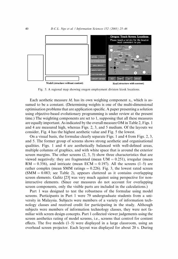
time.) The weighting components are set to 1, supposing that all these measuresare equally important. As indicated by the overall measure OM in Table 2, Figs. 1
and 4 are measured high, whereas Figs. 2, 3, and 5 medium. Of the layouts we
consider, Fig. 4 has the highest aesthetic value and Fig. 5 the lowest.
On a visual basis, the formulae clearly separate Figs. 1 and 4 from Figs. 2, 3,
and 5. The former group of screens shows strong aesthetic and organisational
qualities. Figs. 1 and 4 are aesthetically balanced with well-defined areas,
multiple columns of graphics, and with white space that is around the exterior
screen margins. The other screens (2, 3, 5) show three characteristics that areviewed negatively: they are fragmented (mean UM ¼ 0:251), irregular (meanRM ¼ 0:356), and intricate (mean ECM ¼ 0:197). All the screens (1–5) arerather complex (mean SMM ratings ¼ 0:226). Fig. 3, the lowest rated screen(SMM ¼ 0:083; see Table 2), appears cluttered as it contains overlappingscreen elements. Galitz [23] was very much against using perspective for non-
interactive elements. (Since our measures do not account for overlapping
screen components, only the visible parts are included in the calculations.)
Part 1 was designed to test the robustness of the formulae using modelscreens. Participants in Part 1 were 79 undergraduate students from a uni-
versity in Malaysia. Subjects were members of a variety of information tech-
nology classes and received credit for participating in the study. Although
subjects were members of information technology classes, they were not fa-
miliar with screen design concepts. Part 1 collected viewer judgements using the
screen aesthetics rating of model screens, i.e., screens that control for content
effects. The five models (1–5) were displayed in a large classroom, using an
overhead screen projector. Each layout was displayed for about 20 s. During
Fig. 5. A regional map showing oregon employment division kiosk locations.
40 D.C.L. Ngo et al. / Information Sciences 152 (2003) 25–46

that time, participants rated each layout on a low–medium–high scale re-
garding how beautify it was. The median for the ratings is calculated to show
the relative aesthetics of the screens, according to the viewers (see Table 3).
By and large, the results resemble those obtained using the proposed mea-
sures. Figs. 1 and 4 were rated higher than Figs. 2, 3, and 5. Figs. 1 and 4
Table 1
Summary of layout properties
Layout Object X Y Width Height
Fig. 1 ð319 221Þ 1 80 53 70 70
2 80 128 70 70
3 168 53 70 70
4 168 128 70 70
5 6 5 306 16
Fig. 2 ð319 221Þ 1 6 5 306 16
2 6 25 140 112
3 32 150 88 52
4 200 25 112 177
Fig. 3 ð320 240Þ 1 3 196 48 42
2 53 196 48 42
3 219 196 48 42
4 269 196 48 42
5 103 196 114 42
6 196 68 61 65
7 182 22 61 46
8 130 12 52 65
9 77 22 53 65
10 63 87 61 48
11 124 87 72 41
12 7 37 44 154
13 51 147 219 44
14 270 23 44 168
Fig. 4 ð320 240Þ 1 23 29 64 58
2 93 29 64 58
3 163 29 64 58
4 233 29 64 58
5 23 91 134 58
6 163 91 134 58
7 23 153 64 58
8 93 153 64 58
9 163 153 64 58
10 233 153 64 58
Fig. 5 ð320 240Þ 1 94 2 220 44
2 0 104 84 136
3 94 50 226 160
4 94 218 176 22
D.C.L. Ngo et al. / Information Sciences 152 (2003) 25–46 41

present two layouts that have high computed values and were rated high on
aesthetics by the viewers. Fig. 5, the lowest measured screen, was rated low.
Figs. 2 and 3 with moderate OM were rated medium. The findings are con-
sistent with those obtained in the earlier studies that used simple, artificial
models to analyse previous versions, reinforcing the patterns observed thus far.
While the use of models permits an examination of viewer perceptions in a
controlled environment, generalising from the model screens to real applica-
tions may not be tenable [26]. Part 2 was designed to investigate whetherjudgements would differ if the real screens were used rather than the screen
models. Participants in Part 2 were 180 undergraduate students from the same
university. Subjects were members of a variety of information technology
classes and received credit for participating in the study. None of the subjects
participated in Part 1 and none was familiar with screen design concepts. The
models employed in Part 1 were free from content, therefore enabling subjects
to focus on the overall design of the screen. In contrast, Part 2 examined viewer
judgements of real screens copied from existing multimedia systems. Part 2proceeded in the same manner as Part 1.
Part 1�s results are replicated here. No differences were found, with the re-sults being given in Table 4. Figs. 1 and 4 were rated higher than Figs. 2, 3,
Table 2
Computation of aesthetic value for five layouts
Fig. 1 Fig. 2 Fig. 3 Fig. 4 Fig. 5
BM 0.87412 0.63771 0.76319 0.99625 0.64216
EM 0.99368 0.98150 0.99570 1.00000 0.98134
SYM 0.66871 0.57828 0.73858 0.99850 0.44697
SQM 1.00000 0.50000 1.00000 1.00000 0.25000
CM 0.71578 0.74103 0.80032 0.80116 0.72686
UM 0.52435 0.32515 0.28404 0.87668 0.14543
PM 0.89779 0.83207 0.86032 0.86859 0.79443
SMM 0.27273 0.30000 0.08333 0.17647 0.30000
DM 0.69493 0.72407 0.53823 0.82188 0.40792
RM 0.51250 0.37500 0.31868 0.79722 0.37500
ECM 0.50000 0.25000 0.09091 0.50000 0.25000
HM 0.69444 0.00463 0.01531 1.00000 0.00714
RHM 0.66176 0.54721 0.76674 0.99840 0.46527
OM 0.69314 0.52282 0.55810 0.83347 0.44558
Table 3
Median of the sample (Part 1)
Fig. 1 Fig. 2 Fig. 3 Fig. 4 Fig. 5
High Medium Medium High Low
42 D.C.L. Ngo et al. / Information Sciences 152 (2003) 25–46

and 5. Part 2 indicated, as did Part 1, that our formulae are important eval-
uative metrics for accessing the aesthetics of the real screens. The actual con-
tent of the real screens did not seem to have any effect on judgement, nor did
informal post-study interviews indicate that content was a factor in judging thescreens. Note that the formulae do not focus on content, but on structure. The
above findings are encouraging as they justify the formulae and the conven-
tions in general.
3.1. Discussion
The purpose of this study is to discover principal determinants of the aes-thetic evaluation of the interface. The results of Study 1, using model screens,
confirm and further define the existence of evaluative constructs based on vi-
sual complexity and organization. However, this study differed from earlier
studies in that more determinants were found. Specifically, this study defined
symmetry, sequence, cohesion, regularity, homogeneity, and rhythm.
While the use of models permits an examination of viewer perceptions in a
controlled environment, generalizing from the model screens to real appli-
cations may not be tenable. The purpose of comparing judgments of realscreens against model screens was to determine if the same results carried
across to more practical applications. Study 2 indicated, as did Study 1, that
these thirteen characteristics are important determinants of system accept-
ability.
Our empirical study has been done for the one-to-one correspondence be-
tween a real screen (structure with content) and its model (structure without
content). However, if the same information content is illustrated on the five
layout structures shown in Figs. 1–5, the same empirical results as in Table 3 or4 could be expected (assuming our findings are robust).
The findings of this research greatly help to clarify the choices that are in-
volved. Many long-held beliefs have found detailed empirical confirmation for
the first time; some new and perhaps surprising discoveries have been made.
For example, the study indicated that cohesion and rhythm are important
determinants in judging acceptability from the appearance of the screens.
These and other determinants of system acceptability have not received ex-
tensive treatment in the screen design literature. This study calls attention totheir potential contribution to our evaluation of system acceptability.
Table 4
Median of the sample (Part 2)
Fig. 1 Fig. 2 Fig. 3 Fig. 4 Fig. 5
High Medium Medium High Low
D.C.L. Ngo et al. / Information Sciences 152 (2003) 25–46 43

The results also support the validity of the prediction system. Given a set of
alternative formats, the system can quite accurately predict the relative sub-
jective ratings for the formats.
4. Conclusions and future work
In this paper, we have presented a computational theory of evaluatinginterface aesthetics. In particular, we have introduced 14 aesthetic measures:
balance, equilibrium, symmetry, sequence, cohesion, unity, proportion, sim-
plicity, density, regularity, economy, homogeneity, rhythm, and order and
complexity. Although the population samples used in our informal study
limit generalisability, in view of consistency with previous studies [17–19],
the findings have confirmed and further defined the existence of evaluative
characteristics based on visual order and complexity. It should be emphas-
ised that we have had to make two assumptions, namely, (1) that the inter-action between the selected characteristics is linear, and (2) that all these
characteristics are equally important. The main justification for these as-
sumptions lies in the fact that they lead to results in complete agreement with
experiment.
The study described here has suggested some improvements to enhance their
usability. We can increase scope to include the colour, tone, and shape of
objects in balance, for example. A designer can control some elements of
composition to achieve balance. For instance, colour is visually heavier thanblack and white; big things are visually heavier than little things; black is vi-
sually heavier than white; irregular shapes are visually heavier than regular
shapes. By controlling the colour, size, tone, and shape of objects in a design,
one distributes the visual weight and thus influences balance.
A layout is in equilibrium when its centre corresponds approximately to the
centre of the frame. Practically speaking, there are however, minor deviations
from this definition. Owing to the visual gravitational pull, the balancing centre
of the layout will lie somewhat higher than the centre of the frame, therebycompensating for the greater weight of the area�s upper half. But such dis-crepancies are small.
There are many interesting research topics involving the computation
and use of our formulae. First, experiments must be conducted to provide
additional empirical validation of the formulae and the conventions. Future
research should focus on investigating the interplay between the selected
characteristics, which, contrary to our original assertion, may be nonlinear.
Additional research is also necessary to evaluate the effects of differentweighting strategies. (Weighting deals with the problem that we care about
some characteristics more than others.) Characteristics that are common to the
44 D.C.L. Ngo et al. / Information Sciences 152 (2003) 25–46

feeling which gives one an aesthetic experience should not be limited to the few,
more accordant ordering principles with appropriate design conventions must
be found if this approach is to be improved.
This study has lent initial support to the validity of our formulae as anevaluative metric for interface aesthetics. The most exciting possibility for these
formulae would be to use it in conjunction with an automated layout program
that incorporates additional details about information content and style guide-
lines. The formulae could be used when generating the initial layout. Subse-
quently, as the designer makes changes, the formulae and other metrics could
provide feedback concerning the possible effects of the changes on the user�sability to interpret the information being presented. The formulae are intended
to supplement other metrics, not to stand-alone.
Acknowledgements
The research reported here was supported by IRPA grant 191/9636/0012.
Thanks to Boon Leong Law for his help in conducting the experiments and
analysing the data.
References
[1] J. Maquet, The Aesthetic Experience, Yale University Press, New Haven, CT, 1986.
[2] J.D. Foley, A. van Dam, S.K. Feiner, J.F. Hughes, Computer Graphics: Principles and
Practice, second ed., Addison-Wesley, Reading, MA, 1990.
[3] A. Marcus, Graphic Design for Electronic Documents and User Interfaces, ACM Press, New
York, 1992.
[4] N. Tractinsky, Aesthetics and Apparent Usability: Empirically Assessing Cultural and
Methodological Issues, in: CHI �97 Conference Proceedings, Association for ComputingMachinery, New York, 1997.
[5] M. Kurosu, K. Kashimura, Apparent Usability vs. Inherent Usability, in: CHI �95 ConferenceCompanion, Association for Computing Machinery, New York, 1995.
[6] S.C. Toh, Cognitive and motivational effects of two multimedia simulation presentation modes
on science learning, Ph.D. Dissertation, University of Science Malaysia, Malaysia, 1998.
[7] M. Aspillaga, Screen design: a location of information and its effects on learning, Journal of
Computer-Based Instruction 18 (3) (1991) 89–92.
[8] M. Szabo, H. Kanuka, Effects of Violating Screen Design Principles of Balance, Unity and
Focus on Recall Learning, Study Time, and Completion Rates, in: ED-Media/ED-Telecom 98
Conference Proceedings, Association for the Advancement of Computing in Education,
Charlottesville, VA, 1998.
[9] J. Heines, Screen design strategies for computer-assisted instruction, Digital Press, Bedford,
MA, 1984.
[10] R.S. Grabinger, Computer screen designs: viewer judgements, Educational Technology
Research and Development 41 (2) (1991) 35–73.
[11] T.S. Tullis, An evaluation of alphanumeric, graphic, and colour information displays, Human
Factors 23 (1981) 541–550.
D.C.L. Ngo et al. / Information Sciences 152 (2003) 25–46 45

[12] T.S. Tullis, Predicting the usability of alphanumeric displays, Ph.D. Dissertation, Rice
University, Kansas, 1984.
[13] R.S. Keister, G.R. Gallaway, Making software user friendly: an assessment of data entry
performance, in: HFS 27th Annual Meeting Proceedings, Human Factors Society, Santa
Monica, CA, 1983.
[14] T.S. Tullis, Screen design, in: M. Helander (Ed.), Handbook of Human–Computer
Interaction, Elsevier Science Publishers, Amsterdam, The Netherlands, 1988, pp. 377–411.
[15] D.J. Streveler, A.I. Wasserman, Quantitative measures of the spatial properties of screen
designs, in: INTERACT �84 Conference Proceedings, North Holland, Amsterdam, 1984.[16] A. Sears, Layout appropriateness: guiding user interface design with simple task descriptions,
IEEE Transactions on Software Engineering 19 (7) (1993) 707–719.
[17] D.C.L. Ngo, Visit: visitor information system implementation tool, Ph.D. Dissertation, Trinity
College, Dublin, 1994.
[18] D.C.L. Ngo, J.G. Byrne, Aesthetic measures for screen design, in: OZCHI �98 ConferenceProceedings, IEEE Computer Society, Los Alamitos, CA, 1998.
[19] D.C.L. Ngo, A. Samsudin, R. Abdullah, Aesthetic measures for assessing graphic screens,
Journal of Information Science and Engineering 16 (1) (2000) 97–116.
[20] L. Arlov, GUI design for dummies, IDG Books Worldwide Inc., Foster City, CA, 1997.
[21] R. Arnheim, Art and visual perception, University of California Press, Berkeley, CA, 1954.
[22] D.A. Dondis, A primer of visual literacy, The MIT Press, Cambridge, MA, 1973.
[23] W.O. Galitz, The essential guide to user interface design: an introduction to GUI design
principles and techniques, John Wiley & Sons, Inc., New York, 1997.
[24] S.S. Reilly, J.W. Roach, Improved visual design for graphics display, CG&A (February)
(1984) 42–51.
[25] G. Bonsiepe, A method of quantifying order in typographic design, Journal of Typographic
Research 2 (1968) 203–220.
[26] S.M. Ross, G.R. Morrison, In search of a happy medium in instructional technology research:
issues concerning external validity, media replications, and learner control, Educational
Technology Research and Development 37 (1) (1989) 19–33.
46 D.C.L. Ngo et al. / Information Sciences 152 (2003) 25–46