Mapping the Hard Way - Doug Rose
39
Mapping the Hard Way Doug Rose – May 2015 Introduction Though the origins of computer generated graphics date from much earlier, they started becoming a practical reality in the late 1980s. With this now the norm and even making those early days seem primitive, this article looks at some of the ‘photo-mechanical’ working practices that were the norm beforehand. The reproduction of ‘half-tones’ (comprising continuously variable shades of single or multiple colours as in photographs) has much in common with layer tints (where the shades remain constant over small or large areas and also called ‘continuous tone’), this piece however will only deal with the latter. Though there were and are many ways of printing, ‘letterpress’ and ‘offset lithography’ accounted for the majority of general-purpose publication printing during the 20th century, with lithography (litho) dominating to an increasingly high degree with time. Indeed, letterpress was almost not used for anything larger or more complex than business cards by the 1990s. As with any well planned exercise that involves many stages, the most efficient methods are those which make the following ones as easy to fulfil as is practical. In order to understand why things were done the way they were, it is therefore better to look at the processes involved, working backwards from the printing press, only then will I explain how the work was originated. The production example I will be citing, that of London’s Underground diagram, has been printed lithographically for many decades now, and in numerous forms. As with many technical procedures, there is more than one way of achieving the same result. What I am about to describe was pretty standard, though different jobs would have been tackled by variations on a theme, depending on the draughtsman’s preferences. The Basics of Offset Litho Multi-Colour Printing A litho printing press works by transferring the required image from a printing plate (a thin sheet of metal wrapped round a large rotating cylinder) onto a rubber-like ‘blanket’ wrapped round a second rotating cylinder and in turn (hence ‘offset’) onto the paper which passes its surface. The colour that emerges is the result of the choice of colour ink applied to the plate, via rollers, at the time. This is irrespective of how the original artwork used to be produced and just as relevant for printing from today’s computer generated equivalents. The Underground Diagram depicts the various individual railway routes in coloured lines specific to each. Hence the District Line is green, the Central Line red and so on. If money (and time) were no object, the best result would be achieved by printing each of these colours, using inks of the appropriate colours, one for each line. It can be seen that this would require the use of around ten colours (and plates). If done this way, the process would be similar in concept to buying several different colours of paint and painting ten different walls each from one of the tins. 1
-
Upload
khangminh22 -
Category
Documents
-
view
1 -
download
0
Transcript of Mapping the Hard Way - Doug Rose
Mapping the Hard WayDoug Rose – May 2015
IntroductionThough the origins of computer generated graphics date from much earlier, theystarted becoming a practical reality in the late 1980s. With this now the normand even making those early days seem primitive, this article looks at some ofthe ‘photo-mechanical’ working practices that were the norm beforehand.
The reproduction of ‘half-tones’ (comprising continuously variable shades ofsingle or multiple colours as in photographs) has much in common with layertints (where the shades remain constant over small or large areas and also called‘continuous tone’), this piece however will only deal with the latter.
Though there were and are many ways of printing, ‘letterpress’ and ‘offsetlithography’ accounted for the majority of general-purpose publication printingduring the 20th century, with lithography (litho) dominating to an increasinglyhigh degree with time. Indeed, letterpress was almost not used for anythinglarger or more complex than business cards by the 1990s.
As with any well planned exercise that involves many stages, the mostefficient methods are those which make the following ones as easy to fulfil as ispractical. In order to understand why things were done the way they were, it istherefore better to look at the processes involved, working backwards from theprinting press, only then will I explain how the work was originated. Theproduction example I will be citing, that of London’s Under ground diagram, hasbeen printed lithographically for many decades now, and in numerous forms. Aswith many technical procedures, there is more than one way of achieving thesame result. What I am about to describe was pretty standard, though differentjobs would have been tackled by variations on a theme, depending on thedraughtsman’s preferences.
The Basics of Offset Litho Multi-Colour PrintingA litho printing press works by transferring the required image from a printingplate (a thin sheet of metal wrapped round a large rotating cylinder) onto arubber-like ‘blanket’ wrapped round a second rotating cylinder and in turn(hence ‘offset’) onto the paper which passes its surface. The colour that emergesis the result of the choice of colour ink applied to the plate, via rollers, at thetime. This is irrespective of how the original artwork used to be produced andjust as relevant for printing from today’s computer generated equivalents.
The Underground Diagram depicts the various individual railway routes incoloured lines specific to each. Hence the District Line is green, the Central Linered and so on. If money (and time) were no object, the best result would beachieved by printing each of these colours, using inks of the appropriatecolours, one for each line. It can be seen that this would require the use ofaround ten colours (and plates). If done this way, the process would be similarin concept to buying several different colours of paint and painting ten differentwalls each from one of the tins.
1
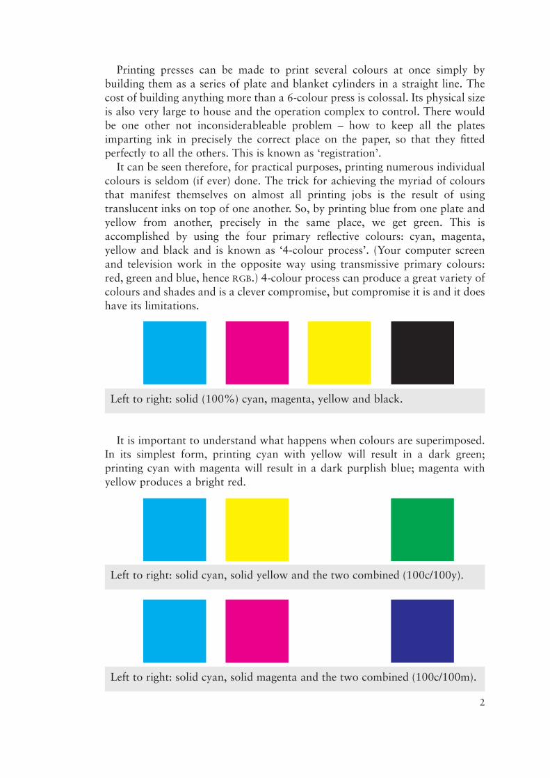
Printing presses can be made to print several colours at once simply bybuilding them as a series of plate and blanket cylinders in a straight line. Thecost of building anything more than a 6-colour press is colossal. Its physical sizeis also very large to house and the operation complex to control. There wouldbe one other not inconsiderableable problem – how to keep all the platesimparting ink in precisely the correct place on the paper, so that they fittedperfectly to all the others. This is known as ‘registration’.
It can be seen therefore, for practical purposes, printing numerous individualcolours is seldom (if ever) done. The trick for achieving the myriad of coloursthat manifest themselves on almost all printing jobs is the result of usingtranslucent inks on top of one another. So, by printing blue from one plate andyellow from another, precisely in the same place, we get green. This isaccomplished by using the four primary reflective colours: cyan, magenta,yellow and black and is known as ‘4-colour process’. (Your computer screenand television work in the opposite way using transmissive primary colours:red, green and blue, hence RGB.) 4-colour process can produce a great variety ofcolours and shades and is a clever compromise, but compromise it is and it doeshave its limitations.
It is important to understand what happens when colours are superimposed.In its simplest form, printing cyan with yellow will result in a dark green;printing cyan with magenta will result in a dark purplish blue; magenta withyellow produces a bright red.
2
Left to right: solid (100%) cyan, magenta, yellow and black.
Left to right: solid cyan, solid yellow and the two combined (100c/100y).
Left to right: solid cyan, solid magenta and the two combined (100c/100m).

But what if light green is wanted? One answer would be to dilute the ink butthis causes other difficulties. If the cyan ink is weakened we could indeed getlight green, but then we would also get light mauve when combined withmagenta and we might not want that. Therefore there has to be a different wayto control ‘weakening’ of the colour in selected areas, and it is found in theprocess prior to the printing press being brought into use. Where did that imageon the printing plate come from?
In the early days of litho printing, the image was engraved directly onto theplate and there was little room for errors to be rectified. The present computermethodology allows the image to come direct from computer files. In the daysbefore computers the images on the plates were produced by a photographicprocess, it having been exposed from either a film negative or film positive.Again there are exceptions, but usually it was only practical to make oneexposure to the plate, and for reasons that will become apparent farther on,complex images to plate were usually made from positives.
When we view a conventional ‘snapshot’ photographic print (also nowalmost completely a thing of the past), we see continuously variable tones fromthe full spectrum of visual colours. Without wishing to go into the realities ofhow this is achieved, suffice it to say that litho printing does not work in thesame way. It is not possible to print lighter shades of the colour ink being usedwith predictable results; the colour of ink being applied is usually reproduced tothe full strength as it comes out of the tin. (This isn’t quite true but explainingwhy not is beyond the scope of this piece.)
Examine now what a black & whitephotograph reproduced in a newspaper lookslike and one phenomenon immediately becomesobvious – it is made up entirely of dots. Lookclosely under a magnifying glass and it can beseen that all those dots are the same density ofblack; there are no light, medium or dark greyones, nor any shades in between. This particularillusion of a full range of tints is accounted forsimply by the varying size of the dots. Thebigger the dot the darker the apparent tint. Andall achievable simply because the humaneye/brain combination is unable to resolve theimage in such tiny detail – so we ‘see’ a picture.
3
Left to right: solid magenta, solid yellow and combined (100m/100y).
In this enlargement, alldots are clearly solid black.
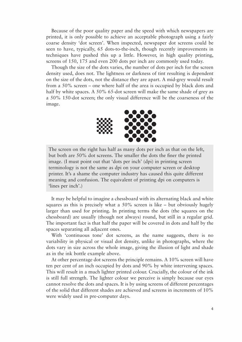
Because of the poor quality paper and the speed with which newspapers areprinted, it is only possible to achieve an acceptable photograph using a fairlycoarse density ‘dot screen’. When inspected, newspaper dot screens could beseen to have, typically, 65 dots-to-the-inch, though recently improvements intechniques have pushed this up a little. However, in high quality printing,screens of 150, 175 and even 200 dots per inch are commonly used today.
Though the size of the dots varies, the number of dots per inch for the screendensity used, does not. The lightness or darkness of tint resulting is dependenton the size of the dots, not the distance they are apart. A mid-grey would resultfrom a 50% screen – one where half of the area is occupied by black dots andhalf by white spaces. A 50% 65-dot screen will make the same shade of grey asa 50% 150-dot screen; the only visual difference will be the coarseness of theimage.
It may be helpful to imagine a chessboard with its alternating black and whitesquares as this is precisely what a 50% screen is like – but obviously hugelylarger than used for printing. In printing terms the dots (the squares on thechessboard) are usually (though not always) round, but still in a regular grid.The important fact is that half the paper will be covered in dots and half by thespaces separating all adjacent ones.
With ‘continuous tone’ dot screens, as the name suggests, there is novariability in physical or visual dot density, unlike in photographs, where thedots vary in size across the whole image, giving the illusion of light and shadeas in the ink bottle example above.
At other percentage dot screens the principle remains. A 10% screen will haveten per cent of an inch occupied by dots and 90% by white intervening spaces.This will result in a much lighter printed colour. Crucially, the colour of the inkis still full strength. The lighter colour we perceive is simply because our eyescannot resolve the dots and spaces. It is by using screens of different percentagesof the solid that different shades are achieved and screens in increments of 10%were widely used in pre-computer days.
4
The screen on the right has half as many dots per inch as that on the left,but both are 50% dot screens. The smaller the dots the finer the printedimage. (I must point out that ‘dots per inch’ (dpi) in printing screenterminology is not the same as dpi on your computer screen or desktopprinter. It’s a shame the computer industry has caused this quite differentmeaning and confusion. The equivalent of printing dpi on computers is‘lines per inch’.)
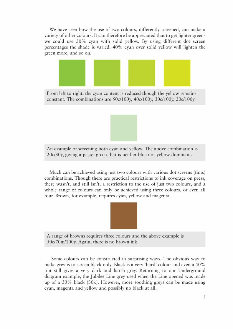
We have seen how the use of two colours, differently screened, can make avariety of other colours. It can therefore be appreciated that to get lighter greenswe could use 50% cyan with solid yellow. By using different dot screenpercentages the shade is varied: 40% cyan over solid yellow will lighten thegreen more, and so on.
Much can be achieved using just two colours with various dot screens (tints)combinations. Though there are practical restrictions to ink coverage on press,there wasn’t, and still isn’t, a restriction to the use of just two colours, and awhole range of colours can only be achieved using three colours, or even allfour. Brown, for example, requires cyan, yellow and magenta.
Some colours can be constructed in surprising ways. The obvious way tomake grey is to screen black only. Black is a very ‘hard’ colour and even a 50%tint still gives a very dark and harsh grey. Returning to our Undergrounddiagram example, the Jubilee Line grey used when the Line opened was madeup of a 30% black (30k). However, more soothing greys can be made usingcyan, magenta and yellow and possibly no black at all.
5
A range of browns requires three colours and the above example is50c/70m/100y. Again, there is no brown ink.
From left to right, the cyan content is reduced though the yellow remainsconstant. The combinations are 50c/100y, 40c/100y, 30c/100y, 20c/100y.
An example of screening both cyan and yellow. The above combination is20c/30y, giving a pastel green that is neither blue nor yellow dominant.
All this only works because the inks are translucent, allowing light to passthrough them. (Inappropriately, they are referred to in the trade as ‘transparentinks’; if they were truly transparent, we wouldn’t see them at all.)
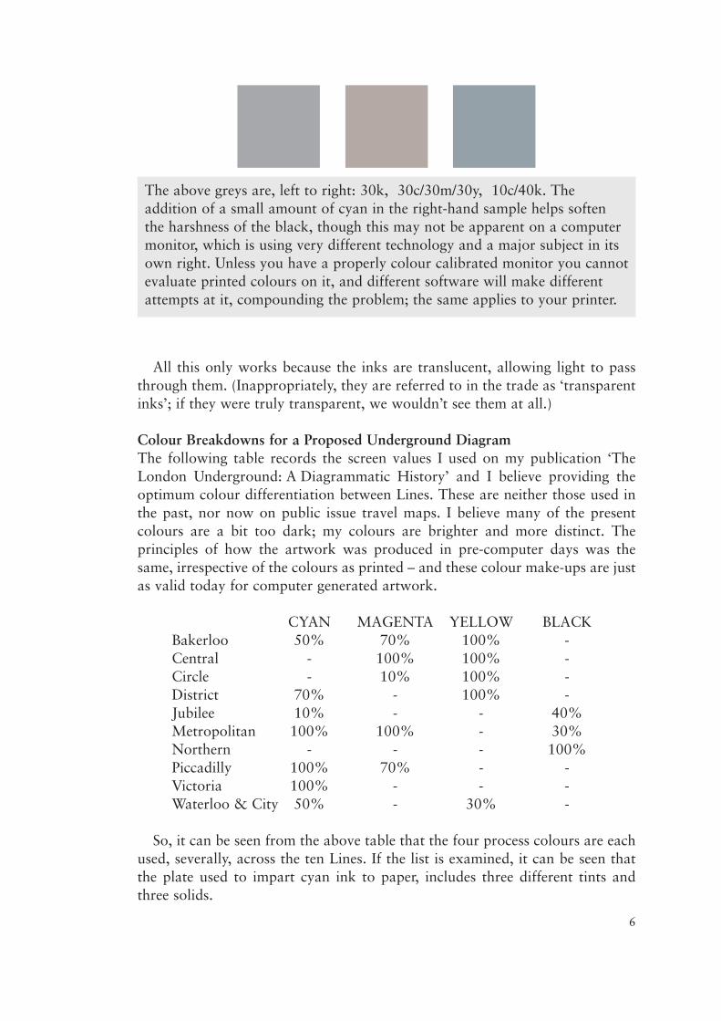
Colour Breakdowns for a Proposed Underground DiagramThe following table records the screen values I used on my publication ‘TheLondon Underground: A Diagrammatic History’ and I believe providing theoptimum colour differentiation between Lines. These are neither those used inthe past, nor now on public issue travel maps. I believe many of the presentcolours are a bit too dark; my colours are brighter and more distinct. Theprinciples of how the artwork was produced in pre-computer days was thesame, irrespective of the colours as printed – and these colour make-ups are justas valid today for computer generated artwork.
CYAN MAGENTA YELLOW BLACKBakerloo 50% 70% 100% -Central - 100% 100% -Circle - 10% 100% -District 70% - 100% -Jubilee 10% - - 40%Metropolitan 100% 100% - 30%Northern - - - 100%Piccadilly 100% 70% - -Victoria 100% - - -Waterloo & City 50% - 30% -
So, it can be seen from the above table that the four process colours are eachused, severally, across the ten Lines. If the list is examined, it can be seen thatthe plate used to impart cyan ink to paper, includes three different tints andthree solids.
6
The above greys are, left to right: 30k, 30c/30m/30y, 10c/40k. Theaddition of a small amount of cyan in the right-hand sample helps softenthe harshness of the black, though this may not be apparent on a computermonitor, which is using very different technology and a major subject in itsown right. Unless you have a properly colour calibrated monitor you cannotevaluate printed colours on it, and different software will make differentattempts at it, compounding the problem; the same applies to your printer.
The Drawing Origination ‘Overlays’It is now appropriate to see how the original images were produced inpreparation for the photographic process that followed, which later on allowedthe four plates to be made.
The basic principle was that every image that eventually needed to be printedas a visually different colour, or shade of a different colour, was created on aseparate piece of material called an ‘overlay’. From the above table it can beinferred that ten overlays would be needed (ignoring station names for now).
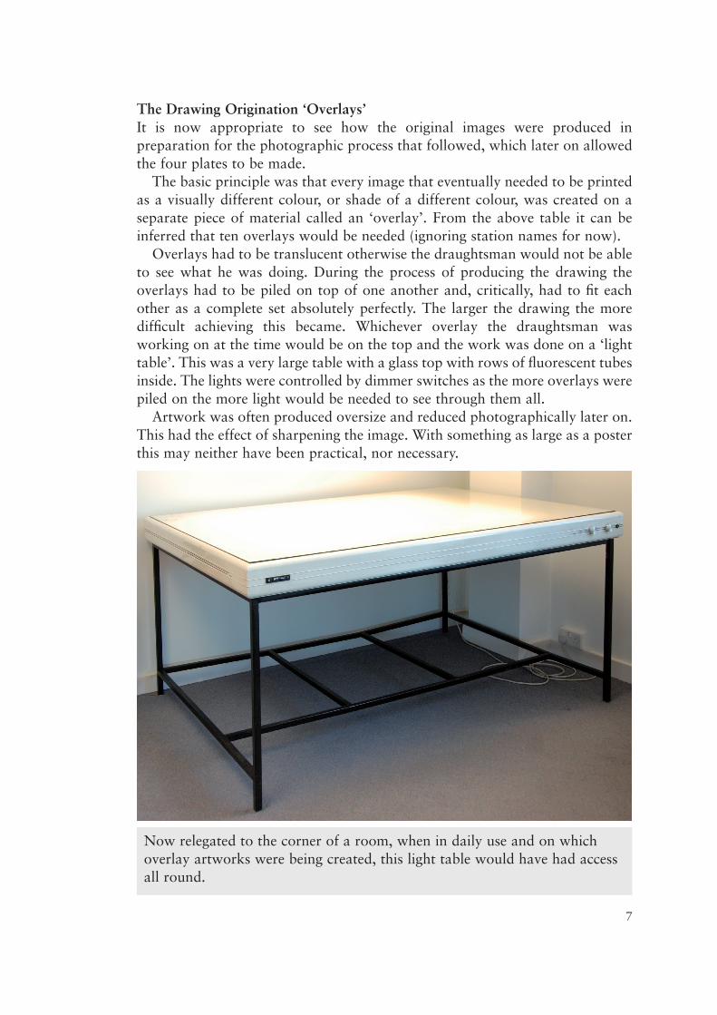
Overlays had to be translucent otherwise the draughtsman would not be ableto see what he was doing. During the process of producing the drawing theoverlays had to be piled on top of one another and, critically, had to fit eachother as a complete set absolutely perfectly. The larger the drawing the moredifficult achieving this became. Whichever overlay the draughtsman wasworking on at the time would be on the top and the work was done on a ‘lighttable’. This was a very large table with a glass top with rows of fluorescent tubesinside. The lights were controlled by dimmer switches as the more overlays werepiled on the more light would be needed to see through them all.
Artwork was often produced oversize and reduced photographically later on.This had the effect of sharpening the image. With something as large as a posterthis may neither have been practical, nor necessary.
7
Now relegated to the corner of a room, when in daily use and on whichoverlay artworks were being created, this light table would have had accessall round.
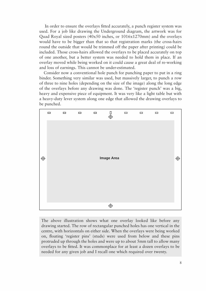
In order to ensure the overlays fitted accurately, a punch register system wasused. For a job like drawing the Underground diagram, the artwork was forQuad Royal sized posters (40x50 inches, or 1016x1270mm) and the overlayswould have to be bigger than that so that registration marks (the cross-hairsround the outside that would be trimmed off the paper after printing) could beincluded. Those cross-hairs allowed the overlays to be placed accurately on topof one another, but a better system was needed to hold them in place. If anoverlay moved while being worked on it could cause a great deal of re-workingand loss of earnings. This cannot be under-estimated.
Consider now a conventional hole punch for punching paper to put in a ringbinder. Something very similar was used, but massively larger, to punch a rowof three to nine holes (depending on the size of the image) along the long edgeof the overlays before any drawing was done. The ‘register punch’ was a big,heavy and expensive piece of equipment. It was very like a light table but witha heavy-duty lever system along one edge that allowed the drawing overlays tobe punched.
8
The above illustration shows what one overlay looked like before anydrawing started. The row of rectangular punched holes has one vertical in thecentre, with horizontals on either side. When the overlays were being workedon, floating ‘register pins’ (studs) were used from below and these pinsprotruded up through the holes and were up to about 5mm tall to allow manyoverlays to be fitted. It was commonplace for at least a dozen overlays to beneeded for any given job and I recall one which required over twenty.
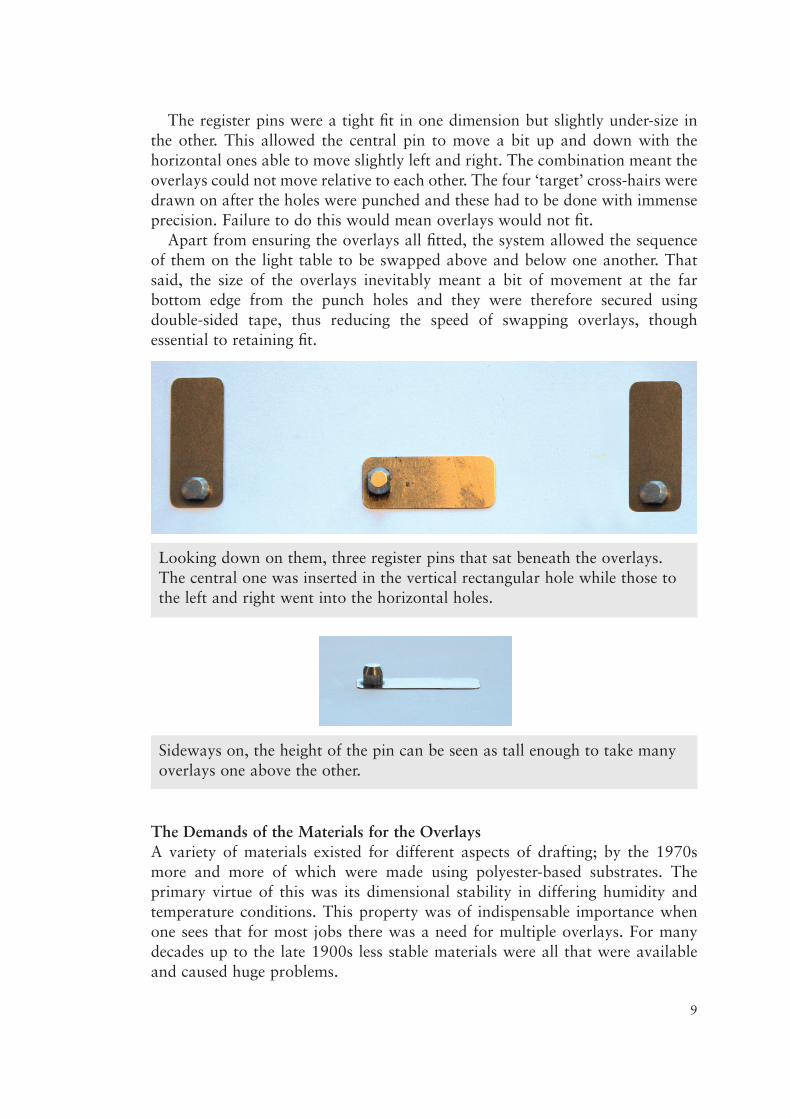
The register pins were a tight fit in one dimension but slightly under-size inthe other. This allowed the central pin to move a bit up and down with thehorizontal ones able to move slightly left and right. The combination meant theoverlays could not move relative to each other. The four ‘target’ cross-hairs weredrawn on after the holes were punched and these had to be done with immenseprecision. Failure to do this would mean overlays would not fit.
Apart from ensuring the overlays all fitted, the system allowed the sequenceof them on the light table to be swapped above and below one another. Thatsaid, the size of the overlays inevitably meant a bit of movement at the farbottom edge from the punch holes and they were therefore secured usingdouble-sided tape, thus reducing the speed of swapping overlays, thoughessential to retaining fit.
The Demands of the Materials for the OverlaysA variety of materials existed for different aspects of drafting; by the 1970smore and more of which were made using polyester-based substrates. Theprimary virtue of this was its dimensional stability in differing humidity andtemperature conditions. This property was of indispensable importance whenone sees that for most jobs there was a need for multiple overlays. For manydecades up to the late 1900s less stable materials were all that were availableand caused huge problems.
9
Looking down on them, three register pins that sat beneath the overlays.The central one was inserted in the vertical rectangular hole while those tothe left and right went into the horizontal holes.
Sideways on, the height of the pin can be seen as tall enough to take manyoverlays one above the other.
In order that the overlays could be reproduced to a high quality, thephotographic techniques required them to be exposed to film by intense ultraviolet light and this dictated that only dense black or red images be used for theoriginal drawings, so the light could not penetrate the image areas. The colourinks that eventually represented these images on paper had no bearing on whatcolour they looked like on the original overlays. Irrespective of printed colour,all overlays had images only in ultra-violet resistant black or red. Today’sconcept of designing on a computer screen and experimenting with colours didnot exist then and the draughtsman would have to refer to colour charts and alot of imagination until completion of the artwork. It was only at proof stagethat any semblance of colour reality could be assessed.
‘Repro’ (jargon for ‘reproduction’)It may seem that I am jumping out of sequence now, but as stated earlier on, nodrawing of artwork could be contemplated without due deference to how itwould be used to make the printing films, and from those, the printing plates.
The type of film used for this ‘repro’ work was called Lith Film; it was a veryhigh contrast film that reproduced only total black on the developed film, ornothing at all. In other words, it did not record light and shade as on pan -chromatic, continuous tone, (‘snapshot’) film. The two drawing colours thatbest resist exposure to it are as stated above, black and red – but even these hadto be dense images that completely resisted the passing of light through them atthe time the image was exposed to the lith film. At some point between drawingand printing, for practical purposes, most overlays would need to exist both inpositive and negative form.
That apart, in some circumstances there was also virtue in keeping items thatwould eventually reproduce in identical colours on separate overlays. Therefore,though the Underground diagram’s grid was reproduced in Victoria Line blue,it had also appeared in black in other editions. By keeping the grid on a separateoverlay from those of the Victoria and Northern Lines, this provided nodifficulty. Indeed, with it separated onto its own overlay, there was no reasonwhy it could not be green, red or any other colour. In addition to the tenoverlays in the table above that represent the individual Underground Lines,these others can be added to our colour breakdown list.
CYAN MAGENTA YELLOW BLACKBorder/Grid 100% - - -River Thames 30% - - -
If further colours were required, the draughtsman simply made furtheroverlays and the list got longer. There was no theoretical limit to how manyoverlays could exist for any job, though the practicalities of maintainingaccurate registration when a draughtsman could be looking through severalsheets of drawing films, must be kept in mind. It could get very complex.
10
Drawing Techniques of the 1960s to 1980sI cannot say when the following methods and techniques started and as with alltechnologies, they had evolved and didn’t start or finish to nice neat historicaldecades. My own involvement started in the mid 1960s and most of what I amabout to describe had taken a firm foothold by then, but got more sophisticated.
Strictly speaking, over the final twenty or so years of these techniques, therewas less and less ‘drawing’ in the true sense of the word. Whilst a pen and inkwas still sometimes used for some fine linework, other more versatile techniqueshad largely supplanted them on the grounds of both speed and quality.
The creation of a set of overlays could be achieved in a variety of ways; noone technique was suited to every kind of job.
Positive Overlays – MaterialsI must say from the outset that there were many different drawing materialsavailable over the years, in both standardized cut sheet sizes and also in rollform. They varied in translucency but all were very easy to see through, thoughnone was glassy clear. It is impractical to go into detail here so I will concentrateon those I used most extensively.
As noted above, most, if not all, overlays would need to exist in both positiveand negative as a means to the eventual end. As such, some original overlayswould be produced in positive and some in negative, according to convenienceand practicalities.
Fine linework could be drawn in ink, in positive, or ‘scribed’ negative in aprocess very similar to etching, more of which below. For positive drawing,there were many choices and, crucially, the right black ink was an essentialpartner to the material. Some inks worked well on some materials but werehopeless on others. The two materials that most dominated my work wereAstrafoil (trade name) and Ozatex (trade name).
Astrafoil was available in flat sheets in three imperial thicknesses – 0.003”,0.005” and 0.010”. Much storage space was therefore required for the drawingoffice stock. It provided a really pleasing surface on which to draw and the inksused would not be allowed nowadays owing to their oil-based chemicalcomposition (see Appendix). These inks actually etched into the Astrafoil assoon as they dried (which could take a minute or so). There were many issues.
Astrafoil had a gloss surface one side but matt for the drawing on the other.The surface could not be drawn onto until it had been rubbed down with amedium hardness rubber. The ink would not take otherwise. Astrafoil was notparticularly dimensionally stable and would expand and contract over time.Bearing in mind, with revisions, these overlays could be used for years.
It also had another serious drawback – it was very brittle and easy to shatterif not handled with care. (The thinnest gauge was almost unusable if you somuch as breathed on it.) I expect readers can imagine the draughtsman’s (andhis boss’s) displeasure when an overlay shattered after weeks of work and theliklihood was starting again. (Computers exert the same dismay on us when wedelete a file by accident and have no back up.)
11
As can be imagined, ink that had etched into the surface could be timeconsuming to remove when revising. It had to be scraped off with a sharp flatblade and the slight groove the etching ink had caused made smooth with thesame implement. This required skill. Without a flat surface, that again had to berubbed down, it was impossible to draw something new over it.
Ozatex (and others similar from other manufacturers) solved a lot of this, butcame with its own drawbacks. It too was available as flat sheets and also inrolls, the latter of which were obviously easier to store, though it could be anuisance to get flat when cutting from near the end of the roll.
The surface didn’t need any preparation and either side could be drawn on.It was polyester based and so dimensionally very stable, furthermore the inksdid not etch and were therefore easier to scrape away for revision.
Positive Overlays – Drawing InstrumentsMany readers will be familiar with Rotring-type (another brand name) pens andthere were others. I detested these as the only inks that would work in themwere too watery and producing lines black enough for repro was almostunachievable. Even with the thinner inks essential for them to work at all, theystill clogged up all the time. One also needed a range of them to draw differentline thicknesses. In my world, they had no redeeming features whatsoever.
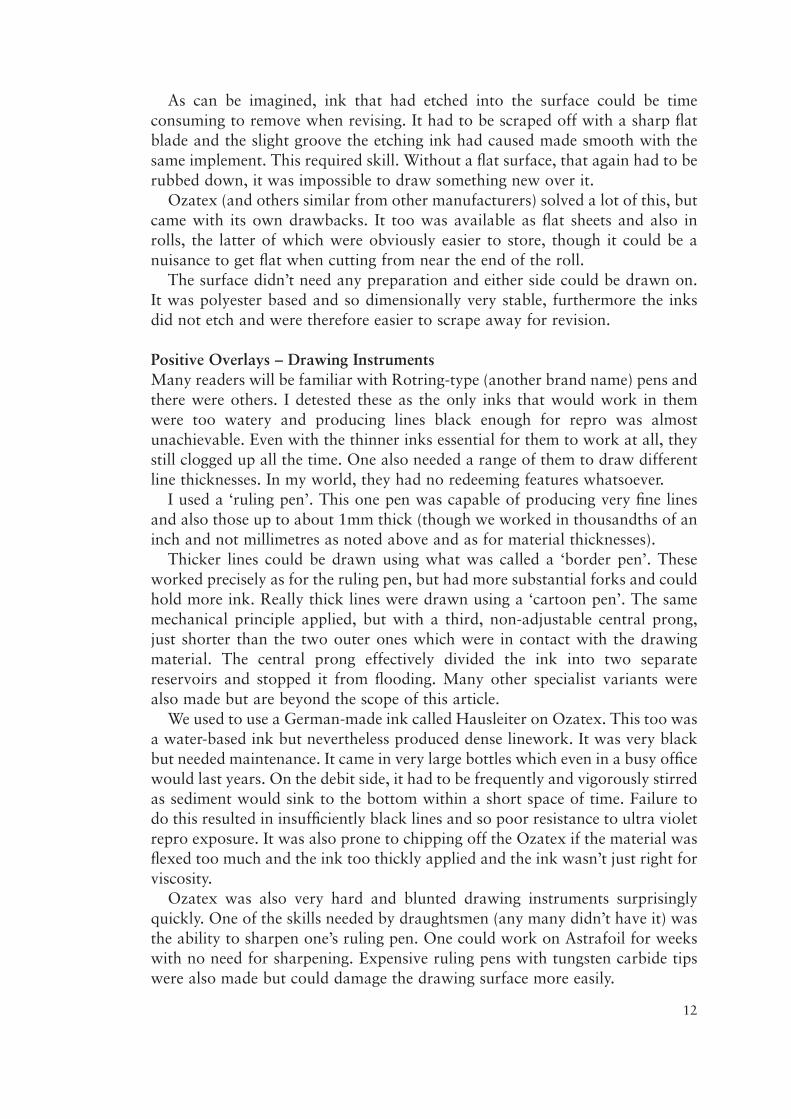
I used a ‘ruling pen’. This one pen was capable of producing very fine linesand also those up to about 1mm thick (though we worked in thousandths of aninch and not millimetres as noted above and as for material thicknesses).
Thicker lines could be drawn using what was called a ‘border pen’. Theseworked precisely as for the ruling pen, but had more substantial forks and couldhold more ink. Really thick lines were drawn using a ‘cartoon pen’. The samemechanical principle applied, but with a third, non-adjustable central prong,just shorter than the two outer ones which were in contact with the drawingmaterial. The central prong effectively divided the ink into two separatereservoirs and stopped it from flooding. Many other specialist variants werealso made but are beyond the scope of this article.
We used to use a German-made ink called Hausleiter on Ozatex. This too wasa water-based ink but nevertheless produced dense linework. It was very blackbut needed maintenance. It came in very large bottles which even in a busy officewould last years. On the debit side, it had to be frequently and vigorously stirredas sediment would sink to the bottom within a short space of time. Failure todo this resulted in insufficiently black lines and so poor resistance to ultra violetrepro exposure. It was also prone to chipping off the Ozatex if the material wasflexed too much and the ink too thickly applied and the ink wasn’t just right forviscosity.
Ozatex was also very hard and blunted drawing instruments surprisinglyquickly. One of the skills needed by draughtsmen (any many didn’t have it) wasthe ability to sharpen one’s ruling pen. One could work on Astrafoil for weekswith no need for sharpening. Expensive ruling pens with tungsten carbide tipswere also made but could damage the drawing surface more easily.
12

13
On the left is a ruling pen. The two forks were kept apart by a small thumbwheel. Turning the stiff wheel allowed the forks to be opened or closed toincrease or decrease the line thickness produced by the ink that was inbetween. The ink was necessarily quite viscous so as to not pour out theend. It was essential to keep the pen vertical to produce crisp lines.
In the centre and right is a ‘contour pen’ which worked to the sameprinciple but had an offset swivel (like a shopping trolley wheel). Whereas aruling pen was used along a straight edge, a contour pen was used freehand,but still upright, for drawing continuously changing wavy lines. Masteringthese took some time.
The four illustrations on the left show the ruling pen’s adjustability andability to draw different thickness lines. The two in the middle represent aborder pen, with its broader forks and so greater ink capacity, though itcould not actually draw lines much thicker than a standard ruling pen. Forreally thick lines a ‘cartoon pen’ was needed, as seen to the right.
Negative Overlays – MaterialsThere were two principle options in regular use – one for ‘scribing’ and one for‘peel coat’. Scribing was suited to fine linework, up to about 1mm thick,whereas peel coat for thicker ones, and also for larger irregular area shapes.
For fine linework we used a material called ‘Stabiline’ (brand name) and twodifferent tools, a ‘straight line scriber’ and a swivel ‘tripod’, the former doingthe equivalent job of a ruling pen and the latter to that of a contour pen. Theyused sapphire chisel tips, more of which below.
Stabiline was a completely clear polyester base material, but with one surfaceorange powder coated, not entirely resistant to ultra violet light, but usable withlesser exposures. The sapphire chisel tips scraped away the coating revealing theclear base material and effectively creating an orange negative.
Peel coat materials, colloquially known as ‘cut & strip’, were widely used forphotographic masking in ‘repro’ houses as well as for ‘drawing’ bydraughtsmen. (I can’t go into this here.) The material usually came in rolls, andhad a clear polyester base film with a thin translucent red membrane adheringto one surface. There were several makes and qualities.
The use of this material for ‘drawing’ is less easy to picture for the layman.To get the basics out of the way, it must be understood there were no pens orinks used – just knives. Cut & strip also produced negatives in the same way asStabiline, it was just that the lines were thicker – limitlessly thick.
When an area of this membrane was cut through with a blade, it was thenpossible to peel it away from the base film revealing the clear base underneathand thus creating a negative image. Only the red membrane was peeled away;the substrate was not cut through at all. Care was needed.
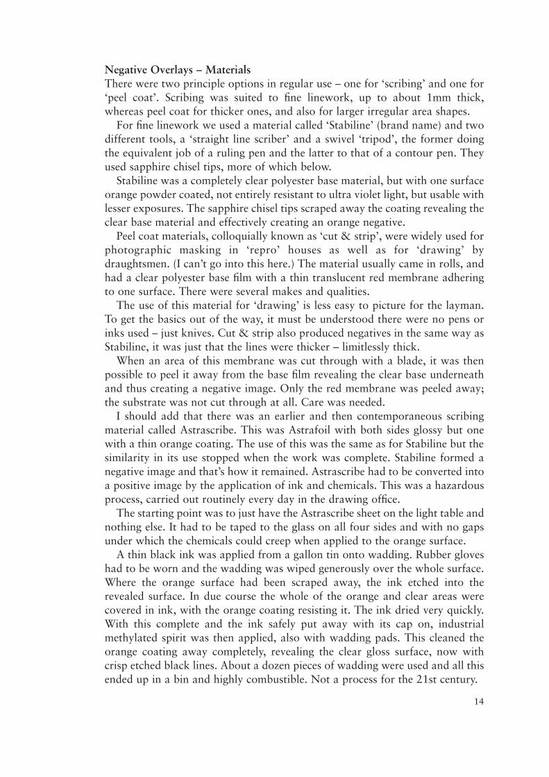
I should add that there was an earlier and then contemporaneous scribingmaterial called Astrascribe. This was Astrafoil with both sides glossy but onewith a thin orange coating. The use of this was the same as for Stabiline but thesimilarity in its use stopped when the work was complete. Stabiline formed anegative image and that’s how it remained. Astrascribe had to be converted intoa positive image by the application of ink and chemicals. This was a hazardousprocess, carried out routinely every day in the drawing office.
The starting point was to just have the Astrascribe sheet on the light table andnothing else. It had to be taped to the glass on all four sides and with no gapsunder which the chemicals could creep when applied to the orange surface.
A thin black ink was applied from a gallon tin onto wadding. Rubber gloveshad to be worn and the wadding was wiped generously over the whole surface.Where the orange surface had been scraped away, the ink etched into therevealed surface. In due course the whole of the orange and clear areas werecovered in ink, with the orange coating resisting it. The ink dried very quickly.With this complete and the ink safely put away with its cap on, industrialmethylated spirit was then applied, also with wadding pads. This cleaned theorange coating away completely, revealing the clear gloss surface, now withcrisp etched black lines. About a dozen pieces of wadding were used and all thisended up in a bin and highly combustible. Not a process for the 21st century.
14
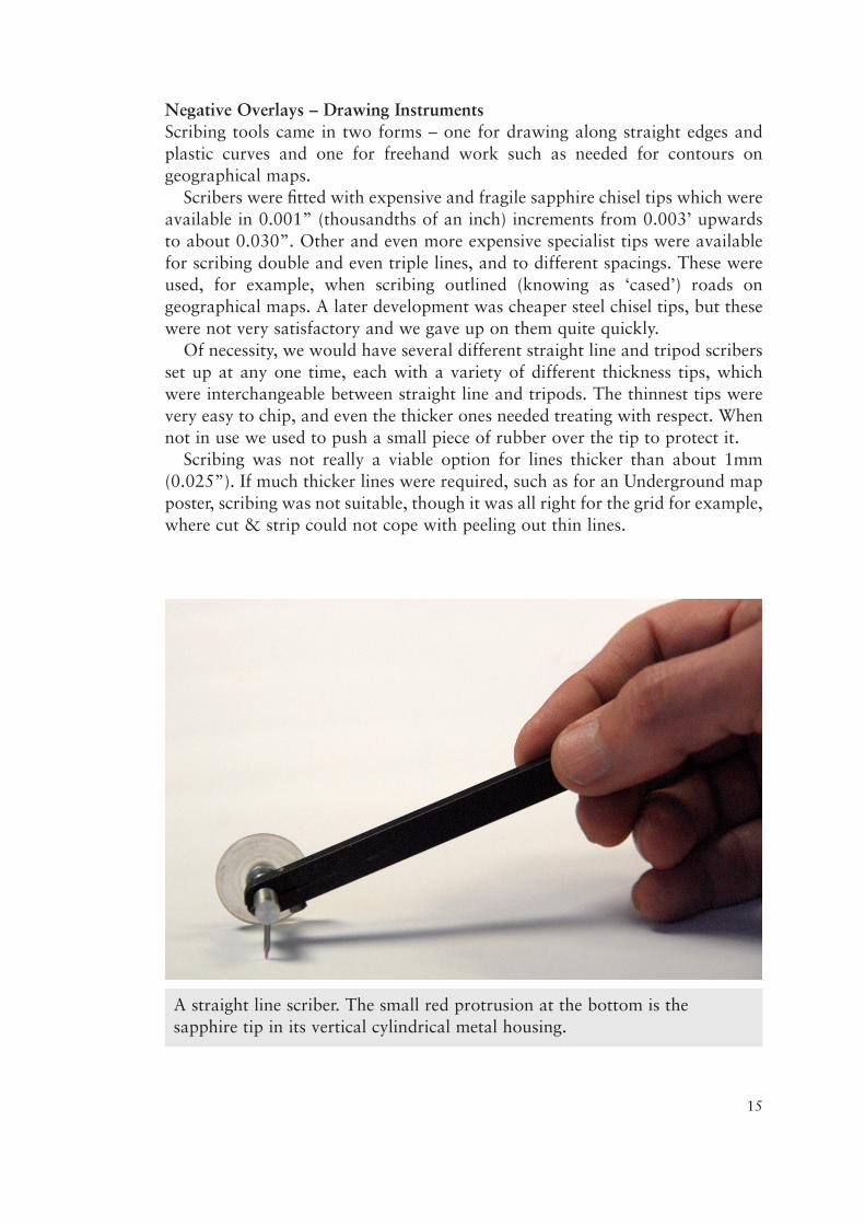
Negative Overlays – Drawing InstrumentsScribing tools came in two forms – one for drawing along straight edges andplastic curves and one for freehand work such as needed for contours ongeographical maps.
Scribers were fitted with expensive and fragile sapphire chisel tips which wereavailable in 0.001” (thousandths of an inch) increments from 0.003’ upwardsto about 0.030”. Other and even more expensive specialist tips were availablefor scribing double and even triple lines, and to different spacings. These wereused, for example, when scribing outlined (knowing as ‘cased’) roads ongeographical maps. A later development was cheaper steel chisel tips, but thesewere not very satisfactory and we gave up on them quite quickly.
Of necessity, we would have several different straight line and tripod scribersset up at any one time, each with a variety of different thickness tips, whichwere interchangeable between straight line and tripods. The thinnest tips werevery easy to chip, and even the thicker ones needed treating with respect. Whennot in use we used to push a small piece of rubber over the tip to protect it.
Scribing was not really a viable option for lines thicker than about 1mm(0.025”). If much thicker lines were required, such as for an Underground mapposter, scribing was not suitable, though it was all right for the grid for example,where cut & strip could not cope with peeling out thin lines.
15
A straight line scriber. The small red protrusion at the bottom is thesapphire tip in its vertical cylindrical metal housing.
16
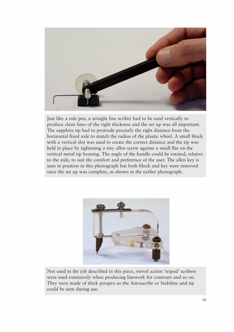
Just like a rule pen, a straight line scriber had to be used vertically toproduce clean lines of the right thickness and the set up was all important.The sapphire tip had to protrude precisely the right distance from thehorizontal fixed axle to match the radius of the plastic wheel. A small blockwith a vertical slot was used to create the correct distance and the tip washeld in place by tightening a tiny allen screw against a small flat on thevertical metal tip housing. The angle of the handle could be rotated, relativeto the axle, to suit the comfort and preference of the user. The allen key isseen in position in this photograph but both block and key were removedonce the set up was complete, as shown in the earlier photograph.
Not used in the job described in this piece, swivel action ‘tripod’ scriberswere used extensively when producing linework for contours and so on.They were made of thick perspex so the Astrascribe or Stabiline and tipcould be seen during use.
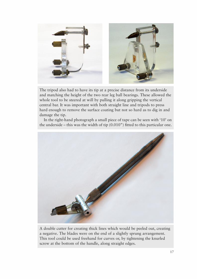
17
The tripod also had to have its tip at a precise distance from its undersideand matching the height of the two rear leg ball bearings. These allowed thewhole tool to be steered at will by pulling it along gripping the verticalcentral bar. It was important with both straight line and tripods to presshard enough to remove the surface coating but not so hard as to dig in anddamage the tip.
In the right-hand photograph a small piece of tape can be seen with ‘10’ onthe underside – this was the width of tip (0.010”) fitted to this particular one.
A double cutter for creating thick lines which would be peeled out, creatinga negative. The blades were on the end of a slightly sprung arrangement.This tool could be used freehand for curves or, by tightening the knurledscrew at the bottom of the handle, along straight edges.
Creating the Design (an Underground Diagram in this Example)Having reviewed the principal instruments in daily use, I can now move ontothe process of using them to create the overlays which each carried theindividual colour components. I am only using an Underground diagram toexplain the principles of how overlay artwork was constructed, because it is anevery day item familiar to most readers. However, these principles were just asapplicable to all manner of proper geographical maps – and pretty muchanything that was going to be printed in colour.
At this point it must be understood that a draughtsmen and/or cartographerscouldn’t easily just start the creative process out of their heads. Makingalterations as one went along was not viable owing to its time-consuming andfiddly nature. The ease with which computers afford alterations progressivelyand at will must be expunged from your thoughts – this simply didn’t happenin ‘manual’ days.
It may be supposed that each Underground Line would be produced, one ata time, but this wouldn’t work as no matter how carefully the design had beendrafted, the design would inevitably be subtly adjusted as work progressed. Thedesign would have had to have been very carefully worked out complete on asheet of Ozatex, as a pencil draft – this being much easier rub out, alter and getright. Over a very large plastic sheet of graph paper, the geometric layout wassketched, simulating lines about 5mm thick, using parallel pencil lines.
The approach to designing a railway network diagram is quite unlike that fora geographical map and I cannot go into the detail here. In brief, designing anUnderground ‘map’ requires understanding the visual balance to be struckbetween line thickness, typeface and station name typesize. The rigid constraintsof the geometry cause the lines to be projected around the station names. Inother words, the names have to be positioned first and the lines constructedaround them, ensuring sufficient space to avoid ambiguity. This is counter-intuitive and not the approach for geographical maps. (This is equally true whenusing a computer and many ‘designers’ would benefit from understanding this.)
With the pencil draft complete, punched and placed on a set of register pins,
18
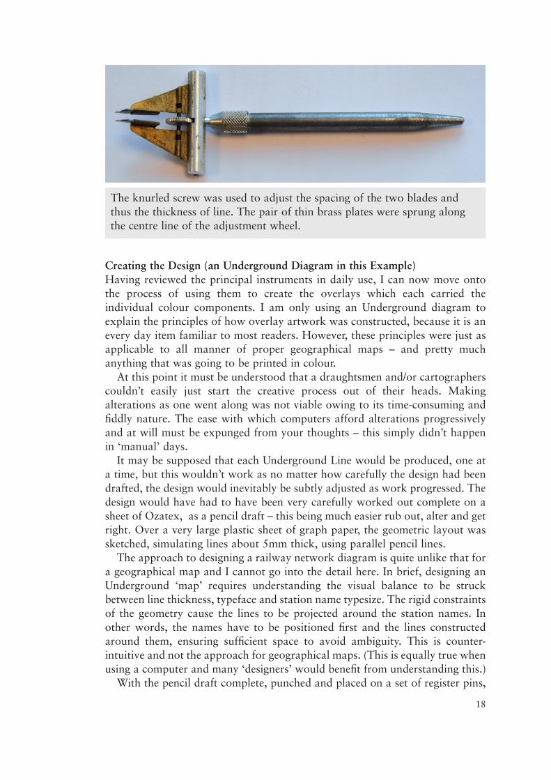
The knurled screw was used to adjust the spacing of the two blades andthus the thickness of line. The pair of thin brass plates were sprung alongthe centre line of the adjustment wheel.
work could start on the first overlay. However, as noted above, the stationnames were needed first.
I would have started by typing the names on a typewriter, in Line order,ensuring none was missed. The typed list (known unsurprisingly as a ‘type list’)would have been sent to a firm of typesetters by post and they then typed themout all over again, using the typeface I requested, and to my chosen point size.A couple of days later I would receive from them a roll of bromide (aphotographic high contrast black & white paper-like material). This was justlike getting your photographs printed. The bromide could be in severalmanageable sheets or on a roll.
Knowing that all images had to be solid positive black or negative, so as tobe able to see what I was doing, the station names overlay would need to be ona clear positive sheet with black positive type. The railway Lines would benegative red cut & strip. The black outline for part of the Circle Line would bepositive, drawn in ink. The interchange black rings would be positive black, butI wouldn’t have wanted to draw all those thick circles, importantly with whitecentres, using ink. Another technique was therefore used for the interchangerings and station names.
Lettering on any map or diagram would need to be black, irrespective of thecolour it would eventually be printed, and it needed to be on its own clearoverlay. A separate overlay would be needed for each lettering set to be printedin a different colour. I state again, at overlay stage, all lettering had to be denseblack.
The station names would need to be positioned individually and transferredfrom the white bromide sheets to a clear adhesive film. This could be done inthe office.
The PMT CameraWe had a couple of small format cameras in the office which allowed copyingthe typeset station names, from the bromides, onto a thin, clear, adhesive film,which came in a variety of convenient sizes.
PMT is the abbreviation for Photo Mechanical Transfer. The camera was verysimilar to the ‘process camera’ which would be used later to make the printingfilm positives, though the latter was enormous and far more sophisticated andversatile – more of which later.
Located in a darkroom, the image from the original (in this instance thebromide) was copied, through the PMT camera’s lens, onto a photographicallysensitive negative paper.
The paper negative was then removed from the camera and fed through a pairof rollers with a sheet of clear adhesive film. The rollers pulled them boththrough a chemical developer bath and then squeezed them together. A wait ofup to a minute was then required while the negative transferred its image to theclear film. They were then peeled apart, the paper negative discarded (they werenot re-usable) and the clear film washed in water. It was now ready to use.
The positive was a sheet of clear base film with a photographically sensitive
19
20
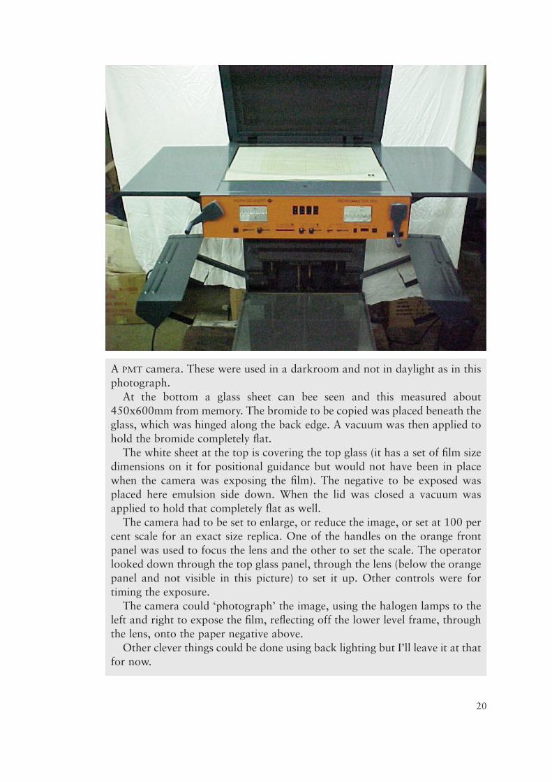
A PMT camera. These were used in a darkroom and not in daylight as in thisphotograph.
At the bottom a glass sheet can bee seen and this measured about450x600mm from memory. The bromide to be copied was placed beneath theglass, which was hinged along the back edge. A vacuum was then applied tohold the bromide completely flat.
The white sheet at the top is covering the top glass (it has a set of film sizedimensions on it for positional guidance but would not have been in placewhen the camera was exposing the film). The negative to be exposed wasplaced here emulsion side down. When the lid was closed a vacuum wasapplied to hold that completely flat as well.
The camera had to be set to enlarge, or reduce the image, or set at 100 percent scale for an exact size replica. One of the handles on the orange frontpanel was used to focus the lens and the other to set the scale. The operatorlooked down through the top glass panel, through the lens (below the orangepanel and not visible in this picture) to set it up. Other controls were fortiming the exposure.
The camera could ‘photograph’ the image, using the halogen lamps to theleft and right to expose the film, reflecting off the lower level frame, throughthe lens, onto the paper negative above.
Other clever things could be done using back lighting but I’ll leave it at thatfor now.

surface, on a paper backing sheet. The image was on the front of the film andcould therefore be damaged in use. When used, the film was cut with a scalpelaround each name and peeled off the backing, ready to be stuck to its overlay.
All the station names were now on adhesive clear film and I did the same withthe interchange rings, drawing just a few and replicating them dozens of timesonto clear adhesive film. The rings would also be cut out with a sharp scalpeland stuck in place on a clear overlay, not pressing them down to hard in casethey needed lifting and re-positioning slightly as the design grew.
The Negative Cut & Strip OverlaysWith the Ozatex draft at the bottom and the first few station names in place ontheir clear overlay, the first sheet of cut & strip was fitted on top and all theUnderground Lines cut and peeled out progressively, swapping overlaysincessantly and working outwards from the most difficult area, while alsoprogressively applying the interchange rings and station names.
The hand-held double cutter tool was used, with its pair of blades adjusted tothe right spacing. With the swivel locked to stop its action, the double cutterwas very carefully guided along a straight edge, not pressing too firmly againstit otherwise the blade spacing would be affected. Changes of line direction weredone by eye, having released the swivel lock, without the straight edge and asuniformly as possible.
The fragmented black outline for the Circle Line was drawn in positive, inink, when everything else was finished. The grid could be drawn in ink onOzatex in positive, or scribed on Stabiline in negative, according to preference.
The following pages show example sections of some of the overlays. For thisto make any kind of sense, I have first shown the finished design. This is part ofone of my own and avoids the alleged confusion some users have in trying toread more into the information than is being offered.
21
An example of a few drawn features to be duplicated onto adhesive film.The double line could be cut into appropriate short lengths to constructdifferent interchange configurations.
22
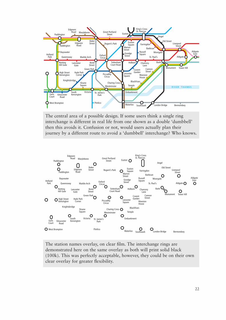
The central area of a possible design. If some users think a single ringinterchange is different in real life from one shown as a double ‘dumbbell’then this avoids it. Confusion or not, would users actually plan theirjourney by a different route to avoid a ‘dumbbell’ interchange? Who knows.
The station names overlay, on clear film. The interchange rings aredemonstrated here on the same overlay as both will print solid black(100k). This was perfectly acceptable, however, they could be on their ownclear overlay for greater flexibility.
23
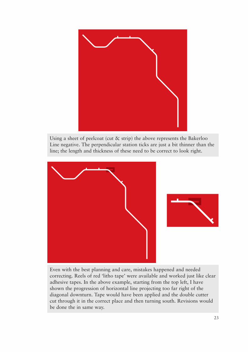
Using a sheet of peelcoat (cut & strip) the above represents the BakerlooLine negative. The perpendicular station ticks are just a bit thinner than theline; the length and thickness of these need to be correct to look right.
Even with the best planning and care, mistakes happened and neededcorrecting. Reels of red ‘litho tape’ were available and worked just like clearadhesive tapes. In the above example, starting from the top left, I haveshown the progression of horizontal line projecting too far right of thediagonal downturn. Tape would have been applied and the double cuttercut through it in the correct place and then turning south. Revisions wouldbe done the in same way.
24
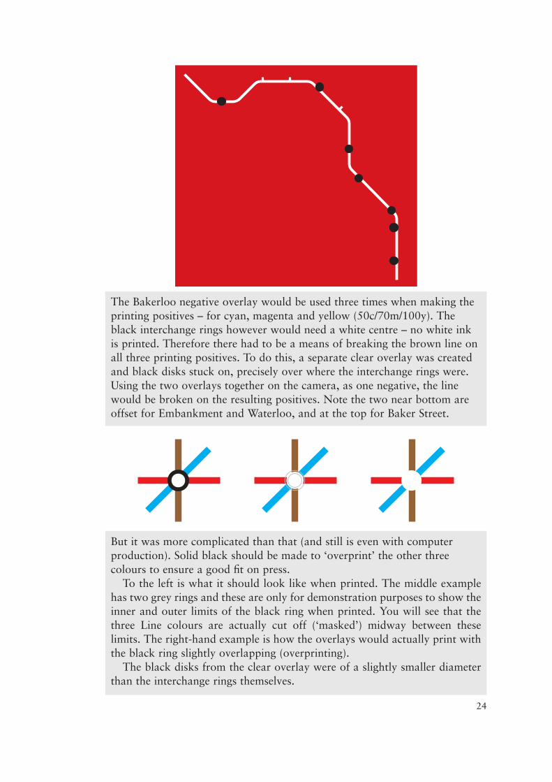
The Bakerloo negative overlay would be used three times when making theprinting positives – for cyan, magenta and yellow (50c/70m/100y). Theblack interchange rings however would need a white centre – no white inkis printed. Therefore there had to be a means of breaking the brown line onall three printing positives. To do this, a separate clear overlay was createdand black disks stuck on, precisely over where the interchange rings were.Using the two overlays together on the camera, as one negative, the linewould be broken on the resulting positives. Note the two near bottom areoffset for Embankment and Waterloo, and at the top for Baker Street.
But it was more complicated than that (and still is even with computerproduction). Solid black should be made to ‘overprint’ the other threecolours to ensure a good fit on press.
To the left is what it should look like when printed. The middle examplehas two grey rings and these are only for demonstration purposes to show theinner and outer limits of the black ring when printed. You will see that thethree Line colours are actually cut off (‘masked’) midway between theselimits. The right-hand example is how the overlays would actually print withthe black ring slightly overlapping (overprinting).
The black disks from the clear overlay were of a slightly smaller diameterthan the interchange rings themselves.

25
Top: the fragmented ‘casing’ black linework for Circle Line. The lines wereonly wanted where the yellow was not contiguous with another colour.
Centre: shown in green here for context only, the District Line positiveoverlay in its finished state, with all its gaps so as to not overlap anyadjacent colours. Note also the gaps for the interchange rings.
Bottom: shown in yellow for context, the Circle Line. Note also how thestation ticks are not allowed to intrude their adjacent coloured lines.
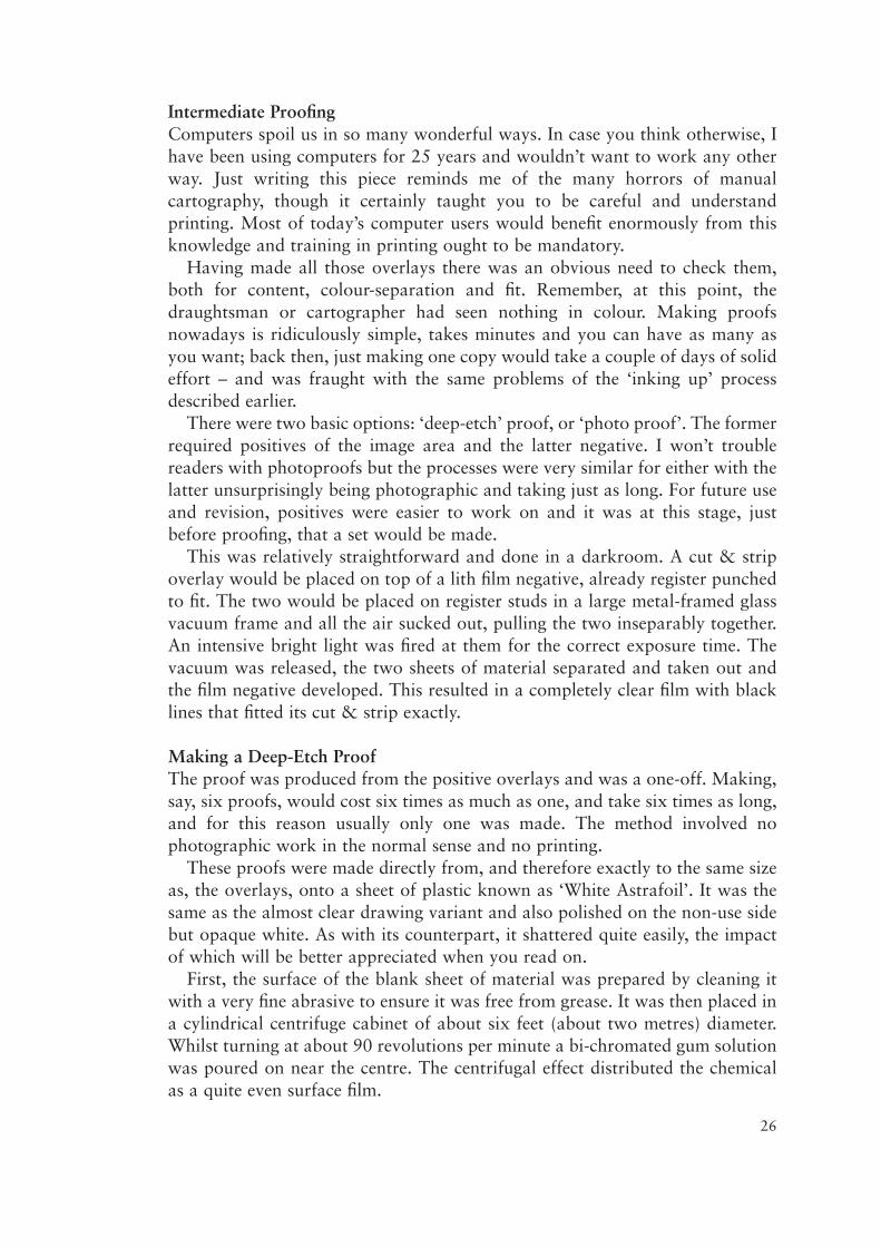
Intermediate ProofingComputers spoil us in so many wonderful ways. In case you think otherwise, Ihave been using computers for 25 years and wouldn’t want to work any otherway. Just writing this piece reminds me of the many horrors of manualcartography, though it certainly taught you to be careful and understandprinting. Most of today’s computer users would benefit enormously from thisknowledge and training in printing ought to be mandatory.
Having made all those overlays there was an obvious need to check them,both for content, colour-separation and fit. Remember, at this point, thedraughtsman or cartographer had seen nothing in colour. Making proofsnowadays is ridiculously simple, takes minutes and you can have as many asyou want; back then, just making one copy would take a couple of days of solideffort – and was fraught with the same problems of the ‘inking up’ processdescribed earlier.
There were two basic options: ‘deep-etch’ proof, or ‘photo proof’. The formerrequired positives of the image area and the latter negative. I won’t troublereaders with photoproofs but the processes were very similar for either with thelatter unsurprisingly being photographic and taking just as long. For future useand revision, positives were easier to work on and it was at this stage, justbefore proofing, that a set would be made.
This was relatively straightforward and done in a darkroom. A cut & stripoverlay would be placed on top of a lith film negative, already register punchedto fit. The two would be placed on register studs in a large metal-framed glassvacuum frame and all the air sucked out, pulling the two inseparably together.An intensive bright light was fired at them for the correct exposure time. Thevacuum was released, the two sheets of material separated and taken out andthe film negative developed. This resulted in a completely clear film with blacklines that fitted its cut & strip exactly.
Making a Deep-Etch ProofThe proof was produced from the positive overlays and was a one-off. Making,say, six proofs, would cost six times as much as one, and take six times as long,and for this reason usually only one was made. The method involved nophotographic work in the normal sense and no printing.
These proofs were made directly from, and therefore exactly to the same sizeas, the overlays, onto a sheet of plastic known as ‘White Astrafoil’. It was thesame as the almost clear drawing variant and also polished on the non-use sidebut opaque white. As with its counterpart, it shattered quite easily, the impactof which will be better appreciated when you read on.
First, the surface of the blank sheet of material was prepared by cleaning itwith a very fine abrasive to ensure it was free from grease. It was then placed ina cylindrical centrifuge cabinet of about six feet (about two metres) diameter.Whilst turning at about 90 revolutions per minute a bi-chromated gum solutionwas poured on near the centre. The centrifugal effect distributed the chemicalas a quite even surface film.
26

This was allowed to dry after which time the Astrafoil was removed from thecabinet and placed in large ‘flat bed’ glass vacuum frame. The first of theoverlays (the Central Line for example) was then placed directly onto thechemical surface and the vacuum applied, thus bringing the two sheets ofmaterial into intimate contact with one another. A bright light, high at the ultra-violet end of the spectrum, was then aimed at them having the effect of makingthe chemical areas, unprotected by the presence of a drawn image, harden; thechemical under the black line image areas on the film positive remained dry butsoluble in the developer it was about to encounter.
The vacuum was switched off, the overlay removed, and the astrafoil placedon a flat working surface. It was then flooded with developer wiped all overuntil the unhardened areas of coating (those protected by the black lines) weredissolved away leaving a ‘stencil’ of hardened gum coating. This stencil thenprotected the Astrafoil base and a coloured dye applied (red in the case of thisCentral Line example). The dye replicated as closely as practical the actualvisual colour required and was wiped on evenly with a pad of wadding acrossthe entire surface. The dye etched into the surface of the Astrafoil making apermanent image. Water was then used to wash away the hard coating,revealing the white surface again with an image in one colour (red) representingthe original overlay from which it was exposed.
The Astrafoil was then returned to the centrifuge, re-coated and exposed tothe second overlay (let’s say the District Line). This time green dye was used andthe surplus gum washed off. And so the process went on, repeatedly, onecoating, one dying up and washing off, for each overlay. At this point, for theUnderground map, at least a dozen repetitions of dying up had been gonethrough and shattering the Astrafoil at any point meant starting again.
At the end of this process a proof was available for checking the accuracy ofthings like spelling, line positioning relative to one another (registration) andthat everything was in the right colour. (It is all too easy for the draughtsman toput something on the wrong overlay – after all, he only saw black or red linesand lettering in positive and/or negative.)
The proof was also a useful tool for assessing the finer points of the design;for example, the grid, which could appear in a variety of colours, was in thecorrect one, so that its suitability can be assessed by the designer – he might seethe proof and think it would look better in a different colour. Though the aboveprocess was laborious, and therefore expensive, it was still much cheaper thanthe cost of a reprint of several thousand copies should anything be wrong.
As can be inferred from this procedure, deep-etch proofs were not made usingthe 4-colour printing process described earlier – that was for later.
After the proof had been checked and the necessary amendments made to theoverlays (and possibly the need for a second deep-etch proof) it was time toproceed to making the film positives from which the printing plates would bemade. It was at this stage that the solid images on the overlays would beconverted to their appropriate dot screen values required to make the correctcolours when on press. The great virtue of the overlay system was that by
27

reverting to the original overlays it was possible to make new printing filmpositives, as often as is desired, using different screen values, and into differentcombinations, to achieve any colour scheme required. The overlays, if handledcarefully, could support many changes of content and thus serve for numerouseditions over many years.
‘Repro’: Making the Film NegativesIt was commonplace to produce original overlays larger than would be printed.When making the final screened printing positives the photographic reductionwould have the effect of sharpening things up as noted earlier.
I have to now refer back to earlier in this piece and the discussion about dotscreens and ‘dots per inch’. These dot screens had to be applied at the finishedsize and this was not necessarily the size at which the overlays had beenproduced. The final size was determined on a ‘process camera’.
As stated, screens of different resolutions were widely available; they came inhuge film sheets. These were expensive and easy to scratch and so had to behandled and stored with great care. A repro house would have had a variety ofresolutions for use, usually at 120, 150 and 175 dots per inch and in 10%increments from ten to ninety per cent. This meant nine huge screens for eachresolution. If a solid (100%) image was required, no screen was needed at all.
If the described Underground diagram was required to be printed at differentsizes that were not hugely different, there was no reason why they could not bederived from the same overlays. However, a new set of 4-colour printingpositives would have had to be generated for each desired printed size. As statedabove, the final size was determined by the lens reduction (or none) of thecamera, but the screen was never enlarged or reduced or it would alter theresolution.
Up to now all proofing had been done from the multitude of overlays atdrawn size and not using 4-colour process. They now had to come together andat exactly the size required for printing. This coming together resulted in fourfilm positives known as a ‘4-colour set’.
The first stage of making a 4-colour set from which the printing plates wouldbe made was to set a ‘process camera’ to the appropriate reduction setting.Every overlay would be needed in negative on lith film and some in positive for‘masking’ purposes (those disks for example). The films had to be at exactly theprinting size and only when the set was complete could screens be applied.
When a full set of film negatives had been made, the high contrast nature ofthe film inevitably meant there would be minor blemishes in the form of pinholes. If left, they would show up on the printed paper and so had to becarefully painted out. A common brand of retouching fluid was ‘Photopaque’and was applied with fine sable-haired brushes in areas of small detail in a jobknown as ‘de-spotting’. It was a skilled and time-consuming job, not much fun,but essential nevertheless. It could be minimised by getting the cameraexposures optimal and eliminating dust as much as practical from the overlays,unexposed film, screens and darkroom generally.
28
29
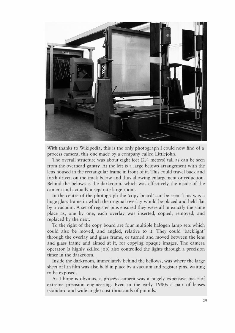
With thanks to Wikipedia, this is the only photograph I could now find of aprocess camera; this one made by a company called Littlejohn.
The overall structure was about eight feet (2.4 metres) tall as can be seenfrom the overhead gantry. At the left is a large belows arrangement with thelens housed in the rectangular frame in front of it. This could travel back andforth driven on the track below and thus allowing enlargement or reduction.Behind the belows is the darkroom, which was effectively the inside of thecamera and actually a separate large room.
In the centre of the photograph the ‘copy board’ can be seen. This was ahuge glass frame in which the original overlay would be placed and held flatby a vacuum. A set of register pins ensured they were all in exactly the sameplace as, one by one, each overlay was inserted, copied, removed, andreplaced by the next.
To the right of the copy board are four multiple halogen lamp sets whichcould also be moved, and angled, relative to it. They could ‘backlight’through the overlay and glass frame, or turned and moved between the lensand glass frame and aimed at it, for copying opaque images. The cameraoperator (a highly skilled job) also controlled the lights through a precisiontimer in the darkroom.
Inside the darkroom, immediately behind the bellows, was where the largesheet of lith film was also held in place by a vacuum and register pins, waitingto be exposed.
As I hope is obvious, a process camera was a hugely expensive piece ofextreme precision engineering. Even in the early 1980s a pair of lenses(standard and wide-angle) cost thousands of pounds.
‘Repro’: Making the Film PositivesReferring back to the tables of overlays on pages 6 and 10, it can be seen thatnine overlays needed to be combined to make the cyan film positive. With allthe negatives at the intended printed size, the camera was no longer required.Attention now turned to a plain horizontal vacuum frame which had asubstantial hinged lid. Called a ‘contact frame’, these were even bigger than thevertical equivalent on the camera and shared its darkroom space.
With yet another set of register pins used in this ‘flat bed’ frame, the firstnegative was placed onto a sheet of unexposed lith film with the relevant screenin between (or no screen if a solid image was needed). The vacuum was appliedand through the negative the film exposed to an extremely bright light. The firstnegative and screen were then removed and the second negative and appropriatescreen positioned correctly. The vacuum was re-applied and the film exposed asecond time. Every negative required, for the colour being made, was exposedthrough its appropriate screen. The astute of you will have realized that the dotscreens were negatives too. So, for example, to get a 10% positive image forprinting, a 90% screen was used to make it.
As the undeveloped film only received light through the transparent areas ofthe negative and dot screen through which it was exposed, the rest of the surfaceof the film remained unexposed. Each negative, being derived from differentoverlays which had mutually exclusive image areas, thus permitted exposurethrough its own transparent areas and prevented exposure through its blackones. Therefore, the surface of the film was progressively exposed through eachrelevant negative but never over the same part of its surface twice.
After the last exposure had been made, the film, having been subjected to nineseparate bursts of light in this example, could then be developed. What emergedwas a sheet of positive film, combined to contain the images from all nineoverlays, each screened to the appropriate percentage of dots and solids, and tothe correct size to be printed. In turn the other three film printing positives, torepresent, magenta, yellow and black, would also be made.
It can be seen from the overlay list that some negatives were used more thanonce and in conjunction with different screens. For example, the negative of theBakerloo Line was used with a 50% screen when making the cyan film positive,a 70% screen when making the magenta, and with no screen at all when makingthe yellow; it was not required for the black.
The Cromalin Colour ProofAt this stage four sheets of positive film existed, each including solid blacklinework and lines made of black dots of different sizes. Visually each of theUnderground Lines on each positive was a different shade of grey, or solidblack, or not there at all – but it was all visually still black.
As stated earlier, the lines looking like different shades of grey were merely aresult of our eyes’ inability to resolve such small black dots and the transparentspaces separating them, and whilst an experienced eye can sometimes spot anincorrect dot screen (‘tint’), it would be a brave man who would allow these
30
four film positives to be used, unchecked, for plate-making and the subsequentprinting of thousands of paper copies from them. Consider too that the fourpositives had been made completely in the dark; even with care it was notdifficult to use a negative back-to-front or with the wrong screen. A ‘Cromalin’(another brand name) colour proof was therefore made, directly from the 4-colour positive film set, so as to test and prove its accuracy of fit and colourcontent.
The purpose of this (second) colour proof was to check the correctness of thescreens on the positives, as well as how well the four films fitted each other, andindeed how well the individual exposures from each of the overlay negativesonto each of the four films fitted within them. The purpose of this proof was notto check the content nor the merits of the design or colour scheme; a lot ofexpensive work had come to this point and to go back to the overlays, alter theimages, make new negatives, re-combine to 4-colour film positive and to makeanother Cromalin colour proof, was not good financial practice.
As with the deep-etch colour proof the Cromalin was made as a one-off – thistime as four separate operations, one from each of the four screened printingpositives as opposed to one from each overlay as with a deep-etch proof.
The Cromalin base sheet of plain white plastic was covered by a taut,microscopically thin, pre-sensitised sheet of film (not dis-similar to cling-film,but thinner and more brittle) and the starting point was to punch that. With thatdone, the first printing positive was placed on top and the two brought togetherfirmly in a vacuum frame. The combination was then exposed to a principallyultra-violet light. With the vacuum then released and the printing positiveremoved, a very fine powder the same colour as the printing ink the positive willin due course represent was dusted all over. The powder adhered where theimage protected the surface during the time of exposure; elsewhere it was easilybrushed away. A second laminate of taut thin film was then stretched over thetop which both sealed the first layer of powder and, subsequently, would takethe next to its surface. One exposure and application of coloured powder wasmade for each of the four process colour printing film positives. Finally, a fifththin laminate film was stretched over the top to seal the fourth colour in place.
With the Cromalin completed, for the first time it was possible to get areasonably accurate idea of what the final image would turn out like on paper.Whilst Cromalins did not represent precisely what a printed job will look like,they approximated the colour rendering quite closely, though, being on anopaque plastic surface, often looked a little vivid.
And so to Plate and PressProviding the Cromalin had proved that all the colour tint combinations werecorrect, and that everything fitted satisfactorily, the printing films were thenavailable for plate-making. In order to make four printing plates, there had tobe four printing film positives from which to make them, and these we now had.Each of the four films was exposed to its own pre-sensitised metal printing plate;one film, one exposure, one plate each.
31
As explained at the beginning, the plates were (and still are today, thoughmade quite differently now) individually fitted around the outside of their owncylinder on the printing press. The process of ‘make-ready’ then took place andinvolved getting each of the plates imparting their specific colour of ink inexactly the correct place on the paper, so that all four components registeredprecisely to one another. This took about an hour, depending on the press size.The inks also needed to be applied so that they gave an even colour consistencyover the whole surface of the sheet. With this done it was then possible to runthe machine at a rate of thousands of copies an hour.
In its early days, computer technology still required 4-colour films (andCromalins) to be made and plates made from them as described above. Thingshave evolved apace and the advent of so called ‘disk to plate’ took over aboutten years ago where the person generating the drawing now generates a high-resolution PDF from which the plates are exposed directly. This has put paid toa whole raft of individual specialist skills, photographic technologies and fineengineered equipment – all wiped out within a very short space of time.
Printing presses and their now advanced control from the computer hasreduced make-ready time and increased performance. Plates used to be storedfor re-use and this demanded space and maintenance (and rent from thecustomer for the privilege). Nowadays plates are re-cycled when the job isfinished, as they received their image from a computer and not film. If a re-printis wanted it is much cheaper just to make new plates as disk space is cheap andso too are the plates relative to the past.
ConclusionThe two fields of colour-separation drawing and film repro were closely linkedand heavily dependent on skilled operators. The highest quality end-product,completed at the keenest price, created in the shortest time, was always achievedwhere the two had an intimate understanding of each other’s methods andrequirements. As with many other disciplines, there is no substitute forexperience. The combination of an experienced draughtsman, and anexperienced photographic camera operator was a formidable one, and couldlead to some impressive results where lesser men would fail.
This essay has dealt with the general principles of manual cartography thatreigned supreme until the late 1980s. There were many exceptions andalternative methods and instruments used from those described in this summarythat I have not explained. I have tried to explain mainstream methodology only.
Beautifully crafted instruments, equipment and tools were consigned to thebin 20 years ago. Massively expensive precision engineered process cameras,costing eye-watering sums of money to buy and install, all went in the skip.
To prevent damage that would occur when pulled in and out, preciousoverlays could not be stored in flat drawers. Some had lives of many manyyears. Countless overlays for thousands of jobs had therefore to be stored,hanging in huge metal cabinets called ‘vertical files’ (often banks of themcreating vast image libraries) with elaborate file recording and retrieval systems
32
and card indexes. By the early 1990s you quite literally couldn’t give them away,nor register punches, nor light tables. I tried, but I ended up having to pay toget them taken away.
Large store rooms full of new materials, inks, chemicals and instruments wereno longer needed and nor the storemen. No-one wanted highly skilled cameraoperators, nor plate makers. Major film and chemical manufacturers went outof business. The inks were subsequently outlawed (not before time).
I first encountered computer generated drawings in the late 1970s and couldnot have imagined, firstly that they would make my skills irrelevant, andsecondly, so quickly. I started using a Macintosh in 1990 and it now rules mylife and I don’t regret it for a second. Computers have unquestionably broughthuge new possibilities that simply could not have been achieved in manual days.However, and I quote from Maya Hambly RIBA “Both the human hand andcomputer-aided drawing can produce abysmal or superb draughtsmanship andit is after all still the architect who should keep both under control.”. I agreewhole-heartedly, and the sentiment is just as applicable to my trade.
* * *
AppendixAs noted above, there were many other mainstream drawing materials andinstruments in common usage. Here are just a few more for those interested.
Materials:Permatrace was similar to Ozatex, but polished on one side. The matt drawingsurface was even harder than Ozatex and in my view just not worth the bother.It had no better a drawing surface.
Ethulon was in my opinion the nicest of all to draw on. It too only had onedrawing surface and needed no preparation. It was easy to draw on, did notblunt instruments, was easy to scrape ink off and revise. Though using water-based inks it was capable of reasonably black lines, though not good enough forrepro and so was mainly used for creating in-house production charts thatwould never get printed. Sadly it had one serious drawback – you needed aclairvoyant to tell you what size it would be by the end of the week.
Instruments:Following the ruling pen model, compasses were made in many sizes. Therewere also ‘drop-bows’ for delicate and small diameter circles and arcs. For large,and very large diameters, a ‘beam compass’ would be needed. These had anadjustable length horizontal bar (hence ‘beam’) a couple of feet in length. Thelonger ones (yards in length) even had small wooden wheels to help steer thepen end, which was another vertical ruling pen that could be moved along thebeam to set the radius. The other end of the beam had a vertical point for thecircle centre. Keeping it upright was a challenge.
33

Referred to earlier, ‘Rotring’ pens were also used vertically and had a tubularnozzle through which the ink came, from a plastic cylindrical reservoir. The inkshad to be water based for them to work at all. Another brand was Pelikan. Bothmade sets of pens for different width lines and both made inks for them.
Rotring also made ‘Graphos’ pens, which had a single handle but could takeinterchangeable nibs for different line thicknesses. The nibs had a swivelarrangement that allowed the two part of the nib to be rotated slightly apart toinsert the ink and also for cleaning. They were fiddly, came in expensive cloth-lined carrying cases and were no match for one ruling pen.
Gillott made superb freehand pens and nibs for use with almost any ink. Weused them for drawing rocky coastlines, embankment symbols and tree canopyon large scale maps and all manner of other things.
Ink:Findings on the safety of using etching inks were published in 1988.Unsurprisingly, today (2015 when this article was written) the findings causedthem to be banned. See:http://www.nicsohs.gov.uk/final_letter_from_trevor_steenson__use_of_dep_astrafoil_ink_by_ordnance_survey_employees_1968_-_1988.pdf
Equipment:Plastic curves came in all shapes and sizes, though we frequently drew curvesusing tiny movements along a straight edge set square, turning it with the penalong the desired trajectory. With care, this was quicker than fiddling aroundnever being able to find a curve the right shape.
34
This is a ‘radius curve’ andwas intended for drawingaround in pencil or ink.Clearly it was not possibleto draw a complete circle.
The concept may haveseemed good but inpractice even drawing partsof circles was far easierdone using a compassadaptation of a ruling pen.

Compass adaptations for ruling pens came in a few different forms, thecommonest being of a conventional adjustable two-fork construction; onehaving a sharp point and the other a ruling pen.
Drawing small radius circles was difficult when one fork had ink in it as itwas all to easy to let the ruling pen fork touch the drawing material beforehaving the sharp point in the right place. Remember too that the ruling pen forkreally needed to be upright – yes, it wasn’t easy.
The solution was to use ‘drop-bows. These had a vertical pin with a circularknurled grip (disk) at the top and it floated within a tube arrangement. Near thetop of the tube was a second knurled grip ring. The outer tube was connectedto a spring bow with a ruling pen tip. By holding the tube grip ring between twofingers and pressing down on the central pin with another, you could lift the penand concentrate on getting the pin in exactly the right spot on the drawingmaterial. With the spring bow adjusted for the correct radius, the outer tubecould be gently lowered to bring the ink pen into contact. The knurled ringallowed you to rotate the pen but keep the pin static and vertical, whereasconventional compasses needed the whole instrument to be rotated.
35
On the left alongside its storage case the pen is in its raised state; on theright it is lowered and ready to turn. Pen and pencil tips were available andinterchangeable.
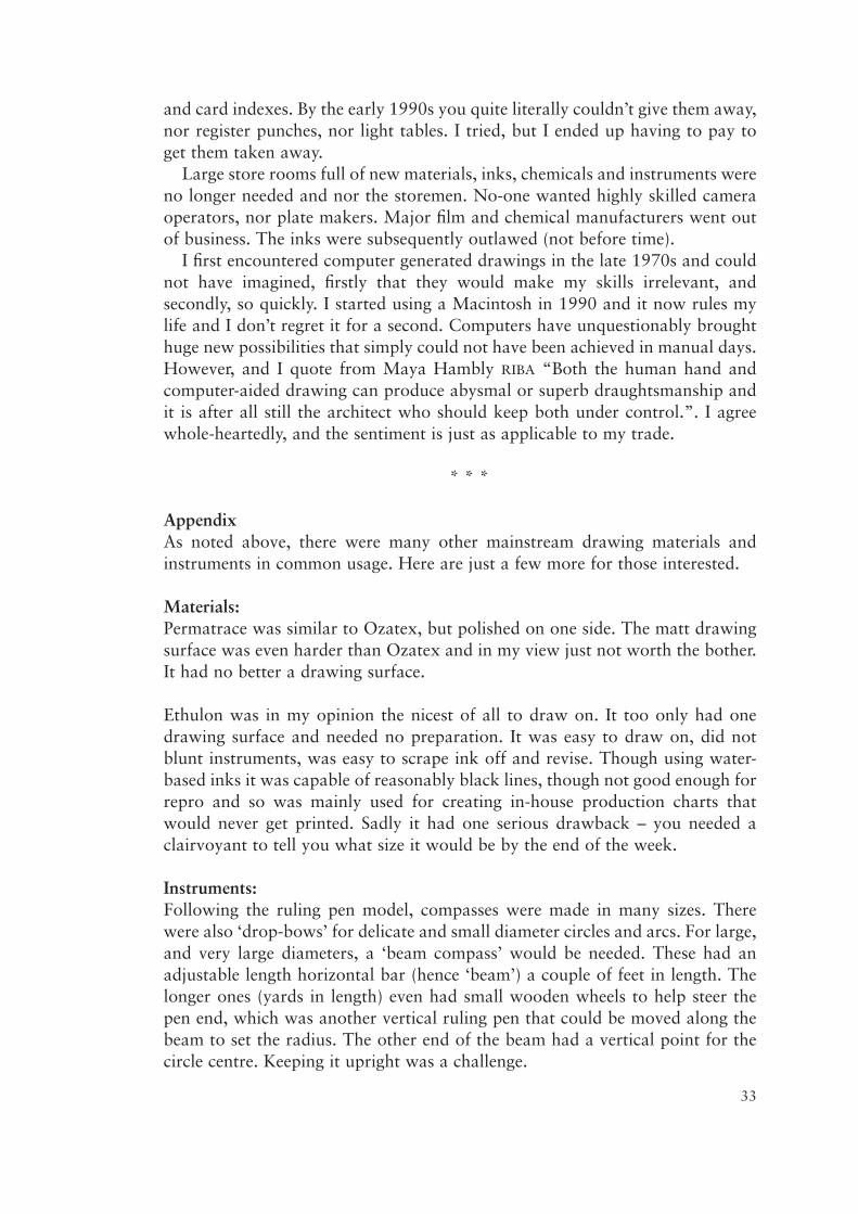
Railway curves were wonderful and hardly ever used. They were made frompearwood (latterly acrylic) and came in a beautifully made box as a set of about30 pieces. Each curve was a section of a precise radius and this value wasstamped onto each one. Shallow radius curves would be about 18 inches longand the smallest (tightest radius) just a few inches. They were difficult to useand, being quite thin and with a slender bevelled edge, had to be taken awayfrom the line just drawn with great care or the ink would smudge.
36
Above is a fairly typical box of wooden railway curves, though the smallestare missing from the slots on the right in this picture. Cheaper sets werelatterly made from a clear acrylic and this made it possible to see thedrawing beneath, which was not possible with the wooden ones.
Below is a representation of one curve. It can be seen that both edges arethe same radius and not concentric, allowing either to be drawn against andproduce the same result. This of course could not be achieved for thesmallest radii curve.
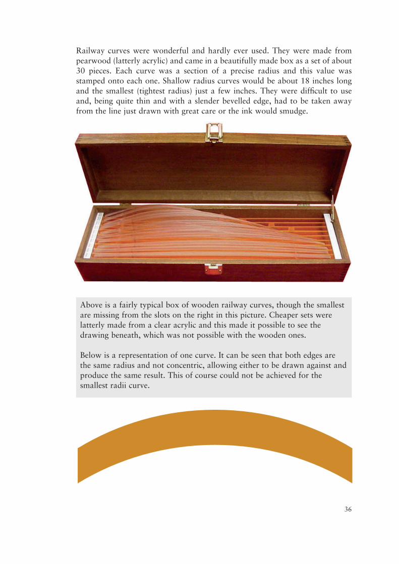
Splines were used for very long shallow curves, and also where a slight changeof curve angle or direction was needed. The wooden splines were about aquarter of an inch (about 6mm) square in cross section and many feet long. Thethinness and type of wood made them quite flexible and they were held in placeto create the correct curve by spline weights. These were similar in size to acomputer mouse, but rectangular blocks. One short edge of the block had aninflexible metal prong sticking out, that angled down onto the top of the spline.They had to be placed at close intervals to hold the spline in place whilst it wasthen drawn along. These could take a long time to set up and the weights werealways in the way. With a computer programme it can be done in seconds.
Various hard, medium and soft rubbers were used, depending on the drawingmaterial and ink. They were not used for etching inks, where sharp flat edgedblades had to be used to remove the lines by careful scraping.
On Ethulon we could use ‘plug rubbers’. They came in different hardnesses andwere cylindrical and about a quarter-of-an-inch in diameter. They were used inwhat looked and operated like an electric drill and had variable speed settings.Too slow and not much erasing happened; too fast and the rubber could do allsort of surprising things to the material – and the user.
Artist’s paint brushes were commonly used with ink to fill in large areas oncethe outline had been produced with a pen. They didn’t last long with etchinginks.
Lettering Applications:The adhesive film made using the PMT camera had a high-tack glue on the non-image side, leaving the photographic emulsion uppermost and possible toscratch and damage. Another method of sticking complete or part words downwas with ‘stripping film’, the practical use of which was the same. However,stripping film could not be made on a PMT camera and had to be madeexternally through a different photographic process. This time, the emulsionwas on the image side of much thinner film in reverse (back to front lettering)
37
The same sort of thing isstill used today to planand draw curves forcutting wood panellingto shape, as seen here.
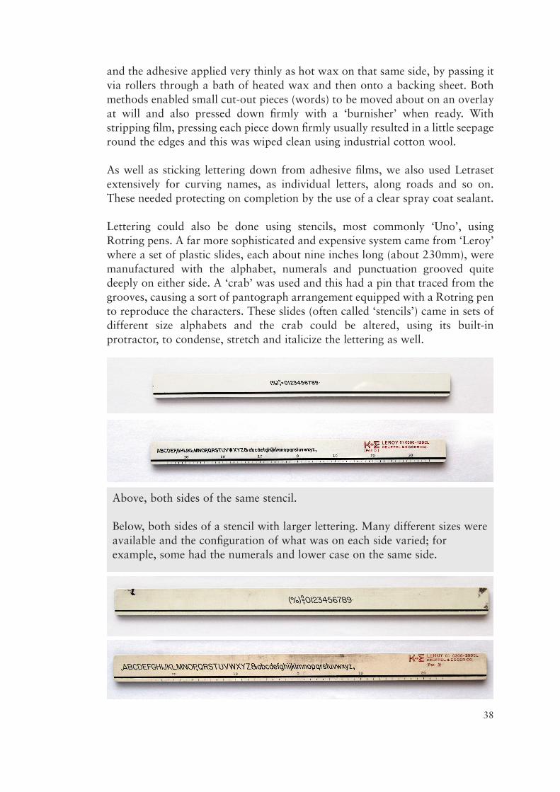
and the adhesive applied very thinly as hot wax on that same side, by passing itvia rollers through a bath of heated wax and then onto a backing sheet. Bothmethods enabled small cut-out pieces (words) to be moved about on an overlayat will and also pressed down firmly with a ‘burnisher’ when ready. Withstripping film, pressing each piece down firmly usually resulted in a little seepageround the edges and this was wiped clean using industrial cotton wool.
As well as sticking lettering down from adhesive films, we also used Letrasetextensively for curving names, as individual letters, along roads and so on.These needed protecting on completion by the use of a clear spray coat sealant.
Lettering could also be done using stencils, most commonly ‘Uno’, usingRotring pens. A far more sophisticated and expensive system came from ‘Leroy’where a set of plastic slides, each about nine inches long (about 230mm), weremanufactured with the alphabet, numerals and punctuation grooved quitedeeply on either side. A ‘crab’ was used and this had a pin that traced from thegrooves, causing a sort of pantograph arrangement equipped with a Rotring pento reproduce the characters. These slides (often called ‘stencils’) came in sets ofdifferent size alphabets and the crab could be altered, using its built-inprotractor, to condense, stretch and italicize the lettering as well.
38
Above, both sides of the same stencil.
Below, both sides of a stencil with larger lettering. Many different sizes wereavailable and the configuration of what was on each side varied; forexample, some had the numerals and lower case on the same side.
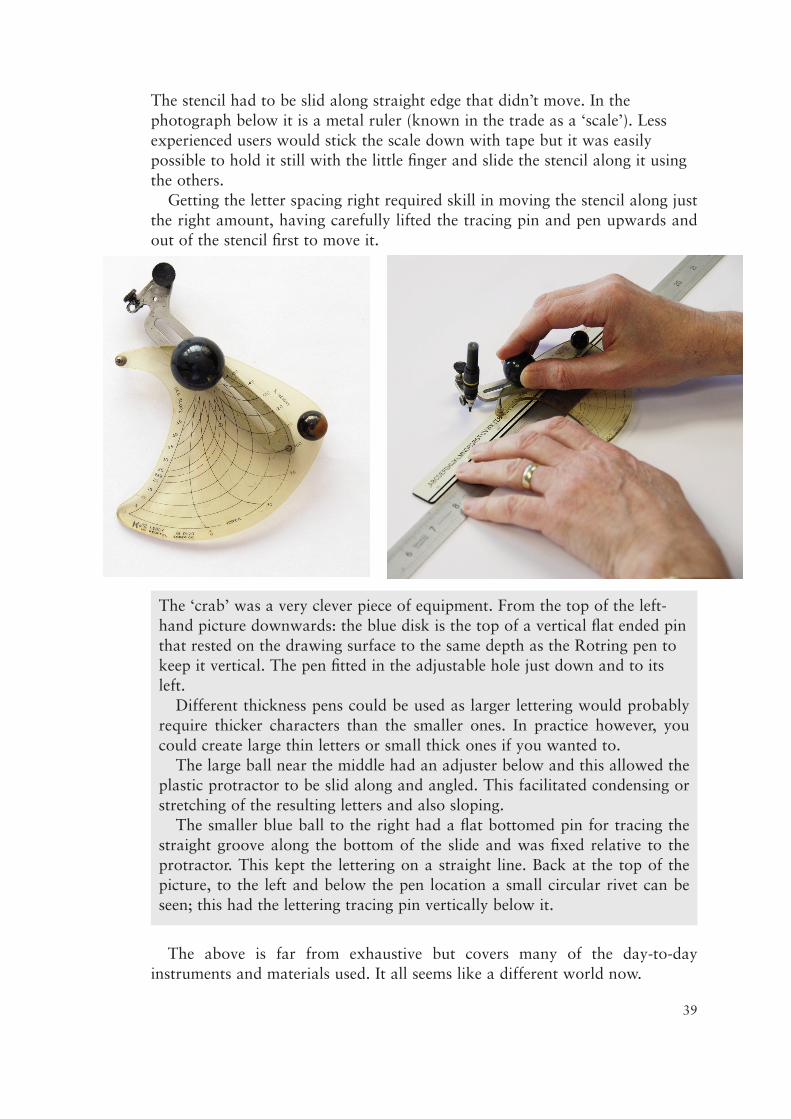
The stencil had to be slid along straight edge that didn’t move. In thephotograph below it is a metal ruler (known in the trade as a ‘scale’). Lessexperienced users would stick the scale down with tape but it was easilypossible to hold it still with the little finger and slide the stencil along it usingthe others.
Getting the letter spacing right required skill in moving the stencil along justthe right amount, having carefully lifted the tracing pin and pen upwards andout of the stencil first to move it.
The above is far from exhaustive but covers many of the day-to-dayinstruments and materials used. It all seems like a different world now.
The ‘crab’ was a very clever piece of equipment. From the top of the left-hand picture downwards: the blue disk is the top of a vertical flat ended pinthat rested on the drawing surface to the same depth as the Rotring pen tokeep it vertical. The pen fitted in the adjustable hole just down and to itsleft.
Different thickness pens could be used as larger lettering would probablyrequire thicker characters than the smaller ones. In practice however, youcould create large thin letters or small thick ones if you wanted to.
The large ball near the middle had an adjuster below and this allowed theplastic protractor to be slid along and angled. This facilitated condensing orstretching of the resulting letters and also sloping.
The smaller blue ball to the right had a flat bottomed pin for tracing thestraight groove along the bottom of the slide and was fixed relative to theprotractor. This kept the lettering on a straight line. Back at the top of thepicture, to the left and below the pen location a small circular rivet can beseen; this had the lettering tracing pin vertically below it.
39