LOOKING DATA - Statistics Teacher
36
SECTION 2 L OOKING D ATA AT
-
Upload
khangminh22 -
Category
Documents
-
view
1 -
download
0
Transcript of LOOKING DATA - Statistics Teacher

SECTION 2
LOOKINGDATA
AT

28
Investigation 2.1What Colors Are Our Shoes?OverviewTh is investigation focuses on students collecting, analyzing, and interpreting categorical data. Students generate questions regarding what they want to know about their shoes and then sort them according to an attribute or vari-able, a characteristic of a person or object that may vary from individual to in-dividual. A Venn diagram is constructed to refl ect the shoe sort. Th e shoes are then used to create a tally chart/frequency table according to the variable, and this display is used to construct a bar graph. Th e data are organized, displayed, and compared in a Venn diagram, tally chart/frequency table, and bar graph. A bar graph is the primary data display used to present categorical data.
GAISE ComponentsTh is investigation follows the four components of statistical problem solving put forth in the Guidelines for Assessment and Instruction in Statistics Education (GAISE) Report. Th e four components are formulate a statistical question that can be answered with data, design and implement a plan to collect appropri-ate data, analyze the collected data by graphical and numerical methods, and interpret the results of the analysis in the context of the original question. Th is is a GAISE Level A activity.
Learning GoalsStudents will be able to do the following after fi nishing this investigation:
• Generate statistical questions about their shoes
• Compare and sort shoes using various attributes or variables
• Use a Venn diagram, tally chart/frequency table, and bar graph to organize and display data
• Analyze the data and record a conclusion in the context of the original question
Common Core State Standardsfor Mathematical Practice1. Make sense of problems and persevere in solving them.2. Reason abstractly and quantitatively.

29
3. Construct viable arguments and critique the reasoning of others.4. Model with mathematics.
Common Core State StandardsGrade Level ContentK.MD3 Classify objects into given categories; count the numbers of objects in each category and sort the categories by count.
1.MD4 Organize, represent, and interpret data with up to three categories; ask and answer questions about the total number of data points, how many in each category, and how many more or fewer are in one category than in another.
2.MD.10 Draw a picture graph and bar graph (with single-unit scale) to rep-resent a data set with up to four categories. Solve simple put-together, take-apart, and compare problems using information presented in a bar graph.
NCTM Principles and Standardsfor School MathematicsData Analysis and Probability
Pre-K–2 All students should pose questions and gather data about themselves and their surroundings; sort and classify objects according to their attributes and organize data about the objects; and represent data using concrete ob-jects, pictures, and graphs.
Materials
• Yarn or plastic hoops
• Chart paper with grids
• Paper for labels
• Pencil or marker
Estimated TimeTwo days

30
Instructional Plan Formulate a Statistical Question
1. Th e president of a shoe company would like to know something about the shoes students in our class wear.
2. Ask the following question: What can we tell the president of the shoe company about our shoes?
3. Possible student responses: color, type (e.g., tennis, sandal), material (e.g., leather, canvas), sole (e.g., smooth, bumpy), laces, etc.
4. Lead your students to frame ideas into statistical questions—what type of shoes do we have? What color are our shoes? What are our shoes made of? How do we fasten our shoes?
5. Pick one attribute to explore. For example, you may choose the ques-tion, “What colors are the shoes of the students in our class?” Note: Th is statistical question will be carried through the investigation as a means of providing an example situation. As many shoes have multiple colors, students would be asked to consider only the color that is most prevalent on their shoes—the “main color.”
Collect Appropriate Data
1. Ask your students to take off one of their shoes and bring it to the front of the room.
2. Ask your students to sort their shoes on the fl oor by color (or a previously selected attribute).
3. Using the attribute, encircle each group with yarn (or a plastic hoop) while clarifying why shoes are placed within a particular group.
4. Develop and make labels (red, brown, etc., if color is the attribute) for each category (group of shoes).
5. Explain to your students that what they have is nice, but it would be hard to communicate this information to the president of the company without having him here. Ask your students how they could represent the shoes they have on the fl oor in a way that would be easily transferable to the president. Students should suggest that they could create a graph of what is on the fl oor.
Sorting and
Displaying
Data
Categorical data are values that have no numerical properties such as blood type, color, letter grade.
A Venn diagram uses circles to illustrate categories and their relationship to each other.
A bar graph is the primary tool used to display categorical data.
31
Analyze the Data
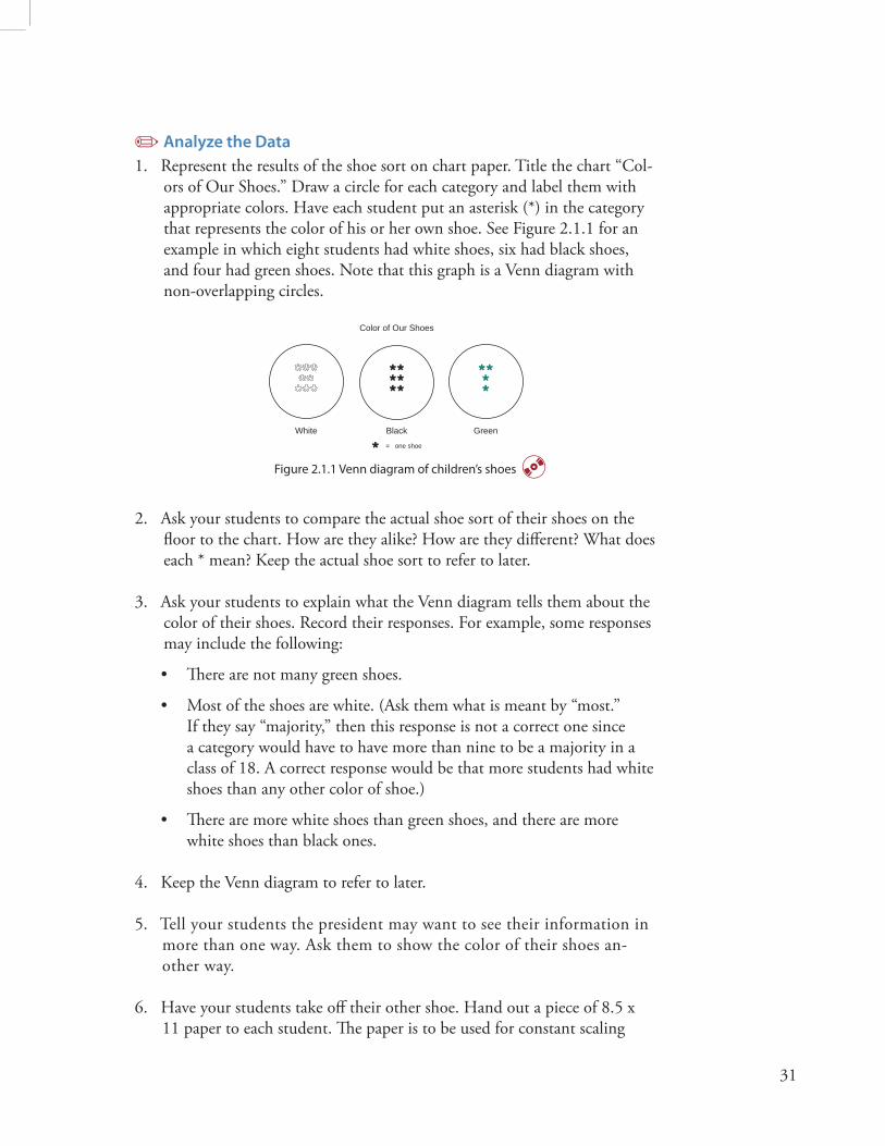
1. Represent the results of the shoe sort on chart paper. Title the chart “Col-ors of Our Shoes.” Draw a circle for each category and label them with appropriate colors. Have each student put an asterisk (*) in the category that represents the color of his or her own shoe. See Figure 2.1.1 for an example in which eight students had white shoes, six had black shoes, and four had green shoes. Note that this graph is a Venn diagram with non-overlapping circles.
Color of Our Shoes
= one shoe
White Black Green
Figure 2.1.1 Venn diagram of children’s shoes
2. Ask your students to compare the actual shoe sort of their shoes on the fl oor to the chart. How are they alike? How are they diff erent? What does each * mean? Keep the actual shoe sort to refer to later.
3. Ask your students to explain what the Venn diagram tells them about the color of their shoes. Record their responses. For example, some responses may include the following:
• Th ere are not many green shoes.
• Most of the shoes are white. (Ask them what is meant by “most.” If they say “majority,” then this response is not a correct one since a category would have to have more than nine to be a majority in a class of 18. A correct response would be that more students had white shoes than any other color of shoe.)
• Th ere are more white shoes than green shoes, and there are more white shoes than black ones.
4. Keep the Venn diagram to refer to later.
5. Tell your students the president may want to see their information in more than one way. Ask them to show the color of their shoes an-other way.
6. Have your students take off their other shoe. Hand out a piece of 8.5 x 11 paper to each student. Th e paper is to be used for constant scaling

32
purposes in a new graph. Note that if your students were to line up their shoes heel to toe by color and compare the heights of the lines of shoes, it is possible that three shoes in one line would be longer than three shoes in another line. Using the paper is an attempt to keep your students from making this graphical error.
7. Tell your students they are going to construct a picture graph using the paper and their shoes. At another spot on the fl oor, label the color catego-ries. Be sure you have room to put all the paper from your students above the respective categories. In this example, the maximum number of shoes of one color is eight, so you need to have enough room to place eight pieces of paper in a column.
8. Have each student put his or her shoe on top of their piece of paper and place the paper with their shoe on top above the appropriate color label. Th e pieces of paper within a color need to line up with no space between the pieces. Th e result is a picture graph. See Figure 2.1.2.
Green
White
BlackG
reen
Figure 2.1.2 Picture graph of children’s shoes
9. Ask your students the following questions regarding the picture graph:
a. What is the most common shoe color? Why?
b. What is the least common shoe color? Why?
c. How many more black shoes are there than green shoes? Explain.
10. Ask your students which graph (the Venn diagram or the picture graph) made it easier to answer these types of questions? Why did one make it easier than the other? Students should realize the picture graph is easier to use to answer these types of questions. It is especially easier for ques-tions like “How many more …,” since one can either subtract or simply “count on” to get up to the other category.
33
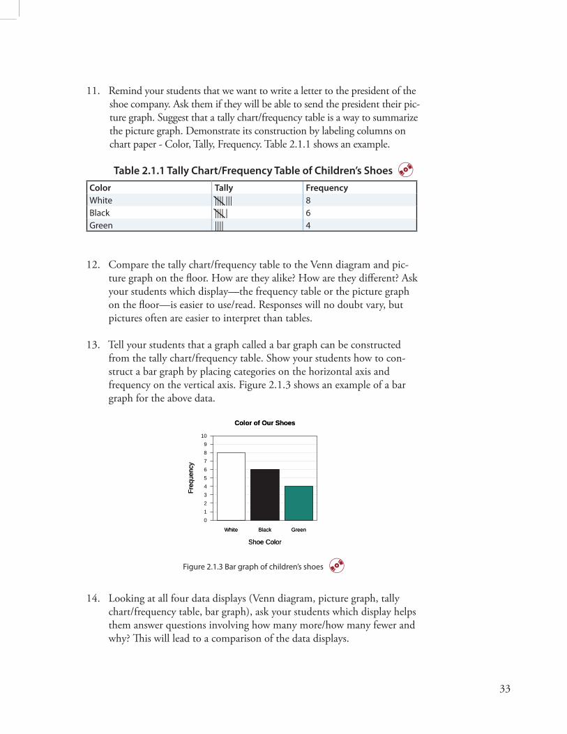
11. Remind your students that we want to write a letter to the president of the shoe company. Ask them if they will be able to send the president their pic-ture graph. Suggest that a tally chart/frequency table is a way to summarize the picture graph. Demonstrate its construction by labeling columns on chart paper - Color, Tally, Frequency. Table 2.1.1 shows an example.
Table 2.1.1 Tally Chart/Frequency Table of Children’s Shoes
Color Tally Frequency
White |||| ||| 8Black |||| | 6Green |||| 4
12. Compare the tally chart/frequency table to the Venn diagram and pic-ture graph on the fl oor. How are they alike? How are they diff erent? Ask your students which display—the frequency table or the picture graph on the fl oor—is easier to use/read. Responses will no doubt vary, but pictures often are easier to interpret than tables.
13. Tell your students that a graph called a bar graph can be constructed from the tally chart/frequency table. Show your students how to con-struct a bar graph by placing categories on the horizontal axis and frequency on the vertical axis. Figure 2.1.3 shows an example of a bar graph for the above data.
White Black Green
Color of Our Shoes
Shoe Color
Freq
uenc
y
0123456789
10
White Black Green
Color of Our Shoes
Shoe Color
Freq
uenc
y
Figure 2.1.3 Bar graph of children’s shoes
14. Looking at all four data displays (Venn diagram, picture graph, tally chart/frequency table, bar graph), ask your students which display helps them answer questions involving how many more/how many fewer and why? Th is will lead to a comparison of the data displays.

34
15. Ask your students which display they would prefer to use if they were to choose one to communicate the results to the president. Why?
16. Tell your students that the type of data displays used are often chosen based on the type of data and the questions to be answered by that data. Note that Venn diagrams, tally chart/frequency tables, bar graphs, and pie charts are the types of graphs for categorical data.
Interpret the Results in the Context of the Original Question
1. Ask your students to write a letter to the president of the shoe company communicating their response to the president’s inquiry based on their statistical question, “What colors are the shoes of the students in our class?” Th ey should include what their data were, what analysis they did, and what conclusion they made.
2. Ask your students the following questions:
• If we did a similar investigation across the hall, do you think we would get similar results?
• If you live in a climate that is diff erent from ours, do you think the color results would diff er from ours?
Example of ‘Interpret the Results’Note: The following is not an example of actual student work, but an example of all the parts that should be included in student work.
Dear Shoe Company President,You asked us to tell you something about the shoes we wear. We decided to collect data and analyze the color of our shoes. We counted the number of shoes of each color and represented our fi ndings in the bar chart below. We chose a bar chart because we thought the heights of the bars showed the com-parison of the colors the best.
White Black Green
Color of Our Shoes
Shoe Color
Freq
uenc
y
0123456789
10
White Black Green
Color of Our Shoes
Shoe Color
Freq
uenc
y

35
Th ere were only three colors of shoes in our class: black, white, and green. Th ere were eight of us who had white shoes, six who had black shoes, and four who had green. Th ere were more white shoes than black or green, so we would recommend you concentrate on making white shoes. Actually, we want to continue our study and see if our classmates across the hall agree with our distribution of colors. We will let you know.
Also, we want to help you by looking at something other than color, like the type of shoes we wear. Many of us wear an athletic shoe, but there are other types, too.
We hope our data analysis helps you. Th ank you for asking us.
Mrs. Franklin’s Class
Assessment with Answers1. Suppose the color of shoes for a class of 20 students was as follows.
W stands for white, B for black, and G for green.
G G B W W W B G W B B B W W W G B G W W
Construct two data displays for these data. Choose one of your data displays and write a letter to the president of a shoe company describing what your chosen display tells you about the color of shoes for that class. Include in your letter to the president why you chose a certain data display.
Possible displays:
Color Tally Frequency
Black |||| | 6
Green |||| 5White |||| |||| 9
Tally Chart
Venn Diagram
Color of Our Shoes
= one shoe
WhiteBlack Green

36
Black Green White
Color of Our Shoes
Shoe Color
Freq
uenc
y
0123456789
10
Black Green White
Color of Our Shoes
Shoe Color
Freq
uenc
y
Bar Graph
ExtensionHave your students collect data from another class. Using this data set, have your students construct a frequency table and a bar graph. Th en, compare the results of the other class’s data with your class’s data. Have your students compare and contrast the bar graphs and focus on questions such as “Who has more white shoes?” “How many more?” “How many red shoes are in both classes?”
ReferencesFranklin, C., G. Kader, D. Mewborn, J. Moreno, R. Peck, M. Perry, and R. Scheaff er. 2007. Guidelines for assessment and instruction in statistics education (GAISE) report: A pre-k–12 curriculum framework. Alexandria, VA: American Statistical Association. www.amstat.org/education/gaise. Greenes, C. E. (ed.) 2002. Navigating through data analysis and probability in prekindergarten – grade 2. Reston, VA: National Council of Teachers of Mathematics.
National Council of Teachers of Mathematics. 2000. Principles and standards for school mathematics. Reston, VA: National Council of Teachers of Mathematics.
Common Core State Standards for Mathematics. www.corestandards.org.

37
Investigation 2.2What Shapes Are Our Buttons?OverviewTh is investigation focuses on students collecting, analyzing, and interpreting categorical data. After listening to the story “A Lost Button” in Frog and Toad are Friends by Arnold Lobel, students generate questions about what they want to know about buttons. Buttons are then sorted according to an attri-bute/variable and used to create a tally chart/frequency table. Th is display is used to construct a bar graph. A bar graph is the primary tool used to display categorical data.
GAISE ComponentsTh is investigation follows the four components of statistical problem solving put forth in the Guidelines for Assessment and Instruction in Statistics Education (GAISE) Report. Th e four components are formulate a statistical question that can be answered with data, design and implement a plan to collect appropri-ate data, analyze the collected data by graphical and numerical methods, and interpret the results of the analysis in the context of the original question. Th is is a GAISE Level A activity with extensions to Level B.
Learning GoalsStudents will be able to do the following after fi nishing this investigation:
• Recognize, compare, and sort buttons using various attributes or variables
• Students will be able to use a tally chart/frequency table and a bar graph to organize and display data
• Students will be able to analyze the data and record observations
Common Core State Standardsfor Mathematical Practice1. Make sense of problems and persevere in solving them.2. Reason abstractly and quantitatively.3. Construct viable arguments and critique the reasoning of others.4. Model with mathematics.

38
Common Core State StandardsGrade Level ContentK.MD.3 Classify objects into given categories; count the numbers of objects in each category and sort the categories by count
1.MD.4 Organize, represent, and interpret data with up to three categories; ask and answer questions about the total number of data points, how many in each category, and how many more or fewer are in one category than in another
2.MD.10 Draw a picture graph and a bar graph (with single-unit scale) to represent a data set with up to four categories; solve simple put-together, take-apart, and compare problems using information presented in a bar graph.
NCTM Principles and Standardsfor School MathematicsData Analysis and Probability
Pre-K–2 Pose questions and gather data about themselves and their sur-roundings; sort and classify objects according to their attributes and organize data about the objects; represent data using concrete objects, pictures, and graphs
3–5 Represent data using tables and graphs such as bar graphs
Materials
• Buttons of diff erent sizes and shapes
• Chart paper with grids
• Frog and Toad Are Friends by Arnold Lobel
Estimated TimeOne day
Instructional Plan Formulate a Statistical Question
1. Read “A Lost Button” in Frog and Toad Are Friends by Arnold Lobel. In this story, Toad loses a button while he and his friend, Frog, are out for a

39
walk. Together, Frog and Toad set out to fi nd the button. As they search for the lost big, white, thick, and round button with four holes, they fi nd many other buttons along the way. Toad then uses all the other buttons to decorate a new jacket for Frog.
2. Reread the story and write all the attributes of the button Toad lost on the board.
3. Ask your students how many have lost something they really like? How many have lost a button like Toad did?
4. Ask your students what they would like to know about the buttons on their clothes. Possible responses: size, color, shape, number of holes, and thickness.
5. Write their responses in the form of a question: How many holes are in our buttons? What color are our buttons? What shape are our buttons?
6. With the help of your students, decide that a statistical question to focus on is “What shape are our buttons?”
Collect Appropriate Data
1. Ask your students to look at the shape of the buttons on their clothes. Students should report the shapes of their buttons. Some children may have two or three shapes. Record the shapes in a tally chart as shown in Table 2.2.1. If a student has a button that is not round or square, record their shape under the category “Other.”
Note: If your students’ clothes have snaps, Velcro, and elastic rather than but-tons, you will have to provide a collection of buttons for them to use.
Table 2.2.1 Tally Chart of Button Shapes
Shape Tally
RoundSquareOther

40
2. Add a column to the tally chart that shows the total number for each type of shape. Th is forms a tally chart/frequency table. An example is shown in table 2.2.2.
Table 2.2.2 Count/Frequency Table of Button Shapes
Shape Tally Count/Frequency
Round |||| |||| ||| 13
Square |||| | 6
Other |||| 4
Analyze the Data
1. Use the tally chart/frequency table to construct a bar graph to represent each button shape. Note: Place categories (round, square, other) on the horizontal axis and frequencies on the vertical axis. Figure 2.2.1 is an example of a bar graph.
Round Square Other
Shape of Our Buttons
Button Shapes
Freq
uenc
y
0123456789
1011121314
Round Square Other
Shape of Our Buttons
Button Shapes
Freq
uenc
y
Figure 2.2.1 Bar graph of button shapes
2. Ask your students, “What is the most common button shape in our class?” (Th e shape “round” is called the mode because there were more buttons with a round shape than “square” or “other.”) Which button shape occurred the least? Ask how many more buttons there were of one type as compared to another.
3. Ask how many students have the same shape as the button Toad lost (round)?
Interpret the Results in the Context of the Original Question
1. Have your students recall the original statistical question, “What shape are our buttons?” Have students write a summary answering this question based on what they found out about the button shapes on their clothes.

41
2. Ask your students if they think their parents or grandparents would have the same button shapes.
Example of ‘Interpret the Results’Note: The following is not an example of actual student work, but an example of all the parts that should be included in student work.
Our class read the story “A Lost Button,” in which Toad loses a button that can be described by fi ve attributes: size, color, thickness, shape, and number of holes. His button was big, white, thick, round, and had four holes. We decided to ask a statistical question for ourselves, “What shape are our but-tons?” It turned out that not all of us had buttons, and some of us had more than one shape. We counted all of them. We put a tally mark for each and then counted them as frequencies in the following table.
Shape Tally Count/Frequency
Round |||| |||| ||| 13
Square |||| | 6
Other |||| 4
Th en, to see the results better, we drew the graph below, called a bar graph.
Round Square Other
Shape of Our Buttons
Button Shapes
Freq
uenc
y
0123456789
1011121314
Round Square Other
Shape of Our Buttons
Button Shapes
Freq
uenc
y
From the bar graph, it is easy to see that there were more round buttons than the other shapes. Round is called the mode shape for our data. Also, we noticed that 13 of the buttons were like the shape of the one Toad lost—round. In addition to our own buttons, we are going to ask our parents and grandparents what shape of buttons they usually wear. Th eir mode might be diff erent than ours. Doing this activity was a lot of fun. Another analysis we want to do is to look at one of the other attributes, such as number of holes, to see if we match Toad’s four holes.

42
Assessment with Answers A group of students recorded the type of buttons they had on their clothes. Table 2.2.3 shows the tallies of the type of buttons.
Table 2.2.3 Tally Chart of Button Shapes
Shape Tally
Triangle |||
Round |||| ||
Square |||| |||| |
Other ||
1. Which button shape is the most common? The most common button shape is square, since it occurred 11 times. Square button is the mode of this data set.
2. How many more square buttons are there than triangle buttons? There are 11 – 3 = 8 more square buttons that there are triangle buttons.
3. Make a bar graph of the diff erent button shapes.
Triangle Round Square Other
Shape of Our Buttons
Button Shapes
Freq
uenc
y
0123456789
1011121314
Triangle Round Square Other
Shape of Our Buttons
Button Shapes
Freq
uenc
y
4. Write a report that indicates how the bar graph for this group of students’ button shapes diff ers from your bar graph. Answers will vary, but students should focus on the shape of buttons and the number of each shape of button.
Level B Extension1. Sort the buttons according to two attributes, such as shape and number
of holes. Collect the data in a table similar to Table 2.2.4.

43
Table 2.2.4 Data-Collecting Table
Fewer Than
3 Holes
3 Holes 4 Holes More Than
4 Holes
Round
Square
Other
2. Have your students make a bar graph of the data.
Round Square Other
Button Shape and Number of Holes
Number of Holes by Button Shape
Freq
uenc
y
0
1
2
3
4
5
Fewer than 3 Holes3 Holes4 HolesMore than 4 Holes
Fewer than 3 Holes 3 Holes 4 Holes More than 4 Holes
Number of Holes and Button Shape
Button Shape by Number of Holes
Freq
uenc
y
0
1
2
3
4
5
RoundSquareOther
3. Ask how many students had a button like the one Toad lost (round with four holes).
ReferencesFranklin, C., G. Kader, D. Mewborn, J. Moreno, R. Peck, M. Perry, and R. Scheaff er. 2007. Guidelines for assessment and instruction in statistics education (GAISE) report: A pre-k–12 curriculum framework. Alexandria, VA: American Statistical Association. www.amstat.org/education/gaise. Greenes, C. E. (ed.) 2002. Navigating through data analysis and probability in prekindergarten – grade 2. Reston, VA: National Council of Teachers of Mathematics.
Lobel, A. 1979. Frog and toad are friends. New York, NY: HarperCollins.
National Council of Teachers of Mathematics. 2000. Principles and standards for school mathematics. Reston, VA: National Council of Teachers of Mathematics.
Common Core State Standards for Mathematics. www.corestandards.org.

44
Investigation 2.3Is London Bridge Falling Down?OverviewTh is investigation focuses on students building a frequency table of words from the nursery rhyme “London Bridge Is Falling Down.” Students then display the data from the table on a bar graph. Th ey use the table and graph to analyze and draw conclusions about the words in the poem.
GAISE ComponentsTh is investigation follows the four components of statistical problem solving put forth in the Guidelines for Assessment and Instruction in Statistics Education (GAISE) Report. Th e four components are formulate a statistical question that can be answered with data, design and implement a plan to collect appropriate data, analyze the collected data by graphical and numerical methods, and interpret the results of the analysis in the context of the original question. Th is is a GAISE Level A activity with extensions to Level B.
Learning GoalsStudents will be able to do the following after completing this investigation:
• Generate questions about the frequency of words in a poem• Collect data and record their observations• Organize data in a frequency table• Display data from a table in a bar graph• Use the information in a frequency table and graphical display to
answer formulated questions Common Core State Standardsfor Mathematical Practice1. Make sense of problems and persevere in solving them.2. Reason abstractly and quantitatively.3. Construct viable arguments and critique the reasoning of others.4. Model with mathematics.

45
Common Core State StandardsGrade Level ContentK.MD.3 Classify objects into given categories; count the number of objects in each category, and sort the categories by count.
1.MD.4 Organize, represent, and interpret data with up to three categories; ask and answer questions about the total number of data points, how many are in each category, and how many more or fewer are in one category than in another.
2.MD.10 Draw a picture graph and bar graph (with single-unit scale) to rep-resent a data set with up to four categories; solve simple put-together, take-apart, and compare problems using information presented in a bar graph.
NCTM Principles and Standardsfor School MathematicsData Analysis and Probability
Pre-K–2 All students should pose questions and gather data about themselves and their surroundings and represent data using concrete objects, pictures, and graphs.
Materials• Chart paper with the words to the rhyme “London Bridge Is Falling
Down” • Chart paper with the words found in the poem written vertically• Grid paper
Estimated TimeOne day
Instructional Plan Formulate a Statistical Question
1. Display the nursery rhyme “London Bridge Is Falling Down,” available on the CD.
2. Have your students sing the song.
‘London Bridge Is
Falling Down’
London Bridge is falling down, Falling down, falling down,London Bridge is falling down, My fair Lady.
Build it up with wood and clay,Wood and clay, wood and clay,Build it up with wood and clay,My fair Lady.
Wood and clay will wash away,Wash away, wash away,Wood and clay will wash away,My fair Lady.

46
3. Discuss the history of the bridge and the rhyme with your students.
London Bridge is a bridge over the River Thames in the city of Lon-don, England. The earliest appearance of the rhyme was in a play from the year 1659. The earliest printed English version dates from 1744 and is found in Tommy Thumb’s Pretty Song Book.
4. Ask your students what they observed about the words in the song. Some of the discussion might focus on questions such as “Are there repeated words in the London Bridge nursery rhyme?” “How often do they ap-pear?” “Unique words?” “Short words?” “How short?” “Long words?”
5. With the help of your students, decide that a statistical question to focus on is “How often do the words in the London Bridge nursery rhyme appear?”
Collect Appropriate Data
1. Display a chart of the words.
2. Have your students tally how many times each word appears in the song. Record the tallies.
3. After your students have tallied the number of times each word occurs in the song, have them complete the frequency column in a tally chart/fre-quency table such as Table 2.3.1.
Table 2.3.1 Tally Chart for Words in ‘London Bridge Is Falling Down’
Word Tally Count/
Frequency
Word Tally Count/
Frequency
London || 2 It || 2Bridge || 2 Up || 2Is || 2 With || 2Falling |||| 4 Wood |||| | 6Down |||| 4 And |||| | 6My ||| 3 Clay |||| | 6Fair ||| 3 Will || 2Lady ||| 3 Wash |||| 4Build || 2 Away |||| 4

47
Analyze the Data
1. Ask your students to use the tally chart and frequency table to answer the following questions:
• How many words are actually in the poem? How can you use the table to fi nd the answer?
• How many diff erent words are in the poem? How can you use the table to answer the question?
• Which word or words appear most often? Th e word appearing most often is called the mode. How many times? Note that there could be more than one mode. In this example, there are three modes: “wood,” “and,” and “clay.”
• Which word or words appears least often? How many times?
• Which words appear more than fi ve times?
• How many more times does the word “wood” appear than the word “bridge”?
• How many words occur more than twice? Fewer than twice?
• Where are the most-repeated words positioned in the rhyme?
2. Discuss with your students that a picture often helps answer questions. Use the frequency table to construct a bar graph as shown in Figure 2.3.1 with the words of the rhyme written horizontally and a dot above each word according to the frequency of the word. Answer the previous ques-tions using the bar graph and ask your students which questions were easier to answer using the graph.
Lond
on
Brid
ge is
fallin
g
dow
n
my
fair
lady
build it up
with
woo
d
and
clay will
was
h
away
Word Frequency in 'London Bridge Is Falling Down'
Freq
uenc
y
01234567
Word
Figure 2.3.1 Bar graph of the word frequency

48
Interpret the Results in the Context of the Original Question
1. To help interpret the data further, construct a bar graph with the words listed in order of frequency as shown in Figure 2.3.2.
Lond
on
Brid
ge is
build it up
with will my
fair
lady
fallin
g
dow
n
was
h
away
woo
d
and
clay
Word Frequency in 'London Bridge Is Falling Down'
Freq
uenc
y
01234567
Word
Figure 2.3.2 Bar graph of the word frequency ordered
2. Ask your students how this graph would help them answer the original statistical question, “How often do the words in the London Bridge nurs-ery rhyme appear?”
3. Have them answer the statistical question by writing a report about how often the words in London Bridge appear.
4. Ask your students if they think other nursery rhymes repeat words such as they are in “London Bridge Is Falling Down?” Have your students share their answers.
Example of ‘Interpret the Results’Note: The following is not an example of actual student work, but an example of all the parts that should be included in student work.
In our history class, we were studying the origins of various literary pieces including nursery rhymes. Some of us wondered what we could do with these rhymes in our mathematics class. Since we have been studying frequency tables and bar graphs there, we thought about doing a statistical analysis of a nursery rhyme. Our teacher suggested “London Bridge Is Falling Down.” Th e statistical question we came up with was “How often do the words in the London Bridge nursery rhyme appear?” We made a tally chart listing all the words and then

49
put a tally beside each word as we sang the rhyme slowly. Th en, we counted the number of tallies and made a frequency table as follows:
London Bridge is falling down my fair lady build
2 2 2 4 4 3 3 3 2
it up with wood and clay will wash away
2 2 2 6 6 6 2 4 4
Sometimes, it’s easier to make conclusions by looking at a picture, so we made a bar graph. Our teacher said that was okay as long as we kept the right vertical spacing for the counts. Here it is:
Lond
on
Brid
ge is
fallin
g
dow
n
my
fair
lady
build it up
with
woo
d
and
clay will
was
h
away
Word Frequency in 'London Bridge Is Falling Down'
Freq
uenc
y
01234567
Word
She suggested it might be even easier to discuss our question if we put the data in order.
Lond
on
Brid
ge is
build it up
with will my
fair
lady
fallin
g
dow
n
was
h
away
woo
d
and
clay
Word Frequency in 'London Bridge Is Falling Down'
Freq
uenc
y
01234567
Word
Our teacher was right, because it is clear that the words that occur most of-ten—six times each—are “wood,” “and,” and “clay.” All of them are modes. We also see that the mode words occurred four more times each than did the eight words that only occurred twice each (6 – 2). Now, we are wonder-ing if there are any nursery rhymes that have unique words, since it looks like nursery rhymes like to repeat words. Th at will be one of our next data analysis studies.
50
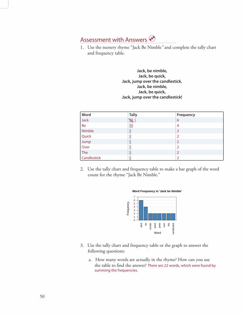
Assessment with Answers1. Use the nursery rhyme “Jack Be Nimble” and complete the tally chart
and frequency table.
Jack, be nimble,
Jack, be quick,
Jack, jump over the candlestick.
Jack, be nimble,
Jack, be quick,
Jack, jump over the candlestick!
Word Tally Frequency
Jack |||| | 6Be |||| 4Nimble || 2Quick || 2Jump || 2Over || 2The || 2Candlestick || 2
2. Use the tally chart and frequency table to make a bar graph of the word count for the rhyme “Jack Be Nimble.”
Jack be
nim
ble
quic
k
jum
p
over the
cand
lest
ick
Word Frequency in 'Jack be Nimble'
Freq
uenc
y
01234567
Word
3. Use the tally chart and frequency table or the graph to answer the following questions:
a. How many words are actually in the rhyme? How can you use the table to fi nd the answer? There are 22 words, which were found by summing the frequencies.
51
b. How many diff erent (distinct) words are in the rhyme? How can you use the table to answer the question? There are eight words that diff er from each other. They are listed in the Word column.
c. Which word or words appear most often? How many times? “Jack” appears six times. “Jack” is the mode.
d. Which word or words appear least often? How many times? “Nimble,” “Quick,” “Jump,” “Over,” “the,” and “Candlestick” each appears twice.
e. Which words appear more than three times? “Jack” appears six times and “Be” occurs four times.
f. How many more times does the word “Jack” appear than the word “jump”? “Jack” appears six times and “jump” appears twice. So “Jack” appears four more times than does “jump” (6 – 2).
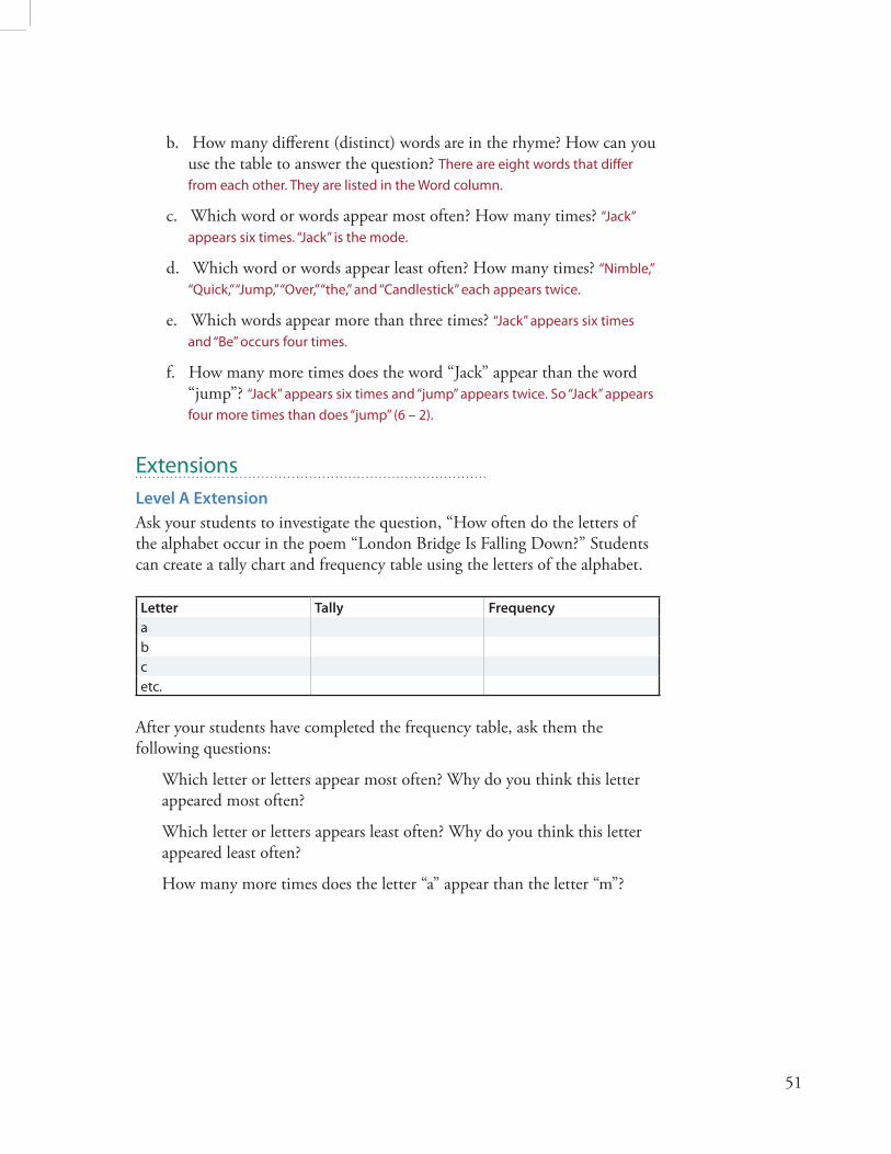
Extensions Level A Extension
Ask your students to investigate the question, “How often do the letters of the alphabet occur in the poem “London Bridge Is Falling Down?” Students can create a tally chart and frequency table using the letters of the alphabet.
Letter Tally Frequency
abcetc.
After your students have completed the frequency table, ask them the following questions:
Which letter or letters appear most often? Why do you think this letter appeared most often?
Which letter or letters appears least often? Why do you think this letter appeared least often?
How many more times does the letter “a” appear than the letter “m”?

52
Level B Extension
To extend this activity to beginning Level B students, use the “rap” song below (available on the CD), written by the students of Sandra McKenzie, a seventh-grade teacher from Denver, Colorado.
London Bridge is falling down,
Whatcha gonna do when you go to town?
I say, London Bridge is falling down.
Hold on there, pretty lady.
Gonna build the bridge up with bricks and clay
Gotta get across, can’t take all day!
Build up that bridge with bricks and clay.
Wait right there, pretty lady.
Dangerous to cross right now,
Can’t ‘llow no one to be goin’ down.
Take the key, can’t cross right now,
Chill out now, pretty lady.
Students could investigate the question, “What is the average length of the words of the ‘rap’ song?”
ReferencesFranklin, C., G. Kader, D. Mewborn, J. Moreno, R. Peck, M. Perry, and R. Scheaff er. 2007. Guidelines for assessment and instruction in statistics education (GAISE) report: A pre-k–12 curriculum framework. Alexandria, VA: American Statistical Association. www.amstat.org/education/gaise. Greenes, C. E. (ed.) 2002. Navigating through data analysis and probability in prekindergarten – grade 2. Reston, VA: National Council of Teachers of Mathematics.
National Council of Teachers of Mathematics. 2000. Principles and standards for school mathematics. Reston, VA: National Council of Teachers of Mathematics.
Common Core State Standards for Mathematics. www.corestandards.org.

53
Investigation 2.4How Can We Sort Our Junk?OverviewTh is investigation introduces students to the idea of an attribute or vari-able, a characteristic of a person or object that may vary from individual to individual. Using actual objects, students will organize them by an attribute and create a graphical display. Students will then verbally describe interest-ing patterns about the attribute using such terms as most common values (categories), least common values, many values (lots of variation), and few values (minimal variation). By the end of the activity, students will be able to identify attributes, display the distribution of their possible values in a graph, answer questions about the occurrence of diff erent values of the attribute, and begin to grasp the concept of variability.
GAISE ComponentsTh is investigation follows the four components of statistical problem solving put forth in the Guidelines for Assessment and Instruction in Statistics Education (GAISE) Report. Th e four components are formulate a statistical question that can be answered with data, design and implement a plan to collect appropri-ate data, analyze the collected data by graphical and numerical methods, and interpret the results of the analysis in the context of the original question. Th is is a GAISE Level A activity.
Learning GoalsStudents will be able to do the following after fi nishing this investigation:
• Identify an attribute or variable pertaining to an object
• Organize information about an attribute using a graphical display
• Describe the patterns (distribution of values) illustrated in the graphs
• Develop a sense for the amount of variation that may exist in the attribute
Common Core State Standardsfor Mathematical Practice1. Make sense of problems and persevere in solving them.2. Reason abstractly and quantitatively.

54
3. Construct viable arguments and critique the reasoning of others.4. Model with mathematics.
Common Core State StandardsGrade Level ContentK.MD3 Classify objects into given categories; count the numbers of objects in each category and sort the categories by count.
1.MD4 Organize, represent, and interpret data with up to three catego-ries; ask and answer questions about the total number of data points, how many in each category, and how many more or fewer are in one category than in another.
2.MD.10 Draw a picture graph and a bar graph (with single-unit scale) to represent a data set with up to four categories. Solve simple put-to-gether, take-apart, and compare problems using information presented in a bar graph.
NCTM Principles and Standardsfor School MathematicsData Analysis and Probability
Pre-K–2 All students should pose questions and gather data about themselves and their surroundings; sort and classify objects according to their attributes and organize data about the objects; and represent data using concrete ob-jects, pictures, and graphs.
Materials
• Chart paper with 1” square grid
• Pencil or marker
• Bags with assorted objects (e.g., beads, buttons, charms, cubes, attribute blocks, fabric swatches, crayons, catalog pictures of jewelry, clothes) Note: You will need one bag for each group of four students
Estimated TimeTwo days

55
Instructional Plan Formulate a Statistical Question
1. Begin this investigation showing your students a bag of ‘junk’ (e.g., a bag containing beads, buttons, charms, cubes, attribute blocks, fabric swatch-es, crayons, catalog pictures of jewelry, clothes). Tell your students this bag of junk is material you have collected or have left over from projects or class activities. Ask them if they have a junk drawer at home. What do they have in their drawer? Ask your students what they think might be in your bag.
2. Empty the bag and tell your students you would like to organize the materials to describe what has been accumulated over the years. Ask your students to suggest some ways they could help you sort your things. Pos-sible student responses: type (toy, button, bead, block), color, size (large, small), design (solid, striped, plaid).
3. Lead students to frame ideas into questions. What kind of objects do we have? For a specifi c type of object, what attribute should we use as a sort-ing factor? Possible attributes include color, size, texture, etc. How will the choice of attribute aff ect the outcome of the sorting process?
4. Th is investigation assumes beads are the junk of interest. It focuses on analyzing two statistical questions: Do our beads diff er in color? Do our beads diff er in shape?
Collect Appropriate Data
1. Have your students work in groups of four.
2. Give each group a bag of ‘junk’ that contains diff erent objects such as buttons, marbles, beads, etc. Tell them to look in their bag of materi-als and select objects to sort, along with an attribute or characteristic by which to sort them. Have the students in each group discuss possible attributes that can be used. Encourage them to consider diff erent ways to sort their junk. (In this investigation, beads have been chosen to sort according to their color and according to their shape.)
3. Allow your students time to explore and discuss the objects as they sort them. Once they have decided how they will sort the objects, assist them in completing the data collection sheet (available on the CD). As they place the objects on the data collection sheet, they should place one
An attribute,
or variable, is a characteristic of a person or object that may vary from individual to individual.

56
object in each section under the proper heading. Figures 2.4.1 and 2.4.2 show examples of a completed data collection sheet for sorting beads by color and shape.
4. Have each group share their fi ndings with the class.
Object
(Individuals)
Beads
Attribute
(Variable)
Color
Possible
Values
Red Blue Yellow Green
Figure 2.4.1 Data collection sheet for attribute of color
Object
(Individuals)
Beads
Attribute
(Variable)
Shape
Possible
Values
Oval Rectangle Round
Figure 2.4.2 Data collection sheet for attribute of shape

57
Analyze the Data
1. Tell your students you would like a way to display their data collection sheet on the bulletin board. One way to display their data collection sheet is to make a pictograph.
2. Hand out grid paper with 1” squares. Ask each group to create a picto-graph of their physical graph that they can post on the bulletin board to share with the class. Th is graph is made by having your students draw a picture of their data collection. Figure 2.4.3 shows an example of a picto-graph based on the attribute of color.
Beads Sorted by Color
Red Blue Yellow Green
Figure 2.4.3 Pictograph of the beads sorted by color
3. Another option for displaying the data collection sheet is to make a bar graph. Hand out another sheet of grid paper. Show your students how to make a bar graph from their pictographs. Place the categories (red, blue, yel-low, green in this example) on the horizontal axis and count on the vertical axis. Figure 2.4.4 is an example of a bar graph based on the example of the beads sorted by color.
Red Blue Yellow Green
Color
Freq
uenc
y
0
1
2
3
4
5
Red Blue Yellow Green
Number of Beads for Each Color
Color
Freq
uenc
y
Figure 2.4.4 Bar graph of the beads sorted by color

58
4. Ask the students in each group to discuss each of the following questions:
a. What sorting factor was used (e.g., color, size, shape, use, material used for construction)?
b. What categories were used for this attribute?
c. Of which category do you have the most? Th e least? Equal amounts? Record the students’ responses.
Interpret the Results in the Context of the Original Question
1. Have each group share their displays, and share the answers to the questions. As each group presents their displays, ask them the following questions:
a. What other attributes did your group discuss? Why did your group choose this attribute?
b. How did you determine the categories for your attribute? For example, what would change if instead of using the actual color of the object, we consider the categories “red” and “not red”?
2. After all the groups have presented, ask which groups used the same at-tribute to sort their “junk.” For the groups that used the same attribute, compare the groups’ displays. Are they similar? How are they diff erent?
3. Have your students recall that the original question was, “How can we sort our junk?” Have your students write a summary of their analysis, including how they displayed their data, what graph(s) they created, and what they learned from the investigation regarding the type of junk they have by the process of sorting.
Example of ‘Interpret the Results’ Note: The following is not an example of actual student work, but an example of all the parts that should be included in student work.
Our teacher asked us if we collected junk. Most of us said we do. He then asked if we had any sort of preference for one characteristic of our junk over another, like color, size, or design. We never really thought about it in that way, so he brought in a bag of “junk” he had collected from doing class activi-ties over a long time. Our problem was to investigate the question, “How can we sort his bag of junk?” We decided to just look at the 12 beads in the bag and sorted the actual beads on two pieces of grid paper, one with regard to color and the other with regard to shape.
59
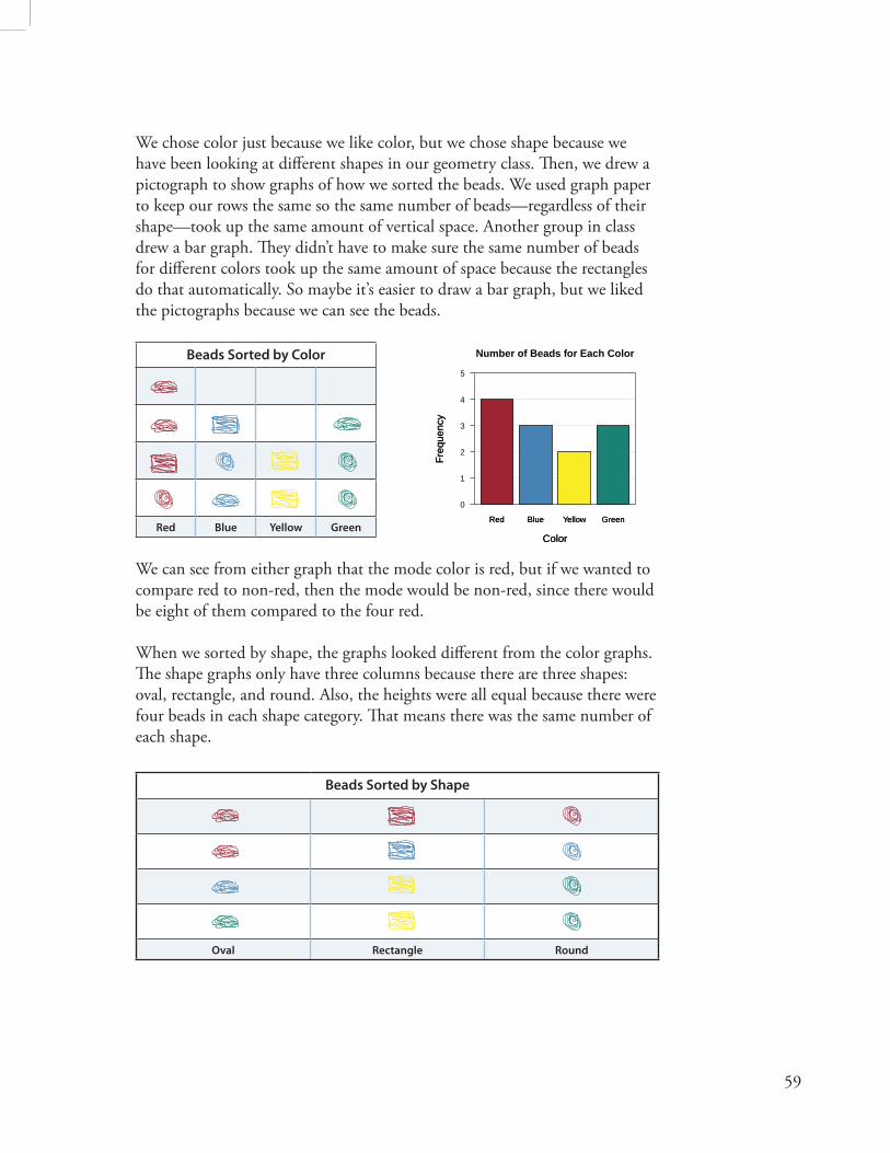
We chose color just because we like color, but we chose shape because we have been looking at diff erent shapes in our geometry class. Th en, we drew a pictograph to show graphs of how we sorted the beads. We used graph paper to keep our rows the same so the same number of beads—regardless of their shape—took up the same amount of vertical space. Another group in class drew a bar graph. Th ey didn’t have to make sure the same number of beads for diff erent colors took up the same amount of space because the rectangles do that automatically. So maybe it’s easier to draw a bar graph, but we liked the pictographs because we can see the beads.
Beads Sorted by Color
Red Blue Yellow Green
We can see from either graph that the mode color is red, but if we wanted to compare red to non-red, then the mode would be non-red, since there would be eight of them compared to the four red.
When we sorted by shape, the graphs looked diff erent from the color graphs. Th e shape graphs only have three columns because there are three shapes: oval, rectangle, and round. Also, the heights were all equal because there were four beads in each shape category. Th at means there was the same number of each shape.
Beads Sorted by Shape
Oval Rectangle Round
Red Blue Yellow Green
Color
Freq
uenc
y
0
1
2
3
4
5
Red Blue Yellow Green
Number of Beads for Each Color
Color
Freq
uenc
y

60
Assessment with AnswersGive each of your students the following pattern blocks: 6 Yellow Hexa-gons, 4 Green Triangles, 3 Red Trapezoids, 2 Blue Parallelograms, and 2 Tan Parallelograms. Instruct your students to sort the shapes and complete the following questions:
1. How did you decide to sort the shapes? Students can sort by color or the number of sides.
2. Draw a pictograph of how you sorted the shapes.
Shapes Sorted by Color
Yellow Red Blue Green Tan
Shapes Sorted by # of Sides
3 4 5 6

61
3. Which category had the most shapes? If they sorted by color, yellow has the most shapes. If they sorted by number of sides, then there are seven shapes with four sides.
4. Which category had the fewest shapes? If they sorted by color, the blue and tan shapes each have two. If they sorted by number of sides, then there are four shapes with three sides.
Extension1. Have students select another set of objects and attribute and repeat the
exercise. Ask them to comment on how this display diff ers from the one done in class. Have them write a summary of their investigation to an-other group. Th e note should address the following points:
a. Was the sorting attribute clearly identifi ed?
b. Was the display easy to interpret?
c. Was the information displayed in a clever fashion?
d. Can you make any suggestions for improving the display?
e. Did you learn ways to improve your graphical display?
2. Play “Gatekeeper.” All students hold an attribute block and stand in line. Participants fi le past the gatekeeper, who has one attribute in mind. Th e participants are admitted with a “yes” response if their attribute matches the sorting factor in the mind of the gatekeeper (for example, all squares). Others are turned away with a “no,” because they don’t have the correct sorting factor. Th e group then identifi es the sorting factor used by the gatekeeper when all participants have fi led past.
3. Extend the game with two gatekeepers. If a participant gets through the fi rst gatekeeper, they encounter the second one (for example, all yellow). Similarly, as with the fi rst gatekeeper, the participant either gets to pass through or not. Note that those who pass through now possess two com-mon attributes. (In this case, they are both square and yellow.)
4. After playing “Gatekeeper,” have your students collect, organize, and dis-play the data. In the one-attribute case, a possible graph would be a bar graph with the horizontal axis labeled “yes” or “no.” Have your students suggest other ways to represent the data. In the two-attribute case, Venn diagrams work well with one circle labeled “square,” the other “yellow.”

62
Th e overlapping part would contain the yellow squares. Your students’ attribute blocks could be placed physically on a large Venn diagram or represented by dots, say, on a smaller one.
5. Use this kind of activity in other subject areas.
a. Classify rocks, leaves, shells, and so on, as an extension of a science topic.
b. Sort letters of the alphabet or words in a poem according to similarity in language arts.
c. Provide a U.S. map to groups. Cut out the states. Organize states according to common attributes as an extension of a social studies topic.
ReferencesBereska, C., L. C. Bolster, C. A. Bolster, and R. Scheaff er. 1998. Exploring statistics in the elementary grades: Book one, grades k–6. White Plains, NY: Dale Seymour.
Franklin, C., G. Kader, D. Mewborn, J. Moreno, R. Peck, M. Perry, and R. Scheaff er. 2007. Guidelines for assessment and instruction in statistics education (GAISE) report: A pre-k–12 curriculum framework. Alexandria, VA: American Statistical Association. www.amstat.org/education/gaise.
National Council of Teachers of Mathematics. 2000. Principles and standards for school mathematics. Reston, VA: National Council of Teachers of Mathematics.
Common Core State Standards for Mathematics. www.corestandards.org.