Important South African and International Art - Straussart.co.za
116
-
Upload
khangminh22 -
Category
Documents
-
view
0 -
download
0
Transcript of Important South African and International Art - Straussart.co.za

Lot 545 Peter Clarke, The Fence (detail)
The Vineyard Hotel, Newlands, Cape Town
6 March – 8 pm
Important South African and International Art
Evening Sale
Lots 491–577

208
491
Hylton NELSOUTH AFRICAN 1941–
Vase with Portrait (HN367)signed and dated 5.10.6hand painted and glazed ceramicheight: 40,5 cm
R18 000 – 24 000PROVENANCE
Stevenson Gallery, Cape Town

209
492 Pablo PICASSOSPANISH 1881–1973
Visage aux yeux rieurs(Laughing-Eyed Face) (A.R.608)executed in 1969base incised ‘Edition Picasso’, ‘249/350’ and ‘Madoura R.137’, and with ‘Edition Picasso’ and ‘Madoura Plein Feu’ pottery stamps partially glazed white earthenware pitcher painted in coloursheight: 34 cm
R250 000 – 350 000

210
493Tinus DE JONGHSOUTH AFRICAN 1885–1942
Mountainous Landscapesigned
oil on canvas
67 by 105,5 cm
R –
494Tinus DE JONGHSOUTH AFRICAN 1885–1942
De Dam, Amsterdamsigned and dated 1912
oil on canvas
64 by 84 cm
R – PROVENANCE
Dr DF Malan
493
LITERATURE
cf. Pat Weckesser in association with the De
Jongh Family. (2013) Tinus de Jongh: His life
and works, Cape Town: MJ de Jongh. Page 25
where an etching of this subject is illustrated
with the title De Dam in 1912 from inside the
Royal Palace.

211
‘In 1912 Tinus was commissioned to paint a number of pictures for
the Royal Ancient Society and Borough Archives of Amsterdam. These
works comprised a large number of scenes of the old city centre with the
purpose of preserving and recording various disappearing landmarks and
these are still in the Beeldarchief in Amsterdam.
There were canals which were destined to be fi lled in and the famous
monument, the “Naatje op de Dam’”was scheduled to be dismantled
prior to the rebuilding of the Dam Square which was renovated and
re-opened on 7 April 1914.
A great honour was conferred upon Tinus when, he says, “Permission
was given to me by Her Majesty the Queen of the Netherlands
(Wilhelmina) to work in her palace for three months”. The paintings, as a
result of this work, were bought by the Amsterdam Museum. Although
there is no evidence that Tinus lived at the Palace, permission was
granted to paint from the windows on 24 February 1912. All members
of the De Jongh family confi rmed that their father took up residence in
the Palace for three months and, as his uncle was gynaecologist to the
Queen, an unoffi cial concession may have been made’. (Weckesser, pages
28 and 29)
494

212
495Hugo NAUDÉSOUTH AFRICAN 1868–1941
A Lagoon with Mountains Beyondsigned and dated 1910
oil on board
28,5 by 39,5 cm
R – PROVENANCE
Dr DF Malan

213
496Hugo NAUDÉSOUTH AFRICAN 1868–1941
Pakhuis, Clanwilliamsigned; inscribed with the title on the reverse
oil on artist’s board
25 by 29,5 cm
R –
214
497Cecil HIGGSSOUTH AFRICAN 1898–1986
Neap Tidesigned and indistinctly dated 65-66
oil on canvas
29,5 by 45,5 cm
R –

215
498Gregoire BOONZAIERSOUTH AFRICAN 1909–2005
Samovar, Lamp and Pumpkinssigned and dated 1962; signed and inscribed with
the title in Afrikaans and English on the reverse
oil on canvas
55 by 70,5 cm
R –
PROVENANCE
Stephan Welz & Co in Association with Sotheby’s,
Johannesburg, 28 November 1994, lot 69

216
499Fanie ELOFFSOUTH AFRICAN 1885–1947
Sitting Girl IIexecuted circa 1934
signed
bronze with a verdigris patina
height: 48 cm
R –
PROVENANCE
The Fanie Eloff Family Collection
LITERATURE
cf. Gerard de Kamper and Chris de
Klerk. (2011) Sculptured – The Complete
Works of Fanie Eloff , Dept of UP Arts
for Pretoria University. A Plaster of
Paris version is illustrated on pages
90 and 96.

217
500Jean WELZSOUTH AFRICAN 1900–1975
Nude of a Young Girlsigned and dated 45; signed
and inscribed with the title and
‘Worcester, Cape’ on the reverse
oil on panel
44,5 by 25,5 cm
R –
Why does one involuntarily associate
this thoughtful Nude with Venus, the
goddess of love? Looking at her the
two aspects of Venus immediately
come to mind: ‘sexual attraction’ and
‘spiritual love’. The voluptuousness
of the woman physically attracts
one while the subtle play of light on
and around the body enhances her
spirituality. Subtly Welz unites these
opposites. The nude looks down
contemplating the removal of the
cloth covering her upper left leg.
Occupied thus she is unaware of her
heads oval and her legs conjuring up
the shape of a heart. Metaphorically
the head and the heart will connect
when she fi nally removes the wrap.
Then Venus will symbolically arise
from the enclosure of Botticelli’s shell.
Jean Welz performs another tour de
force.
Elza Miles

218
501Anton VAN WOUWSOUTH AFRICAN 1862–1945
The Hammer Workersigned, dated 1911 and inscribed
‘Joh-burg’
bronze
height: 61 cm excluding base;
base 75,5 cm
R –
LITERATURE
cf. Diff erent casts are documented
and illustrated in the following:
AE Duff ey. (2008) Anton van Wouw:
The Smaller Works, Pretoria: Pretoria
Book House, illustrated on pages
89 to 92 with the tiitle The Hammer
Worker.
J Ernst. (2006) Anton van Wouw:
a Biography, Vanderbijlpark: Corals
Publishers, illustrated on page 74
with the title Die Hammerwerker.
Hans Fransen. (1982) Three Centuries
of South African Art, Johannesburg:
AD Donker, illustrated on pages 326
and 327.
AE Duff ey. (1981) Anton van Wouw
1862–1945 en die Van Wouwhuis,
Pretoria: University of Pretoria,
illustrated on page 12.
ML Du Toit. (1933) Suid-Afrikaanse
Kunstenaars: Deel 1, Anton van Wouw,
Cape Town: Unknown publisher,
illustration plate 13.

219

220
502Hugo NAUDÉSOUTH AFRICAN 1868–1941
Branders, Onrus (Waves, Onrus)signed; inscribed with the title on a label adhered to the reverse
oil on panel
24,5 by 35 cm
R –

221
503Hugo NAUDÉSOUTH AFRICAN 1868–1941
Baineskloofsigned
oil on canvas
40 by 49 cm
R –
Proceeds from the sale of this lot will benefi t the development of The Jakes Gerwel
Entrepreneurs High School scheduled to open in January 2018.
EXHIBITED
Pretoria Art Museum, Johannesburg Art Gallery, South African National Gallery, Hugo Naudé
Retrospective Exhibition, 1969, catalogue number 123

222
504Jacob Hendrik PIERNEEFSOUTH AFRICAN 1886–1957
Bushveld Landscapesigned and dated 56
oil on canvas
44 by 59 cm
R –
Contrary to popular belief, Pierneef seldom
painted directly from nature. He made a number
of naturalistic drawings and impressionistic water
colours of the landscape before him, which he
then translated into well-composed, synthesized
oil paintings in his studio. Sometimes he relied on
his memory only, drawing on pure imagination and
fantasy. The first recorded drawing on which the
present work is based, was executed as early as 1944.
This was exhibited with the title, Soutpan, at the
Pierneef Festival in Johannesburg arranged by the
Egon Guenther and Adler Fielding galleries in 1964.
The drawing is illustrated in the commemorative
booklet that accompanied the exhibition.
The present oil painting provides a wonderful
insight into the intervening synthesis that took place
in Pierneef’s studio. An off-white grassland forms
part of the wintery foreground of the landscape,
culminating in a typical thunder cloud formation,
more indicative of a summer downpour than
a winter scene. However, the two acacia trees
seemingly are in full bloom, as they would be in
springtime. Pierneef juxtaposes two types of cloud
in the same background: on the left, the orange
reflection of a setting sun on a billowing white cloud
formation contrasting sharply with the ominous dark
rain clouds on the right, typical of an impending
mid-day downpour. Different time zones are thus
present in the landscape. So potent and magical was
the painter’s artistry, according to Justice JF Marais,
who opened the Pierneef Festival exhibition, ‘’that
those who know the Bushveld well have been, and
still are, persuaded beyond all argument that that is
the visible reality, as real as can be.’’
Justice JF Marais (1964) Pierneef Festival booklet.
Johannesburg; Egon Guenther and Adler Fielding galleries,
page 3.
223

224
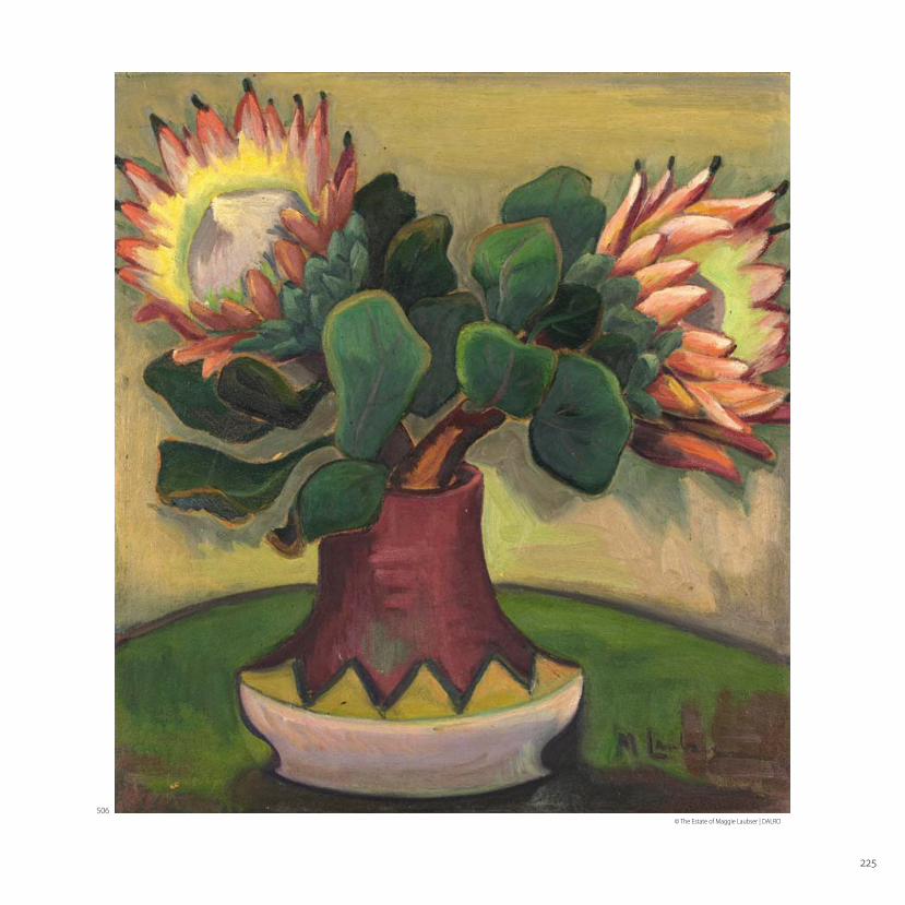
506Maggie LAUBSERSOUTH AFRICAN 1886–1973
Still Life with Proteas in a Vase with Zig-Zag Patternexecuted circa 1930
signed
oil on cardboard
60 by 55 cm
R –
Preliminary painting verso.
PROVENANCE
Acquired directly from the artist
and thence by descent
EXHIBITED
South African National Gallery,
Cape Town, 1969, catalogue
number 91
LITERATURE
Dalene Marais. (1994) Maggie
Laubser: her paintings, drawings
and graphics, Johannesburg and
Cape Town: Perskor. Illustrated
on page 296, catalogue number
1203.
505Maggie LAUBSERSOUTH AFRICAN 1886–1973
Hibisci en Stokrosesigned
oil on board
52,5 by 39,5 cm
R –
PROVENANCE
Acquired from the artist in
1945 by the current owner’s
grandparents
LITERATURE
Dalene Marais. (1994) Maggie
Laubser: her paintings, drawings
and graphics, Johannesburg and
Cape Town: Perskor. Illustrated on
page 306, catalogue number 1261.
© The Estate of Maggie Laubser | DALRO
505
225
© The Estate of Maggie Laubser | DALRO
506

226
507Jean WELZSOUTH AFRICAN 1900–1975
Still Life with a Bowl of Figssigned and dated 54
oil on canvas laid down on board
45 by 60 cm
R –
PROVENANCE
Sotheby Parke Bernet South Africa (Pty) Ltd,
Johannesburg, 3 March 1975, lot 172
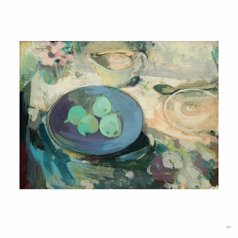
Empty utensils: jug, spoon and saucer
are placed on the edge of a table. A vase
with anemones dominates at the corner’s
edge. At the slightest pull of the cloth the
arrangement will topple over and disappear
into the void.
On the table in front of these objects a blue
bowl with green fi gs is the focal point. It
matches the anemones. Figs, classifi ed as
fruit, are fl owers. With the anemones they
belong to the domain of Lan Ts’ai-ho, the
sixth of the Eight Chinese Immortals. He wore
a blue cloak, carrying a basket with fl owers
and sang of the brevity of life and the
fl eeting nature of pleasure (see: J E Cirlot.
A Dictionary of Symbols). In Still Life with
a Bowl of Figs the blue bowl with its fi g-
fl owers echoes Lan Ts’ai-ho’s song...
Elza Miles
227

228
508Irma STERNSOUTH AFRICAN 1894–1966
Flowers and Fruit signed and dated 1937
oil on canvas
74,5 by 64,5 cm
R –
Proceeds from the sale of this lot will benefi t the Cape Peninsula
Organisation for the Aged to support their extensive welfare
retirement commitment for State pensioners in need.
PROVENANCE
Donated to The Cape Peninsula Organisation for the Aged
LITERATURE
Marion Arnold. (1995) Irma Stern: A Feast for the Eye, Cape Town:
Fernwood Press for the Rembrandt van Rijn Art Foundation.
Illustrated in colour on page 64.
Wilhelm van Rensburg. (ed) (2003) Irma Stern: Expressions of a
Journey. Johannesburg: Standard Bank Gallery. Illustrated in colour
on page 171.
Helene Smuts. (2003) Refl ections of a Journey: an educational resource
to accompany Irma Stern: Expressions of a Journey. Johannesburg:
Standard Bank Gallery. Illustrated in colour on page 26.
‘Each fl ower in Flowers and Fruit of 1937 is subtly diff erent. Irma loved
to fi ll her house with large bunches of the fl owers that she grew
in her garden herself. When she was painting in Johannesburg, it
was Freda Feldman who drove to the market to buy large bunches
of exotic fl owers. “My mother shopped for perfect Cezanne-like
fruits and unusual vegetables that seemed cultivated especially
for the luscious still-lifes Irma would set up.” …“No sooner had Irma
painted them, which she did at considerable speed – than she
would devour them. Eating her still-lifes was a favourite pastime!”
remembers Mona Berman.
In the still-life, Flowers and Fruit, of 1937, Irma Stern goes far beyond
creating pictorial space by organising the forms of diff erent objects
in relation to one another. First her powerful colours evoke our
senses and then she manipulates our perception of pictorial space
by playing off the intensity of one colour against another. The
bright turquoise of the vase is equal in intensity to the bold orange
of the heavy pumpkin, but the evocation of its solid form and mass
in a subtle gradation of oranges, reds and browns convinces us
that it must be deeper in space, and therefore behind the vase.
Irma Stern judges exactly the point at which intense colours are
saturated and then balances these against subtly muted areas of
colour. Her chromatic range creates a sense of life and meaning in
the painting.’ (Smuts, page 26)

229
© The Irma Stern Trust | DALRO

230
509Adolph JENTSCHSOUTH AFRICAN 1888–1977
Namibian Landscape, Summersigned with the artist’s initials and
dated 1939
oil on canvas stretched over board
58 by 78,5 cm
R –
The German, middle-aged Adolph Jentsch, having trained in Dresden,
arrived in the then South West Africa in 1938. Having felt stifl ed in his work
by the pressures of pre-war German policy and taste, the desert landscape
around him, immeasurably vast and still, proved a revelation. He worked
quickly towards a one-man show at the Grossherzog Hotel in Windhoek,
and then made painting trips into the country’s scorched, southern areas.
While reinvigorated in his new environment, and despite having rubbed
shoulders in Dresden with the likes of George Grosz, Kurt Schwitters and
Max Pechstein, each of whom would become synonymous with various
European and American modernisms, Jentsch remained committed to a
conservative, controlled approach to his painting.
Bearing in mind the artist’s iconic vistas of silver grasses, hardy scrub and
sun-bleached, thirsty plateaux, the present lot is particularly unusual as it
shows a fl owing river and the desert in full bloom. Jentsch chose not to
identify the spot, nor indeed the month, but one might imagine the artist,
perched on his fold-away stool (fi g.1), painting the scene in the summer of
1939 on his much-interrupted journey to Eirup, the farm owned by Richard
Schröders, some 80 kilometres north-east of Mariental. The Auob River,
which had to be crossed several times on the way, was in spate at the time,
and forced a number of apparently happy delays. Olga Levinson, in her very
personal monograph on the artist, noted how much Jentsch enjoyed the
amusing adventure of South West African travel, and how readily he would
wade into the current in search of the best places for his vehicle to cross. But
she also remarked on how moved the artist had been by the desert’s rapid,
near-miraculous transformation after the rain.1 There is certainly much in this
picture to suggest his fascination with the details of nature, and a real sense
of his wonder at what he saw in front of him. On the nearest bank he laid out
an intricate, decorative pattern of pebbles using spots and dense strokes of
lavender, orange, grey and baked-pink clay. By way of contrast, he painted
the new shoots and bushes with expressive, calligraphic fl icks of shimmering
green. The composition, however, he organised along strong horizontal
lines: the refl ective water, painted with as much yellow as blue, runs across
the canvas, while above it and below the stony bank, the leafy treeline, the
eroded beach, and the wide sky form parallel bands of diff ering colour and
texture.
1. Olga Levinson. (1973) Adolph Jentsch. Cape Town: Human & Rousseau Publishers.
Pages 37 and 43.
Fig 1. Adolph Jentsch painting en plein air © Olga Levinson

231

232
510Jacob Hendrik PIERNEEFSOUTH AFRICAN 1886–1957
By McGregor, KPsigned; inscribed with the title on the reverse
oil on board
44 by 59 cm
R –
PROVENANCE
Sotheby Parke Bernet South Africa, Johannesburg,
18 September 1979, lot 81, The Property of Mrs WJ Steyn
The Everard Read Gallery label adhered to the reverse
McGregor, a charming village at the foot of the Riviersonderend
mountains, lies roughly 150 kilometres east of Cape Town. In 1905, a main
road to Cape Town passing through the village was proposed, but was
never constructed. As a result Mcgregor retained its allure as a peaceful
retreat for artists and other creatives. This isolated, quiet town was the
perfect repose for Pierneef when he visited the Cape after receiving the
commission to paint the eponymous Johannesburg Station panels. He
toured the Cape in 1929, and again for a protracted period from February
to October in 1931, making numerous sketches and watercolours mainly
of Table Mountain and Lion’s Head, before moving on to Stellenbosch,
where he was naturally attracted to the twin peaks of the mountains
towering over the town. Before reaching the coastal town of Hermanus,
he stopped over in the McGregor district where he recorded his
impressions.
The present lot, evoking the feel of the Cape, may well have been
considered as the basis for one of the Station Panels. What is of particular
interest about this landscape, is the classic composition that is so
characteristic of many of Pierneef’s works. A curved dirt road leads to a
homestead in the foreground, giving way to a mysterious drop beyond
a row of sentinel trees, with some indication of extensive cultivated
fields in the middle ground, ultimately culminating in a series of serrated
mountain ranges. The work includes Pierneef’s whole colour palette,
and constitutes, as Esmé Berman describes ‘’In a wealth of idealised
landscape-compositions the cool harmonies of his earlier impressionistic
paintings are reconciled with the intervening blaze of oranges and golds,
to establish the unmistakable warm-cool palette of his middle years.’’
Esmé Berman. (1983) Art and Artists of South Africa. Cape Town: AA Balkema, page 330
233
234
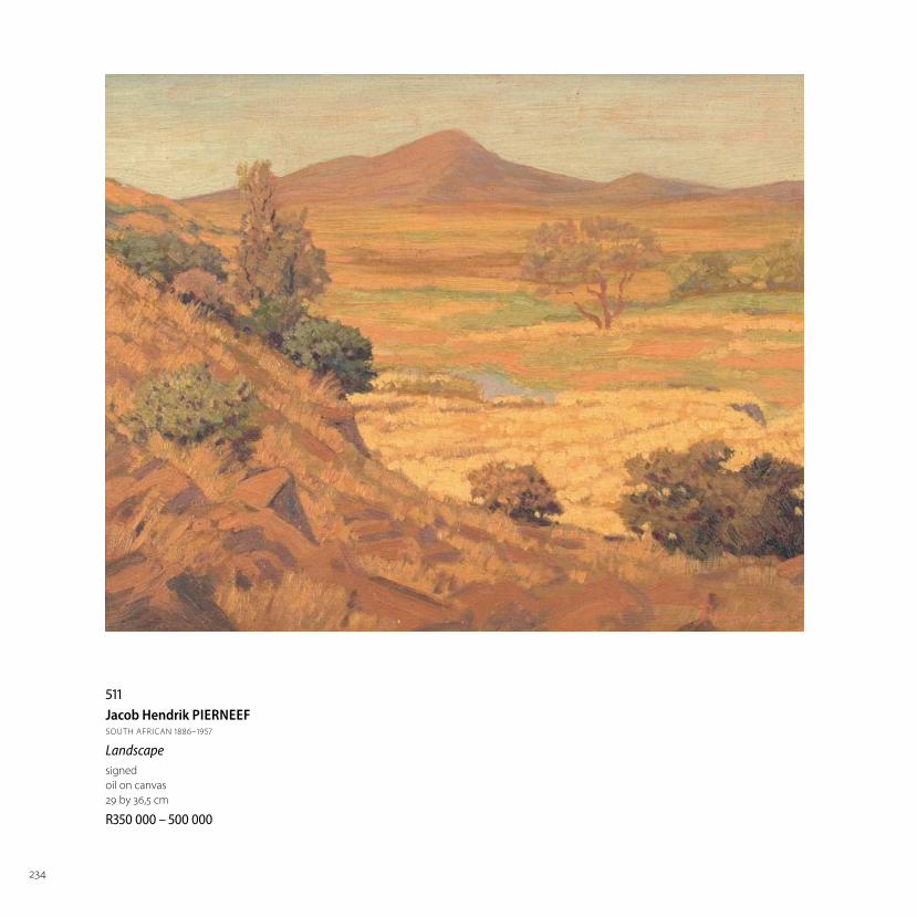
511Jacob Hendrik PIERNEEFSOUTH AFRICAN 1886–1957
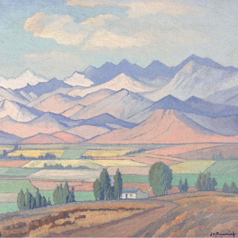
Landscapesigned
oil on canvas
29 by 36,5 cm
R –

235
512Jacob Hendrik PIERNEEFSOUTH AFRICAN 1886–1957
Landscape with Trees signed and dated 44
oil on canvas
34,5 by 44,5 cm
R – PROVENANCE
Purchased from the artist by the current owner

236
513Hugo NAUDÉSOUTH AFRICAN 1868–1941
The Mountain behind Groote Schuur Estatesigned
oil on canvas
60 by 82,5 cm
R –
Groote Schuur, the residence Cecil John Rhodes bequeathed to the nation,
was gutted by fi re in 1896, leaving behind only the outer walls and John
Tweed’s bronze frieze of The Landing of Jan van Riebeeck. It is anyone’s guess
whether or not Hugo Naudé visited the ruins when he arrived back in Cape
Town that year from his European studies, but he evidently returned to the
home repeatedly after it was refurbished in accordance with Sir Herbert
Baker’s designs. A number of quick-fi re sketches survive (fi g. 1), as do vivid,
expressive paintings, made both from the back colonnaded stoep of the
home and the surrounding, sloping gardens. The present lot, seems an
altogether more considered, demanding and fully developed painting than
earlier, smaller renditions. The scope is particularly broad, taking in a group of
iconic Stone Pines, the familiar shoulder of Devil’s Peak, and long, rolling, plum-
shadowed clouds; the brushstrokes and dabs, moreover, are deliberate and
compact. The wild fl owers in bloom dominate the composition, allowing the
painter to blanket the landscape in shades of turquoise, mauve, navy and teal.
The Mountain Behind Groote Schuur Estate might be typical of Naudé’s
pioneering Cape Impressionist style, but the dewy luxury of its painted
surfaces, the soft edges of the tree lines, and the gentle, atmospheric light,
also recall the artist’s year amongst the Barbizon painters in Fontainebleau
near Paris. Most signifi cantly, however, the sense of sheer delight the artist
found in his famous Namaqualand fl ower fi elds, and the joyous spirit in which
he captured them, is transferred to this instantly recognisable and historically
signifi cant Cape setting.
Fig 1. Groote Schuur Estate from one of Naudé’s sketch books.

237

238
514Maud SUMNERSOUTH AFRICAN 1902–1985
Cityscapesigned
oil on canvas
48,5 by 60 cm
R –
PROVENANCE
Acquired from the artist
by the current owner

239
515Maud SUMNERSOUTH AFRICAN 1902–1985
Yachtssigned
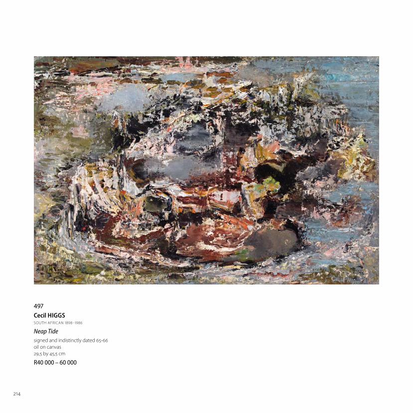
oil on canvas
39 by 79 cm
R –

240
516Irma STERNSOUTH AFRICAN 1894–1966
Young Arabsigned and dated 1942
oil on canvas
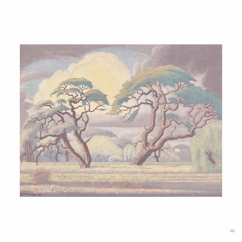
60 by 50 cm
R –
PROVENANCE
Stephan Welz & Co in Association with Sotheby’s,
Johannesburg, 8 May 1995, lot 268, with the title
Young Man with Orange Turban
EXHIBITED
The Museum of Anthropology, Elizabethville, 1942,
catalogue number 1
The Gainsborough Gallery, Johannesburg,
Private View - an exhibition of Paintings and Drawings
from the Belgian Congo, 24 November - 8 December,
1942
LITERATURE
Wilhelm van Rensburg (ed.) (2003) Irma Stern:
Expressions of a Journey. Johannesburg: Standard Bank
Gallery. Illustrated in colour on page 73 and on back
cover, with the title Young Man with Orange Turban.
Stephan Welz. (1996) Art at Auction in South Africa: The
Art Market Review 1969 to 1995, Johannesburg: Art Link
(Pty) Ltd. Page 7 and illustrated in colour on page 12,
with the title Young Man with Orange Turban.
Most of Irma Stern’s Arab subjects derive from the
artist’s two visits to Zanzibar in 1939 and 1945 – and
she is documented to have made several Young Arab
paintings during those visits. Less well-known are the
few Arab subjects Stern depicted during her visit to
the Congo in mid-1942. Stern had gone to the Congo
specifi cally to paint the Watussi and Mangbetu
peoples but along the way – and doubtless
prompted by her Zanzibar experience – she painted
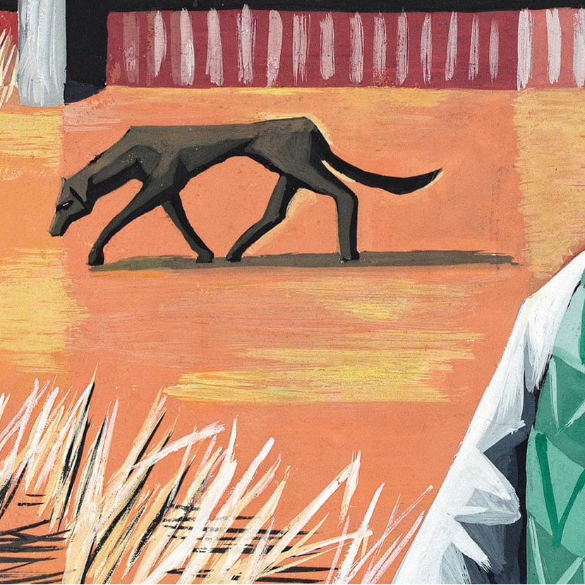
a few Arab subjects: Stern alludes to these subjects
in her book Congo (1943: p.38) “[the Arabs] squat all
around, dark bearded men with heavy sallow faces
and sad calculating eyes. They wear orange turbans
wound around their heads”. Some of these paintings
were included in her exhibition in Elizabethville
at the end of her stay in the Congo; and, again,
at her ‘Congo Exhibition’ at the Gainsborough
Gallery, Johannesburg, in December 1942. Both the
annotated list of this exhibition that is pasted into the

241
© The Irma Stern Trust | DALRO

242
Two Arabs (Father and Son)
Rupert Art Foundation
The present lot Jan van Eyck, Portrait of a Man (Self Portrait?)
© The National Gallery, London
© The Irma Stern Trust | DALRO
© The Irma Stern Trust | DALRO

243
artist’s Scrapbook and her Cashbook record that #7 Young Arab was
sold for £40 to a Dr Swart. This is almost certainly the present work.
A comparison between the Young Arab and the Two Arabs (Father
and Son) (Private Collection; Arnold, p.115) and other work from the
first visit to Zanzibar, is revealing. In 1939, Irma Stern was clearly
attracted to the exoticism of Zanzibar which she found expressed
in colourful costume and, frequently, some form of rhetorical
action: figures are represented saying prayers, drinking coffee or, as
in the Two Arabs (Father and Son), communicating with each other
in some way. Moreover, the early paintings usually incorporate
a spatial context for the figure, either a developed architectural
setting or an indication of background drapery. This richness of
content is expressed in both the relatively large scale of the early
works – the Two Arabs (Father and Son) is over twice the size of the
Young Arab – and by the artist’s use of Zanzibari carved doorways
converted into sensuously rich frames. The Young Arab is relatively
simple on all these counts and seems never to have had an exotic
frame. But where Stern herself would probably have regarded
this work as a modest expression, contemporary taste values the
removal of the paraphernalia of exoticism to focus on the pure
presence of the subject.
Against a backdrop defined more for its harmonious colour
relationship with the principal subject than to create any spatial
setting, the Young Arab presents himself to the spectator simply
as a fellow human subject. According to Joseph Sachs, Irma Stern
and the Spirit of Africa, published in 1942, the year this painting was
made, Stern’s Zanzibar figures, “lulled by [their] inherent indolence
and [their] Oriental quietism”, represent nothing less than “the
rise and fall of Arab civilisation”. But the Young Arab is free of these
exotic associations and while perhaps questioning the purpose of
the pictorial encounter, asserts his shared humanity through the
vitality of his eyes and mouth. As in Jan Van Eyck’s great Portrait
of a Man (Self Portrait?) (National Gallery, London), which Stern
had certainly seen, the magnificent headgear provides a note
of extravagant ostentation but the deep silence of the figure is
enriched by this attribute rather than disrupted. The gestural brush-
strokes, whether defining form or enlivening the painted surface,
also contribute vitality to the figure without disturbing its silence.
The painting is not a portrait in the traditional sense: it lacks the
self-referential specificity of works made in that genre and Stern
was clearly not concerned with the identity of her subject. But as
an essay in the exploration of shared human experience it is rarely
matched in Irma Stern’s oeuvre.
Michael Godby
Marion Arnold. (1995) Irma Stern: A Feast for the Eye, Vlaeberg: Fernwood Press.
Joseph Sachs. (1942) Irma Stern and the Spirit of Africa, Pretoria: J.L. Van Schaik.
Irma Stern. (1943) Congo, Pretoria: J.L. Van Schaik.

244
517Maud SUMNERSOUTH AFRICAN 1902–1985
Mont Blancsigned
oil on canvas
59,5 by 72 cm
R –

245
518Maud SUMNERSOUTH AFRICAN 1902–1985
Namibian Landscapesigned; engraved with the title on a plaque adhered to the reverse
oil on board
59 by 120 cm
R –
Proceeds from the sale of this lot will
benefi t the development of The Jakes
Gerwel Entrepreneurs High School
scheduled to open in January 2018.

246
519Irma STERNSOUTH AFRICAN 1894–1966
A Small Canal, Venicesigned and dated 1948; inscribed with the artist’s
name, title and medium on a Johans Borman Fine
Art label on the reverse
oil on canvas
59 by 49 cm
R –
PROVENANCE
Stephan Welz & Co in Association with Sotheby’s,
Johannesburg, 6 November 1989, lot 352 with the
title Canal, Venice
In the summer of 1947, Irma Stern visited Europe
for the fi rst time after a decade’s absence. She
exhibited at Wildenstein in Paris, as well as in
Brussels, London and Rotterdam. Stern returned
again in 1948, her itinerary including a stopover in
Venice, where she attended the Venice Biennale.
The visit resulted in the production of a number of
Venetian scenes, including the canvas works Venice
Lagoon, Piazza San Marco and The Entrance to the
Grand Canal, Venice. This lot, a study of an arched
pedestrian bridge in the San Marco district, shifts
the view tentatively inwards, towards the everyday
domesticity of Venice. Stern, who had already
fi ne-tuned her expressive brush style and bold
handling of colour, adopts a confi dently restrained
approach here to off er a scene that is observational
rather than interpretive. It was a descriptive way of
painting Stern had honed on her trip to Madeira in
1931. Stern’s visit to Venice resulted in a noteworthy
outcome. The monthly bulletin Jewish Aff airs in
1956 reported: “It was she who was instrumental
in South Africa being invited to take part in one of
the most famous of all art exhibitions, the Biennale
in Venice. In 1948 the Italian Minister in the Union
admired her work and suggested that she show
it at the Biennale.” Two years later, South Africa
debuted with a national exhibit in the Foreign
Halls of the Venice Biennale’s central pavilion. Stern
was among the invited artists. She would return to
Venice to exhibit at the Biennale again in 1952, 1954
and 1958.
1. GH Cooper. (1956) ‘Irma Stern,’ in Jewish Aff airs, September,
volume 11, page 32.

247
© The Irma Stern Trust | DALRO

248
520Maggie LAUBSERSOUTH AFRICAN 1886–1973
Black Swansigned
oil on board
44,5 by 39,5 cm
R –
The expressionist painter Maggie Laubser wed her radical
technique to an emphatically pastoral vision. Laubser’s farm
upbringing near Malmesbury, and her later retreat to the farm
Oortmanspoort, near Durbanville, shortly after her return from
Berlin in 1924, greatly infl uenced her choice of subject matter.
Shepherds, pickers, farm animals and fl owers recur in her depictions
of the Boland’s agricultural landscapes. Laubser is well known
having repeatedly portrayed the same limited range of subjects.
Her output includes a small selection of black swans. Although
executed in a fi gurative style, this lot off ers a symbolic orchestration
of subject matter that includes an oversized renosterveld daisy in
the foreground and settled Boland landscape as backdrop.
In his discussion of a black swan work held in the Sanlam Art
Collection, Professor Fransie Malherbe points out how natural
phenomena come to appear “like apparitions from a world of
fairy-tales” in Laubser’s hands.1 The historian F.L. Alexander similarly
speaks of her “lyrical” works as being composed of “childlike
symbols”.2 Early critics were fl ummoxed by the naïve styling
of Laubser’s paintings. “Time and again, Laubser found herself
confronted by bewildered viewers who asked the question Why?
Why cats with fl owers? Why ducks with lilies?”3 Her water birds
were especially seen as provocative. “It’s amazing how many
people develop a kind of hydrophobia from her duck paintings,”
wrote Johannes Meintjes, whose 1944 biography helped overhaul
Laubser’s reputation.4
Meintjes describes Laubser’s repeated description of nature as
going beyond the superfi cial: “It is her ambition to know every
object thoroughly, so that when she reproduces a fl ower it
is the soul of a fl ower being portrayed – the soul, the basic
shape and characteristics of everything around her.”5 In a 1956
radio interview, Laubser, then a resident in Strand, described
her love of nature in almost sublime terms: “I enjoyed so
much being out in the freedom and space of nature. I fi nd it
such a pity that our children of today do not know enough of
nature because to be close to nature is so important for the
refi nement of the mind and the accentuation of the spirit.”6
1. FEJ Malherbe. (1959) “Maggie Laubser,” in Our Art Vol. 1. Pretoria:
Lantern/SABC, page 40.
2. FL Alexander. (1962) Art in South Africa: Painting, Sculpture and Graphic
Work since 1900. Cape Town: A.A. Balkema, page 13.
3. Esmé Berman. (1993) Painting South Africa. Johannesburg: Southern
Book Publishers, page 71.
4. Johannes Meintjes. (1944) Maggie Laubser. Cape Town: H.A.U.M.
Jacques Dusseau & Co., page 22.
5. Ibid., page 14.
6. E Delmont. (1989) “Maggie Laubser: Juvenilia and early South African
works before 1913”, in South African Journal of Cultural History, Vol. 3.1,
January 1989, page 60.

249
© The Estate of Maggie Laubser | DALRO

250
521Freida LOCKSOUTH AFRICAN 1902–1962
Still Life with Daisiessigned and dated indistinctly
oil on panel
53,5 by 43 cm
R –

251
522Adriaan BOSHOFFSOUTH AFRICAN 1935–2007
Still Life with a Copper Pot and a Blue and White Vasesigned
oil on canvas
70 by 91 cm
R –
252
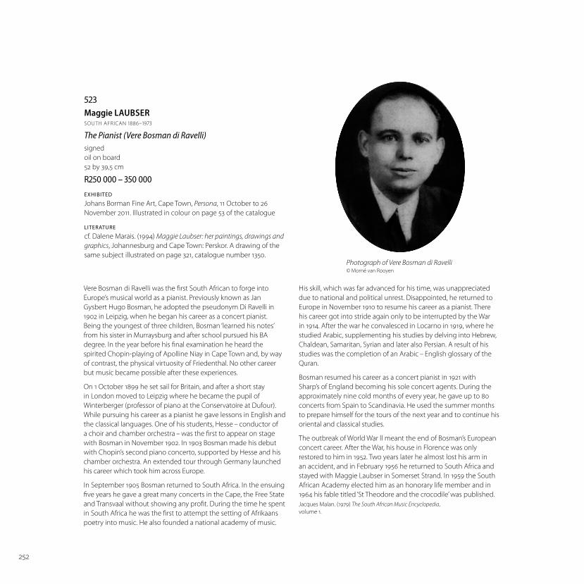
523Maggie LAUBSERSOUTH AFRICAN 1886–1973
The Pianist (Vere Bosman di Ravelli)signed
oil on board
52 by 39,5 cm
R –
EXHIBITED
Johans Borman Fine Art, Cape Town, Persona, 11 October to 26
November 2011. Illustrated in colour on page 53 of the catalogue
LITERATURE
cf. Dalene Marais. (1994) Maggie Laubser: her paintings, drawings and
graphics, Johannesburg and Cape Town: Perskor. A drawing of the
same subject illustrated on page 321, catalogue number 1350.
His skill, which was far advanced for his time, was unappreciated
due to national and political unrest. Disappointed, he returned to
Europe in November 1910 to resume his career as a pianist. There
his career got into stride again only to be interrupted by the War
in 1914. After the war he convalesced in Locarno in 1919, where he
studied Arabic, supplementing his studies by delving into Hebrew,
Chaldean, Samaritan, Syrian and later also Persian. A result of his
studies was the completion of an Arabic – English glossary of the
Quran.
Bosman resumed his career as a concert pianist in 1921 with
Sharp’s of England becoming his sole concert agents. During the
approximately nine cold months of every year, he gave up to 80
concerts from Spain to Scandinavia. He used the summer months
to prepare himself for the tours of the next year and to continue his
oriental and classical studies.
The outbreak of World War ll meant the end of Bosman’s European
concert career. After the War, his house in Florence was only
restored to him in 1952. Two years later he almost lost his arm in
an accident, and in February 1956 he returned to South Africa and
stayed with Maggie Laubser in Somerset Strand. In 1959 the South
African Academy elected him as an honorary life member and in
1964 his fable titled ‘St Theodore and the crocodile’ was published.
Jacques Malan. (1979) The South African Music Encyclopedia,
volume 1.
Vere Bosman di Ravelli was the first South African to forge into
Europe’s musical world as a pianist. Previously known as Jan
Gysbert Hugo Bosman, he adopted the pseudonym Di Ravelli in
1902 in Leipzig, when he began his career as a concert pianist.
Being the youngest of three children, Bosman ‘learned his notes’
from his sister in Murraysburg and after school pursued his BA
degree. In the year before his final examination he heard the
spirited Chopin-playing of Apolline Niay in Cape Town and, by way
of contrast, the physical virtuosity of Friedenthal. No other career
but music became possible after these experiences.
On 1 October 1899 he set sail for Britain, and after a short stay
in London moved to Leipzig where he became the pupil of
Winterberger (professor of piano at the Conservatoire at Dufour).
While pursuing his career as a pianist he gave lessons in English and
the classical languages. One of his students, Hesse – conductor of
a choir and chamber orchestra – was the first to appear on stage
with Bosman in November 1902. In 1903 Bosman made his debut
with Chopin’s second piano concerto, supported by Hesse and his
chamber orchestra. An extended tour through Germany launched
his career which took him across Europe.
In September 1905 Bosman returned to South Africa. In the ensuing
five years he gave a great many concerts in the Cape, the Free State
and Transvaal without showing any profit. During the time he spent
in South Africa he was the first to attempt the setting of Afrikaans
poetry into music. He also founded a national academy of music.
Photograph of Vere Bosman di Ravelli © Morné van Rooyen

253
© The Estate of Maggie Laubser | DALRO

254
524Irma STERNSOUTH AFRICAN 1894–1966
Still Life with Figs signed and dated 1950
oil on canvas
42 by 55 cm
R –
One cannot but imagine that the execution of
this work was an act of unbridled spontaneity by
the artist.
Irma Stern’s backyard hosted a black fi g tree with
the sweetest and most delicious fruit. The bounty
of it must have been great in her day before it
became the half-tree that was left by the end
of the 20th century, fi nally collapsing in the late
1990s.
Figs are redolent of the Mediterranean and
ancient culture, all very appealing to Irma.
Her masterful use of green is evident here, the
fan-like spontaneity of the composition has a
feminine elegance, a fl ourish, almost a fl amenco.
These fi gs would have been, on numerous
occasions, the completion of one her sumptuous
feasts, where a sensual display of fruit on a brass
platter was the climax.
Christopher Peter
Director, UCT Irma Stern Museum

255
© The Irma Stern Trust | DALRO

256
525François KRIGESOUTH AFRICAN 1913–1994
The Old Harbour, Hermanussigned and dated 40
oil on canvas
36 by 46,5 cm
R –
‘While he lived on the Cape Peninsula, particularly during the decade following the
war, Krige returned to the kind of fi shing villages he had loved to frequent as a child
growing up along the Onrus coast. Hundreds of his studies of fi shing boats, hamlets
and the traditional life style of Coloured fi shermen from all over the Western Cape
abound. We see old sailing craft, genre scenes of men repairing their nets, boat-
builders at work on vessels and the wrecked carcasses of others washed up on the
beach. Trek fi shermen surf their boats home and drag in nets shimmering with fi sh;
some sleep off the early morning voyage on the sand beside their craft, while others
celebrate a good catch in the dingy local bar. We see the ubiquitous whitewashed
PROVENANCE
Dr van Ryneveld van
der Horst, Clocolan, and
thence by descent

257
526François KRIGESOUTH AFRICAN 1913–1994
Visbaai, Hermanussigned and dated 41
oil on canvas laid down on board
35,5 by 45,5 cm
R –
cottages on high ground overlooking the ocean and shacks down at the waterline
with bokkems (dried mullet) strung up to dry.
Krige would often spend so much time in a fi shing community that his presence
went unnoticed and he was able to move among the locals recording their daily
tasks in a uniquely insightful way, unmatched by any other South African artist. He
was consciously capturing a lifestyle that he felt was threatened; indeed his beloved
fi shing harbour at Hermanus was soon to become extinct, replaced by a modern
harbour and power-driven boats.’
Justin Fox. (2000) The Life and Art of Francois Krige, Vlaeberg: Fernwood Press. Page 65.
PROVENANCE
Dr van Ryneveld van
der Horst, Clocolan, and
thence by descent

258
527Maggie LAUBSERSOUTH AFRICAN 1886–1973
Shepherd Seated with his Flocksigned
oil on board
45 by 55 cm
R –
Preliminary painting verso.
PROVENANCE
Mrs M van der Merwe, Johannesburg, who acquired the work on
the Empire Exhibition, 1936
Mr and Mrs LG van der Merwe, Northcliff
Stephan Welz & Co in Association with Sotheby’s, Johannesburg,
30 November 1993, lot 490, The Insolvent Estate Mr RA (Tony) Ross
Die Kunskamer
Private Collection
EXHIBITED
Empire Exhibition 1936
LITERATURE
Dalene Marais. (1994) Maggie Laubser: her paintings, drawings and
graphics, Johannesburg and Cape Town: Perskor. Illustrated on
page 261, catalogue number 984, with the title Shepherd Seated in
a Landscape with Sheep.
In 1936 Johannesburg hosted the Empire Exhibition, an itinerant
showcase of cultural and economic achievement by various
territories within the British Empire. The event, held during the
city’s golden jubilee, remains an important milestone in the
early reception of modernism in South Africa. A purpose-built
fair ground was erected in Milner Park, on the current site of
the western campus of the University of the Witwatersrand,
and included innovative structures like architect Geoff rey
Eastcott Pearse’s art deco Tower of Light. A parallel exhibition
was organized at the Johannesburg Art Gallery. The selection
committee was chaired by Leo François, president of the Natal
Society of Artists, and included Maggie Laubser as a juror. Laubser
also presented work, including this lot.
Laubser’s presence on the Empire Exhibition was no small
accomplishment. Her expressive style of painting, informed by
her direct association with German painters Eric Waske, Emil
Nolde, Max Pechstein and Karl Schmidt-Rottluff , was controversial.
Johannes Meintjes writes how, following her return from Berlin
in 1924, Laubser was “horribly persecuted” in the press, often
receiving “coldblooded, cruel and unfair reviews”.1 As Esmé
Berman notes the Empire Exhibition was the “fi rst signifi cant
demonstration of critical recognition” for expressionist painters like
Laubser, Irma Stern and Wolf Kibel.2
In a country haltingly embracing a metropolitan identity,
expressionism was a radical challenge to the prevailing styles
of romantic naturalism and impressionism. This lot is exemplary
of Laubser’s ostensibly naïve style. Produced during her highly
productive years of withdrawal to the family farm, Oortmanspost,
Laubser’s technique is noteworthy. The subjects in the foreground
are rendered with great delicacy, while the eruptive sky is
demonstrative of her gestural use of paint. Laubser’s ecstatic
pastoral studies of the Boland from this period are generally
characterised by the painter’s vivid, non-naturalistic use of colour
and strong emotional identifi cation with her subjects. Laubser
often depicted shepherds. Meintjes describes this recurring fi gure
in her work as a “beloved subject” and praises these particular
canvases as “stirring”.3 Both Meintjes and Berman note a tone of
melancholy in Laubser’s imaginative portrayals of shepherds,
which typically juxtapose a downcast and solitary fi gure against a
resplendent landscape with dramatic sky. “It is clear that the artist
knew great sadness,” ventures Meintjes.4
1. Johannes Meintjes. (1944) Maggie Laubser. Cape Town: H.A.U.M. Jacques
Dusseau & Co., page 8.
2. Esmé Berman. (1993) Painting South Africa. Johannesburg: Southern Book
Publishers, page 67.
3. Meintjes, op.cit., page 20.
4. Ibid., page 20.

259
© The Estate of Maggie Laubser | DALRO

260
528Terence MCCAWSOUTH AFRICAN 1913–1978
A Spanish Townsigned and dated ‘68; inscribed ‘ For Marthinus and Rosemary,
with every wish for their happiness together, from Terence’
oil on canvas laid down on board
68,5 by 79,5 cm
R –
PROVENANCE
A wedding gift from the
artist to the present owner

261
529Terence MCCAWSOUTH AFRICAN 1913–1978
Drostdy Steps, Simon’s Townsigned; inscribed ‘Old Steps in
Simon’s Town’ in another hand
on the reverse
oil on canvasboard
60 by 49,5 cm
R –

262
530François KRIGESOUTH AFRICAN 1913–1994
Cape Town Viewsigned
oil on canvas
45 by 57,5 cm
R –
LITERATURE
FL Alexander. (1962) Art in South Africa: Painting,
Sculpture and Graphic Work Since 1900, Cape Town:
AA Balkema. Illustrated on page 45.

263
531Piet VAN HEERDENSOUTH AFRICAN 1917–1991
A View of Paarlsigned
oil on canvas laid down on board
58,5 by 72 cm
R –
264
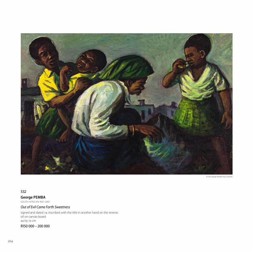
532George PEMBASOUTH AFRICAN 1912–2001
Out of Evil Came Forth Sweetnesssigned and dated 74; inscribed with the title in another hand on the reverse
oil on canvas board
49 by 73 cm
R –
© The George Pemba Trust | DALRO

265
533Gerard SEKOTOSOUTH AFRICAN 1913–1993
The Casamance Dancers and the River Seinesigned and dated 75; signed, inscribed with the title and the artist’s address on the stretcher
oil on canvas
48,5 by 63,5 cm
R –
© The Gerard Sekoto Foundation | DALRO

266
534Walter BATTISSSOUTH AFRICAN 1906–1982
A Gathering of Figures, recto; Two Women with Pots, versosigned on the reverse
oil on canvas
28,5 by 44,5 cm
R –

267
535Peter CLARKESOUTH AFRICAN 1929–2014
Erosionsigned and dated 10.5.1967; inscribed with the title
and the medium on the reverse
gouache
42 by 53,5 cm
R –
PROVENANCE
Purchased from the artist in the
1970s by the current owner
© The Estate of Peter Clarke | DALRO

268
536Cecil SKOTNESSOUTH AFRICAN 1926–2009
Still Life with Coff ee Pot and Fruitsigned
carved, painted and incised wood
panel, in the artist’s handmade frame
127 by 127 cm, including frame
R –
© The Estate of Cecil Skotnes | DALRO
Cecil Skotnes studied painting at the University of
the Witwatersrand, where the still life genre formed
an essential component of the newly founded art
school’s parochial curriculum.1 In 1977 he produced The
Origin of Wine, a three-panel scene for the Cape Wine
Growers Association (KWV) that includes a still life with
fruit, fi sh, bottles and glasses in the left panel. “The
triptych unashamedly divulges the artist’s epicurean
gastronomic pleasures,” noted Frieda Harmsen.2
Skotnes credited art collector and dealer Vittorio
Meneghelli with introducing him to the pleasures of
food and wine. He amassed a wine collection of 1800
bottles at his home in Observatory, Johannesburg.
Skotnes returned to painting after his move to
Cape Town in 1979. He painted a number of still life
scenes. The present lot shares notable similarities
with Still Life with Fruit, Olives, Wine Bottle and Coff ee
Pot, a work gifted by the artist to a chef and sold for
R909 440 at a Strauss & Co auction in 2013. Both works
off er table settings viewed from extreme vertical
perspectives. Any sense of naturalism is disrupted
by the fl attened picture plane and the painter’s
classifi catory arrangement of food and objects, which
are interchangeably portrayed in side and top profi le.

269
537Cecil SKOTNESSOUTH AFRICAN 1926–2009
Citadelexecuted in 1995-6
signed; bears a SANG label on the reverse
acrylic and pigments on panel
115 by 112 cm, in the artist’s incised, painted and
brass-mounted frame
R –
© The Estate of Cecil Skotnes | DALRO
This lot is larger in scale than the other work, and
additionally features a shelf-like display of stoneware,
each object clearly delineated (as if refuting Morandi’s
habit of clustering objects). Despite its unusual spatial
distortions, this is fundamentally a work of pleasure: a
painter’s delight in his medium as much as the bounty
his painting describes.
1. Frieda Harmsen. (1996) ‘Artist Resolute’, in Cecil Skotnes. Cape
Town: Cecil Skotnes, page 28.
2. Ibid., page 45.
3. James Ambrose Brown, (1984) ‘Interview with Cecil Skotnes’,
20 April, Cape Town, uncorrected typed transcript, page 19.
Available at http://cecilskotnes.com
EXHIBITED
South African National Gallery, Cecil
Skotnes Retrospective Exhibition, 1996
LITERATURE
Frieda Harmsen. (ed.) (1996) Cecil
Skotnes, Cape Town: South African
National Gallery. Illustrated in colour on
page 214.

270
538Lucas SITHOLESOUTH AFRICAN 1931–1994
Head (LS6211)signed
wood
height: 40 cm
R –
EXHIBITED
Adler Fielding Galleries,
Johannesburg, 1962, catalogue
number 290.

271
539Edoardo VILLASOUTH AFRICAN 1915–2011
Owl Isigned, dated 95 and numbered 6/6
bronze with a brown patina,
mounted on a marble base
height: 53 cm, including base
R –
LITERATURE
Chris De Klerk and Gerard De
Kamper. (2012) Villa in Bronze:
A Comprehensive Reference to the
Castings of Edoardo Villa, Pretoria:
University of Pretoria Museum.
Another example from this edition
illustrated on page 113.

272
540Cecil SKOTNESSOUTH AFRICAN 1926–2009
Head No 2signed; inscribed with the title on the reverse
carved, painted and incised wood panel
40 by 61 cm
R –
© The Estate of Cecil Skotnes | DALRO

273
541Sydney KUMALOSOUTH AFRICAN 1935–1988
Beast and Rider signed
terracotta
height: 38 cm
R –
PROVENANCE
Acquired from the artist by the
previous owner

274
542Peter CLARKESOUTH AFRICAN 1929–2014
Morning at Bo Plaas, Teslaarsdal, Caledon District, CP (sic)signed and dated 1972; inscribed with the title and medium on
the reverse
acrylic on canvas laid down on board
58 by 43 cm
R –
The reverse bears the following inscription in English and
Afrikaans:
“To – Dear Mr van den Heever. This is not goodbye, for we’ll always
have fond memories of you. This is our token of our appreciation.
From all your students, Grassy Park Sen. Sec. School... 1983”
The village of Tesselaarsdal is situated below the Kleinrivier
Mountains near Caledon in the Overberg region. It derives its
name from Johannes Jacobus Tesselaar, a wealthy landowner
who in 1809 bequeathed one of his fi ve farms to nine workers,
including seven former slaves. The community was established
in 1832 following the death of Tesselaar’s wife and was known
as Hartebeesrivier until 1930, when it received its current name.
Peter Clarke fi rst visited Tesselaarsdal in 1949. At the time he was
employed as a dockworker in Simon’s Town and making art in
his spare time. He spent his December holidays there in 1950 and
1951. Frustrated with his life as dockworker, in 1956 he resigned and
spent three months in Tesselaarsdal. Upon returning to Cape Town
he sought work as a graphic artist at an advertising agency, failed
in his application, and decided to become a full-time artist. Clarke
continued to return to Tesselaarsdal every spring for a three-
month stay until 1960.
Clarke continued to produce paintings of the rural endurance he
had witnessed well after 1960. This atmospheric work from 1972
describes, with a vivid intensity and fullness of notation not seen
in similar scenes produced in the early 1960s, how the rituals of
life in Tesselaarsdal imprinted themselves on Clarke’s imagination.
“Tesselaarsdal is Peter Clarke’s Pont-Aven or Le Pouldo,” notes
literary scholar Hein Willemse, referring to the Breton villages
where Gauguin lived before his fi rst visit to Tahiti in 1891.1 “At
Tesselaarsdal he got to know the ways of the shepherds as he
accompanied them on their daily rounds. The whitewashed
and thatched cottages of this farming community, some dating
back to 1842, signifi ed hospitality. Here even the donkeys were
aff orded shelter in a cottage.”2 It was a refuge during the brutality
of apartheid.
This important work off ers an elaboration of the role of place,
people and circumstance of Clarke’s luminous career. The lot
was originally gifted to a school principal upon his retirement.
Clarke never completed his high schooling. In 1993 he produced
a well-known linocut titled For Some the Pathway to Education Lies
between Thorns. It depicts fi ve black schoolchildren walking a great
distance to school. In 2013 Clarke told a London audience how his
empathy for this on-going national predicament was primed by an
encounter decades earlier with a group of children in Tesselaarsdal
who walked a 16km round trip to school everyday.3
1. Hein Willemse. (2000) More Than Brothers: Peter Clarke and James Matthews at
Seventy. Cape Town: Kwela Books, page 70.
2. Ibid., page 71.
3. Peter Clarke. (2013) From artist walkabout of his exhibition Peter Clarke: Wind
Blowing on the Cape Flats, Institute of International Visual Arts, London.

275
© The Estate of Peter Clarke | DALRO

276
543Ephraim NGATANESOUTH AFRICAN 1938–1971
Jazz Bandsigned and dated ‘69
oil on board
61 by 91 cm
R –
Ephraim Ngatane is an important mid-twentieth century South
African painter. He studied under Cecil Skotnes at Polly Street
Art Centre between 1952 and 1954, where he also met and
befriended Durant Sihlali. Along with Sihlali and David Mogano,
Ngatane earned a reputation for producing highly individual
studies of township scenes using watercolour.1 He debuted
on the second Artists of Fame and Promise exhibition in 1960,
held at the Lawrence Adler Galleries, Johannesburg, and in 1963
presented his fi rst solo exhibition with the same art dealership,
renamed Adler Fielding Galleries. Despite holding sell-out
exhibitions throughout the 1960s until his premature death
in 1971, as well as his role in mentoring Dumile Feni, the white
art market adopted a “patronising attitude” to Ngatane and
treated his work as a “step-child of mainstream South African art,”
according to artist David Koloane.2 Ngatane was nonetheless
regarded as important fi gurehead. Artist and playwright
Matsemela Manaka, quoting Ezrom Legae, describes Ngatane as
“one of the forerunners”3 of township art, a once-dominant style
of social-realist painting descriptive of black urban life.
Ngatane’s “muscular style”4 however challenges easy
categorisation. An accomplished colourist, his work is marked by
its lyrical impressionism and selective use of abstraction. While
© The Estate of Ephraim Ngatane | DALRO

277
544Ephraim NGATANESOUTH AFRICAN 1938–1971
Expectant Motherssigned and dated ‘64
oil on board
60,5 by 91,5 cm
R –
his dominant subject is segregated black life under apartheid,
Ngatane’s output is an expression of a rounded personality.
His work records many instances of pleasure: boxing and jazz
performances, notably, but also weddings and a 1967 snowstorm
in Soweto. “He was an excellent boxer and played both the
penny-whistle and alto-saxophone well,” records art historian EJ
de Jager. “He loved company and his untidy studio was often
fi lled with friends making music and discussing the events of
the day. Ngatane seriously contemplated life and its meaning.
Creative self-fulfi lment, rather than public recognition, was
important to him.”5
1. Steven Sack. (1988) The Neglected Tradition: Towards a New History of South
African Art (1930-1988). Johannesburg: Johannesburg Art Gallery, page 16.
2. David Koloane. (1989) ‘The Polly Street Art Scene’, in African Art in
Southern Africa: From Tradition to Township, Nettleton, Anitra and
Hammond-Tooke, David (eds). Cape Town: Ad. Donker, page 225.
3. Matsemela Manaka. (1987). Echoes of African Art: A Century of Art in
South Africa. Braamfontein: Skotaville Publishers, page 15.
4. Olu Oguibe. (2004) The Culture Game. Minneapolis: University of
Minnesota Press, page 181.
5. EJ De Jager. (1992) Images of Man: Contemporary South African Black Art
and Artists. Alice: University of Fort Hare, page 48.
© The Estate of Ephraim Ngatane | DALRO

278
545Peter CLARKESOUTH AFRICAN 1929–2014
The Fencesigned and dated 11.9.1960; inscribed indistinctly with
the artist’s name, address and title on the reverse
gouache on paper
53,5 by 45 cm
R –
PROVENANCE
Acquired from the artist by the current owner
Peter Clarke’s paintings from the early 1960s are highly esteemed. His
approach to proportion and depth in these paintings reveal the infl uence
of his graphic work, an important complementary aspect of his painterly
output. There is often a cartoonish economy to his scenes, with only
the requisite amount of detail included, from the yellowing grass in the
foreground to the red-painted corrugated fence and cubistic sky. Figures
are confi dently arranged and delineated in simplifi ed landscapes. His
colour palette is also typically vivid and contrasting. The most important
feature of this lot, which was acquired by the seller directly from the artist,
is undoubtedly the fence. It dominates a full third of the picture plane. Its
purpose is ambiguous: it is a staging device that focuses attention on the
four human fi gures and dog, but also a curtain obscuring what the youths
are viewing.
Clarke used this compositional device in a number of subsequent works,
which may account for his request to include this particular lot on his 2012
survey exhibition Peter Clarke: Wind Blowing on the Cape Flats at the Institute
of International Visual Arts in London. The owner declined the invitation.
A later work, the gouache and collage Afrika which way (1978), was shown
instead. Clarke’s London survey also included examples of his Wall (aka
Ghetto Fences) series from the 1980s, which feature the same obscuring
barrier mid picture. Clarke later transformed what was an obvious if latent
criticism in this lot – walls separate and divide society – into a potent
criticism of the urgencies of late-apartheid life.
Dogs also recurred in Clarke’s work, typically as companions of youths.
But they also inferred more sinister things, dogs sometimes linked in
Clarke’s work to “police activity”.1 Despite the sobering undercurrents to
this fi ne composition, it is fi rstly a work of humanist wonder. Unlike his
contemporaries Durant Sihlali and Cecil Skotnes, who moved through
fi guration towards greater abstraction, Clarke never forsook the fi gure. Asked
why, he responded: “I think amazement at people, the person, the great
variety that we represent, and the situations we get into. There are so many
things about people that I fi nd endlessly fascinating.”2
1. Hein Willemse. (2000) More Than Brothers: Peter Clarke and James Matthews at Seventy.
Cape Town: Kwela Books, page 76.
2. Interview with artist by Sean O’Toole, 14 February 2011, Ocean View, Cape Town.
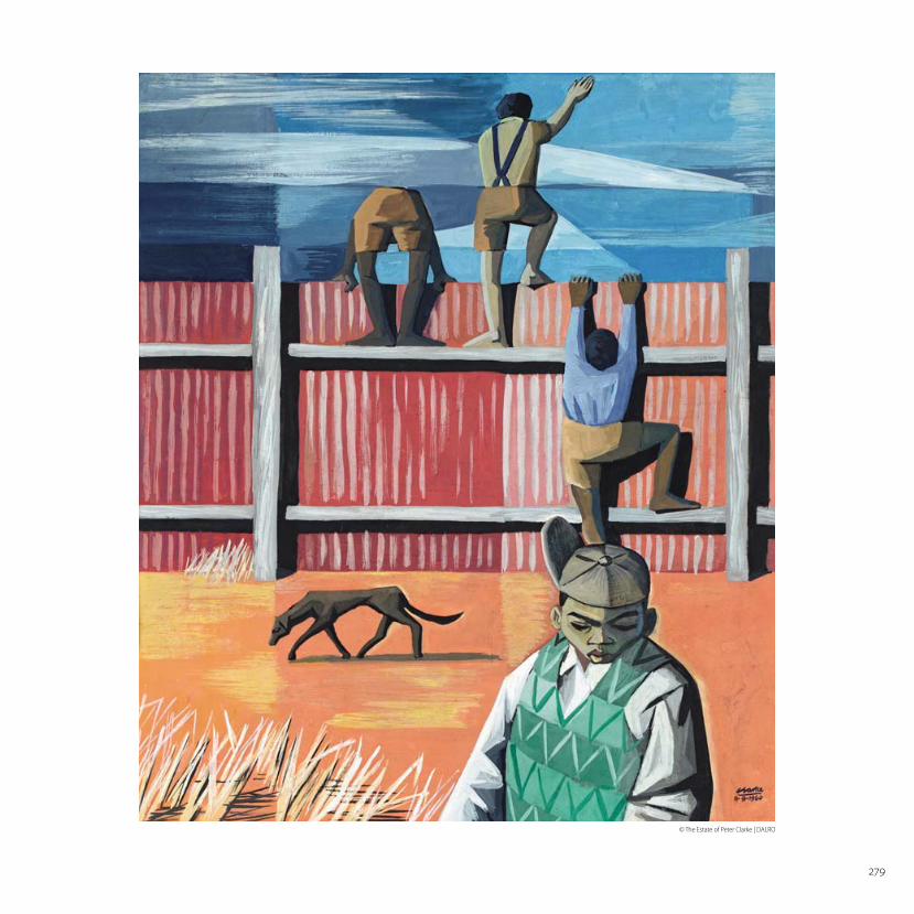
279
© The Estate of Peter Clarke | DALRO
280
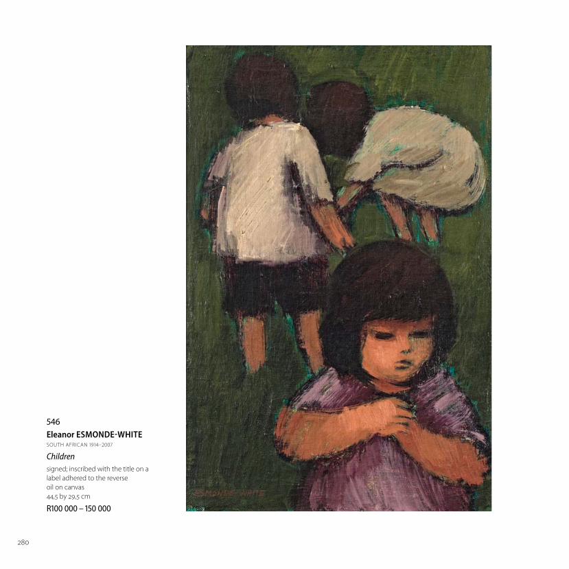
546Eleanor ESMONDE-WHITESOUTH AFRICAN 1914–2007
Childrensigned; inscribed with the title on a
label adhered to the reverse
oil on canvas
44,5 by 29,5 cm
R –

281
547Eleanor ESMONDE-WHITESOUTH AFRICAN 1914–2007
A Contented Cowsigned
oil on canvas
33,5 by 43 cm
R –

282
548Alexander ROSE-INNESSOUTH AFRICAN 1915–1996
Woman at her Dressing Tablesigned and dated 67
oil on board
60,5 by 35 cm
R –
LITERATURE
cf. Martin Bekker. (1991) The Art of
Alexander Rose-Innes, Cape Town:
Perskor. A similar example illustrated
in colour on page 98.

283
549Alexander ROSE-INNESSOUTH AFRICAN 1915–1996
Seated Nudesigned and dated 68
oil on canvas
65,5 by 45 cm
R –

284
550Christo COETZEESOUTH AFRICAN 1929–2000
Flora 2signed and dated 96; signed, dated and inscribed with the title on the reverse
enamel on board
121 by 121 cm
R –

285
551Christo COETZEESOUTH AFRICAN 1929–2000
Bullfi ghtersigned and dated 89; signed, dated and inscribed with the title twice on the reverse
enamel on board
122,5 by 122,5 cm
R –

286
552Eleanor ESMONDE-WHITESOUTH AFRICAN 1914–2007
A Breezy Day at the Beachsigned
oil on canvas
60,5 by 50,5 cm
R –
287
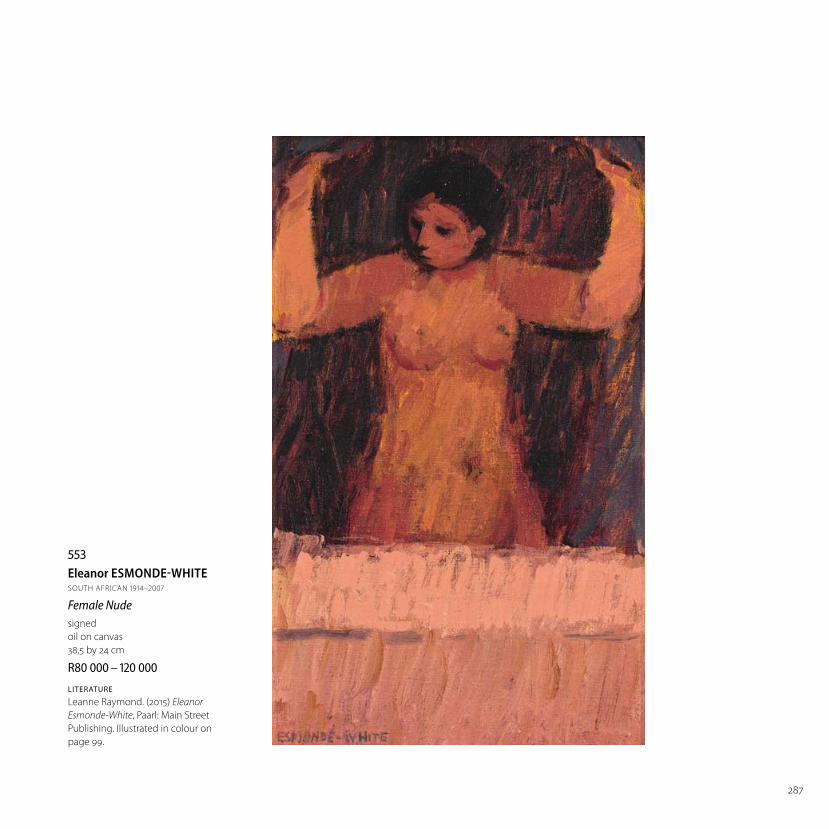
553Eleanor ESMONDE-WHITE SOUTH AFRICAN 1914–2007
Female Nudesigned
oil on canvas
38,5 by 24 cm
R –
LITERATURE
Leanne Raymond. (2015) Eleanor
Esmonde-White, Paarl: Main Street
Publishing. Illustrated in colour on
page 99.
288
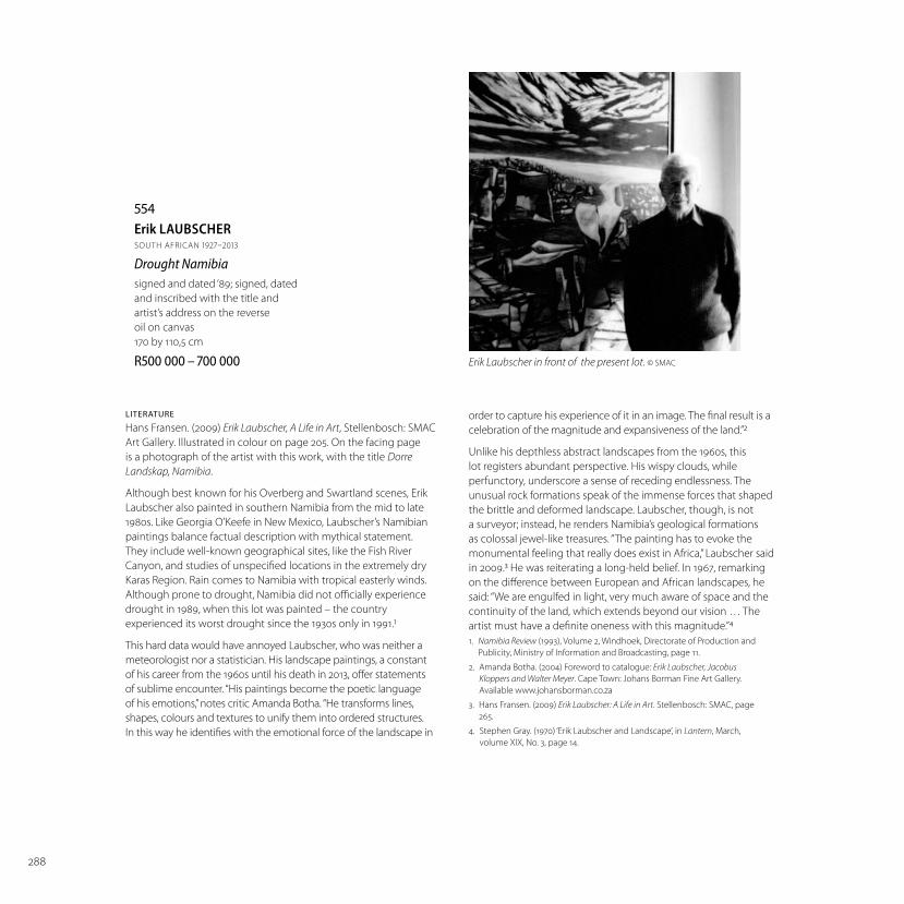
554Erik LAUBSCHERSOUTH AFRICAN 1927–2013
Drought Namibiasigned and dated ‘89; signed, dated
and inscribed with the title and
artist’s address on the reverse
oil on canvas
170 by 110,5 cm
R –
LITERATURE
Hans Fransen. (2009) Erik Laubscher, A Life in Art, Stellenbosch: SMAC
Art Gallery. Illustrated in colour on page 205. On the facing page
is a photograph of the artist with this work, with the title Dorre
Landskap, Namibia.
Although best known for his Overberg and Swartland scenes, Erik
Laubscher also painted in southern Namibia from the mid to late
1980s. Like Georgia O’Keefe in New Mexico, Laubscher’s Namibian
paintings balance factual description with mythical statement.
They include well-known geographical sites, like the Fish River
Canyon, and studies of unspecifi ed locations in the extremely dry
Karas Region. Rain comes to Namibia with tropical easterly winds.
Although prone to drought, Namibia did not offi cially experience
drought in 1989, when this lot was painted – the country
experienced its worst drought since the 1930s only in 1991.1
This hard data would have annoyed Laubscher, who was neither a
meteorologist nor a statistician. His landscape paintings, a constant
of his career from the 1960s until his death in 2013, off er statements
of sublime encounter. “His paintings become the poetic language
of his emotions,” notes critic Amanda Botha. “He transforms lines,
shapes, colours and textures to unify them into ordered structures.
In this way he identifi es with the emotional force of the landscape in
order to capture his experience of it in an image. The fi nal result is a
celebration of the magnitude and expansiveness of the land.”2
Unlike his depthless abstract landscapes from the 1960s, this
lot registers abundant perspective. His wispy clouds, while
perfunctory, underscore a sense of receding endlessness. The
unusual rock formations speak of the immense forces that shaped
the brittle and deformed landscape. Laubscher, though, is not
a surveyor; instead, he renders Namibia’s geological formations
as colossal jewel-like treasures. “The painting has to evoke the
monumental feeling that really does exist in Africa,” Laubscher said
in 2009.3 He was reiterating a long-held belief. In 1967, remarking
on the diff erence between European and African landscapes, he
said: “We are engulfed in light, very much aware of space and the
continuity of the land, which extends beyond our vision … The
artist must have a defi nite oneness with this magnitude.”4
1. Namibia Review (1993), Volume 2, Windhoek, Directorate of Production and
Publicity, Ministry of Information and Broadcasting, page 11.
2. Amanda Botha. (2004) Foreword to catalogue: Erik Laubscher, Jacobus
Kloppers and Walter Meyer. Cape Town: Johans Borman Fine Art Gallery.
Available www.johansborman.co.za
3. Hans Fransen. (2009) Erik Laubscher: A Life in Art. Stellenbosch: SMAC, page
265.
4. Stephen Gray. (1970) ‘Erik Laubscher and Landscape’, in Lantern, March,
volume XIX, No. 3, page 14.
Erik Laubscher in front of the present lot. © SMAC

289
290
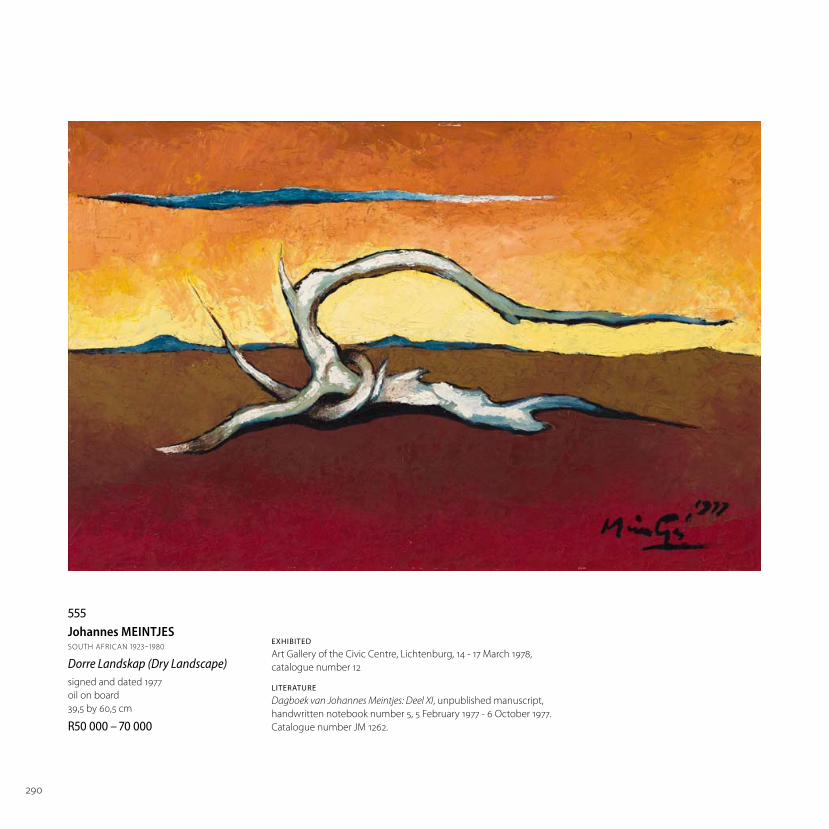
555Johannes MEINTJESSOUTH AFRICAN 1923–1980
Dorre Landskap (Dry Landscape)signed and dated 1977
oil on board
39,5 by 60,5 cm
R –
EXHIBITED
Art Gallery of the Civic Centre, Lichtenburg, 14 - 17 March 1978,
catalogue number 12
LITERATURE
Dagboek van Johannes Meintjes: Deel XI, unpublished manuscript,
handwritten notebook number 5, 5 February 1977 - 6 October 1977.
Catalogue number JM 1262.

291
556Johannes MEINTJESSOUTH AFRICAN 1923–1980
Baaier met See en Dryfhout(Bather with Sea and Driftwood)signed and dated 1961
oil on board
42,5 by 48,5 cm
R –
EXHIBITED
The National Museum, Bloemfontein, 2 - 7 April 1962, catalogue number 25
Studio 101, Johannesburg, 10 - 21 July 1962, catalogue number 4
Regency Galleries, Cape Town, 9 - 13 October 1962, catalogue number 6
Gallery 101, Johannesburg, 3 - 17 August 1963, catalogue number 27
South African Association of Arts, Cape Town, Retrospective Exhibition, 15 - 26 October 1963,
catalogue number 30
LITERATURE
Dagboek van Johannes Meintjes: Deel VI, unpublished manuscript, page 206.
Catalogue number JM 725.

292
557Erik LAUBSCHERSOUTH AFRICAN 1927–2013
Overberg in Wintersigned and dated ‘96; signed, dated and inscribed with the title,
dimensions and artist’s address on the reverse
oil on canvas
110 by 145 cm
R –
PROVENANCE
Acquired directly from the artist by the current owner
LITERATURE
Hans Fransen. (2009) Erik Laubscher, A Life in Art, Stellenbosch:
SMAC Art Gallery. Illustrated in colour on page 226.
Erik Laubscher returned to South Africa from Paris in 1951. After
a period of adjustment, in which he continued to paint in the
School of Paris style, Laubscher discovered his true subject: the
South African landscape. It was a trip to the Bushman’s River
near Kenton-on-Sea that set him off on his decades-spanning
trajectory describing the land in geometrical bands of colour.
Laubscher’s earliest work in this style, from the mid to late 1960s,
shunned perspective. “The moment you use perspective your
eye travels to a certain point and there it stops and the painting
becomes static,” he told the Cape Times in 1965.1 Artist opinions are
changeable. This lot, painted three decades later, shows Laubscher
still preoccupied with the Cape’s landscapes, albeit now with
perspective. Aside from the obvious use of perspective in this
verdant portrayal of an Overberg farming landscape, this work is
noteworthy for its colour palette. Laubscher’s colours are vivid, and
yet, for all the luminescence of especially his greens, it is a mimetic
painting. Contours, borders, dams, gravel tracks and evidence of
human labour are pictured in a receding plane. Laubscher thought
European painterly styles were inadequate for conveying South
Africa’s landscapes, which he became acquainted with during his
years as a travelling paint salesman. “The Swartland and Overberg
regions have dimensions, rhythms and character peculiar to
themselves,” he told framer and collector Joe Wolpe in 1967.2
1. Stephen Gray. (1970) ‘Erik Laubscher and Landscape’, in Lantern, March,
volume XIX, No. 3, page 15.
2. Ibid., page 14.

293

294
558Andrew VERSTERSOUTH AFRICAN 1937–
Turquoise Interior signed and dated 84
oil on canvas
55 by 310 cm
R –

295
© Andrew Verster | DALRO

296
559Erik LAUBSCHERSOUTH AFRICAN 1927–2013
Die Ou Brug – Katbakkiessigned; inscribed with the title on
the frame
oil on canvas
71,5 by 58,5 cm
R –
PROVENANCE
Acquired from the artist in the early
1990s by the current owner

297
560Erik LAUBSCHERSOUTH AFRICAN 1927–2013
Swakop River Bed, Namibiasigned and dated ‘75
oil on canvas
80,5 by 96,5 cm
R –
PROVENANCE
Purchased by the current owner in 1978
LITERATURE
Hans Fransen. (2009) Erik Laubscher, A Life in Art, Stellenbosch:
SMAC Art Gallery. Illustrated in colour on page 159.

298
561Robert HODGINSSOUTH AFRICAN 1920–2010
The Old Boxersigned, dated 1999/2000 and inscribed with the title
and medium on the reverse
oil on canvas
90 by 120 cm
R –
When he was 14, Robert Hodgins was yanked out of school and told
by his mother to earn his keep. He was employed as a gofer at Libraire
Populaire, a newsagent on Dean Street in Soho, London. Twice daily,
Hodgins delivered reading material to Soho’s beau monde, including
politician and art collector, Sir Philip Sassoon, and the seventh Duke of
Leinster, Edward FitzGerald, who scandalised polite society by marrying May
Etheridge, known as the “pink pyjama girl” of Shaftesbury Theatre. Between
deliveries Hodgins swept fl oors and kept watch over printed material on
the store’s pavement display. “A lot of it was sheer boredom,” he recalled
in 2007.1 “Standing watching people go by on the street, making sure they
don’t nick magazines is not the most enlightening of opportunities.” The
mind-numbing labour however trained his eye to recognise detail and
diff erence in people, a skill that later fed into his work as a painter centrally
preoccupied with the human form.
Best known for his sardonic depictions of businessmen and high-ranking
military leaders, often channelled through his interpretation of playwright
Alfred Jarry’s buff oonish regent Ubu, Hodgins’ repertoire of archetypes and
characters is however far more diverse. This lot is the earliest in a small group
of late-career pictures portraying boxers – they include the oil on canvas
Ubu, Boxing Promoter (2002) and photogravure Champ (2004). It is also his
most haunted interpretation. Rendered in sullied reds, this aging pugilist’s
most pronounced feature is his cleaved head. This detail corresponds with a
fragment of biography from Hodgins’ youth.
In 1918, London’s Pugilistic Benevolent Society was renamed the British
Board of Boxing Control. An important sanctioning body, it also distributed
pensions to retired fi ghters from its headquarters on Dean Street, close to
where Hodgins worked. “Outside were these boxers in various stages of
decrepitude, heroic fi gures who couldn’t walk straight. They were shaking
and had brain damage,” remembered Hodgins.2 Rather than functioning
as a portrait of any particular boxer, this lot describes a formative visual
encounter from the artist’s adolescence, one that stayed with him after
he left London in 1954 to teach painting in Pretoria. Commenting on his
working life and visual training on Dean Street, Hodgins later observed: “At
the most impressionable time of my life, without knowing it, I was being
impressed.”
1. Sean O’Toole. (2008) ‘The Human Fog’, in The Ceramic Art of Robert Hodgins, Van Wyk,
Retief. Cape Town: Bell-Roberts Publishing.
2. Interview with artist by Sean O’Toole, November 2007, Menlo Park, Pretoria.

299
300
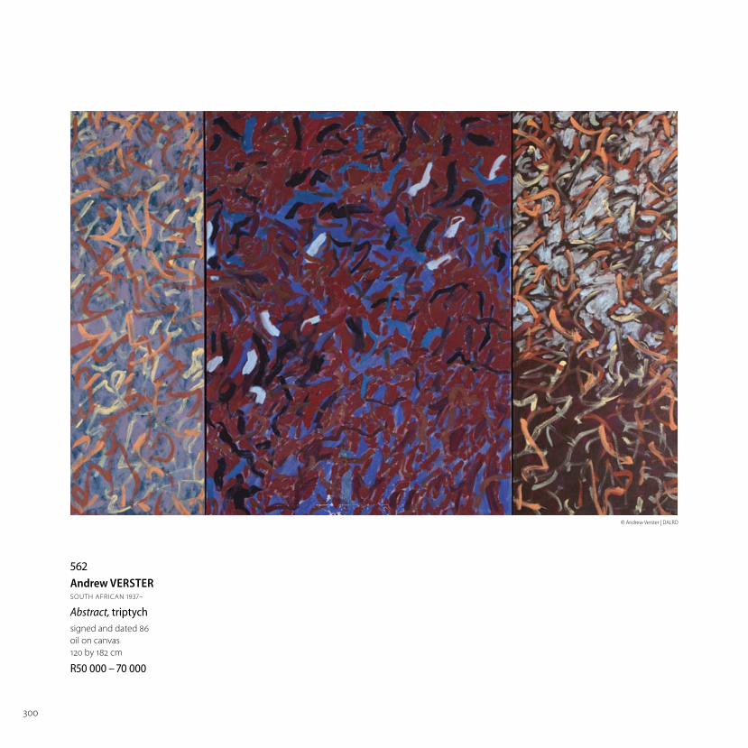
562Andrew VERSTERSOUTH AFRICAN 1937–
Abstract, triptych signed and dated 86
oil on canvas
120 by 182 cm
R –
© Andrew Verster | DALRO

301
563Penny SIOPISSOUTH AFRICAN 1953–
Paper Doily Formsmixed media
32,5 by 48,5 cm
R –

302
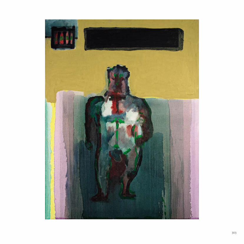
564Robert HODGINSSOUTH AFRICAN 1920–2010
Naked in Solitarysigned, dated 2006 and inscribed with the title and
medium on the reverse
oil on canvas
120 by 90 cm
R –
The Goodman Gallery label adhered to the reverse.
Leonardo da Vinci famously advised artists looking for inspiration to
contemplate stained walls or mossed stones. There, Leonardo said, they
would fi nd no end of suggestion: from landscapes to trees, to battle scenes,
to the “lively postures of strange fi gures”, not to mention the ranges of facial
expression by which emotion is conveyed.
To an extent Robert Hodgins’ work engages with the same sense of artistic
creation - but in reverse. The painting is constructed around the radically
simplifi ed fi gure of a naked man; a fi gure drawn in such way as to eschew
the happenstance and detail of individual appearance. Instead what is
highlighted is a distinctively modernist concern with other, less literal, levels
of presence, materiality and painterly value. What concerns the artist is not
so much how things look as how they feel.
To this end, Hodgins develops an all but codifi ed system of formal
dysfunction: limbs that don’t quite match; a face that dissipates rather than
resolving into features or expression; eyes that are the merest dots and lack
all gaze; a discoloured hanging scrotum, the implied violence displaced to a
dirty red ground between the legs; tiny useless fi sts.
A man without heft or qualities, much reduced by the condition in which he
fi nds himself, less an agent than a repository for what has happened or been
done to him. The red at the chest and in the midriff ; the green brushstrokes;
the shadings discoloured like bruises or contusions.
The subject of Naked in Solitary is, of course, one that had and has
particular relevance for South Africans who lived through the militarism
that characterised apartheid. But, largely because Hodgins’ painterly
usages engage the viewer initially at visceral levels, it reads inexorably as
a metaphor at the same time – as speaking to some profoundly sombre
conditions of the spirit.
This comes through in part in the layering of planes of mainly melancholy
colour and tint in the space behind the prisoner fi gure – foiled though they
might be by a chirpy yellow bleeding into blue and green pastels at the left.
But it is over the prisoner’s head that there hangs the most telling and
the most chilling detail of all. A slot of window to the outside world. It is
unrelievedly black. No images for liberating the imagination.
Ivor Powell
303

304
565Robert HODGINSSOUTH AFRICAN 1920–2010
An Old Couplesigned, dated 2005, inscribed with the title, medium
and ‘We’ve been together now for forty years and it’s
all got a bit too much. There’s loads of ladies living
in this land what I’d swop for me dear old Dutch.
There’s loads of ladies living in this land but I don’t
get around too much‘ on the reverse
oil on canvas
90 by 90 cm
R –
If they still spoke to each other the two fi gures in Robert Hodgins’
2005 painting, An Old Couple, would probably fi nish each other’s
sentences – almost before they were spoken.
The words on the reverse of the painting pastiche a music hall
lyric originally performed by Albert Chevalier, but later revived
by the actor Peter Sellers. In these, however, the lyric expressed a
somewhat less acid sentiment - that “there ain’t a lady living in the
land” the narrator would swap for his “dear old Dutch”.
In Hodgins’ version however those four decades have, presumably
not been very blessed. The two fi gures he paints are shown, to
quote from another piece of English music hall or schoolboy
doggerel, sitting “back to back facing each other”. Eternally bonded,
that is to say. At the same time profoundly alienated.
Hodgins’ signal achievement here is to conjure – by abstract
pictorial devices and painterly means – not only the individual
characters, but also the human paradox of the relationship
between the two.
He, the male we read as vain and self satisfi ed; he has a nose
that is made for looking down along: ineff ectual clasped hands;
and an infl amed sense of self worth and entitlement. Her nose is
virtually prehensile the way that Hodgins discovers its line, and a
top lip capable of expressing fi fty species of disapproval. Hands,
disproportionately large, enough to give a straying husband
nightmares.
The caricature is spare but telling. Almost palpably it has been
generated – as Hodgins described his method in canvases like
these – by “pushing paint around on the canvas” until the image
emerges: controlled chance, active serendipity.
And then, usually over a period of weeks and months, developed
on the canvas through felicities of colour, texture, brushmark.
Thus, in An Old Couple, the separation between the fi gures is
given two strong emphases: by vertically asserted bands of paint
separating the two fi gures; and by the separation of the canvas
eff ectively into two universes, one blue into which the man faces,
the other red and proper to the woman.
But Hodgins’ vision goes beyond the merely satirical. A passage
of brownish paint – suggesting a shared backrest – links the two
fi gures as a negative space imprinted by the eloquently diff erent
lines described by the backs of the jaded fellow and his Old Dutch.
Those lines, though very specifi c to Hodgins, would certainly have
been legible to Samuel Beckett.
Ivor Powell

305

306
566William KENTRIDGESOUTH AFRICAN 1955–
Untitled (Drawing for Felix in Exile) signed and dated 1993
charcoal, pastel and gouache on paper
50 by 66 cm
R –
LITERATURE
cf. Dan Cameron. (1999) William Kentridge,
London: Phaidon Press. A similar example is
illustrated in colour on page 124.
cf. Shinji Kohmoto. (2009) William Kentridge:
What We See & What We Know; Thinking About
history While Walking, and Thus the Drawings
Began to Move, Kyoto: The National Museum of
Art. A similar example is illustrated in colour on
page 63.
cf. Lilian Tone. (ed) (2013) William Kentridge:
Fortuna, London: Thames & Hudson. A similar
example is illustrated in colour on page 175.
This charcoal drawing, an artistic interpretation
of an East Rand landscape, is from William
Kentridge’s fi fth stop-animation fi lm, Felix in
Exile (1994). The nearly nine-minute fi lm was
made between September 1993 and February
1994. It focuses on Felix Teitlebaum, the
insecure alter ego to Kentridge’s other recurring
fi lmic protagonist, Soho Eckstein, a rapacious
property developer. The fi lm uses landscape as
a metaphor for the fallibility of human memory,
particularly in relation to social trauma. Felix
is presented isolated in a Parisian hotel room
surrounded by images of industrial landscapes
and the internecine political strife that wracked
the East Rand, in particular Phola Park, in 1993.
The fi lm includes a female protagonist, Nandi,
who – using a surveying device – views the
same landscapes appearing on Felix’s wall. She
also produces drawings of these landscapes,
which are distinguished in the fi lm by their
circular aspect (as exampled in this lot).
The fi lm and select process drawings were
fi rst exhibited at the Goodman Gallery,
Johannesburg, in October 1994. A 1998
exhibition at The Drawing Center, New York,
saw Kentridge described as “the Anselm Kiefer
of South Africa”.1 This lot is signifi cant given
its relationship to the fi lm’s central subject.
In an artist statement accompanying his
1994 Johannesburg exhibition, Kentridge
wrote of his interest in landscape: “A central
characteristic of the East Rand terrain, is that it
is a landscape constructed rather than found
… It is a landscape that is explicitly social. It is
also temporal – everything in the landscape has
the signs of having been put there and having
been made – all features have the potential to
be unmade.”2
Mine dumps and drive-ins, once well-
known fi xtures of Johannesburg’s physical
landscape, recur as motifs in Kentridge’s fi lms.
A subsequent fi lm, Other Faces (2011), features
descriptions of Top Star, a drive-in cinema built
atop a mine dump that closed in 2006; the
mine dump has also now vanished. “I really miss
the strangeness of the mine dumps, especially
now that they are disappearing from the city.
All one gets is another China City or Southgate
shopping mall,” stated Kentridge in 2013, adding
that Top Star had been an important personal
landmark.3
1. Roberta Smith. (1998) ‘William Kentridge’, New York
Times, 6 February 1998, page E36.
2. William Kentridge. (1998) “Felix in Exile: Geography of
Memory’, in William Kentridge, Carolyn Christov-
Bakargiev. Brussels: Societe des Expositions du Palais
des Beaux-Arts de Bruxelles, pages 95-96.
3. Interview with artist by Sean O’Toole, 19 April 2013,
Johannesburg.

307
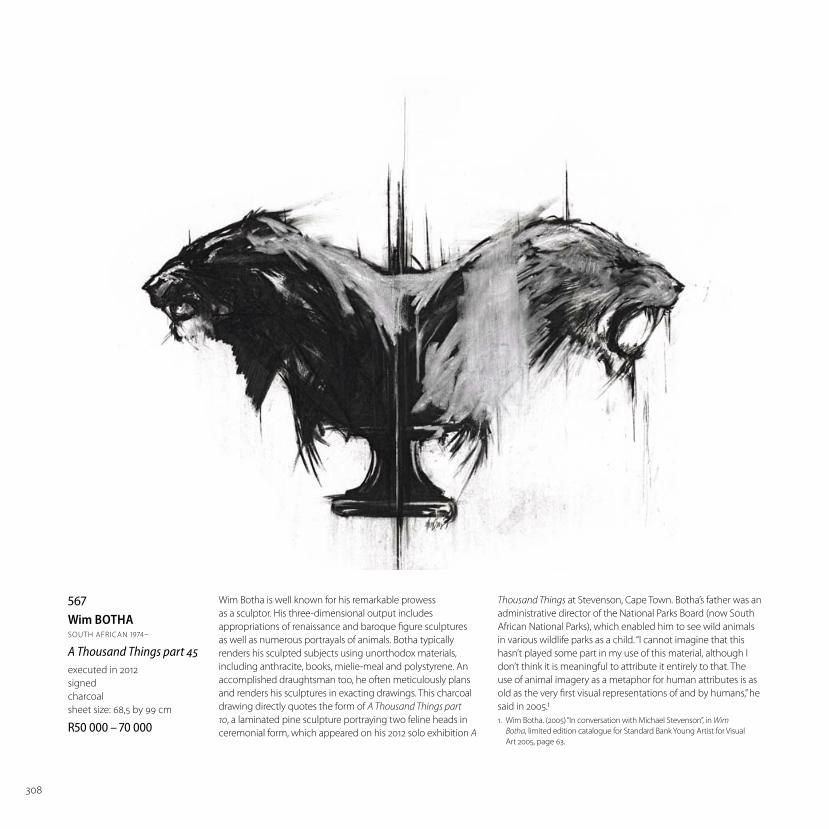
308
567Wim BOTHASOUTH AFRICAN 1974–
A Thousand Things part 45executed in 2012
signed
charcoal
sheet size: 68,5 by 99 cm
R –
Wim Botha is well known for his remarkable prowess
as a sculptor. His three-dimensional output includes
appropriations of renaissance and baroque fi gure sculptures
as well as numerous portrayals of animals. Botha typically
renders his sculpted subjects using unorthodox materials,
including anthracite, books, mielie-meal and polystyrene. An
accomplished draughtsman too, he often meticulously plans
and renders his sculptures in exacting drawings. This charcoal
drawing directly quotes the form of A Thousand Things part
10, a laminated pine sculpture portraying two feline heads in
ceremonial form, which appeared on his 2012 solo exhibition A
Thousand Things at Stevenson, Cape Town. Botha’s father was an
administrative director of the National Parks Board (now South
African National Parks), which enabled him to see wild animals
in various wildlife parks as a child. “I cannot imagine that this
hasn’t played some part in my use of this material, although I
don’t think it is meaningful to attribute it entirely to that. The
use of animal imagery as a metaphor for human attributes is as
old as the very fi rst visual representations of and by humans,” he
said in 2005.1
1. Wim Botha. (2005) “In conversation with Michael Stevenson”, in Wim
Botha, limited edition catalogue for Standard Bank Young Artist for Visual
Art 2005, page 63.

309
568Diane VICTORSOUTH AFRICAN 1964–
Let Sleeping Croc’s Lieexecuted circa 2012
signed, numbered 17/20 and inscribed with the title in pencil
etching, aquatint and embossing
sheet size: 82 by 121 cm
R –

310
569William KENTRIDGESOUTH AFRICAN 1955–
Sleeping on Glass, sixexecuted in 1999
each signed and numbered 32/60 in
pencil in the margin
suite of 6 etchings with soft ground,
aquatint and coloured pencil crayon,
each from 1 copper plate, on spreads
from found books
each approximately: 22 by 28,5 cm
R –
LITERATURE
Bronwyn Law-Viljoen. (2006) William
Kentridge Prints, Johannesburg: David
Krut Publishing. Other examples from
the edition illustrated in colour on
pages 80-83.
Dan Cameron. (1999) William
Kentridge, London: Phaidon Press.
Other examples from the edition
illustrated in colour on pages 134
and 135.
Rosalind Krauss, Roger Malbert
and Kate McCrickard. (2012) A
Universal Archive. William Kentridge
as Printmaker, London: Hayward
Publishing. Other examples from the
edition illustrated on pages 52-55.
‘Sleeping on Glass (1999) was a fi lm
made to be projected onto a two-
way mirror. As the image projected
darkens, so the viewer is more aware
of his or her refl ection in the mirror.
As the image lightens, the viewer
sees less of his or her own image and
more of the projected image. The
etchings that come out of the fi lm
Sleeping on Glass use the palimpsest
eff ect of printing onto chine collé
pages such that the image is layered
onto the page behind, yielding if not
image and cause of image, image
and a text that has some half-evident
connection to the image.’ (Bronwyn
Law-Viljoen, page 80)

311
570William KENTRIDGESOUTH AFRICAN 1955–
Eight Figuressigned, dated July 2010 and inscribed ‘Working Proof’ in the margin
linocut with hand colouring
image size: 83,5 by 184,5 cm; sheet size: 105,5 by 204 cm
R –
LITERATURE
R Krauss, R Malbert and K McCrickard. (2012) A Universal
Archive: Kentridge as Printmaker, London: Hayward
Publishing. Another example from the edition is
illustrated on pages 106 and 107.

312
571Norman CATHERINESOUTH AFRICAN 1949–
Crocodile Tears signed and dated ‘93
oil stick on paper
137 by 119 cm
R –
LITERATURE
Hazel Friedman. (2000) Norman
Catherine, Johannesburg:
Goodman Gallery Editions.
Illustrated in colour on page 111.
Beastly anthropomorphic
creatures such as this human-
crocodile hybrid are an integral
part of Norman Catherine’s
fantastical vision, which was much
admired by the late David Bowie.
They have played a key role in the
artist’s rehearsal of his core themes
of avarice, cruelty, excess and
psychological estrangement. “Over
the years Catherine’s creatures
have become the embodiment
of his creative mythology,” notes
his biographer Hazel Friedman.1
Crocodiles fi rst began appearing
in Catherine’s paintings in the late
1980s. Catherine’s reptiles possess
no fi xed meaning. Sometimes
they are fi re-breathing creatures,
yet again humans in animal skin.
They have occasionally appeared
as visualisations of French
psychoanalyst Jacques Lacan’s
story of a patient who complained
about a crocodile hiding under
his bed.
1. Hazel Friedman. (2000) Norman
Catherine. Johannesburg: Goodman
Gallery, page 122.

313
572Pieter HUGOSOUTH AFRICAN 1976–
Messina/Musina: In Tyrone Brand’s Bedroomexecuted in 2006
special edition AP
C-Print
image size: 55,5 by 70 cm
R –
Accompanied by a certifi cate of authenticity.
LITERATURE
Pieter Hugo. (2007) Messina/Musina, New York: Punctum
Press. Another example from the edition illustrated in colour,
unpaginated.
Michael Godby. (2007) Is there Still Life? Continuity and Change in
South African Still Life Painting, David Krut Publishing. Another
example from the edition illustrated in colour on page 63 and
the back cover.

314
573Mikhael SUBOTZKYSOUTH AFRICAN 1981–
Preacher, Dwarsrivier Prison (0053)signed, dated 2004 and numbered 1/3 in pencil in
the margin
digital print in pigment inks on cotton rag paper
sheet size: 56 by 306,5 cm
R –
In 2004, Mikhael Subotzky embarked on a yearlong project making panoramic photographs for his
fi nal-year portfolio at the University of Cape Town’s Michaelis School of Fine Art. That April he came
across offi cials from the Independent Electoral Commission (IEC) doing special voting in a community
he was photographing. Subotzky learnt that they were planning to visit Dwarsrivier Correctional
Centre, near Wolseley, this pursuant a Constitutional Court ruling a month earlier allowing all inmates
to register and vote in the April 2004 general elections. He sought permission to accompany the IEC
offi cials into prison on Election Day, 14 April, where he took portraits of prisoners voting. It was the fi rst
time Subotzky had been in a prison. The brief encounter prompted him to hone his project and focus
on life in and outside three prisons in the Western Cape. He again returned to Dwarsrivier in August
through November 2004. This important early photograph was acquired at his graduate exhibition,
for which he received the 2004 Michaelis Prize and a much-debated perfect grade of 100% – the
only humanities graduate in UCT’s history until then to accomplish the feat. Subotzky has since won
numerous international accolades, including the 2015 Deutsche Börse Photography Prize in London for
his photobook project with Patrick Waterhouse on Ponte City in Johannesburg.
Based on interview with artist by Sean O’Toole, 1 June 2005, Goodman Gallery, Johannesburg.

315

316
574Zander BLOMSOUTH AFRICAN 1982–
Untitled 1.698signed and dated 2015, Feb, on the reverse
oil on linen
198 by 130 cm
R –
Stevenson Gallery label adhered to the reverse.
LITERATURE:
Zander Blom. (2016) Paintings: Volume II 2013-16, Cape Town:
Stevenson. Illustrated in colour on page 286.
Zander Blom is an abstract painter with a deep interest in
earlier twentieth-century Euro-American abstract painting.
Trained in graphic design, his fi rst works were drawings,
paper assemblies, sound collages and photographs of
unusual painted and sculpted sets fashioned by the artist
in his Brixton home in Johannesburg. Now based in Cape
Town, Blom is mostly identifi ed as a painter.
In 2014 he won the third Jean-François Prat Prize for
contemporary painting in Paris; his work is also included in
Phaidon’s current anthology, Vitamin P3: New Perspectives
in Painting (2016). Blom’s method is process-based and
evolutionary, his canvases tending to progress through
fi xed series. This lot forms part of a small suite of paintings
featuring atomised blocks of colour, notably black, yellow
and lilac, along with marbled paint treatments. Displeased
with the capacities of brushes and oil sticks, Blom started
applying his paint directly to his canvases using various
palette knives, some even made by the artist. “My painting
practice is driven by fi nding new tools and developing new
techniques,” he wrote in 2014.1
All Blom’s paintings are untitled, but for a numerical tag that
situates each work in a timeline of his evolving practice.
“Blom doesn’t want alphabetic language to determine
how the work should be read, but for it to remain open to
all kinds of audiences,” observed critic Nicola Trezzi of the
painter’s strict desire to void his work of narrative.2
1. Zander Blom. (2014) Artists statement for 2014 exhibition New
Paintings at Stevenson, Cape Town. http://archive.stevenson.info/
exhibitions/blom/index2014.html
2. Nicola Trezzi. (2016) ‘Bestial Modernity: The Art of Zander Blom’, in
Paintings: Volume II 2013-16. Cape Town: Stevenson.

317

318
575Jessica WEBSTERSOUTH AFRICAN 1981–
Graceoil, ink and thread on canvas
156 by 159 cm
R –
EXHIBITED
Goodman Gallery, Johannesburg, Working Title,
27 July - 19 August 2013
LITERATURE
Working Title 2013, curated by Emma Laurence
(2014) Johannesburg: Goodman Gallery.
Illustrated on page 83.
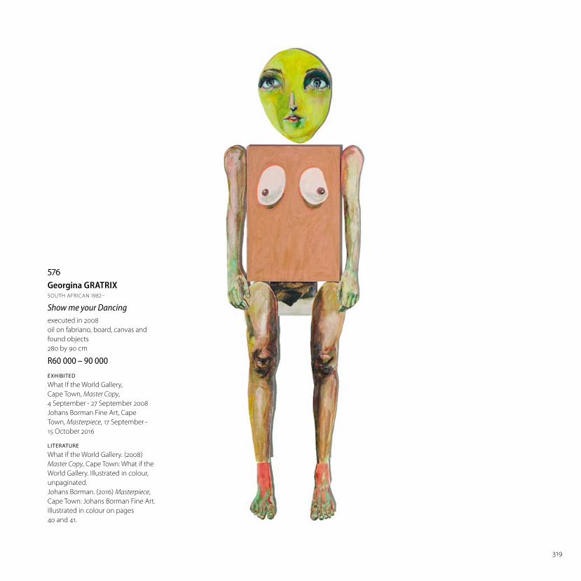
319
576Georgina GRATRIXSOUTH AFRICAN 1982–
Show me your Dancingexecuted in 2008
oil on fabriano, board, canvas and
found objects
280 by 90 cm
R –
EXHIBITED
What If the World Gallery,
Cape Town, Master Copy,
4 September - 27 September 2008
Johans Borman Fine Art, Cape
Town, Masterpiece, 17 September -
15 October 2016
LITERATURE
What if the World Gallery. (2008)
Master Copy, Cape Town: What if the
World Gallery. Illustrated in colour,
unpaginated.
Johans Borman. (2016) Masterpiece,
Cape Town: Johans Borman Fine Art.
Illustrated in colour on pages
40 and 41.

320
577Lionel SMITSOUTH AFRICAN 1982–
Rorschach #4signed and dated 2013
oil on canvas
200 by 300 cm
R –
Everard Read Gallery label
adhered to the reverse.

321