Epidemiology: Beyond the Basics
588
-
Upload
khangminh22 -
Category
Documents
-
view
0 -
download
0
Transcript of Epidemiology: Beyond the Basics


FOURTH EDITION
Beyond the BasicsEpidemiology
Moyses Szklo, MD, DrPHUniversity Distinguished Service Professor
of Epidemiology and MedicineJohns Hopkins University
Editor in Chief, American Journal of Epidemiology
Baltimore, Maryland
F. Javier Nieto, MD, PhDDean and Professor of Epidemiology
College of Public Health and Human SciencesOregon State University
Corvallis, Oregon

World Headquarters Jones & Bartlett Learning 5 Wall Street Burlington, MA 01803 978-443-5000 [email protected] www.jblearning.com
Jones & Bartlett Learning books and products are available through most bookstores and online booksellers. To contact Jones & Bartlett Learning directly, call 800-832-0034, fax 978-443-8000, or visit our website, www.jblearning.com.
Substantial discounts on bulk quantities of Jones & Bartlett Learning publications are available to corporations, professional associations, and other qualified organizations. For details and specific discount information, contact the special sales department at Jones & Bartlett Learning via the above contact information or send an email to [email protected].
Copyright © 2019 by Jones & Bartlett Learning, LLC, an Ascend Learning Company
All rights reserved. No part of the material protected by this copyright may be reproduced or utilized in any form, electronic or mechanical, including photocopying, recording, or by any information storage and retrieval system, without written permission from the copyright owner.
The content, statements, views, and opinions herein are the sole expression of the respective authors and not that of Jones & Bartlett Learning, LLC. Reference herein to any specific commercial product, process, or service by trade name, trademark, manufacturer, or otherwise does not constitute or imply its endorsement or recommendation by Jones & Bartlett Learning, LLC and such reference shall not be used for advertising or product endorsement purposes. All trademarks displayed are the trademarks of the parties noted herein. Epidemiology: Beyond the Basics, Fourth Edition, is an independent publication and has not been authorized, sponsored, or otherwise approved by the owners of the trademarks or service marks referenced in this product.
There may be images in this book that feature models; these models do not necessarily endorse, represent, or participate in the activities represented in the images. Any screenshots in this product are for educational and instructive purposes only. Any individuals and scenarios featured in the case studies throughout this product may be real or fictitious, but are used for instructional purposes only.
Production CreditsVP, Product Management: David D. CellaDirector of Product Management: Michael BrownProduct Specialist: Carter McAlisterProduction Editor: Vanessa RichardsSenior Marketing Manager: Sophie Fleck TeagueManufacturing and Inventory Control Supervisor: Amy BacusComposition: S4Carlisle Publishing Services
Cover Design: Scott ModenRights & Media Specialist: Merideth TumaszMedia Development Editor: Shannon SheehanCover Image (Title Page, Part Opener, Chapter Opener): © Enculescu Marian Vladut/ShutterstockPrinting and Binding: Edwards Brothers MalloyCover Printing: Edwards Brothers Malloy
Library of Congress Cataloging-in-Publication DataNames: Szklo, M. (Moyses), author. | Nieto, F. Javier, author.Title: Epidemiology : beyond the basics / Moyses Szklo, F. Javier Nieto.Description: Fourth edition. | Burlington, Massachusetts : Jones & Bartlett Learning, [2019] | Includes bibliographical references and index.Identifiers: LCCN 2017061666 | ISBN 9781284116595 (pbk.)Subjects: | MESH: Epidemiologic Methods | Epidemiologic Factors | EpidemiologyClassification: LCC RA651 | NLM WA 950 | DDC 614.4--dc23LC record available at https://lccn.loc.gov/2017061666
6048
Printed in the United States of America 22 21 20 19 18 10 9 8 7 6 5 4 3 2 1

iii
© Enculescu Marian Vladut/Shutterstock
Chapter 3 Measuring Associations Between Exposures and Outcomes . . . . . . . 87
3.1 Introduction . . . . . . . . . . . . . . . . . . . . . . . . . . . . . . .87
3.2 Measuring Associations in a Cohort Study . . . 87
3.3 Cross-Sectional Studies: Point Prevalence Rate Ratio . . . . . . . . . . . . . . . . . . . . . . . . . . . . . . . 102
3.4 Measuring Associations in Case-Control Studies . . . . . . . . . . . . . . . . . . . . . . . . . . . . . . . . . . 103
3.5 Assessing the Strength of Associations . . . 115
References . . . . . . . . . . . . . . . . . . . . . . . . . . . . . . . . . . . . 118
Exercises. . . . . . . . . . . . . . . . . . . . . . . . . . . . . . . . . . . . . . . 119
PART 3 Threats to Validity and Issues of Interpretation 125
Chapter 4 Understanding Lack of Validity: Bias . . . . . . . . . . . . . . 127
4.1 Overview . . . . . . . . . . . . . . . . . . . . . . . . . . . . . . . . 127
4.2 Selection Bias . . . . . . . . . . . . . . . . . . . . . . . . . . . . 129
4.3 Information Bias . . . . . . . . . . . . . . . . . . . . . . . . . 135
4.4 Combined Selection/Information Biases . . . .153
References . . . . . . . . . . . . . . . . . . . . . . . . . . . . . . . . . . . . 168
Exercises. . . . . . . . . . . . . . . . . . . . . . . . . . . . . . . . . . . . . . . 171
Chapter 5 Identifying Noncausal Associations: Confounding . . . 175
5.1 Introduction . . . . . . . . . . . . . . . . . . . . . . . . . . . . . 175
5.2 The Nature of the Association Between the Confounder, the Exposure, and the Outcome . . . . . . . . . . . . . . . . . . . . . . . . . . . . . . . . 178
5.3 Theoretical and Graphic Aids to Frame Confounding . . . . . . . . . . . . . . . . . . . . . . . . . . . . 184
5.4 Assessing the Presence of Confounding . . . 186
Preface . . . . . . . . . . . . . . . . . . . . . . . . . . . . . . . . . . . . . . vi
Acknowledgments . . . . . . . . . . . . . . . . . . . . . . . . . . . . ix
About the Authors . . . . . . . . . . . . . . . . . . . . . . . . . . . . . x
PART 1 Introduction 1
Chapter 1 Basic Study Designs in Analytical Epidemiology . . . . . . 3
1.1 Introduction: Descriptive and Analytical Epidemiology . . . . . . . . . . . . . . . . . . . . . . . . . . . . . . 3
1.2 Analysis of Age, Birth Cohort, and Period Effects . . . . . . . . . . . . . . . . . . . . . . . . . . . . . . . 4
1.3 Ecologic Studies . . . . . . . . . . . . . . . . . . . . . . . . . . .15
1.4 Studies Based on Individuals as Observation Units . . . . . . . . . . . . . . . . . . . . . . . . .19
References . . . . . . . . . . . . . . . . . . . . . . . . . . . . . . . . . . . . . .41
Exercises. . . . . . . . . . . . . . . . . . . . . . . . . . . . . . . . . . . . . . . . .44
PART 2 Measures of Disease Occurrence and Association 49
Chapter 2 Measuring Disease Occurrence . . . . . . . . . . . . . . . . . 51
2.1 Introduction . . . . . . . . . . . . . . . . . . . . . . . . . . . . . . .51
2.2 Measures of Incidence . . . . . . . . . . . . . . . . . . . . .52
2.3 Measures of Prevalence . . . . . . . . . . . . . . . . . . . .80
2.4 Odds . . . . . . . . . . . . . . . . . . . . . . . . . . . . . . . . . . . . . .82
References . . . . . . . . . . . . . . . . . . . . . . . . . . . . . . . . . . . . . .82
Exercises. . . . . . . . . . . . . . . . . . . . . . . . . . . . . . . . . . . . . . . . .84
Contents

iv Contents
7.4 Multiple-Regression Techniques for Adjustment . . . . . . . . . . . . . . . . . . . . . . . . . . . . . . 279
7.5 Alternative Approaches for the Control of Confounding . . . . . . . . . . . . . . . . . . . . . . . . . 317
7.6 Incomplete Adjustment: Residual Confounding . . . . . . . . . . . . . . . . . . . . . . . . . . . . 327
7.7 Overadjustment . . . . . . . . . . . . . . . . . . . . . . . . . 329
7.8 Conclusion . . . . . . . . . . . . . . . . . . . . . . . . . . . . . . 331
References . . . . . . . . . . . . . . . . . . . . . . . . . . . . . . . . . . . . 335
Exercises. . . . . . . . . . . . . . . . . . . . . . . . . . . . . . . . . . . . . . . 339
Chapter 8 Quality Assurance and Control . . . . . . . . . . . . . . . 349
8.1 Introduction . . . . . . . . . . . . . . . . . . . . . . . . . . . . . 349
8.2 Quality Assurance . . . . . . . . . . . . . . . . . . . . . . . 351
8.3 Quality Control . . . . . . . . . . . . . . . . . . . . . . . . . . 354
8.4 Indices of Validity and Reliability . . . . . . . . . 364
8.5 Regression to the Mean . . . . . . . . . . . . . . . . . . 400
8.6 Final Considerations . . . . . . . . . . . . . . . . . . . . . 402
References . . . . . . . . . . . . . . . . . . . . . . . . . . . . . . . . . . . . 402
Exercises. . . . . . . . . . . . . . . . . . . . . . . . . . . . . . . . . . . . . . . 405
PART 5 Issues of Reporting and Application of Epidemiologic Results 409
Chapter 9 Communicating Results of Epidemiologic Studies . . . . . . 411
9.1 Introduction . . . . . . . . . . . . . . . . . . . . . . . . . . . . . 411
9.2 What to Report . . . . . . . . . . . . . . . . . . . . . . . . . . 411
9.3 How to Report . . . . . . . . . . . . . . . . . . . . . . . . . . . 416
9.4 Conclusion . . . . . . . . . . . . . . . . . . . . . . . . . . . . . . 431
References . . . . . . . . . . . . . . . . . . . . . . . . . . . . . . . . . . . . 431
Exercises. . . . . . . . . . . . . . . . . . . . . . . . . . . . . . . . . . . . . . . 433
Chapter 10 Epidemiologic Issues in the Interface With Public Health Policy . . . . . . . . . . . . . 437
10.1 Introduction . . . . . . . . . . . . . . . . . . . . . . . . . . . . . 437
10.2 Causality: Application to Public Health and Health Policy . . . . . . . . . . . . . . . . . . . . . . . . 439
10.3 Decision Tree and Sensitivity Analysis . . . . 456
5.5 Additional Issues Related to Confounding . . . 193
5.6 Conclusion . . . . . . . . . . . . . . . . . . . . . . . . . . . . . . 202
References . . . . . . . . . . . . . . . . . . . . . . . . . . . . . . . . . . . . 203
Exercises. . . . . . . . . . . . . . . . . . . . . . . . . . . . . . . . . . . . . . . 205
Chapter 6 Defining and Assessing Heterogeneity of Effects: Interaction . . . . . . . . . . . . . . . . 209
6.1 Introduction . . . . . . . . . . . . . . . . . . . . . . . . . . . . . 209
6.2 Defining and Measuring Effect . . . . . . . . . . . 210
6.3 Strategies to Evaluate Interaction . . . . . . . . 211
6.4 Assessment of Interaction in Case-Control Studies . . . . . . . . . . . . . . . . . . . . 223
6.5 More on the Interchangeability of the Definitions of Interaction . . . . . . . . . . . . . . . . 231
6.6 Which Is the Relevant Model? Additive or Multiplicative . . . . . . . . . . . . . . . . 232
6.7 The Nature and Reciprocity of Interaction . . . 235
6.8 Interaction, Confounding Effect, and Adjustment . . . . . . . . . . . . . . . . . . . . . . . . . . . . . . 239
6.9 Statistical Modeling and Statistical Tests for Interaction . . . . . . . . . . . . . . . . . . . . . . 241
6.10 Interpreting Interaction . . . . . . . . . . . . . . . . . . 242
6.11 Interaction and Search for New Risk Factors in Low-Risk Groups . . . . . . . . . . . . . . . 248
6.12 Interaction and “Representativeness” of Associations . . . . . . . . . . . . . . . . . . . . . . . . . . 249
6.13 A Simplified Flow Chart for Evaluation of Interaction . . . . . . . . . . . . . . . . . 251
References . . . . . . . . . . . . . . . . . . . . . . . . . . . . . . . . . . . . 252
Exercises. . . . . . . . . . . . . . . . . . . . . . . . . . . . . . . . . . . . . . . 254
PART 4 Dealing With Threats to Validity 257
Chapter 7 Stratification and Adjustment: Multivariate Analysis in Epidemiology . . . . . . . . . . . . . . 259
7.1 Introduction . . . . . . . . . . . . . . . . . . . . . . . . . . . . . 259
7.2 Stratification and Adjustment Techniques to Disentangle Confounding . . . . . . . . . . . . . 260
7.3 Adjustment Methods Based on Stratification . . . . . . . . . . . . . . . . . . . . . . . . . . . . . 265

vContents
Appendix D Quality Assurance and Quality Control Procedures Manual for Blood Pressure Measurement and Blood/Urine Collection in the ARIC Study . . . . . . . . . . . . . . . 517
Appendix E Calculation of the Intraclass Correlation Coefficient . . . . . 525
Appendix F Answers to Exercises . . . . . . . 529
Index . . . . . . . . . . . . . . . . . . . . . . . . . . . . . . . . . . . . . . .565
10.4 Meta-analysis . . . . . . . . . . . . . . . . . . . . . . . . . . . . 461
10.5 Publication Bias . . . . . . . . . . . . . . . . . . . . . . . . . . 465
10.6 Translational Epidemiology . . . . . . . . . . . . . . 469
10.7 Summary . . . . . . . . . . . . . . . . . . . . . . . . . . . . . . . . 472
References . . . . . . . . . . . . . . . . . . . . . . . . . . . . . . . . . . . . 473
Exercises. . . . . . . . . . . . . . . . . . . . . . . . . . . . . . . . . . . . . . . 478
Appendix A Standard Errors, Confidence Intervals, and Hypothesis Testing for Selected Measures of Risk and Measures of Association . . . . . . . . . . . . . . 483
Appendix B Test for Trend (Dose Response) . . . . . . . . . . . . . . . 509
Appendix C Test of Homogeneity of Stratified Estimates (Test for Interaction) . . . . . . . . . . . . . . 513

vi
© Enculescu Marian Vladut/Shutterstock
This book was conceived as an intermediate epidemiology textbook. Similar to previous edi-tions, the fourth edition discusses key epidemiologic concepts and basic methods in more depth than that found in basic textbooks on epidemiology. For the fourth edition, new
examples and exercises have been added to all chapters. In addition, several new topics have been introduced, including the use of negative controls to evaluate for the presence of confounding, a simple way to understand adjustment using multiple regression, use of a single analytic unit, and translational epidemiology. Some concepts that were discussed in previous editions have been expanded, including efficacy and ways to conceptualize a control group.
As an intermediate methods text, this book is expected to have a heterogeneous readership. Epidemiology students may wish to use it as a bridge between basic and more advanced epidemio-logic methods. Other readers may desire to advance their knowledge beyond basic epidemiologic principles and methods but are not statistically minded and, therefore, reluctant to tackle the many excellent textbooks that strongly focus on epidemiology’s quantitative aspects. The demonstration of several epidemiologic concepts and methods needs to rely on statistical formulations, and this text extensively supports these formulations with real-life examples, thereby making their logic intuitively easier to follow. The practicing epidemiologist may find selected portions of this book useful for an understanding of concepts beyond the basics. Thus, the common denominators for the intended readers are familiarity with the basic strategies of analytic epidemiology and a desire to increase their level of understanding of several notions that are insufficiently covered (and naturally so) in many basic textbooks. The way in which this textbook is organized makes this readily apparent.
In Chapter 1, the basic observational epidemiologic research strategies are reviewed, includ-ing those based on studies of both groups and individuals. Although descriptive epidemiology is not the focus of this book, birth cohort analysis is discussed in some depth in this chapter because this approach is rarely covered in detail in basic textbooks. Another topic in the interface between descriptive and analytical epidemiology—namely, ecological studies—is also discussed, with a view toward extending its discussion beyond the possibility of inferential (ecological) bias. Next, the chapter reviews observational studies based on individuals as units of observation—that is, cohort and case-control studies. Different types of case-control design are reviewed. The strategy of matching as an approach by which to achieve comparability prior to data collection is also briefly discussed.
Chapters 2 and 3 cover issues of measurement of outcome frequency and measures of asso-ciation. In Chapter 2, absolute measures of outcome frequency and their calculation methods are reviewed, including the person-time approach for the calculation of incidence density and both the classic life-table and the Kaplan-Meier methods for the calculation of cumulative incidence. Chapter 3 deals with measures of association, including those based on relative (e.g., relative risk, odds ratio) and absolute (attributable risk) differences. The connections between measures of association obtained in cohort and case-control studies are emphasized. In particular, a descrip-tion is given of the different measures of association (i.e., odds ratio, relative risk, rate ratio) that
Preface

viiPreface
can be obtained in case-control studies as a function of the control selection strategies that were introduced in Chapter 1.
Chapters 4 and 5 are devoted to threats to the validity of epidemiologic studies—namely, bias and confounding. The “natural history” of a study is discussed, which allows distinguishing between these two concepts. In Chapter 4, the most common types of bias are discussed, including selection bias and information bias. In the discussion of information bias, simple examples are given to improve the understanding of the phenomenon of misclassification resulting from less-than-perfect sensitivity and specificity of the approaches used for ascertaining exposure, outcome, and/or confounding variables. This chapter also provides a discussion of cross-sectional biases and biases associated with evaluation of screening procedures; for the latter, a simple approach to estimate lead time bias is given, which may be useful for those involved in evaluative studies of this sort. In Chapter 5, the concept of confounding is introduced, and approaches to evaluate confounding are reviewed. Special issues related to confounding are discussed, including the distinction between confounders and intermediate variables, residual confounding, the role of statistical significance in the evaluation of confounding effects, and the use of negative controls.
Interaction (effect modification) is discussed in Chapter 6. The chapter presents the concept of interaction, emphasizing its pragmatic application as well as the strategies used to evaluate the presence of additive and multiplicative interactions. Practical issues discussed in this chapter include whether to adjust when interaction is suspected and the importance of the additive model in public health. A new flow chart is presented at the end of the chapter summarizing the main steps in the evaluation of interaction.
The next three chapters are devoted to the approaches used to handle threats to the validity of epidemiologic results. In Chapter 7, strategies for the adjustment of confounding factors are presented, including the more parsimonious approaches (e.g., direct adjustment, Mantel-Haenszel) as well as the more complex approaches (i.e., multiple regression, instrumental variables, Mendelian randomization, and propensity scores). Emphasis is placed on the selection of the method that is most appropriate for the study design used (e.g., Cox proportional hazards for the analysis of survival data and Poisson regression for the analysis of rates per person-time). Chapter 8 reviews the basic quality control strategies for the prevention and control of measurement error and bias. Both qualitative and quantitative approaches used in quality control are discussed. The most-often used analytic strategies for estimating validity and reliability of data obtained in epidemiologic studies are reviewed (e.g., unweighted and weighted kappa, correlation coefficients) in this chapter. In Chapter 9, the key issue of communication of results of epidemiologic studies is discussed. Examples of common mistakes made when reporting epidemiologic data are given as a way to stress the importance of clarity in such reports.
Chapter 10 discusses—from the epidemiologist’s viewpoint—issues relevant to the interface between epidemiology, health policy, and public health, such as Rothman’s causality model, prox-imal and distal causes, and Hill’s guidelines. This chapter also includes brief discussions of three topics pertinent to causal inference—sensitivity analysis, meta-analysis, and publication bias—and consideration of the decision tree as a tool to evaluate interventions. A new section reviews the process of translational epidemiology.
As in the previous editions, Appendices A, B, C, and E describe selected statistical procedures (e.g., standard errors and confidence levels, trend test, test of heterogeneity of effects, intraclass cor-relation) to help the reader more thoroughly evaluate the measures of risk and association discussed in the text and to expose him or her to procedures that, although relatively simple, are not available in many statistical packages used by epidemiology students and practitioners. Appendix D includes two sections on quality assurance and control procedures taken from the corresponding manual of

viii Preface
the Atherosclerosis Risk in Communities (ARIC) Study as examples of real-life applications of some of the procedures discussed in Chapter 8. Finally, Appendix F provides the answers to the exercises.
We encourage readers to advise us of any errors or unclear passages and to suggest improve-ments. Please email any such suggestions or comments to [email protected]. All significant contributions will be acknowledged in the next edition.

ix
© Enculescu Marian Vladut/Shutterstock
This book is an outgrowth of an intermediate epidemiology course taught by the authors at the Johns Hopkins Bloomberg School of Public Health. Over the years, this course has benefited from signif-icant intellectual input of many faculty members, including, among others, George W. Comstock, Helen Abbey, James Tonascia, Leon Gordis, and Mary Meyer. The authors especially acknowledge the late George W. Comstock, a mentor to both of us, who was involved with the course for several decades. His in-depth knowledge of epidemiologic methods and his wisdom over the years have been instrumental to our professional growth. Dr. Comstock also kindly provided many of the materials and examples used in Chapter 9 of this book. The original idea for developing a textbook on intermediate epidemiologic methods came from Michel Ibrahim, to whom we are very grateful.
We are indebted to many colleagues, including Leonelo Bautista, Daniel Brotman, Woody Chambless, Steve Cole, Josef Coresh, Rosa Maria Corona, Ana Diez-Roux, Jingzhong Ding, Manning Feinleib, Leon Gordis, Eliseo Guallar, Jay Kaufman, Kristen Malecki, Alfonso Mele, Paolo Pasquini, Paul Peppard, Patrick Remington, Jonathan Samet, Eyal Shahar, Richey Sharrett, and Michael Silver-berg. These colleagues reviewed partial sections of this or previous editions or provided guidance in solving conceptual or statistical riddles. We are especially grateful to Blake Buchalter, Gabrielle Rude, Salwa Massad, Margarete (Grete) Wichmann, Hannah Yang, and Jennifer Deal for their careful review of some of the exercises and portions of the text. The authors are also grateful to Lauren Wisk for creating the ancillary instructor materials for this text. Finally, we would like to extend our appreciation to Patty Grubb, Michelle Mahana, and Jennifer Seltzer for their administrative help.
Having enjoyed the privilege of teaching intermediate epidemiology for so many years made us realize how much we have learned from our students, to whom we are deeply grateful. Finally, without the support and extraordinary patience of all members of our families, particularly our wives, Hilda and Marion, we could not have devoted so much time and effort to writing the four editions of this text.
Acknowledgments

x
© Enculescu Marian Vladut/Shutterstock
Moyses Szklo, MD, DrPH, is University Distinguished Service Professor of Epidemiology and Medicine (Cardiology) at Johns Hopkins University. His current research focuses on risk factors for subclinical and clinical atherosclerosis. He is also editor in chief of American Journal of Epidemiology.
F. Javier Nieto, MD, PhD, is Dean and Professor of Epidemiology at the College of Public Health and Human Sciences at Oregon State University. His current research focuses on epidemiology of cardiovascular and sleep disorders, population-based survey methods, and global health.
About the Authors

1
© Enculescu Marian Vladut/Shutterstock
PART 1
IntroductionCHAPTER 1 Basic Study Designs in Analytical
Epidemiology � � � � � � � � � � � � � � � � � � � � � � � � � � � � � 3


3
© Enculescu Marian Vladut/Shutterstock
Basic Study Designs in Analytical Epidemiology1.1 Introduction: Descriptive and Analytical EpidemiologyEpidemiology is traditionally defined as the study of the distribution and determinants of health-re-lated states or events in specified populations and the application of this study to control health problems.1 Epidemiology can be classified as either “descriptive” or “analytical.” In general terms, descriptive epidemiology makes use of available data to examine how rates (e.g., mortality) vary according to demographic variables (e.g., those obtained from census data). When the distribution of rates is not uniform according to person, time, and place, the epidemiologist is able to define high-risk groups for prevention purposes (e.g., hypertension is more prevalent in U.S. blacks than in U.S. whites, thus defining blacks as a high-risk group). In addition, disparities in the distribution of rates serve to generate causal hypotheses based on the classic agent–host–environment paradigm (e.g., the hypothesis that environmental factors to which blacks are exposed, such as excessive salt intake or psychosocial stress, are responsible for their higher risk of hypertension).
A thorough review of descriptive epidemiologic approaches can be readily found in numer-ous sources.2,3 For this reason and given the overall scope of this book, this chapter focuses on study designs that are relevant to analytical epidemiology, that is, designs that allow assessment of hypotheses of associations of suspected risk factor exposures with health outcomes. Moreover, the main focus of this textbook is observational epidemiology, even though many of the concepts discussed in subsequent chapters, such as measures of risk, measures of association, interaction/effect modification, and quality assurance/control, are also relevant to experimental studies (randomized clinical trials).
In this chapter, the two general strategies used for the assessment of associations in observational studies are discussed: (1) studies using populations or groups of individuals as units of observation—the so-called ecologic studies—and (2) studies using individuals as observation units, which include the prospective (or cohort), the case-control, the case-crossover, and the cross-sectional study designs.
CHAPTER 1

4 Chapter 1 Basic Study Designs in Analytical Epidemiology
Before that, however, the next section briefly discusses the analysis of birth cohorts. The reason for including this descriptive technique here is that it often requires the application of an analytical approach with a level of complexity usually not found in descriptive epidemiology; furthermore, this type of analysis is frequently important for understanding the patterns of association between age (a key determinant of health status) and disease in cross-sectional analyses. (An additional, more pragmatic reason for including a discussion of birth cohort analysis here is that it is usually not discussed in detail in basic textbooks.)
1.2 Analysis of Age, Birth Cohort, and Period EffectsHealth surveys conducted in population samples usually include participants over a broad age range. Age is a strong risk factor for many health outcomes and is frequently associated with numerous exposures. Thus, even if the effect of age is not among the primary objectives of the study, given its potential confounding effects, it is often important to assess its relationship with exposures and outcomes.
TABLE 1-1 shows the results of a hypothetical cross-sectional study conducted in 2005 to assess the prevalence rates of a disease Y according to age. (A more strict use of the term rate as a measure of the occurrence of incident events is defined in Chapter 2, Section 2.2.2. This term is also widely used in a less precise sense to refer to proportions, such as prevalence.1 It is in this more general sense that the term is used here and in other parts of the book.)
In FIGURE 1-1, these results are plotted at the midpoints of 10-year age groups (e.g., for ages 30–39, at 35 years; for ages 40–49, at 45 years; and so on). These data show that the prevalence of Y in this population decreases with age. Does this mean that the prevalence rates of Y decrease as individuals age? Not necessarily. For many disease processes, exposures have cumulative effects that are expressed over long periods of time. Long latency periods and cumulative effects characterize, for example, numerous exposure/disease associations, including smoking–lung cancer, radiation–thyroid cancer, and saturated fat intake–atherosclerotic disease. Thus, the health status of a person who is 50 years old at the time of the survey may be partially dependent on this person’s past exposures (e.g., smoking during early adulthood). Variability of past exposures across successive generations
TABLE 1-1 Hypothetical data from a cross-sectional study of prevalence of disease Y in a population, by age, 2005.
Age group (years) Midpoint (years) 2005 Prevalence (per 1000)
30–39 35 45
40–49 45 40
50–59 55 36
60–69 65 31
70–79 75 27

1.2 Analysis of Age, Birth Cohort, and Period Effects 5
*Birth cohort: From Latin cohors, warriors, the 10th part of a legion. The component of the population born during a particular period and identified by period of birth so that its characteristics (e.g., causes of death and numbers still living) can be ascertained as it enters successive time and age periods.1
(birth cohorts*) can distort the apparent associations between age and health outcomes that are observed at any given point in time. This concept can be illustrated as follows.
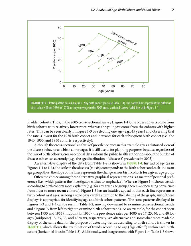
Suppose that the same investigator who collected the data shown in Table 1-1 is able to recover data from previous surveys conducted in the same population in 1975, 1985, and 1995. The resulting data, presented in TABLE 1-2 and FIGURE 1-2, show consistent trends of decreasing prevalence of Y with age in each of these surveys. Consider now plotting these data using a different approach, as shown in FIGURE 1-3. The dots in Figure 1-3 are at the same places as in Figure 1-2 except the lines are connected by birth cohort (the 2005 survey data are also plotted in Figure 1-3). Each of the dotted lines represents a birth cohort converging to the 2005 survey. For example, the “youngest” age point in the 2005 cross-sectional curve represents the rate of disease Y for individuals aged 30 to 39 years (average of 35 years) who were born between 1965 and 1974, that is, in 1970 on average (the “1970 birth cohort”). Individuals in this 1970 birth cohort were on average 10 years younger, that is, 25 years of age at the time of the 1995 survey and 15 years of age at the time of the 1985 survey. The line for the 1970 birth cohort thus represents how the prevalence of Y changes with increasing age for individuals born, on average, in 1970. Evidently, the cohort pattern shown in Figure 1-3 is very different from that suggested by the cross-sectional data and is consistent for all birth cohorts shown in Figure 1-3 in that it suggests that the prevalence of Y actually increases as people age. The fact that the inverse trend is observed in the cross-sectional data is due to a strong “cohort effect” in this example; that is, the prevalence of Y is strongly determined by the year of birth of the person. For any given age, the prevalence rate is higher in younger (more recent) than
FIGURE 1-1 Hypothetical data from a cross-sectional study of prevalence of disease Y in a population, by age, 2005 (based on data from Table 1-1).
0 10 20 30 40 50 60 70 80
Pre
vale
nce
(per
100
0)
Age (years)
50
40
30
20
10
0

6 Chapter 1 Basic Study Designs in Analytical Epidemiology
TABLE 1-2 Hypothetical data from a series of cross-sectional studies of prevalence of disease Y in a population, by age and survey date (calendar time), 1975–2005.
Survey date
Age group(years)
Midpoint(years)
1975 1985 1995 2005
Prevalence (per 1000)
10–19 15 17 28
20–29 25 14 23 35
30–39 35 12 19 30 45
40–49 45 10 18 26 40
50–59 55 15 22 36
60–69 65 20 31
70–79 75 27
FIGURE 1-2 Hypothetical data from a series of cross-sectional studies of prevalence of disease Y (per 1000) in a population, by age and survey date (calendar time), 1975, 1985, 1995, and 2005 (based on data from Table 1-2).
50
40
30
20
10
00 10 20 30 40 50 60 70 80
Pre
vale
nce
(per
100
0)
Age (years)
2005
1995
1985
1975
1.2 Analysis of Age, Birth Cohort, and Period Effects 7
in older cohorts. Thus, in the 2005 cross-sectional survey (Figure 1-1), the older subjects come from birth cohorts with relatively lower rates, whereas the youngest come from the cohorts with higher rates. This can be seen clearly in Figure 1-3 by selecting one age (e.g., 45 years) and observing that the rate is lowest for the 1930 birth cohort and increases for each subsequent birth cohort (i.e., the 1940, 1950, and 1960 cohorts, respectively).
Although the cross-sectional analysis of prevalence rates in this example gives a distorted view of the disease behavior as a birth cohort ages, it is still useful for planning purposes because, regardless of the mix of birth cohorts, cross-sectional data inform the public health authorities about the burden of disease as it exists currently (e.g., the age distribution of disease Y prevalence in 2005).
An alternative display of the data from Table 1-2 is shown in FIGURE 1-4. Instead of age (as in Figures 1-1 to 1-3), the scale in the abscissa (x-axis) corresponds to the birth cohort and each line to an age group; thus, the slope of the lines represents the change across birth cohorts for a given age group.
Often the choice among these alternative graphical representations is a matter of personal pref-erence (i.e., which pattern the investigator wishes to emphasize). Whereas Figure 1-4 shows trends according to birth cohorts more explicitly (e.g., for any given age group, there is an increasing prevalence from older to more recent cohorts), Figure 1-3 has an intuitive appeal in that each line represents a birth cohort as it ages. As long as one pays careful attention to the labeling of the graph, any of these displays is appropriate for identifying age and birth cohort patterns. The same patterns displayed in Figures 1-3 and 1-4 can be seen in Table 1-2, moving downward to examine cross-sectional trends and diagonally from left to right to examine birth cohort trends. As an example, for the cohort born between 1955 and 1964 (midpoint in 1960), the prevalence rates per 1000 are 17, 23, 30, and 40 for ages (midpoint) 15, 25, 35, and 45 years, respectively. An alternative and somewhat more readable display of the same data for the purpose of detecting trends according to birth cohort is shown in TABLE 1-3, which allows the examination of trends according to age (“age effect”) within each birth cohort (horizontal lines in Table 1-3). Additionally, and in agreement with Figure 1-4, Table 1-3 shows
FIGURE 1-3 Plotting of the data in Figure 1-2 by birth cohort (see also Table 1-3). The dotted lines represent the different birth cohorts (from 1930 to 1970) as they converge to the 2005 cross-sectional survey (solid line, as in Figure 1-1).
50
40
30
20
10
00 10 20 30 40 50 60 70 80
Pre
vale
nce
(per
100
0)
Age (years)
1970
2005 cross-sectionalsurvey
1960
19501940
1930

8 Chapter 1 Basic Study Designs in Analytical Epidemiology
how prevalence rates increase from older to more recent cohorts (cohort effect)—readily visualized by moving one’s eyes from the top to the bottom of each age group column in Table 1-3.
Thus, the data in the previous example are simultaneously affected by two strong effects: “cohort effect” and “age effect” (for definitions, see EXHIBIT 1-1). These two trends are jointly responsible for the seemingly paradoxical trend observed in the cross-sectional analyses in this hypothetical example
TABLE 1-3 Rearrangement of the data shown in Table 1-2 by birth cohort.
Age group (midpoint, in years)
15 25 35 45 55 65 75
Birth cohort range Midpoint Prevalence (per 1000)
1925–1934 1930 10 15 20 27
1935–1944 1940 12 18 22 31
1945–1954 1950 14 19 26 36
1955–1964 1960 17 23 30 40
1965–1974 1970 28 35 45
50
40
30
20
10
0
1930 1940 1950 1960 1970
Pre
vale
nce
(per
100
0)
Birth cohort
7565
55
45
35
25
15
FIGURE 1-4 Alternative display of the data in Figure 1-3. Birth cohorts are represented in the x-axis. The lines represent age groups (labeled using italicized numbers representing the midpoints, in years).

1.2 Analysis of Age, Birth Cohort, and Period Effects 9
(Figures 1-1 and 1-2) in which the rates seem to decrease with age. The fact that more recent cohorts have substantially higher rates (cohort effect) overwhelms the increase in prevalence associated with age and explains the observed cross-sectional pattern. In other words, in cross-sectional data, the rates in the older ages are those from the earlier cohorts, whose rates were lower than those of the more recently born cohorts.
In addition to cohort and age effects, patterns of rates can be influenced by the so-called period effect. The term period effect is frequently used to refer to a global shift or change in trends that affects the rates across all birth cohorts and age groups (Exhibit 1-1). Any phenomenon occurring at a specific point in time (or during a specific period) that affects an entire population (or a signif-icant segment of it), such as a war, a new treatment, or massive migration, can produce this change independently of age and birth cohort effects. A hypothetical example is shown in FIGURE 1-5. This figure shows data similar to those used in the previous example (Figure 1-3) except, in this case, the rates level off in 1995 for all cohorts (i.e., when the 1970 cohort is 25 years old on average, when the 1960 cohort is 35 years old, and so on).
EXHIBIT 1-1 Definitions of age, cohort, and period effects.
Age effect Change in the rate of a condition according to age regardless of birth cohort and calendar time
Cohort effect Change in the rate of a condition according to year of birth regardless of age and calendar time
Period effect Change in the rate of a condition affecting an entire population at some point in time regardless of age and birth cohort
50
40
30
20
10
00 10 20 30 40 50 60 70 80
Pre
vale
nce
(per
100
0)
Age (years)
1970
1960
19501940
1930
2005
FIGURE 1-5 Hypothetical example of period effect. An event happened in 1995 that affected all birth cohorts (1930–1970) in a similar way and slowed down the rate of increase with age. The solid line represents the observed cross-sectional age pattern in 2005.

10 Chapter 1 Basic Study Designs in Analytical Epidemiology
Period effects on prevalence rates can occur, for example, when new medications or preventive interventions are introduced for diseases that previously had poor prognoses, as in the case of the introduction of insulin, antibiotics, and the polio vaccine.
It is important to understand that the so-called birth cohort effects may have little to do with the circumstances surrounding the time of birth of a given cohort of individuals. Rather, cohort effects may result from the lifetime experience (including, but not limited to, those surrounding birth) of the individuals born at a given point in time that influences the disease or outcome of interest. For example, currently observed patterns of association between age and coronary heart disease (CHD) may have resulted from cohort effects related to changes in diet (e.g., fat intake) or smoking habits of adolescents and young adults over time. It is well known that coronary atherosclerotic markers, such as thickening of the arterial intima, frequently develop early in life.4 In middle and older ages, some of these early intimal changes may evolve into raised atherosclerotic lesions, eventually leading to thrombosis, lumen occlusion, and the resulting clinically manifest acute ischemic events. Thus, a young adult’s dietary and/or smoking habits may influence atherosclerosis development and sub-sequent coronary risk. If changes in these habits occur in the population over time, successive birth cohorts will be subjected to changing degrees of exposure to early atherogenic factors, which will in part determine future cross-sectional patterns of the association of age with CHD.
Another way to understand the concept of cohort effects is that they are the result of an interac-tion between age and calendar time. The concept of interaction is discussed in detail in Chapter 6. In simple terms, it means that a given variable (e.g., calendar time in the case of a cohort effect) modifies the strength or the nature of an association between another variable (e.g., age) and an outcome (e.g., coronary atherosclerosis). In the previous example, it means that the way age relates to the development of atherosclerosis changes over time as a result of changes in the population prevalence of key risk factors (e.g., dietary/smoking habits of young adults). In other words, calendar time–related changes in risk factors modify the association between age and atherosclerosis.
Cohort–age–period analyses can be applied not only to prevalence data but also to incidence and mortality data. A classic example is Wade Hampton Frost’s study of age patterns of tuberculosis mortality.5 FIGURE 1-6 presents two graphs from Frost’s landmark paper. With regard to Figure 1-6A, Frost5(p94) noted that “looking at the 1930 curve, the impression given is that nowadays an individual
FIGURE 1-6 Frost’s analysis of age in relation to tuberculosis mortality (males only). (A) Massachusetts death rates from tuberculosis, by age, 1880, 1910, 1930. (B) Massachusetts death rates from tuberculosis, by age, in successive 10-year cohorts.
100200300400500600700800
00 10 20 30 40 50 60 70 80
Dea
th r
ates
per
100
,000
Age (years)
Year 1880
Year 1910
Year 1930
A
100200300400500600700800
0
0 10 20 30 40 50 60 70 80
Dea
th r
ates
per
100
,000
Age (years)
Cohort 1870Cohort 1880
Cohort 1890Cohort 1900Cohort 1910
B
Reproduced from Frost WH. The age-selection of tuberculosis mortality in successive decades. Am J Hyg. 1939;30:91-96.5 By permission of Oxford University Press.

1.2 Analysis of Age, Birth Cohort, and Period Effects 11
encounters his greatest risk of death from tuberculosis between the ages of 50 and 60. But this is not really so; the people making up the 1930 age group 30 to 60 have, in earlier life, passed through greater mortality risk” (emphasis in original). This is demonstrated in Figure 1-6B, aptly used by Frost to show how the risk of tuberculosis death after the first few years of life is actually highest at ages 20 to 30 years for cohorts born in 1870 through 1890.
Another example is shown in FIGURE 1-7, based on an analysis of age, cohort, and period effects on the incidence of colorectal cancer in a region of Spain.6 In these figures, birth cohorts are placed on the x-axis (as in Figure 1-4). These figures show strong cohort effects: For each age group, the incidence rates of colorectal cancer tend to increase from older to more recent birth cohorts. An age effect is also evident, as for each birth cohort (for any given year-of-birth value in the horizontal axis) the rates are higher for older than for younger individuals. Note that a logarithmic scale was used in the ordinate in this figure in part because of the wide range of rates needed to be plotted. (For further discussion of the use of logarithmic vs arithmetic scales, see Chapter 9, Section 9.3.5.)
An additional example of age and birth cohort analysis of incidence data is shown in FIGURE 1-8. This figure shows the incidence of ovarian cancer in Mumbai, India, by age and year of birth
FIGURE 1-7 Trends in age-specific incidence rates of colorectal cancer in Navarra and Zaragoza (Spain). The number next to each line represents the initial year of the corresponding 5-year age group.
80–75–
65–
55–
45–
70–
60–
50–
40–
1000
100
101
Age
-spe
cific
rat
es ×
100
,000
1885 1900 1915 1930 1945
Year of birth
MenA
80–75–
65–
55–
45–
70–
60–
50–
40–
1000
100
101
Age
-spe
cific
rat
es ×
100
,000
1885 1900 1915 1930 1945
Year of birth
WomenB
Reproduced from López-Abente G, Pollán M, Vergara A, et al. Age-period-cohort modeling of colorectal cancer incidence and mortality in Spain. Cancer Epidemiol Biomarkers Prev. 1997;6:999-1005.6 With permission from AACR.

12 Chapter 1 Basic Study Designs in Analytical Epidemiology
FIGURE 1-8 Incidence rates of ovarian cancer per 100,000 person-years, by birth cohort (A) and by age (B), Mumbai, India, 1976–2005.
0
5
10
15
20
25
30
Calendar year
Rat
es p
er 1
00,
00
0 p
erso
n-y
ears
Age (years)32 37 42 47 52 57 62
1916 1921 1926 1931 1936 1941 1946 1951 1956 1961 1967 1971
A
Age (years)
1916
32 37 42 47 52 57 62
30
0
5
10
15
20
25
19211926193119361941
Calendaryear
Rat
es p
er 1
00,
00
0 p
erso
n-y
ears
194619511956196119671971
B
Modified from Dhillon PK, Yeole BB, Dikshit R, Kurkure AP, Bray F. Trends in breast, ovarian and cervical cancer incidence in Mumbai, India over a 30-year period, 1976-2005: an age-period-cohort analysis. Br J Cancer. 2011;105:723-730.7

1.2 Analysis of Age, Birth Cohort, and Period Effects 13
cohort.7 This is an example in which there is a strong age effect, particularly for the cohorts born from 1940 through 1970; that is, rates increase dramatically with age through age 52 years but with very little cohort effect, as indicated by the approximate flat pattern for the successive birth cohorts for each age group (the figure shows the midpoint of each age group). It should be manifest that, when there is little cohort effect, as in this situation, the cross-sectional curves and cohort curves will essentially show the same pattern, with the cross-sectional curves practically overlapping each other (Figure 1-8B).
Period effects associated with incidence rates tend to be more prominent for diseases for which the cumulative effects of previous exposures are relatively unimportant, such as infectious diseases and injuries. Conversely, in chronic diseases, such as cancer and cardiovascular disease, cumulative effects are usually important, and thus, cohort effects tend to affect incidence rates to a greater extent than period effects.
These methods can also be used to study variables other than disease rates. An example is the analysis of age-related changes in serum cholesterol levels shown in FIGURE 1-9, based on data from the Florida Geriatric Research Program.8 This figure reveals a slight cohort effect in that serum cholesterol levels tend to be lower in older than in more recent birth cohorts for most age groups. A J- or U-shaped age pattern is also seen; that is, for each birth cohort, serum cholesterol tends to first decrease or remain stable with increasing age and then increase to achieve its maximum value in the oldest members of the cohort. Although at first glance this pattern might be considered an “age effect,” for each cohort the maximum cholesterol values in the oldest age group coincide with a single point in calendar time: 1985 through 1987 (i.e., for the 1909–1911 birth cohort at 76 years of age, for the 1906–1908 cohort at 79 years of age, and so on), leading Newschaffer et al. to ob-serve that “a period effect is suggested by a consistent change in curve height at a given time point over all cohorts. . . . Therefore, based on simple visual inspection of the curves, it is not possible to attribute the consistent U-shaped increase in cholesterol to aging, since some of this shape may be accounted for by period effects.”8(p26)
In complex situations, it may be difficult to differentiate age, cohort, and period effects. In a complex situation, such as that illustrated in the preceding discussion, multiple regression techniques can be used to disentangle these effects. Describing these techniques in detail is beyond the scope of this book. (A general discussion of multiple regression methods is presented in Chapter 7, Section 7.4.) The interested reader can find examples and further references in the original papers from the previously cited examples (e.g., López-Abente et al.6 and Newschaffer et al8).
Finally, it should be emphasized that birth cohort effects may affect associations between disease outcomes and variables other than age. Consider, for example, a case-control study (see Section 1.4.2) in which cases and controls are closely matched by age (see Section 1.4.5). Assume that this is a study of a rare disease in which cases are identified over a 10-year span (e.g., from 2000 through 2009) and controls at the end of the accrual of cases (such as may happen when frequency matching is used—see section 1.4.5). In this study, age per se does not act as a con-founder, as cases and controls are matched on age (see Chapter 5, Section 5.2.2); however, the fact that cases and controls are identified from different birth cohorts may affect the assessment of variables, such as educational level, that may have changed rapidly across birth cohorts. In this case, birth cohort, but not age, would confound the association between education and the disease of interest.
*A mean value can be calculated for both continuous and discrete (e.g., binary) variables. A proportion is a mean of individual binary values (e.g., 1 for presence of a certain characteristic, 0 if the characteristic is absent).

14 Chapter 1 Basic Study Designs in Analytical Epidemiology
FIGURE 1-9 Sex-specific mean serum cholesterol levels by age and birth cohort. Longitudinal data from the Florida Geriatric Research Program, Dunedin County, Florida, 1976–1987.
250
240
230
220
210
200
190
180
17067 70 73 76 79 82 85 88 91
Age-group midpoint (years)
A. Females
Ser
um to
tal c
hole
ster
ol (
mg/
dl)
250
240
230
220
210
200
190
180
17067 70 73 76 79 82 85 88 91
Age-group midpoint (years)
B. Males
Ser
um to
tal c
hole
ster
ol (
mg/
dl)
1909–1911
1900–1902
1906–1908
1897–1899
1903–1905
1894–1896
Reprinted with permission from Newschaffer CJ, Bush TL, Hale WE. Aging and total cholesterol levels: cohort, period, and survivorship effects. Am J Epidemiol. 1992;136:23-34.8 By permission of Oxford University Press.

1.3 Ecologic Studies 15
1.3 Ecologic StudiesThe units of observation in an ecologic study are usually geographically defined populations (such as countries or regions within a country) or the same geographically defined population at different points in time. Mean values* for both a given postulated risk factor and the outcome of interest are obtained for each observation unit for comparison purposes. Typically, the analysis of ecologic data involves plotting the risk factor and outcome values for all observation units to assess whether a relationship is evident. For example, FIGURE 1-10 displays the death rates for CHD in men from 16 cohorts included in the Seven Countries Study plotted against the corresponding estimates of mean fat intake (percent calories from fat).9 A positive relationship between these two variables is suggested by these data, as there is a tendency for the death rates to be higher in countries having higher average saturated fat intakes.
Different types of variables can be used in ecologic studies,10 which are briefly summarized as follows:
■ Aggregate measures that summarize the characteristics of individuals within a group as the mean value of a certain parameter or the proportion of the population or group of interest with
TJ
D
V
MZ
CR B
SG
U
E
N
W
0 5 10 15 20
X = % Diet calories from saturated fat
Y =
10–
Year
cor
onar
y de
aths
per
10,
000
men 600
400
200
0
Y = –83 + 25.1Xr = 0.84
K
FIGURE 1-10 Example of an ecologic study. Ten-year coronary death rates of the cohorts from the Seven Countries Study plotted against the percentage of dietary calories from saturated fatty acids. Cohorts: B, Belgrade; C, Crevalcore; D, Dalmatia; E, East Finland; G, Corfu; J, Ushibuka; K, Crete; M, Montegiorgio; N, Zuphen; R, Rome railroad; S, Slavonia; T, Tanushimaru; U, American railroad; V, Velika Krsna; W, West Finland; Z, Zrenjanin. Shown in the figure are the linear regression coefficients (see Chapter 7, Section 7.4.1) and the correlation coefficient r corresponding to this plot.
Reprinted with permission from Keys A. Seven Countries: A Multivariate Analysis of Death and Coronary Heart Disease. Cambridge, MA: Harvard University Press; 1980.9 By the President and Fellows of Harvard College.

16 Chapter 1 Basic Study Designs in Analytical Epidemiology
a certain characteristic. Examples include the prevalence of a given disease, average amount of fat intake (Figure 1-10), proportion of smokers, and median income.
■ Environmental measures that represent physical characteristics of the geographic location for the group of interest. Individuals within the group may have different degrees of exposure to a given characteristic, which could theoretically be measured. Examples include air pollution intensity and hours of sunlight.
■ Global measures that represent characteristics of the group that are not reducible to charac-teristics of individuals (i.e., that are not analogues at the individual level). Examples include the type of political or healthcare system in a given region, a certain regulation or law, and the presence and magnitude of health inequalities.
In a traditional ecologic study, two ecologic variables are contrasted to examine their possible association. Typically, an ecologic measure of exposure and an aggregate measure of disease or mortality are compared (Figure 1-10). These ecologic measures can also be used in studies of in-dividuals (see Section 1.4) in which the investigator chooses to define exposure using an ecologic criterion on the basis of its expected superior construct validity.* For example, in a cross-sectional study of the relationship between socioeconomic status and prevalent cardiovascular disease, the investigator may choose to define study participants’ socioeconomic status using an aggregate in-dicator (e.g., median family income in the neighborhood) rather than, for example, his or her own (individual) educational level or income. Furthermore, both individual and aggregate measures can be simultaneously considered in multilevel analyses, as when examining the joint role of individuals’ and aggregate levels of income and education in relation to prevalent cardiovascular disease.11
An ecologic association may accurately reflect a causal connection between a suspected risk factor and a disease (e.g., the positive association between fat intake and CHD depicted in Figure 1-10). However, the phenomenon of ecologic fallacy is often invoked as an important limitation for the use of ecologic correlations as bona fide tests of etiologic hypotheses. The ecologic fallacy (or aggregation bias) has been defined as the bias that may occur because an association observed between variables on an aggregate level does not necessarily represent the association that exists at an individual level.1(p88) The phenomenon of ecologic fallacy is schematically illustrated in FIGURE 1-11, based on an example proposed by Diez-Roux.12 In a hypothetical ecologic study ex-amining the relationship between per capita income and the risk of motor vehicle injuries in three populations composed of seven individuals each, a positive correlation between mean income and risk of injuries is observed; however, a close inspection of individual values reveals that cases occur exclusively in persons with low income (less than U.S. $20,000). In this extreme example of ecologic fallacy, the association detected when using populations as observation units (e.g., higher mean income relates to a higher risk of motor vehicle injuries) has a direction diametri-cally opposed to the relationship between income and motor vehicle injuries in individuals—in whom higher individual income relates to a lower injury risk. Thus, the conclusion from the ecologic analysis that a higher income is a risk factor for motor vehicle injuries may be fallacious (discussed later in this section).
Another example of a situation in which this type of fallacy may have occurred is given by an ecologic study that showed a direct correlation between the percentage of the population that was Protestant and suicide rates in a number of Prussian communities in the late 19th century.10,13 Concluding from this observation that being Protestant is a risk factor for suicide may well be
*Construct validity is the extent to which an operational variable (e.g., body weight) accurately represents the phenome-non it purports to represent (e.g., nutritional status).

1.3 Ecologic Studies 17
wrong (i.e., may result from an ecologic fallacy). For example, it is possible that most of the suicides within these communities were committed by Catholic individuals who, when in the minority (i.e., in communities predominantly Protestant), tended to be more socially isolated and therefore at a higher risk of suicide.
As illustrated in these examples, errors associated with ecologic studies are the result of cross-level inference, which occurs when aggregate data are used to make inferences at the individual level.10 The mistake in the example just discussed is to use the correlation between the proportion of Protestants (which is an aggregate measure) and suicide rate to infer that the risk of suicide is higher in Protestant than in Catholic individuals. If one were to make an inference at the population level, however, the conclusion that predominantly Protestant communities with Catholic minorities have higher rates of suicide would still be valid (provided that other biases and confounding factors were not present). Similarly, in the income/injuries example, the inference from the ecologic analysis is wrong only if intended for the understanding of determinants at the level of the individual. The ecologic informa-tion may be valuable if the investigator’s purpose is to understand fully the complex web of causality14 involved in motor vehicle injuries, as it may yield clues regarding the causes of motor vehicle injuries that are not provided by individual-level data. In the previous example (Figure 1-11), higher mean population income may truly be associated with increased traffic volume and, consequently, with higher rates of motor vehicle injuries. At the individual level, however, the inverse association between
$19.8K
Mean income: $24,086 Traffic injuries: 4/7 = 57%
$17.5K$12.2K$10.5K $45.6K$28.5K$34.5K
Population A
$26.4K
Mean income: $22,571 Traffic injuries: 3/7 = 43%
$38.0K$10.0K$12.5K $14.3K$24.3K$32.5K
Population B
$20.5K
Mean income: $21,414 Traffic injuries: 2/7 = 29%
$22.7K$23.5K$28.7K $10.8K$13.5K$30.2K
Population C
FIGURE 1-11 Schematic representation of a hypothetical study in which ecologic fallacy occurs. Boxes represent hypothetical individuals, darker boxes represent incident cases of motor vehicle (MV) injuries, and the numbers inside the boxes indicate individuals’ annual incomes (in thousands of U.S. dollars). Ecologically, the correlation is positive: Population A has the highest values of both mean income and incidence of MV injuries, population B has intermediate values of both mean income and incidence of MV injuries, and population C has the lowest values of both mean income and incidence of MV injuries. In individuals, however, the relationship is negative: For all three populations combined, mean income is U.S. $13,456 for cases and U.S. $29,617 for noncases.

18 Chapter 1 Basic Study Designs in Analytical Epidemiology
income and motor vehicle injuries may result from the higher frequency of use of unsafe vehicles among low-income individuals, particularly in the context of high traffic volume.
Because of the prevalent view that inference at the individual level is the gold standard when studying disease causation,15 as well as the possibility of ecologic fallacy, ecologic studies are often considered imperfect surrogates for studies in which individuals are the observation units. Essentially, ecologic studies are seen as preliminary studies that “can suggest avenues of research that may be promising in casting light on etiological relationships.”3(p210) That this is often but not always true has been underscored by the examples discussed previously here. Furthermore, the following three situations demonstrate that an ecologic analysis may on occasion lead to more accurate conclusions than an analysis using individual-level data—even if the level of inference in the ecologic study is at the individual level.
1. The first situation is when the within-population variability of the exposure of interest is low but the between-population variability is high. For example, if salt intake of indi-viduals in a given population were above the threshold needed to cause hypertension, a relationship between salt and hypertension might not be apparent in an observational study of individuals in this population, but it could be seen in an ecologic study including populations with diverse dietary habits.16 (A similar phenomenon has been postulated to explain why ecologic correlations, but not studies of individuals, have detected a relationship between fat intake and risk of breast cancer.17)
2. The second situation is when, even if the intended level of inference is the individual, the implications for prevention or intervention are at the population level. Some examples of the latter situation are as follows:• In the classic studies on pellagra, Goldberger et al.18 assessed not only individual
indicators of income but also food availability in the area markets. They found that, independently of individual socioeconomic indicators, food availability in local markets in the villages was strongly related to the occurrence of pellagra, leading these authors to conclude the following:
The most potent factors influencing pellagra incidence in the villages studied were (a) low family income, and (b) unfavorable conditions regarding the availability of food supplies, suggesting that under conditions obtaining [sic] in some of these villages in the spring of 1916 many families were without sufficient income to en-able them to procure an adequate diet, and that improvement in food availability (particularly of milk and fresh meat) is urgently needed in such localities.18(p2712)
It should be readily apparent in this example that an important (and potentially modifiable) link in the causal chain of pellagra occurrence—namely, food availability—may have been missed if the investigators had focused exclusively on individual income measures.• Studies of risk factors for smoking initiation and/or smoking cessation may focus
on community-level cigarette taxes or regulation of cigarette advertising. Although individual factors may influence the individual’s predisposition to smoking (e.g., psychological profile, smoking habits of relatives or friends), regulatory “ecologic” factors may be strong determinants and modifiers of the individual behaviors. Thus, an investigator may choose to focus on these global factors rather than on (or in addition to) individual behaviors.
• When studying the determinants of transmission of certain infectious diseases with complex nonlinear infection dynamics (e.g., attenuated exposure–infection relationship at the individual level), ecologic studies may be more appropriate than studies using individuals as observation units.19

1.4 Studies Based on Individuals as Observation Units 19
3. The third situation is when testing a hypothesis exclusively at the population level. An example is given by a study of Lobato et al.20 aimed at testing Rose and Day’s theory that, as the distribution of a particular health-related characteristic in a population shifts, if its dispersion is unchanged, the mean and prevalence of extreme values are expected to be correlated.21 In agreement with this concept, Lobato et al. found a strong correlation between mean body mass index (weight in kilograms/square of height in meters) and prevalence of obesity in 26 Brazilian capitals in adult women (r = 0.86).20
Because ultimately all risk factors must operate at the individual level, the quintessential reduc-tionistic* approach would focus on only the causal pathways at the biochemical or intracellular level. For example, the study of the carcinogenic effects of tobacco smoking could focus on the effects of tobacco by-products at the cellular level, that is, alteration of the cell’s DNA. However, will that make the study of smoking habits irrelevant? Obviously not. Indeed, from a public health perspective, the use of a comprehensive theoretical model of causality—one that considers all factors influencing the occurrence of disease—often requires taking into account the role of upstream and ecologic factors (including environmental, sociopolitical, and cultural) in the causal chain (see also Chapter 10, Sections 10.2.2 and 10.2.3). As stated at the beginning of this chapter, the ultimate goal of epidemiology is to be effectively used as a tool to improve the health conditions of the public; in this context, the factors that operate at a global level may represent important links in the chain of causation, particularly when they are amenable to intervention (e.g., improving access to fresh foods in villages, establishing laws that limit cigarette advertising, or improving the built environment in cities to eliminate barriers to individuals’ physical activity habits). As a result, studies focusing on factors at the individual level may be insufficient in that they fail to address these ecologic links in the causal chain. This important concept can be illustrated using the previously discussed example of religion and suicide. A study based on individuals would “correctly” find that the risk of suicide is higher in Catholics than in Protestants.10 This finding would logically suggest explanations for why the suicide rate differs be-tween these religious groups. For example, is the higher rate in Catholics caused by Catholicism per se? Alternatively, is it because of some ethnic difference between Catholics and Protestants? If so, is it due to some genetic component that distinguishes these ethnic groups? The problem is that these questions, which attempt to characterize risk at the individual level, although important, are insufficient to explain fully the “web of causality,”14 for they fail to consider the ecologic dimension of whether minority status explains and determines the increased risk of suicide. This example underscores the concept that both individual and ecologic studies are often necessary to study the complex causal determination not only of suicide but also of many other health and disease processes.12 The com-bination of individual and ecologic levels of analysis poses analytical challenges for which statistical models (hierarchical models) have been developed. Difficult conceptual challenges remain, however, such as the development of causal models that include all relevant risk factors operating from the social to the biological level and that consider their possible multilevel interaction.12
1.4 Studies Based on Individuals as Observation UnitsThere are three basic types of nonexperimental (observational) study designs in which individuals are the units of observation: the cohort or prospective study, the case-control study, and the cross-sectional study. In this section, key aspects of these study designs are reviewed. The case-crossover study, a special type of case-control study, is also briefly discussed. For a more comprehensive discussion
*Reductionism is a theory that postulates that all complex systems can be completely understood in terms of their components, basically ignoring interactions between these components.

20 Chapter 1 Basic Study Designs in Analytical Epidemiology
of the operational and analytical issues related to observational epidemiologic studies, the reader is referred to specialized texts.22-26
From a conceptual standpoint, the fundamental study design in observational epidemiology—that is, the design from which the others derive and that can be considered the gold standard—is the cohort or prospective study. Cohort data, if unbiased, reflect the “real-life” cause–effect temporal sequence of events, a sine qua non criterion to establish causality (see Chapter 10, Section 10.2.4). From this point of view, the case-control and the cross-sectional designs are mere variations of the cohort study design and are primarily justified by feasibility, logistical ease, and efficiency.
1.4.1 Cohort StudyIn a cohort study, a group of healthy people, or a cohort,* is identified and followed for a certain time period to ascertain the occurrence of health-related events (FIGURE 1-12). The usual objective of a cohort study is to investigate whether the incidence of an event is related to a suspected exposure.
Study populations in cohort studies can be quite diverse and may include a sample of the general population of a certain geographic area (e.g., the Framingham Study27); an occupational cohort, typically defined as a group of workers in a given occupation or industry who are classified according to exposure to agents thought to be occupational hazards; or a group of people who, because of certain characteristics, are at an unusually high risk for a given disease (e.g., the cohort of homosexual men who are followed in the Multicenter AIDS Cohort Study28). Alternatively, co-horts can be formed by “convenience” samples, or groups gathered because of their willingness to participate or because of other logistical advantages, such as ease of follow-up; examples include the Nurses Health Study cohort,29 the Health Professionals Study cohort,30 and the American Cancer Society cohort studies of volunteers.31
After the cohort is defined and the participants are selected, a critical element in a cohort study is the ascertainment of events during the follow-up time (when the event of interest is a newly de-veloped disease, prevalent cases are excluded from the cohort at baseline). This is the reason these studies are also known as prospective studies.30 A schematic depiction of a cohort of 1000 individuals
*A definition of the term cohort broader than that found in the footnote in Section 1.2 is any designated and defined group of individuals who are followed or tracked over a given time period.1
Suspected
exposure
Cohort Outcome
Death
Disease
Recurrence
Recovery
Time
FIGURE 1-12 Basic components of a cohort study: exposure, time, and outcome.
1.4 Studies Based on Individuals as Observation Units 21
Initialcohort
(n = 1000)
Cohort atthe end offollow-up(n = 989)
Time
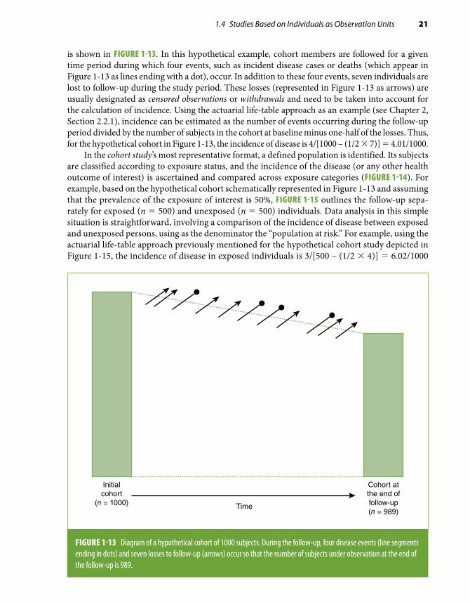
FIGURE 1-13 Diagram of a hypothetical cohort of 1000 subjects. During the follow-up, four disease events (line segments ending in dots) and seven losses to follow-up (arrows) occur so that the number of subjects under observation at the end of the follow-up is 989.
is shown in FIGURE 1-13. In this hypothetical example, cohort members are followed for a given time period during which four events, such as incident disease cases or deaths (which appear in Figure 1-13 as lines ending with a dot), occur. In addition to these four events, seven individuals are lost to follow-up during the study period. These losses (represented in Figure 1-13 as arrows) are usually designated as censored observations or withdrawals and need to be taken into account for the calculation of incidence. Using the actuarial life-table approach as an example (see Chapter 2, Section 2.2.1), incidence can be estimated as the number of events occurring during the follow-up period divided by the number of subjects in the cohort at baseline minus one-half of the losses. Thus, for the hypothetical cohort in Figure 1-13, the incidence of disease is 4/[1000 – (1/2 × 7)] = 4.01/1000.
In the cohort study’s most representative format, a defined population is identified. Its subjects are classified according to exposure status, and the incidence of the disease (or any other health outcome of interest) is ascertained and compared across exposure categories (FIGURE 1-14). For example, based on the hypothetical cohort schematically represented in Figure 1-13 and assuming that the prevalence of the exposure of interest is 50%, FIGURE 1-15 outlines the follow-up sepa-rately for exposed (n = 500) and unexposed (n = 500) individuals. Data analysis in this simple situation is straightforward, involving a comparison of the incidence of disease between exposed and unexposed persons, using as the denominator the “population at risk.” For example, using the actuarial life-table approach previously mentioned for the hypothetical cohort study depicted in Figure 1-15, the incidence of disease in exposed individuals is 3/[500 – (1/2 × 4)] = 6.02/1000

22 Chapter 1 Basic Study Designs in Analytical Epidemiology
Initialcohort
(n = 500)
Cohort atthe end offollow-up(n = 493)
Initialcohort
(n = 500)
Cohort atthe end offollow-up(n = 496)
Time
Exposed
Unexposed
FIGURE 1-15 Same cohort study as in Figure 1-13, but the ascertainment of events and losses to follow-up is done separately among those exposed and unexposed.
Becomediseased
Remainnondiseased
Time
Incidencee
Incidencee
Relative risk
Exposed
Unexposed
FIGURE 1-14 Basic analytical approach in a cohort study.

1.4 Studies Based on Individuals as Observation Units 23
and in unexposed is 1/[500 – (1/2 × 3)] = 2.01/1000. After obtaining incidence in exposed and unexposed, typically the relative risk is estimated (Chapter 3, Section 3.2.1); that is, these results would suggest that exposed individuals in this cohort have a risk approximately three times higher than that of unexposed individuals (relative risk = 6.02/2.01 ≈ 3.0).
An important assumption for the calculation of incidence in a cohort study is that individuals who are lost to follow-up (the arrows in Figures 1-13 and 1-15) are similar to those who remain under observation with regard to characteristics affecting the outcome of interest (see Chapter 2). The reason is that even though techniques to “correct” the denominator for the number (and timing) of losses are available (see Chapter 2, Section 2.2), if the average risk of those who are lost differs from that of those remaining in the cohort, the incidence based on the latter will not represent accurately the true incidence in the initial cohort (see Chapter 2, Section 2.2.1). If, however, the objective of the study is an internal comparison of the incidence between exposed and unexposed subjects, even if those lost to follow-up differ from the remaining cohort members, as long as the biases caused by losses are similar in the exposed and the unexposed, they will cancel out when the relative risk is calculated (see Chapter 4, Section 4.2). Thus, a biased relative risk caused by losses to follow-up is present only when losses are differential in exposed and unexposed subjects with regard to the characteristics influencing the outcome of interest—in other words, when losses are affected by both exposure and disease status.
Cohort studies are defined as concurrent3 (or truly “prospective”32) when the cohort is assembled at the present time—that is, the calendar time when the study starts—and is followed up toward the future (FIGURE 1-16). The main advantage of concurrent cohort studies is that the baseline exam,
Investigatorbegins the study
Selection ofparticipants
Follow-up
Concurrentstudy
Nonconcurrentstudy(Historical cohort)
Mixed design
Investigatorbegins the study
Investigatorbegins the study
FIGURE 1-16 Types of cohort studies.
Emamian
Highlight

24 Chapter 1 Basic Study Designs in Analytical Epidemiology
methods of follow-up, and ascertainment of events are planned and implemented for the purposes of the study, thus best fitting the study objectives; in addition, quality control measures can be im-plemented as needed (see Chapter 8). The disadvantages of concurrent studies relate to the amount of time needed to conduct them (results are available only after a sufficient number of events have been accumulated) and their usually elevated costs. Alternatively, in nonconcurrent cohort studies (also known as historical or retrospective cohort studies), a cohort is identified and assembled in the past on the basis of existing records and is “followed” to the present time (i.e., the time when the study is conducted) (Figure 1-16). An example of this type of design is a 1992 study in which the relationship between childhood body weight and subsequent adult mortality was examined noncon-currently on the basis of existing records of weight and height values obtained from 1933 through 1945 in school-age children who were linked to adult death records.33 The nonconcurrent design is also useful in occupational epidemiology, as occupational records can be linked to mortality or cancer registries. For example, a cohort of all electricians working in Norway in 1960 was followed nonconcurrently through 1990 to study the relationship of electromagnetic radiation to cancer incidence.34 Mixed designs with both nonconcurrent and concurrent follow-up components are also possible (Figure 1-16). Nonconcurrent cohort studies are obviously less expensive and can be done more expeditiously than concurrent studies. Their main disadvantage is an obligatory reliance on available information; as a result, the type or quality of exposure or outcome data may not be well suited to fulfill the study objectives.
1.4.2 Case-Control StudyAs demonstrated by Cornfield35 and discussed in basic epidemiology textbooks (e.g., Gordis3), the case-control design is an alternative to the cohort study for investigating exposure–disease asso-ciations. In contrast to a cohort study, in which exposed and unexposed individuals are compared with regard to the disease incidence (or some other mean value for the outcome) (Figure 1-14), a case-control study compares cases (usually diseased individuals) and controls (e.g., nondiseased individuals) with respect to their level of exposure to a suspected risk factor. When the risk factor of interest is a categorical characteristic (e.g., former, current, and never smokers), the typical analytical approach in case-control studies is to compare the odds of exposure in cases with that in controls by calculating the exposure odds ratio (FIGURE 1-17), which is often an appropriate estimate of the relative risk (see Chapter 3, Section 3.2.1). When the exposure of interest is a continuous trait, its mean levels (e.g., mean blood pressure) can be compared between cases and controls.
The case-control study design has important advantages over the cohort design, particularly over the concurrent cohort study, as the need for a follow-up time is avoided, thus optimizing speed and efficiency.3
Case-Based Case-Control StudyIn the simplest strategy for the selection of groups in a case-control study, cases occurring over a specified time period and noncases are identified. An example of this strategy, sometimes called case-based case-control study, is a study in which incident cases are identified as the individuals in whom the disease of interest was diagnosed (e.g., breast cancer) in a certain hospital during a given year and controls are selected from among members of the community served by this hospital who did not have a diagnosis of the disease of interest by the end of that same year. If exposure data are obtained through interviews, it is necessary to assume that recall or other biases will not distort the findings (see Chapter 4). If only living cases are included in the study, it must be also

1.4 Studies Based on Individuals as Observation Units 25
assumed that cases who survive through the time when the study is done are representative of all cases with regard to the exposure experience (FIGURE 1-18). Furthermore, to validly compare cases and controls regarding their exposure status, it is necessary to assume that they originate from the same reference population, that is, from a more or less explicitly identified cohort, as depicted in Figure 1-18. In other words, for a case-control comparison to represent a valid alternative to a cohort study analysis, cases and controls are expected to belong to a common reference population (or to a similar reference population or study base, discussed later in this chapter). An example is given by a population-based study of acoustic neuroma conducted by Fisher and colleagues.36 These authors identified all 451 diagnosed acoustic neuroma cases in Sweden and selected age-, sex-, and region-matching controls (more on matching later in this chapter). In general, however, it is frequently difficult to define the source cohort in a case-control study, as, for example, in a case-based study in which the cases are ascertained in a single hospital A but controls are selected from a population sample. In this example, it is important to consider the correspondence between the patient population of hospital A and the population of the geographic area from which con-trols are sampled. Thus, for example, if hospital A is the only institution to which area residents can be admitted and all cases are hospitalized, a sample of the same area population represents a valid control group. If, however, residents use hospitals outside of the area and hospital A admits patients from other areas, alternative strategies have to be considered to select controls who are representative of the theoretical population from which cases originate (e.g., matching controls to cases by neighborhood of residency).
The assumption that cases and controls originate from the same hypothetical source cohort (even if undefined) is critical when judging the internal validity of case-control data. Ideally, con-trols should have been eligible for inclusion in the case group had they developed the disease of interest. Pragmatically, although it is not strictly necessary that cases and controls be chosen from exactly the same reference population, both groups must originate from populations having similar
Exposureoddsdis
Diseased(cases)
Odds ratio
Nondiseased(controls)
Exposureoddsnon-dis
Exposed
Unexposed
FIGURE 1-17 Basic design and analytical approach in a case-control study.

26 Chapter 1 Basic Study Designs in Analytical Epidemiology
relevant characteristics. Under these circumstances, the control group can be regarded as a reason-ably representative sample of the case reference population. EXHIBIT 1-2 summarizes the essential features of an ideal control group (i.e., one that maximizes its comparability with the case group).
When cases and controls are not selected from the same (or similar) reference population(s), selection bias may ensue (see Chapter 4). Selection bias may occur even if cases and controls are from the same “hypothetical” cohort; this happens when “losses” occurring before the study groups are
EXHIBIT 1-2 Different ways to conceptualize an ideal control group.
■ Sample of individuals without the disease selected from the same reference population (study base) from which cases were selected
■ Group of individuals who, if they had developed the case disease, would have been included in the case group
■ Group of individuals without the case disease who are subjected to the same selection process as the cases
Hypotheticalcohort
Time
Time ofthe study
Cases
Controls
FIGURE 1-18 Hypothetical case-based case-control study assuming that cases and controls are selected from a hypothetical cohort, as in Figure 1-13. The case group is assumed to include all cases that occurred in that hypothetical cohort up to the time when the study is conducted (dots with horizontal arrows ending at the “case” bar); that is, all of them are assumed to be alive and available to participate in the study. Controls are selected from among those without the disease of interest (noncases) at the time when the cases are identified and assembled. Broken diagonal lines with arrows represent losses to follow-up.

1.4 Studies Based on Individuals as Observation Units 27
selected affect their comparability. For example, if losses among potential controls include a higher proportion of individuals with low socioeconomic status than losses among cases, biased associa-tions may be found with exposures related to socioeconomic status. This example underscores the close relationship between selection bias in case-control studies and differential losses to follow-up in cohort studies. In this context, consider the similarity between Figures 1-18 and 1-13 in that the validity of the comparisons made in both cohort (Figure 1-13) and case-control (Figure 1-18) studies depends on whether the losses (represented by diagonal arrows in both figures) affect the representativeness of the baseline cohort (well defined in Figure 1-13, hypothetical in Figure 1-18) with regard to both exposure and outcome variables.
Deaths caused by either other diseases or the disease of interest comprise a particular type of (prior) “loss” that may affect comparability of cases and controls. For the type of design represented in Figure 1-18, characterized by cross-sectional ascertainment of study subjects, those who die before they can be included in the study may have a different exposure experience compared to the rest of the source population. In addition, by definition, this design identifies only cases that are prevalent at the time of the study, which will tend to be those with the longest survival (FIGURE 1-19). These types of selection bias constitute generic problems affecting cross-sectional ascertainment of study participants; another problem is recall bias, which results from obtaining past exposure data long after disease onset. (For a detailed discussion of these and other biases in case-control studies, see Chapter 4.)
Hypotheticalcohort
Time
Time ofthe study
Cases
Controls
: Survival time
FIGURE 1-19 Survival bias in a case-based case-control study carried out cross-sectionally. Only cases with long survival after diagnosis (best prognosis) are included in the case group. In this hypothetical example, the horizontal lines starting in the cases’ dot symbols represent survival times; note that only two of the four cases are included in the study. Broken diagonal lines with arrows represent losses to follow-up.

28 Chapter 1 Basic Study Designs in Analytical Epidemiology
It should be emphasized that although cross-sectional ascertainment of cases and controls is often carried out, it is not a sine qua non feature of case-based case-control studies. An alternative strategy, which aims at minimizing selection and recall biases and should be used whenever possible, is to ascertain cases concurrently (i.e., to identify and obtain exposure information on incident cases as soon as possible after disease onset). An example of this strategy is a study of risk factors for oral clefts conducted in Denmark.37 In this study, case mothers were women who were hospitalized and gave birth to a live child with cleft lip and/or palate (without other malformations) between 1991 and 1994. Controls were the mothers of the two preceding births in the hospital where the case mother had given birth. Both case and control mothers were concurrently interviewed by trained nurses with regard to previous pregnancies, medications, smoking, diet, and other environmental and occupational exposures.
Case-Control Studies Within a Defined CohortWhen cases are identified within a well-defined cohort, it is possible to carry out nested case- control or case-cohort studies. These designs have received considerable attention in recent years38,39 in part because of the increasing number of well-established large cohort studies that have been initiated and continued during the past few decades and in part because of recent methodological and analytical advances.
Case-control studies within a cohort are also known as hybrid or ambidirectional designs40 because they combine some of the features and advantages of both cohort and case-control de-signs. In these studies, although the selection of the participants is carried out using a case-control approach (Figure 1-17), it takes place within a well-defined cohort. The case group consists of all (or a representative sample of) individuals with the outcome of interest occurring in the defined cohort over a specified follow-up period (diagonal lines ending with a dot in Figure 1-13). The control group can be selected from either individuals at risk at the time each case occurs or the baseline cohort. These two alternatives, respectively known as nested case-control and case-cohort designs, are described in the next paragraphs.
■ Controls are a random sample of the individuals remaining in the cohort at the time each case occurs (FIGURE 1-20). This nested case-control design is based on a sampling approach known as incidence density sampling40,41 or risk-set sampling.23 Cases are compared with a subset (a sample) of the “risk set,” that is, the cohort members who are at risk (i.e., who could become a case) at the time when each case occurs. By using this strategy, cases occurring later in the follow-up are eligible to be controls for earlier cases. Incidence density sampling is the equivalent of matching cases and controls on duration of follow-up (see Section 1.4.5) and permits the use of straightforward statistical analysis techniques (e.g., standard multiple regression procedures for the analysis of matched and survival data) (see Chapter 7, Section 7.4.6).
■ Controls are selected as a random sample of the total cohort at baseline (FIGURE 1-21). In this design, known as case-cohort, the control group may include individuals who become cases during the follow-up (diagonal lines ending with a dot in Figure 1-21). Because of the potential overlap between the case and the cohort random sample (control) groups, special techniques are needed for the analysis of this type of study (see Chapter 7, Section 7.4.6).39 An important advantage of the case-cohort design is that a sample of the baseline cohort can serve as a control group for different sets of cases occurring in the same cohort. For example, in a report from the Atherosclerosis Risk in Communities (ARIC) Study, Dekker et al.42 used a case-cohort approach to analyze the relationship between heart rate variability (a marker of autonomic

1.4 Studies Based on Individuals as Observation Units 29
Time
Controls
Cases
FIGURE 1-20 Nested case-control study in which the controls are selected at each time when a case occurs (incidence density sampling). Cases are represented by a dot connected to a horizontal arrow. Broken diagonal lines with arrows represent losses to follow-up.
nervous system function) and several outcomes. ARIC is a cohort study of approximately 15,800 men and women aged 45 to 64 years at the study’s outset (1987–1989). During a 6-year follow-up period, 443 deaths from all causes, 140 cardiovascular deaths, 173 cancer deaths, and 395 incident CHD cases were identified. As a comparison group for all four of these case groups, a single sample of 900 baseline cohort participants was identified. Heart rate variability was thus measured at baseline in electrocardiography (ECG) records of these 900 controls and on the records of the individuals in each of the four case groups. (An incidence density-type nested case-control design would have required that, for each case group, a separate control group be selected, for a total of four different control groups.)
An additional practical advantage of the case-cohort approach is that if the baseline cohort sample is representative of the source population, risk factor distributions and prevalence rates needed for population attributable risk estimates (Chapter 3, Section 3.2.2) can be obtained.Another consideration in these types of designs is whether to include or exclude the cases from
the pool of eligible controls, that is, the baseline cohort sample or the risk sets in case-cohort and nested case-control designs, respectively. The analytical implications of this choice are discussed in Chapter 3, Section 3.4.1.
In general and regardless of which of the previously mentioned control selection strategies is used (e.g., nested case-control or case-cohort), the likelihood of selection bias tends to be diminished in comparison with the traditional case-based case-control study. This is because cases and controls

30 Chapter 1 Basic Study Designs in Analytical Epidemiology
are selected from the same (defined) source cohort, thus essentially guaranteeing that the ideal fea-tures listed in Exhibit 1-2 are met. Furthermore, other types of biases (such as ascertainment bias and temporal bias; see Chapter 4) are also less likely because (as in any traditional cohort study) exposures are assessed before the disease occurs.
When Should a Case-Control Study Within a Cohort Be Used Instead of a Comparison of Exposed and Unexposed in the Full Cohort?If a well-defined cohort with prospectively collected follow-up data are available, why not simply analyze the data from the entire cohort (as in Figure 1-15)? What would be the advantage of limiting the study to a comparison of incident cases and a subset of the cohort (controls)? The answer is that the nested case-control and case-cohort designs are fundamentally efficient when additional information that was not obtained or measured for the whole cohort is needed. A typical situation is a concurrent cohort study in which biological (e.g., serum) samples are collected at baseline and stored in freezers. After a sufficient number of cases have been accrued during the follow-up, the frozen serum samples for cases and for a sample of controls can be thawed and analyzed. This strategy not only reduces the cost that would have been incurred if the analyte(s) of interest had been assayed in the entire cohort but also preserves serum samples for future analyses. A similar situation arises when the assessment of key exposures or confounding variables (see Chapter 5)
Time
Controls
Cases
FIGURE 1-21 Case-control study in which the controls are selected from the baseline cohort (case-cohort study). Cases are represented by a dot connected to a horizontal arrow. Broken diagonal lines with arrows represent losses to follow-up.

1.4 Studies Based on Individuals as Observation Units 31
requires labor-intensive data collection activities, such as data abstraction from medical or occu-pational records. Collecting this additional information in cases and a sample of the total cohort (or of the noncases) is a cost-effective alternative to using the entire cohort. Thus, case-control studies within a cohort combine and take advantage of both the methodological soundness of the cohort design (i.e., limiting selection bias) and the efficiency of the case-control approach. Some examples follow:
■ A study was conducted to examine the relationship of military rank and radiation exposure to brain tumor risk within a cohort of male members of the U.S. Air Force who had had at least one year of service between 1970 and 1989.43 In this study, for each of the 230 cases of brain tumor identified in that 20-year period, four race- and year-of-birth–matched controls (noncases) were randomly selected among Air Force employees who were active at the time the case was diagnosed (for a total of 920 controls). The reason for choosing a nested case-control design (i.e., a design based on incidence density sampling; see Figure 1-20) instead of using the entire cohort of 880,000 U.S. Air Force members in this study was that labor-intensive abstraction of occupational records was required to obtain accurate data on electromagnetic radiation expo-sure as well as other relevant information on potentially confounding variables. An alternative strategy would have been not to exclude cases from the eligible control sampling frame (dis-cussed previously). Yet another strategy would have been to use a case-cohort design whereby controls would have been sampled from among Air Force cohort members at the beginning of their employment (i.e., at baseline; see Figure 1-21).
■ Graham et al.’s44 study of the relationship of nonsteroidal anti-inflammatory drugs (NSAIDs) to acute myocardial infarction and sudden cardiac deaths is an additional example of a nested case-control study. The study base comprised NSAID-treated patients aged 18 to 84 years who had at least 12 months of Kaiser Permanente coverage without a diagnosis of cancer, renal failure, liver failure, severe respiratory disease, organ transplantation, or HIV/AIDS. Cases were identified during a 3-year follow-up. Controls were selected by risk-set (density) sampling using a 4:1 ratio. In addition to the built-in matching for date of case event, which is characteristic of the nested case-control design, controls were matched to cases on age, sex, and health plan region (North or South). Note that, because the study was conducted within a managed care organization membership, the pool of potential controls was very large, which allowed the authors to conduct fine risk-set sampling, that is, find controls who matched the cases almost exactly according to the date and all the other variables.
■ Dekker et al.’s42 study on heart rate variability in relation to mortality and CHD incidence in the ARIC Study (discussed previously) is an example of the application of a case-cohort de-sign (Figure 1-21). In this study, an elaborate and time-consuming coding of the participant’s ECG was required to characterize heart rate variability. Conducting such coding in the entire cohort (approximately 15,800 subjects) would have been prohibitively expensive. By using a case-cohort design, the authors were able to limit the ECG coding to only 900 controls and the individuals in the four case groups.
■ Another example of sampling controls from the total baseline cohort (i.e., a case-cohort de-sign) (Figure 1-21) is given by a study conducted by Nieto et al.45 assessing the relationship of Chlamydia pneumoniae antibodies in serum collected at baseline to incident CHD in the ARIC Study. Over a 5-year follow-up period, a total of 246 cases of incident CHD (myocardial infarctions or coronary deaths) were identified. The comparison group in this study consisted of a sample of 550 participants of the total baseline cohort (known as a subcohort), which in-cluded 10 of the 246 individuals who later developed CHD (incident cases), a fact that needs

32 Chapter 1 Basic Study Designs in Analytical Epidemiology
to be considered in the statistical analyses of these data (also see Chapter 7, Section 7.4.6). For this study, C. pneumoniae IgG antibody levels were determined in sera of only the cases and cohort sample, that is, in only approximately 800 individuals rather than in the approximately 15,800 cohort participants required for a full cohort analysis. In addition to the estimation of risk ratios expressing the relationship between C. pneumoniae antibodies and incident CHD, the selection of a random sample of the cohort in Nieto et al.’s study has the advantage over the incidence density nested case-control approach of allowing the estimation of the prevalence of C. pneumoniae infection in the cohort (and, by extension, in the reference population) and thus also of population attributable risk (Chapter 3, Section 3.2.2). As in the previous example, the control group could have been used for the assessment of the role of C. pneumoniae for a different outcome. For example, after a sufficient number of stroke cases were accrued, a study of the relationship between C. pneumoniae infection and stroke incidence could have been conducted; the only additional costs would have been those related to measuring C. pneumo-niae antibodies in the stroke cases, as the measurements would have already been available in the control group.
■ A third example of a case-cohort design is a study of the relationship of serum estrogens and estrogen metabolites to breast cancer in postmenopausal women.46 This study is an example of an observational analysis of data from a clinical trial that was originally designed to address a different question. The data came from the Fracture Intervention Trial (FIT), a randomized, placebo-controlled trial designed to test whether alendronate would reduce the rate of fractures in women with low bone mineral density.47 About 15,500 individuals who were screened for participation in FIT were considered for inclusion in this ancillary study, of which almost 14,000 were eligible (FIGURE 1-22). After a mean follow-up of about 8 years, 505 cases were identified in the whole cohort. After a few exclusions, 407 cases were compared with a random sample of 496 cohort participants (the “subcohort”). Note that the subcohort includes both 487 noncases and 9 incident cases developing during the follow-up period.
1.4.3 Cross-Sectional StudiesIn a cross-sectional study design, a sample of the (or the total) reference population is examined at a given point in time. Like the case-control study, the cross-sectional study can be conceptualized as a way to analyze cohort data, albeit an often flawed one, in that it consists of taking a “snap-shot” of a cohort by recording information on disease outcomes and exposures at a single point in time (FIGURE 1-23).* Accordingly, the case-based case-control study represented schematically in Figure 1-19 can also be regarded as a cross-sectional study, as it includes cross-sectionally as-certained prevalent cases and noncases (i.e., cohort participants who survived long enough to be alive at the time of the study). It follows that when cross-sectional data are obtained from a defined reference population or cohort, the analytical approach may consist of either comparing point prevalence rates for the outcome of interest between exposed and unexposed individuals or using a “case-control” strategy, in which prevalent cases and noncases are compared with regard to odds of exposure (see Chapters 2 and 3).
Even though any population-based cross- sectional morbidity survey could (at least theoreti-cally) offer the opportunity to examine exposure/outcome associations,50 cross-sectional analyses
*Cross-sectional studies can also be done periodically for the purpose of monitoring trends in prevalence of diseases or prevalence or distributions of risk factors, as in the case of the U.S. National Health Surveys.48,49

1.4 Studies Based on Individuals as Observation Units 33
of baseline information in cohort studies are especially advantageous. This is particularly the case when examining subclinical outcomes less amenable to survival bias. In the context of baseline data from a cohort study, it may be of interest to verify whether results from cross-sectional analyses are consistent with subsequent analyses of longitudinal data. For example, in the ARIC Study, the cross-sectional associations found at baseline of both active and passive smoking with asymptomatic carotid artery atherosclerosis (defined by B-mode ultrasound)51 were subsequently confirmed by assessing progression of atherosclerosis.52
The conditions influencing the validity of associations inferred from cross-sectional data are discussed in detail in Chapter 4 (Section 4.4.2).
Exclusions
No baseline serum samples (n=872)Missing age (n=13)Bilateral mastectomyHormone therapy within 4 monthsof blood drawPrevious history of cancer (n=258)
Subcohort randomly selected within10-year age range and site
FOLLOW-UP
Exclusions (issueswith sample vial,
unconfirmed cases,missing dates)
Eligible ParticipantsN = 13,784
SubcohortN = 515
Non-casesn = 487
Incident Breast CasesN = 9
Non-casesn = 502
Incident Breast CasesN = 13
B-FIT cohortN = 15,595
Unthawed samplesunavailable
Subcohort (controls)N = 496
Cases included in the analysisN = 407
Non SubcohortN = 13,269
Incident Breast CasesN = 398
Non-casesn = 12,777
Incident Breast CasesN = 492
FIGURE 1-22 Design of the Breast and Bone Follow-Up to the Fracture Intervention Trial (B-FIT) case-cohort study.
Reprinted with permission from Dallal CM, Tice JA, Buist DSM, et al. Estrogen metabolism and breast cancer risk among postmenopausal women: a case-cohort study with B-FIT. Carcinogenesis. 2014;35:346-355.46 By permission of Oxford University Press.

34 Chapter 1 Basic Study Designs in Analytical Epidemiology
1.4.4 Case-Crossover DesignInitially proposed by Maclure,53 the case-crossover study design consists of comparing the exposure status of a case immediately before its occurrence with that of the same case at some other prior time (e.g., the average level of exposure during the previous year). It is especially appropriate to study acute (brief) exposures that vary over time and that produce a transient change in risk of an acute condition after a short latency (incubation) period. For example, this design has been used to study acute triggers of intracranial aneurysms, such as vigorous physical exercise,54 and asthma, such as traffic-related air pollution.55
The case-crossover design represents a special type of matching (see Section 1.4.5) in that individuals serve as their own controls. Thus, the analytical unit is time. The time just preceding the acute event (“case” time) is compared with some other time (“control” time). In this design, all fixed individual characteristics that might confound the association (e.g., gender and genetic susceptibility) are controlled for. This design, however, must assume that the disease does not have an undiagnosed stage that could inadvertently affect the exposure of interest (“reverse causation”). It also assumes that the exposure does not have a cumulative effect, as its strategy is to focus on its
Hypotheticalcohort
Time ofthe study
: Survival time
Time
FIGURE 1-23 Schematic representation of a cross-sectional study. Notice that, as in the case-control design represented in Figure 1-19, the sample will be more likely to include cases with long survival times—to be discussed in Chapter 4. Broken diagonal lines with arrows represent losses to follow-up. Cases are represented by dots connected to horizontal arrows.

1.4 Studies Based on Individuals as Observation Units 35
TABLE 1-4 Odds ratios and 95% confidence intervals (CIs) for sleeping less than 10 hours/day in relation to unintentional injuries in children.
Study subjects n Ca+, Co+ Ca+, Co– Ca–, Co+ Ca–, Co– Odds ratio* (95% CI)
All children 292 62 26 14 190 1.86 (0.97, 3.55)
Boys 181 40 21 9 111 2.33 (1.07, 5.09)
Girls 111 22 5 5 79 1.00 (0.29, 3.45)
*Ratio of number of pairs of Ca+, Co– to the number of pairs of Ca–, Co+ (see Chapter 3, Section 3.4.1).Data from Valent F, Brusaferro S, Barbone F. A case-crossover study of sleep and childhood injury. Pediatrics. 2001;107:E23.57
acute effect on the suspected outcome. Provided that data are available, other time-related differ-ences that could confound the comparison between the case-control times (e.g., differences in the weather or in other varying environmental conditions) could be controlled for in the analyses (see Chapters 5 and 7).
Information on exposures in case-crossover studies is either obtained objectively—as, for ex-ample, in studies of environmental exposures, such as particulate matter56—or relies on participants’ recall, thus being subject to recall bias (see Chapter 4, Section 4.3.1).
An example of a case-crossover design is given by a study conducted by Valent et al.57 in which the association between sleep (and wakefulness) duration and childhood unintentional injury was examined in 292 children. The “case” and “control” periods were designated as the 24 and the 25 to 48 hours preceding the injury, respectively. TABLE 1-4 presents results of the matched-paired analysis in which the association of the exposure (sleeping less than 10 hours/day) with unintentional injury was found to be present only in boys, thus suggesting the presence of qualitative interaction with gender (see Chapter 6, Section 6.7.1). In addition to analyzing data using the ratio of discrepant pairs to estimate the odds ratio (Table 1-4), analysis of case-crossover study data can also be done by means of conditional logistic regression (see Chapter 7, Section 7.4.6), as done by these authors, with additional adjustment for day of the week when injury occurred (weekend vs weekday) and the activity risk level of the child (higher vs lower level of energy).
1.4.5 MatchingIn observational epidemiology, an important concern is that study groups may not be comparable with regard to characteristics that may distort (“confound”) the associations of interest. The issue of confounding is key in epidemiologic inference and practice and is discussed in detail in Chapter 5. Briefly, this issue arises when spurious factors (confounding variables) influence the direction and magnitude of the association of interest. For example, if a case-control study shows an association between hypertension (exposure) and coronary disease (outcome), it can be argued that this association may (at least in part) be due to the fact that coronary disease cases tend to be older than controls. Because hypertension is more frequently seen in older people, the difference in age between cases and controls may produce the observed association (or exaggerate its magnitude). Thus, if the question of interest is to assess the net relationship between hypertension and coronary

36 Chapter 1 Basic Study Designs in Analytical Epidemiology
disease (independently of age), it makes intuitive sense to select cases and controls with the same or similar ages (i.e., matched on age). Similarly, a putative association between serum markers of inflammation (e.g., C-reactive protein) and the risk of CHD may result from confounding by smoking (as smoking increases both the risk of CHD and the levels of inflammatory markers). Recognizing this possibility, researchers matched cases and controls according to smoking status (current, former, or never smoker) in a nested case-control study showing an association between C-reactive protein levels and CHD.58
Matching in Case-Control and in Cohort StudiesThe practice of matching is particularly common and useful in the context of case-control studies when trying to make cases and controls as similar as possible with regard to potential confounding factors. In addition to the two examples just cited, another example is the previously mentioned study of risk factors for oral clefts, in which cases and controls were matched according to place of birth (by selecting controls from the same hospital where the case mother had given birth) and time (by selecting for each case the two preceding births as controls). A special example of matching is given by the nested case-control study design based on incidence density sampling (Section 1.4.2, Figure 1-20). As discussed previously, this strategy results in matching cases and controls on follow-up time. In addition to time in the study, controls may be matched to cases according to other variables that may confound the association of interest. For example, in the U.S. Air Force study of brain tumors mentioned previously,43 controls sampled from the risk sets at the time of occurrence of each case were additionally matched on birth year and race.
In contrast, in cohort studies, matching on potentially confounding variables is not common. Cohort studies are often large and examine a multitude of exposures and outcomes. Thus, alternative means to control for confounding are usually preferred (e.g., adjustment—see Chapter 7). Among the relatively rare instances in which matching is used in cohort studies are studies of prognostic factors for survival after cancer diagnosis in certain settings. For example, in a study examining age (the “exposure” of interest) as a prognostic factor in multiple myeloma patients following an autologous transplant,59 older individuals (≥ 65 years old) were matched to younger individuals (< 65 years old) with regard to other factors that affect prognosis and that could thus confound the age–survival association (levels of β2-microglobulin, albumin, creatinine, and C-reactive protein and the presence/absence of chromosomal abnormalities); the results of this study suggested that, after controlling for these variables, age is not a “biologically adverse” prognostic parameter in these patients.
Types of MatchingPrevious examples concerned studies in which cases and controls were individually matched; that is, for each case, one or more controls with the relevant characteristics matching those of the cases were selected from the pool of eligible individuals. Individual matching according to naturally categorical variables (e.g., gender) is straightforward. When matching is conducted according to continuous variables (e.g., age), a matching range is usually defined (e.g., the matched control’s age should be equal to the index case’s age plus or minus 5 years). In this situation, as well as when continuous or ordinal variables are arbitrarily categorized (e.g., hypertensive/normotensive or current/former/never smoker), differences between cases and controls may remain, resulting in residual confounding (see Chapter 5, Section 5.5.4, and Chapter 7, Section 7.5).
Individual matching may be logistically difficult in certain situations, particularly when there is a limited number of potentially eligible controls and/or if matching is based on multiple variables. An alternative strategy is to carry out frequency matching, which consists of selecting a control group

1.4 Studies Based on Individuals as Observation Units 37
to balance the distributions of the matching variable (or variables) in cases and controls but without doing a case-by-case individual matching. To carry out frequency matching, advance knowledge of the distribution of the case group according to the matching variable(s) is usually needed so that the necessary sampling fractions within each stratum of the reference population for the selection of the control group can be estimated. For example, if matching is to be done according to gender and age (classified in two age groups, < 45 years and ≥ 45 years), four strata would be defined: females younger than 45 years, females aged 45 years or older, males younger than 45 years, and males aged 45 years or older. After the proportion of cases in each of these four groups is obtained, the number of controls to be selected from each gender–age stratum is chosen so that it is proportional to the distribution in the case group. An example is given in EXHIBIT 1-3.
If the controls are to be selected from a large population frame from which information on the matching variables is available, frequency matching can easily be done by stratified random sampling with the desirable stratum-specific sampling fractions. On the other hand, if this infor-mation is not available in advance (e.g., when controls are chosen from among persons attending a certain outpatient clinic), control selection can be done by systematic sampling and successively adding the selected individuals to each stratum until the desired sample size is reached for that stratum. Another strategy, if the distribution of cases according to matching variables is not known in advance but the investigators wish to select and obtain information on cases and controls more or less concurrently, is to obtain (and periodically update) provisional distributions of cases, thus allowing control selection to be carried out before all cases are identified.
When matching for several variables, and particularly when matching for continuous variables is desired, the so-called minimum Euclidean distance measure method is a useful alternative.60 For example, in the study of age as a prognostic factor after transplantation in multiple myeloma patients described previously, older and younger individuals were matched according to five prognostic factors (four of them continuous variables). Matching according to categorical definitions of all of those variables would have been rather cumbersome; furthermore, for some “exposed” individuals,
EXHIBIT 1-3 Hypothetical example of frequency matching.
The cases (n = 254) range between 45 and 64 years of age. We want to select a control group of size n = 508 (2 controls per case) with the same age distribution according to 5-year age groups.
■ Step 1: Examine the distribution of cases by the variable to be matched (5-year age groups in this example).
■ Step 2: Use the same sampling fractions used in the cases for the selection of controls, which will result in the same age distribution in the control group.
Age distribution (years)
Number of cases by age
Percentage of cases by age
Number of controls by age
Percentage of controls by age
45–4950–5455–5960–64
57728342
22.428.332.716.5
508 × 0.224 = 114508 × 0.283 = 144508 × 0.327 = 166508 × 0.165 = 84
22.428.332.716.5
Total 254 100 254 × 2 = 508 100

38 Chapter 1 Basic Study Designs in Analytical Epidemiology
it might have been difficult to find matches among “unexposed” persons. Thus, the authors of this study carried out matching using the minimum Euclidean distance measure method, as schemat-ically illustrated in FIGURE 1-24. For the purpose of simplification, only two matching factors are considered in the figure. For each exposed case, the closest eligible person (e.g., unexposed patient) in this bidimensional space defined by albumin and creatinine levels is chosen as a control. In Siegel et al.’s study,59 the authors used this method to match on more than two variables (levels of β2-microglobulin, albumin, creatinine, and C-reactive protein and the presence/absence of chro-mosomal abnormalities), which would be impossible to represent in a diagram but still conceptually equivalent to the two-variable case illustrated in Figure 1-24. This method can also be used in the context of either case-based case-control studies or case-control studies within the cohort, as in the original application by Smith et al.,60 representing a convenient and efficient alternative form of matching on multiple and/or continuous variables.
In situations in which there is a limited pool of cases, it might be desirable to select more than one matched control for each case to increase sample size and thus statistical power. For example, in the U.S. Air Force study of brain tumor risk factors cited previously,43 each case was individually matched to four controls. In general, however, little statistical power is gained beyond four or five controls per case.61
Advantages and Disadvantages of MatchingMatching is a useful strategy to control for confounding, but it is far from being the only one. Chapter 7 is entirely devoted to describing alternative approaches that can be used at the analytical stage to address
: Exposed
: Unexposed
Albumin
Cre
atin
ine
FIGURE 1-24 Matching according to minimal Euclidean distance measure method. Hypothetical example of a cohort study of survival after transplantation in multiple myeloma patients in which exposed individuals (e.g., older individuals) are matched to unexposed (younger) patients according to two prognostic factors: serum albumin and creatinine levels. For each case, the closest unexposed individual in the bidimensional space defined by the two matching variables is chosen as the control.
Data from Siegel DS, Desikan KR, Mehta J, et al. Age is not a prognostic variable with autotransplants for multiple myeloma. Blood 1999;93:51-54.59

1.4 Studies Based on Individuals as Observation Units 39
the problem of confounding, namely, stratification and adjustment. Whether investigators choose to deal with confounding before data collection by matching during the recruitment phase of the study rather than by stratification or adjustment at the analysis stage depends on a number of considerations.
The advantages of matching include the following:
1. In addition to being easy to understand and describe, matching may be the only way to guarantee some degree of control for confounding in certain situations. This may be particularly important in studies in which a potentially strong confounding variable may produce such an imbalance in the composition of the study groups that adjustment is difficult or outright impossible. For example, in a case-control study of risk factors for prostate cancer, it would make sense to match controls to cases according to age; at the very least, given that most prostate cancer cases are in the older age brackets, the investi-gator should consider restricting the eligibility of the control group to a certain age range. (Restriction is a somewhat “loose” form of matching.) Otherwise, if controls were to be sampled from the general population, the age range could be so broad that there might not be enough overlap with the restricted age range of cases, particularly if the sample size were small (i.e., not enough older subjects in the control sample), to allow for adjustment.
2. If done according to strong confounders (variables that are related to both exposure and outcome; see Chapter 5), matching tends to increase the statistical power (efficiency) of the study.62,63
3. Matching (especially individual matching) is a logistically straightforward way to obtain a comparable control group when cases and controls are identified from a refer-ence population for which there is no available sampling frame listing. For example, in a case-control study using cases of diabetes identified in an outpatient clinic, each case can be matched to the next nondiabetic person attending the clinic who has the same characteristics as the index case (e.g., similar age, gender).
Potential disadvantages of matching should also be considered. They include the following:
1. In certain situations, particularly when multiple variables are being matched for, it may be difficult or impossible to find a matched control or controls for a given case, partic-ularly when sampling from a limited source population; when matching on multiple variables; or when the ratio of controls to cases is greater than 1:1. Furthermore, even if matched controls are available, the process of identifying them may be cumbersome and may add costs to the study’s recruitment phase.
2. When matching is done, the association between the matching variable(s) and the out-come cannot be assessed because, after matching on a certain variable is carried out, the study groups (e.g., cases and controls) are set by design to be equal (or similar) with regard to this variable or set of variables.
3. It follows from number 2 that it is not possible to assess additive interaction in matched case-control studies between the matching variable(s) and the exposure(s) of interest. As discussed in Chapter 6, Section 6.4.2, the assessment of additive interaction in a case-control study relies on the formula for the joint expected relative risk (RR) of two variables A and Z, RRA+Z+ = RRA+Z– + RRA–Z+ – 1.0 (using the odds ratios as estimates of the relative risks). Assuming that A is the matching variable, its independent effect (RRA+Z–) cannot be estimated, as it has been set to 1.0 by design (see number 2). There-fore, this formula cannot be applied.
4. Matching implies some kind of tailoring of the selection of the study groups to make them as comparable as possible; this increased “internal validity” (comparability) may,

40 Chapter 1 Basic Study Designs in Analytical Epidemiology
however, result in a reduced “external validity” (representativeness). For example, a control group that is made identical to the cases with regard to sociodemographic characteristics and other confounding variables may no longer constitute a representative sample of the reference population. In studies that examine the association between novel risk factors and disease, a secondary, yet important, objective may be to study the distribution or correlates of these factors in the reference population. If controls are matched to cases, it may be a complicated task to use the observed distributions in the control group to make inferences applicable to the population at large (complex weighted analyses taking into account the sampling fractions associated with the matching process would be required). On the other hand, if a random sample of the reference population is chosen (as is done in case-cohort studies), it would be appropriate to generalize the distributions of risk factors in the control group to the reference population. Obtaining these distributions (e.g., the prevalence of exposure in the population) is particularly important for the estimation of the population attributable risk (see Chapter 3, Section 3.4.2). In addition, as mentioned previously in this chapter, a control group that is selected as a random sample of the source population can be used as a comparison group for another case group selected from the same cohort or reference population.
5. Because when matching is done it cannot be “undone,” it is important that the matching variables not be strongly correlated with the variable of interest; otherwise, the phenom-enon of “overmatching” may ensue. For example, matching cases and controls on ethnic background may to a great extent make them very similar with regard to variables of interest related to socioeconomic status. For further discussion of this topic and addi-tional examples, see Chapter 5, Section 5.5.3.
6. Finally, no statistical power is gained if the matching variables are weak confounders. If the matching variables are weakly related to exposure, even if they are related to the outcome, the gain in efficiency may be very small. Moreover, if the matching variables are weakly or not related to the outcome of interest, matching can result in a loss of power.62,63
When matching is conducted according to categorical definitions of continuous or ordinal variables, residual differences between cases and controls may remain (residual confounding) (see Chapter 5, Section 5.5.4, and Chapter 7, Section 7.6). In these situations, it may be necessary to adjust for the variable in question in the analyses to eliminate variation within the matching categories. For example, in a study on the relationship between cytomegalovirus antibodies in serum samples collected in 1974 (and retrospectively analyzed) and the presence of carotid atherosclerosis mea-sured by B-mode ultrasound of the carotid arteries about 15 years later (1987–1989),64 150 controls (selected among individuals with normal carotid arteries) were frequency matched to 150 carotid atherosclerosis cases according to gender and two relatively broad age groups (45–54 years and 55–64 years). Thus, by design, both the case and control groups had an identical number of indi-viduals in all four gender–age groups; however, cases in this study were 58.2 years of age on average, whereas the average age in controls was 56.2 years. Therefore, even though the study groups were matched on two age categories, the residual age difference prompted the authors to adjust for age as a continuous variable in the multivariate logistic regression analyses (see Chapter 7, Section 7.4.3).
The same residual differences may remain even in individually matched studies if the matching categories are broadly categorized. The reason for this phenomenon is illustrated in FIGURE 1-25. Even though the cases and controls are equally represented in both age groups, within each age group, cases tend to be older, thus resulting in an overall difference.

41
In summary, investigators should always consider carefully whether to match. Unlike post hoc means to control for confounding (e.g., stratification and adjustment), matching is irreversible after implemented. Although it may be the strategy of choice in studies with limited sample size and a clear-cut set of objectives, it should be avoided in most situations in which a reasonable overlap on potential confounding variables is expected to exist (thus allowing adjustment). If matching is used, the investigators must keep in mind that ignoring the matching during the analysis of the data can lead to bias65 and that special statistical techniques for analyses of matched data are available (see Chapter 7, Section 7.4.6).
References1. Porta M. A Dictionary of Epidemiology. 6th ed. New York: Oxford University Press; 2014.2. Koepsell TD, Weiss NS. Epidemiologic Methods. New York: Oxford University Press; 2003.3. Gordis L. Epidemiology. 5th ed. Philadelphia: Elsevier Saunders; 2014.4. Strong JP, McGill HC Jr. The pediatric aspects of atherosclerosis. J Atheroscler Res. 1969;9:251-265.
References
45 49 55 57
Cases
Nu
mb
er
47 53
Stratum sample, n = 25
Mean age = 52 years
Stratum sample, n = 40
Mean age = 62 years
51 63 65 Age (yrs)6159
45 49 55 57
Controls
Nu
mb
er
47 53
Stratum sample, n = 25
Mean age = 50 years
Stratum sample, n = 40
Mean age = 60 years
51 63 65 Age (yrs)6159
FIGURE 1-25 Schematic representation of a hypothetical situation where matching cases and controls according to broad age categories (45–54 years and 55–64 years) results in a residual mean age difference (residual confounding). Within age categories, cases are skewed toward older ages, but the age distribution of controls is flat. As a result, the mean age within each age group is higher in cases than in controls, resulting in an overall mean age of 58.2 years in cases and 56.2 years in controls.

42 Chapter 1 Basic Study Designs in Analytical Epidemiology
5. Frost WH. The age-selection of tuberculosis mortality in successive decades. Am J Hyg. 1939;30:91-96.6. López-Abente G, Pollán M, Vergara A, et al. Age-period-cohort modeling of colorectal cancer incidence and mortality
in Spain. Cancer Epidemiol Biomar. 1997;6:999-1005.7. Dhillon PK, Yeole BB, Dikshit R, Kurkure AP, Bray F. Trends in breast, ovarian and cervical cancer incidence in Mumbai,
India over a 30-year period, 1976-2005: an age-period-cohort analysis. Br J Cancer. 2011;105:723-730.8. Newschaffer CJ, Bush TL, Hale WE. Aging and total cholesterol levels: cohort, period, and survivorship effects. Am
J Epidemiol. 1992;136:23-34.9. Keys A. Seven Countries: A Multivariate Analysis of Death and Coronary Heart Disease. Cambridge, MA: Harvard
University Press; 1980.10. Morgenstern H. Ecologic studies in epidemiology: concepts, principles, and methods. Ann Rev Public Health. 1995;16:61-81.11. Diez-Roux AV, Nieto FJ, Muntaner C, et al. Neighborhood environments and coronary heart disease: a multilevel
analysis. Am J Epidemiol. 1997;146:48-63.12. Diez-Roux AV. Bringing context back into epidemiology: variables and fallacies in multilevel analysis. Am J Public
Health. 1998;88:216-222.13. Durkheim E. Suicide: A Study in Sociology. New York: Free Press; 1951.14. MacMahon B, Pugh TF. Epidemiology: Principles and Methods. Boston: Little, Brown and Co.; 1970.15. Piantadosi S, Byar DP, Green SB. The ecological fallacy. Am J Epidemiol. 1988;127:893-904.16. Elliott P. Design and analysis of multicentre epidemiological studies: the INTERSALT Study. In: Marmot M, Elliott P,
eds. Coronary Heart Disease Epidemiology: From Aetiology to Public Health. Oxford: Oxford University Press; 1992:166-178.17. Wynder EL, Cohen LA, Muscat JE, Winters B, Dwyer JT, Blackburn G. Breast cancer: weighing the evidence for a
promoting role of dietary fat. J Natl Cancer Inst. 1997;89:766-775.18. Goldberger J, Wheeler GA, Sydenstricker E. A study of the relation of family income and other economic factors to
pellagra incidence in seven cotton-mill villages of South Carolina in 1916. Public Health Rep. 1920;35:2673-2714.19. Koopman JS, Longini IM Jr. The ecological effects of individual exposures and nonlinear disease dynamics in populations.
Am J Public Health. 1994;84:836-842.20. Lobato JCP, Kale PL, Velarde LGC, Szklo M, Costa AJ. Correlation between mean body mass index in the population
and prevalence of obesity in Brazilian capitals: empirical evidence for a population-based approach of obesity. BMC Public Health. 2015;15:322-327.
21. Rose G, Day S. The population mean predicts the number of deviant individuals. Br Med J. 1990;301:1031-1034.22. Breslow NE, Day NE. Statistical methods in cancer research: Volume I: the analysis of case-control studies. IARC Sci
Publ. 1980.23. Breslow NE, Day NE. Statistical methods in cancer research: Volume II: the design and analysis of cohort studies. IARC
Sci Publ. 1987.24. Samet JM, Munoz A. Perspective: cohort studies. Epidemiol Rev. 1998;20:135-136.25. Schlesselman J. Case Control Studies: Design, Conduct, Analysis. New York: Oxford University Press; 1982.26. Armenian HK, Lilienfeld DE. Applications of the case-control method: overview and historical perspective. Epidemiol
Rev. 1994;16:1-5.27. Dawber TR. The Framingham Study: The Epidemiology of Atherosclerotic Disease. Cambridge, MA: Harvard University
Press; 1980.28. Kaslow RA, Ostrow DG, Detels R, Phair JP, Polk BF, Rinaldo CR Jr. The Multicenter AIDS Cohort Study: rationale,
organization, and selected characteristics of the participants. Am J Epidemiol. 1987;126:310-318.29. Stampfer MJ, Willett WC, Colditz GA, Rosner B, Speizer FE, Hennekens CH. A prospective study of postmenopausal
estrogen therapy and coronary heart disease. N Engl J Med. 1985;313:1044-1049.30. Ascherio A, Rimm EB, Stampfer MJ, Giovannucci EL, Willett WC. Dietary intake of marine n-3 fatty acids, fish intake,
and the risk of coronary disease among men. N Engl J Med. 1995;332:977-982.31. Garfinkel L. Selection, follow-up, and analysis in the American Cancer Society prospective studies. Natl Cancer Inst
Monogr. 1985;67:49-52.32. Vandenbroucke JP. Prospective or retrospective: What’s in a name? Br Med J. 1991;302:249-250.33. Nieto FJ, Szklo M, Comstock GW. Childhood weight and growth rate as predictors of adult mortality. Am J Epidemiol.
1992;136:201-213.34. Tynes T, Andersen A, Langmark F. Incidence of cancer in Norwegian workers potentially exposed to electromagnetic
fields. Am J Epidemiol. 1992;136:81-88.35. Cornfield J. A method of estimating comparative rates from clinical data: applications to cancer of the lung, breast, and
cervix. J Natl Cancer Inst. 1951;11:1269-1275.36. Fisher JL, Pettersson D, Palmisano S, et al. Loud noise exposure and acoustic neuroma. Am J Epidemiol. 2014;180:58-67.37. Christensen K, Olsen J, Norgaard-Pedersen B, et al. Oral clefts, transforming growth factor alpha gene variants, and
maternal smoking: a population-based case-control study in Denmark, 1991-1994. Am J Epidemiol. 1999;149:248-255.

43
38. Langholz B, Thomas DC. Nested case-control and case-cohort methods of sampling from a cohort: a critical comparison. Am J Epidemiol. 1990;131:169-176.
39. Thomas D. New techniques for the analysis of cohort studies. Epidemiol Rev. 1998;20:122-134.40. Kleinbaum D, Kupper LL, Morgenstern H. Epidemiologic Research: Principles and Quantitative Methods. Belmont, CA:
Lifetime Learning Publications; 1982.41. Checkoway H, Pearce NE, Crawford-Brown, DJ. Research Methods in Occupational Epidemiology. New York: Oxford
University Press; 1989.42. Dekker JM, Crow RS, Folsom AR, et al. Low heart rate variability in a 2-minute rhythm strip predicts risk of coronary
heart disease and mortality from several causes: the ARIC Study: atherosclerosis risk in communities. Circulation. 2000;102:1239-1244.
43. Grayson JK. Radiation exposure, socioeconomic status, and brain tumor risk in the US Air Force: a nested case-control study. Am J Epidemiol. 1996;143:480-486.
44. Graham DJ, Campen D, Hui R, et al. Risk of acute myocardial infarction and sudden cardiac death in patients treated with cyclo-oxygenase 2 selective and non-selective non-steroidal anti-inflammatory drugs: nested case-control study. Lancet. 2005;365:475-481.
45. Nieto FJ, Folsom AR, Sorlie PD, Grayston JT, Wang SP, Chambless LE. Chlamydia pneumoniae infection and incident coronary heart disease: the Atherosclerosis Risk in Communities Study. Am J Epidemiol. 1999;150:149-156.
46. Dallal CM, Tice JA, Buist DSM, et al. Estrogen metabolism and breast cancer risk among postmenopausal women: a case-cohort study with B-FIT. Carcinogenesis. 2014;35:346-355.
47. Black DM, Reiss TF, Nevitt MC, Cauley J, Karpf D, Cummings SR. Design of the Fracture Intervention Trial. Osteoporos Int. 1993;3(suppl. 3):S29-S39.
48. Hickman TB, Briefel RR, Carroll MD, et al. Distributions and trends of serum lipid levels among United States children and adolescents ages 4-19 years: data from the Third National Health and Nutrition Examination Survey. Prev Med. 1998;27:879-890.
49. Flegal KM, Carroll MD, Ogden CL, Curtin LR. Prevalence and trends in obesity among US adults, 1999-2008. J Am Med Assoc. 2010;303:235-241.
50. Lister SM, Jorm LR. Parental smoking and respiratory illnesses in Australian children aged 0-4 years: ABS 1989-90 National Health Survey results. Aust N Z J Public Health. 1998;22:781-786.
51. Howard G, Burke GL, Szklo M, et al. Active and passive smoking are associated with increased carotid wall thickness: the Atherosclerosis Risk in Communities Study. Arch Intern Med. 1994;154:1277-1282.
52. Howard G, Wagenknecht LE, Burke GL, et al. Cigarette smoking and progression of atherosclerosis: the Atherosclerosis Risk in Communities (ARIC) Study. J Am Med Assoc. 1998;279:119-124.
53. Maclure M. The case-crossover design: a method for studying transient effects on the risk of acute events. Am J Epidemiol. 1991;133:144-153.
54. Vlak MH, Rinkel GJE, Greebe P, van der Bom JG, Algra A. Trigger factors and their attributable risk for rupture of intracranial aneurysms: a case-crossover study. Stroke. 2011;42:1878-1882.
55. Pereira G, Cook A, De Vos AJ, Holman CD. A case-crossover analysis of traffic-related air pollution and emergency department presentations for asthma in Perth, Western Australia. Med J Aust. 2010;193:511-514.
56. Rich KE, Petkau J, Vedal S, Brauer M. A case-crossover analysis of particulate air pollution and cardiac arrhythmia in patients with implantable cardioverter defibrillators. Inhal Toxicol. 2004;16:363-372.
57. Valent F, Brusaferro S, Barbone F. A case-crossover study of sleep and childhood injury. Pediatrics. 2001;107:E23.58. Ridker PM, Cushman M, Stampfer MJ, Tracy RP, Hennekens CH. Inflammation, aspirin, and the risk of cardiovascular
disease in apparently healthy men. N Engl J Med. 1997;336:973-979.59. Siegel DS, Desikan KR, Mehta J, et al. Age is not a prognostic variable with autotransplants for multiple myeloma.
Blood. 1999;93:51-54.60. Smith AH, Kark JD, Cassel JC, Spears GF. Analysis of prospective epidemiologic studies by minimum distance case-
control matching. Am J Epidemiol. 1977;105:567-574.61. Breslow N. Case-control studies. In: Ahrens W, Pigeot I, eds. Handbook of Epidemiology. Heidelberg, Germany: Springer-
Verlag Berlin; 2005:287-319.62. Samuels M. Matching and design efficiency in epidemiological studies. Biometrika. 1981;68:577-588.63. Thompson WD, Kelsey JL, Walter SD. Cost and efficiency in the choice of matched and unmatched case-control study
designs. Am J Epidemiol. 1982;116:840-851.64. Nieto FJ, Adam E, Sorlie P, et al. Cohort study of cytomegalovirus infection as a risk factor for carotid intimal-medial
thickening, a measure of subclinical atherosclerosis. Circulation. 1996;94:922-927.65. Breslow N. Design and analysis of case-control studies. Annu Rev Public Health. 1982;3:29-54.
References

44 Chapter 1 Basic Study Designs in Analytical Epidemiology
Exercises1. The table shows a series of cross-sectional incidence rates of cancer Y per 100,000 by age
and calendar year.
Calendar year
Age 1950 1955 1960 1965 1970 1975 1980 1985
20–24 10 15 22 30 33 37 41 44
25–29 8 17 20 24 29 38 40 43
30–34 5 12 22 25 28 35 42 45
35–39 3 12 15 26 30 32 39 42
40–44 2 10 17 19 28 32 39 42
45–49 2 12 15 18 21 33 40 42
50–54 2 10 16 20 25 32 42 44
55–59 2 15 17 19 22 27 43 44
a. After observing the incidence rates by age at any given year, it is concluded that aging is not related to an increase in the incidence of Y and may even be related to a decrease in the incidence. Do you agree with this observation? Justify your answer.
b. What are the purposes of examining birth cohort vis-à-vis cross-sectional rates?2. Chang et al. carried out a birth cohort analysis of epilepsy mortality in Taiwan from 1971 through
2005.* The following figure shows the epilepsy mortality rates per million person-years by cal-endar year for two of the three age groups examined by the authors.Assume that year of death for people dying in each calendar year category is the midpoint for that period (e.g., for the calendar year category of 1971–1975, the assumed year of death is 1973; for the category 1976–1980, it is 1978, and so on). The same should be assumed for the age groupings (e.g., for ages 0–19, assume that the age of death is 10 years, for the age group 20–69 years, it is 45 years, and so on).a. Is the use of the midpoint value a reasonable approach to analyzing birth cohorts?b. To which cohort do individuals dying in 1973 at ages 0–19 years belong?
*Chang Y, Li C, Tung T, Tsai J, Lu T. Age-period-cohort analysis of mortality from epilepsy in Taiwan, 1971-2005. Seizure. 2011;20:240-243.

45Exercises
0–19 years
20–69 years
10
100
1
1973 1978 1983 1988 1993 1998
Calendar year (period of death)
2003Midpoint:
1971
–197
5
1976
–198
0
1981
–198
5
1986
–199
0
1991
–199
5
1996
–200
0
2001
–200
5
Mo
rtal
ity
rate
per
mill
ion
per
son
-yea
rs
Secular trend in the age-specific epilepsy mortality rate in Taiwan, 1971–2005.
c. Is there a birth cohort effect?d. Is there an age effect?
3. The following figure shows the incidence of dementia and Alzheimer’s disease per 100,000 person-years by age and birth cohort, both sexes combined, in residents of Rochester, Min-nesota, from 1975 through 1984.†a. Are age effects apparent in the figure? Justify your answer.b. Are cohort effects apparent in the figure? Justify your answer.c. From your answer to Exercise 3b, would you expect age patterns to be similar in cross-sec-
tional and cohort analyses? Justify your answer.
†Rocca WA, Cha RH, Waring SC, Kokmen E. Incidence of dementia and Alzheimer’s disease: a reanalysis of data from Rochester, Minnesota, 1975-1984. Am J Epidemiol. 1998;148:51-62.
Reprinted from Chang Y, Li C, Tung T, Tsai J, Lu T. Age-period-cohort analysis of mortality from epilepsy in Taiwan, 1971-2005. Seizure. 2011;20:240-243. With permission from Elsevier.

46 Chapter 1 Basic Study Designs in Analytical Epidemiology
4. A case-control study is conducted within a well-defined cohort. The reason for this is that expensive additional data collection is needed and the budget is not sufficient to obtain these data from all cohort participants.a. What type of case-control study within this cohort would be ideal to study multiple
outcomes, and why is the alternative case-control design not recommended?b. In this cohort study, prevalent cases were not excluded at baseline, and, thus, the investi-
gators chose to use baseline data to examine associations between suspected risk factors and prevalent disease. What type of approach is this, and what are its main advantages and disadvantages?
5. In planning an individually matched case-based case-control study to test the hypothesis that air pollution (measured by individually placed monitors) is related to a certain type of respiratory cancer, the investigators decide to match cases and controls on age, gender, ethnic background, and smoking (yes or no).a. In addition to general logistical difficulties usually associated with matching, what is
the main undesirable consequence that may result from matching cases and controls in this study?
b. Because the disease of interest is rare, the investigators decide to individually match 10 controls for each case. Is this a reasonable strategy considering the additional costs involved and the tight budget to conduct this study?
6. The Multi-Ethnic Study of Atherosclerosis (MESA) has been conducted in six regions in the United States: Baltimore City and Baltimore County, Maryland; Chicago, Illinois; Forsyth
Five-year average incidence rates of dementia (new cases per 100,000 person-years) by age and birth cohort, both sexes combined, Rochester, Minnesota. For each birth cohort, two points are represented corresponding to the incidence in 1975 to 1979 and 1980 to 1984, respectively.
Dementia Alzheimer’s disease
New
cas
es/1
00,0
00/y
ear
New
cas
es/1
00,0
00/y
ear
8000
6000
4000
2000
0
Birthcohort
19301925
1915
190519001895
18851890
1910
1920
50 60 70 80 90 100
Age in years
8000
6000
4000
2000
0
50 60 70 80 90 100
Age in years
Reprinted with permission from Rocca WA, Cha RH, Waring SC, Kokmen E. Incidence of dementia and Alzheimer’s disease: a reanalysis of data from Rochester, Minnesota, 1975-1984. Am J Epidemiol. 1998;148:51-62. By permission of Oxford University Press.

47
County, North Carolina; Los Angeles County, California; New York, New York; and St. Paul, Minnesota.‡ The objectives of MESA are (1) to determine characteristics related to pro-gression of subclinical cardiovascular disease (CVD) to clinical CVD; (2) to determine characteristics related to progression of subclinical CVD itself; (3) to assess ethnic, age, and sex differences in subclinical disease prevalence, risk of progression, and rates of clinical CVD; (4) to determine relations of newly identified risk factors with subclinical disease and their incremental predictive value over established risk factors; and (5) to develop methods, suitable for application in future screening and intervention studies, for characterizing risk among asymptomatic persons.
Study participants included 6500 men and women, in equal numbers, who were aged 45 to 84 years and free of clinical CVD at baseline. Four racial/ethnic groups from six U.S. com-munities were included. Approximately 38% of the cohort is white; 28%, African American; 23%, Hispanic; and 11%, Asian, predominantly of Chinese descent. The first examination, which began in July 2000 and was conducted over a 24-month period, was designed to be the most comprehensive. The second (from July 2002 to January 2004) and third (from January 2004 to July 2005) examinations, conducted over 18 months each, included repetitions of selected baseline measurements and new measures that could not be included at baseline. The fourth examination (from July 2005 to July 2007), conducted over a 24-month period, included repetition of selected measures to be studied for temporal trends.a. What study design was used in the MESA?b. If the investigators wished to analyze the associations of risk factors with a given out-
come using only data from the first (baseline) exam, what type of study would they be conducting?At the same time the study samples were chosen in each center, a random subsample
of 1000 individuals was also selected. Serum samples of the whole cohort (including the subsample) were frozen/stored for future use. Some of the analyses done in the MESA were based on comparing cases of myocardial infarction that occurred during follow-up with the subsample. In these analyses, analytes measured in thawed serum samples were compared between cases and the subsample.c. What type of study/analysis is this?d. What are the main advantages of this study design?
7. A population-based case-control analysis was conducted to evaluate whether dietary pat-terns influence the risk of a rare disorder, classic Hodgkin lymphoma (cHL) in younger or older adults.§ Cases of incident cHL were recruited from the greater Boston metropolitan area of Massachusetts and the state of Connecticut from August 1, 1997, to December 31, 2000. Eligible patients were aged 15 to 79 years, living within the target geographic area and without human immunodeficiency virus (HIV) infection at diagnosis. Cases were identified by using the rapid case ascertainment systems of Harvard and Yale universities with additional support from the Massachusetts and Connecticut state tumor registries. Six hundred seventy-seven eligible cases were invited to participate in the study, and 84% (n = 567) consented. Certain data used in this study were obtained from the Connecticut
‡Bild DE, Bluemke DA, Burke GL, et al. Multi-Ethnic Study of Atherosclerosis: objectives and design. Am J Epidemiol. 2002;151:871-881.§Epstein MM, Chang ET, Zhang Y, et al. Dietary pattern and risk of Hodgkin lymphoma in a population-based case-control study. Am J Epidemiol. 2015;182:405-416.
Exercises

48 Chapter 1 Basic Study Designs in Analytical Epidemiology
Tumor Registry in the Connecticut Department of Public Health. Population-based controls without a history of cHL were frequency matched to cases by age (within 5 years), sex, and state of residence (Massachusetts or Connecticut). In greater Boston, controls were identified through the “Town Books,” annual records documenting all citizens aged ≥ 17 years, which are 90% complete. Of 720 invited controls in Massachusetts, 51% (n = 367) consented. In Connecticut, 450 eligible controls aged 18 to 65 years were identified by random-digit dialing, and 61% (n = 276) consented. Of 69 eligible controls in Connecticut aged 66 to 79 years identified through the Health Care Financing Administration (Medicare), 52% (n = 36) consented to participate.a. What type of study design is this?b. What is a common indication for using this type of design?c. What is the study base of this study?

49
© Enculescu Marian Vladut/Shutterstock
PART 2
Measures of Disease Occurrence and AssociationCHAPTER 2 Measuring Disease Occurrence . . . . . . . . . . . . . . 51
CHAPTER 3 Measuring Associations Between Exposures and Outcomes . . . . . . . . . . . . . . . . . . . . . . . . . . . 87


51
© Enculescu Marian Vladut/Shutterstock
Measuring Disease Occurrence2.1 IntroductionThe outcomes of epidemiologic research have been traditionally defined in terms of disease, although the growing application of epidemiology to public health and preventive medicine increasingly requires the use of outcomes measuring health in general (e.g., outcome measures of functional status in epidemiologic studies related to aging). Outcomes can be expressed as either discrete (e.g., disease occurrence or severity) or continuous variables.
Continuous variables, such as blood pressure and glucose levels, are commonly used as outcomes in epidemiology. The main statistical tools used to analyze correlates or predictors of these types of outcomes are the correlation coefficients, analysis of variance, and linear regression analysis, which are discussed in numerous statistical textbooks. Linear regression is briefly reviewed in Chapter 7, Section 7.4.1, as a background for the introduction to multivariate regression analysis techniques in epidemiology. Other methodological issues regarding the analysis of continuous variables in epidemiology, specifically as they relate to quality control and reliability measures, are covered in Chapter 8.
Most of this chapter deals with categorical dichotomous outcome variables, which are the most often used in epidemiologic studies. The frequency of this type of outcome can be generically defined as the number of individuals with the outcome (the numerator) divided by the number of individuals at risk for that outcome (the denominator). Depending on the time frame of reference, there are two types of absolute measures of outcome frequency: incidence and prevalence (TABLE 2-1).
The term incidence has been traditionally used to indicate a proportion of newly developed (incident) cases of a disease over a specific time period. However, this measure can be used to char-acterize the frequency of any new health- or disease-related event, including death, recurrent disease among patients, disease remission, menopause, and so forth. Incidence is a particularly important measure for analytical epidemiologic research, as it allows the estimation of risk necessary to assess causal associations (Chapter 10, Section 10.2.4).
CHAPTER 2

52 Chapter 2 Measuring Disease Occurrence
Prevalence, on the other hand, measures the frequency of an existing outcome either at one point in time (point prevalence) or during a given period (period prevalence). A special type of period prevalence is lifetime prevalence, which measures the cumulative lifetime frequency of an outcome to the present time (i.e., the proportion of people who have had the event at any time in the past).
For both prevalence and incidence, it is necessary to have a clear definition of the outcome as an event (a “noteworthy happening,” as defined in an English dictionary1). In epidemiology, an event is typically defined as the occurrence of any disease or health phenomenon that can be discretely characterized. For incidence (see Section 2.2), this characterization needs to include a precise defi-nition of the time of occurrence of the event in question. Some events are easily defined and located in time, such as “birth,” “death,” “surgery,” and “trauma.” Others are not easily defined and require a relatively arbitrary operational definition for study, such as “menopause,” “recovery,” “dementia,” or cytomegalovirus (CMV) disease (TABLE 2-2). An example of the complexity of defining certain clinical events is given by the widely adopted definition of a case of AIDS, which uses a number of clinical and laboratory criteria.2
The next two sections of this chapter describe the different alternatives for the calculation of incidence and prevalence. The last section describes the odds, another measure of disease frequency that is the basis for a measure of association often used in epidemiology, particularly in case-based case-control studies (Chapter 1, Section 1.4.2), namely, the odds ratio (Chapter 3, Section 3.4.1).
2.2 Measures of IncidenceIncidence is best understood in the context of prospective (cohort) studies (Chapter 1, Section 1.4.1). The basic structure of any incidence indicator is represented by the number of events occurring in a defined population over a specified period of time (numerator) divided by the population at risk for that event over that time (denominator). There are two types of measures of incidence defined by the type of denominator: (1) incidence based on persons at risk and (2) incidence based on person-time units at risk.
TABLE 2-1 Absolute measures of disease frequency.
Measure Expresses Types of events
Incidence Frequency of a new event over time
Newly developed diseaseDeath in the total population at risk (mortality)Death in patients (case fatality)Recurrence of a diseaseDevelopment of a side effect of a drugDisease remission
Prevalence Frequency of an existing event
Point prevalence: cases at a given point in timePeriod prevalence: cases during a given period
(e.g., 1 year)Cumulative (lifetime) prevalence: cases at any time
in the past (up to the present time)

2.2 Measures of Incidence 53
TABLE 2-2 Examples of operational definitions of events in epidemiologic studies.
Event Definition Reference
Natural menopause
Date of last menstrual period after a woman has stopped menstruating for 12 months
Bromberger et al. 1997*
Remission of diarrhea
At least 2 days free of diarrhea (diarrhea = passage of ≥ 3 liquid or semisolid stools in a day)
Mirza et al. 1997†
Dementia A hospital discharge, institutionalization, or admission to a day-care center in a nursing home or psychiatric hospital with a diagnosis of dementia (ICD-9-CM codes 290.0–290.4, 294.0, 294.1, 331.0–331.2)
Breteler et al. 1995‡
CMV disease Evidence of CMV infection (CMV antigen on white blood cells, CMV culture, or seroconversion) accompanied by otherwise unexplained spiking fever over 48 hours and either malaise or a fall in neutrophil count over 3 consecutive days.
Gane et al. 1997§
*Data from Bromberger JT, Matthews KA, Kuller LH, Wing RR, Meilahn EN, Plantinga P. Prospective study of the determinants of age at menopause. Am J Epidemiol. 1997;145:124-133.†Data from Mirza NM, Caulfield LE, Black RE, Macharia WM. Risk factors for diarrheal duration. Am J Epidemiol. 1997;146:776-785.‡Data from Breteler MM, de Groot RR, van Romunde LK, Hofman A. Risk of dementia in patients with Parkinson’s disease, epilepsy, and severe head trauma: a register-based follow-up study. Am J Epidemiol. 1995;142:1300-1305.§Data from Gane E, Saliba F, Valdecasas JC, et al. Randomised trial of efficacy and safety or oral ganciclovir in the prevention of cytomegalovirus disease in liver-transplant recipients. Lancet. 1997;350:1729-1733.
2.2.1 Incidence Based on Individuals at RiskThis is an index defined in terms of the probability of the event, also known as cumulative incidence (or incidence proportion3), which is the basis for the statistical techniques collectively known as survival analysis.
If follow-up is complete on every individual in the cohort, the estimation of the cumulative incidence is simply the number of events occurring during the follow-up time divided by the initial population. In epidemiologic studies, however, the follow-up is almost always incomplete for many individuals in the study. In a typical cohort study, there are individuals lost to follow-up, those dying from causes other than the outcome of interest, and those whose follow-up is shorter because they are recruited later in the accrual period for the study. All these losses to follow-up are called censored observations, and they require special analytical approaches.*
The traditional techniques for the estimation of cumulative incidence (or its complement, cumulative survival or survival function) in the presence of censored observations are the life table of the actuarial type (interchangeably referred to in this chapter as the classic, actuarial, or interval-based life table) and the Kaplan–Meier method.4
*Duration of follow-up may be regarded as a confounder when it differs between the groups under comparison, as it is usually related to the outcome (e.g., death) (see Chapter 5, Section 5.2).
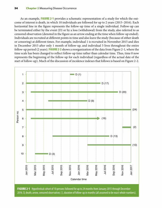
54 Chapter 2 Measuring Disease Occurrence
As an example, FIGURE 2-1 provides a schematic representation of a study for which the out-come of interest is death, in which 10 individuals are followed for up to 2 years (2015–2016). Each horizontal line in the figure represents the follow-up time of a single individual. Follow-up can be terminated either by the event (D) or by a loss (withdrawal) from the study, also referred to as censored observation (denoted in the figure as an arrow ending at the time when follow-up ended). Individuals are recruited at different points in time and also leave the study (because of either death or censoring) at different times. For example, individual 1 is recruited in November 2015 and dies in December 2015 after only 1 month of follow-up, and individual 5 lives throughout the entire follow-up period (2 years). FIGURE 2-2 shows a reorganization of the data from Figure 2-1, where the time scale has been changed to reflect follow-up time rather than calendar time. Thus, time 0 now represents the beginning of the follow-up for each individual (regardless of the actual date of the start of follow-up). Much of the discussion of incidence indexes that follows is based on Figure 2-2.
1
2
3
4
5
6
7
8
9
10
Calendar time
Per
son
no.
Jan
2015
Mar
201
5
May
201
5
Jul 2
015
Sep
201
5
Nov
201
5
Jan
2016
Mar
201
6
May
201
6
Jul 2
016
Sep
201
6
Nov
201
6
Jan
2017
(24)
(2)
(10)
D (9)
D (1)
D (17)
D (20)
(16)
D (13)
D (3)
FIGURE 2-1 Hypothetical cohort of 10 persons followed for up to 24 months from January 2015 through December 2016. D, death; arrow, censored observation; ( ), duration of follow-up in months (all assumed to be exact whole numbers).
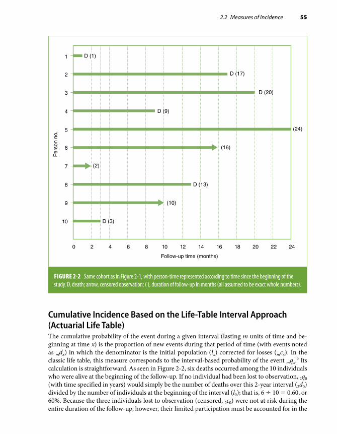
2.2 Measures of Incidence 55
Cumulative Incidence Based on the Life-Table Interval Approach (Actuarial Life Table)The cumulative probability of the event during a given interval (lasting m units of time and be-ginning at time x) is the proportion of new events during that period of time (with events noted as mdx) in which the denominator is the initial population (lx) corrected for losses (mcx). In the classic life table, this measure corresponds to the interval-based probability of the event mqx.5 Its calculation is straightforward. As seen in Figure 2-2, six deaths occurred among the 10 individuals who were alive at the beginning of the follow-up. If no individual had been lost to observation, 2q0 (with time specified in years) would simply be the number of deaths over this 2-year interval (2d0) divided by the number of individuals at the beginning of the interval (l0); that is, 6 ÷ 10 = 0.60, or 60%. Because the three individuals lost to observation (censored, 2c0) were not at risk during the entire duration of the follow-up, however, their limited participation must be accounted for in the
1
2
3
4
5
6
7
8
9
10
Follow-up time (months)
Per
son
no.
0 2 4 6 8 10 12 14 16 18 20 22 24
(24)
(2)
(10)
(16)
D (1)
D (17)
D (20)
D (9)
D (13)
D (3)
FIGURE 2-2 Same cohort as in Figure 2-1, with person-time represented according to time since the beginning of the study. D, death; arrow, censored observation; ( ), duration of follow-up in months (all assumed to be exact whole numbers).

56 Chapter 2 Measuring Disease Occurrence
denominator of the cumulative probability. By convention, half of these individuals are subtracted from the denominator, and the probability estimate is then calculated as follows:
2 02 0
0 2 00 56
10 0 5 30 71q
dl c
=− ×
=− ×
=. .
. (Eq. 2.1)
The conventional approach of subtracting one-half of the total number of censored observations from the denominator is based on the assumption that censoring occurred uniformly throughout that period and thus, on average, these individuals were at risk for only one-half of the follow-up period.
The complement of this cumulative probability of the event (q) is the cumulative probability of survival (p); that is,
2 0 2 01 290p q= =– .
It is important to note that the cumulative probability of an event (or the cumulative survival) has no time period intrinsically attached to it: Time must be specified. Thus, in this example, one has to describe q as the “2-year cumulative probability of death.”
Usually, the classic life table uses multiple intervals, for example, five intervals of 2 years for a total follow-up of 10 years. Within each interval, the probability of survival is calculated using as the denominator the number of individuals under observation at the beginning of the interval corrected for losses during the interval as described previously. To be part of the denominator for the calculation of the survival probability in the second interval (2p2), for example, one has to survive through the first interval; likewise, the survival probability for the third interval (starting at year 4, or 2p4) is calculated among only those who survived both the first and second time intervals. This is the reason these interval-specific probabilities are technically called “conditional probabilities”; that is, survival in a given interval is conditional upon survival in the previous intervals. A cumu-lative probability of survival over more than one interval—for example, the full 10-year follow-up with five 2-year intervals—is obtained by multiplying the conditional survival probabilities over all the intervals:
10 0 2 0 2 2 2 4 2 6 2 8p p p p p p= × × × ×
The cumulative probability of having the event is the complement of this joint probability of survival:
10 0 10 0 2 0 2 2 2 4 2 6 2 81 1q p p p p p p= = × × × ×– – ( ) (Eq. 2.2)
This is analogous to the calculation of the cumulative survival function using the Kaplan–Meier method illustrated in the following section.
It is not necessary that the intervals in a classic (interval-based) life table be of the same duration. The length of the interval should be determined by the pace at which incidence changes over time so that, within any given interval, events and withdrawals occur at an approximately uniform rate (discussed later). For example, to study survival after an acute myocardial infarction, the intervals should be very short soon after onset of symptoms when the probability of death is high and rapidly changing. Subsequent intervals could be longer, however, as the probability of a recurrent event and death tends to stabilize. If the sample size allows it and the pace of the event change is not known, it is reasonable to use shorter intervals when first analyzing survival; subsequently, intervals can be changed according to the shape of the survival curve.

2.2 Measures of Incidence 57
Examples of the use of the actuarial life-table method can be found in reports from classic ep-idemiologic studies (e.g., Pooling Project Research Group6). More details and additional examples can be found in other epidemiology textbooks (e.g., Gordis7 and Kahn and Sempos8).
Cumulative Incidence Based on the Kaplan–Meier (Exact Event Times) ApproachThe Kaplan–Meier approach involves the calculation of the probability of each event at the time it occurs. The denominator for this calculation is the population at risk at the time of each event’s occurrence.4 As for the actuarial life table, the probability of each event is a “conditional probabil-ity”; in other words, it is conditioned on being at risk (alive and not censored) at the event time. If each event (first, second, etc.) is designated by its time of occurrence i, then the formula for the conditional probability is simply as follows:
qdni
i
i=
where di is the number of deaths (or other type of event) occurring at time i, and ni is the number of individuals still under observation (i.e., at risk of the event) at time i. (Usually, di = 1 unless more than one event is occurring simultaneously—something that will occur only when nonexact discrete measures of time are used.)
To facilitate the calculations, FIGURE 2-3 shows the same data as in Figures 2-1 and 2-2 but with the individuals’ follow-up times arranged from shortest to longest. When the first death occurs exactly at the end of the first month (person 1), there are 10 individuals at risk; the conditional probability is then as follows:
q11
10=
When the second death occurs after 3 months of follow-up (person 10), there are only eight persons at risk; this is because in addition to the one previous death (D), one individual had been lost to observation after 2 months (person 7) and therefore was not at risk when the second death occurred. Thus, the conditional probability at the time of the second death is estimated as follows:
q318
0 125= = .
These calculations are repeated for all the event times. For example, for the fifth event, when person 2 died at 17 months of follow-up, there were three individuals still under observation (Figure 2-3), and thus, the conditional probability of the death at month 17 can be estimated as follows:
q1713
0 333= = .
TABLE 2-3 (column 4) shows the calculation of these conditional probabilities for each of the six event times in this example. The censored observations are skipped in these calculations, as they do not represent an identified event. Censored observations, however, are included in the denominator for the computation of conditional probabilities corresponding to events occurring up to the time when the censoring occurs. This represents the most efficient use of the available information.4

58 Chapter 2 Measuring Disease Occurrence
Column 5 in Table 2-3 shows the complements of the conditional probabilities of the event at each time, that is, the conditional probabilities of survival (pi), which, as in the classic life-table method, represent the probability of surviving beyond time i among those who were still under observation at that time (i.e., conditioned on having survived up to time i). Column 6, also shown graphically in FIGURE 2-4, presents the cumulative probabilities of survival, that is, the so-called Kaplan–Meier survival function (usually notated as Si). This represents the probability of surviving beyond time
1
7
10
4
9
8
6
2
3
5
Per
son
no.
0 2 4 6 8 10 12 14 16 18 20 22 24
Months
At time 17 there are 3 individuals atrisk (#2, 3, and 5)
At time 3 there are 8 individuals at risk (#10, 4, 9, 8, 6, 2, 3, and 5)
At time 1 there are 10 individuals at risk (#1, 7, 10, 4, 9, 8, 6, 2, 3, and 5)
(2)
(10)
D (20)
(24)
D (1)
D (3)
D (9)
D (13)
(16)
D (17)
FIGURE 2-3 Same cohort as in Figures 2-1 and 2-2, with individuals sorted according to follow-up time from shortest to longest. D, death; arrow, censored observation; ( ), duration of follow-up in months (all assumed to be exact whole numbers). As examples, the vertical arrows mark the individuals who were at risk for the calculations of the conditional probabilities of death at three of the event times: 1 month, 3 months, and 17 months (see text).

2.2 Measures of Incidence 59
i for all those present at the beginning of follow-up, calculated as the product of all conditional survival probabilities up to time i. In the example, the cumulative probability of surviving beyond the end of the follow-up period of 2 years (Si, where i = 24 months) is as follows:
S249
1078
67
45
23
12
0 18= × × × × × = .
Thus, the estimate of the cumulative probability of the event (1 – Si) is as follows:
1 1 0 18 0 8224– – . .S = =
As for the cumulative probability based on the actuarial life-table approach (Equation 2.2), the time interval for the cumulative probability using the Kaplan–Meier approach also needs to be specified (in this example, 24 months, or 2 years). For a method to calculate confidence limits for a cumulative survival probability estimate, see Appendix A, Section A.1.
Regardless of the method used in the calculation (actuarial or Kaplan–Meier), the cumulative incidence is a proportion in the strict sense of the term. It is unitless, and its value can range from 0 to 1 (or 100%).
TABLE 2-3 Calculation of Kaplan–Meier survival estimates for the example in Figure 2-3.
Time (months) (1)i
Number of individuals
at risk(2)ni
Number of events
(3)di
Conditional probability
of the event(4)
qi 5 di/ni
Conditional probability of survival
(5)pi = 1 – qi
Cumulative probability of survival*
(6)Si
1 10† 1 1/10 5 0.100 9/10 5 0.900 0.900
3 8† 1 1/8 5 0.125 7/8 5 0.875 0.788
9 7 1 1/7 5 0.143 6/7 5 0.857 0.675
13 5 1 1/5 5 0.200 4/5 5 0.800 0.540
17 3† 1 1/3 5 0.333 2/3 5 0.667 0.360
20 2 1 1/2 5 0.500 1/2 5 0.500 0.180
*Obtained by multiplying the conditional probabilities in column (5)—see text.†Examples of how to determine how many individuals were at risk at three of the event times (1, 3, and 17 months) are shown with vertical arrows in Figure 2-3.
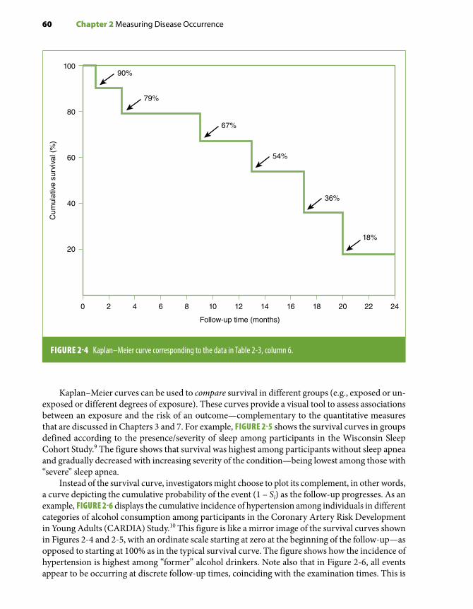
60 Chapter 2 Measuring Disease Occurrence
Kaplan–Meier curves can be used to compare survival in different groups (e.g., exposed or un-exposed or different degrees of exposure). These curves provide a visual tool to assess associations between an exposure and the risk of an outcome—complementary to the quantitative measures that are discussed in Chapters 3 and 7. For example, FIGURE 2-5 shows the survival curves in groups defined according to the presence/severity of sleep among participants in the Wisconsin Sleep Cohort Study.9 The figure shows that survival was highest among participants without sleep apnea and gradually decreased with increasing severity of the condition—being lowest among those with “severe” sleep apnea.
Instead of the survival curve, investigators might choose to plot its complement, in other words, a curve depicting the cumulative probability of the event (1 – Si) as the follow-up progresses. As an example, FIGURE 2-6 displays the cumulative incidence of hypertension among individuals in different categories of alcohol consumption among participants in the Coronary Artery Risk Development in Young Adults (CARDIA) Study.10 This figure is like a mirror image of the survival curves shown in Figures 2-4 and 2-5, with an ordinate scale starting at zero at the beginning of the follow-up—as opposed to starting at 100% as in the typical survival curve. The figure shows how the incidence of hypertension is highest among “former” alcohol drinkers. Note also that in Figure 2-6, all events appear to be occurring at discrete follow-up times, coinciding with the examination times. This is
10090%
79%
67%
54%
36%
18%
80
60
40
20
0 2 4 6 8 10
Follow-up time (months)
12 14 16 18 20 22 24
Cum
ulat
ive
surv
ival
(%
)
FIGURE 2-4 Kaplan–Meier curve corresponding to the data in Table 2-3, column 6.

2.2 Measures of Incidence 61
FIGURE 2-5 Kaplan–Meier estimates of survival probability ac cording to sleep apnea severity as defined by the apnea-hypopnea index (AHI) (shown with the y-axis truncated at 50% survival). None (AHI , 5), mild (AHI . 5, , 15), moderate (AHI . 15, , 30), and severe (AHI $ 30), total sample (n = 1522); AHI is the mean number of apnea and hypopnea episodes/hour of sleep.
100%
90%
80%
70%
60%
50%0 5 10 15 20
% S
urvi
ving
Years of follow-up
AHI < 5
AHI < 5–15
AHI < 15–30
AHI ≥ 30
50
40
30
20
10
00 5 15 20
Dev
elop
ed H
yper
tens
ion,
%
Examination Years
Never
Former
Light
Moderate
At Risk
2 107
FIGURE 2-6 Kaplan–Meier estimates of time to incident hypertension by drinking category, the Coronary Artery Risk Development in Young Adults (CARDIA) Study, 1985–2006.
Reprinted with permission from Young T, Finn L, Peppard PE, et al. Sleep disordered breathing and mortality: eighteen-year follow-up of the Wisconsin Sleep Cohort. Sleep. 2008;31:1071-1078.9 By permission of Oxford Press University.
Reprinted with permission from Halanych JH, Safford MM, Kertesz SG, et al. Alcohol consumption in young adults and incident hypertension: 20-year follow-up from the Coronary Artery Risk Development in Young Adults Study. Am J Epidemiol. 2010;171:532-539.10 By permission of Oxford University Press.

62 Chapter 2 Measuring Disease Occurrence
because “incident hypertension” is determined at the time of each follow-up exam (i.e., participants with high blood pressure or taking anti-hypertensive medications among those who have no evi-dence of hypertension in previous examinations). The exact time when hypertension first started in the interim time between exams (the actual event date) is unknown.
Assumptions in the Estimation of Cumulative Incidence Based on Survival AnalysisThe following assumptions must be met when conducting survival analysis:
Uniformity of Events and Losses Within Each Interval (Classic Life Table). Implicit in the classic life-table calculation (discussed previously) is the generic assumption that events and losses are approximately uniform during each defined interval. If risk changes rapidly within a given interval, then calculating a cumulative risk over the interval is not very informative. The rationale underlying the method to correct for losses—that is, subtracting one-half of the losses from the denominator (Equation 2.1)—also depends on the assumption that losses occur uniformly. The assumption of uniformity of events and losses within a given interval is entirely related to the way the life table is defined and can be met by adjusting the interval definitions to appropriately uniform risk inter-vals (e.g., by shortening them). Furthermore, this assumption does not apply to the Kaplan–Meier calculation, where intervals are not defined a priori.
Whereas this interval-based assumption applies only to classic life-table estimates, the following two assumptions apply to both classic life-table and Kaplan–Meier estimates and are key to survival analysis techniques and analyses of cohort data in general: (1) independence between censoring and survival and (2) lack of secular trends during the study’s accrual period.
Independence Between Censoring and Survival. For the calculations of the conditional and cumulative incidences using the previously described methods, censored individuals are included in the denominator during the entire time they are under observation; after being censored, they are ignored in subsequent calculations. Thus, if one wants to infer that the estimated overall cumu-lative survival (e.g., S24 = 18%, as in Figure 2-4) is generalizable to the entire population present at the study’s outset (at time 0), one needs to assume that the censored observations have the same probability of the event after censoring as those remaining under observation—a phenomenon also known as “uninformative censoring.” In other words, censoring needs to be independent of survival; otherwise, bias will ensue. For example, if the risk were higher for censored than for noncensored observations (e.g., study subjects withdrew because they were sicker), then over time, the study population would include a progressively greater proportion of lower risk subjects; as a result, the (true) overall cumulative incidence would be underestimated (i.e., survival would be overestimated). The opposite bias would occur if censored observations tended to include healthier individuals. The likely direction of the bias according to the reason censoring occurred is summarized in TABLE 2-4. With regard to censored observations caused by death from other causes in cause-specific outcome studies, if the disease of interest shares strong risk factors with other diseases that are associated with mortality, censoring may not be independent of survival. An example is a study in which the outcome of interest is coronary heart disease death and participants dying from other causes, including respiratory diseases (such as lung cancer and emphysema), are censored at the time of their death (as they are no longer at risk of dying from coronary heart disease). Because coronary heart disease and respiratory diseases share an important risk factor (smoking) and, in addition, respiratory disease deaths are very common in smokers, individuals dying from respiratory diseases may have had a higher risk of coronary heart disease if they had not died from respiratory diseases, resulting in a violation of the assumption of independence between censoring and survival.

2.2 Measures of Incidence 63
Other frequent reasons for censoring include refusal or inability of study participants to allow subsequent follow-up contacts (in a study where assessment of the outcome events depends on such contacts) and loss of contact with participants due to migration out of the study area. Individuals who refuse or are unable to continue having follow-up contacts may have a less healthy lifestyle than individuals who agree to continuing participation in a prospective study; if that were the case, censoring for this reason may lead to an underestimation of the cumulative incidence. The direction of the bias resulting from the loss to follow-up of individuals because of migration is a function of the sociodemographic context in which the migration occurs, for example, whether the individuals who migrate are of higher or lower socioeconomic status (SES). If losses occurred mainly among those in the upper SES, who tend to be healthier, those remaining in the study would tend to have poorer survival. On the other hand, if the losses occurred primarily among individuals with a lower SES, and thus poorer health, the survival of those remaining in the study would be overestimated. Generally, censoring that results in bias is referred to as “informative censoring.” For the so-called administrative losses, defined as those that occur because the follow-up ends (e.g., persons 7 and 9 in Figure 2-1), the assumption of independence between censoring and survival is regarded as more justified, as these losses are usually thought to be independent of the characteristics of the individuals per se. (Administrative losses are, however, amenable to temporal changes occurring during the accrual period; see the following section “Lack of Secular Trends.”)
In summary, whether the key assumption of independence between censoring and survival for the calculation of cumulative incidence/survival estimates is met depends on the reasons censoring occurred (Table 2-4). This assumption is particularly relevant when the magnitude of the absolute incidence estimate is the focus of the study; it may be less important if the investigator is primarily interested in a relative estimate (e.g., when comparing incidence/survival in two groups defined by
TABLE 2-4 Relationship between reason for censoring and the assumption of independence between censoring and survival in survival analysis.
Type of censoring
May violate assumption of independence of censoring/
survival
If assumption is violated, likely direction of bias on the
cumulative incidence estimate
Deaths from other causes when there are common risk factors*
Yes Underestimation
Participants’ refusal or inability to allow follow-up contacts
Yes Underestimation
Migration Yes Variable
Administrative censoring Unlikely† Variable
*In cause-specific incidence or mortality studies.†More likely in studies with a prolonged accrual period in the presence of secular trends.

64 Chapter 2 Measuring Disease Occurrence
exposure levels in a cohort study), provided that biases resulting from losses are reasonably similar in the groups being compared. (For a discussion of a related bias, the so-called compensating bias, see “Selection Bias” in Chapter 4, Section 4.2.) Finally, this assumption can often be verified. For example, it is usually possible to compare baseline characteristics related to the outcome of interest between individuals lost and those not lost to observation. In addition, if relevant study participant identifying information is available, linkage to the National Death Index can be used to compare the mortality experience of those lost and those not lost to follow-up.
Lack of Secular Trends. In studies in which the accrual of study participants occurs over an extended time period, the decision to pool all individuals at time 0 (as in Figure 2-2) assumes a lack of secular trends with regard to the characteristics of these individuals that affect the outcome of interest. This, however, may not be the case in the presence of birth cohort and period (calendar time) effects (see Chapter 1, Section 1.2). Changes over time in the characteristics of recruited participants as well as significant secular changes in relevant exposures and/or treatments may introduce bias in the cumulative incidence/survival estimates, the direction and magnitude of which depend on the characteristics of these cohort or period effects. Thus, for example, it would not have been appro-priate to estimate survival from diagnosis of all patients identified with insulin-dependent diabetes from 1915 through 1935 as a single group, as this extended accrual period would inappropriately combine two very heterogeneous patient cohorts: those diagnosed before and those diagnosed after the introduction of insulin. Similarly, it would not be appropriate to carry out a survival analysis pooling at time 0 all HIV-seropositive individuals recruited into a cohort accrued between 1995 and 1999, that is, both before and after a new effective treatment (protease inhibitors) became available.
2.2.2 Incidence Rate Based on Person-TimeRather than individuals, the denominator for the incidence rate is formed by time units (t) contributed to the follow-up period by the individuals at risk (n). For example, consider a hypothetical cohort in which 12 events occur and the total amount of follow-up time for all individuals is 500 days. The incidence rate in this example is 12 ÷ 500 = 0.024 per person-day or 2.4 per 100 person-days. Notice that this rate was calculated even though the actual number of individuals included in this follow-up study was not provided; thus, the “person-time” estimate in the example could have originated from 50 individuals seen during 10 days each (50 × 10), 5 individuals observed for 100 days (5 × 100), and so on.
Incidence rates are not proportions. They are obtained by dividing the number of events by the amount of time at risk (pooling all study participants) and are measured in units of time–1. As a result, a rate can range from 0 to infinity, depending on the unit of time being used. For example, the previously mentioned incidence rate could be expressed in a number of ways: 12 ÷ 500 person-days = 12 ÷ 1.37 person-years = 8.76 per person-year (or 876 per 100 person-years). The latter value exceeds 1 (or 100%) only because of the arbitrary choice of the time unit used in the denominator. If a person has the event of interest after a follow-up of 6 months and the investigator chooses to express the rate per person-years, the rate will be 1 ÷ 0.5, or 200 per 100 person-years.
The time unit used is at the discretion of the investigator and is usually selected on the basis of the frequency of the event under study. The main reason many epidemiologic studies use per-son-years as the unit of analysis is that it is a convenient way to express rare events. On the other hand, when one is studying relatively frequent health or disease events, it may be more convenient to use some other unit of time (TABLE 2-5). The choice is entirely arbitrary and will not affect the inferences derived from the study.

2.2 Measures of Incidence 65
Rather than a unitless proportion of individuals who develop the event among those at risk (see cumulative incidence described previously in this chapter), incidence based on person-time expresses the “rate” at which the events occur in the population at risk at any given point in time. This type of rate is also called incidence density, a concept analogous to that of velocity: the instantaneous rate of change or the “speed” at which individuals develop the event (disease, death, etc.) in the population. This concept is the basis for some of the mathematic model-ing techniques used for the analysis of incidence rates (e.g., Poisson regression models) (see Chapter 7, Section 7.4.5). Because the instantaneous rate for each individual cannot be directly calculated, however, the average incidence over a period of time for a population is usually used as a proxy. The average incidence can be calculated based on individual or aggregate follow-up data, as is discussed later in this chapter. Epidemiologists often use the terms rate and density interchangeably; however, in the discussion that follows, the term rate will be primarily used in the context of grouped data, whereas density will denote a rate based on data obtained from each individual in the study.
Incidence Rate Based on Aggregate DataThis type of incidence is typically obtained for a geographic location by using the average pop-ulation estimated for a certain time period as the denominator. Provided that this period is not excessively long and that the population and its demographic composition in the area of interest are relatively stable, the average population can be estimated as the population at the middle of the period (e.g., July 1 for a 1-year period). In a cohort study, the average of the population at the beginning and the end of the period can be obtained for a given follow-up interval. Thus, for a given time interval,
Incidence rate = Number of eventsAverage populatiion
TABLE 2-5 Examples of person-time units according to the frequency of events under investigation.
Population Event studiedPerson-time unit typically used
General Incident breast cancer Person-years
General Incident myocardial infarction Person-years
Malnourished children Incident diarrhea Person-months
Pancreatic cancer cases Death Person-months
Influenza epidemic Incident influenza Person-weeks
Infants with acute diarrhea Recovery Person-days

66 Chapter 2 Measuring Disease Occurrence
In Figure 2-2, for example, 10 individuals are alive and present in the study at the beginning of the follow-up period (“point zero”). Only one person is alive and present in the study when the 2-year follow-up ends (person 5). Thus, the average population (n) for the total 2-year follow-up period is as follows:
n = + =10 12
5 5.
The average population can also be calculated by subtracting one-half of the events (d) and losses (c) from the initial population:
n = − + =10 12
6 3 5 5( ) .
As for all mean values, the underlying assumption when using this approach is that, on average, there were 5.5 persons for the duration of the study (2 years). For this assumption to be met, events and withdrawals must occur uniformly throughout the follow-up period. The rate of new events in relationship to the average population is then calculated as follows:
Incidence rate = per person years65 5
1 09 2.
.= −
In this example, the rate is based on a time unit of 2 years and not on the number of individ-uals. The assumption underlying the use of the average population is that the same rate would have been obtained if 5.5 individuals had been followed for the entire 2-year period, during which six events were observed. This example again highlights the fact that this type of incidence is not a proportion and, thus, is not bound to be 1 (100%) or less. In this instance, the seemingly counterintuitive rate of 109 per 100 person-time obviously resulted from the fact that “2 years” is being used as the time unit; if a “person-year” unit had been used instead, the rate would have been 1.09 ÷ 2 years = 0.545 per person-year (or 54.5 per 100 person-years).
This example illustrates the estimation of the incidence rate using the average popula-tion of a defined cohort (i.e., the hypothetical cohort represented in Figure 2-2); however, this is not its usual application. Instead, the calculation of incidence based on grouped data is typically used to estimate mortality based on vital statistics information or incidence of newly diagnosed disease obtained from population-based registries (e.g., cancer registries), in other words, when incidence needs to be estimated for a population or an aggregate de-fined by residence in a given geographic area over some time period. These aggregates are called open or dynamic cohorts because they include individuals who are added or with-drawn from the pool of the population at risk as they migrate in or out of the area (i.e., a situation more clearly represented by the diagram in Figure 2-1 than that in Figure 2-2).
Incidence Density Based on Individual DataWhen relatively precise data on the timing of events or losses are available for each individual from a defined cohort, it is possible to estimate incidence density. The total person-time for the study period is simply the sum of the person-time contributed by each individual. The average incidence density is then calculated as follows:
Incidence density = Number of eventsTotal personn-time

2.2 Measures of Incidence 67
For each individual in the example shown in Figures 2-1, 2-2, and 2-3, the length of the hor-izontal line represents the length of time between the beginning of the follow-up and the point when the individual either had the event, which in this hypothetical example is death (D), or was lost to observation. For example, for individual 1, death occurred after exactly 1 month. Thus, this individual’s contribution to the total number of person-years in the first follow-up year (see Figure 2-3) would be 1 ÷ 12 = 0.083; obviously, this person made no contribution to the follow-up during the second year. On the other hand, individual 2 died after remaining in the study for 17 months, or 1 year and 5 months. Thus, his or her contribution to the first follow-up year was 12 ÷ 12 and to the second year was 5 ÷ 12, for a total of 1.417 person-years.
The contribution of censored individuals is calculated in an identical fashion. For example, the contribution of individual 6 to the total number of person-years was equivalent to 16 months, or 1 full person-year in the first year and 4 ÷ 12 person-years in the second year, for a total of 1.333 person-years. The calculation of person-years for all 10 study participants is shown in TABLE 2-6. In this example, the incidence density applicable to the total follow-up period is, therefore, 6 ÷ 9.583 = 0.63 per person-year (or 63 per 100 person-years). Alternatively, the incidence density could be expressed as 6 ÷ (9.583 × 12 months) = 0.052 per person-month (or 5.2 per 100 person-months). For a method to estimate confidence limits of incidence rates, see Appendix A, Section A.2.
Assumptions in the Estimation of Incidence Based on Person-TimeThe assumptions of independence between censoring and survival and of lack of secular trends discussed in Section 2.2.1 are also relevant in the context of person-time analysis. The former assumption relates to absence of selection bias resulting from losses to follow-up. Both assumptions apply to any type of cohort study analysis. Furthermore, as for incidence based on the actuarial life table (Equation 2.1), an important assumption when using the person-time approach is that the risk of the event remains approximately constant over time during the interval of interest, or, in other words, the estimated rate should apply equally to any point in time within the interval. This means that n persons followed during t units of time are equivalent to t persons observed during n units of time; for example, the risk of an individual living five units of time within the interval is equivalent to that of five individuals living one unit each (FIGURE 2-7). When individ-uals are exposed to a given risk factor, another interpretation of this assumption is that the effect resulting from the exposure is not cumulative within the follow-up interval of interest. Often, this assumption is difficult to accept, as, for example, when doing studies of chronic respiratory disease in smokers: the risk of chronic bronchitis for 1 smoker followed for 30 years is certainly not the same as that of 30 smokers followed for 1 year in view of the strong cumulative effect of smoking and the latency period needed for disease initiation. To decrease the dependency of the person-time approach on this assumption, the follow-up period can be divided into smaller intervals and incidence densities calculated for each interval. For example, using data from Table 2-6 and Figure 2-3, it is possible to calculate densities separately for the first and second years of follow-up as follows:
First follow-up year: 3 ÷ 7.083 = 42.4 per 100 person-years(or 3 ÷ 85 = 3.5 per 100 person-months)
Second follow-up year: 3 ÷ 2.500 = 120 per 100 person-years(or 3 ÷ 30 = 10 per 100 person-months)

68 Chapter 2 Measuring Disease Occurrence
TABL
E 2-
6 Ca
lculat
ion
of th
e num
ber o
f per
son-
year
s bas
ed on
Figu
re 2-
2.
Pers
on n
o.To
tal f
ollo
w-u
p (in
m
onth
s)
Cont
ribut
ion
to th
e to
tal n
umbe
r of p
erso
n-ye
ars b
y pa
rtic
ipan
ts in
:
1st Y
ear o
f fol
low
-up
2nd
Year
of f
ollo
w-u
pTo
tal f
ollo
w-u
p pe
riod
11
1/12
5 0
.083
00.
083
217
12/1
2 5
1.0
005/
12 5
0.4
171.
417
320
12/1
2 5
1.0
008/
12 5
0.6
671.
667
49
9/12
5 0
.750
00.
750
524
12/1
2 5
1.0
0012
/12
5 1
.000
2.00
0
616
12/1
2 5
1.0
004/
12 5
0.3
331.
333
72
2/12
5 0
.167
00.
167
813
12/1
2 5
1.0
001/
12 5
0.0
831.
083
910
10/1
2 5
0.8
330
0.83
3
103
3/12
5 0
.250
00.
250
Tota
l11
5 m
onth
s7.
083
year
s2.
500
year
s9.
583
year
s

2.2 Measures of Incidence 69
The fact that the densities differ markedly between the first and second follow-up years in this example strongly implies that it would not be reasonable to estimate an incidence density for the overall 2-year period.
Relationship Between Density (Based on Individual Data) and Rate (Based on Grouped Data)It is of practical interest that when withdrawals (and additions in an open population or dynamic cohort) and events occur uniformly, rate (based on grouped data) and density (based on individual data) are virtually the same. The following equation demonstrates the equivalence between the rate per average population and the density (per person-time), when the former is averaged with regard to the corresponding time unit (e.g., yearly average).
Rate =
No. eventsaverage population
time
( )( )
xn Density
( )tx
n t=
×=
This idea can be understood intuitively. For a given time unit, such as 1 year, the denominator of the rate (the average population) is analogous to the total number of time units lived by all the individuals in the population in that given time period. An example is given in TABLE 2-7, based on data for four persons followed for a maximum of 2 years. One individual is lost to follow-up (censored) after 1 year; two individuals die, one after 0.5 year and the other after 1.5 years; and the
Individualno. Year 1 Year 2 Year 3 Year 4 Year 5
1
2
3
4
5
6
7
8
FIGURE 2-7 Follow-up time for eight individuals in a hypothetical study. It is assumed that the sum of the person-time units for individuals nos. 1 to 5 (with a short follow-up time of 1 year each) is equivalent to the sum for individuals nos. 6 and 7 (with follow-up times of 2 and 3 years, respectively) and to the total time for individual no. 8 (who has the longest follow-up time, 5 years). For each group of individuals (nos. 1–5, 6 and 7, and 8), the total number of person-years of observation is 5.

70 Chapter 2 Measuring Disease Occurrence
fourth individual survives through the end of the study. There is, therefore, perfect symmetry in the distribution of withdrawals or events, which occurred after 0.5, 1, 1.5, and 2 years after the onset of the study. Summing the contribution to the follow-up time made by each participant yields a total of 5 person-years. Density is thus two deaths per 5 person-years, or 0.40.
The average population (n) in this example can be estimated as [(initial population + final population) ÷ 2], or [(4 + 1) ÷ 2 = 2.5]. The rate for the total time (t = 2 years) is then 2 ÷ 2.5. The average yearly rate is thus equivalent to the density using person-time as the denominator:
Yearly rate =person-years
Density =
xnt
xn t
x=×
= = 222 5 2
25
0 40.
.×
= =
On the other hand, when losses and events do not occur in an approximate uniform fashion, the incidence rate based on the average study population and the incidence density for a given population and time period may be discrepant. For example, based on the hypothetical data in Figure 2-3, the estimate of the mean yearly incidence based on the average population was 54.5/100 person-years, whereas that based on the incidence density was 63/100 person-years. In real life, when the sample size is large and provided that the time interval is reasonably short, the assumption of uniformity of events/losses is likely to be met.
The notion that the average population is equivalent to the total number of person-time when events and withdrawals are uniform is analogous to the assumption regarding uniformity of events and withdrawals in the actuarial life table (see Section 2.2.1, Equation 2.1). When it is not known exactly when the events occurred in a given time period, each person in whom the event occurs or who enters or withdraws from the study is assumed to contribute one-half of the follow-up time of the interval. (It is expected that this will be the average across a large number of individuals entering/exiting at different times throughout each time period for which person-time is estimated.)
The correspondence between rate (based on grouped data) and density (based on individual person-time) is conceptually appealing, as it allows the comparison of an average yearly rate based on an average population—which, in vital statistics, is usually the midpoint, or July 1, population estimate—with a density based on person-years. It is, for example, a common practice in occupational
TABLE 2-7 Hypothetical data for four individuals followed for a maximum of 2 years.
Individual no. Outcome Timing of event/loss No. of person-years
1 Death At 6 months 0.5
2 Loss to observation At 1 year 1.0
3 Death At 18 months 1.5
4 Administrative censoring
At 2 years 2.0
Total no. of person-years: 5.0

2.2 Measures of Incidence 71
epidemiology studies to obtain an expected number of events needed for the calculation of the stan-dardized mortality ratio by applying population vital statistics age-specific rates to the age-specific number of person-years accumulated by an exposed cohort (see Chapter 7, Section 7.3.2).
Stratifying Person-Time and Rates According to Follow-up Time and CovariatesThe calculation of person-time contributed by a given population or group is simply the sum of the person-time contributed by each individual in the group during the follow-up period. In most analytical prospective studies relevant to epidemiology, the risk of the event changes with time. For example, the incidence of fatal or nonfatal events may increase with time, as when healthy in-dividuals are followed up as they age. In other situations, risk diminishes as follow-up progresses, as in a study of complications after surgery or of case fatality after an acute myocardial infarction. Because calculating an overall average rate over a long time period when the incidence is not uni-form violates the assumptions discussed previously in this chapter (and does not make much sense), it is necessary to estimate the event rate for time intervals within which homogeneity of risk can be assumed. Thus, it is often important to stratify the follow-up time and calculate the incidence rate for each time stratum (as seen in the example based on the data in Table 2-6). Furthermore, in a cohort study, one may additionally wish to control for potentially confounding variables (see Chapter 5). Time and other confounders can be taken into account by stratifying the follow-up time for each individual according to other time variables (e.g., age) and categories of the confounder(s) and then summing up the person-time within each stratum.
The following examples illustrate the calculation of person-time and the corresponding inci-dence rates based on the data shown in TABLE 2-8, from a hypothetical study of four postmenopausal
TABLE 2-8 Hypothetical data for four postmenopausal women followed for mortality after breast cancer surgery.
Woman no. 1 Woman no. 2 Woman no. 3 Woman no. 4
Date of surgery 2003 2005 2000 2002
Age at surgery 58 50 48 54
Age at menopause
54 46 47 48
Smoking at time of surgery
Yes No Yes No
Change in smoking status (year)
Quits (2006) No No Starts (2003)
Type of event Death Loss Withdrawal alive Death
Date of event 2009 2008 2010 2004

72 Chapter 2 Measuring Disease Occurrence
women followed for mortality after breast cancer surgery (2000 to 2010). Table 2-8 provides the dates of surgery (“entry”), the date of the event (death or censoring), ages at surgery and at meno-pause, and smoking status.
One Time Scale. Based on the data from Table 2-8, the follow-up of these four women is displayed in FIGURE 2-8. The top panel of Figure 2-8 displays the follow-up according to calendar time for each of the four women; the bottom panel displays the follow-up time after surgery. In Figure 2-8 (top), because the precise dates of surgery and events are not known, it is assumed that they occur in the middle of the corresponding year (discussed previously in this chapter).
If it could be assumed that the risk of the event was approximately uniform within 5-year intervals, it would be justified to calculate person-time separately for the first and second 5-year calendar periods (Figure 2-8, top); the calculation of the rates is shown in TABLE 2-9. Individuals whose follow-up starts or ends sometime during a given year are assigned one-half of a person-year. For example, a contribution of 0.5 person-year is made by woman 1 in 2003, as her surgery was
A
B
2000 01 02 03 04 06 07 08 09 2010
D
D
D
D
2005
Time since surgery (years)
10
1
1
2
3
4
Wom
an n
o.W
oman
no.
2
3
4
2 3 4 5 6 7 8 9 10
FIGURE 2-8 Schematic representation of person-time for the hypothetical data in Table 2-8, according to one time scale: calendar time (A) and follow-up time (B). Censored observations are shown with arrows; D 5 death.

2.2 Measures of Incidence 73
TABLE 2-9 Stratification of person-time and rates according to calendar time, based on Table 2-8 and Figure 2-8A.
Calendar time Person-years Events Incidence rate
2000–2004 8 1 0.125
2005–2009 12.5 1 0.080
(2010–2014) (0.5) (0) (0)
carried out at some time in 2003. Thus, the total person-time for the period 2000 to 2004 is 1.5 years (woman 1) + 4.5 years (woman 3) + 2 years (woman 4) = 8 person-years.
Alternatively, one might be interested in examining the rates in this study according to follow-up time, as shown in TABLE 2-10. For example, because woman 1 was followed from 2003.5 to 2009.5, she can be assumed to have a full 6-year follow-up (Figure 2-8, bottom).
Two or More Time Scales. Epidemiologic cohorts are often constituted by free-living individuals who interact and are the subject of multiple and varying biological and environmental circumstances. Thus, it is frequently important to take into consideration more than one time scale; the choice of time scales used for the stratification of follow-up time varies according to the characteristics and goals of the study (TABLE 2-11).
In FIGURE 2-9, the person-time and outcomes of the four women from Table 2-8 are represented according to two time scales, age and calendar time. In this type of graphic representation (known as a Lexis diagram), each individual’s trajectory is represented by diagonals across the two time scales. As in the previous example and given that the time data are approximate (in whole years), it is assumed that entry, censoring, and event of interest occur at the midpoint of the 1-year interval.
TABLE 2-12 shows the corresponding estimates of total person-time in each two-dimensional stratum. They are obtained by adding up the total time lived by the individuals in the study in each age/calendar time stratum represented by eight squares in Figure 2-9; for example, for those 55 to 59 years old between 2000 and 2004, it is the sum of the 1.5 years lived by woman 4 (between age 55 and age 56.5 years, the assumed age of her death) and the 1.5 years lived by woman 1 in that stratum. The relevant events (deaths) are also assigned to each corresponding stratum, thus allowing the calculation of calendar- and age-specific incidence rates, also shown in Table 2-12.
TABLE 2-10 Stratification of person-time and rates according to follow-up time (time since surgery), based on Table 2-8 and Figure 2-8B.
Time since surgery Person-years Events Rate
0–4 years 15 1 0.0667
5–9 years 6 1 0.1667

74 Chapter 2 Measuring Disease Occurrence
TABLE 2-11 Examples of time scales frequently relevant in the context of cohort studies.
Time scale Type of study
Follow-up time (time since recruitment) All studies
Age All studies
Calendar time All studies (especially if recruitment is done over an extended period)
Time since employment Occupational studies
Time since menarche Studies of reproductive outcomes
Time since seroconversion Follow-up of patients with HIV infection
Time since diagnosis Prognostic studies of cancer patients
2010
2005
2000
58.5
64.5
45 50 55 60 65
(3)
(3)
(3)
(2)
(1.5)
#3
#2
#4
#1
(1.5)(1.5)
(0.5)
(4.5) 2009.5
2003.5
Age (years)
D
D
FIGURE 2-9 Schematic representation of person-time for the four women in Table 2-8 according to two time scales, age and calendar time, categorized in 5-year intervals. Because time data are given in whole years, entry, events, and withdrawals are assumed to occur exactly at the middle of the year. Censored observations are represented by an arrow. The total time within each time stratum for all four women is shown in parentheses. The entry and exit times for woman no. 1 are given in italics; D = death.

2.2 Measures of Incidence 75
Other time scales may be of interest. In occupational epidemiology, for example, it may be of interest to obtain incidence rates of certain outcomes taking into account three time scales simultaneously, for example, age (if the incidence depends on age), calendar time (if there have been secular changes in exposure doses), and time since employment (so as to consider a possible cumulative effect). For this situation, one could conceive a tridimensional analogue to Figure 2-9: cubes defined by strata of the three time scales and each individual’s person-time displayed across the tridimensional diagonals.
The layout for the calculation of person-time and associated incidence rates described in this section can be used for the internal or external comparison of stratified rates by means of standard-ized mortality or incidence ratios (see Chapter 7, Section 7.3.2).
Time and Fixed or Time-Dependent Covariates. Stratification according to other variables, in addition to time, may be necessary in certain situations. For example, the data in Table 2-8 could be further stratified according to an additional time scale (e.g., time since menopause) and additional covariates (e.g., smoking status at the time of surgery). Thus, instead of eight strata, as in Figure 2-9 and Table 2-12, one would need to stratify the person-time into 32 strata defined by the combination of all four variables (calendar time, age, time since menopause, and smoking). Individuals under observation would shift from stratum to stratum as their status changes. For example, woman 1 (Table 2-8) is a smoker who enters the study in 2003 at the age of 58 years (that is assumed to be 2003.5 and 58.5 years, respectively, as discussed previously), 4 years after menopause. Thus, as she enters the study in the stratum “2000–2004/55–59 years of age/smoker-at-baseline/menopause < 5 years,” after contributing 1 person-year to this stratum (i.e., in 2004.5 at age 59.5 years), she becomes “≥ 5 years after menopause” and thus shifts to a new stratum: “2000–2004/55–59 years of age/smoker-at-baseline/menopause ≥ 5 years.” Half a year later, she turns 60 and enters a new stratum (“2005–2009/60–64 years of age/smoker-at-baseline/menopause ≥ 5 years”) to contribute her last 4.5 person-years of observation before her death in 2009.5.
TABLE 2-12 Stratification of person-time and rates according to calendar time and age (see Figure 2-9).
Calendar time Age (years) Person-years Events Rate
2000–2004 45–49 1.5 0 0
50–54 3.5 0 0
55–59 3 1 0.3333
60–64 0 — —
2005–2009 45–49 0 — —
50–54 5 0 0
55–59 3 0 0
60–64 4.5 1 0.2222

76 Chapter 2 Measuring Disease Occurrence
In the preceding example, smoking is treated as a fixed covariate, as only baseline status is considered; however, information on smoking status change is available in the hypothetical study data shown in Table 2-8. Changes in exposure status for certain covariates can easily be taken into account when using the person-time strategy. For example, using the information at baseline and change in smoking status shown in Table 2-8, assignment of person-time according to smoking as a time-dependent covariate can be represented as illustrated in FIGURE 2-10. Using this approach, each relevant event is assigned to the exposure status at the time of the event. Thus, woman 1’s death is assigned to the “nonsmoking” group, whereas that of woman 4 is assigned to the “smoking” group. (The latter assignments are opposite to those based on smoking status at baseline described in the preceding paragraph.)
To use the person-time approach to take into account changing exposures involves an as-sumption akin to that used in crossover clinical trials, that after the exposure status changes, so does the associated risk. This is merely another way of stating that there is no accumulation of risk and thus that the effect of a given exposure is “instantaneous.” Whether this assumption is valid depends on the specific exposure or outcome being considered. For example, for smoking, the as-sumption may be reasonable when studying thromboembolic events likely to result from the acute effects of smoking (e.g., those leading to sudden cardiac death). On the other hand, given the well-known latency and cumulative effects leading to smoking-related lung cancer, the assumption of an instantaneous effect would be unwarranted if lung cancer were the outcome of interest. (The cumulative effect of smoking on lung cancer risk can be easily inferred from the fact that the risk in smokers who quit decreases yet never becomes the same as that in people who have never smoked.) If there is a cumulative effect, the approach illustrated in Figure 2-10 (e.g., assigning the event in woman 1 to the nonsmoking category) will result in misclassification of exposure status (see Chapter 4, Section 4.3).
The cumulative effects of exposure can be taken into account with more complex exposure defi-nitions; for example, total pack-years of smoking could be considered even among former smokers. Moreover, lag or latency times could also be introduced in the definition of person-time in relation to events, a frequent practice in occupational or environmental epidemiology studies.11(pp150-155)
2000 01 02 03 04 06 07 08 092005 2010
1
2
3
4
D
D
Wom
an n
o.
FIGURE 2-10 Schematic representation of person-time for the four women in Table 2-8 according to time-dependent smoking status. Solid lines represent smoking status; broken lines represent nonsmoking status.
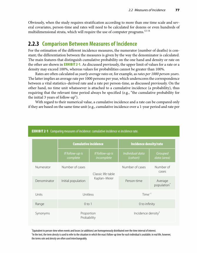
2.2 Measures of Incidence 77
Obviously, when the study requires stratification according to more than one time scale and sev-eral covariates, person-time and rates will need to be calculated for dozens or even hundreds of multidimensional strata, which will require the use of computer programs.12-14
2.2.3 Comparison Between Measures of IncidenceFor the estimation of the different incidence measures, the numerator (number of deaths) is con-stant; the differentiation between the measures is given by the way the denominator is calculated. The main features that distinguish cumulative probability on the one hand and density or rate on the other are shown in EXHIBIT 2-1. As discussed previously, the upper limit of values for a rate or a density may exceed 100%, whereas values for probabilities cannot be greater than 100%.
Rates are often calculated as yearly average rates or, for example, as rates per 1000 person-years. The latter implies an average rate per 1000 persons per year, which underscores the correspondence between a vital statistics–derived rate and a rate per person-time, as discussed previously. On the other hand, no time unit whatsoever is attached to a cumulative incidence (a probability), thus requiring that the relevant time period always be specified (e.g., “the cumulative probability for the initial 3 years of follow-up”).
With regard to their numerical value, a cumulative incidence and a rate can be compared only if they are based on the same time unit (e.g., cumulative incidence over a 1-year period and rate per
EXHIBIT 2-1 Comparing measures of incidence: cumulative incidence vs incidence rate.
Cumulative incidence Incidence density/rate
If follow-up is complete
If follow-up is incomplete
Individual data (cohort)
Grouped data (area)
Numerator Number of cases
Classic life table Kaplan–Meier
Number of cases Number of cases
Denominator Initial population Person-time Average population*
Units Unitless Time–1
Range 0 to 1 0 to infinity
Synonyms Proportion Probability
Incidence density†
*Equivalent to person-time when events and losses (or additions) are homogeneously distributed over the time interval of interest.†In the text, the term density is used to refer to the situation in which the exact follow-up time for each individual is available; in real life, however, the terms rate and density are often used interchangeably.

78 Chapter 2 Measuring Disease Occurrence
person-year). Under this circumstance, the general rule is that, in absolute value, the rate will always be larger than the cumulative incidence. The rationale for this rule is best explained when comparing a rate with a cumulative incidence based on the classic life table, as illustrated in EXHIBIT 2-2. Although losses because of censoring are similarly taken into account in the denominator of both cumulative incidence and rate, the observation time “lost” by the cases is subtracted from the denominator of the rate but not from the probability-based cumulative incidence (which uses number of observations at the start of the interval corrected for losses regardless of how many cases occur subsequently). As a result, the denominator for the rate will always tend to be smaller than that of the cumulative incidence and thus the larger absolute value of the former when compared with the latter. When
EXHIBIT 2-2 Comparing absolute numerical values of cumulative incidence based on the actuarial life table and rate (assuming that follow-up interval equals person-time unit).
Notice that (as long as x . 0) the denominator of the rate will always be smaller than that of the cumulative incidence (960 vs 985 in the example), thus explaining the larger absolute value of the rate.
Cumulativeincidence
In the absenceof censoring
In the presenceof censoring (C )
Example: N = 1000 individualsfollowed for 1 year, x = 50 events,C = 30 censored observations
(q) is calculatedbasedon numberof individualsat risk at thebeginning ofthe interval(N)
qx
N= q
x
N C=
− 12
=−
50
100012
30
= =50985
0 0508.
Rate is calculatedbased onperson-timeof observationoverthe follow-up,subtractingperson-timelost by thecases (x)
Rate =x
N x− 12
– –Rate = x
N x C12
12
=− −
= =
50
100012
5012
30
50960
0 0521.

2.2 Measures of Incidence 79
events are relatively rare, the discrepancy is very small (e.g., example in Exhibit 2-2); as the frequency of the event increases, so will the numerical discrepancy between cumulative incidence and rate pertaining to the same time unit.
Finally, regarding assumptions, all methods for the calculation of incidence share the funda-mental assumptions in the analysis of cohort data that were discussed in previous sections and are summarized in EXHIBIT 2-3: independence between censoring and survival and lack of secular trends. Additional assumptions are needed depending on the specific requirements of the method (e.g., uniformity of risk across defined interval in classic life-table and/or person-time–based analyses).
Experienced epidemiologists have learned that, whereas each approach has advantages and disadvantages, the ultimate choice of how to present incidence data is dictated by pragmatism (and/or personal preference). Thus, in a cohort study without an “internal” comparison (e.g., unexposed) group—as may be the case in occupational epidemiology research—estimation of densities, rather than probabilities, allows using available population rates as control rates. On the other hand, probabilities are typically estimated in studies with a focus on the temporal behavior (or “natural history”) of a disease, as in studies of survival after diagnosis of disease.
2.2.4 The Hazard RateThe instantaneous incidence rate (density) is the so-called hazard rate, also named instantaneous conditional incidence or force of morbidity (or mortality). In the context of a cohort study, the hazard rate is defined as
EXHIBIT 2-3 Assumptions necessary for survival and person-time analyses.
Survival analysis Person-time
If there are lossesto follow-up:
Censored observations have an outcome probability that is similar to that of individuals remaining under observation.
If intervals areused and thereare losses duringa given interval:
Losses are uniform over the interval.
If risk is calculatedover intervals:
Risk is uniformduring the interval.
N individuals followedfor T units of time
have the same risks asT individuals followed
for N units of time.
If accrual of studysubjects is doneover a relativelylong time period:
There are no secular trends over the calendar period covered by the accrual.

80 Chapter 2 Measuring Disease Occurrence
each individual’s instantaneous probability of the event at precisely time t (or at a small interval [t, t + Δt]), given (or “conditioned” on) the fact that the individual was at risk at time t. The hazard rate is de-fined for each particular point in time during the follow-up. In mathematical terms, this is defined for a small time interval (Δt close to zero) as follows:
h tP t t t( ) ( [ ] |= +event in interval between and ∆ aalive at t
t)
∆
The hazard is analogous to the conditional probability of the event that is calculated at each event time using Kaplan–Meier’s approach (Table 2-3, column 4); however, because its denominator is “time-at-risk,” the rate is measured in units of time-1. Another important difference is that, in contrast to Kaplan–Meier’s conditional probability, the hazard rate cannot be directly calculated, as it is defined for an infinitely small time interval; however, the hazard function over time can be estimated using available parametric survival analysis techniques.15
The hazard rate is a useful concept when trying to understand some of the statistical techniques used in survival analysis, particularly those pertaining to proportional hazards regression (see Chapter 7, Section 7.4.4). It is outside the scope of this textbook, however, to discuss the complex mathematical properties of the hazard rate; the interested reader should consult more advanced statistical textbooks, such as Collett’s.15
2.3 Measures of PrevalencePrevalence is defined as the frequency of existing cases of a disease or other condition in a given population at a certain time or period. Depending on how “time” is defined, there are two kinds of prevalence, point prevalence and period prevalence (Table 2-1). Point prevalence is the frequency of a disease or condition at a point in time; it is the measure estimated in the so-called prevalence or cross-sectional surveys, such as the National Health and Nutrition Examination Surveys con-ducted by the U.S. National Center for Health Statistics.16 For the calculation of point prevalence, it is important to emphasize that all existing cases at a given point in time are considered prevalent regardless of whether they are old or more recent. Period prevalence is less commonly used and is defined as the frequency of an existing disease or condition during a defined time period. For example, the period prevalence of condition Y in year 2010 includes all existing cases on January 1, 2010, plus the new (incident) cases occurring during the year. A special type of period prevalence is the cumulative lifetime prevalence, which provides an estimate of the occurrence of a condition at any time during an individual’s past (up to the present time). For example, the United States-based 2003 National Youth Risk Behavior Survey estimated the lifetime prevalence of asthma among high school students to be 18.9%, whereas the estimated point prevalence at the time of the survey was estimated to be 16.1%.17
In the case of period prevalence, the denominator is defined as the average reference popula-tion over the period. In general, when the term prevalence is not specified, it can be taken to mean point prevalence. As a descriptive measure, point prevalence is a useful index of the magnitude of current health problems and is particularly relevant to public health and health policy (Chapter 10). In addition, prevalence is often used as the basis for the calculation of the point prevalence rate ratio, a measure of association in cross-sectional studies or in cohort studies using baseline data.

2.3 Measures of Prevalence 81
Because the point prevalence rate ratio is often used as a “surrogate” of the incidence ratio in the absence of prospective cohort data (see Chapter 3, Section 3.3), it is important to understand prev-alence’s dependence on both incidence and duration of the disease after onset; duration is, in turn, determined by either survival for fatal diseases or recovery for nonfatal diseases. In a population in a steady-state situation (i.e., no major migrations or changes over time in incidence/prevalence of the condition of interest), the relationship between prevalence and disease incidence and duration can be expressed by the following formula:*
Point prevalencePoint prevalence
Incidence ( )1 −
= ×× Duration (Eq. 2.3)
The term [Point prevalence ÷ (1 – Point prevalence)] is the odds of point prevalence (see Section 2.4). Also, in this equation and those derived from it, the time unit for incidence and dura-tion should be the same; that is, if incidence is given as a yearly average, duration should be given using year(s) or a fraction thereof. Equation 2.3 can be rewritten as follows:
Point prevalence = Incidence Duration 1 – Point× × prevalence( ) (Eq. 2.4)
As discussed in Chapters 3 and 4, Equation 2.4 underscores the two elements of a disease that are responsible for the difference between incidence and point prevalence: its duration and the magnitude of its point prevalence. When the point prevalence is relatively low (e.g., 0.05 or less), the term (1 – Point prevalence) is almost equal to 1.0, and the following well-known simplified formula defining the relationship between prevalence and incidence is obtained:
Point prevalence Incidence Duration≈ 3
For example, if the incidence of the disease is 0.5% per year and its average duration (survival after diagnosis) is 10 years, the point prevalence will be approximately 5%.
*The derivation of this formula is fairly straightforward. Under the assumption that the disease is in steady state, the incidence and number of existing cases at any given point (e.g., X) are approximately constant. For an incurable disease, this implies that the number of new cases during any given time period is approximately equal to the number of deaths among the cases. If N is the population size, I is the incidence, and F is the case fatality rate, the number of new cases can be estimated by multiplying the incidence times the number of potentially “susceptible” (N – X); in turn, the number of deaths can be estimated by multiplying the case fatality rate (F) times the number of prevalent cases. Thus, the assump-tion that the number of new cases approximates the number of deaths among the cases in the period can be formulated as follows: I N X F X× ×≈( )– . If there is no immigration, the case fatality rate is the inverse of the duration (D).3 Thus, after a little arithmetical manipulation and dividing numerator and denominator of the right-hand side term by N, the following equation is obtained:
I DX
N X× ≈
−=
−( ) (
Prevalence
Prevalence)1
An analogous reasoning can be applied to nonfatal diseases, for which F is the proportion cured.

82 Chapter 2 Measuring Disease Occurrence
2.4 OddsOdds are the ratio of the probability of the event of interest to that of the nonevent. This can be defined for both incidence and prevalence. For example, when dealing with incidence probabilities, the odds are as follows:
Incidence odds = qq1 −
(Alternatively, knowing the odds allows the calculation of probability: q = Odds ÷ [1 + Odds].)The point prevalence odds are as follows (see also Equation 2.3):
Point prevalence odds = Point prevalencePoint1 − prevalence
Both odds and proportions can be used to express “frequency” of the disease. An odds approx-imates a proportion when the latter is small (e.g., less than 0.1). An example follows:
ProportionOdds
== = =( )
0 050 05 1 0 05 0 05 0 95 0
.
. / – . . / . ..0526
It is easier to grasp the intuitive meaning of the proportion than that of the odds perhaps be-cause, in a description of odds, the nature of the latter as a ratio is often not clearly conveyed. For example, if the proportion of smokers in a population is 0.20, the odds are as follows:
Odds = Proportion of smokersProportion of smo1 − kkers
Proportion of smokersProportion of nonsmo
=kkers
or 0.20 ÷ (1 – 0.20) = 0.20 ÷ 0.80 = 1:4 = 0.25.
Thus, there are two alternative ways to describe an odds estimate: either as an isolated number, 0.25, implying that the reader understands that it intrinsically expresses a ratio, 0.25:1.0, or clearly as a ratio—in the example, 1:4—conveying more explicitly the message that, in the study population, for every smoker there are four nonsmokers.
Traditionally and commonly used in certain venues (e.g., in the horse-race betting world), the odds are rarely if ever used by epidemiologists as measures of disease occurrence. However, the ratio of two odds (the odds ratio) is a very popular measure of association in epidemiology because the odds ratio allows the estimation of the easier-to-grasp relative risk in case-based case-control studies and it is the measure of association derived from logistic regression, one of the most widely used methods for multivariate analysis of epidemiologic data (see Chapter 1, Section 1.4.2; Chapter 3, Section 3.4.1; and Chapter 7, Section 7.4.3).
References1. Merriam-Webster’s Collegiate Dictionary. 11th ed. Springfield, MA: Merriam-Webster Inc.; 2003.2. Centers for Disease Control and Prevention. Revision of the CDC surveillance case definition for acquired immunodeficiency
syndrome. J Am Med Assoc. 1987;258:1143-1145.3. Rothman K, Greenland S, Lash TL. Modern Epidemiology. 3rd ed. Philadelphia: Wolters Kluwer Health/Lippincott
Williams & Wilkins; 2008.4. Kaplan EL, Meier P. Nonparametric estimation from incomplete observations. J Am Stat Assoc. 1958;53:457-481.

83
5. Reed LJ, Merrell M. A short method for constructing an abridged life table: 1939. Am J Epidemiol. 1995;141:993-1022; discussion 1991-1022.
6. Pooling Project Research Group. Relationship of blood pressure, serum cholesterol, smoking habit, relative weight and ECG abnormalities to incidence of major coronary events: final report of the Pooling Project. J Chron Dis. 1978;31:201-306.
7. Gordis L. Epidemiology. 5th ed. Philadelphia: Elsevier Saunders; 2014.8. Kahn HA, Sempos CT. Statistical Methods in Epidemiology. New York: Oxford University Press; 1989.9. Young T, Finn L, Peppard PE, et al. Sleep disordered breathing and mortality: eighteen-year follow-up of the Wisconsin
Sleep Cohort. Sleep. 2008;31:1071-1078.10. Halanych JH, Safford MM, Kertesz SG, et al. Alcohol consumption in young adults and incident hypertension: 20-year
follow-up from the Coronary Artery Risk Development in Young Adults Study. Am J Epidemiol. 2010;171:532-539.11. Checkoway H, Pearce NE, Crawford-Brown DJ. Research Methods in Occupational Epidemiology. New York: Oxford
University Press; 1989.12. Monson RR. Analysis of relative survival and proportional mortality. Comput Biomed Res. 1974;7:325-332.13. Macaluso M. Exact stratification of person-years. Epidemiology. 1992;3:441-448.14. Pearce N, Checkoway H. A simple computer program for generating person-time data in cohort studies involving
time-related factors. Am J Epidemiol. 1987;125:1085-1091.15. Collett D. Modelling Survival Data in Medical Research. 3rd ed. Boca Raton, FL: Chapman & Hall/CRC; 2014.16. Curtin LR, Mohadjer LK, Dohrmann SM, et al. The National Health and Nutrition Examination Survey: sample design,
1999-2006. Vital Health Stat. 2012;155:1-39.17. Centers for Disease Control and Prevention. Self-reported asthma among high school students: United States, 2003.
MMWR. 2005;54:765-767.
References

84 Chapter 2 Measuring Disease Occurrence
Exercises1. A prospective study with a 2-year (24-month) follow-up was conducted. Results are shown
in the table for individuals who either died or were censored before the end of the follow-up period.
Survival data for 20 participants of a hypothetical prospective study.
Follow-up time (months) Event
2 Death
4 Censored
7 Censored
8 Death
12 Censored
15 Death
17 Death
19 Death
20 Censored
23 Death
a. Using the data from the table, for all deaths calculate (1) the probability of death at the exact time when each death occurred, (2) the probability of survival beyond the time when each death occurred, and (3) the cumulative probabilities of survival.
b. What is the cumulative survival probability at the end of the follow-up period?c. Using arithmetic graph paper, plot the cumulative probabilities of survival.d. What is the simple proportion of individuals apparently surviving (i.e., not observed to
die) through the end of the study’s observation period?e. Why are the simple proportion surviving and the cumulative probability of survival
different?f. Using the same data, calculate the overall death rate per 100 person-years. (To
facilitate your calculations, you may wish to calculate the number of person-months and then convert that to the number of person-years.)

Exercises 85
g. Calculate the rates separately for the first and second years of follow-up. (For this calculation, assume that the individual who withdrew at month 12 withdrew just after midnight on the last day of the month.)
h. Assuming that there was no random variability, was it appropriate to calculate the rate per person-year for the total 2-year duration of follow-up?
i. What is the most important assumption underlying the use of both survival analysis and the person-time approach?
j. Now, assume that the length of follow-up was the same for all individuals (except those who died). Calculate the proportion dying and the odds of death in this cohort.
k. Why are these figures so different in this study?2. In a cohort study of individuals aged 65 years and older and free of dementia at baseline,*
the associations of age and APOE ε4 with the risk of incident Alzheimer’s disease (AD) were investigated. The table shows the number of individuals, person-years, and probable cases of AD overall and according to age (< 80 and ≥ 80 years old) and, separately, to presence of APOE ε4.
Probable Alzheimer’s disease (AD) by age and APOE «4.
Number ofindividuals
Number withprobable
AD/person-years
Density ofAD per 100
person-years
Averageduration offollow-up
All subjects 3099 263/18,933
, 80 years 2343 157/15,529
$ 80 years 756 106/3404
APOE«4(1) 702 94/4200
APOE«4(2) 2053 137/12,894
a. Calculate the densities of AD per 100 person-years and the average durations of follow-up for all subjects and for each subgroup.
b. Why is it important that the follow-up durations be similar for the “exposed” and “un-exposed” categories particularly in this study?
c. When calculating a density for a given long follow-up period, the assumption is that the risk remains the same throughout the duration of follow-up. Is this a good assumption in the case of Alzheimer’s disease? Why or why not?
*Li G, Shofer JB, Rhew IC, et al. Age-varying association between statin use and incident Alzheimer’s disease. J Am Geriatr Soc. 2010;58:1311-1317.

86 Chapter 2 Measuring Disease Occurrence
3. In a case-based case-control study of risk factors for uterine leiomyoma, the authors assessed a history of hypertension in cases and controls, as shown in the table here.
Cases Controls
History of hypertension Number Percentage Number Percentage
Absent 248 78.0 363 92.4
Present 70 22.0 30 7.6
Total 318 100.0 393 100.0
a. Using the absolute numbers of cases and controls with and without a history of hyper-tension, calculate the absolute odds of history of hypertension separately in cases and in controls.
b. Now, calculate the odds of hypertension using the percentages of cases and controls with a history of hypertension.
c. What can you conclude from comparing the response to Exercise 2a to the response to Exercise 2b?
d. Why are the odds of a history of hypertension more similar to the proportion of indi-viduals with a history of hypertension in controls than in cases?
4. The baseline point prevalence of hypertension in African American women aged 45 to 64 years included in the Atherosclerosis Risk in Communities (ARIC) cohort study was found to be 56%.† In this study, over a follow-up period of 6 years, the average yearly incidence of hypertension in African American women was estimated to be about 5% and stable over the years.‡ Using these data, estimate the average duration of hypertension in African American women in the ARIC Study.
5. Wakelee et al. reviewed lung cancer incidence rates in never smokers in several cohort stud-ies with varying lengths of follow-up and found them to vary from 4.8 to 20.8 per 100,000 person-years.§a. How can rates per person-years in this review by Wakelee et al. be interpreted given the
variation in the length of follow-up among the cohorts?b. What are the conditions that render this interpretation incorrect?c. Which are the assumptions common to survival analysis and the person-time strategy?
†Harris MM, Stevens J, Thomas N, Schreiner P, Folsom AR. Associations of fat distribution and obesity with hypertension in a bi-ethnic population: the ARIC Study. Obesity Res. 2000;8:516-524.‡Fuchs FD, Chambless LE, Whelton PK, Nieto FJ, Heiss G. Alcohol consumption and the incidence of hypertension: the Atherosclerosis Risk in Communities Study. Hypertension. 2001;37:1242-1250.§Wakelee HA, Chang ET, Gomez SL, et al. Lung cancer incidence in never smokers. J Clin Oncol. 2007;25:472-478.

87
© Enculescu Marian Vladut/Shutterstock
Measuring Associations Between Exposures and Outcomes3.1 IntroductionEpidemiologists are often interested in assessing the presence of associations expressed by dif-ferences in disease frequency. Measures of association can be based on either absolute differences between measures of disease frequency in groups being compared (e.g., exposed vs unexposed) or relative differences or ratios (TABLE 3-1). Measures based on absolute differences are often preferred when public health or preventive activities are evaluated, as their main goal is often an absolute reduction in the risk of an undesirable outcome. In contrast, etiologic studies that are searching disease determinants (causes) usually rely on relative differences in the occurrence of discrete outcomes, with the possible exception of instances in which the outcome of interest is continuous; in that situation, the assessment of mean absolute differences between exposed and unexposed individuals is also a frequently used method for evaluating an association (Table 3-1).
3.2 Measuring Associations in a Cohort StudyIn traditional prospective or cohort studies, study participants are selected in one of two ways: (1) a defined population or population sample is included in the study and classified according to level of exposure, or (2) exposed and unexposed individuals are specifically identified and included in the study. These individuals are then followed concurrently or nonconcurrently1,2 for ascertain-ment of the outcome(s), allowing for the estimation of an incidence measure in each group (see also Chapters 1 and 2).
CHAPTER 3

88 Chapter 3 Measuring Associations Between Exposures and Outcomes
To simplify the concepts described in this chapter, only two levels of exposure are consid-ered in most of the examples that follow—exposed and unexposed. Furthermore, the length of follow-up is assumed to be complete in all individuals in the cohort (i.e., no censoring occurs). (The discussion that follows, however, also generally applies to risk and rate estimates that take into account incomplete follow-up and censoring, described in Chapter 2, Section 2.2.) For simplification purposes, this chapter focuses almost exclusively on the ratio of two simple incidence probabilities (proportions/risks) or odds (which are generically referred to in this chapter as relative risk and odds ratio, respectively) or on the absolute difference between two incidence probabilities (i.e., the attributable risk); however, concepts described in relationship to these measures also apply to a great extent to the other related association measures, such as the rate ratio and the hazard ratio. Finally, for the purposes of simplifying the description of measures of association, it is generally assumed that the estimates are not affected by either confounding or bias.
3.2.1 Relative Risk (Risk Ratio) and Odds Ratio (Relative Odds)A classic two-by-two cross-tabulation of exposure and disease in a cohort study is shown in TABLE 3-2. Of a total of (a 1 b) exposed and (c 1 d ) unexposed individuals, a exposed and c unexposed develop the disease of interest during the follow-up time. The corresponding risk and odds estimates are shown in the last two columns of Table 3-2. The probability odds of the disease (the ratio of the probability of disease to the probability of no disease) arithmetically reduces to the ratio of the number of cases divided by the number of individuals who do not develop the disease for each exposure category.
TABLE 3-1 Types of measures of association used in analytical epidemiologic studies.
Type Examples Usual application
Absolute difference Attributable risk in exposed Primary prevention impact; search for causes
Population attributable risk Primary prevention impact
Effectiveness, efficacy Impact of intervention on recurrence, case fatality, etc.
Mean differences (continuous outcomes)
Search for causes
Relative risk/rate Search for causes
Relative difference Relative odds (odds ratio) Search for causes

3.2 Measuring Associations in a Cohort Study 89
The relative risk of developing the disease is expressed as the ratio of the risk (incidence) in exposed individuals (q+) to that in unexposed (q–):
Relative risk (RR) = qq
aa b
cc d
+
−= +
+
(Eq. 3.1)
For methods of estimating confidence limits and p values for a relative risk, see Appendix A, Section A.3.
The odds ratio (or relative odds) of disease development is the ratio of the odds of developing the disease in exposed individuals divided by that in unexposed individuals. In Table 3-2, the odds of disease are based on incidence proportions or probabilities; thus, they are occasionally designated probability odds ratios. The ratio of the probability odds of disease is equivalent to the cross-prod-uct ratio, (a 3 d )/(b 3 c), when the table is formatted exactly as shown in Table 3-2 (“Exposure Present” in the upper row and “Diseased” category in the left-hand column). Using the notation in Table 3-2, the following equation is obtained:
Probability odds ratio (OR) =
aa b
+
+
−
−
−
−
=
+
1
1
11
1
−+
+
−+
=
+
+
+
+
=
aa bc
c dc
c d
aa b
ba b
cc d
dc d
aabcd
Thus,
OR = a db c
××
(Eq. 3.2)
TABLE 3-2 Cross-tabulation of exposure and disease in a cohort study.
Exposure Diseased NondiseasedDisease incidence
(risk) Probability odds of disease
Present a bq
a
a b+ =
+ q
q
a
a ba
a b
a
b+
+−= +
−+
=1
1
Absent c dq
c
c d− =
+ q
q
c
c dc
c d
c
d−
−−= +
−+
=1
1

90 Chapter 3 Measuring Associations Between Exposures and Outcomes
For methods of obtaining confidence limits and p values for an odds ratio, see Appendix A, Section A.4.
In the hypothetical example shown in TABLE 3-3, severe hypertension and acute myocardial infarction are the exposure and the outcome of interest, respectively. The sample size for each level of exposure was arbitrarily set at 10,000 to facilitate the calculations. For these data, because the probability (risk, incidence) of myocardial infarction is relatively low for both the exposed and unexposed groups, the probability odds of developing the disease approximate the probabilities; as a result, the probability odds ratio of disease (exposed vs unexposed) approximates the relative risk.
RR =
Probabili
18010 000
3010 000
0 0180 003
6 00,
,
.
..= =
tty OR =
1809820
309970
0 018330 00301
6 09= =..
.
A different situation emerges when the probabilities of developing the outcome are high in exposed and unexposed individuals. For example, Seltser et al.3 examined the incidence of local reactions in individuals assigned randomly to either an injectable influenza vaccine or a placebo. TABLE 3-4, based on this study, shows that, because the probability (incidence) of local reactions is high, the probability odds estimates of local reactions do not approximate the probabilities (par-ticularly in the group assigned to the vaccine). Thus, the probability odds ratio of local reactions (vaccine vs placebo) is fairly different from the relative risk.
RR = OR =
65025701702410
0 25290 0705
3 59
650
= =..
. 119201702240
0 33850 0759
4 46= =..
.
RR = OR =
65025701702410
0 25290 0705
3 59
650
= =..
. 119201702240
0 33850 0759
4 46= =..
.
TABLE 3-3 Hypothetical cohort study of the 1-year incidence of acute myocardial infarction in individuals with severe systolic hypertension ($ 180 mm Hg) and normal systolic blood pressure (, 120 mm Hg).
Blood pressure status
Myocardial infarction
Number Present Absent Probability Probability oddsdis
Severehypertension
10,000 180 9820 180/10,000 5 0.018 180/(10,000 2 180)5 180/9820 5 0.01833
Normal 10,000 30 9970 30/10,000 5 0.003 30/(10,000 2 30)5 30/9970 5 0.00301

3.2 Measuring Associations in a Cohort Study 91
Another example of the discrepancy between the relative risk and the odds ratio due to a high frequency of the outcome is given by Serdarevic et al.,4 who investigated a multipathogen outbreak of gastrointestinal illness occurring in a dinner cruise on Lake Michigan, which was most likely caused by a heavy rainfall that resulted in billions of liters of rainwater containing diluted sewage being released into the lake. Results of this outbreak investigation pointed to ice consumption as the main culprit, followed by fish consumption. Results for the ice consumption are shown in TABLE 3-5.
TABLE 3-4 Incidence of local reactions in the vaccinated and placebo groups, influenza vaccination trial.
Local reaction
Group Number Present Absent Probability Probability oddsdis
Vaccine 2570 650 1920 650/2570 5 0.2529 650/(2570 2 650) 5 650/1920 5 0.3385
Placebo 2410 170 2240 170/2410 5 0.0705 170/(2410 2 170) 5 170/2240 5 0.0759
Based on data for individuals 40 years old or older in Seltser et al.3 To avoid rounding ambiguities in subsequent examples based on these data (Figure 3-4, Tables 3-9 and 3-12), the original sample sizes in Seltser et al.’s study (257 vaccinees and 241 placebo recipients) were multiplied by 10.Data from Seltser R, Sartwell PE, Bell JA. A controlled test of Asian influenza vaccine in a population of families. Am J Hygiene. 1962;75:112-135.3
TABLE 3-5 Relation between ice consumption and gastrointestinal illness during a multipathogen outbreak on a dinner cruise in Lake Michigan.
Developed gastrointestinal illness?
Ice consumption Yes No Total Incidence
Yes 35 19 54 0.648
No 5 12 17 0.294
Total 40 31 71 0.563
Data from Serdarevic F, Jones RC, Weaver KN, et al. Multi-pathogen waterborne disease outbreak associated with a dinner cruise on Lake Michigan. Epidemiol Infect. 2012;140:621-625.4

92 Chapter 3 Measuring Associations Between Exposures and Outcomes
In this example the relative risk was 0.648/0.294 5 2.20, but the odds ratio was (0.648/0.352) 4 (0.294/0.706) 5 4.42. Note that the odds ratio can also be calculated using the absolute numbers: [(35/19) 4 (5/12) 5 4.42].
When the condition of interest has a high incidence and the prospective data are available, as was the case in these examples, the common practice is to report the relative risk because it is a more easily understood measure of association between the risk factor and the outcome.
Although, as discussed later, the odds ratio is a valid measure of association in its own right, it is often used as an approximation of the relative risk in situations when the latter cannot be calculated (i.e., case-control studies) (see Section 3.4.1).
In any case, when used as an estimate of the relative risk, the odds ratio is biased in a direction opposite to the null hypothesis. In other words, when compared to the relative risk, the numerical value of the odds ratio tends to exaggerate the magnitude of the association. When the disease is relatively rare, this “built-in” bias is negligible, as in the previous example from Table 3-3. When the incidence is high, however, as in the vaccine trial and the cruise outbreak examples (Tables 3-4 and 3-5), the bias can be substantial.
An expression of the mathematical relationship between the odds ratio on the one hand and the relative risk on the other can be derived as follows. Assume that q+
is the incidence (probability) in exposed (e.g., vaccinated) and q–
the incidence in unexposed individuals. The odds ratio is then as follows:
OR =
+
+
−
−
+
+
−
−
+−
−
=−
× − =1
11
1−−
−
+× −
−
11
(Eq. 3.3)
The term q+/q– in Equation 3.3 is the relative risk. Thus, the term
11
−−
−
+
defines the bias responsible for the discrepancy between the relative risk and the odds ratio estimates (built-in bias). If the association between the exposure and the outcome is positive, q–, q+ and, thus (1 – q–) . (1 – q+). The bias term will therefore be greater than 1.0, leading to an overestimation of the relative risk by the odds ratio. By analogy, if the factor is related to a decrease in risk, the opposite occurs (i.e., [1 – q–] . [1 – q+]), and the odds ratio will again overestimate the strength of the association (in this case, by being smaller than the relative risk in absolute value). In general, the odds ratio tends to yield an estimate further away from 1.0 than the relative risk on both sides of the scale (above or below 1.0).
In the hypertension/myocardial infarction example (Table 3-3), the bias factor is of a small magnitude, and the odds ratio estimate, albeit a bit more distant from 1.0, still approximates the relative risk using Equation 3.3:
OR = RR built-in bias" = 6.0× × −−
=" ..
.1 0 0031 0 018
6 00 1 015 6 09× =. .

3.2 Measuring Associations in a Cohort Study 93
In the example of local reactions to the influenza vaccine (Table 3-4), however, there is a con-siderable bias (3 1.244) when using the odds ratio to estimate the relative risk:
OR = × −−
= × =3 59 1 0 07051 0 2529
3 59 1 244 4 46. ..
. . .
An even higher “built in” bias (3 2.02) occurred in the outbreak example (Table 3-5):
OR = × −−
= × =2 24 1 0 291 0 65
2 24 2 02 4 55. ..
. . .
Note that the rarity assumption relates only to the estimation of the relative risk by the odds ratio and not to the public health importance of the disease. For example, from the viewpoint of the rarity assumption, an incidence of 3% is rare; however, a disease with an incidence of 3% in the population is clearly of public health interest. It should also be pointed out that the rarity assumption is often fairly “forgiving.” For example, if the incidence in exposed individuals is 15% and in unexposed 10%, the odds ratio is expected to be a substantial overestimate of the relative risk. Yet the relative risk is 1.50, whereas the odds ratio is 1.59, which for inferential purposes is fairly close to the relative risk. It takes a relatively large incidence for the odds ratio to overestimate the relative risk by a substantial margin. In addition, the rarity assumption relies on the incidence of both exposed and unexposed being relatively small; if the incidence in exposed or unexposed is large, the odds ratio will be a fairly biased estimate of the relative risk. Consider, for example, a disease with an incidence of 20% in exposed but only 4% in un-exposed, resulting in a relative risk of 5.00 but an odds ratio of 6.00 (that is, 20% higher than the relative risk).
Regardless of whether the odds ratio can properly estimate the relative risk, it is, as men-tioned previously, a bona fide measure of association. Thus, a built-in bias can be said to exist only when the odds ratio is used as an estimate of the relative risk. The odds ratio is especially valuable because it can be measured in case-control (case–noncase) studies and is directly derived from logistic regression models (see Chapter 7, Section 7.4.3). In addition, unlike the relative risk, the odds ratio of an event is the exact reciprocal of the odds ratio of the nonevent. For example, in the study of local reactions to the influenza vaccine discussed previously,3 the odds ratio of a local reaction
ORlocal reaction(+) = =
65019201702240
4 46.
is the exact reciprocal of the odds ratio of not having a local reaction:
ORlocal reaction(− = = =) ..
1920650
2240170
0 224 14 46

94 Chapter 3 Measuring Associations Between Exposures and Outcomes
Using the same example, we see that this feature is not shared by the relative risk:
RRlocal reaction(+ = =) .
65025701702410
3 59
and
RRlocal reaction(− = = ≠) ..
1920257022402410
0 8 13 59
This seemingly paradoxical finding results from the sensitivity of the relative risk to the absolute frequency of the condition of interest, with relative risks associated with very common endpoints approaching 1.0. This is easily appreciated when studying the complement of rare outcomes. For example, if the case fatality rates of patients undergoing surgery using a standard surgical technique and a new technique were 0.02 and 0.01, respectively, the relative risk for the relatively rare outcome “death” would be 0.02/0.01 5 2.0. The relative risk for survival (a common outcome), however, would be 0.98/0.99, which is virtually equal to 1.0, suggesting that the new surgical technique did not affect survival. On the other hand, the odds ratio of death would be
ORdeath = −
−
=
0 021 0 0 02
0 011 0 0 01
2 02
.. .
.. .
.
and that of survival would be
ORsurvival = −
−
= =
0 981 0 0 98
0 991 0 0 99
0 495 12 02
.. .
.. .
..
3.2.2 Attributable Risk, EfficacyThe attributable risk is a measure of association based on the absolute difference between two risk estimates. Thus, the attributable risk estimates the absolute excess risk associated with a given ex-posure. Because the attributable risk is often used to imply a cause–effect relationship, it should be interpreted as a true etiologic fraction only when there is reasonable certainty of a causal connection between exposure and outcome.5,6 The term excess fraction has been suggested as an alternative term when causality has not been firmly established.5 Also, although the formulas and examples in this section generally refer to attributable “risks,” they are also applicable to attributable rates or

3.2 Measuring Associations in a Cohort Study 95
densities; that is, if incidence data based on person-time are used, an attributable rate among the exposed can be calculated in units of rate per person-time.
As extensively discussed by Gordis,2 the attributable risk assumes the following formats.
Attributable Risk in Exposed IndividualsThe attributable risk in the exposed is merely the difference between the risk estimates of different exposure levels and a reference exposure level; the latter is usually formed by the unexposed (or the lowest exposure level) category. Assuming a binary exposure variable and letting risk in exposed equal q+
and risk in unexposed equal q–, the attributable risk in the exposed (ARexp) is simply as follows:
ARexp = +q q– – (Eq. 3.4)
The attributable risk in the exposed measures the excess risk associated with a given exposure category. For example, based on the example in Table 3-3, the cumulative incidence of myocardial infarction among the severely hypertensive individuals (q+) is 0.018 (or 1.8%), and that for nor-motensives (reference or unexposed category) (q–) is 0.003 (or 0.3%); thus, the excess risk associ-ated with exposure to severe hypertension is 0.018 – 0.003 = 0.015 (or 1.5%). That is, assuming a causal association (and thus, no confounding or bias) (see Chapters 4 and 5) and if the excess incidence were completely reversible, the cessation of the exposure (severe systolic hypertension) would lower the risk in the exposed group from 0.018 to 0.003. If the effect of the exposure is cumulative and, thus, not entirely reversible, the attributable risk in the exposed can be interpreted as the fraction of the incidence that can be attributed to the exposure. In FIGURE 3-1, the two bars represent the cumulative incidence in exposed and unexposed individuals; thus, the attributable risk in the exposed (Equation 3.4) is the difference in height between these bars. Because it is the
Un
exp
ose
d
Exp
ose
d
ARexp
Inci
denc
e (p
er 1
000)
FIGURE 3-1 Attributable risk in the exposed.

96 Chapter 3 Measuring Associations Between Exposures and Outcomes
difference between two incidence measures, the attributable risk in the exposed is also an absolute incidence magnitude and therefore is measured using the same units. The estimated attributable risk in the exposed of 1.5% in the previous example represents the absolute excess incidence that would be prevented by eliminating severe hypertension (assuming no cumulative effect) or the absolute excess incidence due to severe hypertension (assuming a cumulative effect).
Because most exposure effects are cumulative, cessation of exposure (even if causally related to the disease) usually does not reduce the risk in exposed individuals to the level found in those who were never exposed. Thus, the maximum risk reduction is usually achieved only through prevention of exposure (also known as primordial prevention) rather than its cessation.
Percent Attributable Risk in Exposed IndividualsA percent attributable risk in the exposed (%ARexp) is merely the ARexp
expressed as a percentage of the q+ (i.e., the percentage of the total q+ that can be attributed to the exposure). For a binary exposure variable, it is as follows:
%ARexp = −
×+ −
+
q qq
100 (Eq. 3.5)
In the example shown in Table 3-3, the percent attributable risk in the exposed is as follows:
% . ..
. %ARexp = − × =0 018 0 0030 018
100 83 3
If causality had been established, this measure can be interpreted as the percentage of the total risk of myocardial infarction among hypertensives that is attributable to hypertension.
It may be useful to express Equation 3.5 in terms of the relative risk:
% .ARRR
RRexp = −
× = −
× = −+ −
+
q qq
100 1 1 100 1 0RRR
× 100
Thus, in the previous example, using the relative risk (0.018/0.003 5 6.0) in this formula pro-duces the same result as when applying Equation 3.5:
% . ..
. %ARexp = −
× =6 0 1 0
6 0100 83 3
The obvious advantage of the formula
% .AR RRRRexp = −
×1 0 100 (Eq. 3.6)
is that it can be used in case-control studies in which incidence data (i.e., q+ or q–) are unavailable. Technically, substituting the odds ratio for the relative risk in Equation 3.6 would result in an esti-mate of the “attributable odds among the exposed,” or, in other words, the fraction of the odds of

3.2 Measuring Associations in a Cohort Study 97
incidence due to exposure. As a corollary of the discussion in Section 3.2.1, however, this will be a very close approximation to the %ARexp when the disease is rare.
Absolute Risk Reduction, Efficacy, and Number Needed to TreatWhen assessing a treatment or an intervention that is supposed to reduce the risk of the outcome (e.g., a vaccine), the term “attributable risk” translates into absolute risk reduction and is calculated the same way as in Equation 3.4 except that, if the incidence in “exposed” (to this beneficial inter-vention) is indeed lower than that in “unexposed,” the result is expected to be negative.
In this situation, the analogous measure to percent attributable risk in exposed is called efficacy, defined as the proportion of incidence in the untreated (e.g., the control group) that is reduced by the intervention. The formula for efficacy is thus equivalent to the formula for percent attributable risk in the exposed (Equation 3.5) where q+ is replaced by qcont (risk in the control group, e.g., the group receiving a placebo) and q– is replaced by qinterv (risk in those undergoing intervention):
Efficacy = cont interv
cont
q qq−
× 100 (Eq. 3.7)
For example, in a randomized trial to evaluate the efficacy of a vaccine, the risks in persons receiving the vaccine and the placebo are 5% and 15%, respectively. The absolute risk reduction is 10%; using Equation 3.7, efficacy is found to be 66.7%:
Efficacy = 15 515
100 66 7% %%
. %−
× =
Alternatively, Equation 3.6 can be used to estimate efficacy. In the previous example, the relative risk (placebo/vaccine) is 15% ÷ 5% 5 3.0. Thus,
Efficacy = 3 0 1 03 0
100 66 7. ..
. %−
× =
The use of Equation 3.6 for the calculation of efficacy requires that, when calculating the rela-tive risk, the group not receiving the intervention (e.g., placebo) be regarded as “exposed” and the group receiving the active intervention (e.g., vaccine) be regarded as “unexposed.” A mathematically equivalent approach would consist of first obtaining the relative risk but this time with the risk of those receiving the active intervention (e.g., vaccine) in the numerator and those not receiving it in the denominator (e.g., placebo). In this case, efficacy is calculated as the complement of the relative risk, that is, (1.0 – RR) 3 100. In the previous example, using this approach, the vaccine efficacy would be as follows:
Efficacy = 1 0 515
100 66 7. %%
. %−
× =
As for percent attributable risk, the correspondence between the relative risk and the odds ratio in most practical situations allows the estimation of efficacy in case-control studies using Equation 3.6.

98 Chapter 3 Measuring Associations Between Exposures and Outcomes
Note that efficacy level does not fully express the magnitude of impact of the intervention on a health problem. For example, in a randomized clinical trial A, the incidence in the control/placebo group is 25%, and that in the active intervention group is 10%, yielding an efficacy of 60%. In a randomized clinical trial B evaluating another health outcome, incidence is 6.0% in the control/placebo group and 1.0% in the active intervention group, yielding a higher efficacy than that estimated in trial A—83%—notwithstanding the fact that the absolute impact on the health outcome in trial B (absolute risk reduction 5 5%) is of a lesser magnitude than that evaluated in trial A (absolute risk reduction 5 15%).
An alternative measure to assess the magni tude of the impact and the costs of the intervention is the number needed to treat (NNT). This measure, frequently used in clinical epidemiology settings, represents the number of patients that need to receive the intervention to prevent the development of one case or death.
A simple calculation to illustrate this concept follows using the same hypothetical example just described. In trial A, if 100 individuals are treated with the intervention, 10 will have the event (incidence 5 10%), whereas 25 events will occur among 100 participants in the control group. This means that, compared with the control treatment (e.g., placebo), the intervention prevents 15 cases among the 100 participants treated. Consequently, approximately 7 study subjects (100 ÷ 15 5 6.7) must have the intervention to prevent 1 case (or 1 death). On the other hand, in trial B, the intervention in 100 individuals prevents only 5 cases from occurring, which means that 20 individuals (100 4 5) have to receive the intervention to prevent 1 case or death.
The number needed to treat (NNT) can be calculated as the inverse of the absolute risk re-duction (ARR),
NNTARR
= 1 (Eq. 3.8)
and it’s conventionally rounded up to the next higher integer (as it represents number of people). For example, NNTtrial A 5 1 4 0.15 (or 100 4 15) = 7 and NNTtrial B = 1 4 0.05 (or 100 4 5) = 20. The greater number of individuals in trial B than in trial A to whom the intervention should be applied to prevent 1 case or death (notwithstanding the greater efficacy of the intervention B) illustrates the importance of the additive model (absolute difference) for clinical and public health purposes. For example, TABLE 3-6 shows results from a study comparing the effectiveness of different treatment modalities after myocardial infarction.7 Based on a systematic review of results from randomized controlled trials testing these different treatments, the authors estimated that the treatments with the lowest NNT were thrombolysis 1 aspirin and beta blockers, whereas antiplatelet agents and statins had the highest NNT. Combined with other data (e.g., costs, side effects), this comparison provides a useful tool for providers to choose among different treatment options.
For harmful exposures, the analogue to the NNT measure is the number needed to harm (NNH). For example, based on the data from Table 3-3, the NNH, or in other words, the number of individuals with severe hypertension that would be “needed” to result in a myocardial infarction is 56 (1 ÷ ARexp 5 1 4 0.018, rounded to the next whole integer).
Levin’s Population Attributable RiskLevin’s population attributable risk estimates the proportion of the disease risk in the total population associated with the exposure.8 For example, let the exposure prevalence in the target population (pe) be 0.40 (and, thus, prevalence of nonexposure, [1 – pe], be 0.60) and the risks in exposed and

3.2 Measuring Associations in a Cohort Study 99
unexposed be q+ 5 0.20 and q–= 0.15, respectively. Thus, the risk in the total population (qpop) is as follows:
q q p q pe epop = [ ] + ( ) × ×+ – –1 (Eq. 3.9)
which represents the weighted sum of the risks in the exposed and unexposed individuals in the population. In the example,
qpop = ( ) + ( ) =× ×0 20 0 40 0 15 0 60 0 17. . . . .
The population attributable risk (Pop AR) is the difference between the risk in the total pop-ulation and that in unexposed subjects:
Pop AR pop= − −q q
Thus, in the example, the population attributable risk is 0.17 – 0.15 5 0.02. That is, if the rela-tionship were causal and the effect of the exposure were completely reversible, exposure cessation would be expected to result in a decrease in total population risk (qpop) from 0.17 to 0.15 (i.e., to the level of risk of the unexposed group).
The Pop AR is usually expressed as the percent population attributable risk (%Pop AR):
%( )
Pop AR = pop
pop
q qq
−×− 100 (Eq. 3.10)
In the previous example, the percent population attributable risk is (0.02/0.17) 3 100, or approx-imately 12%.
As seen in Equation 3.9, the incidence in the total population is the sum of the incidence in the exposed and that in the unexposed, weighted for the proportions of exposed and unexposed
TABLE 3-6 Number needed to treat with different drugs to avoid 1 death in 2 years of treatment in unselected patients after myocardial infarction.
Drug Number needed to treat
Beta blockers 42
Antiplatelet agent 153
Statin 94
Thrombolysis 1 aspirin for 4 weeks 24
Warfarin 63
Data from Freemantle N, Cleland J, Young P, Mason J, Harrison J. Beta blockade after myocardial infarction: systematic review and meta regression analysis. Br Med J. 1999;318:1730-1737.7

100 Chapter 3 Measuring Associations Between Exposures and Outcomes
individuals in the population. Thus, when the exposure prevalence is low, the population inci-dence will be closer to the incidence among the unexposed (FIGURE 3-2A). On the other hand, if the exposure is highly prevalent (FIGURE 3-2B), the population incidence will be closer to the incidence among the exposed. As a result, the population attributable risk approximates the attributable risk in exposed individuals when exposure prevalence is high.
After simple arithmetical manipulation,* Equation 3.10 can be expressed as a function of the exposure prevalence in the population and the relative risk, as first described by Levin:8
*Using Equation 3.9, Equation 3.10 can be rewritten as a function of the prevalence of exposure (pe) and the incidence in exposed (q+) individuals as follows:
%[ ] [ ( )]
[ ] [ (Pop AR =
q q q p qq p q
e e
e
+ − −
+ −
× + × − −× + × −
11 pp
q p q pq p q p qe
e e
e e)][ ] [ ]
[ ] [ ]× =
× + ×× − × +
×+ −
+ − −100 100
This expression can be further simplified by dividing all the terms in the numerator and denominator by q–:
%Pop AR =
p p
p p
pqqe e
e e
e+
−
+
−
+
−× −
× − +× =
× −
1100
1
× −
+× =
× −× − ++
−p
pp
e
e
e1 1100
11
( )( )
RRRR 11
100×
Une
xpos
ed
Exp
osed
Po
pu
lati
on
Pop ARARexp
Inci
denc
e (p
er 1
000)
A Une
xpos
ed
Exp
osed
Po
pu
lati
on
Pop AR
ARexp
Inci
denc
e (p
er 1
000)
B
FIGURE 3-2 Population attributable risk and its dependence on the population prevalence of the exposure. As the population is composed of exposed and nonexposed individuals, the incidence in the population is similar to the incidence in the nonexposed when the exposure is rare (A) and is closer to that in the exposed when the exposure is common (B). Thus, for a fixed relative risk (e.g., RR ≈ 2 in the figure), the population attributable risk is heavily dependent on the prevalence of exposure.

3.2 Measuring Associations in a Cohort Study 101
% ( )( )
Pop AR = RRRR
pp
e
e
× −× − +
×11 1
100 (Eq. 3.11)
Using the same example of a population with an exposure prevalence of 0.40 and a relative risk of 0.20/0.15 5 1.33, Equation 3.11 yields the same percent population attributable risk estimated previously:
% . ( . . ). ( . . ) .
Pop AR = 0 40 1 33 1 00 40 1 33 1 0 1 0
100× −× − +
× == ×× +
× =0 40 0 330 40 0 33 1 0
100 12. .. . .
%
For a method of calculating the confidence limits of the population attributable risk, see Ap-pendix A, Section A.5.
Levin’s formula underscores the importance of the two critical elements contributing to the mag-nitude of the population attributable risk: relative risk and prevalence of exposure. The dependence of the population attributable risk on the exposure prevalence is further illustrated in FIGURE 3-3, which
100%
90%
80%
70%
60%
50%
40%
30%
20%
10%
0%
0 10 20 30 40 50 60 70 80 90 100
Exposure prevalence (%)
Po
pu
lati
on
att
ribu
tab
le r
isk
RR = 10
RR = 5
RR = 3
RR = 2
FIGURE 3-3 Population attributable risk: dependence on prevalence of exposure and relative risk.

102 Chapter 3 Measuring Associations Between Exposures and Outcomes
shows that for all values of the relative risk, the population attributable risk increases markedly as the exposure prevalence increases.
The application of Levin’s formula in case-control studies requires using the odds ratio as an estimate of the relative risk and obtaining an estimate of exposure prevalence in the reference population, as discussed in more detail in Section 3.4.2.
All of the preceding discussion relates to a binary exposure variable (i.e., exposed vs unexposed). When the exposure has more than two categories, an extension of Levin’s formula to calculate the population attributable risk for each of the categories of exposure (%Pop ARi) has been derived by Walter:9
%p
pi
i i
i
ki i
Pop ARRR
RR=
× −( )+ × −( )
×=∑
1
1 1100
0
The subscript i denotes each exposure level, and k is the number of exposure levels (in addition to reference category); pi
is the proportion of the study population in the exposure level i, and RRi is the relative risk for the exposure level i compared with the unexposed (reference) level.
It is important to emphasize that both Levin’s formula and Walter’s extension for multilevel exposures assume that there is no confounding (see Chapter 5). If confounding is present, it is not appropriate to calculate the adjusted relative risk (using any of the approaches described in Chapter 7) and plug it into Levin’s or Walter’s formula to obtain an “adjusted” population attributable risk.10 Detailed discussions on the estimation of the population attributable risk in the presence of con-founding can be found elsewhere.9,11
3.3 Cross-Sectional Studies: Point Prevalence Rate RatioWhen cross-sectional data are available, often associations are assessed using the point prevalence rate ratio. The ability of the point prevalence ratio to estimate the relative risk is a function of the relationship between incidence and point prevalence, as discussed previously in Chapter 2 (Section 2.3, Equation 2.4):
Point prevalence 5 Incidence × Duration 3 (1 – Point prevalence)
Using the notations “Prev” for point prevalence, “q” for incidence, and “Dur” for duration and denoting presence or absence of a given exposure by “+” or “–,” the point prevalence rate ratio (PRR) can be formulated as follows:
PRR = PrevPrev
Dur PrevDur
+
−
+ + +
− −= × × −
[ . ][ .1 01 00 − −Prev ]
Because one of the components of this formula (q+/q–) is the relative risk, this equation can be written as follows:
PRR = RR DurDur
PrevPrev
×
× −−
+
−
+
−
11
(Eq. 3.12)

3.4 Measuring Associations in Case-Control Studies 103
Thus, if the point prevalence rate ratio is used to estimate the relative risk (e.g., in a cross-sec-tional study), two types of potential bias will differentiate these two measures: the ratio of the disease durations (Dur+/Dur–) and the ratio of the complements of the point prevalence estimates in the exposed and unexposed groups (1 − Prev+)/(1 − Prev−).
Chapter 4, Section 4.4.2 provides a discussion and examples of these biases.
3.4 Measuring Associations in Case-Control Studies3.4.1 Odds RatioOne of the major advances in risk estimation in epidemiology occurred in 1951 when Cornfield pointed out that the odds ratio of disease and the odds ratio of exposure are mathematically equiva-lent.12 This is a simple concept yet with important implications for the epidemiologist, as it is the basis for estimating the odds ratio of disease in case-control studies.
Using the hypothetical prospective data shown in Table 3-3, now reorganized as shown in TABLE 3-7, and assuming that the cells in the table represent the distribution of cohort participants during a 1-year follow-up, it is possible to carry out a case-control analysis comparing the 210 individuals who developed a myocardial infarction (cases) with the 19,790 individuals who remained free of clinical coronary heart disease during the follow-up (controls). The absolute odds of exposure (Oddsexp) among cases and the analogous odds of exposure among controls are estimated as the ratio of the proportion of individuals exposed to the proportion of individuals unexposed:
Odds
Odds
exp cases
exp contro
= +
−+
=
aa c
aa c
ac1
lls = +
−+
=
bb d
bb d
bd1
TABLE 3-7 Hypothetical case-control study of myocardial infarction in relation to systolic hypertension, based on a 1-year complete follow-up of the study population from Table 3-3.
Myocardial infarction
Systolic blood pressure status* Present Absent
Severe hypertension 180 (a) 9820 (b)
Normal 30 (c) 9970 (d )
Total 210 (a 1 c) 19,790 (b 1 d)
*Severe systolic hypertension $ 180 mm Hg, and normal systolic blood pressure , 120 mm Hg.

104 Chapter 3 Measuring Associations Between Exposures and Outcomes
As Equation 3.13 shows, the odds ratio of exposure (ORexp) is identical to the odds ratio of dis-ease (ORdis), in other words, the ratio of odds of disease in exposed (a/b) to that in unexposed (c/d):
Odds ORexp dis= = =
acbd
abcd
(Eq. 3.13)
For the example shown in Table 3-7, the odds ratio of exposure is as follows:
OR ORexp dis= = = =
18030
98209970
1809820
309970
6 09.
In this example based on prospective data, all cases and noncases (controls) have been used for the estimation of the odds ratio; however, case-control studies are typically based on samples. If the total number of cases is small, as in the example shown in Table 3-7, the investigator may attempt to include all cases and a sample of controls. For example, if 100% of cases and a sample of approximately 10% of the noncases were studied (TABLE 3-8), assuming no random variability, results would be identical to those obtained when including all noncases, as in Table 3-7:
OR ORexp dis= = = =
18030
982997
18098230
997
6 09.
This example underscores the notion that the sampling fractions do not have to be the same in cases and controls. To obtain unbiased estimates of the absolute odds of exposure for cases and controls, however, sampling fractions must be independent of exposure; that is, they should ap-ply equally to cells (a) and (c) for cases and cells (b) and (d) for controls. (Chapter 4, Section 4.2, presents a more detailed discussion of the validity implications for the OR estimate resulting from differential sampling fractions according to case and exposure status.)
In the example of local reactions to vaccination (Table 3-4), a case-control study could have been carried out including, for example, 80% of the cases that had local reactions and 50% of the controls. Assuming no random variability, data would be obtained as outlined in FIGURE 3-4 and shown in TABLE 3-9. If the sampling fractions apply equally to exposed (vaccinated) and unexposed (unvaccinated) cases and controls, the results would again be identical to those seen in the total population in which the (true) odds ratio is 4.46.
OR ORdisexp .= = =
520136960
1120
4 46
The fact that the odds ratio of exposure is identical to the odds ratio of disease permits a “prospec-tive” interpretation of the odds ratio in case-control studies (i.e., as a disease odds ratio, which, in turn, is

3.4 Measuring Associations in Case-Control Studies 105
TABLE 3-8 Case-control study of the relationship of myocardial infarction to presence of severe systolic hypertension including all cases and a 10% sample of noncases from Table 3-7.
Systolic blood pressure status*
Myocardial infarction
Present Absent
Severe hypertension 180 (a) 982 (b)
Normal 30 (c) 997 (d )
Total 210 (a 1 c) 1979 (b 1 d)
*Severe systolic hypertension $ 180 mm Hg, and normal systolic blood pressure , 120 mm Hg.
an approximation of the relative risk, as discussed later in this chapter). Thus, in the previous example based on a case-control strategy (and assuming that the study is unbiased and free of confounding), the interpretation of results is that for individuals who received the vaccine, the odds of developing local reactions is 4.46 times greater than the odds for those who received the placebo.
Investigator selects samples of80% of cases50% of noncases
Expected composition of these samples if thedistribution of vaccinated/placebo is unbiased
Total cases:820 × 0.8 = 656
Cases:
170 × 0.8 = 136650 × 0.8 = 520Vaccinated:
Placebo: 2240 × 0.5 = 11201920 × 0.5 = 960Vaccinated:
Placebo:
Noncases:
4160 × 0.5 = 2080Total noncases:
FIGURE 3-4 Selection of 80% of total cases (local reactions) and 50% of noncases in a case-control study from the study population shown in Table 3-4. Expected composition assumes no random variability.
Data from Seltser R, Sartwell PE, Bell JA. A controlled test of Asian influenza vaccine in a population of families. Am J Hygiene. 1962;75:112-135.3

106 Chapter 3 Measuring Associations Between Exposures and Outcomes
Another example of the prospective interpretation of the odds ratio obtained in a case-control study is given by Fisher et al.13 In this study, 451 acoustic neuroma cases were compared with 710 age-, sex-, and region-matched controls. In summarizing the study results, the authors stated that exposure to loud noise from leisure activity without hearing protection was more common in cases than in controls (odds ratio ≈ 1.5). Their interpretation of the odds ratio focused on the ratio of the odds of exposure (“retrospective” interpretation). A more practical interpretation from the preventive viewpoint would be to say that individuals exposed to loud noise from leisure activity without hearing protection were found to have an approximately 50% higher odds of developing acoustic neuroma than individuals not so exposed.
The use of the ratio of the odds of exposure for cases to that for controls,
OR =Odds
Oddsexpcases
exp controls
exp
is strongly recommended for the calculation of the odds ratio of exposure, rather than the cross-prod-ucts ratio, to avoid confusion over different arrangements of the table, as, for example, when placing control data on the left and case data on the right:
Exposure Controls Cases
Yes “a” “b”No “c” “d”
In this example, the mechanical application of the cross-product ratio, (a 3 d )/(c 3 d), would result in an incorrect estimate of the odds ratio—actually, the exact inverse of the true relative odds. On the other hand, making sure that one divides the exposure odds in cases (b/d) by that in controls (a/c) results in the correct odds ratio.
Odds Ratio in Matched Case-Control StudiesIn a matched paired case-control study in which the ratio of controls to cases is 1:1, an unbiased estimate of the odds ratio is obtained by dividing the number of pairs in which the case, but not the matched control, is exposed (case [1], control [–]) by the number of pairs in which the control,
TABLE 3-9 Case-control study of the relationship between occurrence of local reaction and previous influenza immunization.
Vaccination Cases of local reaction Controls without local reaction
Yes 520 960
No 136 1120
Total 820 3 0.8 5 656 4160 3 0.5 5 2080
Based on a perfectly representative sample of 80% of the cases and 50% of the controls from the study population shown in Table 3-4 (see Figure 3-4).Data from Seltser R, Sartwell PE, Bell JA. A controlled test of Asian influenza vaccine in a population of families. Am J Hygiene. 1962;75:112-135.3

3.4 Measuring Associations in Case-Control Studies 107
but not the case, is exposed (case [–], control [1]). The underlying logic for this calculation and an example of this approach are discussed in Chapter 7, Section 7.3.3.
Odds Ratio as an Estimate of the Relative Risk in Case-Control Studies: The Rarity AssumptionIn a case-control study, the use of the odds ratio to estimate the relative risk is based on the assumption that the disease under study has a low incidence, thus resulting in a small built-in bias (Equation 3.3). As a corollary to the discussion in Section 3.2.1, it follows that when the disease that defines case status in a case-control study is sufficiently rare, the estimated odds ratio will likely be a good approximation to the relative risk. On the other hand, when studying relatively common conditions, the built-in bias might be large, and case-control studies may yield odds ratios that substantially overestimate the strength of the association vis-à-vis the relative risk. Based on Equation 3.3, the following expression of the relative risk value as a function of the odds ratio can be derived:
RR OROR
=− − ×− −1 [ ( )]q q
(Eq. 3.14)
It is evident from this equation that the relationship between the relative risk and odds ratio depends on the incidence of the outcome of interest (specifically q–, i.e., the incidence in the unexposed, in this particular formulation). As a corollary of this, Equation 3.14 also implies that, to estimate the actual value of the relative risk from an odds ratio obtained in a case-control study, an estimate of incidence obtained from prospective data is necessary. This estimate could be available from outside sources (e.g., published data from another cohort study judged to be comparable to the source population for the study in question); if the study is conducted within a defined cohort, incidence data may be available from the parent cohort from which the case and comparison groups were drawn (see examples later in this chapter). TABLE 3-10 illustrates examples of this relationship for a range of incidence and odds ratio values. For outcomes with incidence in the range of less than 1% or 1 per 1000 (e.g., the majority of chronic or infectious diseases), the value of the relative risk is very close to that of the odds ratio. Even for fairly common outcomes with frequency ranging between 1% and 5%, the values of the relative risk and odds ratio are reasonably similar.
Table 3-10, however, shows that when the condition of interest (that defining case status) is more common (e.g., incidence .10% to 20%), the numerical value of the odds ratio obtained in a case-control study will be substantially different than that of the relative risk. This is not a lim-itation of the case-control design per se but rather a result of the mathematical relation between the odds ratio and the relative risk regardless of study design. Nevertheless, this should be kept in mind when interpreting odds ratio values as estimates of the relative risk in studies of highly frequent conditions, such as, for example, 5-year mortality among lung cancer cases or smoking relapse in a smoking cessation study. The following are additional examples of case-control studies assessing relatively common events in situations in which incidence or prevalence data were also available.
■ In a nested case-control study of predictors of surgical site infections after breast cancer surgery, 76 cases of infection were compared with 154 controls (no infection) with regard to obesity and other variables.14 Data were available on the incidence of infection in the nonobese group (q–), which was estimated to be approximately 30%. The study reported that the odds ratio of

108 Chapter 3 Measuring Associations Between Exposures and Outcomes
infection associated with obesity was 2.5. Thus, using Equation 3.13, the corresponding relative risk of infection comparing obese and nonobese can be estimated as 1.72.
■ A case-control study investigated the relationship between genetic changes and prostate cancer progression.15 Cases were individuals with a biochemical marker of cancer progression (pros-tate-specific agent, PSA . 0.4 ng/mL, n = 26) and were compared with 26 controls without biochemical progression. Loss of heterozygosity (LOH) was associated with an odds ratio of 5.54. Based on data from the study report, the approximate incidence of progression among the non-LOH group was 60%; as a result, it is estimated that the 5.54 odds ratio obtained in the study corresponds to a relative risk of approximately 1.5.
■ In a case-control study conducted among nondiabetic and otherwise healthy obese adults,16
the prevalence odds ratio of hypertension comparing male subjects whose waist circumference was ≥ 102 cm to those with waist circumference < 94 cm was 3.04. Assuming that the overall prevalence of hypertension among obese adults in the United States is around 40%,17 that prevalence odds ratio translates into a prevalence rate ratio of approximately 1.7.
As in prospective studies (see Section 3.2.1), the rare-disease assumption in a cross-sectional case-control study applies to situations in which only the odds ratio is used to estimate the relative risk. When the odds ratio is used as a measure of association in itself, this assumption is obviously not needed. In the previous examples, there is nothing intrinsically incorrect about the odds ratio
TABLE 3-10 Relative risk equivalency to a given odds ratio as a function of the incidence of the condition that defined case status in a case-control study.
Incidence in the unexposed population
Odds ratio5 0.5
Odds ratio5 1.5
Odds ratio5 2.0
Odds ratio5 3.0
0.001 0.50 1.50 2.00 2.99
0.01 0.50 1.49 1.98 2.94
0.05 0.51 1.46 1.90 2.73
0.1 0.53 1.43 1.82 2.50
0.2 0.56 1.36 1.67 2.14
0.3 0.59 1.30 1.54 1.88
0.4 0.63 1.25 1.43 1.67*
*Example of calculation: Using Equation 3.14, if OR 5 3 and q– 5 0.4, the relative risk is
RR3
1 (0.4 3 0.4)1.67=
− − ×=

3.4 Measuring Associations in Case-Control Studies 109
estimates; assuming no bias or random error, LOH is indeed associated with an odds ratio of prostate cancer progression of 5.54 in the preceding case-control study.15 Although it would be a mistake to interpret this estimate as a relative risk, it is perfectly correct to conclude that, compared with non-LOH, LOH multiplies the odds of progression by 5.54; this is as accurate as concluding that the LOH multiplies the risk (incidence) of progression by 1.5.
When the Rarity Assumption Is Not Necessary: Selecting Population ControlsThe rare-disease assumption is irrelevant in situations in which the control group is a sample of the total reference population,18 which is the usual strategy in case-control studies within a defined cohort (Chapter 1, Section 1.4.2). In this situation, the odds ratio is a direct estimate of the relative risk regardless of the frequency of the outcome of interest.
The irrelevance of the rare-disease assumption when the control group is a sample of the total reference population can be demonstrated by comparing the calculation of the odds ratio using different types of control groups. Referring to the cross-tabulation, including all cases and all non-cases in a defined population shown in TABLE 3-11, when noncases are used as the control group, as seen previously (Equation 3.13), the odds ratio of exposure is used to estimate the odds ratio of disease by dividing the odds of exposure in cases by that in controls:
OROdds
OddsORcases
noncasesdisexp
exp
exp= = =
acbd
Another option is to use as a control group the total study population at baseline (last column in Table 3-11) rather than only the noncases. If this is done in the context of a cohort study, the case-control study is usually called a case-cohort study (Chapter 1, Section 1.4.2), and the division of the odds of exposure in cases by that in controls (i.e., the total population) yields the relative risk:
OROdds
Oddscases
total populationexp
exp
exp= =
ac
++
= +
+
=a bc d
aa b
cc d
RR (Eq. 3.15)
TABLE 3-11 Cross-tabulation of a defined population by exposure and disease development.
Exposure Cases NoncasesTotal population
(cases 1 noncases)
Present a b a 1 b
Absent c d c 1 d

110 Chapter 3 Measuring Associations Between Exposures and Outcomes
Using again the local reaction/influenza vaccination investigation as an example (Table 3-4), a case-cohort study could be conducted using all cases and the total study population as the control group. The ratio of the exposure odds in cases (Oddsexp cases) to the exposure odds in the total study population (Oddsexp pop) yields the relative risk
OROddsOdds
cases
popexp
exp
exp= =
650170257022410
65025701702410
3 5
=
= =+
−
. 99 = RR
where q+ is the incidence in exposed and q– the incidence in unexposed individuals.In the estimation of the relative risk in the previous example, all cases and the total study popu-
lation were included. In a case-cohort study, because unbiased sample estimates of Oddsexp cases and Oddsexp pop provide an unbiased estimate of the relative risk, a sample of cases and a sample of the total study population can be compared. For example, assuming no random variability, unbiased samples of 40% of the cases and 20% of the total population would produce the results shown in TABLE 3-12; the product of the division of the odds of exposure in the sample of cases by that in the study population sample can be shown to be identical to the relative risk obtained prospectively for the total cohort as follows:
OR RRexp .= = =
26068
514482
3 59
More commonly, because the number of cases is usually small relative to the study population size, case-cohort studies try to include all cases and a sample of the reference population.
One of the advantages of the case-cohort approach is that it allows direct estimation of the relative risk and thus does not have to rely on the rarity assumption. Another advantage is that because the control group is a sample of the total reference population, an unbiased estimate of the exposure prevalence (or distribution) needed for the estimation of Levin’s population attrib-utable risk (Equation 3.10) can be obtained. A control group formed by an unbiased sample of
TABLE 3-12 Case-cohort study of the relationship of previous vaccination to local reaction.*
Previous vaccination Cases of local reaction Cohort sample
Yes 260 514
No 68 482
Total 328 996
*Based on a random sample of the study population in Table 3-4, with sampling fractions of 40% for the cases and 20% for the cohort.Data from Seltser R, Sartwell PE, Bell JA. A controlled test of Asian influenza vaccine in a population of families. Am J Hygiene. 1962;75:112-135.3

3.4 Measuring Associations in Case-Control Studies 111
the cohort also allows the assessment of relationships between different exposures or even be-tween exposures and outcomes other than the outcome of interest in the cohort sample. To these analytical advantages can be added the practical advantage of the case-cohort design, discussed in Chapter 1, Section 1.4.2, namely, the efficiency of selecting a single control group that can be compared with different types of cases identified on follow-up (e.g., myocardial infarction, stroke, and low-extremity arterial disease). Chapter 1, Section 1.4.2 provides examples of case-cohort (and nested case-control) studies.
In addition to these advantages connected with the choice of a sample of the cohort as the control group, there are other reasons the traditional approach of selecting noncases as controls may not always be the best option. There are occasions when excluding cases from the control group is logistically difficult and can add costs and burden participants. For example, in diseases with a high proportion of a subclinical phase (e.g., chronic cholecystitis, prostate cancer), excluding cases from the pool of eligible controls (e.g., apparently healthy individuals) would require conducting relatively invasive and expensive examinations (e.g., contrasted X-rays, biopsy). Thus, in these instances, a case-cohort approach would be more convenient, in other words, selecting “controls” from the reference population regardless of (i.e., ignoring) the possible presence of the disease (clinical or subclinical).
It is appropriate to conduct a case-cohort study only when a defined population (study base) from which the study cases originated can be identified, as when dealing with a defined cohort in the context of a prospective study. On the other hand, conducting case-cohort studies when deal-ing with “open” cohorts or populations at large requires assuming that they represent the source populations from which the cases originated (see Chapter 1, Section 1.4.2).
It should also be emphasized that when the disease is rare, the strategy of ignoring disease status when selecting controls would most likely result in few, if any, cases being actually included in the control group; thus, in practice, Equation 3.15 would be almost identical to Equation 3.13 because (a + b) ≈ b and (c + d ) ≈ d. For example, in the myocardial infarction/hypertension example shown in Table 3-3, the “case-cohort” strategy selecting, for example, a 50% sample of cases and a 10% sample of total cohort as controls, would result in the following estimate of the odds ratio:
OROddsOdds
cases
popexp
exp
exp.= = =
9015
10001000
6 000 = RR
In this same example, a case–noncase strategy would result in the following estimate:
OROdds
Oddscases
noncasesexp
exp
exp= = =
9015982997
66 09. = ORdis
This is a situation analogous to that discussed in Section 3.2.1 with regard to the similarity of the odds ratio and the relative risk when the disease is rare.
Obviously, the preceding discussion also applies to the cross-sectional case-control study (or a survey). If the prevalence odds ratio is calculated using the odds in the total population (rather than that among the nondiseased subjects), the prevalence odds ratio is an unbiased estimate of the prevalence ratio.

112 Chapter 3 Measuring Associations Between Exposures and Outcomes
Influence of the Sampling Frame for Control Selection on the Parameter Estimated by the Odds Ratio of Exposure: Cumulative Incidence vs Density SamplingIn addition to considering whether controls are selected from either noncases or the total study population, it is important to specify further the sampling frame for control selection. When controls are selected from a defined total cohort, sampling frames may consist of either (1) individuals at risk when cases occur during the follow-up period (density or risk-set sampling) or (2) the baseline cohort (see Chapter 1, Section 1.4.2). The first alternative has been designated nested case-control design and the latter (exemplified by the “local reaction/influenza vaccination” analysis discussed previously) case-cohort design.19 As demonstrated next, the nested case-control study and case-cohort designs allow the estimation of the rate ratio and the relative risk, respectively. An intuitive way to conceptualize which of these two parameters is being estimated by the odds ratio of exposure (i.e., rate ratio or relative risk) is to think of cases as the “numerator” and controls as the “denominator” of the absolute measure of disease frequency to which the parameter relates (see Chapter 2).
Density Sampling: The Nested Case-Control Design. The nested case-control design is based on incidence density sampling (also known as risk-set sampling) (see Chapter 1, Section 1.4.2). It consists of selecting a control group that represents the sum of the subsamples of the cohort selected during the follow-up at the approximate times when cases occur (risk sets) (Figure 1-20). These controls can also be regarded as a population sample “averaged” over all points in time when the events happen (see Chapter 2, Section 2.2.2) and could potentially include the case that defined the risk set or cases that develop in a given risk set after its selection. Therefore, the odds ratio of exposure thus obtained represents an estimate of the rate or density ratio (or relative rate or relative density). This strategy explicitly recognizes that there are losses (censored observations) during the follow-up of the cohort in that cases and controls are chosen from the same reference populations excluding previous losses, thus matching cases and controls on duration of follow-up. When cases are excluded from the sampling frame of controls for each corresponding risk set, the odds ratio of exposure estimates the density odds ratio.
Selecting Controls From the Cohort at Baseline: The Case-Cohort Design. In the case-cohort design (also described in Chapter 1, Section 1.4.2), the case group is composed of cases identified during the follow-up period, and the control group is a sample of the total cohort at baseline (Figure 1-21). The cases and sampling frame for controls can be regarded, respectively, as the type of numerator and denominator that would have been selected to calculate a probability of the event based on the initial population q. Thus, when these controls are selected, the odds ratio of exposure yields a ratio of the probability of the outcome in exposed (q+) to that in unexposed (q–) individuals (i.e., the cumulative incidence ratio or relative risk) (Equation 3.14). Because the distribution of follow-up times in the sample of the initial cohort—which by definition includes those not lost as well as those subsequently lost to observation during follow-up—will be different from that of cases (whose “risk sets” exclude previous losses), it is necessary to use survival analysis techniques to correct for losses that occur during the follow-up in a case-cohort study (see Section 2.2.1).
It is also possible to exclude cases from the control group when sampling the cohort at base-line; that is, the sampling frame for controls would be formed by individuals who have remained disease-free through the duration of the follow-up. They are the persons who would have been selected as the denominator of the odds based on the initial population:
qq1 −

3.4 Measuring Associations in Case-Control Studies 113
TABLE 3-13 Summary of the influence of control selection on the parameter estimated by the odds ratio of exposure in case-control studies within a defined cohort.
DesignPopulation frame for control selection Exposure odds ratio estimates
Nested case-control Population at approximate times when cases occur during follow-up
Rate (density) ratio
(Population during follow-up minus cases)
(Density odds ratio)
Case-cohort Total cohort at baseline Cumulative incidence ratio (relative risk)
(Total cohort at baseline minus cases that develop during follow-up)
(Probability odds ratio)
Thus, the calculation of the odds ratio of exposure when carrying out this strategy yields an estimate of the odds ratio of disease (i.e., the ratio of the odds of developing the disease during the follow-up in individuals exposed and unexposed at baseline).
A summary of the effect of the specific sampling frame for control selection on the parameter estimated by the odds ratio of exposure is shown in TABLE 3-13.
One of the advantages of selecting a sample of the whole cohort instead of just noncases is that relative risks are easier (more “intuitive”) to explain. Another advantage is that, although, as mentioned previously, there is nothing intrinsically wrong with the odds ratio as a measure of association, it is often interpreted as a relative risk, which, as also discussed previously, is not warranted when the outcome is common. Notwithstanding these advantages of reporting relative risks, sometimes authors conduct “case–noncase” studies even though data from a defined cohort are available. As an example, even though their study was based on a defined cohort,20 Pereira et al. chose to select a random sample of noncases to evaluate the relationship of regulatory cytokine expression to preterm births and, thus, had to report odds ratios.21 As preterm birth is a fairly common condition in these authors’ database (Northeastern Brazil), odds ratios likely overesti-mated the relative risks.
Calculation of the Odds Ratio When There Are More Than Two Exposure CategoriesAlthough the examples given so far in this chapter have referred to only two exposure categories, often more than two levels of exposure are assessed. Among the advantages of studying multiple exposure categories is the assessment of different exposure dimensions (e.g., “past” vs “current”) and of graded (“dose-response”) patterns.

114 Chapter 3 Measuring Associations Between Exposures and Outcomes
In the example shown in TABLE 3-14, children with craniosynostosis undergoing craniectomy were compared with normal children with regard to maternal age.22 To calculate the odds ratio for the different maternal age categories, the youngest maternal age was chosen as the reference category. Next, for cases and controls separately, the odds for each maternal age category (vis-à-vis the reference category) were calculated (columns 4 and 5). The odds ratio is calculated as the ratio of the odds of each maternal age category in cases to the odds in controls (column 6). In this study, a graded and positive (direct) relationship was observed between maternal age and the odds of craniosynostosis. Note that the odds ratio for each category can also be calculated as the odds of “caseness” for a given category divided by the odds of “caseness” for the reference category. For example in Table 3-14, the odds ratio for the age category 25–29 would be (56/255)/(12/89) = 1.63 (i.e., the same as the odds ratio calculated in Table 3-14 by dividing the odds of exposure in cases by the odds of exposure in controls).
When the multilevel exposure variable is ordinal (e.g., age categories in Table 3-14), it may be of interest to perform a trend test (see Appendix B).
3.4.2 Attributable Risk in Case-Control StudiesAs noted previously (Section 3.2.2), percent attributable risk in the exposed can be obtained in traditional case-control (case–noncase) studies when the odds ratio is a reasonable estimate of the relative risk by replacing its corresponding value in Equation 3.6:
% .AR ORORexp = −
×1 0 100 (Eq. 3.16)
In studies dealing with preventive interventions, the analogous measure is efficacy (see Sec-tion 3.2.2, Equation 3.7). The fact that the odds ratio is usually a good estimate of the relative risk
TABLE 3-14 Distribution of cases of craniosynostosis and normal controls according to maternal age.
Maternal age (years)
(1)Cases
(2)Controls
(3)
Odds of specifiedmaternal age vs
reference in cases(4)
Odds of specified maternal age vs
reference in controls (5)
Odds ratio(6) 5 (4)/(5)
, 20* 12 89 12/12 89/89 1.00*
20–24 47 242 47/12 242/89 1.44
25–29 56 255 56/12 255/89 1.63
. 29 58 173 58/12 173/89 2.49
*Reference category.Data from Alderman BW, Lammer EJ, Joshua SC, et al. An epidemiologic study of craniosynostosis: risk indicators for the occurrence of craniosynostosis in Colorado. Am J Epidemiol. 1988;128:431-438.22

3.5 Assessing the Strength of Associations 115
makes it possible to use Equation 3.15 in case-control studies of the efficacy of an intervention, such as screening.23
The same reasoning applies to the use of case-control studies to estimate the population attrib-utable risk using a variation of Levin’s formula:
% ( )( )
*
*Pop AR OR
OR= × −
× − +×p
pe
e
11 1
100 (Eq. 3.17)
In Equation 3.17, the proportion of exposed subjects in the reference population (pe in Equation 3.11) is represented as pe* because, in the context of a case-control study, this is often estimated by the exposure prevalence among controls. Such an assumption is appropriate as long as the disease is rare and the control group is reasonably representative of all noncases in the reference population (study base). Obviously, if a case-cohort study is conducted, the rarity assumption is not needed (Section 3.4.1), as both the relative risk and the exposure prevalence can be directly estimated.
As shown by Levin and Bertell,24 if the odds ratio is used as the relative risk estimate, Equation 3.17 reduces to a simpler equation
%.
Pop AR case control
control= −
−×p p
pe e
e1 0100
where pe case represents the prevalence of exposure among cases—that is, a/(a + c) in Table 3-11—and pe control represents the prevalence of exposure among controls—that is, b/(b + d ) in Table 3-11.
3.5 Assessing the Strength of AssociationsThe values of the measures of association discussed in this chapter are often used to rank the rel-ative importance of risk factors. However, because risk factors vary in terms of their physiological modus operandi as well as their exposure levels and units, such comparisons are often unwarranted. Consider, for example, the absurdity of saying that systolic blood pressure is a more important risk factor for myocardial infarction than total cholesterol, based on comparing the relative risk associated with a 50 mm Hg increase in systolic blood pressure with that associated with a 1 mg/dL increase in total serum cholesterol. In addition, regardless of the size of the units used, it is hard to compare association strengths given the unique nature of each risk factor.
An alternative way to assess the strength of the association of a given risk factor with an out-come is to estimate the exposure intensity necessary for that factor to produce an association of the same magnitude as that of well-established risk factors or vice versa. For example, Tverdal et al.25 evaluated the level of exposure of four well-known risk factors for coronary heart disease mortality necessary to replicate the relative risk associated with a coffee intake of nine or more cups per day. As seen in EXHIBIT 3-1, a relative risk of 2.2 corresponds to smoking about 4.3 cigarettes per day or having an increase in systolic blood pressure of about 6.9 mm Hg, and so on.
Another example comes from a study by Howard et al.,26 who evaluated the cross-sectional association between passive smoking and subclinical atherosclerosis measured by B-mode ultra-sound–determined intimal-medial thickness of the carotid artery walls. Because passive smoking had not been studied previously in connection with directly visualized atherosclerosis, its importance as a risk factor was contrasted with that of a known atherosclerosis determinant, age (EXHIBIT 3-2). As seen in the exhibit, the cross-sectional association between passive smoking and atherosclerosis is equivalent to an age difference of 1 year. That is, assuming that the cross-sectional association

116 Chapter 3 Measuring Associations Between Exposures and Outcomes
adequately represents the prospective relationship between age and atherosclerosis and that the data are valid, precise, and free of confounding, the average thickness of the carotid arteries of passive smokers looks like that of never smokers who are 1 year older. This inference was extended by Kawachi and Colditz,27 who, on the basis of data from Howard et al.’s study, estimated that the change in intimal-medial thickness related to passive smoking would result in an increase in the risk of clinical cardiovascular events equivalent to an increment of 7 mm Hg of systolic blood pressure or 0.7 mmol/L of total cholesterol—thus, not negligible.
Using a somewhat similar approach, Sharrett et al. examined low-density cholesterol (LDL) equiv-alents when comparing the roles of diabetes and smoking in atherosclerosis progression in participants of the Multi-ethnic Study of Atherosclerosis.28 Because lipid deposits in the arteries are a necessary component of atherosclerosis, these authors defined LDL equivalent as the concentration of LDL necessary to replicate the magnitudes of the associations of smoking and diabetes with each phase of the natural history of atherosclerosis. They defined as minimal atherosclerosis a carotid intimal-medial
EXHIBIT 3-1 A possible way to describe the strength of an association between a risk factor and an outcome.
A relative risk of 2.2 for coronary heart disease mortality comparing men drinking nine or more cups of coffee per day vs , one cup per day corresponds to a change in/of:
Smoking 4.3 cigarettes/day
Systolic blood pressure 6.9 mm Hg
Total serum cholesterol 0.47 mmol/L
Serum high-density lipoprotein 20.24 mmol/L
Data from Tverdal A, Stensvold I, Solvoll K, Foss OP, Lund-Larsen P, Bjartveit K. Coffee consumption and death from coronary heart disease in middle aged Norwegian men and women. Br Med J. 1990;300:566-569.25
EXHIBIT 3-2 Cross-sectionally determined mean intimal-medial thickness (IMT) of the carotid arteries (mm) by passive smoking status in never-active smokers, the Atherosclerosis Risk in Communities Study, 1987–1989.
Mean IMT (mm)
Passive smoking status in
never-ac→
ttive smokers
Absent Present( )
.( )n n= =1774
0 7003358
00 711
0 011
.
.
Estimated increase by
year of age
Age-equivalent excess attributable to passive smoking: (0.711 – 0.700)/0.011 = 1 year
Data from Howard G, Burke GL, Szklo M, et al. Active and passive smoking are associated with increased carotid wall thickness: the Atherosclerosis Risk in Communities Study. Arch Intern Med. 1994;154:1277-1282.26

3.5 Assessing the Strength of Associations 117
thickness below the 75th percentile of that in the total cohort distribution with no clinical manifesta-tions, moderate atherosclerosis as intimal-medial thickness equal to or greater than the 75th percentile without clinical manifestations, and severe atherosclerosis as the presence of peripheral arterial disease (ankle-brachial index < 0.90). These authors observed that the level of serum LDL concentration that replicated the strength of the associations of both diabetes and smoking with atherosclerosis increased as the natural history progressed from minimal to moderate to severe phases. For minimal and moderate atherosclerosis (as defined), the LDL equivalent seemed to be greater for diabetes than for smoking (115 and 117 mg/dL vs 40 and 85 mg/dL, respectively) (FIGURE 3-5). However, for severe atherosclerosis, the LDL concentration that replicated the association with smoking was greater than that with diabetes (238 vs 178 mg/dL, respectively). The Sharrett et al. results28 suggest that, while diabetes seemed to be more important in minimal and moderate atherosclerosis, peripheral vascular disease (defined as severe atherosclerosis) appeared to be more strongly related to smoking than to diabetes. The association of smoking with severe atherosclerosis implies that, because of its thrombotic effects, smoking is of great importance in precipitating clinical events. In agreement with this notion, epidemiologic studies have shown that, in individuals who quit smoking, risk of myocardial infarction declines rapidly and becomes almost the same as the risk in never smokers.29,30
Minimal Moderate
Atherosclerosis
Severe
*LD
L eq
uiva
lent
(m
g/dL
)
40
115
85
117
238
178
Smoking
Diabetes
FIGURE 3-5 Low-density lipoprotein equivalent* according to atherosclerosis severity level, adjusted for age, gender, center/ethnic background, LDL cholesterol, diabetes, and blood pressure.
*LDL equivalent: serum LDL concentration that replicates the strength of the association of diabetes or smoking with atherosclerosis.
Data from Sharrett AR, Ding J, Criqui MH, et al. Smoking, diabetes, and blood cholesterol differ in their associations with subclinical atherosclerosis: the Multi-ethnic Study of Atherosclerosis (MESA). Atherosclerosis 2006;186:441-447.28

118 Chapter 3 Measuring Associations Between Exposures and Outcomes
References1. Lilienfeld DE, Stolley PD. Foundations of Epidemiology. 3rd ed. New York: Oxford University Press; 1994.2. Gordis L. Epidemiology. 5th ed. Philadelphia: Elsevier Saunders; 2014.3. Seltser R, Sartwell PE, Bell JA. A controlled test of Asian influenza vaccine in a population of families. Am J Hygiene.
1962;75:112-135.4. Serdarevic F, Jones RC, Weaver KN, et al. Multi-pathogen waterborne disease outbreak associated with a dinner cruise
on Lake Michigan. Epidemiol Infect. 2012;140:621-625.5. Greenland S, Robins JM. Conceptual problems in the definition and interpretation of attributable fractions. Am
J Epidemiol. 1988;128:1185-1197.6. Rothman K, Greenland S. Modern Epidemiology. 3rd ed. Philadelphia: Wolters Kluwer Health/Lippincott; 2008.7. Freemantle N, Cleland J, Young P, Mason J, Harrison J. Beta blockade after myocardial infarction: systematic review
and meta regression analysis. Br Med J. 1999;318:1730-1737.8. Levin ML. The occurrence of lung cancer in man. Acta Unio Int Contra Cancrum. 1953;9:531-541.9. Walter SD. The estimation and interpretation of attributable risk in health research. Biometrics. 1976;32:829-849.
10. Rockhill B, Newman B, Weinberg C. Use and misuse of population attributable fractions. Am J Public Health. 1998;88:15-19.11. Walter SD. Effects of interaction, confounding and observational error on attributable risk estimation. Am J Epidemiol.
1983;117:598-604.12. Cornfield J. A method of estimating comparative rates from clinical data: applications to cancer of the lung, breast, and
cervix. J Natl Cancer Inst. 1951;11:1269-1275.13. Fisher JL, Pettersson D, Palmisano S, et al. Loud noise exposure and acoustic neuroma. Am J Epidemiol. 2014;180:58-67.14. Vilar-Compte D, Jacquemin B, Robles-Vidal C, Volkow P. Surgical site infections in breast surgery: case-control study.
World J Surg. 2004;28:242-246.15. Valeri A, Fromont G, Sakr W, et al. High frequency of allelic losses in high-grade prostate cancer is associated with
biochemical progression after radical prostatectomy. Urol Oncol. 2005;23:87-92.16. Guagnano MT, Ballone E, Colagrande V, et al. Large waist circumference and risk of hypertension. Int J Obes.
2001;25:1360-1364.17. Keenan NL, Rosendorf KA. Prevalence of hypertension and controlled hypertension—United States, 2005-2008.
MMWR. 2011;60:94-97.18. Prentice RL. A case-cohort design for epidemiologic cohort studies and disease prevention trials. Biometrika. 1986;73:1-11.19. Langholz B, Thomas DC. Nested case-control and case-cohort methods of sampling from a cohort: a critical comparison.
Am J Epidemiol. 1990;131:169-176.20. Pereira TB, Thomaz EB, Nascimento FR, et al. Regulatory cytokine expression and pre-term birth: case-control study
nested in a cohort. PLoS One. 2016;11:e0158380.21. da Silva AA, Simões VM, Barbieri MA, et al. A protocol to identify non-classical risk factors for preterm births: the
Brazilian Ribeirão Preto and São Luiz prenatal cohort (BRISA). Reprod Health. 2014;11:79-87.22. Alderman BW, Lammer EJ, Joshua SC, et al. An epide miologic study of craniosynostosis: risk indicators for the occurrence
of craniosynostosis in Colorado. Am J Epidemiol. 1988;128:431-438.23. Coughlin SS, Benichou J, Weed DL. Attributable risk estimation in case-control studies. Epidemiol Rev. 1994;16:51-64.24. Levin ML, Bertell R. RE: “simple estimation of popu lation attributable risk from case-control studies.” Am J Epidemiol.
1978;108:78-79.25. Tverdal A, Stensvold I, Solvoll K, Foss OP, Lund-Larsen P, Bjartveit K. Coffee consumption and death from coronary
heart disease in middle aged Norwegian men and women. Br Med J. 1990;300:566-569.26. Howard G, Burke GL, Szklo M, et al. Active and passive smoking are associated with increased carotid wall thickness:
the Atherosclerosis Risk in Communities Study. Arch Intern Med. 1994;154:1277-1282.27. Kawachi I, Colditz GA. Invited commentary: con founding, measurement error, and publication bias in studies of
passive smoking. Am J Epidemiol. 1996;144:909-915.28. Sharrett AR, Ding J, Criqui MH, et al. Smoking, diabetes, and blood cholesterol differ in their associations with subclinical
atherosclerosis: the Multi-ethnic Study of Atherosclerosis (MESA). Atherosclerosis. 2006;186:441-447.29. Dobson AJ, Alexander HM, Heller RF, Lloyd DM. How soon after quitting smoking does risk of heart attack decline?
J Clin Epidemiol. 1991;44:1247-1253.30. Chambless LE, Heiss G, Folsom AR, et al. Association of coronary heart disease incidence with carotid arterial wall
thickness and major risk factors: the Atherosclerotic Risk in Communities (ARIC) Study, 1987-1993. Am J Epidemiol. 1997;146:483-494.

Exercises 119
Exercises1. The following results were obtained in an occupational cohort study of the risk of cancer
associated with exposure to radiation:
Radiationdose (rem)
Totalpopulation(baseline)
Cancercases
Cumulative*
incidenceRelative
risk
Odds ratio(comparing
cases tononcases)
Odds ratio(comparing
cases to total
population)
0–0.99 3642 390
1–4.99 1504 181
51 1320 222
*Assume no losses to follow-up.
*Engelhart MJ, Geerlings MJ, Meijer J, et al. Inflammatory proteins in plasma and risk of dementia: the Rotterdam Study. Arch Neurol. 2004;61:668-672.
a. Fill in the empty cells in this table. For the calculation of relative risks and odds ratios, use the lowest radiation category as the reference category.
b. How do you explain the difference (or the similarity) between each of the two types of odds ratios calculated here and the corresponding relative risks?
c. Assuming that an association between exposure and disease is actually present, which of the following statements is true? Why?1. The odds ratio is always smaller in absolute value than the relative risk.2. The odds ratio is always bigger in absolute value than the relative risk.3. The odds ratio is always closer to 1 than the relative risk.4. The odds ratio is always further from 1 than the relative risk.
d. Progressively higher relative risks (or odds ratios) with increasing radiation dose are observed. Which traditional causality criterion is met when progressively higher relative risks (or odds ratios) are observed?
2. A cohort study to examine the relationships of inflammatory markers (such as interleukin-6 and C-reactive protein) to incident dementia was conducted within the Rotterdam Study cohort (n = 6713).* A random sample of the total cohort at baseline (n = 727) and the 188 individuals who developed dementia on follow-up were compared. Serum inflammatory markers were measured in cases and in the random sample.a. Which type of study have the authors conducted?b. If the authors wished to study the relationship of inflammatory markers to stroke, could
they use the same control group? Why or why not?

120 Chapter 3 Measuring Associations Between Exposures and Outcomes
c. The relative risk of dementia associated with an interleukin-6 value in the highest quintile compared with that in the lowest quintile was found to be about 1.9. Assume that there is no random variability; the relationship is causal; and the relative risks of the second, third, and fourth quintiles compared with the lowest quintile are all 1.0. Calculate the percentage of dementia incidence in the population that might be explained by the values in the highest quintile.
3. A recent case-control study assessed the relationship of hepatitis C virus (HCV) infec-tion to B-cell non-Hodgkin lymphoma (B-NHL).† Cases of B-NHL were identified in the hematology department wards of 10 hospitals located in different cities throughout Italy. The control group consisted of non–B-NHL patients admitted to other departments of the same hospitals (e.g., ophthalmology, general surgery, internal medicine). For both cases and controls, only patients with newly diagnosed diseases were included in the study. Testing for HCV was done after cases and controls were hospitalized.a. What type of case-control study have the authors conducted?The numbers of cases and controls and the numbers who tested positive for HCV by age (55 or less and more than 55 years old) are seen in this table:
Cases Controls
Age (years) Number HCV positive Number HCV positive
# 55 163 18 231 6
. 55 237 52 165 16
†Mele A, Pulsoni A, Bianco E, et al. Hepatitis C virus and B-cell non-Hodgkin lymphomas: an Italian multicenter case-control study. Blood. 2003;102:996-999.‡Melkonian S, Argos M, Pierce BL, et al. A prospective study of the synergistic effects of arsenic exposure and smoking, sun exposure, fertilizer use, and pesticide use on risk of premalignant skin lesions in Bangladeshi men. Am J Epidemiol. 2011;173:183-191.
b. Calculate the exposure odds ratio reflecting the HCV/B-NHL association for each age group.
c. Describe in words the meaning of the odds ratio for the age group > 55 years.d. What is an important shortcoming of this study?
4. Melkonian et al. conducted a cohort study of the synergistic association of arsenic exposure with selected environmental factors, including sun exposure and fertilizer use.‡ As part of their preliminary analyses, they examined the unadjusted relationship of body mass index to skin lesions, as shown the following table.

Exercises 121
a. For each category of BMI, calculate the incidence proportions and odds of developing skin lesions as well as odds ratios and relative risks. For the calculation of odds ratios and relative risk, use $ 25 as the reference category.
b. Considering the magnitude of the incidence of skin lesions, what can be inferred with regard to the assumption that the odds ratio is a good estimate of the relative risk when the disease is rare?
5. This exercise is based on atrial fibrillation (AF) findings of the Atherosclerosis Risk in Communities (ARIC) Study. ARIC is a cohort study of risk factors for both subclinical and clinical atherosclerotic disease. The first exam was carried out in 1987–1989 and included about 15,000 participants. Subsequent exams were carried out approximately every 3 years. In between exams, follow-up was done by telephone calls and review of medical records and death certificates. The present exercise includes incident AF between the baseline exam (1987–1989) and 2006.§ The table shows the number of events of a composite endpoint of ischemic stroke and cardiovascular death and total person-time in participants with incident atrial fibrillation according to smoking status.
Body mass index (kg/m2)
Developedskin lesions
(n = 613)
Did not developskin lesions(n = 3378)
Incidenceproportion* Odds
Oddsratio
Relativerisk
, 18.5 285 1451
18.5–24.9 304 1684
$ 25 21 231 1.0 1.0
*Assume no losses to follow-up.
Smoking status
Never Past Current
No. of events 100 150 82
No. of person-years 2959.8 3980.3 1564.2
Incidence rates/1000 person-years
Values of the measure of association
§Kwon Y, Norvy FL, Jensen PN, et al. Association of smoking, alcohol, and obesity with cardiovascular death and isch-emic stroke in atrial fibrillation. The Atherosclerosis Risk in Communities (ARIC) Study and Cardiovascular Health Study (CHS). PLoS ONE. 11(1):e0147065.

122 Chapter 3 Measuring Associations Between Exposures and Outcomes
Smoking status
Never Past Current
No. of events 100 150 82
No. of persons 2960 3980 1564
Incidence/1000 persons
Relative risk 1.0
Odds/1000
Odds ratio 1.0
a. Calculate the incidence rates/1000 person-years and the values of the measure of asso-ciation dividing the incidence in “past” and “current” smokers by that among “never” smokers (reference category).
b. Which measure of association have you calculated?For the purpose of this exercise, now assume that the number of person-years is the actual number of persons (some rounding was done in the following table; e.g., 2959.8 was rounded to 2960).
Previous MI (exposure)
Developed an MI on follow-up (%) Relative risk Odds (%) Odds ratio
No 20.0 1.0 1.0
Yes 45.0
**Haffner SM, Lehto S, Rönnemaa R, Pyörälä K, Laakso M. Mortality from coronary heart disease in subjects with type 2 diabetes and in nondiabetic subjects with and without prior myocardial infarction. N Eng J Med. 1998;339:229-234.
c. Calculate the relative risks, the absolute odds per 1000 for each category, and the odds ratios, using “never” as the reference.
d. Are the odds and odds ratios substantially different from the incidences and the relative risks, respectively? Why?
6. The association of a previous myocardial infarction (MI) (exposure) and the risk of a subse-quent infarction (disease outcome) was examined in a study by Haffner and collaborators.** Note that the new MI that developed on follow-up in those who had had a previous MI is a recurrent MI, whereas in those without a previous MI, it is a de novo (first) MI. The authors followed the participants for about 7 years and presented their results with stratification by presence of type 2 diabetes. For the purposes of this exercise, only patients with diabetes are shown in the following table:

Exercises 123
a. Calculate the relative risk, the absolute odds, and the odds ratio of a new MI during the follow-up, using those without a previous infarction as the reference category.
7. In a hypothetical study using the same incidence values as shown in Exercise 6 in Haffner et al., 2350 individuals without and 835 individuals with a previous MI (“exposure”) were followed for 7 years to calculate the incidence of a new MI (disease outcome). Note that the new MI that developed on follow-up in those who had had a previous MI is a recurrent MI, whereas in those without a previous MI, it is a de novo MI. The results are shown in the table:
Previous MIDeveloped an MI on follow-up
(cases)Did not develop an MI on follow-up
(controls)
No 235 188
Yes 188 46
Total 423 234
Case-control analysis.
Previous MIDeveloped an MI on
follow-upDid not develop an MI on
follow-up Total cohort
No 470 (20%) 1880 2350
Yes 376 (45%) 459 835
Total 846 2339 3185
Prospective analysis.
a. Calculate the odds ratio of the outcome (development of an MI during the follow-up).b. A case-control study was carried out within this hypothetical cohort, in which random
samples of 50% of cases and 10% of controls were selected (the results are shown in the following table—one of the numbers was rounded). Calculate the odds ratio of a previous MI (“exposure”).
c. Compare the odds ratio of disease that you obtained in your answer to Exercise 7a with the odds ratio of exposure that you calculated in response to Exercise 7b. Are they the same or different? Which inference can you draw from this comparison?
d. How would you interpret in a less useful and then in a more useful fashion the odds ratio you calculated in answer to Exercise 7b, assuming that you wish to design a program to prevent development of an MI during the follow-up of patients with a previous MI?
e. Now, based on the table labeled “Prospective analysis” shown previously, calculate the relative risk.

124 Chapter 3 Measuring Associations Between Exposures and Outcomes
f. Next, use the same 50% of cases shown before, and select a 10% random sample of the total cohort (table titled “Prospective analysis”). Consider it as the control group and calculate the odds ratio. Assume no random variability. What type of study is this?
g. Compare the odds ratio of exposure calculated in response to Exercise 7f with the value calculated from Exercise 7e. What measure did you get by dividing the odds of exposure (previous MI) in cases by the odds in the total study population?
8. Recapitulate the strategies to calculate the relative risk.

125
© Enculescu Marian Vladut/Shutterstock
PART 3
Threats to Validity and Issues of InterpretationCHAPTER 4 Understanding Lack of Validity: Bias . . . . . . . . 127
CHAPTER 5 Identifying Noncausal Associations: Confounding . . . . . . . . . . . . . . . . . . . . . . . . . . . . 175
CHAPTER 6 Defining and Assessing Heterogeneity of Effects: Interaction . . . . . . . . . . . . . . . . . . . . . 209


127
© Enculescu Marian Vladut/Shutterstock
Understanding Lack of Validity: Bias4.1 OverviewBias can be defined as the result of a systematic error in the design or conduct of a study. This systematic error results from flaws either in the method of selection of study participants or in the procedures for gathering relevant exposure and/or disease information; as a consequence, the ob-served study results will tend to be different from the true results. This tendency toward erroneous results is called bias. As discussed in this chapter, many types of bias can affect the study results. The possibility of bias, in addition to that of confounding (see Chapter 5), is an important consideration and often a major limitation in the interpretation of results from observational epidemiologic studies. Systematic error (bias) needs to be distinguished from error due to random variability (sampling error), which results from the use of a population sample to estimate the study parameters in the reference population. The sample estimates may differ substantially from the true parameters be-cause of random error, especially when the study sample is small.
The definition of bias relates to the process—that is, the design and procedures—and not the results of any particular study. If the design and procedures of a study are unbiased, the study is considered to be valid because, on average, its results will tend to be correct. A faulty study design is considered to be biased (or invalid) because it will produce an erroneous result on average. How-ever, a biased study can produce a result close to the truth when combined with sampling error (FIGURE 4-1). Conversely, an unbiased study can produce results that are substantially different from the truth because of random sampling variability.
Bias is said to exist when, on average, the results of a hypothetically infinite number of studies (related to a specific association and reference population) differ from the true result—for example, when the average relative odds of a large (theoretically infinite) number of case-control studies on a certain association in a given population is 2.0 but in fact there is no association (Figure 4-1). This definition of bias, however, is of little use to the epidemiologist who must infer from the results of only his or her study. Even when the epidemiologist carries out an overview or meta-analysis,
CHAPTER 4

128 Chapter 4 Understanding Lack of Validity: Bias
the available published studies are but a fraction of what, by any definition, can be regarded as “an infinite number of studies.” (A related problem is publication bias—e.g., the tendency to publish studies in which results are “positive”; see Chapter 10, Section 10.5.) Bias, therefore, has to be as-sessed in the context of a careful evaluation of the specific study design, methods, and procedures.
Prevention and control of bias are accomplished on three levels: (1) ensuring that the study design—including the procedures for selection of the study sample—is appropriate for addressing the study hypotheses, (2) establishing and carefully monitoring procedures of data collection that are valid and reliable, and (3) using appropriate analytic procedures.
Many types of bias have been described in the epidemiologic literature (see, e.g., Sackett1). However, most biases related to the study design and procedures can be classified into two basic categories: selection and information.
Selection bias is present when individuals have different probabilities of being included in the study sample according to relevant study characteristics, namely, the exposure and the outcome of interest. FIGURE 4-2 illustrates a general situation where exposed cases have a higher probability of being selected for the study than other categories of individuals. An instance of this type of bias is medical surveillance bias, which one might encounter, for example, when conducting a case-control study to examine the relationship of the use of oral contraceptives to any disease with an import-ant subclinical component, such as diabetes. Because oral contraceptive use is likely to be related to a higher average frequency of medical encounters, any subclinical disease is more likely to be diagnosed in oral contraceptive users than in nonusers. As a result, in a study comparing cases of diabetes and controls without diabetes, a spurious positive association with oral contraceptive use may ensue. The effect of selection bias on the direction of the measure of association is, of course, a function of which cell(s) in an n × k table (e.g., a 2 × 2 table, such as that shown in Figure 4-2) is subject to a spuriously higher or lower probability of selection.
Information bias results from a systematic tendency for individuals selected for inclusion in the study to be erroneously placed in different exposure/outcome categories, thus leading to
FIGURE 4-1 Hypothetical distribution of results from a biased study design.
Studies with resultsclose to the truth
Bias
Truth
Study results
Average of results
Freq
uenc
y

4.2 Selection Bias 129
misclassification. The classic example of information bias leading to misclassification is recall bias, in which the ability to recall past exposures may be dependent on case-control status. In the hypothet-ical example sketched in FIGURE 4-3, cases are more likely than controls to overstate past exposure.
What follows is a discussion of the most common selection and information biases affecting exposure—outcome associations in observational epidemiologic studies. Inevitably, because different types of bias overlap, any attempt to classify bias entails some duplication; as will be readily noted, some types of bias may be categorized as either selection or information bias (or as both). The classification of the different types of biases discussed in the following sections is thus mainly set up for didactic purposes and is by no means intended to be a rigid and mutually exclusive taxonomy.
4.2 Selection BiasSelection bias occurs when a systematic error in the recruitment or retention of study participants—cases or controls in case-control studies or exposed or unexposed subjects in cohort studies—results in a tendency toward distorting the measure expressing the association between exposure and out-come. An early example of selection bias has been described by Berkson in the context of case-control studies of hospitalized patients, and this is often referred to as Berksonian bias.2,3
A hypothetical depiction of selection bias in the context of a case-control study is seen in Tables 4-1 through 4-4. In these tables, for ease of understanding, it is assumed that confounding is absent and that there is neither random variability nor information bias (i.e., that there is no misclassification of either exposure or case-control status; see Section 4.3).
In TABLE 4-1, all true cases and true noncases in a reference population of 10,000 subjects are included in a case-control study assessing the relationship of risk factor A with disease Y. Table 4-1
FIGURE 4-2 Selection bias: One relevant group in the population (exposed cases in the example) has a higher probability of being included in the study sample.
Diseasedexposed
Diseasedunexposed
Healthyunexposed
Healthyexposed
Reference population
Study sample
FIGURE 4-3 Misclassification (information) bias: Some degree of misclassification of the exposure information exists in both cases and controls, but unexposed cases in this example tend to mistakenly report past exposure to a greater extent than do controls.
Diseasedexposed
Diseasedunexposed
Healthyunexposed
Healthyexposed
Reference population
Study sample
Cases Controls
Exp
Unexp

130 Chapter 4 Understanding Lack of Validity: Bias
thus shows the “true” results that can be used as the “gold standard” for assessing the results shown in Tables 4-2 through 4-4.
In TABLE 4-2, a 50% unbiased sample of cases and a 10% unbiased sample of controls are chosen from the total population shown in Table 4-1. The use of a larger sampling fraction for cases than for controls in Table 4-2 is typical of many case-control studies for which a limited pool of cases is available (see Chapter 3, Section 3.4.1); however, as long as the sampling fraction within the group of cases and within the group of controls is unaffected by exposure, selection bias does not occur, and this sampling strategy yields unbiased exposure odds in cases and controls and, thus, an unbiased odds ratio.
In contrast to the unbiased approach shown in Table 4-2, TABLE 4-3 provides an example of selection bias whereby, unintended and unbeknownst to the investigator, selection of cases, but not of controls, is biased in that it varies according to exposure status. In the hypothetical example shown in Table 4-3, the investigator decides to select 50% of cases and 10% of controls, as done in Table 4-2; however, the selection of cases is not independent of exposure status. As a consequence, even though the overall sampling fraction for cases is the intended 50%, a greater sampling fraction is applied to exposed than to unexposed cases, biasing the exposure odds in cases but not in controls and thus yielding a biased odds ratio. It is important to emphasize that the erroneous dependence of selecting cases on their exposure status is unintended by the in-vestigator, who is under the impression that both exposed and unexposed cases are subjected to the same pre-established sampling fraction of 50% applied to the total case pool. The examples shown in Tables 4-1 through 4-3 apply to a hypothetical situation in which there is a defined reference population list from which to sample cases and noncases. Often, population listings are unavailable, and thus epidemiologists use convenience samples of cases and controls, making the occurrence of selection bias more likely.
TABLE 4-1 Hypothetical case-control study including all cases and all noncases of a defined population; assume no confounding effects and no information bias.
Total population
Risk factor A Cases Noncases (controls)
Present 500 1800
Absent 500 7200
Total 1000 9000
Exposure odds 500:500 = 1.0:1.0 1800:7200 = 1.0:4.0
Odds ratio 500500
18007200
4 0
= .
The results in this table represent the “gold standard” against which results in Tables 4-2, 4-3, and 4-4 are compared.

4.2 Selection Bias 131
TABLE 4-2 Hypothetical case-control study including a 50% unbiased sample of cases and a 10% unbiased sample of noncases of the reference population shown in Table 4-1.
Sample of the total population
Risk factor A 50% of Cases 10% of Noncases (controls)
Present 250 180
Absent 250 720
Total 1000 × 0.50 = 500 9000 × 0.10 = 900
Exposure odds 250:250 = 1.0:1.0 180:720 = 1.0:4.0
Odds ratio 250250180720
4 0
= .
Consequences Unbiased exposure odds in cases and controls Unbiased odds ratio
A hypothetical example of selection bias is a study of aplastic anemia in which cases are iden-tified in a major referral hospital and controls are patients with nonmalignant, nonhematologic disorders identified in the same hospital. Because aplastic anemia patients may often be referred to this hospital for a bone marrow transplant, some of their characteristics will differ from those of other patients—for example, aplastic anemia patients may be more likely both to come from large families (as they often have a genetically matched sibling donor) and to have health insurance or a higher income to defray the considerable costs involved in this procedure. As a result, exposures related to having a large family and/or a higher socioeconomic status might be differentially dis-tributed between cases and controls, leading to a distortion of the exposure–disease association.
Because differential bias of the type exemplified in Table 4-3 distorts the nature or magnitude of an association, investigators often attempt to “equalize” bias between the groups under compar-ison. In retrospective studies, for example, attempts are often made to obtain samples of cases and controls undergoing the same selection processes. Thus, for cases identified only in hospitals H1 and H2 out of several hospitals serving a given population A, an appropriate control group would be a sample of the population subset that, if diseased, would have chosen or been referred to hos-pitals H1 and H2. (This strategy is occasionally called case-based, clinic-based, or hospital-based control selection.4,5) Choice of controls ignoring the selection process that made study cases seek hospitals H1 and H2 (e.g., selecting controls from total population A) may produce selection bias if, for example, the two hospitals where cases are identified cater to patients having characteristics related to the exposure being evaluated.
Possibly the best example of successful equalization of selection processes is given by case-control studies in which both cases and controls are identified from among women attending a screening

132 Chapter 4 Understanding Lack of Validity: Bias
program.6 Women participating in a screening program of breast cancer are more likely to have higher prevalence rates of known breast cancer risk factors, such as family history. Thus, if cases diagnosed by screening were compared with a sample of noncases drawn from the general population, overestimation of the magnitude of the association with certain risk factors might occur. Selecting both case and control groups from among screened women, however, makes both groups equally prone to the higher likelihood of exposure to known risk factors. This process is schematically il-lustrated in the hypothetical example shown in TABLE 4-4. In this table, bias of the same magnitude resulted in the inclusion of higher proportions of exposed subjects in both the case and the control groups. As a consequence, although exposure odds are biased in both cases and controls vis-à-vis the true exposure odds shown in Tables 4-1 and 4-2, the odds ratio is unbiased.
The magnitude of bias in the selection of cases is the same as for controls in Table 4-4, leading to what Schlesselman4(p128) has defined as “compensating bias”:
BiasObserved odds
True oddscases
cases= =
1 51 01 01
.
.
.
.00
1 02 67= =
Observed oddsTrue odds
controls
controls
..
11 04 0
1 5..
.=
TABLE 4-3 Example of selection bias in choosing cases in a hypothetical case-control study including a 50% sample of cases and a 10% sample of noncases of the reference population shown in Table 4-1.
Total population
Risk factor A Cases Noncases (controls)
Present 500 × 0.60* = 300 180
Absent 500 × 0.40* = 200 720
Total 1000 × 0.50 = 500 9000 × 0.10 = 900
Exposure odds 300:200 = 1.5:1.0 180:720 = 1.0:4.0
Odds ratio 300200180720
6 0
= .
Consequences Biased exposure odds in casesUnbiased exposure in controls
Biased odds ratio
*Differential sampling fractions unintended by, and unknown to, the investigator.

4.2 Selection Bias 133
For compensating bias to occur, the same bias factor (in this example, “× 1.5”) needs to be present in both the numerator (exposure odds of cases, Oddsexp/cases) and the denominator (exposure odds of controls, Oddsexp/controls) of the odds ratio so it is canceled out:
Odds biasOdds bias
Oddexp/cases
exp/controls
××
=[ ][ ]
ssOdds
True odds ratio ORexp/cases
exp/controls= ( )
In the example,
OR =
×
×
=
1 01 0
1 5
1 04 0
1 5
1 51 0
.
..
.
..
.
.
=1 02 67
4 0..
.
In practice, it is usually difficult to know for sure that the same bias applies to the exposure odds of both cases and controls, and attempts to introduce a compensating bias may even backfire, such as in the study examining the association of coffee intake and pancreatic cancer by MacMahon et al.7 In this study, controls were selected from a group of patients seen by the same physicians who had diagnosed the cases’ disease. In addition to ease of logistics, the likely reason the investigators
TABLE 4-4 Example of the same level of selection bias in choosing cases and controls in a hypothetical case-control study including a 50% sample of cases and a 10% sample of noncases of the defined population shown in Table 4-1.
Total population
Risk factor A Cases Noncases (controls)
Present 500 × 0.60* = 300 1800 × 0.136* = 245
Absent 500 × 0.40* = 200 7200 × 0.091* = 655
Total 1000 × 0.50 = 500 9000 × 0.10 = 900
Exposure odds 300:200 = 1.5:1.0 245:655 = 1.0:2.67
Odds ratio 300200245655
4 0
= .
Consequences Exposure odds biased to the same extent in cases and controlsUnbiased odds ratio
*Differential sampling fractions unknown to the investigator.

134 Chapter 4 Understanding Lack of Validity: Bias
chose this design was to make the selection process (including attending biases) of cases and con-trols similar. As the exposure of interest was coffee intake and as patients seen by physicians who diagnose pancreatic cancer often have gastrointestinal disorders and are thus advised not to drink coffee, however, the investigators’ attempt to introduce a compensating bias led to the selection of controls with an unusually low odds of exposure. This resulted in a (spurious) positive association between coffee intake and cancer of the pancreas that could not be subsequently confirmed.8
In another example of selection bias, early hospital-based case-control studies showed reserpine to be a risk factor for breast cancer,9 but subsequent studies could not confirm this association.10 Horwitz and Feinstein postulated that the association shown in the early studies was due to the exclusion of cardiovascular diseases (which would prompt use of reserpine) from the control group. To test this hypothesis, they carried out an age-, race-, and discharge date–matched hospital-based case-control study11 and showed that, when women with cardiovascular disease were excluded from the control group (as in previous studies), the odds ratio was 2.5 (95% confidence interval, CI, 0.9, 7.3) but it was only 1.1 (95% CI 0.5, 3.3) when a sample of all patients were included in the control group. Horwitz and Feinstein named this bias “exclusion bias,” which they defined as exclusion of participants from the control group with an unusually high or unusually low odds of exposure to the suspected risk factor.
Whenever possible, study subjects should be chosen from defined reference populations. In case-control studies, a sample of the defined population from which cases originated (as when doing a case-cohort study) constitutes the best type of control group. Efforts to introduce a compensating bias when the control group selection is driven by the case characteristics may or may not be successful, although these efforts underscore the possibility of obtaining valid measures of association even in situations when it is not possible to obtain valid absolute measures of exposure frequency (odds).
All the preceding examples are from case-control studies because these studies (along with cross-sectional studies) provide the most likely setting in which the sampling probabilities of the different exposure–disease groups may turn out to be differential (Figure 4-2). In a cohort study, because study participants (exposed or unexposed) are selected before the disease actually occurs, differential selection according to disease status is less likely to occur. Nevertheless, selection bias may occur at the outset of a cohort study if the frequency of risk factors in the exposed group(s) is different than that in the comparison group. This might be the case, for example, in a cohort study when a group of persons initially exposed to an occupational hazard is compared with a sample of the general population (healthy worker effect).12
The more significant analogue of selection bias in the context of most cohort studies, however, relates to differential losses to follow-up, that is, whether individuals who are lost to follow-up over the course of the study are different from those who remain under observation up to the event occurrence or termination of the study. This analogy was discussed in Chapter 1, Section 1.4.2, and Figures 1-13 and 1-18 illustrate the theoretical equivalence between issues of selection of cases and controls (from a defined or a hypothetical cohort) and those related to differential losses in a cohort study. The biases on the estimates of incidence that can occur as a consequence of losses were discussed in Chapter 2, Section 2.2. Individuals who are lost to follow-up (particularly when losses are due to mortality from causes other than the outcome of interest, refusal, or migration—see Table 2-4) tend to have different probabilities of the outcome than those who remain in the cohort over the entire span of the study. Thus, incidence estimates tend to be biased. However, as in the case-control study situation (Table 4-4), relative measures of association (relative risk, rate ratio) will be unbiased if the bias on the incidence estimates is of similar magnitude in exposed and unexposed individuals (compensating bias). In other words, a biased relative risk or rate ratio estimate will ensue only if losses to follow-up are biased according to both outcome and exposure.

4.3 Information Bias 135
4.2.1 Correcting for Selection BiasSingle and multiple imputation methods can be used to assess the impact and correct for biases stemming from nonresponse in epidemiologic studies.13,14 These methods rely on assuming (“im-puting”) a set of values or levels of exposure/outcomes among the individuals who declined to participate in the study—or among losses to follow-up in a cohort study. Once the missing data are imputed, analyses are repeated to compare with the results of the original analysis; if large dif-ferences between the results of analyses using actual and imputed data are observed, this will give an indication of the possible severity of selection bias.
In cohort studies, since baseline data exist for both participants lost to follow-up and those remaining in the study, these data (e.g., sociodemographics, lifestyle habits, biological variables) combined with the outcome information from the participants who completed the follow-up can be used to impute the missing follow-up data.15 In cross-sectional and case-control studies, apply-ing these methods relies on the existence of additional information on the nonrespondents (e.g., available sociodemographic information on the entire sampling frame for a survey or from a brief questionnaire administered to a subset of individuals declining to participate in a survey).16
These analyses are often conducted in the context of the so-called sensitivity analysis* (e.g., repeating the analyses using a range of plausible imputed values, exploring how these different sets of assumptions would affect the results, and providing a range of possible “corrected” measures of association that would have been observed in the absence of selection bias).
4.3 Information BiasInformation bias in epidemiologic studies results from either imperfect definitions of study variables or flawed data collection procedures. These errors may result in misclassification of exposure and/or outcome status for a significant proportion of study participants. Throughout this section, the terms validity, sensitivity, specificity, and reliability are frequently used. These concepts are defined in basic epidemiology texts (EXHIBIT 4-1) and will be revisited in Chapter 8, which is closely related to this chapter.
*The word sensitivity here has a different meaning from the same word used to define the validity of a given measurement (see Exhibit 4-1).
EXHIBIT 4-1 Definitions of terms related to the classification of individuals in epidemiologic studies.
■ Validity: the ability of a test to distinguish between who has a disease (or other characteristic) and who does not. • Sensitivity: the ability of a test to identify correctly those who have the disease (or characteristic)
of interest. • Specificity: the ability of a test to identify correctly those who do not have the disease (or
characteristic) of interest.
■ Reliability (repeatability): the extent to which the results obtained by a test are replicated if the test is repeated.
Modified from Gordis L. Epidemiology. 5th ed. Philadelphia, PA: Elsevier Saunders; 2014.17

136 Chapter 4 Understanding Lack of Validity: Bias
A valid study is equivalent to an “unbiased” study—a study that, based on its design, methods, and procedures, will produce (on average) overall results that are close to the truth. Sensitivity and specificity are defined as the two main components of validity. In basic textbooks or chapters discussing issues related to diagnosis and screening (e.g., Gordis17), these terms typically refer to the correct classification of disease status (i.e., diagnosis). In this chapter (as well as in Chapter 8), however, sensitivity and specificity also refer to the classification of exposure status. In addition to the main exposure variable (e.g., the main risk factor of interest in the study), misclassification of other variables, such as confounders, may also occur (see Chapter 7, Section 7.6).
4.3.1 Exposure Identification BiasProblems in the collection of exposure data or an imperfect definition of the level of exposure may lead to bias. Exposure identification bias can affect cohort studies (e.g., when there are technical or other sorts of errors in the baseline measurements of exposure). However, because exposure in a cohort study is usually ascertained before the outcome (disease) of interest occurs, such errors tend to be similar with regard to disease status and thus result in the so-called nondifferential mis-classification with somewhat predictable consequences (see Section 4.3.3). Potentially more serious exposure identification biases may occur in case-control studies where exposure is assessed after case (disease) status is ascertained and thus may vary according to case-control status. Depending on the circumstances of each particular study, this can result in nondifferential or in differential misclassification, leading to less predictable results (see Section 4.3.3). Thus, most examples dealing with this type of information bias come from case-control studies. Two of the main subcategories of exposure identification bias are recall bias and interviewer bias.
Recall BiasRecall bias resulting from inaccurate recall of past exposure is perhaps the most often cited type of exposure identification bias. It is a concern especially in the context of case-control studies when cases and controls are asked about exposures in the past. Errors in recall of these past exposures result in misclassification of exposure status, thus biasing the results of the study. An empirical example of recall bias was documented by Weinstock et al.,18 who collected information on hair color and tanning ability both at baseline and after the occurrence of melanoma in cohort participants of the Nurses’ Health Study. In this study, cases of melanoma tended to overreport “low tanning ability” in the postmelanoma diagnosis interview as compared with the interview carried out before the occurrence of the disease, a difference that was not seen among controls (results from this study are discussed in detail in Section 4.3.3).
Methods used to prevent recall bias include verification of responses from study subjects, use of diseased controls in case-control studies, use of objective markers of exposure, and the conduct of case-control studies within the cohort (Chapter 1, Section 1.4.2).
Verification of exposure information obtained from participants by review of pharmacy records or hospital charts (or other sources) is occasionally done in case-control studies. Examples include the studies examining the relationship of past use of estrogens to breast cancer19 in which responses from samples of cases and controls were verified by contacting physicians. In cohort studies, a sim-ilar strategy can be used to confirm the occurrence of event outcomes reported by the participants or to identify and exclude prevalent cases from the baseline cohort to estimate incidence during follow-up. As an example, in the Atherosclerosis Risk in Communities (ARIC) Study and in the Multi-Ethnic Study of Atherosclerosis (MESA), information provided by cohort members during

4.3 Information Bias 137
the periodic follow-up telephone interviews regarding admissions for the main outcomes (e.g., myocardial infarction) has been systematically verified by review of the relevant medical charts.20,21
Because, on occasion in case-control studies, recall bias may be caused by “rumination” by cases regarding the causes of their disease, a control group formed by diseased subjects is sometimes selected as an attempt to introduce a similar bias in the exposure odds of controls. An example is a study by Mele et al.22 in which cases of leukemia were compared with a control group formed by symptomatic patients who, after evaluation in the same hematology clinics as the cases, were not found to have hematological disorders. The problem with using a diseased control group, how-ever, is that it is often unclear whether the “rumination” process related to the controls’ diseases is equivalent to that of cases with regard to the magnitude of recall bias.
Compared with subjective markers, objective markers of exposure or susceptibility are less prone to recall bias from study subjects, which, however, may still occur. In one of the earliest studies addressing the issue of information bias, Lilienfeld and Graham compared information on circumcision obtained by physical examination with that provided by the participants (TABLE 4-5).23 In this study, of 84 truly circumcised participants, only 37 said that they had been circumcised; of the 108 noncircumcised participants, 89 mentioned that they had not been circumcised. Thus, in this study, the sensitivity and specificity of participants’ statements on whether they had been cir-cumcised were 44% and 82.4%, respectively. On the other hand, an example in which a reasonably objective exposure (hair color) resulted in the virtual absence of information bias can be found in the study of melanoma risk factors cited previously.18 In contrast to the bias in reporting “tanning ability” after the disease diagnosis, the responses of cases and controls regarding hair color did not show any significant change when the responses to the questionnaires applied before and after the disease diagnosis were compared (see Section 4.3.3). A likely reason for this is that hair color is more objectively assessed than tanning ability.
Certain genetic markers constitute “exposures” that are not time dependent and can be mea-sured even after the disease has occurred, thus possibly being less prone to bias (assuming that the genetic marker is not related to survival; see Section 4.3.3). An example is the assessment of DNA
TABLE 4-5 Patients’ statements and examination findings regarding circumcision status, Roswell Park Memorial Institute, Buffalo, New York.
Participants’ statements on circumcision
Physician examination finding
Circumcised Noncircumcised
Number % Number %
Yes 37 44.0 19 17.6
No 47 56.0 89 82.4
Total 84 100.0 108 100.0
Modified from Lilienfeld AM, Graham S. Validity of determining circumcision status by questionnaire as related to epidemiological studies of cancer of the cervix. J Natl Cancer Inst. 1958;21:713-720.23

138 Chapter 4 Understanding Lack of Validity: Bias
repair capabilities as a genetic marker for susceptibility to ultraviolet light–induced nonmelanoma skin cancer in young cases and controls.24 Regrettably, however, most environmental exposures that can be assessed by means of objective biologic markers represent current or very recent rather than past exposures, such as the levels of serum cotinine to indicate exposure to cigarette smoking, and are thus of limited usefulness.25
When a well-defined cohort is available, nested case-control or case-cohort studies (see Chapter 1, Section 1.4.2) allow the evaluation of certain hypotheses free of recall bias (or temporal bias; see Section 4.3.3). Typically, in these case-control studies, information on exposure and confounders is collected at baseline (i.e., before the incident cases occur), thus reducing the likelihood of system-atic recall differences between cases and controls. The study discussed previously examining the relationship of tanning ability to melanoma18 (see previously here and Section 4.3.3) is an example of a case-control study within a cohort (the Nurses’ Health Study cohort); the application of the premelanoma diagnosis questionnaire avoids the recall bias that was observed when the analysis was based on information obtained from the postmelanoma questionnaire.18
Although exposure recall bias is typically a problem of case-control studies, it may also occur in cohort studies. In the latter type of study, it may be present at the outset of the study when catego-rization of individuals by level of exposure relies on recalled information from the distant or recent past, as when attempts are made to classify cohort participants at baseline by duration of exposure.
Interviewer BiasWhen data collection in a case-control study is not masked with regard to the disease status of study participants, observer bias in ascertaining exposure, such as interviewer bias, may occur. Interviewer bias may be a consequence of trying to “clarify” questions when such clarifications are not part of the study protocol and failing to follow either the protocol-determined probing or skipping rules of questionnaires. Although it is often difficult to recognize interviewer bias, it is important to be aware of it and to implement procedures to minimize the likelihood of its occurrence. Attempts to prevent interviewer bias involve the careful design and conduct of quality assurance and control activities (see Chapter 8), including development of a detailed manual of operations, training of staff, standardization of data collection procedures, and monitoring of data collection activities. Even when these methods are in place, however, subtle deviations from the protocol (e.g., emphasizing certain words when carrying out the case but not the control inter-views or vice versa) might be difficult to identify. Additional measures to recognize and prevent this bias are the performance of reliability/validity substudies and the masking of interviewers with regard to case-control status.
Reliability and validity substudies in samples are described in more detail in Chapter 8, Section 8.3. They constitute an important strategy that needs to be carried out systematically with quick feed-back to interviewers who do not follow the protocol or who have encountered problems. Reliability substudies of interviews are not as straightforward as those aimed at assessing the reproducibility of laboratory measurements, such as those described in many of the examples in Chapter 8. Assessing the reliability of interview data is difficult because of intraparticipant variability and because, when interviews are done at separate points in time, interviewees or interviewers may recall previous responses, with the resultant tendency to provide/record the same, albeit mistaken, responses.
As for recall bias, validity studies using independent sources (e.g., medical charts) can be conducted to assess accuracy of data collection by interviewers.
Masking of interviewers with regard to case-control status of study participants is difficult, but when feasible, it may remove an important source of bias, particularly when the interviewer is

4.3 Information Bias 139
familiar with the study hypothesis. On occasion, by including a health question for which a frequent affirmative response is expected from both cases and controls, it is possible to mask the interviewers with regard to the main study hypothesis and have them believe that the hypothesis pertains to the “misleading” question. Such a strategy was employed in a case-control study of psychosocial factors and myocardial infarction in women in which questions about hysterectomy, which were often answered positively in view of the high frequency of this intervention in the United States, led the interviewers to believe that the study was testing a hormonal hypothesis.26
A mistake made in an early study of lung cancer and smoking conducted by Doll and Hill27 in which some controls were erroneously classified as cases provided an unplanned opportunity to assess the possible occurrence of interviewer bias. In this study, the odds of exposure to smoking in the misclassified controls was very similar to that of the nonmisclassified controls and much lower than that of cases, thus confirming the absence of interviewer bias. This example suggests the possibility of assessing interviewer bias by using “phantom” cases and controls and/or purposely misleading interviewers to believe that some cases are controls and vice versa.
4.3.2 Outcome Identification BiasOutcome (e.g., disease) identification bias may occur in both case-control and cohort studies. This bias may result from either differential or nondifferential misclassification of disease status, which in turn may be due to an imperfect definition of the outcome or to errors at the data collection stage.
Observer BiasIn a cohort study, the decision as to whether the outcome is present may be affected by knowledge of the exposure status of the study participant. This may happen particularly when the outcome is “soft” or subjective, such as, for example, when reporting migraine episodes or psychiatric symptoms. There may be observer bias at different stages of the ascertainment of the outcome, including at the stage of applying pathologic or clinical criteria. A fairly crude example of observer bias is the assignment of a histologic specimen to a diagnosis of “alcoholic cirrhosis” when the pathologist knows that the patient is an alcoholic. A documented example of observer bias is the effect of the patient’s race on the diagnosis of hypertensive end-stage renal disease (ESRD). In a study conducted by Perneger et al.,28 a sample of nephrologists were sent case histories of seven patients with ESRD. For each case history, the simulated race of each patient was randomly assigned to be “black” or “white.” Case histories that identified the patient’s race as black were twice as likely to result in a diagnosis of hypertensive ESRD as case histories in which the patient’s race was said to be white.
This type of observer bias occurs when the ascertainment of outcome is not independent from the knowledge of the exposure status and results in differential misclassification of the outcome. Thus, measures aimed at masking observers in charge of deciding whether the outcome is present by exposure status would theoretically prevent observer bias. When masking of observers by exposure status is not practical, observer bias can be assessed by stratifying on certainty of diagnosis. For example, exposure levels can be assessed in relationship to incidence of “possible,” “probable,” or “definite” disease. Observer bias should be suspected if an association is seen for only the “softer” categories (e.g., possible disease).
Another strategy to prevent observer bias is to perform diagnostic classification with multiple observers. For example, two observers could independently classify an event, and if disagreement occurred, a third observer would adjudicate; that is, decision on the presence or absence of the

140 Chapter 4 Understanding Lack of Validity: Bias
outcome would have to be agreed on by at least two of three observers. This is the strategy used to classify events such as acute myocardial infarction and stroke in both the Atherosclerosis Risk in Communities (ARIC) Study and the Multi-Ethnic Study of Atherosclerosis (MESA).21,29
Respondent BiasRecall and other informant biases are usually associated with identification of exposure in case-control studies; however, outcome ascertainment bias may occur during follow-up of a cohort when information on the outcome is obtained by participant response, for example, when collecting information on events for which it is difficult to obtain objective confirmation, such as episodes of migraine headaches.
Whenever possible, information given by a participant on the possible occurrence of the outcome of interest should be confirmed by more objective means, such as hospital chart review. Objective confirmation may, however, not be possible, for example, for nonhospitalized events or events in which laboratory verification is impossible, such as pain or acute panic attacks. For these types of outcomes, detailed information not only on presence versus absence of a given event but also on related symptoms that may be part of a diagnostic constellation may be of help in prevent-ing respondent bias. For example, the questionnaire on the occurrence of an episode of migraine headaches in a study by Stewart et al.30 included questions not only on whether a severe headache had occurred but also on the presence of aura, nausea, and fatigue accompanying the headache. This strategy allowed more objectivity in classifying migraines than the simple determination of the presence or absence of pain. For several outcomes, such as angina pectoris and chronic bronchitis, standardized questionnaires are available (see Chapter 8). Other soft outcomes are diagnosed by using symptom scales, such as the Center for Epidemiologic Studies Depression Scale, which has a good correlation with psychiatrist-diagnosed depression.31 The validity and limitations of some of these instruments, such as, for example, the Rose Questionnaire for the diagnosis of angina pectoris,32 have been assessed.33-35
4.3.3 The Result of Information Bias: MisclassificationInformation bias leads to misclassification of exposure and/or outcome status. For example, when there is recall bias in a case-control study, some exposed subjects are classified as unexposed and vice versa. In a cohort study, a positive outcome may be missed. Alternatively, a pseudo-event may be mistakenly classified as an outcome (a “false positive”). The examples of both differen-tial and nondifferential misclassification in this section refer to exposure levels in case-control studies. Misclassification of case-control status in case-control studies and of exposure and out-come in cohort studies can be readily inferred, although they are not specifically discussed to avoid repetition.
There are two types of misclassification bias: nondifferential and differential.
Nondifferential MisclassificationIn a case-control study, nondifferential misclassification occurs when the degree of misclassification of exposure is independent of case-control status (or vice versa).
Nondifferential Misclassification When There Are Two Categories. A simplistic hypothetical example of nondifferential misclassification of (dichotomous) exposure in a case-control study is shown in EXHIBIT 4-2. In this example, misclassification of exposed subjects as unexposed occurs

4.3 Information Bias 141
in 30% of cases and 30% of controls. In this simple situation when there are only two exposure categories (for instance, “yes” or “no”), nondifferential misclassification tends to bias the association toward the null hypothesis.
In the hypothetical example shown in Exhibit 4-2, misclassification occurs in only one direction: Exposed individuals are misclassified as unexposed. Often, however, misclassification occurs in both directions; that is, exposed individuals are classified as unexposed or “false negatives” (i.e., the correct classification of the truly exposed, or sensitivity, is less than 100%), and unexposed individuals are classified as exposed or false positives (i.e., the correct classification of the unexposed, or specific-ity, is less than 100%). In a case-control study, nondifferential misclassification occurs when both
EXHIBIT 4-2 Hypothetical example of the effect of nondifferential misclassification of two categories of exposure with 30% of both exposed cases and exposed controls misclassified as unexposed.
No misclassification
Exposure Cases Controls
Yes 50 20
No 50 80
OR =
=
50502080
4 0.
30% Exposure misclassification in each group
Exposure Cases Controls
Yes 50 – 15 = 35 20 – 6 = 14
No 50 + 15 = 65 80 + 6 = 86
OR =
=
35651486
3 3.
Effect of nondifferential misclassification with two exposure categories: to bias the OR toward the null value of 1.0. (It “dilutes” the association.)
Bold numbers represent misclassified individuals.

142 Chapter 4 Understanding Lack of Validity: Bias
the sensitivity and specificity of the classification of exposure are the same for cases and controls but either (or both) is less than 100%. Estimation of the total numbers of individuals classified as exposed or unexposed by using a study’s data collection procedures and exposure level definitions is akin to the estimation of “test-positive” and “test-negative” individuals when applying a screening test. Thus, the notions of sensitivity and specificity, schematically represented in FIGURE 4-4, can be used to explore the issue of misclassification in more depth.
A hypothetical example showing nondifferential misclassification of exposure in a case-control study in both directions—that is, when exposed subjects are misclassified as unexposed and unex-posed subjects are misclassified as exposed—is presented in EXHIBIT 4-3. The exhibit shows the effects of nondifferential misclassification resulting from an exposure ascertainment with a sensitivity of 90% and a specificity of 80%. The fact that these sensitivity and specificity values are the same for cases and controls identifies this type of misclassification as nondifferential.
The net effect of misclassifying cases at a sensitivity of 90% and a specificity of 80% is shown in column (III) of Exhibit 4-3. The totals in column (III) indicate the numbers of cases classified as exposed or unexposed in the study and reflect the misclassification due to the less-than-perfect sensitivity and specificity values. Thus, cases classified as exposed include both the 72 persons truly exposed (true positives) and the 4 cases which, although unexposed, are misclassified as exposed (false positives) due to a specificity less than 100% (see also Figure 4-4). Similarly, cases classified in the study as unexposed include both the 16 truly unexposed cases (true negatives) and the 8 exposed cases misclassified as unexposed (false negatives) because the sensitivity is less than 100%. Exhibit 4-3 also shows similar data for controls. The net effect of the classification of controls by exposure at the same sensitivity (90%) and specificity (80%) levels as those of cases is shown in column (VI). The observed (biased) odds ratio of 2.6 in the study underestimates the true odds ratio of 4.0, as expected when misclassification of a dichotomous exposure is nondifferential between cases and controls.
FIGURE 4-4 Application of sensitivity/specificity concepts in misclassification of exposure: schematic representation of true and misclassified relative odds. Sensitivity of exposure ascertainment = TP ÷ (TP + FN); specificity of exposure ascertainment = TN ÷ (TN + FP).
Trueresults
Cases Controls
Studyresults
TP + FP = a
FN + TN = c
MisclassifiedOR:
True OR:
Total studycases
Total studycontrols
TP + FP = b
FN + TN = d
A C B D
Exp Unexp UnexpExp
A/C ÷ B/D
a/c ÷ b/d
TP FP
FN TN
TP FP
FN TN
Exposed
Unexposed
Exp, exposed; FN, false negative; FP, false positive; TN, true negative; TP, true positive; Unexp, unexposed.

4.3 Information Bias 143
EXHIBIT 4-3 Effects of nondifferential misclassification on the odds ratio (sensitivity = 0.90; specificity = 0.80).
Exp, exposed; OR, odds ratio; Se, sensitivity; Sp, specificity; Unexp, unexposed.
Unexposed
Exposed
Controls
Studycases
Studycontrols
50
76
24
55
45
50
Cases
Truedistribution
Observeddistribution
72
8
45
80/20
50/50
5
10
40
4
16
True OR:
= 4.0
76/24
55/45= 2.6
Exp UnexpExp Unexp
Se = 0.90 Sp = 0.80
80 20
Se = 0.90 Sp = 0.80
Misclassified
OR:
(I) (II) (III) (IV) (V) (VI)
In the example shown in Exhibit 4-3, nondifferential misclassification of a dichotomous ex-posure is shown to be affected by sensitivity and specificity levels, such that the net effect is to bias the odds ratio toward 1.0. In addition to reflecting sensitivity and specificity of the procedures for exposure definition and ascertainment, the magnitude of the bias also depends on the exposure prevalence, particularly in the presence of a large control group. For example, EXHIBIT 4-4 shows a hypothetical situation where the true strength of the association between exposure and disease is identical to that in Exhibit 4-3 (odds ratio = 4.0), as are the sensitivity and specificity of exposure measurement (90% and 80%, respectively). However, because of the lower prevalence of exposure (i.e., 20/820 or 2.4% among controls, compared to 50% in Exhibit 4-3), the bias is substantially more pronounced (biased odds ratio = 1.3 versus 2.6 in Exhibit 4-3). In general, low exposure prevalence tends to be associated with a higher degree of bias when the specificity is low. If spec-ificity is high but sensitivity is low, however, a higher degree of bias will result from a situation in which exposure is common. The complex relationships between bias and sensitivity/specificity of exposure definition and its prevalence are illustrated in TABLE 4-6, showing examples of the effects of sensitivity, specificity, and exposure prevalence in controls on the observed odds ratio in several hypothetical situations where the true odds ratio is 4.0.
Nondifferential Misclassification When There Are More Than Two Exposure Categories. The rule that the direction of a nondifferential misclassification bias dilutes the strength of the asso-ciation may not hold in certain nondifferential misclassification situations involving more than two exposure categories. A hypothetical example involving three exposure levels in a case-control study (“none,” “low,” and “high”) is discussed by Dosemeci et al.36 (TABLE 4-7). In this example, 40% of both cases and controls in the “high” exposure category were misclassified as belonging to the

144 Chapter 4 Understanding Lack of Validity: Bias
TABLE 4-6 Nondifferential misclassification: hypothetical examples of the effects of sensitivity and specificity of exposure identification and of exposure prevalence in controls on a study’s odds ratio when the true odds ratio is 4.0.
Sensitivity* Specificity†Prevalence of
exposure in controlsObserved odds ratio
0.90 0.85 0.200 2.6
0.60 0.85 0.200 1.9
0.90 0.95 0.200 3.2
0.90 0.60 0.200 1.9
0.90 0.90 0.368 3.0
0.90 0.90 0.200 2.8
0.90 0.90 0.077 2.2
Bold figures represent the factor (sensitivity, specificity, or exposure prevalence) that is allowed to vary for fixed values of the other two factors.*Sensitivity of the exposure identification is defined as the proportion of all truly exposed correctly classified by the study.†Specificity of the exposure identification is defined as the proportion of all truly unexposed correctly classified by the study.
EXHIBIT 4-4 Effects of nondifferential misclassification on the odds ratio when the exposure prevalence in controls is low.
Exp, exposed; OR, odds ratio; Se, sensitivity; Sp, specificity; Unexp, unexposed.
Unexposed
Exposed
Controls
Studycases
Studycontrols
20
145
405
178
642
800
Cases
Truedistribution
Observeddistribution
45
5
18
50/500
20/800
2
160
640
100
400
True OR:
= 4.0
145/405
178/642= 1.3
Exp UnexpExp Unexp
Se = 0.90 Sp = 0.80
50 500
Se = 0.90 Sp = 0.80
Misclassified
OR:
(I) (II) (III) (IV) (V) (VI)

4.3 Information Bias 145
TABLE 4-7 Examples of the effects of nondifferential misclassification involving three exposure categories; misclassification of 40% between “high” and “low” (A) and between “high” and “none” (B).
Case-control status
True exposure status
None Low High
Cases 100 200 600
Controls 100 100 100
Odds ratio 1.00 2.00 6.00
Misclassified exposure status (in situations A and B)
A. Adjacent categories: 40% of cases and controls in “high” misclassified as “low”
Cases 100 200 CC + 240 MC = 440 600 CC – 240 MC = 360
Controls 100 100 CC + 40 MC = 140 100 CC – 40 MC = 60
Odds ratio 1.00 3.14 6.00
B. Nonadjacent categories: 40% of cases and controls in “high” misclassified as “none”
Cases 100 CC + 240 MC = 340 200 600 CC – 240 MC = 360
Controls 100 CC + 40 MC = 140 100 100 CC – 40 MC = 60
Odds ratio 1.00 0.82 2.47
CC, correctly classified; MC, misclassified.Data from Dosemeci M, Wacholder S, Lubin JH. Does nondifferential misclassification of exposure always bias a true effect toward the null value? Am J Epidemiol. 1990;132:746-748.36
adjacent category, “low”; the net effect was an increase in the odds ratio for the “low” category without a change for the “high.” Misclassification for nonadjacent categories of exposure in the example—that is, between “high” and “none”—resulted in the disappearance of the truly graded relationship and, assuming no random error, the emergence of a J-shaped pattern. Additionally, as shown by Dosemeci et al.,36 misclassification of nonadjacent exposure categories may invert the direction of the graded relationship.
Differential MisclassificationDifferential misclassification occurs when the degree of misclassification differs between the groups being compared; for example, in a case-control study, the sensitivity and/or the specificity of the

146 Chapter 4 Understanding Lack of Validity: Bias
classification of exposure status is different between cases and controls. (Note that differential misclassification may occur even when only one of these validity indices differs.) In a cohort study, differential misclassification will occur when the accuracy of outcome definition differs between exposed and nonexposed.
Whereas the general tendency of nondifferential misclassification of a dichotomous exposure factor is to weaken a true association, differential misclassification may bias the association either toward or away from the null hypothesis. Thus, it is difficult to predict the direction of the bias when differential misclassification occurs, as it is the result of a complex interplay involving differences between cases and controls in sensitivity, specificity, and prevalence of exposure.
A hypothetical example of differential misclassification in a case-control study is given in EXHIBIT 4-5 in which the sensitivity of capturing the exposure in cases is 96% and that in controls is only 70%. Specificity in the example is 100% for both cases and controls. The better sensitivity among cases leads to a higher proportion of truly exposed subjects being identified in cases than in controls, yielding a biased odds ratio further away from 1.0 than the true odds ratio (true odds ratio = 4.0; biased odds ratio = 5.7). To underscore the difficulties in predicting results when there is differential misclassification, if the same calculations are done using a higher specificity in cases (100%) than in controls (80%), the odds ratio is biased toward the null hypothesis (EXHIBIT 4-6), as a poorer specificity in controls offsets the higher sensitivity in cases.
EXHIBIT 4-7 shows a hypothetical example that illustrates a shortcut to the calculation of mis-classified odds ratios. The table shows the complements to sensitivity and specificity values and their application to the relevant cells in cases and controls. In this example, misclassification is differential, and yet the misclassified odds ratio is biased toward the null hypothesis.
EXHIBIT 4-5 Hypothetical example of the effects of differential misclassification on the odds ratio in which, for sensitivity, cases > controls and, for specificity, cases = controls.
Exp, exposed; OR, odds ratio; Se, sensitivity; Sp, specificity; Unexp, unexposed.
Exp UnexpExp Unexp
Observeddistribution
Unexposed
Exposed
Controls
Studycases
Studycontrols
20
48
52
14
86
80
Cases
Truedistribution
48
2
14
50/50
20/80
6
0
80
0
50
True OR:
= 4.0
48/52
14/86= 5.7
Se = 0.70 Sp = 1.0
50 50
Se = 0.96 Sp = 1.0
Misclassified
OR:
(I) (II) (III) (IV) (V) (VI)

EXHIBIT 4-6 Hypothetical example of the effects of differential misclassification on the odds ratio in which, for both sensitivity and specificity, cases > controls.
Exp, exposed; OR, odds ratio; Se, sensitivity; Sp, specificity; Unexp, unexposed.
Exp UnexpExp Unexp
Observeddistribution
Unexposed
Exposed
Controls
Studycases
Studycontrols
20
48
52
30
70
80
Cases
Truedistribution
48
2
14
50/50
20/80
6
16
64
0
50
True OR:
= 4.0
48/52
30/70= 2.1
Se = 0.70 Sp = 0.80
50 50
Se = 0.96 Sp = 1.0
Misclassified
OR:
(I) (II) (III) (IV) (V) (VI)
EXHIBIT 4-7 Shortcut calculation of misclassified odds ratios in a case-control study. Exposure information sensitivity: cases = 0.96; controls = 0.85; specificity: cases = 0.80 and controls = 0.70. Application of complements of sensitivity and specificity values estimates the number of false negatives and false positives in each exposure category. For example, 1 – sensitivity (0.04) for cases results in 2 exposed cases being misclassified as unexposed (false negatives); 1 – specificity for cases (0.20) results in 10 unexposed cases being misclassified as exposed (false positives). Similar calculations are done for controls.
FN, false negative; FP, false positive; Se, sensitivity; Sp, specificity.
Exposed
Cases (n = 100) Controls (n = 100)
1 – Se
Truedistribution
Truedistribution
0.04 0.150.20 0.30Totalmisclassified
50 20 41
50 80 59
–2 –3
+2 +3
+10 +24
–24
58
42–10
(FP) (FP)
(FN) (FN)
1 – Sp 1 – Se 1 – Sp
Unexposed
Totalmisclassified
This differential misclassification biases the odds ratios toward the null hypothesis.
True odds ratio : 50/50
20/20= 4.0
Misclassified odds ratio: 58/42
41/59= 1.98
147

148 Chapter 4 Understanding Lack of Validity: Bias
TABLE 4-8 Examples of the effects of differential sensitivity and specificity of exposure ascertainment on the odds ratio (OR) for a true OR of 3.86 and a control exposure prevalence of 0.10.
Exposure ascertainment
Odds ratio
Sensitivity* Specificity†
Cases Controls Cases Controls
0.90 0.60 1.00 1.00 5.79
0.60 0.90 1.00 1.00 2.22
1.00 1.00 0.90 0.70 1.00
1.00 1.00 0.70 0.90 4.43
*Sensitivity of the exposure identification is defined as the proportion of all truly exposed correctly classified by the study.†Specificity of the exposure identification is defined as the proportion of all truly unexposed correctly classified by the study.
Examples of the isolated effects of sensitivity (for a specificity of 100%) or specificity (for a sensitivity of 100%) on the odds ratio in a hypothetical case-control study with differential misclas-sification of exposure and a control exposure prevalence of 10% are shown in TABLE 4-8.
An example of differential misclassification of exposure was documented by Weinstock et al.18
This example was used previously here to illustrate the concept of recall bias (see Section 4.3.1). In this study, melanoma cases and controls selected from participants of the Nurses’ Health Study cohort and matched for duration of follow-up were compared with regard to their report of “hair color” and “tanning ability” both at baseline and after the case was diagnosed. In this example, the differential misclassification in the postdiagnosis interview probably occurred because the disease status was known to the case and had the potential to affect recall of exposure. Therefore, the premelanoma diagnosis interview is assumed to accurately reflect the true association. The main results of the study are summarized in TABLE 4-9. The discussion that follows focuses on the “exposure” categories that were found associated with an increase in odds using the case-control data obtained after the occurrence of melanoma (“red or blond” and “no tan or light tan” for hair color and tanning ability, respectively).
Compared with the predisease development data, the odds for hair color among cases did not change when the postmelanoma interview data were used (11:23 in both interviews) and increased only slightly among controls (from 37:197 to 41:193); as a result, the odds ratio changed relatively little (prediagnosis odds ratio = 2.5; postdiagnosis odds ratio = 2.3). The effect of differential misclassification of tanning ability, however, was severe, leading to a reversal of the direction of the association. Assuming no random variability, the true association (i.e., that detected using the premelanoma diagnosis information) suggests a protective effect (odds ratio = 0.7), whereas the observed postdiagnosis association (odds ratio = 1.6) indicates a greater melanoma odds associated with a low tanning ability. It is of interest that the misclassification of exposure as

4.3 Information Bias 149
measured by tanning ability seems to have resulted in only a slight change in odds of exposure in controls (from 79:155 to 77:157). In cases, however, the misclassification effect was substantial, with the number of individuals classified as exposed increasing from 9 to 15 between the first and second interviews.
The cross-tabulation of the premelanoma and postmelanoma diagnosis data enables a more detailed analysis of this situation by the calculation of sensitivity and specificity of tanning abil-ity ascertainment in cases.* As shown in TABLE 4-10, the sensitivity of 89% of the postmelanoma diagnosis interviews resulted in the correct classification of eight of the nine truly exposed cases. However, a specificity of only 72% led to a relatively large number of unexposed persons in the false-positive cell and thus to a marked increase in the postdiagnosis exposure odds (true exposure
TABLE 4-9 Reported hair color and tanning ability among incident cases and controls in a case-control study of melanoma within the Nurses’ Health Study cohort.
Premelanoma diagnosis information (gold standard)
Postmelanoma diagnosis information
Cases Controls Cases Controls
Hair color
Red or blond (exposed) 11 37 11 41
Brown or black (unexposed) 23 197 23 193
Odds ratio 2.5 2.3
Tanning ability
No tan, practically no tan, or light tan (exposed)
9 79 15 77
Medium, average, deep, or dark tan (unexposed)
25 155 19 157
Odds ratio 0.7 1.6
Data from Weinstock MA, Colditz GA, Willett WC, et al. Recall (report) bias and reliability in the retrospective assessment of melanoma risk. Am J Epidemiol. 1991;133:240-245.18
*In the paper by Weinstock et al.,18 sensitivity and specificity of postdiagnosis responses on tanning ability were provided for only cases.

150 Chapter 4 Understanding Lack of Validity: Bias
odds in cases, 9:25 or 0.36:1.0; biased exposure odds, 15:19 or 0.79:1.0). Such change resulted in an odds ratio in the postdiagnosis study in a direction opposite to that of the true value. As mentioned previously (Section 4.3.1), differential misclassification in the study by Weinstock et al.18 probably occurred because of recall bias. Additional misclassification may have occurred because the questions on hair color and tanning ability were not exactly the same in the inter-views conducted before and after diagnosis. The latter, however, would be expected to result in nondifferential misclassification (equally affecting cases and controls). (In addition, if the mis-classification had been nondifferential, that is, if the sensitivity and specificity values observed among the cases had been the same in controls, the odds ratio would have changed from the true [premelanoma diagnosis] value of 0.7 to a misclassified value of 0.83, that is, an estimate of the association biased toward the null value.)
An example of both differential and nondifferential misclassification is given by a case-control study of childhood acute lymphoblastic leukemia conducted by Infante-Rivard and Jacques.37 Four hundred ninety-one cases and two sets of age-, sex-, and broad geographic area–matched controls were chosen, one set from a population sample and the other from among hospital patients. For each individual in the study, the authors measured the actual distance between the residence and the nearest power line and compared this distance with the parent’s answer to the question, “Within a radius of 1 km of your house, was there a high-voltage power line?” The authors classified cases into those living in a geographic area where people were concerned about an excess of the disease (“GA” cases) and “other” cases. When comparing GA cases with either population or hospital controls, substantial differential misclassification was detected, with a higher sensitivity but lower specificity
TABLE 4-10 Distribution of incident cases in the Nurses’ Health Study cohort, 1976 to 1984, according to responses given with regard to tanning ability prior to the development of melanoma and after diagnosis was made.
Postmelanoma diagnosis information
Premelanoma diagnosis information(gold standard)
No tan, practicallyno tan, or light tan
(exposed)
Medium, average,deep, or dark tan
(unexposed)
Total(case-controlclassification)
No tan, practically no tan, or light tan (exposed)
8 (TP) 7 (FP) 15
Medium, average, deep, or dark tan (unexposed)
1 (FN) 18 (TN) 19
Total (true classification) 9Sensitivity:8/9 = 89%
25Specificity:
18/25 = 72%
34
FN, false negatives; FP, false positives; TN, true negatives; TP, true positives.Data from Weinstock MA, Colditz GA, Willett WC, et al. Recall (report) bias and reliability in the retrospective assessment of melanoma risk. Am J Epidemiol. 1991;133:240-245. 18

4.3 Information Bias 151
seen for GA cases (TABLE 4-11). If, to calculate the odds ratio, analyses were limited to “other” cases versus hospital controls, however, nondifferential misclassification would have resulted, as their sensitivity and specificity values were found to be almost the same.
Effect of Misclassification of a Confounding VariableMisclassification also affects the efficiency of adjustment for confounding effects. Whereas a nondifferential misclassification of a potential risk factor tends to bias the measure of association toward the null hypothesis, nondifferential misclassification of a confounding variable results in an imperfect adjustment when that variable is matched or controlled for in the analyses (see Chapters 5 and 7).38 This imperfect adjustment results in residual confounding (see Chapter 5, Section 5.5.4, and Chapter 7, Section 7.6).
Prevention of MisclassificationMisclassification has been extensively discussed in the epidemiologic literature,39-42 reflecting its im-portance in epidemiologic studies. As seen in the examples described in this section, misclassification may severely distort the magnitude of an association between a risk factor and a disease. If the true relative risk or odds ratio is close to 1.0, a nondifferential misclassification may completely mask the association. For example, for an exposure with a prevalence as high as 16% (i.e., in a range not unlike that of many risk factors), if the true odds ratio is approximately 1.3, the observed odds ratio may be virtually 1.0 if a nondifferential misclassification resulted from a measurement procedure with both sensitivity and specificity levels of approximately 70%. Differential misclassification of a confounding variable, on the other hand, may either dilute or strengthen an association or even produce a spurious one. When the exposure is common, failing to demonstrate a real relationship or inferring that an association exists when it is spurious may have serious public health conse-quences (see Chapter 10).
TABLE 4-11 Sensitivity and specificity of response by parent of childhood (age 9 years or less) acute lymphoblastic leukemia cases to question, “Within a radius of 1 km (1000 m) of your house, was there a high-voltage power line?” Montreal Island, Quebec, Canada, 1980–1993.
Sensitivity (%)* Specificity (%)*
GA cases† 61.9 54.4
Other cases 34.9 90.6
Population controls 22.2 89.4
Hospital controls 35.8 90.2
*Gold standard: measured distance.†Cases living in a geographic area where people were concerned about an excess of acute lymphoblastic leukemia cases.Data from Infante-Rivard C, Jacques L. Empirical study of parental recall bias. Am J Epidemiol. 2000;152:480-486.37

152 Chapter 4 Understanding Lack of Validity: Bias
Data are usually not available to allow a comparison between correctly classified and mis-classified individuals in terms of available characteristics (e.g., educational level), but when they are, they may be informative. As seen in Table 4-10, of the 34 incident cases included in the case-control study on melanoma nested in the Nurses’ Health Study cohort, 26 were correctly classified (8 true positives and 18 true negatives),18 and 8 were misclassified (7 false positives and 1 false negative). A comparison could be made, for example, between the false positives and true negatives on the one hand (addressing the issue of specificity) and between the false negatives and true positives on the other (addressing the issue of sensitivity). In the Nurses’ Health Study, the authors reported no important differences between the correctly and incorrectly classified cases. (When studying tanning ability, it would not be unreasonable to postulate that recall of tanning ability could be influenced by factors such as family history of skin diseases or involvement in outdoor activities.) Similarity in pertinent characteristics of correctly classified and misclassified persons may perhaps indicate that recall bias is not a probable explanation for the misclassification and raises the possibility that the information bias originated from problems related to the instrument or the observer. Thus, the comparison between misclassified and nonmisclassified subjects need not be limited to respondent charac-teristics and should also include aspects of the data collection procedures. When interviews are taped, adherence to the protocol by interviewers can be compared. Additionally, information should be obtained on the reliability and validity of the instrument (e.g., a questionnaire), as discussed in Chapter 8.
A more general approach to assess information bias is based on the evaluation of the odds of “inaccurate self-reporting” as the outcome of interest (i.e., without specification of sensitivity or specificity). An example is given by a study of the validity of self-reported AIDS-specific diagnoses (such as esophageal candidiasis) vis-à-vis AIDS diagnoses documented by AIDS surveillance regis-tries, with the latter used as the gold standard.43 In this study, when compared with former smoking and no smoking, current smoking was found to be strongly related to inaccurate self-reporting of any AIDS-specific diagnoses, as expressed by an odds ratio of 2.6 (95% confidence interval, 1.2, 5.6). On the other hand, the odds of inaccurate self-reporting in this study did not appear to be related to age, ethnic background, education, or time since the patient had first tested positive for the human immunodeficiency virus (HIV).
Prevention of misclassification of exposure and outcome is a function of the state-of-the-art measurement techniques that can safely be applied to the large number of subjects participating in epidemiologic studies. The use of objective (e.g., biological) markers of exposure and more accurate diagnostic techniques for ascertainment of outcomes, such as the use of ultrasound or computerized tomography (CT) scan to diagnose asymptomatic atherosclerosis,20,44 constitutes the most efficient approach for ameliorating the problems related to misclassification bias. In the meantime, if sensitivity and specificity of outcome or exposure measurements are known, it is possible to correct for misclassification; for example, in a case-control study, this can be done by using available formulas that estimate a “corrected odds ratio” as a function of the “observed odds ratio” and the estimated sensitivity and specificity of the exposure classification.40-43,45 Further-more, correction methods that can be applied to situations in which measurement errors affect both exposure variables and covariates (either categorical or continuous variables) have been described.46 Similarly to the imputation methods used to attempt to correct for selection bias (see Section 4.2.1), when misclassification parameters are unknown, sensitivity analysis could be used to obtain a range of plausible “corrected” estimates under different assumptions about the levels of misclassification (see Chapter 10, Section 10.3).

4.4 Combined Selection/Information Biases 153
4.4 Combined Selection/Information BiasesThis section discusses biases that have both selection and information components. They include biases related to medical surveillance, cross-sectional studies, and evaluation of screening. The sec-tions on cross-sectional and screening evaluation biases may seem somewhat repetitious vis-à-vis previous discussions on selection and information biases in this chapter. They have, however, been included here because they reflect examples specific to these areas and thus may be of special value to those especially interested in cross-sectional and screening intervention studies.
4.4.1 Medical Surveillance (or Detection) BiasMedical surveillance bias occurs when a presumably medically relevant exposure leads to a closer surveillance of study outcomes that may result in a higher probability of detection in exposed individuals (i.e., when the identification of the outcome is not independent of the knowledge of the exposure). This type of bias is particularly likely when the exposure is a medical condition or therapy—such as diabetes or use of oral contraceptives—that leads to frequent and thorough checkups and the outcome is a disease that is characterized by a high proportion of subclinical cases and thus likely to be diagnosed during the frequent medical encounters resulting from the need to monitor the exposure. For example, although there may be no basis for believing that oral con-traceptive use can lead to renal failure, a spurious association would be observed if women taking oral contraceptives were more likely than other women to have medical checkups that included repeated measurements of glomerular filtration rate.
Depending on the study design, medical surveillance bias can be regarded as a type of either selection bias or information bias. In the context of a case-control study, medical surveillance bias can occur if cases are more likely to be identified (or selected into the study) if they are exposed (see Figure 4-2). In a cohort study, medical surveillance bias may be akin to information bias if, for example, the exposed individuals undergo a more thorough examination than the unexposed individuals.
Medical surveillance bias is more likely to occur when the outcome is ascertained through regular healthcare channels (e.g., electronic health records). Alternatively, when the outcome is assessed systematically, regardless of exposure in a concurrent cohort design, medical surveillance bias is less likely to occur.3 Thus, meticulously standardized methods of outcome ascertainment are routinely used in most major cohort studies, such as the classic Framingham Study47 or the Atherosclerosis Risk in Communities Study.20 Another strategy to prevent medical surveillance bias that can be used when conducting cohort studies is to mask exposure status when ascertaining the presence of the outcome.
The strategies mentioned heretofore may not be feasible, however, when carrying out a case-control study in which the case diagnosis may have already been affected by the presence of the exposure. When this occurs, for analytical purposes, information should be obtained on the frequency, intensity, and quality of medical care received by study participants. For example, to assess the relationship between use of hormone replacement therapy and a given disease with a subclinical component (e.g., non–insulin-dependent diabetes) using a traditional case-control design, it is important to take into consideration medical care indicators, such as the frequency of medical visits in the past and whether the individual has medical insurance. Because education and socioeconomic status are usually related to availability and use of medical care, they too should be taken into consideration when trying to assess surveillance bias.

154 Chapter 4 Understanding Lack of Validity: Bias
It is also possible to obtain information on variables that indicate awareness of health prob-lems, such as compliance with screening exams and knowledge of subclinical disease or of results of blood measurements. For example, in a prospective study of the relationship of vasectomy to the risk of clinically diagnosed prostate cancer (that is, not through systematic examination), the possibility of surveillance bias was assessed by examining variables that might reflect greater utilization of medical care.48 In this study, no differences were found between subjects who had and those who had not had vasectomy with regard to their knowledge of their blood pressure or serum cholesterol levels. The proportions of study participants who had had screening sigmoid-oscopy were also similar, leading the authors to conclude that vasectomized men were not under a greater degree of medical surveillance than those who had not been vasectomized. In addition, the frequency of digital rectal examinations was similar between the vasectomized (exposed) and the nonvasectomized (unexposed) groups, implying equal access to a procedure that may lead to the diagnosis of the study outcome (prostate cancer).
Finally, when medical surveillance bias occurs, the disease tends to be diagnosed earlier in exposed than in unexposed individuals; as a result, the proportion of less advanced disease in a cohort study is higher in the exposed group. In a case-control study, the bias is denoted by the fact that the association is found to be stronger or present only for the less advanced cases. In the cohort study discussed previously, Giovannucci et al.48 found that the histologic severity staging of prostate cancer was similar for vasectomized and nonvasectomized men, a finding inconsistent with what would be expected if medical surveillance had been more intensive in the vasectomized group. Stratification by disease severity at diagnosis is thus an additional strategy for examining and taking into consideration the possibility of surveillance bias.
4.4.2 Cross-Sectional BiasesCross-sectional biases can be classified as incidence–prevalence bias and temporal bias. The former is a type of selection bias, whereas the latter can be regarded as an information bias.
Incidence–Prevalence BiasIncidence–prevalence bias may result from the inclusion of prevalent cases in a study when the goal is to make inferences in relation to disease risk. As discussed in Chapter 3, Section 3.3, the strength of an association is sometimes estimated using the prevalence rate ratio rather than the relative risk, as when analyzing data from a cross-sectional survey or when assessing cross-sectional associations at baseline in a cohort study. If the investigator is interested in assessing potentially causal associ-ations, the use of the prevalence rate ratio as an estimate of the incidence ratio is subject to bias. Equation 2.3, described in Chapter 2, Section 2.3, shows the dependence of the point prevalence odds [Prev/(1.0 – Prev)] on cumulative incidence (Inc) and disease duration (Dur), assuming that incidence and duration are approximately constant:
PrevPrev
Inc Dur1 0. −
= ×
Equation 2.3 can be rewritten as Equation 2.4,
Prev Inc Dur Prev= × × −( . )1 0

4.4 Combined Selection/Information Biases 155
thus demonstrating that, in addition to incidence and duration, prevalence is a function of the term (1.0 – Prev) (which, in turn, obviously depends on the magnitude of the point prevalence rate).
As a corollary of Equation 2.4, the point prevalence rate ratio comparing exposed (denoted by subscript “+”) and unexposed (denoted by subscript “–”) individuals, obtained in cross-sectional studies, will be a function of (1) the relative risk, (2) the ratio of the disease duration in exposed individuals to that in unexposed individuals, and (3) the ratio of the term (1.0 – Prev) in exposed individuals to the same term in unexposed individuals. Ratios 2 and 3 represent two types of incidence–prevalence bias, that is, the duration ratio bias and the point prevalence complement ratio bias, respectively, when the prevalence rate ratio (PRR) is used to estimate the relative risk (see Chapter 3, Section 3.3),
PRR DurDur
PrevPrev
=
×
× −−
+
−
+
−
1 01 0
.
. −−
where q+ and q– are the cumulative incidence values for exposed and unexposed individuals, respectively.
Duration Ratio Bias. This type of bias (which can be thought of as a type of selection bias) occurs when the prevalence rate ratio is used as a measure of association and the duration of the disease after its onset is different between exposed and unexposed persons. (Because duration of a chronic disease is so often related to survival, this type of bias may also be designated as survival bias.) For diseases of low prevalence, when the duration (or prognosis) of the disease is independent of the exposure (i.e., the same in exposed and unexposed), the prevalence rate ratio is a virtually unbiased estimate of the relative risk. On the other hand, when the exposure of interest affects the prognosis of the disease, bias will be present, as shown in the examples later in this chapter.
Point Prevalence Complement Ratio Bias. Even if duration is independent of exposure re-gardless of the direction of the effect of the factor on the outcome, the prevalence rate ratio tends to underestimate the strength of the association between the exposure and the outcome (i.e., it biases the relative risk toward 1.0). The magnitude of this bias depends on both the prevalence rate ratio and the absolute magnitude of the point prevalence rates. When the point prevalence rate is higher in exposed than in unexposed individuals (prevalence rate ratio > 1.0), the point prevalence complement ratio [or (1.0 – Prev+)/(1– Prev–)] is less than 1.0. It is close to 1.0 when the point prevalence rates are low in both exposed and unexposed even if the prevalence rate ratio is relatively high. For example, if the prevalence of the disease in exposed subjects is 0.04 and in unexposed subjects 0.01, the prevalence rate ratio is high (0.04/0.01 = 4.0), but the bias resulting from the point prevalence complement ratio is merely 0.96/0.99 = 0.97 (i.e., still < 1.0 but close enough to 1.0 to result in a practically negligible bias). On the other hand, when the prevalence is relatively high in exposed individuals, the point prevalence complement ratio can be markedly less than 1.0, thus resulting in important bias. For example, if the prevalence of the disease in exposed subjects is 0.40 and in unexposed subjects 0.10, the prevalence rate ratio is the same as in the previous example (4.0); however, the point prevalence complement ratio is 0.6/0.90 = 0.67 (i.e., the prevalence rate ratio underestimates the relative risk by 33%—even in the absence of duration ratio bias). The influence of the magnitude of prevalence is sometimes felt even for a low prevalence rate ratio. For example, if the point prevalence rates are 0.40 in exposed and 0.25 in unexposed subjects, the prevalence rate ratio is fairly small (1.6), but the bias factor is 0.80 (i.e., the prevalence rate ratio underestimates the relative risk by at least 20%—and more if there is also duration ratio bias). Obviously, the bias will be greatest when both the prevalence rate ratio and the prevalence rate in one of the groups (exposed or unexposed) are high. For studies of factors that

156 Chapter 4 Understanding Lack of Validity: Bias
decrease the prevalence of the disease (i.e., prevalence rate ratio < 1.0), the reciprocal reasoning applies; that is, (1.0 – Prev+)/(1 – Prev–) will be greater than 1.0, and the magnitude of the bias will also be affected by the absolute rates.
Examples of Incidence–Prevalence Biases. In the examples that follow, it is assumed that the incidence and duration according to the exposure have remained stable over time.
■ Gender and acute myocardial infarction in U.S. whites: White U.S. males have a much higher risk of myocardial infarction than white females. Some studies, however, have shown that, even after careful age adjustment, females have a shorter average survival than males.49 Thus, the ratio (Durmales/Durfemales) tends to be greater than 1.0, and as a consequence, the prevalence rate ratio expressing the relationship of sex to myocardial infarction overestimates the relative risk.
■ Current smoking and emphysema: Smoking substantially increases the risk of emphysema. In addition, survival (and thus duration of the disease) in emphysema patients who continue to smoke after diagnosis is shorter than in those who quit smoking. As a result, prevalence rate ratios estimated in cross-sectional studies evaluating the association between current smoking and emphysema tend to underestimate the relative risk.
■ Tuberculin purified protein derivative (PPD) reaction and clinical tuberculosis: In assessments of the relationship between the size of the PPD skin test reaction and clinical tuberculosis, prevalence rate ratios were shown to underestimate relative risks in a population-based study carried out by G. Comstock et al. (unpublished observations) a few decades ago (FIGURE 4-5). This underestimation was likely due to the relatively high prevalence of clinical tuberculosis in this population at the time the study was carried out and thus to the occurrence of prevalence complement ratio bias.
FIGURE 4-5 Schematic representation of the results of the study by Comstock et al. (unpublished) evaluating the relationship of size of PPD reaction to clinical tuberculosis. After an initial cross-sectional survey conducted in 1946, the cohort was followed over time for determination of incidence rates.
Size of tuberculine reaction
Rat
e ra
tios
1.0
Incidence rate ratio
Prevalence rate ratio
Data from GW Comstock et al., personal communication.

4.4 Combined Selection/Information Biases 157
Prevention of Incidence–Prevalence Bias. If the goal is to evaluate potential disease determinants, whenever possible, incident cases should be used to avoid incidence–prevalence bias. Incidence–prevalence bias, although more easily conceptualized by comparing incidence with prevalence (cross-sectional) rate ratio data, may also occur in case-control studies when prevalent rather than only newly developed (incident) cases are used. For example, if smoking decreases survival after diagnosis, thereby decreasing the disease’s duration (as in myocardial infarction), a case-control study based on prevalent cases may include a higher proportion of nonsmoking cases (as smokers would have been selected out by death) than would a study based on incident cases, thus diluting the strength of the association (see Chapter 1, Figure 1-19).
Another problem in case-control studies is that newly diagnosed cases are used as proxies for newly developed cases. Thus, for diseases that may evolve subclinically for many years before diagnosis, such as chronic lymphocytic leukemia, diabetes, or renal insufficiency, presumed inci-dent cases are, in fact, a mix of incident and prevalent cases, and incidence–prevalence bias may occur unbeknownst to the investigator. A cohort study efficiently prevents incidence–prevalence bias if its procedures include careful ascertainment and exclusion of all prevalent cases at baseline (clinical and subclinical) as well as a systematic and periodic search of newly developed clinical and subclinical outcomes.
Temporal BiasIn cross-sectional studies, the proper temporal sequence needed to establish causality, risk factor → disease, cannot be firmly established. In other words, it is difficult to know which came first, the exposure to the potential risk factor or the disease. Temporal bias occurs when the inference about the proper temporal sequence of cause and effect is erroneous. For example, results from a prevalence survey may establish a statistical association between high serum creatinine levels and the occurrence of high blood pressure. Because the time sequence cannot be established, however, a cross-sectional association between these variables may mean either that high serum creatinine (a marker of kid-ney failure) leads to hypertension or vice versa. A prospective study in which blood pressure levels are measured in persons with normal serum creatinine levels who are then followed over time for ascertainment of hypercreatininemia can obviously identify the proper temporal sequence and thus lend support to the conclusion that high blood pressure predicts incipient renal insufficiency.50
Temporal bias may also occur in case-control studies—even those including only newly devel-oped (incident) cases—when the suspected exposure is measured after disease diagnosis in cases. For example, because hepatitis B virus (HBV) is myelotoxic, it has been suggested that HBV may be an etiologic factor for the so-called idiopathic aplastic anemia (AA).51 Temporal bias, however, could explain the relationship between HBV and AA in a case-control study if serum samples for determination of HBV antibody and antigen levels had been collected after AA onset, as individu-als with AA may receive transfusions of blood contaminated with HBV even before a diagnosis is made. Thus, the erroneously inferred sequence is
HBV → AA,
but the true sequence is
undiagnosed AA → blood transfusion → diagnosed AA.
An example of the reasoning underlying the possibility of temporal bias is given by the asso-ciation between estrogen replacement therapy (ERT) in postmenopausal women and endometrial

158 Chapter 4 Understanding Lack of Validity: Bias
cancer.52 Although the causal nature of this association is currently well established, it was initially disputed on the grounds that a higher likelihood of using ERT resulted from symptoms occurring as a consequence of incipient, undiagnosed endometrial cancer.53 Thus, instead of the sequence
ERT → endometrial cancer,
the alternative sequence would be
undiagnosed endometrial cancer → symptoms → ERT → diagnosed endometrial cancer.
Another example of temporal bias is given by a cross-sectional study of Dutch children in which negative associations were found of pet ownership with allergy, respiratory symptoms, and asthma.54 As aptly postulated by the study’s investigators, these results may have resulted from the fact that families are likely to remove from the home (or not acquire) pets after such manifestations occur. This study also underscores why the term reverse causality is occasionally used in connection with a temporal bias of this sort.
A further example of this type of bias was suggested by Nieto et al.,55 who found that the relationship of current smoking to prevalent clinical atherosclerosis (defined by self-reported physician-diagnosed heart attack or cardiac surgery) was much stronger when using longitudinal data than when using cross-sectional data (in contrast to the association between smoking and subclinical atherosclerosis, which was of similar strength for the longitudinal and cross-sectional data). One possible explanation for these findings was that the occurrence of a heart attack (but not the presence of subclinical atherosclerosis) may lead to smoking cessation and thus to a dilution of the association when using prevalent cases.* Similarly, prevalent cases of clinical coronary heart disease, as part of their medical care, are more likely to be engaged in physical exercise than normal controls. This type of bias may occur even in prospective analyses when the outcome of interest is mortality. For example, the short-term mortality from lung cancer can be higher in individuals who stopped smoking recently than in current smokers because of the tendency of symptomatic individuals or those for whom a diagnosis has been made to quit smoking.56 Epidemiologists usually handle this bias by excluding from the analysis the deaths that occur within a specified period after the beginning of the study.
To prevent temporal bias in a cross-sectional survey, it is occasionally possible to improve the information on temporality when obtaining data through questionnaires. Temporality pertaining to potential risk factors, such as smoking, physical activity, and occupational exposures, can be as-certained in cross-sectional samples by means of questions such as, “When were you first exposed to . . . ?” For some chronic diseases, such as angina pectoris, it is also possible to obtain information on the date of onset.
The investigators can then establish the temporal sequence between risk factor and disease, assuming, of course, that the information from surveyed individuals is accurate. (Obviously, even if temporality can be established in a cross-sectional study, the investigator will still have the incidence–prevalence bias to contend with.) When the date of the beginning of the expo-sure is unknown, as in the example of viral hepatitis and aplastic anemia, the only solution is to use prospective data on exposure and outcome (a formidable challenge in the aplastic anemia example, given the rarity of this disease).
*Survival bias is, of course, another explanation, resulting from a poor prognosis of myocardial infarction in smokers.

4.4 Combined Selection/Information Biases 159
Finally, it may be possible to assess temporal bias occurring because the presumed exposure is a consequence of undiagnosed disease—as in the example of ERT and endometrial cancer mentioned previously in this chapter—by considering why the exposure occurred. In the study of Antunes et al.,52 for instance, data can be stratified according to indication for ERT use, such as bleeding; if temporal bias is not a likely explanation for the relationship of estrogen to endometrial cancer, the association will be observed for both individuals who were prescribed estrogens because they were bleeding and those who were given estrogens for other reasons (e.g., prevention of osteoporosis).
4.4.3 Biases Related to the Evaluation of Screening InterventionsLike any other epidemiologic studies, evaluation of screening interventions are also prone to biases, of which five types are particularly relevant: selection bias, incidence–prevalence bias, length bias, lead time bias, and overdiagnosis bias. (For a better understanding of these types of biases, the reader should review the concepts underlying the natural history of disease; see, e.g., Gordis.17)
Selection BiasSelection bias stems from the fact that when the evaluation of screening relies on an observa-tional design, the screened group may differ substantially from the nonscreened group. Thus, for example, persons who attend a screening program may be of a higher socioeconomic status than those who do not and may therefore have a better prognosis regardless of the effectiveness of the screening program. Prevention of this type of selection bias is best carried out by using an experimental design (i.e., by randomly assigning screening status to study participants). While improving internal validity, however, experimental studies to evaluate screening programs are typically conducted in selected populations, thus potentially limiting their external validity.
Incidence–Prevalence Bias, Length BiasAlso known as survival bias, incident–prevalence bias results from comparing prognosis in prevalent cases detected in the first screen, which is akin to a cross-sectional survey, with that in incident cases detected in subsequent screenings. This bias occurs because prevalent cases include long-term survivors who have a better average survival than that of incident cases in whom the full spectrum of severity is represented. This type of bias may occur in “pre–post” studies, for example, when comparing a screening strategy used in a screening exam (pre) that identifies prevalent cases with a different strategy in subsequent screens identifying incident cases (post).
A related bias is the so-called length bias, which occurs when a better prognosis for cases detected directly by the screening procedure (e.g., occult blood test for colorectal cancer) than for cases diagnosed between screening exams is used as evidence that the screening program is effective. To understand this type of bias, it is important to briefly review some key concepts related to the natural history of a disease and screening.
The effectiveness of screening is positively related to the length of the detectable preclinical phase (DPCP; see FIGURE 4-6 and, for definitions, TABLE 4-12), which in turn reflects the rate at which the disease progresses. This means that for diseases with a rapid progression, it is difficult, if not outright impossible, to improve prognosis by means of early detection. For example, a short average DPCP and its attending poor survival characterize most cases of lung cancer, for which screening generally is not effective. On the other hand, the long DPCP of in situ cervical cancer (or high-grade squamous intraepithelial lesions) explains why treatment after an abnormal Pap smear is related to a cure rate of virtually 100%.

160 Chapter 4 Understanding Lack of Validity: Bias
TABLE 4-12 Natural history of a disease: definitions of components represented in Figure 4-6.
ComponentRepresented inFigure 4-6 as . . . Definition
Detectable preclinical phase
The interval between points B and E
Phase that starts when early diagnosis becomes possible and ends with the point in time when usual diagnosis based on symptomatic disease would have been made.
Critical points D1, D2, and D3 Points beyond which early detection and treatment are less and less effective vis-à-vis treatment following usual diagnosis. Treatment is totally ineffective after the last critical point (point D3 in the figure).
Lead time The interval between points C and E
Period between the point in time when early diagnosis was made and the point in time when the usual diagnosis (based on symptoms) would have been made.
Data from Gordis L. Epidemiology. 5th ed. Philadelphia, PA: Elsevier Saunders; 2014.17
FIGURE 4-6 Natural history of a disease.
Biologicalonset ofdisease
Earliestpoint whendiagnosisis possible
Point whenearly diagnosis
is actuallymade
Usual diagnosisbased on
symptomaticdisease
Outcome(e.g., death,recurrence,
etc.)
A B C E FD1 D2 D3
* * *
*Critical points
Detectable preclinical phase
Survival after early diagnosis
Lead time Survival afterusual diagnosis
See Table 4-12 for definitions. Modified from Gordis L. Epidemiology. 5th ed. Philadelphia, PA: Elsevier Saunders; 2014.17

4.4 Combined Selection/Information Biases 161
Even for the same disease, regardless of screening, it can be shown that patients whose disease has a longer DPCP have a better prognosis than those whose disease has a shorter DPCP (e.g., post-menopausal versus premenopausal breast cancer, respectively). For example, in the Health Insurance Plan Study of the effectiveness of screening for breast cancer, the so-called interval cases—that is, cases who were clinically diagnosed during the interval between the screening exams—had, on av-erage, a higher case fatality rate than subclinical cases diagnosed as a result of the screening exam.57 Although some of these cases may have been false negatives missed by the previous screening exam and therefore not true interval cases, many were probably characterized by rapidly growing tumors, that is, by a short DPCP (FIGURE 4-7). It follows that when evaluating a screening program, one must take into careful consideration the fact that cases detected by the screening procedure (e.g., mammography), which thus tend to have a longer DPCP, have an inherently better prognosis than the interval cases regardless of the effectiveness of screening. Failure to do so results in length bias, which occurs when a better prognosis for screening-detected than for interval cases is used as evidence that the screening program is effective when in reality it may be due to the longer DPCP of the former cases, reflecting a slower growing disease than that of interval cases.
Prevention of length bias can be accomplished by using an experimental approach and compar-ing the prognosis of all cases—which include cases with both short and long DPCPs—occurring in individuals randomly assigned to a screening program with that of all cases occurring in randomly assigned controls who do not undergo the screening exams. (The distribution of patients with long DPCPs versus those with short DPCPs is expected to be the same in the randomly assigned screening and control groups.)
FIGURE 4-7 Schematic representation of the length of the detectable preclinical phase (DPCP) in cases occurring during a screening program. Cases with a longer DPCP (cases 1, 3, and 8) have a higher probability of identification at each screening exam. Cases with a shorter DPCP occurring between screening exams are the interval cases (cases 2, 4, 6, and 7). Case 5 is a false negative (missed by the first exam).
2nd screen1st screen
1
2
3
4
5
6
7
8
Time

162 Chapter 4 Understanding Lack of Validity: Bias
Lead Time BiasLead time is the time by which diagnosis can be advanced by screening. It is the time between early diagnosis (Figure 4-6, point C) and the usual time when diagnosis would have been made if an early diagnostic test(s) had not been applied to the patient (Figure 4-6, point E; see also Table 4-12). The lead time, therefore, is contained within the DPCP.
When evaluating effectiveness of screening, lead time bias occurs when survival (or recurrence-free time) is counted from the point in time when early diagnosis was made. Thus, even if screening is ineffective, the early diagnosis adds lead time to the survival counted from the time of usual diagnosis. Survival may then be increased from time of early diagnosis but not from the biological onset of the disease (FIGURE 4-8).58
Lead time bias occurs only when estimating survival (or time-to-event) from time of diagnosis. Thus, lead time bias can be avoided by calculating the mortality risk or rate among all screened and control subjects rather than the cumulative probability of survival (or its complement, the cumula-tive case fatality probability) from diagnosis among cases.17 If survival from diagnosis is chosen as the strategy to describe the results of the evaluation of a screening approach, the average duration of lead time must be estimated and taken into account when comparing survival after diagnosis between screened and nonscreened groups. For survival to be regarded as increased from the bio-logical onset, it must be greater than the survival after usual diagnosis plus lead time (FIGURE 4-9). It is, thus, important to estimate average lead time.
If the disease for a given individual is identified through screening, it is impossible to know when “usual” diagnosis would have been made if screening had not been carried out. Thus, it is not possible to estimate the lead time for individual patients, only an average lead time. What follows is a simplified description of the basic approach used to estimate average lead time. A more detailed account of lead time estimation is beyond the scope of this intermediate methods text and can be found elsewhere.58
FIGURE 4-8 Schematic representation of lead time bias: In spite of the early diagnosis by screening, survival of patient A is the same as survival of patient B, whose disease was diagnosed because of clinical symptoms, because survival (A) = (1) lead time + (2) survival (B).
Biologiconset
Biologiconset
Earlydiagnosis
Diagnosisbased onsymptoms
(1) Lead time
Time
Death
Death
(2)
Patient A
Patient B
Modified from Gordis L. Epidemiology. 5th ed. Philadelphia, PA: Elsevier Saunders; 2014.17

4.4 Combined Selection/Information Biases 163
As mentioned previously, the lead time is a component of the DPCP. Thus, to estimate the average lead time, it is first necessary to estimate the average duration of the DPCP (DurDPCP) using the known relationship between prevalence (PrevDPCP) and incidence (IncDPCP) of preclinical cases, that is, cases in the DPCP (see also Chapter 2, Section 2.3, Equation 2.4):
Prev Inc Dur PrevDPCP DPCP DPCP DPCP= × × −( . )1 0
The duration of the DPCP can then be easily derived as
Dur PrevInc PrevDPCP
DPCP
DPCP DPCP=
× −( . )1 0
If the prevalence of the disease is not too high (e.g., no greater than about 5%), 1.0 – PrevDPCP will be close to 1.0, and thus, this equation can be simplified as follows:
Dur PrevIncDPCP
DPCP
DPCP≈
To apply this formula, the PrevDPCP is estimated using data from the first screening exam of the target population, which is equivalent to a cross-sectional survey. The IncDPCP can be estimated in successive screening exams among screenees found to be disease free at the time of the first screening. An alternative way to estimate IncDPCP, and one that does not require follow-up with the screenees, is to use the incidence of clinical disease in the reference population if available.
FIGURE 4-9 Schematic representation of lead time bias: Survival of patient A from early diagnosis is better than survival of patient B because survival (A) > (1) lead time + (2) survival (B).
Biologiconset
Survival gainfor patient A
Biologiconset
Early diagnosis
Diagnosisbased onsymptoms
(1) Lead time
Time
Death
Death
(2)
Patient A
Patient B
(3)
Modified from Gordis L. Epidemiology. 5th ed. Philadelphia, PA: Elsevier Saunders; 2014.17

164 Chapter 4 Understanding Lack of Validity: Bias
FIGURE 4-10 Estimation of lead time as a function of the variability of the sensitivity of the screening exam during the detectable preclinical phase (DPCP).
A. Sensitivity of screening exam is same throughout the DPCP: average lead time = 1/2 DPCP
B. Sensitivity of screening exam increases during the DPCP as a result of the progression of the disease: average lead time < 1/2 DPCP
DPCP Clinical phase
DPCP Clinical phase
The rationale for this procedure, and an important assumption justifying screening, is that, if left untreated, preclinical cases would necessarily become clinical cases; thus, there should not be a difference between the incidence of clinical and preclinical disease. When using available clinical disease incidence (e.g., based on cancer registry data), however, it is important to adjust for differences in risk factor prevalence, expected to be higher in screenees than in the reference population from which clinical incidence is obtained. Thus, for example, a family history of breast cancer is likely to be more prevalent in individuals screened for breast cancer than in the female population at large.
Next, using the duration of the DPCP estimate, the estimation of the average lead time needs to take into account whether early diagnosis by screening is made at the first screening exam or in subsequent screening exams.
The estimation of the lead time of point prevalent preclinical cases detected at the first screening exam relies on certain assumptions regarding the distribution of times of early diagnosis during the DPCP. For example, if the distribution of early diagnosis by screening can be assumed to be homogeneous throughout the DPCP—that is, if the sensitivity of the screening test is independent of time within the DPCP (FIGURE 4-10A)—the lead time of point prevalent preclinical cases can be simply estimated as
Lead time DPCP=2
The latter assumption, however, may not be justified in many situations. For most diseases amenable to screening (e.g., breast cancer), the sensitivity of the screening test, and thus the prob-ability of early diagnosis, is likely to increase during the DPCP (FIGURE 4-10B) as a result of the
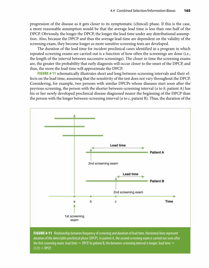
4.4 Combined Selection/Information Biases 165
progression of the disease as it gets closer to its symptomatic (clinical) phase. If this is the case, a more reasonable assumption would be that the average lead time is less than one-half of the DPCP. Obviously, the longer the DPCP, the longer the lead time under any distributional assump-tion. Also, because the DPCP and thus the average lead time are dependent on the validity of the screening exam, they become longer as more sensitive screening tests are developed.
The duration of the lead time for incident preclinical cases identified in a program in which repeated screening exams are carried out is a function of how often the screenings are done (i.e., the length of the interval between successive screenings). The closer in time the screening exams are, the greater the probability that early diagnosis will occur closer to the onset of the DPCP, and thus, the more the lead time will approximate the DPCP.
FIGURE 4-11 schematically illustrates short and long between-screening intervals and their ef-fects on the lead time, assuming that the sensitivity of the test does not vary throughout the DPCP. Considering, for example, two persons with similar DPCPs whose diseases start soon after the previous screening, the person with the shorter between-screening interval (a to b, patient A) has his or her newly developed preclinical disease diagnosed nearer the beginning of the DPCP than the person with the longer between-screening interval (a to c, patient B). Thus, the duration of the
FIGURE 4-11 Relationship between frequency of screening and duration of lead time. Horizontal lines represent duration of the detectable preclinical phase (DPCP). In patient A, the second screening exam is carried out soon after the first screening exam: lead time ≈ DPCP. In patient B, the between-screening interval is longer: lead time ≈ (1/2) × DPCP.
Timea b c
Lead time
1st screeningexam
2nd screening exam
Patient B
Lead time
2nd screening exam
Patient A

166 Chapter 4 Understanding Lack of Validity: Bias
lead time is closer to the duration of the DPCP for patient A than for patient B. The maximum lead time obviously cannot be longer than the DPCP.59
Overdiagnosis BiasOverdiagnosis bias occurs when screening identifies patients whose early subclinical disease does not evolve to more advanced stages and the analysis is based on survival of patients. Consider, for example, the natural history of prostate cancer: It has been estimated that as many as one-third of men younger than 70 years and between two-thirds to 100% of older men may have prostate cancer but often in a microscopic, noninvasive form (see TABLE 4-13).60 In the Surveillance, Epidemiology, and End Results (SEER) Program of the National Cancer Institute, the number of cases of prostate cancer per year was estimated at close to 221,000 from 1975 through 2011, but only 27,540 deaths (≈ 12.5%) occurred in the same period.61 Thus, it is likely that many individuals—particularly as they age—die with prostate cancer rather than from prostate cancer. Because it is not currently possible to identify cases that would not evolve to more invasive stages leading to death, if they represent a relative high proportion of all cases, analysis of survival after diagnosis would favor the diagnosis made by screening, which would include many such cases.*
There have been two recent trials of screening for prostate cancer with prostate-specific an-tigen (PSA): one in the United States and the other in Europe. In the United States-based trial,62
*Note that the efficiency of PSA screening would be diluted by overdiagnosis (i.e., by the inclusion of noninvasive cases). For example, if in a hypothetical population of 10,000, there were 2000 potentially lethal cases, without screening, they would all die. With screening and assuming that the effectiveness of the treatment is very high (e.g., 97.5%), only 50 deaths would occur. If the potentially lethal cases could be identified and screened, the number needed to screen to prevent 1 death would be 40 (i.e., 2000/50). On the other hand, if these potentially lethal cases could not be identified, the whole target population would have to be screened, and the number needed to screen to prevent 1 death would be 200 (i.e., 10,000/50). Thus, screening of only the potentially “lethal” subgroup (those who would have died without screening) would be much more efficient than screening the whole target population.
TABLE 4-13 Range of prevalence rates of prostate cancer by age.
Age (years) Prevalence ranges of prostate cancer (%)
50–59 10–42%
60–69 17–38%
70–79 25–66%
$ 80 18–100%
Data from Franks LM. Latent carcinoma of the prostate. J Pathol Bacteriol. 1954;68:603-61665; Bostwick DG, Cooner WH, Denis L, Jones GW, Scardino PT, Murphy GP. The association of benign prostatic hyperplasia and cancer of the prostate. Cancer. 1992;70:291-30166; Breslow, Chan CW, Dhom G, et al. Latent carcinoma of prostate at autopsy in seven areas. Int J Cancer. 1977;20:680-68867; Baron E, Angrist A. Incidence of occult adenocarcinoma of the prostate after fifty years of age. Arch Pathol. 1941;32:787-79368; Edwards CN, Steinthorsson E, Nicholson D. An autopsy study of latent prostatic cancer. Cancer. 1953;6:531-55469; Halpert B, Schmalhorst WR. Carcinoma of the prostate in patients 70 to 79 years old. Cancer. 1966;695-69870; Scott R, Mutchnik DL, Laskowski TZ, Schmalhorst WR. Carcinoma of the prostate in elderly men: incidence, growth characteristics and clinical significance. J Urol. 1969;101:602-607.71

4.4 Combined Selection/Information Biases 167
the cumulative hazards of death for individuals tested with PSA and for the control group were virtually the same for most of the follow-up and at the end of the trial. In the European trial, a sig-nificant difference in mortality could not initially be found between the screened and nonscreened groups.63 However, upon further follow-up, cumulative mortality was significantly reduced in the PSA group.64 In the two trials, however, by evaluating mortality for all individuals (and not just for those with a diagnosis of prostate cancer), overdiagnosis bias was avoided, as, in each trial, the distributions of noninvasive and invasive cases were the same or very similar in the two fairly large randomly allocated samples.
Unfortunately, it is currently impossible to identify patients with prostate cancer who, if left unscreened, would die. A similar problem may exist with regard to in situ breast cancer.72 This problem suggests expanding the definition of a false-positive test to also include individuals with cancer who do not progress to an invasive, potentially lethal phase.
4.4.4 Additional Types of BiasIn addition to the biases extensively discussed previously in this chapter, the “natural history” of a study provides an appropriate framework to understand other types of bias. More specifically, different types of bias are related to different phases in the natural history of a study (FIGURE 4-12). In addition to selection and information, the epidemiologist should be concerned with the plausibility of his or her hypothesis or hypotheses and with the analysis, interpretation, and dissemination of study results. Plausibility bias occurs when the hypothesis lacks biological, sociological, or psychological
FIGURE 4-12 Natural history of a study and corresponding biases.
Confounding*
Hypothesis
Study participants
Data collection
Results
Interpretation
Target populationSelection
bias
Informationbias
Analyticbias
Manuscript
Inferentialbias
Plausibilitybias
Publicationbias
*Found in the population: only a bias for causal inference purposes.Data from J. Samet, personal communication.

168 Chapter 4 Understanding Lack of Validity: Bias
plausibility, for example, when postulating that chewing gum causes kidney cancer. An example of analytic bias is the use of a single analytic unit (e.g., 1 standard deviation) when the function is not linear (see Chapter 9, Section 9.3.4). Inferential bias may occur when causality is inferred from results of a single observational study.* 73 Publication bias, which has been mentioned previously, is discussed in Chapter 10, Section 10.5.
References1. Sackett DL. Bias in analytical research. J Chron Dis. 1979;32:51-63.2. Porta, M. A Dictionary of Epidemiology. 5th ed. New York, NY: Oxford University Press; 2008.3. Lilienfeld DE, Stolley PD. Foundations of Epidemiology. 3rd ed. New York, NY: Oxford University Press; 1994.4. Schlesselman J. Case Control Studies: Design, Conduct, Analysis. New York, NY: Oxford University Press; 1982.5. Rothman K, Greenland S. Modern Epidemiology. 3rd ed. Philadelphia, PA: Wolters Kluwer Health/Lippincott; 2008.6. Byrne C, Brinton LA, Haile RW, Schairer C. Heterogeneity of the effect of family history on breast cancer risk.
Epidemiology. 1991;2:276-284.7. MacMahon B, Yen S, Trichopoulos D, Warren K, Nardi G. Coffee and cancer of the pancreas. N Engl J Med. 1981;304:630-633.8. Hsieh CC, MacMahon B, Yen S, Trichopoulos D, Warren K, Nardi G. Coffee and pancreatic cancer (Chapter 2). N Engl
J Med. 1986;315:587-589.9. Report from the Boston Surveillance Collaborative Program. Reserpine and breast cancer. Lancet. 1974;ii:669-671.
10. Labarthe DR, O’Fallon WM. Reserpine and breast cancer: a community-based longitudinal study of 2,000 hypertensive women. J Am Med Assoc. 1980;243:2304-2310.
11. Horwitz RI, Feinstein AR. Exclusion bias and the false relationship of reserpine and breast cancer. Arch Intern Med. 1985;145:1873-1875.
12. Heederik K. Micro-epidemiology of the healthy worker effect? Occup Environ Med. 2006;63:83.13. Rubin DB. Multiple Imputation for Nonresponse in Surveys. Hoboken, NJ: John Wiley & Sons; 1987.14. Sterne JAC, White IR, Carlin JB, et al. Multiple imputation for missing data in epidemiologic and clinical research:
potential and pitfalls. Br Med J. 2009:338:b2393.15. Biering K, Hjollund NH, Frydenberg M. Using multiple imputation to deal with missing data and attrition in longitudinal
studies with repeated measures of patient-reported outcomes. Clin Epidemiol. 2015;7:91-106.16. Kmetic A, Lawrence J, Berger C, Tenenhouse A. Multiple imputation to account for missing data in a survey: estimating
the prevalence of osteoporosis. Epidemiology. 2002;13:437-444.17. Gordis L. Epidemiology. 5th ed. Philadelphia, PA: Elsevier Saunders; 2014.18. Weinstock MA, Colditz GA, Willett WC, Stampfer MJ, Rosner B, Speizer FE. Recall (report) bias and reliability in the
retrospective assessment of melanoma risk. Am J Epidemiol. 1991;133:240-245.19. Brinton LA, Hoover RN, Szklo M, Fraumeni JF Jr. Menopausal estrogen use and risk of breast cancer. Cancer.
1981;47:2517-2522.20. Chambless LE, Heiss G, Folsom AR, et al. Association of coronary heart disease incidence with carotid arterial wall
thickness and major risk factors: the Atherosclerosis Risk in Communities (ARIC) Study, 1987-1993. Am J Epidemiol. 1997;146:483-494.
21. Bild D, Bluemke DA, Burke GL, et al. Multi-Ethnic Study of Atherosclerosis. Am J Epidemiol. 2002;156:871-881.22. Mele A, Szklo M, Visani G, et al. Hair dye use and other risk factors for leukemia and pre-leukemia: a case-control
study: Italian Leukemia Study Group. Am J Epidemiol. 1994;139:609-619.23. Lilienfeld AM, Graham S. Validity of determining circumcision status by questionnaire as related to epidemiological
studies of cancer of the cervix. J Natl Cancer Inst. 1958;21:713-720.24. Wei Q, Matanoski GM, Farmer ER, Hedayati MA, Grossman L. DNA repair and susceptibility to basal cell carcinoma:
a case-control study. Am J Epidemiol. 1994;140:598-607.25. The Health Effects of Passive Smoking. Canberra: Australian Government Publishing Service. Commonwealth of Australia,
National Health and Medical Research Council; November 1997.26. Szklo M, Tonascia J, Gordis L. Psychosocial factors and the risk of myocardial infarctions in white women. Am
J Epidemiol. 1976;103:312-320.
*Possible exceptions to the notion that causal inference is not appropriate when interpreting results from a single observa-tional study include studies using Mendelian randomization or instrumental variables when the rather stringent assump-tions related to these approaches are met (see Chapter 7, Section 7.5.1).

169References
27. Doll R, Hill AB. Smoking and carcinoma of the lung: preliminary report. Br Med J. 1950;2:739-748.28. Perneger TV, Whelton PK, Klag MJ, Rossiter KA. Diagnosis of hypertensive end-stage renal disease: effect of patient’s
race. Am J Epidemiol. 1995;141:10-15.29. The ARIC investigators. The Atherosclerosis Risk in Communities (ARIC) Study: design and objectives. Am J Epidemiol.
1989;129:687-702.30. Stewart WF, Linet MS, Celentano DD, Van Natta M, Ziegler D. Age- and sex-specific incidence rates of migraine with
and without visual aura. Am J Epidemiol. 1991;134:1111-1120.31. Radloff LS. The CES-D scale: a self-report depression scale for research in the general population. Appl Psychol Meas.
1977;3:385-401.32. Rose GA. Chest pain questionnaire. Milbank Mem Fund Q. 1965;43:32-39.33. Bass EB, Follansbee WP, Orchard TJ. Comparison of a supplemented Rose Questionnaire to exercise thallium testing
in men and women. J Clin Epidemiol. 1989;42:385-394.34. Garber CE, Carleton RA, Heller GV. Comparison of “Rose Questionnaire Angina” to exercise thallium scintigraphy:
different findings in males and females. J Clin Epidemiol. 1992;45:715-720.35. Sorlie PD, Cooper L, Schreiner PJ, Rosamond W, Szklo M. Repeatability and validity of the Rose Questionnaire for
angina pectoris in the Atherosclerosis Risk in Communities Study. J Clin Epidemiol. 1996;49:719-725.36. Dosemeci M, Wacholder S, Lubin JH. Does nondifferential misclassification of exposure always bias a true effect toward
the null value? Am J Epidemiol. 1990;132:746-748.37. Infante-Rivard C, Jacques L. Empirical study of parental recall bias. Am J Epidemiol. 2000;152:480-486.38. Greenland S. The effect of misclassification in the presence of covariates. Am J Epidemiol. 1980;112:564-569.39. Wacholder S. When measurement errors correlate with truth: surprising effects of nondifferential misclassification.
Epidemiology. 1995;6:157-161.40. Flegal KM, Brownie C, Haas JD. The effects of exposure misclassification on estimates of relative risk. Am J Epidemiol.
1986;123:736-751.41. Flegal KM, Keyl PM, Nieto FJ. Differential misclassification arising from nondifferential errors in exposure measurement.
Am J Epidemiol. 1991;134:1233-1244.42. Willett W. An overview of issues related to the correction of non-differential exposure measurement error in epidemiologic
studies. Stat Med. 1989;8:1031-1040; discussion 1071-1033.43. Hessol NA, Schwarcz S, Ameli N, Oliver G, Greenblatt RM. Accuracy of self-reports of acquired immunodeficiency
syndrome and acquired immunodeficiency syndrome-related conditions in women. Am J Epidemiol. 2001;153:1128-1133.44. Osawa K, Nakanishi R, Budoff M. Coronary artery calcification. Glob Heart. 2016;11:287-293.45. Thomas D, Stram D, Dwyer J. Exposure measurement error: influence on exposure-disease: relationships and methods
of correction. Annu Rev Public Health. 1993;14:69-93.46. Armstrong BG. The effects of measurement errors on relative risk regressions. Am J Epidemiol. 1990;132:1176-1184.47. Kannel WB. CHD risk factors: a Framingham Study update. Hosp Pract (Off Ed). 1990;25:119-127, 130.48. Giovannucci E, Ascherio A, Rimm EB, Colditz GA, Stampfer MJ, Willett WC. A prospective cohort study of vasectomy
and prostate cancer in US men. J Am Med Assoc. 1993;269:873-877.49. Goldberg RJ, Gorak EJ, Yarzebski J, et al. A communitywide perspective of sex differences and temporal trends in the
incidence and survival rates after acute myocardial infarction and out-of-hospital deaths caused by coronary heart disease. Circulation. 1993;87:1947-1953.
50. Perneger TV, Nieto FJ, Whelton PK, Klag MJ, Comstock GW, Szklo M. A prospective study of blood pressure and serum creatinine: results from the “Clue” Study and the ARIC Study. J Am Med Assoc. 1993;269:488-493.
51. Szklo M. Aplastic anemia. In: Lilienfeld AM, ed. Reviews in Cancer Epidemiology. Vol 1. New York, NY: Elsevier North-Holland; 1980:115-119.
52. Antunes CM, Strolley PD, Rosenshein NB, et al. Endometrial cancer and estrogen use: report of a large case-control study. N Engl J Med. 1979;300:9-13.
53. Horwitz RI, Feinstein AR. Estrogens and endometrial cancer: responses to arguments and current status of an epidemiologic controversy. Am J Med. 1986;81:503-507.
54. Brunekreef B, Groot B, Hoek G. Pets, allergy and respiratory symptoms in children. Int J Epidemiol. 1992;21:338-342.55. Nieto FJ, Diez-Roux A, Szklo M, Comstock GW, Sharrett AR. Short- and long-term prediction of clinical and subclinical
atherosclerosis by traditional risk factors. J Clin Epidemiol. 1999;52:559-567.56. Hammond EC, Horn D. Smoking and death rates: report on forty-four months of follow-up of 187,783 men. 2. Death
rates by cause. J Am Med Assoc. 1958;166:1294-1308.57. Shapiro S, Venet W, Strax P, Venet L, Roeser R. Selection, follow-up, and analysis in the Health Insurance Plan Study:
a randomized trial with breast cancer screening. Natl Cancer Inst Monogr. 1985;67:65-74.58. Hutchison GB, Shapiro S. Lead time gained by diagnostic screening for breast cancer. J Natl Cancer Inst. 1968;41:665-681.
170 Chapter 4 Understanding Lack of Validity: Bias
59. Morrison AS. Screening in Chronic Disease. New York, NY: Oxford University Press; 1992.60. Stamey TA, McNeal JE, Yemoto CM, Sigal BM, Johnstone IM. Biological determinants of cancer progression in men
with prostate cancer. J Am Med Assoc. 1999;281:1395-1400.61. Howlader N, Noone AM, Krapcho M, et al., eds. SEER Cancer Statistics Review, 1975-2011. Bethesda, MD: National
Cancer Institute; 2014.62. Andriole GL, Crawford ED, Grubb RL III, et al. Mortality results from a randomized prostate-cancer screening trial.
New Eng J Med. 2009;360:1310-1319.63. Schröder FH, Hugosson J, Roobol MJ, et al. Screening and prostate-cancer mortality in a randomized European study.
New Eng J Med. 2009;360:1320-1328.64. Schröder FH, Hugosson J, Roobol MJ, et al. Screening and prostate cancer mortality: results of the European Randomised
Study of Screening for Prostate Cancer (ERSPC) at 13 years of follow-up. Lancet. 2014;384(9959):2027-2035.65. Franks LM. Latent carcinoma of the prostate. J Pathol Bacteriol. 1954;68:603-616.66. Bostwick DG, Cooner WH, Denis L, Jones GW, Scardino PT, Murphy GP. The association of benign prostatic hyperplasia
and cancer of the prostate. Cancer. 1992;70:291-301.67. Breslow, Chan CW, Dhom G, et al. Latent carcinoma of prostate at autopsy in seven areas. Int J Cancer. 1977;20:680-688.68. Baron E, Angrist A. Incidence of occult adenocarcinoma of the prostate after fifty years of age. Arch Pathol. 1941;32:787-793.69. Edwards CN, Steinthorsson E, Nicholson D. An autopsy study of latent prostatic cancer. Cancer. 1953;6:531-554.70. Halpert B, Schmalhorst WR. Carcinoma of the prostate in patients 70 to 79 years old. Cancer. 1966;695-698.71. Scott R, Mutchnik DL, Laskowski TZ, Schmalhorst WR. Carcinoma of the prostate in elderly men: incidence, growth
characteristics and clinical significance. J Urol. 1969;101:602-607.72. Schonberg MA, Marcantonio ER, Ngo L, Li D, Silliman RA, McCarthy EP. Causes of death and relative survival of older
women after a breast cancer diagnosis. J Clin Oncol. 2011;29:1570-1577.73. Petitti D. Associations are not effects. Am J Epidemiol. 1991;133:101-102.

171
Exercises1. In a case-control study of risk factors of colon cancer, 430 cases were compared with 551
controls. The investigators used a questionnaire to obtain information about demographic variables, socioeconomic variables (e.g., education), weight, and height, among other variables. Using the self-reported weight and height information, body mass index [BMI, weight (kg)/height (m)2] values were calculated. Participants with BMI ≥ 30 kg/m2 were considered “obese.” The association between obesity and colon cancer in this study is shown in the table.
Cases Controls
Obese 162 133
Nonobese 268 418
a. Calculate the odds ratio relating obesity and colon cancer in this study.Subsequently, the investigators obtained additional funds to conduct a validation
study of some of the information obtained from the participants’ interviews. For the validation study, 100 participants (50 cases and 50 controls) were randomly selected and invited to attend a clinic, where diverse objective physical measurements and more extensive questionnaires were used in an attempt to estimate the validity of the self-reported information in the study. Despite intensive efforts for recruitment, only 60 of the 100 participants invited for the validation study agreed to the clinic visit. The participants who agreed to attend included a larger proportion of females and individuals of a higher educational level than those who declined.
Using objectively measured weight and height, BMI was recalculated in the 60 individuals in the validation study. Among the individuals who were classified as obese using measured weight and height, 90% of the cases and 95% of the controls had also been classified as obese by the BMI based on self-reported information; 100% of those classified as nonobese using measured weight and height had been classified as such by the self-reported information.
b. Assuming that weight and height values did not change in the time between the inter-views and the validation study, calculate the “corrected” odds ratio based on the estimates obtained from the validation study. That is, estimate the odds ratio that would have been obtained if no misclassification of obese status based on self-reported weight and height information had occurred.
c. How do you explain the difference between the observed and the corrected odds ratio obtained in this study?
d. In addition to the need to assume no change in weight and height between interviews and validation assessment, what are, in your judgment, other important limitations of the use of the validation study (vis-à-vis the whole study) to estimate a corrected odds ratio, as you did in answer to Exercise 1b?
Exercises

172 Chapter 4 Understanding Lack of Validity: Bias
2. It is estimated that about one-third of prostate cancer cases can be present in men in their fourth or fifth decade of life without any clinical symptoms or signs.* Several observational studies (including cohort studies) have suggested that vasectomy may be related to prostate cancer risk. For example, in a meta-analysis of 5 cohort studies and 17 case-control studies, the pooled relative risk estimate was found to be 1.37 (95% confidence interval, 1.15, 1.62).† In these studies, prostate cancer was not systematically evaluated; rather, usual clinical di-agnosis was the diagnostic strategy. Describe the possible threats to validity when inferring that this association is causal.
3. Two clinical trials have examined the association of PSA testing with mortality from prostate cancer. In one trial (Schröder et al.‡), the mortality for those tested for PSA was significantly lower than that for the control group at the end of the trial. In the other trial (Andriole et al.§), a significant difference could not be found between the groups. Why have the authors examined mortality instead of cumulative survival in cases?
4. A breast cancer screening program based on repeat free clinical breast examinations was implemented in a developing country for women aged 50–59 years. The program is open to all eligible women, but it is not compulsory.a. Do you expect the incidence among the women who take advantage of the program to
be the same as for the total eligible population? Why?In women who choose to take advantage of the program, the average annual incidence
of previously undetected breast cancer is found to be about 100 per 100,000 on follow-up. In the first exam, point prevalence is found to be approximately 200 per 100,000. Assume that, after cases are confirmed by biopsy, no false negatives go undetected.
b. What is the average duration of the detectable preclinical phase in cases of breast cancer detected at the first exam?
c. Define lead time bias in the context of evaluation of a screening program or procedure.d. How does lead time bias affect estimation of average survival time?e. Estimate the average lead time for prevalent cases in this example, and state the assump-
tion underlying this estimation.f. As the interval between screening exams becomes shorter, what is the tendency of the
average lead time value for incident cases that are detected after the initial screening?5. The sensitivity of high levels of prostate specific antigen (PSA ≥ 4.0 ng/ml) to identify pros-
tate cancer has ranged from 35% to 71% and specificity from 63% to 91%, with resulting false-positive rates of 20% to 68%.** A cohort study to evaluate the relationship of serum
*Stamey TA, McNeal JE, Yemoto CM, Sigal BM, Johnstone IM. Biological determinants of cancer progression in men with prostatic cancer. J Am Med Assoc. 1999;281:1395-1400.†Dennis LK, Dawson DV, Resnick MI. Vasectomy and the risk of prostate cancer: a meta-analysis examining vasectomy status, age at vasectomy, and time since vasectomy. Prostate Cancer Prostatic Dis. 2002;5:193-203.‡Schröder FH, Hugosson J, Roobol MJ, et al. Screening and prostate-cancer mortality in a randomized European study. New Engl J Med. 2009;360:1320-1328.§Andriole GL, Crawford ED, Grubb RL III, et al. Mortality results from a randomized prostate-cancer screening trial. New Engl J Med. 2009;360:1310-1319.**Crawford ED, Leewansangtong S, Goktas S, Goktas S, Holthaus K, Baier M. Efficiency of prostate-specific antigen and digital rectal examination in screening, using 4.0 ng/ml and age-specific reference range as a cutoff for abnormal values. Prostate. 1999;38:296-302; Gann PH, Hennekens CH, Stampfer MJ. A prospective evaluation of plasma prostate-specific antigen for detection of prostatic cancer. J Am Med Assoc. 1995;273:289-294.

173
retinol (vitamin A) levels to prostate cancer was conducted by Mondul and collaborators.*** They included close to 30,000 smoking men aged 50–69 years at baseline. The hazard ratio** (relative risk) of prostate cancer associated with the upper quintile of serum retinol—compared with that of the lowest quintile—was found to be 1.13 as measured in the 3-year follow-up visit. This exercise will assume that this is the true relative risk for the association of the 5th vs the 1st quintile of retinol. The table summarizes some of the study results. For the purposes of this exercise, the number of person-years given in the paper by Mondul et al. was considered as number of persons.***
Incidence rates and relative risks of prostate cancer according to extreme quintiles of serum retinol, 1985–2006, from the Alpha-Tocopherol, Beta-Carotene Cancer Prevention Study.
Retinol levels No. of cases No. of persons Incidence/1000 Relative risk
Quintile 1 312 66,010 4.73 1.00
Quintile 5 377 70,747 5.33 1.13
Data from Mondul AM, Watters JL, Männistö S, et al. Serum retinol and risk of prostate cancer. Am J Epidemiol. 2011;173:813-821.
a. Assuming sensitivity and specificity of 0.70 and 0.90 for the ascertainment of prostate cancer in this study, and further assuming that these levels are the same for both quintiles, calculate the biased relative risk using the data in the table above as the gold standard (true values).
b. Define the type of misclassification based on the answer to Exercise 5a.
***Mondul AM, Watters JL, Männistö S, et al. Serum retinol and risk of prostate cancer. Am J Epidemiol. 2011; 173:813-821.
Exercises


175
© Enculescu Marian Vladut/Shutterstock
Identifying Noncausal Associations: Confounding5.1 IntroductionThe term confounding refers to a situation in which a noncausal association between a given exposure and an outcome is observed as a result of the influence of a third variable (or group of variables), usually designated as a confounding variable or merely a confounder. As discussed later in this chapter, the confounding variable must be related to both the putative risk factor and the outcome under study. In an observational cohort study, for example, a confounding variable would differ between exposed and unexposed subjects and be associated with the outcome of interest. As shown in the examples that follow, this may result either in the appearance or strengthening of an association not due to a direct causal effect or in the apparent absence or weakening of a true causal association.
From an epidemiologic standpoint, it is useful to conceptualize confounding as distinct from bias in that a confounded association, although not causal, is real (for further discussion of this concept, see Section 5.5.8). This distinction has obvious practical implications with respect to the relevance of exposures as markers of the presence or risk of disease in a target population for screening purposes (secondary prevention). If, on the other hand, the goal of the researcher is to carry out primary prevention, it becomes crucial to distinguish a causal from a noncausal association, the latter resulting from either bias or confounding. A number of statistical tech-niques are available for controlling confounding; as described in detail in Chapter 7, the basic idea underlying adjustment is to use some statistical model to estimate what the association between the exposure and the outcome would be, given a constant value or level of the suspected confounding variable(s).
Confounding is more likely to occur in observational than in experimental epidemiology studies. In an experimental study (e.g., a clinical trial), the use of randomization reduces the likelihood that the groups under comparison (e.g., exposed/treated and unexposed/untreated) differ with regard to both known and unknown confounding variables. This is particularly true when large sample sizes
CHAPTER 5

176 Chapter 5 Identifying Noncausal Associations: Confounding
are involved. Even if the randomization approach is unbiased and the samples are large, however, there may be random differences between the experimental (e.g., vaccinated) and the control (e.g., those receiving placebo) groups, possibly leading to confounding (EXHIBIT 5-1). In an observational prospective study, in addition to random differences between the comparison groups, factors related to the exposure may confound the association under study, as illustrated in the examples that follow and as further discussed in the next section.
■ Example 1. The overall crude mortality rates in 1986 for six countries in the Americas1 were as follows:
Costa Rica: 3.8 per 1000 Cuba: 6.7 per 1000Venezuela: 4.4 per 1000 Canada: 7.3 per 1000Mexico: 4.9 per 1000 United States: 8.7 per 1000
Assuming that these crude mortality rates are accurate, the literal (and correct) inter-pretation of these data is that the United States and Canada had the highest rates of death during 1986. Although this interpretation of crude data is useful for public health planning purposes, it may be misleading when using mortality rates as indicators of health status, as it fails to take into consideration interpopulation age differences. In this example, the higher mortality rates in Canada and the United States reflect the fact that there is a much higher proportion of older individuals in these populations; because age is a very strong “risk factor” for mortality, these differences in age distribution result in these countries having the highest mortality rates. Inspection of age-specific mortality rates (see Chapter 7, Section 7.2) results in a very different picture, with the lowest mortality rates observed in Canada, the United States, and Costa Rica for every age group. With adjustment for age (e.g., using the direct method and the 1960 population of Latin America as the standard; see Chapter 7, Section 7.3.1), the relative rankings of the United States and Canada are reversed (mortality per 1000: Costa Rica: 3.7; Venezuela: 4.6; Mexico: 5.0; Cuba: 4.0; Canada: 3.2; United States: 3.6). Age is, therefore, a confounder of the observed association between country and mortality.
EXHIBIT 5-1 Confounding in experimental and nonexperimental epidemiologic studies.
Study designExperimental: randomized clinical trial
Observational: cohort study
Approach Random allocation
A B
Nonrandom allocation
A B
Example A = vaccineB = placebo
A = smokersB = nonsmokers
Source of confounding (difference[s] between groups)
Random difference(s) Random difference(s) and factors associated with the exposure of interest

5.1 Introduction 177
■ Example 2. In a cohort study conducted in England,2 participants who reported a higher fre-quency of sexual activity at baseline (as indicated by their reported frequency of orgasm) were found to have a decreased risk of 10-year mortality compared with those who reported lower sexual activity. Does sexual activity cause lower mortality? Or are people with higher levels of sexual activity (or capacity to have orgasms) healthier in general and thus, by definition, at lower risk of mortality? Although the authors of this study, aware of this problem, attempted to control for confounding by adjusting for a number of health-related surrogate variables (see Chapter 7), the possibility of a “residual confounding” effect remains open to question (see Section 5.5.4 and Chapter 7, Section 7.6).
■ Example 3. It has been reported that certain medical or tertiary prevention interventions in patients with chronic obstructive pulmonary disease (COPD) are associated with unfavorable health outcomes.3 For example, long-term oxygen therapy is associated with increased rates of readmission to a hospital; similarly, readmission rates are higher in patients taking anticho-linergic drugs, given influenza vaccination, or undergoing respiratory rehabilitation. In eval-uating these associations, however, it is important to consider the possibility of confounding by severity, as all of these interventions tend to be more often prescribed in the most severe COPD cases.3 This phenomenon, known in the clinical epidemiology field as confounding by severity or confounding by indication,4 frequently complicates the interpretation of results from observational studies of outcomes of clinical or pharmacologic interventions.
■ Example 4. In a nested case-control study among Japanese American men, low dietary vitamin C has been found to be related to colon cancer risk.5 Although it is possible that this relationship is causal, an alternative explanation is that individuals who consume more vitamin C tend to have a healthier lifestyle in general and thus are exposed to true protective factors acting as confounders (e.g., other dietary items, physical exercise).
A way to explain confounding, which is found with increasing frequency in the epidemiology literature, is based on the counterfactual model.6,7 This explanation relies on the notion that the attribution of causation to a particular exposure is based on the concept that the risk of the out-come observed among individuals exposed would have been different in these same individuals had exposure been absent. Because the latter group is, by definition, unobservable (“counterfactual”), epidemiologists are forced instead to use a different group (the unexposed) as comparison; thus, the essence of epidemiologic analysis rests on the assumption that a separate unexposed group is comparable to exposed individuals if they had not been exposed. Confounding is said to be present if this assumption is not correct, that is, if the risk in the unexposed group is not the same as that in the unobserved (counterfactual) exposed group had its members not been exposed. Using an alternative terminology, confounding is described as present when the exposed–unexposed groups are nonexchangeable.8,9 Extending this concept to a case-control study, confounding will be present if controls are not equivalent with regard to exposure odds to a hypothetical (counterfactual) case group where the disease of interest was absent.
Referring to the example on sexual activity and mortality described previously,2 confounding is said to occur when the “low sexual activity” and the “high sexual activity” groups are “nonex-changeable”; that is, the former has a different mortality risk than the group with high sexual activity would have had if its members did not have such a high orgasm frequency (and vice versa).
To conceptualize confounding in terms of nonexchangeability has an intrinsic appeal in that it underscores the old notion that the groups under comparison should be selected from the same study base—a requirement that is optimally met in large trials with random allocation. This definition is also useful in the context of a formal mathematical modeling of confounding.8

178 Chapter 5 Identifying Noncausal Associations: Confounding
A more detailed discussion of the counterfactual method to analyze confounding and its practical applications is outside the scope of this book; the interested reader should refer to more specialized texts.6-8,10 The following paragraphs are based on the more traditional explanation of the confounding effect.
5.2 The Nature of the Association Between the Confounder, the Exposure, and the Outcome5.2.1 General RuleThe common theme with regard to confounding is that the association between an exposure and a given outcome is induced, strengthened, weakened, or eliminated by a third variable or group of variables (confounders). The essential nature of this phenomenon can be stated as follows:
The confounding variable is causally associated with the outcome
noncausally or causally associated with the exposure
is not an intermediate variable in the causal pathway between exposure and outcome
and
but
This general rule is schematically represented in FIGURE 5-1. In this figure and throughout all the figures in this chapter, the association of interest (i.e., whether a given exposure is causally related to the outcome) is represented by shaded boxes connected by a dotted arrow and a question mark; this arrow is pointing to the outcome, as the question of interest is whether the exposure causes the outcome. (An association between exposure and outcome can also occur because the “outcome” causes changes in “exposure”—i.e., reverse causality—a situation that is discussed in Chapter 4, Section 4.4.2).
Some exceptions to the previous general rule for the presence of confounding are discussed in Section 5.2.3; its components are dissected in the next section (5.2.2) using the previously dis-cussed examples as illustrations (FIGURE 5-2). The confounding variables in Figures 5-2A and 5-2B are denoted as simple, and possibly oversimplified, characteristics (“age distribution” and “general health,” respectively). In Figures 5-2C and 5-2D, the postulated confounding variables are repre-sented by relatively complex sets of variables. In Figure 5-2C, “severity” relates to the clinical status of the COPD patients, that is, disease stage, presence of comorbidities, and so on. In Figure 5-2D, the confounder is a constellation of variables related to general socioeconomic status (SES) and lifestyle characteristics that have their own interrelations. There is usually a trade-off in choosing simplicity over complexity in the characterization of these variables and in the conceptualization of their interrelations; this trade-off is directly relevant to the art of statistical modeling and is the core of the science of multivariate analysis, a key tool in analytical epidemiology (see Chapter 7, Sections 7.4 and 7.8).

5.2 The Nature of the Association Between the Confounder, the Exposure, and the Outcome 179
?Confounder
Exposure
Outcome
FIGURE 5-1 General definition of confounding. The confounder is causally associated with the outcome of interest and either causally or noncausally associated with the exposure; these associations may distort the association of interest: whether exposure causes the outcome. A unidirectional arrow indicates that the association is causal; a bidirectional arrow indicates a noncausal association.
?
A
Mortality
Agedistribution
Country
?
C
Readmission forCOPD
Long-termoxygen therapy
?
B
Mortality
Generalhealth
Sexualactivity
?
D
Coloncancer
SES
Vitamin Cintake
Otherdiet andlifestyle
Severity of
COPD
FIGURE 5-2 Schematic representation of the hypothetical relations of confounders, exposures of interest, and outcomes, based on the examples in the text. A unidirectional arrow indicates that the association is causal; a bidirectional arrow indicates a noncausal association. The main exposure and outcome are represented in shaded boxes; a dotted arrow with a question mark indicates the research question of interest.
COPD, chronic obstructive pulmonary disease; SES, socioeconomic status.

180 Chapter 5 Identifying Noncausal Associations: Confounding
5.2.2 Elements of the General Rule for Defining the Presence of Confounding“The Confounding Variable Is Causally Associated With the Outcome”In all the examples illustrated in Figure 5-2, the confounding variables (age distribution, general health, severity of COPD, and SES/other lifestyle characteristics) determine the likelihood of the outcome (mortality rate, risk of death, readmission for COPD, and risk of colon cancer, respectively) to a certain degree.
“And Noncausally or Causally Associated With the Exposure”The examples in Figure 5-2 illustrate the different forms assumed by the relationships between the postulated confounders and the respective exposures of interest (country, sexual activity, long-term oxygen therapy, and vitamin C intake). For instance, in Figure 5-2A, in addition to a causal rela-tionship with the outcome, the confounding variable (age) is related to the exposure of interest (country) in a noncausal fashion. In this example, the relationship between age distribution and country is postulated to be contextual rather than causal, that is, determined by a set of historical and social circumstances that are not unique to any given country.
The confounding variables may also be related to the exposure in a causal fashion, as in the case of the postulated relationship between severity and prescription of oxygen therapy in COPD patients (Figure 5-2C) and that of general health with sexual activity exemplified in Figure 5-2B. Finally, the example in Figure 5-2D shows the different types of relationship of the exposure of in-terest to the constellation of factors included in the confounding complex; for example, lower SES may be causally related to vitamin C intake to the extent that it determines degree of access to food products that are rich in vitamin C. On the other hand, some other lifestyle characteristics related to SES (e.g., physical exercise) may be related to vitamin intake in a noncausal fashion.
An additional illustration of the rule that confounding may result when the confounding variable is causally related to the exposure of interest (not represented in Figure 5-2) is given by smoking and high-density lipoprotein (HDL) cholesterol in relationship to lung cancer. Smoking is known to cause a decrease in HDL levels,11 thus explaining the apparent relationship of low HDL and lung cancer.
“But Is Not an Intermediate Variable in the Causal Pathway Between Exposure and Outcome”The general rule defining a confounding variable excludes the situation in which the exposure determines the presence or level of the presumed confounder. In the previous examples, the as-sumption that this type of situation does not exist may not be entirely justified. For instance, in the example illustrated in Figure 5-2B, increased sexual activity may cause an improvement in general health (e.g., by leading to psychological well-being that may have an impact on physical health), which in turn results in a decrease in mortality (FIGURE 5-3). If this hypothesized mechanistic model is true, general health is the link in the causal pathway between sexual activity and mortality and should thus not be considered a confounder. Another example relates to the hypothesized causal relationship between smoking and suicide. Although it could be argued that this association is due to the confounding effect of depression (e.g., if individuals with depression—which is associated with increased risk of suicide—are also more likely to smoke), an alternative explanation is that depression may be a mediator of the association between smoking and suicide rather than a con-founder (if smoking results in higher likelihood of depression).12

5.2 The Nature of the Association Between the Confounder, the Exposure, and the Outcome 181
5.2.3 Exceptions to the General Rule for the Presence of Confounding“Confounding” Due to Random AssociationsAlthough the general rule is that the confounding variable must be causally associated with the outcome (Figure 5-1), sometimes a random (statistical) association results in confounding. Thus, for example, in a case-control study, sampling (random) variability may create an imbalance between cases and controls with regard to a given variable related to the exposure even though there is no such imbalance in the total reference population.
It is important to understand that this phenomenon is not exclusive to observational studies. The notion that randomized clinical trials are free of confounding is an average concept, akin to that of unbiased designs discussed in Chapter 4, Section 4.1. Randomization does not exclude the possibility of confounding in a given clinical trial, as random differences with regard to important prognostic factors can also occur between randomly allocated groups, especially when the sample sizes are small. This is the reason investigators analyzing results from randomized clinical trials assess imbalances in potential confounding factors between the study groups that, if present, are adjusted for using one of the available statistical techniques (see Chapter 7).
The “Confounder” Does Not Cause the Outcome, but It Is a Marker of Another Unmeasured Causal FactorVariables treated as confounders are occasionally surrogates of the true confounding variable(s). For example, educational level is often used as a surrogate for the considerably more complex SES construct (Figure 5-2D). Another example is gender; although sometimes treated as a confounder in the true sense of the word (i.e., as reflecting distinct sexual or hormonal differences that affect the risk of the outcome), it can be used as a marker of attitudes, behaviors, or exposures that are associated with gender due to contextual or cultural circumstances.
For further discussion of the importance of a solid theoretical foundation when considering complex relationships between risk factors and confounders and their surrogates, see Section 5.3.
Generalhealth
Sexualactivity
Mortality
FIGURE 5-3 Alternative hypothesized model for the relationships in Figure 5-2B: General health is in the causal pathway of the relationship between sexual activity and mortality.
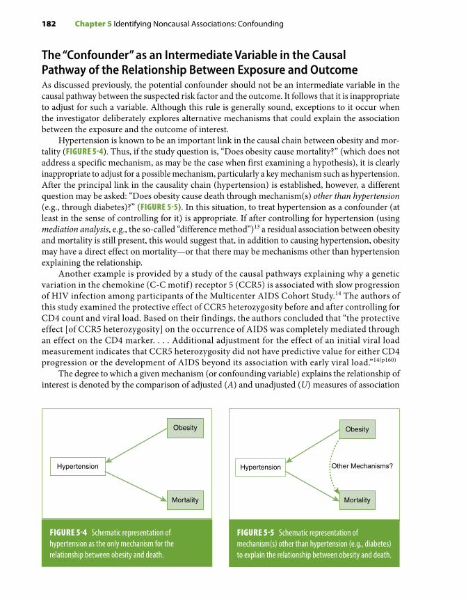
182 Chapter 5 Identifying Noncausal Associations: Confounding
The “Confounder” as an Intermediate Variable in the Causal Pathway of the Relationship Between Exposure and OutcomeAs discussed previously, the potential confounder should not be an intermediate variable in the causal pathway between the suspected risk factor and the outcome. It follows that it is inappropriate to adjust for such a variable. Although this rule is generally sound, exceptions to it occur when the investigator deliberately explores alternative mechanisms that could explain the association between the exposure and the outcome of interest.
Hypertension is known to be an important link in the causal chain between obesity and mor-tality (FIGURE 5-4). Thus, if the study question is, “Does obesity cause mortality?” (which does not address a specific mechanism, as may be the case when first examining a hypothesis), it is clearly inappropriate to adjust for a possible mechanism, particularly a key mechanism such as hypertension. After the principal link in the causality chain (hypertension) is established, however, a different question may be asked: “Does obesity cause death through mechanism(s) other than hypertension (e.g., through diabetes)?” (FIGURE 5-5). In this situation, to treat hypertension as a confounder (at least in the sense of controlling for it) is appropriate. If after controlling for hypertension (using mediation analysis, e.g., the so-called “difference method”)13 a residual association between obesity and mortality is still present, this would suggest that, in addition to causing hypertension, obesity may have a direct effect on mortality—or that there may be mechanisms other than hypertension explaining the relationship.
Another example is provided by a study of the causal pathways explaining why a genetic variation in the chemokine (C-C motif ) receptor 5 (CCR5) is associated with slow progression of HIV infection among participants of the Multicenter AIDS Cohort Study.14 The authors of this study examined the protective effect of CCR5 heterozygosity before and after controlling for CD4 count and viral load. Based on their findings, the authors concluded that “the protective effect [of CCR5 heterozygosity] on the occurrence of AIDS was completely mediated through an effect on the CD4 marker. . . . Additional adjustment for the effect of an initial viral load measurement indicates that CCR5 heterozygosity did not have predictive value for either CD4 progression or the development of AIDS beyond its association with early viral load.”14(p160)
The degree to which a given mechanism (or confounding variable) explains the relationship of interest is denoted by the comparison of adjusted (A) and unadjusted (U) measures of association
Hypertension
Obesity
Mortality
FIGURE 5-4 Schematic representation of hypertension as the only mechanism for the relationship between obesity and death.
Obesity
Mortality
Hypertension
Obesity
Other Mechanisms?
Mortality
FIGURE 5-5 Schematic representation of mechanism(s) other than hypertension (e.g., diabetes) to explain the relationship between obesity and death.

5.2 The Nature of the Association Between the Confounder, the Exposure, and the Outcome 183
(e.g., a relative risk [RR]). This comparison can be made using the ratio of the unadjusted to the ad-justed relative risks, RRU/RRA, or the percentage excess risk explained by the variable(s) adjusted for:*
%
.Excess Risk Explained RR RR
RR= −
−×U A
U 1 0100
(Eq. 5.1)
For example, in a study of the relationship between SES, health behaviors, and mortality in the Americans’ Changing Lives longitudinal survey,15 the age- and demographics-adjusted mortality rate ratio comparing those in the lowest with those in the highest income group was 3.2. In trying to identify behavioral factors that might explain (mediate) the increased risk of mortality associated with low income, the authors further adjusted for smoking, alcohol drinking, sedentary lifestyle, and relative body weight, resulting in a reduction of the mortality rate ratio for low income to 2.8. Applying Equation 5.1, these data would suggest that these four factors explain approximately 18% of the predicted effect of income on mortality (i.e., [3.2 – 2.8]/[3.2 – 1]). Because the influence of major health risk behavior-related factors explains only a “modest proportion of social inequali-ties in overall mortality,” the authors concluded that “public health policies and interventions that exclusively focus on individual risk behaviors have limited potential for reducing socioeconomic disparities in mortality” and argued for the consideration of a “broader range of structural elements of inequality in our society.”15(pp1707-1708)
It is important to keep in mind, however, that if a residual association persists after a potentially intermediate variable is controlled for, this does not necessarily mean that there must be other causal pathways or mechanisms; the residual association may be due to residual confounding (see Section 5.5.4 and Chapter 7, Section 7.6). For example, even if hypertension were an important mechanism, a residual association between obesity and mortality could still be observed after con-trolling (adjusting) for blood pressure levels because of measurement error (e.g., random error due to within-individual variability in blood pressure). Under these circumstances, controlling for an imperfectly measured blood pressure will lead to incomplete adjustment and residual confounding. Likewise, when interpreting the results from the Americans’ Changing Lives study on income, health behaviors, and mortality described previously here, Lantz et al.15 aptly acknowledged that errors in
*Equation 5.1 examines the percentage excess risk explained in an additive scale. Alternatively, one may be interested in calculating the percentage excess risk explained in a multiplicative scale by using logarithmic transformations of the rela-tive risks in the formula:
% Excess multiplicative risk explainedlog RR log RR
=−U AA
U
A
U
RRRR
log RR×
= −
×
100
1 100loglog
The resulting percentage will be different from that obtained using Equation 5.1, reflecting the inherent difference in the two scales. One consideration when using the additive version of Equation 5.1 is that, because of the asymmetry of the relative risks in an additive scale, it cannot be applied in situations where the relative risks are below 1.0 (i.e., when the variable of interest may be a protective factor). The recommended approach in this case is to calculate the “% Excess Risk Explained” associated with the absence of the protective factor (i.e., using the inverted relative risks [e.g., 1/RRU and 1/RRA]) before applying Equation 5.1.

184 Chapter 5 Identifying Noncausal Associations: Confounding
the reporting of these behaviors could have resulted in an underestimation of the mediating effects of individual behaviors on the income–mortality association.
It is also important to emphasize that any conclusion regarding confounding or mediating effects based on the previous considerations should be based on solid theoretical understanding of the mechanisms underlying the associations under investigation. As discussed in more detail in the next section, the concept of proportion of effect explained by a putative mechanism (Equation 5.1) relies on the assumption that the relationship between the suspected intermediary variable and the outcome is free of confounding.16,17 Because this assumption is often difficult to evaluate empiri-cally, caution should be exercised when interpreting results of these analyses; at the very least, the proportion of risk estimated using Equation 5.1 should be interpreted as an approximate indication of the degree to which the hypothesized mechanism could explain the association of interest.
A more detailed discussion of approaches for evaluating mediation can be found elsewhere.13,18
The importance of solid and explicit conceptual models when analyzing confounders and po-tential mechanisms cannot be overemphasized. These issues, as well as additional methodological tools that could help in the process of formulating such conceptual models, are discussed in the following section.
5.3 Theoretical and Graphic Aids to Frame ConfoundingAs suggested by the preceding discussion, confounding is a complex phenomenon; its proper concep-tualization requires a clear understanding of the relationships between all variables involved as the basis for a well-defined theoretical model. The importance of selecting the proper statistical model when analyzing epidemiologic data is discussed in detail in Chapter 7, Section 7.8. In this section, the issues are the conceptual definition of the variables involved and the directionality of the causal associations being investigated. For this purpose, some level of understanding (even if hypothetical) is necessary of the underlying pathophysiologic (or psychosocial) pathways representing the relation-ships between the suspected risk factor(s), confounder(s), and outcome(s). The more explicit this mechanistic model, the more straightforward the analytical approach and data interpretation will be.
A potentially useful analytical aid for this purpose is the directed acyclic graph (DAG). Originally developed in the field of artificial intelligence, this technique has been more recently used in the social science fields, including epidemiology.16,17,19,20 The DAG (also known as a “causal diagram”) is a formal and more elaborate extension of traditional graphs to represent confounding, such as shown in Figure 5-2; in these graphs, the direction of the association between the variables of interests and other unknown confounders is explicitly displayed to facilitate and guide the casual inference process. In DAG’s jargon, the confounding effect is called a “backdoor path”; in the situation illus-trated by the DAG in Figure 5-2B, for example, controlling for general health will effectively close the backdoor path that distorts the observed association between sexual activity and mortality.
DAGs can thus be used to make more explicit the relations between suspected risk factors and outcomes when confounding is suspected; they are particularly useful for the identification of pitfalls in the analyses of direct and indirect (confounded) effects discussed previously in this chapter, which could potentially lead to erroneous conclusions pertaining to the presence of causal relationships. FIGURES 5-6 and 5-7 show two examples, which have been used in previous publications, to illustrate the application of this technique.17,19

5.3 Theoretical and Graphic Aids to Frame Confounding 185
The DAG in Figure 5-6A illustrates the hypothesis that aspirin reduces the risk of coronary heart disease (CHD) through a decrease in platelet aggregation; based on this hypothesis, and in order to evaluate the mediating effect of platelet function and the possibility of additional mechanisms, the relationship between aspirin intake and CHD risk before and after controlling for platelet aggregation can be assessed by means of Equation 5.1. Alternatively, in the DAG in
A B
Coronaryheart disease
Plateletaggregation
?
Coronaryheart disease
Plateletaggregation
?
Geneticvariant
Aspirin Aspirin
FIGURE 5-6 Directed acyclic graphs (DAGs) illustrating alternative hypothesis on the relationship between aspirin intake and risk of coronary heart disease (CHD). According to the DAG in (A), the association is mediated (at least partially) by platelet aggregation. In (B), platelet aggregation acts as a collider, as its relationship with CHD is confounded by an unmeasured genetic variant (see text). The unmeasured variable is represented with faded font and in a dotted box.
Data from Cole SR, Hernán MA. Fallibility in estimating direct effects. Int J Epidemiol. 2002;31:163-165.17
A
Coronaryheart disease
Toothloss
?
Coronaryheart disease
Toothloss ?
B
SES
DietDiet
Periodontaldisease
Periodontaldisease
FIGURE 5-7 Directed acyclic graphs (DAGs) illustrating alternative hypothesis on the relationship between periodontal disease and risk of coronary heart disease (CHD). In (A), baseline periodontal disease and tooth loss (both observed variables in a study) are assumed to be caused by past periodontal disease. Through its relationship to diet, tooth loss is hypothesized to be an intermediary variable in the association between periodontal infection and risk of CHD. In (B), socioeconomic status (SES) is hypothesized to be a confounder of the association between tooth loss and CHD, thus making tooth loss a collider. Unmeasured variables are represented with faded font and in a dotted box.
Data from Merchant AT, Pitiphat W. Directed acyclic graphs (DAGs): an aid to assess confounding in dental research. Community Dent Oral Epidemiol. 2002;30:399-404.19

186 Chapter 5 Identifying Noncausal Associations: Confounding
Figure 5-6B, an additional, unidentified factor, a genetic variant, is hypothesized to be causally related to the suspected intermediate variable (platelet aggregation) and the outcome (CHD). In this situation, the relationship between the intermediate variable and the outcome is confounded by the genetic variant. Notably, the two causal pathways—[aspirin → platelet aggregation → CHD] and [genetic variant → platelet aggregation → CHD]—converge (“collide”) at the suspected inter-mediary variable (platelet aggregation), which is said to be a collider. Using simulated data, Cole and Hernán17 demonstrated that under certain assumptions regarding the strength and direction of the associations between the unknown genetic variant with CHD and platelet aggregation, ad-justing for the latter may introduce bias, that is, may result in spurious estimates of the association between aspirin and CHD.
The example in Figures 5-7A and 5-7B shows DAGs corresponding to alternative assumptions regarding mechanisms surrounding the putative relationship between periodontal disease and CHD. In a hypothetical cohort study, the association between periodontal disease and incidence of CHD is assessed.19 Baseline periodontal disease is measured by clinical detachment loss as a marker of lifetime periodontal disease; in addition, tooth loss is also recorded as a marker of past periodontal disease. Identification of a relationship between periodontal disease and CHD would support the infectious hypothesis of atherosclerosis;21,22 on the other hand, this association could also be explained by the mediating effect of tooth loss (e.g., through its relationship with unhealthy diet). Thus, the investigator might study the relationship between periodontal disease and CHD incidence while controlling for tooth loss (and for diet if information were available) (Figure 5-7A); however, the relationship between tooth loss/diet and CHD may be further confounded by an-other variable; for example, socioeconomic status may be causally related to both CHD and tooth loss (e.g., through poor dental care access; Figure 5-7B). In the latter situation, tooth loss acts as a collider, and controlling for it could result in spurious estimates of the “adjusted” periodontal disease–CHD association.
Additional examples of the application and interpretation of DAGs in the fields of neighbor-hood health effects and perinatal epidemiology have been provided by Fleischer and Diez Roux20 and Hernán et al.,23 respectively.
To understand DAGs, the directionality of the arrows is critical. Those converging at platelet aggregation and tooth loss in Figures 5-6B and 5-7B, respectively, are unidirectional (i.e., they represent causal associations, defining these variables as colliders).
Deciding which variables are involved and the directionality of their connections relies on knowledge of the subject matter and the existence of a theoretical model. Framing confounding through the use of DAGs provides a foundation that facilitates the proper use of analytical tools described in the following section and in Chapter 7. For example, the application of this method-ology for instrumental variable analysis is described in Chapter 7, Section 7.5.
It is important to point out, however, that although helpful, the use of DAGs is limited by their inability to handle effect modification and a large number of variables, among other limitations.20
5.4 Assessing the Presence of ConfoundingAfter proper framing, the existence of confounding can be assessed empirically. In an observational study, assessment of confounding effects is carried out for variables that are known or suspected confounders. The identification of potential confounders is usually based on a priori knowledge of the dual association of the possible confounder with the exposure and the outcome, the two poles of the study hypothesis. In addition to the a priori knowledge about these associations, it is important

5.4 Assessing the Presence of Confounding 187
to verify whether confounding is present in the study. There are several approaches for assessing the presence of confounding, which are related to the following questions:
1. Is the confounding variable related to both the exposure and the outcome in the study?2. Does the exposure–outcome association seen in the crude analysis have the same direction
and similar magnitude as the associations seen within strata of the confounding variable?3. Does the exposure–outcome association seen in the crude analysis have the same direction
and similar magnitude as that seen after controlling (adjusting) for the confounding variable?
These different approaches to assessing the presence and magnitude of confounding effects are illustrated using an example based on a hypothetical case-control study of male gender as a possible risk factor for malaria infection. The crude analysis shown in EXHIBIT 5-2 suggests that males are at a higher risk of malaria than females (odds ratio = 1.7; 95% confidence limits, 1.1–2.7). A “real” associ-ation between male gender and malaria can be inferred if these results are free of random (sampling) and systematic (bias) errors; that is, males do have a higher risk of malaria in this particular population setting. The next question is whether the association is causal—that is, whether there is something inherent to gender that would render males more susceptible to the disease than females (e.g., a hormonal factor). Alternatively, a characteristic that is associated with both gender and an increased risk of malaria may be responsible for the association. One such characteristic is work environment in the sense that individuals who primarily work outdoors (e.g., in agriculture) are more likely to be exposed to the mosquito bite that results in the disease than those who work indoors (FIGURE 5-8). Thus, if the proportion of individuals with mostly outdoor occupations were higher in males than in females, working environment might explain the observed association between gender and malaria.
5.4.1 Is the Confounding Variable Related to Both the Exposure and the Outcome?The associations of the confounder with both the exposure and work environment in this hypo-thetical example are shown in EXHIBIT 5-3, from which the following points should be highlighted:
■ Compared with only 9% (13/144) of females, 43.6% (68/156) of males have mostly outdoor occupations, yielding an odds ratio of 7.8.
■ Forty-two percent (63/150) of the malaria cases, but only 12% (18/150) of controls, have mostly outdoor occupations, yielding an odds ratio of 5.3.
The strong positive associations of the confounder (work environment) with both the risk factor of interest (male gender) and the outcome (“malaria status”) suggest that work environment may indeed have a strong confounding effect.
EXHIBIT 5-2 Example of confounding: hypothetical study of male gender as a risk factor for malaria infection.
Cases Controls Total
Males 88 68 156
Females 62 82 144
Total 150 150 300
Odds ratio = 1.71

188 Chapter 5 Identifying Noncausal Associations: Confounding
5.4.2 Does the Exposure–Outcome Association Seen in the Crude Analysis Have the Same Direction and Similar Magnitude as Associations Seen Within Strata of the Confounding Variable?Stratification according to the confounder represents one of the strategies to control for its effect (see Chapter 7, Section 7.2). When there is a confounding effect, the associations seen across strata of the potentially confounding variable are of similar magnitude to each other but they are all different from the crude estimate. In the previous example, the data can be stratified by the confounder (work environment) to verify whether the association between the exposure (male gender) and the outcome
EXHIBIT 5-3 Association of the putative confounder (mostly outdoor occupation) with the exposure of interest (male gender) and the outcome (malaria) in the hypothetical study in Exhibit 5-2 and Figure 5-8.
Confounder versus exposure
Mostly outdoor
Mostly indoor Total
Males 68 88 156
Females 13 131 144
300
Confounder versus outcome
Cases Controls
Mostly outdoor 63 18
Mostly indoor 87 132
Total 150 150 300
Odds ratio 7.8
Odds ratio 5.3
Outdooroccupation
Malegender
Malaria
?
FIGURE 5-8 Work environment as a possible confounder of the association between male gender and malaria risk.

5.4 Assessing the Presence of Confounding 189
(malaria) is present within the relevant strata (mostly outdoors or mostly indoors). As shown in EXHIBIT 5-4, the estimated odds ratios in one of the strata is 1 and in the other is very close to 1, and are different from the crude value (1.71), thus suggesting that work environment is a confounder that explains virtually all the association between male gender and the presence of malaria. If the association seen in the unadjusted analysis had persisted within strata of the suspected confounder, it would have been appropriate to conclude that a confounding effect of work environment did not explain the association observed between male gender and malaria.
With regard to using stratification as a means to verify presence of confounding, it must be emphasized that, as demonstrated by Miettinen and Cook24 for odds ratios (and subsequently by Greenland25 for rate ratios and absolute differences between rates), the crude odds ratio is sometimes different from the stratum-specific odds ratios even if confounding is absent. Because of the occasional “noncollapsibility” of stratum-specific estimates, the strategy of comparing stratum-specific odds ratios with the crude (pooled/unadjusted) odds ratio for the assessment of confounding should be confirmed through the use of the previous strategy and that which follows.
5.4.3 Does the Exposure–Outcome Association Seen in the Crude Analysis Have the Same Direction and Magnitude as That Seen After Controlling (Adjusting) for the Confounding Variable?Perhaps the most persuasive approach to determine whether there is a confounding effect is the comparison between adjusted and crude associations. The gender–malaria infection example is also used in Chapter 7, Section 7.2, to illustrate the use of the Mantel-Haenszel approach to calculate an adjusted odds ratio. As described in that section, the Mantel-Haenszel adjusted odds ratio in this example is 1.01. (This odds ratio is merely a weighted average of the stratum-specific odds ratios shown in Exhibit 5-4.) The comparison between the crude (1.71) and the work environment–adjusted (1.01) odds ratios is consistent with and confirms the inference based on the previous strategies
EXHIBIT 5-4 Stratified analyses of the association between gender and malaria (from Exhibit 5-2), according to whether individuals work mainly outdoors or indoors.
Cases Controls
Males 53 15
Females 10 3
Total 63 18
Cases Controls
Males 35 53
Females 52 79
Total 87 132
Odds ratio 1.06
Odds ratio 1.00
Mostly outdooroccupation
Mostly indooroccupation

190 Chapter 5 Identifying Noncausal Associations: Confounding
illustrated in Exhibits 5-3 and 5-4 that the increased risk of malaria in males (odds increased by 71%) resulted from their being more likely to work outdoors.
As another example of the comparison between crude and adjusted associations, TABLE 5-1 shows results from the same cohort study that served as the basis for the example described in Section 5.1 (Figure 5-2C). In this study, the presence of confounding by indication was assessed as a way to explain the adverse outcomes of long-term oxygen therapy and other medical inter-ventions in chronic obstructive pulmonary disease (COPD) patients.3 The authors of this study used Equation 5.1* to estimate that three markers of disease severity (forced expiratory volume in 1 second [FEV1], partial pressure of oxygen [PO2], and previous admission) explained about 72% [(2.36 – 1.38)/(2.36 – 1)] of the excess risk associated with long-term oxygen therapy in these patients; as shown in Table 5-1, the paradoxical detrimental effects of other medical interventions (respiratory rehabilitation, treatment with anticholinergics) and being under the care of a pulm-onologist could also be partially explained by disease severity.
A further example serves to illustrate the different approaches to assess confounding in a cohort study of employed middle-aged men (Western Electric Company Study) that examined the relationship of vitamin C and beta-carotene intakes to risk of death.26 For the tables that follow, the suspected risk factor is defined on the basis of a summary index that takes both vitamin C and beta-carotene intakes into consideration. For simplification purposes, this intake index defining the
*Equation 5.1 was presented as a tool to evaluate the proportion of the association explained by a potentially mediating variable. As this example illustrates, however, it may also be used to assess the proportion of the association explained by confounding; as with the previous application, the importance of a proper theoretical basis and required assumptions needs to be carefully considered (see Sections 5.3 and 5.4).
TABLE 5-1 Association between medical interventions and risk of readmission to a hospital in chronic COPD patients: estimating the proportion of risk explained by markers of COPD severity (FEV1, PO2, and previous admission to a hospital).
Crude hazard ratio
Adjusted hazard ratio*
Excess risk explained by covariates†
Long-term oxygen therapy 2.36‡ 1.38 72%
Respiratory rehabilitation 1.77‡ 1.28 64%
Anticholinergics 3.52‡ 2.10‡ 56%
Under the care of pulmonologist§ 2.16‡ 1.73‡ 37%
*Adjusted for FEV1, PO2, and previous admission, using Cox Proportional Hazards Regression (see Chapter 7, Section 7.4.4).†Calculated using Equation 5.1 (see text).‡p < 0.05.§Versus internist.Data from García-Aymerich J, Marrades RM, Monsó E, Barrerio E, Farrero E, Antó JM. Paradoxical results in the study of risk factors of chronic obstructive pulmonary disease (COPD) re-admission. Respir Med. 2004;98:851-857.3

5.4 Assessing the Presence of Confounding 191
exposure of interest is classified as “low,” “moderate,” or “high.” The potential confounder for these examples is current smoking, categorized as absent or present. In this example, the question of interest is whether there is an inverse relationship between intake index and the outcome, all-cause death rate, and, if so, whether it can be partly or totally explained by the confounding effect of smoking.
The first approach to assess whether confounding can explain the graded unadjusted rela-tionship found in this study (TABLE 5-2)—that is, whether the confounder is associated with both exposure and outcome—is illustrated in Tables 5-3 and 5-4. An inverse relationship between current smoking and the exposure, intake index, was observed in this study, with a higher percentage of the low-intake and a slightly lower percentage of the high-intake categories seen in current smokers than in nonsmokers (TABLE 5-3). Current smoking was also found to be associated with a 72% increase in all-cause mortality (TABLE 5-4). Because of its dual association with both intake index (exposure)
TABLE 5-2 Unadjusted mortality rates and corresponding rate ratios in the Western Electric Company Study population, according to intake index.
Intake index
No. of person-years of observation
No. of deaths
Mortality/1000 person-years
Rate ratio
Low 10,707 195 18.2 1.00
Moderate 10,852 163 15.0 0.82
High 11,376 164 14.4 0.79
Data from Pandey DK, Shekelle R, Selwyn BJ, Tangney C, Stamler J. Dietary vitamin C and β-carotene and risk of death in middle-aged men: the Western Electric Study. Am J Epidemiol. 1995;142:1269-1278.26
TABLE 5-3 Percentage distribution of person-years of observation in the Western Electric Company Study population, according to vitamin C–beta-carotene intake index and current smoking.
Percentage distribution
Current smoking
No. of individuals
Intake index
Person-years Low Moderate High
No 657 14,534 (100.0%) 29.3 35.3 35.4
Yes 899 18,401 (100.0%) 35.0 31.1 33.9
Data from Pandey DK, Shekelle R, Selwyn BJ, Tangney C, Stamler J. Dietary vitamin C and β-carotene and risk of death in middle-aged men: the Western Electric Study. Am J Epidemiol. 1995;142:1269-1278.26

192 Chapter 5 Identifying Noncausal Associations: Confounding
TABLE 5-4 Mortality rates and corresponding rate ratios in the Western Electric Company Study population by current smoking.
Current smoking
No. of person-years No. of deaths
Mortality/1000 person-years Rate ratio
No 14,534 165 11.3 1.00
Yes 18,401 357 19.4 1.72
Data from Pandey DK, Shekelle R, Selwyn BJ, Tangney C, Stamler J. Dietary vitamin C and β-carotene and risk of death in middle-aged men: the Western Electric Study. Am J Epidemiol. 1995;142:1269-1278.26
TABLE 5-5 Mortality rates and corresponding rate ratios associated with vitamin C–beta-carotene intake index, according to current smoking, Western Electric Company Study.
Current smoking
Vitamin C–beta-carotene intake index
No. ofperson-years
Mortality/1000person-years Rate ratio
No Low 4260 13.4 1.0
Moderate 5131 10.7 0.80
High 5143 10.3 0.77
Yes Low 6447 21.4 1.0
Moderate 5721 18.9 0.88
High 6233 17.8 0.83
Total (unadjusted) Low 10,707 18.2 1.0
Moderate 10,852 15.0 0.82
High 11,376 14.4 0.79
Data from Pandey DK, Shekelle R, Selwyn BJ, Tangney C, Stamler J. Dietary vitamin C and β-carotene and risk of death in middle-aged men: the Western Electric Study. Am J Epidemiol. 1995;142:1269-1278.26
and mortality (outcome), smoking can be regarded as a potential confounder of the association of the composite vitamin C–beta-carotene intake index with all-cause mortality.
The second approach for examining confounding (stratification according to categories of the suspected confounder) is illustrated in TABLE 5-5, which shows that the rate ratios in the strata formed by current smoking categories are similar to the unadjusted rate ratios. The results of the

5.5 Additional Issues Related to Confounding 193
third approach (adjustment) are presented in TABLE 5-6, which shows the rate ratios adjusted using the direct method (see Chapter 7, Section 7.3.1). Although slightly weakened, the inverse graded relationship of intake index with all-cause mortality remained after adjustment for current smoking. Thus, it can be concluded that, although current smoking (categorized dichotomously as “no” or “yes”) fulfilled strategy 1 criteria needed to define it as a confounder (Tables 5-3 and 5-4), it acted as only an extremely weak confounder in this study. This weak confounding effect may be explained by the relatively weak relationship between smoking and intake index (Table 5-3) coupled with a total mortality rate ratio for the current smoking category of only 1.72 (Table 5-4). This may be due in part to the lack of specificity of the outcome, which included both smoking-related and nonsmoking-related deaths. (It could also be argued that adjustment for only two categories of smoking, which does not take into account either duration or amount of smoking, leaves room for substantial residual confounding; see Section 5.5.4.)
5.5 Additional Issues Related to Confounding5.5.1 The Importance of Using Different Strategies to Assess ConfoundingAlthough, as discussed previously in this chapter, the most persuasive evidence supporting presence of confounding is the demonstration that the crude and adjusted estimates differ, it is useful to consider the other strategies discussed to evaluate confounding. For example, observation of the directions of the associations of the confounder with the exposure and the outcome permits an a priori expectation as to whether removal of confounding would lead to an increase or a decrease in the strength of the observed association (see Section 5.5.5). Should the adjusted estimate be inconsistent with the expectation, the adjustment procedure must be verified for a possible error.
For example, in a case-control study in which cases are younger than controls and age is directly (positively) related to the exposure of interest, confounding is expected to result in an unadjusted relative risk estimate closer to 1.0. Thus, it would be against expectation, and consequently require
TABLE 5-6 Unadjusted and smoking-adjusted all-cause mortality ratios rate in the Western Electric Company Study.
Vitamin C–beta-carotene intake index rate ratios
Rate ratios Low Moderate High
Unadjusted 1.00 0.82 0.79
Adjusted* 1.00 0.85 0.81
*Adjusted using the direct method and the total cohort (sum of the person-years of observation for the three intake index categories) as standard population (see Chapter 7, Section 7.3.1).Data from Pandey DK, Shekelle R, Selwyn BJ, Tangney C, Stamler J. Dietary vitamin C and β-carotene and risk of death in middle-aged men: the Western Electric Study. Am J Epidemiol. 1995;142:1269-1278.26

194 Chapter 5 Identifying Noncausal Associations: Confounding
verification, if the unadjusted estimate was found to be further away from the null hypothesis than the adjusted estimate.
Stratification is also a useful step when analyzing epidemiologic data, as it also allows the for-mulation of an a priori expectation of the effects of confounding on the association and, thus, of the effects of adjustment on the association (notwithstanding the noncollapsibility caveat, previously referred to, that even when confounding is absent the pooled measure of association may be dif-ferent from the stratum-specific measures of association). For example, when the estimates in the strata formed by the confounder are closer to the null hypothesis than the pooled unadjusted value, the relative risk should be closer to 1.0 after adjustment. (Exceptions include certain situations in which multiple variables confound each other.) Another reason stratification is a useful analytical strategy is that, in addition to assessing confounding, it allows the examination of the presence of interaction, as discussed in more detail in Chapters 6 and 7.
5.5.2 Confounding Is Not an “All-or-None” PhenomenonIn the example illustrated in Exhibits 5-2 through 5-4, the confounding variable (work environment) appears to be responsible for the entirety of the relationship between the exposure of interest (male gender) and the outcome (malaria). Likewise, the relationship between long-term oxygen therapy or respiratory rehabilitation and risk of readmission among COPD patients could be almost entirely explained by the confounding effect of severity (Table 5-1).3 In other instances, however, the con-founding effect is only partial. In the example shown in Table 5-1, the increased risk of readmission associated with anticholinergic therapy or being under the care of a pulmonologist diminished somewhat after controlling for markers of severity; however, a relatively strong and statistically significant relative risk was still observed—which, in addition to resulting from residual confound-ing, could also mean that these markers confound part, but not all, of the entirety of the observed associations. Similarly, in the example shown in Tables 5-2 through 5-6, adjustment for smoking had only a slight effect on the association between vitamin C–beta-carotene intake index and mortality.
5.5.3 Excessive Correlation Between the Confounder and the Exposure of InterestAlthough, by definition, a confounding variable is correlated with the exposure of interest (Figure 5-1), on occasion, the correlation is so strong that adjustment becomes difficult if not impossible. This is a problem analogous to the situation known in biostatistics as collinearity. Consider, for example, the exposure “air pollution” and the suspected confounder “area of residence.” Given the high degree of correlation between these variables, it would be difficult (if not impossible) to control for the effect of residence when assessing the effect of air pollution on respiratory symptoms. FIGURE 5-9 schemat-ically represents a perfect correlation between dichotomous exposure and confounding variables, which makes adjustment for the confounder impossible. The ideal situation for effective control of confounding is that in which there is a clear-cut correlation between exposure and confounder but the variability is sufficient to allow adequate representation of all cross-tabulated cells shown in FIGURE 5-10.
An example of the difficulty posed by excessive correlations among variables is given by the assess-ment of the role of dietary components as risk factors. When examining the observational association between dietary animal protein intake and a given outcome, it may be difficult to control for the possible confounding role of dietary fat given the strong correlation between animal protein and fat intake.27 Other examples of collinearity include education–income, serum HDL cholesterol –triglycerides,

5.5 Additional Issues Related to Confounding 195
and race –socioeconomic status. A similar situation occurs when components of the same exposure variable are strongly correlated, making it difficult to adjust for one while looking at the “independ-ent” contribution of the other. For example, it may be difficult if not impossible to examine smoking duration while simultaneously and finely controlling for age of smoking initiation.
As a corollary of the preceding discussion, it is important to underscore that it is possible to adjust for a confounder while examining the relationship between exposure and outcome only when levels of the confounder and those of the exposure overlap, a situation not always encountered in observational epidemiology studies. For example, it would be impossible to adjust for age if there were no overlap in ages between exposed and unexposed individuals (e.g., if all those exposed were over 45 years old and all those unexposed were less than 45 years old).
A related issue is overadjustment (or overmatching), which occurs when adjustment (or matching; see Chapter 1, Section 1.4.5) is carried out for a variable so closely related to the vari-able of interest that no variability in the latter remains (see Chapter 7, Section 7.7). For example, in a case-control study, making the case and control groups very similar or identical regarding the confounder may result in their also being very similar or identical regarding the exposure, thereby resulting in an apparent null association. In general, it must be kept in mind that when adjustment is carried out for a given confounding variable, it is also carried out for all variables related to it. For example, when adjusting for area of residence, adjustment is also carried out to a greater or lesser extent for factors related to residence, such as ethnic background, income, religion, and dietary habits. The example described previously of the relationship of air pollution to a respiratory outcome when matching or adjustment is done for residence is an extreme ex-ample of overmatching or overadjustment.
Present Absent
Pre
sent
Abs
ent
Confounder
Exp
osur
e
A
DC
B
Present Absent
Pre
sent
Abs
ent
Confounder
Exp
osur
e
A
D
FIGURE 5-9 Perfect correlation between dichotomous exposure of interest and confounding factor: There are no cells in which the exposure is present and the confounder is absent and vice versa.
FIGURE 5-10 Correlation between an exposure of interest and a confounding factor: All four cells for a cross-tabulation of dichotomous categories are represented. In this schematic representation, the larger sizes of cells A and D denote the magnitude of the positive correlation between the exposure and the confounder.

196 Chapter 5 Identifying Noncausal Associations: Confounding
5.5.4 Residual ConfoundingResidual confounding, which is discussed in more detail in Chapter 7, Section 7.6, occurs when either the categories of the confounder controlled for are too broad, resulting in an imperfect adjustment, or some confounding variables remain unaccounted for. Thus, in one of the examples discussed previously (Table 5-6), the use of only two categories of smoking (“present” or “absent”) may explain the similarity between the crude and the smoking-adjusted relative risks expressing the relationship between vitamin C–beta-carotene intake index and mortality. If the confounding effect of smoking were a function of other exposure components, such as amount, duration, or time since quitting in former smokers, marked residual confounding might have remained after adjusting for only two smoking categories. Another example is a study of the relationship of quintiles of Mediterranean dietary scores to insulin resistance (and diabetes).28 After multivariable adjustment that included three categories of annual income—< $20,000; $20,000 to < $50,000; and $ $50,000—individuals in this study with a higher Mediterranean dietary score were found to have lower insulin levels. However, because these income categories are fairly broad, within each category, income differences may still have existed among Mediterranean dietary score quintiles, which could have resulted in residual confounding.
Another example is the study of the association between sexual activity and mortality discussed previously.2 Aware of the possibility of confounding, the authors of this study used multiple logistic regression (see Chapter 7, Section 7.4.3) to adjust for several health-related variables. Data on these variables were collected at the baseline examination, including pres-ence of prevalent coronary heart disease, total serum cholesterol, smoking, systolic blood pressure, and occupation (manual vs nonmanual). The lower mortality of study participants with a higher frequency of sexual intercourse persisted when these variables were adjusted for. The authors, nevertheless, aptly concluded that “despite this, confounding may well account for our findings,”2(p1643) pointing out that in an observational study, variables unaccounted for may confound the observed association even after adjustment has been done. For example, in this study, other diseases affecting both sexual activity and mortality (e.g., diabetes, psychiatric conditions) were not taken into account. Furthermore, subtle health status differences that are not captured by the presence or absence of known diseases and risk factors (e.g., psychological profile or general well-being) remained unaccounted for, thus underscoring the difficulties of fully taking into consideration the confounding effects of general health status in observational epidemiologic studies.
Another type of residual confounding occurs when the construct validity of the variable used for adjustment is not ideal; that is, the variable is an imperfect marker of the true variable one wishes to adjust for. Thus, the appropriateness of educational level as a proxy for social class has been questioned, particularly when comparing whites and blacks in the United States.29 Likewise, in the COPD readmission example, the relative risk estimates after controlling for FEV1, PO2, and previous hospital admission, might still be subject to residual confounding by indication if these variables are imperfect markers of COPD severity, as suggested by the authors when they stated that “possible explanations for residual confounding in our study are: the existence of other confounders in the associations between medical care related factors and COPD re-admission, measurement error in questionnaires and lung function testing, and the lack of information on longitudinal changes of the relevant variables.”3(p855)
The different causes of residual confounding are discussed in more detail in Chapter 7, Section 7.6.

5.5 Additional Issues Related to Confounding 197
5.5.5 Types of Confounding Effects: Negative, Positive, and “Qualitative” ConfoundingConfounding may lead to an overestimation of the true strength of the association (positive con-founding) or its underestimation (negative confounding). In other words, in positive confounding, the magnitude of the unadjusted (vis-à-vis the adjusted) association is exaggerated; in negative confounding, it is attenuated. The terms overestimation and underestimation are used in reference to the null hypothesis. Thus, for example, an adjusted odds ratio of 0.7 is (in absolute terms) “greater” than an unadjusted odds ratio of 0.3; however, the fact that the former is closer than the latter to the odds ratio denoting lack of association (1.0) defines the confounding effect as “positive.”
In TABLE 5-7, hypothetical examples showing relative risk estimates illustrate the effect of con-founding. The first three examples show unadjusted associations, which either disappear or become weaker when confounding is adjusted for. These are examples of positive confounding, which are abundant, including most of the examples used previously in this chapter (e.g., gender–malaria vis-à-vis occupation, which would be analogous to example 1 in Table 5-7 or the example of vitamin C intake–colon cancer vis-à-vis healthy lifestyle, possibly comparable to example 3 in Table 5-7).
Examples 4 through 6 in Table 5-7 show the reverse situation—namely, negative confounding—in which the unadjusted is an “underestimate” of the adjusted relative risk (vis-à-vis the null hypoth-esis). Adjustment reveals or strengthens an association that was rendered either absent (example 4) or weakened (examples 5 and 6) because of confounding. An example of negative confounding in which the adjusted relative risk is further away from 1.0 when compared with the unadjusted value is a study by Barefoot et al.30 Using the Cook-Medley Hostility Scale, a subscale of the widely used
TABLE 5-7 Hypothetical examples of unadjusted and adjusted relative risks according to type of confounding (positive or negative).
Example no. Type of confounding Unadjusted relative risk Adjusted relative risk
1 Positive 3.5 1.0
2 Positive 3.5 2.1
3 Positive 0.3 0.7
4 Negative 1.0 3.2
5 Negative 1.5 3.2
6 Negative 0.8 0.2
7 Qualitative 2.0 0.7
8 Qualitative 0.6 1.8

198 Chapter 5 Identifying Noncausal Associations: Confounding
Minnesota Multiphasic Personality Inventory for measuring psychological constructs, the authors examined the relationship of hostility to the incidence of acute myocardial infarction. Although the completely unadjusted results were not given, the relative risk was reported to change from 1.2 when only age and sex were adjusted for to about 1.5 when systolic blood pressure, smoking, triglycerides, sedentary work, and sedentary leisure were also included in the Cox proportional hazards regression model (see Chapter 7, Section 7.4.4). Thus, it can be concluded that one or more of these additional covariates (blood pressure, smoking, triglycerides, sedentary lifestyle) were negative confounders of the association between hostility and myocardial infarction incidence.
Another example is negative confounding resulting from intake of healthy nutrients in fish and seafood (e.g., long-chain n-3 polyunsaturated fatty acids), which results in an underestimation of the toxic effects of methylmercury from intake of these foods.31,32
An extreme case of confounding is when the confounding effect results in an inversion of the direction of the association (Table 5-7, examples 7 and 8), a phenomenon that can be properly designated as qualitative confounding. For instance, in example 1 in Section 5.1, the United States/Venezuela ratio of crude mortality rates is 8.7/4.4 = 1.98; however, when the age-adjusted rates are used, it becomes 3.6/4.6 = 0.78. The opposite patterns of the adjusted and crude rate ratios can be explained by the striking difference in the age distribution between these two countries.
As a summary, FIGURE 5-11 shows schematic representations of negative, positive, and quali-tative confounding effects.
The direction of the confounding effect (positive or negative) can be inferred from the directions of the associations of the confounder with exposure and outcome if known. The expectations of the changes brought about by the adjustment resulting from the directions of these associations are sum-marized in TABLE 5-8. Thus, positive confounding is to be expected when the confounder–exposure
Example no. 1
Example no. 2
Example no. 3
Example no. 4
Example no. 5
0.1 1 10
Relative risk
Unadjusted
Adjusted
FIGURE 5-11 Unadjusted and adjusted relative risks (RR): Negative confounding is seen in examples no. 1 and no. 3 (adjusted RRs are further away from the null value of 1.0 than unadjusted RRs); positive confounding is seen in examples no. 2 and no. 4 (adjusted RRs are closer to the null value of 1.0 than unadjusted RRs). Example no. 5 denotes confounding in which the direction of the association changes (qualitative confounding).

5.5 Additional Issues Related to Confounding 199
association is in the same direction as the confounder–outcome association. When these associ-ations are in divergent directions, there will be negative confounding (or qualitative confounding in extreme cases). (Not shown in Table 5-8, when exposure and disease are inversely associated,33 negative confounding will be expected if the associations of the confounder are in the same direc-tion for both exposure and outcome and positive when they go in divergent directions.)
5.5.6 Statistical Significance in Assessing ConfoundingIt is inappropriate to rely on statistical significance to identify confounding, especially when either the exposure (in case-control studies) or the outcome (in cohort studies) varies markedly accord-ing to the confounding variable. For example, in a hypothetical case-control study examining the relationship of the occurrence of menopause to disease Y in women aged 45 to 54 years old, small, statistically nonsignificant differences in age between cases and controls may cause an important confounding effect in view of the strong relationship between age and presence of menopause in this age range. Thus, even if there were no association whatsoever between occurrence of menopause and disease, if for each year of age the odds of menopause hypothetically increased from 1:1 to 1.5:1 (e.g., for an increase in menopause prevalence from 50% to 60%), a case-control age difference as small as 1 year (which might not be statistically significant if the study sample were not large) would result in an age-unadjusted menopause relative odds of 1.5.
For those who insist on using the p value as a criterion to discern whether confounding is present, it may be wiser to use more “lenient” (conservative) p values as a guide for identifying
TABLE 5-8 Directions of the associations of the confounder with the exposure and the outcome and expectation of change of estimate with adjustment; assume a direct relationship between exposure and outcome, i.e., for exposed/unexposed, relative risk, or odds ratio > 1.0.
Association of confounder with exposure is
Association of confounder with outcome is
Type of confounding
Expectation of change from unadjusted to adjusted estimate
Direct* Direct* Positive‡Unadjusted > Adjusted
Direct* Inverse† Negative§Unadjusted < Adjusted
Inverse† Inverse† Positive‡Unadjusted > Adjusted
Inverse† Direct* Negative§Unadjusted < Adjusted
*Direct association: presence of the confounder is related to an increased probability of the exposure or the outcome.†Inverse association: presence of the confounder is related to a decreased probability of the exposure or the outcome.‡Positive confounding: when the confounding effect results in an unadjusted measure of association (e.g., relative risk) further away from the null hypothesis than the adjusted estimate.§Negative confounding: when the confounding effect results in an unadjusted measure of association closer to the null hypothesis than the adjusted estimate.

200 Chapter 5 Identifying Noncausal Associations: Confounding
possible confounders—for example, 0.20. Doing so decreases the beta error and, thus, increases the probability of accepting the presence of confounding even when there are small differences between cases and controls in case-control studies or between exposed and unexposed subjects in cohort studies. This strategy, however, should not replace the investigator’s consideration of the strength of the associations of the suspected confounder(s) with the exposure and outcome as a means to identify confounding. In other words, the question is not whether the difference in the level of a confounder between the groups is significant but rather whether the difference—large or small—can explain, at least partly, the association of the exposure with the outcome.
5.5.7 Conditional ConfoundingA presumed confounding variable may be confounded by other variables. Thus, univariate eval-uation may suggest that a given variable Z is a confounder but the same variable may not act as a confounder when other variables are adjusted for. Similarly, Z may not appear to be a confounder univariately because it is negatively confounded by other variables, in which case a confounding effect of Z may become evident only after adjustment.
5.5.8 Confounding and BiasShould confounding be regarded as a type of selection bias? Some epidemiology textbooks suggest that confounding is a type of bias (e.g., Rothman and Greenland34) essentially because a confounded association can be considered as a “biased estimate” of the causal association (that which is expressed by the adjusted estimate—assuming that the adjustment procedure is appropriate and not subject to residual confounding). In contrast, other textbooks (e.g., Lilienfeld and Stolley35 and Gordis36) differentiate between “spurious” associations due to bias and “indirect” (or “statistical”) associations due to confounding, thus suggesting that confounding is distinct from bias.
The rationale for keeping confounding conceptually distinct from bias can be described as follows. Assuming no random variability, schematic representations of confounding and bias are shown in FIGURE 5-12A and FIGURE 5-12B, respectively. In these figures, circles represent cases or controls, with larger and smaller circles denoting the reference population and study sample subsets, respectively. In Figure 5-12A, representing confounding, the proportion of confounder C (e.g., smoking) in the reference population is truly greater in cases than in controls; thus, any factors related to C (e.g., alcohol intake) are more frequent in cases. Assuming no random variability, in confounding, the study samples accurately reflect the fact that C is more common in cases than in controls. On the other hand, in Figure 5-12B, the proportion of cases and controls in whom a certain selection factor S is present is the same in the reference population; however, in the study samples, selection bias has resulted in cases having a (spuriously) higher proportion of S than controls have. Consider, for example, a case-control study in which cases are ascertained in hospitals that preferentially admit patients with higher socioeconomic status; on the other hand, controls are sampled from noncases from the population at large. As a result of this type of selection bias, positive associations will be observed in this study for exposures related to high SES.
This was also illustrated in Figure 4-12 in Chapter 4 showing the “natural history” of a study and the associated threats to causal inference where it is quite clear that selection bias and confounding are distinct phenomena.
This conceptual distinction between confounding and bias may be of only intellectual interest when assessing causal relationships (because, for accepting a relationship as causal, both con-founding and bias must be deemed unlikely explanations). However, it becomes important when

5.5 Additional Issues Related to Confounding 201
epidemiologic findings are considered in the context of public health practice. Whether or not confounding is labeled as a bias, there is a clear-cut role for true yet confounded associations, as they allow identification of markers that may be useful for defining high-risk groups for secondary prevention.
As summarized in EXHIBIT 5-5, for primary prevention purposes, a causal association between the risk factor and the disease outcome must exist; otherwise, modification of the former will not lead to a reduction of the risk of the latter. However, an unbiased (true) yet confounded statistical association between a factor and the disease in the study base allows the identification of high-risk groups, which should be the main focus of secondary prevention (screening) and primary prevention based on established causes if known and amenable to intervention. An example is given by the known fact that, in the United States, African Americans have a much greater risk of hypertension than whites. This association is almost certainly not causal (due to a genetic factor predominantly found in African Americans, for example); on the other hand, it is clearly confounded by poverty-related lifestyle risk factors for hypertension, such as obesity and an unhealthy diet, known to be more common in African Americans. Such a confounded relationship—referred to by Lilienfeld and Stolley as indirect35—nevertheless serves to identify African Americans as a high-risk group for hypertension in whom both screening for hypertension and intervention on known hypertension risk factors (e.g., obesity) should be pursued vigorously. Thus, unlike a spurious relationship resulting from bias, a confounded yet true statistical relationship allows identification of individuals with a higher likelihood of disease occurrence and is therefore useful for public health purposes. In a seminar presentation by one of the authors (MS), Donna Spiegelman suggested the terms etiologic confounding when the objective is to determine a causal relationship and public health confounding when the purpose is to identify high-risk markers of disease.
Cases
A. Confounding
Totalreferencepopulation
Sampling
Controls Cases Controls
SS
SS
C C
CC
Studypopulation
B. Selection bias
FIGURE 5-12 Schematic representation of positive confounding and selection bias: In the total reference population, confounding factor C is more common in cases than in controls; assuming no random variability, the study samples of cases and controls reflect the higher frequency of C in cases than in controls (A). In selection bias (B), the frequency of factor S is the same in cases and controls; however, through the selection process, it becomes more common in cases than in controls. Thus, confounding exists “in nature,” whereas selection bias is a result of the sampling process.

202 Chapter 5 Identifying Noncausal Associations: Confounding
5.5.9 Use of Negative and Positive ControlsUse of a control group in whom the association is not expected (negative controls) may provide insight into whether the association with the disease of interest is due to confounding. For example, although there is some controversy, chronic lymphocytic leukemia (CLL) does not appear to be related to ionizing radiation exposure.37 In the following example, it will be assumed that there is no association between ionizing radiation and CLL. A hypothetical example of the use of negative controls is a case-control study in which cases of melanoma and cases of CLL (the negative control group) are compared with a normal control group with regard to ionizing radiation exposure. If positive associations are found for both melanoma and CLL, a common confounding effect should be suspected.
Use of positive controls can also help identifying possible confounding effects. Thus, if a study shows no associations of late age at first pregnancy with both the disease of interest and with a con-trol group formed by breast cancer patients (positive controls), confounding should be suspected, as it is well known that breast cancer is associated with this risk factor.
5.6 ConclusionConfounding, along with bias, constitutes a formidable threat to the evaluation of causal relation-ships. In this chapter, issues related to the definition of confounding effects and some approaches for verifying the presence of confounding were discussed. The assessment of confounding being done before carrying out statistical adjustment was underscored as a means of predicting the magnitude and direction of possible changes (if any) in the measure of association brought about by adjustment. The concept of residual confounding (which is also discussed in Chapter 7) was introduced in this chapter, as was the notion that statistical significance testing should not be used
EXHIBIT 5-5 The relationship between type of evidence needed in epidemiologic studies and type of prevention carried out (primary or secondary).
Goal Type of evidence needed
Primary prevention: prevention or cessation of risk factor exposure (e.g., saturated fat intake and atherosclerosis).
Causal association must be present; otherwise, intervention on risk factor will not affect disease outcome. For example, if fat did not cause atherosclerosis, a lower fat intake would not affect atherosclerosis risk.
Secondary prevention: early diagnosis via selective screening of “high-risk” subjects (e.g., identification of individuals with high triglyceride levels).
Association may be either causal or statistical (the latter must not be biased); that is, the association may be confounded. For example, even if hypertriglyceridemic individuals had a higher probability of developing atherosclerotic disease because of the confounding effect of low high-density lipoprotein levels, atherosclerosis is truly more common in these individuals.

203References
as a criterion for evaluating confounding. Finally, the rationale for not classifying confounding as a type of bias was discussed in the context of the public health usefulness of confounded yet true associations as a way to identify high-risk groups.
References1. Organizacion Panamericana de las Salud/Pan American Health Organization. Las condiciones de salud en las Americas.
Washington, DC: Organizacion Panamericana de las Salud/Pan American Health Organization; 1990. Publicacion Cientifica no. 524.
2. Davey Smith G, Frankel S, Yarnell J. Sex and death: are they related? Findings from the Caerphilly Cohort Study. Br Med J. 1997;315:1641-1644.
3. García-Aymerich J, Marrades RM, Monsó E, Barrerio E, Farrero E, Antó JM. Paradoxical results in the study of risk factors of chronic obstructive pulmonary disease (COPD) re-admission. Respir Med. 2004;98:851-857.
4. Salas M, Hofman A, Stricker BH. Confounding by indication: an example of variation in the use of epidemiologic terminology. Am J Epidemiol. 1999;149:981-983.
5. Heilbrun LK, Nomura A, Hankin JH, Stemmermann GN. Diet and colorectal cancer with special reference to fiber intake. Int J Cancer. 1989;44:1-6.
6. Greenland S, Robins JM. Identifiability, exchangeability, and epidemiological confounding. Int J Epidemiol. 1986;15:413-419.7. Savitz DA. Interpreting Epidemiologic Evidence: Strategies for Study Design and Analysis. New York, NY: Oxford University
Press; 2003.8. Greenland S. Confounding. In: Gail MH, Benichou J, eds. Encyclopedia of Epidemiologic Methods. Chichester, NY: John
Wiley & Sons; 2000:254-261.9. Pearce N, Greenland, S. Confounding and interaction. In: Ahrens W, Pigeot I, eds. Handbook of Epidemiology. Leipzig,
Germany: Springer-Verlag Berlin Heidelberg; 2005:371-397.10. Hernán MA, Robins JM. Causal Inference. Boca Raton, FL: Chapman & Hall/CRC; 2017.11. Broda G, Davis CE, Pajak A, et al. Poland and United States Collaborative Study on Cardiovascular Epidemiology:
a comparison of HDL cholesterol and its subfractions in populations covered by the United States Atherosclerosis Risk in Communities Study and the Pol-MONICA Project. Arterioscler Thromb Vasc Biol. 1996;16:339-349.
12. Poorolaja J, Darvishi N. Smoking and suicide: a meta-analysis. PLoS One. 2016;11:e0156348.13. VanderWeele TJ. Mediation analysis: a practitioner’s guide. Annu Rev Public Health. 2016;37:17-32.14. Taylor JM, Wang Y, Ahdieh L, et al. Causal pathways for CCR5 genotype and HIV progression. J Acquir Immune Defic
Syndr. 2000;23:160-171.15. Lantz PM, House JS, Lepkowski JM, Williams DR, Mero RP, Chen J. Socioeconomic factors, health behaviors, and
mortality: results from a nationally representative prospective study of US adults. J Am Med Assoc. 1998;279:1703-1708.16. Greenland S, Pearl J, Robins JM. Causal diagrams for epidemiologic research. Epidemiology. 1999;10:37-48.17. Cole SR, Hernán MA. Fallibility in estimating direct effects. Int J Epidemiol. 2002;31:163-165.18. VanderWeele TJ. Explanation in Causal Inference: Methods for Mediation and Interaction. New York, NY: Oxford
University Press; 2015.19. Merchant AT, Pitiphat W. Directed acyclic graphs (DAGs): an aid to assess confounding in dental research. Community
Dent Oral Epidemiol. 2002;30:399-404.20. Fleischer NL, Diez Roux AV. Using directed acyclic graphs to guide analyses of neighborhood health effects: an
introduction. J Epidemiol Community Health. 2008;62:842-846.21. Muhlestein JB, Anderson JL. Chronic infection and coronary artery disease. Cardiol Clin. 2003;21:333-362.22. Nieto FJ. Infections and atherosclerosis: new clues from an old hypothesis? Am J Epidemiol. 1998;148:937-948.23. Hernán MA, Hernández-Diaz S, Werler MM, Mitchell AA. Causal knowledge as a prerequisite for confounding evaluation:
an application to birth defects epidemiology. Am J Epidemiol. 2002;155:176-184.24. Miettinen OS, Cook EF. Confounding: essence and detection. Am J Epidemiol. 1981;114:593-603.25. Greenland S. Absence of confounding does not correspond to collapsibility of the rate ratio or rate difference.
Epidemiology. 1996;7:498-501.26. Pandey DK, Shekelle R, Selwyn BJ, Tangney C, Stamler J. Dietary vitamin C and β-carotene and risk of death in
middle-aged men: the Western Electric Study. Am J Epidemiol. 1995;142:1269-1278.27. Shimakawa T, Sorlie P, Carpenter MA, et al. Dietary intake patterns and sociodemographic factors in the Atherosclerosis
Risk in Communities Study: ARIC Study investigators. Prev Med. 1994;23:769-780.

204 Chapter 5 Identifying Noncausal Associations: Confounding
28. Abiemo EE, Alonso A, Nettleton JA, et al. Relations of the Mediterranean dietary pattern with insulin resistance and diabetes incidence in the Multi-ethnic Study of Atherosclerosis. Br J Nutr. 2013;109:1490-1497.
29. Krieger N, Williams DR, Moss NE. Measuring social class in US public health research: concepts, methodologies, and guidelines. Annu Rev Public Health. 1997;18:341-378.
30. Barefoot JC, Larsen S, von der Lieth L, Schroll M. Hostility, incidence of acute myocardial infarction, and mortality in a sample of older Danish men and women. Am J Epidemiol. 1995;142:477-484.
31. Choi AL, Cordier S, Weihe P, Grandjean P. Negative confounding in the evaluation of toxicity: the case of methylmercury in fish and seafood. Crit Rev Toxicol. 2008;38:877-893.
32. Choi AL, Mogensen UB, Bjerve KS, et al. Negative confounding by essential fatty acids in methylmercury neurotoxicity associations. Neurotoxicol Teratol. 2014;42:85-92.
33. Mehio-Sibai A, Feinleib M, Sibai TA, Armenian HK. A positive or a negative confounding variable? A simple teaching aid for clinicians and students. Ann Epidemiol. 2005;15:421-423.
34. Rothman K, Greenland S. Modern Epidemiology. 3rd ed. Philadelphia, PA: Wolters Kluwer Health/Lippincott; 2008.35. Lilienfeld DE, Stolley PD. Foundations of Epidemiology. 3rd ed. New York, NY: Oxford University Press; 1994.36. Gordis L. Epidemiology. 5th ed. Philadelphia, PA: Elsevier Saunders; 2014.37. Vrijheid M, Cardis E, Ashmore P, et al. Ionizing radiation and risk of chronic lymphocytic leukemia in the 15-country
study of nuclear industry workers. Radiat Res. 2008;170:661-665.

205Exercises
Exercises1. A case-control study was carried out to examine the relationship between alcohol drinking
and lung cancer.a. In general, which conditions must be met for a variable to be a confounding variable?b. Indicate with a blank 2 × 2 table (or tables) how the possible confounding effect of
smoking in this study can be assessed in a straightforward manner (assume that both alcohol drinking and smoking are defined as binary, yes/no, variables).
2. In a study of serum dioxin levels and risk of diabetes among Air Force veterans,* the odds ratio of diabetes comparing those with high serum dioxin with those with low serum dioxin levels was found to be 1.71. After adjustment for serum triglyceride levels, however, the estimated odds ratio for high serum dioxin decreased to 1.56.a. Assuming that triglyceride levels are not in the causal pathway of the suspected dioxin
→ diabetes association and that there is no random or measurement error, what is the best explanation for this finding?
b. Assuming, instead, that triglyceride level is in the causal pathway of the dioxin → diabetes association, how do you explain the fact that the association remained positive even after adjustment for triglyceride levels? To answer this question, assume that there is no random or measurement error.
3. By examining the following exhibit, indicate whether, in a case-control study, positive or negative confounding has occurred:
Situation no.
Confounder associatedwith exposure
Confounder morecommon in cases
Confounder morecommon in controls
1 Positively Yes
2 Negatively Yes
3 Positively Yes
4 Negatively Yes
4. Severe restrictions on the transfer of mentally disturbed prisoners to psychiatric hospitals were introduced in Auckland in 1983, whereas the policy in other parts of New Zealand remained unchanged.† The data to support the contention that this policy resulted in an increase in suicides are shown in the following table.
*Longnecker MP, Michalek JE. Serum dioxin level in relation to diabetes mellitus among Air Force veterans with background levels of exposure. Epidemiology. 2000;11(1):44-48.†Skegg K, Cox B. Impact of psychiatric services on prison suicide. Lancet. 1991;338(8780):1436-1438.

206 Chapter 5 Identifying Noncausal Associations: Confounding
a. In areas of New Zealand other than Auckland, adjustments for sentence length caused only a small increase in the rate for 1973–1982 but a marked decrease in the rate for 1983–1987. What do these data tell you about what happened to average length of sen-tences from the earlier to the later period?
b. What else would you like to know before inferring that the temporal difference in the Auckland suicide rates resulted from the changes in policy?
5. In a hypothetical case-control study examining the relationship of exposure X to disease Y, the unadjusted odds ratio was found to be 1.5 ( p < 0.05). The authors examined the possibility that current smoking could be a confounding factor. The percentages of current smokers were found to be 32% in cases and 37% in controls (p = 0.25). The relative risk for the asso-ciation of smoking with the exposure in this study was found to be very strong (OR = 20.0, p < 0.001). Based on the small difference in current smoking percentage between cases and controls, would you conclude that current smoking is not a confounder? Why?
6. Based on the unadjusted and adjusted relative risks in the following table, for each example, state whether there is confounding and, if there is confounding, whether it is positive, neg-ative, or qualitative. Assume that there is no bias or random variability.
Auckland Other areas in New Zealand
1973–1982 1983–1987 1973–1982 1983–1987
Number of suicides 2 18 5 6
Number of prisoner-years
5396 3277 20,059 9815
Suicide rates (per 100,000)
Crude 37.1 549.3 24.9 61.1
Adjusted for sentence length*
26.8 367.9 27.1 54.4
*Because longer sentences (years to be spent in prison) are associated with an increased risk of suicide, the suicide rates were adjusted for the effect of sentence length.

207
Relative risks
Example no. Unadjusted Adjusted Type of confounding
1 4.3 3.1
2 3.0 0.6
3 0.5 0.2
4 2.5 1.0
5 0.2 0.8
6 0.4 0.6
7 3.1 5.4
8 6.1 3.5
7. In a population-based case-control study of the relationship between dietary pattern and risk of Hodgkin lymphoma, 17% of cases and 20% of controls were found to be aged ≥ 50 years.‡a. Assuming that this difference is not significant, under which circumstance could age
be a confounder?In the same study, the unadjusted proportions of cases and controls with previous diagnosis of mononucleosis were virtually the same.b. Can diagnosis of mononucleosis still be a confounder? If so, under which circumstance?
8. A clinical trial was conducted to evaluate the effectiveness of cognitive-behavioral and nicotine replacement therapies for smoking cessation in 1199 volunteers who were randomly assigned to 10 groups stratified according to use of nicotine patch and number of cognitive-behavioral therapy sessions they attended. The sample size was, on average, approximately 102 per group except the two control groups (1 session of brief counseling plus nicotine patch and 1 session of brief counseling without nicotine patch), with sample sizes of about 190 volunteers.§a. Is confounding a potential problem in this study? If so, what is its source?b. In a large randomized clinical trial, is confounding likely? Why or why not?
‡Epstein MM, Chang ET, Zhang Y, et al. Dietary pattern and risk of Hodgkin lymphoma in a population-based case-control study. Am J Epidemiol. 2015;182:405-416.§Otero UB, Perez CA, Szklo M, Esteves G, Marques de Pinho M, Szklo A. Randomized clinical trial of the effectiveness of cognitive-behavioral and nicotine replacement patch in smoking cessation in adults residing in Rio de Janeiro County, Brazil. Cad Saúde Pública. 2006;22:439-449.
Exercises


209
© Enculescu Marian Vladut/Shutterstock
Defining and Assessing Heterogeneity of Effects: Interaction6.1 IntroductionThe term interaction is used in epidemiology to describe a situation in which two or more risk factors modify the effect of each other with regard to the occurrence or level of a given outcome. Generally, this phenomenon is also known as effect modification and needs to be distinguished from the phenomenon of confounding. As discussed in detail in Chapter 5, confounding refers to a situation in which a variable that is associated with both the exposure and the outcome of interest is responsible for the entirety or part of the statistical association between the exposure and the outcome. Interaction between a given variable (effect modifier) and a given exposure is a different phenomenon, as detailed in the following sections. The clear distinction between confounding and interaction notwithstanding, it is important to recognize that, as discussed later in this chapter, under certain circumstances, interaction might cause confounding (see Section 6.8), and the presence of confounding might cause the appearance of an interaction effect (Section 6.10.2).
For dichotomous variables, interaction means that the effect of the exposure on the outcome differs depending on whether another variable (the effect modifier) is present. If interaction exists and the presence of the effect modifier strengthens (accentuates) the effect of the exposure of in-terest, the variable and exposure are said to be synergistic (positive interaction); if the presence of the effect modifier diminishes or eliminates the effect of the exposure of interest, it can be said that the effect modifier and the exposure are antagonistic (negative interaction). Likewise, in the case of continuous variables, interaction means that the effect of exposure on outcome (e.g., expressed by the regression coefficient; see Chapter 7, Section 7.4.1) depends on the level of another variable (rather than on its presence/absence).
CHAPTER 6

210 Chapter 6 Defining and Assessing Heterogeneity of Effects: Interaction
A minimum of three factors is needed for the phenomenon of interaction to occur. For this chapter, the main putative risk factor is designated as factor A, the outcome variable as Y, and the third factor (potential effect modifier) as Z. In addition, although it is recognized that there are terminology differences when referring to absolute or relative differences in either risk, rate or odds, the generic terms risk, attributable risk, and relative risk are mostly used here. In this chapter, the term homogeneity indicates that the effects of a risk factor A are homogeneous or similar in strata formed by factor Z. Heterogeneity of effects, therefore, implies that these effects are dissimilar.
The discussion that follows is largely based on the simplest situation involving interaction between two independent variables with two categories each and a discrete outcome (e.g., disease present or absent). Other types of interaction, which can be assessed but are not discussed in detail in this textbook, include those based on more than two exposure variables or on contin-uous variables.
Interaction can be defined in two different yet compatible ways.* Each definition leads to a specific strategy for the evaluation of interaction; both definitions are discussed in detail in the following section.
1. Definition based on homogeneity or heterogeneity of effects: Interaction occurs when the effect of a risk factor A on the risk of an outcome Y is not homogeneous in strata formed by a third variable Z. When this definition is used, variable Z is often referred to as an effect modifier.
2. Definition based on the comparison between observed and expected joint effects of risk factor A and third variable Z: Interaction occurs when the observed joint effect of A and Z differs from that expected on the basis of their independent effects.
6.2 Defining and Measuring EffectAs discussed by Petitti,3 the term effect needs to be used with caution when inferring etiologic rela-tionships from single observational studies. A more appropriate term to define interaction might be association modification, but as the expression “effect modification” is widely used in the literature regardless of the soundness of the causal inference, we use it in a nonspecific sense (i.e., expressing both causal and noncausal interactions).
An important issue in the evaluation of interaction is how to measure effect. Effect can be measured by either attributable risk (additive model) or a relative difference, for example, the rel-ative risk (multiplicative model). The conceptual basis for the evaluation of interaction is the same for both models.
*For the purpose of this intermediate epidemiology textbook, in this chapter interaction and effect modification are pre-sented as essentially synonymous concepts and are assumed to coincide, which is generally the case in most practical situ-ations. However, using a counterfactual causality framework (see Chapter 5, Section 5.1) and analyses of interaction with an interaction term in multiple regression models (see Chapter 7, Section 7.4.2), it has been shown that there are situations where interaction and effect modification do not necessarily coincide. For a detailed discussion of this topic, the interested reader should refer to more advanced texts.1, 2

6.3 Strategies to Evaluate Interaction 211
6.3 Strategies to Evaluate Interaction6.3.1 Assessment of Homogeneity of EffectsVariability in susceptibility to an outcome, given exposure to a risk factor, is reflected by the between-individual heterogeneity of the effect of the risk factor. This is virtually a universal phenom-enon for both infectious and noninfectious diseases. For example, even for a strong association, such as that between smoking and lung cancer, not every exposed person develops the disease. Assuming that chance does not play a role in determining which smokers develop lung cancer, this suggests that smoking by itself is not a sufficient cause. Thus, smokers who develop lung cancer are likely to differ from smokers who do not in that another component cause4 must be present in smokers who develop lung cancer. This component risk factor may act by either completing the multicausal constellation needed to cause lung cancer and/or increasing susceptibility to smoking-induced lung cancer (see also Chapter 10, Section 10.2.1). In the latter situation, this component cause can be thought of ge-nerically as a susceptibility factor, which could be either genetically or environmentally determined.
A simplified representation of the conceptual framework for interaction defined as heterogeneity of effects is shown in FIGURE 6-1. After observation that a statistical association exists between a risk factor A and a disease outcome Y and it is reasonably certain that the association is not due to confounding, bias, or chance, the key question in evaluating interaction is this: Does the magnitude or direction of the effect of A on Y vary according to the occurrence of some other variable Z in the study population? A positive answer suggests the presence of interaction. For example, because diabetes is a stronger risk factor for coronary heart disease (CHD) in women than in men, it can be concluded that there is interaction (i.e., that gender modifies the effect of diabetes on CHD risk).5
Yes
No
Is there an associationbetween risk factor X
and disease Y?
Is it due to random variability,confounding, or bias?
Is the association of similarmagnitude in subgroups
of the population?
Random, confounded, orspurious association
Interaction or effectmodification present
No interaction
No
Yes
Yes
FIGURE 6-1 Conceptual framework for the definition of interaction based on the homogeneity concept.

212 Chapter 6 Defining and Assessing Heterogeneity of Effects: Interaction
The conceptualization of interaction as the occurrence of heterogeneous effects of A (e.g., asbestos exposure) according to the presence or absence of Z (e.g., smoking) explains why the expression “effect modification” is generally used as a synonym for interaction (see the preceding footnote). For example, appropriate language when describing the interaction between smoking and asbestos in regard to the risk of respiratory cancer is that “the effect of asbestos exposure on respiratory cancer risk is modified by cigarette smoking in that it is stronger in smokers than in nonsmokers.” The expression “effect modifier” suggests that the investigator has decided to consider A as the main variable of interest and Z as the effect modifier. From a preventive standpoint, the variable not amenable to intervention (e.g., a gene) is usually regarded as the effect modifier in contrast to an exposure that can be prevented or eliminated. Thus, for example, in a prospective study conducted in Eastern Finland, apolipoprotein e4 was shown to modify the effect of frequent drinking on dementia in that a strong positive association was present only for carriers of the e4 allele.6 Another example is that recessive mutant alleles can be said to modify the effect of dietary phenylalanine on risk of clinical hyperphenylalaninemias, as diet-induced disease will occur only if these alleles are present. In both these examples, the choice of which variable is the effect modifier (apolipoprotein e4 allele or recessive mutant alleles for hyperphenylalaninemia), although somewhat arbitrary, underscores the fact that these modifiers are immutable, whereas both frequent drinking and diet can be altered. Another common strategy is to choose a variable with a known effect on the outcome as the effect modifier and a novel potential risk factor as the independent variable of interest.
As mentioned previously, a key issue in the evaluation of interaction is that it involves at least three variables: the main factor of interest A (e.g., diabetes), the potential effect modifier Z (e.g., gender), and a given outcome Y (e.g., coronary heart disease). There may, however, be more than two interacting independent variables (e.g., if diabetes were a more important risk factor for women than for men only among older subjects). In this hypothetical example, the simultaneous presence of two variables would be needed to modify the effect of diabetes: gender and age.
Detection of Additive Interaction: The Absolute Difference or Attributable Risk ModelAdditive interaction is considered to be present when the attributable risk in those exposed to factor A (ARexp, i.e., the absolute difference in risks between those exposed and those not exposed to A; see Chapter 3, Equation 3.4) varies (is heterogeneous) as a function of a third variable Z.
The easiest way to evaluate interaction in this instance is to calculate the attributable risk for those exposed to risk factor A for each stratum defined by levels of the potential effect modifier Z. Hypothetical examples of this strategy to evaluate additive interaction are shown in Tables 6-1 and 6-2. In TABLE 6-1, the absolute excess risks of Y attributable to A do not differ according to exposure to Z. In TABLE 6-2, the attributable risk for A is larger for those exposed than for those not exposed to Z, denoting heterogeneity of the absolute effects of A. In these tables, there are two different reference categories for the attributable risks associated with A: For the stratum in which Z is absent, the reference category is Z absent, A absent; for the stratum in which Z is present, the reference category is Z present, A absent.
The patterns shown in Tables 6-1 and 6-2 can be examined graphically (FIGURE 6-2A). A graph using an arithmetic scale to plot risks is used to assess additive interaction. The risks or rates for each category of the risk factor A are plotted separately for individuals exposed and those not exposed to the third variable Z. In this type of graph (with an arithmetic scale in the ordinate), the steepness of the slopes is a function of the absolute differences. Thus, when the absolute difference in risk of the outcome according to A (attributable risk in those exposed to A) is the same regardless of exposure to Z, the two lines are parallel. When the absolute differences differ, denoting additive interaction, the lines are not parallel.

6.3 Strategies to Evaluate Interaction 213
TABLE 6-1 Hypothetical example of absence of additive interaction.
Z A Incidence rate (per 1000) Attributable risk (per 1000)*
No No 10.0 Reference
Yes 20.0 10.0
Yes No 30.0 Reference
Yes 40.0 10.0
*Attributable risk for A within the strata of Z.
TABLE 6-2 Hypothetical example of presence of additive interaction.
Z A Incidence rate (per 1000) Attributable risk (per 1000)*
No No 5.0 Reference
Yes 10.0 5.0
Yes No 10.0 Reference
Yes 30.0 20.0
*Attributable risk for A within the strata of Z.
Detection of Multiplicative Interaction: The Relative Difference or Ratio ModelMultiplicative interaction is considered to be present when the relative difference (ratio) in the risk of an outcome Y between subjects exposed and those not exposed to a putative risk factor A differs (is hetero-geneous) as a function of a third variable Z. Hypothetical examples of the evaluation of multiplicative interaction are shown in Tables 6-3 and 6-4. (Consistent with Tables 6-1 and 6-2, there are two different reference categories for the relative risks associated with A: For the stratum in which Z is absent, the reference category is Z absent, A absent; for the stratum in which Z is present, the reference category is Z present, A absent). In TABLE 6-3, the relative risk for A is the same for those exposed and those not exposed to Z. In TABLE 6-4, the relative risk for A is larger for those exposed than for those not exposed to Z, indicating that the effects of A measured by the relative risk are heterogeneous according to Z.
As for additive interaction, multiplicative interaction can be evaluated graphically by plotting the rates for each category of A according to the strata defined by Z (FIGURE 6-2B). For multiplicative interaction assessment, however, a log scale is used in the ordinate. Thus, the steepness of the slopes is a function of the relative differences: When the risk ratios for A are the same in those exposed

214 Chapter 6 Defining and Assessing Heterogeneity of Effects: Interaction
and those not exposed to Z, the Z-specific curves are parallel, indicating absence of multiplicative interaction. Nonparallel lines suggest the presence of multiplicative interaction.
The concept of heterogeneity can also be applied to the evaluation of different stages of the natural history of a disease. For example, in the Shanghai Women’s Health Study, the hazard ratio (HR)* of both more aggressive and less aggressive lung cancer for the highest compared to the lowest
*Hazard ratios are explained in Chapter 7, Section 7.4.4. Here, they should be interpreted as relative risks for the sake of simplicity.
Absent Present
A. Additive interaction
100
80
60
40
20
0
Ris
k/ra
te o
f Y (
per
1000
)
–Z
+Z
–Z30
60
40
10
A– A+
100
80
60
40
20
0
Ris
k/ra
te o
f Y (
per
1000
)
30
90
40
10
A– A+
+Z
–Z –Z
B. Multiplicative interaction
+Z
+Z
Absent Present100
10
Ris
k/ra
te o
f Y (
per
1000
)(lo
g sc
ale)
15
30
20
10
A– A+
100
10
Ris
k/ra
te o
f Y (
per
1000
)(lo
g sc
ale)
15
90
20
10
A– A+
FIGURE 6-2 Assessment of interaction by means of graphs. For additive interaction (A), an arithmetic scale should be used on the ordinate (slopes represent absolute differences). Interaction is absent on the left panel because the absolute difference between A+ and A– is the same regardless of the presence of Z (60 – 30 = 40 – 10 = 30 per 1000). Interaction is present on the right panel because the absolute difference between A+ and A– is greater when Z is present (90 – 30 = 60 per 1000) than when Z is absent (40 – 10 = 30 per 1000). For multiplicative interaction (B), a logarithmic scale should be used on the ordinate (slopes represent relative differences). Interaction is absent on the left panel because the relative difference between A+ and A– is the same regardless of the presence of Z (30/15 = 20/10 = 2). Interaction is present on the right panel because the relative difference between A+ and A– is higher when Z is present (90/15 = 6) than when Z is absent (20/10 = 2).
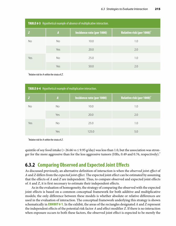
6.3 Strategies to Evaluate Interaction 215
TABLE 6-3 Hypothetical example of absence of multiplicative interaction.
Z A Incidence rate (per 1000) Relative risk (per 1000)*
No No 10.0 1.0
Yes 20.0 2.0
Yes No 25.0 1.0
Yes 50.0 2.0
*Relative risk for A within the strata of Z.
TABLE 6-4 Hypothetical example of multiplicative interaction.
Z A Incidence rate (per 1000) Relative risk (per 1000)*
No No 10.0 1.0
Yes 20.0 2.0
Yes No 25.0 1.0
Yes 125.0 5.0
*Relative risk for A within the strata of Z.
quintile of soy food intake (> 26.66 vs ≤ 9.95 g/day) was less than 1.0, but the association was stron-ger for the more aggressive than for the less aggressive tumors (HRs, 0.49 and 0.76, respectively).7
6.3.2 Comparing Observed and Expected Joint EffectsAs discussed previously, an alternative definition of interaction is when the observed joint effect of A and Z differs from the expected joint effect. The expected joint effect can be estimated by assuming that the effects of A and Z are independent. Thus, to compare observed and expected joint effects of A and Z, it is first necessary to estimate their independent effects.
As in the evaluation of homogeneity, the strategy of comparing the observed with the expected joint effects is based on a common conceptual framework for both additive and multiplicative models; the only difference between these models is whether absolute or relative differences are used in the evaluation of interaction. The conceptual framework underlying this strategy is shown schematically in EXHIBIT 6-1. In the exhibit, the areas of the rectangles designated A and Z represent the independent effects of the potential risk factor A and effect modifier Z. If there is no interaction when exposure occurs to both these factors, the observed joint effect is expected to be merely the
216 Chapter 6 Defining and Assessing Heterogeneity of Effects: Interaction
EXHIBIT 6-1 Conceptual framework of the definition of interaction based on comparing expected and observed joint effects.
*"Excess" due to positive interaction†“Deficit” due to negative interaction.Note: The rectangular areas denote the magnitude of the effects.
+ =A Z
Expected
Observed
+ =A Z
Expected
Observed
*
+ =A Z
A + Z
†
Expected
Observed
A. When there is no interaction, the observed joint effect of riskfactors A and Z equals the sum of their independent effects:
B. When there is positive interaction (synergism), the observedjoint effect of risk factors A and Z is greater than the expectedon the basis of summing their independent effects:
C. When there is negative interaction (antagonism), theobserved joint effect of risk factors A and Z is smaller than theexpected on the basis of summing their independent effects:
A + Z
A + Z
sum of their independent effects, as denoted by the area of the rectangle A + Z in Exhibit 6-1A. (The term sum is not used here in the context of a simple [arithmetic] sum, which would make it limited to the additive model; rather, it implies the combined effects of A and Z in either absolute or relative terms.) In Exhibit 6-1B, the observed joint effect exceeds the expected joint effect. The area to the

6.3 Strategies to Evaluate Interaction 217
right of the dotted line represents the excess caused by interaction. As the observed joint effect is greater than expected, there is positive interaction, or synergism. If the observed joint effect of A and Z is smaller than that expected, however, there is negative interaction, or antagonism (Exhibit 6-1C).
Detection of Additive Interaction: The Absolute Difference or Attributable Risk ModelWhen evaluating the presence of additive interaction by comparing observed and expected joint effects, the joint effect of A and Z is estimated as the arithmetic sum of the independent effects measured by the attributable risks in exposed individuals (ARexp). EXHIBIT 6-2 presents two hypo-thetical examples showing the absence (A) and presence (B) of additive interaction. The first step is to calculate incidence rates for each of the four table cells defined by the two factors A and Z. The cell representing the absence of both exposures (–/–) is designated as the single reference category. The observed attributable risks in Exhibit 6-2 represent the observed absolute incidence differences
EXHIBIT 6-2 Detection of interaction through the comparison of expected and observed joint effects: additive interaction.
A. No additive interaction present
Observedincidencerates/1000
Observedattributablerisks*/1000
A AZ Z
10.0 30.0 0.0 20.0
20.0 40.0 10.0 30.0
Joint expected AR = 10.0 + 20.0 = 30.0/1000Joint observed AR = 30.0/1000
B. Additive interaction present
Observedincidencerates/1000
Observedattributablerisks*/1000
A AZ Z
10.0 30.0 0.0 20.0
20.0 60.0 10.0 50.0
Joint expected AR = 10.0 + 20.0 = 30.0/1000Joint observed AR = 50.0/1000
++
+
+
+
+
+
+
–
–
–
–
–
–
–
–
*Attributable risk in the exposed.

218 Chapter 6 Defining and Assessing Heterogeneity of Effects: Interaction
TABLE 6-5 Assessment of interaction: additive model.
Factor Z Factor A Observed attributable risks represent
Absent Absent Reference category = 0.0
Absent Present Independent effect of A (i.e., in the absence of Z)(e.g., in Exhibit 6-2A, 30.0 – 10.0 = 20.0)
Present Absent Independent effect of Z (i.e., in the absence of A)(e.g., in Exhibit 6-2A, 20.0 – 10.0 = 10.0)
Present Present Joint effect of A and Z(e.g., in Exhibit 6-2A, 40.0 – 10.0 = 30.0)
between each category and the reference category. In this manner, it is possible to separate the ob-served independent effects of A and Z and thus to estimate their joint effect. The meanings of the different categories in Exhibit 6-2 are described in TABLE 6-5.
Estimation of the expected (Expd) joint effect of A and Z measured by the attributable risk is carried out by a simple sum of their independent observed (Obs) attributable risks, as follows:
Expd AR Obs AR Obs ARA Z A Z A Z+ + + − − += + (Eq. 6.1)
Thus, the expected joint attributable risk in the example shown in Exhibit 6-2A is (20.0 + 10.0 = 30.0)/1000. This expected joint effect is identical to the observed joint effect, thus indicating the absence of additive interaction. On the other hand, the observed joint attributable risk shown in Exhibit 6-2B of 50.0/1000 is higher than the expected joint AR of 30.0/1000, denoting positive additive interaction.
The expected joint effect can also be estimated by an expected (Expd) joint incidence (Inc), as follows:
Expd Inc Obs Inc Obs Inc Obs IncA Z A Z A Z A+ + − − + − −= + −( ZZ A Z A Z
A Z
− − + − −
− −
+ −= +
) )(Obs Inc Obs IncObs Inc Obs AR Obs ARA Z A Z+ − − ++
For example, for Exhibit 6-2B,
Expd IncA Z+ + = + − + − =[ . ( . . ) ( . . ) .10 0 30 0 10 0 20 0 10 0 40 0]] / 1000
which is less than the observed joint incidence of 60.0/1000, thus again denoting positive additive interaction.
Detection of Multiplicative Interaction: The Relative Difference or Ratio ModelThe strategy for detecting multiplicative interaction is analogous to that for detecting additive interaction; however, in the evaluation of multiplicative interaction, the expected joint effect is estimated by multiplying the independent relative effects of A and Z:
Expd RR Obs RR Obs RRA Z A Z A Z+ + + − − += × (Eq. 6.3)
(Eq. 6.2)

6.3 Strategies to Evaluate Interaction 219
EXHIBIT 6-3 Detection of interaction through the comparison of expected and observed joint effects: multiplicative interaction.
A. No multiplicative interaction present
Observedincidencerates/1000
Observedrelative
risks (RR)
A A
Z Z
10.0 30.0 1.0 3.0
20.0 60.0 2.0 6.0
Joint expected RR = 2.0 × 3.0 = 6.0Joint observed RR = 6.0
B. Multiplicative interaction present
Observedincidencerates/1000
Observedrelative
risks (RR)
A A
Z Z
10.0 30.0 1.0 3.0
20.0 90.0 2.0 9.0
Joint expected RR = 2.0 × 3.0 = 6.0Joint observed RR = 9.0
–
–
–
–
–
–
–
–
+
+
+
+
+
+
+
+
Independent and joint effects expressed by relative risks are shown in EXHIBIT 6-3, with inter-pretations akin to those for additive interaction based on Exhibit 6-2. In Exhibit 6-3A, the expected (3.0 × 2.0 = 6.0) and the observed joint effects are equal, suggesting no multiplicative interaction. In Exhibit 6-3B, the expected joint relative risk is also 6.0, but the observed joint relative risk is 9.0, denoting positive multiplicative interaction.
6.3.3 Examples of Interaction Assessment in a Cohort StudyData from a cohort study conducted in Washington County, Maryland, allow evaluation of additive and multiplicative interactions between father’s educational level and maternal smoking on the risks of neonatal and postneonatal deaths8 (TABLES 6-6 and 6-7). As shown in Table 6-6A, both the relative risks and the attributable risks for the maternal smoking/neonatal mortality associations are heterogeneous according to the educational level of the father, thus denoting both multiplica-tive and additive interactions, which express the magnification of the smoking effect on neonatal

220 Chapter 6 Defining and Assessing Heterogeneity of Effects: Interaction
TABLE 6-6 Neonatal death rates per 1000 live births according to smoking status of the mother and education of the father, Washington County, MD, 1953–1963.
A. Homogeneity strategy
Father’s education
Mother’s smoking
Estimated no. of live births
Rate/1000 live births
AR/1000 live births RR
9+ grades No 5967 14.9 Reference 1.0
Yes 3833 17.1 2.2 1.1
0–8 grades No 1967 16.4 Reference 1.0
Yes 767 46.1 29.7 2.8
B. Comparison of joint observed and expected effects
Father’seducation
Incidence/1000 live births AR/1000 live births RR
Mother’s smoking Mother’s smoking Mother’s smoking
No Yes No Yes No Yes
9+ grades (unexposed)
14.9 17.1 0 2.2 1.0 1.1
0–8 grades (exposed)
16.4 46.1 1.5 31.2 1.1 3.1
Expected joint effects:Additive → AR = 1.5 + 2.2 = 3.7/1000 live birthsMultiplicative → RR = 1.1 × 1.1 = 1.2
Observed joint effects:Additive → AR = 31.2/1000 live birthsMultiplicative → RR = 3.1
AR, attributable risk in the exposed; RR, relative risk.Data from Comstock GW, Lundin FE Jr. Parental smoking and perinatal mortality. Am J Obstet Gynecol. 1967;98:708-718.8
mortality when father’s educational level is low. (The heterogeneity in Table 6-6, however, may be due to residual confounding resulting from the use of broad educational and smoking categories; see Chapter 5, Section 5.4.3, and Chapter 7, Section 7.6. For purposes of this example, however, it is assumed that the heterogeneity is not due to residual confounding.) The interaction on both scales is confirmed when the joint observed and expected effects are compared in Table 6-6B. For the additive model, the observed joint attributable risk is 31.2/1000 live births, whereas the expected is only 3.7/1000 (i.e., 1.5 + 2.2). For the multiplicative model, observed and expected joint relative risks are 3.1 and 1.2, respectively. (As discussed later in Section 6.7.1, the results in Table 6.6 are

6.3 Strategies to Evaluate Interaction 221
TABLE 6-7 Postneonatal death rates per 1000 live births according to smoking status of the mother and education of the father, Washington County, MD, 1953–1963.
A. Homogeneity strategy
Father’s education
Mother’s smoking
Estimated no. of live births
Rate/1000 live births
AR/1000 live births RR
9+ grades (unexposed)
No 5967 6.1 Reference 1.0
Yes 3833 11.1 5.0 1.8
0–8 grades (exposed)
No 1967 12.3 Reference 1.0
Yes 767 19.8 7.5 1.6
B. Comparison of joint observed and expected effects
Father’seducation
Incidence/1000 live births AR/1000 live births RR
Mother’s smoking Mother’s smoking Mother’s smoking
No Yes No Yes No Yes
9+ grades (unexposed)
6.1 11.1 0 5.0 1.0 1.8
0–8 grades (exposed)
12.3 19.8 6.2 13.7 2.0 3.2
Expected joint effects:Additive → AR = 6.2 + 5.0 = 11.2/1000 live birthsMultiplicative → RR = 2.0 × 1.8 = 3.6
Observed joint effects:Additive → AR = 13.7/1000 live birthsMultiplicative → RR = 3.2
AR, attributable risk in the exposed; RR, relative risk.Data from Comstock GW, Lundin FE Jr. Parental smoking and perinatal mortality. Am J Obstet Gynecol. 1967;98:708-718.8
an example of qualitative interaction, as the rates related to the isolated presence of each factor are very similar to the reference rate but their joint presence results in a much higher rate than that of the reference category.)
In contrast, little or no interaction on either scale is apparent when assessing the association of maternal smoking and father’s education with postneonatal mortality (Tables 6-7A and 6-7B). The small differences between observed and expected joint effects (or the slight heterogeneity of effects) are probably due to random variability.

222 Chapter 6 Defining and Assessing Heterogeneity of Effects: Interaction
TABLE 6-8 Mortality rate per 100 patients after 1 year following coronary stenting for stable or unstable angina, according to gender and presence of diabetes, January 1995–July 2000.
A. Homogeneity strategy
Gender Diabetes Mortality/100 patients AR/100 RR
Men Absent 4.1 Reference 1.0
Present 6.1 2.0 1.5
Women Absent 3.4 Reference 1.0
Present 10.3 6.9 3.0
B. Comparison of joint observed and expected effects
Gender
Mortality/100 AR/100 RR
Diabetes absent
Diabetes present
Diabetes absent
Diabetes present
Diabetes absent
Diabetes present
Men (unexposed)
4.1 6.1 0 2.0 1.0 1.5
Women (exposed)
3.4 10.3 –0.7 6.2 0.83 2.5
Expected joint effects:Additive → AR = –0.7 + 2.0 = 1.3/100 patientsMultiplicative → RR = 0.83 × 1.5 = 1.2
Observed joint effects:Additive → AR = 6.2/100 patientsMultiplicative → RR = 2.5
AR, attributable risk in the exposed; RR, relative risk.Data from Ndrepepa G, Mehilli J, Bollwein H, Pache J, Schömig A, Kastrati A. Sex-associated differences in clinical outcomes after coronary stenting in patients with diabetes mellitus. Am J Med. 2004;117:830-836.9
The study by Ndrepepa et al.9 on the interaction between gender and diabetes in the prognosis of 4460 patients who underwent coronary stenting for stable or unstable angina is another example of how to assess interaction in a cohort (prognostic) study. The 1-year mortality after the proce-dure is shown in TABLE 6-8. In those exposed to diabetes, both the attributable risk and the relative risk are much higher in women than in men. When comparing the joint observed with the joint expected measures of association (Table 6-8B), the former is higher than the latter in both models, thus confirming the heterogeneity seen in Table 6-8A.

6.4 Assessment of Interaction in Case-Control Studies 223
6.4 Assessment of Interaction in Case-Control StudiesThe preceding discussion of the assessment of interaction has relied on absolute and relative mea-sures of risk (incidence rates, attributable risks, and relative risks) obtained in cohort studies. What follows is a discussion of the same concepts and strategies applied to the analysis of case-control data. Because cases and controls always originate from a cohort, even though not always well defined (see Chapter 1, Section 1.4.2), the concept of interaction does not have a distinct or special meaning in these studies. Thus, the discussion that follows merely aims at facilitating the application of the concept of interaction to the analysis of case-control data. The formulas presented in the following section are equally applicable to cohort and case-control studies.
6.4.1 Assessment of Homogeneity of EffectsIn a case-control study, the homogeneity strategy can be used to assess only multiplicative interaction. The reason for this is that absolute measures of disease risk are usually not available in case-control studies; thus, it is not possible to measure the absolute difference between exposed and unexposed, that is, the attributable risk (absolute excess risk) in those exposed to the main risk factor. As a result, the homogeneity of attributable risks (in exposed subjects) in strata formed by the potential effect modifier Z cannot be assessed in case-control studies. As shown in the next section, however, it is possible to assess additive interaction in a case-control study by using the strategy of comparing observed and expected joint effects.
In case-control studies, the assessment of the homogeneity of effects is typically based on the odds ratio. This assessment, as illustrated in TABLE 6-9, is analogous to the assessment of the homogeneity of relative risks. In Table 6-9, cases and controls are stratified according to categories of both the putative risk factor of interest A and the potential effect modifier Z. Different reference categories are used for the comparison of the odds ratios associated with A in the strata formed by Z: When Z is absent, the reference category—denoted by an odds ratio of 1.0—is that in which A is also absent. On the other hand, for the individuals exposed to Z, the reference category with an odds ratio of 1.0 is formed by subjects exposed to Z but unexposed to A. Thus, each odds ratio derived in Table 6-9 refers to the effect of A, first in the absence (upper half) and then in the presence (lower half) of Z.
TABLE 6-9 Outline of table illustrating the homogeneity strategy for assessing multiplicative interaction in case-control studies.
Exposed to A? Cases Controls Odds ratio What does it mean?
Z absentNo 1.0 Reference category
YesEffect of A in the absence of Z
Z presentNo 1.0 Reference category
YesEffect of A in the presence of Z

224 Chapter 6 Defining and Assessing Heterogeneity of Effects: Interaction
TABLE 6-10 The relationship of smoking and oral contraceptive (OC) use to the odds of myocardial infarction in women.
Heavy smoking* OC use Odds ratio What does it mean?
No No 1.0 Reference category
Yes 4.5 Effect of OC in nonsmokers
Yes No 1.0 Reference category
Yes 5.6 Effect of OC in heavy smokers
*≥ 25 cigarettes/day.Data from Shapiro S, Slone D, Rosenberg L, Kaufman DW, Stolley PD, Miettinen OS. Oral-contraceptive use in relation to myocardial infarction. Lancet. 1979;1:743-747.10
It is important to emphasize that the independent effect of Z cannot be estimated when this strategy is used (as the category, Z present and A absent is the reference category for exposure to A and thus set by definition at 1.0). This point should be kept in mind when contrasting this strategy with that of comparing observed and expected joint effects, described in the following section.
The interpretation of results presented in a setup such as that outlined in Table 6-9 is straight-forward: When multiplicative interaction is present, odds ratios will be dissimilar; when absent, they will be similar. For example, in the study by Shapiro et al.10 examining the interaction between use of oral contraceptives and heavy smoking on the odds of myocardial infarction (TABLE 6-10), the odds ratios were only somewhat heterogeneous (4.5 vs 5.6), indicating that multiplicative inter-action, if present, was not strong. (Shapiro et al. examined three smoking categories: none, 1 to 24 cigarettes/day, and ≥ 25 cigarettes/day. For simplification purposes, however, only the nonsmoking and heavy smoking categories are discussed in this and subsequent sections.) In contrast, in the study by Coughlin11 on the relationship between asthma and idiopathic dilated cardiomyopathy (TABLE 6-11), notwithstanding small numbers, the odds ratios appeared to be fairly heterogeneous according to the presence of hypertension, thus suggesting the presence of multiplicative interaction.
TABLE 6-11 Relationship of hypertension and asthma to idiopathic dilated cardiomyopathy.
Hypertension Asthma Odds ratio What does it mean?
No No 1.0 Reference category
Yes 2.4 Effect of asthma in normotensives
Yes No 1.0 Reference category
Yes 13.4 Effect of asthma in hypertensives
Data from Coughlin S. A Case-Control Study of Dilated Cardiomyopathy [doctoral disseration]. Baltimore, MD: The Johns Hopkins Bloomberg School of Public Health; 1987.11

6.4 Assessment of Interaction in Case-Control Studies 225
TABLE 6-12 Odds ratios for the association between maternal smoking and isolated clubfoot, according to family history of clubfoot.
Family history of clubfoot
Maternal smoking Cases (no.) Controls (no.) Odds ratio
Absent Absent 203 2143 1.00
Present 118 859 1.45
Present Absent 11 20 1.00
Present 14 7 3.64
Data from Honein MA, Paulozzi LJ, Moore CA. Family history, maternal smoking, and clubfoot: an indication of a gene-environment interaction. Am J Epidemiol. 2000;152:658-665.12
Another example of multiplicative interaction comes from the study by Honein et al.12 of the relationships of isolated clubfoot in the offspring with maternal smoking and a family history of clubfoot (TABLE 6-12). In this study, the odds ratio related to maternal smoking was higher if a family history of clubfoot were also present than if it were absent.
It has been pointed out by Morabia et al.13 that the odds ratios may be heterogeneous when relative risks are not, a phenomenon that these authors designated as interaction fallacy. Morabia et al. argued that although the likelihood of this “fallacy” is usually negligible in most real-life in-stances in chronic disease epidemiology, it may increase when the risk of the outcome is expected to be high (e.g., in an acute epidemic situation or when studying population groups in which there is a strong genetic susceptibility to the risk factor–induced disease).
6.4.2 Comparing Observed and Expected Joint EffectsThe strategy of comparing observed and expected joint effects in case-control studies is similar to the technique used when incidence data are available. That is, the independent effects of A and Z are estimated to compute the expected joint effect, which is then compared with the observed joint effect. When the expected and observed joint effects differ, interaction is said to be present.
TABLE 6-13 shows schematically how assessment of both additive and multiplicative interactions can be carried out in case-control studies using this strategy. In Table 6-13, independent effects (measured by odds ratios) of A and Z can be estimated by using a single reference category formed by individuals unexposed to both A and Z. The effect of A alone (i.e., the independent effect of A in absence of Z) is estimated by the odds of the category A+Z– relative to that of the reference category A–Z–. Similarly, the independent effect of Z is estimated by the ratio of the odds of the category A–Z+ to that of the reference category.
Detection of Additive InteractionAs mentioned previously, in case-control studies it is not possible to use Equations 6.1 or 6.2 ( Section 6.3.2), as they require incidence data that are usually not available when using this design.

226 Chapter 6 Defining and Assessing Heterogeneity of Effects: Interaction
TABLE 6-13 Outline of table to assess both additive and multiplicative interaction in case-control studies using the strategy of comparing expected and observed joint effects.
What is measured Exposed to Z? Exposed to A? Cases Controls Odds ratio
Reference category No No ORA–Z– = 1.0
Independent effect of A
No Yes ORA+Z–
Independent effect of Z
Yes No ORA–Z+
Observed joint effect Yes Yes ORA+Z+
*Generally, it is inappropriate to use an arithmetic scale on the ordinate as well as a baseline of zero to plot odds ratios when evaluating multiplicative interaction (see Chapter 9, Section 9.3.5). Figure 6-3 uses an arithmetic (additive) scale to facilitate an intuitive understanding of the formula for estimating the expected joint odds ratios when assessing additive interaction.
Thus, it is important to rewrite these equations in terms of relative risks or odds ratios so they can be applied to the case-control data shown schematically in Table 6-13. FIGURE 6-3 allows an intuitive derivation of a formula based on odds ratios that is equivalent to Equations 6.1 and 6.2.* In the figure, the baseline value (odds ratio = 1.0) shown in column 1 represents the odds for individuals unexposed to both A and Z. The absolute excesses due to A (column 2) and Z (column 3) are depicted by the
(1) OR = 1.0
(2) OR = 2.0(3) OR = 3.0
(4) OR = 4.0
(5) OR = 7.0
Baseline Baseline+ excessdue to A
BLBLBLBL BL
A
A A
I
ZZZ
Baseline+ excessdue to Z
Expectedjoint ORbased onaddingabsoluteindependentexcesses dueto A and Z
Observed joint OR >expected OR. Excessdue to I (interaction)is not explainable onthe basis of excessesdue to A and Z
FIGURE 6-3 Schematic representation of the meaning of the formula Expected ORA+Z+ = Observed ORA+Z– + Observed ORA–Z+ – 1.0. Note that, when the independent odds ratio for A and Z are added, the baseline is added twice; thus, it is necessary to subtract 1.0 from the expected joint OR; that is, Expected ORA+Z+ = (Excess due to A + baseline) + (Excess due to Z + baseline) – baseline = ORA+Z– + ORA–Z+ – 1.0.

6.4 Assessment of Interaction in Case-Control Studies 227
parts of the columns above the baseline. The expected joint effect (column 4) is then the baseline odds ratio plus the independent excess due to A plus the independent excess due to Z, as follows:
Expd OR Obs OR Obs ORA Z A Z A Z+ + + − − += + − + −1 0 1 0 1. ( . ) ( .001 0
).= + −+ − − +Obs OR Obs ORA Z A Z (Eq. 6.4)
Because two baselines are added in the equation, it is necessary to subtract 1.0 from the sum of the independent odds ratios. The formal derivation of Equation 6.4 is demonstrated as follows. Starting with Equation 6.2, in which Expd Inc and Obs Inc denote expected incidence and observed incidence, respectively (Section 6.3.2),
Expd Inc Obs Inc Obs Inc Obs IncA Z Z Z A Z A+ + − − + − −= + −( ZZ A Z A Z− − + − −+ −) )(Obs Inc Obs Inc
and dividing every term by Obs IncA–Z–, this equation can be expressed in terms of relative risk as
Expd RR Obs RR Obs RRA Z A Z A Z+ + + − − += + − + −1 0 1 0 1. ( . ) ( .00)
and thus,
Expd RR Obs RR Obs RRA Z A Z A Z+ + + − − += + − 1 0. (Eq. 6.5)
In a typical case-control study, the relative risks are estimated by the odds ratios, and thus, in Equation 6.5, relative risks can be replaced with odds ratios. Equations 6.4 and 6.5, although using odds ratio or relative risks, are based on absolute excesses (attributable risks in exposed) and thus estimate expected joint additive effects. An example is shown in TABLE 6-14, based on the same study used as an example in Table 6-10. The data in the table suggest that there is a strong additive interaction, as Obs ORA+Z+
= 39.0 and Expd ORA+Z+ = 10.5.
Similarly, using the example shown in Table 6-12, when setting the odds ratio for the combined category of absent family history and absent maternal smoking at 1.0, the independent effects of these variables on isolated clubfoot in the offspring are expressed by odds ratios of 5.81 and 1.45, respec-tively (see TABLE 6-15). Thus, the expected joint odds ratio is estimated at 5.81 + 1.45 – 1.0 = 6.26. As the observed joint odds ratio is 21.1, it can be concluded that strong additive interaction is present.
Note that Equation 6.5 cannot be used to assess additive interaction when one of the vari-ables (A or Z) has been matched for, as its odds ratio has been set at 1.0 by design (see Chapter 1, Section 1.4.5); in other words, the independent effect of a variable for which cases and controls have been matched cannot be determined. Because the homogeneity strategy cannot be used to examine additive interaction in case-control studies either, it follows that it is not possible to evaluate additive interaction between a matched factor and other factors in (matched) case-control studies.
Detection of Multiplicative InteractionIn case-control studies, the evaluation of multiplicative interaction based on comparing observed and expected joint effects is analogous to the strategy used in the context of a cohort study. Evaluation of multiplicative interaction comparing expected and observed joint effects is based on the same type of table as that used for assessing additive interaction (e.g., Table 6-14). The expected joint odds ratio is estimated as merely the product of the multiplication of the independent odds ratios,
Expd OR Obs OR Obs ORA Z A Z A Z+ + + − − += × (Eq. 6.6)
which is the analogue of Equation 6.3.

228 Chapter 6 Defining and Assessing Heterogeneity of Effects: Interaction
TABLE 6-14 Example of how to assess interaction on both scales in a case-control study using the formulas Expd ORA+Z+ = Obs ORA+Z– + Obs ORA–Z+ – 1.0 (additive) and Expd ORA+Z+ = Obs ORA+Z– × Obs ORA–Z+ (multiplicative): the relationship of heavy smoking and oral contraceptive (OC) use to the odds of myocardial infarction in women.
Heavy smoking (Z )* OC use (A) Odds ratio
No No 1.0
No Yes 4.5
Yes No 7.0
Yes Yes 39.0
Observed ORA+Z+: 39.0Expected ORA+Z+:
Additive model: 4.5 + 7.0 – 1.0 = 10.5Multiplicative model: 4.5 × 7.0 = 31.5
* ≥ 25 cigarettes/day.Data from Shapiro S, Slone D, Rosenberg L, Kaufman DW, Stolley PD, Miettinen OS. Oral-contraceptive use in relation to myocardial infarction. Lancet. 1979;1:743-747.10
TABLE 6-15 Odds ratios for the association between maternal smoking and isolated clubfoot, according to family history of clubfoot.
Family history of clubfoot
Maternal smoking Cases (no.) Controls (no.) Odds ratio
Absent Absent 203 2143 1.0
Present 118 859 (118/203) ÷ (859/2143) = 1.45
Present Absent 11 20 (11/203) ÷ (20/2143) = 5.81
Present 14 7 (14/203) ÷ (7/2143) = 21.1
Data from Honein MA, Paulozzi LJ, Moore CA. Family history, maternal smoking, and clubfoot: an indication of a gene-environment interaction. Am J Epidemiol. 2000;152:658-665.12
Note that these equations can also be used to assess multiplicative interaction when the odds ratio/relative risks are below 1.0. For multiplicative interaction, for example, if Obs ORA+Z–
= 0.5 and Obs ORA–Z+
= 0.4 (the reciprocal of 2.0 and 2.5, respectively), the Expd ORA+Z+ would be
0.5 × 0.4 = 0.2 (the inverse of 5.0).Using the findings in Table 6-14, it is possible to estimate the expected joint odds ratio as Expd
ORA+Z+ = 4.5 × 7.0 = 31.5. As this expected joint odds ratio is fairly close to the observed (39.0),

6.4 Assessment of Interaction in Case-Control Studies 229
TABLE 6-16 Hypothetical example of evaluation of interaction in a case-control study between smoking and alcohol use in which cases and controls are matched by current smoking (yes versus no).
Pair no. Smoking Cases ControlOdds ratio for alcohol use by
smoking*
1 No + –
ORalc | nonsmok = 2/1 = 2.0
2 No – +
3 No – –
4 No + –
5 No + +
6 Yes + –
ORalc | smok = 4/1 = 4.0
7 Yes + –
8 Yes – +
9 Yes + –
10 Yes + –
The signs (+) and (–) denote alcohol users and nonusers, respectively.*Using the ratio of discrepant pairs.
interaction, if present, is weak on the multiplicative scale, which is the same conclusion derived previously from using the homogeneity strategy (Section 6.4.1, Table 6-10). On the other hand, multiplication of the independent odds ratios in the family history of clubfoot/maternal smoking example results in a joint expected odds ratio of 8.42 (5.81 × 1.45), which is much lower than the joint observed odds ratio of 21.1 (Table 6-15). Thus, in addition to a strong additive interaction, there is also a strong multiplicative interaction of these variables with regard to the outcome, iso-lated clubfoot in the offspring, a finding that is consistent with the heterogeneity seen in Table 6-12.
As for additive interaction, this strategy cannot be used to evaluate multiplicative interaction between a matched variable and another factor, as the independent effect of the former cannot be measured. The homogeneity strategy, however, can be applied to assess multiplicative interaction in matched case-control studies. This is done by stratifying the matched sets according to the levels of the matched variables and evaluating homogeneity of the odds ratios across the strata. Thus, in the schematic example shown in TABLE 6-16, the heterogeneity of odds ratios for alcohol use (based on discrepant case-control pairs; see Chapter 3, Section 3.4.1) in strata formed by the matched variable, smoking (yes vs no), suggests the presence of multiplicative interaction. A summary of the issues related to the evaluation of interaction between the matched variable and another factor in matched case-control studies is given in TABLE 6-17.

230 Chapter 6 Defining and Assessing Heterogeneity of Effects: Interaction
TABLE 6-17 Summary of issues related to the evaluation of interaction in matched case-control studies using as an example smoking as the matched variable and alcohol as the exposure of interest.
Scale StrategyInformation needed
Is this strategy feasible? Why?
Additive Homogeneity of effects
ARs for alcohol use according to smoking
No Because incidence rates for alcohol according to smoking are unavailable in case-control studies.
Additive Observed vs expected joint effects
ORs expressing independent effects of smoking and of alcohol use
No The OR expressing the independent effect of smoking is unavailable because cases and controls have been matched for smoking.
Multiplicative Homogeneity of effects
ORs for alcohol use according to smoking
Yes ORs for alcohol use are available for case-control pairs according to smoking.
Multiplicative Observed vs expected joint effects
ORs expressing independent effects of smoking and alcohol use
No The OR expressing the independent effect of smoking is unavailable because cases and controls have been matched for smoking.
AR, attributable risks in exposed subjects; OR, odds ratio.
As stated at the beginning of this section, Equations 6.5 and 6.6 can also be used when assessing interaction in cohort studies. For example, using the relative risks from Table 6-6, it is possible to construct a table similar to Table 6-13 (TABLE 6-18). In Tables 6-6 and 6-18, the father’s educational level of 0 to 8 grades was categorized as “exposed.” The expected joint effects are expressed by relative risks of (1.1 + 1.1 – 1.0) = 1.2 in an additive scale and (1.1 × 1.1) = 1.2 in a multiplicative scale. The difference between these expected values and the observed joint relative risk of 3.1 leads to the same conclusion reached previously using incidence rates to calculate attributable risks and relative risks (Table 6-6), that there is interaction in both scales.
Another example is a cohort study of olfaction and risk of dementia in a biracial cohort of adults aged 70–79 years at baseline.14 Results of the association of olfaction with dementia ac-cording to race are shown in TABLE 6-19. For the purpose of this example, race is considered as the effect modifying variable (considering “white race” as the effect modifier being “present”) and poor olfaction as the “exposed” category. The expected joint effects are expressed by hazard ratios of (1.4 + 1.3 – 1.0) = 1.7 in an additive scale and (1.3 × 1.4) = 1.8 in a multiplicative scale. The

6.5 More on the Interchangeability of the Definitions of Interaction 231
TABLE 6-18 Neonatal death rates per 1000 live births according to smoking status of the mother and education of the father, Washington County, MD, 1953–1963.
Father’s education (grades) Mother’s smoking Rate/1000 live births Relative risk
Higher (9+) (unexposed) No 14.9 1.0
Higher (9+) (unexposed) Yes 17.1 1.1
Lower (0–8) (exposed) No 16.4 1.1
Lower (0–8) (exposed) Yes 46.1 3.1
Data from Comstock GW, Lundin FE Jr. Parental smoking and perinatal mortality. Am J Obstet Gynecol. 1967;98:708-718.8
TABLE 6-19 Risk of dementia associated with odor identification performance according to race.
Race Olfaction Hazard ratio
Black Moderate (unexposed) 1.0
Black Poor (exposed) 1.4
White Moderate (unexposed) 1.3
White Poor (exposed) 3.4
Data from Yaffe K, Freimer D, Chen H, et al. Olfaction and risk of dementia in a biracial cohort of older adults. Neurology. 2017;88:456-462.14
difference between these expected values and the observed joint relative risk of 3.4 leads to the conclusion that there is interaction in both scales.
6.5 More on the Interchangeability of the Definitions of InteractionIt can easily be shown mathematically that the two definitions of interaction (i.e., based on homoge-neity of effects or on the comparison between observed and expected joint effects) are interchange-able; that is, if the effects are heterogeneous, then the observed is different from the expected joint

232 Chapter 6 Defining and Assessing Heterogeneity of Effects: Interaction
effect and vice versa. Consider, for example, two variables, A and Z, and their potential effects with regard to a given outcome. To evaluate joint additive effects under the hypothesis of no interaction,
Expd RRA+Z+ = Obs RRA+Z+ = Obs RRA+Z– + Obs RRA–Z+ – 1.0 (Eq. 6.7)
The equation can be rewritten as
Obs RRA+Z+ – Obs RRA–Z+ = Obs RRA+Z– – 1.0 (Eq. 6.8)
As shown previously (Section 6.4.2), to derive relative risks from the formula for assessing the expected joint additive effect, all incidence terms in the equation are divided by the incidence when both factors are absent (i.e., IncA–Z–). Working backward, the incidence when both factors are absent times the relative risk for a given exposed category equals the incidence in that exposed category (e.g., IncA+Z–
= IncA–Z– × RRA+Z–). Thus, Equation 6.8 is equivalent to
IncA+Z+ – IncA–Z+ = IncA+Z– – IncA–Z– (Eq. 6.9)
Therefore, when the observed joint additive effect of A and Z is the same as the expected effect (Equation 6.7), the effect of A in the presence of Z will be the same as the effect of A in the absence of Z (Equation 6.9). Alternatively, when the observed joint effects are different from the expected joint effects (i.e., interaction is present), the effects of A will vary according to the presence or absence of Z.
The same reasoning applies to the assessment of multiplicative interaction. For example, under the assumption of no interaction on a multiplicative scale,
Expd RRA+Z+ = Obs RRA+Z+ = Obs RRA+Z– × Obs RRA–Z+ (Eq. 6.10)
Equation 6.10 can be rewritten as
Obs RRObs RR
Obs RRA Z
A Z
A Z+ +
− +
+ −=1 0.
(Eq. 6.11)
The equivalence of Equations 6.10 and 6.11 means that when the observed joint effects are equal to the multiplication of the independent effects (Equation 6.10), then the relative risk for one factor does not vary as a function of the level of the other factor (Equation 6.11) and vice versa.
6.6 Which Is the Relevant Model? Additive or MultiplicativeThe popularity of the Mantel-Haenszel adjustment approach (Chapter 7, Section 7.3.3) and the multiple regression methods based on multiplicative models (Chapter 7, Sections 7.4.3 through 7.4.6) has often led to equating interaction almost exclusively with multiplicative interaction when studying dichotomous outcomes. If the odds ratios or relative risks are homogeneous across strata of a potential effect modifier, it may be erroneously concluded that there is no interaction in gen-eral, even though this conclusion applies exclusively to multiplicative interaction. Yet, as discussed later in this chapter, additive interaction may be of greater interest if disease prevention is being contemplated. Thus, even when using the odds ratio or the relative risk to describe study data, it is often important to also explore the presence of additive interaction. Evaluation of additive interaction can be carried out even in the context of inherently multiplicative models, such as the logistic regression and Cox models.15,16
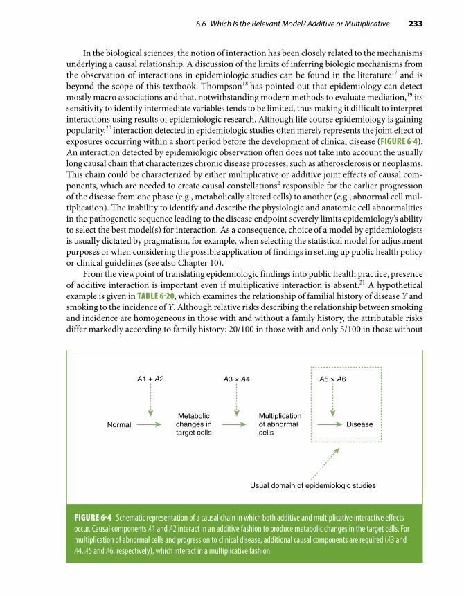
6.6 Which Is the Relevant Model? Additive or Multiplicative 233
In the biological sciences, the notion of interaction has been closely related to the mechanisms underlying a causal relationship. A discussion of the limits of inferring biologic mechanisms from the observation of interactions in epidemiologic studies can be found in the literature17 and is beyond the scope of this textbook. Thompson18 has pointed out that epidemiology can detect mostly macro associations and that, notwithstanding modern methods to evaluate mediation,19 its sensitivity to identify intermediate variables tends to be limited, thus making it difficult to interpret interactions using results of epidemiologic research. Although life course epidemiology is gaining popularity,20 interaction detected in epidemiologic studies often merely represents the joint effect of exposures occurring within a short period before the development of clinical disease (FIGURE 6-4). An interaction detected by epidemiologic observation often does not take into account the usually long causal chain that characterizes chronic disease processes, such as atherosclerosis or neoplasms. This chain could be characterized by either multiplicative or additive joint effects of causal com-ponents, which are needed to create causal constellations2 responsible for the earlier progression of the disease from one phase (e.g., metabolically altered cells) to another (e.g., abnormal cell mul-tiplication). The inability to identify and describe the physiologic and anatomic cell abnormalities in the pathogenetic sequence leading to the disease endpoint severely limits epidemiology’s ability to select the best model(s) for interaction. As a consequence, choice of a model by epidemiologists is usually dictated by pragmatism, for example, when selecting the statistical model for adjustment purposes or when considering the possible application of findings in setting up public health policy or clinical guidelines (see also Chapter 10).
From the viewpoint of translating epidemiologic findings into public health practice, presence of additive interaction is important even if multiplicative interaction is absent.21 A hypothetical example is given in TABLE 6-20, which examines the relationship of familial history of disease Y and smoking to the incidence of Y. Although relative risks describing the relationship between smoking and incidence are homogeneous in those with and without a family history, the attributable risks differ markedly according to family history: 20/100 in those with and only 5/100 in those without
A1 + A2 A3 × A4 A5 × A6
NormalMetabolic
changes intarget cells
Multiplicationof abnormalcells
Disease
Usual domain of epidemiologic studies
FIGURE 6-4 Schematic representation of a causal chain in which both additive and multiplicative interactive effects occur. Causal components A1 and A2 interact in an additive fashion to produce metabolic changes in the target cells. For multiplication of abnormal cells and progression to clinical disease, additional causal components are required (A3 and A4, A5 and A6, respectively), which interact in a multiplicative fashion.

234 Chapter 6 Defining and Assessing Heterogeneity of Effects: Interaction
TABLE 6-20 Hypothetical example of additive interaction (public health interaction) without multiplicative interaction: incidence of disease Y by smoking and family history of Y.
Family history Smoking Incidence/100Attributable
risk (exposed) Relative risk
Absent No 5.0 Reference 1.0
Yes 10.0 5.0/100 2.0
Present No 20.0 Reference 1.0
Yes 40.0 20.0/100 2.0
TABLE 6-21 Hypothetical example of negative multiplicative and positive additive interactions: incidence of disease Y by smoking and family history of Y.
Family history Smoking Incidence/100Attributable
risk (exposed) Relative risk
Absent No 10.0 Reference 1.0
Yes 40.0 30.0/100 4.0
Present No 40.0 Reference 1.0
Yes 100.0 60.0/100 2.5
a positive family history. Thus, there is strong additive interaction but no multiplicative interac-tion. Depending on the prevalence of the combination of family history and smoking in the target population, prevention or elimination of smoking in those with a positive, compared with those with a negative, family history could lead to a greater reduction in the number of incident cases in the reference population.* Positive additive interaction may even occur in the presence of negative multiplicative interaction (TABLE 6-21) and takes precedence over the latter in terms of defining high-risk groups, which should be the target of preventive action.
*The impact of the elimination of smoking in those with a family history is best estimated by means of the population attributable risk, which takes into account the strength of the association between smoking and disease in each stratum of family history as well as the prevalence of the joint presence of these factors (see Chapter 3, Section 3.2.2).

6.7 The Nature and Reciprocity of Interaction 235
6.7 The Nature and Reciprocity of Interaction6.7.1 Quantitative Versus Qualitative InteractionWhen the association between factor A and outcome Y exists and is of the same direction in each stratum formed by Z but the strength of the association varies across strata, quantitative interaction is said to exist. On the other hand, qualitative interaction is regarded as present when either the effects of A on the outcome Y are in opposite directions (crossover) according to the presence of the third variable Z or there is an association in one of the strata formed by Z but not in the other (FIGURE 6-5). In other words, the nature of A is dependent on the presence of the effect modifier Z.
An example of qualitative interaction is given in a study by Stanton and Gray.22 To examine the effects of caffeine consumption on waiting time to conception, the authors obtained information retrospectively on pregnancies occurring from 1980 through 1990 in 1430 noncontracepting women who had been pregnant at least once. The main exposure of interest was daily caffeine intake, esti-mated from the consumption of caffeinated beverages during the first month of pregnancy. Whereas the odds ratios of delayed conception (> 1 year) were below 1 for caffeine consumption among smoking women, an increase in delayed conception odds was seen in nonsmoking women with a high (≥ 300 mg/day) caffeine consumption (TABLE 6-22). According to the authors, the qualitative interaction found in their study supports findings from previous studies that smoking increases the rate of caffeine clearance and that, as a result, caffeine elimination is slower in nonsmokers.
In the example shown in Table 6-22, the point estimates of the effects of high caffeine consump-tion appear to cross over as a function of smoking (i.e., there is a positive association of high caffeine intake with delayed conception in nonsmokers and a negative association in smokers). Qualitative
A– A+ A+A–
Y Y
+ (RR > 1.0, AR > 0)
– (RR < 1.0, AR < 0)
+ (RR > 1.0, AR > 0)
– (RR = 1.0, AR = 0)
BA
Z
Z Z
Z
A = exposure of interestZ = effect modifierY = risk of outcome
FIGURE 6-5 Qualitative interaction is always seen in both scales (additive and multiplicative) because when the relative risk (RR) > 1.0, the attributable risk (AR) > 0; when RR < 1.0, the AR < 0; and when RR = 1.0, the AR = 0. In (A), there is crossover; that is, RRA+/A– > 1.0 and ARA+/A– > 0 when Z (effect modifier) is present, and RRA+/A– < 1.0 and ARA+/A– < 0 when Z is absent. In (B), RRA+/A– > 1.0 and ARA+/A– > 0 when Z is present, and RRA+/A– = 1.0 and ARA+/A– = 0 when Z is absent.

236 Chapter 6 Defining and Assessing Heterogeneity of Effects: Interaction
TABLE 6-22 Relationship between caffeine consumption and odds of delayed conception (> 1 year) according to smoking among 2465 pregnancies occurring in noncontracepting women between 1980 and 1990.
Caffeine consumption (mg/day)
Nonsmoking women Smoking women
PregnanciesDelayed
conception OR PregnanciesDelayed
conception OR
None 575 47 1.0 76 15 1.0
1–150 975 69 0.9 233 33 0.7
151–300 290 26 1.1 166 18 0.5
≥ 300 89 17 2.3 83 11 0.7
OR, odds ratio.Data from Stanton CK, Gray RH. Effects of caffeine consumption on delayed conception. Am J Epidemiol. 1995;142:1322-1329.22
interaction can be expressed by either this type of crossover (Figure 6-5A) or an association between the factor of interest and the outcome in the presence but not in the absence of an effect modifier (or vice versa) (Figure 6-5B). Examples of the latter type of qualitative interaction are as follows:
■ The results of the Health Insurance Plan randomized clinical trial of the effectiveness of mam-mography showed that menopausal status seemed to modify the effect of mammography.23 Specifically, in this study a lower breast cancer death rate in the group undergoing mammography compared with the control group was seen only in postmenopausal women. In premenopausal women, no difference in rates was found between the experimental and the control groups.
■ In a large population-based cohort study conducted in Sweden on the relationship of paternal age to schizophrenia,24 the hazard ratio was found to be 1.60 for individuals without a family history and close to 1.0 for those with a family history (p for interaction = 0.04; see Section 6.9). (The authors interpreted this finding as supportive of the notion that accumulating de novo mutations in germ cells of older fathers might result in an increased risk of schizophrenia in their offspring.)
■ In a study by Williams et al.,25 although high anger proneness score was associated with an increased coronary heart disease (CHD) risk in normotensive individuals, no association was seen for hypertensive patients (FIGURE 6-6). This pattern, if true, denotes a negative interaction, that is, antagonism between hypertension and high anger score with regard to the outcome.
■ In a cohort study conducted by Shanmugham et al.,26 a strong heterogeneity was seen for the association of alcohol and oral cancer across strata formed by folate intake in women: The relative risk for alcohol intake equal to ≥ 30 g/day in those with a low folate intake (< 350 µg/day) was 3.36, but it was 0.98 for those with a high folate intake (≥ 350 µg/day).
■ In the study of the relationship of low educational status of the father (≤ grade 8) and mother’s smoking with regard to neonatal death rates (Table 6-6),8 each of these factors was unrelated

6.7 The Nature and Reciprocity of Interaction 237
1.00
0.98
0.96
0.94
0.92
0 200 400 600 800 1000 1200 1400 1600 1800 2000
CH
D–f
ree
surv
ival
pro
babi
litie
s
Days of follow–up
A
FIGURE 6-6 Example of qualitative interaction. Coronary heart disease event-free survival (Kaplan-Meier estimates) according to anger proneness among nonhypertensive (A) and hypertensive cohort participants (B) of the Atherosclerosis Risk in Communities (ARIC) Study. Anger proneness was classified in three levels (low, moderate, high) based on an overall anger score obtained from the 10-item Spielberger Trait Anger Scale.
1.00
0.98
0.96
0.94
0.92
0 200 400 600 800 1000 1200 1400 1600 1800 2000
CH
D–f
ree
surv
ival
pro
babi
litie
s
Days of follow–up
Low (10–14)Moderate (15–21)High (22–40)
B
Williams JE, Paton CC, Siegler IC, Eigenbrodt ML, Nieto FJ, Tyroler HA. Anger proneness predicts coronary heart disease risk: prospective analysis from the Atherosclerosis Risk in Communities (ARIC) Study. Circulation. 2000;101:2034-2039.25 http://circ.ahajournals.org/content/101/17/2034

238 Chapter 6 Defining and Assessing Heterogeneity of Effects: Interaction
to the outcome, with rate ratios very close to 1.0, but their joint presence resulted in a rate ratio of 3.1. In this study, the attributable risks in those exposed to only a paternal low educational status or maternal smoking were close to zero, but their joint presence yielded an attributable risk of 31.2/1000 live births.
■ In Loomba et al.’s cohort study,27 there was almost no difference in the hazard of hepatocellular carcinoma between obese (BMI ≥ 30) and nonobese individuals not drinking alcohol, whereas in alcohol drinkers (defined as those who had consumed alcohol at least 4 days per week for at least 1 year), the hazard ratio comparing obese to nonobese was 3.8.
These examples underscore the notion that, when qualitative interaction is present, it is always present in both the additive and the multiplicative models and is thus independent of the measure-ment scale (Figure 6-5). Consider, for example, the data shown in Table 6-22. Because the relative risk in nonsmoking women with a caffeine consumption of ≥ 300 mg/day is greater than 1.0, the attributable risk by definition must be greater than 0, whereas in smokers, the relative risk for caffeine consumption of ≥ 300 mg/day is less than 1.0, and thus, by definition, the attributable risk has to be less than 0. Although Table 6-22 presents only relative risks and, therefore, at first glance, may be regarded as particularly suitable for assessing multiplicative interaction, the occurrence of qualitative interaction indicates that interaction is present in both scales; in other words, when there is qualitative interaction, the scale does not need to be specified. A similar inference can be drawn from the study of paternal age and schizophrenia mentioned previously: As the relative risk in those without a family history is 1.60, the attributable risk by definition has to be greater than zero. On the other hand, as the relative risk in those with a family history is close to 1.0, the attributable risk will be close to zero. Similarly, because the data in Figure 6-6 are based on absolute differences in cumulative incidence (or event-free survival)—denoted by the fact that the scale on the ordinate is arithmetic—they imply the presence of an additive interaction between hypertension status and anger proneness in relation to risk of CHD; however, because this interaction is qualitative (a difference was shown among normotensives but not among hypertensives), it must also be present in a multiplicative scale. Indeed, the age-adjusted relative hazard comparing individuals with high and low anger scores reported by Williams et al.25 was 2.97 among normotensives and 1.05 among hypertensives.
6.7.2 Reciprocity of InteractionInteraction is completely reciprocal in that, if Z modifies the effect of A, then A modifies the effect of Z. As mentioned previously, the choice of A as the suspected risk factor of interest and Z as the potential effect modifier is arbitrary and a function of the hypothesis being evaluated. For example, because the effect of cigarette smoking on lung cancer is strong and has been firmly established, it may be of interest to explore its role as an effect modifier when assessing other potential lung cancer risk factors. Factors that cannot be modified (e.g., genes, gender) are often treated as effect modifiers.
The concept of interaction reciprocity is illustrated in TABLE 6-23, which rearranges the data from Table 6-22 such that smoking becomes the risk factor of interest and caffeine consumption becomes the effect modifier (for simplification purposes, only the two extreme caffeine consumption categories are used). As seen, smoking is positively associated with delayed conception in mothers who consume no caffeine, but it seems to be a protective factor in those with a high level of con-sumption. This pattern is the mirror image of the pattern shown in Table 6-22, again emphasizing that there is no intrinsic hierarchical value when deciding which variable should be treated as the effect modifier and which as the factor of primary interest.

6.8 Interaction, Confounding Effect, and Adjustment 239
TABLE 6-23 Relationship between maternal smoking and risk of delayed conception (> 1 year) according to heavy caffeine consumption (≥ 300 mg/day) among 824 pregnancies occurring in noncontracepting women between 1980 and 1990.
Smoking
No caffeine consumption Caffeine consumption ≥ 300 mg/day
PregnanciesDelayed
conceptionOdds ratio Pregnancies
Delayed conception
Odds ratio
No 575 47 1.0 90 17 1.0
Yes 76 15 2.4 83 11 0.7
Data from Stanton CK, Gray RH. Effects of caffeine consumption on delayed conception. Am J Epidemiol. 1995;142:1322-1329.22
6.8 Interaction, Confounding Effect, and AdjustmentAlthough on occasion the same variable may be both a confounder and an effect modifier, con-founding and interaction are generally distinct phenomena. Confounding effects are undesirable, as they make it difficult to evaluate whether a statistical association is also causal. Interaction, on the other hand, if true, is part of the web of causation28 and may have important implications for prevention, as in the example of anger and CHD shown in Figure 6-6.
When a variable is found to be both a confounding variable and an effect modifier, adjustment for this variable is contraindicated. When additive interaction is found, it is not appropriate to ad-just for the effect modifier to obtain an adjusted attributable risk, and when there is multiplicative interaction, it is inappropriate to obtain an effect modifier–adjusted relative risk or odds ratio. This is because, when there is interaction, the notion of an overall adjusted (weighted) mean value (main effect) makes little sense. For example, if odds ratios are found to be 2.0 for men and 25.0 for women, an “average” that summarizes the increase in odds for all individuals regardless of gender is meaningless. This notion is even more important in qualitative interaction; if the odds ratios for a given exposure are 0.3 for men and 3.5 for women, an “average, gender-adjusted” odds ratio may denote no association whatsoever—an illogical inference given that strong associations, albeit in opposite directions, exist in both sexes (for additional examples, see Chapter 7, Section 7.3.1).
Because some degree of heterogeneity is usually found (sometimes simply due to random variability; see Section 6.10.1), the epidemiologist is often faced with the dilemma as to whether to adjust for the possible effect modifier. One solution is to carry out statistical testing and not adjust if the homogeneity null hypothesis is rejected (see Section 6.9 and Appendix C). If, for example, the two odds ratios are 2.3 and 2.6, however, it is probably appropriate to adjust and obtain an average adjusted effect regardless of the p value. (If the sample size is very large, a small degree of heteroge-neity may be statistically significant even if devoid of medical or public health significance). On the other hand, if the odds ratios are 12.0 and 1.5, even if the heterogeneity is not found to be statistically significant, adjustment may be contraindicated. Although no clear-cut rule exists regarding whether

240 Chapter 6 Defining and Assessing Heterogeneity of Effects: Interaction
TABLE 6-24 Relative risks (RR) for factor A in relation to outcome Y, stratified by potential effect modifier Z.
Suspected effect modifier (Z) Given a heterogeneity of this magnitude, should a weighted average (Z-adjusted) effect that applies to all Z strata of the study population be reported?Absent Present
2.3 2.6 Yes. Even if the difference in RRs is statistically significant, it makes sense to say that, on the average—that is, regardless of Z—the relative risk has a value somewhere between 2.3 and 2.6.
2.0 20.0 Even if this difference is not statistically significant, presentation of a Z-adjusted, “average” RR may not be appropriate in view of the great difference in the magnitude of the RRs. It is recommended that Z-specific RRs be presented.
0.5 3.0 No. When there is a suggestion of qualitative interaction, Z-specific RRs should be presented.
3.0 4.5 Perhaps. Although this quantitative interaction may be of interest, effects are in the same direction, and it may be appropriate to present a Z-adjusted RR. In addition, it is wise to present Z-specific RRs as well.
to adjust in the presence of heterogeneity, consideration of the following question may be helpful: “Given heterogeneity of this magnitude, am I willing to report an average (adjusted) effect that is reasonably representative of all strata of the study population formed on the basis of the suspected effect modifier?” Some examples and possible answers to this question are shown in TABLE 6-24 and may help in the pragmatic evaluation of this issue. Regardless of whether a “Z-adjusted” effect is reported, it is often informative to report the stratum-specific values as well.
6.8.1 Joint Presence of Two Factors That Interact as a Confounding VariableWhen there is interaction, the joint presence of variables that interact may produce a confounding effect even if each individual variable is not identified as a confounder. In the interaction example shown in TABLE 6-25, the incidence of the outcome is the same in individuals exposed to factor A as it is to unexposed individuals when data are stratified by factors B and C and their joint presence. However, because the prevalence of the joint presence of B and C is higher in those exposed to A and there is strong interaction between B and C, the crude incidence is greater in the individuals exposed to A than in the unexposed. Note that the risk factor distributions are the same in exposed and unexposed when their joint presence is ignored. Thus, the joint presence of interacting risk factors should always be considered when evaluating confounding effects. A schematic represen-tation of interaction as a confounding variable is shown in FIGURE 6-7.

6.9 Statistical Modeling and Statistical Tests for Interaction 241
TABLE 6-25 Hypothetical example of interaction as a confounding variable. Assume the incidence of the outcome in the absence of factors B and C to be zero in both individuals exposed to A and those unexposed to A. When stratified by the isolated presence of each factor (B and C) and the interaction (joint effect), there is no association between B and C or their interaction with the incidence of the outcome. However, as the joint effect is related to a higher incidence and is more common in the exposed group, the total incidence in the exposed group is substantially greater than that in the unexposed group.
FactorPrevalence of factor among exposed and
among unexposed to A (%)Incidence of outcome
(per 1000)
Exposed to factor A
B alone 18 10
C alone 20 15
B + C present 15 50
Unexposed to factor A
B alone 18 10
C alone 20 15
B + C present 3 50
Total incidence in exposed to A = [(0.010 × 0.18) + (0.015 × 0.20) + (0.050 × 0.15)] × 1000 = 12.3 (per 1000)
Total incidence in unexposed to A = [(0.010 × 0.18) + (0.015 × 0.20) + (0.050 × 0.03)] × 1000 = 6.3 (per 1000)
6.9 Statistical Modeling and Statistical Tests for InteractionThe examples given in this chapter refer to risk of disease as the outcome, but interaction may be studied in relationship to any outcome (e.g., the mean value of a physiologic variable, such as glucose level). As mentioned previously, it is also possible to examine interaction for continuous
Cases Controls
A AB BA * B A*B
FIGURE 6-7 Interaction as a source for confounding. The isolated distributions of A and B are the same in cases and controls (represented by the areas of the circles). However, the presence of a stronger joint effect between A and B represented by the overlapping areas (the “interaction term” A * B; see Section 6.9) is more common in cases than in controls and may act as a confounding variable.

242 Chapter 6 Defining and Assessing Heterogeneity of Effects: Interaction
variables, as when assessing homogeneity of effects of continuous blood pressure levels on stroke between men and women or between blacks and whites. In this situation, the investigator often uses more complex statistical approaches to evaluate interaction, for example, by including “interaction terms” in the regression equation (see Chapter 7, Section 7.4.2). These models can also be used to evaluate interaction between categorical variables as an alternative to the stratification methods presented in the previous sections.
Another question with important practical implications is whether the observed heterogeneity is produced by chance. When using regression models to evaluate interaction, the answer to this question is simply indicated by the statistical significance of the interaction term in the regression equation (see Chapter 7, Section 7.4.8, and Appendix A, Section A.9). When evaluating interaction using the stratification techniques described in the previous sections, formal statistical tests are available to assess whether an observed heterogeneity is statistically significant. These tests, in-cluding tests for additive interaction in case-control studies, have been described in detail in other textbooks (see, e.g., Schlesselman29 or Selvin30) and are illustrated in Appendix C.
It should be emphasized again that statistical tests of homogeneity, although helpful, are not sufficient to evaluate interaction fully. When sample sizes are large, as in multicenter studies, even a slight heterogeneity of no practical value or biologic importance may be statistically significant. On the other hand, although not statistically significant, relative risk point estimates that are markedly different from each other suggest the possibility of true heterogeneity. Ideally, such nonstatistically significant yet marked heterogeneity should be confirmed by a study with sufficient statistical power to detect it.
6.10 Interpreting InteractionThere are many reasons an observed effect of an exposure may differ according to the level or the presence of a third variable. The apparent heterogeneity may be due to chance, selective confound-ing, or bias. It could, in addition, result from a heterogeneous exposure dose (often unbeknownst to the investigator). Differential susceptibility at different levels in the pathogenesis of the disease in question is yet another explanation for heterogeneity of effects. A succinct practical guide to the main issues involved in interpreting an observed interaction follows.
6.10.1 Heterogeneity due to Random VariabilityHeterogeneity may result from random variability produced by the stratification by a suspected effect modifier. Random variability may occur in spite of an a priori specification of interaction in the context of the hypothesis to be evaluated. A more common situation, however, is when interaction is not specified a priori but the investigator decides to carry out subgroup analysis. The decision to examine subgroups is often motivated by overall null study findings. The investigator may decide to pursue more specific hypotheses once the original postulated association was not observed. Post hoc questions posed by the frustrated epidemiologist may, for example, include the following: “Since I cannot find an association when studying all study participants, will I be able to find it in men only? In older men? In older men with a high educational level?” And so on.
Sample size inevitably decreases as more strata are created in subgroup analysis, making it likely that heterogeneity would occur by chance alone. Thus, subgroup analysis should be regarded as an exploratory strategy. The detection of heterogeneity should be assessed vis-à-vis its plausibility. An example is provided by the Multiple Risk Factor Intervention Trial, a randomized clinical trial that assessed the effectiveness of multiple cardiovascular risk factor cessation strategies. An increased

6.10 Interpreting Interaction 243
TABLE 6-26 Apparent interaction due to confounding (hypothetical example).
Gender/smoking Coffee intake Cases Controls Odds ratio
Female/nonsmoker
Yes 10 10
1.0No 90 90
Total 100 100
Male/total Yes 38 22
2.2No 62 78
Total 100 100
Male/smoker Yes 35 15
1.0No 35 15
Total 70 30
Male/nonsmoker
Yes 3 7
1.0No 27 63
Total 30 70
Assume that smoking causes cancer Y, 50% of smokers but only 10% of nonsmokers drink coffee, coffee intake is not independently related to cancer Y, all females are nonsmokers, and 70% of male cases and 30% of male controls are smokers.
mortality was found in hypertensive participants with electrocardiographic changes undergoing the experimental interventions.31 Although not predicted when the study was planned, the harmful effect of the intervention limited to this subset of study participants led to the biologically plausible hypothesis that potassium-depleting drugs may be contraindicated in hypertensive patients with cardiac abnormalities. After being observed by means of subgroup analysis, interaction has to be confirmed in a study especially designed to evaluate it.
6.10.2 Heterogeneity due to ConfoundingWhen associations between A and Y in strata formed by Z are being explored, differential con-founding effects across strata may be responsible for the heterogeneity of effects. As a hypothetical example, consider a case-control study assessing the relationship between coffee intake and cancer Y (TABLE 6-26). The investigator wishes to assess gender as an effect modifier and accordingly stratifies cases and controls by gender and coffee intake (yes/no). In this hypothetical example, smoking is a cause of cancer Y, female cases and controls include only nonsmokers, smoking is associated with coffee drinking, and male cases include a higher proportion of smokers than controls. As smoking

244 Chapter 6 Defining and Assessing Heterogeneity of Effects: Interaction
TABLE 6-27 Relative risks of liver cirrhosis according to alcohol drinking and cigarette smoking in chronic HBsAg carriers.
Variable Total no.No. of incident
cases
Relative risk
Without adjustment
With multivariate adjustment*
Nondrinker
Nonsmoker 744 31 1.0 1.0
< 20 cigarettes/day 267 19 1.7 1.5
≥ 20 cigarettes/day 167 14 2.0 1.9
Drinker
Nonsmoker 111 1 1.0 1.0
< 20 cigarettes/day 100 6 6.7 3.9
≥ 20 cigarettes/day 105 7 7.4 9.3
*Simultaneously adjusted for age, HBsAg carrier status at recruitment, elevation of serum aminotransferase concentration for at least 6 months, educational level, and blood type using a Cox proportional hazards model (see Chapter 7, Section 7.4.4).Data from Yu MW, Hsu FC, Sheen IS, et al. Prospective study of hepatocellular carcinoma and liver cirrhosis in asymptomatic chronic hepatitis B virus carriers. Am J Epidemiol. 1997;145:1039-1047.32
is related to coffee intake and cancer Y, it acts as a positive confounder in males. Assuming that coffee intake is not causally related to cancer Y, in females (who are all nonsmokers) a relative odds of 1.0 is found. The confounding effect of smoking in males, on the other hand, results in male cases having a higher odds of coffee intake than controls, and as a consequence, the relative odds are found to be markedly higher than 1.0. There is, therefore, heterogeneity due to confounding by smoking limited to males.
The possibility that interaction may be explained partially or entirely by a confounding effect makes it essential to adjust for potential confounders when assessing interaction. In the example shown in Table 6-26, the confounding effect of smoking explains the entire apparent gender heterogeneity of the relationship of coffee intake to cancer Y. In most real-life instances, confounding may either exaggerate or decrease heterogeneity. An example is given by Yu et al.,32 who examined the interaction of cigarette smoking and alcohol drinking in chronic hepatitis B surface antigen (HBsAg) carriers with regard to the risk of liver cirrhosis (TABLE 6-27). An unadjusted heterogeneity for smoking according to drinking could be detected, which became more marked for heavy smokers (≥ 20 cigarettes/day) versus nonsmokers (but less so for moderate smokers) when the relative risk was simultaneously ad-justed for confounding factors using a Cox proportional hazards model (see Chapter 7, Section 7.4.4).

6.10 Interpreting Interaction 245
TABLE 6-28 Risk of miscarriage per 100 pregnancies, corrected for induced abortions overall and according to maternal years of education: Alamance County, North Carolina, 1988–1991.
White Black
Black/white ratioNumber Risk/100 Number Risk/100
Total 325 7.7 93 5.5 0.7
Mother’s years of education
< 9 12 10.4 0 – –
10–11 52 8.0 15 4.5 0.6
12 111 6.3 44 4.7 0.7
≥ 13 150 9.2 33 9.5 1.0
Data from Savitz DA, Brett KM, Evans LE, Bowes W. Medically treated miscarriage in Alamance County, North Carolina, 1988–1991. Am J Epidemiol. 1994;139:1100-1106.33
6.10.3 Heterogeneity due to BiasAs for confounding, the observed heterogeneity may also result from differential bias across strata. For example, in a study of the incidence of medically treated miscarriage in a county in North Carolina, Savitz et al.33 found that, overall, blacks appeared to have a lower risk of miscarriage than whites. The authors interpreted this finding as probably resulting from bias due to underascertainment of miscarriage among blacks. As shown in TABLE 6-28, when stratification according to educational status was undertaken, the apparent decreased risk of miscarriage in blacks was seen only in the lower educational strata. This pattern of an apparent modification of the race effect by educational level is probably due to the underascertainment bias operating only in less educated blacks.
Another example of possible misclassification resulting in apparent interaction is given by Bryson et al.’s34 population-based case-control study of the relationship of gestational diabetes to eclampsia or severe preeclampsia. As seen in TABLE 6-29, these authors found a marked heteroge-neity when the data on the association of gestational diabetes with eclampsia were stratified by level of prenatal care, as ascertained by using a dichotomized Kotelchuck Index.35 In this study, the difference in odds ratios by level of care seemed to occur mainly for severe eclampsia (test for interaction, p = 0.02). As expected, an earlier, aggressive treatment of preeclampsia in those with “high” prenatal care may be the explanation for the lesser increase in gestational diabetes–related odds of severe eclampsia; on the other hand, the authors also suggested that, in those with a low level of care, preexisting diabetes may have been misclassified as gestational, which may have artificially increased the strength of the association in these individuals.
An illustration of how information bias can result in an apparent heterogeneity of effects is presented in FIGURE 6-8, which shows results of a hypothetical case-control study on the potential

246 Chapter 6 Defining and Assessing Heterogeneity of Effects: Interaction
TABLE 6-29 Odds ratios for the association of gestational diabetes to eclampsia stratified by level of prenatal care.
Case status
Level of care
p value for interaction†High* Low*
Odds ratio (95% confidence interval)
Eclampsia 0.61 (0.15, 2.49) 4.16 (1.24, 13.96) 0.07
Severe eclampsia 1.25 (0.88, 1.79) 3.13 (1.76, 5.52) 0.02
Mild preeclampsia 1.45 (1.22, 1.73) 1.72 (1.20, 2.44) NS
Gestational hypertension 1.35 (1.17, 1.55) 1.61 (1.20, 2.15) NS
*“High” and “Low” correspond to “adequate/adequate plus” and “inadequate/intermediate” in the dichotomized Kotelchuck Index.†NS, not statistically significantBryson CL, Ioannou GN, Rulyak SJ, Critchlow C. Association between gestational diabetes and pregnancy-induced hypertension. Am J Epidemiol. 2003;158:1148-1153.34
True odds ratios showing no heterogeneity
Smoking status BMI status Cases ControlsTRUE
Odds ratio
Smokers Overweight 200 100 2.25
Not overweight 800 900
Nonsmokers Overweight 200 100 2.25
Not overweight 800 900
Smokers: Cases Controls
Sensitivity 0.80 0.80
0.85 0.85Nonsmokers: Cases Controls
Sensitivity 0.95 0.95
0.98 0.98
Smokers Nonsmokers
Overweight Cases Controls ORMISCL Overweight Cases Controls ORMISCL
Yes 280 215 1.4 Yes 206 113 2.0
No 720 785 No 794 887
Values of indices ofvalidity are different
between smokers andnonsmokers, although
within each stratumthey are the same forcases and controls
(nondifferentialmisclassi�cation within
each stratum)
Sensitivity and speci�city of information on overweight
Misclassi�edodds ratios
Speci�city
Speci�city
FIGURE 6-8 Apparent interaction between smoking and overweight in a case-control study. Within each stratum (smokers or nonsmokers), the levels of misclassification of overweight are the same in cases and controls; however, levels of nondifferential misclassification are different across strata formed by smoking.

6.10 Interpreting Interaction 247
effect modification of the relationship between overweight and disease Y by smoking. In this study, the misclassification of overweight within each stratum formed by smokers or nonsmokers is nondifferential; that is, the levels of sensitivity and specificity are the same for cases and controls. However, these validity levels differ between smokers and nonsmokers. Even though the true odds ratios for overweight are the same for smokers and nonsmokers (2.25), different levels of sensitivity and specificity levels across strata result in an apparent heterogeneity (see Chapter 4, Section 4.3.3, Figure 4-4, and Exhibits 4-3 and 4-4 for similar calculations).
6.10.4 Heterogeneity due to Differential Intensity of ExposureAn apparent interaction can occur when there is heterogeneity in the levels of exposure to the risk factor of interest according to the potential effect modifier. For example, in a study of epidemic asthma in New Orleans, White et al.36 investigated the role of airborne soy dust originating from vessel cargo from the New Orleans harbor. The association was stronger when the maximum wind speed was below 12 miles per hour (relative odds = 4.4) than when wind speeds were higher (rel-ative odds = 1.7). This heterogeneity was probably due to a heavier exposure to soy dust resulting from slower wind speeds and would thus not represent true interaction using the narrow criterion of differential biological susceptibility to the same environmental exposure level. For practical purposes, however, there may be important public health implications of identifying this kind of heterogeneity. Another example is the potential effect modification by gender of the relationship of smoking to respiratory diseases, which may be created or exaggerated by the fact that the level of exposure to smoking is higher in men than in women.
6.10.5 Interaction and Host FactorsFacilitation and, ultimately, level of exposure are also the result of anatomical or pathophysiological char-acteristics of the host. For example, a qualitative interaction has been found in a case-control study by Reif et al.37 between the shape of the skull in pet dogs and passive smoking in relation to lung cancer: The increase in odds of lung cancer was limited to dogs with a short nose (brachycephalic and mesocephalic) presumably because of the absence of a mechanical barrier to carcinogenic particles represented by the ciliae of the long-nosed (dolichocephalic) dogs. (An alternative explanation is that there are genetic dif-ferences in susceptibility to smoking-induced lung cancer between these types of dogs.) In a subsequent study by Reif et al., a qualitative interaction was again found between passive smoking and skull shape with regard to nasal cancer except that a higher odds of cancer was found for the long-nosed than for the shorter-nosed dogs,38 leading the authors to speculate that “an increased risk of nasal cancer among long-nosed dogs may be explained by enhanced filtration, and impaction of particles in the mucosa.” These examples underscore the importance of considering the intensity and/or facilitation of exposure when attempting to explain heterogeneity of effects. Effective exposure dose is obviously a function of the net result of the amount of “exposure” in the individual’s environment (the example of soy dust), the dose absorbed into the organism, and the dose that reaches the cellular levels (the examples of canine lung and nasal cancers). From the host viewpoint, effect modifiers can act on different portals of entry (skin, gastrointestinal, respiratory). For example, it is well known that exposure to the same intensity of a skin pathogen (e.g., streptococcus) is related to a higher probability of infection in individuals with an existing skin rash than in those with a normal skin. Thus, factors that produce skin lesions (e.g., skin allergens, mechanical trauma) interact with infectious agents in increasing risk of infection.
The biological mechanism of effect modification can also vary at the metabolic or cellular level. Interaction between metabolic pathways and exposure to risk factors is exemplified by genetic disorders, such as phenylketonuria. In this disorder, the inability to oxidize a metabolic product of

248 Chapter 6 Defining and Assessing Heterogeneity of Effects: Interaction
phenylalanine found in many food items may result in severe mental deficiency. Another example is that, judging from experiments in mice, it is possible that humans too have a differential genetic susceptibility to salt-induced hypertension.39 At the immunological level, the interactions between certain drugs (e.g., steroids, immunosuppressants) and infectious agents in relationship to risk and/or severity of infections are well known. The relatively low risk of coronary heart disease in white women at similar levels of exposure to traditional cardiovascular risk factors as men in the United States suggests that endogenous hormones may play a role in modifying the effects of these risk factors,40 notwithstanding the lack of a protective effect of estrogen therapy shown in recent clinical trials.41,42 A final example is the known antagonistic interaction between antacids and certain anti-biotics possibly due to a reduced absorption in the gut of the latter in the presence of the former.43
6.11 Interaction and Search for New Risk Factors in Low-Risk GroupsThe strength of an association measured by a relative difference (e.g., a relative risk) is a function of the relative prevalence of other risk factors.29,44 This concept seems to have first been recognized by Cornfield et al.,45(p194) who stated this:
If two uncorrelated agents, A and B, each increases the risk of a disease, and if the risk of the disease in the absence of either agent is small . . . then the apparent relative risk for A . . . is less than the (relative) risk for A in the absence of B.
This notion is readily understood when considering a situation in which a risk factor is strongly associated with the disease, as in the case of smoking and lung cancer: To examine the role of a weaker factor A, it would be intuitively logical to study nonsmokers, as otherwise the vast majority of cases would be explained by smoking. In other words, a magnification of the relative risk for A in those unexposed to smoking (vis-à-vis smokers) is expected (i.e., a negative multiplicative in-teraction).29 The tendency toward a negative multiplicative interaction when examining the joint effect of a strong risk factor Z and a weak risk factor A can be intuitively understood by considering two facts: (1) the maximum absolute risk associated with the exposure to any risk factor cannot surpass 100%, and (2) the higher the independent relative risk associated with exposure to Z, the more the risk in those exposed to Z approximates 100%.
For illustration purposes, let us assume a simple hypothetical example involving risk factors Z and A, shown in TABLE 6-30, in which the baseline incidence of the disease (i.e., the incidence in those unexposed to both risk factors) is about 10% and the independent relative risk for Z (i.e., in the absence of A) is 9.0 (reflecting an incidence in those unexposed to A but exposed to Z of 90%). As the incidence in those exposed to A in the stratum exposed to Z cannot surpass the 100% mark, the maximum possible relative risk for A if Z is present is 100% ÷ 90% = 1.1. A similar absolute difference in incidence of 10% due to exposure to A in those unexposed to Z would result in a relative risk of 20% ÷ 10% = 2.0. A similar reasoning can be applied to a situation in which Z is a constellation of risk factors rather than a single variable; for example, when studying cardiovascular disease outcomes, Z can be defined as the simultaneous presence of the traditional cardiovascular risk factors (hypertension, hypercholesterolemia, smoking, and diabetes).
An example is given by the known gender difference with regard to the prevalence of gallstones. It is estimated that in the population at large, 80% of women and 8% of men have gallbladder dis-ease.46 Thus, the relative risks for risk factors other than gender would have a tendency to be larger in men than in women.

6.12 Interaction and “Representativeness” of Associations 249
TABLE 6-30 Example of negative interaction between a stronger and a weaker risk factor.
Factor Z Factor APopulation
sizeIncidence/
100Attributable risk for A/100
Relative risk for A
Relative risk for Z
Absent Absent 1000 10.0 0 1.0 1.0
Present 1000 20.0 10.0 2.0 1.0
Present Absent 1000 90.0 0 1.0 9.0*
Present 1000 100.0 10.0 1.1 5.0†
*Relative risk of Z in persons unexposed to A.†Relative risk of Z in persons exposed to A.
Because of its intuitive appeal, the idea of studying “emergent” risk factors in individuals with no known risk factors is on occasion considered in the design of a study. For example, in a study of the putative protective effect of antibiotics on CHD, Meier et al.47 compared prior antibiotic use (obtained from pharmacy records) in CHD cases and controls; in selecting these groups, the authors excluded all individuals with a known prior history of CHD or other cardiovascular diseases as well as individuals with evidence of hypertension, hypercholesterolemia, or diabetes. It is important to realize, however, that the use of this strategy may limit the generalizability of the study findings to the general population, which includes both low- and high-risk individuals. Furthermore, associations that rely on synergism between risk factors may be missed altogether. For example, if infections are neither sufficient nor necessary causes for atherosclerosis but rather are involved in atherogenesis because of their synergism with other cardiovascular risk factors (e.g., hypercholesterolemia, dia-betes), as suggested elsewhere,48 the “low-risk” approach may underestimate the potential impact of infections (or, by analogy, antibiotics) on atherosclerosis.
6.12 Interaction and “Representativeness” of AssociationsAn important assumption when generalizing results from a study is that the study population should have an “average” susceptibility to the exposure under study with regard to a given outcome. When susceptibility is unusual, results cannot easily be generalized. For example, results of a study on the effectiveness of a vaccine in African children may not be applicable to Swiss children, as inad-equate nutrition in the former may significantly alter the immune system and thus the production of antibodies to the killed or inactivated agent.
Consider, for example, the findings in Table 6-11 with regard to the influence of interaction on the ability to generalize. Assuming that hypertensive individuals are indeed more susceptible to asthma-induced cardiomyopathy than normotensives, the large odds ratio (13.4) found in hyper-tensives is obviously not generalizable to nonhypertensives, whose odds ratio for asthma pertaining to cardiomyopathy is much smaller (2.4). It follows that the so-called average effect of asthma on cardiomyopathy is a function of the prevalence of hypertension in the population to which one

250 Chapter 6 Defining and Assessing Heterogeneity of Effects: Interaction
wishes to generalize results. Assuming that the relative odds from Coughlin’s study11 (Table 6-11) represented the true estimates, in populations in which most individuals are hypertensive, the odds ratio would approximate 13.4; on the other hand, in populations with a low proportion of hypertensives, the relative odds would be closer to 2.4. Whereas the example of hypertension and asthma is based on an easily measurable effect modifier (hypertension), differences in the strength of an association from population to population may also be due to between-population differences in the prevalence of unmeasured environmental or genetic effect modifiers.
Although it is difficult to establish to what extent the susceptibility of a given study population differs from an “average” susceptibility, the assessment of its epidemiologic profile (based on well-known risk factors) may indicate how “usual” or “unusual” that population is. Thus, in studies of breast cancer, assuming no bias, a study population in which the well-known association with age at first pregnancy was not found would suggest that it might not be a population of “average” susceptibility. This strategy, however, is limited because level of susceptibility to a known risk factor may not be representative of the level of susceptibility regarding the exposure under study (see also Chapter 10, Section 10.2.4).
A related effect modification issue that affects external validity of a study is selection bias, characterized by censored observations having a distribution of the modifier different from that of the cohort participants who continue to be observed. FIGURE 6-9 shows a hypothetical example of a cohort study in which censored observations comprise all those in whom the effect modifier Z is present; as a result, the relative risk of the factor of interest A reflects that of the participants unexposed to the effect modifier Z. Transportability of findings to different populations requires consideration of the distribution of the effect modifier. (For a formal statistical approach to trans-portability across studies, see Pearl and Bareinboim49; an example of transportability in the presence of interaction is given by Edwards et al.50)
“Main effect” RRA
Dis
trib
utio
n of
effe
ct m
odi�
er
Effect modi�cation of A by Z:Z present: RRA = 5.0Z absent: RRA = 2.0
Cohort atbaseline
Censoredobservations
Cohort afterlosses
Informative censoring
≈ 3.5 5.0 2.0
Z(–)
Z(–)Z(+) Z(+)
FIGURE 6-9 Effect modification and selection bias. In this example, the censored observations include only individuals in which the effect modifier Z is present. Thus, the relative risk associated with factor A (RRA) of individuals remaining in the study is the same as that of those in which Z is absent.

6.13 A Simplified Flow Chart for Evaluation of Interaction 251
6.13 A Simplified Flow Chart for Evaluation of InteractionA simplified flow chart showing the steps that can be considered when evaluating interaction is shown in FIGURE 6-10. In the presence of heterogeneity of “effects,” as a first step, confounding and
Is heterogeneity present?
No
No
Yes
No Yes
Yes
NoYes
NoYes
Is it due to confounding?
Is it due to bias?
Is it statistically signi�cant?
Is it a study with a small sample size?
1 2
3
4 5
6
7 8
9
11 10
15 13
12
1416
16
In a study with a largesample size, consider
ignoring a smallheterogeneity, particularly in
the absence of a strongbiologic plausibility or an a
priori hypothesis
In a study with a small sample size,if heterogeneity is substantial, it
should still be considered if thereis a strong biologic plausibility oran a priori hypothesis. A larger
study should be recommended forcon�rmation.
FIGURE 6-10 Evaluation of interaction in an epidemiologic study. If heterogeneity is present and not due to confounding or bias when it is statistically nonsignificant but strong, it should still be considered in the presence of strong biologic plausibility or an a priori hypothesis. A small but statistically significant heterogeneity detected in a study with a large sample size (e.g., a multicenter study) perhaps should be ignored in the absence of a strong biologic plausibility or an a priori hypothesis.

252 Chapter 6 Defining and Assessing Heterogeneity of Effects: Interaction
bias must be ruled out or considered as unlikely explanations. In a study with a very large sample size, a statistically significant yet negligible heterogeneity (e.g., when comparing two strata of a modifier with relative risks of 1.8 and 1.9) may be ignored if the study was exploratory or biologic plausibility unconvincing. On the other hand, when a nonstatistically significant yet large hetero-geneity is observed in a study with a small sample size, a larger study to confirm interaction should be recommended, particularly if the study is based on an a priori hypothesis grounded on strong biologic plausibility.
References1. VanderWeele TJ. On the distinction between interaction and effect modification. Epidemiology. 2009;20:863-871.2. VanderWeele TJ. Explanation in Causal Inference: Methods for Mediation and Interaction. New York, NY: Oxford
University Press; 2015.3. Petitti DB. Associations are not effects. Am J Epidemiol. 1991;133:101-102.4. Rothman K, Greenland S, Lash TL. Modern Epidemiology. 3rd ed. Philadelphia, PA: Wolters Kluwer Health/Lippincott
Williams and Wilkins; 2008.5. Kannel WB. Lipids, diabetes, and coronary heart disease: insights from the Framingham Study. Am Heart J. 1985;110:1100-1107.6. Anttila T, Helkala EL, Viitanen M, et al. Alcohol drinking in middle age and subsequent risk of mild cognitive impairment
and dementia in old age: a prospective population based study. Br Med J. 2004;329:539.7. Yang G, Shu XO, Chow W, et al. Soy food intake and risk of lung cancer: evidence from the Shanghai Women’s Health
Study and a meta-analysis. Am J Epidemiol. 2012;176:846-855.8. Comstock GW, Lundin FE Jr. Parental smoking and perinatal mortality. Am J Obstet Gynecol. 1967;98:708-718.9. Ndrepepa G, Mehilli J, Bollwein H, Pache J, Schömig A, Kastrati A. Sex-associated differences in clinical outcomes after
coronary stenting in patients with diabetes mellitus. Am J Med. 2004;117:830-836.10. Shapiro S, Slone D, Rosenberg L, Kaufman DW, Stolley PD, Miettinen OS. Oral-contraceptive use in relation to myocardial
infarction. Lancet. 1979;1:743-747.11. Coughlin S. A Case-Control Study of Dilated Cardiomyopathy [doctoral disseration]. Baltimore, MD: The Johns Hopkins
Bloomberg School of Public Health; 1987.12. Honein MA, Paulozzi LJ, Moore CA. Family history, maternal smoking, and clubfoot: an indication of a gene-environment
interaction. Am J Epidemiol. 2000;152:658-665.13. Morabia A, Ten Have T, Landis JR. Interaction fallacy. J Clin Epidemiol. 1997;50:809-812.14. Yaffe K, Freimer D, Chen H, et al. Olfaction and risk of dementia in a biracial cohort of older adults. Neurology.
2017;88:456-462.15. Thompson WD. Statistical analysis of case-control studies. Epidemiol Rev. 1994;16:33-50.16. Cox D. Regression models and life table (with discussion). J Roy Stat Soc [B]. 1972;34:187-220.17. Darroch J. Biologic synergism and parallelism. Am J Epidemiol. 1997;145:661-668.18. Thompson WD. Effect modification and the limits of biological inference from epidemiologic data. J Clin Epidemiol.
1991;44:221-232.19. VanderWeele TJ. Mediation analysis: a practitioner’s guide. Annu Rev Public Health. 2016;37:2.1-2.16.20. Power C, Kuh D, Morton S. From development origins of adult disease to life course research on adult disease and aging:
insights from birth cohort studies. Annu Rev Public Health. 2013;34:7-28.21. Rothman KJ, Greenland S, Walker AM. Concepts of interaction. Am J Epidemiol. 1980;112:467-470.22. Stanton CK, Gray RH. Effects of caffeine consumption on delayed conception. Am J Epidemiol. 1995;142:1322-1329.23. Shapiro S, Venet W, Strax P, Venet L, Roeser R. Selection, follow-up, and analysis in the Health Insurance Plan Study:
a randomized trial with breast cancer screening. Natl Cancer Inst Monogr. 1985;67:65-74.24. Sipos A, Rasmussen F, Harrison G, et al. Paternal age and schizophrenia: a population based cohort study. Br Med J.
2004;329:1070.25. Williams JE, Paton CC, Siegler IC, Eigenbrodt ML, Nieto FJ, Tyroler HA. Anger proneness predicts coronary heart disease
risk: prospective analysis from the Atherosclerosis Risk in Communities (ARIC) Study. Circulation. 2000;101:2034-2039.26. Shanmugham JR, Zavras AI, Rosner B, Giovannucci EL. Alcohol-folate interactions in the risk of oral cancer in women:
a prospective cohort study. Cancer Epidemiol Biomarkers Prev. 2010;19:2516-2524.27. Loomba R, Yang H, Su J, Barrett-Connor E, Iloeje U, Chen CJ. Synergism between obesity and alcohol in increasing the
risk of hepatocellular carcinoma: a prospective cohort study. Am J Epidemiol. 2013;177:333-342.28. MacMahon B, Pugh TF. Epidemiology: Principles and Methods. Boston, MA: Little, Brown and Co.; 1970.

253References
29. Schlesselman J. Case Control Studies: Design, Conduct, Analysis. New York, NY: Oxford University Press; 1982.30. Selvin S. Statistical Analysis of Epidemiologic Data. New York, NY: Oxford University Press; 1991.31. Cohen JD. Abnormal electrocardiograms and cardiovascular risk: role of silent myocardial ischemia: evidence from
MRFIT. Am J Cardiol. 1992;70:14F-18F.32. Yu MW, Hsu FC, Sheen IS, et al. Prospective study of hepatocellular carcinoma and liver cirrhosis in asymptomatic
chronic hepatitis B virus carriers. Am J Epidemiol. 1997;145:1039-1047.33. Savitz DA, Brett KM, Evans LE, Bowes W. Medically treated miscarriage in Alamance County, North Carolina, 1988–1991.
Am J Epidemiol. 1994;139:1100-1106.34. Bryson CL, Ioannou GN, Rulyak SJ, Critchlow C. Association between gestational diabetes and pregnancy-induced
hypertension. Am J Epidemiol. 2003;158:1148-1153.35. Kotelchuck M. An evaluation of the Kessner Adequacy of Prenatal Care Index and a proposed Adequacy of Prenatal
Care Utilization Index. Am J Public Health. 1994;84:1414-1420.36. White MC, Etzel RA, Olson DR, Goldstein IF. Reexamination of epidemic asthma in New Orleans, Louisiana, in relation
to the presence of soy at the harbor. Am J Epidemiol. 1997;145:432-438.37. Reif JS, Dunn K, Ogilvie GK, Harris CK. Passive smoking and canine lung cancer risk. Am J Epidemiol. 1992;135:234-239.38. Reif JS, Bruns C, Lower KS. Cancer of the nasal cavity and paranasal sinuses and exposure to environmental tobacco
smoke in pet dogs. Am J Epidemiol. 1998;147:488-492.39. Szklo M. Epidemiologic patterns of blood pressure in children. Epidemiol Rev. 1979;1:143-169.40. Szklo M. Epidemiology of coronary heart disease in women. In: Gold E, ed. The Changing Risk of Disease in Women.
Lexington, MA: Collamore Press; 1984:233-241.41. Anderson GL, Limacher M, Assaf AR, et al. Effects of conjugated equine estrogen in postmenopausal women with
hysterectomy: the Women’s Health Initiative randomized controlled trial. J Am Med Assoc. 2004;291:1701-1712.42. Hulley S, Grady D, Bush T, et al. Randomized trial of estrogen plus progestin for secondary prevention of coronary
heart disease in postmenopausal women. J Am Med Assoc. 1998;280:605-613.43. Gugler R, Allgayer H. Effects of antacids on the clinical pharmacokinetics of drugs: an update. Clin Pharmacokinet.
1990;18:210-219.44. Rothman KJ, Poole C. A strengthening programme for weak associations. Int J Epidemiol. 1988;17:955-959.45. Cornfield J, Haenszel W, Hammond EC, Lilienfeld AM, Shimkin MB, Wynder EL. Smoking and lung cancer: recent
evidence and a discussion of some questions. J Natl Cancer Inst. 1959;22:173-203.46. Greenberger N, Isselbacher KJ. Diseases of the gallbladder and bile ducts. In: Isselbacher K, Braunwald E, Wilson JD,
et al., eds. Harrison’s Principles of Internal Medicine. 13th ed. New York, NY: McGraw-Hill; 1994:1504-1516.47. Meier CR, Derby LE, Jick SS, Vasilakis C, Jick H. Antibiotics and risk of subsequent first-time acute myocardial infarction.
J Am Med Assoc. 1999;281:427-431.48. Nieto FJ. Infections and atherosclerosis: new clues from an old hypothesis? Am J Epidemiol. 1998;148:937-948.49. Pearl J, Bareinboim E. Transportability of Causal and Statistical Relations: A Formal Approach. 2011 IEEE 11th International
Conference on Data Mining Workshops (ICDMW); 2011:540-547.50. Edwards JK, Cole SR, Westreich D, et al. Age at entry into care, timing of antiretroviral therapy initiation, and 10-year
mortality among HIV-seropositive adults in the United States. Clin Infec Dis. 2015;61:1189-1195.

254 Chapter 6 Defining and Assessing Heterogeneity of Effects: Interaction
Cumulative incidence, relative risks, and exposure attributable risks of MI during a 7-year follow-up according to previous MI history and presence of type 2 diabetes.
Diabetes Previous MI Incidence (%)* RR AR in those with previous MI (%)
Present Yes 45.0 2.2 24.8
No 20.2 1.0 Reference
Absent Yes 18.8 5.4 15.3
No 3.5 1.0 Reference
AR, attributable risk; MI, myocardial infarction; RR, relative risk.*In those with a previous MI, incidence refers to incidence of a recurrent MI.
Exercises1. In a prospective study of the relationship of hepatitis B and C viruses to newly developed
hepatocellular carcinoma, the authors examined the interaction between alcohol and hepatitis C virus (HCV). The following table is based on this study’s results:
Alcohol drinking Anti-HCV No. of persons Incidence rates/100,000
Absent Negative 8968 78.7
Positive 2352 127.1
Present Negative 461 309.7
Positive 90 384.9
Anti-HCV, antibodies against hepatitis C virus.
a. Using the category “absent–negative” as the reference, calculate the relative risks and the attributable risks (in the exposed) for those with positive antibodies to HCV only, for those exposed to alcohol only, and for those exposed to both.
b. Calculate the expected joint relative risk (multiplicative model) and the expected joint attributable risk in the exposed (additive model).
c. Assuming no random variability, is there multiplicative or additive interaction? If so, is it positive or negative?
d. Using the homogeneity strategy and alcohol as the effect modifier, confirm your answers to the previous questions.
2. Haffner et al. examined coronary heart disease risk according to presence of type 2 diabetes, stratified by whether individuals had had a prior myocardial infarction.* The results of the study are shown in the table.
*Haffner SM, Lehto S, Rönnemaa T, Pyörälä K, Laakso M. Mortality from coronary heart disease in subjects with type 2 diabetes and in nondiabetic subjects with and without prior myocardial infarction. N Engl J Med. 1998;339:229-234.

Exercises 255
Odds ratios* of lung cancer according to exposure to asbestos for 2.5 fiber-years or more and smoking of more than 20 cigarettes/day.
Never smokers Smoking > 20 cigarettes/day
Unexposed to asbestos 1.0 45.4
≥ 2.5 fiber-years 10.2 80.6
*Odds ratios adjusted for age, inclusion year, residential radon, environmental nitrogen oxide, diesel exhaust, and combustion products.
†Gustavsson P, Nyberg F, Pershagen G, Schéele P, Jakobsson R, Plato N. Low-dose exposure to asbestos and lung cancer: dose-response relations and interaction with smoking in a population-based case-referent study in Stockholm, Sweden. Am J Epidemiol. 2002;155:1016-1022.‡Alguacil J, Kogevinas M, Silverman DT, et al. Urinary pH, cigarette smoking and bladder cancer risk. Carcinogenesis. 2011;32;843-847.
a. What is the value of the odds ratio expressing the independent association of smoking > 20 cigarettes/day with lung cancer?
b. What is the value of the odds ratio expressing the independent association of exposure of ≥ 2.5 fiber-years of asbestos with lung cancer?
c. What is the joint expected odds ratio for each of the two models (additive and multiplicative)?d. Assuming no bias or confounding, what are your conclusions resulting from the com-
parison of the joint expected with the joint observed odds ratios?4. Using a case-control design, the interaction between urine pH and cigarette smoking was
examined by Alguacil et al.,‡ with regard to bladder cancer odds. Results of this study are shown in the table. (In the original table, data for a category of former smokers are also shown. For simplification purposes, results are shown only for nonsmokers and current smokers).
a. What types of interaction can be inferred by inspection of the table?b. Is it appropriate to merely show a diabetes-adjusted measure of association? Why?c. Can you speculate as to why the relative risk for a previous myocardial infarction is closer
to one in the stratum with diabetes present than in the stratum with diabetes absent?3. A case-control study was conducted by Gustavsson et al.† to examine the joint associations
of asbestos exposure and smoking with lung cancer odds. Results are shown in the table for exposure to asbestos of 2.5 fiber-years or more and smoking of more than 20 cigarettes.
Distribution of cases and controls according to pH of the urine and smoking status.
Smoking status Urine pH
No. of cases
No. of controls
Unadjusted odds ratio
Adjusted odds ratio (95% CI)*
Nonsmokers > 6.0 67 114 1.0 1.0
≤ 6.0 39 67 1.0 1.0 (0.6, 1.8)
Current smokers
> 6.0 144 84 1.0 1.0
≤ 6.0 158 54 1.6 2.1 (1.3, 3.2)
*Adjusted for age (5 categories), study region, gender, cigarettes per day, and duration of smoking.

256 Chapter 6 Defining and Assessing Heterogeneity of Effects: Interaction
Sleep duration (hours) Napping frequency Relative risk
8–9 Rarely/never 1.0
Some or most of the time 2.3
5–7 or ≥ 10 Rarely/never 1.0
Some or most of the time 0.7
Note: Participants were asked how often they get so sleepy during the day or evening that they have to take a nap, with possible responses being “most of the time,” “sometimes,” or “rarely or never.”
Modified from Rawal S, Hinkle SN, Zhu Y, Albert PS, Zhang C. A longitudinal study of sleep duration in pregnancy and subsequent risk of gestational diabetes: findings from a prospective, multiracial cohort. Am J Obstet Gynecol. 2017;216:399.e1-399.e8.
a. The heterogeneity of the odds ratios across strata of the potential effect modifier (pres-ence or absence of current smoking) suggests the presence of interaction. Assuming no random error or bias, is the interaction additive or multiplicative?
b. With adjustment, the odds ratio for the pH–bladder cancer association in the stratum of nonsmokers did not change. However, for smokers, the odds ratio increased from 1.6 to 2.1. What do these findings suggest?
5. In a meta-analysis that included 32 articles, the relative risks expressing the relationship of high body mass index to low bone mass–related fractures were found to be 0.80 in men and 0.91 in women.§ Assuming these results to be valid and precise, is it possible to readily conclude that this heterogeneity expresses a positive or a negative interaction? Why?
6. In a cohort study examining the joint association of sleep duration and napping frequency with regard to gestational diabetes mellitus in weeks 16–22 of pregnancy,|| the following multivariable adjusted relative risks were found:
§Xiang BY, Huang W, Zhou GQ. Body mass index and the risk of low bone mass-related fractures in women compared with men: a PRISMA-compliant meta-analysis of prospective cohort studies. Medicine. 2017;96(12):e5290.||Rawal S, Hinkle SN, Zhu Y, Albert PS, Zhang C. A longitudinal study of sleep duration in pregnancy and subsequent risk of gestational diabetes: findings from a prospective, multiracial cohort. Am J Obstet Gynecol. 2017;216:399.e1-399.e8.
a. Assuming that the results are valid and precise, what type of interaction is this?b. Is it multiplicative or additive?

257
© Enculescu Marian Vladut/Shutterstock
PART 4
Dealing With Threats to ValidityCHAPTER 7 Stratification and Adjustment: Multivariate
Analysis in Epidemiology . . . . . . . . . . . . . . . . . 259
CHAPTER 8 Quality Assurance and Control . . . . . . . . . . . . . 349


259
© Enculescu Marian Vladut/Shutterstock
Stratification and Adjustment: Multivariate Analysis in Epidemiology7.1 IntroductionAnalytic epidemiologic studies are designed to evaluate the association between environmental exposures or other subject characteristics (e.g., demographic variables, genetic polymorphisms) and disease risk. Even if the epidemiologist’s interest is focused on a single exposure, there are usually several other factors that need to be considered in the analysis either because they may distort (confound) the exposure–disease relationship (see Chapter 5) or because the magnitude of the association between exposure and disease may vary across levels of these variables (effect modification; see Chapter 6). Stratification and multivariate analysis (modeling) are the analytical tools that are used to control for confounding effects, to assess effect modification, and to summarize the associations of several predictor variables with disease risk in an efficient fashion.
The simplest method to analyze the possible presence of confounding is stratification, which is frequently a very informative method because (1) it allows a straightforward and simultaneous examination of the possible presence of both confounding and effect modification and (2) examining stratified results is often useful when choosing the appropriate statistical technique for adjustment.
Multivariate analysis refers to a series of analytical techniques, each based on a more or less com-plex mathematical model, which are used to carry out statistical adjustment—that is, the estimation of a certain measure of association between an exposure and an outcome while controlling for one or more confounding variables. Effect modification can also be assessed in the context of multivariate analysis. The next section presents an example to illustrate the basic idea of stratification and ad-justment as two often-complementary alternatives to discern and control for confounding variables. The following sections discuss in more detail some of the adjustment techniques frequently used in epidemiology. Because it can be seen as both an adjustment technique and a study design feature,
CHAPTER 7

260 Chapter 7 Stratification and Adjustment: Multivariate Analysis in Epidemiology
matching (including individual and frequency matching) has been previously addressed in Chapter 1 of this book, in which the main observational design strategies were discussed (Chapter 1, Section 1.4.5). In this chapter, the issue of individual matching is taken up again but only insofar as it relates to the application of this strategy in adjusting for follow-up length in cohort studies (Section 7.4.6) and to demonstrate its analytic convergence with the Mantel-Haenszel approach when matched sets are treated as strata for the adjustment of the odds ratio (Section 7.3.3).
Towards the end of the chapter, a section describing alternative approaches to stratification and adjustment that might be useful to control for confounding in specific circumstances: propensity scores, instrumental variables, and Mendelian randomization.
7.2 Stratification and Adjustment Techniques to Disentangle ConfoundingTABLE 7-1 shows a hypothetical example of a case-control study of male gender as a possible risk factor for malaria infection. This example was used in Chapter 5 to illustrate how to assess whether a variable is a confounder (Section 5.4). The crude analysis shown at the top of the table suggests that males are at higher risk of malaria (odds ratio = 1.71). If random and systematic errors (bias) are deemed to be unlikely explanations for the observed association, the possibility of confounding needs to be considered (i.e., whether the association may be explained by characteristics related to both gender and increased odds of malaria). One such characteristic is occupation; individuals who work mostly outdoors (e.g., agricultural workers) are more likely to be exposed to mosquito bites than those who work indoors and are therefore at a higher risk of malaria. Thus, the observed association could be explained if the likelihood of working outdoors differed between genders. In Chapter 5, Section 5.4.1, occupation was shown to be related to both gender (the “exposure”) and malaria (the “outcome”) (strategy 1 for the assessment of confounding; see Exhibit 5-3); it was also shown that when the data were stratified by type of occupation (strategy 2 to assess confounding), the stratified estimates were different from the pooled (crude) estimate. These results are presented in the lower part of Table 7-1. By stratifying the study results according to the potential confounder, it is possible to control for its effect; that is, it is possible to assess the association between the risk factor of interest (male gender) and the disease (malaria) separately for those whose work is mostly outdoors (odds ratio = 1.06) and for those who work mostly indoors (odds ratio = 1.00). Because these stratum-specific odds ratios are similar to each other and fairly different from the crude estimate (odds ratio = 1.71), it can be concluded that occupation is a confounder of the association between male gender and the presence of malaria. The fact that the stratified odds ratios are very close to 1.0 suggests that, after occupation is taken into account, there is no association between gender and the presence of malaria—in other words, that the crude association can be explained by the confounding effect of occupation. (As discussed in Chapter 5, Section 5.5.1, unadjusted odds ratios, rate ratios, and absolute differences can be different from the stratum-specific estimates even if confounding is not present.1,2 Thus, the assessment of potential confounding effects by means of stratification must be confirmed by the use of the other strategies discussed in Chapter 5 and in this chapter.)
The stratified data shown in the 2 × 2 tables in the lower part of Table 7-1 allow a closer ex-amination of why occupation is a confounder in this hypothetical example: (1) 43.6% (68 of 156) of males have mostly outdoor occupations compared with only 9% (13 of 144) of females (odds ratio = 7.8) and (2) 42% (63 of 150) of the malaria cases have mostly outdoor occupations com-pared with 12% (18 of 150) of controls (odds ratio = 5.3). The strong positive associations of the

7.2 Stratification and Adjustment Techniques to Disentangle Confounding 261
TABLE 7-1 Example of stratified analysis: hypothetical study of male gender as a risk factor for malaria infection.
Crude analysis
All cases and controls
Cases Controls Total
Males 88 68 156 OR = 1.71
Females 62 82 144
Total 150 150 300
Stratified analysis by occupation
Cases and controls with mostly outdoor occupations
Cases Controls Total
Males 53 15 68 OR = 1.06
Females 10 3 13
Total 63 18 81
Cases and controls with mostly indoor occupations
Cases Controls Total
Males 35 53 88 OR = 1.00
Females 52 79 131
Total 87 132 219
confounder (occupation) with both the risk factor of interest (male gender) and case-control status explain the (positive) confounding effect.
The stratified analysis also allows the assessment of the possible presence of interaction (see Chapter 6). In the previous example (Table 7-1), the fact that stratum-specific odds ratios are very similar (homogeneous) indicates that no interaction is present and, thus, an overall occupation-adjusted odds ratio can be calculated. As described later in this chapter, this can be done by calculating a weighted average of the stratum-specific estimates, for example, using the Mantel-Haenszel weighted odds ratio, ORMH, which turns out to be 1.01 in this particular case (see Section 7.3.3). Compared with the examination of the stratum-specific results, the calculation of this weighted average (i.e., the “adjusted” odds ratio) requires the assumption that the association is homogeneous across strata.

262 Chapter 7 Stratification and Adjustment: Multivariate Analysis in Epidemiology
On the other hand, when the odds ratios are not too similar (e.g., 1.4 and 2.0), it may be difficult to decide whether the observed heterogeneity is real—that is, whether there is actual effect modifica-tion as opposed to its being the result of random variability caused by the small size of the strata, bias, confounding, or differential intensity of exposure across strata of the possible modifier (see Chapter 6, Section 6.10). In other words, the issue is whether the presence of interaction should be accepted by the investigator. As discussed in Chapter 6, Section 6.9, the interaction magnitude should be considered when deciding whether it is present; thus, stratum-specific odds ratios of 1.4 and 20.0 are more likely to reflect a true interaction than odds ratios of 1.4 and 2.0. Other factors that should be considered are whether the interaction is quantitative (e.g., stratum-specific odds ratios of 1.4 and 2.0) or qualitative (e.g., odds ratios of 1.4 and 0.3) and, most importantly, its consistency with a pre-established hypothesis, particularly in the presence of a perceived biological plausibility.
If interaction is judged to be present, adjustment (e.g., obtaining a pooled odds ratio) is unwar-ranted, for in this case, the “adjusted” odds ratio has no relevance, as it will be a weighted average of heterogeneous stratum-specific odds ratios. Consider, for example, the study by Reif et al.,3
cited in Chapter 6, showing that an association between environmental tobacco smoke and lung cancer in pet dogs was present in short-nosed dogs (odds ratio = 2.4) and virtually absent (odds ratio = 0.9) in long-nosed dogs. The biological plausibility of this possible qualitative interaction was discussed in Chapter 6, Section 6.10.5. Assuming that this interaction is real, adjustment for skull shape (nose length) is obviously not warranted because an adjusted odds ratio, representing the weighted average of the stratum-specific odds ratios of 2.4 and 0.9, has no useful interpretation.
Another example is provided in TABLE 7-2, which summarizes the results from a case-control study of oral contraceptive use as a possible risk factor for myocardial infarction among women of reproductive ages.4 As shown in the upper part of Table 7-2, the odds of disease among women who used oral contraceptives was estimated to be about 70% higher than the odds in those who did not use oral contraceptives. The possibility of confounding by age, however, was considered by the authors of this study. Because age was known to be directly related to the outcome (risk of myocardial infarction) and inversely related to the exposure (decreased oral contraceptive use among older women), it could act as a negative confounder (see Chapter 5, Section 5.5.5).
In a stratified analysis by age, also shown in Table 7-2, all but one of the strata had estimated odds ratios further away from 1.0 than the overall crude estimate, confirming the expectation of negative confounding (i.e., age driving the estimated crude association toward the null). The adjusted odds ratio (see Section 7.3.3) for the data in Table 7-2 was found to be 3.97, more than twice the crude estimate. As mentioned previously, implicit when calculating any average, this adjusted odds ratio estimate requires assuming that the associations are homogeneous (i.e., that the observed between-strata differences in odds ratios result from random variation). In this example, this assumption is probably reasonable, given the small number of cases in some of the cells and the fact that all odds ratios are in the same direction (denoting absence of qualitative interaction; see Chapter 6, Section 6.7.1). On the other hand, it could be argued that the quantitative differ-ences among odds ratios in Table 7-2 are too large and thus that the estimation of a single average (adjusted) estimate supposedly representative of all age strata is not warranted. For example, one could argue that the association seems to be stronger in women younger than 35 years (odds ratios of 7.2 and 8.9) than in older women (odds ratios ranging from 1.5 to 3.9). Acceptance of this het-erogeneity of the values of odds ratios suggests an alternative approach that consists of calculating two age-adjusted odds ratios: one for women 25 to 34 years old (i.e., the weighted average odds ratio for the two younger groups) and another for women 35 to 49 years old (i.e., the weighted av-erage odds ratio for the three older groups). (These calculations yield ORMH values of 8.3 and 2.7, respectively; see Section 7.3.3.) This example illustrates the advantages of stratification for assessing

7.2 Stratification and Adjustment Techniques to Disentangle Confounding 263
TABLE 7-2 Example of stratified analysis: case-control study of oral contraceptives (OC) and myocardial infarction in women.
Crude analysis
All cases and controls
Cases Controls
OC 29 135 OR = 1.7
No OC 205 1607
234 1742
Stratified by analysis: by age
Age 25–29 years Age 30–34 years
Cases Controls Cases Controls
OC 4 62 OR = 7.2 OC 9 33 OR = 8.9
No OC 2 224 No OC 12 390
Age 35–39 years Age 40–44 years
Cases Controls Cases Controls
OC 4 26 OR = 1.5 OC 6 9 OR = 3.7
No OC 33 330 No OC 65 362
Age 45–49 years
Cases Controls
OC 6 5 OR = 3.9
No OC 93 301
Data from Shapiro S, Slone D, Rosenberg L, Kaufman DW, Stolley PD, Miettinen OS. Oral-contraceptive use in relation to myocardial infarction. Lancet. 1979;1:743-747.4
the presence of confounding and/or interaction and for deciding when adjustment is appropriate and how it should be carried out. It also illustrates a common situation in epidemiologic analysis: The exposure of interest seems to have heterogeneous effects according to a certain grouping of a third variable, sometimes not considered before the analysis of the data. Given the large number of possibilities for grouping variables when conducting stratified analysis and the potential random variability of apparent subgroup effects (Chapter 6, Section 6.10.1), this type of analysis, if not based on biologically plausible a priori hypotheses, should be considered as exploratory.

264 Chapter 7 Stratification and Adjustment: Multivariate Analysis in Epidemiology
Because the previous examples were based on the assessment of stratified odds ratios, they were used to illustrate the evaluation of multiplicative interaction. It is, however, important to bear in mind that, if the measure of association of interest is the attributable risk (Chapter 3, Section 3.2.2), it is additive interaction that should be considered (see Chapter 6, Section 6.6), as discussed in the context of the direct method of adjustment in Section 7.3.1.
7.2.1 Stratification and Adjustment: AssumptionsCompared with adjustment, stratification is virtually (but not completely) assumption free. Note that stratification is akin to frequency matching (discussed in Chapter 1, Section 1.4.5) in that it requires assuming that the strata are meaningful and properly defined. This means that there should be homogeneity within each stratum. For example, for the strata in Table 7-1, it must be implicitly assumed that there is uniformity regarding the association of gender with malaria in each of the two occupational strata (mostly outdoors or mostly indoors); similarly, in Table 7-2, it is assumed that the association of oral contraceptives with myocardial infarction is homogeneous within each 5-year age group. If this assumption were not appropriate in each of these examples, other more precisely defined categories (e.g., more specific occupational categories or finer age intervals, respectively) would have to be chosen for the stratified analysis. This assumption is equivalent to the assumption of lack of residual confounding, described later in this chapter (Section 7.6).
For adjustment, further assumptions must be met. As described in the next section, all adjustment techniques are based on assuming some kind of statistical model that summarizes the association be-tween the variables under investigation. Sometimes the statistical model is a simple one, as in the case of adjustment methods based on stratification, namely direct and indirect adjustment (Sections 7.3.1 and 7.3.2) or the Mantel-Haenszel method (Section 7.3.3). As discussed previously, for the calcula-tion of a (weighted) mean odds ratio of a number of stratum-specific odds ratios, it is assumed that they are homogeneous across strata (i.e., that there is no [multiplicative] interaction). These simpler stratification-based adjustment methods are most often used when controlling for a limited number of potential confounders that are categorical or that can be categorized (see Section 7.3.4). On the other hand, more mathematically complex models are the basis for multivariate adjustment methods based on regression methods.* As described more extensively in Section 7.4, these more complex models are used as tools for epidemiologic inferences about the relationships between a number of factors and a disease while simultaneously controlling (or adjusting) for the potentially mutual confounding effects of all these factors. These multiple-regression methods can also handle continuous covariates.
In the following paragraphs, some of the most frequently used techniques for adjustment and multivariate analysis of epidemiologic data are briefly described. Sections 7.3 and 7.4 describe the techniques based on stratification and those based on multiple-regression methods, respectively. Section 7.5 describes alternative methods for controlling confounding that are applicable in certain situations. Each of these analytical techniques is based on both a conceptual model and a mathemat-ical model (i.e., something we could refer to as a “statistical model”). Sections 7.6 and 7.7 discuss some potential limitations of multivariate adjustment (residual confounding and overadjustment), and the final section of this chapter (Section 7.8) presents a summary and overview of common uses of multivariate statistical modeling techniques in epidemiologic practice.
*The term multivariate analysis, commonly used in the epidemiology literature, is in contrast with crude analysis, which assesses the relationship between one variable and one outcome. Most often, the term multivariate is used when simulta-neously controlling for more than one variable (in contrast to bivariate analysis). It is, however, used in a different way in the field of biostatistics, where multivariate analysis usually refers to the multiple-regression techniques involving more than one dependent variable.

7.3 Adjustment Methods Based on Stratification 265
7.3 Adjustment Methods Based on Stratification7.3.1 Direct AdjustmentDirect adjustment has been traditionally used for age adjustment when comparing morbidity and mortality rates across countries or regions or across different time periods, although age adjustment is by no means its only application. The popularity of more mathematically sophisticated statistical methods (such as those presented in the following sections) has limited the use of direct adjustment in epidemiologic research in recent years, but the method remains a straightforward technique that is particularly useful for illustrating the basic principles of statistical adjustment.
The direct method is described in most introductory epidemiologic textbooks (e.g., Gordis5). TABLE 7-3 outlines the procedure when comparing incidence rates between two groups, A and B (e.g., exposed and unexposed), stratified according to the suspected confounding variable (strata i = 1 to k). A brief description of Table 7-3 follows:
1. For each stratum of the suspected confounding variable, the incidence is calculated in the two study groups (columns 4 and 7).
2. A standard population with a specific number of individuals in each stratum is iden-tified (column 8).
3. The expected number of cases in each stratum of the standard population (expected under the assumption that the age-specific incidence rates in the standard population are equal to those of either study group A or B, respectively) is calculated by multiplying each of the corresponding stratum-specific rates observed in study group A (column 9) and in study group B (column 10) times the number of subjects in the equivalent stan-dard population stratum.
4. The overall sums of expected cases in the standard population (based on the rates of A and B) divided by the total number of individuals in the standard population are the adjusted or standardized incidence rates, IA* and IB
* —that is, the incidence rates that would be observed in groups A and B if these populations had exactly the same age distribution as the standard population or, conversely, the incidence that would be observed in the standard population if it had the stratum-specific rates of study group A or the stratum-specific rates of study group B.
It should be evident from looking at the formula for the calculation of the adjusted rates that they are weighted averages of the stratum-specific rates in each study group, using as weights the corresponding number of subjects in each stratum of the standard population. The fact that both averages are calculated using the same weights allows their comparison. The resulting adjusted rates can then be used to calculate either the adjusted attributable risk (AR) in those exposed (for the standard error of this estimate, see Appendix A, Section A.6) or the relative risk (RR):
Adjusted AR
Adjusted RR
= −
=
I I
II
A B
A
B
* *
*
*
As discussed in the previous section, the main assumption implicit in the calculation of ad-justed attributable risks or relative risks obtained by direct adjustment is that these measures of association are homogeneous across the strata of the confounding variable(s); that is, if an overall summary measure of association across strata of a given variable is calculated, it is assumed that this

266 Chapter 7 Stratification and Adjustment: Multivariate Analysis in Epidemiology
TABL
E 7-
3 Di
rect
adju
stmen
t for
com
paris
on of
incid
ence
(I) i
n tw
o stu
dy gr
oups
.
Stud
y gro
up A
Stud
y gro
up B
Stan
dard
pop
ulat
ion
Susp
ecte
d co
nfou
ndin
g va
riabl
e (1
)No
. (2
)Ca
ses
(3)
Inci
denc
e
(4) 5
(3)/(
2)No
. (5
)Ca
ses
(6)
Inci
denc
e
(7) 5
(6)/(
5)No
. (8
)
Expe
cted
ca
ses u
sing
I o
f A
(9) 5
(4) 3
(8)
Expe
cted
ca
ses u
sing
I o
f B
(10)
5 (7
) 3 (8
)
Stra
tum
1n A1
x A1I A1
n B1x B1
I B1W
1I A1
× W
1I B1
× W
1
Stra
tum
2n A2
x A2I A2
n B2x B2
I B2W
2I A2
× W
2I B2
× W
2
Stra
tum
3n A3
x A3I A3
n B3x B3
I B3W
3I A3
× W
3I B3
× W
3
——
——
——
——
——
Stra
tum
kn Ak
x AkI Ak
n Bkx Bk
I BkW
kI Ak
× W
kI Bk
× W
k
Tota
lN
AX A
I AN
BX B
I Bi
wi∑
[]
Iw
Aii
i
×∑
[]
Iw
Bii
i
×∑
Adju
sted
inci
denc
e
A
Aii
i
ii
II
w
w
*[
]
=×
∑∑
B
Bii
i
ii
II
w
w
*[
]
=×
∑∑

7.3 Adjustment Methods Based on Stratification 267
average is reasonably representative of each of and all the involved strata. Further specification of this assumption is necessary, namely, whether the homogeneity refers to an absolute scale (additive model) or a relative scale (multiplicative model). This concept is simplistically illustrated by the hypothetical situations shown in TABLES 7-4 and 7-5, in which there is strong confounding by age; that is, the outcome is more frequent in older than in younger subjects, and the study groups are quite different with regard to their age distributions.
In Table 7-4, the attributable risks are homogeneous across the two age strata (stratum- specific attributable risks = 10%), and both are different from the crude overall attributable risk (20%), denoting a confounding effect by age. Because the stratum-specific attributable risks are
TABLE 7-4 Hypothetical example of direct adjustment when stratum-specific absolute differences (attributable risks) are homogeneous.
Age (years)
Study group A Study group B
RRN Cases Rate (%) N Cases Rate (%) AR (%)
< 40 100 20 20 400 40 10 10 2.00
≥ 40 200 100 50 200 80 40 10 1.25
Total 300 120 40 600 120 20 20 2.00
Calculation of the adjusted estimates
Age (years)
Younger standard population Older standard population
N
Expected cases if A
rates
Expected cases if B
rates N
Expected cases if A
rates
Expected cases if B
rates
< 40 500 100 50 100 20 10
≥ 40 100 50 40 500 250 200
Total 600 150 90 600 270 210
Adjusted rate (%)
25 15 45 35
AR 10% 10%
RR 1.67 1.29
AR, attributable risk; RR, relative risk.

268 Chapter 7 Stratification and Adjustment: Multivariate Analysis in Epidemiology
homogeneous (identical in this hypothetical example), the weighted average of these differences (i.e., the adjusted attributable risk) does not vary with the choice of the standard population (lower half of Table 7-4). The same is not true, however, when calculating an adjusted relative risk in this example; because relative risks vary by age, the adjusted relative risk (i.e., the weighted average of the nonhomogeneous age-specific relative risks) depends on which stratum is given more weight when choosing the standard population. For example, because the relative risk is higher in the younger (2.0) than in the older (1.25) stratum, the use of a younger standard population results in a higher age-adjusted relative risk (1.67) than that obtained when using an older standard population (1.29).
TABLE 7-5 Hypothetical example of direct adjustment when stratum-specific absolute differences (relative risks) are homogeneous.
Age (years)
Study group A Study group B
N Cases Rate (%) N Cases Rate (%) AR (%) RR
< 40 100 6 6 400 12 3 3 2.00
≥ 40 200 60 30 200 30 15 15 2.00
Total 300 66 22 600 42 7 15 3.14
Calculation of the adjusted estimates
Age (years)
Younger standard population Older standard population
N
Expected cases if A
rates
Expected cases if B
rates N
Expected cases if A
rates
Expected cases if B
rates
< 40 500 30 15 100 6 3
≥ 40 100 30 15 500 150 75
Total 600 60 30 600 156 78
Adjusted rate (%)
10 5 26 13
AR 5% 13%
RR 2.00 2.00
AR, attributable risk; RR, relative risk.

7.3 Adjustment Methods Based on Stratification 269
In conclusion, because there is homogeneity of attributable risks (i.e., no additive interaction), it is appropriate to use directly adjusted rates for the purpose of calculating an age-adjusted attributable risk. Given the heterogeneity of relative risks by age, however, it is not appropriate to estimate an age-adjusted relative risk in this case. In this situation, the adjusted relative risk may vary depending on the standard chosen. This is a matter of special concern in situations in which there is qualitative or strong quantitative interaction.
A situation opposite to that depicted in Table 7-4 is shown in Table 7-5. In the hypothetical example given in Table 7-5, the stratum-specific relative risks are homogeneous; however, the same is not true for the attributable risks. Thus, the adjusted relative risks are identical regardless of the choice of the standard population, but the value of the adjusted attributable risk estimate depends on which stratum is given more weight. For instance, the older standard population yields a higher adjusted attributable risk because the attributable risk is greater for the older (15%) than for the younger (3%) stratum. Thus, given the heterogeneity of stratum-specific attributable risks, it is not appropriate to calculate an age-adjusted attributable risk. On the other hand, an age-adjusted relative risk accurately reflects the homogeneity of multiplicative effects by age when comparing groups A and B.
Other practical considerations related to the direct method of adjustment are as follows:
■ This method is used for the comparison of rates in two or more study groups; the absolute value of an adjusted rate is usually not the main focus because it depends on the choice of the standard population, which is often arbitrary.
■ Several options are available for the choice of the standard population, including the following:1. An entirely artificial population (e.g., 1000 subjects in each stratum).2. One of the study groups. This will make calculations simpler and save time, for the observed
rate in the group chosen to be the standard population is, by definition, “standardized.” When one of the study groups is particularly small, it should be used as the standard to minimize random variability. This is because when the smaller group is used as the standard, there is no need to use its statistically unstable stratum-specific rates to estimate expected numbers of events, as its total observed rate is the adjusted rate. The more precise age-specific rates of the other (larger) group(s) produce a more stable expected number of events and thus more precise adjusted rate(s).
3. The sum of the study populations or groups.4. A population that may be either a reference population or the population from which the
study groups originate (e.g., the population of the state, province, or country where the study is conducted or the whole world when the focus is on comparing several countries). When comparing occupational groups in residents of a metropolitan area, for example, it would be reasonable to select the total metropolitan area working population as the standard. Although this choice is still arbitrary, the resulting adjusted rates would be at least somewhat representative of the “true” study group rates.
5. The minimum-variance standard population, which produces the most statistically stable adjusted estimates and is thus particularly useful when sample sizes are small. When two groups are compared using the same notation as in Table 7-3, for each stratum (i), the stratum-specific minimum-variance standard population is calculated as
W
n n
n nn ni
Ai Bi
Ai Bi
Ai Bi=
+= ×
+1
1 1 (Eq. 7.1)

270 Chapter 7 Stratification and Adjustment: Multivariate Analysis in Epidemiology
For the example shown in Table 7-4, the minimum-variance standard population would therefore be as follows:
Stratum age less than 40 years:
Standard population = ×+
=100 400100 400
80
Stratum age greater than or equal to 40 years:
Standard population = ×+
=200 200200 200
100
If one of the groups (e.g., population A) is much smaller than the other—that is, if nAi <<
nBi —then (1/nAi) >> (1/nBi), and thus, Equation 7.1 reduces to Wi ≈ nAi, which formally
supports the recommendation mentioned previously that, when one of the groups is small, it should be used as the standard.
■ As mentioned previously, although the direct method of adjustment has been traditionally used for age-adjusted comparisons of mortality and morbidity rates by time or place, it is an appropriate method to carry out adjustment for any categorical variables. It can also be used to simultaneously adjust for more than one variable (see layout in TABLE 7-6). Obviously, the latter application will be limited if there are too many strata and data are sparse.
■ The direct method can be used for the adjustment of any rate or proportion (mortality, case fatality rate, incidence per person-time, prevalence). Thus, this method can also be used in the context of a case-control study to obtain the adjusted proportions of exposed cases and controls, which in turn could be used to calculate an adjusted odds ratio.
TABLE 7-6 Example of layout for using the direct method for simultaneous adjustment for gender, race, and education (categorically defined).
Gender RaceEducation
(years) Stratum (i)Study group
A rateStudy group
B rate
Standard population (weights)
Male Black < 12 1 – – –
≥ 12 2 – – –
White < 12 3 – – –
≥ 12 4 – – –
Female Black < 12 5 – – –
≥ 12 6 – – –
White < 12 7 – – –
≥ 12 8 – – –

7.3 Adjustment Methods Based on Stratification 271
TABLE 7-7 Indirect adjustment: comparing the observed mortality in a study population with that of an external reference population.
Suspected confounding variable
(1)
Study population A Reference population
No. (2)
Observed deaths
(3)
Mortality rate in the reference
population (4)
Expected deaths in A if it had rates of reference population
(5) = (4) × (2)
Stratum 1 nA1 x A1 M1 M nA1 1×
Stratum 2 nA2 x A2 M2 M nA2 2×
Stratum 3 nA3 x A3 M3 M nA3 3×
. . . . . . . . . . . . . . .
Stratum k nAk x Ak Mk M nk Ak×
Total x Aii
∑ [ ]M ni Aii
×∑
Standardized mortality ratio
SMR =Observed deathsExpected deaths
=×
∑ x
M n
Aii
i[ AAii
]∑
7.3.2 Indirect AdjustmentLike the direct adjustment method, indirect adjustment has been traditionally used for age adjustment of mortality and morbidity data. In the indirect method of adjustment, which has been particularly popular in the field of occupational epidemiology, the expected number of events (e.g., deaths) in a study group (e.g., an occupational cohort) is calculated by applying reference rates (“standard” rates) to the number of individuals in each stratum of the study group(s). For each study group, the ratio of the total number of observed events to the number of expected events (if the rates in the study group were the standard rates) provides an estimate of the factor-adjusted relative risk or rate ratio comparing the study group with the population that served as the source of the reference rates (TABLE 7-7). When used in the context of mortality data, this ratio is known as the standardized mortality ratio (SMR), with similar terms used for morbidity data, such as standardized incidence ratio (SIR) and standardized prevalence ratio (SPR). For simplification purposes, the remaining discussion will use the acronym SMR even though this acronym also applies to SIR and SPR.
The so-called indirect method is considered to be particularly useful either when stratum-specific risks or rates are missing in one of the groups under comparison or when the study group(s) is (are)

272 Chapter 7 Stratification and Adjustment: Multivariate Analysis in Epidemiology
TABLE 7-8 Hypothetical example of two study groups with identical age-specific rates but different age distributions: use of the indirect method using external reference rates results in different SMRs.
Age (years)
Study group A Study group B External reference
ratesN Deaths Rate N Deaths Rate
< 40 100 10 10% 500 50 10% 12%
≥ 40 500 100 20% 100 20 20% 50%
Total 600 110 18.3% 600 70 11.7%
Age (years)
Expected no. of deaths obtained by applying the reference rates to groups A and B
Study group A Study group B
< 40 12% × 100 = 12 12% × 500 = 60
≥ 40 50% × 500 = 250 50% × 100 = 50
Total number expected 262 110
SMR (observed/expected) 110/262 = 0.42 70/110 = 0.64
small so that the stratum-specific rates are too unstable, thus resulting in statistically unreliable expected numbers when using the direct method (columns 9 and 10 in Table 7-3).
When carrying out indirect adjustment, it is not appropriate to define the population serving as the source of the rates as a “standard population,” the reason being that the true standard pop-ulation is actually the study group(s) to which the external reference (standard) rates are applied. The calculation of the SMRs is based on applying the rates of a reference population to each study group’s distribution. Thus, when comparing more than one study group to the source of reference rates, the SMRs are in fact adjusted to different standards (i.e., the study groups themselves). As a corollary, the comparison of SMRs for different study groups may be inappropriate, as illustrated in the hypothetical example in TABLE 7-8. In this example, the two study groups have identical age-specific rates; however, because of their different age distributions, the crude overall rates are different (18.3% and 11.7%). Application of the standard (reference) rates to each of these study groups results in expected numbers that are unevenly weighted and, consequently, yields different SMRs (0.42 and 0.64). As discussed in detail by Armstrong,6 this situation arises when the ratios of rates in study groups and in the reference population are not homogeneous across strata.
Thus, although the use of SMRs to compare study groups is a relatively common practice in the epidemiologic literature, it is not always appropriate. SMRs are obviously appropriate when the comparison of interest is between each study group and the reference population. It is interesting to note that when the goal is to compare two populations (e.g., an occupational group vs the total area population serving as the source of standard rates or any study group vs a reference population), the direct and indirect methods converge: In this situation, the calculation of the SMR can also
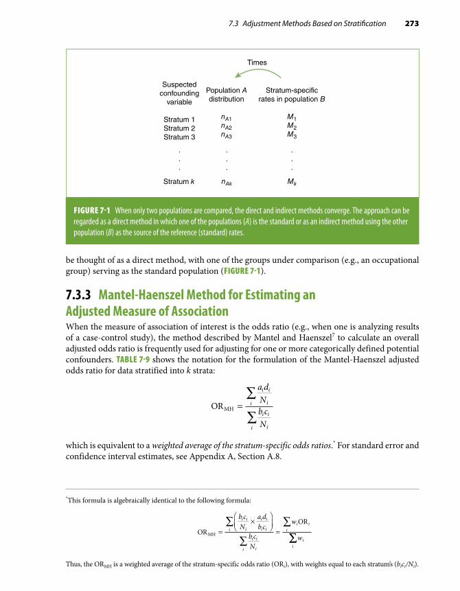
7.3 Adjustment Methods Based on Stratification 273
*This formula is algebraically identical to the following formula:
OROR
MH =×
=∑
∑
∑b cN
a db c
b cN
w
w
i i
i
i i
i ii
i i
ii
i ii
ii
∑∑
Thus, the ORMH is a weighted average of the stratum-specific odds ratio (ORi), with weights equal to each stratum’s (bici/Ni).
Suspectedconfounding
variable
Stratum 1Stratum 2Stratum 3
Population Adistribution
nA1nA2nA3
Stratum k
.
.
.
.
.
.
nAk
Stratum-specificrates in population B
M1M2M3
.
.
.
Mk
Times
FIGURE 7-1 When only two populations are compared, the direct and indirect methods converge. The approach can be regarded as a direct method in which one of the populations (A) is the standard or as an indirect method using the other population (B) as the source of the reference (standard) rates.
be thought of as a direct method, with one of the groups under comparison (e.g., an occupational group) serving as the standard population (FIGURE 7-1).
7.3.3 Mantel-Haenszel Method for Estimating an Adjusted Measure of AssociationWhen the measure of association of interest is the odds ratio (e.g., when one is analyzing results of a case-control study), the method described by Mantel and Haenszel7 to calculate an overall adjusted odds ratio is frequently used for adjusting for one or more categorically defined potential confounders. TABLE 7-9 shows the notation for the formulation of the Mantel-Haenszel adjusted odds ratio for data stratified into k strata:
ORMH =∑
∑
a dNb cN
i i
ii
i i
ii
which is equivalent to a weighted average of the stratum-specific odds ratios.* For standard error and confidence interval estimates, see Appendix A, Section A.8.

274 Chapter 7 Stratification and Adjustment: Multivariate Analysis in Epidemiology
TABLE 7-9 Notation for the calculation of the Mantel-Haenszel adjusted odds ratio in a case-control study, stratified according to a potential confounding variable.
Stratum i Cases Controls Total
Exposed ai bi m1i
Unexposed ci di m2i
Total n1i n2i Ni
The calculation of the ORMH is straightforward, as illustrated by the following examples. In Table 7-1 the crude association between the presence of malaria and gender suggested that males were at higher odds of developing the disease; however, when the association was examined by strata of occupation, no association with gender was observed in either occupational category. In addition to inspecting the occupation-specific odds ratios, a summary odds ratio can be calculated, expressing the occupation-adjusted association between gender and malaria. The adjusted ORMH (the weighted average of the occupational stratum-specific odds ratios) is calculated as follows:
ORMH = =
× + ×
× +
∑
∑
a dNb cN
i i
ii
i i
ii
53 381
35 79219
10 1581
52 ×× =53219
1 01.
The estimate of ORMH lies between the stratum-specific estimates (1.06 and 1.00). It is, however, closer to the stratum “mostly indoor occupation” because of the larger sample size in that stratum, for which the estimate is consequently given more weight (bici/Ni) when calculating the average adjusted ORMH.
In the example in Table 7-2, the age-adjusted estimate of the ORMH is
ORMH = =
× + × + ×∑
∑
a dNb cN
i i
ii
i i
ii
4 224292
9 390444
4 3303933
6 362442
6 301405
2 62292
12 33444
33 26393
6
+ × + ×
× + × + × + 55 9442
93 5405
3 97× + × = .
The assumption implicit in the Mantel-Haenszel procedure for the calculation of an adjusted odds ratio is that there is homogeneity of effects (expressed by odds ratios in this case) across the categories of the stratifying variable. In other words, it is assumed that there is no multiplicative interaction between the exposure and the stratifying variable (see Chapter 6, Section 6.3.1). For example, when calculating an overall adjusted odds ratio for the data shown in Table 7-2, it is im-plicitly assumed that the odds ratio of myocardial infarction in relation to oral contraceptive use is approximately 4 (the calculated weighted average being 3.97) for all age strata. As discussed previously (Section 7.2), in this example, the observed differences in the stratum-specific odds ratio values are

7.3 Adjustment Methods Based on Stratification 275
TABLE 7-10 Notation for the calculation of the Mantel-Haenszel adjusted rate ratio in a prospective study based on person-time incidence rates stratified according to a potential confounding variable.
Stratum i Cases Person-time
Exposed a1i y1i
Unexposed a0i y0i
Total Ti
assumed to result from random variation; if the observed heterogeneity is considered excessive, an option is to calculate separate age-adjusted odds ratios for younger and older women as follows:
OR MH , 25 34
4 224292
9 390444
2 62292
12 33444
8− =
× + ×
× + × =y ..3
4 330393
6 362442
6 301405
33 263
35 49ORMH, − =
× + × + ×
×y
99365 9
44293 5
405
2 7+ × + × = .
Mantel-Haenszel Adjusted Rate RatioThe Mantel-Haenszel method has been extended to the calculation of an adjusted rate ratio in the context of a cohort study with incidence data based on person-time.7(pp219-221) TABLE 7-10 shows the general layout of the data from each of the stratum-specific tables. Based on the notation in this table, the Mantel-Haenszel estimate of the adjusted rate ratio is calculated as
RRMH =∑
∑
a yT
a yT
i i
ii
i i
ii
1 0
0 1
An example of the application of this formula is presented in TABLE 7-11, based on data8 from one of the examples used in Chapter 5 to illustrate the techniques for the assessment of confound-ing (Section 5.4). The estimated RRMH comparing “high” vs “low” vitamin index intake obtained in Table 7-11 is identical to the corresponding smoking status–adjusted rate ratio when using the direct method of adjustment based on data presented in Table 5-5.
Mantel-Haenszel Method and the Odds Ratio for Matched Case-Control DataAs presented in basic textbooks (e.g., Gordis5) and briefly discussed in Chapter 3, Section 3.4.1, in individually matched-paired case-control studies, the odds ratio is calculated by dividing the number of pairs in which the case is exposed and the control is not by the number of pairs in which the case is unexposed and the control is exposed. In TABLE 7-12, each cell represents the number of

276 Chapter 7 Stratification and Adjustment: Multivariate Analysis in Epidemiology
TABLE 7-11 Example for the calculation of the Mantel-Haenszel adjusted rate ratio (RRMH): data on mortality in individuals with high and low vitamin C–beta-carotene intake index, by smoking status, Western Electric Company Study.
Vitamin C–beta-carotene intake index No. of deaths Person-years Stratified RRs
Nonsmokers High 53 5143 RR = 0.77
Low 57 4260
Total 9403
Smokers High 111 6233 RR = 0.83
Low 138 6447
Total 12,680
RRMH = =
× + ×∑
∑
a y
Ta y
T
i i
ii
i i
ii
1 0
0 1
53 42609403
111 6447122 680
57 51439403
138 623312 680
0 81,
,
.× + × =
The “moderate” vitamin intake index category in Table 5-4 (Chapter 5) has been omitted for simplicity. All rate ratios in the table compare those with a “high” vitamin intake index to those with a “low” vitamin intake index.Data from Pandey DK, Shekelle R, Selwyn BJ, Tangney C, Stamler J. Dietary vitamin C and beta-carotene and risk of death in middle-aged men: the Western Electric Study. Am J Epidemiol. 1995;142:1269-1278.8
TABLE 7-12 Layout of a 2 × 2 table for the calculation of a paired odds ratio and an example.
Notation Example*
Controls Controls
Exposed Unexposed CMV+ CMV–
CasesExposed a b
CasesCMV+ 214 65
Unexposed c d CMV– 42 19
Paired OR = b
cPaired OR = =65
421 55.
Each cell represents the number of pairs for each category defined by case-control and exposure status.*Cases represent individuals with carotid atherosclerosis defined by B-mode ultrasound; controls are individuals without atherosclerosis, individually match paired to cases by age group, sex, ethnicity, field center, and date of examination. Cytomegalovirus (CMV) infection status is defined according to the presence or absence of IgG serum antibodies.Data from Sorlie PD, Adam E, Melnick SL, et al. Cytomegalovirus/herpesvirus and carotid atherosclerosis: the ARIC Study. J Med Virol. 1994;42:33-37.9

7.3 Adjustment Methods Based on Stratification 277
TABLE 7-13 Calculation of the paired odds ratio for the data in Table 7-12, based on the Mantel-Haenszel estimation approach.
Four possible pair types: Exp Case Cont Total
No. of pairs in Table 7-12
Each pair contributes to ORMH
Numeratora d
N
3
Denominator
b c
N
3
Type 1 Concordant
+ 1 12 a = 214 0 0
– 0 0
Type 2 Discordant
+ 1 02 b = 65 1⁄2 0
– 0 1
Type 3 Discordant
+ 0 12 c = 42 0 1⁄2
– 1 0
Type 4 Concordant
+ 0 02 d = 19 0 0
– 1 1
ORMH = × + × + × + ×× + ×
( ) ( ) ( ) ( )
( ) (
214 0 65 42 0 19 0
214 0 65 0
12
)) ( ) ( )+ × + ×= ×
×= =
42 19 0
65
42
65421
2
12
12
b
c
Cont, controls; Exp, exposure status; OR, odds ratio.
pairs for the corresponding category defined by case-control and exposure status. Thus, in the 2 × 2 cross-tabulation shown on the left-hand side of Table 7-12, the odds ratio is estimated as the ratio of discordant pairs, b/c. An example is provided on the right-hand side of the table, from a report from the Atherosclerosis Risk in Communities (ARIC) Study on the association between chronic cytomegalovirus (CMV) infection and carotid atherosclerosis (measured by B-mode ultrasound).9 In this study, atherosclerosis cases and controls were individually matched by age, sex, ethnicity, field center, and date of examination; the paired odds ratio (i.e., the odds ratio controlling for all matching variables) is estimated as 65/42 = 1.55. The rationale for estimating the odds ratio as the ratio of discordant pairs in a matched case-control study is readily grasped by the application of the Mantel-Haenszel method for averaging stratified odds ratios.
The data in Table 7-12 can be rearranged as in TABLE 7-13, where each of the 340 pairs in this study is now a stratum with a size n of 2. The resulting 340 2 × 2 tables can be arranged as in Table 7-13 because the pairs can be only one of four possible types (each of the cells in Table 7-12). For exam-ple, for the first type of pair in which both case and control are CMV+ (cell a on the left panel of Table 7-12), there would be a total of 214 identical tables; for the second type (the b cell, discordant, with case exposed and control unexposed), there would be 65 tables, and so on. In the last two

278 Chapter 7 Stratification and Adjustment: Multivariate Analysis in Epidemiology
TABLE 7-14 Example of the use of the Mantel-Haenszel approach in a matched case-control study with two controls per case.
Each pair contributes to ORMH
Exposed Case Control TotalNo. of pairs
Numeratora d
N
3
Denominatorb c
N
3
Yes 1 03 200 0.67 0
No 0 2
Yes 1 13 100 0.33 0
No 0 1
Yes 0 13 50 0 0.33
No 1 1
Yes 0 23 30 0 0.67
No 1 0
Yes 0 03 120 0 0
No 1 2
Yes 1 23 40 0 0
No 0 0
ORMH = × + × + × + × + ×( . ) ( . ) ( ) ( ) (200 0 67 100 0 33 50 0 30 0 120 0)) ( )( ) ( ) ( . ) ( . ) (
+ ×× + × + × + × +
40 0200 0 100 0 50 0 33 30 0 67 1220 0 40 0
167 036 6
4 56× + ×
= =) ( )
..
.
OR, odds ratio.
columns of Table 7-13, the contribution to the numerator and denominator of the ORMH of each of the 340 pairs is indicated. The contribution (to either the numerator or the denominator) from all the strata based on concordant pairs is always 0, whereas the discordant pairs contribute to either the numerator (b-type pairs in Table 7-12) or the denominator (c-type pairs in Table 7-12). All of these contributions, which are always 1⁄2—that is, (1 × 1)/2—cancel out, with the actual number of discor-dant pairs in the numerator and the denominator resulting in the well-known formula ORMH = b/c. Thus, the formula of discrepant pairs represents a weighted average odds ratio for stratified data (using the Mantel-Haenszel weighing approach), where the strata are defined on the basis of matched pairs.
When there is more than one control per case, the ratio of discrepant pairs, by definition, cannot be used, but the use of the Mantel-Haenszel approach allows the estimation of the odds ratio, adjusted for the matching variables. TABLE 7-14 shows a hypothetical example of the application of this approach in a case-control study with two controls individually matched to each case.

7.4 Multiple-Regression Techniques for Adjustment 279
7.3.4 Limitations of Stratification-Based Methods of AdjustmentThe techniques described in the previous sections (direct and indirect adjustment, Mantel-Haenszel odds ratio or rate ratio) can be used for multivariate analysis—that is, for simultaneously controlling for more than one covariate. This can be done simply by constructing the strata based on all possible combinations of the adjustment variables (e.g., see Table 7-6). These stratification-based methods, however, have practical limitations for multivariate adjustment:
1. Although they can be used to adjust for several covariates simultaneously, adjustment is carried out only for the association between one independent variable and an outcome at a time. For example, to assess the association of oral contraceptives with myocardial infarction while controlling for age and educational level, it would be necessary to create one 2 × 2 table for oral contraceptives vis-à-vis myocardial infarction for each stratum defined by combining age groups and educational levels. If the exposure of interest were educational level and the covariates to be adjusted for were age and oral contra-ceptive use, however, a new set of 2 × 2 tables would have to be created (representing education vs myocardial infarction for each stratum defined by categories of age and oral contraceptive use).
2. These methods allow adjustment only for categorical covariates (e.g., gender); contin-uous covariates need to be categorized, as age was in the example shown in Table 7-2. Residual differences within these somewhat arbitrarily defined categories may in turn result in residual confounding (Section 7.6 and Chapter 5, Section 5.5.4).
3. Data become sparse when the strata are too numerous. For the direct method, for ex-ample, if the sample size of a given stratum is 0, no corresponding stratum-specific rate is available for application to the standard population in that stratum; as a result, the adjusted rate becomes undefined.
Thus, in practice, stratification methods are usually limited to simultaneous adjustment for a few categorical confounders (usually one or two), with a small number of categories each. When simultaneous adjustment for multiple covariates (including continuous variables) is needed, methods based on multiple-regression techniques are typically used.
7.4 Multiple-Regression Techniques for AdjustmentMultiple-regression techniques are better suited to address the limitations of the simpler tech-niques discussed heretofore, as they allow the examination of the effects of all exposure variables reciprocally and simultaneously adjusting for all the other variables in the model. In addition, they allow adjusting for continuous covariates, and within reasonable limits, they are generally more efficient than stratification-based methods when data are sparse. Moreover, in addition to multi-variate adjustment, multiple-regression techniques are useful for prediction (that is, for estimating the predicted value of a certain outcome as a function of given values of independent variables, as in the case of the prediction equations of coronary risk that were developed from the Framingham Heart Study using logistic regression)10 (see Section 7.4.3).
The sections that follow describe four of the most frequently used regression models for mul-tivariate adjustment in epidemiology: (1) linear regression, used when the outcome is continuous (e.g., blood pressure); (2) logistic regression, preferentially used when the outcome is categorical (cumulative incidence, prevalence); (3) proportional hazards (Cox) regression, used in survival analysis; and (4) Poisson regression, used when incidence rate (based on person-time) is the outcome

280 Chapter 7 Stratification and Adjustment: Multivariate Analysis in Epidemiology
TABLE 7-15 Multiple-regression models and interpretation of the regression coefficients = b1.
Model Interpretation of b1
Linear y b b x b x b xk k= + + + +0 1 1 2 2. . . Increase in outcome y mean value
(continuous variable) per unit increase in x1, adjusted for all other variables in the model
Logistic log (odds) = + + + +b b x b x b xk k0 1 1 2 2. . . Increase in the log odds of the outcome
per unit increase in x1, adjusted for all other variables in the model
Cox log (hazard) = + + + +b b x b x b xk k0 1 1 2 2. . . Increase in the log hazard of the outcome
per unit increase in x1, adjusted for all other variables in the model
Poisson log (rate) = + + + +b b x b x b xk k0 1 1 2 2. . . Increase in the log rate of the outcome per
unit increase in x1, adjusted for all other variables in the model
of interest. It is beyond the scope of this chapter to discuss these techniques in detail; for this, the reader is referred to a general statistics textbook (e.g., Armitage et al.11) and to the specific references given in each section. Instead, the discussion focuses on the applied aspects of multiple regression.
In spite of their different applications and even though only one of the models is specifically defined as “linear,” the fundamental underpinning of all regression techniques discussed in this chapter is a linear function. This can be clearly seen in TABLE 7-15, in which the right-hand side of all models is exactly the same (b0 + b1x1 + b2x2 + . . . + bkxk), thus explaining why they are collectively termed generalized linear models. The models listed in the table differ only with regard to the type of dependent variable or outcome postulated to be related to predictors in a linear fashion. Conse-quently, and as underscored in the sections that follow, the interpretation of the multiple-regression coefficients is similar for all these models, varying only with regard to the outcome variable.
In the next section, the concept of linear regression is reviewed in the context of the simplest situation, namely that involving only one predictor variable (one x). The four sections that follow briefly review the basic features of the regression models listed in Table 7-15. Finally, Sections 7.4.6 to 7.4.8 cover issues regarding the application of these models to matched and nested studies and to situations when a linear model is not reasonable as well as issues related to statistical inference based on the parameter estimates.
7.4.1 Linear Regression: General ConceptsSimple linear regression is a statistical technique usually employed to assess the association between two continuous variables. FIGURE 7-2, for example, shows a plot of the cross-sectional values of systolic blood pressure (SBP) and the carotid intimal-medial thickness (IMT), a measure of atherosclerosis obtained by B-mode ultrasound imaging, in a subset of 1410 participants from the ARIC Study.12 Each dot in the scatter of points represents an individual, with corresponding SBP and IMT values

7.4 Multiple-Regression Techniques for Adjustment 281
FIGURE 7-2 Relation between systolic blood pressure (SBP) and carotid intimal-medial thickness (IMT) in a subset of participants in the ARIC Study (N = 1410).
2.00
1.75
1.50
1.25
1.00
0.75
0.50
0.25
0.00
IMT
(m
m)
0 20 40 60 80 100 120 140 160 180 200
SBP (mm Hg)
in the abscissa and the ordinate, respectively. It can be seen that although there is a wide scatter, there is a tendency for the IMT values to be higher when SBP is also higher, and vice versa. This pattern warrants the assessment of whether SBP and IMT are linearly associated. The hypothesis regarding a possible linear association between these two continuous variables can be expressed as the following questions:
1. Is the average increase in IMT levels associated with a given increase in SBP approxi-mately constant throughout the entire range of SBP values?
2. Can the association between SBP and IMT be assumed to follow a straight-line pattern (the statistical model) with the scatter around the line being the consequence of random error?
In addition to inspecting the scatter plot visually (e.g., Figure 7-2), assessing whether the relationship between two continuous variables (e.g., SBP and IMT) is statistically compatible with a perfect straight line can be done by calculating the Pearson linear correlation coefficient (r) (see, e.g., Armitage et al.,11(pp195-197) as well as an application in Chapter 8, Section 8.4.2). The correlation coefficient values range from –1.0 (when there is a perfect negative correlation—i.e., when all the points form a perfect straight line with a negative slope) to +1.0 (when there is a perfect positive correlation—i.e., when the points form a straight line with a positive slope). A value of 0 indicates no linear correlation. In the example in Figure 7-2, the value of the Pearson correlation coefficient is 0.21, with a corresponding p value of 0.0001. The small p value in this example suggests that there is some kind of linear correlation between SBP and IMT not likely to be explained by chance even though the magnitude of the coefficient implies that the correlation is only moderate. This conclu-sion fits the graphical display in Figure 7-2: Although there is an average tendency for higher SBP
IMT, intimal-medial thickness; SBP, systolic blood pressure.

282 Chapter 7 Stratification and Adjustment: Multivariate Analysis in Epidemiology
values to be associated with higher IMT values, there is a substantial dispersion of values around this hypothetical linear relationship.
The correlation coefficient value contains no information about the strength of the associa-tion between the two variables that is represented by the slope of the hypothetical line, such as the amount of increase to be expected in the IMT per unit increase in SBP. To estimate the strength of the linear association, it is necessary to find the formula for the regression line that best fits the observed data. This line can be formulated in terms of two parameters (b 0
and b1), which relate the mean (expected) value of the dependent variable (conventionally noted as E(y) and placed in the ordinate of the plot) as a function of the independent or predictor variable (conventionally noted as x, in the abscissa). The general formula for the regression line is
E y x( ) = +β β0 1
E(y) is also known as the “predicted” value of y as a function of x. In the discussion that follows, it is denoted as y to simplify the notation.
FIGURE 7-3 shows the graphical representation of this general regression line. Inspection of this formula and the figure underscores the straightforward interpretation of the two parameters, b0 and b1, as follows:
■ b 0 is the intercept—that is, the estimated value of y when x = 0. ■ b1 is the regression coefficient—that is, the estimated increase in the dependent variable (y) per unit
increase in the predictor variable (x). Thus, when x = 1, y = b 0 + b1; for x = 2, y = b0 + b1 × 2; and so on. This regression coefficient corresponds to the slope of the regression line; it reflects the strength of the association between the two variables—that is, how much increase (or decrease, in the case of a descending line) in y is to be expected (or predicted) as x increases. The absolute value of b1 depends on the units of measurement for both x and y.
After this statistical model is formulated, the practical question is how to estimate the regression line that best fits a given set of data, such as the data in Figure 7-2. In linear regression, the method often used to estimate the values of the regression coefficients (or “parameters”) is the least-squares
FIGURE 7-3 Graphical and mathematical representation of a linear model.
y
β
β β
β
y = x +
x
1
0
0 1
1 unit0

7.4 Multiple-Regression Techniques for Adjustment 283
2.00
1.75
1.50
1.25
1.00
0.75
0.50
0.25
0.00
IMT
(m
m)
0 20 40 60 80 100 120 140 160 180 200
SBP (mm Hg)
FIGURE 7-4 Regression line that best fits the data (least-squares estimate) to the scatter points in Figure 7-2 (see text).
method. This consists of finding the parameter values that minimize the sum of the squares of the vertical distances between each of the observed points and the line. For details on the methods to estimate the regression line, see any general statistics textbook, e.g., Armitage et al.11 or Kleinbaum et al.,13 or a more specialized text, e.g., Draper and Smith.14 For example, FIGURE 7-4 shows the re-gression line that best fits the observed data shown in Figure 7-2. The notation traditionally used to represent the estimated linear regression line is as follows:
y b b x e= + +0 1
That is, the symbols for the parameters denoted by the Greek letter beta (b ) are replaced by the letter b to denote that they are estimates. The error term, e, represents the difference between each observed y value and the corresponding predicted value (e.g., the vertical distance between each point in the scatter in Figure 7-4 and the y value at the line). (For the sake of simplicity, the error term will be omitted from the remaining formulas in this chapter.) Returning to Figure 7-4, the mathematical formula for the estimated regression line shown in the figure is
IMT (mm) = 0.4533 + 0.0025 × SBP (mm Hg) (Eq. 7.2)
The value of the intercept (0.4533 mm in this example) is purely theoretical; it does not have any real biological relevance in this case. It corresponds to the estimated IMT when SBP = 0 (i.e., when the previous equation reduces to IMT [mm] = 0.4533). The fact that the intercept is biolog-ically meaningless is a common occurrence in many applications of linear regression in biomedical research because the value of 0 for many variables is not biologically viable or has no practical relevance. This is illustrated in Figure 7-4 and schematically in FIGURE 7-5, which shows how the
IMT, intimal-medial thickness; SBP, systolic blood pressure.

284 Chapter 7 Stratification and Adjustment: Multivariate Analysis in Epidemiology
FIGURE 7-5 Observed data and extrapolation of regression line toward the axis (intercept).
1.20
1.00
0.80
0.60
0.40
0.20
Extrapolationof the regression line
0
IMT
(m
m)
SBP (mm Hg)
0 20 40 60 80 100 120 140 160 180
Observedvalues
Estimatedregression line
Range of biologicallyplausible values
b0
intercept value is often a mere extrapolation of the regression line to meet the ordinate (y-axis), well beyond the range of biologically plausible values.*
More relevant in most circumstances is the value of the regression coefficient. In the previous example, the estimate of the regression coefficient for SBP implies that, in these cross-sectional data, an SBP increase of 1 mm Hg is associated with an average IMT increase of 0.0025 mm. This regression coefficient is the slope of the line in Figure 7-4, expressing the strength of the association between SBP and IMT, in contrast with the correlation coefficient, which evaluates only the degree to which a given set of quantitative data fits a straight line.
The previous model assumes that the increase is linear (i.e., that the increase in IMT as a function of the increase in SBP is constant). This assumption is obviously implicit in the fact that
*The value of the intercept is useful if the investigator’s intention is to use the regression results to predict the expected value of the dependent variable, given certain characteristics. To solve the equation, one needs to use the values of all the coefficients, including the intercept (see examples in the context of logistic regression in Section 7.4.3).
There are ways to improve the interpretability of the intercept by using transformations of the original continuous vari-ables in the regression. For example, the mean systolic blood pressure could be subtracted from each individual’s blood pressure value in the study population in Figure 7-4. This new variable (i.e., the difference between each individual’s blood pressure and the mean) could then be used in the regression, instead of the actual blood pressure value. In this case, even though the intercept is still defined as the estimated IMT for an individual with a value of 0 for the independent vari-ables (x), it can be interpreted as the estimated IMT for an individual with the average blood pressure value in the study population.
IMT, intimal-medial thickness; SBP, systolic blood pressure.

7.4 Multiple-Regression Techniques for Adjustment 285
one single regression coefficient was given in the previous equation (0.0025 mm increase in IMT per unit increase in SBP [mm Hg]), which is assumed to apply to the entire range of SBP values. For example, whether the SBP increases from 80 to 81 mm Hg or from 160 to 161 mm Hg, the estimated increase in IMT is still the same. Whether this simple model is appropriate will depend on each particular circumstance, as discussed in more detail in Section 7.4.7.
Another important issue when interpreting the slope (regression coefficient) of a regression function is the unit to which it corresponds. For example, it may be expressed as the increase in IMT per 5 mm Hg increase in SBP, rather than per 1 mm Hg, which would then be translated as a value of 5 × 0.0025 = 0.0125 mm in this example. The importance of specifying the units of variables x and y when reporting and interpreting the magnitude of the regression coefficient (slope) cannot be sufficiently emphasized.
It is important to keep in mind, however, that comparison of the strength of the association between different variables (particularly continuous variables) based on the size of the regression coefficients should generally be avoided. This is related to the general problem of comparing the strength of the associations across different variables that was discussed in Chapter 3, Section 3.5; further discussion of this issue is presented in Chapter 9, Section 9.3.4.
The regression coefficient (b1) estimates the average increase in the dependent variable (e.g., IMT) per unit increase in the independent variable (e.g., SBP), and like any other statistical estimate, it is subject to uncertainty and random error. Thus, it is important to estimate the standard error of the regression coefficient to evaluate its statistical significance and to calculate the confidence limits around its point estimate (see Section 7.4.8 and Appendix A). The standard error (SE) estimate is readily provided by most statistical packages performing linear regression; for the regression coef-ficient b1
= 0.0025 in the previous example, it was estimated as SE(b1) = 0.00032.Both the line in Figure 7-4 and the corresponding mathematical formula (Equation 7.2)
can be seen as a way to summarize data (a sort of sketch) that tries to capture the essence of the relationship of interest, while avoiding unnecessary and cumbersome details subject to random variability and measurement error (see Section 7.8). The attractiveness of the model proposed in the example—that the relationship between SBP and IMT is linear—lies in its simplicity and the fact that the regression coefficient has a very straightforward and easy interpretation: It is the slope of the regression function, or the average increase in IMT (mm) per unit increase in SBP (mm Hg). This model, however, may not be either appropriate or the best to describe the data. It is, for example, possible that additional parameters describing more complex relationships (e.g., a curve) may better describe the data. Adding new parameters to the model (e.g., a square term to take into account a curvilinear relationship) may improve its predictive capabilities (see Section 7.4.7); however, this often results in a more complex interpretation of the regression coefficient(s). There is usually a trade-off between simplicity (interpretability) and completeness (predictive power, statistical fit) of any statistical model. In the last section of this chapter (Section 7.8), conceptual issues related to the art and science of statistical modeling are briefly discussed.
An additional example of the use of linear regression is based on the ecological analysis discussed in Chapter 1. Figure 1-10 displays the death rates for coronary heart disease (CHD) in men from 16 cohorts included in the Seven Countries Study vs an estimate of the mean fat intake in each study site.15 That figure also shows the value of the correlation coefficient (r = 0.84), which indicates to which extent the scatter of points fits a straight line; the corresponding regression equation is
y = –83 + (25.1 × x)
286 Chapter 7 Stratification and Adjustment: Multivariate Analysis in Epidemiology
where y is the 10-year rate of coronary mortality (per 10,000) and x is the percentage of calories from fat in the diet. The regression estimates can be interpreted as follows:
■ The intercept (–83) has a basically meaningless real-life interpretation, as it represents the theoretical rate in a country where there is no consumption of fat whatsoever. Its negative value underscores its merely theoretical interpretation.
■ The regression coefficient (25.1) represents the estimated average increase in the 10-year coronary mortality (per 10,000) associated with a 1% increase in the proportion of calories from fat in the diet. In other words, according to this model, an increment of 1% in the proportion of calories from fat is related to an increase of 0.00251 (or 2.51 per thousand) in coronary mortality over 10 years. (Obviously, any causal inference from data such as these must take into consideration the possibility of ecologic fallacy or other biases.) As in the preceding example, the previous model also assumes that the increase is linear (i.e., that the increase in mortality as a function of the increase in dietary fat is constant so that it is as harmful for the level of fat in the diet to change from 10% to 11% as it is to change from 40% to 41%). On the other hand, careful inspection of the data in the figure suggests that the increase in mortality may be nonlinear (i.e., that the relationship may be slightly curvilinear, with sharper increases in mortality at higher than at lower levels of dietary intake of saturated fat). To examine this alternative hypothesis, it would be necessary to test nonlinear models by including quadratic terms or dummy variables (see Section 7.4.7).
■ Finally, it is beyond the scope of this text to discuss statistical properties and assumptions related to the use of linear regression. Detailed discussions of these topics can be found in general statistics textbooks (e.g., Armitage et al.11) as well as more specialized textbooks (e.g., Draper and Smith14).
7.4.2 Multiple-Linear RegressionThe extension of the simple linear regression model (see the previous section) to a multivariate situa-tion is based on the so-called multiple-linear regression models. Multiple-linear regression models are typically used for adjustment when the outcome (the y or dependent variable) is a continuous variable, although an application for a binary outcome is briefly discussed at the end of this section. The question is whether a given variable (x1) is linearly associated with the outcome (y) after controlling for a number of other covariates (e.g., x2
and x3). The corresponding linear regression model is written as follows:
y x x x= + + +β β β β0 1 1 2 2 3 3
The postulated risk factors (x’s or independent variables) can be either continuous or categorical (e.g., dichotomous), as shown in the example later. Categorical variables can have multiple levels, which can be treated as either ordinal or transformed in a set of binary (indicator) variables (see Section 7.4.7).
As an example of the use of multiple-linear regression, it may be of interest to know whether SBP is linearly associated with carotid IMT as a proxy for atherosclerosis and whether this association is independent of age, gender, and body mass index (BMI). The results of a series of multiple-re-gression analyses to answer this question, using the subset of individuals from the ARIC Study that was used in the example in the preceding section, are shown in TABLE 7-16.
Model 1 is based on the same example discussed previously and includes only SBP as the independent variable (Figure 7-4 and Equation 7.2). Model 2 adds the variable age and can be written as follows:
IMT (mm) = b0 + b1 × SBP (mm Hg) + b2 × Age (years)

7.4 Multiple-Regression Techniques for Adjustment 287
TABLE 7-16 Multiple-linear regression analyses of the cross-sectional association between systolic blood pressure and carotid IMT (mm) in a subset of participants in the Washington County cohort of the Atherosclerosis Risk in Communities (ARIC) Study, ages 45–64 years, 1987–1989.
Linear regression coefficient
Model 1 Model 2 Model 3 Model 4
Intercept 0.4533 –0.0080 0.0107 –0.0680
Systolic blood pressure (1 mm Hg) 0.0025 0.0016 0.0014 0.0012
Age (1 year) Not included 0.0104 0.0096 0.0099
Gender (1 = male, 0 = female) Not included Not included 0.0970 0.0981
Body mass index (1 kg/m2) Not included Not included Not included 0.0033
IMT, intimal-medial thickness of the carotid arteries (measured in millimeters): average of B-mode ultrasound measurements taken at six sites of the carotid arteries in both sides of the neck.
The estimated values of the regression coefficients, obtained by the least-squares method (see the previous section), are displayed in Table 7-16 (model 2). Using these values, the equation can be rewritten as a function of the estimates—that is, b0, b1, and b2
(again omitting the error term, e, for simplicity):
IMT (mm) = –0.0080 + 0.0016 × SBP (mm Hg) + 0.0104 × Age (years) (Eq. 7.3)
To represent this model graphically, a three-dimensional plot is needed: one dimension for SBP, one for age, and one for IMT. The scatter of points will be a three-dimensional cloud of points in this three-axis space, and the model in Equation 7.3 expresses the formula of a plane that is supposed to fit this three-dimensional scatter (i.e., of the linear relations between the three variables). Each of the regression coefficients in model 2 can be interpreted as follows:
■ The intercept (b0 = –0.008) corresponds to the estimated IMT of a 0-year-old individual with
SBP = 0 mm Hg; as in the preceding example, this represents an extrapolation with no practical use or meaningful interpretation (see Section 7.4.1).
■ The regression coefficient for SBP (b1 = 0.0016 mm) represents the estimated average absolute
increase in IMT (mm) per unit increase in SBP (mm Hg) while controlling for age effects (i.e., after the associations of age with both SBP and IMT have been removed).
■ Similarly, the regression coefficient for age (b2 = 0.0104 mm) represents the estimated aver-
age increase in IMT per year increase in age while controlling for SBP (i.e., after removing the associations of SBP with both age and IMT).
(For a succinct derivation and additional interpretation of the adjusted regression coefficients in multiple-linear regression, the reader should consult Kahn and Sempos.16 More detailed discussions of multiple regression can be found in the statistical textbooks referred to previously.)

288 Chapter 7 Stratification and Adjustment: Multivariate Analysis in Epidemiology
The estimated coefficient for SBP (b1 = 0.0016 mm) in model 2 is smaller than the corresponding
coefficient in model 1 (0.0025 mm). This is because age is a confounder of the relationship between SBP and IMT. In other words, some of the apparent relationship between SBP and IMT observed in the crude (unadjusted) analysis (model 1) appears to be due to the fact that people with higher SBP tend to be older, and older people tend to have a higher degree of atherosclerosis. In model 2, the strength of the association between SBP and IMT is reduced because the (positive) confounding effect of age is removed, at least partially (see Section 7.6).
An important assumption in the model represented in Equation 7.3 is that there is no (additive) interaction between SBP and age, the two variables included in the model. In other words, implicit in the formulation of this statistical model (y = b 0 + b 1x1 + b 2x2) is the fact that the change in y associated with a unit change in x1
is assumed to be constant for the entire range of x2, and vice versa. In the previous example, the increase in IMT per unit increase in SBP, the estimate b1
= 0.0016 mm, not only is adjusted for age but also should be applicable to individuals of all ages (and the converse is true for b2). If interaction is present—that is, for example, if the association of SBP with IMT is deemed to be different between older and younger individuals—then the previous model (Equation 7.3) will not be appropriate. As discussed in Chapter 6, when a given factor (in this ex-ample, age) modifies the effect of the variable of interest (in this example, SBP), it is recommended that the association between the variable of interest and the outcome be assessed in strata formed by the effect modifier categories. Thus, rather than age adjustment, age-stratified models (i.e., separate models for each age group) should be used, a situation that is analogous to the examples discussed in Section 7.2. An alternative analytical technique to deal with interaction in the context of multiple-regression analyses is to include interaction terms (also known as product terms) in the regression equation. For instance, in the present example, if an interaction between SBP and age is suspected, the following model can be used:
IMT SBP) age) (SBP age)]= + × + × + × ×β β β β0 1 2 3( ( [ (Eq. 7.4)
where (SBP × age) represents a new variable that is obtained by multiplying the values of SBP and age in each individual. If SBP and age were binary variables, the previous model would be analogous to stratified models. In comparison with stratified analyses, the use of interaction terms increases the statistical efficiency and has the advantage of allowing the evaluation of interaction between continuous variables. The interaction term can be conceptualized as the excess change not explained by the sum of the individual independent effects of two independent (x) variables; it is schematically represented in Figure 6-3 of Chapter 6 by the excess, “I,” on the joint-effect column (right-hand side). If interaction is present, the inclusion of the interaction term in the model is important for prediction, as it increases the amount of the variability in the outcome explained by the full model vis-à-vis the sum of the isolated effects of the individual predictors in the model.
When two variables x2 and x3 interact and the effect of another variable x1 is of interest, it is important to adjust x1
for x2, x3, and the interaction term (x2 × x3). Adjusting for the interaction term is important because the distributions of x2
or x3 (when examined individually) may be the same for the different categories of x1 (say, exposed vs unexposed) but the distributions of the joint presence of x2 and x3 (x2 × x3) may be different, and thus the interaction term may act as a con-founding variable. (See Chapter 6, Section 6.8 and Table 6-24.) In addition, as interaction itself is amenable to confounding effects (see Chapter 6, Section 6.10.2), it is obviously important to adjust the interaction term for the other variables in the model. For more details, refer to biostatistics textbooks (e.g., Armitage et al.11).

7.4 Multiple-Regression Techniques for Adjustment 289
1.20
1.00
0.80
0.60
0.40
0.20
0
IMT
(m
m)
Gender
0 1
b0
b1
FIGURE 7-6 Graphical interpretation of the regression coefficient for a dichotomous variable, such as gender (as in models 3 and 4 in Table 7-16). For analogy with the regression situation with a continuous independent variable (e.g., Figure 7-4), the regression line is plotted between the two clusters even though no values are possible between x = 0 and x = 1. Note that the intercept (b0) corresponds to the mean IMT value in females (x = 0), and the regression coefficient (b1) represents the average difference between males and females.
Model 3 in Table 7-16 adds a new variable, gender. This is a dichotomous variable, arbitrarily assigned a value of 1 for males and 0 for females. As with any other variable, the coefficient b3 = 0.097 is interpreted as the adjusted increase in IMT (in mm) per “unit increase in gender,” but what this actually means for gender is the average difference in IMT between males and females adjusted for the other variables in the model (SBP and age) (FIGURE 7-6). If the variable gender had been coded as 1 for females and 0 for males, the results would have been identical to those shown in Table 7-16 except that the sign of the coefficient would have been negative (i.e., b3 = –0.097), representing the absolute difference, females minus males, in IMT.
The interpretation of the coefficients in model 4, shown in Table 7-16, is consistent with that of models 2 and 3 except that there is additional adjustment for BMI. As seen in the table, the magnitude of the coefficient for SBP decreased in models 3 and 4, implying that not only age but also gender and BMI were (positive) confounders of the observed relationship between SBP and IMT. The increase in IMT (mm) per unit increase in SBP (mm Hg) after simultaneously controlling for age, gender, and BMI (model 4; 0.0012 mm) is about one-half of the estimated value when none of these variables was adjusted for (model 1; 0.0025 mm). For inferential purposes, it is important to consider the possibility that confounders not included in the model and residual confounding due, for example, to misclassi-fication of covariates such as BMI, may be responsible for at least part of the apparent residual effect of SBP, denoted by a regression coefficient of 0.0012 mm (see Section 7.6).
As indicated in Figure 7-4, a model with one independent variable (model 1) can be easily represented in a graph; so can model 2, although it would require a three-dimensional graph.
IMT, intimal-medial thickness.

290 Chapter 7 Stratification and Adjustment: Multivariate Analysis in Epidemiology
TABLE 7-17 Multiple-linear regression analysis of demographic and constitutional correlates of leukocyte count (in thousands per mm3) among never-smokers (n = 5392) in the Atherosclerosis Risk in Communities (ARIC) Study cohort, 1987–1989.
Variable (unit) Linear regression coefficient (b)* Standard error of b
Age (5 years) –0.066 0.019
Sex (1 = male, 0 = female) 0.478 0.065
Race (1 = white, 0 = black) 0.495 0.122
Work activity score (1 unit) –0.065 0.021
Subscapular skinfold (10 mm) 0.232 0.018
Systolic blood pressure (10 mm Hg) 0.040 0.011
FEV1 (1 L) –0.208 0.047
Heart rate (10 beats/min) 0.206 0.020
*All regression coefficients are statistically significant (Wald statistic; see Section 7.4.8), P < 0.01.Data from Nieto FJ, Szklo M, Folsom AR, Rock R, Mercuri M. Leukocyte count correlates in middle-aged adults: the Atherosclerosis Risk in Communities (ARIC) Study. Am J Epidemiol. 1992;136:525-537.17
In contrast, models 3 and 4 (i.e., regression models with more than three dimensions—with one y variable and more than two x variables) cannot be represented in a simple graph. However, the interpretation of the regression coefficients of models 3 and 4 remains analogous to that of models 1 and 2: These coefficients still represent the average estimated increase in the y variable per unit increase in the corresponding x variable, simultaneously adjusted for all other x variables in the model. As an extension of the previous discussion regarding model 2, the formulations for models 3 and 4 also imply lack of interaction between the independent variables included in the model; in other words, the effect of each variable (each estimated b) is assumed to be constant across all levels of the other variables. The presence of interactions would require conducting stratified analysis or including interaction terms in the model, as previously described.
A further example of multiple-linear regression results taken from a study assessing correlates of leukocyte count in middle-aged adults17 is shown in TABLE 7-17. In interpreting the findings in the table, the following points must be emphasized: (1) All coefficients refer to units of the depen-dent variable (i.e., 1000 leukocytes/mm3) and (2) each linear regression coefficient represents the expected change in the mean leukocyte count for a given unit change of the independent variable, while simultaneously adjusting for all other variables included in the regression model. To be inter-pretable, the units of the regression coefficients must be specified (e.g., for age, a 5-year increment) (see Section 7.4.1). The negative sign of a coefficient means that, on average, the leukocyte count decreases as the corresponding x variable increases.
Examples of how to interpret the data from Table 7-17 are as follows:
■ The mean leukocyte count decreases by (0.066 × 1000)/mm3 (or 66 cells/mm3) per unit increase in age (i.e., 5 years), after controlling for the other variables in the table. This is equivalent to an

7.4 Multiple-Regression Techniques for Adjustment 291
average adjusted decrease of 13.2 cells/mm3 per year of age (i.e., 66/5 years), or 132 cells/mm3 per 10 years of age, and so on.
■ Because the variable sex is categorical, the unit increase actually represents the average differ-ence between males and females. The regression coefficient estimate (b = 0.478) can thus be interpreted as males having on average 478 more leukocytes per cubic millimeter than females, after adjusting for the other variables listed in the table.
The value of the intercept was omitted from Table 7-17, as it has no practical value or meaningful interpretation in this example. (Its interpretation would be the expected leukocyte count value for a person with a 0 value in all the independent variables (i.e., a newborn black woman, with zero systolic blood pressure [SBP], zero FEV1, no heartbeat, etc.).
In this and the previous sections, linear regression methods have been described in the context of their usual application (i.e., the assessment of predictors of a continuous outcome variable, such as intimal-medial thickness). It is, however, possible to extend this method to the evaluation of binary (dichotomous) variables, such as the presence of carotid atherosclerosis defined as a categorical variable (present or absent), or the occurrence of an incident event (e.g., disease or death), using the approach proposed by Feldstein.18 In Feldstein’s model, the regression coefficients are interpreted as the predicted change in the probability (prevalence or incidence) of the outcome of interest in relation to a given increase or change in the value of the independent variable(s) while simultaneously adjusting for all the other variables in the model.16(pp144-147) One theoretical caveat of this method relates to the violation of some of the basic assumptions of linear regression (e.g., that the errors, e, are normally distributed; see Armitage et al.11). Another important problem is related to extrapolations to extreme values, which can, at least theoretically, result in absurd estimates of the predicted probability (e.g., < 0 or > 1). As a consequence of these problems, Feldstein’s binary linear regression model has fallen into disuse, particularly in the presence of alternatives resulting from the increasing availability and power of computational resources, such as the logistic regression model and related methods (see the following sections). The approach, however, tends to provide adjusted estimates in line with those obtained by other regression strategies.
A Simple Way to Understand Adjustment in Multiple-Linear RegressionA simplified summary way to understand how multiple-linear regression adjusts for confounding is as follows: Let us assume that the main risk factor of interest is smoking (x1) and the confounder to be adjusted for is hypertension (x2). Let x1 = 1 for smokers and x1 = 0 for nonsmokers, and let x2 = 1 for hypertensives and x2 = 0 for normotensives. The regression coefficients for smoking and hypertension are b1 and b2, respectively.
Two equations can then be constructed, one for smokers and one for nonsmokers, but both with the same hypertension status (in these equations, presence of the outcome is denoted by Y+, absence by Y–, and the absolute difference between the two equations by Ydiff). Subtraction of the equation in which x1 = 0 (nonsmokers) from that in which x1 = 1 (smokers) expresses the attributable risk for those exposed to smoking, adjusting for the presence of hypertension (as in both equations x2 = 1):
(Y+ = b0 + b1 × 1 + b2 × 1) – (Y – = b0 + b1 × 0 + b2 × 1) = Ydiff = b1
Note that b1 is the attributable risk in smokers adjusted for hypertension, Note also that, for both smokers and nonsmokers, the weight (hypertension present) is the same (x2 = 1.0).

292 Chapter 7 Stratification and Adjustment: Multivariate Analysis in Epidemiology
FIGURE 7-7 Two mathematically equivalent formulations of the logistic regression function.
1.0
0.8
0.6
0.4
0.2
0.0
X
A
Pro
bab
ility
(P
)
5
0
–5
X
B
Lo
git
(lo
g[P
/(1
– P
)])
P (y | x) =1
1 + e—(b0 + b1x )= b0 + b1xlog
(1 – P)
P
Importantly, it is assumed that the same value of b1 is obtained when b2 = 0—that is, when both equations include only normotensives, which indicates that, according to this model, there is no interaction, meaning that the absolute difference between smokers and nonsmokers is homogeneous across the strata of x2. As for stratification, the x2-specific strata (hypertensive or normotensive individuals) is a way to control/adjust for hypertension when evaluating the association of smoking with the outcome Y. In real life, the value of the confounder (weight) that is held constant may be arbitrarily set (e.g., proportion or mean value of the confounder in the study population or a fixed value, such as systolic blood pressure = 100 mm Hg).
This simplified understanding of how multiple regression handles adjustment is essentially applicable to all regression models (see Sections 7.4.3 to 7.4.5).
7.4.3 Multiple-Logistic RegressionFor binary outcome variables, such as the occurrence of death, disease, or recovery, the logistic regression model offers a more robust alternative to binary multiple-linear regression. The logistic regression model assumes that the relationship between a given value of a variable x and the prob-ability of a binary outcome follows the so-called logistic function:
P y xe b b x( | ) ( )=
+ − +1
1 0 1 (Eq. 7.5)
where P(y | x) denotes the probability (P) of the binary outcome (y) for a given value of x. The outcome of this equation, a probability, is constrained to values within the 0 to 1 range.
FIGURE 7-7A shows a graphical depiction of this function in the case of a continuous vari-able x. It is noteworthy that this function’s shape seems to be biologically plausible for the kinds of dose-response relationships observed in toxicology and risk assessment—that is, situations where

7.4 Multiple-Regression Techniques for Adjustment 293
low doses of x induce a weak response up to a certain threshold, after which the response increases markedly up to a certain level of x; beyond that level, a saturation effect occurs (when the proba-bility of the outcome becomes close to 1). Biological plausibility, however, is not the main reason for the popularity of the logistic regression for the multivariate analysis of predictors of a binary outcome. Rather, this is one of the most popular methods for multivariate analysis of epidemiologic data because of the convenience and interpretability of its regression estimates, which are easily translated into odds ratio estimates; this is readily apparent when Equation 7.5 is expressed in the following mathematically equivalent form:
log log(odds)P
Pb b x
1 0 1−
= = + (Eq. 7.6)
where P is the short notation for P(y | x) in Equation 7.5.This expression is analogous to the simple linear regression function (Section 7.4.1), except
that the ordinate is now the logarithm of the odds (log odds, also known as logit) rather than the usual mean value of a continuous variable. Thus, if the relationship between exposure (x) and the occurrence of the outcome is assumed to fit the logistic regression model, that implies that the log odds of the outcome increases linearly with x (FIGURE 7-7B).
In the context of a cohort study (in which data on the incidence of the outcome are obtained), the interpretation of the parameters from the logistic regression equation is analogous to that of the parameters of the linear regression model (Section 7.4.1), as follows:
■ The intercept (b0) is an estimate of the log odds of the outcome when x = 0. As in linear regres-sion, this value may not have a useful interpretation in itself if x = 0 is a mere extrapolation of the realistic (possible) range of the exposure values.
■ The logistic regression coefficient (b1) is the estimated increase in the log odds of the outcome per unit increase in the value of x, or in other words, e(b1) is the odds ratio associated with a one-unit increase in x.
As an illustration of the meaning of b1 in a logistic function, consider a situation where x is the dichotomous variable, sex, for which values of 1 and 0 are assigned to males and females, respectively. After the value of the regression coefficient is estimated, the predicted logistic regression equations can be formulated for each gender as follows:
For males: log(odds)males = b0 + b1 × 1 = b0 + b1For females: log(odds)females = b0 + b1
× 0 = b0
Thus, b1 is the difference in log odds between males and females, which as a result of the arith-
metic properties of logarithms, is also the log odds ratio comparing males and females:
b1 = − =log(odds) log(odds) log (odds)males females
malees
females(odds)log(OR)
=
Similarly, if the variable x in Equation 7.6 is continuous, the regression coefficient, b1, rep-resenting the increase in log odds per unit increase in x, can be translated into the log odds ratio when comparing any value of x with a value (x – 1).
It follows that the odds ratio corresponding to a unit increase in the independent variable (e.g., when comparing males to females in the example above) is the antilogarithm (i.e., the exponential function) of the regression coefficient, b1:
OR = eb1

294 Chapter 7 Stratification and Adjustment: Multivariate Analysis in Epidemiology
TABLE 7-18 Results from a logistic regression analysis of binary and continuous predictors of coronary heart disease (CHD) incidence in the Washington County cohort of the Atherosclerosis Risk in Communities (ARIC) Study, ages 45–64 years at baseline, 1987–1994.
Variable (unit) Logistic regression coefficient Odds ratio
Intercept –8.9502 —
Gender (male = 1, female = 0) 1.3075 3.70
Smoking (yes = 1, no = 0) 0.7413 2.10
Age (1 year) 0.0114 1.011
Systolic blood pressure (1 mm Hg) 0.0167 1.017
Serum cholesterol (1 mg/dL) 0.0074 1.007
Body mass index (1 kg/m2) 0.0240 1.024
For example, TABLE 7-18 shows the logistic regression coefficients corresponding to the asso-ciations between several risk factors and coronary heart disease (CHD) incidence in a subset of participants from the ARIC Study.19 These analyses are based on the cumulative incidence of CHD between the baseline examination (1987–1989) and December 1994, among 3597 Washington County participants, who were free of clinical CHD at baseline. A total of 171 incident CHD events (myocardial infarction, CHD death, or coronary bypass surgery) were identified by the end of the follow-up. (For more details on methods and results from the follow-up study in the full ARIC cohort, see Chambless et al.20) The column labeled “Logistic regression coefficient” in Table 7-18 presents the intercept as well as the adjusted regression coefficients for each assessed independent variable. Each regression coefficient shown in Table 7-18 is adjusted for all the other variables in the model (listed in the table) and can be converted to an adjusted odds ratio (shown in the last column). For example, for gender, the adjusted odds ratio of incident CHD comparing males to females is
ORmales/females = =e1 3075 3 70. .
Taking an example of a continuous variable, systolic blood pressure (SBP), the adjusted odds ratio for a one-unit increase (1 mm Hg) is
OR1 mm Hg SBP = =e0 0167 1 017. .
The odds ratio for SBP is very small because it is calculated for a very small increase in the independent variable (1 mm Hg). An odds ratio related to a more clinically meaningful SBP unit, such as a 10 mm Hg increase, can, however, be easily obtained by transforming the value of the coefficient into this SBP unit and then recalculating the corresponding odds ratio:
OR10 mm Hg SBP = =×e10 0 0167 1 18. .

7.4 Multiple-Regression Techniques for Adjustment 295
TABLE 7-19 Results from a logistic regression analysis of binary predictors of coronary heart disease (CHD) incidence in the Washington County cohort of the Atherosclerosis Risk in Communities (ARIC) Study, ages 45–64 years at baseline, 1987–1994.
Variable (unit) Logistic regression coefficient Odds ratio
Intercept –4.5670 —
Gender (male = 1, female = 0) 1.3106 3.71
Current smoking (yes = 1, no = 0) 0.7030 2.02
Older age* (yes = 1, no = 0) 0.1444 1.16
Hypertension† (yes = 1, no = 0) 0.5103 1.67
Hypercholesterolemia‡ (yes = 1, no = 0) 0.4916 1.63
Obesity§ (yes = 1, no = 0) 0.1916 1.21
*Age ≥ 55 years.†Blood pressure ≥ 140 mm Hg systolic or ≥ 90 mm Hg diastolic or antihypertensive therapy.‡Total serum cholesterol ≥ 240 mg/dL or lipid-lowering treatment.§Body mass index ≥ 27.8 kg/m2 in males and ≥ 27.3 kg/m2 in females.
The odds ratios for age, serum cholesterol, and BMI in Table 7-18 also correspond to small changes (1 year, 1 mg/dL, and 1 kg/m2, respectively) and can similarly be converted to more meaningful units. For serum cholesterol, for example, the odds ratio corresponding to a 20 mg/dL increase in serum cholesterol is
OR20 mg/dL chol = =×e20 0 0074 1 16. .
For age, the odds ratio corresponding to a 5-year increase in age is
OR5 years age = =×e5 0 0114 1 06. .
The validity of these calculations depends on one of the main assumptions underlying the use of continuous variables in multiple-regression methods (see also Sections 7.4.1 and 7.4.7): that the relationships are linear (in the log odds scale, in this particular case) across the entire range of the data (e.g., for age, that the increase in the log odds of CHD incidence associated with an age unit increase is the same throughout the age range of study participants). This assumption, however, will not apply if continuous variables are categorized into binary exposure variables, such as “older” vs “younger” age categories or “hypertension present” vs “hypertension absent,” as illustrated in TABLE 7-19.
It is interesting to compare the values of the estimates shown in Table 7-19 with those in Table 7-18. The definitions of gender and smoking did not change, but because those of the adjusting covariates (all the other variables) did, the adjusted regression coefficients and

296 Chapter 7 Stratification and Adjustment: Multivariate Analysis in Epidemiology
corresponding odds ratios for gender and smoking are slightly different; however, the estimates for the other predictors obviously changed more markedly as a result of their transformation from continuous (Table 7-18) to categorical (Table 7-19) variables. For example, the adjusted odds ratio for hypertension (1.67) in Table 7-19 is interpreted as the ratio of the CHD incidence odds for individuals meeting the criteria used to define hypertension (blood pressure ≥ 140 mm Hg systolic or ≥ 90 mm Hg diastolic or antihypertensive therapy) to the odds of those not meeting any of these hypertension criteria. This is very different from the estimate for SBP in Table 7-18, both in value and in interpretation. It is important to recognize that the dichotomous definition of hypertension (or that of any other intrinsically continuous variable), while avoid-ing the assumption of linearity inherent to the continuous definition, is not assumption free, as it implies that the risk of CHD is homogeneous within categories of hypertension. If there is a gradient of risk within the hypertension categories, this information is lost in the model, and this loss of information may result in residual confounding (Section 7.6). Consider, for example, the assessment of the association between smoking and CHD odds, with adjustment for hypertension (and other variables), as depicted in Table 7-19; because the relationship between blood pressure and CHD follows a dose-response (graded) pattern, residual confounding may have occurred if hypertensives among smokers had higher blood pressure values than hypertensives among non-smokers. Notwithstanding the possible loss of information, unlike in some of the examples discussed previously, the use of dichotomous variables as shown in Table 7-19 allows an interpretation of the intercept in logistic regression that may be useful in a couple of ways.
First, in the context of data from a prospective study and on the basis of Equation 7.6, the intercept can be interpreted as the log (odds) for individuals with values of 0 for all the independent variables. For example, according to the results presented in Table 7-19, the intercept represents the log (odds) of incident CHD for nonsmoking females who are aged 45 to 54 years, nonhypertensive, nonhypercholesterolemic, and nonobese. This value is calculated as –4.567 + 0, or transformed to the corresponding value in an arithmetic scale, odds = e–4.567 = 0.0104.
For predictive purposes, this result can be translated into the more readily interpretable cumu-lative incidence (probability, p) estimate (see Chapter 2, Section 2.4) as follows:
P =+
=+
=OddsOdds
or 1.03%1
0 01041 0 0104
0 0103..
. ,
This example underscores the utility of the intercept when the assigned values of 0 fall within biologically plausible ranges of values of the independent variables. In contrast, interpretation of the intercept per se is meaningless when using results such as those from Table 7-18.
Second, as for regression models in general, the intercept is needed in logistic regression for obtaining the predicted probability (cumulative incidence) of the outcome for an individual with a given set of characteristics. For example, based on the results in Table 7-19, the probability of CHD for a male smoker who is younger than 55 years, hypertensive, nonhypercholesterolemic, and obese can be estimated simply by substituting the values of each x variable in an equation of the form shown in Equation 7.5, as follows:
Pe
=+ − − + × + × + × +
11 4 567 1 3106 1 0 703 1 0 1444 0[ . ( . ) ( . ) ( . ) (( . ) ( . ) ( . )]
( .
0 5103 1 0 4916 0 0 1916 1
4 5671
1
× + × + ×
− −=+ e ++ + + + =1 3106 0 703 0 5103 0 1916 0 1357 13 57. . . . ) . . %, or

7.4 Multiple-Regression Techniques for Adjustment 297
Similarly, the results from Table 7-18 can be used to estimate the probability of CHD in an individual with specific values of each of the physiologic parameters measured. This could be done for an individual with average values for all the covariates. For example, the average values of the covariates presented in Table 7-18 for the individuals in this ARIC cohort were as follows (the average value of dichotomous covariates is the proportion of individuals with the value that was coded as 1): male gender = 0.469; smoking = 0.229; age = 54.7 years; SBP = 119.1 mm Hg; cho-lesterol = 217.7 mg/dL; BMI = 27.8 kg/m2. Thus, using the results from Table 7-18, the predicted probability of incident CHD for an “average individual” in the cohort will be
Pe
=+ − − + ×( )+ ×( )+
11 0 0 0 0 0 08 95 2 1 3 75 469 7413 229. . . . . .00 0 0 0 00 0 0114 54 7 167 119 1 74 217 7 2×( )+ ×( )+ ×( )+. . . . . . 44 27 8×( )
− −=+
=
.
( . )
. , . %
110 0364 3 63
3 27649948eor
(The concept of an “average individual” is an abstract one, particularly with respect to the average of binary variables. For example, in this case, it means an individual who is “0.469 male” and “0.229 smoker” and who has the mean value of all the other continuous covariates.)
As another example of the application of the logistic model for prediction, Framingham Heart Study investigators produced the so-called Framingham multiple-logistic risk equation, which can be used to estimate the risk of cardiovascular disease over time for a person with a given set of values for a number of relevant variables (gender, age, serum cholesterol, systolic blood pressure, cigarette smoking, left ventricular hypertrophy by electrocardiogram, and glucose intolerance).10 Several prediction equations for cardiovascular outcomes are available using different models.21
The use of these models for prediction purposes assumes, of course, that the model fits the data reasonably well. Furthermore, the previous discussion about the interpretation of the intercept and the calculation of predicted probabilities of the event is relevant when the data are prospective. The use of the logistic regression model for the analyses of cohort data, however, is limited in that the model uses cumulative incidence data and therefore has to rely on two important assump-tions: that follow-up of study participants is complete and that consideration of time-to-event is not important. These assumptions are often not met because of staggered entries in many cohort studies in which recruitment is carried out over a more or less extended time period, because of subsequent losses of follow-up, and because of the variability of latency periods for most outcomes of interest (see Chapter 2, Section 2.2). For the analysis of cohort data with incomplete follow-up for some observations, more appropriate multivariate analysis tools are available, as discussed in the following two sections.
The most frequent application of the logistic regression model is in the context of case-control studies, where it constitutes the primary analytical tool for multivariate analyses.22,23 In a case- control study, the interpretation of regression coefficients is identical to that of the cohort study (i.e., the log of the odds ratio), as shown in the following examples. On the other hand, when the data come from a case-control study, the intercept is not readily interpretable, as the sampling fractions for cases and controls are arbitrarily selected by the investigator (for a more technical discussion of this issue, see Schlesselman23).
An example of the use of multiple regression in a case-control study is based on a study of the seroprevalence of hepatitis B virus in healthcare workers in Boston in the late 1970s and early 1980s (i.e., before the introduction of the hepatitis B virus vaccine).24 Some findings of this study

298 Chapter 7 Stratification and Adjustment: Multivariate Analysis in Epidemiology
TABLE 7-20 Multivariate logistic regression analysis in a case-control study of risk factors for the presence of hepatitis B virus serum antibodies in health workers, Boston, Massachusetts, 1977–1982.
CharacteristicsLogistic regression
coefficientOdds ratio (95% confidence
interval)*
Occupational/blood exposure (yes/no) 0.7747 2.17 (1.31–3.58)
Recent needlestick (yes/no) 0.8459 2.33 (1.19–4.57)
Hepatitis A virus positive serology (yes/no) 0.6931 2.00 (1.13–3.54)
Age (1 year) 0.0296 1.03 (0.99–1.06)
Years in occupation (1 year) 0.0198 1.02 (0.97–1.08)
*See Appendix A, Section A.9.Data from Gibas A, Blewett DR, Schoenfeld DA, Dienstag JL. Prevalence and incidence of viral hepatitis in health workers in the prehepatitis B vaccination era. Am J Epidemiol. 1992;136:603-610.24
are presented in TABLE 7-20, which shows the results of a multiple-logistic regression analysis aimed at identifying variables associated with the odds of positivity for hepatitis B serum antibodies. Table 7-20 shows both the logistic regression coefficients and the corresponding odds ratios (as well as their 95% confidence intervals; see Section 7.4.8 and Appendix A, Section A.9). The intercept was omitted because of its irrelevance (discussed previously). The first three variables are dichot-omous; thus, the regression coefficient for each of these variables represents the difference in the log odds between the two corresponding categories (in other words, the antilog of the regression coefficient represents the odds ratio comparing the “exposure” category—coded as 1—with the reference category—coded as 0). For example, for the variable “recent needlestick,” the value 0.8459 is the estimated difference in the log odds of positive antibodies to hepatitis B between those with and those without a history of a recent needlestick, after adjusting for all the other variables in the table. Consequently, the odds ratio associated with recent needlestick is estimated as e0.8459 = 2.33. The two bottom variables in Table 7-20 (age and years in occupation) were entered in the model as continuous, and the regression coefficients and corresponding odds ratios are given for incre-ments of 1 year. For example, for “years in occupation,” the value 0.0198 represents the adjusted estimated increase in log odds of positive antibodies per year increase in length of employment as a health worker. In other words, the adjusted odds ratio corresponding to an increase in 1 year of occupation is estimated as e0.0198 = 1.02.
It should be reemphasized that the logistic regression model is a linear model in the log odds scale, as was seen in Equation 7.6. What this means in practical terms is that when a continuous variable is entered as such, the resulting coefficient (and corresponding odds ratio) is assumed to represent the linear increase in log odds (or the exponential increase in odds) per unit increase in the independent variable across the entire range of x values. For example, the estimated increase in the odds of positive hepatitis B antibodies per year of occupation (i.e., odds ratio = 1.02) shown in Table 7-20 is assumed to be the same when comparing 3 years with 2 years as it is when comparing 40 years with 39 years of occupation. Again, as discussed in Sections 7.4.1 and 7.4.7, if this assumption

7.4 Multiple-Regression Techniques for Adjustment 299
is not justified (e.g., if the increase in the odds of infection associated with a 1-year change in the occupation is higher in more recently hired, less experienced workers), the previous model will be incorrect, and alternative models using categorical definitions of the variable (dummy variables) or other forms of parameterization (e.g., quadratic terms) must be used.
Finally, a word of caution is necessary on the use (or abuse) of the logistic regression model for the analysis of cohort or cross-sectional data. The adjusted odds ratio resulting from the exponentiation of the logistic regression coefficient obtained in these studies is often used as a surrogate of the relative risk or prevalence rate ratio, respectively. As discussed in detail in Chapter 3, this interpretation is justified for the analyses of only rare outcomes, but when the frequency of the outcome of interest is high in either or both exposed and unexposed individuals (e.g., 20%), the odds ratio is a biased estimate of the relative risk (or the prevalence rate ratio), as it tends to exaggerate the magnitude of the association. The investigator choosing to use logistic regression in these types of studies (often because of its ease and convenient features) should always keep in mind the built-in bias associated with the odds ratio as an estimate of the incidence or prevalence rate ratio when the outcome is common (see Chapter 3, Section 3.4.1). Because the odds ratio is often interpreted as a relative risk or prevalence ratio, with statements such as “the risk in exposed was x times higher than in the unexposed individuals” or “the disease is x times more prevalent in exposed than in unexposed,” investigators might consider using other regression procedures when analyzing data from cohort or cross-sectional studies, such as the log-binomial regression model.25 This model results in direct estimates of the incidence or prevalence rate ratio, although in the case of cohort studies, the Cox proportional hazards model described in the next section is usually considered a better alternative.
7.4.4 Cox Proportional Hazards ModelWhen the analysis is based on time-to-event (or survival) data, one of the options is to model the data using the hazard (or instantaneous force of morbidity or mortality) scale (see Chapter 2, Section 2.2.4). The assumption underlying this approach is that exposure to a certain risk factor (or the presence of a certain characteristic) is associated with a fixed relative increase in the instantaneous risk of the outcome of interest compared with a baseline or reference hazard (e.g., the hazard in the unexposed). In other words, it is assumed that at any given time (t), the hazard in those exposed to a certain risk factor [h1(t)] is a multiple of some underlying hazard [h0(t)]. FIGURE 7-8 illustrates this model, which can be mathematically formulated as follows:
h1(t) = h0(t) × B (Eq. 7.7)
That is, at any given point in time, the hazard among those exposed to the risk factor of interest is the hazard among those not exposed to it multiplied by a constant factor (B). The hazards in both the exposed and the reference groups may be approximately constant or may increase over time (see Figure 7-8A; e.g., the instantaneous risk of mortality as individuals age) or fluctuate over time (see the hypothetical example in Figure 7-8B; e.g., the risk of an accident as the driving speed changes). In both examples in Figure 7-8, it is assumed that at any given point in time, the hazard among those exposed (e.g., car wearing old tires) is multiplied by 2 regardless of the baseline hazard (e.g., wearing new tires)—in other words, that the hazard ratio (or relative hazard) comparing exposed and unexposed is constant throughout the observation period.
For estimating B—that is, the constant multiplication factor in Equation 7.7—it is convenient to define it in terms of an exponential function, B = eb, in other words, by reformulating Equation 7.7 as
h1(t) = h0(t) × eb (Eq. 7.8)

300 Chapter 7 Stratification and Adjustment: Multivariate Analysis in Epidemiology
Exposed
Exposed
Unexposed
h(t
)
h(t
)
Time Time
A B
Unexposed
FIGURE 7-8 Hazard over time in two hypothetical situations in which exposed individuals have twice the hazard of those unexposed. A represents a situation with a relatively stable hazard that slowly increases over time, such as the hazard of death as adult individuals age; B represents a situation in which the hazard fluctuates with time, such as the hazard of a car accident that increases or decreases as a function of the car’s velocity at any given point in time, with the presence of the exposure (e.g., having worn-out tires) doubling the risk of having an accident compared with its absence (having new tires).
If h0(t) represents the hazard in the unexposed group at any given point in time, then the hazard ratio (HR) comparing the exposed and the unexposed is
HR = =h th t
eb1
0
( )( )
Or taking logarithms,
log(HR) = b
Like the odds ratio, the hazard ratio is a multiplicative measure of association; consequently, many of the issues related to the logistic regression coefficients (log odds ratio) apply as well to the regression coefficients from the Cox model (log hazard ratio). Thus, for example, the issues related to the type of independent variable included in the model (continuous, ordinal, categorical) are similar in the Cox and logistic regression models.
TABLE 7-21 shows the results of two alternative analyses using Cox proportional regression (models 1 and 2) to assess predictors of incident CHD in the Washington County cohort of the ARIC Study. In Table 7-21, the independent variables included as predictors are the same as those used previously to illustrate the logistic regression model (Tables 7-18 and 7-19). Here, the outcome of interest is also incident CHD, but in contrast with the logistic regression analysis (which assumes that all participants had complete follow-up and the cumulative incidence odds were obtained), the regression coefficients in Table 7-21 take into account the time of occurrence of each event as well as the time of censoring for the participants who were not observed for the entire follow-up (see Chapter 2, Section 2.2). Thus, also in contrast with the logistic regression, where the regression

7.4 Multiple-Regression Techniques for Adjustment 301
TABLE 7-21 Results of Cox proportional regression analysis of binary and continuous predictors of coronary heart disease (CHD) incidence in the Washington County cohort of the Atherosclerosis Risk in Communities (ARIC) Study, ages 45–64 years at baseline, 1987–1994.
Model Variable (unit) Cox regression coefficient Hazard ratio
1 Gender (male = 1, female = 0) 1.2569 3.52
Smoking (yes = 1, no = 0) 0.7045 2.02
Age (1 year) 0.0120 1.012
Systolic blood pressure (1 mm Hg) 0.0152 1.015
Serum cholesterol (1 mg/dL) 0.0067 1.007
Body mass index (1 kg/m2) 0.0237 1.024
2 Gender (male = 1, female = 0) 1.2669 3.55
Smoking (yes = 1, no = 0) 0.6803 1.97
Older age* (yes = 1, no = 0) 0.1391 1.15
Hypertension† (yes = 1, no = 0) 0.5030 1.65
Hypercholesterolemia‡ (yes = 1, no = 0) 0.4552 1.58
Obesity§ (yes = 1, no = 0) 0.1876 1.21
*Age ≥ 55 years.†Blood pressure ≥ 140 mm Hg systolic or ≥ 90 mm Hg diastolic or antihypertensive therapy.‡Total serum cholesterol ≥ 240 mg/dL or lipid-lowering treatment.§Body mass index ≥ 27.8 kg/m2 in males and ≥ 27.3 kg/m2 in females.
coefficients antilogs were interpreted as odds ratios, exponentiation of the regression (beta) coef-ficients in Table 7-21 results in hazards ratios (analogous to relative risks).
There is a remarkable similarity between the estimates obtained from logistic regression in Tables 7-18 and 7-19 (cumulative incidence odds ratio; time-to-event and censoring not consid-ered) and the Cox estimates in Table 7-21 (hazard ratio; time-to-event and censoring taken into account). This similarity is probably due to the following facts: (1) CHD is relatively rare, so the odds ratio estimated from logistic regression approximates the hazard ratio (akin to a relative risk) estimated by Cox’s regression; and (2) losses to follow-up and time-to-events are likely to be nondifferential between the exposure groups, so the biases resulting from time-related factors

302 Chapter 7 Stratification and Adjustment: Multivariate Analysis in Epidemiology
tend to cancel out, which represents a phenomenon comparable to compensating bias, described in Chapter 4, Section 4.2.
It should be underscored that, unlike the output obtained from logistic regression, there is no intercept in the Cox model. Cox’s important contribution was to devise a method for estimating the regression parameters in the proportional hazards model without the need to specify the value or the shape of the baseline hazard (h0), which is the equivalent of the intercept.26 Methods have been devised that permit the estimation of the underlying survival function based on the results of a multivariate Cox regression analysis; details on this and other applications of the Cox model can be found in the growing literature and textbooks on survival analysis.27,28
The Cox model is also called the proportional hazards model. This term emphasizes the proportionality assumption (i.e., the assumption that the exposure of interest multiplies the baseline hazards [the hazards in those unexposed] by a constant factor, eb [see Equation 7.8], at any given point during follow-up). As illustrated in Figure 7-8, this implies that, regardless of the value of the baseline hazard at any given point in time, those exposed have a hazard equal to the baseline hazard multiplied by eb. The need for this assumption is implicit in the fact that one hazard ratio is estimated for the entire follow-up. If the hazards are not proportional over time (i.e., if the hazard ratio changes during the follow-up), the model needs to account for this by stratifying according to follow-up time. This situation could be properly described as a case of time × exposure interaction (i.e., effect modification [see Chapter 6]) in which time modifies the relationship between exposure and outcome. For a more detailed description of methods to assess the proportionality assumption when applying the Cox model as well as approaches to account for time × exposure interactions, the reader is referred to a more specialized text (e.g., Collett27 or Parmar and Machin28).
7.4.5 Poisson RegressionThe Poisson regression model is another method for multiple-regression analysis of cohort data with a dichotomous outcome and one or more categorically defined predictors. It is mostly used in situations in which the outcomes of interest are rates (and rate ratios); it is especially suitable for studying rare diseases in large populations. The model specifies that the magnitude of the rate is an exponential function of a linear combination of covariates and unknown parameters:
Rate = + + + +e b b x b x b xk k( . . . )0 1 1 2 2
This equation can be rewritten as the log of the rate being the dependent variable of a linear function:
log(rate) = b0 + b1x1 + b2x2 + . . . + bkxk
(Eq. 7.9)
Equation 7.9 is also called a log-linear model, reflecting the fact that it is simply a log transfor-mation of an outcome variable (a rate in this case) related to a linear equation of predictors. If the rate is decomposed into its two components (number of events in the numerator and person-time in the denominator), Equation 7.9 can be rewritten in the following ways:
log(events/person-time) = b b x b x b xk k0 1 1 2 2+ + + +. . .
log(events) – log(person-time) = b b x b x b xk k0 1 1 2 2+ + + +. . .

7.4 Multiple-Regression Techniques for Adjustment 303
log(events) = [log(person-time)] + b b x b x b xk k0 1 1 2 2+ + + +. . .
log(events) = b b x b x b xk k0 1 1 2 2* . . .+ + + +
In this equation, the log (person-time) is incorporated (“offset” in statistical terms) into the intercept (now noted as b0
* ) of the multiple linear predictor, and the outcome variable is now a count, the number of events (log transformed). For this type of outcome variable (a count) and for reasonably rare events (as is the case in most epidemiologic studies), it is assumed that the most appropriate basis for the statistical procedure of estimation of the parameters in this model is the Poisson distribution. (Several statistical textbooks provide additional details regarding the statistical properties and uses of the Poisson distribution; see, for example, Armitage et al.11)
Again, the interpretation of the Poisson regression coefficients is analogous to that in logistic regression and Cox models, except that where the odds ratio and the hazard ratio respectively were obtained in those models, in the Poisson regression the rate ratio is estimated. For example, when com-paring exposed (e.g., x1
= 1) and unexposed (x1 = 0) groups, Equation 7.9 will reduce to the following:
For the exposed: log(rateexp) = b b b x b xk k0 1 2 21+ × + + +. . .
For the unexposed: log(rateunexp) = b b b x b xk k0 1 2 20+ × + + +. . .
Subtracting these equations gives:log(rate log(rateexp unexp) )− = b1
And thus:
lograte
ratelog(rate ratio) =exp
unexp
= b1
Consequently, the antilog of the regression coefficient estimate (eb1) corresponds to the rate ratio comparing exposed and unexposed individuals, adjusted for all the other variables included in the model (x2,. . . xk).
As pointed out previously, all independent (x) variables in the Poisson regression model need to be categorical, as the method is set to use the total amount of person-time and the total number of events per category or cell (representing each unique combination of the predictors). For example, the application of the Poisson regression method to the analysis of CHD incidence in the ARIC Study and including the same variables as in model 2 of the Cox regression example (Table 7-21) results in the data shown in TABLE 7-22. The exponentiation of the Poisson regression coefficients provides estimates of the adjusted rate ratios comparing exposed (i.e., those with the characteristic coded as 1) and unexposed individuals.
To carry out the Poisson regression analyses in Table 7-22, each unique combination of the six independent variables had to be identified (total 26 = 64 cells), the total person-time contributed by all individuals in each cell had to be added up, and the total number of events among these individuals had to be identified. The cell-specific data look as shown in TABLE 7-23, in which 8 of the 64 cells are shown, each with its corresponding total person-years (PY; log[PY] is the logarithm of that value) and number of CHD events. The calculation of the regression coefficients shown in Table 7-22 was based on these data.

304 Chapter 7 Stratification and Adjustment: Multivariate Analysis in Epidemiology
TABLE 7-22 Results from a Poisson regression analysis of binary predictors of coronary heart disease (CHD) incidence in the Washington County cohort of the Atherosclerosis Risk in Communities (ARIC) Study, ages 45–64 years at baseline, 1987–1994.
Variable (unit) Poisson regression coefficient Rate ratio
Intercept –6.3473 —
Gender (male = 1, female = 0) 1.1852 3.27
Smoking (yes = 1, no = 0) 0.6384 1.89
Older age* (yes = 1, no = 0) 0.2947 1.34
Hypertension† (yes = 1, no = 0) 0.5137 1.67
Hypercholesterolemia‡ (yes = 1, no = 0) 0.6795 1.97
Obesity§ (yes = 1, no = 0) 0.2656 1.30
*Age ≥ 55 years.†Blood pressure ≥ 140 mm Hg systolic or ≥ 90 mm Hg diastolic or antihypertensive therapy.‡Total serum cholesterol ≥ 240 mg/dL or lipid-lowering treatment.§Body mass index ≥ 27.8 kg/m2 in males and ≥ 27.3 kg/m2 in females.
TABLE 7-23 Data used for calculating the results shown in Table 7-22.
Cell Male Smok Old age Hyperten Hypercho Obese PY CHD LogPY
1 0 0 0 0 0 0 1740.85 1 7.46213
2 0 0 0 0 0 1 1181.40 2 7.07446
3 0 0 0 0 1 0 539.97 0 6.29152
4 0 0 0 0 1 1 521.93 1 6.25754
. . . /. . .
61 1 1 1 1 0 0 24.48 1 3.19804
62 1 1 1 1 0 1 37.41 0 3.62208
63 1 1 1 1 1 0 171.41 1 5.14405
64 1 1 1 1 1 1 85.37 5 4.44701

7.4 Multiple-Regression Techniques for Adjustment 305
TABLE 7-24 Adjusted odds ratios* for carotid atherosclerosis in relation to selected cardiovascular risk factors in 386 matched pairs† from the Atherosclerosis Risk in Communities (ARIC) Study cohort examined between 1987 and 1989.
Variable and reference category
Age-adjusted odds ratio (95% confidence interval)
Multivariate-adjusted‡ odds ratio (95% confidence interval)
Current smoker vs ex- and never-smoker
3.3 (2.3–4.7) 3.9 (2.6–5.9)
Ever smoker vs never-smoker 2.8 (2.0–4.0) 3.1 (2.1–4.6)
Hypertensive vs normotensive 2.7 (1.9–3.8) 2.9 (1.9–4.3)
LDL cholesterol ≥ 160 vs < 100 mg/dL
2.6 (1.6–4.4) 2.0 (1.1–3.7)
LDL cholesterol 100–159 vs < 100 mg/dL
1.6 (1.0–2.6) 1.4 (0.8–2.4)
*Obtained by conditional logistic regression.†Matched on sex, race, age group (45–54 or 55–64 years), study center, and date of examination.‡Adjusted for age (as a continuous variable) and all the other variables listed in the table, in addition to matching variables.Data from Heiss G, Sharrett AR, Barnes R, Chambless LE, Szklo M, Alzola C. Carotid atherosclerosis measured by B-mode ultrasound in populations: associations with cardiovascular risk factors in the ARIC Study. Am J Epidemiol. 1991;134:250-256.30
7.4.6 A Note on Models for the Multivariate Analyses of Data From Matched Case-Control Studies and Case-Control Studies Within a Defined CohortIn matched case-control studies (see Chapter 1, Section 1.4.5), the multivariate analysis technique most frequently used is conditional logistic regression. This model is analogous to the logistic regression model presented previously (Section 7.4.3), except that the parameters (the intercept and regression coefficients) are estimated taking into account (“conditioned on”) the individual matching of cases and controls with respect to the variables that determined the matching. The interpretation of the coefficients in conditional logistic regression is the same as in ordinary logistic regression, except that these coefficients are to be considered “adjusted” not only for the variables included in the model but also for the matching variables. Details on the statistical properties and applications of the conditional logistic regression model can be found elsewhere (e.g., Hosmer and Lemeshow22 and Breslow and Day29). This model is particularly useful for the analyses of studies in which cases and controls are individually matched sets (case-control pairs, triplets, and so on—when more than one control is matched to each case). An example is given by the cross-sectional examination of vari-ables associated with carotid atherosclerosis in the ARIC Study.30 For this analysis, cases (n = 386) were defined as individuals with elevated carotid artery intimal-medial thickness (IMT) based on B-mode ultrasound imaging measurements (see preceding examples in this chapter). Controls in this study were selected among individuals with low IMT and were individually matched to each case on sex, race, age group (45–54 or 55–64 years), study center, and date of examination. Selected results from this study are presented in TABLE 7-24. Each of the odds ratios in this table was obtained by exponentiating the regression coefficient estimate (eb) obtained from a logistic regression model

306 Chapter 7 Stratification and Adjustment: Multivariate Analysis in Epidemiology
TABLE 7-25 Intimal-medial thickness case-control status in the Atherosclerosis Risk in Communities (ARIC) Study (1987–1992) in relation to high or moderate vs low positive/negative values for cytomegalovirus (CMV) antibodies in serum samples collected in 1974.
CMV antibody levels* Cases Controls
Matched OR† (95% confidence interval)
Adjusted OR‡ (95% confidence interval)
Low 31 51 1.0§ 1.0§
Moderate 104 94 1.9 (1.1–3.2) 1.5 (0.8–2.9)
High 15 5 5.2 (1.7–16.0) 5.3 (1.5–18.0)
*Low, positive/negative ratio < 4; moderate, positive/negative ratio 4 to 19; high, positive/negative ratio ≥ 20.†Odds ratios obtained by multiple-logistic regression analysis including the frequency-matching variables age (10-year categories) and gender.‡Odds ratios obtained by multiple-logistic regression analysis including the frequency-matching variables age (10-year categories) and gender plus continuous age, cigarette smoking (current/former vs never), years of education (> 12 vs ≤ 12), hypercholesterolemia, hypertension, diabetes, and overweight.§Reference category.Data from Nieto FJ, Adam E, Sorlie P, et al. Cohort study of cytomegalovirus infection as a risk factor for carotid intimal-medial thickening, a measure of subclinical atherosclerosis. Circulation. 1996;94:922-927.31
conditioned on the matching variables. Although the estimates in Table 7-24 are adjusted for age (and for other matching variables), residual confounding could result from the use of broad age-matching categories. This is the reason the study investigators also adjusted for age as a continuous variable (see Chapter 1, Section 1.4.5 and Figure 1-24 and Section 7.6).
In studies in which cases and controls are frequency matched (see Chapter 1, Section 1.4.5), a more efficient strategy is simply to use ordinary logistic regression and include the matching variables in the model. An example of a frequency-matched study, cited in Chapter 1, is the examination of the relationship between CMV antibodies and atherosclerosis.31 TABLE 7-25 shows the association between CMV antibody levels in serum samples collected in 1974 and the presence of carotid atherosclerosis in the ARIC Study’s first two examinations (1987–1992).31 These odds ratios were obtained from the estimated coefficients in logistic regression models that contained the matching variables (matched odds ratio) and additional variables adjusted for (adjusted odds ratio).
Nested case-control studies, in which the controls are selected among the members of the risk set—that is, among the cohort members at risk at the time when the case occurs (see Chapter 1, Section 1.4.2)—can be considered and analyzed as matched case-control studies in which cases and controls are matched by length of follow-up (Chapter 1, Figure 1-20). Thus, as in other matched case-control studies, the multivariate analysis technique most frequently indicated is the conditional logistic regression, in which the conditional variable is length of follow-up. This type of conditional logistic regression model is analogous to the Cox proportional hazards regression model.32 In addi-tion to its inherent logistical advantages (see Chapter 1, Section 1.4.2), the nested case-control study has become a popular study design as a result of the wide availability in recent years of statistical packages that can carry out this type of conditional analysis.
In the alternative design for case-control studies within a well-defined cohort, known as the case-cohort study, cases occurring in the cohort during follow-up are compared with a random sample

7.4 Multiple-Regression Techniques for Adjustment 307
TABLE 7-26 Estimated crude and adjusted hazard ratios of incident coronary heart disease (and 95% confidence intervals) by level of C. pneumoniae antibody titers at baseline, 1987–1991:* a case-cohort study within the Atherosclerosis Risk in Communities cohort study.
C. pneumoniae IgG antibody titers
Negative 1:8–1:32 ≥ 1:64
Adjusted for demographics† 1.0 1.2 (0.7–2.1) 1.6 (1.0–2.5)
Adjusted for demographics† and risk factors‡ 1.0 1.1 (0.6–2.3) 1.2 (0.7–2.1)
*Estimated using weighted proportional hazards regression models with staggered entries for cases outside the subcohort and Barlow’s robust variance estimates.33
†Age (continuous), gender, race, and center.‡Smoking, hypercholesterolemia, hypertension, diabetes, and educational level.Data from Nieto FJ, Folsom AR, Sorlie PD, Grayston JT, Wang SP, Chambless LE. Chlamydia pneumoniae infection and incident coronary heart disease: the Atherosclerosis Risk in Communities Study. Am J Epidemiol. 1999;150:149-156.35
of the baseline cohort (subcohort) (see Chapter 1, Section 1.4.2). The analytical approach to these data must consider the design’s peculiar sampling scheme—namely, that a fraction of the cases may have been included in the subcohort. Fortunately, as described elsewhere,33,34 the Cox model can be adapted to this situation by allowing for staggered entries (for the cases outside the subcohort).
As an example of this approach, TABLE 7-26 shows results from a study described at the end of Section 1.4.2. This case-cohort study was conducted within the ARIC cohort and looked at the association between serum antibodies against Chlamydia pneumoniae and incident CHD over a follow-up of 3 to 5 years.35 The 246 incident CHD cases were compared with a stratified random sample of 550 participants from the original cohort using a Cox regression analysis, which takes into consideration time-to-event and allows for staggered entries to handle the case-cohort sampling design. As in the previous examples, each of the hazard ratios shown in the table was obtained by exponentiating the corresponding regression coefficient from the Cox regression model. The results shown in Table 7-26 suggest that the apparent increased hazard of CHD in those with high levels of C. pneumoniae antibodies at baseline can be largely explained by positive confounding effects by other risk factors.
7.4.7 Modeling Nonlinear Relationships With Linear Regression ModelsEpidemiologic studies often use continuous variables to measure physiologic parameters or other characteristics, such as those in the examples discussed in previous sections. Two different defini-tions of such variables were used to illustrate the application of a number of adjustment models: continuous (e.g., systolic blood pressure levels; Tables 7-16; 7-18; and 7-21, model 1) or dichotomous (e.g., hypertension; Tables 7-19; 7-21, model 2; and 7-22). In this section, the possible limitations of these models and some alternative approaches are briefly discussed.
To illustrate the problems related to the selection of the modeling approach, FIGURE 7-9A shows a hypothetical observed (assumed to be true) J-shaped relationship between a given continuous

308 Chapter 7 Stratification and Adjustment: Multivariate Analysis in Epidemiology
y
x
A
0
y
x
B
0
y
Transformed x
C
0 1
y
Dummy x’s
D
Reference x1 x2 x3 x4
FIGURE 7-9 Hypothetical example of an observed (true) J-shaped relationship between x and an outcome variable y (A). B through D illustrate the observed relationship (broken line) with alternative models superimposed: continuous x (B), dichotomous x (C), and dummy variables for x quintiles (D).
predictor (x) and an outcome variable (y); y here could be any of the dependent variables in the models summarized in Table 7-15—for example, a continuous variable such as the carotid int imal-medial thickness when using linear regression or the log (odds) of carotid atherosclerosis (defined as a binary variable) when using logistic regression. This type of relationship has been found in epidemiologic studies of body weight and mortality36,37 in which a higher risk of mortality has been observed in low-weight individuals (possibly because of underlying chronic morbidity), the lowest risk in individuals of normal weight, and a steady increase in mortality in overweight and obese individuals. (Other examples of such J- or U-type relationships are those between serum cholesterol and mortality38 and between alcohol intake and coronary heart disease.39)
FIGURE 7-9B illustrates the problems of using a linear regression model to explain the observed relationship between x and y. In Figure 7-9B, an estimate of the regression coefficient, b, would represent the average linear increase of y (e.g., mortality) per unit increase in the continuous variable x (e.g., body weight) (i.e., the slope of the straight line in Figure 7-9B). Obviously, the estimation

7.4 Multiple-Regression Techniques for Adjustment 309
of an overall linear regression coefficient, corresponding to the straight line shown in Figure 7-9B, ignores the fact that there is actually a decrease in y in the lower x range, a slow increase in y in the mid x range, and a pronounced increase in y in the upper x range. Because the latter is more pronounced than the former, the average value of b will come out positive; however, as readily inferred from Figure 7-9B, this estimate misrepresents the true relationship of x to y, to the extent that it falsely reverses the observed negative association for lower values of x and underestimates the strong positive association seen for higher x values.
For the model represented in FIGURE 7-9C, x is defined as a dichotomous variable, with the categories 0 and 1 represented in the abscissa of the graph. By so modeling x, the model assumes that there is a threshold phenomenon; that is, the relationship between x and y is flat for the lower range of x values, and there is a sudden increase in y at a certain x threshold (which is the cutoff point used to define x as a categorical variable), after which there is no further increase in y as x increases. The estimated regression coefficient in this case represents the difference in the average y value between the higher and the lower x range categories (see Figure 7-6)—that is, the vertical distance (in y units) between the two horizontal bars depicted in Figure 7-9C. As for the model shown in Figure 7-9B, it also neglects an important feature of the relationship between x and y—namely, that y decreases as x increases for low values of x, whereas the opposite is true for higher values.
Use of Indicator (Dummy) VariablesTo take into account these patterns, more elaborate and complex models are necessary. One option, often used in epidemiology, consists of breaking down the continuous independent variable x into multiple categories (based, for example, on quartiles or quintiles) and then using one dummy variable as an indicator for each category while allowing the slope (the change in y) to vary from category to category. Examples of the use of dummy variables for modeling multilevel categories of an independent variable that is not linearly related to the outcome follow. Consider the model illustrated in FIGURE 7-9D. In this panel, the range of x values has been divided into fifths (i.e., in five groups defined by the quintiles), each containing 20% of the individuals ordered according to the value of x from lowest to highest. A set of dummy or indicator variables (categories) can then be defined, as many as the number of categories for the independent variable minus 1 (4 in this example). One of the categories is chosen as the reference, and each of the remaining categories is assigned a value of 1 for one of the dummy variables and 0 for the others (TABLE 7-27). For the category arbitrarily chosen as the reference (the lowest fifth in this case), all four dummy variables have 0 values. Each of the dummies represents the remaining fifths. Thus, the model corresponding to Figure 7-9D can be written as follows:
y = b0 + b1x1 + b2x2 + b3x3 + b4x4 (Eq. 7.10)
These four dummy variables correspond to different categories of a single variable, x. In fact, because of the complete lack of overlap between these variables (no one individual can have a value of 1 for more than one such variable simply because no individual can belong to more than one of these mutually exclusive fifths), the model in Equation 7.10 can be reduced to the following equations for each of the fifths:
■ For the individuals in the bottom fifth, all dummies have a value of 0, and thus y = b0 ■ For individuals in the second fifth, where only x1
is equal to 1, y = b0 + b1x1 = b0 + b1 ■ For individuals in the third fifth, y = b0 + b2x2 = b0 + b2 ■ For individuals in the fourth fifth, y = b0 + b3x3= b0 + b3 ■ For individuals in the top fifth, y = b0 + b4x4 = b0 + b4

310 Chapter 7 Stratification and Adjustment: Multivariate Analysis in Epidemiology
TABLE 7-27 Definitions of dummy variables for the model in Figure 7-9D.
Fifth of x
Dummy variables
x1 x2 x3 x4
1 (reference) 0 0 0 0
2 1 0 0 0
3 0 1 0 0
4 0 0 1 0
5 0 0 0 1
Thus, the regression coefficients have the following interpretation:
■ b0 = the average value of y among individuals in the reference category (bottom fifth). ■ b1 = the average difference in the value of y between individuals in the second fifth and those
in the bottom fifth. ■ b2 = the average difference in the value of y between individuals in the third fifth and those
in the bottom fifth. ■ b3 = the average difference in the value of y between individuals in the fourth fifth and those
in the bottom fifth. ■ b4 = the average difference in the value of y between individuals in the top fifth and those in
the bottom fifth.
The difference between each fifth and a different fifth other than the reference is easily obtained by subtraction of the regression coefficients. For example, the difference between the top fifth and the second fifth can be calculated as b4 – b1.
In Figure 7-9D, b0 represents the y value corresponding to the horizontal bar for the reference
category, and each of the other b’s represents the vertical distance (in y units) between the horizontal bars for each of the fifths and the reference fifth. In the hypothetical example shown in Figure 7-9D, the values of b1 and b2 will be negative (because the average y values in subjects in the second and third fifths are lower than the average y value in the bottom fifth), whereas the values of b3 and of b4 will be positive. The choice of the reference category is purely arbitrary and largely inconsequential. For example, because the second fifth is the category with the lowest y value and thus might be con-sidered the normal range for x, it could have been chosen as the reference category in the preceding example. If this had been the case, b0
would have represented the average value of the individuals in this new reference category, and the remaining b’s (all positive in this situation) would have been the average differences between each of the other fifths and the second fifth. If, in addition, the model in Equation 7.10 had included other variables, each of the estimates for the difference between each category and the reference category would have been adjusted for these other variables.
A real-life example of breaking down continuous independent variables into several categories when using the multiple-logistic regression model is presented in TABLE 7-28, which shows results pertaining to the examination of the cross-sectional associations between sociodemographic char-acteristics and the prevalence of depressive symptoms among Mexican Americans participating in

7.4 Multiple-Regression Techniques for Adjustment 311
TABLE 7-28 Logistic regression analysis of the association between various sociodemographic characteristics and prevalence of depressive state, Hispanic Health and Nutrition Examination Survey, Mexican Americans aged 20–74 years, 1982–1984.
Characteristic Logistic regression coefficient Odds ratio p value
Intercept –3.1187
Sex (female vs male) 0.8263 2.28 0.0001
Age (years)
20–24 — 1.00
25–34 0.1866 1.20 0.11
35–44 –0.1112 0.89 0.60
45–54 –0.1264 0.88 0.52
55–64 –0.1581 0.85 0.32
65–74 –0.3555 0.70 0.19
Marital status
Married — 1.00
Disrupted marriage 0.2999 1.35 0.18
Never married 0.7599 2.14 0.004
Years of education
0–6 0.8408 2.32 0.002
7–11 0.4470 1.56 0.014
12 0.2443 1.28 0.21
≥ 13 — 1.00
Annual household income (US$)
0–4999 0.7055 2.02 0.019
5000–9999 0.7395 2.09 0.009
10,000–19,999 0.4192 1.52 0.08
≥ 20,000 — 1.00
(continues)

312 Chapter 7 Stratification and Adjustment: Multivariate Analysis in Epidemiology
Characteristic Logistic regression coefficient Odds ratio p value
Employment
Unemployed vs employed 0.2668 1.31 0.20
Place of birth/acculturation
US born/Anglo oriented — 1.00
US born/bicultural –0.3667 0.69 0.004
Foreign born/bicultural –0.6356 0.53 0.026
Foreign born/Mexican oriented
–0.8729 0.42 0.0003
Data from Moscicki EK, Locke BZ, Rae DS, Boyd JH. Depressive symptoms among Mexican Americans: the Hispanic Health and Nutrition Examination Survey. Am J Epidemiol. 1989;130:348-360.40
TABLE 7-28 Logistic regression analysis of the association between various sociodemographic characteristics and prevalence of depressive state, Hispanic Health and Nutrition Examination Survey, Mexican Americans aged 20–74 years, 1982–1984. (continued)
the Hispanic Health and Nutrition Examination Survey.40 In Table 7-28, logistic regression coeffi-cients and corresponding odds ratios (and the attached p values—see Wald statistic, Appendix A, Section A.9) are presented side by side. All variables were entered in the model as categorical vari-ables, including variables that could have been entered as continuous (e.g., age, annual household income). With the exception of sex and employment status, all variables in Table 7-28 have more than two categories. For each of these variables, one of the categories is used as the reference (i.e., it has no regression coefficient), with the value of its odds ratio being, by definition, 1.0. All other categories have been modeled as dummy variables. For each of these categories, a logistic regres-sion coefficient is estimated; exponentiation of this coefficient results in an estimate of the odds ratio that compares this category with the reference category. For example, for age, the younger age group (20–24 years) was chosen as the reference. The coefficient for the age group 25 to 34 years is 0.1866, corresponding to an odds ratio of e0.1866, or 1.2; for the next age group (35–44 years), the coefficient is negative (–0.1112), thus indicating that the log odds in this category is lower than that in the reference, which translates into an odds ratio less than 1.0 (OR = e–0.1112 = 0.89), and so forth. For years of education and income, the highest categories were chosen as the reference; if the authors had chosen the lowest instead, the results would have been the reciprocals of those shown in the table. Very importantly, as discussed previously in this section, by breaking down the continuous variables into dummy variables (categories), it is possible to model adequately the nonlinear relationships observed in these data by using a linear model. For example, the use of five dummy variables (plus a reference category) for age in Table 7-28 suggests the presence of an inverse J-shaped pattern, as the odds ratio is higher for the category 25 to 34 years than for the reference category (20–24 years) but consistently and increasingly lower for the older age categories.
Many other studies have highlighted the need to use dummy variables when the function describing the association of a potential risk factor and a disease does not have a linear shape. For example, in a

7.4 Multiple-Regression Techniques for Adjustment 313
case-control study within a cohort of the association of leukocyte telomere length with breast cancer, a J-shaped relationship was observed, prompting the authors to use dummy variables (quintiles).41
The use of dummy variables is sometimes mandatory, as when modeling nonordinal polychot-omous categorical variables, such as marital status and place of birth/acculturation in Table 7-28. For example, one potentially important finding of this analysis is that, compared with the US-born/Anglo-oriented participants, the prevalence of depressive state seems to be significantly lower among the foreign-born participants, particularly those who are Mexican oriented. Again, it is important to bear in mind that the estimate for each variable is adjusted for all other variables shown in Table 7-28. Variables not included in the model, however, could still confound these associations (see Section 7.6); furthermore, causal inferences based on the data shown in Table 7-28 may be affected by their cross-sectional nature and its related biases (see Chapter 4, Section 4.4.2).
With respect to continuous or ordinal categorical variables, dummy variables can serve as an intermediary or exploratory step to evaluate whether a straight linear model is appropriate or whether several categories have to be redefined or regrouped. For example, after seeing the results shown in Table 7-28, one could simplify the definition for the variable “income” by grouping the two categories of less than US $10,000 into one, in view of their seemingly homogeneous odds of depression. Furthermore, because of the appearance of an approximately linear increase in the odds of depression according to decreasing levels of education, the authors could have further simplified the model by replacing the three dummy variables for education with a single ordinal variable (coded 1 to 4 or 0 to 3); in this example, the value of the coefficient in the latter case would be interpreted as the decrease in the log odds per unit increase in the level of education. In other words, the antilog of this coefficient would be the estimate of the odds ratio comparing any one pair of adjacent ordinal categories of education (i.e., those with ≥ 13 years vs those with 12 years, or those with 12 years vs those with 7–11 years, or those with 7–11 years vs those with 0–6 years). As is the case with all adjusted estimates, the single odds ratio in this example represents a weighted average difference in odds between adjacent categories. Note that its estimation is warranted when the association follows a graded (dose-response) pattern.
The latter approach, which is frequently used in the analysis of epidemiologic data (as when re-defining the levels of certain serum parameters, nutrients, etc., according to quartiles, quintiles, etc.), is essentially equivalent to using a continuous variable, except that the possible values of x are now restricted to the integer values from 1 to 4 , from 1 to 5, and so on. The advantages of this approach as compared with a more complex model including a number of dummy variables are that (1) the resulting model is more parsimonious and simpler to explain (see Section 7.7) and (2) the statistical testing of the corresponding regression coefficient (see the next section and Appendix A, Section A.9) is the multivariate adjusted analogue of the test for dose-response described in Appendix B. It is important to bear in mind, however, the risks of using these ordinal definitions of the independent variables without consideration of the possible presence of patterns such as those schematically represented in Figure 7-9A. Using results from analyses of meta-analytic dose-response patterns, which are becom-ing increasingly frequent, two examples are given of the importance of considering the shape of the function before deciding whether one or more than one relative risk/odds ratio should be estimated:
■ Grosso et al. conducted a dose-response meta-analysis of the relationship of dietary fatty acids and fish consumption to depression.42 A linear dose-response relationship of fish consumption and depression was observed, thus justifying the use of a single relative risk value defining the entire function based on fish consumption categories.
■ On the other hand, the relationship of nut intake and stroke risk has been shown in a recent meta-analysis to follow a nonlinear pattern, similar to that shown in Figure 7-9D, thus requiring the estimation of more than a single relative risk value using dummy variables.43

314 Chapter 7 Stratification and Adjustment: Multivariate Analysis in Epidemiology
Alternative Modeling Techniques for Nonlinear AssociationsThe use of more complex mathematical functions constitutes another approach to modeling asso-ciations for which a simple linear function (e.g., a straight line) does not seem to represent a proper fit. Examples of these alternative models include the use of quadratic terms (which can model sim-ple curve relationships), or more complex polynomial or other types of functions to model U- or J-shaped relationships (e.g., Figure 7-9A). Another approach for modeling nonlinear functions is the multivariate adaptive regression splines (MARS), a type of regression model developed a few years ago by Jerome H. Friedman.44 Although a discussion of these models is outside the purview of this book (see, e.g., Armitage et al.11), two examples are displayed in Figures 7-10 and 7-11.
FIGURE 7-10 is based on a study that examined the relationship between BMI and percent body fat in several populations of African descent.45 Figure 7-10A shows the scatter diagram for
60
50
40
30
20
10
00 10 20 30 40 50 60
Body mass index
Per
cent
bod
y fa
t
A
60
50
40
30
20
10
0100 20 30 40 50 60
Body mass index
Per
cent
bod
y fa
t
B
Men60
50
40
30
20
10
0100 20 30 40 50 60
Body mass index
Per
cent
bod
y fa
t
C
Women
FIGURE 7-10 Relations between BMI and percent body fat among men and women in Nigeria, 1994–1995. (A) Scatter diagram of raw data (men, +; women, ο). (B and C) Estimated regression lines for males and females, respectively.
Reprinted with permission from Luke A, Durazo-Arvizu R, Rotimi C, et al. Relation between body mass index and body fat in black population samples from Nigeria, Jamaica, and the United States. Am J Epidemiol. 1997;145:620-628.45 By permission of Oxford University Press.

7.4 Multiple-Regression Techniques for Adjustment 315
the combined male and female subjects from the Nigeria subset in that study, and Figures 7-10B and 7-10C show the estimated regression lines separately for males and females. After evaluating different modeling options, the authors concluded that the relationship between BMI and body fat was well described by a simple linear model in men,
% body fat = –21.37 + 1.51(BMI)
whereas a curvilinear model (quadratic term) was needed for women,
% body fat = –44.24 + 4.01(BMI) – 0.043(BMI)2
FIGURE 7-11 is from a simulation study of the spread of two sexually transmitted diseases (gonor-rhea and Chlamydia trachomatis) based on different assumptions regarding transmission patterns.46 Specifically, Figure 7-11 shows the prevalence of these diseases according to the effective contact rate (a function of the mean and variance of the number of sexual partners); shown in the figure are the estimated (observed) prevalence in each of the simulations (open circles) and the estimated
10.0
8.0
6.0
4.0
2.0
0.0
0.0 2.0 4.0 6.0 8.0
Pre
vale
nce,
%
Effective contact rate
GonorrheaChlamydia
FIGURE 7-11 Simulation models for the spread of gonorrhea and Chlamydia trachomatis: the prevalence rates of gonorrhea and chlamydia (as percentages of the model population) as a function of the effective contact rates. Each data point represents one simulation run. The solid lines represent hyperbolic functions of the form y = [b0(x – b1)]/[b2 + (x – b1)], which were fitted to the data points with a nonlinear curve-fitting program. In this equation, y is prevalence and x is the effective contact rate; the resulting parameter value estimates were for gonorrhea, b0 = 10.08, b1 = 1.89, b2 = 3.18, and for chlamydia, b0 = 11.12, b1 = 1.85, b2 = 2.0.
Reprinted with permission from Kretzschmar M, van Duynhoven YT, Severijnen AJ. Modeling prevention strategies for gonorrhea and chlamydia using stochastic network simulations. Am J Epidemiol. 1996;144:306-317.46 By permission of Oxford University Press.

316 Chapter 7 Stratification and Adjustment: Multivariate Analysis in Epidemiology
statistical models that best fit the observed data for either disease. As previously discussed, these complex hyperbolic functions are useful for prediction. On the other hand, none of the parameters from these models (e.g., b1 = 1.89) has a clear interpretation in terms of summarizing the asso-ciation between the variables of interest (e.g., effective contact rate and prevalence of gonorrhea). The trade-off between simplicity and interpretability on the one hand and proper fit on the other hand is at the core of the art and science of statistical modeling, as briefly discussed in the summary section of this chapter (Section 7.8).
7.4.8 Statistical Testing and Confidence Intervals of Regression EstimatesThe values of the regression parameters in linear regression, whether simple (Section 7.4.1) or multiple (Section 7.4.2) linear regression, are estimated using the ordinary least-squares method. This method of estimation is fairly simple and, in the case of simple linear regression, can be carried out with a pocket calculator; for multivariate linear regression, however, matrix algebra is required. On the other hand, the simple least-squares method cannot be applied to the other three regression methods described in the previous sections. Logistic regression, Cox regression, and Poisson regression methods require an iterative estimation process based on the maximum likelihood estimation (MLE) method, a task that is greatly facilitated by using modern computers and statistical software. (For a general introduction to the principles of likelihood and MLE, see Clayton and Hills.47)
As with any other statistical estimates, the regression parameters obtained using ordinary least-squares or MLE for the regression methods, presented in the previous sections, are subject to uncertainty because of sampling variability. Thus, in addition to the regression coefficient, the estimation algorithm provides the standard error associated with that parameter estimate (see, e.g., Table 7-17). With the point estimate of the regression coefficient and its standard error (in any of the regression methods described in the preceding sections), hypothesis testing can be performed to assess whether the regression coefficient in question is statistically significant—that is, whether the null hypothesis (H0: b = 0) can be rejected at a certain significance (alpha error) level. This test, called the Wald statistic, is briefly described with some examples in Appendix A, Section A.9. Similarly, a confidence interval for the value of a regression coefficient can be estimated using the point estimate and the standard error of that regression coefficient (see Appendix A). As shown in the examples in the appendix, for multiplicative models (e.g., logistic, Cox, Poisson), the expo-nentiation of the lower and upper confidence intervals for the regression coefficients provides the corresponding confidence limits for the multiplicative measures of association (e.g., odds ratio, hazards ratio, rate ratio).
In addition to the Wald statistic and confidence limits to evaluate the statistical relevance of each regression parameter estimated, other statistical parameters or tests are useful for the comparison of different models; they include the value of the R2 in the context of linear re-gression, which gives an estimate of the proportion of the variance of the dependent variable explained by the independent variables, and the likelihood ratio test, a significance test com-paring models based on MLE-based regression methods. In addition, a number of numerical and graphical techniques can be used to evaluate the statistical assumptions and fit of the data to a particular model or set of independent variables. For more details on these methods, the reader is referred to more advanced textbooks, such as Armitage et al.,11 Kleinbaum et al.,13 or Clayton and Hills.47

7.5 Alternative Approaches for the Control of Confounding 317
Exposure
Outcome
Confounders
Instrumentalvariable
?
FIGURE 7-12 Instrumental variable analysis. The instrumental variable is causally associated with the outcome only through its causal association with the exposure independently of any other confounding relationships between exposure and outcome.
7.5 Alternative Approaches for the Control of ConfoundingThe preceding sections covered the traditional approaches to control for confounding in epidemiologic studies (either in the design phase of the study, such as matching, or during the analysis, such as strati-fication and regression). In addition to these traditional methods, new approaches have been proposed in recent years. They include the use of instrumental variables, of which the Mendelian randomization method is a special case, and the propensity score method. In this section, the rationale, methodology, and application examples of these methods as well as their potential caveats are discussed.
7.5.1 Instrumental Variable MethodThe instrumental variable method originated in the fields of econometrics and social sciences and has recently been applied in health services and epidemiologic research. The approach uses directed acyclic graphical techniques (see Chapter 5, Section 5.3) to identify the existence of a variable (the instrument) that is causally related to the exposure of interest and is not related to the outcome other than through the exposure. Under such circumstances, by studying the relation between the instrument and the outcome, or more specifically, by regressing the exposure on the instrument and then regressing the outcome on the predicted value of the exposure (as a function of the instrument—discussed later in this chapter), one can make causal inferences with regard to the relation between the exposure and the outcome that are not affected by the presence of un-measured confounding.48-51
As illustrated in FIGURE 7-12, an instrumental variable must meet the following conditions:1. Be causally associated with the exposure2. Affect the outcome only through the exposure3. Not be associated with any confounders (known or unknown) of the association between
the exposure and the outcome

318 Chapter 7 Stratification and Adjustment: Multivariate Analysis in Epidemiology
An example of the application of the instrumental variable approach has been provided by Glymour et al.52 These authors were interested in examining the association between childhood schooling (number of years in school) and memory in older age. They used individual-level data on education, mental status, and other covariates from participants in the Health and Retirement Study. The authors were concerned about potential confounding (e.g., by intelligence quotient [IQ] or socioeconomic status [SES]) that could be related to both childhood education and cognitive function in older age (including memory) (see FIGURE 7-13A). To control for these and other unknown confounders, the authors used an instrumental variable approach. They used compulsory state schooling laws at the time of the study participants’ birth as the instrument (FIGURE 7-13B) based on the following rationale: Because there are states that require more years of schooling (by regulating mandatory enrollment age and minimum dropout age), if a relation between the existence of these
FIGURE 7-13 Example of the application of instrumental variable analysis. When studying the relation between childhood schooling and memory in old age, other factors such as intelligence quotient (IQ) and socioeconomic status (SES) can act as confounders (A). By studying the relation between previous existence of compulsory minimum schooling state laws (the instrument) and epidemiologic data on memory of older people (B), an inference can be made with regard to the relation between schooling and cognitive function in older age independently of measured or unmeasured confounders.
IQ, SES
Compulsorystate law
??
Childhoodschooling
Old agememory
A
B
IQ, SES ??
Childhoodschooling
Old agememory
Based on Glymour MM, Kawachi I, Jencks CS, Berkman LF. Does childhood schooling affect old age memory or mental status? Using state schooling laws as natural experiments. J Epidemiol Community Health. 2008;62:532-537.52

7.5 Alternative Approaches for the Control of Confounding 319
compulsory schooling regulations during childhood and memory in older age is observed, this finding will strengthen the inference of a causal relationship between schooling and cognitive function later in life. The key assumption for this inference to be valid (condition number 3 in the list presented earlier in this section) is that state regulations are not related to the individual-level confounding factors that affect the traditional observational study assessing the relation between individual schooling and old age memory (i.e., IQ, SES, and other unmeasured confounders in this example).
The implementation of the instrumental variable approach is not as straightforward as Figure 7-13B would imply, however. The naïve analyst would simply replace the exposure (schooling) with the instrumental variable (state laws) in the regression on the outcome (old age memory). However, while the existence of an association in this analysis would be suggestive, its results will not provide a correct inference with regard to the magnitude of the association of interest (childhood schooling–old age memory). The reason is that childhood schooling depends on many other variables besides state laws; simply ignoring these other determinants of schooling will tend to dilute the association.
As described in detail elsewhere,50,52,53 the correct analysis involves a two-step approach as follows: (1) a regression of the instrument on the exposure to obtain predicted values of the exposure (years of schooling in this example) as a function of the instrumental variable (see Section 7.4.1) and (2) a regression of the predicted years of schooling (exposure) on the outcome (old age memory). The regression coefficient estimated for predicted years of schooling in the second step thus represents an unbiased estimate of the association between schooling and memory in old age.
In another example, Leigh and Schembri53 used cigarette price as an instrument to try to estimate the causal association between smoking and general health. Whereas the relation between smoking and health can be subject to confounding (e.g., by other unhealthy behaviors), one can assume that the price of cigarettes in the locality where an individual lives is not directly associated with his or her health. The authors of this study conducted a cross-sectional analysis of data from more than 34,000 adult participants in a national survey to study how number of cigarettes smoked per day, as predicted by the average cigarette price for the state in which the participant resided, correlated with functional status measured using the SF-12 instrument. The main findings of this study were that higher average cigarette price in each state was associated with lower cigarette consumption and that predicted cigarettes per day (based on cigarette price—the instrument) was strongly and negatively associated with physical functioning; moreover, the latter association was stronger than that for observed cigarette consumption, implying that the true effect of smoking on health may be larger than conventional methods have estimated.53 The assumption is that, by using a modi-fied estimate of the exposure (predicted by the instrument) that is less prone to confounding, this approach offers a more accurate estimate of the true causal relation between smoking and physical functioning than a standard exposure–outcome regression analysis.
In a further example of the use of the instrumental variable approach, an inverse and statistically significant association between duration of breastfeeding and the probability of obesity at age 2 years was observed with the use of two instruments strongly related to the exposure (hospital experience with breastfeeding and whether staff provided information to mothers about breastfeeding).54
When the instrument is an ecological variable, such as in the preceding examples (e.g., compul-sory schooling law, price of cigarettes, breastfeeding practices), the instrumental variable approach can be thought of as emulating a “natural experiment.”5,52 In general, the usefulness of this approach relies on the degree to which it mimics an experimental randomization approach. As illustrated in FIGURE 7-14, the randomization model is essentially an analogue of the instrumental variable model (Figure 7-12); the variable “treatment assignment” (as determined by randomization) meets the three conditions that define an instrument as described earlier: (1) It determines who receives what treatment (who is exposed), (2) it affects the outcome through its effect on what treatment is

320 Chapter 7 Stratification and Adjustment: Multivariate Analysis in Epidemiology
Confounders
Treatment assignment(randomization)
?
Treatmentreceived
Outcome
FIGURE 7-14 Randomization as an analogue of the instrumental variable approach. When compared to Figure 7-12, randomized treatment assignment could be described as an instrumental variable used to assess the causal relation between treatment received (exposure) and outcome.
actually received, and (3) it is unrelated to confounders of the treatment–outcome association. A randomized trial, using an intention-to-treat approach to study the relation between randomization (treatment allocation) and an outcome, provides an unbiased estimate of the causal effect of treat-ment on the outcome.5 Thus, in the preceding examples, compulsory schooling laws and cigarette pricing are considered analogues to a randomized treatment assignment to the extent that they can be assumed to be independent of confounding factors that could affect the associations of interest (schooling and cognitive function in older age, smoking and physical functioning) and to have an effect on the outcome only through their effects on the exposures of interest.
Conversely, the randomization analogy offers a framework for understanding the possible limitations of the instrumental variable approach. Inasmuch as the instrument fails to mimic a randomized treatment assignment, it will be unwarranted to use the instrumental variable strategy to make valid causal inferences. This could be the case in either one of these two circumstances:
1. When the instrument is only weakly associated with the exposure. This would be the case, for example, if cigarette pricing were only weakly associated with cigarette con-sumption (e.g., because of people’s mobility, the pricing in the current state of residence might not truly reflect long-term smoking habits)53 or if the level of schooling varies according to variables other than compulsory schooling laws (FIGURE 7-15A). If this were the case, studying the association between the instrument and the outcome may lead to an incorrect conclusion regarding the true causal nature of the exposure–outcome association, as it would be affected by confounding (or even bias—e.g., dilution bias, ecological bias). Note that this is analogous to the shortcomings of an intention-to-treat analysis of a clinical trial when randomization does not effectively separate the treatment groups (e.g., because of poor compliance or crossover), leading to biased estimates of the effects of treatment.

7.5 Alternative Approaches for the Control of Confounding 321
? ?
Childhoodschooling
Old agememory
IQ, SES
Compulsorystate law
Othervariables
A
B
? ?
Childhoodschooling
Old agememory
Compulsorystate law
SES, politicalenvironment
Other healthfactors
IQ, SES
FIGURE 7-15 Limitations of the instrumental variable approach: (A) when the instrument (e.g., compulsory state law) is only weakly associated with the exposure (childhood schooling); (B) when the instrument is associated with other variables that in turn are related to the outcome (old age memory).
2. When the relationship between the instrument and the outcome is affected by confound-ing (e.g., when condition number 3 is not fulfilled). For example, it is conceivable that states that have more stringent schooling regulations might also have different average SES and a different political environment (e.g., healthcare and public health programs), which in turn would affect health throughout the life course, including cognitive function in older age (FIGURE 7-15B).52 If that were the case, the instrumental variable approach, illustrated in Figure 7-13B, would not lead to the correct inferences regarding the asso-ciation between childhood schooling and old age memory (see Chapter 5).

322 Chapter 7 Stratification and Adjustment: Multivariate Analysis in Epidemiology
Because of these potential biases, instrumental variable approaches should be used and inter-preted cautiously.55 In addition to these potential interpretation caveats, another important practical limitation of the instrumental variable method is that it is applicable only when a suitable instru-ment is available. Like the randomized trial approach—which is often not feasible or applicable for addressing many epidemiologic questions—there are instances when there is no identifiable or measurable instrumental variable that could be used in the analysis.
Mendelian RandomizationMendelian randomization is a special application of the instrumental variable approach when the instrument is a genetic polymorphism known to affect the presence or the level of the exposure of interest (the phenotype).56 Because chromosomes and genes are randomly segregated during gamete formation and recombined at conception, the association between the suspected genetic polymorphism and the disease will be free of confounding (e.g., by other genetic, behavioral, or environmental characteristics) and thus will reflect the true causal exposure–disease association.
One example is the study of the association between plasma homocysteine levels and cardiovascular disease. Observational studies have suggested that high levels of homocysteine (an amino acid that is a by-product of methionine’s metabolism) are associated with both subclinical and clinical atheroscle-rosis.57,58 However, because high homocysteine levels might be the result of low folate and vitamin B12 dietary intake,59,60 this association might be affected by confounding (e.g., poor diet resulting from an unhealthy lifestyle, low SES, or other factors). Homocysteine metabolism and its blood levels are also affected by a functional polymorphism of the gene encoding the enzyme methylene tetrahydrofolate reductase (MTHFR).56 A substitution of cytosine (C) for thyamine (T) at the 677T allele results in a decreased activity of this enzyme; individuals who are homozygous for this polymorphism (MTHFR 677T TT) tend to have higher plasma homocysteine levels. The MTHFR 677T TT genetic variant thus mimics the effect of low folate but is theoretically not subject to the potential confounding from factors affecting dietary intake of vitamins. If an association between the MTHFR 677T TT genotype and car-diovascular disease is observed, then the notion that homocysteine is causally related to cardiovascular disease is supported (FIGURE 7-16) in view of the association between this genotype and homocysteine levels. Note that this situation is analogous to the instrumental variable approach described earlier (Figure 7-12) and that the MTHFR 677T TT trait meets all required conditions that characterize an instrument: (1) It is associated with a higher level of the exposure (homocysteine level), (2) it affects the outcome (cardiovascular disease) only through its association with the exposure, and (3) it is not affected by confounders of the exposure–outcome association (diet, other lifestyle factors).
Casas et al. used the Mendelian randomization approach, depicted in Figure 7-16, to test the hypothesis that homocysteine is causally related to stroke.61 A meta-analysis of 111 observational studies (see Chapter 10, Section 10.4) found that the pooled mean difference in homocysteine concen-tration between MTHFR C677T TT and CC homozygous individuals was 1.93 μmol/L. The pooled odds ratio of stroke was 1.26 (95% confidence limits, 1.14–1.40) for TT versus CC homozygotes, which was very similar to the pooled odds ratio estimate corresponding to a 1.93 μmol/L difference in homocysteine concentration from these same studies (pooled OR = 1.20). The similarity in the strength of the association of the instrument with the outcome and that of the exposure with the outcome can be regarded as evidence supporting causality. Taken overall, these results are consistent with a causal relation between homocysteine concentration and risk of stroke.
In another example, Elliott et al. used Mendelian randomization to investigate whether C-reactive protein (CRP, a maker of inflammation) is causally associated with coronary heart disease (CHD).62 The authors identified single-nucleotide polymorphisms (SNPs) that were associated with increased CRP but not related to risk of CHD in a meta-analysis of observational studies. These findings argue

7.5 Alternative Approaches for the Control of Confounding 323
?
?
Highhomocysteine
levels
Cardiovasculardisease
Unhealthylifestyle,low SES
MTHFR 677T TTgenotype
Low folateintake
FIGURE 7-16 Example of Mendelian randomization. High levels of plasma homocysteine occur as a result of low dietary intake of folate. Because of the association between low folate intake and other unhealthy behaviors or low socioeconomic status, an association between high homocysteine levels and cardiovascular disease could be due to confounding. But high homocysteine is also present in individuals homozygous for the T allele of the MTHFR 677T TT genotype. If an association between the MTHFR 677T TT genotype (the instrumental variable) and cardiovascular disease is observed, the inference that high levels of homocysteine are associated with increased cardiovascular risk (see text) is warranted.
against a causal association between CRP and CHD and imply that the widely observed association between high CRP levels and cardiovascular outcomes might be explained by confounding or reverse causation (e.g., rather than a causal factor, high CRP may be a consequence of atherosclerosis, the underlying pathological process in CHD).
It is important to note that Mendelian randomization is not limited to the study of biochemi-cal markers such as homocysteine and CRP levels. It could be applied to any other characteristics (including other physical, mental, or behavioral characteristics) for which a genetic polymorphism can be causally linked. For example, this approach was used to assess the hypothesis that alcohol intake is causally related to risk of esophageal cancer.63 This association has been well established in numerous observational studies and has been attributed to the carcinogenic effects of acetalde-hyde, the principal alcohol metabolite. The ability to metabolize acetaldehyde is encoded by the ALDH2 gene; a single point mutation in ALDH2 results in the ALDH2*2 allele, which produces an inactive protein that is unable to metabolize acetaldehyde. Individuals who are ALDH2*2*2 ho-mozygotes have unpleasant symptoms after consumption of alcohol (including nausea, headaches, and drowsiness) that prevent them from heavy drinking; heterozygotes have a limited ability to metabolize acetaldehyde but do not have such an adverse physical reaction following alcohol intake. Lewis and Davey Smith62 found that, relative to ALDH2*1*1 homozygotes, the risk of esophageal cancer was reduced among *2*2 homozygotes (OR = 0.36) and increased among *1*2 heterozy-gotes (OR = 3.19). These results not only provide strong evidence in support of the notion that

324 Chapter 7 Stratification and Adjustment: Multivariate Analysis in Epidemiology
the relation between alcohol intake and esophageal cancer is causal in nature, but also validate the hypothesis that acetaldehyde plays a carcinogenic role.
Like instrumental variable analysis in general, Mendelian randomization is not free of lim-itations.64 The method cannot be used unless a genetic trait that is strongly associated with the exposure of interest has been identified. Furthermore, the analysis might be confounded by link-age disequilibrium (i.e., if the genetic polymorphism under study is associated [linked] with other genetic variants that increase or decrease the risk of the outcome). This phenomenon is known as population stratification in the field of genetic epidemiology and would constitute a violation of the third condition for an instrumental variable discussed earlier. Other possible limitations of Men-delian randomization might occur as a result of phenomena such as pleiotropy and developmental compensation (canalization), as discussed in more specialized literature.64
7.5.2 Propensity ScoresA propensity score is the predicted probability (propensity) of exposure in a particular individual based on a set of relevant characteristics.65 As originally proposed by Rosenbaum and Rubin,66 propensity scores can be used to control for confounding in observational cohort studies using one of several approaches briefly described in this section. The idea is to try to mimic randomization by making the exposed and the unexposed groups as comparable as possible with respect to relevant confounding variables. Historically, these methods have been particularly popular in cohort studies assessing the effectiveness of drugs or other therapies when random allocation was not done, but they can be equally applied to other types of exposure (see the examples discussed in this section). These methods have the intuitive appeal of trying to emulate randomization and under certain circumstances provide a more efficient control of confounding, which makes them particularly useful for the study of rare outcomes.
The application of this method involves two steps. In the first step, the exposure variable (e.g., treated or not treated) is modeled as the dependent variable in a multiple regression (typically a logistic regression) including as predictors covariates that are considered as possible confounders of the expo-sure–outcome association. As described in Section 7.4.3, the intercept and the regression coefficients from this multiple regression can then be used to calculate the predictive probability of exposure as a function of this multivariate set of possible confounding variables. These predicted probabilities of exposure (propensity scores) can then be applied to generate a new data set of matched exposed and unexposed individuals based on propensity score. Because these two groups are similar with respect to an overall set of (known) covariates, this approach (described later in this section) could be thought of as analogous to a simulated randomization. An alternative approach, also briefly described in this section, is to use the propensity score as an overall covariate score in a multivariate regression model.
Propensity Score MatchingFor this method, a new data set is created that includes exposed and unexposed individuals matched with respect to the propensity score. This data set is typically smaller than the original data set, as it includes only exposed and unexposed individuals whose scores matched (i.e., individuals in the extreme ranges of the propensity score in either group for whom a match was not found are excluded).
An example of this approach is a study of the association between in-hospital smoking cessation counseling and 3-year mortality among 2342 survivors of a myocardial infarction at 103 acute-care hospitals in Ontario, Canada.67 Of these individuals, 1588 patients received smoking cessation counseling (treated) before discharge and 754 did not (untreated). This intervention was not ran-domized, and the two groups were quite different with regard to several characteristics that could strongly influence prognosis (TABLE 7-29, “Overall” columns). The smoking cessation counseling

7.5 Alternative Approaches for the Control of Confounding 325
TABLE 7-29 Example of propensity score matching: characteristics of myocardial infarction survivors who were given smoking cessation counseling and those who were not, overall and after propensity score matching.
Overall Propensity score matched*
Smoking cessation
counseling (n 5 1588)
No counseling (n 5 754) p value
Smoking cessation
counseling (n 5 646)
No counseling (n 5 646)
Age (mean years) 56.2 60.5 < 0.001 58.7 59.1
Female (%) 25.0 29.2 0.032 27.1 27.6
Diabetes (%) 16.4 23.7 < 0.001 21.7 20.1
Hyperlipidemia (%) 33.9 31.6 0.254 33.1 33.4
Hypertension (%) 34.1 39.1 0.017 38.2 38.2
Family history CHD (%) 47.5 33.6 < 0.001 36.4 33.7
Comorbid
Stroke/TIA (%) 4.2 8.2 < 0.001 7.1 6.0
Cancer (%) 1.3 2.9 0.005 2.0 2.3
Depression (%) 8.2 10.1 0.145 9.8 9.8
CHF (%) 1.5 3.2 0.008 2.2 2.0
White cell count (in thousands)
10.8 11 0.17 10.7 10.9
Prescriptions
Statin 40.1 25.6 < 0.001 28.6 29.3
Beta-blocker 75.1 61.0 < 0.001 66.1 65.6
Aspirin 84.4 72.1 < 0.001 75.5 73.7
CHD, coronary heart disease; CHF, congestive heart failure.*Matching according to a total of 33 variables, including the variables shown in the table and the following variables: acute pulmonary edema, systolic blood pressure, diastolic blood pressure, heart rate, respiratory rate, angina, dementia, previous myocardial infarction, asthma, peptic ulcer disease, peripheral vascular disease, previous coronary revascularization, hemoglobin, glucose, sodium, potassium, creatinine, angiotensin-converting enzyme inhibitor, Plavix.Data from Austin PC. A tutorial and case study in propensity score analysis: an application to estimating the effect of in-hospital smoking cessation counseling on mortality. Multivariate Behav Res. 2011;46:119-151.67

326 Chapter 7 Stratification and Adjustment: Multivariate Analysis in Epidemiology
propensity scores were calculated using a set of 33 relevant characteristics (including demographic variables, risk factors, comorbidities, and other treatments, among others). To be considered a match, treated and untreated subjects had to be within 0.2 standard deviation units of the logit of the propensity score. A total of 646 treated and untreated propensity score–matched pairs were identified. As shown on the right-hand side columns, these matched treated and untreated indi-viduals were very similar with respect to the characteristics shown in Table 7-29, albeit not exactly identical for most of them, as the matching was done on the overall propensity score. (Note that this is the same situation with randomization: The randomized groups tend to be similar but not necessarily identical with respect to most characteristics.) In this analysis, the 3-year probabilities of death in the propensity-matched treated and untreated groups were 0.14 and 0.16, respectively (relative risk = 0.88; 95% confidence limits, 0.69–1.13).
In another example, propensity score matching was used to explore whether females were at higher risk of mortality than males following coronary bypass surgery.68 In this historical cohort study, the in-hospital mortality of 9848 males and 3267 females who underwent bypass surgery at a Texas hospital between 1995 and 2009 was compared. Because of the potential for confounding according to differential severity and comorbidity profiles between males and females, propensity scores for being female were calculated based on a logistic regression model, including 20 po-tentially relevant clinical covariates. Based on these propensity scores, 1800 males were matched to the same number of females. The odds ratio of in-hospital mortality comparing females to males was 1.84 (95% confidence limits, 1.22–2.78). In comparison, in a regular logistic regression analysis that included gender and the other 20 variables that were used in the propensity score calculation as covariates, the odds ratio associated with female gender was 1.67 (95% confidence limits, 1.35–2.05).
Covariate Adjustment Using the Propensity ScoreFor this approach, a multiple-regression analysis (e.g., linear, logistic, or Cox regression) is conducted using the propensity score as a covariate (other covariates can be added if necessary).
For example, in the same smoking cessation counseling study described earlier,67 a logistic regression analysis with smoking cessation counseling as the main independent variable and the propensity score added to the model as a covariate resulted in an estimated adjusted odds ratio of 3-year mortality associated with treatment of 0.79 (95% confidence limits, 0.60–1.05). A logistic regression analysis including treatment and all the 33 covariates that were used in the propensity score calculation resulted in an odds ratio of 0.77 (95% confidence limits, 0.56–1.05) comparing treated to untreated patients.
Propensity score covariate adjustment was also the approach used in a study of the risk of diabetes mellitus associated with statin use.69 A total of 153,840 participants in the Women’s Health Initiative without diabetes at baseline (7% of whom were taking statins) were followed for a total of 1,004,466 person-years. Statin propensity score was estimated based on a logistic regression that included age, BMI, self-report of hypertension, self-report of cardiovascular disease, family history of diabetes, and smoking. In the unadjusted analysis using Cox proportional hazards regression (Section 7.4.4), statin use was associated with a relative hazard of incident diabetes mellitus of 1.71 (95% confidence limits, 1.61–1.83); after adjustment using the propensity score, the estimated relative hazard was attenuated but remained statistically significant (1.38; 95% confidence limits, 1.29–1.47). In adjusted analyses introducing all the same covariates used to construct the propensity score as separate terms in the Cox regression (instead of the propensity score as such), the corresponding hazard ratio was 1.48 (95% confidence limits, 1.38–1.59).

7.6 Incomplete Adjustment: Residual Confounding 327
An interesting combination of Mendelian randomization and propensity score strategies was used by Hysinger et al. to examine the relationship of vitamin D level to pediatric asthma.70 These authors used SNPs rs10741657, located near the CYP2R1 gene on chromosome 11p15, and rs2282679, located in the vitamin D–binding protein (GC) gene on chromosome 4p12, to generate vitamin propensity scores strongly associated with serum 25(OH)D levels. No associations between these scores and asthma were found, suggesting that the relationship between low vitamin D and asthma found in previous studies71 was due to reverse causality.
The approaches described in the preceding paragraphs are two of the possible ways propensity scores can be used to control for confounding. Other approaches also based on the propensity scores (not described here) are stratification on the propensity score and weighting by the inverse of the propensity score.68,72
Partly because of their intuitive appeal owing to their ability to handle a large number of co-variates, propensity score–based methods are becoming increasingly popular and widely used.64 Compared to traditional regression methods for controlling confounding, which include all known relevant covariates, the propensity score methods have the disadvantage of losing useful information about predictors of outcomes64 (i.e., not explicitly examining the association between single covari-ates and the outcome). In any event, as shown in the preceding examples and elsewhere,65,67,72,73 the results of analyses using these methods tend to be very similar to those using conventional multiple-regression methods. Finally, propensity score–based methods are fundamentally limited to the control of known confounders on which information is available and, thus, like all the other methods described in this chapter (with the exception of powerful instrumental variable and Mendelian randomization approaches), are subject to potential residual confounding by unknown or misspecified confounding variables (see the next section).
7.6 Incomplete Adjustment: Residual ConfoundingThe issue of residual confounding, which occurs when adjustment does not completely remove the confounding effect due to a given variable or set of variables, was introduced in Chapter 5, Section 5.5.4. The sources of incomplete adjustment and/or residual confounding are diverse, and some of the most important ones are discussed here.
1. The categories of the confounding variable are not defined properly. This occurs, for example, when attempting to adjust for a continuous variable using categories that are too broad. For example, TABLE 7-30 shows the results of different alternatives for age adjustment when exploring the cross-sectional relationship between menopausal status and prev-alent coronary heart disease (CHD) using unpublished data from the ARIC Study. The decrease in odds ratio when adjusting for age as a continuous variable indicates that the age-adjusted estimates using categorical definitions of age did not completely remove its confounding effect. The inference that the best alternative for the age adjustment in Table 7-30 is the model using age as a continuous variable obviously requires assuming that CHD prevalence increases linearly with age throughout the entire age range of study participants. This is an approximately correct assumption in this particular example, given the relatively narrow age range of the study population (middle-aged women). This may not be the case, however, in other situations. For example, if the age range of individuals in the study covered the entire life span, a linear model would not be rea-sonable, as the rate at which the increase in CHD risk varies by age is different between

328 Chapter 7 Stratification and Adjustment: Multivariate Analysis in Epidemiology
TABLE 7-30 Cross-sectional relationship between natural menopause and prevalent coronary heart disease (CHD), Atherosclerosis Risk in Communities (ARIC) Study, ages 45–64, 1987–1989.
Model OR 95% confidence interval
1 Crude 4.54 2.67–7.85
2 Adjusted for age using two categories: 45–54 and 55–64 years (Mantel-Haenszel)
3.35 1.60–6.01
3 Adjusted for age using four categories:45–49, 50–54, 55–59, and 60–64 years(Mantel-Haenszel)
3.04 1.37–6.11
4 Adjusted for age as a continuous variable(logistic regression)
2.47 1.31–4.63
younger and older individuals. In this situation, a model similar to model 3 in Table 7-30 (defining age categorically) but using narrower age categories might have been the most appropriate. Another example of potential residual confounding relates to the adjustment for smoking using categorical definitions such as “current,” “former,” or “never.” The variability in cumulative dose within the first two categories (i.e., in average number of cigarettes per day, pack-years, and time since quitting) may be large, thus resulting in important residual confounding when evaluating associations confounded by smoking.
2. The variable used for adjustment is an imperfect surrogate of the condition or characteristic the investigator wishes to adjust for. When using a given variable in an epidemiologic study, it is important to consider the issue of its construct validity (i.e., the extent to which it represents the exposure or the outcome it purports to represent).74 A typical example leading to residual confounding is the use of education to adjust for social class when evaluating ethnic differences (e.g., black–white differences) in a given outcome, as residual differences in access to goods and income level may exist between ethnic/racial groups, even within each educational-level category.75
3. Other important confounders are not included in the model. If some of the confounding variables are left out of the model, the adjusted estimates will obviously still be confounded. The results in the first row of Table 7-26, for example, are adjusted for demographic variables; if these had been the only results provided (either because of missing data on the additional possible confounders considered in the second model or because these data, although available, had been deemed unimportant by the investigators), their inter-pretation would have been that a high level of C. pneumoniae antibodies was associated with a 60% increase in the adjusted hazard ratio of CHD. Even the second model, which implies that the association is either weak or nonexistent, may be subject to residual confounding because of the failure to include additional (unmeasured or unknown) confounders. Another example is the study showing an association between frequent sexual activity and lower mortality76 that was discussed in Chapter 5, Section 5.5.4. As mentioned in that section, the lower mortality of study participants with a higher
7.7 Overadjustment 329
frequency of sexual intercourse persisted when a number of putative confounding variables were adjusted for using multiple-logistic regression. In their discussion, the authors of that study speculated that unknown confounders might account for the re-sults. Although they did not discuss which specific variables might account for residual confounding, at least two possibilities can be suggested. First, social class, an important determinant of both disease and mortality, has been taken into consideration in only a very crude manner by a dichotomous occupational variable (manual and nonmanual occupations); thus, substantial residual confounding may have remained. In addition, the only prevalent disease adjusted for was CHD; other diseases or conditions affecting both sexual activity and mortality (e.g., diabetes, radical prostatectomy for advanced prostate cancer, perhaps psychiatric conditions) apparently were not considered and could result in residual confounding of the reported results.
4. Confounding variables are misclassified. Another source of residual confounding is misclassification of confounders, which results in imperfect adjustment.77 Thus, for exam-ple, if there is no causal association between exposure and outcome, but the confounded association is reflected by a risk ratio or odds ratio greater than 1.0, adjustment for misclassified confounders may not result in an adjusted risk ratio or odds ratio of 1.0. An example of this phenomenon, based on hypothetical data, is presented in TABLE 7-31. The left-hand side of this table shows the same data from Table 7-1. In this example, although the crude odds ratio suggested that males were at a 71% higher risk of malaria than females, this association all but vanished in occupation-stratified analyses; the occupation-adjusted ORMH was 1.01 (see Sections 7.2 and 7.3.3). When misclassifi-cation of the confounder occurs (right-hand side of the table), the resulting adjusted ORMH (1.30) is affected by residual confounding and fails to remove the confounding effect of occupation completely. The example in Table 7-31 is one of the simplest cases of misclassification: nondifferential and in only one direction. More complex patterns of misclassification (e.g., bidirectional and/or differential) may lead to unpredictable consequences with respect to the magnitude of bias in the adjusted estimates.
Methods to assess the impact of residual confounding resulting from confounder misclassifica-tion have been described.78 These methods allow the estimation of how much confounding is likely to remain based on the change in estimates after adjusting for the imperfect confounding measure.
7.7 OveradjustmentAs mentioned in Chapter 5, Section 5.5.3, adjustment for a given variable implies an adjustment, at least partially, for other variables related to it. Thus, when adjusting for educational level, adjustment for income is to a certain extent also carried out. As mentioned previously, depending on the specific characteristics of the study population, adjustment for residence will result in adjustment for related variables, such as socioeconomic status or ethnic background. Overadjustment (or overmatching, for a variable adjusted for by matching) is said to occur when adjustment is inadvertently carried out for a variable that is either in the causal pathway between the exposure and the outcome (thus being an intermediate cause) or so strongly related to either the exposure or the outcome that their true relationship is distorted.79 Overadjustment can, therefore, obscure a true effect or create an apparent effect when none exists.80
An example is given by the adjustment for hypertension when examining the association be-tween overweight and hemorrhagic stroke. As hypertension is likely to be an important mechanism explaining this association, adjustment for it may obscure the obesity–stroke relationship. As discussed

330 Chapter 7 Stratification and Adjustment: Multivariate Analysis in Epidemiology
TABLE 7-31 Hypothetical data showing residual confounding resulting from nondifferential misclassification of a confounder (occupational status).
All cases and controls
Cases Controls Total
Males 88 68 156 OR = 1.71
Females 62 82 144
Total 150 150 300
Correctly classifiedoccupational status*
Misclassifiedoccupational status†
Mostly outdoor occupations
Cases Controls Total Cases Controls Total
Males 53 15 68 OR = 1.06 35† 10 45 OR = 1.00
Females 10 3 13 7 2 9
Total 63 18 81 42 12 54
Mostly indoor occupations
Cases Controls Total Cases Controls Total
Males 35 53 88 OR = 1.00 53† 58 111 OR = 1.33
Females 52 79 131 55 80 135
Total 87 132 219 108 138 246
Correct ORMH = 1.01 Misclassified ORMH = 1.30
*See Table 7-1.†Nondifferential misclassification: One-third of all individuals with mostly outdoor occupations (regardless of case-control or gender status) are misclassified to mostly indoor occupations. (All the misclassified numbers are rounded to the nearest integer.) For example, of the 53 male cases in outdoor occupations, 18 (≈ 53 × 0.333) are misclassified to mostly indoor, which leaves 35 subjects in that cell; in turn, as many as 53 male cases (35 correctly classified + 18 misclassified) are now included in the corresponding indoor occupation stratum.

7.8 Conclusion 331
in Chapter 5, Section 5.2.3, it would nevertheless be appropriate to adjust for an intermediate cause or a mechanistic link when assessing the presence of residual effects due to alternative mechanisms.
Overadjustment may also occur when adjusting for a variable closely related to the exposure of interest. An example that epitomizes gross overadjustment is the adjustment for residence when studying the relationship of air pollution to respiratory disease. Other examples include situations when different variables representing overlapping constructs are simultaneously adjusted, as when including BMI, weight, and waist-to-hip ratio in the same regression model. Because all these variables are markers of adiposity, their collinearity may result in unreliable regression coefficients, limiting their interpretability.
The issue of overadjustment underscores the need to consider the biologic underpinnings of a postulated relationship as well as to carry out a thorough assessment of the relationships between the postulated confounding variable on the one hand and the exposure and outcome variables on the other hand (see Chapter 5, Section 5.3).
7.8 ConclusionOur aim is to discover and ascertain the nature and substance of the soul, and, in the next place, all the accidents belonging to it.
—Aristotle (quoted in Durrant81[p15])
Statistical models are conceptual and mathematical summaries that are meant to express the presence of a certain pattern or association between the elements of a system (e.g., suspected risk factors and disease outcome). The epidemiologist uses statistical models “to concisely summarize broad patterns in data and to interpret the degree of evidence in a data set relevant to a particular hypothesis.”82(p1064) When trying to identify patterns of associations between exposures and outcomes in epidemiology, the goal of the modeling process is usually to find the most parsimonious statistical model (i.e., the simplest model that satisfactorily describes the data). One simple way to understand this idea is to conceive the statistical model as a sketch or a caricature of the association under investigation. Thus, statistical modeling could be seen as a process analogous to that of a cartoonist trying to find the few lines that capture the essence of the character being portrayed, as illustrated in FIGURE 7-17. The four panels in this figure can be conceived as four models of former U.S. president William J. Clinton. The model in Figure 7-17A is the simplest but fails to represent effectively the person it is trying to portray (most people would not recognize President Clinton if shown only this picture). Some, but not all people, would recognize Clinton if shown Figure 7-17B, and probably almost everyone would recognize him in the sketch in Figure 7-17C. Thus, when looking for a succinct, parsimonious model to describe the essence of Clinton’s portrait, those shown in Figures 7-17B and 7-17C would be the best choices. The model in Figure 7-17D fits “the data” better but at the expense of making each of the elements in the sketch less useful in portraying the essence of the character.
This process is similar when using statistical modeling in epidemiologic analysis. As discussed by Zeger,82 statistical models should be considered as “tools for science” rather than “laws of nature”: “Statistical models for data are never true. The question of whether a model is true is irrelevant. A more appropriate question is whether we obtain the correct scientific conclusion if we pretend that the process under study behaves according to a particular statistical model.”82(p1064)
Thus, the key question is whether the model fits the data reasonably well to help the investi-gator derive appropriate inferences. This means that whether the estimated value of the parameter (e.g., b1 = 0.0025 mm in Table 7-16, model 1) is a perfect estimate of the “true” relationship between

332 Chapter 7 Stratification and Adjustment: Multivariate Analysis in Epidemiology
FIGURE 7-17 Building a model of President Clinton.
A B
C D
systolic blood pressure (SBP) and carotid intimal-medial thickness (IMT) or whether the true rela-tionship between these two variables is exactly linear (e.g., Figure 7-4) is not that important. Often, the relevant questions are whether there is a more or less linear increment and what the approximate average increment is on y per unit of x after controlling for certain covariates. It again should be emphasized, however, that, as in the example in Figure 7-9, a model should never be adopted just because it is simple if it does not describe the association of interest properly (e.g., Figure 7-9B or 7-9C).
The attractiveness of simple linear models is precisely their simplicity and the interpretability of the parameters, such as the straight line that expresses the expected increase in carotid IMT for a given increase in SBP (Figure 7-4). Assuming that the model is appropriate (i.e., that the association is linear), it is possible to calculate the parameters (intercept and linear regression coefficient of the line—the model) that would best fit the data (Equation 7.2). Thus, the assumption is that the line in Figure 7-4 reflects the true essence of the relationship between SBP and IMT and that the scatter around the line (the observed data) is just noise (i.e., within-individual variability or random error).
Copyright © Kevin “KAL” Kallaugher, Baltimore Sun, http://kaltoons.com

7.8 Conclusion 333
The same logic applies to situations that incorporate the mutual relations among different correlates of both exposure (e.g., SBP) and outcome (e.g., IMT), such as models 2 to 4 in Table 7-16. These multivariate or multiple-regression models, while assuming that the relationship between these variables is linear, define a multidimensional space where the mutual correlations between the independent and dependent variables can be accounted for. Thus, each estimate from these multi-ple-regression models (each regression coefficient) is said to be adjusted for all the other variables in the model, although it is important to always consider the potential limitations of this kind of inference, as discussed in Sections 7.6 and 7.7. This discussion applies to all generalized linear models that were presented in the preceding sections in this chapter (see Table 7-15), which differ only with regard to the type of dependent variable and, consequently, the interpretation of the corresponding regression coefficient.
It may, of course, be found that the data do not fit one of these simple linear models. For example, if the type of scatter in Figures 7-9, 7-10, and 7-11 is observed, it would probably be necessary to use some of the more complex modeling approaches that were discussed in Section 7.4.7 (e.g., dummy variables, quadratic terms). Furthermore, if it is suspected that two or more of the covariates in the model interact (i.e., if one modifies the effect of the other), stratification or inclusion of interaction terms will be needed to account for such interactions.
Again, the investigator has to take a stand in the trade-off between fit and simplicity (interpretabil-ity) of the model. Ignoring the possibility that a linear association may not be a good way to describe the association of interest may lead to seriously misleading conclusions. The need to examine the data carefully cannot be sufficiently emphasized. The use of dummy variables to examine patterns of associations across the range of values of continuous variables was discussed briefly in Section 7.4.7. More advanced statistical textbooks cover in great detail other statistical tools to assess the goodness of fit of the models described previously here (see, for example, Draper and Smith14 for linear models, Hosmer and Lemeshow22 for logistic models, and Collett27 for Cox regression). If a straight line is not an appropriate model, more complex models need to be adopted, such as those seen in Figures 7-10 and 7–11, a process that could be seen as analogous to going from B to C or D in Figure 7-9.
The preceding discussion pertains to the use of statistical models in identifying and describing associations between exposures and outcomes in epidemiology; however, statistical models can also be used for prediction, as discussed with examples in the logistic regression section in this chapter (Section 7.4.3). In this case, obtaining a model as parsimonious as possible is no longer the primary goal. In fact, to obtain an accurate prediction of the expected value of a dependent variable, the more complex the model, the better. Because the interpretation of the parameters in themselves is not the goal, complex models (e.g., Figures 7-10 and 7-11) are perfectly suitable for prediction. Again, using the analogy of the cartoonist (Figure 7-17), if the goal were to identify the subject accurately (e.g., if the cartoonist were working for the police in creating—predicting—a suspect’s portrait), the most complex model of the type shown in Figure 7-9D would be a more appropriate choice—an actual photograph would be even better.
7.8.1 Selecting the Right Statistical ModelSo far, this discussion has focused mainly on modeling issues with respect to the shape of the re-lationship between a certain independent variable and a dependent variable. Obviously, however, this is not the only issue in statistical modeling. Other fundamental decisions in any multivariate or multiple-regression analysis are (1) the choice of the specific regression/stratification-based technique and (2) the choice of the variables to be included in the multivariate equation or strat-ification scheme.

334 Chapter 7 Stratification and Adjustment: Multivariate Analysis in Epidemiology
TABLE 7-32 Commonly used analytic techniques available to the epidemiologist for the assessment of relationships between exposures and outcomes.
Type of studyType of dependent variable (outcome)
Multivariate technique
Adjusted measure of association
Any Continuous biological parameter
ANOVALinear regression
Difference in meansLinear regression coefficient
Cross-sectional
Diseased/nondiseased Direct adjustment Prevalence rate ratio
Indirect adjustment Standardized prevalence ratio
Mantel-Haenszel Odds ratio
Logistic regression Odds ratio
Case-control Diseased/nondiseased Mantel-Haenszel Odds ratio
Logistic regression Odds ratio
Cohort Cumulative incidence (by the end of follow-up)
Direct adjustment Relative risk
Indirect adjustment Standardized incidence ratio
Mantel-Haenszel Odds ratio
Logistic regression Odds ratio
Cumulative incidence (time-to-event data)
Cox model Hazard ratio
Incidence rate (per person-time)
Mantel-Haenszel Rate ratio
Poisson regression Rate ratio
Nested
case-control
case-cohort
Time-dependent disease status
Time-to-event data
Conditional logistic regression
Cox model with staggered entries
Hazard ratio
The choice of the adjustment technique (stratification or regression based) is often a matter of convenience and personal preference. The choice of a particular adjustment technique over all others described in the preceding sections of this chapter (and others not covered here) is often based on the type of study design, the type of variables (dependent and independent) under investigation, and the type of measure of association that one wishes to obtain. TABLE 7-32 summarizes how the adjustment techniques described in this chapter relate to the main study designs, variable types, and measures of association.

335References
Analysis of variance methods (not discussed here) and linear regression models are indicated when the outcome variable is continuous. When the outcome is a binary variable (as is often the case in epidemiology), the adjustment techniques based on the popular multiplicative models described previously (e.g., Mantel-Haenszel summary odds ratio or rate ratio, logistic regression, Cox regres-sion, Poisson regression) tend to provide similar results. This is illustrated by the similarity of results obtained in Tables 7-16, 7-18, 7-19, 7-21, and 7-22. A similar example can be found in Kahn and Sempos,16 where different stratification-based and multiple-regression–based adjustment methods were used to obtain the adjusted estimates of the associations of three risk factors (hypertension, age, and male sex) with coronary heart disease in a subset of participants from the Framingham Heart Study. All methods resulted in comparable estimates leading to similar conclusions. As discussed by Greenland,83 many of these methods often used in epidemiology (e.g., Mantel-Haenszel, logis-tic, Poisson, Cox) are based on similar assumptions (i.e., multiplicative relationships between risk factors and disease) and have similar epidemiologic meanings. Thus, it is not surprising that, with the exception of unusually extreme circumstances (e.g., gross violations of the basic assumptions of the model, extreme outliers), these methods will often produce similar results.
The issue of which independent variables (confounders) ought to be included in the model is at the core of the discussion of the topic of confounding in general (Chapter 5) and of residual con-founding in particular (Section 7.6). A detailed discussion of the statistical techniques that could be helpful in choosing a particular set of variables for a model is outside the scope of this textbook. A useful overview was provided by Greenland.83
Finally, an important recommendation when choosing a particular statistical model is to con-duct a sensitivity analysis (i.e., to check whether similar results are obtained when different models or assumptions are used for the analysis).83,84
Because of the increased ease and availability of computers and computer software, the past few years have seen a flourishing of the options for and frequency of use of multivariate analysis in the biomedical literature. These highly sophisticated mathematical models, however, rarely eliminate the need to ex-amine carefully the raw data by means of scatter diagrams, simple n × k tables, and stratified analyses.
References1. Miettinen OS, Cook EF. Confounding: essence and detection. Am J Epidemiol. 1981;114:593-603.2. Greenland S. Absence of confounding does not correspond to collapsibility of the rate ratio or rate difference.
Epidemiology. 1996;7:498-501.3. Reif JS, Dunn K, Ogilvie GK, Harris CK. Passive smoking and canine lung cancer risk. Am J Epidemiol. 1992;135:234-239.4. Shapiro S, Slone D, Rosenberg L, Kaufman DW, Stolley PD, Miettinen OS. Oral-contraceptive use in relation to myocardial
infarction. Lancet. 1979;1:743-747.5. Gordis L. Epidemiology. 5th ed. Philadelphia, PA: Elsevier Saunders; 2014.6. Armstrong BG. Comparing standardized mortality ratios. Ann Epidemiol. 1995;5:60-64.7. Mantel N, Haenszel W. Statistical aspects of the analysis of data from retrospective studies of disease. J Natl Cancer
Inst. 1959;22:719-748.8. Pandey DK, Shekelle R, Selwyn BJ, Tangney C, Stamler J. Dietary vitamin C and beta-carotene and risk of death in
middle-aged men: the Western Electric Study. Am J Epidemiol. 1995;142:1269-1278.9. Sorlie PD, Adam E, Melnick SL, et al. Cytomegalovirus/herpesvirus and carotid atherosclerosis: the ARIC Study. J Med
Virol. 1994;42:33-37.10. Kannel WB, McGee D, Gordon T. A general cardiovascular risk profile: the Framingham Study. Am J Cardiol. 1976;38:46-51.11. Armitage P, Berry G, Matthews JNS. Statistical Methods in Medical Research. 4th ed. Oxford, UK: Blackwell Publishing; 2002.12. Nieto FJ, Diez-Roux A, Szklo M, Comstock GW, Sharrett AR. Short- and long-term prediction of clinical and subclinical
atherosclerosis by traditional risk factors. J Clin Epidemiol. 1999;52:559-567.13. Kleinbaum DG, Kupper LL, Nizam A, Muller KE. Applied Regression Analysis and Other Multivariable Methods. 4th ed.
Belmont, CA: Thomson, Brooks/Cole; 2008.

336 Chapter 7 Stratification and Adjustment: Multivariate Analysis in Epidemiology
14. Draper N, Smith H. Applied Regression Analysis. 3rd ed. New York, NY: John Wiley; 1998.15. Keys A. Seven Countries: A Multivariate Analysis of Death and Coronary Heart Disease. Cambridge, MA: Harvard
University Press; 1980.16. Kahn HA, Sempos CT. Statistical Methods in Epidemiology. 2nd ed. New York, NY: Oxford University Press; 1989.17. Nieto FJ, Szklo M, Folsom AR, Rock R, Mercuri M. Leukocyte count correlates in middle-aged adults: the Atherosclerosis
Risk in Communities (ARIC) Study. Am J Epidemiol. 1992;136:525-537.18. Feldstein M. A binary multiple regression method for analyzing factors affecting perinatal mortality and other outcomes
of pregnancy. J Roy Stat Soc [A]. 1966;129:61-73.19. The Atherosclerosis Risk in Communities (ARIC) Study: design and objectives: the ARIC investigators. Am J Epidemiol.
1989;129:687-702.20. Chambless LE, Heiss G, Folsom AR, et al. Association of coronary heart disease incidence with carotid arterial wall
thickness and major risk factors: the Atherosclerosis Risk in Communities (ARIC) Study, 1987–1993. Am J Epidemiol. 1997;146:483-494.
21. Lloyd-Jones DM. Cardiovascular risk prediction: basic concepts, current status and future directions. Circulation. 2010;121:1768-1777.
22. Hosmer D, Lemeshow S. Applied Logistic Regression. 2nd ed. New York, NY: John Wiley; 2000.23. Schlesselman J. Case Control Studies: Design, Conduct, Analysis. New York, NY: Oxford University Press; 1982.24. Gibas A, Blewett DR, Schoenfeld DA, Dienstag JL. Prevalence and incidence of viral hepatitis in health workers in the
prehepatitis B vaccination era. Am J Epidemiol. 1992;136:603-610.25. Spiegelman D, Hertzmark E. Easy SAS calculations for risk or prevalence ratios and differences. Am J Epidemiol.
2005;162:199-200.26. Cox D. Regression models and life table (with discussion). J Roy Stat Soc [B]. 1972;34:187-220.27. Collett D. Modelling Survival Data in Medical Research. London, UK: Chapman & Hall; 1994.28. Parmar M, Machin D. Survival Analysis: A Practical Approach. Chichester, UK: John Wiley; 1995.29. Breslow NE, Day NE. Statistical methods in cancer research: volume I: the analysis of case-control studies. IARC Sci Publ. 1980.30. Heiss G, Sharrett AR, Barnes R, Chambless LE, Szklo M, Alzola C. Carotid atherosclerosis measured by B-mode ultrasound
in populations: associations with cardiovascular risk factors in the ARIC Study. Am J Epidemiol. 1991;134:250-256.31. Nieto FJ, Adam E, Sorlie P, et al. Cohort study of cytomegalovirus infection as a risk factor for carotid intimal-medial
thickening, a measure of subclinical atherosclerosis. Circulation. 1996;94:922-927.32. Pearce N. Incidence density matching with a simple SAS computer program. Int J Epidemiol. 1989; 18:981-984.33. Barlow WE. Robust variance estimation for the case-cohort design. Biometrics. 1994;50:1064-1072.34. Thomas D. New techniques for the analysis of cohort studies. Epidemiol Rev. 1998;20:122-134.35. Nieto FJ, Folsom AR, Sorlie PD, Grayston JT, Wang SP, Chambless LE. Chlamydia pneumoniae infection and incident
coronary heart disease: the Atherosclerosis Risk in Communities Study. Am J Epidemiol. 1999;150:149-156.36. Waaler HT. Height, weight and mortality: the Norwegian experience. Acta Med Scand Suppl. 1984;679:1-56.37. Allison DB, Faith MS, Heo M, Kotler DP. Hypothesis concerning the U-shaped relation between body mass index and
mortality. Am J Epidemiol. 1997;146:339-349.38. Fagot-Campagna A, Hanson RL, Narayan KM, et al. Serum cholesterol and mortality rates in a Native American
population with low cholesterol concentrations: a U-shaped association. Circulation. 1997;96:1408-1415.39. Thun MJ, Peto R, Lopez AD, et al. Alcohol consumption and mortality among middle-aged and elderly U.S. adults. N
Engl J Med. 1997;337:1705-1714.40. Moscicki EK, Locke BZ, Rae DS, Boyd JH. Depressive symptoms among Mexican Americans: the Hispanic Health and
Nutrition Examination Survey. Am J Epidemiol. 1989;130:348-360.41. Qu S, Wen W, Shu XO. Association of leukocyte telomere length with breast cancer risk: nested case-control findings
from the Shanghai Women’s Health Study. Am J Epidemiol 2013;177:617-624.42. Grosso G, Micek A, Marventano S, et al. Dietary n-2 PUFA, fish consumption and depression: a systematic review and
meta-analysis of observational studies. J Affect Disord. 2016;205:269-281.43. Shao C, Tang H, Zhao W, He J. Nut intake and stroke risk: a dose-response meta-analysis of prospective cohort studies.
Sci Rep. 6:3039. doi:10.1038/srep30394.44. Friedman JH. Multivariate adaptive regression splines. Ann Statist. 1991;19:1-67.45. Luke A, Durazo-Arvizu R, Rotimi C, et al. Relation between body mass index and body fat in black population samples
from Nigeria, Jamaica, and the United States. Am J Epidemiol. 1997;145:620-628.46. Kretzschmar M, van Duynhoven YT, Severijnen AJ. Modeling prevention strategies for gonorrhea and chlamydia using
stochastic network simulations. Am J Epidemiol. 1996;144:306-317.47. Clayton D, Hills M. Statistical Models in Epidemiology. Oxford, UK: Oxford University Press; 1993.

337References
48. Zohoori N, Savitz DA. Econometric approaches to epidemiologic data: relating endogeneity and unobserved heterogeneity to confounding. Ann Epidemiol 1997;7:251-257.
49. Greenland S. An introduction to instrumental variables for epidemiologists. Int J Epidemiol. 2000;29:722-729.50. Martens EP, Pestman WR, de Boer A, Belitser SV, Klungel OH. Instrumental variables, applications and limitations.
Epidemiology. 2006;17:260-267.51. Porta M. Dictionary of Epidemiology. 5th ed. New York, NY: Oxford University Press; 2008.52. Glymour MM, Kawachi I, Jencks CS, Berkman LF. Does childhood schooling affect old age memory or mental status?
Using state schooling laws as natural experiments. J Epidemiol Community Health. 2008;62:532-537.53. Leigh JP, Schembri M. Instrumental variable technique: cigarette price provided better estimates of effects of smoking
on SF-12. J Clin Epidemiol. 2004;284-293.54. Modrek S, Basu S, Harding M, et al. Does breastfeeding duration decrease child obesity? An instrumental variables
analysis. Pediatr Obes. 2017;12:304-311.55. Hernán MA, Robins JM. Instruments for causal inference: an epidemiologist’s dream. Epidemiology. 2006;17:360-372.56. Davey Smith G, Ebrahim S. “Mendelian randomization”: can genetic epidemiology contribute to understanding
environmental determinants of disease? Int J Epidemiol. 2003;32:1-22.57. Malinow MR, Nieto FJ, Szklo M, et al. Carotid artery intimal-medial thickening and plasma homocyst(e)ine in
asymptomatic adults: the Atherosclerosis Risk in Communities Study. Circulation. 1993;87:1107-1113.58. Ford ES, Smith SJ, Stroup DF, Steinberg KK, Mueller PW, Thacker SB. Homocyst(e)ine and cardiovascular disease: a
systematic review of the evidence with special emphasis on case-control studies and nested case-control studies. Int J Epidemiol. 2002;31:59-70.
59. Shimakawa T, Nieto FJ, Malinow MR, Chambless LE, Schreiner PJ, Szklo M. Vitamin intake: a possible determinant of plasma homocyst(e)ine among middle-aged adults. Ann Epidemiol. 1997;7:285-293.
60. Homocysteine Lowering Trialists’ Collaboration. Lowering blood homocysteine with folic acid based supplements: meta-analysis of randomised trials. Br Med J. 1998;316:894-898.
61. Casas JP, Bautista LE, Smeeth L, Sharma P, Hingorani AD. Homocysteine and stroke: evidence on a causal link from Mendelian randomisation. Lancet. 2005;365:224-232.
62. Elliott P, Chambers JC, Zhang W, et al. Genetic loci associated with C-reactive protein levels and risk of coronary heart disease. J Am Med Assoc. 2009;302:37-48.
63. Lewis SJ, Davey Smith G. Alcohol, ALDH2, and esophageal cancer: a meta-analysis which illustrates the potential and limitations of a Mendelian randomization approach. Cancer Epidemiol Biomarkers Prev. 2005;14:1967-1971.
64. Lewis SJ. Mendelian randomization as applied to coronary heart disease, including recent advances incorporating new technology. Circ Cardiovasc Genet. 2010;3:109-117.
65. Stürmer T, Joshi M, Glynn RJ, Avorn J, Rothman KJ, Schneeweiss S. A review of the application of propensity score methods yielded increasing use, advantages in specific settings, but not substantially different estimates compared with conventional multivariable methods. J Clin Epidemiol. 2006;59:437-447.
66. Rosenbaum PR, Rubin DB. The central role of the propensity score in observational studies for causal effect. Biometrika. 1983;70:41-55.
67. Austin PC. A tutorial and case study in propensity score analysis: an application to estimating the effect of in-hospital smoking cessation counseling on mortality. Multivariate Behav Res. 2011;46:119-151.
68. Alam M, Lee VV, Elayda MA, et al. Association of gender with morbidity and mortality after isolated coronary artery bypass grafting: a propensity score matched analysis. Int J Cardiol. 2013;167(1):180-184.
69. Culver AL, Ockene IS, Balasubramanian R, et al. Statin use and risk of diabetes mellitus in postmenopausal women in the Women’s Health Initiative. Arch Intern Med. 2012;172:144-152.
70. Hysinger EB, Roizen JD, Mentch M, et al. Mendelian randomization analysis demonstrates that low vitamin D is unlikely causative for pediatric asthma. J Allergy Clin Immunol. 2016;138:1747-1749.
71. Brehm JM, Schuemann B, Fuhlbrigge AL, et al. Serum vitamin D levels and severe asthma exacerbations in the Childhood Asthma Management Program study. J Allergy Clin Immunol. 2010;126:52-58.
72. Williamson E, Morley R, Lucas A, Carpenter J. Propensity scores: from naïve enthusiasm to intuitive understanding. Stat Methods Med Res. 2011:1-21.
73. Shah BR, Laupacis A, Hux JE, Austin PC. Propensity score methods gave similar results to traditional regression modeling in observational studies: a systematic review. J Clin Epidemiol. 2005;58:550-559.
74. Krieger N, Williams DR, Moss NE. Measuring social class in US public health research: concepts, methodologies, and guidelines. Annu Rev Public Health. 1997;18:341-378.
75. Kaufman JS, Cooper RS, McGee DL. Socioeconomic status and health in blacks and whites: the problem of residual confounding and the resiliency of race. Epidemiology. 1997;8:621-628.

338 Chapter 7 Stratification and Adjustment: Multivariate Analysis in Epidemiology
76. Davey Smith G, Frankel S, Yarnell J. Sex and death: are they related? Findings from the Caerphilly Cohort Study. Br Med J. 1997;315:1641-1644.
77. Greenland S. The effect of misclassification in the presence of covariates. Am J Epidemiol. 1980;112:564-569.78. Savitz DA, Baron AE. Estimating and correcting for confounder misclassification. Am J Epidemiol. 1989;129:1062-1071.79. Last J. A Dictionary of Epidemiology. 4th ed. New York, NY: Oxford University Press; 2000.80. Breslow N. Design and analysis of case-control studies. Ann Rev Public Health. 1982;3:29-54.81. Durrant M. Aristotle’s De Anima in Focus. London, UK: Routledge; 1993.82. Zeger SL. Statistical reasoning in epidemiology. Am J Epidemiol. 1991;134:1062-1066.83. Greenland S. Modeling and variable selection in epidemiologic analysis. Am J Public Health. 1989; 79:340-349.84. Robins JM, Greenland S. The role of model selection in causal inference from nonexperimental data. Am J Epidemiol.
1986;123:392-402.

Exercises 339
Exercises1. The association between activities of daily living and the prevalence of low back pain was
studied cross-sectionally in a sample of middle-aged and older adult residents in a suburban area. One of the activities of interest was gardening. Current prevalent low back pain was defined based on the reporting of at least one episode of low back pain during the past month. The following table shows the distribution of individuals according to the prevalence of low back pain (outcome) and whether they frequently engaged in gardening activities (exposure). Because the authors of the study were concerned with the possible confounding effect of age, the data were stratified by age as follows:
Frequent gardening
Low back pain
Yes No
Age < 65 years Yes 70 299
No 20 198
Age ≥ 65 years Yes 55 15
No 40 25
a. Use the data presented in this stratified table to assess whether age meets each of the criteria to be a confounder, and justify your answers.1st criterion: Age is related to the exposure.2nd criterion: Age is related to the outcome.3rd criterion: (Describe)
b. Use the data shown in the previous table to calculate the crude odds ratio of low back pain (i.e., not considering age) comparing those who do frequent gardening with those who do not.
c. Based on the data shown in the previous table, use the Mantel-Haenszel method to cal-culate the age-adjusted odds ratio of low back pain comparing those who do frequent gardening with those who do not.
d. Was it appropriate to carry out this adjustment?e. Which of the following statements best describes the preceding data? Justify your answer.
• Age is a negative confounder of the association between gardening and low back pain.• Age is a positive confounder of the association between gardening and low back pain.• Age is an effect modifier of the association between gardening and low back pain.• Age is both a confounder and an effect modifier of the association between gardening
and low back pain.

340 Chapter 7 Stratification and Adjustment: Multivariate Analysis in Epidemiology
2. Fukushima et al.* conducted a case-control study of the relationship of peak (as opposed to average) alcohol drinking and risk of Parkinson’s disease. The 124 cases were patients within 6 years of the onset of the disease and were recruited from 11 collaborating Japanese hospitals. Controls were inpatients and outpatients without neurodegenerative diseases and numbered 327. The odds ratios expressing the relationship of peak alcohol drinking to Parkinson’s disease are shown in the following table:
Odds ratios for Parkinson’s disease in relation to alcohol drinking during peak period.
Frequency of alcohol drinking during peak period
Cases (N 5 124)
Controls (N 5 327)
Crude OR (95% CI) Adjusted† ORNo. (%) No. (%)
Nondrinker 115 (53.7) 181 (55.4) 1.00 1.00
< 6 days/week 63 (29.4) 77 (23.6) 1.29 (0.86, 1.93) 1.29 (0.78, 2.13)
≥ 6 days/week 36 (16.8) 69 (21.1) 0.82 (0.51, 1.30) 0.96 (0.50, 1.81)
P for trend 0.70 0.96
OR, odds ratio.†Adjusted for sex, age, region of residence, pack-years of smoking, years of education, body mass index, alcohol flushing status, and medication history for hypertension, hypercholesterolemia, and diabetes.Modified from Fukushima W, Miyake Y, Tanaka K, et al. Alcohol drinking and risk of Parkinson’s disease: a case-control study in Japan. BMC Neurol. 2010;10:111-119.
*Fukushima W, Miyake Y, Tanaka K, et al. Alcohol drinking and risk of Parkinson’s disease: a case-control study in Japan. BMC Neurol. 2010;10:111-119.†Chambless LE, Heiss G, Folsom AR, et al. Association of coronary heart disease incidence with carotid arterial wall thickness and major risk factors: the Atherosclerosis Risk in Communities (ARIC) Study, 1987-1993. Am J Epidemiol. 1997;146:483-494.
a. Examining only the point estimates of OR, what can be inferred when comparing the crude ORs with the adjusted ORs?
b. Examining the point estimates for both the crude and the adjusted ORs, was it appro-priate to do a linear trend test?
3. The table shows the relationship of current smoking to coronary heart disease incidence rates in the Atherosclerosis Risk in Communities (ARIC) Study.†

Exercises 341
Age-, field center–, and race-adjusted average coronary heart disease incidence rates, ARIC.
Rate (per 1000 person-years)
Smoking Women Men
Current 5.3 11.5
Never 1.3 4.7
Modified from Chambless LE, Heiss G, Folsom AR, et al. Association of coronary heart disease incidence with carotid arterial wall thickness and major risk factors: the Atherosclerosis Risk in Communities (ARIC) Study, 1987-1993. Am J Epidemiol. 1997;146:483-494.
Smoking Standard population
Expected number of cases
Women Men
Current 5000
Never 2000
Total 7000
Smoking adjusted rate
Rate ratio 1.0
Absolute difference in rates 0
a. Using the data in this table, calculate the smoking stratum–specific rate ratios and ab-solute differences between men and women.
b. Assuming that men are the exposed category and women the unexposed category, and further assuming that these relative and absolute differences are valid (i.e., free of addi-tional confounding and bias), how do you interpret this table’s findings?
c. Using the direct method and a standard population of 5000 current smokers and 2000 never-smokers, calculate the smoking-adjusted rates/1000 person-years, the smoking-adjusted rate ratio, and absolute difference in rates. For these calculations, use the table, assuming that women represent the unexposed category.
d. Repeat all of these calculations using a standard population formed by 10,000 never-smokers and 500 current smokers.

342 Chapter 7 Stratification and Adjustment: Multivariate Analysis in Epidemiology
Smoking Standard population
Expected number of cases
Women Men
Current 500
Never 10,000
Total 10,500
Smoking adjusted rate
Rate ratio 1.0
Absolute difference in rates 0
e. How do you explain the differences/similarities between this table and the previous table (Exercise 3c)?
f. From the comparison between the results in this table and the previous table, what can you infer about the use of standard populations?
4. The questions that follow are based on the data below.
AgePopulation
APopulation
B
Incidence rates/1000 in A and B
Standard rates/1000
Expected number of incident cases
Population A
Population B
45–54 200 400 10.0 5.0
55–64 800 600 15.0 7.0
65–74 400 2500 25.0 20.0
Total population
3200 3500 12/1000
Total number of cases
Standardized incidence ratio

Exercises 343
a. Calculate age-standardized incidence rate ratios in populations A and B. For these calculations, an external study population should be used as the source of the standard rates. Note that the age-specific incidence rates are exactly the same in these two study populations.
b. What is the interpretation of the standardized incidence (or mortality) ratio?c. Why, in spite of having the same age-specific incidence rates, was there such a fairly large
difference in the standardized incidence ratio between populations A and B?5. Gallagher et al. conducted a clinical trial of 458 children to assess the effectiveness of a
sun-protective cream (“sunscreen”) with regard to the development of new nevi during a 3-year follow-up.‡ Parents of children assigned to the intervention group were told to apply sunscreen with a sun-protective factor (SPF) of 30 when sun exposure was expected to last 30 minutes or longer. Parents of control children were not given any advice pertaining to the use of sunscreen. The table shows data based on Gallagher et al.’s study.
‡Gallagher RP, Jason K, Rivers JK, Bajdik CD, McLean DI, Coldman AJ. Broad-spectrum sunscreen use and the develop-ment of new nevi in white children: a randomized controlled trial. J Am Med Assoc. 2000;283:2955-2960.
Sunburn score
Sunscreen group Control group
[Control–sunscreen] mean
differenceNo. (%)
Mean no. of new
nevi No. (%)
Mean no. of new
nevi
Low 50 (22.5) 20 180 (76.0) 50 30
High 172 (77.5) 60 56 (24.0) 90 30
Total 222 (100.0) 51 136 (100.0) 59.5 8.5
Modified from Gallagher RP, Jason K, Rivers JK, Bajdik CD, McLean DI, Coldman AJ. Broad-spectrum sunscreen use and the development of new nevi in white children: a randomized controlled trial. J Am Med Assoc. 2000;283:2955-2960.
a. By mere inspection of the table, would you conclude that sunburn score is a confounding variable? Why?
b. Using the data in this table and, as standard weights (standard population), the sum of the sunscreen and control groups shown in the table, calculate the sunburn score–adjusted difference in mean number of new nevi between the sunscreen and the control groups.
c. If another set of standard weights had been used, would the same sunburn score–adjusted difference be observed? Why?
d. The authors also examined the development of new nevi according to the percentage of the childrens’ faces covered by freckles. The results are shown in the following table. What important information would be lost if only freckle-adjusted mean differences in the development of new nevi had been reported by the authors?

344 Chapter 7 Stratification and Adjustment: Multivariate Analysis in Epidemiology
Exposed? Case Cont Total No. of matched sets Num Den
Yes 1 04 40
No 0 3
Yes 1 14 60
No 0 2
Yes 1 24 12
No 0 1
Yes 1 34 10
No 0 0
Yes 0 04 30
No 1 3
Yes 0 14 5
No 1 2
Yes 0 24 7
No 1 1
Yes 0 34 20
No 1 0
Numerator =Denominator =ORMH =
Number of new nevi in the sunscreen and control group.
No. of new nevi
Freckles (%) Sunscreen Control Difference
10 24 24 0
20 20 28 –8
30 20 30 –10
40 16 30 –14
6. In the hypothetical results of an individually matched case-control study shown in the following table, the authors selected three controls per case. Calculate the odds ratio using the Mantel-Haenszel method to adjust for matching variables.

Exercises 345
7. In a study of the determinants of serum glucose levels in a population of women, four variables were found to be significantly associated in multiple-logistic regression analyses with impaired glucose tolerance (serum glucose ≥ 7.8 mmol/L). The following results were obtained when four variables were simultaneously included in the model with impaired glucose tolerance as the dependent variable:
Variable Logistic regression coefficient Standard error
Body mass index (kg/m2) 0.077 0.032
Waist-to-hip ratio (ratio increase of 1.0) 3.625 1.670
Diabetogenic drugs: yes = 1; no = 0 0.599 0.302
Regular exercise: no = 1; yes = 0 1.664 0.740
a. State in words the meaning (interpretation) of the logistic regression coefficients for waist-to-hip ratio (3.625) and regular exercise (1.664).
b. Based on the information in the table, calculate the odds ratios and their corresponding 95% confidence limits for each of the variables, as indicated in the following table:
Variable Odds ratio 95% CL
Body mass index (kg/m2)
Waist-to-hip ratio
Diabetogenic drugs: yes = 1; no = 0
Regular exercise: no = 1; yes = 0
c. State in words the meaning of the odds ratio for waist-to-hip ratio and for regular exercise.d. Based on the data previously described, the investigators concluded, “In our study, waist/
hip ratio was more strongly associated with impaired glucose tolerance than body mass index.” Do you agree with this conclusion? Why?
e. Calculate the odds ratio and the 95% confidence limits for an increase in 0.01 in the waist-to-hip ratio. (It is suggested that you use the answer to this question to reconsider your answer to the previous question.)
8. Plasma fibrinogen concentration has been shown to be a predictor of incident clinical atheroscle-rotic disease. In a study looking at correlates of plasma fibrinogen levels in a group of middle-aged adults, multiple-linear regression methods were used to explore what other risk factors may be associated with plasma fibrinogen levels. The following table shows some of the results from this study. In the analyses under model 1, only demographic variables (age, sex, and race) were included. In model 2, cigarette smoking was added. In model 3, body mass index was added.

346 Chapter 7 Stratification and Adjustment: Multivariate Analysis in Epidemiology
Multiple-linear regression analyses of predictors of plasma fibrinogen levels (in mg/dL).
Characteristic Label
Model 1 Model 2 Model 3
Estimated regression coefficient
Age (1 year) b1 0.019 0.020 0.018
Sex (women = 1, men = 0) b2 29.1 28.4 29.0
Race (blacks = 1, whites = 0) b3 15.8 15.9 6.8
Cigarettes per day* 1–19 b4 — 11.3 12.2
≥ 20 b5 — 18.5 17.3
Body mass index (1 kg/m2) b6 — — 4.7
*Reference category: nonsmokers.
a. State in words the interpretation of b1 (the coefficient for age) and b4 (the coefficient for 1–20 cigarettes/day) in model 3.
b. Which of the following statements best corresponds to these results?• Body mass index but not cigarette smoking is an effect modifier of the association
between race and plasma fibrinogen levels.• Both body mass index and smoking are positive confounders of the association
between race and plasma fibrinogen levels.• Body mass index but not cigarette smoking is a positive confounder of the association
between race and plasma fibrinogen levels.• Body mass index but not cigarette smoking is a negative confounder of the association
between race and plasma fibrinogen levels.• There is evidence of an interaction between body mass index and cigarette smoking
in relation to plasma fibrinogen levels.9. Golden et al. examined the relationship of endogenous gonadal hormones and carotid athero-
sclerosis in a case-based case-control study within the Atherosclerosis Risk in Communities (ARIC) Study.§ Carotid atherosclerosis cases were defined as cohort participants with values of the carotid intimal-medial thickness (IMT) equal to or greater than the 95th percentile of the whole cohort distribution. Controls were cohort participants with an IMT less than the 75th percentile. Frequency matching by age and ARIC center was done. Additional adjustment was carried out using multiple-logistic regression for a number of confounders,
§Golden SH, Maguire A, Ding J, et al. Endogenous postmenopausal hormones and carotid atherosclerosis: a case-control study of the Atherosclerosis Risk in Communities cohort. Am J Epidemiol. 2002;155:437-445.

Exercises 347
including total cholesterol, high-density lipoprotein (HDL)–cholesterol, systolic blood pressure, pack-years of smoking, sports index, fibrinogen, insulin, glucose, body mass index, and type of menopause. The multivariable-adjusted odds ratios pertaining to two potential predictors— dehydroepiandrosterone sulfate (DHEA-S) and the ratio of total testosterone and sex hormone–binding globulin (SHBG)—are shown in the following table:
Quartile of endogenous hormone
Fully adjusted odds ratio 95% confidence intervalDHEA-S (μg/dL)
Q1 (5.68–48.40) 1.00 Reference
Q2 (48.43–72.80) 1.17 0.60, 2.28
Q3 (72.88–107.61) 0.74 0.37, 1.48
Q4 (107.79–497.40) 0.68 0.35, 1.36
Total testosterone/SHBG ratio
Q1 1.00 Reference
Q2 0.75 0.30, 1.46
Q3 0.62 0.30, 1.24
Q4 0.51 0.24, 1.10
Data from Golden SH, Maguire A, Ding J, et al. Endogenous postmenopausal hormones and carotid atherosclerosis: a case-control study of the Atherosclerosis Risk in Communities cohort. Am J Epidemiol. 2002;155:437-445.
a. Assuming no random variability, why did the authors decide to use quartiles instead of treating DHEA-S as a continuous variable in multiple regression?
b. With regard to the quartile-specific odds ratios for the testosterone/SHBG ratio, what is the problem in inferring linearity by examining quartiles (or other broad groupings based on percentiles, such as quintiles)?
c. The authors show the confidence intervals for each quartile-specific odds ratio. Which other information would perhaps be more useful for the testosterone/SHBG ratio?
d. The data were adjusted for known potential confounders of the association. From the study description given in the introduction, which information is missing about the confounders? Why is the missing information needed?
10. What are the main causes of residual confounding?


© Enculescu Marian Vladut/Shutterstock
349
Quality Assurance and Control8.1 IntroductionAs with other types of empirical research, the validity of the inferences made from results of epide-miologic research depends on the accuracy of its methods and procedures. In epidemiologic jargon, the term validity (or accuracy) refers to the extent to which bias is absent. The most common biases and some approaches to prevent their occurrence to maximize the validity of the study’s results and inferences were discussed in Chapter 4. This chapter extends the discussion of issues related to the accuracy of data collection and processing that should be considered when designing and conducting epidemiologic studies. In addition to validity, this chapter addresses issues related to assessing and ensuring reliability (precision, reproducibility) of the data collected.
The terms quality assurance and quality control are sometimes used interchangeably or, even more often, lumped together under a common term, quality control. However, for systematization purposes in this chapter, the activities to ensure quality of the data before data collection are re-garded as quality assurance, and the efforts to monitor and maintain the quality of the data during the conduct of the study are regarded as quality control.
Quality assurance and quality control activities are key components of epidemiologic research and are best understood in the context of the key features of an epidemiologic study design. The important features of a study design, aptly described in Kahn and Sempos’s textbook,1 provide the background for further elaboration in the context of this chapter (TABLE 8-1). Most components of a study can be said to relate to quality assurance or quality control in one way or another in the broad context of validity and reliability of epidemiologic research. This chapter, however, focuses on the activities more traditionally regarded as belonging to the realms of quality assurance or control (i.e., items 7 and 8 in Table 8-1). For an additional systematic review on this topic, see Whitney et al.2 To illustrate some of the issues covered in the discussion that follows, Appendix D includes a verbatim transcription of the quality assurance and control manual for two procedures carried out in a multicenter cohort study of atherosclerosis, the Atherosclerosis Risk in Communities (ARIC) Study:3 blood pressure and venipuncture.
CHAPTER 8

350
TABLE 8-1 Key features of the design of an epidemiologic study.
Activity (QA or QC) Comments
1. Formulation of study’s main hypothesis/hypotheses (QA)
The hypothesis should specify the independent (e.g., risk factor) and the dependent (e.g., disease outcome) variables. If the investigators plan to analyze interaction, the study’s hypothesis should specify the potential effect modifier(s).
2. A priori specification of potential confounding variables (QA)
A review of the pertinent literature may assist the investigators in identifying the main confounding variables and thus help in choosing the most appropriate study design (e.g., matched vs unmatched case-control) and in selecting the data that need to be collected.
3. Definition of the characteristics of the study population for external validity (generalizability) purposes (QA)
The ability to generalize results to other populations is condi-tional on several circumstances, including differences in the dis-tribution of effect modifiers and the characteristics of the study population. A detailed characterization of the study participants allows data “consumers” to decide whether findings are applica-ble to their target population.
4. Definition of the design strategy (e.g., cohort, case-based case-control, case- cohort) and the groups to be compared, and specification of selection procedures for internal validity (comparabil-ity) purposes (QA)
Selection of groups to be compared relates to prevention of selection bias and the level of confounding to be expected. The strategy for the search of confounders in the study itself, in addition to those suggested by previous studies, should be specified.
5. Definition of the design strategy and samples for studies of reliability and validity (QA/QC)
The approach for selection of samples for studies of repeat measurements (reliability) and of comparison with “gold standards” (validity) should be specified.
6. Specification of the study power necessary to detect the hypothesized associ-ation(s) at a given level of significance (QA)
The estimation of sample size is an important guidepost to decide whether the study has sufficient power at a given alpha error level, and it should take into account the potential interac-tion(s) if specified in the study hypothesis.
7. Standardization of procedures (QA)
This includes preparation of written manuals that contain a detailed description of the procedures for selection of the study population and data collection as well as training and certifica-tion of staff.
Chapter 8 Quality Assurance and Control

8.2 Quality Assurance 351
Activity (QA or QC) Comments
8. Activities during data collection, including analysis of quality control data and remedial actions (QC)
These include ongoing monitoring of data collection proce-dures as well as conducting studies on samples to assess validity and reliability of measurements, which may result in retraining and recertification of study staff.
9. Data analysis Data analysis should be done according to a pre-established plan. Efforts should be made to establish analytic strategies in advance (e.g., the choice of cutoff points when using con-tinuous or ordinal data to create discrete categories). Analysis should proceed from the more parsimonious strategies (de-scription of data, calculation of unadjusted measures of associ-ation, stratification, simple adjustment approaches) to the more complex models (e.g., Cox, logistic regression). Investigators should also specify analytic strategies to evaluate validity and reliability of procedures.
10. Reporting of data Findings should be reported as soon as possible after data col-lection activities are finished to preserve the timeliness of the study. To avoid publication bias, data should be reported regard-less of the direction of findings (see Chapter 10, Section 10.5). The study instruments, databases (that are free of identifying information), and quality control data should be available to the scientific community on request.
QA, quality assurance; QC, quality control.Modified from Kahn HA, Sempos CT. Statistical Methods in Epidemiology. New York, NY: Oxford University Press; 1989.1
8.2 Quality AssuranceQuality assurance activities before data collection relate to standardizing procedures and thus preventing or at least minimizing systematic or random errors in collecting and analyzing data. Traditionally, these activities have comprised detailed protocol preparation, development of data collection instruments and procedures and their manuals of operation, and training and certification of staff. (The development of manuals specifying quality control activities can also be regarded as a quality assurance activity.)
The design of quality assurance activities should be followed by pretesting and pilot studying these activities. Results of pretests and pilot studies, in turn, assist in modifying and/or making adjustments to these procedures to make them more efficient, valid, and reliable.
8.2.1 Study Protocol and Manuals of OperationThe study protocol consists of a description of the general components of the investigation, including those shown in Table 8-1. It provides a global picture of the strategies leading to the development of more detailed manuals of operation. The protocol describes the general design and procedures

352 Chapter 8 Quality Assurance and Control
used in the study (including those related to sampling and recruiting study participants) and assists the staff in understanding the context in which their specific activities are carried out.
Manuals of operation should contain detailed descriptions of exactly how the procedures spe-cific to each data collection activity are to be carried out to maximize the likelihood that tasks will be performed as uniformly as possible. For example, the description of the procedures for blood pressure measurements should include the calibration of the sphygmomanometer, the position of the participant, the amount of resting time before and between measurements, the size of the cuff, and the position of the cuff on the arm. With regard to interviews, the manual of operations should contain instructions as to exactly how each question should be asked during the course of the interview (“question-by-question” instructions, or to use epidemiologic jargon, “q by q’s”). Standardization of procedures is particularly critical in multicenter studies in which several technicians carry out the same exams or administer the same questionnaires to study participants recruited and examined at different clinics or locations. Detailed manuals of operation are important to achieve the highest possible level of uniformity and standardization of data collection procedures in the entire study population.
In large studies involving different measurements, the manuals of operation may be activity specific; that is, separate manuals of operation may be prepared for different data-related activities, such as interviews, collection and processing of blood samples, and pulmonary function testing. Manuals of operation must also be developed for reading and classifying data, as when coding electrocardiographic findings using the Minnesota Code4 or assigning a disease to different diagnostic categories, such as “definite,” “probable,” or “absent” myocardial infarction.5 A manual may also have to be developed specifying how derived variables are created for the purposes of the study—that is, analytical variables based on combinations of raw variables obtained during data collection. An example is the definition of hypertension (present or absent) based on measured blood pressure levels or a participant’s report of physician-diagnosed hypertension or use of anti-hypertensive medications.
8.2.2 Data Collection InstrumentsDevelopment (or choice) of data collection instruments and their corresponding operation manuals is a key step in the study design and should be carried out according to well-established rules, as in the case of designing a questionnaire.6,7
Whenever possible, it is advisable to choose data collection instruments and procedures that have been used effectively in previous studies to measure both suspected risk factors and disease outcomes. Examples include the questionnaire to identify angina pectoris developed by Rose8 (the “Rose questionnaire”), the American Thoracic Society questionnaire to assess respiratory symp-toms,9 the blood pressure measurement procedures followed by the National Health Examination Surveys,10 the food frequency questionnaires designed by Block et al.11 or Willett et al.12 to assess dietary habits, and the Center for Epidemiologic Studies Depression Scale.13,14
Validity and reliability of such previously tested instruments and procedures are sometimes known,12 allowing to some extent the assessment of, and even correction for, possible bias and misclassification (discussed later). (Note, however, that reliability and validity values are often dependent on the specific study population for which they have been estimated and thus may not be generalizable to populations distinct from the study population [e.g., interview data from pop-ulations with different educational levels].)
In addition, the use of established instruments and procedures permits comparing findings of the study with those of previous studies, thus facilitating the preparation of systematic reviews.15

8.2 Quality Assurance 353
On occasion, a well-established instrument is modified to suit a study’s purposes. For example, modification of a questionnaire may be done either to include or exclude variables or to reduce interview time. The extent to which the modified version maintains the reliability and validity of the original instrument can be assessed by comparing results using the two instruments in the same sample. Such assessment, however, may be affected by the lack of independence between the two instruments when they are applied to the same individuals (i.e., responses to the questionnaire administered last may be influenced by the study participants’ recall of the responses to the first questionnaire). Sometimes, a questionnaire designed in English has to be translated to another lan-guage (e.g., Chinese, Spanish) for application to a minority subgroup.16 When that is the case, reverse translation to English is helpful to establish the accuracy of the translation.17,18 When instruments effectively used in the past are not available, making it necessary to create special instruments to suit the purposes of the study, pilot studies of the validity and reliability of the instruments and of related measurement procedures should be carried out, preferably before data collection activities begin (Section 8.2.4).
8.2.3 Training of StaffTraining of each staff person should aim at making him or her thoroughly familiar with the pro-cedures under his or her responsibility. These procedures include not only data collection and processing procedures but also setting up appointments for interviews or visits to study clinics, preparing materials for the interviewers and other data collectors, calibrating instruments, and as-signing interviewers to study participants. Training should also involve laboratory technicians and those in charge of reading and classifying data obtained from exams, such as electrocardiograms and imaging studies. In multicenter studies, training of technicians from all field centers is usually done at a central location. Training culminates with the certification of the staff member to perform the specific procedure. Particularly in studies with a relatively long duration (such as concurrent prospective studies; see Gordis19), periodic recertification is carried out, with retraining of any staff member whose performance in conducting recertification tasks is deemed to be inadequate. Because retraining and recertification are done when data collection activities are already ongoing, however, they are usually classified as quality control rather than quality assurance activities.
Careful training of all study personnel involved in data collection is required for standardization of data collection and classification procedures and should emphasize adherence to the procedures specified in the manuals of operation (discussed previously). A thorough training of data collectors is key to prevent misclassification, which may occur if data collection procedures are not used in a standardized manner. Use of standardized procedures is particularly important to ensure that, if misclassification occurs, it will be nondifferential (Chapter 4, Section 4.3.3).
8.2.4 Pretesting and Pilot StudiesVerification of the feasibility and efficiency of the study procedures is carried out through pretests and pilot studies. Often, the terms pretesting and pilot testing are used interchangeably; however, a useful distinction is that the pretest involves assessing specific procedures on a “grab,” or convenience, sample (e.g., on staff persons themselves or their friends or relatives) to detect major flaws, whereas the pilot study is a formal “rehearsal” of study procedures that attempts to reproduce the entire flow of operations in a sample as similar as possible to study participants. Results of pretesting and pilot studies are used to assess participant recruitment and data collection procedures and, if necessary, to correct these procedures before fieldwork begins. For example, after pretesting and carrying out

354 Chapter 8 Quality Assurance and Control
a pilot study of a questionnaire, the following elements can be assessed: flow of questions (includ-ing skip patterns), presence of sensitive questions, appropriateness of categorization of variables, clarity of wording to the respondent and the interviewer, and clarity of the question-by-question instructions to the interviewer.
Pilot studies also allow evaluating alternative strategies for participant recruitment and data collection. For example, a pilot study can be carried out to assess whether telephone interviews are a good alternative to the more expensive and time-consuming in-person interviews.
A summary of some of the key quality assurance steps is shown in EXHIBIT 8-1.
8.3 Quality ControlQuality control activities begin after data collection and processing start. Monitoring of quality control data is the basis for possible remedial actions aimed at minimizing bias and reliability problems. Quality control strategies include observation of procedures performed by staff mem-bers, which allows the identification of obvious protocol deviations, and special studies of validity and reliability usually carried out in samples of study subjects at specified intervals throughout data collection and processing (see Appendix D). What follows is a summary of the most common quality control strategies and indices. The in-depth statistical discussion of reliability and validity indices is beyond the scope of this textbook; instead, the focus of the following sections is on these indices’ applicability, interpretation, and limitations.
8.3.1 Observation Monitoring and Monitoring of TrendsTo identify problems in the implementation of study procedures by interviewers, technicians, and data processors, supervisors can monitor the quality of these procedures by “over-the- shoulder” observation of staff. For example, observation monitoring of the quality of blood pressure measure-ments can be done by “double stethoscoping” (i.e., using a stethoscope that allows two observers to measure blood pressure levels simultaneously). Observation monitoring of interviews to assess
EXHIBIT 8-1 Steps in quality assurance.
1. Specify study hypothesis.
2. Specify general design to test study hypothesis → Develop an overall study protocol.
3. Choose or prepare specific instruments, and develop procedures for data collection and processing → Develop operation manuals.
4. Train staff → Certify staff.
5. Using certified staff, pretest and pilot study data collection and processing, instruments, and procedures; pilot study alternative strategies for data collection (e.g., telephone vs mail interviews).
6. If necessary, modify 2 and 3, and retrain staff on the basis of results of 5.

8.3 Quality Control 355
interviewers’ adherence to the protocol and accuracy of the recorded responses can be done by tape-recording all interviews and reviewing a random sample of them.
Another monitoring technique routinely performed in epidemiologic studies, particularly in multicenter studies in which participants are recruited and data collected over prolonged periods, is the statistical assessment of trends over time in the performance of each observer (interviewer and clinic or laboratory technician).2 In the ARIC Study, for example, the Coordinating Center routinely (quarterly) performs calculation of statistics on blood pressure and other variables measured by each technician for all study participants. After adjustment for age, sex, and other relevant charac-teristics, the temporal trends in these statistics are analyzed for each technician (see Appendix D). If drifts are detected that cannot be explained by changes in the demographic composition of the participant pools, the corresponding clinic coordinator is notified, and a review of the protocol adherence for the affected technician is conducted.
Each type of measurement may require a special quality monitoring approach. For blood pres-sure and anthropometric measurements, for example, the routine assessment of digit preference is carried out in a straightforward manner. For studies using specialized reading centers for the reading and scoring of measurements performed at different field centers (e.g., ultrasound, magnetic resonance imaging, X-rays), monitoring data quality over time is more complicated because both field center data collection and centralized reading/scoring procedures can be sources of errors and variability.2 Monitoring of laboratory data quality may require using external or internal standards (pools), as discussed later in this chapter.
8.3.2 Validity StudiesIn epidemiologic studies, particularly those conducted on large numbers of individuals, a compromise between accuracy on the one hand and costs and participants’ burden on the other hand is often necessary. Highly accurate diagnostic procedures are often too invasive and/or expensive for use in large population-based samples; accurate information on complex lifestyle characteristics or habits usually requires the use of lengthy (and therefore time-consuming) questionnaires. Thus, epidemiologists must frequently settle for less invasive or less time-consuming instruments or procedures that, although cheaper and more acceptable to study participants, may result in errors in the assessment of the variables of interest. Validity studies in subsamples of participants who undergo both the study-wide procedure and a more accurate procedure serving as a gold standard allow assessing the impact of these errors on the study estimates.
Some of the approaches applicable to the evaluation of validity in the context of epidemiologic studies are described next. In Section 8.4, the most commonly used indices of validity are described.
Standardized Pools for Laboratory MeasurementsWhen using blood or other biological specimens, a possible approach for conducting a validity study is to take advantage of a well-established external quality control program conducted in a masked fashion. This approach consists of using the same biological (e.g., serum) pool to compare measurements obtained from applying study procedures with those resulting from the application of the gold standard procedures. The reference values serving as the gold standard may be mea-sured in a pool external to the study, such as a pool provided by the Centers for Disease Control and Prevention (CDC) serum cholesterol standardization program.20 Alternatively, an internal pool can be created by combining specimens obtained from study participants and tested by a standard

356 Chapter 8 Quality Assurance and Control
Aliquot 1:measurement instudy laboratory
Aliquot 2:measurement in
gold standardlaboratory
Study participants’ blood samples
Phantom sample
FIGURE 8-1 Phantom (quality control) sample based on an internal pool: a small sample of blood is obtained from each of several participants to obtain the phantom sample, which is divided into two aliquots so that measurements can be conducted both in the study laboratory and in the gold standard laboratory.
laboratory outside the study. Usually, each sample unit in the pool is formed by biologic specimens contributed to by several participants to use as small an amount of specimen of each study individ-ual as possible (see FIGURE 8-1). Ideally, deviations, if any, of the study measurements from the true (standard) results should be random during data collection and measurement activities; importantly, these deviations should not vary by presence and level of key variables, such as the main exposure and outcome of interest and participant accrual or follow-up time, lest differential misclassification occur (Chapter 4, Section 4.3.3). An example of the use of an internal pool is a validity study based on a mass serum cholesterol screening program involving 1880 Washington County, Maryland, residents. Screening measurements were done on blood obtained by the fingerstick method in a nonfasting state. In a subset of 49 screenees who also participated in a major cardiovascular study,

8.3 Quality Control 357
serum cholesterol could also be assayed in a nationally recognized standard laboratory (Comstock, personal communication, 1991). The standard measurements were done in a fasting state under carefully controlled conditions. The validity (i.e., sensitivity and specificity; see Section 8.4.1) of the screening measurements resulting in a classification according to presence of hypercholesterolemia (yes or no) could thus be evaluated by using the standard laboratory values as the gold standard.
An example of a study that participated in the CDC serum cholesterol standardization program is the study by Burke et al.21 of time trends in mean cholesterol levels in participants in the Minnesota Heart Survey (MHS). In this study, values obtained from applying MHS procedures were compared with those obtained from applying gold standard (CDC) procedures. MHS values were found to be lower than CDC values, and the difference was found to be greater at the beginning than at the end of the study. This phenomenon of differential bias over time, generically referred to as a temporal “drift,” is schematically shown in FIGURE 8-2. After the magnitude of the drift is estimated using the standard, statistical techniques can be used to estimate corrected values. Thus, with correction for the temporal drift, the temporal decrease in serum cholesterol over time in the MHS was estimated to be even larger than that observed without the correction.21
Other Approaches to Examine ValidityThe approach of comparing study-wide data with gold standard results in samples of study par-ticipants is not limited to laboratory measurements; it applies to questionnaire data as well. For example, in a case-control study assessing the relationship of hormone replacement therapy to breast cancer, information given by study participants was verified by contacting the physicians who had written these prescriptions.22 Another example is given by a study that assessed the validity of Willett’s food frequency questionnaire in a sample of 173 women selected from among the more than 90,000 participants in the Nurses’ Health Study.12 All study participants responded to the 61-item food frequency questionnaire, which is relatively simple and easy to administer and measures the approximate average frequency of intake of selected food items. In addition, the women in the sample kept a 1-week diet diary, which was then used as the gold standard to assess the validity of
Time
“True” values
Bia
s
Observed values
Mean serumcholesterol
FIGURE 8-2 Difference between “true” and observed values in an epidemiologic study with follow-up over time. True values are those determined by the gold standard laboratory, and observed values are those determined by the study laboratory.

358 Chapter 8 Quality Assurance and Control
the food frequency questionnaire applied to the entire cohort. (This sample was also given the same food frequency questionnaire twice over a 1-year period to assess its reliability; see Section 8.3.3.)
In some studies, validation is sought only for positive responses given by study participants. Assess-ing samples of both positive and negative answers is important, however, because it allows estimation of both the sensitivity and the specificity of the study’s data collection strategy (see Section 8.4.1), as, for example, when confirming interview data given by both participants who report and those who do not report oral contraceptive pill use. In addition, information should be collected separately for the groups being compared (e.g., cases and controls or exposed and unexposed individuals) to assess whether misclassification, if present, is nondifferential or differential (see Chapter 4, Section 4.3.3).
Availability of Validity Data From Previous StudiesOn occasion, data on validity of a given procedure are available from previous studies. For example, data have been published on self-reported hypertension ever diagnosed by a health professional in approximately 8400 participants of the National Health and Nutrition Examination Survey III (NHANES III), a nationwide inquiry conducted in the United States between 1988 and 1991.23 Availability of gold standard data comprising the actual blood pressure levels measured in these participants makes it possible to estimate the sensitivity and specificity of the participants’ self-reports both for the total sample and according to sociodemographic characteristics. For the total sample, using a definition of hypertension as systolic blood pressure ≥ 140 mm Hg, diastolic blood pressure ≥ 90 mm Hg, or use of antihypertension medications, sensitivity and specificity of self-reports were 71% and 90%, respectively. Higher levels of validity were found in women than in men, and in those who reported a medical visit during the past year than in those with no visits. The lowest levels of validity in this study were found in Mexican American men (see Section 8.4.1).
Similarly, a study of the validity of self-reported anthropometric variables was conducted in participants of the Lipid Research Clinics (LRC) Family Study, whose weights and heights were both self-reported and measured.24 The overall sensitivity and specificity of obesity based on self-reported weight and height were 74% and 99%, respectively, but there was considerable variation by age, sex, and educational status. Sensitivity, for example, was higher in women than in men and decreased with increasing age and increased education in both men and women (see Section 8.4.1).
Studies that rely on self-reported information, such as that on hypertension or weight/ height, may use the estimates of validity of previous studies to evaluate the possible misclassification re-sulting from the use of such information in their own study population. In this case, it is necessary to judge whether the estimates of validity obtained in these previous studies (e.g., NHANES III or the LRC Family Study) are relevant and applicable to the study population in question, as briefly discussed in the following paragraphs.
Importance and Limitations of Validity StudiesAs extensively illustrated in Chapter 4, the presence and strength of associations observed in epidemiologic studies are a function of the validity (and reliability) of key study variables, which in turn determine the presence and degree of misclassification (see Chapter 4, Section 4.3.3). Thus, an important element in the causal inferential process is the knowledge of the validity of exposure, outcome, main confounding variables, and effect modifiers. That many variables—even those considered as fairly objective—have a relatively poor validity has been clearly shown (TABLE 8-2).25 Consider, for example, a case-control study in which information on smoking is obtained from next of kin rather than directly from cases and controls. In this study, assume that the prevalence of

8.3 Quality Control 359
smoking in controls is 10%. Assume, in addition, that the true odds ratio associated with smoking (2.25) can be obtained by using data from direct personal interviews with the cases and controls themselves. Using the sensitivity and specificity figures for smoking shown in Table 8-2 (bottom row), if misclassification were nondifferential, the study’s observed (biased) relative odds would be almost 30% closer to the null hypothesis (i.e., 1.63) than would the true value. (For the calcula-tion of biased estimates based on sensitivity and specificity figures, see Chapter 4, Section 4.3.3.) A weaker association might have been missed altogether with these same levels of sensitivity and specificity, even though the sensitivity (94%) and specificity (88%) levels are reasonably high! As also mentioned in Chapter 4, Section 4.3.3, knowledge of the sensitivity and specificity levels of misclassified variables (as shown in Table 8-2) allows the correction of a biased estimate. When sensitivity and specificity values of a certain procedure are not known, sensitivity analysis* can be carried out whereby certain values within a reasonable range are assumed and their impact on the measure of association is evaluated (see Chapter 10, Section 10.3). It should be emphasized that
*Note that sensitivity analysis in this context is distinct from examination of sensitivity in validity studies (Chapter 10, Section 10.3).
TABLE 8-2 Examples of reported sensitivities and specificities of tests used in epidemiologic studies.
Test Validation approach* Sensitivity (%) Specificity (%)
Cohort
Glucose tolerance by University Group Diabetes Project Criteria
World Health Organization criteria
91 94
Pap smear Biopsy 86 91
Peptic ulcer by questionnaire Radiologic diagnosis 50 98
Protoporphyrin assay–microhematocrit
Blood lead concentration
95 73
Rose questionnaire Clinical interview 44 93
Case-control
Circumcision status by questionnaire
Physician’s examination
83 44
Smoking status by next of kin Personal questionnaire 94 88
*For bibliographic sources of original validation studies, see Copeland et al.25
Data from Copeland KT, Checkoway H, McMichael AJ, Holbrook RH. Bias due to misclassification in the estimation of relative risk. Am J Epidemiol. 1977;105:488-495.25

360 Chapter 8 Quality Assurance and Control
assessment of validity levels is crucial to the continuous efforts to develop ever more accurate data collection procedures without sacrificing their efficiency.
Notwithstanding the importance of carrying out validity studies, it should be emphasized that these studies, especially (but not exclusively) those dealing with questionnaire data, may have im-portant limitations. Thus, their results should be interpreted with caution. First, the gold standard itself may not be entirely valid. In validation studies of dietary information, for example, diary data, often used as the gold standard, may have their own limitations with regard to measuring food intake.26 Similarly, the use of information from medical charts, which is not primarily collected for research purposes, to validate data collected by interview may be problematic; as these records are not tightly standardized, they often lack relevant information. As a consequence, even important data from medical records regarding the patients’ medical history may have limited accuracy. For information on habits or behaviors (e.g., past history of smoking) that is not routinely collected and recorded in medical records, self-reports from participants may well be more accurate.
Another problem related to validity studies is that, although these studies are usually attempted on a random sample of participants, the study sample frequently constitutes a selected group of especially willing individuals. Because the gold standard procedure tends to be more invasive and burdensome—which, in addition to its cost, may be precisely why it has not been used as the primary means of study-wide data collection in the first place—often validity studies primarily include com-pliant volunteers. As a result, validity levels estimated in these participants may not be representative of the true validity levels in the entire study population, particularly for questionnaire data. For example, in the validation study of Willett’s dietary questionnaire described previously, 224 female nurses randomly selected among the Boston participants were invited to participate (participants from other locations were excluded for logistical reasons); of these, 51 declined, dropped out, or had missing information on key items for the validation study. Thus, the 173 women on whom the validity and reproducibility were eventually assessed (77% of those originally invited from the Boston subset) may be unrepresentative of all study participants.
An additional concern is that the usually small sample size and resulting statistical impreci-sion of validity studies limit the applicability of their findings. This is especially problematic if the derived estimates of sensitivity and specificity are used to correct the study’s observed estimate of the measure of association. A correction based on validation estimates that are markedly affected by random error may do more harm than good; in other words, the “corrected” estimate may be even less “correct” than the original one. A related problem is that, although it is usually assumed that the estimates obtained in a validation study apply equally to the whole study population, this may not be the case if sensitivity and specificity of the procedure varied according to certain char-acteristics of the study population, as shown in the examples given previously of hypertension and weight/height. With regard to self-reported weight, the accuracy of self-reports may be affected by the participant’s true weight. Yet the sample size for a validation study that allowed for stratifi-cation for all possible relevant variables would likely be too large and, thus, not practical vis-à-vis the resources available to most studies. Similarly, caution should be used when extrapolating the results of a validation study from one population to another, particularly if the data collection instrument is a questionnaire. For example, the validity of Willett’s food frequency questionnaire, even if estimated accurately and precisely in a cohort of nurses, may not be generalizable to other study populations with different sociodemographic characteristics and health-related attitudes and awareness. Particularly problematic is the application to different cultures of validity figures for interview instruments obtained from a given study population. Often, culture-specific instruments need to be developed; an example is the food frequency questionnaire developed by Martin-Moreno et al.27 for use in the Spanish population.

8.3 Quality Control 361
8.3.3 Reliability StudiesIn contrast with validity studies, reliability studies assess the extent to which results agree when obtained by different observers, study instruments, or procedures or by the same observer, study instrument, or procedure at different points in time. To assess reliability, it is important to consider all sources of variability in an epidemiologic study. Ideally, the only source of variability in a study should be that between study participants. Unfortunately, other sources of variability also influence any given measurement in most real-life situations; they include the following:
■ Variability due to imprecision of the observer or the method, which can be classified into two types:1. Within-observer (or intra-observer) or within-method variability, such as the variability of
a laboratory determination conducted twice on the same sample by the same technician using the same technique. Within-observer variability also pertains to the variability of a response to a question by the same study participants when the same interview is con-ducted at different points in time by the same interviewer (assuming that the response is not time dependent).
2. Between-observer (or inter-observer) or between-method variability, such as the variability of a laboratory determination conducted on the same sample by two (or more) different technicians using the same assay or the variability of a laboratory determination done on the same individuals by the same technician using different assays.
■ Variability within study participants, such as variability in habits and behaviors (e.g., day-to-day dietary intake variability) or physiologic variability in hormone or blood pressure levels. For example, FIGURE 8-3 shows systolic blood pressure values of two individuals over time. In this hypothetical example, one of the individuals is hypertensive, and the other is not (i.e., their average blood pressure levels are, respectively, above the cutoff level vs equal to or below the cutoff level for the definition of systolic hypertension, 140 mm Hg). Because of the physi-ologic within-individual blood pressure variability, however, participant A’s blood pressure occasionally dips below the hypertension cutoff level. If the measurement turns out to be at one of those moments (and if the participant does not have a hypertensive diastolic level and is not being medicated for hypertension), that participant will be erroneously classified as “normotensive.” In this example, the within-individual variability masks the between- individual variability—that is the difference in true average values that distinguish participants A and B as hypertensive and normotensive, respectively. Unlike observer or method variability, with-in-individual variability is real; however, it has consequences similar to those resulting from variability due to measurement errors in that it introduces “noise” in detecting differences between study participants, the usual goal in epidemiologic research. Like errors due to the measurement method (originating from the observer, the participant, the instrument, or the procedure), intra-individual variability produces misclassification and by doing so masks the true between-individual variability. Whereas quality assurance procedures attempt to prevent or minimize within- and between-observer or method variability, physiologic within-indi-vidual variability is not amenable to prevention. Its influence, however, can be minimized by standardizing the timing of data collection for measures with known temporal fluctuations, such as physiologic measures that have circadian rhythms (e.g., levels of salivary cortisol or blood pressure), or by standardizing measurement conditions for variables affected by stress or activity (e.g., blood pressure should be measured after a resting time in a quiet environment). If possible, it is highly advisable to collect data at several points in time and use the average of all values. This would tend to prevent the nondifferential misclassification also known as

362 Chapter 8 Quality Assurance and Control
180
160
140
120
100
80
60
Sys
tolic
blo
od p
ress
ure
(m
m H
g)
Time of measurement
Time
Participant Baverage
Participant Aaverage
FIGURE 8-3 Hypothetical systolic blood pressure values of two individuals over time. Participant A is “hypertensive” (average or usual systolic blood pressure, 154 mm Hg, is higher than the standard cutoff of 140 mm Hg); participant B is “normotensive” (average systolic blood pressure, 115 mm Hg). If they are measured at the time indicated by the arrow, misclassification will occur due to within-individual variability: Participant A will be misclassified as “normotensive” (systolic blood pressure < 140 mm Hg). Moreover, participant B’s blood pressure will be considered higher than participant A’s blood pressure.
regression dilution bias resulting from random variation over time in the values of a suspected risk factor or confounder (see Section 8.5). Statistical correction for this type of bias is also possible under certain conditions.28
All of these sources of variability, if present, tend to decrease the reliability of the measured value of a given variable; for any given measurement, they will add to the variability of the true (physiologic) value for the individual in question when compared with the rest of the individuals in the study population.
Reliability studies during data collection and processing activities usually consist of obtaining random repeat measurements, often referred to as “phantom” measurements. FIGURE 8-4 schemat-ically illustrates an approach to reliability studies in the case of a biologic specimen.29 Reliability studies may include repeated measures in the same individual to assess within-individual variability. Measurements of within-laboratory (or technician) reliability can be done by splitting a phantom sample into two aliquots, which are then measured by the same laboratory (or technician) on separate occasions (Figure 8-4, aliquots 1.1 and 1.2). An additional split aliquot (aliquot 1.3) can be sent to another laboratory (or technician) to assess between-laboratory reliability. It is important that all of these repeat determinations in phantom samples be conducted in a masked fashion. Typically,

8.3 Quality Control 363
phantoms are interspaced in the general pool of samples that are sent to a given laboratory or technician so that masking can be achieved.
As for laboratory determinations, reliability studies of other types of measurements (e.g., radiological imaging, height) can be conducted by repeat exams or repeat readings. Within- individual short-term variability for many of these exams is limited or null (e.g., the short-term variability of height or of a radiological image of a tumor). Sources of variability that should be assessed include the exam procedures (e.g., the participant’s positioning in the machine) and the reading (or interpretation) of the image. The examples in Section 8.4.2 illustrate the assessment of reliability of readers of polysomnographic studies to determine the presence of sleep-related breathing disorders.
Assessing the reliability of each type of measurement has its own singularities and challenges. Anthropometric determinations, such as adult height, have little (if any) within-individual variability (at least in the short term); assessment of between-observer variability is fairly straightforward. On the other hand, assessment of within-observer reliability of such measurements may be challeng-ing because it is difficult to mask the reader, as he or she may recognize the study participant as a repeat measurement (and thus remember the previous reading and/or make an effort to be more precise than usual). Similarly, studying the reliability of answers to questionnaires is difficult, as
To measure within-individual variability:
Repeat blood collection x time later
Blood collected(1st measurement)
Blood collected(replicate measurement)
Aliquot 1.1: Study lab determination done at time t1
Aliquot 1.2To examine within-lab variability
Aliquot 1.2: Labdetermination doneby same laboratory attime t2
Aliquot 1.3: Labdetermination done by a differentlaboratory
Time
Aliquot 1.3Phantomsample
To examine between-lab variability
FIGURE 8-4 Design of a study to evaluate within-individual and within- and between-laboratory variability. Note that within-individual variability must be evaluated with samples of individuals, whereas the other sources of variability can be assessed using phantom samples.
Based on Chambless LE, McMahon RP, Brown SA, Patsch W, Heiss G, Shen YL. Short-term intraindividual variability in lipoprotein measurements: the Atherosclerosis Risk in Communities (ARIC) Study. Am J Epidemiol. 1992;136:1069-1081.29

364 Chapter 8 Quality Assurance and Control
the participant’s recall of his or her previous answers will influence the responses to the repeat questionnaire (whether it is administered by the same interviewer or by a different interviewer).
As with validity studies, if the sample is of sufficient size, it is important to assess whether reliability estimates obtained for a sample of study participants differ according to relevant char-acteristics, which may result in differential levels of misclassification. For example, the reliability of Willett’s food frequency questionnaire was compared across subgroups of participants in the Nurses’ Health Study, defined according to age, smoking and alcohol intake status, and tertiles of relative body weight.30 In this study, no important differences in reproducibility of nutrient intake estimates among these different categories were observed, suggesting that the measurement errors resulting from the imperfect reliability of nutrient intake information were probably nondifferential (see Chapter 4, Section 4.3.3).
Finally, as with results of validity studies, it is important to be cautious when generalizing results from a reliability study of a given instrument to another study population; like validity, reliability may be a function of the characteristics of the study population. Even though it is appropriate to use published reliability and validity estimates in the planning stages of the study, it is recommended that, whenever possible, reliability and validity of key instruments, particularly questionnaires, be assessed in study participants. In addition, it is important to evaluate within-individual variabil-ity, as it may also differ according to certain population characteristics, thus further affecting the generalizability of reliability results. For example, the daily variability in levels of serum gonadal hormones (e.g., estrogens) is much larger in premenopausal women than in postmenopausal women; thus, regardless of the measurement assays, reliability of levels of gonadal hormones for younger women is not applicable to older women.
8.4 Indices of Validity and ReliabilityIn this section, some of the most frequently used indices of validity and reliability are briefly de-scribed along with examples from published studies. Some of these indices, such as sensitivity and specificity, relate to the assessment of validity, whereas others, such as kappa or intraclass correlation, are usually applied in the evaluation of reliability (TABLE 8-3); however, some of these indices are used interchangeably to evaluate validity and reliability. For example, indices that are typically used as reliability indices, such as percent agreement or intraclass correlation coefficient (ICC), are some-times used to report validity results. Ultimately, however, what determines whether the evaluation is of validity or reliability is not the type of test, but rather what the specific goal of the evaluation is and whether a gold standard is available. When the goal is to estimate validity but a true gold standard is not be available, validity results are often referred to as inter-method reliability estimates.
8.4.1 Indices of Validity/Reliability for Categorical DataSensitivity and SpecificitySensitivity and specificity are the two traditional indices of validity when the definitions of exposure and outcome variables are categorical. The study exposure or outcome categorization is contrasted with that of a more accurate method (the gold standard, which is assumed to represent the true value and thus to be free of error). Sensitivity and specificity are measures also frequently used in the context of the evaluation of diagnostic and screening tools; in that context, basic epidemiology textbooks usually describe them in relationship to the assessment of disease status (the outcome).

8.4 Indices of Validity and Reliability 365
TABLE 8-3 Summary of indices or graphic approaches most frequently used for the assessment of validity and reliability.
Type of variable Index or technique
Mostly used to assess . . .
Validity Reliability
Categorical Sensitivity/specificity + +
Youden’s J statistic + + +
Percent agreement + + +
Percent positive agreement + + +
Kappa statistic + + +
Continuous Scatter plot (correlation graph) + + +
Linear correlation coefficient (Pearson) + +
Ordinal correlation coefficient (Spearman) + +
Intraclass correlation coefficient + + +
Mean within-pair difference + + +
Coefficient of variation + +
Bland-Altman plot + + + +
+: Although the index is used to measure the magnitude of either validity or reliability, its indication is somewhat questionable.+ +: The index is indicated and used to measure the magnitude of validity or reliability.
As quality control measures in an analytic epidemiologic study, however, these indices apply to the evaluation of both exposure and outcome variables.
The definitions of the terms sensitivity and specificity were presented in Chapter 4, Exhibit 4-1. The calculation of sensitivity and specificity for a binary variable is again schematically shown in TABLE 8-4. (Appendix A, Section A.10, shows the method for the calculation of the confidence interval for estimates of sensitivity and specificity.)
An example is shown in TABLE 8-5, based on a study done in Washington County, Maryland, and previously discussed in Section 8.3.2. In this study, fingerstick tests were compared with standard laboratory (gold standard) measurements of serum cholesterol. For Table 8-5, abnormal values are defined as those corresponding to 200 mg/dL or higher. Sensitivity and specificity for these data were found to be 18/19 = 0.95 and 11/30 = 0.37, respectively. Although the screening

366 Chapter 8 Quality Assurance and Control
TABLE 8-4 Schematic representation of the calculation of sensitivity and specificity for a binary variable.
Study’s result
Gold standard’s result
TotalPositive Negative
Positive a b a + b
Negative c d c + d
Total a + c b + d N
Sensitivity = a/(a + c)Specificity = d/(b + d)
test’s ability to identify truly hypercholesterolemic individuals was quite acceptable, its ability to identify normal individuals was poor (63% of normal cases—which represent the complement of specificity—were false positives).
In the study of the validity of self-reported weight and height information among participants in the LRC Family Study mentioned previously,22 participants were classified in four categories according to their body mass index (BMI), measured as kilograms per meter squared (kg/m2): “underweight” (BMI < 20 kg/m2), “normal” (BMI = 20–24.9 kg/m2), “overweight” (BMI = 25–29.9 kg/m2), and “obese” (BMI ≥ 30 kg/m2). BMI was calculated on the basis of either self-reported or measured weight and height. The cross-tabulation between self-reported and measured BMI
TABLE 8-5 Comparison of screening values of serum cholesterol under field conditions and values done in a standard laboratory.
Screening values
Standard laboratory values
TotalAbnormal* Normal
Abnormal* 18 19 37
Normal 1 11 12
Total 19 30 49
Sensitivity = 18/19 = 0.95Specificity = 11/30 = 0.37
*Abnormal: serum cholesterol ≥ 200 mg/dL for screening and standard laboratory, respectively.Unpublished data from GW Comstock, 1991.

8.4 Indices of Validity and Reliability 367
categories is presented in TABLE 8-6. Based on these data and using measured BMI as the gold stan-dard, the validity of binary definitions of self-reported overweight and obesity can be estimated by constructing the 2 × 2 tables shown in TABLE 8-7. The validity estimates differ according to the
TABLE 8-6 Cross-tabulation of self-reported and measured four body mass index (BMI) categories: 7455 adult participants in the Lipid Research Clinics Family Study, 1975–1978.
BMI based onself-reports
BMI category based on measured weight and height
Underweight Normal Overweight Obese Total
Underweight 462 178 0 0 640
Normal 72 2868 505 2 3447
Overweight 0 134 2086 280 2500
Obese 0 0 59 809 868
Total 534 3180 2650 1091 7455
Underweight, BMI < 20 kg/m2; normal, BMI = 20–24.9 kg/m2; overweight, BMI = 25–29.9 kg/m2; obese, BMI ≥ 30 kg/m2.Data from Nieto-García FJ, Bush TL, Keyl PM. Body mass definitions of obesity: sensitivity and specificity using self-reported weight and height. Epidemiology. 1990;1:146-152.24
TABLE 8-7 Cross-tabulation of self-reported and measured binary body mass index (BMI) categories: 7455 adult participants in the Lipid Research Clinics Family Study, 1975–1978 (see Table 8-6).
Definition A: overweight* Definition B: obese†
BMI based onself-report
Measured BMI categoryBMI based on
self-report
Measured BMI category
Overweight Nonoverweight Obese Nonobese
Overweight 3234 134 Obese 809 59
Nonoverweight 507 3580 Nonobese 282 6305
Total 3741 3714 Total 1091 6364
*Overweight, BMI ≥ 25 kg/m2 (that is, for the purposes of this example, “overweight” also includes “obese”).†Obese, BMI ≥ 30 kg/m2.Data from Nieto-García FJ, Bush TL, Keyl PM. Body mass definitions of obesity: sensitivity and specificity using self-reported weight and height. Epidemiology. 1990;1:146-152.24

368 Chapter 8 Quality Assurance and Control
cutoff adopted. For example, for definition A, overweight was defined as BMI ≥ 25 kg/m2, resulting in a sensitivity of 3234/3741 = ([2086 + 280 + 59 + 809] ÷ [2086 + 280 + 59 + 809 + 505 + 2]) = 0.86 and a specificity of 3580/3714 = 0.96. For definition B (right-hand side of Table 8-7), “obesity” was defined as BMI ≥ 30 kg/m2, with sensitivity and specificity estimates of 0.74 and 0.99, respectively. In this example, sensitivity is lower than specificity; that is, there is a lower proportion of false positives than of false negatives, probably as a consequence of the stigma associated with obesity in our society, resulting in a higher proportion of individuals underestimating their weight compared to those overestimating their weight.
Other issues related to sensitivity and specificity that should be underscored include the fol-lowing. First, the dependence of sensitivity and specificity estimates on the cutoff level used shows that there is a certain degree of arbitrariness when assessing the validity of binary definitions of continuous exposure and outcome variables. This problem should not be confused, however, with the dependence of predictive values on the prevalence of the condition.* Unlike positive and negative predictive values, sensitivity and specificity are conditioned on the true numbers of positives and negatives (the bottom totals in Table 8-7) and thus are theoretically independent of the prevalence of the condition. However, the common belief that sensitivity and specificity are inherent (fixed) properties of the test (or diagnostic criteria or procedure) itself, regardless of the characteristics of the study population, may be an oversimplification. This is particularly true for conditions based on a continuous scale that is more or less arbitrarily changed into a binary one (e.g., obesity, hyper-tension).31,32 For a continuous trait, the probability of misclassifying a true positive as a negative (i.e., 1 – sensitivity, or cell c in Table 8-4) tends to be higher for individuals whose true values are near the chosen cutoff value, such as hypertensive individuals with systolic blood pressure values close to the traditional cutoff point to define “high” values (e.g., 140 mm Hg). Thus, even for the same test (or diagnostic procedure) and the same cutoff point, the degree of misclassification will be larger if the distribution of values (i.e., the “spectrum of severity” of the condition) is closer to that of the truly negative, as illustrated in FIGURE 8-5.
Thus, the sensitivity and specificity of a given definition of a condition (i.e., based on a cutoff in a continuous distribution) depend on the distribution of the severity of the condition. The validity of a test can also vary from population to population when the test is not a direct marker of the condition. For example, the specificity of positive occult blood in the stool for the diagnosis of colon
*Positive and negative predictive values are measures used in the context of the evaluation of screening and diagnostic procedures, in addition to sensitivity and specificity. Positive predictive value (PPV) is the proportion of true positives among individuals who test positive (e.g., in Table 8-7, definition A, 3234/[3234 + 134] = 0.96). Negative predictive value (NPV) is the proportion of true negatives out of the total who test negative (e.g., in Table 8-7, definition A, 507/[507 + 3580] = 0.12). An important feature of these indices is that, in addition to their dependence on the sensitiv-ity/specificity of the test in question, they are a function of the prevalence of the condition. For example, in Table 8-7, the prevalence of overweight (definition A) is 50.2% (3741/[3741 + 3714]); if the prevalence had been 10% instead, even at the same self-reported weight and height sensitivity and specificity levels as those from the LRC Family Study, the PPV would have been only 0.71. This can be shown as follows: Using the notation from Table 8-4, and assuming the same total N = 7455, the expected value of cell a would be 641.1 (7455 × 0.10 × 0.86) and that of cell b would be 268.4 [7455 × (1 – 0.10) × (1 – 0.96)]; thus, PPV = 641.1/(641.1 + 268.4) = 0.70. These indices have limited relevance in the context of evaluating the influence of validity on estimates of measures of association and are thus not discussed here. A detailed discussion of their interpretation and use as well as a discussion of the likelihood ratio and other validity issues more relevant to screening and clinical decision making, such as the area under the curve and c statistic, can be found in basic clinical epidemiology textbooks.33,34

8.4 Indices of Validity and Reliability 369
Freq
uenc
yFr
eque
ncy
Truenegatives
Truepositives
Severity
Severity
Cutoff
Fewfalse negatives
Highsensitivity
Manyfalse negatives
Lowsensitivity
Wide spectrum of severityamong true positives
Narrow spectrum of severityamong true positives
FIGURE 8-5 Two hypothetical situations leading to different estimates of sensitivity, depending on the spectrum of severity of a given condition (e.g., systolic blood pressure in the abscissa), even though the same test and cutoff (e.g., systolic blood pressure ≥ 140 mm Hg for the definition of hypertension) is used in both situations.
or anal cancer varies according to the prevalence of other conditions that also cause gastrointesti-nal bleeding, such as peptic ulcer, parasitic disorders, or hemorrhoids. Similarly, the ability of the purified protein derivative (PPD) test to diagnose human tuberculosis accurately is a function of the prevalence of atypical mycobacterial infections in the study population.
As discussed previously, another limitation of sensitivity and specificity estimates obtained in validation studies, especially when the information is obtained by questionnaire, is that these measures can vary according to the characteristics of the individuals in question. As a result, their external validity (generalizability) is limited. Examples are shown in TABLE 8-8. In Nieto-García et al.’s study,24 the validity of the definition of obesity (BMI ≥ 30 kg/m2) based on self-reported weight and height information varied substantially according to age and gender. Sensitivity estimates using measured BMI as the gold standard (74% overall) ranged from more than 80% in young adults of either sex to less than 40% in older males.
Table 8-8 also shows the marked differences in the sensitivity of self-reported hypertension, depending on ethnicity and healthcare utilization (indicated by a doctor’s visit in the previous year) in the NHANES III survey. On the basis of these data, the authors concluded that “use of self-reported hypertension as a proxy for hypertension prevalence . . . is appropriate among non-Hispanic whites and non-Hispanic black women and persons who had a medical contact in the past 12 months. However, self-reported hypertension is not appropriate . . . among Mexican-Americans and indi-viduals without access to regular medical care.”23(p684) These examples illustrate the influence of key

370 Chapter 8 Quality Assurance and Control
TABLE 8-8 Examples of results from subgroup analyses of sensitivity of information obtained by self-reports in two epidemiologic studies.
Study
Males Females
Category Sensitivity (%)
Nieto-García et al. “Obesity” based on self-reported weight and height*
Age (years) 20–29 81 82
30–39 73 85
40–49 69 82
50–59 65 81
60–69 46 75
70–79 38 68
Vargas et al. “Hypertension” based on self-report†
White
Doctor visit last year Yes 71 73
No 43 57
Black
Doctor visit last year Yes 80 74
No 36 73
Mexican American
Doctor visit last year Yes 61 65
No 21 65
*Based on data from the LRC Family Study (see text); true “obesity” defined as measured body mass index ≥ 30 kg/m2.Data from Nieto-García FJ, Bush TL, Keyl PM. Body mass definitions of obesity: sensitivity and specificity using self-reported weight and height. Epidemiology. 1990;1:146-152.24
†Based on data from NHANES III (see text); true “hypertension” defined as measured systolic blood pressure ≥ 140 mm Hg, diastolic blood pressure ≥ 90 mm Hg, or use of antihypertensive medication.Data from Vargas CM, Burt VL, Gillum RF, Pamuk ER. Validity of self-reported hypertension in the National Health and Nutrition Examination Survey III, 1988-1991. Prev Med. 1997;26(5 pt 1):678-685.23

8.4 Indices of Validity and Reliability 371
sociodemographic variables on estimates of validity and serve as an empirical demonstration of the problems related to the extrapolation of validity estimates to populations with characteristics different from those in which validity was assessed. In addition, the large variability of validity estimates according to demographic variables, such as those shown in Table 8-8, suggests that if these variables represent the exposures of interest (or are associated with them), differential mis-classification may arise (see Chapter 4, Section 4.3.3).
Finally, it is important to emphasize that, as discussed in Section 8.3.2, the validity of some information items that are widely used in clinical settings or epidemiologic studies cannot be taken for granted. Table 8-2 shows some examples of results from validation studies of diverse clinical or medical history data, as summarized in a review by Copeland et al.25 Some of the tests included in Table 8-2 suffer from poor sensitivity but have acceptable specificity, such as self-reported peptic ulcer and the Rose questionnaire for angina pectoris. These tests miss 50% or more of the cases identified by X-rays or clinical interviews, respectively, while correctly identifying almost all non-cases. On the other hand, other tests suffer from the opposite problem, such as the self-report of circumcision status, which tends to identify more than 80% of truly positive cases (according to a physician’s examination), while labeling a large proportion of true negatives as (false) positives (1 – specificity = 56%). The poor specificity of self-reported circumcision status underscores the fact that even items of information expected to be highly valid because of their supposedly “objective” nature are subject to error. Further illustration is given by findings from a study by Fikree et al.35 on the validity of husbands’ report of their wives’ pregnancy outcomes. In this study, carried out on a sample of 857 couples selected from a working population in Burlington, Vermont, the wives’ reports were used as the standard against which the husbands’ reports were evaluated. The sen-sitivity of men’s report of low-birth-weight pregnancies was 74%, that of spontaneous abortions was 71.2%, and that of induced abortions was 35.1%. The validity was poorer among the younger and lower-educated individuals. The authors of this study concluded that it “would be prudent to avoid the use of husbands as proxy informants of their wives’ reproductive histories.”35(p237) On the other hand, the validity of self-reported diagnosis of gestational diabetes 6 weeks after delivery was found to be very high in the National Institute Child Health and Human Development Fetal Growth Study-Singletons.36 In this study, sensitivity was found to be 95% and specificity, 100%, suggesting that using self-reports of this condition a few months after delivery would result in very little misclassification of gestational diabetes.
Net Sensitivity and Net SpecificityParticularly in cohort studies, diagnosis of a relevant predictor or outcome can be done sequentially. For example, the diagnosis of electrocardiography (ECG)-determined left ventricular hypertrophy (LVH) may initially be done using computer software (automated mode), followed by review by an ECG expert. Each of these steps has a certain validity. Final diagnosis of LVH is based on the expert review of those who tested positive by the automated first step. EXHIBIT 8-2 summarizes this sequential process, assuming hypothetically that the prevalence of LVH is 10% and that sensitivity and specificity levels are, respectively, 0.85 and 0.70 for the first step (automated) and 93% and 98% for the second step (expert review). Note, in the exhibit, that only electrocardiograms that test positive for LVH in the first step are reviewed by the expert; among the 255 + 810 who test initially positive, the final (net) sensitivity based on the expert’s review (0.93) results in the identification of 237 true LVH cases. Thus, net sensitivity is 237/300 = 0.79. For the calculation of net specificity, the 1890 true negatives (LVH-free) who are identified in an automated mode are added to the 794 identified

372 Chapter 8 Quality Assurance and Control
EXHIBIT 8-2 Hypothetical joint validity of sequential evaluation of left ventricular hypertrophy (LVH) identified by electrocardiography (ECG), assuming automated reading as the first test and reading by an expert reader as the second test (see text).
Sensitivity = 85% Specificity = 70%
(1) Automated result (2) ECG expert readerSensitivity = 93% Specificity = 98%
LVH
Testresults
Testresults
Positive 255
Overall (program)
Net sensitivity = 237/300 x 100 = 79% Specificity = (1890 + 794)/2700 x 100 = 99%
Negative
Yes No
45
810
1890
300 2700
LVH
Positive 16
Negative
Yes No
237
18 794
255 810
by the expert. Net specificity, therefore, is calculated as ([1890 + 794] ÷ 2700) × 100 = 99%. Note that misclassification of LVH in this example would mainly result from the decreased net sensitivity (vis-à-vis the sensitivity level of each step), as most true-negative cases are identified as a result of the increased net specificity.
Also commonly done in cohort studies is simultaneous review of a given outcome by two (or more) experts, which requires a different strategy for calculation of net sensitivity and net speci-ficity (EXHIBIT 8-3).
In the hypothetical example shown in Exhibit 8-3, heart failure (HF) is the outcome, reviewer A has a sensitivity of 0.85 and a specificity of 0.90, and reviewer B has a sensitivity of 0.90 and a specificity of 0.80. For this approach, a correct classification by either A or B is regarded as a net true positive or a net true negative. As shown in panel A of Exhibit 8-3, the calculation of the total number of cases that are expected to be classified as true positives by both reviewers is based on their joint sensitivity levels: 0.85 × 0.90 = 0.765. This value is then multiplied by the total number of true HF cases: 0.765 × 200 = 153. The next step is to calculate the number of true cases correctly classified by each of the reviewers. For A, it is 170 – 153 = 17; for B, it is 180 – 153 = 27. Summing the number of true positives identified by both reviewers and the number of true positives identified by just one but not the other reviewer results in 153 + 17 + 27 = 197 total number of true positives identified by the process, yielding a net sensitivity of 197/200 = 98.5%.
The calculation of the total number of cases that are classified as true negatives by both reviewers is based on their joint (net) specificity (as the reviewers have to agree that the negatives are those identified by both as such): 0.90 × 0.80 = 0.72, resulting in 0.72 × 800 = 576 true negatives iden-tified by this process (see Exhibit 8-3, panel B). Thus, when doing simultaneous review, sensitivity increases (vis-à-vis the levels of each reviewer), whereas specificity decreases. A greater number

8.4 Indices of Validity and Reliability 373
EXHIBIT 8-3 Hypothetical joint validity of simultaneous evaluation of heart failure (HF) diagnosed by two different reviewers.
A. Sensitivity
Sensitivity = 85% Specificity = 90%
(1) Reviewer A (2) Reviewer BSensitivity = 90% Specificity = 80%
Reviewer’sresults
Heart failure
Reviewer’sresults
Positive 170
Negative
Yes No
30
80
720
200 800
Heart failure
Positive 160
Negative
Yes No
180
20 640
200 800
17
Reviewer A
Totalnumber of true
positivesby A
Total numberof true
positives byBOTH
reviewers*
Numbertesting
positive byonly A
- =153170
Reviewer B
Totalnumber of true
positivesby B
Total numberof true
positives byBOTH
reviewers*
Numbertesting
positive byonly B
- = 27153180
*This number is obtained by calculating the joint sensitivity of the reviewers (i.e., 0.85 x 0.90 = 0.765),which is then multiplied by the total number of true HF (i.e., 0.765 x 200 = 153).
Number of people who have the disease and test positive by one or both reviewers (without double-counting those who tested positive on both exams) = 153 + 17 + 27 =197
Net sensitivity = 197/200 x 100 = 98.5%
B. Specificity
Net specificity = (576/800) x 100 = 72%
No. of peoplewho do not have
disease
Specificityof A
Specificityof B
No. of people who do not haveHF and test negative by both
reviewers
xx =800 0.90 0.80 576
of false positives is, therefore, the main determinant of misclassification when evaluation of an outcome is done simultaneously by two (or more) reviewers.
In real life, when two reviewers disagree, a third expert or a panel of experts (e.g., the study’s Outcomes Committee or Morbidity and Mortality Committee) is asked to side with one of the reviewer’s results, adding further complexity to the calculation of net validity levels. However, if

374 Chapter 8 Quality Assurance and Control
the net sensitivity is low, it may indicate that either one or both reviewers are not following the manual of procedures for classification of events too closely or that the manual itself is not clear and needs to be revised.
Youden’s J StatisticDescribed by Youden36 in 1950, the J statistic is a summary index of validity that combines sensitivity and specificity. It is calculated as
J = Sensitivity + Specificity – 1.0
For example, for the data shown in Table 8-5,
J = (18/19) + (11/30) – 1.0 = 0.947 + 0.367 – 1.0 = 0.314 (or 31.4%)
The value 1.0 is subtracted from the sum of sensitivity and specificity so that the maximum value of the index becomes 1 when there is perfect agreement. Although theoretically the value of J can be negative, down to –1 (i.e., in the presence of perfect disagreement, when the test always disagrees with the gold standard), a more realistic minimum for the range of J in real life is J = 0, obtained when the test performs no better than chance alone (i.e., sensitivity and specificity = 0.5). This index gives equal weight to sensitivity and specificity, thus assuming that both are equally important components of validity. For example, for the data shown in Table 8-7, the values of J for the self-reported information are 0.82 and 0.73 for “overweight” and “obese,” respectively. (The latter is almost identical to the estimated sensitivity of obesity based on self-report [0.74] because of the virtually perfect specificity [0.99]—in this case, a value that is essentially canceled out by subtracting 1.0 in the calculation.)
The formulas for the calculation of the confidence interval for a J statistic estimate are provided in Appendix A, Section A.11.
Because the J statistic assigns equal weight to sensitivity and specificity, alternative indices need to be used when these validity components are deemed not to be equally important in a given situation.
Percent AgreementPercent agreement between two sets of observations is obtained by dividing the number of paired observations in the agreement cells by the total number of paired observations (FIGURE 8-6). As an example of calculation of percent agreement, TABLE 8-9 shows the results of repeat readings of B-mode ultrasound images of the left carotid bifurcation, conducted to examine the reliability of atherosclerotic plaque identification in the ARIC Study.38 When using a binary definition of the variable (plaque or normal), as in the example shown in Table 8-9, the percent agreement can be calculated simply as
Percent agreement = 140 725986
100 87 7+ × = . %
Not only is the percent agreement the simplest method of summarizing agreement for categorical variables, but it has the added advantage that it can be calculated for any number of categories—not just two, as in the preceding example. Thus, in the carotid ultrasound reading reliability study,38 readers who detected a carotid plaque were also asked to assess the presence of acoustic shadowing (an attenuation of echoes behind the plaque often reflecting the presence of plaque calcification,

8.4 Indices of Validity and Reliability 375
Test +
Test +
Test –
Concordant observations
× 100
Test –
ba
Observation No. 1
Ob
serv
atio
n N
o. 2
c d
Percent agreement: (a + d)
(a + b + c + d)
FIGURE 8-6 Percent agreement for paired binary test results (positive vs negative, such as those obtained by two different observers or methods or by the same observer at two different points in time): proportion of concordant results among all tested.
TABLE 8-9 Agreement between the first and second readings to identify atherosclerosis plaque in the left carotid bifurcation by B-mode ultrasound examination in the Atherosclerosis Risk in Communities (ARIC) Study.
Second reading
First reading
Plaque Normal Total
Plaque 140 52 192
Normal 69 725 794
Total 209 777 986
Data from Li R, Cai J, Tegeler C, Sorlie P, Metcalf PA, Heiss G. Reproducibility of extracranial carotid atherosclerotic lesions assessed by B-mode ultrasound: the Atherosclerosis Risk in Communities Study. Ultrasound Med Biol. 1996;22:791-799.38
meaning an advanced atherosclerotic plaque). In this study, the results of the reproducibility readings of the left carotid bifurcation when the finer definition of the plaque is used are shown in TABLE 8-10. The percent agreement in this case can be calculated as
Percent agreement = 17 104 725986
100 85 8+ + × = . %

376 Chapter 8 Quality Assurance and Control
TABLE 8-10 Agreement between the first and second readings to identify atherosclerosis plaque with or without acoustic shadowing in the left carotid bifurcation by B-mode ultrasound examination in the Atherosclerosis Risk in Communities (ARIC) Study.
Second reading
First reading
P ∙ S * Plaque only Normal Total
P ∙ S * 17 14 6 37
Plaque only 5 104 46 155
Normal 5 64 725 794
Total 27 182 777 986
*Plaque plus (acoustic) shadowing.Data from Li R, Cai J, Tegeler C, Sorlie P, Metcalf PA, Heiss G. Reproducibility of extracranial carotid atherosclerotic lesions assessed by B-mode ultrasound: the Atherosclerosis Risk in Communities Study. Ultrasound Med Biol. 1996;22:791-799.38
TABLE 8-11 Reproducibility of the staining procedure for p53 overexpression in 49 breast cancer sections: Netherlands OC Study.
Second reading
First reading
p53∙ p53∙ p53– Total
p53∙ 14 1 15
p53± 7 2 9
p53– 4 21 25
Total 14 12 23 49
p53+, p53 overexpression; p53±, weak overexpression; p53–, no p53 overexpression.Data from van der Kooy K, Rookus MA, Peterse HL, van Leeuwen FE. p53 protein overexpression in relation to risk factors for breast cancer. Am J Epidemiol. 1996;144:924-933.39
Results from another reliability evaluation, based on data from a study of the relationship be-tween p53 protein overexpression and breast cancer risk factor profile, are shown in TABLE 8-11.39 As part of the quality control procedures in this study, 49 breast tumor sections were stained twice, and the resulting cross-tabulation of the results after the first and second stainings shows the percent agreement to be [(14 + 7 + 21)/49] × 100 = 85.7%.

8.4 Indices of Validity and Reliability 377
Although the percent agreement is the epitome of a reliability index for categorical variables, it can also be used to assess validity; that is, it can be used to examine the agreement between the test results and a presumed gold standard. When this is done, the calculation is obviously carried out without conditioning on the latter (as is the case with sensitivity/specificity calculations). For example, in Table 8-5, percent agreement is merely the percentage of the observations falling in the agreement cells over the total, or [(18 + 11)/49] × 100 = 59.2%. Likewise, in the validity study results shown in Table 8-6, the percent agreement between the weight categories based on self-report and measured weight and height is [(462 + 2868 + 2086 + 809)/7455] × 100 = 83.5%.
A limitation of the percent agreement approach is that its values tend to be high whenever the proportion of negative–negative results is high (resulting from a low prevalence of positivity in the study population), particularly when the specificity is high. For example, in Table 8-7, the percent agreement is higher for definition B (95.4%) than for definition A (91.4%), even though sensitivity was 12 points lower in B than in A (74% and 86%, respectively); this can be explained partly by the fact that the prevalence of the condition is lower in B than in A, thus inflating the negative–negative cell, and partly by the fact that the specificity is higher in B than in A (it is close to 100% for the former). As further illustration, TABLE 8-12 shows the hypothetical situation of a population in which the prevalence of obesity was 20 times lower than that observed in the LRC population but the sensitivity and specificity levels were the same as those observed in Table 8-7, definition B (except for rounding). In this situation, the percent agreement will increase from 95.4%
TABLE 8-12 Hypothetical results based on the example shown in Table 8-7 (definition B), assuming the same validity figures but a prevalence of obesity approximately 20 times lower than that found in the Lipid Research Clinics population.
BMI based on self-report
Measured BMI category
TotalObese Nonobese
Obese 41 69 110
Nonobese 14 7331 7345
Total 55 7400 7455
Percent agreement =( )
. %41 7331
7455100 98 9
+ × =
PPA =2 41
55 110100 49 7
×+
× =( )
. %
Chamberlain s PPA ='41
41 69 14100 33 1
( ). %
+ +× =
BMI, body mass index; PPA, percent positive agreement.

378 Chapter 8 Quality Assurance and Control
to about 99%; that is, it will be almost perfect solely as a result of the decreased prevalence. In an analogous fashion, the percent agreement tends to be high when the prevalence of the condition is very high (resulting in a high proportion of positive–positive observations), particularly when the sensitivity is high.
As for sensitivity and specificity, standard errors and confidence limits for percent agreement are calculated following standard procedures for an observed proportion (see Appendix A, Section A.10).
Percent Positive AgreementIn part to overcome the limitations of the percent agreement as a reliability index when the prev-alence of the condition is either very low or very high, at least two measures of positive agreement (PPA) have been proposed:40
1. Percent positive agreement: the number of occurrences for which both observers report a positive result out of the average number of positives by either observer. Using the notation in Table 8-4, this is formulated as follows:
PPA = aa c a b
aa c a b( ) ( ) ( ) ( )+ + +
× =+ + +[ ] ×
2
100 2 1000
22
100=+ +
×aa b c( )
(An intuitive understanding of the PPA formula is that 2a represents positives identified by both observers, whereas b and c are the positives identified by only one observer.)
2. Chamberlain’s percent positive agreement: the number of occurrences for which both observers report positive results out of the total number of observations for which at least one observer does so.41
Chamberlain s PPA =’ aa b c( )+ +
× 100
The calculation of these two indices is illustrated in the example shown in Table 8-12. Notice that the two indices are closely related algebraically:
Chamberlain s PPA = PPAPPA)
’(2 −
Kappa StatisticThe preceding measures of agreement have an important limitation: They do not take into account the agreement that may occur by chance alone; that is, they do not take into consideration the fact that, even if both readings were completely unrelated (e.g., both observers scoring at random), they would occasionally agree just by chance. A measure that corrects for this chance agreement is the kappa statistic (κ), defined as the fraction of the observed agreement not due to chance in relation to

8.4 Indices of Validity and Reliability 379
the maximum nonchance agreement when using a categorical classification of a variable.42-44 This definition is readily grasped by consideration of the formula for the calculation of κ:
κ = −−
P PP
o e
e1 0.
where Po is the proportion of observed agreement and Pe is the chance agreement, meaning the pro-portion of agreement expected to occur by chance alone. Their difference (the numerator of kappa) is thus the nonchance observed agreement, whereas 1.0 – Pe (the denominator) is the maximum nonchance agreement.
The kappa statistic is calculated from the cells shown in the diagonal of a cross-tabulation table, representing complete concordance between the two sets of observations. The chance agreement is the agreement that would be expected if both observers rated the responses at random. The total chance agreement is the sum of the chance agreement for each cell on the diagonal. The number expected in each cell by chance alone is the product of the corresponding marginal totals divided by the grand total. (This is the same method as that used for calculating the expected values under the null hypothesis for a chi-square test in a contingency table.) For example, the chance agreement for the “plaque–plaque” cell in Table 8-9 is (209 × 192)/986, or 40.7, and that for the “normal–normal” cell is (777 × 794)/986, or 625.7.* The total expected chance agreement is thus (40.7 + 625.7)/986 = 0.676. A shortcut for the calculation of the chance agreement proportion for each cell is to divide the products of the marginals by the square of the total, thereby combining both steps—calculation of the expected number and that of the expected proportion—into one. For example, for the data in Table 8-9, the expected proportion for the “plaque–plaque” cell is [209 × 192]/9862, and that for the “normal–normal” cell is [777 × 794]/9862. The total chance agreement is therefore [209 × 192 + 777 × 794]/9862 = 0.676). Because, as shown previously, the observed agreement for this table was 0.877, thus
κ = −−
=0 877 0 6761 0 0 676
0 62. .. .
.
Formulas for the standard error and confidence interval of kappa are given in Appendix A, Section A.12.
Possible values of kappa range from –1 to 1, although values less than 0 are not realistic in practice (the observed agreement would be worse than by chance alone). For the interpretation of a given value of kappa, different classifications have been proposed43,45-47 (FIGURE 8-7). Of these, probably the most widely used is that proposed by Landis and Koch.45 It is important to realize, however, that these classifications are arbitrary48; for any given value of kappa, the degree of mis-classification/bias that would result from using the corresponding instrument/reader will depend on
*To understand better the probability that both readings would coincide by chance, it can be calculated for the “plaque–plaque” cell as follows (a similar calculation can be done for the “normal– normal” cell): The propor-tions of plaque identified by the first and second readings in Table 8-9 are, respectively, 209/986 = 0.212 and 192/986 = 0.195. Thus, if both readings were entirely independent (i.e., coinciding only by chance), the joint proba-bility that both would identify plaque is 0.212 × 0.195 = 0.041, which translates into an expected chance agreement of 0.041 × 986 = 40.7 for plaque–plaque readings.

380 Chapter 8 Quality Assurance and Control
other circumstances, such as the prevalence of the condition and the distribution of the marginals (discussed later).
Like the percent agreement, the kappa can be estimated from 3 × 3, 4 × 4, or k × k tables. For example, the value of kappa for the repeat readings of the ultrasound examinations of the left carotid bifurcation in the ARIC Study shown in Table 8-10 can be calculated as follows:
Observed agreement (see above) = 0.858
Chance agreement = [( ) ( ) ( )27 37 182 155 777 794× + × + × ]]( )
.
( . . )( . )
.
9860 665
0 858 0 6651 0 665
0 576
2 =
= −−
=κ
Also like percent agreement, kappa is primarily used for the assessment of reliability—that is, when there is no clear-cut standard and it is appropriate to give equal weight to both sets of read-ings. It is also occasionally used for the assessment of validity, however, to compare the test results with those from a gold standard. As previously discussed, the observed agreement between BMI categories based on self-report and the gold standard (measured BMI) in Table 8-6 is 0.835. The expected chance agreement would be
[( ) ( ) ( ) ( )]534 640 3180 3447 2650 2500 1091 8687
× + × + × + ×4455
0 3402 = .
Almostperfect
Substantial
Moderate
Fair
Slight
Poor
Very good
Good
Moderate
Fair
Poor
ExcellentExcellent
Fairto
good
Poor
Very good
Good
Fair
Slight
Poor
Noagreement
1.0
0.8
0.6
0.4
0.2
0.0
–1.0
(0.75)
(0.92)
Landis andKoch (1977)
Altman (1991) Fleiss (1981) Byrt (1996)
FIGURE 8-7 Proposed classifications for the interpretation of a kappa value.
8.4 Indices of Validity and Reliability 381
Thus,
κ = −−
=( . . )( . )
.0 835 0 3401 0 340
0 75
Kappa is also frequently used in situations in which, although a gold standard exists, it is subject to non-negligible error, and thus the investigator is reluctant to take the gold standard at face value (as assumed when sensitivity and specificity of the test are calculated). (As mentioned previously, in this situation, it may be preferable to refer to the comparison between the gold standard and the test as an evaluation of intermethod reliability rather than of validity.) An example is a study using serum cotinine levels as the gold standard to assess the validity of self-reported current smoking among pregnant women.49 Because in this example the “gold standard” is also subject to errors stemming from both laboratory and within-individual variability, true measures of “validity” (e.g., sensitivity and specificity) did not seem appropriate and kappa was calculated instead, which was shown to be 0.83. In addition, to assess indirectly which method (self-report or serum cotinine) had better predictive validity (and reliability), the authors compared the magnitude of their cor-relation with an outcome known to be strongly related to maternal smoking: infant birth weight. The correlation between serum cotinine and birth weight (r = 0.246) was only slightly higher than that observed between smoking self-report and birth weight (r = 0.200), suggesting that, in this study population, serum cotinine and self-report are similarly adequate as markers of current smoking exposure. (The limitations of inferences based on the value of the correlation coefficient are discussed in Section 8.4.2.)
Another example of the application of kappa to evaluate intermethod reliability is a study com-paring performance-based and self-rated functional capacity in an older population of Barcelona, Spain.50 Selected results from this study are shown in TABLE 8-13. The authors reported traditional measures of both validity (sensitivity and specificity) and reliability (percent agreement and kappa), thus leaving to the reader the judgment as to whether performance evaluation at one point in time was an appropriate gold standard.
Extensions of the kappa statistic to evaluate the agreement between multiple ratings (or multiple repeat measurements) are available.43 An example of this application of kappa can be found in a study assessing the reliability of diagnostic classification of emergency visits and its implications for studies of air pollution.51 The agreement (kappa) between the diagnosis obtained from the hospital database and that made by six external raters (full-time emergency physicians) according to diagnostic category and day’s pollution level was efficiently displayed by the authors (as shown in FIGURE 8-8).
Weighted KappaWhen study results can be expressed by more than two categories, certain types of disagreement may be more serious than others; in this situation, consideration should be given to the use of the weighted kappa. An example of its application is the comparison between self-reported and measured BMI, previously discussed (see Table 8-6). When the kappa statistic for these data was calculated above (k = 0.75), it was assumed that only total agreement (the diagonal in Table 8-6) was worth considering; that is, any type of disagreement, regardless of its magnitude, was regarded as such. An alternative approach when calculating the value for kappa is to assign different weights to different levels of disagreement and thus to assume that cells that are adjacent to the diagonal

382 Chapter 8 Quality Assurance and Control
TABL
E 8-
13 A
gree
men
t bet
ween
repo
rted d
isabi
lity a
nd ob
serv
ed pe
rform
ance
in a
sam
ple o
f 626
indi
vidua
ls ag
ed 72
year
s and
olde
r in
Barce
lona
, Spa
in.
Repo
rted
“nee
d of
hel
p” to
wal
kPe
rfor
man
ce: 4
-met
er w
alk
Unab
leAb
leSe
nsit
ivit
y*Sp
ecifi
city
*%
Agr
eem
ent
Kapp
a
Yes
1512
0.58
0.98
960.
55N
o11
571
Repo
rted
“diffi
cult
y” in
wal
king
Perf
orm
ance
: 4-m
eter
wal
k
Slow
†Qu
ick†
Sens
itiv
ity
Spec
ifici
ty%
Agr
eem
ent
Kapp
a
Yes
8575
0.60
0.83
780.
41N
o56
367
Repo
rted
“diffi
cult
y” in
stan
ding
up
from
a ch
air
Perf
orm
ance
: 5 co
nsec
utiv
e ris
es fr
om a
chai
r
Unab
leAb
leSe
nsit
ivit
ySp
ecifi
city
% A
gree
men
tKa
ppa
Yes
7141
0.63
(0.5
4–0.
72) ‡
0.92
(0.8
9–0.
94) ‡
86(8
3–89
) ‡0.
55(0
.47–
0.63
) ‡
No
4245
5
* Sens
itivit
y and
spec
ificit
y wer
e calc
ulat
ed co
nsid
erin
g the
phys
ical p
erfo
rman
ce te
st as
the g
old s
tand
ard.
† “Slo
w” a
nd “q
uick
” wer
e ide
ntifi
ed ac
cord
ing t
o whe
ther
the s
ubjec
t walk
ed 4
met
ers i
n m
ore o
r les
s tha
n 7.
5 sec
onds
, res
pect
ively.
‡ Conf
iden
ce in
terv
als fo
r the
se es
timat
es ar
e pre
sent
ed an
d the
ir ca
lculat
ion
illus
trate
d in
Appe
ndix
A, Se
ctio
ns A
.10 a
nd A
.12.
Data
from
Ferre
r M, L
amar
ca R
, Orfi
la F,
Alon
so J.
Com
paris
on of
perfo
rman
ce-b
ased
and s
elf-ra
ted f
unct
iona
l cap
acity
in Sp
anish
elde
rly. A
m J E
pide
miol
. 199
9;14
9:22
8-23
5.50

8.4 Indices of Validity and Reliability 383
represent some sort of partial agreement. For example, TABLE 8-14 shows the same data as in Table 8-6 but also indicates that full weight (1.0) was assigned to the diagonal cells representing perfect agreement, a weight of 0.75 to disagreement between adjacent categories, a weight of 0.5 to disagreement corresponding to a “distance” of two categories, and a weight of 0 to disagreement of three categories. The calculation of the observed agreement in Table 8-14 is analogous to the calcu-lation of a weighted mean in that it consists of merely multiplying the number in each cell by the corresponding weight, summing up all products, and dividing the sum by the grand total. Starting in the first row with the cell denoting “Underweight” for both assays and proceeding from left to right in each row, the observed agreement (Pow, in which the letters o and w denote “observed” and “weighted,” respectively) is
Pow = (462 × 1 + 178 × 0.75 + 0 + 0 + 72 × 0.75 + 2868 × 1+ 505 × 0.75 + 2 × 0.5 + 0 + 134 × 0.75 + 2086 × 1+ 280 × 0.75 + 0 + 0 + 59 × 0.75 + 809 × 1)/7455 = 0.959
1.0
0.9
0.8
0.7
0.6
0.5
0.4
0.3
All raters
Kap
pa
(95%
CI)
*
FIGURE 8-8 Reliability of diagnostic classification of emergency visits by diagnostic category: ratings by hospital database and six external raters. Saint John Regional Hospital emergency department database, Saint John, New Brunswick, Canada, 1994. Shaded symbols represent high-pollution days, and open symbols represent low-pollution days.
*P (high- vs low-pollution days) = 0.0002. ●, asthma; ▼, cardiac diseases; ■, chronic obstructive pulmonary disease; ◆, other; ▲, respiratory infection.
Reprinted with permission from Stieb DM, Beveridge RC, Rowe BH, Walter SD, Judek S. Assessing diagnostic classification in an emergency department: implications for daily time series studies of air pollution. Am J Epidemiol. 1998;148:666-670.51 By permission of Oxford University Press.

384 Chapter 8 Quality Assurance and Control
TABLE 8-14 Calculation of weighted kappa: cross-tabulation of self-reported and measured four body mass index (BMI) categories among 7455 adult participants in the Lipid Research Clinics Family Study, 1975–1978 (see Table 8-6).
BMI based onself-reports
Measured BMI category
Underweight Normal Overweight Obese Total
Underweight 462 (1.0)* 178 (0.75) 0 (0.5) 0 (0) 640
Normal 72 (0.75) 2868 (1.0) 505 (0.75) 2 (0.5) 3447
Overweight 0 (0.5) 134 (0.75) 2086 (1.0) 280 (0.75) 2500
Obese 0 (0) 0 (0.5) 59 (0.75) 809 (1.0) 868
Total 534 3180 2650 1091 7455
*Observed number (weight for the calculation of kappa).
The calculation of Pow can be simplified by rearranging this equation, grouping the cells with equal weights (and omitting those with zeros):
Pow = [(462 + 2868 + 2086 + 809) × 1 + (178 + 72 + 505 + 134 + 280 + 59) × 0.75 + (2) × 0.5]/7455 = 0.959
The calculation of the chance agreement (Pew, in which the letter e denotes “expected” by chance alone) in this example is done as follows: (1) Multiply the marginal totals corresponding to cells showing a weight of 1.0; then sum these products, and multiply this sum by the weight of 1.0; (2) do the same for the cells with weights of 0.75 and for the cells with weights of 0.5 (i.e., including those with an observed value of 0); and (3) sum all of these, and divide the sum by the square of the grand total, as follows:
Pew = [(534 × 640 + 3180 × 3447 + . . .) × 1 + (534 × 3447 + . . .) × 0.75
+ (2650 × 640 + 1091 × 3447 + 534 × 2500 + 3180 × 868) × 0.5]/74552
= 0.776
After the weighted observed and chance agreement values are obtained, the formula for the weighted kappa (kw) is identical to that for the unweighted kappa:
κ wow ew
ew
P PP
= −−1 0.

8.4 Indices of Validity and Reliability 385
Using this formula to calculate a weighted kappa for Table 8-14 yields
κ w = −−
=0 959 0 7761 0 0 776
0 82. .. .
.
In this example, the weight of 0.5 assigned to a disagreement of two categories was used only as a hypothetical example for the calculation of weighted kappa; in real life, one would be unlikely to assign any weight at all to disagreements between such extreme categories as “obese” versus “normal” or “overweight” versus “underweight.” In general, the weights assigned to cells, although somewhat arbitrary, should be chosen on the basis of the investigators’ perception of how serious the disagreement is in the context of how the data will be used. For example, in a clinical setting where a confirmatory breast cancer diagnosis from biopsy specimens may be followed by mastectomy, nothing short of perfect agreement may be acceptable. (In practice, in this situation, disagreement between two observers is usually adjudicated by an additional observer or observers.) As a different example, the inclusion of either “definite” or “probable” myocardial infarction cases in the numerator of incidence rates for analyzing associations with risk factors in a cohort study (see, e.g., White et al.5) may well be acceptable, thus justifying the use of a weighting score similar to that shown in TABLE 8-15 for the calculation of kappa between two raters. In this example, the weighting scheme is set up recognizing that the disagreement between “probable” or “definite” on the one hand and “absent” on the other hand is deemed to be more serious than that between “definite” and “probable.” In the hypothetical example shown in Table 8-15, perfect agreement in myocardial infarction diagnoses between two observers was assigned a weight of 1.0 (as in the calculation of the unweighted kappa); the “definite” versus “probable” disagreement was arbitrarily assigned an “agreement” weight of 0.75, which recognized its lesser seriousness—for analytic, not clinical, purposes—vis-à-vis the weight of 0 assigned to the disagreement between the “absent” category and other categories. If an additional and even “softer” diagnostic category, “possible,” were also used, the disagreement between, for example, “definite” and “possible” might be given a smaller weight (e.g., 0.5) than that assigned to the “definite” and “probable” cells. A similar approach could be used for the data shown in Table 8-10, in which the disagreement between the readings
TABLE 8-15 Agreement weights for calculation of kappa: a hypothetical example of classification of myocardial infarction by certainty of diagnosis.
Observer no. 2
Observer no. 1
Definite Probable Absent
Definite 1.0 0.75 0
Probable 0.75 1.0 0
Absent 0 0 1.0

386 Chapter 8 Quality Assurance and Control
“plaque + shadowing” and “plaque” might not be considered as severe as the disagreement between either of the two and “normal.”
In any event, the value of weighted kappa will obviously depend on the weighting scheme that is chosen. This arbitrariness has been criticized and is one of the weaknesses of weighted kappa,52 particularly when continuous variables are grouped into multiple ordinal categories (e.g., the BMI categories in Table 8-6). In the latter case, it would be better to use certain weighting schemes for kappa* that are equivalent to the intraclass correlation coefficient described in Section 8.4.2.
Dependence of Kappa on PrevalenceAn important limitation of kappa when comparing the reliability of a diagnostic procedure (or exposure) in different populations is its dependence on the prevalence of true positivity in each population. Following is an example that illustrates how differences in prevalence affect the values of kappa.
Consider a given condition Y, which is to be screened independently by two observers (A and B) in two different populations (I and II), each with a size of 1000 individuals. Prevalence rates in these populations are 5% and 30%, respectively, such as can be found in younger and older target populations with regard to hypertension. Thus, the numbers of true positives are 50 for population I and 300 for population II. The sensitivity and specificity of each observer (assumed not to vary with the prevalence of Y) are, for observer A, 80% and 90%, respectively, and for observer B, 90% and 96%, respectively.
These sensitivity levels can be applied to the true positives in populations I and II to obtain the results shown in TABLE 8-16. For example, for population I, as seen in the row total, the sensitivity of observer A being 0.80, 40 of the 50 true positive subjects are correctly classified by him or her, whereas 10 are mistakenly classified as (false) negatives. For observer B, who has a sensitivity of 0.90, these numbers are, respectively, 45 and 5. The concordance cell—that is, the number of persons who are classified as positive by both observers A and B—is merely the joint sensitivity applied to the total group of positive cases; for example, for population I, (0.80 × 0.90) × 50 = 0.72 × 50 = 36. With three of these numbers—that is, those classified as positive by A, those classified as positive by B, and those jointly classified as positive—it is possible to calculate the other cells in Table 8-16.
In TABLE 8-17, similar calculations are done for the true negatives, using the specificity values for observers A and B. Again, the number of true negatives so classified by both observers is obtained by applying the joint probability of both observers detecting a true negative (0.90 for A times 0.96 for B) to the total number of true negatives in each population; for example, in population I, (0.90 × 0.96) × 950 = 821 (some rounding is used).
*It has been shown by Fleiss43 that for ordinal multilevel variables, when the weights wij (i = 1, . . . , k; j = 1, . . . , k) are defined as
wi jky = − −
−1
1
2
2( )( )
and where k is the number of categories in the contingency table for the readers indexed by i and j, the value of the weighted kappa is identical to that of the intraclass correlation coefficient (see Section 8.4.2).

8.4 Indices of Validity and Reliability 387
TABLE 8-16 Results of measurements conducted by observers A and B* in true positives in populations with different prevalence rates of the condition measured, each with a population size of 1000.
Observer B
Population I(prevalence ∙ 5%)
Population II(prevalence ∙ 30%)
Observer A Observer A
Pos Neg Total Pos Neg Total
Positive 36‡ 9 45§ 216‡ 54 270§
Negative 4 1 5 24 6 30
Total 40** 10 50† 240** 60 300†
*Observer A has an 80% sensitivity and a 90% specificity; observer B has a 90% sensitivity and a 96% specificity.†Number of true positives, obtained by multiplying the prevalence times the total population size; for example, for population I, 0.05 × 1000.‡Obtained by applying the joint sensitivity of observers A and B to the total number of true positives; for example, for population I, (0.80 × 0.90) × 50.§Obtained by applying the sensitivity level of observer B to the total number of true positives in populations I and II; for example, for population I, 0.90 × 50.**Obtained by applying the sensitivity level of observer A to the total number of true positives in populations I and II; for example, for population I, 0.80 × 50.
TABLE 8-17 Results of measurements conducted by observers A and B* in true negatives in populations with different prevalence rates of the condition measured, each with a population size of 1000.
Observer B
Population I(prevalence ∙ 5%)
Population II(prevalence ∙ 30%)
Observer A Observer A
Pos Neg Total Pos Neg Total
Positive 4 34 38 3 25 28
Negative 91 821‡ 912§ 67 605‡ 672§
Total 95 855** 950† 70 630** 700†
*Observer A has an 80% sensitivity and a 90% specificity; observer B has a 90% sensitivity and a 96% specificity.†Number of true negatives, obtained by subtracting the number of true positives (Table 8-16) from the total population size; for example, for population I, 1000 – 50.‡Obtained by applying the joint specificity of observers A and B to the total number of true negatives; for example, for population I, (0.90 × 0.96) × 950 (results are rounded).§Obtained by applying the specificity level of observer B to the total number of true negatives in populations I and II; for example, for population I, 0.96 × 950.**Obtained by applying the specificity level of observer A to the total number of true negatives in populations I and II; for example, for population I, 0.90 × 950.

388 Chapter 8 Quality Assurance and Control
The total results shown in TABLE 8-18 are obtained by summing the data from Tables 8-16 and 8-17. Kappa calculations for populations I and II, using the data shown in Table 8-18, yield the following values:
Population I Population II
κ κ= −−
= = −−
0 862 0 8041 0 0 804
0 296 0 830 0 5771 0 0
. .. .
. . .. ..
.577
0 598=
Thus, for the same sensitivity and specificity of the observers, the kappa value is greater (about twice in this example) in the population in which the prevalence of positivity is higher (population II) than in that in which it is lower (population I). A formula that expresses the value of kappa as a function of prevalence and the sensitivity/specificity of both observers has been developed,44 demonstrating that, for fixed sensitivity and specificity levels, kappa tends toward 0 as the preva-lence approaches either 0 or 1.
An additional problem is that, paradoxically, high values of kappa can be obtained when the marginals of the contingency table are unbalanced;53,54 thus, kappa tends to be higher when the observed positivity prevalence is different between observers A and B than when both observers report similar prevalence. Kappa therefore unduly rewards a differential assessment of positivity between observers.
The previous discussion suggests that comparisons of kappa values among populations or across different manifestations of a condition (e.g., symptoms) may be unwarranted; it follows that using a specific kappa value obtained in a given target population to predict the value for another population is warranted only if prevalence rates of the condition(s) of interest are similar in both populations and if different raters (or repeat readings) provide reasonably similar prevalence estimates of positivity. For example, in the ARIC carotid ultrasound reliability study,38 the authors assessed the reliability of plaque identification (with or without shadowing) not only in the left carotid bifurcation (see Table 8-10), but also in the common and the internal carotid sites. The weighted kappa results for the three arterial segments are shown in TABLE 8-19. Both readings resulted in reasonably similar
TABLE 8-18 Results of measurements by observers A and B for total populations I and II obtained by combining results from Tables 8-16 and 8-17.
Observer B
Population I(prevalence = 5%)
Population II(prevalence ∙ 30%)
Observer A Observer A
Pos Neg Total Pos Neg Total
Positive 40 43 83 219 79 298
Negative 95 822 917 91 611 702
Total 135 865 1000 310 690 1000

8.4 Indices of Validity and Reliability 389
prevalence percentages of plaque for each carotid artery site. For each reading, however, there are important differences in plaque prevalence across sites. Thus, in comparing these kappa values across arterial segments, the authors aptly noted that “the low weighted kappa coefficient . . . in the com-mon carotid artery may be partially due to the low prevalence of lesions in this segment.”38(pp796-797) (On the other hand, although the prevalence of plaque is almost as low in the internal carotid as in the common carotid, the highest kappa is found in the former, probably as a function of the fact that the actual images in the internal carotid were of better quality than those in the other sites.)
Notwithstanding these limitations, kappa does provide a useful estimate of the degree of agreement between two observers or tests over and above the agreement that is expected to occur purely by chance, which explains its popularity. Furthermore, under certain conditions and partly because of its dependence on prevalence, kappa may be useful as an index to predict the degree to which nondifferential misclassification of dichotomous exposures attenuates the odds ratio;44 that is, it can be used to assess the validity of the value of the measure of association based on data obtained with a given instrument or test.
In summary, although clearly a useful measure of reliability for categorical variables, kappa should be used and interpreted with caution. Most experts agree in recommending its use in conjunction with other measures of agreement, such as the percent agreement indices described previously here. When using it, however, it is important to take into consideration its variability as a function of the prevalence of the condition and the degree of similarity between observers with regard to the prevalence of positivity.38,40,48,54
8.4.2 Indices of Validity/Reliability for Continuous DataThis section describes some of the available methods to evaluate the validity and/or the reliability of a given continuous measurement. The indices most frequently used for these purposes are listed in Table 8-3 and are briefly described later. As indicated in Table 8-3, some of these indices can be used for the assessment of validity (e.g., when measurements in serum samples done in a certain laboratory are compared with measurements in the same samples obtained at a reference laboratory; see Section 8.3.2), whereas others are more often used in reliability studies (e.g., for assessment of
TABLE 8-19 Weighted kappa and prevalence of plaque (with or without shadowing) in two readings of B-mode ultrasound exams in three carotid artery segments, Atherosclerosis Risk in Communities (ARIC) Study.
Carotid segment
First readingprevalence of
plaque %Second reading
prevalence of plaque %Weighted
kappa
Common carotid 5.0 6.0 0.47
Carotid bifurcation* 21.2 19.5 0.60
Internal carotid 7.7 7.3 0.69
*See data in Table 8-10. Note that this weighted kappa value is slightly greater than the unweighted value of 0.576 (see text).Data from Li R, Cai J, Tegeler C, Sorlie P, Metcalf PA, Heiss G. Reproducibility of extracranial carotid atherosclerotic lesions assessed by B-mode ultrasound: the Atherosclerosis Risk in Communities Study. Ultrasound Med Biol. 1996;22:791-799.38

390 Chapter 8 Quality Assurance and Control
within-observer, between-observer, or within-individual repeated measurements of a continuous parameter; see Section 8.3.3).
The data shown in TABLE 8-20 are used to illustrate the reliability measures discussed in this sec-tion. Shown in this table are partial data obtained during a reliability study of polysomnography (PSG)
TABLE 8-20 Data from a reliability study of sleep-breathing disorders variables obtained from home polysomnography recordings.
Studyno.
Apnea–hypopnea index* Arousal index†
Scorer A
Scorer B
Scorer A
Scorer BFirst
readingSecondreading
Firstreading
Repeatreading
1 1.25 0.99 1.38 7.08 7.65 8.56
2 1.61 1.57 2.05 18.60 23.72 19.91
3 5.64 5.60 5.50 20.39 39.18 25.17
4 0.00 0.32 0.00 16.39 26.77 22.68
5 12.51 11.84 11.03 27.95 22.64 17.21
6 22.13 21.64 21.34 29.57 34.20 27.15
7 2.68 1.77 2.39 13.50 14.31 18.66
8 2.19 2.18 2.04 24.50 21.35 20.58
9 8.52 8.67 8.64 14.63 13.42 15.61
10 0.33 0.16 0.16 11.15 13.12 13.10
11 0.00 0.00 19.52 19.05
12 2.70 2.46 18.91 18.59
13 3.03 2.11 17.98 10.78
14 3.49 3.30 15.78 12.64
15 1.12 0.98 0.00 7.04

8.4 Indices of Validity and Reliability 391
Studyno.
Apnea–hypopnea index* Arousal index†
Scorer A
Scorer B
Scorer A
Scorer BFirst
readingSecondreading
Firstreading
Repeatreading
16 4.94 4.09 8.15 10.75
17 9.52 8.47 20.36 20.61
18 27.90 25.47 36.62 34.90
19 5.58 5.21 18.31 20.84
20 6.59 6.94 17.56 24.28
21 1.08 1.32 8.14 22.94
22 5.46 5.16 17.30 19.38
23 0.00 0.00 16.39 22.68
24 2.32 1.64 29.29 65.09
25 1.93 1.38 18.80 18.75
26 17.68 18.74 10.92 20.97
27 2.54 1.70 12.53 13.38
28 6.50 6.34 24.94 43.92
29 2.09 2.35 18.66 18.02
30 11.09 9.25 12.50 23.25
Within scorer Within scorer
Between scorer Between scorer
Partial data obtained as part of a formal reliability study in the Sleep Heart Health Study (Quan SF, Howard BV, Iber C, et al. The Sleep Heart Health Study: design, rationale, and methods. Sleep. 1997;20:1077-108555; Whitney CW, Gottlieb DJ, Redline S, et al. Reliability of scoring respiratory disturbance indices and sleep staging. Sleep. 1998;21:749-757.56 These data, kindly provided by the SHHS investigators, are presented for didactic purposes. Derived validity/reliability indices are not to be interpreted as an accurate and complete representation of the reliability of the scoring procedures in the SHHS, for which readers are referred to the original report [see Whitney et al.]).*Apnea–hypopnea index: average number of apnea and hypopnea episodes per hour of sleep (apnea, cessation of airflow for ≥ 10 seconds; hypopnea, decrease in airflow or thoracoabdominal excursion of ≥ 30% for ≥ 10 seconds, accompanied by a ≥ 4% decrease in oxygen saturation).†Arousal index: average number of sleep arousals per hour of sleep.

392 Chapter 8 Quality Assurance and Control
scoring in the Sleep Heart Health Study (SHHS) project, a population-based study of the cardiovascular consequences of sleep-disordered breathing (e.g., sleep apnea).55 In the SHHS, the PSG recordings obtained from 6440 participants in six field centers were sent to a central reading center for scoring (sleep staging and calculation of indices of sleep-disordered breathing). The design and results of the reliability study conducted in the SHHS have been described in detail,56 including both the within- and between-scorer reliability of sleep-disordered breathing variables and sleep staging. For the purposes of this example, Table 8-20 shows only data on two measures of sleep-disordered breathing (apnea–hypopnea index [AHI] and arousal index [AI]) for 30 PSG studies that were read by two of the scorers (scorers A and B) to assess between-scorer reliability as well as 10 studies that were read twice by one of the scorers (scorer A) as part of the within-scorer reliability study.
The validity/reliability measures described in the following paragraphs are one of two types. The first type consists of indices based on assessing the linear correlation between the two sets of values being compared (correlation plot, correlation coefficients). The second type consists of measures based on the pair-wise comparison of the numerical values of the two measures being compared (mean difference, coefficient of variation, and Bland-Altman plot).
Correlation Graph (Scatter Diagram)The simplest way to compare two sets of readings is to plot the values for each method and care-fully examine the patterns observed in the scatter plot. For example, FIGURES 8-9A and 8-9B show the correlation between the AHI and AI values obtained by scorers A and B. FIGURES 8-9C and 8-9D correspond to the within-scorer reliability; that is, these charts show the AHI and AI values result-ing from the 10 repeat readings done by scorer A. They show that AHI readings (Figures 8-9A and 8-9C) are strongly correlated (as expressed by their being almost perfectly superimposed on the 45° lines, which correspond to a perfect agreement). For AI, although there appears to be a correlation, a significant scatter is seen around the ideal 45° lines. (The diagonals, or identity lines, in Figure 8-9 [going through the origin with a 45° slope] are equivalent to regression lines [see Chapter 7, Section 7.4.1] with intercept = 0 and regression coefficient = 1.0 unit.)
Although simple correlation graphs are useful to get a sense of the degree of agreement between two measures, they are not as sensitive as alternative graphic techniques (see the discussion of the Bland-Altman plot later in this chapter) for the detection of certain patterns in the data.
Linear Correlation Coefficient, Rank Correlation, and Linear RegressionPearson’s product-moment correlation coefficient (usually denoted by r) is a measure of the degree to which a set of paired observations in a scatter diagram approaches the situation in which every point falls exactly on a straight line.46,57 The possible range of values of r is from –1 (when there is a perfect negative correlation between the two observations) to +1 (when there is a perfect positive correlation). The closer the r values are to 0, the weaker the correlation (either negative or positive) between the two sets of values. For example, the r values for the scatter diagrams in Figure 8-9 are as follows:
AHI: Between scorer (A), n = 30: r = 0.995 Within scorer (C), n = 10: r = 0.999 AI: Between scorer (B), n = 30: r = 0.655 Within scorer (D), n = 10: r = 0.710

8.4 Indices of Validity and Reliability 393
25
20
15
10
5
0
0 5 10 15 20 25
First reading
Sec
on
d r
ead
ing
CAHI, within scorer (scorer A)
30
25
20
15
10
5
00 5 10 15 20 25 30
Scorer A
Sco
rer
BA
AHI, between scorer
Sco
rer
B
70
60
50
40
30
10
20
0
0 10 20 30 40 50 60 70
Scorer A
BAI, between scorer
FIGURE 8-9 Scatter diagrams for between- and within-scorer reliability for data shown in Table 8-20. A: between-scorer AHI values (scorers A and B); B: between-scorer AI values (scorers A and B); C: within-scorer AHI values for repeat readings by scorer A; D: within-scorer AI values for repeat readings by scorer A. The straight diagonal lines in these plots represent the identity lines, where the points would be if agreement were perfect. AHI and AI are expressed as the average number of episodes per hour of sleep.
Calculation of the Pearson correlation coefficient is fairly straightforward and can be done using most available statistical packages and even most pocket calculators carrying scientific functions.
Although Pearson’s r is probably one of the most frequently used measures of agreement for continuous variables in the biomedical literature (in both validity and reliability studies), it is also one of the least appropriate.58-61 Its main limitations can be summarized as follows.
50
40
30
20
10
0
0 10 20 30 40 50
First reading
Sec
on
d r
ead
ing
DAI, within scorer (scorer A)

394 Chapter 8 Quality Assurance and Control
First, Pearson’s r is an index of linear association, but it is not necessarily a good measure of agreement. It is insensitive to systematic differences (bias) between two observers or readings, as illustrated in FIGURE 8-10. The values of the correlation coefficients (r = 1.0) in this figure indicate perfect linear correlation between the two observers in all three panels. However, perfect agreement of values occurs only in Figure 8-10A, in which all the observations fall in the identity line (i.e., for each pair of observations, observer B value = observer A value). In Figure 8-10B, the points fall in a perfect straight line, but the slope of the line is different from 45o (linear regression coefficient = 1.0); that is, compared with observer A, observer B tends to read the higher values at lower levels. The situation illustrated in Figure 8-10C also shows lack of agreement due to systematic readings by observer B at higher levels across the entire range of values (which results in a regression line with an intercept different from zero).
The latter situation (Figure 8-10C) is particularly likely to occur in the presence of systematic differences among readers, drifts over time in the readers’ ability to apply the study criteria, wearing out of reagents used in certain laboratory techniques, and so forth. In these situations, the exclusive use of Pearson’s r may produce a misleading assessment of agreement. A real-life example relates to the LRC data (see Tables 8-6 and 8-7) in which the Pearson correlation coefficient between “self-reported” and “measured” BMI was found to be 0.96. Other studies have shown similarly strong correlations between these approaches of measuring BMI and body weight, leading some authors to conclude that self-reported weights are remarkably accurate and may obviate the need for costly and time-consuming anthropometric measurements in epidemiologic investigations.62,63 This conclusion may be misleading, however, because even though the correlation is high, there is a systematic tendency of individuals to underestimate their weights (usually paralleled by an overestimation of their heights). As a result, in Table 8-6, there is a larger number of individuals above (and to the right) of the perfect agreement diagonal than below it. It follows that if the BMI based on self-reports is used to define categorical adiposity variables, this systematic error will result in less than perfect agreement (and thus misclassification). For the data shown in Table 8-6, kappa was 0.75—notwithstanding, as mentioned previously, the almost perfect correlation between self-reports and measured weight and height (Pearson r = 0.96).
Second, the value of r is very sensitive to the range of values. The influence of the range of values on the Pearson’s r is illustrated in FIGURES 8-11A and 8-11B. In this hypothetical example, both
Observer A
Obs
erve
r B
Observer A Observer A
Ar = 1.0
Br = 1.0
Cr = 1.0
FIGURE 8-10 Correlation coefficients are equally high when both observers read the same value (A) and when there is a systematic difference between observers but readings vary simultaneously (B and C).
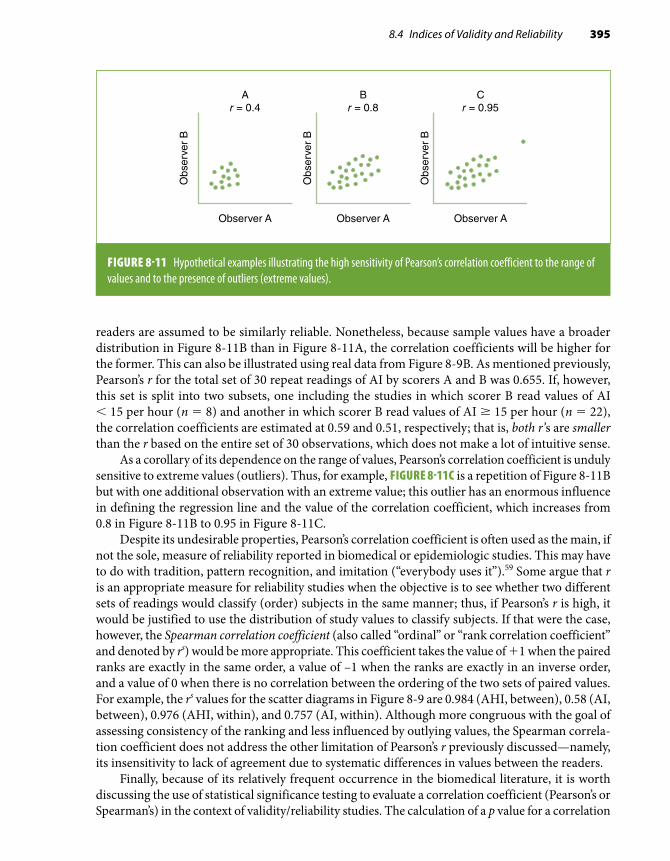
8.4 Indices of Validity and Reliability 395
readers are assumed to be similarly reliable. Nonetheless, because sample values have a broader distribution in Figure 8-11B than in Figure 8-11A, the correlation coefficients will be higher for the former. This can also be illustrated using real data from Figure 8-9B. As mentioned previously, Pearson’s r for the total set of 30 repeat readings of AI by scorers A and B was 0.655. If, however, this set is split into two subsets, one including the studies in which scorer B read values of AI < 15 per hour (n = 8) and another in which scorer B read values of AI ≥ 15 per hour (n = 22), the correlation coefficients are estimated at 0.59 and 0.51, respectively; that is, both r’s are smaller than the r based on the entire set of 30 observations, which does not make a lot of intuitive sense.
As a corollary of its dependence on the range of values, Pearson’s correlation coefficient is unduly sensitive to extreme values (outliers). Thus, for example, FIGURE 8-11C is a repetition of Figure 8-11B but with one additional observation with an extreme value; this outlier has an enormous influence in defining the regression line and the value of the correlation coefficient, which increases from 0.8 in Figure 8-11B to 0.95 in Figure 8-11C.
Despite its undesirable properties, Pearson’s correlation coefficient is often used as the main, if not the sole, measure of reliability reported in biomedical or epidemiologic studies. This may have to do with tradition, pattern recognition, and imitation (“everybody uses it”).59 Some argue that r is an appropriate measure for reliability studies when the objective is to see whether two different sets of readings would classify (order) subjects in the same manner; thus, if Pearson’s r is high, it would be justified to use the distribution of study values to classify subjects. If that were the case, however, the Spearman correlation coefficient (also called “ordinal” or “rank correlation coefficient” and denoted by rs) would be more appropriate. This coefficient takes the value of +1 when the paired ranks are exactly in the same order, a value of –1 when the ranks are exactly in an inverse order, and a value of 0 when there is no correlation between the ordering of the two sets of paired values. For example, the rs values for the scatter diagrams in Figure 8-9 are 0.984 (AHI, between), 0.58 (AI, between), 0.976 (AHI, within), and 0.757 (AI, within). Although more congruous with the goal of assessing consistency of the ranking and less influenced by outlying values, the Spearman correla-tion coefficient does not address the other limitation of Pearson’s r previously discussed—namely, its insensitivity to lack of agreement due to systematic differences in values between the readers.
Finally, because of its relatively frequent occurrence in the biomedical literature, it is worth discussing the use of statistical significance testing to evaluate a correlation coefficient (Pearson’s or Spearman’s) in the context of validity/reliability studies. The calculation of a p value for a correlation
Observer A
Obs
erve
r B
Ar = 0.4
Observer A
Obs
erve
r B
Br = 0.8
Observer A
Obs
erve
r B
Cr = 0.95
FIGURE 8-11 Hypothetical examples illustrating the high sensitivity of Pearson’s correlation coefficient to the range of values and to the presence of outliers (extreme values).

396 Chapter 8 Quality Assurance and Control
coefficient (i.e., evaluating the null hypothesis H0: r = 0.0) is not useful in this context for both theoretical and practical reasons: (1) The null hypothesis—that there is no relationship between two tests (or two observers) supposedly measuring the same variable or construct—is illogical and demonstrating that it can be rejected is not very informative; and (2) even when the reliability is fairly poor (e.g., r ≤ 0.3 or 0.4), the corresponding p value may well be statistically significant if the sample size is reasonably large. Thus, a highly significant p value may be mistakenly interpreted as evidence of high reliability when in fact its only interpretation is that it is relatively safe to reject a (meaningless, anyway) null hypothesis. Testing the hypothesis of quasi-perfect correlation (e.g., H0: r = 0.95) has been proposed as an alternative and more useful approach.60 Another logical alternative is to calculate confidence limits for the value of the correlation coefficient rather than its associated p value.
The preceding discussion suggests that the correlation coefficient should be used judiciously. More specifically, its interpretation is greatly enhanced by a consideration of possible systematic differences between measurements. The use of a scatter diagram of the data is helpful in detecting these systematic differences, the presence of outlying values, and differences between variables with regard to the range of their values. Other indices of reliability that avoid some of the pitfalls inherent to Pearson’s r are discussed next.
An alternative to Pearson’s r is linear regression, which provides a measure of the regression function’s intercept and slope (see Chapter 7, Section 7.4.1), thus allowing the assessment of sit-uations such as those illustrated in Figure 8-10B and Figure 8-10C in which the intercept is not zero or in which there is a systematic difference between readers. Linear regression, however, is not problem free when used to analyze reliability data; for example (and importantly), it neglects the fact that measurement errors may occur for both dependent and independent variables.58 (In ordinal linear regression, the so-called independent variable, x, is assumed to be error free, and only errors [statistical variability] in the dependent variable are considered; see Chapter 7, Section 7.4.1.) Linear regression is more useful for calibration purposes than to assess reliability; that is, it is more useful to predict outcomes or to obtain corrected values once a systematic difference is identified and quantified.
Intraclass Correlation CoefficientThe intraclass correlation coefficient (ICC) or reliability coefficient (R) is an estimate of the fraction of the total measurement variability caused by variation among individuals.43,61 Ideally, an epide-miologic study should use highly standardized procedures and data collection methods known to be valid and reliable. Under these optimal circumstances, most of the variability can be attributed to differences among study participants (between-individual variability) (see Section 8.3.3).
The general formula for the ICC is
ICC = VV
VV V
b
T
b
b e=
+
in which Vb = variance between individuals and VT = total variance, which includes both Vb and Ve, with Ve being the unwanted variance (error). Ve will include different components depending on the design of the study (see Figure 8-4). For example, in a within-laboratory reliability study, it will include the variance due to laboratory/method error. In a within-individual reliability study (i.e., based on repeat readings or determinations by the same reader or technique obtained in the same individual), it will be the estimated variance within individuals. It can also be combinations

8.4 Indices of Validity and Reliability 397
of these, as, for example, in a study assessing both the laboratory and within-individual variability of hemostasis and inflammation plasma parameters.64
The ICC is akin to the kappa statistic for continuous variables and has the same range of pos-sible values (from –1.0 [or, more realistically, from 0] to +1.0, in case of perfect agreement). It has the advantage over the Pearson’s or Spearman’s correlation coefficient in that it is a true measure of agreement, combining information on both the correlation and the systematic differences between readings.61 As in the case of Pearson’s correlation coefficient, however, ICC is affected by the range of values in the study population. In the previous formula, when Vb is small, ICC also will be small. This is particularly important in studies within populations in which the exposure values are either very high or very low. For example, a high intake of animal fat in all individuals of some populations may result in uniformly high serum cholesterol levels. A low reliability coefficient resulting from a small variability of the exposure levels may negatively influence the power of an epidemiologic study and thus make it difficult to assess an association. Obviously, the ICC will also be low when there is substantial intra-individual variability of the factor of interest, as in the case of gonadal hormone levels in premenopausal women.
ICC can be calculated from an analysis of variance (ANOVA) table, although a simpler formula based on the standard deviations of the two sets of observations and the sum and the standard de-viation of the paired differences has been described61 (see Appendix E). Based on this formula, for example, the ICC for the between-reader reliability study data shown in Table 8-20 can be estimated as 0.99 for AHI and as 0.58 for AI. Like kappa, the ICC can be extended to calculate the reliability between more than two observers or readings. For example, in the actual (full) reliability study of sleep scoring in the SHHS,56 the reported ICC between the three scorers was 0.99 for both AHI and AI.
As an additional example, TABLE 8-21 shows the ICC for three lipid measurements in a sample of the ARIC Study cohort baseline examination.29 The high ICC obtained for total cholesterol and total high-density lipoprotein (HDL) cholesterol in this study suggests that the proportion of the variance due to within-individual variability or laboratory error for these analytes is small; on the other hand, the ICC for an HDL cholesterol fraction (HDL2) was found to be much lower.
The Cronbach alpha, an additional reliability measure that is closely related to the intraclass correlation coefficient, is widely used by researchers in the social sciences.65,66
TABLE 8-21 Intraclass correlation coefficients (ICCs) and coefficients of variation (CVs) for selected analytes in the Atherosclerosis Risk in Communities (ARIC) Study.*
Analyte ICC CV (%)
Total cholesterol 0.94 5.1
HDL cholesterol 0.94 6.8
HDL2 0.77 24.8
*Includes both within-individual and laboratory variability.Data from Chambless LE, McMahon RP, Brown SA, Patsch W, Heiss G, Shen YL. Short-term intraindividual variability in lipoprotein measurements: the Atherosclerosis Risk in Communities (ARIC) Study. Am J Epidemiol. 1992;136:1069-1081.29

398 Chapter 8 Quality Assurance and Control
Mean Difference and Paired t-TestThe average of the differences between the two values of the pairs of observations is a measure of the degree of systematic differences between the two sets of readings. A paired t-test statistic can be calculated simply by dividing the mean value of all paired differences denoted by x by its standard error (i.e., the standard deviation [s] over the square root of the sample size):
tx
s n− = −
−test
/( )
( )
1 2
1 2
This index is typically used when assessing validity, as it provides a direct estimate of the degree of bias for one of the sets of measurements when it is justified to use the other set as a gold standard. It can also be used in the context of paired reliability studies, as when assessing systematic differ-ences between readers of a test. For example, for the between-reader reliability study in Table 8-20, scorer A’s and scorer B’s mean differences were 0.367 (standard deviation [SD] = 0.703) for AHI and –3.327 (SD = 8.661) for AI. Although their magnitude is rather small, particularly for AHI, both differences were found to be statistically significant at conventional levels (p < 0.05), thus suggesting the existence of a systematic between-scorer variability. In Whitney et al.’s report,56 this index was used to assess within-scorer reliability.
Caution should be exercised when using the mean difference as a measure of validity or reliability without a careful examination of the data (e.g., looking at a scatter diagram or a Bland-Altman plot; see later in this chapter), as its value can be heavily dependent on extreme values.
Coefficient of VariabilityAnother index of reliability often used in epidemiologic studies is the coefficient of variability (CV), which is the standard deviation expressed as a percentage of the mean value of two sets of paired observations. In an analysis of reliability data, it is calculated for each pair of observations and then averaged over all pairs of original and replicate measures. Its estimation is very straightforward. The variance of each pair of measurements is
V x xi ij ij
= −=∑( )2
1
2
in which i is a given pair of repeat measurements (indexed by j) on the same sample or individual, xi1 and xi2 are the values of these two measurements, and xi is their mean.
The standard deviation (SD) for each pair of observations is the square root of Vi; thus, for each pair of measurements, the coefficient of variability (expressed as a percentage) is
CV SDi
i
ix= × 100
For example, for the last pair (pair 30) of between-scorer readings of AHI in Table 8-20 (11.09 and 9.25, mean 10.17), these calculations are
V30 = (11.09 − 10.17)2 + (9.25 − 10.17)2 = 1.693

8.4 Indices of Validity and Reliability 399
with the resulting coefficient of variability for that pair being
CV301 693
10 17100 12 8= × =.
.. %
This calculation would have to be repeated for all pairs of measurements, and the overall co-efficient of variability would be the average of all pair-wise coefficients of variability. The lower the coefficient of variability, the less variation there is between the replicate measurements. Obviously, if there were no differences whatsoever between paired values (perfect agreement), the value of the coefficient of variability would be zero. The overall between-scorer coefficients of variability for all 30 paired observations shown in Table 8-20 are 10.1% for AHI and 22.8% for AI. In addition to the ICCs discussed previously, Table 8-21 shows the coefficients of variability for serum total cholesterol, HDL cholesterol, and HDL2 in the ARIC Study.29 Consistent with the intraclass cor-relation coefficients, the coefficients of variability are fairly low for total cholesterol and total HDL cholesterol but high for the HDL cholesterol fraction, HDL2, indicating substantial imprecision in the measurement of the latter fraction.*
Bland-Altman PlotThis is a very useful graphical technique that is a good complement to the ordinary scatter diagram (discussed previously) for the examination of patterns of disagreement between repeated measure-ments (or between a given measurement and the gold standard). It consists of a scatter plot where the difference between the paired measurements (A – B in the ordinate) is plotted against their mean value [(A + B)/2, in the abscissa]. From this plot, it is much easier than in a regular scatter diagram to assess the magnitude of disagreement (including systematic differences), spot outliers, and see whether there is any trend.58,59 For example, FIGURES 8-12A and 8-12B show the Bland-Altman plots for the between-scorer measurements of AHI and AI data from Table 8-20. Compared with the corresponding scatter diagrams (Figures 8-9A and 8-9B), these pictures reveal more clearly some interesting features of the data:
■ There is a slight systematic difference between the two measurements, as represented by the departure from zero of the horizontal line corresponding to the mean difference.
■ Outliers may be present. In Figure 8-12, there is one measurement with a mean AHI greater than 25 and one measurement with a mean AI greater than 40 that are clearly outside the range of mean difference ± 2 SD.
■ The graphs provide a clearer idea of the magnitude of disagreement in comparison with the actual measurement. In Figure 8-12A, for example, all but one (or perhaps two or three) AHI
*The coefficient of variability (CV) is also useful to determine whether between-individual exposure variability in an ob-servational study is sufficient to allow evaluation of an association. It can be calculated simply as the exposure’s standard deviation divided by its mean value. For example, in some populations the intake of salt is high and does not vary much between individuals, which makes it difficult to detect an association between salt intake and high blood pressure. When used for this purpose, it is expected that, unlike in the examples in this chapter, the CV will be reasonably high. It should also be noted that, when the exposure (or the outcome) is not too variable between individuals within populations, but it varies among populations, an ecologic correlation analysis (see Chapter 1, Section 1.3) may provide better evidence for an association than a study of individuals within a population. For a discussion of variability in the context of homogeneity of associations, see Chapter 10, Section 10.2.4.

400 Chapter 8 Quality Assurance and Control
3
2
1
0
–1
–2
0 5 10 15 20 25 30
+2 SD
–2 SD
Mean
AHI
Wit
hin
-pai
r A
HI d
iffer
ence
Within-pair AHI mean
A
20
10
0
–10
–20
–40
0 10 3020 40 50
–30
+2 SD
–2 SD
Mean
AI
Wit
hin
-pai
r A
I diff
eren
ce
Within-pair AI mean
B
FIGURE 8-12 Bland-Altman plots for AHI and AI for the between-scorer reliability study data from Table 8-20. The horizontal lines represent the mean within-pair difference (0.367 and –3.327, for AHI and AI, respectively) and the mean ± 2 standard deviations (1 SD = 0.703 for AHI and 8.661 for AI). AHI and AI are expressed as the average number of episodes per hour of sleep. (Note that the scales in the ordinates of AHI and AI are different.)
mean differences are within the (mean ± 2 SD) range, which spans approximately three AHI units; the latter is a relatively low value in the range of AHI values in the abscissa. In contrast, the (mean difference ± 2 SD) range for AI (Figure 8-12B), while also containing all but one observation, spans almost 35 AI units, which is practically the entire range of AI values observed in these individuals.
■ The AHI plot in Figure 8-12A suggests that disagreement between the scorers increases as the actual value of AHI increases. This pattern is not as evident for AI, however (Figure 8-12B).
If this graphic approach is used when one of the measurements can be considered a gold stan-dard, one may want to represent the latter in the abscissa instead of the mean of both measurements. In this case, the vertical departure from zero will represent the magnitude of bias of the test value with respect to the gold standard.
An alternative to the Bland-Altman approach that allows the evaluation of agreement between more than two sets of observations and is based on an extension of the Kaplan-Meier method has been suggested by Luiz et al. and is described in detail elsewhere.67
8.5 Regression to the MeanThe phenomenon known as regression to the mean permeates many of the problems and analyt-ical approaches described in the previous sections and deserves a brief discussion here. This is a well-known phenomenon, aptly discussed by Oldham in 1962,68 which expresses the tendency for high values of continuous variables (e.g., blood pressure) measured at any given point in time to decrease, and for low values to increase, when repeated measurements are done. This tendency may result from either intra-individual variability (as illustrated in Figure 8-3) or random measurement

8.5 Regression to the Mean 401
mm Hg
180
160
140
120
100
200
80
Sys
tolic
blo
od p
ress
ure
Placebo
Intervention
Time
Regressionto the mean
FIGURE 8-13 Schematic representation of regression to the mean in a randomized clinical trial. In a clinical trial of an antihypertensive drug, individuals are selected on the basis of a blood pressure value above a certain cutoff point defining hypertension (e.g., systolic blood pressure ≥ 160 mm Hg, denoting severe hypertension). Some individuals are thus chosen when their blood pressure levels are above their average values. As a result, in the initial phases of follow-up, blood pressure will decline in both intervention and placebo groups regardless of the effectiveness of the drug.
errors. As an example, when measurements of blood pressure levels in a group of individuals are repeated, many values converge (regress) toward the mean. A corollary of this is that caution is needed when analyzing data on repeated measurements over time and when analyzing correlation of these data with baseline values.69 In addition, regression to the mean underscores the desirability of using the average of repeated measurements rather than single measurements for physiologic parameters that fluctuate (as is the case of blood pressure, among many other examples). This is particularly important in studies in which a cutoff point is used as a study inclusion criterion, such as the cutoff to define hypertension in clinical trials of hypertension management. Many individuals eligible on the basis of one measurement would not be eligible if the mean of repeated measurements of blood pressure was used instead. When regression to the mean occurs, the ini-tial follow-up phase of a clinical trial aimed at examining the effectiveness of an antihypertensive medication may show a decrease in blood pressure levels in both the active intervention and the placebo groups (FIGURE 8-13). An example is given by the Hypertension Detection and Follow-up Program, in which an initial decline in systolic blood pressure was seen in both the intervention and the control groups and in all four sex–ethnic groups (white men and women and African American men and women).70

402 Chapter 8 Quality Assurance and Control
8.6 Final ConsiderationsIt should be emphasized that validity and reliability are two entirely different issues. For example, poor validity may be consistent with an excellent reliability (i.e., every time the procedure is repeated, the same or very similar, albeit always inaccurate, results are found).
In addition, assessment of the same summary measures, such as the kappa statistic, may not be sufficient to implement a specific corrective action. Consider, for example, a situation in which agreement between experienced readers in the interpretation of mammographic images results in a high kappa value (e.g., k = 0.9), denoting that the agreement is “almost perfect,” according to Landis and Koch’s classification (Figure 8-7).45 However, the reviewers disagree with regard to 10 observations. For quality control, it may be useful to ask why two experienced readers, using the same protocols, arrived at different results from 10 study participants. Can the results be explained by these participants’ characteristics (e.g., obesity interfering with the quality of the mammographic images)? Were the discrepant results due to one or both of the readers’ state of mind when they were interpreting the results? And so on. This example underscores the contrast between reporting a summary measure (kappa) and the practical aspects of conducting research and suggests that, in addition to examining the actual reasons for the discrepant findings, strategies that allow a more complete examination of data, such as the Bland-Altman plot, should be favored over more concise summary measures, such as kappa.
References1. Kahn HA, Sempos CT. Statistical Methods in Epidemiology. New York, NY: Oxford University Press; 1989.2. Whitney CW, Lind BK, Wahl PW. Quality assurance and quality control in longitudinal studies. Epidemiol Rev. 1998;20:71-80.3. ARIC Investigators. The Atherosclerosis Risk in Communities (ARIC) Study: design and objectives. Am J Epidemiol.
1989;129:687-702.4. Prineas R, Crow RS, Blackburn H. The Minnesota Code Manual of Electrocardiographic Findings. Littleton, MA: John
Wright PSG; 1982.5. White AD, Folsom AR, Chambless LE, et al. Community surveillance of coronary heart disease in the Atherosclerosis
Risk in Communities (ARIC) Study: Methods and initial two years’ experience. J Clin Epidemiol. 1996;49:223-233.6. Sudman S, Bradburn NM. Asking Questions. San Francisco, CA: Jossey-Bass; 1982.7. Converse J, Presser S. Survey Questions: Handcrafting the Standardized Questionnaire. Newbury Park, CA: Sage; 1986.8. Rose GA. Chest pain questionnaire. Milbank Mem Fund Q. 1965;43:32-39.9. Comstock GW, Tockman MS, Helsing KJ, Hennesy KM. Standardized respiratory questionnaires: comparison of the
old with the new. Am Rev Respir Dis. 1979;119:45-53.10. Burt VL, Cutler JA, Higgins M, et al. Trends in the prevalence, awareness, treatment, and control of hypertension in
the adult US population: data from the Health Examination Surveys, 1960 to 1991. Hypertension. 1995;26:60-69.11. Block G, Hartman AM, Dresser CM, Carroll MD, Gannon J, Gardner L. A data-based approach to diet questionnaire
design and testing. Am J Epidemiol. 1986;124:453-469.12. Willett WC, Sampson L, Stampfer MJ, et al. Reproducibility and validity of a semiquantitative food frequency questionnaire.
Am J Epidemiol. 1985;122:51-65.13. Radloff L. Center for Epidemiological Studies Depression Scale. Appl Psychol Meas. 1977;1:385-401.14. Irwin M, Artin KH, Oxman MN. Screening for depression in the older adult: criterion validity of the 10-item Center
for Epidemiological Studies Depression Scale (CES-D). Arch Intern Med. 1999;159:1701-1704.15. Dickersin K, Berlin JA. Meta-analysis: state-of-the-science. Epidemiol Rev. 1992;14:154-176.16. Bild D, Bluemke DA, Burke GL, et al. Multi-ethnic Study of Atherosclerosis: objectives and design. Am J Epidemiol.
2002;156:871-881.17. Ramirez-Anaya M, Macias ME, Velazquez-Gonzalez E. Validation of a Mexican Spanish version of the Children’s
Dermatology Life Quality Index. Pediatr Dermatol. 2010;27:143-147.18. Laliberté S, Lamoureux J, Sullivan MJ, Miller JM, Charron J, Bouthillier D. French translation of the Multidimensional
Pain Inventory: L’inventaire multidimensionnel de la douler. Pain Res Manag. 2008;13:497-505.

403References
19. Gordis L. Epidemiology. 5th ed. Philadelphia, PA: Elsevier Saunders; 2014.20. Lippel K, Ahmed S, Albers JJ, Bachorik P, Muesing R, Winn C. External quality-control survey of cholesterol analyses
performed by 12 lipid research clinics. Clin Chem. 1978;24:1477-1484.21. Burke GL, Sprafka JM, Folsom AR, Hahn LP, Luepker RV, Blackburn H. Trends in serum cholesterol levels from 1980
to 1987: the Minnesota Heart Survey. N Engl J Med. 1991;324:941-946.22. Brinton LA, Hoover RN, Szklo M, Fraumeni JF Jr. Menopausal estrogen use and risk of breast cancer. Cancer.
1981;47:2517-2522.23. Vargas CM, Burt VL, Gillum RF, Pamuk ER. Validity of self-reported hypertension in the National Health and Nutrition
Examination Survey III, 1988–1991. Prev Med. 1997;26(5 pt 1):678-685.24. Nieto-García FJ, Bush TL, Keyl PM. Body mass definitions of obesity: sensitivity and specificity using self-reported
weight and height. Epidemiology. 1990;1:146-152.25. Copeland KT, Checkoway H, McMichael AJ, Holbrook RH. Bias due to misclassification in the estimation of relative
risk. Am J Epidemiol. 1977;105:488-495.26. Block G. A review of validations of dietary assessment methods. Am J Epidemiol. 1982;115:492-505.27. Martin-Moreno JM, Boyle P, Gorgojo L, et al. Development and validation of a food frequency questionnaire in Spain.
Int J Epidemiol. 1993;22:512-519.28. Frost C, White IR. The effect of measurement error in risk factors that change over time in cohort studies: do simple
methods overcorrect for “regression dilution”? Int J Epidemiol. 2005;34:1359-1368.29. Chambless LE, McMahon RP, Brown SA, Patsch W, Heiss G, Shen YL. Short-term intraindividual variability in lipoprotein
measurements: the Atherosclerosis Risk in Communities (ARIC) Study. Am J Epidemiol. 1992;136:1069-1081.30. Colditz GA, Willett WC, Stampfer MJ, et al. The influence of age, relative weight, smoking, and alcohol intake on the
reproducibility of a dietary questionnaire. Int J Epidemiol. 1987;16:392-398.31. Ransohoff DF, Feinstein AR. Problems of spectrum and bias in evaluating the efficacy of diagnostic tests. N Engl J Med.
1978;299:926-930.32. Brenner H, Gefeller O. Variation of sensitivity, specificity, likelihood ratios and predictive values with disease prevalence.
Stat Med. 1997;16:981-991.31.33. Sackett DL. Clinical Epidemiology: A Basic Science for Clinical Medicine. Boston, MA: Little, Brown; 1991.34. Fletcher R, Fletcher SW, Wagner EH. Clinical Epidemiology: The Essentials. 2nd ed. Baltimore, MD: Williams & Wilkins;
1988.35. Fikree FF, Gray RH, Shah F. Can men be trusted? A comparison of pregnancy histories reported by husbands and wives.
Am J Epidemiol. 1993;138:237-242.36. Hinkle S, Rawal S, Zhu Y, Grewal J, Albert PS, Zhang C. Validation of self-reported diagnosis of gestational diabetes at
6 weeks postpartum. Epidemiology. 2017;28:747-752.37. Youden WJ. Index for rating diagnostic tests. Cancer. 1950;3:32-35.38. Li R, Cai J, Tegeler C, Sorlie P, Metcalf PA, Heiss G. Reproducibility of extracranial carotid atherosclerotic lesions
assessed by B-mode ultrasound: the Atherosclerosis Risk in Communities Study. Ultrasound Med Biol. 1996;22:791-799.39. van der Kooy K, Rookus MA, Peterse HL, van Leeuwen FE. p53 protein overexpression in relation to risk factors for
breast cancer. Am J Epidemiol. 1996;144:924-933.40. Cicchetti DV, Feinstein AR. High agreement but low kappa: II: resolving the paradoxes. J Clin Epidemiol. 1990;43:551-558.41. Chamberlain J, Rogers P, Price JL, Ginks S, Nathan BE, Burn I. Validity of clinical examination and mammography as
screening tests for breast cancer. Lancet. 1975;2:1026-1030.42. Cohen J. A coefficient of agreement for nominal scales. Educ Psychol Meas. 1960;20:37-46.43. Fleiss J. Statistical Methods for Rates and Proportions. 2nd ed. New York, NY: John Wiley and Sons; 1981.44. Thompson WD, Walter SD. A reappraisal of the kappa coefficient. J Clin Epidemiol. 1988;41:949-958.45. Landis JR, Koch GG. The measurement of observer agreement for categorical data. Biometrics. 1977;33:159-174.46. Altman DG. Practical Statistics for Medical Research. London, UK: Chapman and Hall; 1991.47. Byrt T. How good is that agreement? Epidemiology. 1996;7:561.48. Seigel DG, Podgor MJ, Remaley NA. Acceptable values of kappa for comparison of two groups. Am J Epidemiol.
1992;135:571-578.49. Klebanoff MA, Levine RJ, Clemens JD, DerSimonian R, Wilkins DG. Serum cotinine concentration and self-reported
smoking during pregnancy. Am J Epidemiol. 1998;148:259-262.50. Ferrer M, Lamarca R, Orfila F, Alonso J. Comparison of performance-based and self-rated functional capacity in Spanish
elderly. Am J Epidemiol. 1999;149:228-235.51. Stieb DM, Beveridge RC, Rowe BH, Walter SD, Judek S. Assessing diagnostic classification in an emergency department:
implications for daily time series studies of air pollution. Am J Epidemiol. 1998;148:666-670.52. Maclure M, Willett WC. Misinterpretation and misuse of the kappa statistic. Am J Epidemiol. 1987;126:161-169.

404 Chapter 8 Quality Assurance and Control
53. Feinstein AR, Cicchetti DV. High agreement but low kappa: I: the problems of two paradoxes. J Clin Epidemiol. 1990;43:543-549.
54. Byrt T, Bishop J, Carlin JB. Bias, prevalence and kappa. J Clin Epidemiol. 1993;46:423-429.55. Quan SF, Howard BV, Iber C, et al. The Sleep Heart Health Study: design, rationale, and methods. Sleep. 1997;20:1077-1085.56. Whitney CW, Gottlieb DJ, Redline S, et al. Reliability of scoring respiratory disturbance indices and sleep staging. Sleep.
1998;21:749-757.57. Armitage P, Berry G. Statistical Methods in Medical Research. 3rd ed. London, UK: Blackwell; 1994.58. Altman DG, Bland JM. Measurement in medicine: the analysis of method comparison studies. Statistician. 1983;32:307-317.59. Bland JM, Altman DG. Statistical methods for assessing agreement between two methods of clinical measurement.
Lancet. 1986;1:307-310.60. Hebert JR, Miller DR. The inappropriateness of conventional use of the correlation coefficient in assessing validity and
reliability of dietary assessment methods. Eur J Epidemiol. 1991;7:339-343.61. Deyo RA, Diehr P, Patrick DL. Reproducibility and responsiveness of health status measures: statistics and strategies
for evaluation. Control Clin Trials. 1991;12(4 suppl):142S-158S.62. Stunkard AJ, Albaum JM. The accuracy of self-reported weights. Am J Clin Nutr. 1981;34:1593-1599.63. Palta M, Prineas RJ, Berman R, Hannan P. Comparison of self-reported and measured height and weight. Am J Epidemiol.
1982;115:223-230.64. Sakkinen PA, Macy EM, Callas PW, et al. Analytical and biologic variability in measures of hemostasis, fibrinolysis, and
inflammation: assessment and implications for epidemiology. Am J Epidemiol. 1999;149:261-267.65. Cronbach LJ. Coefficient alpha and the internal structure of tests. Psychometrika. 1951;16:297-334.66. Cronbach LJ, Shavelson RJ. My current thoughts on coefficient alpha and successor procedures. Educational and
Psychological Measurement. 2004;64:391-418.67. Luiz RR, Costa AJL, Kale PL, Werneck GL. Assessment of agreement of a quantitative variable: a new graphical approach.
J Clin Epidemiol. 2003;56:963-967.68. Oldham PD. A note on the analysis of repeated measurements of the same subjects. J Chron Dis. 1962;15:969-977.69. Nieto-García FJ, Edwards LA. On the spurious correlation between changes in blood pressure and initial values. J Clin
Epidemiol. 1990;43:727-728.70. Hypertension Detection and Follow-up Program Cooperative Group. Five-year findings of the Hypertension Detection and
Follow-up Program: III: reduction in stroke incidence among persons with high blood pressure. JAMA. 1982;247:633-638.

Exercises 405
1. The relationship between serum cholesterol and coronary heart disease seems to follow a dose-response (graded) pattern. A serum cholesterol concentration test based on blood obtained by fingerstick in nonfasting individuals was considered for use in a large cohort study of risk factors for coronary heart disease. Also, discussed in Section 8.3.2 of this chapter, a pilot study was conducted comparing results from this test with those obtained by assaying serum cholesterol in a nationally recognized standard laboratory. The standard examinations were done in the fasting state on plasma under carefully controlled conditions. The results are shown in the table. In this table, “positive” values refer to a serum cholesterol concentration of ≥ 200 mg/dL.
Fingerstick values
Standard laboratory values
Positive Negative Total
Positive 18 19 37
Negative 1 11 12
Total 19 30 49
a. Calculate the sensitivity, specificity, and predictive values of the fingerstick test by using the standard laboratory values as the gold standard.
b. On the basis of this pilot study, would you recommend the use of the fingerstick test in the study? State the reasons for your recommendation and the potential impact of using this test on the study’s results.
c. Would you have analyzed the results of this pilot study differently? Why and how?2. Define quality assurance and quality control, and next to each activity shown in the table
check whether it should be regarded as a quality assurance or a quality control activity.
ActivityQuality
assuranceQuality control
Preparation of manuals of operation . . . . . . . . . . . .
Over-the-shoulder observation of interviews during the study’s data collection phase
. . . . . . . . . . . .
Determination of inter-observer reliability during the study’s data collection phase
. . . . . . . . . . . .
Exercises
(continues)

406 Chapter 8 Quality Assurance and Control
ActivityQuality
assuranceQuality control
Certification of interviewers . . . . . . . . . . . .
Recertification of interviewers . . . . . . . . . . . .
Examination of intralaboratory reliability using phantom (repeat) blood samples collected from the study participants
. . . . . . . . . . . .
Assessment of the validity of two data collection instruments to decide which instrument should be used in the study
. . . . . . . . . . . .
Duplicate readings (with adjudication by a third reader) of X-rays for confirmation of an outcome in an ongoing cohort study
. . . . . . . . . . . .
Training of interviewers . . . . . . . . . . . .
Pretest of a questionnaire . . . . . . . . . . . .
3. In an ongoing epidemiologic study, the inter-observer reliability of body mass index (BMI, measured in kilograms per meter squared [kg/m2]) was examined, based on three cate-gories: “normal” (BMI < 25 kg/m2), “overweight” (BMI = 25–29.9 kg/m2), and “obese” (BMI ≥ 30 kg/m2). Two independent observers measured weight and height on the same day in 30 volunteers. The results are shown in the following table:
Observer A
Observer B Normal Overweight Obese Total
Normal 10 10
Overweight 12 2 14
Obese 1 5 6
Total 10 13 7 30
a. Calculate the unweighted and the weighted kappa values. For the latter, use weights of 1.0 for perfect agreement and 0.7 for a one-category difference.
b. Given these kappa values, which additional action would you pursue?c. Under which circumstances would you use the weighted kappa?

Exercises 407
4. In a hypothetical study, two technicians used a stethoscope that allows two observers to measure levels of blood pressure simultaneously to determine inter-observer agreement of systolic blood pressure measures. Both technicians were trained using the same protocol and by the same experienced third technician. The results are as follows:
Studyparticipant no.
Levels of systolic blood pressure (mm Hg)
Technician A Technician B
1 122 125
2 130 129
3 118 116
4 136 135
5 114 112
6 116 118
7 124 122
8 110 111
9 140 142
10 146 145
a. Calculate the coefficient of variability for this set of blood pressure measurements.b. What can be concluded from your observation of these values and from the coefficient
of variability?5. During the follow-up of a cohort study that included individuals aged 65 years or older, two
members of the study’s Morbidity and Mortality Committee reviewed the diagnosis of heart failure among cohort participants. The reviewers considered only the symptoms reported prior to hospital admission of each cohort member who stated that he or she had been dis-charged with a diagnosis of heart failure (not all patients admitted with symptoms received a diagnosis of heart failure). Using magnetic resonance images obtained during the hospital admission as the gold standard, the sensitivity and specificity, respectively, were 80% and 95% for reviewer A and 85% and 90% for reviewer B. At the end of the follow-up of 2000 cohort members, 300 had been discharged with a diagnosis of heart failure (true positives).a. Using the sensitivity and specificity figures above, construct two 2 × 2 tables showing
the distribution of results obtained from each reviewer according to the results of their review and the true classification of heart failure.

408 Chapter 8 Quality Assurance and Control
b. Assuming that the two reviewers reviewed the patients’ symptoms to arrive at the di-agnosis of heart failure simultaneously, calculate the net sensitivity and net specificity of the process.
c. Now, assume that reviewer A was the first to review the patients’ symptoms and only those who were considered to have heart failure by reviewer A were reviewed by reviewer B. Calculate the net sensitivity and the net specificity of this process.
d. What are the advantages of each process (simultaneous vs sequential review)?

409
© Enculescu Marian Vladut/Shutterstock
PART 5
Issues of Reporting and Application of Epidemiologic ResultsCHAPTER 9 Communicating Results of Epidemiologic
Studies . . . . . . . . . . . . . . . . . . . . . . . . . . . . . . . . 411
CHAPTER 10 Epidemiologic Issues in the Interface With Public Health Policy . . . . . . . . . . . . . . . . . 437


411
© Enculescu Marian Vladut/Shutterstock
Communicating Results of Epidemiologic Studies9.1 IntroductionOral and written communication of research results is not only frequently full of specialized jargon, but is also often characterized by systematic mistakes that might properly be classified as biases. This chapter reviews some basic concepts and approaches that are relevant to the reporting of epidemiologic results and discusses common mistakes made when communicating empirical findings. Although some of these mistakes may be a function of errors made during the design and conduct of the study and are thus difficult, if not impossible, to rectify, many can be prevented during the preparation of the report of study results. This chapter is not meant to be prescriptive, but rather attempts to cover some issues that should be considered when preparing a report of epidemiologic findings.
9.2 What to ReportNotwithstanding the necessary flexibility in style and content of reports of epidemiologic studies, EXHIBIT 9-1 summarizes some of the key issues that are worth considering when preparing such reports. Obviously, not all of the items listed in Exhibit 9-1 are relevant to all reports of empirical findings. In the following paragraphs, selected issues summarized in Exhibit 9-1 that are often neglected when describing the study rationale, design, and results are briefly discussed.
9.2.1 Study Objectives and/or HypothesesThe study objectives and hypotheses that guided the conduct of the study need to be explicitly stated, usually at the end of the Introduction section. One common way to structure the Introduction sec-tion of the paper is to link previous evidence on the subject (from epidemiologic and other studies, such as animal experiments) with the specific questions that justify the present study.
CHAPTER 9

412 Chapter 9 Communicating Results of Epidemiologic Studies
EXHIBIT 9-1 Issues to be considered when preparing epidemiologic reports.
1. Introduction
a. Succinctly review rationale for study: Biologic plausibility*
What is new about studyb. State hypothesis/hypotheses [specify interaction(s), if part of the hypothesis].
2. Methodsa. Describe study population characteristics (e.g., age, gender), setting (e.g., hospital patients,
population-based sample), and time frame of the study.b. Describe inclusion and exclusion criteria.c. Describe data collection procedures; give accuracy/reliability figures for these procedures if
known.d. Describe quality assurance and quality control approaches.e. Specify criterion/criteria for identification of confounding variables.f. Describe statistical methods; explain criterion/criteria for categorization of study variables.
g. Give rationale for believing that the assumptions underlying the selected model are reasonable (e.g., for the use of the Cox model, that the hazard ratio is constant over the follow-up time).
3. Resultsa. Present descriptive data with minimum modeling (frequency distributions, medians, means,
unadjusted differences).b. Present stratified data.c. Present data using more complex models, but use the most parsimonious model warranted
by the data (e.g., Mantel-Haenszel adjusted odds ratio if only one or two categorical variables need to be adjusted).
d. When postulating interactions a priori (or exploring their presence a posteriori), consider assessing both multiplicative and additive interactions.
4. Discussiona. Review main results of study, and emphasize similarities and dissimilarities with the
literature.b. Review strengths and limitations of study. Consider bias and confounding as alternative
explanations for the results. Comment on possible misclassification of data in the context of the known or estimated validity and reliability of the data collection instruments and procedures used in the study.
c. Suggest specific ways to rectify some of the shortcomings of previous research and the present study to help future investigators address the same question(s).
d. If appropriate and warranted by the data, discuss the implications for public health policy or medical practice of the study results.
*“Biologic” if the disease process investigated is biological or physiological in nature. For epidemiologic studies dealing with psychosocial aspects, for example, the relevant aspects will be based on the psychosocial theoretical model underlying the hypothesis under study.Modified from Kahn HA, Sempos CT. Statistical Methods in Epidemiology. 2nd ed. New York, NY: Oxford University Press; 1989.1
If the study does not have specific hypotheses—that is, if it is an exploratory study of multiple exposure–outcome relationships (i.e., a “fishing expedition” in the epidemiology jargon)—this too should be clearly stated in the Introduction. In many large epidemiologic studies and surveys, doz-ens or hundreds of variables can be cross-tabulated in search of possible associations. For example, up to 1000 2 × 2 tables showing pooled data can be generated from a survey with information on

9.2 What to Report 413
100 two-level exposure variables and 10 possible binary outcomes (e.g., the prevalence rates of 10 different diseases). Theoretically, even if none of these exposure variables is truly associated with the outcomes, chance alone will determine that, in approximately 50 of the 1000 cross-tabulations, a statistical association will be found to be significant at the p ≤ 0.05 level. Selective publication of only these “significant” findings will lead to publication bias (see Chapter 10, Section 10.5).
For example, Friedman et al.2 published a paper reporting for the first time a strong graded relationship between leukocyte count and risk of myocardial infarction. In their discussion of these findings, then unexpected, Friedman et al. aptly opened their Discussion section with the following statement: “Our finding that the leukocyte count is a predictor of myocardial infarction should be viewed in the context of the exploratory study that we have been carrying out. In searching through approximately 750 assorted variables for new predictors of infarction . . .”2(p1278) Notwithstanding their exploratory nature, Friedman et al.’s results were subsequently replicated in a number of other studies. Although the causal nature of the association remains controversial,3 its biologic plausibility has been strengthened by studies showing a relationship between inflammatory markers and cor-onary heart disease.4,5 On the other hand, how many other findings in the medical/epidemiologic literature are just the product of a chance finding in a “fishing expedition,” creating a short-lived uproar in the mass media and then never being replicated?
This argument also applies to the reporting of interactions. Because an apparent effect modi-fication may occur by chance (see Chapter 6, Section 6.10.1), the reader needs to consider whether an apparent heterogeneity was a chance event resulting from multiple stratified cross-tabulations between the study variables rather than an expected finding based on a previously established and plausible hypothesis.
9.2.2 Description of Validity and Reliability of Data Collection InstrumentsWhen describing the data collection procedures, it is important to report the corresponding measures of validity and reliability whenever possible (see Chapter 8). Avoid statements such as “the validity/reliability of [the questionnaire] has been reported elsewhere [reference]” or “the instrument has been validated previously [reference],” as such wording is not informative for the reader without time or access to the source article. Moreover, these statements may be interpreted as meaning that the instrument is valid and reliable when in fact they may relate to a questionnaire with poor to moderate validity/reliability (e.g., kappa or intraclass correlation coefficients of 0.20–0.40, as seen in validation studies of dietary data, for example). In the case of questionnaires, a special problem is that their validity and reliability may be a function of the characteristics of the study population (e.g., educational level); that is, validity/reliability figures obtained from a given population may not be applicable to another population (see Chapter 8, Sections 8.3.2 and 8.3.3). Similarly, as discussed in Chapter 8, the validity/reliability of certain instruments or tests may be different between pop-ulations as a function of the underlying distribution of the trait. It is, therefore, important not only that results of validity/reliability studies be reported, but also that a summary of the characteristics of the individuals who participated in these studies be provided. Obviously, reports of the specific study findings should include results of quality control substudies if available (see Chapter 8).
9.2.3 Rationale for the Choice of ConfoundersReports of epidemiologic observational studies frequently fail to describe the criteria for selection of confounding variables. For example, was the choice of potentially confounding variables initially

414 Chapter 9 Communicating Results of Epidemiologic Studies
based on the literature and subsequently verified in the study data? Were new potential confounders explored in the study that had not been considered in previous studies, and if so, which analytic approaches were used to examine confounding (see Chapter 5, Section 5.4.)?
Sometimes, direct acyclic graphs may help in framing the analysis of confounding in the context of a theoretical causal model and should be presented whenever appropriate (see Chapter 5, Section 5.3). Generally, authors should avoid selecting confounders on the basis of results of significance testing (see Chapter 5, Section 5.5.6).
9.2.4 Criteria for Selection of the Cutoff Points When Establishing Categories for Continuous or Ordinal VariablesCommon approaches for categorizing continuous or ordinal variables are the use of either estab-lished standards (e.g., abnormal ST-T segment elevations observed in an electrocardiogram tracing to define myocardial ischemia) or study data distributions (e.g., use of percentiles as cutoff points). On occasion, investigators choose cutoff points that have been widely used for clinical purposes or in previous epidemiologic research (e.g., defining hypertension as values of ≥ 140 mm Hg systolic or ≥ 90 mm Hg diastolic blood pressure levels or defining hypercholesterolemia as serum cholesterol levels ≥ 200 mg/dL). When no such cutoff points exist and particularly when investigating novel risk factor–disease associations, the investigator may be interested in using exploratory techniques for optimizing and exploring the consequences of different cutoff choices for categorical6 or ordinal7 regression analyses. In any case, the report should explicitly describe the criteria or method used for this purpose; failure to define criteria clearly for selection of categories of the variables of interest may suggest that data were regrouped over and over again until the results were to the investigator’s liking (e.g., until they achieved statistical significance).
9.2.5 Unmodeled and Parsimoniously Modeled Versus Fully Modeled DataTo provide adequate background information to put the study findings in proper perspective, un-modeled and parsimoniously modeled results should be presented, including the characteristics of the study population and both univariate and stratified distributions of key study variables and findings. Authors should avoid the temptation of reporting only the results of full statistical modeling. Because unadjusted results undergo minimum modeling and are thus more representative of the study population, it could even be argued that, if adjusted and unadjusted results are similar, only the latter should be presented. Otherwise, it is advantageous to show unadjusted along with adjusted results; this strategy not only allows additional insight into the strength of a possible confounding effect but may also help in elucidating underlying mechanisms. An illustration of the advantage of showing both unadjusted and adjusted measures of association to elucidate mechanisms is given by a study of the relationship of social class to carotid atherosclerotic disease.8 The weakening of the relationship resulting from adjustment for major cardiovascular risk factors (e.g., hypertension, smoking, and hypercholesterolemia) gives a measure of the importance of these factors as mediating factors.9 Because the relationship may indeed be explained (at least partly) by these risk factors, it is inappropriate to show only the adjusted results.
Another example is that, assuming no measurement errors, the difference in the magnitude of birth weight–adjusted and unadjusted associations of obesity with mortality reflects the impor-tance of hypertension as a mechanism explaining the association (Chapter 5, Figures 5-4 and 5-5).

9.2 What to Report 415
Ideally, the role of each potential confounder should be assessed to pinpoint the exact source of confounding and/or to assess the mechanism linking the risk factor to the outcome. Procedures and the rationale for evaluating the influence of a given variable reflecting a mechanism linking the risk factor of interest to the outcome or the degree of positive confounding were discussed in Chapter 5, Sections 5.2.3 and 5.3.
Another issue related to confounding is that, although logistic regression is often used in cross- sectional analysis of prevalence,* a prevalence odds ratio may be misinterpreted as a prevalence ratio. For example, authors may describe a prevalence odds ratio of 3.0 as meaning that “the disease is three times more likely to be present in the exposed than in the unexposed.” Yet studies of associations based on prevalence rates usually deal with fairly common conditions, such as those encountered in cross-sectional surveys. Under these circumstances, the prevalence odds ratio is a biased estimate of the prevalence ratio (see Chapter 3, Section 3.2.1). For example, in a cross-sectional study including individuals aged 65 years or older, hypertension was found to be prevalent in 66% of African Ameri-can women and 52% of white women.10 Thus, the prevalence of hypertension was approximately 1.3 times greater in African American women than in white women; the prevalence odds ratio, however, was estimated at 1.8, which may lead to the erroneous inference that the prevalence of hypertension in this study was 80% greater in African American than in white women. In another study among nondiabetic overweight and obese adult subjects,11 the odds ratio of hypertension when comparing those with a large waist circumference (≥ 102 cm) to those with a waist circumference < 94 cm was 3.04. Because prevalence of hypertension is common in this population (approximately 50%), this odds ratio corresponds to a prevalence rate ratio of approximately 1.5; as this report was framed as a study of the relation between anthropometric measures and “risk of hypertension,”11 the large difference between the odds ratio and the prevalence rate ratio may be misleading.
Regardless of the accuracy of the interpretation of the odds ratio, prevalence ratios (and relative risks) are usually preferred, as they are easier to grasp by readers who are unfamiliar with epide-miology, such as the practicing physicians to whom many epidemiologic papers are aimed. As also mentioned in Chapter 7, Section 7.4.3, an alternative to logistic regression for the calculation of adjusted risk and prevalence ratios has been described.12
Finally, it should be emphasized that, from the public health viewpoint, reporting the unad-justed results may be of greater interest. Consider, for example, a comparison of Alzheimer’s disease rates between two groups of interest, the objective of which is to assist in the planning of health services. Would it be useful to the health planner to conclude that, after age adjustment, there is no difference between the groups? Obviously not, as the adjusted rates would not accurately express the differential disease burden in the two groups.
9.2.6 Assessment of InteractionAll too often, the widespread use of logistic regression, Cox regression, and related models results in an almost exclusive focus on multiplicative interaction. As discussed in Chapter 6, Section 6.6, evaluation of additive interaction is also of importance to public health practitioners13,14 and should be carried out regardless of the statistical model used to analyze epidemiologic data. It is important to bear in mind that the use of logistic regression or other multiplicative models does not preclude the assessment of additive interaction.15
*Or in prospective studies when incidence ratios are estimated without consideration of time-to-event or in case-based case-control studies.

416 Chapter 9 Communicating Results of Epidemiologic Studies
9.3 How to Report9.3.1 Avoiding Scientific ArroganceWhen reporting results of individual studies, particularly those of observational studies, epidemi-ologists frequently do not sufficiently recognize that no study can stand alone and that replication is needed to minimize the effects of chance, design, or analytic problems. One individual study supplies at best only one piece of a huge, almost limitless puzzle. Thus, in general, it is advisable to avoid definitive statements, such as “this study unequivocally demonstrates that . . . ,” or the use of the word effect as a proxy for association when interpreting the results of a single observational study. In general, caution is called for when interpreting results of observational research.*
9.3.2 Avoiding VerbosityAs in all scientific communication, it is important to be as concise as possible when reporting results from epidemiologic studies. In an editorial written a few years ago, Friedman16 underscored the importance of writing scientific reports in a manner as concise as possible without loss of meaning or clarity. The top panel of EXHIBIT 9-2 shows a 70-word paragraph from a paper submitted to an epidemiology journal; a significant reduction of its length (to 42 words) recommended by Fried-man16 not only preserved the paragraph’s meaning but may have improved its clarity. Friedman has subsequently renewed his call for the avoidance of verbosity17 and invited readers to read a paper by Lewis et al.18 as an exemplar of concise, yet clear, writing.
*The exceptions to the general rule that causal inferences should not be made when interpreting results of a single observational study include studies using special strategies to control for confounding, such as the use of instrumental variables and Mendelian randomization (see Chapter 7, Section 7.5).
EXHIBIT 9-2 Example of a verbose paragraph and its more concise alternative.
Original Paragraph (75 words)
Other investigations exploring the association between the risk factor and the disease have obtained information on the risk factor using surrogate measures. The amount of money spent on diapers, without consideration of inflation, has been used as a proxy by several groups of investigators, and all have reported that no significant differences were observed once the data were stratified by age at last full time pregnancy. Similar results were found in the analysis reported here.
Concise Version (44 words)
Other investigators have used surrogate measures of the risk factor, such as the amount of money spent on diapers, without consideration of inflation. As with our study, all revealed no significant differences once the data were stratified by age at last full time pregnancy.
Reproduced from Friedman GD. Be kind to your reader. Am J Epidemiol. 1990;132:591-593.16 By permission of Oxford University Press.

9.3 How to Report 417
9.3.3 Improving ReadabilityAnother way to make communication of epidemiologic findings more efficient, particularly when it is expected that some of the readers will lack familiarity with the terms used in the article, is to use as simple language as possible. Several readability formulas are available to determine the educational grade level of the intended readership.19,20 Consider, for example, applying the SMOG grading formula for tailoring an English-written report to the educational level of the readers21—an approach that reminds us of the need to keep the language simple when communicating with the public at large. The formula is easy to apply: (1) Select 30 sentences from the paper’s text—10 at the beginning, 10 in the middle, and 10 near the end of the text; (2) count words with three or more syllables; (3) take the square root of this count; and (4) add 3 to this square root to obtain the US-equivalent grade level needed for understanding the report. For example, if there were 100 such words, the educational level needed would be
SMOG Index = 100 3 13+ =
Thus, at least completion of high school is required to understand this report. By applying this formula, Freimuth18 concluded that patients receiving educational pamphlets about mammog-raphy from the Fox Chase Cancer Center would need to have at least 2 years of high school to be able to understand them. Although there is an obvious difference in the educational level of readers of scientific papers and that of the usual target readers of health education pamphlets, the SMOG formula and related formulas may be useful to epidemiologists who need to interface with the lay public (e.g., to communicate with the press or to have their views understood in a court of law).
In view of their cultural specificity and assuming that epidemiologic literature is read all over the world, jargon and abbreviations should be avoided or used sparingly and only when they achieve a universal acceptance/permanence status, as in the case of the terms DNA, IgG, and HIV. Widely used abbreviations, such as CHD (for coronary heart disease) or SES (for socioeconomic status), may be acceptable, provided they are properly spelled out at their first appearance in the article. Even the widespread use of commonly recognized abbreviations may lead to some con-fusion, however; for example, in Spanish-speaking countries, the abbreviation AIDS for acquired immunodeficiency syndrome becomes SIDA (síndrome de inmunodeficiencia adquirida), which in turn may be interpreted by English-speaking readers as a misspelling of the abbreviation SIDS, denoting sudden infant death syndrome. In any case, authors should always be reminded that the abuse of abbreviations, although shortening the length of the manuscript, tends to decrease its readability, particularly for readers not entirely familiar with the specific research topic. Consider the paragraph shown in EXHIBIT 9-3, taken from the (structured) abstract of a paper published in a major medical journal,22 which the use of abbreviations makes virtually incomprehensible to the average reader.
9.3.4 Deriving Appropriate InferencesCommon inferential mistakes in epidemiologic reports include the implication that a statistical association can be automatically interpreted as causal, the use of statistical significance as the main criterion to judge whether an association is present, and the comparison of the strength of associations for different risk factors using the size of the regression coefficients or derived risk estimates.

418 Chapter 9 Communicating Results of Epidemiologic Studies
EXHIBIT 9-3 Example of a published abstract using numerous acronyms in the Methods and Results section.
Methods and Results: Relative LV myocardial MMP activity was determined in the normal (n = 8) and idiopathic DCM (n = 7) human LV myocardium by substrate zymography. Relative LV myocardial abundance of interstitial collagenase (MMP-1), stromelysin (MMP-3), 72 kD gelatinase (MMP-2), 92 kD gelatinase (MMP-9), TIMP-1, and TIMP-2 were measured with quantitative immunoblotting. LV myocardial MMP zymographic activity increased with DCM compared with normal (984 ± 149 versus 413 ± 64 pixels, P < .05). With DCM, LV myocardial abundance of MMP-1 decreased to 16 ± 6% (P < .05), MMP-3 increased to 563 ± 212% (P < .05), MMP-9 increased to 422 ± 64% (P < .05), and MMP-2 was unchanged when compared with normal. LV myocardial abundance of TIMP-1 and TIMP-2 increased by > 500% with DCM. A high-molecular-weight immunoreactive band for both TIMP-1 and TIMP-2, suggesting a TIMP/MMP complex, was increased > 600% with DCM.
Reproduced from Thomas CV, Coker ML, Zellner JL, Handy JR, Crumbley AJ 3rd, Spinale FG. Increased matrix metalloproteinase activity and selective upregulation in LV myocardium from patients with end-stage dilated cardiomyopathy. Circulation. 1998;97:1708-1715.22 http://circ.ahajournals.org /content/97/17/1708
The Presence of an Association (Even If Statistically Significant) Does Not Necessarily Reflect CausalityThe fact that statistical associations are not necessarily causal is extensively discussed in basic epidemiology and statistics textbooks (e.g., Gordis,23 Armitage and Berry24) and Chapters 4, 5, and 10 in this textbook. However, epidemiologists often use the word effect as a proxy for association (or otherwise imply causality from statistical associations, e.g., “A decrease in X resulted in a decrease in Y”) even if it is not warranted, given that most epidemiologic studies are observational in nature.25
Even more troubling because of its frequent occurrence is the often implicit assumption that an adjusted estimate is free of confounding. Caution about inferring that confounding has been eliminated is crucial because, even if multivariate models are used as an attempt to adjust for all known confounding variables, the possibility of residual confounding must almost always be explicitly considered (as discussed in detail in Chapter 7, Section 7.6).
Statistical Significance and Precision Are Not Measures of the Presence or Strength of an AssociationIt is a common mistake to describe an association as nonexistent when it is not statistically significant or when its 95% confidence interval includes the null value. For example, it may be correctly reported in a paper’s abstract that a statistically significant association has not been found between depressed mood and subsequent breast cancer, as the estimated relative risk was 1.5, with the lower 95% confidence limit barely overlapping the null hypothesis.* Yet it would be erroneous if this finding were subsequently interpreted by other authors as evidence of lack
*The 95% confidence interval is a statistic that estimates precision and is not a test for the statistical significance of a point estimate; however, when the 95% confidence interval of an association measure, such as the relative risk, does not overlap the null value, it is often used as a proxy for the presence of statistical significance (p < 0.05).

9.3 How to Report 419
of association. Similarly, on the basis of the hypothetical results shown in TABLE 9-1, particularly because of the suggestion of a graded association for every outcome examined, it would be a mistake to conclude (based on whether the lower confidence limit overlapped the null hypoth-esis) that smoking was related to mortality due to lung cancer and coronary heart disease but not to mortality from stroke. It is important to remember that statistical significance and the width of the confidence limits are strongly dependent on the sample size; a smaller number of stroke deaths, compared with coronary disease deaths, could explain why the latter but not the former association was found to be statistically significant in a situation such as that shown in the hypothetical example in Table 9-1.
The inference that there is no association when the association is not statistically signif-icant or when the confidence interval overlaps the null hypothesis value fails to consider the important fact that the likelihood of the values within the confidence interval is maximum for the point estimate.26 It is our impression that many authors who publish in the medical (and even in the epidemiologic) literature view the 95% confidence interval as some kind of flat (and closed) range of possible values of the parameter of interest. In other words, all of these possible values included in the range are assumed to be equally likely (FIGURE 9-1A). Thus, in the previous hypothetical example (estimated relative risk for current smoking and stroke = 2.1; 95% confidence interval, 0.9, 4.9), because the 95% confidence interval includes the null hypothesis (i.e., relative risk = 1.0), this result may be mistakenly interpreted as reflecting “lack of association.” This is an erroneous interpretation because the likelihood of any given value of the true parameter being estimated is not uniform across the range of values contained in the confidence interval. It is at its maximum at the point estimate (e.g., relative risk = 2.1 for current smokers in Table 9-1) and declines as the values move away from it (FIGURE 9-1B). The relative risk value of 0.9 (the lower bound of the confidence interval) is very unlikely (as is the upper-most value—relative risk = 4.9). Moreover, values outside the 95% confidence limits are also plausible (albeit less likely). If the sample size in the study had been larger, the same estimate of the relative risk = 2.1 might have been associated with a 95% confidence interval not including the null hypothesis value (e.g., 1.1, 3.9). The confidence interval merely expresses the statistical uncertainty of the point estimate and should not be mechanically and erroneously interpreted as a range of equally likely possible values.
TABLE 9-1 Hypothetical example of age-adjusted mortality rate ratios for current and former cigarette smokers vs nonsmokers, according to cause of death.
Cause of death
Mortality rate ratio (95% confidence interval)
Current smokers Former smokers Nonsmokers
Lung cancer 8.0 (3.0, 21.3) 2.5 (0.9, 6.9) 1.0
Coronary heart disease 2.3 (1.6, 3.3) 1.5 (1.1, 2.0) 1.0
Stroke 2.1 (0.9, 4.9) 1.4 (0.8, 2.5) 1.0

420 Chapter 9 Communicating Results of Epidemiologic Studies
The Magnitude of the Association Estimates Across Variables May Not Be Directly ComparableThe issue of comparing different variables with regard to the strength of their association with a given outcome was introduced in Chapter 3, Section 3.5, to which the reader is referred. An exten-sion of that discussion follows.
For an example of a situation in which it is inappropriate to compare the values of a measure of association between variables, consider the results of the logistic regression analysis shown in Chapter 7, Table 7-18; the inference that the association for gender is stronger than that for age, based on the fact that the odds ratio is higher for the former (3.70) than for the latter (1.011) variable, is clearly unwarranted in view of the striking difference in the nature of these variables and the width of the units used (in the example shown in that table, male/female vs 1 year of age). Although this example highlights the difficulties when comparing discrete with continuous variables, the com-parison between continuous variables is also a function of the width of unit used for each variable; thus, in Table 7-18, it would be unwarranted to compare the increase in coronary heart disease odds related to a change in total serum cholesterol of 1 mg/dL (odds ratio = 1.007) with that related to a change of 1 kg/m2 in body mass index (odds ratio = 1.024), as these “units” (the “widths” for which the odds ratios in this example are calculated) are rather arbitrary. For example, if instead of 1 mg/dL one were to adopt 10 mg/dL as the unit for serum cholesterol, the corresponding odds ratio (based on Table 7-18 results) would be e(10 × 0.0074) = 1.08, which is larger than the odds ratio for 1 kg/m2 in body mass index.
On occasion, authors attempt to overcome this problem by calculating the standardized regres-sion coefficients for continuous variables. They are obtained by using one standard deviation as the unit for each variable (or simply multiplying each regression coefficient by the variable’s standard deviation); it is argued that this strategy permits comparing different variables within a study or
Point estimate95% Cl
Like
lihoo
d
A Incorrect interpretation B Correct interpretation
Point estimate95% Cl
Like
lihoo
d
FIGURE 9-1 Incorrect and correct interpretation of the confidence interval (CI): The likelihood of any given value within the range is not uniform (as shown in A); it is at its maximum at the point estimate of the parameter being measured and declines as values move away from it (B). (Likelihood is a measure of the support provided by a body of data for a particular value of the parameter of a probability model.) Note that, in the example shown in Table 9-1, for current smokers and stroke, most mortality rate ratio values (> 1.0) are within the 95% CI (0.9, 4.9) and thus are consistent with the presence of an association.
For more details on this fundamental statistical concept, the reader should refer to more specialized textbooks (e.g., Clayton D, Hills M. Statistical Models in Epidemiology. New York, NY: Oxford University Press; 1993).

9.3 How to Report 421
the same variable across studies.27 This approach, however, has serious problems,28 including the following: (1) When different variables in the same study are compared, smaller standard devia-tion units will result from variables with less variability than from those with more variability; and (2) when the same variable is compared across different studies, the standard deviation is heavily dependent on the characteristics of the study population, the distribution of the variable, and design characteristics of each study. Thus the regression coefficients may not be really standardized or comparable across studies.
An additional and more fundamental problem is that these comparisons do not take the bio-logic nature of each factor into consideration.29 As discussed in Chapter 3, Section 3.5, the unique biological nature of each variable makes it difficult to compare its association strength with that of other variables. Consider, for example, a study in which a 1 mg/dL change in total serum choles-terol is compared with a blood pressure change of 1 mm Hg with regard to coronary disease risk; because the mechanisms by which these variables produce both the underlying disease process (atherosclerosis) and its clinical manifestation (e.g., myocardial infarction) may be quite different, this comparison would be difficult, if not impossible, to justify.
In Chapter 3, Section 3.5, an approach was suggested for comparing different variables that consisted of estimating the exposure intensity necessary for each risk factor of interest to produce an association of the same magnitude as that of well-established risk factors. In addition, Greenland et al.30 have suggested a method that compares the increase in the level of each factor needed to change the risk of the outcome by a certain fixed amount, such as 50%.
An additional example of the application of a similar type of approach is the study by Sharrett et al.,31 who used cross-sectional data from the Multi-ethnic Study of Atherosclerosis to compare the relative importance of smoking (and diabetes) and low-density lipoprotein cholesterol (LDLc) in different phases of the natural history of atherosclerosis. Based on the fact that LDLc is essential to the atherosclerotic process, these authors used LDLc to estimate the “LDL-equivalent” associations* of smoking and diabetes with various manifestations of atherosclerosis indicative of its severity. They estimated, for example, that it would take a 238 mg/dL difference in LDLc value to replicate the association of smoking with severe atherosclerotic disease (as indicated by a low ankle–brachial index, a marker of lower-extremity arterial disease). A much smaller difference in LDLc—178 mg/dL—would replicate the association of diabetes with severe atherosclerosis. Thus, in this study, smoking seemed to be a stronger risk factor than diabetes for advanced atherosclerosis. Interest-ingly, smoking cessation has been shown to decrease the incidence of acute myocardial infarction to the extent that, within a fairly short time interval after quitting smoking, the incidence seems to become similar to the incidence in never-smokers.32,33 This finding suggests an important role for smoking in precipitating the acute event, which would be expected given its strong association with severe atherosclerosis.
Statistical Significance and Confounding Are Not Necessarily RelatedStatistical significance is often used as a criterion to identify a confounding variable. For example, a potential confounder may be ruled out in a case-control study solely because there is no statistically significant difference in its odds between cases and controls. Yet consider, for example, postmeno-pausal status as the exposure and age as a potential confounder. Between the ages of approximately
*The LDL-equivalent calculation done by the authors is straightforward. For example, if smoking doubled the odds of lower-extremity arterial disease (LEAD), the method calculates the amount of LDLc associated with a doubling of the smoking-LEAD odds ratio.

422 Chapter 9 Communicating Results of Epidemiologic Studies
45 and 55 years, the menopause onset proportion slope is very steep. For example, in the United States approximately 72% and 62% of women reach menopause at ages 51 and 50, respectively,34 corresponding to an odds ratio of [(0.72/0.28) ÷ (0.62/0.38)] = 1.6. Extending the age difference to 2 years, 52 vs 50 years, yields an odds ratio of about 2.5 [that is, (0.81/0.19) ÷ (0.62/0.38)]. Yet these small age differences are not likely to be statistically significant unless the study’s sample size is large.
Although not recommended, if statistical significance is used at all to identify a confounding effect, it is important that the p-value cutoff point be higher than the conventional 0.05 (e.g., 0.15–0.20) to minimize the beta error and, therefore, to increase the likelihood of accepting associations between the potential confounder and both the exposure and the disease.
Overlapping 95% Confidence Intervals Are Not Equivalent to a Homogeneity TestWhen examining the presence of effect modification, overlapping 95% confidence intervals of the measure of association of interest between levels of the potential effect modifier are often interpreted as evidence that heterogeneity is not statistically significant. For example, in a study by Tuovinen et al., 35 the multivariate-adjusted difference in waist circumference between over-weight or obese individuals (BMI ≥ 25 kg/m2) and those with normal weight was 1.72 cm (95% confidence interval, CI: 0.83, 2.61) in heavy smokers and 1.30 cm in never-smokers (95% CI: 0.63, 1.96). Thus, there was an overlap of the confidence intervals, which may be mistakenly interpreted as an absence of statistically significant heterogeneity. For 95% CIs not to overlap, the difference between the point estimates must be greater than 4 times the log standard error—a far too stringent test of heterogeneity. Rather than using overlapping or nonoverlapping 95% CIs to infer statistical significance, a formal heterogeneity test should be done (see Chapter 6, Section 6.9 and Appendix C).
Another mistake is to infer that there is heterogeneity based on the fact that the association is statistically significant in one of the strata of the effect modifier but not in the other (or others). This mistake results from ignoring that each p-value represents the significance of each stratum-specific association measure against the null (which obviously depends on the sample size in each stratum) and not the significance of the association measure difference(s) across strata.
Linearity of the Function Is Mandatory When Using a Single Analytic UnitWhen a single analytic unit is used to report an association, the main assumption is that the rela-tionship of the exposure with the disease follows a linear pattern. As seen in FIGURE 9-2A, when the function is linear, a change in the exposure of a fixed amount (in the figure, a change of 10 mm Hg in systolic blood pressure) will result in the same difference in the outcome regardless of the location in the abscissa where the change takes place. However, if the function is not linear, a single analytic unit is unwarranted (FIGURE 9-2B), and alternative approaches must be used (for additional details, see Chapter 7, Section 7.4.7).
The use of a single analytic unit, such as the standard deviation, is a common practice in reports of epidemiologic findings. For example, in a paper evaluating inflammatory markers and calcified atherosclerotic plaques, the authors stated that each standard deviation (SD) higher of interleukin-6 (IL-6), fibrinogen, and C-reactive protein was associated with a 5% higher coronary artery calcium prevalence and each SD higher of fibrinogen was associated with a 4% higher abdominal aortic calcium prevalence.36 Yet there was no indication that the linearity of the function had been evaluated.

9.3 How to Report 423
{
{
Log odds
About thesame
Systolic blood pressure (mm Hg)
80 100 120 140 160
In this hypothetical example, whether thesystolic blood pressure increases from 110 to 120 mm Hg or from 140 to 150 mm Hg, the change in log odds is about the same. This justifies the use of a single analytic unit of 10mm Hg.
A
Systolic blood pressure (mm Hg)
Log odds
Not thesame
80 100 120 140 160
In this hypothetical example, the change in log odds is greater when the systolic bloodpressure increases from 140 to 150 mm Hgthan when it increases from 110 to 120mm Hg. Thus, use of a single analytic unit isnot warranted.
B
FIGURE 9-2 Use of a single analytic unit (e.g., standard deviation) assumes that the relationship of the predictor with the outcome is linear.
9.3.5 Tables and FiguresThere is no standard way of reporting findings in tables and figures, and the need to address dif-ferent audiences (e.g., peers vs the lay public) and use different vehicles (e.g., scientific journals vs newsletters) calls for flexibility. Even so, there seem to be some simple rules that, if not always followed, should be systematically considered.
TablesFollowing are general guidelines concerning the presentation of tables:
■ Labels and headings. Tables should be clearly labeled, with self-explanatory titles. Optimally, readers should be able to understand the table even if it is examined in isolation. Regrettably, to understand and interpret tables published in the literature, often the entire paper, or at least the Methods section, must be reviewed (e.g., the relevant subgroups are not well defined or the outcome is not specified or defined in the table). Generous use of footnotes to render the table self-explanatory is recommended.
■ Units. Categories for discrete variables and units for continuous variables should be spec-ified. For example, an odds ratio next to the variable “age” is meaningless unless it is also stated whether the unit is 1 year of age or some other age grouping. Likewise, an odds ratio next to the variable “race” is not very informative unless the categories being compared are explicitly stated.

424 Chapter 9 Communicating Results of Epidemiologic Studies
EXHIBIT 9-4 Examples of more and less desirable ways to organize columns in a hypothetical table that is meant to compare rates across exposure groups. Three alternative presentations.
TABLE A Preferred presentation.
No. of person-years Rate/person-years
Exposed Unexposed Exposed Unexposed
TABLE B Less desirable presentation.
Exposed Unexposed
No. of person-years
Rate/ person-years
No. of person-years
Rate/ person-years
TABLE C Least desirable presentation.
Severely exposed Moderately exposed Unexposed
No. of person-
years
Rate/person-
years
No. of person-
years
Rate/person-
years
No. of person-
years
Rate/person-
years
■ Comparability with other reports. Often, it is useful to present results in a way that would make them comparable with results of most previous reports. For example, it may be more useful to present age using conventional groupings (e.g., 25–34 and 35–44) than unconventional groupings (e.g., 23–32 and 33–42).
■ Comparing statistics between groups. Another useful strategy, and one that facilitates grasping the meaning of the results, is to present side by side the statistics that provide the main comparison(s) of interest. For example, when one is presenting cohort study results, the ease of comparing rate/person-years side by side makes Table A in EXHIBIT 9-4 more reader friendly than Table B. In Tables A and B, only two exposure categories are shown (exposed vs unexposed). Not presenting rates side by side becomes less visually friendly when there are several exposure categories, as in that case, readers have to compare the rates by skipping more than one column (Table C).
The same principle applies to frequency distributions. Data on diabetes according to smoking status37 can be presented as shown on the right-hand side of TABLE 9-2 or in the less desirable format on the left.
■ Avoidance of redundancy. Although there is some controversy regarding the advantages of reporting statistical testing results vis-à-vis precision estimates (i.e., confidence intervals),38 avoidance of redundancy is not controversial; thus, for example, it is usually undesirable to show in the same table values for chi-square, standard error, and p-values. Another type of

9.3 How to Report 425
TABLE 9-2 Number and percentage of distributions of individuals with and without diabetes mellitus, according to smoking at baseline. Two alternative presentations.
Smoking
Less desirable presentation Preferred presentation
Diabetes No diabetes No. %
No. % No. % Diabetes No diabetes Diabetes No diabetes
Current 90 19.6 2307 18.2 90 2307 19.6 18.2
Former 70 12.7 1136 9.1 70 1136 12.7 9.1
Never 155 27.0 2553 20.4 155 2553 27.0 20.4
Unknown 287 40.7 6566 52.3 287 6566 40.7 52.3
Data from Ford ES, DeStefano F. Risk factors for mortality from all causes and from coronary heart disease among persons with diabetes: findings from the National Health and Nutrition Examination Survey I Epidemiologic Follow-up Study. Am J Epidemiol. 1991;133:1220-1230.37
redundancy is the text’s repetition of all or most of the table results, often including p-values or confidence limits. Whereas some repetition of this sort may be useful, the text ought to empha-size mainly the patterns of associations rather than repeating what is clearly seen in the tables.
■ Shifting denominators. In most studies, the number of individuals for whom information is missing differs from variable to variable. When this situation occurs, totals should be given for each variable to allow the reader to judge whether the magnitude of the loss is sufficient to cast doubt on the precision and accuracy of the information. A useful strategy is to add a “not stated” or “unknown” category for each variable; alternatively, the apparent inconsistencies in the denominators can be explained in footnotes.
■ Presenting data parsimoniously. A choice often exists between presenting an intermediate sta-tistic or a more easily interpretable one. For example, given the choice of presenting either a beta coefficient from a logistic regression model or the corresponding odds ratio, the latter is usually preferable, particularly when the purpose of the communication is to present an adjusted measure of association rather than a formula needed for prediction. Even in linear regression, a table heading along the lines of “absolute differences in outcome Y (units) associated with changes in selected variables,” with the units for the independent variables specified in the body of the table, is more informative than merely “linear regression coefficient.” Another example is the customary reporting of a beta coefficient for an interaction term, which is difficult to interpret outside of the predictive context of the regression formula (TABLE 9-3A). It is usually more useful to show stratified results (TABLE 9-3B), with the interaction term used merely for testing the statistical significance of the heterogeneity and as a confounder to be adjusted for (for an explanation of the latter concept, see Chapter 6, Section 6.8.1).
Some of the principles discussed are illustrated in the hypothetical example shown in TABLE 9-4A and 9-4B (preferred). In Table 9-4A, beta coefficients rather than hazard ratios (relative risks) are given; no units for the variables are shown, and three somewhat redundant statistics are given (standard error, chi-square, and p-values). In Table 9-4B, the units that correspond to the hazard ratios are given, and instead of the three statistics, only 95% confidence intervals are shown.

426 Chapter 9 Communicating Results of Epidemiologic Studies
TABLE 9-3 Colon cancer incidence rates per 1000 per 5 years among 1963 census participants 45–64 years of age at baseline, by sex and residence, Washington County, Maryland, 1963–1975. Two alternative presentations.
A
Characteristic No.
Colon cancer incidence rates/1000
Crude Adjusted
Total 17,968 6.5 6.5
Sex
Men 8674 5.5 5.2
Women 9294 7.3 5.6
Residence
Rural 8702 7.6 9.7
Urban 9266 5.4 4.5
Interaction term (sex × residence)
–4.6
Unpublished data from GW Comstock.
B
Sex No.
Colon cancer incidence rates/1000
Crude Adjusted
Rural Urban Rural Urban
Men 8674 5.5 5.6 5.9 5.6
Women 9294 9.7 5.2 10.1 5.2
FiguresThe rules that guide presentation of data in tabular form generally apply to figures as well. Some of the issues that should be considered specifically when preparing figures for presentation are discussed next.
■ Use of figure format. Avoid abusing figures and graphs—that is, displaying data in a graphical format when they could easily be reported in the text. An example of this type of superfluous graphical display is illustrated in FIGURE 9-3. The information in this figure obviously could be succinctly described in the text. Figure 9-3 exemplifies what Tufte39 has called a “low data–ink ratio”—too much ink for very little data.

9.3 How to Report 427
TABLE 9-4 Cox multiple regression model relating baseline risk factors to the incidence of coronary heart disease. Two alternative presentations.
A
Variable Beta coefficient Standard error b2 p-value
Age 0.149 0.027 29.97 0.0000
Cholesterol 0.013 0.003 15.36 0.0001
Smoking 0.380 0.125 9.28 0.0020
Parental history of coronary heart disease
0.152 0.392 0.15 0.7000
B
VariableUnit/comparison
categories Relative hazard95% confidence
interval
Age 10-year difference 4.5 2.6–7.6
Cholesterol 40 mg/dL difference 1.7 1.3–2.2
Smoking 20 cigarettes/day vs nonsmokers
2.1 1.3–3.5
Parental history of coronary heart disease
Present vs absent 1.2 0.5–2.5
FIGURE 9-3 Example of superfluous use of a figure. The only two data points (prevalence in males and prevalence in females) could easily be described in the text.
7%
10%
Females Males
Prevalenceof
diabetes(%)

428 Chapter 9 Communicating Results of Epidemiologic Studies
FIGURE 9-4 Examples of ways to label curves in a figure.
Rat
e
Age
Black malesBlack femalesWhite malesWhite females
A
Rat
e
B
Age
White femalesWhite malesBlack femalesBlack males
C
Rat
e
Age
Black males
Black females
White males
White females
■ Titles and labels. As with tables, figure titles should be as self-explanatory as possible. Ordinates and abscissas should be labeled in their units. When the plot includes several lines, it is useful to organize and place the legends in a manner as closely related as possible to the order and place of the corresponding categories in the actual figure. For example, in FIGURE 9-4A, the legend for each of the curves is at the bottom of the figure, and the reader has to go back and forth from the graph to the legend to relate each curve to the corresponding group. In FIGURE 9-4B, the legends are next to the curves, but the order or the sex/race legends are inverted. By placing the sex/race identification next to the actual curves, FIGURE 9-4C seems to be the most readily

9.3 How to Report 429
understandable. It should also be emphasized that, the greater the number of curves in a figure, the more difficult it is to decipher it. For example, in Figure 9-4, additional stratification by, for example, two age groups would render the figure difficult to understand without careful and time-consuming inspection, thus defeating the main purpose of a figure—to allow data to be more readily grasped. In this situation, it would be preferable to present two different figures—one for each age group (or one for each gender or ethnic background, depending on the primary comparison of interest).
■ Ordinate scale. The scale in the ordinate should be consistent with the measure being plotted. For example, when the main interest is measures expressing relative differences (e.g., relative risks or odds ratios) plotted with bar charts, a baseline value of 1.0 and a logarithmic scale should be used. An example is shown in FIGURE 9-5, in which three alternative ways to plot the relative risks corresponding to two different levels associated with a certain variable (relative risk = 0.5 and relative risk = 2.0) are compared. In Figure 9-5A, in which the baseline value is 0 (an unreal value in a relative scale), the visual impression conveyed by the bars is that the relative risk on the right-hand side is 4 times higher than that on the left-hand side, which is senseless in view of the fact that these two relative risks go in opposite directions.
The plot in Figure 9-5B, although an improvement over that shown in Figure 9-5A in that its baseline corresponds to the correct null relative risk value (relative risk = 1.0), is still a distorted representation of the magnitude of the relative risks, as it uses an arithmetic scale on the ordinate. The height of the bar corresponding to the relative risk of 2.0 is twice that corresponding to a relative risk of 0.5 when both relative differences are actually of the same magnitude, albeit in opposite directions. The correct representation is seen in Figure 9-5C, in
2.0
1.0
0
0.5
RR
Risk factorlevel
Arithmetic scale
A
2.0
1.0
0
0.5
RR
Arithmetic scale
B
Risk factorlevel
Risk factorlevel
2.0
1.0
0.5
RR
Logarithmic scale
C
FIGURE 9-5 Graphical representation of relative risks (RR) with arithmetic scales (A, origin at 0; B, origin at 1.0) or logarithmic scale (C).

430 Chapter 9 Communicating Results of Epidemiologic Studies
FIGURE 9-6 Comparison of a linear trend in relative risks (RR) using an arithmetic scale (A) and a logarithmic scale (B).
2.04.0
8.0
16.0
1 2 3 4 5
Risk factor level
ARR, arithmetic scale
2.0
4.0
8.0
16.0
1 2 3 4 5
Risk factor level
BRR, logarithmic scale
which a logarithmic scale is used in the ordinate. Even if all relative risks are in the same di-rection, the use of an arithmetic scale in the ordinate is generally inappropriate when the main focus is the assessment of linear trends in relative differences (ratios). An example is given in FIGURE 9-6. In Figure 9-6A, in which an arithmetic scale is used, the visual impression is that the relative risk increases more rapidly at the higher levels of the risk factor. When a logarith-mic scale is used instead (Figure 9-6B), the correct impression is obtained—the relative risk increase is linear. The curvature in Figure 9-6A is the product of the exponential nature of all relative measures of association. Although the trained eye may correctly infer that the pattern in Figure 9-6A is linear in an exponential scale, the use of a logarithmic scale on the ordinate, as seen in Figure 9-6B, is less prone to misinterpretation. (An exception to the rule that relative risks or odds ratios are best represented using a log scale in a figure is when the authors wish to emphasize absolute differences, such as in studies of effectiveness—the formula of which is akin to that of percent attributable risk in the exposed. The focus on absolute—rather than relative—excesses justifying the use of an arithmetic scale also applies to the evaluation of ad-ditive interactions by means of plotting relative risks or odds ratios, as illustrated in Chapter 6, Figure 6-3.)Sometimes, the use of a logarithmic ordinate scale may be pragmatically necessary to include
all data in the graph, as illustrated in Chapter 1, Figure 1-7. The use of a logarithmic (rather than arithmetic) scale in the ordinate allows plotting the wide range of rates included in the analysis of age, cohort, and period effects (from 2–3 per 100,000 in those 40–44 years old from the 1920–1930 birth cohorts to 200–500 per 100,000 in those ≥ 80 years old from the 1905–1910 birth cohorts). It must be emphasized that when a log scale is used, a given difference should be interpreted as a relative difference (ratio) between the rates; in the example shown in Figure 1-7, the fact that the slope of each line tends to be steeper for the older age groups than for the younger age groups in men (perhaps with the exception of the 40–44 age group) means that the relative increase (rate ratio; see Chapter 3) from older to recent birth cohorts tends to be larger in older men than in younger men (the opposite seems to be true among women).

431References
9.4 ConclusionEpidemiologists must communicate results of empirical research not only to their peers but also to other consumers of epidemiologic data, including practicing physicians, public health personnel, law professionals, and the general public. Scientific journals with a readership traditionally formed by clinical practitioners, such as New England Journal of Medicine and Journal of the American Medical Association, are devoting more and more pages to reports of epidemiologic studies. The use of epidemiologic data by the legal profession is also on the increase. Christoffel and Teret,40 for example, found that the number of times a word starting with epidemiol appeared in federal or state courts increased from close to 0 in 1970 to more than 80 in 1990. It is virtually certain that this increase has been continuing ever since. Thus, epidemiologists should concern themselves not only with the conduct of scientifically valid studies, but also with clearly expressing their results to audiences with varying degrees of epidemiological sophistication. Epidemiologic papers using simple, unambiguous language are likely to be more easily understood by individuals both inside and outside the discipline and, therefore, are more likely to perform their major function—to be used.
References1. Kahn HA, Sempos CT. Statistical Methods in Epidemiology. 2nd ed. New York, NY: Oxford University Press; 1989.2. Friedman GD, Klatsky AL, Siegelaub AB. The leukocyte count as a predictor of myocardial infarction. N Engl J Med.
1974;290:1275-1278.3. Nieto FJ, Szklo M, Folsom AR, Rock R, Mercuri M. Leukocyte count correlates in middle-aged adults: the Atherosclerosis
Risk in Communities (ARIC) Study. Am J Epidemiol. 1992;136:525-537.4. Yeh ET. High-sensitivity C-reactive protein as a risk assessment tool for cardiovascular disease. Clin Cardiol. 2005;28:408-412.5. Koenig W, Rosenson RS. Acute-phase reactants and coronary heart disease. Semin Vasc Med. 2002;2:417-428.6. Wartenberg D, Northridge M. Defining exposure in case-control studies: a new approach. Am J Epidemiol. 1991;133:1058-1071.7. Pastor R, Guallar E. Use of two-segmented logistic regression to estimate change-points in epidemiologic studies. Am
J Epidemiol. 1998;148:631-642.8. Diez-Roux AV, Nieto FJ, Tyroler HA, Crum LD, Szklo M. Social inequalities and atherosclerosis: the Atherosclerosis
Risk in Communities Study. Am J Epidemiol. 1995;141:960-972.9. VanderWeele TJ. Mediation analysis: a practitioner’s guide. Annu Rev Public Health. 2016;37:17-32.
10. Svetkey LP, George LK, Burchett BM, Morgan PA, Blazer DG. Black/white differences in hypertension in the elderly: an epidemiologic analysis in central North Carolina. Am J Epidemiol. 1993;137:64-73.
11. Guagnano ME, Ballone E, Colagrande V, et al. Large waist circumferences and risk of hypertension. Int J Obes. 2001;25:1360-1364.
12. Spiegelman D, Hertzmark E. Easy SAS calculations for risk or prevalence ratios and differences. Am J Epidemiol. 2005;162:199-200.
13. Saracci R. Interaction and synergism. Am J Epidemiol. 1980;112:465-466.14. Rothman KJ, Greenland S, Walker AM. Concepts of interaction. Am J Epidemiol. 1980;112:467-470.15. Thompson WD. Statistical analysis of case-control studies. Epidemiol Rev. 1994;16:33-50.16. Friedman GD. Be kind to your reader. Am J Epidemiol. 1990;132:591-593.17. Friedman GD. Please read the following paper and write this way! Am J Epidemiol. 2005;161:405.18. Lewis SA, Antoniak M, Venn AJ, et al. Secondhand smoke, dietary fruit intake, road traffic exposures, and the prevalence
of asthma: a cross-sectional study in young children. Am J Epidemiol. 2005;161:406-411.19. Freimuth VS. Assessing the readability of health education messages. Public Health Rep. 1979;94:568-570.20. Johnson ME, Mailloux SL, Fisher DG. The readability of HIV/AIDS educational materials targeted to drug users.
Am J Public Health. 1997;87:112-113.21. McLaughlin G. SMOG grading: a new readability formula. J Reading. 1969;12:639-646.22. Thomas CV, Coker ML, Zellner JL, Handy JR, Crumbley AJ 3rd, Spinale FG. Increased matrix metalloproteinase
activity and selective upregulation in LV myocardium from patients with end-stage dilated cardiomyopathy. Circulation. 1998;97:1708-1715.
23. Gordis L. Epidemiology. 4th ed. Philadelphia, PA: Elsevier Saunders; 2008.24. Armitage P, Berry G. Statistical Methods in Medical Research. 3rd ed. London, UK: Blackwell; 1994.

432 Chapter 9 Communicating Results of Epidemiologic Studies
25. Petitti DB. Associations are not effects. Am J Epidemiol. 1991;133:101-102.26. Rothman KJ, Lanes S, Robins J. Casual inference. Epidemiology. 1993;4:555-556.27. Newman TB, Browner WS. In defense of standardized regression coefficients. Epidemiology. 1991;2:383-386.28. Greenland S, Maclure M, Schlesselman JJ, Poole C, Morgenstern H. Standardized regression coefficients: a further
critique and review of some alternatives. Epidemiology. 1991;2:387-392.29. Criqui MH. On the use of standardized regression coefficients. Epidemiology. 1991;2:393.30. Greenland S, Schlesselman JJ, Criqui MH. The fallacy of employing standardized regression coefficients and correlations
as measures of effect. Am J Epidemiol. 1986;123:203-208.31. Sharrett AR, Ding J, Criqui MH, et al. Smoking, diabetes, and blood cholesterol differ in their associations with subclinical
atherosclerosis: the Multi-ethnic Study of Atherosclerosis (MESA). Atherosclerosis. 2006;186:441-447.32. Dobson AJ, Alexander HM, Heller RF, Lloyd DM. How soon after quitting smoking does risk of heart attack decline?
J Clin Epidemiol. 1991;44:1247-1253.33. Rossi M, Negri E, La Vecchia C, Campos H. Smoking habits and the risk of non-fatal acute myocardial infarction in
Costa Rica. Eur J Cardiovasc Prev Rehabil. 2011;18:467-474.34. U.S. National Center for Health Statistics. Age at Menopause, the United States 1960–1962. DHEW Publication No.
(HSM) 73-1268. Washington, DC: Department of Health, Education, and Welfare; 1966.35. Tuovinen E, Saarni SE, Mannisto S, et al. Smoking status and abdominal obesity among normal- and overweight/obesity
adults: population-based FINRISK study. Prev Med Rep. 2016;4:324-330.36. Hughes-Austin JM, Wassel CL, Criqui MH, et al. The relationship between adiposity-associated inflammation and
coronary artery and abdominal aortic calcium differs by strata of central obesity: the Multi-ethnic Study of Atherosclerosis (MESA). Vasc Med. 2014;19:264-271.
37. Ford ES, DeStefano F. Risk factors for mortality from all causes and from coronary heart disease among persons with diabetes: findings from the National Health and Nutrition Examination Survey I Epidemiologic Follow-up Study. Am J Epidemiol. 1991;133:1220-1230.
38. Savitz DA, Tolo KA, Poole C. Statistical significance testing in the American Journal of Epidemiology, 1970–1990. Am J Epidemiol. 1994;139:1047-1052.
39. Tufte E. The Visual Display of Quantitative Information. Cheshire, CT: Graphics Press; 1983.40. Christoffel T, Teret SP. Epidemiology and the law: courts and confidence intervals. Am J Public Health. 1991;81:1661-1666.

433Exercises
Exercises1. The following table shows the results of a cohort study examining the relationship between
alcohol and liver cancer:
Relationship between alcohol and liver cancer.
AlcoholNumber of
subjectsNumber who develop liver cancer
on follow-up Relative risk
Yes 560 15 8.4
No 1575 5 1.0
Identify and describe the flaws in this table.2. Rewrite the following sentence, which appeared in the Discussion section of a paper, in
fewer words:“As a result of the confounding effect of smoking, a relationship of alcohol with respiratory cancer was observed. However, upon adjustment for smoking (treating smoking as an ordinal variable in terms of number of cigarettes smoked), the relationship disappeared entirely.” (40 words)
3. High nevus density is a risk factor for cutaneous malignant melanoma. As described pre-viously (Chapter 7, Exercise 5), in 1993, Gallagher et al. conducted a clinical trial of the effectiveness of high sun-protection factor (SPF) sunscreen in preventing the development of new nevi in white children in grades 1 and 4 in Vancouver, British Columbia, Canada.* Children assigned to the control group received neither sunscreen nor advice about its use. The results pertaining to a 3-year follow-up (June 1993 through May 1996), stratified by the percentage of the children’s face covered by freckles, were presented by the authors in table format, as follows:
*Gallagher RP, Rivers JK, Lee TK, Bajdik CD, McLean DI, Coldman AJ. Broad spectrum sunscreen use and the develop-ment of new nevi in white children. J Am Med Assoc. 2000;283:2955-2960.
Average number of new nevi on follow-up
Difference in average number of new nevi
(sunscreen minus control)
Difference in average number of new nevi as a
percentage of the number of new nevi in controlsFreckles % Sunscreen Control
10 24 24 . . . . . . . . . . . .
20 20 28 . . . . . . . . . . . .
30 20 30 . . . . . . . . . . . .
40 16 30 . . . . . . . . . . . .
Data from Gallagher RP, Rivers JK, Lee TK, Bajdik CD, McLean DI, Coldman AJ. Broad spectrum sunscreen use and the development of new nevi in white children. J Am Med Assoc. 2000;283:2955-2960.

434 Chapter 9 Communicating Results of Epidemiologic Studies
a. For each category of percentage of the face covered by freckles, calculate the difference in the average number of new nevi between sunscreen-using and control children as a percentage of the average number of new nevi in the control group.
b. Using the data presented in the table, construct and label a graph to show the number of nevi by group to which children were randomly allocated and by percentage of the face covered with freckles. Assume no losses to follow-up. Also assume that the percentage of face covered by freckles is a continuous variable and the categories in the table represent the midpoint of the interval. Do not forget the title.
c. Based on the table (and the figure), how would you report (in words) the joint associa-tions of high-SPF sunscreen and freckling (with regard to the number of new nevi) in a scientific meeting (assuming no random variability and no bias)?
4. a. For each category of leisure activity status and separately for those with and those without chronic bronchitis in the table, plot the total mortality odds ratios and 95% confidence intervals found in the Whitehall study,† which was the basis for one of the exercises in Chapter 6:
Leisure activity status
Multivariate adjusted rate ratio (95% confidence interval)
No chronic bronchitis
Inactive 1.21 (1.1, 1.3)
Moderate 1.06 (1.0, 1.2)
Active (reference) 1.0
Chronic bronchitis
Inactive 0.70 (0.3, 1.4)
Moderate 0.73 (0.3, 1.6)
Active (reference) 1.0
Data from Batty GD, Shipley MJ, Marmot MG, Smith GD. Leisure time physical activity and disease-specific mortality among men with chronic bronchitis: evidence from the Whitehall study. Am J Pub Health. 2003;93:817-821.
b. Assuming no bias and no confounding, what would you conclude about the possible association between moderate leisure activity status and mortality?
†Batty GD, Shipley MJ, Marmot MG, Smith GD. Leisure time physical activity and disease-specific mortality among men with chronic bronchitis: evidence from the Whitehall study. Am J Pub Health. 2003;93:817-821.

Exercises 435
5. The table shows results for selected variables in a case-control study conducted by Cox and Sneyd.‡ Variables were simultaneously and reciprocally adjusted for year of age, sex, ethnicity, and family history of colorectal cancer using logistic regression. When asked to describe the findings in this table, a hypothetical reader described them as follows: “No associations were found for history of ulcerative colitis or Crohn’s disease (odds ratio, OR = 1.29; 95% confidence interval, CI: 0.56, 3.00), age (OR = 0.99, CI: 0.98, 1.01), sex (OR = 0.81, CI: 0.64, 1.02), and smoking (past smoking OR = 1.06, CI: 0.82, 1.36; current smoking OR = 0.69, CI: 0.46, 1.03). Family history of colorectal cancer was significantly related to colorectal cancer (OR = 1.46, CI: 1.08, 1.96).”
‡Cox B, Sneyd MJ. School milk and risk of colorectal cancer: a national case-control study. Am J Epidemiol. 2011;173:394-403.
Odds ratios for selected variables
Characteristic Odds ratio 95% confidence interval
Age (individual years) 0.99 0.98, 1.01
Sex
Male 1.00
Female 0.81 0.64, 1.02
Family history of colorectal cancer
No 1.00
Yes 1.46 1.08, 1.96
Smoking
Never 1.00
Past 1.06 0.82, 1.36
Current 0.69 0.46, 1.03
History of ulcerative colitis or Crohn’s disease
No 1.00
Yes 1.29 0.56, 3.00
Based on Cox B, Sneyd MJ. School milk and risk of colorectal cancer: a national case-control study. Am J Epidemiol. 2011;173:394-403.
Can you identify some problems with this description that render it less than ideal?

436 Chapter 9 Communicating Results of Epidemiologic Studies
a. Since the 95% confidence intervals overlapped, can you conclude that there was no significant interaction between smoking and alcohol? Justify your answer.
b. The p-values for alcohol consumption in nonsmokers and smokers were statistically sig-nificant for smokers but not for nonsmokers. Based on these p-values, can you conclude that there is heterogeneity? Justify your answer.
c. Based on the fact that the 95% confidence interval for alcohol consumption in nonsmok-ers overlaps the OR = 1.0, can you conclude that there is an association of alcohol with esophageal cancer only in smokers? Justify your answer.
d. Now, assume that, in the example shown in the table, a formal test of interaction yields a p-value = 0.01. Is statistical significance the only criterion to determine whether statistical heterogeneity is equivalent to true biologic interaction in this example? If not, what are other possible explanations that ought to be discussed in a report submitted to a journal?
7. Which concerns might you have when reviewing the following hypothetical abstract?
“Results of a study that evaluated the association of C-reactive protein (CRP) with incident myocardial infarction (MI) revealed that the relative risk estimate for the association of this potential predictor with MI was 2.3 (p < 0.05; 95% confidence interval [CI], 1.3, 4.2), after adjustment for age, race, gender, smoking, diabetes, hypertension, LDL cholesterol, and HDL cholesterol. The association between C-reactive protein and MI was evaluated because there has been a suggestion that inflammation expressed by high C-reactive protein may cause atherosclerosis. It can be concluded from our study that inflammation is causally related to MI.”
6. Results of a hypothetical case-control study evaluating the association of alcohol and current smoking with cancer of the esophagus are shown in the following table:
Variables
Odds ratio 95% Confidence intervalSmoking Alcohol consumption
Negative Negative 1.0 —
Positive 2.3 0.8, 4.2
Positive Negative 1.0 —
Positive 5.5 3.8, 9.3

437
© Enculescu Marian Vladut/Shutterstock
Epidemiologic Issues in the Interface With Public Health Policy10.1 IntroductionAs reflected in the definition of epidemiology introduced in the first chapter of this textbook, the ultimate goal of epidemiology is to apply knowledge about the distribution and determinants of health-related states to the control of health problems. The translation of study findings into the practice of public health, however, is not an easy task. Like clinicians, policy makers typically grade the quality of the evidence to decide whether it is strong enough to support implementing a program or service (EXHIBIT 10-1). Randomized clinical trials are considered as providing the best level of evidence,1,2 but their application to study questions relevant to health policy is frequently limited by ethical or feasibility concerns, as pointed out by Frieden.3 Moreover, even decisions based on results from such trials are often difficult as underscored by the inconsistent results from large clinical trials on the effectiveness of mammography as a screening tool for breast cancer.4,5
The problems associated with experimental evidence are compounded when nonexper-imental study designs are used, as confounding and bias are more likely to occur in these studies. However, it should be emphasized that, notwithstanding problems in inferring causality, observational studies have made important contributions to public health throughout history. Indeed, epidemiology has played a major role in shaping public health policy and prevention, with examples spanning from Snow’s classic 19th-century cholera studies leading to the closing of the Broad Street water pump6 to the United States Preventive Services Task Force recom-mendations for the primary prevention of cardiovascular diseases by promotion of physical activity and a healthful diet.7 Additional, more recent examples of policies directly influenced by observational data include fat content labeling of processed foods, air pollution standards, and prohibition of indoor smoking. Relatively recent observational strategies that attempt to
CHAPTER 10

438 Chapter 10 Epidemiologic Issues in the Interface With Public Health Policy
EXHIBIT 10-1 Levels of evidence.
GradeLevel of
evidence Description of level
A 1a1b1c
2a2b
Systematic review (with homogeneity) of randomized clinical trials Individual RCT (with narrow confidence interval)“Natural experiments,” consisting of, interventions with dramatic effects (e.g., streptomycin for tuberculosis meningitis; insulin for diabetes) Systematic review (with homogeneity) of cohort studiesIndividual cohort study or randomized clinical trial of lesser quality (e.g., with < 80% follow-up)
B 2c3a3b
Outcomes research (based on existing records)Systematic review (with homogeneity) of case-control studies Individual case-control study
C 4a
4b
Temporal (before–after) series with controls and cohort-and case-control studies of lesser qualityTemporal (before–after) series without controls
D 5 Expert opinion without explicit critical appraisal or not based on logical deduction
strengthen the generation of causal inference in observational studies are the use of instrumental variables (which include Mendelian randomization) and propensity score matching/adjustment (see Chapter 7, Section 7.5).
Other challenges to the inferential process leading to policy recommendations are common to both experimental and nonexperimental studies, such as lack of consistency across studies, particularly in the presence of weak associations or modest effectiveness.
In this chapter, some epidemiologic issues related to the use of exposure–outcome association data in the development of policy recommendations are discussed. Descriptions of Rothman’s causality model9 and Hill’s guidelines to infer causality10 in the context of their application to the decision-making process are also part of this chapter. Other relevant topics, such as weak associa-tions and homogeneity among studies, are discussed along with the causality guidelines. It should be emphasized that this chapter does not elaborate on many issues that are of interest to health policy students and experts, such as the influence of politics on policy or the role of public health or other agencies. Instead, it tries to emphasize the relevance to prevention of topics that are largely
Data from Canadian Task Force on the Periodic Health Examination. Canadian Guide to Clinical Preventive Health Care. Ottawa, Ontario, Canada: Health Canada; 19946; U.S. Preventive Services Task Force. Guide to Clinical Preventive Services. Concord, NH: U.S. Prevention Services Task Force, U.S. Department of Health and Human Services, Office of Disease Prevention and Health Promotion; 20037; Bigby M, Szklo M. Evidence-based dermatology. In: Freedberg IM, Eisen AZ, Wolff K, et al., eds. Fitzpatrick’s Dermatology in General Medicine. 6th ed. New York, NY: McGraw-Hill Medical Publishing Division; 2003:2302.8

10.2 Causality: Application to Public Health and Health Policy 439
of specific concern to those involved in epidemiologic teaching and research. Although many of the examples discussed in this chapter refer to primary prevention, several concepts discussed here are also applicable to secondary prevention and clinical practice.
10.2 Causality: Application to Public Health and Health PolicyInferring whether an association is causal is key to the use of epidemiologic findings in primary prevention and other interventions that aim at modifying the probability of the outcomes of interest. An in-depth discussion of the different models of causal inference is beyond the scope of this book and can be found elsewhere.11 For practical purposes, the inductive process of prediction—which consists of generalizing results obtained in one or more studies to different target or reference populations—remains the premier approach that public health professionals and policy makers use.
Criteria to define causality were pioneered by Koch as an effort to identify biologic agents responsible for infectious diseases.12,13 Koch’s postulates required that the organism had to be re-covered from each case of disease, that the organism had to be cultured in vitro from each case, that reinoculation of the purified organism had to cause disease in another host, and that the organism had to be reisolated from the latter. The validity of Koch’s paradigm, as expressed by his postulates, has been shown for several infectious diseases. In contradistinction to Koch’s paradigm focusing on single causal agents, however, almost a century later, MacMahon, Pugh, and Ipsen14 proposed the concept of “web of causation” as a way to emphasize the importance of multiple causes of disease. As stated persuasively by Gordis,15 risk factors in isolation are rarely either sufficient or necessary to cause disease. Even when necessary causes are present, they are usually not sufficient to produce disease—a fact that is particularly true for conditions such as tuberculosis and stomach cancer that in certain populations are rare manifestations of common exposures (Mycobacterium tuberculosis and Helicobacter pylori, respectively).
The web of causality for stomach cancer sharply underscores the interconnections between multiple risk factors. Although H. pylori infection appears to be a necessary causal agent for non-cardia gastric cancer,16 its high prevalence and the relative rarity of this neoplasm strongly suggest involvement of other factors, which may include, for example, smoking and exposure of gastric mucosa to N-nitroso compounds. A possible chain of causality may start with low socioeconomic status and household crowding resulting in exposure to H. pylori. A subsequent event may be the ingestion of nitrate-rich foods, such as cured meats; these, in turn, are reduced to nitrites by bacteria found in human saliva and the stomach, the growth of which is facilitated by a change in acidity brought about by smoking and excessive salt intake. Nitrites then react with secondary amines found in several ingested foods (such as pork-based products) to form N-nitroso carcinogenic compounds. A potent inhibitor of this reaction is vitamin C; thus, its deficiency may be yet another factor that contributes to the formation of these carcinogens and, thus, to the web of causation in noncardia gastric cancer.17
10.2.1 Rothman’s Causality ModelThe pathogenesis of stomach cancer underscores the importance of assessing a constellation of risk factors, or component causes, acting jointly to form what Rothman has named a sufficient cause, defined as “a set of minimal conditions and events that inevitably produce disease.”9(p11) These
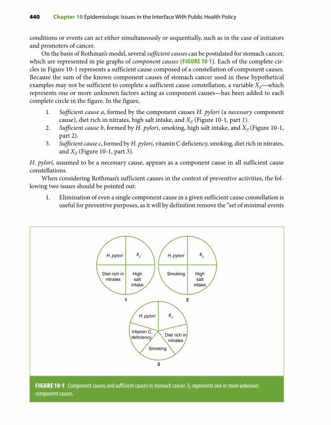
440 Chapter 10 Epidemiologic Issues in the Interface With Public Health Policy
conditions or events can act either simultaneously or sequentially, such as in the case of initiators and promoters of cancer.
On the basis of Rothman’s model, several sufficient causes can be postulated for stomach cancer, which are represented in pie graphs of component causes (FIGURE 10-1). Each of the complete cir-cles in Figure 10-1 represents a sufficient cause composed of a constellation of component causes. Because the sum of the known component causes of stomach cancer used in these hypothetical examples may not be sufficient to complete a sufficient cause constellation, a variable XZ—which represents one or more unknown factors acting as component causes—has been added to each complete circle in the figure. In the figure,
1. Sufficient cause a, formed by the component causes H. pylori (a necessary component cause), diet rich in nitrates, high salt intake, and XZ (Figure 10-1, part 1).
2. Sufficient cause b, formed by H. pylori, smoking, high salt intake, and XZ (Figure 10-1, part 2).
3. Sufficient cause c, formed by H. pylori, vitamin C deficiency, smoking, diet rich in nitrates, and XZ (Figure 10-1, part 3).
H. pylori, assumed to be a necessary cause, appears as a component cause in all sufficient cause constellations.
When considering Rothman’s sufficient causes in the context of preventive activities, the fol-lowing two issues should be pointed out:
1. Elimination of even a single component cause in a given sufficient cause constellation is useful for preventive purposes, as it will by definition remove the “set of minimal events
FIGURE 10-1 Component causes and sufficient causes in stomach cancer. XZ represents one or more unknown component causes.
H. pylori H. pyloriXZ XZ
Diet rich innitrates
Highsalt
intake
Smoking Highsalt
intake
Vitamin Cdeficiency
H. pylori XZ
Diet rich innitrates
Smoking
1 2
3

10.2 Causality: Application to Public Health and Health Policy 441
and conditions” that form that sufficient cause. Consider, for instance, Figure 10-1, sufficient causes 1 and 2: If salt intake were not high, stomach cancer would not occur even if the necessary cause (H. pylori) and the other component causes (H. pylori, diet rich in nitrates, and XZ in sufficient cause a and H. pylori, smoking, and XZ in sufficient cause b) were present. In other words, all sufficient causes containing the component cause “high salt intake” would cease to exist. This notion is supported by the fact that, as pointed out previously, although the prevalence of H. pylori is very common in certain populations (expressed as a percentage), the incidence of stomach cancer in these same populations is fairly rare (expressed as per 100,000).18
2. As aptly stated by MacMahon, Pugh, and Ipsen14(p18) several decades ago, “to effect pre-ventive measures, it is not necessary to understand causal mechanisms in their entirety.” This important concept is exemplified by Snow’s recommendations pertaining to London’s water supply many years before Pasteur’s discoveries and by Casal and Goldberger’s discovery of the nutritional deficiency nature of pellagra well before the actual vitamin involved was discovered.19,20 Other examples of instances in which identification of an epidemiologic chain amenable to prevention interventions preceded the discovery of the actual causal factor have been discussed by Wynder.19 Thus, prevention of only a single component cause, without any knowledge about the other component causes forming a sufficient cause, would be enough to decrease the risk of the disease, as all sufficient causes of which the component cause is part of would disappear.
10.2.2 Proximate, Intermediate, and Distal (Upstream) Causes and PreventionSeveral researchers21,22 have criticized epidemiology’s modern tendency toward reductionism, with a primary focus on proximate component causes, particularly those related to biologic markers of risk. These reductionistic approaches tend to be in tune with clinically oriented, “high-risk” strategies for prevention. In contrast, the study of more upstream causes may provide clues for the development of prevention strategies at the level of the total target population. As argued by Rose,23,24 the population-wide approach based on distal causes—for example, those related to social determinants of health—might be the most effective prevention strategy for the total population. An example is stroke prevention by either hypertension prevention or treatment. A hypothetical model representing the chain of causality for stroke is proposed in FIGURE 10-2. In addition to the distal and proximal sufficient causes, this model recognizes that there may be an intermediate sufficient cause. Likewise, it considers the time sequence of distal, intermediate, and proximal causes. In this example, the joint presence of the component causes low social class and DZ is conceptualized as a distal sufficient cause, which in turn results in the intermediate sufficient cause formed by obesity, excessive salt intake, stress, sedentary life, and XZ. This intermediate sufficient cause is responsible for a proximal component cause, hypertension, which along with genetic susceptibility, is part of the proximal sufficient cause of stroke. As previously, the subscript Z represents component causes needed to complete each sufficient cause constellation above and beyond known component causes.
Using this example, a typical high-risk preventive strategy may, for example, focus on a prox-imate component cause—severe hypertension—which would be identified and treated. Although the relative risk of stroke associated with severe hypertension is high, the prevalence of this type of hypertension is much lower than that of prehypertension plus moderate hypertension, which, notwithstanding their weaker association with stroke, are related to a much higher attributable

442 Chapter 10 Epidemiologic Issues in the Interface With Public Health Policy
risk in the population (FIGURE 10-3). EXHIBIT 10-2 shows that, although the relative risk of stroke associated with stage 2 hypertension is very high (4.0), its attributable risk is less than that asso-ciated with prehypertension, notwithstanding the latter’s much lower relative risk (1.5); this is because the prevalence of prehypertension (50%) is much higher than that of stage 2 hypertension (approximately 5%).24
The use of a population-wide strategy, consisting of primary prevention by intervention on the distal or intermediate component causes represented in Figure 10-2, could shift the entire blood pressure distribution curve to the left. Examples of this strategy include an improvement in the socioeconomic status of the target population, regulating salt content in processed foods, or promoting the development of urban environments and public transportation options that en-courage residents’ physical activity. In turn, the prevalence of both prehypertension and moderate/severe hypertension in the total population would decrease (FIGURE 10-4), resulting in a decrease in stroke incidence of a greater magnitude than that achieved by the high-risk approach. It has been estimated, for example, that a 33% decrease in average salt intake in the population at large would result in a 22% reduction in the incidence of stroke; in comparison, even if all hypertensive patients were identified and successfully treated, this would reduce stroke incidence by only 15%.26 Similar decreases in all other modifiable hypertension component causes would obviously be expected to have an even greater impact on stroke and coronary heart disease (CHD) incidence than salt reduction alone. Thus, when distal or even intermediate component causes are known, primary prevention based on these causes is generally more effective than intervention directed toward proximal causes. Another example of the advantages of the population-based approach is provided by smoking prevention; whereas smoking cessation is important, its effectiveness is known to be much lower than that of programs that aim at preventing smoking initiation in the total population, such as increase in taxation of cigarettes and prohibition of indoor smoking.27 For example, it has been estimated that, of the reduction in smoking rates since 2013 in Michigan, United States, 72% was due to increases in taxes and smoke-free air laws and only 26% to cessation treatment policies (2% was due to a decrease in youth access).28
FIGURE 10-2 Component causes and sufficient causes in stroke. DZ represents one or more unknown distal component causes; XZ represents one or more unknown intermediate component causes.
Low socialclass
DZ
Hypertension
Genetic susceptibility
Excessivesalt
intake
Obesity XZ
Sedentarylife
Stress Stroke
Distalsufficient
cause
Intermediatesufficient
causeProximalsufficient
cause

10.2 Causality: Application to Public Health and Health Policy 443
FIGURE 10-3 The “high-risk” approach focuses on individuals with severe hypertension. Although the relative risk for stroke is high in individuals with severe hypertension (compared to those with normal blood pressure), the prevalence of severe hypertension in the total population is low, and thus the associated population attributable risk is low. Most cases of stroke originate among those with pre- and moderate hypertension, the prevalence of which is high.
Pre- and moderatehypertension
Num
ber
of in
divi
dual
s
“High risk” approach—identify and treat individuals
with severe hypertension
Severehypertension
Systolic blood pressure
Lower Higher
EXHIBIT 10-2 Relative risks and attributable risks for severe (stage 2) hypertension and prehypertension.
ARpop = −Prevalence RRPrevalence RR
RF
RF
( . )1 0−−( ) +1 0 1 0. .
Stage 2 hypertension (SBP = 160+ or DBP = 100+ mm Hg) and stroke
- Relative risk ~4.0
- Prevalence ~5%
ARPOP = −−( ) +
×0 05 4 0 1 00 05 4 0 1 0 1 0
10. ( . . )
. . . .00 13= %
Prehypertension (SBP 120–139 or DBP 80–98 mm Hg) and stroke
- Relative risk ~1.5
- Prevalence ~50%
ARPOP = −−( ) +
×0 50 1 5 1 00 50 1 5 1 0 1 0
10. ( . . )
. . . .00 20= %
Based on Chobanian AV, Bakris GL, Black HR, et al. The seventh report of the Joint National Committee on prevention, detection, evaluation and treatment of high blood pressure: the JNC 7 report. J Am Med Assoc. 2003;289:2560-2572.25

444 Chapter 10 Epidemiologic Issues in the Interface With Public Health Policy
Because screening aims at identifying individuals who already have the disease, it can be re-garded as the embodiment of the high-risk approach. Taking this approach even further is selective screening, based on two or more steps.29 In a two-step screening, the first step is the identification of high-risk individuals—for example, those with a given trait T—and the second, the application of the screening test. In the example illustrated in TABLE 10-1, 100,000 women aged 50–64 years undergo selective screening for incident breast cancer based first on identification of those with a family history (53% of this population) who, in a second phase, are referred to a mammographic exam. Based on published data, the sensitivity and specificity for the discrimination of incident breast cancer are assumed to be, respectively, 0.54 and 0.53 for family history30 and 0.93 and 0.99 for mammography.31 At the end of this two-step screening approach, the overall (“program”) sensitivity is estimated to be 0.50. If mammography had been applied to the total population (and not just to those with a positive family history), approximately 11 true cases would have been missed (obtained by multiplying the total number of true cases by the complement of the sensitivity). With the two-step approach exemplified in Table 10-1, 64 additional cases are missed (i.e., 69 + 6 – 11), underscoring the loss of sensitivity resulting from this “high–high-risk” strategy. This example high-lights the notion that the main reason for using a high-risk strategy is related to cost- effectiveness rather than to effectiveness alone.
10.2.3 Social DeterminantsEpidemiology as a formal discipline started in 19th-century Great Britain , where a heavy emphasis was placed on the importance of the unequal distribution of morbidity and mortality by social class. The recent renewed interest in the study of social determinants of health and disease—which had
FIGURE 10-4 Distribution of systolic blood pressure (SBP) before and after the application of a population-wide approach. The prevalence of both moderate and severe hypertension decreases, resulting in a decrease of the population attributable risk.
Num
ber
of in
divi
dual
s
Systolic blood pressure
Pre/moderate + severe hypertension
Before
After
Distribution ofSBP after theapplication of apopulation-wideapproach
Distribution ofSBP before theapplication of apopulation-wideapproach
Population density with“pre/moderate + severe”hypertension before and afterthe application of apopulation-wide approach

10.2 Causality: Application to Public Health and Health Policy 445
previously peaked in the 1960s and 1970s32,33—has focused on a multilevel causality framework, whereby the exclusive emphasis on proximal causes (e.g., smoking in relation to coronary throm-bosis, hypertension as a cause of stroke) has been changed to reflect the interdependence between proximal and more distal or upstream (ecological) variables (e.g., high serum cholesterol levels resulting from difficult access to healthy foods, which in turn is at least partly determined by social class) (see Chapter 1, Section 1.3). The model subscribed to by social epidemiologists favors neither a reductionistic (proximal cause-oriented) nor a purely ecological, socially determined approach (based on upstream causes) but rather a consideration of both types of component causes in the search for sufficient causes.22
TABLE 10-1 Program validity of a “high-risk” approach in incident breast cancer screening in a population of 100,000 women aged 50–64 years. “High-risk” is defined by the presence of a family history of breast cancer, with sensitivity = 0.54 and specificity = 0.53.* Those with a family history undergo mammography, with sensitivity = 0.93 and specificity = 0.99.† Yearly incidence of breast cancer is assumed to be about 150/100,000.
Step 1. Identification of individuals with a positive family history
Family history Disease present Disease absent Total
Present 81 52,920 53,001
Absent 69 46,930 46,999
Total 150 99,850 100,000
Sensitivity = 0.54 Specificity = 0.53
Step 2. Mammography in those with a positive family history
Test Disease present Disease absent Total
Positive 75 529 604
Negative 6 52,391 52,397
Total 81 52,920 53,001
Sensitivity = 0.93 Specificity = 0.99
Program’s sensitivity = 75 ÷ 150 = 0.50 (also calculated as the product of the two sensitivity values, or 0.54 × 0.93 = 0.50)Program’s specificity = [46,930 + 52,391] ÷ 99,850 = 0.995 (also calculated as the complement of the product of the complements of the specificities: 1 – [1 – 0.53] × [1 – 0.99] = 0.995)*Data from Hartmann LC, Sellers TA, Frost MH, et al. Benign breast disease and the risk of breast cancer. N Engl J Med. 2005;353:229-237.30
†Data from Mushlin AI, Kouides RW, Shapiro DE. Estimating the accuracy of screening mammography: a meta-analysis. Am J Prev Med. 1998;14:143-153.31

446 Chapter 10 Epidemiologic Issues in the Interface With Public Health Policy
A growing methodological interest in the interface between individual-level (usually proximal) and group-level (usually distal or intermediate) variables has led to the development of analytical strategies that take into consideration both types of variables. Excellent summaries of these strategies can be found in the literature.34,35
10.2.4 Hill’s GuidelinesThe so-called Hill’s criteria, which have been referred to more properly by Gordis as “guidelines,”15 were originally published as part of the first Surgeon General’s Report on Smoking and Health36 and comprise a series of aspects of a statistical association that, when present, may strengthen the inference that the statistical association is also causal;10 however, with the exception of “temporal-ity” (discussed later), failure to satisfy any or even most of these guidelines does not necessarily constitute evidence that the association is not causal.15,37
Notwithstanding the renewed interest in other models of causality over the past few years (see, for example, Greenland and Brumback38), Hill’s guidelines remain the cornerstone of causal infer-ence for the practical epidemiologist and health policy expert. The overarching implicit questions that these guidelines seek to address are whether confounding and bias are reasonable alternative explanations for an observed statistical association and, if not, whether a cause–effect relationship can be inferred. What follows is an attempt to expand the discussion of Hill’s guidelines and its related issues of meta-analysis and publication bias, with a particular emphasis on consistency of associations across studies. Another issue related to the process of causal inference, sensitivity analysis, is also briefly discussed.
1. Experimental evidence: Because randomized trials in humans usually offer the best protection against confounding and bias, they are widely regarded as the gold standard for determining causal associations; thus, they are thought to provide the highest level of evidence for developing recommendations pertaining to preventive and clinical interventions (Exhibit 10-1).1,2 In epidemiologic or public health research, however, random allocation is often neither feasible (e.g., when studying social class as a deter-minant) nor ethically acceptable (e.g., when studying the consequences of a potentially harmful environmental exposure); as a result, these trials are typically limited to assessing interventions that are expected to have a beneficial effect. Internal validity of a randomized trial is optimal when single interventions (e.g., a drug or a vaccine) are studied; from this viewpoint, it may be considered the epitome of reductionism in epidemiology. In addition to the problems related to open trials of effectiveness, such as poor compliance and “crossovers,” results of randomized trials can be erroneously generalized. A possible example is the Finnish trial of smokers, which could not confirm experimentally the results of observational studies suggesting that a diet rich in beta-carotene and alpha- tocopherol reduced lung cancer incidence.39 Although this trial’s results may have accurately expressed these nutrients’ lack of efficacy, they may have alternatively reflected the fact that, without considering their complex relationships (including possible interactions) with other dietary components, intake of beta-carotene or alpha-tocopherol may not be enough to influence a sufficient cause of lung cancer. In other words, the trial likely provided the response to the question asked by its authors (i.e., that using these nutrients as simple pills is not effective in preventing cancer in smokers); however, this response should not necessarily lead to the inference that alpha-tocopherol and/or beta-carotene are not protective if consumed in their natural states as part of a healthy diet.

10.2 Causality: Application to Public Health and Health Policy 447
2. Temporality: The presence of the right temporal sequence, “possible cause → possible effect,” per se does not constitute proof that the first event caused the second. Thus, for example, the fact that a given viral infection occurring in early life (e.g., measles) precedes a chronic disease (e.g., degenerative arthritis) cannot be said to constitute strong evidence of the former causing the latter. On the other hand, of all the guidelines by which to judge whether the relationship is causal, the demonstration that the exposure preceded the outcome under investigation is the only one that, if not met, eliminates the possibility of a causal connection. Yet it is often difficult to establish temporality in epidemiologic studies, particularly when assessing diseases with long subclinical phases and insidious onsets, such as chronic renal disease or chronic lymphocytic leukemia. A special type of temporal bias, discussed in Chapter 4, Section 4.4.2, is “reverse causality,” which occurs when the presumed outcome (disease) is responsible for the occurrence of the exposure of interest. Thus, for example, a chronic disease may go undiagnosed for years with a single symptom (e.g., a moderate loss of appetite) that may result in the hypothesized exposure (e.g., an exposure related to a change in diet). Although case-control studies are more amenable to this bias, it may also occur in cohort studies when ascertainment of the disease onset is difficult and the diagnosis is based on symptomatic disease, which may occur long after the subclinical onset of the disease.
3. Strength of the association: The rationale for using strength of the association as a guide-line to infer causality is that it is more difficult to explain away a stronger than a weaker association on the basis of confounding or bias. Thus, the relationship of lung cancer to active smoking, expressed by a high relative risk, is more likely to be causal than that of CHD to environmental tobacco smoking (passive smoking), for which the relative risk is estimated at between 1.1 and 1.5.40 As for Hill’s guidelines in general (with the exception of temporality), however, observation of a weak association (e.g., one characterized by a relative risk less than 2.0) does not negate the possibility of causality. For public health purposes, careful consideration of whether a weak association is causal is justified by the possibility that it may result in a high population attributable risk if the exposure prevalence is high (see Chapter 3, Section 3.2.2). As an example, a relative risk of CHD related to environmental tobacco smoke of 1.2–1.3 and an exposure prevalence of 26%41 would result in a population attributable risk of about 13%, which given the very large absolute number of new coronary events is far from negligible.42
The importance of considering the scale (relative versus absolute excess) when assessing the impact of potentially causal—albeit weak—associations is particularly manifest when assessing interactions. With the widespread use of ratio-based models, assessment of interaction has become virtually synonymous with assessment of mul-tiplicative interaction. Yet as shown in Chapter 6, Section 6.6, evaluation of additive interactions is crucial for public health purposes and can readily be done in the context of ratio-based models.43,44
4. Dose-response (graded pattern): The observation of a straightforward monotonic rela-tionship between exposure dose and risk of an outcome is regarded as strong evidence that a cause–effect relationship exists (FIGURE 10-5A). There are numerous examples of this type of pattern in the epidemiologic literature (e.g., smoking and lung cancer, blood pressure and stroke). In a meta-analysis of the relationship between birth weight and leukemia (discussed later), the authors used the observation of consistent linear dose-response associations across studies as further evidence that the association was likely causal (FIGURE 10-6).45 Meta-analysis (see Section 10.4) has been increasingly used

448 Chapter 10 Epidemiologic Issues in the Interface With Public Health Policy
FIGURE 10-5 Some patterns of cause–effect relationships.
Diseaserisk
Exposure level
Monotonicthroughout range ofexposure levels (e.g.,smoking and lungcancer)
A
Exposure level
J-shaped (e.g., alcoholand cardiovasculardisease)
B
Exposure level
Threshold pattern (e.g.,weight and risk of suddendeath due to coronaryheart disease)
C
to evaluate dose-response patterns. For example, in a meta-analysis done by Zhang et al., the authors pooled 45 cohort studies and detected a linear relationship between resting heart rate and both cardiovascular and noncardiovascular diseases.46 Causal relationships, however, may also be characterized by other types of patterns reflecting the biological mechanisms underpinning these relationships. Thus, for example, the association between alcohol intake and cardiovascular mortality seems to follow a J-shaped relationship (FIGURE 10-5B) probably because, at low intake levels, alcohol may be protective against atherosclerotic disease through an increase in serum high-density lipoprotein concentration, platelet activation inhibition (and thus coagulation inhibition), and antioxidant activity; however, at higher levels, its harmful effects on blood pressure may predominate.47 Another type of pattern is that in which the excess risk appears only above a certain exposure level (i.e., a certain threshold) (FIGURE 10-5C). As an example, in early analyses of the Framingham Heart Study data, relative weight seemed to be related to an increased incidence of atherothrombotic brain infarction in men aged 50–59 years only at high levels (FIGURE 10-7).48 An exposure–outcome association pattern may, in addition, be dose independent—for example, that seen in allergic disorders to certain environmental exposures, such as medications, pollen, and others.
Although confounding or bias is regarded as having less explanatory value when there is a linear dose-response pattern of the type shown in Figure 10-5A, it must be emphasized that this may not be the case if there is a correlation between the level of the exposure of interest and the level of a confounder (or the level of information bias). An example is the relationship of excessive alcohol intake to lung cancer, which may show a graded pattern because of the graded relationship between alcohol (the putative risk factor of interest) and the confounder (smoking). In addition, as previously discussed (Chapter 4, Section 4.3.3), both nondifferential misclassification when there are more

10.2 Causality: Application to Public Health and Health Policy 449
FIGURE 10-6 Dose-response in 8 studies of birth weight and leukemia included in a meta-analysis.
4.00
0.50
1.00
2.00
0.25
400035003000250020001500 4500
Odd
s ra
tio
Birth weight (g)
MacMahon, 1962 (n = 1326)16.00
0.25
1.00
4.00
0.06
400035003000250020001500 4500
Odd
s ra
tio
Birth weight (g)
Cnattingius, 1995 (n = 610)
4.00
0.50
1.00
2.00
0.25
400035003000250020001500 4500
Odd
s ra
tio
Birth weight (g)
Fasal, 1971 (n = 800)4.00
0.50
1.00
2.00
0.25
400035003000250020001500 4500
Odd
s ra
tio
Birth weight (g)
Westergaard, 1977 (n = 405)
4.00
0.50
1.00
2.00
0.25
400035003000250020001500 4500
Odd
s ra
tio
Birth weight (g)
Shu, 1988 (n = 309)
4.00
0.50
1.00
2.00
0.25
400035003000250020001500 4500
Odd
s ra
tio
Birth weight (g)
Shu, 2002 (n = 1839)
4.00
0.50
1.00
2.00
0.25
400035003000250020001500 4500
Odd
s ra
tio
Birth weight (g)
Schüz, 1995 (n = 995)4.00
0.50
1.00
2.00
0.25
400035003000250020001500 4500
Odd
s ra
tio
Birth weight (g)
Reynolds, 2002 (n = 1407)
Data from Hjalgrim LL, Westergaard T, Rostgaard K, et al. Birth weight as a risk factor for childhood leukemia: a meta-analysis of 18 epidemiologic studies. Am J Epidemiol. 2003;158:724-735.45

450 Chapter 10 Epidemiologic Issues in the Interface With Public Health Policy
than two exposure categories and differential misclassification may produce a spuriously graded relationship between exposure and outcome.
5. Biological plausibility: For an association to be causal, it has to be plausible (i.e., consistent with the laws of biology). Biological plausibility may well be one of the most problematic guidelines supporting causality, as it is based on a priori evidence that may not stand the test of time. Thus, for example, vis-à-vis the state-of-the-art scientific knowledge of his time, Snow’s hypothesis that cholera was produced by a live organism lacked biological plausibility altogether. Weed and Hursting49 go as far as to suggest the dispensability of the biological plausibility criterion and cite Schlesselman’s contention that it “may occasionally impede acceptance of new facts.”50(p201)
Notwithstanding these limitations, biological plausibility is a useful guideline when it is consistent with the epidemiologic patterns of the exposure–outcome associations. Consider, for example, the J-shaped relationship of alcohol to cardiovascular mortality mentioned previously. Its biological plausibility is based on the known dose-dependent relationships of alcohol to serum high-density lipoprotein, coagulation factors, and blood pressure as well as on the knowledge of the roles of these factors in the causal pathways resulting in atherosclerosis.
6. Consistency: Consistency of results across epidemiologic studies gets at the heart of inductive reasoning and is highly esteemed by epidemiologists as a guideline to infer causality in observational studies, particularly when ratio-based measures indicate weak associations. Observation of consistent, albeit weak, associations provides the main rationale for the use of meta-analytic techniques for policy decision making (see the next section).
Consistency among studies, however, should be used as a means to infer causality cautiously, as it may merely reflect consistency of confounding or bias across studies,
FIGURE 10-7 Risk of atherothrombotic brain infarction in relation to relative weight,* men aged 50–59 years.
150
100
50
200
080–99 100–119 120+
Rat
e pe
r 10
00Relative weight
Corrected rateCrude rate
86 85
136
926567
*Relative weight was determined by comparing the weight of the individual to the median for the corresponding age and sex group.
Courtesy of the Harvard University Press. Dawber TR. The Framingham Study: The Epidemiology of Atherosclerotic Disease. Cambridge, MA: Harvard University Press; 198048 by the President and Fellows of Harvard College.

10.2 Causality: Application to Public Health and Health Policy 451
particularly observational ones.50 In addition, apparently consistent results across stud-ies may result from publication bias, whereby “positive” results are more likely to be published than null ones (see Section 10.5).
Conversely, lack of consistency does not necessarily constitute evidence against a causal association. The reasons causal associations may not appear consistent have been described by some authors51-53 and are summarized as follows:• Differences in the specific circumstances of exposure. Several characteristics of the
exposure of interest may cause differences between the results of individual studies, including duration and level. For example, earlier studies of the relationship of es-trogen replacement therapy to breast cancer did not take duration into account as accurately as more recent studies54 and, therefore, were not able to establish firmly the presence of the association.
• Differences in the timing of the study with regard to the exposure’s latency (incuba-tion) period. When studies are done at different points in time after introduction of a given exposure, they may yield inconsistent results. Armenian and Lilienfeld have shown that the distribution of neoplasm cases after exposure to a risk factor follows the same log-normal pattern as that seen in infectious diseases. Examples cited by these authors include bladder tumors in dyestuff workers and leukemia after the atom bomb explosion in Hiroshima and Nagasaki.55 Although their examples were limited to neoplasms, they logically should apply to all chronic diseases. Thus, plotting the distribution of cases by time after exposure initiation (i.e., constructing an epidemic curve56,57) may assist in ascertaining at which point in the curve the study was done. When the minimum latency (incubation) period has not yet gone by in a given study population, investigation of a recently introduced agent cannot detect associations between the agent and the outcome of interest (FIGURE 10-8).
FIGURE 10-8 Epidemic curve: studies conducted during the minimum incubation (latency) period cannot detect an association between a causal agent and a disease.
Studies do not show association Studies show association
Num
ber
of c
ases
Time
Exposure to causalagent
Minimumincubation
(latency) period
Casesunrelated
to theexposure
Based on Armenian HK, Lilienfeld AM. The distribution of incubation periods of neoplastic diseases. Am J Epidemiol. 1974;99:92-100.55

452 Chapter 10 Epidemiologic Issues in the Interface With Public Health Policy
For example, in the Women’s Health Initiative (WHI) trial, no association between initial use of estrogen plus progestin replacement therapy and breast cancer was seen in the first 3 years, which is likely an approximation of the latency between the exposure to hormonal therapy and breast cancer.58
• Differences in design and analytic strategies. Inconsistent results between studies may also result from differences in the confounders included in the statistical models used in data analyses, the sensitivity and specificity of the definitions of exposure and outcome variables, the power of the study, and the length of follow-up (in cohort studies). Use of broad categories of relevant variables is another problem, as it may hide differences in exposure levels between studies; for example, by using merely the categories “yes” and “no” for smoking, differences may occur in the level of tobacco use from study to study, thus resulting in inconsistent values of the measure of association.
• Differences in the distribution of a component cause. Differences in results across studies may also reflect differences in the presence of component causes of a sufficient cause constellation. This notion is best understood in the context of effect modifica-tion. For example, if a susceptibility gene for salt-induced hypertension varies from population to population, studies conducted in different populations will detect average (“main”) effects of high salt intake on hypertension of different magnitudes. Assume the extreme example of a qualitative interaction, in which the relative risk is 3.0 when the susceptibility gene Z (effect modifier) is present but is null (1.0) when the gene is absent (FIGURE 10-9). In this hypothetical example, for the population
FIGURE 10-9 Impact of variable proportions of the effect modifier in different populations. Assume qualitative interaction of exposure X with effect modifier Z: RRX/Z+ = 3.0; RRX/Z– = 1.0. Shaded areas represent the proportions of the effect modifier.
Z+ = 100%
A B
C D
Pooled RRX = 3.0
Z+ = 10%
Pooled RRX = 1.2
Z+ = 50%
Pooled RRX = 2.0
Z+ = 0%
Pooled RRX = 1.0
10.2 Causality: Application to Public Health and Health Policy 453
in which everyone carries the susceptibility gene (Figure 10-9A), the relative risk will be 3.0. On the other hand, for populations without the susceptibility gene, the relative risk for hypertension in heavy salt consumers will be 1.0 (Figure 10-9B). The lower the prevalence of gene carriers, the nearer the average (“main effect”) relative risk will be to 1.0—a phenomenon that has been coined “drowning of susceptibles” (A. Correa, personal communication). Consider, for example, the results of the study by Yu et al.59 on the relationship between smoking and liver cirrho-sis in chronic hepatitis B surface antigen carriers (see Chapter 6, Section 6.10.2, Table 6-27). In this study, there was marked heterogeneity of the association ac-cording to presence of alcohol drinking. Thus, in alcohol-drinking individuals, the adjusted relative risk for heavy smoking was about 9.0, whereas in nondrinkers, it was only 1.9. As a result (and assuming that these adjusted point estimates are the true values), it can be inferred that among hepatitis B surface antigen carriers with a high prevalence of drinking compared with those with a low prevalence of drinking, heavy smoking will be a much stronger risk factor for liver cirrhosis. In another study, Fretz et al. found that the association of educational level with the prevalence of subclinical myocardial damage, defined as a concentration of high-sensitivity troponin T (hs-cTnT) of 14 ng/L or more, was found only in black participants. Again, assuming that this study’s point estimates are free of random variability, bias, and confounding, studies with mostly white participants would tend to show no association, while those conducted in mostly or exclusively black individuals would yield a prevalence ratio contrasting low (< 12th grade) and high (college or higher) educational levels as high as 1.8.60 Differences in the proportion of the modifier between a study population and other populations, therefore, affect external validity and require the use of a transportability strategy when generalizing results (see Chapter 6, Section 6.12).61
• Differences in the stage of the natural history of the underlying process. The natural history of a given disease is often a lengthy process that starts many years before its clinical manifestations. An example is carotid atherosclerosis, which may begin as early as the first or second decade of life.62,63 Its clinical expression (e.g., myocardial infarction), however, is not common until the sixth and later decades. Traditional risk factors for clinical atherosclerotic disease include high serum cholesterol levels, hypertension, smoking, and diabetes. The role of smoking as a key risk factor had been established early on in the landmark Framingham Heart Study.64 Its asso-ciation with CHD, however, was not of uniform magnitude in all locations of the Seven Countries Study.65 In the latter study, the relationship of heavy smoking (≥ 20 cigarettes/day) to CHD was clearly seen in the Northern European cohort but it was almost absent in the cohort from the former Yugoslavia (FIGURE 10-10). This find-ing may reflect the fact that smoking appears to have a more important role in the development of later (rather than earlier) stages of atherosclerosis (FIGURE 10-11),66 which were more prevalent in Northern Europe than in the former Yugoslavia. Thus, when assessing differences in association strengths across populations, it is crucial to consider the natural history of the disease and the fact that the role of each risk factor may be not be equally important in all its stages.
Another example is the discrepancy of findings between observational studies and the Women’s Health Initiative (WHI), a randomized trial that evaluated the effect of estrogen therapy on cardiovascular disease. Although observational studies

454 Chapter 10 Epidemiologic Issues in the Interface With Public Health Policy
FIGURE 10-11 Smoking seems to be particularly important in later stages of the natural history of atherosclerosis. In the former Yugoslavia, earlier atherosclerotic lesions seemed to predominate, so smoking appeared to be a less important risk factor than in Northern Europe, where more advanced lesions likely predominated.
smokingsmoking
Normal fattystreaks
Intimal-medicalthickening
Stable Unstableplaque plaque
Clinical events• Myocardial infarction• Peripheral vascular disease• StrokeFormer
YugoslaviaNorthern Europe
FIGURE 10-10 Age-adjusted cumulative incidence rates of coronary heart disease (CHD) in two cohorts of the Seven Countries Study after a 10-year follow-up.
20
15
10
5
25
0
CH
D in
cide
nce
(%)
Never
Smoking
Northern Europe
13.7
19.1
> 20 cig/day–
20
15
10
5
25
0
CH
D in
cide
nce
(%)
Never
Smoking
Yugoslavia
6.07.7
> 20 cig/day–
have suggested a protective effect for hormone therapy, the WHI trial showed the opposite effect. In addition to residual confounding, it has been suggested that the discrepancy is due to differences between the two types of studies (observational and randomized trial) in time after menopause.67 Whereas most women included in the observational studies initiated hormone use within 10 years after menopause, in the WHI they did so much later.68,69 Thus, women included in the WHI were much older than those included in the observational studies. Therefore, underlying atherosclerosis may have been less severe in the latter than in the former, which would
Adapted from Keys A. Seven Countries: A Multivariate Analysis of Death and Coronary Heart Disease. Cambridge, MA: Harvard University Press; 1980.65

10.2 Causality: Application to Public Health and Health Policy 455
result in favorable effects of hormone therapy on lipids and endothelial function in observational studies and harmful prothrombotic and proinflammatory effects of therapy in the older women participating in the WHI trial.70
• Differences in the effectiveness of interventions. The applied epidemiologist is often interested in studying the effectiveness of a given preventive intervention, such as a smoking cessation program. A crucial issue usually ignored in evaluating con-sistency of effectiveness values across studies is that this measure is more context specific—and thus less generalizable—than efficacy. The use of vaccines in the field underscores the sharp distinction between efficacy and effectiveness. The efficacy of a vaccine may be high, but if the field conditions are not ideal—due, for example, to deterioration of the vaccine because of lack of refrigeration or poor acceptance by the target population—its effectiveness will be compromised.
Another key consideration is that, as persuasively demonstrated by Comstock,71 observational studies of interventions yield effectiveness, not efficacy estimates. An example is given by an observational study that suggested a negative effectiveness of a needle exchange program (NEP) for prevention of HIV infection in the Montreal area.72 The explanation for this paradoxical finding, offered by the authors of this study, was that “because of the availability of clean equipment through pharmacies . . . needle exchange programs may have attracted existing core groups of marginal-ized, high risk individuals” and that “in view of the high risk population NEPs, the number of needles may have been less than the actual number needed,” which in turn may have led to the use of contaminated needles.72(p1001) An obvious conclusion is that a positive effectiveness may have been achieved under different circumstances than those encountered in this particular study population. Section 10.3 discusses the role of the decision tree in estimating the effectiveness of a given intervention.
• Differences in the variability of the risk factor. As noted by Wynder and Stellman73(p459) with regard to case-control studies, “If cases and controls are drawn from a population in which the range of exposures is narrow, then a study may yield little information about potential health effects.” The issue of little variability in the exposure levels is also applicable to cohort studies. For example, as discussed in Chapter 1, Section 1.3, observational studies using individuals as analytic units have been unable to show consistent relationships between salt intake and hypertension (FIGURE 10-12A); on the other hand, because of the marked interpopulation variability in average salt intake, ecological studies using country as the unit of analysis have clearly demonstrated a correlation74 (FIGURE 10-12B).
Thus, the variability of the risk factor level within a population is a key de-terminant of whether an association can be found in that population. It is recom-mended, therefore, that presumed risk factor variability be considered by the use of, for example, the coefficient of variability (median standard ÷ deviation) or the interquartile range.
Readers might notice the absence of three of Hill’s original guidelines—coherence, analogy, and specificity of an association—from the preceding discussion. We like others,15,37 believe that these three guidelines are not useful for the following reasons: Coherence is hard to distinguish from biological plausibility; specificity is inconsistent with state-of-the art knowledge, as it erroneously postulates that a given agent is always associated with only one disease and that the agent can always be found for that disease; and with regard to analogy, as pointed out by Rothman and Greenland,37

456 Chapter 10 Epidemiologic Issues in the Interface With Public Health Policy
“Whatever insight might be derived from analogy is handicapped by the inventive imagination of scientists who can find analogies everywhere.”
In the next three sections, four topics closely related to the evaluation of the previous guidelines are briefly discussed: decision tree, an approach that is useful when estimating overall effectiveness of a program or intervention; sensitivity analysis, a technique to evaluate the impact of errors on study results or alternative levels of factors influencing effectiveness; meta-analysis, an important tool for the evaluation of strength of a given association and consistency across different studies; and publication bias, which may strongly affect results of systematic reviews, including meta-analyses.
10.3 Decision Tree and Sensitivity AnalysisEpidemiologists consistently focus on the quantitative assessment of the impact of random error on the precision (reliability) of association estimates (e.g., hypothesis testing and calculation of confidence intervals). However, generally little attention is given to the quantitative analysis of the impact of errors—systematic or random—on an estimate’s validity. This is the focus of sensitivity analysis. Broadly used in fields such as econometrics, environmental sciences, cybernetics, and statistics, sensitivity analysis is a tool to examine the changes in the output (results) of a given model resulting from varying certain model parameters (or assumptions) over a reasonable range.
FIGURE 10-12 Intracountry variability in salt intake is not sufficient to allow observation of an association between salt intake and systolic blood pressure (SBP). However, given intercountry variability, there is a strong correlation between average salt intake and SBP when “country” is used as the analytic unit. Small circles denote individuals within each country; large circles denote countries.
A
Hypothetical data on individualswithin different countries
Daily salt intake
SP
B (
mm
Hg)
Country A
Country B
Country C
B
Hypothetical data on countries
Average daily salt intake
Ave
rage
SP
B (
mm
Hg)

10.3 Decision Tree and Sensitivity Analysis 457
In epidemiology, because of its primary focus on validity, the term sensitivity analysis is generally used to refer to the “quantitative assessment of systematic error on an effect estimate.”75(p451) It is, however, important to realize that random errors can also affect validity (e.g., regression dilution bias resulting in nondifferential misclassification and bias toward the null hypothesis; see Chapter 4, Section 4.3.3); consequently, sensitivity analysis can also be used to assess the impact of such errors on validity (see, e.g., Peppard et al.76).
Whether differential or nondifferential, misclassification is one of the primary sources of error that limit the validity of epidemiologic inference. As discussed in Chapter 4, Section 4.3.3, when the sensitivity and specificity of exposure–outcome measures are known, estimates of the “corrected” (unbiased) relative risks (or any other measure of association) can be obtained. Misclassification parameters are often unknown, however; in this situation, sensitivity analysis can be used to esti-mate the association measure under varying (more or less plausible) assumptions regarding these parameters, as illustrated in the following example.
The relative risk expressing the relationship of passive smoking in nonactive smokers (second-hand smoking) to coronary heart disease (CHD) has been found to be around 1.15 to 1.30.77,78 It could be hypothesized, however, that this excess risk is due to misclassification resulting from the fact that some active smokers self-report as passive smokers. A sensitivity analysis could be based on the assumptions that 5% of active smokers are classified as passive smokers and that all excess risk associated with self-reported passive smoking originates from active smokers misclassified as passive smokers. Under these assumptions, the relative risk for the relationship of active smoking to CHD would have to be 7.0 to entirely explain an observed odds ratio of 1.3 for passive smoking.79 Because the relative risk for active smoking and CHD is around 2.0,80 it can be concluded that, under the stated assumptions, this type of misclassification is unlikely to entirely explain an odds ratio of 1.3 reflecting the association of passive smoking with CHD. (Similar calculations could be done using other reasonable assumptions—for example, that 10% of active smokers are misclassified as passive smokers.)
In addition to etiologic studies, sensitivity analysis can readily be applied to studies of effectiveness. Using a hypothetical example, assume that a policy maker wishes to compare the effectiveness of a New vaccine with that of a Standard vaccine. New vaccine is less expensive than Standard vaccine, but clinical trials have shown that 30% of those who receive it develop serious adverse effects. The incidence of adverse effects associated with Standard vaccine, which has been in use for some time, is 10%. Assuming that it is possible to identify in advance those in whom adverse effects will occur (e.g., pregnant women, individuals with poor nutritional status), only 70% and 90% of the target population are, therefore, eligible to receive the New and Standard vaccines, respectively (TABLE 10-2, column I). Probabilities of the event (E) that each vaccine is expected to prevent are 0.10 and 0.40 for those who are and are not eligible to receive it, respectively (Table 10-2, column II). The joint probability of E can be estimated by multiplying the proportion of the target population who can or cannot receive the vaccine times the incidence in each stratum (Table 10-2, column III). The sum of these joint probabilities provides the total incidence of E in the target population and is estimated at 19% for New vaccine and 13% for Standard vaccine, thus reflecting a greater effectiveness for Standard than for New in this example.
Because the New vaccine is less expensive than Standard vaccine, policy makers may wish to know whether further efforts by the laboratory that developed New, aimed at achieving the same incidence of adverse effects as that associated with Standard, would make it as or even more effec-tive than Standard. Assuming this new incidence of adverse effects for New, a sensitivity analysis (Table 10-2, bottom panel) indicates a slightly lower total incidence of E for New vaccine in the target population than that seen for Standard (12.5% and 13%, respectively). It can, therefore, be

458 Chapter 10 Epidemiologic Issues in the Interface With Public Health Policy
TABLE 10-2 Probability of event that Standard and New vaccines are expected to prevent, according to whether the target population receives the vaccine, assuming a prevalence of eligibility associated with the Standard, New, and Improved New vaccines of 90%, 70%, and 90%, respectively.
Proportion eligible
in target population
Probability of disease (E) that
vaccine is expected to prevent
Joint probability of the event that vaccine is expected to
prevent
(I) (II) (III) ∙ (I) ∙ (II)
Eligible to receive Standard vaccine
Yes 0.90 0.10 0.90 × 0.10 = 0.09
No 0.10 0.40 0.10 × 0.40 = 0.04
Total 1.00 0.09 + 0.04 = 0.13, or 13.0%
Eligible to receive New vaccine
Yes 0.70 0.10 0.70 × 0.10 = 0.07
No 0.30 0.40 0.30 × 0.40 = 0.12
Total 1.00 0.07 + 0.12 = 0.19, or 19.0%
Effectiveness* of New vs Standard: [(0.13 – 0.19) ÷ 0.13] × 100 = –46.1%
Imputed values for New vaccine (sensitivity analysis)
Eligible to receive Improved New vaccine
Yes 0.85 0.10 0.85 × 0.10 = 0.085
No 0.15 0.40 0.10 × 0.40 = 0.04
Total 1.00 0.085 + 0.04 = 0.125, or 12.5%
Effectiveness* of New Improved vs Standard: [(0.13 – 0.125) ÷ 0.13] × 100 = +3.8%
*Effectiveness calculated using the formula for efficacy (Chapter 3, Equation 3.7) applied to the total population that includes both vaccine recipients and nonrecipients.
concluded that at the imputed adverse effect levels, effectiveness of New vaccine is very similar to that of Standard vaccine, but its lower cost would likely make it more cost-effective.
In the vaccine example, effectiveness was affected by only one general factor: adverse effects. In most situations, however, there is more than one factor influencing the level of effectiveness (e.g., compliance). A decision tree is a useful tool to estimate the overall effectiveness of an inter-vention or program while taking into consideration one or more factors influencing it. A detailed description of how to construct a decision tree is beyond the scope of this textbook and can be found elsewhere.81(pp19-28) Here, only a simple description and example will be given.

10.3 Decision Tree and Sensitivity Analysis 459
A decision tree, which is part of a decision analysis, has two types of nodes: decision nodes, which are under the investigator’s or policy maker’s control, and chance (or probability) nodes, which are not under the investigator’s or policy maker’s control. In the previous example, assign-ment of the vaccine to participants is under the epidemiologist’s or public health worker’s control (control node), whereas the adverse reactions are not (chance node). In the hypothetical example that follows, there is one control node—the decision to implement or not implement intervention A or B—and two chance nodes—compliance to each intervention and social class. The outcome is mortality. FIGURE 10-13 displays the decision tree as well as its associated probabilities. Note that, for those who comply with the intervention, intervention B has a lower mortality than intervention A. For high social class, mortality rates are 0.10 for intervention A and 0.05 for intervention B; for low social class, these rates are, respectively, 0.20 and 0.10. A greater proportion of participants, however, comply with intervention A (70%) than with B (30%). As a result, the overall probability of death—calculated by multiplying the proportions in each pathway shown in EXHIBIT 10-3—is lower
FIGURE 10-13 Example of decision tree with two chance nodes. Proportions and probabilities are shown in parentheses. SC, social class (see text and Exhibit 10-3).
Mortality (0.10)
Mortality (0.20)
Mortality (0.50)
Mortality (0.50)
Mortality (0.05)
Mortality (0.10)
Mortality (0.50)
Mortality (0.50)
High social class (0.10)
Low social class (0.90)
Low social class (0.90)
High social class (0.10)
Low social class (0.90)
High social class (0.10)
Low social class (0.90)
High social class (0.10)
Yes(0.70)
Yes(0.30)
No(0.30)
No(0.70)
SC
SC
SC
SC
Decision node
Compliancewith
intervention
Compliancewith
intervention
Intervention A
Intervention B

460 Chapter 10 Epidemiologic Issues in the Interface With Public Health Policy
for intervention A than for intervention B: 28.3% vs 37.85%, respectively. Thus, the effectiveness of A compared with B can be calculated as follows:
[(37.85% – 28.30%) ÷ 37.85%] × 100 = 25.2%
Here too, a sensitivity analysis can be done, assuming that tolerance to intervention B can be increased to, say, 50% (see Exercise 7).
An example of a decision tree based on published results is given in FIGURE 10-14. In this ex-ample, the decision node is to offer drug therapy to hypertensive patients. Chance nodes include hypertension control and whether the patients accept the drug therapy. Incidence of coronary heart disease (CHD) is the outcome of interest. For the patients who do not accept the drug ther-apy, hypertension control is sometimes achieved by other means (e.g., weight loss or lowering salt intake). CHD incidence rates are identical for those in whom hypertension is controlled regardless of acceptance of drug therapy (5/1000). However, the proportion of patients achieving hypertension control is much higher in those who accept the drug therapy than in those who do not (68% vs 10%). As a result, the overall incidence of CHD is 3.7/1000 in the drug therapy acceptance group, and 4.9/1000 in the nonacceptance group. Effectiveness associated with drug acceptance is, thus, [(10.5 – 6.9) ÷ 6.9] × 100 = 33.5%. Note that, because the figures shown in Figure 10-14 come from different target populations, they may not be applicable to a given target population.
Ideally, when calculating effectiveness, the results should be based on a systematic review and meta-analysis. Thus, for the decision maker, the ideal sequence should be ([meta-analysis] → [decision analysis] → [cost-effectiveness analysis]). The two initial steps are in the realm of epidemiology, whereas the last step (cost-effectiveness) requires the input of health economists.81
EXHIBIT 10-3 Effectiveness of intervention A compared with intervention B (Figure 10-13). Intervention B is more efficacious (i.e., those who comply with the intervention have a lower mortality than those under intervention A), but because compliance with intervention A is higher, its overall effectiveness is higher. Effectiveness of A (compared with B) = [(37.85% – 28.30%) ÷ 37.85%] × 100 = 25.2%.
Intervention A: less efficacious but better compliance (70%)
Intervention B: more efficacious but less compliance (30%)
Compliance Joint probability of death Compliance Joint probability of death
Yes 0.70 × 0.10 × 0.10 = 0.007 Yes 0.30 × 0.10 × 0.05 = 0.0015
0.70 × 0.90 × 0.20 = 0.126 0.30 × 0.90 × 0.10 = 0.027
No 0.30 × 0.10 × 0.50 = 0.015 No 0.70 × 0.10 × 0.50 = 0.035
0.30 × 0.90 × 0.50 = 0.135 0.70 × 0.90 × 0.50 = 0.315
Total 0.007 + 0.126 + 0.015 + 0.135= 0.283 (or 28.30%)
Total 0.0015 + 0.027 + 0.035 + 0.315= 0.3785 (or 37.85%)

10.4 Meta-analysis 461
FIGURE 10-14 Decision tree of hypertension medication therapy with one decision node using average annual incidence of coronary heart disease (CHD) as outcome.*
Hypertensioncontrol
Hypertensioncontrol
Acceptanceof drugtherapy
Drug therapyoffered to
patientDecision node
Yes (0.53)
No (0.47)
Yes (0.10)
No (0.90)
No (0.32)
Yes (0.68)CHD incidence (0.005)
CHD incidence (0.005)
CHD incidence (0.011)
CHD incidence (0.011)
Overall incidence in target hypertensive population = (0.53 × 0.68 × 0.005) + (0.53 × 0.32 × 0.011) +(0.47 × 0.10 × 0.005) + (0.47 × 0.90 × 0.011) = 0.00855 = 8.5/1000
Incidence according to acceptance of drug therapyYes: (0.68 × 0.005) + (0.32 × 0.011) = 0.0069 = 6.9/1000No: (0.10 × 0.005) + (0.90 × 0.011) = 0.0104 = 10.4/1000
By using different hypothetical levels of tolerance to interventions, misclassification, or other parameters of interest over a reasonable range, an array of plausible values of the effect estimate can be obtained. As an alternative, automated methods to assess the impact of misclassification and other sources of systematic errors and confounding are available.75,85 These methods are based on multiple iterative reconstructions of the data based on varying selection bias, misclassification, or confounding parameters (or combinations of them) and provide estimates of a distribution of possible corrected effect estimates.
10.4 Meta-analysisAs aptly defined by Petitti, meta-analysis is a “quantitative approach for systematically assessing the results of previous research in order to arrive at conclusions about the body of research”81(p2) on a given subject. In other words, it is actually a statistical approach that aims at summarizing results
*This example is based on real data from several studies with different population frames. Thus, results may not be applicable to a given target population.
Data from Nieto FJ, Alonso J, Chambless LE, et al. Population awareness and control of hypertension and hypercholesterolemia. Arch Intern Med. 1995;155(7):677-68483; Chambless LE, Heiss G, Folsom AR, et al. Association of coronary heart disease incidence with carotid arterial wall thickness and major risk factors. Am J Epidemiol. 1997;146:483-49484; Moore J. Hypertension: catching the silent killer. Nurse Pract. 2005;30(10):16-35.85

462 Chapter 10 Epidemiologic Issues in the Interface With Public Health Policy
of a systematic review. Meta-analysis uses “study” as the unit of analysis rather than “individual.” Its steps include a thorough review of the results of studies dealing with the hypothesis of interest as well as the statistical analyses of these results. An in-depth discussion of the statistical approaches used by meta-analysts is beyond the scope of this textbook and can be found elsewhere.81,82,86-88 The main features of this technique, however, are briefly described in this chapter.
Meta-analysis may be considered to be “the epidemiologic study of epidemiologic studies” (Dr. Bruce Psaty, University of Washington, personal communication). Studies included in a meta-analysis are subjected to predefined inclusion or exclusion criteria, a process that is analogous to that of determining eligibility for inclusion or exclusion of individuals in a single study. More specific to a systematic review (with or without meta-analysis), inclusion of a study is conditional on its quality, the evaluation of which is based on a standard set of criteria.89
Results are typically presented as a summary pooled measure of association that is displayed in a graphical form along with the individual estimates of studies included in the analysis. As an exam-ple, Lorant et al.90 conducted a meta-analysis of the relationship of social class to major depression. When searching the literature addressing the topic, the authors found 743 studies that matched the selected search keywords (e.g., depression, socioeconomic status); however, after the eligibility criteria for inclusion were applied, only a fraction (less than 10%) of these studies were used in the meta-analysis. The results are shown as a forest plot in FIGURE 10-15 for 51 studies of prevalence done after 1979. The horizontal and vertical axes in this graph correspond, respectively, to the odds ratios (plotted on a logarithmic scale) and the studies included in the meta-analysis. The odds ratio point estimates and their 95% confidence intervals (95% CI) are represented, respectively, by the square black boxes and corresponding horizontal lines. By convention, the area of each black box showing the point estimate is proportional to the precision of the estimate. The solid vertical line is set at the null value (odds ratio = 1.0), denoting the hypothetical lack of association between social class and depression (null hypothesis). When the horizontal lines do not cross this solid vertical line (i.e., when the 95% CIs do not include the null value), the odds ratios for those particular studies are statistically significant at an alpha level of 5%.
A diamond (or in other meta-analyses, an open box or a circle) represents the summary (pooled) measure of association. Meta-analysis can pool both absolute (e.g., attributable risk) and relative (e.g., odds ratio, hazards ratio) measures of association. When a relative measure of association is meta-analyzed, its pooled value can be estimated by using a stratified method akin to that used to estimate adjusted odds ratios or relative risks (see Chapter 7, Section 7.3.3). For example, the Mantel-Haenszel method can also be used to meta-analyze odds ratio data. The weighing scheme when applying this method of meta-analysis is the same as that used for adjustment of odds ratio in individual case-control studies (i.e., the inverse of the variance of each stratum). Thus, consid-ering each study as a separate stratum and using the notations found in Chapter 7, Table 7-9, the weight for each stratum is (bi × ci/Ni). The calculation is identical to that shown for individual case-control studies (see Chapter 7, Section 7.3.3), providing a weighted pooled estimate of the odds ratio (taking into account the statistical power of each study) as well as allowing estimation of its variance and confidence intervals.
In the example displayed in Figure 10-15, two pooled odds ratios are shown: One uses a random-effects model and the other uses a fixed-effects model (akin to the Mantel-Haenszel method just described). There is debate among statisticians as to which of these two meta-analytic strategies is better.81,91,92 The difference between these models relates to the extent to which results can be generalized: only to the specific study populations used in the meta-analysis for the fixed-effects model or to a hypothetical “population of studies” for the random-effects model. The latter is more conservative than the former from the statistical precision viewpoint, as it takes into account

10.4 Meta-analysis 463
FIGURE 10-15 Odds ratios for major depression by socioeconomic status (SES) group in 51 prevalence studies published after 1979. Horizontal lines depict 95% confidence intervals. Squares show original estimates; diamonds show meta-analyzed results. The expression “favor the rich” denotes a greater odds of depression in low-SES than in high-SES individuals. Horizontal axis is on a logarithmic scale.
2.01.00.50.1 10
Favor the poorOdds ratio
Favor the rich
Andrews 2001Araya 2001Meyer 2000Miech 2000
Andrade 2000de Snyder 1999
Le Pape 1999Turner 1999
Bhagwanjee 1998Kylyec 1998
Bijl 1998Reijneveld 1998
Weich 1998Muntaner 1998
Cho 1998Lewis 1998
Caraveo 1997Fichter 1997Lynch 1997Abas 1997
Goering 1996Kovess 1996
Lehtinen 1996Kessler 1994Regier 1993
Surtees 1993Dohrenwend 1992
Wittchen 1992Murphy 1991
Rodgers 1991Carta 1991
Cockerham 1990Hollifield 1990
Ulbrich 1989Ross 1989
Cheng 1988Romans 1988
Hodiamont 1987Vazquez 1987
Kaplan 1987Canino 1987
Mavreas 1986Ross 1985
Halldin 1985Noll 1985
Brown 1984Husaini 1981Brown 1981
Bebbington 1981Eaton 1981
Wheaton 1980Meta-random
Meta-fixed
Data from Lorant V, Deliege D, Eaton W, et al. Socioeconomic inequalities in depression: a meta-analysis. Am J Epidemiol. 2003;157:98-112.90

464 Chapter 10 Epidemiologic Issues in the Interface With Public Health Policy
not only the within-study variance but also the variance between studies.81 As with the pooling of strata in single studies, the main assumption when pooling measures of association is that results from different studies (the strata)—particularly their directions—are consistent (homogeneous). Homogeneity tests are available to evaluate consistency, and neither method (fixed or random effects) is advisable when there is substantial heterogeneity between studies. 93 (Issues related to heterogeneity were discussed in Section 10.2.4, item 6: Consistency. Apparent homogeneity resulting from publication bias is discussed in Section 10.5.)
In the example shown in Figure 10-15, results are fairly consistent, with all but a handful of the 51 studies showing odds of major depression to be higher in the low-SES than in the high-SES individuals (denoted as “favor the rich” in the figure).
In another example of meta-analysis, Engel et al.94 examined the association of glutathione S-transferase M1 (GSTM1) null status with bladder cancer (FIGURE 10-16). GSTM1 is the prod-uct of the GSTM1 gene and is involved in the metabolism of polycyclic aromatic hydrocarbons
FIGURE 10-16 Odds ratios and 95% confidence intervals for gluthatione S-transferase M1 (GSTM1) null status and bladder cancer risk. Solid circles are proportional in area to the number of cases. The vertical axis is on a logarithmic scale.
2.72
1.44
1.00
7.39
0.40
Romkes,
unpubl.
Heckbert,
1992
Daly, 19
93
Munga
n, 20
00
Salago
vic, 1
999
Georgiou, 2000
Chern, 1
994
Zhong, 19
93
Katoh, 1998
Kim, 2
000
Lin, 1994
Peluso, 2
000
Kang, 19
99
Bell, 19
93
Okkels,
1996
Brock
möller,
1996
Met
a-an
alysis
Odd
s ra
tio
Schnake
nberg, 2000
Data from Engel LS, Taioli E, Pfeiffer R, et al. Pooled analysis and meta-analysis of glutathione S-transferase M1 and bladder cancer: a HuGE review. Am J Epidemiol. 2002;156:95-109.94

10.5 Publication Bias 465
found in tobacco smoke. A null status is related to a reduced clearance of smoking products. This meta-analysis included 17 case-control studies, for a total of about 2150 cases and 3650 controls, and used a random-effects model to estimate the pooled odds ratio at 1.44 (95% confidence interval, 1.23, 1.68). In Figure 10-16, the open circle and its corresponding vertical line represent the pooled odds ratio along with its 95% confidence interval. Note that both in the previous example (Figure 10-15) and in the example shown in Figure 10-16, the 95% confidence intervals for the meta-analytic (pooled) odds ratios are very narrow, reflecting the large gain in statistical precision resulting from pooling study results.
In an additional example, Bai et al. conducted a systematic review to examine the relationship of statin use to Parkinson’s disease.95 The authors used a stringent selection process to conduct a computerized literature search using several sources, including PubMed, the Cochrane Library, and Google Scholar, which identified 380 papers with the relevant search terms (e.g., “statin,” “lipid-lowering drugs,” “simvastatin”). After excluding 369 records for various reasons (e.g., 32 reviews and 34 animal and in vitro studies), only 11 studies were included in the meta-analysis, yielding a pooled relative risk of 0.81 (95% CI, 0.71, 0.92).
Notwithstanding the appeal of a quantitative approach to summarize data from several studies, numerous problems must be considered when conducting a meta-analysis, including the difficulties related to the variable quality of the studies and the fact that different studies use different participant selection and data collection methods, which may result in bias. For these reasons, the use of meta-analytic techniques has been criticized, particularly when applied to observational data.96,97 Used judiciously along with nonsystematic (narrative) reviews of the literature, however, results of meta-analysis may be credible98 and helpful in decision analysis and analysis of the cost-effectiveness of interventions.81
10.4.1 Network Meta-analysisNetwork meta-analysis is a strategy to compare treatment outcomes in the context of systematic reviews. As Li et al.99(p79) put it, “network meta-analysis expands the scope of a conventional pair-wise meta-analysis by analyzing simultaneously both direct comparisons of interventions within randomized controlled trials (RCTs) and indirect comparisons across trials based on a common comparator (e.g., placebo or some standard treatment).” Lumley has exemplified this approach using a simple example: “Suppose that treatment B is known to be superior to placebo. If A is better than B in a randomized trial, then most people would believe that A is better than placebo. Similarly, if A is equivalent to B then A would still be better than placebo.”100(p2313) Because network meta-analysis is mostly relevant to clinical trials rather than to observational studies, it will not be discussed here, but readers can readily find several reports of this strategy’s design and results100-103 as well as discussion of its shortcomings.104,105
10.5 Publication BiasSome common problems that may influence the quality of reporting of epidemiologic studies and potentially create biases are discussed in detail in Chapter 9. In this section, we focus on a special type of reporting bias: publication bias.
Assessment of consistency of results of multiple studies and the application of meta-analytic techniques rely heavily on published reports of research results. If papers that favor (or do not favor) a given hypothesis are more likely to be submitted and published, then this results in an apparent (biased) consistency and a biased estimation of the pooled measure of association.

466 Chapter 10 Epidemiologic Issues in the Interface With Public Health Policy
Acceptance of the validity of published findings is conditional on two important assump-tions: (1) that each published study used unbiased methods (see Chapter 4) and (2) that published studies constitute an unbiased sample of a theoretical population of unbiased studies. When these assumptions are not met, a literature review based on either meta-analytic or conventional narrative approach will give a distorted view of the exposure–outcome association of interest. Whether these assumptions are met depends on several factors, including the soundness of the study designs and the quality of peer reviews. Publication bias, as conventionally defined, occurs when assumptions cannot be met because, besides the quality of the report, other factors dictate acceptability for publication. Direction of findings is one such factor. For example, a study carried out a few decades ago106 demonstrated that 97% of papers published in four psychology journals showed statistically significant results at the alpha level of 5%, thus strongly suggesting that results were more likely to be published if they had reached this conventional significance level.
Subsequent research107-111 has confirmed the tendency to publish positive results. In a study comparing published randomized clinical trials with completed yet unpublished randomized tri-als, 55% of the published studies but only 15% of the unpublished studies favored the new therapy being assessed.109
A possible reason for publication bias is the reluctance of journal editors and reviewers to accept negative (“uninteresting”) results. For example, in a study by Mahoney,112 a group of 75 reviewers were asked to assess different versions (randomly assigned) of a fictitious manuscript. The Introduction and Methods sections in all versions were identical, whereas the Results and Discussion sections were different, with results ranging from “positive” to “ambiguous” to “negative.” Reviewers were asked to evaluate the methods, the data presentation, the scientific contribution, and the publication merit. Compared with negative or ambiguous results, the manuscripts with positive results systematically received higher average scores for all categories, including the category for evaluation of methods, even though the Methods sections were identical in all sets.
Interestingly, editors and reviewers may not be the only or even the most important source of publication bias. For example, in Dickersin et al.’s study,109 publication was intended by the authors for only 12% of unpublished yet completed studies. Reasons given by the authors of why publication was not intended for the remaining 88% included “negative results” (28%), “lack of interest” (12%), and “sample size problems” (11%).
Even the source of support seems to interfere with the likelihood of publication. Davidson,113 for example, found that clinical trials favoring a new therapy over a traditional therapy funded by the pharmaceutical industry had a publication odds 5.2 times greater than that of trials supported by other sources, such as the National Institutes of Health. A similar finding was reported subse-quently by Lexchin et al.114
Some forms of publication bias are rather subtle, such as “language bias” (e.g., publication in an English-language journal vs publication in a journal in another language). For example, Egger et al.115 compared randomized clinical trials published by German investigators in either German journals or English journals from 1985 through 1994. When articles with the same first author were compared, no evidence of differences in quality between the papers written in German or English was found. In contrast, a strong, statistically significant difference with regard to the significance of findings was present: 63% of the articles published in English reported a statistically significant result compared with only 35% of articles published in German (odds ratio = 3.8; 95% confidence limits, 1.3, 11.3). These results strongly suggest that using language as one of the criteria to select studies to be included in a systematic literature review (a criterion that is frequently adopted because of practical reasons or reasons related to access) can seriously undermine the representativeness of published reviews, including those using meta-analytic methods.

10.5 Publication Bias 467
Strategies suggested to prevent publication bias include the development of study registers110,116 and advance publication of study designs.117 The latter has increasingly found its niche in some peer-reviewed journals (see, e.g., Bild et al.118). Prevention of publication bias obviously requires efforts on the part of the scientific community as a whole, including researchers, peer reviewers, and journal editors. The latter should be aware that direction of findings and absence of statistically significant results should not be used as criteria for rejection or acceptance of a paper.
An approach that has been proposed to evaluate the possible presence of publication bias is the “funnel plot.”116,119 To construct the funnel plot, the values of the measure of association are plotted on one of the graph’s axes, and the study sample sizes or measures of statistical precision (e.g., stan-dard errors) on the other axis. When there is no publication bias, the graph should have the shape of a funnel, reflecting the sampling variability of studies. The larger, more precise studies will tend to appear close to the center of the funnel—that is, close to the overall pooled (weighted) estimate; smaller, less precise studies would be expected to appear symmetrically distributed on both sides of the average estimate, increasingly distant as their precision decreases (thus, the funnel shape). As an example, the funnel plot constructed by Engel et al. for the meta-analysis of GSTM1 null status and bladder cancer is shown in FIGURE 10-17. Notwithstanding the relatively small number of studies, their odds ratio logarithms (plotted on the vertical axis) fall both in the upper half and the lower half of the funnel across the precision range of the studies (measured by their standard errors); thus, the plot is approximately symmetric, suggesting that publication bias is not a likely explanation for the findings shown in Figure 10-16.
FIGURE 10-17 Funnel plot for assessing publication bias in relation to gluthatione S-transferase M1 (GSTM1) null status and bladder cancer risk. The horizontal line corresponds to the meta-analysis pooled odds ratio estimate.
1
0
2
-1
0.40.20.0 0.6
Standard error of log odds ratio
Log
odds
rat
io
Data from Engel LS, Taioli E, Pfeiffer R, et al. Pooled analysis and meta-analysis of glutathione S-transferase M1 and bladder cancer: a HuGE review. Am J Epidemiol. 2002;156:95-109.94

468 Chapter 10 Epidemiologic Issues in the Interface With Public Health Policy
Another example of absence of publication bias comes from the previously mentioned meta-analysis evaluating the relationship of statin use to Parkinson’s disease.95 In this meta- analysis, the 11 studies that met the authors’ criteria fell symmetrically on both sides of the log of the pooled relative risk when plotted against the studies’ precision. In contrast, when there is a tendency toward favoring the publication of positive results, an asymmetric funnel plot will result. For example, in a systematic review of studies of the genetic epidemiology of stroke, Flossmann et al.120 presented the funnel plot shown in FIGURE 10-18, where the odds ratios are plotted in a logarithmic scale, against a measure of precision (1/standard error). The distribution of odds ratios from the individual studies shows a clearly asymmetric plot, whereby the lower the precision, the more distant the odds ratio from the null hypothesis. Because, in addition, most studies in this example show odds ratios higher than 1.0, the funnel plot strongly suggests that negative studies are not being published. The meta-analytic pooled odds ratio estimate based on this analysis was 1.76, and its 95% CI was 1.7, 1.9, denoting a highly significant result that is nonetheless called into question because of the evidence of publica-tion bias illustrated in Figure 10-18. Examples of the use of funnel plots to evaluate the presence of publication bias as part of a meta-analysis are often found in the literature.121,122
Symmetry tests of the null hypothesis that the distribution of study results in a funnel plot is homogeneous are available.123 Another strategy to evaluate publication bias, also based on the funnel plot, is the “trim and fill” approach, developed by Duval and Tweedie.124
A special type of publication bias, which is particularly relevant to clinical trial results, is the selective reporting of outcomes, which occurs when the findings related to the primary endpoints are deemed by the investigators to be “uninteresting”; as a result, the report may address only
FIGURE 10-18 Funnel plot of odds ratio (OR) of family history of stroke as a risk factor for stroke vs precision (i.e., inverse of the standard error of the OR) in case-control (full circles) and cohort studies (empty circles). Note the asymmetry of the plot due to lack of estimates when OR < 1 (i.e., small negative studies).
10
10
8
6
4
2
12
00.1 1
Odds ratio
Asymmetry significantat p < 0.0001
Pre
cisi
on o
f est
imat
e
Data from Flossmann E, Schulz UG, Rothwell PM. Systematic review of methods and results of studies of the genetic epidemiology of ischemic stroke. Stroke. 2004;35:212-227.120

10.6 Translational Epidemiology 469
results pertaining to secondary endpoints that conform to the authors’ a priori expectations. As an example, Chan et al.125 recorded the number and characteristics of both reported and unreported trial outcomes from protocols, journal articles, and a survey of trialists. An outcome was consid-ered by these authors as incompletely reported if published articles had insufficient information for carrying out a meta-analysis. Overall, about one-half of efficacy values and two-thirds of harm outcomes per trial were incompletely described. The odds ratios of reporting statistically significant efficacy and harm endpoints (compared with reporting nonstatistically significant results) were, respectively, 2.4 (95% CI, 1.4, 4.0) and 4.7 (1.8, 12.0). More than 60% of the trials had at least one primary endpoint changed, introduced, or omitted. Based on these findings, the authors concluded that reporting of outcomes in clinical trials is incomplete, biased, and inconsistent with protocols, and they recommended that trials be registered and protocols made available before trial completion.
10.6 Translational EpidemiologyThe Dictionary of Epidemiology from the International Epidemiologic Association, which has been developed with the input of numerous distinguished epidemiologists, provides a clue to the nature of translational epidemiology (TransEpi) when it defines the two objectives of epidemiology: “The study of the occurrence and distribution of health-related events, states, and processes in specified populations, including the study of the determinants influencing such processes, and the application of this knowledge to control relevant health problems.”13(p255) The process whereby the first part of the definition (“The study of the occurrence . . . determinants influencing such processes”) is related to the second part (“and the application of this knowledge”) represents the essence of TransEpi. Thus, based on this definition, TransEpi may be defined as the effective transfer of new knowledge resulting from epidemiologic studies (including trials) into the planning of population-wide and individual-level disease control programs and policies.*
The TransEpi process can be summarized as shown in FIGURE 10-19. It involves several stages, starting with (1) evidence from epidemiologic studies, preferrably from systematic reviews, and then proceeding to (2) evaluation of levels of evidence (as shown in Exhibit 10-1), (3) based on which effectiveness is assessed using decision analysis (Section 10.3). The next step (4), cost-effectiveness
*With regard to translational research in general, several definitions have been proposed. For example, according to Rubio et al., “Translational research fosters the multidirectional integration of basic research, patient-oriented research, and population-based research, with the long-term aim of improving the health of the public.” These authors go on to define three phases of translational research: “T1 research expedites the movement between basic research and patient-oriented research that leads to new or improved scientific understanding or standards of care. T2 research facilitates the movement between patient-oriented research and population-based research that leads to better patient outcomes, the implementation of best practices, and improved health status in communities. T3 research promotes interaction between laboratory-based research and population-based research to stimulate a robust scientific understanding of human health and disease.”126(p470)
The Institute of Medicine’s Clinical Research Roundtable definition (an earlier definition) is more central to medical scientists, although it overlaps to some extent with that of Rubio et al. by identifying two blocks: Translational Block 1 relates to the “transfer of new understandings of disease mechanisms gained in the laboratory into the development of new methods for diagnosis, therapy, and prevention and their first testing in humans.” Translational Block 2 involves “the translation of results from clinical studies into everyday clinical practice and health decision making.”127(p1279)

470 Chapter 10 Epidemiologic Issues in the Interface With Public Health Policy
with or without sensitivity analysis, requires the input of health economists. Finally, (5) evidence-based recommendations are developed, which also have to consider obstacles of an ethical, political, or resource-related nature.
As can be reckoned from Figure 10-19, it should be emphasized that translational epidemiol-ogy is not an exact science and depends on the judgment of experts, usually working as members of a committee, such as the U.S. Preventive Services Task Force’s reviews of evidence in support of screening for colorectal cancer129 or syphilis infection.130 EXHIBIT 10-4 shows a possible repre-sentation of the interface of evidence from epidemiologic studies; translation of the evidence; and implementation of interventions, programs, or policy. Upon evaluation of the levels of evidence presented in Exhibit 10-1, translation is graded on the basis of level of certainty about the evidence and expected net benefit. Recommendations on whether to implement an intervention, program, or policy in turn are based on the level of certainty and can be summarized as “implement,” “offer the intervention/program/policy on a case-by-case basis” (for the latter option, the balance of benefits and harms should be explained to every eligible individual), or “discourage the implementation.”
An example is given by screening for prostate cancer with prostate-specific antigen (PSA) testing. Large clinical trials of the effectiveness of PSA testing in reducing prostate cancer mortality were conducted in the United States131 and Europe.132 Whereas the US trial did not show a reduction of prostate cancer mortality with PSA screening after 7 to 10 years of follow-up, the European trial showed a significant 27% reduction in prostate cancer mortality after a 13-year follow-up (rate
FIGURE 10-19 The process of translational epidemiology.
(1)
Systematicreviewsor singlestudies
(3)
Evaluation of theeffectiveness ofprogrammatic
options (decisionanalysis)
(2)
Evaluationof levels ofevidence
(4)
Cost-effectiveness
(5)
EVIDENCE-BASEDRECOMMENDATIONS
Sensitivityanalysis
Eviden
ceObstacles*
Policy/programimplementation?
* Values/ethics Politics Resources
Knowledge translation
Modified from Dickersin K. Cancer findings and the Cochrane Collaboration. In: Seminar at the Johns Hopkins School of Public Health. Baltimore, MD: Johns Hopkins Bloomberg School of Public Health; 2007.128

10.6 Translational Epidemiology 471
ratio = 0.73; 95% confidence interval, 0.61, 0.88). Reasons for concern about PSA screening include the high percentage of false positives (about 20%–68%) due to transient or long-term causes (e.g., prostatitis, use of finasteride, benign prostatic hyperplasia); discomfort, cost, and complications of prostate biopsy, such as bleeding; and cost and complications of both radiation therapy and surgery, including urinary incontinence, sexual impotence, and urethral stricture.133-136 In addition, evidence supports the notion that most prostate cancers are not invasive, as the case fatality rate seems to be around only 12.5%, with prevalence rates as high as 5% and 12% in individuals aged 60–69 and 70–79 years, respectively.137 Thus, the definition of false positivity in prostate cancer should include not only those individuals who are PSA positive and who do not have cancer, but also those with cancer that will never become invasive.
The most up-to-date recommendation (2016) came from the American Cancer Society (ACS).138 Taking into account the effectiveness shown in the European trial as well as the concerns described above and considering whether the intervention provides more benefit than harm, the ACS chose level of evidence C, which corresponds to the level of evidence “moderate or high” and expected benefit (vs harm) “small.” More specifically, the ACS “recommends that men have a chance to make an informed decision with their health care provider about whether to be screened for prostate cancer. The decision should be made after getting information about the uncertainties, risks, and potential benefits of prostate cancer screening. Men should not be screened unless they
EXHIBIT 10-4 Levels of evidence, translation, and implementation.
TranslationRecommendation on the
implementation of the intervention, program, or policy
Grade of evidence Level of certainty
Expected net benefit
A High Substantial → Intervention, program, or policy should be implemented
B High Moderate-substantial
→ Intervention, program, or policyshould be implemented
C Moderate or high Small → Offer on a base-by-case basis*
D Moderate or high None → Discourage implementation
I Evidence is lacking or poor
Unknown → Offer on a case-by-case basis
* The balance of benefits and hards should be explained to eligible individuals.Based on Canadian Task Force on the Periodic Health Examination. Canadian Guide to Clinical Preventive Health Care. Ottawa, Ontario, Canada: Health Canada; 19946; U.S. Preventive Services Task Force. Guide to Clinical Preventive Services. Concord, NH: U.S. Prevention Services Task Force, U.S. Department of Health and Human Services, Office of Disease Prevention and Health Promotion; 20037; Bigby M, Szklo M. Evidence-based dermatology. In: Freedberg IM, Eisen AZ, Wolff K, et al., eds. Fitzpatrick’s Dermatology in General Medicine. 6th ed. New York, NY: McGraw-Hill Medical Publishing Division; 2003:2302.8

472 Chapter 10 Epidemiologic Issues in the Interface With Public Health Policy
have received this information.” 138 In other words, the ACS recommends that screening should be offered on a case-by-case basis whereby the eligible individual is apprised of both the benefits and side effects related to PSA screening. The 2016 recommendation from the ACS is in contrast with the 2012 Grade D recommendation discouraging PSA screening from the U.S. Preventive Services Task Force, which was issued before the publication of results of the European trial.139
10.7 SummaryThe process of translating epidemiologic findings into policy involves careful consideration of issues such as bias and confounding as well as the ability to extrapolate results obtained in one or more study populations to other target populations. Although consideration of issues such as cost-effectiveness and political and logistical problems in the implementation of programs is a key step in the development of health policy, they were not discussed in this chapter, which focused instead on epidemiologic issues that are routinely dealt with by the applied epidemiologist.
Translation to health policy is best based on the results of experimental studies—in view of their optimal control of bias and confounding—but these studies are often not feasible for logistical and/or ethical reasons. In addition, the experimental design may not lend itself to operationalizing and evaluating certain interventions related to complex component causes—particularly those re-lated to the social milieu. Furthermore, effectiveness data, commonly obtained from experimental studies, are frequently not generalizable, in view of the influence of between-population differences in sociocultural, economic, and other characteristics.
The observation of ratio-based (e.g., relative risk) weak associations poses another challenge to the policy expert, as even small increases in odds ratios or relative risks may translate into large absolute excesses of incident disease if the exposures are common. Consideration of consistency across studies and the use of meta-analysis to arrive at pooled estimates of the measure of asso-ciation are useful strategies when weak associations are detected (e.g., those based on incidence ratios less than 2.0). Caution must be exercised when relying on consistency of results, as bias and confounding may also be consistent across studies and be the real reasons associations of similar strengths and direction are observed in different populations. In addition, an apparent consistency among studies may be the result of publication bias.
The type of association—causal versus noncausal—should also be considered. The importance of confounded (as opposed to biased) associations to prevention was emphasized in Chapter 5, Section 5.5.8. For primary prevention, a causal connection between the risk factor or trait and the outcome of interest is a sine qua non condition. Given the purpose of making this book as practical as possible, we focused on only one causality model (Rothman’s) and one set of guidelines to infer causality (Hill’s). Although the latter remains the main strategy to infer causality from epidemio-logic studies, particularly observational ones, the policy expert must be cautious when considering these guidelines, as failure to meet them does not necessarily constitute evidence against causality.
Another issue of great importance to the translation of epidemiologic findings into public health practice and health policy is the choice of the preventive strategy: high risk vs population based. In this chapter, examples were provided that illustrate why the population-based approach, when feasible, is the strategy of choice to reduce disease incidence in the population as a whole. Whereas the population attributable risk is the ideal measure to assess the potential effectiveness of a population-based prevention strategy, the high-risk strategy is better evaluated through the attributable risk in the exposed, as it usually focuses on the excess risk in individuals exposed to proximal causes (see Chapter 3, Section 3.2.2).

473References
The beginning of this chapter focused on a discussion of traditional epidemiologic themes that interface with health policy and public health. The reader with a specific interest on the health policy side of the interface is referred to other textbooks dealing with the cultural, legal, and cost-effectiveness issues specifically relevant to health policy.140,141
References1. Paneth N. Assessing the contributions of John Snow to epidemiology: 150 years after removal of the Broad Street pump
handle. Epidemiology. 2004;15:514-516.2. Lin JS, O’Connor E, Whitlock EP, et al. Behavioral Counseling to Promote Physical Activity and a Healthful Diet to
Prevent Cardiovascular Disease in Adults: Update of the Evidence for the U.S. Preventive Services Task Force. Report No.: 11-05149-EF–1. Rockville, MD: Agency for Healthcare Research and Quality; December 2010.
3. Frieden TR. Evidence for health decision making: beyond randomized, controlled trials. N Engl J Med. 2017;377:465-475.4. Goodman SN. The mammography dilemma: a crisis for evidence-based medicine? Ann Intern Med. 2002;137
(5 pt 1):363-365.5. van Veen WA, Knottnerus JA. Screening mammography. Lancet. 2002;359:1701.6. Canadian Task Force on the Periodic Health Examination. Canadian Guide to Clinical Preventive Health Care. Ottawa,
Ontario, Canada: Health Canada; 1994.7. U.S. Preventive Services Task Force. Guide to Clinical Preventive Services. Concord, NH: U.S. Prevention Services Task
Force, U.S. Department of Health and Human Services, Office of Disease Prevention and Health Promotion; 2003.8. Bigby M, Szklo M. Evidence-based dermatology. In: Freedberg IM, Eisen AZ, Wolff K, et al., eds. Fitzpatrick’s Dermatology
in General Medicine. 6th ed. New York, NY: McGraw-Hill Medical Publishing Division; 2003:2302.9. Rothman K. Modern Epidemiology. Boston, MA: Little Brown and Company; 1986.
10. Hill AB. The environment and disease: association or causation? Proc Royal Soc Med. 1965;58:295-300.11. Rothman KJ, Lanes S, Robins J. Casual inference. Epidemiology. 1993;4:555-556.12. Koch R. Die aetiologie der tuberkulose. Mitt Kais Gesundheitsamt. 1884;2:1-88.13. Porta M. A Dictionary of Epidemiology. 6th ed. New York, NY: Oxford University Press; 2014.14. MacMahon B, Pugh TF, Ipsen J. Epidemiology: Principles and Methods. Boston, MA: Little, Brown and Company; 1960.15. Gordis L. Epidemiology. 5th ed. Philadelphia, PA: Elsevier Saunders; 2014.16. Brenner H, Arndt V, Stegmaier C, et al. Is Helicobacter pylori infection a necessary condition for noncardia gastric
cancer? Am J Epidemiol. 2004;159:252-258.17. Nomura A. Stomach cancer. In: Schottenfeld D, Fraumeni JF Jr, eds. Cancer Epidemiology and Prevention. New York,
NY: Oxford University Press; 1996:707-724.18. Menaker RJ, Sharaf AA, Jones NL. Helicobacter pylori infection and gastric cancer: host, bug, environment, or all three?
Curr Gastroenterol Rep. 2004;6:429-435.19. Wynder EL. Invited commentary: studies in mechanism and prevention: striking a proper balance. Am J Epidemiol.
1994;139:547-549.20. Goldberger J, Wheeler GA, Sydenstricker E. A study of the relation of family income and other economic factors to
pellagra incidence in seven cotton-mill villages of South Carolina in 1916. Public Health Rep. 1920;35:2673-2714.21. Susser M, Susser E. Choosing a future for epidemiology: I: eras and paradigms. Am J Public Health. 1996;86:668-673.22. Diez-Roux AV. On genes, individuals, society, and epidemiology. Am J Epidemiol. 1998;148:1027-1032.23. Rose G. Sick individuals and sick populations. Int J Epidemiol. 1985;14:32-38.24. Rose G. The Strategy of Preventive Medicine. Oxford, UK: Oxford University Press; 1992.25. Chobanian AV, Bakris GL, Black HR, et al. The seventh report of the Joint National Committee on prevention, detection,
evaluation and treatment of high blood pressure: the JNC 7 report. J Am Med Assoc. 2003;289:2560-2572.26. Law MR, Frost CD, Wald NJ. By how much does dietary salt reduction lower blood pressure? III: analysis of data from
trials of salt reduction. Br Med J. 1991;302:819-824.27. Effectiveness of tax and price policies for tobacco control 2011. In: IARC Handbook of Cancer Preventions. Tobacco
Control, Volume 14. http://www.iarc.fr/en/publications/pdfs-online/prev/handbook14/handbook14.pdf.28. Levy DT, Huang A, Havumaki JS, et al. The role of public policies in reducing smoking prevalence: results from the
Michigan SimSmoke tobacco policy simulation model. Cancer Causes Control. 2016;27:615-625.29. Szklo M. Selective screening: when should screening be limited to high-risk individuals? J Gen Intern Med. 1990;5(5
suppl):S47-S49.30. Hartmann LC, Sellers TA, Frost MH, et al. Benign breast disease and the risk of breast cancer. N Engl J Med. 2005;353:229-237.

474 Chapter 10 Epidemiologic Issues in the Interface With Public Health Policy
31. Mushlin AI, Kouides RW, Shapiro DE. Estimating the accuracy of screening mammography: a meta-analysis. Am J Prev Med. 1998;14:143-153.
32. Cassel J, Tyroler HA. Epidemiological studies of culture change: I: health status and recency of industrialization. Arch Environ Health. 1961;3:25-33.
33. Syme SL. Sociological approach to the epidemiology of cerebrovascular disease. Public Health Monogr. 1966;76:57-63.34. Duncan C, Jones K, Moon G. Context, composition and heterogeneity: using multilevel models in health research. Soc
Sci Med. 1998;46:97-117.35. Diez-Roux AV. Bringing context back into epidemiology: variables and fallacies in multilevel analysis. Am J Public
Health. 1998;88:216-222.36. U.S. Department of Health, Education, and Welfare. Smoking and Health: Report of the Advisory Committee to the
Surgeon General of the Public Health Service. PHS Publication No. 1103. Washington, DC: U.S. Department of Health, Education, and Welfare, Public Health Service, Centers for Disease Control; 1964.
37. Rothman KJ, Greenland S. Causation and causal inference in epidemiology. Am J Public Health. 2005;95(suppl 1):S144-S150.38. Greenland S, Brumback B. An overview of relations among causal modelling methods. Int J Epidemiol. 2002;31:1030-1037.39. Albanes D, Heinonen OP, Taylor PR, et al. Alpha-tocopherol and beta-carotene supplements and lung cancer incidence in
the Alpha-Tocopherol, Beta-Carotene Cancer Prevention study: effects of base-line characteristics and study compliance. J Natl Cancer Inst. 1996;88:1560-1570.
40. Wells AJ. Passive smoking and coronary heart disease. N Engl J Med. 1999;341:697-698; author reply 699-700.41. Wells AJ. Passive smoking and lung cancer: a publication bias? Br Med J (Clin Res Ed). 1988;296:1128.42. Glantz SA, Parmley WW. Passive smoking and heart disease: epidemiology, physiology, and biochemistry. Circulation.
1991;83:1-12.43. Thompson WD. Statistical analysis of case-control studies. Epidemiol Rev. 1994;16:33-50.44. Li R, Chambless L. Tests for additive interaction in proportional hazards models. Ann Epidemiol. 2007;17:227-236.45. Hjalgrim LL, Westergaard T, Rostgaard K, et al. Birth weight as a risk factor for childhood leukemia: a meta-analysis of
18 epidemiologic studies. Am J Epidemiol. 2003;158:724-735.46. Zhang D, Wang W, Li F. Association between resting heart rate and coronary artery disease, stroke, sudden death and
noncardiovascular diseases: a meta-analysis. CMAJ. 2016;188:E384-E392.47. Hill JA. In vino veritas: alcohol and heart disease. Am J Med Sci. 2005;329:124-135.48. Dawber TR. The Framingham Study: The Epidemiology of Atherosclerotic Disease. Cambridge, MA: Harvard University
Press; 1980.49. Weed DL, Hursting SD. Biologic plausibility in causal inference: current method and practice. Am J Epidemiol.
1998;147:415-425.50. Schlesselman JJ. “Proof ” of cause and effect in epidemiologic studies: criteria for judgment. Prev Med. 1987;16:195-210.51. Shapiro S. Meta-analysis/shmeta-analysis. Am J Epidemiol. 1994;140:771-778.52. Szklo M. Evaluation of epidemiologic information. In: Gordis L, ed. Epidemiology and Health Risk Assessment. New
York, NY: Oxford University Press; 1988:268-272.53. Szklo M. Population-based cohort studies. Epidemiol Rev. 1998;20:81-90.54. Colditz GA. Estrogen, estrogen plus progestin therapy, and risk of breast cancer. Clin Cancer Res. 2005;11(2 pt 2):909S-917S.55. Armenian HK, Lilienfeld AM. The distribution of incubation periods of neoplastic diseases. Am J Epidemiol. 1974;99:92-100.56. Sartwell PE. The incubation period and the dynamics of infectious disease. Am J Epidemiol. 1966; 83:204-206.57. Armenian HK, Lilienfeld AM. Incubation period of disease. Epidemiol Rev. 1983;5:1-15.58. Anderson GL, Chlebowski RT, Rossouw JE, et al. Prior hormone therapy and breast cancer risk in the Women’s Health
Initiative randomized trial of estrogen plus progestin. Maturitas. 2006;55:103-115.59. Yu MW, Hsu FC, Sheen IS, et al. Prospective study of hepatocellular carcinoma and liver cirrhosis in asymptomatic
chronic hepatitis B virus carriers. Am J Epidemiol. 1997;145:1039-1047.60. Fretz A, Schneider ALC, McEvoy JW, et al. The association of socioeconomic status with subclinical myocardial damage,
incident cardiovascular events, and mortality in the ARIC Study. Am J Epidemiol. 2016;183:452-461.61. Hernan MM, VanderWeele TJ. Compound treatments and transportability of causal inference. Epidemiology. 2011;22:368-377.62. Strong JP, Malcom GT, McMahan CA, et al. Prevalence and extent of atherosclerosis in adolescents and young adults:
implications for prevention from the Pathobiological Determinants of Atherosclerosis in Youth Study. J Am Med Assoc. 1999;281:727-735.
63. Strong JP, McGill HC Jr. The pediatric aspects of atherosclerosis. J Atheroscler Res. 1969;9:251-265.64. Dawber TR, Kannel WB, Revotskie N, et al. Some factors associated with the development of coronary heart disease:
six years’ follow-up experience in the Framingham Study. Am J Public Health. 1959;49:1349-1356.65. Keys A. Seven Countries: A Multivariate Analysis of Death and Coronary Heart Disease. Cambridge, MA: Harvard
University Press; 1980.

475
66. Sharrett AR, Coady SA, Folsom AR, et al. Smoking and diabetes differ in their associations with subclinical atherosclerosis and coronary heart disease: the ARIC Study. Atherosclerosis. 2004;172:143-149.
67. Manson JE, Bassuk SS, Harman SM, et al. Hormone therapy in menopause: applying research findings to optimal patient care and education. Menopause. 2006;13:139-147.
68. Manson JE, Hsia J, Johnson KC, et al. Estrogen plus progestin and the risk of coronary heart disease. N Engl J Med. 2003;349:523-534.
69. Grodstein F, Manson JE, Stampfer MJ. Hormone therapy and coronary heart disease: the role of time since menopause and age at hormone initiation. J Women’s Health. 2006;15:35-44.
70. Manson JE, Bassuk SS, Harman SM, et al. Postmenopausal hormone therapy: new questions and the case for new clinical trials. Menopause. 2006;139-147.
71. Comstock GW. Evaluating vaccination effectiveness and vaccine efficacy by means of case-control studies. Epidemiol Rev. 1994;16:77-89.
72. Bruneau J, Lamothe F, Franco E, et al. High rates of HIV infection among injection drug users participating in needle exchange programs in Montreal: results of a cohort study. Am J Epidemiol. 1997;146:994-1002.
73. Wynder EL, Stellman SD. The “over-exposed” control group. Am J Epidemiol. 1992;135:459-461.74. Elliott P. Design and analysis of multicentre epidemiological studies: the INTERSALT Study. In: Marmot M, Elliott P, eds.
Coronary Heart Disease Epidemiology: From Aetiology to Public Health. Oxford, UK: Oxford University Press; 1992:166-178.75. Lash TL, Fink AK. Semi-automated sensitivity analysis to assess systematic errors in observational data. Epidemiology.
2003;14:451-458.76. Peppard PE, Young T, Palta M, Skatrud J. Prospective study of the association between sleep-disordered breathing and
hypertension. N Engl J Med. 2000;342:1378-1384.77. Chen Z, Boreham J. Smoking and cardiovascular disease. Semin Vasc Med. 2002;2:243-252.78. Kaur S, Cohen A, Dolor R, et al. The impact of environmental tobacco smoke on women’s risk of dying from heart
disease: a meta-analysis. J Women’s Health (Larchmt). 2004;13:888-897.79. Szklo M. The evaluation of epidemiologic evidence for policy-making. Am J Epidemiol. 2001;154(12 suppl):S13-S17.80. Glynn RJ, Rosner B. Comparison of risk factors for the competing risks of coronary heart disease, stroke, and venous
thromboembolism. Am J Epidemiol. 2005;162:975-982.81. Petitti DB. Meta-analysis, Decision Analysis, and Cost-Effectiveness Analysis: Methods for Quantitative Synthesis in
Medicine. 2nd ed. New York, NY: Oxford University Press; 2000.82. Fox MP, Lash TL, Greenland S. A method to automate probabilistic sensitivity analyses of misclassified binary variables.
Int J Epidemiol. 2005;34:1370-1376.83. Nieto FJ, Alonso J, Chambless LE, et al. Population awareness and control of hypertension and hypercholesterolemia.
Arch Intern Med. 1995;155(7):677-684.84. Chambless LE, Heiss G, Folsom AR, et al. Association of coronary heart disease incidence with carotid arterial wall
thickness and major risk factors. Am J Epidemiol. 1997;146:483-494.85. Moore J. Hypertension: catching the silent killer. Nurse Pract. 2005;30(10):16-35.86. Berlin JA, Laird NM, Sacks HS, Chalmers TC. A comparison of statistical methods for combining event rates from
clinical trials. Stat Med. 1989;8:141-151.87. Lau J, Ioannidis JP, Schmid CH. Quantitative synthesis in systematic reviews. Ann Intern Med. 1997;127:820-826.88. Greenland S. Quantitative methods in the review of epidemiologic literature. Epidemiol Rev. 1987;9:1-30.89. Wells GA, Shea B, O’Connel D, et al. The Newcastle-Ottawa Scale (NOS) for assessing the quality of nonrandomized
studies in meta-analyses. http://www.ohri.ca/programs/clinical_epidemiology/oxford.asp. Accessed December, 13, 2017.90. Lorant V, Deliege D, Eaton W, et al. Socioeconomic inequalities in depression: a meta-analysis. Am J Epidemiol.
2003;157:98-112.91. Demets DL. Methods for combining randomized clinical trials: strengths and limitations. Stat Med. 1987;6:341-350.92. Fleiss JL, Gross AJ. Meta-analysis in epidemiology, with special reference to studies of the association between exposure
to environmental tobacco smoke and lung cancer: a critique. J Clin Epidemiol. 1991;44:127-139.93. Thompson SG. Why sources of heterogeneity in meta-analysis should be investigated. Br Med J. 1994;309:1351-1355.94. Engel LS, Taioli E, Pfeiffer R, et al. Pooled analysis and meta-analysis of glutathione S-transferase M1 and bladder cancer:
a HuGE review. Am J Epidemiol. 2002;156:95-109.95. Bai S, Song Y, Huang X, et al. Statin use and the risk of Parkinson’s disease: an updated meta-analysis. PLoS One.
11:e0152564. https://doi.org/10.1371/journal.pone.015256496. Ioannidis JPA. The mass production of redundant, misleading, and conflicted systematic reviews and meta-analyses.
Milbank Q. 2016;94:485-514.97. Page MJ, Moher D. Mass production of systematic reviews and meta-analyses: an exercise in mega-silliness? Milbank Q.
2016;94:515-519.
References

476 Chapter 10 Epidemiologic Issues in the Interface With Public Health Policy
98. Ioannidis JPA. Meta-analyses can be credible and useful. J Am Med Assoc. Psychiatry. 2017;74:311-312.99. Li T, Puhan MA, Vedula SS, Singh S, Dickersin K; The Ad Hoc Network Meta-analysis Methods Meeting Working
Group. Network meta-analysis: highly attractive but more methodologic research is needed. BMC Med. 2011;9:79. https://doi.org/10.1186/1741-7015-9-79
100. Lumley T. Network meta-analysis for indirect treatment comparisons. Stat Med. 2002;21:2313-2324.101. Goh SL, Persson MS, Bhattacharya A, et al. Relative efficacy of different types of exercise for treatment of knee and hip
osteoarthritis: protocol for network meta-analysis of randomized controlled trials. Syst Rev. 2016;5:147-155.102. Tawfik A, Bielecki JH, Krahn M, et al. Systematic review and network meta-analysis of stroke prevention treatments
in patients with atrial fibrillation. Clin Pharmacol. 2016;8:93-107.103. Veettil SK, Saokaew S, Lim KG, et al. Comparative effectiveness of chemopreventive interventions for colorectal
cancer: protocol for a systematic review and network meta-analysis of randomized controlled trials. J Gastrointest Oncol. 2016;7:595-602.
104. Li T, Puhan MA, Vedula SS, et al. Network meta-analysis: highly attractive but more methodologic research is needed. BMC Med. 2011;9:79-83.
105. Song F, Loke YK, Walsh T, et al. Methodological problems in the use of indirect comparisons for evaluating health care interventions: survey of published systematic reviews. Br Med J. 2009;338:b1147.
106. Sterling TD. Publication decisions and their possible effects on inferences drawn from tests of significance or vice versa. J Am Stat Assoc. 1959;54:30-34.
107. Dickersin K, Hewitt P, Mutch L, et al. Perusing the literature: comparison of MEDLINE searching with a perinatal trials database. Control Clin Trials. 1985;6:306-317.
108. Dickersin K, Chan S, Chalmers TC, et al. Publication bias and clinical trials. Control Clin Trials. 1987;8:343-353.109. Dickersin K, Min YI, Meinert CL. Factors influencing publication of research results: follow-up of applications submitted
to two institutional review boards. J Am Med Assoc. 1992;267:374-378.110. Dickersin K. Report from the panel on the Case for Registers of Clinical Trials at the Eighth Annual Meeting of the
Society for Clinical Trials. Control Clin Trials. 1988;9:76-81.111. Easterbrook PJ, Berlin JA, Gopalan R, Matthews DR. Publication bias in clinical research. Lancet. 1991;337:867-872.112. Mahoney MJ. Publication prejudices: an experimental study of confirmatory bias in the peer review system. Cog Ther
Res. 1977;1:161-175.113. Davidson RA. Source of funding and outcome of clinical trials. J Gen Intern Med. 1986;1:155-158.114. Lexchin J, Bero LA, Djulbegovic B, Clark O. Pharmaceutical industry sponsorship and research outcome and quality:
systematic review. Br Med J. 2003;326:1167-1170.115. Egger M, Zellweger-Zahner T, Schneider M, et al. Language bias in randomised controlled trials published in English
and German. Lancet. 1997;350:326-329.116. Dickersin K, Berlin JA. Meta-analysis: state-of-the-science. Epidemiol Rev. 1992;14:154-176.117. Piantadosi S, Byar DP. A proposal for registering clinical trials. Control Clin Trials. 1988;9:82-84.118. Bild DE, Bluemke DA, Burke GL, et al. Multi-ethnic Study of Atherosclerosis: objectives and design. Am J Epidemiol.
2002;156:871-881.119. Light RJ, Pillemer DB. Summing Up: The Science of Reviewing Research. Beverly Hills, CA: Sage; 1984.120. Flossmann E, Schulz UG, Rothwell PM. Systematic review of methods and results of studies of the genetic epidemiology
of ischemic stroke. Stroke. 2004;35:212-227.121. Luo G, Zhang Y, Wang L, et al. Risk of colorectal cancer with hysterectomy and oophorectomy: a systematic review
and meta-analysis. Int J Surg. 2016;34:88-95.122. Lee PN, Hamling JS. Environmental tobacco smoke exposure and risk of breast cancer in nonsmoking women: an
updated review and meta-analysis. Inhal Toxicol. 2016; 28:431-454.123. Egger M, Davey Smith G, Schneider M, Minder C. Bias in meta-analysis detected by a simple, graphical test. Br Med J.
1997;315:629-634.124. Duval S, Tweedie R. Trim and fill: a simple funnel-plot-based method of testing and adjusting for publication bias in
meta-analysis. Biometrics. 56;2000:455-463.125. Chan AW, Hrobjartsson A, Haahr MT, et al. Empirical evidence for selective reporting of outcomes in randomized
trials: comparison of protocols to published articles. J Am Med Assoc. 2004;291:2457-2465.126. Rubio DM, Schoenbaum EE, Lee LS, et al. Defining translational research: implications for training. Acad Med.
2010;85:470-475.127. Sung NS, Crowley WF Jr, Genel M, et al. Central challenges facing the National Clinical Research Enterprise. J Am
Med Assoc. 2003;289:1278-1287.128. Dickersin K. Cancer findings and the Cochrane Collaboration. In: Seminar at the Johns Hopkins School of Public Health.
Baltimore, MD: Johns Hopkins Bloomberg School of Public Health; 2007.

477
129. Knudsen AB, Zauber AG, Rutter CM, et al. Estimation of benefits, burden, and harms of colorectal cancer screening strategies: modeling study for the U.S. Preventive Services Task Force. J Am Med Assoc. 2016;315:2595-2609.
130. Bibbins-Domingo K, Grossman D, Curry SJ, et al. Screening for syphilis infection in nonpregnant adults and adolescents: U.S. Preventive Services Task Force Recommendation Statement. J Am Med Assoc. 2016;315:2321-2327.
131. Andriole GL, Crawford ED, Grubb RL III. Mortality results from a randomized prostate-cancer screening trial. N Engl J Med. 2009;360:1310-1319.
132. Schroder FH, Hugosson J, Roobol MJ, et al. Screening and prostate cancer mortality: results of the European Randomized Study of Screening for Prostate Cancer (ERSPC) at 13 years of follow-up. Lancet. 2014;384:2027-2035.
133. Crawford ED, Leewansangtong S, Goktas S, et al. Efficiency of prostate-specific antigen and digital rectal examination in screening, using 4.0 ng/ml and age-specific reference range as a cutoff for abnormal values. Prostate. 1999;38:296-302.
134. Gann PH, Hennekens CH, Stampfer MJ. A prospective evaluation of plasma prostate-specific antigen for detection of prostatic cancer. J Am Med Assoc. 1995;273:289-294.
135. Beduschi MC, Oesterling JE. Enhancing PSA performance in the diagnosis of prostate cancer. Can J Urol. 1997;4:6-17.136. Tan LG, Tan YK, Tai BC, et al. Prospective validation of %p2PSA and the Prostate Health Index, in prostate cancer
detection in initial prostate biopsies of Asian men, with total PSA 4–10 ng/ml. Asian J Androl. 2016;19:286-290.137. SEER Cancer Statistics Review, 1975–2011. Washington, DC: National Cancer Institute, National Institutes of Health; 2014.138. American Cancer Society. American Cancer Society recommendations for prostate cancer early detection [Web page].
https://www.cancer.org/cancer/prostate-cancer/early-detection/acs-recommendations.html. Accessed December 15, 2017.139. Moyer VA, on behalf of the U.S. Preventive Services Task Force. Screening for prostate cancer: U.S. Preventive Services
Task Force Recommendation Statement. Ann Intern Med. 2012;157:120-134.140. Armenian HK, Shapiro S, eds. Epidemiology and Health Services. New York, NY: Oxford University Press; 1998.141. Brownson RC, Petitti DB, eds. Applied Epidemiology. New York, NY: Oxford University Press; 1998.
References

478 Chapter 10 Epidemiologic Issues in the Interface With Public Health Policy
1. Human papillomavirus (HPV) is a group of more than 100 HPV types, of which at least 13 are known component causes of cervical cancer and other malignant neoplasms. Seventy percent of cervical cancers are caused by HPV types 16 and 18, so a high-risk HPV type (e.g., 16 or 18) is often present in cases of cervical cancer. Why doesn’t the presence of one or more of these types inevitably cause cervical cancer?
2. Pregnant women who report nausea sometimes or daily seem to be less likely to have a spontaneous abortion than those who do not. On the other hand, caffeine intake appears to be related to an increased risk of spontaneous abortion, which is substantially attenuated when adjusting for occurrence of nausea.* The relationships between caffeine intake, nausea, and spontaneous abortion seem to be complex, but for the purposes of this exercise, assume that many pregnant women in whom nausea occurs develop an aversion to coffee (and tea) intake and that nausea, not caffeine intake abstention, is causally related to a decrease in risk of spontaneous abortion. How can the relationship between caffeine intake and spontaneous abortion be defined, and what is its practical application?
3. In the study by Haffner et al.,† which was the basis for Exercise 2 in Chapter 6, histories of diabetes and a prior episode of myocardial infarction (MI) were assessed with regard to CHD risk. Selected results from this study are shown in the table.
Exercises
*Cnattingius S, Signorello LB, Anneren G, et al. Caffeine intake and the risk of first trimester spontaneous abortion. N Engl J Med. 2000;343:1839-1845.†Haffner SM, Lehto S, Ronnemaa T, et al. Mortality from coronary heart disease in subjects with type 2 diabetes and in nondiabetic subjects with and without prior myocardial infarction. N Engl J Med. 1998;339:229-234.
Assuming you had very limited resources and a homogeneous distribution of the population among the four categories based on diabetes and a prior MI, would you favor the “diabetes
Cumulative fatal or nonfatal myocardial infarction (MI) incidence (%) during a 7-year follow-up, according to a history of prior MI and presence of type 2 diabetes at baseline.
Type 2 diabetes status Prior MI Incidence (%) Relative risk
Attributable risk in those reporting
prior MI (%)
Present Yes 45.0 2.23 24.8
No 20.2 Reference Reference
Absent Yes 18.8 5.37 15.3
No 3.5 Reference Reference
Data from Haffner SM, Lehto S, Ronnemaa T, et al. Mortality from coronary heart disease in subjects with type 2 diabetes and in nondiabetic subjects with and without prior myocardial infarction. N Engl J Med. 1998;339:229-234.

Exercises 479
present” or the “diabetes absent” group as the focus of your efforts aimed at reducing CHD risk? Justify your answer.
4. The following histogram shows the distribution of a hypothetical population according to levels of a given risk factor (x). This distribution has the typical log-normal shape characteristic of many biological parameters in populations. The number of people in each category of x is shown in the second column of the following table. This table also shows the relative risk of disease y associated with each increasing category of x (in comparison with the lowest category).
1 2 3 4 5 6 7 8
Level of x
180,000
160,000
140,000
120,000
100,000
80,000
60,000
40,000
20,000
0
Population Cases
Risk factor x level
No. of people %
Relative risk Risk Number
Excess cases
1 (lowest) 30,000 4.3 Reference 0.05 . . . . . . . . . Reference
2 100,000 14.3 1.50 . . . . . . . . . . . . . . . . . . . . . . . . . . .
3 150,000 21.4 1.75 . . . . . . . . . . . . . . . . . . . . . . . . . . .
4 160,000 22.9 2.00 . . . . . . . . . . . . . . . . . . . . . . . . . . .
5 130,000 18.6 2.50 . . . . . . . . . . . . . . . . . . . . . . . . . . .
6 80,000 11.4 3.00 . . . . . . . . . . . . . . . . . . . . . . . . . . .
7 40,000 5.7 4.00 . . . . . . . . . . . . . . . . . . . . . . . . . . .
8 10,000 1.4 5.00 . . . . . . . . . . . . . . . . . . . . . . . . . . .
Total 700,000 100.0

480 Chapter 10 Epidemiologic Issues in the Interface With Public Health Policy
a. Assuming that the risk of y in the lowest category of x is 5%, for each category of x, calculate the total number of cases as well as the excess number of cases (i.e., the excess above the number that would be expected if the risk in each category were equal to that in the lowest category) (complete the last three columns of the table).Calculations: examples for category x = 2Number of cases: 100,000 × (0.05 × 1.5) = 7500Excess number of cases: 100,000 × (0.05 × [1.5 – 1.0]) = 2500
b. What proportion of cases in the population occur in the high-risk group (x = 8)?c. Assume that a high-risk strategy for prevention among those at the highest level of risk factor
x (category 8, associated with an RR = 5.0) were to be implemented. A population-wide survey is implemented, and all individuals in that category of exposure are identified and successfully treated (moved down to category 7). How many total number of cases would be expected to be prevented with this strategy?
d. Assume that a population-based strategy for prevention is implemented. Measures to reduce exposure in the entire population are implemented and result in a shift to the left of the entire distribution: 15% of individuals in each category are moved to the category immediately below (except for those in the bottom category). How many total number of cases would be expected to be prevented with this strategy?
5. The table shows average annual coronary heart disease incidence rates from the multicenter Atherosclerosis Risk in Communities (ARIC) Study.‡
‡Chambless LE, Heiss G, Folson AR, et al. Association of coronary heart disease incidence with carotid arterial wall thickness and major risk factors: the Atherosclerosis Risk in Communities (ARIC) Study, 1987–1993. Am J Epidemiol. 1997;146:483-494.
What can be inferred from these results, assuming that they are valid, free of confounding, and precise?
Age-, field center–, and race-adjusted average coronary heart disease incidence rates/1000 person-years (PYs), ARIC.
Rate Rate ratioAttributable risk in the
exposed/1000 PYs
Smoking Women Men Women Men Women Men
Current 5.3 11.5 4.1 2.5 4.0 6.8
Former 1.6 5.8 1.2 1.2 0.3 1.1
Never 1.3 4.7 Reference Reference Reference Reference
Data from Chambless LE, Heiss G, Folson AR, et al. Association of coronary heart disease incidence with carotid arterial wall thickness and major risk factors: the Atherosclerosis Risk in Communities (ARIC) Study, 1987–1993. Am J Epidemiol. 1997;146:483-494.

Exercises 481
6. Renehan et al. conducted a meta-analysis of cohort studies to examine the relationship of body mass index (measured as weight in kilograms divided by the square of height in meters) to colon cancer. Results for men are shown in the following figure. The abscissa shows the relative risks.§
§Renehan AG, Tyson M, Egger M, et al. Body mass index and incidence of cancer: a systematic review and meta-analysis of prospective observational studies. Lancet. 2008;371:569-578.
# of cases
A 434B 330C 104D 88E 953F 424Subtotal
1.32 (1.13, 1.56)1.24 (1.02, 1.51)1.73 (1.18, 2.54)1.25 (0.82, 1.91)1.22 (1.09, 1.37)1.64 (1.27, 2.12)1.32 (1.20, 1.46)
RR (95% CI)Study
# of casesStudy
# of casesStudy
G 236H 103I 153J 13,805K 262L 227M 284N 73O 421P 1795
1.12 (1.01, 1.24)1.40 (0.99, 1.96)1.29 (1.04, 1.60)1.20 (1.17, 1.24)1.24 (1.07, 1.44)1.20 (1.03, 1.38)1.19 (1.00, 1.42)1.32 (0.89, 1.95)1.22 (1.05, 1.43)1.27 (1.19, 1.36)1.21 (1.18, 1.24)
RR (95% CI)
Subtotal
icAsia - Pacif Europe & Australia
0.8
1
2
4
A B C E F
Subtotal
Subtotal
D
Studies Studies Studies
G H I J K L M O PN
Q 302R 59S 104T 140U 467V 1676
1.47 (1.19, 1.81)1.30 (0.89, 1.89)1.68 (1.17, 2.40)1.58 (1.20, 2.09)1.32 (1.12, 1.55)1.21 (1.14, 1.28)1.35 (1.21, 1.50)
RR (95% CI)
Subtotal
USA
Subtotal
Total1.24 (1.20, 1.28)
Q S T U VR
Relative risks for colon cancer associated with 5 kg/m2 increase in body mass index in men: a meta-analysis.
a. Are the results homogeneous across studies? Justify your answer.b. Are the summary risk ratios similar for North American, European and Australian,
and Asia-Pacific cohorts?c. What are the main threats to inferring that the association of body mass index with
colon cancer is true?The following figure shows a funnel plot for the papers included in Renehan et al.’s meta-analysis on the relation between BMI and colon cancer risk.d. What is the usefulness of a funnel plot?e. Interpret the funnel plot results shown in the figure.

482 Chapter 10 Epidemiologic Issues in the Interface With Public Health Policy
7. A trial was conducted in a specific study population to compare the effectiveness of two interventions (A and B). The table shows the percentage distributions of compliance (yes vs no) and socioeconomic status (SES, high or low) in the groups assigned to A or B as well as the mortality probabilities associated with the strata formed by these variables.
.8 1
Risk ratio [log scale]
Colon cancer, men
Sta
ndar
d er
ror
1.2 1.4 1.6 1.8
.2
.15
.1
.05
0
Intervention A Intervention B
Compliance SES Mortality Compliance SES Mortality
Yes = 0.95 High = 0.20Low = 0.80
0.100.20
Yes = 0.50 High = 0.20Low = 0.80
0.050.10
No = 0.05 High = 0.10Low = 0.90
0.400.60
No = 0.50 High = 0.10Low = 0.90
0.400.60
a. Based on this table, construct a decision tree.b. How many decision and chance (probability) nodes are there in this setting?c. Calculate the overall mortality of interventions A and B.d. Calculate the effectiveness of intervention A vis-à-vis B.
8. In the decision tree shown in Figure 10-13 and Exhibit 10-3, assume that compliance with intervention B can be increased to 50%. Recalculate the effectiveness of intervention A when compared with intervention B.
9. Assuming that the mortality rate for breast cancer in women who do not participate in a screening program is about 30/100,000 and that screening (mammography and clinical examination of the breast) has an effectiveness of 20%, how many women would have to be screened to prevent one death from breast cancer?

483
© Enculescu Marian Vladut/Shutterstock
Standard Errors, Confidence Intervals, and Hypothesis Testing for Selected Measures of Risk and Measures of Association
▸ IntroductionIn this appendix, methods for calculating confidence intervals for selected measures of risk and measures of association presented in this textbook are described. For some of the measures, common methods for hypothesis testing are also presented.
This appendix is not intended to represent a comprehensive review of all of the statistical inference methods used in epidemiology. Methods for only some of the epidemiologic parameters are presented, and only one commonly used method for the calculation of standard error is described for each—sometimes among other alternatives. Moreover, it is not our intention to discuss the methodological and conceptual limitations of these methods, which have been thoroughly discussed elsewhere.1,2 Our intention is pragmatic: to provide a brief description of the methods of statistical inference that we believe are most commonly used in relation to the epidemiologic parameters presented in this textbook.
It is assumed that the reader of this appendix is familiar with basic biostatistical concepts, including standard normal distribution (z-score), t-test, standard deviation, standard error, confi-dence intervals, hypothesis testing, and the p value. (For a review of these basic concepts, the reader should refer to biostatistics books, such as Armitage et al.3 or Altman.4)
The general purpose for the calculation of confidence intervals and hypothesis testing is to estimate the statistical uncertainty around the measure of risk or association obtained in the study (the so-called point estimate) in relation to the (unknown) true value of the parameter in the ref-erence population. Although shortcuts are provided in specific cases, the general structure of the presentation for most of these measures is as follows:
1. The method for calculating the variance and/or its square root, the standard error, of the estimate is presented in most instances. However, in cases where the calculation of the standard error is more mathematically cumbersome (e.g., for regression coefficients), it is assumed that the standard error can be obtained from a computer-assisted statistical analysis and thus this step is skipped.
Appendix A

484 Appendix A Standard Errors, Confidence Intervals, and Hypothesis Testing
2. Based on the point estimate of the parameter in question and its standard error (SE), the formula for the 95% confidence interval is provided. The general structure of this formula is as follows:
Point estimate ± [1.96 × SE (estimate)]
Notice that 1.96 is the z-score (standard normal score) corresponding to the 95% confi-dence level (i.e., an alpha error of 5%). Confidence intervals for different levels of alpha error can be obtained by simply replacing this value with the corresponding z-score value (e.g., 1.64 for 90% confidence intervals, 2.58 for 99% confidence intervals).
3. The test of the null hypothesis is presented for some of the indices (depending on our assessment of its relevance in each case and the frequency of its use in the literature). The logic and structure of these tests of hypothesis are also fairly homogeneous across different measures. The standard test of hypothesis is designed to test the null hypoth-esis, that is, the absence of a difference (absolute or relative) or a correlation. Thus, for absolute measures of association (e.g., a difference between two means or two rates), the null hypothesis is formulated as follows:
H0: True parameter = 0
For relative measures of association (e.g., a relative risk, a rate ratio, an odds ratio), the null hypothesis is formulated as
H0: True parameter = 1
Specific formulations for statistical testing approaches are presented in a few cases. In others, the general approach for a test of hypothesis is to calculate a z-score by dividing the point estimate by its standard error:
Point estimateSE (estimate)
-score≈ z
Or equivalently, the square of the z-score has a distribution approximate to a chi-square with 1 degree of freedom.
4. An example of each of the preceding calculations (usually based on one of the examples in the textbook) is presented in most cases.
Finally, a note on “notation”: Throughout this appendix, the symbol “log x” refers to the nat-ural logarithm of x, that is, the logarithm on base e. The corresponding antilog is the exponential function, which is denoted by either exp[x] or ex.
A.1 Cumulative Survival EstimateAs described in Chapter 2, Section 2.2.1, the cumulative survival estimate is the product of the conditional survival probabilities for all preceding intervals (in the case of the classical actuarial life table) or for all preceding events (in the case of the Kaplan-Meier method; see Chapter 2, Table 2-3).

A.2 Incidence Rate (per Person-Time) 485
Variance and Standard Error (Greenwood Formula)In 1926, Greenwood5 described the following formula, which approximates the variance of a cu-mulative survival estimate at time i,
Var (S Sd
n n di ij
j j jj
i
) ( )( )
≈ 2
1×
−
=∑
where j indexes all the previous event times (or intervals) up to and including time i, d is the num-ber of deaths at each time (typically 1 in the Kaplan-Meier method, any number in the classical life table), and n is the denominator, that is, the number of individuals at risk at each time (or the “corrected” denominator in the life table; see Equation 2.1 in Chapter 2, Section 2.2.1).
The standard error (SE) can be obtained as the square root of the variance:
SE ( )( )
S Sd
n n di ij
j j jj
i
≈ ×−
=∑
1
95% Confidence IntervalThis can be obtained from the point estimate (Si) and the SE (Si) as follows:
S Si i± ×[ . ( )]1 96 SE
ExampleTo calculate the standard error for the cumulative survival estimate at time 9 months in Chapter 2, Table 2-3, we need the estimate of S9 from the table (0.675) and the number of events and individuals at risk at all previous times up to 9 months (i.e., 1, 3, and 9 months):
SE ( ) .( ) ( ) ( )
S9 0 675 110 10 1
18 8 1
17 7 1
0≈ ×−
+−
+−
= ..155
Thus, the 95% confidence interval can be obtained as follows:
0.675 ± (1.96 × 0.155) = 0.675 ± 0.304,
or 0.371 to 0.979.
A.2 Incidence Rate (per Person-Time)A person-time incidence rate is obtained by dividing the number of events by the sum of person-time units contributed to by all individuals in the study population over the time interval of interest. Because rates are usually calculated for rare events (i.e., the numerator is usually a small number compared to the denominator), the number of events can be assumed to follow a Poisson distribu-tion.3 Procedures to calculate variance and standard error of the rate are based on this assumption.

486 Appendix A Standard Errors, Confidence Intervals, and Hypothesis Testing
95% Confidence IntervalA simple way to calculate the confidence limits for a rate is based on the table provided by Haenszel et al.6 (see also Breslow and Day7[p70]).
The process involves two steps:
1. Estimate a confidence interval for the number of events (the numerator of the rate): Multiply the number of observed events times the lower and upper limit factors shown in the table. (For large numbers, an approximate interpolation can be made; for example, if the number of events is 95, the limit factors would be approximately 0.813 and 1.23.)
2. Use these lower and upper limits of the number of events to calculate the confidence limits of the rate, using the number of person-time units as the denominator.
ExampleIn the hypothetical example cited in Chapter 2 at the beginning of Section 2.2.2, 12 events are ob-served for a total follow-up time of 500 days. The incidence rate in this example is 12/500 = 0.024 per person-day, or 2.4 per 100 person-days. The 95% confidence interval for that count, assuming a Poisson distribution, is
Lower limit = 12 × 0.517 = 6.2
Upper limit = 12 × 1.75 = 21.0
Thus, the 95% confidence interval for the rate is then calculated as follows:
Lower limit = 6.2/500 = 0.0124 per person-day
Upper limit = 21/500 = 0.042 per person-day
That is, the 95% confidence interval for the observed rate (2.4 per 100 person-days) is 1.24 to 4.2 per 100 person-days.

A.2 Incidence Rate (per Person-Time) 487
Observed no. of events on which estimate is based
Lower limit factor
Upper limit factor
Observed no. of events on which estimate is based
Lower limit factor
Upper limit factor
Observed no. of events on which estimate is based
Lower limit factor
Upper limit factor
1 0.0253 5.57 21 0.619 1.53 120 0.833 1.200
2 0.121 3.61 22 0.627 1.51 140 0.844 1.184
3 0.206 2.92 23 0.634 1.50 160 0.854 1.171
4 0.272 2.56 24 0.641 1.49 180 0.862 1.160
5 0.324 2.33 25 0.647 1.48 200 0.868 1.151
6 0.367 2.18 26 0.653 1.47 250 0.882 1.134
7 0.401 2.06 27 0.659 1.46 300 0.892 1.121
8 0.431 1.97 28 0.665 1.45 350 0.899 1.112
9 0.458 1.90 29 0.670 1.44 400 0.906 1.104
10 0.480 1.84 30 0.675 1.43 450 0.911 1.098
11 0.499 1.79 35 0.697 1.39 500 0.915 1.093
12 0.517 1.75 40 0.714 1.36 600 0.922 1.084
13 0.532 1.71 45 0.729 1.34 700 0.928 1.078
14 0.546 1.68 50 0.742 1.32 800 0.932 1.072
15 0 .560 1.65 60 0.770 1.30 900 0.936 1.068
16 0.572 1.62 70 0.785 1.27 1000 0.939 1.064
17 0.583 1.60 80 0.798 1.25
18 0.593 1.58 90 0.809 1.24
19 0.602 1.56 100 0.818 1.22
20 0.611 1.54
Data from Haenszel W, Loveland DB, Sirken MG. Lung cancer mortality as related to residence and smoking histories: I: White males. J Natl Cancer Inst. 1962;28:947-1001.6
Tabulated values of 95% confidence limit factors for a Poisson-distributed variable.

488 Appendix A Standard Errors, Confidence Intervals, and Hypothesis Testing
A.3 Relative Risk and Rate RatioRelative Risk (Ratio of Probabilities)The relative risk is the ratio of two incidence cumulative probabilities: the ratio of the proportion of exposed individuals with the event of interest out of the total exposed divided by the proportion of unexposed individuals with the event of interest out of the total number of unexposed subjects (see Chapter 3, Table 3-2 and Equation 3.1). Consider the following notation:
Diseased Nondiseased Total
Exposed a b a + b
Unexposed c d c + d
Total a + c b + d T
The relative risk (RR) (from Equation 3.1) is
RR = qq
aa b
cc d
+
−= +
+
Standard ErrorBecause the relative risk is a multiplicative measure and thus asymmetrically distributed, its standard error (SE) needs to be calculated in a logarithmic scale. Thus, the standard error of the logarithm of the relative risk is8
SE (log RR) = ba a b
dc c d( ) ( )+
++
95% Confidence IntervalThe 95% confidence interval should also be calculated in the logarithmic scale:
95% CI (log RR) = log RR SE (log RR)
= l
± × .1 96
oog RR ± ×+
++
.
( ) ( )1 96 b
a a bd
c c d

A.3 Relative Risk and Rate Ratio 489
The confidence interval for the relative risk can be obtained taking the antilog (exponentiation) of these numbers:
95% CI (RR) = exp log RR ± ×+
++
1 96.( ) ( )
ba a b
dc c d
A shortcut for this calculation is as follows:
Lower limit 95% CI(RR) = RR × e–[1.96 × SE(log RR)]
Upper limit 95% CI(RR) = RR × e[1.96 × SE(log RR)]
Hypothesis TestingThe null hypothesis is
H0: RR = 1
Use the usual chi-square or Fisher’s exact test for 2 × 2 contingency tables.
ExampleFrom the data in Chapter 3, Table 3-3, the relative risk of myocardial infarction is estimated as
RR = 0 0180 003
6 0..
.=
The standard error of the log of this estimate is
SE(log RR) = 9820180 10 000
997030 10 000
0 1( , ) ( , )
.+ = 997
Thus, the 95% confidence interval can be obtained as follows:
95% CI(RR) = exp [log (6.0) ± (1.96 × 0.197)] = exp [1.792 ± 0.386]
Lower limit = exp [1.406] = 4.08
Upper limit = exp [2.178] = 8.83
A shortcut for this calculation is as follows:
Lower limit 95% CI(RR) = 6.0 × e–[1.96 × 0.197] = 4.08
Upper limit 95% CI(RR) = 6.0 × e[1.96 × 0.197] = 8.83

490 Appendix A Standard Errors, Confidence Intervals, and Hypothesis Testing
Rate Ratio (Ratio of Incidence Densities)Approximate procedures to calculate the confidence interval of a rate ratio have been proposed by Ederer and Mantel.9 Definitions for the notations that will be used are
O1 = observed events in group 1O2 = observed events in group 2L1 = person-time observed in group 1L2 = person-time observed in group 2R1 = O1/L1 = event rate in group 1R2 = O2/L2 = event rate in group 2RR = R1/R2
95% Confidence IntervalPerform the following two steps:
1. Set limits on the ratio of observed events in one group (e.g., group 1) to the total number of observed events:
P̂O
O O=
+1
1 2
Using the general formula for the standard error of a binomial proportion, the lower (PL) and upper (PU) limits of the 95% confidence interval for this ratio are
P Pp pO O
P Pp
L = − × −+
= + ׈ .ˆ( ˆ) ; ˆ .
ˆ1 96 1 1 96
1 2U
(( ˆ)11 2
−+
pO O
2. Convert to limits on rate ratio:
RR RRLL
LU
U
U=
−
× =
−
×P
PLL
PP
LL1 1
2
1
2
1;
Hypothesis TestingFor testing H0: RR = 1, an approximate chi-square test with 1 degree of freedom can be used,
χ12 1 1
2
1
2 22
2= − + −( ) ( )O E
EO E
E
where
E O OL
L L
E O OL
L L
1 1 21
1 2
2 1 22
1 2
= + ×+
= + ×+
( )
( )

A.4 Odds Ratio (Unmatched and Matched) 491
Example
O1 = 60, L1 = 35,000, R1 = 0.00171
O2 = 45, L2 = 30,000, R2 = 0.0015
RR = 0.00171/0.0015 = 1.14
P̂ = 60105
The 95% confidence limits are
P
P
L
U
= − × × ×
=
=
60105
1 96 60105
45105
1105
0 4768
6
. .
00105
1 96 60105
45105
1105
0 6661
0 4
+ × × ×
=
=
. .
.RRL7768
0 523230 00035 000
0 78
0 66610 3339
30.
,,
.
.
.
× =
= ×RRU,,,
.00035 000
1 71=
Hypothesis testing is performed as follows:
E
E
1
2
60 45 35 00065 000
56 54
60 45 30 0006
= + × =
= + ×
( ) ,,
.
( ) ,55 000
48 46
60 56 5456 54
45 48 46481
22 2
,.
( . ).
( . ).
=
= − + −χ446
0 46 0 5= >. ; .p
A.4 Odds Ratio (Unmatched and Matched)Unmatched Case-Control StudyBased on the notation from Chapter 3, Table 3-8 (or from the table in Section A.3, assuming a case-control sampling scheme), in which the controls (cells b and d) are a sample of noncases, the odds ratio can be calculated as the cross-product ratio:
OR = a db c
××

492 Appendix A Standard Errors, Confidence Intervals, and Hypothesis Testing
Standard ErrorAs with the relative risk (see Section A.3), because of its multiplicative nature, the standard error for the odds ratio is calculated in a logarithmic scale, as described by Woolf:10
SE (log OR) = 1 1 1 1a b c d
+ + +
95% Confidence IntervalThe 95% confidence interval is also calculated in the logarithmic scale:
95% CI (log OR) = log OR SE (log OR)]
= l
± × [ .1 96
oog OR ± × + + +
1 96 1 1 1 1.
a b c d
The limits of the confidence interval for the odds ratio can be obtained by taking the antilog of (exponentiating) these numbers:
95% CI (log OR) = exp log OR ± × + + +
.1 96 1 1 1 1a b c d
A shortcut for this calculation is as follows:
Lower limit 95% confidence interval = OR × e–[1.96 × SE(log OR)]
Upper limit 95% confidence interval = OR × e[1.96 × SE(log OR)]
Hypothesis TestingFor testing H0: OR = 1, the usual chi-square or Fisher’s exact test for 2 × 2 contingency tables can be used.
ExampleFrom the data in Chapter 3, Table 3-8,
OR = 180 997982 30
6 09××
= .
The standard error of the logarithm of this estimate is
SE (log OR) = 1180
1982
130
1997
0 202+ + + = .

A.4 Odds Ratio (Unmatched and Matched) 493
The 95% confidence interval can be obtained as follows:
95% CI(OR) = exp [log 6.09 ± (1.96 × 0.202)] = exp [1.807 ± 0.396]
Lower limit = exp [1.411] = 4.10
Upper limit = exp [2.203] = 9.05
A shortcut for this calculation is as follows:
Lower limit 95% CI(RR) = 6.09 × e–[1.96 × 0.202] = 4.10
Upper limit 95% CI(RR) = 6.09 × e[1.96 × 0.202] = 9.05
Matched Case-Control StudyIn a case-control study in which cases and controls are individually matched (paired), the odds ratio is estimated as the number of pairs in which the case is exposed and the control is not exposed divided by the number of pairs in which the case is unexposed and the control is exposed. Thus, based on the notation in Chapter 7, Table 7-12:
OR = bc
Standard ErrorThe standard error for the logarithm of the paired odds ratio is
SE (log OR) = 1 1b c
+
95% Confidence IntervalThe 95% confidence interval is also calculated in the logarithmic scale:
95% CI(log OR) = log OR SE (log OR)]
= l
± × [ .1 96
oog OR ± × +
.1 96 1 1
b c
The confidence limits for the OR can be obtained by taking the antilog of (exponentiating) these numbers:
95% CI(OR) = exp log OR ± × +
1 96 1 1.
b c
The same shortcut as for the unmatched OR can be used.

494 Appendix A Standard Errors, Confidence Intervals, and Hypothesis Testing
Hypothesis TestingFor testing H0: OR = 1, use McNemar’s chi-square test (corrected for continuity), with 1 degree of freedom:
χ12
21=
− −+
( )b cb c
ExampleFrom the data in Chapter 7, Table 7-12:
OR = 6542
1 55= .
The standard error of the logarithm of the estimate is
SE (log OR) = 165
142
0 198+ = .
The 95% confidence interval is obtained as follows:
95% CI(OR) = exp [log 1.55 ± (1.96 × 0.198)] = exp [0.438 ± 0.388]
Lower limit = exp [0.050] = 1.05
Upper limit = exp [0.826] = 2.28
A shortcut for this calculation is as follows:
Lower limit 95% CI(OR) = 1.55 × e–[1.96 × 0.198] = 1.05
Upper limit 95% CI(OR) = 1.55 × e[1.96 × 0.198] = 2.28
Hypothesis testing is performed as follows:
χ12
265 42 165 42
4 52 0 05= − −+
= < (| | ) . , .p
A.5 Attributable RiskAttributable Risk in the ExposedFor the simple excess attributable fraction—that is, the difference in incidence between exposed and unexposed individuals (Chapter 3, Equation 3.4)—the variance can be estimated as the sum of the variances of each of the incidence estimates. For example, if the incidence estimates are based on cumulative survival, the variance of the attributable risk will be the sum of the individual variances

A.5 Attributable Risk 495
obtained using Greenwood’s formula (see Section A.1). The standard error is then the square root of the variance, from which 95% confidence limits can be estimated and hypothesis testing can be carried out using the general approach outlined in the introduction to this appendix.
Percent Attributable Risk in the Exposed (%ARexp)Because the %ARexp (Chapter 3, Equation 3.5) reduces to this equation (Equation 3.6),
%AR RRRRexp = − × = − ×+ −
+
q qq
100 1 100
this measure is a function of only one parameter (the relative risk, RR). Thus, an estimate of the confidence interval for %ARexp can be based on the confidence interval of the RR (see Section A.3).
Percent Population Attributable Risk (%Pop AR)Levin’s formula for the calculation of the %Pop AR, based on data from a cohort study (Chapter 3, Equation 3.10), is
%Pop AR = RRRR
pp
e
e
( )( )
−− +
×11 1
100
where RR is the estimated relative risk and pe is the proportion of individuals exposed in the popu-lation [i.e., based on the notation in the table in Section A.3, pe = (a + b)/T]. In a case-control study, assuming that the disease is rare and the controls are reasonably representative of the total reference population, the relative risk in Levin’s formula can be replaced by the odds ratio (see Chapter 3, Section 3.2.2), and pe can be estimated from the prevalence of exposure in controls.
Standard ErrorThe following formulas, proposed by Walter,11 are based on the notation in the table in Section A.3. For %Pop AR calculated from cohort data,
SE (%Pop AR) = cT ad T c bca c c d[ ( ) ]( ) ( )
− ++ +
×2
3 3 100
For %Pop AR calculated from case-control data,
SE (%Pop AR) = c b dd a c
ac a c
bd b d
( )( ) ( ) (
++
+
++
2
))
× 100
95% Confidence IntervalThe 95% confidence interval can be calculated using the preceding point estimate and standard errors:
95% CI(%Pop AR) = %Pop AR ± 1.96 × SE(%Pop AR)

496 Appendix A Standard Errors, Confidence Intervals, and Hypothesis Testing
Hypothesis TestingFor testing H0: %Pop AR = 0, the z-score is obtained:
%Pop ARSE(%Pop AR)
-score≈ z
ExampleAccording to the hypothetical cohort study data in Chapter 3, Table 3-3, the relative risk of myocardial infarction is 6.0, comparing severe hypertensives to nonhypertensives; the prevalence of exposure (severe systolic hypertension) is 50%. Thus, the population attributable risk is
%Pop AR = 0 5 6 0 10 5 6 0 1 1
100 71 4. ( . ). ( . )
. %−− +
× =
The standard error of this estimate is
SE (%Pop AR) = 30 20 000 180 9970 19 970 9820× × × × + ×, [ , 330210 10 000
100
4 82
2
3 3]
,. %
××
=
The 95% confidence interval is obtained as follows:
95% CI(%Pop AR) = 71.4 ± (1.96 × 4.82) = 71.4 ± 9.4
Lower limit = 62.0%
Upper limit = 80.8%
Hypothesis testing is performed as follows:
71 44 82
14 8 0 001..
. , .= <p
A.6 Difference Between Two Adjusted Rates or Probabilities (Direct Method)Define d = I IA B
* *− —that is, the difference between two adjusted probabilities (see Chapter 7, Section 7.3.1, Table 7-3).
Standard ErrorAn approximate standard error for d (d being an estimated adjusted difference [e.g., excess incidence] based on i = 1 . . . k strata) is obtained using the formula12

A.6 Difference Between Two Adjusted Rates or Probabilities (Direct Method) 497
SE A B( )( )
dw p p
n n
w
i i ii ii
k
ii
k=− +
=
=
∑
∑
2
1
1
1 1 1
where pi are the overall stratum-specific rates (both study groups combined),
px xn ni
i i
i i= +
+A B
A B
and wi are the standard population weights used to adjust the study group rates. If the minimum variance method is used (i.e., if these weights are calculated as follows; see Chapter 7, Section 7.3.1),
wn nn ni
i i
i i= +
+A B
A B
the above formula is substantially simpler:
SE min variance( )( )
dw p p
w
i i ii
k
ii
k=−
=
=
∑
∑
11
1
95% Confidence IntervalThe 95% confidence interval can be obtained using the general approach outlined in the introduc-tion to this appendix:
d d± ×[ . )]1 96 SE(
Hypothesis TestingHypothesis testing also uses the general approach (see above):
dd
zSE(
-score)
≈
ExampleThe data for this example come from the study by Pandey et al.13 on the comparison of mortality according to dietary vitamin intake in the Western Electric Company Study cohort. These data were used as an example for the techniques to evaluate confounding in Chapter 5 (Tables 5-2 through 5-6). For the purpose of the current example, the category “moderate” is ignored, and the purpose

498 Appendix A Standard Errors, Confidence Intervals, and Hypothesis Testing
is to calculate the smoke-adjusted difference in mortality rates between the high and low vitamin intake categories as well as the corresponding confidence interval for such adjusted difference. Based on the numbers presented in the tables mentioned in Chapter 5, the following working table for the calculation of the adjusted difference (using direct adjustment with the minimum variance method) and its standard error was constructed:
Smoking
Low vitamin intake*
High vitamin intake* Total Minimum variance standard
N Rate N Rate N (pi) N(wi)†
Expected no. of
deaths (low)†
Expected no. of
deaths (high)†
wi pi (1 – pi)
†
No 4260 0.0134 5143 0.0103 9403 0.0117 2330.020 31.1763 24.0115 26.9386
Yes 6447 0.0214 6233 0.0178 12,680 0.0196 3169.097 67.8355 56.4367 61.0102
Sum 5499.117 99.0118 80.4482 87.9488
*See Chapter 5, Table 5-5.†The expected numbers shown in the table are exact and may differ slightly from those obtained using the rates shown for low and high because the latter have been rounded.
Thus, the adjusted rates are:
■ For the low vitamin intake group: 99.0118/5499.117 = 0.0180 ■ For the high vitamin intake group: 80.4482/5499.117 = 0.0146
The adjusted difference between the high vitamin intake group and low vitamin intake group is therefore d = 0.0146 – 0.018 = –0.0034, or –3.4 per 1000.
The standard error of this estimate can be calculated as
SE ( min varianced ) ..
.= =87 94885499 117
0 0017
The 95% confidence interval is as follows:
–0.0034 ± 1.96 × 0.0017
Lower limit = –0.0034 – 0.0033 = –0.0067
Upper limit = –0.0034 + 0.0033 = –0.0001

A.8 Mantel-Haenszel Odds Ratio (and Rate Ratio) 499
A.7 Standardized Mortality RatioThe standardized mortality ratio (SMR) and related measures, such as the standardized incidence ratio (SIR), are defined as the number of observed events (e.g., deaths, incident cases) in a given population (O) divided by the expected number of events (E) if the study population had the same rates as those in a reference population (see Chapter 7, Section 7.3.2):
SMR = OE
95% Confidence IntervalAssuming that the number of expected events is not subject to random variability, an easy way to obtain the 95% confidence interval for an SMR is to calculate the lower and upper limits for the observed number of events, O (see Section A.2), and then substitute in the SMR formula. (For alternative methods, see Breslow and Day.7)
ExampleBased on the hypothetical data in Chapter 7, Table 7-8, 70 deaths were observed in study group B. The number of expected events obtained by applying the rates of an external reference population is 110. Thus, the estimated SMR for study group B is 70/110 = 0.64. According to the table in Section A.2, the lower and upper limit factors for a rate based on 70 observed events (O) are, respectively, 0.785 and 1.27. Thus, the 95% confidence interval limits for O are OL = 70 × 0.785 = 54.95 and OU = 70 × 1.27 = 88.9. The resulting limits for the 95% confidence interval for the SMR are thus
SMR
SMR
L
U
= =
= =
54 95110
0 50
88 9110
0 81
. .
. .
A.8 Mantel-Haenszel Odds Ratio (and Rate Ratio)
Standard ErrorFor 2 × 2 contingency tables stratified in k strata (i = 1, . . . k), an approximate formula for the standard error (SE) of the Mantel-Haenszel estimate of the adjusted log odds ratio (OR), based on the notation in Chapter 7, Table 7-9, has been given by Robins et al.,14
SE (log ORMH )( ) (
=
++
=
=
∑
∑
P R
R
Pwi ii
k
ii
k
i i1
1
2
2
QQ R
R w
Q wi ii
k
ii
k
ii
k
i ii
) ( )=
= =
=∑
∑ ∑
+1
1 12
11
1
2
2
k
ii
k
w
∑
∑=

500 Appendix A Standard Errors, Confidence Intervals, and Hypothesis Testing
where
Pa d
N
Qb c
N
Ra d
N
wb c
N
ii i
i
ii i
i
ii i
i
ii i
i
= +
= +
= +
= +
(Note: Greenland and Robins15 have derived an analogous equation for the calculation of the SE of the Mantel-Haenszel estimate of the adjusted rate ratio for stratified cohort data; see Chapter 7, Section 7.3.3.)
95% Confidence IntervalThe same approach described for the unadjusted OR in Section A.4 should be used, that is, the calculation of the confidence limits in a log scale and the exponentiation of the results to obtain the confidence interval for the ORMH.
Hypothesis TestingAgain, following the notation in Chapter 7, Table 7-9, an approximate chi-square test with 1 degree of freedom (regardless of the number of strata involved) can be calculated as follows:16
χ12 11
2
1 2 1 22
0 5
=
− −
==∑∑a E
n n m mN N
i ii
k
i
k
i i i i
i
.
( iii
k
−
=
∑ 11 )
where Ei is the expected value in the “a” cell in each stratum, calculated from the values in the margins, as in any chi-square test (e.g., ni1 × mi1/Ni).
ExampleFrom the stratified results in Chapter 7, Table 7-1, the estimate of the ORMH was 1.01. The following working table was set to apply the SE formula:

A.9 Regression Coefficient 501
Sex Case Cont N OR P Q R w PR Pw+QR Qw
Stratum 1
M 53 15 81 1.06 0.691 0.309 1.963 1.852 1.357 1.886 0.572
F 10 3
Stratum 2
M 35 53 219 1.00 0.521 0.479 12.626 12.584 6.572 12.604 6.034
F 52 79
Sum = 14.589 14.436 7.929 14.490 6.606
Thus,
SE (log ORMH ) ..
.. .
=×
+× ×
7 9292 14 589
14 4902 14 589 142 4436
6 6052 14 436
0 262
2+×
=
..
.
The 95% confidence interval can be obtained as follows:
95% CI(OR) = exp [log 1.01 ± (1.96 × 0.262)]
Lower limit = exp [–0.504] = 0.60
Upper limit = exp [0.525] = 1.69
(Note: The same shortcut for the direct calculation of the confidence limits of the OR as that shown for the crude OR—Section A.4—can be used.)
Hypothesis testing is performed as follows:
χ12
2
53 35 63 6881
87 88219
0 5
63=+ − × + ×
−
( ) .
×× × ×−
+ × × ×−
=18 68 1381 81 1
87 132 88 131219 219 1
02 2( ) ( )
.0008
Thus, in this example, the ORMH is not statistically significant.
A.9 Regression CoefficientIn Chapter 7, Section 7.4, several regression models for multivariate analysis of epidemiologic data (linear, logistic, Cox, Poisson) are described. These regression analyses are typically conducted with the help of computers and statistical packages, which provide the estimates of the regression coef-ficients (b) and of their standard errors (SE(b)). On the basis of these estimates and following the

502 Appendix A Standard Errors, Confidence Intervals, and Hypothesis Testing
general approach described in the introduction to this appendix, it is possible to obtain confidence intervals and carry out hypothesis testing.
95% Confidence IntervalThe 95% confidence interval for a regression coefficient estimate can be obtained with the following formula:
b ± [1.96 × SE(b)]
The standard errors are scaled to the same units as those used to calculate the regression coefficient. Thus, to calculate the confidence interval for a different unit size, both terms need to be recalibrated, for example, to calculate the 95% confidence limits corresponding to a 10-unit increment in the independent variable,
(b × 10) ± [1.96 × SE(b) × 10]
Likewise, to calculate the 95% confidence limits of an increase in one-tenth of the b-value,
(b × 0.1) ± [1.96 × SE(b) × 0.1]
(See examples that follow.)
Hypothesis TestingThe null hypothesis is formulated as follows,
H0 0: β =
where β denotes the true value of the parameter in the reference population.The test statistic in this context is known as the Wald statistic:
bb
zSE(
-score)
≈
ExamplesLinear RegressionFrom the value of the regression coefficient and standard error for systolic blood pressure (10 mm Hg increase) in Chapter 7, Table 7-17, the 95% confidence intervals can be calculated as
0.040 ± (1.96 × 0.011).
That is, the estimated 95% confidence interval for the increase in leucocyte count per 10 mm Hg increase in systolic blood pressure is 0.018 to 0.062 thousand per cubic millimeter of blood. As de-scribed, the 95% confidence interval for an increase in 5 mm Hg (instead of 10) would be estimated as
(0.040 × 0.5) ± (1.96 × 0.011 × 0.5),
or 0.020 ± 0.01078 = 0.009 to 0.031.

A.9 Regression Coefficient 503
The Wald statistic, which approximates the z-score, is calculated as
z ≈ 0 0400 011
3 64..
.=
This value is associated with p < 0.001, which allows rejecting the null hypothesis with a probability of type-I error lower than 1/1000.
Logistic RegressionAs with the preceding linear regression example, to calculate the OR corresponding to a different unit of the independent variable, the rescaling of units for both the logistic regression coefficient and its standard error needs to be done before the exponentiation step. For example, according to the results of the logistic regression analysis shown in Chapter 7, Table 7-18, and assuming a standard error for the coefficient of 0.0045 (not shown in Table 7-18), the 95% confidence interval for the OR corresponding to an increase in 1 mm Hg of systolic blood pressure (OR = e0.0167 = 1.017) will be
Lower limit = exp [0.0167 – (1.96 × 0.0045)] = 1.008
Upper limit = exp [0.0167 + (1.96 × 0.0045)] = 1.026
And the 95% confidence limits for the OR associated with an increase in 10 mm Hg are
Lower limit = exp [0.0167 × 10 – (1.96 × 0.0045 × 10)] = 1.082
Upper limit = exp [0.0167 × 10 + (1.96 × 0.0045 × 10)] = 1.291
As an additional example for the case of a categorical variable, in the example in Chapter 7, Table 7-19, the estimated logistic regression coefficient associated with hypertension is 0.5103, which translates into an estimated odds ratio of coronary disease of e0.5103 = 1.67, comparing hypertensives with nonhypertensives (adjusted for all the other variables displayed in Table 7-19). The standard error corresponding to the estimated regression coefficient is 0.1844 (not shown in Table 7-19). Thus, the 95% confidence interval for the regression coefficient is calculated as
0.5103 ± (1.96 × 0.1844)
or 0.1489 (lower limit) and 0.8717 (upper limit). The corresponding confidence interval (CI) of the odds ratio (OR) estimate can be obtained by exponentiating these confidence limits. This can also be done in just one step:
Lower limit = exp [0.5103 – (1.96 × 0.1844)] = 1.16
Upper limit = exp [0.5103 + (1.96 × 0.1844)] = 2.39
The corresponding Wald statistic for the regression coefficient estimate is
z ≈ 0 51030 1844
2 767..
.=

504 Appendix A Standard Errors, Confidence Intervals, and Hypothesis Testing
The associated p value for this z-score is 0.006. Note that this statistic tests the null hypothesis (H0: β = 0, or the equivalent H0: OR = 1).
The same approach can be used to obtain confidence limits and conduct hypothesis testing for regression coefficients and derived measures of association from Cox and Poisson regression models.
Wald Statistic for InteractionIf the model contains an interaction term (e.g., the product of two x variables; see Chapter 7, Section 7.4.2, Equation 7.4), the statistical significance of the corresponding regression coefficient estimate (Wald statistic) is a formal test for the interaction between the two variables. In the example in Equation 7.4, which is a variation of model 2 in Table 7-16, allowing for an interaction between age and systolic blood pressure, the estimated b3 is 0.0000503, with a standard error of 0.0000570, which corresponds to a Wald statistic of 0.882 (not statistically significant). Thus, these data do not support the hypothesis that there is an interaction between age and systolic blood pressure in relation to carotid intimal-medial thickness.
A.10 Sensitivity, Specificity, and Percent AgreementStatistical inference procedures for these three measures are the same as those for any other simple proportion.
Standard Error, 95% Confidence IntervalThe standard formulation to calculate the standard error of a proportion (p) calculated in a sample of N individuals can be used:
SE( ) ( )p
p pN
= −1
Once the standard error is calculated, the general approach for obtaining confidence limits outlined in the introduction to this appendix can be used.
ExamplesAll of the following examples are based on the data from a validation study of self-reported “diffi-culty in standing up from a chair”17 (Chapter 8, Table 8-13).
SensitivityThe estimated sensitivity is 71/(71 + 42) = 0.628. To calculate the standard error, use as N the total number of true positives (N = 113, the denominator for sensitivity):
SE (sensitivity) = 0 628 1 0 628113
0 0455. ( . ) .− =

A.11 Youden’s J Statistic 505
Thus, the 95% confidence interval is
Lower limit = 0.628 – (1.96 × 0.0455) = 0.539
Upper limit = 0.628 + (1.96 × 0.0455) = 0.717
SpecificityThe estimated specificity is 455/(455 + 41) = 0.917. To calculate the standard error, use as N the total number of true negatives (N = 496, the denominator for specificity):
SE (specificity) = 0 917 1 0 917496
0 0124. ( . ) .− =
Thus, the 95% confidence interval is
Lower limit = 0.917 – (1.96 × 0.0124) = 0.893
Upper limit = 0.917 + (1.96 × 0.0124) = 0.941
Percent AgreementThe estimated percent agreement is (71 + 455)/609 = 0.864. To calculate the standard error, use as N the total number in the table (N = 609):
SE (% Agreement) = 0 864 1 0 864609
0 0139. ( . ) .− =
Thus, the 95% confidence interval (using percentage values) is
Lower limit = 86.4 – (1.96 × 1.39) = 83.7%
Upper limit = 86.4 + (1.96 × 1.39) = 89.1%
A.11 Youden’s J StatisticStandard Error, Confidence IntervalYouden’s J statistic is based on the sum of two proportions (sensitivity and specificity) (see Chapter 8, Section 8.4.1). Assuming that they are independent, the standard error (SE) can be calculated as
SE Sens(1 Sens) Spec(1 Spec)true+ true
( )JN N
= − + −−
Once the standard error is calculated, the general approach for obtaining confidence limits outlined in the introduction to this appendix can be used.

506 Appendix A Standard Errors, Confidence Intervals, and Hypothesis Testing
Based on the preceding notation, the SE of the estimated kappa (k) can be obtained as follows:
SE( ˆ)( )
. . ( . . )kp n
p p p p p pe
e e i i i ii
k
=− ×
× + − × × +
=∑1
12
1
ExamplesThe following example is based on the data from Chapter 8, Table 8-5. The estimated Youden’s J statistic is (18/19) + (11/30) – 1 = 0.314. Using the preceding formula, the standard error is
SE( ) .J =×
+×
=
1819
119
19
1130
1930
300 102
Thus, the 95% confidence interval is
Lower limit = 0.314 – (1.96 × 0.102) = 0.114
Upper limit = 0.314 + (1.96 × 0.102) = 0.514
A.12 KappaThe kappa statistic is a useful measure of reliability of categorical variables (see Chapter 8, Section 8.4.1). Formulas for the calculation of the standard error and 95% confidence interval for the un-weighted kappa are provided as follows.
Standard Error and 95% Confidence IntervalFormulas for the calculation of the standard error of kappa have been published.18 Consider a sit-uation in which two replicate readings (e.g., readings by two raters, A and B) of a given set of test values have been done. The outcome of the test has k possible values, the number of agreement cells. The following table defines the notation for the observed proportions (p) in each cell and marginal totals of the resulting contingency table of both sets of readings.
Rater B
Rate
r A
1 2 . . . k Total
1 p11 p12 . . . p1k p.1
2 p21 p22 . . . p2k p2
. . . . . . . . . . . . . . . . . .
k pk1 pk2 . . . pkk pk.
Total p.1 p.2 . . . p.k 1

A.12 Kappa 507
Observed difficulty
Reported difficulty Yes No Total
Yes 71 41 112
No 42 455 497
Total 113 496 609
Data from Ferrer M, Lamarca R, Orfila F, Alfonso J. Comparison of performance-based and self-rated functional capacity in Spanish elderly. Am J Epidemiol. 1999;149:228-235.17
Dividing numbers in the table by the total (N = 609), the following table shows the proportions as in the notation table shown previously:
Observed difficulty
Reported difficulty Yes No Total
Yes 0.1166 0.1839
No 0.7471 0.8161
Total 0.1856 0.8144 1
The proportions in the discordant cells are not shown because they are not used in the calculations that follow.Data from from Ferrer M, Lamarca R, Orfila F, Alfonso J. Comparison of performance-based and self-rated functional capacity in Spanish elderly. Am J Epidemiol. 1999;149:228-235.17
where pe is the total expected chance agreement, which is calculated from the product of the sym-metrical marginal proportions (see Chapter 8, Section 8.4.1):
p p pe i ii
k
= ×=∑ . .
1
Note that formulas for the standard error of weighted kappa have also been derived; see, e.g., Fleiss.18
ExampleThe following example is based on the data from a study of self-reported “difficulty in standing up from a chair”17 (Chapter 8, Table 8-13) (see also Section A.10):
The observed agreement is
p piii
k
01
0 1166 0 7471 0 8637= = + ==∑ . . .

508 Appendix A Standard Errors, Confidence Intervals, and Hypothesis Testing
The expected (chance) agreement is
p p pe i i= × = × + × =. . ( . . ) ( . . ) .0 1865 0 1839 0 8144 0 8161 0 698891i
k
=∑
Thus, the estimated kappa for these data is
κ = −−
= −−
=p pp
e
e
0
10 8637 0 6989
1 0 69890 547. .
..
Using the earlier formula, the standard error is as follows:
11 0 6989 609
0 6989 0 69890 1839 0 1856 02
( . ). .
. . ( .−
× + −× × 11839 0 1856
0 8161 0 8144 0 8161 0 8144+
+ × × +
. ) . . ( . . )
= 0 041.
Thus, the 95% confidence interval is
Lower limit = 0.547 – (1.96 × 0.041) = 0.467
Upper limit = 0.547 + (1.96 × 0.041) = 0.627
References1. Goodman SN. p values, hypothesis tests, and likelihood: implications for epidemiology of a neglected historical debate.
Am J Epidemiol. 1993;137:485-496.2. Royal R. Statistical Evidence: A Likelihood Primer. London, UK: Chapman and Hall; 1997.3. Armitage P, Berry G, Matthews JNS. Statistical Methods in Medical Research. 4th ed. Oxford, UK: Blackwell Publishing; 2002.4. Altman DG. Practical Statistics for Medical Students. London, UK: Chapman and Hall; 1991.5. Greenwood M. A report on the natural duration of cancer. Rep Public Health Med Subjects. 1926;33:1-26.6. Haenszel W, Loveland DB, Sirken MG. Lung cancer mortality as related to residence and smoking histories: I: White
males. J Natl Cancer Inst. 1962;28:947-1001.7. Breslow NE, Day NE. Statistical Methods in Cancer Research. Vol II: The Design and Analysis of Cohort Studies. Lyon,
France: IARC Scientific Publications; 1987.8. Katz D, Baptista J, Azen SP, Pike MC. Obtaining confidence intervals for the risk ratio in cohort studies. Biometrics.
1978;34:469-474.9. Ederer F, Mantel N. Confidence limits on the ratio of two Poisson variables. Am J Epidemiol. 1974;100:165-167.
10. Woolf B. On estimating the relation between blood group and disease. Ann Hum Genet. 1955;19:251-253.11. Walter SD. Calculation of attributable risks from epidemiological data. Int J Epidemiol. 1978;7:175-182.12. Kahn HA, Sempos CT. Statistical Methods in Epidemiology. 2nd ed. New York, NY: Oxford University Press; 1989.13. Pandey DK, Shekelle R, Selwyn BJ, Tangney C, Stamler J. Dietary vitamin C and ß-carotene and risk of death in
middle-aged men: the Western Electric Study. Am J Epidemiol. 1995;142:1269-1278.14. Robins J, Greenland S, Breslow NE. A general estimator for the variance of the Mantel-Haenszel odds ratio. Am
J Epidemiol. 1986;124:719-723.15. Greenland S, Robins JM. Estimation of a common effect parameter from sparse follow-up death. Biometrics. 1985;41:55-68.16. Mantel N, Haenszel W. Statistical aspects of the analysis of data from retrospective studies of disease. J Natl Cancer
Inst. 1959;22:719-748.17. Ferrer M, Lamarca R, Orfila F, Alfonso J. Comparison of performance-based and self-rated functional capacity in
Spanish elderly. Am J Epidemiol. 1999;149:228-235.18. Fleiss JL. Statistical Methods for Rates and Proportions. 2nd ed. New York, NY: John Wiley and Sons; 1981.

509
© Enculescu Marian Vladut/Shutterstock
Test for Trend (Dose Response)When exposure is categorized into multiple ordinal categories, it may be of interest to assess whether the observed relation between increasing (or decreasing) levels of exposure and the risk (or odds) of disease follows a linear dose-response pattern. One example was provided in Chapter 3, at the end of Section 3.4.1, Table 3-14, in which the odds ratios of craniosynostosis seemed to increase in relation to increasing maternal age in a dose-response fashion.1 A statistical test to assess whether the observed trend is statistically significant (i.e., whether the null hypothesis that there is no linear trend can be rejected) was developed by Mantel.2 The formulation below is based on the following notation:
Stratum (i ) Score (x i ) No. of cases (a i ) No. of controls (bi ) Total (ni )
1 x1 a1 b1 n1
2 x2 a2 b2 n2
. . . . .
. . . . .
k xk ak bk nk
Total A B N
The following statistic has a chi-square distribution with 1 degree of freedom:
χ12 1
2
2
1
=−
× × ×
=
=
∑ a xn x A
N
A B N n x
i ii i
i
k
i ii
kk
i ii
k
n x
N N
∑ ∑
−
−
=1
2
2 1( )
where the scores (xi) are values that represent the level of exposure in each subsequent ordinal category (see below).
Appendix B

510 Appendix B Test for Trend (Dose Response)
▸ ExampleTo illustrate the application of Mantel’s trend test, the data from the example in Chapter 3, Table 3-14, are used. For the purpose of making the calculations easier, these data are rearranged in the fol-lowing work table:
Age (yr) i xi ai bi ni
a xn x A
Ni i
i i−
n xi i n xi i
2
< 20 1 1 12 89 101 –6.748 101 101
20–24 2 2 47 242 289 –13.290 578 1156
25–29 3 3 56 255 311 –5.186 933 2799
> 29 4 4 58 173 231 60.485 924 3696
Total 173 759 932 35.262 2536 7752
Data from Alderman BW, Lammer EJ, Joshua SC, et al. An epidemiologic study of craniosynostosis: risk indicators for the occurrence of craniosynostosis in Colorado. Am J Epidemiol. 1998;128:431-438.1
Thus, applying the preceding formula,
χi2
2
2
2
35 262173 759 932 7752 2536
932 932
=× × × −
[ . ][( ) ]
( −−
=
1
9 65
)
.
corresponding to a p value of 0.0019.
▸ NotesThe null hypothesis corresponding to this trend test is that there is no linear association, or, in other words, the slope of the association with increasing levels of exposure is zero (flat). Thus, a significant p value from this test means that the data do not support the hypothesis of a zero slope. Such a result should not replace the examination of the actual odds ratio estimates to judge whether a linear trend is indeed present. As for any other statistical test, the p value depends strongly on the sample size; thus, if the sample size is large, a J-type or a threshold-type association may result in a significant trend test, even though the association is not linear. For example, suppose that the estimated odds ratios for five increasing ordinal categories of a given exposure (e.g., quintiles of a continuous variable) are 1.0 (reference), 0.9, 1.1, 1.0, and 3.0. If the sample size is sufficiently large, the trend test may yield a highly significant result, which simply indicates that the null hypothesis (“slope” = 0) can be rejected with a certain level of confidence, notwithstanding the fact that, in this example, the pattern of the association is practically flat, except for the high odds ratio in the

511Multivariate Trend Test
top quintile that is an increase in odds limited to the individuals in the top fifth of the distribution. This phenomenon is analogous to the issues discussed in Chapter 7, Section 7.4.7, on the use of linear models to analyze nonlinear patterns.
The preceding trend test is analogous to the Wald test for a linear regression coefficient (see Chapter 7, Section 7.4.8), except that it is based on a small number of data points (four in the preceding example) that are weighted according to the number of subjects in the corresponding category. Thus, as when using any linear regression model, caution should be exercised when interpreting the results of a trend test.
Alternative formulations of the trend test described have been proposed, based on assessing the linear trends in proportions (see, for example, Cochran3). Given the arithmetical equivalence between proportions and odds, all these alternative tests lead to similar results; for additional ref-erences and discussion, see Fleiss4 or Schlesselman.5
In the next example, the scores were arbitrarily set as 1, 2, 3, and 4. Note that the exact same chi-square value will be obtained using the scores –1, 0, 1, and 2 and the calculations (if done by hand) will be considerably easier. In the case of ordinal categorizations based on a continuous variable (such as age in the preceding example), instead of these completely arbitrary scores, it may be more appropriate to choose as scores the midpoints for the variables that define each cat-egory. For example, assuming that the ranges for the top and bottom open-ended categories were 10 to 19 years and 30 to 39 years, respectively, the scores would be 15, 22.5, 27.5, and 35, with the following result:
Age (yr) i xi ai bi ni
a xn x A
Ni i
i i−
n xi i n xi i
2
< 20 1 15 12 89 101 –101.22 1515 22,725
20–24 2 22.5 47 242 289 –149.51 6502.5 146,306.3
25–29 3 27.5 56 255 311 –47.535 8552.5 235,193.8
> 29 4 35 58 173 231 529.244 8085 282,975
Total 173 759 932 230.982 24,655 687,200
Data from Alderman BW, Lammer EJ, Joshua SC, et al. An epidemiologic study of craniosynostosis: risk indicators for the occurrence of craniosynostosis in Colorado. Am J Epidemiol. 1998;128:431-438.1
In this example, the resulting chi-square is 10.08, p = 0.0015. (Alternatively, the score for each category could be the mean or median value for the variable in question for all the individuals included in each respective category.)
▸ Multivariate Trend TestAs stated previously, the statistical test for trend is the analogue to the Wald test assessing the statis-tical significance of a linear regression coefficient (see Chapter 7, Section 7.4.8, and Appendix A.9).

512 Appendix B Test for Trend (Dose Response)
In fact, a regression approach can be used to test the statistical significance of a linear dose-response trend (using odds ratios or another measure of association, depending on the statistical model at hand; see Chapter 7, Table 7-14) corresponding to an ordinal variable while adjusting for additional covariates included in the model. For example, it may be of interest to assess whether the risk of craniosynostosis increases linearly with age (categorized as above) while adjusting for additional covariates (e.g., socioeconomic status, family history). In that situation, to carry out the multivar-iate analogue of the trend test in the example, a logistic regression model can be used entering the variable AGEGROUP as a single ordinal term (with values 1, 2, 3, and 4, or any other meaningful alternative, as discussed) along with any other variables in the model that need to be controlled for. The Wald statistic for the regression coefficient corresponding to this variable can be interpreted as a statistical test for linear dose-response for adjusted data. As for the trend test for unadjusted data, it is important to examine whether there is an actual dose-response trend by inspection of stratum-specific estimates (e.g., by examining the estimates based on a model using dummy variables) before interpreting this statistical trend test on the basis of regression (see Chapter 7, Section 7.4.7).
References1. Alderman BW, Lammer EJ, Joshua SC, et al. An epidemiologic study of craniosynostosis: risk indicators for the occurrence
of craniosynostosis in Colorado. Am J Epidemiol. 1998;128:431-438.2. Mantel N. Chi-square tests with one degree of freedom: extensions of the Mantel-Haenszel procedure. J Am Stat Assoc.
1963;58:690-700.3. Cochran WG. Some methods for strengthening the common chi-square tests. Biometrics. 1954;10:417-451.4. Fleiss JL. Statistical Methods for Rates and Proportions. 2nd ed. New York, NY: John Wiley and Sons; 1981.5. Schlesselman JJ. Case Control Studies. New York, NY: Oxford University Press; 1982.

513
© Enculescu Marian Vladut/Shutterstock
Test of Homogeneity of Stratified Estimates (Test for Interaction)As discussed in Chapter 6, interaction, or effect modification, is present when the association between a given exposure and an outcome is modified by the presence or level of a third variable (the effect modifier). The different aspects that need to be considered when judging whether an observed heterogeneity of the association is truly interaction or is due to random variability of the stratum-specific estimates were discussed in Sections 6.9 and 6.10.1. In this appendix, a general procedure to assess the hypothesis of homogeneity (i.e., lack of interaction) is described. As with any hypothesis test, the p value resulting from this homogeneity testing is strongly dependent on sample size. This problem is especially important when stratified data are evaluated. Epidemio-logic studies are typically designed to optimize the statistical power to detect associations based on pooled data from the total study sample. However, the power to detect interaction is often limited by insufficient stratum-specific sample sizes.1
Consider a situation in which a given measure of association r between exposure and outcome is estimated across k strata of a suspected effect modifier. The general form of a statistical test of the homogeneity hypothesis (i.e., H0: the strength of association is homogeneous across all strata) is analogous to a familiar type of statistical test to compare stratified survival data (log rank test) and adopts the following general form,1
χki
ii
k R R
V−=
=−( )∑1
2
2
1
ˆ
where Ri is the stratum-specific measure of association (for i = 1 to k strata), Vi is the corresponding variance, and R̂ is the estimated “common” underlying value of the measure of association under the null hypothesis. The latter is usually estimated using one of the approaches to obtain weighted averages of stratum-specific estimates of association described in Section 7.3 (e.g., direct adjustment, indirect adjustment, Mantel-Haenszel). This test statistic has a chi-square distribution with as many degrees of freedom as the number of strata minus 1.
One important consideration is that for multiplicative (relative) measures of association (e.g., relative risk, odds ratio, rate ratio), the logarithm of the ratio (not the ratio itself) is used in the preceding equation for Ri and R̂; consequently, the corresponding variance, Vi, is the variance of the log (ratio).
Appendix C

514
▸ Example: Test of Homogeneity of Stratified Odds Ratios
This test uses the following formula:
χki
ii
k
−
∧
== −∑1
22
1
( ))
log OR log ORvar(log OR
The following example of the application of this test uses data from Chapter 7, Table 7-2, which displayed the association between oral contraceptive use and myocardial infarction stratified by age.2 The Mantel-Haenszel estimate of the overall odds ratio for these data is ORMH = 3.97 (Chapter 7, Section 7.3.3). The following table is organized to facilitate the calculations of the homogeneity test statistic:
Stratum no.(age, yr) OC
No. ofcases
(a)(c)
No. ofcontrols
(b)(d )
OR( )( )a d
b c
××
Log OR
Var (Log OR)
1 1 1 1*
a b c d+ + +
1 (25–29) Yes 4 627.226 1.978 0.771
No 2 224
2 (30–34) Yes 9 338.864 2.182 0.227
No 12 390
3 (35–39) Yes 4 261.538 0.431 0.322
No 33 330
4 (40–44) Yes 6 93.713 1.312 0.296
No 65 362
5 (45–49) Yes 6 53.884 1.357 0.381
No 93 301
OC, oral contraceptive use; OR, odds ratio.*See Appendix A, Section A.4.Data from Shapiro S, Slone D, Rosenberg L, Kaufman DW, Stolley PD, Miettinen OS. Oral-contraceptive use in relation to myocardial infarction. Lancet. 1979;1:743-747.2
Appendix C Test of Homogeneity of Stratified Estimates (Test for Interaction)

515
Thus, applying the preceding formula:
χ42
21 9780 771
2 182= − + −[ ..
[ .log (3.97)] log (3.97)]22 2
0 2271 357
0 3810 4655 2 838
.[ .
.. .
+ + −
= +
… log (3.97)]
22 2 7925 0 0151 0 00136 113
+ + +=
. . ..
This chi-square value with 4 degrees of freedom is associated with a P > 0.10 and thus is nonsig-nificant at conventional levels.
References1. Rothman KJ, Greenland S, Lash TL. Modern Epidemiology. 3rd ed. Philadelphia, PA: Wolters Kluwer Health/Lippincott
Williams and Wilkins; 2008.2. Shapiro S, Slone D, Rosenberg L, Kaufman DW, Stolley PD, Miettinen OS. Oral-contraceptive use in relation to myocardial
infarction. Lancet. 1979;1:743-747.
References


517
© Enculescu Marian Vladut/Shutterstock
Quality Assurance and Quality Control Procedures Manual for Blood Pressure Measurement and Blood/Urine Collection in the ARIC StudyThe following is a verbatim transcription of two sections of the Atherosclerosis Risk in Commu-nities (ARIC) Study Quality Assurance/Quality Control Manual of operations. These are included as examples for some of the procedures discussed in Chapter 8. For more detail on the ARIC Study design and protocol (including the entire Quality Control Manual and other manuals cited in the following text), see the ARIC Study Web page.1
▸ Sitting Blood Pressure1. Brief Description of Sitting Blood Pressure Procedures and Related Quality Assurance and Quality Control MeasuresThe following equipment is used for measuring sitting blood pressure: a standard Littman stetho-scope with bell; standardized Hawksley random-zero instrument; standard Baum manometer for determining peak inflation level; four standardized cuffs (from Baum). After the technician explains the procedure to the participant, measures the arm circumference and wraps the arm with the correct cuff, the participant sits quietly for 5 minutes, and then the technician makes two readings, with at least 30 seconds between reading one measure and beginning the next. The average of the two readings is reported to the participant.
From the detailed protocol for sitting blood pressure in ARIC Manual 11, the various data trans-fer points and other possible sources of error have been considered, and needed quality assurance and control measures have been derived. Important elements in quality assurance are training and certification programs, observation of data collection by supervisors, biannually simultaneous blood pressure measurements using Y-tubes by two technicians, and standard equipment maintenance procedures performed and entered into logs.
Appendix D
Courtesy of Atherosclerosis Risk in Communities Study (ARIC).

518 Appendix D Quality Assurance and Quality Control Procedures Manual
2. Maintenance of Equipmenta. Availability of all sizes cuffs: The field center blood pressure supervisor makes certain that
the field center always has the full range of blood pressure cuffs available at each blood pressure station. Field center staff report immediately to the blood pressure supervisor if they cannot find all cuff sizes at the station.
b. Sphygmomanometers: Regular inspections of random-zero and standard sphygmoma-nometers are described in ARIC Manual 11, Section 1.13.1 and Appendices I, II, and V. A log sheet is kept by the field center blood pressure supervisor, who records the performance of these checks and comments on any problems found (see copy of log sheet in Manual 11, Appendix IV). By the end of each January and July, the summary form for the checklists should be filled and mailed to the Coordinating Center.
c. Measuring tape: Each week the blood pressure supervisor checks the condition of the measuring tape used to measure arm circumference at the blood pressure station(s), and replaces any that have become worn. The results of this check are recorded on the anthropometry weekly log. (See the anthropometry section for details.)
3. Field Center Monitoring of Technician Performancea. Double stethoscoping: To help assess the accuracy and precision of blood pressure measure-
ments, once each January and July each blood pressure technician takes part in measuring blood pressure simultaneously with another technician, using a Y-tube. This procedure should be carried out using volunteers or other field center staff members, not ARIC study participants. The two technicians also perform independent measurements of arm cir-cumference, which they record on the forms. If the two technician measurements lead to a disagreement on which blood pressure cuff to use, then both remeasure the arm together and use the cuff size determined by that measurement. Each records this disagreement on the Sitting Blood Pressure form. Each technician separately records all blood pressure measurements on paper on a standard Sitting Blood Pressure form. The two paper forms are given to the field center blood pressure supervisor, who compares the results.
The field center blood pressure supervisor reviews the results of these duplicate examinations, calculating the disagreement between technicians on the blood pressure measurements and recording it on the form. The two technicians should agree on each of the two measurements of diastolic and systolic blood pressure within 4 mm Hg, and their average should agree within 3 mm Hg, as is required by the standards for certi-fication. If they do not, further duplicate readings are taken to determine if either or both technicians require recertification. These further measurements should again be recorded as described in the previous paragraph.
The IDs of each set of technicians paired for simultaneous measurement of blood pressure are recorded in the Report on Use of Observation and Equipment Checklist, which is mailed to the Coordinating Center at the end of each January and July.
b. Biannual observation: Once every January and July, the field center’s blood pressure su-pervisor observes each blood pressure technician performing the entire measurement procedure with a study participant. The field center supervisor notes any problems with technique and discusses them with the technician after the examination has been completed. Also, another technician observes the field center blood pressure supervisor perform the entire measurement process. After the examination, the two of them discuss any questions

519Sitting Blood Pressure
that come up in the course of this observation. In performing these observations, the supervisor and technicians use the checklist given in Appendix III of ARIC Manual 11. For each technician, the date that the technician was observed and the observer’s ID number are recorded in the Report on Use of Observation and Equipment Checklist.
4. Recording of Participant ID DataIn filling out the Sitting Blood Pressure screen, the technician verifies that the name and ID number on the DES screen which accompanies the participant match the participant’s to avoid ID errors. If the PC is down and a paper form is used, the technician verifies the name on the folder accom-panying the participant before using the ID labels in the folder on the forms.
5. Measurement of Arm Circumference and Choice of Blood Pressure CuffAs described above, once every 6 months duplicate measurements of blood pressure are performed on a volunteer or field center staff member (not an ARIC participant). During the course of this procedure, both technicians measure arm circumference and record their results. The field center blood pressure supervisor compares these results, and if they differ by more than 1 cm, the mea-surement technique is reviewed with both technicians.
Both the arm measurement and the cuff size chosen are recorded on the SBP form. The data entry system checks for the consistency of cuff size and arm circumference.
6. Participant Posture and Rest Before Blood Pressure MeasurementThe field center blood pressure supervisor monitors that the station(s) used for blood pressure measurement continue to meet the conditions specified in the protocol, for example, that blood pressure measurements are done in a quiet room away from other field center activities. Coordi-nating Center staff on monitoring visits also take note whether this condition is being maintained.
The field center blood pressure supervisor is responsible for seeing that the protocol is followed by timing blood pressure measurements early in the visit, before blood drawing or other stressful activities. Each month the field center supervisor reviews a sample of participant itinerary forms for the previous month to confirm that this is done.
To assist in judging that a full 5-minute rest is allowed before taking the first blood pressure measurement, the blood pressure technician uses a handheld timer or other means of accurately timing the rest period. Biannually, the field center blood pressure supervisor observes each tech-nician performing the full blood pressure procedure and notes whether the correct rest period is being allowed.
7. Coordinating Center Quality Control AnalysesThe Coordinating Center analyzes data from each technician for digit preference in reading sys-tolic or diastolic blood pressure. This check is performed annually, unless problems detected call for more or less intensive monitoring. The Coordinating Center reports these results to the field center, and the field center blood pressure supervisor reviews these results with each technician.
The Coordinating Center checks that correct data entry procedures are used for recording missing data. The Coordinating Center communicates with the field centers when problems are identified.

520 Appendix D Quality Assurance and Quality Control Procedures Manual
▸ Blood and Urine Collection and Processing1. Brief Description of Blood Collection and Processing and Related Quality Assurance and Quality Control MeasuresAt the time of the telephone contact participants are requested to fast for 12 hours before field center visit, unless they are diabetics taking insulin or have other medical reasons that make fasting inadvisable. A detailed protocol, set out in ARIC Manual 7 (Blood Collection and Processing) has been developed, which describes the preparation of blood tubes, the anticoagulants to be used for samples for each laboratory, and the specific steps to be taken in blood drawing and processing. After the blood is drawn, the sample tubes go through further processing at the field center. Blood samples used for lipid and hemostasis analyses are frozen at –70°C for weekly shipment to the ARIC central laboratories. Samples for hematology analyses are sent to local laboratories. All shipments to Central Laboratories are by overnight delivery services. All of these steps are performed by technicians trained in the ARIC protocol and certified to have adequately mastered its details.
The first step in quality assurance for blood drawing consists in this training and certification process. Other steps include maintaining logs of equipment checks; observation of technicians (by other technicians and by monitors on visits) as they go through the sequence of steps in blood drawing and processing; review of the condition of samples received at central laboratories for problems in shipment; and periodic analysis of the study data for participant compliance with fasting and for signs of problems in drawing or processing, such as hemolysis or delays in completing processing.
2. Maintenance of EquipmentEach field center performs daily temperature checks on refrigerators, freezers, the refrigerated cen-trifuge, and the heating block (see ARIC Manual 7). The actual speed of the centrifuge is checked and recorded monthly with a tachometer. The results of these checks are recorded on a log sheet kept at the blood processing station and are summarized onto the Report on the Use of Observation and Equipment Checklist at the end of each January and July. A copy of the report is sent to the Coordinating Center at that time.
3. Participant Compliance with ProtocolIn contrast to previous visits, venipuncture is performed on all cohort members, regardless of their fasting status (Manual 2, Section 3.9.2), and includes three plasma samples for the Lipid and Hemo-stasis labs; two serum samples for the Hemostasis and Dental labs; and an optional sample for a local Hematology lab. In addition, a second venipuncture is performed on OGTT eligible participants. The post glucola blood draw must occur within 2 hours (plus or minus 10 minutes) of administration of the glucola drink. Failure to meet criteria can affect the values of various measurements (e.g., lipids, glucose) and compromise their value to the study. ARIC participants should also abstain from smoking and vigorous physical effort before the visit to the field center, since smoking may affect electrocardiograms or blood pressure and vigorous activity may activate fibrinolysis and alter blood levels of tPA and FPB8. Interviewers are trained to explain the importance of compliance with these restrictions. When field centers contact participants before their appointment to remind them about the scheduled visit, they repeat these instructions.
The Coordinating Center analyzes study data for information on length of time fasting and time since smoking and hard exercise, broken down by field center, to obtain the number and percent of participants at each field center each month who do not comply with these restrictions.

521Blood and Urine Collection and Processing
4. Maintaining ProficiencyTo maintain their proficiency, technicians are urged to perform blood drawing and processing at least once each week (or eight times each 2 months). The Coordinating Center analyzes the study data to report on the number of times that technicians collect and process blood in the field centers.
5. Periodic ObservationPeriodically (each month in the beginning) each field center technician performing blood drawing and processing is observed performing the entire procedure by either another trained technician or a supervisor, using a detailed checklist to verify that the technician is continuing to follow all parts of the ARIC protocol. Carrying out this observation also provides a review of the protocol for the person doing the observation (see ARIC Manual 7 for further details and for a copy of the ARIC Venipuncture and Processing Procedure Certification Checklist). This checklist is also used for observations by monitors from the Coordinating Center performing monitoring. The IDs of observer and observed are recorded in the ARIC Venipuncture and Processing Procedure Certifi-cation Checklist. They are also recorded on the Report on the Use of Observation and Equipment Checklist, which is mailed to the Coordinating Center by the end of each January and July.
6. The Laboratory FormTo avoid ID errors in which information regarding a given participant’s samples is written down on the wrong form, the technician should begin filling out each Laboratory Form (LABB) as the blood is drawn, verifying the ID from the folder that accompanies the participant.
7. Quality Control Replicate DataThe system of drawing extra tubes of blood for QC replicate analysis is fully explained in ARIC Manual 7. In this system specified extra tubes of blood are drawn from a number of participants and matched to one “phantom participant” per week. The post-glucola blood sample is designated as Tube 6 on the Phantom Participant and Non-Participant ID form. See also Chapter 2 of Manual 12 for an explanation of the QC phantom system.
Persons who are nonfasting and indicate that they would like to be rescheduled for another blood draw should never be used as a QC blood phantom.
The field center blood drawing station maintains a schedule of which tubes should be drawn for phantoms each day (see ARIC Manual 7) to help fit the QC phantom sets into the work flow and make it easy to keep track of what is required. The Coordinating Center reviews each month, broken down by field center, the number of QC phantom forms for which blood drawing is indi-cated. If field centers fail to provide sufficient sets of QC phantom blood, the Coordinating Center contacts the field centers to discuss the problem. To reduce the risk of labeling a QC phantom blood tube with the wrong ID or of recording the wrong match between phantom and participant IDs on the QC Phantom Participant Forms, QC blood is drawn from no more than one member of each pair of participants whose blood is processed together. To help make certain that the correct match is recorded between real participant ID and QC phantom ID, as soon as blood-drawing has been completed an ID label for the real participant ID is added to the appropriate space on the QC Phantom Participant and Non-Participant ID Form in the QC phantom folder.
8. Analysis of Venipuncture and Processing Data for Quality ControlThe Coordinating Center analyzes the study data annually to determine the frequencies of filling time, number of stick attempts and reported presence of hemolysis, and selected markers of lack

522 Appendix D Quality Assurance and Quality Control Procedures Manual
of adherence to protocol during phlebotomy and/or processing of specimens at the field center laboratory. These analyses include field center tabulations by the ID of the technician performing the blood drawing or processing. (Standards for time needed for various processing steps are given in ARIC Manual 7.) Adherence to the 2-hour post-glucola blood draw window is assessed quarterly and reported to field centers.
9. Packing Samples for Shipment to LaboratoriesAll vials of blood samples as well as the plastic bags in which the samples for a given participant are packed for shipment to the several laboratories are labeled with the participant’s ID. A ship-ping list is enclosed with each shipment to the Central Laboratories giving the IDs for all sets of samples that are enclosed. The person unpacking these samples at the Central Laboratories verifies that the IDs on the vials match the IDs on the plastic bag and checks both against the shipping list. If any discrepancies are detected, the Central Laboratory contacts the field center to resolve the problem.
Blood vials shipped to the Central Laboratories must be packed securely to avoid both breakage and warming. Full instructions for packing samples are specified in ARIC Manual 7, Sections 5.1–5.3. The laboratories monitor the arrival condition of the samples sent from each field center. If problems are encountered, the laboratories notify the field centers involved. If a pattern of sample damage becomes apparent that suggests a need to modify the materials used to ship samples (e.g., excessive leakage of a certain type of vial) or how samples are packed, the Laboratory Subcommittee takes appropriate action.
ARIC blood samples are mailed promptly to the Central Laboratories at the start of the week after they are drawn. The laboratories monitor the dates of blood drawing on samples which they receive and notify the field center and the Coordinating Center if they receive samples that were shipped at a later date than that called for under this schedule. (Note: quality control phantom blood tubes are held over one week before shipping, but the date of drawing on these samples that is reported to the laboratory is altered to conceal their identity as QC.) The field centers should phone the central laboratories to notify them if they are shipping on a day other than Monday.
To avoid delays in transit to the laboratories that might cause samples to be warmed or thawed in shipping, all samples are shipped by an overnight delivery service. To avoid delays over weekends or holidays in delivering samples or in moving them to the Central Laboratory freezer once they are delivered to the receiving area, all samples are shipped out at the beginning of the working week, on Monday or Tuesday. The laboratories notify the Coordinating Center and the field center if a shipment is received that was shipped out on a later day in the week, and the field center reports to the Coordinating Center on the reasons for this deviation from protocol. The laboratories notify the Field Centers if sets of samples are received late. If a pattern of delays is encountered with the delivery service a field center is using, the field center will change to an alternate delivery service.
10. Description of Urine Collection and Processing and Related Measures for Quality Assurance and Quality ControlAfter a participant is greeted at the clinic, he or she is asked to provide a urine specimen at the participant’s convenience (e.g., when the participant expresses the need to void). When the par-ticipant is ready to void, a specimen cup (labeled with the participant’s ID and TIME VOIDED) is

523Blood and Urine Collection and Processing
provided, and the participant is instructed to fill the cup if possible. If the sample is insufficient for processing, the participant is requested to void again in a clean container prior to leaving the field center. Prior to processing, the technician records on the participant’s Laboratory Form whether a urine sample was obtained, the collection time of the initial (if more than one) urine sample, and adequacy of volume.
11. QC Sample PreparationThe following instructions describe specific additions to urine collection and processing protocols in order to meet QC requirements. These instructions assume that the normal procedures for col-lecting, processing, and shipping creatinine and albumin samples (see Manual 7, Section 6.0–6.3) are being followed.
12. Urine QC ScheduleThe Visit 4 schedule for urine QC sampling parallels the blood QC sampling protocol: a mini-mum of one sample is required each week. QC specimens should be taken from the first partici-pant either Tuesday or Thursday who provides sufficient urine. If no participant on Tuesday (or Thursday) provides a sufficient amount, the first participant to do so on Wednesday (or Friday) should be selected.
Urine QC sample collection should be added to the weekly checklist maintained by the field center venipuncture technicians. As with blood QC samples, each urine sample should be checked off as it is prepared. On Wednesday or Friday mornings, the checklist is consulted to see if an ad-ditional urine sample is still needed.
13. QC Sample RequirementsEach participant’s urine specimen is divided into three separate sample tubes and frozen at the field centers until shipping. Aliquots for creatinine and albumin on each participant (3.5 ml each) are shipped to the Minneapolis ARIC Field Center. The 50-ml conical tube (one per participant) for the hemostatic metabolites is shipped to the ARIC Hemostasis Laboratory; this tube must contain a minimum of 40 ml. When the schedule calls for collection of a QC sample (phantom) for creatinine and albumin, the participant’s specimen cup must contain at least 54 ml (14 ml for a total of four 3.5-ml vials and one 40-ml hemostasis sample). For a hemostasis laboratory phantom, 87 ml (7 ml for two 3.5-ml vials and two 40-ml hemostasis samples) are needed.
14. Laboratory and Phantom FormsTo ensure that the correct match is recorded between the real participant ID and the QC phantom ID, as soon as it can be ascertained that sufficient urine for a QC sample has been provided, an ID label for the real participant ID is added to the appropriate space on the QC Phantom Participant and Nonparticipant ID Form.
To avoid ID errors in which information regarding a given participant’s urine sample is en-tered on the wrong form, the technician should begin filling out a URINE SAMPLE section of the Laboratory Form for the phantom ID at the same time the participant’s URINE SAMPLE section of this form is completed.

524 Appendix D Quality Assurance and Quality Control Procedures Manual
15. Sample PreparationWhen creatinine and albumin phantom urine specimens are to be prepared, a total of four 3.5-ml aliquoting vials are required. Two vials are labeled with the participant ID and the remaining two with the phantom ID.
The two CREATININE and two ALBUMIN specimen vials are distinguished by cap inserts: YELLOW for CREATININE, and BLUE for ALBUMIN. The creatinine participant and phantom cryovials are filled first by the lab technician. Then the procedure for pH balancing of the albumin sample is executed (Manual 7, Section 6.1.2), and the pH balanced specimen is pipetted into the participant and phantom cryovials.
The phantom hemostasis urine specimen is prepared at the same time and manner as the participant hemostasis urine sample.
16. Procedure for Small SamplesFor QC purposes, the pairs of participant and phantom creatinine, albumin, and hemostasis urine samples must come from the same batch. If a single batch is inadequate for both the participant and phantom samples, then the specimens should be combined prior to drawing the samples.
17. Storage InstructionsStorage instructions (Manual 7, Section 6.2) stipulate that samples be packed in the order of the date drawn, putting a single participant’s two specimens (CREATINE and ALBUMIN) side by side in the row. Since the phantom and participant specimens are drawn on the same date, they will likely be on the same row, possibly next to each other.
Record the box and position numbers on the participant’s Laboratory Form, and be sure to do the same for the phantom.
Finally, record the IDs of all participants and phantoms in each box on a Box Log Form.
18. Quality Assurance and Quality ControlIn addition to annual recertification authorized by the Hemostasis Laboratory, protocol adherence in the performance of each procedure is reviewed at least biannually by the lead technician, and annually by Coordinating Center field center monitors. Deviation from protocol and possible remedial actions are discussed with study coordinators and staff at that time. Major deviations are brought to the attention of the Cohort Operation Committee.
The CC will produce reports based on replicate data from the labs. Results of these reports will be examined by the QC Committee, and recommended corrective actions will be implemented. The Coordinating Center will provide to the QC Committee and field centers a report based on the procedural data recorded on the Laboratory Form. This report will evaluate data for consistency, and for missing or out of range values.
Reference1. Atherosclerosis Risk in Communities Study. Atherosclerosis Risk in Communities Study description. https://www2.cscc
.unc.edu/aric/. Accessed January 23, 2018.

525
© Enculescu Marian Vladut/Shutterstock
Calculation of the Intraclass Correlation CoefficientThe intraclass correlation coefficient (ICC) is the proportion of the total variability in the mea-sured factor that is due to the variability between individuals (see Chapter 8, Section 8.4.2). In this appendix, two approaches for the calculation of the ICC are described: One is based on analysis of variance (ANOVA) results1 and the other on a shortcut formula described by Deyo et al.2 Both techniques are illustrated using as an example the between-scorer reliability data from the Sleep Heart Health Study quality control study (see Chapter 8, Table 8-20).
▸ Analysis of VarianceTo carry out an ANOVA on a set of replicate observations (e.g., the between-scorer apneahypopnea index (AHI) reliability data from Table 8-20), the data need to be arranged so that all AHI values (from both sets of replicate observations) are contained in a single variable. Additional indicator variables denote the identifier for both the study number (1 through 30) and the scorer (A or B). Thus, in this example, the data can be arranged for a total of 60 observations, as follows:
Study no. Scorer AHI
1 A 1.25
1 B 1.38
2 A 1.61
2 B 2.05
3 A 5.64
3 B 5.50
Appendix E
(continues)

526 Appendix E Calculation of the Intraclass Correlation Coefficient
Study no. Scorer AHI
. . .
. . .
. . .
29 A 2.09
29 B 2.35
30 A 11.09
30 B 9.25
A similar approach is used to arrange the arousal index (AI) data, also shown in Table 8-20.An ANOVA of these data can be conducted using any standard statistical package. From the
output of the analysis conducted using SAS (SAS Institute, Cary, NC), the following tables are obtained:
For AHI:
Source of variation
Mean square
SS DF* SS/DF Label
Observer 2.023 1 2.023 MSO
Study 2477.991 29 85.448 MSS
Error 7.169 29 0.247 MSE
DF, degrees of freedom; SS, sum of squares.*Degrees of freedom: for observer, k – 1, where k is the number of times each observation is made; for study, n – 1, where n is the number of observations; for error, (k – 1) × (n – 1).

527Deyo’s Method
For AI:
Mean square
Source of variation SS DF* SS/DF Label
Observer 166.010 1 166.010 MSO
Study 4436.759 29 152.992 MSS
Error 1087.749 29 37.509 MSE
DF, degrees of freedom; SS, sum of squares.*Degrees of freedom: for observer, k – 1, where k is the number of times each observation is made; for study, n – 1, where n is the number of observations; for error, (k – 1) × (n – 1).
In these tables, “observer” relates to the variability due to the scorer in this example (or to the specific set of repeat readings in a within-observer reliability study), and “study” refers to the variability related to the participant, study, or specimen that is being repeatedly studied, read, or determined.
The formula for the calculation of the ICC is1
ICC MSS MSEMSS + MSE MSO MSE)/
= −− + −( ) (k k n1
where k is the number of repeat readings (e.g., 2 in the above example) and n is the number of individual studies or specimens being studied (e.g., 30 in the above example).
Applying this formula to the preceding data, the following results are obtained:
For AHI:
ICCAHI = −+ − + −
85 448 0 24785 448 0 247 2 1 2 2 023 0
. .. . ( ) ( . .2247 30
0 993)
./
=
For AI:
ICCAI = −+ − +
152 992 37 509152 992 37 509 2 1 2 166 0
. .. . ( ) ( . 11 37 509 30
0 580−
=. )
./
▸ Deyo’s MethodAn equivalent formula described by Deyo et al.2 can easily be applied using a pocket calculator or a standard computer spreadsheet. The layout for this calculation requires obtaining the difference between the values (e.g., scores) for each pair of repeated observations, as shown in the following table for both the AHI and AI data from Table 8-20.

528 Appendix E Calculation of the Intraclass Correlation Coefficient
AHI AI
Study no. Scorer A Scorer B Difference Scorer A Scorer B Difference
1 1.25 1.38 –0.13 7.08 8.56 –1.48
2 1.61 2.05 –0.44 18.60 19.91 –1.31
3 5.64 5.50 0.14 20.39 25.17 –4.78
. . . . . . .
. . . . . . .
. . . . . . .
29 2.09 2.35 –0.26 18.66 18.02 0.64
30 11.09 9.25 1.84 12.50 23.25 –10.74
Mean 5.748 5.381 0.367 17.306 20.632 –3.327
s 6.702 6.386 0.703 7.682 11.467 8.661
s2 44.918 40.777 0.494 59.017 131.483 75.017
s, standard deviation.
Deyo’s formula uses the numbers shown in bold in the table, namely the mean difference ( ),xdiff the variances (standard deviations squared) for the measurements by each scorer (sA
2 and sB2), and the
variance of the differences (sdiff ):2
ICC/
A B diff
A B diff diff= + −
+ + −s s s
s s x s n
2 2 2
2 2 2 2
where n is the total number of studies (paired observations).For the data in the table:
ICCAHI = + −+ + −
44 918 40 777 0 49444 918 40 777 0 3672
. . .. . . 00 494
0 993
59 017 131 483 75 01759 01
..
. . ..
/30
ICCAI
=
= + −77 131 483 3 327 75 017
0 5802+ + −=
. . ..
/30
These results are identical to the values obtained from the ANOVA, shown earlier.
References1. Armitage P, Berry G. Statistical Methods in Medical Research. 3rd ed. London, UK: Blackwell; 1994.2. Deyo RA, Diehr P, Patrick DL. Reproducibility and responsiveness of health statistics measures: statistics and strategies
for evaluation. Controlled Clin Trials. 1991;12:142S-158S.

529
© Enculescu Marian Vladut/Shutterstock
Answers to Exercises
▸ Chapter 1 1a. No. To examine incidence trends as a given birth cohort ages, one needs to look along the
diagonals. It is clear that the incidence rates increase with age within each birth cohort. See the example below shown in shaded cells for the cohort born around 1933—that is, those who were, on average, 22 years old in 1955.
As rates within each age group have consistently increased from birth cohort to birth cohort, in each cross-sectional set of incidence rates the older ages seem to have unusually low rates, as they originate from the older cohorts, which had lower rates.
Age
Calendar year
1950 1955 1960 1965 1970 1975 1980 1985
20–24 10 15 22 30 33 37 41 44
25–29 8 17 20 24 29 38 40 43
30–34 5 12 22 25 28 35 42 45
35–44 3 12 15 26 30 32 39 42
45–49 2 10 17 19 28 32 39 42
50–54 2 12 15 18 21 33 40 42
55–59 2 10 16 20 25 32 42 44
60–64 2 15 17 19 22 27 43 44
Appendix F

530 Appendix F Answers to Exercises
1b. Birth cohort analysis allows the examination of how rates in the population change over time in individuals born at approximately the same time and, therefore, how these rates change with age in a longitudinal fashion, regardless of calendar time.
Cross-sectional analysis allows assessment of the patterns of disease (or condition) burden according to age or any other characteristic at a given point in time. Cross- sectional rates provide a snapshot of a given point in time, which may be useful for various rea-sons (e.g., policy, budget, outreach) but can be misleading if extrapolated beyond that snapshot (e.g., trying to establish a pattern with aging or causality).
2a. Not for age because the age ranges are very broad. For calendar time, the 5-year inter-vals are fairly narrow and, therefore, use of the midpoint is reasonable. When intervals are broad, information on trends is lost, as it is assumed that the changes within each interval are uniform.
2b. Using the midpoint for age, individuals dying at age 10 years in 1973 belong to the 1963 birth cohort. However, as 0–19 years is a fairly broad category, it would be more accurate to say that individuals aged 0–19 who died in 1973 belong to cohorts born from 1954 through 1973 (that is, from [1973 – 19] years old through [1973 – less than 1 year old]).
2c. Birth cohorts are examined by looking at the same age grouping over calendar years. For ages 20–69 years, mortality does not seem to have changed much across birth cohorts (as the curve is relatively flat). However, for ages 0–19 years, it looks like the birth cohort mortality rates decreased a bit across cohorts, starting in 1986–1990 (a slight increase is seen in more recent cohorts). The broad age groupings, however, render this analysis fairly crude.
2d. Yes. The rates are higher for those aged 20–69 years than for those aged 0–19 years in all cohorts. The age differences seem to have become more pronounced with time.
3a. Yes. Within each birth cohort and across the birth cohorts, the incidence increases with age.
3b. No. The separate lines for each birth cohort seem to overlap. For example, in the dementia plot, for age approximately 78 years, there are two data points (for two different birth cohorts, 1900 and 1905), indicating that the rate at age 78 years is similar in the two cohorts. The same phenomenon is largely seen for many other ages and birth cohorts.
3c. Yes. When there is no cohort effect, the age pattern within each cohort and that observed in a cross-sectional analysis tend to be the same.
4a. A case-cohort design would be ideal, as the same control group, represented by a sample of the total cohort at baseline, could be used as a comparison group to multiple case groups. If a nested case-control study design were chosen, a different control group would have to be selected for each case group, which would not be cost-effective.
4b. In a cohort study, cross-sectional associations can be sought at baseline between exposures and prevalent outcomes. Its advantages are that they allow identification of associations that can later be assessed in longitudinal analyses (that is, they allow generation of hy-potheses). The disadvantage is that point prevalence ratios may not be good estimates of the relative risks, as prevalence is a reflection of both incidence and duration of the disease after diagnosis (see also Chapter 4). Although cross-sectional results may also inform decisions about which measures to add or drop from follow-up exams, epide-miologists should be mindful of the incidence-prevalence bias.
5a. By matching on ethnic background, the investigators would also match on variables related to ethnic background, which may include residence area. As a result, cases and controls may be overmatched; that is, they may be matched on the exposure of interest.

Chapter 2 531
5b. Probably not. Little additional efficiency (statistical power) is achieved when the ratio of controls to cases is greater than 4:1 or 5:1.
6a. Concurrent cohort study 6b. Cross-sectional 6c. Case cohort 6d. One control group can be used for all sorts of outcomes (e.g., in addition to myocardial
infarction, stroke cases could be compared to the subsample).Serum samples can be saved. Instead of thawing about 6500 serum samples to measure
a certain analyte, only the serum samples of cases and the subsample have to be thawed. 7a. Individually matched case-based case-control study 7b. When the disease is rare 7c. Individuals aged 15–79 years old living in the greater Boston metropolitan area and the
state of Connecticut
▸ Chapter 2 1a. Survival analysis of 20 participants of a hypothetical prospective study:
Follow-uptime (months) Event
Probability of death at exact
time when death occurred
Probability of survival beyond
time when death occurred
Cumulative probability of
survival beyond time when
death occurred
2 Death 1/20 = 0.050 0.950 0.950
4 Censored – – –
7 Censored – – –
8 Death 1/17 = 0.059 0.941 0.894
12 Censored – – –
15 Death 1/15 = 0.067 0.933 0.834
17 Death 1/14 = 0.071 0.929 0.775
19 Death 1/13 = 0.077 0.923 0.715
20 Censored – – –
23 Death 1/11= 0.091 0.909 0.650
1b. Cumulative survival probability = 0.65

532 Appendix F Answers to Exercises
1c. See graph:
1.0
0.8
0.6
0.4
Cum
ulat
ive
surv
ival
0.2
0.00 5 10 15
Months
20 25
Survival curves for 20 participants of a hypothetical prospective study.
1d. Of the 20 alive at the beginning of the study, 14 are alive at the end of the follow-up period; thus, the proportion surviving is 14 ÷ 20 = 0.70 = 70%.
1e. The survival analysis adjusts for varying lengths of follow-up (i.e., it takes into account that not all individuals are observed for the entire follow-up period). In other words, the simple proportion does not take into consideration the censored observations, whereas the survival analysis does.
1f. Ten individuals who were neither censored nor died contributed with 24 person-months of follow-up. Thus, the total number of person-months for these individuals was 24 × 10 = 240, or 240 ÷ 12 = 20 person-years of follow-up. Those who either died or were censored contributed to the following person-months of follow-up:
Person Event Total follow-up (months)
1 Death 2
2 Censored 4
3 Censored 7
4 Death 8
5 Censored 12
6 Death 15
7 Death 17
8 Death 19
9 Censored 20
10 Death 23
Total 127

Chapter 2 533
Person-time: 2 + 4 + 7 + 8 + 12 + 15 + 17 + 19 + 20 + 23 = 127 person-months, or 127 ÷ 12 = 10.6 person-years
Thus, the total number of person-years of observation (including those who were followed up for the 2-year total period) = 20 + 10.6 = 30.6.
Death rate per 100 person-years = 6 ÷ 30.6 = 19.6
1g. Number of person-years in the first year = (15 × 12) + 2 + 4 + 7 + 8 + 12 = 213 person- months = 17.75 person-years
Rate in first year = 2 ÷ 17.75 = 0.113 = 11.3/100 person-years
Number of person-years in the second year = (10 × 12) + 3 + 5 + 7 + 8 + 11 = 154 person-months = 12.83 person-years
Rate in second year = 4 ÷ 12.83 = 0.312 = 31.2/100 person-years
1h. No. The rates do not appear to be homogeneous within the 2-year period (the rate in the second year is almost three times that in the first year). Thus, it is not appropriate to calculate the rate per person-year for the total two-year period; rates should be reported separately for the first year and the second year of follow-up.
1i. Participants lost to follow-up (censored observations) have the same probability of survival as those who are not lost to follow-up. In other words, there is independence between censoring and survival.
1j. Proportion dying = 6 ÷ 20 = 0.30 = 30%
Odds of dying = 6:14 = 0.43:1 = 43:100 (43%)
Note that the odds are usually reported as a percentage (in the example, 43%). However, because the absolute odds is a ratio of events to nonevents, in this example it may make more sense to report it as 43:100; that is, for every 43 deaths, there are 100 people who survived.
1k. As death is fairly frequent in this group of people, the odds of death are much higher than the proportion dying.
2a.
Number of individuals
Number with
probable AD
Person-years
Incidence density of AD per 100
person-years
Average duration of follow-up
(years)
All subjects 3099 263 18,933 1.389 6.11
< 80 years 2343 157 15,529 1.011 6.63
≥ 80 years 756 106 3404 3.114 4.50
APOE ε4(+) 702 94 4200 2.238 5.98
APOE ε4(–) 2053 137 12,894 1.063 6.28

534 Appendix F Answers to Exercises
2b. Age and perhaps APOE ε4 status are also risk factors for death from other causes, de-creasing the duration of follow-up for those older than 80 years and individuals with APOE ε4(+). If the older persons and those with APOE ε4(+) (“exposed”) are more likely to be lost to follow-up (compared to their counterparts), incidence of AD will be underestimated, more so in the exposed group than in the unexposed group. Duration of follow-up is particularly important for the age–AD association, as older individuals have a shorter mean survival time (shorter duration of follow-up).
2c. No. Because the incidence of AD increases with age, the risk of AD will increase over the follow-up period. The incidence should be reported over relatively short time intervals, within which the risk tends to be homogeneous.
3a. Using absolute numbers, odds of hypertension history: cases = 70/248 = 0.28; controls = 30/363 = 0.08
3b. Using percentages, odds of hypertension history: cases = 22/78 = 0.28; controls = 7.6/92.4 = 0.08
3c. Odds can be calculated using either the absolute numbers of exposed and unexposed or their relative frequencies.
3d. Because the proportion (prevalence) of a history of hypertension is much lower in con-trols (7.6%) than in cases (22.0%). The odds tend to approximate the proportion when the proportion is low.
4. The relationship of prevalence to duration and incidence is expressed by the formula
Point prevalencePoint prevalence
Incidence1 −
= × DDuration
Thus, average duration can be estimated as
Duration = Point prevalencePoint prevalence1
1−
×IIncidence
Thus,
Duration = years0 561 0 56
10 05
25 45.. .
.−
× =
5a. Rates per person-years are equivalent to average yearly rates. 5b. When events that occur during the follow-up period (new cases and censored observations)
are not constant throughout the time interval for which the number of person-years is calculated.
5c. (1) Uninformative censoring and (2) no secular changes

Chapter 3 535
▸ Chapter 3 1a.
Radiationdose
Totalpopulation
Cancer cases
Cumulative*
incidenceRelative
risk
Odds ratio(comparing
cases tononcases)
Odds ratio(comparing
cases to total
population)
0–0.99 3642 390 0.107 1.0 1.0 1.0
1–4.99 1504 181 0.120 1.12 1.14 1.12
≥ 5 1320 222 0.168 1.57 1.69 1.57
*Assumes no losses to follow-up.
For the case vs noncase analysis, the number of noncases needs to be calculated:
Radiation dose Cases Noncases*
0–0.99 390 3252
1–4.99 181 1323
≥ 5 222 1098
*Example: For 0–0.99 = 3642 – 390 = 3252
Using noncases as controls:
OR /1323/3252
OR 222/1098390/
1 4 99
5
181390
1 14−
≥
= =
=
. .
33252= 1 69.
Using total population as controls:
OR /1504/3642
OR 222/1320390/
1 4 99
5
181390
1 12−
≥
= =
=
. .
33642= 1 57.

536 Appendix F Answers to Exercises
1b. The odds ratio based on noncases as controls is slightly further away from 1.0 than the relative risk. When using the total population as the control group, the odds ratio of exposure yields the relative risk. For example, for the category ≥ 5, the relative risk calculated in a prospective mode is identical to the exposure odds ratio when the odds of exposure in cases is divided by the odds of exposure in the total population, as follows:
Relative risk = /1320
390/3642222/390
1320/36222 =
442= 1 57.
1c. Number 4 (the OR is always further away from 1 than the RR), as the built-in bias is always > 1 when RR > 1 and < 1 when RR < 1. (When the OR is 1.0, the RR is also 1.0.)
1d. Dose-response (see also Chapter 10, Section 10.2.4) 2a. A case-cohort study—that is, a case-control study within a defined cohort in which the
control group is a random sample of the total cohort at baseline 2b. Yes, the same control group (cohort sample) could be used; for every type of case, the
exposure odds ratio would yield the relative risk. 2c. Prevalence of exposure (IL-6 values in the highest quintile) = 0.20
Relative risk = 1.9
Percent population attributable risk using Levin’s formula:
Percent population AR = 0 20 1 9 1 00 20 1 9 1
. ( . . ). ( .
−− .. ) .
.
.. %
0 1 0100 0 18
1 18100 15 2
+× = × =
3a. Case-based case-control study using hospital patients as cases and their matched controls 3b. For age group ≤ 55, OR = [18 ÷ (163 – 18)]/[6 ÷ (231 – 6)] = 4.66 For age group > 55, OR = [52 ÷ (237 – 52)]/[16 ÷ (165 – 16)] = 2.62 3c. The odds of developing B-NHL is 2.62 times greater for individuals who are positive
for HCV than for those without HCV. (Even in a case-control study, the interpretation of the odds ratio is always prospective when cases are incident.)
3d. HCV was tested after B-NHL in cases and the diseases in controls had started. Thus, temporality cannot be determined in this study (see also Chapter 10).
4a. Incidence
BMI< 18.5: 285/(285 + 1451) = 0.164BMI18.5–24.9: 304/(304 + 1684) = 0.153BMI≥ 25: 21/(21 + 231) = 0.083
Odds
BMI< 18.5: 285/1451= 0.196BMI18.5–24.9: 304/1684 = 0.180BMI≥ 25: 21/231= 0.091
Odds ratios
BMI< 18.5: (285/21) ÷ (1451/231) = 2.2BMI18.5–24.9: (304/21) ÷ (1684/231) = 2.0

Chapter 3 537
Relative risks
BMI< 18.5: (285/1736) ÷ (21/252) = 2.0BMI18.5–24.9: (304/1988) ÷ (21/252) = 1.8
4b. The assumption is fairly robust. Even with incidence values as high as near 16% in the BMI categories, < 18.5, and 18.5–24.9, the odds ratios are fairly similar to the relative risks.
5a.
Smoking status
Never Past Current
No. of events 100 150 82
No. of person-years 2959.8 3980.3 1564.2
Incidence rate/1000 person-years 33.8 37.7 52.4
Values of the measure of association 1.0 1.1 1.6
5b. Rate ratio
5c. Smoking status
Never Past Current
No. of events 100 150 82
No. of persons 2960 3980 1564
Incidence/1000 persons 33.8 37.7 52.4
Relative risk 1.0 1.1 1.6
Odds/1000 35.0* 39.2 55.3
Odds ratio 1.0 1.1 1.6
*Example of calculation of the odds/1000 = [100 ÷ (2960 – 100)] × 1000 = 35.0.
5d. No, because the outcome is rare.

538 Appendix F Answers to Exercises
6a. Previous MI (exposure)
Developed an MI on follow-up (%) Relative risk Odds (%) Odds ratio
No 20.0 1.0 25.0 1.0
Yes 45.0 2.3 81.8 3.3
7a. Odds ratio of development of an MI = (376/459) ÷ (470/1880) = 3.3 7b. Odds ratio of exposure (previous MI) = (188/235) ÷ (46/188) = 3.3 7c. They are the same; thus, even in case-control studies, the odds ratio can/should be
interpreted prospectively. 7d. Less useful interpretation (albeit correct): The odds of a previous MI are 3.3 times
greater in individuals who developed an MI during follow-up than in those who didn’t (retrospective interpretation).
More useful interpretation: Individuals with a history of previous MI have 3.3 times greater odds of developing a subsequent MI than do those without a history of previous MI (prospective interpretation).
7e. Relative risk = (376/835) ÷ (470/2350) = 2.2
7f.Previous MI Developed an MI on follow-up (cases) Total (subcohort)
No 235 235
Yes 188 84
Total 423 319
Odds ratio = (188/84) ÷ (235/235) = 2.2 (Note that this is identical to the relative risk in 7e.)Case-cohort study
7g. Relative risk 8. Divide incidence in exposed individuals by incidence in unexposed individuals when car-
rying out traditional cohort analysis. Divide odds of exposure in cases by odds of exposure in the total cohort or a sample of the total cohort (the latter is often called a subcohort).
▸ Chapter 4 1a. Observed OR = (162 ÷ 268)/(133 ÷ 418) = 1.9 1b. Total number of cases = 162 + 268 = 430
Sensitivity of self-report in cases = 0.90. Thus, truly obese = 162/0.90 = 180, and truly nonobese = 430 – 180 = 250.
Total number of controls = 133 + 418 = 551

Chapter 4 539
Sensitivity of self-report in controls = 0.95. Thus, truly obese = 133/0.95 = 140, and truly nonobese = 551 – 140 = 411.
“Corrected” OR = (180 ÷ 250)/(140 ÷ 411) = 2.1
1c. There is differential misclassification of obesity status resulting from the fact that the sensitivity of self-reported obesity is different between cases and controls. (When there is differential misclassification, the OR can be biased in any direction depending on what the patterns of misclassification in cases and controls are—for example, closer to 1.0, as in this case.)
1d. Individuals in the validation study are not representative of the entire study population (e.g., validation study participants included more females and were higher educated, and perhaps they are also different with regard to other variables related to the self-report validity). Thus, it may be inappropriate to generalize the validation results to the entire study population.
Another limitation is that validation results are based on a small sample and, therefore, are subject to large sample variability.
2. Individuals who undergo vasectomy may have better access to health care and, therefore, have their subclinical disease diagnosed more often.
In case-control studies, recall bias may occur whereby cases are more likely to recall past vasectomy than controls (although, given the fact that this exposure is objective, this is not likely).
Publication bias whereby only positive results are reported in peer-reviewed journals.(Not discussed in this chapter: There may be differences between vasectomized and
nonvasectomized men that are relevant to the observed findings, such as level of sexual activity. This would be an example of confounding and is discussed in detail in Chapter 5.)
3. The authors evaluated mortality in the total groups to avoid both lead time bias and overdiagnosis bias (see Chapter 4, Section 4.4.3).
4a. No. Women with certain characteristics known to be related to breast cancer are more likely to participate in the program—for example, those with a family history of breast cancer, those with benign breast disease, and those with a higher socioeconomic status (and thus better educational level and health awareness). Incidence in those taking ad-vantage of the program is therefore expected to be higher than in the total population of women aged 50–59 years.
4b. Cases detected at the first exam are point prevalent cases. Given the low point prevalence, the simplified formula expressing the relation between point prevalence and incidence can be used: Prevalence ≈ Incidence × Duration. Thus,
Duration ≈ Point prevalence ÷ Incidence
Using the incidence and point prevalence values above:
Duration ≈ 200/100,000 ÷ 100/100,000 = 2 years
Using the more precise, correct formula, Point prevalence = Incidence × Duration × (1 – Point prevalence), and thus,
Duration = (Point prevalence) ÷ [Incidence × (1 – Point prevalence)]

540 Appendix F Answers to Exercises
In this example, Duration = 0.002 ÷ [0.001 × (1 – 0.0020)] = 2.004 years. (Note the use of three decimal places for the duration of the detectable clinical phase of breast cancer when using the correct formula aimed at highlighting the fact that, when the prevalence is very low, the duration values using either the correct formula or the simplified formula are virtually identical.)
4c. Lead time is the time between early diagnosis using a screening test (followed by a con-firmatory diagnostic test) and the time when the disease would have been diagnosed by usual clinical practice (that is, if screening had not been done).
4d. Survival time appears to be longer in those who undergo the screening procedure (above and beyond any possible true benefits brought about by the screening). This longer survival reflects the fact that diagnosis was advanced by the application of the screening test (vis-à-vis when it would have occurred without screening).
4e. The average lead time for point prevalent cases is about one-half of the duration of the detectable preclinical phase (i.e., 2 years ÷ 2 = 1 year). This estimation is based on the assumption that the sensitivity of the test is homogeneous throughout the duration of the detectable preclinical phase.
4f. The average lead time for incident cases will increasingly approximate the duration of the detectable preclinical phase when screenings are done more and more frequently. This is because cases are more likely to be detected earlier in the detectable preclinical phase.
5a.
Quintile 1 Quintile 5
Study
Gold standard
Total Study
Gold standard
TotalDisease No disease Disease No disease
Disease 218 6570 6788 Disease 264 7037 7301
No disease 94 59,128 59,222 No disease 113 63,333 63,445
Total 312 65,698 66,010 Total 377 70,370 70,747
Incidence = 6788 ÷ 66,010 = 0.103Or 10.3%
Incidence = 7301 ÷ 70,747 = 0.103Or 10.3%
Relative risk = 1.00
Illustration for a couple of the calculations:Quintile 1, Disease/Disease cell: 312 × 0.70 = 218Quintile 5, Disease/No disease cell: (70,747 − 377) × (1 − 0.90) = 7037
5b. Nondifferential

Chapter 5 541
▸ Chapter 5 1a. The variable needs to be associated with the exposure.
The variable needs to be associated with the outcome.The variable must not be in the causal pathway between exposure and outcome.
1b. The easiest way to assess confounding is to stratify cases and controls by the potential confounding factor and then examine the association between case-control status and the potential risk factor in each stratum, as follows:
Smokers Nonsmokers
Lung cancer cases Controls
Lung cancer cases Controls
Alcohol drinkers
Alcohol drinkers
Nondrinkers Nondrinkers
OR OR
When this table is used, absence of confounding is suggested by the fact that the odds ratios for alcohol stratified by smoking are similar to the pooled (crude) odds ratio (an exception is noncollapsibility; see Chapter 5, Section 5.4.2).
Alternatively, the dual relationship between smoking and both exposure (alcohol) and outcome can be assessed:
Alcohol drinkers Nondrinkers
Lung cancer cases Controls
Smokers Smokers
Nonsmokers Nonsmokers
OR OR
Note that, if there is no interaction between smoking and drinking, the odds ratios reflecting the relationship of smoking to drinking should be similar in cases and controls. It is, however, customary to assess the relationship between the potential confounder and the potential risk factor of interest in controls, which (theoretically at least) represent a sample of the case study base—that is, the population from which cases developed.
(Note, in addition, that the suspected confounding variable cannot be in the causal pathway between the potential risk factor of interest and the outcome; that is, it cannot be a mediator. In this example, it does not make sense to consider smoking as a mediator for the relation of alcohol to lung cancer.)
2a. Triglyceride level is a positive confounder of the association between serum dioxin and diabetes, but because the odds ratio remains > 1.0 upon adjustment, the association cannot be entirely explained by the confounding effect of triglycerides.
2b. Serum triglycerides explain part of the association between serum dioxin and diabetes, but other variables may be in the causal pathway of the dioxin → diabetes association,

542 Appendix F Answers to Exercises
explaining the fact that the association did not disappear after adjustment for triglycerides. There could also be a direct effect of dioxin on diabetes by means of, for example, pan-creatic damage (that is, without any effects of mediating factors).
3. By situation number:1—Positive confounding2—Negative confounding3—Negative confounding4—Positive confounding
4a. The sentence lengths were longer at the later period. The fact that the suicide rate was attenuated after adjusting for sentence length represents positive confounding, which occurs when the exposure–confounder and the outcome–confounder associations are in the same direction. We know from the footnote to the table that increased sentence length is associated with an increased suicide rate, so the confounder–calendar time (exposure) association must be in the same direction (i.e., later time period associated with longer sentences).
4b. Temporal changes in other variables (i.e., characteristics of the population of prisoners that could also be related to suicide risk should be considered—for example, whether there are other confounders or selection biases that changed over time). In other words, as with all attempts to infer causal associations, one must consider residual confounding, other potential biases, and other potential causes for the temporal change in suicide rates.
5. Statistical significance is not a good criterion to establish the presence of a confounding effect. Because smoking is very strongly related to the disease, even a small difference between cases and controls may explain an association between X and Y. In this exam-ple, it would be important to adjust for smoking to see whether the adjusted odds ratio differs from the unadjusted odds ratio.
6.
Relative risks
Example no. Unadjusted Adjusted Type of confounding
1 4.3 3.1 Positive
2 3.0 0.6 Qualitative
3 0.5 0.2 Negative
4 2.5 1.0 Positive
5 0.2 0.8 Positive
6 0.4 0.6 Positive
7 3.1 5.4 Negative
8 6.1 3.5 Positive

Chapter 6 543
7a. If age were strongly related to dietary pattern, it could be a confounder. 7b. Yes, if there is conditional confounding; that is, mononucleosis may be a confounder
once adjustment for its confounders were done. 8a. Yes, random differences between the groups resulting from the relatively small sample
sizes. 8b. Confounding is unlikely in a large clinical trial, as random allocation results in random
samples of the study base (e.g., intervention vs placebo), which are very likely to have the same distributions of both known and unknown confounders.
▸ Chapter 6
1a.
Alcohol drinking Anti-HCV
No. of persons
Incidence rates/
100,000 RRAR/
100,000
Absent Negative 8968 78.7 Reference Reference
Positive 2352 127.1 1.61 48.4
Present Negative 461 309.7 3.94 231.0
Positive 90 384.9 4.89 306.2
1b. Expected joint relative risk = 1.61 × 3.94 = 6.34Expected joint attributable risk = 48.4 + 231.0 = 279.4 per 100,000
1c. The expected joint relative risk (6.34) is greater than the observed joint relative risk (4.89), thus denoting negative multiplicative interaction. On the other hand, the expected joint attributable risk in the exposed group (279.4/100,000) is lower than the observed joint attributable risk (306.2/100,000), denoting a positive additive interaction.
1d. Using alcohol as the effect modifier, the relative risks and attributable risks for those exposed to HCV follow:
Relative Risks for Anti-HCV
Alcohol drinking absent: 127.1 ÷ 78.7 = 1.61
Alcohol drinking present: 384.9 ÷ 309.7 = 1.24
Attributable Risks in Individuals Exposed to HCV
Alcohol drinking absent: 127.1 – 78.7 = 48.4/100,000
Alcohol drinking present: 384.9 – 309.7 = 75.2/100,000
Thus, the homogeneity strategy confirmed the findings obtained from the comparison between expected and observed joint effects: The relative risk for anti-HCV exposure

544 Appendix F Answers to Exercises
is lower for the alcohol present stratum than for the alcohol absent stratum (negative multiplicative interaction), but the anti-HCV attributable risk is higher for the alcohol present stratum than for the alcohol absent stratum (positive additive interaction).
Note that the same inference pertaining to heterogeneity is made when using anti-HCV as the effect modifier. The relative risks and attributable risks in those exposed to alcohol drinking follow:
Relative Risks
Anti-HCV negative: 309.7 ÷ 78.7 = 3.93
Anti-HCV positive: 384.9 ÷ 127.1 = 3.02
Attributable Risks
Anti-HCV negative: 309.7 – 78.7 = 231/100,000
Anti-HCV positive: 384.9 – 127.1 = 257.8/100,000
The relative risk for alcohol drinking is greater in those negative than in those positive for anti-HCV (negative multiplicative interaction), but the attributable risk in those exposed to alcohol drinking shows the inverse pattern (positive additive interac-tion). These findings confirm the fact that interaction is a reciprocal phenomenon; that is, if alcohol modifies the association of HCV with hepatocellular carcinoma, then by definition, HCV will modify the association of alcohol with hepatocellular carcinoma.
2a. There is a negative multiplicative interaction and a positive additive interaction between diabetes and a previous MI. The relative risk is smaller in the stratum of diabetes pres-ent (negative multiplicative interaction), and the attributable risk in those exposed to a previous MI is greater in the stratum of diabetes present (positive additive interaction).
2b. No. The adjusted relative risk and attributable risk would be averages, which ignore the heterogeneity by presence of diabetes.
2c. When incidence proportions/rates/risks are high in the reference category (individuals without a prior MI), there is a tendency for the relative risk to approach 1.0. Note that the incidence is much higher in those without a previous MI in the stratum with diabetes (20.2%) than in the stratum without diabetes (3.5%). As (theoretically) the maximum incidence in any strata is 100%, the maximum relative risk associated with a prior MI for those with diabetes would be 100% ÷ 20.2% = 4.9, whereas in those without diabetes, it could reach 100% ÷ 3.5% = 28.6.
3a. It is the odds ratio of heavy smokers in those unexposed to asbestos (i.e., 45.4). 3b. It is the odds ratio of asbestos exposure ≥ 2.5 fiber-years in never smokers (i.e., 10.2). 3c. Joint expected odds ratio:
Additive model: 10.2 + 45.4 – 1.0 = 54.6
Multiplicative model: 10.2 × 45.4 = 463.1
3d. For the additive model, the joint expected odds ratio is lower than the joint observed odds ratio; thus, there is positive additive interaction.
For the multiplicative model, the joint expected odds ratio is larger than the joint observed odds ratio; thus, there is negative multiplicative interaction.
4a. Because the interaction is qualitative, it is present in both scales. 4b. For smokers only, there was negative confounding by the set of variables adjusted for.

Chapter 7 545
5. No, because either gender category can be arbitrarily defined as exposed. If men are categorized as exposed, the interaction can be defined as positive. (The relative risk of 0.80 for men denotes a stronger association in men than in women.) On the other hand, if women are categorized as exposed, the interaction can be defined as negative.
6a. This is an example of qualitative interaction. 6b. Qualitative interaction is always present in both scales. In the example, a relative risk
of 2.3 corresponds to an absolute difference with a plus sign, and a relative risk of 0.7 corresponds to an absolute difference with a minus sign.
▸ Chapter 7 1a. • 1st criterion: Yes, this criterion is met. The odds of engaging in gardening are lower
for older than for younger persons.
Gardening No gardening
Age < 65 years 70 + 299 = 369 20 + 198 = 218
Age ≥ 65 years 55 + 15 = 70 40 + 25 = 65
ORolder vs younger = 70/65 ÷ 369/218 = 0.64
Note that comparison of proportions (instead of odds) would work as well.
• 2nd criterion: Yes, the criterion is met.
Low back pain No low back pain
Age < 65 years 70 + 20 = 90 299 + 198 = 497
Age ≥ 65 years 55 + 40 = 95 15 + 25 = 40
ORolder vs younger = 95/40 ÷ 90/497= 13.1
Note that comparison of proportions would work as well.
• 3rd criterion: Age is not in the causal pathway and, therefore, this criterion is also met here (for age to be in the causal pathway, gardening would have to “cause” age—that is, gardening → increased age → back pain).
1b.
Low back pain No low back pain
Gardening 70 + 55 = 125 299 + 15 = 134
No gardening 20 + 40 = 60 198 + 25 = 233
OR = 125/314 ÷ 60/223 = 1.48

546 Appendix F Answers to Exercises
1c. ORMH = (70 × 198/587 + 55 × 25/135)/(20 × 299/587 + 40 × 15/135) = 2.31 1d. Yes. Making this adjustment is appropriate because the stratified ORs are 2.32 (for the
younger) and 2.29 (for the older), approximately equal, and differ from the crude (un-adjusted) odds ratio.
1e. Age is a negative confounder of the association between gardening and low back pain. Thus, the adjusted OR is further away from the null than the crude OR. Note that, because of the homogeneity of stratum-specific ORs (about 2.3 in both strata), there is no evidence of age being an effect modifier.
2a. For the highest level of alcohol drinking, there seems to be positive confounding (as the OR comes closer to 1.0 after multiple adjustment). For the category < 6 days/week, the adjusted OR is the same as the crude OR, indicating that the set of variables included in the adjusted model did not confound the association.
2b. No, because the shape of the function seems to be an inverted U rather than linear.
3a.
SmokingStandard
population
Expected number of cases
Women Men
Current 5000 0.0053 × 5000 = 26.5 0.0115 × 5000 = 575
Never 2000 0.0013 × 2000 = 2.6 0.0047 × 2000 = 9.4
Total 7000 29.1 66.9
Smoking adjusted rate
29.1/7000 = 4.2/1000 66.9/7000 = 9.5/1000
Rate ratio Reference 9.5/4.2 = 2.3
Absolute difference in rates
Reference 9.5 – 4.2 = 5.3/1000
3b. Rate ratios
Current smokers: 0.0115/0.0053 = 2.2
Never smokers: 0.0047/0.0013 = 3.6
Absolute differences in rates
Current smokers: 11.5 – 5.3 = 6.2/1000 person-years
Never smokers: 4.7 – 1.3 = 3.4/1000 person-years
3c. There is a negative multiplicative interaction (the rate ratio for gender is lower in cur-rent smokers than in never-smokers) and a positive additive interaction (the absolute difference in rates is higher for current smokers than for never-smokers).

Chapter 7 547
SmokingStandard population
Expected number of cases
Women Men
Current 500 0.0053 × 500 = 2.7 0.0115 × 500 = 5.8
Never 10,000 0.0013 × 10,000 = 13.0 0.0047 × 10,000 = 47.0
Total 10,500 2.7 + 13.0 = 15.7 5.8 + 47.0 = 52.8
Smoking adjusted rate 15.7/10,500 = 1.5/1000 52.8/10,500 = 5.0/1000
Rate ratio Reference 5.0/1.5 = 3.3
Absolute difference in rates Reference 5.0 – 1.5 = 3.5/1000
3e. Because the standard population sample size for never-smokers is much larger than that for smokers, both the relative risk and the attributable risk approximate those of never-smokers.
3f. When the confounder is also an effect modifier, association measures may not be similar across populations with different distributions of the confounder and will tend to ap-proximate the value of the measure obtained in the category of the standard population with the larger sample size. In other words, if the rate ratios are not homogeneous across strata of the confounder, the adjusted rate ratio will vary according to the composition of the standard population.
4a.
Age Pop A Pop BIncidence
rates
Observed no. of Incident cases
Standardrates
Expected no. of incident cases
Pop A Pop B Pop A Pop B
45–54 2000 400 0.01 20 4 0.005 10 2
55–64 800 600 0.015 12 9 0.007 5.6 4.2
65–74 400 2500 0.025 10 62.5 0.02 8 50
Total population 3200 3500 – – – 12/1000 – –
Total number of cases
– – – 42 75.5 – 23.6 56.2
Standardized incidence ratio
– – – – – – 1.78 1.34
3d.

548 Appendix F Answers to Exercises
4b. A standardized incidence ratio (SIR) estimates whether the rate (or risk) in each study population is the same as (SIR = 1.0), greater than (SIR > 1.0), or lower than (SIR < 1.0) than that in the population that that was used as a source of the standard rates.
4c. The standardized incidence (or mortality) ratio expresses only the comparison between each population and the population that served as the source of standard rates. Note that the age distributions of populations A and B in this exercise are very different, which renders the comparison between the two standardized incidence ratios inappropriate. In other words, these values are not standardized to the same (standard) population.
5a. Yes. Sunburn score has very different distributions in the groups, and it is also associated with the mean number of new nevi on follow-up. Thus, it can be concluded that it is a confounding variable.
5b.
Sunburnscore
Sunscreen Control Standard
N
Mean new nevi
(a) N
Mean new nevi
(b)
Total N
(c)*Sunscreen
(d) ∙ (a) ∙ (c)Control
(e) ∙ (b) ∙ (c)
Low 50 20 180 50 230 4600 11,500
High 172 60 56 90 228 13,680 20,520
Total – – – – 458 18,280 32,020
*Standard population.
Sunburn score–adjusted mean number of new nevi in sunscreen group = 18,280/458 = 39.91Sunburn score–adjusted mean number of new nevi in control group = 32,020/458 = 69.91Sunburn score–adjusted mean [control – sunscreen] difference = 69.91 – 39.91 = 30.0
5c. Yes. The differences are homogeneous across strata (in this example, mean [control – sunscreen] difference is 30 for both strata of sunscreen score). Thus, any standard set of weights (standard population) would yield the same estimates. When using mean differences of continuous variables, the additive interaction is evaluated. In this example, homogeneity of the differences between the control and intervention groups indicates that there is no additive interaction. When there is no additive interaction, any standard population would yield the same adjusted mean absolute differences (or rates/risks).
5d. If only the facial freckle–adjusted mean difference in development of new nevi had been reported, the heterogeneity seen in the table would have been missed. This information is useful for determining which children would be likely to benefit from sunscreen. In this example, and assuming that the results are valid and precise, children with 10% of their face covered by freckles would not benefit from sunscreen use with regard to development of new nevi.

Chapter 7 549
Type of matched set Exposed? Case Cont Total
No. ofmatched
sets Num Den
A YesNo
10
03
4 40 3/4 0
B YesNo
10
12
4 60 2/4 0
C YesNo
10
21
4 12 1/4 0
D YesNo
10
30
4 10 0 0
E YesNo
01
03
4 30 0 0
F YesNo
01
12
4 5 0 1/4
G YesNo
01
21
4 7 0 2/4
H YesNo
01
30
4 20 0 3/4
There are eight types of matched sets according to the combination of presence or ab-sence of exposure in cases and controls. Each matched set (one case and three matched controls) should be considered as a separate stratum. For example, for type set A, there is one exposed case and three unexposed controls. Thus, using the Mantel-Haenszel approach, the numerator pertaining to each of this type of matched set is (1 × 3) ÷ 4 = 0.75. As there are 40 sets of this type, this number should be multiplied by 40. The same approach is used for each type of set in the numerator and the denominator. Us-ing set F as another example, the denominator is (1 × 1) ÷ 4 = 0.25. As there are five matched sets of this type, this number should be multiplied by 5, and so on.
Numerator = (40 × 0.75) + (60 × 0.5) + (12 × 0.25) + 0 + 0 + 0 + 0 + 0 = 63Denominator = 0 + 0 + 0 + 0 + 0 + (5 × 0.25) + (7 × 0.5) + (20 × 0.75) = 19.75ORMH = 63/19.75 = 3.19
7a. The log odds of impaired glucose tolerance increases by 3.625 in waist-to-hip ratio after simultaneous control for body mass index (BMI), diabetogenic drugs, and regular exercise.
6.

550 Appendix F Answers to Exercises
The log odds ratio of impaired glucose tolerance is 1.664 higher in those who do not exercise regularly compared with those who exercise regularly after simultaneous control for BMI, waist-to-hip ratio, and use of diabetogenic drugs.
7b. OR = exp (regression coefficient)
95% CI lower limit = exp [regression coefficient – (1.96 × SE)]
95% CI upper limit = exp [regression coefficient + (1.96 × SE)]
Regressioncoefficient SE OR
95% CI lower limit
95% CI upper limit
BMI (per 1) 0.077 0.032 1.08 1.01 1.15
Waist-to-hip ratio (per 1)
3.625 1.67 37.52 1.42 990.49
Drugs (yes = 1) 0.599 0.302 1.82 1.01 3.29
Exercise (no = 1) 1.664 0.74 5.28 1.24 22.52
7c. Waist-to-hip ratio: e3.625 = 37.52→ The odds of impaired glucose tolerance is 37.5 greater per unit difference in waist-to-hip ratio after simultaneous control for BMI, regular exercise, and use of diabetogenic drugs. Note that the extraordinarily high magnitude of this OR is a consequence of the extraordinarily large unit that defines it: A difference of 1 unit in the waist-to-hip ratio would correspond to the comparison of two persons with extreme (almost biologically implausible) waist-to-hip ratios (e.g., waist-to-hip ratio = 1.5—or waist circumference 50% larger than hip circumference—vs a waist-to-hip ratio = 0.5—or waist circumference half of the hip circumference). In this particular case, a more reasonable (more realistic and more informative) unit for reporting this association might be, for example, a 0.1 unit difference:
OR W/H ratio0 13 625 0 1 1 43.
. . .= =×e
Regular exercise: e1.664 = 5.28 → The odds of impaired glucose tolerance is 5.28 greater in those who do not exercise regularly than in those who exercise regularly after simul-taneous control for BMI, waist-to-hip ratio, and use of diabetogenic drugs.
7d. No. In general, it is not a good idea to compare association strengths based on the values of the coefficients or measures of association. Not only do the variables differ in their biological mechanisms, but the magnitude of the coefficients (or derived odds ratios in this example) also depends on the units, which are arbitrarily defined.
7e.
e0 01 3 625
0 01 3 625 1 9
1 037 1 04
95
. .
{ . . .
. .
%
×
× ±
= ≈
CI = e 66 0 1 1 670 1 004 1 071 1 00 1 07× × = ≈. . } ( . , . ) ( . , . )
8a. b1 = An increase in age of 1 year corresponds to an average increase in plasma fibrinogen concentration of 0.018 mg/dL after simultaneously controlling for sex, race, cigarette smoking, and body mass index (BMI).

Chapter 8 551
b4 = Those who smoke 1–19 cigarettes per day have an average concentration of plasma fibrinogen that is 12.2 mg/dL higher than that of nonsmokers after simultaneously controlling for age, sex, race, and BMI.
8b. Body mass index but not cigarette smoking, is a positive confounder of the association between race and plasma fibrinogen levels.
9a. Because the function is not linear. The odds ratio for the second quartile is greater than 1.0, and the odds ratios for the third and fourth quartiles are less than 1.0.
9b. The odds ratio is more or less based on the middle value of each quartile range, which assumes that the function within each quartile is linear. If, for example, in the upper values of fourth quartile range of the testosterone/SHBG ratio, the slope of IMT values declined markedly to, say, 0.10, the function would be not be (log) linear.
9c. A linear trend test. 9d. The authors did not provide the categories for the confounders. Depending on the
width of the category/analytic unit for each confounder, residual confounding should be considered. Because the authors did not provide information about categories, it is assumed that the continuous variables were entered in the multiple-logistic regression model as such.
10. • Confounders are not identified and thus are missing from the adjustment strategies.• Categories of the confounding variable are too wide (e.g., ages < 45 and ≥ 45 years);
thus, within each of the wide categories, there may be important differences in the distribution of the confounder between the groups under comparison.
• The confounding variable is misclassified.• The groups under comparison differ in terms of the construct validity of the con-
founding variable.
▸ Chapter 8 1a. Sensitivity = 18/19 = 0.95
Specificity = 11/30 = 0.37Positive predictive value = 18/37 = 0.49Negative predictive value = 11/12 = 0.92
1b. The test should not be recommended because the test’s validity, particularly its speci-ficity, is poor. The poor validity would result in substantial misclassification. Because of the poor specificity, many people classified as having a cholesterol level ≥ 200 mg/dL would in reality have a lower cholesterol concentration (i.e., the test has a low positive predictive value).
1c. Yes. As stated above, there is a graded (dose-response) relationship of cholesterol with coronary heart disease. Thus, the investigators should have examined cholesterol level as a continuous variable and calculated the intraclass correlation between the results obtained by the fingerstick test and those obtained in the standard laboratory.
2. Quality assurance: procedures that aim at preventing bias and imprecision, which are conducted prior to data collection activities
Quality control: procedures that aim at correcting bias and imprecision, which are conducted after the onset of data collection

552 Appendix F Answers to Exercises
Activity QA QC
Preparation of manuals of operation ✓
Over-the-shoulder observation of interviews during the study’s data collection phase
✓
Determination of inter-observer reliability during the study’s data collection phase
✓
Certification of interviewers ✓
Recertification of interviewers ✓
Examination of intralaboratory reliability using phantom (repeat) blood samples collected from the study participants
✓
Assessment of the validity of two data collection instruments to decide which instrument should be used in the study
✓
Duplicate readings (with adjudication by a third reader) of X-rays for confirmation of an outcome in an ongoing cohort study
✓
Training of interviewers ✓
Pretest of a questionnaire ✓
3a. Unweighted kappa values
Observed agreement: (10 + 12 + 5) ÷ 30 = 0.90
Expected agreement: [(10 × 10) + (13 × 14) + (7 × 6)] ÷ 302 = 0.36
Unweighted kappaObserved agreement Expected ag
=−( ) ( rreement
Expected agreement)
. ( ). ..
1 00 90 0 361 0 0
−
= −− ..
.36
0 84=
Weighted kappa values
Observed agreement: [1.0 (10 + 12 + 5) + 0.7(1 + 2)] ÷ 30 = 0.97
Expected agreement: {1.0 [(10 × 10) + (13 × 14) + (7 × 6)} + 0.7[(13 × 6) + (7 × 14)]} ÷ 302 = [1.0 (100 + 182 + 42) + 0.7(78 + 98)] ÷ 900 = (324 + 123.2) ÷ 900 = 0.50

Chapter 8 553
Weighted kappaObserved agreement Expected agre
=−( ) ( eement
Expected agreement)
. ( ). .. .
1 00 97 0 501 0 0 5
−
= −− 00
0 94= .
3b. The excellent agreement (as expressed by a high kappa value) is encouraging. However, it would be important to know more about specific reasons for the existence of some disagreement. Were the procedures used by the observers exactly the same? Did the measurements of height and weight pose difficulties?
3c. When there is a clearly discernible ranking with regard to the different levels of dis-agreement in a multicategorical variable and tolerance for certain levels of disagreement vis-à-vis the purposes of the study.
The use of a weight of 0.7 for a one-category disagreement in this example was somewhat arbitrary, although based on the investigators’ perception of the need to give some credit to this level of disagreement; it seemed reasonable to tolerate the fact that, for three participants, classification was discrepant by one category.
4a. For each pair of measurements, the variance is
V X Xi ij ii
= −=∑( )2
1
2
so the standard deviation is
SD Vi i=
The coefficient of variability is, for each pair of measurements (where X is the mean of the two estimates),
CVSDXi
i
i= × 100
The coefficient of variability is calculated for each pair of measurements and averaged (i.e., divided by 10) to estimate the overall coefficient of variability. The table shows the detailed calculation for the first pair of observations.
Participant no. Technician A Technician B Coefficient of variability (%)
1 122 125 –X1 = 123.5V1 = (122 – 123.5)2 + (125 – 123.5)2 = 4.5SD1 = 2.12CV1 = 2.12/123.5 × 100 = 1.72%
2 130 129 0.55
(continues)

554 Appendix F Answers to Exercises
Participant no. Technician A Technician B Coefficient of variability (%)
3 118 116 1.21
4 136 135 0.52
5 114 108 3.82
6 116 118 1.21
7 124 120 2.32
8 110 111 0.64
9 140 130 5.24
10 146 141 2.46
Total 1.97
4b. 1. There does not seem to be a systematic difference between technicians, particu-larly in view of the small number of observations: In four pairs of observations, technician B records higher levels than technician A, who records higher levels for the six remaining pairs.
2. Technician A has a strong digit preference: He or she records only final even digits. The values recorded by technician B are evenly distributed with regard to the final digit (odd or even).
3. The overall coefficient of variability is fairly small, but for a few pairs of observa-tions, the differences vis-à-vis means are reasonably large (participant numbers 5 and 9, and perhaps 7 and 10 as well). These differences should be investigated; they highlight the importance of examining real values rather than just a summary measure (coefficient of variability).
5a. Reviewer A
Reviewer HF(+)
HF(-)
Total
MRI
HF(+) HF(-)
240
60
300
85
1615
1700
Reviewer B
Reviewer HF(+)
HF(-)
Total
MRI
HF(+) HF(-)
255
45
300
170
1530
1700
HF(+), heart failure present; HF(-), heart failure absent; MRI, magnetic resonance imaging.

Chapter 9 555
5b. Total number classified as true HF by both reviewers: (0.80 × 0.85) × 300 = 204Number classified as true HF by just each reviewer:
Reviewer A: 240 – 204 = 36
Reviewer B: 255 – 204 = 51
Net sensitivity = (204 + 36 + 51)/300 = 0.97
Net specificity = (1700 × 0.95 × 0.90)/1700 = 0.86
5c. Reviewer A
Reviewer HF(+)
HF(-)
Total
MRI
HF(+) HF(-)
240
60
300
85
1615
1700
Reviewer B
Reviewer HF(+)
HF(-)
Total
MRI
HF(+) HF(-)
204
36
240
8
77
85
HF(+), heart failure present; HF(-), heart failure absent; MRI, magnetic resonance imaging.
Net sensitivity = 204/300 = 0.68
Net specificity = (1615 + 77)/1700 = 0.995
5d. The sequential review increases specificity and thus decreases the number of false positives. As a result, misclassification of individuals without the disease is minimized. The simultaneous review would result in higher (net) sensitivity when compared with the sensitivity of each reviewer, albeit at the expense of a decreased (net) specificity.
▸ Chapter 9 1. 1. Title is sketchy. Information on calendar time and characteristics of the cohort
(e.g., gender, age, place or source, study period) is missing. 2. It is not clear whether the “Yes” category includes drinking irrespective of amount,
current or past, ever, and so on. 3. The relative risk is based on dividing the incidence proportions during the follow-up
without adjustment for follow-up time; that is, there is no indication of whether the authors considered time-to-event. (Alcohol is associated with smoking, which increases the likelihood of death, and thus with a difference in the duration of follow-up between drinkers and nondrinkers.)
4. It is not stated whether the relative risks are adjusted for confounding factors. 5. The 95% confidence interval or p-value should have been provided. 2. Alcohol use was associated with respiratory cancer in unadjusted analyses but not when
controlling for the number of cigarettes smoked. (20 words)

556 Appendix F Answers to Exercises
Freckles %
Average number of new nevi
on follow-up
Difference in average number
of new nevi (sunscreen minus
control)
Difference in average number of new nevi (sunscreen minus
control) as a percentage of the number of new nevi
in controlsSunscreen Control
10 24 24 0 0
20 20 28 –8 –28.6
30 20 30 –10 –33.3
40 16 30 –14 –46.7
3b.
*Effectiveness, rather than efficacy, was likely estimated, as controls were not given a placebo and were not advised about use of a sunscreen. In addition, it is possible that some children assigned to the control group may have used sunscreen.
3a.
3c. The effectiveness* of the high-SPF sunscreen increased as the percentage of the face covered with freckles increased. It was zero for 10% of the face covered by freckles and almost 50% when the children had 40% of their face covered by freckles. Thus, there seemed to be an additive interaction between freckling and sunscreen use in terms of reduction of average number of new nevi.
Alternative statement: “The effectiveness of the high-SPF sunscreen in preventing the development of new nevi was modified by the percentage of the face covered by freck-ling. Because the outcome—development of new nevi—is a continous variable, it can be stated that there was an additive interaction between sunscreen and percentage of the face covered by freckles.”
Number of new nevi over a 3-year follow-up in white children in grades 1 and 4 randomly assigned to high sun protection–factor sunscreen or control group by percentage of face covered by freckles, Vancouver, British Columbia, Canada, 1993–1996.
15
10 20 30 40
20
25
Ave
rage
num
ber
of n
ew n
evi o
n fo
llow
-up
Control group
Sunscreen group
30
202024
24
2830 16
30
Percentage of face covered by freckles

Chapter 9 557
4b. Although confidence intervals largely overlap the null odds ratio (1.0), it is interesting that the point estimates suggest that leisure activity may be beneficial in those with chronic bronchitis, which warrants the cliché statement that further studies are necessary. There also seems to be a graded positive relationship of leisure activity status to total mortality in those without chronic bronchitis.
5. 1. The order in which variables are described does not follow the order of variables shown in the table.
2. The authors confuse “no association” with “no statistically significant association.” In this table, the strength of the point estimate for current smoking (with a “positive association equivalent” of 1/0.69 = 1.45, which is described as “no association”) is virtually identical to that for family history (1.46, which is described as “significant”);
4a. See the graph. There are two ways to plot these data: (1) using a log scale in the ordinate or (2) taking the log of the odds ratio values and plotting it in an arithmetic scale.
0.5
1.0
Odd
s ra
tio a
nd 9
5% c
onfid
ence
inte
rval
Active Moderate Inactive Active Moderate Inactive
Chronic bronchitisNo chronic bronchitis
1.5
2.0
Odds ratio of mortality according to presence of chronic bronchitis and leisure activity status (active [reference], moderate, inactive), the Whitehall Study.

558 Appendix F Answers to Exercises
thus, current smoking may be related to colorectal cancer. Judging from the 95% CI for this association, the p-value for current smoking may well be of borderline significance.
3. There is no need to repeat in the text all the results shown in the table; otherwise, why bother with presenting the table?
6a. No. The inference that overlapping confidence intervals are equivalent to lack of statistical significance is based on the mistaken assumption that, for interaction to be significant, the difference between the point estimates should be greater than approximately 3.96 × 4 (log) standard errors.
6b. No. Each p-value tests the point estimate against the null value, not the difference be-tween the point estimates.
6c. No. The 95% confidence interval likelihood function is not flat. The most likely value is the point estimate. In addition, most values within the confidence interval are compatible with the presence of an association of alcohol consumption with esophageal cancer in nonsmokers as well.
6d. No. Other explanations for the statistical heterogeneity should be considered as follows:• Misclassification and confounding may cause apparent interaction.• In the example, the level of alcohol consumption has not been considered. For ex-
ample, it is possible that, in the smoking stratum, consumption of alcohol is greater than that in the nonsmoking stratum. True biologic interaction (also known as synergy) means that susceptibility to the same level of alcohol consumption differs between smokers and nonsmokers. (Possible differences in the level of smoking should also be considered.)
7. Concerns about this abstract include the following:• The study design is not succinctly described (case-control?; cohort?; sample size?; age,
gender, and race of the cohort participants?; site of study?; if cohort, length of follow-up?).• The rationale for the study (“this association was evaluated because”) is given after
its result.• The abstract reports both the p-value and the 95% confidence interval.• A single study does not allow for inferring causality (“It can be concluded from
our study”).• The statement on the evaluation of the association of C-reactive protein with myo-
cardial infarction is repeated twice.
▸ Chapter 10 1. HPV high-risk types (16 and 18) are neither necessary nor sufficient in the causation of
cervical cancer. Other component causes are necessary to form a cervical cancer– sufficient cause. This phenomenon explains why, in certain populations, these HPV types are very prevalent and measured as “per 100,” yet cervical cancer incidence or mortality is measured as “per 100,000.” For example, approximately one-fifth of women aged
*McQuillan G, Kruszon-Moran D, Markowitz LE, Unger ER, Paulose-Ram R. Prevalence of HPV in adults aged 18–69: United States 2011–2014. NCHS Data Brief. 2017;(280):1-8.

Chapter 10 559
18–59 years are infected with a high-risk HPV type in the United States,* but the vast majority of such women do not develop cervical cancer.
2. Nausea is a confounder for the relation between caffeine intake and spontaneous abor-tion. However, even if it is confounded by nausea, caffeine intake defines a high-risk group for spontaneous abortion.
3. This study’s results emphasize the relevance of additive interaction for prevention. Although the relative risk for a prior history of MI is higher in nondiabetics than in diabetics, the excess absolute risk attributable to a prior MI shows the opposite pattern. Assuming the distributions of diabetes and prior MI to be homogeneous in the popula-tion, and (as stated in the question) further assuming limited resources, the presence of a positive (synergistic) additive interaction strongly suggests favoring diabetic patients with history of a prior MI as the group in which prevention of CHD should be especially emphasized—notwithstanding the observation of a negative (antagonistic) multiplicative interaction.
4a.
Population Cases
Risk factor x level N Proportion
Relative risk Risk Number
Number expected at 5% risk Excess
1 30,000 0.043 Reference 0.05 1500 1500 Reference
2 100,000 0.143 1.5 0.075 7500 5000 2500
3 150,000 0.214 1.75 0.0875 13,125 7500 5625
4 160,000 0.229 2 0.1 16,000 8000 8000
5 130,000 0.186 2.5 0.125 16,250 6500 9750
6 80,000 0.114 3 0.15 12,000 4000 8000
7 40,000 0.057 4 0.2 8000 2000 6000
8 10,000 0.014 5 0.25 2500 500 2000
Total 700,000 1 76,875 41,875
4b. 2500/76,875 = 3.25% 4c. Calculation: All 10,000 individuals in category 8 are moved to category 7, which now has
50,000 individuals. The number of cases in category 7 is now 10,000 (50,000 × 0.05 × 4.0) (cases no longer occur in category 8).

560 Appendix F Answers to Exercises
As seen in the revised table below, the new number of cases would be 76,375, compared with the total 76,875 before the high-risk strategy was implemented, or only 500 cases prevented.
Population Cases
Risk factor x level N Proportion
Relative risk Risk Number
Number expected at 5% risk Excess
1 30,000 0.043 Reference 0.05 1500 1500 Reference
2 100,000 0.143 1.5 0.075 7500 5000 2500
3 150,000 0.214 1.75 0.0875 13,125 7500 5625
4 160,000 0.229 2 0.1 16,000 8000 8000
5 130,000 0.186 2.5 0.125 16,250 6500 9750
6 80,000 0.114 3 0.15 12,000 4000 8000
7 50,000 0.057 4 0.2 10,000 2500 7500
8 0 0.014 5 0.25 0 0 0
Total 700,000 1 76,375 41,375
4d. Prevented cases = 2118 (rounded down)Calculation:
Risk factor level
Original population
Population after 15% down shift
New number of cases
Difference between
cases before and after
shift
1 30,000 45,000 2250 –750
2 100,000 107,500 8062.5 –562.5
3 150,000 151,500 13,256.25 –131.25
4 160,000 155,500 15,550 450

Chapter 10 561
Risk factor level
Original population
Population after 15% down shift
New number of cases
Difference between
cases before and after
shift
5 130,000 122,500 15,312.5 937.5
6 80,000 74,000 11,100 900
7 40,000 35,500 7100 900
8 10,000 8500 2125 375
Total 700,000 700,000 74,756.25 2118.75
Example of calculation: 1500 persons are shifted from level 8 to level 7, and 6000 persons are shifted from level 7 to level 6; thus, 35,500 remain in risk factor level 7 (i.e., 40,000 + 1500 – 6000). The new number of cases in level 7 thus becomes 35,500 × 0.05 × 4.0 = 7100. Because previously the number of cases was 8000, the shift resulted in 900 fewer cases.
5. There is a multiplicative interaction between smoking and sex, with rate ratios for current smoking being higher in women than in men. There is also heterogeneity in the attributable rates in those exposed to smoking but in the opposite direction. Also, for both women and men, because the rate in former smokers approximates the rate in those who never smoked, it can be inferred that smoking cessation is effective. (It is never too late to stop smoking!)
6a. Yes. Relative risk point estimates do not differ substantially (all are below 1.75 and above 1.0).
6b. Yes. All summary relative risks have approximately the same value. 6c. 1. The same biases or residual (positive) confounding can be present in all studies,
moving the relative risk away from the null value of 1.0. 2. Publication bias 6d. Funnel plots are used to evaluate whether publication bias is present. 6e. This funnel plot shows asymmetry around the pooled risk ratio, indicating that publi-
cation bias is present. As expected, as precision decreases—as expressed by the increase in standard errors of the risk ratios—the risk ratios get further away from the average risk ratio. (Note that the SE increases as its values move down on the abscissa scale.) The bottom left of the plot is conspicuously bare, although we would expect to see some smaller, less precise studies having reported estimates less than the average risk ratio; this finding suggests that smaller studies are published only if a positive association is found. In other words, there seems to be publication bias.

562 Appendix F Answers to Exercises
7a.
Mortality (0.10)
Mortality (0.20)
Mortality (0.40)
Mortality (0.60)
Mortality (0.05)
Mortality (0.10)
Mortality (0.40)
Mortality (0.60)
High (0.20)
Low (0.80)
Low (0.90)
High (0.10)
Low (0.80)
High (0.20)
Low (0.90)
High (0.10)
Yes(0.95)
Yes(0.50)
No(0.05)
No(0.50)
SES
SES
SES
SES
Decision node
Interventio
n A
Intervention B
Compliance with
intervention
Compliance with
intervention
7b. One decision node, assignment to intervention A or B, and two chance nodes, compli-ance and social class

Chapter 10 563
7c.Intervention A Intervention B
Compliance SESJoint probability
of death Compliance SESJoint probability
of death
Yes
High 0.95 × 0.20 × 0.10 = 0.019
Yes High 0.50 × 0.20 × 0.05 = 0.005
Low 0.95 × 0.80 × 0.20 = 0.152
Low 0.50 × 0.80 × 0.10 = 0.04
No High 0.05 × 0.10 × 0.40 = 0.002
No High 0.50 × 0.10 × 0.40 = 0.02
Low 0.05 × 0.90 × 0.60 = 0.027
Low 0.50 × 0.90 × 0.60 = 0.027
Total mortality 0.019 + 0.152 + 0.002 + 0.027 = 0.200, or 20%
Total mortality 0.005 + 0.04 + 0.02 + 0.027 = 0.335, or 33.5%
7d. Mortality: Intervention A: 0.200; intervention B: 0.335Effectiveness of A (vis-à-vis B) = [(0.335 – 0.200)/0.335] × 100 = 40.3%
8. Sensitivity analysis: Assume that tolerance to the compliance in intervention A is in-creased to 50%.
Intervention A: Less efficacious but better drug tolerance (70%)
Intervention B: More efficacious but lessdrug tolerance (50%)
Tolerance Joint probability of death Tolerance Joint probability of death
Yes 0.70 × 0.10 × 0.10 = 0.0070.70 × 0.90 × 0.20 = 0.126
Yes 0.50 × 0.10 × 0.05 = 0.00250.50 × 0.90 × 0.10 = 0.045
No 0.30 × 0.10 × 0.50 = 0.0150.30 × 0.90 × 0.50 = 0.135
No 0.50 × 0.10 × 0.50 = 0.0250.50 × 0.90 × 0.50 = 0.225
Total mortality
0.007 + 0.126 + 0.015 + 0.135 = 0.283, or 28.3%
0.0025 + 0.045 + 0.025 + 0.225 = 0.2975, or 29.75%(Before: 37.85%)

564 Appendix F Answers to Exercises
Effectiveness of A (vis-à-vis B) = ([29.75% – 28.3%] + 29.75%) × 100 = 4.9% Intervention A is still a bit more effective than intervention B, but if the cost of B is lower, it might be cost-effective to implement the latter.
9. If screening effectiveness is 20%, the mortality rate in those who are screened is 24/100,000 (that is, 30/100,000 × 0.80). The difference between screened and unscreened women is thus 6/100,000. If it is necessary to screen 100,000 women to prevent six deaths, then to prevent one death, about 16,667 women would have to be screened (that is, 100,000 ÷ 6).

565
© Enculescu Marian Vladut/Shutterstock
IndexNote: Page numbers followed by f, t, and n indicate material in figures, tables, and notes respectively.
Aabbreviations, 417absolute differences
of additive interactions, 212, 213t, 217–218
homogeneous stratum-specific, 265, 267t
measures of association and, 87absolute measures of disease
frequency, 51–52, 52tabsolute odds of exposure
(Oddsexp), 103accuracy, 349. See also validityactuarial life table, 52, 57, 59additive interactions
attributable risk and, 210, 212, 213t, 214f, 217–218, 218t
in case-control studies, 225–227, 228t
detection of, 217–218expected joint effects and,
217–218, 228tmatching and, 39model of, 210, 217, 218tmultiplicative vs., 232–234,
233–234t, 233fobserved joint effects and,
217–218, 228tpositive, 234, 234t
adjusted incidence rates, 265adjusted odds ratio, 189, 273–274,
305–306t, 306adjustment methods, 259–347. See
also regression techniquesassumptions regarding, 264confounding and, 189–193, 192t,
239–240, 240tcovariate, 326–327direct. See direct adjustmentincomplete, 327–329
indirect, 271–273, 271t, 273flimitations of, 279Mantel-Haenszel approach, 189,
273–278, 274–278todds ratio, 189, 273–274over-adjustment, 195, 329–331rate ratio, 275selection of, 333–335, 334tstatistical models for, 259, 264stratification-based, 265–279
administrative losses, 64age effects
cohorts and, 4–14, 4t, 5–8f, 10–12f, 14f
cross-sectional studies and, 4–7, 5f, 5t, 6f, 6t
defined, 9incidence rates and, 11, 12, 12fmortality data and, 10–11, 10fprevalence and, 4–7, 4t, 5f, 6f
agent-host-environment paradigm, 3
aggregate data, 66–67aggregate measures, 15–16aggregation bias, 16, 17fAHI. See apnea–hypopnea indexAI. See arousal indexalternative modeling techniques
for nonlinear relationships, 314–315f, 314–316
ambidirectional studies, 28American Cancer Society cohort
studies, 20American Thoracic Society
questionnaire to assess respiratory symptoms, 352
Americans’ Changing Lives survey, 183
analogies, 455–456analytical epidemiology
defined, 3differences in strategy, 452
measures of association used in, 87, 88t
ANOVA (analysis of variance) tables, 397, 525–527
antagonistic (negative) interactions, 209
apnea–hypopnea index (AHI), 390t, 391t, 392, 525, 526, 527
AR. See attributable riskARIC Study. See Atherosclerosis
Risk in Communities Study
arithmetic scale, 429–430, 429–430farousal index (AI), 390t, 392, 525,
526, 527arrogance, scientific, 416associations, 87–124
across variables, 420–421assessing strength of, 115–117in case-control studies, 103–114causality and, 418in cohort studies, 87–102in cross-sectional studies,
102–103dose-response, 447–448,
448–450f, 509–512exposure categories and,
113–114, 113tlack of, 419noncausal. See confoundingodds ratio. See odds ratio (OR)overview, 87point prevalence rate ratio, 81,
102, 155population controls and,
109–110t, 109–111random, 181rarity assumption, 107–109, 108trepresentativeness of, 40,
249–250risk. See attributable risk (AR);
relative risk (RR)

566 Index
associations (Continued)strength of, 115–117, 418–420,
447types of, 87, 88t
Atherosclerosis Risk in Communities (ARIC) Study
adjusted odds ratio in, 305–306t, 306–307
case-cohort approach in, 28–30, 306–307, 307t
coefficient of variability (CV) and, 397–399, 397t
conditional logistic regression analyses of, 305–306, 305t
Cox proportional regression analyses of, 300, 301t
cross-sectional approach in, 32, 116
intraclass correlation coefficients (ICCs) and, 397, 397t
kappa statistic in, 388–389, 389tlinear regression analyses of,
280–281, 281fmatched odds ratio in, 306, 307tmedical surveillance bias
and, 153monitoring of trends in, 354–355multiple linear regression
analyses of, 287, 287t, 290, 290t
multiple logistic regression analyses of, 294–296, 294t, 295t
paired odds ratio in, 277, 277tpercent agreement in, 374–378,
375–377tPoisson regression analyses of,
303, 304tQuality Assurance/Quality
Control Manual, 517–524recall bias in, 136–137residual confounding in,
327, 328tattributable risk (AR)
additive interactions and, 210, 212, 213t, 214f, 217–218, 218t
adjusted, 265, 268–269, 268tin case-control studies, 114–115in cohort studies, 84–102, 95f,
100–101fconfidence interval calculation
for, 495expected joint, 217, 218–219in exposed individuals, 95, 95fhomogeneous, 265, 267, 268t
observed joint, 217–218percent in exposed individuals,
96–97, 495population, 98–102, 100–101f, 495standard error calculation for,
495, 496average susceptibility, 249–250
BBackdoor path, 184Berksonian bias, 129between-observer variability, 361bias, 127–173. See also selection bias
additional types of, 167–168aggregation bias, 16, 17fBerksonian bias, 129built-in bias, 92–93combined selection/information
bias, 153–168compensating bias, 132–133confounding and, 200–202, 201fcontrol of, 128cross-sectional bias, 154–159defined, 127detection bias, 153–154differential bias over time,
357, 357fduration ratio bias, 155exposure identification bias,
136–139heterogeneity due to, 245–246t,
245–247, 246fincidence-prevalence bias,
154–157, 156f, 159–161information bias, 128–129, 129f,
135–152interviewer bias, 138–139language bias, 466lead time bias, 162–164f,
162–166length bias, 159–161medical surveillance bias, 128,
153–154observer bias, 138, 139–140outcome identification bias,
139–140over-diagnosis bias, 166–167,
166toverview, 127–129, 128fpoint prevalence complement
ratio bias, 154–155prevention of, 128publication, 413, 465–469
recall bias, 27–28, 129, 136–138, 137t
regression dilution, 361–362respondent bias, 140in screening interventions,
159–167surveillance bias, 128, 153–154survival bias, 27, 27f, 155, 159temporal bias, 157–159, 357,
357f, 447binary linear regression model, 291biologic plausibility, 450biostatistics, 264nbirth cohorts, defined, 5, 5n. See
also cohort effects; cohort studies
Bland-Altman plots, 399–400, 400fblood collection, quality assurance
for, 520–524blood pressure measurement,
quality assurance for, 352, 354, 362f, 517–519
built-in bias, 92–93
Ccalendar time, 9, 10, 71–72, 73f, 73tcase-based case-control studies,
24–28, 26–27fcase-based control selection, 131case-cohort studies
examples of, 31–32multivariate analyses in,
307, 307toverview, 28–30, 29–30fpopulation control selection in,
109–110t, 109–111, 113trelative risk in, 110
case-control studies, 24–32additive interactions in,
225–227, 228tambidirectional, 28analytical approach to, 24,
25f, 334tassociation measures in,
103–114attributable risk in, 114–115case-based, 24–28, 26–27fcohorts within. See case-cohort
studiesdifferential misclassification,
145–151, 145t, 148–151texposure categories in, 113–114,
113t

Index 567
homogeneity of effects in, 223–225, 223–225t
hybrid, 28incidence-prevalence bias in,
156–157interaction assessment in,
223–231internal validity in, 25interviewer bias in, 138–139matched, 36, 106–107, 305–307,
493–494medical surveillance bias and,
153–154multiplicative interactions in,
223–225, 223–225t, 227–231, 228–231t
multivariate analyses of, 297–298, 298t, 305–307
nested, 28–29, 29f, 112–113, 113t, 306–307
nondifferential misclassification, 140–145
observed and expected joint effects in, 225–231, 226f, 226t, 228t
odds ratio in, 103–106t, 103–114, 105f, 108–110t, 113t
paired data in, 275–278, 276–278t
population control selection in, 109–110t, 109–111, 113t
rarity assumption in, 107–109, 108t
recall bias in, 27–28, 136–138relative risk in, 107–109, 108tselection bias in, 26–27,
129–135, 130–133tstratification in, 260–262,
261t, 263tsurvival bias in, 27, 27ftemporal bias in, 157
case-crossover studies, 34–35, 35tcategorical variables
kappa statistic and, 379, 389multiple linear regression
and, 286percent agreement and,
374–375Poisson regression and,
302, 303sensitivity and specificity and,
364–365causal diagrams, 184causality, 439–456
associations and, 418component causes, 440, 440f
distal causes, 441–444, 442fHill’s guidelines for, 446–456intermediate causes, 441–444,
442fKoch’s postulates and, 439patterns of cause–effect
relationship, 447–448, 448fproximate causes, 441–444, 442fpublic health policy applications
and, 439–456relationship to type of
prevention, 201–202reverse, 158, 447Rothman’s model, 439–441, 440fsocial determinants of health
and, 444–446sufficient causes, 439–440, 440fweb of, 17, 19, 439
censored observations, 21, 53, 62–64, 77, 79
Centers for Disease Control and Prevention (CDC), 355, 357
Chamberlain’s percent positive agreement, 378
chance agreement, 378–380, 384classic life table, 55, 56, 61–62classification. See also
misclassificationof individuals, 135for interpretation of kappa
statistic, 379–380, 380fclinic-based control selection, 131coefficient of variability (CV),
398–399coherence, 455–456cohort data, 20cohort effects, 4–14
aggregates and, 66–67calendar time and, 9, 10cross-sectional studies and,
5–8, 6tdefined, 9incidence rates and, 11, 12finteractions and, 10in measures of incidence, 64mortality data and, 10–11, 11fprevalence and, 5–9, 6–8f, 8t, 9f
cohort studiesanalytical approach to, 22f,
23, 334tassociation measures in, 87–102attributable risk in, 94–102, 95f,
100–101fin case-control studies. See case-
cohort studiescomponents of, 19, 20f
concurrent, 23–24, 23fcross-tabulation of exposure and
disease in, 88, 89thistorical, 23f, 24hypothetical, 21, 21f, 22fincidence-prevalence bias in, 157interaction assessment in,
219–222, 231tmatching in, 36medical surveillance bias and,
153, 154mixed design, 23f, 24multiple logistic regression in,
293–299, 293t, 295tnonconcurrent, 23f, 24objectives, 20observer bias in, 139occupational, 20–21odds ratio in, 88–94, 90–91trecall bias in, 138relative risk in, 88–94, 90–91t,
230, 234tselection bias in, 134time scales relevant in,
72–76, 74ttypes of, 20–21, 23f, 24
cohorts, defined, 20, 20ncolliders, 186collinearity, 194communicating results. See
reporting resultscomparability, 39–40compensating bias, 132–133component causes, 439–440, 440fconcurrent cohort studies,
23–24, 23fconditional confounding, 200conditional logistic regression,
305–307conditional probabilities, 56confidence intervals, 483–508
attributable risk and, 495, 496cumulative survival estimate
and, 484–485defined, 418direct adjustment and, 496, 497J statistic and, 505–506kappa statistic and, 506–508Mantel-Haenszel method
and, 500odds ratio and, 491–494overview, 483–484percent agreement and, 504–505person-time incidence rates and,
486–487rate ratio and, 490–491

568 Index
confidence intervals (Continued)regression coefficients
and, 501–504of regression estimates, 316relative risk and, 488results reporting and, 418–419,
419t, 420fsensitivity and, 504–505specificity and, 504–505standardized mortality ratio
(SMR) and, 499confounding, 175–207. See also
residual confoundingadjustment methods and,
189–193, 191t, 239–240, 240tas all-or-none phenomenon,
187–189, 194assessment of, 186–193bias and, 200–202, 201fconditional, 200crude analyses of, 187–189,
188f, 190tdefined, 35–36, 175, 209directed acyclic graphs, 184–186,
185f, 414examples, 175–177experimental epidemiologic
studies, 176framing of, 184–186general rule of, 178–184,
178f, 181fheterogeneity due to, 243–244,
243–244tby indication, 177indirect relationships and, 202interactions and, 239–240, 240tmatching and, 35–41, 41fnegative, 197–199, 197t,
198f, 199tnonexperimental epidemiologic
studies, 176odds ratio and, 189overview, 175–178population attributable risk and,
101–102positive, 197–199, 197t, 198f, 199tqualitative, 197–199, 198f, 199tfrom random associations, 181relative risk and, 197–199,
197t, 198fby severity, 177statistical significance and,
199–200stratification and, 188–189, 194,
260–264types of, 197–199
confounding variablesassociation with outcome and
exposure, 179f, 180–181, 181f, 182f, 187–193, 191–192t
correlation with exposure of interest, 194–195, 195f
defined, 35, 175improper definitions of, 327–328inclusion of, 328–329misclassification of, 151,
329, 330treporting on selection of,
413–414as surrogate markers, 181time and, 71
consistency of results, 450–451construct validity, 16, 16n, 196continuous variables
categorizing, 414comparing, 420defined, 51indices of validity and reliability
for, 348, 392multiple linear regression
and, 286multiple regression methods
and, 294–295regression to the mean and,
400–401control groups, 137control selection
sampling frame for, 112–113, 113ttypes of, 131
correlation coefficientsintraclass, 396–397, 525–528Pearson’s linear, 281, 392–396,
394–395fSpearman’s (ordinal, rank), 395statistical significance testing
of, 395–396correlation graphs, 392, 393fcounterfactual model, 177covariates, 76–77, 326–327Cox proportional hazards model,
299–302, 300f, 306, 307Cronbach alpha, 397cross-level inferences, 17cross-product ratios, 89cross-sectional bias, 154–159cross-sectional studies
age effects and, 4–7, 4t, 5f, 7fanalytical approach to, 32,
34f, 334tassociation measures in, 102,
115, 116
bias in, 154–159cohort effects and, 5–8, 6–7fperiod effects and, 9–10, 9f, 32n
crude analyses, 187–189, 188f, 190t, 264n
cumulative incidence rates, 55–64assumptions in estimation of,
61–64, 63tcomparing with incidence rates,
77–80density sampling vs., 112–113Kaplan-Meier approach, 57–61,
59f, 59t, 80life table approach, 55–57overview, 54f, 55, 55fsurvival analyses and, 53, 61–64,
63t, 79, 80cumulative incidence ratio, 112cumulative (lifetime) prevalence,
52, 81cumulative survival estimate, 53,
484–485cutoff points, 414
DDAGs. See directed acyclic graphsdata
aggregate, 66–67cohort, 20collection instruments, 352–353experimental evidence, 446–447gold standard data, 355–356,
358, 360, 446grouped, 69–71, 70tincidence density, 65, 67,
70–71, 70tmodeled, 414–415paired case-control data,
275–278, 276–278tphantom measurements,
362–363, 363fresults. See reporting resultsunmodeled, 414–415
decision trees, 456–460, 459f, 461fdenominators, 425density. See incidence densitydependent variables, 282descriptive epidemiology, 3design strategies. See study designsdetectable preclinical phase (DPCP),
16, 159, 160f, 160t, 163–166, 164–165f
detection bias, 153–154

Index 569
Deyo’s method, 527–528diagrams
causal, 184scatter, 392, 393f
dichotomous variables, 291differences
absolute, 87, 212, 213tmean, 398relative, 87, 213–215, 218–219
differential bias over time, 357, 357fdifferential losses to follow-up, 134differential misclassification, 136,
139, 145–151, 145t, 148–151tdirect adjustment
attributable risk and, 265, 267, 268–269, 268t
confidence interval calculation for, 496, 497
hypothesis testing for, 496, 497for incidence rate comparison,
265, 266toverview, 265practical considerations for, 269relative risk and, 265, 267,
268–269, 268tstandard error calculation for,
496, 497standardized mortality ratio and,
270t, 271–273, 273fdirected acyclic graphs (DAGs),
184–186, 185f, 414directionality, 184disease
cross-tabulation with exposure, 88, 89t, 109, 109t
detectable preclinical phase (DPCP) of, 159, 160f, 160t, 161, 163–166, 164–165f
frequency, 51–52, 52tnatural history of, 159, 160f,
160t, 453occurrence measures of. See
incidence rates; prevalence rates
odds ratio of, 113status, 136susceptibility to, 137, 211, 247
distal causes, 441–444, 442fdose-response associations,
447–450, 448–450f, 509–512double stethoscoping, 354DPCP. See detectable preclinical
phasedrift, 357, 357fdummy variables. See indicator
variables
duration ratio bias, 155dynamic cohorts, 66–67
Eecologic fallacy, 16, 17fecologic studies, 15–19, 15f, 17feffect modification, 209, 210, 212effect modifiers, 209, 210, 212,
235–236effects. See age effects; cohort effects;
heterogeneity of effects; homogeneity of effects; period effects
efficacy, 97–98emergent risk factors, 249environmental measures, 16epidemic curve, 451, 451fepidemiology
analytical, 3, 87, 88tdefined, 3descriptive, 3experimental, 178genetic, 324observational, 3, 20, 35, 175occupational, 23, 74, 271translational, 469–472, 470f
errors. See standard errors (SE)etiologic fractions, 94event times. See Kaplan-Meier
approachevents, defined, 52, 52tevidence
experimental, 446–447levels of, 438for prevention purposes,
201–202excess fractions, 94expected joint effects
additive interactions and, 217–218, 228t
attributable risk and, 217–218in case-control studies, 223–231,
226f, 226t, 228tmultiplicative interactions and,
218–219, 227–231overview, 215relative risk and, 219, 227, 232
experimental epidemiology, 175, 176experimental evidence, 446–447exposure
association with confounding and outcome, 179f, 180, 181f, 182f, 187–188, 191–192t
correlation with confounding variables, 194–195, 195f
cross-tabulation with disease, 88, 89t, 109, 109t
differences in, 451heterogeneity due to intensity
of, 247latency period of, 451, 451fmeasuring. See associationsobjective markers of, 137statistical models for, 333subjective markers of, 137verification of
information, 136exposure categories
misclassification and, 144, 145todds ratio and, 113–114, 114t
exposure identification bias, 136–139
interviewer bias, 138–139overview, 136recall bias, 27–28, 129,
136–138, 137texposure intensity, 115, 247exposure prevalence, 144, 144texposure status, 136external validity, 40
Ffallacy
ecologic, 16, 17finteraction, 225
false negatives, 141false positives, 140, 141Feldstein’s binary linear regression
model, 291field center monitoring, 518–519figures, 423, 426–430, 427–430ffollow-up
differential losses to, 134person-time incidence rates
and, 71–77, 72–75t, 73f, 75–76f
food frequency questionnaire, 357–358, 360, 364
force of morbidity/mortality, 78Framingham Heart Study, 20, 153,
297, 335, 448, 453frequency matching, 36–37frequency of disease measures,
51–52, 52tFrost, Wade Hampton, 10, 10ffunnel plots, 467–468, 467–468f

570 Index
Ggeneralized linear models, 280genetic epidemiology, 324global measures, 16gold standard data
experimental evidence and, 446–447
in validity studies, 355, 357, 358, 360
graded patterns, 447–450graphs
correlation, 392, 393fdirected acyclic graphs (DAGs),
184–186, 185f, 414interaction assessment with,
212, 213tGreenwood formula, 485grouped data, 69–71, 70t
Hhazard rates, 78–80, 299–302, 300f,
306, 307headings on tables, 423Health and Retirement Study,
318, 318fHealth Insurance Plan Study, 161, 235health policy. See public health
policy applicationsHealth Professionals Study cohort, 20healthy worker effects, 134heterogeneity of effects
bias and, 245–246t, 245–247, 246fconfounding and, 242–243,
243–244tdefined, 209exposure intensity and, 247random variability and, 242–243
high-risk groups, 202high-risk prevention strategies, 441,
443f, 444, 445tHill’s guidelines for causality,
446–456Hispanic Health and Nutrition
Examination Survey, 311t, 312, 312t
historical cohort studies, 23–24, 23fhomogeneity of effects
absolute differences and, 265, 267, 268t
assessment of, 211–215, 211f, 223–225
attributable risk and, 265, 267, 268t
in case-control studies, 223–225t, 223–225
defined, 210relative risk and, 268–269, 268tstatistical tests of, 241–242, 513
hospital-based control selection, 131host factors, 247–248hybrid studies, 28Hypertension Detection and
Follow-up Program, 401hypotheses, 411–413hypotheses testing, 483–508
direct adjustment and, 496, 497Mantel-Haenszel method
and, 500for null hypothesis, 502,
509, 510odds ratio and, 491–494overview, 483–484rate ratio and, 490–491regression coefficients
and, 502relative risk and, 488
IICCs. See intraclass correlation
coefficientsincidence density
based on individual data, 65, 67, 69–71, 70t
ratio, 112sampling, 28, 29f, 112
incidence odds, 82incidence proportion, 53incidence rates, 51–80
adjusted, 265cohort-age-period analyses
and, 11, 12fcomparing, 77–80cumulative, 53–64, 112–113defined, 51–52, 52tdensity sampling, 28direct adjustment for comparing,
265, 266thazard rates and, 78, 299–302,
300f, 306, 307odds and, 82–83person-time, 64–77, 485–487standardized, 265stratification and, 71–77yearly, 70
incidence-prevalence biasin case-control studies, 157in cohort studies, 157in cross-sectional studies,
154–157, 156flength bias, 159–161in screening interventions,
159–161survival bias, 27, 27f, 155, 159
incomplete adjustment, 327–329independent variables, 282indicator variables, 309–310, 310tindirect adjustment, 271–273,
271t, 273findirect relationships, 202individual data, 66–67, 69–71, 70tindividual matching, 36–37inferences, 17, 417–423information bias, 135–152
combined selection/information bias, 153–168
defined, 128–129, 129fdifferential misclassification and,
136, 139, 146–151exposure identification bias,
136–139interviewer bias, 138–139medical surveillance bias,
153–154nondifferential misclassification
and, 136, 140–145, 144–145t, 151
outcome identification bias, 139–140
overview, 135–136recall bias, 27–28, 129,
136–138, 137ttemporal bias, 157–159, 357,
357f, 447initial population, 112–113instantaneous conditional
incidence, 78instrumental variable method,
317–324applications of, 318–320, 318fconditions for using, 317, 317flimitations of, 320–322, 321f, 324Mendelian randomization,
322–324, 323foverview, 317–318randomization approach, 319,
320f, 322–324, 323fintention-to-treat approach, 320interactions, 209–252. See also
additive interactions; multiplicative interactions

Index 571
antagonistic (negative), 209in case-control studies, 223–231cohort effects and, 10in cohort studies, 219–222, 231tconfounding and, 239–240definitions of, 209, 210, 231–232evaluation strategies,
211–221, 211ffallacy, 225flow chart for evaluation of,
251–252, 251fhost factors and, 247–248interpreting, 242–248negative, 209, 248, 249tobserved and expected joint
effects, 215–219overview, 209–210positive, 209quantitative vs. qualitative,
235–238, 235f, 236t, 237freciprocity of, 238, 239treporting of, 416representativeness of
associations and, 39–40, 249–250, 250f
risk factors and, 248–249, 249tstatistical modeling and tests
for, 241–242synergistic (positive), 209terms used regarding, 288testing for, 513
intercept, 282, 283–284intermediate causes, 441–444, 442finter-method reliability estimates, 364internal comparisons, 23internal validity, 25, 39inter-observer variability, 361interval cases, 161interval-based life table, 53interventions. See screening
interventionsinterviewer bias, 138–139intraclass correlation coefficients
(ICCs), 396–397, 525–528intra-observer variability, 361
JJ statistic, 374, 505–506jargon, 417joint effects. See expected joint
effects; observed joint effectsJ-shape relationships, 307–308, 308f,
314, 447, 448f
KKaplan-Meier approach, 57–61, 59f,
59t, 80kappa statistic
agreement measures for, 378–381, 380t
applications for, 380–381calculation of, 379classifications for interpretation
of, 378–380, 380fconfidence interval calculation
for, 506–508prevalence and, 386–389,
387–388tstandard error calculation
for, 506–507weighted, 381–386, 384t, 386n
Koch’s postulates, 439
Llabels
on figures, 428, 428fon tables, 423
laboratory forms, 521, 523, 524laboratory measurements, 355–357,
356–357flanguage bias, 466latency period of exposure,
451, 451flead time bias, 162–164f, 162–166least-squares method, 282–283,
282f, 316length bias, 159–161Levin, M. L., 98, 100–102Lexis diagrams, 72, 72flife table approach, 53–56lifetime (cumulative) prevalence,
52, 81likelihood ratio test, 316linear correlation, 392
coefficient, 281, 392–396, 394–395f
linear function, 280linear regression
binary, 291confidence interval calculation
and, 502general concepts, 280–286graphical representations of,
280–286, 281f, 283–284finterpretation of, 285–286
least-squares method, 282–283, 283f, 316
in log odds scale, 298modeling nonlinear
relationships with, 307–309, 308f, 314–315f, 314–316
multiple, 286–292reliability indices and, 396trends tests and, 509–512
linkage disequilibrium, 324Lipid Research Clinics (LRC)
Family Study, 358, 366–367, 377–378, 377t
log odds (logit), 293, 298logarithmic scale, 429–430, 429flog-binomial regression model, 299logistic function, 292, 293logistic regression
conditional, 305–307confidence interval calculation
and, 502–503multiple, 292–299
log-linear models, 302losses, 64, 134low data-ink ratio, 426low-risk groups, 248–249LRC Family Study. See Lipid
Research Clinics Family Study
MMantel-Haenszel method, 189,
273–278, 274–278t, 462, 499–501
Mantel’s trend test, 509–512manuals of operation, 351–352markers, 175MARS. See multivariate adaptive
regression splinesmasking of interviewers, 138–139masking of observers, 139matched case-control studies, 36,
106–107, 305–307, 493–494matched odds ratio, 106–107, 306,
307t, 493–494matching, 35–41, 38f, 41f
additive interactions and, 39, 210, 212, 213t, 214f
advantages of, 39in case-control studies, 36,
106–107, 305–307, 493–494in cohort studies, 36confounding and, 35–41, 41f

572 Index
matching (Continued)disadvantages of, 39–40frequency, 36–37minimum Euclidean distance
measure method, 37–38, 38fodds ratio and, 106–107overmatching, 40, 195, 329, 331overview, 35propensity scores and,
324–326, 325ttypes of, 36–38validity and, 39–40
maximum likelihood method (MLE), 316
mean difference, 398mean values, 13n, 15medical surveillance bias, 128,
153–154Mendelian randomization,
322–324, 323fmeta-analyses, 461–465, 463–464fminimum Euclidean distance
measure method, 37–38, 38fminimum-variance standard
population, 269Minnesota Heart Survey (MHS), 357misclassification, 128–129, 140–152
of confounding variables, 151, 329, 330t
differential, 136, 139, 145–151exposure categories and, 144, 145tnondifferential, 136, 140–145,
144–145t, 151odds ratio and, 142–145overview, 140prevention of, 151–152
mixed design cohort studies, 23f, 24MLE. See maximum likelihood
methodmodeled data, 414–415monitoring
field center, 518–519of observations, 354–355of trends, 354–355
morbidity data, 78–79, 271mortality data
cohort-age-period analyses and, 11, 12f
force of, 78–79standardized mortality ratio,
271–273, 272t, 273f, 499Multicenter AIDS Cohort Study,
20, 182Multi-Ethnic Study of
Atherosclerosis, 116, 117f, 136–137, 421
multilevel analyses, 16multiple linear regression, 286–292
examples of, 286–287, 287t, 290–291, 290t
graphical representations of, 287–290, 289f
overview, 286multiple logistic regression,
292–299in case-control studies, 297–298,
298tin cohort studies, 293–299,
294t, 295tFramingham risk equation, 297graphical representations
of, 292–293, 292foverview, 292–293
Multiple Risk Factor Intervention Trial, 242
multiplicative interactionsadditive vs., 232–234, 233f, 234tin case-control studies,
223–225, 223–225t, 227–231, 228–231t
expected joint effects and, 218–219, 227–231
observed joint effects and, 218–219, 227–231
ratio model of, 213–215, 218–219
relative risk and, 210, 213–215, 214f, 215t, 219
multivariate adaptive regression splines (MARS), 314
multivariate analyses, 259–347. See also adjustment methods; regression techniques; stratification
of case-cohort studies, 306–307, 307t
of case-control studies, 297–298, 298t, 305–307
defined, 259, 264ninstrumental variable method,
317–324limitations of, 279propensity scores, 324–327, 325ttechniques, 333–335, 334t
NNational Death Index, 64National Health and Nutrition
Examination Survey
(NHANES), 80–81, 352, 358, 369
natural history of disease, 159, 160f, 160t, 453
negative confounding, 197–199, 197t, 198f, 199t
negative interactions, 209, 248, 249tnegative multiplicative interactions,
234, 234tnegative predictive value (NPV),
368nnested case-control studies, 28–29,
29f, 112, 113t, 306–307, 334tNetherlands OC Study, 376tNHANES. See National Health
and Nutrition Examination Survey
95% confidence intervals. See confidence intervals
noncausal association measures. See confounding
noncollapsibility, 189, 194nonconcurrent cohort studies,
23–24, 23fnondifferential misclassification,
136, 140–145, 144–145t, 151nonexchangeability, 177nonexperimental epidemiology. See
observational epidemiologynonexposure. See also exposure
case-control study, 24, 25f, 29cohort study, 22f, 23–24cross-sectional study, 32–33hazard rates, 300fLevin’s population attributable
risk, 98types of matching, 36–38, 38f
nonlinear relationships, 307–309, 308f, 314–315f, 314–316
NPV. See negative predictive valuenull hypothesis, 502, 509, 510Nurses Health Study
as cohort, 20differential misclassification and,
148–150t, 151recall bias and, 136reliability and, 364validity and, 357–358
Oobjective markers of exposure,
136–137objectives of studies, 411–413

Index 573
observational epidemiology, 3, 20, 35, 175, 176
observationscensored, 21, 53, 62–64, 80monitoring of, 354–355
observed agreement, 378–381, 383, 384t
observed joint effects, 215–219additive interactions and,
217–218, 228tattributable risk and, 217–218in case-control studies, 223–231,
226f, 226t, 228tcompared with expected effects,
215–217multiplicative interactions and,
218–219, 227–231overview, 215–217relative risk and, 219, 227, 232
observer bias, 139–140occupational cohort studies, 20occupational epidemiology, 24, 74,
78, 271occurrence of disease measures. See
incidence rates; prevalence rates
oddsbased on initial population,
112–113defined, 82of exposure, 103point prevalence, 82, 154–155
odds ratio (OR)adjusted, 189, 273–274,
305–306t, 306as antilogarithm of regression
coefficient, 293–294case-cohort studies and, 111, 113tin case-control studies,
103–106t, 103–114, 105f, 108–110t, 113t
in cohort studies, 88–92, 90–91tconfidence interval calculation
for, 493confounding variable and, 189defined, 88density, 112–113differential misclassification and,
145–146, 150of disease, 113exposure categories and,
113–114, 114thypothesis testing for, 494Mantel-Haenszel method, 189,
273–278, 274–278t, 462, 499–501
matched, 106–107, 306–307, 307t, 493–494
case-control data, 275–278, 276–278t
meta-analysis of, 462, 463–464fnested case-control studies and,
111–112, 113tnondifferential misclassification
and, 142–148population controls and,
109–110t, 109–111probability odds ratio, 88–89rarity assumption and, 107–109,
108trelative risk and, 88–94, 90–91t,
107–109, 108tstandard error calculation for,
492, 493stratified, 514–515stratum-specific, 273
open cohorts, 66–67operational definitions of events,
52, 53tOR. See odds ratioordinal correlation coefficient, 395ordinal variables, 414ordinary least-squares method, 316ordinate scale, 429, 429foutcomes
association with confounding and exposure, 179f, 180, 180f, 182f, 187–194, 191–192t
identification bias, 139–140measuring. See associationsrisk factors association with,
92, 115selective reporting of, 468–469statistical models for, 333stratified analyses, 188–189systematic assessment of, 153
overadjustment, 195, 329–331over-diagnosis bias, 166–167, 166tover-estimation, 197overmatching, 40, 195, 329
Pp values, 396paired case-control data, 275–278,
276–278tpaired t test, 398pair-wise comparison, 392participants. See study participants
Pearson’s linear correlation coefficient, 282–283, 392–396, 394–395f
percent agreement, 374–378, 375–377t, 375f, 504–505
percent attributable risk, 96–97, 495percent positive agreement (PPA),
378period effects
cross-sectional studies and, 9f, 10–11
defined, 9incidence rates and, 11, 12fin measures of incidence, 64mortality data and, 10, 10fprevalence and, 9–10, 9f
period prevalence, 52, 81person-time incidence rates, 64–77,
485–487aggregate data and, 66–67assumptions in estimation of, 67,
69, 69fconfidence interval calculation
for, 486–487covariates and, 76–77density and, 65, 67, 69–71, 70tfollow-up time and, 71–77,
72–75t, 73f, 75–76findividual data and, 67, 68toverview, 64–65, 65tstandard error calculation
for, 485stratification of, 72, 73–75t
Person-years, 65, 65tphantom measurements, 356f,
362–363, 363fpilot testing, 353–354point estimates, 483point prevalence, 80–82, 81n
complement ratio bias, 155–156odds, 82, 154–155rate ratio, 81, 102–103, 154–155
Poisson model, 302–303, 304tstatistical testing of
estimates, 316Poisson regression model,
302–303, 304tpopulation
attributable risk, 98–102, 100–101f, 495
controls, 109–110t, 109–111standard, 265–269, 272stratification, 324level implications, 17wide prevention strategies,
442, 444f

574 Index
positive additive interactions, 234, 234t
positive confounding, 197–199, 197t, 198f, 199t
positive interactions, 209positive predictive value (PPV),
368nPPA. See percent positive agreementpredictive values, 368, 368npredictor variables, 282pretesting, 353–354prevalence rates
age effects and, 4–7, 4t, 5f, 7fcohort effects and, 5–6, 6–7f,
8t, 9fcumulative (lifetime), 52, 81defined, 52, 52t, 81incidence-prevalence bias,
154–157, 156f, 159–161kappa statistic and, 386–389,
387–388tmeasuring, 80–82odds and, 82period effects and, 9–10, 9fperiod prevalence, 52, 80–82point prevalence, 80–82, 81nrate ratio, 81, 102–103, 154–155standardized, 271
preventionhigh-risk strategies, 441, 443f,
444, 445tpopulation-wide strategies, 442,
445fprimary, 201–202secondary, 201–202
primary prevention, 201–202probability
conditional, 56estimating, 296odds ratio, 88
product terms, 288propensity scores, 324–327, 325tproportional hazards model (Cox),
299–302, 300f, 306–307proportions, 13nprospective studies. See cohort
studiesprotocol, 351–352proximate causes, 441–444, 442fpublic health policy applications,
437–482causality and, 439–456decision trees and, 459–460,
459f, 461fmeta-analyses and, 461–465,
463–464f
overview, 437–438publication bias and, 413,
465–469sensitivity analyses and, 335,
358, 456–461, 458ttranslational epidemiology,
469–472, 470fpublication bias, 413, 465–469
Qqualitative confounding, 197–199,
198f, 199tqualitative interactions, 235–238,
235f, 236t, 237fquality assurance, 349, 351–354
for blood pressure measurement, 351, 362, 362f, 517–519
data collection instruments and, 352–353
manuals of operation and, 351–352
overview, 349, 351pretesting and pilot studies,
353–354steps involved in, 354study protocol and, 351–352training of staff and, 353for urine and blood collection,
520–524Quality Assurance/Quality Control
Manual (ARIC Study), 517–524
quality control, 349, 354–364for blood pressure measurement,
517–519monitoring of observations and
trends, 354–355overview, 349, 354reliability studies and, 361–364for urine and blood collection,
520–524validity studies and, 355–360
quantitative interactions, 235
Rrandom associations, 181random variability, 242–243randomization
instrumental variable approach and, 319, 320f
Mendelian, 322–324, 323fsimulated, 324
rank correlation coefficient, 395rarity assumption, 107–109, 108trate ratio
adjusted, 275confidence interval calculation
for, 490–491hypothesis testing for, 490Mantel-Haenszel method,
275–278, 276–277t, 499–501in Poisson regression model, 303
ratio model of multiplicative interactions, 213–215, 214f, 215t , 218–219
readability of results, 417recall bias, 27–28, 129, 136–138, 137treciprocity of interactions, 238, 239treductionism, 19, 19nredundancy in tables, 424–425regression coefficients, 282,
284–285, 291, 303, 420–421, 501–504
regression dilution bias, 361–362regression techniques, 279–316. See
also linear regressionconfidence intervals of, 316Cox proportional hazards model,
299–302, 300f, 306–307log-binomial model, 298logistic, 292–299, 305–307,
502–503overview, 264, 279–280, 280t
regression to mean, 400–401, 401frelative differences, 87, 213–215,
214f, 215t, 219relative odds. See odds ratio (OR)relative risk (RR)
adjusted, 265, 267–269, 268tin case-control studies, 107–109,
108tin cohort studies, 88–94, 90–91t,
232, 234tconfidence interval calculation
for, 488–489confounding effects and,
197–199, 197t, 198fexpected joint effects and, 219,
227, 232formula, 39homogeneous, 268, 268thypotheses testing and, 489multiplicative interactions and,
210, 213–215, 214f, 215t, 219observed joint effects and, 194,
227, 231–232

Index 575
odds ratio and, 88–94, 90–91t, 107–109, 109t
population controls and, 109–110t, 109–111
prevalence rate ratio as estimate of, 154–155
preventative strategy geared to, 441
rarity assumption and, 107–109, 109t
standard error calculation for, 488, 489
reliabilitycoefficient, 396, 397defined, 135inter-method estimates, 364overview, 349reporting, 413
reliability indices, 364–400coefficient of variability,
398–399correlation coefficients,
392–396kappa statistic and, 378–381,
383f, 386–389linear regression and, 396mean difference and paired t
test, 398overview, 364, 365t, 389–390percent agreement, 374–378,
375–377t, 375fpercent positive agreement, 378scatter diagrams, 392, 393f
reliability studiesdata from previous studies, 364paired, 398phantom measurements and,
362–363, 363fquality control and, 361–364,
362f, 364fsubstudies, 138variability in, 361–362
repeat measurements, 362, 363repeatability. See reliabilityreporting results, 411–436
confidence intervals and, 419t, 420f, 422
confounding variable selection, 413–414
consistency of, 450–451cutoff points, 414data collection procedures, 413figures, 423, 426–430, 427–430fhow to report, 416–430inferential mistakes in, 417–423interaction assessment, 415
modeled and unmodeled data, 414–415
overview, 411readability and, 417scientific arrogance and, 416statistical significance and,
418–420study objectives and hypotheses,
411–413tables, 423–425, 425–426tvalidity and reliability, 413verbosity and, 416what to report, 411–415
representativeness of associations, 40, 249–250, 250f
reproducibility. See validityresearch. See study designsresidual confounding
defined, 196examples of, 196lack of, 264matching and, 40–41, 41fsources of, 327–329, 328t, 330t
respondent bias, 140restriction techniques, 39results. See reporting resultsretrospective cohort studies, 23f, 24reverse causality, 158, 447risk. See also attributable risk;
relative risk (RR)high-risk groups, 201–202high-risk strategies, 441, 443f,
444, 445tlow-risk groups, 248–249percentage excess risk explained,
161n, 182–183risk factors
emergent, 249in low-risk groups, 248–249negative interactions between,
248, 249toutcome association with, 92, 115variability of, 455, 456f
risk-set sampling, 28, 112rose questionnaire, 352Rothman’s causality model, 439–441,
440fRR. See relative risk
Ssampling
controls, 31density, 28–29, 29f, 112
errors, 127frame for control selection,
112–113, 113treliability and validity sub-
studies in, 138risk-set, 28, 112
scatter diagrams, 392, 393fscientific arrogance, 416screening interventions
bias in, 159–167detectable preclinical phase
and, 159, 160f, 160t, 161, 163–166, 164–165f
high-risk strategies and, 444, 445t
SE. See standard errorssecondary prevention, 201–202secular trends, 64, 67selection bias
in case-control studies, 26–27, 129–135, 130–133t
in cohort studies, 135combined selection/information
bias, 153–168confounding and, 200–202, 201fdefined, 128–129, 129fincidence-prevalence bias,
154–157, 156f, 159–161medical surveillance bias, 128,
153–154prevention of, 159in screening interventions, 159
selective reporting of outcomes, 468–469
self-reporting, 151, 369, 370tsensitivity
analyses of, 335, 358, 456–461, 458t
for binary variables, 365, 365tcalculation of, 365–368,
366–367t, 369fconfidence interval calculation
for, 504–505defined, 135, 136differential misclassification and,
145–151, 148–151tJ statistic, 374kappa statistic and, 386–389limitations of, 368–371, 370tnondifferential misclassification
and, 141–145, 142f, 144t, 151percent agreement and, 378of self-reporting, 369, 370tstandard error calculation
for, 504of tests used in studies, 358, 359t
576 Index
Seven Countries Study, 453, 454fsimulated randomization, 324SIR. See standardized incidence ratioSleep Heart Health Study (SHHS)
project, 390t, 391–392, 397SMOG grading formula, 417SMR. See standardized mortality
ratiosocial determinants of health,
444–446Spearman’s correlation
coefficient, 395specificity
for binary variables, 365, 366tcalculation of, 365–368,
366–367t, 369fconfidence interval calculation
for, 504–505defined, 135, 136differential misclassification and,
145–151, 148–151tin Hill’s guidelines, 455J statistic, 374kappa statistic and, 386–389limitations of, 368–371, 370fnondifferential misclassification
and, 141–145, 142f, 144t, 151
percent agreement and, 378standard error calculation for,
504, 505of tests used in studies, 358, 359t
SPR. See standardized prevalence ratio
staff training, 353standard errors (SE), 483–508
attributable risk and, 495, 496cumulative survival estimate
and, 484–485direct adjustment and, 496, 497J statistic and, 505–506kappa statistic and, 506–507linear regression and, 285Mantel-Haenszel method and,
499–501odds ratio and, 491–493overview, 483–484percent agreement and, 504, 505person-time incidence rates
and, 485–487relative risk and, 488, 489sensitivity and, 504–505specificity and, 504–505
standard population, 265–270, 272standardization of procedures, 352standardized incidence rates, 265
standardized incidence ratio (SIR), 271
standardized mortality ratio (SMR), 271–273, 272t, 273f, 499
standardized pools for laboratory measurements, 355–357, 356–357f
standardized prevalence ratio (SPR), 271
standardized regression coefficients, 420–421
statistical adjustment, 259statistical compatibility, 281statistical models
adjustment methods for, 259, 264
for exposures and outcomes, 333for interactions, 241–242linear regression and, 282selection of, 333–335, 334tas sketches or caricatures,
331–332, 332fstatistical significance testing
in confounding assessment, 199–200
of correlation coefficients, 395–396
for interactions, 241–242of regression estimates, 316results reporting and, 419
storage instructions, 524stratification, 259–347. See also
direct adjustment; indirect adjustment
adjustment methods based on, 265–279
assumptions regarding, 264in case-control studies, 260–262,
261t, 263tconfounding and, 188–189, 194,
260–264defined, 259incidence rates and, 71–77limitations of, 279Mantel-Haenszel method, 189,
273–278, 274–278tmedical surveillance bias
and, 154of person-time incidence rates,
72, 73–75tpopulation, 324on propensity scores, 327test of homogeneity of, 513
Stratum-specific odds ratio, 273study designs, 3–48. See also case-
control studies; cohort
studies; cross-sectional studies
age effects and, 4–15, 4t, 5f, 6–12f, 6t, 8t, 14
ambidirectional, 28case-crossover, 34–35, 35tcohort effects and, 5–14, 6–7f,
8t, 9–13fdifferences in strategy, 451ecologic, 15–19, 15f, 17ffeatures of, 349, 350–351thybrid, 28matching in. See matchingoverview, 3period effects and, 9–13, 9–14f
study objectives, 411–413study participants
compliance with protocols, 520recording data of, 519selection of, 87variability within, 361–362, 362f
study protocol, 351–352subcohorts, 307subjective markers of exposure, 137sufficient causes, 439–441, 440fsurveillance bias, 128, 153–154survival analyses, 53, 62–64, 63t
assumptions necessary for, 77, 79survival bias
in case-control studies, 27, 27fdefined, 155in screening interventions, 159
survival function, 53, 58susceptibility to disease, 137,
210, 242synergistic interactions, 209systematic errors, 127
Ttables, 423–426, 425–426ttemporal bias, 157–159, 357, 357ftemporal drift, 357, 357ftemporality, 446, 447threshold phenomenon, 309time scales, 71–72, 74t. See also
person-time incidence ratestitles on figures, 428–429training of staff, 353translational epidemiology,
469–472, 470ftrends
linear regression and, 511–512monitoring of, 354–355

Index 577
secular, 64testing for, 509–512
Uunderestimation, 197unmodeled data, 414–415urine collection, quality control
for, 520–524U.S. National Health Surveys, 32nU-type relationships, 308
Vvalidity. See also bias; confounding;
interactionsapproaches to, 357–358construct, 16, 16n, 196defined, 135, 136, 349external, 39–40internal, 25, 39matching and, 39–40overview, 349of published findings, 466reporting, 413sub-studies in samples, 138
validity indices, 364–400. See also sensitivity; specificity
correlation coefficients, 392–396
J statistic, 374kappa statistic and, 378–381,
389–390mean difference and paired t
test, 398overview, 364, 365t, 389–390,
392percent agreement, 377
validity studiesdata from previous studies, 358importance and limitations of,
358–360quality control and, 355–360standardized pools for
laboratory measurements, 355–357, 356–357f
sub-studies, 138variability
between-observer (inter-observer), 361
coefficient of, 398–399in reliability studies, 361–364of risk factors, 455, 456fsources of, 360, 362within study participants,
361–362, 362fwithin-observer (intra-
observer), 361variables. See also categorical
variables; confounding variables; continuous variables
across association measures, 420–421
dependent, 282dichotomous, 291independent, 282indicator (dummy), 309–313,
310t, 313ordinal, 413predictor, 282
verbosity, 416
WWald statistic, 312, 317, 502, 503,
512Walter, S. D., 102web of causality, 17, 19, 439weighted kappa, 381–386,
384t, 386nWestern Electric Company study,
190, 191–193tWillett’s food frequency
questionnaire, 358, 360, 364
withdrawals, 21within-observer variability, 361Women’s Health Initiative, 326
Yyearly average rates, 77Youden’s J statistic, 374, 505–506