Animated skeuomorphic services for the web
80
Animated skeuomorphic services for the web Animated skeuomorphic services for the web by Noelle Campbell-Smith Submitted to OCAD University in partial fulfillment of the requirements for the degree of Master of Design in Inclusive Design Toronto, Ontario, Canada, May 2014 Noelle Campbell-Smith, 2014 This work is licensed under the Creative Commons Attribution-NonCommercial- ShareAlike 2.5 Canada License. To view a copy of this license, visit http://creativecommons.org/licenses/by-nc-sa/2.5/ca/ or send a letter to Creative Commons, 444 Castro Street, Suite 900, Mountain View, California, 94041, USA.
Transcript of Animated skeuomorphic services for the web

Animated skeuomorphic services for the web
Animated skeuomorphic services for the web
by Noelle Campbell-Smith
Submitted to OCAD University in partial fulfillment of the
requirements for the degree of Master of Design in Inclusive
Design
Toronto, Ontario, Canada, May 2014
Noelle Campbell-Smith, 2014
This work is licensed under the Creative Commons Attribution-NonCommercial-
ShareAlike 2.5 Canada License. To view a copy of this license, visit
http://creativecommons.org/licenses/by-nc-sa/2.5/ca/ or send a letter to Creative
Commons, 444 Castro Street, Suite 900, Mountain View, California, 94041, USA.

Animated skeuomorphic services for the web N. Campbell-Smith
ii
Creative Commons Copyright Notice
This work is licensed under a Creative Commons Attribution-
NonCommercial-ShareAlike 2.5 Canada license.
You are free to:
• Share — copy and redistribute the material in any medium or format • Adapt — remix, transform, and build upon the material
The licensor cannot revoke these freedoms as long as you follow the license terms.
Under the following terms:
• Attribution — You must give appropriate credit, provide a link to the license, and indicate if changes were made. You may do so in any reasonable manner, but not in any way that suggests the licensor endorses you or your use.
• Non-Commercial — You may not use the material for commercial purposes.
• ShareAlike — If you remix, transform, or build upon the material, you must distribute your contributions under the same license as the original.
• No additional restrictions — You may not apply legal terms or technological measures that legally restrict others from doing anything the license permits.
Notices:
You do not have to comply with the license for elements of the material in the public domain or where your use is permitted by an applicable exception or limitation.
No warranties are given. The license may not give you all of the permissions necessary for your intended use. For example, other rights such as publicity, privacy, or moral rights may limit how you use the material.

Animated skeuomorphic services for the web N. Campbell-Smith
iii
Author's Declaration
I hereby declare that I am the sole author of this MRP. This is a true copy of the
MRP, including any required final revisions, as accepted by my examiners.
I authorize OCAD University to lend this MRP to other institutions or individuals
for the purpose of scholarly research.
I understand that my MRP may be made electronically available to the public.
I further authorize OCAD University to reproduce this MRP by other means, in
total or in part, at the request of other institutions or individuals for the purpose of
scholarly research.
Signature _________________________________
Noelle Campbell-Smith

Animated skeuomorphic services for the web N. Campbell-Smith
iv
Abstract
In Ontario, many individuals who speak and read languages other than
English or French use government services. This major research project explores
how to make services more accessible for populations who speak and read
English as a second language. Following an analysis of services currently
available, participatory design methods with Chinese speakers who do not read
or speak English showed how written language can be augmented or replaced
with animations, sound, and representations of physical objects (such as
automobiles, forms, drivers licenses, and license plates) to deliver services to
audiences from diverse linguistic backgrounds. Initial prototyping suggests that
‘realistic’ or ‘visual’ representations can effectively augment or replace written
language when the aim is to convey something that is concrete, such as an
automobile or license plate. When the aim is to convey something that is slightly
less concrete, such a car or home, outline drawings can be effective. However,
certain aspects of government services, such as legal disclaimers or privacy
information, are more difficult to convey without written language, suggesting that
writing can be minimized, but not eliminated completely.

Animated skeuomorphic services for the web N. Campbell-Smith
v
Acknowledgments
Thanks to my principal advisor Peter Coppin for advice and support, long hours
of discussion with good food, and for always being frank. Thank you professor
Sambhavi Chandrashekar for your advice and support this past year. Thank you
to my manager and co-workers for their encouragement, help and understanding.
Thank very much to Hong Zou for being my Mandarin interpreter and helper;
thanks to Karman Chan for doing the same in Cantonese. Thank you Zheng
Yang and Ambrose Lee for translation help. Thanks to all my classmates who
helped me to think through and test my idea and for all your help and support
along the way. Thanks to Larry Kwok for always being my go-to study buddy,
listener, and steam valve, to Sarah Crosskey for making me feel like the one with
the plan, to Jan Derbyshire for being able to talk about the hard stuff, and to Spirit
Synott for your warmth that always makes me smile. Thank you also to Jutta
Treviranus who encouraged me to plunge into the world of Inclusive Design.
Lastly, thanks to my family: Jesse, Lauren, Joy and my Mom and Dad for always
believing in me and making me feel loved for who I am. You are my foundation.

Animated skeuomorphic services for the web N. Campbell-Smith
vi
Dedication
To my family
Animated skeuomorphic services for the web N. Campbell-Smith
vii
Table of Contents
List of Figures ..................................................................................................... viii
List of Tables ......................................................................................................... xi
Introduction ........................................................................................................... 1
Analysis and Related Work ................................................................................. 12
Method: Game Sessions ..................................................................................... 28
Results: game sessions ...................................................................................... 35
Prototype Design ................................................................................................. 41
Other Design Concepts ....................................................................................... 54
Scope and Limitations ......................................................................................... 57
Recommendations .............................................................................................. 59
Discussion ........................................................................................................... 62
Further Study ...................................................................................................... 63
References .......................................................................................................... 66
Appendix A: CD containing the Javascript / HTML / CSS prototype(s) ............... 68

Animated skeuomorphic services for the web N. Campbell-Smith
viii
List of Figures
Figure 1 My Inspiration Timeline…………………………………………...………….3
Figure 2 The final prototype design ..................................................................... 10
Figure 3 iPhone's notepad app circa 2010 .......................................................... 13
Figure 4 Virtual DJ Pro. Screen shot of the Pioneer cdj interface – http://chris-
dodge-ma-page.blogspot.ca/ .............................................................................. 14
Figure 5 Liesbeth Zikkenhelmar, from Visual Function (Mijksenaar 1997) ......... 17
Figure 6 Essential (visual) elements of the renew plate sticker service .............. 21
Figure 7 Sketches done by classmates in preparation for the game sessions.. 23
Figure 8 Address information card. Designed and iterated by ServiceOntario staff
............................................................................................................................ 26
Figure 9 House number and street name are separate concepts ....................... 27
Figure 10 Map of Toronto's dominant languages (excluding English) by
neighborhood. (Farley & Listar, 2007) ................................................................ 29
Figure 11 Chart showing the stages of testing and iteration ............................... 34
Figure 12 Particularly successful image for the concept of "moving." Drawing by
classmate Ambrose Lee ..................................................................................... 38
Figure 13 The start of the renew plate sticker transaction prototype design,
clicking on the arrow will start the application ..................................................... 42
Figure 14 Text shows up momentarily while it is audio narrated (spoken). ........ 43
Figure 15 The licence plate interface. The area where the letters are can be
interacted with – the typeface is a Google web font named “Oswald.” It was
chosen for its similarity to the font found on Ontario licence plates. ................... 44

Animated skeuomorphic services for the web N. Campbell-Smith
ix
Figure 16 The plate stickers, before selection .................................................... 45
Figure 17 The plate stickers after a selection has been made. After the sticker is
selected, the green arrow indicates the user can move to the next part of the
transaction .......................................................................................................... 45
Figure 18 Insurance Form, Step 1. The application speaks the words insurance
company and an arrow indicates where the information should be entered. ...... 46
Figure 19 Insurance Form, Step 2. Audio narration speaks "Insurance number"
and arrow indicates the area to enter it ............................................................... 46
Figure 20 Once completed, the information is reflected on the form and the green
arrow indicates the user can move to the next part of the transaction ................ 47
Figure 21 Odometer form interface version 1. Digital numbers…..……………... 47
Figure 22 Odometer, final design uses a more traditional dial ............................ 48
Figure 23 When the odometer is clicked on the area to enter information zooms
in ......................................................................................................................... 48
Figure 24 Added during the final design phase, the Drive Clean form works very
much like the insurance form .............................................................................. 50
Figure 25 Once the number is entered the next part becomes available, clicking
on either the arrow, the graphic “?” or hitting the right arrow key will move the
user to next question ........................................................................................... 50
Figure 26 The driver's licence shows the person's name and the address that the
Ministry of Transportation has on file .................................................................. 52
Figure 27 Once the address is confirmed, it animates over to the envelope, and
the envelope files away, signaling that the transaction is done and that the sticker
will be sent in the mail ......................................................................................... 53

Animated skeuomorphic services for the web N. Campbell-Smith
x
Figure 28 My idea for a photo app would avoid forms altogether – until the
payment process……………………………………………………………………….54
Figure 29 Print version of a visual form ............................................................... 56

Animated skeuomorphic services for the web N. Campbell-Smith
xi
List of Tables
Table 1. Readability test scores for the start page of the online address change
service. Scores represent the number of years of schooling required to
understand the text in question. ............................................................................ 6
Table 2. Readability test scores for the second page of the online address
change service. Scores represent the number of years of schooling required to
understand the text in question. ............................................................................ 7
Table 3. Results of the reading test done with the adapted address card .......... 36


Animated skeuomorphic services for the web
Introduction
My primary research question is: How can realistic visuals and/or animations
paired with narration be added to online services to make them easier to use for
people who don't speak English as a first language?
This project aims to make online services more accessible for populations
who speak and read English as a second language (ESL) by replacing words
with images, narration and animations in online forms. I hope to gain insight into
how best to provide access to services such as these for people who have
trouble reading English.
Inspiration
As a user-experience professional and designer, I have always looked for ways
to use visuals that will improve the accessibility of my designs. I have a particular
appreciation for the use of icons because they successfully represent many
concepts and can be understood without the use of language. I was inspired by
Nigel Holmes’s Wordless Diagrams, which demonstrates just how much can be
communicated with diagrams. This led me to think that if such complex ideas
could be conveyed through sequential images, then many other things could be
adapted to work the same way, including government transactions.

Animated skeuomorphic services for the web N. Campbell-Smith
2
I had a hunch that realistic items would allow people to make the connection
visually between the actual document like a licence plate and the picture of
something that looks realistic. I wondered why I had never typed my credit card
number into something that looked like a credit card or my licence plate number
into something that looked like a licence plate.
A visual representation of my inspiration timeline can be found on the following
page
(Fig. 1).

Animated skeuomorphic services for the web N. Campbell-Smith
3
Figure 1 My inspiration timeline
Animated skeuomorphic services for the web N. Campbell-Smith
4
To limit the project to a specific case study, I decided to focus on an existing
Ontario government service that is delivered both in person and online in an
effort to better understand how people who don’t speak English currently receive
their services in person. My goal was to note the words and actions used by
clients and employees to convey meaning when delivering those services. These
findings informed a simplified version of the online incarnation of the same
service. With a basic idea of what communication is necessary for these
patrons, I employed a novel research method that helped both to test and create
a paper prototype of the service during a co-design exercise with the target
audience. I then tested, with that same audience, interactive web forms that
emulate real-life objects.
Specifically, I examined the licence plate sticker renewal and address change
transactions in detail from an online, mail and kiosk perspective and compared
these to the in-person service. I chose these transactions because the service
locations are conveniently located, serve a diverse population and are both very
popular government services that deal with physical products that can be
represented visually. These are also transactions I have used personally, and as
a user experience professional, I have thought deeply about the ways that they
can be made more accessible. The renew plate sticker transaction was
redesigned in 2013, and now has much improved readability scores (Grade 7 or
8). However, some phrases such as “identify your plate” are still more difficult or
bureaucratic than they might be. Further, I observed that even without a
language barrier, the online transactions are not easy to use; in fact, several of
Animated skeuomorphic services for the web N. Campbell-Smith
5
my co-workers have recently failed to complete their online address changes
using the current interface.
As a user experience professional that works for the provincial
government, I know all too well that the Government of Ontario’s online
transactions can be overly complicated and that some include what may be
unnecessary steps. My analysis of all the ways the service can be delivered
helped me to decide what to include and exclude from the transaction, and to find
the essential parts of the form / transaction in order to make them visual.
In Ontario, there are two official languages, English and French. Services
offered by the Ontario government are offered in these two official languages and
obtaining service in another language can be difficult, if not impossible. It is even
more difficult to get services in other languages online than it is in-person where
at some counters there may be a speaker of your language by chance.
According to the 2011 Census, 45% of Toronto residents had a first
language other than English or French, and Statistics Canada (Statistics Canada,
2012) has identified about 160 mother tongues in the Toronto Census
Metropolitan Area (Toronto, 2012). With 1.8 million Torontonians speaking a
language other than English or French at home, it is likely that many individuals
are having trouble accessing services online. The online process to change an
address is long and wordy and requires a tenth-grade reading level, or often

Animated skeuomorphic services for the web N. Campbell-Smith
6
more, to understand. It would be advantageous if systems did not require the
use of language at all or at least required it only minimally.
To illustrate, examples of reading level scores from two pages of the current
online address change service are shown in tables 1 & 2 below:
Gunning Fog Index 11.58
Coleman-Liau Index 15.49
Automated Readability
Index 16.72
SMOG grade 8.08
Flesch–Kincaid grade 17.49
Flesch Reading Ease 15.07
Table 1. Readability test scores for the start page of the online address change service. Scores represent the number of years of schooling required to understand the text in question.

Animated skeuomorphic services for the web N. Campbell-Smith
7
Gunning Fog Index 13.90
Coleman-Liau Index 13.70
Automated Readability
Index 15.84
SMOG grade 11.41
Flesch–Kincaid grade 16.49
Flesch Reading Ease 25.11
Table 2. Readability test scores for the second page of the online address change service. Scores represent the number of years of schooling required to understand the text in question.
This project aims to develop a prototype of a novel interface for an existing online
service. The redesigned interface is expected to rely less on written language
than existing services by leveraging pictures, spoken narration, and animations
to convey meaning. I expect this approach will be more useful to individuals from
a wide range of cultural and linguistic backgrounds.

Animated skeuomorphic services for the web N. Campbell-Smith
8
The exploratory design prototype proposed in this paper (Fig. 2) exemplifies the
following ideas: That realistic or skeuomorphic1 backgrounds on online forms
increase usability and comprehension for people who don’t understand English
when the corresponding items are uniform, as government documents are. That
pairing realistic and abstract line drawn visuals with English narration and simple
English text and numbers will allow people with many different language
backgrounds to comprehend and use the same service. That it is important to
choose words and images carefully so that only the most relevant pieces are
presented, because maximizing simplicity serves to increase overall
comprehension and more words or images increases the chance of
misinterpretation. Some parts of the transaction were not suited to being
presented visually so text that is difficult or impossible to replace visually is
discussed in the results section.
Research was limited to five Chinese speakers, and responses were interpreted
from Chinese to English for me. To ensure that design direction was clear,
classmates who speak both languages interpreted feedback. Despite the
limitations outlined, the participatory design method was very successful in
eliciting copious feedback and the examples of visual designs presented here
1 In this document, I use the term “realistic designs” to refer to “skeuomorphism.”
Skeuomorphic interfaces are composed of elements that resemble features of
the physical world.

Animated skeuomorphic services for the web N. Campbell-Smith
9
were well received by game participants who thought it was something “everyone
could use”.

Animated skeuomorphic services for the web N. Campbell-Smith
10
Figure 2 The final prototype design

Animated skeuomorphic services for the web N. Campbell-Smith
11
In order to describe the process that led me to the design pictured (Fig. 2), this
report contains the following sections. Section 1, Analysis and Related Work,
describes the current situation of both the application in question and of the
research informing my approach. Section 2, Method, gives an overview of the
game session processes. Section 3, Results, discusses the results of the
participatory design game sessions, Section 4 Prototype Design, describes the
design of the low / high-fidelity prototypes and improvements made as a result of
research and testing with the same audience as the game sessions. Section 5,
Scope and Limitations provides information on the specific limitations of this
study. Section 6, Recommendations, describes useful design tips for low-text
interfaces gleaned over the course of the study. Finally the last sections conclude
this work and summarize questions that still remain unanswered.

Animated skeuomorphic services for the web N. Campbell-Smith
12
Analysis and Related Work
This section outlines the analysis that informed the design of my prototype, and
the strategies I used to gather feedback during research.
First I present opinions on skeuomorphic designs and examine the ways that
interaction designers and form designers have employed realism to increase the
perceived usability and intuitiveness of their interfaces. I then summarize the
methods used by others to teach low-literacy and culturally-diverse audiences
that I applied to the design of my prototype(s). Issues considered include when to
use different visual representations and when and how to use animation and
audio (narration). Finally, I outline best practices for research with an audience
that does not speak my language and consider the limitations imposed by cross-
language research methods.
Realistic Interfaces
By looking beyond web forms to the world of software application design,
I found a wealth of realistic designs from which to draw inspiration.
A well-known example of skeuomorphic design is the notepad application for the
iPhone. The notepad’s interface mimics the physical appearance and behavior
of a paper notepad, as does the icon that represents it. (Fig. 3)

Animated skeuomorphic services for the web N. Campbell-Smith
13
Figure 3 iPhone's notepad app circa 2010
http://uk.queryclick.com/seo-news/skeuomorphism-and-flat-design/

Animated skeuomorphic services for the web N. Campbell-Smith
14
Figure 4 Virtual DJ Pro. Screen shot of the Pioneer cdj interface – http://chris-dodge-ma-page.blogspot.ca/
Figure 4 shows a skeuomorphic design for a DJ mixer application that emulates
the visual appearance and interactive behavior of a physical Pioneer DJ mixer. A
user who is already familiar with the behaviors of a physical DJ mixer can draw
upon their knowledge (their “mental model”) to interact with the DJ mixer
application.
Inspiration from the field of form design
In my professional experience, I have encountered several strategies for
presenting forms to users. Some innovative examples that have inspired me
include: contact forms that resemble paper envelopes or letters, and forms that
use an entire paragraph of text, with blanks in some spots. To fill out the form
you ‘fill-in-the-blanks’ to complete a ‘note’ that is sent to a site owner. The fill-in-
the-blanks convention was first introduced on Jeremy Keith’s Huffduffer.com. It

Animated skeuomorphic services for the web N. Campbell-Smith
15
was then used by Luke Wroblewski on a car dealer contact form where it
increased the number of transactions by 25-40% (Christiansen & Wroblewski,
2010). The success of these approaches suggest that skeuomorphism can
increase form usability and improve form completion rates.
Problems with Realistic Interfaces.
Although the field of user interface design has successfully adopted
skeuomorphic design strategies to emulate physical (non-software) products
such as tape recorders or calculators, it is also known to hinder usability when
used in an arbitrary way or solely for design aesthetic (Weyenberg, 2011). In
particular, Apple Inc., under the leadership of the late Steve Jobs, was
so enamoured with skeuomorphic designs that nearly every native iPhone
application was skeuomorphic. However, common sense would dictate that one
style of design cannot fulfill all needs. The notepad metaphor, for example, only
helps the beginner to recognize the application on a list; it offers no other
advantages for usability. Unless the design offers a way to help the person use
the iPhone, it becomes an entirely aesthetic choice. Some, including Johnathan
Ive, head of industrial design at Apple, is of the opinion that skeuomorphism
looks outdated and that interface design has reached a point where
skeuomorphic “tricks” are unnecessary (Wingfield & Bilton, 2012). Ive has now
embraced a flat 2D design aesthetic that represents a clear change in design
direction.

Animated skeuomorphic services for the web N. Campbell-Smith
16
One concern that I tested was an assertion from Luke Wroblowski, that forms still
need to act like forms to be usable (Christiansen & Wroblewski, 2010).
Successful Visual Communication: Methods to use
with Low-Literacy and Cross-Cultural Audiences
In order to make use of visuals in the most optimal way, and understand when to
use audio or graphic text, I drew from the following research.
Use narration and animation / visuals together
My decision to use audio narration and short animations simultaneously is
informed by the multimodal principle in Clark and Mayer's (2011) seven theories
of multimedia learning. Clark and Mayer claim that learning comprehension is
increased when information is presented using two “channels” of input
simultaneously: auditory and visual (p78-79). Additionally, Clark and Mayer’s
(p.91-110) “temporal contiguity principle” suggests that people learn more
effectively when aural and visual materials are shown simultaneously, rather than
sequentially.
Clark and Mayer’s (2011, p.133) “redundancy principal” warns against presenting
spoken narration with printed text simultaneously. However, they also note an
exception to this principle: When brief chunks of text are placed next to objects in
order to highlight actions. Clark and Mayer found that such text placement is
particularly useful when words are presented in a language that is unfamiliar to
the learner (2011, p.142).

Animated skeuomorphic services for the web N. Campbell-Smith
17
An analysis of the services, an interview with staff who deliver it in-person, and a
participatory design game were used to discover some key English words that
are often used by ESL clients in the context of using government services. In the
final design prototype these words are combined with animation and narration
(Clark & Mayer, 2011).
Visual styles: Increased Photorealism with Deeper Interaction
When searching for the best way to represent the concepts in my visual
application, I found the following very helpful. Figure 4, a graphic by Liesbeth
Zikkenhelmar, from the book Visual Interaction: An Introduction to Information
Design studies correspondences between visual elements and their referents.
(p.35 Mijksenaar 1997). Here we can see that drawings or cartoons are suited to
refer to more abstract concepts, and that photographs (and by extension
skeuomorphism), are well suited to refer to concrete objects.
Figure 5 Liesbeth Zikkenhelmar, from Visual Function (Mijksenaar 1997)

Animated skeuomorphic services for the web N. Campbell-Smith
18
In addition, Medhi, et al. (2007) suggest that line drawings are one of the most
effective ways to present information that is more conceptual. For example when
the visual represents any car, home, or person. Medhi et al. also suggest that the
use of realistic items can be useful when providing more specifics, for example
representing a service location by showing a photograph of the building in which
it is located. A combination of concrete and abstract graphics was found to be
much more successful than the use of more complex abstract graphics (Medhi,
Prasad, & Toyama, 2007) (Medhi, Sagar, & Toyama, 2008) (Gray, Brown, &
Macanufo, 2010). In my designs, I chose to use realistic photographs to depict
government-issued documents such as an Ontario licence plate or insurance
document, and also tested a generic looking odometer.
Written numbers are recognized
During tests done with illiterate and semi-literate audiences Medhi et. al. (2008)
also found that numbers were recognized. While the goal was to eliminate as
much text as possible, numbers were used in the design of the prototype.
Working with English as a Second Language (ESL)
Participants
My approach to designing and testing interfaces that could serve the needs of
ESL clients was informed by Teaching Patients with Low Literacy Skills (Doak,
Doak, & Root, 1985). For example, when language compression is difficult for an

Animated skeuomorphic services for the web N. Campbell-Smith
19
audience, Doak, et al. (1985) recommend utilizing family members who speak
English to help craft messages. Doak, et al. also advises designers to consider
how cultural practices can vary among diverse groups. For example, some
cultures prefer to receive small chunks of information at a time. Other cultures
seem to prefer that information be conveyed through stories. Additionally, Doak,
et al. found that other cultures rely on family networks (Doak, Doak, & Root,
1985).
As a general strategy, Doak, et al. advises designers to work with bilingual
members of an audience to gain insights that reveal how to present information
to them. For example, a designer can ask a native language speaker to write
instructions in their own language for use with other individuals familiar with that
language. It can be advantageous to involve family and significant decision-
makers with certain cultural groups.
In “Methodological Challenges in Cross-Cultural Qualitative Research,” Squires
suggests that when doing qualitative research with others who don’t speak your
language, you are more likely to ensure the validity of your data if you have
interpreters who are skilled enough to explain abstract concepts and ideas in
both the language of the participants and the researchers (Squires, 2009).
In order to properly involve the audience in the creation of the design and to
understand the needs of my proposed participants, I enlisted the help of three
students in the INCD program that speak Chinese.

Animated skeuomorphic services for the web N. Campbell-Smith
20
I drew inspiration from alternative means of communicating with people whose
first language is not English; of special interest to me for this project were the
strategies employed during in-person official transactions that can be translated
to the online space such as the use of actual objects, the drawing of pictures, or
the use of simluation (e.g. driving) which might inspire animations or visuals.
In order to use realism appropriately and effectively, and for maximum
comprehension, this project involved the users in the co-design of the system.
Building with the input of users and verifying results with them, helped me to
refine an interface that minimizes the use of graphical text.
Analysis - Current Services
Before the participatory design sessions of the prototype with native Chinese
participants, I analyzed the currently-available services online and offline for
address change and the mail-in process. I was able to get a holistic view of what
is required in each case and to find potential areas for simplification of the
process.
Results of the service analysis
Key parts of the existing transaction process were identified (Fig. 6):
• Privacy and collection of information statement
• Car
• Sticker
• Licence plate

Animated skeuomorphic services for the web N. Campbell-Smith
21
• Odometer
• Insurance
• Drive clean (optional: dependent on vehicle type and year)
• Address (for delivery of sticker – may not need to enter if current
information is correct)
Figure 6 Essential (visual) elements of the renew plate sticker service
Upon review of the current transaction processes available, I realized that the
online address change service is vastly different and more complex than both the
in-person and mail-in processes; I also saw an opportunity to fold address
change into the design of the renew sticker process. Luckily, many of the key
pieces of the renew licence plate sticker are either standard documents or well
suited to the idea of a text-free or low-text interface. Unfortunately, as I
discovered, some text is hard to replace with visuals.
Animated skeuomorphic services for the web N. Campbell-Smith
22
Difficult text: Mandatory privacy and collection of information
All government transactions contain mandatory privacy and collection of
information disclaimers. While many people choose not to read legal disclaimers
on the paper forms, the government is required to present them to everyone. In
the online service, users are presented with what looks like a “wall of text” that is
written in legal language. A page of legalese could prove to be an
insurmountable barrier; when faced with an English-language legal document
they do not understand, most non-English language readers are likely to back out
of the transaction.
Since most, if not all of the legal disclaimers used by the Ontario government are
standard for online information collection and privacy, it may be possible that
another ministry has a Chinese translation that could be available for reference.
Future work could include locating standard collections of information contracts
that have been translated by others within government.
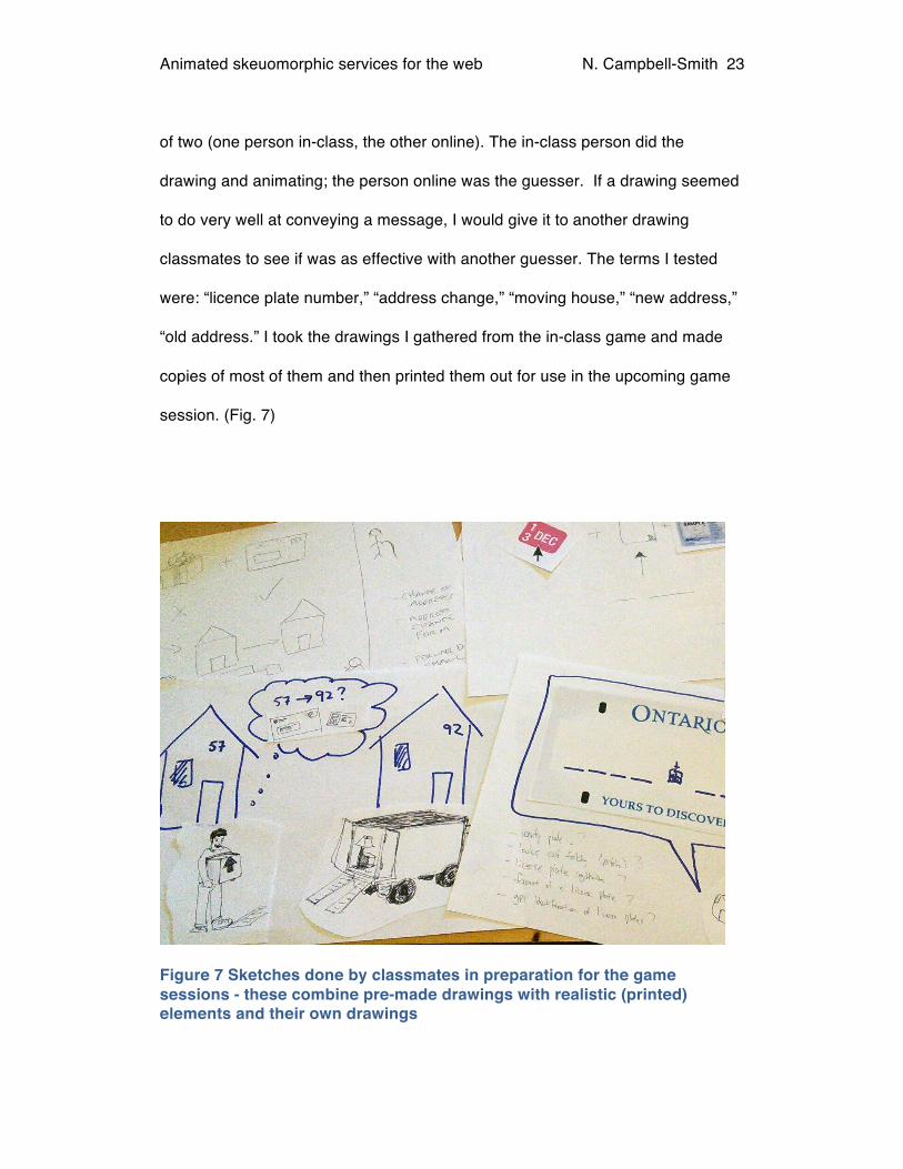
Preparing visuals for the game and gathering input on imagery
In order to gather input on what images might be best suited to the main
concepts presented in the renew licence plate sticker transaction game session, I
enlisted the help of my classmates. Together, we played a game similar to the
one I intended to play with my game participants. The game involved one person
trying to get the other to guess a concept or phrase by drawing on paper. They
may combine that with pre-made drawings, sound effects and “animation,” which
is emulated by moving the drawings by hand. The exercise was done in groups
Animated skeuomorphic services for the web N. Campbell-Smith
23
of two (one person in-class, the other online). The in-class person did the
drawing and animating; the person online was the guesser. If a drawing seemed
to do very well at conveying a message, I would give it to another drawing
classmates to see if was as effective with another guesser. The terms I tested
were: “licence plate number,” “address change,” “moving house,” “new address,”
“old address.” I took the drawings I gathered from the in-class game and made
copies of most of them and then printed them out for use in the upcoming game
session. (Fig. 7)
Figure 7 Sketches done by classmates in preparation for the game sessions - these combine pre-made drawings with realistic (printed) elements and their own drawings
Animated skeuomorphic services for the web N. Campbell-Smith
24
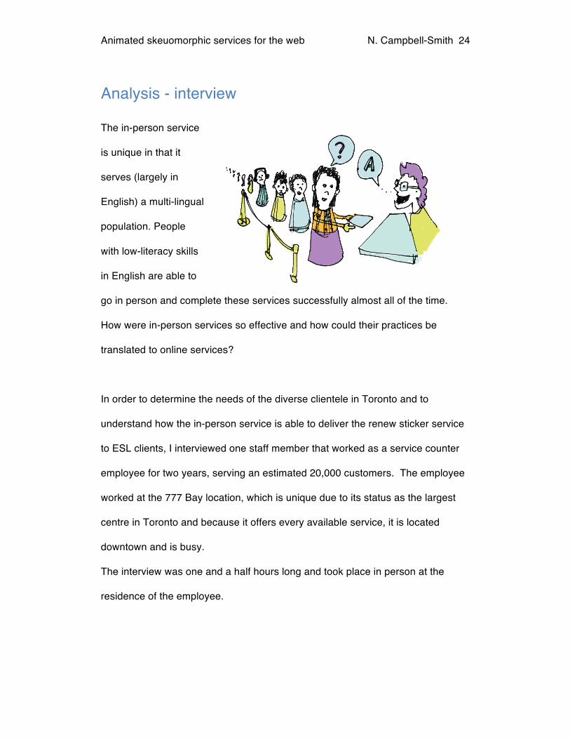
Analysis - interview
The in-person service
is unique in that it
serves (largely in
English) a multi-lingual
population. People
with low-literacy skills
in English are able to
go in person and complete these services successfully almost all of the time.
How were in-person services so effective and how could their practices be
translated to online services?
In order to determine the needs of the diverse clientele in Toronto and to
understand how the in-person service is able to deliver the renew sticker service
to ESL clients, I interviewed one staff member that worked as a service counter
employee for two years, serving an estimated 20,000 customers. The employee
worked at the 777 Bay location, which is unique due to its status as the largest
centre in Toronto and because it offers every available service, it is located
downtown and is busy.
The interview was one and a half hours long and took place in person at the
residence of the employee.

Animated skeuomorphic services for the web N. Campbell-Smith
25
Despite being the only interview I conducted, many of the ideas I collected
helped to inform what was presented in the game sessions. I was also able to
gather insights into how best to serve ESL clients in-person and incorporated
these ideas into the design of the interface.
Interview Insights
Most receive personal help with forms
The interview revealed that most non-English speakers come to the service
centre with someone who speaks their language. In a busy office like the 777
Bay location, where there are as many as 150-200 people waiting for a service,
those who need help with translation often find someone in the office who can
speak their language (as long as their language is relatively common).
Experience counts
A lot of the work to determine what service a person needs is done quickly and
intuitively by the counter staff at ServiceOntario. By looking at the documents that
someone is holding, the service counter person will often know what transaction
the person will be doing. Some employees reportedly have experience and
intuition built up over 25 years. While their experience is unlikely to be completely
replaced by an online service, we can surely take some of that knowledge and
apply it to improve the services we offer online.

Animated skeuomorphic services for the web N. Campbell-Smith
26
One effective strategy
One of the employees found it effective to iterate the design of a simple address-
gathering card (Fig. 8) because it sped up the process of acquiring the address
change service. The text is printed inexpensively on the back of official forms that
are used for signatures. The language used was modified over time to best serve
those who have trouble with English. In the games sessions, I showed this card
to each of the participants to see what they could read. Any words they couldn’t
read were spoken, again to see if they understood.
Figure 8 Address information card. Designed and iterated by ServiceOntario staff

Animated skeuomorphic services for the web N. Campbell-Smith
27
Another adaptation
The employee also indicated that pointing at physical documents like his own
driver’s licence is a strategy that has proven effective.
Some terms benefit from being “broken out”
In the address card example, the address has been separated out into house
number and street name. It might not occur to an English-speaking person that
“address” is a complex word. Breaking it into two simpler concepts (Fig. 8)
proved useful in this context. It seems there is value in closely examining the
words we use online in order to ensure they are as simple as possible.
Understanding which terms are successfully understood during in-person
services provided a useful way to find key words in this study.
Figure 9 House number and street name are separate concepts

Animated skeuomorphic services for the web N. Campbell-Smith
28
Method: Game Sessions
Target Audience
After doing the analysis of current services and conducting the interview, I
conducted game sessions with five separate individuals. Selected individuals
speak Mandarin or Cantonese Chinese and have low English-language
proficiency (both written and spoken). I focused this study on adult Mandarin and
Cantonese Chinese speakers in the Greater Toronto Area. To recruit
participants for the study, I enlisted the help of classmates who speak either
Mandarin or Cantonese. Two of my classmates served as hosts and interpreters
for the game sessions.
The Chinese community was chosen because it is one of the largest language
groups in the Greater Toronto Area; according to information published by The
Toronto Star newspaper, over 7% of Toronto residents speak Chinese at home
(Fig. 10) (Farley & Listar, 2007). The community is well represented downtown
making it easy to access participants. Chinese was also chosen because the
language is very dissimilar to English grammatically, and does not use the
Roman alphabet.

Animated skeuomorphic services for the web N. Campbell-Smith
29
Figure 10 Map of Toronto's dominant languages (excluding English) by neighborhood (Farley & Listar, 2007).
A screening questionnaire was used to ensure participants qualified for the study.
All of the participants were over fifty years of age. All participants were women;
men were not excluded from the recruitment process but were either unable to
attend, or did not qualify for the study because they were able to read English.
Participants who have very little understanding of spoken or written English were
selected in order to get a better idea of what might work for an application without
Animated skeuomorphic services for the web N. Campbell-Smith
30
language, or with minimal language. All of the women could read and write in
their own language (Cantonese or Mandarin).
All participants had varying levels of English knowledge (Table 3, p. 34-35).
Some could not read very simple English presented, but understood those words
when spoken. All indicated they had trouble reading English in the screening
questionnaire.
Technology
All participants own a phone or computer that connects to the Internet and use
the Internet to perform tasks such as emailing, Skyping and shopping or banking
in their own language. Despite some use of computers, several participants
found using the mouse or track pad challenging and had trouble clicking on
objects and acquiring the correct targets. This may have been due to their
unfamiliarity with the particular computer and mouse used for the study.2 Three of
the five participants reported that they rely on family members to complete
government transactions, while the other two go in-person to the closest local
office.
Cultural Differences
Recruited participants displayed a desire to have someone they knew present at
the session, and a preference to be in a familiar location such as the house of a
friend or relative. At the outset of my research, I wanted to conduct tests with
2 While low-income levels may contribute to restricted access to technology, an audience who is not technically literate is not considered here.

Animated skeuomorphic services for the web N. Campbell-Smith
31
participants at school, but found that insisting on these criteria made it impossible
to find anyone who was willing to participate. The tests were therefore all
conducted at the homes of my classmates who were also the recruiters and
interpreters.
Gamestorming
Gamestorming, a portmanteau of "game" and "brainstorm," describes the use of
improvisation to come up with novel games to explore ideas and brainstorm in a
playful way. Grey, Brown & Macanufo (2010) authors of the book Gamestorming
define it as “… games that encourage engagement and creativity while bringing
structure and clarity“. Gamestorming does not generally have a fixed set of rules;
as a method, it is always undefined. The book in question offers a multitude of
games to use as a starting point; I chose to make up my own game.
Testing with paper drawings
The style of game I chose for the session is similar to the practice of usability
testing with paper prototypes of web sites often used by user experience
professionals. I made minor changes through the addition of motion, sounds and
spoken words, to simulate animation. The game sessions lasted approximately
one hour and used a paper prototype. The low-fidelity prototype consisted of
sketches of key aspects of the renew sticker service, such as envelopes, houses,
moving trucks, cars, and arrows for pointing.

Animated skeuomorphic services for the web N. Campbell-Smith
32
The sketches I created with the help of my classmates in advance of the session
provided the basic starting point from which I simulated animations.
In order to gather inputs and feedback on concepts for the prototype, I moved the
paper drawings and made sounds to simulate animation, and spoke instructions
in English. These were trying to communicate parts of the renew sticker process
to participants. Interpreters told participants what transaction they were about to
complete and then participants would watch me “act out” an animation for the
service and speak any necessary English words. Generally I started with visuals
only and increased the amount of information I gave when the participant was
having difficulty understanding how the visuals related to the service. I added to
the prototype during the “game” by drawing ad lib in a style similar to the game of
Pictionary where participants try to draw pictures to have teammates guess the
meaning of them. If this failed to convey the message, the intended action was
revealed to the participant. Then they drew something they thought might elicit
the correct response, using a method similar to the one I employed. Participants
also offered suggestions in their language about what could be added and I
would then make changes in response to their suggestions.
An interpreter who spoke Chinese was present in order to confirm whether the
participant had guessed correctly, to take note of their guesses and to tell them
the correct answer relating to the exercise.
Along with the game, participants were presented with a high-fidelity prototype of
an interface to interact with on a computer. The test was to see if they would
Animated skeuomorphic services for the web N. Campbell-Smith
33
enter the correct information in the form. This test was observed and videotaped.
If the participants did not enter the correct information, they were then asked
what they thought the interface was asking for, they were told the answer and
then asked how they might improve the interface.
Iterative design
Over the course of the game sessions, the fidelity of the design was improved.
Simple changes were made between the two concurrent sessions (3&4), and
more major ones between the other sessions in order to iterate the design and
test new ideas. I gave a lot of weight to the feedback given during the game
sessions. To make this exercise participatory, I took participants’ suggestions
and incorporated them into the design updates. The resulting design was then
used in the next game session.
As a result of the rapid iteration, there was much less interaction with the paper
prototypes in the final session. More of the test focused on the low-fidelity and
high fidelity versions. Also, from Session Three onwards, I showed the high-
fidelity designs when they would naturally have appeared in the flow of the
application. The graphic below (Fig. 11) shows the items tested at each game
session and highlights items that were iterated during the design process.

Animated skeuomorphic services for the web N. Campbell-Smith
34
Figure 11 Chart showing the stages of testing and iteration
Testing the address card for comprehension
In order to test if the participants could use the address card discovered above, I
first asked if they could read any of it. If not, I spoke the words and pointed at the
place where they would enter the information on the paper. As I did this, I
covered the English (printed) words. When simple (one or two word) instructions
were spoken in English, most of the participants understood what I was saying.

Animated skeuomorphic services for the web N. Campbell-Smith
35
Results: game sessions
The results section will address the test of the address card that was used to get
an idea of what basic terms were understood by the game participants. A section
outlining conclusions from the games sessions that may be useful for others
hoping to build visual and / or low-text interactions follows this. Lastly, the final
design prototype is presented with details on how each screen is intended to
function.
Results of address card test
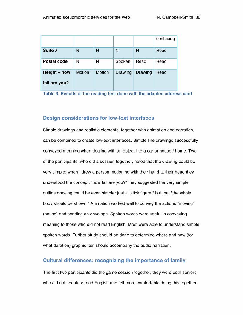
Table 3 shows how each participant did in reading tests done with the adapted
address card. Results of the reading test show that though participants report not
being able to read English, many simple words were still recognized in text. With
the addition of English narration, most terms are understood.
Word
Name Spoken Spoken Read Read Read
House # spoken spoken Y Y Y
Building # n n Read Read Read
confusing
Street name Spoken Spoken Read Read Read
City N N Read Read Read
Apartment # N N Spoken N Read*
Animated skeuomorphic services for the web N. Campbell-Smith
36
confusing
Suite # N N N N Read
Postal code N N Spoken Read Read
Height – how
tall are you?
Motion Motion Drawing Drawing Read
Table 3. Results of the reading test done with the adapted address card
Design considerations for low-text interfaces
Simple drawings and realistic elements, together with animation and narration,
can be combined to create low-text interfaces. Simple line drawings successfully
conveyed meaning when dealing with an object like a car or house / home. Two
of the participants, who did a session together, noted that the drawing could be
very simple: when I drew a person motioning with their hand at their head they
understood the concept: "how tall are you?" they suggested the very simple
outline drawing could be even simpler just a "stick figure," but that "the whole
body should be shown." Animation worked well to convey the actions “moving”
(house) and sending an envelope. Spoken words were useful in conveying
meaning to those who did not read English. Most were able to understand simple
spoken words. Further study should be done to determine where and how (for
what duration) graphic text should accompany the audio narration.
Cultural differences: recognizing the importance of family
The first two participants did the game session together, they were both seniors
who did not speak or read English and felt more comfortable doing this together.

Animated skeuomorphic services for the web N. Campbell-Smith
37
They offered each other help. Family members and friends often help each other
with tasks like these. My classmates both indicated that the family does most of
the transactions for family members who don’t speak English; they also said that
having family members present was something these participants preferred. One
participant said she would use the application “if my daughter was there to help
me.”3 It was necessary to hold games sessions at the homes of friends and
family members in order to recruit enough willing participants for the study. Using
an environment where participants were comfortable was key to encouraging
participation: participants were very relaxed, quite talkative and engaged during
the games.
Choose simple and unambiguous words
When I first said the words “licence plate number” the first word “licence” was
heard and focused on, leading the participant to believe that I was speaking
about the driver’s licence. When I then shortened it to “plate number” it was no
longer misconstrued. It is clear that choosing words that are not ambiguous is of
paramount importance and is another reason to conduct tests with your target
audience. Doak, et al. (1985) recommend speaking at a normal pace, and found
that speaking too slowly could influence comprehension because words said
together are interpreted together. I may have spoken the words licence and plate
3 A classmate who speaks native Mandarin interpreted participants’ responses. In the following text, the items in quotes refer to the interpretation of the Mandarin speaker.

Animated skeuomorphic services for the web N. Campbell-Smith
38
too slowly; this could have contributed to the fact that “licence” was interpreted
separately from “plate.”
Recognized images
The following drawing created by my classmate Ambrose Lee correctly conveyed
the concept "moving" to all participants when it was physically moved across a
piece of paper (Fig. 12).
Figure 12 Particularly successful image for the concept of "moving." Drawing by classmate Ambrose Lee
The drawings of the car, houses and trucks that were very simple (see figure 8
above) conveyed more meaning to the participants than pictures that showed
more detail.

Animated skeuomorphic services for the web N. Campbell-Smith
39
Seeing both houses and moving the truck brought the concept to light for two of
the participants, others needed only the truck and the animation (The animation
implying the action – moving). When I added houses to the truck image, this
caused some confusion in Game 3, proving that adding more images does not
generally increase comprehension, but rather introduces more opportunities for
misinterpretation. (Medhi, Prasad, & Toyama, Optimal audio-visual
representation for illiterate users of computers, 2007).
Drawings of envelopes were recognized, but using a physical envelope to signify
“address” had more success with the first two participants. In subsequent
designs, I used a realistic looking envelope for the interface that asks users for
their mailing address.4
The “?” is interpreted as a question
All participants recognized the number (#) and the question mark (?). A “?” was
thought to represent the concept of a "question," rather than "help" as I had in
mind. The interpretation of the participants was that by pressing on the image of
the question mark, it would speak the question. Coincidentally, I thought that
audio speaking the question would be helpful and my design did speak the
4 Cultural difference: According to one participant, the order of information in an
address and where it is found on an envelope are different in China.

Animated skeuomorphic services for the web N. Campbell-Smith
40
question when the button was "pressed.” This would be a good method of
providing a phrase that a user wants to hear again.
Positive reactions to visual interface
The first two participants responded that the realistic interfaces were "easier" and
that they could see how they would useful "to anyone," and "to everybody". All of
the participants noted that having something you don’t have to read was a good
idea. After having used the interface, all the participants said that they would try
an interface that they were told was easy to use.
Tests with the realistic interfaces clearly showed that they drew upon the users’
intuitive sense of what belonged somewhere, and the fact that they could "fetch"
their "matching" document and enter information letter for letter made it possible
even for those who could not "write" in English to use the form. The participants
seemed enthused at the idea that there might be more visual interfaces available
in the future and expressed the thought that this would be something that
"everyone can use." It is widely known that if an interface just looks easy to use it
can make a difference to users perception of how useable it actually is.
This method elicited a high level of engagement
Not all participants decided to pick up a pen, but used the given images quite well
and were very animated in their responses. Allowing participants to play the
game at locations that were familiar to them and with family and friends
encouraged the relaxed and comfortable atmosphere required for this type of
participatory design. It is clear that in order to minimize confusion and lead
Animated skeuomorphic services for the web N. Campbell-Smith
41
people quickly to their destinations (transactions), the co-design phase is an
essential step in the creation of an image-heavy interface.
Prototype Design
Iterations
Based on the analysis of the transactions, the interview, and the games
sessions, I iterated the design of a low-fidelity version of the renew licence plate
sticker interface. The low-fidelity interface has some higher fidelity form elements
integrated within it where form fields are needed to obtain information from the
user.
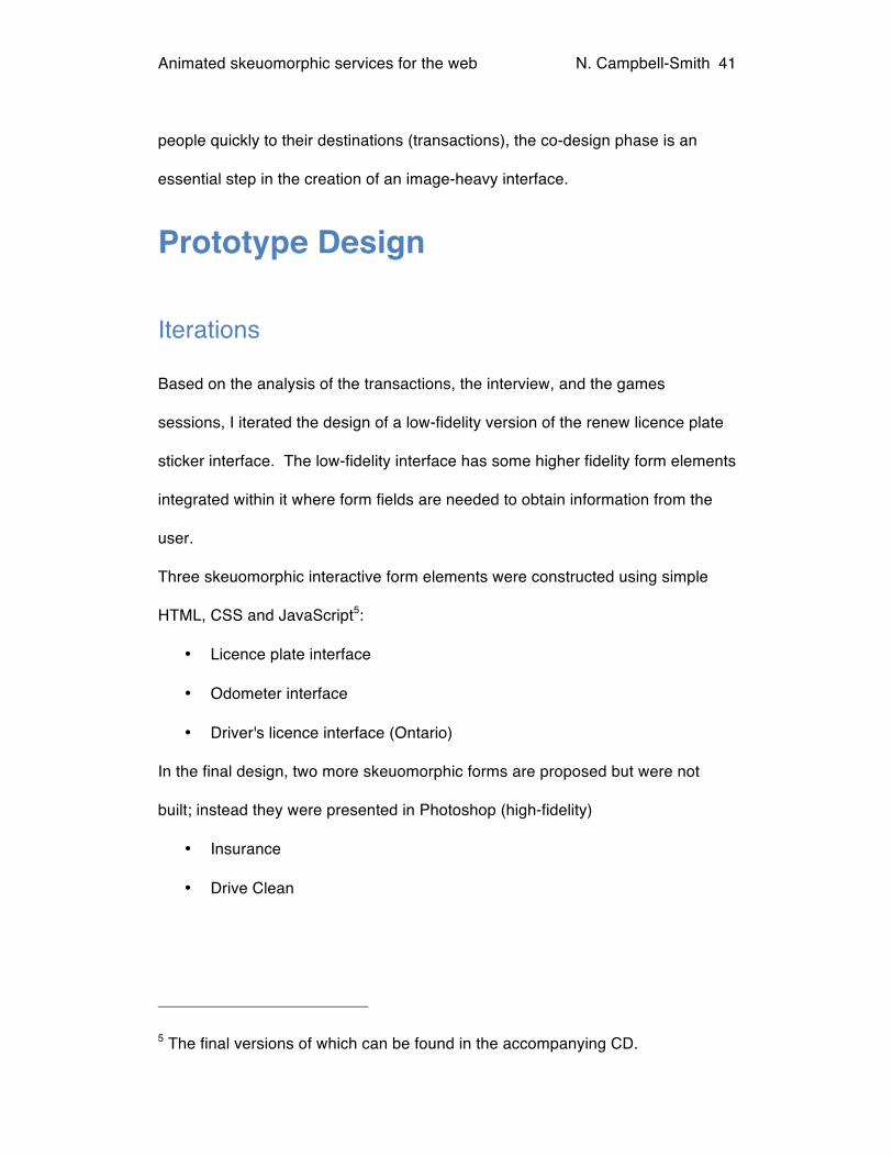
Three skeuomorphic interactive form elements were constructed using simple
HTML, CSS and JavaScript5:
• Licence plate interface
• Odometer interface
• Driver's licence interface (Ontario)
In the final design, two more skeuomorphic forms are proposed but were not
built; instead they were presented in Photoshop (high-fidelity)
• Insurance
• Drive Clean
5 The final versions of which can be found in the accompanying CD.

Animated skeuomorphic services for the web N. Campbell-Smith
42
Final Design
Figure 13 The start of the renew plate sticker transaction prototype design, clicking on the arrow will start the application
Car (cartoon style) and Sticker (realistic image)
All participants in the game sessions recognized the picture of an actual sticker
for the licence plate. They knew that they were completing the renew plate
sticker transaction; they identified it as the thing they were going to get.
Licence plate interface
Using a car provided context
The licence plate interface was paired with a drawing of a car (Figure 13). In
game session paper tests, I tried showing only the licence plate, without context
and this was more confusing to the non-driving participants. The non-drivers
were less sure of what the item was and when told it was in fact, a licence plate,
they suggested the use of the car by choosing to place it in the scene.
In first tests, I used a version where the car drove (animated) into the scene –
this proved unnecessary, as later tests where it was removed were just as
successful in eliciting the proper information from participants.
Animated skeuomorphic services for the web N. Campbell-Smith
43
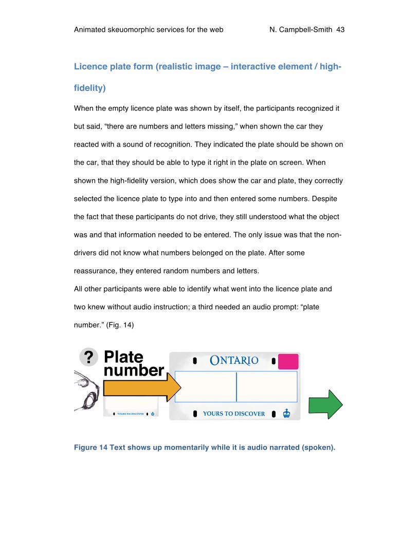
Licence plate form (realistic image – interactive element / high-
fidelity)
When the empty licence plate was shown by itself, the participants recognized it
but said, “there are numbers and letters missing,” when shown the car they
reacted with a sound of recognition. They indicated the plate should be shown on
the car, that they should be able to type it right in the plate on screen. When
shown the high-fidelity version, which does show the car and plate, they correctly
selected the licence plate to type into and then entered some numbers. Despite
the fact that these participants do not drive, they still understood what the object
was and that information needed to be entered. The only issue was that the non-
drivers did not know what numbers belonged on the plate. After some
reassurance, they entered random numbers and letters.
All other participants were able to identify what went into the licence plate and
two knew without audio instruction; a third needed an audio prompt: “plate
number.” (Fig. 14)
Figure 14 Text shows up momentarily while it is audio narrated (spoken).

Animated skeuomorphic services for the web N. Campbell-Smith
44
Figure 15 The licence plate interface. The area where the letters are can be interacted with – the typeface is a Google web font named “Oswald.” It was chosen for its similarity to the font found on Ontario licence plates.
When the user clicks on the licence plate, it animates “towards” them, becoming
large enough to take up most of the space in the browser window (Fig. 15).
The participants were able to click on the plate and enter letters with little
encouragement, showing that the form doesn’t necessarily need to “look like a
form” to be easy to use. The large interface that takes over the screen leaves
little confusion about where information should be entered, and offers
accessibility for low-vision users.6
.
6 The large plate interface with a font-size of 120px or 7.5em (which is 7.5 times the browser default size) offers the extra advantage of being extremely easy to read.

Animated skeuomorphic services for the web N. Campbell-Smith
45
Stickers 1 year or 2 year
The stickers are made to look almost identical to actual plate stickers. I added the
year above the stickers at the suggestion of a game participant number three,
who had mistaken the year for the day of the month. The design pictured here
(Fig. 16) did very well in tests four and five, causing no confusion. It seemed
that, numbers were recognized.
Figure 16 The plate stickers, before selection
Figure 17 The plate stickers after a selection has been made. After the sticker is selected, the green arrow indicates the user can move to the next part of the transaction

Animated skeuomorphic services for the web N. Campbell-Smith
46
Insurance
This design was not tested with users, but is part of the final design. The
skeuomorphic forms were successful during the games, so I extended the idea in
the final interface. (Figs. 18,19, 20)
Figure 18 Insurance Form, Step 1. The application speaks the words insurance company and an arrow indicates where the information should be entered.
Figure 19 Insurance Form, Step 2. Audio narration speaks "Insurance number" and arrow indicates the area to enter it

Animated skeuomorphic services for the web N. Campbell-Smith
47
Figure 20 Once completed, the information is reflected on the form and the green arrow indicates the user can move to the next part of the transaction
Odometer interface
Step # 5 of the transaction is the odometer
interface. The speedometer was recognized by
every one of the participants as being the place
that shows how fast the car is going; however,
non-drivers were confused about what would go in
the odometer area. A design change from a
digital interface (Fig. 21) to a more traditional
looking “roller” style odometer (Fig. 22) was used correctly in the final game. The
last participant is the only one who tested it, so it is unclear whether the design
Figure 21 Odometer form interface, version one. Digital numbers.

Animated skeuomorphic services for the web N. Campbell-Smith
48
update was in fact the reason for her increased comprehension.
Figure 22 Odometer, final design uses a more traditional dial
Figure 23 When the odometer is clicked on the area to enter information zooms in

Animated skeuomorphic services for the web N. Campbell-Smith
49
When clicked upon the field areas where information should be entered get larger
and take up a larger portion of the screen area. Zooming in on form fields leaves
little else to interact with. (Fig. 23)

Animated skeuomorphic services for the web N. Campbell-Smith
50
Drive clean
Like the insurance form, the drive clean form design proposes the idea of using a
field “close up” (Fig. 24, 25)
Figure 24 Added during the final design phase, the Drive Clean form works very much like the insurance form
Figure 25 Once the number is entered the next part becomes available, clicking on either the arrow, the graphic “?” or hitting the right arrow key will move the user to next question

Animated skeuomorphic services for the web N. Campbell-Smith
51
Driver’s Licence Interface
During the first game, the two participants were able to copy the correct numbers
into the address field on the form when looking at a piece of mail for reference.
The driver’s licence interface was recognized by all participants, and was easily
used when I verbally said what belonged in each field and pointed at it with my
finger (during the game session). There did not seem to be any confusion about
how to interact with the form. For game sessions 3-5, I eliminated this step in
favour of using the driver’s licence to provide the person’s current address.
Screen shots: show “check address” on driver’s licence
I experimented with showing the person’s current address on an envelope and on
the driver’s licence. The driver’s licence was more successful in relating the idea
of “current address” or “address on file,” because that where the address on file
should appear on your driver’s licence.
In the final version, the user is presented with the driver’s licence with their name
and current address filled in on it. The application then speaks the words “is this
where you live? Is this your address?” “ YES “ an arrow points, “or NO” (Fig. 26)

Animated skeuomorphic services for the web N. Campbell-Smith
52
Figure 26 The driver's licence shows the person's name and the address that the Ministry of Transportation has on file
The user’s address is confirmed on the licence, A check mark or X are pressed to
indicate YES or NO. One participant suggested the words go beside the
checkmark and X respectively. If YES, is clicked the address flies over to an
envelope to indicate that this is the address the sticker will be mailed to, followed
by an animation showing the sticker going into the envelope.
Last, the user must confirm whether the address on the envelope is correct. In
either the driver’s licence or the envelope, clicking the x or NO will erase the
current address and allow the user to enter a new one. Pressing on the green
arrow confirms the completion of this step, as per the rest of the application (Fig.
27).
Having the text adjacent to the item when it is time to fill in that information is the
best time to show text. Further study should be done to determine whether it is
best to have the labels for the required fields visible at all times. Does hiding and

Animated skeuomorphic services for the web N. Campbell-Smith
53
showing the labels help with focus, and reduce errors? Or does it show progress
and cause confusion. The reason I decided to use this method was in order to
synchronize the text shown with audio narration. An alternative design might
show all the labels but enlarge and point at them as they are spoken.
Figure 27 Once the address is confirmed, it animates over to the envelope, and the envelope files away, signaling that the transaction is done and that the sticker will be sent in the mail

Animated skeuomorphic services for the web N. Campbell-Smith
54
Other Design Concepts
Two alternative design concepts I came up with during ideation include a stand-
alone application that works in a way similar to the ING7 application that allows
you to deposit a cheque by taking a photo of it. This idea eliminates the form
filling altogether. The idea is that you take a photo of the government form you
need to fill out and it will prompt you to take photos of all the required information.
Using OCR, the text would populate in the correct spots would be acquired and
processed. Payment by credit card could also work this way (Fig. 28). The
second alternative design concept is an extension of the prototype design
proposed in this paper, but instead of being online it has been translated to a
paper format (Fig. 29).
7 ING is now known as Tangerine in Canada

Animated skeuomorphic services for the web N. Campbell-Smith
55
Figure 28 My idea for a photo app would avoid forms altogether – until the payment process

Animated skeuomorphic services for the web N. Campbell-Smith
56
Design Concepts: Visual Paper Form
Figure 29 Print version of a visual form

Animated skeuomorphic services for the web N. Campbell-Smith
57
Scope and Limitations
This project is based on my experience as a web designer working for the
government for more than twelve years. As the web evolves, I see opportunities
to use more animation, audio and visual elements to create more immersive
experiences without the need to install third-party plug-ins. I chose to focus on an
existing transaction because I like to focus on solving existing problems in
innovative ways. Building a better online form was always a problem I wanted to
tackle and going to school has afforded me that luxury. This paper studies
possibilities available to designers and suggests new ways for us all to think
about what online forms can look like and do for us.
Language limitations
Limited to One Language
Due to time and fiscal constraints, I only targeted one language group (Chinese
Mandarin or Cantonese). Testing with other language groups would help to
confirm that these visuals communicate are not culturally specific.
Researcher does not speak the language of the participants
I do not understand either Mandarin or Cantonese, so I relied on interpretation to
gather feedback. I did however attempt to integrate ideas and make changes
either in real time by drawing and adapting the prototype on the spot, or in-
between sessions by iterating the design.

Animated skeuomorphic services for the web N. Campbell-Smith
58
Responses were translated by interpreters
According to recommendation by Squires found in a paper entitled
“Methodological challenges in cross-language qualitative research – A research
review,” suggests that studies using interpreters should ensure that those
interpreters have a high level of vocabulary in both languages, and have the
ability to describe concepts or words when they do not know the actual word or
phrase. Both of my interpreters first languages were either Cantonese or
Mandarin, both are Masters degree candidates in the same program as me.
Assignments are in English, and all remain in good standing academically; they
must therefore have an advanced knowledge of the language (Squires 2009).
Interpretation was done in real-time and translation was done for the recruitment
letter and for the screening questionnaire.

Animated skeuomorphic services for the web N. Campbell-Smith
59
Recommendations
The following section outlines recommendations for people who might want to
make their own low-text interfaces outlined are some of the findings that came up
during the study.
Use few clearly defined words
Carefully choose words, make sure they are not ambiguous, the order and choice
of words is also important. In the game session the first spoken was focused
upon, make sure the first word is clear and is the main thing being focused on, in
this case “plate” before “number”, or “sticker” before “plate”.
When you want users to enter information place text next to the field in question
and have the English word spoken at the same time (Clark & Mayer, 2011)
Some terms benefit from being “broken out” – Avoid
“government speak”
Separate out the components of words like address into house # and street name
– these words are easier for people with ESL to understand. It would be
advantageous if governments could think about which words may be broken out
or simplified. This study found that the words “height” and “residential (address)”
were two of the least understood in the context of the services I analyzed. Again,
these kinds of issues are easily identified if the service is looked at holistically,
this kind if adaptation is obvious to someone who deals with these kinds of
issues everyday.

Animated skeuomorphic services for the web N. Campbell-Smith
60
English narration is helpful
Audio narration, although presented in English appeared to reinforce the
message, and helped those who understand spoken English. All the participants
understood some spoken English even if they could not read simple words.
Speak at a normal speed
Words may be interpreted individually if spoken too slowly (Doak et al. 1985).
It is also advisable to avoid the use of unnecessary words. It is not necessary to
say: “please enter…” only speak what is needed. E.g.,: “plate number”.
When to use which representation (line / animation / realism)
The literature and my own observations suggest using line drawing for more
abstract concepts such as any car, house or person. In the game, line drawing
worked very well to communicate simple concepts. During the tests, animations
were interpreted as actions. Therefore, the use of animation should represent an
action and not a thing (i.e., moving vs. truck), or that the user should take action
or interact with an object on screen, like the green arrows in the proposed
prototype, or the sticker going into the envelope before it flies away. Participants
of the game easily recognized official government documents like the licence
plate and driver’s licence, and intuitively interacted with them. The skeuomorphic
form interfaces proved easy for people to use, and all participants were able to
type into the licence plate with little encouragement.

Animated skeuomorphic services for the web N. Campbell-Smith
61
A method for finding simple representations
Start with one image that you think represents the idea you want to
communicate, layer in complexity one piece at a time by adding images, words
and sounds until the participant guesses correctly. Finding the simplest possible
way to represent each part of the transaction prevents confusion, because more
complex visuals leave more room for multiple interpretations.
Use a game to engage people in discussion about interface design. The game
method used in the study elicited a lot of enthusiastic participation. I was able to
test and gather ideas very rapidly. Make participants comfortable and involve
family members in the game when dealing with cultures where family cooperation
is integral.

Animated skeuomorphic services for the web N. Campbell-Smith
62
Discussion
Low-text transactions are possible and may help ESL people to
get services.
Focusing on making forms more visual could increase their usability for low-
literacy audiences and help to serve clients in areas with very diverse
populations.
Visuals worked well, testers were able to figure out how to do key parts of the
transaction.
Realistic form elements are intuitive – they don’t need to look
like traditional forms
When presented properly, skeuomorphic interfaces can be extremely intuitive.
Zooming in on areas to be interacted with leaves little else to focus on. This may
have improved the usability of the form elements presented.
Forms are due for a shake up.
The response to high-fidelity prototypes was strong. I think that if people who are
currently intimidated by text-heavy services were able to access a set of services
that were more visual, they would be more likely to do their transactions online.
Since most people don’t do service transactions online, the perception of usability
afforded by a visual redesign might prompt others to revisit previously unusable
service transactions. If the transaction increases usability, I would expect
increased traffic to the transaction, which could be measured.

Animated skeuomorphic services for the web N. Campbell-Smith
63
More widely, professionals who construct web forms for a living should consider
what they could do to make their forms more visually based.
Further Study
More testing and further iterations
Further study would require that this prototype be Iterated and tested with a wider
audience. Images should be tested more widely with various audiences to
confirm the connection between the concepts and the visual styles we found
worked well for this study. A more sophisticated prototype could incorporate the
most recognized graphic images and spoken words into a higher fidelity iteration
of this application. The next iteration of the design could include realistic form
elements for the insurance and drive clean documents. Considering that the
odometer interface was usable and was understood by the end of the last game,
it would be worth exploring other ideas for things that look “specific enough.”
Testing a payment process that incorporates realistic looking credit cards would
be a good next step. Choosing key transactions like a payment process could
prove useful to a wide audience that extends beyond the government to the
private sector. Other unanswered questions include: when should text be shown
on screen and for what duration?

Animated skeuomorphic services for the web N. Campbell-Smith
64
Share the ideas and code
Reusable component could be useful for front-end designers. Create patterns
that can be shared though github8 – sharing of this resource could lead to more
visual forms.
More interfaces like this one should be built to test the limits of what is possible.
Identify the services most required by non-English speakers
for redesign.
Ethnographic studies may be useful to understand specific communities.
More interviews with ServiceOntario staff could uncover ways to make
improvements to the language and processes in existing online pages and
processes. One simple improvement already suggested to the Ontario.ca UX
team is the addition of photographs of service locations and pictures of required
documents for transactions.
Outline game method
The game method employed in this study facilitated active participation and
elicited very useful feedback from participants. Others may find it is a useful
method for gathering feedback on visual transactions from those who speak
many languages.
8 www.github.com is an open source sharing platform

Animated skeuomorphic services for the web N. Campbell-Smith
65
Conclusion
It is now apparent to me that each interface type and circumstance will require a
new set of images and that achieving true accessibility in forms for those who
don't speak or read English may be something that requires quite a bit of
research. There may be ways to speed the process of figuring out which images
align to which concepts. After seeing the designs in action with those who don't
speak or read English, I have quite a lot of hope for their use.
UX designers should push the boundaries of what we think of as web forms and
be inspired by native applications that immerse the user in the experience and
leverage the user’s mental model by employing skeuomorphism and cues from
the physical world to increase usability. Reducing the amount of text required to
complete a service will also increase usability for those who have trouble reading
the language. UX designers should pair the visual interface with audio narration
for added comprehension.
Tests with the realistic interfaces clearly showed that they lent the users intuitive
sense of where information belonged and encouraged them to "fetch" their
"matching" document and enter information letter for letter. This made it possible
for those who could not "write" in English to use the form. The participants
seemed enthused at the idea that there might be more visual interfaces available
and believed that this would be something "everyone can use."

Animated skeuomorphic services for the web N. Campbell-Smith
66
References
Christiansen, B., & Wroblewski, L. (2010, February 11). Spoolcast: Moving beyond web forms with Luke Wroblewski. Retrieved 2013, 10-‐10 from User Interface Engineering: http://www.uie.com/brainsparks/2010/02/11/spoolcast-‐moving-‐beyond-‐static-‐forms-‐with-‐luke-‐wroblewski/
Clark, R. C., & Mayer, R. E. (2011). e-‐Learning and the Science of Instruction: Proven Guidelines for Consumers and Designers of Multimedia Learning, Third Edition. Pfieffer.
Doak, C. C., Doak, L. G., & Root, J. H. (1985). Teaching patients with low literacy skills. Philadelphia: J.B. Lippincott.
Farley, C., & Listar, D. (2007, December 30). Greater Toronto's language quilt. The Toronto Star .
Gray, D., Brown, S., & Macanufo, J. (2010). Gamestorming: A playbook for innovators, rulebreakers, and changemakers. O'Reilly Media, Inc.
Medhi, I., Prasad, A., & Toyama, K. (2007). Optimal audio-‐visual representation for illiterate users of computers. In Proceedings of the 16th international conference on World Wide Web , 873-‐882.
Medhi, I., Sagar, A., & Toyama, K. (2008). Text-‐free user interfaces for illiterate and semilliterate users. Microsoft.
Misfud, J. (2011, August 11). An extensive guide to web form usability. Retrieved 03 09, 2014, from Smashing magazine: http://uxdesign.smashingmagazine.com/2011/11/08/extensive-‐guide-‐web-‐form-‐usability/.
Squires, A. (2009). Methodological challenges in cross-‐language qualitative research: A research review. International journal of nursing studies , 46 (2), 277-‐287.
Statistics Canada. (2012, October 24). Focus on Geography Series, 2011 Census -‐ Census of Metropolitan City of Toronto. Retrieved 10 14, 2013, from Statistics Canada: https://www12.statcan.gc.ca/census-‐recensement/2011/as-‐sa/fogs-‐spg/Facts-‐cma-‐eng.cfm?LANG=Eng&GK=CMA&GC=535
Toronto, C. o. (n.d.). City of Toronto -‐ Demographic Information for the City of Toronto. Retrieved 2013, 23-‐04 from City of Toronto: http://www.toronto.ca/demographics/pdf/language_2011_backgrounder.pdf

Animated skeuomorphic services for the web N. Campbell-Smith
67
Weyenberg, A. (2011, May 13). Realistic UI Design. Seattle, Washington, USA.
Wingfield, N., & Bilton, N. (2012, October 29). In Shake-‐Up, Apple’s Mobile Software and Retail Chiefs to Depart. Retrieved 2013, 26-‐11 from New York Times: http://bits.blogs.nytimes.com/2012/10/29/apples-‐mobile-‐software-‐and-‐retail-‐chiefs-‐to-‐depart/

Animated skeuomorphic services for the web N. Campbell-Smith
68
Appendix A: CD containing the
Javascript / HTML / CSS prototype(s)
A CD is attached that contains the prototype. On the CD is the Adobe Photoshop
file, a .jpg representation of the design and HTML, CSS, and Javascript that
make up the interactive part of the prototype.
The form elements may look fancy but are very accessible, they are simply forms
with fancy backgrounds and fonts. Much of the animation is done using CSS
transforms, some with Javascript.
A readme.txt file on the CD provides more information about the code and how
pages should be structured on a web server.