
5 shocking design Mistakes you need to avoid - Moodle@Units
44
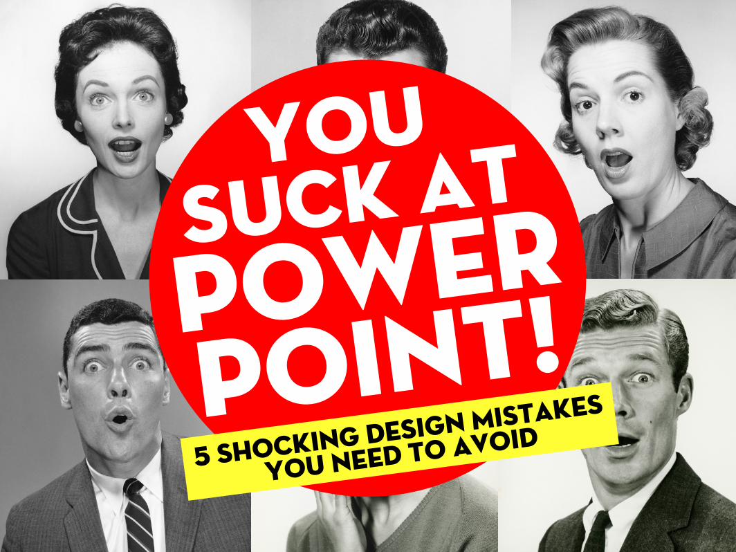
Suck at Power Point! You 5 shocking design Mistakes you need to avoid
-
Upload
khangminh22 -
Category
Documents
-
view
3 -
download
0
Transcript of 5 shocking design Mistakes you need to avoid - Moodle@Units
Suck atPowerPoint!
You
5 shocking design Mistakes
you need to avoid

People working in non-profits, government, schools and cubicles all around the world hate PowerPoint,
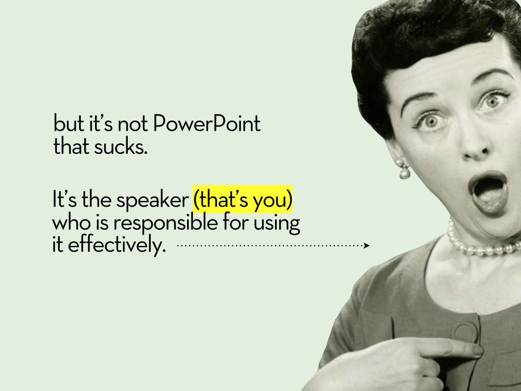
but it’s not PowerPoint that sucks.
It’s the speaker (that’s you) who is responsible for using it effectively.

Your slides are there to support you and unfortunately if they suck, so do you.

There are endless books written on the topic by some very smart people.But there are lots of ways of designing a great looking presentation, and definitely more than one opinion.
Ultimately one of my favourite ways to learn is from other people’s mistakes.
So here are...

5 shocking designmistakes youneed to avoid

mISTAKE #1
toomuchinfo

If you’re going to put word for word what you’re are going to say, hand over the slides and take a seat buddy.
BLAH BLAH BLAH BLAH BLAH BLAH BLAH BLAH BLAH BLAH BLAH BLAH BLAH BLAH BLAH BLAH BLAH BLAH BLAH BLAH BLAH BLAH BLAH BLAH BLAH BLAH BLAH BLAH BLAH BLAH BLAH BLAH BLAH BLAH BLAH BLAH BLAH BLAH BLAH BLAH BLAH BLAH BLAH BLAH BLAH BLAH BLAH BLAH BLAH BLAH BLAH BLAH BLAH BLAH BLAH BLAH BLAH BLAH BLAH BLAH BLAH BLAH BLAH
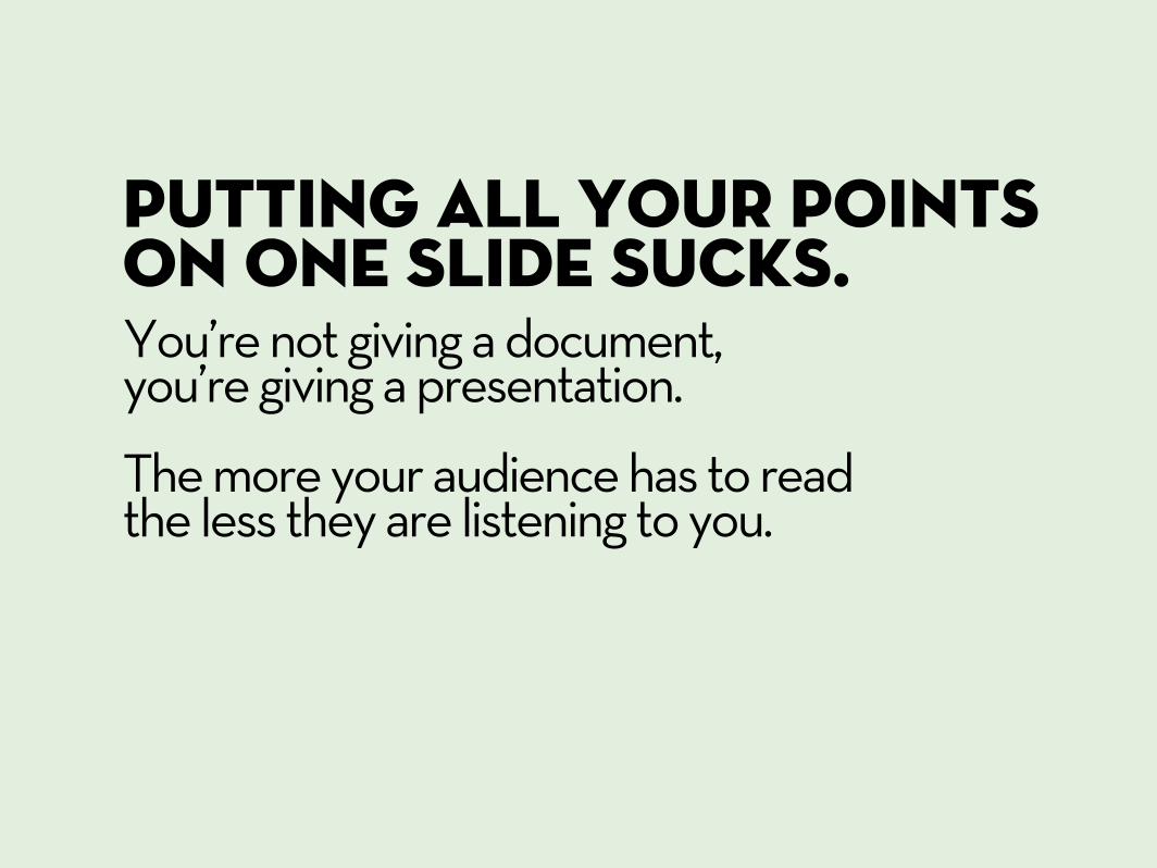
Putting all your points on one slide sucks.You’re not giving a document, you’re giving a presentation.
The more your audience has to read the less they are listening to you.

A good trick is to keep only one point per slide.
This helps you with timing and keeps people from skipping ahead.
POINT 1 POINT 2SUBPOINT
POINT 3SUBPOINTSUBPOINT

Effective communication is knowing what to cut out.
Be a merciless editor and
keep it relevant.

While you’re at it...
Once or twice is ok.
30 times? That sucks.
We’re So BigInternationalLook at our BIG logo!
Get rid of your logo on every slide.

mISTAKE #2
not enoughvisuals

Visuals are more interesting than words.
There are endless sources of images and videos you can use to bring your presentation to life.
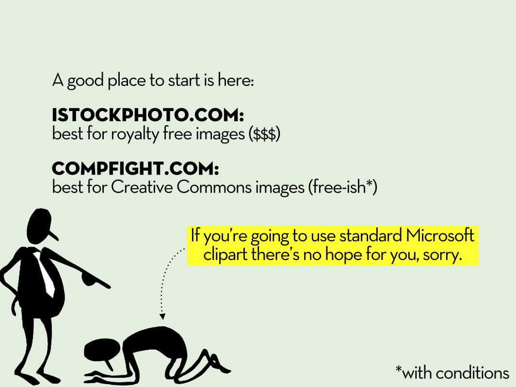
If you’re going to use standard Microsoft clipart there’s no hope for you, sorry.
A good place to start is here:
iStockPhoto.com: best for royalty free images ($$$)
COMPFIGHT.com: best for Creative Commons images (free-ish*)
*with conditions

You don’t have to use cheesy stock photos.
(is it really that much fun to work in a call center?)
Whichever visuals you use just remember to...

If it’s unreadable, don’t use it.
Design for this guy.
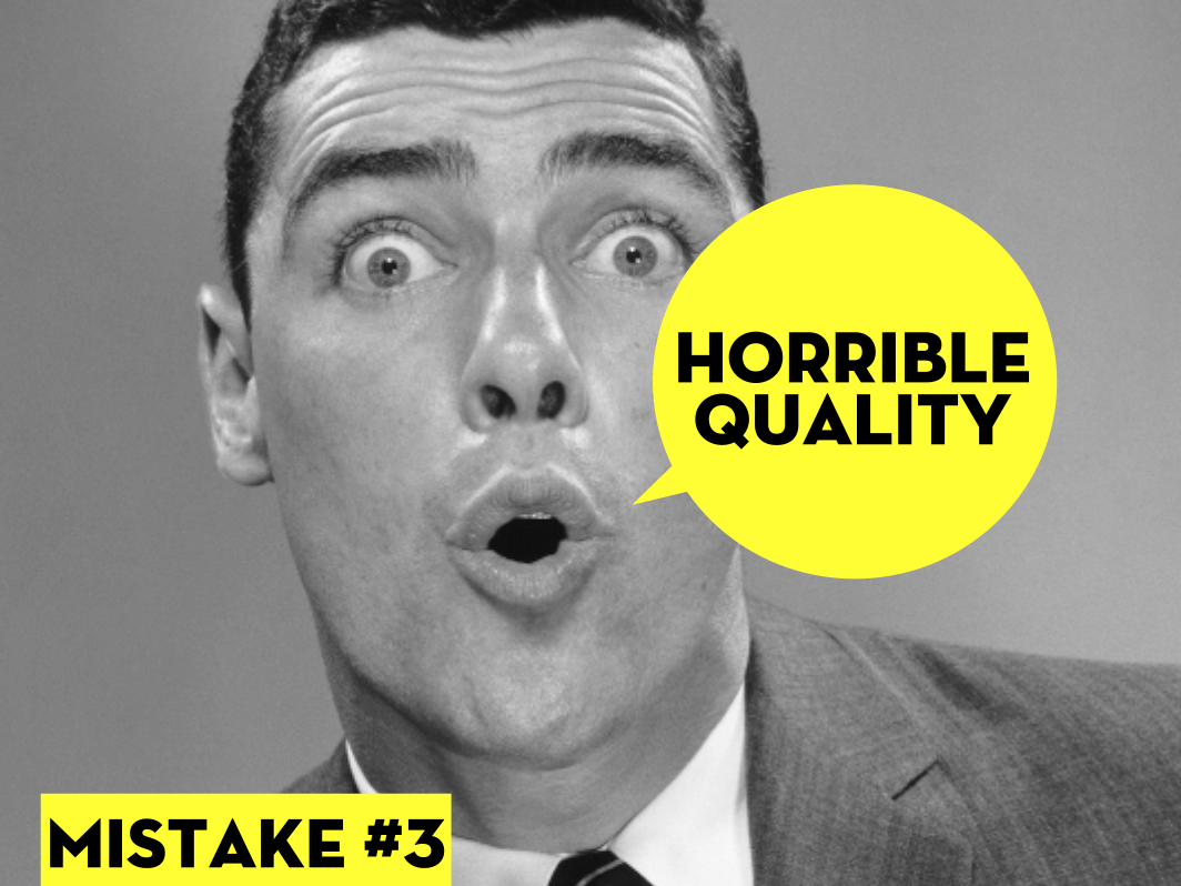
mISTAKE #3
horriblequality

Pixelation sucks.

Use high-quality images at their right sizes.
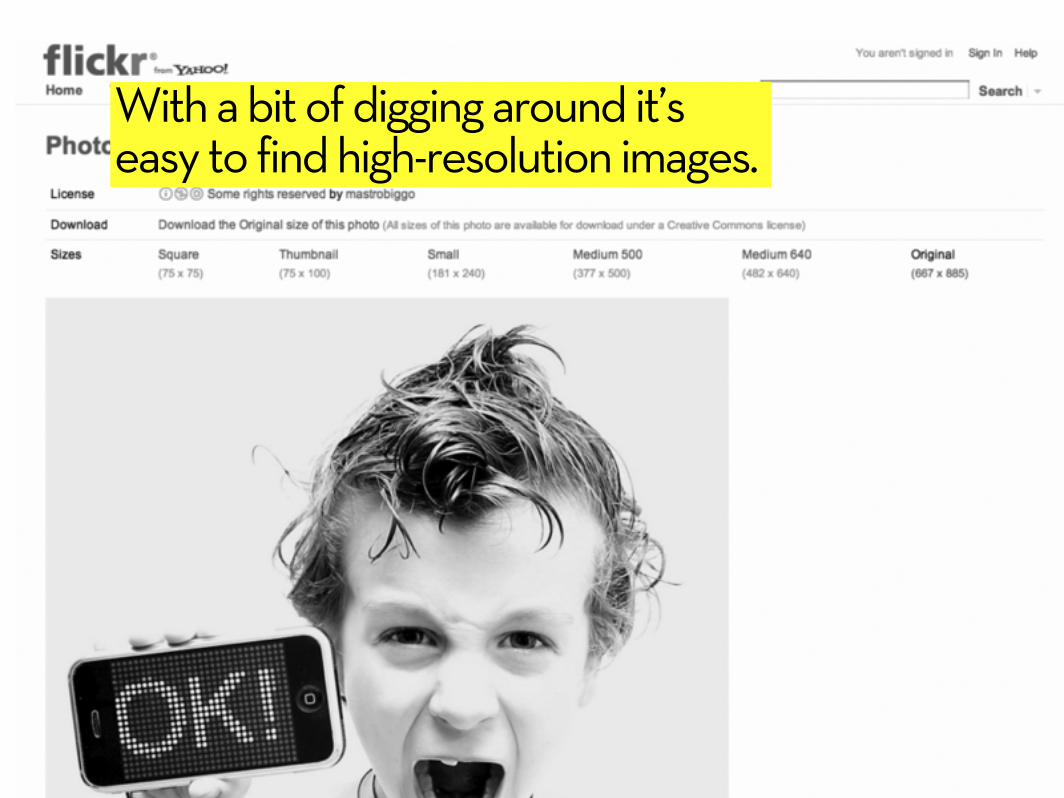
With a bit of digging around it’s easy to find high-resolution images.
Tahoma Microsoft Sans Serif Arial Verdana Courier New Times New RomanTrebuchet MSLucida Console
Comic Sans MS
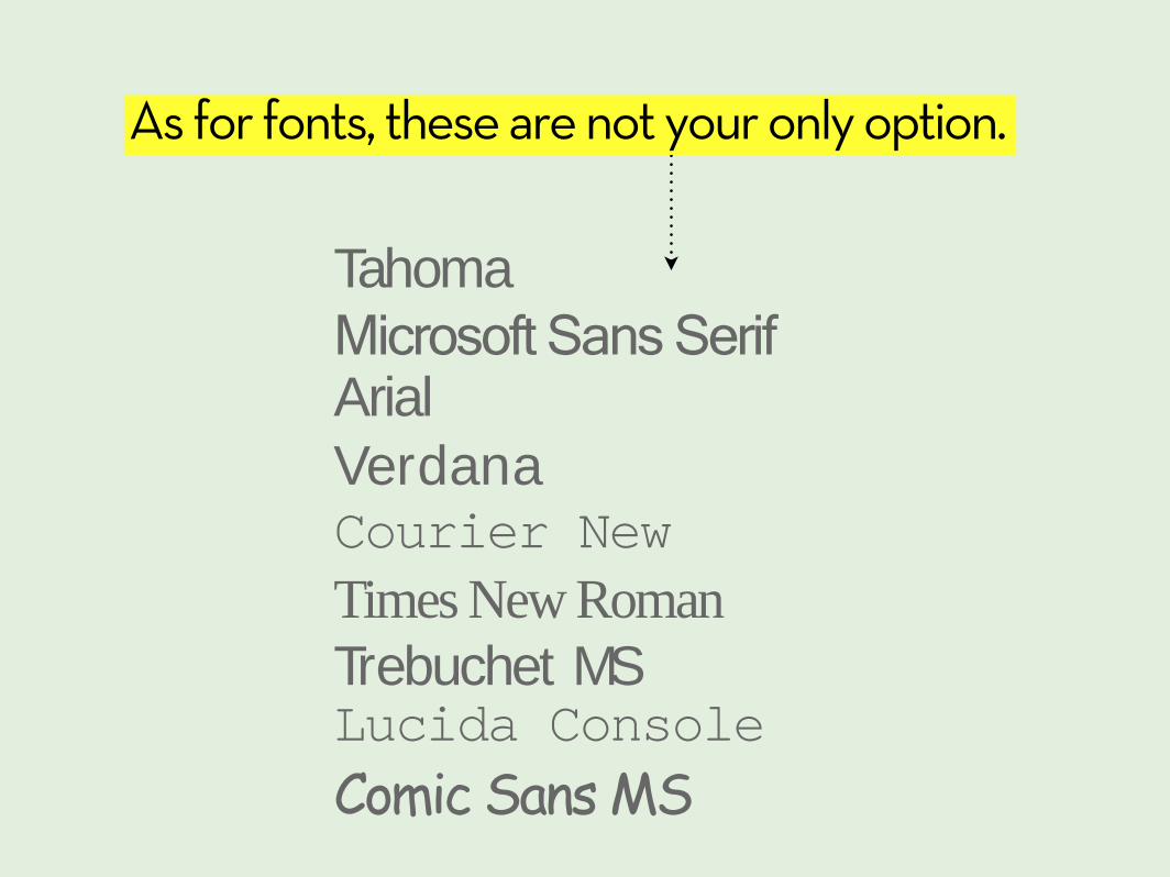
As for fonts, these are not your only option.

Google ‘beautiful fonts’ and you’ll find plenty of handpicked fonts by some very good designers.

Here’s an example of a free font that looks, um, delicious.

mISTAKE #4
ALL-OVER-THE-PLACE
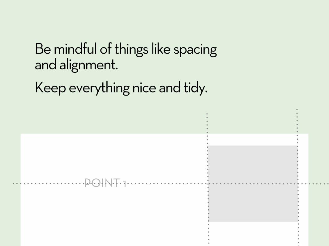
Be mindful of things like spacing and alignment.Keep everything nice and tidy.
POINT 1
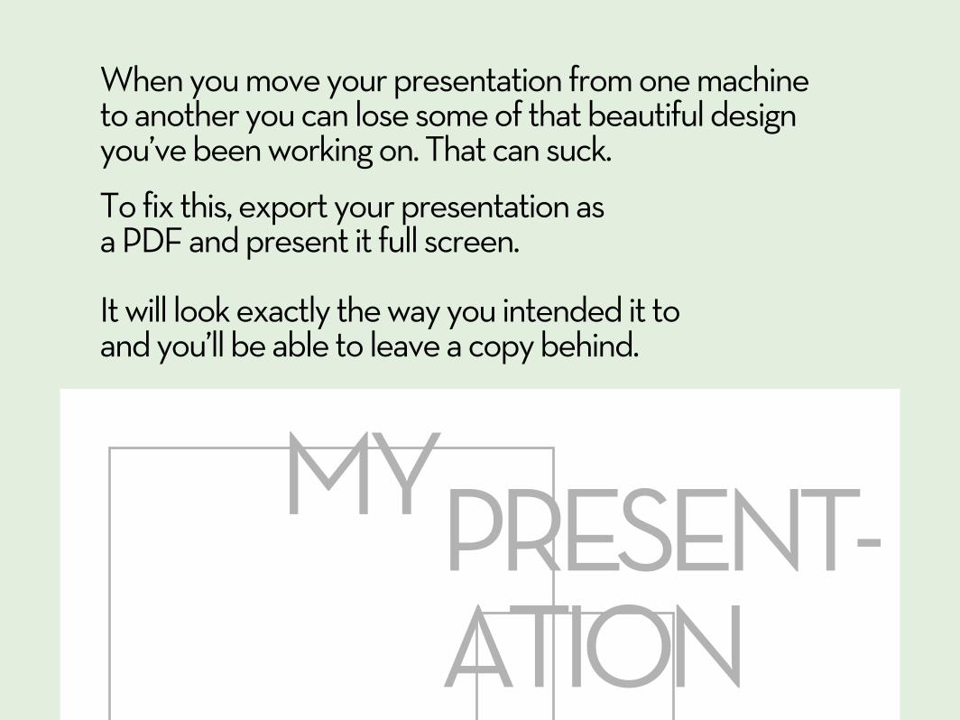
When you move your presentation from one machine to another you can lose some of that beautiful design you’ve been working on. That can suck.
To fix this, export your presentation as a PDF and present it full screen.
It will look exactly the way you intended it to and you’ll be able to leave a copy behind.
MYPRESENT-ATION

Having a consistent use of colors, images & alignment gives a cohesive look to your presentation.
It also helps to separate your presentation into sections.
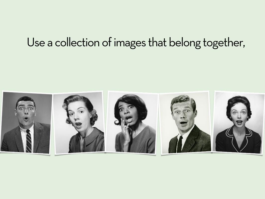
Use a collection of images that belong together,

and always stick to a color scheme.

and the most common mistake...

mISTAKE #5
lackof prep
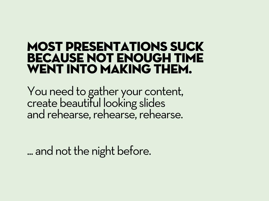
Most presentations suck because not enough time went into making them.You need to gather your content, create beautiful looking slides and rehearse, rehearse, rehearse.
... and not the night before.

get organized and plan ahead.

Source: www.distinction-services.com
of top executives say that communicating with clarity directly impacts their career and income.
25%
86%Yet only
Spend more than 2 hours on ‘high-stakes’ presentations

An outstanding 1 hour presentation can take 30 hours or more of prep time.
Shocking I know.

but It’s all worth it. Giving a ‘high-stakes’ presentation is your moment to shine, to influence and to spread ideas.
How much is that worth to you?
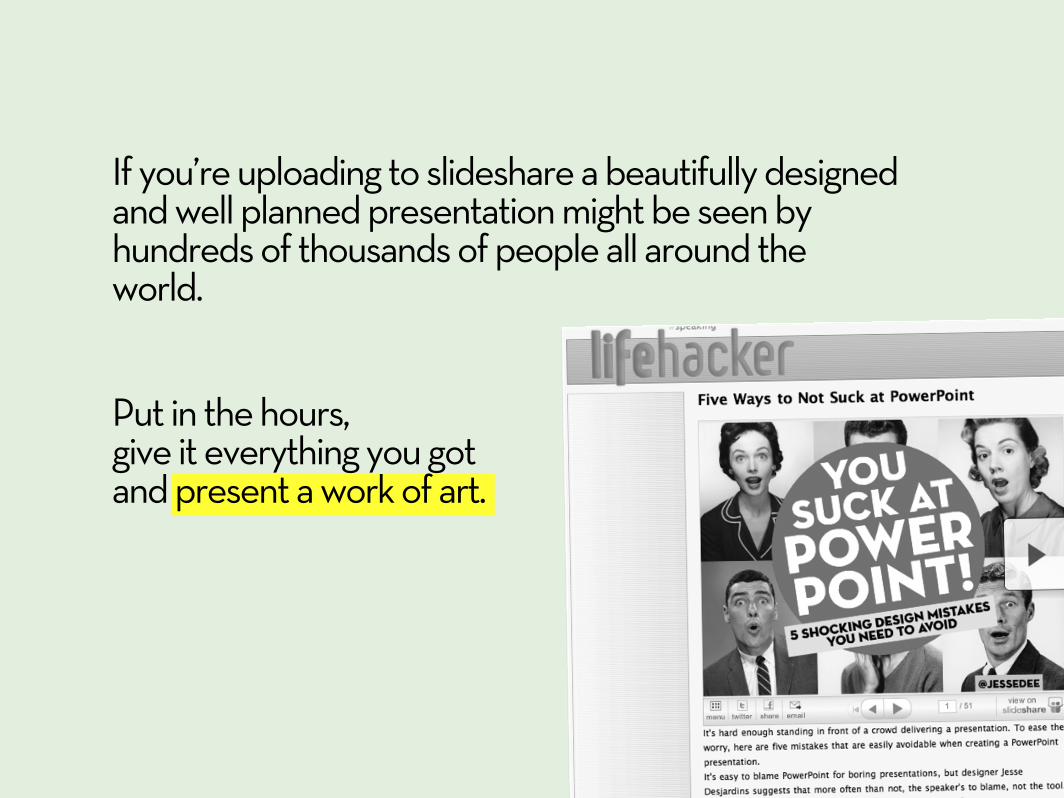
If you’re uploading to slideshare a beautifully designed and well planned presentation might be seen by hundreds of thousands of people all around the world.
Put in the hours, give it everything you got and present a work of art.
If your presentation sucks, don’t blame PowerPoint.
Design, don’t just slap something together.

Too much info
NOT ENOUGHVISUALS
horrible QUALITY
ALL-OVER-THE-PLACE
LACK OF PREP
MISTAKES TO AVOID
Let’s recap:

(you sign here)
I promise to never design a presentation that sucks ever again

Click here to download:
Share this presentation with your colleagues, your boss or with the speaker of that horrible presentation you sat through last week.
They will thank you, trust me.
Together let’s rid the world of PowerPoint that sucks.

thankyou
Jesse Desjardinstwitter.com/jessedeeslideshare.net/jessedee