graphics dalam R - · PDF fileGraphics dalam R • Graphs dibangun di R dengan dua prinsip...
58
graphics dalam R
-
Upload
truonghuong -
Category
Documents
-
view
220 -
download
1
Transcript of graphics dalam R - · PDF fileGraphics dalam R • Graphs dibangun di R dengan dua prinsip...

graphics dalam R

Graphics dalam R
• Graphs dibangun di R dengan dua prinsip
1) Membangun Grafik Dasar2) Menambah infomasi pada grafik Dasar2) Menambah infomasi pada grafik Dasar

fungsi Graphics
• fungsi dengan level tinggi– Membuat grafik dari data
• Fungsi dengan level rendah– Modifikasi grafik yang telah dibuat– Modifikasi grafik yang telah dibuat
• Parameter grafik– Mengkontrol tampilan grafik

Fungsi Grafik Tingkat Tinggi
• plot()• hist()• barplot()• boxplot()• boxplot()

Fungsi Grafik tingkat Rendah
• points()• lines()• abline()• text()• text()• mtext()• title()• legend()etc
Graphical parameters
• Parameter diset dengan perintah par()• Mengkontrol bagaimana tampilan grafik

Graphical Type
• Histogram• Box Plot• Box Plot• Bar Plot• Line Plot

histogram
• Datax1= c(1,2,3,4,4,6,7,10,9)
• Plot histogram:hist(x1)
histogram
• Plot as probabilityhist(x1,prob=T)

histogram
• Plot as probabilityhist(x1,prob=T)
• Add density curvelines(density(x1),col=“red”)
histogram
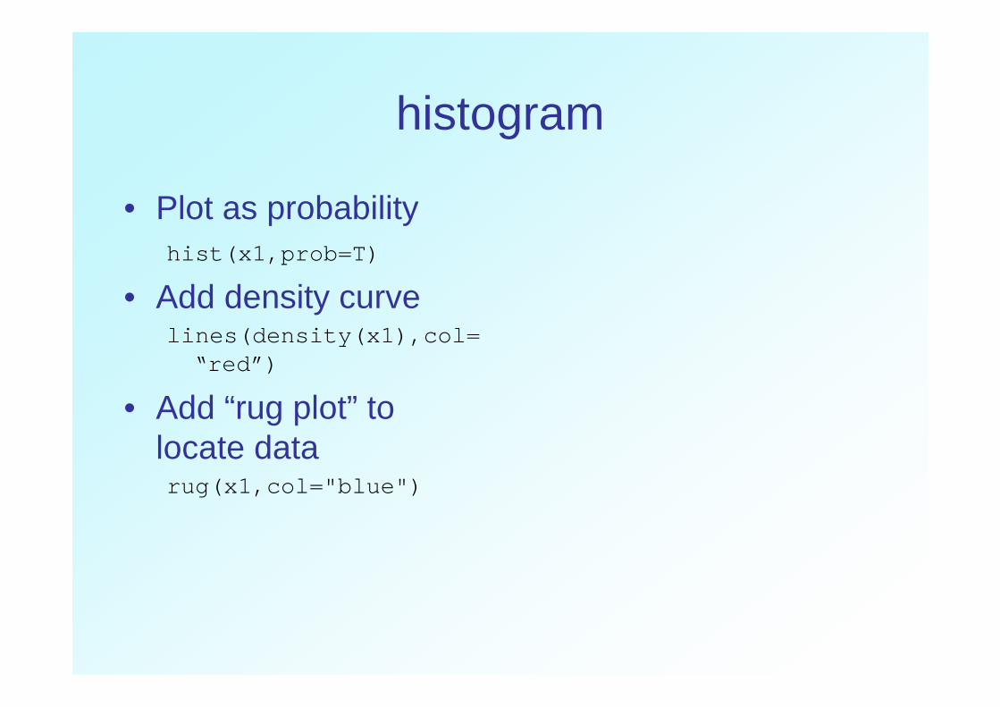
• Plot as probabilityhist(x1,prob=T)
• Add density curvelines(density(x1),col=
“red”)“red”)
• Add “rug plot” to locate data rug(x1,col="blue")
boxplot
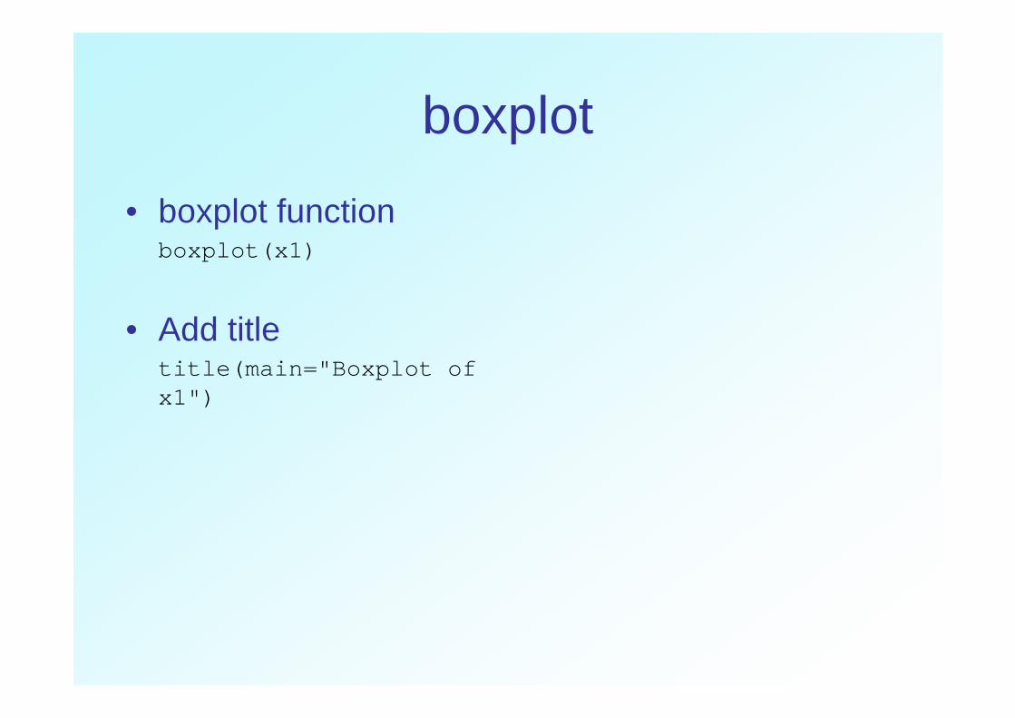
• boxplot functionboxplot(x1)
boxplot
• boxplot functionboxplot(x1)
• Add titletitle(main="Boxplot of title(main="Boxplot of x1")

boxplot
• boxplot functionboxplot(x1)
• Add titletitle(main="Boxplot of title(main="Boxplot of x1")
• Plot horizontallyboxplot(x1,main="Boxplot of x1",horizontal=T)
Boxplot >1
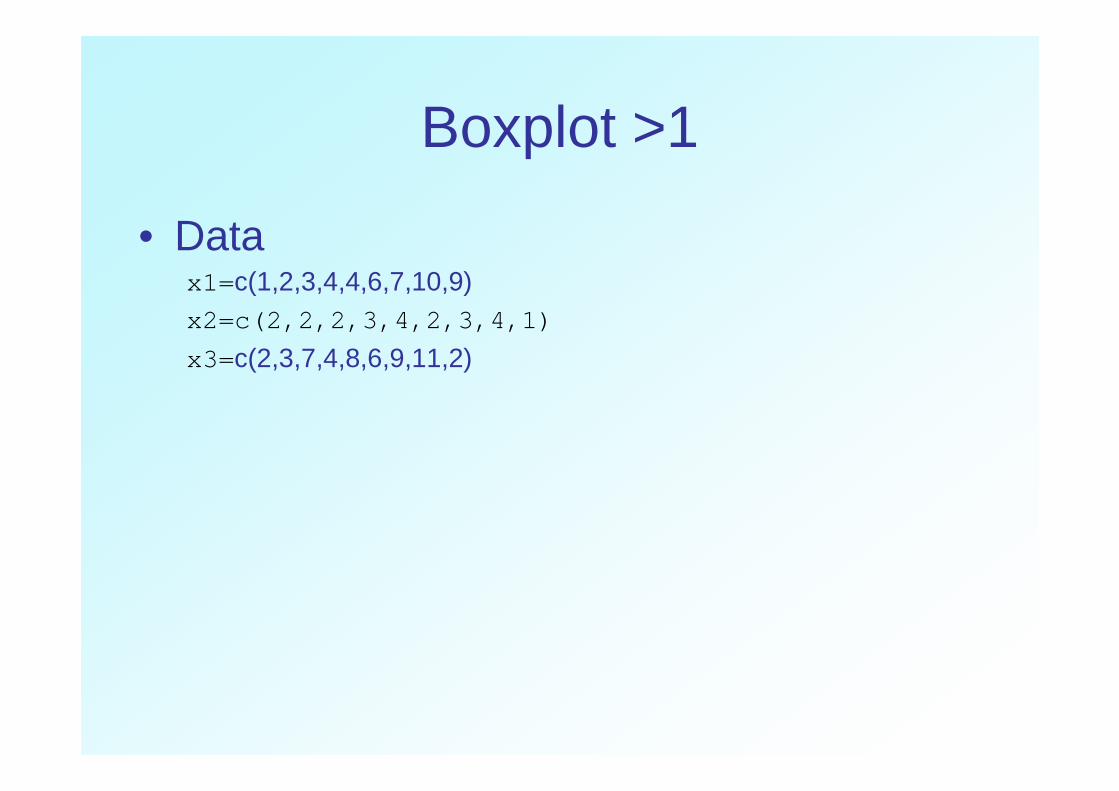
• Datax1= c(1,2,3,4,4,6,7,10,9) x2=c(2,2,2,3,4,2,3,4,1)
x3= c(2,3,7,4,8,6,9,11,2)

boxplot
boxplot(x1,x2,x3)
title(main=“three boxplots”)

boxplot
boxplot(x1,x2,x3)
title(main=“three boxplots”)
ORORbp3<-data.frame(x1,x2,x3)
boxplot(bp3)

boxplot
boxplot(x1,x2,x3)
title(main=“three boxplots”)
ORORbp3<-data.frame(x1,x2,x3)
boxplot(bp3)
barplot
barplot(x1)
barplot
barplot(x1,col=rainbow(20))

barplot
barplot(x1)
barplot(x1,col=rainbow(20))
barplot(x1,col=rainbow(20), horizontal=T)

Barplots data dalam group
Usia A B C D
50-54 11.7 8.7 15.4 8.4
55-59 18.1 11.7 24.3 13.6
60-64 26.9 20.3 37.0 19.3
65- 69 41.0 30.9 54.6 35.165- 69 41.0 30.9 54.6 35.1
70-74 66.0 54.3 71.1 50.0

Barplot
A=c(11.7,18.1,26.9,41,66)B=c(8.7,11.7,20.3,30.9,54.3)C=c(15.4,24.3,37,54.6,71.1)D=c(8.4,13.6,19.3,35.1,50)mydata=data.frame(A,B,C,D)rownames(mydata)=c("50-54","55-59","60-64","65-69","70-74")
mydata2=as.matrix(mydata)

Barplots for grouped data
barplot(mydata2)

Barplots for grouped data
barplot(mydata2)
barplot(mydata2, col=rainbow(5),legend=T)

Barplots for grouped data
barplot(mydata2)
barplot(mydata2, col=rainbow(5),legend=T)
barplot(mydata, col=rainbow(5), legend=T,beside=T)
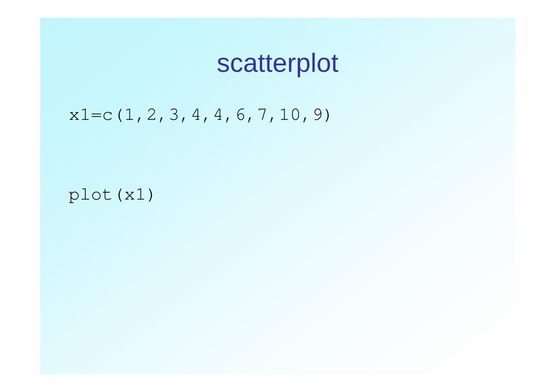
scatterplot
x1=c(1,2,3,4,4,6,7,10,9)
plot(x1)plot(x1)

scatterplot
• plot(x1,type="l")

scatterplot
par(mfrow=c(3,2))
plot(x1,type="p",main="type p: points")
plot(x1,type="l",main="type l: lines")
plot(x1,type="b",main="type b: plot(x1,type="b",main="type b: both")
plot(x1,type="o",main="type o: overplot")
plot(x1,type="h",main="type h: histogram")
plot(x1,type="s",main="type s: steps")

Plotting symbols, par(pch)
• Default : 25 plotting characters dikontrol oleh pch parameter Exp :pch = n
• Parameter pch dapat berupa character, expch = “x” dan dapat juga berupa vectorpch = “x” dan dapat juga berupa vector

Plotting symbols, par(pch)x<-rep(1:5,times=5)y<-rep(1:5,each=5)
par(xpd=T)plot(x,y,type="p",pch=1:25
,cex=3,axes=F,ann=F,bty="n",bg="red")
x and y are both vectors of length 25
xpd controls “clipping” of graphics, allows data to be plotted outside the main plot area.
pch is a vector 1:25, so each point has a unique symbol"n",bg="red")
title(main="Data symbols 1:25")
text(x,y,labels=1:25,pos=1,offset=1)
has a unique symbolcex controls the symbol sizebg is background colour
axes = F and ann = F stops the drawing of axes and labels
text adds labels to the points, x and y give locations, labels contains the text, pos=1 puts the text below the points

Plotting symbols, par(pch)tb=c(160, 165, 175, 180, 185)bb=c(55,60,70,75,80)
Plotting symbols: size and width
• symbol size dikontrol oleh perintah cex– cex=n plots a figure n times the default size
• Line width dikontrol oleh lwd• Line width dikontrol oleh lwd– lwd=n

Plotting symbols: size and width
x<-rep(1:5,times=5)y<-rep(1:5,each=5)
plot(x,y,type="p",pch=3,lwd=x,cex=y,xlim=c(0,5),ylim=c
x and y generated as in previous example
Also act as vectors of width: lwd=x
and size:x,cex=y,xlim=c(0,5),ylim=c(0,5),bty="n", ann=F)
title(main="R plotting symbols: size and width", xlab="Width (lwd)",ylab="Size (cex)")
and size:cex=y
pch=3 only uses a single symbol

Plotting symbols: colour
• Warna dari objects dikontrol oleh “col”• Warna dispesifikasikan berdasarkan:
– by name: colours() – by integer: palette()– by integer: palette()

Plotting symbols: colour
• default palette:> palette()
[1] "black" "red" "green3" "blue" "cyan"
"magenta" "yellow" "gray"
• integer values for colours refer to locations • integer values for colours refer to locations in the palette, recycled as necessary

Plotting symbols: colourx<-rep(1:5,times=5)y<-rep(1:5,each=5)
plot(x,y,type="p",pch=3,lwd=x,cex=y,col=1:25 , xlim=c(0,5),ylim=c(0,5)
Identical to previous example, but with a colour argument added to the plot function
col here is a vector 1:25, only 8 colours in the default palette, so they will be recycled
xlim=c(0,5),ylim=c(0,5),bty="n", ann=F)
title(main="R plotting symbols: size and width", xlab="Width (lwd)",ylab="Size (cex)")

Plotting symbols: colourx<-rep(1:5,times=5)y<-rep(1:5,each=5)
plot(x,y,type="p",pch=3,lwd=x,cex=y, col=1:25 , xlim=c(0,5),ylim=c(0,5)xlim=c(0,5),ylim=c(0,5),bty="n", ann=F)
title(main="R plotting symbols: size and width", xlab="Width (lwd)",ylab="Size (cex)")

Plotting symbols: colour
• Built-in colour packages:– rainbow() Vary from red to violet– heat.colors() white�orange�red – terrain.colors() white�brown�green– topo.colors() white�brown�green�blue– grey() shades of grey– grey() shades of grey

Plotting symbols: colour
x<-rep(1:5,times=5)y<-rep(1:5,each=5)
plot(x,y,type="p",pch=3,lwd=x,cex=y, col=rainbow(25) , col=rainbow(25) , xlim=c(0,5),ylim=c(0,5),bty="n", ann=F)
title(main="R plotting symbols: size and width", xlab="Width (lwd)",ylab="Size (cex)")

Plotting symbols: colourx<-rep(1:5,times=5)y<-rep(1:5,each=5)
plot(x,y,type="p",pch=3,lwd=x,cex=y, col=heat.colors(25) , xlim=c(0,5),ylim=c(0,5),bxlim=c(0,5),ylim=c(0,5),bty="n", ann=F)
title(main="R plotting symbols: size and width", xlab="Width (lwd)",ylab="Size (cex)")

Plotting symbols: colourx<-rep(1:5,times=5)y<-rep(1:5,each=5)
plot(x,y,type="p",pch=3,lwd=x,cex=y, col=grey(1:25)/25 , xlim=c(0,5),ylim=c(0,5),bxlim=c(0,5),ylim=c(0,5),bty="n", ann=F)
title(main="R plotting symbols: size and width", xlab="Width (lwd)",ylab="Size (cex)")
Plot dengan built in color
tb=c(160, 165, 175, 180, 185)bb=c(55,60,70,75,80)
R users group An introduction to graphics in R
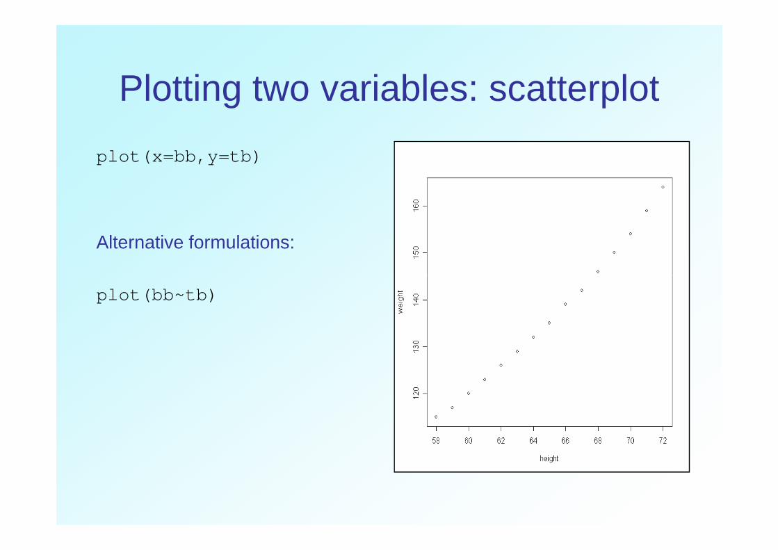
Plotting two variables: scatterplot
plot(x=bb,y=tb)
Alternative formulations:
plot(bb~tb)

Plotting two variables: scatterplot
Different symbols, specified by pch parameter
plot(bb~tb, pch=16)
Plotting two variables: scatterplot
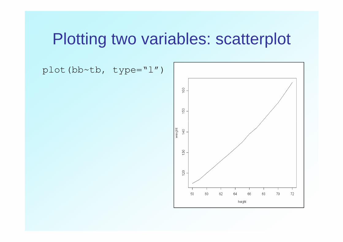
plot(bb~tb, type=“l”)

Plotting two variables: scatterplot
plot(bb~tb, type=“l”, lty=“dotted”)

Types of lines, par(lty)
x<-1:10plot(x,y=rep(1,10),ylim=c(1,6.5),
type="l",lty=1,axes=F,ann=F)title(main="Line Types")
for(i in 2:6){lines(x,y=rep(i,10),lty=i)}}
axis(2,at=1:6,tick=F,las=1)
linenames<-paste("Type",1:6,":",c("solid","dashed","dotted","dotdash","longdash","twodash"))
text(2,(1:6)+0.25,labels=linenames)box()
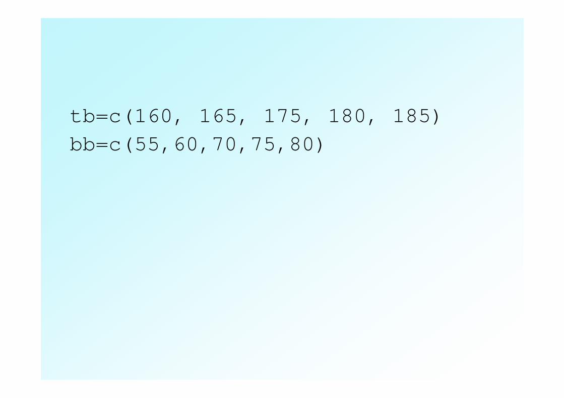
tb=c(160, 165, 175, 180, 185)bb=c(55,60,70,75,80)

Adding to plots: lines
plot(bb,tb)
reg<-lm(tb~bb)
abline(reg, col="red",lty=2)

plot(bb,tb)
reg< -lm(tb~bb)
abline(reg, col="red",lty=2)
abline(v=60,col="red")

Adding to plots: legends
y1=c(2, 5, 4, 5, 12)
y2=c(2,3,4,5,4)
plot(y1, type="o", col="blue",
ylim=c(0,12),xlab="tahun",ylab="jumlah")
lines(y2, type="o", pch=22, lty=2, col="red")
title(main="Contoh aja", col.main="red", font.main= 4)
legend(1, 6, c("A","B"), cex=0.8, col=c("blue","red "), pch=21:22, lty=1:2) legend(1, 6, c("A","B"), cex=0.8, col=c("blue","red "), pch=21:22, lty=1:2)

Pie Chart
• # Membuat vector carscars2 <- c(1, 3, 6, 4, 9)
• # Membuat pie chart dari carspie(cars)
• #Membuat pie chart dengan labelpie(cars, main="Cars", col=rainbow(length(cars)), labels=c(“SUV",“MVV",“WAGON ","Truck",“SPORT") )
• # Membuat persentasi untuk masing2 kategoricar_labels <-round(cars/sum(cars) * 100, 1)
• # Meletakan label '%‘ pada pie chart car_labels <- paste(car_labels, "%", sep="")
• # Membuat pie dengan warna tertentu• # Membuat pie dengan warna tertentupie(cars2, main="Cars", col=rainbow(length(cars)), labels=car_labels , cex=0.8 )

• # 3D Exploded Pie Chartlibrary(plotrix)slices <- c(10, 12, 4, 16, 8) lbls <- c("US", "UK", "Australia", lbls <- c("US", "UK", "Australia", "Germany", "France")pie3D(slices,labels=lbls,explode=0.1,
main="Pie Chart of Countries ")
R users group An introduction to graphics in R

• # Membuat persentasi untuk masing2 kategoricar_labels <-round(cars/sum(cars) * 100, 1)
• # Meletakan label '%‘ pada pie chart car_labels <- paste(car_labels, "%", sep="")
• # Membuat pie dengan warna tertentupie3D (cars, main="Cars", col=rainbow(length(cars)), pie3D (cars, main="Cars", col=rainbow(length(cars)), labels=car_labels , cex=0.8 )
R users group An introduction to graphics in R

Line Chart
• # Membuat vector cars <- c(1, 3, 6, 4, 9)
• # Membuat grafik line dengan titik berwarna biru plot(cars, type="o", col="blue")
• # Membuat judul grafik title(main="Autos", col.main="red", font.main=4)

• # Mendefinisikan vector ke 2trucks <- c(2, 5, 4, 5, 12)
• # Membuat grafik dengan sumbu y memiliki range antara 0 to 12 plot(cars, type="o", col="blue", ylim=c(0,12))
• # Membuat grafik trucks dengan garis putus2 berwarna merah lines(trucks, type="o", pch=22, lty=2, col="red")
• # Membuat Judul Grafik title(main="Autos", col.main="red", font.main=4)
• # Membuat Legendlegend(1, c("cars","trucks"), cex=0.8, col=c("blue ","red"), pch=21:22, lty=1:2);