


Bahasa
Halaman
Hukum

1
Media Nonproyeksi danProyeksi
Nonproyeksi
Benda nyataModelGambarGrafik (graphs)Diagram (charts)PosterBahan tercetakBuletin
2
Benda nyata
Benda yang bisa diakses dan punyanilai pendidikanCocok untuk perkenalkan konsepbaru dan abstrakMisalnya:
potongan (untuk mengetahui cara kerjabagian dalam)contoh/sampelbarang pameran
Model
Representasi 3D dari bendasesunggguhnyaBisa lebih kecil, besar atau samaBisa detail atau sederhana

3
Gambar
Foto (orang, tempat, benda), ilustrasi, kartu posTersedia dengan mudah dari buku, majalah, koran, katalog, kalenderMudah digunakanKeterbatasan: sering terlalu kecil, dua dimensi
Contoh Grafik (Graphs)

4
Contoh Diagram (Charts)
Proyeksi
Overhead projection (OHP)SlidesFilmstripsOpaque projection
5
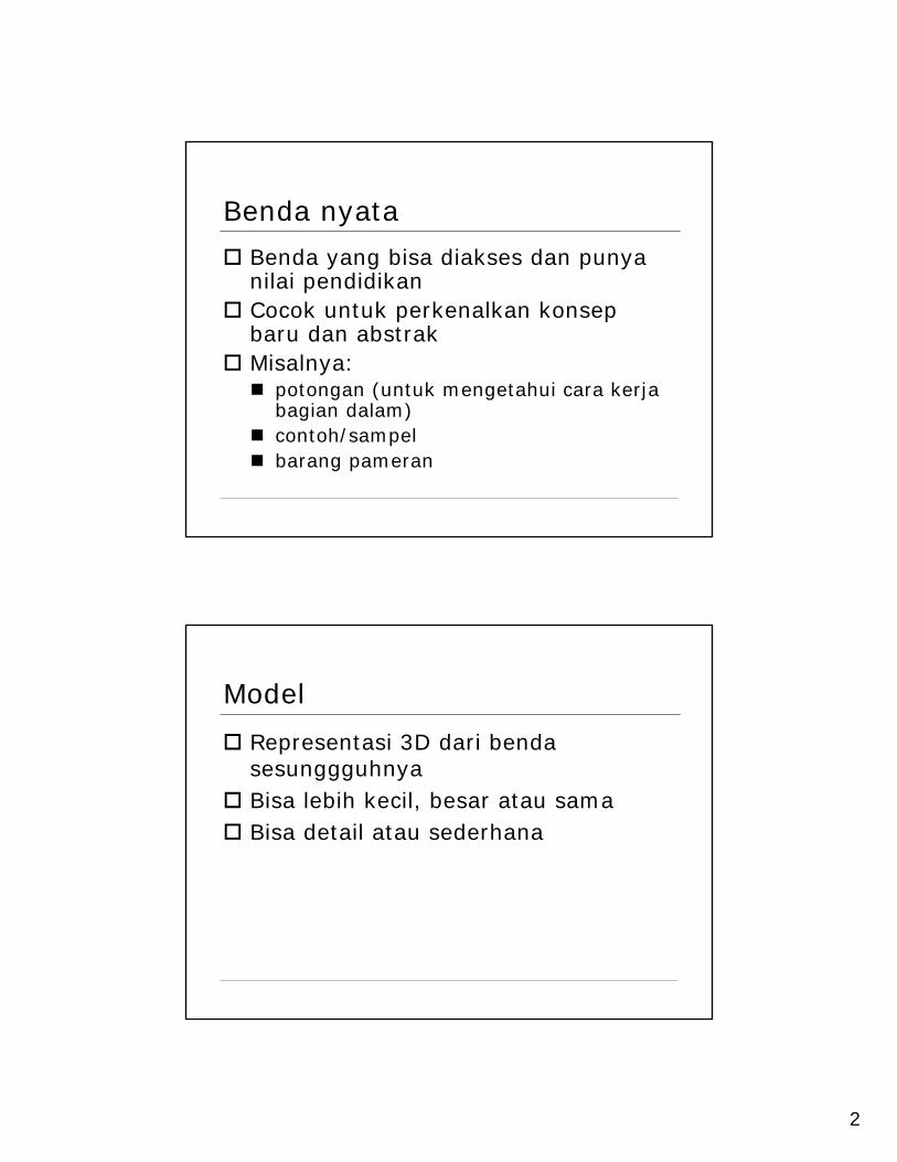
Contoh OHP
Struktur OHP

6
Keuntungan OHP
Presenter menghadap audienceMudah pengoperasianON-OFF untuk fokus perhatianMaterial mudah dimanipulasiUrutan materi bisa dimodifikasiRuang tidak perlu gelapBeaya produksi relatif murah
Transparansi berlapis
Base + overlayOverlay elaborates base
EnhancementsColorLayersOther
Frame or sleeve

7
Merancang transparansi
Format horisontalIde visualKonsep tunggalTulisan minimalKeyword/judulKeterbacaan
Format Horisontal
8
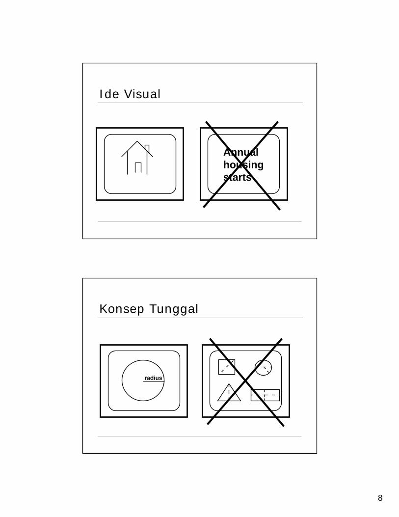
Ide Visual
Annual housingstarts
Konsep Tunggal
radius

9
Tulisan minimal
U.N. Cost-of-LivingIndex 1985
//// //////// ///////// // ///
///// // ///////// //////// /////
Rural Urban
Cost of living of United Nations personnel interrelated cities as connected by index of retail prices, 1985
See next Transp.
Key Words / Judul
Mexico LeadsLatin Americain exports
Country Exports

10
Keterbacaan
All letters at least 18 points for legibility
Small type is too small for legibility
Outline Formats are Easier to Follow
Mengapa OHP?
11
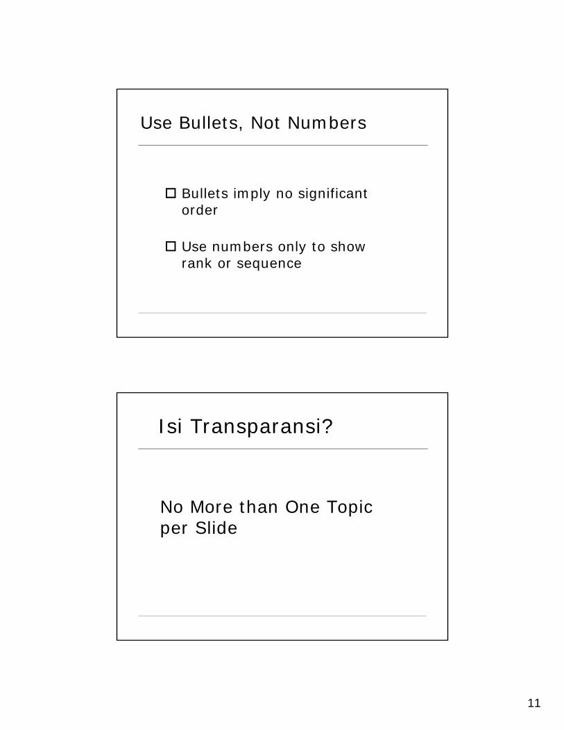
Use Bullets, Not Numbers
Bullets imply no significant order
Use numbers only to show rank or sequence
No More than One Topic per Slide
Isi Transparansi?
12
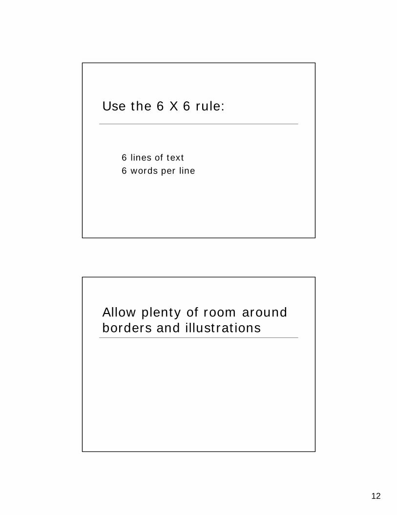
Use the 6 X 6 rule:
6 lines of text6 words per line
Allow plenty of room around borders and illustrations

13
Select Readable Type SizeThis is 40 point
Minimum 36 point for titles
24 point for body text
This is 32 point
45 point40 point35 point30 point25 point20 point15 point10 point
Use a Readable Typeface and FontUse Sans serif (no curly feet) such as
Arial or universal for body textUse San serif (no curly feet) such as Arial or
universal for body text Use serif such as a roman for titles
only
Use a Readable Typeface and Font
14
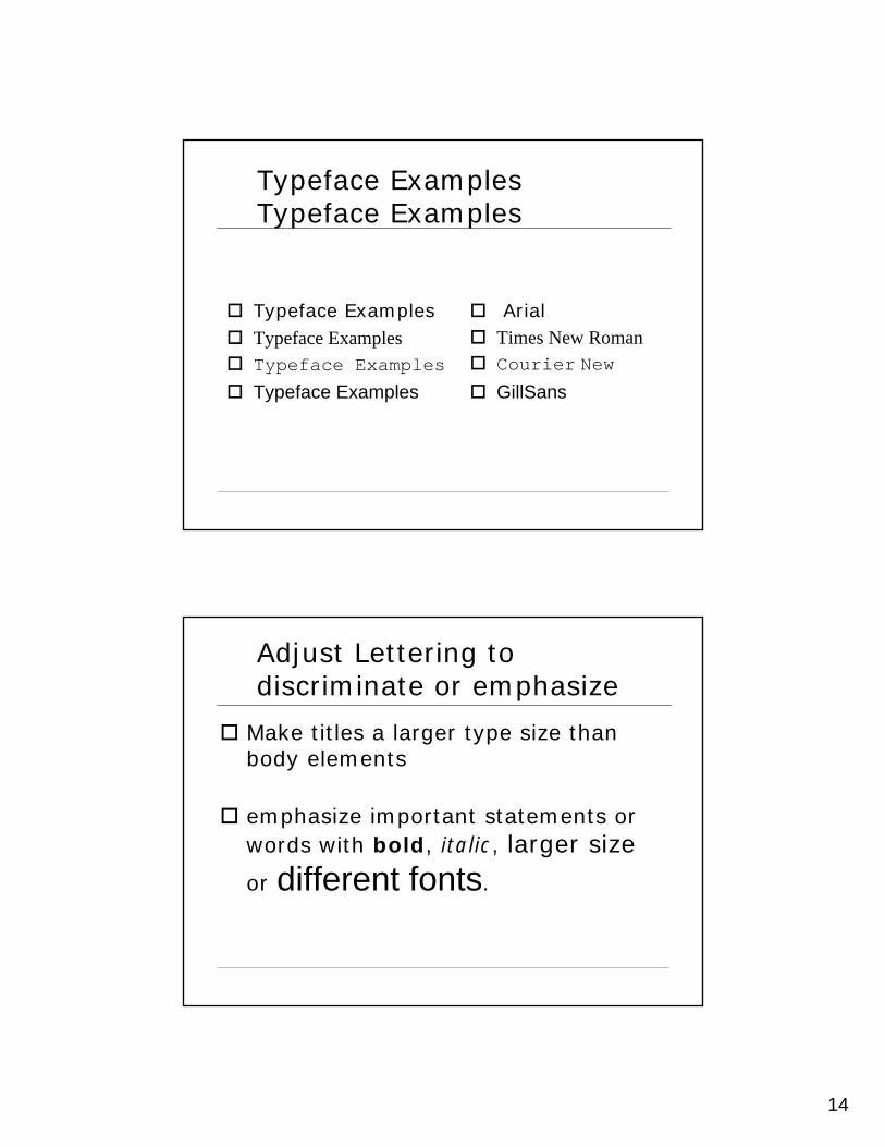
Typeface Examples Typeface Examples
Typeface ExamplesTypeface ExamplesTypeface Examples
Typeface Examples
ArialTimes New RomanCourier New
GillSans
Adjust Lettering to discriminate or emphasize
Make titles a larger type size than body elements
emphasize important statements or words with bold, italic, larger size
or different fonts.

15
Choose Color Carefully
Use the same color consistently throughout the presentation
Use light letters on a dark background
Colors
Avoid placing saturated primary colors (red, green or blue) adjacent to each other.They may create a third color where the two colors meet.
16
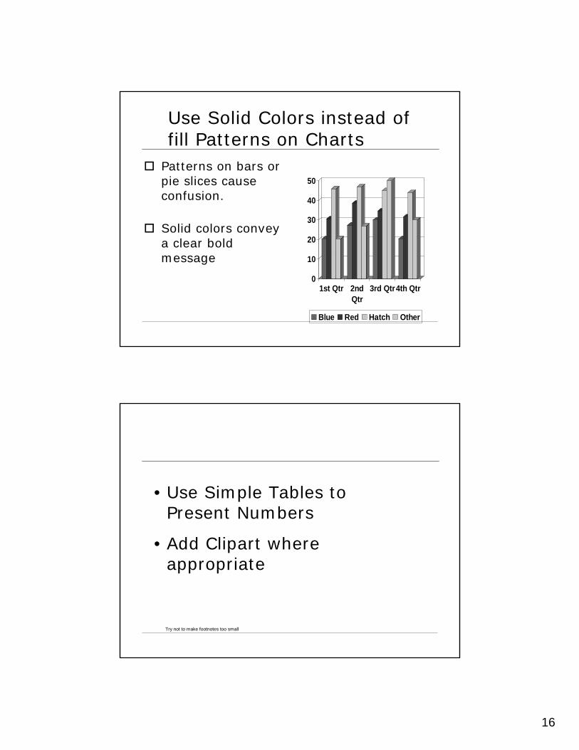
Use Solid Colors instead of fill Patterns on Charts
Patterns on bars or pie slices cause confusion.
Solid colors convey a clear bold message
0
10
20
30
40
50
1st Qtr 2ndQtr
3rd Qtr4th Qtr
Blue Red Hatch Other
Try not to make footnotes too small
• Use Simple Tables to Present Numbers
• Add Clipart where appropriate

17
Tip menggunakan OHP
Presentasikan transparansi sambilmenghadap audienceJangan menunjuk ke layarGunakan alat bantu untuk menunjukGunakan ON-OFF untukmemfokuskan perhatianBuka tahap demi tahapBila memerlukan catatan, gunakanframe
Top Related
Copyright © 2022 FDOKUMEN

