


Bahasa
Halaman
Hukum


PORTFOLIO DIANA OSSAArchitecture + Design
WASHINGTON UNIVERSITY IN ST. LOUIS | M. ARCH and MCM GRINNELL COLLEGE | B.A. STUDIO ART
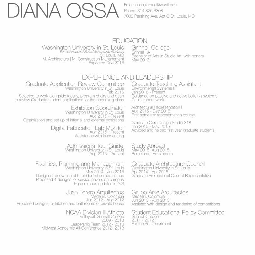
DIANA OSSA Email: [email protected]: 314.825.63087002 Pershing Ave. Apt G St. Louis, MO
EDUCATION
EXPERIENCE AND LEADERSHIP
Washington University in St. Louis
Graduate Teaching Assistant
Facilities, Planning and Management
Juan Forero Arquitectos
Student Educational Policy Committee
Grinnell College
Exhibition Coordinator
Grupo Arke Arquitectos
Admissions Tour Guide
NCAA Division III Athlete
Graduate Application Review Committee
Graduate Architecture Council
Digital Fabrication Lab Monitor
Study Abroad
M. Architecture | M. Construction Management
Jan 2016 - Present
May 2014 - Jun 2015
Jun 2012 - Aug 2012
2011 - 2012
Aug 2015 - Dec 2015
Jan 2015 - May 2015
St. Louis, MOEdward Hubbard Pelton Scholarship Recipient
Environmental Systems II
Washington University in St. Louis
Medellin, Colombia
Grinnell College
Architectural Representation I
Graduate Core Design Studio 318
Grinnell, IA
Washington University in St. Louis
Medellin, Colombia
Washington University in St. Louis
Volleyball Grinnell College
Washington University in St. Louis
Washington University in St. Louis
Aug 2015 - Present
May 2015- Aug 2015
Expected Dec 2016
Guidance on passive and active building systemsCritic student work
Designed renovation of 5 residential computer labsProposed 4 designs for service pavers on campus
Egress maps updates in GIS
Proposed designs for kitchen and bathrooms of private house
For the Art Department
First semester representation course
Adviced and helped first year graduate students
May 2013
Organization and set up of internal and external exhibitions
Assisted with design and rendering of competitions
Leadership Team 2012 - 2013
Selected to work alongside faculty, program chairs and dean
Midwest Academic All-Conference 2012- 2013
to review Graduate student applications for the upcoming class
Graduate Professional Council Representative
Bachelor of Arts in Studio Art, with honors
Aug 2015 - Present
Jun 2013 - Aug 2013
Aug 2015 - Present
2009 - 2013
Feb 2016
Apr 2014 - Apr 2015
Assistance with laser cutting
Barcelona - Amsterdam

EXHIBITIONS AND AWARDS
SKILLS AND LANGUAGES
REFERENCES
Selected for Approach
Core Studio 318 Selected Work Exhibition
Art and Architecture: Guggenheim Exhibition
Refuse Exhibition
Zebra Woman and Other Works
Robert McCarter
Elena Cánovas
Rhinoceros | AutoCad | Revit
International Seoul Exhibition
Digital Representations Exhibition
Make Do Exhibition
Annual Student Art Salon
Sung Ho Kim
Catalina Freixas
GIS | Climate Consultant | WUFI Passive
Washington University in St. Louis
Washington University in St. Louis
Drawing | Sketching | Painting
Option Studio III Prof. Robert McCarter | Fall 2015
Washington University in St. Louis
Grinnell College
Grinnell College
Grinnell College
Option Studio I Prof. Elena Cánovas | Spring 2015
Prof. Catalina Freixas
Independent Study with Prof.Jill Schrift
Core Studio 419 Prof. Sung Ho Kim | Fall 2014
Spring 2014
Spring 2013
2011
2010
Core Studio 318 Prof. Catalina Freixas | Spring 2014
Student Work Publication
Ruth and Norman Moore Professor of Architecture
Assistant Professor of Architecture
T-Splines | Grasshopper | DIVA | V-ray
Washington University in St. Louis
Washington University in St. Louis
Grinnell, IA
Grinnell, IA
Associate Professor of Architecture
Assistant Professor of Architecture
Adobe Photoshop | Adobe Illustrator | Adobe InDesign
English, Spanish
Fall 2014Exhibition to take place in Seoul, South Korea for work done during housing core studio 419
Fall 2014
2012
2010, 2011, 2012Work selected by curator to be part of the year end exhibition
Italian
Prof. Sung Ho Kim
Prof. Lavender Tessmer
Washington University in St. Louis
Washington University in St. Louis
Modeling | Laser Cutting | 3D Printing

TABLE OF CONTENT
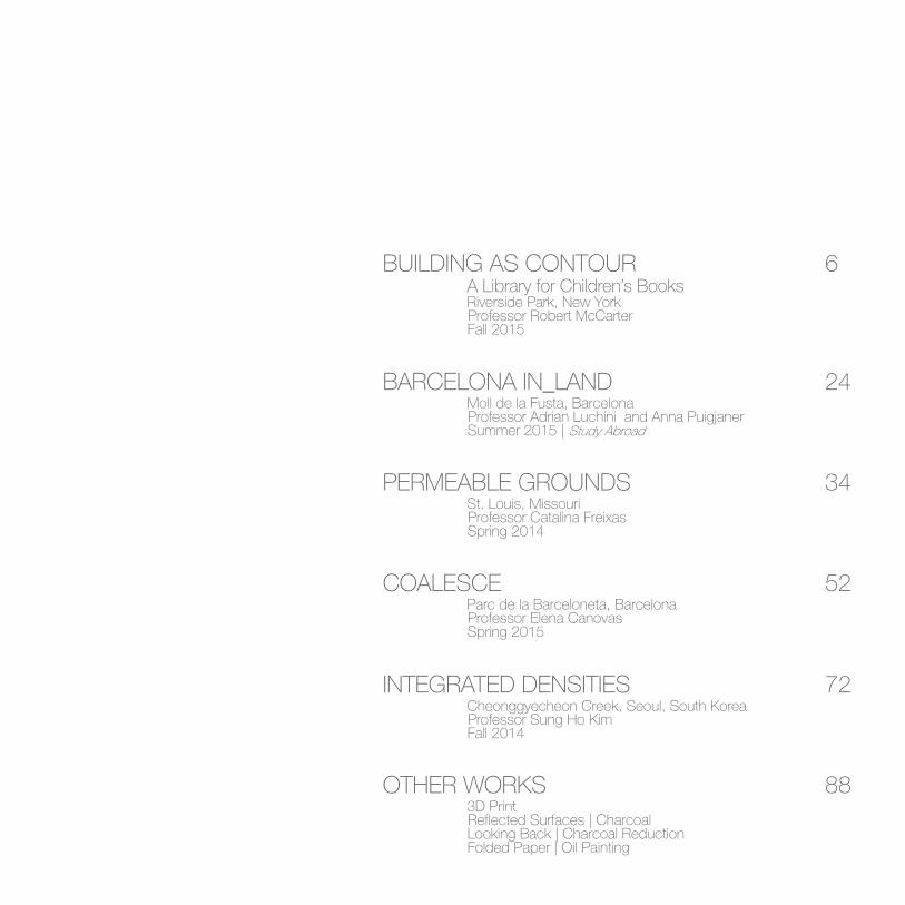
BUILDING AS CONTOUR 6
24
34
52
72
88
BARCELONA IN_LAND
PERMEABLE GROUNDS
COALESCE
INTEGRATED DENSITIES
OTHER WORKS
A Library for Children’s BooksRiverside Park, New York
Moll de la Fusta, Barcelona
St. Louis, Missouri
Parc de la Barceloneta, Barcelona
Cheonggyecheon Creek, Seoul, South Korea
3D Print
Fall 2015
Summer 2015 | Study Abroad
Spring 2014
Spring 2015
Fall 2014
Looking Back | Charcoal ReductionFolded Paper | Oil Painting
Professor Robert McCarter
Professor Adrian Luchini and Anna Puigjaner
Professor Catalina Freixas
Professor Elena Canovas
Professor Sung Ho Kim
Reflected Surfaces | Charcoal

Building As ContourA LibrAry for ChiLdren's books | An Addition to Louis kAhn And isAmu noguChi's Levy PLAyground in new york
riverside PArk, new york design 611_fALL 15 Professor: robert mCCArter
The intention of this studio was to design a children’s library to be sited as an “addition” to the architect Louis Kahn and the sculptor Isamu Noguchi’s Playground in Riverside Park, on the Hudson River, New York, with the assumption that their playground was built in 1966. This new public library would house the city of New York’s primary collection of children’s books (40,000), with both open book stacks and reading rooms. In addition to the library, there would be a space dedicated for a day care as well as a cafe that connects the visitors to the context of Riverside Park.
6
Selected for Approach | Student Work Publication

7

Riverside Drive
103 St
Site Plan with Playground
Building’s Plan
Hudson River
Kahn’s and Noguchi’s Playground
Main Circulation Riverside Park
8

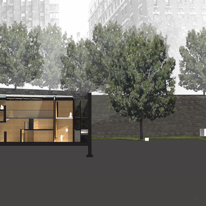
The location for the library is challenging because of its topography. The main entrance occurs at the street level, on Riverside Drive, but the highest point of the park begins 24 ft. below street level, hence the need for a big retention wall. In addition to the 24 ft. wall, the topography drops another 20 feet from the highest point to the main circulation area inside of Riverside Park. In total, the building has over 40 ft. difference between its highest point on the street to its lowest point in the park. With this in mind, two main concepts aroused in the design of the library: one was a wall and circulation system that slowly meander people down from the street level to the park level, and the second, was a flat roof that keeps a relation to the street level and a connection to the city. These two systems interlock and create two kinds of reading spaces: one that occurs under the flat roof, and another one that occurs outside of it.
Cube Project
Site Model 1’=1/16’’9

Axonometric | Main Circulation
10

More conventional reading spaces were designed in the areas under the roof, thus the glass diving the interior and the exterior also became a way to organize the space inside the library. With the main circulation following the wall system, kids walking through the library could experience both kinds of spaces as they travel down to the park. Additionally, each reading area has a different relationship to natural light: while the ‘labyrinth’ rooms experience a top light condition, the conventional reading spaces experience light coming through the glass on the side.
Before designing the final library, the project began by exploring the relationship between different small reading rooms in a cube of 30 ft. x 30 ft. The main idea during this exploration was to create a library as a playground, which would encourage children to explore and find different rooms that offer different qualities for reading. This idea was translated into the final project by having areas inside the library that were designed at a kid’s scale, and that felt somewhat like a labyrinth. These spaces occurred in the areas outside of the flat roof. Due to the complexity of these rooms, the actual design was made by drawing in an axonometric view.
11

Longitudinal Section
12

13

Street Level Plan
Riverside Drive
Entry Hall
(Day Care below)
Cafe
HVAC room
Cafe
Playground Level Plan14

Cafe
Cafe/ Park Circulation Level Plan15

Cross Section
16
17

View from suspended catwalk
Reading Room
18

In the ‘labyrinth’ areas, kids are offered different reading rooms that vary in size and light condition. With a pitched roof, these rooms are intended to feel like an attic, where kids have privacy, but at the same time do not feel adult-like. The circulation between these rooms is much smaller than the main circulation of the library, creating the sense of a maze with the tall walls that divide the small rooms. Light enters from the top and is channelled through many of these walls to the lower level. Additionally, the structural mullions that hold the roof are also used as a divider between the two main reading areas. The mullions are held together with a horizontal structure that also becomes a shelving system. This horizontal structure changes in scale along the glass in order to provide shading from the south sunlight.
The big walls that carry the main circulation divide the more conventional reading spaces into two areas. Each reading area has two levels, with the top level having an opening that offers a connection between the two. These areas have different kinds of reading rooms than those found in the ‘labyrinth’ reading section since they are all on the ground and are bigger for larger groups. These rooms are divided by shelves that vary in height in order to offer more privacy to some rooms more than others. Finally, a catwalk that is suspended from the roof offers a direct connection between the entry hall and the café. This catwalk allows for visitors to experience the whole library from above, and to have a visual connection to the Hudson River. At the end of the walk, the long set of stairs brings visitors down to a smaller reading area, and finally down to the café.
19

Retention Wall
Sand
Radiant Tubing
Concrete Block
Concrete
Rigid Insulation
Air Gap
Plaster Ceiling
Steel Beam
Steel Beam
Skylight
Extruded Polystyrene
Roof Membrane
Skylight (Behind)
Aggregate
Structural Mullions
Weathered Steel
Rigid Insulation
Gravel
Drainage Matt
20

21

Exterior Render
22

23

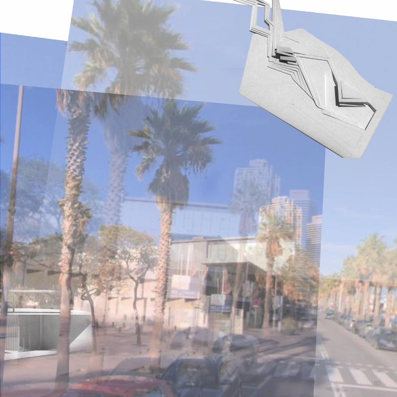
Barcelona IN_land moLL de LA fustA, bArCeLonA
study AbroAd, design 512_summer 15 Professor: AdriAn LuChini And AnnA PuigjAner
24
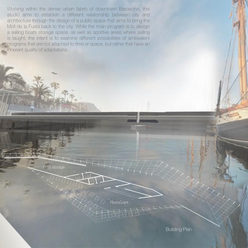
Working within the dense urban fabric of downtown Barcelona, this studio aims to establish a different relationship between city and architecture through the design of a public space that aims to bring the Moll de la Fusta back to the city. While the main program is to design a sailing boats storage space, as well as sportive areas where sailing is taught, the intent is to examine different possibilities of ambivalent programs that are not attached to time or space, but rather that have an inherent quality of adaptations.
Restaurant
Boat storage
Building Plan
25

Existing Section line
Existing Site Conditions
Fast Speed Highways
Pedestrian connection to the city and site circulation
Passeig de Colom
Gothic Quarter
Ronda Litoral
Moll de la Fusta
The site’s major problem is its isolation to the city due to the high speed highways that run along the site, making it hard for pedestrians to cross over form the city to the Moll de la Fusta. Additionally, the site only has two pedestrian bridges that connect the upper side of the site to the lower side that is next to the water, thus making the circulation through the site parallel to the roads.
26

Proposed Site Conditions
Proposed site cross section
Pedestrian connection to the city and site circulation
The proposed design raises the street level to the curb in order to give pedestrians priority while crossing from the Gothic Quarter to the Moll de la Fusta, and forcing cars to slow down as the drive through. Additionally, the street lanes are reorganized and placed in the center of the road, thus opening more sidewalk space on either side of the road.
On the site, multiple bridges coming from different directions are also proposed in order to connect people coming from different areas. The paths are designed for either leisure as you walk from one side of the site to the other one, or for speed to make crossing faster. These paths activate the site and create informal nodes where activities can occur.
27

28
29
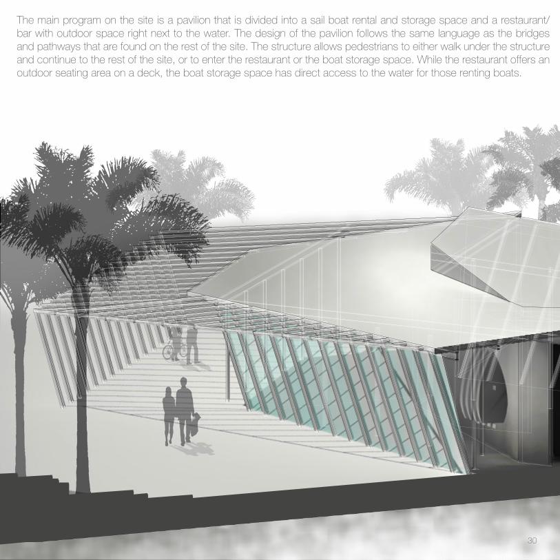
The main program on the site is a pavilion that is divided into a sail boat rental and storage space and a restaurant/ bar with outdoor space right next to the water. The design of the pavilion follows the same language as the bridges and pathways that are found on the rest of the site. The structure allows pedestrians to either walk under the structure and continue to the rest of the site, or to enter the restaurant or the boat storage space. While the restaurant offers an outdoor seating area on a deck, the boat storage space has direct access to the water for those renting boats.
30

The simple structure of 2 x 4 can adapt to different programs while keeping the same language. For enclosed spaces, glass can be attached to the wood slats, as well as cables where vines can grow for shading purposes. In other areas, the 2 x 4 are left open as the structure of the bridges and pathways.
Section Perspective31

32

33

34

Permeable Grounds st. Louis, missouri
design 318_sPring 14 Professor: CAtALinA freixAs
This public library was designed for a neighborhood in St. Louis situated in between to major and active areas of the city: downtown and Soulard. The aim of this project then, is to create a meeting point in the neighborhood for diferent kinds of activities and for different ages that would connect its community to its neighborhood more than it
does today.
35
Selected for Approach | Student Work Publication

CONCEPTUAL DRAWINGCOMPRESSED URBAN DWELLING | PUBLIC LIBRARYConceptual Drawing
36

CONCEPTUAL DRAWINGCOMPRESSED URBAN DWELLING | PUBLIC LIBRARY
37
LINEAR PARKS AND URBAN CONTEXT
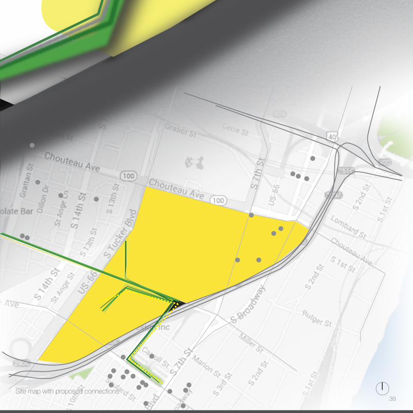
Site map with proposed connections38

LINEAR PARKS AND URBAN CONTEXT
MOSTSOCIAL
SOCIAL PRIVATE
SPATIAL ORGANIZATION
MOSTSOCIAL
SOCIAL PRIVATE
SPATIAL ORGANIZATION With the idea of creating a space that connects multiple people for different activities, the library is divided into different areas depending on the level of privacy, with the lowest level being completely open and public, and the top level being more enclosed and private for library purposes. The ramped floor also encourages the movement
up the building into different activities.
39

Level 1 1’=1/8’’PERMEABLE GROUNDS DIANA OSSA
First Level Plan
40

Level 1 1’=1/8’’PERMEABLE GROUNDS DIANA OSSA
The first level of the building is completely open to the public with no enclosure on any side. Since the site is located next to a dead road with a church at the end, the street is redisigned to create a larger connection between the building and the open area around the church. The first level counts with an open theater, a large pedestrian walk covered with grass and plants that blur the line between exterior and interior, and a restaurant at the end of the ramp that connects the building with the church.
41

Level 2 1’=1/8’’PERMEABLE GROUNDS DIANA OSSA
Second Level Plan
42
Level 2 1’=1/8’’PERMEABLE GROUNDS DIANA OSSA
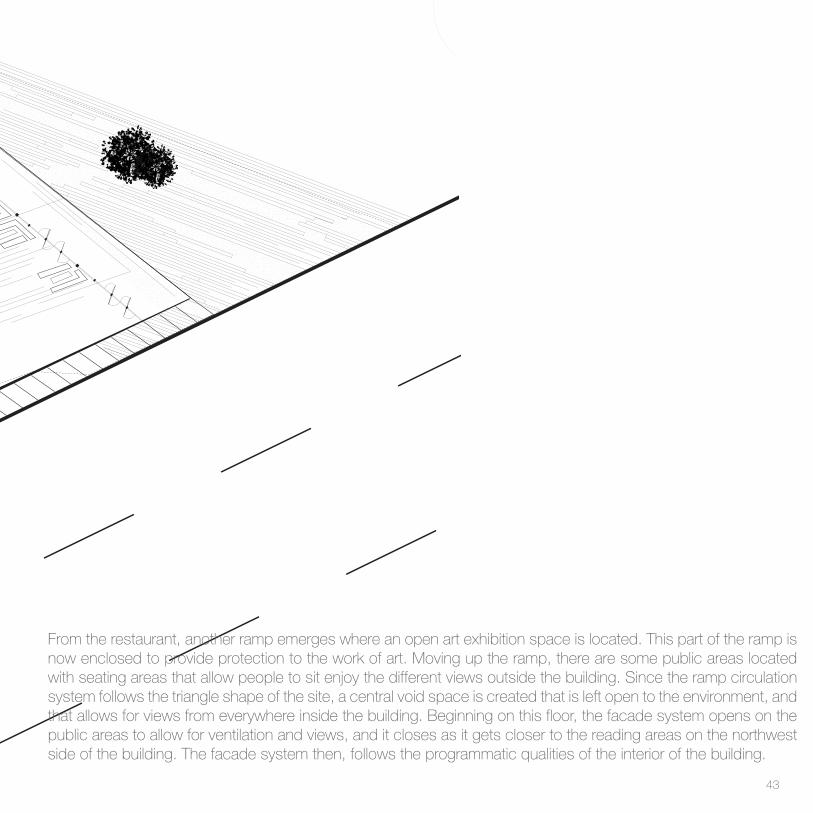
From the restaurant, another ramp emerges where an open art exhibition space is located. This part of the ramp is now enclosed to provide protection to the work of art. Moving up the ramp, there are some public areas located with seating areas that allow people to sit enjoy the different views outside the building. Since the ramp circulation system follows the triangle shape of the site, a central void space is created that is left open to the environment, and that allows for views from everywhere inside the building. Beginning on this floor, the facade system opens on the public areas to allow for ventilation and views, and it closes as it gets closer to the reading areas on the northwest side of the building. The facade system then, follows the programmatic qualities of the interior of the building.
43

Level 3 1’=1/8’’PERMEABLE GROUNDS DIANA OSSA
Third Level Plan
44
Level 3 1’=1/8’’PERMEABLE GROUNDS DIANA OSSA
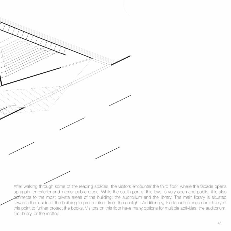
After walking through some of the reading spaces, the visitors encounter the third floor, where the facade opens up again for exterior and interior public areas. While the south part of this level is very open and public, it is also connects to the most private areas of the building: the auditorium and the library. The main library is situated towards the inside of the building to protect itself from the sunlight. Additionally, the facade closes completely at this point to further protect the books. Visitors on this floor have many options for multiple activities: the auditorium, the library, or the rooftop.
45

Site Plan Site Plan 1’=1/32’’PERMEABLE GROUNDS DIANA OSSA
46

Site Plan 1’=1/32’’PERMEABLE GROUNDS DIANA OSSA
The rooftop of the building is very similar to the first level as it is completely open, full of gardens, and public. In this way, the green gardens and the open spaces travel up the building leading the visitors to the public areas, while protecting the more private spaces inside of the building. The facade system also adapts to the program and it closes in areas that need sun protection, and open again in public areas when the views are desirable.
47

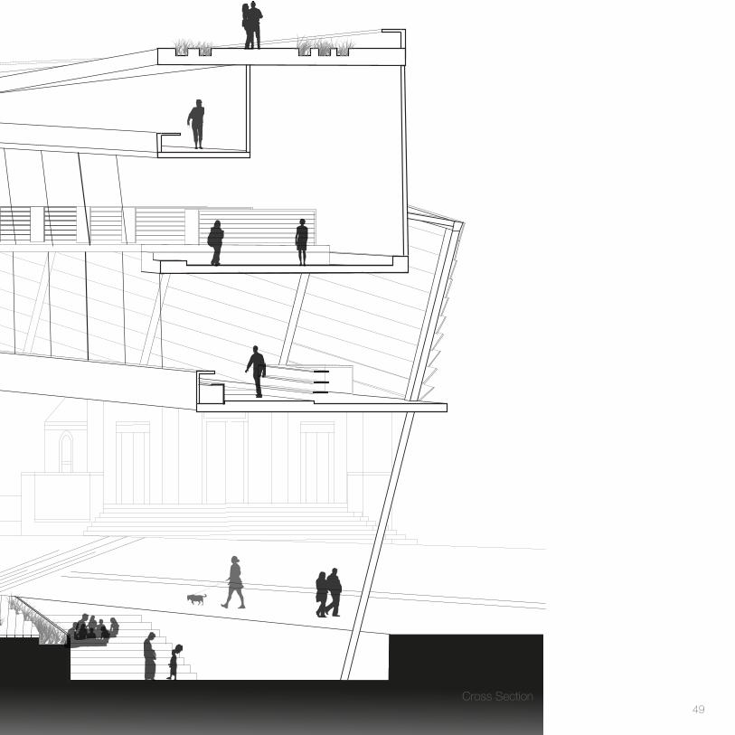
Section 1’=1/8’’Permeable GroundsDiana Ossa
48
Section 1’=1/8’’Permeable GroundsDiana Ossa
Cross Section49

Second Floor - Reading Areas
Study Model Final Model 1’=1/8”
Third Level - Library
Open Theater
50

Open Theater Final Model - South side
Outside view - Looking at northwest facade Second Floor - Reading Areas
51
52

CoalescePArC de LA bArCeLonetA, bArCeLonA, sPAin
design 511_sPring 15 Professor: eLenA CAnovAs
The Parc de la Barceloneta is a very strategic location for the city of Barcelona, but not one that many locals or tourists know about. The goal of this project is to bring this park back to the city, as well as to propose a future connection to Parc de la Ciudatella, which now is blocked by train tracks and a major highway. This project aims to become an ‘open gateway’ to the Barceloneta neighborhood, as well as to create a physical and visual connection to the beach and the city by providing a sequence of spaces that could be used for multiple representative events both political and civic. The program includes an extension of the Catalan Parliament to host political representative events in a more open urban context, and a small permanent collection of local
artists.
53
Selected for Approach | Student Work Publication

Ciutadella Park
Miralles Gas Natural Headquarters
Train Tracks and Highway
Hospital
Barceloneta
School
Beach
One of the design strategies was to create multiple plazas that respond to the site’s surrounding buildings (Miralles, Hospital, School, Barceloneta) but that were always connected either through buildings or paths. After overlapping all the multiple iterations into one diagram, a main path connecting the beach and Miralles’ building became apparent, and thus became the main strategy to move people around the site and from the beach to Ciutadella Park.
Existing site plan
FINAL PLAZAS + TARGET SPACES
SKETCH
LIGHT ANALYSIS
INITIAL SITE RESPONSE
DIVISION OF PLAZAS BASED
ON SURROUNDINGS
MAIN CIRCULATION
CIRCULATION + PLAZASCIRCULATION + PLAZAS +
POSSIBLE BUILDING LOCATIONS
FINAL PLAZAS + TARGET SPACES
SKETCH
LIGHT ANALYSIS
INITIAL SITE RESPONSE
DIVISION OF PLAZAS BASED
ON SURROUNDINGS
MAIN CIRCULATION
CIRCULATION + PLAZASCIRCULATION + PLAZAS +
POSSIBLE BUILDING LOCATIONS
FINAL PLAZAS + TARGET SPACES
SKETCH
LIGHT ANALYSIS
INITIAL SITE RESPONSE
DIVISION OF PLAZAS BASED
ON SURROUNDINGS
MAIN CIRCULATION
CIRCULATION + PLAZASCIRCULATION + PLAZAS +
POSSIBLE BUILDING LOCATIONS
54

Process Work
FINAL PLAZAS + TARGET SPACES
SKETCH
LIGHT ANALYSIS
INITIAL SITE RESPONSE
DIVISION OF PLAZAS BASED
ON SURROUNDINGS
MAIN CIRCULATION
CIRCULATION + PLAZASCIRCULATION + PLAZAS +
POSSIBLE BUILDING LOCATIONS
FINAL PLAZAS + TARGET SPACES
SKETCH
LIGHT ANALYSIS
INITIAL SITE RESPONSE
DIVISION OF PLAZAS BASED
ON SURROUNDINGS
MAIN CIRCULATION
CIRCULATION + PLAZASCIRCULATION + PLAZAS +
POSSIBLE BUILDING LOCATIONS
FINAL PLAZAS + TARGET SPACES
SKETCH
LIGHT ANALYSIS
INITIAL SITE RESPONSE
DIVISION OF PLAZAS BASED
ON SURROUNDINGS
MAIN CIRCULATION
CIRCULATION + PLAZASCIRCULATION + PLAZAS +
POSSIBLE BUILDING LOCATIONS
FINAL PLAZAS + TARGET SPACES
SKETCH
LIGHT ANALYSIS
INITIAL SITE RESPONSE
DIVISION OF PLAZAS BASED
ON SURROUNDINGS
MAIN CIRCULATION
CIRCULATION + PLAZASCIRCULATION + PLAZAS +
POSSIBLE BUILDING LOCATIONS
FINAL PLAZAS + TARGET SPACES
SKETCH
LIGHT ANALYSIS
INITIAL SITE RESPONSE
DIVISION OF PLAZAS BASED
ON SURROUNDINGS
MAIN CIRCULATION
CIRCULATION + PLAZASCIRCULATION + PLAZAS +
POSSIBLE BUILDING LOCATIONS
FINAL PLAZAS + TARGET SPACES
SKETCH
LIGHT ANALYSIS
INITIAL SITE RESPONSE
DIVISION OF PLAZAS BASED
ON SURROUNDINGS
MAIN CIRCULATION
CIRCULATION + PLAZASCIRCULATION + PLAZAS +
POSSIBLE BUILDING LOCATIONS
Initial site response
Division of plazas based on surroundings
Main circulation
Circulation + Plazas
Circulation + Plazas + Possible building
locations
Final plazas + Target spaces
55

The design focused on the way the topography becomes building, and the building disolves and becomes the landscape and the connecting paths, blurring the line between interior and exterior. The unfolding of the ground encourages the movement through the site as the paths go in and out of the buildings, creating interior spaces. Movement through the buildings is also encouraged by having multiple entrances and exits, allowing people to experience the buildings as part of the site and not as objects.
art gallery
EXISTING GAS TOWER
EXISTING WATER TOWER
Beach road
Underground
connection to
beach
MAIN PATH
to barceloneta
to ciu
tadell
a park
parliament
Overlap of multiple iterations + Final Building Locations
56

Proposed Site Plan_No Roofs
The ‘Main Path’ is used as a reference point to place the two buildings, and to create paths that give access to pedestrians to the different informal plazas around the site, and access to the bridge to Ciutadella Park.
Additional paths extend and unfold from the ‘Main Path’ to create alternative connections to the site’s surrounding areas. Some of these alternative paths also aim to create an experience through the existing gas tower, which has been historically important to the site.
Another important connection to the beach was made with a passage under the beach road. This passage takes advantage of the 10 ft difference between the beach and the street level, and proposes a pedestrian walkway that directly connects those on the beach to the site whithout having to cross the street. This walkway has direct access to the art gallery and to the main paths that connect to the rest of the site.
57
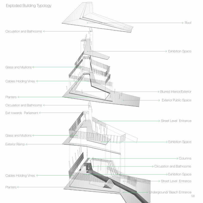
Roof
Underground/ Beach Entrance
Street Level Entrance
Street Level Entrance
Exterior Public Space
Blurred Interior/Exterior
Exhibition Space
Exhibition Space
Exhibition Space
Columns
Circulation and Bathrooms
Planters
Cables Holding Vines
Exterior Ramp
Glass and Mullions
Glass and Mullions
Exit towards Parliament
Circulation and Bathrooms
Circulation and Bathrooms
Planters
Cables Holding Vines
Exploded Building Typology
58

Although very different, both the Parliament building and the Art Gallery follow the same building typology that blurs the lines between exterior and interior. On every floor, the glass is surrounded by planters where the vertical cables connect to. These cables hold the vines that grown on the planters and that help shade the building from the sun. Additionally, the rhythm and spacing of the mullions also changes depending on the sun orientation. Thus, when facing West or South, the mullions become closer to each other, adding another layer of protection from the sun. The cables/planters and the glass get divided on the third floor, creating a sense of ambiguity between what is inside and outside.
Except for the first and last floor, all the other floors are designed as a ramp to encourage the movement from level to level, and from inside to outside of the building. Additionally, there are multiple entrances to allow people coming from different places to have access to the building and experience it from different views.
59

-10
0
4
UP
UP
- 4
0
14
18
DN
0
10
DN
8
7
14
15
UP
UP
- 14
-10-10
0
4
UP
UP
- 4
0
Art Gallery Street Level PlanArt Gallery Beach Level Plan
‘Silent Rain’ ‘Storm’ ‘Memoria’ ‘Spiegel I and II’ ‘Constellation’ ‘Where?’ ‘Twentynine Palms’Jaume Plensa Jaume Plensa Jaume Plensa Jaume Plensa Jaume Plensa Jaume Plensa Jaume Plensa2003 2013 2013 2010 1998 2008 2007
9.6 x 5.5 x 8 ft 13 x 8 x 9 ft 12 x 7.7 x 8 ft 3.2 x 2.4 x 3.2 ft
60
-10
0
4
UP
UP
- 4
0
14
18
DN
0
10
DN
8
7
14
15
-10
0
4
UP
UP
- 4
0
14
18
DN
0
10
DN
8
7
14
15
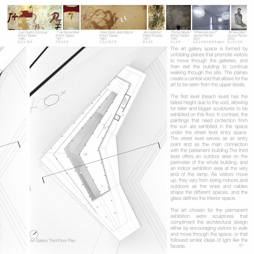
‘Las Cuatro Cronicas’ ‘7 de Noviembre’ ‘Gran Diptic dels Mitjons’ ‘Accordionist’ ‘Forma Negra’ ‘Where are you?’ ‘Tel Aviv Man’Antoni Tapies Antoni Tapies Antoni Tapies Pablo Picasso Antoni Tapies Jaume Plensa Jaume Plensa1990 1971 1987 1911 1987 2007 20038.2 x 19 ft 7.6 x 5 ft 7.3 x 19.7 ft 6 x 3 ft 5 x 4 ft 4.2 x 4.9 x 6.8 ft each 6 x 3 x 3 ft
The art gallery space is formed by unfolding planes that promote visitors to move through the galleries, and then exit the building to continue walking through the site. The planes create a central void that allows for the art to be seen from the upper levels.
The first level (beach level) has the tallest height due to the void, allowing for taller and bigger sculptures to be exhibited on this floor. In contrast, the paintings that need protection from the sun are exhibited in the space under the street level entry space. The street level serves as an entry point and as the main connection with the parliament building.The third level offers an outdoor area on the perimeter of the whole building, and an indoor exhibition area at the very end of the ramp. As visitors move up, they vary from being indoors and outdoors as the vines and cables shape the different spaces, and the glass defines the interior space.
The art chosen for the permanent exhibition were sculptures that compliment the architectural design either by encouraging visitors to walk and move through the space, or that followed similar ideas of light like the facade.
Art Gallery Third Floor Plan61

62

63

Art Gallery View from Street
64
65

-10
0
4
UP
UP
- 4
0
14
18
DN
0
10
DN
8
7
14
15
Parliament Extension First Floor Plan
Auditorium
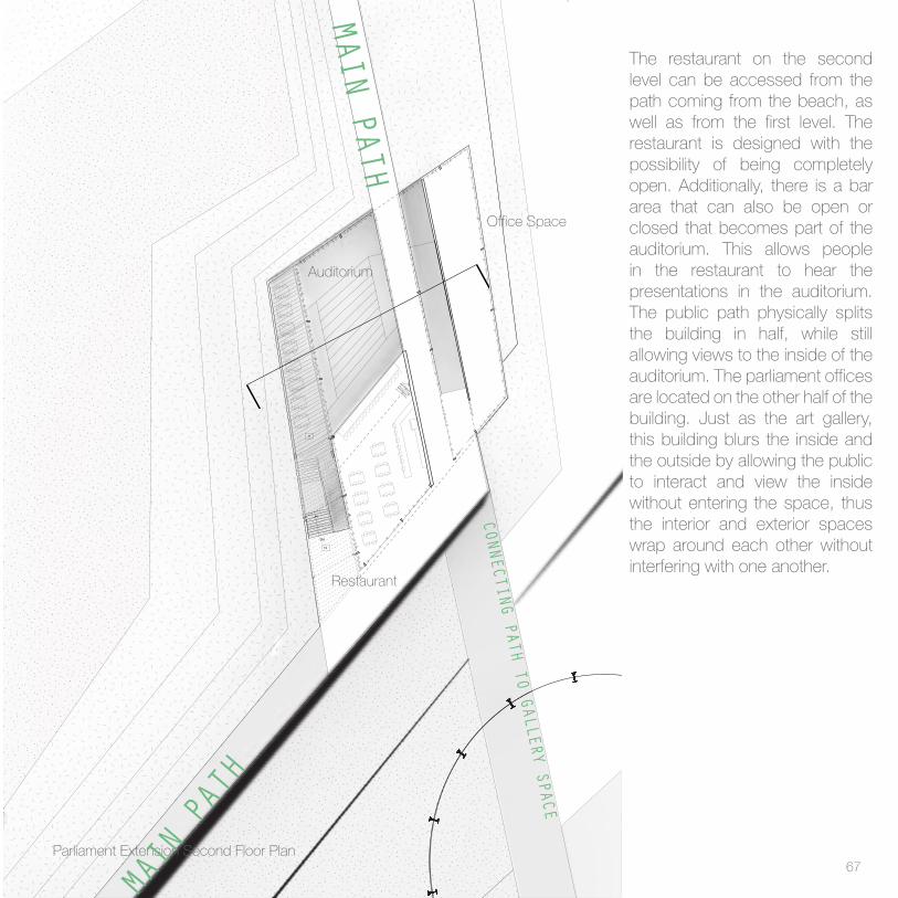
CONNECTING PATH TO GALLERY SPACEThe Parliament Extension building follows the same typology as the Art gallery, with the cables and vines protecting the building from the sun exposure, and the slabs emerging from the redesigned topography lines. The main idea for this building was to create a space where both the public walking through the site and those from the government working in the building could visually share the same space, while being physically separated. The main entrance is located on the first level coming from the path that connects to the art gallery. From this level there is access to the auditorium and a ramp that leads to the second floor, which connects to the public path coming from the beach, that crosses right through the building, and becomes the bridge to cross over to Ciutadella park. The main seating area for the restaurant, located on the second floor, is also on the first level. On this space, the vines get separated from the glass, and create a canopy that gives shade to the open seating area.
MAIN PATH
66
-10
0
4
UP
UP
- 4
0
14
18
DN
0
10
DN
8
7
14
15
Parliament Extension Second Floor Plan
Restaurant
Auditorium
Office Space
CONNECTING PATH TO GALLERY SPACE
The restaurant on the second level can be accessed from the path coming from the beach, as well as from the first level. The restaurant is designed with the possibility of being completely open. Additionally, there is a bar area that can also be open or closed that becomes part of the auditorium. This allows people in the restaurant to hear the presentations in the auditorium. The public path physically splits the building in half, while still allowing views to the inside of the auditorium. The parliament offices are located on the other half of the building. Just as the art gallery, this building blurs the inside and the outside by allowing the public to interact and view the inside without entering the space, thus the interior and exterior spaces wrap around each other without interfering with one another.
MAIN PATH
MAIN PATH
67

68

69

Parliament view from Miralles’ Building
70

71

Physical Model 72
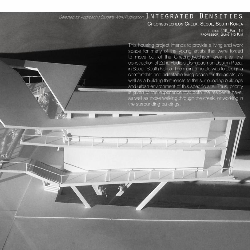
Integrated DensitiesCheonggyeCheon Creek, seouL, south koreA
design 419_fALL 14 Professor: sung ho kim
This housing project intends to provide a living and work space for many of the young artists that were forced to move out of the Cheonggyecheon area after the construction of Zaha Hadid’s Dongdaemun Design Plaza, in Seoul, South Korea. The main principle was to design a comfortable and adaptable living space for the artists, as well as a building that reacts to the surrounding buildings and urban environment of this specific site. Thus, priority is given to the experience that both the residents have, as well as those walking through the creek, or working in the surrounding buildings.
73
Selected for Approach | Student Work Publication

Existing Pedestrian Path
Existing Pedestrian Path
Waterfall on Southwest Wall of Creek
Water feature on Creek
New Exhibition Space for Residents
The building is located on the Cheonggyecheon Creek, which was restored in 2005 from an elevated highway to an open and clean environment with natural habitats that improved the pedestrian life in Seoul. This 30 unit housing project aims to work with the environment by being a completely open space where the public areas can be enjoyed by the residents as additional green spaces similar to those on the creek, and only have enclosed areas in the privacy of the individual apartments. The existing vehicular bridge that crosses the creek is included as part of the design as cars can drive through the building and still experience the site.
The site is located in between a waterfall on the West side of the bridge, and a water feature on the creek on the East side. Thus the two sets of unit wings are designed to look towards the creek, as the circulation for the building is placed on the back looking towards the surrounding buildings. This allows residents to enjoy the views of the site form their office space inside their units. The circulation of the building is left completely open and is enhanced with green gardens to provide nice views for the people working in the surrounding buildings. Additionally, under the existing brigde, the creek has been redisigned to allow residents to exhibit their art work for the public to experience as they walk through the creek. Thus, the building is designed to become part of the environment and the existing conditions.
74

Creek Level Plan Diagram
Creek Surroundings75

Public
Private
76

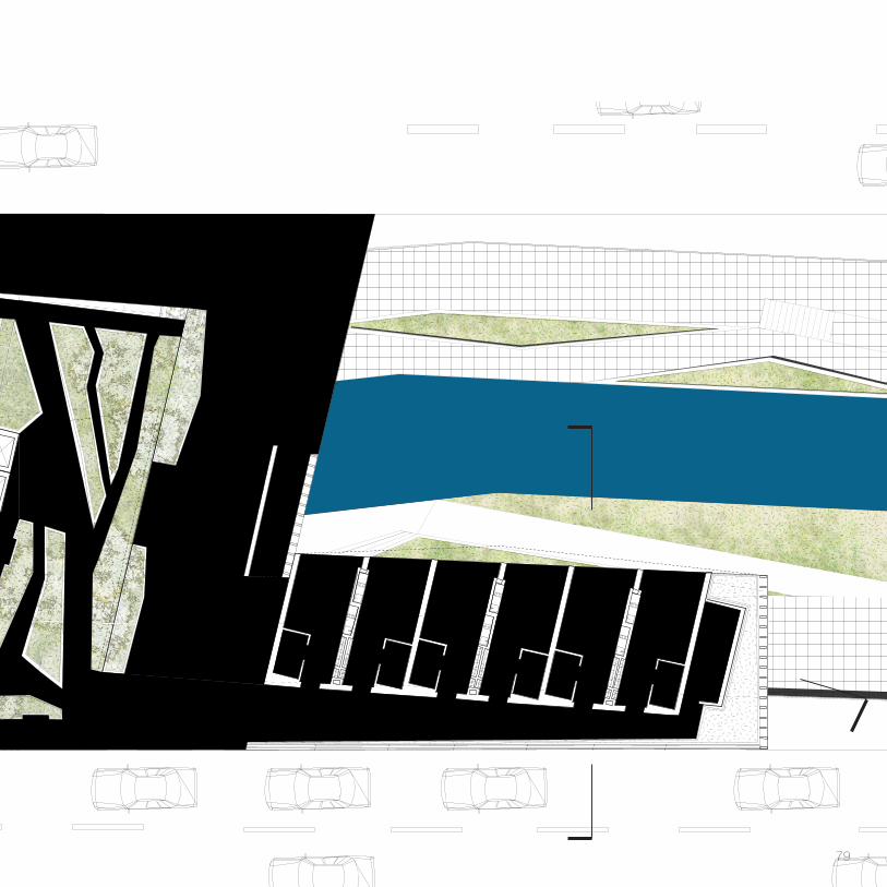
As a result of being placed in the middle of a very pedestrian public space, this building aims to provide some public areas for non-residents, while keeping the entrance to the units private. The space under the bridge is both for residents and for pedestrians, as well as the first level of the building, which can be accessed both from the elevator on the West side of the bridge, and the staircaise on the East. This main level is intended for a small public restaurant area. The following levels can only be accessed by the residents through the elevator. Just as the main level, all these floors are completely open, and are full of green gardens and bamboo trees that make the residents feel like they haven’t left the creek. Additionally, the roof splits right in the center of the public areas to allow for natural conditions
inside of the building.
Physical Model77
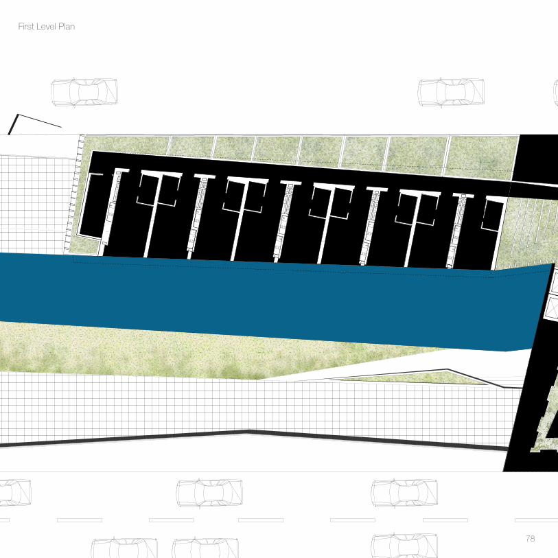
First Level Plan
78
79
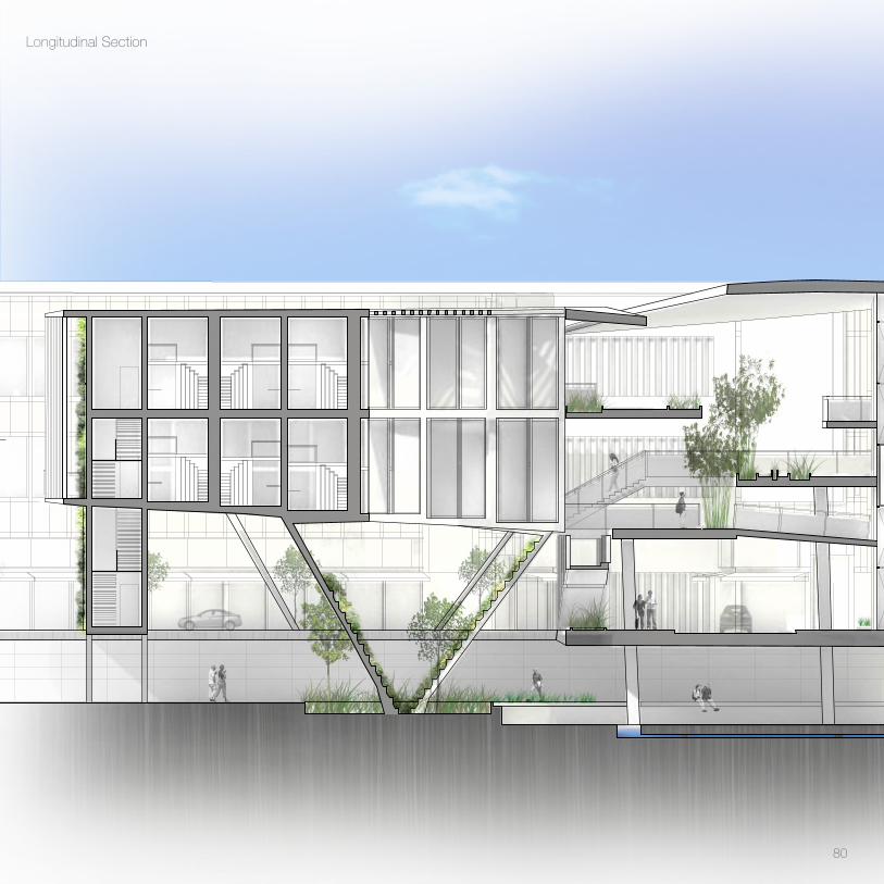
Longitudinal Section
Longitudinal Section
80

81

Cross Section
Cross Section
82

83
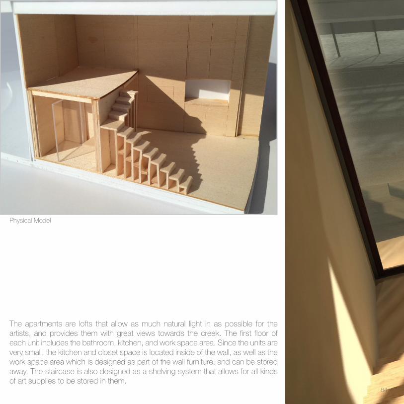
The apartments are lofts that allow as much natural light in as possible for the artists, and provides them with great views towards the creek. The first floor of each unit includes the bathroom, kitchen, and work space area. Since the units are very small, the kitchen and closet space is located inside of the wall, as well as the work space area which is designed as part of the wall furniture, and can be stored away. The staircase is also designed as a shelving system that allows for all kinds of art supplies to be stored in them.
Physical Model
84

85

86

Night Render87

3D Print
88

89

Reflected Surfaces Still LifeCharcoal
90
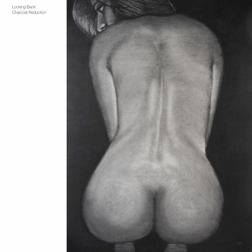
Looking BackCharcoal Reduction
91

Still Life Folded PaperOil painting
92
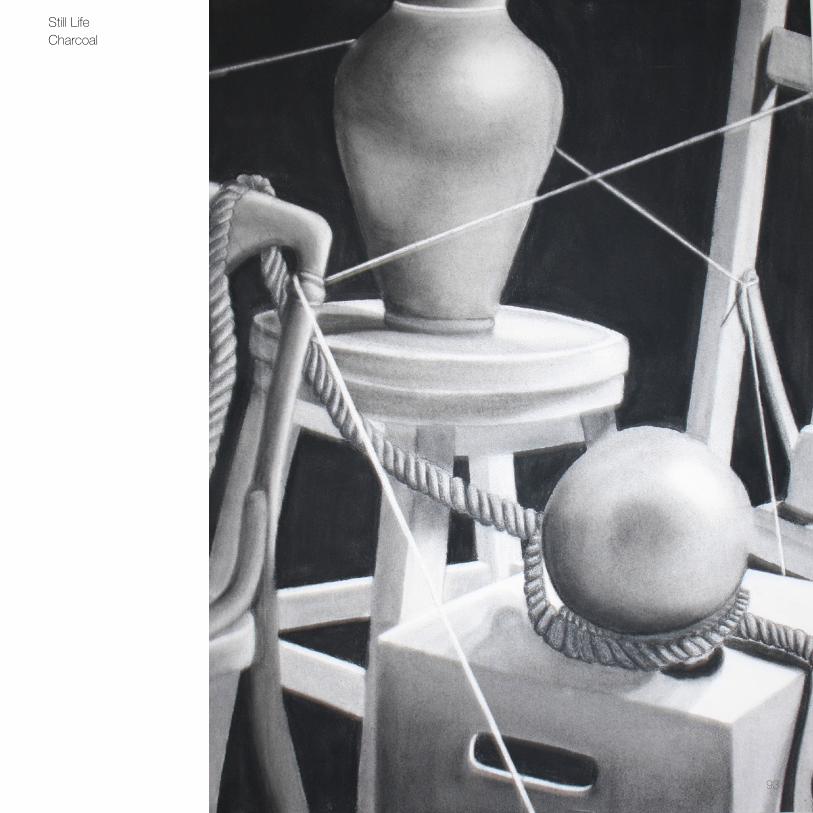
Still LifeCharcoal
93

Thank You
Copyright © 2022 FDOKUMEN

