The Optimum Font Size and Type for Students Aged 9-12 Reading Arabic Characters on Screen: A Case...
15
University of Huddersfield Repository Abubaker, Azza and Lu, Joan The Optimum Font Size and Type for Students Aged 9-12 Reading Arabic Characters on Screen: A Case Study Original Citation Abubaker, Azza and Lu, Joan (2012) The Optimum Font Size and Type for Students Aged 9-12 Reading Arabic Characters on Screen: A Case Study. Journal of Physics: Conference Series, 364. ISSN 1742-6596 This version is available at http://eprints.hud.ac.uk/16427/ The University Repository is a digital collection of the research output of the University, available on Open Access. Copyright and Moral Rights for the items on this site are retained by the individual author and/or other copyright owners. Users may access full items free of charge; copies of full text items generally can be reproduced, displayed or performed and given to third parties in any format or medium for personal research or study, educational or not-for-profit purposes without prior permission or charge, provided: • The authors, title and full bibliographic details is credited in any copy; • A hyperlink and/or URL is included for the original metadata page; and • The content is not changed in any way. For more information, including our policy and submission procedure, please contact the Repository Team at: [email protected]. http://eprints.hud.ac.uk/
Transcript of The Optimum Font Size and Type for Students Aged 9-12 Reading Arabic Characters on Screen: A Case...
University of Huddersfield Repository
Abubaker, Azza and Lu, Joan
The Optimum Font Size and Type for Students Aged 9-12 Reading Arabic Characters on Screen: A Case Study
Original Citation
Abubaker, Azza and Lu, Joan (2012) The Optimum Font Size and Type for Students Aged 9-12 Reading Arabic Characters on Screen: A Case Study. Journal of Physics: Conference Series, 364. ISSN 1742-6596
This version is available at http://eprints.hud.ac.uk/16427/
The University Repository is a digital collection of the research output of theUniversity, available on Open Access. Copyright and Moral Rights for the itemson this site are retained by the individual author and/or other copyright owners.Users may access full items free of charge; copies of full text items generallycan be reproduced, displayed or performed and given to third parties in anyformat or medium for personal research or study, educational or not-for-profitpurposes without prior permission or charge, provided:
• The authors, title and full bibliographic details is credited in any copy;• A hyperlink and/or URL is included for the original metadata page; and• The content is not changed in any way.
For more information, including our policy and submission procedure, pleasecontact the Repository Team at: [email protected].
http://eprints.hud.ac.uk/
The Optimum Font Size and Type for Students Aged 9-12
Reading Arabic Characters on Screen: A Case Study
A A Abubaker1 and J Lu
2
1 PhD student, informatics department,
University of Huddersfield, Queen Gate, Huddersfield HD1 3DH, UK
E-mail [email protected] 2 Professors in Department of Informatics
University of Huddersfield, Queen Gate, Huddersfield HD1 3DH, UK
E-mail: [email protected]
Abstract. More and more, interest in the way data is displayed on screen has increased,
especially with the increase in the number of people using e-text for learning purposes. So,
this requires more focus on factors that affect screen legibility. Text display factors, such as
font size, line length and font type, have an impact on reading online. Two font types [Arabic
Traditional and Simplified Arabic] in four different sizes [10, 14, 16 and 18] are measured
using Arabic text. On-line processes were measured using reading –aloud technique.
Accuracy of reading was also measured by the average of errors that students made when
reading the text, while reading speed was tested by the time it took students to read the text.
However, results indicated that Arabic text in font size 10 is not readable to students aged 10
to 12. On the other hand, font sizes sixteen and eighteen are more readable than any smaller-
sized font, the averages of error size 18 improve in all font types, while age has a significant
impact on reading speed. Simplified Arabic font is reported as readable to students aged 10-
12, especially in sizes 14 and 18.
1. Introduction
The online reading environment has specific characteristics that make it different from reading paper-
based literature. Some researchers, such as Alan [1], reported that presenting text on a screen is
broadly similar to displaying it on a page, even though there are a number of distinct differences, as
in quality, size, and orientation. This approach may create difficulty when reading on screen. Coyle
[2] contends that the reason behind the failure of e- book to render the print book electronically rather
than developing new standards is to guide designers and writers when designing e- text. This idea
was supported by many studies that examined e-text display. For example, Maria [3] and Lonsdale
[4] examined the effect of question layout and answer sheet on reading English. Study findings show
that text layout affects reading performance significantly.
The font size is one of the typographical elements that have received considerable attention by
researchers interested in studying display text on the screen by investigating their effect on reading
speed and accuracy. The findings of these researchers could be classified into three groups; the first
group reported significant effect of font size and type on online reading, the second group reported
limited effect, while the third group reported no effect. Points usually used to measure the size of
letters include the cap high of the letters plus a small interval of the space above and below the
letters. Points are also used to measure the distance between lines.
In the same perspective, the studies that confirmed the effect of font size and type did not agree on
the optimal size and type that could be considered as standards for designing e-text. For example,
Bernard et al. [5] tested three different font size points (10, 12, and 14) with 8 font types. Using a
sample size with 20 participants aged between 18 and 55, they were asked to read passages of over
1000 words. The study reported that speed and accuracy was affected by font size and font at 12
point size was read faster than size 10. There is thus a positive relationship between speed reading
and accuracy. This finding was confirmed by Shurtleff [6] and National findings [7]. Furthermore,
findings by Smith [8] indicated that characters’ height has significant effect on search time and
accuracy, e.g. the average accuracy was about 91% in size 2.2 mm. This average went down to 81%
in size 1.4 mm, while in 3.3 mm the search speed increased but decreased when the characters’
height is up to 3.3 mm.
In addition, Jayeeta et al. [9] reported that there was no statistical difference in reading speed
between font sizes 10 and 12, while, some researchers point out that readable font size starts from 14
point [9-13] [12] [10].
Otherwise, other researchers in the typographic literature [14] [15] [16] [9] believed that serifs
have a significant impact on the readability of text on screen because they think serifs increased letter
discriminability. Few researchers, such as Chien and Chen [17], argued that increasing size does not
necessarily improve the perception of legibility. While Kolers and Duchnicky [18] debated whether
smaller characters, with more characters per line, are read faster.
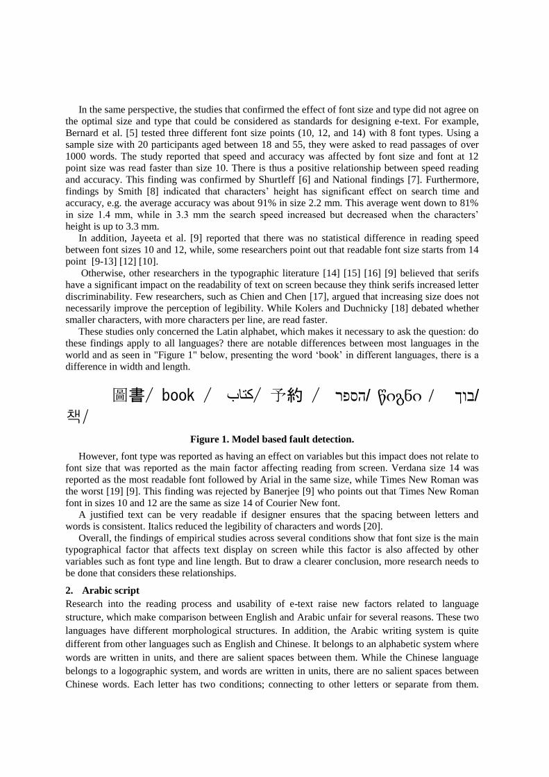
These studies only concerned the Latin alphabet, which makes it necessary to ask the question: do
these findings apply to all languages? there are notable differences between most languages in the
world and as seen in "Figure 1" below, presenting the word ‘book’ in different languages, there is a
difference in width and length.
圖書/ book / كتاب / 予約 / הספר/ წიგნი / בוך/
책/ Figure 1. Model based fault detection.
However, font type was reported as having an effect on variables but this impact does not relate to
font size that was reported as the main factor affecting reading from screen. Verdana size 14 was
reported as the most readable font followed by Arial in the same size, while Times New Roman was
the worst [19] [9]. This finding was rejected by Banerjee [9] who points out that Times New Roman
font in sizes 10 and 12 are the same as size 14 of Courier New font.
A justified text can be very readable if designer ensures that the spacing between letters and
words is consistent. Italics reduced the legibility of characters and words [20].
Overall, the findings of empirical studies across several conditions show that font size is the main
typographical factor that affects text display on screen while this factor is also affected by other
variables such as font type and line length. But to draw a clearer conclusion, more research needs to
be done that considers these relationships.
2. Arabic script
Research into the reading process and usability of e-text raise new factors related to language
structure, which make comparison between English and Arabic unfair for several reasons. These two
languages have different morphological structures. In addition, the Arabic writing system is quite
different from other languages such as English and Chinese. It belongs to an alphabetic system where
words are written in units, and there are salient spaces between them. While the Chinese language
belongs to a logographic system, and words are written in units, there are no salient spaces between
Chinese words. Each letter has two conditions; connecting to other letters or separate from them.
There are three cases of connecting letters; thus, Arabic text can be divided into 19 cases based on
style.
Otherwise, English has a concatenative morphological structure, whereas Arabic is non-
concatenative based on the notion of root. On the other hand, 15 letters in Arabic language have dots
in them, and a large number of the letters differ depending only on the number of dots or where dots
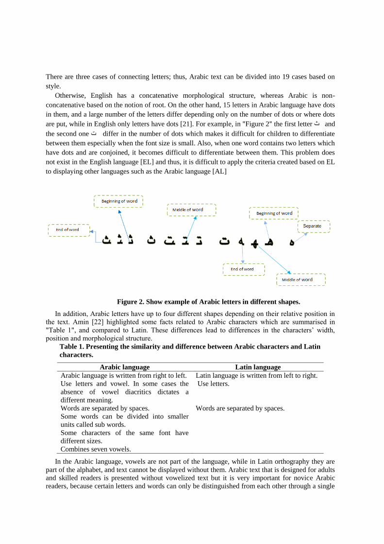
are put, while in English only letters have dots [21]. For example, in "Figure 2" the first letter ث and
the second one ت differ in the number of dots which makes it difficult for children to differentiate
between them especially when the font size is small. Also, when one word contains two letters which
have dots and are conjoined, it becomes difficult to differentiate between them. This problem does
not exist in the English language [EL] and thus, it is difficult to apply the criteria created based on EL
to displaying other languages such as the Arabic language [AL]
Figure 2. Show example of Arabic letters in different shapes.
In addition, Arabic letters have up to four different shapes depending on their relative position in
the text. Amin [22] highlighted some facts related to Arabic characters which are summarised in
"Table 1", and compared to Latin. These differences lead to differences in the characters’ width,
position and morphological structure.
Table 1. Presenting the similarity and difference between Arabic characters and Latin
characters.
Arabic language Latin language
Arabic language is written from right to left. Latin language is written from left to right.
Use letters and vowel. In some cases the
absence of vowel diacritics dictates a
different meaning.
Use letters.
Words are separated by spaces. Words are separated by spaces.
Some words can be divided into smaller
units called sub words.
Some characters of the same font have
different sizes.
Combines seven vowels.
In the Arabic language, vowels are not part of the language, while in Latin orthography they are
part of the alphabet, and text cannot be displayed without them. Arabic text that is designed for adults
and skilled readers is presented without vowelized text but it is very important for novice Arabic
readers, because certain letters and words can only be distinguished from each other through a single
stroke or dot. Short vowels may be above, and/or in, and/or below the letters for letter-sound
pronunciation. Abu-Rabia [23] [24] tested Arabic vowels and their influence on the reading accuracy
of poor and skilled native Arabic speakers of different ages. The findings suggest that vowels were
important factors in assisting word recognition among poor and skilled readers. Moreover, testing the
effect of vowels on the Hebrew language in terms of comprehension and reading time shows that
vowels make no significant difference as to reading time but they influence comprehension [25].
Furthermore, Abu-Rabia [23] and Abu-Rabia and Siegel [24] argue that understanding the
development of reading could help build a better comprehensive reading theory.
In the present research, the legibility of Arabic text presented on screen to children aged 9 to 12
will be investigated in order to identify and measure the optimal font size using two font types [
Arabic traditional and simplified Arabic] in four different font sizes [10, 14, 16 and 18].
3. Experiment design
3.1. Participants.
30 Students, studying at a Libyan school in the UK, participated as volunteers to do the experiment.
Their ages ranged from 10 to 12. There were 15 female and 15 male students, 26 of whom were
studying in an English school for more than one year, and 9 participants were born in the UK with
the Arabic language as their mother tongue. Participating students were also classified into two
groups based on education levels and reading scores; the first group included students who scored in
reading course a mark of at least 5 out of 10, while the second group included students whose scores
were less than 5 as seen in" table 2". Table 2. Show the sample size.
3.2 Material design
Taking into account the previous findings which show that there is a positive correlation between
content’s length and reading rate, the text used in the experiment was divided into two parts, each
part representing a separate window. In each test, different lessons were used, although all the lessons
were taken from the reading school book for primary stage in Libya and the eight lessons discussed
different subjects of general interest. In addition, the four windows have equal length (31 words per
lines, 27 lines per text and non-margins).
The sentences were printed with black letters on grey background. Four font sizes (10, 14, 16, and
18) were tested with two font types as shown in "Table 3". Finally, the text in both conditions was
presented in a single column.
"Table 4" shows an example of text layout using 14 point as font size and Times New Roman as
font type.
Age N Total gender
10 10
30
male 15
11 10
12 10 female 15
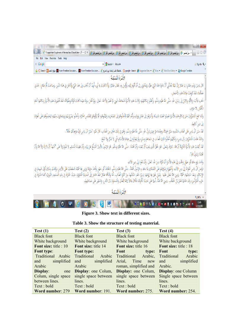
Figure 3. Show text in different sizes.
Table 3. Show the structure of testing material.
Test (1) Test (2) Test (3) Test (4)
Black font
White background
Font size: title : 10
Font type:
Traditional Arabic
and simplified
Arabic
Display: one
Colum, single space
between lines.
Text : bold
Word number: 279
Black font
White background
Font size: title 14
Font type:
Traditional Arabic
and simplified
Arabic
Display: one Colum,
single space between
lines.
Text : bold
Word number: 191.
Black font
White background
Font size: title 16
Font type: Traditional Arabic,
Arial, Time new
roman, simplified and
Display: one Colum,
single space between
lines.
Text : bold
Word number: 275.
Black font
White background
Font size: title : 18
Font type: Traditional Arabic
and simplified
Arabic.
Display: one Column
Single space between
lines.
Text : bold
Word number: 254.
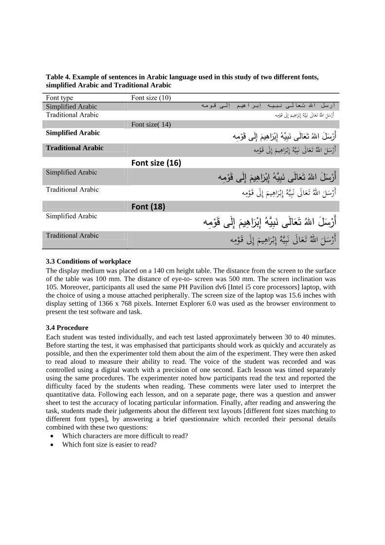
Table 4. Example of sentences in Arabic language used in this study of two different fonts,
simplified Arabic and Traditional Arabic
Font type Font size (10)
Simplified Arabic ه م و ى ق ل يم إ اه ر ب ه إ ي ب ى ن ال ع ل اهلل ت س ر أ
Traditional Arabic أرسل اهلل ت عال نبيه إب راهيم إل ق ومه Font size( 14)
Simplified Arabic قومهإلىإبراهيمنبيههتعالىاللهأرسلTraditional Arabic أرسل اهلل ت عال نبيه إب راهيم إل ق ومه Font size (16) Simplified Arabic أرسلاللهتعالىنبيههإبراهيمإلىقومهTraditional Arabic أرسل اهلل ت عال نبيه إب راهيم إل ق ومه Font (18) Simplified Arabic أرسلاللهتعالىنبيههإبراهيمإلىقومهTraditional Arabic أرسل اهلل ت عال نبيه إب راهيم إل ق ومه 3.3 Conditions of workplace
The display medium was placed on a 140 cm height table. The distance from the screen to the surface
of the table was 100 mm. The distance of eye-to- screen was 500 mm. The screen inclination was
105. Moreover, participants all used the same PH Pavilion dv6 [Intel i5 core processors] laptop, with
the choice of using a mouse attached peripherally. The screen size of the laptop was 15.6 inches with
display setting of 1366 x 768 pixels. Internet Explorer 6.0 was used as the browser environment to
present the test software and task.
3.4 Procedure
Each student was tested individually, and each test lasted approximately between 30 to 40 minutes.
Before starting the test, it was emphasised that participants should work as quickly and accurately as
possible, and then the experimenter told them about the aim of the experiment. They were then asked
to read aloud to measure their ability to read. The voice of the student was recorded and was
controlled using a digital watch with a precision of one second. Each lesson was timed separately
using the same procedures. The experimenter noted how participants read the text and reported the
difficulty faced by the students when reading. These comments were later used to interpret the
quantitative data. Following each lesson, and on a separate page, there was a question and answer
sheet to test the accuracy of locating particular information. Finally, after reading and answering the
task, students made their judgements about the different text layouts [different font sizes matching to
different font types], by answering a brief questionnaire which recorded their personal details
combined with these two questions:
Which characters are more difficult to read?
Which font size is easier to read?
4. Result
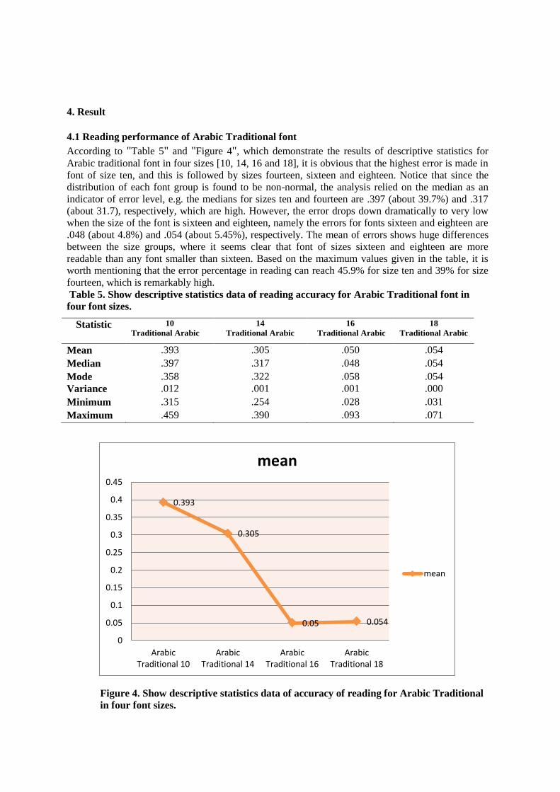
4.1 Reading performance of Arabic Traditional font
According to "Table 5" and "Figure 4", which demonstrate the results of descriptive statistics for
Arabic traditional font in four sizes [10, 14, 16 and 18], it is obvious that the highest error is made in
font of size ten, and this is followed by sizes fourteen, sixteen and eighteen. Notice that since the
distribution of each font group is found to be non-normal, the analysis relied on the median as an
indicator of error level, e.g. the medians for sizes ten and fourteen are .397 (about 39.7%) and .317
(about 31.7), respectively, which are high. However, the error drops down dramatically to very low
when the size of the font is sixteen and eighteen, namely the errors for fonts sixteen and eighteen are
.048 (about 4.8%) and .054 (about 5.45%), respectively. The mean of errors shows huge differences
between the size groups, where it seems clear that font of sizes sixteen and eighteen are more
readable than any font smaller than sixteen. Based on the maximum values given in the table, it is
worth mentioning that the error percentage in reading can reach 45.9% for size ten and 39% for size
fourteen, which is remarkably high.
Table 5. Show descriptive statistics data of reading accuracy for Arabic Traditional font in
four font sizes.
Statistic 10
Traditional Arabic
14
Traditional Arabic
16
Traditional Arabic
18
Traditional Arabic
Mean .393 .305 .050 .054
Median .397 .317 .048 .054
Mode .358 .322 .058 .054
Variance .012 .001 .001 .000
Minimum .315 .254 .028 .031
Maximum .459 .390 .093 .071
Figure 4. Show descriptive statistics data of accuracy of reading for Arabic Traditional
in four font sizes.
0.393
0.305
0.05 0.054
0
0.05
0.1
0.15
0.2
0.25
0.3
0.35
0.4
0.45
ArabicTraditional 10
ArabicTraditional 14
ArabicTraditional 16
ArabicTraditional 18
mean
mean
However, to investigate the relationship between the four sizes of traditional Arabic font and the
error percentages resulting from using these sizes, the Friedman test is used to test the difference in
median error for the four fonts. The Friedman test indicates strong differences in error percentages
among the four groups (χ2= 82, p-value < .001) as seen in "table 6".
Next, follow-up tests will need to be conducted in order to evaluate comparisons between pairs of
medians using the Wilcoxon test. Using the Bonferroni adjustment for controlling adequately for type
I error, the adjusted level of significance will be .05/6 = .008. Based on the adjusted p-value, the
median error percentage of traditional Arabic font for size ten is significantly greater than the median
error for sizes fourteen, sixteen and eighteen, p-value < .008. Also, the median error percentage for
size fourteen is found to be significantly higher than the error provided by median error for sizes
sixteen and eighteen. However, the median error percentage for size sixteen does not differ
significantly from the median error for size eighteen. Notice that these two sizes (sixteen and
eighteen) show the lowest error made by the students which is about .048 (4.8%) and .054 (5.4%)
respectively.
Table 6. Show Pairs comparison using the Wilcoxon test in terms of traditional Arabic font
groups.
To measure the degree of association between age and gender with speed and error, Spearman’s
correlation is used for each font size. Based on "table 7", we observe that the age of students tends to
have a negative correlation with speed; this means that as age increases, the time spent on reading
decreases. The correlation becomes stronger as long as the font size becomes bigger and all of the
correlations are found to be significant. In terms of errors in reading, the researcher finds that when it
comes to age the correlation is negative and significant for all of the font sizes. It is obvious that the
correlation drops when the font size becomes bigger. In other words, age will have a low association
with error if the font size is big but it should be kept in mind that this relationship is still significant,
and hence should not be ignored.
Alternatively, the results reveal that gender shows a very weak correlation with both speed and
error. The findings indicated that for font of size fourteen there is a significant correlation between
gender and error; the correlation is -.402. It seems difficult to interpret this result. For measuring the
correlation between speed and error, the researcher observes that a higher speed of reading is
positively combined with a higher error, which is a surprising result. This finding may be attributed
to the following: students who have a low level of reading will take a long time to finish the text and
hence time will not lead to them reducing their error.
Table 7. Shows Spearman’s correlations between the variables using Arabic traditional font.
Ten Fourteen Sixteen Eighteen
Speed Error Speed Error Speed Error Speed Error
Age -.302* -.661*** -.603*** -.379** -.775*** -.781** -.664*** -.408**
Gender -.055 -.127 -.019 -.402* .070 .062 .027 .012
Speed Speed Speed Speed
Error .377* .413** .816** .469**
4.2. Reading performance of Simplified Arabic font:
For simplified Arabic font, error seems to dramatically drop as demonstrated by the computed mean,
median and mode given in "table 8". It is observed that a considerable reduction in error percentage
results from fonts of sizes 16 and 18; these percentages are 7.4% and 2.6% respectively. In addition,
10-14 10-16 10-18 14-16 14-18 16-18
Z -4.782 -4.782 -4.782 -4.784 -4.782 -2.149
p-value .000 .000 .000 .000 .000 .032
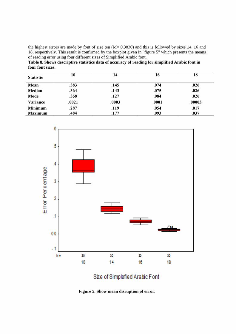
the highest errors are made by font of size ten (M= 0.3830) and this is followed by sizes 14, 16 and
18, respectively. This result is confirmed by the boxplot given in "figure 5" which presents the means
of reading error using four different sizes of Simplified Arabic font.
Table 8. Shows descriptive statistics data of accuracy of reading for simplified Arabic font in
four font sizes.
Statistic 10
14
16
18
Mean .383 .145 .074 .026
Median .364 .143 .075 .026
Mode .358 .127 .084 .026
Variance .0021 .0003 .0001 .00003
Minimum .287 .119 .054 .017
Maximum .484 .177 .093 .037
Figure 5. Show mean disruption of error.
Similar to the aforementioned fonts, the Friedman test, shown in "table 9" which is 90.00,
indicates a highly significant difference among errors resulting from reading the four sizes of
Simplified Arabic font. The Wilcoxon test, given in "table 10", tells us that a highly significant
difference is determined by each of the pairs of two font sizes. Hence, to reduce the percentage of
reading error, it is better to use a larger font size.
Table 9. Shows Friedman test for four groups of simplified Arabic font.
Font size Mean rank Chi-square p-value
Ten 4.00
90.00 .000 fourteen 3.00
sixteen 2.00
Eighteen 1.00
Table 10. Shows Pairs comparison using the Wilcoxon test in terms of Simplified Arabic font
group.
10-14 10-16 10-18 14-16 14-18 16-18
Z -4.782 -4.782 -4.782 -4.787 -4.783 -4.783
p-value .000 .000 .000 .000 .000 .000
For Spearman’s correlation, age tends to have a moderate correlation with the speed and error of
reading. But this correlation is highly significant and hence it is possible to say that when a student
grows, the chances of reading errors occurring will be lower. By looking at gender, we do not
observe any significant correlation with speed and error. In terms of the relationship between speed
and error, the highest correlation, which is .602, is obtained for size ten, but then the correlation
becomes somewhat weak for the rest of the sizes as seen in "table 11".
Table 11. Spearman test testing the correlation between reading speed and errors according
into age and gender.
Ten Fourteen Sixteen Eighteen
Speed Error Speed Error Speed Error Speed Error
Age -.488** -.542** -.645** -.206** -.580** -.106 -.429* -.483*
Gender -.056 -.075 -.076 -.033 -.053 -.070 .204 .027
Speed Speed Speed Speed
Error .602** .351* .249 .471*
Finally, short questionnaire answers show that students aged 10 to 11, who represent 80% of the
sample, prefer size 18 as reading size, while 4 students aged 12 found that the text is clear to read
from size 16 (20%).
4.3 Reading speed
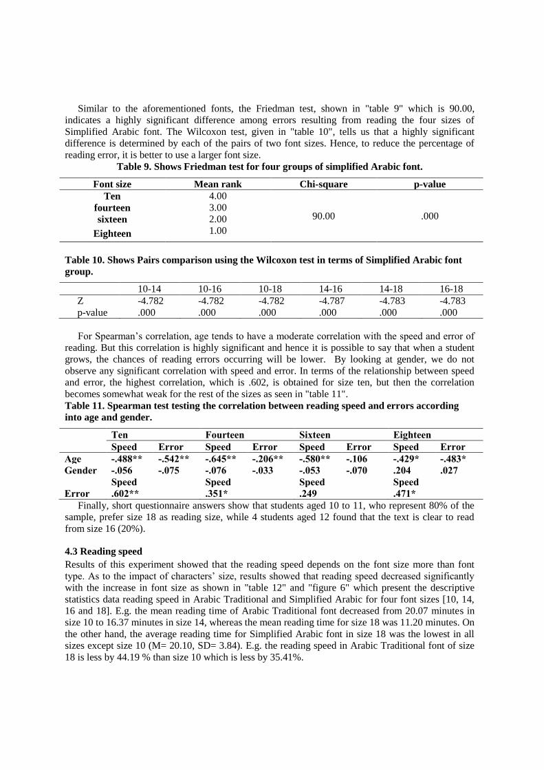
Results of this experiment showed that the reading speed depends on the font size more than font
type. As to the impact of characters’ size, results showed that reading speed decreased significantly
with the increase in font size as shown in "table 12" and "figure 6" which present the descriptive
statistics data reading speed in Arabic Traditional and Simplified Arabic for four font sizes [10, 14,
16 and 18]. E.g. the mean reading time of Arabic Traditional font decreased from 20.07 minutes in
size 10 to 16.37 minutes in size 14, whereas the mean reading time for size 18 was 11.20 minutes. On
the other hand, the average reading time for Simplified Arabic font in size 18 was the lowest in all
sizes except size 10 (M= 20.10, SD= 3.84). E.g. the reading speed in Arabic Traditional font of size
18 is less by 44.19 % than size 10 which is less by 35.41%.
Table 12. Show means & Standard Deviations of reading time under
each of font size.
Font size
Arabic Traditional Simplified Arabic
M SD M SD
10 20.07 2.66 20.10 3.84
14 16.37 3.84 15.27 3.71
16 14.60 4.91 14.03 4.57
18 11.20 4.06 9.07 2.23
Figure 6. Show mean of reading time under each of font size.
Sequentially, age has been measured as an independent variable to define optimal font size and
type. According to "tables 13" and "figure 7" which display mean and standard definition of all fonts
in different sizes, readable font size differs according to the age of the reader. E.g. reading speed of
students aged 10, when reading text presented using Arabic Traditional in size 18 (M= 13.50/ SD=
2.76) is higher than students aged 12 who read the same text in size 16 (M= 8.20/ SD= 1.69) by
55.67%. In addition, it is notable that the difference in reading performance between age group 10
and 11 is similar in all font sizes and types. For instance, comparing reading speed of students aged
10 in size 10 (Simplified Arabic) with students aged 11 shows a slight difference (3.6%). This
convergence in the performance of students at the age of 10 and 11 is obvious in sizes 10, 14 and 16.
Table 13. Display means & Standard Deviations of reading time under each of font size.
age Arabic Traditional Simplified Arabic
Size 10 Size 14 Size 16 Size 18 Size 10 Size 14 Size 16 Size 18
M SD M SD M SD M SD M SD M SD M SD M SD
10 21.20 3.26 18.80 1.75 18 2.11 13.50 2.76 22.20 2.62 17.90 2.38 16.80 2.49 10.60 2.07
11 20.20 1.81 17.40 4.01 17.60 1.51 13.70 1.49 21.40 2.84 17 2.11 16.90 1.91 8.80 2.15
12 18.80 5.73 12.90 2.69 8.20 169 6.40 2.22 16.70 3.40 10.90 1.45 8.40 2.12 7.80 1.62
Figure 7. the means & Standard Deviations of reading time under each of font size.
5. Discussion
In this experiment, Arabic text was used to define the optimum font size and type to read from screen
for students aged 10 to 12. Accuracy of reading was measured by the average of error that students
made when reading the text, while reading speed was determined by the time it took students to read
the text. Previous studies demonstrate that the text is readable in font size 10 to 12 for adults using
English characters, but Alotaibi [26] has found that 14 is a readable font with Arabic text.
Furthermore, some researchers [18] [3] linked poor reading not just to font size but also to line length
and interlinear spacing.
The results of this experiment showed that the highest error is made with font size ten, and this is
followed by sizes fourteen, sixteen and eighteen, which confirm the relationship between font size
and word vision. This result is not consistent with Alotaibi’s survey [26] which determines that the
14 point is the best font size for reading Arabic characters in print material by students aged 18 to 28.
Also, it supports the finding that age tends to have a negative correlation with reading speed; in other
words, when age increases the reading time decreases. This correlation is strong in Arabic text
because of the Arabic vowels which are key factors for defining the legible font size for children.
Thus, the legible font should be able to show the difference between dots and the vowels, and this
0
20
40
60
80
100
120
140
160
180
M SD M SD M SD M SD M SD M SD M SD M SD
Size 10 Size 14 Size 16 Size 18 Size 10 Size 14 Size 16 Size 18
Arabic Traditional Simplified Arabic
10 11 12
cannot be achieved using font size 10, 12, 14 or even 16 in spite of the low rate of errors. However,
more research is needed to investigate the relationship between language structure and font size.
Therefore, font sizes 14 and 16 are readable for readers aged 12 and over and can be used to display
Arabic text on screen. In the same way, font size 18 is recommended for reading Arabic text online.
Alternatively, in this experiment, reading speed is generally slower in font sizes 14 and 16 as well
as in 10 for the low reading groups, especially in age 10. Also, the improvement in the level of
reading is notable, whether in error or time, starting from size 16 regardless of the font type.
The effects of character size on participants were more significant with characters of the Arabic
language; this is contrary to some research findings that font types impact the reading speed in
different languages such as English [27]. Besides, Alotaibi [28] investigated the effect of font size
and type on reading speed in printed Arabic text and concluded that font type as well as font size
impact the reading speed. Therefore, reading Arabic on screen for children aged 10 to 12 is not
influenced by font types as in other languages.
In order to investigate the difference in reading performance among students based on gender, this
is used as an independent variable to clarify their impact on this type of research. Most previous
research were not concerned with finding out if there was difference in reading performance so as to
avoid this variable in future research. However, the findings of this experiment showed no difference
in reading performance between male students and female students.
Arabic traditional font should be avoided when designing Arabic text for children even if the
Arabic traditional font in size 16 was more readable than Simplified Arabic font in the same size.
6. Future work
Future work will move in the following direction: (a) it is notable that reading performance of
children is influenced by font size and font type which means more investigations of different Arabic
fonts to determine the optimal font for presenting Arabic text; (b) further studies should examine the
causes of the difficulty in reading Arabic characters in sizes 12 and 14 as Latin characters.
References
[1] Alan, C., designing computer- based learning materials. 2001: Gower Publishing Limited.
[2] Coyle, K., E- reading The Journal of Academic Librarianship, 2008. 34(2): p. 160 - 162.
[3] Maria dos santos Lonsdale, m.C.D., and Linda Reynolds, reading in examination- type
situations: the effects of text layout on performance. Research in reading, 2006. 29(4): p.
433- 453.
[4] D. De Stefano and J. Lefevre, Cognitive load in hypertext reading: a review. Computers in
Human Behaviour, 2007. 23: p. 1616-1641.
[5] Bernard, M., et al. (2002) A comparison of popular online fonts: which size and type is best?
Usability News Volume,
[6] Shurtleff, D., Studies in television legibility: a review of the literature. Information Display
1967. 4: p. 40–45.
[7] National, A., American National Standard for Human Factors Engineering of Visual Display
Terminal Workstations A.H.S.N. 100-1988, Editor. 1988: Santa Monica.
[8] Smith, W.J., ISO and ANSI Ergonomic standards for computer products: a guide to
implementation and compliance. 1996: Prentice Hall.
[9] Banerjee, J., et al., Readability, Subjective Preference and Mental Workload Studies on Young
Indian Adults for Selection of Optimum Font Type and Size during Onscreen Reading. Al
Ame en J Med S c i, 2011. 4 (2): p. 131- 143.
[10] L, R., Legibility studies: Their relevance to present-day documentation methods 1979;. J
Documentation 1979. 35(4): p. 307-340.
[11] TS, T., B. JL, and H. H., Readability of Fonts in the Windows Environment, in ACM CHI
Conference on Human Factors in Computing Systems. 1995. p. 127-128.
[12] D, B., et al. A study of fonts designed for screen display. in CHI. 1998.
[13] J, L. and S. PV, The influence of font type and line length on visual search and information
retrieval in web pages. Int J Human-Computer Studies, 2006. 64: p. 395-404.
[14] Mansfield, J.S., G.E. Legge, and M.C. Bane, Psychophysics of reading Xv: Font effects in
normal and low vision Investigative Ophthalmology and Visual Science, 1996. 37(8): p.
1492–1501.
[15] Mackeben, M., Typefaces influence peripheral letter recognition and can be optimized for
reading with eccentric viewing. , . Paper presented at the Vision 99. 1999, New York: NY.
[16] Arditi, A. and J. Cho, Serifs and font legibility. Vision research, 2005. 45(23): p. 2926-2933.
[17] Chen, C.-H. and Y.-H. Chien, Effect of dynamic display and speed of display movement on
reading Chinese text presented on a small screen. Perceptual and Motor Skills, 2005.
100(3): p. 865-873.
[18] Kolers, P., R.L. Duchnicky, and D.C. Ferguson., Eye movement measurement of read ability of
crt displays Human Factors, 1981. 23: p. 517-527.
[19] JE, S., et al., Text legibility and the letter superiority effect. Human Factors, 2005. 47(4): p.
797- 815.
[20] Sheedy, J.E., et al., Text legibility and the letter superiority effect. The jurnal of the human
Factors and Ergonomics Society 2005. 47(4): p. 797- 815.
[21] Shahreza, M. Persian/ Arabic text font estimation using dots. in IEEE International
Symposium on Signal Processing and Information Technology. 2006.
[22] Amin, A., recognition of printed Arabic text based on global features and decision tree
learning techniques pattern Recognition, 2000 33: p. 1309- 1323.
[23] Abu-Rabia, S., The Effect of Arabic Vowels on the Reading Comprehension of Second- and
Sixth-Grade Native Arab Children. Journal of Psycholinguistic Research, 1999. 28(1): p.
93-101.
[24] Abu-Rabia, S., The role of vowels and context in the reading of highly skilled native Arabic
readers. Journal of Psycholinguistic Research, 1996. 25(6): p. 629-641.
[25] Simmonds, D.R., L., Data presentation and visual literacy in medicine and science. 1994,
Oxford: Butterworth-Heinemann.
[26] Alotaibi, A.Z., The effect of font size and type on reading performance with Arabic words in
normally sighted and simulated cataract subjects. Clinical & Experimental Optometry,
2007. 90(3): p. 203-203.
[27] Feely, M., et al., Investigation into font characteristics for optimum reading fluency in readers
with sight problems. International Congress Series, 2005. 1282: p. 530- 533.
[28] Alotaibi, A.Z., The effect of font size and type on reading performance with Arabic words in
normally sighted and simulated cataract subjects optometry 2006. 90(3): p. 203- 206.