
MPLAB Harmony Graphics Composer User's Guide
131
MPLAB Harmony Graphics Composer User's Guide MPLAB Harmony Integrated Software Framework © 2013-2018 Microchip Technology Inc. All rights reserved.
-
Upload
khangminh22 -
Category
Documents
-
view
0 -
download
0
Transcript of MPLAB Harmony Graphics Composer User's Guide

MPLAB Harmony Graphics Composer User's Guide
MPLAB Harmony Integrated Software Framework
© 2013-2018 Microchip Technology Inc. All rights reserved.

Volume III: MPLAB Harmony Configurator (MHC) This volume provides user and developer-specific information on the MPLAB Harmony Configurator (MHC).
Description
The MPLAB Harmony Configurator (MHC) is a graphical utility used to configure MPLAB Harmony projects. MHC provides a "New MPLAB Harmony" project wizard and a graphical user interface for configuration of MPLAB Harmony projects. When used, it generates (or updates) a project outline, including the C-language main function and system configuration files and stores the project configuration selections for later retrieval, modification, and sharing.
Volume III: MPLAB Harmony Configurator (MHC)
© 2013-2017 Microchip Technology Inc. MPLAB Harmony v2.06 2

MPLAB Harmony Graphics Composer User's Guide
This section provides user information about using the MPLAB Harmony Graphics Composer (MHGC).
Introduction
This user's guide provides information on the MPLAB Harmony Graphics Composer (MHGC), also referred to as the graphics composer, which is included in your installation of MPLAB Harmony. MHGC is tightly coupled with the Aria User Interface Library to facilitate rapid prototyping and optimization of the application's graphical user interface (GUI).
Description
The MPLAB Harmony Graphics Composer (MHGC), also referred to as the graphics composer, is a graphics user interface design tool that is integrated as part of the MPLAB Harmony Configurator (MHC). MHGC is tightly coupled with the Aria User Interface Library to facilitate rapid prototyping and optimization of the application's graphical user interface (GUI). The tool provides a "What you see is what you get" (WSYWIG) environment for users to design the graphics user interface for their application. Refer to Volume V: MPLAB Harmony Framework Reference > Graphics Library Help > Aria User Interface Library for more information.
The MPLAB Harmony Graphics Composer (MHGC) Tool Suite and the Aria User Interface Library provide the following benefits to developers:
• Enhanced User Experience – Libraries and tools are easy to learn and use.
• Intuitive MHGC Window Tool – Flexible window docking/undocking. Undo/Redo and Copy/Paste support. Tree-based design model. Display design canvas control including zooming.
• Tight Integration Experience – Graphics design & code generator tools are tightly integrated, providing rapid prototyping and optimization of look and feel
• Powerful User Interface (UI) Library – Provides graphics objects and touch support
• Multi-Layer UI design – Supported in the MHGC tool and Aria Library
• Complete Code Generation – Can generate code for library initialization, library management, touch integration, color schemes and event handling with a single click
• Supports Performance and Resource Optimization – Draw order, background caching, and advanced color mode support improve performance
• Resource optimization – Measures Flash memory usage and can direct resources to external memory if needed. Global 8-bit color look-up table (LUT) supports reduced memory footprint. Heap Estimator tool, which helps to manage the SRAM memory footprint.
• Text localization – Easily integrate international language characters into a design and seamlessly change between defined languages at run-time
• Easy to Use Asset Management – Tools provide intuitive management of all graphics assets (fonts, images, text strings)
• Image Optimization – Supports cropping, resizing, and color mode tuning of images
• Expanded Color Mode Support – The graphics stack can manage frame buffers using 8-bit to 32-bit color
• Powerful Asset Converter – Inputs several image formats, auto converts from input format to several popular internal asset formats, performs auto palette generation for image compression, supports run-length encoding. Supports automatic font character inclusion & rasterization.
• Event Management – Wizard-based event configuration. Tight coupling to enable touch user events and external logical events to change the graphics state machine and graphics properties.
• Abstract Hardware Support – Graphics controllers and accelerators can be added or removed without any change to the application
Glossary of Terms
Throughout this user's guide the following terms are used:
Acronym or Term Description
Action A specific task to perform when an event occurs.
Asset An image, font, or binary data blob that is used by a user interface.
Event A notification that a specific occurrence has taken place.
Resolution The size of the target device screen in pixels.
Screen A discreet presentation of organized objects.
Tool An interface used to create objects.
UI Abbreviation for User Interface.
Widget A graphical object that resides on the user interface screen.
Graphics Composer Window User Interface
This section describes the layout of the different windows and tool panels available through MHGC.
Volume III: MPLAB Harmony Configurator (MHC) MPLAB Harmony Graphics Composer User's Graphics Composer Window User Interface
© 2013-2017 Microchip Technology Inc. MPLAB Harmony v2.06 3

Description
MHGC is launched from the MHC toolbar Launch Utility menu. Launching the Graphics Composer creates a new screen. Shown below is the MHGC screen for the Aria Showcase demonstration. (If you don’t see this screen layout, reset the screen by selecting Window > Reset Dock Areas from the window’s menus.)
Panels
By default, there are five active panels and one minimize panel on this screen:
• Screen Designer – Shows the screen design for the selected screen. Tabs on the bottom of the Screen Designer panel show the available screens.
• Tree View – Shows the layer and widget hierarchy for the current screen.
• Screens – Manages screens in the application.
• Schemes – Manages coloring schemes in the application.
Note:In v2.03b of MPLAB Harmony, a third tab named Options, along with Screens and Schemes was available. These properties are now located within the File > Settings menu.
• Widget Tool Box – Available graphics widgets are shown on this panel. Widgets are added to the screen by selecting an icon and dragging or clicking. Widget properties are discussed in the Widget Properties section below.
• Properties Editor – All properties for the currently selected object are shown in this panel.
• The MHGC Output console is parked at the bottom of the Screen Designer window. This console panel can be used to debug problems when the Graphics Composer boots up or during its operation.
Each of the panels has a window tool icon at the upper right corner. Minimizing a panel parks it on the screen just like the Output Console. Undocking the panel creates a new, free floating window. Redocking returns a previously undocked window to its original location on the Screen Designer window.
Volume III: MPLAB Harmony Configurator (MHC) MPLAB Harmony Graphics Composer User's Graphics Composer Window User Interface
© 2013-2017 Microchip Technology Inc. MPLAB Harmony v2.06 4

When a panel is undocked, its edges become active and support moving or manipulating the panel as an independent window.
Tool Bar
There are 18 tool bar icons on the Screen Designer Window, as described in the following figure.
Volume III: MPLAB Harmony Configurator (MHC) MPLAB Harmony Graphics Composer User's Graphics Composer Window User Interface
© 2013-2017 Microchip Technology Inc. MPLAB Harmony v2.06 5

Create New Design brings up a New Project Wizard dialog that allows you to select anew the screen size, color mode, memory size, and project type. This will erase the currently displayed design.
Save Design saves the current graphics design.
Note:The target configuration's configuration.xml will not be updated to reflect these changes in the graphics design until one of the following events happens:
1. The application is regenerated in MHC,
2. The target configurations are changed in the MPLAB X IDE,
3. MPLAB X IDE is exited.
In items 2 and 3 you will be prompted to save the new configuration.
Undo and Redo manipulate changes in the screen design into internal MHC memory.
Cut/Copy/Paste support the manipulation of graphics objects (widgets).
Canvas Size Dialog brings up a dialog window allowing changes in the pixel width and height of the Screen Designer panel. (Note: Dimensions smaller than the display’s dimensions are ignored).
Center View centers the panel’s view of the screen.
Zoom In and Zoom Out allow you to change the scale of the Screen Designer’s display of the current window. Currently this only supports coarse zooming (powers of two zooms in and out).
Toggle Line Snapping enables/disables line snapping when moving objects (widgets).
Show Grid turns the Screen Designer pixel grid on/off.
X and Y Grid Size adjust the pixel grid.
Grid Color selects the pixel grid color.
Toggle Object Clipping turns object clipping on/off.
Toggle Screen Info turns the display of screen information (X and Y axes) on/off.
Select Text Preview Language changes the language used on all text strings shown, when the application supports more than one language.
Screen Designer Window
Most of the work of the MPLAB Harmony Graphics Composer is done using the Screen Designer. This section covers the basics of how a graphical user interface is designed using the screen designer.
Description
The following figure shows the Screen Designer window for the Aria Quickstart demonstration, with the pic32mz_ef_sk_meb2 configuration selected. (Load whatever configuration belongs to your board and follow along.)
Volume III: MPLAB Harmony Configurator (MHC) MPLAB Harmony Graphics Composer User's Graphics Composer Window User Interface
© 2013-2017 Microchip Technology Inc. MPLAB Harmony v2.06 6

The pixel dimensions of the display (480x272) are determined by the MHC Display Manager. Other configuration in Aria Quickstart can have different size displays (such as: 220x176, 320x24, or 800x480).
This demonstration has three widgets: a label containing the title string at the top, an image of the MPLAB Harmony logo in the middle, and a button containing the text string “Make changes. Generate. Run.” at the bottom. The label widget’s text string was first created using the String Assets window before it was assigned to the label widget. The image assigned to the image widget was first imported using the Image Assets. The string embedded in the button widget was also created using the String Assets window before it was assigned to the button widget.
The Tree View panel organizes the display’s widgets into groups using layers. Every display has at least one layer and complex designs can have many more. Within the tree view, the order of layers and the order of widgets within a layer determine the draw order. Draw order goes from top to bottom. Top-most layers and widgets are drawn first and bottom-most are drawn last. Controlling draw order is one of the ways to improve graphics performance by minimizing redrawing.
Since the location of every widget within a layer is relative to the layer, you can move a layer’s worth of widgets by simply moving the layer. Layers also provide inheritance of certain properties from the layer to all the layer’s widgets.
Volume III: MPLAB Harmony Configurator (MHC) MPLAB Harmony Graphics Composer User's Graphics Composer Window User Interface
© 2013-2017 Microchip Technology Inc. MPLAB Harmony v2.06 7

Exploring the Screen Designer Window
We can add another widget to this screen by launching the Widget Tool Box panel into a separate window.
Next, drag a circle from the tool box onto the display. Find a place on the display for this new widget.
Besides dragging widgets onto the display, you can click on a widget in the Widget Tool Box, converting the cursor into that widget, and then click on the screen to drop the widget in place.
Your display should now look appear like the following figure.
Note how the Tree View panel now shows the widget you just added.
Launch the Properties Editor for the circle.
Volume III: MPLAB Harmony Configurator (MHC) MPLAB Harmony Graphics Composer User's Graphics Composer Window User Interface
© 2013-2017 Microchip Technology Inc. MPLAB Harmony v2.06 8

Next, change the fill property on the circle from “None” to “Fill”.
Note:If the properties in the Properties Editor shown are not for CircleWidget1, click on the circle widget to change the focus of the Properties Window.
When done, the screen should now appear, as follows.
Turn on Line Snapping, which enables drawing guides to assist in aligning widgets on the display.
Volume III: MPLAB Harmony Configurator (MHC) MPLAB Harmony Graphics Composer User's Graphics Composer Window User Interface
© 2013-2017 Microchip Technology Inc. MPLAB Harmony v2.06 9

Next, turn on Object Clipping, which allows you to see how widgets are clipped by the boundaries of the layer that contains them.
Note: Clipping applies to layers, which can be smaller than the display.
To delete a widget, select the widget and press Delete on your keyboard or use the delete icon ( ) on the Tree View panel.
For more hands-on exploration of graphics using the Aria Quickstart demonstration, see Volume 1: Getting Started With MPLAB Harmony > Quick Start Guides > Graphics and Touch Quick Start Guides > Adding an Event to the Aria Quickstart Demonstration.
The steps to create a new MPLAB Harmony project with touch input on a PIC32MZ EF Starter Kit with the Multimedia Expansion Board (MEB) II display can be found in Volume 1: Getting Started With MPLAB Harmony > Quick Start Guides > Graphics and Touch Quick Start Guides > Creating New Graphics Applications.
Menus
This section provides information on the menus for the MPLAB Harmony Graphics Composer screen.
Volume III: MPLAB Harmony Configurator (MHC) MPLAB Harmony Graphics Composer User's Graphics Composer Window User Interface
© 2013-2017 Microchip Technology Inc. MPLAB Harmony v2.06 10

Description
File Menu
New – Same as the Create New Design tool icon.
Save – Same as the Save Design tool icon.
Save As – Supports exporting the design under a new name. By default, the name is composer_export.xml. See Importing and Exporting Graphics Data for more information.
Import - Reads in (imports) a previously exported design or a ./framework/src/system_config/{board_config}/configuration.xml file that contains the graphics design to be imported. See Importing and Exporting Graphics Data for more information.
Export – Same as Save As. See Importing and Exporting Graphics Data for more information.
Settings – Brings up Project and User Settings dialog, including:
• Project Color Mode - How colors are managed
• Using a Global Palette
• Show Welcome Dialog
• Pre-emption Level – Allows for sharing of the device’s cycles with other parts of the application
• Hardware Acceleration – Is graphics hardware accelerator enabled in software?
Exit – Closes the MHGC window and exits
The choices for Project and User Settings > Project Color Mode are:
• GS_8 - 8-bit gray scale
• RGB_332 - Red/Green/Blue, 3 bits Red/Green, 2 bits Blue
• RGB_565 - Red/Green/Blue, 5 bits Red, 6 bits Green, 5 bits Blue
• RGBA_5551 - Red/Green/Blue/Alpha, 5 bits Red/ Green/Blue, 1 bit for Alpha Blending
• RGB_888 - Red/Green/Blue, 8 bits Red/Green/Blue
• RGBA_8888 - Red/Green/Blue/Alpha, 8 bits Red/Green/Blue/Alpha Blending
• ARGB_8888 - Alpha/Red/Green/Blue, 8 bits Alpha Blending/Red/Green/Blue
Ensure that the Project Color Mode chosen is compatible with the display hardware you are using; otherwise, the colors shown on the display will not match those shown on the Graphics Composer Screen Designer.
Using a Global Palette enables frame buffer compression for applications using the Low-Cost Controllerless (LCC) Graphics Controller or Graphics LCD (GLCD) Controller. If the global palette is enabled, you will have to change the MHC configuration of the Graphics Controller to match. For the LCC controller, enable "Palette Mode". For the GLCD controller, change the Driver Settings > Frame Buffer Color Mode to "LUT8".
If Using a Global Palette is enabled, the following warning appears.
Volume III: MPLAB Harmony Configurator (MHC) MPLAB Harmony Graphics Composer User's Graphics Composer Window User Interface
© 2013-2017 Microchip Technology Inc. MPLAB Harmony v2.06 11

If Show Welcome Dialog is enabled, the following welcome screen appears when launching MHGC.
Note:If you are not creating a new project you can ignore this window.
When the Preemption Level is set to zero, all dirty graphics objects are refreshed before the graphics process relinquishes control of the device. (Dirty means needing a redraw.) With the level set to two, graphics provides maximum sharing with the rest of the application, at the cost of slower display refreshes. A level of one provides an intermediate level of sharing.
The Hardware Acceleration check box determines whether graphics uses the device’s built-in graphics hardware accelerator in software.
Note:You must also specify the graphics hardware accelerator in the MPLAB Harmony Framework Configuration within the MHC Options tab. If the host device lacks a graphics processor, you will see a warning message when you try to select a processor that does not exist on your device.
Volume III: MPLAB Harmony Configurator (MHC) MPLAB Harmony Graphics Composer User's Graphics Composer Window User Interface
© 2013-2017 Microchip Technology Inc. MPLAB Harmony v2.06 12

Edit Menu
This menu implements the same functions as the first seven tool icons.
View Menu
This implements the same functions as the remaining tool icons.
Asset Menu
These menu features are discussed in Graphics Composer Asset Management.
Volume III: MPLAB Harmony Configurator (MHC) MPLAB Harmony Graphics Composer User's Graphics Composer Window User Interface
© 2013-2017 Microchip Technology Inc. MPLAB Harmony v2.06 13

Tools Menu
The Event Manager, Global Palette, and Heap Estimator are discussed in MHGC Tools.
Window Menu
Selecting Console opens the Output Console for the Graphics Composer. This console panel can be used to debug problems when the Graphics Composer boots up or during its operation.
Selecting Reset Dock Areas restores the MHGC panel configuration to the default setup by redocking all of the panels that have been undocked into separate windows.
New Project Wizard
The New Project Wizard is launched from the Welcome dialog of the MPLAB Harmony Graphics Composer (MHGC), which supports the creation of a new graphics design, or the importing of an existing graphics design.
Description
Welcome Dialog window
The Welcome dialog is launched when the Graphics Composer is chosen from the Launch Utility pull-down menu in the MPLAB Harmony Configurator (MHC).
The window has three options:
Volume III: MPLAB Harmony Configurator (MHC) MPLAB Harmony Graphics Composer User's Graphics Composer Window User Interface
© 2013-2017 Microchip Technology Inc. MPLAB Harmony v2.06 14

Note:If this window does not appear, it can be re-enabled from MHGC’s File > Settings > General menu.
New Project Wizard Windows
Selecting the first icon in the Welcome dialog launches the New Project Wizard. There are four stages in the New Project Wizard: Color Mode, Memory Size, Project Type, and Finish.
The New Project Wizard can also be launched from the first icon (Create New Design) of MHGC’s tool bar:
Volume III: MPLAB Harmony Configurator (MHC) MPLAB Harmony Graphics Composer User's Graphics Composer Window User Interface
© 2013-2017 Microchip Technology Inc. MPLAB Harmony v2.06 15

If the Graphics Stack has not been enabled in MHC, an Enable Graphics Stack? dialog will appear to support enabling the Graphics Stack before proceeding:
In the Color Mode stage you choose the Display Color Mode for the new graphics design:
This choice must be supported by the graphics controller defined in the board support package of the project configuration. (If you make a mistake it can be corrected using MHGC’s File > Settings > Project Color Mode menu.) Click Next moves the wizard on to the next stage.
The Memory Size stage configures the Program Flash allocated to memory use. This value is only used by the Graphics Composer’s Asset menu Memory Configuration tool. The value used in the Memory Size stage can be updated using the Configuration sub-tab of the Memory Configuration tool window.
Volume III: MPLAB Harmony Configurator (MHC) MPLAB Harmony Graphics Composer User's Graphics Composer Window User Interface
© 2013-2017 Microchip Technology Inc. MPLAB Harmony v2.06 16

Clicking Previous returns to the Color Mode stage and clicking Next moves the wizard to the Project Type stage.
There are two choices at the Project Type stage: A completely blank design, and a template design with a few predefined widgets.
Clicking Previous returns to the Memory Size stage, and clicking Next moves the wizard to the Finish stage.
If the “Template” project type was chosen, MHGC’s Screen Designer will show:
Volume III: MPLAB Harmony Configurator (MHC) MPLAB Harmony Graphics Composer User's Graphics Composer Window User Interface
© 2013-2017 Microchip Technology Inc. MPLAB Harmony v2.06 17

Tree View Panel
The organization of application widgets and layers, including draw order, is managed using this panel.
Description
Example Tree View
The following Tree View (from main screen of the Aria Coffee Maker demonstration shows the tree structure for a screen with three layers.
Volume III: MPLAB Harmony Configurator (MHC) MPLAB Harmony Graphics Composer User's Graphics Composer Window User Interface
© 2013-2017 Microchip Technology Inc. MPLAB Harmony v2.06 18
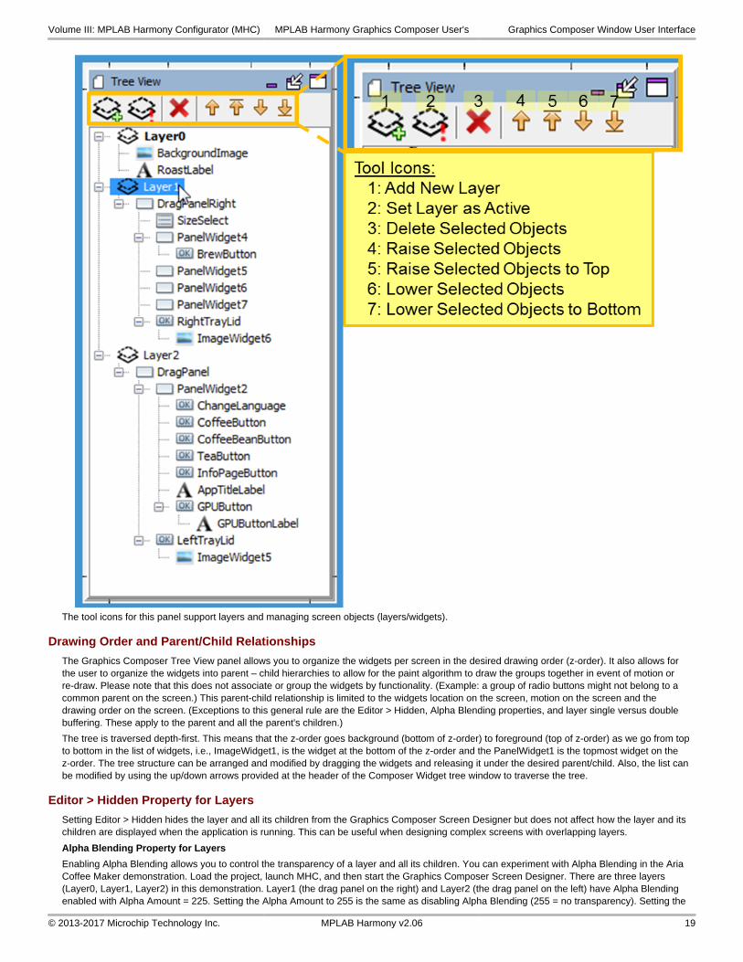
The tool icons for this panel support layers and managing screen objects (layers/widgets).
Drawing Order and Parent/Child Relationships
The Graphics Composer Tree View panel allows you to organize the widgets per screen in the desired drawing order (z-order). It also allows for the user to organize the widgets into parent – child hierarchies to allow for the paint algorithm to draw the groups together in event of motion or re-draw. Please note that this does not associate or group the widgets by functionality. (Example: a group of radio buttons might not belong to a common parent on the screen.) This parent-child relationship is limited to the widgets location on the screen, motion on the screen and the drawing order on the screen. (Exceptions to this general rule are the Editor > Hidden, Alpha Blending properties, and layer single versus double buffering. These apply to the parent and all the parent's children.)
The tree is traversed depth-first. This means that the z-order goes background (bottom of z-order) to foreground (top of z-order) as we go from top to bottom in the list of widgets, i.e., ImageWidget1, is the widget at the bottom of the z-order and the PanelWidget1 is the topmost widget on the z-order. The tree structure can be arranged and modified by dragging the widgets and releasing it under the desired parent/child. Also, the list can be modified by using the up/down arrows provided at the header of the Composer Widget tree window to traverse the tree.
Editor > Hidden Property for Layers
Setting Editor > Hidden hides the layer and all its children from the Graphics Composer Screen Designer but does not affect how the layer and its children are displayed when the application is running. This can be useful when designing complex screens with overlapping layers.
Alpha Blending Property for Layers
Enabling Alpha Blending allows you to control the transparency of a layer and all its children. You can experiment with Alpha Blending in the Aria Coffee Maker demonstration. Load the project, launch MHC, and then start the Graphics Composer Screen Designer. There are three layers (Layer0, Layer1, Layer2) in this demonstration. Layer1 (the drag panel on the right) and Layer2 (the drag panel on the left) have Alpha Blending enabled with Alpha Amount = 225. Setting the Alpha Amount to 255 is the same as disabling Alpha Blending (255 = no transparency). Setting the
Volume III: MPLAB Harmony Configurator (MHC) MPLAB Harmony Graphics Composer User's Graphics Composer Window User Interface
© 2013-2017 Microchip Technology Inc. MPLAB Harmony v2.06 19

Alpha Amount to 0 makes the layer invisible (0 = full transparency, i.e., invisible).
The following figure shows the main screen with Alpha Blending = 225.
The following figure shows the main screen with Layer 2’s Alpha Blending = 255.
Double Buffering for Layers
Graphics double buffering for the LCC driver is enabled in the Display Manager’s Display Setting screen when the application is changed to use external memory instead of internal. Click Configure to bring up the LCC Driver Configuration Settings Window.
Volume III: MPLAB Harmony Configurator (MHC) MPLAB Harmony Graphics Composer User's Graphics Composer Window User Interface
© 2013-2017 Microchip Technology Inc. MPLAB Harmony v2.06 20

Configure the memory according to whether double buffering is to be enabled for the display’s layer or layers.
Volume III: MPLAB Harmony Configurator (MHC) MPLAB Harmony Graphics Composer User's Graphics Composer Window User Interface
© 2013-2017 Microchip Technology Inc. MPLAB Harmony v2.06 21

Increasing the Buffer Count of a layer from 1 to 2 enables double buffering for the layer and all its child widgets. To prevent tearing on the display when switching from one buffer to the other, VSync Enabled should also be selected.
Screens Panel
Application screens are managed using the Screens Panel.
Description
The Screens panel tab manages all the application’s screens, as shown in the following figure.
Volume III: MPLAB Harmony Configurator (MHC) MPLAB Harmony Graphics Composer User's Graphics Composer Window User Interface
© 2013-2017 Microchip Technology Inc. MPLAB Harmony v2.06 22

Note:These screens are examples from the Aria Showcase demonstration project
The underlined screen name identifies the primary screen (in this case, SplashScreen.) The bold screen name identifies the currently active screen in the Graphics Composer Screen Designer window (in this case MainMenu.) The blue background identifies the selected screen (i.e., the screen that is manipulated by the tool icons), in this case FirstScreen.
Window Toolbar
The window’s tools icons support:
1. Create New Screen – Create a new screen. You will be prompted for the name of the new screen, which will appear at the bottom of the Screens list.
2. Delete Screen – Delete the selected screen. This removes the selected screen from the application.
3. Set as Primary Screen – Sets the selected screen as the default screen displayed by the application at boot-up.
4. Make Screen Active – This selected screen is displayed in the Screen Designer panel. You can also select the active screen by clicking on the screen’s tab at the bottom of the Screen Designer panel.
5. Move Screen Up in Order – Moves the selected screen up in the list of screens, which is useful in organizing a large list of screens, but has no other significance.
6. Move Screen Down in Order – Moves the selected screen down in the list of screens.
Useful in organizing a large list of screens, but has no other significance.
Window Columns
The Generate check box is used in selecting those screens that will be included in the application when MPLAB Harmony Configurator (MHC) generates/regenerates the application. (This, along with the Enabled check box for languages, allows customization of the application’s build to support different end uses from the same project.) The Visible check box can be cleared to hide a screen from the sub-tabs located at the bottom of the Screen Designer. The View column provides a mouse-over preview of the screen.
Volume III: MPLAB Harmony Configurator (MHC) MPLAB Harmony Graphics Composer User's Graphics Composer Window User Interface
© 2013-2017 Microchip Technology Inc. MPLAB Harmony v2.06 23

Schemes Panel
Application color schemes are managed using the Schemes Panel.
Description
Color schemes for the application’s graphics are managed using the Schemes sub-tab.
Editing a Scheme
To edit an existing scheme, select the scheme from the list and click Edit.
The Scheme Editor dialog appears, which allows you to change the colors associated with this display scheme.
Scheme Editor
The Scheme Editor window supports editing the individual colors of a color scheme. Clicking the ellipsis ( … ) opens the Color Picker window.
Volume III: MPLAB Harmony Configurator (MHC) MPLAB Harmony Graphics Composer User's Graphics Composer Window User Interface
© 2013-2017 Microchip Technology Inc. MPLAB Harmony v2.06 24

Color Picker
The Color Picker window allows the user to easily select a color by providing a color wheel, brightness gauge, and some common predefined color choices. The user can change the individual color values or input a number in Hexadecimal format. The end result is displayed in the top right corner.
Volume III: MPLAB Harmony Configurator (MHC) MPLAB Harmony Graphics Composer User's Graphics Composer Window User Interface
© 2013-2017 Microchip Technology Inc. MPLAB Harmony v2.06 25

Options
Provides information on the defeatured Options window.
Description
In v2.03b, MPLAB Harmony Graphics Composer user interface provided a third window along with Screens and Schemes, named Options. Beginning with v2.04b of MPLAB Harmony, these options are now located within the File > Settings menu (see Menus for details).
Widget Tool Box Panel
The Widget Tool Box panel is the interface by which users add widgets into the screen representation.
Description
All the available graphics widgets are shown in the Widget Tool Box:
MPLAB Harmony Graphics Composer provides automatic code optimization by keeping track of the widgets that are currently being used. When MHC generates or regenerates the application, only the Graphics Library code necessary for your design is included in the project.
There are two primary methods for creating new widget objects: clicking and dragging. To add a new layer to a screen use the Screens sub-tab.
Click Method
The following actions can be performed by using the Click method:
• Clicking an item selects it as active. Users can then move the cursor into the screen window and view a representation of the object about to be added.
• Left-clicking confirms the placement of the new object
• Right-clicking aborts object creation
• Clicking the active item again deactivates it
Volume III: MPLAB Harmony Configurator (MHC) MPLAB Harmony Graphics Composer User's Graphics Composer Window User Interface
© 2013-2017 Microchip Technology Inc. MPLAB Harmony v2.06 26

Drag Method
Dragging and dropping a tool item into the Screen Designer Window creates a new instance of an object. When dragging a tool item, releasing the cursor outside of the Screen Designer Window cancels the drag operation.
Widget List
The Graphics Composer Tool Box is the interface by which users add widgets into the screen representation.
Widget Example Application
Arc aria_showcase_reloaded
Bar Graph aria_showcase_reloaded
Button aria_adventure and many others, including aria_quickstart
Check Box aria_showcase_reloaded, aria_video_player
Circle None
Circular Gauge aria_showcase_reloaded, aria_oven_controller
Circular Slider aria_showcase_reloaded
Draw Surface None
Gradient aria_showcase (background)
Group Box aria_video_player
Image aria_quickstart
Image Plus aria_oven_controller
Image Sequence aria_showcase, aria_basic_motion
Key Pad aria_showcase, aria_touchadc_calibrate
Volume III: MPLAB Harmony Configurator (MHC) MPLAB Harmony Graphics Composer User's Graphics Composer Window User Interface
© 2013-2017 Microchip Technology Inc. MPLAB Harmony v2.06 27

Label aria_quickstart
Line aria_video_player, ./aps/examples/3rd_party_display
Line Graph aria_showcase_reloaded
List Wheel aria_showcase
List aria_video_player
Panel aria_video_player
Pie Chart aria_showcase_reloaded
Progress Bar aria_flash
Radial Menu aria_radial_menu, aria_showcase_reloaded
Radio Button aria_showcase
Rectangle aria_benchmark
Scroll Bar None
Slider aria_video_player
Text Field aria_showcase
Touch Test aria_showcase, aria_touchadc_calibrate, ./apps/examples/3rd_party_display
Window None
Click Method
The following actions can be performed by using the Click method:
• Clicking an item selects it as active. Users can then move the cursor into the screen window and view a representation of the object about to be added.
• Left-clicking confirms the placement of the new object
• Right-clicking aborts object creation
• Clicking the active item again deactivates it.
Drag Method
Dragging and dropping a tool item into the Screen Designer Window creates a new instance of an object. When dragging a tool item, releasing the cursor outside of the Screen Designer Window cancels the drag operation.
Automatic Code Optimization
MPLAB Harmony Graphics Composer keeps track of the types of widgets that are used and updates the MHC Tree constantly to ensure that only the Graphics Library code necessary for your design is included in the project.
Widgets
Widgets can be configured by using the Properties Editor on the right side of the MHGC interface. Each widget has multiple properties to manage their appearance as well as their functioning. Most properties related to appearance are common between widgets, though some widgets require specific property entries.
Arc – A graphical object in the shape of an arc. The arc thickness can be set and filled.
Bar Graph – A graphing widget that shows data in categories using rectangular bars.
Button - A binary On and Off control with events generation for Press and Release state.
Check Box - A selection box with Checked and Unchecked states, and associated events.
Circle - A graphical object in the shape of a circle.
Circular Gauge – A circular widget that operates like a gauge, where the hand/needle position indicates a value.
Circular Slider – A circular widget that can change values based on external input like touch. The slider is filled based on the value of the widget relative to the maximum value.
Draw Surface - A container with a callback from its paint loop. a draw surface lets the application have a chance to make draw calls directly to the HAL during LibAria's paint loop.
Gradient - A draw window that can be associated with a gradient color scheme. This allows for color variation on the window.
Group Box - A container with a border and a text title. With respect to functionality, a group box is similar to a window.
Image Sequence - A special widget that allows image display on screen to be scheduled and sequenced. Select the images to be displayed, and the order for display. A timer to trigger the transitions must be created by calling the image sequence APIs to show the next image from the timer callback function.
Image - Allows an image to be displayed on screen. The size and shape of the widget decides the visible part of the image, as scaling is not enabled for images at this time.
Image Plus - Allows an image to be displayed on screen. The image can be resized (aspect ratio lock is optional). The widget can be set to accept two-finger touch input.
Volume III: MPLAB Harmony Configurator (MHC) MPLAB Harmony Graphics Composer User's Graphics Composer Window User Interface
© 2013-2017 Microchip Technology Inc. MPLAB Harmony v2.06 28

Key Pad - A key entry widget that can can be designed for the number of entries divided as specified number of rows and column entries. The widget has a key click event that can be customized.
Label - A text display widget. This does not have any input at runtime capability. A Text Field widget serves that purpose.
Line - A graphical object in the shape of a line.
Line Graph – A graphing widget that shows data in categories using points and lines.
List Wheel - Allows multiple radial selections that were usually touch-based selections and browsing.
List - Allows making lists of text and image items. The list contents, number of items, and the sequence can be managed through a List Configuration dialog box in the Properties box.
Panel - A container widget that is a simpler alternative to DrawSurface as it does not have the DrawSurface callback feature.
Pie Chart – A graphing widget that shows data entries as sectors in a circle.
Progress Bar - Displays the progress pointer for an event being monitored through the "Value Changed" event in the Properties Editor.
Radial Menu - A widget that groups any number of images into an elliptical carousel. It can configured as a touch interactive image carousel or interface menu.
Radio Button - A set of button widgets that are selected out of the group one at a time. The group is specified by the Group property in the Properties Editor.
Note:The radio buttons in the same group must have the same group number specified in their properties.
Rectangle - A graphical object in the shape of a rectangle.
Scroll Bar - Intended to be used with another relevant widget such as the List Wheel to scroll up and down. It has a callback each time the value is changed. The callback allows users to trigger actions to be handled on the scroll value change event.
Slider - Can change values with an external input such as touch. Event callbacks on value change are also available through the Properties Editor.
Text Field - Text input can be accepted into the text field from an external input or from a widget such as keypad. Event 'Text Changed' in the Properties Editor is used for accepting the input.
Touch Test - Allows tracking of touch inputs. Each new touch input is added to the list of displayed touch coordinates. The input is accepted through the 'Point Added' event callback in the Properties Editor.
Window - A container widget similar to the Panel but has the customizable title bar.
Properties Editor Panel
The properties for all layers and widgets are managed using this panel.
Description
The Properties Editor displays options for the currently-selected object (layer or widget), or the options for the active screen if no objects are selected. To edit an option: left-click the value in the right column and then change the value. Some values have an ellipsis that will provide additional options. In the previous case, the ellipsis button will display the Color Picker dialog.
Some properties, like the screen width and height, are locked and cannot be edited. Other properties offer check boxes and combo-type drop-down box choices. Some properties are grouped together like the Position and Size entries. Individual values of the group can be edited by expanding the group using the plus symbol. For example, the following figure shows properties for a Button Widget.
A new support feature is the ? icon to the right of the Scheme pull-down, which brings up an “Scheme Helper” for the widget showing how it is colored when using a Bevel border. For a more complete description of widget coloring, see Widget Colors.
Volume III: MPLAB Harmony Configurator (MHC) MPLAB Harmony Graphics Composer User's Graphics Composer Window User Interface
© 2013-2017 Microchip Technology Inc. MPLAB Harmony v2.06 29

Object Properties
Provides information on widget, layer, and screen properties.
Description
Object Properties and Event Actions
Each widget has a structured tree of properties, visible under the MPLAB Harmony Configurator window on the right of the standard window setup within MPLAB X IDE. Most widget properties have a Related Event action that can be use in an event or macro to change or set a property from the application.
Each widget has 3-4 property sets:
Editor – Controls the behavior of layers and widgets under the MPLAB Harmony Graphics Composer Suite Editor.
Property Name Type Description Related Event Actions
Locked Boolean Locks the object (widget), preventing changes by the designer. Only affects the object (widget) in the editor.
N/A
Hidden Boolean Hides the widget and its children in the designer window. Only affects the appearance of the widget in the editor.
N/A
Active Boolean For layers only. Sets the layer as active. Any objects (widgets) added to the screen will be added to this layer.
N/A
Locked to Screen Size Boolean For layers only. Locks the layer size to the size of the display’s screen.
N/A
Widget – Controls the behavior of screens, layers, and widgets on the display.
Volume III: MPLAB Harmony Configurator (MHC) MPLAB Harmony Graphics Composer User's Graphics Composer Window User Interface
© 2013-2017 Microchip Technology Inc. MPLAB Harmony v2.06 30

Property Name Type Description Related Event Actions
Name String Editable name for each object. By default, widgets are named NameWidget1, …,NameWidgetN. For example: ButtonWidget1, ButtonWidget2, … .
N/A
Position [X,Y] Pair of Integers
Location on the layer of the upper left corner of the widget or the location on the display of the upper left corner of the layer. Measured in display pixels. X is measured from left-to-right and Y is measured from up-to-down from the upper left corner of the parent object (typically a Layer or Panel).
Adjust Position, Set X Position, Set Y Position
Size [X,Y] Pair of Integers
X: Width, Y: Height of object, in display pixels. Adjust Size, Set Size, Set Width, Set Height
Enabled Boolean Is the object enabled? Disabled objects are not built into the display’s firmware.
Set Enabled
Visible Boolean Is the object visible by default? Object visibility can be manipulated in firmware using laWidget_GetVisible and laWidget_SetVisible.
Set Visible
Border Widget Border Choices are: { None | Line | Bevel }. Set Border Type
Margin Integer Four integers ([Left,Top,Right,Bottom]) defining the widget’s margins on the display, in display pixels.
Set Margins
Scheme - Color scheme assigned to the layer or widget. Blank implies the default color scheme.
Set Scheme
Background Type - Sets the background of the layer or widget. Choices are { None | Fill | Cache }. In MPLAB Harmony v2.03, this type was Boolean. Now, Off = None, On = Fill. With Fill selected, the widget's background is one solid color. With Cache selected, a copy (cache) of the framebuffer is created before the widget is drawn and this cache is used to fill the background of the widget. This supports transparent widgets in front of complex widgets, such as JPEG images. Instead of rerendering the JPEG image, it is just drawn from the cache.
Set Draw Background
Alpha Blending Boolean Is alpha blending enabled for this layer or widget and all of its children? If enabled, specify the amount of alpha blending as an 8-bit integer. Zero makes the object invisible, whereas 255 makes the background invisible.
N/A
Widget Advanced – Advanced control of layers and widgets
Optimization Sub-Property Name
Type Description Related Event Actions
Draw Once Boolean Indicates that the widget should draw once per screen Show Event. All other attempts to invalidate or paint the widget will be rejected.
N/A
Force Opaque Boolean Provides a hint to the renderer that the entire area for this widget is opaque. Useful for widgets that may use something like an opaque image to fill the entire widget rectangle despite having fill mode set to None. This can help reduce unnecessary drawing.
N/A
Local Redraw Boolean Provides a “hint” to the widget’s renderer that the widget is responsible for removing old pixel data. This can avoid unnecessary redrawing.
N/A
Important!
Use Local Redraw only if you know what you’re doing!
Widget Name (e.g., Button Check Box, Circle, etc.) – Optional properties tied to each widget. See Dedicated Widget Properties and Event Actions.
Events – Associates widget events with event call-backs. For example, you can enable and specify a button pressed event and button release event for the Button widget.
For each event you specify:
• Enabled/Disabled Check box – To enable or disable (default) the event.
Volume III: MPLAB Harmony Configurator (MHC) MPLAB Harmony Graphics Composer User's Graphics Composer Window User Interface
© 2013-2017 Microchip Technology Inc. MPLAB Harmony v2.06 31

• Event Callback – Selected from the Event Editor Action List.
There are additional Event actions that do not correspond to any specific property:
• Set Parent – Set the parent of the object, including no parent.
Dedicated Widget Properties and Event Actions
Arc Widget
Property Name
Type Description Related Event Actions
Radius Integer The outside radius of the arc. Set Radius
Start Angle Integer The starting angle of the arc in degrees. Set Start Angle
Center Angle Integer The center angle of the arc in degrees. A positive angle draws the arc counter-clockwise from the start angle. A negative angle draws clockwise.
Set Center Angle
Thickness Integer The thickness of the arc fill, measured from the radius to center. (radius – thickness) determines the inside radius.
Set Thickness
Round Edge Boolean Draws round arc edge. Set Round Edge
Bar Graph Widget
Property Name Type Description Related Event Actions
Stacked Boolean Stacks the bars for the entries in a category Set Stacked Bars
Tick Length Integer The length, in pixels, of the ticks on each axis Set Tick Length
Fill Graph Area Boolean Fills the graph area with scheme base color Fill Graph Area
Value Axis Configuration
• Maximum Value
• Minimum Value
• Tick Interval
• Subtick Interval
• Show Ticks
• Tick Position
• Show Tick Labels
• Show Subticks
• Subtick Position
• Show Gridlines
• String Set
Integer
Integer
Integer
Integer
Boolean
Enum
Boolean
Boolean
Enum
Boolean
String Asset
Configures the value (Y) axis
The maximum value of the axis
The minimum value of the axis
The intervals between major ticks
The interval between minor ticks
Show/Hide the major ticks
Position of major ticks on the value axis. Choices are: {Inside | Center | Outside}
Show/Hide the tick labels
Show/Hide the minor ticks
Position of minor ticks on the value axis. Choices are: {Inside | Center | Outside}
Show/Hide the gridlines
The string asset containing the numeric characters for the tick labels. The asset must contain the characters for numbers 0 to 9.
Set Max Value
Set Min Value
Set Tick Interval
Set Subtick Interval
Show Value Axis Ticks
Set Value Axis Ticks Position
Show Value Axis Labels
Show Value Axis Subticks
Set Value Axis Subticks Position
Show Value Axis Gridlines
Set Labels String
Category Axis Configuration
• Show Tick
• Show Category Labels
• Tick Position
Boolean
Boolean
Enum
Configures the category (X) axis
Show/Hide the ticks
Show/Hide the category labels
Position of the ticks on the category axis. Choices are: {Inside | Center | Outside}
Show Category Axis Ticks
Show Category Axis Labels
Set Category Axis Ticks Position
Category Configuration Dialog
(See Description)
The Category Configuration Dialog lets users add categories to the line graph. The following properties can be set:
• Label – String Asset. The label to show for each category
None
Data Configuration Dialog
(See Description)
The Data Configuration Dialog lets users add and configure data series to the line graph. The following properties can be set:
• Scheme – Scheme. The color scheme of the data series
• Category Values – Integer. Values in series for each category
None
Button
Property Name Type Description Related Event Actions
Toggleable Boolean Is button toggle enabled? Set Toggleable
Volume III: MPLAB Harmony Configurator (MHC) MPLAB Harmony Graphics Composer User's Graphics Composer Window User Interface
© 2013-2017 Microchip Technology Inc. MPLAB Harmony v2.06 32

Pressed Boolean If Toggleable is enabled, provide default state of the button. This can be used to see the colors of an asserted button.
Set Press State
Text String - Select widget’s text string from the Select String Dialog. Set Text
Alignment:
• Horizontal
• Vertical
- Text string alignment within the button object.
Horizontal alignment. Choices are: { Left | Center | Right }.
Vertical alignment. Choices are: { Top | Middle | Bottom }.
Set Horizontal Alignment
Set Vertical Alignment
Pressed Image - Select image used for pressed state. Default: no image. Set Pressed Image
Released Image - Select image used for pressed state. Default: no image. Set Released Image
Image Position - Position of image relative to button text. Choices are: { LeftOf | Above | RightOf | Below | Bottom }.
Set Image Position
Pressed Offset Integer Offset of button contents when pressed. In Pixels.
The X and Y position of the button contents is offset by this amount.
Set Pressed Offset
Check Box
Property Name Type Description Related Event Actions
Text String - Select widget’s text string from the Select String Dialog. Set Text
Alignment:
• Horizontal
• Vertical
- Text string alignment within the button object.
Horizontal alignment. Choices are: { Left | Center | Right }.
Vertical alignment. Choices are: { Top | Middle | Bottom }.
Set Horizontal Alignment
Set Vertical Alignment
Checked Boolean Default state of the check box. Set Check State
Unchecked Image - Select image used for widget’s unchecked state. Default: no image.
Set Unchecked Image
Checked Image - Select image used for the widget’s checked state. Default: no image.
Set Checked Image
Image Position - Position of image relative to check box text. Choices are: : { LeftOf | Above | RightOf | Below | Bottom }.
Set Image Position
Image Margin Integer Space between image and text. In Pixels. Set Image Margin
Circle
Property Name Type Description Related Event Actions
X Integer X offset of circle’s center, from widget’s upper left hand corner, in pixels.
N/A
Y Integer Y offset of circle’s center, from widget’s upper left hand corner, in pixels.
N/A
Radius Integer Circle’s radius, in pixels. Set Radius
Circular Gauge Widget
Property Name Type Description Related Event Actions
Radius Integer The outside radius of circular gauge. Set Radius
Start Angle Integer The starting angle of the circular gauge in degrees. Set Start Angle
Center Angle Integer The canter angle of the circular gauge in degrees. A positive value draws the gauge counter-clockwise. Clockwise if negative.
Set Center Angle
Start Value Integer The start value of the circular gauge. Set Start Value
End Value Integer The end value of the circular gauge. Set End Value
Value Integer The value of the circular gauge. Set Value
String Set String Asset
The string asset containing the numeric characters for the tick labels. The asset must contain the characters for numbers 0 to 9.
-
Volume III: MPLAB Harmony Configurator (MHC) MPLAB Harmony Graphics Composer User's Graphics Composer Window User Interface
© 2013-2017 Microchip Technology Inc. MPLAB Harmony v2.06 33

Major Ticks Configuration
• Ticks Visible
• Tick Length
• Tick Value
• Tick Labels Visible
Boolean
Integer
Integer
Boolean
Configures the major ticks.
Shows/Hides the major ticks.
The length of ticks in pixels.
The interval between ticks.
Shows/Hides the major tick labels.
Show/Hide Ticks
Set Tick Length
Set Tick Value
Show/Hide Tick Labels
Hand Configuration
• Hand Visible
• Hand Radius
• Center Circle Visible
• Center Circle Radius
• Center Circle Thickness
Boolean
Integer
Integer
Integer
Integer
Configures the gauge hand/needle.
Shows/Hides the gauge hand/needle.
Sets the length of the hand in pixels
Shows/Hides the hand center circle.
Sets the radius of the center circle in pixels
Sets the thickness of the center circle in pixels.
Show/Hide Hand
Set Hand Radius/Length
Show/Hide Center Circle
Set Center Circle Radius
Set Center Circle Thickness
Advanced Configuration - Additional widget configuration options for adding minor ticks, labels and arcs.
-
Minor Ticks Configuration Dialog
(See Description)
The Minor Ticks configuration lets users add minor ticks to the widget. The following properties can be set:
• Start Value – Integer. The value where the first tick starts
• End Value – Integer. The value where the last tick ends
• Interval – Integer. The interval between ticks
• Radius – The radius in pixels where the ticks will be drawn from
• Length – The length of the ticks in pixels, drawn from the radius towards the center
• Scheme – The color scheme for the ticks
None
Minor Tick Labels Configuration Dialog
(See Description)
The Minor Ticks configuration lets users add minor tick labels to the widget. The following properties can be set:
• Start Value – Integer. The value where the first tick label is drawn
• End Value – Integer. The value where the last tick ends
• Interval – Integer. The interval between ticks
• Radius – Integer. The radius, in pixels, where the tick labels will be drawn from
• Position – Enum, choices are {Outside | Inside}. Position of the label relative to the radius
• Scheme – The color scheme for the ticks
None
Arcs Configuration Dialog (See Description)
The Arcs configuration lets users draw arcs in the gauge widget. The arcs can be used to colorize regions or range of values in the gauge. The following properties can be set for each arc:
• Type – Enum, choices are {VALUE | ANGLE}. A value type arc is drawn relative to the values in the gauge. An angle type arc is draw based on the angles and is not affected by the values in the gauge.
• Start – Integer. The start value or angle of the arc
• End – Integer. The start value or angle of the arc
• Thickness – Integer. The thickness of the arc in pixels, filled inward from the radius towards the center
• Radius – Integer. The radius of the arc in pixels
• Scheme. The color scheme of the arc
None
Circular Slider Widget
Property Name Type Description Related Event Actions
Radius Integer The outside radius of circular slider. Set Radius
Start Angle Integer The start angle of the circular slider, in degrees. Set Start Angle
Start value Integer The start value of the circular slider. Set Start Value
End Value Integer The end value of the circular slider. Set End Value
Value Integer The value of the circular slider. Set Value
Volume III: MPLAB Harmony Configurator (MHC) MPLAB Harmony Graphics Composer User's Graphics Composer Window User Interface
© 2013-2017 Microchip Technology Inc. MPLAB Harmony v2.06 34

Border Circle Configuration
• Show Outside Circle
• Outside Circle Thickness
• Show Inside Circle
• Inner Circle Thickness
Boolean
Integer
Boolean
Integer
Configures the border circle.
Shows/Hides the outside circle border.
The thickness of the outside circle border in pixels.
Shows/Hides the inside circle border.
The thickness of the inside circle border in pixels.
Show/Hide Outside Border
Set Outside Border Thickness
Show/Hide Inside Border
Set Inside Border Thickness
Active Area Configuration
• Fill Active Slider Area
• Round Edges
• Active Slider Area Thickness
• Inner Circle Thickness
Boolean
Boolean
Integer
Integer
Configures the slider active area.
Fills the active slider area.
Draws a round edge for the active area.
The thickness of the slider active area in pixels.
The thickness of the inside circle border in pixels.
Show/Hide Active Arc Area
Set Round Edges
Set Active Arc Area Thickness
Show/Hide Inactive Arc Area
Button Configuration
• Show Circular Button
• Sticky Button
• Touch on Button Only
• Circular Button Radius
• Circular Button Thickness
Boolean
Boolean
Boolean
Integer
Integer
Configures the slider button.
Shows/Hides the circular slider button.
If set, the button sticks when it reaches the start/end values.
If set, the widget responds to touches within the button area only.
The radius of the circular button in pixels.
The thickness of the of the circular button border in pixels.
Show/Hide Circular Button
Set Sticky Button
None
Set Circular Button Radius
Set Circular Button Thickness
Draw Surface – No additional properties.
Gradient
Property Name Type Description Related Event Actions
Direction - Gradient draw direction. Choices are: { Right | Down | Left | Up }. Set Direction
Group Box
Property Name Type Description Related Event Actions
Text String - Select widget’s text string from the Select String Dialog. Set Text
Alignment - Text string alignment within the widget. Choices are: { Left|Center|Right }.
Set Alignment
Image Sequence
Property Name Type Description Related Event Actions
Sequence Configuration Dialog
- Specify image sequence by using the Image Sequence Configuration Dialog window.
Set Entry Image, Set Entry Horizontal Alignment, Set Entry Vertical Alignment, Set Entry Duration, Set Image Count
Starting Image Integer Selects the first image to be shown. Set Active Image
Play By Default Boolean Will image sequence play automatically? N/A
Repeat Boolean Should the image sequence repeat? Set Repeat
Additional related event actions: , Show Next, Start Playing, Stop Playing.
Image Widget
Property Name Type Description Related Event Actions
Image - Select image used. Set Image
Alignment:
• Horizontal
• Vertical
- Image alignment within the image object.
Horizontal alignment. Choices are: { Left | Center | Right }.
Vertical alignment. Choices are: { Top | Middle | Bottom }.
Set Horizontal Alignment
Set Vertical Alignment
Image Plus Widget
Volume III: MPLAB Harmony Configurator (MHC) MPLAB Harmony Graphics Composer User's Graphics Composer Window User Interface
© 2013-2017 Microchip Technology Inc. MPLAB Harmony v2.06 35

Property Name
Type Description Related Event Actions
Image - Select Image used Set Image
Resize To Fit Boolean Resize the image to fill the size of the widget area Toggles option to best fit the image to the widget area
Interactive Boolean Makes the widget interactive, allowing the image to be translated, stretched and zoomed
Toggles option to permit two-finger gestures to interact with the widget
Key Pad
Property Name Type Description Related Event Actions
Row Count Integer Number of key pad rows. None.
Column Count Integer Number of key pad columns. None.
Key Pad Configuration Dialog
(see Description) The Key Pad dialog window has the following:
• Width – Integer. Width of each key, in pixels.
• Height – Integer. Height of each key, in pixels.
• Rows – Integer. Number of key rows. A duplicate of Row Count.
• Columns – Integer. Number of key columns. A duplicate of Column Count.
None.
None.
None.
None.
- - Selecting one of the keys on the key pad diagram displays the Cell Properties for that key:
• Enabled – Boolean. Disabled cells (keys) are made invisible.
• Text String – Select key’s text string from the Select String Dialog.
• Pressed Image – Select image used for pressed state. Default: no image.
• Released Image – Select image used for released state. Default: no image.
• Image Position – Position of image relative to key text. Choices are: { LeftOf | Above | RightOf | Below | Behind }.
• Image Margin – Integer. Space between image and text. In Pixels.
• Draw Background – Boolean. Controls whether the key should fill its background rectangle.
• Editor Action – Select the generic editor action that fires when the key is clicked. Choices are: { None | Accept | Append |
• Editor Value String
Other Key Event Actions:
Set Key Enabled
Set Key Text
Set Key Pressed Image
Set Key Released Image
Set Key Image position
Set Key Image Margin
None.
Set Key Action
Set Key Value
Set Key Background Type
Label
Property Name Type Description Related Event Actions
Text String - Select widget’s text string from the Select String Dialog. Set Text
Alignment:
• Horizontal
• Vertical
- Text string alignment within the widget.
Horizontal alignment. Choices are: { Left | Center | Right }.
Vertical alignment. Choices are: { Top | Middle | Bottom }.
Set Horizontal Alignment
Set Vertical Alignment
Line
Property Name Type Description Related Event Actions
Start X Integer X start of line, in pixels, from upper left hand corner of the widget.
Set Start Point Position
Start Y Integer Y start of line, in pixels, from upper left hand corner of the widget.
Set Start Point Position
End X Integer X end of line, in pixels, from upper left hand corner of the widget. Set End Point Position.
End Y Integer Y end of line, in pixels, from upper left hand corner of the widget. Set End Point Position.
Line Graph Widget
Volume III: MPLAB Harmony Configurator (MHC) MPLAB Harmony Graphics Composer User's Graphics Composer Window User Interface
© 2013-2017 Microchip Technology Inc. MPLAB Harmony v2.06 36

Property Name Type Description Related Event Actions
Stacked Boolean Stacks the values of the entries in a category Set Stacked Points
Tick Length Integer The length of the ticks on each axis Set Tick Length
Fill Graph Area Boolean Fills the graph area with scheme base color Fill Graph Area
Fill Series Area Boolean Fills the series area with series scheme base color Fill Series Area
Value Axis Configuration
• Maximum Value
• Minimum Value
• Tick Interval
• Subtick Interval
• Show Ticks
• Tick Position
• Show Tick Labels
• Show Subticks
• Subtick Position
• Show Gridlines
• String Set
Integer
Integer
Integer
Integer
Boolean
Enum
Boolean
Boolean
Enum
Boolean
String Asset
Configures the value (Y) axis
The maximum value of the axis.
The minimum value of the axis.
The intervals between major ticks.
The interval between minor ticks.
Show/Hide the major ticks.
Position of major ticks on the value axis. Choices are: {Inside | Center | Outside}.
Show/Hide the tick labels.
Show/Hide the minor ticks.
Position of minor ticks on the value axis. Choices are: {Inside | Center | Outside}.
Show/Hide the gridlines.
The string asset containing the numeric characters for the tick labels. The asset must contain the characters for numbers 0 to 9.
Set Max Value
Set Min Value
Set Tick Interval
Set Subtick Interval
Show Value Axis Ticks
Set Value Axis Ticks Position
Show Value Axis Labels
Show Value Axis Subticks
Set Value Axis Subticks Position
Show Value Axis Gridlines
Set Labels String
Category Axis Configuration
• Show Tick
• Show Category Labels
• Tick Position
Boolean
Boolean
Enum
Configures the category (X) axis
Show/Hide the ticks
Show/Hide the category labels
Position of the ticks on the category axis. Choices are: {Inside | Center | Outside}
Show Category Axis Ticks
Show Category Axis Labels
Set Category Axis Ticks Position
Category Configuration Dialog
(See Description)
The Category Configuration Dialog lets users add categories to the line graph. The following properties can be set:
• Label – String Asset. The label to show for each category
None
Data Configuration Dialog
(See Description)
The Data Configuration Dialog lets users add and configure data series to the line graph. The following properties can be set:
• Scheme – Scheme. The color scheme of the data series
• Point Type – Enum. The point indicator to use for the series. Choices are: {None | Circle | Square}
• Fill Points – Boolean. Fills the points with series scheme foreground color
• Draw Lines – Boolean. Draws lines between points in the series using series scheme foreground color
• Category Values – Integer. Values in series for each category
None
List
Property Name Type Description Related Event Actions
Selection Mode - Select list selection mode. Choices are: {Single|Multiple|Contiguous}.
Set Selection Mode
Allow Empty Selection Boolean Is a list selection allowed to be empty? Set Allow Empty Selection
Alignment - Horizontal text alignment. Choices are: { Left | Center | Right }. Set Item Alignment
Icon Position - Position of list icons relative to list text. Choices are: { LeftOf | RightOf }.
Set Icon Position
Icon Margin - Space between icon and text, in pixels. Set Icon Margin
Volume III: MPLAB Harmony Configurator (MHC) MPLAB Harmony Graphics Composer User's Graphics Composer Window User Interface
© 2013-2017 Microchip Technology Inc. MPLAB Harmony v2.06 37

List Configuration Dialog - Defines the string and icon image for each entry in the list. Set Item Icon, Set Item Icon (actually sets item text).
Additional Related Event Actions: Deselect All Items, Insert Item, Remove All Items, Remove Item, Select All Items, Set Item Selected, Toggle Item Select(ed).
List Wheel
Property Name Type Description Related Event Actions
Alignment - Sets horizontal text alignment. Choices are: { Left | Center | Right }.
Set Item Alignment
Icon Position - Position of icons relative to text. Choices are: { LeftOf | RightOf }.
Set Icon Position
Icon Margin Integer Sets the space between icon and text. In pixels. Set Icon Margin
Selected Index Integer Selects the default list item. Set Selected Index
List Configuration Dialog - Defines the image/text for each entry in the list. Set Item Icon, Set Item Icon (actually sets item text)
Additional Related Event Actions: Append Item, Insert Item, Remove All Items, Remove Item, Select Next Item, Select Previous Item.
Panel – No additional properties.
Pie Chart Widget
Property Name
Type Description Related Event Actions
Start Angle Integer The starting angle of the pie chart in degrees. Set Start Angle
Center Angle Integer The center angle of the pie chart in degrees. A positive value draws the chart counter-clockwise. Clockwise if negative.
Set Center Angle
Labels Visible Boolean Shows/Hides the labels for each data Show/Hide Labels
Labels Offset Integer The position of the labels relative to the center of the pie chart, in pixels. Set Label Offset
String Set String Asset
The string asset containing the numeric characters for the tick labels. The asset must contain the characters for numbers 0 to 9.
Set Label String ID
Data Configuration Dialog
(See Description)
The Data Configuration Dialog lets users add data entries to the pie chart. The following properties can be set:
• Value – Integer. The value of the entry
• Radius – Integer. The radius, in pixels, of the pie for the entry
• Offset – Integer. The offset, in pixels, of the pie from the center
• Scheme – The color scheme for the ticks
None
Progress Bar
Property Name Type Description Related Event Actions
Direction - Direction of progress bar. Choices are: { Right | Down | Left | Up }.
Set Direction
Value - Default value of the progress bar. The primitives laProgressBarWidget_GetValue and laProgressBarWidget_GetValue can be used to manipulate the widget’s value during run time.
Set Value
Volume III: MPLAB Harmony Configurator (MHC) MPLAB Harmony Graphics Composer User's Graphics Composer Window User Interface
© 2013-2017 Microchip Technology Inc. MPLAB Harmony v2.06 38

Radial Menu Widget
Property Name
Type Description Related Event actions
Ellipse Visible Boolean Show the elliptical track of the widget Elliptical track gets draw in Harmony Composer simulation and at runtime.
Highlight Prominent
Boolean Highlights the prominent item when the widget rotation has completed its reset to the static, selectable position by drawing a rectangle behind the prominent item.
-
Ellipse Type Enum Selects the type of elliptical track
Default – an elliptical track that best fits the widget area based on the size of the tallest and widest images with the size scale settings factored-in.
Orbital – a “flatter” elliptical track that is best used with the Theta setting for a tilted look
Rolodex – a vertical track with Theta setting locked at 90 degrees
Locks Theta to 90 degrees when Rolodex is selected
Theta Integer The angle (in degrees) of tilt relative to the y-axis of the ellipse. The number range is 0 to 90 degrees.
This field is only valid for Default and Orbital Ellipse Type setting. It is locked at 90 when Rolodex is selected.
a Integer This is the half-length (in pixels) of the 0-180 axis of ellipse. It is auto-calculated based on the widget size, the tallest image’s height, the ellipse type and scale settings.
-
b Integer This is the half-length (in pixels) of the 90-270 axis of ellipse. It is auto-calculated based on the widget size, the widest image’s width, the ellipse type and scale settings.
-
Size Scale Configuration
• Size Scale
* Minimum Size Modifier
* Maximum Size Modifier
Enum
Integer
Integer
Off – all images displays at its original size
Gradual – images in the very back are scale to the Minimum Size Modifier setting, the scale is gradually increased, with the prominent front item scaled to the Maximum Size Modifier setting
Prominent – the image that is at the front, prominent location is scaled based on the Maximum Size Modifier, all other images are scaled to the Minimum Size Modifier setting
The value (in percent) for the widget to resize the image to. When Size Scale is set to Gradual, this value represents the lowest scale for the item in the back. When Size Scale is set to Prominent, this value represents the scaling value for every image in the widget except for the prominent item. This value is equal to or less than the Maximum Size Modifier value
The value (in percent) for the widget to resize the image to. When Size Scale is set to Gradual, this value represents the largest scale for the item in the front (prominent position). When Size Scale is set to Prominent, this value represents the scaling value for the prominent item. This value is equal to or greater than the Minimum Size Modifier value
-
-
-
Volume III: MPLAB Harmony Configurator (MHC) MPLAB Harmony Graphics Composer User's Graphics Composer Window User Interface
© 2013-2017 Microchip Technology Inc. MPLAB Harmony v2.06 39

Item List Configuration
• Total Number of Items Shown
* Total Number of Widget Items
* Widget Items Configuration Dialog
Integer
Integer
(See Description)
The number images visible on the radial menu. This number does not may be less than or equal to the total images in the widget.
The total number of images the widget contains.
The Widget Items Configuration Dialog lets users add images to the widget. The follow properties can be set:
• Image – Image Asset. The image to show for the widget item
The widget automatically space-out the images along the elliptical track base on this value.
If this number is greater than Total Number of Items Shown, some of the images will be hidden in a FIFO queue in the back
-
Touch Area Configuration
• Show Touch Area
* Touch Area X Offset
* Touch Area Y Offset
* Touch Area Width Percent
* Touch Area Height Percent
Boolean
Integer
Integer
Integer
Integer
Show visually in Harmony Graphics composer the rectangular area that permits touch interaction.
The X-coordinate in local space of the touch-allowed area for the widget. This is auto-calculated based on the Touch Area Width Percent.
The Y-coordinate in local space of the touch-allowed area for the widget. This is auto-calculated based on the Touch Area Height Percent.
The percentage of the width of the touch-allowed area as compared to the entire widget area.
The percentage of the height of the touch-allowed area as compared to the entire widget area. The default value is 50.
This setting is for preview in Harmony Graphics composer only. The touch area is not rendered at runtime.
-
-
If this value is less than 100 percent, the area is horizontally centered.
If this value is less than 100 percent, the area is defined starting from the bottom of the widget.
Radio Button
Property Name Type Description Related Event Actions
Text String - Select widget’s text string from the Select String Dialog. Set Text
Alignment:
• Horizontal
• Vertical
- Text string alignment within the widget.
Horizontal alignment. Choices are: { Left | Center | Right }.
Vertical alignment. Choices are: { Top | Middle | Bottom }.
Set Horizontal Alignment
Set Vertical Alignment
Group Integer Radio Button Group Number. Default is -1, indicating no group. Only one radio button in a group can have a default selected value of On. All others in the group are Off
N/A
Selected Boolean If selected, the button has a default value of On. All other buttons in the group have a Selected value of Off.
Select
Selected Image - Select image used for selected state. Default: no image. Set Selected Image
Unselected Image - Select image used for unselected state. Default: no image. Set Unselected Image
Image Position - Position of image relative to widget text. Choices are: { LeftOf | Above | RightOf | Below | Behind }.
Set Image Position
Image Margin - Space between radio button image and text, in pixels. Set Image Margin
Circle Button Size - The diameter of the default circle button, in pixels Set Circle Button Size
Volume III: MPLAB Harmony Configurator (MHC) MPLAB Harmony Graphics Composer User's Graphics Composer Window User Interface
© 2013-2017 Microchip Technology Inc. MPLAB Harmony v2.06 40

Rectangle
Property Name Type Description Related Event Actions
Thickness Integer Line thickness in pixels. Set Thickness
Scroll Bar
Property Name Type Description Related Event Actions
Orientation - Scroll bar orientation. Choices are: { Vertical | Horizontal }. Set Orientation
Maximum Integer Maximum scroll value (minimum = 0.) Set Maximum Value
Extent Integer Length of scroll bar slider, re scroll bar maximum value. Indicates the number of lines or size of window visible at each scroll setting.
Set Extent
Value Integer Initial scroll bar value. Set Value, Set Value Percentage
Step Size Integer Step size value of scroll bar arrow buttons. ( Min = 1, Max = 9999 ).
Set Step Size
Additional Related Event Actions: Step Backward, Step Forward
Slider
Property Name Type Description Related Event Actions
Orientation - Orientation of the slider. Choices are: { Vertical | Horizontal }. Set Orientation
Minimum - Minimum slider value. Set Minimum Value
Maximum - Maximum slider value. Set Maximum Value
Value - Initial slider value. Set Value, Set Value Percentage
Grip Size - Grip size of slider, from 10 to 9999, in pixels. Set Grip Size
Additional Related Event Actions: Step
Text Field
Property Name Type Description Related Event Actions
Text String - Select widget’s text string from the Select String Dialog. Clear Text followed by Append Text
Alignment - Horizontal alignment. Choices are: { Left | Center | Right }. Set Alignment
Cursor Enable - Boolean. Show blinking cursor while editing. Set Cursor Enabled
Cursor Delay - Cursor delay in milliseconds. From 1 to 999,999. Set Cursor Delay
Additional Related Event Actions: Accept Text, Append Text, Backspace, Clear Text, Start Editing.
Touch Test – No dedicated properties.
Window
Property Name Type Description Related Event Actions
Title String - Select widget’s title string from the Select String Dialog. Set Title
Icon Image - Select image used. Default: no image. Set Icon
Image Margin Integer Space between icon and title, in pixels. N/A
Layer Properties and Event Actions
The property list for a graphic layer is close in look and feel to that of a widget. Each Layer has three property sets: Editor (see above), Widget (see above), and Layer (see below).
Volume III: MPLAB Harmony Configurator (MHC) MPLAB Harmony Graphics Composer User's Graphics Composer Window User Interface
© 2013-2017 Microchip Technology Inc. MPLAB Harmony v2.06 41

Layer Properties
Property Name Type Description Related Event Actions
Transparency Enabled Boolean Automatically mask out pixels of with a specified color.
If enabled Specify:
N/A
Mask Color Integer Red/Green/Blue or Red/Green/Blue/Alpha color value N/A
All Input Passthrough Boolean Allow input events to pass through this layer to layers behind it. N/A
VSync Enabled Boolean Layers should swap only during vertical syncs. N/A
Buffer Count Integer Integer number of frame buffers associated with this layer,
either 1 or 2.
N/A
Buffer N - For each buffer (N= 1 or 2) you specify: -
Allocation Method - Buffer allocation method.
Choices are: { Auto | Address | Variable Name }
• Auto – Automatically allocate frame buffer space
• Address – Specify a memory address
• Variable Name – Use variable name as buffer location
N/A
Memory Address - If Address is the allocation method, specify the raw (physical) memory address as a hexadecimal number.
N/A
Variable Name String If Variable name is the allocation method,
specify the variable name as a string value.
N/A
Screen Properties and Events
The property list for a screen shares the Name and Size properties with Layers and Widgets but has these unique properties.
Screen Properties
Property Name Type Description Related Event Actions
Orientation - Display orientation: 0, 90, 180, 270 Degrees.
This can also be set using the Display Manager.
N/A
Mirrored Boolean Enables screen mirroring. N/A
Layer Swap Sync Boolean Enables that all layer buffer swapping happen at the same time, delaying lower layers until higher layers are finished drawing as well. For example, assume you make changes to layer 0 and layer 1 and you want to see those changes show up on the screen at the same time. Without this option you’d see layer 0’s changes as soon as it finishes when layer 1 has not yet started drawing. This option will hold layer 0’s swap operation until layer 1 finishes as well.
Note: Currently, this property is only supported by the CLCD Graphics Controller Driver and is ignored by all other drivers.
N/A
Persistent Boolean Indicates that the screen should not free its widgets and memory when it is hidden. This results in faster load times and persistent data, but at the cost of higher memory consumption.
N/A
Export Boolean Includes this screen the application build.
This can also be set using the Screens panel.
N/A
Primary Boolean Sets this screen as the primary screen. The primary screen is the first screen displayed when the application starts. This can also be done using the Screens Panel Generate check box.
N/A
Graphics Composer Asset Management
The Asset menu supports managing all graphical assets (memory, images, languages, fonts, strings, and binary data).
Volume III: MPLAB Harmony Configurator (MHC) MPLAB Harmony Graphics Composer User's Graphics Composer Window User Interface
© 2013-2017 Microchip Technology Inc. MPLAB Harmony v2.06 42

Memory Configuration
Provides information on configuring memory locations.
Description
The Memory Locations window is launched from the Graphics Composer’s Asset menu. Selecting Memory Locations this brings up a window with three sub-tabs (in this example, the Aria Showcase demonstration is referenced):
Window Toolbar
The window’s tools icons support:
1. Add New Memory Location – This supports multiple external memory resources.
2. Delete Selected Memory Location – Removes a previously defined memory location.
3. Rename Selected Memory Location – Renames a previously defined memory location.
4. Configure External Media Application Callback – This allow definition of media callbacks, which must be provided in the project.
Volume III: MPLAB Harmony Configurator (MHC) MPLAB Harmony Graphics Composer User's Graphics Composer Window User Interface
© 2013-2017 Microchip Technology Inc. MPLAB Harmony v2.06 43

5. Show Values as Percent – Memory utilization on the bar graph can be in bytes or as a percent of the total internal flash memory assigned to support asset storage. (That memory allocation is set using the Configuration sub-tab.)
The APIs for the external media callback functions are as follows: GFX_Result app_externalMediaOpen(GFXU_AssetHeader* asset);GFX_Result app_externalMediaRead(GFXU_ExternalAssetReader* reader, GFXU_AssetHeader* asset, void* address, uint32_t readSize, uint8_t* destBuffer, GFXU_MediaReadRequestCallback_FnPtr cb);void app_externalMediaClose(GFXU_AssetHeader* asset);
The graphics demonstration project, aria_external_resources, provides an example of how to write these callbacks. This demonstration supports three types of external memory: SQI External Memory, USB Binary, and USB with File System. Examples of these callbacks are found in the project’s app.c file. The Aria demonstration projects Aria External Resources and Aria Flash provide more details on how to use external memory to store graphics assets.
Sub-tabs
There are three sub-tabs to this window.
Summary Sub-tab
This sub-tab summarizes program flash allocations for images, strings, and fonts.
Volume III: MPLAB Harmony Configurator (MHC) MPLAB Harmony Graphics Composer User's Graphics Composer Window User Interface
© 2013-2017 Microchip Technology Inc. MPLAB Harmony v2.06 44

The memory allocation shown for “Font Glyphs” measure the space that holds all the font glyphs used by the application, either by static strings or by glyph ranges defined in support of dynamic strings. Strings are defined by arrays of pointers to glyphs, so string memory usage measures the size of these arrays, not the actual font glyphs used. (“Glyph” is defined here.)
Note:The word “glyph” comes from the Greek for “carving”, as seen in the word hieroglyph – Greek for “sacred writing”. In modern usage, a glyph is an elemental or atomic symbol representing a readable character for purposes of communicating through writing.
Configuration Sub-tab
This sub-tab specifies the intended allocation of internal (program) flash memory to graphics assets (Total Size). (The default value is 1024 bytes.) It also names the graphics assets file name (here it will be gfx_assets.c). The allocation of flash is only used to scale the Total/Used/Available bar graph at the top of the display. Under sizing or oversizing this amount does not affect how the application is built.
If your device has 1024 Kbytes (1048576 bytes) of flash, you can assign 40% to asset storage and 60% to code. In that case the “Total Size” in the above sub-tab would be set to 419430 (= 40% of 1048576).
The Calculator button can assist you in allocating internal flash. Click on it and then set the device flash capacity. Then you can apply an adjustment to that value to assign that memory to asset storage.
Example:
If the device has 2 Mbytes of internal Flash, click 2MB.
Volume III: MPLAB Harmony Configurator (MHC) MPLAB Harmony Graphics Composer User's Graphics Composer Window User Interface
© 2013-2017 Microchip Technology Inc. MPLAB Harmony v2.06 45

Then, to assign 75% of the 2 Mbytes to asset storage, click -25% to reduce the 2 MB by 25%, leaving 75%, and then click OK to finish. This will then assign 1,536,000 bytes to asset storage.
Internal (program) Flash is shared between the application’s code and asset storage. If the application code and graphics assets (fonts, strings, images) won’t fit into the available flash memory then the linker will be unable to build the application and an error will be generated in MPLAB X IDE.
The Output File Name must be compatible with the operating system hosting MPLAB X IDE. In most cases the default name (gfx_asset.c) will suffice, but this is provided for additional flexibility in building the application.
Optimization Sub-tab
The Optimization sub-tab for the Aria Quickstart demonstration is shown in the following figure.
Volume III: MPLAB Harmony Configurator (MHC) MPLAB Harmony Graphics Composer User's Graphics Composer Window User Interface
© 2013-2017 Microchip Technology Inc. MPLAB Harmony v2.06 46

The Size column shows the bytes allocated for storage in internal flash for the images, fonts, and binaries of the application.
The References column shows the number of known references for these assets by the application’s widgets. A references count of zero suggests that the asset is not used by the application, but it could also mean that the asset is only used in real-time when it is dynamically assigned to a widget by the application. Clicking the title of a column (Name, Size, or References) sorts the lists of graphics assets by that column. Clicking the same column again reverses the sort order.
The window’s tools icons support:
1. Edit Selected Asset – This brings up the edit dialog for the image, font, or binary chosen
2. Delete Selected Assets – Removes the selected assets
3. Move Selected Assets – Move assets from one location to another. This is useful for moving assets to/from internal memory from/to external memory.
4. Show Only Images – Show image assets toggle on/off
5. Show Only Fonts – Show font assets toggle on/off
6. Show Only Binaries – Show binary assets toggle on/off
DDR Organizer
The DDR Organizer tool supports managing buffers, raw images, and other memory resources in the DDR memory of DA devices and only DDR-enabled DA devices. This tool also requires that the DA’s built-in 2D graphics processor be enabled. Under Harmony Framework Configuration > Graphics Stack > Graphics Processor, select the NANO 2D processor:
The DDR Organizer tool is launched from the Assets Management pull-down menu:
Volume III: MPLAB Harmony Configurator (MHC) MPLAB Harmony Graphics Composer User's Graphics Composer Window User Interface
© 2013-2017 Microchip Technology Inc. MPLAB Harmony v2.06 47

The following window will appear if the tool has not been used before for the active project target configuration:
Select the memory profile that corresponds to the target DDR-enabled DA device:
Then select the Load Button to load that memory configuration into the tool.
When Preprocessing is enabled for an image under the Image Assets tool:
Volume III: MPLAB Harmony Configurator (MHC) MPLAB Harmony Graphics Composer User's Graphics Composer Window User Interface
© 2013-2017 Microchip Technology Inc. MPLAB Harmony v2.06 48

An entry for the image appears in the DDR Organizer window:
When the memory profile is loaded, the tool automatically reserves DDR memory for the GLCD Frame Buffers sufficient for three double-buffered layers, allocating 32 bits (4 bytes) for RGBA_8888 format for each pixel. This provides 384,000 pixels (800x480) per frame buffer.
The tool icons support adding non-image memory allocations to the DDR memory map. To add or remove the memory allocation belonging to an image, the Preprocessing enabled property for that image is enabled/disabled using the Image Asset tool.
Image Assets
Provides information on the Image Assets features.
Description
The Image Assets window is launched from the Graphics Composer’s Asset menu.
The Image Assets window lets you import images, select different image formats/color modes for each image, select compression methods (for example, RLE) for each image, and displays the memory footprint of each. Images can be imported as a BMP, GIF, JPEG, and PNG (but not TIFF). Images can be stored as Raw (BMP, GIF), JPEG, and PNG.
Note:MHGC does not support image motion that can be found in GIF (.gif) files. GIF images are stored in the raw image format, meaning that there is no image header information stored with the image.
Volume III: MPLAB Harmony Configurator (MHC) MPLAB Harmony Graphics Composer User's Graphics Composer Window User Interface
© 2013-2017 Microchip Technology Inc. MPLAB Harmony v2.06 49

When an image is imported into MGHC, the Graphics Asset Converter (GAC) stores the input format and color mode along with any relevant header data. The image’s pixel data is then promoted from its native format into a Java Image using 32 bits/pixel (8 bits for each color, RGB, and 8 bits for Alpha Blending). If the image contains Alpha Blending then this information is stored in the “A” of RGBA, otherwise the “A” is set to maximum opacity. When the application is built each image is stored in the image format and color mode selected. Images displayed in the Screen Designer are converted from Java Image format into the format/color mode selected so that the Screen Designer accurately represents what the application will show when running.
The images are decoded on the fly by the graphics library and rendered on the screen. This provides the designer with considerable flexibility to import using one format and store resources using another format, thus exploring and maximizing the best memory utilization for their application and hardware. This supports trading a smaller memory footprint at the cost of additional processing (for static or drawn-once) or reducing processing at the cost of a larger memory footprint (dynamic or drawn many times).
The following figure shows the Image Assets window for the Aria Quickstart demonstration.
Window Toolbar
There are five icons on the toolbar below the Images tab:
1. Add Image Asset – Brings up “Import Image File” dialog window to select image file to add to the graphics application.
2. Replace Existing Image with New Image File – Brings up the same “Import Image File” dialog but instead of creating a new image, the file’s content replaces the currently selected image.
3. Rename Selected Image – Renames the selected image.
4. Create New Virtual Folder – Creates a new virtual folder, allowing you to organize images in a hierarchy.
5. Delete Selected Images – removes the selected images from the application.
Selecting the Add Image Asset or Replace Existing Image icon opens the Import Image File dialog that can be used to select and import an image.
After selecting the file and clicking Open, the Image Assets window opens.
Volume III: MPLAB Harmony Configurator (MHC) MPLAB Harmony Graphics Composer User's Graphics Composer Window User Interface
© 2013-2017 Microchip Technology Inc. MPLAB Harmony v2.06 50

The size of the memory used for this image based on its color mode, format, compression, and global palette usage is shown by Size (bytes). See Image Format Options below for more details.
The File Name of the original source file is also shown, but may be blank if the image was imported under MPLAB Harmony v2.03b or earlier. The format and color mode of the stored image can be changed to reduce the image’s memory footprint. (If using an LCC controller, you can also turn on the Global Palette, replacing each pixel in the image with just an 8 bit LUT index.)
The three internal image formats are:
• Raw – binary bit map with no associated header information. GIF and BMP images are imported into this format.
• PNG – lossless image format with compression, 24 bits/pixel (RBG_888) or 32bits/pixel (RGBA_8888). A good choice for line drawings, text, and icons.
• JPEG (JPG) – loss compressed format, uses much less storage than the equivalent bit map (raw). Good for photos and realistic images.
New to Harmony 2.06 is the option to preprocess an image into raw pixels at boot-up, which will greatly improve image draw/redraw times though the use of the high performance 2-D graphics processing unit (GPU) that is available on DDR-enabled DA devices. Be sure that this feature is enabled in MPLAB Harmony Configurator. Under Harmony Framework Configuration > Graphics Stack > Graphics Processor, select the NANO 2D processor:
Note:Do not enable image preprocessing except on DDR-enabled DA devices with the NANO 2D graphics processor enabled. To do so will produce an application that builds but does not run.
With Preprocessing of the image enabled, additional options become available:
• DDR Memory allocation for the image is automatically handled when the Managed option is selected
• The Output Mode should be selected to match the GLCD’s color mode, typically RGBA_8888
• The Padding option expands the image size to the nearest power of two. For example, a 480x212 image would be increased to 512x256 pixels.
• The expected size of the preprocessed image in DDR memory is shown in the Expected Size entry
For more information on how images are stored within DDR memory, see the section on the Asset Management DDR Memory tool above.
Volume III: MPLAB Harmony Configurator (MHC) MPLAB Harmony Graphics Composer User's Graphics Composer Window User Interface
© 2013-2017 Microchip Technology Inc. MPLAB Harmony v2.06 51

The Image Assets window supports resizing, cropping, or resetting an image:
• Resize – Brings up a dialog window to change the pixel dimensions of the image. The image is interpolated from the original pixel array into the new pixel array.
• Crop – Places a cropping rectangle on the image. Click and drag a rectangle across the image to select the new image. Then click Ok to crop the image.
• Reset – Allows undoing of a resize or crop. The original image is always stored in the project, so a Reset is always available to return the image to its original state.
Original images are retained by MHGC by the superset Java Image format. So an image crop will change how the image is stored in the application but not how it is stored in MHGC. Reset will always restore the image back to the original pixels. (Reset is not an “undo”.)
Example Images
Example images are available from many sites on the internet. One of the best sites is found at the USC-SIPI Image Database (http://sipi.usc.edu/database/). There are many canonical test images, such as Lena, The Mandrill (Baboon), and other favorites, all in the TIFF
Volume III: MPLAB Harmony Configurator (MHC) MPLAB Harmony Graphics Composer User's Graphics Composer Window User Interface
© 2013-2017 Microchip Technology Inc. MPLAB Harmony v2.06 52

format. The TIFF format is not supported by the Graphics Composer, but you can easily convert from TIFF to BMP, GIF, JPEG, or PNG using the export feature found in the GNU Image Manipulation Program (GIMP), which is available for free download at: https://www.gimp.org. GIMP also allows you to change the pixel size of these images, usually 512x512, to something that will fit on the MEB II display (either 256x256 or smaller).
The following figure shows the Graphics Composer Screen Designer for the pic32mz_da_sk_meb2 configuration of the Aria Quick Start project after adding three images.
The following figure shows the Optimization Tab after adding these images.
Selecting the Baboon_GIF image and the Edit Selected Asset icon ( ) opens an Image Assets window, as shown in the following figure.
Volume III: MPLAB Harmony Configurator (MHC) MPLAB Harmony Graphics Composer User's Graphics Composer Window User Interface
© 2013-2017 Microchip Technology Inc. MPLAB Harmony v2.06 53

Because this image had only 253 unique pixel colors (Unique Pixel Count = 253) the Enable Palette option was automatically enabled. This feature, which works on an image by image basis, is separate from enabling a Global Palette. The image is stored using 8 bits of indexing into an image-specific lookup table (LUT). If the image has more than 256 unique colors then the Enable Palette option is not available and is not shown.
Image Format Options
Raw Format Images
Raw format images have the following options:
Regardless of the Color Mode of the imported the image, the stored image can be stored in a different color mode. For example, a JPEG image could be in 24 bits/pixel RGB format but stored in the application using RGB_565 or even RBG_332 to save space. The Project Color Mode (set through the File > Settings menu) is different from the Color Mode of images. This is determined by the capabilities of the projects graphics controller. The graphics library converts images from the stored color mode to the project’s color mode before output.
If the image has 256 or less unique pixel colors an option to Enable Palette is set by default. If the image has more than 256 unique colors this option is not displayed. This replaces the palette pixels with 8-bit indices into the image’s palette look up table (LUT). NOTE: Enabling the Global Palette disables this for all images and all image pixels are replaced by 8-bit indices into the global palette LUT.
The Compression Mode for a raw format image is either None (no compression) or RLE for run-length encoding.
Image masking is a form of cheap blending. For example, given the following image, you may want to show the image without having to match the lime green background. With image masking you can specify that the lime green color as the “mask color”, causing it to be ignored when drawing this image. The rasterizer will simply match a pixel to be drawn with the mask. If they match, the pixel is not rendered.
Volume III: MPLAB Harmony Configurator (MHC) MPLAB Harmony Graphics Composer User's Graphics Composer Window User Interface
© 2013-2017 Microchip Technology Inc. MPLAB Harmony v2.06 54

PNG Format Images
For PNG format images you can change the image format and the image color mode:
JPEG Format Images
For JPEG format images you can change from JPEG format to Raw or PNG:
Once changed from JPEG into another format, the new format will have other options.
Managing Complex Designs
The Image assets tool lists the images in the order of their creation. In a future version of MPLAB Harmony this will be sortable by image name. For now, it is recommended that you use the Memory Locations asset tool, and use the Optimization sub-tab instead to manage a complex set of images. The Optimization sub-tab allows you to sort graphics assets (fonts, images, binaries) by Name, Size, and number of widget References. This makes it much easier to find and edit an image by its name rather than order of creation.
Font Assets
Provides information on the Font Assets features.
Description
The Font Assets window is launched from the Graphics Composer’s Asset menu.
Note:There are three dimensions to text support: Languages, Fonts, and Strings. Language “ID” strings are identified when an application supports more than one language. (In the case of single language support, the language default is provided.) Fonts are imported and organized using the Font Assets window. Strings are defined by a string name, and this name is used by widgets to reference the string. For each string and each language supported the glyphs are defined to spell out the string’s text and the font is chosen for that text.
• Languages are managed within the String Table Configuration window
• Fonts are managed within the Font Assets window (this topic)
• Strings are managed within the String Assets window
The following figure shows the Font Assets window from the Aria Coffee Maker demonstration.
Volume III: MPLAB Harmony Configurator (MHC) MPLAB Harmony Graphics Composer User's Graphics Composer Window User Interface
© 2013-2017 Microchip Technology Inc. MPLAB Harmony v2.06 55

The Size (bytes): for a Font asset shows how much memory is needed to store all the glyphs used by the application from this font. For static strings MHGC determines which glyphs are used by the application’s pre-defined strings and builds these glyphs into the application. For dynamic strings (i.e. strings created during run time) ranges of glyphs are selected by the designer and these ranges are also included in the application by MHGC. The memory needed to store all these glyphs is shown by Size (bytes): .
Window Toolbar
There are five icons on the toolbar below the Images tab:
1. Add Font From File – Adds a font asset from a file.
Volume III: MPLAB Harmony Configurator (MHC) MPLAB Harmony Graphics Composer User's Graphics Composer Window User Interface
© 2013-2017 Microchip Technology Inc. MPLAB Harmony v2.06 56

2. Add Installed Font – Add a font installed on your computer.
3. Replace Existing Font Data with New Source Font – Both Add Font From File and Add Installed Font create a new font asset. This icon allows you to update an existing font asset, importing from a file or using a font installed on your computer.
4. Rename Selected Font – Renames an existing font asset. In the example above, the Arial font was installed twice, first as a 16 point font and second as a 12 point font. If added to the fonts assets in this order, the 12 point font will have the name Arial_1. This font asset was renamed to Arial_Small using this tool.
Volume III: MPLAB Harmony Configurator (MHC) MPLAB Harmony Graphics Composer User's Graphics Composer Window User Interface
© 2013-2017 Microchip Technology Inc. MPLAB Harmony v2.06 57

5. Delete Selected Fonts – Removes selected font assets from the application.
Sub-tabs
There are three sub-tabs to this window.
Style Sub-tab
The Size (bytes): shown represents the memory needed to store all the font’s glyphs. The application only stores the glyphs that are used by static (build-time) strings and by predefined glyph ranges to support dynamic (run-time) strings.
The choices for Memory Location must be defined before the font can be assigned. Go to the Memory Configuration window to add a new location before using it in this sub-tab.
Each font asset consists of a font, size, and some combination of the { Bold, Italic, Anti-Aliasing } options, including selecting none of these options. If you need bold for one set of strings and italic for another, then you will need two font assets, one with Bold checked and a second with Italic checked. The same applies for font sizes. Each font size requires its own font asset. Thus if you need two sizes of Arial, with plain, bold, and italic for each size, you will need 6 separate assets (6 = 2 Sizes x 3 ).
Glyphs are normally (Anti-Aliasing off) stored as a pixel bit array, with each pixel represented by only one bit. Turning on Anti-Aliasing replaces each pixel bit with an 8-bit gray scale, thereby increasing font storage by a factor of 8!
What if a font is chosen that does not support the character types of the text used for a particular language in the application? How can you test and debug this? There a basically two ways:
• Use an external font viewer to examine if the needed glyphs exist
• Configure, build, and run the application and verify the strings are correctly rendered
If the glyphs are not available they will be rendered as rectangles ( ).
Volume III: MPLAB Harmony Configurator (MHC) MPLAB Harmony Graphics Composer User's Graphics Composer Window User Interface
© 2013-2017 Microchip Technology Inc. MPLAB Harmony v2.06 58

Strings Sub-tab
The Bound check box accomplishes the same thing as assigning a font to a text string in the Strings Assets window (Window:Strings menu). Assigning a string to a font means that the font will generate glyphs for that string. This is just another way to accomplish the binding of the string text to font.
This sub-tab is also useful in a complicated graphics design to see how many strings use a particular font. Lightly-used or unused fonts can be eliminated to free up internal Flash memory.
Glyphs Sub-tab
Note:The word “glyph” comes from the Greek for “carving”, as seen in the word hieroglyph – Greek for “sacred writing”. In modern usage a glyph is an elemental or atomic symbol representing a readable character for purposes of communicating via writing.
The Glyph sub-tab is only used when your application supports dynamic strings. For static (build-time) strings MHGC automatically determines which font glyphs are used based on the characters present in all the strings used by the application’s graphics widgets. Only these glyphs are included as part of the application’s font assets. With dynamic (i.e. run-time) strings this is not possible. This sub-tab allows you to specify which range of glyphs will be used by run-time strings. Once glyph ranges are defined, these glyphs are added to the font glyphs used by static strings.
The Create New Custom Import Range icon ( ) allows you to input a new glyph range for the font. Selecting this icon opens the Font Assets window.
Volume III: MPLAB Harmony Configurator (MHC) MPLAB Harmony Graphics Composer User's Graphics Composer Window User Interface
© 2013-2017 Microchip Technology Inc. MPLAB Harmony v2.06 59

String Table Configuration
Provides information on the String Assets features.
Description
The String Table Configuration window is launched from the Graphics Composer’s Asset menu.
Note:There are three dimensions to text support: Languages, Fonts, and Strings. Language “ID” strings are identified when an application supports more than one language. (In the case of single language support, the language default is provided.) Fonts are imported and organized using the Font Assets window. Strings are defined by a string name, and this name is used by widgets to reference the string. For each string and each language supported the glyphs are defined to spell out the string’s text and the font is chosen for that text.
• Languages are managed within the String Table Configuration window (this topic)
• Fonts are managed within the Font Assets window
• Strings are managed within the String Assets window
Within this window, the Languages supported by the application are defined and the encoding for all application glyphs selected.
The “ID” string used for each language is merely for ease of use in building the texts to be used. “English”, “American”, or any other string can be used to identity that language, as long as it is understood by the application’s creator when selecting the text to be used for that particular language. Then the application can switch to supporting one of its languages using “ID” strings defined.
Here is an example string asset definition, taken from the Aria Coffee Maker demonstration. This application supports English, French, Italian, and German. The text string “InfoText_Desc9” uses the Arial font, and text for each language is specified within the String Assets window.
Volume III: MPLAB Harmony Configurator (MHC) MPLAB Harmony Graphics Composer User's Graphics Composer Window User Interface
© 2013-2017 Microchip Technology Inc. MPLAB Harmony v2.06 60

Any number of languages can be defined as long as there is memory to store the strings needed.
The following figure shows the String Table Configuration for an application that uses English, Spanish, and Chinese.
The size of all the strings for each language is shown in the Size column. String size represents the memory allocated for glyph indices for all the strings supporting that language. A language can be enabled/disabled via the check box in the Enabled column. Disabling a language removes it from the application build but keeps it in the project.
Window Toolbar
There are three icons on the toolbar:
1. Add New Language – Adds a new Language.
2. Set Default Language – Sets the application’s default language. Note, this is different than the abc tool on the Graphics Composer Window toolbar. The abc icon sets the preview language for the Screen Designer panel only. This icon sets the language used by the application after boot-up.
3. Remove Selected Language – Removes language from the application.
Clicking Add New Language opens a new line, allowing you to select and edit the new language’s “ID” string.
Volume III: MPLAB Harmony Configurator (MHC) MPLAB Harmony Graphics Composer User's Graphics Composer Window User Interface
© 2013-2017 Microchip Technology Inc. MPLAB Harmony v2.06 61

Then, for every string defined in the application there will be a line to define the needed text, and to specify the font to be used.
If you don’t provide a value for the new language the string will be output as a null (empty string). If you don’t provide a Font selection then the string will be output as a series of blocks (?).
The Aria User Interface Library primitive, LIB_EXPORT void laContext_SetStringLanguage(uint32_t id), allows the application to switch between languages using the Language ID #defines are specified in the application’s gfx_assets.h file.
Sub-tabs
There are two sub-tabs to this window.
Language Definitions Sub-tab
This sub-tab shows the languages defined for the application. A Language can be enabled/disabled to include or exclude it from the application’s generation/regeneration under MPLAB Harmony Configurator (MHC). New languages can be added by specifying a text string for the language. With a new language, go to the String Assets window to specify the text and fonts for all defined strings.
Encoding Sub-tab
Selecting the Character Encoding Format Selection Dialog icon gives you three choices for how the characters in all strings in the graphics application are encoded:
Volume III: MPLAB Harmony Configurator (MHC) MPLAB Harmony Graphics Composer User's Graphics Composer Window User Interface
© 2013-2017 Microchip Technology Inc. MPLAB Harmony v2.06 62

The default is ASCII. It is typically the most efficient in terms of memory and processing, but it does not support as many glyphs. Chinese text should be encoded in UTF-8 or UTF-16, but Western language text can be encoded in ASCII to save memory. The trade-off between ASCII, UTF-8, and UTF-16 depends on the application. Changing from UTF-8 to UTF-16 will double the size of all strings in the application. This is because the sizes of all glyph indices double in size. (String sizes are the sizes of glyph reference indices, not the size of the particular font glyphs used to write out the string.)
The memory utilization resulting from an encoding choice can be seen in the Summary sub-tab of the Memory Configuration window.
String Assets
Provides information on the String Assets features.
Description
The String Assets window is launched from the Graphics Composer’s Asset menu.
The String Assets window supports managing the strings in the application. Strings are referenced by graphic widgets using an application-wide unique name. This unique name is built into an enumeration that the application’s C code uses. For each language supported text is defined and a font asset selected.
Note:There are three dimensions to text support: Languages, Fonts, and Strings. Language “ID” strings are identified when an application supports more than one language. (In the case of single language support, the language default is provided.) Fonts are imported and organized using the Font Assets window. Strings are defined by a string name, and this name is used by widgets to reference the string. For each string and each language supported the glyphs are defined to spell out the string’s text and the font is chosen for that text.
• Languages are managed within the String Table Configuration window
• Fonts are managed within the Font Assets window
• Strings are managed within the String Assets window (this topic)
The following figure shows an example taken from the Aria Coffee Maker demonstration. The string name, InfoText_Desc9, defines a string asset that is used by the application.
Volume III: MPLAB Harmony Configurator (MHC) MPLAB Harmony Graphics Composer User's Graphics Composer Window User Interface
© 2013-2017 Microchip Technology Inc. MPLAB Harmony v2.06 63

The Total Size in Byte: for a string asset represents the memory needed to store the glyph indices for all the text defined for that string asset. Adding more text will increase the number of glyph indices needed thus increasing the size of the string’s memory. Adding another language will do the same, since the number of glyph indices also increases. Changing the font does not increase the size of the string’s memory, but may increase the size of the font chosen if it is a “bigger” font and adds more glyphs to the new font. (By “bigger” we mean a font with more pixels, for example because it is bigger in size, or perhaps because it is anti-aliased and the original font was not.)
Note:The Reference Count shown reflects the number of build-time references to the string. Dynamic uses of a string, such as through macros or events, is not reflected in this number.
Window Toolbar
There are four icons on the toolbar:
1. Add New String – Adds a new string.
2. Rename Selected Item – Allows renaming the string.
3. Describe Selected String - Provides a Description field value for selected string.
4. Create New Virtual Folder – Creates a new virtual folder, allowing you to organize strings in a hierarchy. Here’s an example reorganization of the existing strings. Note the order of virtual folders or items in the list is strictly alphabetical. Virtual folders and string asset organization is merely for the convenience of the developer. Neither has an effect on how the application is built.
Volume III: MPLAB Harmony Configurator (MHC) MPLAB Harmony Graphics Composer User's Graphics Composer Window User Interface
© 2013-2017 Microchip Technology Inc. MPLAB Harmony v2.06 64

5. Delete Selected Items – Deletes selected strings from the application.
6. Import String Table - Imports an Excel CSV (Comma Separated Value) file to replace the current string table.
7. Export String Table - Exports the current string table as an Excel CSV (Comma Separated Value) text file.
Creating New Strings
To create a new string, click Add New String ( ).
Selecting this icon opens the Add String dialog to name the string. The text chosen for the string name should be acceptable as a C variable.
After entering the new string’s name and click Create, the following String Assets window appears.
Volume III: MPLAB Harmony Configurator (MHC) MPLAB Harmony Graphics Composer User's Graphics Composer Window User Interface
© 2013-2017 Microchip Technology Inc. MPLAB Harmony v2.06 65

In the String Assets window, there will be a line for each of the languages defined for the application. Provide the string text and font for each of the languages. An empty string will be used if the text is not provided. Not providing a font causes the string to be rendered as a string of boxes ( ).
Importing and Exporting String Tables
Importing an Excel CSV (Comma Separated Values) file replaces the existing string assets table. Exporting creates an Excel CSV file that can be imported into another project or target configuration. Exported string tables can be manipulated in Excel, even combining multiple string tables into a single string table that can then be imported.
If the string asset table contains UTF-8 then the file cannot be directly loaded into Excel. Instead, within Excel create a new sheet. Import the string table using Get Data, selecting From File, From Text, or CSV. Then in the dialog window change the File Origin to Unicode (UTF-8).
Note:Excel does not support importing UTF-16.
Binary Assets
Provides information on the Binary Assets features.
Description
The Binary Assets window is launched from the Graphics Composer’s Asset menu.
Selecting the Add Binary File icon ( opens the Import File dialog.
Volume III: MPLAB Harmony Configurator (MHC) MPLAB Harmony Graphics Composer User's Graphics Composer Window User Interface
© 2013-2017 Microchip Technology Inc. MPLAB Harmony v2.06 66
This supports any formatted binary file. Developers can then add a custom-coded decoder to support the format implied by the imported file. (A future version of the GFX library will include a bin2code utility in support of this feature.)
MHGC Tools
The Tools menu supports managing all graphics events, using a global palette, and estimating heap memory usage.
Event Manager
This section provide information on the Event Manager.
Description
The Graphics Composer Event Manager provides a GUI interface to manage all of the events associated with a graphics application. In a general sense, an event is an action or occurrence that is processed by software using an “event handler”. Button pushes or keystrokes are widely recognized and handled events. Events related to a touch screen are commonly called “gestures”. This GUI allows the assignment of actions to events associated with graphics widgets and to events outside of the graphics library. Under the Graphics Composer Event Manager tab there are two sub-tabs, one for “Events” and a second for “Macros”.
The following table summarizes the difference between "events" and "macros" and provides examples of each instance of source to destination:
Differences Between Events and Macros
Source Inside of Graphics (Destination) Outside of Graphics (Destination)
Inside of Graphics "Event"
Example: Button changes button text
"Event"
Example: Button changes MEB2 LED color
Outside of Graphics "Macro"
Example: Mounting SD card changes screen
Not supported by Event Manager Tool
“Events” under the first tab are generated from within graphics widgets and can manipulate the properties of screen widgets or set semaphores that engage with the rest of the application. “Macros” are executed outside of graphics widgets by other parts of the application. “Macros” allow the application to change widget properties or behavior.
Both “Events” and “Macros” event handlers can be built using collections of “Template” actions or using “Custom” developer-provided code. Most widget properties have an associated Template action that can be used to manipulate that property in an event handler (either “Event” or “Macro”). For more information on properties and related actions, see the discussion on the Properties Window below.
To explore these capabilities, let’s look at the Aria Quickstart project after the completion of the Adding an Event to the Aria Quickstart Demonstration Quick Start Guide.
Graphics Composer Events
The Graphics Composer Screen Designer shows that there is one layer and three widgets in this demonstration.
Volume III: MPLAB Harmony Configurator (MHC) MPLAB Harmony Graphics Composer User's Graphics Composer Window User Interface
© 2013-2017 Microchip Technology Inc. MPLAB Harmony v2.06 67

Of the three widgets shown above, only ButtonWidget1 can have events associated with it, one for button pressed and a second for button released. This can be seen in the Graphics Composer Event Manager window, which is available from the Tools menu:
The events shown under “ButtonWidget1” are mirrored in the widget’s properties. Selecting or clearing an event in one window does the same in the other window, thus enabling (selecting) or disabling (clearing) the corresponding event.
We can add a Check Box widget to the applications display and then use the Event Manager to assign actions to the widget’s events. A Check Box widget has two events, one for being “Checked” (i.e., selected) and another for being “Unchecked” (i.e., cleared). Enabling the “Checked” event then allows the selection of the action or actions for that event.
The Actions: sub-window has five tool icons for managing the actions associated with an event:
Volume III: MPLAB Harmony Configurator (MHC) MPLAB Harmony Graphics Composer User's Graphics Composer Window User Interface
© 2013-2017 Microchip Technology Inc. MPLAB Harmony v2.06 68

Clicking the Create New Action icon ( ) opens the Action Edit dialog.
If you select Custom and click Next, you will see the following dialog. Unfortunately, there is no C code error checking with this window. It just copies the code into libaria.c and libaria.h. If there is a problem with the code you will not know about it until you try to build your application. An alternative is just to type a comment such as /*My event goes here*/, generate the code, and then find out where this comment landed in the code. (Typically, inside libaria_events.c, or libaria_macros.c) You can then write the action routine from within the MPLAB X IDE editor and compile just that file to debug the code written.
If you select Template, the Action Edit dialog will update, as follows. Select ButtonWidget1.
As shown previously, you next need to select the widget that you want to manipulate with this action. Note that the event originated with CheckBoxWidget1, but the event’s action can manipulate any of the existing widgets. In this case, ButtonWidget1 has been selected. Clicking Next
Volume III: MPLAB Harmony Configurator (MHC) MPLAB Harmony Graphics Composer User's Graphics Composer Window User Interface
© 2013-2017 Microchip Technology Inc. MPLAB Harmony v2.06 69

will then bring up a list of the actions available in manipulating a button widget.
You can select the “Set Text” action, which will then change the button’s text property, followed by NEXT, which will open a dialog to select the text string for this action.
You can then select from the available (already defined) strings which text to use for the button’s text field. Press the Finish button to complete the definition of this action.
Screen Events
As shown previously, the Graphics Composer Event Manager, Events sub-tab supports screen events when the screen is visible (On Show) and hidden (On Hide). These events can define event handlers based on Template actions or Custom, user-defined code.
Widget Events
Not all widgets can generate an event. For example, a Label Widget has nothing to generate, it just sits there on the screen, labeling. Here is a list of the widgets that can generate an event:
• Button – Pressed and Released events
• Check Box – Checked and Unchecked events
• Draw Surface – Draw Notification event
• Image Sequence – Image Changed event
Volume III: MPLAB Harmony Configurator (MHC) MPLAB Harmony Graphics Composer User's Graphics Composer Window User Interface
© 2013-2017 Microchip Technology Inc. MPLAB Harmony v2.06 70

• Key Pad – Key Click event
• List Wheel – Select Item Changed event
• List – Selection Changed event
• Progress Bar – Value Changed event
• Radio Button – Selected and Deselected event
• Scroll Bar – Value Changed event
• Slider Widget – Value Changed event
• Text Field – Text Changed event
• Touch Test – Point Added event
Graphics Composer Macros
Macros implement event handlers for events that originate outside of graphics primitives such as widgets and are designed to change or manipulate widgets inside of the graphics part of an application. (Events that originate outside of graphics and don’t touch the graphics part of the application are outside of the scope of the Graphics Event Manager and are not discussed here.)
The following figure shows a simple example of a macro.
The toolbar for Macros has three icons.
Creating a new macro and selecting its actions is just like that of a widget event:
1. Create a new macro using the “Create New Macro” tool. The check box to the left of the new macro’s name enables/disables the macro. Clearing it removes the macro from the next code generation.
2. Select the new macro and edit it using the second icon (shown previously).
3. In the Actions: window, select Create New Action. An optional name can be provided in the Name: box. You can then choose to use a Template and select a predefined action or Custom to create a customized action.
4. If you chose a “Custom” action, proceed as discussed previous in Graphics Composer Events. When using templates the next step is to choose the target widget for the action. This choice is limited to those only the widgets in the currently “active” screen. If your application has multiple screens and the widget you are targeting is not part of the currently active screen you need to change the active screen.
• Changing the active screen can be done by selecting the corresponding screen tab at the bottom of the Graphics Composer Screen Designer
• Alternately, you can switch using the Graphics Composer Manager:Screens tab
Volume III: MPLAB Harmony Configurator (MHC) MPLAB Harmony Graphics Composer User's Graphics Composer Window User Interface
© 2013-2017 Microchip Technology Inc. MPLAB Harmony v2.06 71

5. After selecting the target widget for this macro, click Next button to select an action related to this widget. (Just as with template-based widget events.) The macro can contain more than one action, targeting more than one widget.
Graphics Events Test Bed
Additional examples of events and macros can be found in the MPLAB Harmony project found in ./apps/examples/events_testbed. This project is based on the Quick Start Guide “Adding an Event to the Aria Quickstart Demonstration” found in Volume 1 of MPLAB Harmony’s built-in documentation.
This project has target configurations for PIC32MZ DA and EF starter kits with the MEB2 graphics board. It demonstrates the following events/macros:
Event Testbed
Source Inside of Graphics (Destination) Outside of Graphics (Destination)
Inside of Graphics
"Event"
Button changes button text from "Make Changes. Generate. Run" to "Ouch! Ouch! Ouch!"
"Event"
Virtual Switch S1 changes MED2 LEDs D6 and D7 on/off via boolean semaphore
Outside of Graphics
"Macro"
APP_Tasks changes color scheme for Virtual LEDs D6 and D7 between LED_OFF and LED_ON
Not supported by Event Manager Tool
MEB2 S1 changes MEB2 LEDs D6 and D7
Asserting the “Make Changes. Generate. Run” button on the display changes its text to “Ouch! Ouch! Ouch!”. Pressing the MEB2’s Switch S1 changes the LED D6 and D7 on the MEB2 board as well as changing the virtual LEDs D6 and D7 on the display. Pressing the display’s virtual S1 switch does the same.
Volume III: MPLAB Harmony Configurator (MHC) MPLAB Harmony Graphics Composer User's Graphics Composer Window User Interface
© 2013-2017 Microchip Technology Inc. MPLAB Harmony v2.06 72

The application’s events are defined in libaria_events.c:
#include "gfx/libaria/libaria_events.h"
// CUSTOM CODE - DO NOT DELETE
extern bool bDisplay_S1State;
// END OF CUSTOM CODE
// ButtonWidget1 - PressedEvent
void ButtonWidget1_PressedEvent(laButtonWidget* btn)
{
// ButtonDown - Set Text - ButtonWidget1
laButtonWidget_SetText((laButtonWidget*)ButtonWidget1,
laString_CreateFromID(string_OuchOuchOuch));
}
// ButtonWidget1 - ReleasedEvent
void ButtonWidget1_ReleasedEvent(laButtonWidget* btn)
{
// ButtonUp - Set Text - ButtonWidget1
laButtonWidget_SetText((laButtonWidget*)ButtonWidget1,
laString_CreateFromID(string_Instructions));
}
// Display_S1 - PressedEvent
void Display_S1_PressedEvent(laButtonWidget* btn)
{
// CUSTOM CODE - DO NOT DELETE
bDisplay_S1State = true;
// END OF CUSTOM CODE
}
Volume III: MPLAB Harmony Configurator (MHC) MPLAB Harmony Graphics Composer User's Graphics Composer Window User Interface
© 2013-2017 Microchip Technology Inc. MPLAB Harmony v2.06 73

// Display_S1 - ReleasedEvent
void Display_S1_ReleasedEvent(laButtonWidget* btn)
{
// CUSTOM CODE - DO NOT DELETE
bDisplay_S1State = false;
// END OF CUSTOM CODE
}
The ButtonWidget1 changes the text using the laButtonWidget_SetText function. Details on how this is accomplished are discussed in the Quick Start Guide “Adding an Event to the Aria Quickstart Demonstration”.
The Display_S1 widget just sets a Boolean semaphore bDisplay_S1State. Creating the events for the Display_S1 virtual switch is easy, just enable the widget’s events in the widget’s properties:
This will create empty event handlers in libaria_events.c, which can then be modified to change the boolean semaphore bDisplay_S1State as shown above.
The application’s macros are defined in libaria_macros.c change the coloring scheme for the display’s virtual LEDs:
#include "gfx/libaria/libaria_macros.h"
void LEDsTurnOn(void)
{
if(laContext_GetActiveScreenIndex() != default_ID)
return;
// TurnOnDisplayD6 - Set Scheme - MEB2_LED_D6
laWidget_SetScheme((laWidget*)MEB2_LED_D6, &LED_ON);
// TurnOnDisplayD7 - Set Scheme - MEB2_LED_D7
laWidget_SetScheme((laWidget*)MEB2_LED_D7, &LED_ON);
}
void LEDsTurnOff(void)
{
if(laContext_GetActiveScreenIndex() != default_ID)
return;
// TurnOffDisplayD6 - Set Scheme - MEB2_LED_D6
laWidget_SetScheme((laWidget*)MEB2_LED_D6, &LED_OFF);
// TurnOffDisplayD7 - Set Scheme - MEB2_LED_D7
laWidget_SetScheme((laWidget*)MEB2_LED_D7, &LED_OFF);
Volume III: MPLAB Harmony Configurator (MHC) MPLAB Harmony Graphics Composer User's Graphics Composer Window User Interface
© 2013-2017 Microchip Technology Inc. MPLAB Harmony v2.06 74

}
The difference between the color scheme LED_OFF and LED_ON is only in the base color:
The macros LEDsTurnOn and LEDsTurnOff are called from the application’s main task loop, APP_Tasks. The work of controlling the LEDs is done in the APP_STATE_SERVICE_TASKS case.:
#include "gfx/libaria/libaria_macros.h"
bool bMEB2_S1State = false;
bool bDisplay_S1State = false;
bool bLED_State = false;
bool bLED_StateNow;
void APP_Tasks ( void )
{
/* Check the application's current state. */
switch ( appData.state )
{
/* Application's initial state. */
case APP_STATE_INIT:
{
bool appInitialized = true;
if (appInitialized)
{
appData.state = APP_STATE_SERVICE_TASKS;
}
break;
}
case APP_STATE_SERVICE_TASKS:
{
bMEB2_S1State = !BSP_SWITCH_S1StateGet(); // Closed --> grounded
bLED_StateNow = bMEB2_S1State || bDisplay_S1State;
if ( bLED_State != bLED_StateNow )
{// LED state has changed
if ( bLED_StateNow )
{
BSP_LED_D6On(); // MEB2 LED D6 On
BSP_LED_D7On(); // MEB2 LED D7 On
LEDsTurnOn(); // Turn display LEDs on
}
else
{
BSP_LED_D6Off(); // MEB2 LED D6 Off
BSP_LED_D7Off(); // MEB2 LED D7 Off
LEDsTurnOff(); // Turn display LEDs off
}//end if ( bMEB2_S1State || bDisplay_S1State )
bLED_State = bLED_StateNow; // Remember new state
}
break;
Volume III: MPLAB Harmony Configurator (MHC) MPLAB Harmony Graphics Composer User's Graphics Composer Window User Interface
© 2013-2017 Microchip Technology Inc. MPLAB Harmony v2.06 75

}
/* TODO: implement your application state machine.*/
/* The default state should never be executed. */
default:
{
/* TODO: Handle error in application's state machine. */
break;
}
}
}
Heap Estimator
Provides information on heap space allocation.
Description
Many parts of a graphics design are implemented using memory allocated from the application’s heap space. Therefore, it is important to allocate sufficient memory for the heap. This tool can estimate heap usage by the allocation based on the widgets, layers, screens, and decoders currently in the design.
When launching the tool from the Tools menu, the Heap Configuration window appears.
Clicking Calculate estimates heap usage. The following figure shows what occurs within the Aria Quickstart demonstration if the heap space is only 4096 bytes:
The Summary tab shows how the estimated heap requirements was derived by summing up all the sizes shown under the “Size (Bytes)” column.
Volume III: MPLAB Harmony Configurator (MHC) MPLAB Harmony Graphics Composer User's Graphics Composer Window User Interface
© 2013-2017 Microchip Technology Inc. MPLAB Harmony v2.06 76

Note that the largest contribution comes from the screen requiring the largest heap allocation (in this case MainMenu).
If there is insufficient memory allocated to the heap, an exclamation point ( ! ) appears in the window. If you hold your mouse pointer over this icon, the following message appears:
You can click Set MHC Heap Value to reset the heap allocation to match the estimated requirements. Selecting Add to MHC Heap Value adds the estimated heap requirements to the current heap value. (In the case above, this would change the heap allocation to 4096+10664 bytes.)
Alternately, you can set the heap allocation to a larger value by going to the MPLAB Harmony Configurator window, selecting the Options tab and setting the Heap Size within Device & Project Configuration > Project Configuration.
The Screen Details tab (from the Aria Showcase demonstration) shows screen-by-screen the heap space needed for each layer and widget on the screen selected.
Note:After you have updated the Heap Size, either using the Heap Estimator tool or by directly editing the value as shown above, you must regenerate the project using the Generate Code button. This will update the actual heap size value used in building the application.
Volume III: MPLAB Harmony Configurator (MHC) MPLAB Harmony Graphics Composer User's Graphics Composer Window User Interface
© 2013-2017 Microchip Technology Inc. MPLAB Harmony v2.06 77

Clicking the “Name” column will alphabetize the list. Clicking the “Size (Bytes)” column sorts the assets by size, with the largest at the top and smallest at the bottom.
This sub-tab can help in managing the application’s utilization of heap space. For example, excess use of cached backgrounds for widgets can become ruinously expensive, expanding the application’s need for heap well beyond the capabilities of the device. As an example, consider a screen label from the Aria Showcase demonstration.
The Heap Estimator tool shows that if caching is enabled for the label’s background, this widget requires 23699 bytes of heap to store the widget. Note that the label is twice the size of the text it contains, so one way of reducing the cost of the widget is to make it smaller, thereby reducing the number of background pixels that must be stored. If the label is resized, the heap allocation is reduced to 11688 bytes, which is a drop of appoximately 50%. Finally, if the background is changed from “Cache” to “Fill” the widget only needs 188 bytes.
The lesson learned is to use Cache as a background only for widgets where it is absolutely necessary and to make the “cached” widgets as small as possible.
Global Palette
Provides information on the Global Palette features.
Description
The Global Palette window is launched from the Graphics Composer’s Asset pull-down menu.
Using a Global Palette enables frame buffer compression for the LCC graphics controller. It creates a 256 color look up table (LUT) and then changes the entire user interface design to adhere to that LUT. Frame buffers are stored as 8 bits/pixel (bpp) indices rather than 16-32 bpp colors. The display driver performs a LUT operation to change each LUT index into a color before writing to the display/controller memory. This enables the use of double buffering, without using external memory, on devices that could not support it before. It also supports single buffering on larger displays. Of course, running the LUT requires more processing on the host. Currently only the LCC graphics controller supports this feature. The Aria demonstration Aria Basic Motion is an example of how using a Global Palette greatly improves the efficiency and capabilities of a design.
Enable the Global Palette by clicking on the Enable Global Palette check box in the window or using the File > Settings menu. the Global palette can always be disabled. MHGC will then restore the project back to its original configuration.
If the global palette is enabled you will have to change the MHC configuration of the Graphics Controller to match. For the LCC controller, enable
Volume III: MPLAB Harmony Configurator (MHC) MPLAB Harmony Graphics Composer User's Graphics Composer Window User Interface
© 2013-2017 Microchip Technology Inc. MPLAB Harmony v2.06 78

"Palette Mode". For the GLCD controller, change the Driver Settings > Fame Buffer Color Mode to "LUT8".
The results of enabling the Global Palette:
• 8bpp frame buffers. In the case of the most common demonstrations this means a 50% reduction in the size of the frame buffer.
• This also opens up the capability to support a single frame buffer for some larger displays.
What is lost by enabling the Global Palette:
• First and foremost - No Dynamic Colors. Dynamic colors are unlikely to match up with an entry in the global palette’s look-up table.
• No alpha blending capability. The level of alpha blending can be changed during run-time. (See No Dynamic Colors.)
• No JPEGs or PNGs. Again, no dynamic colors. All images in MGHC will be changed to the color mode of the project, and generated as Raw.
• No font anti-aliasing. Again, no dynamic colors. While the 8-bits/pixel for each glyph is known, the color of the text depends on the color scheme used, and color schemes can change at run time.
• Additional overhead when performing LUT (index->color) operations in the display driver.
The following figure shows the default “Global Palette” when Project Color Mode is set to RGB_888.
This default palette is good for designs that use a wide array of colors. MHGC also supports developing a custom palette by importing an image defining the palette or by analyzing the pixel colors already in use by the application’s images. The palette’s color mode is determined by the Project Color Mode, which is determined by the graphics controller.
Clicking on an entry in the palette with bring up the Color Picker dialog window, allowing you to edit the entry’s color.
Window Toolbar
There are four icons on the toolbar:
1. Import From Image File - Importing a global palette from an image file. Selecting this brings up the following warning. Images can be imported as a BMP,.GIF, JPEG, and PNG (but not TIFF).
2. Auto-Calculate Palette – Calculates a new palette using the current design. Selecting this brings up the following warning.
Volume III: MPLAB Harmony Configurator (MHC) MPLAB Harmony Graphics Composer User's Graphics Composer Window User Interface
© 2013-2017 Microchip Technology Inc. MPLAB Harmony v2.06 79

• Selecting Yes opens a status window that shows the progress made in selecting a palette of 256 colors
• This can be lengthy operation, but it will effectively generate a palette better tailored to the design. However, extreme (or rare) colors will be changed to nearby, more-plentiful colors, thereby eliminating some of the contrast in images. Whites will tend to darken and blacks lighten. This can be remedied by editing the calculated palette to whiten the whites, darken the blacks, and make other colors closer to the original. This of course may increase the posterization of the image, but that is a natural trade-off in using only 256 colors.
3. Reset to Default – This returns the Global Palette to its default values, which opens the Reset Global Palette dialog.
4. Enable Global Palette – This performs the same function as File > Settings: Using a Global Palette. Selecting this opens the Enable Global Palette Mode warning.
Volume III: MPLAB Harmony Configurator (MHC) MPLAB Harmony Graphics Composer User's Graphics Composer Window User Interface
© 2013-2017 Microchip Technology Inc. MPLAB Harmony v2.06 80

Widget Colors
Provides information on widget coloring.
Description
Widget Colors
Widget coloring can be customized by creating additional color schemes and assigning these customized schemes to a subset of the widgets uses. For example, a ButtonColorScheme could be customized and used only for Button Widgets.
To help highlight the different colors available for each widget, a “CrazyScheme”, with extreme contrast among the 16 available colors, was used as the color scheme for each widget:
Use this color scheme to help identify the relevant colors for the widgets listed below.
The left column shows the coloring assignments for a Bezel boarder. The right side shows Line/No Border color assignments.
Volume III: MPLAB Harmony Configurator (MHC) MPLAB Harmony Graphics Composer User's Graphics Composer Window User Interface
© 2013-2017 Microchip Technology Inc. MPLAB Harmony v2.06 81

Widget With Bezel Border Widget With Line or No Borders
Arc Widget:
Bar Graph:
Volume III: MPLAB Harmony Configurator (MHC) MPLAB Harmony Graphics Composer User's Graphics Composer Window User Interface
© 2013-2017 Microchip Technology Inc. MPLAB Harmony v2.06 82

Volume III: MPLAB Harmony Configurator (MHC) MPLAB Harmony Graphics Composer User's Graphics Composer Window User Interface
© 2013-2017 Microchip Technology Inc. MPLAB Harmony v2.06 83

Volume III: MPLAB Harmony Configurator (MHC) MPLAB Harmony Graphics Composer User's Graphics Composer Window User Interface
© 2013-2017 Microchip Technology Inc. MPLAB Harmony v2.06 84

Volume III: MPLAB Harmony Configurator (MHC) MPLAB Harmony Graphics Composer User's Graphics Composer Window User Interface
© 2013-2017 Microchip Technology Inc. MPLAB Harmony v2.06 85

Volume III: MPLAB Harmony Configurator (MHC) MPLAB Harmony Graphics Composer User's Graphics Composer Window User Interface
© 2013-2017 Microchip Technology Inc. MPLAB Harmony v2.06 86

Volume III: MPLAB Harmony Configurator (MHC) MPLAB Harmony Graphics Composer User's Graphics Composer Window User Interface
© 2013-2017 Microchip Technology Inc. MPLAB Harmony v2.06 87

Volume III: MPLAB Harmony Configurator (MHC) MPLAB Harmony Graphics Composer User's Graphics Composer Window User Interface
© 2013-2017 Microchip Technology Inc. MPLAB Harmony v2.06 88

Volume III: MPLAB Harmony Configurator (MHC) MPLAB Harmony Graphics Composer User's Code Generation
© 2013-2017 Microchip Technology Inc. MPLAB Harmony v2.06 89

Code Generation
This topic describes using the graphics composer to generate code.
Description
MPLAB Harmony Graphics Composer data is generated the same way as the rest of the project within MHC through the Generate button.
libaria_harmony.h/c – These files provide the interface that binds libaria to the overall MPLAB Harmony framework. They contain the implementations for the standard state management, variable storage, and initialization and tasks functions. If the touch functionality is enabled then the touch bindings are also generated in libaria_harmony.c.
libaria_init.h/c - These files contain the main initialization functions for the library state and screens. The header file contains all predefined information for the library state including screen IDs, schemes, and widget pointers. The main initialization function initializes all schemes and screens, creates all screen objects, and sets the initial state of the library context. As each screen must be capable of being created at any time, each screen has a unique create function that can be called at any time by the library. The libaria_init.c file contains these create functions.
libaria_events.h/c – The event files contain the definitions and implementations of all enabled MHGC events. Each event implementation will contain all generated actions for that event.
libaria_macros.h/c – The macro files contain the definitions and implementations of all defined MHGC screen macros. A macro is similar to an event in that it can contain actions. However, it is meant to be called from an external source such as the main application.
libaria_config.h – This file contains configuration values for the library. These are controlled through settings defined in the MHC settings tree.
gfx_display_def.c – This file contains generated definitions for enabled graphics displays.
gfx_driver_def.c – This file contains generated definitions for enabled graphics drivers.
gfx_processor_def.c – This file contains generated definitions for enabled graphics processors.
gfx_assets.h/c – These files contain generated asset data.
Advanced Topics
This section provides advanced information topics for MHGC.
Adding Third-Party Graphics Products Using the Hardware Abstsraction Layer (HAL)
This topic provides information on using the Hardware Abstraction Layer (HAL) to add third-party graphics products.
Description
The architecture of the MPLAB Harmony Graphics Stack is shown in the following diagram.
Volume III: MPLAB Harmony Configurator (MHC) MPLAB Harmony Graphics Composer User's Advanced Topics
© 2013-2017 Microchip Technology Inc. MPLAB Harmony v2.06 90

Hardware Abstraction Layer (HAL)
The HAL is a software layer that serves as a gatekeeper for all graphics controller and accelerator drivers. This layer is configured at initialization by the underlying graphics drivers and provides functionality such as buffer management, primitive shape drawing, hardware abstraction, and draw state management. This layer serves as a means of protection for the drivers, frame buffers, and draw state in order to prevent state mismanagement by the application.
Third-Party Graphics Library
The third-party graphics library can be used with the MPLAB Harmony framework to perform the graphics operations desired by the application. The third-party library has access to the HAL, which has been configured to service the frame buffer which is filled by the third-party graphics library.
The third-party graphics library can access the MPLAB Harmony framework drivers such as touch drivers, graphics controller driver, and display driver through the HAL. The draw pipeline and the user interface (UI) design files come from the third-party graphics library. The third-party graphics library needs the frame buffer location to fill the frame buffer with the pixel values. Or, in case of external controllers, it would need a function to access the controller drivers to output pixels on the display. The HAL provides the third-party graphics library with the frame buffer location or the API to communicate the pixel values to the external controllers.
The following figure from the MPLAB Harmony Configurator (MHC), shows the selections made in the Graphics Stack to enable the needed graphics display and controller features. Note that the Draw Pipeline for the MPLAB Harmony Graphics Stack has been disabled to assure that the third-party graphics alone is taking effect. The MPLAB Harmony Graphics Configurator (MHGC) is also not enabled, as the design tools from the third-party graphics library are used to generate the UI graphics. The LCDConf.c file has appropriate APIs for the third-party graphics library to communicate through the HAL with the display drivers and the framebuffer.
Example Demonstration Project
The Aria demonstration project, emwin_quickstart, has three configurations. Each configuration has an API named LCD_X_Config, which is
Volume III: MPLAB Harmony Configurator (MHC) MPLAB Harmony Graphics Composer User's Advanced Topics
© 2013-2017 Microchip Technology Inc. MPLAB Harmony v2.06 91

generated with the relevant calls for SEGGER emWin to communicate with the display driver and obtain the frame buffer location pointer to write the pixel data to it. For PIC32MZ DA and PIC32MZ EF configurations, the frame buffer pointer address is provided to SEGGER emWin by the HAL. For the S1D controller on PIC32MX devices (pic32mx_usb_sk2_s1d_pictail_wqvga), The pixel write function pointers are assigned to the appropriate S1D driver APIs, which allow SEGGER emWin to write to the display controller.
Speed and Performance of Different Image Decode Formats in MHGC
Provides information and recommendations for image decode formats.
Description
MHGC supports various image formats and the MHGC Image Assets Manager provides the ability to convert and store a source image into to the following formats
• Bitmap RAW
• Bitmap Raw Run-Length Encoded (RLE)
• JPEG
• PNG
• Predecoded RAW Bitmap in DDR (PIC32MZ DA)
The following table shows the relative rendering time and Flash memory requirements of the different image formats in the MPLAB Harmony Graphics Library. The rendering time includes decoding the image and drawing it to the screen. This information is helpful when optimizing a MPLAB Harmony graphics project for performance and/or Flash memory space. For example, as shown by the red highlighted text in the table, a 40x40 pixel 16-bit RAW image renders 2.38 times faster and uses 2.59 times more Flash space than a JPEG image.
Predecoded Images in DDR (RAW)
For PIC32MZ DA devices with DDR, the MHGC Image Asset Manager provides an option to predecode images from Flash and store them into DDR as RAW images. The GPU is used to render the decoded image from DDR to the frame buffer. This provides a faster render time than an equivalent RAW image in Flash memory, specifically for large images (up to 10 times faster for a 200x200 image). Conversely, predecoding small images 40x40 pixels or smaller in DDR may not render faster due to the additional overhead of setting up the GPU.
Recommendations:
• If there is adequate DDR memory available, consider predecoding images to DDR for best performance
• Using JPEG images and predecoding them into DDR can provide the best rendering performance and most Flash memory savings.
Note:The images are decoded from Flash to DDR memory by the Graphics Library during initialization and may introduce delay at boot-up, depending on the number and size of the images.
RAW Images
RAW images provide fast rendering time, as there is no decoding needed. However, depending on image content, it can be two times larger than a Run-Length Encoded (RLE) image and about 3 to 10 times larger than a JPEG.
Recommendation:
For small images that are to be rendered frequently, consider using a RAW image for better performance
JPEG Images
JPEG images provide the most Flash space savings, but are slower to render compared to RAW and RAW RLE.
Volume III: MPLAB Harmony Configurator (MHC) MPLAB Harmony Graphics Composer User's Advanced Topics
© 2013-2017 Microchip Technology Inc. MPLAB Harmony v2.06 92

Recommendations:
• If images are large and not used frequently, consider using the JPEG image format to save flash memory space
• If DDR memory is available, consider predecoding JPEG images in DDR for better rendering performance
Run-Length Encoded RAW Images
In terms of rendering speed and size, RAW RLE images are in between RAW and other compressed formats like JPEG or PNG. Depending on the image contents, RAW RLE can be approximately 1.5 times faster than JPEG, but could be significantly larger in size for large images. Again, depending on the image content, RAW RLE can be about half the size and performance of a RAW image.
Recommendation:
If optimizing your application for both speed and flash size consider using RAW RLE images
PNG Images
Among the image formats, PNG is slowest to render and requires more memory to decode.
Recommendations:
• Unless fine levels of alpha-blending are needed, it is better to use other image formats to achieve the best performance. Use the MHGC Asset Manager to convert the source PNG image and store it in a different image format.
• If you would like to use an image with a transparent background, it may be better to use a RAW RLE image with background color masking to achieve the same effect with better performance than a PNG. Color masking is supported in the MHGC Image Asset Manager.
Draw Pipeline Options
This section details how to use the Graphics Pipeline.
Description
The nominal rendering pipeline for an image is shown in the following figure.
The order of rendering for other widgets may differ. For example, for a colored rectangle the color mask is first checked. If the rectangle’s fill matches the mask color defined then there is nothing to draw.
Graphics Pipeline
Provides information on the graphics pipeline.
Description
Layer Clipping
In order of the processing, Layer Clipping is first applied to the image. If the image extends beyond the edges of the layer that contains it then those pixels are not drawn. Failure to clip out-of-bound pixels can cause the application to crash. The following figures shows an example of layer clipping:
Before applying layer boundaries:
Volume III: MPLAB Harmony Configurator (MHC) MPLAB Harmony Graphics Composer User's Advanced Topics
© 2013-2017 Microchip Technology Inc. MPLAB Harmony v2.06 93

After applying layer boundaries:
Rectangle Clipping
Next, the image is clipped to the boundaries of any widgets that contain it as a parent, such as a rectangle.
Before applying the clipping rectangle.:
After applying the clipping rectangle:
Volume III: MPLAB Harmony Configurator (MHC) MPLAB Harmony Graphics Composer User's Advanced Topics
© 2013-2017 Microchip Technology Inc. MPLAB Harmony v2.06 94

Color Masking of Pixels
Pixels in the image are matched to a mask color. If the colors match the pixel is discarded (not drawn). In the following example, the black border of the image is removed by defining the mask color to be black.
Before applying color mask:
After applying color mask:
Orientation and Mirroring
The logical orientation of the graphics design may not match the physical layout of the display. Pixels may need to be reoriented from logical to physical space before being rendered.
Volume III: MPLAB Harmony Configurator (MHC) MPLAB Harmony Graphics Composer User's Advanced Topics
© 2013-2017 Microchip Technology Inc. MPLAB Harmony v2.06 95

Pixels may also need to be flipped (mirrored) before being rendered.
Alpha Blending
Each pixel drawn is a composite of the image color and the background color based on the alpha blend value defined by a global alpha value, the pixels alpha value, or both.
Before alpha blending:
After alpha blending:
Volume III: MPLAB Harmony Configurator (MHC) MPLAB Harmony Graphics Composer User's Advanced Topics
© 2013-2017 Microchip Technology Inc. MPLAB Harmony v2.06 96

Color Conversion
The image color format may not be the same as the destination frame buffer. Each pixel must be converted before it is written. In the following example, the image is stored using 24 bits per pixel; however, the frame buffer uses 16 bits per pixel.
Frame Buffer Write
The final stage in rendering an image is to write each-color converted pixel to the frame buffer.
Graphics Pipeline Options
Provides information graphics pipeline options.
Description
Each stage in the graphics pipeline adds overhead to the rendering. Stages can be removed from processing using MPLAB Harmony Configurator (MHC) options for the Draw Pipeline, found by selecting MPLAB Harmony Framework Configuration > Graphics Stack.
Volume III: MPLAB Harmony Configurator (MHC) MPLAB Harmony Graphics Composer User's Advanced Topics
© 2013-2017 Microchip Technology Inc. MPLAB Harmony v2.06 97

For example, the Alpha Blending stage can be disabled if your graphics application does not use alpha blending. If the color mode of the display matches the color mode of all images you can disable Color Conversion. Disabling unneeded stages can improve performance and reduce code size.
Also, a graphics controller driver may add additional stages, or opt to bypass stages completely depending on the capabilities of the graphics hardware supported by the driver.
Improved Touch Performance with Phantom Buttons
This topic provides information on the use of phantom buttons to improve touch performance.
aria_coffeemaker Demonstration Example
Provides image examples with buttons in the aria_coffeemaker demonstration.
Description
Small buttons are hard to activate on the screen. The use of phantom (invisible) buttons can improve touch performance without increasing the size of the visible footprint of the button on the display.
The aria_coffee_maker has a sliding tray on each side of the display. Sliding a tray in, or out, is accomplished by a phantom (invisible) button. Looking at the left tray, we see the three parts of this phantom button.
1. LeftTrayLid: An invisible button widget, whose outline is shown in blue. This area is the touch field.
2. ImageWidget5: An image widget containing a hand icon, providing a visual clue as to how to manipulate the tray.
3. The Release Image and Pressed Image: These are defined as part of the button widget properties. The Pressed Image has a darker coloring than the Released Image. This difference is what shows the user that the button has been pressed.
Volume III: MPLAB Harmony Configurator (MHC) MPLAB Harmony Graphics Composer User's Advanced Topics
© 2013-2017 Microchip Technology Inc. MPLAB Harmony v2.06 98

The drawing hierarchy for this part of the design is shows that ImageWidget5 is a daughter widget to the LeftTrayLid button widget.
Examining the properties of the LeftTrayLid button widget reveals more about how this works. The following figure demonstrates these three properties.
1. The Border is defined as None.
2. Background Type is defined as None.
3. The different images used will show when the button is Pressed or Released.
Volume III: MPLAB Harmony Configurator (MHC) MPLAB Harmony Graphics Composer User's Advanced Topics
© 2013-2017 Microchip Technology Inc. MPLAB Harmony v2.06 99

By setting the border and background to None, the button is invisible. Only by providing different images for Released versus Pressed does the user know when the button has been pressed.
The actual touch region defined by the button is much larger than the images shown on the display. This extra area increases the touch response of the display.
Small Buttons Controlled by Phantom Buttons
Provides information on phantom button control of small buttons.
Description
When the border is not set to None, and the background is not set to None, the button widget provides a direct visible clue to the user when it is pressed. Which can be seen in the following figure with the button from aria_quickstart. In aria_quickstart, ButtonWidget1 has a bevel border, and a fill background.
Volume III: MPLAB Harmony Configurator (MHC) MPLAB Harmony Graphics Composer User's Advanced Topics
© 2013-2017 Microchip Technology Inc. MPLAB Harmony v2.06 100

Let’s use aria_quickstart to demonstrate how to control ButtonWidget1 using a phantom button to surround it, thereby increasing touch responsiveness.
When using a bevel border and filled background, the button provides visible feedback when it is asserted.
To use this feedback mechanism instead of images, there is a way to have a small button on the display, with a larger touch zone provided by another phantom button.
Steps:
1. Click on ButtonWidget1 in the Screen Designer panel. Go to the Properties Editor panel for the widget and uncheck the Enabled property to disable the button. Enable Toggleable so that this button will have a memory.
2. Drag a new button from the Widget Tool Box panel and center it around ButtonWidget1. In the Properties Editor panel for this new button, change the name of the widget to PhantomButton. Change the Background Type to None. Leave the Border set as Bevel for now. The following figure displays the new button in the Screen Designer panel:
Volume III: MPLAB Harmony Configurator (MHC) MPLAB Harmony Graphics Composer User's Advanced Topics
© 2013-2017 Microchip Technology Inc. MPLAB Harmony v2.06 101

The Properties Editor panel should display the following information.
3. In the Tree View panel, drag ButtonWidget1 to be a daughter widget of PhantomWidget. When PhantomWidget is moved, ButtonWidget1 will move along with the parent.
4. Click on PhantomButton again in the Screen Designer panel and move to the Properties Editor. Enable both the Pressed and Released events. Then click on the (…) icon to define the events. (See the following two steps.)
5. Defining the Pressed Event.
Click on the (…) icon. In the Event Editor, under Pressed dialog, click the New icon to define a new event. In the Action Edit Dialog that next appears, leave the selection on the template and hit the Next button. In the next window, select the target of the event. We want to change the state of ButtonWidget1, so select it and hit Next. The next dialog shows all the template actions that we can use to modify ButtonWidget1. Choose Set Pressed State and hit Next. Set the Argument to Enable Pressed. Name this event Set Press state for ButtonWidget1 then hit Finish. Leave the Event Editor by hitting Ok.
Volume III: MPLAB Harmony Configurator (MHC) MPLAB Harmony Graphics Composer User's Advanced Topics
© 2013-2017 Microchip Technology Inc. MPLAB Harmony v2.06 102

6. Defining the Released Event.
Click on the (…) icon. In the Event Editor, under Released dialog, click the New icon to define a new event. In the Action Edit Dialog that next appears, leave the selection on the template and hit the Next button. In the next window, select the target of the event. We want to change the state of ButtonWidget1, so select it and hit Next. Choose Set Pressed State and hit Next. Leave the Argument disabled. Name this event Unset Press state for ButtonWidget1 then hit Finish. Leave the Event Editor by hitting Ok.
7. Generate the application from the MPLAB Harmony Configurator main menu.
8. From the MPLAB main menu, build and run the project. To verify that ButtonWidget1 does change, click outside of the original boundaries.
9. As a final step, hide the PhantomButton by changing its border to None. Next, Generate the code again from MHC. Finally, build and run the project from MPLAB and see how much easier it is to assert ButtonWidget1 using a phantom button.
GPU Hardware Accelerated Features
This section details how to configure the GPU hardware accelerated features.
Description
On the PIC32MZ DA devices, the on-board 2D Graphics Processing Unit (GPU) peripheral allows certain features to be accelerated. These features are:
• Line draw
• Single-color rectangle fill
• Image Blit
Once configured, these features are supported by the Hardware Abstraction Layer (HAL) and can be enabled or disabled at run-time. When disabled, the HAL falls back to the software-based algorithms, and relies on the CPU to perform the features.
Configuring for GPU Hardware Acceleration
The Nano2D library, is the driver library that permits hardware acceleration via the GPU. To make sure the Nano2D library is configured as part of your application, make sure to enable this in the MPLAB Harmony Configurator (MHC) under Graphics Stack > Use Graphics Stack > Graphics Processor > Select Processor Type > NANO 2D.
Volume III: MPLAB Harmony Configurator (MHC) MPLAB Harmony Graphics Composer User's Advanced Topics
© 2013-2017 Microchip Technology Inc. MPLAB Harmony v2.06 103

Enabling/Disabling GPU Hardware Acceleration at Runtime
Once configured, the hardware acceleration via the GPU is enabled by default at launch. The hardware acceleration can subsequently be turned on or off at runtime by calling the following lines of code:
Enable acceleration:
GFX_Set(GFXF_DRAW_PIPELINE_MODE, GFX_PIPELINE_GCUGPU);
Disable acceleration:
GFX_Set(GFXF_DRAW_PIPELINE_MODE, GFX_PIPELINE_GCU);
This change takes effect immediately for subsequent draw instructions into HAL.
Line Draw and Rectangle Fill Hardware Acceleration
When the GPU hardware acceleration is enabled, line draw and rectangle fill features are automatically supported. This is supported by HAL function calls GFX_DrawLine and GFX_RectFill. The actual routing of the call between the hardware accelerated support versus the software-based algorithmic support is abstracted from the caller.
The following table displays performance improvement by comparing the frame update rate of rectangular fills of varying sizes with, and without hardware acceleration. The table shows that the higher the frame update rate, the better the performance. The measurement is performed using the entire Harmony Graphics Stack but with most Aria draw pipeline features disabled, so that the focus is on HAL performance.
Rect Fill Size No Acceleration Frame Update Frequency (Hz)
Hardware accelerated Frame Update Frequency (Hz)
Performance Improvement
60x60 101 160 58.4%
100x100 37 158 327.0%
140x140 19 157 726.3%
180x180 11 156 1318.2%
220x220 8 155 1837.5%
Volume III: MPLAB Harmony Configurator (MHC) MPLAB Harmony Graphics Composer User's Advanced Topics
© 2013-2017 Microchip Technology Inc. MPLAB Harmony v2.06 104

Note:The HAL uses a software algorithm for rectangle fill sizes below 50x50, as the CPU is able to perform the operation faster than the GPU below that size.
Image Blit Hardware Acceleration
The only way Image Blits significantly leverage hardware acceleration is via the block transfer of image data that has been preprocessed into DDR/Internal SRAM memory into frame buffer memory.
Note:The GPU is able to interpret and transfer pixel data in RGB565 or RGBA8888 format only.
The following table displays performance improvement by comparing the frame update rate of the image blit of the same 100x100 image in varying formats with, and without GPU acceleration. The table shows that the higher the frame update rate, the better the performance. There is a marked performance increase when using the preprocessing method (despite the amount of image data is doubled in RGBA8888 versus RGB565).
Image Format (100x100) No Acceleration Frame Update Frequency (Hz)
GPU Frame Update Frequency (Hz)
Performance Improvement
RGB565 raw pixels 37 60 62.1%
RGB565 with RLE compression 26 34 30.8%
JPEG (24-bit) 17 22 29.4%
PNG (32-bit) 13 15 15.4%
Preprocessed RGBA8888 raw pixels 29 161 455.2%
The GPU works best with image sizes in powers of two (such as 128x128 instead of 125x105). Images with sizes that are not a power of two may be rendered with artifacts. This is often a case-by-case situation and the way to remedy this is to pad the memory footprint up to the nearest power of two.
Prior to application use, images stored in flash storage will need to be preprocessed, converting them from the original format into a raw bitmap. There are two methods to achieve this:
1. Calling from application code: The API GFXU_Preprocess Image can be used to preprocess an image asset to a target memory location (DDR or internal SRAM) while specifying the destination color mode (RGB565 or RGBA8888). The application developer will need to manage the target memory and be careful not to stomp on other critical memory structures such as the frame buffer, or the GPU’s command buffer. Power of two padding can be enabled via the API.
2. The application developer can also use the Image Assets options within the MPLAB Harmony Graphics Composer User's Guide (MHGC) to specify that certain image assets should be preprocessed at application launch. This can be achieved by enabling image preprocessing as shown under the Preprocessing sub-section of the Image Asset window as shown in the following figure:
For more information, see Image Assets and DDR Organizer under the Graphics Composer Asset Management section above.
Volume III: MPLAB Harmony Configurator (MHC) MPLAB Harmony Graphics Composer User's Advanced Topics
© 2013-2017 Microchip Technology Inc. MPLAB Harmony v2.06 105

Image Preprocessing Memory Management
This sections describes preprocessing.
Description
Whether using internal SRAM only or DDR memory, care must be taken when allocating memory for preprocessing images. For more information, see Image Assets and DDR Organizer under the Graphics Composer Asset Management section above.
Preprocessing using DDR
For PIC32MZ DA devices with access to DDR memory, the frame buffer and the command buffer for the GPU is also located on the DDR. It is important for the application developer to select the appropriate memory location in DDR for image preprocessing without trampling on these other memory structures.
The following table specifies the available addressing region to access the DDR memory.
Device Type Address Range Begin (KSEG1) Address Range End (KSEG1)
Internal DDR (maximum size 32 MB) 0xA8000000 0xA9FFFFFF
External DDR (maximum size 128 MB) 0xA8000000 0xAFFFFFFF
At configuration time, MHGC generates the frame buffer allocation in the application’s system configuration code.
This allocation is targeting a WVGA RGBA8888 3-overlay double-buffered configuration; therefore, six buffer allocations are specified. More DDR memory can be freed up for image preprocessing using the following:
• WVGA Resolution is not required
• Enable all three overlays
• Double frame buffering
The application developer may choose to change the allocation manually in system_config.h.
The following table breaks down the allocation:
Frame Buffer Address Range Begin Address Range End
Layer0 Buffer 0 0xA8000000 0xA8176FFF
Layer0 Buffer 1 0xA8465000 0xA85DBFFF
Layer1 Buffer 0 0xA8177000 0xA82EDFFF
Layer1 Buffer 1 0xA85DC000 0xA8752FFF
Layer2 Buffer0 0xA82EE000 0xA8464FFF
Layer2 Buffer1 0xA8753000 0xA88CBFFF
For an example on using image preprocessing using DDR memory, please refer to the aria_coffee_maker application.
Internal SRAM Only
When operating with only the internal SRAM, the frame buffer can take up a significant portion of available memory. To avoid system stability issues with dynamically allocating memory for the preprocessing, the application developer may want to predetermine the memory footprint required for the image and assign the memory statically.
For an example of image preprocessing using internal SRAM, please refer to the aria_radial_menu application.
Creating a MPLAB Harmony Graphics Application Using a Third-Party Display
This demonstration provides a step-by-step example of how to create a MPLAB Harmony graphics application using a non-Microchip (third-party) display.
Description
Introduction
Creating a new MPLAB Harmony graphics application using a Microchip board and a Microchip display is very simple: A new MPLAB Harmony application is created and the Board Support Package (BSP) belonging to the hardware configuration is selected. If the project is using a third-party display then there are more steps and this tutorial will provide an example of the process.
This tutorial shows how to connect a third-party display to the PIC32MZ Embedded Connectivity with Floating Point Unit (EF) Starter Kit board (EF Starter Kit) using two Microchip Adapter boards and a custom ribbon cable. It shows how to setup the pinouts, configure graphics, and adapt an existing MPLAB Harmony capacitive touch driver to support the display board’s capacitive touch controller.
Volume III: MPLAB Harmony Configurator (MHC) MPLAB Harmony Graphics Composer User's Advanced Topics
© 2013-2017 Microchip Technology Inc. MPLAB Harmony v2.06 106

Prerequisites
Before beginning this tutorial, ensure that the MPLAB X IDE is installed along with the necessary language tools as described in Volume I: Getting Started With MPLAB Harmony > Prerequisites. In addition, ensure that MPLAB Harmony is installed on the hard drive, and that the correct MPLAB Harmony Configurator (MHC) plug-in is installed in the MPLAB X IDE.
A basic familiarity with application development under MPLAB X and MPLAB Harmony is required, including how to use MPLAB Harmony Configurator (MHC). There are introductory videos on Microchip’s YouTube channel for those who have never used MPLAB Harmony. The first video to watch is Getting Started with MPLAB Harmony. There is also a Creating Your First Project tutorial in Volume 1 of MPLAB Harmony’s documentation.
For first time users of MPLAB Harmony Graphics there is a video series on YouTube. The first video is MM MPLAB® Harmony Edition - Ep. 7 - MPLAB Harmony Graphics Composer Suite. In Volume 1 of MPLAB Harmony’s documentation there are Quick Start tutorials covering graphics, located at Quick Start Guides > Graphics and Touch Quick Start Guides.
Tutorial Resources
The folder ./apps/examples in MPLAB Harmony has a project that can be copied and used as the base of this tutorial, 3rd_party_display_start, and a project that represents the completed project from this tutorial, 3rd_party_display.
This is what you will find in the ./apps/examples folder under Harmony 2.06:
3rd_party_display
3rd_party_display_start
creating_your_first_project
peripheral
events_testbed
system
If there are difficulties then compare the completed project with the current project.
Tutorial Hardware
Of all the PIC32MZ devices available today, the PIC32MZ EF family is the best candidate for this effort. The EF family does not have on-chip graphics controller or Graphics Processing Unit (GPU), which makes it a less expensive and lower power solution for use with a display that has a built-in controller.
Mikroelektronika (Mikroe) offers a prototype display that can be used using a ribbon cable between the display and the EF host. This third party (non-Microchip) board serves as the basis for this tutorial. The ‘TFT PROTO 5" Capacitive’ display costs around 100USD and is available for order online (https://www.mikroe.com/tft-proto-5-capacitive-board). It has an 800x480 pixel WVGA display, driven by an SSD1963 graphics controller. The SSD1963 graphics controller is already supported in MPLAB Harmony. It has a Focal Tech FT5x06 capacitive touch controller. This tutorial will cover how to design the pin-out between the EF host and display board, as well as how to adapt an existing MPLAB Harmony capacitive touch driver (MTCH6303) to support the Focal Tech touch controller.
For this tutorial the following hardware will be used:
1. PIC32MZ Embedded Connectivity with Floating Point Unit (EF) Starter Kit board (Part # DM320007).
2. Starter Kit I/O Expansion Board (Part # DM320002) – this provides the 0.1” headers we need to connect up the display using a ribbon cable or 0.1" jumpers.
3. PIC32MZ Starter Kit Adaptor Board (Part # AC320006) – this provides an 168 to 132 pin adapter to adapt the 168-pin connector on the EF starter kit with the 132 pin connector on the I/O Expansion Board.
4. Mikroelektronika TFT PROTO 5" Capacitive display.
5. 40 to 50 pin ribbon cable to connect the I/O Expansion Board to the display, or a set of colored 0.1" jumpers.
Here is how the hardware is assembled:
Volume III: MPLAB Harmony Configurator (MHC) MPLAB Harmony Graphics Composer User's Advanced Topics
© 2013-2017 Microchip Technology Inc. MPLAB Harmony v2.06 107

The connectors that route signals from the EF pins to the display’s ribbon cable are:
The EF Starter Kit + 168-132 Pin Adapter + I/0 Expansion board can host any number of prototype hardware configurations. A spreadsheet has been developed that maps every pin of the EF device to a pin on the I/O Expansion board, with one final spreadsheet tab that provides the pin outs for the ribbon cable that connects the display to the I/O Expansion Board. (The spreadsheet is found in the Zip file .\apps\examples\3rd_party_display\pinouts.zip.) The picture above shows the board connectors used in getting from a pin on the EF device to a pin on the display’s ribbon connector.
This spreadsheet has the following tabs:
1. Sorted by Skit J1 Pins – This tab maps EF pins to pins on the J1 (168 pin) connector on the 168-132 pin adapter. It also maps the 168-pin J1 connecter to the J2 132-pin connecter. Pins are sorted by the pin order on the Starter Kit 168-pin J1 connector.
2. Sorted by Device Pins – A copy of the first tab, sorted by EF device pins.
3. Sorted by Adaptor J2 Pins – A copy of the first tab, sorted by the pins on the J2 132-pin adaptor.
4. PIC32 IO Expansion Pin Out – Provides the pin out of the I/O Expansion Board from the 132-pin J1 connector to the 0.1” pitch headers on the board (J10,J11).
5. End to End – maps the EF device pins to the 0.1” pitch headers on the I/O Expansion Board. This tab can be reused to map out other application pin outs.
6. Mikroe Display – Provides the pin outs for the 40-pin ribbon cable connector (CN3) on the display board.
Volume III: MPLAB Harmony Configurator (MHC) MPLAB Harmony Graphics Composer User's Advanced Topics
© 2013-2017 Microchip Technology Inc. MPLAB Harmony v2.06 108

7. End to End by Device Pins – This tab combines Tab 4 with Tab 6. It shows how to build a ribbon cable between the I/O Expansion Board and the display. On this tab the rows belonging to EF device pins that aren’t part of the ribbon cable are hidden for the sake of simplicity.
Tab 7 of the spreadsheet shows:
The ribbon cable for this project is constructed using the map from J10 Pin#/J11 Pin # to the TFT Proto 5” Pin #. For example, the first line of the Tab 7 shows that pin 7 of the J10 header on the I/O expansion board is connected to pin 18 of the display connector, thereby connecting PMPD5 (PMP data pin 5) on the device to TFT-D5 on the display.
Note: display pins with a “#” suffix indicate that the signal is active low (# = bar).
TFT-Dn display pins are part of the SSD1963 display controller’s Parallel Master Port (PMP) interface. Other TFT-* pins are part of the controller to host interface. For example, TFT-WR# is connected to the controller’s WRbar (write strobe bar) pin, which is called WR_STROBE_BAR in the MPLAB Harmony Graphical Pin Manager. (Setting up the project’s pins using the Pin Manager is discussed later in the tutorial.)
On the display connector FT5x06 capacitive touch controller pins are called CTP-*. There is an I2C clock pin (CTP-SCL), I2C data pin (CTP-SDA), an interrupt pin to alert the host of a touch event (CTP-INT#), and reset/wakeup pins (CTP-RST#/CTP-WAKE#).
Creating the Project in MPLAB and MPLAB Harmony
Getting Started
The pre-installed project, 3rd_party_display_start can be used as a basis for the work discussed in this tutorial. Be sure to copy this project to a place in the MPLAB Harmony directory hierarchy that is just as deep. If this is not done, all the relative paths in the project’s configuration will no longer find the project’s files and nothing will build.
For example, copying 3rd_party_display_start into a directory .\apps\3rd_party_display will not work, since the target directory is one level higher in MPLAB Harmony’s directory hierarchy. The directory .\apps\gfx\3rd_party_display will work since it is at the same level in the hierarchy.
There is an extra file in the .\apps\examples\3rd_party_display_start file (xc32_vm.nn_pic32mx_include_assert.h) , which provides the modification to the compiler’s assert.h as discussed in Volume 1 of MPLAB Harmony’s documentation (Creating Your First Project). This modification supports producing breakpoints under the debugger when an assert fails, which can be very useful in debugging the code. Simply use this file to replace ./xc32/vm.nn/pic32mx/include/assert.h,where m.nn represents the version number of the compiler you are using.
For first time users of the PIC32MZ product line and MPLAB Harmony should create the starting the project from scratch. Follow the instructions in “Creating Your First Project”, which is found in Volume 1: Getting Started With MPLAB Harmony Libraries and Applications. Call the new project 3rdPartyDisplay instead of Heartbeat.
In Part 1, Step 3 of the Creating Your First Project, use a different application name than “heartbeat." For example accept the default “app”, then replace “heartbeat” with the new application name in the tutorial code examples. If the default application name “app” is used then “heartbeat” is replaced by “app” in the code examples. The header file heartbeat.h would be named app.h instead and it should contain:
typedef enum
{
/* Application's state machine's initial state. */
APP_STATE_INIT=0,
APP_STATE_SERVICE_TASKS,
/* TODO: Define states used by the application state machine. */
APP_RESTART_TIMER
} APP_STATES;
Volume III: MPLAB Harmony Configurator (MHC) MPLAB Harmony Graphics Composer User's Advanced Topics
© 2013-2017 Microchip Technology Inc. MPLAB Harmony v2.06 109

Here the enum is called APP_STATES instead of HEARTBEAT_STATES and the state APP_RESTART_TIMER replaces the state HEARTBEAT_RESTART_TIMER. The structure HEARTBEAT_DATA is now called APP_DATA:
typedef struct
{
/* The application's current state */
APP_STATES state;
/* TODO: Define any additional data used by the application. */
SYS_TMR_HANDLE hDelayTimer; // Handle for delay timer
} APP_DATA;
The same principle applies to app.c (instead of heartbeat.c in the tutorial). The structure heartbeatData is now called appData. The source file app.c should contain:
{
/* Check the application's current state. */
switch ( appData.state )
{
/* Application's initial state. */
case APP_STATE_INIT:
{
bool appInitialized = true;
if (appInitialized)
{
appData.hDelayTimer = SYS_TMR_DelayMS(HEARTBEAT_DELAY);
if (appData.hDelayTimer != SYS_TMR_HANDLE_INVALID)
{ // Valid handle returned
BSP_LEDOn(HEARTBEAT_LED);
appData.state = APP_STATE_SERVICE_TASKS;
}
appData.state = APP_STATE_SERVICE_TASKS;
}
break;
}
case APP_STATE_SERVICE_TASKS:
{
if (SYS_TMR_DelayStatusGet(appData.hDelayTimer))
{ // Single shot timer has now timed out.
BSP_LEDToggle(HEARTBEAT_LED);
appData.state = APP_RESTART_TIMER;
}
break;
}
/* TODO: implement your application state machine.*/
case APP_RESTART_TIMER:
{ // Create a new timer
appData.hDelayTimer = SYS_TMR_DelayMS(HEARTBEAT_DELAY);
if (appData.hDelayTimer != SYS_TMR_HANDLE_INVALID)
{ // Valid handle returned
appData.state = APP_STATE_SERVICE_TASKS;
}
Volume III: MPLAB Harmony Configurator (MHC) MPLAB Harmony Graphics Composer User's Advanced Topics
© 2013-2017 Microchip Technology Inc. MPLAB Harmony v2.06 110

break;
}
/* The default state should never be executed. */
default:
{
/* TODO: Handle error in application's state machine. */
break;
}
}
}
At the end of the Creating Your First Project tutorial, the project supports a HyperTerminal console on a PC, which can be used to display diagnostic messages. The project will also support the advanced error handling (asserts and exceptions) that MPLAB Harmony provides.
When running this application, verify that the HyperTerminal application (115200 baud, 8 bits, no stop bits) sees an initialization message of, Application created Mar 1 2018 15:09:50 initialized! at startup, where the date and time report when the app.c file was last compiled. This message originates in the application initialization function:
void APP_Initialize ( void )
{
SYS_MESSAGE("\r\nApplication created " __DATE__ " " __TIME__ " initialized!\r\n");
//Test out error handling
// assert(0);
// {
// uint8_t x, y, z;
// x = 1;
// y = 0;
// z = x/y;
// SYS_DEBUG_PRINT(SYS_ERROR_DEBUG,"x: %d, y: %d, z: %d\r\n",x,y,z);
// }
/* Place the App state machine in its initial state. */
appData.state = APP_STATE_INIT;
/* TODO: Initialize your application's state machine and other
* parameters.
*/
}
Verify that asserts and exception handling work before proceeding. Uncomment the assert and test. Then comment out the assert and uncomment the {…} clause to test out exceptions.
Note:If this is the first time hooking up a HyperTerminal session to the EF Starter Kit using the MCP2221, see Part 3 of the Creating Your First Project tutorial in Volume 1 of MPLAB Harmony’s documentation. This part of the tutorial shows how to hookup the EF Starter Kit to your PC. It also discusses in Steps 11 and 12 how to setup your HyperTerminal application.
Setting Up Pins using the MPLAB Harmony Graphical Pin Manager
Since a pre-defined Board Support Package is not available, pin assignments will have to be manually entered into the Pin Manger using the “Pin Settings” tab. Load the startup project, either from a copy made from .\apps\examples\3rd_party_display_start or one created from scratch. Then run MPLAB Harmony Configurator:
From MPLAB Harmony Configurator, select the Pin Settings tab:
Volume III: MPLAB Harmony Configurator (MHC) MPLAB Harmony Graphics Composer User's Advanced Topics
© 2013-2017 Microchip Technology Inc. MPLAB Harmony v2.06 111

Make these modifications to the pin table:
The pins labeled USART to USB Bridge (BSP) support the MCP2221 USART to USB device on the EF Starter Kit board. It provides a HyperTerminal interface on the PC. This is setup in the 3rd_party_diaplay_start project.
Be sure the touch interrupt event interrupt (pin 104, CTP_INT_BAR) pin is pulled high (CNPU enabled), otherwise touch event interrupts will never fire:
Volume III: MPLAB Harmony Configurator (MHC) MPLAB Harmony Graphics Composer User's Advanced Topics
© 2013-2017 Microchip Technology Inc. MPLAB Harmony v2.06 112

Setting up Graphics
In MPLAB Harmony Configurator, under the Options tab:
open Harmony Framework Configuration > Graphics Stack and enable the Graphics Stack with the following settings.
First select a “Custom Display” as the display type.
Then enter the dimensions of the Mikroe display (800x480).
Note:The display can be set in MHC’s Display Manager.
Enable the Graphics Stack using the MHC’s Options tab, it is easier to do the basic display setup here. Later the Display Manager will be used to tune the display’s timing (syncs plus front porches and back porches) so that all 800x480 pixels are correctly displayed. For now, accept the default display timings.The equivalent setup using the Display Manager is:
The Mikroe display uses a SSD1963 graphics controller to run the TFT display, which is supported in MPLAB Harmony. This graphics controller is connected to the EF host using the Parallel Master Port (PMP), I2C, and GPIO peripherals. (For details, see the Setting Up Pins using the MPLAB Harmony Graphical Pin Manager section above.)
Under Graphics Stack > Graphics Controller, select the SSD1963 graphics controller, enable the controller’s backlight PWM. Change the pixel clock from the default to 30 MHz and click “Execute” to compute the Pixel Clock Prescaler value. Finally, since the system clock for the EF host runs at 200 MHz, add an additional NOP for correct Write Strobe timing.
Volume III: MPLAB Harmony Configurator (MHC) MPLAB Harmony Graphics Composer User's Advanced Topics
© 2013-2017 Microchip Technology Inc. MPLAB Harmony v2.06 113

Finally, verify Use Touch System Service? (Deprecated) is enabled:
When finished, re-generate the code to capture these new settings using the Generate Code button in MPLAB Harmony Configurator.
Be sure to use the Prompt Merge For All Differences merge strategy to maintain code customizations installed outside of MHC.
After regenerating the project, you will have to customize the system_init.c file, found in the project under Source Files / app / system_config / <target_configuration>, where <target_configuration> is typically "default". Move the SYS_PORTS_Initialize call from the middle of SYS_Initialize to between SYS_DEVCON_PerformanceConfig and BSP_Initialize.
The Old location:
The New location is:
Tuning Display Timing Using Display Manager
The next step is to tune the timing of the display using the Display Manger to prevent the edges of the screen from being clipped. A rectangle needs to be drawn on the edges of the screen. Then by building and running the application, we can see if any parts of the border rectangle are
Volume III: MPLAB Harmony Configurator (MHC) MPLAB Harmony Graphics Composer User's Advanced Topics
© 2013-2017 Microchip Technology Inc. MPLAB Harmony v2.06 114

clipped or missing. A different color is needed for each of the four sides of the border rectangle, as in some cases the display controller’s memory pointers can “wrap” a pixel from one side of the display to the opposite side. If all the sides are the same color this would not be apparent. Here is the screen to implement in the Screen Designer panel:
Each side of the border will require a custom color scheme. The border is created by drawing four separate lines using four separate line widgets. Examine how line widgets are colored by dragging a line widget from the Widget Toolbox panel onto the Screen Designer panel and then pick the Properties Editor Panel for that widget. Click on the “?” to the right of the Scheme property.
This will bring up the “Line Widget Scheme Helper” window:
If the Background and Shape of the widget are colored with the same color, different for each side, then the four edges of the display are easily marked. Using the same colors for the line, and the widget’s background, allows the use of the size and position of the line widget rather than the line’s coordinates to mark that edge of the display.
To create the display, within MHC, launch the Graphics Composer.
Volume III: MPLAB Harmony Configurator (MHC) MPLAB Harmony Graphics Composer User's Advanced Topics
© 2013-2017 Microchip Technology Inc. MPLAB Harmony v2.06 115

Using the Scheme panel, create four new color schemes.
Volume III: MPLAB Harmony Configurator (MHC) MPLAB Harmony Graphics Composer User's Advanced Topics
© 2013-2017 Microchip Technology Inc. MPLAB Harmony v2.06 116

Next, drag a line widget onto the display four times and edit each widget’s properties to create and position each edge of the display’s border:
Volume III: MPLAB Harmony Configurator (MHC) MPLAB Harmony Graphics Composer User's Advanced Topics
© 2013-2017 Microchip Technology Inc. MPLAB Harmony v2.06 117

Note that the “Line” coordinates are set to [0,0,0,0] since it is the size of the widget rather than the widget’s line that marks each border line. The lines in these widgets are not used. Each widget’s position and size mark an edge of the display, not the line. Re-generate the application and then run it.
The HyperTerminal application (115200 baud, 8 bits, no stop bits) should show the following when the application boots up:
Volume III: MPLAB Harmony Configurator (MHC) MPLAB Harmony Graphics Composer User's Advanced Topics
© 2013-2017 Microchip Technology Inc. MPLAB Harmony v2.06 118

Examine the border of the resulting display,note that the top edge of the border is completely missing and the left edge is about half the width desired, compared to the right and bottom edges. To fix this the display timings need to be adjusted using the Display Manager:
If this is the first time using the Display Manger, Volume 1 of MPLAB Harmony’s documentation has a Display Manager Quick Start Guide and Volume III has the MPLAB Harmony Display Manager User’s Guide. Increase the Horizonal Pulse Width by two clocks, re-generate, and then run. The left border should be fully visible.
Next, tune the Vertical Pulse Width. Gradually increasing it to move the top border line down until it is fully visible. (22 H-syncs seems to be the correct value.)
After each adjustment re-generate, build and run, then examine the resulting display. Stop when all borders are fully visible and there are no “dead” (black) pixels on the display.
In the Display Manger, the final, optimal, settings for the display are:
Volume III: MPLAB Harmony Configurator (MHC) MPLAB Harmony Graphics Composer User's Advanced Topics
© 2013-2017 Microchip Technology Inc. MPLAB Harmony v2.06 119

When finished, the display should be:
Volume III: MPLAB Harmony Configurator (MHC) MPLAB Harmony Graphics Composer User's Advanced Topics
© 2013-2017 Microchip Technology Inc. MPLAB Harmony v2.06 120

A picture of each edge through a 10x power loupe verifies that each edge is exactly 4 pixels wide and there are no “dead” (black) pixels between the edges of the display and the colored border.
The Mikroe board uses a Riverdi RVT50AQTNWC00 display.
Table 8.3 of its datasheet covers display timing:
Some explanation is required to match up this data with the Display Manager’s settings. Back porch timings are not shown in the table, but can be calculated by subtracting the HS/VS pulse width from the HS/VS Blanking:
HS Back Porch = HS Blanking – HS pulse width = Thbp = Thb – Thfp
VS Back Porch = VS Blanking – VS pulse width = Tvbp = Tvb – Tvfp
The DCLK Frequency typical value of 30 MHz has already been used in setting up the display pixel clock speed. However, using the “Typ” (Typical) values, and the calculated Thbp and Tvbp values from the equations above, the timing will not work. The timing values that work for this tutorial meet the minimum or maximum range shown above with one exception:
The “One Horizontal Line” timing, Th, has a minimum of 889 pixel clocks, but the one in use is:
Th = Thpw + Thbp + 800 pixels+ Thfp = 44 + 2 +800 + 2 = 848 pixel clocks < 889
Volume III: MPLAB Harmony Configurator (MHC) MPLAB Harmony Graphics Composer User's Advanced Topics
© 2013-2017 Microchip Technology Inc. MPLAB Harmony v2.06 121

which is 41 pixel clocks (4.6%) below the minimum Th of 889 shown in Table 8.3 above.
Results may vary on your display. This was tested on two different boards with the same results. Starting out with the default display timings and then iteratively tuning them to reduce pixel clipping and dead pixels, as discussed above, will provide the optimal display timings for the hardware regardless of the final settings.
Supporting the Focal Tech FT5x06 Capacitive Touch Controller
Microchip (Atmel) and Focal Tech are key providers of capacitive touch controllers. Focal Tech FT5x06 touch controllers are found on many of the displays used by Microchip customers, so a third-party display with a Focal Tech capacitive touch controller is a good choice for this tutorial.
MPLAB Harmony provides these touch controller drivers:
The Generic Touch Driver outlines the generic Touch Driver API supported by MPLAB Harmony. It provides a template that can serve as the base for a custom-built driver for the FT5x06 touch controller.
A faster way to support the Focal Tech FT5x06 is to find a similar device that is already supported in MPLAB Harmony and simply modify the driver code for that device. This eliminates having to write all the supporting code needed to fit the new driver into MPLAB Harmony. Capacitive touch devices typically have an I2C interface with the host, and an interrupt signal that is driven low to alert the host that a touch event has been detected. In response to this external interrupt the host uses the I2C interface with the device to query the device and read the (x,y) pixel coordinates of the touch event.
The FT5x06 command interface is closest to the MTCH6303 interface since it requires a write command followed by a read command to get the touch event. (The MTCH6301 only requires the read message.) The other thing to be aware of is the data order coming from the chip.
FT5x06 Memory:
Volume III: MPLAB Harmony Configurator (MHC) MPLAB Harmony Graphics Composer User's Advanced Topics
© 2013-2017 Microchip Technology Inc. MPLAB Harmony v2.06 122

Volume III: MPLAB Harmony Configurator (MHC) MPLAB Harmony Graphics Composer User's Advanced Topics
© 2013-2017 Microchip Technology Inc. MPLAB Harmony v2.06 123

Modifying MPLAB Harmony’s MTCH6303 Touch Driver for the Focal Tech FT5x06
The first step towards supporting the FT5x06 is to add a MTCH6303 driver to the application, and then modify the MTCH6303’s code to support the FT5x06. To support the FT5x06, we will add a C preprocessor #if defined(FT_SUPPORT)…#else…#endif clauses to the code and then define FT_SUPPORT in the project’s C compiler properties.
To add the MTCH6303 touch driver, make the following changes to the project’s MHC settings:
Be sure to increase the event queue depth from the default of 10 to something larger, here it is 25. The controller’s CTP-INT# (CTP_INT_BAR in the Pin Settings table) is connected to INT0, so change the external interrupt source to INT_SOURCE_EXTERNAL_0.
Next, enable the I2C driver, using a bit-banged implementation:
The Interrupt System Service is enabled, with an Interrupt Priority of 5, connected to INT0, and triggered on a falling edge (since CTP-INT# is active low):
Volume III: MPLAB Harmony Configurator (MHC) MPLAB Harmony Graphics Composer User's Advanced Topics
© 2013-2017 Microchip Technology Inc. MPLAB Harmony v2.06 124

Re-generate the application to implement these changes to the application.
Rather than edit the application’s MTCH6303 driver code, install the modified driver from the tutorial project found in .\apps\examples\3rdPartyDisplay. Copy the code found in directory
.\apps\examples\3rdPartyDisplay\firmware\src\system_config\default\framework\driver\touch\mtch6303
into the same folder in the project.
To keep these changes in the code whenever the project is regenerated, always choose the “Prompt Merge For All Differences” merge strategy and simply close all the windows related to the MTCH6303 driver. These changes are identified by // CUSTOM CODE – DO NOT DELETE … // END OF CUSTOM CODE flags in the code.
Note:Ignore all proposed changes for the following files:
• drv_mtch6303_static.h
• drv_mtch6303_static.c
• drv_mtch6303_static_local.h
To enable Focal Tech support in the modified driver, open the project’s configuration and define FT_SUPPORT in the C compiler section.
Adding a Touch Test Widget
Bring up MHC’s Graphics Composer again and add a Touch Test widget to the screen. Resize the widget to cover most of the display. Next, create another color scheme, and customize it to see the cross hairs for all touch measurements reported by the widget.
The TouchTest Widget has the following color scheme:
First, create a new scheme, call it TouchTestScheme:
Volume III: MPLAB Harmony Configurator (MHC) MPLAB Harmony Graphics Composer User's Advanced Topics
© 2013-2017 Microchip Technology Inc. MPLAB Harmony v2.06 125

Edit the Foreground and Background colors so that both are red.
Finally, edit the properties for the Touch Test widget to have a Line border, and to use the TouchTestScheme color scheme:
The Screen Designer panel should show:
Volume III: MPLAB Harmony Configurator (MHC) MPLAB Harmony Graphics Composer User's Advanced Topics
© 2013-2017 Microchip Technology Inc. MPLAB Harmony v2.06 126

Close the Graphics Composer window and save the modifications to the graphics design. Re-generate the application’s code and then build and load the application.
Testing the Final Application
Here is what the display should look like during a touch event:
Volume III: MPLAB Harmony Configurator (MHC) MPLAB Harmony Graphics Composer User's Advanced Topics
© 2013-2017 Microchip Technology Inc. MPLAB Harmony v2.06 127

Completed Tutorial Project
The completed tutorial project can be found in .\apps\examples\3rdPartyDisplay.
Importing and Exporting Graphics Data
This topic provides information on importing and exporting graphics composer-related data.
Description
The MPLAB Harmony Graphics Composer (MHGC) provides the capability for users to import and export graphics designs. The user can export the state of an existing graphics composer configuration or import another graphics composer configuration from another project.
Importing Data
1. To import a graphics design into MHGC, select File > Import. The Browse for MPLAB Harmony Graphics Composer XML file dialog appears, which allows the selection of a previously exported Graphics Composer .xml file, or the configuration.xml file that contains the desired graphics image.
2. After selecting a file and clicking Open, you will be prompted whether to overwrite existing data.
3. If you selected a composer_export.xml file, clicking Yes will replace the current graphics design with the new design.
4. Otherwise, if you selected a configuration.xml file, you will be prompted to import the data into the current graphics design. Click Yes to replace the current graphics design with the new design.
Volume III: MPLAB Harmony Configurator (MHC) MPLAB Harmony Graphics Composer User's Importing and Exporting Graphics Data
© 2013-2017 Microchip Technology Inc. MPLAB Harmony v2.06 128

Exporting Data
1. To export a graphics design from MHGC, select File > Export. The Select File Location for MPLAB Harmony Graphics Composer XML file dialog appears.
2. To export a graphics design using a configuration.xml file, use the Save Configuration utility from the MPLAB Harmony Configurator (MHC) toolbar.
Volume III: MPLAB Harmony Configurator (MHC) MPLAB Harmony Graphics Composer User's Importing and Exporting Graphics Data
© 2013-2017 Microchip Technology Inc. MPLAB Harmony v2.06 129

MPLAB Harmony Graphics Composer Suite
This section provides user information about using the MPLAB Harmony Graphics Composer Suite (MHGS).
Description
Please see Volume IV: MPLAB Harmony Framework Reference > Graphics Libraries Help > MPLAB Harmony Graphics Composer Suite for detailed information.
Volume III: MPLAB Harmony Configurator (MHC) MPLAB Harmony Graphics Composer Suite
© 2013-2017 Microchip Technology Inc. MPLAB Harmony v2.06 130

Index
A
Adding Third-Party Graphics Products Using the Hardware Abstsraction Layer (HAL) 90
Advanced Topics 90
aria_coffeemaker Demonstration Example 98
B
Binary Assets 66
C
Code Generation 90
Creating a MPLAB Harmony Graphics Application Using a Third-Party Display 106
Creating the Project in MPLAB and MPLAB Harmony 109
D
DDR Organizer 47
Draw Pipeline Options 93
E
Event Manager 67
F
Font Assets 55
G
Global Palette 78
GPU Hardware Accelerated Features 103
Graphics Composer Asset Management 42
Graphics Composer Window User Interface 3
Graphics Pipeline 93
Graphics Pipeline Options 97
H
Heap Estimator 76
I
Image Assets 49
Image Preprocessing Memory Management 106
Importing and Exporting Graphics Data 128
Improved Touch Performance with Phantom Buttons 98
Introduction 3
M
Memory Configuration 43
Menus 10
MHGC Tools 67
MPLAB Harmony Graphics Composer Suite 130
MPLAB Harmony Graphics Composer User's Guide 3
N
New Project Wizard 14
O
Object Properties 30
Options 26
P
Properties Editor Panel 29
S
Schemes Panel 24
Screen Designer Window 6
Screens Panel 22
Small Buttons Controlled by Phantom Buttons 100
Speed and Performance of Different Image Decode Formats in MHGC 92
String Assets 63
String Table Configuration 60
Supporting the Focal Tech FT5x06 Capacitive Touch Controller 122
T
Tree View Panel 18
V
Volume III: MPLAB Harmony Configurator (MHC) 2
W
Widget Colors 81
Widget Tool Box Panel 26
Index
© 2013-2017 Microchip Technology Inc. MPLAB Harmony v2.06 131