Milan’s anarchich modernist
9
Eye 85/13 37 36 Eye 85/13 MILAN’S ANARCHIC MODERNIST Alessandro Colizzi explores the Futurist past of Bruno Munari, the eclectic, prolific designer- illustrator of Mussolini’s Italy. 1. Cover of Natura VI no. 1, January 1933. 260mm × 340mm – a photomontage influenced by the work of Herbert Bayer. Biblioteca Comunale Centrale Palazzo Sormani, Milan. 2 (opposite). Portrait of Munari by fellow designer Albe Steiner, 1941. Archivi Storici, Archivio Albe e Lica Steiner, Politecnico di Milano. 1
Transcript of Milan’s anarchich modernist

Eye 85/13 37 36 Eye 85/13
Milan’s anarchic ModernistAlessandro Colizzi explores the Futurist past of Bruno Munari, the eclectic, prolific designer-illustrator of Mussolini’s Italy.
1. Cover of Natura VI no. 1, January 1933. 260mm × 340mm – a photomontage influenced by the work of Herbert Bayer. Biblioteca Comunale Centrale Palazzo Sormani, Milan. 2 (opposite). Portrait of Munari by fellow designer Albe Steiner, 1941. Archivi Storici, Archivio Albe e Lica Steiner, Politecnico di Milano.
1
admin
Note
please keep «no.1» on same line

38 Eye 85/13 Eye 85/13 39
activities, Mussolini’s government, with the support of the church, the monarchy, the armed forces and the industrial establishment, soon metamorphosed into an outright dictatorship, through a series of laws that suppressed political freedom and expression.
Art and designMunari grew up in the Veneto countryside, where his family ran an inn. At the age of nineteen he returned to Milan, his birthplace, to become a painter, and was soon participating in the Milanese Futurists’ group exhibitions. Advertising design was often the main source of income for artists of his generation. ‘Working as a graphic designer … was my salvation,’ Munari said in the 1980s. ‘While other artists were bound to some dealer … I worked as a graphic designer for magazines. I also did comics, but with a very different sense of humour.
In the years before the Second World War, the Italian Modernist Bruno Munari (1907-98) worked simultaneously as a painter and an advertising designer trying his hand at a wide array of media: illustration, photomontage, animation, book design, publicity, art direction, exhibition and furniture design. His work, though apparently founded on a fundamental rationality, is enlivened by an anarchic, humorous vein. Yet nowadays Munari is associated mostly with playful ‘illegible books’, work for children and his polemical best-seller Design as Art (Penguin Modern Classics).
This may be because Munari’s early work was made under the Fascist regime, which rose to power in 1922 in the unstable Italian economic situation that followed the First World War. While protectionist policies and state interventions led to a significant growth in production and wider availability of consumer goods and leisure
I also worked with [the Rationalists] but I was a graphic designer – both to earn a living as well as to have freedom in other areas.’ 1
Milan was an important cultural centre, a welcoming environment for artists, writers and intellectuals. They were able to nurture the emerging relationship between art and industry in art galleries such as Il Milione; in the editorial offices of Casabella, run by the critic and editor Edoardo Persico and the typographer Guido Modiano, and of Guido Mazzali’s L’Ufficio moderno; in Olivetti’s advertising office on via Clerici; and in Antonio Boggeri’s studio on via Borghetto.
In his early twenties Munari was employed as a sketch artist in the Mauzan–Morzenti studio, an ad agency founded by the French affichiste Achille Mauzan, and began collaborating with the comic-strip artists Carlo and Vittorio Cossio on pioneering animated advertising shorts. 2
3. Cover of La Rivista Illustrata del Popolo d’Italia XII 3, 1934. 245mm × 335mm. During his decade-long collaboration with the regime’s monthly supplement, Munari alternated between more sophisticated illustrations and propagandistic covers modelled on pictorial realism. His first cover seems to be an attempt to integrate photomontage with traditional illustration. Biblioteca Comunale Centrale Palazzo Sormani, Milan.
4. Cover from Almanacco antiletterario Bompiani 1937. Milan: Bompiani, 1936. 210mm × 285mm. Munari’s cover design for the 1937 edition of this popular literary review accompanies a polemical call for a return to seriousness — reflecting the changing political climate after the annexation of Ethiopia left Italy in international isolation.
5. Studio Boggeri logo (original artwork), 1933. 150mm × 100mm. Boggeri had originally commissioned a logo (a red Didot ‘B’ between two black dots) from the advertising office of the Parisian foundry Deberny & Peignot. Possibly aiming for a trademark that reflected photography’s importance in the studio’s work, Munari designed a new logo, based on the principle of the camera obscura. In 1934 the logo was integrated into a letterhead designed by the Hungarian designer Imre Reiner. Archivio Studio Boggeri, Meride, Switzerland.
6 (opposite). Cover of L’Ala d’Italia, April 1934. 210mm × 280mm. This radical photomontage announcing the forthcoming Aeronautics Show features the profile of an aircraft in which typographic elements and aerial views of the Palazzo dell’Arte (Giovanni Muzio’s brand-new building for the Triennale) and the nearby Torre della Radio (by Ponti) are collaged. Biblioteca Comunale Centrale Palazzo Sormani, Milan.
4 5
3
admin
Note
Giorgio Maffei, Turin.

40 Eye 85/13 Eye 85/13 41
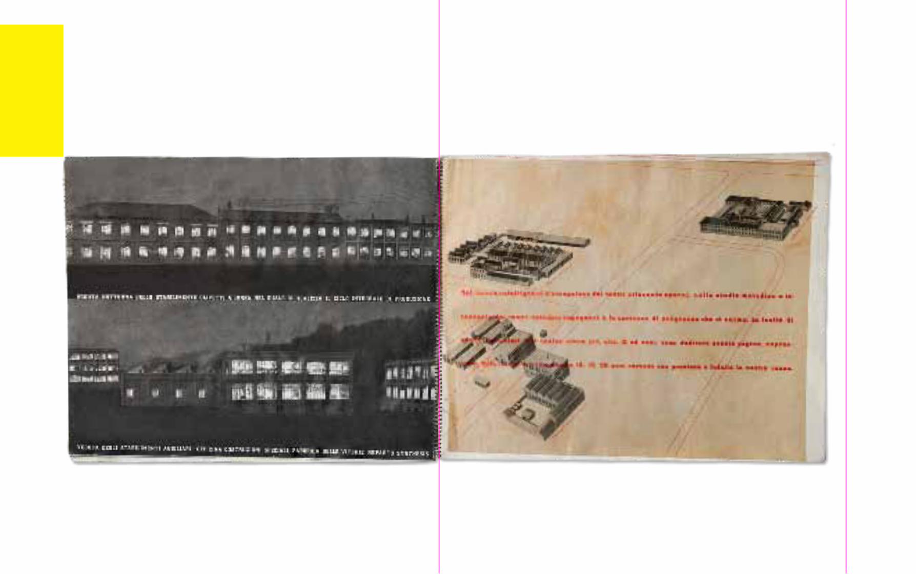
7-9. Cover and spreads from the booklet 25 anni Olivetti, 1933. 225mm × 280mm. Spiral binding, printed by Guido Modiano. When Olivetti’s publicity office moved to Milan in 1932, Munari was among the first artists called upon by its art director, Renato Zveteremich. The booklet celebrating the company’s first 25 years was produced in
less than two months and met with great acclaim, leading to Munari joining the creative team as a freelancer. Numerous press advertisements and commissions followed over the next few years until Zveteremich quit his position in 1938. Renata Bazzani Zveteremich, Milano / Associazione Archivio Storico Olivetti, Ivrea.
7 8

42 Eye 85/13 Eye 85/13 45
10 and 11. Cover and spread from the booklet Il linoleum: sua fabbricazione. Milano: Società del Linoleum, 1938. 250mm × 280mm. Spiral binding. Printer Guido Modiano oversaw the design of the contents in collaboration with R+M (Munari and Ricas), while the cover is by Luigi Veronesi. Collezione Bruno Munari, Enaip Factory, Cantù.
Working as a magazine illustrator, he could experiment freely with visual language. His contributions to Futurist publishing ventures such as Almanacco dell’Italia veloce (1930) and Simultanina (1931), and his work for popular magazines (Lidel, Natura and L’Ala d’Italia) successfully transposed the new ‘aeropictorial’ trend into mainstream illustration. The best examples of his mature Futurist style can be seen in the anthology Il Cantastorie di Campari [The Story-teller of Campari](1932) and the tin-litho book L’Anguria lirica [The Lyric Cucumber] (1934).
Futurist collaborationsUntil 1939, Munari’s work appeared in every edition of L’Almanacco letterario, an annual publication devoted to the literary scene, published by Bompiani. His contributions ranged from comic drawings to collage, photomontage and photograms, all with a distinctive ironic tone. He also explored more conservative visual languages for the covers of La Rivista illustrata del popolo d’Italia – the monthly supplement of Mussolini’s newspaper Il Popolo d’Italia – and La Lettura.
In 1931, together with his fellow designer Riccardo Castagnedi (known by the pseudonym
Ricas), Munari set up the graphic design studio R+M, one of the first of its kind in Italy. He had met Ricas a couple of years earlier through Futurist circles. To begin with, R+M’s output had a painterly emphasis, but gradually moved toward a redefinition of the Futurist language through a more concise, abstract approach. The adoption of the photographic collage as their preferred medium set Ricas and Munari’s style closer to Surrealism than to typographic functionalism, and would remain their hallmark until the mid-1930s. Their professional partnership remained flexible, with them signing work both together and individually, until they parted ways in 1937, when Ricas joined the publisher Editoriale Domus.
While Futurism provided his stylistic framework, Munari kept abreast of metaphysical and Surrealist developments through foreign examples reproduced in the trade press. Despite the closed intellectual climate imposed by the regime, artists in Milan could follow advances in international art through foreign publications circulated in selected bookshops and art galleries. Munari’s compositions sometimes show close similarities to Herbert Bayer’s more Surrealist advertising work. 3
12. Cover of La Lettura XXXVII 7, 1937. 190mm × 280mm. The illustration was created with a ‘tactile’ technique, using a three- dimensional assemblage of cut-out photographs, cardstock, fabric, and sandpaper. Biblioteca Braidense, Milan.
13. Cover of Grazia no.37, 1939. 230mm × 310mm. Mondadori’s women’s weekly was launched in November 1938; Munari joined the editorial office soon afterwards. Its conservative formula, albeit with a modern edge, paved the way to commercial success with a middle-class readership. Only after July 1939 did the magazine begin to use colour. Emeroteca storica Arnoldo Mondadori Editore, Fondazione Arnoldo e Alberto Mondadori, Milan.
10 11
12 13
admin
Texte surligné
Biblioteca Nazionale Braidense, Milan.
admin
Note
Collezione Bruno Munari, Città di Cantù, Associazione Amici dei Musei Cantù.
46 Eye 85/13 Eye 85/13 47
By the early 1930s photomontage was enjoying a degree of popularity in Italy, both as a form of illustration in the press and at exhibitions. Munari used photomontage in his illustration work for periodicals as well as in advertising.
Occasionally, he made celebratory photomontages on propagandist themes, such as ‘Udite! Udite!’ (‘Hear! Hear!’), a long sequence published in L’Almanacco antiletterario (1937). Later in the decade his interest in photography focused on Surrealist collage, inspired by Ernst, and on cinematic sequences.
R+M’s clients included firms such as Campari and Olivetti, which were among the first in Italy to create internal publicity offices. Olivetti’s Ufficio Sviluppo e Pubblicità (Development and Advertising Office), founded in 1931 and directed by Renato Zveteremich, functioned as a kind of laboratory. By hiring up-and-coming young designers – Studio Boggeri, Xanti Schawinsky, the architects Luigi Figini and Gino Pollini, and later, Marcello Nizzoli and Giovanni Pintori – it set the stage for the creation in the postwar period of the ‘Olivetti style’.
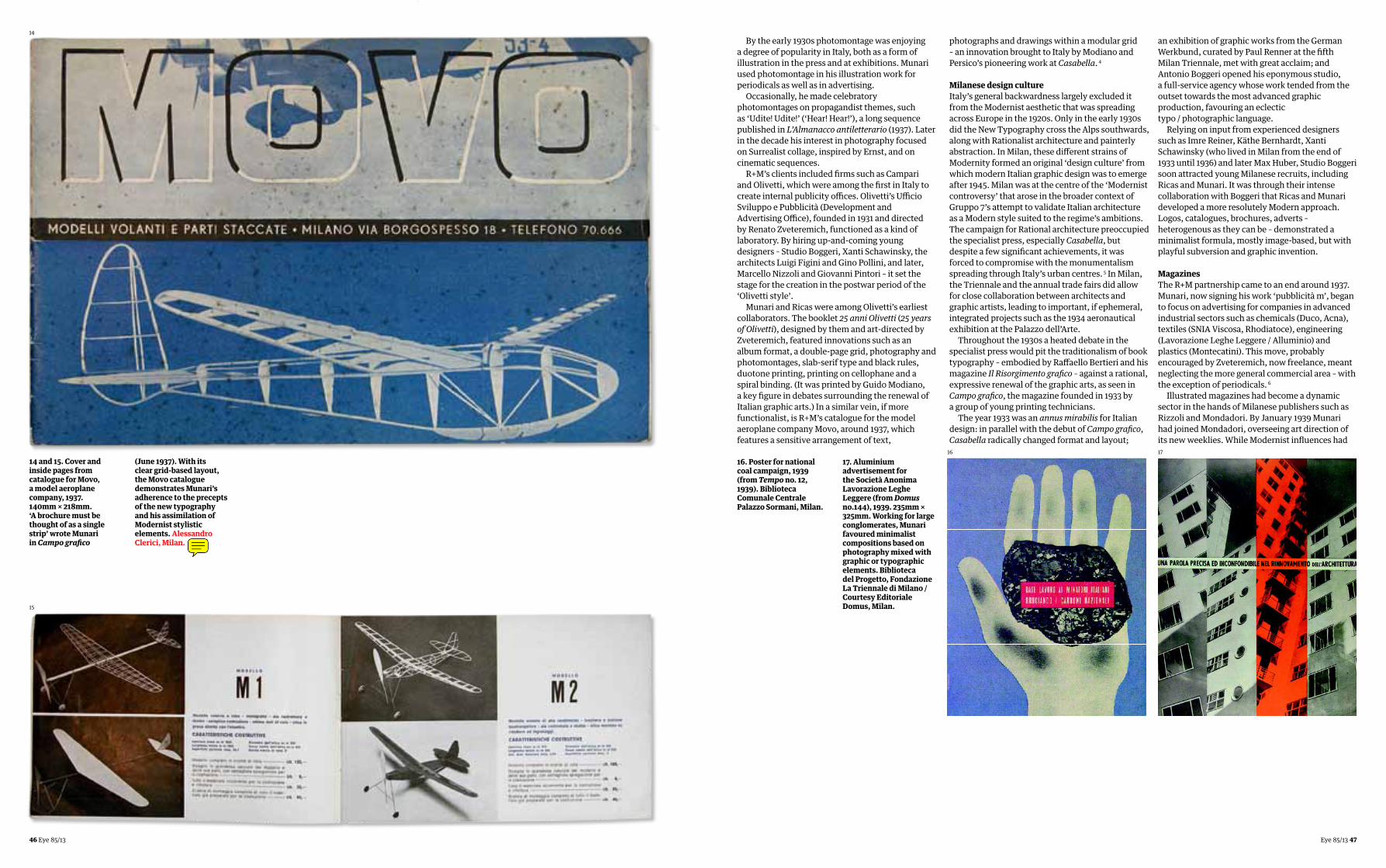
Munari and Ricas were among Olivetti’s earliest collaborators. The booklet 25 anni Olivetti (25 years of Olivetti), designed by them and art-directed by Zveteremich, featured innovations such as an album format, a double-page grid, photography and photomontages, slab-serif type and black rules, duotone printing, printing on cellophane and a spiral binding. (It was printed by Guido Modiano, a key figure in debates surrounding the renewal of Italian graphic arts.) In a similar vein, if more functionalist, is R+M’s catalogue for the model aeroplane company Movo, around 1937, which features a sensitive arrangement of text,
photographs and drawings within a modular grid – an innovation brought to Italy by Modiano and Persico’s pioneering work at Casabella. 4
Milanese design cultureItaly’s general backwardness largely excluded it from the Modernist aesthetic that was spreading across Europe in the 1920s. Only in the early 1930s did the New Typography cross the Alps southwards, along with Rationalist architecture and painterly abstraction. In Milan, these different strains of Modernity formed an original ‘design culture’ from which modern Italian graphic design was to emerge after 1945. Milan was at the centre of the ‘Modernist controversy’ that arose in the broader context of Gruppo 7’s attempt to validate Italian architecture as a Modern style suited to the regime’s ambitions. The campaign for Rational architecture preoccupied the specialist press, especially Casabella, but despite a few significant achievements, it was forced to compromise with the monumentalism spreading through Italy’s urban centres. 5 In Milan, the Triennale and the annual trade fairs did allow for close collaboration between architects and graphic artists, leading to important, if ephemeral, integrated projects such as the 1934 aeronautical exhibition at the Palazzo dell’Arte.
Throughout the 1930s a heated debate in the specialist press would pit the traditionalism of book typography – embodied by Raffaello Bertieri and his magazine Il Risorgimento grafico – against a rational, expressive renewal of the graphic arts, as seen in Campo grafico, the magazine founded in 1933 by a group of young printing technicians.
The year 1933 was an annus mirabilis for Italian design: in parallel with the debut of Campo grafico, Casabella radically changed format and layout;
14 and 15. Cover and inside pages from catalogue for Movo, a model aeroplane company, 1937. 140mm × 218mm. ‘A brochure must be thought of as a single strip’ wrote Munari in Campo grafico
(June 1937). With its clear grid-based layout, the Movo catalogue demonstrates Munari’s adherence to the precepts of the new typography and his assimilation of Modernist stylistic elements. Alessandro Clerici, Milan.
16. Poster for national coal campaign, 1939 (from Tempo no. 12, 1939). Biblioteca Comunale Centrale Palazzo Sormani, Milan.
17. Aluminium advertisement for the Società Anonima Lavorazione Leghe Leggere (from Domus no.144), 1939. 235mm × 325mm. Working for large conglomerates, Munari favoured minimalist compositions based on photography mixed with graphic or typographic elements. Biblioteca del Progetto, Fondazione La Triennale di Milano / Courtesy Editoriale Domus, Milan.
an exhibition of graphic works from the German Werkbund, curated by Paul Renner at the fifth Milan Triennale, met with great acclaim; and Antonio Boggeri opened his eponymous studio, a full-service agency whose work tended from the outset towards the most advanced graphic production, favouring an eclectic typo / photographic language.
Relying on input from experienced designers such as Imre Reiner, Käthe Bernhardt, Xanti Schawinsky (who lived in Milan from the end of 1933 until 1936) and later Max Huber, Studio Boggeri soon attracted young Milanese recruits, including Ricas and Munari. It was through their intense collaboration with Boggeri that Ricas and Munari developed a more resolutely Modern approach. Logos, catalogues, brochures, adverts – heterogenous as they can be – demonstrated a minimalist formula, mostly image-based, but with playful subversion and graphic invention.
MagazinesThe R+M partnership came to an end around 1937. Munari, now signing his work ‘pubblicità m’, began to focus on advertising for companies in advanced industrial sectors such as chemicals (Duco, Acna), textiles (SNIA Viscosa, Rhodiatoce), engineering (Lavorazione Leghe Leggere / Alluminio) and plastics (Montecatini). This move, probably encouraged by Zveteremich, now freelance, meant neglecting the more general commercial area – with the exception of periodicals. 6
Illustrated magazines had become a dynamic sector in the hands of Milanese publishers such as Rizzoli and Mondadori. By January 1939 Munari had joined Mondadori, overseeing art direction of its new weeklies. While Modernist influences had
14
15
16 17
admin
Note
I emailed them twice but never got any reaction from them. I'd keep the credits as they are.

48 Eye 85/13 Eye 85/13 49
by then been partly assimilated into mainstream graphic production, Munari’s position in the early 1940s seems to be based on a personal synthesis of Modernist vocabulary tempered by a more poetic, even anarchic, attitude.
Munari’s influence is visible in the covers and the design of the women’s weekly Grazia: he worked according to an intuitive layout, without preset typographic grids, giving himself a great deal of freedom in the combination of backgrounds and borders and the crop of photographs, often going back to plain illustrations.
The news weekly Tempo was launched in June 1939, on the eve of the war. It was Italy’s first full colour illustrated magazine: large-format, full bleed photographic cover, 60-odd pages divided into columns on politics, news, literature and art. Tempo was an immediate success, with several foreign editions selling up to one million copies a week. Photography was a key element in its
formula, and its graphic layout, overseen by Munari, had a decidedly popular American bent, modelled as it was on Life.
As well as overseeing the art department (where contributors included Fulvio Bianconi and Carlo Dradi), in his four years in Mondadori’s editorial office Munari produced twenty or so original photo features, encompassing curiosities, jokes and topics of war propaganda. In 1944 these were collected in a volume as Fotocronache by Editoriale Domus – Munari had joined the publishing house as art director of its architecture magazine, also called Domus, after the Tempo. 7
Apart from its often striking covers, Tempo’s design was not innovative: the typeface Landi was its sole concession to Rational typography, and its graphic design lay somewhere between the eclectic and the popular. It nevertheless became a long-term success in Italian publishing (Mondadori used the same approach in 1950 for a new illustrated
18 and 19. Spreads from Tempo no.141, 1942, with military infographics showing the substantial loss of enemy (i.e. Allied) ships and planes. Infographics accompanying photo-essays and the popular scientific columns were an original development of the Mondadori editorial office, overseen by Munari. Biblioteca Comunale Centrale Palazzo Sormani, Milan.
20 (opposite). Cover of Tempo 67, 1940, documenting the first year of the Second World War. 270mm × 365mm. Apart from minor differences, the magazine’s adherence to Life’s model is clear, though Tempo granted more space to political issues. Photography played a role in the striking covers, which week after week presented Italian readers with an ‘official’ account of the war’s progress. Biblioteca Comunale Centrale Palazzo Sormani, Milan.
18 20
19

50 Eye 85/13 Eye 85/13 51
magazine, Epoca – once again overseen by Munari). One notable aspect of Tempo was its information graphics – such as maps, diagrams, plans that accompanied articles about the war fronts. This visual development – which may have been inspired by Signal, a propagandistic German fortnightly distributed in occupied countries – soon became one of the magazine’s more distinctive features. Munari would perfect these skills further at Domus in 1943-44.
Inside publishingDuring the war years, in addition to art direction for Mondadori and Editoriale Domus, Munari designed book jackets for Bompiani. This early entry into the cultural industry anticipated later consolidations in the Italian graphic arts. Whereas in the 1940s Olivetti was practically the only instance, the 1950s saw important synergies between intellectuals and technologically advanced industrial firms such as Pirelli, Italsider, Rinascente, Montecatini, Rai and Roche. After the war Munari would re-emerge not only as an artist and graphic designer but also as industrial designer and pedagogue. Despite his previous acceptance of the Fascist climate, Munari’s work and activities throughout the postwar period were informed by a progressive outlook. First with the Movimento Arte Concreta (Concrete Art Movement), and later through his writings and his teaching, he became a spokesman for the designer’s social role.
Popular polemicist‘Today, the artist must step off his pedestal and deign to design [even] the butcher-shop sign
FOOTNOTES1. Munari quoted in Andrea Branzi, ‘Il gioco del fare. Intervista con Bruno Munari’ in Modo 8: 71–72 (August–September 1984): 42. Corsico (Milano): Ricerche Design Editrice. 2. No surviving copies or photographic extracts are yet known. 3. Munari may have seen Bayer’s work in die neue linie, a women’s magazine, art-directed by Moholy-Nagy and Bayer.4. Designer, printer and critic Guido Modiano (1899–1943) specialised in prestigious editions and cultural periodicals such as Quadrante, Edilizia Moderna and Le vie d’Italia. Alongside Edoardo Persico, he played a major role in the redesign of Casabella’s graphic look. For the VII Triennale (1940) he was curator of the graphic arts exhibition.
5. After Florence’s Santa Maria Novella station, other notable examples of modernist Italian architecture include Terragni’s Casa del Fascio (Como), Pagano’s Università Bocconi (Milan), and the Città universitaria and Termini station (Rome).6. Renato Zveteremich left Olivetti in 1938 to work as a freelance consultant for industrial conglomerates such as Montecatini, Schering and Farmitalia.7. Following the German occupation of northern Italy in September 1943. 8. Bruno Munari, Arte come mestiere (Bari / Rome: Laterza, 1966).
21 and 22 (opposite). Spread and cover from Domus 195, 1944. 245mm × 330mm. Munari laid out the architecture and design magazine on a modular grid with flexible placing of text, photographs and graphic elements. The pages have 2, 3, 4 or 5 columns; simple overprinted line drawings enliven photographic pages; a second colour added visual emphasis. CCA, Montreal / Courtesy Editoriale Domus, Milan [all rights reserved].
23. Spread from Domus 193, 1944. 245mm × 330mm. CCA, Montreal / Courtesy Editoriale Domus, Milan [all rights reserved]All photographs by the author except for: 2 (Albe Steiner), 15 (Enaip, Cantù), 16 (Biblioteca Braidense, Milan).All reproductions © Bruno Munari. Courtesy Corraini Edizioni.
(if he knows how) [… and] become an active person amongst others, aware of current techniques, materials, and working methods, and – without abandoning his innate aesthetic sense – humbly and competently answer the questions one might pose. The designer is now the point of contact … between art and the public … It’s no longer the painting for one’s living room but rather the kitchen appliance. Art mustn’t be separated from life: [with] beautiful things to be looked at and ugly things to be used.’ 8
Notwithstanding a number of highly original visual investigations (the award-winning ‘illegible [wordless] books’, which eschew textual communication for aesthetics; light projections; experimental films; fountains; toys; and teaching workshops) and his book design, which helped define the identity of publishers such as Einaudi, Bompiani, Rizzoli and Editori Riuniti – establishing his own place in the Italian design scene would be increasingly problematic for Munari.
By the late 1950s Munari seemed constricted by an outdated Modernist formula that was pictorial in character rather than typographically structured.
Though this approach was well suited to the children’s books and toys he created, it may have hampered his wider success as a graphic designer. Yet his commitment to the world of childhood and education, culminating in the creative workshops for children he established in the late 1970s, allowed him widespread, popular recognition that few other Milanese designers have attained.
22
21 23
admin
Note
Centre Canadien d'Architecture, Montreal.
admin
Texte surligné
admin
Texte surligné
admin
Note
All photographs by the author except for: 2 (Albe Steiner), 15 (Ufficio Cultura, Città di Cantù), 16 (Biblioteca Nazionale Braidense, Milan).All reproductions © Bruno Munari. Courtesy Corraini Edizioni.
admin
Barrer
admin
Barrer
admin
Barrer
admin
Barrer