
HTML5 24-Hour Trainer
338
-
Upload
khangminh22 -
Category
Documents
-
view
4 -
download
0
Transcript of HTML5 24-Hour Trainer


HTML5 24-Hour Trainer
inTroducTion . . . . . . . . . . . . . . . . . . . . . . . . . . . . . . . . . . . . . . . . . . . . . . . . . . . . . . . . . . . . xxv
secTion ⊲ i GeTTinG sTarTed wiTH HTML5
Lesson 1 What Is HTML? . . . . . . . . . . . . . . . . . . . . . . . . . . . . . . . . . . . . . . . . . . . . . . . . . 3
Lesson 2 Creating Your First Web Page . . . . . . . . . . . . . . . . . . . . . . . . . . . . . . . . . . . . 9
Lesson 3 Viewing Web Pages . . . . . . . . . . . . . . . . . . . . . . . . . . . . . . . . . . . . . . . . . . . . .15
secTion i ⊲ i sTyLinG your web PaGe
Lesson 4 What Is CSS? . . . . . . . . . . . . . . . . . . . . . . . . . . . . . . . . . . . . . . . . . . . . . . . . . . .21
Lesson 5 Testing CSS . . . . . . . . . . . . . . . . . . . . . . . . . . . . . . . . . . . . . . . . . . . . . . . . . . . 29
secTion ii ⊲ i workinG wiTH HTML basics
Lesson 6 Adding Text . . . . . . . . . . . . . . . . . . . . . . . . . . . . . . . . . . . . . . . . . . . . . . . . . . . 37
Lesson 7 Styling Text with CSS . . . . . . . . . . . . . . . . . . . . . . . . . . . . . . . . . . . . . . . . . . 45
Lesson 8 Linking to Content . . . . . . . . . . . . . . . . . . . . . . . . . . . . . . . . . . . . . . . . . . . . . 55
Lesson 9 Validating Your Pages . . . . . . . . . . . . . . . . . . . . . . . . . . . . . . . . . . . . . . . . . . 67
secTion iV incorPoraTinG iMaGe ⊲ s
Lesson 10 Working with Images . . . . . . . . . . . . . . . . . . . . . . . . . . . . . . . . . . . . . . . . . . . 75
Lesson 11 Using Image Maps . . . . . . . . . . . . . . . . . . . . . . . . . . . . . . . . . . . . . . . . . . . . . 87
Lesson 12 Adding Horizontal Rules . . . . . . . . . . . . . . . . . . . . . . . . . . . . . . . . . . . . . . . . 93
secTion ⊲ V usinG LisTs
Lesson 13 Inserting Unordered Lists . . . . . . . . . . . . . . . . . . . . . . . . . . . . . . . . . . . . . . . 101
Lesson 14 Working with Ordered Lists . . . . . . . . . . . . . . . . . . . . . . . . . . . . . . . . . . . . 109
Lesson 15 Extending Lists . . . . . . . . . . . . . . . . . . . . . . . . . . . . . . . . . . . . . . . . . . . . . . . . 115
secTion V ⊲ i sTrucTurinG TabLes
Lesson 16 Building a Simple Table . . . . . . . . . . . . . . . . . . . . . . . . . . . . . . . . . . . . . . . . .127
Lesson 17 Styling Tables . . . . . . . . . . . . . . . . . . . . . . . . . . . . . . . . . . . . . . . . . . . . . . . . 133
Lesson 18 Making Tables More Accessible . . . . . . . . . . . . . . . . . . . . . . . . . . . . . . . . 143
Continues
secTion Vi ⊲ i buiLdinG ForMs
Lesson 19 Creating a Form . . . . . . . . . . . . . . . . . . . . . . . . . . . . . . . . . . . . . . . . . . . . . . . 151
Lesson 20 Enhancing Forms . . . . . . . . . . . . . . . . . . . . . . . . . . . . . . . . . . . . . . . . . . . . . 165
secTion Vii ⊲ i enHancinG HTML wiTH JaVascriPT
Lesson 21 Adding JavaScript . . . . . . . . . . . . . . . . . . . . . . . . . . . . . . . . . . . . . . . . . . . . 179
Lesson 22 Advanced JavaScript . . . . . . . . . . . . . . . . . . . . . . . . . . . . . . . . . . . . . . . . . . 191
secTion i ⊲ X addinG Media
Lesson 23 Working with Plug-Ins . . . . . . . . . . . . . . . . . . . . . . . . . . . . . . . . . . . . . . . . 201
Lesson 24 Inserting Audio . . . . . . . . . . . . . . . . . . . . . . . . . . . . . . . . . . . . . . . . . . . . . . . . 211
Lesson 25 Inserting Video . . . . . . . . . . . . . . . . . . . . . . . . . . . . . . . . . . . . . . . . . . . . . . 221
secTion ⊲ X neXT sTePs in HTML5
Lesson 26 Looking Ahead in HTML5 . . . . . . . . . . . . . . . . . . . . . . . . . . . . . . . . . . . . . 233
Lesson 27 Enhancing Web Page Structure . . . . . . . . . . . . . . . . . . . . . . . . . . . . . . . . . 239
Lesson 28 Integrating Advanced Design Elements . . . . . . . . . . . . . . . . . . . . . . . . . 249
aPPendiX a Browser Support for HTML5 . . . . . . . . . . . . . . . . . . . . . . . . . . . . . . . . . . . 265
aPPendiX b Advanced HTML5 Features . . . . . . . . . . . . . . . . . . . . . . . . . . . . . . . . . . . . 277
aPPendiX c What’s on the DVD? . . . . . . . . . . . . . . . . . . . . . . . . . . . . . . . . . . . . . . . . . . . 281
indeX . . . . . . . . . . . . . . . . . . . . . . . . . . . . . . . . . . . . . . . . . . . . . . . . . . . . . . . . . . . . . . . . . . . . . 287

HTML524-HOUR TRAInER


HTML524-Hour Trainer
Joseph W. Lowery Mark Fletcher

HTML5 24-Hour Trainer
Published by Wiley Publishing, Inc. 10475 Crosspoint Boulevard Indianapolis, IN 46256 www.wiley.com
Copyright ©2011 by Wiley Publishing, Inc., Indianapolis, Indiana
Published simultaneously in Canada
ISBN: 978-0-470-64782-0
Manufactured in the United States of America
10 9 8 7 6 5 4 3 2 1
No part of this publication may be reproduced, stored in a retrieval system or transmitted in any form or by any means, electronic, mechanical, photocopying, recording, scanning or otherwise, except as permitted under Sections 107 or 108 of the 1976 United States Copyright Act, without either the prior written permission of the Publisher, or authorization through payment of the appropriate per-copy fee to the Copyright Clearance Center, 222 Rosewood Drive, Danvers, MA 01923, (978) 750-8400, fax (978) 646-8600. Requests to the Publisher for permission should be addressed to the Permissions Department, John Wiley & Sons, Inc., 111 River Street, Hoboken, NJ 07030, (201) 748-6011, fax (201) 748-6008, or online at http://www.wiley.com/go/permissions.
Limit of Liability/Disclaimer of Warranty: The publisher and the author make no representations or warranties with respect to the accuracy or completeness of the contents of this work and specifically disclaim all warranties, including without limitation warranties of fitness for a particular purpose. No warranty may be created or extended by sales or pro-motional materials. The advice and strategies contained herein may not be suitable for every situation. This work is sold with the understanding that the publisher is not engaged in rendering legal, accounting, or other professional services. If professional assistance is required, the services of a competent professional person should be sought. Neither the pub-lisher nor the author shall be liable for damages arising herefrom. The fact that an organization or Web site is referred to in this work as a citation and/or a potential source of further information does not mean that the author or the publisher endorses the information the organization or Web site may provide or recommendations it may make. Further, readers should be aware that Internet Web sites listed in this work may have changed or disappeared between when this work was written and when it is read.
For general information on our other products and services please contact our Customer Care Department within the United States at (877) 762-2974, outside the United States at (317) 572-3993 or fax (317) 572-4002.
Wiley publishes in a variety of print and electronic formats and by print-on-demand. Some material included with standard print versions of this book may not be included in e-books or in print-on-demand. If this book refers to media such as a CD or DVD that is not included in the version you purchased, you may download this material at http://booksupport.wiley.com. For more information about Wiley products, visit www.wiley.com.
Library of Congress Control Number: 2010937824
Trademarks: Wiley, the Wiley logo, Wrox, the Wrox logo, Programmer to Programmer, and related trade dress are trade-marks or registered trademarks of John Wiley & Sons, Inc. and/or its affiliates, in the United States and other countries, and may not be used without written permission. All other trademarks are the property of their respective owners. Wiley Publishing, Inc., is not associated with any product or vendor mentioned in this book.

For Nelee, whose life will resonate for
generations to come
— Joseph Lowery
To my wife, Vanessa. You are and always will
be my soul mate.
— Mark FLetcher


eXecuTiVe ediTorBob Elliott
senior ProJecT ediTorKevin Kent
TecHnicaL ediTorCarlos Gonzalez
senior ProducTion ediTorDebra Banninger
coPy ediTorKim Cofer
ediToriaL direcTorRobyn B . Siesky
ediToriaL ManaGerMary Beth Wakefield
FreeLancer ediToriaL ManaGerRosemarie Graham
associaTe direcTor oF MarkeTinGDavid Mayhew
ProducTion ManaGerTim Tate
Vice PresidenT and eXecuTiVe GrouP PubLisHerRichard Swadley
Vice PresidenT and eXecuTiVe PubLisHerBarry Pruett
associaTe PubLisHerJim Minatel
ProJecT coordinaTor, coVerKatie Crocker
coMPosiTorJeff Wilson, Happenstance Type-O-Rama
ProoFreadernancy Carrasco
indeXerRobert Swanson
coVer desiGnerMichael E . Trent
coVer iMaGe© Konstantin Inozemtsev/istockphoto .com
crediTs


abouT THe auTHors
JosePH Lowery’s books about the Web and web-building tools are international bestsellers, having sold more than 400,000 copies worldwide in 11 different languages. His most recent books are the Adobe Dreamweaver CS5 Bible and Adobe CS4 Web Workflows. Joe developed the Dreamweaver CS5 and WordPress 3.0 course for Lynda.com. He is the author of the popular CSS Hacks and Filters as well as numerous other books on creating websites. A well-known speaker, Joe has pre-sented at Adobe conferences in the United States and Europe as well as user groups around the country. Joe bases his books on over 12 years of real-world experience building sites, applications, and tools for web designers and developers. He currently works with a number of designers and also designs sites himself.
Mark FLeTcHer is an eLearning Developer specializing in Rapid e-Learning Development. Mark has worked with many blue chip companies such as Adobe Systems Inc., eSyncTraining.com, and a leading eLearning company. Mark also has presented at a number of conferences on e-Learn-ing. Mark lives on the northwest coast of the United Kingdom with his wife, Vanessa, and their two children, Joel and Lucy. Mark can be reached on his personal blog. http://macrofireball .blogspot.com.
abouT THe TecHnicaL ediTor
carLos GonzaLez was born in Brighton on the south coast of England in 1979. He started doing graphic and web design 11 years ago. Carlos worked for Victoria Real on the first two Big Brother UK websites. He has been a freelance web designer for over 6 years, creating bespoke websites with a keen focus on aesthetics and the latest W3C standards.

acknowLedGMenTs
THanks To aLL THe GreaT folks at Wiley/Wrox for helping with this book. We really appreciate the work put in by Scott Meyers, Kevin Kent, Rosemarie Graham, and others for keeping us on track and moving forward.


conTenTs
IntroductIon xxv
GeTTinG sTarTed wiTH HTMLsecTion i: 5
wHaT is HTML? Lesson 1: 3
The Language of the Web 3How Browsers Style Web Pages 5The Latest Version: HTML5 6Try it 7
Lesson Requirements 7
Step-by-Step 7
creaTinG your FirsT web PaGe Lesson 2: 9
HTML5 Syntaxes: an embarrassment of riches 9understanding Basic Page Structure 10
Setting a Document Type 10
Defining the Root Element: <html> 11
Forming the <head> 11
Enclosing the Content with <body> 12
Try it 12Lesson Requirements 12
Step-by-Step 12
ViewinG web PaGes 1Lesson 3: 5
opening Files in a Browser 15Setting a Web Workflow 16Try it 18
Lesson Requirements 18
Step-by-Step 18
sTyLinG your web PaGe secTion ii:
wHaT is css? 2Lesson 4: 1
understanding Cascading Style Sheets 21Key CSS Concepts 23
The Cascading Principle 23

xvi
ConTenTS
The Inheritance Principle 23
The Specificity Principle 24
Working with CSS Placement 25External Style Sheets 25
Embedded Styles 26
Inline Styles 26
Working with Selectors 26Tags 27
IDs 27
Classes 27
Compound Selectors 28
TesTinG css 2Lesson 5: 9
Validating Your CSS 29Checking Your CSS in a Browser 30Try it 33
Lesson Requirements 33
Step-by-Step 34
workinG wiTH HTML basicssecTion iii:
addinG TeXT 3Lesson 6: 7
Working with Paragraphs 37Try it 38
Lesson Requirements 39
Step-by-Step 39
adding Headings 39Try it 41
Lesson Requirements 41
Step-by-Step 41
applying Special Characters 42Try it 43
Lesson Requirements 43
Step-by-Step 43
sTyLinG TeXT wiTH css 4Lesson 7: 5
Picking Your Font Family 45Try it 46
Lesson Requirements 46
Step-by-Step 47
Setting Text Size and Line Height 48

xvii
ConTenTS
Try it 50Lesson Requirements 50
Step-by-Step 50
Choosing Text Color 51Try it 52
Lesson Requirements 52
Step-by-Step 52
aligning and emphasizing Text 53Try it 54
Lesson Requirements 54
Step-by-Step 54
LinkinG To conTenT 5Lesson 8: 5
Linking to other Pages 55Same Site Links 55
Linking to Another Site 56
Targeting Links 57
Try it 58Lesson Requirements 58
Step-by-Step 58
Linking to a Page Section 59Try it 60
Lesson Requirements 60
Step-by-Step 60
Styling Link States 61Working with e-mail and Document Links 63Try it 64
Lesson Requirements 64
Step-by-Step 64
VaLidaTinG your PaGes 6Lesson 9: 7
Working with the HTML5 doctype 67using the W3C Validator 69Try it 71
Lesson Requirements 71
Step-by-Step 71
incorPoraTinG iMaGessecTion iV:
workinG wiTH iMaGes 7Lesson 10: 5
understanding Web images 75

xviii
ConTenTS
inserting Foreground images 77Try it 78
Lesson Requirements 78
Step-by-Step 78
using Links with images 79aligning images 80Try it 81
Lesson Requirements 81
Step-by-Step 82
including Background images 83Try it 84
Lesson Requirements 85
Step-by-Step 85
usinG iMaGe MaPs 8Lesson 11: 7
Creating an image Map 87Try it 89
Lesson Requirements 89
Step-by-Step 89
addinG HorizonTaL ruLes 9Lesson 12: 3
Separating Page Sections 93Sizing and Styling rules 94Try it 96
Lesson Requirements 96
Step-by-Step 96
usinG LisTssecTion V:
inserTinG unordered LisTs 10Lesson 13: 1
Working with Bulleted items 101Try it 102
Lesson Requirements 103
Step-by-Step 103
nesting unordered Lists 103Changing List appearance 104Try it 106
Lesson Requirements 106
Step-by-Step 106

xix
ConTenTS
workinG wiTH ordered LisTs 10Lesson 14: 9
Creating numbered Lists 109Try it 110
Lesson Requirements 110
Step-by-Step 110
expanding an outline 111Combining unordered and ordered Lists 112Try it 113
Lesson Requirements 113
Step-by-Step 113
eXTendinG LisTs 11Lesson 15: 5
understanding Website navigation Bars 115Working with Lists for navigation 116Try it 118
Lesson Requirements 118
Step-by-Step 119
using Definition Lists and the <dialog> Tag 120Try it 123
Lesson Requirements 123
Step-by-Step 123
sTrucTurinG TabLessecTion Vi:
buiLdinG a siMPLe TabLe 12Lesson 16: 7
understanding HTML Tables 127Specifying a Table Header 128
Defining a Table Header, Body, and Footer 129
Working with rows and Columns 130Try it 131
Lesson Requirements 131
Step-by-Step 131
sTyLinG TabLes 13Lesson 17: 3
Creating White Space in Tables 133aligning Tables 136Working with Borders 137Modifying Table Colors 139Try it 141
Lesson Requirements 141
Step-by-Step 141

xx
ConTenTS
MakinG TabLes More accessibLe 14Lesson 18: 3
inserting Captions 143incorporating Details and Summary 144Try it 146
Lesson Requirements 146
Step-by-Step 146
buiLdinG ForMssecTion Vii:
creaTinG a ForM 15Lesson 19: 1
understanding Forms 151using Text and Textarea Fields 153Try it 154
Lesson Requirements 154
Step-by-Step 154
Working with radio Buttons 156offering Checkbox options 156implementing Select Lists 157Try it 158
Lesson Requirements 158
Step-by-Step 158
using Hidden Form Controls 160inserting Form Buttons 160Try it 161
Lesson Requirements 161
Step-by-Step 161
enHancinG ForMs 16Lesson 20: 5
applying Fieldsets and Legends 165Try it 166
Lesson Requirements 166
Step-by-Step 166
using Tables for Form Layout 168Styling Forms with CSS 169
Creating a Two-Column Layout 169
Styling Fieldsets and Legends 170
Working with Input Fields 171
understanding additional HTML5 Form enhancements 172Try it 173
Lesson Requirements 173
Step-by-Step 173

xxi
ConTenTS
enHancinG HTML wiTH JaVascriPTsecTion Viii:
addinG JaVascriPT 17Lesson 21: 9
understanding JavaScript 179integrating JavaScript Code 181
Activating JavaScript Instantly 181
Invoking JavaScript on Page Load 183
Triggering JavaScript Interactively 184
Degrading Gracefully 186Testing JavaScript 187Try it 189
Lesson Requirements 189
Step-by-Step 189
adVanced JaVascriPT 19Lesson 22: 1
Linking external Files 191incorporating a JavaScript Framework 194Try it 196
Lesson Requirements 196
Step-by-Step 196
addinG MediasecTion iX:
workinG wiTH PLuG-ins 20Lesson 23: 1
understanding Plug-ins 201Using <object> Tags 202
Embedding Plug-In Content 203
Combining <object> and <embed> Tags 204
inserting an SWF File 205adding Silverlight Code 207Try it 208
Lesson Requirements 208
Step-by-Step 208
inserTinG audio 21Lesson 24: 1
using Web-Compatible audio 211Linking to MP3 Files 212embedding audio with Plug-ins 213incorporating HTML5 audio 215

xxii
ConTenTS
Try it 218Lesson Requirements 218
Step-by-Step 218
inserTinG Video 22Lesson 25: 1
Working with Video Types 221adding a Video Player 223integrating Video without a Plug-in 226Try it 229
Lesson Requirements 229
Step-by-Step 229
neXT sTePs in HTML5secTion X:
LookinG aHead in HTML5 23Lesson 26: 3
using HTML5 Today 233What Works now 234What Doesn’t Work Yet 235Determining What Works Dynamically 236Try it 237
Lesson Requirements 237
Step-by-Step 237
enHancinG web PaGe sTrucTure 23Lesson 27: 9
understanding Current Layouts 239Working with the new HTML5 Semantics 241
Defining Sections 242
Creating Headers 243
Setting navigation Areas 243
Establishing Articles 244
Defining Asides 245
Including Footers 245
Bringing It All Together 246
Try it 247Lesson Requirements 247
Step-by-Step 247
inTeGraTinG adVanced desiGn eLeMenTs 24Lesson 28: 9
expanding Font Possibilities 249

xxiii
ConTenTS
Designing for Multiple Screens 251Drawing with <canvas> 253
Understanding <canvas> Basics 253
Drawing Lines 256
Working with Circles 258
Adding Text to a Canvas 259
Placing Images on the Canvas 261
Try it 263Lesson Requirements 263
Step-by-Step 263
aPPendiX a: browser suPPorT For HTML5 265
HTML5 new Features 265Semantic Tags 266
<audio> Tag 266
<video> Tag 267
Form Tags 267
<canvas> Tag 271
CSS3 new Features 271@font-face 271
Enhanced Colors 272
Media Queries 272
Multiple Columns 273
Enhanced Selectors 273
CSS Transitions 274
CSS Transforms 274
box-shadow Property 274
text-shadow Property 275
box-sizing 275
border-radius 275
Multiple Background Images 276
background-image Options 276
aPPendiX b: adVanced HTML5 FeaTures 277
editable Content 277Local Storage 278Geolocation 279
aPPendiX c: wHaT’s on THe dVd? 281
System requirements 281

xxiv
ConTenTS
using the DVD 282What’s on the DVD 282Troubleshooting 282Customer Care 283
Index 287

inTroducTion
no doubT abouT iT, HTML5 is hot. Although the fires were initially stoked by Apple’s expressed preference for the nascent web language over embedded plug-ins, the power of HTML5 is tran-scending that discussion. HTML5 brings much-needed capabilities to web designers — capabilities that could significantly reshape the look-and-feel of the Web.
As a long-time web designer, I’m very excited about the possibilities of HTML5. And, as a teacher of web technologies, I feel it’s important that new designers get off on the right foot so they can build web standard–compliant sites that work across multiple browsers today and well into the future.
wHo THis book is For
The HTML5 24-Hour Trainer is designed primarily to introduce the language to beginning web designers and, secondarily, as an aid to current designers who want to try out the new features of HTML5. Whether you’re a total newbie or a working professional who just needs a quick brush-up, this book will work for you.
If you are just starting out as a web designer, I suggest you read the book straight through, cover to cover. I’ve made sure to introduce concepts and techniques before they are put to use. Be sure to work your way through the Try It exercises as well, whether by following along with the written steps in the book or by watching the videos presented on the DVD with the print book, or watch online at www.wrox.com/go/html5video. The first series of exercises are intentionally very basic, and they ramp up as the book progresses.
If you are familiar with HTML in general, I suggest you read the opening lesson to get a sense of the specifics of HTML5 before moving on to more advanced topics. You’ll find that the core of web pages (text, images, and links) works pretty much the same way in HTML5 as in prior versions, and enhancements begin to appear as more complex elements, such as tables and forms, are covered. If you just need a quick reference as to what features from HTML5 are working now in various browsers, be sure to take a look at Appendix A.
wHaT THis book coVers
At this point in time, HTML5 is not a locked-down technology. The W3C working group still has the language specifications in a working draft state and is not, by some estimates, slated to reach full recommendation with them until 2022. But the Web won’t wait, and many browsers have already implemented a number of features and are continuing to add more with every release.
Part of what’s driving the quick adoption of HTML5 is that much of the language is backward-compatible with the previous version of HTML. Throughout the HTML5 24-Hour Trainer the

xxvi
inTroducTion
code focuses on the working implementation of the language, and where some aspect may only be ready for the cutting-edge and not prime time, we tell you so.
Because the emphasis on this book is for beginners to web design, I don’t cover the ultra high end of HTML5, except for a sneak peek in Appendix B. This book focuses on the functionality that designers need to build 95 percent of current websites and what works today.
How THis book is sTrucTured
This book is designed as an easy on-ramp to the speedy highway of web design. I’ve tried to lay the foundation of the HTML language early so you can quickly build on that base to start designing pages. As the book progresses, more and more complex topics are covered.
Section I: Getting Started with HTML5➤➤ gives you a quick overview of HTML5 and discusses the various syntaxes available in the first lesson. Succeeding lessons cover the structure of an HTML page and how to create and view your pages.
CSS (short for cascading style sheets) is the focus of ➤➤ Section II: Styling Your Web Page. CSS is an essential partner to HTML in web page design. The lessons in this section explain the fundamentals of CSS and show you how to check and validate your work.
In ➤➤ Section III: Working with HTML Basics, two of the three lynchpins of web page design — text and links — are covered. The included lessons show you not only the code you’ll need to include text and create links, but also how to style them properly.
The third key element in web page design, images, is a topic so big it takes all of ➤➤ Section IV: Incorporating Images to do it justice. In this section, you’ll learn the difference between fore-ground and background images and how to implement them both. You’ll also see how to work with image maps to add links to your graphics and how to include the graphical hori-zontal rule — a cool addition to HTML5.
Section V: Using Lists➤➤ provides all you need to know about the different kinds of lists avail-able to web designers. In addition to the basics concerning unordered (bulleted) and ordered (numbered) lists, you’ll also learn some of the more advanced — but very common — uses for lists, including creating navigation bars.
Although tables are no longer used for layout, they still are a necessary element for presenting ➤➤
data in an organized fashion. Section VI: Structuring Tables explains the basic ins and outs of the various elements and attributes that are needed to create a table on the Web. In addition, the lessons in this section take a look at styling a table to achieve a cleaner look-and-feel and reaching a broader audience with accessibility techniques.
If your site tries to reach out to its visitors, you’ll need the information in ➤➤ Section VII: Building Forms. The first lesson in this section covers all the essentials of forms: their struc-ture and key form controls, including textareas, radio buttons, checkboxes, and more. The next lesson shows you how to enhance your forms to make them really stand out with addi-tional tags and CSS styling.

xxvii
inTroducTion
Section VIII: Enhancing HTML with JavaScript➤➤ takes a bit of a leap, but it’s a critical one for today’s web designer. You’ll learn JavaScript fundamentals as well as how to test and debug your scripts. More advanced topics, like working with a fully-formed JavaScript framework, are also covered.
Websites that don’t incorporate video or audio in some form are getting harder and harder ➤➤
to find. In Section IX: Adding Media, you’ll see how to work in plug-ins in general to extend the capabilities of your browser. You’ll also learn specifics on adding audio players and video players to your sites — including the new HTML5 techniques for plug-in free control.
The final section, ➤➤ Section X: Next Steps in HTML5, discusses how you can use HTML5 today with a focus on what does and doesn’t work across browsers at this point. The final two lessons dive deep into some of the more bleeding-edge features of HTML5, including structural tags, linked fonts, multiple-screen design, and interactive web graphics.
wHaTaTa ’s on THe dVd
Each of this book’s lessons contains one or more Try It sections that enable you to practice the concepts covered by that lesson. The Try It includes a high-level overview, requirements, and step-by-step instructions explaining how to build the example. The DVD that accompanies this book contains video screencasts showing a computer screen as we work through key pieces of the Try Its from each lesson. In the audio we explain what we’re doing step-by-step so you can see how the techniques described in the lesson translate into actions.
wHaTaTa you you y need To use THis book
One of the more beautiful aspects of creating web pages with HTML is that the barriers to entry are so low. For the most part, you need only a simple text editor (the simpler the better, actually) and a browser. Because this book is concerned with many newly implemented technologies, it’s good to have a number of the more modern browsers installed. You can get the latest browsers here:
Firefox➤➤ : http://www.getfirefox.net/
Google➤➤ Chrome: http://www.google.com/chrome
Internet Explorer➤➤ : http://microsoft.com/IE9 (currently in beta)
Opera➤➤ : http://www.opera.com/download/
Safari➤➤ : http://www.apple.com/safari/download/
All browsers, except Internet Explorer, are available for both Windows and Mac. Internet Explorer is Windows only.

xxviii
inTroducTion
The good news is that all these browsers are free for the download and the necessary text editor is standard on almost all systems.
conVenTions
To help you get the most from the text and keep track of what’s happening, several conventions are throughout the book.
sidebars
Sidebars such as this one contain additional information and side topics.
Boxes with a warning icon like this one hold important, not-to-be forgotten information that is directly relevant to the surrounding text.
The pencil icon indicates notes, tips, hints, tricks, and asides to the current dis-cussion. They are offset and placed in italics like this.
References such as this one tell you when to look at the DVD with the print book, or watch online at www.wrox.com/go/html5video for screencasts related to the discussion.
As for styles in the text:
We ➤➤ highlight new terms and important words when we introduce them.highlight new terms and important words when we introduce them.highlight
We show keyboard strokes like this: Ctrl+A.➤➤
We show file names, URLs, and code within the text like so: ➤➤ persistence.properties.
We present code in the following way:➤➤
We use a monofont type for code examples.

xxix
inTroducTion
source code and suPPorTinG FiLes
As you work through the lessons in this book, you may choose either to type in all the code manually or to use the supporting code files that accompany the book. All the code and other support files used in this book are available for download at http://www.wrox.com. Once at the site, simply locate the book’s title (either by using the Search box or by using one of the title lists) and click the Download Code link on the book’s detail page to obtain all the downloadable material for the book.
Because many books have similar titles, you may find it easiest to search by ISBN; this book’s ISBN is 978-0-470-64782-0.
Once you download the materials, just decompress them with your favorite compression tool. Alternatively, you can go to the main Wrox code download page at http://www.wrox.com/dynamic/books/download.aspx to see the downloads available for this book and all other Wrox books.
erraTrraTrra aTaT
We make every effort to ensure that there are no errors in the text or in the code. However, no one is perfect, and mistakes do occur. If you find an error in one of our books, like a spelling mistake or faulty piece of code, we would be very grateful for your feedback. By sending in errata you may save another reader hours of frustration and at the same time you will be helping us provide even higher quality information.
To find the errata page for this book, go to http://www.wrox.com and locate the title using the http://www.wrox.com and locate the title using the http://www.wrox.com
Search box or one of the title lists. Then, on the book details page, click the Book Errata link. On this page you can view all errata that has been submitted for this book and posted by Wrox editors.
A complete book list including links to each book’s errata is also available at www.wrox.com/misc-pages/booklist.shtml.
If you don’t spot “your” error on the Book Errata page, go to www.wrox.com/contact/techsupport.shtml and complete the form there to send us the error you have found. We’ll check the information and, if appropriate, post a message to the book’s errata page and fix the problem in subsequent editions of the book.

xxx
inTroducTion
P2P .wroX .coM
For author and peer discussion, join the P2P forums at p2p.wrox.com. The forums are a web-based system for you to post messages relating to Wrox books and related technologies and interact with other readers and technology users. The forums offer a subscription feature to e-mail you topics of interest of your choosing when new posts are made to the forums. Wrox authors, editors, other industry experts, and your fellow readers are present on these forums.
At http://p2p.wrox.com you will find a number of different forums that will help you not only as http://p2p.wrox.com you will find a number of different forums that will help you not only as http://p2p.wrox.com
you read this book, but also as you develop your own applications. To join the forums, just follow these steps:
1 . Go to p2p.wrox.com and click the Register link.p2p.wrox.com and click the Register link.p2p.wrox.com
2 . Read the terms of use and click Agree.
3 . Complete the required information to join as well as any optional information you wish to provide and click Submit.
4 . You will receive an e-mail with information describing how to verify your account and com-plete the joining process.
You can read messages in the forums without joining P2P, but in order to post your own messages, you must join.
Once you join, you can post new messages and respond to messages other users post. You can read messages at any time on the Web. If you would like to have new messages from a particular forum e-mailed to you, click the Subscribe to this Forum icon by the forum name in the forum listing.
For more information about how to use the Wrox P2P, be sure to read the P2P FAQs for answers to questions about how the forum software works as well as many common questions specific to P2P and Wrox books. To read the FAQs, click the FAQ link on any P2P page.
section iGetting started with HTML5
Lesson 1:⊲ What Is HTML?
Lesson 2:⊲ Creating Your First Web Page
Lesson 3:⊲ Viewing Web Pages


What is HTML?
HTML is an acronym for HyperText Markup Language — but that collection of geeky words sure doesn’t tell you much. In this lesson, I explain exactly what HTML is, what it does, and, more importantly, why it is important to you. I also show you how you peek under the hood of any web page so you can see what’s really going on and learn from the masters of the web designer’s craft.
THe LanGuaGe oF THe web
The Internet, or World Wide Web, is essentially a network of computers. Browsers, like Internet Explorer, Firefox, or Safari, are computer programs that display web pages, which, in turn, are written in HTML. So, at its heart, HTML is the language of the Web.
As noted, HTML is an abbreviation for HyperText Markup Language. Let’s break down that HTML acronym to dive a bit deeper. HyperText is text presented on one electronic deviceHyperText is text presented on one electronic deviceHyperText — whether it’s a computer, smart phone, or something else — that is connected, via a link, to other text, which could be located elsewhere in the same document, on a different page in the same website, or on an entirely different site. HyperText is perhaps the defining essence of the Internet: the ability to link from one web page to another, thus creating a web of information.
A simple hypertext system that connects raw textual content pretty much describes the earliest Internet systems. So how did we get to the rich multimedia experience that makes up much of the web today? That’s where the second half of the HTML abbreviation, Markup Language, comes into play. The Markup Language part of HTML takes plain text with additional codes or tags and turns raw text into easily readable text on other electronic devices.
1
4 ❘ Lesson 1 What Is htML?
Here is a good example of HTML in use. Say you have a block of text that you want to communicate:
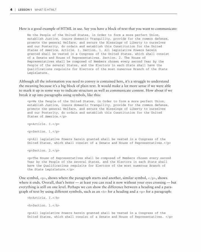
We the People of the United States, in Order to form a more perfect Union,establish Justice, insure domestic Tranquility, provide for the common defense,promote the general Welfare, and secure the Blessings of Liberty to ourselvesand our Posterity, do ordain and establish this Constitution for the UnitedStates of America. Article. I. Section. 1. All legislative Powers hereingranted shall be vested in a Congress of the United States, which shall consistof a Senate and House of Representatives. Section. 2. The House ofRepresentatives shall be composed of Members chosen every second Year by thePeople of the several States, and the Electors in each State shall have theQualifications requisite for Electors of the most numerous Branch of the StateLegislature.
Although all the information you need to convey is contained here, it’s a struggle to understand the meaning because it’s a big block of plain text. It would make a lot more sense if we were able to mark it up in some way to indicate structure as well as communicate content. How about if we break it up into paragraphs using symbols, like this:
<p>We the People of the United States, in Order to form a more perfect Union,establish Justice, insure domestic Tranquility, provide for the common defense,promote the general Welfare, and secure the Blessings of Liberty to ourselvesand our Posterity, do ordain and establish this Constitution for the UnitedStates of America.</p>
<p>Article. I.</p>
<p>Section. 1.</p>
<p>All legislative Powers herein granted shall be vested in a Congress of theUnited States, which shall consist of a Senate and House of Representatives.</p>
<p>Section. 2.</p>
<p>The House of Representatives shall be composed of Members chosen every secondYear by the People of the several States, and the Electors in each State shallhave the Qualifications requisite for Electors of the most numerous Branch ofthe State Legislature.</p>
One symbol, <p>, shows where the paragraph starts and another, similar symbol, </p>, shows where it ends. Overall, that’s better — at least you can read it now without your eyes crossing — but everything is still on one level. Perhaps we can show the difference between a heading and a para-graph of text by using different symbols, such as an <h> for a heading and a <p> for a paragraph:
<h>Article. I.</h>
<h>Section. 1.</h>
<p>All legislative Powers herein granted shall be vested in a Congress of theUnited States, which shall consist of a Senate and House of Representatives. </p>

How Browsers Style Web Pages ❘ 5
Getting better, but are all headings the same? How about if we indicate the most important heading with the number 1 and a less important heading with a 2, like this:
<h1>Article. I.</h1>
<h2>Section. 1.</h2>
Now when a computer program, like a browser, renders this marked-up text, it strips out the markup symbols (called tags in HTML) and shows the text with the appropriate styling, as shown in Figure 1-1.
FiGure 1-1
Most of this book explores the wide range of HTML tags used to mark up web page content so that you can create web pages that look the way you want them to.
How browsers sTyLe web PaGes
Like most computer software, a web browser only works with a particular type of file. An HTML page typically ends in the file extension of .html or .htm. When a browser loads an .html document, it begins to redraw the screen according to the included HTML markup and content.
The browser has a default style for each HTML tag that indicates a visual element for the page, such as a heading, that governs the size, color, and other properties of the element. These default styles — and, in fact, how HTML tags are applied in general — are based on a recommendation by the inter-national consortium that determines HTML specifications, the W3C. Each browser determines how best to interpret the HTML recommendations, which explains why web pages can look different from one browser to the next.

6 ❘ Lesson 1 What Is htML?
A sharp eye on your browser’s address bar will quickly reveal that not all web pages end in .html or .htm. You’ll encounter a veritable alphabet soup of file extensions: .php, .cfm, .cfm, .cfm .aspx, and many, many more. Such pages likely require the use of a server-side processor and additional languages to perform calcula-tions or integrate details from a database. Once the processing is complete, the server-side program sends the browser straight HTML that can be rendered on the screen — so it all comes down to HTML.
Rather than force all web pages to be rendered using the same or similar set of design rules, brows-ers recognize a set of customizable styles known as cascading style sheets (CSS). When rendering a web page, browsers take the structure of the page from the HTML tags and style it according to the associated CSS rules. The web designer is responsible for developing the CSS styles and applying them to the HTML elements. Because HTML and CSS are so tightly integrated these days, you’ll be learning a bit of CSS styling along with each of the HTML tags.
To learn more about cascading style sheets (CSS) see Lesson 4.
Because HTML is a markup language, the code for each page is readable, unlike compiled or machine code used to power most computer applications. The underlying HTML for almost any web page is readily visible and this ability to learn by example can be a terrific way to sharpen your understanding of HTML. All modern browsers include a built-in command that allows you to examine the HTML code used to render the current web page. You will review text with HTML tags in the Try It section at the end of this lesson.
THe LaTe LaTe La esT Version: HTML5
The W3C, as mentioned earlier, is the organization responsible for creating the HTML specifications. The W3C has been active since the very beginning of the web under the direction of Tim Berners-Lee, defining the standards for numerous computer document formats, including HTML and CSS. This standards body has developed several versions of HTML over the years. The last version to reach the final stage of recommendation was HTML 4.01 in 1999. The most recent version, HTML5, is still under development as of this writing, but nearing completion.
The World Wide Web is a rapidly developing organism and much has changed since 1999. The new-est version of HTML attempts to embrace the robust multimedia environment of today’s Web while remaining backward-compatible with current browsers. Although HTML5 has not been finalized, almost all of the tags can be used safely in web pages today. Even some of the more advanced tags, such as those for video, work with the most current browser versions.
So what makes HTML5 different from its predecessors? HTML5 is distinguished in two main cat-egories: structure and media. As you’ll see in greater detail later in this book, today’s web page is typically structured by generic divisions through the <div> tag. Thus, a layout that requires header,

Try it ❘ 7
main content, and footer areas would have a minimum of three <div> tags. HTML5, by contrast, offers specific <header> and <footer> tags, as well as ones for content such as <article> and <summary>. HTML5 contains numerous other structural elements for handling figures, forms, and navigation as well. Most of these have not yet been implemented by current browsers as of this writing.
The other major difference — and one that has gotten a lot of attention recently with the release of the Apple iPad — is built-in media support. In HTML4 and earlier, if you wanted to show an anima-tion or play a video, you needed to use a browser plug-in, such as the Adobe Flash Player. HTML5 includes native support for playing video and audio through the <video> and <audio> tags, respec-tively, as well as static and animated vector graphics via the <canvas> tag. A few browsers on the cutting-edge, including the latest versions of Firefox and Google Chrome, have begun to support one or more of these elements, as shown by the video playing in Safari 4.0.5 in Figure 1-2.
FiGure 1-2
To find out more details about the newest elements of HTML5, see Section 10 later in this book.
Try iT
In this Try It you learn how to review the HTML source code for any given web page.
Lesson requirementsYou will need an Internet connection and a web browser, such as Internet Explorer, Firefox, or Safari.
step-by-step1 . Open your favorite browser.

8 ❘ Lesson 1 What Is htML?
2 . Enter the following in the web address (or location) field: http://html5.markofthejoe.com/pages/lesson_01/constitution.html. Press Return (Enter).
3 . After the page loads, choose the following menu command for your browser:
Internet Explorer: View ➪ Page Source
Firefox: View ➪ Page Source
Safari: View ➪ View Source
4 . When the new window opens, scroll down the page to review the HTML markup and note the use of <p>, <h1>, and <h2> tags.
5 . When you’re done, close the window containing the HTML code to view the web page in the browser (Figure 1-3).
FiGure 1-3
Please select the video for Lesson 1 on the DVD with the print book, or watch online at www.wrox.com/go/html5video to see an example that takes you through the process of displaying the web page source code.

Creating Your First Web Page
The beauty of the HTML language is that you don’t need to be a rocket scientist — or even a computer science major — to write it. Moreover, you don’t need a special program to create an HTML page. Any text editor will do: the simpler, the better.
In this lesson, you gain an understanding of the basic structure common to all HTML pages. The core document you create can serve as a foundation for the most complex web page you can envision — or, as you’ll see in this chapter’s exercise — the most basic.
HTML5 synTaTaT Xes: an eMbarrassMenT oF ricHes
Before we proceed with the actual page code, we need to take a moment to explain the type of code that will be used in this chapter and throughout the book.
During the development of previous HTML versions, two different syntaxes were used: standard HTML and the more structured XHTML. When first created, HTML was a fairly loose language in terms of the requirements it placed on authors. For example, certain com-mon tags, such as the paragraph tag <p>, did not require a corresponding closing element. Likewise, attribute values did not have to be enclosed in quotes; class=”item” was the same as class=item. The primary benefit to standard HTML syntax was that browsers were very forgiving of coding errors which, in turn, lowered the entry barrier for beginning web page authors.
As the Web expanded in its usefulness, the drive to use the information it contained in many more situations gave rise to the XHTML syntax. The X in XHTML stands for eXtensible and is derived from another computer language called Extensible Markup Language, or XML. XHTML, like its XML cousin, is much more rigid than HTML. For starters, XHTML is case-sensitive: All tags and attributes must be in lowercase. In addition, all tags must be explicitly closed whether via a tag pair, like <p>…</p>, or a closing slash mark within the tag itself, like the line break tag, <br/>. The trade-off for this increased fastidiousness is a more widespread readability among various browsers.
2
10 ❘ Lesson 2 CreatIng Your FIrst Web Page
So which syntax model does HTML5 follow? Well, to date, both. The specifications for HTML5, as they stand today, call for web authors to be able to choose whether they prefer to work in an HTML or XHTML flavored language environment. Given the two different paths, we’ve decided to forge ahead — right down the middle. There is enough overlap between the two choices to find common ground and write web pages that will be acceptable under either syntax. Although this will entail a few more rules than following a straight HTML syntax, it’s a good type of structure, one that will cause you to write standardized code without constraining your creative freedom. Details of the syn-tax are described throughout the book as various tags and attributes are explored.
undersTandinTandinT G basic PaGe sTrucTure
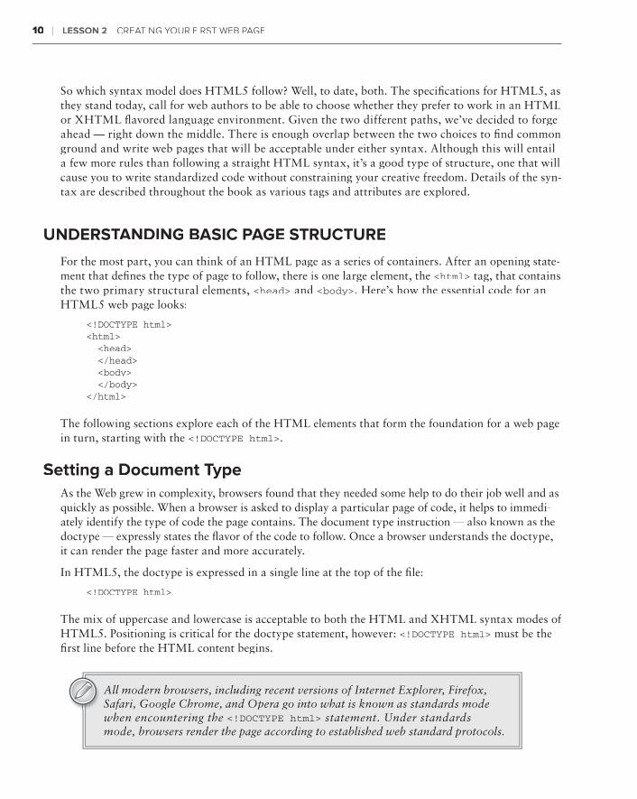
For the most part, you can think of an HTML page as a series of containers. After an opening state-ment that defines the type of page to follow, there is one large element, the <html> tag, that contains the two primary structural elements, <head> and <body>. Here’s how the essential code for an HTML5 web page looks:
<!DOCTYPE html><html> <head> </head> <body> </body></html>
The following sections explore each of the HTML elements that form the foundation for a web page in turn, starting with the <!DOCTYPE html>.
setting a document TypeAs the Web grew in complexity, browsers found that they needed some help to do their job well and as quickly as possible. When a browser is asked to display a particular page of code, it helps to immedi-ately identify the type of code the page contains. The document type instruction — also known as the doctype — expressly states the flavor of the code to follow. Once a browser understands the doctype, it can render the page faster and more accurately.
In HTML5, the doctype is expressed in a single line at the top of the file:
<!DOCTYPE html>
The mix of uppercase and lowercase is acceptable to both the HTML and XHTML syntax modes of HTML5. Positioning is critical for the doctype statement, however: <!DOCTYPE html> must be the first line before the HTML content begins.
All modern browsers, including recent versions of Internet Explorer, Firefox, Safari, Google Chrome, and Opera go into what is known as standards mode when encountering the <!DOCTYPE html> statement. Under standards mode, browsers render the page according to established web standard protocols.

understanding Basic Page Structure ❘ 11
defining the root element: <html>The primary container for any web page is the <html> element. All content processed by the browser must be contained within an <html>… </html> pair. Because <html> is the outermost container, it is known as the root element.root element.root
The HTML page so far looks like this:
<!DOCTYPE html><html>
</html>
One key browser feature can make web pages much more readable. By default, browsers consider all white space — spaces between words and carriage returns — except for a single space, to be extraneous and ignore it. This allows coders to use line breaks, extra lines, and indentations to format their output for easy reading. Feel free to use as much, or as little, white space as you like in your code.
Forming the <head>Within the root <html> tag are two main structural branches: the <head> and the <body>. The head section contains information about the current document, often referred to as metadata. This metadata may include the title of the document, keywords and descriptions that describe the page, author details, and copyright statements among other information. Almost all of the content within the <head>… </head> tag pair is hidden from immediate public view; that is, outside of the <title>tag, content in the head is not rendered in the browser. It is intended to be used by the external agents, such as search engine spiders, to gather information about the page as well as to serve as the central storage facility for other code (like links to JavaScript or cascading style sheets) that affect the presen-tation of the page.
The <head> tag is contained within the <html> element, directly after the opening root element, like this:
<!DOCTYPE html><html> <head>
</head></html>
As noted earlier, it’s okay to use white space, like we have here, to indent code. Such indentations, accomplished either with tabs or spaces, are often used to represent the level of nesting.
12 ❘ Lesson 2 CreatIng Your FIrst Web Page
enclosing the content with <body>The second structural branch within the <html> tag is the <body> tag. The body section is home to all the content visible in the browser. As the containing element for such content, the <body> tag plays a pivotal role in styling as well as interactively presenting the page.
The <body>… </body> tag pair is written immediately after the closing </head> tag and before the closing </html> tag, like this:
<!DOCTYPE html><html> <head>
</head> <body>
</body></html>
The <body> tag is capable of accepting numerous attributes, including the ID attribute, like this:
<body id=”home”>
A page with a distinctive ID in the <body> tag can be targeted for specific styling using CSS. Other common attributes include lang, for defining the primary language used in the page, and onload, which can be used for triggering one or more JavaScript functions when the page has been fully loaded by the browser.
To learn more about how CSS is used with the <body> tag, see Lesson 4.
Try iT
In this Try It you learn how to create a basic HTML page.
Lesson requirementsYou will need a text editor (such as NotePad on the PC, or TextEdit on the Mac) and a web browser, such as Internet Explorer, Firefox, or Safari.
step-by-step1 . Open your favorite text editor.
2 . If you’re using TextEdit on the Mac or any other RTF editor, switch to plain text. In TextEdit, for example, choose Format ➪ Make Plain Text.

Try it ❘ 13
3 . At the top of a blank page, enter the doctype statement <!DOCTYPE html> and press Enter (Return).
4 . On a new line, type <html> and press Enter (Return) twice.
5 . Enter the closing tag, </html>.
6 . Place your cursor in the empty line between the opening and closing <html> tags and enter <head>.
7 .7 .7 Press Enter (Return) and type <title>My New Page</title>.
8 . Press Enter (Return) and type </head>.
9 . Press Enter (Return) and type <body>.
10 . Press Enter (Return) and type <p>Welcome to my new world</p>.
11 . Press Enter (Return) and type </body>.
12 . Verify your code is the same as that shown in Figure 2-1 and then save your page as Lesson2.html.
FiGure 2-1
Please select the video for Lesson 2 on the DVD with the print book, or watch online at www.wrox.com/go/html5video to see an example of creating an HTML page.


Viewing Web Pages
Viewing your web pages in a browser is an essential part of learning to write HTML code. Not only does it give you a sense of satisfaction (when everything goes right), but it also pro-vides a valuable testing platform (when it doesn’t). Throughout the balance of this book, after you’ve created or modified a web page, you’ll be asked to view it in your browser. This lesson shows you how to view and change an HTML page.
oPeninG FiLes in a browser
The majority of the time, you’ll use your favorite web browser — whether it is Internet Explorer, Firefox, Safari, Google Chrome, Opera, or another — to view pages and sites posted on the World Wide Web. However, your browser is also a very capable tool for displaying locally stored web pages composed of standard HTML.
The steps for viewing a locally saved HTML file in a browser are the same across the spectrum of modern browsers, with a couple of exceptions. The following programs work identically when it comes to viewing a local web page, on either a PC or a Mac:
Firefox ➤➤
Safari ➤➤
Google Chrome➤➤
To view a saved web page with these browsers, choose File ➪ Open File or press the keyboard shortcut, Ctrl+O (Command+O). The standard Open File dialog box, used in all programs across the operating system, is displayed, like the one in Figure 3-1. Navigate to the desired file and click Open to load the document in the browser.
3

16 ❘ Lesson 3 VIeWIng Web Pages
FiGure 3-1
If you’re an Internet Explorer user, the steps are slightly different:
1 . Choose File ➪ Open from the Menu Bar.
2 . When the Open dialog box appears, click Browse.
3 . In the Windows Internet Explorer dialog, navigate to your desired file and click Open.
Starting with Internet Explorer 7, the File menu is hidden by default. To restore the File menu, choose Tools (located near the upper right of the browser win-dow) ➪ Toolbars ➪ Menu Bar.
The keyboard shortcut for displaying the Open dialog box in Internet Explorer is the same as the one for the Open File command in the previously mentioned browsers — Ctrl+O.
You will practice viewing an HTML page that has been saved on your own system at the end of this lesson.
seTTinG a web workFLow
Although viewing an HTML page is very straightforward, the action is one that fits snugly into the typical web page development workflow. When you’re working on your website, you’ll find yourself falling into a general routine:
Write the initial code in a text editor.➤➤
Save the page.➤➤
View the page in a browser.➤➤

Setting a Web Workflow ❘ 17
Update the page in the text editor.➤➤
Save the page to include any changes.➤➤
Refresh the page in the browser.➤➤
Typically, the text editor and browser run simultaneously so you can easily switch between the two. There’s no need to close the web page in the browser and re-open — refreshing or reloading the newly saved page achieves the same effect.
Again, the various browsers are relatively consistent, with the exception of Internet Explorer, in their implementation of the page reloading feature, as shown in the following table:
browser Menu LocaTion sHorTcuT
Internet Explorer View ➪ Refresh F5
Firefox View ➪ Reload Ctrl+R (Command+R)
Safari View ➪ Reload Page Ctrl+R (Command+R)
Google Chrome View ➪ Reload This Page Ctrl+R (Command+R)
Opera none Ctrl+R (Command+R)
All modern browsers make it easy to reload the page with the click of a mouse. Although the icon symbol varies somewhat, each browser provides a button with one or more curved arrows to reload the page when selected. Figure 3-2 shows where you can find the refresh/reload icon in a variety of browsers.
Internet Explorer
Firefox
Google Chrome
Opera
Safari
FiGure 3-2

18 ❘ Lesson 3 VIeWIng Web Pages
Try iT
In this Try It you learn how to view and make changes to an HTML page that you have saved on your own system.
Lesson requirementsYou will need the .html file you created in Lesson 2, a text editor and a web browser, such as Internet Explorer, Firefox, or Safari.
step-by-step1 . Open your favorite text editor.
2 . Press the keyboard shortcut for opening a file, Ctrl+O (Command+O).
3 . Locate Lesson 2.html in the displayed dialog box.
4 . Click Open.
5 . Add text to the body of the page between the <p> and </p> tags.
6 . Save your page as Lesson3.html.
7 .7 .7 Open the page in a browser to see your changes, which will be similar to those shown in Figure 3-3.
FiGure 3-3
Please select the video for Lesson 3 on the DVD with the print book, or watch online at www.wrox.com/go/html5video to see an example of viewing and changing an HTML page.
section iistyling your your y web Page
Lesson 4:⊲ What Is CSS?
Lesson 5:⊲ Testing CSS


What is CSS?
CSS, short for cascading style sheets, is the look-and-feel for HTML content. With CSS, you can change how text, images, and links appear quickly and easily, on a single web page or across and entire site — and what’s more, the content’s appearance can change based on the medium presenting it. CSS is a powerful technology, tightly intertwined with HTML in the building of modern websites. In this lesson, you learn the basics of CSS, including key con-cepts, where to store your CSS rules, and how to work with primary selectors.
undersTandinTandinT G cascadinG sTyLe sHeeTs
Before CSS gained popularity, HTML pages were styled with tag attributes. For example, if you wanted to make a particular heading red, your tag would look like this:
<h1 color=”red”>Listen Up!</h1>
The problem with this approach is that the styling of the content is very tightly tied to the con-tent itself. Though changing a single tag is easy enough, what if your design called for all <h1>tags to be red? If your color scheme changed so that every heading needed to be blue, you’d have to update every tag, one at a time. CSS provides a presentation layer independent of the content where you can easily make global formatting changes. This presentation layer brings numerous benefits, including:
Ease of modification:➤➤ With CSS, you can style all the <h1> tags — or any other tags or custom selected content — in an entire site by changing values in one place.
Advanced design options:➤➤ Current CSS implementations enable rich background elements, pixel-perfect positioning, and robust padding and margin possibilities. The next genera-tion of CSS, much of which is available today in modern browsers, extends the designer’s palette with rounded corners, drop shadows, and gradients, among many other features.
4

22 ❘ Lesson 4 What Is Css?
Media targeting:➤➤ Today’s digital content isn’t just for the computer screen: you can easily print a web page, view it on your smart phone, or even see it on your TV. CSS makes it possible to change the look-and-feel of your content to suit the output device with radically different lay-outs, removal or inclusion of page sections, and a completely different color scheme.
With CSS, web page styles are made up of one or more rules. A CSS rule is comprised of three main parts: the selectors, the properties, and the values. For example, in the CSS rule depicted in Figure 4-1, h1 is the selector, color is the property, and red is the value.
Selector Value
Property
FiGure 4-1
After the selector, properties and values (collectively referred to as a declaration) are enclosed in a set of curly braces. Properties and values are separated by a colon and each declaration must end with a semicolon. You can include multiple declarations for any selector. For example:
h1 { color: red; margin: 0; padding: 5px;}
As with HTML, white space is ignored in CSS, so you can apply line-returns and indentation as needed to make your CSS rules more readable.
Moreover, you can specify multiple selectors for any set of declarations in a comma-separated list:
h1, h2, h3, h4 { color: red; margin: 0; padding: 5px;}
CSS is truly an integral part of modern web page creation and a further understanding of its basic tenets and how it can be used as discussed in the following sections will further your work with HTML.
Key CSS Concepts ❘ 23
key css concePTs
To represent CSS rules consistently, browsers follow a set of implementation guidelines that adhere to three main principles in CSS
cascading ➤➤
inheritance➤➤
specificity➤➤
The cascading PrincipleThe “cascading” in cascading style sheets refers to the idea that, given two identical CSS rules, the one closest to the targeted element wins. For example, say you have the following two rules, one after the other:
h1 { color: red; }h1 { color: blue; }
In this situation, the second rule — with the declaration that the color should be blue — would take effect and the heading would be blue. As you learn later in this lesson, CSS rules can be located in one of three places: an external style sheet, embedded in the <head> of a document, or inline with the affected tag. The cascade concept dictates that in any CSS rule conflict, an embedded rule would best one in an external style sheet and an inline rule would beat them both.
The inheritance PrincipleYou’ve seen how much of HTML is based on the principle of nested tags, where, for example, all content is within the <body> tag. CSS rules defined to target outer or parent tags also affect inner or child tags, thanks to the principle of inheritance. For instance, this rule, which uses the <body> tag as the selector, also sets the font-family property for every other text element on the page unless otherwise specified:
body { font-family: Verdana, Arial, Helvetica, sans-serif;}
Many style sheets start with a series of so-called reset statements that rely on the inheritance principle to establish a baseline of values for a wide spectrum of tags.
As you learn later in this lesson, CSS declarations can be applied to more than just tags. You can also create custom selectors, called classes and IDs. You’ve seen what happens when two rules with identical selectors conflict — thanks to the cascading principle, the one closest to the actual tag overcomes the other — but what happens when two rules with different selectors affect the same tag? For example, say you have one rule that sets the color of <h1> tags to red, like this:
h1 { color: red; }

24 ❘ Lesson 4 What Is Css?
Furthermore, say there is a second rule that uses a custom CSS selector called a class with the name .alert:
.alert { color: purple; }
How do you think the browser is supposed to render the following tag?
<h1 class=”alert”>Attention site visitors!</h1>
In this situation, the CSS principle of specificity comes into play.
The specificity PrincipleA class selector is regarded as being more specific than that of a tag selector, so, in this example, the text would be purple. The hierarchy of selectors from least to most specific looks like this:
1 . Tags
2 . Classes
3 . IDs
4 . Inline styles
I want to take a look at an example to demonstrate how specificity works. Say that you have a page like this:
<body> <div id=”content”> <h1 class=”mainTopic”>When in Doubt, Be Specific!</h1> </div></body>
Furthermore, assume you declared a CSS rule that made all h1 tags green, like this:
h1 { color: green; }
Now, if the client decides he or she wants h1 tags to be green in general, but those that are within a mainTopic class to be red, you could keep your original CSS rule and write another, like this:
.mainTopic h1 { color:red; }
Because this CSS rule has a higher specificity, the heading in this section would be red. If, for what-ever reason, the client decides that this one particular heading has to be purple, you could inject an inline style into the HTML source code:
<h1 class=”mainTopic” style=”color:purple;”>When in Doubt, Be Specific!</h1>
As noted previously, inline styles are generally frowned upon by web designers because they are difficult to quickly modify. Specificity is a fundamental principle to keep in mind when you’re debugging your CSS styles.

Working with CSS Placement ❘ 25
workinG wiTH css PLaceMenT
As mentioned earlier, CSS rules can be integrated into an HTML page in a number of ways: as an external style sheet, embedded within the HTML page itself, and inline as an attribute within the tag. This section takes a look at each approach in turn.
external style sheetsExternal style sheets are used to provide a consistent look-and-feel to any number of related pages, up to and including an entire website. An external style sheet is connected to an HTML page in one of two ways: either with a <link> tag, or with an @import directive within a <style> tag. For example, say you wanted to include the CSS rules written in a file called main.css. The <link> syntax would look like this:
<link href=”styles/main.css” type=”text/css” rel=”stylesheet” />
The href attribute provides the path to the external style sheet, and type specifies the kind of docu-ment the browser can expect. The relationship of the HTML page to the linked file is defined by the rel attribute; the two possible values are stylesheet and alternate stylesheet.
If you wanted to use the @import syntax, you would write code like this:
<style> @import { url(“styles/main.css”); }</style>
Notice that @import is actually a CSS rule with the single url property, written somewhat differ-ently from standard CSS declarations. When used with an HTML page, the @import rule must be within a <style> tag.
Complex site designs often use the @import rule within an external style sheet to include additional style sheets. When used in an external style sheet, the @importrule does not require a <style> tag.
So when do you use <link> and when do you use @import? It really is a matter of choice at this point in time. All modern browsers recognize both options. I prefer to use the <link> syntax because it involves a single tag instead of a tag and a rule when associating an external style sheet with an HTML page, and save @import for incorporating additional style sheets into CSS files.
Whichever technique you use, external style sheets have the tremendous advantage of being able to affect multiple HTML pages simultaneously. Change any CSS rule, save the external style sheet, publish it, and immediately the modification can be seen by any site visitor to any of the associ-ated pages. You can see why external style sheets are widely used by web designers across the industry.

26 ❘ Lesson 4 What Is Css?
embedded stylesCSS rules can also be included in an HTML page, typically in the <head> section of the document. This technique is known as embedding. CSS rules are embedded through use of the <style> tag, like this:
<style type=”text/css”>body { margin: 0; padding: 0; background-color: white;}h1, h2, h3, h4 { color: red; margin: 0; padding: 5px;}</style>
As mentioned earlier, if the same CSS rule is both included in an external style sheet and embedded, the embedded rule has precedence. The obvious disadvantage to embedding rather than linking to an external style sheet is that CSS modifications apply only to a single page. Updates to multiple pages with embedded styles require multiple steps.
inline stylesThe final method for styling HTML tags is called inline styles. An inline style is applied by use of the style attribute within an HTML tag. For example, if you want to color an <h1> tag red with in an inline style, your code would look this:
<h1 style=”color:red;”>Important Message Ahead</h1>
You’ll notice the resemblance between the inline style and the pre-CSS technique for changing the look-and-feel of a tag. Not surprisingly, the inline style has the same drawback as the pre-CSS attribute-based method of being difficult to update. For this reason, inline styles are rarely used by designers when creating web pages.
Currently, inline styles do have one practical use: HTML e-mails. E-mail pro-grams do not recognize embedded or external style sheets across the board. To achieve universal acceptance, designers are forced to incorporate inline styles to add flair to their e-mails.
workinG wiTH seLecTors
This lesson has touched on the use of selectors in creating CSS rules and now it’s time to dive in a little deeper. There are basically four different types of selectors:
Tags:➤➤ An HTML tag can serve as a CSS selector.

Working with Selectors ❘ 27
IDs:➤➤ An ID is a custom CSS selector, intended to be used once per HTML page.
Classes:➤➤ A class is another custom selector, which can be used as many times as needed on a web page.
Compound:➤➤ Tags, IDs, and classes can be combined to create a compound selector, which pinpoints a particular section of the page.
TagsThe use of HTML tags as a CSS selector is very straightforward. When an HTML tag, such as <p>, is defined as a selector with CSS, all <p> tags are immediately affected unless another CSS style over-rules it. With tag selectors, it is easy to implement broad, sweeping modifications to existing web pages. This ability is both a blessing and a curse. You’ll need to make sure that any tag styles created work well in all page variations.
idsA CSS ID is a custom selector intended for use once per HTML page. To define an ID selector, use a leading number sign symbol, like this:
#header { width: 960px;}
An ID is applied to an HTML tag with the ID attribute:
<div id=”header”>
Note that the # symbol is only used when defining the CSS rule, not when applying it.
classesThe class selector is similar to the ID, except it may be used multiple times on a single page. Additionally, instead of a leading number sign, a period is used to define a class selector, like this:
.legalNotice { font-size: small;}
To apply the class selector to an HTML tag, use the class attribute:
<div class=”legalNotice”>
The names of classes and IDs must begin with a letter and not contain any white spaces or other special characters. Similarly, classes and IDs are case-sensitive. In other words, .legalNotice is not the same as .LegalNotice.
28 ❘ Lesson 4 What Is Css?
compound selectorsIt is often beneficial to limit CSS rules to a tightly defined section of the page. Rather than create a specific ID or class for such sections, designers often opt for a compound selector that targets the area contextually.
Say, for example, that you need to make all <h1> tags in the sidebar green. Instead of creating and applying a series of classes, you can define a compound selector, like this:
#sidebar h1 { color: green;}
This selector will apply to any <h1> tag within any HTML element with an ID of sidebar. Compound selectors can utilize any combination of tags, IDs, and classes.
You’ll be using CSS — with a full range of selectors, properties, and values — throughout the book to help you better understand how HTML5 tags are used to create coherent web pages.
Because this lesson just covers some of the basics of CSS, there is no accompany-ing Try It and video. Starting in Lesson 5, you’ll begin some real hands-on work using CSS.

Testing CSS
In my experience, CSS errors make up the vast majority of problems with websites. If you fol-low web standards, once you’ve got the content on the page in a website, you’ll spend most of your time trying to get it to look right in one browser or another. Unfortunately, the disparate state of browsers heightens the likelihood that you’re going to have to make adjustments to your CSS. The good news is that browsers, on a whole, are moving closer together in how they render web pages. In this lesson, you learn a few techniques for uncovering issues with your site’s CSS before your client does.
VaLidaTidaTida inG your your y css
Before you start testing your pages in browsers, you want to make sure all of your CSS prover-bial i’s are dotted and t’s are crossed. To assure your CSS syntax is error-free, you validate it. CSS is based on a specification, known as a recommendation, developed by the W3C. The CSS specification is used by online applications called validators to check your files for accuracy and make sure there are no unsupported selectors, properties, or values.
The most frequently used CSS validator is hosted by the W3C itself. The W3C CSS Validation Service (Figure 5-1) is located at http://jigsaw.w3.org/css-validator and can check CSS in a variety of formats:
By URI:➤➤ URI, short for Uniform Resource Identifier, is the parent term of the more frequently used URL (Uniform Resource Locator). A URI can refer to a web address or a local file path. For the CSS Validation Service, the URI may be an HTML page with CSS linked or embedded or an external CSS file.
By file upload:➤➤ If the file you want to check is not already online, you can upload it. Again, the service will validate HTML with CSS or CSS alone.
By direct input:➤➤ Paste any copied CSS into the supplied text area and click Check to validate selections of CSS code.
5

30 ❘ Lesson 55 testIng Css
FiGure 5-1
After running the Validation Service, it will return any errors found. If none are identified, it will let you know that your CSS is valid and present you with a couple of badges that you can proudly dis-play on your site (Figure 5-2). The CSS Validation Service will also warn you of any repetitive prop-erty/value uses or if, for example, you haven’t included a generic font at the end of your font-family value. It is best to clear up any warnings to avoid potential problems.
cHeckinG your css in a browser
When web designers talk of “testing their CSS,” what do they mean? For the most part, you test a page by simply viewing it in the browser. If there is a serious problem, it will jump out at you right away. For example, older versions of Internet Explorer (versions 6 and below) handled a basic CSS concept, the box model, differently from web standards–compliant browsers. In short, when you specified a <div> tag’s width, the prior editions of Internet Explorer (IE) potentially thought you meant a larger amount of space than all the other browsers. In multiple column designs — which is most of the Web — this led to one of the columns being squeezed out because IE thought the first column was bigger than it actually was. This situation is immediately obvious when you look at your page in an IE 6 or earlier browser.
Other design differences are not so obvious and may even be acceptable. The amount of browser “chrome” (the various toolbars and interface elements surrounding the actual web page) varies from browser to browser. A browser with more chrome will push your page down the document window, but because it does the same to all pages, such an issue isn’t critical and, I would argue, is a fact-of-life on the Web.

Checking Your CSS in a Browser ❘ 31
FiGure 5-2
To discover which issues you have to fix and which you can accept, you’ll need to view your pages in as many browsers as you can. If you’re redesigning a site, you can get a clear idea of what browsers you’ll need to review by checking the stats of the current site. For new sites, it’s best to understand the site’s potential market to know which browsers to target. If the expected visitors are older, you probably would include more past versions of browsers because older folks tend not to upgrade their browsers frequently; if you think your visitors will be hip designers, you should target the latest browsers.
The tricky part of testing your web pages becomes apparent when you realize that you’re not just checking different browsers, you’re checking different operating systems. Once again, Internet Explorer provides a telling example. When IE6 was released for the PC, IE for the Mac was also being used. Although they were produced by the same company, they were created by separate engi-neering teams and often rendered pages completely differently. In the best of all worlds, you’ll need access to both PCs and Macs.
If you’re like most designers, you have focused on one platform, whether it is PC, Mac, or even Linux. Luckily, software such as Parallels, VMWare, and Microsoft Virtual PC has made it possible to run more than one operating sys-tem at a time. Although you do need a valid license for an alternative OS, only one piece of computer hardware is required.
32 ❘ Lesson 55 testIng Css
The most direct method to view the results of your CSS is to install as many browsers as you can on your system and open the associated pages in them. Luckily, all modern browsers are freely avail-able, including all of these:
Microsoft Internet Explorer➤➤
Mozilla Firefox➤➤
Apple Safari➤➤
Google Chrome➤➤
Opera➤➤
All but IE allow you to easily install multiple versions of their browsers. To maintain access to older versions of IE, you’ll need to use virtualization soft-ware like Microsoft Virtual PC or a utility such as IETester. IETester is a free program that allows you to check pages on a full range of Internet Explorer versions from IE 5.5 to, as of this writing, the preview version of IE 9. You can find IETester, as well as other handy debugging tools, at http://www.my-debugbar.com.
Another method for seeing how your web pages look in a range of browsers is to use an online service. A number of companies have set up virtualization servers that render any submitted URL and then display a snapshot of that rendering. Services such as BrowserCam (http://www .browsercam.com) make it possible to review rendered pages on a full set of devices. A relatively recent entry, BrowserLab, comes to the field from Adobe (https://browserlab.adobe.com). Though BrowserLab offers tight integration with Adobe’s web development software, Dreamweaver, it is also available on its own. As shown in Figure 5-3, BrowserLab offers the ability to compare the same page in two different browsers simultaneously. You can also overlay one browser page on top of the other with variable transparency in the Onion Skin mode. BrowserLab is free to use with an Adobe ID, which is also available at no charge.
Once you’ve uncovered a problem, how do you fix it? The most basic approach is to modify the CSS in your editor, save the page, and review. Though this technique is effective, its repetitive nature can be very time-consuming. A variety of browser-based tools have emerged to help you hone in on the problem without relying on the update-save-preview cycle.
For example, Firefox users can install a free extension called Firebug (http://getfirebug.com) that allows you to view the CSS of any web page and even make changes in real time. In addition, you can highlight page elements and follow the HTML code tree to hone in on problem areas. The same organization makes a Firebug Lite, which can be used with other browsers.
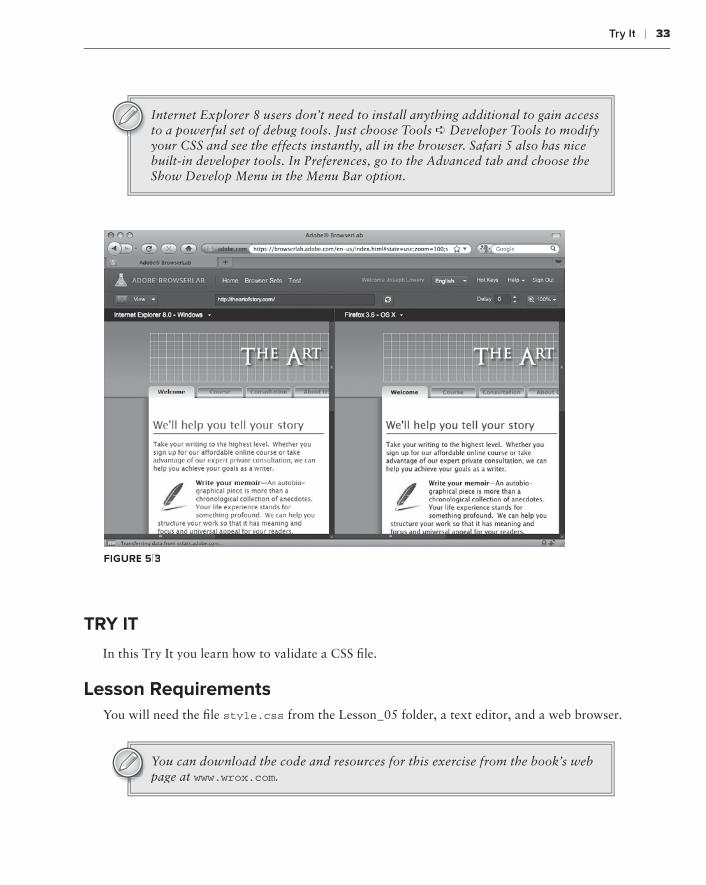
Try it ❘ 33
Internet Explorer 8 users don’t need to install anything additional to gain access to a powerful set of debug tools. Just choose Tools ➪ Developer Tools to modify your CSS and see the effects instantly, all in the browser. Safari 5 also has nice built-in developer tools. In Preferences, go to the Advanced tab and choose the Show Develop Menu in the Menu Bar option.
FiGure 5-3
Try iT
In this Try It you learn how to validate a CSS file.
Lesson requirementsYou will need the file style.css from the Lesson_05 folder, a text editor, and a web browser.
You can download the code and resources for this exercise from the book’s web page at www.wrox.com.

34 ❘ Lesson 55 testIng Css
step-by-step1 . Open your favorite browser.
2 . In the address field, type http://jigsaw.w3.org/css-validator and press Enter.
3 . When the CSS Validation Service appears, click the By File Upload tab.
4 . Click Browse and navigate to the styles.css file in the Lesson 5 exercise files.
5 . Click Check.
6 . Note the problem found on line 16 (Property witdh doesn’t exist: 1019px 1019px) as shown in Figure 5-4.
FiGure 5-4
7 .7 .7 Open styles.css in your text editor and go to line 16.
8 . Change “witdh” to “width.”
9 . Save your file.
10 . Return to the CSS Validation Service and re-check the styles.css file.
Please select the video for Lesson 5 on the DVD with the print book, or watch online at www.wrox.com/go/html5video to see an example of validating a CSS file.
section iiiworking with HTML basics
Lesson 6:⊲ Adding Text
Lesson 7:⊲ Styling Text with CSS
Lesson 8:⊲ Linking to Content
Lesson 9:⊲ Validating Your Pages

adding Text
Text is obviously an essential part of almost every web page. Though you can have a page or even a site completely devoid of text, they are the exception rather than the rule. HTML text is best handled in a structural fashion, with headings introducing paragraphs. In this lesson, you learn how to quickly add paragraphs, headings, and special characters to your web pages.
workinG wiTH ParaGraPHs
In HTML, paragraphs of text are, aptly enough, contained in a <p>, or paragraph, tag. The <p> tag separates a text block from other elements, including other <p> tags. A paragraph tag can contain one or more sentences. For example, quotes from Henry David Thoreau formatted for the Web would look like this:
<p>Cultivate the habit of early rising. It is unwise to keep the head long on alevel with the feet.</p><p>Books are the carriers of civilization. Without books, history is silent,literature dumb, science crippled, thought and speculation at a standstill. I think that there is nothing, not even crime, more opposed to poetry, tophilosophy, ay, to life itself than this incessant business.</p>
By default, browsers typically render paragraph tags with a noticeable margin above and below the <p> tag content. In Firefox, the example text is depicted with one em of space on top and bottom as shown in Figure 6-1. Note the separation between the two paragraphs in the browser where there is none in the code.
An em is a percentage-based measurement equal to the width of the letter “M” in the current font.
6

38 ❘ Lesson 6 addIng text
FiGure 6-1
The <p> tag is what’s known as a block element in HTML. Without additional styling, any block element appears on its own line and flows to fill the containing element while respecting any pad-ding or margins that have been added with CSS rules. To break the content within a <p> tag at a designer-controlled point, you’d use a <br>, or line-break, tag. For example, the following code:
<p> Our life is frittered away by detail. <br/>Simplify, simplify.<p>
would be rendered in two lines in a browser, like this:
Our life is frittered away by detail. Simplify, simplify.
Note that the <br> tag always includes a closing forward slash when used in code and typed as <br/>. This closing indicator is in keeping with the XHTML syntax of HTML5 and also works with the standard HTML syntax. <br> with-out the forward slash is the name of the tag.
There is no top or bottom margin in the default styling of the <br> tag, so each of the lines appears closer together.
Don’t make the mistake of thinking you have to use the <br> tag every time you want to keep text closer together. You learn how to control the margin-top and margin-bottom CSS properties in Lesson 7.
Try iT
In this Try It you learn how to insert paragraphs of content.

adding Headings ❘ 39
Lesson requirementsYou will need the file new.html from the Lesson_06 folder, a text editor and a web browser.
You can download the code and resources for this exercise from the book’s web page at www.wrox.com.
step-by-step1 . Open your text editor.
2 . From the Lesson_06 folder, open new.html.
3 . Place your cursor after <body> and press Enter (Return) to make a new line.
4 . On the new line, enter the following code: <p>Henry David Thoreau is best known for his books and essays.</p>.
5 . Press Enter (Return) and enter the following code: <p>However, many of his quotations resonate with us today.</p>.
6 . Save your text editor document as thoreau.html.
7 .7 .7 In your browser, open thoreau.html to review the rendered page, as shown in Figure 6-2.
FiGure 6-2
addinG HeadinGs
Headings serve to separate and introduce major divisions to a web page. Search engines pay close attention to headings when available, especially at the top levels. A tight correlation between the window title, the de facto page title (the first heading), and the content can really boost a page’s rankings in a search engine index.
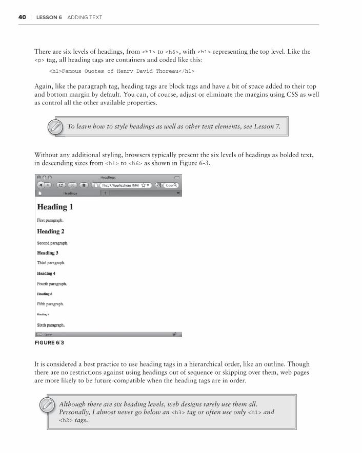
40 ❘ Lesson 6 addIng text
There are six levels of headings, from <h1> to <h6>, with <h1> representing the top level. Like the <p> tag, all heading tags are containers and coded like this:
<h1>Famous Quotes of Henry David Thoreau</h1>
Again, like the paragraph tag, heading tags are block tags and have a bit of space added to their top and bottom margin by default. You can, of course, adjust or eliminate the margins using CSS as well as control all the other available properties.
To learn how to style headings as well as other text elements, see Lesson 7.
Without any additional styling, browsers typically present the six levels of headings as bolded text, in descending sizes from <h1> to <h6> as shown in Figure 6-3.
FiGure 6-3
It is considered a best practice to use heading tags in a hierarchical order, like an outline. Though there are no restrictions against using headings out of sequence or skipping over them, web pages are more likely to be future-compatible when the heading tags are in order.
Although there are six heading levels, web designs rarely use them all. Personally, I almost never go below an <h3> tag or often use only <h1> and <h2> tags.

Try it ❘ 41
Try iT
In this Try It you learn how to separate text with headings.
Lesson requirementsYou will need your previously created web page, thoreau.html, a text editor, and a web browser.
step-by-step 1 . Open your text editor.
2 . Open the previously saved thoreau.html.
3 . Place your cursor before the first <p> tag and press Enter (Return) to make a new line above the paragraph tag.
4 . On the new line, enter the following code: <h1>Famous Quotes of Henry David Thoreau</h1>.
5 . After the last closing </p> tag press Enter (Return) to create a new line.
6 . On the new line, enter the following code: <h2>On Living</h2>.
7 . Create a new line and enter the following code: <p>Every man is the builder of a temple called his body.</p>. <p>Our life is frittered away by detail. Simplify, simplify.</p>.
8 . Save your document.
9 . In your browser, open thoreau.html to view the rendered page, as shown in Figure 6-4.
FiGure 6-4

42 ❘ Lesson 6 addIng text
aPPLyinG sPeciaL cHaracTers
Special characters, like the copyright or trademark symbols, are known in HTML as character enti-ties. A character entity starts with an ampersand and ends with a semicolon, with either an abbrevi-ated name or a number in between. For example, if you want the ampersand itself to be rendered properly in HTML, it should be written in the code like this:
&
And a trademark symbol is coded like this:
™
When used in context, code that looks like this:
<p>M & J Productions is proud to present An Evening of Nerditry™
would be rendered like this:
M & J Productions is proud to present An Evening of Nerditry™
A great number of character entities exist. In addition to visible special characters, a non-breaking space that connects two words or adds additional white space is represented in code with a char-acter entity,  . Any word that requires an accent or other diacritical mark needs a character entity. Because HTML code uses the <and> characters to indicate tags, if you want to use a less than or greater than symbol in your content, you’ll need to use their respective character entities: < and >.
The following table shows some of the most commonly used character entities:
sPeciaL cHaracTer syMboL HTML cHaracTer enTiTy
non-breaking space or  
Less than sign < < or <
Greater than sign > > or >
Copyright symbol © © or ©
Registered symbol ® ® or ³
Trademark symbol ™ ™ or ™
Em-dash — — or —
En-dash – – or –
English pound sign £ £ or £
European euro € € or €
Japanese yen ¥ ¥ or &165;

Try it ❘ 43
Try iT
In this Try It you learn how to include a character entity in your code.
Lesson requirementsYou will need your previously created file, thoreau.html, a text editor, and a web browser.
step-by-step1 . Open your text editor.
2 . Open the previously saved file thoreau.html.
3 . Place your cursor at the end of the last closing </p> tag and press Enter (Return) to make a new line below the paragraph tag.
4 . Enter the following code: <p>All quotations are in the public domain. Additional material © 2010 Mr. Quotes, Inc.</p>
5 . Save your page.
6 . View thoreau.html in your browser to see the rendered page, as shown in Figure 6-5.
FiGure 6-5
Please select a video from Lesson 6 on the DVD with the print book, or watch online at www.wrox.com/go/html5video to see an example of the following:
Creating paragraphs for web pages➤➤
Adding heading tags to a page➤➤
Adding a character entity to a page➤➤


Styling Text with CSS
One of the key assets in the designer’s toolbox is typographic design. Compared to print, the Web is limited in what can be done with typography — however, you do have a fair amount of leeway with the available CSS properties. In this lesson, you learn how to style your text with specific fonts, sizes, colors, and alignment.
PickinG your Fonyour Fony T FaMiLyLyL
As noted earlier, web text is more restricted than print text, especially when it comes to the fonts available. In all but the most recent browsers, you have to use a font that is common across operating systems. This means that if your site needs to be moderately backward- compatible, you have fewer than 30 fonts from which to choose for your web designs versus tens of thousands in print. To make sure that your site visitors see a font as close as possible to your ideal, use the CSS font-family property.
With the font-family property, a series of fonts can be assigned as values in a comma- separated list, like this:
font-family: Arial, Helvetica, sans-serif;
When a browser renders text with the preceding CSS declaration, it first tries to use the ini-tial font listed, Arial. If that font is not found on the user’s system, it tries the second font, Helvetica. Should neither font be available, the text is displayed with a generic sans-serif font. If the font name includes a space, the typeface must be surrounded by quotes, like this:
font-family: “Lucida Sans Unicode”, “Lucida Grande”, sans-serif;
7
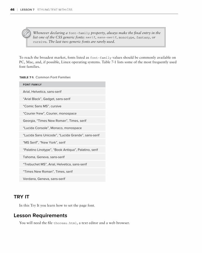
46 ❘ Lesson 7 stYLIng text WIth Css
Whenever declaring a font-family property, always make the final entry in the list one of the CSS generic fonts: serif, sans-serif, monotype, fantasy, or cursive. The last two generic fonts are rarely used.
To reach the broadest market, fonts listed as font-family values should be commonly available on PC, Mac, and, if possible, Linux operating systems. Table 7-1 lists some of the most frequently used font families.
TabLe 7-1: Common Font Families
FonT FaMiLyLyL
Arial, Helvetica, sans-serif
“Arial Black”, Gadget, sans-serif
“Comic Sans MS”, cursive
“Courier new”, Courier, monospace
Georgia, “Times new Roman”, Times, serif
“Lucida Console”, Monaco, monospace
“Lucida Sans Unicode”, “Lucida Grande”, sans-serif
“MS Serif”, “new York”, serif
“Palatino Linotype”, “Book Antiqua”, Palatino, serif
Tahoma, Geneva, sans-serif
“Trebuchet MS”, Arial, Helvetica, sans-serif
“Times new Roman”, Times, serif
Verdana, Geneva, sans-serif
Try iT
In this Try It you learn how to set the page font.
Lesson requirementsYou will need the file thoreau.html, a text editor and a web browser.
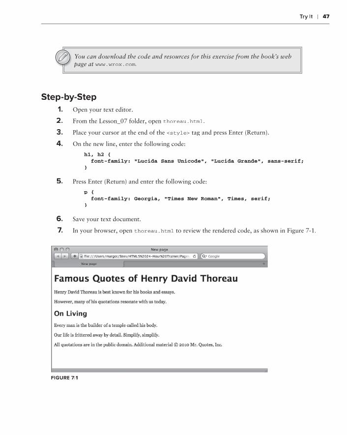
Try it ❘ 47
You can download the code and resources for this exercise from the book’s web page at www.wrox.com.
step-by-step1 . Open your text editor.
2 . From the Lesson_07 folder, open thoreau.html.
3 . Place your cursor at the end of the <style> tag and press Enter (Return).
4 . On the new line, enter the following code:
h1, h2 { font-family: “Lucida Sans Unicode”, “Lucida Grande”, sans-serif;}
5 . Press Enter (Return) and enter the following code:
p { font-family: Georgia, “Times New Roman”, Times, serif;}
6 . Save your text document.
7 .7 .7 In your browser, open thoreau.html to review the rendered code, as shown in Figure 7-1.
FiGure 7-1

48 ❘ Lesson 7 stYLIng text WIth Css
Although the font-family property by itself works with most browsers currently being used, you are restricted to a very limited number of typefaces. The most modern browsers, including Internet Explorer 9, Safari 5, and Firefox 3.x, support a CSS property that allows designers to integrate a whole new category of fonts made specifically for the Web. The @font-face property opens the door for web designers to create pages that rival print in terms of richness of typography. Some web fonts that use @font-face are freely available, whereas others must be licensed on a site-by-site basis.
With @font-face, you link to a web font much as you would link to an external style sheet with @import. Here’s a very basic use of @font-face:
@font-face { font-family: ‘MyWebFont’; src: url(‘MyWebFont.ttf’) format(‘truetype’);}
Once the @font-face declaration has been made, the font-family property can be applied:
h1 { font-family: “MyWebFont”, sans-serif; }
The generic font — here, sans-serif — is listed as a fallback, just in case the user does not have a browser that supports @font-face. You could, and probably should, list several fonts in the family.
Unfortunately, but not surprisingly, the various browsers aren’t completely compatible across the board when it comes to @font-face. Firefox and Safari support TrueType (.ttf) and OpenType (.otf), whereas Internet Explorer supports only the Embedded OpenType (.eot) format. These inconsistencies on the browser front require a more detailed @font-face use:
@font-face { font-family: ‘MyWebFont’; src: url(‘MyWebFont.eot’); src: local(‘MyWebFont’), url(‘MyWebFont.otf’) format(‘opentype’); }
Browsers that don’t support the .eot format will ignore the first src property and value and use the .otf format. Internet Explorer, on the other hand, will load the .eot font and then skip the second src property.
The @font-face declaration truly heralds a sea-change in web design. Previously, whenever a non-common font was required, the text had to be created in a graphics program like Photoshop and then the image of that text was integrated into the web page as a background or foreground graphic. By enabling text to be rendered as a true font rather than an image, the @font-face property keeps all text searchable, selectable, and able to be copied — just as text should be. Figure 7-2 illustrates what’s possible with @font-face.
seTTinG TeXT size and Line HeiGHT
The size of the font for text on the Web is determined by the font-size property. You can use a named, relative measurement such as large or small like this:
h1 { font-size: x-large; }

Setting Text Size and Line Height ❘ 49
FiGure 7-2
The acceptable named values are xx-small, x-small, small, medium, large, x-large, and xx-large. Each browser determines how tall to render the various named values, but they are all roughly the same.
A more precise approach is to use font-size with a numeric measurement system. For example, if you wanted to define your paragraphs to be 12 pixels tall, your CSS declaration would be:
p { font-size: 12px; }
Although most browsers support a wide range of measurement systems, the majority of web design-ers typically use pixels (px), percentage (%), or ems (em) for their web pages. Other systems, like points (pt), can be used when specifying font sizes for print media style sheets.
An em is a percentage-based measurement equal to the width of the letter “M” in the current font.
The height of the line can be controlled separately from the size of the font in CSS by the aptly named line-height property. The default setting for line-height in browsers is typically 120 per-cent of the font size, which gives a bit of white space above and below the text. You can adjust the line-height either by a percentage or, as in this example, a fixed value:
p { line-height: 24px; }
The effect of a line-height twice the size of the font-size is shown in Figure 7-3.
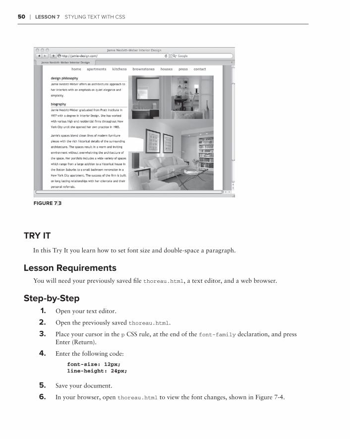
50 ❘ Lesson 7 stYLIng text WIth Css
FiGure 7-3
Try iT
In this Try It you learn how to set font size and double-space a paragraph.
Lesson requirementsYou will need your previously saved file thoreau.html, a text editor, and a web browser.
step-by-step 1 . Open your text editor.
2 . Open the previously saved thoreau.html.
3 . Place your cursor in the p CSS rule, at the end of the font-family declaration, and press Enter (Return).
4 . Enter the following code:
font-size: 12px;line-height: 24px;
5 . Save your document.
6 . In your browser, open thoreau.html to view the font changes, shown in Figure 7-4.

Choosing Text Color ❘ 51
FiGure 7-4
cHoosinG TeXT coLor
HTML5 provides a wide range — a full palette, if you will — of color options for text. When assigning colors for text, it is always important to keep readability uppermost in mind. For content to be easily readable there must be a high contrast between the background color and the text. The CSS color property sets the color of the text, as in this example:
h1, h2 { color: maroon; }
You can specify a color value in four different ways, three of which are supported by a full slate of browser versions. The four value methods are:
Names:➤➤ CSS2 and the upcoming CSS3 both support 16 different color names: aqua, black, blue, fuchsia, gray, green, lime, maroon, navy, olive, purple, red, silver, teal, white, and yel-low. Browsers often support many other named color values, but may differ on the actual color represented.
Hexadecimal:➤➤ A hexadecimal color is a number in base 16 that represents the red, green, and blue (RGB) values. Hexadecimal color values start with a pound sign, like #ffffff (white) or #000000 (black). CSS supports long notation that uses six digits where two digits repre-sent a hexadecimal number from 0 to 255 as well as short notation with three digits. The short notation can be used only when each of the two digits in a hexadecimal pair are the same. In other words, #fff is the same as #ffffff.
RGB:➤➤ Two flavors of RGB notation are available: numeric and percentage. Numeric values must be between 0 and 255, as with this example — rgb(255, 0, 0) — which is dis-played as a pure red. To set the same color with the percentage notation, the value would be rgb(100%, 0, 0).

52 ❘ Lesson 7 stYLIng text WIth Css
RGBA:➤➤ The most recent browsers include support for an extended version of the RGB notation, which allows the designer to define the opacity or alpha value for the color. The alpha (or a value) is a decimal from 0 (total transparency) to 1 (fully opaque). If, for exam-ple, your design calls for a blue heading that is half opaque, the CSS declaration would be h1 { color: rgba(0, 0, 255, .5) } You can use either the numeric or percentage style for the red, green, and blue values but the alpha must be in decimal format (or, of course, 0 or 1).
So which technique should you use? It really depends on your own background and familiarity with graphics programs. If you use a graphics program like Adobe Fireworks, which has a screen-based orientation, you’ll be more familiar with hexadecimal values and can easily copy and paste them as needed. Folks who work with Adobe Photoshop and similar programs can easily pick up RGB val-ues. Named values can be useful for very quick color assignments that you know will be faithfully rendered and easily understood in the code.
Be careful using RGBA notation for your text color. Remember that it is important to keep the contrast between your background and text color high. Lowering the alpha value toward 0 would likely make the text too transparent and decrease the readability of the content.
Try iT
In this Try It you learn how to define the color for text.
Lesson requirementsYou will need your previously saved file thoreau.html, a text editor, and a web browser.
step-by-step1 . Open your text editor.
2 . Open the previously saved thoreau.html.
3 . Place your cursor in the h1, h2 CSS rule, at the end of the font-family declaration, and press Enter (Return).
4 . Enter the following code:
color: rgb(51, 102, 0);
5 . Place your cursor in the p CSS rule, at the end of the font-size declaration, and press Enter (Return).
6 . Enter the following code:
color: #333333;

aligning and emphasizing Text ❘ 53
7 .7 .7 Save your page.
8 . View thoreau.html in your browser to view the color changes, as shown in Figure 7-5. (Note: This figure is in grayscale in the book so you will only notice a shading difference here. The color will be fully visible on your own computer when you run this example.)
FiGure 7-5
aLiGninG and eMPHasizinG TeXT
You can easily align headings and paragraphs to the left, right, and center with CSS through the text-align property. Paragraphs can also be justified so that the text goes to both the left and right margins. To align text, create a CSS declaration like this:
text-align: center;
In addition to center, the other acceptable values are left, right, and justify.
When a browser applies a defined CSS alignment, it takes the width of the containing element into account as well as any relevant margins or paddings.
You can bring attention to text in numerous ways. Two of the most commonly used HTML tags are <em> and <strong>. Content within an <em> tag, short for emphasis, is typically rendered as italic text. Text in a <strong> tag is typically bolded. You’re free to modify the default stylings by adding your own characteristics to a CSS rule for em or em or em strong.
Beginning web designers often wonder why there is no tag for underlining text, which is a typical method of emphasizing text in the print world. In earlier ver-sions of HTML, there was a <u> tag, but the resulting text was quickly found to be easily confused with links, which are underlined by default. The <u> tag is obsolete in HTML5. Instead, you can use the text-decoration property set to an underline value to achieve the same results in a CSS rule.

54 ❘ Lesson 7 stYLIng text WIth Css
Try iT
In this Try It you learn how to center text.
Lesson requirementsYou will need your previously saved file thoreau.html, a text editor, and a web browser.
step-by-step1 . Open your text editor.
2 . Open the previously saved thoreau.html.
3 . Place your cursor at the end of the h1, h2 CSS rule and press Enter (Return).
4 . Enter the following code:
h2 { text-align: center; }
5 . Save your page.
6 . View thoreau.html in your browser to view the alignment change, as shown in Figure 7-6.
FiGure 7-6
Please select a video from Lesson 7 on the DVD with the print book, or watch online at www.wrox.com/go/html5video to see an example of the following:
Specifying a font-family➤➤
Setting the font size and spacing in a paragraph➤➤
Defining text color➤➤
Centering text➤➤

Linking to Content
Try to imagine the World Wide Web without links. For every new page, you’d have to enter the full web address and you couldn’t quickly navigate content in a long page. Links are central to the Web.
The traditional term for a link is hypertext. However, you can create a link from more than just text, especially in HTML5. An image — or a portion of a graphic — can also be used to link to other content. As you see in this lesson, you can create a link to other web pages (in or out of your site), other sections of the same page, images, or documents. You can even open an e-mail for sending with a link.
LinkinG To oTHer PaGes
To jump from one page to another, you use the <a> tag, also known as the anchor tag. The text or image enclosed by the <a> tag anchors one side of the link to the current page, and the href attribute (short for hypertext reference) specifies the other side, the destination. Here’s a simple example:
<a href=”home.html”>Home</a>
With this example, when a user clicks the word Home, the browser would jump to the home.html page.
same site LinksThe href value is always some form of URL. When linking to pages within your own site, you can use a shortened format called a document relative URL. If the page you are linking to is within the same folder as the current page, all you need is the name of the page itself, like these examples:
<a href=”home.html”>Home</a><a href=”services.html”>Services</a><a href=”products.html”>Products</a>
8

56 ❘ Lesson 8 LInkIng to Content
Sites are typically organized as a series of files and folders with everything in one master folder called the site root.
For targeted pages outside the current folder, you’ll need to include the relative path. Say that you are linking from the home page to a series of gallery pages, which are all contained in a subfolder called portfolio. In this situation, your links would look like this:
<a href=”portfolio/cats.html”>Cat Photos</a><a href=”portfolio/dogs.html”>Dog Photos</a><a href=”portfolio/fish.html”>Fish Photos</a>
Should you need to link to a page that is contained in a folder above the current one, use ../ to go up one level in the folder structure. For example, to create a link from the cats.html page back to the home page, you code the link like this:
<a href=”../home.html”>Home</a>
Just add another ../ for every folder level you need to ascend.
In addition to document relative links, you can also use root relative links within a site. A root relative link takes the site structure into account and is signified with a leading forward slash. For example, a link to a page that is con-tained within a folder two levels from the site root would look like this:
<a href=”/products/widgets/fancy_widgets.html”>Fancy Widgets</a>
The advantage of using root relative links over document relative links is that you can use the same link from any page within the site, regardless of location.
Linking to another site Every accessible element that makes up a website — whether it is the HTML pages, images, JavaScript files, external style sheets, or anything else — has an absolute URL. A prime example of an absolute URL is the string of text and characters entered in a browser’s address field, such as http://markofthejoe.com/index.htm, which is the home page of the authors’ eLearning consultancy site. To link to this site from any other site on the Web (and you know you should!), use the following code:
<a href=”http://markofthejoe.com/index.htm”>The best eLearning consultants!</a>
If you’re linking to a default page in a site or folder, you can leave off the specific page name (that is, index.html, home.htm, and so on). On the other hand, you can be as specific as necessary to link to

Linking to other Pages ❘ 57
particular portions of a site, such as an image. This absolute URL will display the logo for the Mark of the Joe site:
http://markofthejoe.com/images/logo.png
Because absolute URLs can be quite lengthy and composed of non-word ele-ments, it’s a good idea to copy the URL for the desired location from the browser and paste it in your code as the href attribute value whenever possible.
By default, links are blue and underlined, as shown in Figure 8-1, though you can’t see the color blue in this figure. Later in this chapter you learn how to take control of link styling.
FiGure 8-1
Targeting Links The default browser behavior when a link is clicked is to replace the current document on screen with the destination page. Through the target attribute, you can tell the browser to open the link in a new window or tab, thus leaving the current page open and available. The target attribute is

58 ❘ Lesson 8 LInkIng to Content
commonly used this way when linking to an external site, so the user still has the option of staying on the current site:
<a href=”http://www.wikipedia.org/” target=”_blank”>Wikipedia</a>
The target attribute has four accepted values, although only two are useful in HTML5:
_blank:➤➤ Opens the linked content in a new window or tab, as determined by the browser preferences.
_self:➤➤ Opens the linked content in the same window/tab as the current document.
_parent:➤➤ Opens the linked content in the surrounding frameset, if present. Frames are obso-lete in HTML5.
_top:➤➤ Opens the linked content in the topmost frame, if present. Again, frames are obsolete in HTML5.
Try iT
In this Try It you learn how to link to a page from another page.
Lesson requirementsYou will need a text editor, a web browser and Thoreau.html.
You can download the code and resources for this exercise from the book’s web page at www.wrox.com.
step-by-step1 . Open your text editor.
2 . From the Lesson_08 folder, open thoreau.html.
3 . Place your cursor between the <p> tag and the text Henry David Thoreau.
4 . Enter the following code:
<a href=”http://en.wikipedia.org/wiki/Thoreau”target=”_blank”>
5 . Place your cursor after the text Henry David Thoreau.
6 . Enter the following code:
</a>
7 .7 .7 Save your text document.
8 . In your browser, open thoreau.html to view the link, as shown in Figure 8-2.

Linking to a Page Section ❘ 59
FiGure 8-2
LinkinG To a PaGe secTion
A web page can be any length. If the page is longer than the browser window is tall, a scroll bar automatically appears so the user can scroll down to read the content. If the page is very long, the designer often includes a link to a specific section of the page as well as a link back to the top. This type of internal linking requires two parts for each section: a link and a target. To distinguish an internal link from a standard link to an external page, a leading hash mark (#) is used, like this:
<a href=”#top”>Return to Top</a>
Prior to HTML5, browsers used a named anchor as an internal link target. A named anchor is an named anchor as an internal link target. A named anchor is an named anchor<a> tag with a name attribute instead of an href and without content between the opening and closing tags. The named anchor that acts as the target for the preceding example would be coded like this:
<a name=”top”></a>
Notice that the leading hash mark is not used in the named anchor, only in the internal link itself.
Beginning with HTML5, an internal target can be any page element with an ID. For example, if the page content begins with an <h1> tag, the target would look like this:
<h1 id=”top”>Welcome to our site!</h1>
The HTML5 technique removes unnecessary code from the page and provides more flexibility for internal linking.
If you’re concerned about backward browser compatibility, it’s entirely pos-sible to use named anchors as well as elements with ID attributes. Simply put the code for the named anchor above the element your internal link targets and make sure the name attribute in the named anchor is the same as the ID for the targeted element.
60 ❘ Lesson 8 LInkIng to Content
Try iT
In this Try It you learn how to link to another part of the current web page.
Lesson requirementsYou will need a previously created web page, a text editor, and a web browser.
step-by-step 1 . Open your text editor.
2 . Open the previously saved thoreau.html.
3 . Place your cursor within the opening <h1> tag and add a space followed by this code:
id=”top”
4 . After the closing </p> tag in each section of quotes, press Enter (Return) and add this code:
<a href=”#top”>Top</a>
5 . Place your cursor before the text On Living in the list of categories and add the following code:
<a href=”#living”>
6 . After the text On Living in the list of categories, add the following code:
</a>
7 . Repeat steps 5 and 6 for the two remaining categories, On Books and On Government, with these href values, #books and #government, respectively.
8 . Change the <h2> tag On Living to the following code:
<h2 id=”living”>
9 . Repeat step 8 for the two remaining <h2> tags, On Books and On Government, with these ID attributes, books and living, respectively.
10 . Save your document.
11 . In your browser, open thoreau.html to view the links, as shown in Figure 8-3.
12 . Click any category link (On Living, On Books, On Government) to test your internal links and then click Top.

Styling Link States ❘ 61
FiGure 8-3
sTyLinG Link sTaTes
Unlike standard text, links have five different states, depending on user interaction:
Link:➤➤ When the web page first opens, the link is in the default link state. In this state, brows-ers typically underline the link text and color it blue. If the link contains an image, a blue border surrounds the image.
Visited:➤➤ After the user has clicked the link, the link is in the visited state. By default, visited links are colored purple.
Hover:➤➤ When the user’s mouse is positioned over the link, the link is in the hover state. There is no default color change for the hover state; however, the mouse cursor changes from an arrow to a pointing hand, as shown in Figure 8-4.
Focus:➤➤ Should the user be using the keyboard for navigation and has tabbed onto a link, the link is in the focus state.
Active:➤➤ When the user clicks the mouse, during the time the mouse button is down, the link is in the active state. The typical default active state colors the link red.
Although you can set a style for the <a> tag by itself, any CSS properties are applied to just the default state. It’s better to create style rules for a:link, a:visited, and so on. These link states are also known as pseudo-elements.

62 ❘ Lesson 8 LInkIng to Content
FiGure 8-4
In addition to changing color to indicate a different link state, you can also define the font-weightproperty, which determines whether or not text is bold. To give a link state (or any other text) a bold appearance, use this code:
font-weight: bold;
If text already has a bold value applied, you can remove it by setting the font-weight property to normal, like this:
font-weight: normal;
The CSS specification for the font-weight property actually calls for the user to be able to define varying degrees of boldness, from 100 to 900 (in 100-unit increments). Unfortunately, almost no browsers — with the exception of Firefox 3 and above on the Mac — as of this writing render different font weights.
Another CSS property often used in styling link states is text-decoration. As noted earlier, the default style for the a:link state includes underlined text — this is accomplished by the text-decoration property. Other possible values for this property are overline, line-through, blink, inherit, and none. One common technique is to turn the underline style off for the a:link state and then enable it for the a:hover state, like this:
a:link { text-decoration: none; }a:hover { text-decoration: underline; }

Working with e-mail and Document Links ❘ 63
Many designers, myself included, like to keep the visited link appearance the same as that of the default link. Though you could define two identical CSS rules, one for a:link and another for a:visited, it’s more efficient to group the selectors, like this:
a:link, a:visited { color: green; font-weight: bold;}
Similarly, I tend to group the a:hover, a:focus, and a:active states.
workinG wiTH e-MaiL and docuMenT Links
You can do more with links that open another page or section of a document in your browser. Links can also be used to open a blank e-mail in a visitor’s system, pre-addressed and ready for any message. Links can also be set up to transfer virtually any type of document from the Web to any user — with just a single click of the mouse.
To enable a link to pop open an e-mail message, set the href attribute to a mailto: preface com-bined with the addressee’s e-mail address. For example, if you wanted to add an Email Me! link that, when clicked, opened a new e-mail to [email protected], your code would look like this:
<a href=”mailto:[email protected]”>Email Me!</a>
The resulting e-mail message, of course, would vary according to the e-mail program on the user’s system. Figure 8-5 shows an e-mail message from an e-mail program called Mozilla Thunderbird on the Mac as well as the initiating link.
FiGure 8-5
64 ❘ Lesson 8 LInkIng to Content
In addition to sending e-mails, you can also use links to set up documents for downloading. Simply include the path to the document you want to be available for downloading as the href value, like this:
<a href=”assets/resume.pdf”>My Resume (PDF format)</a>
The browser will attempt to open the linked file and, if it cannot, it offers to download it. You can use this same technique to create downloadable files for compressed archives, Microsoft Office documents, or most anything else.
In addition to pre-addressing the e-mail, most systems support specifying the e-mail’s subject line in the mailto: link. The subject line is added as a param-eter to the link, like this:
<a href=”[email protected]?subject=Information%20Requested”>Request Information</a>
The question mark after the e-mail address indicates to the browser that there are one or more parameters to follow. The keyword subject is the parameter fol-lowed by an equals sign and the value, which becomes the subject line. When this example link is clicked, the e-mail subject line will read Information Requested. The %20 is a URL-friendly way of indicating a space between the words.
Try iT
In this Try It you learn how to style link states.
Lesson requirementsYou will need your previously saved file thoreau.html, a text editor, and a web browser.
step-by-step1 . Open your text editor.
2 . Open the previously saved thoreau.html.
3 . Place your cursor after the closing brace, }, in the p CSS rule and press Enter (Return).
4 . Enter the following code:
a:link, a:visited { font-weight: bold; color: #360; text-decoration: none; }

Try it ❘ 65
5 . Press Enter (Return) to create a new line and enter the following code:
a:hover, a:focus, a:active{ font-weight: bold; color: red; text-decoration: underline; }
6 . Save your page.
7 .7 .7 View thoreau.html in your browser, as shown in Figure 8-6.
8 . Move your mouse over the various links to review the hover effect; click any link to test.
FiGure 8-6
Please select a video from Lesson 8 on the DVD with the print book, or watch online at www.wrox.com/go/html5video to see an example of the following
Linking to a page from another site➤➤
Linking to another part of the current web page➤➤
Styling text links➤➤

Validating Your PagesWhen your newly coded page is not looking like you expect, what’s your best first step? Validate! Validating your web pages ensures a baseline functionality and rules out misspelled or missing HTML tags. Furthermore, valid HTML is web standards–compliant and, to the best of current capabilities, future-proof. Validation is a straightforward process made much simpler by the freely available online tools explored in this lesson.
workinG wiTH THe HTML5 docTyPe
Because several versions of HTML are in use, validators rely on a bit of code to establish which version the page is to be judged against. This code is the document type declaration or doctype. As noted in Lesson 2, the doctype for HTML5 is very simple:
<!DOCTYPE html>
Although you should use the simplified doctype in the preceding example when coding pages with HTML5, it is entirely likely you’ll encounter pages written with an earlier version of HTML. The World Wide Web Consortium (W3C) maintains a list of document type declarations for prior HTML versions at http://www.w3.org/QA/2002/04/valid-dtd-list.html.
For browsers and validators to work properly — and, in accordance with HTML syntax — the doctype must be the first line of code in your web page.
So what happens if you don’t include a doctype? The biggest impact occurs when a browser tries to render the page. Without clear guidelines of which version of HTML to rely on, a browser is left to make its own assumptions and guess how to interpret the page. This results in slower processing and possibly an inaccurate display.
9

68 ❘ Lesson 9 VaLIdatIng Your Pages
Prior Versions oF HTML and docTyPes
If you’re coding specifically for a non-HTML5 page, the use of a doctype is, unfor-tunately, a lot more complex. There are a several doctypes that pertain to the for-mer version, HTML 4.01. Moreover, a different doctype should be used if you’re coding your web page with the XHTML syntax. The choice of doctype directly affects the way browsers render your pages, so a proper doctype is essential.
When you are working with HTML 4.01 (the last approved version of the web lan-guage prior to HTML5), there are two basic choices: strict and transitional. The strict doctype relies on a subset of HTML 4.01 which emphasizes struc-ture over presentation. Numerous tags and attributes — including frames and link targets — from previous versions of HTML that have been deprecated may not be used. A strict doctype looks like this:
<!DOCTYPE HTML PUBLIC “-//W3C//DTD HTML 4.01//EN”“http://www.w3.org/TR/html4/strict.dtd”>
The strict doctype is often used by designers who want to create a web stan-dards–compliant site that relies on CSS for presentation and does not use outmoded structures, such as frames.
The transitional doctype, on the other hand, allows a mix of the old and the new. Code containing deprecated tags and attributes are allowed. A transitional doctype looks like this:
<!DOCTYPE HTML PUBLIC “-//W3C//DTD HTML 4.01 Transitional//EN”“http://www.w3.org/TR/html4/loose.dtd”>
Several browsers — such as Internet Explorer 6 and 7 — enter into what is referred to as quirks mode when they encounter a transitional doctype. Quirks mode allows the browsers to render the page according to earlier standards.
Web pages coded with XHTML syntax have parallel doctypes to those using HTML syntax. Here’s an XHTML strict doctype:
<!DOCTYPE html PUBLIC “-//W3C//DTD XHTML 1.0 Strict//EN”“http://www.w3.org/TR/xhtml1/DTD/xhtml1-strict.dtd”>
The transitional doctype for XHTML is similar, but significantly different:
<!DOCTYPE html PUBLIC “-//W3C//DTD XHTML 1.0 Transitional//EN”“http://www.w3.org/TR/xhtml1/DTD/xhtml1-transitional.dtd”>
There are also HTML and XHTML doctypes for pages that rely on frames as well as those for earlier versions of HTML.

using the W3C Validator ❘ 69
usinG THe w3c VaLidaTor
To help web designers adhere to web standards, the W3C — the consortium that developed the rec-ommended HTML syntax — sponsors a free validation service. You can find the markup validation service used with HTML pages at http://validator.w3.org/.
As with the CSS validator, covered in Lesson 5, you can use the markup validator in three ways:
By URI:➤➤ Enter a full web address of a complete HTML page on the By URI tab.
By file upload:➤➤ Click the Browse button to select an HTML page stored on your computer or computer network.
By direct input:➤➤ Paste a copied HTML page into the text area to validate it.
In addition to the default settings, you can define several user-selectable parameters by clicking More Options. All but one of the options are available with any of the three methods just described. Table 9-1 describes each of the options shown in Figure 9-1.
FiGure 9-1
Once you click Check to run the validator, any noted errors will be displayed. If your code is error free, you’ll have the opportunity to put the W3C validation icon on your page through the supplied code.

70 ❘ Lesson 9 VaLIdatIng Your Pages
As of this writing, HTML5 has not passed the recommendation stage. This impacts the W3C Markup Validation Service in two ways. First, there is no W3C validation icon for HTML5. Second, even if your page passes with no errors, you’ll receive a warning that the page was checked with an experimental feature, the HTML5 Conformance Checker. Because the HTML5 specification has not been finalized, neither has the validation engine.
TabLe 9-1: Additional W3C Markup Validator Options
oPTion descriPTion
Validate Full Document/
Validate HTML Fragment
Available only in the Validate by Direct Input tab . This toggle
allows you to validate a portion of a page or a full page (default) . If
you choose to validate a fragment, you can choose between two
doctypes: HTML 4 .01 and XHTML 1 .0 . When validating a full page,
you can specify the doctype from a full list (including HTML5) or
allow the validator to detect it automatically .
List Messages Sequentially/
Group Error Messages by
Type
Dictates the error message output format . By default, the validator
details each error as it encounters it in the code, which is read from
top to bottom . Choose Group Error Messages by Type when you’d
prefer to see all similar errors together .
Show Source Outputs the entire source code listing of the document validated .
Show Outline Displays the structured outline of the text headings, <h1> to <h6> .
Validate Error Pages normally, if the validator cannot find a page entered for validation, it
will display a “file not found error” as returned by the server . When
this option is checked, the validator will attempt to validate the
returned error page .
Verbose Output Displays additional information about the error found, including fuller
explanations and suggested courses of action .
Clean up Markup with HTML
Tidy
HTML Tidy is an open source program developed and maintained
outside the W3C that attempts to correct any found errors . If this
option is enabled, the corrected source is provided below the
error warnings . For more information on HTML Tidy, visit
http://tidy.sourceforge.net/ .

Try it ❘ 71
Try iT
In this Try It you learn how to use the HTML Validation Service.
Lesson requirementsYou will need a previously created CSS file, a text editor, and a web browser.
You can download the code and resources for this lesson from the book’s web page at www.wrox.com.
step-by-step1 . Open your favorite browser.
2 . In the address field, type http://validator.w3.org/ and press Enter.
3 . When the Markup Validation Service appears, click the Validate by File Upload tab.
4 . Click Browse and navigate to the thoreau.html file in the Lesson 9 exercise files.
5 . Click Check.
6 . Note the problem found on line 49 (heading cannot be a child of another heading.)
7 .7 .7 Open thoreau.html in your text editor and go to line 49, which reads <h2 id=”government”>On Government<h2>.
8 . Change the final <h2> tag on the line to </h2>.
9 . Save your file.
10 . In your browser, click the Back button to return to the Markup Validation Service: Validate by File Upload page.
11 . Click Check.
12 . Note that no errors are reported, as shown in Figure 9-2.
To see an example from this lesson that takes you through the process of vali-dating an HTML file, watch the video for Lesson 9 on the DVD with the print book, or watch online at www.wrox.com/go/html5video.

72 ❘ Lesson 9 VaLIdatIng Your Pages
FiGure 9-2

section iVincorporating images
Lesson 10:⊲ Working with Images
Lesson 11:⊲ Using Image Maps
Lesson 12:⊲ Adding Horizontal Rules


Working with images
Images, along with text and links, are one of the three key components of web pages today. Like typography, graphics on the Web are limited when compared to print, but the ability to use images as both foreground and background elements goes a long way toward reduc-ing those limitations. In this lesson, you learn which graphic formats are appropriate for the Web as well as the proper code for adding the different types of images to your web designs. Common image techniques — including alignment, text wrapping, and links — are also cov-ered in this lesson.
undersTandinTandinT G web iMaGes
Images on a web page are separate files that are linked to the HTML source code. Unlike text and CSS styles, you cannot embed an image into a web page; every image is an independent file. This concept is an important one to keep in mind for two reasons. First, you must remem-ber to upload all files — including all images — when posting a web page with graphics online. Second, your images should be optimized for the best possible picture quality at the lowest possible file size. The first step in optimizing your graphics is to choose the proper format for the image.
Graphics on the Web can come in three formats: GIF, JPEG, and PNG. Each format has its own special properties and uses.
A GIF (Graphics Interchange Format) image consists of 256 colors or less and is best used for graphics that have large areas of flat or limited colors, like logos and illustrations. GIF images can also have transparent areas — this property is often used to give the appearance of non-rectangular graphics, as shown in Figure 10-1. GIF images have a file extension of .gif. Reducing the file size of a GIF image typically involves removing colors in what is known as a lossless compression technique.
10

76 ❘ Lesson 10 WorkIng WIth IMages
FiGure 10-1
The GIF format also supports animation through a basic page-flipping architec-ture. With GIF animation, a series of images are rapidly displayed to give the appearance of movement. GIF animations are frequently used for simple banner ads on the Web.
A photographic image is best represented in the JPEG format. The acronym is derived from the for-mat’s creator body, the Joint Photographic Experts Group. A JPEG image can be comprised of thou-sands of colors, necessary for showing color ranges like those that appear in nature or in skin tones. Unlike GIFs, JPEGs cannot display any transparent areas. To make a JPEG image smaller in file size, reduce the quality setting. Because a lossy compression algorithm is used, when the quality is reduced too much of the image visibly becomes less recognizable. For example, Figure 10-2 shows the same image with three different quality settings. Although there is little visual difference between the first two, the file size reduction is significant. The third image, however, goes too far; although the file size is the smallest of the three, the image quality has deteriorated too far for the image to be used.
FiGure 10-2
In some ways the best of both worlds, the PNG (Portable Network Graphics) format offers a wide color range like JPEG, and transparency like, but superior to, GIF. PNG provides several output for-mats like 8-bit, 16-bit, and 24-bit color so you can optimize your images appropriately. Of the three formats, PNG images are found the least on the Web because across-the-board browser support has

inserting Foreground images ❘ 77
been realized only in the past several years. Many web designers are using the PNG to create gradi-ents like the one shown in Figure 10-3.
FiGure 10-3
You’ll need a graphics program to work with your web graphics, and you have a great many to choose from. Perhaps the most popular are two from the same company: Adobe Photoshop and Adobe Fireworks. Both are capable of produc-ing optimized web graphics and both have their adherents. Photoshop is legend-ary for photographic manipulation and Fireworks excels at combining vector and bit-mapped graphics.
inserTinG ForeGround iMaGes
As noted earlier, every image used on an HTML page is a separate file. To incorporate these files into your source code, you use the <img> tag:
<img src=”images/logo.gif” width=”400” height=”175” alt=”MyCompany logo” />
The <img> tag is a single or empty HTML tag, which means no closing tag is required. The primary attribute of an <img> tag is src, short for source. The src value contains the path to the desired graphic file. As with links, the path can be either relative to the current page, like the preceding example, or absolute, like this one: http://MyCompany.com/images/logo.gif.
78 ❘ Lesson 10 WorkIng WIth IMages
Strictly speaking, browsers don’t need the width or height attributes to render the image; they can detect the size if those values are not present. However, leaving the dimensions out of the <img> tag slows down the page rendering a bit and web designers typically include the width and height attri-butes to optimize their sites.
Keep in mind that if the width and height attributes are present, the browser will use them to display the image. If you accidentally add a zero to a 300-pixel-wide graphic, it will be shown with a width of 3000 pixels. Although it’s more advis-able to always rescale your images with a graphics program, you can temporarily take advantage of this browser property to view resized graphics in your page.
The final attribute in the example code, alt, is short for alternative text. If, for whatever reason, the browser is not able to display the image, the alternative text is shown. You can see this behavior on smart phones when they retrieve HTML e-mail; if the automatic download of images is disabled, a rectangle the width and height of the image is shown along with the alternative text. Perhaps the most critical use of alternative text is to provide an image substitute for screen readers, which are used to help the visually impaired understand web pages. For this reason alone, foreground images should always include an alt property and value.
Try iT
In this Try It you learn how to add an image to the page.
Lesson requirementsYou will need the tpa.html file from the Lesson_10 folder, a text editor, and a web browser.
You can download the code and resources for this lesson from the book’s web page at www.wrox.com.
step-by-step1 . Open your text editor.
2 . From the Lesson_10 folder, open tpa.html.
3 . Remove the placeholder text Header and enter the following code:
<img src=”images/logo.png” width=”410” height=”181” alt=”TPA: Trans Planet Airlines” />
4 . Save your file.

using Links with images ❘ 79
5 . In your browser, open tpa.html.
6 . Return to your text editor and press Enter (Return) to create a new line after the just-entered code.
7 . Enter the following code:
<br /><img src=”images/tpa_name.gif” width=”373” height=”37” alt=”Trans Planet Airlines” />
8 . Save your file.
9 . In your browser, refresh the page to confirm that both images appear, as shown in Figure 10-4.
FiGure 10-4
usinG Links wiTH iMaGes
Linking from an image is exactly the same as linking from text. Instead of surrounding one or more words with an <a> tag, you use an <img> tag:
<a href=”bigco.html”><img src=”bigco_logo.gif” width=”300” height=”200” alt=”BigCo, Home of the Big Products”></a>

80 ❘ Lesson 10 WorkIng WIth IMages
The default stylings for the various link states apply to images as they do text. However, instead of displaying blue text with an underline in the a:link state, a linked image has a blue border around it. A great many designers find that the blue border does not fit their design, so they’ll include a CSS rule that removes it for all linked images in their site:
a img {border: none;}
The compound selector in this CSS rule allows you to add a border to an image while making sure there is none for any <img> tag within an <a> tag.
aLiGninG iMaGes
Images in HTML are inline elements — which means they can mix with text on the same line. It also means that basic image alignment is controlled by the same CSS property as text, text-align. Say you wanted to center an image that was on its own line, like this:
<p><img src=”bigco_logo.gif” width=”300” height=”200” alt=”BigCo, Home of the Big Products”></p>
One approach would be to add a CSS class such as .centerPara to the <p> tag:
<p class=”centerPara”><img src=”bigco_logo.gif” width=”300” height=”200” alt=”BigCo, Home of the Big Products”></p>
The corresponding CSS rule might read:
.centerPara { text-align: center; }
With images, the useful values for the text-align property are left, center, and right. The justify value is not meaningful for graphics.
One other ramification of the inline aspect of HTML images is that additional steps must be taken to wrap text around any graphic. When an <img> is placed within a paragraph, the image is ren-dered within the flow of the text, as shown in Figure 10-5. If the text-align property is set to leftor right for the paragraph, the entire paragraph — including the image — is aligned to the desig-nated direction. To wrap text around the image, you need to use the CSS property float.
The float property can be set to left or right. If an image is floated to the right, all text appears to its left and vice versa. Typically, CSS classes are created with the float property and applied as needed:
.imageLeft { float: left; padding-bottom: 15px; padding-right: 15px;}.imageRight { float: right; padding-bottom: 15px; padding-left: 15px;}

Try it ❘ 81
FiGure 10-5
The padding properties are added to create some additional white space between the image and the text as shown in Figure 10-6. Without it, the text could possibly run into the image, making it harder to read.
FiGure 10-6
Try iT
In this Try It you learn how to align images.
Lesson requirementsYou will need the previously worked on file tpa.html from the Lesson_10 folder, a text editor, and a web browser.

82 ❘ Lesson 10 WorkIng WIth IMages
step-by-step 1 . Open your text editor.
2 . From the Lesson_10 folder, open tpa.html.
3 . Place your cursor after width:100%; in the #header rule and press Enter (Return).
4 . Enter the following code:
text-align: center;
5 . Place your cursor before the closing </style> tag and press Enter (Return).
6 . Enter the following code:
.imageRight { float: right; padding-bottom: 15px; padding-left: 15px;}
7 . Place your cursor after the opening <p> tag of the first paragraph and before the words Our Mars portal.
8 . Enter the following code:
<img src=”images/mars.jpg” alt=”Visit Mars!” width=”200” height=”200” class=”imageRight” />
9 . Save your file.
10 . In your browser, open tpa.html to confirm that the new image is now floated properly, as shown in Figure 10-7.
FiGure 10-7

including Background images ❘ 83
incLudinG backGround iMaGes
The collective background properties offer designers the most flexibility in terms of design. With background-color, you can determine the color of any element’s background. This property uses the same color values for backgrounds as the color property does for text: named colors, hexa-decimal values, RGB values, and RGBA values. To define a background as black, a simple example would be:
background-color: black;
Through CSS you can use a single image to fill the screen or repeat that image just along the hori-zontal or vertical axis of any section. Or you can place a single image smack dab in the center of your page — or any other position you like.
To define an image in the background, use the background-image property:
#wrapper { background-image: url(“../images/main_bg.jpg”) }
The url() value holds the path to the graphic you want in the background. For compliance in both HTML5 syntaxes, enclose the relative or absolute path in quotes. If you use a relative path, make sure it is relative to the style sheet — or wherever the background-image property is declared — and not the source code.
The default behavior of any background image is to fill the containing element by repeating or tiling, horizontally and vertically, as much as necessary. You can control this behavior, however, through the background-repeat property, which has four primary values:
repeat:➤➤ When set to repeat, the image tiles horizontally and vertically to fill the containing element.
repeat➤➤ -x: For images declared with a repeat-x value, the image repeats horizontally, along the X axis.
repeat-y:➤➤ Background images with a repeat-y value tile vertically, along the Y axis.
no-repeat:➤➤ If background-image is set to no-repeat, the image is rendered just once.
Not only can you control the repetition of a background image, you can define its position, both horizontally and vertically, within the containing element. The background-position values are stated as a pair, with the horizontal position first and the vertical second. This property allows you to place the image in three different ways: by name, fixed measurement, or percentage. For example, if you wanted to center a 200-pixel square image in the middle of an 800-pixel-by-400-pixel con-tainer (Figure 10-8), your CSS property could look like any of these three declarations:
background-position: center center;background-position: 50% 50%;background-position: 300px 100px;
Valid named values for the horizontal position are left, center, and right, and those for vertical position are top, center, and bottom.

84 ❘ Lesson 10 WorkIng WIth IMages
FiGure 10-8
One final refinement you can toss into the mix comes with the background-attachment property. Via background-attachment, you can set the image to scroll with the window (the default behav-ior) or stay in its original fixed position. The two primary values for background-attachment are scroll and fixed.
CSS allows you to define these properties separately or as a group under the background property. For example, this verbose code:
#header { background-color: black; background-image: url(“../images/header_bg.png”); background-repeat: repeat-x; background-position: left top; background-attachment: scroll;}
could be written much more succinctly:
#header { background: black url(“..images/header_bg.png”) repeat-x left top scroll;}
You can safely mix any number of background properties — you don’t have to include them all.
Try iT
In this Try It you learn how to add a background image to the page.
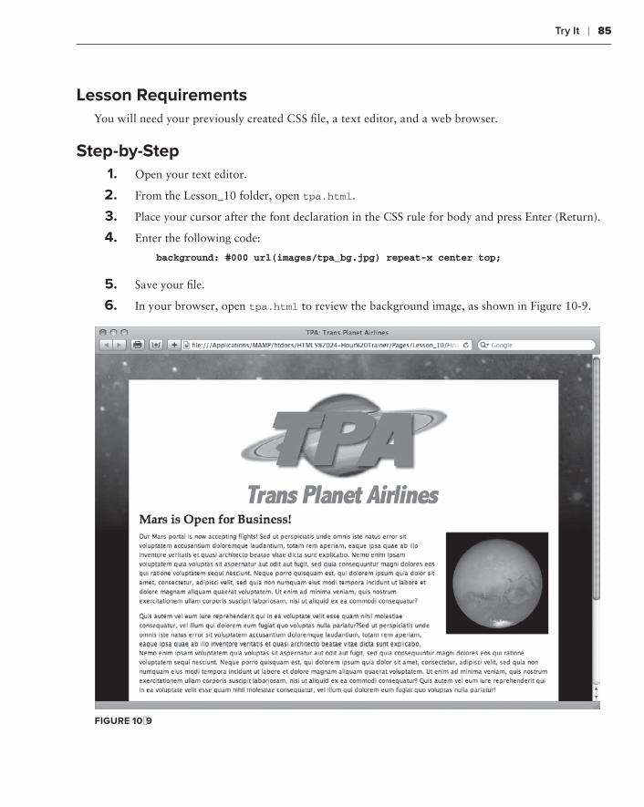
Try it ❘ 85
Lesson requirementsYou will need your previously created CSS file, a text editor, and a web browser.
step-by-step 1 . Open your text editor.
2 . From the Lesson_10 folder, open tpa.html.
3 . Place your cursor after the font declaration in the CSS rule for body and press Enter (Return).
4 . Enter the following code:
background: #000 url(images/tpa_bg.jpg) repeat-x center top;
5 . Save your file.
6 . In your browser, open tpa.html to review the background image, as shown in Figure 10-9.
FiGure 10-9

86 ❘ Lesson 10 WorkIng WIth IMages
Please select a video from Lesson 10 on the DVD with the print book, or watch online at www.wrox.com/go/html5video to see an example of the following:
Adding an image to a page➤➤
Aligning images➤➤
Adding a background image to a page➤➤

using image Maps
In Lesson 10, you saw how you could create a link from a single image. With image maps, it’s possible to incorporate multiple links with just one image. What’s more, these links can be vir-tually any shape: a rectangle, a circle, or a polygon. In this lesson, you learn how to add this valuable functionality to your designer’s palette.
creaTreaTrea inG an iMaGe MaP
To create an HTML image map, you need three separate but related pieces of code. First, a standard <img> tag is required to represent the image itself. There is one addition to the tradi-tional <img> tag: a usemap attribute. For example,
<img src=”usa.gif” width=”637” height=”399” alt=”USA map” usemap=”#usa”>
The usemap attribute value must have a leading number sign, for example, #usa, and refers to an attribute found in the second code chunk, the <map> tag. The <map> tag is a simple one, with just the name attribute:
<map name=”usa”></map>
Note that in the <map> tag, the name value, which corresponds to the <img> tag’s usemapvalue, does not have a leading number sign.
Within the <map> tag is the final component of an image map, one or more <area> tags. Each <area> tag has all the attributes necessary to create a linked region of the image. Here’s a typical <area> tag:
<area shape=”poly” coords=”87,162,95,236,157,231,147,153” href=”Wyoming.html” alt=”Wyoming” title=”Wyoming”>
11

88 ❘ Lesson 11 usIng IMage MaPs
The <area> tags include an attribute that specifies the kind of shape used for the linked region. The shape attribute has three accepted values: circle, rect (short for rectangle), and poly (short for polygon).
Each of the shapes requires a different series of coordinates, stated as the coords value. These coor-dinates are pixel measurements taken from the image, with the upper-left corner of the image serv-ing as the origin point.
The ➤➤ circle shape requires three numbers: two values that define the X and Y coordinates for the center of the circle and a third for the radius of the circle.
The ➤➤ rect shape has four numbers: The first pair of numbers form the X and Y coordinates for the upper-left corner of the rectangle, and the second pair describes the X and Y coordi-nates of the lower-right corner.
The ➤➤ poly shape includes an even number of numbers, each a pair of X and Y coordinates that, taken together, outline the polygon region. The X and Y coordinates are listed in a clockwise direction.
Other attributes in the <area> tag are familiar ones: href and alt. As with the <a> tag, the hrefattribute sets the path to a linked document or page section. You can use both absolute and relative paths in the <area> href attribute. The title attribute can also be used to ensure that text appears on hover in certain browsers.
Taken all together, the code for a simple image map might be:
<img src=”usa.gif” width=”637” height=”399” alt=”USA map” title=”USA map” usemap=”#usa”><map name=”usa”> <area shape=”poly” coords=”87,162,95,236,157,231,147,153” href=”Wyoming.html” alt=”Wyoming” title=”Wyoming”></map>
When rendered in a browser, the only indication of a link on an image map is the pointer icon when the user’s mouse hovers over a defined <area> region and, in some browsers, a tooltip displaying the alt or title value, as shown in Figure 11-1.
Plotting the coordinates for an image map can be a very tedious process with just an image editor. Most web authoring tools, like Adobe Dreamweaver, have image map drawing tools built-in. A number of online tools are also available, one of which — http://www.maschek.hu/imagemap/imgmap — is used in the Try It section that follows.

Try it ❘ 89
FiGure 11-1
Try iT
In this Try It you learn how to incorporate image maps.
Lesson requirementsYou will need the tpa_map.html and mars_map.jpg file from the Lesson_11 folder, a text editor, and a web browser.
You can download the code and resources for this lesson from the book’s web page at www.wrox.com.
step-by-step1 . From your browser, go to http://www.maschek.hu/imagemap/imgmap.
2 . Click Browse.
3 . Navigate to the images folder in the Lesson_11 folder and select mars_map.jpg.

90 ❘ Lesson 11 usIng IMage MaPs
4 . From the web page, click Upload and then click the adjacent Accept.
5 . Change the Zoom value to 50%.
6 . With the first area set to rectangle, draw a rectangle around the text Tharsis Region, 160° Longitude.
7 . In the Href field for the first area, enter tharsis.html.
8 . In the Alt field for the first area, enter Tharsis.
9 . From the second area entry, choose circle.
10 . Draw a circle around the leftmost view of Mars.
11 . In the second area, enter an Href of tharsis.html and alt of Tharsis.
12 . Repeat steps 6–11 for the other two views of Mars with the following values:
iMaGe HreF aLT
Middle valles.html Valles Marineris
Right syrtis.html Syrtis Major
13 . Expand the Code section.
14 . Copy the generated code.
15 . Open your text editor.
16 . From the Lesson_11 folder, open tpa_map.html.
17 . In the <img> tag with the src of images/mars_map.jpg, place your cursor before the closing angle bracket, >, and enter the following code:
usemap=”mars”
18 . Create a new line after the <img> tag and paste in the copied code from the online image map editor.
19 . In the <map> tag, change the id and name values to mars.
20 . Save your file.
21 . In your browser, open tpa_map.html to view the image map, shown in Figure 11-2.
22 . Click any image map link to go to a linked page; click Back in your browser to return to tpa_map.html and click another image map link.

Try it ❘ 91
FiGure 11-2
To see an example from this lesson that shows you how to create an image map, watch the video for Lesson 11 on the DVD with the print book, or watch online at www.wrox.com/go/html5video.


adding Horizontal rules
As I’m writing this lesson, I can already hear those folks who skim the table of contents (you know who you are!) scoffing. “Horizontal rules! There’s a whole chapter on horizontal rules. Fiddlesticks!” But what those skeptics don’t understand is that the lowly horizontal rule has gotten a notable promotion in HTML5.
In prior HTML versions, the <hr> tag would simply place a line across the page wherever it appeared. Sure, by setting various attributes you could determine its length, alignment, and even whether it had a quasi-3D drop shadow. But it was always a lowly line, of little meaning to the overall page context.
In the HTML5 specification, the purpose of the <hr> tag has been broadened. Now, the <hr>tag indicates a transition from one topic to another within a larger section. Perhaps what’s more important, it doesn’t have to be a line at all. Styled correctly, any symbol could be used. For example, say that the next paragraph starts a discussion on using advanced CSS tech-niques with the <hr> tag. A separating image could be used, like this:
In this lesson, you learn how to add the <hr> tag to the page whether you want to display a simple horizontal rule or something with a bit more flair to indicate thematic changes in content.
seParaParaP TaraTara inG PaGe secTions
The horizontal rule tag is simplicity itself:
<hr />
As one of the handful of HTML5 so-called empty elements, <hr> does not require a closing tag, just a forward slash before the final caret. When rendered by a browser, the <hr> tag by
12

94 ❘ Lesson 12 addIng horIzontaL ruLes
default is displayed as a line that extends the full available width of the containing element as shown in Figure 12-1.
FiGure 12-1
sizinG and sTyLinG ruLes
The style attributes formerly associated with the horizontal rule — align, color, noshade, size, and width — were deprecated in the prior HTML recommendation, 4.01. In HTML5, all stylings are handled through CSS. In this section, you learn how to control the traditional look-and-feel of the horizontal rule as well as replace the standard line with an image.
As noted earlier, when an <hr> tag is inserted into a page without additional styling, a line that expands the full width of the containing element is rendered. If you wanted to shorten the line by half and center it, your CSS would look like this:
hr { width: 50%; margin: 0 auto;}
By setting width to 50%, you ensure that the horizontal line is half of the container width; you can, of course, also set width to a fixed pixel value. You’ll recall that the margin property declaration is the standard method for centering an element.
By default, the <hr> tag aligns left, but if you’d like to align it to the right, you can use a variation of the margin property again, like this: margin: 0 0 0 auto. That zeros out all the margin values, except the left, which is defined to automati-cally calculate the needed margin to fill the space given the <hr> tag’s width.

Sizing and Styling rules ❘ 95
If you want to color your horizontal rule, you’ll need to combine two properties to cover a full range of browsers. Rather than just define the color or background-color properties, declare both, like this:
color: red;background-color: red;
To make a taller line, use the height property instead of the older size attribute. For the height value, you can use pixels, ems, or percentages. Figure 12-2 shows a 3-pixel high, purple, centered horizontal rule with a 75% width, though obviously you can’t see the color in the figure.
FiGure 12-2
Replacing the default line with an image requires three properties: one to link to the image, another to make room for the image, and a third to disable the line.
The background property is used to identify the source of the graphic. As noted in Lesson 10, the background property can combine background-image, background-repeat, and background-position, like this:
hr { background: url(“images/saturn_outline.gif”) no-repeat center center;}
Because the default height of the <hr> tag is typically just a pixel or two, unless your image is very small, you won’t be able to see it without adding a height property. The height value should be the same as that of the image itself. For example, if my image is 100 pixels wide by 50 pixels tall, I would insert this declaration:
height: 50px;
To make sure only the image is displayed, combine the previous two properties with a border: none declaration, as in this example:
hr { background: url(“images/saturn_outline.gif”) no-repeat center center;
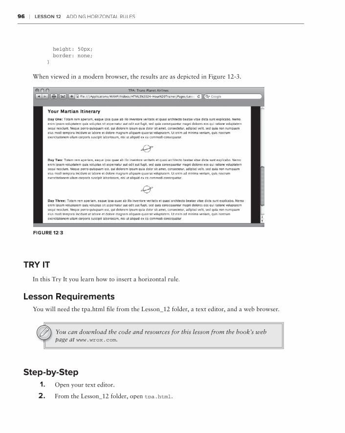
96 ❘ Lesson 12 addIng horIzontaL ruLes
height: 50px; border: none;}
When viewed in a modern browser, the results are as depicted in Figure 12-3.
FiGure 12-3
Try iT
In this Try It you learn how to insert a horizontal rule.
Lesson requirementsYou will need the tpa.html file from the Lesson_12 folder, a text editor, and a web browser.
You can download the code and resources for this lesson from the book’s web page at www.wrox.com.
step-by-step1 . Open your text editor.
2 . From the Lesson_12 folder, open tpa.html.

Try it ❘ 97
3 . Put your cursor at the end of the Day One paragraph after the closing </p> tag and press Enter (Return).
4 . Enter the following code:
<hr />
5 . Repeat steps 3 and 4 at end of the Day Two paragraph.
6 . Save your file.
7 .7 .7 In your browser, open tpa.html.
8 . Return to your text editor and place your cursor before the closing </style> tag in the <head> section of the file and press Enter (Return).
9 . Enter the following code:
hr { background: url(images/saturn_outline.gif) no-repeat center center; height: 50px; border: none;}
10 . Save your file.
11 . In your browser, refresh tpa.html to view the new horizontal rule, as shown in Figure 12-4.
FiGure 12-4
To see an example from this lesson that shows you how to insert a horizontal rule, watch the video for Lesson 12 on the DVD with the print book, or watch online at www.wrox.com/go/html5video.


section Vusing Lists
Lesson 13:⊲ Inserting Unordered Lists
Lesson 14:⊲ Working with Ordered Lists
Lesson 15:⊲ Extending Lists

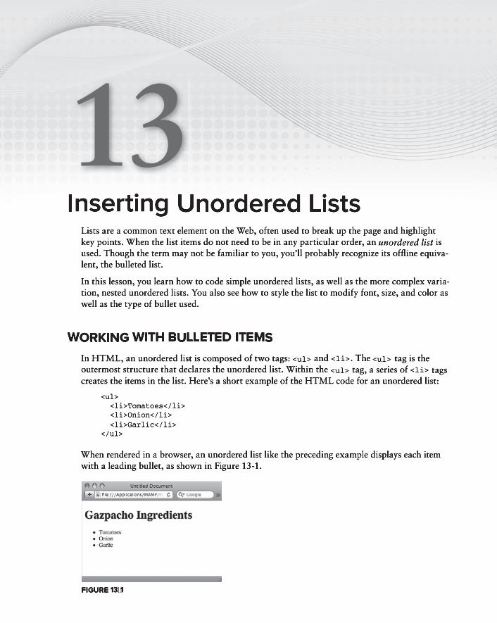
inserting unordered ListsLists are a common text element on the Web, often used to break up the page and highlight key points. When the list items do not need to be in any particular order, an unordered list is unordered list is unordered listused. Though the term may not be familiar to you, you’ll probably recognize its offline equiva-lent, the bulleted list.
In this lesson, you learn how to code simple unordered lists, as well as the more complex varia-tion, nested unordered lists. You also see how to style the list to modify font, size, and color as well as the type of bullet used.
workinG wiTH buLLeTed iTeMs
In HTML, an unordered list is composed of two tags: <ul> and <li>. The <ul> tag is the outermost structure that declares the unordered list. Within the <ul> tag, a series of <li> tags creates the items in the list. Here’s a short example of the HTML code for an unordered list:
<ul> <li>Tomatoes</li> <li>Onion</li> <li>Garlic</li></ul>
When rendered in a browser, an unordered list like the preceding example displays each item with a leading bullet, as shown in Figure 13-1.
FiGure 13-1
13
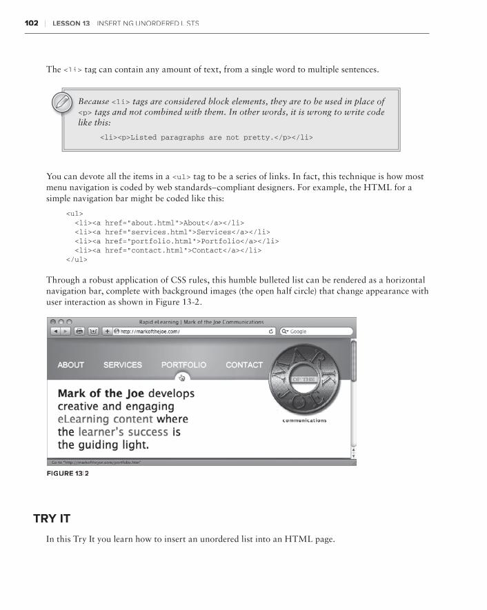
102 ❘ Lesson 13 InsertIng unordered LIsts
The <li> tag can contain any amount of text, from a single word to multiple sentences.
Because <li> tags are considered block elements, they are to be used in place of <p> tags and not combined with them. In other words, it is wrong to write code like this:
<li><p>Listed paragraphs are not pretty.</p></li>
You can devote all the items in a <ul> tag to be a series of links. In fact, this technique is how most menu navigation is coded by web standards–compliant designers. For example, the HTML for a simple navigation bar might be coded like this:
<ul> <li><a href=”about.html”>About</a></li> <li><a href=”services.html”>Services</a></li> <li><a href=”portfolio.html”>Portfolio</a></li> <li><a href=”contact.html”>Contact</a></li></ul>
Through a robust application of CSS rules, this humble bulleted list can be rendered as a horizontal navigation bar, complete with background images (the open half circle) that change appearance with user interaction as shown in Figure 13-2.
FiGure 13-2
Try iT
In this Try It you learn how to insert an unordered list into an HTML page.
nesting unordered Lists ❘ 103
Lesson requirementsYou will need the tpa_jupiter.html file from the Lesson_13 folder, a text editor, and a web browser.
You can download the code and resources for this lesson from the book’s web page at www.wrox.com.
step-by-step1 . Open your text editor.
2 . From the Lesson_13 folder, open tpa_jupiter.html.
3 . Put your cursor at the end of the text Here’s what you’ll need to make the most of your Jovian jaunt: after the closing </p> tag and press Enter (Return).
4 . Enter the following code:
<ul> <li>Oxygen converter mask (Jupiter certified)</li> <li>Thermal transistion suit</li> <li>Portable storm shelter</li> </ul>
5 . Save your file.
6 . In your browser, open tpa_jupiter.html.
nesTinG unordered LisTs
A standard unordered list gives equal weight to all the bulleted items, one after another. In some situations, it’s desirable to depict multiple levels of content with sub-items. HTML provides the capacity to incorporate any level of sub-items desired by nesting <ul> tags.
Say your online camera store carries digital SLR, compact, and waterproof cameras. The store might list them on its site in an unordered list:
<ul> <li>Digital SLR Cameras</li> <li>Compact Cameras</li> <li>Waterproof Cameras</li></ul>
Should the store want to show the range of resolutions available in the digital SLR category, it would nest a <ul> tag under that list item, like this:
<ul> <li>Digital SLR Cameras <ul>

104 ❘ Lesson 13 InsertIng unordered LIsts
<li>8 – 10 megapixels</li> <li>10 – 12 megapixels</li> <li>12 and above megapixels</li> </ul> </li> <li>Compact Cameras</li> <li>Waterproof Cameras</li></ul>
As shown in Figure 13-3, browsers typically render items within a nested <ul> tag with a different type of bullet. Usually the first-level bullet is a solid disc, the second-level item is an open circle, and the third and subsequent level items are solid squares. As you learn in the next section, it’s possible for you to control the bullet image used on any level through CSS.
cHanGinG LisT aPPearance
Because an unordered list is basically composed of two tags (<ul> and <li>), you have two ways to control its look-and-feel through CSS.
CSS rules with a ➤➤ ul selector define the overall positioning, padding, and list style, that is, the type of bullet displayed.
To define the basic look of the list, you would use the ➤➤ li selector.
In addition to supporting basic appearance properties — such as color, font, and size — CSS has a whole category of properties dedicated to the list image. Three individual properties and one all-encompassing property can be used as a shorthand method of setting the separate attributes. The overall property is list-style, and the three individual properties are:
list-style-type:➤➤ Sets the kind of bullet to be used in <ul> list items. Acceptable values are none, disc, circle, and square.
list-style-position:➤➤ Determines whether the leading symbol appears inside or outside the docu-ment flow. If this property is set to outside (the default option), the symbol stays to the left of the entire text block. Set the property to inside if you want the text to wrap to the same position as the list symbol. Figure 13-4 illustrates the difference between the two options with the outside option used on the page in the background and the inside option set for the page in the foreground.
list-style-image:➤➤ Use this property to set up a custom graphic as the bullet. As with the background-image property, this property takes a path to the image in a url() argument.
FiGure 13-3

Changing List appearance ❘ 105
FiGure 13-4
The general list-style property can be used as shorthand for any or all of these properties. For example, this CSS declaration:
ul { list-style-image: url(“image/myBullet.gif”); list-style-position: inside;}
is the same as this declaration:
ul { list-style: url(“image/myBullet.gif”) inside;}
The list-style-image property doesn’t accept any width or height values, so you’ll need to make sure that your custom bullet image is sized appropriately.
If your unordered list includes sub-items and you want to style the levels of items differently, you need to use the proper compound selectors in your CSS declarations. Say, for example, you wanted to make your primary-level list items bold and the secondary-level items not bold, but red. Here’s the CSS you might use:
ul li { font-weight: bold;

106 ❘ Lesson 13 InsertIng unordered LIsts
}ul li ul li { font-weight: normal; color: red;}
Note that although the first rule applies to all list items, including the first level, the second rule applies only to nested list items. Because the second rule appears after the first, its values are predominant.
Try iT
In this Try It you learn how to style an unordered list in an HTML page.
Lesson requirementsYou will need the tpa_mars.html file from the Lesson_13 folder, a text editor, and a web browser.
step-by-step 1 . Open your text editor.
2 . From the Lesson_13 folder, open tpa_mars.html.
3 . Put your cursor before the closing </style> tag in the <head> section of the file and press Enter (Return).
4 . Enter the following code:
ul { list-style: url(images/rocket_ship.gif) outside; }li { margin-bottom: 12px;}
5 . Save your file.
6 . In your browser, open tpa_mars.html to view the newly styled lists, as shown in Figure 13-5.

Try it ❘ 107
FiGure 13-5
Please select a video from Lesson 13 on the DVD with the print book, or watch online at www.wrox.com/go/html5video to see an example of the following:
Inserting an unordered list➤➤
Styling an unordered list➤➤


Working with ordered Lists
Ordered lists, more commonly known as numbered lists, are used when the sequence of the items is important. Though you could use a bulleted list for the Top 25 Websites, it’d be a lot harder to figure out which site placed where. Ordered lists are very flexible with a wide range of number styles — from standard, cardinal numbers to classical Roman numerals. As you’ll learn in this lesson, you can nest ordered lists to create a multi-level outline. What’s more, you can even combine the two list types.
creaTreaTrea inG nuMbered LisTs
If you read the previous lesson, you’ll have no problem understanding the code for an ordered list. Like unordered lists, the numbered variety uses two key elements: an outer wrapping tag and a separate tag for each list item. The only difference is that the outer tag is not <ul> but <ol>. Here’s a brief example:
<ol> <li>Pull mask from overhead bin</li> <li>Place mask over face</li> <li>Pull strings tight</li></ol>
When rendered in a standard browser, the items appear in 1-2-3 order, as shown in Figure 14-1.
When it comes to editing, ordered lists provide some wonderful functionality. If a fourth <li> tag were to be added before the closing </ol> tag, a number 4 would appear before it. Should that item be inserted before the third item, it would become number 3 and the previously third item would become num-ber 4. The browser handles all the renumbering, automatically.
FiGure 14-1
14

110 ❘ Lesson 14 WorkIng WIth ordered LIsts
If you’d like your ordered list to begin with a different number than 1, use the start attribute in the <ol> tag. For example, if I wanted a list to start with 100, my opening tag would look like this:
<ol start=”100”>
The first list item would be 100, the second 101, the third 102, and so on.
The HTML5 specification includes another attribute for the <ol> tag, reverse. When applied, the number order descends rather than ascends. For example, if you have a list of 10 items with the opening tag like this, <ol reverse=”reverse”>, the items would appear in a countdown fashion. Browser support for the reverseattribute is almost nil as of this writing.
Try iT
In this Try It you learn how to insert an ordered list into an HTML page.
Lesson requirementsYou will need the tpa_jupiter.html file from the Lesson_14 folder, a text editor, and a web browser.
You can download the code and resources for this lesson from the book’s web page at www.wrox.com.
step-by-step1 . Open your text editor.
2 . From the Lesson_14 folder, open tpa_jupiter.html.
3 . Put your cursor at the end of the text From time to time, it’s necessary for the passengers to land the aircraft. Here’s all you need to know: after the closing </p> tag and press Enter (Return).
4 . Enter the following code:
<ol> <li>Remove unconscious or unwilling pilot from cockpit.</li> <li>Strap yourself in pilot seat.</li> <li>Press green AutoLand button.</li> </ol>
5 . Save your file.
6 . In your browser, open tpa_jupiter.html to view the new ordered list.
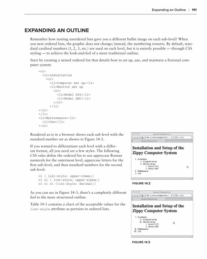
expanding an outline ❘ 111
eXPandinG an ouTLine
Remember how nesting unordered lists gave you a different bullet image on each sub-level? When you nest ordered lists, the graphic does not change; instead, the numbering restarts. By default, stan-dard cardinal numbers (1, 2, 3, etc.) are used on each level, but it is entirely possible — through CSS styling — to achieve the look-and-feel of a more traditional outline.
Start by creating a nested ordered list that details how to set up, use, and maintain a fictional com-puter system:
<ol> <li>Installation <ol> <li>Computer set up</li> <li>Monitor set up <ol> <li>Model XYZ</li> <li>Model ABC</li> </ol> </li></ol></li><li>Maintenance</li> <li>Use</li></ol>
Rendered as-is in a browser shows each sub-level with the standard number set as shown in Figure 14-2.
If you wanted to differentiate each level with a differ-ent format, all you need are a few styles. The following CSS rules define the ordered list to use uppercase Roman numerals for the outermost level, uppercase letters for the first sub-level, and then standard numbers for the second sub-level:
ol { list-style: upper-roman;}ol ol { list-style: upper-alpha;}ol ol ol {list-style: decimal;}
As you can see in Figure 14-3, there’s a completely different feel to the more structured outline.
Table 14-1 contains a chart of the acceptable values for the list-style attribute as pertains to ordered lists.
FiGure 14-2
FiGure 14-3

112 ❘ Lesson 14 WorkIng WIth ordered LIsts
TabLe 14-1: Ordered List Style Values
aTTribuTe VaLue descriPTion eXaMPLe
decimal (default) numbers 1, 2, 3
lower-alpha Lowercase letters a, b, c
upper-alpha Uppercase letters A, B, C
lower-roman Lowercase Roman
numerals
i, ii, iii
upper-roman Uppercase Roman
numerals
I, II, III
coMbininG unordered and ordered LisTs
There’s no reason to keep <ul> and <ol> tags isolated from each other. You can easily mix the two in any desired sequence by nesting one (or more) within the other. This can be a very effective way of conveying information while at the same time varying your design options.
Say you wanted to expand the computer installation list from the previous example. A solid candi-date for a bulleted list nested in a numbered list is the level of monitor models: There’s no reason for one to be sequentially before another and an unordered list is just what the doctor ordered.
<ol> <li>Installation <ol> <li>Computer set up</li> <li>Monitor set up <ul> <li>Model XYZ</li> <li>Model ABC</li> </ul> </li> </ol> </li> <li>Maintenance</li> <li>Use</li></ol>
Only the third-level <ol> tag was switched to a <ul> tag, but the effect is quite noticeable, as shown in Figure 14-4. If this was your code, you should, of course, remove the CSS declaration that was previously styled to be a decimal because it is no longer necessary.

Try it ❘ 113
FiGure 14-4
Try iT
In this Try It you learn how to combine ordered and unordered lists in an HTML page.
Lesson requirementsYou will need the previously saved tpa_jupiter.html file from the Lesson_14 folder, a text editor, and a web browser.
step-by-step 1 . Open your text editor.
2 . From the Lesson_14 folder, open tpa_jupiter.html.
3 . Put your cursor at the end of the text Remove unconscious or unwilling pilot from cockpit before the closing </li> tag and press Enter (Return).
4 . Enter the following code:
<ul> <li>Request assistance from stewards and fellow passengers</li> <li>Any bribes will be reimbursed</li> <li>Physical force is not recommended</li> </ul>
5 . Save your file.
6 . In your browser, open tpa_jupiter.html to view the combined ordered and unordered lists, as shown in Figure 14-5.

114 ❘ Lesson 14 WorkIng WIth ordered LIsts
FiGure 14-5
Please select a video from Lesson 14 on the DVD with the print book, or watch online at www.wrox.com/go/html5video to see an example of the following:
Inserting an ordered list➤➤
Combining ordered and unordered lists➤➤

extending Lists
Lists aren’t just for bullets and numbers. With a little bit of CSS styling magic, the standard unordered list can be transformed into a navigation bar, complete with background imagery and interactive states. What’s more, a completely different type of list used for definitions is available to the HTML coder. This lesson explores all these facets of lists and more.
undersTandinTandinT G websiTe naVaVa iGaTaTa ion bars
A navigation bar is typically a series of links to pages in a site, grouped in a horizontal or vertical area. The links can be depicted either as plain text or text with imagery. Modern web designers, for the most part, use unordered lists to create navigation bars for their sites. CSS is often employed to change the appearance of the list to a series of navigation buttons or tabs, as shown in Figure 15-1.
FiGure 15-1
15

116 ❘ Lesson 15 extendIng LIsts
Unordered lists are used as the basis for a navigation bar for several reasons.
First, the links in a navigation bar are essentially a collection of similar items, as are list items. ➤➤
Second, if the visitor’s browser is incapable of rendering the styled elements, the navigation ➤➤
bar degrades gracefully to a fully functional group of links, which serves the same purpose as the navigation bar.
Finally, sub-menu items on a navigation bar, which may appear when the main menu item is ➤➤
clicked or hovered over, have an exact parallel in nested list items.
A slightly older technique for navigation bars relies on a series of images, each set up with a separate link. To keep these images structured properly, the graphics are placed in a table. With the advent of CSS, however, this method has gone out of favor, along with other instances of table-based layouts.
When designing your navigation bars, it’s important to keep their primary purpose in mind. The navigation needs to be clear enough to be understood at a glance by the site visitor. Consistent implementation across the site is also an important consideration: You don’t want your visitors try-ing to figure out a new navigation scheme on every page. Ideally, your navigation should make it easy for folks to get to the content on your site as quickly as possible.
workinG wiTH LisTs For naVaVa iGaTaTa ion
Very frequently, the HTML for a navigation bar — whether horizontal or vertical — is coded in exactly the same way, that is, as a <ul> tag, complete with list items in a <div>. Here’s an example:
<div id=”nav”> <ul> <li><a href=”home.html”>Home</a></li> <li><a href=”products.html”>Products</a></li> <li><a href=”services.html”>Services</a></li> <li><a href=”contact.html”>Contact Us</a></li> </ul></div>
This same HTML code could be used for either a horizontal or vertical navigation bar: It all depends on how the relevant CSS is styled. Four key sections in the standard navigation bar require CSS rules:
The container ➤➤
The ➤➤ <ul> tag
The ➤➤ <li> tags
The ➤➤ <a> tags

Working with Lists for navigation ❘ 117
For sites coded with HTML 4, the container is typically a <div> tag with a unique ID or class. HTML5 provides a new tag to hold the navigation items, <nav>. Whichever containing element for the navigation bar is used, this selector defines the overall dimensions of the group as well as provides any border, background color, or image that encompasses all of the elements. It is often also used to set the position of the navigation bar. Here’s a typical containing element declaration:
div#nav { width:400px; height:20px; background:#f3f3f3; border:1px solid #ff0000; position:absolute; left: 50px; top: 25px; }
If you want to try out the HTML5 <nav> tag in the example code, just substitute nav for div#nav. That changes the selector from a <div> tag with an ID of navto an HTML5-compatible <nav> tag. However, be aware — not all browsers support the newer tag yet.
The <ul> tag CSS declaration removes the bullet image, if not part of the design, and sets the mar-gins surrounding the navigation. For example:
div#nav ul { list-style-type:none; margin:0 auto;}
The CSS rule for the list item typically controls how much space each individual item takes up by defining a width; once a width is set, the text can be aligned as desired. Furthermore, if the naviga-tion bar is a horizontal one, the <li> tags are often floated in one direction or another, like this:
div#nav ul li { float:left; width:120px; text-align: center;}
The final set of CSS rules are centered on the <a> elements in the unordered list. You’ll often find multiple rules related to the <a> tag when working, one for the default link state and others for addi-tional interactive states, like the hover state. Here are two typical declarations:
div#nav ul li a { display:block; line-height:40px;} div#nav ul li a:hover { color: red; background-color: yellow;}
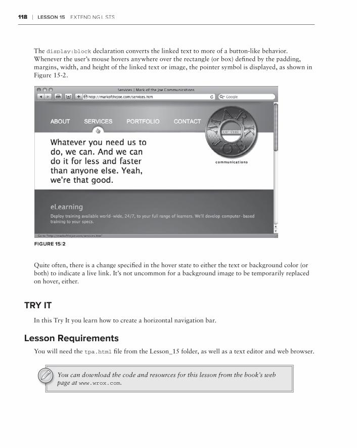
118 ❘ Lesson 15 extendIng LIsts
The display:block declaration converts the linked text to more of a button-like behavior. Whenever the user’s mouse hovers anywhere over the rectangle (or box) defined by the padding, margins, width, and height of the linked text or image, the pointer symbol is displayed, as shown in Figure 15-2.
FiGure 15-2
Quite often, there is a change specified in the hover state to either the text or background color (or both) to indicate a live link. It’s not uncommon for a background image to be temporarily replaced on hover, either.
Try iT
In this Try It you learn how to create a horizontal navigation bar.
Lesson requirementsYou will need the tpa.html file from the Lesson_15 folder, as well as a text editor and web browser.
You can download the code and resources for this lesson from the book’s web page at www.wrox.com.
Try it ❘ 119
step-by-step 1 . Open your text editor.
2 . From the Lesson_15 folder, open tpa.html.
3 . Put your cursor before the code <div id=”content”> and press Enter (Return).
4 . Enter the following code:
<div id=”nav”> <ul> <li><a href=”Final/home.html”>HOME</a></li> <li><a href=”Final/planets.html”>PLANETS</a></li> <li><a href=”Final/flights.html”>FLIGHTS</a></li> <li><a href=”Final/book.html”>SUIT UP</a></li> </ul> </div>
5 . Put your cursor before the code </style> in the <head> section of the document and press Enter (Return).
6 . Enter the following code:
div#nav { font-family: “Trebuchet MS”, Arial, Helvetica, sans-serif; color: white; width: 740px; font-size: 30px; margin: 20px auto; overflow: hidden;}
7 . Press Enter (Return) and enter the following code:
div#nav ul { margin: auto; width: 688px; list-style: none; }
8 . Press Enter (Return) and enter the following code:
div#nav ul li { float: left; width: 170px; text-align: center;}
9 . Press Enter (Return) and enter the following code:
div#nav ul li a { line-height: 40px; display: block; color: white; background-color: #00F; text-decoration: none;}

120 ❘ Lesson 15 extendIng LIsts
10 . Press Enter (Return) and enter the following code:
div#nav ul li a:hover { color: #FFF; background-color: #F70816;}
11 . Save your file.
12 . In your browser, open tpa.html to view the newly-styled navigation bar, shown in Figure 15-3. Click on any link to go to that page.
FiGure 15-3
usinG deFiniTion LisTs and THe <diaLoG> TaG
HTML supports another type of list used for creating definitions, like in a glossary. A definition list is made of three tags:
<dl>➤➤ : The surrounding definition list tag
<dt>➤➤ : The definition term
<dd>➤➤ : The definition data or description

using Definition Lists and the <dialog> Tag ❘ 121
When coded, the <dt> and <dd> tags are placed in pairs, within the enveloping <dl> tag, like this:
<dl> <dt>Acquittal</dt> <dd>Judgement that a criminal defendant has not been proved guilty beyond a reasonable doubt.</dd> <dt>Allegation</dt> <dd>Something that someone says happened.</dd> <dt>Chambers</dt> <dd>A judge’s office</dd></dl>
Typically, browsers render the definition list with the terms on one line and the data on the line below it, indented, as shown in Figure 15-4.
FiGure 15-4
Naturally, you can manipulate the look-and-feel of a definition list however you like through CSS. For example, if you wanted to put both the <dt> and <dd> tag values on the same line, with a bolded definition term, your CSS rule might look like this:
dt { float: left; font-weight: bold; padding-right: 5px;}
The padding-right property is used to create a little distance between the term and its definition, as shown in Figure 15-5.
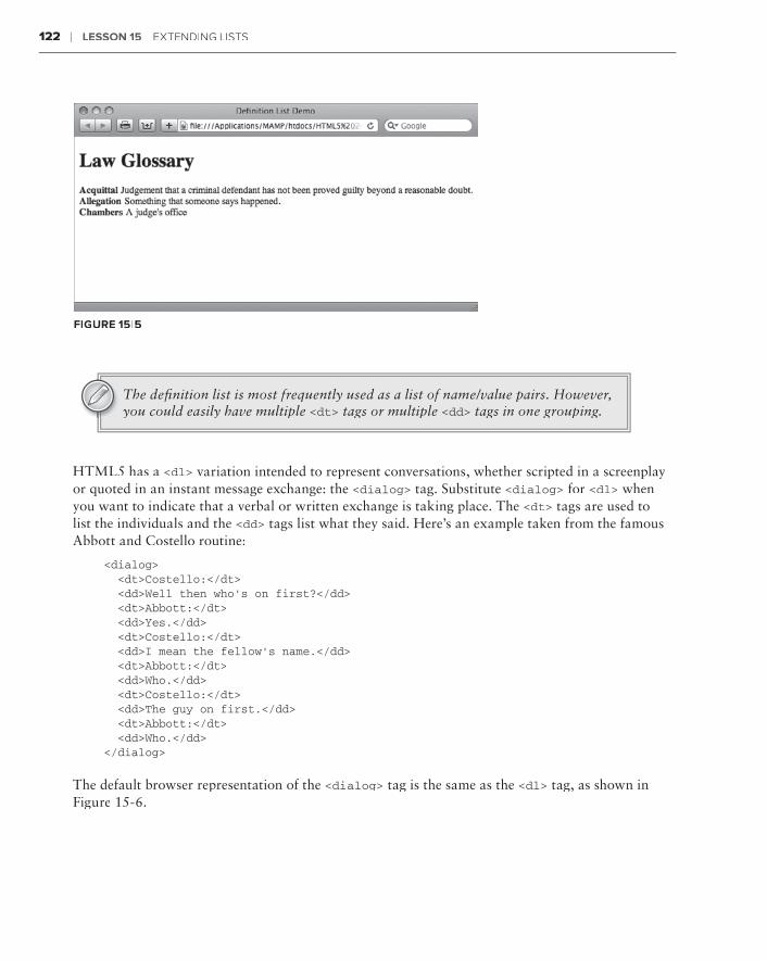
122 ❘ Lesson 15 extendIng LIsts
FiGure 15-5
The definition list is most frequently used as a list of name/value pairs. However, you could easily have multiple <dt> tags or multiple <dd> tags in one grouping.
HTML5 has a <dl> variation intended to represent conversations, whether scripted in a screenplay or quoted in an instant message exchange: the <dialog> tag. Substitute <dialog> for <dl> when you want to indicate that a verbal or written exchange is taking place. The <dt> tags are used to list the individuals and the <dd> tags list what they said. Here’s an example taken from the famous Abbott and Costello routine:
<dialog> <dt>Costello:</dt> <dd>Well then who’s on first?</dd> <dt>Abbott:</dt> <dd>Yes.</dd> <dt>Costello:</dt> <dd>I mean the fellow’s name.</dd> <dt>Abbott:</dt> <dd>Who.</dd> <dt>Costello:</dt> <dd>The guy on first.</dd> <dt>Abbott:</dt> <dd>Who.</dd></dialog>
The default browser representation of the <dialog> tag is the same as the <dl> tag, as shown in Figure 15-6.

Try it ❘ 123
FiGure 15-6
Try iT
In this Try It you learn how to build a definition list in an HTML page.
Lesson requirementsYou will need mars_vocabulary.html from Lesson 15, a text editor, and a web browser.
step-by-step 1 . Open your text editor.
2 . From the Lesson_15 folder, open mars_vocabulary.html.
3 . Put your cursor at the end of the text Here are your first Martian words: after the closing </p> tag and press Enter (Return).
4 . Enter the following code:
<dl> <dt>Apotay</dt> <dd>Hello</dd> <dt>Atopay</dt> <dd>Goodbye</dd> <dt>Biznit</dt> <dd>Martian delicacy</dd> <dt>Cramlok</dt> <dd>Earthling</dd></dl>
5 . Save your file.
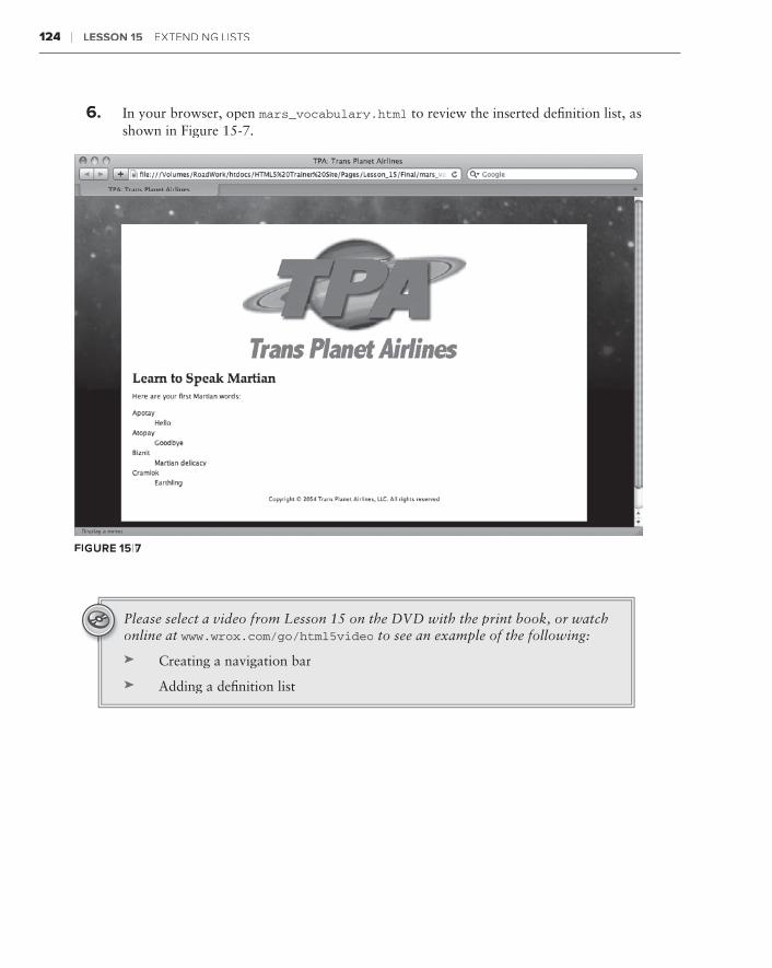
124 ❘ Lesson 15 extendIng LIsts
6 . In your browser, open mars_vocabulary.html to review the inserted definition list, as shown in Figure 15-7.
FiGure 15-7
Please select a video from Lesson 15 on the DVD with the print book, or watch online at www.wrox.com/go/html5video to see an example of the following:
Creating a navigation bar➤➤
Adding a definition list➤➤

section Vistructuring Tables
Lesson 16:⊲ Building a Simple Table
Lesson 17:⊲ Styling Tables
Lesson 18:⊲ Making Tables More Accessible


Building a Simple Table
Modern web standards maintain that HTML tables should only be used to contain tabular data. And what’s tabular data? Why content that goes in tables, of course! Don’t you love cir-cular definitions?
Tables on the Web allow information to be displayed in a grid. The rows and columns of the table can be labeled and styled to help make the content easy to understand at a glance. As you might expect with a highly structured page element like a table, numerous tags are involved, which must be precisely placed to create the proper code configuration. In this lesson, you learn how HTML tables are constructed and how to work the various table elements — rows, columns, and cells — to create a basic table.
undersTandinTandinT G HTML TabLes
To create the most basic HTML table, you need three different tags:
<table>➤➤ : The <table> tag is the outermost element that contains the other two tags and all content.
<tr>➤➤ : The <tr> tag defines the table row and holds the final element.
<td>➤➤ : The <td> tag stands for table data; the complete <td> tag is also known as a table cell. Any content that is displayed in the table is placed between the opening and closing <td> tag pair.
You’ll notice that there is no tag related directly to the columns. With a basic HTML table, the number of <td> tags in a table row determines the number of columns. For example, the fol-lowing table has three columns and two rows:
<table> <tr> <td>First name</td> <td>Last name</td> <td>Extension</td> </tr><tr>
16
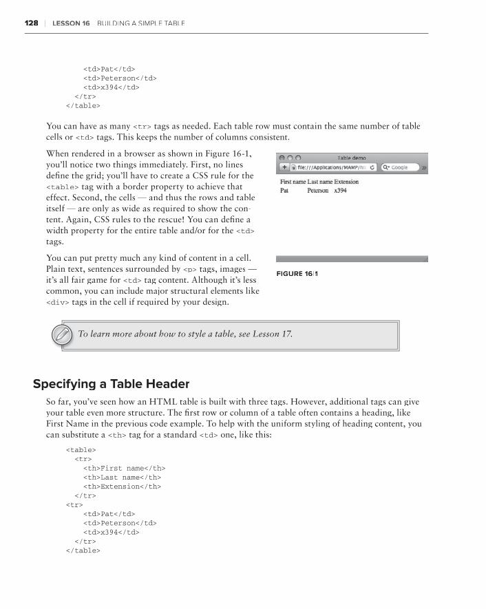
128 ❘ Lesson 16 buILdIng a sIMPLe tabtabt Le
<td>Pat</td> <td>Peterson</td> <td>x394</td> </tr></table>
You can have as many <tr> tags as needed. Each table row must contain the same number of table cells or <td> tags. This keeps the number of columns consistent.
When rendered in a browser as shown in Figure 16-1, you’ll notice two things immediately. First, no lines define the grid; you’ll have to create a CSS rule for the <table> tag with a border property to achieve that effect. Second, the cells — and thus the rows and table itself — are only as wide as required to show the con-tent. Again, CSS rules to the rescue! You can define a width property for the entire table and/or for the <td>tags.
You can put pretty much any kind of content in a cell. Plain text, sentences surrounded by <p> tags, images — it’s all fair game for <td> tag content. Although it’s less common, you can include major structural elements like <div> tags in the cell if required by your design.
To learn more about how to style a table, see Lesson 17.
specifying a Table HeaderSo far, you’ve seen how an HTML table is built with three tags. However, additional tags can give your table even more structure. The first row or column of a table often contains a heading, like First Name in the previous code example. To help with the uniform styling of heading content, you can substitute a <th> tag for a standard <td> one, like this:
<table> <tr> <th>First name</th> <th>Last name</th> <th>Extension</th> </tr><tr> <td>Pat</td> <td>Peterson</td> <td>x394</td> </tr></table>
FiGure 16-1
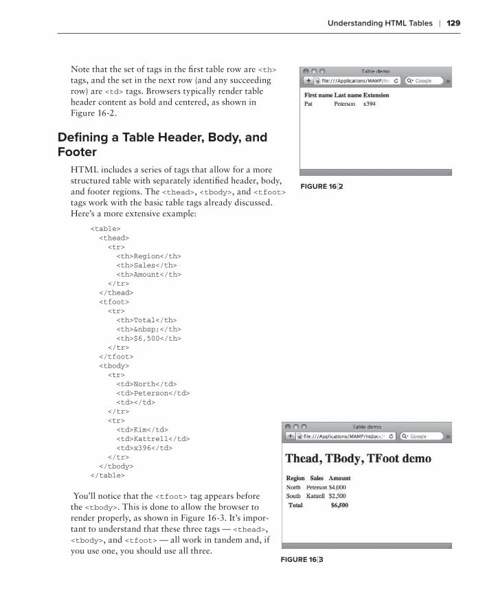
understanding HTML Tables ❘ 129
<td>Pat</td> <td>Peterson</td> <td>x394</td> </tr></table>
You can have as many <tr> tags as needed. Each table row must contain the same number of table cells or <td> tags. This keeps the number of columns consistent.
When rendered in a browser as shown in Figure 16-1, you’ll notice two things immediately. First, no lines define the grid; you’ll have to create a CSS rule for the <table> tag with a border property to achieve that effect. Second, the cells — and thus the rows and table itself — are only as wide as required to show the con-tent. Again, CSS rules to the rescue! You can define a width property for the entire table and/or for the <td> tags.
You can put pretty much any kind of content in a cell. Plain text, sentences surrounded by <p> tags, images — it’s all fair game for <td> tag content. Although it’s less common, you can include major structural elements like <div> tags in the cell if required by your design.
specifying a Table HeaderSo far, you’ve seen how an HTML table is built with three tags. However, additional tags can give your table even more structure. The first row or column of a table often contains a heading, like First Name in the previous code example. To help with the uniform styling of heading content, you can substitute a <th> tag for a standard <td> one, like this:
<table> <tr> <th>First name</th> <th>Last name</th> <th>Extension</th> </tr><tr> <td>Pat</td> <td>Peterson</td> <td>x394</td> </tr></table>
Note that the set of tags in the first table row are <th> tags, and the set in the next row (and any succeeding row) are <td> tags. Browsers typically render table header content as bold and centered, as shown in Figure 16-2.
defining a Table Header, body, and Footer
HTML includes a series of tags that allow for a more structured table with separately identified header, body, and footer regions. The <thead>, <tbody>, and <tfoot> tags work with the basic table tags already discussed. Here’s a more extensive example:
<table> <thead> <tr> <th>Region</th> <th>Sales</th> <th>Amount</th> </tr> </thead> <tfoot> <tr> <th>Total</th> <th> </th> <th>$6,500</th> </tr> </tfoot> <tbody> <tr> <td>North</td> <td>Peterson</td> <td></td> </tr> <tr> <td>Kim</td> <td>Kattrell</td> <td>x396</td> </tr> </tbody></table>
You’ll notice that the <tfoot> tag appears before the <tbody>. This is done to allow the browser to render properly, as shown in Figure 16-3. It’s impor-tant to understand that these three tags — <thead>, <tbody>, and <tfoot> — all work in tandem and, if you use one, you should use all three.
FiGure 16-2
FiGure 16-3

130 ❘ Lesson 16 buILdIng a sIMPLe tabLe
workinG wiTH rows and coLuMns
You’ve seen how a basic table conforming to a simple grid is created in HTML. But how do you extend a header over two columns or two rows? Two attributes — colspan for columns and rowspan for rows — are used to create more complex table structures. Both attributes are used with either the <td> or <th> tags. Because the content in a spanned cell is most frequently a heading of some kind, the <th> tag and corresponding attribute are most often combined.
The colspan and rowspan attributes both take numeric values to define how many columns or rows will be spanned, respectively. For example, if I wanted to create a table that had two headers, each of which spanned two of the four columns, my code would look like this:
<table> <tr> <th colspan=”2”>Atlantic Division</th> <th colspan=”2”>Pacific Division</th> </tr> <tr> <td>New York</td> <td>Boston</td> <td>San Francisco</td> <td>Los Angeles</td> </tr></table>
When rendered in the browser, the headers are centered over the spanned columns as shown in Figure 16-4. To better show the spanning and centering, I added a CSS rule to give the table a width of 300 pixels as well as another to create the outlining borders.
Implementing the rowspan attribute requires a different table configuration than what’s needed for colspan:
<table> <tr> <th rowspan=”2”>Atlantic Division</th> <td>New York</td> </tr> <tr> <td>Boston</td> </tr> <tr> <th rowspan=”2”>Pacific Division</th> <td>San Francisco</td> </tr> <tr> <td>Los Angeles</td> </tr></table>
FiGure 16-4
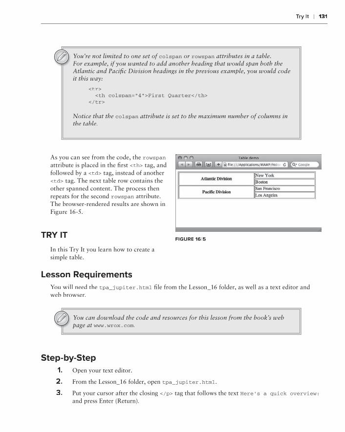
Try it ❘ 131
You’re not limited to one set of colspan or rowspan attributes in a table. For example, if you wanted to add another heading that would span both the Atlantic and Pacific Division headings in the previous example, you would code it this way:
<tr> <th colspan=”4”>First Quarter</th></tr>
Notice that the colspan attribute is set to the maximum number of columns in the table.
As you can see from the code, the rowspanattribute is placed in the first <th> tag, and followed by a <td> tag, instead of another <td> tag. The next table row contains the other spanned content. The process then repeats for the second rowspan attribute. The browser-rendered results are shown in Figure 16-5.
Try iT
In this Try It you learn how to create a simple table.
Lesson requirementsYou will need the tpa_jupiter.html file from the Lesson_16 folder, as well as a text editor and web browser.
You can download the code and resources for this lesson from the book’s web page at www.wrox.com.
step-by-step1 . Open your text editor.
2 . From the Lesson_16 folder, open tpa_jupiter.html.
3 . Put your cursor after the closing </p> tag that follows the text Here’s a quick overview:and press Enter (Return).
FiGure 16-5

132 ❘ Lesson 16 buILdIng a sIMPLe tabtabt Le
4 . Enter the following code:
<table> <tr> <th>IO</th> <th>EUROPA</th> <th>GANYMEDE</th> <th>CALLISTO</th> </tr> <tr> <td><img src=”images/io.jpg” width=”50” height=”50”></td> <td><img src=”images/europa.jpg” width=”50” height=”50”></td> <td><img src=”images/ganymede.jpg” width=”50” height=”54”></td> <td><img src=”images/callisto.jpg” width=”50” height=”51”></td> </tr> <tr> <td>Thrill Seekers Paradise</td> <td>The Liveliest Moon</td> <td>Jupiter’s Largest</td> <td>Winter Wonderland </td> </tr></table>
5 . Save your file.
6 . In your browser, open tpa_jupiter.html to view the rendered table, as shown in Figure 16-6.
FiGure 16-6
To see an example from this lesson that shows you how to create a table, watch the video for Lesson 16 on the DVD with the print book, or watch online at www.wrox.com/go/html5video.

Styling Tables
A totally unstyled HTML table certainly doesn’t fulfill the function of providing informa-tion at a glance. Without styling, table cells collapse to the width of their content without any margins, paddings, or borders to make the rows and columns distinct. This can make table content hard to read.
Prior to HTML5, tables supported a number of default attributes that provided space around the content as well as a — to be honest — somewhat unattractive border. Starting with HTML5, these attributes are obsolete and styling a table is an absolute must. In this lesson, you learn how to add padding, margins, and borders to tables as well as align them and spice them up with color.
creaTreaTrea inG wHiTe sPace in TabsPace in TabsP Les
Paddings and margins add white space to many HTML elements, such as <div>, <p>, and <h1>tags. With tables, you can add padding to a td selector when you want to increase the white space around the cell content. Similarly, margins are applied to a CSS table selector to provide additional space around the entire table or even position it. As you learn in this section, how-ever, you’ll need a whole new set of CSS properties to create space between table cells.
Start by adding white space around the entire table by creating a CSS rule with the marginproperty. Here’s an example that places 20 pixels of space all around the table:
table { margin: 20px; border: 1px solid black;}
As you can see in Figure 17-1, the margin keeps the table away from the horizontal rules above and below as well as increases the space on the left and right. If you wanted to just add hori-zontal spacing, you could either use the margin-top and margin-bottom properties or use margin-bottom properties or use margin-bottom
shorthand code like margin: 20px 0.
17

134 ❘ Lesson 17 stYLIng tabtabt Les
FiGure 17-1
Border properties were added to the CSS rules to show the edges of the table and the table cells in Figure 17-1 and subsequent figures.
Next, create some white space inside the table cells. If you wanted to provide a little distance between the content and the edge of the table cells, the padding property would be defined within the td and th selectors, like this:
td, th { padding: 10px; border: 1px solid black;}
You can see a real difference in Figure 17-2. Note how the padding makes the content much easier to read at a glance. Padding within the cell is very helpful and highly recommended.
FiGure 17-2

Creating White Space in Tables ❘ 135
When the design calls for space between cells, you’ll need work with two border-related properties: border-collapse and border-spacing. The border-collapse property determines whether table cells share borders or have separate ones. If border-collapse is set to collapse, the borders are shared; when the property is set to separate, the borders are independent. Figure 17-3 shows the same table with border-collapse: collapse on the bottom and border-collapse: separate on the top. The default behavior is to keep the borders separate.
FiGure 17-3
For the border-spacing property to have any effect, border-collapse must be defined as separate. After all, you can’t have space between cell borders unless they’re separate, can you? The spacing around a cell can be set to all be the same by using a single value, like this example:
table { border-spacing: 5px;}
Note that, as with the border-collapse property, the border-spacing property is defined within a table selector. This declaration tells the browser to put 5 pixels on the top, bottom, left, and right of all table cells. Say that you wanted to increase the space between the top and bottom of the cells, but keep the area between left and right sides the same. For this effect, you’d use two values, like this:
table { border-spacing: 5px 15px;}
When the preceding CSS rule is rendered, you can see a clear difference, as shown in Figure 17-4. The first value in a border-spacing declaration controls the horizontal spacing, and the second controls the vertical.
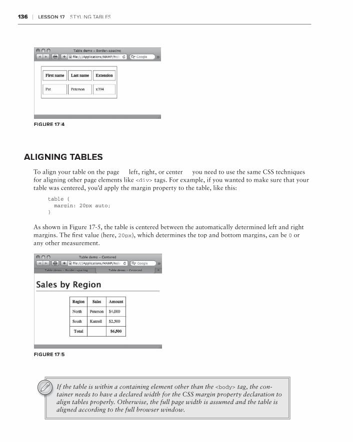
136 ❘ Lesson 17 stYLIng tabtabt Les
FiGure 17-4
aLiGninG TabLes
To align your table on the page — left, right, or center — you need to use the same CSS techniques for aligning other page elements like <div> tags. For example, if you wanted to make sure that your table was centered, you’d apply the margin property to the table, like this:
table { margin: 20px auto;}
As shown in Figure 17-5, the table is centered between the automatically determined left and right margins. The first value (here, 20px), which determines the top and bottom margins, can be 0 or any other measurement.
FiGure 17-5
If the table is within a containing element other than the <body> tag, the con-tainer needs to have a declared width for the CSS margin property declaration to align tables properly. Otherwise, the full page width is assumed and the table is aligned according to the full browser window.

Working with Borders ❘ 137
Variations of the same technique can be used to align the table to the right or, explicitly, to the left. Say you want to align the table to the right. The CSS rule would then declare 0 margin for the right and auto for the left, like this:
table { margin: 20px 0 20px auto;}
You’ll recall that the four values refer to the top, right, bottom, and left of the CSS box model. Thus, when rendered, the preceding code effectively automatically fills in the left margin, aligning the table right (Figure 17-6).
FiGure 17-6
For most situations, there’s no need to align the table to the left because that is the default position. However, should you ever need to explicitly do so, here’s the code to align the table to the left, again making use of the auto value:
table { margin: 20px auto 20px 0;}
Another option for table alignment is the float property used in an earlier les-son to align images to the left or right. Applying the float property to the table selector will have the same effect, including wrapping any following text.
workinG wiTH borders
You’ve already seen how applying a border property to the table selector puts a border around the entire table. You’ve also seen an example of how using the border property in a td and/or th selec-tor outlines the table cells. Both techniques are often used in basic table design — however, you’re
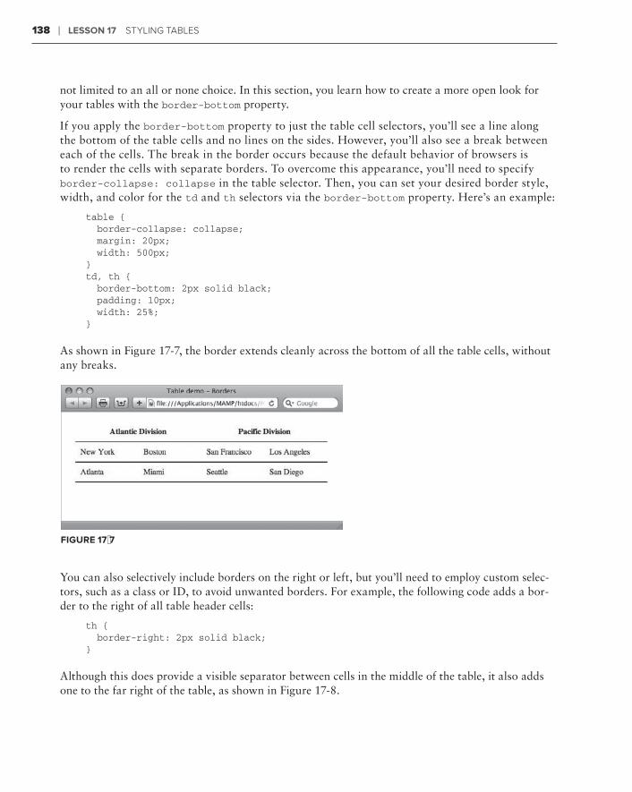
138 ❘ Lesson 17 stYLIng tabLes
not limited to an all or none choice. In this section, you learn how to create a more open look for your tables with the border-bottom property.
If you apply the border-bottom property to just the table cell selectors, you’ll see a line along the bottom of the table cells and no lines on the sides. However, you’ll also see a break between each of the cells. The break in the border occurs because the default behavior of browsers is to render the cells with separate borders. To overcome this appearance, you’ll need to specify border-collapse: collapse in the table selector. Then, you can set your desired border style, width, and color for the td and th selectors via the border-bottom property. Here’s an example:
table { border-collapse: collapse; margin: 20px; width: 500px;}td, th { border-bottom: 2px solid black; padding: 10px; width: 25%;}
As shown in Figure 17-7, the border extends cleanly across the bottom of all the table cells, without any breaks.
FiGure 17-7
You can also selectively include borders on the right or left, but you’ll need to employ custom selec-tors, such as a class or ID, to avoid unwanted borders. For example, the following code adds a bor-der to the right of all table header cells:
th { border-right: 2px solid black;}
Although this does provide a visible separator between cells in the middle of the table, it also adds one to the far right of the table, as shown in Figure 17-8.

Modifying Table Colors ❘ 139
FiGure 17-8
To get the desired effect, change the CSS rule to reference a more specific target. Here’s the CSS as well as the excerpted HTML:
th.separatedCell { border-right: 2px solid black;}
<tr> <th colspan=”2” class=”separatedCell”>Atlantic Division</th> <th colspan=”2”>Pacific Division</th></tr>
This code results in a border separating only the table header cells as shown in Figure 17-9.
FiGure 17-9
There’s a great deal of design flexibility available to working with border styles, but you have to be very specific about your CSS rules.
ModiFyinG TabLe coLors
Color, in tables, is not only great for spicing up potentially boring data, but it can also make the same data easier to read. You can add two types of color to a table: background color and text color. Often, both color options are applied at the same time to maintain a high contrast for increased

140 ❘ Lesson 17 stYLIng tabLes
readability. For example, say you wanted to make the header row really stand out. One technique is to set the background to a dark color and then make the type white. Here’s how to do that in CSS:
th { background-color: black; color: white;}
Because the th selector causes the CSS rule to only affect the header cells, the rather dramatic change (Figure 17-10) is very targeted.
Another common table effect is called zebra striping. As the term implies, alternating rows (or columns) of a table are given a different color to make it easy to differentiate between the data. This technique is extremely useful in large tables with a lot of data, but it can also be applied to smaller tables as well. To achieve the zebra strip-ing look, you need to define at least one class and apply that class to alternating <tr> tags. For example, if I wanted to give the even rows of my table a bluish-green background, I would set up the CSS rule like this:
.evenRow { background-color: #66FFFF;}
The .evenRow class is then added to every other table data row, starting with the second one, as in this example:
<table> <tr> <th>First name</th> <th>Last name</th> <th>Extension</th> </tr><tr> <td>Pat</td> <td>Peterson</td> <td>x394</td> </tr><tr class=”evenRow”> <td>Ricky</td> <td>Johnson</td> <td>x553</td></tr><tr> <td>Naomi</td> <td>Freders</td> <td>x932</td></tr>
FiGure 17-10

Try it ❘ 141
<tr class=”evenRow”> <td>Winston</td> <td>Torrtle</td> <td>x346</td></tr></table>
The zebra stripes are clear, even in the black-and-white image shown in Figure 17-11. Of course, you have to be careful that there is sufficient contrast between the background and text color. If neces-sary, be sure to define a color attribute with an appropriate color for your row class.
Try iT
In this Try It you learn how to style a table.
Lesson requirementsYou will need the tpa_jupiter.html file from the Lesson_17 folder, as well as a text editor and web browser.
You can download the code and resources for this lesson from the book’s web page at www.wrox.com.
step-by-step1 . Open your text editor.
2 . From the Lesson_17 folder, open tpa_jupiter.html.
3 . Put your cursor before the closing </style> tag within the <head> section and press Enter (Return).
4 . Enter the following code:
table { width: 100%; border-collapse: collapse;}td { text-align: center; width: 25%; padding: 10px 0; border-bottom: 2px black solid;}
FiGure 17-11
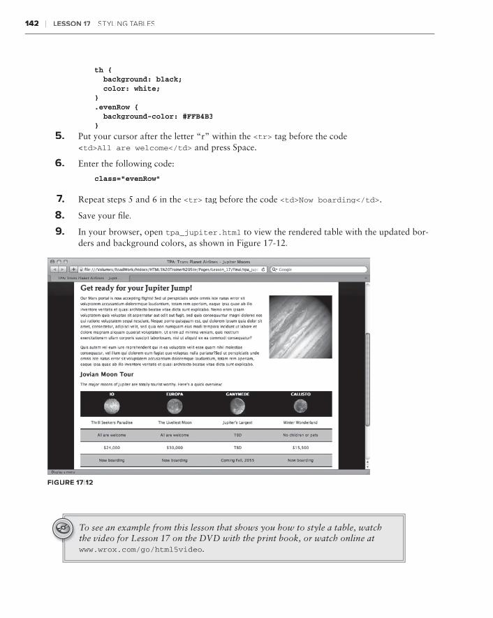
142 ❘ Lesson 17 stYLIng tabtabt Les
th { background: black; color: white;}.evenRow { background-color: #FFB4B3}
5 . Put your cursor after the letter “r” within the <tr> tag before the code <td>All are welcome</td> and press Space.
6 . Enter the following code:
class=”evenRow”
7 .7 .7 Repeat steps 5 and 6 in the <tr> tag before the code <td>Now boarding</td>.
8 . Save your file.
9 . In your browser, open tpa_jupiter.html to view the rendered table with the updated bor-ders and background colors, as shown in Figure 17-12.
FiGure 17-12
To see an example from this lesson that shows you how to style a table, watch the video for Lesson 17 on the DVD with the print book, or watch online at www.wrox.com/go/html5video.
Making Tables More accessible
One of the main purposes of tables is to make it easy to grasp concepts and details at a glance for most web page visitors. Unfortunately, for a significant minority, tables actually make comprehension a great deal harder. For those who are visually challenged and depend on tech-nology such as screenreaders to translate the Web from a visual to an aural experience, tables represent a significant challenge. HTML5 includes a number of additional tags and attributes that can make tables and their content more accessible to all.
inserTinG caPTions
Often an editor or web copywriter will assume that a table is self-explanatory and place it onto the page without explanation or reference. For example, a visit to any of the major sports websites frequently reveals a table of statistics that is only understandable if you look at it in the full context of informative graphics. To those using screenreaders, such a table is an unclear combination of abbreviations and numbers. If, however, the table included an explana-tory passage, such as a caption, the details in the table would become clear.
The <caption> tag is the perfect vehicle for delivering the explanation of a table’s function in HTML. The <caption> tag is placed within the table structure, immediately after the opening <table> tag, as shown in the following code fragment:
<table><caption>Regional Sales, Q1</caption> <thead> <tr> <th>Region</th> <th>Sales</th> <th>Amount</th> </tr> </thead>
18

144 ❘ Lesson 18 MakIng tabtabt Les More aCCessIbLe
When rendered, the content in the <caption> tag is centered above the table as shown in Figure 18-1. As you can see, no additional styling is applied, by default. You can, of course, use CSS to style the caption tag selector however you like.
FiGure 18-1
Although the caption normally appears above the table, you can move it to the bottom through the CSS property caption-side. CSS3 specifications call for caption-side to accept top, bottom, bottom, bottom left, and right values, but almost all modern browsers (as of this writing) only support top and bottom. The excep-tion is Firefox, which supports all four caption-side values.
incorPoraToraTora inG deTaiTaiT Ls and suMMary
If the caption is not enough to explain the table, HTML5 provides additional tags that can be used: <summary> and <details>. These two tags are placed within the <caption> tag and rendered on the screen in the same position as the caption. Here’s an example taken from the W3C HTML5 specification:
<table> <caption> <strong>Characteristics with positive and negative sides.</strong> <details> <summary>Help</summary> <p>Characteristics are given in the second column, with the negative side in the left column and the positive side in the right column.</p> </details>

incorporating Details and Summary ❘ 145
</caption> <thead> <tr> <th id=”n”> Negative <th> Characteristic <th> Positive <tbody> <tr> <td headers=”n r1”> Sad <th id=”r1”> Mood <td> Happy <tr> <td headers=”n r2”> Failing <th id=”r2”> Grade <td> Passing</table>
Notice how the <details> tag is placed within the <caption> tag and, further, how the <summary> tag is within <details>. The content in the <details> tag that is not in the <summary> tag is considered the actual details of the table. When ren-dered by the browser (Figure 18-2), the caption is immediately followed by the summary and then the details.
The summary is really intended for screenreaders and often does not add anything useful to the visual display. If that is the case with your design, you can use CSS to move it offscreen, but at the same time, keep it accessible to assistive technology. Here’s an example CSS rule:
summary { position: absolute; left: -999px;}
Through absolute positioning, the summary tag selector is moved a good distance (999 pixels) from the left edge of the screen, effectively hiding it from view while still keeping the content within the document flow.
The negative absolute positioning method is a better technique than the use of the display: none directive because most screenreaders ignore content that is explicitly not defined.
FiGure 18-2

146 ❘ Lesson 18 MakIng tabtabt Les More aCCessIbLe
Try iT
In this Try It you learn how to make a table more accessible.
Lesson requirementsYou will need the tpa_jupiter.html file from the Lesson_18 folder, as well as a text editor and web browser.
You can download the code and resources for this lesson from the book’s web page at www.wrox.com.
step-by-step1 . Open your text editor.
2 . From the Lesson_18 folder, open tpa_jupiter.html.
3 . Put your cursor before the closing </style> tag within the <head> section and press Enter (Return).
4 . Enter the following code:
caption { font-size: 14px; padding-bottom: 5px; font-weight: bold;}
5 . Put your cursor at the end of the opening <table> tag before the first <tr> tag and press Enter (Return).
6 . Enter the following code:
<caption>Available Jupiter Moon Tours</caption>
7 .7 .7 Save your file.
8 . In your browser, open tpa_jupiter.html to view the rendered table with the new caption, as shown in Figure 18-3.
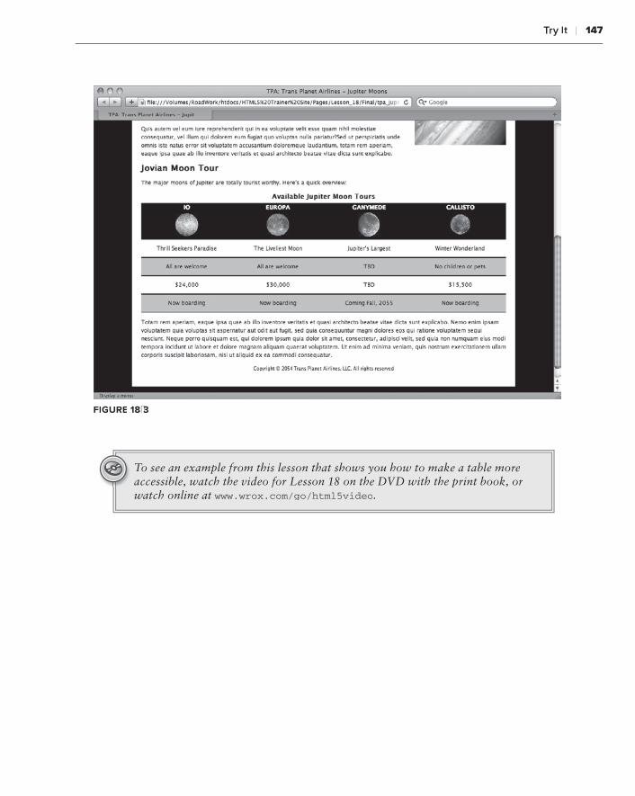
Try it ❘ 147
FiGure 18-3
To see an example from this lesson that shows you how to make a table more accessible, watch the video for Lesson 18 on the DVD with the print book, or watch online at www.wrox.com/go/html5video.


section Viibuilding Forms
Lesson 19:⊲ Creating a Form
Lesson 20:⊲ Enhancing Forms


Creating a Form
Forms turn the Web into a two-way medium. Without forms, website owners could never hear directly from their site visitors outside of other forms of communication. Forms are essential to surveys, polls, contact requests, and online shopping. In this lesson, you learn the basics of how forms are structured as well as the specifics for implementing the key form elements.
undersTandinTandinT G ForMs
A form is basically made of four parts:
The ➤➤ <form> tag
Form controls, such as the ➤➤ <input> tag
Labels, which identify the form elements➤➤
A trigger, typically a button form element, that submits the form➤➤
A simple form, in code, would look like this:
<form> <label>Name: <input type=”text” name=”fullName” /> </label> <input type=”button” value=”Submit” /></form>
When displayed in the browser, the label, text form field, and button are presented all in a single line, as shown in Figure 19-1.
FiGure 19-1
19
152 ❘ Lesson 19 CreatIng a ForM
As you learn later in this lesson, you can use <p> tags, tables, and other HTML elements along with CSS to create a structure to position the form elements.
In the preceding code example, notice how the <label> tag wraps around the <input> tag, which defines their connection. Many modern web designers use a variation on this technique to connect a given label to a particular form control. This variation uses a for attribute in the <label> tag that points to an id attribute in the form control, like this:
<form> <label for=”fullName”>Name: </label> <input type=”text” name=”fullName” id=”fullName” /> <input type=”button” value=”Submit” /></form>
The for attribute technique has a several benefits over the <label> tag wrapping method. First, it separates the two tags — <label> and <input> — which allows the tags to be positioned in sepa-rate table cells, a common design approach. In addition, the independent tags make it easier to apply CSS styles; with the for attribute technique, you could, for instance, add padding to a label tag selector to keep the form controls uniformly distant. Perhaps most importantly, the for attribute technique is far more accessible to assistive technology like screen readers.
One of the least understood aspects of website development is how the entries in a form are trans-mitted to the website owner or other designated party. It is important to understand that some form of server-side processing is necessary for form data to be delivered properly. Such processing usually takes the form of a script that runs on the server natively (in a high-end computer language like Perl) or on installed server applications such as PHP, .NET, or ColdFusion. The specific form processing script to be used is identified with the action attribute in the <form> tag, like this:
<form action=”scripts/mailForm.php”>
The action attribute requires a path to a file; this web address can be a relative or absolute URL. Another attribute, method, determines how the data is transmitted to the file noted in the actionattribute. The method attribute accepts one of two values: get and post. If your code specifies a method of get, the data is passed via the URL. For example, the following code expands on the prior example:
<form action=”scripts/mailForm.php” method=”get”> <label for=”fullName”>Name: </label> <input type=”text” name=”fullName” id=”fullName” /> <input type=”button” value=”Submit” /></form>
When the user clicks the Submit button, the next web address displayed in the browser will be a combination of the action value as well as information from the form, like this:
http://www.mysite.com/scripts/mailForm.php?fullName=Joseph%20Lowery
using Text and Textarea Fields ❘ 153
The question mark after the name of the referenced page (mailForm.php) indicates that what fol-lows is one or more name/value pairs. With forms, the name portion of the pair corresponds to a form control’s id value, which, here, is fullName. The value that follows is what was entered in the form text field, in this case Joseph Lowery. The %20 between the first and last names is a URL-encoded value for a space.
usinG TeXT and TeXTarea FieXTarea FieXT Lds
Text fields come in two flavors. When an <input> tag’s type attribute is set to text, a single-line text field is rendered in the browser, best used for a limited set of characters. Use the <textarea>tag when you want a more open-ended multi-line entry, capable of handling larger blocks of text.
Take a look at the smaller text field first. The code for creating a basic text field is straightforward:
<input type=”text” name=”firstName” id=”firstName” />
Although it’s apparently redundant, it is best to include both the name and id attributes with the same value. The name attribute is required and should be both meaningful and unique on the page. The id attribute is important for accessibility, most notably providing a hook for the <label> tag’s for attribute.
With CSS you can set the width, alignment, and font characteristics for a text field.
HTML5 brings a wide range of new attributes to the <input> tag. However, most are not supported across all browsers as of this writing. Some of the more interesting ones to keep an eye on are:
autocomplete➤➤ : When this attribute is set to on, browsers remember previous entries and will display them in a list when the user types the first couple of letters. If set to off, the entries are stored.
autofocus➤➤ : Allowed only once per form, it establishes the active form control when the page loads. Use the following syntax for the attribute: autofocus=”autofocus”.
max➤➤ : Determines the maximum number of characters allowed.
min➤➤ : Sets the minimum number of characters allowed.
placeholder➤➤ : The value of this attribute is initially shown in the text field and then removed when the form control is given focus.
required➤➤ : Ensures that the form field has an entry when the form is submitted.
Currently, support for these attributes is most complete in Opera 10.x and Safari 5.x browsers.
Many other form controls share the <input> tag with the text type. Web designers often add a custom CSS class to their text fields to allow for more selective customization.

154 ❘ Lesson 19 CreatIng a ForM
The code for inserting a multi-line <textarea> form control is quite different from that of a stan-dard text field:
<textarea name=”comments” id=”comments” cols=”50” rows=”5”> Tell us about yourself in 100 words or less</textarea>
Unlike the <input> tag, <textarea> has both opening and closing tags. Any content within the <textarea> tag pair is displayed in the field itself as shown in Figure 19-2. The size of the textarea field can be set in two ways. HTML5 recognizes the rows and cols attributes, which define the number of lines (the height) and number of characters in each row (the width), respectively. Alternatively, you can create a CSS rule for the textarea selector with width and height properties.
In HTML5, the <textarea> tag supports the autofocus, placeholder, and required attri-butes previously discussed. In addition, it has a few other attributes specific to itself:
maxlength➤➤ : Sets the number of characters permitted in the textarea.
wrap➤➤ : Determines how the text will be submitted. If wrap=”hard”, line breaks are added at the cols value; if wrap=”soft”, no breaks are added.
Try iT
In this Try It you learn how to create a form with text and textarea fields.
Lesson requirementsYou will need the tpa_saturn.html file from the Lesson_19 folder, as well as a text editor and web browser.
You can download the code and resources for this lesson from the book’s web page at www.wrox.com.
step-by-step1 . Open your text editor.
2 . From the Lesson_19 folder, open tpa_saturn.html.
FiGure 19-2
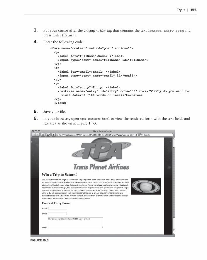
Try it ❘ 155
3 . Put your cursor after the closing </h2> tag that contains the text Contest Entry Form and press Enter (Return).
4 . Enter the following code:
<form name=”contest” method=”post” action=”“> <p> <label for=”fullName”>Name: </label> <input type=”text” name=”fullName” id=”fullName”> </p> <p> <label for=”email”>Email: </label> <input type=”text” name=”email” id=”email”> </p> <p> <label for=”entry”>Entry: </label> <textarea name=”entry” id=”entry” cols=”50” rows=”5”>Why do you want to visit Saturn? (100 words or less)</textarea> </p> </form>
5 . Save your file.
6 . In your browser, open tpa_saturn.html to view the rendered form with the text fields and textarea as shown in Figure 19-3.
FiGure 19-3

156 ❘ Lesson 19 CreatIng a ForM
workinG wiTH radio buTTons
Radio buttons allow the user to choose one item from two or more options. Users can switch their choices, and the previously chosen option is deselected so that only one option is selected. To make it possible for browsers to understand which radio buttons are part of the same group, the name attribute must be the same for all the options. Here’s a simple example with two options:
<input type=”radio” name=”gender” id=”male” value=”male” /><label for=”male”>Male</label><input type=”radio” name=”gender” id=”female” value=”female” /><label for=”female”>Female</label>
In this example, the name attribute is defined as gender for both <input> tags, whereas the id and value attri-butes are different. As with the text and textarea form controls, the id attribute is used by the <label> for iden-tification. The value attribute contains the text string to be submitted if the associated radio button is selected. For example, if someone chooses the Male radio button option, the value sent is male.
Common practice is to place the label to the right of the radio button, as shown in Figure 19-4. How you group radio buttons is determined by the design and the number of options in a group.
It is possible to preselect a radio button in a group by adding the attribute checked, like this:
<input type=”radio” name=”gender” id=”female” value=”female” checked=”checked” />
If you didn’t want the radio button to be checked you would set the checked attribute to an empty string, that is, checked=”“, or remove the attribute entirely.
oFFerinG cHeckboX oPTions
Unlike radio buttons, checkbox form controls allow the user to select as many options as desired, not just one. Although checkboxes often appear near each other, they are not grouped by the name or other attribute.
<input type=”checkbox” name=”redCheckbox” id=”redCheckbox” value=”red” /><label for=”redCheckbox”>Red</label><input type=”checkbox” name=”greenCheckbox” id=”greenCheckbox” value=”green” /><label for=”greenCheckbox”>Green</label> <input type=”checkbox” name=”blueCheckbox” id=”blueCheckbox” value=”blue” /> <label for=”blueCheckbox”>Blue</label>
Again, the value attribute contains the information to be transmitted if the checkbox is selected. Like radio buttons, the label is typically placed after the checkbox (Figure 19-5).
FiGure 19-4

implementing Select Lists ❘ 157
Preselecting checkboxes is handled the same way as radio buttons, by using the checked attribute. Say you wanted to have the Green option already checked when the user first sees the page. Here’s how the <input> tag for a selected checkbox would be coded:
<input type=”checkbox” name=”greenCheckbox” id=”greenCheckbox” value=”green” checked=”checked” />
Obviously, unlike radio buttons, you can have as many checkboxes checked as necessary.
iMPLeMenTinG seLecT LisTs
Select lists — also known as drop-down lists — provide another way for users to make selections. Select lists are extremely flexible and can be set up to emulate either radio buttons (with a single mutually exclusive choice) or checkboxes (with multiple selections).
To code a select list, you’ll need two separate tags, similar to ordered and unordered lists. The outer tag is the <select> tag, which contains the name attribute and, optionally, an id attribute. Each item in a select list form control is coded with an <option> tag. The text in between the opening and clos-ing <option> tag pair is what is displayed in the drop-down list. When a user chooses a particular select list item, the content of the value attribute is conveyed as the choice for the select list.
Take a look at some example code:
<select name=”region” id=”region”> <option value=”ne” selected=”selected”>Northeast</option> <option value=”se”>Southest</option> <option value=”mw”>Midwest</option> <option value=”sw”>Southwest</option> <option value=”w”>West</option></select>
When this select list is clicked by the user, the list drops down to display the options as shown in Figure 19-6. The first option, Northeast, is visible in the list when the list is closed.
FiGure 19-6
FiGure 19-5

158 ❘ Lesson 19 CreatIng a ForM
By default, the select list form control acts like a radio button in that it allows one mutually exclu-sive choice from many. To change the behavior to be like checkboxes, you add the multiple attri-bute to the <select> tag, like this:
<select name=”region” id=”region” multiple=”multiple” size=”5”>
When you add the multiple attribute, the select list transforms from a drop-down list to a fully visible menu of selections as shown in Figure 19-7. To make multiple selections, the user must press Ctrl on the PC, Command on the Mac, or — for contiguous selections — Shift on either platform.
FiGure 19-7
The size attribute determines how large the visible menu should be. If you choose less than the number of entries, a scroll bar appears so the user can select their option(s) from the entire list.
Try iT
In this Try It you learn how to add a select list to an online form.
Lesson requirementsYou will need the tpa_saturn.html file from the previous exercise, as well as a text editor and web browser.
step-by-step 1 . Open your text editor.
2 . From the Lesson_19 folder, open the previously saved tpa_saturn.html.
3 . Put your cursor at the end of the opening </p> tag after the closing </textarea> tag and press Enter (Return).
4 . Enter the following code:
<p> <label for=”age”>Age</label> <select name=”age” id=”age”> <option value=”Under_12”>Under 12 not allowed</option> <option value=”12_18” selected>12 - 18</option>
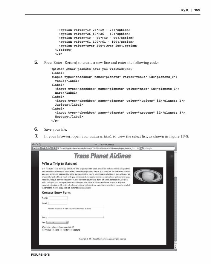
Try it ❘ 159
<option value=”19_25”>19 - 25</option> <option value=”26_40”>26 - 40</option> <option value=”40 - 60”>40 - 60</option> <option value=”61_100”>61 - 100</option> <option value=”Over_100”>Over 100</option> </select> </p>
5 . Press Enter (Return) to create a new line and enter the following code:
<p>What other planets have you visited?<br><label><input type=”checkbox” name=”planets” value=”venus” id=”planets_0”> Venus</label><label> <input type=”checkbox” name=”planets” value=”mars” id=”planets_1”> Mars</label><label> <input type=”checkbox” name=”planets” value=”jupiter” id=”planets_2”> Jupiter</label><label> <input type=”checkbox” name=”planets” value=”neptune” id=”planets_3”> Neptune</label></p>
6 . Save your file.
7 . In your browser, open tpa_saturn.html to view the select list, as shown in Figure 19-8.
FiGure 19-8

160 ❘ Lesson 19 CreatIng a ForM
usinG Hidden ForM conTroLs
As you might suspect from the name, a hidden form control is not visible to the user. If forms are used to gain feedback from the user, what’s the point of a hidden field? Quite often website owners work best when they know the context of the information supplied by the users. Say a site has two different forms on different pages, each of which asks for comments on the site’s services. One form is for the general public, and the other is for current customers who are logged in. Both forms store their information in the same database. How can the data from the two groups be distinguished? By using a hidden form control, of course.
The hidden form control is another <input> tag type, which is coded like this:
<input type=”hidden” name=”Customer_Type” value=”General Public” />
Because this form control is not displayed, there is no need for a label and thus, no need for an idattribute. You can have as many hidden form controls in your form as needed. Moreover, as long as the <input> tag is within the <form> tag, it can be placed anywhere.
From a coder’s perspective, I prefer to group all of my hidden form controls after the rest of the form elements, just before the closing </form> tag.
inserTinG ForM buTTons
As mentioned in the beginning of this lesson, one of the key elements of every form is some sort of trigger to submit the form and all the collected information. Most frequently, this trigger takes the form of a button form control.
You have two ways to create HTML form buttons. You can use the faithful standby the <input>tag, or you can use the <button> tag. With <input>, you choose the appropriate type attribute, either submit, reset, or button:
<input type=”submit” name=”submitButton” value=”Submit your form” />
With the <input> style button, the value attribute defines the label for the button, which appears in the button itself, as shown in Figure 19-9. As you probably have guessed, the submit type trig-gers the form and initiates the process to deliver the data. The reset type clears all the entries in the form, setting it to its default state. Finally, the button value for the type attribute allows the button to act as a general trigger, usually to activate some JavaScript.
Unlike the <input> tag, the <button> tag is not an empty tag — in other words, you need opening and closing tags with content in between to use the <button> tag. A type attribute is also needed in a <button> tag: the same three available for the button-related <input> tag: submit, reset, and button. The label for the button is entered as its content, like this:
<button type=”submit” name=”submitButton”>Submit your form</button>

Try it ❘ 161
When rendered in a modern browser, this code creates a button similar to the one created with the previous <input> example code. So what’s the difference between the two approaches? With a <button> tag, you can add other HTML elements as content, including images. For example:
<button type=”submit” name=”submitButton”> <img src=”images/checkmark.png” width=”16” height=”16” /> Submit your form</button>
As you can see in Figure 19-10, this code cleanly integrates a checkmark with the button text. More changes can be applied via CSS.
FiGure 19-9 FiGure 19-10
The one downside of using the <button> tag is that it is not supported in older versions of Internet Explorer, specifically IE 6 and below.
If your images don’t align with the text in the <button> tag, adjust the graphics’ position with the CSS vertical-align property. Quite often, setting that prop-erty to middle does the trick.
Try iT
In this Try It you learn how to add buttons to your form.
Lesson requirementsYou will need the tpa_saturn.html file from the previous exercise, as well as a text editor and web browser.
step-by-step1 . Open your text editor.
2 . From the Lesson_19 folder, open tpa_saturn.html saved in the previous exercise.

162 ❘ Lesson 19 CreatIng a ForM
3 . Put your cursor before the closing </style> tag within the <head> section and press Enter (Return).
4 . Enter the following code:
button img { vertical-align: middle;}
5 . Put your cursor at the end of the closing </p> tag after the final checkbox and press Enter (Return).
6 . Enter the following code:
<p> <button type=”submit” name=”submitButton”> <img src=”images/tick.png” width=”16” height=”16” /> Submit your entry </button> <button type=”reset” name=”resetButton”> <img src=”images/arrow_refresh.png” width=”16” height=”16” /> Start over </button> </p>
7 . Save your file.
8 . In your browser, open tpa_jupiter.html to view the rendered table with the new buttons as shown in Figure 19-11.
FiGure 19-11

Try it ❘ 163
Please select a video from Lesson 19 on the DVD with the print book, or watch online at www.wrox.com/go/html5video to see an example of the following:
Adding text and textarea fields➤➤
Inserting radio buttons, checkboxes, and select lists➤➤
Including form buttons➤➤

enhancing Forms
Filling out forms on the Web can be a trying experience for the user. Unclear labels, sloppy layouts, and hard-to-follow designs can all add unnecessary roadblocks to getting the user’s full cooperation when it is most needed. In this lesson, you learn how to add clarifying struc-tural elements like fieldsets to a form as well as how to lay out your form with tables and with CSS. You also get a peek of CSS form enhancements set forth in the HTML5 specification.
aPPLyinaPPLyinaPPL G FieLdseTs and LeGends
When working with larger forms with lots of labels and form controls, it can be helpful to group sections by using <fieldset> and <legend> tags. These tags are placed within a form and add a border around a designated set of fields (hence, a fieldset). The <legend> tag, which goes within the <fieldset> tag, provides a title that identifies the group. Here’s an example:
<form method=”post” action=”“> <fieldset> <legend>Personal details</legend> <p> <label for=”Name”> Name:</label> <input type=”text” name=”name” id=”Name” /> </p> <p> <label for=”Email”>Email:</label> <input type=”text” name=”email” id=”Email” /> </p> <p> <label for=”Tel”>Telephone:</label> <input type=”text” name=”tel” id=”Tel” /> </p> </fieldset> <p> <input type=”submit” value=”Submit” /> </p></form>
20

166 ❘ Lesson 20 enhanCIng ForMs
As shown in Figure 20-1, the legend is, by default, displayed within the border surrounding the fieldset. You can, of course, use CSS to modify both the border and the legend text; designers might, for example, assign a background color to the fieldset selector to further distinguish the form control group.
FiGure 20-1
You can use as many fieldset/legend combinations as you would like in a form. For complex forms, they can certainly help guide the user to a successful form completion and submission.
Try iT
In this Try It you learn how to add a fieldset and legend to a form.
Lesson requirementsYou will need the tpa_saturn.html file from the Lesson_20 folder, as well as a text editor and web browser.
You can download the code and resources for this lesson from the book’s web page at www.wrox.com.
step-by-step1 . Open your text editor.
2 . From the Lesson_20 folder, open tpa_saturn.html.
3 . Put your cursor after the opening <form> tag and press Enter (Return).

Try it ❘ 167
4 . Enter the following code:
<fieldset><legend>Your Info</legend>
5 . Place your cursor after the closing </p> tag that follows the code <input type=”text” name=”email” id=”email”> and press Enter (Return).
6 . Enter the following code:
</fieldset><fieldset><legend>Your entry</legend>
7 . Place your cursor after the closing </p> tag that follows the final checkbox and press Enter (Return).
8 . Enter the following code:
</fieldset>
9 . Save your file.
10 . In your browser, open tpa_saturn.html to view the rendered form with the fieldsets and legends as shown in Figure 20-2.
FiGure 20-2

168 ❘ Lesson 20 enhanCIng ForMs
usinG TabLes For ForM LayouT
For many years, web designers relied on the natural fit between forms and tables. A common layout placed labels in one column of a table and their associated form controls in the next. Frequently, the labels were right-aligned so that their connection to the adjacent controls were obvious. It’s a very tried-and-true technique, and one that works well even today.
The basic table structure is to provide a row for each label/form control pair and a final row for the submit button. The key code aspect to remember is to place the entire table (or tables) within the form, like this:
<form method=”post” action=”“><table> <tr> <td><label for=”Name”> Name:</label></td> <td><input type=”text” name=”name” id=”Name” /></td> </tr> <tr> <td><label for=”Email”>Email:</label></td> <td><input type=”text” name=”email” id=”Email” /></td> </tr> <tr> <td><label for=”Tel”>Telephone:</label></td> <td><input type=”text” name=”tel” id=”Tel” /></td> </tr> <tr> <td> </td> <td><input type=”submit” value=”Submit” /></td> </tr></table></form>
This approach, even without CSS styling, offers a very neat form appearance, as shown in Figure 20-3. If desired, you can add additional rows for a caption, sum-mary, and details. Should you want to integrate a fieldset and legend, it is recommended that multiple tables be used.
Right-aligning the label text is a two-stage process. First, you need to declare a custom CSS rule:
.labelText { text-align: right; padding-right: 3px;}
Next, you need to apply the .labelText class to the <td> tag for each of the cells that contain a <label> tag. Here’s the code with the appropriate classes applied:
<form method=”post” action=”“><table> <tr> <td class=”labelText”><label for=”Name”> Name:</label></td>
FiGure 20-3

Styling Forms with CSS ❘ 169
<td><input type=”text” name=”name” id=”Name” /></td> </tr> <tr> <td class=”labelText”><label for=”Email”>Email:</label></td> <td><input type=”text” name=”email” id=”Email” /></td> </tr> <tr> <td class=”labelText”><label for=”Tel”>Telephone:</label></td> <td><input type=”text” name=”tel” id=”Tel” /></td> </tr> <tr> <td> </td> <td><input type=”submit” value=”Submit” /></td> </tr></table></form>
When viewed in a browser (Figure 20-4), the labels move closer to their associated form fields, making it easy for users to follow the form at glance.
sTyLinG ForMs wiTH css
Although tables offer a very straightforward layout option for forms, many web designers prefer a pure CSS approach. In addition to opening up a more colorful world of design possibilities, the two-column, right-aligned label look-and-feel can easily be replicated with just a few CSS rules.
creating a Two-column LayoutThe key to recreating a two-column form layout in CSS is separating the <label> tag from the form control by using the for attribute as described in Lesson 19. Here’s an example to refresh your memory:
<label for=”fullName”> Name:</label><input type=”text” name=”fullName” id=”fullName” />
Because the <label> tag is not wrapped around the form control, you can declare a CSS rule for the label selector that floats it to the left — and then align the text to the right within that floated width. For example:
label { width:100px; float:left; margin-right:10px; text-align:right; clear:left;}
FiGure 20-4

170 ❘ Lesson 20 enhanCIng ForMs
The width attribute ensures that all the labels will have the same distance to work with. A constant margin-right attribute keeps the form controls the same number of pixels (in this case) to the right. And, as shown in Figure 20-5, the text-align property works just as well here as in the table cells. Finally, the clear:left declaration stops the float property from extending to the next line.
FiGure 20-5
styling Fieldsets and LegendsIf your form includes one or more <fieldset> and <legend> tags, they provide very handy hooks on which to hang some distinctive CSS. You can easily add a background color and border to make both stand out, as well as padding and margins to keep the form controls easy to read. As shown in Figure 20-6, the following CSS rules give the fieldset selector a light-orange background, complete with rounded corners in modern browsers (note, the color is not visible in this grayscale figure):
fieldset { margin: 0; padding: .5em; background: #FF9900; border: 1px solid #000000; -webkit-border-radius: 10px; -moz-border-radius: 10px; border-radius: 10px;}legend { padding: .2em; background-color: #EBEBFF; font-weight: bold; color: #000000; border: 1px solid #000000;}
FiGure 20-6

Styling Forms with CSS ❘ 171
You may be wondering about the two somewhat odd looking properties in the fieldset rule, -webkit-border-radius and -moz-border-radius. These properties were implemented by Safari and Mozilla (Firefox) to bring a rounded corner option to their browsers while the CSS 3 specification — which includes border-radius — is still in the formation phase. At this point in web design, it’s best to include all three declarations for backward and forward compatibility.
working with input FieldsWay back in Lesson 8, when discussing link styles, the :focus link state was mentioned. Although it can be used for text links, this particular state really comes into play with form controls. Whenever a user selects or clicks into a particular form control, such as a text field, that control is said to have focus and, thus, be in the :focus state. You can use this distinction to give your form controls two different styles: one when the field is selected and one when it is not. For example, if you want to change the text and background colors when a user clicks into a text field, here are two CSS rules you might use:
input { border: 1px solid #000000; font-weight: bold; background-color: #F5F5F5;}input:focus { font-weight: bold; color: #FFF; background-color: #0F0}
The different (green) background-color and white text values defined in the input:focus rule should be readily apparent in Figure 20-7, even in grayscale.
FiGure 20-7

172 ❘ Lesson 20 enhanCIng ForMs
You’ll recall the input selector affects many different types of form controls from text fields to check-boxes. You need to be careful when you create a CSS rule that targets all <input> tags that you don’t inadvertently affect a particular form control. To avoid this problem, you can specify the type of form control with a more particular CSS selector with the attribute selector. Here’s an example CSS rule intended to modify the submit button:
input[type=”submit”] { margin:0 0 0 120px;}
The square brackets indicate an attribute selector that targets an attribute in the tag, here type=”submit”. You can easily create selectors for checkboxes and radio buttons using similar selectors.
undersTandinG addiTionaL HTML5 ForM enHanceMenTs
One of the major areas addressed in HTML5 is forms. In addition to the required, autocomplete, autofocus, and other attributes covered in Lesson 19, many — 13, in fact — new types have been added to the <input> tag. Though there is not full cross-browser compatibility for these new types yet, support is included in many of the latest browser versions with more on the way.
Perhaps best of all, all of these new type attributes degrade gracefully because the default type value is text. In other words, if a browser does not recognize the new url type, it handles it as if it were text. Here’s a quick overview of the newly available types:
color➤➤ : Displays a color picker. Unfortunately, as of this writing, no browser has implemented the color type.
date➤➤ : Displays a calendar and adds the selected date in the field as a text string.
datetime➤➤ : Displays a calendar as well as a time field with up and down arrows.
datetime-local➤➤ : Displays a calendar as well as a time field with up and down arrows with-out a time zone.
time➤➤ : Displays a time field with up and down arrows.
week➤➤ : Displays a calendar and, when a date is selected, inserts the number of the week (1 to 52) as well as the year.
month➤➤ : Displays a calendar and, when a date is selected, inserts the number of the month (1 to 12) as well as the year.
number➤➤ : Displays a stepper control (up and down arrows). Available attributes include min, max, step, and value.
range➤➤ : Displays a slider control. Available attributes include min, max, step, and value.
email➤➤ : Validates the entered value as an e-mail address.
search➤➤ : Includes a clear search icon.

Try it ❘ 173
tel➤➤ : Validates the entered value as a telephone number.
url➤➤ : Validates the entered value as a web address.
As noted earlier, as of this writing browser support is just beginning. Opera 10 supports most of the new types and can be freely downloaded from http://www.opera.com if you’d like to see how it works for yourself. An example show-www.opera.com if you’d like to see how it works for yourself. An example show-www.opera.com
ing the date and range types is shown in Figure 20-8.
FiGure 20-8
Try iT
In this Try It you learn how to style a form with CSS.
Lesson requirementsYou will need the tpa_saturn.html file from the previous exercise, as well as a text editor and web browser.
step-by-step1 . Open your text editor.
2 . From the Lesson_20 folder, open the previously saved tpa_saturn.html.

174 ❘ Lesson 20 enhanCIng ForMs
3 . Put your cursor before the closing </style> tag in the <head> section and press Enter (Return).
4 . Enter the following code:
input, textarea, select { border: 1px solid #000000; margin-top: -5px;}input:focus { font-weight: bold; color: #F00;}label { width:100px; float:left; margin-right:10px; text-align:right; clear:left;}input[type=”checkbox”] { margin:2px 0 0 0;}fieldset { background: #F8B9BC; margin-bottom: 15px; -webkit-border-radius: 8px; -moz-border-radius: 8px; border-radius: 8px;}legend { background: #FFF; border: 1px solid #F70816; padding: 5px; font-weight: bold; -webkit-border-radius: 8px; -moz-border-radius: 8px; border-radius: 8px;}
5 . Save your file.
6 . In your browser, open tpa_saturn.html to view the rendered form with the new styling, as shown in Figure 20-9.

Try it ❘ 175
FiGure 20-9
Please select a video from Lesson 20 on the DVD with the print book, or watch online at www.wrox.com/go/html5video to see an example of the following:
Adding a fieldset and legend➤➤
Styling a form with CSS➤➤


section Viiienhancing HTML with Javascript
Lesson 21:⊲ Adding JavaScript
Lesson 22:⊲ Advanced JavaScript


adding JavaScript
The modern Web is built on three technologies: HTML, CSS, and JavaScript. The first provides content and structure, the second provides presentation, and the third provides interactivity and advanced applications. JavaScript is a client-side — meaning it runs on your computer, not the web host — scripting language. Because JavaScript is not compiled, like Java or C++, all you need to write and read it is a text editor, just like HTML and CSS.
JavaScript is enjoying a bit of a renaissance these days, especially with the upcoming release of HTML5. The major browsers have all revamped their JavaScript engines with a focus on faster processing. HTML5 provides support for many JavaScript enhancements affecting user interactivity, databases, local storage, offline applications, geolocation, audio and video manipulation, and even drawing with the new <canvas> tag.
A comprehensive examination of all that JavaScript can do is far beyond the scope of this book, but this section of the book can get you started. For any work in JavaScript on the Web, you need to know how to include JavaScript in your web page both as directly as code and also by referencing an external script. In this lesson, you learn how to add JavaScript code to your page, how to prepare for website visitors who have JavaScript disabled, and how to test your JavaScript.
undersTandinTandinT G JaV JaV Ja aVaV scriPT
JavaScript can address aspects of the browser used to look at a web page as well as the web page itself. With JavaScript, you can detect which browser is being used and change CSS styles accordingly. JavaScript has control over the browser window as well and can pop up new win-dows, resize existing ones, or close any that are open. For example, if you wanted to change the size of the current browser window to 800 pixels wide by 600 pixels tall, you might use this JavaScript code:
window.resizeTo(800, 600);
21

180 ❘ Lesson 21 addIng JaVng JaVng Ja aVaV sCrIPt
The window portion of the code identifies the browser window portion of the code identifies the browser window object to be affected, and object to be affected, and object resizeTo() is an applied function. The values in the parentheses are called arguments or parameters. All JavaScript statements must end with a semicolon.
When it comes to web pages, JavaScript works by identifying page elements and modifying them or by inserting new elements. You can use JavaScript, for example, to dynamically change text on one part of the web page when the user hovers over another part of the page. Another common use of JavaScript is to display an alert box — a new element — when an error is encountered. To identify the various page elements, JavaScript uses the document object model or DOM.
The DOM is, essentially, a road map to any given web page. JavaScript uses the DOM to pinpoint a precise page element — such as a text field in a specific form — and analyze, modify, or delete its content. The DOM is made up of a series of objects including window, document, history, form, text, and others. To identify an element, JavaScript uses what’s known as dot notation to drill down through the various objects.
For example, say you have a text form control with a name of fullName that is contained in a form named myForm. To find the current value of that field — what’s in the text box, in other words — your JavaScript might look like this:
var theEntry = window.document.myForm.fullName.value;
Note the periods that separate each object: These are the “dots” in dot notation. Because JavaScript is a scripted language, much of JavaScript’s work is done with simple equations like this where you can get or set the current value of a page element. The code var is short for variable and, unlike in many other computer languages, you don’t need to specify whether the variable is text, number, or some other type.
JavaScript is a case-sensitive language, so you need to be careful about naming variables and functions exactly. In other words, theEntry is not the same as TheEntry or theentry.
Now that you have captured what was entered in the fullName text field, you can use that in another common JavaScript function, alert(), which displays a message box:
alert(“Thanks for entering, “ + theEntry);
The plus sign is used here to bring together — or concatenate — the static text string (“Thanks for entering, “) and the variable, theEntry. When incorporated into a page that I had visited, the resulting message box might look like the one in Figure 21-1.

integrating JavaScript Code ❘ 181
FiGure 21-1
inTeGraTinG JaVascriPT code
You can incorporate JavaScript code in your web page directly in three different ways. You can set up your JavaScript so that it activates while the page is loading, after the page has loaded, or interac-tively when prompted by the user.
activating Javascript instantly To trigger JavaScript code immediately, add the <script> tag containing the JavaScript code within the <body> area. For example, if you wanted to show the current date and time, your code might be:
<h1>Today is <script type=”text/javascript”><!-- document.write(Date())--></script></h1>
As you can see from Figure 21-2, JavaScript returns a lot of info with just the one line of code. Now take a look at the example in more digestible parts. First, notice that the <script> tag is within an <h1> tag; you can intermingle HTML and JavaScript within a <script> tag anywhere in the <body> area.

182 ❘ Lesson 21 addIng JaVng JaVng Ja aVaV sCrIPt
FiGure 21-2
Next, note the attribute in the <script> tag:
<script type=”text/javascript”>
HTML supports numerous scripting languages, although JavaScript is by far the most popular. You need to identify which language is to be executed through the type attribute.
It is also possible to target a specific version of JavaScript with the languageattribute, like this:
<script type=”text/javascript” language=”javascript1.5”>
However, unless your code calls for functionality specific to a certain version, you can omit the language attribute.
Immediately following the opening <script> tag and right before its closing mate, you’ll find the code for creating an HTML comment. This practice stems from the earlier days of the Web where browser support for JavaScript was not universal. A browser without JavaScript support would essentially jump over the scripting language code because of the HTML comment placement. Many web designers leave off the comment code, but others feel it is a good way to future-proof your pages just in case as-yet-unreleased devices that do not support JavaScript appear. For me, it is sec-ond nature and I always include them.
Finally, we arrive at the one line of JavaScript code:
document.write(Date())
This code uses a frequently applied function, document.write() that inserts a text string into the HTML page. The text string can be plain text, HTML, a JavaScript value, or any combination thereof. In the example, the text returned from invoking the Date() object is written to the page.

integrating JavaScript Code ❘ 183
invoking Javascript on Page LoadAnother approach is to put the <script> tag and JavaScript function in the <head> of the document and then invoke or call the function when the page is loaded. This method allows all the JavaScript call the function when the page is loaded. This method allows all the JavaScript callfunctions to be grouped in one central location which, in turn, makes it easier to debug and fine-tune.
Take a look at a slightly more elaborate JavaScript function that returns the date in a familiar for-mat. This function, getTodaysDate(), establishes a new date object (theDate) and then extracts specific details from it in numeric format: month, day, and year. Next it puts them all together and stores that text string in another variable, theFullDate. Finally, it sets a form field on the page to theFullDate variable. Here’s the code in its entirety:
<script type=”text/javascript”><!--function getTodaysDate() { var theDate = new Date(); var theMonth = theDate.getMonth() + 1; var theDay = theDate.getDate(); var theYear = theDate.getFullYear(); var theFullDate = theMonth + “/” + theDay + “/” + theYear; document.theForm.todaysDate.value = theFullDate;}//--></script>
All the JavaScript statements look pretty straightforward, although you may be wondering about the code that gets the value for the current month — why is there a plus 1? JavaScript, in true programmer’s fashion, starts counting months with 0, so to get a value that makes sense to non-programmers you need to add a 1.
To get the date on the page, you need two things: an input field named todaysDate in a form named theForm and a way to call the JavaScript function. The form field is used because it’s very easy for theForm and a way to call the JavaScript function. The form field is used because it’s very easy for theForm
JavaScript to change the value of a text field. To activate the function, use what is known as an event handler, placed in the handler, placed in the handler <body> tag, like this:
<body onload=”getTodaysDate();”>
When the page loads, the function is called and the current date is placed in the text form control, shown in Figure 21-3. Why doesn’t it look like a text field? Why, the magic of HTML and CSS of course! In the HTML code, I added a disabled attribute like the following to the <input> tag so that users would not be able to click into the text field:
<input type=”text” name=”todaysDate” id=”todaysDate” disabled=”disabled” />

184 ❘ Lesson 21 addIng JaVasCrIPt
FiGure 21-3
On the CSS side, I removed the border with one simple rule:
input { border: none;}
This technique allows the JavaScript to dynamically insert the date and very cleanly integrate it into the page.
Triggering Javascript interactivelyAs the name implies, the onload event handler calls the specified function (or functions) when the content in the <body> tag has finished loading.
Other event handlers exist besides onload. These additional event handlers make it possible for JavaScript functions to be interactively called and depend on user action. The primary event handlers include:
onclick➤➤
onmouseover➤➤
onmouseout➤➤
onblur➤➤
onfocus➤➤
JavaScript event handlers are most frequently applied to links, form controls, and form buttons. For example, suppose you want to create another JavaScript function that returns the current time and allows the user to get that value whenever a form button is clicked. Here’s the JavaScript func-tion, which as you can see, introduces another JavaScript concept, the if-then-else or conditional statement:
<script type=”text/javascript”><!--function getCurrentTime() {var theAM_PM;var theDate = new Date();var theHour = theDate.getHours();if (theHour < 12) {

integrating JavaScript Code ❘ 185
theAM_PM = “AM”; }else { theAM_PM = “PM”; }if (theHour == 0) { theHour = 12; }if (theHour > 12) { theHour = theHour - 12; }var theMinutes = theDate.getMinutes();theMinutes = theMinutes + ““;if (theMinutes < 10) { theMinutes = “0” + theMinutes; }var theFullTime = theHour + “:” + theMinutes + “ “ + theAM_PM;document.theForm.currentTime.value = theFullTime;}//--></script>
Essentially, the conditional statements modify the values returned from the JavaScript function calls to fit the 12-hour clock model. First, the AM or PM suffix is calculated depending on whether the hour is less than or greater than 12. Next, the hour variable is modified if it is also greater than 12 to use the U.S. rather than the European or military time standard. Finally, if the minutes returned are under 10, a leading zero is added — something JavaScript does not do. When all the calculations are finished, the time string is created and placed in the (somewhat disguised) text form field, as shown in Figure 21-4.
FiGure 21-4
It should be noted that these three methods are not mutually exclusive and can be intermingled easily. For instance, you could use an onload event handler in the onload event handler in the onload <body> tag to call the getCurrentTime()function when the page loads as well as call it when the user clicks the button.
There is a fourth method for making JavaScript functions available: Include a link to an external file. This technique is covered in Lesson 22.
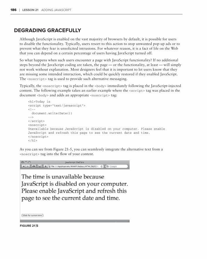
186 ❘ Lesson 21 addIng JaVasCrIPt
deGradinG GraceFuLLy
Although JavaScript is enabled on the vast majority of browsers by default, it is possible for users to disable the functionality. Typically, users resort to this action to stop unwanted pop-up ads or to prevent what they fear is unsolicited intrusions. For whatever reason, it is a fact of life on the Web that you can depend on a certain percentage of users having JavaScript turned off.
So what happens when such users encounter a page with JavaScript functionality? If no additional steps beyond the JavaScript coding are taken, the page — or the functionality, at least — will simply not work without explanation. Most designers feel that it is important to let users know that they are missing some intended interaction, which could be quickly restored if they enabled JavaScript. The <noscript> tag is used to provide such alternative messaging.
Typically, the <noscript> tag is placed in the <body> immediately following the JavaScript-injected content. The following example takes an earlier example where the <script> tag was placed in the document <body> and adds an appropriate <noscript> tag:
<h1>Today is <script type=”text/javascript”><!-- document.write(Date())--></script><noscript>Unavailable because JavaScript is disabled on your computer. Please enable JavaScript and refresh this page to see the current date and time.</noscript></h1>
As you can see from Figure 21-5, you can seamlessly integrate the alternative text from a <noscript> tag into the flow of your content.
FiGure 21-5

Testing JavaScript ❘ 187
Should the <script> tag be located in the <head> of the web page, you must make sure to place the <noscript> tag where the JavaScript-driven content is expected. Here’s the HTML section of the earlier example that displayed the JavaScript calculated date when the page loaded:
<h1>The date is <noscript>unavailable because JavaScript is disabled on your computer. Please enable JavaScript and refresh this page to see the current date and time.</noscript><input type=”text” name=”todaysDate” id=”todaysDate” disabled=”disabled” /></h1>
Again, the <noscript> text is shown only when JavaScript is disabled.
The HTML5 specification currently makes it possible for the <noscript> tag to be placed in the <head> of the web page as well as the <body>. No browser has, as of this writing, implemented this functionality, however.
TesTinG JaV JaV Ja aVaV scriPT
Testing is one of the key steps to working with any computer language, and JavaScript is no excep-tion. Though numerous tools are available for JavaScript development, you can employ a couple of built-in functions to debug your scripts when — not if — you run into problems with your code.
First, you want to familiarize yourself with the technique for turning off JavaScript in your browser so you can emulate the disabled JavaScript condition. Here’s how you disable JavaScript in the top three browsers:
Internet Explorer:➤➤ Choose Tools ➪ Internet Options. When the Internet Options dialog opens, switch to the Security tab and click Custom Levels. In the Security Settings – Internet Zone dialog box, scroll down to the Scripting section and, under Active scripting, click Disable. Click OK once to close the Security Settings dialog and then again to close Internet Options.
Firefox:➤➤ Choose Edit ➪ Preferences on Windows or Firefox ➪ Preferences on the Mac. When the Preferences dialog box opens, switch to the Content tab and uncheck the Enable JavaScript option. Close the dialog box.
Safari:➤➤ Choose Edit ➪ Preferences on Windows or Firefox ➪ Preferences on the Mac. In the Preferences dialog box, switch to the Security category. Under the Web Content section, uncheck the Enable JavaScript option and close the dialog box.
Now that you know how to test for disabled JavaScript scenarios, how do you test your page when JavaScript is working? A very simple JavaScript function, alert(), can help you track what is going on — and going wrong — with your code. You’ve seen the alert() function in action earlier: When

188 ❘ Lesson 21 addIng JaVasCrIPt
encountered in the JavaScript code, it displays a pop-up dialog box with a message. For example, the following code would display a simple greeting:
alert(“Hello!”);
In debugging, the alert() function is most commonly used to check the status of a variable anywhere in your code. Consider the current time function covered earlier in an example. Say that, for some reason you can’t discern, the AM and PM part of time displays “Undefined” when the function is run. You could use the alert() function in several places to track the content of the variable, like this:
<script type=”text/javascript”><!--function getCurrentTime() {var theAM_PM;var theDate = new Date();var theHour = theDate.getHours();
alert(“Before: “ + theAM_PM);
if (theHour < 12) { theAM_PM = “AM”; }else { theAM_PM = “PM”; }
alert(“After: “ + theAM_PM);
if (theHour == 0) { theHour = 12; }if (theHour > 12) { theHour = theHour - 12; }var theMinutes = theDate.getMinutes();theMinutes = theMinutes + ““;if (theMinutes < 10) { theMinutes = “0” + theMinutes; }
alert(“End: “ + theAM_PM);
var theFullTime = theHour + “:” + theMinutes + “ “ + theAM_PM;document.theForm.currentTime.value = theFullTime;}//--></script>
Additional lines were added before and after the alert() function to make it easy to identify the inserted code. Notice that the content of the function combines text (Before, After, and End) plus the variable, theAM_PM. When the button is clicked to get the current time, the dialog box will appear three separate times. The technique of concatenating a bit of text with the variable allows you to identify when each dialog box appears, as shown in Figure 21-6.

Try it ❘ 189
FiGure 21-6
Try iT
In this Try It you learn how to add an event handler and JavaScript function.
Lesson requirementsYou will need the tpa_mars.html file from the Lesson_21 folder, as well as a text editor and web browser.
You can download the code and resources for this lesson from the book’s web page at www.wrox.com.
step-by-step1 . Open your text editor.
2 . From the Lesson_21 folder, open tpa_mars.html.
3 . Put your cursor after the closing </style> tag and press Enter (Return).
4 . Enter the following code:
<script type=”text/javascript”> <!-- function getMarsWeight() { var theEarthWeight; theEarthWeight = document.theForm.earthWeight.value; if (theEarthWeight == 0) { alert(“Please enter your Earth weight in pounds”); document.theForm.earthWeight.focus(); } var theMarsWeight = theEarthWeight * .38; document.theForm.marsWeight.value = theMarsWeight + “ lbs”; }//--></script>
5 . Place your cursor in the opening <button> tag at the end and press Space.
6 . Enter the following code:
onclick=”getMarsWeight();”

190 ❘ Lesson 21 addIng JaVng JaVng Ja aVaV sCrIPt
7 .7 .7 Save your file.
8 . In your browser, open tpa_mars.html.
9 . Enter your weight in the Your Weight on Earth field and click the button to test the JavaScript, as shown in Figure 21-7.
FiGure 21-7
Watch the video for Lesson 21 on the DVD with the print book, or watch online at www.wrox.com/go/html5video to see examples from this lesson that show you how to insert a JavaScript function and add an event handler.
advanced JavaScript
In the previous lesson, you got your first look at JavaScript and how it integrates with HTML on a basic level. JavaScript is a very robust language made even more valuable in recent years by enhancements to the JavaScript engines incorporated in modern browsers. Now JavaScript functions execute faster than ever — which has lead to an explosion of development particu-larly in the area of JavaScript code libraries, also known as frameworks.
There’s an amazing wealth of freely available JavaScript functionality already developed in these frameworks that you can apply to your websites — all you need to know is how. In this lesson you learn how to work with one of the most popular JavaScript frameworks, jQuery, and integrate its code into your own starting with the key step of linking to external JavaScript files.
LinkinG eXTernaL FiLes
Just like external CSS files are the best approach to styling an entire website, consolidating your JavaScript functions in one or more external documents is the preeminent method for adding enhanced functionality. To externalize your JavaScript, you’ll need two elements: a page of JavaScript functions and a <script> tag linking to that page from your source code.
Creating a JavaScript file is very straightforward and can be accomplished with any text editor. In essence, you simply move any JavaScript functions from your main page, whether located in the <head> or <body> sections, to a blank text file. You must move only the JavaScript functions themselves and be sure to not include the HTML <script> tags. No additional code is required beyond the functions. For example, take the getCurrentTime() function used in the previous lesson. When located in the <head> of the HTML source code, the function was enclosed in a <script> tag and HTML comments, like this:
<script type=”text/javascript”><!--function getCurrentTime() {var theAM_PM;var theDate = new Date();
22

192 ❘ Lesson 22 adVanCed JaVasCrIPt
var theHour = theDate.getHours();if (theHour < 12) { theAM_PM = “AM”; }else { theAM_PM = “PM”; }if (theHour == 0) { theHour = 12; }if (theHour > 12) { theHour = theHour - 12; }var theMinutes = theDate.getMinutes();theMinutes = theMinutes + ““;if (theMinutes < 10) { theMinutes = “0” + theMinutes; }var theFullTime = theHour + “:” + theMinutes + “ “ + theAM_PM;document.theForm.currentTime.value = theFullTime;}//--></script>
To convert this code to an external JavaScript file, simply cut only the function code and paste it in a blank text document, like this:
function getCurrentTime() {var theAM_PM;var theDate = new Date();var theHour = theDate.getHours();if (theHour < 12) { theAM_PM = “AM”; }else { theAM_PM = “PM”; }if (theHour == 0) { theHour = 12; }if (theHour > 12) { theHour = theHour - 12; }var theMinutes = theDate.getMinutes();theMinutes = theMinutes + ““;if (theMinutes < 10) { theMinutes = “0” + theMinutes; }var theFullTime = theHour + “:” + theMinutes + “ “ + theAM_PM;document.theForm.currentTime.value = theFullTime;}
It is traditional to save the file with a .js extension so that it can be easily identified as a JavaScript document. Web designers often store their JavaScript files in a site root folder called scripts for convenience.

Linking external Files ❘ 193
The second step is to create a link from the HTML source file to the external JavaScript document. This is handled through a <script> tag with an src attribute, typically in the <head> section of the main document. Say that the previously created JavaScript file was saved as main.js. To link or include the JavaScript file, use this code:
<script type=”text/javascript” src=”scripts/main.js”></script>
You’ll notice two things right away. First, in addition to the src attribute, the type attribute still defines the kind of script as JavaScript. Second, the <script> tag is empty, that is, there is no con-tent between the opening and closing tags. The path to the JavaScript file in the src attribute can be document relative (as it is here) or absolute, like http://mySite.com/scripts/main.js.
When the page is rendered in the browser, there is no indication that you’re working with multiple files. The functionality loads exactly the same, as shown in Figure 22-1.
FiGure 22-1
coMMenTinG JaV JaV Ja aVaV scriPT code
Occasionally it is helpful to add comments to your JavaScript code, especially when you externalize the files. You have two ways to create a JavaScript comment. To create a single-line comment, place two forward slashes, //, at the beginning of the code line, like this:
// This function gets the current time
You can also use the two-slash method at the end of a code line; all the text that follows is considered a comment and is ignored by the JavaScript engine.
For multiple line comments, start your comment with a slash, followed by an asterisk, /*, and end it with the reverse: an asterisk, followed by a slash, */. Here’s an example:
/* This function gets the current timeand presents it in an AM/PM format.*/
Although it is not necessary to put the /* and */ characters on their own line, it does make the comment much more noticeable.
194 ❘ Lesson 22 adVanVanV Ced JaVed JaVed Ja aVaV sCrIPt
incorPoraToraTora inG a JaV a JaV a Ja aVaV scriPT FraMework
The same technique explored in the previous section for externalizing your JavaScript functions can be applied to code developed by other programmers. Over the past years, an ever-growing commu-nity of developers have created and published a very robust universe of freely available open source code. Many of these developers have leveraged core JavaScript frameworks such as Yahoo! User Interface (YUI), Prototype, MooTools, script.aculo.us, and jQuery to further extend the power of JavaScript. Best of all, their work can be used to enhance your own websites.
Each JavaScript framework has its own syntax. To lessen the learning curve, I recommend that you find a framework you like and use it exclusively, at least for a while. This approach should help you code more efficiently with fewer errors; there is certainly more than enough to explore in all of the major JavaScript frameworks.
The typical method for incorporating an effect or functionality from a JavaScript framework is a two-step process. First, you link to the external file or files that make up the library. You can either download the framework and incorporate it into your site or, if available, create an absolute link to a file hosted on the Web. Next, you include a short JavaScript script in the <head> of your document to call just the function you need and pass any arguments that relate to your HTML and/or CSS code.
Take a look at an example that uses the jQuery framework to fade in an image when the page loads. The first step is to visit http://jquery.com and download the latest version, which, as of this writ-http://jquery.com and download the latest version, which, as of this writ-http://jquery.com
ing is version 1.4.2.
Two different versions of jQuery are available, one for production and the other for development. The production version is compressed and not readable. The development version can be examined in any text editor. When you’re just start-ing out, I recommend you download the development version.
When you click Download, the JavaScript file is displayed in your browser. Save the file to your local system, preferably in a scripts folder of your site root.
Next, you link to the JavaScript file from your HTML source code, as described earlier:
<script type=”text/javascript” src=”../scripts/jquery-1.4.2.js”></script>
Then you need to make sure that your HTML and CSS are set up properly. Most JavaScript frame-work functions work by identifying the page element you want to affect, typically through use of the id or class attribute. In this example, there is a photo on the page with the id of fadePhoto:
<img id=”fadePhoto” src=”/images/DebraDance.jpg” width=”613” height=”685” />
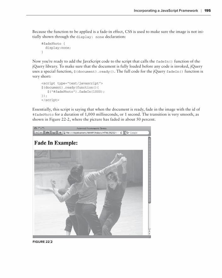
incorporating a JavaScript Framework ❘ 195
Because the function to be applied is a fade-in effect, CSS is used to make sure the image is not ini-tially shown through the display: none declaration:
#fadePhoto { display:none;}
Now you’re ready to add the JavaScript code to the script that calls the fadeIn() function of the jQuery library. To make sure that the document is fully loaded before any code is invoked, jQuery uses a special function, $(document).ready(). The full code for the jQuery fadeIn() function is very short:
<script type=”text/javascript”>$(document).ready(function(){ $(“#fadePhoto”).fadeIn(1000);});</script>
Essentially, this script is saying that when the document is ready, fade in the image with the id of #fadePhoto for a duration of 1,000 milliseconds, or 1 second. The transition is very smooth, as shown in Figure 22-2, where the picture has faded in about 50 percent.
FiGure 22-2

196 ❘ Lesson 22 adVanVanV Ced JaVed JaVed Ja aVaV sCrIPt
Try iT
In this Try It you learn how to include advanced functionality from a JavaScript framework.
Lesson requirementsYou will need the tpa_earthrise.html file from the Lesson_22 folder, as well as a text editor and web browser.
You can download the code and resources for this lesson from the book’s web page at www.wrox.com.
step-by-step1 . Open your text editor.
2 . From the Lesson_22 folder, open tpa_earthrise.html.
3 . Put your cursor after the closing </style> tag and press Enter (Return).
4 . Enter the following code:
<script type=”text/javascript”> <!-- $(document).ready(function(){ $(“#erImage”).fadeIn(8000); }); --> </script>
5 . Save your file.
6 . In your browser, open tpa_earthrise.html to make sure that the earth fades in properly as shown in Figure 22-3.
7 .7 .7 Return to your text editor and adjust the fadeIn value.
8 . Save the page and switch to your browser. Refresh the page to view the changed timing.

Try it ❘ 197
FiGure 22-3
To see an example from this lesson that shows you how to include advanced functionality from a JavaScript framework, watch the video for Lesson 22 on the DVD with the print book, or watch online at www.wrox.com/go /html5video.


section iXadding Media
Lesson 23:⊲ Working with Plug-Ins
Lesson 24:⊲ Inserting Audio
Lesson 25:⊲ Inserting Video


Working with Plug-ins
HTML is very flexible for a text-based computer language, but, by itself, it can’t do every-thing. For this reason, browsers are designed to be extended through a plug-in architecture. Plug-ins can make it possible to open non-web documents and handle other tasks typically suited for desktop applications. Some plug-ins, like the Flash Player from Adobe, are almost ubiquitous and have become a platform themselves. In this lesson, you learn how to work with plug-ins in general and also, specifically, with the Flash Player to display animations and the competing Microsoft Silverlight plug-in.
undersTandinTandinT G PLuG-ins
A plug-in is a small computer application that works with one or more browsers to provide additional functionality. Plug-ins typically need to be installed separately by the user, although in certain instances they may be included in the browser installation. Because plug-ins most frequently require site visitors to take an extra step, the web designer must be sure their use is important, if not essential, to the site’s viability.
Web designers do not insert plug-ins into their web pages — they insert content that requires a plug-in to be displayed in a browser. For instance, you don’t add the Flash Player to your page, you add an SWF file that relies on the Flash Player to be seen. Plug-in content comprises one or more external files that must be published online along with the HTML source code, CSS, images, and other files.
Two HTML tags are used for including plug-in content in a web page: <embed> and <object>. At various times over the history of the Web, these two tags have been used both separately and together to add plug-in material to a page. This section takes a look at the code necessary for these tags and tag combinations starting with the <object> tag.
23

202 ❘ Lesson 23 WorkIng WIth PLug-Ins
using <object> TagsThe <object> tag was introduced in an early version of HTML and standardized in HTML ver-sion 4.0; Microsoft’s Internet Explorer supported <object> but not <embed>.The <object> tag is non-empty; that is, it has an opening and closing tag. Alternative content — which is rendered if the browser cannot handle the plug-in file — is placed within the tag pair. For example, if you wanted to play an audio file in WAV format, your code might look like this:
<object data=”mySound.wav” type=”audio/wav” width=”200” height=”100”>Your browser does not support this file format.</object>
When encountering this code, a browser looks for whatever plug-in is registered to handle the speci-fied audio format and loads the file defined in the data attribute. If no such plug-in is found, the text within the tag is displayed as the alternative content.
Interestingly enough, the alternative content is not restricted to text or imagery: the <object> tag can actually contain other <object> tags. This technique allows multiple alternatives to be pre-sented to the browser in the hopes that one will be viable. Assume that the web designer had the same audio content in both WAV and MP3 formats. Here’s how you would code for that combina-tion with an <object> tag:
<object data=”mySound.wav” type=”audio/wav” width=”200” height=”100”> <object data=”mySound.mp3” type=”audio/mp3” width=”200” height=”100”> Your browser does not support this file format. </object></object>
Note that the text alternative content is still included in case the user’s browser does not support either of the offered formats. When rendered in a browser, a small control bar is displayed, as shown in Figure 23-1.
The <object> tag often incorporates a series of <param> tags to define the plug-in settings for the spe-cific content to be rendered. Here’s some example code for a QuickTime ActiveX plug-in used with Internet Explorer:
<object classid=”clsid:02BF25D5-8C17-4B23-BC80-D3488ABDDC6B” width=”160”height=”144” codebase=”http://www.apple.com/qtactivex/qtplugin.cab”> <param name=”src” value=”mySample.mov”> <param name=”autoplay” value=”true”> <param name=”controller” value=”false”></object>
Some of these parameters — classid and codebase — are required with the stated values to identify the needed resource as an ActiveX QuickTime plug-in. Others, such as autoplay and controller, are configurable features particular to the plug-in. For more information, see the article at the Apple support site at http://support.apple.com/kb/TA26444.
FiGure 23-1

understanding Plug-ins ❘ 203
embedding Plug-in contentThe <embed> tag was originally developed by Netscape as a proprietary tag — meaning not in the HTML specification — to work with the plug-in architecture for its browser, Navigator. Although Netscape Navigator is no more, Firefox — created by Netscape’s spin-off company, Mozilla — con-tinues to support the <embed> as well as the officially sanctioned <object> tag.
Unlike <object>, the <embed> tag does not require a closing tag. All attributes are contained within the single tag and there is no way to include alternative content. Here’s an example:
<embed src=”assets/mySounds.mp3” height=”60” width=”144”>
The src attribute contains the path to the associated file; the path can be either relative or absolute. The height and width attributes are optional. Any plug-in–specific settings are entered as attributes within the <embed> tag; there are no <param> tags as with the <object> tag. For example, here’s how content that requires the QuickTime plug-in might be coded with <embed>:
<embed src=”assets/weather.mov” width=”432” height=”376” autoplay=”true”controller=”true”pluginspage=”http://www.apple.com/quicktime/download/”>
A web page with the preceding code — if the QuickTime plug-in is available to the browser — dis-plays a QuickTime movie, complete with a control bar as shown in Figure 23-2.
FiGure 23-2
Just to keep life interesting, HTML5 — as of this writing — recommends that a new version of the <embed> tag by itself be the vehicle for delivering plug-in con-tent, although the <object> tag is also included in the specification.

204 ❘ Lesson 23 WorkIng WIth PLug-Ins
combining <object> and <embed> TagsYou’ve seen how to code with both the <object> and <embed> tags to include plug-in content, but the question remains, which do you use? For many web designers, the answer is both. To achieve full cross-browser compatibility, the two tags can be combined to provide the user with the best pos-sible user experience. Take a look at how it’s done.
You’ll recall that the <object> tag allows alternative content to be included between its opening and closing tags. To combine the two tags, you simply add a parallel <embed> tag — one that has all the same attributes — within the <object> tag. Here’s an example that inserts a QuickTime movie into the page:
<object classid=”clsid:02BF25D5-8C17-4B23-BC80-D3488ABDDC6B” width=”432”height=”376” codebase=”http://www.apple.com/qtactivex/qtplugin.cab”> <param name=”src” value=”assets/weather.mov”> <param name=”autoplay” value=”true”> <param name=”controller” value=”true”> <embed src=”assets/weather.mov” width=”432” height=”376” autoplay=”true” controller=”true”pluginspage=”http://www.apple.com/quicktime/download/”></object>
Although most of the attributes — such as src, autoplay, and controller — have direct matches in both tags, a couple are distinct. The classid and codebase attributes are found only in the <object> tag, and the pluginspage parameter is used only in the <embed> tag. Be sure to check with the plug-in provider’s documentation to see what specific attributes are required and which others are optional, but available.
Although the code can be a bit of a hassle to work with, the good news is that the effort really pays off. From a user’s perspective, the plug-in content works almost exactly the same, as shown in Figure 23-3.
FiGure 23-3
inserting an SWF File ❘ 205
If you’ve ever looked at a YouTube video anywhere else but the YouTube site, you’ve seen the combi-nation <object> and <embed> tags in action. All of YouTube’s code for embedding one of its hosted videos uses this method. Here’s an example:
<object width=”640” height=”385”><param name=”movie” value=”http://www.youtube.com/v/t-Sm4kTUGCc?fs=1&hl=en_US&rel=0”></param><param name=”allowFullScreen” value=”true”></param><param name=”allowscriptaccess” value=”always”></param><embed src=”http://www.youtube.com/v/t-Sm4kTUGCc?fs=1&hl=en_US&rel=0” type=”application/x-shockwave-flash” allowscriptaccess=”always” allowfullscreen=”true” width=”640” height=”385”></embed></object>
Though the movie’s web address (the value attribute in the <param> tag and src attribute in the <embed> tag) is somewhat convoluted, you can clearly see the two major tags combined.
The sharp-eyed reader may have spotted the closing </embed> tag in the YouTube code. Although it is not required, some developers — including YouTube, obvi-ously — continue to add it for supposed browser compatibility. The closing tag is ignored by all modern browsers, so you can use it or not as per your preference.
inserTinG an swF FiLe
The Adobe Flash Player is certainly one of the most popular plug-ins available. The Flash Player’s ability to play SWF files created by Adobe Flash and other authoring programs expands the creative professional’s palette extensively. An SWF file portrays an animation, drives a sophisticated applica-tion, and even — in specialized versions — displays full-screen video.
If you don’t have the latest Flash Player installed, you can — and should — get it get it at http://get.adobe.com/flashplayer.
If you’re creating your own Flash-generated content, you can use Flash itself to publish an HTML page, complete with all the required code, to host the content. On the other hand, if you’re insert-ing an SWF created by someone else, you’ll need to know a few key values. Here’s an example code block that uses the combined tag method for working with plug-in content:
<object classid=”clsid:d27cdb6e-ae6d-11cf-96b8-444553540000” codebase=”http://download.macromedia.com/pub/shockwave/cabs/flash/swflash.cab#version=10,0,0,0” width=”1000” height=”260” id=”Traced Bird FMA” align=”middle”> <param name=”allowScriptAccess” value=”sameDomain” /> <param name=”allowFullScreen” value=”false” /> <param name=”movie” value=”Traced Bird FMA.swf” />

206 ❘ Lesson 23 WorkIng WIth PLug-Ins
<param name=”quality” value=”high” /> <param name=”bgcolor” value=”#ffffff” /> <embed src=”Traced Bird FMA.swf” quality=”high” bgcolor=”#ffffff” width=”1000” height=”260” name=”Traced Bird FMA” align=”middle” allowScriptAccess=”sameDomain” allowFullScreen=”false” type=”application/x-shockwave-flash” pluginspage=”http://www.adobe.com/go/getflashplayer” /></object>
The classid and codebase attributes are required for the Internet Explorer ActiveX plug-in and must be included verbatim — with one exception. Note the version number at the end of the codebase attribute. This is the minimum version of the Flash Player required to play the content. As of this writing, the most current version is 10.1 — which would be described in the codebase attribute as 10,1,0,0. (For whatever reason, the codebase attribute uses commas rather than periods to separate version numbers.) In the <embed> tag, the type and pluginspage attributes are unique to Flash Player content.
Designed properly, SWF animations blend seamlessly into the web page as shown in Figure 23-4. The Traced Bird Skateboard Wheels logo — complete with spinning multi-colored wheels — is an SWF file inset with the preceding code example.
FiGure 23-4

adding Silverlight Code ❘ 207
Flash SWF files have a full range of attributes that can be added in <param> and <embed> tags. Here’s a quick overview of some of the most common attributes:
autoplay➤➤ : Determines whether the movie automatically starts. Accepted values are trueand false.
loop➤➤ : Sets whether the movie starts over after finishing playing. Accepted values are trueand false.
quality➤➤ : Sets the level of anti-aliasing in the SWF file. Define a low setting when you want faster playback with less anti-aliasing and a high setting when anti-aliasing is more impor-tant. Acceptable values are low, autolow, high, and autohigh. The two auto values attempt to adjust playback using the viewer’s computer processor.
scale➤➤ : Defines how the movie is shown. The default option renders the entire movie within the defined height and width dimensions. Other acceptable values include noborder (which resizes the movie to fit the width and height while maintaining the original proportions) and exactfit, which forces the movie to the width and height without regard to the original proportions.
wmode➤➤ : Defines how Flash content interacts with other HTML page elements. The default option, window, plays the movie in its own rectangular space, defined by the width and height attributes. Other values include transparent (which allows portions of the web page to show through transparent areas of the Flash movie) and opaque (which forces the movie to hide everything behind it).
One of the most popular uses of the Flash Player is to play video. You’ll find a full section on the topic in Lesson 25.
addinG siLVerLiGHT code
Silverlight was developed by Microsoft as a competitive platform to Adobe Flash. Though not as ubiquitous as the Flash Player, the Silverlight plug-in has made significant in-roads. Including Silverlight content in your web page focuses primarily on the <object> tag and does not include the <embed> tag.
<object id=”SilverlightPlugin1” width=”300” height=”300” data=”data:application/x-silverlight-2,” type=”application/x-silverlight-2” > <param name=”source” value=”SilverlightApplication1.xap”/> <param name=”minRuntimeVersion” value=”4.0.50401.0” /> <a href=”http://go.microsoft.com/fwlink/?LinkID=149156&v=4.0.50401.0”> <img src=”http://go.microsoft.com/fwlink/?LinkId=161376” alt=”Get Microsoft Silverlight” /> </a></object>

208 ❘ Lesson 23 WorkIng WIth PLug-Ins
Silverlight files have an .xap extension, which can be seen in the <param> tag with the name=”source” attribute. In this example, the alternative content includes a linked image that allows users who do not have the Silverlight plug-in to get it.
Silverlight has a robust set of parameters that can be used to customize the viewer’s user experience. Here’s an overview of some of the most frequently used parameters:
allowHtmlPopupWindow➤➤ : Controls whether the Silverlight application can open in a separate window. Accepted values are true and false.
enableAutoZoom➤➤ : Determines whether the automatic zoom features available in Internet Explorer 8 and above can be used. Accepted values are true and false.
splashScreenSource➤➤ : Defines a path to the file initially displayed by a Silverlight plug-in.
windowless➤➤ : Sets the rendering mode for Silverlight playback. When set to false (the default option), the Silverlight application is displayed in a window; when true, the applica-tion plays without the window border.
Try iT
In this Try It you learn how to incorporate plug-in content into your web page.
Lesson requirementsYou will need the tpa_lunarlanding.html file from the Lesson_23 folder, as well as a text editor and web browser.
You can download the code and resources for this lesson from the book’s web page at www.wrox.com.
step-by-step1 . Open your text editor.
2 . From the Lesson_23 folder, open tpa_lunarlanding.html.
3 . Put your cursor after the <div id=”lunarVideo”> tag and press Enter (Return).
4 . Enter the following code:
<object width=”640” height=”385”> <param name=”movie” value=”http://www.youtube.com/v/t-Sm4kTUGCc?fs=1&hl=en_US&rel=0”></param> <param name=”allowFullScreen” value=”true”></param> <param name=”allowscriptaccess” value=”always”></param> <embed src=”http://www.youtube.com/v/t-Sm4kTUGCc?fs=1&hl=en_US&rel=0” type=”application/x-shockwave-flash” allowscriptaccess=”always”

Try it ❘ 209
allowfullscreen=”true” width=”640” height=”385”></embed></object>
5 . Save your file.
6 . In your browser, open tpa_lunarlanding.html and play the embedded video, shown in Figure 23-5.
FiGure 23-5
To see an example from this lesson that shows you how to include plug-in con-tent in your web pages, watch the video for Lesson 23 on the DVD with the print book, or watch online at www.wrox.com/go/html5video.


inserting audio
Although sound is not appropriate for every website, it’s definitely an online option — and essential to certain types of sites. Just as with images and video, there is a vast range of formats for audio, but only a few are widely used. In this lesson, you learn which formats are the most compatible with the Web, the simplest approach to bringing music to a site, how to integrate an audio plug-in, and how to play audio natively with HTML5.
usinG web-coMPaMPaMP TaTa ibLe audio
To play an audio file on the Web, the sound must be recorded in a digital format. Uncompressed audio formats, such as the Audio Interchange File Format (AIFF) developed by Apple or Waveform Audio File Format (WAV) created by Microsoft and IBM, were popular in the early history of the Web. Although still seen on some websites, most web designers have switched to faster-loading, compressed audio formats like MP3.
The MP3 — short for MPEG Audio Layer 3 — format features high-quality digital audio files with excellent compression. MP3 has become the standard for downloadable music. Like all formats prior to HTML5, MP3 requires a plug-in, but support is widespread. MP3 files can be played in the QuickTime Player, RealPlayer, Windows Media Player, and a whole range of standalone players that work as browser helper applications. Basic MP3 files must be com-pletely downloaded before they begin to play.
Another approach is streaming audio, which plays as it downloads. RealAudio, developed by RealNetworks, is an example of a streaming audio. Playback of a RealAudio file — which can be recognized by a .ra or .ram file extension.ram file extension.ram — requires the use of the RealPlayer plug-in. Both free and commercial versions of this plug-in are available from http://www.real.com.
One of the most recent entries into the audio format arena carries the somewhat odd name of Ogg Vorbis, also known as just Vorbis. Vorbis files, which use an .ogg file extension, are simi-lar in quality to MP3, but are also streamable. The format was developed by an open source
24

212 ❘ Lesson 24 InsertIng audIo
organization, Xiph, and released into the public domain. For this reason, as well as the solid sound quality, Ogg Vorbis is supported in many recent browsers — including Firefox, Google Chrome, and Opera — in their implementation of the new HTML5 <audio> tag discussed later in this lesson.
LinkinG To MP3 FiLes
The absolute simplest way to deliver an MP3 file to a site visitor is to link to it. An MP3 link, when clicked, opens a new window or tab in the browser and begins playing the associated sound file. Virtually all browsers have some method of playing MP3 files because of the popularity of the for-mat, typically by including a plug-in or other helper application during installation.
Here’s an example of an MP3 link:
<h1><a href=”../assets/fb_demo_song.mp3”>Play Me!</a></h1>
Unfortunately, there is a price to pay for this simplicity: You have no control over what the user will see or be able to interact with when the music plays. It could be as elaborate as the floating Windows Media Player that appears in Internet Explorer 8 as shown in Figure 24-1, or as simple as the audio controller that shows up in Safari on the Mac (Figure 24-2).
FiGure 24-1

embedding audio with Plug-ins ❘ 213
FiGure 24-2
Furthermore, many browsers — like Safari — open the music player in a separate tab or window. To integrate an audio player in the same page, you need to use a plug-in or the new <audio> tag, as described in the upcoming sections.
Although linking to MP3 files requires that the audio file be completely down-loaded before playing, it is possible to set up those same files for streaming. The process is beyond the scope of this book, but you can find an excellent resource at http://transom.org/?p=7482.
eMbeddinG audio wiTH PLuG-ins
Depending on your web page design, it might be important for the audio player for your files to be displayed on the same page as other web content. To accomplish this combination and achieve maxi-mum cross-browser compatibility, you need to incorporate code for plug-in content in your site.
You can learn more about plug-ins in Lesson 23.
By far, the Flash Player is the most popular plug-in for audio playback. Also, the Flash Player does not have built-in audio support — the Flash authoring system is so flexible that creating a player is relatively easy to do. Let me stress the phrase “relatively easy.” Though developing your own player gives you the ultimate in control over the interface’s look-and-feel, it’s not a task for the complete Flash novice. Luckily numerous Flash Player–based MP3 players are available on the Web, many of them for free.
Google, for example, makes it Google Reader Audio Player available to anyone. The Google Reader Audio Player is an SWF movie located at http://www.google.com/reader/ui/3523697345-audio-player.swf. To use this player, you need to set a <param> with the
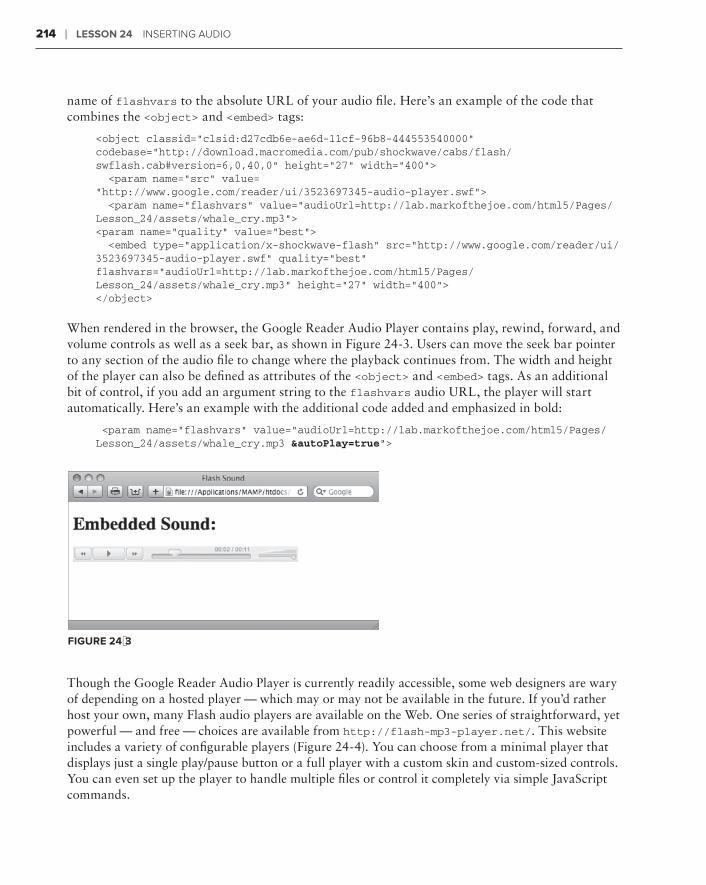
214 ❘ Lesson 24 InsertIng audIo
name of flashvars to the absolute URL of your audio file. Here’s an example of the code that combines the <object> and <embed> tags:
<object classid=”clsid:d27cdb6e-ae6d-11cf-96b8-444553540000” codebase=”http://download.macromedia.com/pub/shockwave/cabs/flash/swflash.cab#version=6,0,40,0” height=”27” width=”400”> <param name=”src” value=“http://www.google.com/reader/ui/3523697345-audio-player.swf”> <param name=”flashvars” value=”audioUrl=http://lab.markofthejoe.com/html5/Pages/Lesson_24/assets/whale_cry.mp3”><param name=”quality” value=”best”> <embed type=”application/x-shockwave-flash” src=”http://www.google.com/reader/ui/3523697345-audio-player.swf” quality=”best” flashvars=”audioUrl=http://lab.markofthejoe.com/html5/Pages/Lesson_24/assets/whale_cry.mp3” height=”27” width=”400”></object>
When rendered in the browser, the Google Reader Audio Player contains play, rewind, forward, and volume controls as well as a seek bar, as shown in Figure 24-3. Users can move the seek bar pointer to any section of the audio file to change where the playback continues from. The width and height of the player can also be defined as attributes of the <object> and <embed> tags. As an additional bit of control, if you add an argument string to the flashvars audio URL, the player will start automatically. Here’s an example with the additional code added and emphasized in bold:
<param name=”flashvars” value=”audioUrl=http://lab.markofthejoe.com/html5/Pages/Lesson_24/assets/whale_cry.mp3 &autoPlay=true”>
FiGure 24-3
Though the Google Reader Audio Player is currently readily accessible, some web designers are wary of depending on a hosted player — which may or may not be available in the future. If you’d rather host your own, many Flash audio players are available on the Web. One series of straightforward, yet powerful — and free — choices are available from http://flash-mp3-player.net/. This website includes a variety of configurable players (Figure 24-4). You can choose from a minimal player that displays just a single play/pause button or a full player with a custom skin and custom-sized controls. You can even set up the player to handle multiple files or control it completely via simple JavaScript commands.

incorporating HTML5 audio ❘ 215
FiGure 24-4
incorPoraTinG HTML5 audio
Until HTML5, playing music, sound effects, or background audio required the use of a plug-in. With the advent of the new <audio> tag, certain audio formats can be played natively, without any helper applications.
The basic <audio> tag is very straightforward:
<audio src=”assets/fb_demo_song.mp3” controls=”controls”></audio>
As with the <img> and other tags, the src attribute sets the path to an appropriate file, either relative or absolute. The controls attribute tells the compliant browser to dis-play basic play/pause and volume controls as well as a seek bar, as shown in Figure 24-5.
FiGure 24-5

216 ❘ Lesson 24 InsertIng audIo
If you’re not using XHTML syntax as we do throughout the book, the code would read:
<audio src=”assets/fb_demo_song.mp3” controls></audio>
The controls attribute is a Boolean one and its presence, even without a value, enables the attribute.
There are two scenarios in which you might want to leave out the controls attribute. Say you want to have background music start playing when your page loads. In this situation, you would remove the controls attribute and add an autoplay one, like this:
<audio src=”assets/fb_demo_song.mp3” autoplay=”autoplay”></audio>
This combination of attributes would cause the designated song to begin playing immediately when the browser is ready. Though this might be gratifying to the song’s creator, not all web visitors enjoy a sudden burst of music. It’s a good idea to offer a way to mute or stop playing the song. Luckily, the <audio> tag supports a number of key JavaScript functions — which can also be used to create cus-tom buttons, the second scenario where you might want to hide the native controls.
If you just wanted to pause the music, you could create a button with a little JavaScript attached, like this:
<audio id=”mySong” src=”../assets/fb_demo_song.mp3” autoplay=”autoplay”></audio><button onclick=”javascript:document.getElementById(‘mySong’).volume=0;” >Mute Music</button>
You’ll notice that the <audio> tag now has an id attribute, which makes it easier for the JavaScript function to properly target the tag. The onclick event handler in the <button> tag pinpoints the <audio> tag and sets the volume to zero when clicked. Another option would be to change to but-tons to play and pause, as shown in Figure 24-6. This is accomplished with the following code:
<audio id=”mySong” src=”../assets/fb_demo_song.mp3” autoplay=”autoplay”></audio><button onclick=”javascript:document.getElementById(‘mySong’).pause();” >Pause Music</button><button onclick=”javascript:document.getElementById(‘mySong’).play();” >Play Music</button>
FiGure 24-6

incorporating HTML5 audio ❘ 217
All is not pitch perfect with the <audio> tag, however: different browsers support different file for-mats. Table 24-1 contains a breakdown of the current state of audio format support.
TabLe 24-1: HTML5 Browser Support for Audio Formats
browser MP3 suPPorT waV suPPorT oGG Vorbis suPPorT
Google Chrome Yes no Yes
Opera no Yes Yes
Safari Yes Yes no
Firefox no Yes Yes
Internet Explorer (9 Beta) YesInternet Explorer (9 Beta) Yes Yes no
As you can see, no format enjoys universal support as yet. Happily, the <audio> tag was designed to handle this situation by making use of the <source> tag. Currently, to support all of the major browsers, you’d need to offer at least two of the formats, like MP3 and Ogg Vorbis, with code like this:
<audio controls=”controls”> <source src=”assets/mySong.ogg” type=”audio/ogg” /> <source src=”assets/mySong.mp3” type=”audio/mpeg” /></audio>
When the browser encounters this code, it displays the controls and tries to play the first source file in the Ogg Vorbis format. If that format is not supported, it moves to the second format, MP3. You can include as many <source> tags as needed to cover your desired browser range. The type attri-bute assists the browser by identifying the proper MIME type for each format. Should the browser not support any of the formats, you can even include a link so the user can download the song:
<audio controls=”controls”> <source src=”assets/mySong.ogg” type=”audio/ogg” /> <source src=”assets/mySong.mp3” type=”audio/mpeg” /> <a href=”assets/mySong.mp3”>Download</a></audio>
Converting audio files from one format to another requires dedicated soft-ware like Adobe Soundbooth or an online application like the one found at http://media.io/. The Media.IO converter allows you to set the quality (which also determines file size) as well as re-create files in the major audio formats. Best of all, it’s free.
Two other <audio> tag attributes are worth mentioning: loop and preload. As you might suspect, including the loop attribute causes the audio file to start over once it is completed. This attribute is added with code such as this, bolded for emphasis:
<audio id=”mySong” src=”../assets/fb_demo_song.mp3” autoplay=”autoplay” loop=”loop”></audio>

218 ❘ Lesson 24 InsertIng audIo
The loop attribute is an all-or-none situation. Once it is set the audio continues to loop forever. Naturally, you’d want to be careful about setting up a web page where music loops continuously in the background with no way to stop it.
The preload attribute determines whether the browser fully loads the audio before the page is dis-played. It has three possible values:
auto➤➤ : When set to auto, the entire audio is downloaded before the page is displayed.
meta➤➤ : If the meta value is used, only the metadata (such as author, date created, and so on) is loaded on page load.
none➤➤ : Neither audio nor metadata is preloaded.
You need to be careful if you have many <audio> tags on your page. Excessive use of the preloadattribute set to auto (which is the default) could result in long delay before your page is displayed.
Try iT
In this Try It you learn how to include HTML5 audio in your web page.
Lesson requirementsYou will need the tpa_martian_sounds.html file from the Lesson_24 folder, as well as a text edi-tor and a modern web browser such as Safari 5+, Firefox 3.5+, or Opera 10+.
You can download the code and resources for this lesson from the book’s web page at www.wrox.com.
step-by-step1 . Open your text editor.
2 . From the Lesson_24 folder, open tpa_martian_sounds.html.
3 . Put your cursor after the <div id=”martianSong”> tag and press Enter (Return).
4 . Enter the following code:
<audio controls=”controls”> <source src=”assets/whale_cry.ogg” type=”audio/ogg” /> <source src=”assets/whale_cry.mp3” type=”audio/mpeg” /> </audio>
5 . Save your file.
6 . In your browser, open tpa_martian_sounds.html and click the play button, shown in Figure 24-7.

Try it ❘ 219
FiGure 24-7
Watch the video for Lesson 24 on the DVD with the print book, or watch online at www.wrox.com/go/html5video to see examples from this lesson that show you how to include audio in your web pages.

inserting Video
The rise of online video has had a significant impact on the Web. Video has transitioned from the jerky, postage-stamp size and tinny-sounding implementation of just a few years back to full-screen, high-definition quality, complete with an immersive soundtrack. With the inclu-sion of a <video> tag in HTML5, video on the Web is bound to continue to expand and become even more ubiquitous. In this lesson, you learn all about the different video formats, the most common way to show video via a plug-in, and how to apply the new plug-in free approach in HTML5.
workinG wiTH Video TyPes
Online video is among the most complex topics facing the web designer today. As with audio, a great number of incompatible formats are available — and they keep coming. Moreover, the very nature of video, which can combine both sight and sound, requires a sophisticated pack-aging system that can deliver synchronized video and audio tracks in a compressed file.
To handle multiple tracks required by most videos, video container formats were developed. Among the most popular container formats are:
.flv➤➤ : Developed by Adobe for use in its Flash Player plug-in, the .flv (and related
.f4v) formats enjoy wide-spread use on the Web in sites including YouTube, Hulu, Google Video, and others.
.mp4➤➤ : A video compression format developed by the Motion Pictures Expert Group — LA, often used in conjunction with Apple’s QuickTime Player.
.ogg➤➤ : A container format developed by the Xiph open source foundation for use in the HTML5 <video> tag.
.webM➤➤ : A royalty-free, high-quality video container pioneered by Google, also for use in the <video> tag.
25

222 ❘ Lesson 25 InsertIng VIdeo
Each of these (and many other) container formats are capable of supporting multiple codecs. A codec is a compression/decompression algorithm for creating the highest quality video at the low-est possible file size. The most frequently used codecs include H.264, often used for high-definition video; VP8, a relatively new codec released into the public domain by Google; and Theora, created by Xiph to work with its Ogg container.
To play video on the Web, the video file must be encoded in a particular format and codec. Numerous desktop tools for encoding video are available, including Adobe CS5 Media Encoder (Figure 25-1), which is bundled with Flash Professional CS5. As you might expect, the online video explosion has also brought about a plethora of online video encoding services, like the one found at http://heywatch.com.
FiGure 25-1
If you’re looking to encode your video in the newer formats — Ogg and WebM — and are a Firefox user, there’s a free plug-in available called Firefogg (http://firefogg.org). Once this is installed, you can quickly upload your http://firefogg.org). Once this is installed, you can quickly upload your http://firefogg.org
video and choose from a number of presets with a variety of compression ranges and configurable options. The length of the actual encoding process depends on the duration of your video and conversion choices, but the service seems quite quick in general.

adding a Video Player ❘ 223
addinG a Video PLayer
As with audio, the most popular plug-in for video playback is the Flash Player. And, like audio, you’ll need a specialized SWF file capable of playing your video. Rather than delving into the com-plex world of Flash video programming, you can take advantage of one of the freely available play-ers online. In this section, you learn how to work with a popular model called the JW Player from Longtail Video (http://longtailvideo.com).
Once you’ve downloaded and uncompressed the JW Player, you’ll have a number of options for implementing its functionality. In addition to the <object> and <embed> methods for working with plug-ins, the JW Player also makes a JavaScript technique available. We want to take a look at both of those methods, starting with the HTML tag approach.
The basic video player strategy is to create a generic player to which you pass the filename of the video file you want to show, along with any specific parameters. In the following code, you can see that the movie parameter is set to player.swf, which is the main video player. There is also sepa-rate <param> named flashvars where the video to be played is specified, Star2.flv.
<object id=”player1” classid=”clsid:D27CDB6E-AE6D-11cf-96B8-444553540000” width=”480” height=”270”> <param name=”movie” value=”player.swf” /> <param name=”quality” value=”high” /> <param name=”wmode” value=”opaque” /> <param name=”swfversion” value=”6.0.65.0” /> <param name=”flashvars” value=”file=Star2.flv&autostart=true” /> <param name=”allowfullscreen” value=”true” /> <param name=”allowscriptaccess” value=”always” /> <embed flashvars=”file=Star2.flv&autostart=true” allowfullscreen=”true” allowscriptaccess=”always” id=”player1” name=”player1” src=”player.swf” width=”480” height=”270” /></object>
To simplify the code, I moved both the player.swf file from the JW Player’s mediaplayer folder and the video to be played to be in the same folder as my HTML page. If you don’t do this, you need to use either an absolute URL or a site root path to player and video.
The video is also set up, through the <param> tags and attributes in the <embed> tag, to allow full screen. A full-screen toggle can be seen on the far right of the controls in Figure 25-2.
One of the drawbacks of the <object> and <embed> technique is that it doesn’t validate under any HTML version 4 doctype. As a workaround — and to give more flexibility to the web designer — JavaScript methods were developed. So now it’s time to take a look at the JW Player’s JavaScript technique for playing video.

224 ❘ Lesson 25 InsertIng VIdeo
FiGure 25-2
Many developers, including those with Adobe and Longtail Video, have leveraged a powerful, open source JavaScript library for SWF playback called SWFObject. You can either download it from its home in the Google Code library (http://code.google.com/p/swfobject/) or, as JW Player does, just reference the file with a <script> tag in the <head> of your document:
<script type=”text/javascript”src=”http://ajax.googleapis.com/ajax/libs/swfobject/2.2/swfobject.js”></script>
Next, you’ll need to create a block-level containing element — either a <div> or <p> tag — with an id attribute defined:
<div id=”myVideo”></div>
Finally, you insert the JavaScript functions, wrapped up neatly in a <script> tag within the con-taining element:
<script type=”text/javascript”> var flashvars = { file:’../assets/Star2.flv’,autostart:’true’ }; var params = { allowfullscreen:’true’, allowscriptaccess:’always’ }; var attributes = { id:’player1’, name:’player1’ }; swfobject.embedSWF(‘../mediaplayer-5.3/player.swf’,’myVideo’,’480’,’270’,‘9.0.115’,’false’,flashvars, params, attributes);</script>
Take a look at the JavaScript broken down one line at a time.
var flashvars = { file:’../assets/Star2.flv’,autostart:’true’ };

adding a Video Player ❘ 225
This first JavaScript function sets the appropriate flashvars attribute values, namely the video to be played as well as the autostart value.
var params = { allowfullscreen:’true’, allowscriptaccess:’always’ };
Next, two more parameters are set, allowfullscreen and allowscriptaccess — enabling both.
var attributes = { id:’player1’, name:’player1’ };
In the third code line, the video player is identified with an ID and name.
swfobject.embedSWF(‘../mediaplayer-5.3/player.swf’,’myVideo’,’480’,’270’,‘9.0.115’,’false’,flashvars, params, attributes);
The final code line is jam-packed as it calls a function in the swfobject library, embedSWF(). The arguments passed to the function are, in sequence:
The path to the video player ➤➤ (../mediaplayer-5.3/player.swf)
The ID of the containing element (➤➤ myVideo)
The width (➤➤ 480)
The height (➤➤ 270)
The version number of the least acceptable Flash Player (➤➤ 9.0.115)
Whether the Flash Express Install should be made available (➤➤ false)
Passing the three variables (➤➤ flashvars, params, attributes)
Though it may appear complex at first, in practice it’s quite easy to configure because you’re gener-ally changing only one or two values. When implemented on a page, the resulting video plays just as smoothly as the HTML tag method, as shown in Figure 25-3.
FiGure 25-3

226 ❘ Lesson 25 InsertIng VIdeo
inTeGraTraTra inG Video wiTHouT a PLuG-in
If you worked your way through the section on the <audio> tag in the previous lesson, you won’t find too many surprises when it comes to the <video> tag, new in HTML5. In fact, except for a couple of attributes, the syntax is exactly the same. Here’s how you insert a video without a plug-in through the <video> tag:
<video src=”assets/vesta.mp4” controls=”controls”></video>
Again, the src attribute identifies the video file to play, and the controls attribute makes the play, pause, seek bar, and volume controls available as shown in Figure 25-4. Additional attributes in common with the <audio> tag include autoplay, loop, and preload.
FiGure 25-4
Several attributes are unique to the <video> tag. Because the dimensions of a movie are often criti-cal to its placement in the web page, both width and height attributes are supported.
It’s important to take note of the video’s dimensions during the encoding process so you can include them in your code. Not all browsers automatically detect the video size.
The poster attribute is another one found only in the <video> tag. If you set the poster value to the path of a static image in a web-compatible format — such as GIF, JPEG, or PNG — the image is dis-played before the user clicks the play button, as shown in Figure 25-5. Naturally, you would need to make sure you have omitted the autoplay attribute.

integrating Video without a Plug-in ❘ 227
FiGure 25-5
Unfortunately, the comparison to the <audio> tag carries over to the area of browser support. There is no single video format that can be played across all browsers. Table 25-1 shows which browsers support which video formats as of this writing.
TabLe 25-1: HTML5 Browser Support for Video Formats
browser H .264 suPPorT webM suPPorT oGG THeora suPPorT
Google Chrome Yes Yes Yes
Opera Partial Yes Yes
Safari Yes no no
Firefox no Yes (4 .0) Yes
Internet Explorer (9 Beta) Yes no no
The workaround to achieve full cross-browser video playback involves the use of the <source> tags, same as with the <audio> tag:
<video width=”320” height=”240” controls=”controls”> <source src=”assets/vesta.mp4” type=”video/mp4; codecs=’avc1.42E01E, mp4a.40.2’” /> <source src=”assets/vesta.webm” type=”video/webm; codecs=’vp8, vorbis’” /> <source src=”assets/vesta.ogv” type=”video/ogg; codecs="theora, vorbis"” /></video>
228 ❘ Lesson 25 InsertIng VIdeo
As promised, there are some additional, video specific attributes. Within each <source> tag is a rather robust type attribute that details both the video format — like video/mp4 — and the codecs used in the encoding of the video. The codecs portion of the type attribute lists the video codec first, followed by the audio one, for example, type=”video/webm; codecs=’vp8, vorbis’”. Note the careful use of double and single quotation marks within the attribute. Additionally, the final codec for Ogg Theora employs character entities for the quote character — " — instead of actual quotes so that it can be read properly by Firefox.
A bug in the iPad and iPhone implementation of the <video> tag allows those systems to recognize only the first <source> tag. Because they use a Safari-based browser, be sure to put your .mp4 format first.
For the ultimate in cross-browser compatibility, you can take the <video> tag implementation one step further by including a Flash fallback. If your site visitor uses an older browser that does not rec-ognize the <video> tag, it will be ignored and the Flash Player, invoked through the <object> and <embed> tag method, will be used. Here’s how that code might look:
<video width=”320” height=”240” controls=”controls”> <source src=”assets/vesta.mp4” type=”video/mp4; codecs=’avc1.42E01E, mp4a.40.2’” /> <source src=”assets/vesta.webm” type=”video/webm; codecs=’vp8, vorbis’” /> <source src=”assets/vesta.ogv” type=”video/ogg; codecs="theora, vorbis"” /> <object id=”player1” classid=”clsid:D27CDB6E-AE6D-11cf-96B8-444553540000” width=”480” height=”270”> <param name=”movie” value=”player.swf” /> <param name=”quality” value=”high” /> <param name=”wmode” value=”opaque” /> <param name=”swfversion” value=”6.0.65.0” /> <param name=”flashvars” value=”file=assets/vesta2.flv&autostart=true” /> <param name=”allowfullscreen” value=”true” /> <param name=”allowscriptaccess” value=”always” /> <embed flashvars=”file=assets/vesta.flv&autostart=true” allowfullscreen=”true” allowscriptaccess=”always” id=”player1” name=”player1” src=”player.swf” width=”480” height=”270” /> </object></video>
Want to make sure everyone has access to your video? Add a link to a downloadable video, perhaps in a QuickTime .mov format, in between the closing </object> and </video> tags. Now your video bases are truly covered!

Try it ❘ 229
Try iT
In this Try It you learn how to include HTML5 video in your web page.
Lesson requirementsYou will need the tpa_nova.html file from the Lesson_25 folder, as well as a text editor and a mod-ern web browser such as Safari 5+, Firefox 3.5+, or Opera 10+.
You can download the code and resources for this lesson from the book’s web page at www.wrox.com.
step-by-step1 . Open your text editor.
2 . From the Lesson_25 folder, open tpa_nova.html.
3 . Put your cursor after the <div id=”nova”> tag and press Enter (Return).
4 . Enter the following code:
<video controls=”controls” width=”470” height=”264”> <source src=”assets/nova.mp4” type=”video/mp4; codecs=’avc1.42E01E, mp4a.40.2’” /> <source src=”assets/nova.webm” type=”video/webm; codecs=’vp8, vorbis’” /> <source src=”assets/nova.ogv” type=”video/ogg; codecs="theora, vorbis"” /> </video>
5 . Save your file.
6 . In your browser, open tpa_nova.html and click the play button to view the video, shown in Figure 25-6.

230 ❘ Lesson 25 InsertIng VIdeo
FiGure 25-6
Watch the video for Lesson 25 on the DVD with the print book, or watch online at www.wrox.com/go/html5video to see examples from this lesson that show you how to include video in your web pages.

section Xnext steps in HTML5
Lesson 26:⊲ Looking Ahead in HTML5
Lesson 27:⊲ Enhancing Web Page Structure
Lesson 28:⊲ Integrating Advanced Design Elements


Looking ahead in HTML5
The state of HTML5 is an odd one. The W3C, the organization responsible for defining the language and all its particulars, has released its first public working draft for the new version of the web language but doesn’t expect it to reach its final stage — the recommendation — until 2022.
That’s not a typo: 2022. That’s just a little over 11 years from the date of this writing.
However, the competition for browser marketshare is intense and none of the major browser organizations are waiting for one year much less 11. Numerous features are being imple-mented as currently specified. Though this is exciting for designers, it also adds elements of instability and confusion. Until standards are established, designers will have to carefully implement any new features and do so with eyes wide open to the risks and downsides.
Consequently, some features of HTML5 work today in some of the browsers. Unfortunately for the designer, implementation is not at all consistent across the board on pretty much any of the new elements. The goal of this lesson is to clear up the confusion and point the way for-ward for web designers willing and excited to blaze the trail.
usinG HTML5 Today
The vast majority of the tags in the HTML5 language have been carried over from the previ-ous version and are fully cross-browser compatible now. All the basics — text, images, links — are in place and work as before. Most other major structural elements like tables and forms can also be used as before, but have new features available in HTML5, which browsers have implemented to varying degrees. A few totally new elements, such as the <video>, <audio>, and <canvas> tags, have been introduced in HTML5; many of the major browsers are latch-ing onto these tags and rendering them, although not consistently.
The primary concern when working with HTML5 — or any web technology — is meeting the requirements of the site. These requirements are based on the client’s needs balanced against the website’s audience. If the client wants to be totally cutting-edge, but a high percentage of
26
234 ❘ Lesson 26 LookIng ahead In htML5
the site visitors rely on older browsers, you won’t be able to utilize the most advanced technologies. If at all possible, it’s important to review website statistics to get a better picture of the site’s audi-ence. Key aspects include:
Browsers:➤➤ Take note of which browsers are used by the majority of site visitors as well as which are hardly used. Identifying the most-often used browser will help you establish a baseline for HTML5 support, and discovering the least-used allows you to avoid features that are supported by only those browsers.
Browser versions:➤➤ Understanding which versions of your most-used browsers are visiting the site is key. It doesn’t matter if Internet Explorer 9 supports a feature if 75 percent of your users depend on version 6.
JavaScript use:➤➤ All browsers have the ability to disable JavaScript. Though most users tend to keep JavaScript operational, there are definitely folks who prefer to deactivate it. If a signifi-cant percentage of your site visitors turn JavaScript off, you’ll have to be sure to avoid using the language without careful consideration.
Screen resolution:➤➤ Although not critical to HTML5-related decisions, figuring out how your site is being viewed — whether it’s on resolutions of 800 x 600 or 1280 x 768, for example — will help you determine the optimum layout for your site.
In addition to examining the site statistics for this information over a set time period, it’s a good idea to keep an eye on trends. For example, say that during the past six months, an average of 8 per-cent of users visited the site with Internet Explorer 6. Though the amount is relatively small, it is not insignificant. However, if you then examine the previous 6-month period and find that the percent-age of visitors relying on that browser was 12 percent, you can expect that older browser usage will continue to decline and bolster your case for more advanced HTML5 functionality.
wHaT works now
Want some good news? A great deal of the most desired HTML5 features are supported in the majority of the key browsers. Moreover, because competition is so fierce between the browser teams, updates are being released more frequently and the trend is to include more HTML5 functionality with each new version.
Currently, of the five major browsers — Internet Explorer, Firefox, Safari, Opera, and Chrome — all but one support about 90 percent of HTML5 functionality. Unfortunately, the current version of Internet Explorer, which retains the lion’s share of market, supports only about 75 percent.
Specifically, the HTML5 media elements — <audio>, <video>, and <canvas> — are among the best supported with solid implementations in Firefox, Safari, Opera, and Chrome. Again, Internet Explorer is lagging behind with the current version, but version 9 is already in beta testing and expected to be released in less than a year. Moreover, as discussed in Lesson 25, methods are already in place that allow such content to be displayed should the tags not be supported in a given browser.
Interestingly enough, one of HTML5’s most advanced features, web storage, already enjoys uni-versal support among current browsers. This new ability allows website developers to store larger amounts of data on the user’s system than was previously possible.

What Doesn’t Work Yet ❘ 235
Wondering exactly when you can use a specific HTML5 feature? Look no fur-ther than the site Can I Use (http://caniuse.com/). You’ll find a feature-by-feature breakdown that shows what is working now in which browsers so you can make an informed decision. The site covers the next wave in both HTML and CSS.
Another feature on web designer’s most wanted list that can be put to use today is font linking as implemented through the @font-face tag. As discussed in Lesson 28, the @font-face tag frees the web professional from the restrictions of client-based fonts so that the rich world of typography can be explored. Best of all, if a browser does not support the tag, a perfectly readable string of text is displayed — just not in the preferred font. An example of the @font-face tag in use is shown in Figure 26-1: the heading, East Village Feldenkrais, is rendered in a soft-rounded font not typically available on user systems.
FiGure 26-1
wHaTaTa doesn’T work yeT
Unfortunately, numerous features in the HTML5 working draft still have not been implemented in browsers fully enough to be used. These lesser-supported tags and attributes run the gamut from “I’ll never use that anyway” to “I could really use that right now!” Here’s a brief look at the more esoteric unsupported features.
Scalable Vector Graphics (SVG) is a technology that has hovered on the fringes of the Web for many years — and it looks like it will be a few more years before it enjoys major recognition and use. The HTML5 draft includes the ability to incorporate SVG figures inline, which is very useful
236 ❘ Lesson 26 LookIng ahead In htML5
for representing complex mathematical and scientific equations. Currently only Firefox 3.6 renders inline SVG, and only after a special HTML5 parser has been enabled.
Advanced form controls and functionality are among the most tantalizing HTML5 highlights. A wide range of new input types — such as e-mail, number, and telephone — combined with valida-tion and some advanced controls (slider and calendar among others) make the form enhancements extremely desirable. Sadly, only Opera has seen fit to fully implement the specification to a signifi-cant degree. Hopefully, the other browsers will follow suit sooner rather than later.
deTerMininG wHaTaTa works dynadynad MicaLLyLLyLL
As browsers leap-frog over one another to offer more advanced technology than their competitors, a new philosophy has taken hold among web designers. Rather than wait until all users’ browsers have reached a desirable level, designers have looked for a way to provide an advantage to those users with more advanced browsers while not detracting from the message for those who use older web viewing programs. This approach is known as progressive enhancement.
To render the page differently for different browsers, it’s necessary to detect whether the more advanced features are available on a per-browser basis. Various JavaScript functions can be used for this purpose and to insert the necessary code or text into a page depending on the detection outcome.
Look at an example concerning one of the more exotic HTML5 enhancements, geolocation. Geolocation is a new property added to the Document Object Model in HTML5 that returns the physical location of a site visitor’s computer. Or rather, the location of the visitor’s IP address, which may be broadcasting from the nearest Internet node or cell tower. Geolocation is a function with a great number of applications: Imagine searching for “Italian restaurant” and a list of the nearest five is returned. Geolocation functionality is available in Firefox 3.5+, Safari 5+, Chrome 5+, and Opera 10+, but not Internet Explorer.
To determine whether a browser supports the geolocation property, all that’s needed is a simple JavaScript call, like this:
if (navigator.geolocation) { // code if geolocation supported goes here} else { // code if geolocation not supported goes here}
I’m sure there are a great many among you — myself included — who, upon learning of the geolocation functionality immediately think, “But what if I don’t want my location found?” According to the current HTML5 specifications, geo-location is intended to be opt-in and not automatic. In other words, browsers must ask the site visitor’s permission before detecting his or her position. Firefox opens an info bar that asks if you’d like to share your location and other brows-ers have a similar apparatus in place.
Try it ❘ 237
Rather than create a function to detect all the HTML5 features, why not use a JavaScript library written expressly for that purpose, especially when it’s free? Modernizr is just such an open source code library and is available from http://www.modernizr.com/. If Modernizr determines a specifi-cally requested property or tag is available or not, it inserts a CSS class in the <html> tag. This strat-egy makes it easy to set up CSS rules that do one thing if the property is available and another if it is not. Best of all, setup is very straightforward. All you have to do is add a link to the Modernizr JavaScript file and a class of .no-js to the <html> tag, like this:
<html class=”.no-js”><head> <script src=”scripts/modernizr-1.5.js” type=”text/javascript”></script></head>
Modernizr is a very powerful, yet compact library used by a veritable Who’s Who of major websites including Twitter, NFL, The State of Texas, and more.
Try iT
In this Try It you learn how to detect if HTML5 functionality is available in the user’s browser.
Lesson requirementsYou will need the tpa_geo.html file from the Lesson_26 folder, as well as a text editor and a web browser.
You can download the code and resources for this lesson from the book’s web page at www.wrox.com.
step-by-step1 . Open your text editor.
2 . From the Lesson_26 folder, open tpa_geo.html.
3 . Put your cursor after the <h2 id=”geolocation”> tag and press Enter (Return).
4 . Enter the following code:
<script type=”text/javascript”> if (navigator.geolocation) { document.write(“I see you’re still on Earth. Enter EARTHFREE to blast off for 50% less!”); } else { document.write(“Your location could not be determined. No coupon available.”); } </script>

238 ❘ Lesson 26 LookIng ahead In htML5
5 . Save your file.
6 . In your browser, open tpa_geo.html to see if your browser supports the geolocation prop-erty, shown in Figure 26-2.
FiGure 26-2
Watch the video for Lesson 26 on the DVD with the print book, or watch online at www.wrox.com/go/html5video to see an example from this lesson that shows you how to determine if an HTML5 property is supported.

enhancing Web Page Structure
One of the great movements in recent years is the introduction of different devices capable of accessing the Web. From desktop to laptop to netbook to tablet to phone to TV — the number of devices continues to grow every year, all with their own particular size screens and dimensions. The growth of content on the Web has sparked a secondary revolution where information is cross-referenced and can appear on multiple pages and sites. A single blog post, for example, can be picked up and republished in any number of formats, such as a syndicated feed. How can por-table content be viewed properly under all these different circumstances?
The answer is semantics.
Semantics is the study of meaning, particularly as it relates to words and text. When applied to HTML, semantics essentially means using the right tag for the right content. In other words, the semantic web is a standardized web where the same content can be given a proper display regardless of the device or containing context. As you learn in this lesson, a good number of new tags in HTML5 are devoted to enhancing the underlying structure of a web page.
Though special care must be taken to use these new tags today, they are defi-nitely the way of the future for web designers working with HTML5 and it’s important you understand their application.
undersTandinTandinT G currenT LayouTs
After you’ve looked at a number of websites, you begin to see a pattern. Most sites are designed along similar lines:
There is a header section where the logo and, often, site-wide navigation appears.➤➤
Below the header is a content area that may be divided into two or more columns, quite ➤➤
often with one column taking up the most screen real estate.
A footer area along the bottom contains pertinent information about the site, such as ➤➤
copyright and contact details.
27

240 ❘ Lesson 27 enhanCIng Web Page struCture
Prior to HTML5, the <body> section of a typical web page might be coded like this:
<div id=”outerWrapper”> <div id=”header”> <img src=”images/logo.jpg” /> <div id=”nav”> <ul> <li><a href=”home.htm”>Home</a></li> <li><a href=”products.htm”>Products</a></li> <li><a href=”services.htm”>Services</a></li> <li><a href=”about.htm”>About Us</a></li> </ul> </div> <!-- End nav --> </div> <!-- End header --> <div id=”contentWrapper”> <div id=”mainContent”> <h1>Welcome to Our Company Website</h1> <p>We Make Great Stuff</p> <p>Our stuff is the best stuff around. Nobody makes stuff like our stuff. Best of all, our stuff is the least expensive stuff you’ll ever see – which makes our stuff a terrific value.</p> <p>When you need stuff, come see ours! You’ll be glad you did!</p> </div> <!-- End mainContent --> <div id=”sideContent”> <h2>People Like Our Stuff</h2> <p>Here’s what people have to say about our stuff:</p> <p>It’s really great stuff!! <br /> - Joe Schmoe</p> <p>Wow! Super stuff! <br /> - Jane Schmain</p> <p>The best stuff at the best price! <br /> - Bob Schmob</p> </div> <!-- End sideContent --> </div> <!-- End contentWrapper --> <div id=”footer”> <p>Copyright © 2011 Good Stuff, Inc. </div> <!-- End footer --></div> <!-- End outerWrapper -->
Depending on the CSS employed, this HTML page might be rendered like the one shown in Figure 27-1. Around all of the other code is a <div> tag with an id of outerWrapper. First, within that tag is the header <div> tag, which contains a logo image and a <div> tag filled with a list of links, identified with an id of nav. The content section comes next with two nested <div> tags, mainContent and sideContent, all with a <div> tag bearing an id of contentWrapper. After the content, the page is finished off with a final <div> tag, footer. All in all, seven <div> tags are used in this code.
There is certainly nothing wrong with coding in this manner for today’s standards. However, even a brief look at the code reveals a heavy reliance on <div> tags. The <div> tags by themselves have no real semantic meaning, although the associated id attributes attempt to address the situation. The problem is that there is no continuity between designers and, thus, sites. One designer might use sideContent as the id for a section of the page that contains tangentially relevant content, whereas another might use sidebar and a third rightColumn. The lack of standards makes moving the same content to different devices and other pages problematic.

Working with the new HTML5 Semantics ❘ 241
FiGure 27-1
Another issue is the content itself. If you look at the code, you’ll find one <h1> tag and one <h2> tag. Designers who are looking to structure their web pages really only have the heading tags, <h1> through <h6>, to use as hierarchical elements. The accepted style is to use a single <h1> tag per page that serves as the root or base element. Then, any number of <h2>, <h3> and other heading tags are incorporated in a hierarchical fashion. Though valid, this approach is fairly limiting. Many websites use content assembled from a multitude of sources, each of which may incorporate their own <h1> tags to designate the most important heading within the individual content articles.
In the next section, you learn the new semantically correct tags in HTML5 that help standardize web pages.
workinG wiTH THe new HTML5 seManTics
HTML5 has six major new semantic-based tags:
<section>➤➤
<header>➤➤

242 ❘ Lesson 27 enhanCIng Web Page struCture
<nav>➤➤
<article>➤➤
<aside>➤➤
<footer>➤➤
Each of these tags is intended to identify a specific type of content. The tags all work together; you can have one or more <article> tags within a <section>, each of which might have a <header>and a <footer> tag. The following sections take a close up look at each of the major HTML5 tags.
In addition to the major semantic tags, there is another tag that is less structural in nature, but which is intended to be used with highly targeted content: <time>. This tag is discussed in the section on the <article> tag.
defining sectionsThe <section> tag is designed to designate a grouping of related content. If you were working with books, a chapter would be a section. A web page can have several sections, such as an introduction, current news, and special announcements. Use the <section> tag to separate major portions of your web page.
In the earlier example code, the <section> tag would be used to replace the <div> tag with the mainContent id, like this:
<section> <h1>Welcome to Our Company Website</h1> <p>We Make Great Stuff</p> <p>Our stuff is the best stuff around. Nobody makes stuff like our stuff. Best of all, our stuff is the least expensive stuff you’ll ever see – which makes our stuff a terrific value.</p> <p>When you need stuff, come see ours! You’ll be glad you did!</p></section>
If you need to identify a <section> tag for CSS styling purposes, you’re free to use an id or id or id class attribute, as with this example: <section id=”mainContent”>.
For related content, whereas <h1> tags were generally advised to be used once per page, <section>tags allow each content group to have its own hierarchical headings — and, as you see later, its own <footer> tags.
Working with the new HTML5 Semantics ❘ 243
creating HeadersThe <header> tag is designed to contain introductory and navigational elements. An introductory element can be a logo, a masthead, or headings. Here’s how the example code would incorporate a <header> tag:
<header> <img src=”images/logo.jpg” /> <div id=”nav”> <ul> <li><a href=”home.htm”>Home</a></li> <li><a href=”products.htm”>Products</a></li> <li><a href=”services.htm”>Services</a></li> <li><a href=”about.htm”>About Us</a></li> </ul> </div> <!-- End nav --></header>
As noted, the <header> tag can be used to hold one or more headings. It’s not unusual for design-ers to combine heading tags, like an <h1> and an <h2> together or use an <h1> tag with a <p> tag as a tagline. HTML5 introduced a new tag, <hgroup>, to handle such situations where the intent is to consider the various related elements as one hierarchical level. If you recall, the example code included one such pairing that would be perfect for the <hgroup> tag:
<section> <header> <hgroup> <h1>Welcome to Our Company Website</h1> <p>We Make Great Stuff</p> </hgroup> </header> <p>Our stuff is the best stuff around. Nobody makes stuff like our stuff. Best of all, our stuff is the least expensive stuff you’ll ever see – which makes our stuff a terrific value.</p> <p>When you need stuff, come see ours! You’ll be glad you did!</p></section>
Note that you’re not restricted to using the <header> tag once on a page. An area designated by a <section> tag can also include a <header>.
setting navigation areasAs covered in Lesson 15, modern website navigation is typically handled by a well-styled unordered list of links. The aim of the <nav> tag is to contain the major navigation on a website page; the <nav> tag is typically enclosed in the <header> tag. Here’s how the example code would look with the <nav> tag in place:
<header> <img src=”images/logo.jpg” /> <nav> <ul> <li><a href=”home.htm”>Home</a></li>

244 ❘ Lesson 27 enhanCIng Web Page struCture
<li><a href=”products.htm”>Products</a></li> <li><a href=”services.htm”>Services</a></li> <li><a href=”about.htm”>About Us</a></li> </ul> </nav> </header>
One of the major benefits for using the <nav> tag over a generic <div> tag is that it is easier to find for assistive technology like screenreaders. Because the site navigation can literally be located any-where on a web, the current methodology is to create a named anchor called a skip link at the top of the page that connects to the <div> tag with the navigation. This allows anyone using a screen-reader to quickly access the primary links in a site. The <nav> tag has the potential to render the skip link unnecessary because, once the <nav> tag is supported by the assistive technology, screen-readers will be able to find the primary navigation without the extra guidance.
establishing articlesThe content in an <article> tag differs from the general content contained within a <section> tag in a very important way: It’s self-contained and able to be repurposed. Examples of content ideal for the <article> tag are blog posts, forum posts, or comments — any bit of independent content.
Here’s an example of how the <article> tag might be used with a blog post:
<article> <header> <h1>Why Our Stuff is the Best</h1> <p>by Simon Stuffy, CEO of Good Stuff, Inc.</p> <p class=”post-date”>March 31, 2011</p> </header> <p>Our stuff is truly the best you’ll find anywhere. Why? Because we give hire the best people to create our stuff, from the best materials anywhere. Then we test our stuff under a wide range of conditions to be sure that it’s really the best stuff around.</p> <footer> <p>Copyright © 2011 Good Stuff, Inc.</p> </footer></article>
As you can see, the content within the <article> tag is ready to be published in any other web page. There is also a <header>, complete with author name and date of publication, a content area, and a footer with copyright details (the <footer> tag is covered later in this lesson). All of it wrapped up in a neat little <article> tag.
HTML5 also includes a new tag designed to make dates and time machine readable while maintain-ing a customizable human aspect as well. The <time> tag is most frequently seen in an <article> tag, although it is not restricted to that placement. The <time> tag is quite flexible and allows the coder to depict a date, a time, or both. Here’s how I might change the date in the previous example to use the <time> tag:
<header> <h1>Why Our Stuff is the Best</h1>

Working with the new HTML5 Semantics ❘ 245
<p>by Simon Stuffy, CEO of Good Stuff, Inc.</p> <time datetime=”2011-03-31” pubdate=”pubdate”>March 31, 2011</time></header>
If the datetime attribute in the <time> tag is used to define a date, the year-month-day format must be used. Should you want to specify a time as well, you add the letter T to the date, followed by the time in a 24-hour representation and end with a time zone, designated as an offset to Greenwich Mean Time (GMT). For example, if I wanted to note the exact time it was published — say at 2:30 p.m. in New York (Eastern Standard Time) during Daylight Savings Time (-4:00 GMT) — I’d change the code to this:
<time datetime=”2011-03-31T14:30:00-04:00” pubdate=”pubdate”>March 31, 2011 at 2:30 PM in NYC</time>
As you can see, the text within the <time> tag can be as precise or as subjective as you want.
You may be wondering about the pubdate attribute. When included within an <article> tag, the pubdate attribute indicates that the <time> value is the publication date of the <article>, or — if <time> is not in an <article> tag — the publication date of the document.
defining asidesMany printed pages contain a sidebar with content that is related to the primary subject matter, but not critical to it. In HTML5, this additional content is best enclosed in an <aside> tag. Here’s how the example code, previously wrapped in a <div> tag with an id of sideContent, looks with the <aside> tag:
<aside> <h2>People Like Our Stuff</h2> <p>Here’s what people have to say about our stuff:</p> <p>It’s really great stuff!! <br /> - Joe Schmoe</p> <p>Wow! Super stuff! <br /> - Jane Schmain</p> <p>The best stuff at the best price! <br /> - Bob Schmob</p></aside>
Other elements that are outside of the main content of the page, such as pull quotes, would also be appropriate choices for the <aside> tag. The <aside> tag can also be used to contain secondary navigation lists and advertisements.
including FootersThe final semantically related HTML5 tag is the <footer> tag. As you might suspect, the <footer> tag is typically placed at the end of your content. Typical material for this tag includes related links, copyright information, and contact info. Here’s the example code with the new <footer> tag in place:
<footer> <p>Copyright © 2011 Good Stuff, Inc.</footer>
246 ❘ Lesson 27 enhanCIng Web Page struCture
Of course, the degree of content does not have to be as limited as this example. One of the trends in web design these days is the aptly named fat footer. A fat footer may include a host of links to related material, a separate section on the creation of the page or site, or other extensive content. If the amount or depth of material warrants, you’re free to use a <section> tag within a <footer>.
bringing it all TogetherI’ll close out this section by pulling together all the disparate tags so you can see how a fully devel-oped, semantically correct HTML5 page would look in code:
<div id=”outerWrapper”> <header> <img src=”images/logo.jpg” /> <nav> <ul> <li><a href=”home.htm”>Home</a></li> <li><a href=”products.htm”>Products</a></li> <li><a href=”services.htm”>Services</a></li> <li><a href=”about.htm”>About Us</a></li> </ul> </nav> </header> <div id=”contentWrapper”> <section> <hgroup> <h1>Welcome to Our Company Website</h1> <p>We Make Great Stuff</p> </hgroup> <p>Our stuff is the best stuff around. Nobody makes stuff like our stuff. Best of all, our stuff is the least expensive stuff you’ll ever see – which makes our stuff a terrific value.</p> <p>When you need stuff, come see ours! You’ll be glad you did!</p> </section> <aside> <h2>People Like Our Stuff</h2> <p>Here’s what people have to say about our stuff:</p> <p>It’s really great stuff!! <br /> - Joe Schmoe</p> <p>Wow! Super stuff! <br /> - Jane Schmain</p> <p>The best stuff at the best price! <br /> - Bob Schmob</p> </aside> </div> <!-- End contentWrapper --> <footer> <p>Copyright © 2011 Good Stuff, Inc. </footer></div> <!-- End outerWrapper -->
The first thing you’ll notice is that this code still uses <div> tags to enclose content. Such enclosures are used, in conjunction with CSS, to achieve presentation effects like centering of the page. It’s fine to combine <div> tags with the new semantic-based HTML5 tags as long as you use each to their own purpose.

Try it ❘ 247
If you attempt to view the HTML5 tags in a browser that does not support them, you’ll run into presentation issues right away. Essentially, because the browser does not recognize them, they’re ignored and the content within them just reproduced without any breaks. You can work around this problem with a simple CSS rule:
section, header, nav, article, aside, footer, time { display: block;}
This rule makes sure that all the HTML5 semantic tags act like other block-level elements such as <p> and <div> tags. You can, of course, add any other styling you’d like to the grouped selectors or any individual HTML5 tag.
Try iT
In this Try It you learn how to convert a page to use HTML5 semantic-based tags.
Lesson requirementsYou will need the tpa.html file from the Lesson_27 folder, as well as a text editor and a web browser.
You can download the code and resources for this lesson from the book’s web page at www.wrox.com.
step-by-step1 . Open your text editor.
2 . From the Lesson_27 folder, open tpa.html.
3 . Replace <div id=”header”> with <header>.
4 . Replace </div> <!-- End header --> with </header>.
5 . Replace <div id=”nav”> with <nav>.
6 . Replace </div> <!-- End nav --> with </nav>.
7 .7 .7 Replace <div id=”mainContent”> with <section>.
8 . Replace </div> <!-- End mainContent --> with </section>.
9 . Place your cursor after the opening <section> tag and press Enter (Return).
10 . Enter the following code:
<hgroup>
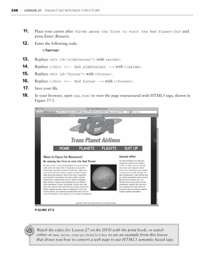
248 ❘ Lesson 27 enhanCIng Web Page struCture
11 . Place your cursor after <h2>Be among the first to visit the Red Planet</h2> and press Enter (Return).
12 . Enter the following code:
</hgroup>
13 . Replace <div id=”sideContent”> with <aside>.
14 . Replace </div> <!-- End sideContent --> with </aside>.
15 . Replace <div id=”footer”> with <footer>.
16 . Replace </div> <!-- End footer --> with </footer>.
17 .17 .17 Save your file.
18 . In your browser, open tpa.html to view the page restructured with HTML5 tags, shown in Figure 27-2.
FiGure 27-2
Watch the video for Lesson 27 on the DVD with the print book, or watch online at www.wrox.com/go/html5video to see an example from this lesson that shows you how to convert a web page to use HTML5 semantic-based tags.

integrating advanced Design elements
HTML5 is, at the moment, the very definition of cutting-edge. Many of the features built into the language are just barely being supported cross-browser. In this lesson, you explore a few of the more tantalizing prospects in HTML5 and CSS3. Looking to add more print-like typography to your sites? Check out the section on the new @font-face CSS property. Need to develop sites for smart phones and tablets? Take advantage of the new media query capabilities in the multiple screen section. Want to add dynamic imaging capabilities to your repertoire? Be sure to read the section on using the HTML5 <canvas> tag. The best news is that all three of these technologies are usable today and definitely prepare you to better handle the future of the Web.
eXPandineXPandineXP G FonT PossibiLiTies
Type has long been the bane of the web designer’s existence — especially those designers who came from the print world. In print, there is a veritable universe of choice when it comes to typefaces. On the Web, designers have been restricted to a very small number of fonts com-mon to the major computing platforms. Worse, you could never be sure exactly what font was being displayed on the site visitor’s screen because the CSS font-family property allowed for a number of options.
Happily, using fonts on the Web just got a whole lot better with the @font-face CSS declara-tion. The @font-face declaration is specified in the CSS3 working draft, but the benefit is so needed that almost all major browsers have implemented it already (Firefox 3.5, Safari 3.2, Opera 10.1, and Google Chrome 5.0) and the one holdout, Internet Explorer, has announced plans to fully support it in the next release, version 9.0. Even better, Internet Explorer already supports a variation of the specification and, with a little coding magic, @font-face can be made to work in earlier browser versions as well.
28
250 ❘ Lesson 28 IntegratIng adVanVanV Ced desIgn eLeMents
Essentially, the @font-face declaration is a way to link to a font that may or may not be on the site visitor’s system. Here’s what a sample rule looks like:
@font-face { font-family: “DragonwickFGRegular”; src: url(fonts/dragwifg-webfont.ttf) format(“truetype”);}
A @font-face declaration includes two properties: font-family and src. The font-family prop-erty contains the name of the font you want to link to and the src contains the path to that font file as well as its format. As with online video, a number of different type formats exist and — of course — different browsers support different formats. The primary formats and their supporting browsers are as follows:
Embedded OpenType (EOT):➤➤ Supported by Internet Explorer
OpenType (OTF):➤➤ Supported by Firefox, Safari, Chrome, and Opera
TrueType (TTF):➤➤ Supported by Firefox, Safari, Chrome, and Opera
Web Open Font Format (WOFF):➤➤ Supported by Firefox, Chrome, and Internet Explorer (version 9 beta)
Again, as with the <video> tag, the solution to the mixed bag of browser support is to offer multiple versions of the fonts. Because of peculiarities in Internet Explorer, the Embedded OpenType format must be listed first, followed by a symbolic reference to a local, non-existent font. The smiley-face symbol is used because there is no font named with this symbol, which prevents any local font from loading. Finally, the remaining formats are declared: WOFF and TrueType. Here’s the complete, cross-browser compatible, @font-face declaration:
@font-face { font-family: ‘DragonwickFGRegular’; src: url(‘fonts/DragonwickFGRegular.eot’); src: local(‘☺’), url(‘fonts/DragonwickFGRegular.woff’) format(‘woff’), url(‘fonts/DragonwickFGRegular.ttf’) format(‘truetype’);}
This technique, known as the Bulletproof @font-face Syntax, was developed by Paul Irish. You can read more details about its background at http://paulirish.com/2009/bulletproof-font-face-implementation-syntax/.
After the @font-face declaration, you’ll need to use the font-family property to assign the linked font to the desired selector. Should you want to use the newly linked font in your <h1> tags, the CSS rule would look like this:
h1 { font-family: “DragonwickFGRegular”, sans-serif }
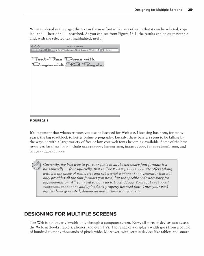
Designing for Multiple Screens ❘ 251
When rendered in the page, the text in the new font is like any other in that it can be selected, cop-ied, and — best of all — searched. As you can see from Figure 28-1, the results can be quite notable and, with the selected text highlighted, useful.
FiGure 28-1
It’s important that whatever fonts you use be licensed for Web use. Licensing has been, for many years, the big roadblock to better online typography. Luckily, these barriers seem to be falling by the wayside with a large variety of free or low-cost web fonts becoming available. Some of the best resources for these fonts include http://www.fontex.org, http://www.fontsquirrel.com, and http://typekit.com.
Currently, the best way to get your fonts in all the necessary font formats is a bit squirrelly — font squirrelly, that is. The FontSquirrel.com site offers (along FontSquirrel.com site offers (along FontSquirrel.com
with a wide range of fonts, free and otherwise) a @font-face generator that not only provides all the font formats you need, but the specific code necessary for implementation. All you need to do is go to http://www.fontsquirrel.com/fontface/generator and upload any properly licensed font. Once your pack-age has been generated, download and include it in your site.
desiGninG For MuLTiPLe screens
The Web is no longer viewable only through a computer screen. Now, all sorts of devices can access the Web: netbooks, tablets, phones, and even TVs. The range of a display’s width goes from a couple of hundred to many thousands of pixels wide. Moreover, with certain devices like tablets and smart

252 ❘ Lesson 28 IntegratIng adVanCed desIgn eLeMents
phones, the width and height can swap dimensions just by changing the orientation of the screen. What’s a poor web designer to do?
A new CSS property known broadly as media queries is here to help. A media query is a way to modify the CSS applied according to specified properties of the viewing device. In other words, a media query may ask, “How big is your screen?” and then use an appropriate CSS style sheet that depends on the answer.
Just as you have more than one way to include a style sheet, you have more than one way to use media queries.
If you’re looking to switch entire style sheets — which is an approach most web designers take — your two options are the @import declaration and the <link> tag. Take a look at the @import tech-nique first with some sample code:
@import url(styles/phone.css) screen and (max-width:320px);
Translated into English, this CSS declaration says, “Import the phone.css style sheet from the styles folder if the site visitor is using a screen with a maximum width of 320 pixels.” The max-width property sets the conditional maximum value for the width. To make the most of the phone screen design, the navigation as well as the entire page might be redesigned, as shown in Figure 28-2.
Along with max-width, there is a corresponding min-width property as well, which might come into play if you wanted to use a specific style sheet when the site is viewed through a desktop system:
@import url(styles/desktop.css) screen and (min-width:769px);
But what about tablets, which are bigger than a phone and smaller than a desktop? To load a tablet-specific style sheet, you can use both the min-width and max-width properties, like this:
@import url(styles/tablet.css) screen and (min-width:321px) and (max-width:768px);
The and keyword allows you to combine different query parameters.
If you’d prefer to use the <link> tag (as I do), equivalent techniques exist for loading different external style sheets for devices with different screen dimensions. For a phone with a maximum width of 320 pixels, your code would look like this:
<link href=”styles/phone.css” rel=”style sheet” type=”text/css” media=”only screen and (max-width: 320px)” />
As you can see, a media attribute is used to contain the query. Note that the keyword only is incor-porated here. For desktop systems, you could use this code:
<link href=”styles/desktop.css” rel=”style sheet” type=”text/css” media=”only screen and (min-width: 769px)” />
FiGure 28-2

Drawing with <canvas> ❘ 253
Finally, this code would be required to link to a tablet-specific style sheet:
<link href=”../styles/tablet.css” rel=”style sheet” type=”text/css” media=”only screen and (min-width: 321px) and (max-width: 768px)” />
Though swapping entire style sheets is definitely the best practice for most websites, it’s possible that you may need to modify only one or two CSS rules. In this situation, rather than use @import or <link>, you would use the @media declaration. Say the only changes you desire are a smaller back-ground logo image in the header and an overall width change when rendered on a phone. The @media declaration is the perfect approach to take under these circumstances:
@media screen and (max-width:320px) { #header { background-image: url(images/logo_small.jpg); } #outerWrapper { width: 318px; }}
Note how the CSS rules are nested within the @media declaration. Although there’s no limit to the number of rules that can be included, if you find yourself including a good many you probably would be better off importing or linking to an external style sheet.
Looking at the maximum and minimum display width is just the very tip of what you can do with media queries. You can also change CSS based on the device’s resolution, orientation, and even color depth.
drawinG wiTH <canVas>Vas>V
Graphics on the Web have long been the sole creation of image programs like Adobe Photoshop, Adobe Fireworks, and Corel Paint Shop Pro — but now it’s time for them to share the stage. HTML5 introduces the <canvas> tag, which declares a space on your web page — a blank canvas, if you will — that you can draw on with JavaScript.
Why does the Web need a real-time graphics tool when the existing software has evolved to such sophisticated heights? The <canvas> tag and associated JavaScript API are not intended to replace your copy of Photoshop (although some designers will inevitably try). Rather, the <canvas> tag is intended to handle simple graphic tasks, like generating smooth gradients, and open the door to dynamically drawing charts and other page elements.
understanding <canvas> basicsAdding a <canvas> tag to your page is extremely straightforward:
<canvas id=”myCanvas” width=”300” height=”225”></canvas>

254 ❘ Lesson 28 IntegratIng adVanVanV Ced desIgn eLeMents
Though only two of the three attributes (width and height) are required, the id attribute is truly essential for carrying out any drawing with JavaScript. Like the <video> and <audio> tags, content between the opening and closing <canvas> tags is rendered only if the <canvas> tag is not sup-ported. One approach is to provide a static image as an alternative, like this:
<canvas id=”myCanvas” width=”300” height=”225”> <img src=”altCanvas.jpg” width=”300” height=”225” /></canvas>
If an alternative image is not available, you can substitute explanatory text.
A <canvas> tag on a page without any associated JavaScript is just an empty space on the page. To start using the canvas area, you’ll need to create a variable that targets the <canvas> tag by first referencing its id value and then setting the context of that canvas to a two-dimensional drawing space. Here’s the starting JavaScript:
<head><script type=”text/javascript”>function doCanvas() { var my_canvas = document.getElementById(“myCanvas”); var myCanvas_context = my_canvas.getContext(“2d”);}</script></head><body onload=”doCanvas();”>
As you can see, one technique is to place the canvas-related function (here, doCanvas() although you can use any name you like) in the <head> tag and then call it through an onload event handler in the <body> tag. Once the context of the canvas area is established, you’re ready to start drawing. JavaScript regards the canvas as a grid with the origin of the x and y coordinates in the upper-left corner. The number of points on the grid corresponds to the stated width and height attributes in the <canvas> tag. So, in this example there are 300 x points and 225 y points.
To view any <canvas> example, you’ll need to use a browser that supports the tag. As of this writing, these browsers include Firefox 3.0+, Safari 3.2+, Opera 10.1+, and Google Chrome 5.0+. Internet Explorer 9 is expected to support the <canvas> tag and associated JavaScript API as well.
Say you wanted to draw a black rectangle that started 50 pixels from the top-left corner and was 100 pixels square. For this, you’d use the fillRect() function, which requires four coordinates: an x and y pair for the upper-left corner and another pair for the lower-right. Here’s the code that would work with the already established canvas context:
myCanvas_context.fillRect(50, 50, 150, 150);

Drawing with <canvas> ❘ 255
Though it’s nothing to write home about from a graphical perspective, the page (when viewed in a compatible browser) shows a large black rectangle offset in the canvas, as shown in Figure 28-3. I used a simple CSS rule to outline the canvas area with a dashed line so you could see how the rect-angle is relatively placed.
FiGure 28-3
By default, the rectangle’s fill color is black. The fill style is controlled by the appropriately named JavaScript function fillStyle(). Your canvas elements can be filled with a solid color, a gradient, or a pattern. The stroke style can also be user defined with the — you guessed it — strokeStyle() function.
If you’d rather have an unfilled rectangle, use the strokeRect() function instead of fillRect(). Here’s a complete example of the JavaScript code, with the strokeRect() function in bold:
<script type=”text/javascript”>function doCanvas() { var my_canvas = document.getElementById(“myCanvas”); var myCanvas_context = my_canvas.getContext(“2d”); myCanvas_context.strokeRect(50, 50, 150, 150);}</script>
The unfilled rectangle, as rendered in Safari, is shown in Figure 28-4.
To draw both the stroke and the filled rectangle, simply include both code lines.
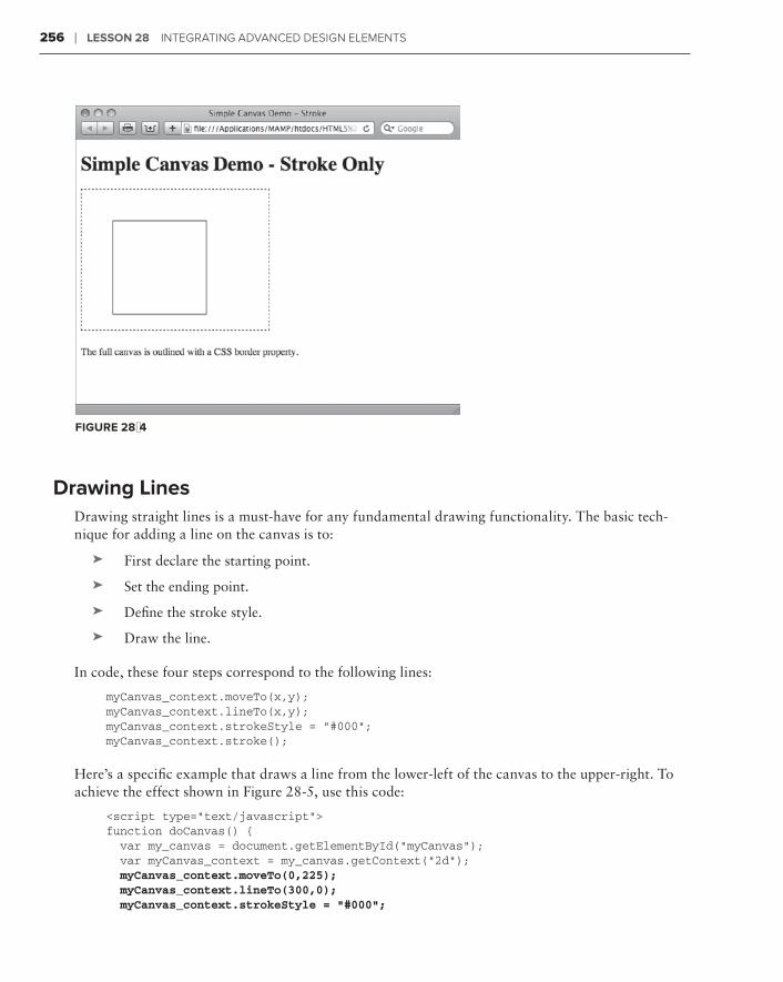
256 ❘ Lesson 28 IntegratIng adVanCed desIgn eLeMents
FiGure 28-4
drawing LinesDrawing straight lines is a must-have for any fundamental drawing functionality. The basic tech-nique for adding a line on the canvas is to:
First declare the starting point.➤➤
Set the ending point.➤➤
Define the stroke style.➤➤
Draw the line.➤➤
In code, these four steps correspond to the following lines:
myCanvas_context.moveTo(x,y);myCanvas_context.lineTo(x,y);myCanvas_context.strokeStyle = “#000”;myCanvas_context.stroke();
Here’s a specific example that draws a line from the lower-left of the canvas to the upper-right. To achieve the effect shown in Figure 28-5, use this code:
<script type=”text/javascript”>function doCanvas() { var my_canvas = document.getElementById(“myCanvas”); var myCanvas_context = my_canvas.getContext(“2d”); myCanvas_context.moveTo(0,225); myCanvas_context.lineTo(300,0); myCanvas_context.strokeStyle = “#000”;
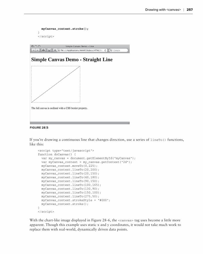
Drawing with <canvas> ❘ 257
myCanvas_context.stroke();}</script>
FiGure 28-5
If you’re drawing a continuous line that changes direction, use a series of lineTo() functions, like this:
<script type=”text/javascript”>function doCanvas() { var my_canvas = document.getElementById(“myCanvas”); var myCanvas_context = my_canvas.getContext(“2d”); myCanvas_context.moveTo(0,225); myCanvas_context.lineTo(20,200); myCanvas_context.lineTo(20,150); myCanvas_context.lineTo(40,180); myCanvas_context.lineTo(90,150); myCanvas_context.lineTo(100,165); myCanvas_context.lineTo(130,90); myCanvas_context.lineTo(150,100); myCanvas_context.lineTo(275,50); myCanvas_context.strokeStyle = “#000”; myCanvas_context.stroke();}</script>
With the chart-like image displayed in Figure 28-6, the <canvas> tag uses become a little more apparent. Though this example uses static x and y coordinates, it would not take much work to replace them with real-world, dynamically driven data points.

258 ❘ Lesson 28 IntegratIng adVanCed desIgn eLeMents
FiGure 28-6
working with circlesBecause there is a fillRect() function for drawing rectangles, it’s natural to think there would be a fillCircle() function for circles — but that would be too easy. Seriously, the JavaScript API includes a function that provides much more flexibility in rendering curved lines: arc().
The arc() function requires the following arguments:
A center point (designated by an x and y pair of coordinates)➤➤
A radius➤➤
The starting and ending angle, in radians➤➤
A Boolean direction flag where ➤➤ true means counter-clockwise and false means clockwise
Unless you’re fresh from a geometry class, you probably don’t recall how radians are calculated. Not to worry, JavaScript includes a Math library that can handle the heavy lifting for you. Because drawing a circle with a series of arcs is a continuous path, methods for starting and stopping the path are necessary. The beginPath() and closePath() functions fulfill this need. Once the path is closed, the stroke() and fill() functions draw the circle on the page. Here’s the code for drawing a circle that is centered in a canvas 300 pixels square, with a radius of 100 pixels:
<script type=”text/javascript”>function doCanvas() { var my_canvas = document.getElementById(“myCanvas”); var myCanvas_context = my_canvas.getContext(“2d”); myCanvas_context.strokeStyle = “#000000”; myCanvas_context.fillStyle = “#FFFF00”;
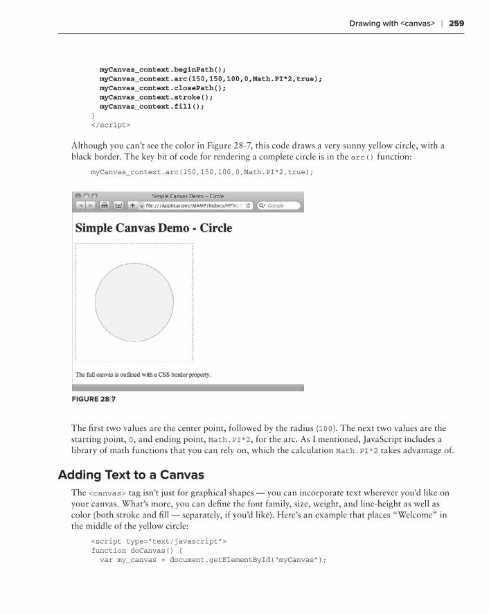
Drawing with <canvas> ❘ 259
myCanvas_context.beginPath(); myCanvas_context.arc(150,150,100,0,Math.PI*2,true); myCanvas_context.closePath(); myCanvas_context.stroke(); myCanvas_context.fill();}</script>
Although you can’t see the color in Figure 28-7, this code draws a very sunny yellow circle, with a black border. The key bit of code for rendering a complete circle is in the arc() function:
myCanvas_context.arc(150,150,100,0,Math.PI*2,true);
FiGure 28-7
The first two values are the center point, followed by the radius (100). The next two values are the starting point, 0, and ending point, Math.PI*2, for the arc. As I mentioned, JavaScript includes a library of math functions that you can rely on, which the calculation Math.PI*2 takes advantage of.
adding Text to a canvasThe <canvas> tag isn’t just for graphical shapes — you can incorporate text wherever you’d like on your canvas. What’s more, you can define the font family, size, weight, and line-height as well as color (both stroke and fill — separately, if you’d like). Here’s an example that places “Welcome” in the middle of the yellow circle:
<script type=”text/javascript”>function doCanvas() { var my_canvas = document.getElementById(“myCanvas”);

260 ❘ Lesson 28 IntegratIng adVanCed desIgn eLeMents
var myCanvas_context = my_canvas.getContext(“2d”); myCanvas_context.strokeStyle = “#000000”; myCanvas_context.fillStyle = “#FFFF00”; myCanvas_context.beginPath(); myCanvas_context.arc(150,150,100,0,Math.PI*2,true); myCanvas_context.closePath(); myCanvas_context.stroke(); myCanvas_context.fill(); myCanvas_context.fillStyle = “#000”; myCanvas_context.font = “bold 36px sans-serif”; myCanvas_context.fillText(“Welcome”, 75, 160);}</script>
To get the nice black text shown in Figure 28-8, I first needed to change the current fillStyle(). Then the font() function sets the font-weight (bold), size (36px), and font (sans-serif). Finally, the fillText() function specifies the string to put on the canvas as well as the starting x and y coordinates.
FiGure 28-8
Because the length of the text string as drawn on the canvas is not immediately obvious, finding those starting points to get a perfectly centered element can require a good deal of trial and error. Luckily, the JavaScript API includes two text-related functions that can simplify the process: textAlign() and textBaseline(). With possible values of start, end, left, right, and center, the textAlign() function is like, but not exactly the same, as the CSS text-align property. The textBaseline() function determines where the text is drawn relative to the starting coordinates; possible values for this function are top, hanging, middle, alphabetic, ideographic, and bottom.
Putting the textAlign() and textBaseline() functions to work, you can align your text by set-ting the starting point to the center of the canvas as shown in Figure 28-9 with the following code, even when you change the text:
<script type=”text/javascript”>

Drawing with <canvas> ❘ 261
function doCanvas() { var my_canvas = document.getElementById(“myCanvas”); var myCanvas_context = my_canvas.getContext(“2d”); myCanvas_context.strokeStyle = “#000000”; myCanvas_context.fillStyle = “#FFFF00”; myCanvas_context.beginPath(); myCanvas_context.arc(150,150,100,0,Math.PI*2,true); myCanvas_context.closePath(); myCanvas_context.stroke(); myCanvas_context.fill(); myCanvas_context.textAlign = “center”; myCanvas_context.textBaseline = “middle”; myCanvas_context.fillStyle = “#000”; myCanvas_context.font = “bold 36px sans-serif”; myCanvas_context.fillText(“Howdy”, 150, 150);}</script>
FiGure 28-9
Placing images on the canvasDrawing programmatically with basic elements such as lines, rectangles, and circles — and even adding text — will get you only so far. There is a wealth of existing artwork, with more created every day, to utilize as well. Happily, the <canvas> tag JavaScript API makes it possible to include any web-compatible image on your canvas.
The first step in placing an image via the <canvas> tag is to create a new Image() object, like this:
var bobcat = new Image();
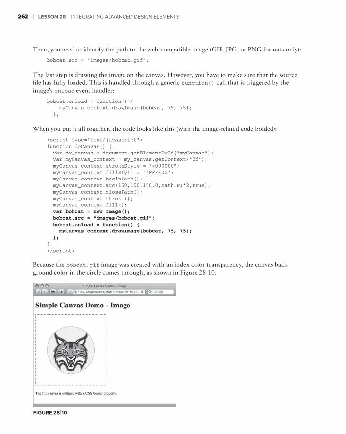
262 ❘ Lesson 28 IntegratIng adVanCed desIgn eLeMents
Then, you need to identify the path to the web-compatible image (GIF, JPG, or PNG formats only):
bobcat.src = “images/bobcat.gif”;
The last step is drawing the image on the canvas. However, you have to make sure that the source file has fully loaded. This is handled through a generic function() call that is triggered by the image’s onload event handler:
bobcat.onload = function() { myCanvas_context.drawImage(bobcat, 75, 75); };
When you put it all together, the code looks like this (with the image-related code bolded):
<script type=”text/javascript”>function doCanvas() { var my_canvas = document.getElementById(“myCanvas”); var myCanvas_context = my_canvas.getContext(“2d”); myCanvas_context.strokeStyle = “#000000”; myCanvas_context.fillStyle = “#FFFF00”; myCanvas_context.beginPath(); myCanvas_context.arc(150,150,100,0,Math.PI*2,true); myCanvas_context.closePath(); myCanvas_context.stroke(); myCanvas_context.fill(); var bobcat = new Image(); bobcat.src = “images/bobcat.gif”; bobcat.onload = function() { myCanvas_context.drawImage(bobcat, 75, 75); };}</script>
Because the bobcat.gif image was created with an index color transparency, the canvas back-ground color in the circle comes through, as shown in Figure 28-10.
FiGure 28-10
Try it ❘ 263
Try iT
In this Try It you learn how to create a simple chart with the <canvas> tag.
Lesson requirementsYou will need the tpa_chart.html file from the Lesson_28 folder, as well as a text editor and a web browser.
step-by-step 1 . Open your text editor.
2 . From the Lesson_28 folder, open tpa_chart.html.
3 . Place your cursor before the closing angle bracket in the <body> tag, press Space, and then enter this code:
onLoad=”doCanvas();”
4 . Place your cursor before the code </div> <!-- End mainContent--> and press Enter (Return).
5 . Enter this code:
<canvas id=”myCanvas” width=”550” height=”300”></canvas>
6 . Place your cursor after the closing </style> tag and press Enter (Return).
7 . Enter the following code:
<script type=”text/javascript”>function doCanvas() { var my_canvas = document.getElementById(“myCanvas”); var myCanvas_context = my_canvas.getContext(“2d”); myCanvas_context.font = “bold 18px sans-serif”; // Moon myCanvas_context.fillStyle=”#F00”; myCanvas_context.fillRect(60, 110, 90, 300); myCanvas_context.fillStyle=”#000”; myCanvas_context.fillText(“Moon”, 80, 100); // Jupiter myCanvas_context.fillStyle=”#0F0”; myCanvas_context.fillRect(180, 240, 90, 300); myCanvas_context.fillStyle=”#000”; myCanvas_context.fillText(“Jupiter”, 195, 230); // Mars myCanvas_context.fillStyle=”#00F”; myCanvas_context.fillRect(300, 50, 90, 300); myCanvas_context.fillStyle=”#000”; myCanvas_context.fillText(“Mars”, 325, 40); // Saturn myCanvas_context.fillStyle=”#F0F”; myCanvas_context.fillRect(420, 150, 90, 300);

264 ❘ Lesson 28 IntegratIng adVanVanV Ced desIgn eLeMents
myCanvas_context.fillStyle=”#000”; myCanvas_context.fillText(“Saturn”, 435, 140);}</script>
8 . Save your file.
9 . In your browser, open tpa.html to view the page restructured with HTML5 tags, shown in Figure 28-11.
FiGure 28-11
Watch the video for Lesson 28 on the DVD with the print book, or watch online at www.wrox.com/go/html5video to see an example from this lesson that shows you how to create a simple chart using the <canvas> tag.

Browser Support for HTML5
Browser support is critical for any aspect of HTML5 — or any other web technology, for that matter. This appendix is a snapshot of the current state-of-the-art regarding the various new features of HTML5 and CSS3. Each section lists a feature and what version of the five major browsers — Internet Explorer, Firefox, Safari, Opera, and Google Chrome — support that feature, if any.
As a web designer who often pushes the limits, I feel it’s necessary for me to accompany this appendix with a caveat. As always when you’re deciding whether or not to include a tag or attribute in your code, it’s not enough to see that it is supported on one or more browsers. The key is to make sure that the supporting browsers make up the vast majority of the visitors to the site you’re building. It doesn’t matter if the latest bleeding-edge feature is available in WhizBang 3.1, if hardly anyone who visits your site has that browser.
As of this writing, the final version of Internet Explorer 9.0 has not been released, but it is in beta testing. The following charts include Internet Explorer 9.0 sup-port if it is included in the beta version or has been announced by Microsoft that the feature is expected to be supported. It is entirely possible that some announced or even beta-based features may not make it to the released version.
HTML5 new FeaTew FeaTew Fea ures
As this book attests, HTML5 is overflowing with new tags and attributes that bring greatly enhanced functionality. Overall, browser support for many of these new features is rather good —certainly good enough for web designers to play and test the advanced functionality. Check the following tables to find a suitable browser for seeing the HTML enhancements in action.
A

266 ❘ aPPendiX a a a broWser suPPort For htML5
Not all tags and attributes discussed here are covered in this book, but, where they are, I’ll refer you to the proper lesson.
semantic TagsHTML5 helps web designers craft more semantically correct sites with a new group of tags. Semantic tags include:
<section>➤➤
<header>➤➤
<hgroup>➤➤
<nav>➤➤
<article>➤➤
<aside>➤➤
<footer>➤➤
<time>➤➤
<mark>➤➤
<figcaption>➤➤
For in-depth information on how to use virtually all of the semantic tags listed here, see Lesson 27.
browser Version suPPorTed noTes
Internet Explorer 9 .0 (Beta) As of Platform Preview Build 6
Firefox 3 .0+
Safari 3 .2+
Opera 10 .1+
Google Chrome 5 .0+
<audio> TagThe <audio> tag allows you to play music and sounds natively in the browser without a plug-in.

HTML5 new Features ❘ 267
To learn more about using the <audio> tag, see Lesson 24.
browser Version suPPorTed noTes
Internet Explorer 9Internet Explorer 9 .0 (Beta) Supports MP3, WAV, and Ogg Vorbis formats
Firefox 3 .5+ Supports WAV and Ogg Vorbis formats
Safari 3 .2+ Supports MP3 and WAV formats
Opera 10 .5+ Supports WAV and Ogg Vorbis formats
Google Chrome 5Google Chrome 5 .0+ Supports MP3 and Ogg Vorbis formats
<video> TagAs with the <audio> tag, the <video> tag allows native, plug-in free playback. A variety of formats are supported in the various browsers.
For more in-depth details about using the <video> tag, see Lesson 25.
browser Version suPPorTed noTes
Internet Explorer 9Internet Explorer 9 .0 (Beta) Supports H .264 format only
Firefox 3 .5+ Supports Ogg Theora only in version 3 .5+; plans to
add support for WebM in version 4 .0
Safari 3 .2+ Supports H .264 and Ogg Theora formats
Opera 10 .5+ Supports H .264 (partially), WebM, and Ogg Theora
formats
Google Chrome 5Google Chrome 5 .0+ Supports H .264, WebM, and Ogg Theora formats
Form Tags Most of the advancements for forms in HTML5 arrive as new attributes, rather than tags. Unfortunately, browser support for many of these features is all over the map. The tables in this section are broken out to show the current state of support for individual attributes.
To learn more about forms in general and the new HTML5 tags and attributes specifically, see Lessons 19 and 20.

268 ❘ aPPendiX a broWser suPPort For htML5
auToFocus aTTribuTe
browser Versions suPPorTed noTes
Internet Explorer 9 .0 (Beta) As of Platform Preview Build 6
Firefox 3 .7 Plans support in this future version
Safari 4 .0+
Opera 10 .0+
Google Chrome 5 .0+
PLaceHoLder aTTribuTe
browser Version suPPorTed noTes
Internet Explorer 9 .0 (Beta) As of Platform Preview Build 6
Firefox 3 .7 Plans support in this future version
Safari 4 .0+
Opera 4 .0+
Google Chrome 5 .0+
required aTTribuTe
browser Version suPPorTed noTes
Internet Explorer 9 .0 (Beta) As of Platform Preview Build 6
Firefox 3 .7 Plans support in this future version
Safari 4 .0+
Opera 4 .0+
Google Chrome 5 .0+
coLor TyPe aTTribuTe
browser Version suPPorTed noTes
Internet Explorer 9 .0 (Beta) As of Platform Preview Build 6
Firefox 4 .0 Plans support in this future version
Safari none

HTML5 new Features ❘ 269
browser Version suPPorTed noTes
Opera none
Google Chrome none
daTe TyPe aTTribuTe
browser Version suPPorTed noTes
Internet Explorer 9 .0 (Beta) As of Platform Preview Build 6
Firefox 4 .0 Plans support in this future version
Safari none
Opera 9 .0+ Opera also supports the following type attri-
bute values: month, week, time, datetime,
and datetime-local
Google Chrome none
e-MaiL TyPe aTTribuTe
browser Version suPPorTed noTes
Internet Explorer 9 .0 (Beta) As of Platform Preview Build 6
Firefox 3 .7 Plans support in this future version
Safari 5 .0+
Opera 9 .0+ Displays an e-mail icon
Google Chrome 6 .0+
nuMber TyPe aTTribuTe
browser Version suPPorTed noTes
Internet Explorer 9 .0 (Beta) As of Platform Preview Build 6
Firefox 4 .0 Plans support in this future version
Safari none
Opera 9 .0+
Google Chrome none
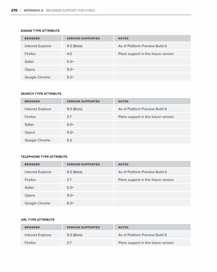
270 ❘ aPPendiX a broWser suPPort For htML5
ranGe TyPe aTTribuTe
browser Version suPPorTed noTes
Internet Explorer 9 .0 (Beta) As of Platform Preview Build 6
Firefox 4 .0 Plans support in this future version
Safari 5 .0+
Opera 9 .0+
Google Chrome 5 .0+
searcH TyPe aTTribuTe
browser Version suPPorTed noTes
Internet Explorer 9 .0 (Beta) As of Platform Preview Build 6
Firefox 3 .7 Plans support in this future version
Safari 5 .0+
Opera 9 .0+
Google Chrome 5 .0
TeLePHone TyPe aTTribuTe
browser Version suPPorTed noTes
Internet Explorer 9 .0 (Beta) As of Platform Preview Build 6
Firefox 3 .7 Plans support in this future version
Safari 5 .0+
Opera 9 .0+
Google Chrome 6 .0+
urL TyPe aTTribuTe
browser Version suPPorTed noTes
Internet Explorer 9 .0 (Beta) As of Platform Preview Build 6
Firefox 3 .7 Plans support in this future version
CSS3 new Features ❘ 271
browser Version suPPorTed noTes
Safari 5 .0+
Opera 9 .0+
Google Chrome 6Google Chrome 6 .0+
<canvas> TagThe <canvas> tag establishes a blank area on the web page that can be programmatically drawn upon using JavaScript functions.
To begin to explore the exciting world of the <canvas> tag, see the relevant section in Lesson 28.
browser Version suPPorTed noTes
Internet Explorer 9Internet Explorer 9 .0 (Beta) As of Platform Preview Build 6
Firefox 3 .0+
Safari 4 .0+
Opera 10 .5+
Google Chrome 5Google Chrome 5 .0+
css3 new FeaTew FeaTew Fea ures
The next advance in CSS is closely tied to the enhancements in HTML5. Like HTML5, the CSS3 specification is still in development, but many browsers have already implemented many of the more exciting — and needed — features.
@font-faceThe @font-face declaration allows web designers to link to fonts to use in their web pages.
To learn how to use the @font-face declaration, see the relevant section in Lesson 28.

272 ❘ aPPendiX a a a broWser suPPort For htML5
browser Version suPPorTed noTes
Internet Explorer 6Internet Explorer 6 .0+ Supports EOT formats in versions 6 .0, 7 .0,
and 8 .0; support for other formats to be
added in version 9 .0
Firefox 3 .5+
Safari 3 .1+
Opera 10 .1+
Google Chrome 5Google Chrome 5 .0+
enhanced colorsIn CSS3, web designers can specify colors in HSL (Hue, Saturation, Light) values and RGBA (Red, Green, Blue, Alpha) values as well as hexadecimal numbers.
Find out more about working with color in Lesson 7.
browser Version suPPorTed noTes
Internet Explorer 9Internet Explorer 9 .0 (Beta) As of Platform Preview Build 6
Firefox 3 .5+
Safari 4 .0+
Opera 10 .1+
Google Chrome 5Google Chrome 5 .0+
Media queriesWith media queries, the web designer can specify different CSS style sheets for different device form factors or configurations.
Learn more about how to use media queries in the relevant section of Lesson 28.

CSS3 new Features ❘ 273
browser Version suPPorTed noTes
Internet Explorer 9Internet Explorer 9 .0 (Beta) As of Platform Preview Build 6
Firefox 3 .5+
Safari 4 .0+
Opera 10 .1+
Google Chrome 5Google Chrome 5 .0+
Multiple columnsWhen multiple columns are defined in the CSS, text can flow into two or more columns as needed.
browser Version suPPorTed noTes
Internet Explorer 9Internet Explorer 9 .0 (Beta) Possible, but not definite
Firefox 3 .0+ Requires –moz prefix
Safari 3 .2+ Requires –webkit prefix
Opera 11 .0 Possible, but not definite
Google Chrome 5Google Chrome 5 .0+ Requires –webkit prefix
enhanced selectorsCSS3 adds a full slate of new selectors to allow for more specific CSS rules.
To understand how CSS selectors work, see Lesson 4.
browser Version suPPorTed noTes
Internet Explorer 9Internet Explorer 9 .0 (Beta) As of Platform Preview Build 6
Firefox 3 .5+
Safari 3 .2+
Opera 10 .1+
Google Chrome 5Google Chrome 5 .0+

274 ❘ aPPendiX a broWser suPPort For htML5
css TransitionsCSS3 transitions allow more complex animation timings in conjunction with CSS transforms.
browser Version suPPorTed noTes
Internet Explorer none
Firefox 4 .0+ Requires –moz prefix
Safari 3 .2+ Requires –webkit prefix
Opera 10 .5+ Requires –o prefix
Google Chrome 5 .0+ Requires –webkit prefix
css TransformsA CSS transform property gives web designers the option of moving, rotating, skewing, and/or scal-ing any page element over a specified duration.
browser Version suPPorTed noTes
Internet Explorer 9 .0 (Beta) Requires –ms prefix
Firefox 3 .5+ Requires –moz prefix
Safari 4 .0+ Requires –webkit prefix
Opera 10 .5+ Requires –o prefix
Google Chrome 5 .0+ Requires –webkit prefix
box-shadow PropertyWith the box-shadow property, a shadow or blur can be applied to page elements without using a graphics tool.
browser Version suPPorTed noTes
Internet Explorer 9 .0 (Beta) As of Platform Preview Build 6
Firefox 3 .5+ Requires –moz prefix
Safari 4 .0+ Requires –webkit prefix
Opera 10 .5+
Google Chrome 5 .0+ Requires –webkit prefix
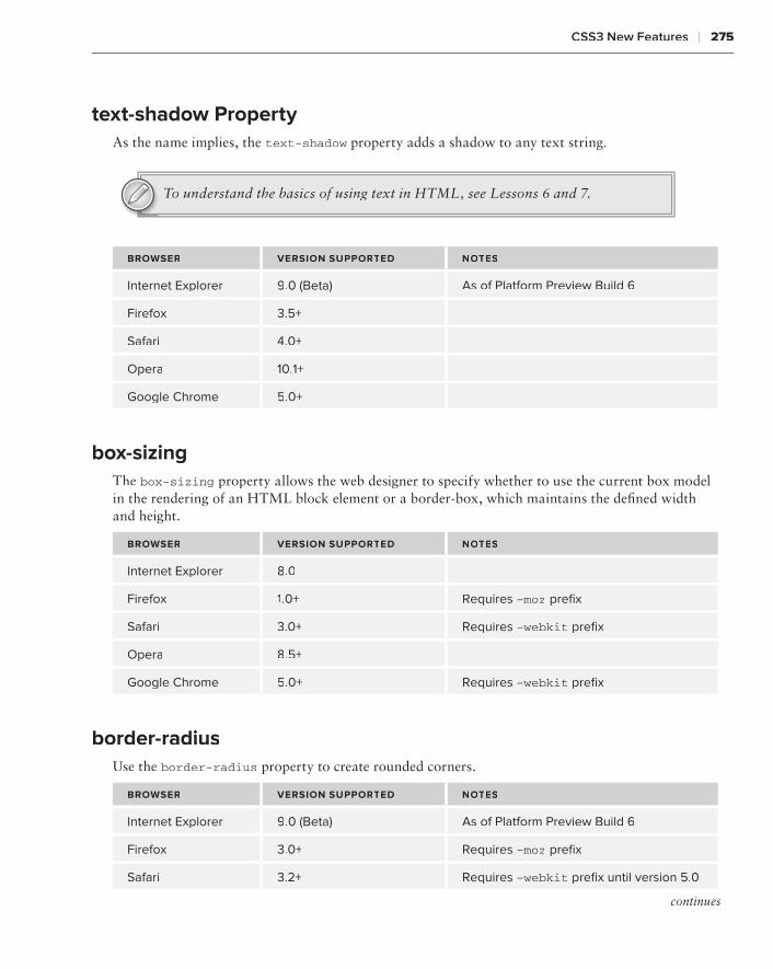
CSS3 new Features ❘ 275
text-shadow PropertyAs the name implies, the text-shadow property adds a shadow to any text string.text-shadow property adds a shadow to any text string.text-shadow
To understand the basics of using text in HTML, see Lessons 6 and 7.
browser Version suPPorTed noTes
Internet Explorer 9Internet Explorer 9 .0 (Beta) As of Platform Preview Build 6
Firefox 3 .5+
Safari 4 .0+
Opera 10 .1+
Google Chrome 5Google Chrome 5 .0+
box-sizingThe box-sizing property allows the web designer to specify whether to use the current box model in the rendering of an HTML block element or a border-box, which maintains the defined width and height.
browser Version suPPorTed noTes
Internet Explorer 8Internet Explorer 8 .0
Firefox 1 .0+ Requires –moz prefix
Safari 3 .0+ Requires –webkit prefix
Opera 8 .5+
Google Chrome 5Google Chrome 5 .0+ Requires –webkit prefix
border-radiusUse the border-radius property to create rounded corners.
browser Version suPPorTed noTes
Internet Explorer 9Internet Explorer 9 .0 (Beta) As of Platform Preview Build 6
Firefox 3 .0+ Requires –moz prefix
Safari 3 .2+ Requires –webkit prefix until version 5 .0
continues

276 ❘ aPPendiX a broWser suPPort For htML5
browser Version suPPorTed noTes
Opera 10 .5+
Google Chrome 5 .0+
Multiple background imagesWith multiple background support, web designers can add more than one image to a single selector’s background.
browser Version suPPorTed noTes
Internet Explorer 9 .0 (Beta) As of Platform Preview Build 6
Firefox 3 .0+ Requires –moz prefix
Safari 3 .2+ Requires –webkit prefix until version 5 .0
Opera 10 .5+
Google Chrome 5 .0+
background-image optionsCSS3 introduces a broader range of flexibility with background-image options, including resizing, clipping, and setting the origin of the image.
browser Version suPPorTed noTes
Internet Explorer 9 .0 (Beta) As of Platform Preview Build 6
Firefox 3 .6+ Requires –moz prefix until 4 .0 (proposed)
Safari 5 .0+
Opera 10 .5+
Google Chrome 5 .0+
(continued)

advanced HTML5 Features
Unfortunately, the scope and intended market of this book did not allow the inclusion of some of the more advanced HTML5 features. Fortunately, they’re the perfect subject for a brief appendix. In addition to semantic tags, advanced form controls, native audio and video, and the other enhancements covered in the lessons in this book, the HTML5 specification has a good number of truly cutting-edge technologies just waiting to be supported by the majority of browsers. This appendix takes a look at the top three “oh, wow” features:
Editable content➤➤
Local storage➤➤
Geolocation➤➤
ediTabTabT Le conTenT
How many times have you come across a web page with some compelling or meaningful con-tent that sparked a clear response from you and thought, “Oh, I’ve got to write that down.” Then, if you’re like me, something happens that interrupts your attempt to save and/or print out the web page and add your own thoughts — and the moment (and your reaction) is lost.
The contenteditable attribute, when set to true, allows any user to click into your web page and modify the designated text. The modified content only appears in the user’s browser and only until that page is refreshed or reloaded, but the ability to interact with web-hosted content is quite exciting.
To convert any amount of content into editable text, all you need to do is add contenteditable=”true” to any text-based tag, such as a heading, paragraph or, as in this example, list:
<section> <h2>Items to Take to College</h2> <p>Here’s a few items to get you started — feel free to add your own and then print out the page!</p> <ol id=”editableList” contenteditable=”true”>
B

278 ❘ aPPendiX b adVanCed htML5 Features
<li>Laptop</li> <li>Posters</li> <li>Small refrigerator</li> </ol></section>
Now, your site visitors can interact with the text just as if they were typing it into a word processing document, but without any formatting controls. You can add new list items at any point, remove existing items, and even re-order the list by moving one item to another location. Because it is an ordered list, the items are automatically renumbered.
You might find yourself thinking, “That’s cool — but it’d be really great if the page would remember what you wrote.” Well, thanks to another advanced HTML5 feature — local storage, covered in the next section — it can.
Browser support for editable content is very widespread and includes:
Internet Explorer 6.0+➤➤
Firefox 3.5+➤➤
Safari 3.2+➤➤
Google Chrome 5.0+➤➤
Opera 10.1+➤➤
LocaL sToraGe
Web pages are non-persistent or, in the programmer’s parlance, stateless. A stateless page is one that treats each request to view it as an independent one, unrelated to any previous request. This is why, for the most part, web pages don’t greet repeat visitors by name — that is, of course, unless the web page stores a tiny bit of information (like a name) in a small file on the user’s computer called a cookie. Cookies are great for simple name/value pairs of information, for example, visitor=Joe, but really limited in size. To overcome this problem and make it possible for each user to interact with web pages persistently, an HTML5-related specification provides for local storage of text or code that is saved in the user’s browser. With the local storage option enabled on a web page, the content editable example in the preceding section becomes much more useful because the personal-ized list will always be available online for the site visitor.
To take advantage of the local storage ability, your code will need to have the following elements:
A variable that is set to the ➤➤ id attribute of the area to be stored
A function that stores the text in the area, typically triggered by the ➤➤ blur event handler, and temporarily freezes the page by turning the designMode off
A function that re-enables the page for editing when the editable area gets focus by turning ➤➤
the designMode attribute on
A function that retrieves the stored content from the user’s system and inserts it into the page ➤➤
in the editable area

Geolocation ❘ 279
When you put it all together, the code looks like this:
<script>var editable = document.getElementById(‘editableList’);
addEvent(editable, ‘blur’, function () { localStorage.setItem(‘contenteditable’, this.innerHTML); document.designMode = ‘off’;});
addEvent(editable, ‘focus’, function () { document.designMode = ‘on’;});
if (localStorage.getItem(‘contenteditable’)) { editable.innerHTML = localStorage.getItem(‘contenteditable’);}
</script>
This, of course, is just a bare-bones example of what’s possible with this feature. Local storage could be used for everything from a simple to-do list to an elaborate time-tracking application.
Local storage is supported by Safari 4+, Firefox 3.5+, Internet Explorer 8+, and Google Chrome 4+.
GeoLocaTion
The integration of GPS (Global Positioning System) into our everyday lives is one of the more amaz-ing feats of modern technology. From driving directions in your car to nearby restaurant locators in your cell phone, the ability to pinpoint a user’s location — and send place-relevant information — is quickly changing our world.
Now, with the HTML5 geolocation feature, your websites can join in the localizing revolution. What good is geolocation? A great number of online sites are local businesses. Imagine searching for a television repair shop and getting those closest to you at the top of the listing, automatically. Or picture quickly identifying the nearest veterinarian while on vacation in an unfamiliar city. The pos-sibilities for geolocation are enormous.
The HTML5 geolocation API is capable of retrieving your current IP (Internet Protocol) address. Though this is not, in most cases, the same as your current exact location, generally it’s pretty close. Even so, some of you may be thinking, “But what if I don’t want my location discovered — even the location of my IP address host computer?” The contributors to the HTML5 specification had the same concerns and made it imperative that browsers handle geolocation requests on an opt-in basis. In other words, a browser must ask if you want to share your location before processing the function and uncovering it.
To retrieve a site visitor’s location, you’ll need JavaScript code to do the following:
A function that calls the ➤➤ geolocation.getCurrentPosition() function where geolocation is a navigator object.
A function that checks to make sure that the user has given his or her permission to share ➤➤
their position. This function is most typically set up as an error handler that also checks to

280 ❘ aPPendiX b adVanCed htML5 Features
see if the position is unavailable for some other reason or if the user does not respond in a timely manner.
A function that gets the latitude and longitude by calling the ➤➤ coords.latitude() and coords.longitude() functions, respectively, for the object returned from the geolocation.getCurrentPosition() function.
Here’s some sample code that meets all the geolocation criteria to return the user’s latitude and longitude:
<script> function initiate_geolocation() { navigator.geolocation.getCurrentPosition (handle_geolocation_query,handle_errors); } function handle_errors(error) { switch(error.code) { case error.PERMISSION_DENIED: alert(“user did not share geolocation data”); break; case error.POSITION_UNAVAILABLE: alert(“could not detect current position”); break; case error.TIMEOUT: alert(“retrieving position timed out”); break; default: alert(“unknown error”); break; } } function handle_geolocation_query(position){ alert(‘Lat: ‘ + position.coords.latitude + ‘ Lon: ‘ + position.coords.latitude); } </script>
Once you have the user’s position in the form of the latitude and longitude, you can use those details to map the location or locate services and businesses in the area.
Browsers that currently support geolocation include:
Internet Explorer 9.0 (beta)➤➤
Firefox 3.5+➤➤
Safari 5.0+➤➤
Google Chrome 5.0+➤➤
Opera 10.6+➤➤

What’s on the DVD?
This appendix provides you with information on the contents of the DVD that accompanies this book. For the latest and greatest information, please refer to the ReadMe file located at the root of the DVD. Here is what you will find in this appendix:
System Requirements➤➤
Using the DVD➤➤
What’s on the DVD➤➤
Troubleshooting➤➤
sysTeM requireMenTs
Make sure that your computer meets the minimum system requirements listed in this section. If your computer doesn’t match up to most of these requirements, you may have a problem using the contents of the DVD.
PC running Windows XP, Windows Vista, Windows 7, or later, or a Macintosh run-➤➤
ning OS X
A processor running at 1.6GHz or faster➤➤
An Internet connection➤➤
At least 1GB of RAM➤➤
At least 3GB of available hard disk space➤➤
A DVD-ROM drive➤➤
C

282 ❘ aPPendiX c What’s on the dVd?
usinG THe dVd
To access the content from the DVD, follow these steps:
1 . Insert the DVD into your computer’s DVD-ROM drive. The license agreement appears.
The interface won’t launch if you have autorun disabled. In that case, click Start➪Start➪Start Run (for Windows 7, click Start➪Run (for Windows 7, click Start➪Run (for Windows 7, click Start All Programs➪Accessories➪Run). In the dialog box that appears, type D:\Start.exe. (Replace D with the proper letter if your DVD drive uses a different letter. If you don’t know the letter, check how your DVD drive is listed under My Computer.) Click OK.
2 . Read through the license agreement, and then click the Accept button if you want to use the DVD.
The DVD interface appears. Simply select the lesson number for the video you want to view.
wHaTaTa ’s on THe dVd
Each of this book’s lessons contains one or more Try It sections that enable you to practice the con-cepts covered by that lesson. The Try It includes a high-level overview, requirements, and step-by-step instructions explaining how to build the example.
This DVD contains video screencasts showing a computer screen as we work through key pieces of the Try Its from each lesson. In the audio we explain what we’re doing step-by-step so you can see how the techniques described in the lesson translate into actions.
Finally, if you’re stuck and don’t know what to do next, e-mail me at [email protected], and I’ll try to point you in the right direction.
TroubLesHooTinG
If you have difficulty installing or using any of the materials on the companion DVD, try the following solutions:
Reboot if necessary➤➤ . As with many troubleshooting situations, it may make sense to reboot your machine to reset any faults in your environment.
Turn off any anti-virus software that you may have running.➤➤ Installers sometimes mimic virus activity and can make your computer incorrectly believe that it is being infected by a virus. (Be sure to turn the anti-virus software back on later.)

Customer Care ❘ 283
Close all running programs.➤➤ The more programs you’re running, the less memory is available to other programs. Installers also typically update files and programs; if you keep other pro-grams running, installation may not work properly.
Reference the ReadMe. ➤➤ Please refer to the ReadMe file located at the root of the DVD for the latest product information at the time of publication.
cusToMer care
If you have trouble with the DVD, please call the Wiley Product Technical Support phone number at (800) 762-2974. Outside the United States, call 1(317) 572-3994. You can also contact Wiley Product Technical Support at http://support.wiley.com. John Wiley & Sons will provide technical support only for installation and other general quality control items. For technical support on the applications themselves, consult the program’s vendor or author.
To place additional orders or to request information about other Wiley products, please call (877) 762-2974.


inDeX


287
indeX
symbols
, (comma), codebase, 206. (dot), JavaScript, 180; (semicolon), declarations, 22*/ (asterisk-slash), JavaScript
comments, 193© (copyright symbol), 42{} (curly brackets), declarations, 22../ (dot,dot,slash), folder links, 56£ (English pound sign), 42 — (em-dash), 42– (en-dash), 42> (greater than sign), 42¥ (Japanese yen), 42< (less than sign), 42% (percentage sign), font size, 49+ (plus sign), concatenation, 180# (pound sign)
CSS rules, 27hexadecimal color, 51links, 59
? (question mark)e-mail address, 64name/value pairs, 153
‘’ (quotes), attribute values, 9® (registered symbol), 42/ (slash), <br>, 38/* (slash-asterisk), JavaScript
comments, 193// (slash/double), JavaScript comments, 193
[] (square brackets), attribute selector, 171™ (trademark symbol), 42%20, 64, 153
a
<a>, 55, 59, 79–80, 116–117absolute positioning, 145absolute URL, 56–57accessibility, 143–148action, 152Active link state, 61ActiveX, 206Adobe CS5 Media Encoder, 222Adobe Dreamweaver, 88Adobe Fireworks, 52, 77Adobe Flash Player, 7
authoring system, 213.flv, 221SWF files, 205–207video, 228
Adobe Photoshop, 52, 77AIFF. See Audio Interchange File Formatalert(), 180, 187–188alert boxes, 180alignment
images, 80–81tables, 136–137text, 53–54
a:link, 61–63, 80

288
allowfullscreen – caption-side
allowfullscreen, 225allowHtmlPopupWindow, 208allowscriptaccess, 225alpha, 52alt, 78, 88alternate stylesheet, 25anchor tags, 55arc(), 258–259<area>, 87–88<article>, 7, 244–245<aside>, 245.aspx, 6audio, 211–219
file format conversion, 217plug-ins, 213–215
<audio>, 7, 215–218controls, 216loop, 217–218<source>, 217web browsers, 234, 266–267
Audio Interchange File Format (AIFF), 211autocomplete, 153, 172autofocus, 153, 172, 268autoplay, 202, 204, 206autostart, 225a:visited, 61
b
background, 21, 52, 83–85background-attachment, 84background-color, 83
horizontal rules, 85input:focus, 171tables, 140–141
background-image, 83, 95, 276background-position, 83, 95background-repeat, 83, 95beginPath(), 258Berners-Lee, Tim, 6
_blank, 58blink, 62block elements, 36, 102<body>, 10, 12, 240
event handlers, 183onload, 184–185, 254<script>, 181
border, 95border-bottom, 138border-collapse, 135border-collapse: collapse, 138border-radius, 171, 275–276borders
forms, 166tables, 137–139
border-spacing, 135bottom, 144box-shadow, 274box-sizing, 275<br>, 9, 36BrowserCam, 32BrowserLab, 32browsers. See web browsersbulleted items, 101–104Bulletproof @font-face Syntax, 250<button>, 160–161, 216buttons, forms, 160–161
c
<canvas>, 7circles, 258–259images, 261–262JavaScript, 253–262lines, 256–258text, 259–261web browsers, 234, 271
caption, 144<caption>, 143–145caption-side, 144

289
cascading style sheets (CSS), 6, 21–28, 171<body>, 12classes, 27, 80debugging, 24external style sheets, 25font-family, 45–48font-weight, 62forms, 169–172IDs, 23, 27inheritance, 23–24JavaScript, 179, 194list-style, 105media queries, 252presentation layer, 21–22rules, 22, 27, 102
bulleted items, 102embedding, 26<head>, 23<input>, 171<table>, 128
selectors, 27tags, 26–27
testing, 29–34OS, 31web browsers, 30–33
text, 45–54transforms, 274transitions, 274unordered lists, 104–106validators, 29–30web browsers, 32, 267–276
case-sensitivityCSS, 27JavaScript, 180XHTML, 9
center, 80, 83.cfm, 6checkboxes, 156–157checked, 156, 157child tags, 23Chrome. See Google Chrome
chrome, 30circle, 88circles, 258–259class, 194classes
CSS, 23, 27, 80selectors, 24
classid, 202, 204, 206Clean up Markup with HTML Tidy, 70clear:left, 170closePath(), 258codebase, 202, 204, 206codecs, 222codecs, 228color
background, 83hexadecimal, 51horizontal rules, 85tables, 139–141text, 51–53
background, 52web browsers, 272
color, 172, 268–269cols, 154colspan, 130–131columns, 127, 130–131, 239, 273comments, 193compound selectors, 28concatenation, 180conditional statements, 184–185contenteditable, 277–278contentWrapper, 240controller, 202, 204cookies, 278coords.latitude(), 280coords.longitude(), 280CSS. See cascading style sheetsCSS Validation Service, 29–30, 69–72customer care, 283
cascading style sheets – customer care

290
data – fat footers
d
data, <object>, 202Date(), 182date, 172
web browsers, 269datetime, 172datetime-local, 172<dd>, 120–124debugging, 24, 33, 188decimal, 112declarations, 22, 46definition lists, 120–124designMode, 278<details>, 144–145devices
CSS, 22multiple screens, 251–253
<dialog>, 120–124direct input, 29, 69display: none, 145display:block, 118<div>, 6–7, 116–117, 240
content, 246id, 224mainContent id, 242<nav>, 244<p>, 224tables, 128
div#nav, 117<dl>, 120–124doctype, 10, 67–68, 223
strict, 68transitional, 68W3C, 67XHTML, 68
<!DOCTYPE html>, 10, 67–68document, 180Document Object Model (DOM), 236
JavaScript, 180document.write(), 182
DOM. See Document Object Modeldrop shadows, 21drop-down lists. See select lists<dt>, 120–124DVD contents, 281–283
e
else check, 49<em>, 53em space (em), 37, 49email, 172, 269e-mail, 26, 63–65<embed>, 203
Adobe Flash Player SWF files, 206doctype, 223Google Reader Audio Player, 214<object>, 204–205plug-ins, 201pluginspage, 206type, 206
Embedded OpenType (.eot), 48, 250embedded styles, 26embedding
CSS rules, 26<style>, 26
embedSWF(), 225empty tags, 77, 93enableAutoZoom, 208.eot. See Embedded OpenType.evenRow, 140event handlers, 183external style sheets, 25–26
F
fadeIn(), 195fantasy, 45fat footers, 246

291
<fieldset> – Google Chrome
<fieldset>, 165–166, 170–171fill(), 258fillCircle(), 258fillRect(), 254–255fillStyle(), 255, 260Firebug, 32Firebug Lite, 32Firefogg, 222Firefox, 7, 10, 234
CSS, 32, 267–276@font-face, 48, 272JavaScript, 187Ogg Vorbis, 212video, 227web pages
reloading, 17viewing, 15
fixed, 84flashvars, 214, 225float, 80, 137, 170.flv, 221:focus, 171Focus link state, 61folders, 56font(), 260fonts, 249–251
links, 235unordered lists, 104
fontex.org, 251@font-face, 235, 249–250
@import, 48web browsers, 271–272
font-family, 249–250CSS, 45–48declarations, 46
font-size, 48–50fontsquirrel.com, 251font-weight, 62<footer>, 7, 244–246footers, 129, 239, 242
for, 152foreground images, 77–79form, 180<form>, 151, 160forms
borders, 166buttons, 160–161checkbox, 156–157controls, 236creating, 151–163CSS, 169–172enhancing, 165–176<fieldset>, 165–166hidden controls, 160input, 171<label>, 169<legend>, 165–166radio buttons, 156select lists, 157–158styles, 169–172tables, 168–169text, 153–154<textarea>, 153–154web browsers, 267–271
frameworks, 194–195functions, 180, 278
G
geolocation, 236, 279–280geolocation.getCurrentPosition(),
279–280getCurrentTime(), 185getTodaysDate(), 183GIF. See Graphics Interchange FormatGlobal Positioning System (GPS), 279GMT. See Greenwich Mean TimeGoogle Chrome, 7, 10, 234
CSS, 32, 267–276Ogg Vorbis, 212

292
Google Chrome (continued) – <img>
Google Chrome (continued)video, 227web pages
reloading, 17viewing, 15
Google Reader Audio Player, 213–214Google Video, 221GPS. See Global Positioning Systemgradients, 21Graphics Interchange Format (GIF), 74–75Greenwich Mean Time (GMT), 245Group Error Messages by Type, 70
H
<h>, 4–5, 243, 251H.264, 222<head>, 10, 11
CSS rules, 23JavaScript frameworks, 194<noscript>, 187<script>, 183
<header>, 7, 243, 244headers, 239
<div>, 240tables, 128–129
headings, 4–5, 242, 243, 251height
<canvas>, 254<embed>, 203horizontal rules, 95<img>, 78<video>, 226
hexadecimal color, 51heywatch.com, 222<hgroup>, 243hidden form controls, 160history, 180horizontal rules, 85, 93–98Hover link state, 61<hr>, 84, 93–98
href, 25, 55–56, 64, 88HSL. See Hue, Saturation, Light.htm, 5.html, 5<html>, 10, 11, 12HTML Tidy, 70HTML5 Conformance Checker, 70Hue, Saturation, Light (HSL), 272Hulu, 221HyperText, 3
i
ID, 59id, 224, 240
<audio>, 216<canvas>, 254JavaScript frameworks, 194<label>, 153nav, 240outerWrapper, 240<p>, 224sideContent, 245
IDsCSS, 23, 27internal links, 59
IE. See Internet ExplorerIETester, 32Image(), 261–262images, 75–86
alignment, 80–81alt, 78background, 83–85<canvas>, 261–262foreground, 77–79links, 79–80maps, 87–92navigation bars, 116padding, 81
<img>, 77–80, 87

293
@import – lines
@import, 25, 48, 252–253inherit, 62inheritance, 23–24inline styles, 24, 26input, 171<input>, 151
for, 152checkboxes, 157CSS rules, 171form buttons, 160–161<label>, 152type, 153
input:focus, 171inside, 104internal links, 59–61Internet Explorer (IE), 10, 16, 17, 234
ActiveX, 206CSS, 30, 32, 267–276debugging, 33@font-face, 48, 272JavaScript, 187semantics, 266video, 227
Internet Protocol (IP), 279IP. See Internet ProtocoliPad, 7, 228iPhone, 228Irish, Paul, 250
J
JavaScript, 234adding, 179–190advanced, 191–198<canvas>, 253–262case-sensitivity, 180comments, 193CSS, 179DOM, 180
frameworks, 194–195libraries, 237links, 191–193page load, 183–184SWF, 224testing, 187–189web browsers, 187web pages, 180
Joint Photographic Experts Group (JPEG), 76JPEG. See Joint Photographic Experts GroupjQuery, 194JW Player, 223
k
keyboard shortcuts, 15–16
L
<label>, 152forms, 169id, 153value, 156
lang, 12language, 182large, 49left
background-position, 83caption-side, 144text-align, 80
<legend>, 165–166li, 104<li>, 101–104
block elements, 102navigation bars, 116–117
line breaks, 9, 36line-height, 49–50lines, 256–258

294
line-through – multiple screens
line-through, 62lineTo(), 257<link>, 25, 252–253links, 55–65
e-mail, 63–65fonts, 235images, 79–80JavaScript, 191–193JavaScript frameworks, 194MP3, 212–213navigation bars, 116page sections, 59–61<script>, 191–193skip links, 244states, 61–63target, 57–58<ul>, 102
Link link state, 61List Messages Sequentially, 70lists, 115–124
navigation bars, 116–118ordered, 109–114select lists, 157–158unordered, 101–108
list-style, 104–105, 111–112list-style-image, 104list-style-position, 104list-style-type, 104local storage, 278–279longtailvideo.com, 223loop, 206, 217–218lossless compression, 74lower-alpha, 112lower-roman, 112
M
mailto:, 63mainContent id, 242
<map>, 87margin, 84, 133margins
CSS, 21tables, 133–136
margin-bottom, 133margin-right, 170margin-top, 133Markup Language, 3Markup Validation Service, 70maschek.hu, 88max, 153maxlength, 154max-width, 252media, 253@media, 253media queries, 252, 272–273media support, 7Media.IO converter, 217mediaplayer, 223medium, 49metadata, 11method, 152MIME, 217min, 153min-width, 252monotype, 45month, 172MooTools, 194.mov, 228-moz-border-radius, 171Mozilla Thunderbird, 63MP3. See MPEG Audio Layer 3.mp4, 221MPEG Audio Layer 3 (MP3), 211–213multiple, 158multiple screens, 251–253

295
name – player.swf
n
name, 59named anchors, 59name=”source”, 208nav, 117, 240<nav>, 117, 243–244navigation bars, 116–118negative absolute positioning, 145nested tags, 23, 103–104, 111none, 62<noscript>, 186–187number, 172, 269numbered lists, 109–110
o
<object>
data, 202doctype, 223<embed>, 204–205Google Reader Audio Player, 214<param>, 202plug-ins, 201–202Silverlight, 207
objects, 180.ogg, 211, 221Ogg Vorbis, 211–212<ol>, 109–110, 112–113onblur, 184onclick, 184, 216onfocus, 184onload, 12, 184–185, 254only, 253onmouseout, 184onmouseover, 184opacity, 52OpenType (.otf), 48, 250Opera, 10, 173, 234
CSS, 32, 267–276Ogg Vorbis, 212
semantics, 266video, 227web page reloading, 17
operating systems (OS), 31<option>, 157ordered lists, 109–114
list-style, 111–112nested tags, 111with unordered lists, 112–113
OS. See operating systems.otf. See OpenTypeouterWrapper, 240outline expansion, 111–112outside, 104overline, 62
P
<p>, 4, 9, 37–38block elements, 36CSS classes, 80id, 224tables, 128
paddingCSS, 21images, 81tables, 133–136unordered lists, 104
padding-right, 121–122paragraphs, 4, 9, 37–38
web browsers, 37<param>
Google Reader Audio Player, 213–214value, 205
_parent, 58parent tags, 23.php, 6pixels (px), 49placeholder, 153, 268player.swf, 223

296
plug-ins – <select>
plug-ins, 201–209. See also Adobe Flash Player
audio, 213–215<embed>, 201MP3, 211<object>, 201–202Silverlight, 207–208SWF, 201video, 226–228
pluginspage, 206PNG. See Portable Network Graphicspoints (pt), 49poly, 88Portable Network Graphics (PNG), 76–77portfolio, 56positioning, 21, 145preload, 217–218presentation layer, 21–22progressive enhancement, 236Prototype, 194pseudo-elements, 61pt. See pointspubdate, 245px. See pixels
q
quality, 206QuickTime Player, 211, 221, 228
r
.ra, 211radio buttons, 156.ram, 211range, 172, 270RealAudio, 211rect, 88Red, Green, Blue, Alpha (RGBA), 52, 272
red, green, blue (RGB), 51rel, 25required, 153, 172, 268resizeTo(), 180RGB. See red, green, blueRGBA. See Red, Green, Blue, Alpharight
background-position, 83caption-side, 144text-align, 80
rightColumn, 240rounded corners, 21, 171rows, 127, 130–131rows, 154rowspan, 130–131rules, CSS, 22, 23, 27, 128
bulleted items, 102embedding, 26<input>, 171
s
Safari, 7, 10, 234CSS, 32, 267–276@font-face, 48, 272JavaScript, 187semantics, 266video, 227web pages
reloading, 17viewing, 15
sans-serif, 45Scalable Vector Graphics (SVG), 235–236scale, 206screen resolution, 234<script>, 181–183, 191–193scroll, 84search, 172, 270<section>, 242, 243, 246<select>, 157–158

297
select lists – tables
select lists, 157–158selectors, 26–28, 171
classes, 24compound, 28tags, 24web browsers, 273
_self, 58semantics
tags, 239–248web browsers, 247, 266web pages, 239–248
serif, 45shape, 88Show Outline, 70Show Source, 70sidebar, 240sideContent, id, 240, 245Silverlight, 207–208single tags, 77site root, 56size, 158skip links, 244small, 49<source>, 217, 227–228special characters, 42specificity, 24splashScreenSource, 208src, 48, 203–204
<audio>, 215@font-face, 250<img>, 77value, 205
standards mode, 10start, 110stateless web pages, 278strict, 68stroke(), 258strokeStyle(), 255<strong>, 53<style>, 25–26
stylesembedded, 26<fieldset>, 170–171forms, 169–172horizontal rules, 94–96inline, 24, 26legends, 170–171link states, 61–63tables, 133–142tags, 5unordered lists, 104
stylesheet, 25<summary>, 7, 144–145SVG. See Scalable Vector GraphicsSWF
Adobe Flash Player, 205–207JavaScript, 224plug-ins, 201
SWFObject, 224swfobject, 225syntax, 9–10, 194system requirements, 281–282
T
<table>, 127–132tables
accessibility, 143–148alignment, 136–137background-color, 140–141body, 129borders, 137–139building, 127–132captions, 143–144color, 139–141columns, 127, 130–131details, 144–145float, 137footers, 129forms, 168–169

298
tables (continued) – uploads
tables (continued)headers, 128–129margins, 133–136padding, 133–136rows, 127, 130–131styles, 133–142summary, 144–145white space, 133–136
tags, 5anchor, 55child, 23CSS, 21, 26–27empty, 77, 93headings, 251nested, 23parent, 23selectors, 24semantics, 239–248single, 77styles, 5
target, 57–58<tbody>, 129<td>, 127–132tel, 173, 270testing
CSS, 29–34JavaScript, 187–189
text, 37–43alignment, 53–54<canvas>, 259–261color, 51–53
background, 52CSS, 45–54emphasis, 53–54forms, 153–154size and height, 48–50
text, 180text editor, 16–17textAlign(), 260text-align, 53–54, 80, 170, 260<textarea>, 153–154textBaseline(), 260
text-decoration, 53, 62text-shadow, 275<tfoot>, 129<th>, 128–129<thead>, 129theFullDate, 183tiling, 83time, 172<time>, 244–245todaysDate, 183top, 144_top, 58<tr>, 127–132transitional, 68triggers, 151, 160TrueType (.ttf), 48, 250.ttf. See TrueTypetype, 153, 206, 228
codecs, 228external style sheets, 25MIME, 217
typekit.com, 251
u
<u>, 53ul, 104<ul>, 101–104
links, 102navigation bars, 116–117nested tags, 104<ol>, 112–113
underline, 53Uniform Resource Identifier (URI), 29, 69Uniform Resource Locator (URL), 29, 56–57unordered lists, 101–108
navigation bars, 116nested tags, 103–104ordered lists with, 112–113
uploads, 29, 69

299
upper-alpha – web browsers
upper-alpha, 112upper-roman, 112URI. See Uniform Resource IdentifierURL. See Uniform Resource Locatorurl, 25url(), 83, 104url, 173, 270–271usemap, 87
V
Validate Error Pages, 70Validate Full Document, 70Validate HTML Fragment, 70validators, 29–30, 67–72value
checkboxes, 156<label>, 156<param>, 205src, 205
variables, local storage, 278Verbose Output, 70versions, web browsers, 234video, 221–230
players, 223–225plug-ins, 226–228web browsers, 227
<video>, 7, 226–228height, 226iPad, 228iPhone, 228<source>, 227web browsers, 234, 267width, 226
virtualization servers, 32 tables (continued)Visited link state, 61Vorbis, 211–212VP8, 222
w
W3C. See World Wide Web ConsortiumWAV. See Waveform Audio File FormatWaveform Audio File Format (WAV), 211web browsers, 265–276
<audio>, 234, 266–267autofocus, 268background-image, 276backward compatibility, 59border-radius, 275–276box-shadow, 274box-sizing, 275<canvas>, 234, 254, 271chrome, 30color, 272color, 268–269columns, 273CSS, 30–33, 271–276date, 269email, 269@font-face, 48, 271–272forms, 267–271HSL, 272JavaScript, 187media queries, 272–273number, 269opening files, 15–16paragraphs, 37placeholder, 268range, 270required, 268RGBA, 272search, 270selectors, 273semantics, 247, 266standards mode, 10tel, 270text editor, 16–17text-shadow, 275url, 270–271
300
web browsers (continued) – zebra striping
web browsers (continued)versions, 234video, 227<video>, 234, 267web pages, 5–6
Web Open Font Format (WOFF), 250web pages
creating, 9–13JavaScript, 180reloading, 17semantics, 239–248stateless, 278validation, 67–72viewing, 15–18web browsers, 5–6workflows, 16–17
web storage, 234-webkit-border-radius, 171.webM, 221week, 172white space, 11, 22, 133–136width
<canvas>, 254<embed>, 203forms, 170horizontal rules, 84<img>, 78<video>, 226
window, 180windowless, 208
wmode, 206WOFF. See Web Open Font Formatworkflows, 16–17World Wide Web Consortium (W3C), 5, 6,
29–30, 69–72doctype, 67
wrap, 154
X
.xap, 208XHTML, 9, 68Xiph, 212, 221x-large, 49x-small, 49xx-large, 49xx-small, 49
y
Yahoo! User Interface (YUI), 194YouTube, 205, 221YUI. See Yahoo! User Interface
z
zebra striping, 140–141


READ THIS. You should carefully read these terms and condi-tions before opening the software packet(s) included with this book “Book”. This is a license agreement “Agreement” between you and Wiley Publishing, Inc. “WPI”. By opening the accompanying software packet(s), you acknowledge that you have read and accept the following terms and conditions. If you do not agree and do not want to be bound by such terms and conditions, promptly return the Book and the unopened software packet(s) to the place you obtained them for a full refund.
1. License Grant. WPI grants to you (either an individual or entity) a nonexclusive license to use one copy of the enclosed software program(s) (collectively, the “Software”) solely for your own personal or business purposes on a single computer (whether a standard computer or a workstation component of a multi-user net-work). The Software is in use on a computer when it is loaded into temporary memory (RAM) or installed into permanent memory (hard disk, CD-ROM, or other storage device). WPI reserves all rights not expressly granted herein.
2. Ownership. WPI is the owner of all right, title, and interest, including copyright, in and to the compilation of the Software recorded on the physical packet included with this Book “Software Media”. Copyright to the individual programs recorded on the Software Media is owned by the author or other authorized copy-right owner of each program. Ownership of the Software and all proprietary rights relating thereto remain with WPI and its licensers.
3. Restrictions on Use and Transfer.(a) You may only (i) make one copy of the Software for backup or archival purposes, or (ii) transfer the Software to a single hard disk, provided that you keep the original for backup or archival purposes. You may not (i) rent or lease the Software, (ii) copy or reproduce the Software through a LAN or other network system or through any computer subscriber system or bulletin-board sys-tem, or (iii) modify, adapt, or create derivative works based on the Software.
(b) You may not reverse engineer, decompile, or disassemble the Software. You may transfer the Software and user documentation on a permanent basis, provided that the transferee agrees to accept the terms and conditions of this Agreement and you retain no cop-ies. If the Software is an update or has been updated, any transfer must include the most recent update and all prior versions.
4. Restrictions on Use of Individual Programs. You must follow the individual requirements and restrictions detailed for each individual program in the “About the CD” appendix of this Book or on the Software Media. These limitations are also contained in the indi-vidual license agreements recorded on the Software Media. These limitations may include a requirement that after using the program for a specified period of time, the user must pay a registration fee or discontinue use. By opening the Software packet(s), you agree to abide by the licenses and restrictions for these individual programs that are detailed in the “About the CD” appendix and/or on the Software Media. None of the material on this Software Media or listed in this Book may ever be redistributed, in original or modified form, for commercial purposes.
5. Limited Warranty.(a) WPI warrants that the Software and Software Media are free from defects in materials and workmanship under normal use for a
period of sixty (60) days from the date of purchase of this Book. If WPI receives notification within the warranty period of defects in materials or workmanship, WPI will replace the defective Software Media.
(b)WPI AND THE AUTHOR(S) OF THE BOOK DISCLAIM ALL OTHER WARRANTIES, EXPRESS OR IMPLIED, INCLUDING WITHOUT LIMITATION IMPLIED WARRANTIES OF MERCHANTABILITY AND FITNESS FOR A PARTICULAR PURPOSE, WITH RESPECT TO THE SOFTWARE, THE PROGRAMS, THE SOURCE CODE CONTAINED THEREIN, AND/OR THE TECHNIQUES DESCRIBED IN THIS BOOK. WPI DOES NOT WARRANT THAT THE FUNCTIONS CONTAINED IN THE SOFTWARE WILL MEET YOUR REQUIREMENTS OR THAT THE OPERATION OF THE SOFTWARE WILL BE ERROR FREE.
(c) This limited warranty gives you specific legal rights, and you may have other rights that vary from jurisdiction to jurisdiction.
6. Remedies. (a) WPI’s entire liability and your exclusive remedy for defects in materials and workmanship shall be limited to replacement of the Software Media, which may be returned to WPI with a copy of your receipt at the following address: Software Media Fulfillment Department, Attn.: HTML5 24-Hour Trainer, Wiley Publishing, Inc., 10475 Crosspoint Blvd., Indianapolis, IN 46256, or call 1-800-762-2974. Please allow four to six weeks for delivery. This Limited Warranty is void if failure of the Software Media has resulted from accident, abuse, or misapplication. Any replacement Software Media will be warranted for the remainder of the original warranty period or thirty (30) days, whichever is longer.
(b) In no event shall WPI or the author be liable for any damages whatsoever (including without limitation damages for loss of busi-ness profits, business interruption, loss of business information, or any other pecuniary loss) arising from the use of or inability to use the Book or the Software, even if WPI has been advised of the pos-sibility of such damages.
(c) Because some jurisdictions do not allow the exclusion or limita-tion of liability for consequential or incidental damages, the above limitation or exclusion may not apply to you.
7. U.S. Government Restricted Rights. Use, duplication, or disclosure of the Software for or on behalf of the United States of America, its agencies and/or instrumentalities “U.S. Government” is subject to restrictions as stated in paragraph (c)(1)(ii) of the Rights in Technical Data and Computer Software clause of DFARS 252.227-7013, or subparagraphs (c) (1) and (2) of the Commercial Computer Software - Restricted Rights clause at FAR 52.227-19, and in similar clauses in the NASA FAR supplement, as applicable.
8. General. This Agreement constitutes the entire understanding of the parties and revokes and supersedes all prior agreements, oral or written, between them and may not be modified or amended except in a writing signed by both parties hereto that specifically refers to this Agreement. This Agreement shall take precedence over any other documents that may be in conflict herewith. If any one or more provisions contained in this Agreement are held by any court or tribunal to be invalid, illegal, or otherwise unenforceable, each and every other provision shall remain in full force and effect.
wiLey PubLisHinG, inc . end-user License aGreeMenT