Extending Rule Developing Experimentation to Perception of Food Packages with Eye Tracking
13
66 The Open Food Science Journal, 2009, 3, 66-78 1874-2564/09 2009 Bentham Open Open Access Extending Rule Developing Experimentation to Perception of Food Packages with Eye Tracking Alex Gofman* ,1 , Howard R. Moskowitz 2 , Johanna Fyrbjork 3 , David Moskowitz 4 and Tõnis Mets 5 1 Moskowitz Jacobs Inc., 1025 Westchester Ave., White Plains, New York 10604, USA 2 Moskowitz Jacobs Inc., 1025 Westchester Ave., White Plains, New York 10604, USA 3 Market Research Products, Tobii Technology AB, Karlsrovägen 2D, S-182 53 Danderyd, Sweden 4 Moskowitz Jacobs Inc., 1025 Westchester Ave., White Plains, New York 10604, USA 5 Centre for Entrepreneurship, University of Tartu, Narva Rd 4 - B104, Tartu EE51009, Estonia Abstract: The paper presents an approach to analyzing food packages based on the eye-tracking analysis of consumers exposed to experimentally designed prototypes of packages based on Rule Developing Experimentation methodology. In addition, the paper analyses emotional reactions to conceptual packages (the respondent had a choice among seven alter- natives, including one ‘non-emotion’ response). The combined approach allows the researcher and the designer to control the stimuli, presenting known combinations to the respondent leading to the discovery of existing links between what the researcher can do to the stimulus by means of a systematic design, how the eye tracks these changes, and what type of re- sponse the participant in a study might make (e.g., interest, statement of emotion). The paper explores this new interlinked approach working with a popular product, wine in a box. INTRODUCTION In the last decades, innovation and advances in technol- ogy have radically altered the packaging industry revolution- izing the four main functions of packaging - containment, protection, convenience and communication [1]. The main purposes of the packaging are to provide a safe and conven- ient storage for the food, protect it from spoilage and pests and facilitate easy transportation. The aesthetic side of wrap- ping the mainstream food came only in the last two hundred years [2] with many of the packages beautified by top designers, evolving these advances from technology into art. The products must figuratively ‘jump out’ at the consumer in order that the consumer picks it out from the shelf, where it competes with many other offerings. Experts advise that the graphics designer should be as bold as package configura- tion, space, and stacking position allow, using lively, persua- sive colors, striking typefaces and prominent, creative pho- tography or illustration [3]. On the other hand, this revolu- tion all too frequently led to creations of art on the shelves of supermarkets without regard to consumer needs and tastes, sustainability, and the like. Rule Developing Experimentation (RDE), first formal- ized by the senior authors of the paper (AG and HM) in co- operation with Wharton Business School [4], has been adopted to optimize packages, websites and magazine covers. RDE refers to a systematized solution-oriented busi- ness process of experimentation, which designs, tests, and modifies alternative ideas, packages, products, or services in a disciplined way. The stimuli are laid out using statistical *Address correspondence to this author at the Moskowitz Jacobs Inc., 1025 Westchester Ave., White Plains, New York 10604, USA; Tel: 914-421- 7400; Fax: 914-428-8364; E-mail: [email protected] design, allowing the developer and marketer to discover what appeals to the customer, even if the customer can’t articulate the need, much less the solution. RDE is based on conjoint methods that have proliferated in the last few years. Conjoint measurement refers to a class of research and analytic procedures that estimate the contri- bution of individual elements or components from respon- dent reactions to the entire mixture or total concept. When the respondent evaluates the systematically varied concepts on interest, simple modeling often done using “dummy vari- able regression” reveals what each element contributes to the respondent concept ratings. These part-worth contributions or utilities have meaning in an absolute sense pointing to how many rating points are added or what proportion of the respondent population becomes interested when the element is inserted into the concept. These utilities can be databased in order to measure brand value over time, throughout con- sumer population segments, and across countries [5]. Psychologists try to analyze consumer perception using other approaches. Researchers who worked with subjects in experiments in the 1920’s were confronted by innovations in technology such as the Galvanic Skin Response (GSR) meter, which measured electrical conductance on the skin, and which later was to take its place as a standard physio- logical measure in the world of psychology. Later, research- ers began to measure the electrical properties of the skin, especially those of muscles, and then later take complete electroencephalograms (EEG’s) of the head. Another well- known GSR application is the lie-detector or so called Poly- Graph. All of these efforts were to supplement current ways of measuring subjective responses, and perhaps open up new paths. The newest of these technologies is brain scans [6].
-
Upload
independent -
Category
Documents
-
view
0 -
download
0
Transcript of Extending Rule Developing Experimentation to Perception of Food Packages with Eye Tracking
66 The Open Food Science Journal, 2009, 3, 66-78
1874-2564/09 2009 Bentham Open
Open Access
Extending Rule Developing Experimentation to Perception of Food Packages with Eye Tracking
Alex Gofman*,1, Howard R. Moskowitz
2, Johanna Fyrbjork
3, David Moskowitz
4 and Tõnis Mets
5
1Moskowitz Jacobs Inc., 1025 Westchester Ave., White Plains, New York 10604, USA
2Moskowitz Jacobs Inc., 1025 Westchester Ave., White Plains, New York 10604, USA
3Market Research Products, Tobii Technology AB, Karlsrovägen 2D, S-182 53 Danderyd, Sweden
4Moskowitz Jacobs Inc., 1025 Westchester Ave., White Plains, New York 10604, USA
5Centre for Entrepreneurship, University of Tartu, Narva Rd 4 - B104, Tartu EE51009, Estonia
Abstract: The paper presents an approach to analyzing food packages based on the eye-tracking analysis of consumers
exposed to experimentally designed prototypes of packages based on Rule Developing Experimentation methodology. In
addition, the paper analyses emotional reactions to conceptual packages (the respondent had a choice among seven alter-
natives, including one ‘non-emotion’ response). The combined approach allows the researcher and the designer to control
the stimuli, presenting known combinations to the respondent leading to the discovery of existing links between what the
researcher can do to the stimulus by means of a systematic design, how the eye tracks these changes, and what type of re-
sponse the participant in a study might make (e.g., interest, statement of emotion). The paper explores this new interlinked
approach working with a popular product, wine in a box.
INTRODUCTION
In the last decades, innovation and advances in technol-ogy have radically altered the packaging industry revolution-izing the four main functions of packaging - containment, protection, convenience and communication [1]. The main purposes of the packaging are to provide a safe and conven-ient storage for the food, protect it from spoilage and pests and facilitate easy transportation. The aesthetic side of wrap-ping the mainstream food came only in the last two hundred years [2] with many of the packages beautified by top designers, evolving these advances from technology into art. The products must figuratively ‘jump out’ at the consumer in order that the consumer picks it out from the shelf, where it competes with many other offerings. Experts advise that the graphics designer should be as bold as package configura-tion, space, and stacking position allow, using lively, persua-sive colors, striking typefaces and prominent, creative pho-tography or illustration [3]. On the other hand, this revolu-tion all too frequently led to creations of art on the shelves of supermarkets without regard to consumer needs and tastes, sustainability, and the like.
Rule Developing Experimentation (RDE), first formal-ized by the senior authors of the paper (AG and HM) in co-operation with Wharton Business School [4], has been adopted to optimize packages, websites and magazine covers. RDE refers to a systematized solution-oriented busi-ness process of experimentation, which designs, tests, and modifies alternative ideas, packages, products, or services in a disciplined way. The stimuli are laid out using statistical
*Address correspondence to this author at the Moskowitz Jacobs Inc., 1025
Westchester Ave., White Plains, New York 10604, USA; Tel: 914-421-
7400; Fax: 914-428-8364; E-mail: [email protected]
design, allowing the developer and marketer to discover
what appeals to the customer, even if the customer can’t
articulate the need, much less the solution.
RDE is based on conjoint methods that have proliferated
in the last few years. Conjoint measurement refers to a class
of research and analytic procedures that estimate the contri-
bution of individual elements or components from respon-
dent reactions to the entire mixture or total concept. When
the respondent evaluates the systematically varied concepts
on interest, simple modeling often done using “dummy vari-
able regression” reveals what each element contributes to the
respondent concept ratings. These part-worth contributions
or utilities have meaning in an absolute sense pointing to
how many rating points are added or what proportion of the
respondent population becomes interested when the element
is inserted into the concept. These utilities can be databased
in order to measure brand value over time, throughout con-sumer population segments, and across countries [5].
Psychologists try to analyze consumer perception using
other approaches. Researchers who worked with subjects in
experiments in the 1920’s were confronted by innovations in
technology such as the Galvanic Skin Response (GSR)
meter, which measured electrical conductance on the skin,
and which later was to take its place as a standard physio-
logical measure in the world of psychology. Later, research-
ers began to measure the electrical properties of the skin,
especially those of muscles, and then later take complete
electroencephalograms (EEG’s) of the head. Another well-
known GSR application is the lie-detector or so called Poly-
Graph. All of these efforts were to supplement current ways
of measuring subjective responses, and perhaps open up new paths. The newest of these technologies is brain scans [6].
Extending Rule Developing Experimentation to Perception of Food The Open Food Science Journal, 2009, Volume 3 67
During the past decade, the notion has been developing that eye tracking or analyzing one’s gaze could provide addi-tional insights into consumer behavior. Eye tracking follows the eye of the user, using technology to track where the eye moves when looking at an object, in our case - inspecting a package. Thus, at a more cognitively meaningful level, eye tracking provides a way for the researcher to know what the person is looking at, even if the person cannot articulate what he sees.
Formally defined, eye tracking is a general term for tech-niques for measuring the point of gaze, where a person looks. Since human behavior and thinking is linked to where people look, the ability to measure eye gaze adds value to behavioral research and analysis.
Eye tracking originated in the late 1800s, used first by experimental psychologists and physiologists. Their equip-ment was intimidating, probably because most researchers at that time had to craft their own equipment with materials at hand. There were devices attached to the eyes of people, in what probably was a fairly painful or at least annoying way.
Equipment advances with technology breakthroughs. Eye tracking is no different. Over time the barriers have fallen, reducing the intrusiveness of equipment (always a discourag-ing factor), increasing robustness, and improving the means to compute results rapidly and automatically. Finally, and probably most important, the price for the equipment has dropped, making the technology in reach of those who are interested in the problems, not simply those who are fortu-nate to have a skilled equipment-maker, and the financial resources to make things happen [7].
The first of these more modern, more recognizable tech-nologies for eye tracking appeared on the scene about 70 years ago in the 1930’s. The trackers used beams of light that were shined, reflected by the eye and recorded on film. Today there are modern eye trackers that do not affect test subjects or users and that do not require extensive technical expertise. Non-intrusiveness and ease of use have been keys for taking eye tracking out of the research labs into broader use [8].
METHODOLOGY
The typical outcome of such eye tracking is a ‘heat map’, showing where most of the looking takes place. By dividing the package into areas of interest, and by measuring the loca-tion of one’s focus several times, eye tracking can tell the designer the package areas gathering the most gazes and attracting the most attention. This information is not the same as what is important for the consumer. Rather the information tells what attracts the eye.
Eye tracking as a measurement method has become popular among qualitative researchers, as a way to identify where a person looks. Once the researcher discovers the key locations, it becomes easy to probe the consumer who may not be aware of where he looked, but can certainly offer opinions about the different package areas of interest (AOI) that are being measured by eye tracking.
There is also a quantitative way of analyzing eye-tracking data. When the package is divided into AOI, eye tracking can identify which AOI is looked at say every 10
th
of a second. The technology to do so is already available.
Eye Tracking in the World of Advertising and Package Research
Eye tracking is now used in virtually every kind of mar-keting research to measure what works and what does not, or at least where the eye looks in a stimulus that has many different AOI’s. The world of eye tracking encompasses such diverse entities as TV ads, billboards, product packag-ing and web sites.
With the increasing technological prowess comes increasing sophistication in the way the data are analyzed. For example, packages and other objects are scanned differ-ently by each visitor based on individual perception, interest, need, age, education level, computer monitor, browser set-tings and other variables that can be tracked in empirical, eye tracking studies [9]. Although cognitive processes cannot be observed directly, they are reflected in the pattern of gaze behavior. People do not explore an image or package ran-domly while looking at it. For example, while viewing an image, the items in the foreground get more attention than the items in the background [10]. People usually pay more attention to certain distinct features such as the edges of an object, colors, or asymmetries processing a significant part of the visual information on a pre-attention level.
Researchers working with eye tracking have developed some normative data about how to measure the different aspects of eye movement. For example, Gaze path is a sequential combination of fixations and saccades produced by the eyes. Fixation is a relative stability of the eyes for a brief period on a specific location. On average, fixation lasts for 200-300 milliseconds. In general, more than 150,000 eye movements occur each day for one person. Saccades usually last between 50 and 150 milliseconds and occur 2-3 times per second with people having clear vision during the fixa-tions, but not during the saccades [11].
The paper focuses specifically on eye tracking and the experimental design of packages, when the researcher and the designer can control the stimuli, presenting known com-binations to the respondent. What type of link exists between what the researcher can do to the stimulus by such system-atic design, how the eye tracks these changes, and what type of response the participant in a study might make (e.g., inter-est, statement of emotion)? The paper explores this new interlinked approach working with wine in a box.
Boxed wine Case Study
It is difficult to overstate the role of correctly choosing the right visual parameters for packaging. Recent studies showed that even when shoppers are open-minded and directly considering a category (as opposed to picking up their usual brand), over one-third of the brands displayed are completely ignored. However, a unique and striking appear-ance consistently helps to attract the shopper’s gaze [12] and aid in an increased purchase intent.
Sometimes the packages become the unintended victims of the conflicting approaches separately favored by market-ers, designers, product developers, brand managers, etc. Focus groups and other forms of direct questioning, although still popular, do not usually resolve the problem. The only reliable way to satisfy the consumers is by involving them in the process of package creation [13]. Let’s now see the same
68 The Open Food Science Journal, 2009, Volume 3 Gofman et al.
consumer involvement explored, but this time ‘married to’ the technology of eye tracking.
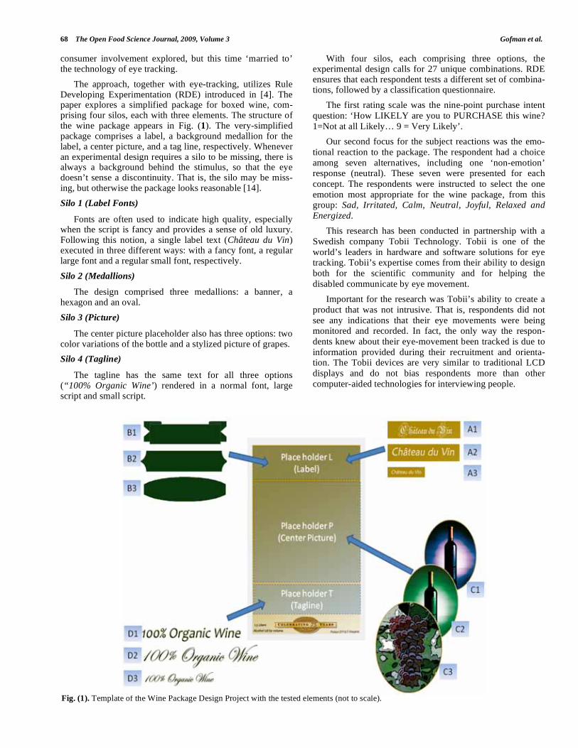
The approach, together with eye-tracking, utilizes Rule Developing Experimentation (RDE) introduced in [4]. The paper explores a simplified package for boxed wine, com-prising four silos, each with three elements. The structure of the wine package appears in Fig. (1). The very-simplified package comprises a label, a background medallion for the label, a center picture, and a tag line, respectively. Whenever an experimental design requires a silo to be missing, there is always a background behind the stimulus, so that the eye doesn’t sense a discontinuity. That is, the silo may be miss-ing, but otherwise the package looks reasonable [14].
Silo 1 (Label Fonts)
Fonts are often used to indicate high quality, especially when the script is fancy and provides a sense of old luxury. Following this notion, a single label text (Château du Vin) executed in three different ways: with a fancy font, a regular large font and a regular small font, respectively.
Silo 2 (Medallions)
The design comprised three medallions: a banner, a hexagon and an oval.
Silo 3 (Picture)
The center picture placeholder also has three options: two color variations of the bottle and a stylized picture of grapes.
Silo 4 (Tagline)
The tagline has the same text for all three options (“100% Organic Wine’) rendered in a normal font, large script and small script.
With four silos, each comprising three options, the experimental design calls for 27 unique combinations. RDE ensures that each respondent tests a different set of combina-tions, followed by a classification questionnaire.
The first rating scale was the nine-point purchase intent
question: ‘How LIKELY are you to PURCHASE this wine?
1=Not at all Likely… 9 = Very Likely’.
Our second focus for the subject reactions was the emo-
tional reaction to the package. The respondent had a choice
among seven alternatives, including one ‘non-emotion’ response (neutral). These seven were presented for each
concept. The respondents were instructed to select the one
emotion most appropriate for the wine package, from this group: Sad, Irritated, Calm, Neutral, Joyful, Relaxed and
Energized.
This research has been conducted in partnership with a
Swedish company Tobii Technology. Tobii is one of the
world’s leaders in hardware and software solutions for eye tracking. Tobii’s expertise comes from their ability to design
both for the scientific community and for helping the
disabled communicate by eye movement.
Important for the research was Tobii’s ability to create a
product that was not intrusive. That is, respondents did not
see any indications that their eye movements were being monitored and recorded. In fact, the only way the respon-
dents knew about their eye-movement been tracked is due to
information provided during their recruitment and orienta-tion. The Tobii devices are very similar to traditional LCD
displays and do not bias respondents more than other
computer-aided technologies for interviewing people.
Fig. (1). Template of the Wine Package Design Project with the tested elements (not to scale).
Extending Rule Developing Experimentation to Perception of Food The Open Food Science Journal, 2009, Volume 3 69
A second objective measure was response time. There is always a reaction time between the presentation of a stimu-lus package on the computer screen and the first response that a person makes, e.g., rating. This intervening time is presumed to be the time it takes for a respondent to process the information, and make a judgment. More than a century ago, psychologists began to measure reaction time to stimuli. Over the years, this measure, like blood pressure for a doctor, started to yield its secrets. Response or reaction time wasn’t simply something fixed. It varied with the stimulus, suggesting that this ‘dead time’ might actually correspond to some mental processing.
The RDE tool utilized in the research, IdeaMap®.Net, is set up to measure the interval between the time when the rendering of the package is complete on the respondent’s screen and the rating assigned by the respondent. It’s impor-tant to keep in mind that computers differ in the speed at which they are able to download the particular image of a package and display that image. The response time utility picks up that time between the completion of rendering and the respondent’s rating, because that definition of response time cannot be influenced by the speed of the computer.
Overall, the data generated by this first study using experimental design and eye tracking provides a very rich source of information including the experimental design, interest and emotion, coupled with eye movements (at least for the first 5 seconds), and response time.
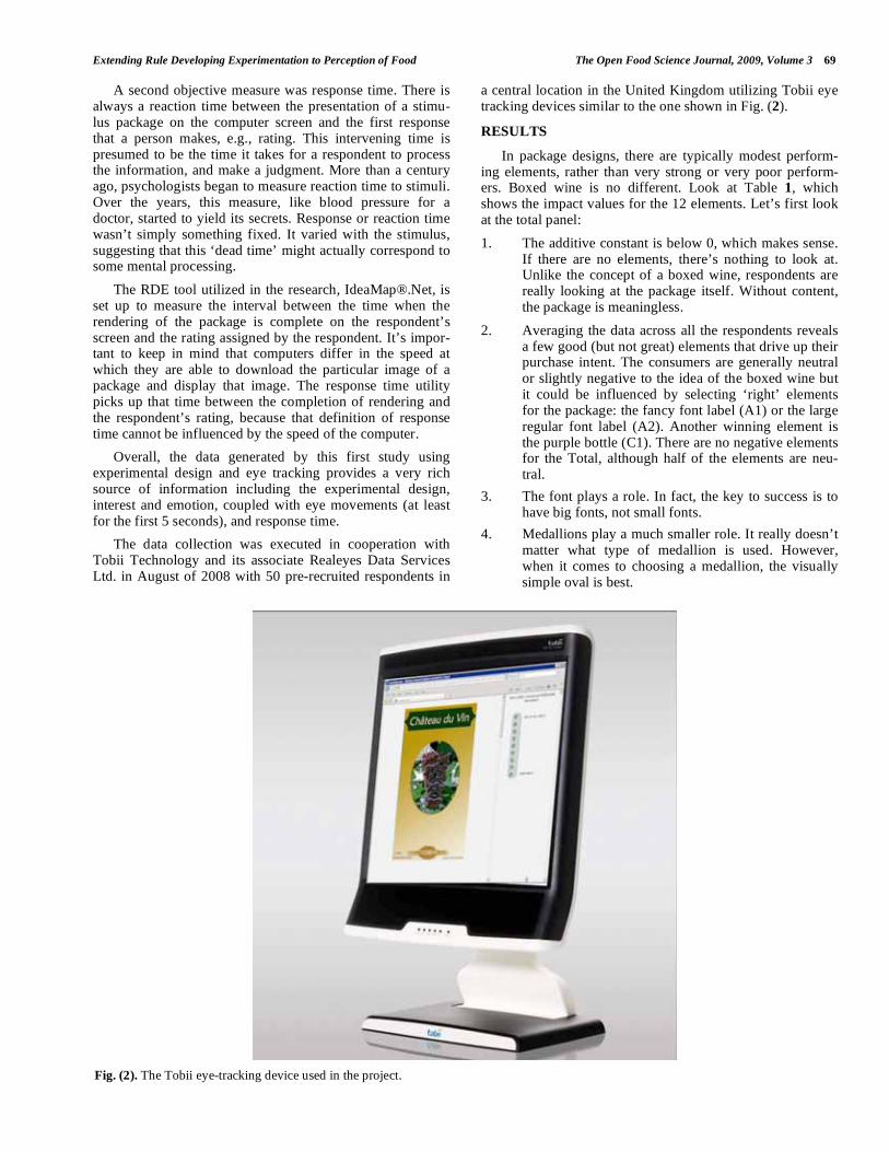
The data collection was executed in cooperation with Tobii Technology and its associate Realeyes Data Services Ltd. in August of 2008 with 50 pre-recruited respondents in
a central location in the United Kingdom utilizing Tobii eye tracking devices similar to the one shown in Fig. (2).
RESULTS
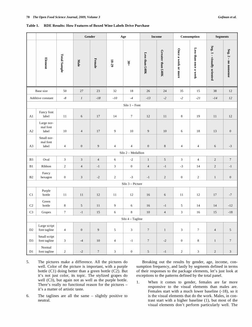
In package designs, there are typically modest perform-ing elements, rather than very strong or very poor perform-ers. Boxed wine is no different. Look at Table 1, which shows the impact values for the 12 elements. Let’s first look at the total panel:
1. The additive constant is below 0, which makes sense. If there are no elements, there’s nothing to look at. Unlike the concept of a boxed wine, respondents are really looking at the package itself. Without content, the package is meaningless.
2. Averaging the data across all the respondents reveals a few good (but not great) elements that drive up their purchase intent. The consumers are generally neutral or slightly negative to the idea of the boxed wine but it could be influenced by selecting ‘right’ elements for the package: the fancy font label (A1) or the large regular font label (A2). Another winning element is the purple bottle (C1). There are no negative elements for the Total, although half of the elements are neu-tral.
3. The font plays a role. In fact, the key to success is to have big fonts, not small fonts.
4. Medallions play a much smaller role. It really doesn’t matter what type of medallion is used. However, when it comes to choosing a medallion, the visually simple oval is best.
Fig. (2). The Tobii eye-tracking device used in the project.
70 The Open Food Science Journal, 2009, Volume 3 Gofman et al.
Table 1. RDE Results: How Features of Boxed Wine Labels Drive Purchase
Gender Age Income Consumption Segments
Ele
men
t
To
tal S
am
ple
Ma
le
Fem
ale
18
-29
30
+
Less th
an
£4
0K
Grea
ter th
an
£4
0K
On
ce a
week
or m
ore
Less th
an
on
ce a
week
Seg
. 1 –
visu
ally
orie
nte
d
Seg
. 2 –
no
no
nse
nse
Base size 50 27 23 32 18 26 24 35 15 38 12
Additive constant -8 1 -18 -10 -4 -13 -2 -2 -21 -14 12
Silo 1 – Font
A1
Fancy font
label 11 6 17 14 7 12 11 8 19 11 12
A2
Large nor-
mal font
label 10 4 17 9 10 9 10 6 18 13 0
A3
Small nor-
mal font
label 4 0 9 4 4 0 8 4 4 6 -3
Silo 2 – Medallion
B3 Oval 3 3 4 6 -2 1 5 3 4 2 7
B1 Ribbon 2 4 -1 3 0 4 -1 -3 14 2 -1
B2
Fancy
hexagon 0 3 -2 2 -3 -1 2 0 2 1 0
Silo 3 – Picture
C1
Purple
bottle 11 11 12 11 12 16 6 11 12 17 -7
C2
Green
bottle 8 5 11 9 6 16 -1 5 14 14 -12
C3 Grapes 7 -1 15 6 8 10 4 3 16 15 -18
Silo 4 – Tagline
D2
Large script
font tagline 4 0 9 5 3 7 1 3 7 4 5
D3
Small script
font tagline 3 -4 10 4 -1 7 -2 0 8 1 7
D1
Normal
font tagline 2 -2 7 3 0 5 -1 2 3 2 3
5. The pictures make a difference. All the pictures do
well. Color of the picture is important, with a purple bottle (C1) doing better than a green bottle (C2). But it’s not just color, its topic. The stylized grapes do well (C3), but again not as well as the purple bottle. There’s really no functional reason for the pictures – it’s a matter of artistic taste.
6. The taglines are all the same – slightly positive to neutral.
Breaking out the results by gender, age, income, con-sumption frequency, and lastly by segments defined in terms of their responses to the package elements, let’s just look at exceptions to the patterns defined by the total panel.
1. When it comes to gender, females are far more responsive to the visual elements than males are. Females start with a much lower baseline (-18), so it is the visual elements that do the work. Males, in con-trast start with a higher baseline (1), but most of the visual elements don’t perform particularly well. The
Extending Rule Developing Experimentation to Perception of Food The Open Food Science Journal, 2009, Volume 3 71
message here is clear – females are more responsive than males. Females are quite negative to the general idea of the package but selecting the fancy or large font label with the picture of the grapes dramatically increases their purchase intent (A1 or A2 and C3). In fact, the three mentioned above elements would con-vince an additional 42% of the female consumers to buy the wine. Males are different. They are com-pletely indifferent to the picture of grapes, and mes-saging about organic content -- whereas females love both.
2. The two age groups show random differences. One interesting ‘factoid’ is that the older respondents like the elaborate font more than the younger respondents do. If that is an instance of a general rule, then the font may be very important as a covert attractor of the appropriate age group.
3. Income makes a difference, with the higher income respondents beginning with a much lower base (addi-tive constant = -13), but with the elements doing all the work.
4. Moving on to consumption patterns, the patterns that emerged previously could be observed. Those who consume wine frequently start out with higher base-lines, but the elements are not particularly powerful. In contrast, those who consume wine less frequently start out with low baselines, but respond more strongly to some of the elements, especially the pictures.
5. The segmentation of the respondents based on the patterns of their responses shows the most profound differences among ‘complementary’ groups of respondents. The two segments that emerge differ dramatically in the pattern of what they respond to.
a. Segment 1, ‘Visual’, comprises about 75% of the respondents. The ‘Visual’ is negative to the general idea of boxed wine. However, merely featuring a simple large font label (A2) along with the purple bottle (C1) could sway an additional 30% of the respondents to say that they would buy the packaged wine.
b. Segment 2, ‘No Nonsense’, comprises about 25% of the respondents. The ‘No Nonsense’ is moderately positive to the general idea of boxed wine - about12% would be interested in buying the package without any elements shown to them. However, things go downhill from here – there are not many positives that influence these consumers. With the exception of the fancy font label (A1) on the oval banner (B3) and small font tagline (D3, a modest impact), nothing sways them. Quite the opposite – any picture reduces their interest in purchase.
6. Our excursion into the innards of the experimental design suggests to us that the pictures make a lot of difference, as do the fonts. The medallions make less of a difference, and the taglines hardly contribute.
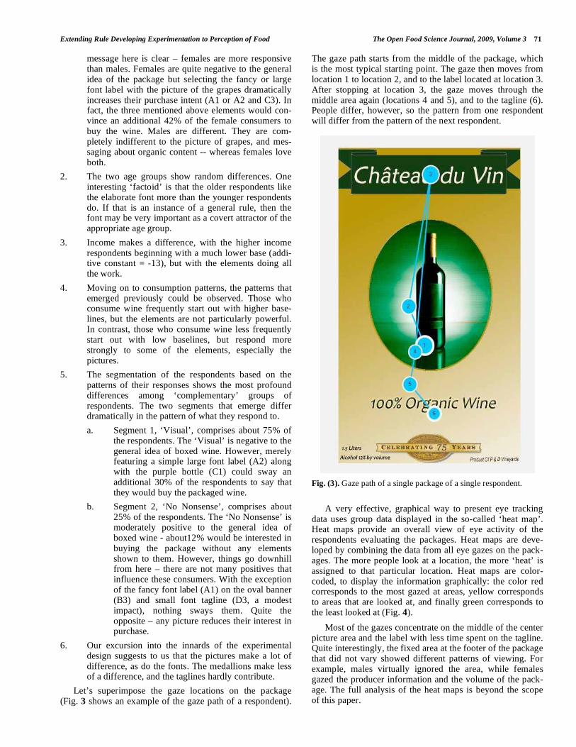
Let’s superimpose the gaze locations on the package (Fig. 3 shows an example of the gaze path of a respondent).
The gaze path starts from the middle of the package, which is the most typical starting point. The gaze then moves from location 1 to location 2, and to the label located at location 3. After stopping at location 3, the gaze moves through the middle area again (locations 4 and 5), and to the tagline (6). People differ, however, so the pattern from one respondent will differ from the pattern of the next respondent.
Fig. (3). Gaze path of a single package of a single respondent.
A very effective, graphical way to present eye tracking data uses group data displayed in the so-called ‘heat map’. Heat maps provide an overall view of eye activity of the respondents evaluating the packages. Heat maps are deve-loped by combining the data from all eye gazes on the pack-ages. The more people look at a location, the more ‘heat’ is assigned to that particular location. Heat maps are color-coded, to display the information graphically: the color red corresponds to the most gazed at areas, yellow corresponds to areas that are looked at, and finally green corresponds to the least looked at (Fig. 4).
Most of the gazes concentrate on the middle of the center picture area and the label with less time spent on the tagline. Quite interestingly, the fixed area at the footer of the package that did not vary showed different patterns of viewing. For example, males virtually ignored the area, while females gazed the producer information and the volume of the pack-age. The full analysis of the heat maps is beyond the scope of this paper.
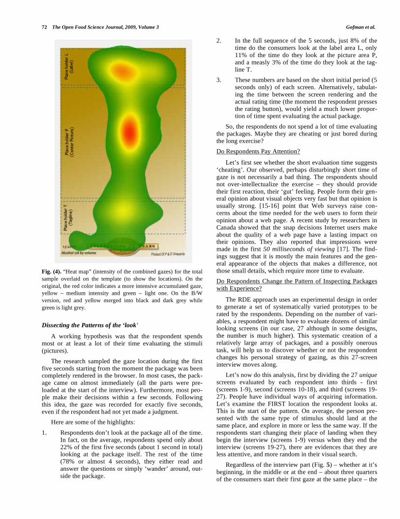
72 The Open Food Science Journal, 2009, Volume 3 Gofman et al.
Fig. (4). “Heat map” (intensity of the combined gazes) for the total
sample overlaid on the template (to show the locations). On the
original, the red color indicates a more intensive accumulated gaze,
yellow – medium intensity and green – light one. On the B/W
version, red and yellow merged into black and dark grey while
green is light grey.
Dissecting the Patterns of the ‘look'
A working hypothesis was that the respondent spends most or at least a lot of their time evaluating the stimuli (pictures).
The research sampled the gaze location during the first five seconds starting from the moment the package was been completely rendered in the browser. In most cases, the pack-age came on almost immediately (all the parts were pre-loaded at the start of the interview). Furthermore, most peo-ple make their decisions within a few seconds. Following this idea, the gaze was recorded for exactly five seconds, even if the respondent had not yet made a judgment.
Here are some of the highlights:
1. Respondents don’t look at the package all of the time. In fact, on the average, respondents spend only about 22% of the first five seconds (about 1 second in total) looking at the package itself. The rest of the time (78% or almost 4 seconds), they either read and answer the questions or simply ‘wander’ around, out-side the package.
2. In the full sequence of the 5 seconds, just 8% of the time do the consumers look at the label area L, only 11% of the time do they look at the picture area P, and a measly 3% of the time do they look at the tag-line T.
3. These numbers are based on the short initial period (5 seconds only) of each screen. Alternatively, tabulat-ing the time between the screen rendering and the actual rating time (the moment the respondent presses the rating button), would yield a much lower propor-tion of time spent evaluating the actual package.
So, the respondents do not spend a lot of time evaluating the packages. Maybe they are cheating or just bored during the long exercise?
Do Respondents Pay Attention?
Let’s first see whether the short evaluation time suggests ‘cheating’. Our observed, perhaps disturbingly short time of gaze is not necessarily a bad thing. The respondents should not over-intellectualize the exercise – they should provide their first reaction, their ‘gut’ feeling. People form their gen-eral opinion about visual objects very fast but that opinion is usually strong. [15-16] point that Web surveys raise con-cerns about the time needed for the web users to form their opinion about a web page. A recent study by researchers in Canada showed that the snap decisions Internet users make about the quality of a web page have a lasting impact on their opinions. They also reported that impressions were made in the first 50 milliseconds of viewing [17]. The find-ings suggest that it is mostly the main features and the gen-eral appearance of the objects that makes a difference, not those small details, which require more time to evaluate.
Do Respondents Change the Pattern of Inspecting Packages with Experience?
The RDE approach uses an experimental design in order to generate a set of systematically varied prototypes to be rated by the respondents. Depending on the number of vari-ables, a respondent might have to evaluate dozens of similar looking screens (in our case, 27 although in some designs, the number is much higher). This systematic creation of a relatively large array of packages, and a possibly onerous task, will help us to discover whether or not the respondent changes his personal strategy of gazing, as this 27-screen interview moves along.
Let’s now do this analysis, first by dividing the 27 unique screens evaluated by each respondent into thirds - first (screens 1-9), second (screens 10-18), and third (screens 19-27). People have individual ways of acquiring information. Let’s examine the FIRST location the respondent looks at. This is the start of the pattern. On average, the person pre-sented with the same type of stimulus should land at the same place, and explore in more or less the same way. If the respondents start changing their place of landing when they begin the interview (screens 1-9) versus when they end the interview (screens 19-27), there are evidences that they are less attentive, and more random in their visual search.
Regardless of the interview part (Fig. 5) – whether at it’s beginning, in the middle or at the end – about three quarters of the consumers start their first gaze at the same place – the
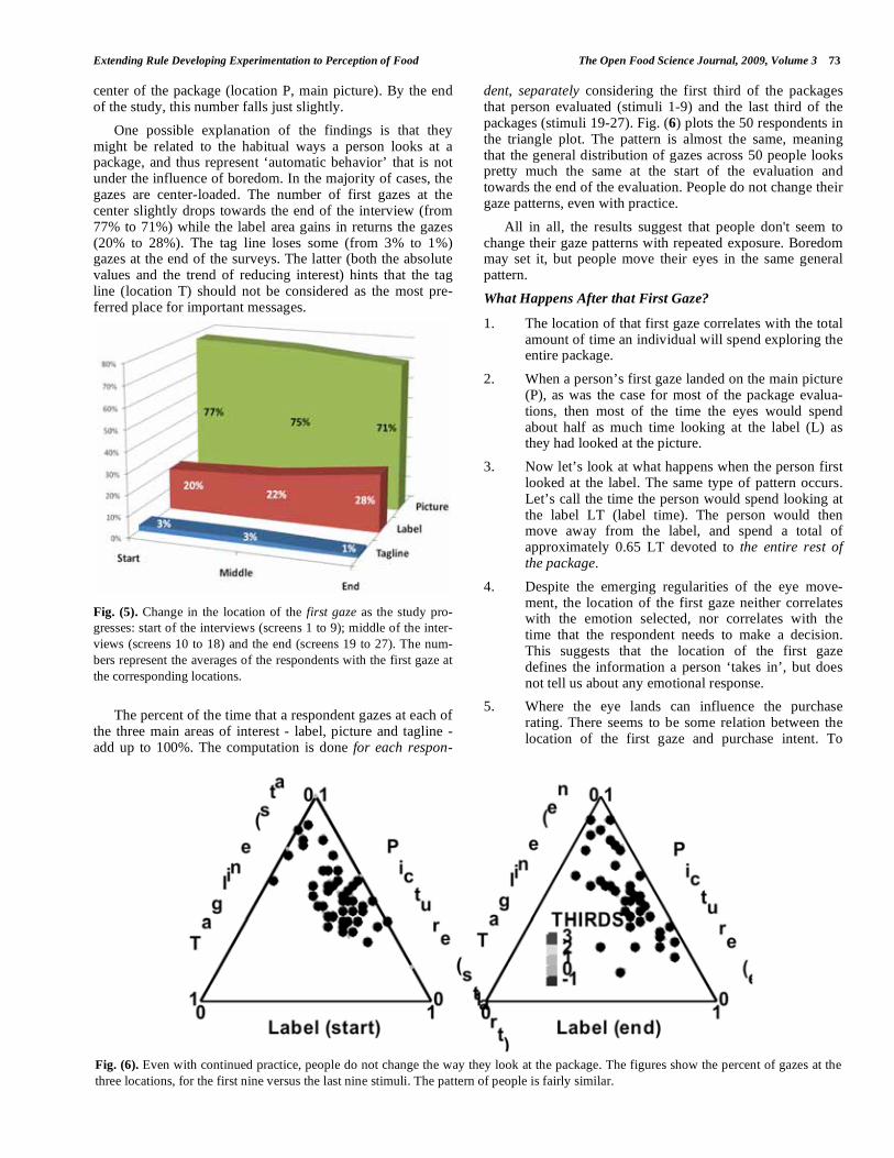
Extending Rule Developing Experimentation to Perception of Food The Open Food Science Journal, 2009, Volume 3 73
center of the package (location P, main picture). By the end of the study, this number falls just slightly.
One possible explanation of the findings is that they might be related to the habitual ways a person looks at a package, and thus represent ‘automatic behavior’ that is not under the influence of boredom. In the majority of cases, the gazes are center-loaded. The number of first gazes at the center slightly drops towards the end of the interview (from 77% to 71%) while the label area gains in returns the gazes (20% to 28%). The tag line loses some (from 3% to 1%) gazes at the end of the surveys. The latter (both the absolute values and the trend of reducing interest) hints that the tag line (location T) should not be considered as the most pre-ferred place for important messages.
Fig. (5). Change in the location of the first gaze as the study pro-
gresses: start of the interviews (screens 1 to 9); middle of the inter-
views (screens 10 to 18) and the end (screens 19 to 27). The num-
bers represent the averages of the respondents with the first gaze at
the corresponding locations.
The percent of the time that a respondent gazes at each of the three main areas of interest - label, picture and tagline - add up to 100%. The computation is done for each respon-
dent, separately considering the first third of the packages that person evaluated (stimuli 1-9) and the last third of the packages (stimuli 19-27). Fig. (6) plots the 50 respondents in the triangle plot. The pattern is almost the same, meaning that the general distribution of gazes across 50 people looks pretty much the same at the start of the evaluation and towards the end of the evaluation. People do not change their gaze patterns, even with practice.
All in all, the results suggest that people don't seem to change their gaze patterns with repeated exposure. Boredom may set it, but people move their eyes in the same general pattern.
What Happens After that First Gaze?
1. The location of that first gaze correlates with the total amount of time an individual will spend exploring the entire package.
2. When a person’s first gaze landed on the main picture (P), as was the case for most of the package evalua-tions, then most of the time the eyes would spend about half as much time looking at the label (L) as they had looked at the picture.
3. Now let’s look at what happens when the person first looked at the label. The same type of pattern occurs. Let’s call the time the person would spend looking at the label LT (label time). The person would then move away from the label, and spend a total of approximately 0.65 LT devoted to the entire rest of the package.
4. Despite the emerging regularities of the eye move-ment, the location of the first gaze neither correlates with the emotion selected, nor correlates with the time that the respondent needs to make a decision. This suggests that the location of the first gaze defines the information a person ‘takes in’, but does not tell us about any emotional response.
5. Where the eye lands can influence the purchase rating. There seems to be some relation between the location of the first gaze and purchase intent. To
Fig. (6). Even with continued practice, people do not change the way they look at the package. The figures show the percent of gazes at the
three locations, for the first nine versus the last nine stimuli. The pattern of people is fairly similar.
74 The Open Food Science Journal, 2009, Volume 3 Gofman et al.
explore that, the respondents were divided into groups, defined by the location where their eyes landed at package-by-package level. 1350 screens (27 from each of 50 people) were divided by the location where the respondents’ gaze first landed. The most interesting discovery, probably not leading to a rule, however, is for the Fancy Front Label (element A1). When the first gaze landed in the label L, and it hap-pened to be this particular element, a full 23% more respondents would buy this package, rather than just 8% if the first gaze landed in the picture area. Getting the first landing right, on the label, and getting the first gaze there, may have some unexpected impact.
What ‘Sticks’ the Viewer’s Eyes to the Package?
Some parts of the package grab the attention of the respondents and keep them for a while. Others might be as striking and catch the gazes but not for long. The eye moves away after looking for a moment. In the best of worlds, the designer and marketer want the consumer to look at the dif-ferent parts of the package, not just focus on one part and ignore the other. The various parts of the package convey information – whether brand, flavor, price, nutrition, etc.
The proportion of time for each test package that the eye spent on the different areas of interest was measured. The objective was to develop a number that shows the variation in the time spent on the three major areas of interest: label/medallion (the label and the medallion were co-located), the picture, and the tagline.
Each individual package yielded a variation in gaze loca-tion. If the person spends equal amounts of time, regardless of how much, gazing at the three different locations, a stan-dard deviation for this stimulus for this person should be equal to ‘0’. If, however, the person spends a lot of gaze time looking at the picture, and little gaze time looking at the label or the tagline, the standard deviation should be high.
For demonstration purposes, the following example will show the logic. Five scenarios below summarize different
patterns of gaze times, defined as percent of the total time a
person looks at the test package (relative length of time).
1. Person 1: 33% looking at the label, 33% looking at
the picture, 33% looking at the tagline, standard
deviation = 0.00. This person shows no preference. All three locations on the package are equally sticky.
2. Person 2: 45% looking at the label, 45% looking at the picture, 10% looking at the tagline, standard
deviation = 0.20. This person shows no preference for
label versus picture, but does not pay attention to the tagline.
3. Person 3: 60% looking at the label, 30% looking at
the picture, 10% looking at the tagline, standard deviation = 0.25. This person focuses primarily on the
label, suggesting that the label ‘hogs the gaze’.
4. Person 4: 66% looking at the label, 33% looking at
the picture, 0% looking at the tagline, standard devia-
tion = 0.33. In this is one of the extreme examples, the person is looking 2/3 of the time at the label, 1/3
of the time at the picture, and never at the tagline.
5. Person 5: 100% looking at the label, 0% looking at the picture, 0% looking at the tagline standard devia-tion = 0.58. This is the most extreme example.
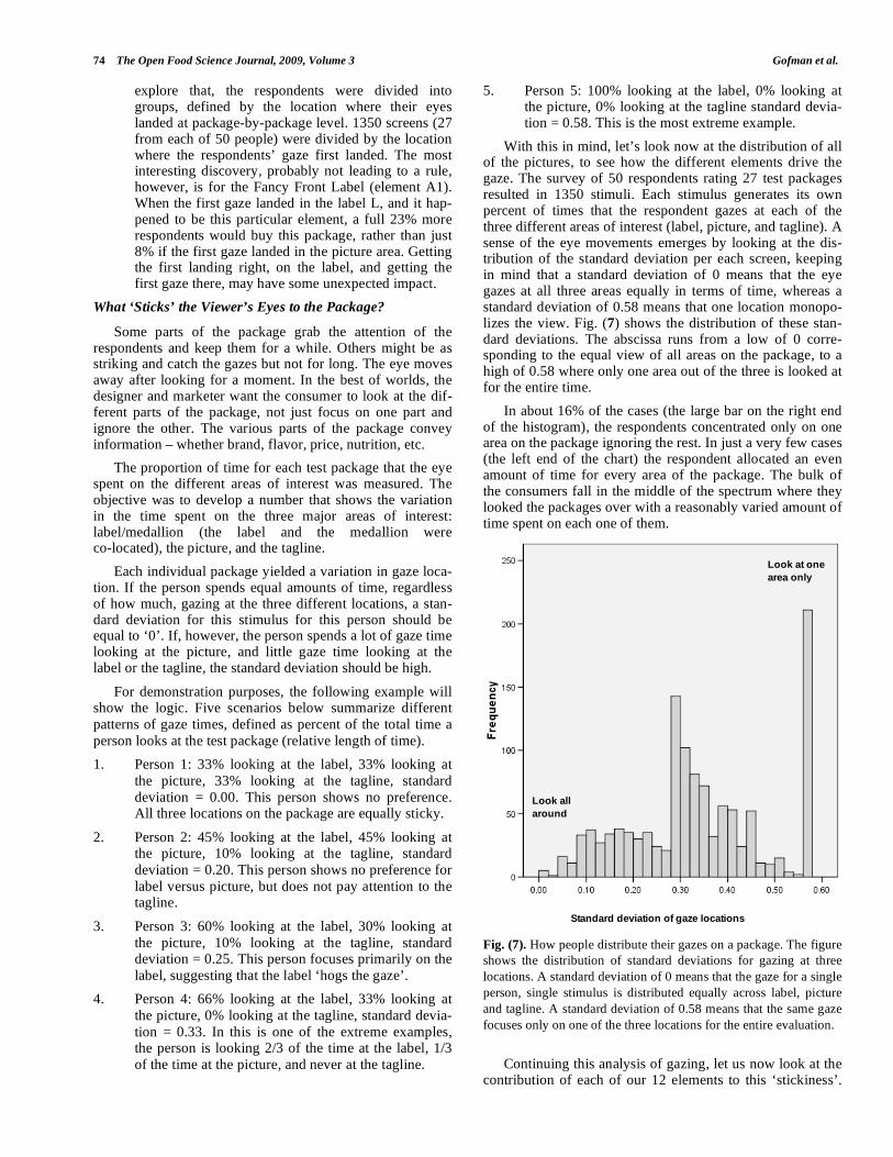
With this in mind, let’s look now at the distribution of all of the pictures, to see how the different elements drive the gaze. The survey of 50 respondents rating 27 test packages resulted in 1350 stimuli. Each stimulus generates its own percent of times that the respondent gazes at each of the three different areas of interest (label, picture, and tagline). A sense of the eye movements emerges by looking at the dis-tribution of the standard deviation per each screen, keeping in mind that a standard deviation of 0 means that the eye gazes at all three areas equally in terms of time, whereas a standard deviation of 0.58 means that one location monopo-lizes the view. Fig. (7) shows the distribution of these stan-dard deviations. The abscissa runs from a low of 0 corre-sponding to the equal view of all areas on the package, to a high of 0.58 where only one area out of the three is looked at for the entire time.
In about 16% of the cases (the large bar on the right end of the histogram), the respondents concentrated only on one area on the package ignoring the rest. In just a very few cases (the left end of the chart) the respondent allocated an even amount of time for every area of the package. The bulk of the consumers fall in the middle of the spectrum where they looked the packages over with a reasonably varied amount of time spent on each one of them.
Fig. (7). How people distribute their gazes on a package. The figure
shows the distribution of standard deviations for gazing at three
locations. A standard deviation of 0 means that the gaze for a single
person, single stimulus is distributed equally across label, picture
and tagline. A standard deviation of 0.58 means that the same gaze
focuses only on one of the three locations for the entire evaluation.
Continuing this analysis of gazing, let us now look at the contribution of each of our 12 elements to this ‘stickiness’.
Standard deviation of gaze locations
Look all
around
Look at one
area only
Extending Rule Developing Experimentation to Perception of Food The Open Food Science Journal, 2009, Volume 3 75
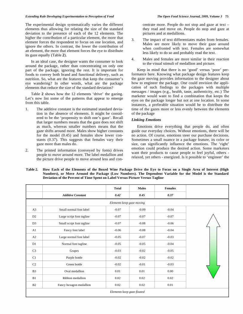
The experimental design systematically varies the different elements thus allowing for relating the size of the standard deviation to the presence of each of the 12 elements. The higher the contribution of a particular element, the more that element forces the respondent to focus on one location, and ignore the others. In contrast, the lower the contribution of an element, the more that element forces the eye to distribute its gaze equally (Table 2).
In an ideal case, the designer wants the consumer to look around the package, rather than concentrating on only one part of the package, ignoring the rest. It is important for foods to convey both brand and functional delivery, such as nutrition. So, what are the features that keep the consumer’s eye wandering? In other words, what are the package elements that reduce the size of the standard deviation?
Table 2 shows how the 12 elements ‘drive’ the gazing. Let’s now list some of the patterns that appear to emerge from this table.
1. The additive constant is the estimated standard devia-tion in the absence of elements. It might be consid-ered to be the ‘propensity to shift one’s gaze’. Recall that larger numbers means that the gaze does not shift as much, whereas smaller numbers means that the gaze shifts around more. Males show higher constants for the model (0.45) and females show lower con-stants (0.37). This suggests that females vary their gaze more than males do.
2. The printed information (conveyed by fonts) drives people to move around more. The label medallion and the picture drive people to move around less and con-
centrate more. People do not stop and gaze at text – they read and move on. People do stop and gaze at pictures and at medallions.
3. The impact of text differentiates males from females. Males are more likely to move their gaze around when confronted with text. Females are somewhat less likely to do so and probably read the text.
4. Males and females are more similar in their reaction to the visual stimuli of medallion and picture.
Keep in mind that there is no ‘good’ versus ‘poor’ per-formance here. Knowing what package design features keep the gaze moving provides information to the designer about how to engineer the package. One could envision the appli-cation of such findings to the packages with multiple messages / images (e.g., health, taste, authenticity, etc.) The marketer would want to find a combination that keeps the eyes on the package longer but not at one location. In some instances, a preferable situation would be to distribute the time of the gazes more or less evenly between the elements of the package
Linking Emotions
Emotions drive everything that people do, and often guide our everyday choices. Without emotions, there will be no action. Of course, emotions steer our purchase decisions. Sometimes a small nuance in a package feature, its color or size, can significantly influence the emotions. The ‘right’ emotion could produce the desired action. Some marketers want their products to cause people to feel joyful, others - relaxed, yet others - energized. Is it possible to ‘engineer’ the
Table 2. How Each of the Elements of the Boxed Wine Package Drive the Eye to Focus on a Single Area of Interest (High
Numbers), or Move Around the Package (Low Numbers). The Dependent Variable for the Model is the Standard
Deviation of the Percent of Time Spent on Label Versus Picture Versus Tagline
Total Males Females
Additive Constant 0.42 0.45 0.37
Elements keep gaze moving
A3 Small normal font label -0.07 -0.09 -0.04
D2 Large script font tagline -0.07 -0.07 -0.07
D3 Small script font tagline -0.07 -0.08 -0.06
A1 Fancy font label -0.06 -0.08 -0.04
A2 Large normal font label -0.05 -0.07 -0.03
D1 Normal font tagline -0.05 -0.05 -0.04
C3 Grapes -0.03 -0.02 -0.05
C1 Purple bottle -0.02 -0.02 -0.02
C2 Green bottle -0.02 -0.01 -0.03
B3 Oval medallion 0.01 0.01 0.00
B1 Ribbon medallion 0.02 0.02 0.02
B2 Fancy hexagon medallion 0.02 0.02 0.01
Elements keep gaze fixated
76 The Open Food Science Journal, 2009, Volume 3 Gofman et al.
emotions that the consumer might experience looking at the specific package and thus help the marketers and designers to create an emotional link or context for a more successful product?
Emotions can be measured either through self-reporting, where the consumers indicate their feelings, or through psycho-physiological measurements where the emotions are indirectly measured through physiological parameters. The former method of direct self-report is much more practical and has been used in our case study here.
The next area of research was a search for a correlation between eye movements and emotions. The method of having a respondent select the emotion that most character-ized a particular package seemed appropriate for this study as well. It’s easy for respondents to select the emotion, although such an approach does not get at the rich set of multiple emotions that might underlie a specific package. There were no expectations about what might be the relation, if any.
The second rating question of our experiment instructed the respondents to select the ONE emotion they felt when they inspected the particular package for boxed wine. A standard set of emotions was proposed: sad, irritated, calm, neutral, joyful, relaxed or energized, respectively.
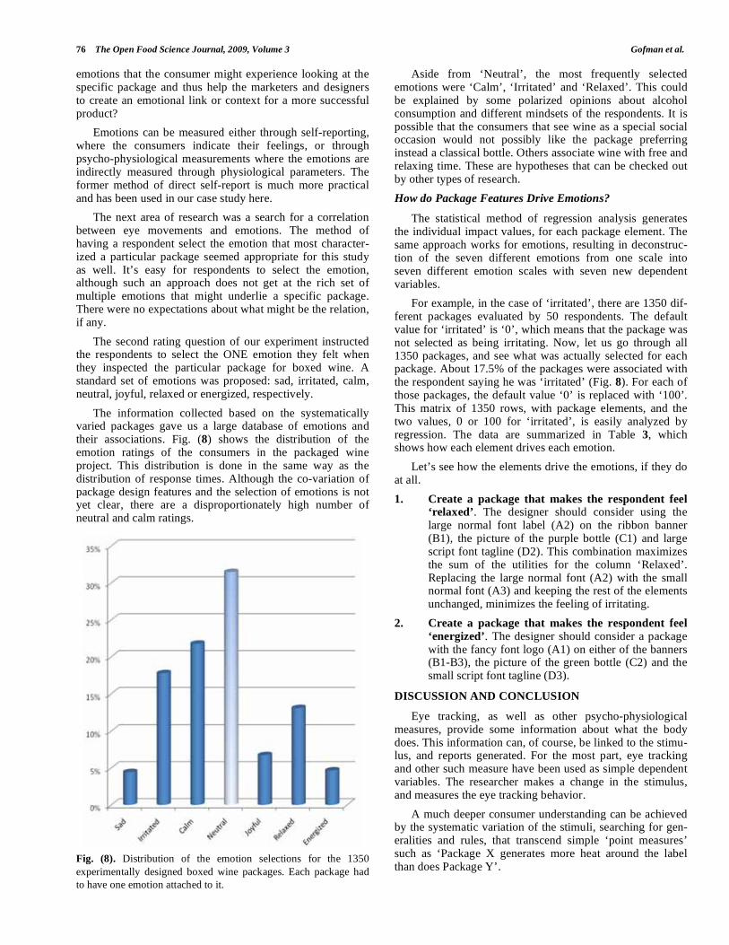
The information collected based on the systematically varied packages gave us a large database of emotions and their associations. Fig. (8) shows the distribution of the emotion ratings of the consumers in the packaged wine project. This distribution is done in the same way as the distribution of response times. Although the co-variation of package design features and the selection of emotions is not yet clear, there are a disproportionately high number of neutral and calm ratings.
Fig. (8). Distribution of the emotion selections for the 1350
experimentally designed boxed wine packages. Each package had
to have one emotion attached to it.
Aside from ‘Neutral’, the most frequently selected emotions were ‘Calm’, ‘Irritated’ and ‘Relaxed’. This could be explained by some polarized opinions about alcohol consumption and different mindsets of the respondents. It is possible that the consumers that see wine as a special social occasion would not possibly like the package preferring instead a classical bottle. Others associate wine with free and relaxing time. These are hypotheses that can be checked out by other types of research.
How do Package Features Drive Emotions?
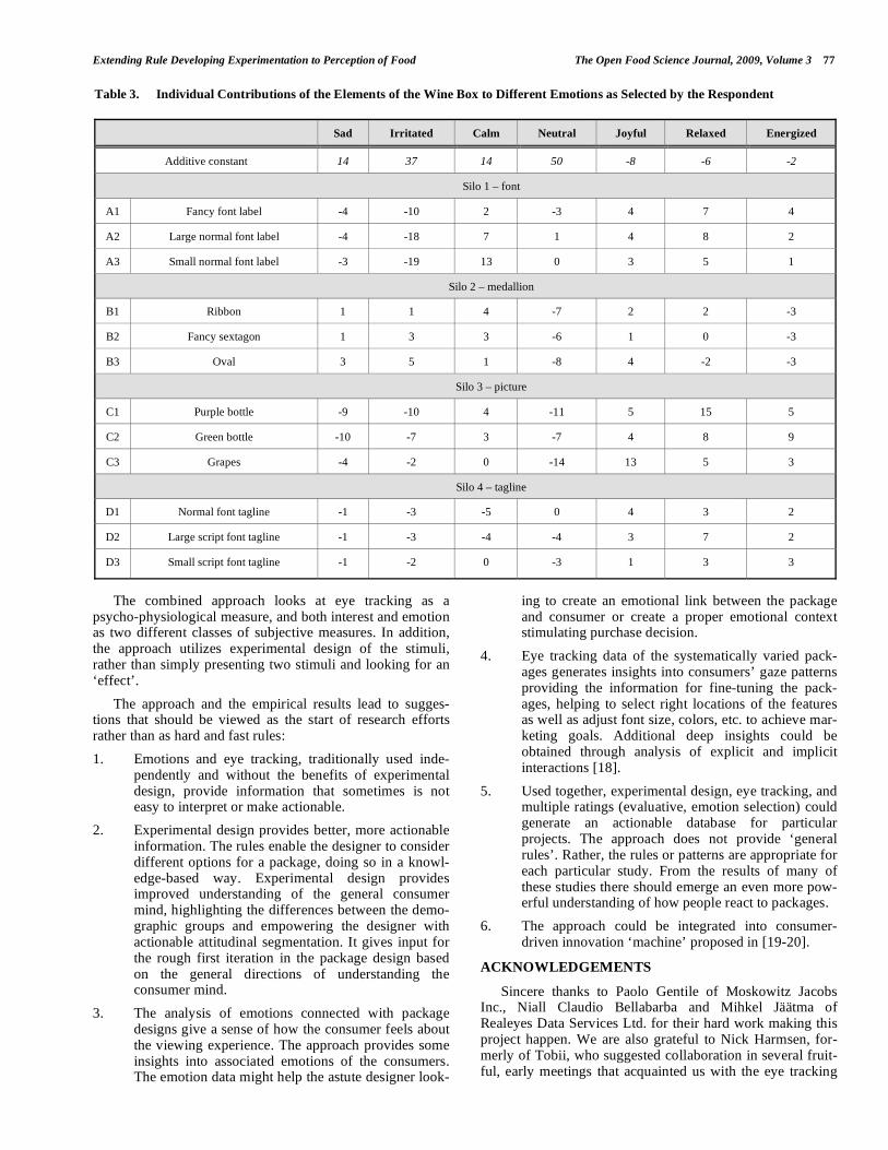
The statistical method of regression analysis generates the individual impact values, for each package element. The same approach works for emotions, resulting in deconstruc-tion of the seven different emotions from one scale into seven different emotion scales with seven new dependent variables.
For example, in the case of ‘irritated’, there are 1350 dif-ferent packages evaluated by 50 respondents. The default value for ‘irritated’ is ‘0’, which means that the package was not selected as being irritating. Now, let us go through all 1350 packages, and see what was actually selected for each package. About 17.5% of the packages were associated with the respondent saying he was ‘irritated’ (Fig. 8). For each of those packages, the default value ‘0’ is replaced with ‘100’. This matrix of 1350 rows, with package elements, and the two values, 0 or 100 for ‘irritated’, is easily analyzed by regression. The data are summarized in Table 3, which shows how each element drives each emotion.
Let’s see how the elements drive the emotions, if they do at all.
1. Create a package that makes the respondent feel ‘relaxed’. The designer should consider using the large normal font label (A2) on the ribbon banner (B1), the picture of the purple bottle (C1) and large script font tagline (D2). This combination maximizes the sum of the utilities for the column ‘Relaxed’. Replacing the large normal font (A2) with the small normal font (A3) and keeping the rest of the elements unchanged, minimizes the feeling of irritating.
2. Create a package that makes the respondent feel
‘energized’. The designer should consider a package with the fancy font logo (A1) on either of the banners (B1-B3), the picture of the green bottle (C2) and the small script font tagline (D3).
DISCUSSION AND CONCLUSION
Eye tracking, as well as other psycho-physiological measures, provide some information about what the body does. This information can, of course, be linked to the stimu-lus, and reports generated. For the most part, eye tracking and other such measure have been used as simple dependent variables. The researcher makes a change in the stimulus, and measures the eye tracking behavior.
A much deeper consumer understanding can be achieved by the systematic variation of the stimuli, searching for gen-eralities and rules, that transcend simple ‘point measures’ such as ‘Package X generates more heat around the label than does Package Y’.
Extending Rule Developing Experimentation to Perception of Food The Open Food Science Journal, 2009, Volume 3 77
The combined approach looks at eye tracking as a psycho-physiological measure, and both interest and emotion as two different classes of subjective measures. In addition, the approach utilizes experimental design of the stimuli, rather than simply presenting two stimuli and looking for an ‘effect’.
The approach and the empirical results lead to sugges-tions that should be viewed as the start of research efforts rather than as hard and fast rules:
1. Emotions and eye tracking, traditionally used inde-pendently and without the benefits of experimental design, provide information that sometimes is not easy to interpret or make actionable.
2. Experimental design provides better, more actionable information. The rules enable the designer to consider different options for a package, doing so in a knowl-edge-based way. Experimental design provides improved understanding of the general consumer mind, highlighting the differences between the demo-graphic groups and empowering the designer with actionable attitudinal segmentation. It gives input for the rough first iteration in the package design based on the general directions of understanding the consumer mind.
3. The analysis of emotions connected with package designs give a sense of how the consumer feels about the viewing experience. The approach provides some insights into associated emotions of the consumers. The emotion data might help the astute designer look-
ing to create an emotional link between the package and consumer or create a proper emotional context stimulating purchase decision.
4. Eye tracking data of the systematically varied pack-ages generates insights into consumers’ gaze patterns providing the information for fine-tuning the pack-ages, helping to select right locations of the features as well as adjust font size, colors, etc. to achieve mar-keting goals. Additional deep insights could be obtained through analysis of explicit and implicit interactions [18].
5. Used together, experimental design, eye tracking, and multiple ratings (evaluative, emotion selection) could generate an actionable database for particular projects. The approach does not provide ‘general rules’. Rather, the rules or patterns are appropriate for each particular study. From the results of many of these studies there should emerge an even more pow-erful understanding of how people react to packages.
6. The approach could be integrated into consumer-driven innovation ‘machine’ proposed in [19-20].
ACKNOWLEDGEMENTS
Sincere thanks to Paolo Gentile of Moskowitz Jacobs Inc., Niall Claudio Bellabarba and Mihkel Jäätma of Realeyes Data Services Ltd. for their hard work making this project happen. We are also grateful to Nick Harmsen, for-merly of Tobii, who suggested collaboration in several fruit-ful, early meetings that acquainted us with the eye tracking
Table 3. Individual Contributions of the Elements of the Wine Box to Different Emotions as Selected by the Respondent
Sad Irritated Calm Neutral Joyful Relaxed Energized
Additive constant 14 37 14 50 -8 -6 -2
Silo 1 – font
A1 Fancy font label -4 -10 2 -3 4 7 4
A2 Large normal font label -4 -18 7 1 4 8 2
A3 Small normal font label -3 -19 13 0 3 5 1
Silo 2 – medallion
B1 Ribbon 1 1 4 -7 2 2 -3
B2 Fancy sextagon 1 3 3 -6 1 0 -3
B3 Oval 3 5 1 -8 4 -2 -3
Silo 3 – picture
C1 Purple bottle -9 -10 4 -11 5 15 5
C2 Green bottle -10 -7 3 -7 4 8 9
C3 Grapes -4 -2 0 -14 13 5 3
Silo 4 – tagline
D1 Normal font tagline -1 -3 -5 0 4 3 2
D2 Large script font tagline -1 -3 -4 -4 3 7 2
D3 Small script font tagline -1 -2 0 -3 1 3 3
78 The Open Food Science Journal, 2009, Volume 3 Gofman et al.
technology, and Suzanne Gabrione for her help with the text of the paper.
REFERENCES
[1] Robertson GL. Food Packaging: Principles and Practice, 2nd ed. Food Science and Technology. Boca Raton, FL: CRC Press 2005.
[2] Klimchuk MR, Krasovec SA. Packaging Design: successful Product Branding from Concept to Shelf. New York: John Wiley
and Sons 2006. [3] Saito Y. Japanese aesthetics of packaging. J Aesthetics Art
Criticism 1999; 57(2): 257-65. [4] Moskowitz H, Gofman A. Selling Blue Elephants: How to make
great products that people want BEFORE they even know they want them. Saddle River, NJ: Wharton School Publishing 2007.
[5] Gofman A, Moskowitz H. Developing from the ground up: Self-authoring systems for text and package concepts in Concept
Research. In: Moskowitz HR, Porretta S, Silcher M, Eds. Food Product Design and Development.Ames, Iowa: Blackwell Publish-
ing 2005; pp. 283-322. [6] Coon D. Psychology: A Modular Approach to Mind and Behavior.
Florence, KY: Thomson Wadsworth 2005. [7] Dongheng L, Babcock J, Parkhurst D. openEyes: a low-cost head-
mounted eye-tracking solution. In Proceedings of the 2006 sympo-sium on Eye tracking research & applications. San Diego,
California. New York: ACM 2006; pp. 95-100. [8] Tobii [Online]. What is eye tracking? 2008 [cited March 13, 2009].
Available from: URL: http://www.tobii.com/corporate/eye_ track-ing/what_is_eye_tracking.aspx
[9] Tanner J. Eye Tracking, Statistical Analysis and Site Success. SiteProNews [Online]. 2007 [cited 2009 March 13]. Available
from:URL: http://www.sitepronews.com/archives/2007/sep/17prt. html
[10] Mazza V, Turatto M, Umiltà C. Foreground–background segmenta-tion and attention: a change blindness study. Psycholog Res 2004;
69(3): 201-10.
[11] Pannasch S, Dornhoefer SM, Unema PJA, Velichkovsky BM. The
omnipresent prolongation of visual fixations: saccades are inhibited by changes in situation and in subject's activity. Vis Res 2001; 41
(25, 26): 3345-51. [12] Young S. New and improved indeed: documenting the business
value of packaging innovations. QUIRK’S Market Res Rev 2008; XXII(1): 46-50.
[13] Thomas J. Begin at the beginning: research should be involved at the outset of any (re)packaging process. QUIRK’S Market Res Rev
2008; XXII(1): 52-56. [14] Gofman A. Getting the package and website graphics right with
consumer co-creation. In: Moskowitz HR, Saguy S, Straus T, Eds. An Integrated Approach to Successful New Food Product Devel-
opment. Boca Raton, FL: CRC Press/Taylor & Francis 2009; pp. 369-386.
[15] Gofman A, Moskowitz H, Mets T. Integrating science into web design: consumer driven website optimization. J Consum Market
2009; 26(4): 286-98. [16] Gofman A. Consumer driven multivariate landing page optimiza-
tion: overview, issues and outlook. IPSI BgD Trans Internet Res 2007; 3(2): 7-9.
[17] Lindgaard G, Fernandes GJ, Dudek C, Brown J. Attention web designers: you have 50 milliseconds to make a good first impres-
sion. Behav Inform Technol 2006; 25 (2): 115-26. [18] Gofman A. Emergent scenarios, synergies, and suppressions
uncovered within conjoint analysis. J Sens Stud 2006; 21(4): 373-414.
[19] Gofman A, Moskowitz H. Steps towards a consumer-driven innovation machine for ‘ordinary’ product categories in their later
lifecycle stages. Int J Technol Manage 2009; 45(3/4): 349-363. [20] Moskowitz HR, Porretta S, Silcher M. Food Product Design and
Development. Ames, IO: Blackwell Publishing 2005.
Received: December 16, 2008 Revised: March 13, 2009 Accepted: March 19, 2009
© Gofman et al.; Licensee Bentham Open.
This is an open access article licensed under the terms of the Creative Commons Attribution Non-Commercial License
(http://creativecommons.org/licenses/by-nc/3.0/) which permits unrestricted, non-commercial use, distribution and reproduction in any medium, provided the
work is properly cited.