covering music for the masses by depeche mode
10
ACHIEVING UNITY THROUGH CONTRASTS: COVERING MUSIC FOR THE MASSES BY DEPECHE MODE Cinla Seker DokuzEylul University Buca Faculty of Education Department of Fine Arts Education UgurMumcu Cad. 135 Sk. No.5 Buca 35150 Izmir Turkey e-mail: [email protected] telephone: +90 532 465 09 53 Abstract Music as an art form based on sound and silence recorded as actual sounds since the second half of the 19 th century and developed in time according to the technical improvements. Covers both protecting and labeling recording mediums are graphic design spaces to organize. The pre-production design of 2 dimensional printed surfaces called the graphic design. Like every design field graphic design has its own elements and principles as guides. The aim of this paper is to analyze contrasts concluded in unity on the covers of the Depeche Mode’s album Music for the Masses. Depeche Mode is a synth-pop, new wave, electronic and dance rock and alternative rock band established in 1980 and still active. Depeche Mode has 31 times nominated and 10 times won the highly prestigious worldwide prizes during those years, it is the most popular electronic band the world has ever known and in the list of the 50 bands that changed the world. The front cover of the album is a booklet with 6 pages / 12 faces designed and a back side combined. In this paper 12 faces of the booklet and the backside analyzed according to the 6 main principles of graphic design and find out that unity achieved through contrasting elements. Keywords: graphic design; album cover; unity; contrast; Depeche Mode 1. Introduction Music as an art form based on sound and silence recorded as actual sounds since the second half of the 19 th century and developed in time according to the technical improvements (Frith, 8). Covers both protecting and labeling recording mediums are also graphic design spaces to organize. The pre-production design of 2 dimensional printed surfaces called the graphic design, under the concept ofdesign,which is the decision making process of a product before production (Raizman, 375). Like every design field graphic design has its own elements and principles as guides. While line, shape, color, texture, value and space are the Scientific Cooperations International Journal of Arts, Humanities and Social Sciences Vol 2, Issue 1, July 2016 84
-
Upload
khangminh22 -
Category
Documents
-
view
1 -
download
0
Transcript of covering music for the masses by depeche mode

ACHIEVING UNITY THROUGH CONTRASTS: COVERING MUSIC
FOR THE MASSES BY DEPECHE MODE
Cinla Seker
DokuzEylul University
Buca Faculty of Education Department of Fine Arts Education
UgurMumcu Cad. 135 Sk. No.5 Buca
35150 Izmir
Turkey
e-mail: [email protected]
telephone: +90 532 465 09 53
Abstract
Music as an art form based on sound and silence recorded as actual sounds since the second
half of the 19th
century and developed in time according to the technical improvements.
Covers both protecting and labeling recording mediums are graphic design spaces to
organize. The pre-production design of 2 dimensional printed surfaces called the graphic
design. Like every design field graphic design has its own elements and principles as guides.
The aim of this paper is to analyze contrasts concluded in unity on the covers of the Depeche
Mode’s album Music for the Masses. Depeche Mode is a synth-pop, new wave, electronic and
dance rock and alternative rock band established in 1980 and still active. Depeche Mode has
31 times nominated and 10 times won the highly prestigious worldwide prizes during those
years, it is the most popular electronic band the world has ever known and in the list of the 50
bands that changed the world. The front cover of the album is a booklet with 6 pages / 12
faces designed and a back side combined. In this paper 12 faces of the booklet and the
backside analyzed according to the 6 main principles of graphic design and find out that unity
achieved through contrasting elements.
Keywords: graphic design; album cover; unity; contrast; Depeche Mode
1. Introduction
Music as an art form based on sound and silence recorded as actual sounds since the
second half of the 19th
century and developed in time according to the technical improvements
(Frith, 8). Covers both protecting and labeling recording mediums are also graphic design
spaces to organize. The pre-production design of 2 dimensional printed surfaces called the
graphic design, under the concept ofdesign,which is the decision making process of a product
before production (Raizman, 375). Like every design field graphic design has its own
elements and principles as guides. While line, shape, color, texture, value and space are the
Scientific Cooperations International Journal of Arts, Humanities and Social Sciences Vol 2, Issue 1, July 2016
84

six main graphic design elements, unity / harmony, balance, hierarchy, scale / proportion,
dominance / emphasis and, similarity / contrast are the six main graphic design principles
(Pipes, 13; Resnick, 23-25).
Depeche Mode is a synth-pop, new wave, electronic, dance- and alternative rock band
established in 1980 and still active. Depeche Mode has 31 times nominated and 10 times won
the highly prestigious worldwide prizes. It is the most popular electronic band the world has
ever known and it is in the list of the 50 bands that changed the world. The aim of this paper
is to analyze contrasts concluded in unity on the cover of the Depeche Mode’s album Music
for the Masses. (Moskowitz, 210)
2. Unity asa Graphic Design Principle: Achieving Unity Through Contrast
Having visual or verbal messages to convey is another dimension of graphic design.
Like many graphic design product, from an album cover it is expected to reflect an audio
expression visually. For a successful visualization some graphic design principles shouldhave
considered by the graphic designers. The graphic design principles guide the designer while
the organization process of visuals and typography -the art, design and technique of writing-
(Baines & Haslam, 7).
After the design process has finished the final should be a whole, which is unite and
harmonious: This means that the design at the end should be something different than the
gathered elements,a graphic design product which’s elements behavingharmoniously in order
to make it an album cover, etc...Harmony is a feature created by the design attitudes, how the
elements organized as appearances and their interrelations. Every element of a graphic design
product both visual and verbal has a unique shape, size, color, texture, tone and location. The
amounts of these ingredients determine the amount of harmony, so finally determineunity.
These concepts can be better understood by analysis of a sample. (Golombisky& Hagen, 55;
George-Palilonis, 178)
3. The Analysis of the Music for the Masses Album Cover
Music for the Masses is Depeche Mode’s sixth studio album which released on 28
September 1987 by Mute Records. As a musical genre it is labeled as electronic, post-punk
and synth-pop. While electronic music defined as music made by electronic musical
instruments and technology (Holmes & Holmes, 6), synth-pop also known as electro-pop or
techno-pop made by synthesizer as a dominant instrument (Kosmicki, 236). Synthesizer
Scientific Cooperations International Journal of Arts, Humanities and Social Sciences Vol 2, Issue 1, July 2016
85

generates electric signals that are converted to sound through instrument amplifiers and
loudspeakers or headphones (Holmes & Holmes, 207). On the other hand, post-punk is the
heterogeneous type of rock music that emerged after the punk movement of the 1970s. Simply
punk or punk rock is a rock music developed during 1974-76 as a rejection to the mainstream
rock. Punk music is typical with its short or fast-paced songs, with hard-edge melodies and
singing styles, stripped down instrumentation, and often political, and has anti-establishment
lyrics which are standing in opposition to the conventional social, political, and economic
principles of the society. (Wikipedians, 55-57)
In between many, album covers are one of the graphic design products because they
are two dimensional printouts, which consists typographic elements like letters, numbers,
words, and texts, and visuals like illustrations and photographs (Stoltze, 18). These packages
both protect and visualize musical expression. The genre of music and the expression of the
musician show itself on these covers by using visuals and typographic combinations which
are the main elements of graphic design. In order to access the data easily there is an
organization. There is a booklet in front of the package with pictures, lyrics, additional info,
the names of the performer and the album. At the back of the package there is a list of the
songs with duration and other details like recording or production company name, logo,
barcode…etc. In this paper the front cover, 12 faces of the front booklet, print on the CD and
the back of the cover analyzed according to the 6 main principles of graphic design and found
out that on every designed piece and the package as a product, unity achieved through
contrasting elements.
The front cover of the album seen on figure 1 is a booklet with 6 pages, 12 faces
designed according to the characteristics of the whole. When it is on the cover of the CD the
booklet is a 12 centimeters to 12 centimeters square equal as height and width. Equality is
something balanced and that’s why something calm and stress-free. Because human lives in a
world of balance things should be balanced also. Because human used to live under this rule,
he or she feels stressed when encountering imbalanced things. The format of the cover is
based on the shape of the recorded medium, the CD. CDs produced as perfect circles which’s
diameter is 12 centimeters (Hepworth-Sawyer & Golding, 249). Functionality is the major
characteristic which should considered in the world of design, which limits but defines at the
same time. This limitation – definition lead the design into another level: fill in the blanks.
Scientific Cooperations International Journal of Arts, Humanities and Social Sciences Vol 2, Issue 1, July 2016
86

3.1.1 Music for the Masses
Figure 1 Cover of the Front Booklet
Source: Author’s Collection
This calm equality of the square broke into pieces by putting a landscape formatted
photograph, which proportions contrasted into a level that keeps it still a rectanglewith a
visible photography in it. A flattened rectangle like a prison window on a cream surface
makes a proportional contrast with the main square and positioned on the golden section
horizontally, which is a little below the center of the cover.Golden ratio, also golden mean or
section is a ratio derived from the nature which isn’t equal – dull, but accepted as the most
aesthetic; while calculating the ratio on a rectangle, the four golden sections two vertical two
horizontal and four infinity points can find (Olsen, 1-9).
The photograph shows an unusual trinity: three red megaphones in front of a sunset
over a shady land. While the proportion of the land and sky is contrastingwith each other,the
shady land balanced the bluish sky with its position and dark tone.The metal pole with red
megaphones on it is contrasting as a vertical with the horizontality of the whole skyscene. The
sun shine coming from the leftand the two red megaphones on right balanced each other. The
general darker tones of the photograph are contrasting with the surrounding cream
background.Textures of the cream background are also contrasting with the perfect
smoothness of the photography.
Scientific Cooperations International Journal of Arts, Humanities and Social Sciences Vol 2, Issue 1, July 2016
87

After all of these over contrasting situations the middle positioning of the pole calmed
down the scene but still contrasting as a vertical movement above all the horizontals. This
centralization supported by the alignment of all the typographic elements: the name of the
band, the album and the special logo made for this recording: two initials of Depeche Mode -
the band and ared negative megaphone stylization. The logo, with its squared entity placed on
top in order to balance the heaviness of the photography lays down. The name of the band and
the album positioned on the golden section above the center and grouped as a whole.
Figure 2 Inside of the Booklet 1-2
Source: Author’s Collection
The typographic elements on the cover are very dark grey on cream color. Cream and
greyare low saturated neutrals, which suit every color schemes. On the other hand, dark grey
doesn’t dominate the colors of the photography,on the contrary it emphasizes the feeling, the
colors of the photography create. The name of the band typed in bigger sizes. Because the
band was very famous and the name of the band better be seen and read at first sight. A
modern, sans serif font used to create a contemporary and clean look on grained background.
Grouping all of the typographic elements prevents a chaos on the surface. The photography in
a combination with the name of the band has the leading role in the hierarchy among all the
elements.
Scientific Cooperations International Journal of Arts, Humanities and Social Sciences Vol 2, Issue 1, July 2016
88

The front cover should design according to two different eye sight distances; one for
shelves in between many others, one when the CD is in both hands, which is the reading
distance- maximum thirty centimeters. The pages within the booklet with lyrics and other
verbal messages have only one eye sight distance which is only for reading.The photography
and the size of the typographic elements can be small as they can be seen or read. Because of
the white backgroundthe two pages perceived as onewide rectangle in landscape format. On
left,four different variations of the same theme are seen one above the other with the logo in
the middle.All four are same as size, have real life color schemeexcept the red megaphones
and have a proportion like the one used on the cover. White background as a space leads the
attention to the photography. On every photograph metal pole is seen with the megaphones on
it in a different environment like natural rocks or mountains, a stone bridge on a river or in
front of stone looking cooling towers.And every time the size, positioning, location and
direction of the megaphones differ according to the composition.
On the right only typographic elements organized as verses in a way lyrics generally
written but this time from rightaligned. Placing the photography on one side and typography
on the other creates a contrast between the two pages balanced with the darkness of
thetypography, the logo and a black thin line under them.
Figure 3Middle of the Booklet 2-3
Source: Author’s Collection
Scientific Cooperations International Journal of Arts, Humanities and Social Sciences Vol 2, Issue 1, July 2016
89
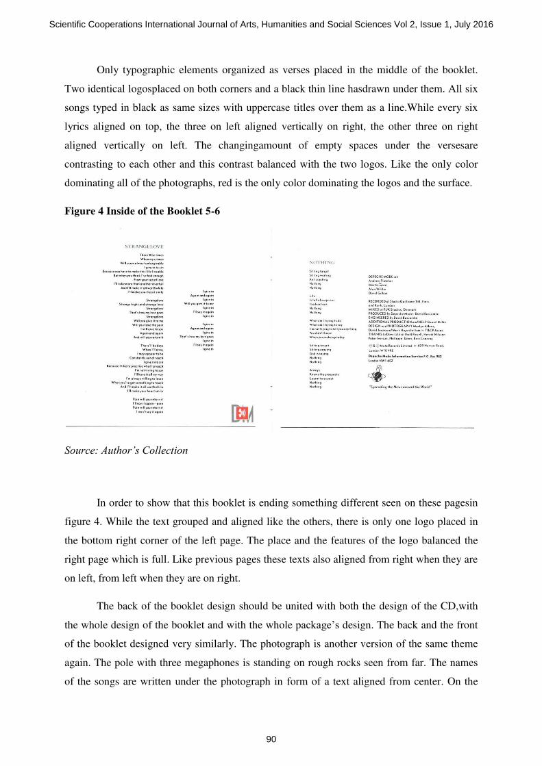
Only typographic elements organized as verses placed in the middle of the booklet.
Two identical logosplaced on both corners and a black thin line hasdrawn under them. All six
songs typed in black as same sizes with uppercase titles over them as a line.While every six
lyrics aligned on top, the three on left aligned vertically on right, the other three on right
aligned vertically on left. The changingamount of empty spaces under the versesare
contrasting to each other and this contrast balanced with the two logos. Like the only color
dominating all of the photographs, red is the only color dominating the logos and the surface.
Figure 4 Inside of the Booklet 5-6
Source: Author’s Collection
In order to show that this booklet is ending something different seen on these pagesin
figure 4. While the text grouped and aligned like the others, there is only one logo placed in
the bottom right corner of the left page. The place and the features of the logo balanced the
right page which is full. Like previous pages these texts also aligned from right when they are
on left, from left when they are on right.
The back of the booklet design should be united with both the design of the CD,with
the whole design of the booklet and with the whole package’s design. The back and the front
of the booklet designed very similarly. The photograph is another version of the same theme
again. The pole with three megaphones is standing on rough rocks seen from far. The names
of the songs are written under the photograph in form of a text aligned from center. On the
Scientific Cooperations International Journal of Arts, Humanities and Social Sciences Vol 2, Issue 1, July 2016
90

surface of the bare shining CD, three giant red megaphone stylization placed looking into
three different directions and as a base a label placed bottom.
Figure 5Back of the Booklet and the CD
Source: Author’s Collection
Figure 7Back
Source: Author’s Collection
The back of the cover designed similar like the back of the booklet but this time with
additional information. Same photograph is placed on the upper golden section horizontally.
The names of the songs typed as lines under the photograph aligned centered vertically. Some
Scientific Cooperations International Journal of Arts, Humanities and Social Sciences Vol 2, Issue 1, July 2016
91
labels, signs, logotypes and a barcode placed around. The sizes of these are small and thin.
Despite red and white megaphone sign, the others are in black.
4. Conclusion
The unique design attitude of the cover depends on unity achieving through contrasts.
There can be seen contrasts of size, proportion, color, tone, location. Size contrasts can be
seen on photography and typography. Proportion contrasts can be seen on photography and
the placement of the photography. Color contrasts can be seen on background and
typographic elements. Logos also consist color contrasts with the background. Tone contrasts
can be seen among background and typographic elements. Location is the most contrasting
element. Location of the typographic elements contrasting with the photographs. Location of
the photographs contrasting with the cover itself which is a square. All of these contrasts
concluded in unity. The cover unites as sizes, proportions, colors, tones and locations. The
cover unites as interrelations of the elements. The cover unites as the usage of the
photographs as the themes, location, proportions, framing and color scheme.The cover unites
as the usage of the typographic elements as size, color, font, location, grouping and
interrelations. The cover unites as backgrounds as color, tone, texture. The cover unites as the
usage of space. Full and empty spaces contrasting each other. The sizes of the full and empty
spaces are contrasting each other. With this contrasts continuing the cover unites.
References
[1] BAINES, P. & HASLAM, A. Type & Typography.London: Laurence King Publishing,
2005.
[2] FRITH, S. Popular Music: Critical Concepts in Media and Cultural Studies, Vol.
III.London: Routledge, 2004.
[3]GEORGE-PALILONIS, J. A Practical Guide to Graphics Reporting: Information
Graphics for Print, Web & Broadcast.Burlington: Elsevier, 2006.
[4] GOLOMBISKY, K.& HAGEN, R.White Space is not Your Enemy: A Beginner’s Guide to
Communicating Visually Through Graphic, Web and Multimedia Design.Burlington: Taylor
& Francis, 2013.
[5] HEPWORTH-SAWYER, R. & GOLDING, C. What is Music Production: Professional
Techniques to Make a Good Recording Great.Burlington: Elsevier, 2010.
[6] HOLMES, T.B.& HOLMES, T. Electronic and Experimental Music: Pioneers in
Technology and Composition. New York: Routledge, 2002.
Scientific Cooperations International Journal of Arts, Humanities and Social Sciences Vol 2, Issue 1, July 2016
92

[7]KOSMICKI, G. MusiquesElectroniques: des Avant-Gardes Aux Dance Floors. Marseille:
Mot et le Reste, 2009.
[8]MOSKOWITZ, D.V. The 100 Greatest Bands of All Time: A Guide to the Legends Who
Rockedthe World.Santa Barbara: ABC-CLIO, 2015.
[9] OLSEN, S. The Golden Section: Nature’s Greatest Secret. New York: Walker Publishing,
2006.
[10] PIPES, A. Foundations of Art and Design:A History of the Analog Record. London:
Laurence King Publishing, 2003
[11]RAIZMAN, D. History of Modern Design: Graphics and Products since the Industrial
Revolution.London:Laurence King Publishing, 2003.
[12] RESNICK, E. Design for Communication: Conceptual Graphic Design
Basics.Hoboken:John Wiley & Sons., 2003.
[13] STOLTZE, C. 1,000 Music Graphics: A Compilation of Packaging, Posters, and Other
Sound Solutions. Beverly: Rockport Publishing, 2008.
[14] WIKIPEDIANS, (Eds.). Alternative Rock: A Complete Guide. Mainz: Pedia Press, 2010.
Scientific Cooperations International Journal of Arts, Humanities and Social Sciences Vol 2, Issue 1, July 2016
93