Chapter Learning Objectives - SAGE Publishing
48
27 2 THE ORGANIZATION AND GRAPHIC PRESENTATION OF DATA Chapter Learning Objectives 1. Construct and analyze frequency, percentage, and cumulative distributions. 2. Calculate proportions and percentages. 3. Compare and contrast frequency and percentage distributions for nominal, ordinal, and interval-ratio variables. 4. Construct and interpret a pie chart, bar graph, histogram, the statistical map, line graph, and time- series chart. D emographers examine the size, composition, and distribution of human populations. Changes in the birth, death, and migration rates of a pop- ulation affect its composition and social characteristics. 1 To examine a large population, researchers often have to deal with very large amounts of data. For example, imagine the amount of data it takes to describe the immigrant or elderly population in the United States. To make sense out of these data, a researcher must organize and summarize the data in some systematic fashion. In this chapter, we review two such methods used by social scientists: (1) the creation of frequency distributions and (2) the use of graphic presentation. FREQUENCY DISTRIBUTIONS The most basic way to organize data is to classify the observations into a frequency distribution. A frequency distribution is a table that reports the number of observations that fall into each category of the variable we are analyzing. Constructing a frequency distribution is usually the first step in the statistical analysis of data. Immigration has been described as “remaking America with political, economic, and cultural ramifications.” 2 Globalization has fueled migration, particularly since the beginning of the 21st century. Workers migrate because of the promise of employment and higher standards of living than what is attainable in their home countries. Data reveal that many migrants seek spe- cifically to move to the United States. 3 The U.S. Census Bureau uses the term foreign born to refer to those who are not U.S. citizens at birth. The U.S. Census estimates that 13.5% of the U.S. population, or approximately 44 million people, are foreign born. 4 Immigrants are not one homogeneous group but are many diverse groups. Table 2.1 shows the frequency distribu- tion of the world region of birth for the foreign-born population. The frequency distribution is organized in a table, which has a number (2.1) and a descriptive title. The title indicates the kind of data presented: “Frequency Distribution for Categories of Region of Birth for Foreign-Born Population.” The table consists of two columns. The first column identi- fies the variable (world region of birth) and its categories. The second column, with the heading “Frequency ( f ),” tells the number of cases in each category as well as the total number of cases (N = 43,681,654). Note also that the Frequency distribution: A table reporting the number of observations falling into each category of the variable. Copyright ©2021 by SAGE Publications, Inc. This work may not be reproduced or distributed in any form or by any means without express written permission of the publisher. Do not copy, post, or distribute
-
Upload
khangminh22 -
Category
Documents
-
view
0 -
download
0
Transcript of Chapter Learning Objectives - SAGE Publishing

27
2THE ORGANIZATION AND GRAPHIC PRESENTATION OF DATA
Chapter Learning Objectives1. Construct and analyze
frequency, percentage, and cumulative distributions.
2. Calculate proportions and percentages.
3. Compare and contrast frequency and percentage distributions for nominal, ordinal, and interval-ratio variables.
4. Construct and interpret a pie chart, bar graph, histogram, the statistical map, line graph, and time-series chart.
Demographers examine the size, composition, and distribution of human populations. Changes in the birth, death, and migration rates of a pop-
ulation affect its composition and social characteristics.1 To examine a large population, researchers often have to deal with very large amounts of data. For example, imagine the amount of data it takes to describe the immigrant or elderly population in the United States. To make sense out of these data, a researcher must organize and summarize the data in some systematic fashion. In this chapter, we review two such methods used by social scientists: (1) the creation of frequency distributions and (2) the use of graphic presentation.
FREQUENCY DISTRIBUTIONS
The most basic way to organize data is to classify the observations into a frequency distribution. A frequency distribution is a table that reports the number of observations that fall into each category of the variable we are analyzing. Constructing a frequency distribution is usually the first step in the statistical analysis of data.
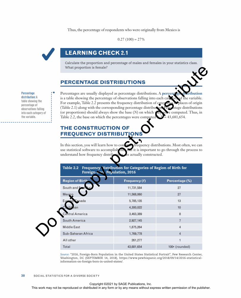
Immigration has been described as “remaking America with political, economic, and cultural ramifications.”2 Globalization has fueled migration, particularly since the beginning of the 21st century. Workers migrate because of the promise of employment and higher standards of living than what is attainable in their home countries. Data reveal that many migrants seek spe-cifically to move to the United States.3 The U.S. Census Bureau uses the term foreign born to refer to those who are not U.S. citizens at birth. The U.S. Census estimates that 13.5% of the U.S. population, or approximately 44 million people, are foreign born.4 Immigrants are not one homogeneous group but are many diverse groups. Table 2.1 shows the frequency distribu-tion of the world region of birth for the foreign-born population.
The frequency distribution is organized in a table, which has a number (2.1) and a descriptive title. The title indicates the kind of data presented: “Frequency Distribution for Categories of Region of Birth for Foreign-Born Population.” The table consists of two columns. The first column identi-fies the variable (world region of birth) and its categories. The second column, with the heading “Frequency ( f ),” tells the number of cases in each category as well as the total number of cases (N = 43,681,654). Note also that the
Frequency distribution: A table reporting the number of observations falling into each category of the variable.
Copyright ©2021 by SAGE Publications, Inc. This work may not be reproduced or distributed in any form or by any means without express written permission of the publisher.
Do n
ot co
py, p
ost, o
r dist
ribute

28 Social StatiSticS for a DiverSe Society
source of the table is clearly identified. It tells us that the data are from a 2018 report by Jynnah Radford and Abby Budiman (although the information is based on 2016 American Community Survey data from the U.S. Census). The source of the data can be reported as a source note or in the title of the table.
What can you learn from the information presented in Table 2.1? The table shows that as of 2016, approximately 44 million people were classified as foreign born. Out of this group, most—about 11.7 million people—were from South and East Asia, just under 11.6 million were from Mexico, followed by about 5.8 million from Europe or Canada.
PROPORTIONS AND PERCENTAGES
Frequency distributions are helpful in presenting information in a compact form. However, when the number of cases is large, the frequencies may be difficult to grasp. To standardize these raw frequencies, we can translate them into relative frequencies—that is, proportions or percentages.
A proportion is a relative frequency obtained by dividing the frequency in each cat-egory by the total number of cases. To find a proportion (p), divide the frequency (f) in each category by the total number of cases (N):
pf
N= (2.1)
where
f = frequency
N = total number of cases
Table 2.1 Frequency Distribution for Categories of Region of Birth for Foreign-Born Population, 2016
Region of Birth Frequency (f )
South and east asia 11,731,584
Mexico 11,568,060
europe/canada 5,785,135
caribbean 4,300,022
central america 3,463,389
South america 2,927,145
Middle east 1,875,264
Sub-Saharan africa 1,769,778
all other 261,277
total 43,681,654
Source: “2016, Foreign-Born Population in the United States Statistical Portrait”, Pew Research Center, Washington, D.C (SEPTEMBER 14, 2018), https://www.pewhispanic.org/2018/09/14/2016-statistical- information-on-foreign-born-in-united-states/.
Proportion: A relative frequency obtained by dividing the frequency in each category by the total number of cases.
Copyright ©2021 by SAGE Publications, Inc. This work may not be reproduced or distributed in any form or by any means without express written permission of the publisher.
Do n
ot co
py, p
ost, o
r dist
ribute

cHaPter 2 • tHe organization anD graPHic PreSentation of Data 29
We’ve calculated the proportion for the three largest groups of foreign born. First, the proportion of foreign born originally from South and East Asia is
11,731,58443,681,654
.269=
The proportion of foreign born who were originally from Mexico is11,568,06043,681,654
.265=
The proportion of foreign born who were originally from Europe or Canada is
5,785,13543,681,654
.132=
The proportion of foreign born who were originally from all other reported areas (com-bining the category “All other” with those from the Caribbean, Central and South America, Middle East, and sub-Saharan Africa) is
14,596,87543,681,654
.334=
Proportions should always sum to 1.00 (allowing for some rounding errors). Thus, in our example, the sum of the six proportions is
0.27 + 0.27 + 0.13 + 0.33 = 1.0
To determine a frequency from a proportion, we simply multiply the proportion by the total N:
f = p(N) (2.2)
Thus, the frequency of foreign born from South and East Asia can be calculated as
0.27 (43,681,654) = 11,794,047
The obtained frequency differs somewhat from the actual frequency of 11,731,584. This difference is due to rounding off of the proportion. If we use the actual proportion instead of the rounded proportion, we obtain the correct frequency:
0.268570050026036 (43,681,654) = 11,731,584
We can also express frequencies as percentages. A percentage is a relative frequency obtained by dividing the frequency in each category by the total number of cases and mul-tiplying by 100. In most statistical reports, frequencies are presented as percentages rather than proportions. Percentages express the size of the frequencies as if there were a total of 100 cases.
To calculate a percentage, multiply the proportion by 100:
Percentage 100( )% = ( )fN (2.3)
or
Percentage (%) = p(100) (2.4)
Percentage: A relative frequency obtained by dividing the frequency in each category by the total number of cases and multiplying by 100.
Copyright ©2021 by SAGE Publications, Inc. This work may not be reproduced or distributed in any form or by any means without express written permission of the publisher.
Do n
ot co
py, p
ost, o
r dist
ribute
30 Social StatiSticS for a DiverSe Society
Thus, the percentage of respondents who were originally from Mexico is
0.27 (100) = 27%
LEARNING CHECK 2.1
Calculate the proportion and percentage of males and females in your statistics class. What proportion is female?
PERCENTAGE DISTRIBUTIONS
Percentages are usually displayed as percentage distributions. A percentage distribution is a table showing the percentage of observations falling into each category of the variable. For example, Table 2.2 presents the frequency distribution of categories of places of origin (Table 2.1) along with the corresponding percentage distribution. Percentage distributions (or proportions) should always show the base (N) on which they were computed. Thus, in Table 2.2, the base on which the percentages were computed is N = 43,681,654.
THE CONSTRUCTION OF FREQUENCY DISTRIBUTIONS
In this section, you will learn how to construct frequency distributions. Most often, we can use statistical software to accomplish this, but it is important to go through the process to understand how frequency distributions are actually constructed.
Percentage distribution: A table showing the percentage of observations falling into each category of the variable.
Table 2.2 Frequency Distribution for Categories of Region of Birth for Foreign-Born Population, 2016
Region of Birth Frequency (f ) Percentage (%)
South and east asia 11,731,584 27
Mexico 11,568,060 27
europe/canada 5,785,135 13
caribbean 4,300,022 10
central america 3,463,389 8
South america 2,927,145 7
Middle east 1,875,264 4
Sub-Saharan africa 1,769,778 4
all other 261,277 1
total 43,681,654 100* (rounded)
Source: “2016, Foreign-Born Population in the United States Statistical Portrait”, Pew Research Center, Washington, DC (SEPTEMBER 14, 2018), https://www.pewhispanic.org/2018/09/14/2016-statistical- information-on-foreign-born-in-united-states/.
Copyright ©2021 by SAGE Publications, Inc. This work may not be reproduced or distributed in any form or by any means without express written permission of the publisher.
Do n
ot co
py, p
ost, o
r dist
ribute

cHaPter 2 • tHe organization anD graPHic PreSentation of Data 31
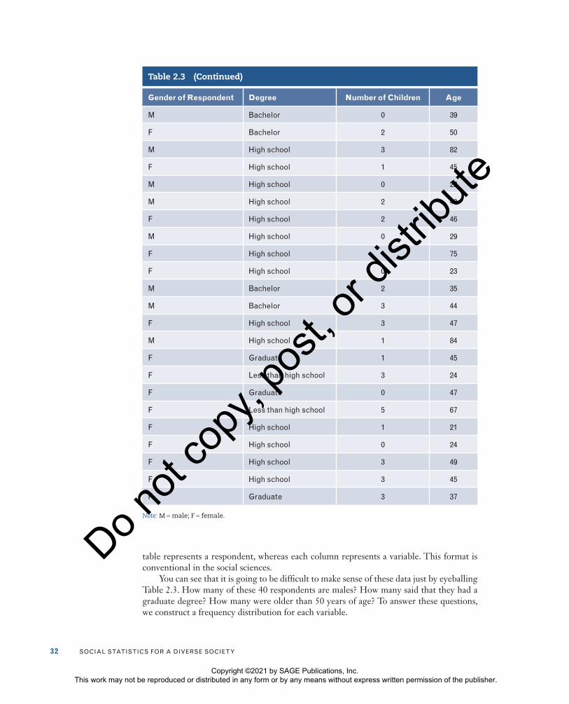
For nominal and ordinal variables, constructing a frequency distribution is quite sim-ple. To do so, count and report the number of cases that fall into each category of the vari-able along with the total number of cases (N). For the purpose of illustration, let’s take a small random sample of 40 cases from a General Social Survey (GSS) sample and record their scores on the following variables: gender, a nominal-level variable; degree, an ordinal measurement of education; and age and number of children, both interval-ratio variables. The use of “male” and “female” in parts of this book is in keeping with the GSS categories for the variable sex (respondent’s sex).
The interviewer recorded the gender of each respondent at the beginning of the inter-view. To measure degree, researchers asked everyone to indicate the highest degree com-pleted: less than high school, high school, some college, bachelor’s degree, and graduate degree. The first category represented the lowest level of education. Researchers calcu-lated respondents’ age based on the respondent’s birth year. The number of children was determined by the question, “How many children have you ever had?” The answers given by our subsample of 40 respondents are displayed in Table 2.3. Note that each row in the
Table 2.3 A GSS Subsample of 40 Respondents
Gender of Respondent Degree Number of Children Age
M Bachelor 1 43
f High school 2 71
f High school 0 71
M High school 0 37
M High school 0 28
f High school 6 34
f High school 4 69
f graduate 0 51
f Bachelor 0 76
M graduate 2 48
M graduate 0 49
M less than high school 3 62
f less than high school 8 71
f High school 1 32
f High school 1 59
f High school 1 71
M High school 0 34
(Continued)
Copyright ©2021 by SAGE Publications, Inc. This work may not be reproduced or distributed in any form or by any means without express written permission of the publisher.
Do n
ot co
py, p
ost, o
r dist
ribute
32 Social StatiSticS for a DiverSe Society
Gender of Respondent Degree Number of Children Age
M Bachelor 0 39
f Bachelor 2 50
M High school 3 82
f High school 1 45
M High school 0 22
M High school 2 40
f High school 2 46
M High school 0 29
f High school 1 75
f High school 0 23
M Bachelor 2 35
M Bachelor 3 44
f High school 3 47
M High school 1 84
f graduate 1 45
f less than high school 3 24
f graduate 0 47
f less than high school 5 67
f High school 1 21
f High school 0 24
f High school 3 49
f High school 3 45
f graduate 3 37
Note: M = male; F = female.
Table 2.3 (Continued)
table represents a respondent, whereas each column represents a variable. This format is conventional in the social sciences.
You can see that it is going to be difficult to make sense of these data just by eyeballing Table 2.3. How many of these 40 respondents are males? How many said that they had a graduate degree? How many were older than 50 years of age? To answer these questions, we construct a frequency distribution for each variable.
Copyright ©2021 by SAGE Publications, Inc. This work may not be reproduced or distributed in any form or by any means without express written permission of the publisher.
Do n
ot co
py, p
ost, o
r dist
ribute

cHaPter 2 • tHe organization anD graPHic PreSentation of Data 33
Frequency Distributions for Nominal Variables
Let’s begin with the nominal variable, gender. First, we tally the number of males, then the number of females (the column of tallies has been included in Table 2.4 for the purpose of illustration). The tally results are then used to construct the frequency distribution pre-sented in Table 2.4. The table has a title describing its content (“Frequency Distribution of the Variable Gender: GSS Subsample”). Its categories (male and female) and their associated frequencies are clearly listed; in addition, the total number of cases (N) is also reported. The Percentage column is the percentage distribution for this variable. To con-vert the Frequency column to percentages, simply divide each frequency by the total num-ber of cases and multiply by 100. Percentage distributions are routinely added to almost any frequency table and are especially important if comparisons with other groups are to be considered. Immediately, we can see that it is easier to read the information. There are 25 females and 15 males in this sample. Based on this frequency distribution, we can also conclude that the majority of sample respondents are female.
LEARNING CHECK 2.2
Construct a frequency and percentage distribution for males and females in your sta-tistics class.
Frequency Distributions for Ordinal Variables
To construct a frequency distribution for ordinal-level variables, follow the same proce-dures outlined for nominal-level variables. Table 2.5 presents the frequency distribution for the variable degree. The table shows that 60.0%, a majority, indicated that their highest degree was a high school degree.
The major difference between frequency distributions for nominal and ordinal vari-ables is the order in which the categories are listed. The categories for nominal-level vari-ables do not have to be listed in any particular order. For example, we could list females first and males second without changing the nature of the distribution. Because the catego-ries or values of ordinal variables are rank-ordered, however, they must be listed in a way that reflects their rank—from the lowest to the highest or from the highest to the lowest. Thus, the data on degree in Table 2.5 are presented in declining order from “less than high school” (the lowest educational category) to “graduate” (the highest educational category).
Table 2.4 Frequency Distribution of the Variable Gender: GSS Subsample
Gender Tallies Frequency (f ) Percentage (%)
Male
15 37.5
female
25 62.5
total (N) 40 100.0
Copyright ©2021 by SAGE Publications, Inc. This work may not be reproduced or distributed in any form or by any means without express written permission of the publisher.
Do n
ot co
py, p
ost, o
r dist
ribute

34 Social StatiSticS for a DiverSe Society
Frequency Distributions for Interval-Ratio Variables
We hope that you agree by now that constructing frequency distributions for nominal- and ordinal-level variables is rather straightforward. Simply list the categories and count the number of observations that fall into each category. Building a frequency distribution for interval-ratio variables with relatively few values is also easy. For example, when construct-ing a frequency distribution for number of children, simply list the number of children and report the corresponding frequency, as shown in Table 2.6.
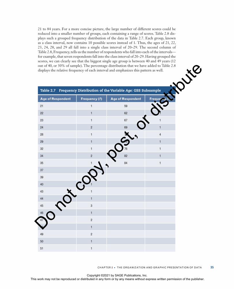
Very often interval-ratio variables have a wide range of values, which makes simple frequency distributions very difficult to read. For example, look at the frequency distribu-tion for the variable age in Table 2.7. The distribution contains age values ranging from
Table 2.5 Frequency Distribution of the Variable Degree: GSS Subsample
Degree Tallies Frequency (f ) Percentage (%)
less than high school 4 10.0
High school
24 60.0
Bachelor
6 15.0
graduate
6 15.0
total (N) 40 100.0
Table 2.6 Frequency Distribution of Variable Number of Children: GSS Subsample
Number of Children Frequency (f ) Percentage (%)
0 13 32.5
1 9 22.5
2 6 15.0
3 8 20.0
4 1 2.5
5 1 2.5
6 1 2.5
7+ 1 2.5
total (N) 40 100.0
Copyright ©2021 by SAGE Publications, Inc. This work may not be reproduced or distributed in any form or by any means without express written permission of the publisher.
Do n
ot co
py, p
ost, o
r dist
ribute
cHaPter 2 • tHe organization anD graPHic PreSentation of Data 35
21 to 84 years. For a more concise picture, the large number of different scores could be reduced into a smaller number of groups, each containing a range of scores. Table 2.8 dis-plays such a grouped frequency distribution of the data in Table 2.7. Each group, known as a class interval, now contains 10 possible scores instead of 1. Thus, the ages of 21, 22, 23, 24, 28, and 29 all fall into a single class interval of 20–29. The second column of Table 2.8, Frequency, tells us the number of respondents who fall into each of the intervals—for example, that seven respondents fall into the class interval of 20–29. Having grouped the scores, we can clearly see that the biggest single age group is between 40 and 49 years (12 out of 40, or 30% of sample). The percentage distribution that we have added to Table 2.8 displays the relative frequency of each interval and emphasizes this pattern as well.
Table 2.7 Frequency Distribution of the Variable Age: GSS Subsample
Age of Respondent Frequency (f ) Age of Respondent Frequency (f )
21 1 59 1
22 1 62 1
23 1 67 1
24 2 69 1
28 1 71 4
29 1 75 1
32 1 76 1
34 2 82 1
35 1 84 1
37 2
39 1
40 1
43 1
44 1
45 3
46 1
47 2
48 1
49 2
50 1
51 1
Copyright ©2021 by SAGE Publications, Inc. This work may not be reproduced or distributed in any form or by any means without express written permission of the publisher.
Do n
ot co
py, p
ost, o
r dist
ribute

36 Social StatiSticS for a DiverSe Society
The decision as to how many groups to use and, therefore, how wide the intervals should be is usually up to the researcher and depends on what makes sense in terms of the purpose of the research. The rule of thumb is that an interval width should be large enough to avoid too many categories but not so large that significant differences between observa-tions are concealed. Obviously, the number of intervals depends on the width of each. For instance, if you are working with scores ranging from 10 to 60 and you establish an interval width of 10, you will have five intervals.
LEARNING CHECK 2.3
Can you verify that Table 2.8 was constructed correctly? Use Table 2.7 to determine the frequency of cases that fall into the categories of Table 2.8.
LEARNING CHECK 2.4
If you are having trouble distinguishing between nominal, ordinal, and interval-ratio variables, review the section on levels of measurement in Chapter 1. The distinction between these levels of measurement will be important throughout the book.
CUMULATIVE DISTRIBUTIONS
Sometimes, we may be interested in locating the relative position of a given score in a distribution. For example, we may be interested in finding out how many or what percent-age of our sample was younger than 40 or older than 60. Frequency distributions can be presented in a cumulative fashion to answer such questions. A cumulative frequency dis-tribution shows the frequencies at or below each category of the variable.
Cumulative frequencies are appropriate only for variables that are measured at an ordinal level or higher. They are obtained by adding to the frequency in each category the frequencies of all the categories below it.
Table 2.8 Grouped Frequency Distribution of the Variable Age: GSS Subsample
Age Category Frequency (f ) Percentage (%)
20–29 7 17.5
30–39 7 17.5
40–49 12 30.0
50–59 3 7.5
60–69 3 7.5
70–79 6 15.0
80–89 2 5.0
total (N) 40 100.0
Cumulative frequency distribution: A distribution showing the frequency at or below each category (class interval or score) of the variable.
Copyright ©2021 by SAGE Publications, Inc. This work may not be reproduced or distributed in any form or by any means without express written permission of the publisher.
Do n
ot co
py, p
ost, o
r dist
ribute

cHaPter 2 • tHe organization anD graPHic PreSentation of Data 37
Let’s look at Table 2.9. It shows the cumulative frequencies based on the frequency distribution from Table 2.8. The cumulative frequency column, denoted by Cf, shows the number of persons at or below each interval. For example, you can see that 14 of the 40 respondents were 39 years old or younger, and 29 respondents were 59 years old or younger.
To construct a cumulative frequency distribution, start with the frequency in the low-est class interval (or with the lowest score, if the data are ungrouped), and add to it the frequencies in the next highest class interval. Continue adding the frequencies until you reach the last class interval. The cumulative frequency in the last class interval will be equal to the total number of cases (N). In Table 2.9, the frequency associated with the first class interval (20–29) is 7. The cumulative frequency associated with this interval is also 7, since there are no cases below this class interval. The frequency for the second class interval is 7.
Table 2.9 Grouped Frequency Distribution and Cumulative Frequency for the Variable Age: GSS Subsample
Age Category Frequency (f ) Cumulative Frequency (Cf )
20–29 7 7
30–39 7 14
40–49 12 26
50–59 3 29
60–69 3 32
70–79 6 38
80–89 2 40
total (N) 40
A C
LO
SE
R L
OO
K 2.1
Real Limits, Stated Limits, and Midpoints of Class Intervals
The intervals presented in Table 2.8 constitute the categories of the variable age that we used to classify the survey’s respondents. In Chapter 1, we noted that our variables need to be both exhaus-tive and mutually exclusive. These principles apply to the intervals here as well. This means that each of the 40 respondents can be classi-fied into one and only one category. In addition, we should be able to classify all the possible scores.
In our example, these requirements are met: Each observation score fits into only one interval,
and there is an appropriate category to classify each individual score as recorded in Table 2.8. However, if you looked closely at Table 2.8, you may have noticed that there is actually a gap of 1 year between adja-cent intervals. A gap could create a problem with scores that have fractional values. Although age is conventionally rounded down, let’s suppose for a moment that respondent’s age had been reported with more precision. Where would you classify a woman who was 49.25 years old? Notice that her age would actually fall between the intervals 40–49 and 50–59! To avoid this potential problem, use the
(Continued)
Copyright ©2021 by SAGE Publications, Inc. This work may not be reproduced or distributed in any form or by any means without express written permission of the publisher.
Do n
ot co
py, p
ost, o
r dist
ribute

38 Social StatiSticS for a DiverSe Society
real limits shown in the following table rather than the stated limits listed in Table 2.8.
Real limits extend the upper and lower limits of the intervals by .5. For instance, the real limits for the interval 40–49 are 39.5–49.5, the real limits for the interval 50–59 are 49.5–59.5, and so on. (Scores that fall exactly at the upper real limit or the lower real limit of the interval [e.g., 59.5 or 49.5] are usually rounded to the closest even number. The number 59.5 would be rounded to 60 and would thus be included in the interval 59.5–69.5.) In the following table, we include both the stated limits and real limits for the grouped frequency distribution of respondent’s age. So where would you classify a respondent who was 49.25 years old? (Answer: In the interval 39.5–49.5.) How about 19.9? (In the interval 19.5–29.5.)
The midpoint is a single number that represents the entire interval. A midpoint is calculated by add-ing the lower and upper real limits of the interval and dividing by 2. The midpoint of the interval 19.5–29.5, for instance, is (19.5 + 29.5) ÷ 2 = 24.5. The midpoints for all the intervals of the table are displayed in the third column.
Even though grouped frequency distributions are very helpful in summarizing information, remember that they are only a summary and therefore involve a considerable loss of detail. Since most researchers and students have access to computers, grouped frequen-cies are used only when the raw data are not available. Most of the statistical procedures described in later chapters are based on the raw scores.
Respondent’s Age
Stated Limits Real Limits Midpoint Frequency (f )
20–29 19.5–29.5 24.5 7
30–39 29.5–39.5 34.5 7
40–49 39.5–49.5 44.5 12
50–59 49.5–59.5 54.5 3
60–69 59.5–69.5 64.5 3
70–79 69.5–79.5 74.5 6
80–89 79.5–89.5 84.5 2
total (N) 40
(Continued)
Cumulative percentage distribution: A distribution showing the percentage at or below each category (class interval or score) of the variable.
We can also construct a cumulative percentage distribution (C%), which has wider appli-cations than the cumulative frequency distribution (Cf). A cumulative percentage distribu-tion shows the percentage at or below each category (class interval or score) of the variable. A cumulative percentage distribution is constructed using the same procedure as for a cumula-tive frequency distribution except that the percentages—rather than the raw frequencies—for each category are added to the total percentages for all the previous categories.
The cumulative frequency for this interval is 7 + 7 = 14. To obtain the cumulative frequency of 26 for the third interval, we add its frequency (12) to the cumulative frequency associ-ated with the second class interval (14). Continue this process until you reach the last class interval. Therefore, the cumulative frequency for the last interval is equal to 40, the total number of cases (N).
Copyright ©2021 by SAGE Publications, Inc. This work may not be reproduced or distributed in any form or by any means without express written permission of the publisher.
Do n
ot co
py, p
ost, o
r dist
ribute

cHaPter 2 • tHe organization anD graPHic PreSentation of Data 39
In Table 2.10, we have added the cumulative percentage distribution to the frequency and percentage distributions shown in Table 2.8. The cumulative percentage distribution shows, for example, that 35% of the sample was 39 years or younger. Like the percentage distributions described earlier, cumulative percentage distributions are especially useful when you want to compare differences between groups. For an example of how cumula-tive percentages are used in a comparison, we used GSS 2018 data to contrast the opinions of whites and blacks about Muslims. Respondents were asked, “What is your personal attitude towards members of the following religious group—Muslims?” The percentage distribution and the cumulative percentage distribution for whites and blacks are shown in Table 2.11. (This table is referred to as a bivariate table, reporting the overlap between two variables—[1] respondent race and [2] level of agreement to the immigration statement. We’ll discuss bivariate tables in depth in Chapter 9.)
The cumulative percentage distributions suggest that a higher percentage of blacks hold positive views of Muslims. The two groups are separated by just over 17 percentage points—54.9% of black respondents hold either very positive or somewhat positive views
Table 2.10 Grouped Frequency Distribution and Cumulative Percentages for the Variable Age: GSS Subsample
Age Category Frequency (f ) Percentage (%) Cumulative Percentage (C%)
20–29 7 17.5 17.5
30–39 7 17.5 35.0
40–49 12 30.0 65.0
50–59 3 7.5 72.5
60–69 3 7.5 80.0
70–79 6 15.0 95.0
80–89 2 5.0 100.0
total (N) 40 100.0
Table 2.11 Cumulative Percentage Distribution for “Personal Attitude Towards Muslims” by Race: GSS 2018
Whites Blacks
Percentage (%)Cumulative
Percentage (C%)Percentage
(%)Cumulative
Percentage (C%)
very positive 9.2 9.2 26.3 26.3
Somewhat positive 28.5 37.7 28.6 54.9
neither 41.4 79.1 37.6 92.5
Somewhat negative 12.8 91.9 6.0 98.5
very negative 8.2 100.1 1.5 100.0
total 100.1 100.0
Copyright ©2021 by SAGE Publications, Inc. This work may not be reproduced or distributed in any form or by any means without express written permission of the publisher.
Do n
ot co
py, p
ost, o
r dist
ribute

40 Social StatiSticS for a DiverSe Society
RATES
Terms such as birthrate, unemployment rate, and marriage rate are often used by social scientists and demographers and then quoted in the popular media to describe population trends. But what exactly are rates, and how are they constructed? A rate is obtained by dividing the number of actual occurrences in a given time period by the number of possible occurrences.
Rate
Population=
f (2.5)
For example, we can use data from the American Community Survey to determine the 2017 poverty rate by dividing (actual occurrences) by the total population in 2017 (possible occurrences). The 2017 rate can be expressed as
Poverty rate, 2017Number of people in poverty in 2017
Tota=
ll population in 2017
Since 42,583,651 people were poor in 2017 and the number for the total population was 317,741,588, the poverty rate for 2017 is
Poverty rate, 201742,583,651
317,741,5880.13= =
We can thus conclude that the poverty rate in 2017 was 13% (.13 × 100). This means that for every 1,000 people, 130 were poor according to the American Community Survey definition. Rates are often expressed as rates per thousand or hundred thousand to eliminate decimal points and make the number easier to interpret.
The preceding poverty rate can be referred to as a crude rate because it is based on the total population. Rates can be calculated on the general population or on a more narrowly defined select group. For instance, poverty rates are often given for the number of people who are 18 years or younger—highlighting how our young are vulnerable to poverty. The poverty rate for those 18 years or younger is as follows:
Poverty rate for those 18 years or younger, 201713,353,20
=22
72,452,9250.18=
We could even take a look at the poverty rate for older Americans:
Poverty rate for those 65 years of age or older, 20174,58
=11,772
49,500,4790.09=
Rate: A number obtained by dividing the number of actual occurrences in a given time period by the number of possible occurrences.
of Muslims, while only 37.7% of white respondents said the same. (Note that a higher per-centage of whites holds negative views of Muslims.) These data prompt many other ques-tions about the role that race or other variables may play in Islamophobia (the fear, usually fueled by hatred and prejudice, against the Islamic religion). What explains the difference between white and black respondents? What would the differences be if we compared men with women? Whites with Latinos? Employed with unemployed individuals?
Copyright ©2021 by SAGE Publications, Inc. This work may not be reproduced or distributed in any form or by any means without express written permission of the publisher.
Do n
ot co
py, p
ost, o
r dist
ribute

cHaPter 2 • tHe organization anD graPHic PreSentation of Data 41
LEARNING CHECK 2.5
Law enforcement agencies routinely record crime rates (the number of crimes com-mitted relative to the size of a population), arrest rates (the number of arrests made relative to the number of crimes reported), and conviction rates (the number of con-victions relative to the number of cases tried). What other variables can be expressed as rates?
READING THE RESEARCH LITERATURE: ACCESS TO PUBLIC BENEFITS
Statistical tables that display frequency distributions or other kinds of statistical infor-mation are found in virtually every book, article, or newspaper report that makes any use of statistics. However, the inclusion of statistical tables in a report or an article doesn’t necessarily mean that the research is more scientific or convincing. You will always have to ask what the tables are saying and judge whether the information is relevant or accurately presented and analyzed. Most statistical tables presented in the social science literature are a good deal more complex than those we describe in this chapter.
The first step in reading any statistical table is to understand what the researcher is trying to tell you. Begin your inspection of the table by reading its title, as the title usually describes the central contents of the table. Check for any source notes to the table; such notes reveal the source of the data or the table and any additional information that the author considers important. Next, examine the column and row headings and subheadings. These identify the variables, their categories, and the kind of statistics presented, such as raw frequencies or percentages. The main body of the table includes the appropriate sta-tistics (frequencies, percentages, rates, etc.) for each variable or group as defined by each heading and subheading.
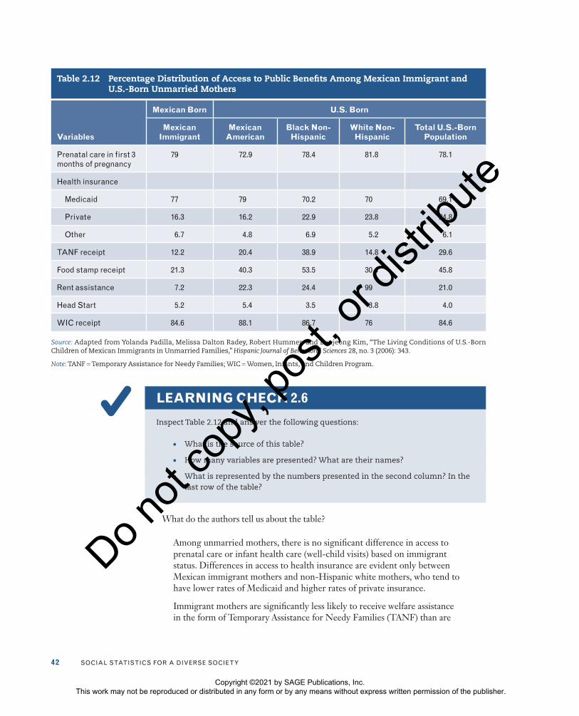
Table 2.12 was included in an article written by Yolanda Padilla and her colleagues (2006) about the disadvantages faced by the young children of Mexican immigrants in unmarried families. For their analysis, the researchers relied on data from the Fragile Families and Child Wellbeing Study, a nationally representative, longitudinal survey that follows a cohort of new parents and their children for 5 years. They compared parental demographic and socioeconomic characteristics, formal and informal sup-port, and child well-being indicators for Mexican immigrant and U.S.-born unmar-ried mothers. Note that several categories of U.S.-born women (Mexican American, black non-Hispanic, white non-Hispanic) are presented. Social scientists are seldom interested in a single population. The most interesting questions pertain to differences between two or more groups.5 Table 2.12 summarizes the utilization of public benefits and programs by immigrant and U.S.-born groups. The columns or rows do not add up to 100%.
Note that the frequency (f) for each category is not reported in Table 2.12. Although the table is quite simple, it is important to examine it carefully, including its title and head-ings, to make sure that you understand what the information means.
Copyright ©2021 by SAGE Publications, Inc. This work may not be reproduced or distributed in any form or by any means without express written permission of the publisher.
Do n
ot co
py, p
ost, o
r dist
ribute
42 Social StatiSticS for a DiverSe Society
Table 2.12 Percentage Distribution of Access to Public Benefits Among Mexican Immigrant and U.S.-Born Unmarried Mothers
Variables
Mexican Born U.S. Born
Mexican Immigrant
Mexican American
Black Non-Hispanic
White Non-Hispanic
Total U.S.-Born Population
Prenatal care in first 3 months of pregnancy
79 72.9 78.4 81.8 78.1
Health insurance
Medicaid 77 79 70.2 70 69.1
Private 16.3 16.2 22.9 23.8 24.8
other 6.7 4.8 6.9 5.2 6.1
tanf receipt 12.2 20.4 38.9 14.8 29.6
food stamp receipt 21.3 40.3 53.5 30.4 45.8
rent assistance 7.2 22.3 24.4 99 21.0
Head Start 5.2 5.4 3.5 3.8 4.0
Wic receipt 84.6 88.1 86.7 76 84.6
Source: Adapted from Yolanda Padilla, Melissa Dalton Radey, Robert Hummer, and Eunjeong Kim, “The Living Conditions of U.S.-Born Children of Mexican Immigrants in Unmarried Families,” Hispanic Journal of Behavioral Sciences 28, no. 3 (2006): 343.
Note: TANF = Temporary Assistance for Needy Families; WIC = Women, Infants, and Children Program.
LEARNING CHECK 2.6
Inspect Table 2.12 and answer the following questions:
• What is the source of this table?
• How many variables are presented? What are their names?
• What is represented by the numbers presented in the second column? In the last row of the table?
What do the authors tell us about the table?
Among unmarried mothers, there is no significant difference in access to prenatal care or infant health care (well-child visits) based on immigrant status. Differences in access to health insurance are evident only between Mexican immigrant mothers and non-Hispanic white mothers, who tend to have lower rates of Medicaid and higher rates of private insurance.
Immigrant mothers are significantly less likely to receive welfare assistance in the form of Temporary Assistance for Needy Families (TANF) than are
Copyright ©2021 by SAGE Publications, Inc. This work may not be reproduced or distributed in any form or by any means without express written permission of the publisher.
Do n
ot co
py, p
ost, o
r dist
ribute

cHaPter 2 • tHe organization anD graPHic PreSentation of Data 43
U.S.-born mothers. Only about 12.2% of Mexican immigrant mothers receive TANF compared with 20.4% of U.S.-born Mexican mothers and 38.9% of non-Hispanic black mothers. Unmarried Mexican immigrant mothers do not differ significantly from non-Hispanic white mothers in this measure. The same pattern is observed for food stamps and rent assistance. Only 21.3% of unmarried Mexican immigrant mothers receive food stamps, and only 7.2% receive rent assistance. In terms of assistance from Head Start/Early Head Start, we found no significant difference between Mexican immigrants and natives. Finally, rates of receipt of Women, Infants, and Children (WIC) Program benefits are similar across all groups, although Mexican immigrant mothers are slightly more likely to receive WIC benefits than are non-Hispanic white mothers.6
The authors conclude that despite having fewer resources, immigrant mothers are less likely than U.S.-born mothers to receive formal support (which includes access to public assistance and private health insurance).
Further analyses could examine why these differences exist. Other variables that explain the differences between these groups could be identified (such as educational attainment, social support networks, or employment status). For a more detailed analysis of the relationships between these variables, you need to consider some of the more com-plex techniques of bivariate (two-variable) analysis and statistical inference. We consider these advanced techniques beginning with Chapter 8.
GRAPHIC PRESENTATION OF DATA
You have probably heard that “a picture is worth a thousand words.” The same can be said about statistical graphs because they summarize hundreds or thousands of numbers. Graphs communicate information visually, rather than in words or numbers, and are often used in news stories, research reports, and government documents. Information that is pre-sented graphically may seem more accessible than the same information when presented in frequency distributions or in other tabular forms.
In this section, you will learn about some of the most commonly used graphical tech-niques. We concentrate less on the technical details of how to create graphs and more on how to choose the appropriate graphs to make statistical information coherent. We also focus on how to interpret graphically presented information.
As we introduce various graphical techniques, we also show you how to use graphs to tell a story. The particular story we tell here is that of the elderly in the United States and throughout the world. Demographers predict that over the next several decades, the U.S. overall population growth will be among middle-aged and older Americans, what demog-raphers have referred to as the graying of America. “Population aging is a long-range trend that will characterize our society as we continue into the 21st century. It is a force we all will cope with for the rest of our lives,” warns gerontologist Harry Moody.7
The different types of graphs demonstrate the many facets and challenges of our aging society. People have tended to talk about seniors as if they were a homogeneous group, but the different graphical techniques illustrate the wide variation in economic characteristics, living arrangements, and family status among people aged 65 years and older.
Here we focus on those graphical techniques most widely used in the social sci-ences. The first two, (1) the pie chart and (2) bar graph, are appropriate for nominal
Copyright ©2021 by SAGE Publications, Inc. This work may not be reproduced or distributed in any form or by any means without express written permission of the publisher.
Do n
ot co
py, p
ost, o
r dist
ribute

44 Social StatiSticS for a DiverSe Society
and ordinal variables. The next two, (3) histograms and (4) line graphs, are used with interval-ratio variables. We also discuss statistical maps and time-series charts. The sta-tistical map is most often used with interval-ratio data. Finally, time-series charts are used to show how some variables change over time.
THE PIE CHART
The elderly population of the United States is racially heterogeneous. As the data in Table 2.13 show, of the total 47,732,389 elderly (defined as persons 65 years and older) in 2013–2017, the two largest racial groups were whites (83.5%) and blacks (8.9%).
A pie chart shows the differences in frequencies or percentages among the categories of a nominal or an ordinal variable. The categories are displayed as segments of a circle whose pieces add up to 100% of the total frequencies. The pie chart shown in Figure 2.1 displays the same information that Table 2.13 presents (notice that due to rounding, the percentages in Table 2.13 do not add up to 100%). Although you can inspect these data in Table 2.13, you can interpret the information more easily by seeing it presented in the pie chart in Figure 2.1.
Did you notice that the percentages for several of the racial groups are 4.2% or less? It might be better to combine categories—American Indian or Alaska Native, Asian, Native Hawaiian or Pacific Islander, and some other race—into an “other races” category. This will leave us with four distinct categories: (1) white, (2) black, (3) two or more races, and (4) other. The revised pie chart is presented in Figure 2.2. We can highlight the diversity of the elderly population by “exploding” the pie chart, moving the nonwhite segments rep-resenting these groups slightly outward to draw them to the viewer’s attention. This also highlights the largest slice of the pie chart—white elderly comprised 83.5% of the U.S. elderly population in 2013–2017.
Table 2.13 Five-Year Estimates of the U.S. Population 65 Years and Over by Race, 2013–2017
Race Percentage (%)
White alone 83.5
Black alone 8.9
american indian or alaska native 0.5
asian alone 4.2
native Hawaiian or Pacific islander alone 0.1
Some other race alone 1.7
two or more races combined 1.0
total 99.9
Source: U.S. Census Bureau, American Fact Finder, Table S0103, 2017.
Pie chart: A graph showing the differences in frequencies or percentages among categories of a nominal or an ordinal variable. The categories are displayed as segments of a circle whose pieces add up to 100% of the total frequencies.
Copyright ©2021 by SAGE Publications, Inc. This work may not be reproduced or distributed in any form or by any means without express written permission of the publisher.
Do n
ot co
py, p
ost, o
r dist
ribute

cHaPter 2 • tHe organization anD graPHic PreSentation of Data 45
Figure 2.1 Five-Year Estimates of the U.S. Population 65 Years and Over by Race, 2013–2017
0.5%4.2%
0.1%1.7%
1%
83.5%
8.9%
Native Hawaiian orPacific Islander alone
Some otherrace alone
Two or moreraces combined
White alone Black alone American Indian orAlaska Native
Asian alone
Source: U.S. Census Bureau, American Fact Finder, Table S0103, 2017.
Figure 2.2 Five-Year Estimates of U.S. Population 65 Years and Over by Race, 2013–2017
White alone Black aloneOther races Two or more
races combined
83.5%
8.9%
6.6%
1%
Source: U.S. Census Bureau, American Fact Finder, Table S0103, 2017.
Copyright ©2021 by SAGE Publications, Inc. This work may not be reproduced or distributed in any form or by any means without express written permission of the publisher.
Do n
ot co
py, p
ost, o
r dist
ribute

46 Social StatiSticS for a DiverSe Society
THE BAR GRAPH
The bar graph provides an alternative way to graphically present nominal or ordinal data. It shows the differences in frequencies or percentages among categories of a nominal or an ordinal variable. The categories are displayed as rectangles of equal width with their height proportional to the frequency or percentage of the category.
Let’s illustrate the bar graph with an overview of the marital status of the elderly. Figure 2.3 is a bar graph displaying the percentage distribution of persons 65 years old and over by marital status in 2017. This chart is interpreted similar to a pie chart except that the categories of the variable are arrayed along the horizontal axis (sometimes referred to as the X-axis) and the percentages along the vertical axis (sometimes referred to as the Y-axis). This bar graph is easily interpreted: It shows that in 2017, the majority of the elderly population were married. Specifically, 55.8% were married, 23.4% were widowed, 13.9% divorced, 1.2% separated, and 5.7% never married.
Construct a bar graph by first labeling the categories of the variables along the hori-zontal axis. For these categories, construct rectangles of equal width, with the height of each proportional to the frequency or percentage of the category. Note that a space sepa-rates each of the categories to make clear that they are nominal categories.
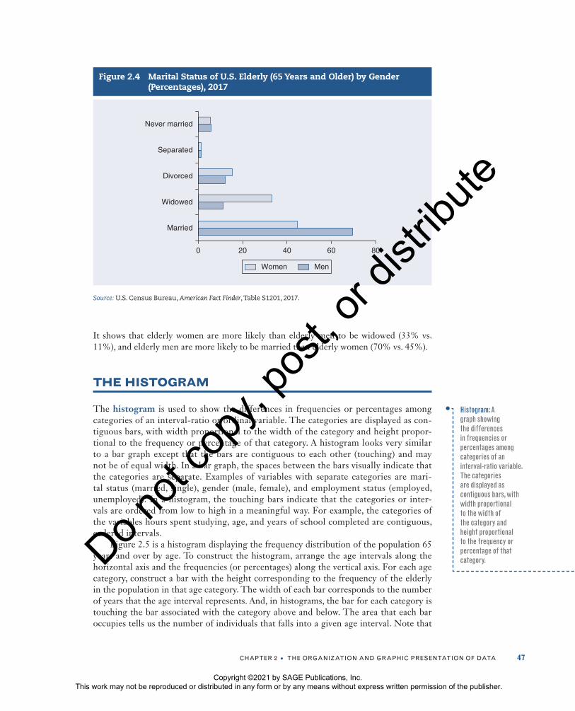
Bar graphs are often used to compare one or more categories of a variable among dif-ferent groups. Suppose we want to show how the patterns in marital status differ between men and women. The longevity of women is a major factor in the gender differences in marital and living arrangements.8 Additionally, elderly widowed men are more likely to remarry than elderly widowed women.
Figure 2.4 compares the marital status for women and men 65 years and older in 2017. We can also construct bar graphs horizontally, with the categories of the variable arrayed along the vertical axis and the percentages or frequencies displayed on the horizontal axis, as displayed in Figure 2.4. This presentation allows for a side-by-side visual comparison.
Bar graph: A graph showing the differences in frequencies or percentages among categories of a nominal or an ordinal variable. The categories are displayed as rectangles of equal width with their height proportional to the frequency or percentage of the category.
Figure 2.3 Marital Status of U.S. Elderly (65 Years and Older), Percentages, 2017
55.8
23.4
13.9
1.25.7
0
10
20
30
40
50
60
Married Widowed Divorced Separated Nevermarried
Source: U.S. Census Bureau, American Fact Finder, Table S0103, 2017.
Copyright ©2021 by SAGE Publications, Inc. This work may not be reproduced or distributed in any form or by any means without express written permission of the publisher.
Do n
ot co
py, p
ost, o
r dist
ribute
cHaPter 2 • tHe organization anD graPHic PreSentation of Data 47
It shows that elderly women are more likely than elderly men to be widowed (33% vs. 11%), and elderly men are more likely to be married than elderly women (70% vs. 45%).
THE HISTOGRAM
The histogram is used to show the differences in frequencies or percentages among categories of an interval-ratio or ordinal variable. The categories are displayed as con-tiguous bars, with width proportional to the width of the category and height propor-tional to the frequency or percentage of that category. A histogram looks very similar to a bar graph except that the bars are contiguous to each other (touching) and may not be of equal width. In a bar graph, the spaces between the bars visually indicate that the categories are separate. Examples of variables with separate categories are mari-tal status (married, single), gender (male, female), and employment status (employed, unemployed). In a histogram, the touching bars indicate that the categories or inter-vals are ordered from low to high in a meaningful way. For example, the categories of the variables hours spent studying, age, and years of school completed are contiguous, ordered intervals.
Figure 2.5 is a histogram displaying the frequency distribution of the population 65 years and over by age. To construct the histogram, arrange the age intervals along the horizontal axis and the frequencies (or percentages) along the vertical axis. For each age category, construct a bar with the height corresponding to the frequency of the elderly in the population in that age category. The width of each bar corresponds to the number of years that the age interval represents. And, in histograms, the bar for each category is touching the bar associated with the category above and below. The area that each bar occupies tells us the number of individuals that falls into a given age interval. Note that
Figure 2.4 Marital Status of U.S. Elderly (65 Years and Older) by Gender (Percentages), 2017
0 20 40 60 80
Married
Widowed
Divorced
Separated
Never married
Women Men
Source: U.S. Census Bureau, American Fact Finder, Table S1201, 2017.
Histogram: A graph showing the differences in frequencies or percentages among categories of an interval-ratio variable. The categories are displayed as contiguous bars, with width proportional to the width of the category and height proportional to the frequency or percentage of that category.
Copyright ©2021 by SAGE Publications, Inc. This work may not be reproduced or distributed in any form or by any means without express written permission of the publisher.
Do n
ot co
py, p
ost, o
r dist
ribute

48 Social StatiSticS for a DiverSe Society
the figure title includes the notation “numbers in thousands.” You should multiply each reported frequency by 1,000. For example, the largest age category is 65–69 years with 16,927,000 (16,927 × 1,000). The smallest age group is 80–84 years with 5,970,000. The total number of elderly 65 years and over can be found by summing all the reported frequencies.
THE STATISTICAL MAP
Since the 1960s, the elderly have been relocating to the South and the West of the United States. The concentration of elderly in these areas has increased by as much as 80% (although recent census data reveal that the Great Recession halted this dominant immi-gration trend). We can display these dramatic geographical changes in American soci-ety by using a statistical map. A statistical map presents geographic data patterns or variations, such as population distribution, voting patterns, crime rates, or labor force composition.
Let’s look at Figure 2.6. It presents a statistical map, by state, of the percentage of the population 65 years and over for 2017. The variable percentage of the population has four categories: (1) less than 13%, (2) 13% to 14.9%, (3) 15% to 15.9%, and (4) 16% or more. Each category is represented by a different shading (or color code), and the states are shaded depending on their classification into the different categories. To make it easier to read a map that you construct and to identify its patterns, keep the number of categories relatively small—say, not more than five.
Figure 2.5 Age Distribution of U.S. Elderly (65 Years and Older), 2017 (Numbers in Thousands)
16,927
12,805
8,855
5,970 6,259
0
2,000
4,000
6,000
8,000
10,000
12,000
14,000
18,000
16,000
65–69 70–74 75–79 80–84 85+
Source: U.S. Census Bureau, American Fact Finder, Table S0101, 2017.
Note: Ages were collapsed into categories in this example for visual purposes only. In general, histograms should be displayed with interval-ratio data that haven’t been collapsed.
Statistical map: A visual presentation of geographic data patterns or variations, such as the population distribution.
Copyright ©2021 by SAGE Publications, Inc. This work may not be reproduced or distributed in any form or by any means without express written permission of the publisher.
Do n
ot co
py, p
ost, o
r dist
ribute

cHaPter 2 • tHe organization anD graPHic PreSentation of Data 49
Maps may also display geographical patterns on the level of cities, counties, city blocks, census tracts, and other units. Your choice of whether to display variations on the state level or for smaller units will depend on the research question you wish to explore.
LEARNING CHECK 2.7
Can you think of a few other examples of data that could be described using a statisti-cal map? What type of data are organized or reported at the state level?
THE LINE GRAPH
The elderly population is growing worldwide in both developed and developing countries. In 1994, 30 nations had elderly populations of at least 2 million; demographic projections indicate that there will be 55 such nations by 2020. Japan is one of the nations that is
Figure 2.6 Percentage of the Population 65 Years and Over by State, 2017
CA
OR
WA
ID
NVUT
AZ NM
CO
WY
MT ND
SDCT
DEMD
NJ
RI
AK
HI
TXFL
VAWV
MS
LA
AR
MO
IA
MNWI
MI
NY
PA
MENH
MA
VT
IL INOH
TN
KYNC
GAAL
SCOK
KS
NE
16 or more
Less than 13.013–14.913–14.915–15.9
Source: U.S. Census Bureau, American Fact Finder, Table GCT0103, 2017.
Copyright ©2021 by SAGE Publications, Inc. This work may not be reproduced or distributed in any form or by any means without express written permission of the publisher.
Do n
ot co
py, p
ost, o
r dist
ribute
50 Social StatiSticS for a DiverSe Society
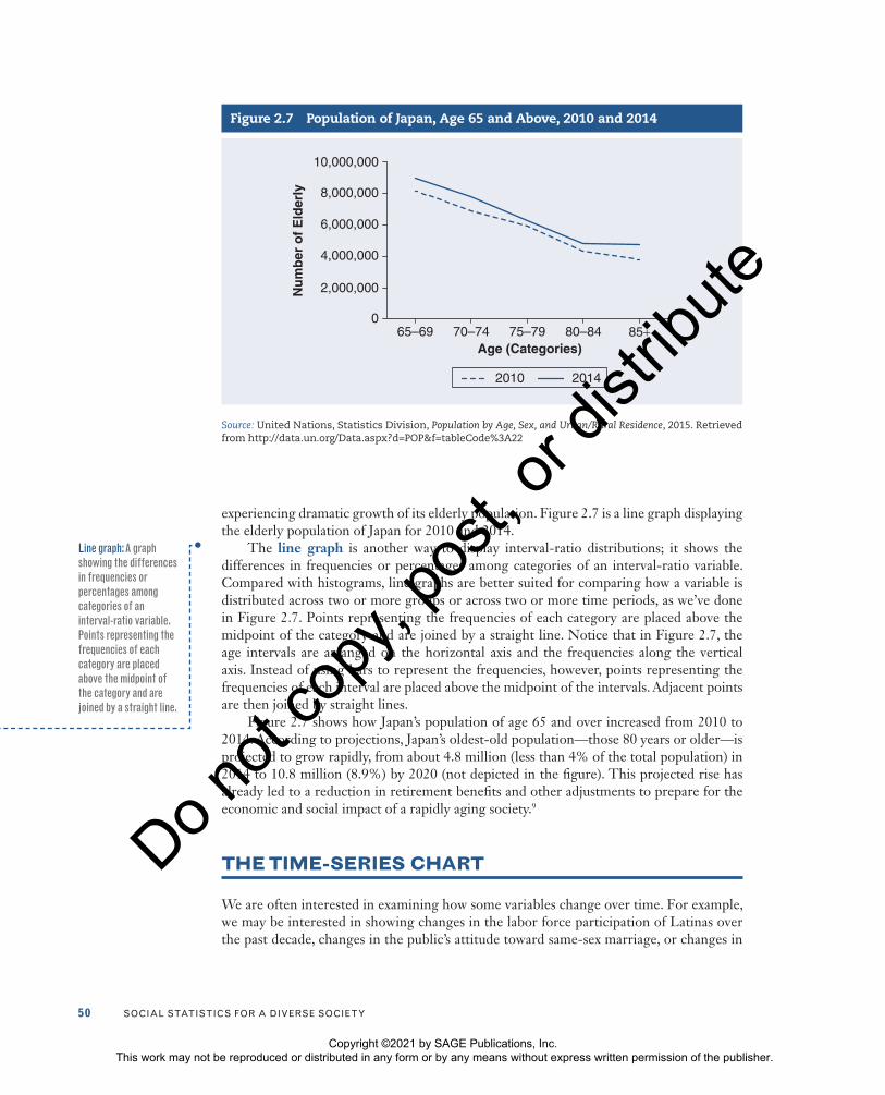
experiencing dramatic growth of its elderly population. Figure 2.7 is a line graph displaying the elderly population of Japan for 2010 and 2014.
The line graph is another way to display interval-ratio distributions; it shows the differences in frequencies or percentages among categories of an interval-ratio variable. Compared with histograms, line graphs are better suited for comparing how a variable is distributed across two or more groups or across two or more time periods, as we’ve done in Figure 2.7. Points representing the frequencies of each category are placed above the midpoint of the category and are joined by a straight line. Notice that in Figure 2.7, the age intervals are arranged on the horizontal axis and the frequencies along the vertical axis. Instead of using bars to represent the frequencies, however, points representing the frequencies of each interval are placed above the midpoint of the intervals. Adjacent points are then joined by straight lines.
Figure 2.7 shows how Japan’s population of age 65 and over increased from 2010 to 2014. According to projections, Japan’s oldest-old population—those 80 years or older—is projected to grow rapidly, from about 4.8 million (less than 4% of the total population) in 2014 to 10.8 million (8.9%) by 2020 (not depicted in the figure). This projected rise has already led to a reduction in retirement benefits and other adjustments to prepare for the economic and social impact of a rapidly aging society.9
THE TIME-SERIES CHART
We are often interested in examining how some variables change over time. For example, we may be interested in showing changes in the labor force participation of Latinas over the past decade, changes in the public’s attitude toward same-sex marriage, or changes in
Figure 2.7 Population of Japan, Age 65 and Above, 2010 and 2014
0
2,000,000
4,000,000
6,000,000
8,000,000
10,000,000
65–69 70–74 75–79 80–84 85+
2010 2014
Age (Categories)
Nu
mb
er o
f E
lder
ly
Source: United Nations, Statistics Division, Population by Age, Sex, and Urban/Rural Residence, 2015. Retrieved from http://data.un.org/Data.aspx?d=POP&f=tableCode%3A22
Line graph: A graph showing the differences in frequencies or percentages among categories of an interval-ratio variable. Points representing the frequencies of each category are placed above the midpoint of the category and are joined by a straight line.
Copyright ©2021 by SAGE Publications, Inc. This work may not be reproduced or distributed in any form or by any means without express written permission of the publisher.
Do n
ot co
py, p
ost, o
r dist
ribute
cHaPter 2 • tHe organization anD graPHic PreSentation of Data 51
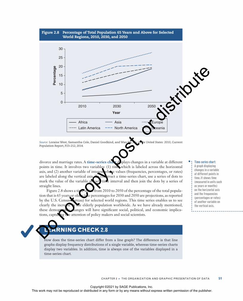
divorce and marriage rates. A time-series chart displays changes in a variable at different points in time. It involves two variables: (1) time, which is labeled across the horizontal axis, and (2) another variable of interest whose values (frequencies, percentages, or rates) are labeled along the vertical axis. To construct a time-series chart, use a series of dots to mark the value of the variable at each time interval and then join the dots by a series of straight lines.
Figure 2.8 shows a time series from 2010 to 2050 of the percentage of the total popula-tion that is 65 years or older (the percentages for 2030 and 2050 are projections, as reported by the U.S. Census Bureau) for selected world regions. This time series enables us to see clearly the increase in the elderly population worldwide. As we have already mentioned, these demographic changes will have significant social, political, and economic implica-tions, capturing the attention of policy makers and social scientists.
LEARNING CHECK 2.8
How does the time-series chart differ from a line graph? The difference is that line graphs display frequency distributions of a single variable, whereas time-series charts display two variables. In addition, time is always one of the variables displayed in a time-series chart.
Figure 2.8 Percentage of Total Population 65 Years and Above for Selected World Regions, 2010, 2030, and 2050
0
5
10
15
20
25
30
2010 2030
Year
2050
Per
cen
tag
e
Africa Asia Europe
Latin America North America Oceania
Source: Loraine West, Samantha Cole, Daniel Goodkind, and Wan He, 65+ in the United States: 2010, Current Population Report, P23–212, 2014.
Time-series chart: A graph displaying changes in a variable at different points in time. It shows time (measured in units such as years or months) on the horizontal axis and the frequencies (percentages or rates) of another variable on the vertical axis.
Copyright ©2021 by SAGE Publications, Inc. This work may not be reproduced or distributed in any form or by any means without express written permission of the publisher.
Do n
ot co
py, p
ost, o
r dist
ribute

52 Social StatiSticS for a DiverSe Society
STATISTICS IN PRACTICE: FOREIGN-BORN POPULATION 65 YEARS AND OVER
In their 2014 report 65+ in America, U.S. Census Bureau researchers Loraine West, Samantha Cole, Daniel Goodkind, and Wan He describe the foreign-born population aged 65 and over in a series of tables and graphs. We present several for your review.
Frequencies and percentages presented in Table 2.14 summarize three charac-teristics of the 5,000,000 foreign-born elderly. The majority of these older men and women entered the U.S. prior to 1990. Almost 73% were naturalized citizens in 2010. In the same year, the largest percentage lived in the West (36%), followed by the South (29%).
Figure 2.9 is a pie chart, presenting one variable—world region of birth. We learn that the majority of the foreign-born elderly originally came from Latin America (37%), Asia (29%), and Europe (28%). The bar graph (Figure 2.10) presents the percentage of foreign-born elderly from each world region by their period of entry. Prior to 1990 and during 2000–2010, the largest percentage of foreign-born elderly came from Latin America and the Caribbean. However, from 1990 to 1999, the largest percentage of foreign-born elderly emigrated from Asia.
Table 2.14 Foreign-Born Population Aged 65 and Over by Period of Entry, Citizenship Status, and Region, 2010
Characteristic Population (in Thousands) Percentage (%)
total 4,963 100
Period of entry
Prior to 1990 3,769 76
1990 to 1999 644 13.0
2000 to 2010 550 11.1
citizenship status
naturalized citizen 3,582 72.2
not a U.S. citizen 1,381 27.8
region
northwest 1,232 24.8
Midwest 504 10.1
South 1,442 29.1
West 1,784 36.0
Source: Loraine West, Samantha Cole, Daniel Goodkind, and Wan He, 65+ in the United States: 2010, Current Population Report, P23–212, 2014.
Copyright ©2021 by SAGE Publications, Inc. This work may not be reproduced or distributed in any form or by any means without express written permission of the publisher.
Do n
ot co
py, p
ost, o
r dist
ribute

cHaPter 2 • tHe organization anD graPHic PreSentation of Data 53
Figure 2.9 Foreign-Born Population Aged 65 Years and Over by World Region of Birth, 2010
4.2%
2.0%0.5%
27.6%
28.8%
36.9%
Africa Europe AsiaNorthern America Latin America and
the CaribbeanOceania or at sea
Source: Loraine West, Samantha Cole, Daniel Goodkind, and Wan He, 65+ in the United States: 2010, Current Population Report, P23–212, 2014.
Figure 2.10 Foreign-Born Population Aged 65 and Over by World Region of Birth and Period of Entry, 2010
Africa
1.5
0
5
10
15
20
25
30
35
45
40
2.9 4.
7
4.8
24.7
44.2
38.5
31.5
18.0
12.1
0.5
0.3
0.41.4 3.
7
37.0
33.2
40.6
LatinAmerica and
the Caribbean
NorthernAmerica
Asia Europe Oceania
Prior to 1990 1990 to 1999 2000 to 2010
Source: Loraine West, Samantha Cole, Daniel Goodkind, and Wan He, 65+ in the United States: 2010, Current Population Report, P23–212, 2014.
Copyright ©2021 by SAGE Publications, Inc. This work may not be reproduced or distributed in any form or by any means without express written permission of the publisher.
Do n
ot co
py, p
ost, o
r dist
ribute
54 Social StatiSticS for a DiverSe Society
A C
LO
SE
R L
OO
K 2
.2 A Cautionary Note: Distortions in Graphs
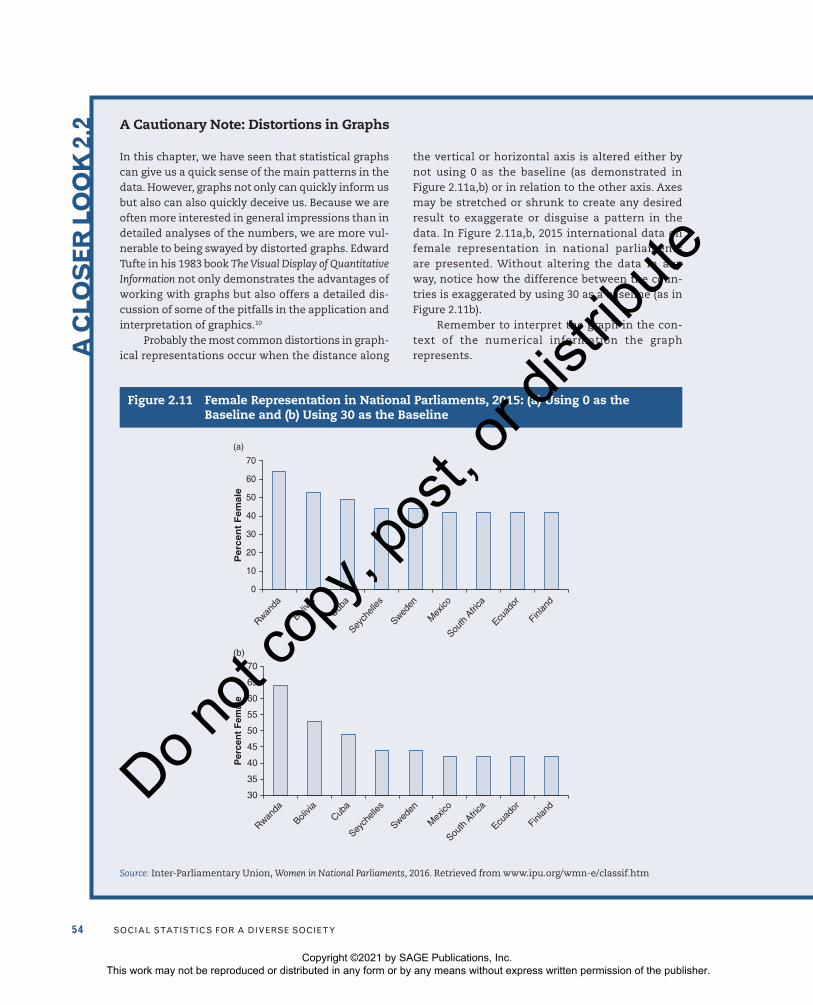
In this chapter, we have seen that statistical graphs can give us a quick sense of the main patterns in the data. However, graphs not only can quickly inform us but also can also quickly deceive us. Because we are often more interested in general impressions than in detailed analyses of the numbers, we are more vul-nerable to being swayed by distorted graphs. Edward Tufte in his 1983 book The Visual Display of Quantitative Information not only demonstrates the advantages of working with graphs but also offers a detailed dis-cussion of some of the pitfalls in the application and interpretation of graphics.10
Probably the most common distortions in graph-ical representations occur when the distance along
the vertical or horizontal axis is altered either by not using 0 as the baseline (as demonstrated in Figure 2.11a,b) or in relation to the other axis. Axes may be stretched or shrunk to create any desired result to exaggerate or disguise a pattern in the data. In Figure 2.11a,b, 2015 international data on female representation in national parliaments are presented. Without altering the data in any way, notice how the difference between the coun-tries is exaggerated by using 30 as a baseline (as in Figure 2.11b).
Remember to interpret the graph in the con-text of the numerical information the graph represents.
Figure 2.11 Female Representation in National Parliaments, 2015: (a) Using 0 as the Baseline and (b) Using 30 as the Baseline
0
Rwanda
Bolivia
Cuba
Seych
elles
Sweden
Mex
ico
South
Afri
ca
Ecuad
or
Finlan
d
10
20
30
40
50
60
70
(a)
Per
cen
t F
emal
e
30
Rwanda
Bolivia
Cuba
Seych
elles
Sweden
Mex
ico
South
Afri
ca
Ecuad
or
Finlan
d
35
40
45
50
55
60
65
70
Per
cen
t F
emal
e
(b)
Source: Inter-Parliamentary Union, Women in National Parliaments, 2016. Retrieved from www.ipu.org/wmn-e/classif.htm
Copyright ©2021 by SAGE Publications, Inc. This work may not be reproduced or distributed in any form or by any means without express written permission of the publisher.
Do n
ot co
py, p
ost, o
r dist
ribute

cHaPter 2 • tHe organization anD graPHic PreSentation of Data 55
MAIN POINTS
• The most basic way to organizing data is to classify the observations into a frequency distribution—a table that reports the number of observations that fall into each category of the variable being analyzed.
• Constructing a frequency distribution is usually the first step in the statistical analysis of data. To obtain a frequency distribution for nominal and ordinal variables, count and report the number of cases that fall into each category of the variable along with the total number of cases (N). To construct a frequency distribution for interval-ratio variables that have a wide range of values, first combine the scores into a smaller number of groups—known as class intervals—each containing a number of scores.
• Proportions and percentages are relative frequencies. To construct a
proportion, divide the frequency (f) in each category by the total number of cases (N). To obtain a percentage, divide the frequency (f) in each category by the total number of cases (N) and multiply by 100.
• Percentage distributions are tables that show the percentage of observations that fall into each category of the variable. Percentage distributions are routinely added to almost any frequency table and are especially important if comparisons between groups are to be considered.
• Cumulative frequency distributions allow us to locate the relative position of a given score in a distribution. They are obtained by adding to the frequency in each category the frequencies of all the categories below it.
• Cumulative percentage distributions have wider applications than cumulative frequency distributions. A cumulative percentage distribution
Kurt Taylor Gaubatz: Graduate Program in International Studies
Although Kurt began his college career as a music major, after taking an economics class, he was fascinated by the challenge of understanding and modeling human behavior. He came to see the importance of public policy. “All
of the biggest problems we face as a society, indeed, as human beings, comes down to questions in the social sciences. . . . This is a very good area to work on the hardest and most important issues.”
According to Kurt, “A research career is a life of posing and answering questions, of trying to think about things in new and more interesting ways. In that sense, then, in addition to getting to work on important social problems, research is a natural out-let for human curiosity.”
He advises students to develop two essen-tial research skills. “Information, a huge amount of information, is now increasingly available to everyone who carries a phone. The critical skill[s] [are] knowing how to build new ideas from the organization and analysis of that information, and being able to communicate those ideas effec-tively. Students need to focus on filling their toolbox with those analytic and communication skills.”
DA
TA
AT
WO
RK
Pho
to c
ourt
esy
of K
urt t
aylo
r gau
batz
Copyright ©2021 by SAGE Publications, Inc. This work may not be reproduced or distributed in any form or by any means without express written permission of the publisher.
Do n
ot co
py, p
ost, o
r dist
ribute

56 Social StatiSticS for a DiverSe Society
is constructed by adding to the percentages in each category the percentages of all the categories below it.
• A rate is a number that expresses raw frequencies in relative terms. A rate can be calculated as the number of actual occurrences in a given time period divided by the number of possible occurrences for that period. Rates are often multiplied by some power of 10 to eliminate decimal points and make the number easier to interpret.
• A pie chart shows the differences in frequencies or percentages among categories of a nominal or an ordinal variable. The categories of the variable are segments of a circle whose pieces add up to 100% of the total frequencies.
• A bar graph shows the differences in frequencies or percentages among categories of a nominal or an ordinal variable. The categories are displayed as rectangles of equal width with their
height proportional to the frequency or percentage of the category.
• Histograms display the differences in frequencies or percentages among categories of interval-ratio variables. The categories are displayed as contiguous bars with their width proportional to the width of the category and height proportional to the frequency or percentage of that category.
• A line graph shows the differences in frequencies or percentages among categories of an interval-ratio variable. Points representing the frequencies of each category are placed above the midpoint of the category (interval). Adjacent points are then joined by a straight line.
• A time-series chart displays changes in a variable at different points in time. It displays two variables: (1) time, which is labeled across the horizontal axis, and (2) another variable of interest whose values (e.g., frequencies, percentages, or rates) are labeled along the vertical axis.
KEY TERMS
bar graph 46cumulative frequency
distribution 36cumulative percentage
distribution 38
frequency distribution 27histogram 47line graph 50percentage 29percentage distribution 30
pie chart 44proportion 28rate 40statistical map 48time-series chart 51
DIGITAL RESOURCES
Get the tools you need to sharpen your study skills. SAGE Edge offers a robust online envi-ronment featuring an impressive array of free tools and resources. Access practice quizzes, eFlashcards, video, and multimedia at edge.sagepub.com/frankfort9e.
Copyright ©2021 by SAGE Publications, Inc. This work may not be reproduced or distributed in any form or by any means without express written permission of the publisher.
Do n
ot co
py, p
ost, o
r dist
ribute

cHaPter 2 • tHe organization anD graPHic PreSentation of Data 57
SPSS DEMONSTRATIONS [GSS18SSDS-A]
Demonstration 1: Producing Frequency Distributions
In SPSS, you can review the frequency distribution for a single variable or for several variables at once. The frequency procedure is found in the Descriptive Statistics menu under Analyze. For this chapter, we will use the GSS18SSDS-A data set.
In the Frequencies dialog box, click on the variable name(s) in the left column and transfer the name(s) to the Variable(s) box. More than one variable can be selected at one time.
For our demonstration, let’s select the variable POLVIEWS (respondent’s political views). Click on OK to process the frequency. Respondents were asked to answer the question by indicating 1 = extremely liberal, 2 = liberal, 3 = slightly liberal, 4 = moderate, 5 = slightly conservative, 6 = conservative, and 7 = extremely conservative.
SPSS will produce two tables in a separate Output window, a small statistics table (not presented here), and a frequency table. Use the Window scroll keys to move up and down the window to find the statistics and frequency tables for POLVIEWS. What level of measurement is this variable? (Refer to Chapter 1 to review definitions.)
In the first table, Statistics, SPSS identifies all the valid and missing responses to this question. Responses are coded missing if no answer was given.
In the frequency table (see Figure 2.12), the variable label is reported. The first column lists the value and value label for each category of POLVIEWS. The next four columns contain important frequency information about the variable. The Frequency column shows the number of respondents who gave a particular response. Thus, we can see that 1,500 respondents are included in the data set, but only 1,437 provided a valid response, with 63 responses missing.
The Percent column calculates what percentage of the whole sample (1,500 cases) each of the responses represents. Thus, 10.7% of the total sample indicated slightly liberal political views. In most instances, percentages reported in the third column, Valid Percent, are more useful. This column removes all the cases defined as missing and recalculates percentages based only on the valid responses. Recalculated based only on valid cases (1,437), the percentage of those who answered slightly liberal is 11.2. The last column, Cumulative Percent, calculates
Figure 2.12
Copyright ©2021 by SAGE Publications, Inc. This work may not be reproduced or distributed in any form or by any means without express written permission of the publisher.
Do n
ot co
py, p
ost, o
r dist
ribute

58 Social StatiSticS for a DiverSe Society
cumulative percentages beginning with the first response. We know that 29% of the valid sample reported that they were liberal (extremely liberal, liberal, or slightly liberal).
Demonstration 2: Recoding Variables
Some variables may need to be recoded or reduced into a smaller number of categories or intervals to better present and understand the data. We could, for example, collapse POLVIEWS into a variable with three categories: (1) liberal, (2) moderate, and (3) conservative. To accomplish this, we could use the SPSS commands Transform–Recode Into Different Variables.
For more detailed instruction on recoding variables, please refer to the section on Recod-ing Variables in the SPSS Appendix on the text’s study site, which explains how to recode the variable EDUC (respondent’s years of education).
After reviewing the SPSS Appendix, recode POLVIEWS into a new variable called RPOLVIEWS. Frequencies for Recoded POLVIEWS, 3 Categories (RPOLVIEWS) should look like Figure 2.13.
Figure 2.13
Demonstration 3: Producing a Bar Graph
SPSS greatly simplifies and improves the production of graphics. The program offers a separate choice from the main menu bar, Graphs, which lists more than a dozen types of graphs that SPSS can create.
Under the Graphs menu, select Legacy Dialogs and then Bar, which will produce various types of bar graphs. We will use bar graphs to display the distribution of the nominal variable MARITAL (marital status of respondent). After clicking on Bar, you will be presented with the initial dialog box, with the Simple bar graphs option already selected.
Almost all graphics procedures in SPSS begin with a dialog box that allows you to choose exactly the type of chart you want to construct. Many graph types can display more than one variable (the Clustered or Stacked choices). We will keep things simple here, so click on Simple, then on Define. When you do so, the main dialog box for simple bar graphs opens.
The variable MARITAL should be placed in the box labeled Category Axis. In the Bars Rep-resent box, click on the % of cases radio button. This choice changes the default statistic from the number of cases to percentages, which are normally more useful for comparison purposes. Click on OK to submit your request. (SPSS automatically excludes missing values. You can change this by clicking on Options. Click in the box labeled Display groups defined by missing values to turn on this choice. Then, click on Continue, then on OK to submit your request to SPSS.)
The bar graph for MARITAL is presented in an output window labeled SPSS Viewer. You can see in Figure 2.14 that the bar graph for MARITAL has five bars because the only valid responses to this question are (1) “married,” (2) “widowed,” (3) “divorced,” (4) “separated,” and (5) “single, never been married.”
SPSS graphs can be edited by selecting Edit, then Edit Content, In Separate Window, which moves the graph to its own window (Chart Editor) and displays various editing tools and choices.
Copyright ©2021 by SAGE Publications, Inc. This work may not be reproduced or distributed in any form or by any means without express written permission of the publisher.
Do n
ot co
py, p
ost, o
r dist
ribute
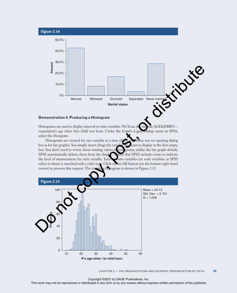
cHaPter 2 • tHe organization anD graPHic PreSentation of Data 59
Demonstration 4: Producing a Histogram
Histograms are used to display interval or ratio variables. We’ll use the variable AGEKDBRN—respondent’s age when first child was born. Under the Graphs–Legacy Dialogs menu in SPSS, select the Histogram.
Histograms are created for one variable at a time (that’s why there was no opening dialog box as for bar graphs). You simply insert (drag) the variable you want to display in the first empty box. You don’t need to worry about missing values in histograms; unlike the bar graph default, SPSS automatically deletes them from the display. Notice that SPSS includes icons to indicate the level of measurement for each variable. Interval-ratio variables (or scale variables as SPSS refers to them) is matched with a ruler icon. Click on the OK button (on the bottom right-hand corner) to process this request. The resulting histogram is shown in Figure 2.15.
Figure 2.15
10 20
20
30 40
40
50 60
60
80
100
R’s age when 1st child born
0
Fre
qu
ency
Mean = 24.13Std. Dev. = 5.701N = 1,058
Figure 2.14
0%
10.0%
20.0%
30.0%
40.0%
50.0%
Married Widowed Divorced Separated Never married
Marital status
Per
cen
t
Copyright ©2021 by SAGE Publications, Inc. This work may not be reproduced or distributed in any form or by any means without express written permission of the publisher.
Do n
ot co
py, p
ost, o
r dist
ribute

60 Social StatiSticS for a DiverSe Society
SPSS automatically decided the appropriate width for each interval based on the range of the variable and the optimal number of bars to be displayed on a screen. The histogram also includes the calculation for mean and standard deviation, which will be discussed in Chapters 3 and 4.
SPSS PROBLEMS [GSS18SSDS-A]
S1. Use the SPSS Frequencies command to produce a frequency table for the variable CONFED (confidence in the executive branch of federal government).
a. What is the number of valid respondents?
b. Based on the valid number of respondents, what percentage of the sample reported a great deal of confidence in the executive branch of federal government? What proportion of the sample reported hardly any confidence?
c. What is the best way to graphically display these data? Explain.
S2. The GSS included a series of questions on respondents’ attitudes about abortion if the woman wants an abortion for any reason (ABANY), is married and doesn’t want any more children (ABNOMORE), and is low income and can’t afford any more children (ABPOOR).
a. Run frequencies for all the three variables.
b. Prepare a general statement summarizing your results from the three frequency tables. Identify the level of measurement for each variable. How would you describe respondents’ attitudes about abortion?
S3. Produce the frequency table for HAPMAR (happiness of marriage).
a. What is the level of measurement for this variable?
b. Identify two independent variables that may affect how someone responded to HAPMAR. Explain the relationship between these variables and HAPMAR.
c. What is the best way to graphically display these data? Explain.
S4. The GSS2018 respondents were asked to report their highest year of school (EDUC). Using GSS18SSDS-A, run the frequency table for this variable. Collapse this interval-ratio variable into an ordinal measure (omitting those who did not respond to the question). How many categories do you have?
a. Prepare a frequency and cumulative percentage table of your recoded EDUC variable.
b. Prepare a graphic presentation of your recoded EDUC variable.
S5. Determine how best to represent the following variables graphically:
a. PARTYID (respondent’s political party identification)
b. SEXORNT (sexual orientation)
c. HEALTH (condition of health)
d. EMAILHR (e-mail hours per week)
Note: Before selecting/constructing your graph, you may want to review the variable by first using the Frequencies or Utilities—Variables command. The levels of
Copyright ©2021 by SAGE Publications, Inc. This work may not be reproduced or distributed in any form or by any means without express written permission of the publisher.
Do n
ot co
py, p
ost, o
r dist
ribute

cHaPter 2 • tHe organization anD graPHic PreSentation of Data 61
measurement for several variables might be mislabeled in SPSS. If you are using the Utilities—Variables option to review each variable and its level of measurement, you should confirm the level of measurement by reviewing the variable’s frequency table (Analyze—Descriptive—Frequencies).
EXCEL DEMONSTRATIONS [GSS18SSDS-E]
Before we begin this chapter’s Excel demonstrations, it is important to know that you can paste any tables, graphs, and charts you produce in Excel into a Word document by selecting the object in Excel you’ve created and then clicking on Edit and then Copy. You will be able to Paste (Edit and then Paste) your object into a document, e-mail, and so on.
Demonstration 1: Producing a Frequency Distribution
In Excel, you can produce a frequency distribution for one variable at a time. Open the GSS18SSDS-E data set. In the data view sheet of Excel, use your mouse to highlight the column “SEX,” including all of the respondents (up to and including row 136). Your screen should look like Figure 2.16.
From the main Excel toolbar, click on Edit and then Copy. This will copy the SEX column data. On the bottom of the Excel window, next to the sheets DATA VIEW and VARIABLE VIEW, click on the “+” sign. Doing this will open a blank sheet that’s capable of editing. Click on the empty A1 cell, and then select Edit and then Paste. The SEX column data have been reproduced in your new sheet (see Figure 2.17). You are now ready to produce a frequency dis-tribution and any other graphs or charts you may desire. (Note: This copy-and-paste procedure
Figure 2.16
Copyright ©2021 by SAGE Publications, Inc. This work may not be reproduced or distributed in any form or by any means without express written permission of the publisher.
Do n
ot co
py, p
ost, o
r dist
ribute
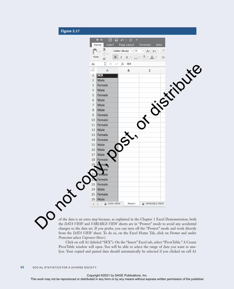
62 Social StatiSticS for a DiverSe Society
of the data is an extra step because, as explained in the Chapter 1 Excel Demonstration, both the DATA VIEW and VARIABLE VIEW sheets are in “Protect” mode to avoid any accidental changes to the data set. If you prefer, you can turn off the “Protect” mode and work directly from the DATA VIEW sheet. To do so, on the Excel Home Tab, click on Format and under Protection select Unprotect Sheet.)
Click on cell A1 (labeled “SEX”). On the “Insert” Excel tab, select “PivotTable.” A Create PivotTable window will open. You will be able to select the range of data you want to ana-lyze. Your copied and pasted data should automatically be selected if you clicked on cell A1
Figure 2.17
Copyright ©2021 by SAGE Publications, Inc. This work may not be reproduced or distributed in any form or by any means without express written permission of the publisher.
Do n
ot co
py, p
ost, o
r dist
ribute

cHaPter 2 • tHe organization anD graPHic PreSentation of Data 63
as directed before selecting the “PivotTable” option. Under “Choose where to place the PivotTable,” select “Existing worksheet,” and then click on an empty cell in this sheet. We will click on cell C2 (see Figure 2.18).
A “PivotTable Fields” window will open on the right side of the Excel sheet. In the “Field Name” box, you should see “SEX.” Click on “SEX” and drag it to “Rows.” Then, drag “SEX” to the “Values” box. Repeat this step three times. Doing so will easily allow you to produce frequencies, percentages, and cumulative percentages. As you follow these steps, you will see Excel begin to construct a frequency distribution that starts in cell C2 and builds out. Click on “Row Labels” in C2. Rename “Row Labels” to “SEX.” Doing this will make our frequency dis-tribution more presentable. Click on D2. A window will open. In the “Field name” box, replace “Count of SEX” with “Frequency.” Make sure in the “Summarize by” option that “Count” is highlighted. Select OK. Click on E2. In the “Field name” box, replace “Count of SEX2” with “%.” Make sure the option “Count” is highlighted in “Summarize by.” In “Show data as,” select “% of Column Total” in the dropdown box. Select OK. Click on F3. In the “Field name” box, replace “Count of SEX3” with “C%” for cumulative percentage. Make sure the option “Count” is highlighted in “Summarize by.” In “Show data as,” select “% of Running Total In” in the dropdown box. Select OK. Your frequency distribution is ready for interpretation (see Figure 2.19).
Figure 2.18
Copyright ©2021 by SAGE Publications, Inc. This work may not be reproduced or distributed in any form or by any means without express written permission of the publisher.
Do n
ot co
py, p
ost, o
r dist
ribute

64 Social StatiSticS for a DiverSe Society
Figure 2.19
The first column of the frequency table contains the categories (Female/Male) of your variable (SEX). The second column contains the frequency for each category. Notice how there are 135 respondents (75 females and 60 males) in this data set. We don’t have missing data in this variable, so we can easily interpret the percentage as presented. For example, we could say that our data set is made up of almost 56% females and only 44% males. Given our variable is nominal, it wouldn’t be useful to interpret the cumulative percentage distribution we created.
If you are working with an ordinal or interval-ratio variable, interpreting the cumulative percentage would be beneficial. But, you would need to make sure the categories of the vari-able are placed in order from low to high or high to low. You can easily order categories in any frequency distribution created in Excel by adding a “1,” “2,” or “3” in front of each category. Then reorder the categories by clicking on the little arrow in the variable (in our example, this is cell C2). A window will appear. Click on Sort, then choose either Ascending or Descending. Your categories should be ordered from either low to high (ascending) or high to low (descending).
Demonstration 2: Producing a Bar Graph
We will now produce a bar graph using the SEX variable we were working with in Demonstration 1. On the “Insert” Excel tab, next to “Recommend Charts,” click on the dropdown image of the bar graph. There are many bar graphs to choose from. Let’s choose the first one under “2-D Column” (see Figure 2.20).
In the “PivotChart Fields” window on the right, under “Values,” select “Frequencies” and drag it to the “SEX” window at the top. This will remove “Frequencies” from the frequency distribution as well as the bar graph we created. Do the same for “C%.” You can delete the legend in the bar graph by selecting it and clicking delete on your keyboard. At the top of the bar graph, you should see “Total” as a tentative title. We’ve clicked on the tentative title and retitled it to read “Respondent’s Sex, GSS18SSDS-E” (see Figure 2.21). Excel graphs can be edited by clicking on the bar graph you created and the selecting the Excel “Design” tab. From this menu, you can change the colors of the graph you created and add a chart element (a title, a legend, and more). We suggest you experiment with the many different design options Excel offers its users.
Copyright ©2021 by SAGE Publications, Inc. This work may not be reproduced or distributed in any form or by any means without express written permission of the publisher.
Do n
ot co
py, p
ost, o
r dist
ribute

cHaPter 2 • tHe organization anD graPHic PreSentation of Data 65
Figure 2.20
Figure 2.21
Demonstration 3: Producing a Pie Chart
Let’s produce a pie chart with Excel, again using our SEX variable. On the “Insert” Excel tab, next to “Recommend Charts,” click on the dropdown image of the pie chart. There are many pie charts to choose from. Let’s choose the first one under “2-D Pie” (see Figure 2.22).
Excel will create a pie chart for the variable SEX. You can retitle the tentative title as we’ve done to read “SEX, GSS18SSDS-E.” You can further edit the pie chart by navigating to the “Design” tab. We’ve chosen one of the designs Excel offers that includes percentages
Copyright ©2021 by SAGE Publications, Inc. This work may not be reproduced or distributed in any form or by any means without express written permission of the publisher.
Do n
ot co
py, p
ost, o
r dist
ribute
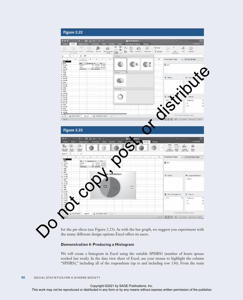
66 Social StatiSticS for a DiverSe Society
for the pie slices (see Figure 2.23). As with the bar graph, we suggest you experiment with the many different design options Excel offers its users.
Demonstration 4: Producing a Histogram
We will create a histogram in Excel using the variable SPHRS1 (number of hours spouse worked last week). In the data view sheet of Excel, use your mouse to highlight the column “SPHRS1,” including all of the respondents (up to and including row 136). From the main
Figure 2.22
Figure 2.23
Copyright ©2021 by SAGE Publications, Inc. This work may not be reproduced or distributed in any form or by any means without express written permission of the publisher.
Do n
ot co
py, p
ost, o
r dist
ribute

cHaPter 2 • tHe organization anD graPHic PreSentation of Data 67
Excel toolbar, click on Edit and then Copy. This will copy the SPHRS1 column data. On the bottom of the Excel window, next to the sheets DATA VIEW and VARIABLE VIEW, click on the “+” sign. Doing this will open a blank sheet that’s capable of editing. Click on the empty A1
Figure 2.24
Figure 2.25
Copyright ©2021 by SAGE Publications, Inc. This work may not be reproduced or distributed in any form or by any means without express written permission of the publisher.
Do n
ot co
py, p
ost, o
r dist
ribute

68 Social StatiSticS for a DiverSe Society
cell, and then select Edit and then Paste. The SPHRS1 column data have been reproduced in your new sheet. You are now ready to ask Excel to create a histogram. On the “Insert” Excel tab, next to “Recommend Charts,” click on the dropdown image of the histogram. There are three histograms to choose from. Let’s choose the first one under “Histogram” (see Figure 2.24).
Excel will create a histogram for SPHRS1. You can retitle the tentative title as we’ve done to read “Spouse’s Number of Hours Worked, GSS18SSDS-E.” You can further edit the histogram by navigating to the “Design” tab (see Figure 2.25).
EXCEL PROBLEMS [GSS18SSDS-E]
E1. We will use Excel to examine the highest degree our respondents have earned.
a. Produce a frequency distribution for the variable DEGREE. Be sure to order the categories in the frequency distribution from lowest to highest.
b. What percentage of respondents reported their highest degree earned was high school?
c. How many respondents reported their highest degree earned was a bachelor’s degree?
d. Considering the level of measurement for DEGREE, have Excel create an appropriate graph or chart. (Hint: consider level of measurement.) Be sure to name the variable in the title of the graph/chart, and also identify the data source.
E2. Use Excel to create a histogram of any interval-ratio variable in GSS18SSDS-E. Do not use SPHRS1 since we used that variable in Demonstration 4 to demonstrate how to produce a histogram in Excel.
a. How many respondents are represented in your chosen variable?
b. In two to three sentences, what does the histogram you’ve created show us about your chosen variable?
E3. For the following variables in GSS18SSDS-E, identify whether a bar graph, pie chart, and/or histogram is the most appropriate tool to visually represent each variable.
a. ABANY (abortion if woman wants for any reason)
b. HAPMAR (happiness of marriage)
c. SEXORNT (sexual orientation)
d. TVHOURS (hours per day watching TV)
CHAPTER EXERCISES
C1. Suppose you surveyed 30 people and asked them whether they are white (W) or nonwhite (N) and how many traumas (serious accidents, rapes, or crimes) they have experienced in the past year. You also asked them to tell you whether they perceive themselves as being in the upper, middle, working, or lower class. Your survey resulted in the raw data presented in the following table:
a. Identify the level of measurement for each variable.
Copyright ©2021 by SAGE Publications, Inc. This work may not be reproduced or distributed in any form or by any means without express written permission of the publisher.
Do n
ot co
py, p
ost, o
r dist
ribute

cHaPter 2 • tHe organization anD graPHic PreSentation of Data 69
b. Construct raw frequency tables for race.
c. What proportion of the 30 individuals is nonwhite? What percentage is white?
Race Class Trauma Race Class Trauma
W l 1 W W 0
W M 0 W M 2
W M 1 W W 1
n M 1 W W 1
n l 2 n W 0
W W 0 n M 2
n W 0 W M 1
W M 0 W M 0
W M 1 n W 1
n W 1 W W 0
n W 2 W W 0
n M 0 n M 0
n l 0 n W 0
W U 0 n W 1
W W 1 W W 0
Note: Race: W = white; N = nonwhite; Class: L = lower class; M = middle class; U = upper class; W = working class.
C2. Using the data from Exercise 1, construct a frequency and percentage distribution for class.
a. Which is the smallest perceived class group?
b. Which two classes include the largest percentages of people?
C3. Using the data from Exercise 1, construct a frequency distribution for trauma.
a. What level of measurement is used for the trauma variable?
b. Are people more likely to have experienced no traumas or only one trauma in the past year?
c. What proportion has experienced one or more traumas in the past year?
C4. Using the data from Exercise 1, construct appropriate graphs showing percentage distributions for race, class, and trauma.
C5. GSS 2018 respondents were asked to describe how much confidence they had in the press. Results are provided in the following table for the percentage in each category by whom the respondent voted for in the 2016 U.S. presidential election. Do these data support the statement that those who voted for Donald Trump have
Copyright ©2021 by SAGE Publications, Inc. This work may not be reproduced or distributed in any form or by any means without express written permission of the publisher.
Do n
ot co
py, p
ost, o
r dist
ribute

70 Social StatiSticS for a DiverSe Society
lower levels of confidence in the press than those who didn’t vote for Trump? Why or why not?
Trump (%) Clinton (%) Other (%)
a great deal 2.9 21.8 11.8
only some 17.9 58.9 29.4
Hardly any 79.2 19.3 58.8
total 100.0 100.0 100.0
C6. How many hours per week do you spend on e-mail? Data are presented here for a GSS sample of 99 men and women, who each reported the number of hours they spent per week on e-mail.
a. Compute the cumulative frequency and cumulative percentage distribution for the data.
b. What proportion of the sample spent 3 hours or less per week on e-mail?
c. What proportion of the sample spent 6 or more hours per week on e-mail?
d. Construct a graph that best displays these data. Explain why the graph you selected is appropriate for these data.
E-mail Hours per Week Frequency
0 19
1 20
2 13
3 5
4 2
5 6
6 5
7 2
8 3
9 1
10 or more 23
C7. The time-series chart shown below displays trends for presidential election voting rates by race and Hispanic origin for 1980–2016. U.S. Census Senior Sociologist Thom File noted how for the first time in the 2012 presidential election, black voting rates exceeded the rates for non-Hispanic whites. However, in the 2016 presidential election, there was a remarkable shift in voting rates by race and Hispanic origin. Describe the variation in voting rates in 2016 for the four racial and Hispanic origin groups and then compare that variation with that presented for the four groups from 1980 onward.
Copyright ©2021 by SAGE Publications, Inc. This work may not be reproduced or distributed in any form or by any means without express written permission of the publisher.
Do n
ot co
py, p
ost, o
r dist
ribute

cHaPter 2 • tHe organization anD graPHic PreSentation of Data 71
Reported Voting Rates by Race and Hispanic Origin: 1980–2016
46.0 50.0 48.051.6
44.0 44.147.2 49.9 48.0 47.6
53.151.7 50.8
54.0
45.7 45.148.3 50.5 49.9 49.3
59.664.154.0
60.755.1
59.353.0
56.960.3
65.2
66.2 66.4 64.270.2
60.7 61.867.2 66.1 66.6 65.3
1 White, non-Hispanic3 Other race, non-Hispanic
2 Black, non-Hispanic4 Hispanic
0
10
20
30
40
50
60
70
80
1980 1984 1988 1992 1996 2000 2004 2008 2012 2016
Source: Thom File, Voting in America: A Look at the 2016 Presidential Election, 2017. Retrieved from https://www .census.gov/newsroom/blogs/random-samplings/2017/05/voting_in_america.html
C8. According to the Pew Research Center (2015), recent immigrants are better educated than earlier immigrants to the United States. The change was attributed to the availability of better education in each region or country of origin. The percentage of immigrants 25 years of age and older who completed at least high school is reported in this table for 1970 to 2013. Write a statement describing the change over time in the percentage who completed at least a high school degree.
1970 1980 1990 2000 2013
Mexico 14 17 26 30 48
other central/South america
52 57 53 60 66
asia 75 72 75 82 84
europe 48 68 81 87 95
caribbean 36 48 52 58 72
africa 81 91 88 85 85
Source: Pew Research Center, Modern Immigration Wave Brings 59 Million to U.S., Driving Population Growth and Change Through 2065, 2015. Retrieved from https://www.pewresearch.org/hispanic/2015/09/28/modern- immigration-wave-brings-59-million-to-u-s-driving-population-growth-and-change-through-2065/
C9. Older Americans are often described as more politically engaged than younger Americans. One measure of political engagement is election voting. In a 2017 report,
Copyright ©2021 by SAGE Publications, Inc. This work may not be reproduced or distributed in any form or by any means without express written permission of the publisher.
Do n
ot co
py, p
ost, o
r dist
ribute

72 Social StatiSticS for a DiverSe Society
U.S. Census senior sociologist Thom File presented the following time-series chart of voting rates by age in presidential elections from 1980 to 2016. Based on this time-series chart, are older Americans more likely to vote in the presidential election than younger Americans? (Before you answer, define which age groups are younger vs. older.)
Reported Voting Rates by Age: 1980–2016
18 to 29 year olds 30 to 44 year olds45 to 64 year olds 65 and older
0
10
20
30
40
50
60
70
80
1980 1984 1988 1992 1996 2000 2004 2008 2012 2016
74.4 75.372.7
76.169.1 69.6 71.0 70.3 72.0
70.969.872.2 72.3
75.168.2 67.8 70.4
61.8
67.9 66.667.2 67.163.1
67.9
56.9 58.562.4
69.2
59.558.7
48.2 49.143.8
52.0
39.6 40.3
49.051.1
45.046.1
Source: Thom File, Voting in America: A Look at the 2016 Presidential Election, 2017. Retrieved from https://www .census.gov/newsroom/blogs/random-samplings/2017/05/voting_in_america.html
C10. The U.S. Bureau of Justice reports the estimated percentage of sentenced prisoners under state and federal jurisdiction by sex and age, as of December 31, 2014. Percentages are presented in the following table. Due to rounding, the totals may not equal 100%.
All Males (%) Total Number (1,402,404)
All Females (%) Total Number (106,232)
18–19 1.0 .6
20–24 11.4 10.0
25–29 15.4 17.5
30–34 16.5 18.6
35–39 14.2 14.7
40–44 12.2 12.8
45–49 10.4 10.9
50–54 8.5 7.7
Copyright ©2021 by SAGE Publications, Inc. This work may not be reproduced or distributed in any form or by any means without express written permission of the publisher.
Do n
ot co
py, p
ost, o
r dist
ribute
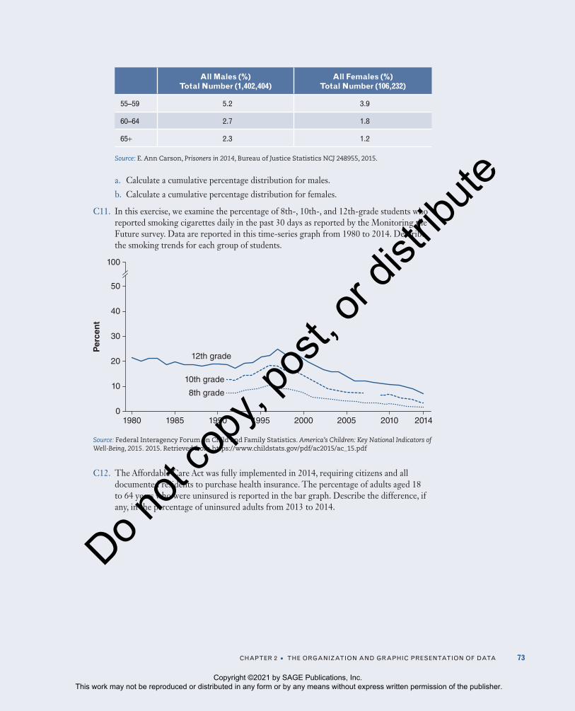
cHaPter 2 • tHe organization anD graPHic PreSentation of Data 73
All Males (%) Total Number (1,402,404)
All Females (%) Total Number (106,232)
55–59 5.2 3.9
60–64 2.7 1.8
65+ 2.3 1.2
Source: E. Ann Carson, Prisoners in 2014, Bureau of Justice Statistics NCJ 248955, 2015.
a. Calculate a cumulative percentage distribution for males.
b. Calculate a cumulative percentage distribution for females.
C11. In this exercise, we examine the percentage of 8th-, 10th-, and 12th-grade students who reported smoking cigarettes daily in the past 30 days as reported by the Monitoring the Future survey. Data are reported in this time-series graph from 1980 to 2014. Describe the smoking trends for each group of students.
19800
10
20
30
40
50
100
1985 1990 1995 2000 2005 2010 2014
Per
cen
t
12th grade
10th grade
8th grade
Source: Federal Interagency Forum on Child and Family Statistics. America’s Children: Key National Indicators of Well-Being, 2015. 2015. Retrieved from https://www.childstats.gov/pdf/ac2015/ac_15.pdf
C12. The Affordable Care Act was fully implemented in 2014, requiring citizens and all documented residents to purchase health insurance. The percentage of adults aged 18 to 64 years who were uninsured is reported in the bar graph. Describe the difference, if any, in the percentage of uninsured adults from 2013 to 2014.
Copyright ©2021 by SAGE Publications, Inc. This work may not be reproduced or distributed in any form or by any means without express written permission of the publisher.
Do n
ot co
py, p
ost, o
r dist
ribute

74 Social StatiSticS for a DiverSe Society
50
40
30
20
10
0Hispanic Non-Hispanic
WhiteNon-Hispanic
BlackNon-Hispanic
Asian
Per
cen
t
41.1
34.1
14.511.5
24.7
17.616.1
12.1
2013 2014
Source: Michael Martinez, Brian Ward, and Patricia Adams, Health Care Access and Utilization Among Adults Aged 18–65 by Race and Hispanic Origin: United States, 2013 and 2014, NCHS Data Brief No. 208, 2015.
C13. Elizabeth Greico and her colleagues (2012) analyzed U.S. Census data on foreign-born individuals by country of origin and age for 2010. The data are presented in the following table with row percentages totaling 100% (approximately).
Less Than 18 18–44 45–64 65+
africa 10.6 54.9 28.2 6.3
asia 7 47.6 32.8 12.7
europe 5.6 32.9 33 28.4
north america 7.3 30.7 36.1 25.9
oceania 7.8 51.7 30.3 10.3
latin america 7.2 56.1 28.1 8.6
Source: Elizabeth Greico, Yesenia Acosta, G. Patricia de la Cruz, Thomas Gryn, Luke Larsen, Edward Trevelyan, and Nathan Walters, The Foreign Born Population in the United States: 2010 (American Community Survey Reports ACS-19; Washington, D.C.: U.S. Census Bureau, 2012).
a. Describe the relationship between immigrant age and country of origin.
b. Construct a graph that best displays these data.
Copyright ©2021 by SAGE Publications, Inc. This work may not be reproduced or distributed in any form or by any means without express written permission of the publisher.
Do n
ot co
py, p
ost, o
r dist
ribute